PROMPTS · KREATIV ENTDECKEN

Prompt-Galerie

Echte Prompts und erzeugte Beispiele erkunden. Inspiration für Ihre nächste kreative Mission finden und den vollständigen Prompt kostenlos kopieren.

Beispiele
10,974
Modelle
17
Quellen
1277
10.974 Prompt-Beispiele · Seite 31 von 229
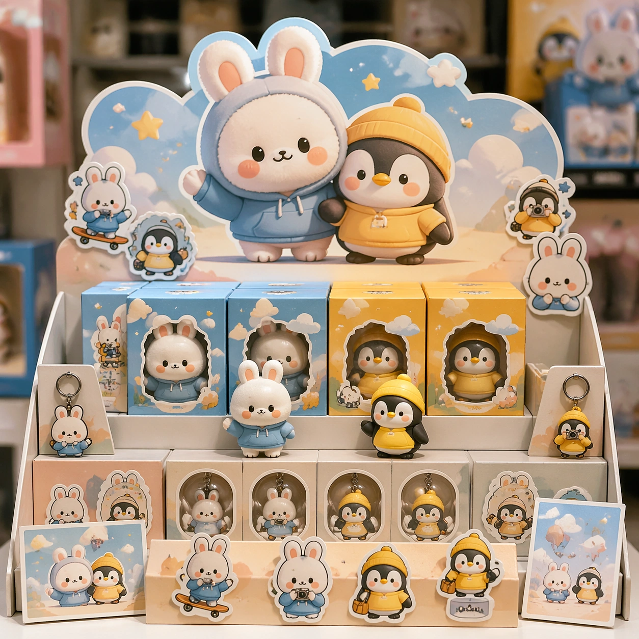
Example generated from “Mascot Ip Brand Collab — Counter Display”
GPT Image 2en

Scene: A square retail-ready campaign visual for Mascot IP Brand Collab, combining cute character appeal with polished commercial presentation. The composition should feel like a high-finish launch board: crisp packaging edges, collectible object staging, clean shelf or poster context, and vivid but controlled color. It should be immediately legible from far away, but still dense with charming small details that reward closer inspection. Subject: Build the image around Counter Display, a frame that a point-of-sale display study that proves the system can live in store. Translate Imagine premium brand collaborations between mascots and recognizable IP characters, spanning key art, packaging, in-store display, and social promo assets. into one lovable mascot, figure, or product system that feels ready for posters, boxes, stickers, inserts, or point-of-sale material. The result should feel like a fresh research image with clear commercial focus rather than random fan art. The main subject must remain unmistakable even when surrounded by accessories and display pieces. Important details: Charm alone is not enough. Preserve clean silhouette recognition, convincing package construction, reliable prop scale, and structured layout logic so the image feels sellable. This theme studies commercial-mockup, style-transfer, structured-layout, multi-image-reference through a production-ready visual system. Avoid noisy clutter; every secondary element should reinforce collectibility, retail desirability, or explainer clarity. Aim for clear hierarchy, polished craft, and immediately usable campaign logic. Use case: Mascot IP Brand Collab single study 3/5. Constraints: No readable text, no watermark, no logos, preserve exact 1:1 aspect ratio, no horror elements, no brand theft, no malformed packaging edges, no muddy mascot silhouette, no messy retail shelf, no chaotic prop overload.

Example generated from “Mascot Ip Brand Collab — Launch Poster”
GPT Image 2en

Scene: A square retail-ready campaign visual for Mascot IP Brand Collab, combining cute character appeal with polished commercial presentation. The composition should feel like a high-finish launch board: crisp packaging edges, collectible object staging, clean shelf or poster context, and vivid but controlled color. It should be immediately legible from far away, but still dense with charming small details that reward closer inspection. Subject: Build the image around Launch Poster, a frame that a clean release poster with cute emotional pull and unmistakable product focus. Translate Imagine premium brand collaborations between mascots and recognizable IP characters, spanning key art, packaging, in-store display, and social promo assets. into one lovable mascot, figure, or product system that feels ready for posters, boxes, stickers, inserts, or point-of-sale material. The result should feel like a fresh research image with clear commercial focus rather than random fan art. The main subject must remain unmistakable even when surrounded by accessories and display pieces. Important details: Charm alone is not enough. Preserve clean silhouette recognition, convincing package construction, reliable prop scale, and structured layout logic so the image feels sellable. This theme studies commercial-mockup, style-transfer, structured-layout, multi-image-reference through a production-ready visual system. Avoid noisy clutter; every secondary element should reinforce collectibility, retail desirability, or explainer clarity. Aim for clear hierarchy, polished craft, and immediately usable campaign logic. Use case: Mascot IP Brand Collab single study 4/5. Constraints: No readable text, no watermark, no logos, preserve exact 1:1 aspect ratio, no horror elements, no brand theft, no malformed packaging edges, no muddy mascot silhouette, no messy retail shelf, no chaotic prop overload.

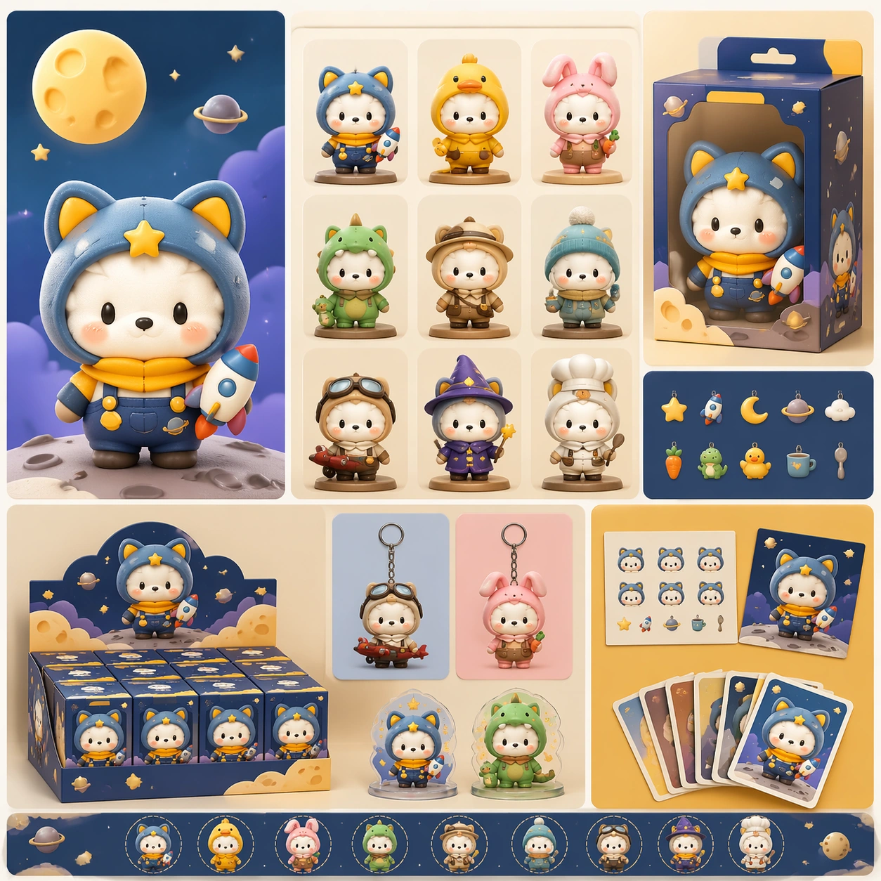
Example generated from “Mascot Ip Brand Collab — Collector Sheet”
GPT Image 2en

Scene: A square retail-ready campaign visual for Mascot IP Brand Collab, combining cute character appeal with polished commercial presentation. The composition should feel like a high-finish launch board: crisp packaging edges, collectible object staging, clean shelf or poster context, and vivid but controlled color. It should be immediately legible from far away, but still dense with charming small details that reward closer inspection. Subject: Build the image around Collector Sheet, a frame that a collector-oriented overview image unifying variants, icons, and packaging cues. Translate Imagine premium brand collaborations between mascots and recognizable IP characters, spanning key art, packaging, in-store display, and social promo assets. into one lovable mascot, figure, or product system that feels ready for posters, boxes, stickers, inserts, or point-of-sale material. The result should feel like a fresh research image with clear commercial focus rather than random fan art. The main subject must remain unmistakable even when surrounded by accessories and display pieces. Important details: Charm alone is not enough. Preserve clean silhouette recognition, convincing package construction, reliable prop scale, and structured layout logic so the image feels sellable. This theme studies commercial-mockup, style-transfer, structured-layout, multi-image-reference through a production-ready visual system. Avoid noisy clutter; every secondary element should reinforce collectibility, retail desirability, or explainer clarity. Aim for clear hierarchy, polished craft, and immediately usable campaign logic. Use case: Mascot IP Brand Collab single study 5/5. Constraints: No readable text, no watermark, no logos, preserve exact 1:1 aspect ratio, no horror elements, no brand theft, no malformed packaging edges, no muddy mascot silhouette, no messy retail shelf, no chaotic prop overload.

Example generated from “Matchday Poster And Score Update System — Reference Match Poster”
GPT Image 2en

Scene: Create a square pre-match hero poster for Matchday System, using a fictional big-match stadium world with midnight navy, bright amber, steel gray, and high-contrast floodlight haze. The frame should feel commercial, polished, and immediately useful for a real client deliverable rather than a one-off art experiment. Keep the composition readable at thumbnail scale while still rewarding a closer look with layered depth, clean negative space, and strong directional light. Build the image so it clearly supports sports communication, with enough modular structure to imply information architecture without relying on literal words. Subject: Center the image on two original rival athletes in brandless competition kits with sharp silhouettes and clear face readability, arranged as opposing-athlete standoff. Treat the subject as original and brandless, with believable apparel construction, realistic body proportions, and strong emotional legibility. Surround the subject with supporting environmental cues that reinforce the category but never overpower the main figure. All secondary objects, props, and background elements should strengthen the same professional sports or fitness context. Important details: This first image must establish the full reference system for later derivatives: modular score-card framing, abstract non-readable stat blocks, and disciplined broadcast geometry. The emotional tone should read as balanced anticipation. Make the visual language reusable, disciplined, and commercially credible, with clean edges, coherent light behavior, and obvious hierarchy. Abstract panels, diagram bands, or stat-like modules are welcome, but they must remain non-readable and subordinate to the main visual message. The result should feel original, specific, and ready to anchor a larger package. Use case: Matchday System series study 1/9, the reference image for the package. Constraints: No readable text, no watermark, no logos, preserve exact 1:1 aspect ratio, no brand marks, no copied famous team or product identity, no generic stock-photo stiffness, no cluttered background noise, no celebrity likenesses.

Example generated from “Matchday Poster And Score Update System — Live Score Flash”
GPT Image 2en

Scene: Build a square live score flash derived from the reference image for Matchday System. Preserve the exact world established by the reference image, including the same palette family, lighting direction, environmental logic, and surface finish. The new frame should feel like a deliberate extension of one campaign system, not a separate concept. Shift the hierarchy to suit this use case, but keep the overall composition commercial, polished, and ready for real rollout. Subject: Use the same original subject identity and anchor cues introduced by the reference image, now organized as single-athlete surge. Keep faces, hair logic, body proportions, apparel or product construction, and major supporting forms consistent with the reference. Allow only the layout emphasis, pose, crop, and contextual energy to change so the result clearly belongs to the same package. Important details: Continuity is the main challenge. Preserve the exact reference language for color, materials, framing rhythm, and overall brandless campaign grammar while steering the tone toward compressed urgency. Keep any stat blocks, schedule modules, arrows, badges, or callout panels non-readable. The derivative should prove that the same art direction can handle a different communication task without losing identity or utility. Make it credible for production use, with clean edges, intentional spacing, and no random decorative elements. Use case: Matchday System series study 2/9, a derivative surface linked to 01-reference-match-poster. Constraints: No readable text, no watermark, no logos, preserve exact 1:1 aspect ratio, no new subject identity, no brand marks, no palette drift, no unrelated props, no collage chaos, no copied public-figure styling.

Example generated from “Matchday Poster And Score Update System — Post-match Result Board”
GPT Image 2en

Scene: Build a square post-match result card derived from the reference image for Matchday System. Preserve the exact world established by the reference image, including the same palette family, lighting direction, environmental logic, and surface finish. The new frame should feel like a deliberate extension of one campaign system, not a separate concept. Shift the hierarchy to suit this use case, but keep the overall composition commercial, polished, and ready for real rollout. Subject: Use the same original subject identity and anchor cues introduced by the reference image, now organized as winning-athlete calm. Keep faces, hair logic, body proportions, apparel or product construction, and major supporting forms consistent with the reference. Allow only the layout emphasis, pose, crop, and contextual energy to change so the result clearly belongs to the same package. Important details: Continuity is the main challenge. Preserve the exact reference language for color, materials, framing rhythm, and overall brandless campaign grammar while steering the tone toward settled authority. Keep any stat blocks, schedule modules, arrows, badges, or callout panels non-readable. The derivative should prove that the same art direction can handle a different communication task without losing identity or utility. Make it credible for production use, with clean edges, intentional spacing, and no random decorative elements. Use case: Matchday System series study 3/9, a derivative surface linked to 01-reference-match-poster. Constraints: No readable text, no watermark, no logos, preserve exact 1:1 aspect ratio, no new subject identity, no brand marks, no palette drift, no unrelated props, no collage chaos, no copied public-figure styling.

Example generated from “Matchday Poster And Score Update System — Rivalry Countdown Variant”
GPT Image 2en

Scene: Build a square rivalry countdown teaser derived from the reference image for Matchday System. Preserve the exact world established by the reference image, including the same palette family, lighting direction, environmental logic, and surface finish. The new frame should feel like a deliberate extension of one campaign system, not a separate concept. Shift the hierarchy to suit this use case, but keep the overall composition commercial, polished, and ready for real rollout. Subject: Use the same original subject identity and anchor cues introduced by the reference image, now organized as mirrored-profile faceoff. Keep faces, hair logic, body proportions, apparel or product construction, and major supporting forms consistent with the reference. Allow only the layout emphasis, pose, crop, and contextual energy to change so the result clearly belongs to the same package. Important details: Continuity is the main challenge. Preserve the exact reference language for color, materials, framing rhythm, and overall brandless campaign grammar while steering the tone toward tight tension. Keep any stat blocks, schedule modules, arrows, badges, or callout panels non-readable. The derivative should prove that the same art direction can handle a different communication task without losing identity or utility. Make it credible for production use, with clean edges, intentional spacing, and no random decorative elements. Use case: Matchday System series study 4/9, a derivative surface linked to 01-reference-match-poster. Constraints: No readable text, no watermark, no logos, preserve exact 1:1 aspect ratio, no new subject identity, no brand marks, no palette drift, no unrelated props, no collage chaos, no copied public-figure styling.

Example generated from “Matchday Poster And Score Update System — Lineup Intensity Card”
GPT Image 2en

Scene: Create a square lineup intensity card for Matchday System, using premium sports-media packaging built around stadium light, clean panel hierarchy, and brandless matchday communication. The composition should read as a practical, production-ready sports or fitness surface with a clear hierarchy, premium lighting, and obvious commercial intent. Keep the environment specific enough to feel real, but leave enough control in the layout for non-readable information modules, campaign blocks, or visualized metrics. Aim for a finish that works for a brand, club, app, academy, or event operator. Subject: Build the image around waist-up athlete portrait. The subject should be original, believable, and free of any real-brand or celebrity cues. Use realistic apparel, safe body mechanics when movement is visible, and environmental props that support the category without clutter. The subject must stay visually dominant so the design still works as a communication asset rather than a pure scene study. Important details: The mood should read as roster precision. Treat layout, light, and supporting graphic structure as part of one polished delivery surface. Any schedule blocks, metric panels, quote zones, badges, or path diagrams must stay abstract and non-readable. Prioritize usefulness, clarity, and category truth over spectacle. The image should feel distinct from the series package while still belonging naturally to the same topic and business use case. Use case: Matchday System single study 6/9, an independent rollout surface for the topic. Constraints: No readable text, no watermark, no logos, preserve exact 1:1 aspect ratio, no brand marks, no public-figure resemblance, no generic stock layout, no cluttered UI imitation, no accidental copyrighted insignia.

Example generated from “Matchday Poster And Score Update System — Halftime Momentum Panel”
GPT Image 2en

Scene: Create a square halftime momentum panel for Matchday System, using premium sports-media packaging built around stadium light, clean panel hierarchy, and brandless matchday communication. The composition should read as a practical, production-ready sports or fitness surface with a clear hierarchy, premium lighting, and obvious commercial intent. Keep the environment specific enough to feel real, but leave enough control in the layout for non-readable information modules, campaign blocks, or visualized metrics. Aim for a finish that works for a brand, club, app, academy, or event operator. Subject: Build the image around fatigued athlete between plays. The subject should be original, believable, and free of any real-brand or celebrity cues. Use realistic apparel, safe body mechanics when movement is visible, and environmental props that support the category without clutter. The subject must stay visually dominant so the design still works as a communication asset rather than a pure scene study. Important details: The mood should read as analytical tempo. Treat layout, light, and supporting graphic structure as part of one polished delivery surface. Any schedule blocks, metric panels, quote zones, badges, or path diagrams must stay abstract and non-readable. Prioritize usefulness, clarity, and category truth over spectacle. The image should feel distinct from the series package while still belonging naturally to the same topic and business use case. Use case: Matchday System single study 7/9, an independent rollout surface for the topic. Constraints: No readable text, no watermark, no logos, preserve exact 1:1 aspect ratio, no brand marks, no public-figure resemblance, no generic stock layout, no cluttered UI imitation, no accidental copyrighted insignia.

Example generated from “Matchday Poster And Score Update System — Player of the Match Card”
GPT Image 2en

Scene: Create a square player recognition card for Matchday System, using premium sports-media packaging built around stadium light, clean panel hierarchy, and brandless matchday communication. The composition should read as a practical, production-ready sports or fitness surface with a clear hierarchy, premium lighting, and obvious commercial intent. Keep the environment specific enough to feel real, but leave enough control in the layout for non-readable information modules, campaign blocks, or visualized metrics. Aim for a finish that works for a brand, club, app, academy, or event operator. Subject: Build the image around composed standout athlete. The subject should be original, believable, and free of any real-brand or celebrity cues. Use realistic apparel, safe body mechanics when movement is visible, and environmental props that support the category without clutter. The subject must stay visually dominant so the design still works as a communication asset rather than a pure scene study. Important details: The mood should read as quiet prestige. Treat layout, light, and supporting graphic structure as part of one polished delivery surface. Any schedule blocks, metric panels, quote zones, badges, or path diagrams must stay abstract and non-readable. Prioritize usefulness, clarity, and category truth over spectacle. The image should feel distinct from the series package while still belonging naturally to the same topic and business use case. Use case: Matchday System single study 8/9, an independent rollout surface for the topic. Constraints: No readable text, no watermark, no logos, preserve exact 1:1 aspect ratio, no brand marks, no public-figure resemblance, no generic stock layout, no cluttered UI imitation, no accidental copyrighted insignia.

Example generated from “Matchday Poster And Score Update System — Venue Program Cover”
GPT Image 2en

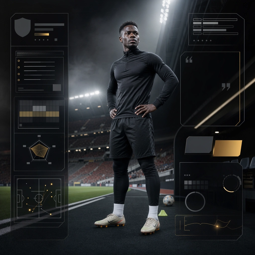
Scene: Create a square venue program cover for Matchday System, using premium sports-media packaging built around stadium light, clean panel hierarchy, and brandless matchday communication. The composition should read as a practical, production-ready sports or fitness surface with a clear hierarchy, premium lighting, and obvious commercial intent. Keep the environment specific enough to feel real, but leave enough control in the layout for non-readable information modules, campaign blocks, or visualized metrics. Aim for a finish that works for a brand, club, app, academy, or event operator. Subject: Build the image around athlete near pitch edge. The subject should be original, believable, and free of any real-brand or celebrity cues. Use realistic apparel, safe body mechanics when movement is visible, and environmental props that support the category without clutter. The subject must stay visually dominant so the design still works as a communication asset rather than a pure scene study. Important details: The mood should read as editorial calm. Treat layout, light, and supporting graphic structure as part of one polished delivery surface. Any schedule blocks, metric panels, quote zones, badges, or path diagrams must stay abstract and non-readable. Prioritize usefulness, clarity, and category truth over spectacle. The image should feel distinct from the series package while still belonging naturally to the same topic and business use case. Use case: Matchday System single study 9/9, an independent rollout surface for the topic. Constraints: No readable text, no watermark, no logos, preserve exact 1:1 aspect ratio, no brand marks, no public-figure resemblance, no generic stock layout, no cluttered UI imitation, no accidental copyrighted insignia.

Example generated from “Material Swaps — Butter Palace Gate”
GPT Image 2en

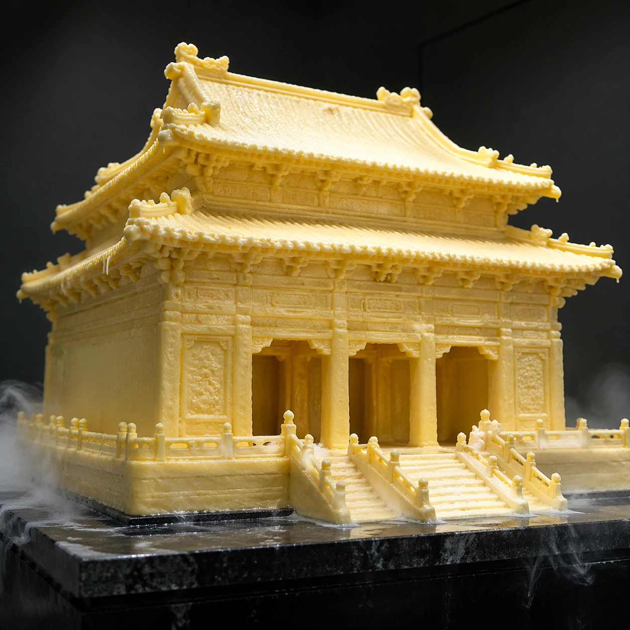
Scene: A square photoreal studio museum shot of a miniature imperial palace gate carved entirely from butter, placed on a chilled black stone plinth under soft overhead light. The camera is slightly low and close, so the gate feels monumental despite its tabletop scale. Cool condensation hangs near the base, and the background is a dark neutral gallery wall. Subject: The subject is a recognizable ornate palace gate form with layered roofs, bracket sets, columns, stair edges, ridge ornaments, and carved panels, but every part is made from pale yellow butter. The roof corners sag slightly, thin decorative edges soften, and tiny knife marks, creamy ridges, and glossy melt highlights reveal the material. Small droplets collect where warm light touches sharp carvings. Important details: The swap must be physical, not just yellow architecture. Butter should control all behavior: softened corners, low structural stiffness, oily sheen, translucent thin edges, melt trails, fingerprints, and chilled support contact. Keep the architectural silhouette readable while showing that fine details are at the limit of what butter can hold. Lighting should reveal creamy subsurface scattering and soft contact shadows on the black plinth. Use case: Material Swaps single study 1/8, testing whether monumental architecture can remain recognizable while obeying butter material physics. Constraints: No readable text, no watermark, no logos, preserve exact 1:1 aspect ratio, no real landmark label, no plastic model look, no golden metal, no dry stone texture, no fantasy glow, no extra people, no food plate styling, no collapsed unreadable blob.

Example generated from “Material Swaps — Glass Rose Stem”
GPT Image 2en

Scene: A square macro product photograph on a charcoal velvet surface, lit with narrow studio strip lights that create sharp reflections and caustic glints. A single rose lies diagonally across the frame, but the entire flower is made from transparent blown glass. The background stays dark and quiet so the optical material behavior is easy to inspect. Subject: A delicate rose with curled petals, sepals, thorny stem, and two leaves, all formed from thin clear glass with faint pink and green tint only in the thickest areas. The petals have variable thickness, polished rims, trapped microbubbles, hairline stress marks, and subtle distortions where one petal overlaps another. The stem is cylindrical glass with tiny sharp thorns that catch bright highlights. Important details: The rose must not read as a normal flower covered in shine. Glass should define the object: refraction, internal reflection, transparent overlaps, caustic spots on velvet, brittle thin edges, slight optical magnification, and green-pink tint caused by thickness. Keep the botanical structure recognizable and elegant, but include a few tiny chips at petal tips to sell fragility. Shadows should be complex and transparent rather than opaque floral shadows. Use case: Material Swaps single study 2/8, testing transparent glass optics applied to an organic rose form. Constraints: No readable text, no watermark, no logos, preserve exact 1:1 aspect ratio, no plastic flower, no wet real petals, no neon glow, no gemstone rose, no metal stem, no extra bouquet, no impossible soft glass bending, no decorative label card.

Example generated from “Material Swaps — Lace Cathedral”
GPT Image 2en

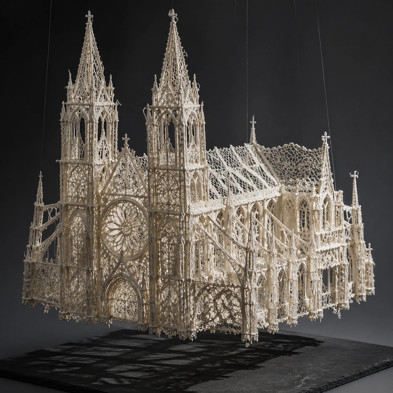
Scene: A square museum-style object photograph of a Gothic cathedral model made from ivory lace, suspended just above a dark slate base so its shadow reveals the openwork structure. The lighting is cool and directional, grazing across towers, arches, and lace threads. The background is deep gray with a slight vignette, keeping attention on the fragile architecture. Subject: A cathedral with twin spires, pointed arches, rose window, flying buttresses, ribbed nave roof, and carved doorway forms, all constructed from layered lace. The walls are open mesh, the windows are floral lace medallions, and buttresses are stiffened thread bands. Some towers curve slightly under tension, and tiny stitched knots replace stone details. The lace is off-white, with subtle translucency and thread shadows. Important details: The building must obey lace physics: tensile thread networks, delicate negative space, flexible edges, pinned or stiffened load-bearing lines, and soft sag between structural points. Keep Gothic silhouette readable without making it solid stone. Light should pass through lace holes and cast patterned shadows on the base. The material should feel handmade, with varied thread thickness, knots, uneven tension, and slight fraying at selected edges. Use case: Material Swaps single study 4/8, testing lace as a structural architectural material with believable translucency and tension. Constraints: No readable text, no watermark, no logos, preserve exact 1:1 aspect ratio, no solid marble cathedral, no paper cutout, no wedding dress scene, no people, no stained glass colors, no fantasy glow, no perfectly rigid lace, no broken unreadable silhouette.

Example generated from “Material Swaps — Porcelain Ocean Wave”
GPT Image 2en

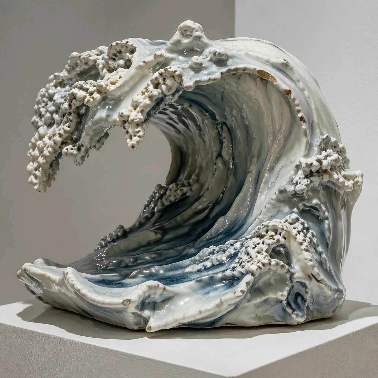
Scene: A square fine-art product photograph of a frozen ocean wave sculpted from glazed porcelain, displayed on a simple ceramic plinth in a quiet white gallery. Soft daylight from above reveals glossy highlights, hairline cracks, and translucent thin crests. The camera is close enough to see glaze pooling and chipped edges. Subject: A curling ocean wave form, like a suspended breaker with foam, spray, and ridges, but every part is porcelain. The wave body is milky white with blue-gray celadon glaze in thicker valleys. Foam becomes clusters of tiny porcelain beads and lace-like glazed fragments. The crest is thin, brittle, and slightly translucent; a few chips and cracks expose matte ceramic underneath. Important details: The material behavior must contradict liquid motion while preserving wave anatomy. Porcelain should make the wave rigid, heavy, glossy, brittle, and fired, with glaze drips following gravity, pooled blue glaze in recesses, crazing cracks, and broken sharp rims. Keep the water shape recognizable through curl, lip, trough, and foam texture, but avoid real liquid transparency. Contact shadows on the plinth should make the ceramic weight believable. Use case: Material Swaps single study 5/8, testing whether dynamic water can be reinterpreted as brittle glazed porcelain. Constraints: No readable text, no watermark, no logos, preserve exact 1:1 aspect ratio, no real water splash, no plastic resin, no blue glass wave, no surfer, no beach scene, no fantasy glow, no flat decorative plate, no smooth featureless sculpture.

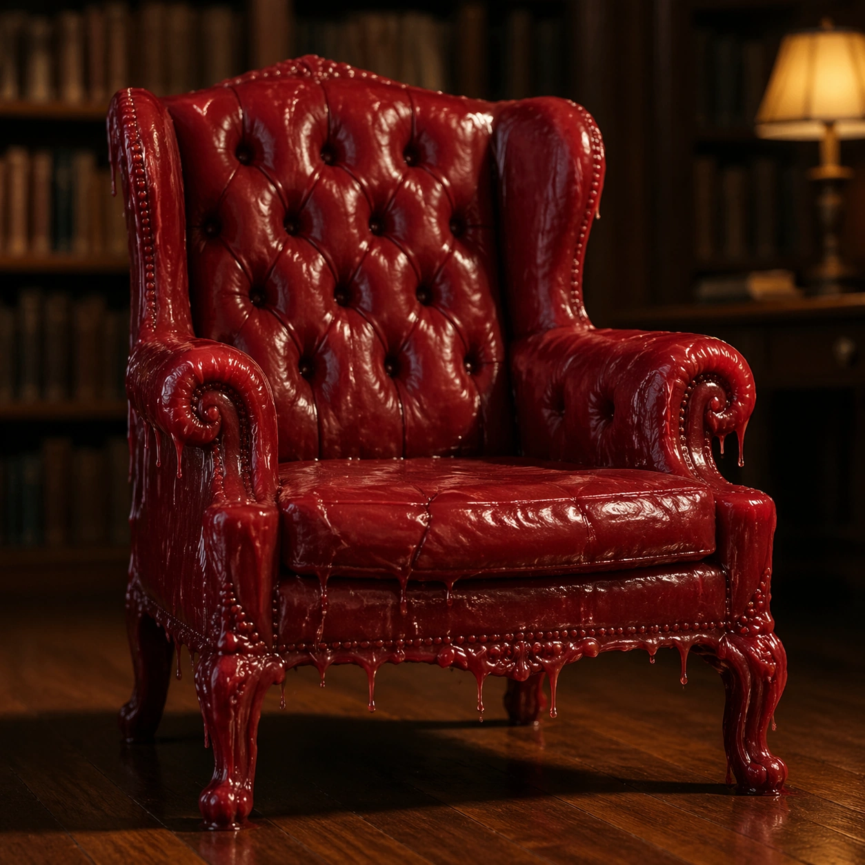
Example generated from “Material Swaps — Wax Library Chair”
GPT Image 2en

Scene: A square cinematic interior photograph of an ornate reading chair in a quiet old library, but the entire chair is made from dark red sealing wax. Warm lamplight falls from one side, causing slight softening near the arms, while the background bookshelves remain blurred and contain no readable spines. The chair sits on a polished wooden floor with a heavy shadow. Subject: A high-backed tufted library chair with rolled arms, carved legs, nailhead-like details, cushion seams, and button depressions, all formed from glossy red wax. The seat has subtle sag, the arms show softened finger-like ridges, and carved leg details droop at the warmest points. Small cooled wax drips hang below the upholstery seams, and a few cracks reveal darker wax inside. Important details: The chair should remain usable-looking but visibly unstable under heat and weight. Wax must define the physics: glossy highlights, translucent thick edges, softened relief, slow drips, sagging cushions, fingerprints, cooled ripples, and brittle cracks in colder thin areas. Keep the library mood grounded and photoreal, with accurate contact shadows and reflections on the wood floor. Do not make the object look like red leather or polished plastic. Use case: Material Swaps single study 6/8, testing wax material behavior on an upholstered furniture form. Constraints: No readable text, no watermark, no logos, preserve exact 1:1 aspect ratio, no readable book titles, no leather chair, no plastic toy, no open flame, no human figure, no melted puddle replacing the chair, no fantasy castle decor, no brand embossing.

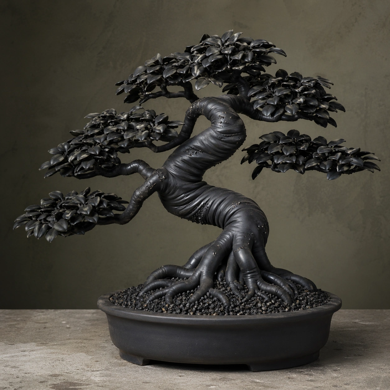
Example generated from “Material Swaps — Rubber Bonsai Tree”
GPT Image 2en

Scene: A square studio still life of a bonsai tree on a simple concrete table, photographed with soft side lighting and a neutral olive-gray background. The bonsai sits in a shallow matte pot filled with dark gravel. The tree form is elegant and traditional, but every trunk, branch, and leaf is made from flexible black rubber. Subject: A miniature bonsai with twisting trunk, exposed roots, branching canopy pads, and hundreds of small leaves, all formed from matte and semi-gloss rubber. The trunk bends under its own elastic memory, with molded seam lines, stretched glossy highlights on curves, and fine rubber nubs where bark texture would be. Leaves are thin rubber tabs with curled edges, slight sag, and dust adhering to their surfaces. Important details: Do not treat rubber as simply black paint. Rubber physics should be visible: flexible deformation, rounded compressed roots, elastic tension in bent branches, soft non-brittle edges, scuffed matte areas, oily highlights, molded texture, and slight rebound shape. The bonsai silhouette must remain recognizable and sculptural, with the material making it strange but believable. Contact with gravel should show soft compression and small pebbles pressing into rubber roots. Use case: Material Swaps single study 7/8, testing elastic rubber material behavior applied to a natural bonsai form. Constraints: No readable text, no watermark, no logos, preserve exact 1:1 aspect ratio, no real leaves, no plastic plant shine, no metal wire sculpture, no cartoon tree, no bright colors, no human hands, no garden signage, no broken anatomy of the bonsai structure.

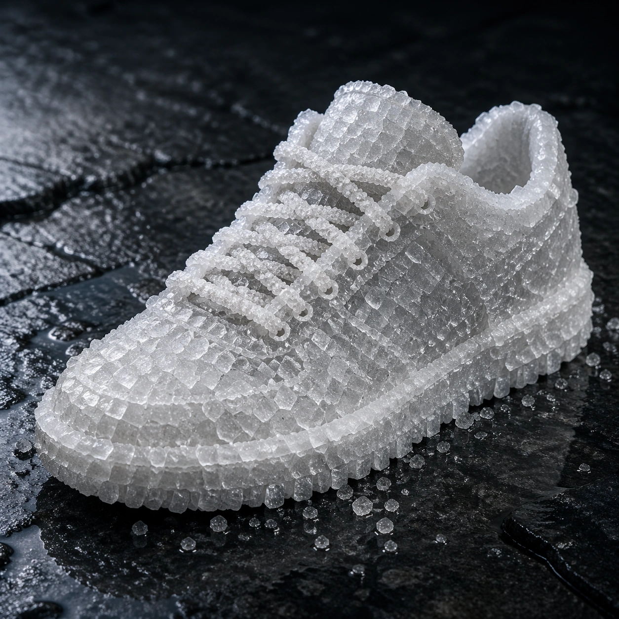
Example generated from “Material Swaps — Salt Crystal Sneaker”
GPT Image 2en

Scene: A square premium sneaker product shot on a dark wet basalt surface, lit with a cool overhead softbox and a low side highlight. The sneaker is displayed in three-quarter view like a commercial footwear hero image, but it is entirely grown from translucent white salt crystals. Tiny grains scatter around the sole and catch the light. Subject: A low-top sneaker silhouette with toe box, laces, eyelets, tongue, collar, side panels, midsole, and tread pattern, all made from salt. The upper is a crust of interlocking cubic crystals, the laces are chains of smaller salt formations, the sole is a dense compressed crystalline slab, and the tread edges crumble into granular powder. Some areas are translucent, while thicker parts look chalky white. Important details: The material swap must respect salt crystal behavior: cubic facets, brittle fractures, granular shedding, moisture-darkened contact points, translucent edges, powder residue, and uneven growth around seams. Keep the sneaker construction readable without fabric, leather, or rubber. The basalt surface should show a faint wet halo where salt draws moisture, but avoid dissolving the entire shoe. Product lighting should reveal crystal sparkle and roughness at multiple scales. Use case: Material Swaps single study 8/8, testing crystalline salt physics on a modern footwear form. Constraints: No readable text, no watermark, no logos, preserve exact 1:1 aspect ratio, no brand marks, no normal fabric sneaker, no sugar candy look, no ice sculpture, no glowing crystals, no foot inside, no retail tag, no collapsed salt pile, no oversized logo shape.

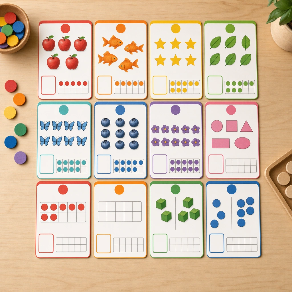
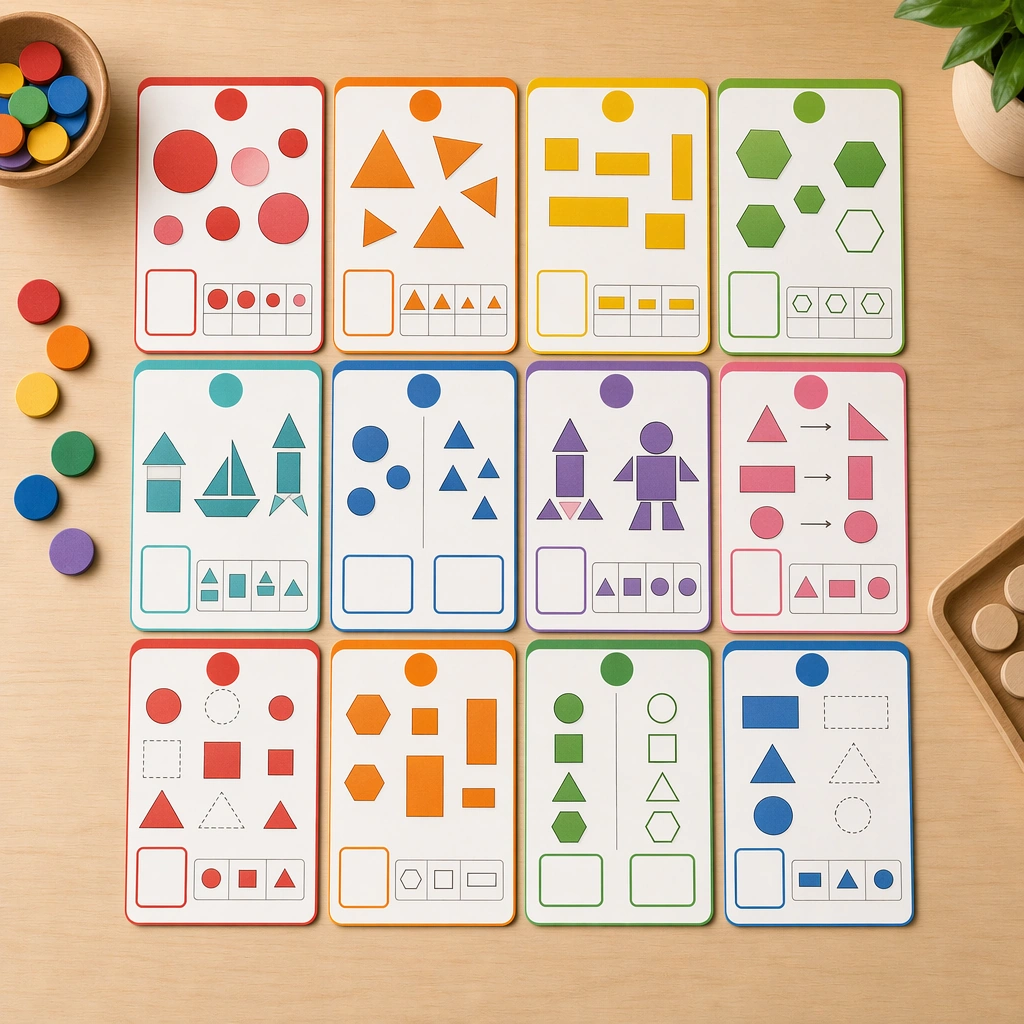
Example generated from “Math Concept Visual Card Set — Reference Counting Cards”
GPT Image 2en

Scene: Create a square overhead board of math-learning cards on a neutral classroom table, lit evenly like a professional teacher-supply catalog photograph. The cards should feel tactile and precise, with matte lamination, rounded corners, and small wooden counters nearby to reinforce hands-on learning. Keep the square frame balanced, calm, and production-ready so the asset can serve gallery review, research comparison, and real educational delivery at the same time. Subject: Center the system on counting cards that pair groups of simple shapes and objects with blank answer areas, ten-frame hints, and color-coded quantity markers. The visuals should make mathematical relationships feel concrete and approachable for young learners without showing any actual numbers. The subject matter should feel intentionally selected for a coherent curriculum family rather than like a random decorative assortment. Important details: Use a strong teaching structure: one idea per card, high contrast between object groups, consistent spacing, and a palette that helps sorting and comparison. The image should feel both warm and rigorous, proving the deck can support real pedagogy instead of generic cute illustration. Preserve the same card format, diagram density, block spacing, icon size, and color-coding hierarchy from the reference math board. Use variation only in the teaching content, supporting props, and scene-specific mood while preserving the core visual system exactly. Use case: Math Concept Visual Card Set series study 1/4, reference counting cards. Constraints: No readable text, no watermark, no logos, preserve exact 1:1 aspect ratio, no readable equations, no numerals, no logos, no abstract adult infographic styling, no clutter, no warped cards.

Example generated from “Math Concept Visual Card Set — Shape Sorting Cards”
GPT Image 2en

Scene: Keep the identical square overhead product-shot setup, card scale, and tactile lighting from the reference board. The composition should read as the next approved module in the same math deck, with equal margins, matching paper finish, and the same calm classroom-commercial mood. Keep the square frame balanced, calm, and production-ready so the asset can serve gallery review, research comparison, and real educational delivery at the same time. Subject: Replace the counting focus with shape logic using circles, triangles, rectangles, hexagons, and composite forms sorted into clear comparison zones. Include blank label spaces, grouping trays, and visual cues for matching, rotating, and classifying without ever relying on text. The subject matter should feel intentionally selected for a coherent curriculum family rather than like a random decorative assortment. Important details: Preserve the same reference layout rules exactly, including border thickness, diagram density, spacing, and color-coding hierarchy. Variation should come from the logic tasks and silhouette contrasts, while the deck still feels manufacturable as one unified product family. Preserve the same card format, diagram density, block spacing, icon size, and color-coding hierarchy from the reference math board. Use variation only in the teaching content, supporting props, and scene-specific mood while preserving the core visual system exactly. Use case: Math Concept Visual Card Set series study 2/4, shape sorting cards. Constraints: No readable text, no watermark, no logos, preserve exact 1:1 aspect ratio, no readable equations, no numerals, no logos, no abstract adult infographic styling, no clutter, no warped cards.

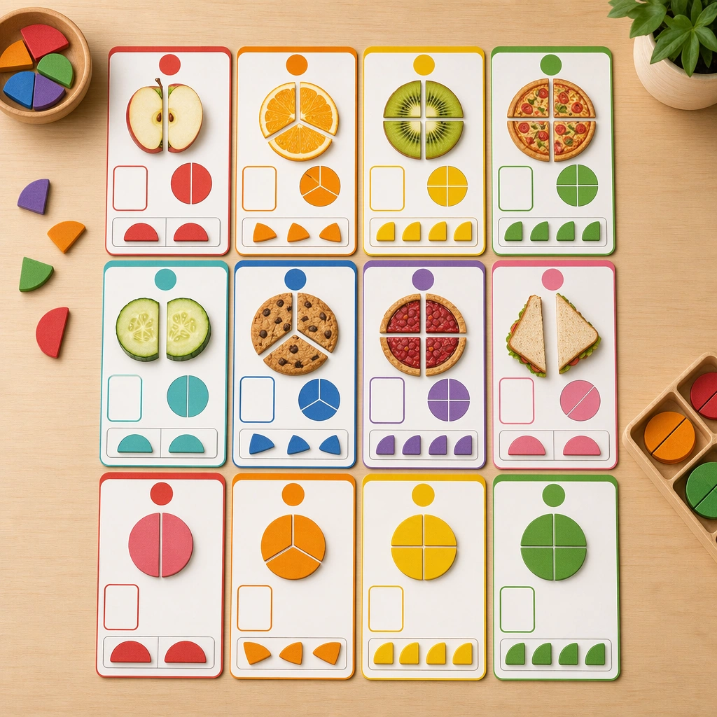
Example generated from “Math Concept Visual Card Set — Fraction Snack Cards”
GPT Image 2en

Scene: Render the same square tabletop board again, preserving the exact camera angle, card dimensions, and tidy catalog lighting from the reference image. This should feel like a curriculum extension for a slightly older early-math learner while remaining visually coherent with the original deck. Keep the square frame balanced, calm, and production-ready so the asset can serve gallery review, research comparison, and real educational delivery at the same time. Subject: Use foods and circular objects cut into halves, thirds, and quarters, plus blank comparison slots, colored segment guides, and matching piece trays. The relationships should be visible instantly, making part-whole reasoning feel tactile and friendly rather than formal or textbook-heavy. The subject matter should feel intentionally selected for a coherent curriculum family rather than like a random decorative assortment. Important details: Keep the structural system from the reference board locked: same margin rhythm, pastel code families, manipulable-diagram aesthetic, and empty title zones. Let only the math content evolve, not the production language or visual standards. Preserve the same card format, diagram density, block spacing, icon size, and color-coding hierarchy from the reference math board. Use variation only in the teaching content, supporting props, and scene-specific mood while preserving the core visual system exactly. Use case: Math Concept Visual Card Set series study 3/4, fraction snack cards. Constraints: No readable text, no watermark, no logos, preserve exact 1:1 aspect ratio, no readable equations, no numerals, no logos, no abstract adult infographic styling, no clutter, no warped cards.

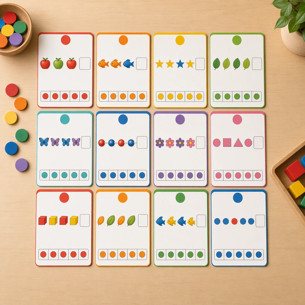
Example generated from “Math Concept Visual Card Set — Pattern Sequence Cards”
GPT Image 2en

Scene: Return to the identical square product-shot arrangement with the same tabletop warmth and layout discipline established by the reference board. The image should look like a fourth approved board in a coherent math-learning line sold to schools and parents. Keep the square frame balanced, calm, and production-ready so the asset can serve gallery review, research comparison, and real educational delivery at the same time. Subject: Build the card set around repeating sequences, visual rhythms, and fill-the-gap logic using shapes, animals, beads, and block colors. Include blank completion spaces and subtle directional hints that make sequence reasoning obvious without readable instructions. The subject matter should feel intentionally selected for a coherent curriculum family rather than like a random decorative assortment. Important details: The deck must still obey the reference system completely: matching border treatment, spacing, card proportions, and object scale. Use pattern variation and pacing as the only major change, proving that multiple foundational math concepts can live under one stable educational design system. Preserve the same card format, diagram density, block spacing, icon size, and color-coding hierarchy from the reference math board. Use variation only in the teaching content, supporting props, and scene-specific mood while preserving the core visual system exactly. Use case: Math Concept Visual Card Set series study 4/4, pattern sequence cards. Constraints: No readable text, no watermark, no logos, preserve exact 1:1 aspect ratio, no readable equations, no numerals, no logos, no abstract adult infographic styling, no clutter, no warped cards.

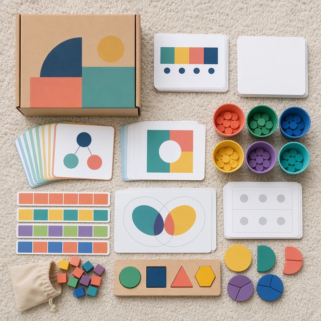
Example generated from “Math Concept Visual Card Set — Home Practice Box”
GPT Image 2en

Scene: Render a square flatlay of a take-home math kit on a soft neutral rug with even daylight and careful prop spacing. The image should look like an ecommerce bundle for parents, containing durable materials that promise structured, low-stress learning at home. Keep the square frame balanced, calm, and production-ready so the asset can serve gallery review, research comparison, and real educational delivery at the same time. Subject: Feature a compact box with concept cards, counters, pattern strips, sorting cups, and fraction pieces, all arranged so each component suggests a different lesson type. Use blank instruction cards and diagram panels rather than text. The subject arrangement should feel complete and self-contained, able to stand alone as a real supporting deliverable inside the same education business line. Important details: The hierarchy should be obvious enough that families could understand the kit through visual grouping alone. Keep the palette cheerful but rational, emphasizing trust, repeatability, and age-appropriate design. Keep the visual hierarchy modular, commercially believable, and clearly tied to a real educational use case rather than a generic mood board. Use case: Math Concept Visual Card Set single study 3/5, home practice box. Constraints: No readable text, no watermark, no logos, preserve exact 1:1 aspect ratio, no readable equations, no numerals, no logos, no messy classroom clutter, no generic stock-photo styling, no broken manipulatives.

Example generated from “Math Concept Visual Card Set — Assessment Ring Cards”
GPT Image 2en

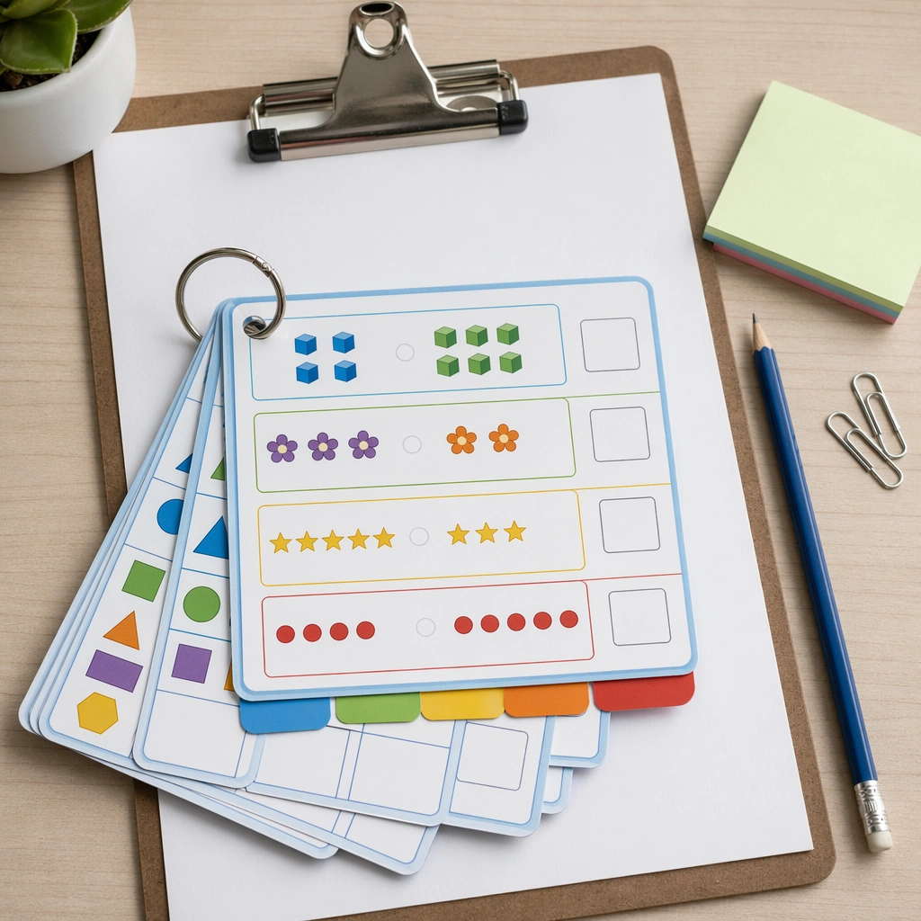
Scene: Create a square close product shot of ring-bound assessment cards resting on a teacher clipboard with tidy desk props and cool neutral light. The composition should feel compact, practical, and ready for use in a classroom observation or intervention setting. Keep the square frame balanced, calm, and production-ready so the asset can serve gallery review, research comparison, and real educational delivery at the same time. Subject: Show small sturdy cards with comparison diagrams, visual sequences, quantity groups, and shape sorting prompts, each designed for quick child response without text. The ring format should feel durable and professional, with color tabs and blank scoring zones. The subject arrangement should feel complete and self-contained, able to stand alone as a real supporting deliverable inside the same education business line. Important details: Keep the product crisp and believable. The image should communicate speed, clarity, and repeated classroom use while still fitting the cheerful design language of the broader math-card family. Keep the visual hierarchy modular, commercially believable, and clearly tied to a real educational use case rather than a generic mood board. Use case: Math Concept Visual Card Set single study 4/5, assessment ring cards. Constraints: No readable text, no watermark, no logos, preserve exact 1:1 aspect ratio, no readable equations, no numerals, no logos, no messy classroom clutter, no generic stock-photo styling, no broken manipulatives.

Example generated from “Math Concept Visual Card Set — Playtable Problem Scene”
GPT Image 2en

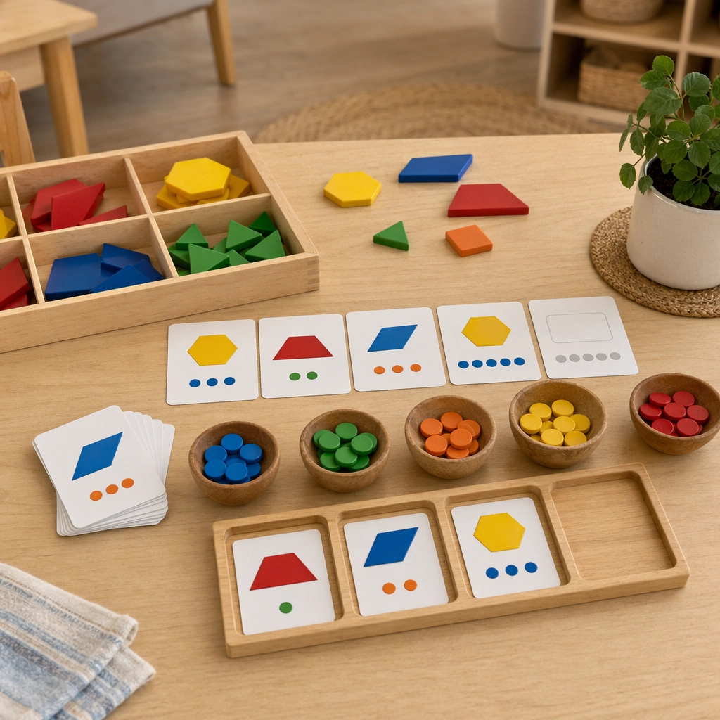
Scene: Show a square lifestyle tabletop scene in a calm play-based classroom, with pattern blocks, counting bowls, and math cards arranged on a light wood table. Use warm daylight and a slightly lived-in but still polished setup, as if photographed for a curriculum campaign about joyful reasoning. Keep the square frame balanced, calm, and production-ready so the asset can serve gallery review, research comparison, and real educational delivery at the same time. Subject: The scene should hint at one open-ended challenge built from shapes, quantities, and missing-sequence pieces, inviting children to solve by moving objects. No human figures are required; the spatial arrangement should suggest active reasoning on its own. The subject arrangement should feel complete and self-contained, able to stand alone as a real supporting deliverable inside the same education business line. Important details: Balance educational seriousness with approachable play. The asset should feel more like a real learning invitation than a toy advertisement, proving the math-card system can support both structured instruction and discovery-based activity. Keep the visual hierarchy modular, commercially believable, and clearly tied to a real educational use case rather than a generic mood board. Use case: Math Concept Visual Card Set single study 5/5, playtable problem scene. Constraints: No readable text, no watermark, no logos, preserve exact 1:1 aspect ratio, no readable equations, no numerals, no logos, no messy classroom clutter, no generic stock-photo styling, no broken manipulatives.

Example generated from “Maya Temple Dawn Discovery — Reference Anchor”
GPT Image 2en

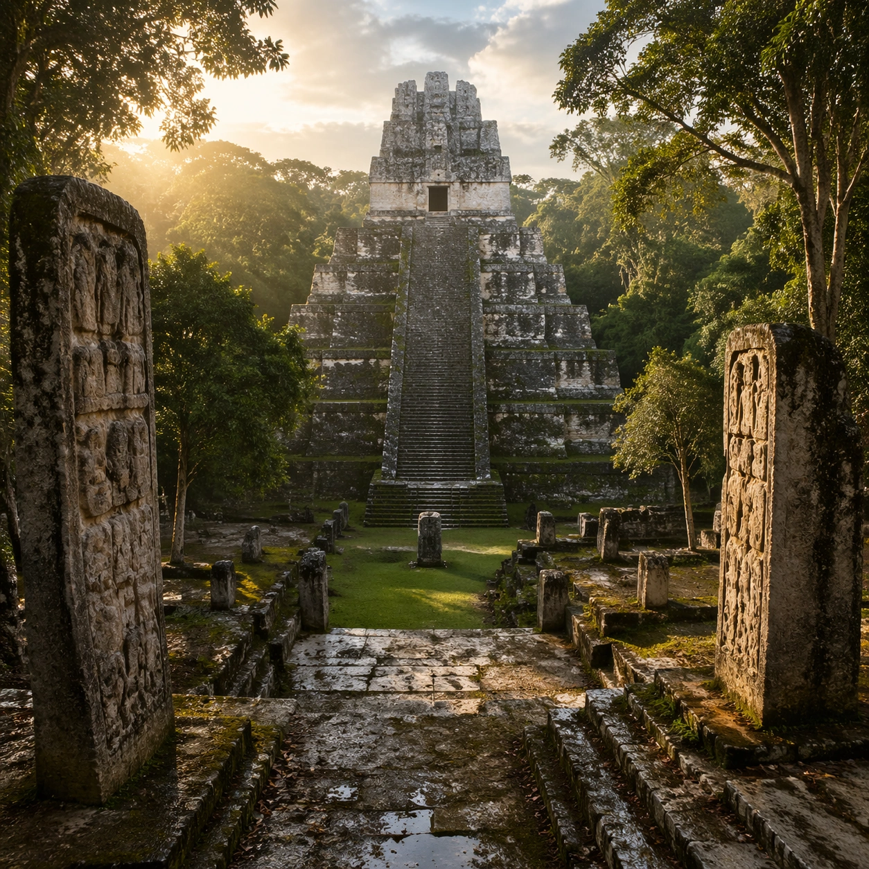
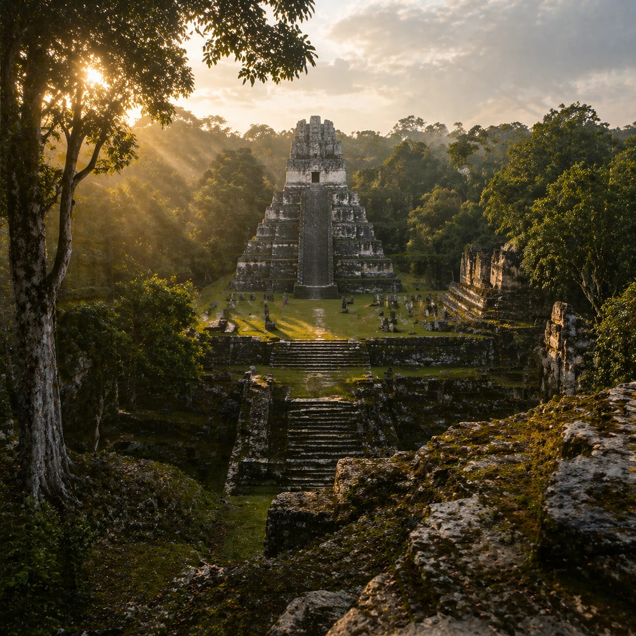
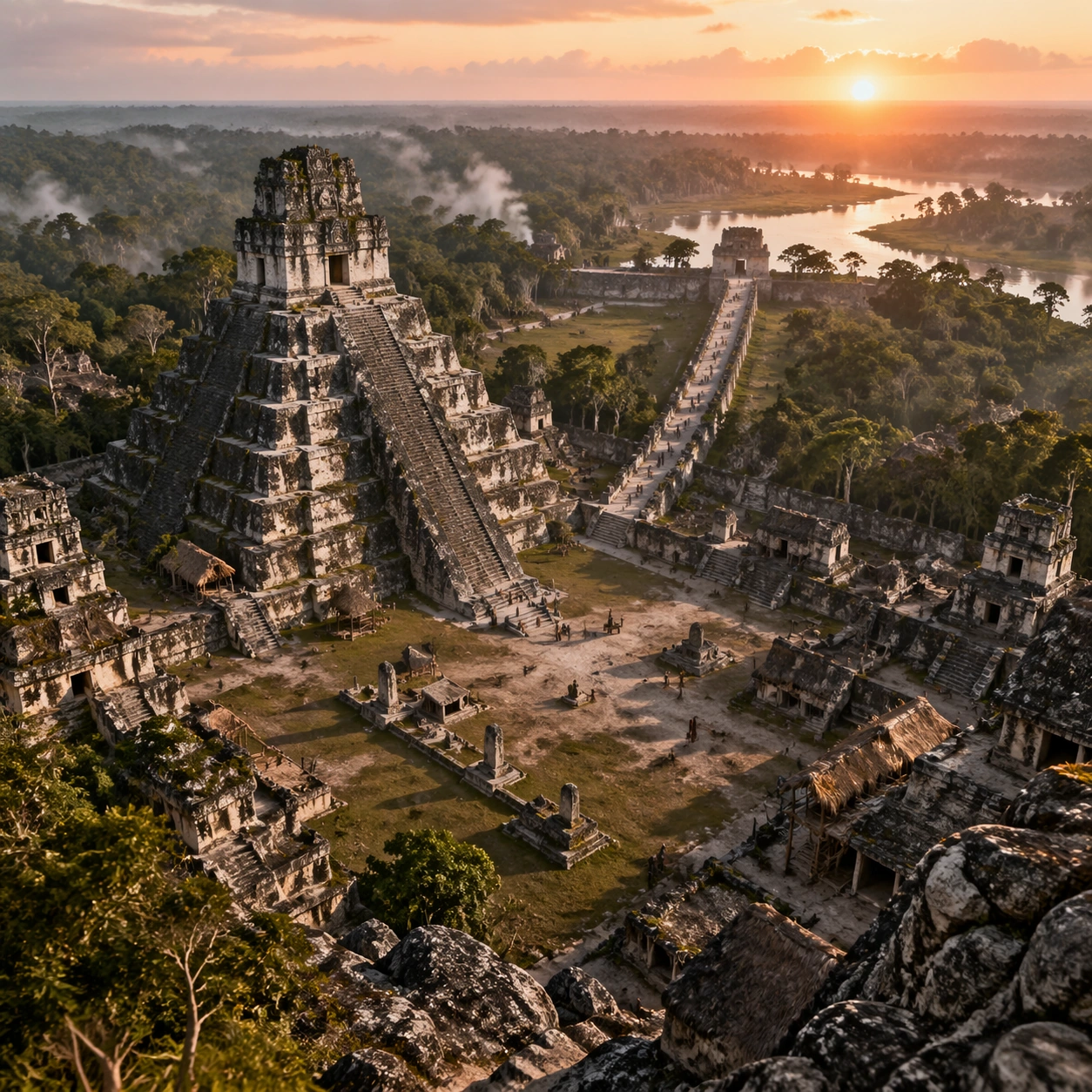
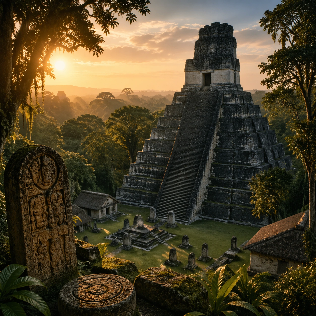
Scene: A square documentary image composed like a premium archaeology magazine feature. Use humid jungle greens, weathered limestone gray, and low golden dawn light. Frame a stepped Maya pyramid rising above dense Yucatan canopy, flanked by carved stelae and damp limestone stairs with crisp depth layering, restrained contrast, and subtle atmospheric depth so the scene feels excavated, observed, and historically grounded rather than theatrical or game-like. Keep the light directional but believable, as if captured during a careful field visit. Subject: Center the image on a stepped Maya pyramid rising above dense Yucatan canopy, flanked by carved stelae and damp limestone stairs. Include culturally accurate surface logic, region-specific setting, and believable human-scale cues in stairs, doorways, cut blocks, relief edges, or water depth. Shapes, carvings, masonry joints, and site wear should feel studied from real archaeology, with no generic ancient-world mashup and no ornamental filler borrowed from another civilization. Important details: Keep the architecture unmistakably Maya rather than generic fantasy ruins, with steep stepped geometry, roof-comb silhouettes, believable glyph blocks, and dense tropical vegetation that respects the stone volumes instead of swallowing them completely. Emphasize limestone blocks, moss, wet leaf litter, carved glyph panels, eroded stucco traces, and jade-toned lichen. Keep inscriptions, painted registers, symbolic motifs, or carved bands visually plausible but not readable. Preserve a museum-grade balance between beauty and evidence: light should reveal relief depth, edge wear, repairs, sediment traces, and excavation context without turning the site into fantasy spectacle. The composition should feel like a definitive reference frame that later variations can inherit exactly. Use case: Maya Temple Dawn Discovery series study 1/9. Constraints: No readable text, no watermark, no logos, preserve exact 1:1 aspect ratio, no modern vehicles, no sci-fi glow, no fantasy monsters, no glass skyscrapers, no tourists, no anachronistic props, no collage layout, no exaggerated fantasy lighting.

Example generated from “Maya Temple Dawn Discovery — Human Scale Reveal”
GPT Image 2en

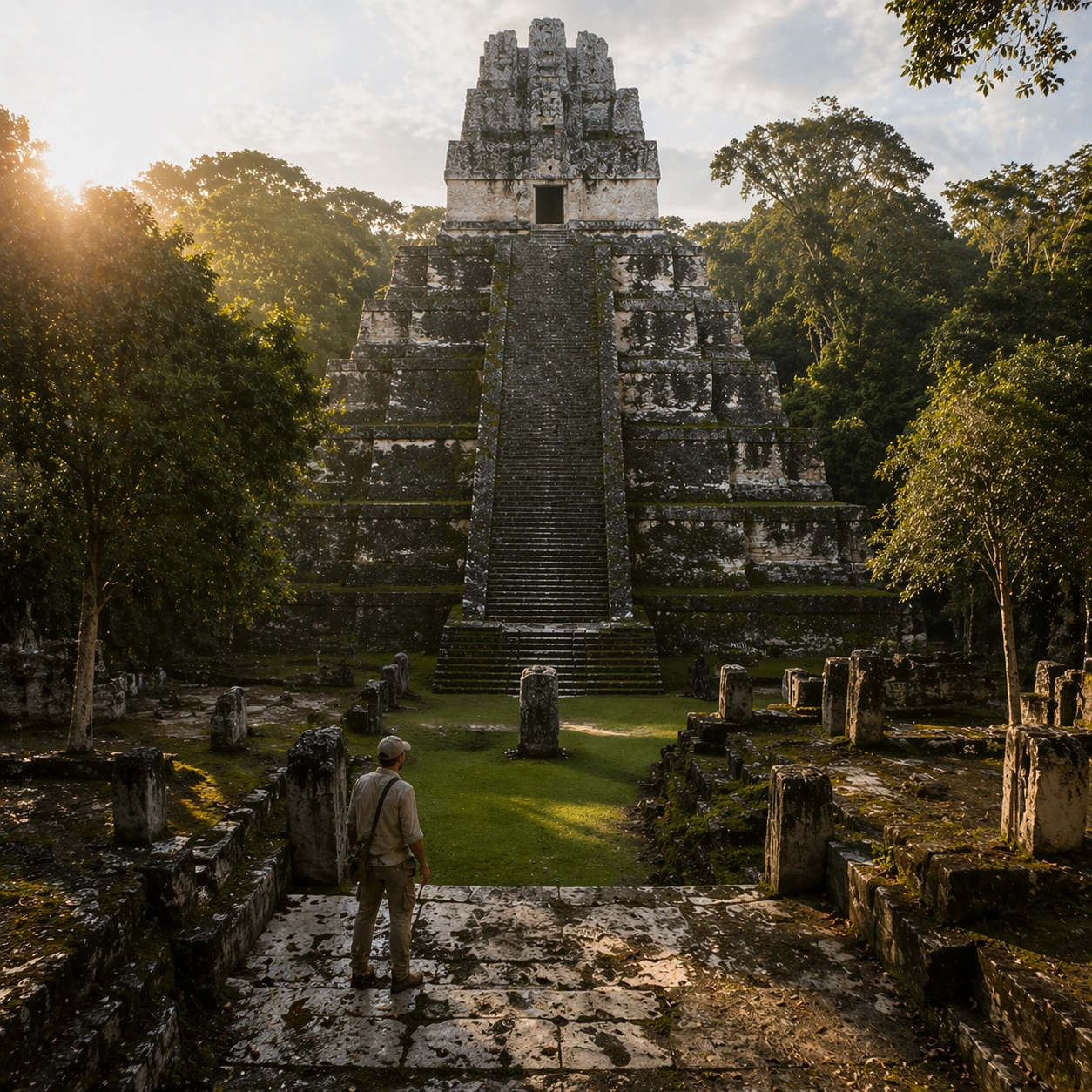
Scene: A square follow-up field image from the same site, slightly closer and lower than the reference anchor, with careful documentary framing and the same material palette. The camera should feel physically present inside the archaeological space, using natural light, soft depth separation, and one clear human figure to explain scale without turning the image into lifestyle photography. Subject: Show the same site identity established in the reference anchor, now with an archaeologist, conservator, or field researcher moving through the scene in practical neutral clothing. The person should be small relative to the monument and clearly secondary to the architecture, water, or painted wall system. Keep the main forms, structural rhythm, and civilizational markers unchanged. Important details: Preserve the exact site identity, base geometry, material behavior, and cultural signatures from the reference model. Only vary vantage, gesture, and scale cues. Keep the architecture unmistakably Maya rather than generic fantasy ruins, with steep stepped geometry, roof-comb silhouettes, believable glyph blocks, and dense tropical vegetation that respects the stone volumes instead of swallowing them completely. Human presence should clarify stair height, wall size, carving depth, or spatial compression while respecting conservation protocol and historical seriousness. Keep any tools understated and generic, with no readable labels. The image must still look like a rigorous archaeological record first and a dramatic scene second. Use case: Maya Temple Dawn Discovery series study 2/9. Constraints: No readable text, no watermark, no logos, preserve exact 1:1 aspect ratio, preserve exact site identity from the reference image, no modern vehicles, no sci-fi glow, no fantasy monsters, no glass skyscrapers, no fashion editorial styling, no crowd, no cinematic props.

Example generated from “Maya Temple Dawn Discovery — Surface Close Study”
GPT Image 2en

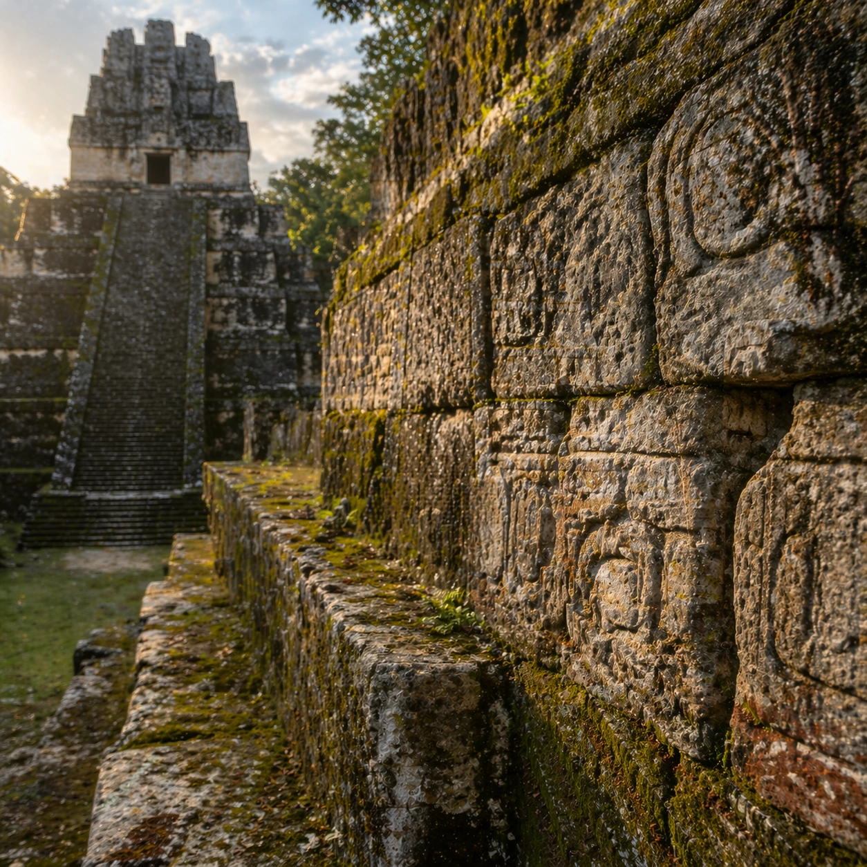
Scene: A square close study framed within the same site established by the reference anchor. Use a tight crop, shallow but believable depth of field, and raking light that reveals tactile evidence in surface relief, pigment, tool marks, moisture, or marine wear. The image should feel like a museum conservation photograph elevated to gallery quality. Subject: Focus on a materially rich portion of the same site: carved edges, painted plaster, fitted stone, root-wrapped masonry, submerged paving, or quarry-cut facial planes depending on the civilization. The composition should remain anchored to the original location and show enough surrounding context that viewers still recognize the parent site rather than mistaking it for an unrelated artifact. Important details: Preserve the exact site identity from the reference model while shifting emphasis to forensic surface evidence. Keep the architecture unmistakably Maya rather than generic fantasy ruins, with steep stepped geometry, roof-comb silhouettes, believable glyph blocks, and dense tropical vegetation that respects the stone volumes instead of swallowing them completely. Make micro-texture, fracture lines, pigment retention, water wear, plant interaction, dust, or chisel traces visually persuasive. Avoid decorative clutter. Every mark should feel like evidence of making, weathering, excavation, or conservation. Keep any symbolic marks non-legible and historically appropriate, and make the light reveal depth without flattening the material richness. Use case: Maya Temple Dawn Discovery series study 3/9. Constraints: No readable text, no watermark, no logos, preserve exact 1:1 aspect ratio, preserve exact site identity from the reference image, no modern vehicles, no sci-fi glow, no fantasy monsters, no glass skyscrapers, no isolated floating artifact, no studio backdrop, no fake macro abstraction.

Example generated from “Maya Temple Dawn Discovery — Atmospheric Wide Reveal”
GPT Image 2en

Scene: A square wide reveal of the same site under a slightly different environmental condition, with more surrounding geography or architecture visible while keeping the anchor landmark dominant. Use disciplined composition, atmospheric perspective, and natural light behavior so the image feels like a patient field photograph captured after the reference shot rather than a different fantasy set. Subject: Show the same site identity with broader context: approaches, terraces, ring walls, canyon slot, canopy volume, quarry slope, or chamber boundaries depending on the location. The anchor structure must remain instantly recognizable. Environmental scale should deepen understanding of why the site is placed here and how people, water, topography, or vegetation shape the experience of the monument. Important details: Preserve the exact landmark, materials, and civilizational cues from the reference model while allowing wider framing and a different atmospheric emphasis. Keep the architecture unmistakably Maya rather than generic fantasy ruins, with steep stepped geometry, roof-comb silhouettes, believable glyph blocks, and dense tropical vegetation that respects the stone volumes instead of swallowing them completely. Use geography and environmental systems to add meaning: drainage, mist, current, valley depth, roots, irrigation, or enclosure logic. The image should feel both beautiful and evidentiary, with no compositional tricks that break continuity with the established site. Use case: Maya Temple Dawn Discovery series study 4/9. Constraints: No readable text, no watermark, no logos, preserve exact 1:1 aspect ratio, preserve exact site identity from the reference image, no modern vehicles, no sci-fi glow, no fantasy monsters, no glass skyscrapers, no unrelated landmarks, no speculative mashup architecture, no posterized grading.

Example generated from “Maya Temple Dawn Discovery — Excavation Overview”
GPT Image 2en

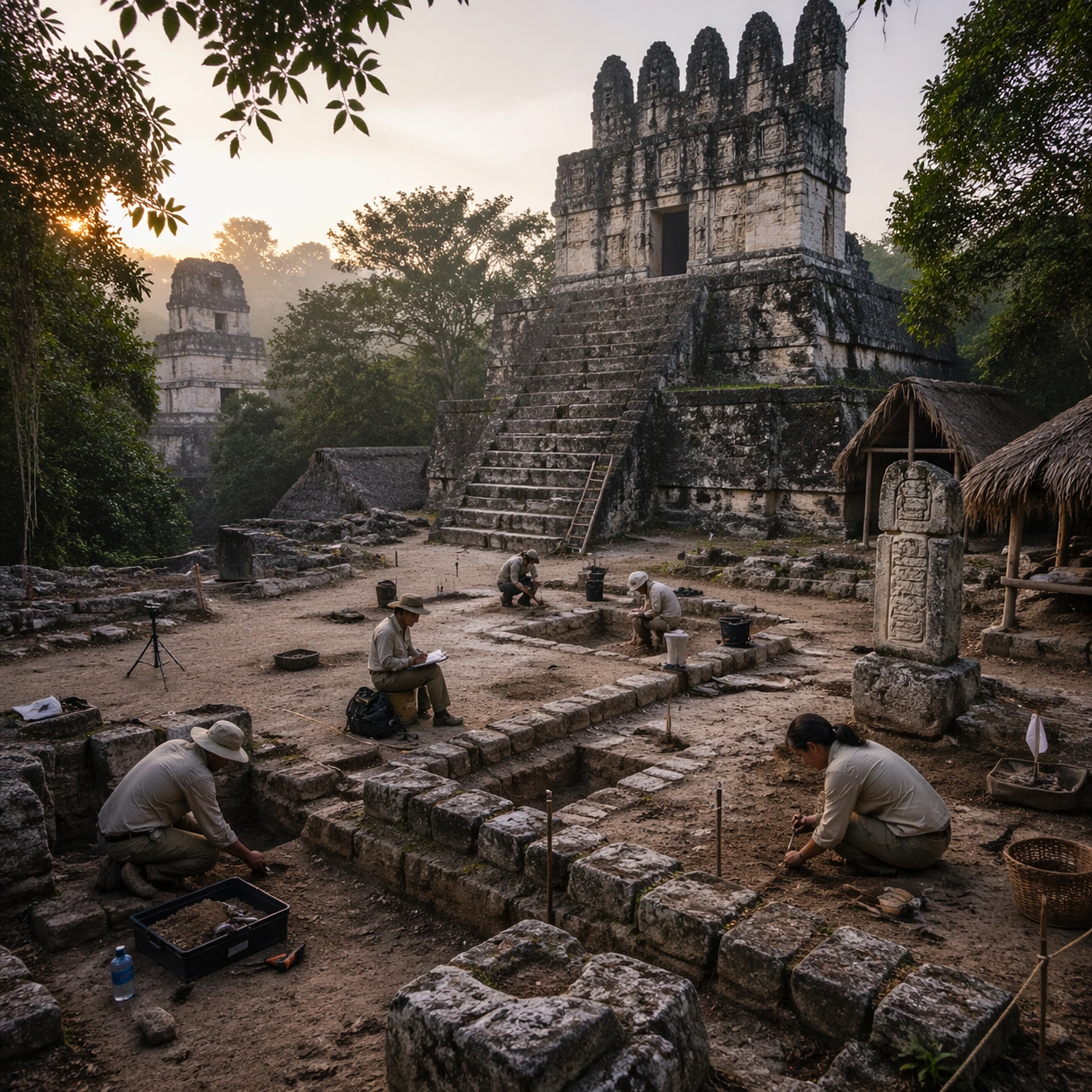
Scene: A square independent archaeology study composed from a slightly elevated fieldwork viewpoint. Use balanced natural light, crisp evidence hierarchy, and practical site organization so the image feels publishable in a museum report and still visually strong enough for a gallery wall. The frame should explain where excavation is happening without relying on readable markers or diagrams. Subject: Show a partially cleared plaza with field brushes, rope boundaries, freshly exposed stone alignments, and careful archaeological documentation around the temple base. Include grounded human traces such as ladders, trays, brushes, baskets, light rigs, or measuring tools only when they support archaeological realism and remain visually secondary. The site should stay culturally specific, with architecture, surface treatment, sediment, and environmental context all belonging to the correct civilization rather than a generic dig. Important details: Keep the architecture unmistakably Maya rather than generic fantasy ruins, with steep stepped geometry, roof-comb silhouettes, believable glyph blocks, and dense tropical vegetation that respects the stone volumes instead of swallowing them completely. Prioritize evidence relationships: exposed layers, cleaned edges, protected surfaces, loose fragments, and transitions between buried and revealed material. Let color, wear, and composition explain what has just been uncovered. The image must feel methodical rather than adventurous. Keep any site tags, notes, or markers abstract and unreadable. Avoid sensational treasure imagery and keep the atmosphere scholarly, patient, and materially convincing. Use case: Maya Temple Dawn Discovery single study 5/9. Constraints: No readable text, no watermark, no logos, preserve exact 1:1 aspect ratio, no modern vehicles, no sci-fi glow, no fantasy monsters, no glass skyscrapers, no treasure-chest clichés, no action-movie posing, no arbitrary props, no infographic overlay.

Example generated from “Maya Temple Dawn Discovery — Artifact Tableau”
GPT Image 2en

Scene: A square artifact and material study arranged like a high-end conservation photograph. Use soft directional light, controlled shadow falloff, and a neutral work surface so every fragment reads clearly. The image should feel intimate and scientific, but still rich enough to communicate the broader civilization through craft, wear, and material vocabulary alone. Subject: Present jade beads, obsidian blades, shell inlay, pottery shards, and carved limestone fragments arranged on a padded conservation table. Arrange the pieces with disciplined spacing and believable conservation handling. Include enough variation in scale, finish, and damage state to suggest excavation reality rather than a perfectly staged luxury still life. Nothing should look modern or decorative for its own sake; every object must feel like evidence tied to the same cultural world as the main topic. Important details: Emphasize tactile surfaces, honest aging, and historically grounded material behavior. Keep the architecture unmistakably Maya rather than generic fantasy ruins, with steep stepped geometry, roof-comb silhouettes, believable glyph blocks, and dense tropical vegetation that respects the stone volumes instead of swallowing them completely. Show abrasion, dust, corrosion, cracks, mineral bloom, pigment retention, or edge polish where appropriate. Keep the arrangement orderly but not sterile, as if prepared for a serious cataloging session. No readable labels, no museum placards, and no visual shortcuts that turn the study into product photography detached from archaeology. Use case: Maya Temple Dawn Discovery single study 6/9. Constraints: No readable text, no watermark, no logos, preserve exact 1:1 aspect ratio, no modern vehicles, no sci-fi glow, no fantasy monsters, no glass skyscrapers, no luxury advertising gloss, no floating objects, no velvet jewelry styling, no unrelated tools.

Example generated from “Maya Temple Dawn Discovery — Light Shift Study”
GPT Image 2en

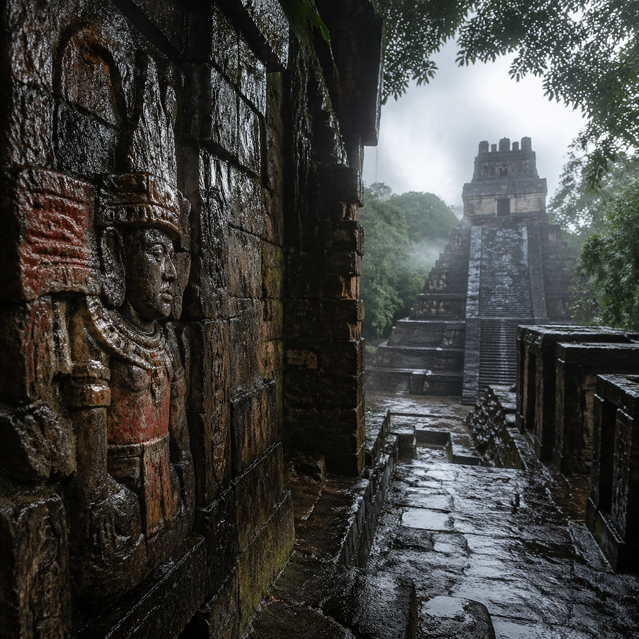
Scene: A square mood variation from the same civilization theme, built around rain-cooled cloudbreak light that leaves the stone wet, darker, and more reflective while keeping the site recognizable. The image should stay grounded in field realism while testing how different illumination changes material reading, atmosphere, and emotional register. Keep the frame self-contained and coherent, as if photographed during a second visit under altered conditions. Subject: Show a culturally accurate site or interior connected to the same world as the main topic, but not as a direct dependency on the series reference. The focus should be on how light transforms relief, color, moisture, water, dust, or vegetation while preserving archaeological credibility. Architectural forms, objects, and setting must still belong to the same civilization with no cross-cultural contamination. Important details: Keep the architecture unmistakably Maya rather than generic fantasy ruins, with steep stepped geometry, roof-comb silhouettes, believable glyph blocks, and dense tropical vegetation that respects the stone volumes instead of swallowing them completely. Use the shift in light to reveal different evidence than the other studies: pigment glow, root sheen, caustics, wet stone, canyon shadow, marine haze, terrace depth, or quarry moisture. Keep the result serious and observational rather than romanticized. Non-readable motifs are acceptable, but there should be no signs, captions, or modern display devices. The image should feel like a rigorous visual experiment in historical atmosphere. Use case: Maya Temple Dawn Discovery single study 7/9. Constraints: No readable text, no watermark, no logos, preserve exact 1:1 aspect ratio, no modern vehicles, no sci-fi glow, no fantasy monsters, no glass skyscrapers, no theatrical color filters, no supernatural effects, no montage composition, no glossy concept-art exaggeration.

Example generated from “Maya Temple Dawn Discovery — Survey Perspective”
GPT Image 2en

Scene: A square survey-oriented image that explains spatial logic with the clarity of an expert field overview while still reading as a finished artwork. Use a stable elevated vantage, clean depth layering, and enough visible terrain or architecture to make relationships legible without turning the frame into a literal map. The scene should feel analytical and cinematic at the same time. Subject: Show an elevated overlook that reveals the pyramid, adjoining plaza, processional causeway, and jungle edge in one coherent survey image. Organize the composition so paths, terraces, walls, courtyards, chambers, canals, root systems, or quarry clusters can be read as a coherent system. The image should reveal how the civilization used land, water, elevation, enclosure, or monumentality. Keep all architecture, materials, and environmental details consistent with the correct place and period. Important details: Keep the architecture unmistakably Maya rather than generic fantasy ruins, with steep stepped geometry, roof-comb silhouettes, believable glyph blocks, and dense tropical vegetation that respects the stone volumes instead of swallowing them completely. This image should reward close looking by showing infrastructural logic: how stone courses align, how water moves, how rooms connect, how carved masses sit inside geology, or how vegetation interacts with built form. Avoid explicit annotation. Let composition, light, and scale cues do the explanatory work. Keep any measuring elements generic and unreadable, and make the image feel like serious research made visually elegant. Use case: Maya Temple Dawn Discovery single study 8/9. Constraints: No readable text, no watermark, no logos, preserve exact 1:1 aspect ratio, no modern vehicles, no sci-fi glow, no fantasy monsters, no glass skyscrapers, no infographic arrows, no split-screen layout, no impossible aerial geometry, no unrelated settlements.

Example generated from “Maya Temple Dawn Discovery — Editorial Reconstruction”
GPT Image 2en

Scene: A square hero image designed for a museum wall graphic or flagship magazine cover, but without any actual typography. Use strong focal hierarchy, refined contrast, and a polished finish that still feels rooted in archaeological evidence. The frame should look complete on its own and communicate why this civilization remains visually unforgettable. Subject: Build the image around a museum-grade hero reconstruction that presents the temple as a real archaeological headline with discipline, depth, and emotional restraint. Present architecture, artifacts, environment, and atmosphere as one coherent statement. The composition can be more distilled than a field snapshot, but it must remain culturally specific, materially persuasive, and free of fantasy shorthand. Nothing should feel like a movie poster or commercial franchise imitation. Important details: Keep the architecture unmistakably Maya rather than generic fantasy ruins, with steep stepped geometry, roof-comb silhouettes, believable glyph blocks, and dense tropical vegetation that respects the stone volumes instead of swallowing them completely. Distill the site or cultural world into one decisive visual argument: place, craft, weathering, engineering, and memory. Use the strongest material signatures from this civilization and let them sit in a believable environment with controlled dramatic weight. Keep any carved or painted symbols non-readable. The result should look like responsible high-end visual storytelling for research and public interpretation, not a spectacle-first matte painting. Use case: Maya Temple Dawn Discovery single study 9/9. Constraints: No readable text, no watermark, no logos, preserve exact 1:1 aspect ratio, no modern vehicles, no sci-fi glow, no fantasy monsters, no glass skyscrapers, no movie-poster tropes, no overdesigned framing devices, no collage layout, no brand-like iconography.

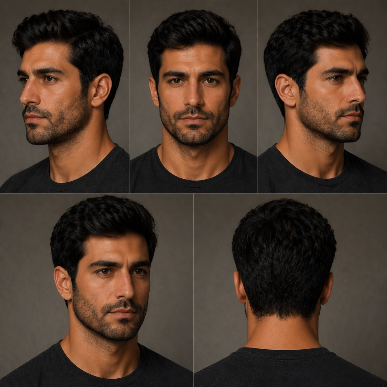
Example generated from “Mens Grooming Hair Beard Rotation — Reference Natural Base”
GPT Image 2en

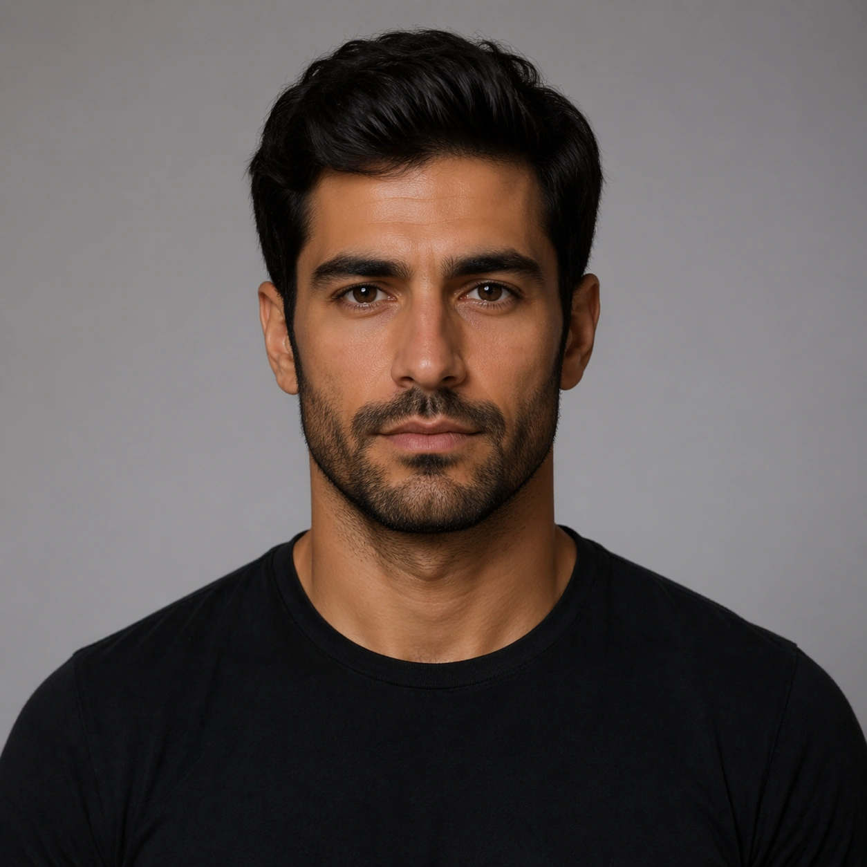
Scene: Create a square 1:1 portrait image for Mens Grooming Hair Beard Rotation. Use a clean approval-style studio portrait with neutral light, simple wardrobe, and enough facial visibility to lock identity perfectly. The frame should feel like a finished professional deliverable rather than a casual snapshot, with clear lens discipline, believable light falloff, and a palette that directly supports identity-locked portrait photography. Keep enough surrounding space and compositional control for gallery, research, campaign, or approval-board reuse while staying photoreal and human-scaled. Subject: Center one male grooming model with medium olive skin, straight dark hair, strong jaw, deep-set eyes, and a stable beard growth pattern. Establish the exact same face, hair base, skin tone family, and body proportions that every transformation image must preserve. Use the example direction from the brief as grounding context: a professional portrait deliverable for Mens Grooming Hair Beard Rotation. Wardrobe, lighting, environment, and pose may shift to serve this variation, but the viewer must immediately understand that the same reference identity is still in front of the camera. Important details: This backlog line is difficult because the same person must remain exact across controlled portrait changes. Preserve skin tone family, bone structure, eye spacing, nose shape, mouth shape, hairline logic, shoulder width, and overall body read across the entire series. preserve exact face / hair base / body proportions from the reference model. This baseline must read like the trustworthy approval frame before switching anything. Avoid the common failure described in the brief: ordinary image models often lose likeness once styling, lighting, or layout changes enter the frame. Success should feel like the result should feel professionally usable, coherent, and clearly built around one stable human identity. Use case: Mens Grooming Hair Beard Rotation series study 1/9, the natural baseline look. Constraints: No readable text, no watermark, no logos, preserve exact 1:1 aspect ratio, preserve exact face / hair base / body proportions from the reference model, no heavy styling, no logo wardrobe, no beauty filter, no extra subjects.

Example generated from “Mens Grooming Hair Beard Rotation — Look Switch One”
GPT Image 2en

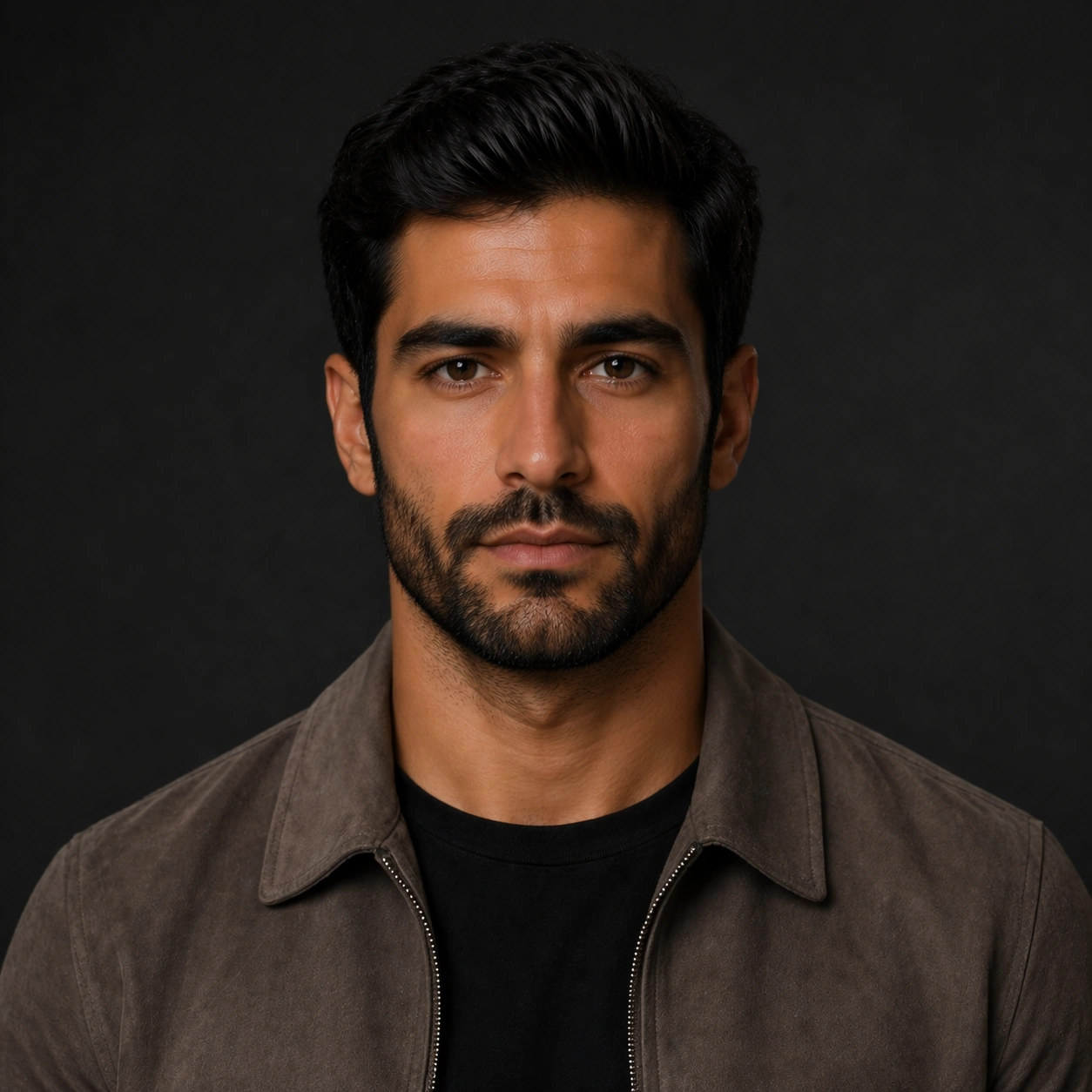
Scene: Create a square 1:1 portrait image for Mens Grooming Hair Beard Rotation. Use a premium portrait frame with one clear change direction and enough negative space to judge styling cleanly. The frame should feel like a finished professional deliverable rather than a casual snapshot, with clear lens discipline, believable light falloff, and a palette that directly supports identity-locked portrait photography. Keep enough surrounding space and compositional control for gallery, research, campaign, or approval-board reuse while staying photoreal and human-scaled. Subject: Center one male grooming model with medium olive skin, straight dark hair, strong jaw, deep-set eyes, and a stable beard growth pattern. Keep the exact same person from the reference while executing the first major change requested by the topic, whether hair, makeup, wardrobe, grooming, or professional read. Use the example direction from the brief as grounding context: a professional portrait deliverable for Mens Grooming Hair Beard Rotation. Wardrobe, lighting, environment, and pose may shift to serve this variation, but the viewer must immediately understand that the same reference identity is still in front of the camera. Important details: This backlog line is difficult because the same person must remain exact across controlled portrait changes. Preserve skin tone family, bone structure, eye spacing, nose shape, mouth shape, hairline logic, shoulder width, and overall body read across the entire series. preserve exact face / hair base / body proportions from the reference model. The switch must be obvious, but the identity must remain stronger than the styling change. Avoid the common failure described in the brief: ordinary image models often lose likeness once styling, lighting, or layout changes enter the frame. Success should feel like the result should feel professionally usable, coherent, and clearly built around one stable human identity. Use case: Mens Grooming Hair Beard Rotation series study 2/9, the first controlled transformation. Constraints: No readable text, no watermark, no logos, preserve exact 1:1 aspect ratio, preserve exact face / hair base / body proportions from the reference model, no face redraw, no changed age unless explicitly asked, no costume-party exaggeration, no new body shape.

Example generated from “Mens Grooming Hair Beard Rotation — Look Switch Three”
GPT Image 2en

Scene: Create a square 1:1 portrait image for Mens Grooming Hair Beard Rotation. Use a slightly bolder campaign-like frame with disciplined crop and clean light falloff. The frame should feel like a finished professional deliverable rather than a casual snapshot, with clear lens discipline, believable light falloff, and a palette that directly supports identity-locked portrait photography. Keep enough surrounding space and compositional control for gallery, research, campaign, or approval-board reuse while staying photoreal and human-scaled. Subject: Center one male grooming model with medium olive skin, straight dark hair, strong jaw, deep-set eyes, and a stable beard growth pattern. Apply a third styling direction while holding the same reference identity with no drift in age, ethnicity, or face structure. Use the example direction from the brief as grounding context: a professional portrait deliverable for Mens Grooming Hair Beard Rotation. Wardrobe, lighting, environment, and pose may shift to serve this variation, but the viewer must immediately understand that the same reference identity is still in front of the camera. Important details: This backlog line is difficult because the same person must remain exact across controlled portrait changes. Preserve skin tone family, bone structure, eye spacing, nose shape, mouth shape, hairline logic, shoulder width, and overall body read across the entire series. preserve exact face / hair base / body proportions from the reference model. The image should prove range under control rather than spectacle for spectacle alone. Avoid the common failure described in the brief: ordinary image models often lose likeness once styling, lighting, or layout changes enter the frame. Success should feel like the result should feel professionally usable, coherent, and clearly built around one stable human identity. Use case: Mens Grooming Hair Beard Rotation series study 4/9, the third controlled transformation. Constraints: No readable text, no watermark, no logos, preserve exact 1:1 aspect ratio, preserve exact face / hair base / body proportions from the reference model, no gimmick costume, no false lashes that change eye shape, no surreal hair physics, no second person.

Example generated from “Mens Grooming Hair Beard Rotation — Look Switch Four”
GPT Image 2en

Scene: Create a square 1:1 portrait image for Mens Grooming Hair Beard Rotation. Use a close or mid-shot portrait that privileges detail and approval clarity over background storytelling. The frame should feel like a finished professional deliverable rather than a casual snapshot, with clear lens discipline, believable light falloff, and a palette that directly supports identity-locked portrait photography. Keep enough surrounding space and compositional control for gallery, research, campaign, or approval-board reuse while staying photoreal and human-scaled. Subject: Center one male grooming model with medium olive skin, straight dark hair, strong jaw, deep-set eyes, and a stable beard growth pattern. Keep the same exact subject while introducing another visible shift in style language, finish, or mood tied directly to the topic brief. Use the example direction from the brief as grounding context: a professional portrait deliverable for Mens Grooming Hair Beard Rotation. Wardrobe, lighting, environment, and pose may shift to serve this variation, but the viewer must immediately understand that the same reference identity is still in front of the camera. Important details: This backlog line is difficult because the same person must remain exact across controlled portrait changes. Preserve skin tone family, bone structure, eye spacing, nose shape, mouth shape, hairline logic, shoulder width, and overall body read across the entire series. preserve exact face / hair base / body proportions from the reference model. Micro-details may change, but likeness, skin tone family, and body read cannot. Avoid the common failure described in the brief: ordinary image models often lose likeness once styling, lighting, or layout changes enter the frame. Success should feel like the result should feel professionally usable, coherent, and clearly built around one stable human identity. Use case: Mens Grooming Hair Beard Rotation series study 5/9, the fourth controlled transformation. Constraints: No readable text, no watermark, no logos, preserve exact 1:1 aspect ratio, preserve exact face / hair base / body proportions from the reference model, no retouch blur, no facial asymmetry drift, no extra accessories noise, no unreadable product text.

Example generated from “Mens Grooming Hair Beard Rotation — Look Switch Five”
GPT Image 2en

Scene: Create a square 1:1 portrait image for Mens Grooming Hair Beard Rotation. Use a square portrait with polished commercial finish and enough room to see styling structure clearly. The frame should feel like a finished professional deliverable rather than a casual snapshot, with clear lens discipline, believable light falloff, and a palette that directly supports identity-locked portrait photography. Keep enough surrounding space and compositional control for gallery, research, campaign, or approval-board reuse while staying photoreal and human-scaled. Subject: Center one male grooming model with medium olive skin, straight dark hair, strong jaw, deep-set eyes, and a stable beard growth pattern. Push to a fifth variation while preserving exact face / hair base / body proportions from the reference model. This should still feel like one person being art-directed, not re-generated from scratch. Use the example direction from the brief as grounding context: a professional portrait deliverable for Mens Grooming Hair Beard Rotation. Wardrobe, lighting, environment, and pose may shift to serve this variation, but the viewer must immediately understand that the same reference identity is still in front of the camera. Important details: This backlog line is difficult because the same person must remain exact across controlled portrait changes. Preserve skin tone family, bone structure, eye spacing, nose shape, mouth shape, hairline logic, shoulder width, and overall body read across the entire series. preserve exact face / hair base / body proportions from the reference model. Keep continuity stronger than novelty. Avoid the common failure described in the brief: ordinary image models often lose likeness once styling, lighting, or layout changes enter the frame. Success should feel like the result should feel professionally usable, coherent, and clearly built around one stable human identity. Use case: Mens Grooming Hair Beard Rotation series study 6/9, the fifth controlled transformation. Constraints: No readable text, no watermark, no logos, preserve exact 1:1 aspect ratio, preserve exact face / hair base / body proportions from the reference model, no gender drift unless explicitly relevant, no unrelated props, no costume confusion, no body-scale jump.

Example generated from “Mens Grooming Hair Beard Rotation — Look Switch Six”
GPT Image 2en

Scene: Create a square 1:1 portrait image for Mens Grooming Hair Beard Rotation. Use a final single-look variation with confident but restrained campaign polish. The frame should feel like a finished professional deliverable rather than a casual snapshot, with clear lens discipline, believable light falloff, and a palette that directly supports identity-locked portrait photography. Keep enough surrounding space and compositional control for gallery, research, campaign, or approval-board reuse while staying photoreal and human-scaled. Subject: Center one male grooming model with medium olive skin, straight dark hair, strong jaw, deep-set eyes, and a stable beard growth pattern. Use the same person again in a sixth styling state, making sure recognition is instant before the viewer notices what changed. Use the example direction from the brief as grounding context: a professional portrait deliverable for Mens Grooming Hair Beard Rotation. Wardrobe, lighting, environment, and pose may shift to serve this variation, but the viewer must immediately understand that the same reference identity is still in front of the camera. Important details: This backlog line is difficult because the same person must remain exact across controlled portrait changes. Preserve skin tone family, bone structure, eye spacing, nose shape, mouth shape, hairline logic, shoulder width, and overall body read across the entire series. preserve exact face / hair base / body proportions from the reference model. The transformation should feel deliberate, premium, and usable in a real salon, beauty, fashion, or casting workflow. Avoid the common failure described in the brief: ordinary image models often lose likeness once styling, lighting, or layout changes enter the frame. Success should feel like the result should feel professionally usable, coherent, and clearly built around one stable human identity. Use case: Mens Grooming Hair Beard Rotation series study 7/9, the sixth controlled transformation. Constraints: No readable text, no watermark, no logos, preserve exact 1:1 aspect ratio, preserve exact face / hair base / body proportions from the reference model, no hidden face, no perspective warp, no dramatic environment change, no AI-gloss artifacts.

Example generated from “Mens Grooming Hair Beard Rotation — Detail Proof Board”
GPT Image 2en

Scene: Create a square 1:1 portrait image for Mens Grooming Hair Beard Rotation. Use a square composition that can include multiple tight crops or one richer close-up, but still reads as one coherent portrait asset. The frame should feel like a finished professional deliverable rather than a casual snapshot, with clear lens discipline, believable light falloff, and a palette that directly supports identity-locked portrait photography. Keep enough surrounding space and compositional control for gallery, research, campaign, or approval-board reuse while staying photoreal and human-scaled. Subject: Center one male grooming model with medium olive skin, straight dark hair, strong jaw, deep-set eyes, and a stable beard growth pattern. Stay locked to the same identity while emphasizing the evidence of the switch: hair texture, makeup finish, beard line, garment detail, or aging cues depending on the topic. Use the example direction from the brief as grounding context: a professional portrait deliverable for Mens Grooming Hair Beard Rotation. Wardrobe, lighting, environment, and pose may shift to serve this variation, but the viewer must immediately understand that the same reference identity is still in front of the camera. Important details: This backlog line is difficult because the same person must remain exact across controlled portrait changes. Preserve skin tone family, bone structure, eye spacing, nose shape, mouth shape, hairline logic, shoulder width, and overall body read across the entire series. preserve exact face / hair base / body proportions from the reference model. This frame should support professional review and decision making without readable text. Avoid the common failure described in the brief: ordinary image models often lose likeness once styling, lighting, or layout changes enter the frame. Success should feel like the result should feel professionally usable, coherent, and clearly built around one stable human identity. Use case: Mens Grooming Hair Beard Rotation series study 8/9, a detail-proof or comparison board. Constraints: No readable text, no watermark, no logos, preserve exact 1:1 aspect ratio, preserve exact face / hair base / body proportions from the reference model, no readable labels, no broken panel alignment, no detached close-up fragments, no face drift.

Example generated from “Menu Cover And Spread Food System — Cover Anchor”
GPT Image 2en

Scene: Compose a square menu-design mockup that combines printed surfaces, structured page hierarchy, and appetizing food photography into one coherent brand-authored system. The page layouts should feel intentional and premium, with strong margins, modular blocks, and realistic print or board materials even though all textual zones remain unreadable. Use a three-quarter tabletop view showing a printed menu cover on premium stock, one edge of an interior spread, and soft restaurant light defining paper depth. Subject: The menu should communicate category structure, hero dish placement, and brand tone through composition, image framing, typographic blocks, and page rhythm rather than through readable copy. Food imagery must stay believable and publication-ready. Feature one hero dish image integrated into the cover with bold but unreadable typographic blocks, category dividers, and clean margin structure. Important details: This topic tests layout reasoning as much as food styling. Preserve clean grids, realistic paper behavior, credible shadows, and strong focal hierarchy between cover, spreads, dish photos, and placeholder text zones. Text-like marks can exist only as abstract or unreadable forms; clarity must come from design structure. This image establishes the reference system for the series, including camera height, tabletop discipline, prop family, and color control that later images must inherit. This image must establish the menu system for the series: disciplined grid, realistic paper grain, consistent photography style, and placeholder text zones that feel designed but not legible. Use case: Menu System series study 1/9, built for Prompt Atlas coverage of a food and beverage commercial visual system. Constraints: No readable text, no watermark, no logos, preserve exact 1:1 aspect ratio, no readable text, no logos, no fake menu prices, no warped paper errors, no amateur flyer clutter, no chaotic collage, no obvious software UI chrome, no legible letters, no visible software editor, no warped spiral notebook aesthetic.

Example generated from “Menu Cover And Spread Food System — Breakfast Spread”
GPT Image 2en

Scene: Compose a square menu-design mockup that combines printed surfaces, structured page hierarchy, and appetizing food photography into one coherent brand-authored system. The page layouts should feel intentional and premium, with strong margins, modular blocks, and realistic print or board materials even though all textual zones remain unreadable. Preserve the same paper stock, print lighting, and layout language, but open the spread wider so multiple food images, dividers, and modular text blocks can coexist. Subject: The menu should communicate category structure, hero dish placement, and brand tone through composition, image framing, typographic blocks, and page rhythm rather than through readable copy. Food imagery must stay believable and publication-ready. Show a breakfast menu spread with one large dish photo, several smaller supporting photos, and clearly separated but unreadable content areas. Important details: This topic tests layout reasoning as much as food styling. Preserve clean grids, realistic paper behavior, credible shadows, and strong focal hierarchy between cover, spreads, dish photos, and placeholder text zones. Text-like marks can exist only as abstract or unreadable forms; clarity must come from design structure. Preserve the exact camera height, lens feel, prop family, tabletop scale, palette discipline, and brand logic established by 01-cover-anchor. The anchor system must remain visible in spacing, page ratio, and typographic rhythm, while the breakfast imagery adds warmth and hospitality cues. Use case: Menu System series study 2/9, built for Prompt Atlas coverage of a food and beverage commercial visual system. Constraints: No readable text, no watermark, no logos, preserve exact 1:1 aspect ratio, no readable text, no logos, no fake menu prices, no warped paper errors, no amateur flyer clutter, no chaotic collage, no obvious software UI chrome, no readable headings, no fake prices, no sloppy page curl.

Example generated from “Menu Cover And Spread Food System — Chef Special Spread”
GPT Image 2en

Scene: Compose a square menu-design mockup that combines printed surfaces, structured page hierarchy, and appetizing food photography into one coherent brand-authored system. The page layouts should feel intentional and premium, with strong margins, modular blocks, and realistic print or board materials even though all textual zones remain unreadable. Maintain the same print and tabletop conditions, but let one premium plated dish dominate the right page while secondary modules support it on the left. Subject: The menu should communicate category structure, hero dish placement, and brand tone through composition, image framing, typographic blocks, and page rhythm rather than through readable copy. Food imagery must stay believable and publication-ready. Create a special-feature spread with strong image hierarchy, accent color blocks, and premium dish photography integrated into the page grid. Important details: This topic tests layout reasoning as much as food styling. Preserve clean grids, realistic paper behavior, credible shadows, and strong focal hierarchy between cover, spreads, dish photos, and placeholder text zones. Text-like marks can exist only as abstract or unreadable forms; clarity must come from design structure. Preserve the exact camera height, lens feel, prop family, tabletop scale, palette discipline, and brand logic established by 01-cover-anchor. Keep the exact grid logic and placeholder-text treatment from the anchor image so the spread feels like part of one authored restaurant system. Use case: Menu System series study 3/9, built for Prompt Atlas coverage of a food and beverage commercial visual system. Constraints: No readable text, no watermark, no logos, preserve exact 1:1 aspect ratio, no readable text, no logos, no fake menu prices, no warped paper errors, no amateur flyer clutter, no chaotic collage, no obvious software UI chrome, no readable chef signature, no chalkboard menu clichés, no hand-drawn doodle clutter.

Example generated from “Menu Cover And Spread Food System — Drinks Insert Layout”
GPT Image 2en

Scene: Compose a square menu-design mockup that combines printed surfaces, structured page hierarchy, and appetizing food photography into one coherent brand-authored system. The page layouts should feel intentional and premium, with strong margins, modular blocks, and realistic print or board materials even though all textual zones remain unreadable. Retain the same print stock, margin system, and tabletop context, but introduce brighter beverage imagery, glass reflections, and smaller modular blocks. Subject: The menu should communicate category structure, hero dish placement, and brand tone through composition, image framing, typographic blocks, and page rhythm rather than through readable copy. Food imagery must stay believable and publication-ready. Show a drinks-focused insert layout with one or two beverage images and clean placeholder typographic zones that feel like a premium sub-menu. Important details: This topic tests layout reasoning as much as food styling. Preserve clean grids, realistic paper behavior, credible shadows, and strong focal hierarchy between cover, spreads, dish photos, and placeholder text zones. Text-like marks can exist only as abstract or unreadable forms; clarity must come from design structure. Preserve the exact camera height, lens feel, prop family, tabletop scale, palette discipline, and brand logic established by 01-cover-anchor. The goal is continuity with the anchor cover and spreads, not a new design. Preserve grid discipline, color restraint, and material realism while shifting category emphasis. Use case: Menu System series study 4/9, built for Prompt Atlas coverage of a food and beverage commercial visual system. Constraints: No readable text, no watermark, no logos, preserve exact 1:1 aspect ratio, no readable text, no logos, no fake menu prices, no warped paper errors, no amateur flyer clutter, no chaotic collage, no obvious software UI chrome, no cocktail recipe copy, no readable drink names, no nightclub flyer energy.

Example generated from “Menu Cover And Spread Food System — Tabletop Menu Mockup”
GPT Image 2en

Scene: Compose a square menu-design mockup that combines printed surfaces, structured page hierarchy, and appetizing food photography into one coherent brand-authored system. The page layouts should feel intentional and premium, with strong margins, modular blocks, and realistic print or board materials even though all textual zones remain unreadable. Compose a square three-quarter restaurant-table shot where a menu object lies beside plate and glass elements under quiet evening light. Subject: The menu should communicate category structure, hero dish placement, and brand tone through composition, image framing, typographic blocks, and page rhythm rather than through readable copy. Food imagery must stay believable and publication-ready. Let the menu remain primary while the restaurant setting proves scale, use, and hospitality context. Important details: This topic tests layout reasoning as much as food styling. Preserve clean grids, realistic paper behavior, credible shadows, and strong focal hierarchy between cover, spreads, dish photos, and placeholder text zones. Text-like marks can exist only as abstract or unreadable forms; clarity must come from design structure. This image should feel fully self-contained while still belonging to the same broader topic and commercial world. The interaction between paper, ceramic, and glass needs to feel physically coherent, with clean edges and strong hierarchy between object and environment. Use case: Menu System single study 6/9, built for Prompt Atlas coverage of a food and beverage commercial visual system. Constraints: No readable text, no watermark, no logos, preserve exact 1:1 aspect ratio, no readable text, no logos, no fake menu prices, no warped paper errors, no amateur flyer clutter, no chaotic collage, no obvious software UI chrome, no readable copy, no cluttered bill folder, no visible diner faces.

Example generated from “Menu Cover And Spread Food System — Takeaway Trifold”
GPT Image 2en

Scene: Compose a square menu-design mockup that combines printed surfaces, structured page hierarchy, and appetizing food photography into one coherent brand-authored system. The page layouts should feel intentional and premium, with strong margins, modular blocks, and realistic print or board materials even though all textual zones remain unreadable. Use a bright counter scene with one tri-fold menu standing partly open near packaged food and one drink, all framed in a disciplined square crop. Subject: The menu should communicate category structure, hero dish placement, and brand tone through composition, image framing, typographic blocks, and page rhythm rather than through readable copy. Food imagery must stay believable and publication-ready. Balance takeaway practicality with brand polish, using unreadable category blocks and food photography to imply a coherent quick-service menu. Important details: This topic tests layout reasoning as much as food styling. Preserve clean grids, realistic paper behavior, credible shadows, and strong focal hierarchy between cover, spreads, dish photos, and placeholder text zones. Text-like marks can exist only as abstract or unreadable forms; clarity must come from design structure. This image should feel fully self-contained while still belonging to the same broader topic and commercial world. Make the fold mechanics, paper behavior, and food-photo integration feel credible so the piece works as a real retail support surface. Use case: Menu System single study 7/9, built for Prompt Atlas coverage of a food and beverage commercial visual system. Constraints: No readable text, no watermark, no logos, preserve exact 1:1 aspect ratio, no readable text, no logos, no fake menu prices, no warped paper errors, no amateur flyer clutter, no chaotic collage, no obvious software UI chrome, no readable combo text, no price stickers, no disposable clutter overload.
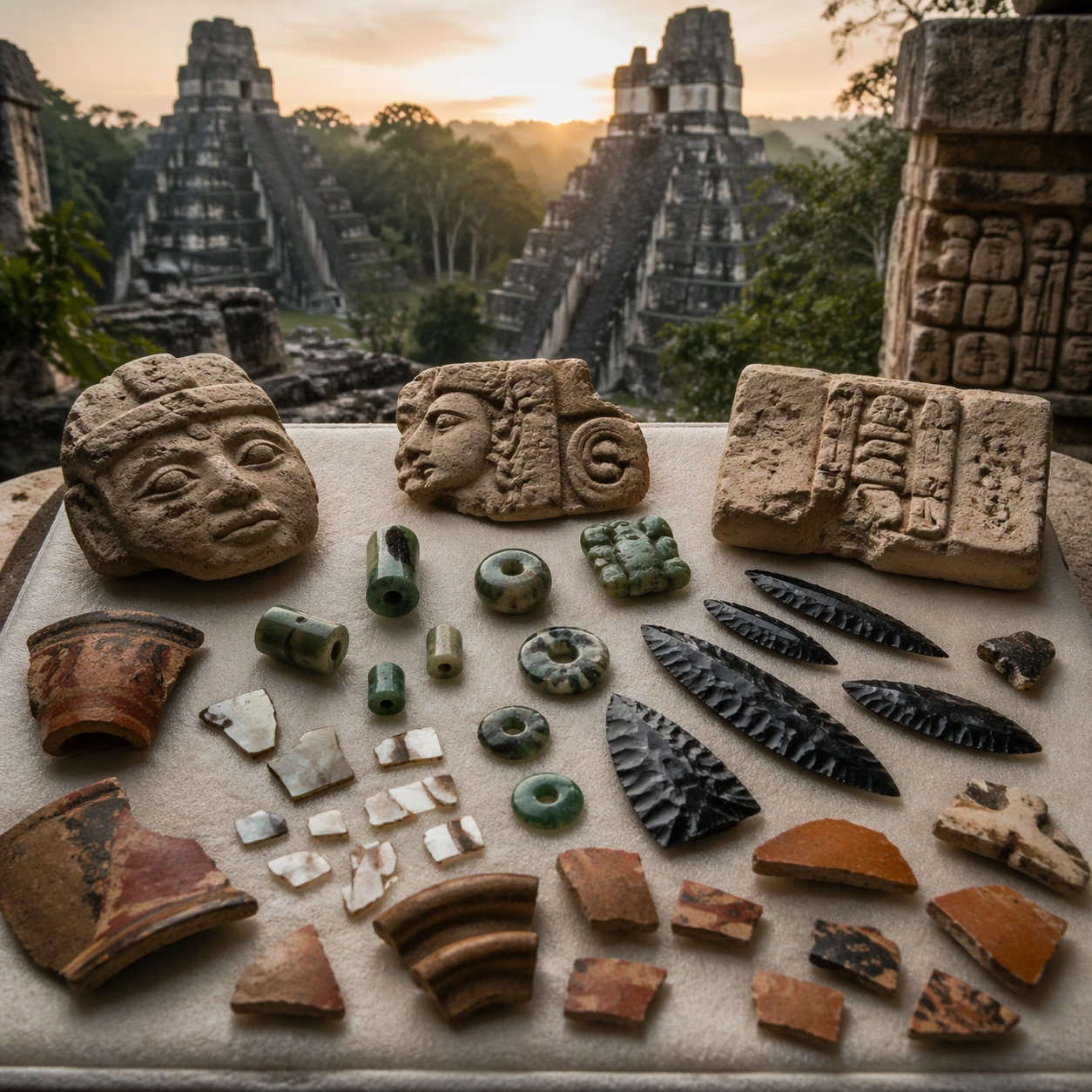
Example generated from “Menu Cover And Spread Food System — Counter Lightbox Board”
GPT Image 2en

Scene: Compose a square menu-design mockup that combines printed surfaces, structured page hierarchy, and appetizing food photography into one coherent brand-authored system. The page layouts should feel intentional and premium, with strong margins, modular blocks, and realistic print or board materials even though all textual zones remain unreadable. Frame a square crop of a counter board under controlled indoor light, with subtle glow and nearby food cues to show retail context. Subject: The menu should communicate category structure, hero dish placement, and brand tone through composition, image framing, typographic blocks, and page rhythm rather than through readable copy. Food imagery must stay believable and publication-ready. Use a structured layout with image modules and unreadable typographic zones that feel like a quick-glance ordering surface. Important details: This topic tests layout reasoning as much as food styling. Preserve clean grids, realistic paper behavior, credible shadows, and strong focal hierarchy between cover, spreads, dish photos, and placeholder text zones. Text-like marks can exist only as abstract or unreadable forms; clarity must come from design structure. This image should feel fully self-contained while still belonging to the same broader topic and commercial world. Glow control, edge sharpness, and hierarchy are critical. The board must look professionally produced, not like a cluttered fast-food ad. Use case: Menu System single study 8/9, built for Prompt Atlas coverage of a food and beverage commercial visual system. Constraints: No readable text, no watermark, no logos, preserve exact 1:1 aspect ratio, no readable text, no logos, no fake menu prices, no warped paper errors, no amateur flyer clutter, no chaotic collage, no obvious software UI chrome, no legible lettering, no LED glare blowout, no cashier screen UI.