PROMPTS · KREATIV ENTDECKEN

Prompt-Galerie

Echte Prompts und erzeugte Beispiele erkunden. Inspiration für Ihre nächste kreative Mission finden und den vollständigen Prompt kostenlos kopieren.

Beispiele
10,974
Modelle
17
Quellen
1277
10.974 Prompt-Beispiele · Seite 6 von 229
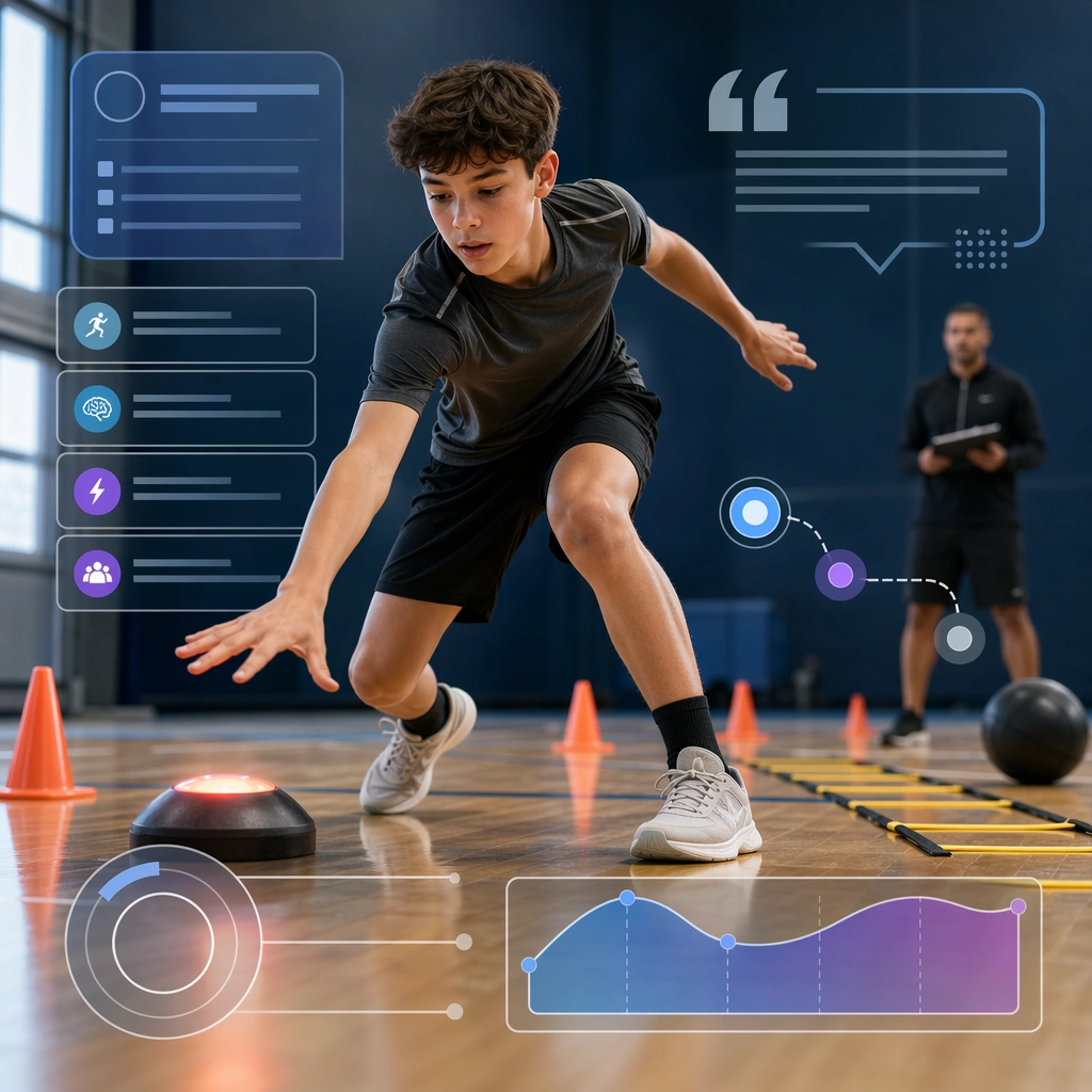
Example generated from “Sports Camp Enrollment Promo Kit — Goalkeeper Camp Tile”
GPT Image 2en

Scene: Create a square specialty camp tile for Camp Promo, using family-friendly sports enrollment marketing with trustworthy supervision, clean logistics framing, and bright athletic atmosphere. The composition should read as a practical, production-ready sports or fitness surface with a clear hierarchy, premium lighting, and obvious commercial intent. Keep the environment specific enough to feel real, but leave enough control in the layout for non-readable information modules, campaign blocks, or visualized metrics. Aim for a finish that works for a brand, club, app, academy, or event operator. Subject: Build the image around young athlete in reaction drill. The subject should be original, believable, and free of any real-brand or celebrity cues. Use realistic apparel, safe body mechanics when movement is visible, and environmental props that support the category without clutter. The subject must stay visually dominant so the design still works as a communication asset rather than a pure scene study. Important details: The mood should read as focused skill energy. Treat layout, light, and supporting graphic structure as part of one polished delivery surface. Any schedule blocks, metric panels, quote zones, badges, or path diagrams must stay abstract and non-readable. Prioritize usefulness, clarity, and category truth over spectacle. The image should feel distinct from the series package while still belonging naturally to the same topic and business use case. Use case: Camp Promo single study 6/9, an independent rollout surface for the topic. Constraints: No readable text, no watermark, no logos, preserve exact 1:1 aspect ratio, no brand marks, no public-figure resemblance, no generic stock layout, no cluttered UI imitation, no accidental copyrighted insignia.

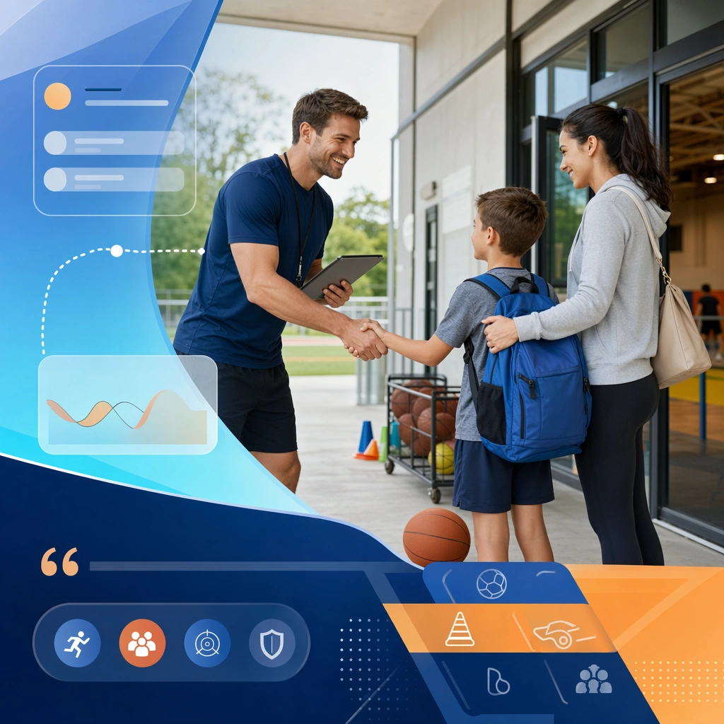
Example generated from “Sports Camp Enrollment Promo Kit — Teamwork Scrimmage Board”
GPT Image 2en

Scene: Create a square teamwork scrimmage board for Camp Promo, using family-friendly sports enrollment marketing with trustworthy supervision, clean logistics framing, and bright athletic atmosphere. The composition should read as a practical, production-ready sports or fitness surface with a clear hierarchy, premium lighting, and obvious commercial intent. Keep the environment specific enough to feel real, but leave enough control in the layout for non-readable information modules, campaign blocks, or visualized metrics. Aim for a finish that works for a brand, club, app, academy, or event operator. Subject: Build the image around small scrimmage under coach view. The subject should be original, believable, and free of any real-brand or celebrity cues. Use realistic apparel, safe body mechanics when movement is visible, and environmental props that support the category without clutter. The subject must stay visually dominant so the design still works as a communication asset rather than a pure scene study. Important details: The mood should read as supervised group energy. Treat layout, light, and supporting graphic structure as part of one polished delivery surface. Any schedule blocks, metric panels, quote zones, badges, or path diagrams must stay abstract and non-readable. Prioritize usefulness, clarity, and category truth over spectacle. The image should feel distinct from the series package while still belonging naturally to the same topic and business use case. Use case: Camp Promo single study 7/9, an independent rollout surface for the topic. Constraints: No readable text, no watermark, no logos, preserve exact 1:1 aspect ratio, no brand marks, no public-figure resemblance, no generic stock layout, no cluttered UI imitation, no accidental copyrighted insignia.
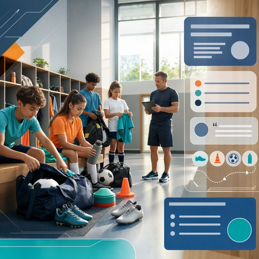
Example generated from “Sports Camp Enrollment Promo Kit — Parents Info Card”
GPT Image 2en

Scene: Create a square parents info support card for Camp Promo, using family-friendly sports enrollment marketing with trustworthy supervision, clean logistics framing, and bright athletic atmosphere. The composition should read as a practical, production-ready sports or fitness surface with a clear hierarchy, premium lighting, and obvious commercial intent. Keep the environment specific enough to feel real, but leave enough control in the layout for non-readable information modules, campaign blocks, or visualized metrics. Aim for a finish that works for a brand, club, app, academy, or event operator. Subject: Build the image around coach greeting parent and child. The subject should be original, believable, and free of any real-brand or celebrity cues. Use realistic apparel, safe body mechanics when movement is visible, and environmental props that support the category without clutter. The subject must stay visually dominant so the design still works as a communication asset rather than a pure scene study. Important details: The mood should read as reassuring organization. Treat layout, light, and supporting graphic structure as part of one polished delivery surface. Any schedule blocks, metric panels, quote zones, badges, or path diagrams must stay abstract and non-readable. Prioritize usefulness, clarity, and category truth over spectacle. The image should feel distinct from the series package while still belonging naturally to the same topic and business use case. Use case: Camp Promo single study 8/9, an independent rollout surface for the topic. Constraints: No readable text, no watermark, no logos, preserve exact 1:1 aspect ratio, no brand marks, no public-figure resemblance, no generic stock layout, no cluttered UI imitation, no accidental copyrighted insignia.
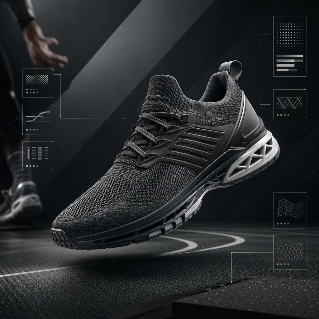
Example generated from “Sports Camp Enrollment Promo Kit — Dorm Life Photo Board”
GPT Image 2en

Scene: Create a square camp lifestyle board for Camp Promo, using family-friendly sports enrollment marketing with trustworthy supervision, clean logistics framing, and bright athletic atmosphere. The composition should read as a practical, production-ready sports or fitness surface with a clear hierarchy, premium lighting, and obvious commercial intent. Keep the environment specific enough to feel real, but leave enough control in the layout for non-readable information modules, campaign blocks, or visualized metrics. Aim for a finish that works for a brand, club, app, academy, or event operator. Subject: Build the image around youth athletes preparing gear in tidy shared space. The subject should be original, believable, and free of any real-brand or celebrity cues. Use realistic apparel, safe body mechanics when movement is visible, and environmental props that support the category without clutter. The subject must stay visually dominant so the design still works as a communication asset rather than a pure scene study. Important details: The mood should read as healthy community calm. Treat layout, light, and supporting graphic structure as part of one polished delivery surface. Any schedule blocks, metric panels, quote zones, badges, or path diagrams must stay abstract and non-readable. Prioritize usefulness, clarity, and category truth over spectacle. The image should feel distinct from the series package while still belonging naturally to the same topic and business use case. Use case: Camp Promo single study 9/9, an independent rollout surface for the topic. Constraints: No readable text, no watermark, no logos, preserve exact 1:1 aspect ratio, no brand marks, no public-figure resemblance, no generic stock layout, no cluttered UI imitation, no accidental copyrighted insignia.
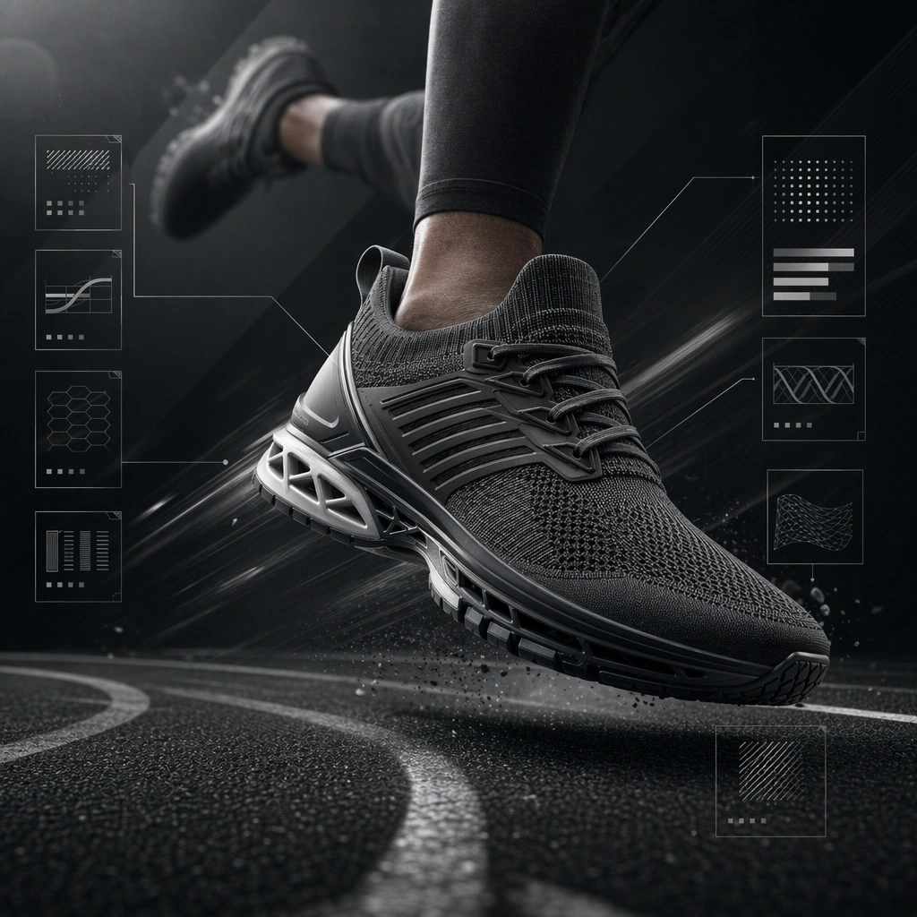
Example generated from “Sports Equipment Advertising Set — Reference Product Hero”
GPT Image 2en

Scene: Create a square product hero advertisement for Equipment Ads, using a premium sports-product advertising world with graphite backdrops, controlled reflections, and high-end studio-action lighting. The frame should feel commercial, polished, and immediately useful for a real client deliverable rather than a one-off art experiment. Keep the composition readable at thumbnail scale while still rewarding a closer look with layered depth, clean negative space, and strong directional light. Build the image so it clearly supports sports communication, with enough modular structure to imply information architecture without relying on literal words. Subject: Center the image on one original performance product with believable seams, materials, and athletic function, supported by only minimal human context, arranged as single original performance product. Treat the subject as original and brandless, with believable apparel construction, realistic body proportions, and strong emotional legibility. Surround the subject with supporting environmental cues that reinforce the category but never overpower the main figure. All secondary objects, props, and background elements should strengthen the same professional sports or fitness context. Important details: This first image must establish the full reference system for later derivatives: clean ad framing, non-readable feature-callout panels, and product-first hierarchy. The emotional tone should read as premium object focus. Make the visual language reusable, disciplined, and commercially credible, with clean edges, coherent light behavior, and obvious hierarchy. Abstract panels, diagram bands, or stat-like modules are welcome, but they must remain non-readable and subordinate to the main visual message. The result should feel original, specific, and ready to anchor a larger package. Use case: Equipment Ads series study 1/9, the reference image for the package. Constraints: No readable text, no watermark, no logos, preserve exact 1:1 aspect ratio, no brand marks, no copied famous team or product identity, no generic stock-photo stiffness, no cluttered background noise, no celebrity likenesses.

Example generated from “Sports Equipment Advertising Set — Motion Surge Ad”
GPT Image 2en

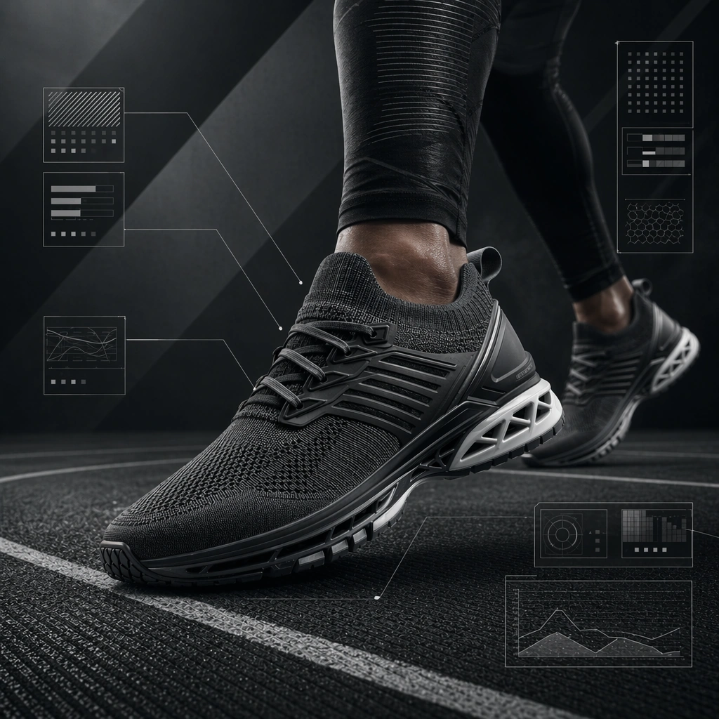
Scene: Build a square motion surge ad derived from the reference image for Equipment Ads. Preserve the exact world established by the reference image, including the same palette family, lighting direction, environmental logic, and surface finish. The new frame should feel like a deliberate extension of one campaign system, not a separate concept. Shift the hierarchy to suit this use case, but keep the overall composition commercial, polished, and ready for real rollout. Subject: Use the same original subject identity and anchor cues introduced by the reference image, now organized as same product in use or implied motion. Keep faces, hair logic, body proportions, apparel or product construction, and major supporting forms consistent with the reference. Allow only the layout emphasis, pose, crop, and contextual energy to change so the result clearly belongs to the same package. Important details: Continuity is the main challenge. Preserve the exact reference language for color, materials, framing rhythm, and overall brandless campaign grammar while steering the tone toward fast controlled energy. Keep any stat blocks, schedule modules, arrows, badges, or callout panels non-readable. The derivative should prove that the same art direction can handle a different communication task without losing identity or utility. Make it credible for production use, with clean edges, intentional spacing, and no random decorative elements. Use case: Equipment Ads series study 2/9, a derivative surface linked to 01-reference-product-hero. Constraints: No readable text, no watermark, no logos, preserve exact 1:1 aspect ratio, no new subject identity, no brand marks, no palette drift, no unrelated props, no collage chaos, no copied public-figure styling.

Example generated from “Sports Equipment Advertising Set — Material Cutaway Board”
GPT Image 2en

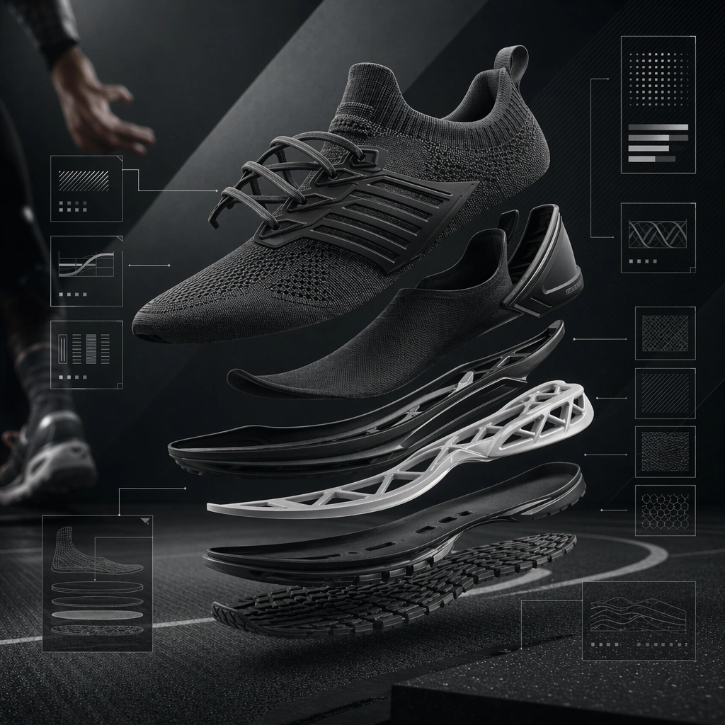
Scene: Build a square material cutaway board derived from the reference image for Equipment Ads. Preserve the exact world established by the reference image, including the same palette family, lighting direction, environmental logic, and surface finish. The new frame should feel like a deliberate extension of one campaign system, not a separate concept. Shift the hierarchy to suit this use case, but keep the overall composition commercial, polished, and ready for real rollout. Subject: Use the same original subject identity and anchor cues introduced by the reference image, now organized as same product exploded into layers. Keep faces, hair logic, body proportions, apparel or product construction, and major supporting forms consistent with the reference. Allow only the layout emphasis, pose, crop, and contextual energy to change so the result clearly belongs to the same package. Important details: Continuity is the main challenge. Preserve the exact reference language for color, materials, framing rhythm, and overall brandless campaign grammar while steering the tone toward analytical precision. Keep any stat blocks, schedule modules, arrows, badges, or callout panels non-readable. The derivative should prove that the same art direction can handle a different communication task without losing identity or utility. Make it credible for production use, with clean edges, intentional spacing, and no random decorative elements. Use case: Equipment Ads series study 3/9, a derivative surface linked to 01-reference-product-hero. Constraints: No readable text, no watermark, no logos, preserve exact 1:1 aspect ratio, no new subject identity, no brand marks, no palette drift, no unrelated props, no collage chaos, no copied public-figure styling.

Example generated from “Sports Equipment Advertising Set — Athlete Pairing Variant”
GPT Image 2en

Scene: Build a square athlete-pairing ad derived from the reference image for Equipment Ads. Preserve the exact world established by the reference image, including the same palette family, lighting direction, environmental logic, and surface finish. The new frame should feel like a deliberate extension of one campaign system, not a separate concept. Shift the hierarchy to suit this use case, but keep the overall composition commercial, polished, and ready for real rollout. Subject: Use the same original subject identity and anchor cues introduced by the reference image, now organized as same product with one athlete. Keep faces, hair logic, body proportions, apparel or product construction, and major supporting forms consistent with the reference. Allow only the layout emphasis, pose, crop, and contextual energy to change so the result clearly belongs to the same package. Important details: Continuity is the main challenge. Preserve the exact reference language for color, materials, framing rhythm, and overall brandless campaign grammar while steering the tone toward humanized performance context. Keep any stat blocks, schedule modules, arrows, badges, or callout panels non-readable. The derivative should prove that the same art direction can handle a different communication task without losing identity or utility. Make it credible for production use, with clean edges, intentional spacing, and no random decorative elements. Use case: Equipment Ads series study 4/9, a derivative surface linked to 01-reference-product-hero. Constraints: No readable text, no watermark, no logos, preserve exact 1:1 aspect ratio, no new subject identity, no brand marks, no palette drift, no unrelated props, no collage chaos, no copied public-figure styling.

Example generated from “Sports Equipment Advertising Set — Racket Launch Still”
GPT Image 2en

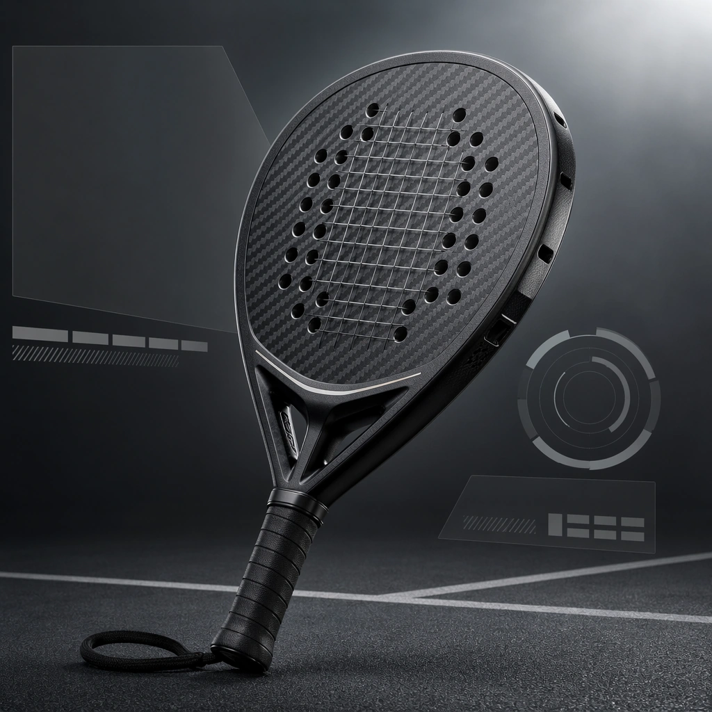
Scene: Create a square racket launch still for Equipment Ads, using sports-product advertising with strong material realism, clean hierarchy, and commerce-ready performance styling. The composition should read as a practical, production-ready sports or fitness surface with a clear hierarchy, premium lighting, and obvious commercial intent. Keep the environment specific enough to feel real, but leave enough control in the layout for non-readable information modules, campaign blocks, or visualized metrics. Aim for a finish that works for a brand, club, app, academy, or event operator. Subject: Build the image around single racket at three-quarter angle. The subject should be original, believable, and free of any real-brand or celebrity cues. Use realistic apparel, safe body mechanics when movement is visible, and environmental props that support the category without clutter. The subject must stay visually dominant so the design still works as a communication asset rather than a pure scene study. Important details: The mood should read as studio precision. Treat layout, light, and supporting graphic structure as part of one polished delivery surface. Any schedule blocks, metric panels, quote zones, badges, or path diagrams must stay abstract and non-readable. Prioritize usefulness, clarity, and category truth over spectacle. The image should feel distinct from the series package while still belonging naturally to the same topic and business use case. Use case: Equipment Ads single study 5/9, an independent rollout surface for the topic. Constraints: No readable text, no watermark, no logos, preserve exact 1:1 aspect ratio, no brand marks, no public-figure resemblance, no generic stock layout, no cluttered UI imitation, no accidental copyrighted insignia.
Example generated from “Sports Equipment Advertising Set — Cleat Exploded Detail”
GPT Image 2en

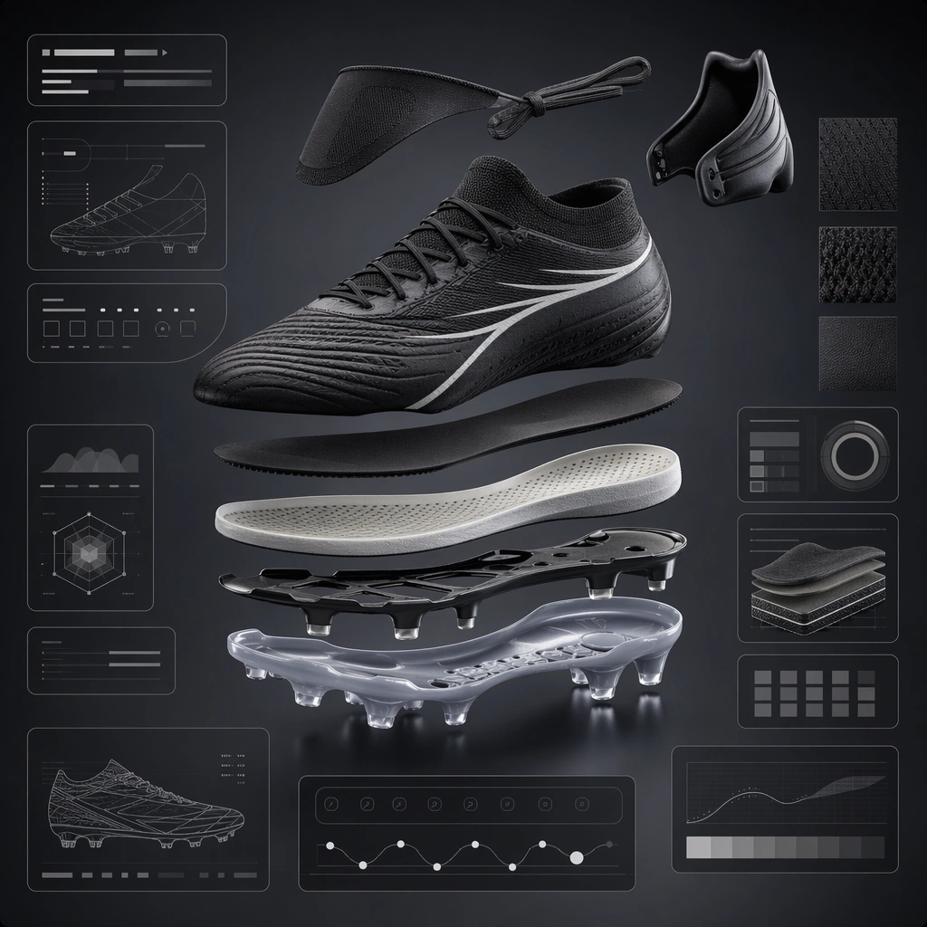
Scene: Create a square cleat exploded detail board for Equipment Ads, using sports-product advertising with strong material realism, clean hierarchy, and commerce-ready performance styling. The composition should read as a practical, production-ready sports or fitness surface with a clear hierarchy, premium lighting, and obvious commercial intent. Keep the environment specific enough to feel real, but leave enough control in the layout for non-readable information modules, campaign blocks, or visualized metrics. Aim for a finish that works for a brand, club, app, academy, or event operator. Subject: Build the image around original boot in separated layers. The subject should be original, believable, and free of any real-brand or celebrity cues. Use realistic apparel, safe body mechanics when movement is visible, and environmental props that support the category without clutter. The subject must stay visually dominant so the design still works as a communication asset rather than a pure scene study. Important details: The mood should read as engineering clarity. Treat layout, light, and supporting graphic structure as part of one polished delivery surface. Any schedule blocks, metric panels, quote zones, badges, or path diagrams must stay abstract and non-readable. Prioritize usefulness, clarity, and category truth over spectacle. The image should feel distinct from the series package while still belonging naturally to the same topic and business use case. Use case: Equipment Ads single study 6/9, an independent rollout surface for the topic. Constraints: No readable text, no watermark, no logos, preserve exact 1:1 aspect ratio, no brand marks, no public-figure resemblance, no generic stock layout, no cluttered UI imitation, no accidental copyrighted insignia.
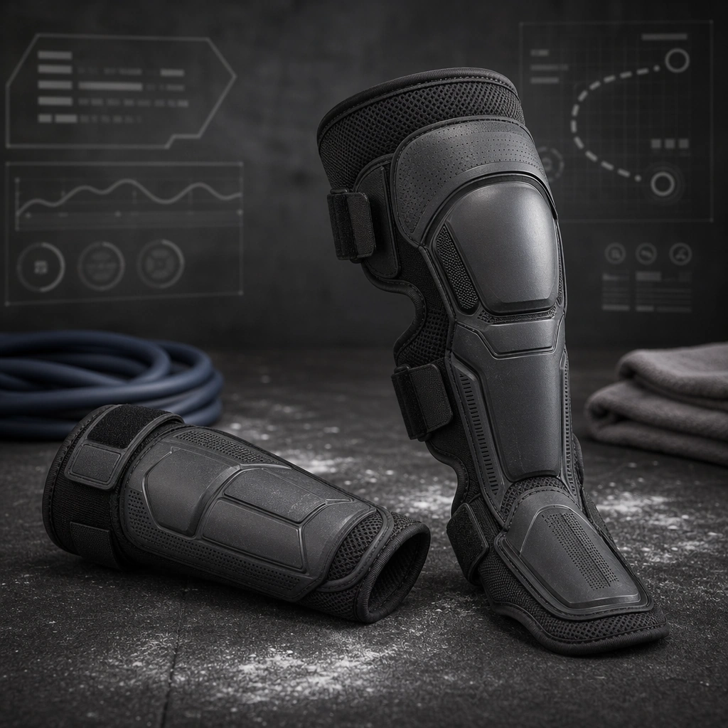
Example generated from “Sports Equipment Advertising Set — Protective Gear Duo”
GPT Image 2en

Scene: Create a square protective-gear duo ad for Equipment Ads, using sports-product advertising with strong material realism, clean hierarchy, and commerce-ready performance styling. The composition should read as a practical, production-ready sports or fitness surface with a clear hierarchy, premium lighting, and obvious commercial intent. Keep the environment specific enough to feel real, but leave enough control in the layout for non-readable information modules, campaign blocks, or visualized metrics. Aim for a finish that works for a brand, club, app, academy, or event operator. Subject: Build the image around two related gear pieces. The subject should be original, believable, and free of any real-brand or celebrity cues. Use realistic apparel, safe body mechanics when movement is visible, and environmental props that support the category without clutter. The subject must stay visually dominant so the design still works as a communication asset rather than a pure scene study. Important details: The mood should read as balanced utility. Treat layout, light, and supporting graphic structure as part of one polished delivery surface. Any schedule blocks, metric panels, quote zones, badges, or path diagrams must stay abstract and non-readable. Prioritize usefulness, clarity, and category truth over spectacle. The image should feel distinct from the series package while still belonging naturally to the same topic and business use case. Use case: Equipment Ads single study 7/9, an independent rollout surface for the topic. Constraints: No readable text, no watermark, no logos, preserve exact 1:1 aspect ratio, no brand marks, no public-figure resemblance, no generic stock layout, no cluttered UI imitation, no accidental copyrighted insignia.
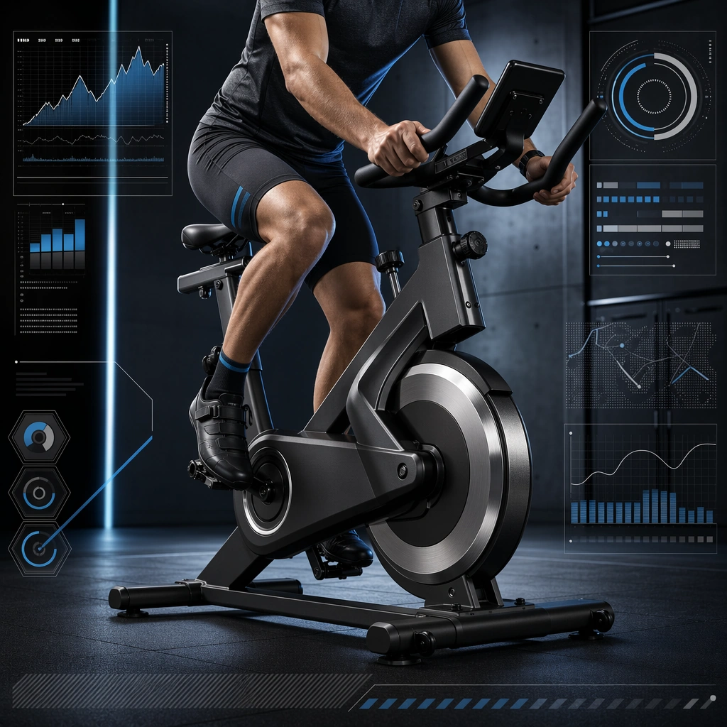
Example generated from “Sports Equipment Advertising Set — Indoor Bike Energy Poster”
GPT Image 2en

Scene: Create a square indoor bike energy poster for Equipment Ads, using sports-product advertising with strong material realism, clean hierarchy, and commerce-ready performance styling. The composition should read as a practical, production-ready sports or fitness surface with a clear hierarchy, premium lighting, and obvious commercial intent. Keep the environment specific enough to feel real, but leave enough control in the layout for non-readable information modules, campaign blocks, or visualized metrics. Aim for a finish that works for a brand, club, app, academy, or event operator. Subject: Build the image around cardio machine with partial athlete. The subject should be original, believable, and free of any real-brand or celebrity cues. Use realistic apparel, safe body mechanics when movement is visible, and environmental props that support the category without clutter. The subject must stay visually dominant so the design still works as a communication asset rather than a pure scene study. Important details: The mood should read as machined power. Treat layout, light, and supporting graphic structure as part of one polished delivery surface. Any schedule blocks, metric panels, quote zones, badges, or path diagrams must stay abstract and non-readable. Prioritize usefulness, clarity, and category truth over spectacle. The image should feel distinct from the series package while still belonging naturally to the same topic and business use case. Use case: Equipment Ads single study 8/9, an independent rollout surface for the topic. Constraints: No readable text, no watermark, no logos, preserve exact 1:1 aspect ratio, no brand marks, no public-figure resemblance, no generic stock layout, no cluttered UI imitation, no accidental copyrighted insignia.
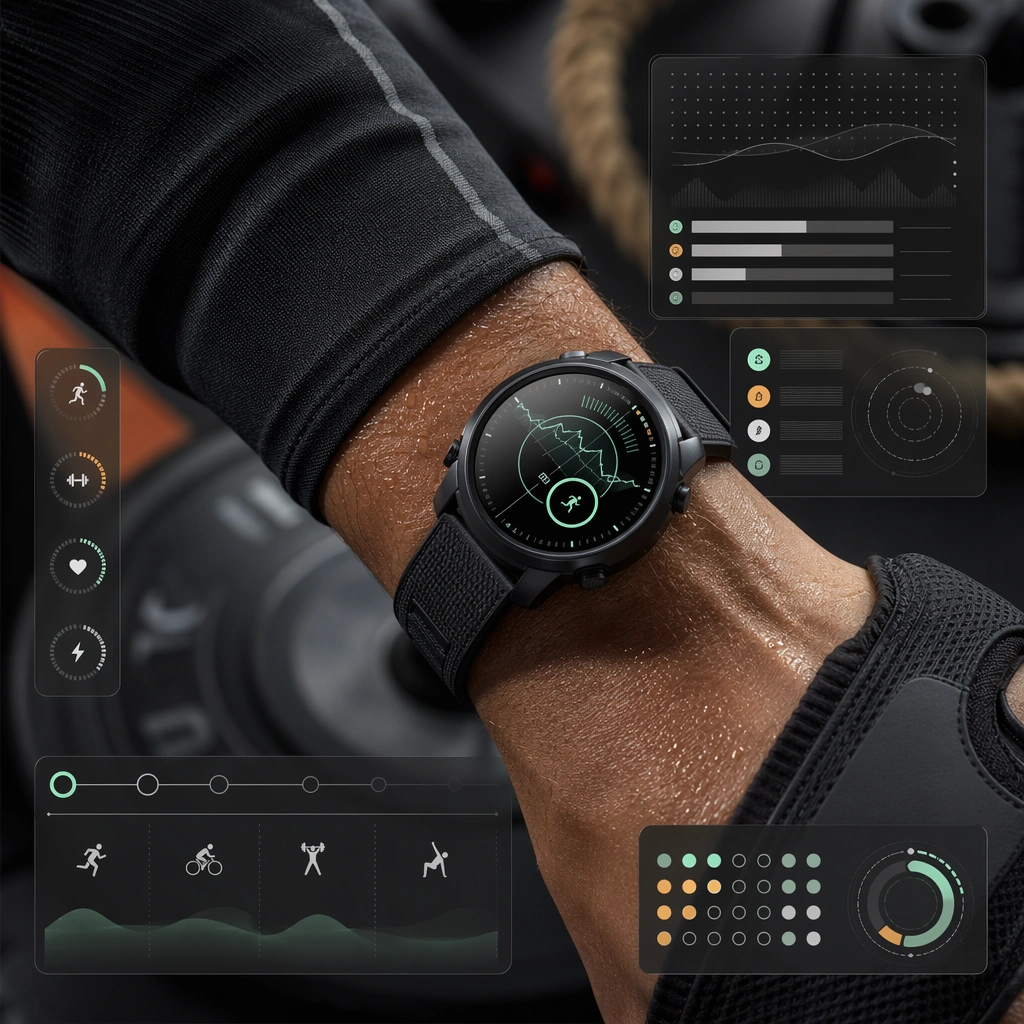
Example generated from “Sports Equipment Advertising Set — Training Watch Close-up”
GPT Image 2en

Scene: Create a square training-watch close-up ad for Equipment Ads, using sports-product advertising with strong material realism, clean hierarchy, and commerce-ready performance styling. The composition should read as a practical, production-ready sports or fitness surface with a clear hierarchy, premium lighting, and obvious commercial intent. Keep the environment specific enough to feel real, but leave enough control in the layout for non-readable information modules, campaign blocks, or visualized metrics. Aim for a finish that works for a brand, club, app, academy, or event operator. Subject: Build the image around wearable on athlete wrist. The subject should be original, believable, and free of any real-brand or celebrity cues. Use realistic apparel, safe body mechanics when movement is visible, and environmental props that support the category without clutter. The subject must stay visually dominant so the design still works as a communication asset rather than a pure scene study. Important details: The mood should read as macro sports-tech focus. Treat layout, light, and supporting graphic structure as part of one polished delivery surface. Any schedule blocks, metric panels, quote zones, badges, or path diagrams must stay abstract and non-readable. Prioritize usefulness, clarity, and category truth over spectacle. The image should feel distinct from the series package while still belonging naturally to the same topic and business use case. Use case: Equipment Ads single study 9/9, an independent rollout surface for the topic. Constraints: No readable text, no watermark, no logos, preserve exact 1:1 aspect ratio, no brand marks, no public-figure resemblance, no generic stock layout, no cluttered UI imitation, no accidental copyrighted insignia.
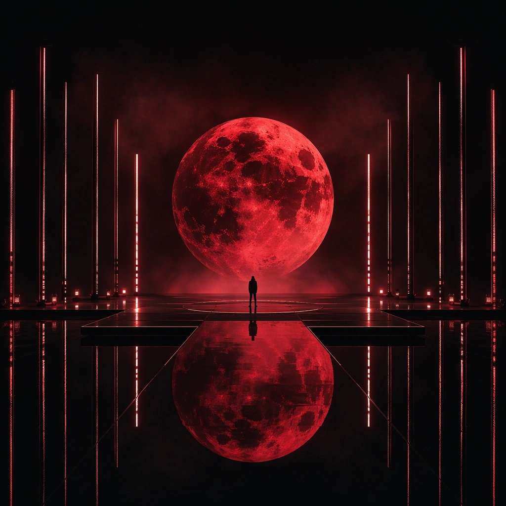
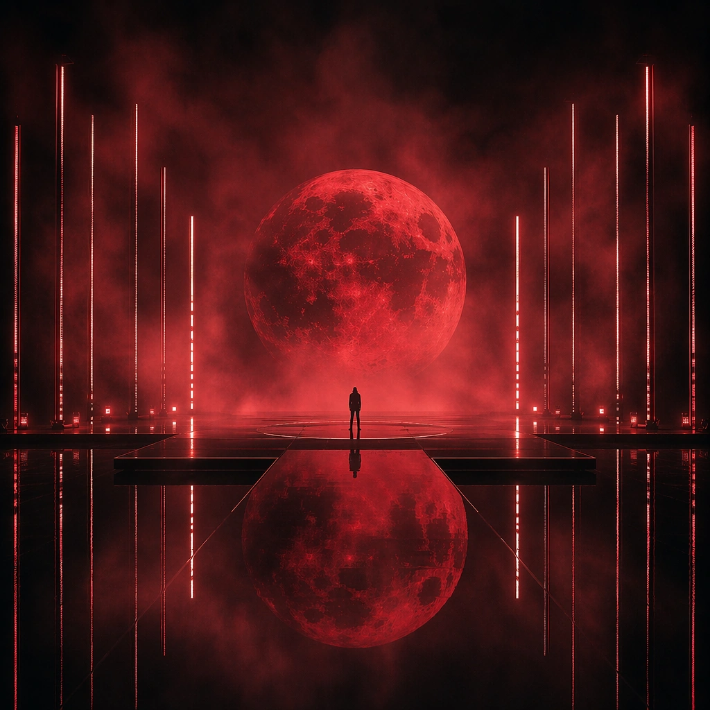
Example generated from “Stage Visual Moodboard Performance World — Reference Obsidian Stage”
GPT Image 2en

Scene: A square stage-world moodboard showing a large performance environment with an obsidian reflective floor, hanging haze, a giant red moon-like screen graphic, and narrow vertical light slits framing the space. The camera is front-facing and slightly elevated so the entire world reads like a creative-direction board for a tour stage rather than a documentary photo. Subject: A solitary performer silhouette stands at center stage, small relative to the environment, while the true subject is the world itself: reflective black floor, red lunar screen motif, vertical light architecture, and ceremonial empty space. This first image must lock the exact scenic language that later variants preserve: floor finish, screen symbol, scale relationship, and atmospheric density. Important details: Think like a stage creative deck image. Every element should feel intentional and translatable into screens, lighting, wardrobe, and promo materials. The stage world should be dramatic yet minimal, with a strong symbolic motif and enough clean geometry to support coherent expansion. Avoid readable show titles or brand marks; the ownership comes from environmental grammar. Use case: Stage Moodboard series study 1/9 for the Stage Visual Moodboard Performance World Prompt Atlas theme. Constraints: No readable text, no watermark, no logos, preserve exact 1:1 aspect ratio, no audience visible, no visible truss clutter, no sponsor logo, no fireworks, no random props, no realistic venue seating dominating the frame

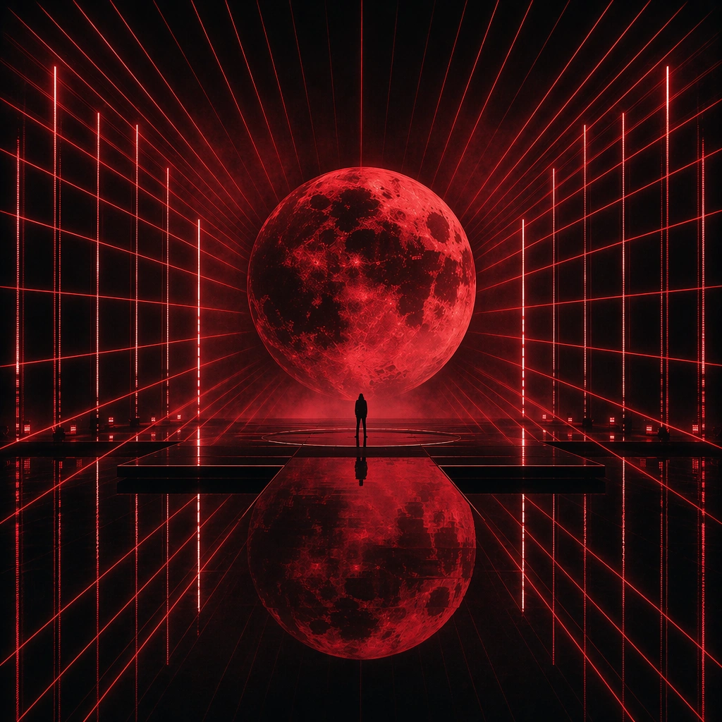
Example generated from “Stage Visual Moodboard Performance World — Laser Tunnel Variant”
GPT Image 2en

Scene: A square creative-direction image in the same stage universe, now emphasizing a laser tunnel depth effect built from parallel red beams and stronger perspective pull. The obsidian floor, haze density, and red moon motif must remain intact so the world still feels like the same production language. Subject: Preserve the same central performer silhouette scale, stage proportions, floor finish, and lunar screen symbol from the reference image. The performer remains minimal, while the laser tunnel becomes the active scenic extension, creating a more aggressive live-energy interpretation of the same world. Important details: The point is not to rebuild the stage but to stress one facet of it. Keep the same materials, same symbolic anchor, and same ceremonial emptiness while letting the beam geometry intensify. This should read like an alternate scenic rendering from the same show bible, not a different concert concept. Use case: Stage Moodboard series study 2/9 for the Stage Visual Moodboard Performance World Prompt Atlas theme. Constraints: No readable text, no watermark, no logos, preserve exact 1:1 aspect ratio, preserve the obsidian floor and red-moon motif from the reference; no audience, no extra dancers, no moving-head fixture clutter, no rainbow lasers, no brand logos

Example generated from “Stage Visual Moodboard Performance World — Fog Curtain Variant”
GPT Image 2en

Scene: A square moodboard image from the same stage universe, now layered with drifting fog curtains and more diffused side light that partially veils the red lunar screen. The overall architecture must remain identical, but the atmosphere becomes softer and more dreamlike. Subject: Preserve the same central performer silhouette scale, obsidian floor reflections, red moon screen motif, and stage proportions from the reference image. The performer stays small and ceremonial, while the fog becomes a new scenic medium that turns the world into a softer, suspended environment. Important details: This variant should feel like the same performance world viewed through an alternate atmospheric treatment. Do not change the world language; enrich it through diffusion, layered haze, and softened reflections. The stage should still feel buildable, practical, and translatable into a real show creative direction deck. Use case: Stage Moodboard series study 3/9 for the Stage Visual Moodboard Performance World Prompt Atlas theme. Constraints: No readable text, no watermark, no logos, preserve exact 1:1 aspect ratio, preserve the obsidian floor and red-moon motif from the reference; no audience, no extra scenic objects, no heavy rain effect, no decorative starscape, no venue branding

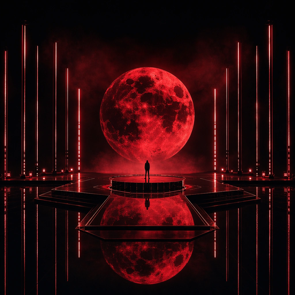
Example generated from “Stage Visual Moodboard Performance World — Mirror Riser Variant”
GPT Image 2en

Scene: A square stage-world rendering in the same obsidian universe, now featuring a central mirrored riser and slightly more sculptural platform geometry beneath the performer. The red moon motif, haze, and vertical light slits remain the defining anchors of the composition. Subject: Preserve the same performer silhouette scale, red lunar screen, obsidian floor language, and ceremonial emptiness from the reference image. The only major shift is the introduction of a mirror-like riser that elevates the performer and gives the scene a stronger ritual center. Important details: The riser should feel like a logical scenic extension inside the same show package. Use reflection, material realism, and symmetry to create focus, but avoid making the stage ornate or overbuilt. This must still read as one coherent performance world that could support lighting plots, wardrobe choices, and promo imagery. Use case: Stage Moodboard series study 4/9 for the Stage Visual Moodboard Performance World Prompt Atlas theme. Constraints: No readable text, no watermark, no logos, preserve exact 1:1 aspect ratio, preserve the obsidian floor and red-moon motif from the reference; no audience, no pyrotechnics, no extra props, no architectural set pieces unrelated to the world, no brand marks

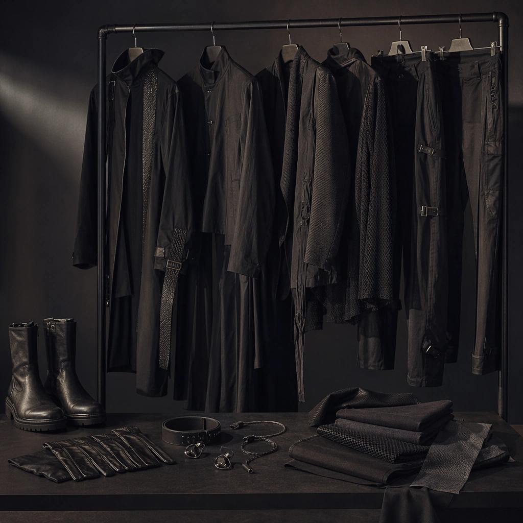
Example generated from “Stage Visual Moodboard Performance World — Wardrobe Rail Study”
GPT Image 2en

Scene: A square studio moodboard image showing a wardrobe rail with several dark garments, metallic trims, boots, gloves, and folded fabric swatches under dramatic side light. The shot should feel like a presentation slide for a tour costume direction rather than a retail fashion rack. Subject: The subject is the wardrobe language itself: long silhouettes, matte black textiles, brushed metal accents, and disciplined color control that could belong to a live performance world. No literal brand labels or readable tags should appear; the rail should communicate stage identity through material and silhouette. Important details: Keep the styling serious, modern, and show-ready. Use selective props such as a belt, earpiece, or glove only if they reinforce the live-performance world. The image should bridge fashion and staging without feeling like a store display or editorial shopping spread. Use case: Stage Moodboard single study 5/9 for the Stage Visual Moodboard Performance World Prompt Atlas theme. Constraints: No readable text, no watermark, no logos, preserve exact 1:1 aspect ratio, no retail signage, no readable clothing labels, no bright casual garments, no mannequins, no audience or stage in the background

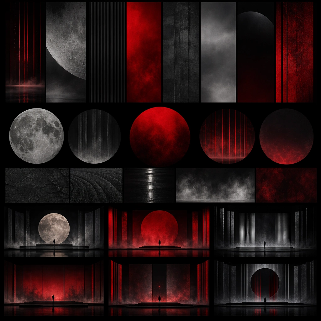
Example generated from “Stage Visual Moodboard Performance World — Screen Texture Board”
GPT Image 2en

Scene: A square design board of layered texture panels, circular red gradients, black reflective fields, and grainy atmospheric surfaces arranged with clean spacing. The board should look like a stage visual concept sheet for massive LED content rather than a random abstract-art collage. Subject: The subject is a family of visual motifs for stage screens: lunar discs, fog-softened gradients, vertical slit textures, and reflective shadow fields. Each panel should feel like a usable scenic content ingredient that belongs to a larger performance universe. Important details: Keep the board disciplined and production-minded. The motifs should read clearly, feel scalable to large screens, and suggest a coherent show identity. Use texture and layout to sell professionalism, not novelty. Avoid any readable labels or software annotation. Use case: Stage Moodboard single study 6/9 for the Stage Visual Moodboard Performance World Prompt Atlas theme. Constraints: No readable text, no watermark, no logos, preserve exact 1:1 aspect ratio, no UI software panels, no readable notes, no rainbow glitch effects, no unrelated photography, no decorative scrapbook style

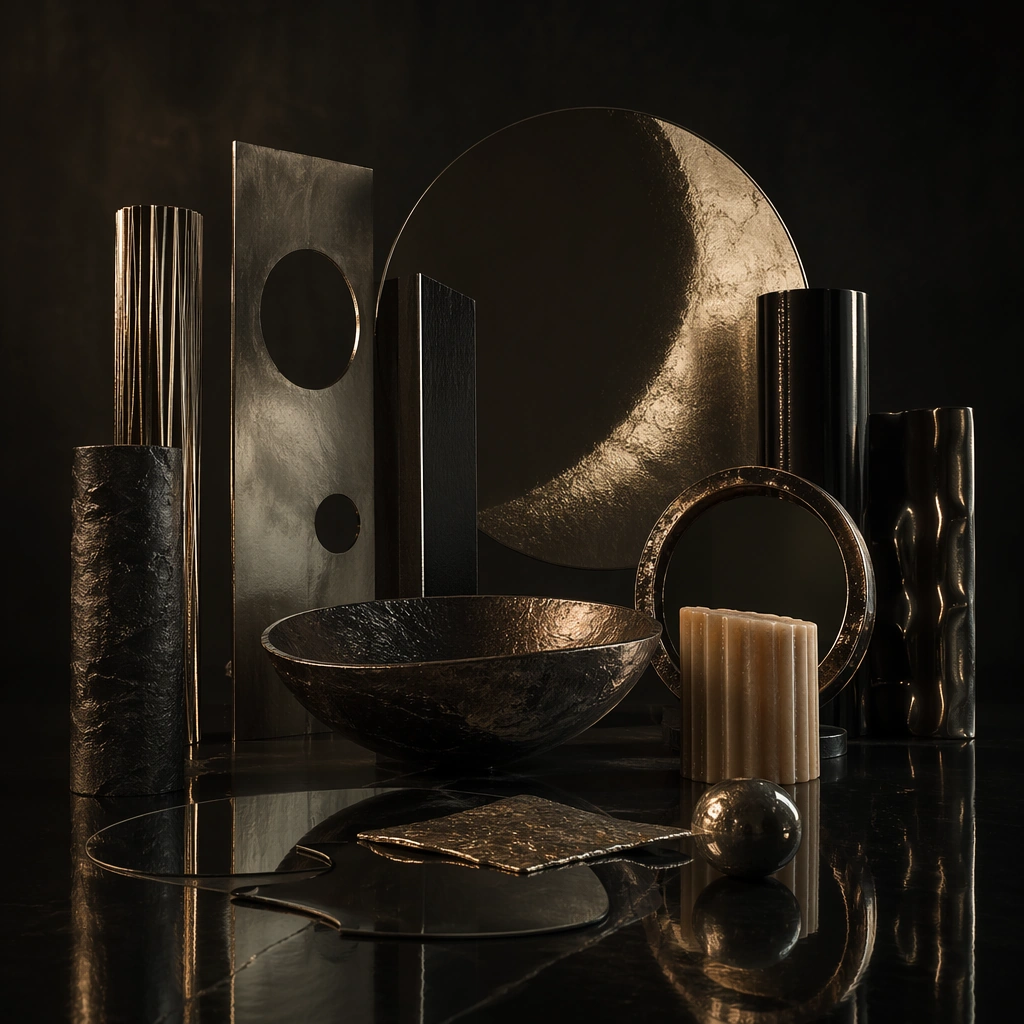
Example generated from “Stage Visual Moodboard Performance World — Prop Altar Study”
GPT Image 2en

Scene: A square still life on a dark reflective table holding a few sculptural stage props, metallic forms, candles made abstract and unlit, mirrored shards, and circular scenic fragments. The lighting should be low and ceremonial, with enough clarity to present materials while maintaining mystery. Subject: The subject is not occult symbolism but a focused stage-prop language: a few objects that could live on stage, inform close-up camera inserts, or inspire scenic detail. The arrangement should feel deliberate and ownable, not like cluttered home decor. Important details: Use reflection, silhouette, and composition to create a sense of ritual performance design. The object set must remain sparse and purposeful, demonstrating how a stage world can be extended through props. Everything should feel translatable into real production design without literal readable annotation. Use case: Stage Moodboard single study 7/9 for the Stage Visual Moodboard Performance World Prompt Atlas theme. Constraints: No readable text, no watermark, no logos, preserve exact 1:1 aspect ratio, no flames, no brand objects, no fantasy weapons, no religious symbols, no tabletop clutter beyond the focused prop family

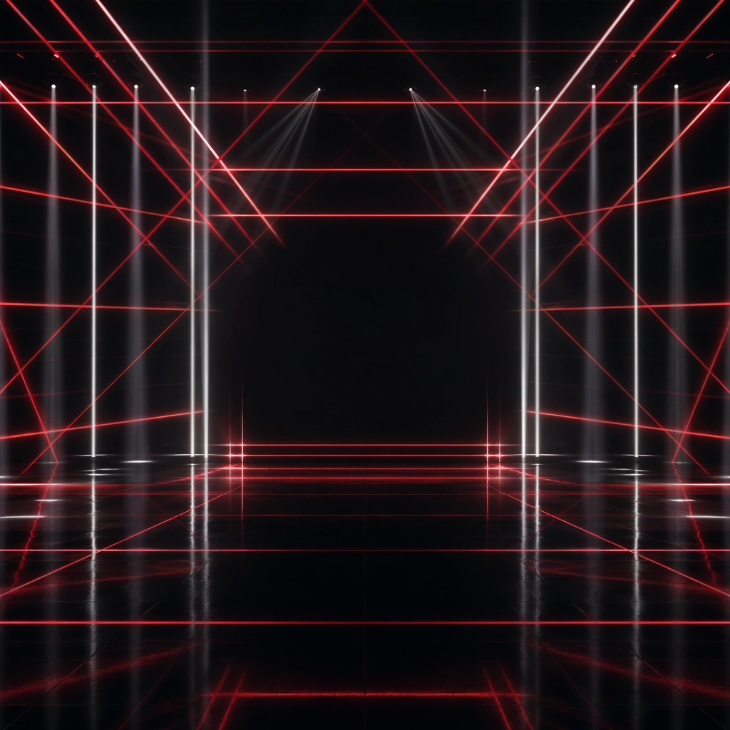
Example generated from “Stage Visual Moodboard Performance World — Laser Grid Study”
GPT Image 2en

Scene: A square stage-concept still with a black reflective floor and a disciplined lattice of red and white beams cutting through haze. The camera faces the grid head-on so the geometry reads clearly, like a concept rendering inside a production deck. Subject: The subject is the beam system itself: intersecting lines, reflective floor echoes, and an implied performer zone left open in the center. The image should demonstrate how lighting alone can create an ownable performance space. Important details: Keep the beams clean, the floor believable, and the empty center powerful. This should feel technical enough to inform a show, but stylish enough to function as a moodboard image. Avoid making it a generic club-laser wallpaper by preserving strong composition and negative space. Use case: Stage Moodboard single study 8/9 for the Stage Visual Moodboard Performance World Prompt Atlas theme. Constraints: No readable text, no watermark, no logos, preserve exact 1:1 aspect ratio, no audience, no DJ booth, no rainbow colors, no visible truss clutter, no readable control screens

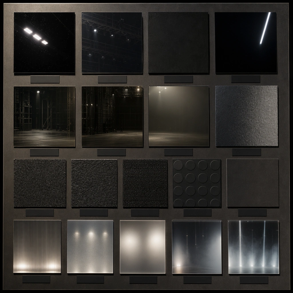
Example generated from “Stage Visual Moodboard Performance World — Material Floor Board”
GPT Image 2en

Scene: A square material board arranged with swatches of reflective black acrylic, smoked mirror, matte charcoal, textured rubber, and haze-lit sample panels. The presentation should feel like a serious stage-scenic material study rather than an interior-design moodboard. Subject: The subject is the tactile palette of a performance floor and its neighboring surfaces. Each swatch should imply how stage light, reflection, and movement would behave during a live show, creating a credible scenic language from materials alone. Important details: Use disciplined spacing, subtle labels implied only as empty blocks, and careful lighting to show surface response. The board should communicate production intelligence and world-building ownership. Material realism matters more than decorative beauty here. Use case: Stage Moodboard single study 9/9 for the Stage Visual Moodboard Performance World Prompt Atlas theme. Constraints: No readable text, no watermark, no logos, preserve exact 1:1 aspect ratio, no readable notes, no interior-design magazine props, no wood furniture mood, no home-decor palette, no unrelated lifestyle items

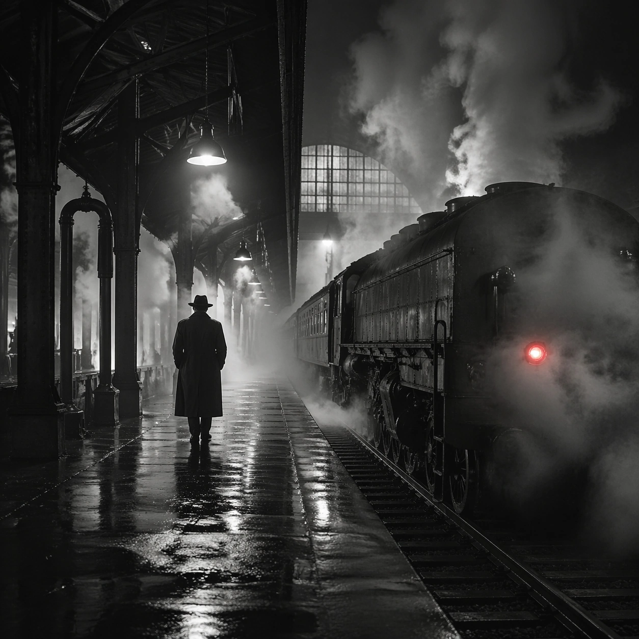
Example generated from “Steam Engine Station Noir — Reference Anchor”
GPT Image 2en

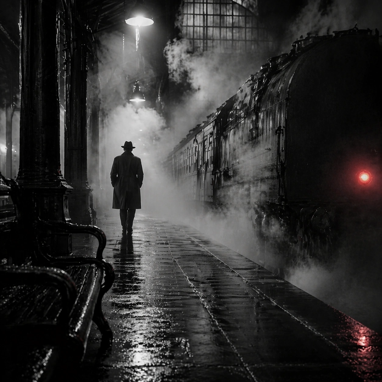
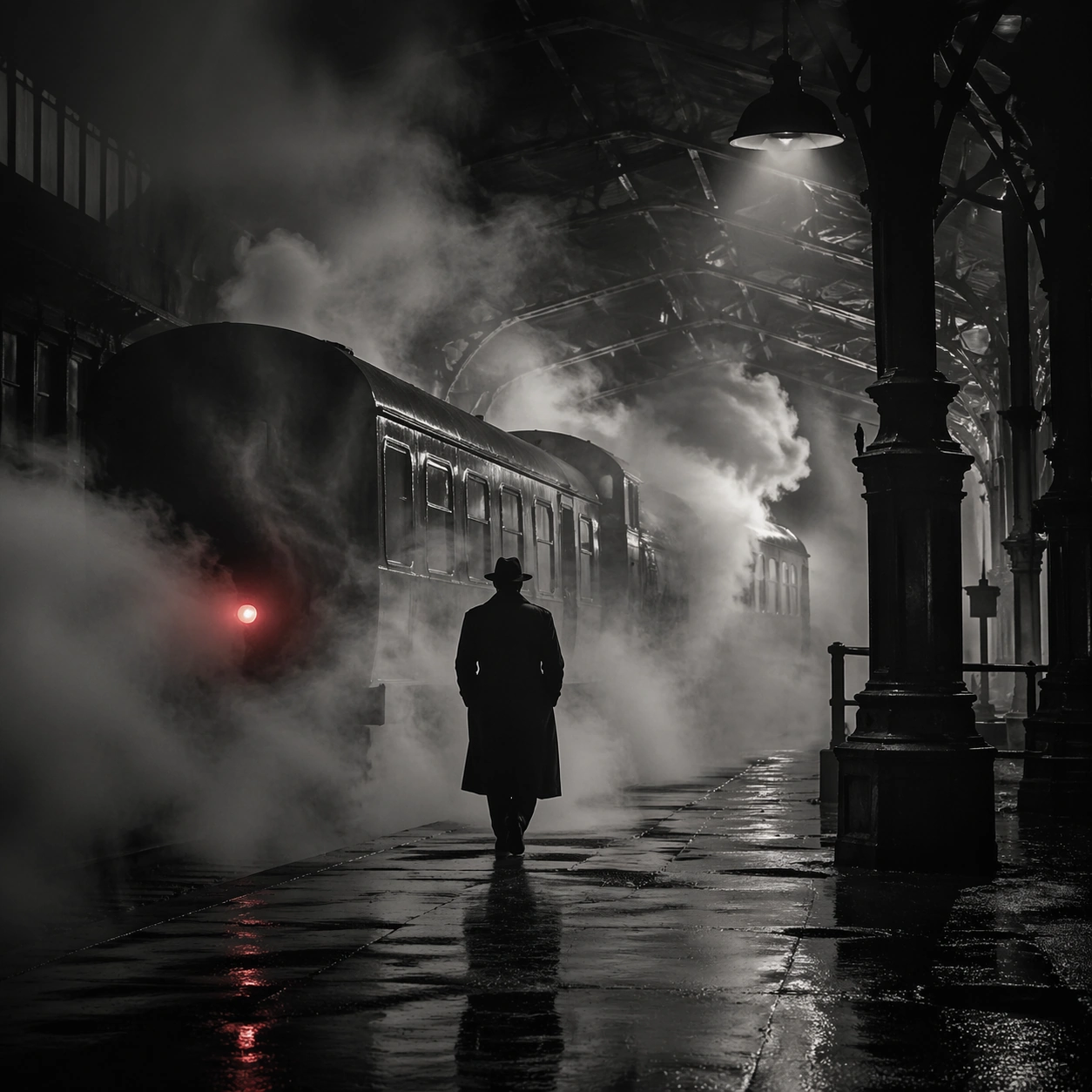
Scene: Create a square cinematic still for Steam Engine Station Noir. Use production-grade photoreal lighting, disciplined lens behavior, and a composition that feels like a finished key frame from an original film rather than a casual snapshot. A mid-century rail platform is buried in rolling steam and hard-edged station light, with mostly monochrome tonality, wet pavement, iron structure, and one restrained red tail lamp or signal glowing through the vapor. Keep the camera in a disciplined anchor position so the full lighting event and the main spatial structure are immediately legible from edge to edge. Subject: Build a coherent original scene whose emotional center comes from atmosphere, light physics, and spatial clarity. Avoid relying on celebrity likeness, franchise iconography, or stylized illustration shortcuts. A lone figure in a trench coat, the locomotive mass, steel beams, and layered steam curtains should build the scene, but the person remains anonymous and secondary to the environment and the light-cutting fog. This frame should lock the canonical arrangement, scale relationship, and emotional tone that the later dependent images inherit. Important details: Preserve a believable physical world with strong depth layering, careful color separation, and premium image discipline. Prioritize steam density layering, wet-surface sheen, noir contrast, and restrained color use, so the image feels like a lost still from a serious black-and-white crime film rather than a cosplay set. Use this image to establish the authoritative direction of light, atmospheric density, and structural silhouette for the package. Use case: Steam Station series study 1/9. Constraints: No readable text, no watermark, no logos, preserve exact 1:1 aspect ratio, no readable station boards, no crowded commuters, no exaggerated detective props, no pristine modern train design, no bright advertising.

Example generated from “Steam Engine Station Noir — Closer Frame”
GPT Image 2en

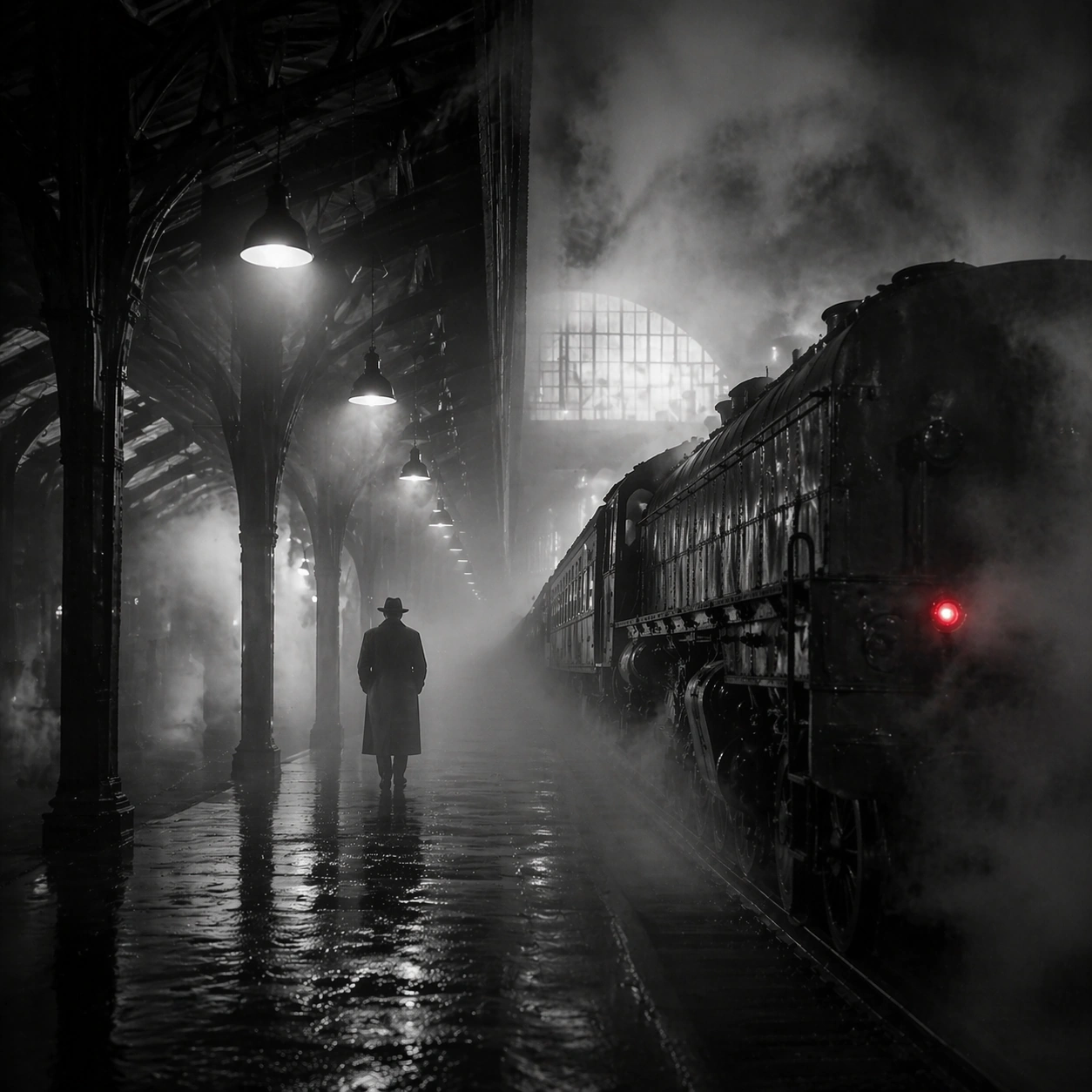
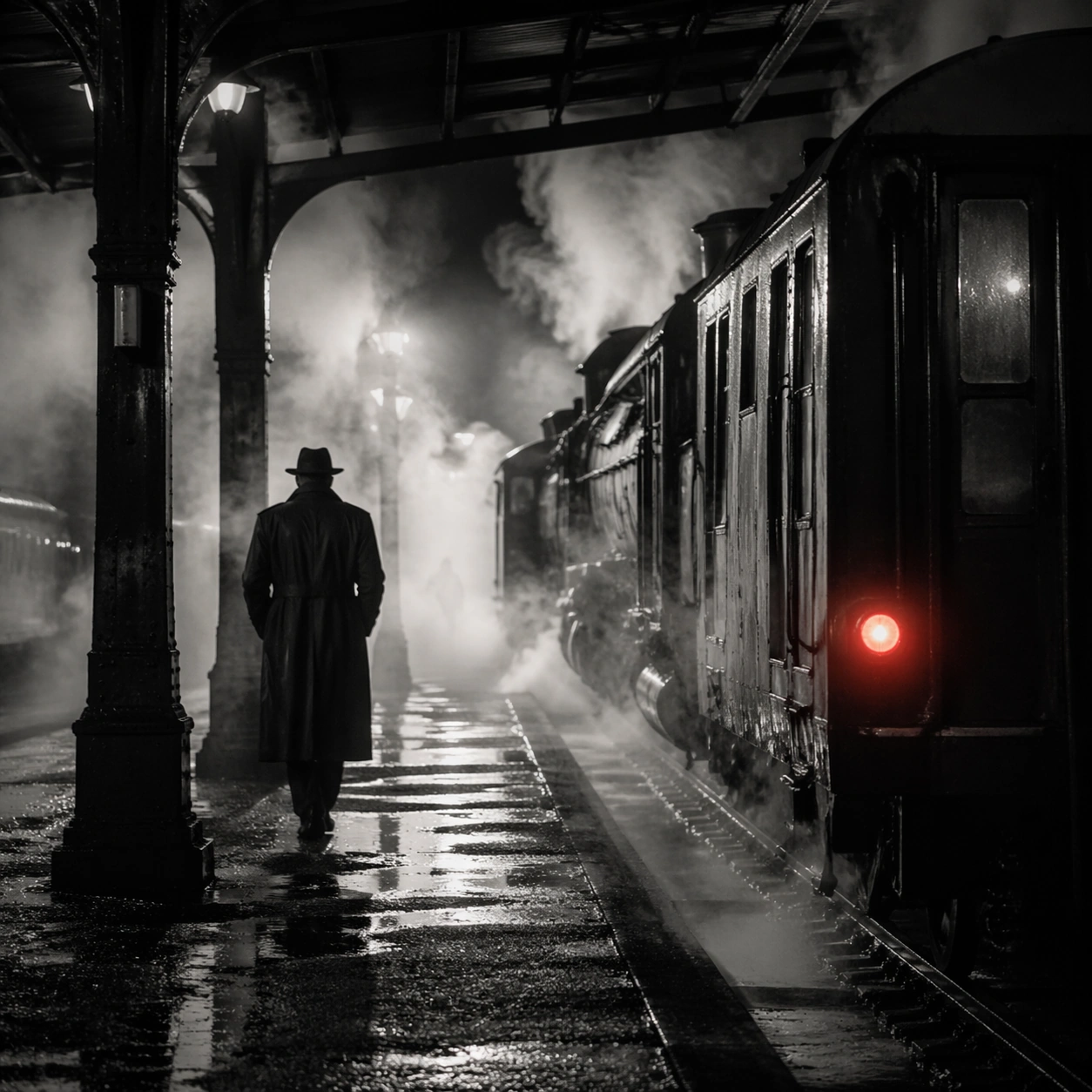
Scene: Create a square cinematic still for Steam Engine Station Noir. Use production-grade photoreal lighting, disciplined lens behavior, and a composition that feels like a finished key frame from an original film rather than a casual snapshot. A mid-century rail platform is buried in rolling steam and hard-edged station light, with mostly monochrome tonality, wet pavement, iron structure, and one restrained red tail lamp or signal glowing through the vapor. Move the camera closer or lower so the viewer feels more embedded inside the atmosphere while the same light direction and environment remain intact. Subject: Build a coherent original scene whose emotional center comes from atmosphere, light physics, and spatial clarity. Avoid relying on celebrity likeness, franchise iconography, or stylized illustration shortcuts. A lone figure in a trench coat, the locomotive mass, steel beams, and layered steam curtains should build the scene, but the person remains anonymous and secondary to the environment and the light-cutting fog. Preserve the same world logic from the reference and let one human-scale or material-scale element become more prominent without stealing focus from the atmosphere. Important details: Preserve a believable physical world with strong depth layering, careful color separation, and premium image discipline. Prioritize steam density layering, wet-surface sheen, noir contrast, and restrained color use, so the image feels like a lost still from a serious black-and-white crime film rather than a cosplay set. Keep the palette family, structural read, and light behavior from image 01 while increasing immediacy and tactile presence. Use case: Steam Station series study 2/9. Constraints: No readable text, no watermark, no logos, preserve exact 1:1 aspect ratio, no readable station boards, no crowded commuters, no exaggerated detective props, no pristine modern train design, no bright advertising.

Example generated from “Steam Engine Station Noir — Spatial Counterpoint”
GPT Image 2en

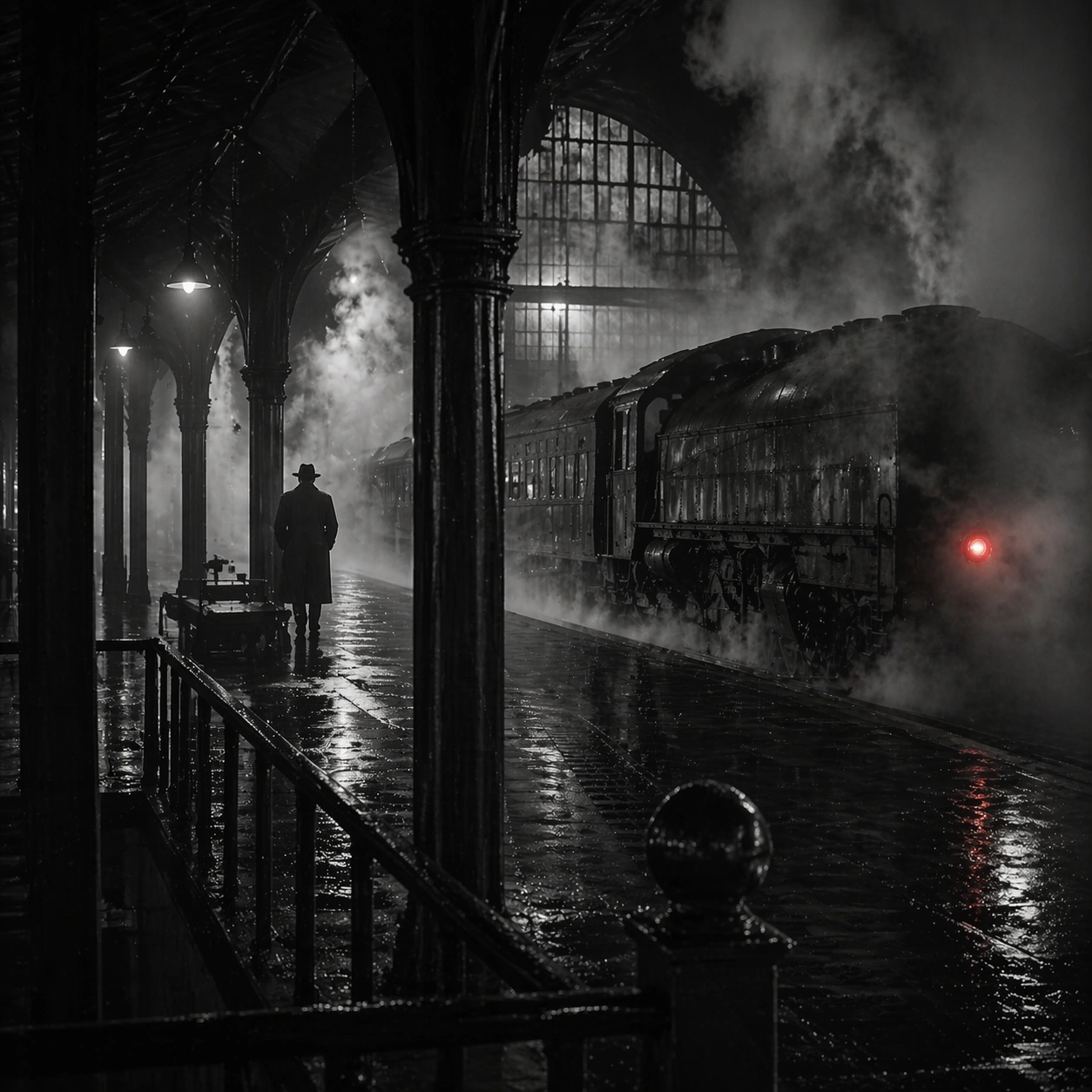
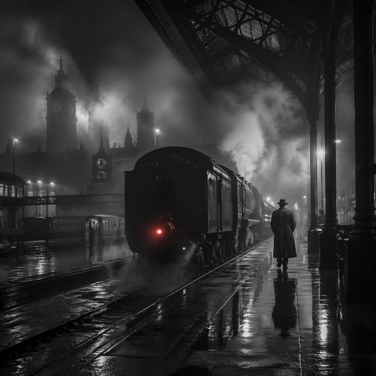
Scene: Create a square cinematic still for Steam Engine Station Noir. Use production-grade photoreal lighting, disciplined lens behavior, and a composition that feels like a finished key frame from an original film rather than a casual snapshot. A mid-century rail platform is buried in rolling steam and hard-edged station light, with mostly monochrome tonality, wet pavement, iron structure, and one restrained red tail lamp or signal glowing through the vapor. Shift to an oblique or lateral point of view that reveals different depth layers while staying inside the same place and the same atmospheric event. Subject: Build a coherent original scene whose emotional center comes from atmosphere, light physics, and spatial clarity. Avoid relying on celebrity likeness, franchise iconography, or stylized illustration shortcuts. A lone figure in a trench coat, the locomotive mass, steel beams, and layered steam curtains should build the scene, but the person remains anonymous and secondary to the environment and the light-cutting fog. Hold the reference structure, but use the new angle to show secondary planes, foreground interruption, or a changed distance relationship. Important details: Preserve a believable physical world with strong depth layering, careful color separation, and premium image discipline. Prioritize steam density layering, wet-surface sheen, noir contrast, and restrained color use, so the image feels like a lost still from a serious black-and-white crime film rather than a cosplay set. The success condition is continuity with the reference plus a richer sense of depth, not a new location or a new lighting system. Use case: Steam Station series study 3/9. Constraints: No readable text, no watermark, no logos, preserve exact 1:1 aspect ratio, no readable station boards, no crowded commuters, no exaggerated detective props, no pristine modern train design, no bright advertising.

Example generated from “Steam Engine Station Noir — Climax Frame”
GPT Image 2en

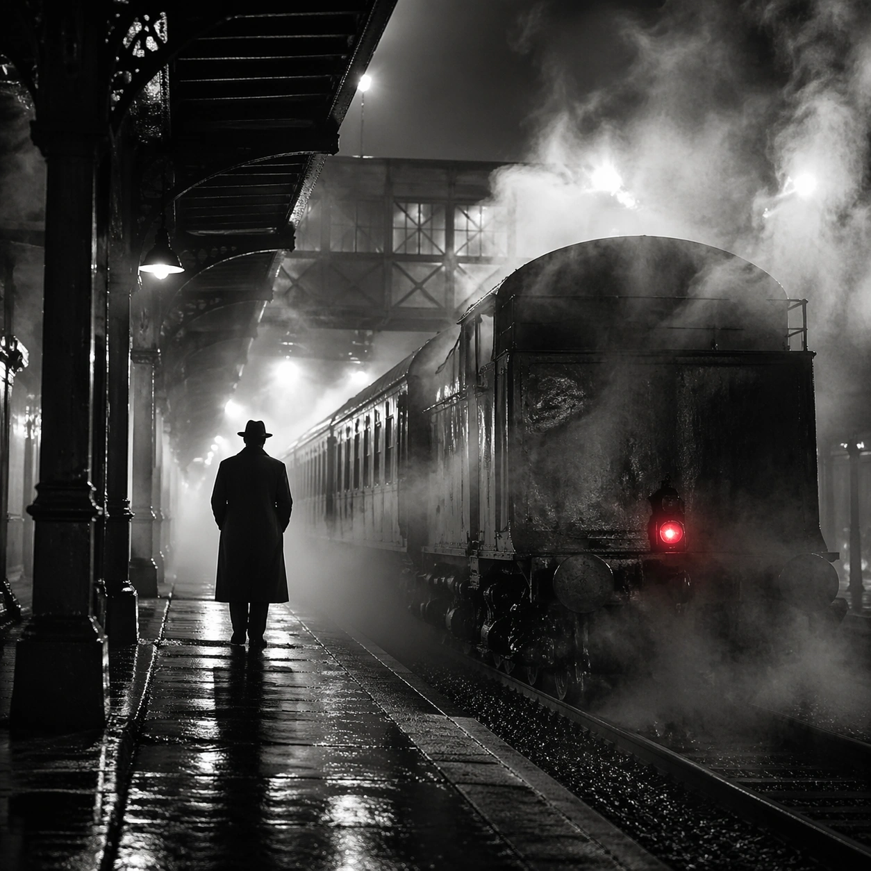
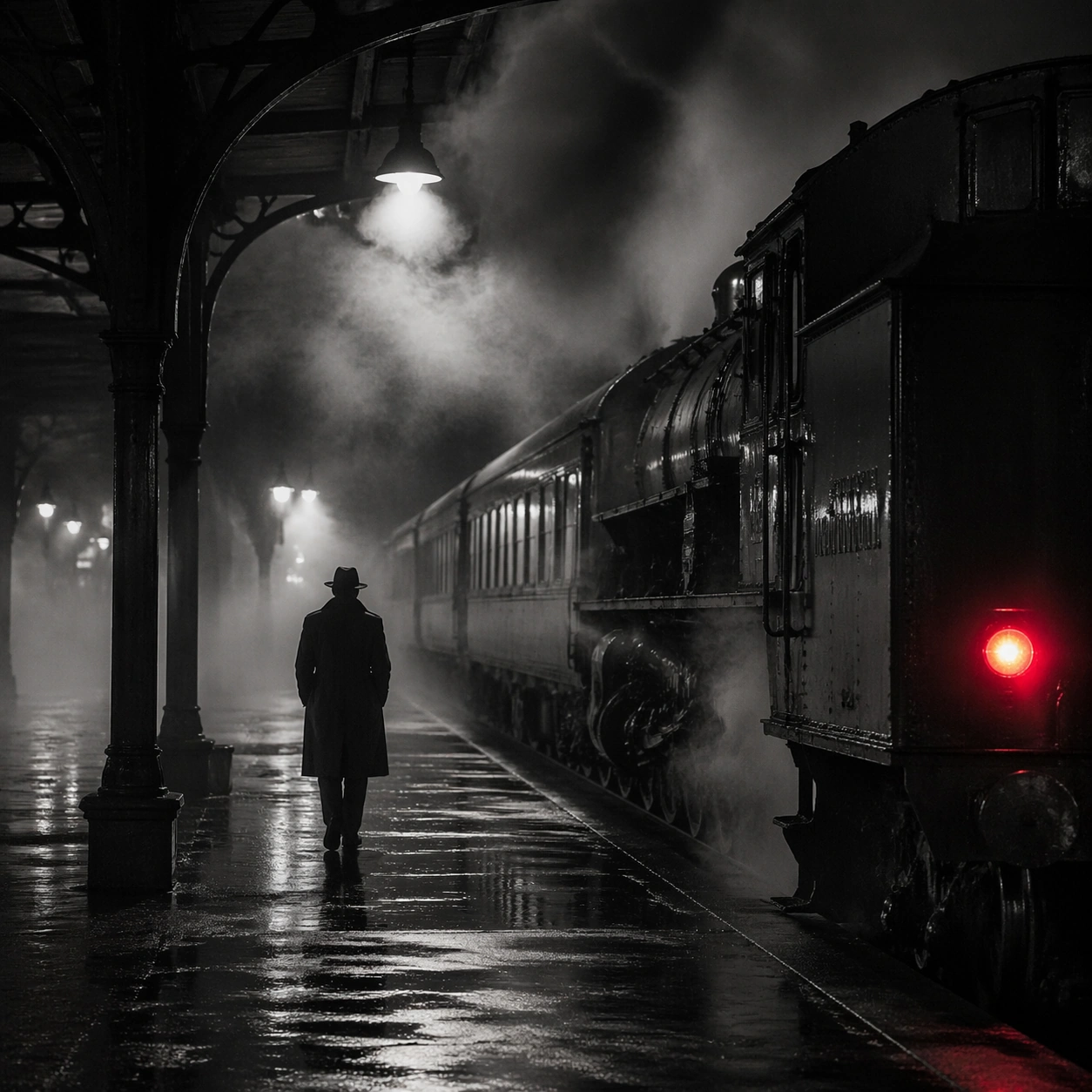
Scene: Create a square cinematic still for Steam Engine Station Noir. Use production-grade photoreal lighting, disciplined lens behavior, and a composition that feels like a finished key frame from an original film rather than a casual snapshot. A mid-century rail platform is buried in rolling steam and hard-edged station light, with mostly monochrome tonality, wet pavement, iron structure, and one restrained red tail lamp or signal glowing through the vapor. Push the composition toward the emotional peak of the same setup, with the most dramatic balance of brightness, shadow, or atmospheric density inside the established world. Subject: Build a coherent original scene whose emotional center comes from atmosphere, light physics, and spatial clarity. Avoid relying on celebrity likeness, franchise iconography, or stylized illustration shortcuts. A lone figure in a trench coat, the locomotive mass, steel beams, and layered steam curtains should build the scene, but the person remains anonymous and secondary to the environment and the light-cutting fog. Everything should still read as the same location and same event, but framed for maximum narrative force and visual closure. Important details: Preserve a believable physical world with strong depth layering, careful color separation, and premium image discipline. Prioritize steam density layering, wet-surface sheen, noir contrast, and restrained color use, so the image feels like a lost still from a serious black-and-white crime film rather than a cosplay set. Make it feel like the strongest hero frame of the sequence without breaking continuity or introducing a new design language. Use case: Steam Station series study 4/9. Constraints: No readable text, no watermark, no logos, preserve exact 1:1 aspect ratio, no readable station boards, no crowded commuters, no exaggerated detective props, no pristine modern train design, no bright advertising.

Example generated from “Steam Engine Station Noir — Surface Study”
GPT Image 2en

Scene: Create a square cinematic still for Steam Engine Station Noir. Use production-grade photoreal lighting, disciplined lens behavior, and a composition that feels like a finished key frame from an original film rather than a casual snapshot. A mid-century rail platform is buried in rolling steam and hard-edged station light, with mostly monochrome tonality, wet pavement, iron structure, and one restrained red tail lamp or signal glowing through the vapor. Build an independent square study around the way atmosphere interacts with surfaces, keeping enough environmental context for the image to feel finished rather than cropped at random. Subject: Build a coherent original scene whose emotional center comes from atmosphere, light physics, and spatial clarity. Avoid relying on celebrity likeness, franchise iconography, or stylized illustration shortcuts. A lone figure in a trench coat, the locomotive mass, steel beams, and layered steam curtains should build the scene, but the person remains anonymous and secondary to the environment and the light-cutting fog. Let textures, reflections, residue, moisture, dust, or particulate response become primary, while the broader setting remains clearly implied. Important details: Preserve a believable physical world with strong depth layering, careful color separation, and premium image discipline. Prioritize steam density layering, wet-surface sheen, noir contrast, and restrained color use, so the image feels like a lost still from a serious black-and-white crime film rather than a cosplay set. The key is material credibility under dramatic light, with micro-contrast and controlled mood supporting the theme. Use case: Steam Station single study 5/9. Constraints: No readable text, no watermark, no logos, preserve exact 1:1 aspect ratio, no readable station boards, no crowded commuters, no exaggerated detective props, no pristine modern train design, no bright advertising.

Example generated from “Steam Engine Station Noir — Silhouette Study”
GPT Image 2en

Scene: Create a square cinematic still for Steam Engine Station Noir. Use production-grade photoreal lighting, disciplined lens behavior, and a composition that feels like a finished key frame from an original film rather than a casual snapshot. A mid-century rail platform is buried in rolling steam and hard-edged station light, with mostly monochrome tonality, wet pavement, iron structure, and one restrained red tail lamp or signal glowing through the vapor. Compose an independent frame where one human, animal, or object silhouette negotiates with the atmospheric light event in a clean, readable way. Subject: Build a coherent original scene whose emotional center comes from atmosphere, light physics, and spatial clarity. Avoid relying on celebrity likeness, franchise iconography, or stylized illustration shortcuts. A lone figure in a trench coat, the locomotive mass, steel beams, and layered steam curtains should build the scene, but the person remains anonymous and secondary to the environment and the light-cutting fog. The silhouette should supply scale and emotional orientation, but the environment still needs to carry most of the storytelling weight. Important details: Preserve a believable physical world with strong depth layering, careful color separation, and premium image discipline. Prioritize steam density layering, wet-surface sheen, noir contrast, and restrained color use, so the image feels like a lost still from a serious black-and-white crime film rather than a cosplay set. Keep the silhouette simple and believable, avoiding poster-like graphic flattening while preserving strong contrast. Use case: Steam Station single study 6/9. Constraints: No readable text, no watermark, no logos, preserve exact 1:1 aspect ratio, no readable station boards, no crowded commuters, no exaggerated detective props, no pristine modern train design, no bright advertising.

Example generated from “Steam Engine Station Noir — Transition Study”
GPT Image 2en

Scene: Create a square cinematic still for Steam Engine Station Noir. Use production-grade photoreal lighting, disciplined lens behavior, and a composition that feels like a finished key frame from an original film rather than a casual snapshot. A mid-century rail platform is buried in rolling steam and hard-edged station light, with mostly monochrome tonality, wet pavement, iron structure, and one restrained red tail lamp or signal glowing through the vapor. Treat this as an adjacent moment before or after the main event, preserving the same topic language while letting the atmosphere shift slightly in intensity or position. Subject: Build a coherent original scene whose emotional center comes from atmosphere, light physics, and spatial clarity. Avoid relying on celebrity likeness, franchise iconography, or stylized illustration shortcuts. A lone figure in a trench coat, the locomotive mass, steel beams, and layered steam curtains should build the scene, but the person remains anonymous and secondary to the environment and the light-cutting fog. Show the environment in transition, with clear evidence of recent motion, changing weather, or fading light, but without turning it into action spectacle. Important details: Preserve a believable physical world with strong depth layering, careful color separation, and premium image discipline. Prioritize steam density layering, wet-surface sheen, noir contrast, and restrained color use, so the image feels like a lost still from a serious black-and-white crime film rather than a cosplay set. Subtle temporal storytelling matters here more than maximal drama, so let traces, gradients, and environmental residue do the work. Use case: Steam Station single study 7/9. Constraints: No readable text, no watermark, no logos, preserve exact 1:1 aspect ratio, no readable station boards, no crowded commuters, no exaggerated detective props, no pristine modern train design, no bright advertising.

Example generated from “Steam Engine Station Noir — Wide Study”
GPT Image 2en

Scene: Create a square cinematic still for Steam Engine Station Noir. Use production-grade photoreal lighting, disciplined lens behavior, and a composition that feels like a finished key frame from an original film rather than a casual snapshot. A mid-century rail platform is buried in rolling steam and hard-edged station light, with mostly monochrome tonality, wet pavement, iron structure, and one restrained red tail lamp or signal glowing through the vapor. Pull back enough to explain the broader geography or architectural envelope while keeping the square crop intentional and balanced. Subject: Build a coherent original scene whose emotional center comes from atmosphere, light physics, and spatial clarity. Avoid relying on celebrity likeness, franchise iconography, or stylized illustration shortcuts. A lone figure in a trench coat, the locomotive mass, steel beams, and layered steam curtains should build the scene, but the person remains anonymous and secondary to the environment and the light-cutting fog. The wider frame should reveal how the main light or weather phenomenon organizes the surrounding world and not just the immediate subject. Important details: Preserve a believable physical world with strong depth layering, careful color separation, and premium image discipline. Prioritize steam density layering, wet-surface sheen, noir contrast, and restrained color use, so the image feels like a lost still from a serious black-and-white crime film rather than a cosplay set. Make scale legible through spacing, horizon control, and foreground-to-background separation rather than through extra props. Use case: Steam Station single study 8/9. Constraints: No readable text, no watermark, no logos, preserve exact 1:1 aspect ratio, no readable station boards, no crowded commuters, no exaggerated detective props, no pristine modern train design, no bright advertising.

Example generated from “Steam Engine Station Noir — Afterglow Study”
GPT Image 2en

Scene: Create a square cinematic still for Steam Engine Station Noir. Use production-grade photoreal lighting, disciplined lens behavior, and a composition that feels like a finished key frame from an original film rather than a casual snapshot. A mid-century rail platform is buried in rolling steam and hard-edged station light, with mostly monochrome tonality, wet pavement, iron structure, and one restrained red tail lamp or signal glowing through the vapor. End on a quieter independent image that holds the residue of the topic atmosphere after its loudest moment has passed, while still feeling complete and exhibition-ready. Subject: Build a coherent original scene whose emotional center comes from atmosphere, light physics, and spatial clarity. Avoid relying on celebrity likeness, franchise iconography, or stylized illustration shortcuts. A lone figure in a trench coat, the locomotive mass, steel beams, and layered steam curtains should build the scene, but the person remains anonymous and secondary to the environment and the light-cutting fog. The frame should suggest memory, aftermath, or lingering presence through environment first and only secondarily through any figure or object. Important details: Preserve a believable physical world with strong depth layering, careful color separation, and premium image discipline. Prioritize steam density layering, wet-surface sheen, noir contrast, and restrained color use, so the image feels like a lost still from a serious black-and-white crime film rather than a cosplay set. Favor restraint, believable light decay, and subtle narrative closure over spectacle or decorative excess. Use case: Steam Station single study 9/9. Constraints: No readable text, no watermark, no logos, preserve exact 1:1 aspect ratio, no readable station boards, no crowded commuters, no exaggerated detective props, no pristine modern train design, no bright advertising.

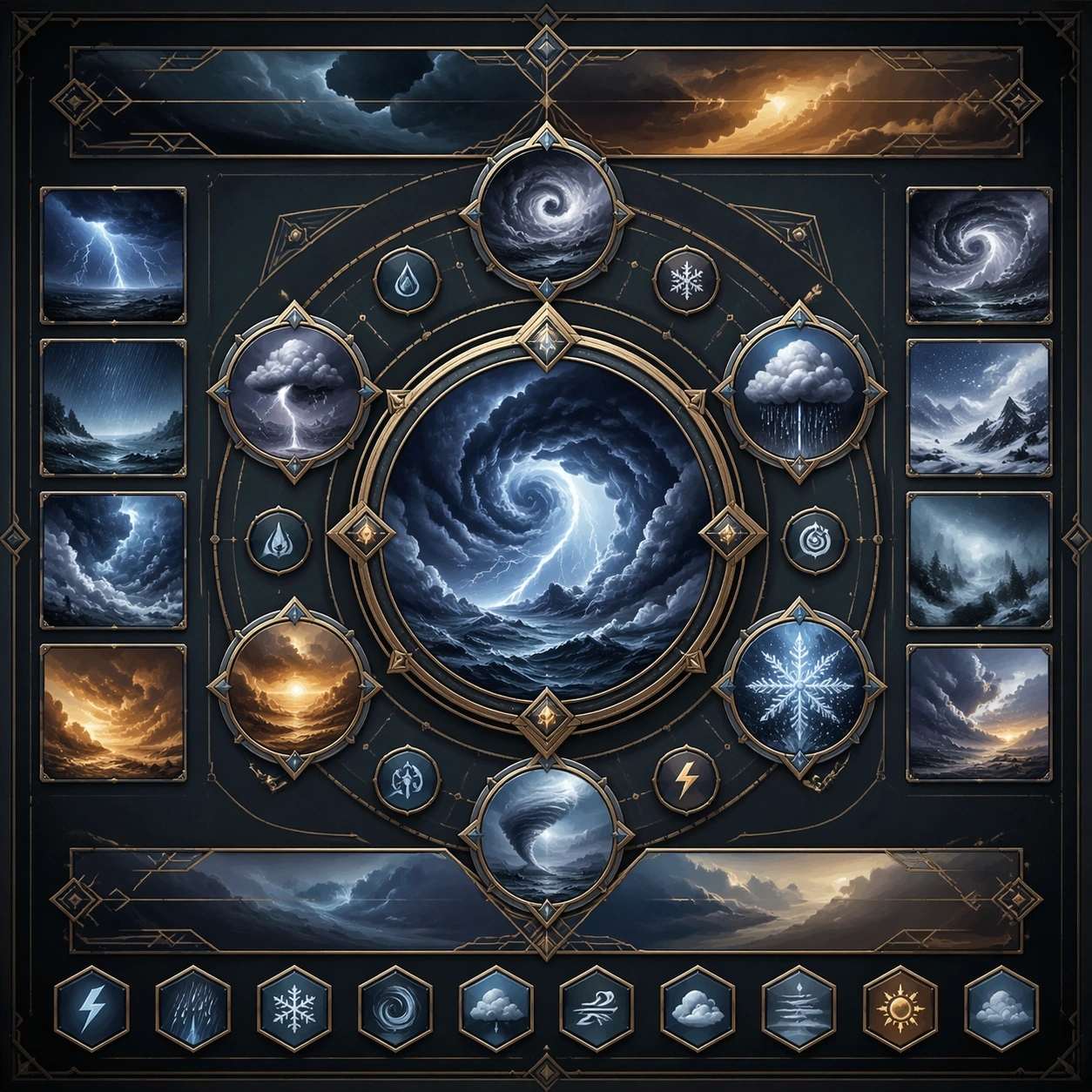
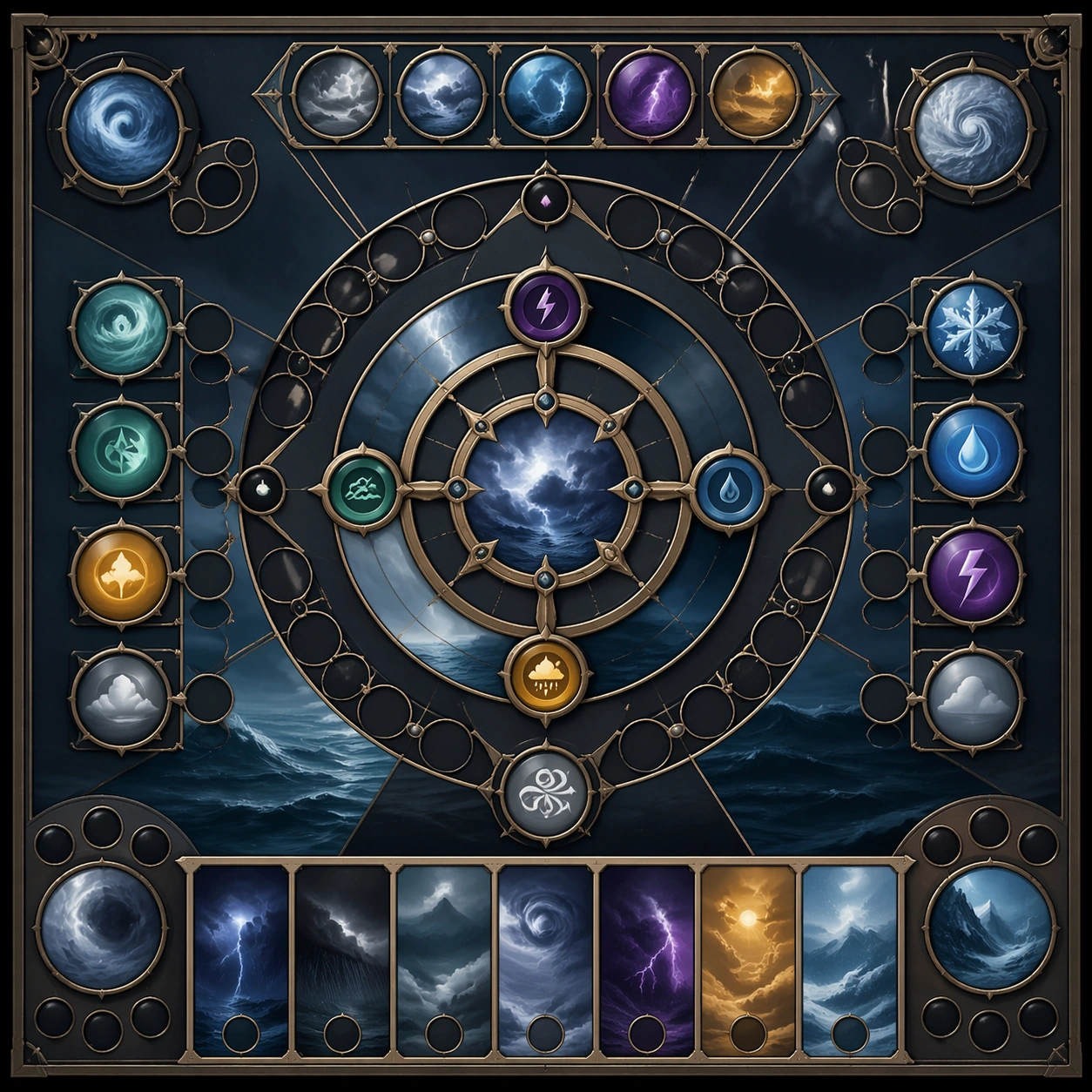
Example generated from “Storm And Weather Spectacle Series — Reference Anchor”
GPT Image 2en

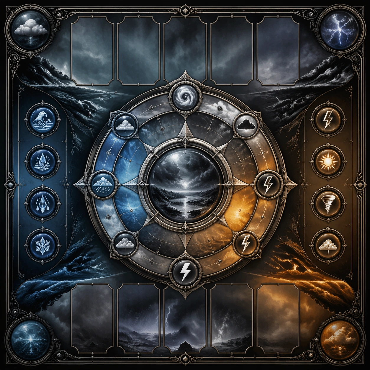
Scene: Create a square reference image for Storm and Weather Spectacle Series. Build a reference anchor establishing the core system with a premium, production-ready finish. Use a polished modular board or campaign surface with clean spacing, premium game-UI finish, and clear focal hierarchy. The composition should feel intentional, clean, and reusable for gallery, research, campaign, or internal handoff contexts. Lighting must support readability first, with the main forms clearly separated from the background and enough breathing room for the system to stay legible at both hero scale and thumbnail scale. Subject: Center a coherent original game-art system built for premium production and marketing surfaces. For this image, focus on reference anchor. Keep the same system logic stable across screenshots, cards, banners, and overview boards. This image is the canonical anchor that later series images must follow. The viewer should immediately understand what role this surface plays inside a cohesive game-production asset pack. Important details: Lock framing, icon grammar, palette blocking, and surface hierarchy so the kit feels production-ready and consistent. Preserve the core silhouette, framing language, and material logic from the reference image while each variation changes function. Keep materials believable, edge hierarchy disciplined, and the visual language consistent with Weather Spectacle. Use abstract interface blocks or diagram accents when helpful, but avoid any readable language. The final result should feel like a deliberate production asset rather than a random illustration. Use case: Storm and Weather Spectacle Series series study 1/9, designed as reference anchor within a cohesive asset pack. Constraints: No readable text, no watermark, no logos, preserve exact 1:1 aspect ratio, no unrelated objects, no broken visual hierarchy, no malformed anatomy or broken perspective, no random decorative clutter.

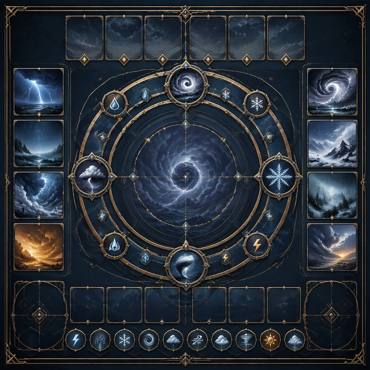
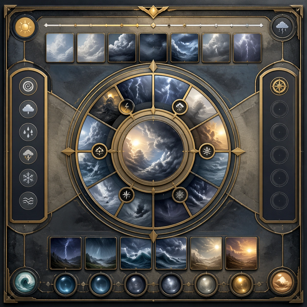
Example generated from “Storm And Weather Spectacle Series — Variant One”
GPT Image 2en

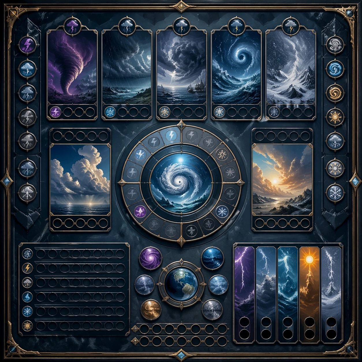
Scene: Create a square dependent image for Storm and Weather Spectacle Series. Build a first controlled variation in the same system with a premium, production-ready finish. Use a polished modular board or campaign surface with clean spacing, premium game-UI finish, and clear focal hierarchy. The composition should feel intentional, clean, and reusable for gallery, research, campaign, or internal handoff contexts. Lighting must support readability first, with the main forms clearly separated from the background and enough breathing room for the system to stay legible at both hero scale and thumbnail scale. Subject: Center a coherent original game-art system built for premium production and marketing surfaces. For this image, focus on the intended support surface. Keep the same system logic stable across screenshots, cards, banners, and overview boards. Preserve exact identity or system logic from the reference image while changing only the intended variation axis. The viewer should immediately understand what role this surface plays inside a cohesive game-production asset pack. Important details: Lock framing, icon grammar, palette blocking, and surface hierarchy so the kit feels production-ready and consistent. Preserve the core silhouette, framing language, and material logic from the reference image while each variation changes function. Keep materials believable, edge hierarchy disciplined, and the visual language consistent with Weather Spectacle. Use abstract interface blocks or diagram accents when helpful, but avoid any readable language. The final result should feel like a deliberate production asset rather than a random illustration. Use case: Storm and Weather Spectacle Series series study 2/9, designed as variant one within a cohesive asset pack. Constraints: No readable text, no watermark, no logos, preserve exact 1:1 aspect ratio, no unrelated objects, no broken visual hierarchy, no malformed anatomy or broken perspective, no random decorative clutter.

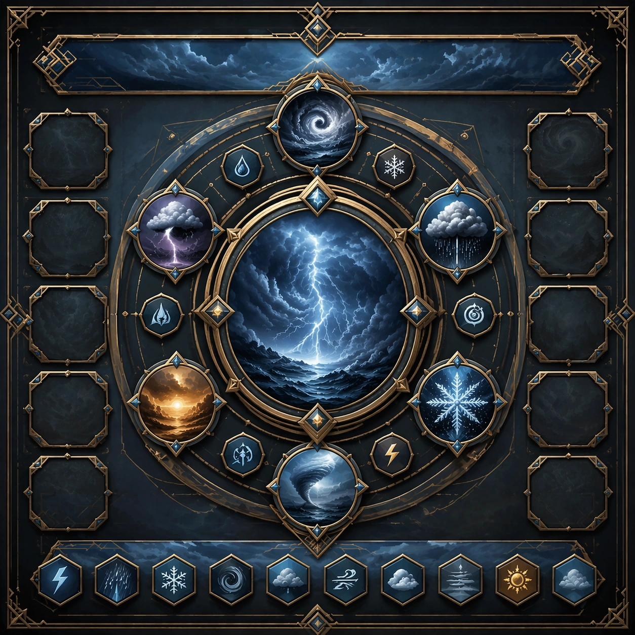
Example generated from “Storm And Weather Spectacle Series — Variant Two”
GPT Image 2en

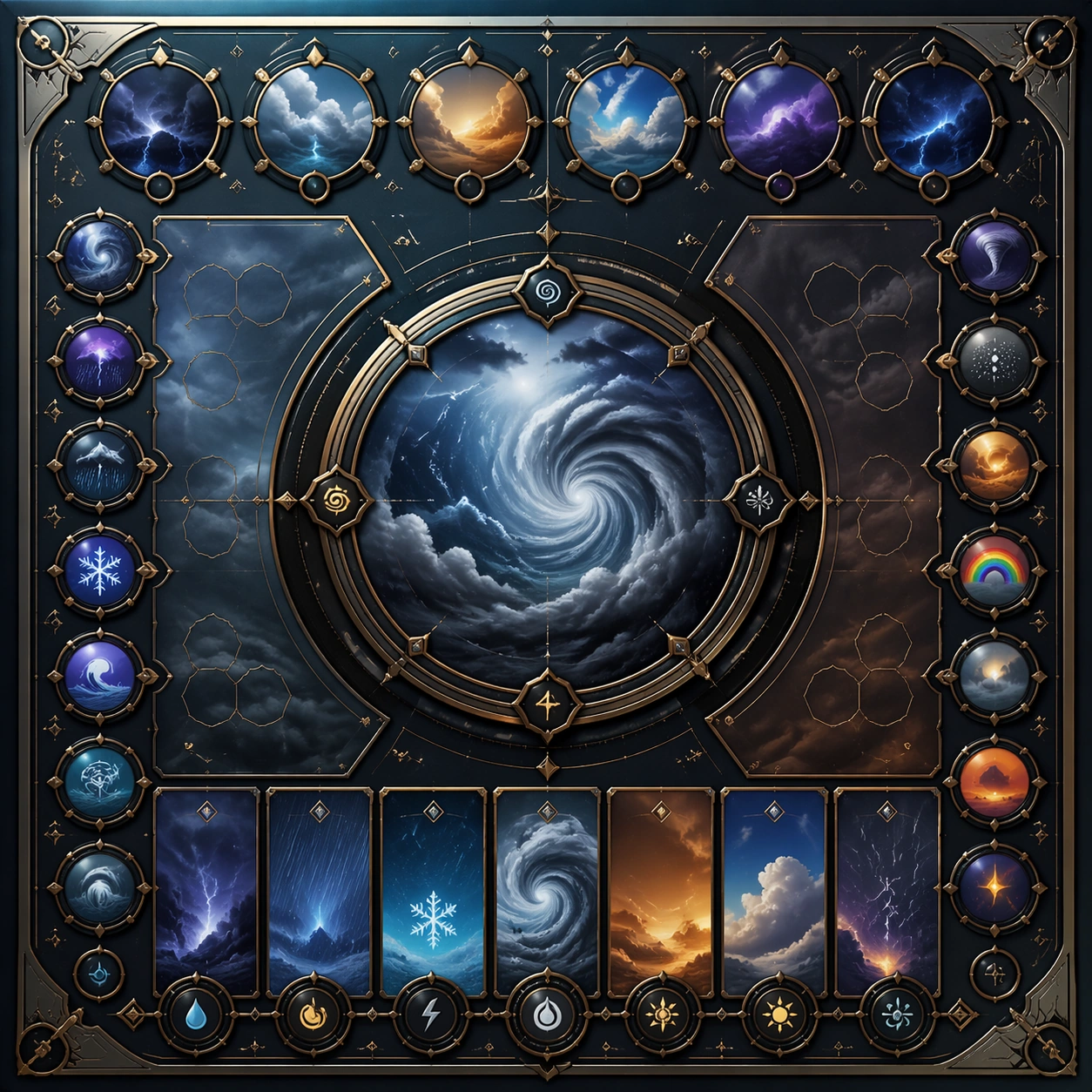
Scene: Create a square dependent image for Storm and Weather Spectacle Series. Build a second controlled variation in the same system with a premium, production-ready finish. Use a polished modular board or campaign surface with clean spacing, premium game-UI finish, and clear focal hierarchy. The composition should feel intentional, clean, and reusable for gallery, research, campaign, or internal handoff contexts. Lighting must support readability first, with the main forms clearly separated from the background and enough breathing room for the system to stay legible at both hero scale and thumbnail scale. Subject: Center a coherent original game-art system built for premium production and marketing surfaces. For this image, focus on the intended support surface. Keep the same system logic stable across screenshots, cards, banners, and overview boards. Preserve exact identity or system logic from the reference image while changing only the intended variation axis. The viewer should immediately understand what role this surface plays inside a cohesive game-production asset pack. Important details: Lock framing, icon grammar, palette blocking, and surface hierarchy so the kit feels production-ready and consistent. Preserve the core silhouette, framing language, and material logic from the reference image while each variation changes function. Keep materials believable, edge hierarchy disciplined, and the visual language consistent with Weather Spectacle. Use abstract interface blocks or diagram accents when helpful, but avoid any readable language. The final result should feel like a deliberate production asset rather than a random illustration. Use case: Storm and Weather Spectacle Series series study 3/9, designed as variant two within a cohesive asset pack. Constraints: No readable text, no watermark, no logos, preserve exact 1:1 aspect ratio, no unrelated objects, no broken visual hierarchy, no malformed anatomy or broken perspective, no random decorative clutter.

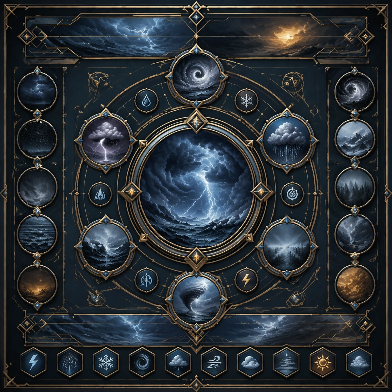
Example generated from “Storm And Weather Spectacle Series — Variant Three”
GPT Image 2en

Scene: Create a square dependent image for Storm and Weather Spectacle Series. Build a third controlled variation in the same system with a premium, production-ready finish. Use a polished modular board or campaign surface with clean spacing, premium game-UI finish, and clear focal hierarchy. The composition should feel intentional, clean, and reusable for gallery, research, campaign, or internal handoff contexts. Lighting must support readability first, with the main forms clearly separated from the background and enough breathing room for the system to stay legible at both hero scale and thumbnail scale. Subject: Center a coherent original game-art system built for premium production and marketing surfaces. For this image, focus on the intended support surface. Keep the same system logic stable across screenshots, cards, banners, and overview boards. Preserve exact identity or system logic from the reference image while changing only the intended variation axis. The viewer should immediately understand what role this surface plays inside a cohesive game-production asset pack. Important details: Lock framing, icon grammar, palette blocking, and surface hierarchy so the kit feels production-ready and consistent. Preserve the core silhouette, framing language, and material logic from the reference image while each variation changes function. Keep materials believable, edge hierarchy disciplined, and the visual language consistent with Weather Spectacle. Use abstract interface blocks or diagram accents when helpful, but avoid any readable language. The final result should feel like a deliberate production asset rather than a random illustration. Use case: Storm and Weather Spectacle Series series study 4/9, designed as variant three within a cohesive asset pack. Constraints: No readable text, no watermark, no logos, preserve exact 1:1 aspect ratio, no unrelated objects, no broken visual hierarchy, no malformed anatomy or broken perspective, no random decorative clutter.

Example generated from “Storm And Weather Spectacle Series — Support One”
GPT Image 2en

Scene: Create a square standalone support image for Storm and Weather Spectacle Series. Build a support-surface study with a clear focal hierarchy and a finished professional surface. Use a polished modular board or campaign surface with clean spacing, premium game-UI finish, and clear focal hierarchy. The frame should feel self-contained and polished, with enough structure to explain the system even without the reference series, yet still obviously belonging to the same theme and production world. Subject: Show a coherent original game-art system built for premium production and marketing surfaces in a way that emphasizes the intended support surface. Keep the same system logic stable across screenshots, cards, banners, and overview boards. Even though this image is independent, the viewer should still recognize the same universe, same commercial logic, and same production intent as the core package. Important details: Lock framing, icon grammar, palette blocking, and surface hierarchy so the kit feels production-ready and consistent. Preserve the broader theme language through color, framing, material choices, and modular composition. Use clean panel rhythm, premium asset presentation, and believable detail density. The image should work equally well as a gallery study, research reference, and mock production deliverable. Use case: Storm and Weather Spectacle Series single study 5/9, exploring support one as a support surface. Constraints: No readable text, no watermark, no logos, preserve exact 1:1 aspect ratio, no unrelated objects, no broken visual hierarchy, no visual noise that obscures the main surface, no accidental brand resemblance.

Example generated from “Storm And Weather Spectacle Series — Support Two”
GPT Image 2en

Scene: Create a square standalone support image for Storm and Weather Spectacle Series. Build a second support-surface study with a clear focal hierarchy and a finished professional surface. Use a polished modular board or campaign surface with clean spacing, premium game-UI finish, and clear focal hierarchy. The frame should feel self-contained and polished, with enough structure to explain the system even without the reference series, yet still obviously belonging to the same theme and production world. Subject: Show a coherent original game-art system built for premium production and marketing surfaces in a way that emphasizes the intended support surface. Keep the same system logic stable across screenshots, cards, banners, and overview boards. Even though this image is independent, the viewer should still recognize the same universe, same commercial logic, and same production intent as the core package. Important details: Lock framing, icon grammar, palette blocking, and surface hierarchy so the kit feels production-ready and consistent. Preserve the broader theme language through color, framing, material choices, and modular composition. Use clean panel rhythm, premium asset presentation, and believable detail density. The image should work equally well as a gallery study, research reference, and mock production deliverable. Use case: Storm and Weather Spectacle Series single study 6/9, exploring support two as a support surface. Constraints: No readable text, no watermark, no logos, preserve exact 1:1 aspect ratio, no unrelated objects, no broken visual hierarchy, no visual noise that obscures the main surface, no accidental brand resemblance.

Example generated from “Storm And Weather Spectacle Series — Support Three”
GPT Image 2en

Scene: Create a square standalone support image for Storm and Weather Spectacle Series. Build a third support-surface study with a clear focal hierarchy and a finished professional surface. Use a polished modular board or campaign surface with clean spacing, premium game-UI finish, and clear focal hierarchy. The frame should feel self-contained and polished, with enough structure to explain the system even without the reference series, yet still obviously belonging to the same theme and production world. Subject: Show a coherent original game-art system built for premium production and marketing surfaces in a way that emphasizes the intended support surface. Keep the same system logic stable across screenshots, cards, banners, and overview boards. Even though this image is independent, the viewer should still recognize the same universe, same commercial logic, and same production intent as the core package. Important details: Lock framing, icon grammar, palette blocking, and surface hierarchy so the kit feels production-ready and consistent. Preserve the broader theme language through color, framing, material choices, and modular composition. Use clean panel rhythm, premium asset presentation, and believable detail density. The image should work equally well as a gallery study, research reference, and mock production deliverable. Use case: Storm and Weather Spectacle Series single study 7/9, exploring support three as a support surface. Constraints: No readable text, no watermark, no logos, preserve exact 1:1 aspect ratio, no unrelated objects, no broken visual hierarchy, no visual noise that obscures the main surface, no accidental brand resemblance.

Example generated from “Storm And Weather Spectacle Series — Support Four”
GPT Image 2en

Scene: Create a square standalone support image for Storm and Weather Spectacle Series. Build a fourth support-surface study with a clear focal hierarchy and a finished professional surface. Use a polished modular board or campaign surface with clean spacing, premium game-UI finish, and clear focal hierarchy. The frame should feel self-contained and polished, with enough structure to explain the system even without the reference series, yet still obviously belonging to the same theme and production world. Subject: Show a coherent original game-art system built for premium production and marketing surfaces in a way that emphasizes the intended support surface. Keep the same system logic stable across screenshots, cards, banners, and overview boards. Even though this image is independent, the viewer should still recognize the same universe, same commercial logic, and same production intent as the core package. Important details: Lock framing, icon grammar, palette blocking, and surface hierarchy so the kit feels production-ready and consistent. Preserve the broader theme language through color, framing, material choices, and modular composition. Use clean panel rhythm, premium asset presentation, and believable detail density. The image should work equally well as a gallery study, research reference, and mock production deliverable. Use case: Storm and Weather Spectacle Series single study 8/9, exploring support four as a support surface. Constraints: No readable text, no watermark, no logos, preserve exact 1:1 aspect ratio, no unrelated objects, no broken visual hierarchy, no visual noise that obscures the main surface, no accidental brand resemblance.

Example generated from “Storm And Weather Spectacle Series — Support Five”
GPT Image 2en

Scene: Create a square standalone support image for Storm and Weather Spectacle Series. Build a fifth support-surface study with a clear focal hierarchy and a finished professional surface. Use a polished modular board or campaign surface with clean spacing, premium game-UI finish, and clear focal hierarchy. The frame should feel self-contained and polished, with enough structure to explain the system even without the reference series, yet still obviously belonging to the same theme and production world. Subject: Show a coherent original game-art system built for premium production and marketing surfaces in a way that emphasizes the intended support surface. Keep the same system logic stable across screenshots, cards, banners, and overview boards. Even though this image is independent, the viewer should still recognize the same universe, same commercial logic, and same production intent as the core package. Important details: Lock framing, icon grammar, palette blocking, and surface hierarchy so the kit feels production-ready and consistent. Preserve the broader theme language through color, framing, material choices, and modular composition. Use clean panel rhythm, premium asset presentation, and believable detail density. The image should work equally well as a gallery study, research reference, and mock production deliverable. Use case: Storm and Weather Spectacle Series single study 9/9, exploring support five as a support surface. Constraints: No readable text, no watermark, no logos, preserve exact 1:1 aspect ratio, no unrelated objects, no broken visual hierarchy, no visual noise that obscures the main surface, no accidental brand resemblance.

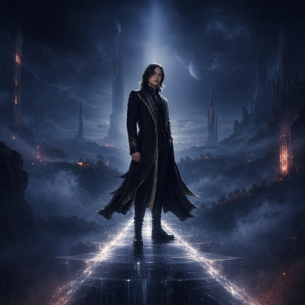
Example generated from “Streaming Banner And Canvas Promo Set — Reference Header World”
GPT Image 2en

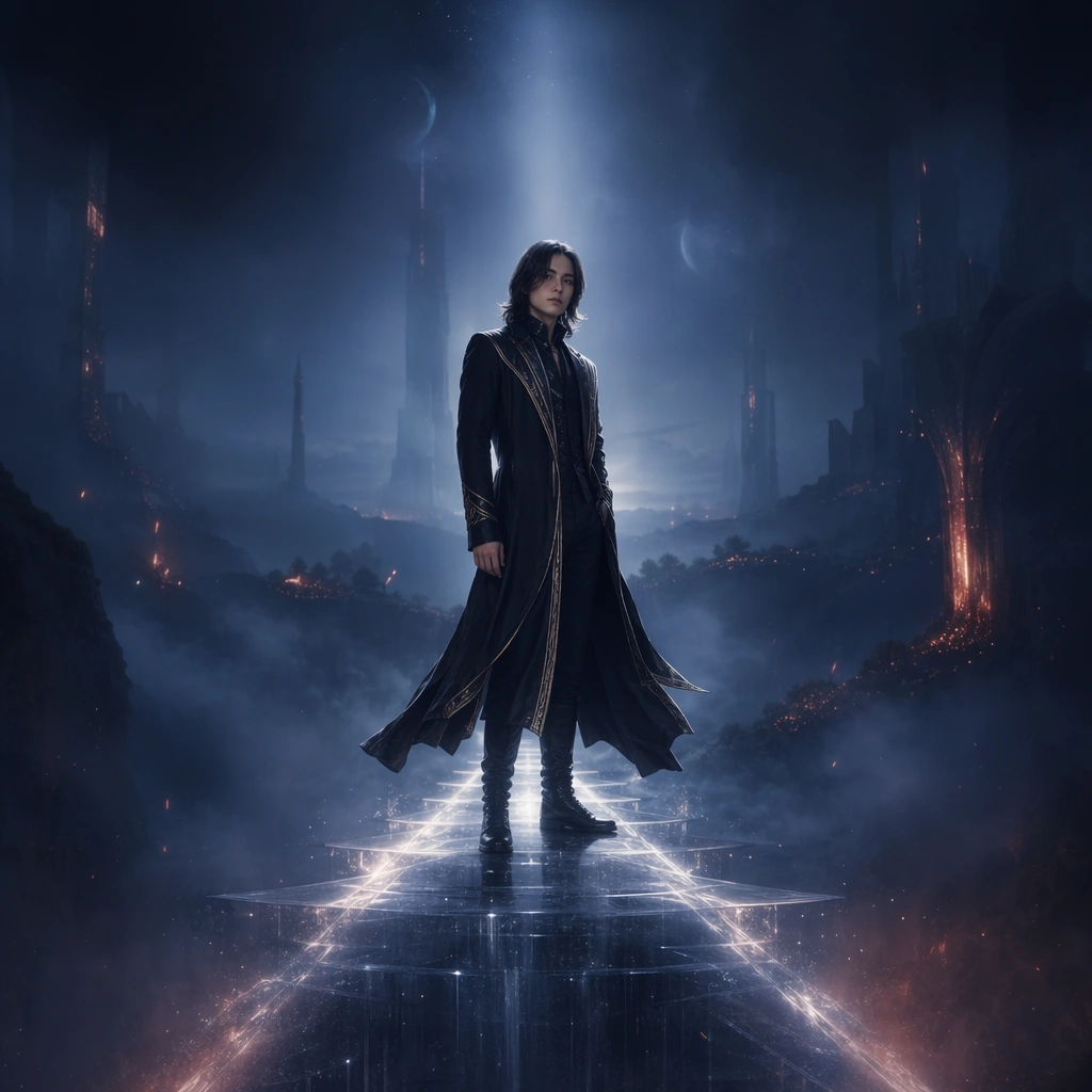
Scene: A square promotional hero frame designed to scale into streaming banner crops, with an invented performer standing on a narrow floating light bridge inside a deep atmospheric world of mist, soft spotlights, and layered distant architecture. The composition should feel cinematic and adaptable, with strong focal center and clear negative zones for later surface changes. Subject: The performer is an invented musician in a long dark coat with subtle metallic trim, shoulder-length straight hair, and a poised stance facing slightly toward camera. This reference image must lock the exact face, hair base, body proportions, coat silhouette, and floating-light environment so later promo images can preserve the same identity across different streaming surfaces. Important details: Think like a release-week platform takeover. The world should feel premium, atmospheric, and immediately ownable at both full size and reduced crops. Use one coherent palette of midnight blue, soft silver, and ember accents; keep the light bridge as a signature cue; and preserve enough empty edges to support future surface adaptation without adding readable platform UI or text. Use case: Streaming Promo series study 1/9 for the Streaming Banner and Canvas Promo Set Prompt Atlas theme. Constraints: No readable text, no watermark, no logos, preserve exact 1:1 aspect ratio, no crowd, no handheld microphone, no giant stage screens, no brand interface, no overloaded fantasy skyline, no extra performers
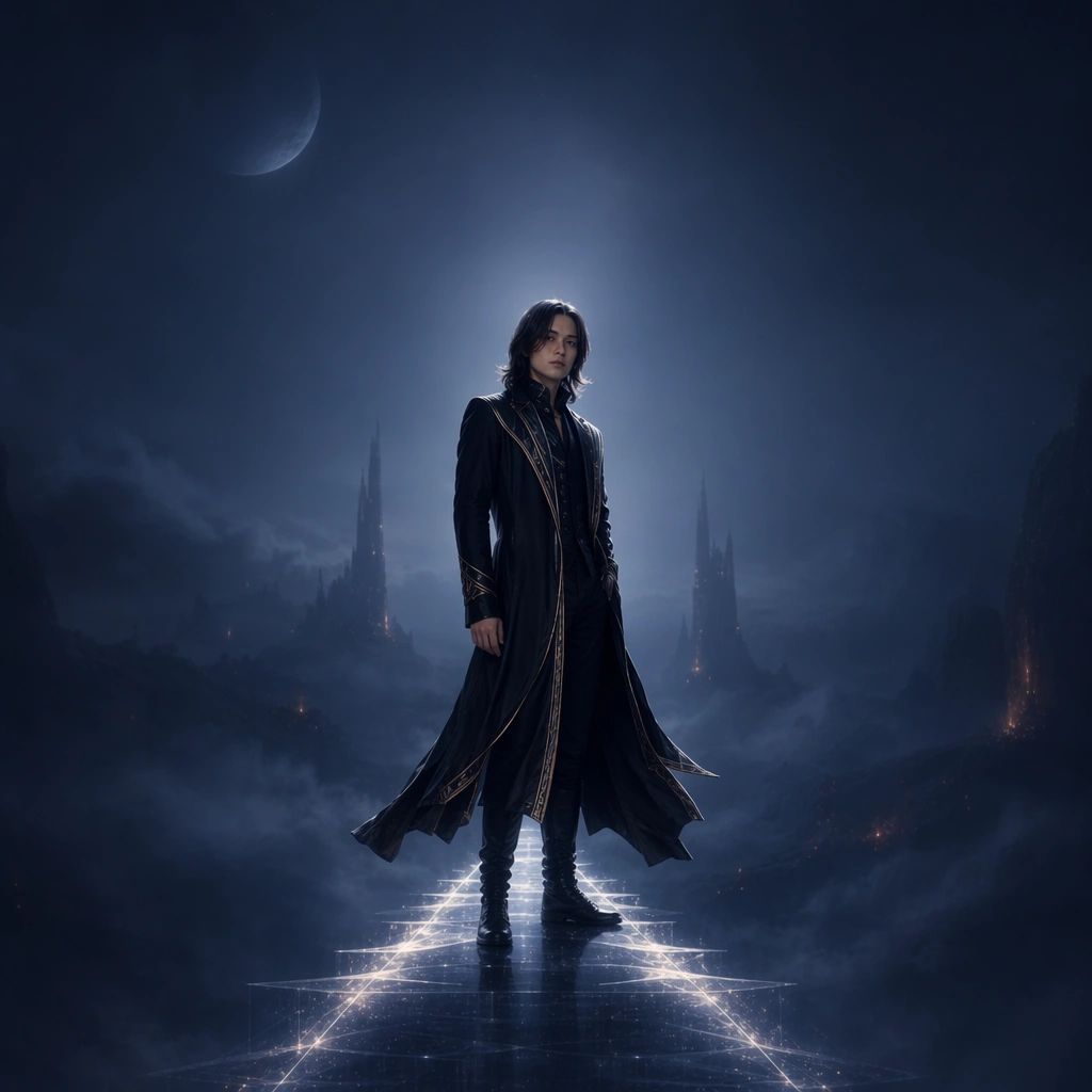
Example generated from “Streaming Banner And Canvas Promo Set — Canvas Loop Still”
GPT Image 2en

Scene: A square promo still in the same floating-bridge world, now cropped tighter and energized by drifting haze ribbons, faint motion blur in fabric edges, and stronger light pulses under the performer’s feet. The environment must remain unmistakably tied to the reference hero frame, just optimized for a looping surface mood. Subject: Preserve the exact same performer from the reference image, including face shape, hair base, body proportions, and long coat silhouette. The musician now turns slightly within the frame as if caught mid-loop, while the light bridge and mist layers remain the signature spatial anchors of the streaming campaign. Important details: This should feel like a believable canvas still from the same release system. Keep the color world, bridge geometry, and crop discipline consistent, but introduce subtle motion implication through fabric, haze, and light sweep. The image must remain clean enough for platform use and recognizably identical to the reference release identity. Use case: Streaming Promo series study 2/9 for the Streaming Banner and Canvas Promo Set Prompt Atlas theme. Constraints: No readable text, no watermark, no logos, preserve exact 1:1 aspect ratio, preserve the exact reference face, hair base, and body proportions; no extra characters, no fake playback controls, no chaotic particles, no lens warping, no bright daylight

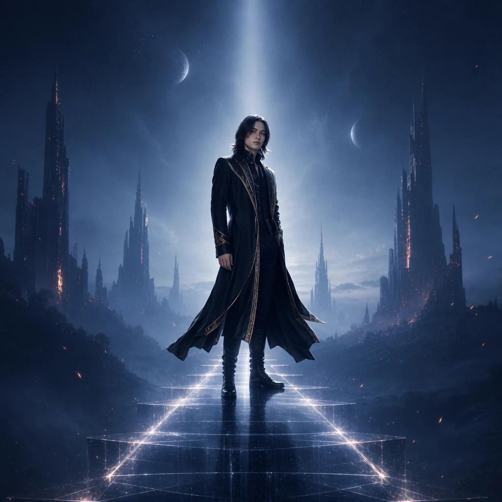
Example generated from “Streaming Banner And Canvas Promo Set — Profile Takeover Card”
GPT Image 2en

Scene: A square streaming promo card in the same atmospheric world, with the performer shifted slightly off center so the frame carries more negative space and cleaner silhouette edges. Mist, distant architecture, and the floating bridge remain present, but the composition is calmer and more interface-ready. Subject: Preserve the exact same performer from the reference image with identical face, hair base, body proportions, and coat silhouette. The artist stands in the same world and same mood, now framed to allow more breathing room and profile-surface adaptability while retaining the strong release identity established by the root image. Important details: The key is adaptability without dilution. Keep the same signature bridge cue, the same midnight palette, and the same atmospheric layering while simplifying the composition for profile-centric placement. It should feel like a streaming profile takeover asset that clearly belongs to one release campaign and one specific artist identity. Use case: Streaming Promo series study 3/9 for the Streaming Banner and Canvas Promo Set Prompt Atlas theme. Constraints: No readable text, no watermark, no logos, preserve exact 1:1 aspect ratio, preserve the exact reference face, hair base, and body proportions; no interface icons, no notification symbols, no crowd, no large props, no busy skyline detail

Example generated from “Streaming Banner And Canvas Promo Set — Discovery Promo Still”
GPT Image 2en

Scene: A square discovery-page promo still in the same floating-bridge world, now brighter in edge contrast and more graphic in silhouette so it reads immediately in a crowded browsing surface. The environment should remain familiar but slightly simplified, with signature light and mist cues supporting fast identification. Subject: Preserve the exact same performer from the reference image, maintaining the identical face shape, hair base, body proportions, and coat silhouette. The artist stays isolated against a slightly brighter atmospheric field, helping the profile and bridge motif read quickly without breaking the shared campaign world. Important details: This is the glance-speed adaptation of the same release language. Keep the world coherent, the silhouette legible, and the mood cinematic. The challenge is to simplify for discoverability without turning the image into a generic thumbnail. Signature cues from the reference must remain visible: floating bridge, cool mist, metallic trims, and disciplined negative space. Use case: Streaming Promo series study 4/9 for the Streaming Banner and Canvas Promo Set Prompt Atlas theme. Constraints: No readable text, no watermark, no logos, preserve exact 1:1 aspect ratio, preserve the exact reference face, hair base, and body proportions; no platform UI, no cluttered environment, no extra performers, no heavy effects fog, no random color shifts

Example generated from “Streaming Banner And Canvas Promo Set — Playlist Cover Board”
GPT Image 2en

Scene: A square design board presenting several playlist-cover style tiles arranged on a dark neutral ground, each using a related mood, portrait fragment, or atmospheric field. The board should look like a streaming-campaign workbench rather than an app screenshot, with careful spacing and premium visual polish. Subject: The subject is a family of compact promo tiles built around one imagined music release atmosphere: partial performer crops, environmental stills, light-bridge fragments, and abstract shape cues meant for browse surfaces. No tile needs readable text, but the family should feel coherent enough to belong to one release period. Important details: Prioritize small-format legibility, tone control, and system variation. The board should demonstrate how one release world can populate playlist and discovery surfaces without flattening into sameness. Use distinct but compatible crops, disciplined spacing, and enough atmospheric depth to preserve the music mood. Use case: Streaming Promo single study 5/9 for the Streaming Banner and Canvas Promo Set Prompt Atlas theme. Constraints: No readable text, no watermark, no logos, preserve exact 1:1 aspect ratio, no platform logos, no readable playlist titles, no software chrome, no extra lifestyle props, no crowded collage look

Example generated from “Streaming Banner And Canvas Promo Set — Listener Milestone Card”
GPT Image 2en

Scene: A square celebratory announcement card set against a deep atmospheric field with controlled sparks of light, portrait fragments, and soft metallic gradients. The frame should feel like a streaming milestone celebration surface while staying generic and platform-neutral. Subject: One invented musician appears through cropped portrait panels and silhouette fragments, surrounded by rings of light, confetti-like particles, and clean zones where future milestone numbers could sit. The card should communicate achievement and momentum without literal stats or readable copy. Important details: Keep it elegant rather than noisy. Use small bursts of light, subtle metallic edges, and a calm but optimistic palette shift within the established release mood. The composition should feel like a premium music announcement card intended for reposting across artist channels and profile surfaces. Use case: Streaming Promo single study 6/9 for the Streaming Banner and Canvas Promo Set Prompt Atlas theme. Constraints: No readable text, no watermark, no logos, preserve exact 1:1 aspect ratio, no readable numbers, no social app UI, no emoji language, no cheap party styling, no brand icons

Example generated from “Streaming Banner And Canvas Promo Set — Ambient Canvas Room”
GPT Image 2en

Scene: A square ambient room with shallow water reflections, floating light strips, and low mist, photographed as a still that could anchor a looping canvas mood. The environment should feel musical and platform-safe, with strong emotional atmosphere but no cluttered narrative action. Subject: The subject is the release environment itself rather than a person: light bridge fragments, fog, reflection, and architectural depth arranged into a calm but ownable promo surface. It should read instantly as part of a music campaign and leave clean space for later adaptation. Important details: This image tests environmental world-building for streaming surfaces. Keep geometry simple, reflections believable, and color disciplined. The mood should be immersive enough to feel tied to a specific release, but abstract enough to adapt across banners, loop stills, and profile takeovers. Use case: Streaming Promo single study 7/9 for the Streaming Banner and Canvas Promo Set Prompt Atlas theme. Constraints: No readable text, no watermark, no logos, preserve exact 1:1 aspect ratio, no furniture, no visible venue branding, no crowd, no bright rainbow color, no surreal objects breaking the calm world

Example generated from “Streaming Banner And Canvas Promo Set — Release Reminder Card”
GPT Image 2en

Scene: A square reminder-style card with a dark field, one centered musician silhouette, and a modular stack of non-readable bars and abstract countdown shapes. The design should feel crisp and repostable, built for release anticipation rather than narrative complexity. Subject: The subject is a clear promotional hierarchy: one portrait or silhouette, one strong ambient light cue, and a disciplined field of abstract modules where release information would eventually live. The image must feel native to music marketing while staying entirely non-branded and non-verbal. Important details: Keep the composition tight, easy to scan, and emotionally direct. Use large tonal contrast, one accent color, and carefully controlled spacing so the card can survive tiny crops. It should feel like a reminder surface for a streaming release, but not like a software notification or generic event flyer. Use case: Streaming Promo single study 8/9 for the Streaming Banner and Canvas Promo Set Prompt Atlas theme. Constraints: No readable text, no watermark, no logos, preserve exact 1:1 aspect ratio, no readable countdown numerals, no app interface, no bright busy gradient mesh, no extra props, no fake device mockup frames