PROMPTS · KREATIV ENTDECKEN

Prompt-Galerie

Echte Prompts und erzeugte Beispiele erkunden. Inspiration für Ihre nächste kreative Mission finden und den vollständigen Prompt kostenlos kopieren.

Beispiele
10,974
Modelle
17
Quellen
1277
10.974 Prompt-Beispiele · Seite 66 von 229
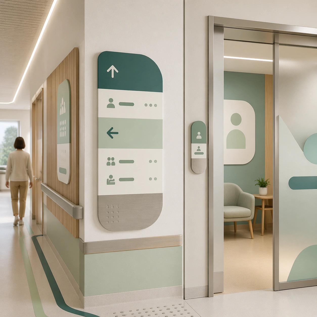
Example generated from “Clinic Brand And Interior Visual System — Wayfinding Wall Panel”
GPT Image 2en

Scene: A square interior wayfinding panel study for Clinic Brand and Interior Visual System. Compose it as a close architectural crop with wall graphics, corridor transitions, and one visible room threshold. Use a palette of mineral white, muted teal, pale sage, warm oak, and brushed aluminum, soft daylight with clean indirect reflections, and a mood of institutional calm, premium trust, and approachable warmth. The frame should feel like a real healthcare communication asset art-directed for professional delivery, not a stock photo, speculative concept render, or generic corporate template. Keep the camera distance, negative space, and depth cues disciplined so the image reads immediately even at thumbnail size. Subject: Center on a clinic hallway segment featuring abstract directional panels, room markers, frosted doors, floor lines, and calm overhead lighting. Show enough surrounding context that the viewer understands the intended service surface, user situation, and institutional setting. Every object, person, diagram, device crop, or spatial cue should support clarity, trust, and practical use. If people appear, keep them anonymous, natural, privacy-safe, and grounded in believable body language rather than promotional posing. Important details: Maintain a clinic identity system expressed through rounded geometry, hygienic materials, discreet wayfinding zones, and premium but practical detailing. Emphasize wayfinding hierarchy, accessible contrast, and how the same identity system scales across navigation surfaces. Use abstract icon shapes, color blocks, chart bars, interface modules, or non-legible placeholder microcopy whenever information structure is needed, but never readable text. Materials, spacing, lighting, and hierarchy should feel production-ready and healthcare-specific. Avoid generic lifestyle filler, decorative noise, or design gestures that do not reinforce the communication goal. Use case: Clinic Brand single study 3/9 for a signage system proposal board. Constraints: No readable text, no watermark, no logos, preserve exact 1:1 aspect ratio, no spa cliches, no chaotic emergency scenes, no futuristic medical hardware, no dirty or damaged surfaces, no long unreadable text columns, no visual clutter.
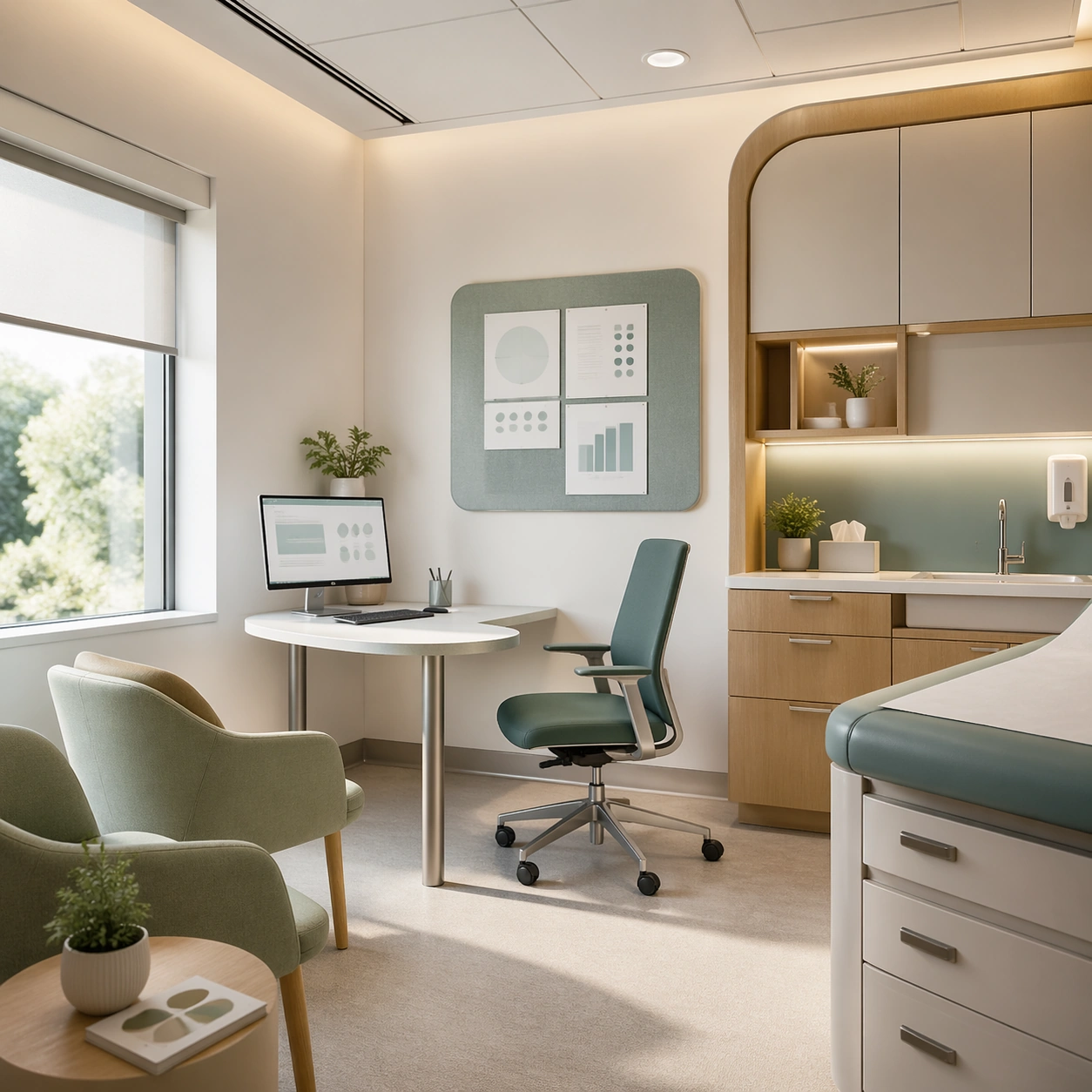
Example generated from “Clinic Brand And Interior Visual System — Consultation Room Overview”
GPT Image 2en

Scene: A square consultation-room interior study for Clinic Brand and Interior Visual System. Compose it from a slightly wide corner angle that reveals seating, exam surfaces, and patient-facing information zones. Use a palette of mineral white, muted teal, pale sage, warm oak, and brushed aluminum, soft daylight with clean indirect reflections, and a mood of institutional calm, premium trust, and approachable warmth. The frame should feel like a real healthcare communication asset art-directed for professional delivery, not a stock photo, speculative concept render, or generic corporate template. Keep the camera distance, negative space, and depth cues disciplined so the image reads immediately even at thumbnail size. Subject: Center on a private consultation room with a clinician chair, visitor seating, concealed storage, soft wall art, and gentle technology integration. Show enough surrounding context that the viewer understands the intended service surface, user situation, and institutional setting. Every object, person, diagram, device crop, or spatial cue should support clarity, trust, and practical use. If people appear, keep them anonymous, natural, privacy-safe, and grounded in believable body language rather than promotional posing. Important details: Maintain a clinic identity system expressed through rounded geometry, hygienic materials, discreet wayfinding zones, and premium but practical detailing. Keep the room believable, privacy-aware, and aligned with the clinic brand through color, materials, and small operational touches. Use abstract icon shapes, color blocks, chart bars, interface modules, or non-legible placeholder microcopy whenever information structure is needed, but never readable text. Materials, spacing, lighting, and hierarchy should feel production-ready and healthcare-specific. Avoid generic lifestyle filler, decorative noise, or design gestures that do not reinforce the communication goal. Use case: Clinic Brand single study 4/9 for a brochure spread for private care spaces. Constraints: No readable text, no watermark, no logos, preserve exact 1:1 aspect ratio, no spa cliches, no chaotic emergency scenes, no futuristic medical hardware, no dirty or damaged surfaces, no invasive procedure setup, no cold hospital harshness.

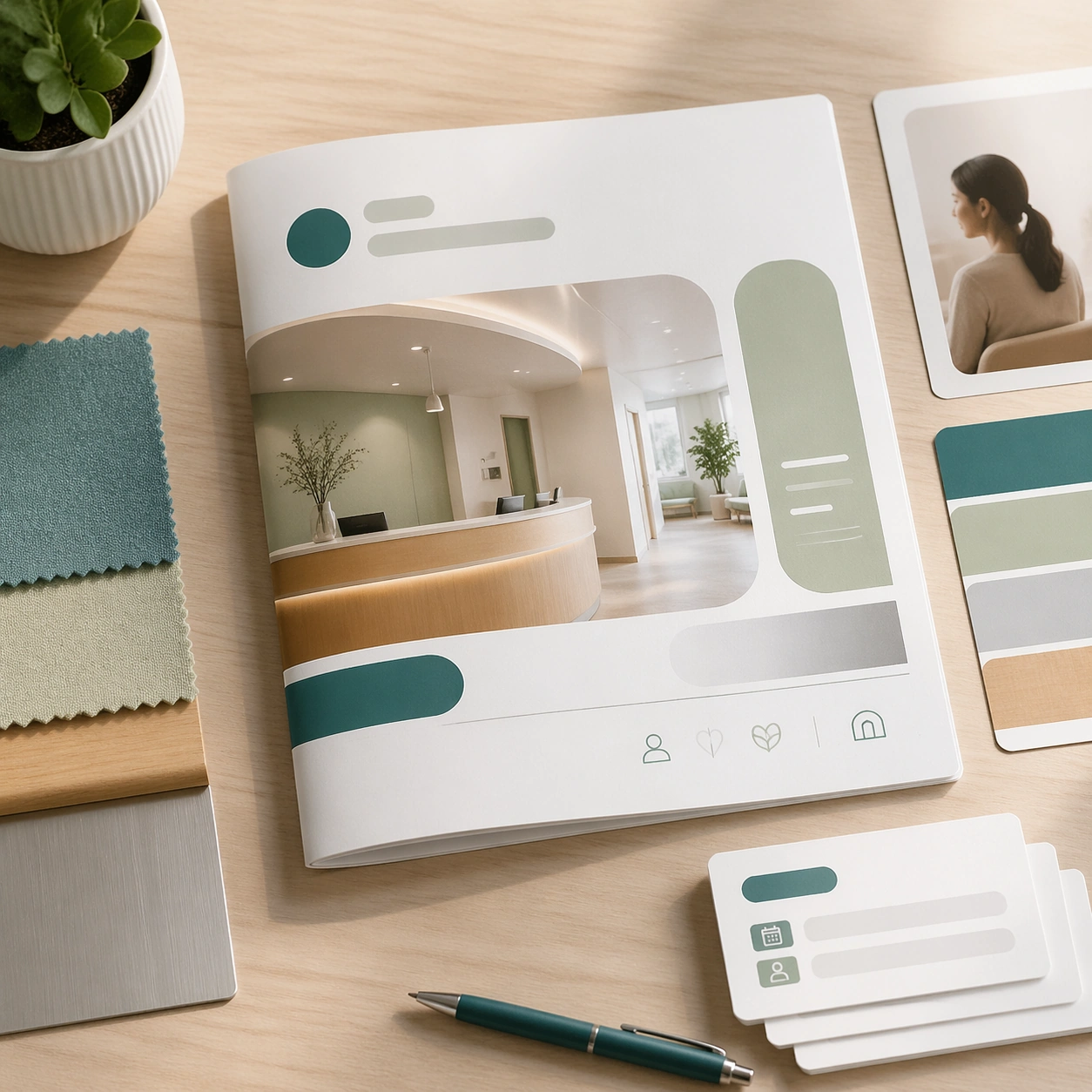
Example generated from “Clinic Brand And Interior Visual System — Doctor Intro Brochure Cover”
GPT Image 2en

Scene: A square printed brochure cover mockup for Clinic Brand and Interior Visual System. Compose it as a flat but dimensional print piece resting on a clean desk with supporting samples. Use a palette of mineral white, muted teal, pale sage, warm oak, and brushed aluminum, soft daylight with clean indirect reflections, and a mood of institutional calm, premium trust, and approachable warmth. The frame should feel like a real healthcare communication asset art-directed for professional delivery, not a stock photo, speculative concept render, or generic corporate template. Keep the camera distance, negative space, and depth cues disciplined so the image reads immediately even at thumbnail size. Subject: Center on a folded clinic brochure cover paired with appointment cards, a pen, fabric swatches, and a subtle portrait placeholder panel. Show enough surrounding context that the viewer understands the intended service surface, user situation, and institutional setting. Every object, person, diagram, device crop, or spatial cue should support clarity, trust, and practical use. If people appear, keep them anonymous, natural, privacy-safe, and grounded in believable body language rather than promotional posing. Important details: Maintain a clinic identity system expressed through rounded geometry, hygienic materials, discreet wayfinding zones, and premium but practical detailing. Use abstract photo windows and non-legible text bars to suggest editorial hierarchy while preserving a premium healthcare tone. Use abstract icon shapes, color blocks, chart bars, interface modules, or non-legible placeholder microcopy whenever information structure is needed, but never readable text. Materials, spacing, lighting, and hierarchy should feel production-ready and healthcare-specific. Avoid generic lifestyle filler, decorative noise, or design gestures that do not reinforce the communication goal. Use case: Clinic Brand single study 5/9 for a brand brochure cover and collateral preview. Constraints: No readable text, no watermark, no logos, preserve exact 1:1 aspect ratio, no spa cliches, no chaotic emergency scenes, no futuristic medical hardware, no dirty or damaged surfaces, no fashion-magazine styling, no excessive props.

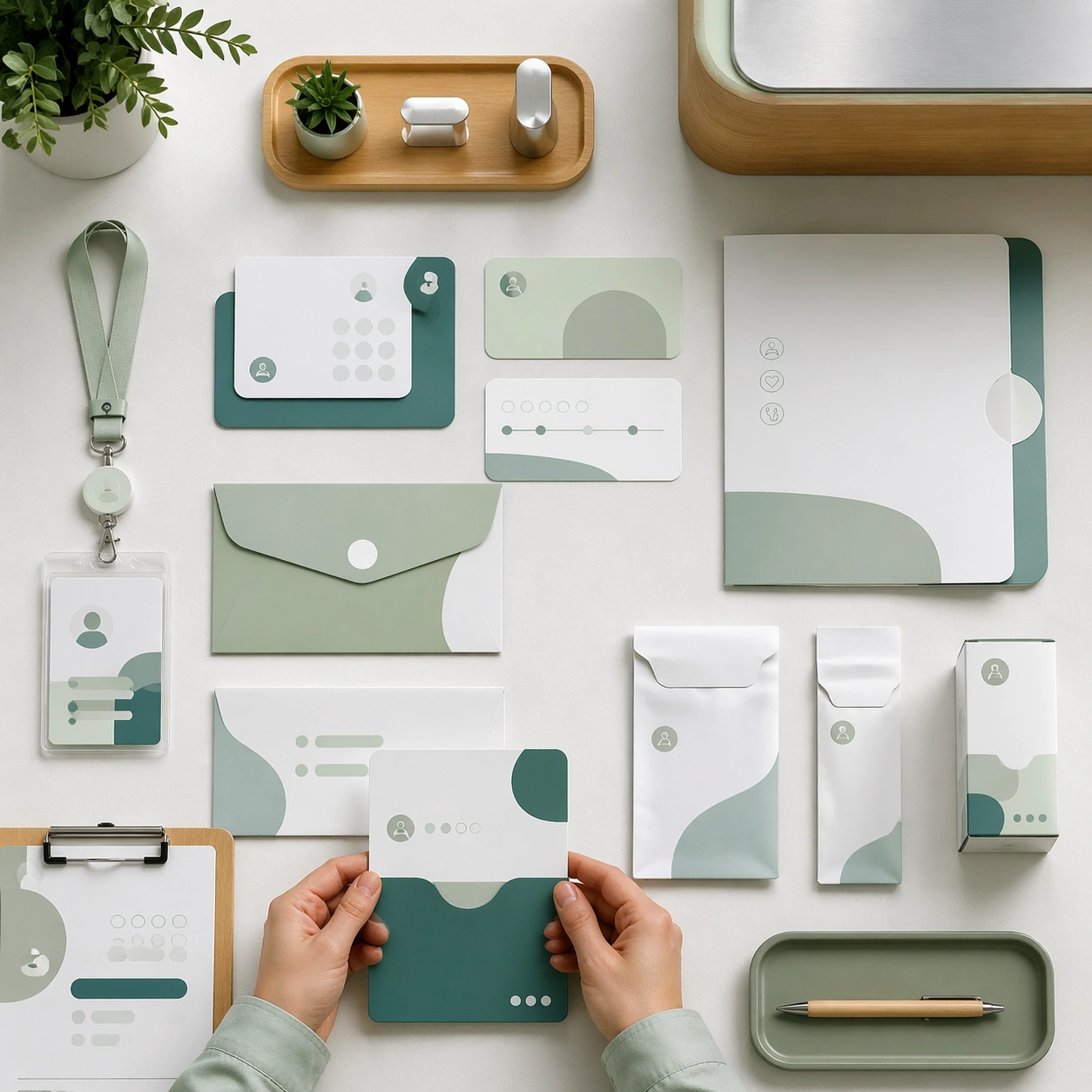
Example generated from “Clinic Brand And Interior Visual System — Stationery and Badge Flatlay”
GPT Image 2en

Scene: A square operational collateral flatlay for Clinic Brand and Interior Visual System. Compose it from directly above with deliberate spacing between every item. Use a palette of mineral white, muted teal, pale sage, warm oak, and brushed aluminum, soft daylight with clean indirect reflections, and a mood of institutional calm, premium trust, and approachable warmth. The frame should feel like a real healthcare communication asset art-directed for professional delivery, not a stock photo, speculative concept render, or generic corporate template. Keep the camera distance, negative space, and depth cues disciplined so the image reads immediately even at thumbnail size. Subject: Center on a coordinated set of appointment cards, envelopes, badge holders, prescription sleeves, a folder, and a small product carton. Show enough surrounding context that the viewer understands the intended service surface, user situation, and institutional setting. Every object, person, diagram, device crop, or spatial cue should support clarity, trust, and practical use. If people appear, keep them anonymous, natural, privacy-safe, and grounded in believable body language rather than promotional posing. Important details: Maintain a clinic identity system expressed through rounded geometry, hygienic materials, discreet wayfinding zones, and premium but practical detailing. Make the system feel ready for daily clinic operations, with cohesive colors, materials, and restrained iconography. Use abstract icon shapes, color blocks, chart bars, interface modules, or non-legible placeholder microcopy whenever information structure is needed, but never readable text. Materials, spacing, lighting, and hierarchy should feel production-ready and healthcare-specific. Avoid generic lifestyle filler, decorative noise, or design gestures that do not reinforce the communication goal. Use case: Clinic Brand single study 6/9 for a stationery and onboarding asset sheet. Constraints: No readable text, no watermark, no logos, preserve exact 1:1 aspect ratio, no spa cliches, no chaotic emergency scenes, no futuristic medical hardware, no dirty or damaged surfaces, no luxury-brand excess, no readable printed copy.

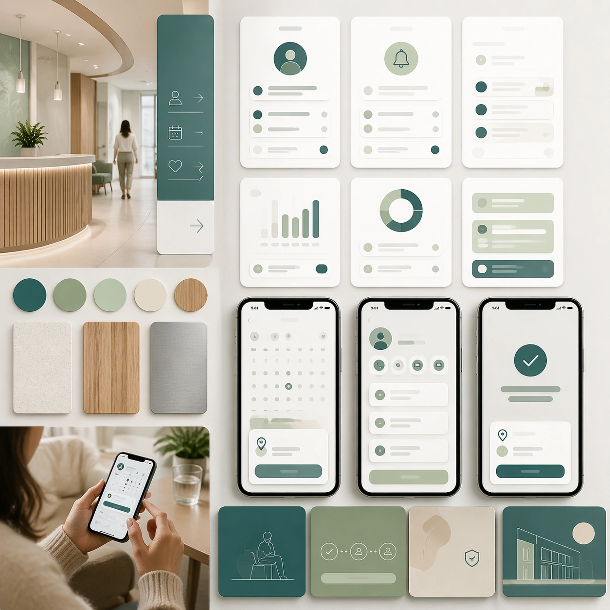
Example generated from “Clinic Brand And Interior Visual System — Appointment App Screen Board”
GPT Image 2en

Scene: A square digital interface concept board for Clinic Brand and Interior Visual System. Compose it as a tidy screen mockup array integrated with real material samples and a device crop. Use a palette of mineral white, muted teal, pale sage, warm oak, and brushed aluminum, soft daylight with clean indirect reflections, and a mood of institutional calm, premium trust, and approachable warmth. The frame should feel like a real healthcare communication asset art-directed for professional delivery, not a stock photo, speculative concept render, or generic corporate template. Keep the camera distance, negative space, and depth cues disciplined so the image reads immediately even at thumbnail size. Subject: Center on mobile appointment screens, reminder modules, profile cards, and check-in states translated into calm healthcare UI tiles. Show enough surrounding context that the viewer understands the intended service surface, user situation, and institutional setting. Every object, person, diagram, device crop, or spatial cue should support clarity, trust, and practical use. If people appear, keep them anonymous, natural, privacy-safe, and grounded in believable body language rather than promotional posing. Important details: Maintain a clinic identity system expressed through rounded geometry, hygienic materials, discreet wayfinding zones, and premium but practical detailing. Keep interface blocks realistic, highly legible in structure, and visibly tied back to the same clinic brand system. Use abstract icon shapes, color blocks, chart bars, interface modules, or non-legible placeholder microcopy whenever information structure is needed, but never readable text. Materials, spacing, lighting, and hierarchy should feel production-ready and healthcare-specific. Avoid generic lifestyle filler, decorative noise, or design gestures that do not reinforce the communication goal. Use case: Clinic Brand single study 7/9 for a digital touchpoint extension board. Constraints: No readable text, no watermark, no logos, preserve exact 1:1 aspect ratio, no spa cliches, no chaotic emergency scenes, no futuristic medical hardware, no dirty or damaged surfaces, no futuristic dashboard overload, no obvious consumer-tech branding.

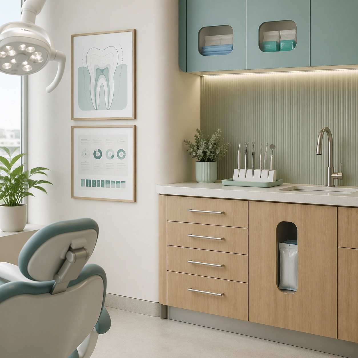
Example generated from “Clinic Brand And Interior Visual System — Specialty Room Brand Crop”
GPT Image 2en

Scene: A square specialty-room environmental detail for Clinic Brand and Interior Visual System. Compose it as a tighter crop focused on one branded treatment room corner with depth and texture. Use a palette of mineral white, muted teal, pale sage, warm oak, and brushed aluminum, soft daylight with clean indirect reflections, and a mood of institutional calm, premium trust, and approachable warmth. The frame should feel like a real healthcare communication asset art-directed for professional delivery, not a stock photo, speculative concept render, or generic corporate template. Keep the camera distance, negative space, and depth cues disciplined so the image reads immediately even at thumbnail size. Subject: Center on a dermatology or dental treatment space with cabinetry, task lighting, soft accent color, framed diagrams, and clean instrument storage. Show enough surrounding context that the viewer understands the intended service surface, user situation, and institutional setting. Every object, person, diagram, device crop, or spatial cue should support clarity, trust, and practical use. If people appear, keep them anonymous, natural, privacy-safe, and grounded in believable body language rather than promotional posing. Important details: Maintain a clinic identity system expressed through rounded geometry, hygienic materials, discreet wayfinding zones, and premium but practical detailing. Show how specialty cues can appear without changing the overall identity language or making the room feel intimidating. Use abstract icon shapes, color blocks, chart bars, interface modules, or non-legible placeholder microcopy whenever information structure is needed, but never readable text. Materials, spacing, lighting, and hierarchy should feel production-ready and healthcare-specific. Avoid generic lifestyle filler, decorative noise, or design gestures that do not reinforce the communication goal. Use case: Clinic Brand single study 8/9 for a specialty service page supporting image. Constraints: No readable text, no watermark, no logos, preserve exact 1:1 aspect ratio, no spa cliches, no chaotic emergency scenes, no futuristic medical hardware, no dirty or damaged surfaces, no graphic tools, no patient in procedure.

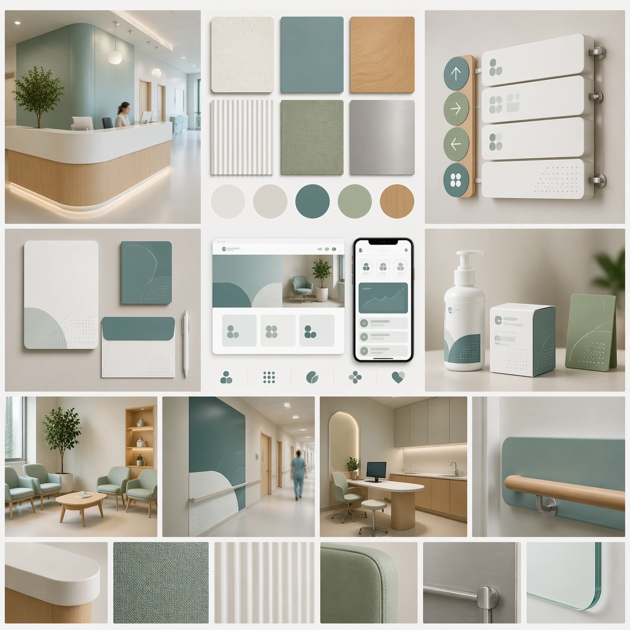
Example generated from “Clinic Brand And Interior Visual System — Brand Guideline Material Board”
GPT Image 2en

Scene: A square brand guideline material board for Clinic Brand and Interior Visual System. Compose it as a square presentation board with samples, mini mockups, and environmental crops arranged in a crisp grid. Use a palette of mineral white, muted teal, pale sage, warm oak, and brushed aluminum, soft daylight with clean indirect reflections, and a mood of institutional calm, premium trust, and approachable warmth. The frame should feel like a real healthcare communication asset art-directed for professional delivery, not a stock photo, speculative concept render, or generic corporate template. Keep the camera distance, negative space, and depth cues disciplined so the image reads immediately even at thumbnail size. Subject: Center on material chips, color swatches, signage fragments, packaging details, web module previews, and spatial reference photos from the same clinic identity. Show enough surrounding context that the viewer understands the intended service surface, user situation, and institutional setting. Every object, person, diagram, device crop, or spatial cue should support clarity, trust, and practical use. If people appear, keep them anonymous, natural, privacy-safe, and grounded in believable body language rather than promotional posing. Important details: Maintain a clinic identity system expressed through rounded geometry, hygienic materials, discreet wayfinding zones, and premium but practical detailing. The board should read as a complete operating system for healthcare branding rather than a loose mood board. Use abstract icon shapes, color blocks, chart bars, interface modules, or non-legible placeholder microcopy whenever information structure is needed, but never readable text. Materials, spacing, lighting, and hierarchy should feel production-ready and healthcare-specific. Avoid generic lifestyle filler, decorative noise, or design gestures that do not reinforce the communication goal. Use case: Clinic Brand single study 9/9 for a final brand system summary board. Constraints: No readable text, no watermark, no logos, preserve exact 1:1 aspect ratio, no spa cliches, no chaotic emergency scenes, no futuristic medical hardware, no dirty or damaged surfaces, no random inspiration scraps, no off-theme luxury cues.

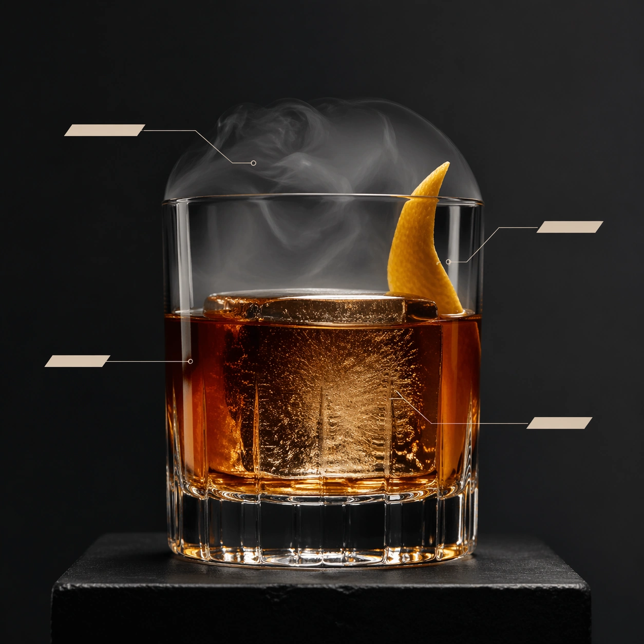
Example generated from “Cocktail Anatomy Editorial — Editorial Old Fashioned Anchor”
GPT Image 2en

Scene: Create a square premium editorial cocktail photograph with Scandinavian restraint: the glass sits against a dark or neutral studio backdrop, lit with crisp directional light that reveals liquid clarity, condensation, and the shape of the vessel. The composition should leave clean space for anatomy-like annotation structures. Any diagram devices must stay abstract, minimal, and completely unreadable. Center a low heavy glass on a dark matte pedestal with generous negative space around it, using cool neutral studio light and a faint warm edge highlight to model the liquid. Thin annotation leaders and blank callout tabs should orbit the glass with clean spacing, like a high-end editorial layout. Subject: Show an amber stirred cocktail with one large clear ice cube, a restrained citrus twist, and a lifted smoke dome or lingering smoke veil. The glass should feel expensive and weighty, with clear optical distortion through the liquid and ice. The anatomy-callout system must point toward liquid layer, ice core, garnish twist, and smoke volume without using any readable words. Important details: The work should feel like a luxury magazine spread translated into one square frame, where product photography and information design cooperate without becoming cluttered. Glass thickness, ice clarity, citrus oils, bubbles, smoke, and liquid layering all need to feel physically accurate. Hairline leader lines may terminate in blank bars or geometric tabs, but never readable labels. This first image establishes the editorial anatomy grammar for the series, so callout spacing, leader-line weight, glass scale, and lighting family must feel precise and repeatable. Smoke should remain semi-transparent, the ice should show subtle internal bubbles, and the callouts must stay elegant rather than technical or crowded. Use case: Cocktail anatomy editorial series study 1/9, defining the anchor layout for diagrammed bar photography. Constraints: No readable text, no watermark, no logos, preserve exact 1:1 aspect ratio, no menu typography, no neon nightclub clutter, no brand bottle labels, no bar receipt props, no visible trademarks, no bottle in frame, no readable magazine masthead, no heavy infographic clutter.

Example generated from “Cocktail Anatomy Editorial — Martini Cutaway”
GPT Image 2en

Scene: Create a square premium editorial cocktail photograph with Scandinavian restraint: the glass sits against a dark or neutral studio backdrop, lit with crisp directional light that reveals liquid clarity, condensation, and the shape of the vessel. The composition should leave clean space for anatomy-like annotation structures. Any diagram devices must stay abstract, minimal, and completely unreadable. Keep the exact centered layout, leader-line grammar, negative-space balance, and restrained studio lighting from the reference image so the editorial system stays instantly recognizable. The background should remain minimal and dark-neutral, with only soft gradients separating the glass from the field. Subject: Feature a chilled martini-style stemmed glass with pale transparent liquid, a long olive or citrus garnish, and a visible frost ring near the upper bowl. Hairline annotation leaders should point toward the glass lip, chill haze, garnish suspension, and the meniscus of the drink. The glass should read as razor-clean and architectural. Important details: The work should feel like a luxury magazine spread translated into one square frame, where product photography and information design cooperate without becoming cluttered. Glass thickness, ice clarity, citrus oils, bubbles, smoke, and liquid layering all need to feel physically accurate. Hairline leader lines may terminate in blank bars or geometric tabs, but never readable labels. Preserve exact layout, callout spacing, and camera height from the reference model while only changing the vessel family and the material cues of chill and clarity. The stem, rim, and liquid meniscus must feel crisp, and the abstract callout shapes should stay elegant and unreadable. Use case: Cocktail anatomy editorial series study 2/9, translating the anchor layout into a chilled martini profile. Constraints: No readable text, no watermark, no logos, preserve exact 1:1 aspect ratio, no menu typography, no neon nightclub clutter, no brand bottle labels, no bar receipt props, no visible trademarks, no olive-brine mess, no nightclub blue lighting, no readable etched glass text.

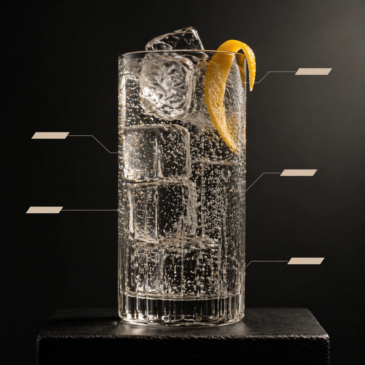
Example generated from “Cocktail Anatomy Editorial — Highball Carbonation Diagram”
GPT Image 2en

Scene: Create a square premium editorial cocktail photograph with Scandinavian restraint: the glass sits against a dark or neutral studio backdrop, lit with crisp directional light that reveals liquid clarity, condensation, and the shape of the vessel. The composition should leave clean space for anatomy-like annotation structures. Any diagram devices must stay abstract, minimal, and completely unreadable. Maintain the exact centered composition, annotation grammar, and premium restraint from the reference image, but use a taller glass and slightly brighter side light so carbonation remains visible. The background should stay minimal and soft enough that the bubbles and ice become the active visual detail. Subject: Show a clear or lightly tinted highball in a tall glass packed with stacked ice and a slim citrus garnish. Tiny streams of carbonation should rise through the liquid, while leader lines point toward bubble columns, ice faces, garnish bend, and condensation paths. The scene should feel refreshing, exact, and diagrammed without becoming corporate. Important details: The work should feel like a luxury magazine spread translated into one square frame, where product photography and information design cooperate without becoming cluttered. Glass thickness, ice clarity, citrus oils, bubbles, smoke, and liquid layering all need to feel physically accurate. Hairline leader lines may terminate in blank bars or geometric tabs, but never readable labels. Preserve exact layout rhythm, callout weight, and studio tone from the reference model while shifting the hero to sparkle and verticality. Carbonation needs believable scale variation, the ice should feel cold and transparent, and every diagram accent must stay abstract and label-free. Use case: Cocktail anatomy editorial series study 3/9, converting the anchor system into a carbonation-focused highball page. Constraints: No readable text, no watermark, no logos, preserve exact 1:1 aspect ratio, no menu typography, no neon nightclub clutter, no brand bottle labels, no bar receipt props, no visible trademarks, no soda-ad cliche styling, no readable bottle labels, no fruit pile garnish.

Example generated from “Cocktail Anatomy Editorial — Smoke Dome Negroni”
GPT Image 2en

Scene: Create a square premium editorial cocktail photograph with Scandinavian restraint: the glass sits against a dark or neutral studio backdrop, lit with crisp directional light that reveals liquid clarity, condensation, and the shape of the vessel. The composition should leave clean space for anatomy-like annotation structures. Any diagram devices must stay abstract, minimal, and completely unreadable. Use the same centered editorial stage, blank callout bars, and restrained lighting family from the reference image, but allow a lifted glass dome or drifting smoke volume to create a second large form around the drink. The backdrop must remain clean so the transparent layers stay readable. Subject: Present a ruby-toned stirred cocktail in a low glass with one large clear cube and a curled peel, partially wrapped by a glass dome and a fading smoke plume. Callout leaders should point toward the smoke edge, the ice core, the citrus oil zone, and the liquid body. The whole scene should feel like an upscale spirits magazine cutaway translated into abstract visual language. Important details: The work should feel like a luxury magazine spread translated into one square frame, where product photography and information design cooperate without becoming cluttered. Glass thickness, ice clarity, citrus oils, bubbles, smoke, and liquid layering all need to feel physically accurate. Hairline leader lines may terminate in blank bars or geometric tabs, but never readable labels. Preserve exact layout spacing, callout grammar, and camera height from the reference model while increasing atmospheric complexity. Smoke must feel semi-transparent and volumetric, not opaque fog, and the ruby liquid should remain luminous around the ice. Use case: Cocktail anatomy editorial series study 4/9, closing the anchor system with a smoked ruby cocktail. Constraints: No readable text, no watermark, no logos, preserve exact 1:1 aspect ratio, no menu typography, no neon nightclub clutter, no brand bottle labels, no bar receipt props, no visible trademarks, no brand bottle hero, no busy back bar reflections, no readable callout text.

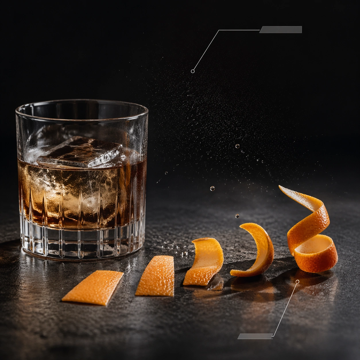
Example generated from “Cocktail Anatomy Editorial — Citrus Peel Mechanics”
GPT Image 2en

Scene: Create a square premium editorial cocktail photograph with Scandinavian restraint: the glass sits against a dark or neutral studio backdrop, lit with crisp directional light that reveals liquid clarity, condensation, and the shape of the vessel. The composition should leave clean space for anatomy-like annotation structures. Any diagram devices must stay abstract, minimal, and completely unreadable. Use a square close editorial setup on a dark stone or brushed metal surface with clean directional light and plenty of empty space. The image should feel like a magazine detail spread, not a casual garnish-prep shot. Subject: Show several precisely cut citrus peels at different stages of twist and expression beside a half-finished lowball glass. A few tiny oil droplets should catch the light midair or on the surface, while one hairline leader points toward the peel curl and another toward the mist of oil. The scene should celebrate garnish engineering through restraint. Important details: The work should feel like a luxury magazine spread translated into one square frame, where product photography and information design cooperate without becoming cluttered. Glass thickness, ice clarity, citrus oils, bubbles, smoke, and liquid layering all need to feel physically accurate. Hairline leader lines may terminate in blank bars or geometric tabs, but never readable labels. Peel thickness, pore texture, and oil sparkle must feel real and high-end. The callout grammar should stay minimal so the viewer reads design thinking rather than instruction. Use case: Cocktail anatomy editorial single study 6/9, turning citrus garnish construction into an editorial mechanism study. Constraints: No readable text, no watermark, no logos, preserve exact 1:1 aspect ratio, no menu typography, no neon nightclub clutter, no brand bottle labels, no bar receipt props, no visible trademarks, no bar clutter, no readable recipe cards, no messy rinds pile.

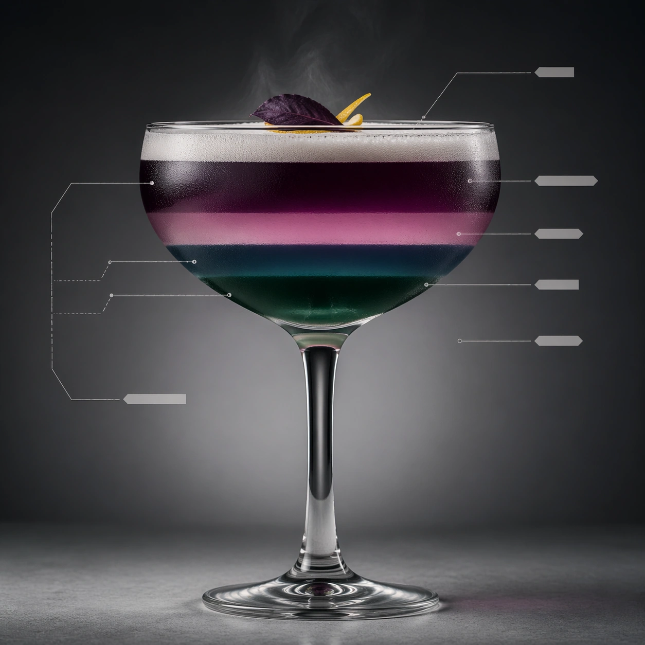
Example generated from “Cocktail Anatomy Editorial — Layered Coupe Section”
GPT Image 2en

Scene: Create a square premium editorial cocktail photograph with Scandinavian restraint: the glass sits against a dark or neutral studio backdrop, lit with crisp directional light that reveals liquid clarity, condensation, and the shape of the vessel. The composition should leave clean space for anatomy-like annotation structures. Any diagram devices must stay abstract, minimal, and completely unreadable. Create a square front-facing studio composition with a coupe glass centered against a soft dark-to-light gradient background. Fine leader lines and blank tabs may bracket the glass, but the main impression should remain elegant and photographic. Subject: Fill the coupe with visibly stratified liquid bands in closely related jewel tones, crowned by a thin foam or perfumed mist and a restrained garnish. The liquid layers should remain sharply separated, with the meniscus and stem rendered crisply. The drink should feel like a controlled visual experiment in density and light. Important details: The work should feel like a luxury magazine spread translated into one square frame, where product photography and information design cooperate without becoming cluttered. Glass thickness, ice clarity, citrus oils, bubbles, smoke, and liquid layering all need to feel physically accurate. Hairline leader lines may terminate in blank bars or geometric tabs, but never readable labels. Make the layer boundaries believable, not posterized, with subtle transitions at the edges and proper distortion through the curvature of the glass. The editorial annotations should suggest explanation while staying entirely unreadable. Use case: Cocktail anatomy editorial single study 7/9, documenting liquid stratification inside a coupe. Constraints: No readable text, no watermark, no logos, preserve exact 1:1 aspect ratio, no menu typography, no neon nightclub clutter, no brand bottle labels, no bar receipt props, no visible trademarks, no candy-bright rainbow layers, no nightclub neon, no recipe text.

Example generated from “Cocktail Anatomy Editorial — Bar Spoon Vortex”
GPT Image 2en

Scene: Create a square premium editorial cocktail photograph with Scandinavian restraint: the glass sits against a dark or neutral studio backdrop, lit with crisp directional light that reveals liquid clarity, condensation, and the shape of the vessel. The composition should leave clean space for anatomy-like annotation structures. Any diagram devices must stay abstract, minimal, and completely unreadable. Use a square close studio crop on a mixing glass under moody directional light, leaving enough surrounding space for the spiral motion to remain legible. The background should stay quiet and neutral, with no bar clutter. Subject: Show a long bar spoon inside a mixing glass as the drink rotates into a visible vortex, with stacked ice facets and subtle reflections in the liquid. A couple of abstract callout marks can point toward the vortex center and spoon spiral, but the scene should remain photographic first. The motion must feel refined and controlled, not splashy. Important details: The work should feel like a luxury magazine spread translated into one square frame, where product photography and information design cooperate without becoming cluttered. Glass thickness, ice clarity, citrus oils, bubbles, smoke, and liquid layering all need to feel physically accurate. Hairline leader lines may terminate in blank bars or geometric tabs, but never readable labels. Focus on circular liquid behavior, reflection distortion, and the elegant geometry of the spoon stem. The viewer should sense technique and choreography rather than speed for its own sake. Use case: Cocktail anatomy editorial single study 8/9, emphasizing the stirring vortex as a diagrammable cocktail mechanism. Constraints: No readable text, no watermark, no logos, preserve exact 1:1 aspect ratio, no menu typography, no neon nightclub clutter, no brand bottle labels, no bar receipt props, no visible trademarks, no splash explosion, no visible bartender hands, no branded mixing glass.
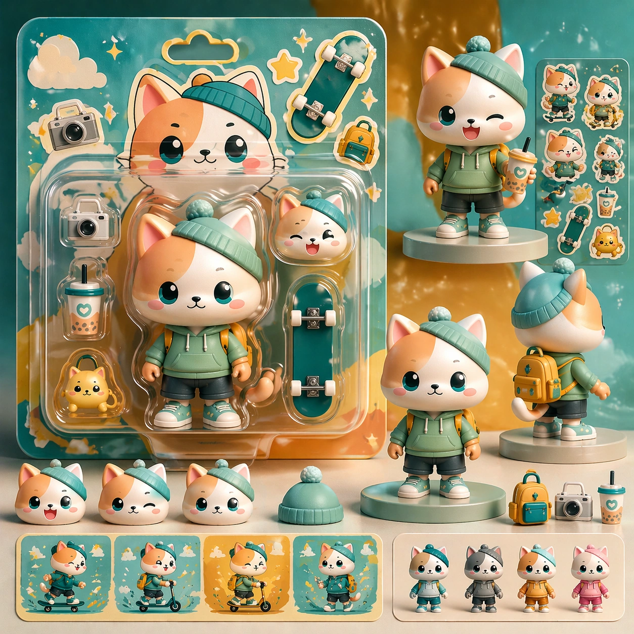
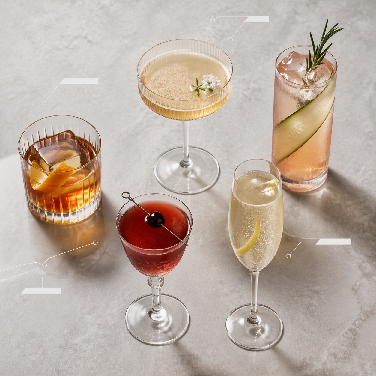
Example generated from “Cocktail Anatomy Editorial — Frosted Cocktail Flight”
GPT Image 2en

Scene: Create a square premium editorial cocktail photograph with Scandinavian restraint: the glass sits against a dark or neutral studio backdrop, lit with crisp directional light that reveals liquid clarity, condensation, and the shape of the vessel. The composition should leave clean space for anatomy-like annotation structures. Any diagram devices must stay abstract, minimal, and completely unreadable. Create a square overhead arrangement on a pale stone surface, using cool natural-looking studio light and enough spacing that each glass reads as one entry in an editorial taxonomy. The overall image should feel clean, Scandinavian, and magazine-ready. Subject: Arrange five different cocktails in distinct vessels: lowball, coupe, highball, flute, and Nick-and-Nora, each with a restrained garnish and different ice or foam behavior. Use a few abstract leader lines and blank tabs in the negative space between glasses to hint at anatomy indexing without introducing readable information. The flight should feel curated, not commercial or crowded. Important details: The work should feel like a luxury magazine spread translated into one square frame, where product photography and information design cooperate without becoming cluttered. Glass thickness, ice clarity, citrus oils, bubbles, smoke, and liquid layering all need to feel physically accurate. Hairline leader lines may terminate in blank bars or geometric tabs, but never readable labels. Make each vessel and drink behavior distinct while maintaining one coherent palette and lighting language. The composition should function like an overview page that still respects material realism down to condensation beads and glass thickness. Use case: Cocktail anatomy editorial single study 9/9, broadening the theme into a curated editorial flight. Constraints: No readable text, no watermark, no logos, preserve exact 1:1 aspect ratio, no menu typography, no neon nightclub clutter, no brand bottle labels, no bar receipt props, no visible trademarks, no menus, no coasters with logos, no tabletop clutter.
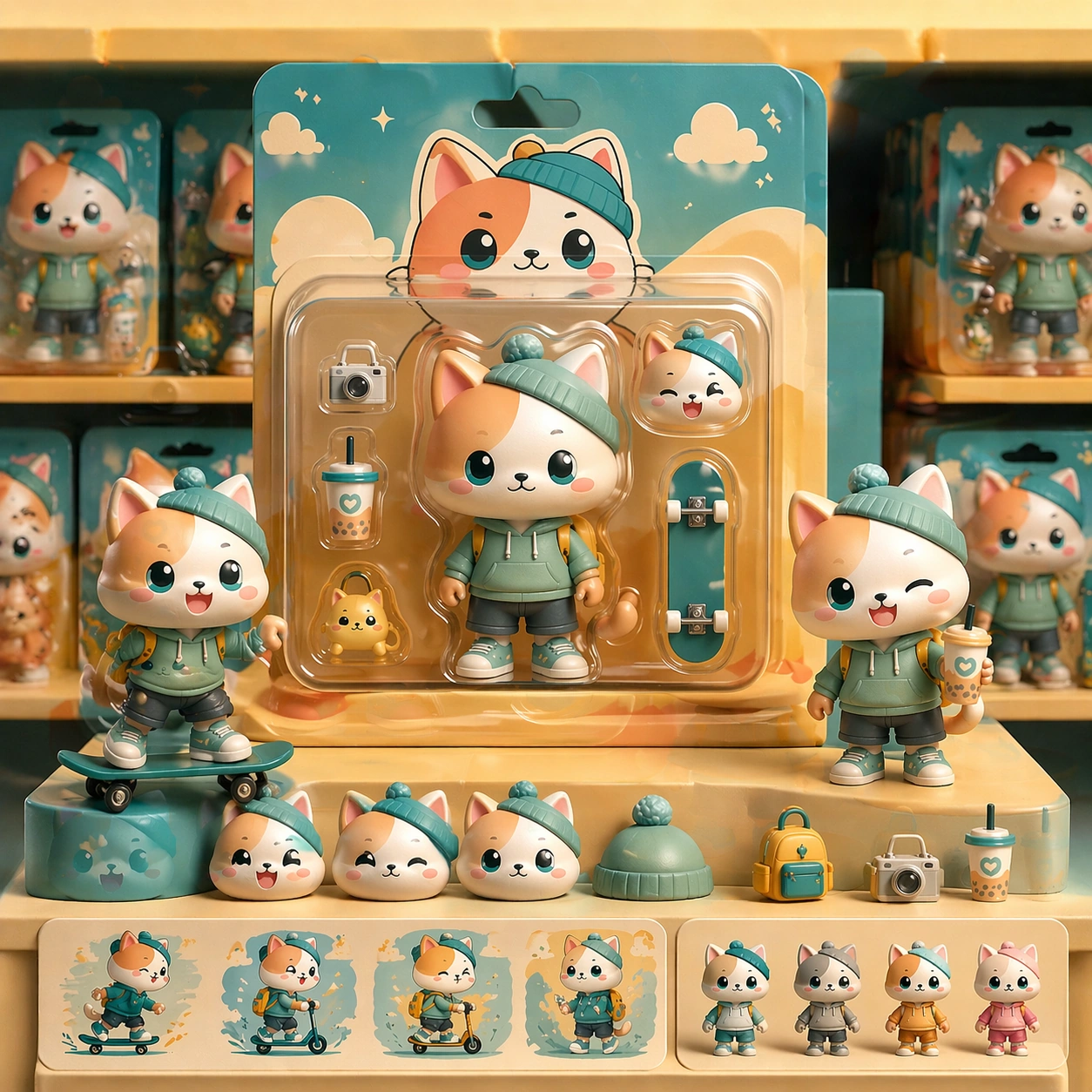
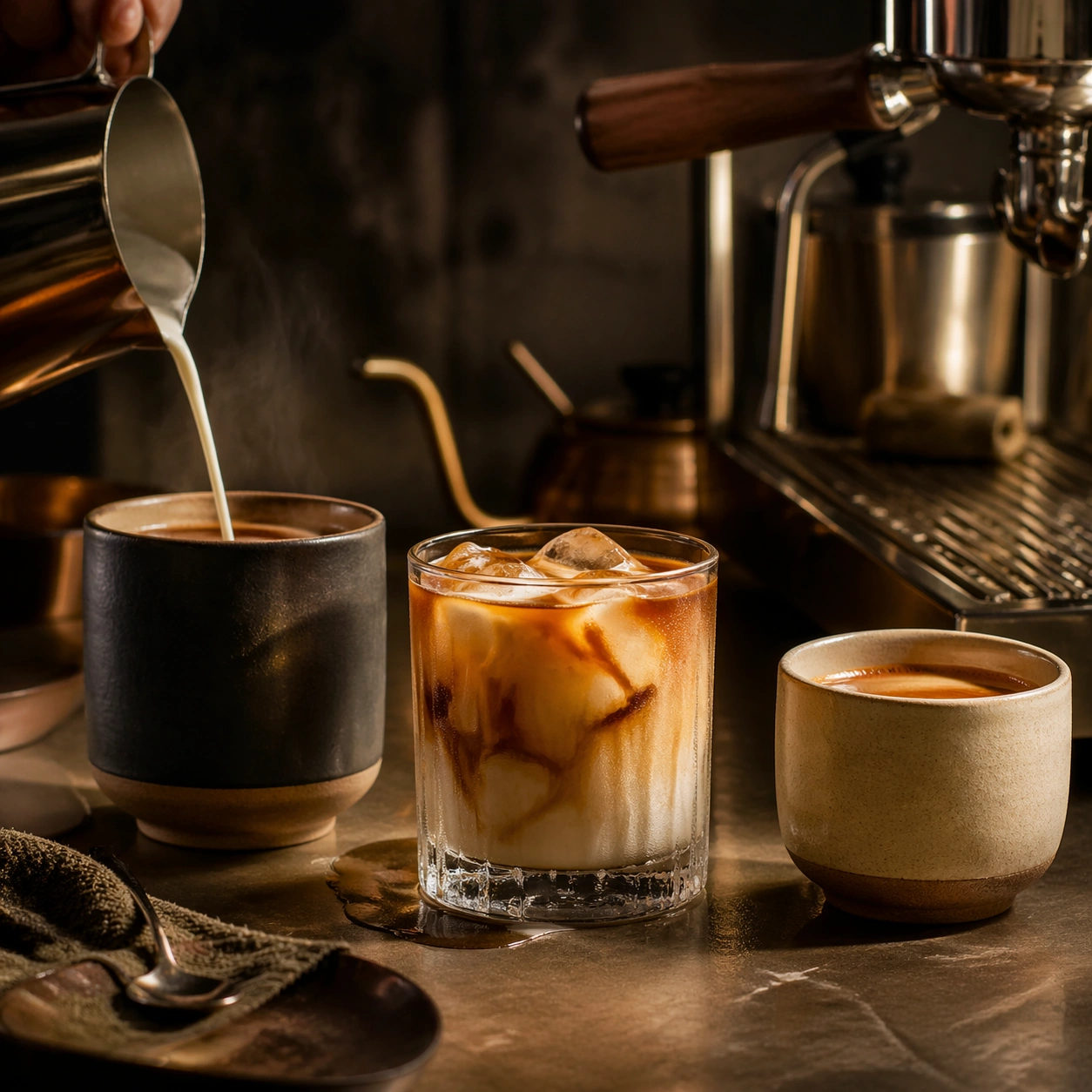
Example generated from “Coffee Drink Ritual Campaign Series — Morning Bar Anchor”
GPT Image 2en

Scene: Compose a square beverage campaign image built around ritual, vessel, light, and atmosphere. The frame should feel like it belongs to a premium drink brand that understands daily habits: ceramic warmth, glass condensation, steam behavior, and tactile surfaces all need to read as observed and real rather than generic lifestyle filler. Use early daylight mixed with one practical warm source, creating a quiet bar counter atmosphere with long soft shadows and tactile wood grain. Subject: The hero beverage must feel consumable and culturally grounded, with believable proportions, realistic liquid behavior, and supporting tools or props that reinforce the ritual without overwhelming the drink itself. Center a fresh coffee or tea beverage in a crafted vessel, supported by one spoon, one small side element, and subtle traces of recent preparation. Important details: Credibility comes from timing and materials: crema density, ice clarity, tea translucency, condensation trails, and the way a hand or vessel sits in space. Keep the mood intentional and campaign-ready, with enough atmosphere to suggest a lived routine while preserving product focus. This image establishes the reference system for the series, including camera height, tabletop discipline, prop family, and color control that later images must inherit. This reference image should lock the camera height, prop discipline, palette, and sensory mood for the series: calm, premium, tactile, and deeply habitual. Use case: Coffee Rituals series study 1/9, built for Prompt Atlas coverage of a food and beverage commercial visual system. Constraints: No readable text, no watermark, no logos, preserve exact 1:1 aspect ratio, no plastic café props, no latte-art gimmick overload, no fake steam clouds, no unreadable cup slogans, no random breakfast clutter, no artificial neon excess, no visible brand logos, no café crowd, no oversized pastry props.
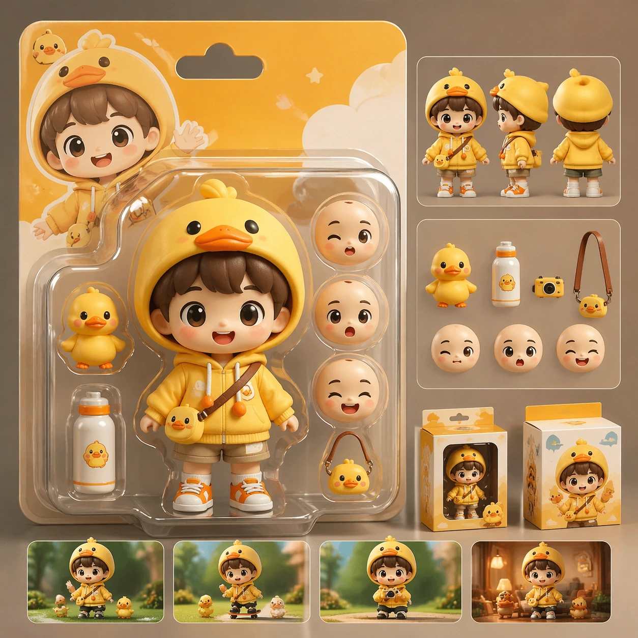
Example generated from “Coffee Drink Ritual Campaign Series — Pour-Over Bloom”
GPT Image 2en

Scene: Compose a square beverage campaign image built around ritual, vessel, light, and atmosphere. The frame should feel like it belongs to a premium drink brand that understands daily habits: ceramic warmth, glass condensation, steam behavior, and tactile surfaces all need to read as observed and real rather than generic lifestyle filler. Retain the same bar counter, vessel family, and morning tonal warmth, but add a precise pouring gesture and gentle bloom rising from the grounds. Subject: The hero beverage must feel consumable and culturally grounded, with believable proportions, realistic liquid behavior, and supporting tools or props that reinforce the ritual without overwhelming the drink itself. Show a pour-over setup with kettle stream, dripper, and cup in alignment, making the brew moment feel accurate and sensory-rich without becoming tutorial-like. Important details: Credibility comes from timing and materials: crema density, ice clarity, tea translucency, condensation trails, and the way a hand or vessel sits in space. Keep the mood intentional and campaign-ready, with enough atmosphere to suggest a lived routine while preserving product focus. Preserve the exact camera height, lens feel, prop family, tabletop scale, palette discipline, and brand logic established by 01-morning-bar-anchor. Preserve the reference lens feel, table scale, and premium quietness while making water flow, filter geometry, and steam behavior physically convincing. Use case: Coffee Rituals series study 2/9, built for Prompt Atlas coverage of a food and beverage commercial visual system. Constraints: No readable text, no watermark, no logos, preserve exact 1:1 aspect ratio, no plastic café props, no latte-art gimmick overload, no fake steam clouds, no unreadable cup slogans, no random breakfast clutter, no artificial neon excess, no dramatic splash chaos, no gadget overload, no café menu boards.
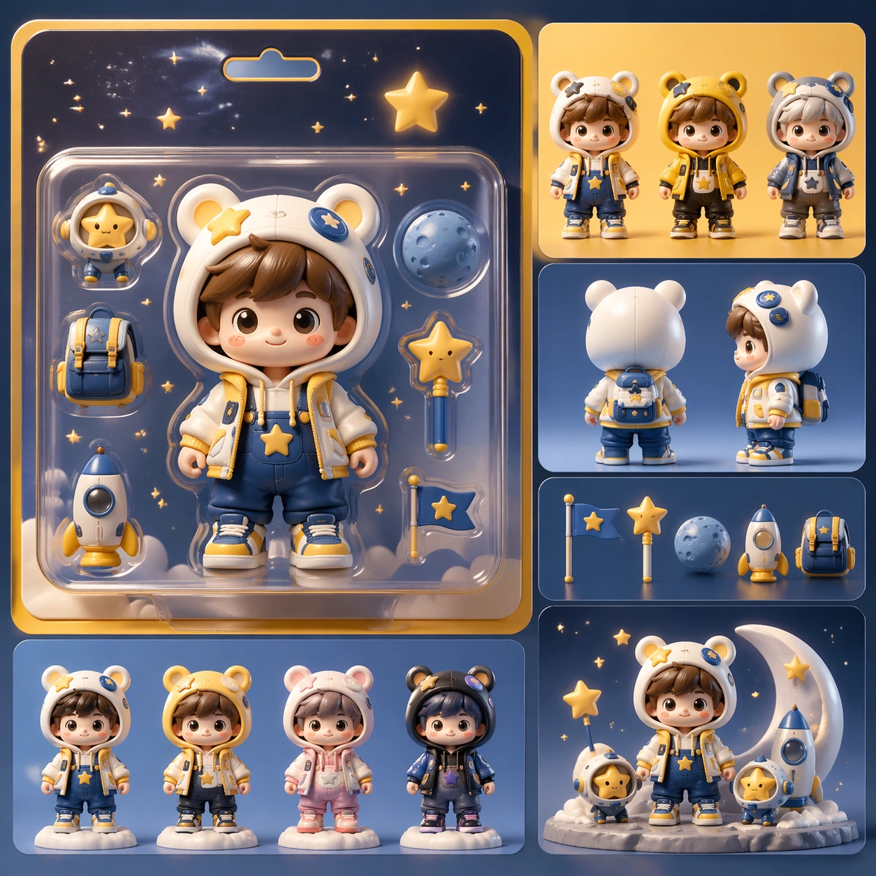
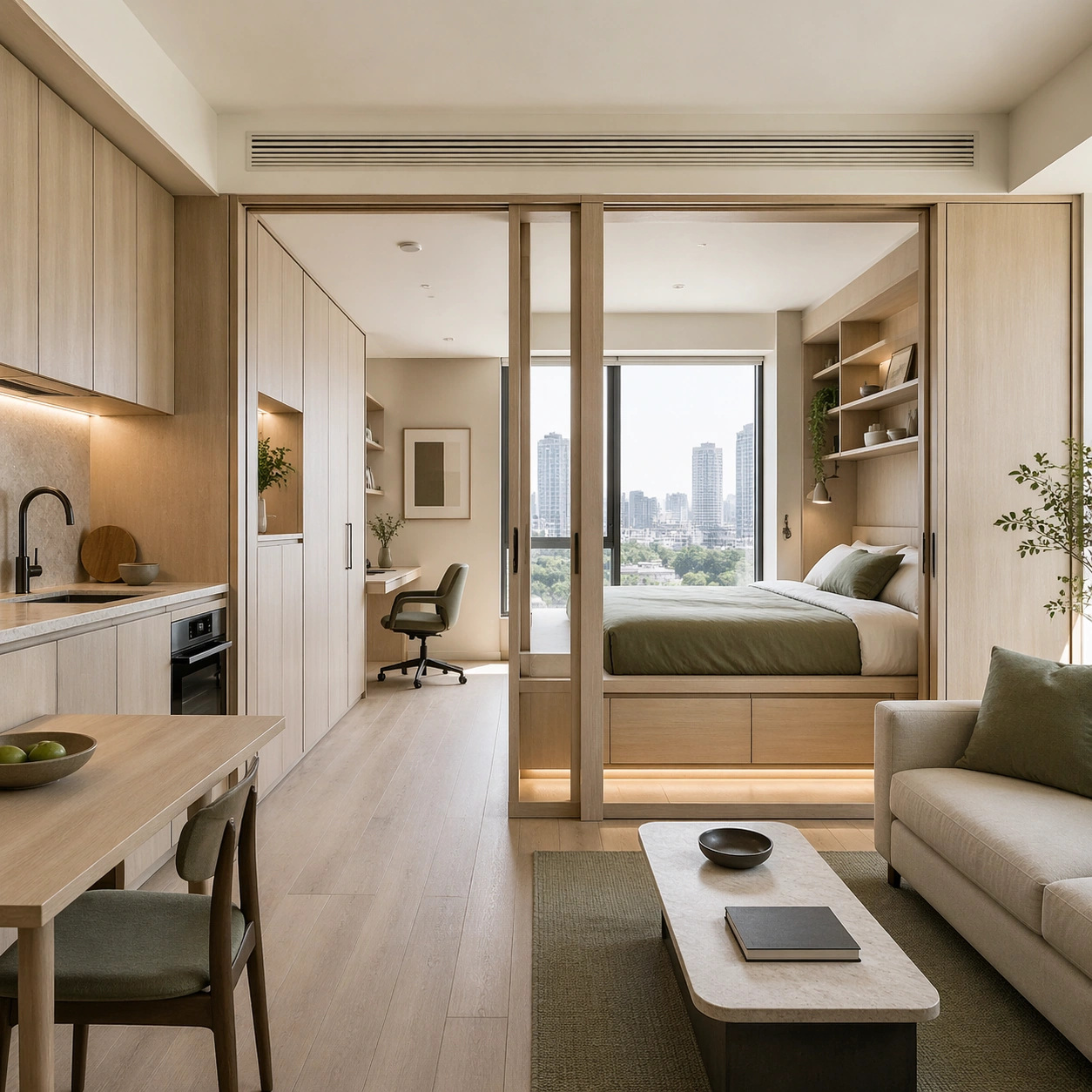
Example generated from “Coffee Drink Ritual Campaign Series — Latte Window Steam”
GPT Image 2en

Scene: Compose a square beverage campaign image built around ritual, vessel, light, and atmosphere. The frame should feel like it belongs to a premium drink brand that understands daily habits: ceramic warmth, glass condensation, steam behavior, and tactile surfaces all need to read as observed and real rather than generic lifestyle filler. Maintain the same square framing and tabletop materials, but pivot the light toward a side window so steam, foam, and cup curvature become more prominent. Subject: The hero beverage must feel consumable and culturally grounded, with believable proportions, realistic liquid behavior, and supporting tools or props that reinforce the ritual without overwhelming the drink itself. Present a milk-based coffee or tea latte in a ceramic cup with nuanced foam texture, one side pastry accent, and a calm morning pause mood. Important details: Credibility comes from timing and materials: crema density, ice clarity, tea translucency, condensation trails, and the way a hand or vessel sits in space. Keep the mood intentional and campaign-ready, with enough atmosphere to suggest a lived routine while preserving product focus. Preserve the exact camera height, lens feel, prop family, tabletop scale, palette discipline, and brand logic established by 01-morning-bar-anchor. The anchor image should remain visible through vessel shape, surface palette, and camera distance, even as the drink texture becomes creamier and more diffuse. Use case: Coffee Rituals series study 3/9, built for Prompt Atlas coverage of a food and beverage commercial visual system. Constraints: No readable text, no watermark, no logos, preserve exact 1:1 aspect ratio, no plastic café props, no latte-art gimmick overload, no fake steam clouds, no unreadable cup slogans, no random breakfast clutter, no artificial neon excess, no heart-shaped foam cliché, no breakfast buffet clutter, no oversized mug.

Example generated from “Coffee Drink Ritual Campaign Series — Evening Tonic Pour”
GPT Image 2en

Scene: Compose a square beverage campaign image built around ritual, vessel, light, and atmosphere. The frame should feel like it belongs to a premium drink brand that understands daily habits: ceramic warmth, glass condensation, steam behavior, and tactile surfaces all need to read as observed and real rather than generic lifestyle filler. Keep the same tabletop geometry and campaign polish, but shift to twilight tones, reflective glass, and a crisp rim light that catches bubbles and ice edges. Subject: The hero beverage must feel consumable and culturally grounded, with believable proportions, realistic liquid behavior, and supporting tools or props that reinforce the ritual without overwhelming the drink itself. Show a tonic-style coffee, tea, or nonalcoholic evening drink being poured over clear ice in a premium glass, supported by one minimal garnish. Important details: Credibility comes from timing and materials: crema density, ice clarity, tea translucency, condensation trails, and the way a hand or vessel sits in space. Keep the mood intentional and campaign-ready, with enough atmosphere to suggest a lived routine while preserving product focus. Preserve the exact camera height, lens feel, prop family, tabletop scale, palette discipline, and brand logic established by 01-morning-bar-anchor. Preserve the reference composition and prop restraint while letting carbonation, condensation, and glass reflections carry the new time-of-day story. Use case: Coffee Rituals series study 4/9, built for Prompt Atlas coverage of a food and beverage commercial visual system. Constraints: No readable text, no watermark, no logos, preserve exact 1:1 aspect ratio, no plastic café props, no latte-art gimmick overload, no fake steam clouds, no unreadable cup slogans, no random breakfast clutter, no artificial neon excess, no nightclub scene, no cocktail umbrellas, no bar-label branding.

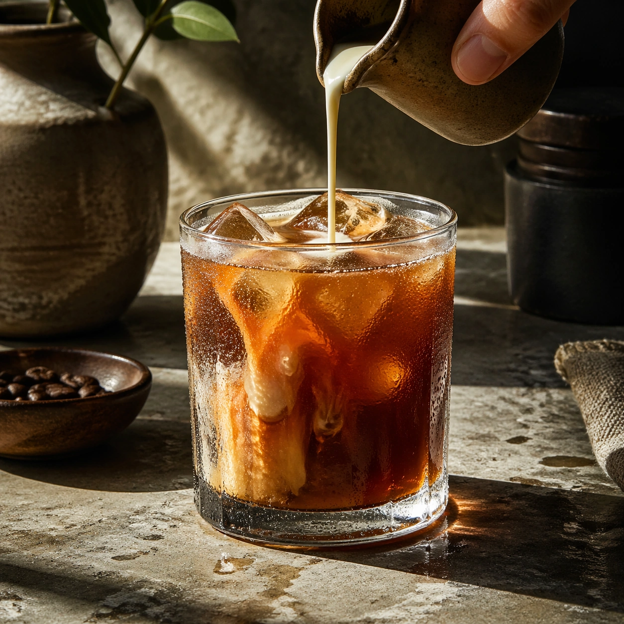
Example generated from “Coffee Drink Ritual Campaign Series — Iced Condensation Study”
GPT Image 2en

Scene: Compose a square beverage campaign image built around ritual, vessel, light, and atmosphere. The frame should feel like it belongs to a premium drink brand that understands daily habits: ceramic warmth, glass condensation, steam behavior, and tactile surfaces all need to read as observed and real rather than generic lifestyle filler. Move close to a chilled glass on a stone surface with directional afternoon light catching the wet exterior and the drink color within. Subject: The hero beverage must feel consumable and culturally grounded, with believable proportions, realistic liquid behavior, and supporting tools or props that reinforce the ritual without overwhelming the drink itself. Center an iced beverage with clean cubes, believable dilution, and subtle garnish so the drink itself becomes the landscape. Important details: Credibility comes from timing and materials: crema density, ice clarity, tea translucency, condensation trails, and the way a hand or vessel sits in space. Keep the mood intentional and campaign-ready, with enough atmosphere to suggest a lived routine while preserving product focus. This image should feel fully self-contained while still belonging to the same broader topic and commercial world. Condensation must behave physically, with varying droplet sizes, slick surfaces, and realistic refraction through the glass and ice. Use case: Coffee Rituals single study 6/9, built for Prompt Atlas coverage of a food and beverage commercial visual system. Constraints: No readable text, no watermark, no logos, preserve exact 1:1 aspect ratio, no plastic café props, no latte-art gimmick overload, no fake steam clouds, no unreadable cup slogans, no random breakfast clutter, no artificial neon excess, no explosive splash, no frozen slush, no beach props.

Example generated from “Coffee Drink Ritual Campaign Series — Tea Ritual Tray”
GPT Image 2en

Scene: Compose a square beverage campaign image built around ritual, vessel, light, and atmosphere. The frame should feel like it belongs to a premium drink brand that understands daily habits: ceramic warmth, glass condensation, steam behavior, and tactile surfaces all need to read as observed and real rather than generic lifestyle filler. Use a square top-down or slight angle over a dark tray, with muted daylight and a quiet background that emphasizes vessel shapes. Subject: The hero beverage must feel consumable and culturally grounded, with believable proportions, realistic liquid behavior, and supporting tools or props that reinforce the ritual without overwhelming the drink itself. Arrange a teapot, two cups, one infuser or strainer, and a small ingredient accent such as citrus peel or loose leaves. Important details: Credibility comes from timing and materials: crema density, ice clarity, tea translucency, condensation trails, and the way a hand or vessel sits in space. Keep the mood intentional and campaign-ready, with enough atmosphere to suggest a lived routine while preserving product focus. This image should feel fully self-contained while still belonging to the same broader topic and commercial world. The tray composition should feel elegant and intentional, with credible ceramic finish, liquid translucency, and a sense of preparation without showing full instruction steps. Use case: Coffee Rituals single study 7/9, built for Prompt Atlas coverage of a food and beverage commercial visual system. Constraints: No readable text, no watermark, no logos, preserve exact 1:1 aspect ratio, no plastic café props, no latte-art gimmick overload, no fake steam clouds, no unreadable cup slogans, no random breakfast clutter, no artificial neon excess, no ornate palace styling, no crowded dim sum spread, no readable tea labels.

Example generated from “Coffee Drink Ritual Campaign Series — Cafe Counter Rush”
GPT Image 2en

Scene: Compose a square beverage campaign image built around ritual, vessel, light, and atmosphere. The frame should feel like it belongs to a premium drink brand that understands daily habits: ceramic warmth, glass condensation, steam behavior, and tactile surfaces all need to read as observed and real rather than generic lifestyle filler. Use a square crop of a busy but controlled counter moment, with several drinks aligned and warm practical lights reflecting off metal and ceramic surfaces. Subject: The hero beverage must feel consumable and culturally grounded, with believable proportions, realistic liquid behavior, and supporting tools or props that reinforce the ritual without overwhelming the drink itself. Show two or three beverages at different completion stages, suggesting a café rush without introducing visible faces or chaos. Important details: Credibility comes from timing and materials: crema density, ice clarity, tea translucency, condensation trails, and the way a hand or vessel sits in space. Keep the mood intentional and campaign-ready, with enough atmosphere to suggest a lived routine while preserving product focus. This image should feel fully self-contained while still belonging to the same broader topic and commercial world. Timing is crucial: drips, steam, and bar reflections should feel immediate, but the frame still needs clear focal priority and commercial polish. Use case: Coffee Rituals single study 8/9, built for Prompt Atlas coverage of a food and beverage commercial visual system. Constraints: No readable text, no watermark, no logos, preserve exact 1:1 aspect ratio, no plastic café props, no latte-art gimmick overload, no fake steam clouds, no unreadable cup slogans, no random breakfast clutter, no artificial neon excess, no cashier hardware, no readable order slips, no crowded human figures.

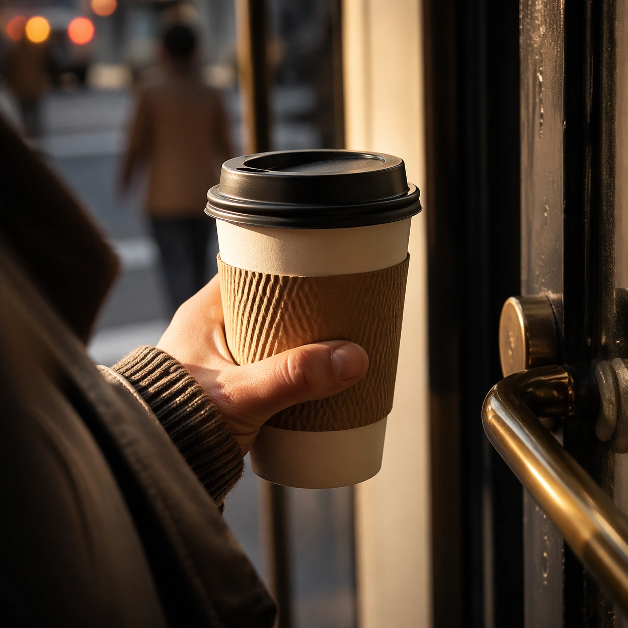
Example generated from “Coffee Drink Ritual Campaign Series — Commuter Takeaway Cup”
GPT Image 2en

Scene: Compose a square beverage campaign image built around ritual, vessel, light, and atmosphere. The frame should feel like it belongs to a premium drink brand that understands daily habits: ceramic warmth, glass condensation, steam behavior, and tactile surfaces all need to read as observed and real rather than generic lifestyle filler. Frame a square close crop of a hand carrying a takeaway cup near a doorway or transit-adjacent surface, with soft city blur in the background. Subject: The hero beverage must feel consumable and culturally grounded, with believable proportions, realistic liquid behavior, and supporting tools or props that reinforce the ritual without overwhelming the drink itself. Keep the cup, sleeve, lid texture, and drink warmth central while using the environment only to hint at an active daily commute. Important details: Credibility comes from timing and materials: crema density, ice clarity, tea translucency, condensation trails, and the way a hand or vessel sits in space. Keep the mood intentional and campaign-ready, with enough atmosphere to suggest a lived routine while preserving product focus. This image should feel fully self-contained while still belonging to the same broader topic and commercial world. The sleeve, paper grain, lid fit, and hand posture must feel real and premium. The image should sell habit and convenience without looking like stock lifestyle advertising. Use case: Coffee Rituals single study 9/9, built for Prompt Atlas coverage of a food and beverage commercial visual system. Constraints: No readable text, no watermark, no logos, preserve exact 1:1 aspect ratio, no plastic café props, no latte-art gimmick overload, no fake steam clouds, no unreadable cup slogans, no random breakfast clutter, no artificial neon excess, no readable brand mark, no obvious train logos, no full face portrait.

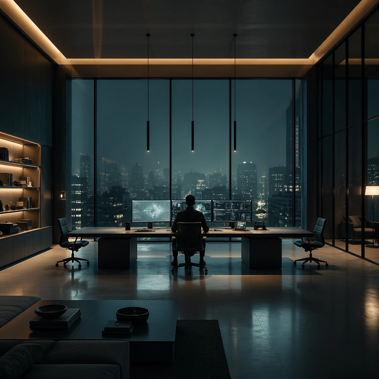
Example generated from “Cold Precision Grid Interior — Apartment Command Desk”
GPT Image 2en

Scene: A square interior image defined by desaturated teal, nicotine amber, matte charcoal, and polished glass, with every desk, chair, monitor, and light source positioned with mathematical restraint. The room should feel contemporary and expensive, but emotionally distant, as if every element has been audited for balance and control. Use a luxury apartment living room converted into a command desk arrangement, with floor-to-ceiling windows, low shelving, and one long table centered under pendant lights. Subject: Use office floors, apartments, control rooms, or meeting spaces where human figures appear small, backlit, and subordinate to the grid of furniture and screens. The subject is not one person so much as the cold system of objects, reflections, and intervals between them. A single resident works alone at the table, reduced to a dark outline against the glass and screen reflections. Important details: The signature depends on exact spacing, subdued color, restrained contrast, and a polished investigative mood. Preserve orderly cable paths, clean desk surfaces, sensible monitor glow, and strong negative space. Avoid colorful personality clutter, playful decor, or casual lived-in mess. The interior should feel curated and severe, with almost no personal objects except those necessary to support the system logic. Use case: Cold Precision Grid Interior single study 2/9. Constraints: No readable text, no watermark, no logos, preserve exact 1:1 aspect ratio, no visible logos on screens, no colorful sticky notes, no comic exaggeration, no warm family-home coziness, no random clutter piles, no broken anatomy, no low-detail background, no accidental text fragments.

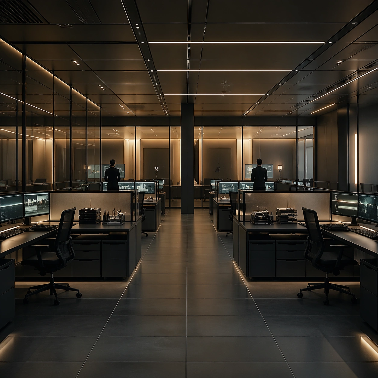
Example generated from “Cold Precision Grid Interior — Compliance Room”
GPT Image 2en

Scene: A square interior image defined by desaturated teal, nicotine amber, matte charcoal, and polished glass, with every desk, chair, monitor, and light source positioned with mathematical restraint. The room should feel contemporary and expensive, but emotionally distant, as if every element has been audited for balance and control. Construct a compliance review room with modular desks, rolling task chairs, file trays, and frosted partitions arranged in perfect lanes. Subject: Use office floors, apartments, control rooms, or meeting spaces where human figures appear small, backlit, and subordinate to the grid of furniture and screens. The subject is not one person so much as the cold system of objects, reflections, and intervals between them. Two people stand at opposite ends of the room reviewing screens, their separation reinforcing the procedural atmosphere. Important details: The signature depends on exact spacing, subdued color, restrained contrast, and a polished investigative mood. Preserve orderly cable paths, clean desk surfaces, sensible monitor glow, and strong negative space. Avoid colorful personality clutter, playful decor, or casual lived-in mess. Let the frosted glass, aluminum edges, and muted amber light make the space feel monitored and exact. Use case: Cold Precision Grid Interior single study 3/9. Constraints: No readable text, no watermark, no logos, preserve exact 1:1 aspect ratio, no visible logos on screens, no colorful sticky notes, no comic exaggeration, no warm family-home coziness, no random clutter piles, no broken anatomy, no low-detail background, no accidental text fragments.

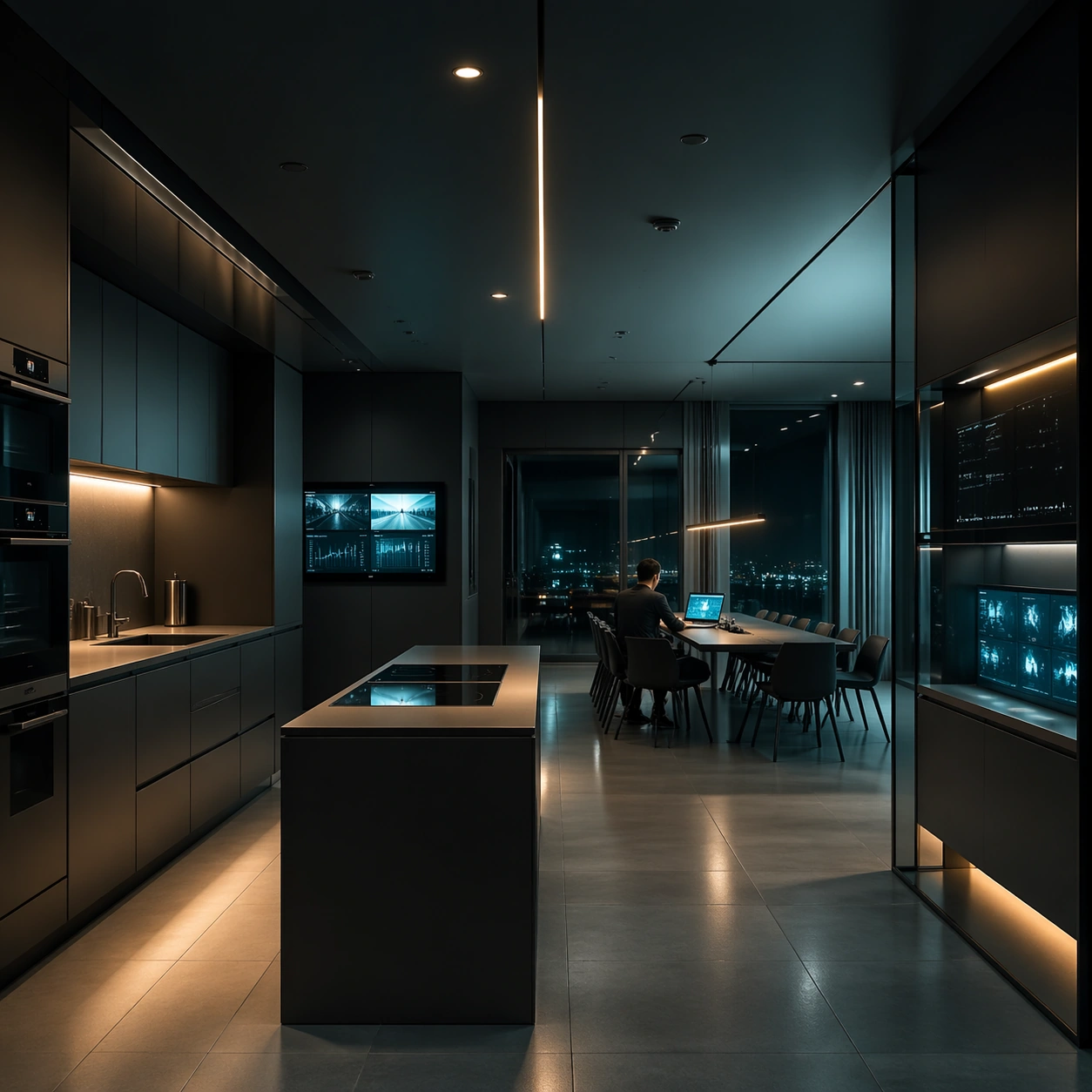
Example generated from “Cold Precision Grid Interior — Surveillance Kitchen”
GPT Image 2en

Scene: A square interior image defined by desaturated teal, nicotine amber, matte charcoal, and polished glass, with every desk, chair, monitor, and light source positioned with mathematical restraint. The room should feel contemporary and expensive, but emotionally distant, as if every element has been audited for balance and control. Set the scene in a minimalist kitchen-dining space where under-cabinet lights, induction panels, and wall screens turn domestic architecture into a monitored grid. Subject: Use office floors, apartments, control rooms, or meeting spaces where human figures appear small, backlit, and subordinate to the grid of furniture and screens. The subject is not one person so much as the cold system of objects, reflections, and intervals between them. A seated figure studies a laptop at the dining end while secondary screens glow softly from built-in millwork. Important details: The signature depends on exact spacing, subdued color, restrained contrast, and a polished investigative mood. Preserve orderly cable paths, clean desk surfaces, sensible monitor glow, and strong negative space. Avoid colorful personality clutter, playful decor, or casual lived-in mess. The room must remain believable as a home, but every line should still feel calibrated and unsentimental. Use case: Cold Precision Grid Interior single study 4/9. Constraints: No readable text, no watermark, no logos, preserve exact 1:1 aspect ratio, no visible logos on screens, no colorful sticky notes, no comic exaggeration, no warm family-home coziness, no random clutter piles, no broken anatomy, no low-detail background, no accidental text fragments.

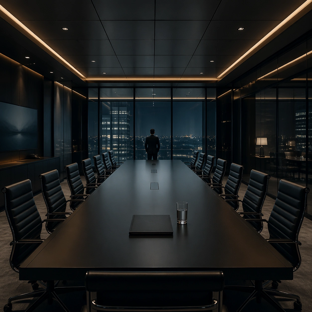
Example generated from “Cold Precision Grid Interior — Legal Boardroom”
GPT Image 2en

Scene: A square interior image defined by desaturated teal, nicotine amber, matte charcoal, and polished glass, with every desk, chair, monitor, and light source positioned with mathematical restraint. The room should feel contemporary and expensive, but emotionally distant, as if every element has been audited for balance and control. Use a boardroom with elongated table, identical leather chairs, concealed lighting coves, and dark glass panels reflecting the room back into itself. Subject: Use office floors, apartments, control rooms, or meeting spaces where human figures appear small, backlit, and subordinate to the grid of furniture and screens. The subject is not one person so much as the cold system of objects, reflections, and intervals between them. A solitary folder and water glass sit at the midpoint of the table while one attorney silhouette lingers at the far end. Important details: The signature depends on exact spacing, subdued color, restrained contrast, and a polished investigative mood. Preserve orderly cable paths, clean desk surfaces, sensible monitor glow, and strong negative space. Avoid colorful personality clutter, playful decor, or casual lived-in mess. The composition should communicate power through stillness and expensive restraint rather than grand decoration. Use case: Cold Precision Grid Interior single study 5/9. Constraints: No readable text, no watermark, no logos, preserve exact 1:1 aspect ratio, no visible logos on screens, no colorful sticky notes, no comic exaggeration, no warm family-home coziness, no random clutter piles, no broken anatomy, no low-detail background, no accidental text fragments.

Example generated from “Cold Precision Grid Interior — Copy Room Grid”
GPT Image 2en

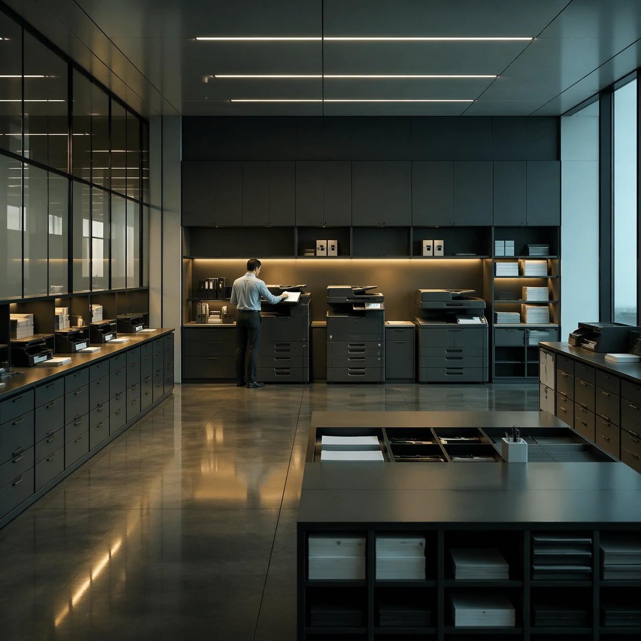
Scene: A square interior image defined by desaturated teal, nicotine amber, matte charcoal, and polished glass, with every desk, chair, monitor, and light source positioned with mathematical restraint. The room should feel contemporary and expensive, but emotionally distant, as if every element has been audited for balance and control. Build a corporate copy room with printers, supply cabinets, and utility counters arranged as a perfect service matrix under flat overhead light. Subject: Use office floors, apartments, control rooms, or meeting spaces where human figures appear small, backlit, and subordinate to the grid of furniture and screens. The subject is not one person so much as the cold system of objects, reflections, and intervals between them. An employee in shirtsleeves stands alone feeding paper into one machine, the smallest human event inside an exact equipment grid. Important details: The signature depends on exact spacing, subdued color, restrained contrast, and a polished investigative mood. Preserve orderly cable paths, clean desk surfaces, sensible monitor glow, and strong negative space. Avoid colorful personality clutter, playful decor, or casual lived-in mess. The printers should feel heavy, matte, and practical, with every edge parallel or perpendicular to the frame. Use case: Cold Precision Grid Interior single study 6/9. Constraints: No readable text, no watermark, no logos, preserve exact 1:1 aspect ratio, no visible logos on screens, no colorful sticky notes, no comic exaggeration, no warm family-home coziness, no random clutter piles, no broken anatomy, no low-detail background, no accidental text fragments.

Example generated from “Cold Precision Grid Interior — Server Apartment”
GPT Image 2en

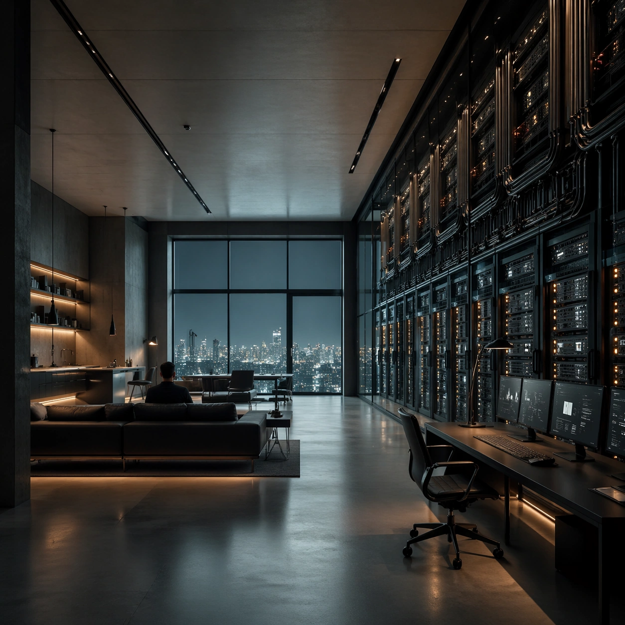
Scene: A square interior image defined by desaturated teal, nicotine amber, matte charcoal, and polished glass, with every desk, chair, monitor, and light source positioned with mathematical restraint. The room should feel contemporary and expensive, but emotionally distant, as if every element has been audited for balance and control. Compose a loft apartment where one wall has been replaced by server racks and cable management channels, balanced by calm residential furnishings on the opposite side. Subject: Use office floors, apartments, control rooms, or meeting spaces where human figures appear small, backlit, and subordinate to the grid of furniture and screens. The subject is not one person so much as the cold system of objects, reflections, and intervals between them. A resident in dark clothing sits at a minimalist sofa facing the racks, small against the machine wall. Important details: The signature depends on exact spacing, subdued color, restrained contrast, and a polished investigative mood. Preserve orderly cable paths, clean desk surfaces, sensible monitor glow, and strong negative space. Avoid colorful personality clutter, playful decor, or casual lived-in mess. Keep the electronics elegant and believable, with amber status lights punctuating a largely teal, charcoal, and smoke palette. Use case: Cold Precision Grid Interior single study 7/9. Constraints: No readable text, no watermark, no logos, preserve exact 1:1 aspect ratio, no visible logos on screens, no colorful sticky notes, no comic exaggeration, no warm family-home coziness, no random clutter piles, no broken anatomy, no low-detail background, no accidental text fragments.

Example generated from “Cold Precision Grid Interior — Night Audit Pods”
GPT Image 2en

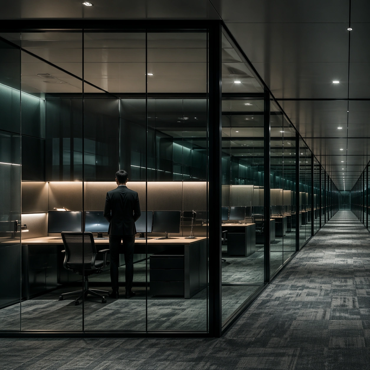
Scene: A square interior image defined by desaturated teal, nicotine amber, matte charcoal, and polished glass, with every desk, chair, monitor, and light source positioned with mathematical restraint. The room should feel contemporary and expensive, but emotionally distant, as if every element has been audited for balance and control. Show a deep office floor divided into glass-walled audit pods, each furnished identically and receding in measured rhythm. Subject: Use office floors, apartments, control rooms, or meeting spaces where human figures appear small, backlit, and subordinate to the grid of furniture and screens. The subject is not one person so much as the cold system of objects, reflections, and intervals between them. One worker stands in the nearest pod while the remaining rooms glow empty, emphasizing the modular system. Important details: The signature depends on exact spacing, subdued color, restrained contrast, and a polished investigative mood. Preserve orderly cable paths, clean desk surfaces, sensible monitor glow, and strong negative space. Avoid colorful personality clutter, playful decor, or casual lived-in mess. Use glass reflections and muted carpet pattern to build a slow, clinical sense of repetition. Use case: Cold Precision Grid Interior single study 8/9. Constraints: No readable text, no watermark, no logos, preserve exact 1:1 aspect ratio, no visible logos on screens, no colorful sticky notes, no comic exaggeration, no warm family-home coziness, no random clutter piles, no broken anatomy, no low-detail background, no accidental text fragments.

Example generated from “Cold Precision Grid Interior — Sleep Pod Office”
GPT Image 2en

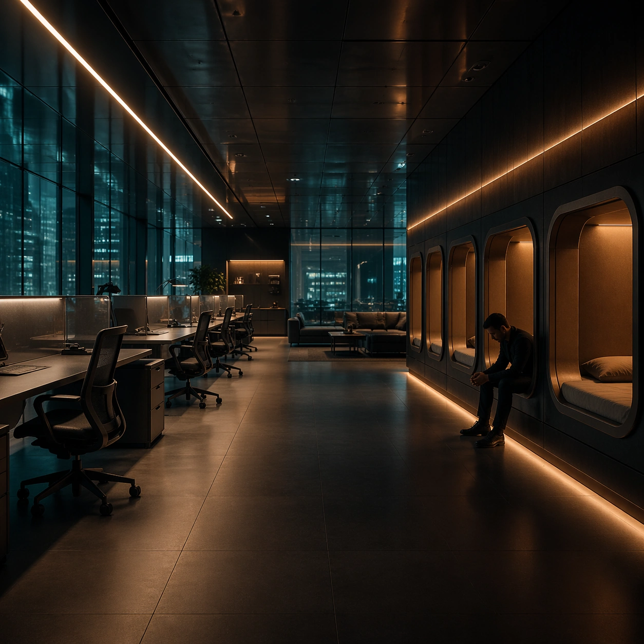
Scene: A square interior image defined by desaturated teal, nicotine amber, matte charcoal, and polished glass, with every desk, chair, monitor, and light source positioned with mathematical restraint. The room should feel contemporary and expensive, but emotionally distant, as if every element has been audited for balance and control. End with an after-hours office lounge containing built-in sleep pods, low amber strips, and neatly parked ergonomic chairs under teal window reflections. Subject: Use office floors, apartments, control rooms, or meeting spaces where human figures appear small, backlit, and subordinate to the grid of furniture and screens. The subject is not one person so much as the cold system of objects, reflections, and intervals between them. A single exhausted worker sits upright at the edge of a pod, silhouetted against the controlled ambient light. Important details: The signature depends on exact spacing, subdued color, restrained contrast, and a polished investigative mood. Preserve orderly cable paths, clean desk surfaces, sensible monitor glow, and strong negative space. Avoid colorful personality clutter, playful decor, or casual lived-in mess. The image should feel quietly troubling because of its orderliness, not because of visible drama. Use case: Cold Precision Grid Interior single study 9/9. Constraints: No readable text, no watermark, no logos, preserve exact 1:1 aspect ratio, no visible logos on screens, no colorful sticky notes, no comic exaggeration, no warm family-home coziness, no random clutter piles, no broken anatomy, no low-detail background, no accidental text fragments.

Example generated from “Collector Figure Blister Ads — Reference Mascot Pack”
GPT Image 2en

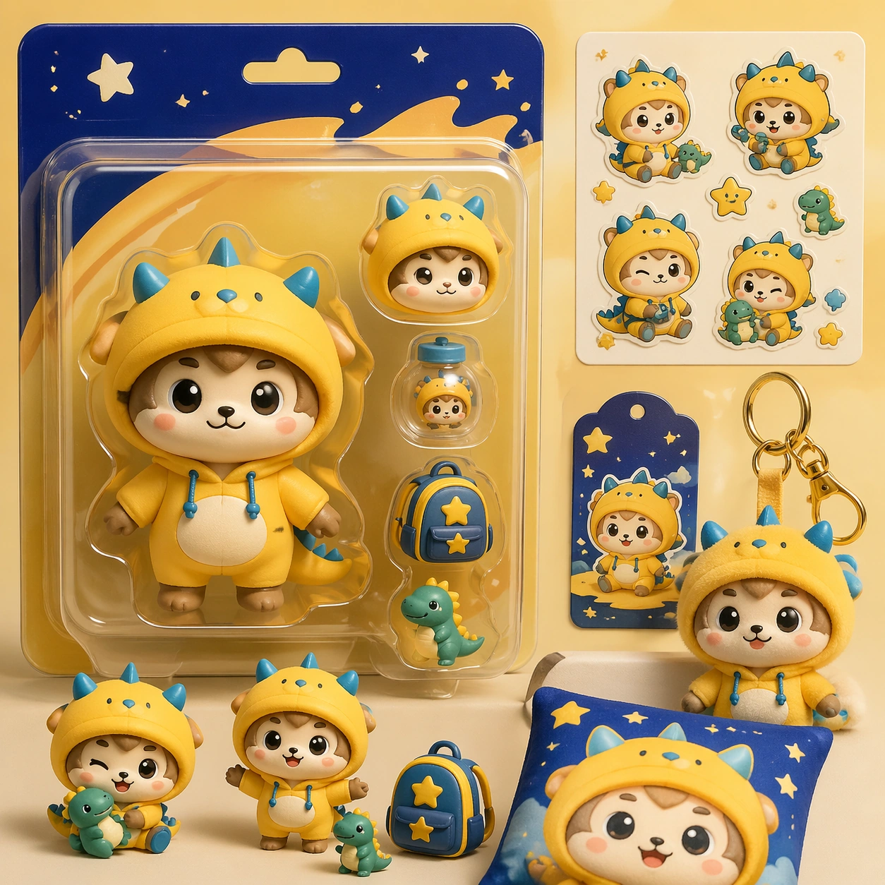
Scene: A square retail-ready campaign visual for Collector Figure Blister Ads, combining cute character appeal with polished commercial presentation. The composition should feel like a high-finish launch board: crisp packaging edges, collectible object staging, clean shelf or poster context, and vivid but controlled color. It should be immediately legible from far away, but still dense with charming small details that reward closer inspection. Subject: Build the image around Reference Mascot Pack, a frame that defines the cute character silhouette, packaging shell, and retail color logic. Translate Build campaign-ready blister-pack and collector-toy advertisements featuring super-deformed characters, accessories, rarity cues, and retail-style packaging polish. into one lovable mascot, figure, or product system that feels ready for posters, boxes, stickers, inserts, or point-of-sale material. The result should feel like a fresh research image with clear commercial focus rather than random fan art. The main subject must remain unmistakable even when surrounded by accessories and display pieces. Important details: Charm alone is not enough. Preserve clean silhouette recognition, convincing package construction, reliable prop scale, and structured layout logic so the image feels sellable. This theme studies commercial-mockup, style-transfer, structured-layout, photorealism through a production-ready visual system. Avoid noisy clutter; every secondary element should reinforce collectibility, retail desirability, or explainer clarity. Aim for clear hierarchy, polished craft, and immediately usable campaign logic. Use case: Collector Figure Blister Ads series study 1/4. Constraints: No readable text, no watermark, no logos, preserve exact 1:1 aspect ratio, no horror elements, no brand theft, no malformed packaging edges, no muddy mascot silhouette, no messy retail shelf, no chaotic prop overload.

Example generated from “Collector Figure Blister Ads — Sticker Burst Variant”
GPT Image 2en

Scene: A square retail-ready campaign visual for Collector Figure Blister Ads, combining cute character appeal with polished commercial presentation. The composition should feel like a high-finish launch board: crisp packaging edges, collectible object staging, clean shelf or poster context, and vivid but controlled color. It should be immediately legible from far away, but still dense with charming small details that reward closer inspection. Subject: Build the image around Sticker Burst Variant, a frame that keeps the same character and package identity while adding collectible sticker energy. Translate Build campaign-ready blister-pack and collector-toy advertisements featuring super-deformed characters, accessories, rarity cues, and retail-style packaging polish. into one lovable mascot, figure, or product system that feels ready for posters, boxes, stickers, inserts, or point-of-sale material. The result should feel like a fresh research image with clear commercial focus rather than random fan art. The main subject must remain unmistakable even when surrounded by accessories and display pieces. Important details: Charm alone is not enough. Preserve clean silhouette recognition, convincing package construction, reliable prop scale, and structured layout logic so the image feels sellable. This theme studies commercial-mockup, style-transfer, structured-layout, photorealism through a production-ready visual system. Avoid noisy clutter; every secondary element should reinforce collectibility, retail desirability, or explainer clarity. Aim for clear hierarchy, polished craft, and immediately usable campaign logic. Use case: Collector Figure Blister Ads series study 2/4. Constraints: No readable text, no watermark, no logos, preserve exact 1:1 aspect ratio, no horror elements, no brand theft, no malformed packaging edges, no muddy mascot silhouette, no messy retail shelf, no chaotic prop overload.

Example generated from “Collector Figure Blister Ads — Shelf Launch Variant”
GPT Image 2en

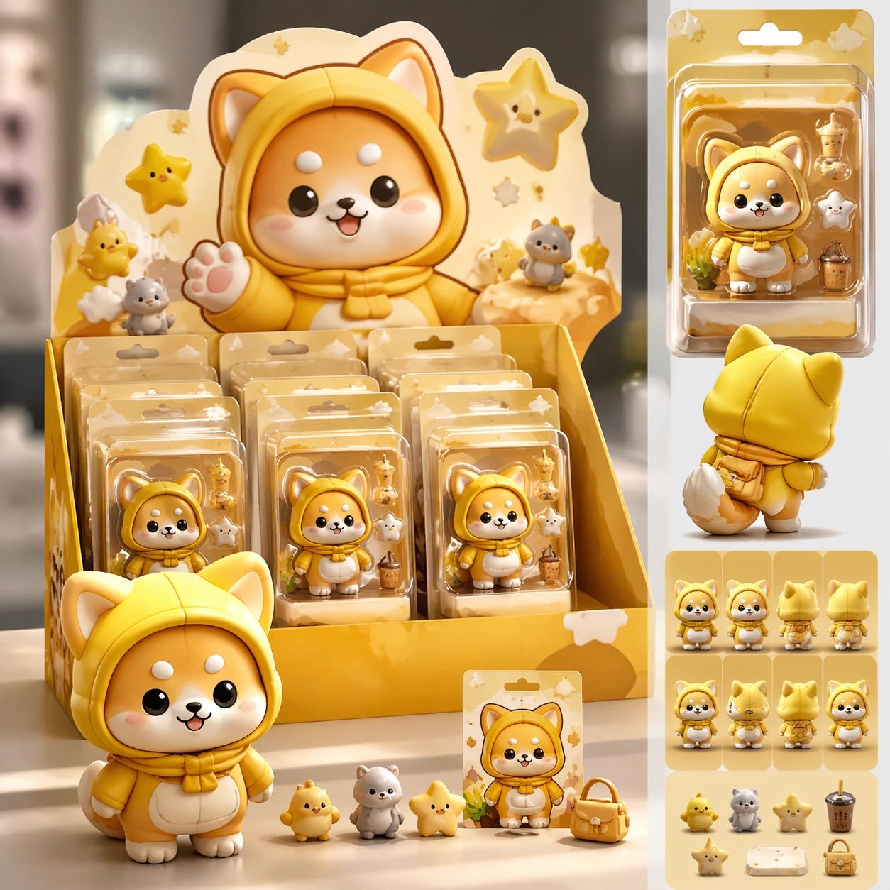
Scene: A square retail-ready campaign visual for Collector Figure Blister Ads, combining cute character appeal with polished commercial presentation. The composition should feel like a high-finish launch board: crisp packaging edges, collectible object staging, clean shelf or poster context, and vivid but controlled color. It should be immediately legible from far away, but still dense with charming small details that reward closer inspection. Subject: Build the image around Shelf Launch Variant, a frame that translates the same mascot package into a shelf-ready launch composition. Translate Build campaign-ready blister-pack and collector-toy advertisements featuring super-deformed characters, accessories, rarity cues, and retail-style packaging polish. into one lovable mascot, figure, or product system that feels ready for posters, boxes, stickers, inserts, or point-of-sale material. The result should feel like a fresh research image with clear commercial focus rather than random fan art. The main subject must remain unmistakable even when surrounded by accessories and display pieces. Important details: Charm alone is not enough. Preserve clean silhouette recognition, convincing package construction, reliable prop scale, and structured layout logic so the image feels sellable. This theme studies commercial-mockup, style-transfer, structured-layout, photorealism through a production-ready visual system. Avoid noisy clutter; every secondary element should reinforce collectibility, retail desirability, or explainer clarity. Aim for clear hierarchy, polished craft, and immediately usable campaign logic. Use case: Collector Figure Blister Ads series study 3/4. Constraints: No readable text, no watermark, no logos, preserve exact 1:1 aspect ratio, no horror elements, no brand theft, no malformed packaging edges, no muddy mascot silhouette, no messy retail shelf, no chaotic prop overload.

Example generated from “Collector Figure Blister Ads — Premium Collab Box”
GPT Image 2en

Scene: A square retail-ready campaign visual for Collector Figure Blister Ads, combining cute character appeal with polished commercial presentation. The composition should feel like a high-finish launch board: crisp packaging edges, collectible object staging, clean shelf or poster context, and vivid but controlled color. It should be immediately legible from far away, but still dense with charming small details that reward closer inspection. Subject: Build the image around Premium Collab Box, a frame that elevates the same character system into a premium collaboration box visual. Translate Build campaign-ready blister-pack and collector-toy advertisements featuring super-deformed characters, accessories, rarity cues, and retail-style packaging polish. into one lovable mascot, figure, or product system that feels ready for posters, boxes, stickers, inserts, or point-of-sale material. The result should feel like a fresh research image with clear commercial focus rather than random fan art. The main subject must remain unmistakable even when surrounded by accessories and display pieces. Important details: Charm alone is not enough. Preserve clean silhouette recognition, convincing package construction, reliable prop scale, and structured layout logic so the image feels sellable. This theme studies commercial-mockup, style-transfer, structured-layout, photorealism through a production-ready visual system. Avoid noisy clutter; every secondary element should reinforce collectibility, retail desirability, or explainer clarity. Aim for clear hierarchy, polished craft, and immediately usable campaign logic. Use case: Collector Figure Blister Ads series study 4/4. Constraints: No readable text, no watermark, no logos, preserve exact 1:1 aspect ratio, no horror elements, no brand theft, no malformed packaging edges, no muddy mascot silhouette, no messy retail shelf, no chaotic prop overload.

Example generated from “Collector Figure Blister Ads — Merch Preview”
GPT Image 2en

Scene: A square retail-ready campaign visual for Collector Figure Blister Ads, combining cute character appeal with polished commercial presentation. The composition should feel like a high-finish launch board: crisp packaging edges, collectible object staging, clean shelf or poster context, and vivid but controlled color. It should be immediately legible from far away, but still dense with charming small details that reward closer inspection. Subject: Build the image around Merch Preview, a frame that a merchandise-forward visual showing accessories, stickers, tags, or bonus items. Translate Build campaign-ready blister-pack and collector-toy advertisements featuring super-deformed characters, accessories, rarity cues, and retail-style packaging polish. into one lovable mascot, figure, or product system that feels ready for posters, boxes, stickers, inserts, or point-of-sale material. The result should feel like a fresh research image with clear commercial focus rather than random fan art. The main subject must remain unmistakable even when surrounded by accessories and display pieces. Important details: Charm alone is not enough. Preserve clean silhouette recognition, convincing package construction, reliable prop scale, and structured layout logic so the image feels sellable. This theme studies commercial-mockup, style-transfer, structured-layout, photorealism through a production-ready visual system. Avoid noisy clutter; every secondary element should reinforce collectibility, retail desirability, or explainer clarity. Aim for clear hierarchy, polished craft, and immediately usable campaign logic. Use case: Collector Figure Blister Ads single study 2/5. Constraints: No readable text, no watermark, no logos, preserve exact 1:1 aspect ratio, no horror elements, no brand theft, no malformed packaging edges, no muddy mascot silhouette, no messy retail shelf, no chaotic prop overload.

Example generated from “Collector Figure Blister Ads — Counter Display”
GPT Image 2en

Scene: A square retail-ready campaign visual for Collector Figure Blister Ads, combining cute character appeal with polished commercial presentation. The composition should feel like a high-finish launch board: crisp packaging edges, collectible object staging, clean shelf or poster context, and vivid but controlled color. It should be immediately legible from far away, but still dense with charming small details that reward closer inspection. Subject: Build the image around Counter Display, a frame that a point-of-sale display study that proves the system can live in store. Translate Build campaign-ready blister-pack and collector-toy advertisements featuring super-deformed characters, accessories, rarity cues, and retail-style packaging polish. into one lovable mascot, figure, or product system that feels ready for posters, boxes, stickers, inserts, or point-of-sale material. The result should feel like a fresh research image with clear commercial focus rather than random fan art. The main subject must remain unmistakable even when surrounded by accessories and display pieces. Important details: Charm alone is not enough. Preserve clean silhouette recognition, convincing package construction, reliable prop scale, and structured layout logic so the image feels sellable. This theme studies commercial-mockup, style-transfer, structured-layout, photorealism through a production-ready visual system. Avoid noisy clutter; every secondary element should reinforce collectibility, retail desirability, or explainer clarity. Aim for clear hierarchy, polished craft, and immediately usable campaign logic. Use case: Collector Figure Blister Ads single study 3/5. Constraints: No readable text, no watermark, no logos, preserve exact 1:1 aspect ratio, no horror elements, no brand theft, no malformed packaging edges, no muddy mascot silhouette, no messy retail shelf, no chaotic prop overload.

Example generated from “Collector Figure Blister Ads — Launch Poster”
GPT Image 2en

Scene: A square retail-ready campaign visual for Collector Figure Blister Ads, combining cute character appeal with polished commercial presentation. The composition should feel like a high-finish launch board: crisp packaging edges, collectible object staging, clean shelf or poster context, and vivid but controlled color. It should be immediately legible from far away, but still dense with charming small details that reward closer inspection. Subject: Build the image around Launch Poster, a frame that a clean release poster with cute emotional pull and unmistakable product focus. Translate Build campaign-ready blister-pack and collector-toy advertisements featuring super-deformed characters, accessories, rarity cues, and retail-style packaging polish. into one lovable mascot, figure, or product system that feels ready for posters, boxes, stickers, inserts, or point-of-sale material. The result should feel like a fresh research image with clear commercial focus rather than random fan art. The main subject must remain unmistakable even when surrounded by accessories and display pieces. Important details: Charm alone is not enough. Preserve clean silhouette recognition, convincing package construction, reliable prop scale, and structured layout logic so the image feels sellable. This theme studies commercial-mockup, style-transfer, structured-layout, photorealism through a production-ready visual system. Avoid noisy clutter; every secondary element should reinforce collectibility, retail desirability, or explainer clarity. Aim for clear hierarchy, polished craft, and immediately usable campaign logic. Use case: Collector Figure Blister Ads single study 4/5. Constraints: No readable text, no watermark, no logos, preserve exact 1:1 aspect ratio, no horror elements, no brand theft, no malformed packaging edges, no muddy mascot silhouette, no messy retail shelf, no chaotic prop overload.

Example generated from “Collector Figure Blister Ads — Collector Sheet”
GPT Image 2en

Scene: A square retail-ready campaign visual for Collector Figure Blister Ads, combining cute character appeal with polished commercial presentation. The composition should feel like a high-finish launch board: crisp packaging edges, collectible object staging, clean shelf or poster context, and vivid but controlled color. It should be immediately legible from far away, but still dense with charming small details that reward closer inspection. Subject: Build the image around Collector Sheet, a frame that a collector-oriented overview image unifying variants, icons, and packaging cues. Translate Build campaign-ready blister-pack and collector-toy advertisements featuring super-deformed characters, accessories, rarity cues, and retail-style packaging polish. into one lovable mascot, figure, or product system that feels ready for posters, boxes, stickers, inserts, or point-of-sale material. The result should feel like a fresh research image with clear commercial focus rather than random fan art. The main subject must remain unmistakable even when surrounded by accessories and display pieces. Important details: Charm alone is not enough. Preserve clean silhouette recognition, convincing package construction, reliable prop scale, and structured layout logic so the image feels sellable. This theme studies commercial-mockup, style-transfer, structured-layout, photorealism through a production-ready visual system. Avoid noisy clutter; every secondary element should reinforce collectibility, retail desirability, or explainer clarity. Aim for clear hierarchy, polished craft, and immediately usable campaign logic. Use case: Collector Figure Blister Ads single study 5/5. Constraints: No readable text, no watermark, no logos, preserve exact 1:1 aspect ratio, no horror elements, no brand theft, no malformed packaging edges, no muddy mascot silhouette, no messy retail shelf, no chaotic prop overload.

Example generated from “Compact Urban Apartment Efficiency Aesthetic — Transformable Overview”
GPT Image 2en

Scene: Create a square architectural reference still for Compact Urban Apartment Efficiency Aesthetic. Use a wide daylight overview that reveals living, dining, work, and sleep zones in one frame and treat the frame like a premium interior or architecture editorial photograph with disciplined perspective, readable depth from foreground to background, and enough negative space for the spatial hierarchy to breathe. Light the scene so space efficiency, hidden storage, and calm urban living feel immediate, using light ash wood, warm white plaster, soft graphite accents, pale stone, and muted sage textiles as the governing tonal range. The composition must read as a high-end commercial image that could sit inside rental campaigns, design editorials, developer micro-unit decks, and small-space planning references. Subject: Show a compact urban apartment with ash wood millwork, sliding partitions, hidden storage walls, a built-in platform bed, compact stone kitchen surfaces, and calm metropolitan daylight. Center the apartment’s transformable plan logic, storage walls, and quiet urban elegance. This is the canonical reference image for the package, so the major proportions, material transitions, fixture families, and circulation logic must feel highly specific and internally coherent rather than generic luxury styling. Let the viewer understand how the space is organized within a single glance, with foreground anchors, a clear middle zone, and a resolved background termination. Important details: Lock the sliding partition system, integrated storage geometry, ash wood detailing, compact kitchen language, and quiet city-apartment restraint. Surfaces should feel tactile and believable: stone veining must stay plausible, metals should have disciplined reflectance, fabrics should show natural weight, and concealed lighting should shape the volume instead of flattening it. Use abstract signage, menu, label, or caption zones only as unreadable graphic hints. The image should feel practical for downstream design reviews and polished enough for public-facing campaign use. Use case: Compact Urban Apartment Efficiency Aesthetic series study 1/9, establishing the canonical compact apartment system for the series. Constraints: No readable text, no watermark, no logos, preserve exact 1:1 aspect ratio, no clutter piles, no messy shoes, no novelty gadgets, no colorful toy furniture, no cramped distortion, no fisheye distortion.

Example generated from “Compact Urban Apartment Efficiency Aesthetic — Kitchen Desk Hybrid”
GPT Image 2en

Scene: Create a square reference-dependent architecture still for Compact Urban Apartment Efficiency Aesthetic. Use a square view focused on the kitchen counter extending into a work nook while keeping the same lens discipline, editorial polish, and material believability established by the reference image. The lighting can shift to support the intended mood, but the space must still feel like the same authored project with a stable viewpoint logic, convincing depth separation, and clean commercial-photography finish. Keep light ash wood, warm white plaster, soft graphite accents, pale stone, and muted sage textiles as the governing tonal range even when the emphasis changes. Subject: Show a compact urban apartment with ash wood millwork, sliding partitions, hidden storage walls, a built-in platform bed, compact stone kitchen surfaces, and calm metropolitan daylight. Focus on the exact same apartment from the reference image, now emphasizing multifunctional surfaces and compact circulation. Preserve exact architectural identity, plan logic, material palette, fixture family, and circulation cues from the reference image while changing only the intended emphasis described here. The viewer should immediately recognize the same project, not a loose cousin, with matching silhouette logic, aligned detailing, and consistent brand atmosphere. Important details: Preserve the sliding partition system, integrated storage geometry, ash wood detailing, compact kitchen language, and quiet city-apartment restraint. Any abstract wayfinding, menu, wall-label, or packaging zones must stay unreadable and subordinate to the spatial image. Joinery, edges, reflections, and lighting should remain realistic enough for an operator or design team to treat the image as a credible reference. The variation should feel deliberate and commercially useful, proving that one locked spatial language can flex across multiple campaign or editorial surfaces. Use case: Compact Urban Apartment Efficiency Aesthetic series study 2/9, extending hybrid kitchen-work logic while preserving the same apartment identity. Constraints: No readable text, no watermark, no logos, preserve exact 1:1 aspect ratio, preserve exact architectural identity from the reference image, no clutter piles, no messy shoes, no novelty gadgets, no colorful toy furniture, no cramped distortion, no visible laptop logos.

Example generated from “Compact Urban Apartment Efficiency Aesthetic — Platform Bedroom Storage”
GPT Image 2en

Scene: Create a square reference-dependent architecture still for Compact Urban Apartment Efficiency Aesthetic. Use a viewpoint toward the platform bed and integrated drawers while keeping the same lens discipline, editorial polish, and material believability established by the reference image. The lighting can shift to support the intended mood, but the space must still feel like the same authored project with a stable viewpoint logic, convincing depth separation, and clean commercial-photography finish. Keep light ash wood, warm white plaster, soft graphite accents, pale stone, and muted sage textiles as the governing tonal range even when the emphasis changes. Subject: Show a compact urban apartment with ash wood millwork, sliding partitions, hidden storage walls, a built-in platform bed, compact stone kitchen surfaces, and calm metropolitan daylight. Focus on the exact same apartment from the reference image, now emphasizing bed-platform joinery, concealed storage, and soft evening calm. Preserve exact architectural identity, plan logic, material palette, fixture family, and circulation cues from the reference image while changing only the intended emphasis described here. The viewer should immediately recognize the same project, not a loose cousin, with matching silhouette logic, aligned detailing, and consistent brand atmosphere. Important details: Preserve the sliding partition system, integrated storage geometry, ash wood detailing, compact kitchen language, and quiet city-apartment restraint. Any abstract wayfinding, menu, wall-label, or packaging zones must stay unreadable and subordinate to the spatial image. Joinery, edges, reflections, and lighting should remain realistic enough for an operator or design team to treat the image as a credible reference. The variation should feel deliberate and commercially useful, proving that one locked spatial language can flex across multiple campaign or editorial surfaces. Use case: Compact Urban Apartment Efficiency Aesthetic series study 3/9, extending sleep-zone efficiency in the same design language. Constraints: No readable text, no watermark, no logos, preserve exact 1:1 aspect ratio, preserve exact architectural identity from the reference image, no clutter piles, no messy shoes, no novelty gadgets, no colorful toy furniture, no cramped distortion, no exposed clothing mess.

Example generated from “Compact Urban Apartment Efficiency Aesthetic — Bath and Laundry Core”
GPT Image 2en

Scene: Create a square reference-dependent architecture still for Compact Urban Apartment Efficiency Aesthetic. Use a precise angle into the bathroom-laundry core framed by the sliding partition while keeping the same lens discipline, editorial polish, and material believability established by the reference image. The lighting can shift to support the intended mood, but the space must still feel like the same authored project with a stable viewpoint logic, convincing depth separation, and clean commercial-photography finish. Keep light ash wood, warm white plaster, soft graphite accents, pale stone, and muted sage textiles as the governing tonal range even when the emphasis changes. Subject: Show a compact urban apartment with ash wood millwork, sliding partitions, hidden storage walls, a built-in platform bed, compact stone kitchen surfaces, and calm metropolitan daylight. Focus on the exact same apartment from the reference image, now emphasizing compact service planning and refined material transitions. Preserve exact architectural identity, plan logic, material palette, fixture family, and circulation cues from the reference image while changing only the intended emphasis described here. The viewer should immediately recognize the same project, not a loose cousin, with matching silhouette logic, aligned detailing, and consistent brand atmosphere. Important details: Preserve the sliding partition system, integrated storage geometry, ash wood detailing, compact kitchen language, and quiet city-apartment restraint. Any abstract wayfinding, menu, wall-label, or packaging zones must stay unreadable and subordinate to the spatial image. Joinery, edges, reflections, and lighting should remain realistic enough for an operator or design team to treat the image as a credible reference. The variation should feel deliberate and commercially useful, proving that one locked spatial language can flex across multiple campaign or editorial surfaces. Use case: Compact Urban Apartment Efficiency Aesthetic series study 4/9, extending service-core intelligence without changing the core apartment identity. Constraints: No readable text, no watermark, no logos, preserve exact 1:1 aspect ratio, preserve exact architectural identity from the reference image, no clutter piles, no messy shoes, no novelty gadgets, no colorful toy furniture, no cramped distortion, no detergent labels.

Example generated from “Compact Urban Apartment Efficiency Aesthetic — Wardrobe Organization Wall”
GPT Image 2en

Scene: Create a square standalone support study for Compact Urban Apartment Efficiency Aesthetic. Use an open wardrobe wall with drawers, hanging zones, and inset lighting and frame it like a premium commercial still or design-editorial crop with clear focal hierarchy, disciplined perspective, and enough breathing room for the materials and objects to read at both thumbnail and full size. Keep light ash wood, warm white plaster, soft graphite accents, pale stone, and muted sage textiles as the tonal guide so the image still belongs to the same theme family, and light the scene in a controlled way that emphasizes texture, edge quality, and authored atmosphere over spectacle. Subject: Show a compact urban apartment with ash wood millwork, sliding partitions, hidden storage walls, a built-in platform bed, compact stone kitchen surfaces, and calm metropolitan daylight. In this support study, focus on organization logic, material calm, and believable daily-use spacing. The image should work independently, yet it must still feel like it belongs to the same broader world of Urban Apartment. Make the space, props, and detailing useful for real campaign, editorial, or design-review contexts rather than moodboard abstraction. Important details: Carry forward the broader language of the sliding partition system, integrated storage geometry, ash wood detailing, compact kitchen language, and quiet city-apartment restraint, but let this image prove a new support surface or secondary deliverable. Material realism is essential: wood grain, metal sheen, glass edges, textiles, and stone should feel physically plausible and carefully art directed. Any graphic panels, labels, menus, packaging, or captions must stay abstract and unreadable. The overall result should feel reusable for rental campaigns, design editorials, developer micro-unit decks, and small-space planning references, with enough structure that a creative or operations team could build on it. Use case: Compact Urban Apartment Efficiency Aesthetic single study 6/9, exploring storage-system support image for compact living. Constraints: No readable text, no watermark, no logos, preserve exact 1:1 aspect ratio, no clutter piles, no messy shoes, no novelty gadgets, no colorful toy furniture, no cramped distortion, no readable garment branding.

Example generated from “Compact Urban Apartment Efficiency Aesthetic — Window Nook Editorial”
GPT Image 2en

Scene: Create a square standalone support study for Compact Urban Apartment Efficiency Aesthetic. Use a quiet window nook with bench seat, shelf, and city light beyond and frame it like a premium commercial still or design-editorial crop with clear focal hierarchy, disciplined perspective, and enough breathing room for the materials and objects to read at both thumbnail and full size. Keep light ash wood, warm white plaster, soft graphite accents, pale stone, and muted sage textiles as the tonal guide so the image still belongs to the same theme family, and light the scene in a controlled way that emphasizes texture, edge quality, and authored atmosphere over spectacle. Subject: Show a compact urban apartment with ash wood millwork, sliding partitions, hidden storage walls, a built-in platform bed, compact stone kitchen surfaces, and calm metropolitan daylight. In this support study, focus on micro-living comfort, layered textiles, and negative space. The image should work independently, yet it must still feel like it belongs to the same broader world of Urban Apartment. Make the space, props, and detailing useful for real campaign, editorial, or design-review contexts rather than moodboard abstraction. Important details: Carry forward the broader language of the sliding partition system, integrated storage geometry, ash wood detailing, compact kitchen language, and quiet city-apartment restraint, but let this image prove a new support surface or secondary deliverable. Material realism is essential: wood grain, metal sheen, glass edges, textiles, and stone should feel physically plausible and carefully art directed. Any graphic panels, labels, menus, packaging, or captions must stay abstract and unreadable. The overall result should feel reusable for rental campaigns, design editorials, developer micro-unit decks, and small-space planning references, with enough structure that a creative or operations team could build on it. Use case: Compact Urban Apartment Efficiency Aesthetic single study 7/9, exploring editorial support for a calm urban lifestyle. Constraints: No readable text, no watermark, no logos, preserve exact 1:1 aspect ratio, no clutter piles, no messy shoes, no novelty gadgets, no colorful toy furniture, no cramped distortion, no dominant skyline billboards.

Example generated from “Compact Urban Apartment Efficiency Aesthetic — Entry Bike Storage”
GPT Image 2en

Scene: Create a square standalone support study for Compact Urban Apartment Efficiency Aesthetic. Use an entry sequence where a bicycle fits neatly beside hidden cabinetry and a bench and frame it like a premium commercial still or design-editorial crop with clear focal hierarchy, disciplined perspective, and enough breathing room for the materials and objects to read at both thumbnail and full size. Keep light ash wood, warm white plaster, soft graphite accents, pale stone, and muted sage textiles as the tonal guide so the image still belongs to the same theme family, and light the scene in a controlled way that emphasizes texture, edge quality, and authored atmosphere over spectacle. Subject: Show a compact urban apartment with ash wood millwork, sliding partitions, hidden storage walls, a built-in platform bed, compact stone kitchen surfaces, and calm metropolitan daylight. In this support study, focus on practical storage, circulation clearance, and tasteful metropolitan realism. The image should work independently, yet it must still feel like it belongs to the same broader world of Urban Apartment. Make the space, props, and detailing useful for real campaign, editorial, or design-review contexts rather than moodboard abstraction. Important details: Carry forward the broader language of the sliding partition system, integrated storage geometry, ash wood detailing, compact kitchen language, and quiet city-apartment restraint, but let this image prove a new support surface or secondary deliverable. Material realism is essential: wood grain, metal sheen, glass edges, textiles, and stone should feel physically plausible and carefully art directed. Any graphic panels, labels, menus, packaging, or captions must stay abstract and unreadable. The overall result should feel reusable for rental campaigns, design editorials, developer micro-unit decks, and small-space planning references, with enough structure that a creative or operations team could build on it. Use case: Compact Urban Apartment Efficiency Aesthetic single study 8/9, exploring support study for urban mobility integration. Constraints: No readable text, no watermark, no logos, preserve exact 1:1 aspect ratio, no clutter piles, no messy shoes, no novelty gadgets, no colorful toy furniture, no cramped distortion, no brand marks on the bicycle.

Example generated from “Compact Urban Apartment Efficiency Aesthetic — Integrated Pet Corner”
GPT Image 2en

Scene: Create a square standalone support study for Compact Urban Apartment Efficiency Aesthetic. Use a compact pet nook built into lower millwork beside the living zone and frame it like a premium commercial still or design-editorial crop with clear focal hierarchy, disciplined perspective, and enough breathing room for the materials and objects to read at both thumbnail and full size. Keep light ash wood, warm white plaster, soft graphite accents, pale stone, and muted sage textiles as the tonal guide so the image still belongs to the same theme family, and light the scene in a controlled way that emphasizes texture, edge quality, and authored atmosphere over spectacle. Subject: Show a compact urban apartment with ash wood millwork, sliding partitions, hidden storage walls, a built-in platform bed, compact stone kitchen surfaces, and calm metropolitan daylight. In this support study, focus on small-space empathy, concealed bowls, durable finishes, and residential warmth. The image should work independently, yet it must still feel like it belongs to the same broader world of Urban Apartment. Make the space, props, and detailing useful for real campaign, editorial, or design-review contexts rather than moodboard abstraction. Important details: Carry forward the broader language of the sliding partition system, integrated storage geometry, ash wood detailing, compact kitchen language, and quiet city-apartment restraint, but let this image prove a new support surface or secondary deliverable. Material realism is essential: wood grain, metal sheen, glass edges, textiles, and stone should feel physically plausible and carefully art directed. Any graphic panels, labels, menus, packaging, or captions must stay abstract and unreadable. The overall result should feel reusable for rental campaigns, design editorials, developer micro-unit decks, and small-space planning references, with enough structure that a creative or operations team could build on it. Use case: Compact Urban Apartment Efficiency Aesthetic single study 9/9, exploring support image for flexible compact-home marketing. Constraints: No readable text, no watermark, no logos, preserve exact 1:1 aspect ratio, no clutter piles, no messy shoes, no novelty gadgets, no colorful toy furniture, no cramped distortion, no visible pet food labels.

Example generated from “Complex Optics Materials — Macro Study”
GPT Image 2en

Scene: A square material-focused image where lighting, scale, and surface behavior are the main event. Build the frame around extreme close observation of texture, grain, and edge behavior. Keep the lighting, camera distance, and spatial organization tuned for a high-signal research image rather than a casual snapshot. The image belongs to the Complex Optics Materials theme and should feel immediately legible as a prompt atlas theme for complex optics materials, testing photorealism, physics-materials, reasoning-composition with gpt image 2.. Subject: Center the study on extreme close observation of texture, grain, and edge behavior. Translate the theme into a concrete visual statement instead of an abstract mood board: the viewer should understand what kind of image this is, what is being tested, and why the composition is difficult. Use the slug idea of complex optics materials as a literal guide for subject matter, materials, and staging. Important details: Microstructure matters: refraction, fibers, scratches, pores, edge wear, translucency, and dust should all feel physically specific. Preserve a disciplined square composition, clear focal hierarchy, and enough secondary information to make the image feel complete rather than underspecified. The image should look polished, novel, and exhibition-ready, with topic-specific credibility coming from the way surfaces, structure, and visual language reinforce Complex Optics Materials. Avoid generic filler elements that do not serve the main concept. Use case: Complex Optics Materials single study 2/8, testing photorealism, physics-materials, reasoning-composition through the macro study variation. Constraints: No readable text, no watermark, no logos, preserve exact 1:1 aspect ratio, no generic stock macro, no broken scale cues, no plastic-looking texture when it should feel natural, no meaningless blur, no watermark, no fake labels.