PROMPTS · KREATIV ENTDECKEN

Prompt-Galerie

Echte Prompts und erzeugte Beispiele erkunden. Inspiration für Ihre nächste kreative Mission finden und den vollständigen Prompt kostenlos kopieren.

Beispiele
10,974
Modelle
17
Quellen
1277
10.974 Prompt-Beispiele · Seite 68 von 229
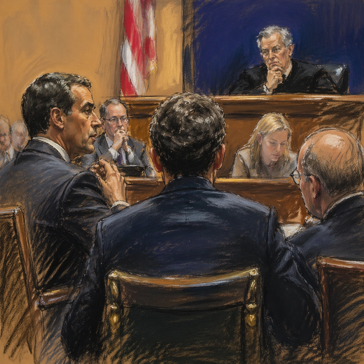
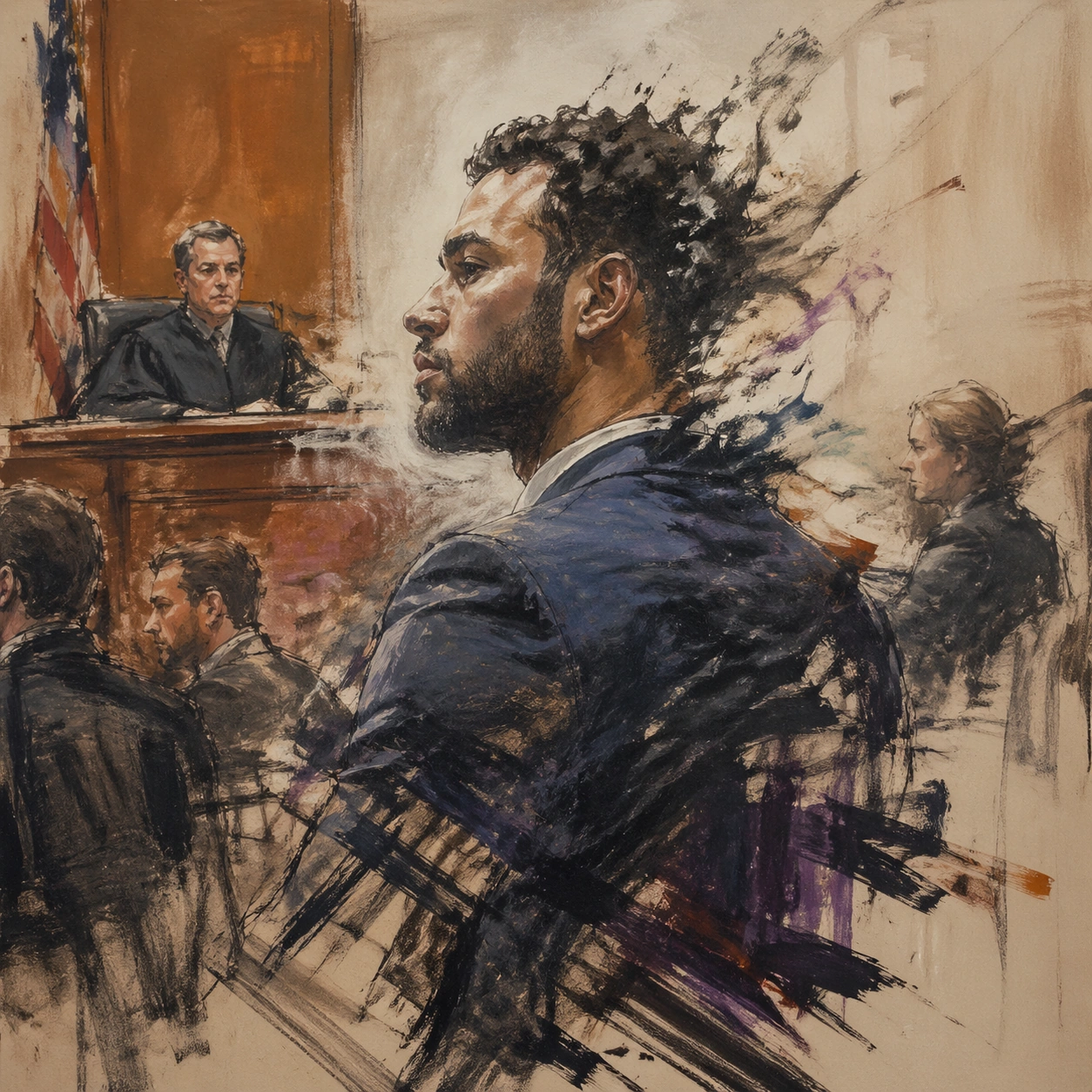
Example generated from “Courtroom Sketch — Color Field Threshold”
GPT Image 2en

Scene: A square, gallery-ready composition with painterly surfaces, controlled negative space, and a deliberate fine-art presentation. Build the frame around a few dominant blocks or atmospheres of color with slow transitions and emotional weight. Keep the lighting, camera distance, and spatial organization tuned for a high-signal research image rather than a casual snapshot. The image belongs to the Courtroom Sketch theme and should feel immediately legible as a prompt atlas theme for courtroom sketch, testing photorealism, world-knowledge, style-transfer with gpt image 2.. Subject: Center the study on a few dominant blocks or atmospheres of color with slow transitions and emotional weight. Translate the theme into a concrete visual statement instead of an abstract mood board: the viewer should understand what kind of image this is, what is being tested, and why the composition is difficult. Use the slug idea of courtroom sketch as a literal guide for subject matter, materials, and staging. Important details: Focus on authored mark-making, hierarchy, rhythm, and a visual idea that reads immediately before the viewer inspects the brushwork. Preserve a disciplined square composition, clear focal hierarchy, and enough secondary information to make the image feel complete rather than underspecified. The image should look polished, novel, and exhibition-ready, with topic-specific credibility coming from the way surfaces, structure, and visual language reinforce Courtroom Sketch. Avoid generic filler elements that do not serve the main concept. Use case: Courtroom Sketch single study 2/8, testing photorealism, world-knowledge, style-transfer through the color field threshold variation. Constraints: No readable text, no watermark, no logos, preserve exact 1:1 aspect ratio, no direct copy of a known artwork, no comic speech bubbles, no accidental typography, no low-effort doodle energy, no muddy center, no fake museum label.
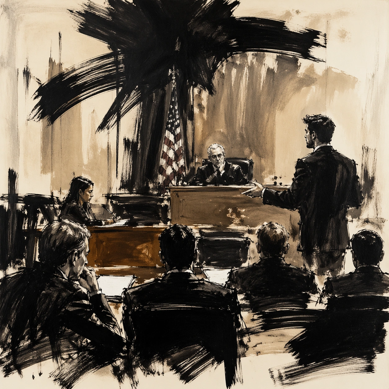
Example generated from “Courtroom Sketch — Fractured Figure Surge”
GPT Image 2en

Scene: A square, gallery-ready composition with painterly surfaces, controlled negative space, and a deliberate fine-art presentation. Build the frame around a figure-like presence that emerges and dissolves through broken strokes and unstable edges. Keep the lighting, camera distance, and spatial organization tuned for a high-signal research image rather than a casual snapshot. The image belongs to the Courtroom Sketch theme and should feel immediately legible as a prompt atlas theme for courtroom sketch, testing photorealism, world-knowledge, style-transfer with gpt image 2.. Subject: Center the study on a figure-like presence that emerges and dissolves through broken strokes and unstable edges. Translate the theme into a concrete visual statement instead of an abstract mood board: the viewer should understand what kind of image this is, what is being tested, and why the composition is difficult. Use the slug idea of courtroom sketch as a literal guide for subject matter, materials, and staging. Important details: Focus on authored mark-making, hierarchy, rhythm, and a visual idea that reads immediately before the viewer inspects the brushwork. Preserve a disciplined square composition, clear focal hierarchy, and enough secondary information to make the image feel complete rather than underspecified. The image should look polished, novel, and exhibition-ready, with topic-specific credibility coming from the way surfaces, structure, and visual language reinforce Courtroom Sketch. Avoid generic filler elements that do not serve the main concept. Use case: Courtroom Sketch single study 3/8, testing photorealism, world-knowledge, style-transfer through the fractured figure surge variation. Constraints: No readable text, no watermark, no logos, preserve exact 1:1 aspect ratio, no direct copy of a known artwork, no comic speech bubbles, no accidental typography, no low-effort doodle energy, no muddy center, no fake museum label.
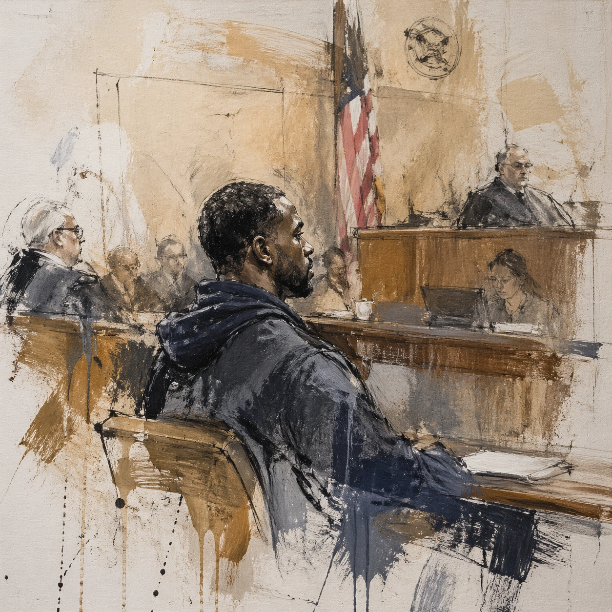
Example generated from “Courtroom Sketch — Black Brush Choir”
GPT Image 2en

Scene: A square, gallery-ready composition with painterly surfaces, controlled negative space, and a deliberate fine-art presentation. Build the frame around large decisive black gestures that create rhythm, tension, and architectural pressure. Keep the lighting, camera distance, and spatial organization tuned for a high-signal research image rather than a casual snapshot. The image belongs to the Courtroom Sketch theme and should feel immediately legible as a prompt atlas theme for courtroom sketch, testing photorealism, world-knowledge, style-transfer with gpt image 2.. Subject: Center the study on large decisive black gestures that create rhythm, tension, and architectural pressure. Translate the theme into a concrete visual statement instead of an abstract mood board: the viewer should understand what kind of image this is, what is being tested, and why the composition is difficult. Use the slug idea of courtroom sketch as a literal guide for subject matter, materials, and staging. Important details: Focus on authored mark-making, hierarchy, rhythm, and a visual idea that reads immediately before the viewer inspects the brushwork. Preserve a disciplined square composition, clear focal hierarchy, and enough secondary information to make the image feel complete rather than underspecified. The image should look polished, novel, and exhibition-ready, with topic-specific credibility coming from the way surfaces, structure, and visual language reinforce Courtroom Sketch. Avoid generic filler elements that do not serve the main concept. Use case: Courtroom Sketch single study 4/8, testing photorealism, world-knowledge, style-transfer through the black brush choir variation. Constraints: No readable text, no watermark, no logos, preserve exact 1:1 aspect ratio, no direct copy of a known artwork, no comic speech bubbles, no accidental typography, no low-effort doodle energy, no muddy center, no fake museum label.
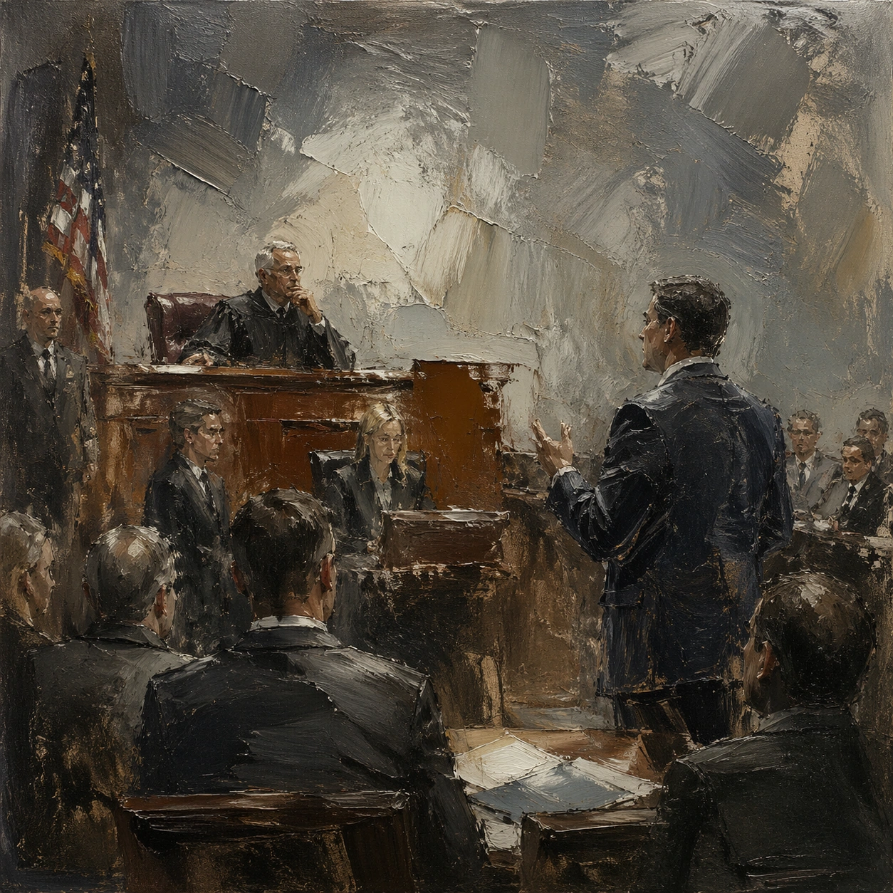
Example generated from “Courtroom Sketch — Studio Floor Afterimage”
GPT Image 2en

Scene: A square, gallery-ready composition with painterly surfaces, controlled negative space, and a deliberate fine-art presentation. Build the frame around evidence of process, splatter, drag, and layered correction without becoming documentary clutter. Keep the lighting, camera distance, and spatial organization tuned for a high-signal research image rather than a casual snapshot. The image belongs to the Courtroom Sketch theme and should feel immediately legible as a prompt atlas theme for courtroom sketch, testing photorealism, world-knowledge, style-transfer with gpt image 2.. Subject: Center the study on evidence of process, splatter, drag, and layered correction without becoming documentary clutter. Translate the theme into a concrete visual statement instead of an abstract mood board: the viewer should understand what kind of image this is, what is being tested, and why the composition is difficult. Use the slug idea of courtroom sketch as a literal guide for subject matter, materials, and staging. Important details: Focus on authored mark-making, hierarchy, rhythm, and a visual idea that reads immediately before the viewer inspects the brushwork. Preserve a disciplined square composition, clear focal hierarchy, and enough secondary information to make the image feel complete rather than underspecified. The image should look polished, novel, and exhibition-ready, with topic-specific credibility coming from the way surfaces, structure, and visual language reinforce Courtroom Sketch. Avoid generic filler elements that do not serve the main concept. Use case: Courtroom Sketch single study 5/8, testing photorealism, world-knowledge, style-transfer through the studio floor afterimage variation. Constraints: No readable text, no watermark, no logos, preserve exact 1:1 aspect ratio, no direct copy of a known artwork, no comic speech bubbles, no accidental typography, no low-effort doodle energy, no muddy center, no fake museum label.
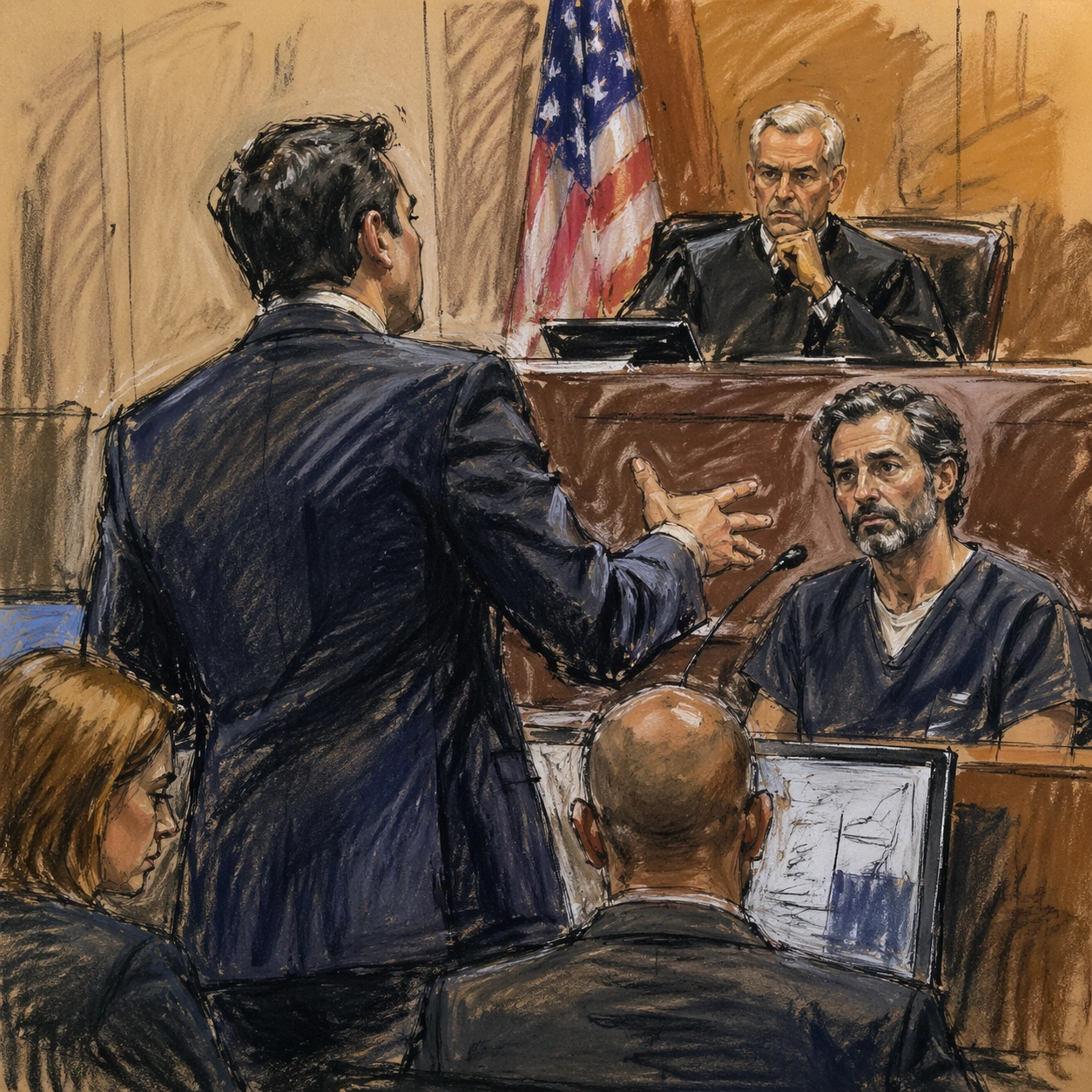
Example generated from “Courtroom Sketch — 厚涂天气”
GPT Image 2en

Scene: A square, gallery-ready composition with painterly surfaces, controlled negative space, and a deliberate fine-art presentation. Build the frame around surface build-up, scrape marks, and thick tactile passages that feel meteorological. Keep the lighting, camera distance, and spatial organization tuned for a high-signal research image rather than a casual snapshot. The image belongs to the Courtroom Sketch theme and should feel immediately legible as a prompt atlas theme for courtroom sketch, testing photorealism, world-knowledge, style-transfer with gpt image 2.. Subject: Center the study on surface build-up, scrape marks, and thick tactile passages that feel meteorological. Translate the theme into a concrete visual statement instead of an abstract mood board: the viewer should understand what kind of image this is, what is being tested, and why the composition is difficult. Use the slug idea of courtroom sketch as a literal guide for subject matter, materials, and staging. Important details: Focus on authored mark-making, hierarchy, rhythm, and a visual idea that reads immediately before the viewer inspects the brushwork. Preserve a disciplined square composition, clear focal hierarchy, and enough secondary information to make the image feel complete rather than underspecified. The image should look polished, novel, and exhibition-ready, with topic-specific credibility coming from the way surfaces, structure, and visual language reinforce Courtroom Sketch. Avoid generic filler elements that do not serve the main concept. Use case: Courtroom Sketch single study 6/8, testing photorealism, world-knowledge, style-transfer through the 厚涂天气 variation. Constraints: No readable text, no watermark, no logos, preserve exact 1:1 aspect ratio, no direct copy of a known artwork, no comic speech bubbles, no accidental typography, no low-effort doodle energy, no muddy center, no fake museum label.
Example generated from “Courtroom Sketch — Museum Wall Hang”
GPT Image 2en

Scene: A square, gallery-ready composition with painterly surfaces, controlled negative space, and a deliberate fine-art presentation. Build the frame around a resolved exhibition-grade work whose internal balance feels complete and intentional. Keep the lighting, camera distance, and spatial organization tuned for a high-signal research image rather than a casual snapshot. The image belongs to the Courtroom Sketch theme and should feel immediately legible as a prompt atlas theme for courtroom sketch, testing photorealism, world-knowledge, style-transfer with gpt image 2.. Subject: Center the study on a resolved exhibition-grade work whose internal balance feels complete and intentional. Translate the theme into a concrete visual statement instead of an abstract mood board: the viewer should understand what kind of image this is, what is being tested, and why the composition is difficult. Use the slug idea of courtroom sketch as a literal guide for subject matter, materials, and staging. Important details: Focus on authored mark-making, hierarchy, rhythm, and a visual idea that reads immediately before the viewer inspects the brushwork. Preserve a disciplined square composition, clear focal hierarchy, and enough secondary information to make the image feel complete rather than underspecified. The image should look polished, novel, and exhibition-ready, with topic-specific credibility coming from the way surfaces, structure, and visual language reinforce Courtroom Sketch. Avoid generic filler elements that do not serve the main concept. Use case: Courtroom Sketch single study 8/8, testing photorealism, world-knowledge, style-transfer through the museum wall hang variation. Constraints: No readable text, no watermark, no logos, preserve exact 1:1 aspect ratio, no direct copy of a known artwork, no comic speech bubbles, no accidental typography, no low-effort doodle energy, no muddy center, no fake museum label.
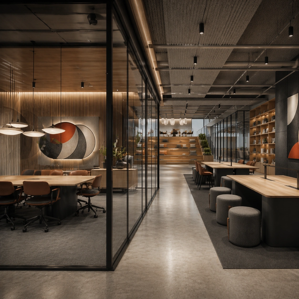
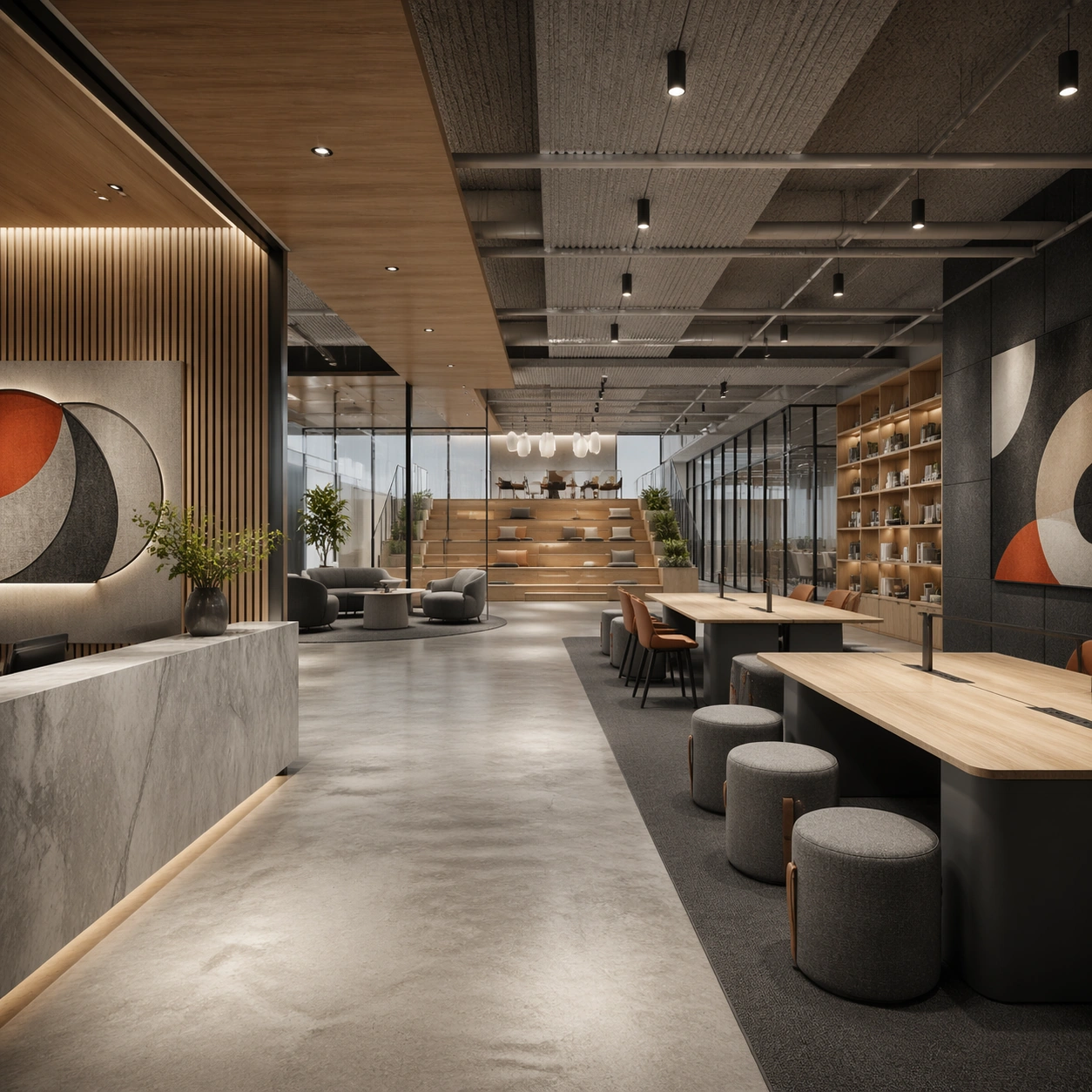
Example generated from “Creative Studio And Office Brand Floor — Reception and Townhall Anchor”
GPT Image 2en

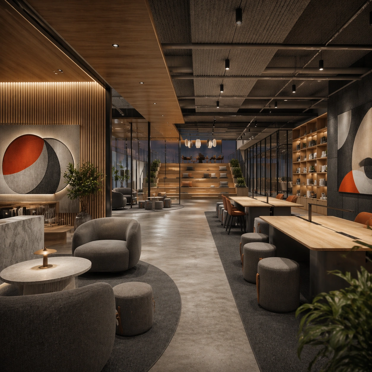
Scene: Create a square architectural reference still for Creative Studio and Office Brand Floor. Use a wide entry view that reveals reception, townhall seating, and the main collaborative volume and treat the frame like a premium interior or architecture editorial photograph with disciplined perspective, readable depth from foreground to background, and enough negative space for the spatial hierarchy to breathe. Light the scene so collaboration, material calm, and authored workplace identity feel immediate, using warm gray, natural oak, charcoal felt, off-white surfaces, and one controlled accent hue as the governing tonal range. The composition must read as a high-end commercial image that could sit inside office leasing decks, employer-brand campaigns, interior editorials, and workspace design reviews. Subject: Show a branded creative studio and office floor with modular collaboration tables, acoustic felt panels, smoked glass partitions, library shelving, soft lounge seating, and clear company personality. Center the office’s first impression, brand atmosphere, and circulation hierarchy. This is the canonical reference image for the package, so the major proportions, material transitions, fixture families, and circulation logic must feel highly specific and internally coherent rather than generic luxury styling. Let the viewer understand how the space is organized within a single glance, with foreground anchors, a clear middle zone, and a resolved background termination. Important details: Lock the table system, acoustic materials, glass-partition rhythm, informal lounge furniture, and abstract brand-graphic zones. Surfaces should feel tactile and believable: stone veining must stay plausible, metals should have disciplined reflectance, fabrics should show natural weight, and concealed lighting should shape the volume instead of flattening it. Use abstract signage, menu, label, or caption zones only as unreadable graphic hints. The image should feel practical for downstream design reviews and polished enough for public-facing campaign use. Use case: Creative Studio and Office Brand Floor series study 1/9, establishing the canonical workplace identity for the package. Constraints: No readable text, no watermark, no logos, preserve exact 1:1 aspect ratio, no office workers, no readable whiteboard text, no startup cliché neon, no messy desks, no cheap task-chair overload, no lobby turnstiles dominating.

Example generated from “Creative Studio And Office Brand Floor — Workbench Cluster”
GPT Image 2en

Scene: Create a square reference-dependent architecture still for Creative Studio and Office Brand Floor. Use a square composition centered on the open workbench cluster under balanced daylight while keeping the same lens discipline, editorial polish, and material believability established by the reference image. The lighting can shift to support the intended mood, but the space must still feel like the same authored project with a stable viewpoint logic, convincing depth separation, and clean commercial-photography finish. Keep warm gray, natural oak, charcoal felt, off-white surfaces, and one controlled accent hue as the governing tonal range even when the emphasis changes. Subject: Show a branded creative studio and office floor with modular collaboration tables, acoustic felt panels, smoked glass partitions, library shelving, soft lounge seating, and clear company personality. Focus on the exact same office from the reference image, now emphasizing shared tables, lighting discipline, and creative energy without clutter. Preserve exact architectural identity, plan logic, material palette, fixture family, and circulation cues from the reference image while changing only the intended emphasis described here. The viewer should immediately recognize the same project, not a loose cousin, with matching silhouette logic, aligned detailing, and consistent brand atmosphere. Important details: Preserve the table system, acoustic materials, glass-partition rhythm, informal lounge furniture, and abstract brand-graphic zones. Any abstract wayfinding, menu, wall-label, or packaging zones must stay unreadable and subordinate to the spatial image. Joinery, edges, reflections, and lighting should remain realistic enough for an operator or design team to treat the image as a credible reference. The variation should feel deliberate and commercially useful, proving that one locked spatial language can flex across multiple campaign or editorial surfaces. Use case: Creative Studio and Office Brand Floor series study 2/9, extending collaboration logic while preserving the same office identity. Constraints: No readable text, no watermark, no logos, preserve exact 1:1 aspect ratio, preserve exact architectural identity from the reference image, no office workers, no readable whiteboard text, no startup cliché neon, no messy desks, no cheap task-chair overload, no laptops with readable stickers.

Example generated from “Creative Studio And Office Brand Floor — Meeting Room Layer”
GPT Image 2en

Scene: Create a square reference-dependent architecture still for Creative Studio and Office Brand Floor. Use a view through glass partitions into a meeting room and adjacent circulation while keeping the same lens discipline, editorial polish, and material believability established by the reference image. The lighting can shift to support the intended mood, but the space must still feel like the same authored project with a stable viewpoint logic, convincing depth separation, and clean commercial-photography finish. Keep warm gray, natural oak, charcoal felt, off-white surfaces, and one controlled accent hue as the governing tonal range even when the emphasis changes. Subject: Show a branded creative studio and office floor with modular collaboration tables, acoustic felt panels, smoked glass partitions, library shelving, soft lounge seating, and clear company personality. Focus on the exact same office from the reference image, now emphasizing transparency, privacy gradients, and acoustic control. Preserve exact architectural identity, plan logic, material palette, fixture family, and circulation cues from the reference image while changing only the intended emphasis described here. The viewer should immediately recognize the same project, not a loose cousin, with matching silhouette logic, aligned detailing, and consistent brand atmosphere. Important details: Preserve the table system, acoustic materials, glass-partition rhythm, informal lounge furniture, and abstract brand-graphic zones. Any abstract wayfinding, menu, wall-label, or packaging zones must stay unreadable and subordinate to the spatial image. Joinery, edges, reflections, and lighting should remain realistic enough for an operator or design team to treat the image as a credible reference. The variation should feel deliberate and commercially useful, proving that one locked spatial language can flex across multiple campaign or editorial surfaces. Use case: Creative Studio and Office Brand Floor series study 3/9, extending formal discussion zones inside the same brand language. Constraints: No readable text, no watermark, no logos, preserve exact 1:1 aspect ratio, preserve exact architectural identity from the reference image, no office workers, no readable whiteboard text, no startup cliché neon, no messy desks, no cheap task-chair overload, no readable writing on glass.
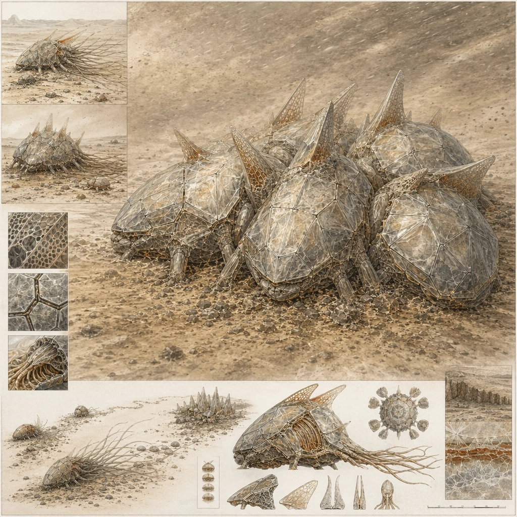
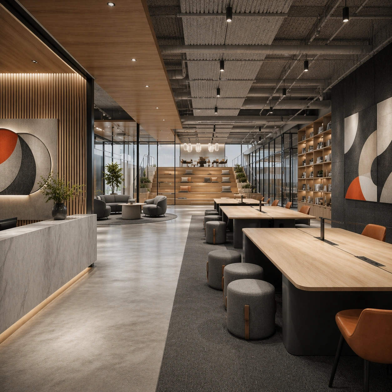
Example generated from “Creative Studio And Office Brand Floor — Cafe Commons Transition”
GPT Image 2en

Scene: Create a square reference-dependent architecture still for Creative Studio and Office Brand Floor. Use a composition linking the office cafe commons to nearby lounge and work points while keeping the same lens discipline, editorial polish, and material believability established by the reference image. The lighting can shift to support the intended mood, but the space must still feel like the same authored project with a stable viewpoint logic, convincing depth separation, and clean commercial-photography finish. Keep warm gray, natural oak, charcoal felt, off-white surfaces, and one controlled accent hue as the governing tonal range even when the emphasis changes. Subject: Show a branded creative studio and office floor with modular collaboration tables, acoustic felt panels, smoked glass partitions, library shelving, soft lounge seating, and clear company personality. Focus on the exact same office from the reference image, now emphasizing pause, social energy, and softer materials. Preserve exact architectural identity, plan logic, material palette, fixture family, and circulation cues from the reference image while changing only the intended emphasis described here. The viewer should immediately recognize the same project, not a loose cousin, with matching silhouette logic, aligned detailing, and consistent brand atmosphere. Important details: Preserve the table system, acoustic materials, glass-partition rhythm, informal lounge furniture, and abstract brand-graphic zones. Any abstract wayfinding, menu, wall-label, or packaging zones must stay unreadable and subordinate to the spatial image. Joinery, edges, reflections, and lighting should remain realistic enough for an operator or design team to treat the image as a credible reference. The variation should feel deliberate and commercially useful, proving that one locked spatial language can flex across multiple campaign or editorial surfaces. Use case: Creative Studio and Office Brand Floor series study 4/9, extending informal social space within the same branded floor. Constraints: No readable text, no watermark, no logos, preserve exact 1:1 aspect ratio, preserve exact architectural identity from the reference image, no office workers, no readable whiteboard text, no startup cliché neon, no messy desks, no cheap task-chair overload, no branded coffee cups.

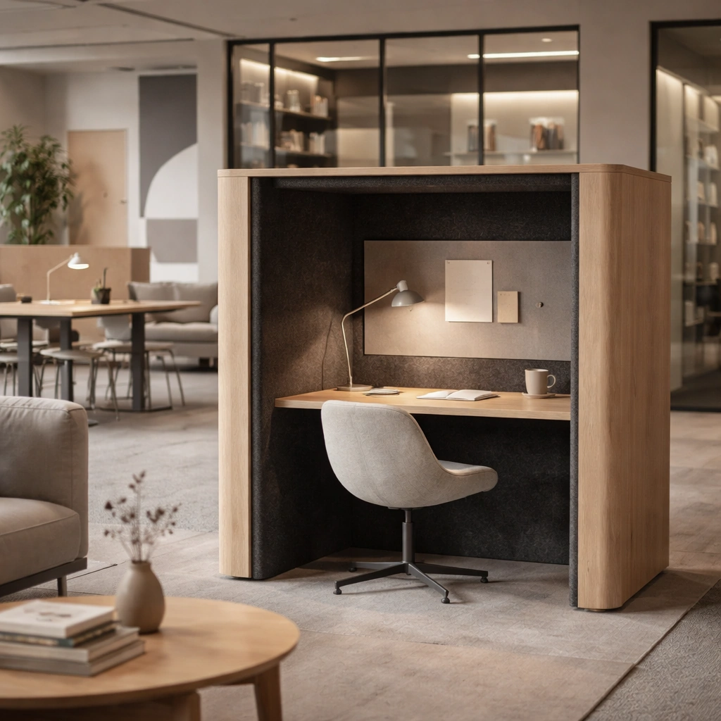
Example generated from “Creative Studio And Office Brand Floor — Focus Booth Study”
GPT Image 2en

Scene: Create a square standalone support study for Creative Studio and Office Brand Floor. Use a quiet focus booth with integrated desk, lamp, and acoustic lining and frame it like a premium commercial still or design-editorial crop with clear focal hierarchy, disciplined perspective, and enough breathing room for the materials and objects to read at both thumbnail and full size. Keep warm gray, natural oak, charcoal felt, off-white surfaces, and one controlled accent hue as the tonal guide so the image still belongs to the same theme family, and light the scene in a controlled way that emphasizes texture, edge quality, and authored atmosphere over spectacle. Subject: Show a branded creative studio and office floor with modular collaboration tables, acoustic felt panels, smoked glass partitions, library shelving, soft lounge seating, and clear company personality. In this support study, focus on privacy, compact comfort, and work-ready calm. The image should work independently, yet it must still feel like it belongs to the same broader world of Studio Office. Make the space, props, and detailing useful for real campaign, editorial, or design-review contexts rather than moodboard abstraction. Important details: Carry forward the broader language of the table system, acoustic materials, glass-partition rhythm, informal lounge furniture, and abstract brand-graphic zones, but let this image prove a new support surface or secondary deliverable. Material realism is essential: wood grain, metal sheen, glass edges, textiles, and stone should feel physically plausible and carefully art directed. Any graphic panels, labels, menus, packaging, or captions must stay abstract and unreadable. The overall result should feel reusable for office leasing decks, employer-brand campaigns, interior editorials, and workspace design reviews, with enough structure that a creative or operations team could build on it. Use case: Creative Studio and Office Brand Floor single study 6/9, exploring support still for flexible office planning. Constraints: No readable text, no watermark, no logos, preserve exact 1:1 aspect ratio, no office workers, no readable whiteboard text, no startup cliché neon, no messy desks, no cheap task-chair overload, no visible computer screens.

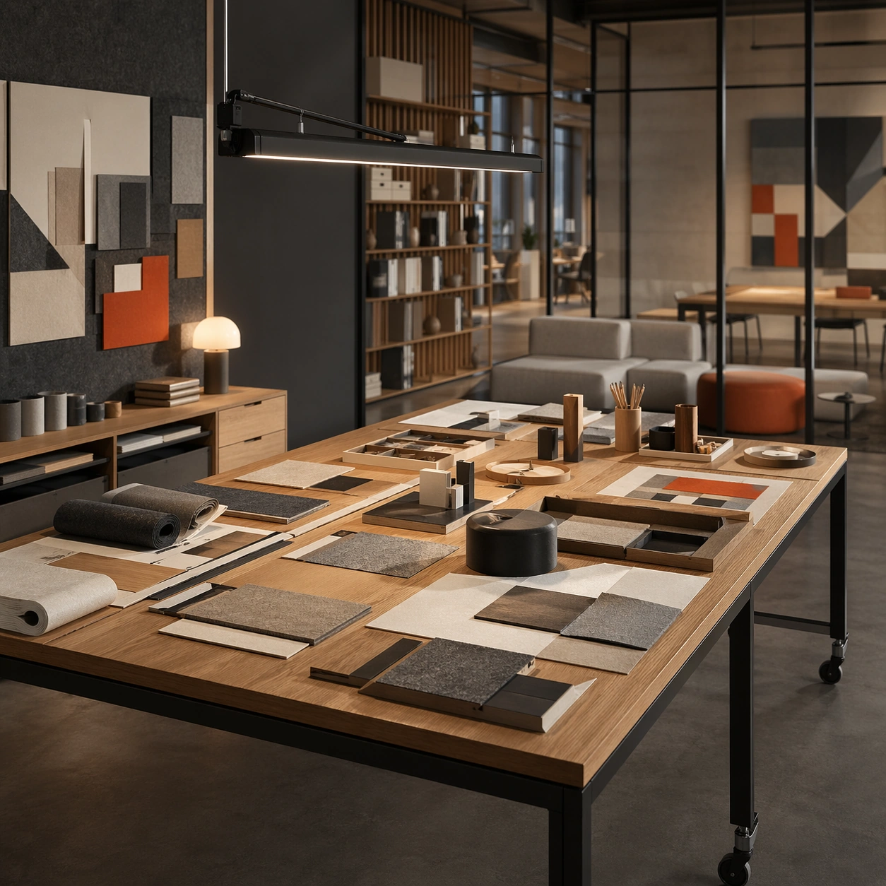
Example generated from “Creative Studio And Office Brand Floor — Maker Table Layout”
GPT Image 2en

Scene: Create a square standalone support study for Creative Studio and Office Brand Floor. Use a maker table with samples, tools, mock forms, and overhead task light and frame it like a premium commercial still or design-editorial crop with clear focal hierarchy, disciplined perspective, and enough breathing room for the materials and objects to read at both thumbnail and full size. Keep warm gray, natural oak, charcoal felt, off-white surfaces, and one controlled accent hue as the tonal guide so the image still belongs to the same theme family, and light the scene in a controlled way that emphasizes texture, edge quality, and authored atmosphere over spectacle. Subject: Show a branded creative studio and office floor with modular collaboration tables, acoustic felt panels, smoked glass partitions, library shelving, soft lounge seating, and clear company personality. In this support study, focus on hands-on process atmosphere while staying clean and brand-polished. The image should work independently, yet it must still feel like it belongs to the same broader world of Studio Office. Make the space, props, and detailing useful for real campaign, editorial, or design-review contexts rather than moodboard abstraction. Important details: Carry forward the broader language of the table system, acoustic materials, glass-partition rhythm, informal lounge furniture, and abstract brand-graphic zones, but let this image prove a new support surface or secondary deliverable. Material realism is essential: wood grain, metal sheen, glass edges, textiles, and stone should feel physically plausible and carefully art directed. Any graphic panels, labels, menus, packaging, or captions must stay abstract and unreadable. The overall result should feel reusable for office leasing decks, employer-brand campaigns, interior editorials, and workspace design reviews, with enough structure that a creative or operations team could build on it. Use case: Creative Studio and Office Brand Floor single study 7/9, exploring support image for creative production identity. Constraints: No readable text, no watermark, no logos, preserve exact 1:1 aspect ratio, no office workers, no readable whiteboard text, no startup cliché neon, no messy desks, no cheap task-chair overload, no scattered mess.

Example generated from “Creative Studio And Office Brand Floor — Brand Corridor Graphics”
GPT Image 2en

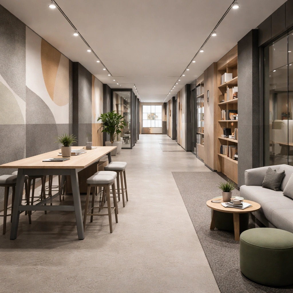
Scene: Create a square standalone support study for Creative Studio and Office Brand Floor. Use a corridor with abstract graphic bands, textured wall panels, and a long perspective and frame it like a premium commercial still or design-editorial crop with clear focal hierarchy, disciplined perspective, and enough breathing room for the materials and objects to read at both thumbnail and full size. Keep warm gray, natural oak, charcoal felt, off-white surfaces, and one controlled accent hue as the tonal guide so the image still belongs to the same theme family, and light the scene in a controlled way that emphasizes texture, edge quality, and authored atmosphere over spectacle. Subject: Show a branded creative studio and office floor with modular collaboration tables, acoustic felt panels, smoked glass partitions, library shelving, soft lounge seating, and clear company personality. In this support study, focus on secondary-space branding without readable text and with strong wayfinding rhythm. The image should work independently, yet it must still feel like it belongs to the same broader world of Studio Office. Make the space, props, and detailing useful for real campaign, editorial, or design-review contexts rather than moodboard abstraction. Important details: Carry forward the broader language of the table system, acoustic materials, glass-partition rhythm, informal lounge furniture, and abstract brand-graphic zones, but let this image prove a new support surface or secondary deliverable. Material realism is essential: wood grain, metal sheen, glass edges, textiles, and stone should feel physically plausible and carefully art directed. Any graphic panels, labels, menus, packaging, or captions must stay abstract and unreadable. The overall result should feel reusable for office leasing decks, employer-brand campaigns, interior editorials, and workspace design reviews, with enough structure that a creative or operations team could build on it. Use case: Creative Studio and Office Brand Floor single study 8/9, exploring support still for brand-in-space systems. Constraints: No readable text, no watermark, no logos, preserve exact 1:1 aspect ratio, no office workers, no readable whiteboard text, no startup cliché neon, no messy desks, no cheap task-chair overload, no slogans or letters.

Example generated from “Creative Studio And Office Brand Floor — Rooftop Collaboration Terrace”
GPT Image 2en

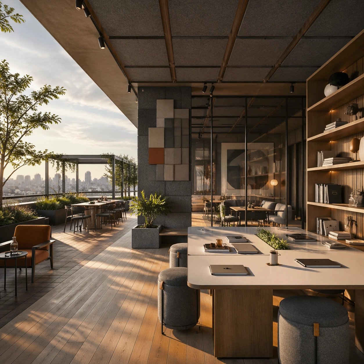
Scene: Create a square standalone support study for Creative Studio and Office Brand Floor. Use a rooftop terrace with outdoor tables, planting, and skyline softness beyond and frame it like a premium commercial still or design-editorial crop with clear focal hierarchy, disciplined perspective, and enough breathing room for the materials and objects to read at both thumbnail and full size. Keep warm gray, natural oak, charcoal felt, off-white surfaces, and one controlled accent hue as the tonal guide so the image still belongs to the same theme family, and light the scene in a controlled way that emphasizes texture, edge quality, and authored atmosphere over spectacle. Subject: Show a branded creative studio and office floor with modular collaboration tables, acoustic felt panels, smoked glass partitions, library shelving, soft lounge seating, and clear company personality. In this support study, focus on company culture, fresh-air work mode, and continuity with interior materials. The image should work independently, yet it must still feel like it belongs to the same broader world of Studio Office. Make the space, props, and detailing useful for real campaign, editorial, or design-review contexts rather than moodboard abstraction. Important details: Carry forward the broader language of the table system, acoustic materials, glass-partition rhythm, informal lounge furniture, and abstract brand-graphic zones, but let this image prove a new support surface or secondary deliverable. Material realism is essential: wood grain, metal sheen, glass edges, textiles, and stone should feel physically plausible and carefully art directed. Any graphic panels, labels, menus, packaging, or captions must stay abstract and unreadable. The overall result should feel reusable for office leasing decks, employer-brand campaigns, interior editorials, and workspace design reviews, with enough structure that a creative or operations team could build on it. Use case: Creative Studio and Office Brand Floor single study 9/9, exploring support image for talent-brand campaigns and office editorials. Constraints: No readable text, no watermark, no logos, preserve exact 1:1 aspect ratio, no office workers, no readable whiteboard text, no startup cliché neon, no messy desks, no cheap task-chair overload, no visible neighboring logos.

Example generated from “Creator Column And Thumbnail Family — Reference Anchor”
GPT Image 2en

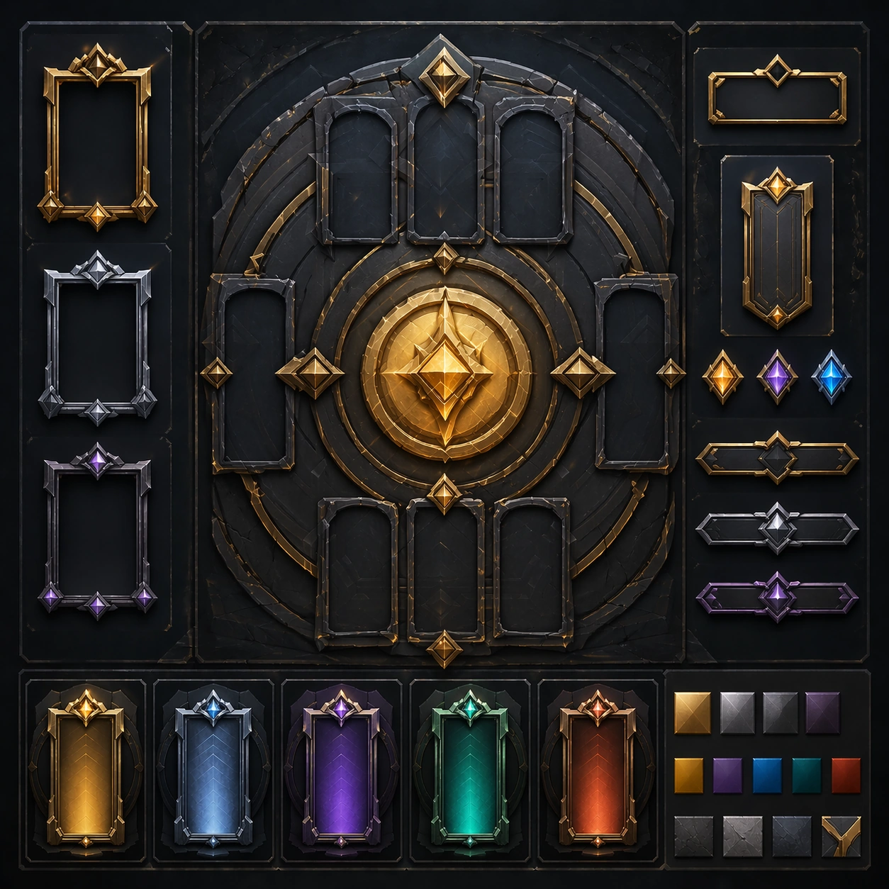
Scene: Create a square reference image for Creator Column and Thumbnail Family. Build a reference anchor establishing the core system with a premium, production-ready finish. Use a polished modular board or campaign surface with clean spacing, premium game-UI finish, and clear focal hierarchy. The composition should feel intentional, clean, and reusable for gallery, research, campaign, or internal handoff contexts. Lighting must support readability first, with the main forms clearly separated from the background and enough breathing room for the system to stay legible at both hero scale and thumbnail scale. Subject: Center a coherent original game-art system built for premium production and marketing surfaces. For this image, focus on reference anchor. Keep the same system logic stable across screenshots, cards, banners, and overview boards. This image is the canonical anchor that later series images must follow. The viewer should immediately understand what role this surface plays inside a cohesive game-production asset pack. Important details: Lock framing, icon grammar, palette blocking, and surface hierarchy so the kit feels production-ready and consistent. Preserve the core silhouette, framing language, and material logic from the reference image while each variation changes function. Keep materials believable, edge hierarchy disciplined, and the visual language consistent with Column Family. Use abstract interface blocks or diagram accents when helpful, but avoid any readable language. The final result should feel like a deliberate production asset rather than a random illustration. Use case: Creator Column and Thumbnail Family series study 1/9, designed as reference anchor within a cohesive asset pack. Constraints: No readable text, no watermark, no logos, preserve exact 1:1 aspect ratio, no unrelated objects, no broken visual hierarchy, no malformed anatomy or broken perspective, no random decorative clutter.

Example generated from “Creator Column And Thumbnail Family — Variant One”
GPT Image 2en

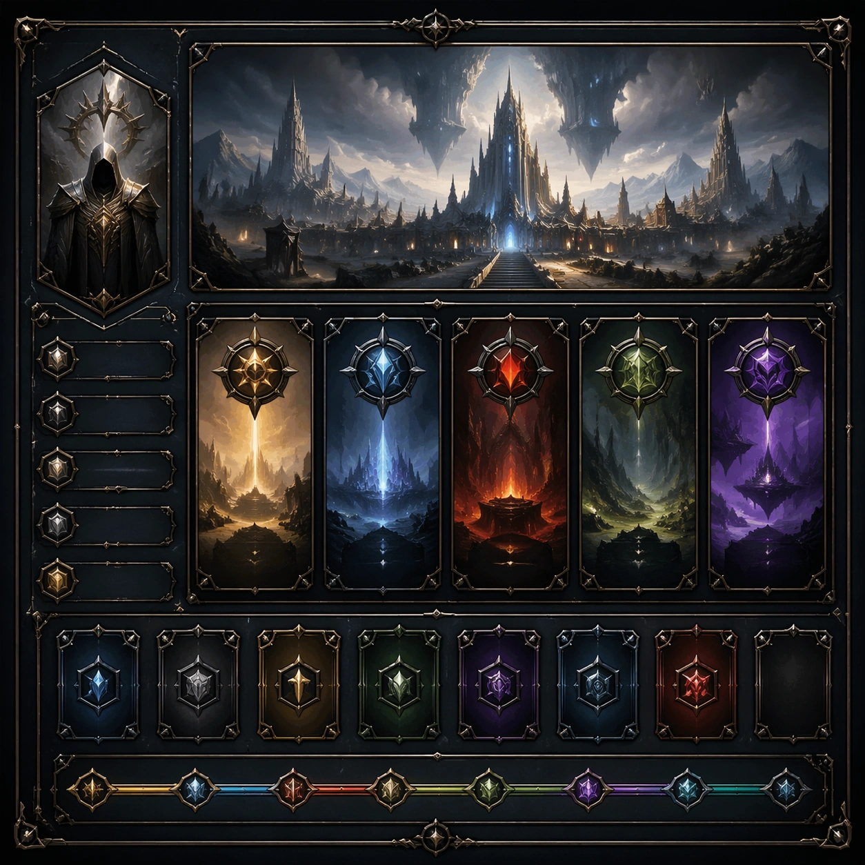
Scene: Create a square dependent image for Creator Column and Thumbnail Family. Build a first controlled variation in the same system with a premium, production-ready finish. Use a polished modular board or campaign surface with clean spacing, premium game-UI finish, and clear focal hierarchy. The composition should feel intentional, clean, and reusable for gallery, research, campaign, or internal handoff contexts. Lighting must support readability first, with the main forms clearly separated from the background and enough breathing room for the system to stay legible at both hero scale and thumbnail scale. Subject: Center a coherent original game-art system built for premium production and marketing surfaces. For this image, focus on the intended support surface. Keep the same system logic stable across screenshots, cards, banners, and overview boards. Preserve exact identity or system logic from the reference image while changing only the intended variation axis. The viewer should immediately understand what role this surface plays inside a cohesive game-production asset pack. Important details: Lock framing, icon grammar, palette blocking, and surface hierarchy so the kit feels production-ready and consistent. Preserve the core silhouette, framing language, and material logic from the reference image while each variation changes function. Keep materials believable, edge hierarchy disciplined, and the visual language consistent with Column Family. Use abstract interface blocks or diagram accents when helpful, but avoid any readable language. The final result should feel like a deliberate production asset rather than a random illustration. Use case: Creator Column and Thumbnail Family series study 2/9, designed as variant one within a cohesive asset pack. Constraints: No readable text, no watermark, no logos, preserve exact 1:1 aspect ratio, no unrelated objects, no broken visual hierarchy, no malformed anatomy or broken perspective, no random decorative clutter.

Example generated from “Creator Column And Thumbnail Family — Variant Two”
GPT Image 2en

Scene: Create a square dependent image for Creator Column and Thumbnail Family. Build a second controlled variation in the same system with a premium, production-ready finish. Use a polished modular board or campaign surface with clean spacing, premium game-UI finish, and clear focal hierarchy. The composition should feel intentional, clean, and reusable for gallery, research, campaign, or internal handoff contexts. Lighting must support readability first, with the main forms clearly separated from the background and enough breathing room for the system to stay legible at both hero scale and thumbnail scale. Subject: Center a coherent original game-art system built for premium production and marketing surfaces. For this image, focus on the intended support surface. Keep the same system logic stable across screenshots, cards, banners, and overview boards. Preserve exact identity or system logic from the reference image while changing only the intended variation axis. The viewer should immediately understand what role this surface plays inside a cohesive game-production asset pack. Important details: Lock framing, icon grammar, palette blocking, and surface hierarchy so the kit feels production-ready and consistent. Preserve the core silhouette, framing language, and material logic from the reference image while each variation changes function. Keep materials believable, edge hierarchy disciplined, and the visual language consistent with Column Family. Use abstract interface blocks or diagram accents when helpful, but avoid any readable language. The final result should feel like a deliberate production asset rather than a random illustration. Use case: Creator Column and Thumbnail Family series study 3/9, designed as variant two within a cohesive asset pack. Constraints: No readable text, no watermark, no logos, preserve exact 1:1 aspect ratio, no unrelated objects, no broken visual hierarchy, no malformed anatomy or broken perspective, no random decorative clutter.

Example generated from “Creator Column And Thumbnail Family — Variant Three”
GPT Image 2en

Scene: Create a square dependent image for Creator Column and Thumbnail Family. Build a third controlled variation in the same system with a premium, production-ready finish. Use a polished modular board or campaign surface with clean spacing, premium game-UI finish, and clear focal hierarchy. The composition should feel intentional, clean, and reusable for gallery, research, campaign, or internal handoff contexts. Lighting must support readability first, with the main forms clearly separated from the background and enough breathing room for the system to stay legible at both hero scale and thumbnail scale. Subject: Center a coherent original game-art system built for premium production and marketing surfaces. For this image, focus on the intended support surface. Keep the same system logic stable across screenshots, cards, banners, and overview boards. Preserve exact identity or system logic from the reference image while changing only the intended variation axis. The viewer should immediately understand what role this surface plays inside a cohesive game-production asset pack. Important details: Lock framing, icon grammar, palette blocking, and surface hierarchy so the kit feels production-ready and consistent. Preserve the core silhouette, framing language, and material logic from the reference image while each variation changes function. Keep materials believable, edge hierarchy disciplined, and the visual language consistent with Column Family. Use abstract interface blocks or diagram accents when helpful, but avoid any readable language. The final result should feel like a deliberate production asset rather than a random illustration. Use case: Creator Column and Thumbnail Family series study 4/9, designed as variant three within a cohesive asset pack. Constraints: No readable text, no watermark, no logos, preserve exact 1:1 aspect ratio, no unrelated objects, no broken visual hierarchy, no malformed anatomy or broken perspective, no random decorative clutter.

Example generated from “Creator Column And Thumbnail Family — Support One”
GPT Image 2en

Scene: Create a square standalone support image for Creator Column and Thumbnail Family. Build a support-surface study with a clear focal hierarchy and a finished professional surface. Use a polished modular board or campaign surface with clean spacing, premium game-UI finish, and clear focal hierarchy. The frame should feel self-contained and polished, with enough structure to explain the system even without the reference series, yet still obviously belonging to the same theme and production world. Subject: Show a coherent original game-art system built for premium production and marketing surfaces in a way that emphasizes the intended support surface. Keep the same system logic stable across screenshots, cards, banners, and overview boards. Even though this image is independent, the viewer should still recognize the same universe, same commercial logic, and same production intent as the core package. Important details: Lock framing, icon grammar, palette blocking, and surface hierarchy so the kit feels production-ready and consistent. Preserve the broader theme language through color, framing, material choices, and modular composition. Use clean panel rhythm, premium asset presentation, and believable detail density. The image should work equally well as a gallery study, research reference, and mock production deliverable. Use case: Creator Column and Thumbnail Family single study 5/9, exploring support one as a support surface. Constraints: No readable text, no watermark, no logos, preserve exact 1:1 aspect ratio, no unrelated objects, no broken visual hierarchy, no visual noise that obscures the main surface, no accidental brand resemblance.

Example generated from “Creator Column And Thumbnail Family — Support Two”
GPT Image 2en

Scene: Create a square standalone support image for Creator Column and Thumbnail Family. Build a second support-surface study with a clear focal hierarchy and a finished professional surface. Use a polished modular board or campaign surface with clean spacing, premium game-UI finish, and clear focal hierarchy. The frame should feel self-contained and polished, with enough structure to explain the system even without the reference series, yet still obviously belonging to the same theme and production world. Subject: Show a coherent original game-art system built for premium production and marketing surfaces in a way that emphasizes the intended support surface. Keep the same system logic stable across screenshots, cards, banners, and overview boards. Even though this image is independent, the viewer should still recognize the same universe, same commercial logic, and same production intent as the core package. Important details: Lock framing, icon grammar, palette blocking, and surface hierarchy so the kit feels production-ready and consistent. Preserve the broader theme language through color, framing, material choices, and modular composition. Use clean panel rhythm, premium asset presentation, and believable detail density. The image should work equally well as a gallery study, research reference, and mock production deliverable. Use case: Creator Column and Thumbnail Family single study 6/9, exploring support two as a support surface. Constraints: No readable text, no watermark, no logos, preserve exact 1:1 aspect ratio, no unrelated objects, no broken visual hierarchy, no visual noise that obscures the main surface, no accidental brand resemblance.

Example generated from “Creator Column And Thumbnail Family — Support Three”
GPT Image 2en

Scene: Create a square standalone support image for Creator Column and Thumbnail Family. Build a third support-surface study with a clear focal hierarchy and a finished professional surface. Use a polished modular board or campaign surface with clean spacing, premium game-UI finish, and clear focal hierarchy. The frame should feel self-contained and polished, with enough structure to explain the system even without the reference series, yet still obviously belonging to the same theme and production world. Subject: Show a coherent original game-art system built for premium production and marketing surfaces in a way that emphasizes the intended support surface. Keep the same system logic stable across screenshots, cards, banners, and overview boards. Even though this image is independent, the viewer should still recognize the same universe, same commercial logic, and same production intent as the core package. Important details: Lock framing, icon grammar, palette blocking, and surface hierarchy so the kit feels production-ready and consistent. Preserve the broader theme language through color, framing, material choices, and modular composition. Use clean panel rhythm, premium asset presentation, and believable detail density. The image should work equally well as a gallery study, research reference, and mock production deliverable. Use case: Creator Column and Thumbnail Family single study 7/9, exploring support three as a support surface. Constraints: No readable text, no watermark, no logos, preserve exact 1:1 aspect ratio, no unrelated objects, no broken visual hierarchy, no visual noise that obscures the main surface, no accidental brand resemblance.

Example generated from “Creator Column And Thumbnail Family — Support Four”
GPT Image 2en

Scene: Create a square standalone support image for Creator Column and Thumbnail Family. Build a fourth support-surface study with a clear focal hierarchy and a finished professional surface. Use a polished modular board or campaign surface with clean spacing, premium game-UI finish, and clear focal hierarchy. The frame should feel self-contained and polished, with enough structure to explain the system even without the reference series, yet still obviously belonging to the same theme and production world. Subject: Show a coherent original game-art system built for premium production and marketing surfaces in a way that emphasizes the intended support surface. Keep the same system logic stable across screenshots, cards, banners, and overview boards. Even though this image is independent, the viewer should still recognize the same universe, same commercial logic, and same production intent as the core package. Important details: Lock framing, icon grammar, palette blocking, and surface hierarchy so the kit feels production-ready and consistent. Preserve the broader theme language through color, framing, material choices, and modular composition. Use clean panel rhythm, premium asset presentation, and believable detail density. The image should work equally well as a gallery study, research reference, and mock production deliverable. Use case: Creator Column and Thumbnail Family single study 8/9, exploring support four as a support surface. Constraints: No readable text, no watermark, no logos, preserve exact 1:1 aspect ratio, no unrelated objects, no broken visual hierarchy, no visual noise that obscures the main surface, no accidental brand resemblance.

Example generated from “Creator Column And Thumbnail Family — Support Five”
GPT Image 2en

Scene: Create a square standalone support image for Creator Column and Thumbnail Family. Build a fifth support-surface study with a clear focal hierarchy and a finished professional surface. Use a polished modular board or campaign surface with clean spacing, premium game-UI finish, and clear focal hierarchy. The frame should feel self-contained and polished, with enough structure to explain the system even without the reference series, yet still obviously belonging to the same theme and production world. Subject: Show a coherent original game-art system built for premium production and marketing surfaces in a way that emphasizes the intended support surface. Keep the same system logic stable across screenshots, cards, banners, and overview boards. Even though this image is independent, the viewer should still recognize the same universe, same commercial logic, and same production intent as the core package. Important details: Lock framing, icon grammar, palette blocking, and surface hierarchy so the kit feels production-ready and consistent. Preserve the broader theme language through color, framing, material choices, and modular composition. Use clean panel rhythm, premium asset presentation, and believable detail density. The image should work equally well as a gallery study, research reference, and mock production deliverable. Use case: Creator Column and Thumbnail Family single study 9/9, exploring support five as a support surface. Constraints: No readable text, no watermark, no logos, preserve exact 1:1 aspect ratio, no unrelated objects, no broken visual hierarchy, no visual noise that obscures the main surface, no accidental brand resemblance.

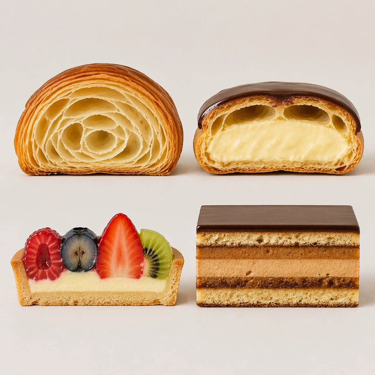
Example generated from “Cross Section Pastry Atlas — Atlas Board Anchor”
GPT Image 2en

Scene: Create a square pastry documentation image on a seamless pale gray or warm ivory studio background with soft catalog lighting and almost no cast-shadow drama. The camera should feel orthographic or gently frontal so cross-sections remain easy to compare. Everything must read like a pastry atlas: clean, measured, and highly legible, with crumbs controlled and edges crisp. Arrange the scene as a square 2x2 board on a seamless pale background, with enough breathing room around each pastry half that the viewer can read structure immediately. The light should be clean and even, revealing layers and fillings without turning the pastries flat or overexposed. Subject: Show four pastry halves aligned on the same plane: one croissant section, one eclair section, one fruit tartlet section, and one opera slice section. Each specimen should be cut cleanly in half and placed with the cut face turned directly toward the camera. The four pieces must feel diverse yet unified by the same photographic discipline and scale logic. Important details: Treat every cut face as the hero: laminated layers, cream density, air pockets, fruit cavities, glaze thickness, and crumb structure all need to be countable and believable. The studio language should stay consistent and understated so structural detail does the work. No element should feel collapsed, smeared, or over-stylized. This image establishes the atlas board system for the series, so spacing, background tone, cut-face angle, and shadow softness must be stable enough for later variations to inherit. Countable layers, precise cream volumes, and controlled crumb falloff are more important than decorative garnish. Use case: Pastry cross-section atlas series study 1/9, defining the reference board for later specimen families. Constraints: No readable text, no watermark, no logos, preserve exact 1:1 aspect ratio, no bakery counter background, no casual napkins, no readable labels, no powdered sugar mess, no rustic knife marks, no serving plates, no forks, no handwritten bakery notes.

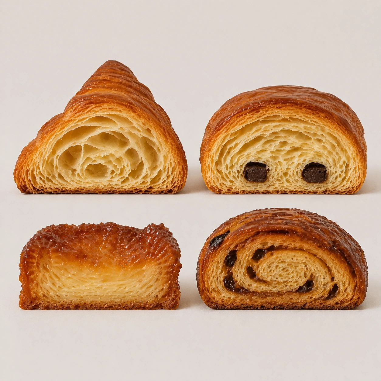
Example generated from “Cross Section Pastry Atlas — Laminated Quartet”
GPT Image 2en

Scene: Create a square pastry documentation image on a seamless pale gray or warm ivory studio background with soft catalog lighting and almost no cast-shadow drama. The camera should feel orthographic or gently frontal so cross-sections remain easy to compare. Everything must read like a pastry atlas: clean, measured, and highly legible, with crumbs controlled and edges crisp. Preserve the exact board spacing, background tone, camera angle, and soft catalog lighting established by the reference image so the grid feels like the same specimen sheet continued. The surface should remain neutral and almost invisible, keeping the eye on the internal structure. Subject: Replace the mixed board with four laminated pastries: croissant, pain au chocolat, kouign-amann wedge, and morning bun section. Each item should be sliced with the cut face presented directly forward, revealing different lamination patterns, sugar crust behavior, and internal air-pocket geometry. The collection should feel taxonomic rather than indulgent. Important details: Treat every cut face as the hero: laminated layers, cream density, air pockets, fruit cavities, glaze thickness, and crumb structure all need to be countable and believable. The studio language should stay consistent and understated so structural detail does the work. No element should feel collapsed, smeared, or over-stylized. Preserve exact specimen spacing, cut orientation, background tone, and shadow softness from the reference model while only changing the pastry family. Butter layers must remain countable, crisp, and dry-edged, with no gummy collapse or cartoon inflation. Use case: Pastry cross-section atlas series study 2/9, focusing the reference board on laminated pastry anatomy. Constraints: No readable text, no watermark, no logos, preserve exact 1:1 aspect ratio, no bakery counter background, no casual napkins, no readable labels, no powdered sugar mess, no rustic knife marks, no melted chocolate drips, no sticky bakery glaze mess, no decorative fruit.

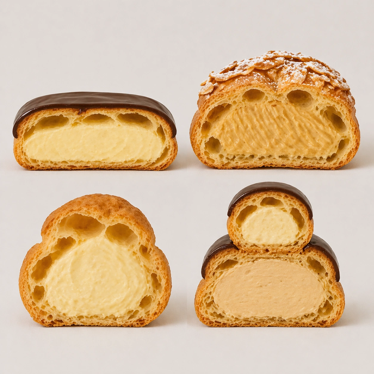
Example generated from “Cross Section Pastry Atlas — Choux Cavity Grid”
GPT Image 2en

Scene: Create a square pastry documentation image on a seamless pale gray or warm ivory studio background with soft catalog lighting and almost no cast-shadow drama. The camera should feel orthographic or gently frontal so cross-sections remain easy to compare. Everything must read like a pastry atlas: clean, measured, and highly legible, with crumbs controlled and edges crisp. Keep the exact board spacing, camera angle, and neutral specimen-sheet lighting from the reference image so the series continuity stays obvious. The background should remain pale and seamless, with only the faintest controlled shadows under each piece. Subject: Present four choux-based specimens cut in half: eclair, Paris-Brest segment, cream puff, and religieuse stack section. Highlight their hollow shells, piped cream chambers, crisp baked crusts, and occasional glaze caps. The group should feel like a rigorous study of void, shell, and filling relationships across one pastry family. Important details: Treat every cut face as the hero: laminated layers, cream density, air pockets, fruit cavities, glaze thickness, and crumb structure all need to be countable and believable. The studio language should stay consistent and understated so structural detail does the work. No element should feel collapsed, smeared, or over-stylized. Preserve exact spacing, background tone, and front-facing cut logic from the reference model while changing only the pastry family. Cream should show piping ridges and weight, while shells need thin yet stable walls that do not look inflated or bread-like. Use case: Pastry cross-section atlas series study 3/9, mapping hollow-shell structure across choux pastry forms. Constraints: No readable text, no watermark, no logos, preserve exact 1:1 aspect ratio, no bakery counter background, no casual napkins, no readable labels, no powdered sugar mess, no rustic knife marks, no melting cream collapse, no cartoon puffs, no extra garnish dust.

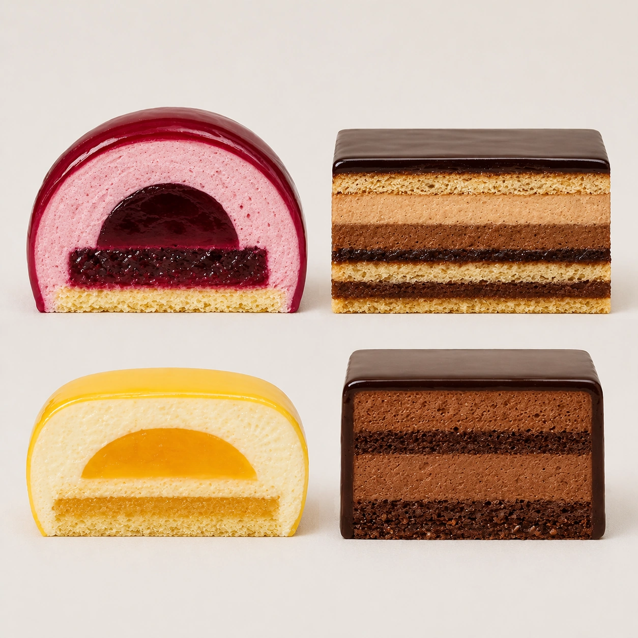
Example generated from “Cross Section Pastry Atlas — Entremet Geometry Board”
GPT Image 2en

Scene: Create a square pastry documentation image on a seamless pale gray or warm ivory studio background with soft catalog lighting and almost no cast-shadow drama. The camera should feel orthographic or gently frontal so cross-sections remain easy to compare. Everything must read like a pastry atlas: clean, measured, and highly legible, with crumbs controlled and edges crisp. Use the same specimen-board spacing, pale background, and frontal cut-face presentation as the reference image, but let the surfaces gain slightly more gloss so mirror glazes and mousse layers stay readable. The lighting must remain calm and documentary. Subject: Show four entremet or mousse-cake sections: one berry dome half, one rectangular opera-inspired mousse bar, one citrus insert cake wedge, and one chocolate glaze cube section. Their exteriors should be polished, but the real focus is the precise internal layering of mousse, sponge, gel insert, and glaze skin. Important details: Treat every cut face as the hero: laminated layers, cream density, air pockets, fruit cavities, glaze thickness, and crumb structure all need to be countable and believable. The studio language should stay consistent and understated so structural detail does the work. No element should feel collapsed, smeared, or over-stylized. Preserve exact spacing, angle, and catalog-light behavior from the reference model while only shifting into colder mousse and glaze structures. Layers need clean boundaries, even thickness, and believable interaction between sponge, cream, and insert. Use case: Pastry cross-section atlas series study 4/9, completing the board system with entremet geometry. Constraints: No readable text, no watermark, no logos, preserve exact 1:1 aspect ratio, no bakery counter background, no casual napkins, no readable labels, no powdered sugar mess, no rustic knife marks, no smeared mirror glaze, no melting edges, no plated restaurant garnishes.

Example generated from “Cross Section Pastry Atlas — Opera Layer Count”
GPT Image 2en

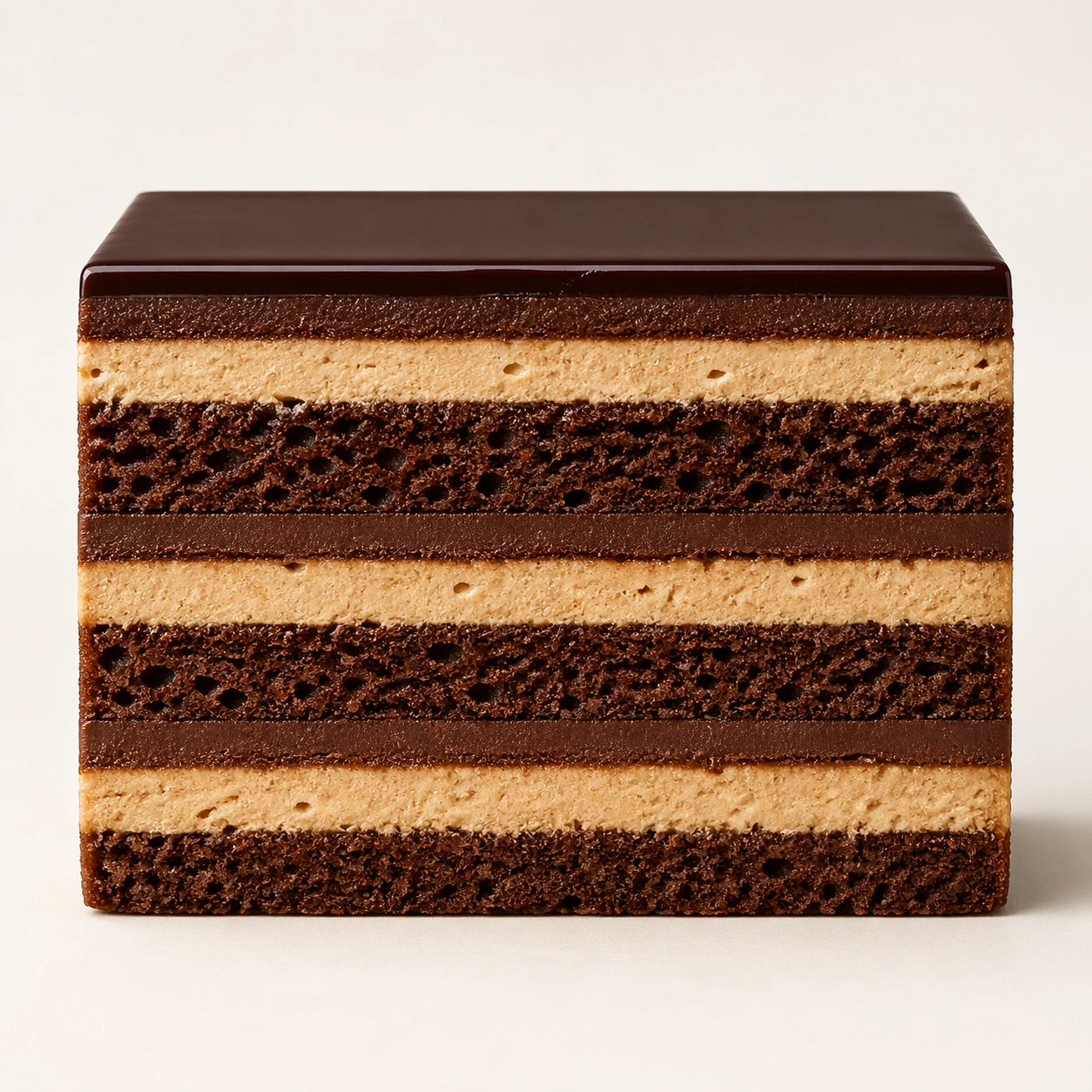
Scene: Create a square pastry documentation image on a seamless pale gray or warm ivory studio background with soft catalog lighting and almost no cast-shadow drama. The camera should feel orthographic or gently frontal so cross-sections remain easy to compare. Everything must read like a pastry atlas: clean, measured, and highly legible, with crumbs controlled and edges crisp. Use a square catalog setup on pale ivory with nearly frontal lighting and a slight shadow at the base. The background should disappear into neutrality so the opera slice reads as stacked architecture. Subject: Present one rectangular opera slice cut with surgical cleanliness, revealing alternating dark sponge, coffee cream, ganache, and a taut glossy top glaze. The slice should hold perfectly vertical edges and accurate proportions from top to bottom. The piece must feel elegant, strict, and highly engineered. Important details: Treat every cut face as the hero: laminated layers, cream density, air pockets, fruit cavities, glaze thickness, and crumb structure all need to be countable and believable. The studio language should stay consistent and understated so structural detail does the work. No element should feel collapsed, smeared, or over-stylized. Layer boundaries should stay crisp and evenly proportioned, with no sagging cream or muddied glaze. The image should reward close counting and comparison, like a pastry textbook plate made luxurious. Use case: Pastry cross-section atlas single study 6/9, documenting opera cake as layered edible architecture. Constraints: No readable text, no watermark, no logos, preserve exact 1:1 aspect ratio, no bakery counter background, no casual napkins, no readable labels, no powdered sugar mess, no rustic knife marks, no garnish gold flakes, no plate rim, no melted chocolate smears.

Example generated from “Cross Section Pastry Atlas — Mille-Feuille Fracture”
GPT Image 2en

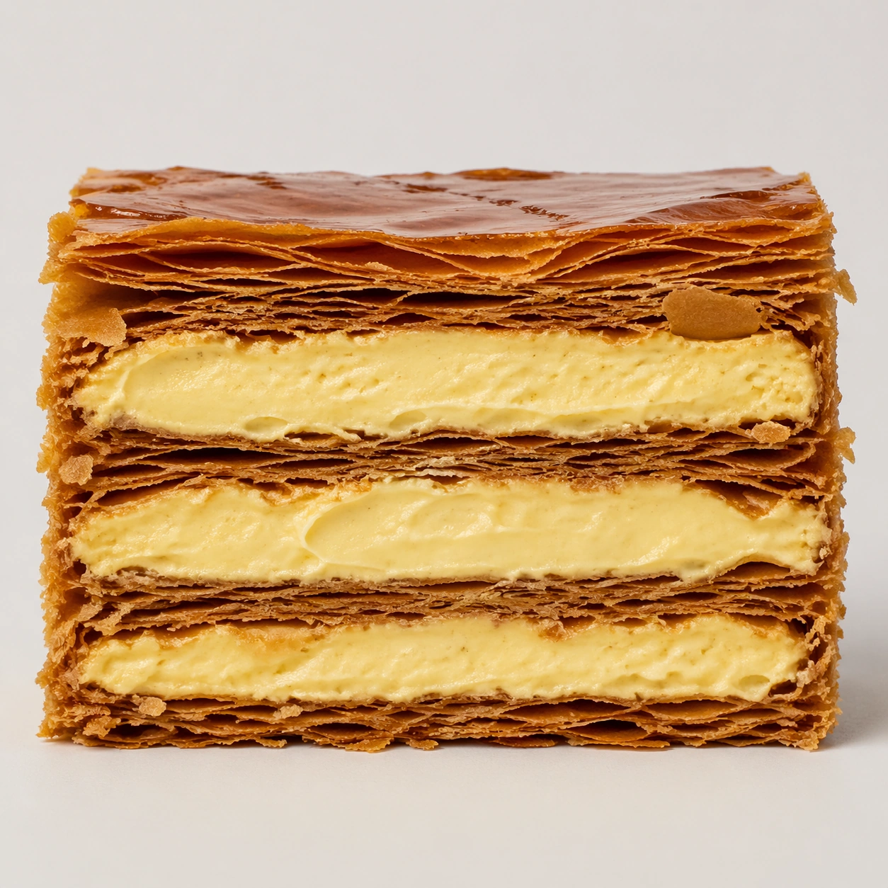
Scene: Create a square pastry documentation image on a seamless pale gray or warm ivory studio background with soft catalog lighting and almost no cast-shadow drama. The camera should feel orthographic or gently frontal so cross-sections remain easy to compare. Everything must read like a pastry atlas: clean, measured, and highly legible, with crumbs controlled and edges crisp. Create a square close documentary shot on a pale neutral field with enough side light to reveal the crisp edges of the pastry sheets. The shadows should remain restrained so the cream layers stay bright and readable. Subject: Show one mille-feuille slice cut or broken cleanly enough to expose dozens of pastry leaves stacked above and below thick pastry cream. The upper layers may show a few slight fractures and flakes, but the overall geometry should remain disciplined and premium. The specimen should feel delicate, brittle, and precise. Important details: Treat every cut face as the hero: laminated layers, cream density, air pockets, fruit cavities, glaze thickness, and crumb structure all need to be countable and believable. The studio language should stay consistent and understated so structural detail does the work. No element should feel collapsed, smeared, or over-stylized. Make the contrast between crisp laminated sheets and smooth compressed cream unmistakable. Flake loss should feel natural but controlled, and no part of the dessert should look soggy or collapsed. Use case: Pastry cross-section atlas single study 7/9, studying fracture and compression inside mille-feuille. Constraints: No readable text, no watermark, no logos, preserve exact 1:1 aspect ratio, no bakery counter background, no casual napkins, no readable labels, no powdered sugar mess, no rustic knife marks, no cafe sugar dust blizzard, no berries on top, no crushed collapse.

Example generated from “Cross Section Pastry Atlas — Fruit Tart Core”
GPT Image 2en

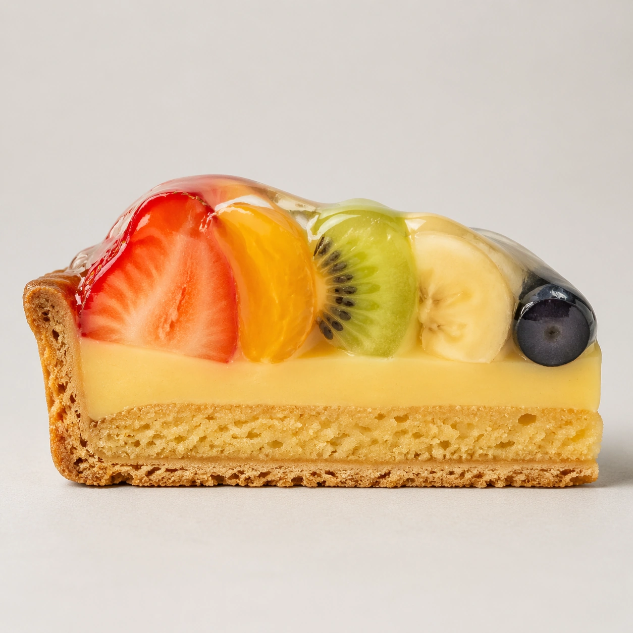
Scene: Create a square pastry documentation image on a seamless pale gray or warm ivory studio background with soft catalog lighting and almost no cast-shadow drama. The camera should feel orthographic or gently frontal so cross-sections remain easy to compare. Everything must read like a pastry atlas: clean, measured, and highly legible, with crumbs controlled and edges crisp. Use a square frontal pastry plate setup on a pale gray seamless background with soft light that reveals glossy fruit and the tart shell interior equally well. The environment must remain neutral and controlled. Subject: Present one fruit tart wedge cut cleanly to reveal the short crust shell, almond cream layer, pastry cream, and stacked fruit slices glazed on top. The cut face should show how the fruit mass sits over the cream without collapsing into mush. The tart must feel elegant, clean, and structurally sound. Important details: Treat every cut face as the hero: laminated layers, cream density, air pockets, fruit cavities, glaze thickness, and crumb structure all need to be countable and believable. The studio language should stay consistent and understated so structural detail does the work. No element should feel collapsed, smeared, or over-stylized. Prioritize distinct textures between crisp shell, dense baked layer, smooth cream, and moist glazed fruit. The fruit should look fresh and believable, but the cross-section logic remains the real hero. Use case: Pastry cross-section atlas single study 8/9, documenting the internal logic of a glazed fruit tart. Constraints: No readable text, no watermark, no logos, preserve exact 1:1 aspect ratio, no bakery counter background, no casual napkins, no readable labels, no powdered sugar mess, no rustic knife marks, no messy juice leakage, no decorative mint bouquet, no uneven cut face.

Example generated from “Cross Section Pastry Atlas — Canele Alveoli Study”
GPT Image 2en

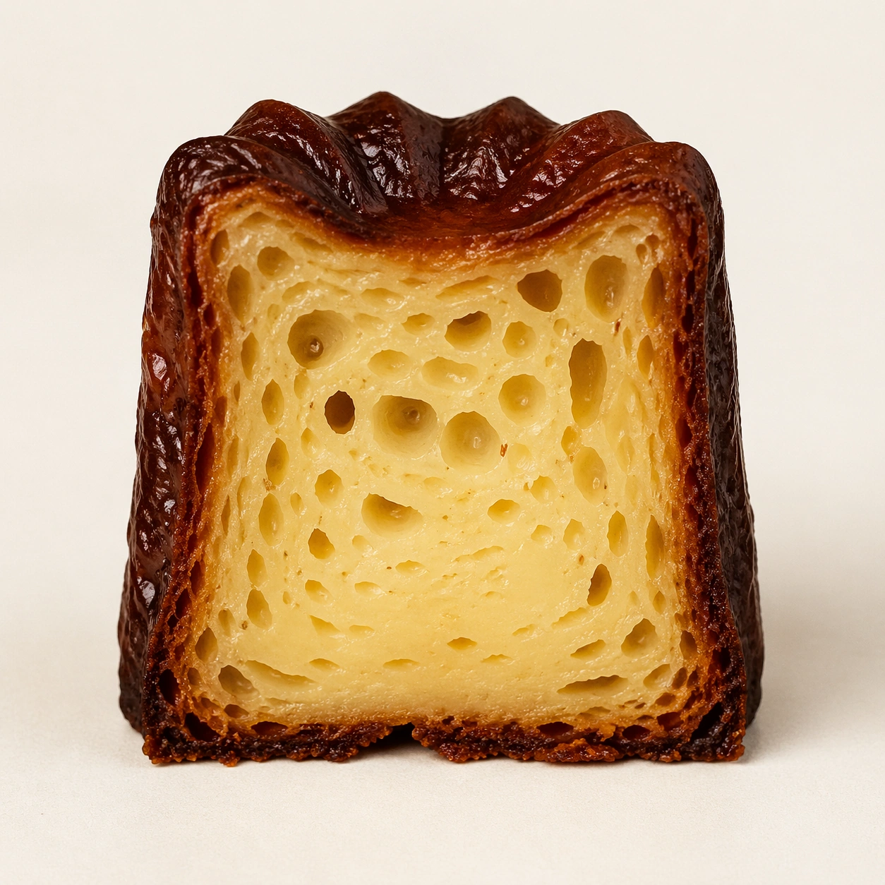
Scene: Create a square pastry documentation image on a seamless pale gray or warm ivory studio background with soft catalog lighting and almost no cast-shadow drama. The camera should feel orthographic or gently frontal so cross-sections remain easy to compare. Everything must read like a pastry atlas: clean, measured, and highly legible, with crumbs controlled and edges crisp. Create a square specimen photograph on warm ivory with soft side light that catches both the ridged dark exterior and the pale open crumb inside. The frame should feel austere and archival. Subject: Show one canele cut perfectly in half from top to base, with the interior facing forward and the exterior retaining its dark caramelized ridges. The crumb should show irregular alveoli and a moist custard-like core, while the shell remains thin, glossy, and deeply browned. The pastry must feel honest and tactile, not idealized into plastic perfection. Important details: Treat every cut face as the hero: laminated layers, cream density, air pockets, fruit cavities, glaze thickness, and crumb structure all need to be countable and believable. The studio language should stay consistent and understated so structural detail does the work. No element should feel collapsed, smeared, or over-stylized. The key contrast is between lacquered shell and tender interior: make both equally believable. Tiny pores, subtle moisture, and crisp outer ridges should all remain visible without making the dessert look wet or underbaked. Use case: Pastry cross-section atlas single study 9/9, capturing canele crust and crumb as one structural contrast. Constraints: No readable text, no watermark, no logos, preserve exact 1:1 aspect ratio, no bakery counter background, no casual napkins, no readable labels, no powdered sugar mess, no rustic knife marks, no syrup puddles, no cafe props, no over-dark burnt shell.

Example generated from “Crystal Ball Narrative — Reference Oracle”
GPT Image 2en

Scene: A dark walnut oracle table in a quiet library at night, black velvet cloth under the object, one warm candle on the left, soft cool moonbeam from a high window on the right, shallow background blur. Subject: a transparent crystal ball on an antique brass three-claw stand, centered on a dark walnut oracle table. The crystal ball fills about 68% of the square image width and remains the main object. Important details: Photorealistic macro still life, 85mm lens, accurate glass refraction and caustics, subtle double reflections on the sphere, crisp brass patina, dark wood grain, inside the ball is a tiny neutral valley with a river and one stone bridge. The miniature world must appear physically inside the glass, not painted on the surface. Use case: Reference-dependent Prompt Atlas series for testing object continuity, runtime --ref injection, and gallery thumbnail readability. Square 1:1 crop-safe composition. Constraints: No readable text, no watermark, no logos, no human hands, no extra crystal balls, no cartoon style, no fantasy glow outside the sphere, preserve exact 1:1 aspect ratio.

Example generated from “Crystal Ball Narrative — Spring Oracle”
GPT Image 2en

Scene: A dark walnut oracle table in a quiet library at night, black velvet cloth under the object, one warm candle on the left, soft cool moonbeam from a high window on the right, shallow background blur. Subject: the same crystal ball and brass stand, now containing a miniature spring world of white blossoms, a winding river, and two tiny travelers. The crystal ball fills about 68% of the square image width and remains the main object. Important details: Photorealistic macro still life, 85mm lens, accurate glass refraction and caustics, subtle double reflections on the sphere, crisp brass patina, dark wood grain, preserve the reference crystal ball identity, tabletop position, brass stand, camera angle, and lighting. The miniature world must appear physically inside the glass, not painted on the surface. Use case: Reference-dependent Prompt Atlas series for testing object continuity, runtime --ref injection, and gallery thumbnail readability. Square 1:1 crop-safe composition. Constraints: No readable text, no watermark, no logos, no human hands, no extra crystal balls, no cartoon style, no fantasy glow outside the sphere, preserve exact 1:1 aspect ratio.

Example generated from “Crystal Ball Narrative — Autumn Oracle”
GPT Image 2en

Scene: A dark walnut oracle table in a quiet library at night, black velvet cloth under the object, one warm candle on the left, soft cool moonbeam from a high window on the right, shallow background blur. Subject: the same crystal ball and brass stand, now containing a miniature autumn forest with copper leaves and a lantern path. The crystal ball fills about 68% of the square image width and remains the main object. Important details: Photorealistic macro still life, 85mm lens, accurate glass refraction and caustics, subtle double reflections on the sphere, crisp brass patina, dark wood grain, preserve the reference crystal ball identity, tabletop position, brass stand, camera angle, and lighting. The miniature world must appear physically inside the glass, not painted on the surface. Use case: Reference-dependent Prompt Atlas series for testing object continuity, runtime --ref injection, and gallery thumbnail readability. Square 1:1 crop-safe composition. Constraints: No readable text, no watermark, no logos, no human hands, no extra crystal balls, no cartoon style, no fantasy glow outside the sphere, preserve exact 1:1 aspect ratio.

Example generated from “Crystal Ball Narrative — Winter Oracle”
GPT Image 2en

Scene: A dark walnut oracle table in a quiet library at night, black velvet cloth under the object, one warm candle on the left, soft cool moonbeam from a high window on the right, shallow background blur. Subject: the same crystal ball and brass stand, now containing a miniature winter cabin beside a frozen river under pale blue aurora light. The crystal ball fills about 68% of the square image width and remains the main object. Important details: Photorealistic macro still life, 85mm lens, accurate glass refraction and caustics, subtle double reflections on the sphere, crisp brass patina, dark wood grain, preserve the reference crystal ball identity, tabletop position, brass stand, camera angle, and lighting. The miniature world must appear physically inside the glass, not painted on the surface. Use case: Reference-dependent Prompt Atlas series for testing object continuity, runtime --ref injection, and gallery thumbnail readability. Square 1:1 crop-safe composition. Constraints: No readable text, no watermark, no logos, no human hands, no extra crystal balls, no cartoon style, no fantasy glow outside the sphere, preserve exact 1:1 aspect ratio.

Example generated from “Crystal Silicon Lifeform — Feeding Fracture Study”
GPT Image 2en

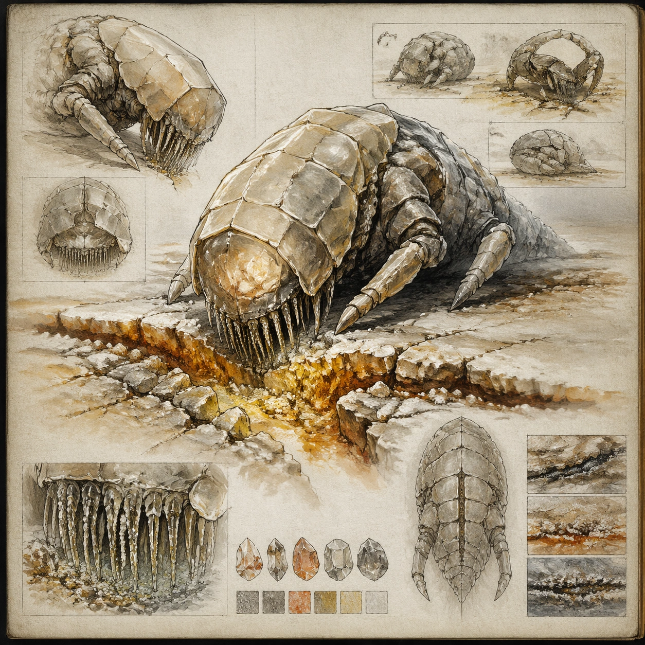
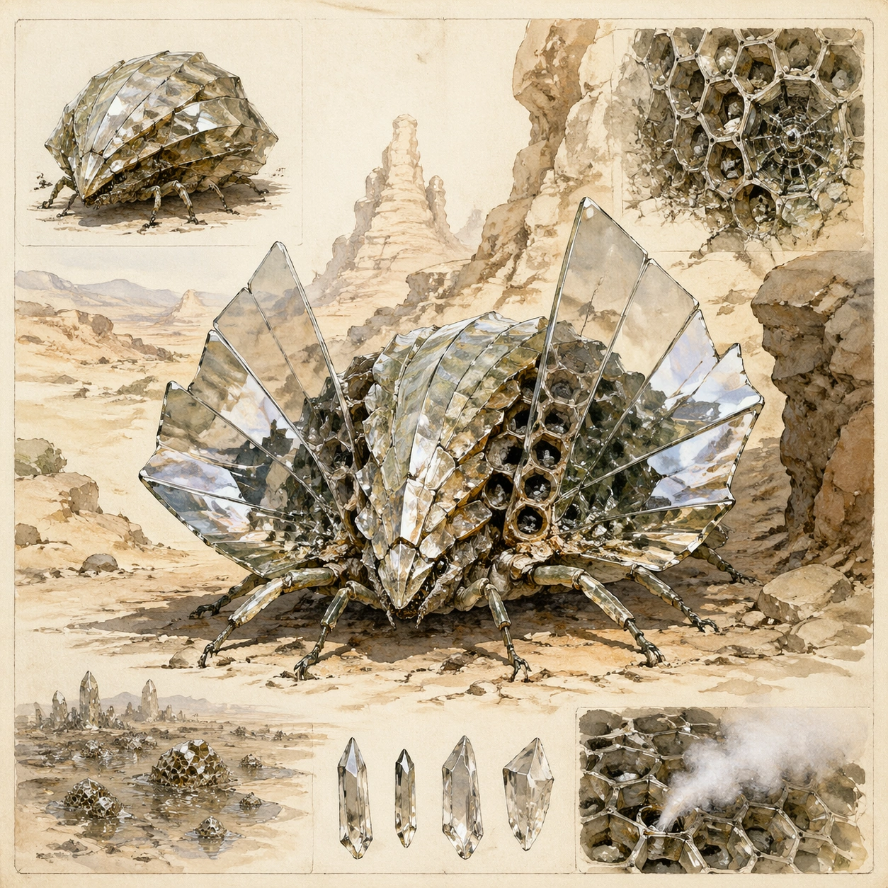
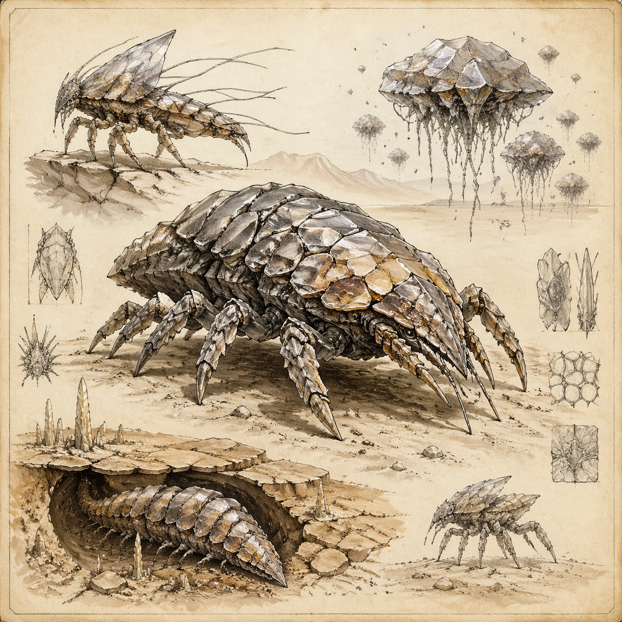
Scene: Design a naturalist notebook page centered on a feeding behavior study, with one main illustration of the organism kneeling at a cracked mineral seam and smaller observational insets around it. The paper should show subtle wash stains, graphite underdrawing, and careful edge shadows that keep the page tactile. Build the frame as a square natural history study with disciplined composition, believable lighting, and enough environmental evidence to explain how this organism or system functions without any caption. Keep the image polished, observational, and suitable for a research gallery rather than pulp fantasy spectacle. Subject: Show the organism opening fine feeding cilia or rasping facets into a fracture line rich in heat and trace minerals. Include secondary views of mineral slurry uptake, worn mouthparts, and residue patterns left behind on the rock crust after feeding. Show the anatomy, habitat interaction, and scale cues clearly so the viewer can infer locomotion, feeding, reproduction, or ecological role from the visual alone. Every visible structure should feel evolved for a purpose, with layered foreground, midground, and background information that rewards close inspection. Important details: Assume these organisms use mineral accretion, fracture repair, thermal gradients, and electrochemical surfaces instead of flesh-heavy metabolisms. Forms should look feasible for an arid silicon ecology: faceted growth, abrasive wear, and slow but purposeful movement across sand and rock. Explain the feeding method through anatomy and composition alone. Fracture geometry, mineral dust, and body posture should all point toward slow extractive feeding rather than predation. The page should feel like a thoughtful behavior note recorded in the field. Favor coherent biology over decorative excess: tissues, shells, membranes, spores, tendrils, fins, silica lattices, or atmospheric sacs should all follow one material logic. Preserve a convincing relationship between the environment and the body plan, use restrained color hierarchy, and make the image feel like a serious speculative field record rather than a random monster concept. Use case: Crystal Silicon Lifeform Field Sketch single study 2/9. Constraints: No readable text, no watermark, no logos, preserve exact 1:1 aspect ratio, no readable annotations, no industrial mining machine look, no laser-beam feeding, no gem-store glamour, no accidental brand resemblance, no direct copy of known terrestrial species, no cartoon simplification.

Example generated from “Crystal Silicon Lifeform — Reproductive Spore Cone”
GPT Image 2en

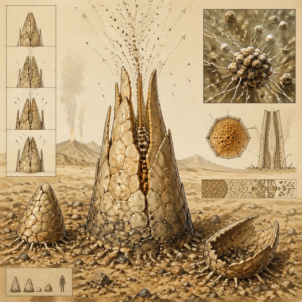
Scene: Compose a cream notebook page dominated by an upright reproductive structure emerging from desert gravel, with supporting inset diagrams showing release stages. Use warm dusty washes and spare pen lines so the scientific page feels quiet and exacting. Build the frame as a square natural history study with disciplined composition, believable lighting, and enough environmental evidence to explain how this organism or system functions without any caption. Keep the image polished, observational, and suitable for a research gallery rather than pulp fantasy spectacle. Subject: Center on a mature reproductive cone whose facets open along pressure seams to vent microscopic silica propagules into dry thermally rising air. Around it, show one immature cone, one post-release shell, and a close observational inset of propagules clinging to charged dust. Show the anatomy, habitat interaction, and scale cues clearly so the viewer can infer locomotion, feeding, reproduction, or ecological role from the visual alone. Every visible structure should feel evolved for a purpose, with layered foreground, midground, and background information that rewards close inspection. Important details: Assume these organisms use mineral accretion, fracture repair, thermal gradients, and electrochemical surfaces instead of flesh-heavy metabolisms. Forms should look feasible for an arid silicon ecology: faceted growth, abrasive wear, and slow but purposeful movement across sand and rock. Make the reproductive logic tangible: staged opening, dry-environment dispersal, and sacrificial material layers that protect the cone until the correct temperature and electrical conditions arrive. Keep the design alien but structurally believable. Favor coherent biology over decorative excess: tissues, shells, membranes, spores, tendrils, fins, silica lattices, or atmospheric sacs should all follow one material logic. Preserve a convincing relationship between the environment and the body plan, use restrained color hierarchy, and make the image feel like a serious speculative field record rather than a random monster concept. Use case: Crystal Silicon Lifeform Field Sketch single study 3/9. Constraints: No readable text, no watermark, no logos, preserve exact 1:1 aspect ratio, no flower analogy, no fantasy crystal bloom, no readable handwriting, no glossy product render finish, no accidental brand resemblance, no direct copy of known terrestrial species, no cartoon simplification.

Example generated from “Crystal Silicon Lifeform — Locomotion Track Plate”
GPT Image 2en

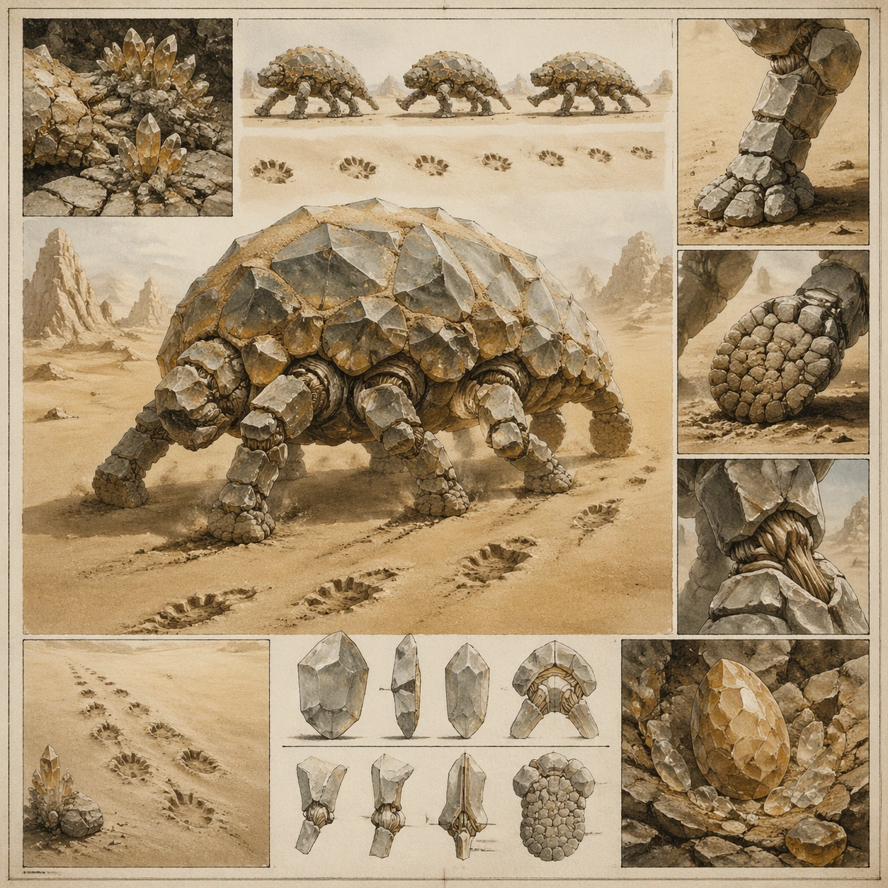
Scene: Lay out a field-journal page that compares motion studies across one square spread: a central moving figure over sand, plus inset track patterns and enlarged limb views. The page should feel neatly composed, like a researcher organizing observations after a long desert traverse. Build the frame as a square natural history study with disciplined composition, believable lighting, and enough environmental evidence to explain how this organism or system functions without any caption. Keep the image polished, observational, and suitable for a research gallery rather than pulp fantasy spectacle. Subject: Show how the organism advances over abrasive dunes using alternating facet edges, flexible fracture joints, and low-pressure contact pads that keep it from sinking. Tracks in the sand should echo the body plan and reveal gait timing without any written notation. Show the anatomy, habitat interaction, and scale cues clearly so the viewer can infer locomotion, feeding, reproduction, or ecological role from the visual alone. Every visible structure should feel evolved for a purpose, with layered foreground, midground, and background information that rewards close inspection. Important details: Assume these organisms use mineral accretion, fracture repair, thermal gradients, and electrochemical surfaces instead of flesh-heavy metabolisms. Forms should look feasible for an arid silicon ecology: faceted growth, abrasive wear, and slow but purposeful movement across sand and rock. Convey locomotion through repeated positions, dust plumes, and footprint spacing rather than cartoon speed lines. The mechanical story matters: how rigid crystal structures still permit movement, shock absorption, and directional control on unstable ground. Favor coherent biology over decorative excess: tissues, shells, membranes, spores, tendrils, fins, silica lattices, or atmospheric sacs should all follow one material logic. Preserve a convincing relationship between the environment and the body plan, use restrained color hierarchy, and make the image feel like a serious speculative field record rather than a random monster concept. Use case: Crystal Silicon Lifeform Field Sketch single study 4/9. Constraints: No readable text, no watermark, no logos, preserve exact 1:1 aspect ratio, no comic-book motion effects, no robotics schematic style, no readable symbols, no chrome metal look, no accidental brand resemblance, no direct copy of known terrestrial species, no cartoon simplification.

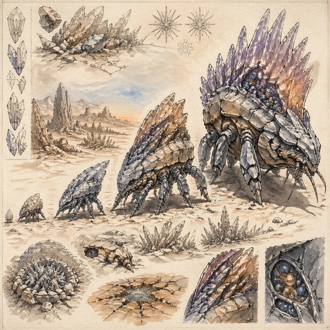
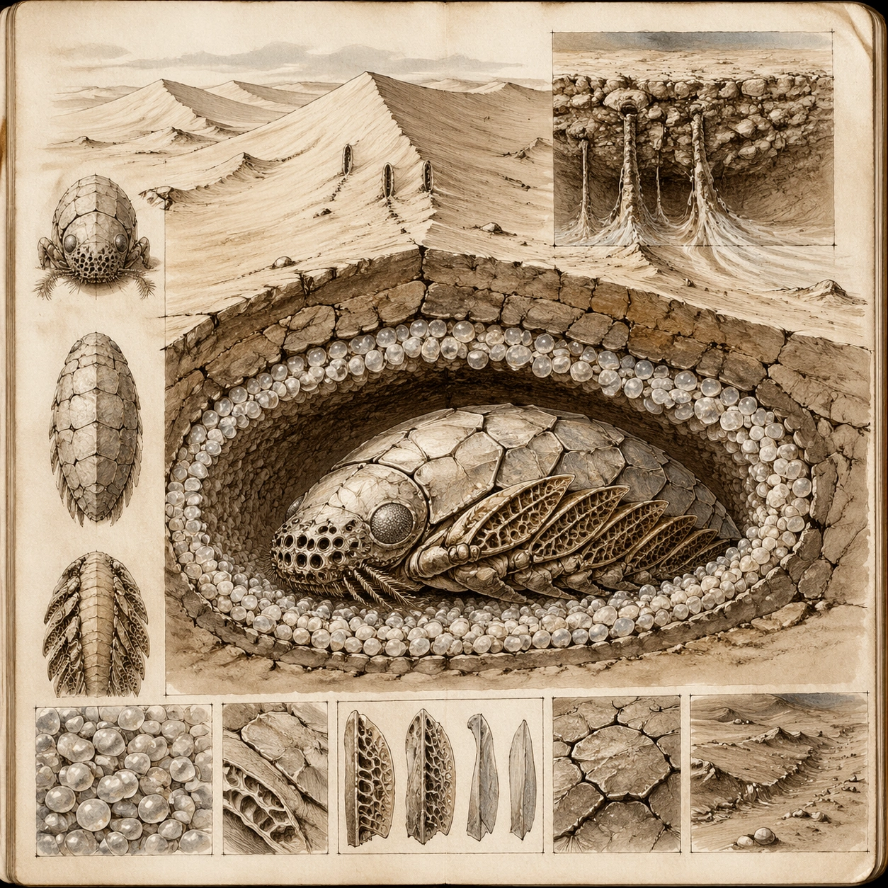
Example generated from “Crystal Silicon Lifeform — Dune Burrow Cross Section”
GPT Image 2en

Scene: Render a notebook page centered on a clean dune cross section, with the main burrow chamber in the lower half and surface dune contours above. Use sepia and pale mineral washes to make the page feel field-made but lucid, with layered sand textures and calm page rhythm. Build the frame as a square natural history study with disciplined composition, believable lighting, and enough environmental evidence to explain how this organism or system functions without any caption. Keep the image polished, observational, and suitable for a research gallery rather than pulp fantasy spectacle. Subject: Illustrate a shelter chamber lined with fused silica pellets where one organism rests during daytime heat spikes. Secondary insets should show vent slits, heat-shedding fins folded for rest, and the relation between surface crust and interior microclimate. Show the anatomy, habitat interaction, and scale cues clearly so the viewer can infer locomotion, feeding, reproduction, or ecological role from the visual alone. Every visible structure should feel evolved for a purpose, with layered foreground, midground, and background information that rewards close inspection. Important details: Assume these organisms use mineral accretion, fracture repair, thermal gradients, and electrochemical surfaces instead of flesh-heavy metabolisms. Forms should look feasible for an arid silicon ecology: faceted growth, abrasive wear, and slow but purposeful movement across sand and rock. This page should explain environmental engineering: how the organism stabilizes loose sand, retains nighttime cold, and protects delicate sensor structures from abrasive storms. Keep the cutaway believable, simple, and academically composed. Favor coherent biology over decorative excess: tissues, shells, membranes, spores, tendrils, fins, silica lattices, or atmospheric sacs should all follow one material logic. Preserve a convincing relationship between the environment and the body plan, use restrained color hierarchy, and make the image feel like a serious speculative field record rather than a random monster concept. Use case: Crystal Silicon Lifeform Field Sketch single study 5/9. Constraints: No readable text, no watermark, no logos, preserve exact 1:1 aspect ratio, no modern infographic arrows, no readable captions, no fantasy cave crystals everywhere, no glossy sci-fi bunker design, no accidental brand resemblance, no direct copy of known terrestrial species, no cartoon simplification.

Example generated from “Crystal Silicon Lifeform — Storm Shelter Cluster”
GPT Image 2en

Scene: Create a naturalist page focused on group behavior during a dust storm, with the main plate showing several organisms interlocking in a shallow basin while dust passes overhead. The paper palette should stay restrained, using pale ocher, gray, and rust washes. Build the frame as a square natural history study with disciplined composition, believable lighting, and enough environmental evidence to explain how this organism or system functions without any caption. Keep the image polished, observational, and suitable for a research gallery rather than pulp fantasy spectacle. Subject: Show how multiple bodies angle their sensor crests inward and lock outer armor facets together to reduce abrasion and preserve charge balance. Small inset views can compare the open roaming posture with the closed storm posture. Show the anatomy, habitat interaction, and scale cues clearly so the viewer can infer locomotion, feeding, reproduction, or ecological role from the visual alone. Every visible structure should feel evolved for a purpose, with layered foreground, midground, and background information that rewards close inspection. Important details: Assume these organisms use mineral accretion, fracture repair, thermal gradients, and electrochemical surfaces instead of flesh-heavy metabolisms. Forms should look feasible for an arid silicon ecology: faceted growth, abrasive wear, and slow but purposeful movement across sand and rock. The cluster should look like an evolved social response, not decorative patterning. Pay attention to contact points, wind direction, sand accumulation, and the tradeoff between protection and sensory awareness. Favor coherent biology over decorative excess: tissues, shells, membranes, spores, tendrils, fins, silica lattices, or atmospheric sacs should all follow one material logic. Preserve a convincing relationship between the environment and the body plan, use restrained color hierarchy, and make the image feel like a serious speculative field record rather than a random monster concept. Use case: Crystal Silicon Lifeform Field Sketch single study 6/9. Constraints: No readable text, no watermark, no logos, preserve exact 1:1 aspect ratio, no military phalanx styling, no robot swarm look, no text labels, no dramatic sci-fi explosions, no accidental brand resemblance, no direct copy of known terrestrial species, no cartoon simplification.

Example generated from “Crystal Silicon Lifeform — Juvenile Growth Sequence”
GPT Image 2en

Scene: Arrange the page as a clean developmental sequence on cream paper, with four life stages stepping across the square from smallest to largest. Soft watercolor washes should distinguish age-related color shifts while pen outlines keep the page disciplined and museum-grade. Build the frame as a square natural history study with disciplined composition, believable lighting, and enough environmental evidence to explain how this organism or system functions without any caption. Keep the image polished, observational, and suitable for a research gallery rather than pulp fantasy spectacle. Subject: Present hatchling shards, mobile juvenile scouts, subadult ridge builders, and a mature adult with fully developed sensor crest and mineral reservoirs. Each stage should share unmistakable lineage while showing believable changes in proportion, armor thickness, and function. Show the anatomy, habitat interaction, and scale cues clearly so the viewer can infer locomotion, feeding, reproduction, or ecological role from the visual alone. Every visible structure should feel evolved for a purpose, with layered foreground, midground, and background information that rewards close inspection. Important details: Assume these organisms use mineral accretion, fracture repair, thermal gradients, and electrochemical surfaces instead of flesh-heavy metabolisms. Forms should look feasible for an arid silicon ecology: faceted growth, abrasive wear, and slow but purposeful movement across sand and rock. Growth should look accretive and geological: edges repaired, facets thickened, and stress lines reorganized over time. The page should feel comparative and educational without relying on words or numeric markers. Favor coherent biology over decorative excess: tissues, shells, membranes, spores, tendrils, fins, silica lattices, or atmospheric sacs should all follow one material logic. Preserve a convincing relationship between the environment and the body plan, use restrained color hierarchy, and make the image feel like a serious speculative field record rather than a random monster concept. Use case: Crystal Silicon Lifeform Field Sketch single study 7/9. Constraints: No readable text, no watermark, no logos, preserve exact 1:1 aspect ratio, no cute baby-animal styling, no toy-figure look, no readable numbering, no fantasy evolution glow, no accidental brand resemblance, no direct copy of known terrestrial species, no cartoon simplification.

Example generated from “Crystal Silicon Lifeform — Predator Defense Display”
GPT Image 2en

Scene: Construct a page around one dramatic but disciplined defense display, with the main figure opening reflective frills against a rocky desert backdrop sketched in wash. The composition should feel observed, not theatrical, as if the naturalist caught a brief warning posture in the field. Build the frame as a square natural history study with disciplined composition, believable lighting, and enough environmental evidence to explain how this organism or system functions without any caption. Keep the image polished, observational, and suitable for a research gallery rather than pulp fantasy spectacle. Subject: Show the animal spreading shard-like lateral plates, angling mirrored surfaces toward a threat, and exposing vibrating resonance cavities that could confuse predators or crack fragile attackers. Include a smaller resting-state inset for comparison. Show the anatomy, habitat interaction, and scale cues clearly so the viewer can infer locomotion, feeding, reproduction, or ecological role from the visual alone. Every visible structure should feel evolved for a purpose, with layered foreground, midground, and background information that rewards close inspection. Important details: Assume these organisms use mineral accretion, fracture repair, thermal gradients, and electrochemical surfaces instead of flesh-heavy metabolisms. Forms should look feasible for an arid silicon ecology: faceted growth, abrasive wear, and slow but purposeful movement across sand and rock. The defense mechanism should derive from the same material logic as the rest of the organism: reflective planes, stress-managed seams, and multipurpose structures that also assist thermoregulation or communication. Avoid turning it into a fantasy weapon showcase. Favor coherent biology over decorative excess: tissues, shells, membranes, spores, tendrils, fins, silica lattices, or atmospheric sacs should all follow one material logic. Preserve a convincing relationship between the environment and the body plan, use restrained color hierarchy, and make the image feel like a serious speculative field record rather than a random monster concept. Use case: Crystal Silicon Lifeform Field Sketch single study 8/9. Constraints: No readable text, no watermark, no logos, preserve exact 1:1 aspect ratio, no battle armor, no humanoid pose, no glowing laser attack, no readable marginal notes, no accidental brand resemblance, no direct copy of known terrestrial species, no cartoon simplification.

Example generated from “Crystal Silicon Lifeform — Comparative Field Page”
GPT Image 2en

Scene: Finish the package with a comparative notebook page that presents several related species on one coherent cream background, balancing one large key organism with smaller companion sketches. The layout should feel like the concluding spread of a naturalist atlas made in the field. Build the frame as a square natural history study with disciplined composition, believable lighting, and enough environmental evidence to explain how this organism or system functions without any caption. Keep the image polished, observational, and suitable for a research gallery rather than pulp fantasy spectacle. Subject: Include a scout form, a burrow specialist, a storm-cluster species, and a juvenile silhouette, each arranged so lineage and niche differences are legible without labels. A faint desert horizon wash can unify the page behind the studies. Show the anatomy, habitat interaction, and scale cues clearly so the viewer can infer locomotion, feeding, reproduction, or ecological role from the visual alone. Every visible structure should feel evolved for a purpose, with layered foreground, midground, and background information that rewards close inspection. Important details: Assume these organisms use mineral accretion, fracture repair, thermal gradients, and electrochemical surfaces instead of flesh-heavy metabolisms. Forms should look feasible for an arid silicon ecology: faceted growth, abrasive wear, and slow but purposeful movement across sand and rock. This page should summarize the ecosystem through morphology and composition alone. Preserve consistency of pen style, paper texture, and mineral logic while giving each species enough distinction to feel evolutionarily related but ecologically separate. Favor coherent biology over decorative excess: tissues, shells, membranes, spores, tendrils, fins, silica lattices, or atmospheric sacs should all follow one material logic. Preserve a convincing relationship between the environment and the body plan, use restrained color hierarchy, and make the image feel like a serious speculative field record rather than a random monster concept. Use case: Crystal Silicon Lifeform Field Sketch single study 9/9. Constraints: No readable text, no watermark, no logos, preserve exact 1:1 aspect ratio, no specimen cutout collage, no readable titles, no modern UI boxes, no polished gemstone catalogue look, no accidental brand resemblance, no direct copy of known terrestrial species, no cartoon simplification.

Example generated from “Cuban 70S Revolution Print — Canonical One-Sheet”
GPT Image 2en

Scene: A square straight-on studio view of a pristine poster mounted on a matte wall with even museum lighting, crisp corners, and enough breathing room around the sheet for the full composition to read as an intentional object. The poster should express 1970s Caribbean solidarity silkscreen with fluorescent flat planes, stencil edges, posterized faces, and lively registration drift, using hot pink, turquoise, lime, orange, black, and warm off-white paper and a tactile surface appropriate to the medium. Subject: Build the flagship poster statement for this style, with the strongest hierarchy, the clearest subject silhouette, and the most disciplined balance between image field, pseudo-typography, and empty space. Use profiles, palms, sun discs, megaphones, marching silhouettes, stars, and tropical botanical shapes as the main visual ingredients, and organize them with blocky title slabs and seal-like shapes rendered as non-readable silkscreen graphics. For the contemporary-subject axis, thread in community gardens, rooftop speakers, and neighborhood bicycles absorbed into a solidarity poster language. The poster must feel like an original design object rather than a reproduction of any known work. Important details: Treat this as the cleanest thesis image in the set: the paper should look fresh, the inks or paint should feel deliberate, and every formal rule of the style should be easy to study at a glance. Preserve flat color stacking, visible plate misalignment, rough fibers, and heated tropical energy without realism. Keep every letterform abstract and non-readable, as if it were a typographic texture rather than language. Make the style unmistakable through composition, palette, surface behavior, and symbolic compression. no airbrushed realism, no corporate polish, no clean luxury gradients, no literal readable slogans. Use case: Cuban Silkscreen single study 1/9, establishing the cleanest museum-grade poster reading. Constraints: No readable text, no watermark, no logos, preserve exact 1:1 aspect ratio, no copyrighted characters, no real brand marks, no QR codes, no interface chrome, no accidental gibberish lettering.

Example generated from “Cuban 70S Revolution Print — Print Proof Flatlay”
GPT Image 2en

Scene: A square overhead tabletop photograph of a fresh poster proof on neutral worktable paper, lit by cool daylight, with crop marks, tape tabs, and slight paper bow visible around the sheet. The poster should express 1970s Caribbean solidarity silkscreen with fluorescent flat planes, stencil edges, posterized faces, and lively registration drift, using hot pink, turquoise, lime, orange, black, and warm off-white paper and a tactile surface appropriate to the medium. Subject: Design the poster as a print-shop proof, preserving the same poster language while allowing production clues such as edge trims, registration targets, and process marks to frame the composition. Use profiles, palms, sun discs, megaphones, marching silhouettes, stars, and tropical botanical shapes as the main visual ingredients, and organize them with blocky title slabs and seal-like shapes rendered as non-readable silkscreen graphics. For the contemporary-subject axis, thread in community gardens, rooftop speakers, and neighborhood bicycles absorbed into a solidarity poster language. The poster must feel like an original design object rather than a reproduction of any known work. Important details: The image must still read as a finished poster concept, but it should carry believable print-process evidence and material tactility instead of gallery-wall perfection. Preserve flat color stacking, visible plate misalignment, rough fibers, and heated tropical energy without realism. Keep every letterform abstract and non-readable, as if it were a typographic texture rather than language. Make the style unmistakable through composition, palette, surface behavior, and symbolic compression. no airbrushed realism, no corporate polish, no clean luxury gradients, no literal readable slogans. Use case: Cuban Silkscreen single study 2/9, testing production realism and process evidence. Constraints: No readable text, no watermark, no logos, preserve exact 1:1 aspect ratio, no copyrighted characters, no real brand marks, no QR codes, no interface chrome, no accidental gibberish lettering.

Example generated from “Cuban 70S Revolution Print — Transit Lightbox”
GPT Image 2en

Scene: A square dusk street photograph of a backlit transit poster glowing inside glass, with faint rain reflections, soft city blur in the distance, and the poster remaining fully legible as a composition. The poster should express 1970s Caribbean solidarity silkscreen with fluorescent flat planes, stencil edges, posterized faces, and lively registration drift, using hot pink, turquoise, lime, orange, black, and warm off-white paper and a tactile surface appropriate to the medium. Subject: Adapt the poster into a public-facing lightbox version that still honors the original style grammar while feeling bold enough to stop a passerby from several meters away. Use profiles, palms, sun discs, megaphones, marching silhouettes, stars, and tropical botanical shapes as the main visual ingredients, and organize them with blocky title slabs and seal-like shapes rendered as non-readable silkscreen graphics. For the contemporary-subject axis, thread in community gardens, rooftop speakers, and neighborhood bicycles absorbed into a solidarity poster language. The poster must feel like an original design object rather than a reproduction of any known work. Important details: Let the style survive the illumination test: color blocking, silhouette contrast, and abstract lettering should stay controlled under bright internal light and reflective glass. Preserve flat color stacking, visible plate misalignment, rough fibers, and heated tropical energy without realism. Keep every letterform abstract and non-readable, as if it were a typographic texture rather than language. Make the style unmistakable through composition, palette, surface behavior, and symbolic compression. no airbrushed realism, no corporate polish, no clean luxury gradients, no literal readable slogans. Use case: Cuban Silkscreen single study 3/9, testing distance readability in public display. Constraints: No readable text, no watermark, no logos, preserve exact 1:1 aspect ratio, no copyrighted characters, no real brand marks, no QR codes, no interface chrome, no accidental gibberish lettering.

Example generated from “Cuban 70S Revolution Print — Wheatpaste Wall Layer”
GPT Image 2en

Scene: A square urban wall study with the poster pasted onto rough plaster among torn edges and older paper remnants, photographed in soft overcast light so texture, glue bubbles, and surface scars stay visible. The poster should express 1970s Caribbean solidarity silkscreen with fluorescent flat planes, stencil edges, posterized faces, and lively registration drift, using hot pink, turquoise, lime, orange, black, and warm off-white paper and a tactile surface appropriate to the medium. Subject: Create a version that feels made for the street, with the poster carrying enough formal force to survive abrasion, layering, and imperfect placement without losing its visual identity. Use profiles, palms, sun discs, megaphones, marching silhouettes, stars, and tropical botanical shapes as the main visual ingredients, and organize them with blocky title slabs and seal-like shapes rendered as non-readable silkscreen graphics. For the contemporary-subject axis, thread in community gardens, rooftop speakers, and neighborhood bicycles absorbed into a solidarity poster language. The poster must feel like an original design object rather than a reproduction of any known work. Important details: Keep the main design intact but let the environment add grit: lifted corners, tiny tears, wrinkled paper, and older color fragments around the perimeter should amplify the style rather than dilute it. Preserve flat color stacking, visible plate misalignment, rough fibers, and heated tropical energy without realism. Keep every letterform abstract and non-readable, as if it were a typographic texture rather than language. Make the style unmistakable through composition, palette, surface behavior, and symbolic compression. no airbrushed realism, no corporate polish, no clean luxury gradients, no literal readable slogans. Use case: Cuban Silkscreen single study 4/9, testing street-life durability and layered context. Constraints: No readable text, no watermark, no logos, preserve exact 1:1 aspect ratio, no copyrighted characters, no real brand marks, no QR codes, no interface chrome, no accidental gibberish lettering.

Example generated from “Cuban 70S Revolution Print — Folded Archive Copy”
GPT Image 2en

Scene: A square conservation-table view of a vintage poster laid on gray felt under raking light, with visible fold lines, softened corners, and subtle aging that still preserves the integrity of the image. The poster should express 1970s Caribbean solidarity silkscreen with fluorescent flat planes, stencil edges, posterized faces, and lively registration drift, using hot pink, turquoise, lime, orange, black, and warm off-white paper and a tactile surface appropriate to the medium. Subject: Present the poster as an archive copy that has been stored, unfolded, and carefully documented, letting age and handling reveal how the design holds up across time. Use profiles, palms, sun discs, megaphones, marching silhouettes, stars, and tropical botanical shapes as the main visual ingredients, and organize them with blocky title slabs and seal-like shapes rendered as non-readable silkscreen graphics. For the contemporary-subject axis, thread in community gardens, rooftop speakers, and neighborhood bicycles absorbed into a solidarity poster language. The poster must feel like an original design object rather than a reproduction of any known work. Important details: Aging must stay believable rather than theatrical: slight yellowing, fold memory, edge wear, and pigment variation should support the historical or crafted feeling of the style. Preserve flat color stacking, visible plate misalignment, rough fibers, and heated tropical energy without realism. Keep every letterform abstract and non-readable, as if it were a typographic texture rather than language. Make the style unmistakable through composition, palette, surface behavior, and symbolic compression. no airbrushed realism, no corporate polish, no clean luxury gradients, no literal readable slogans. Use case: Cuban Silkscreen single study 5/9, testing archival endurance and age character. Constraints: No readable text, no watermark, no logos, preserve exact 1:1 aspect ratio, no copyrighted characters, no real brand marks, no QR codes, no interface chrome, no accidental gibberish lettering.