PROMPTS · KREATIV ENTDECKEN

Prompt-Galerie

Echte Prompts und erzeugte Beispiele erkunden. Inspiration für Ihre nächste kreative Mission finden und den vollständigen Prompt kostenlos kopieren.

Beispiele
10,950
Modelle
15
Quellen
1269
10.950 Prompt-Beispiele · Seite 8 von 229
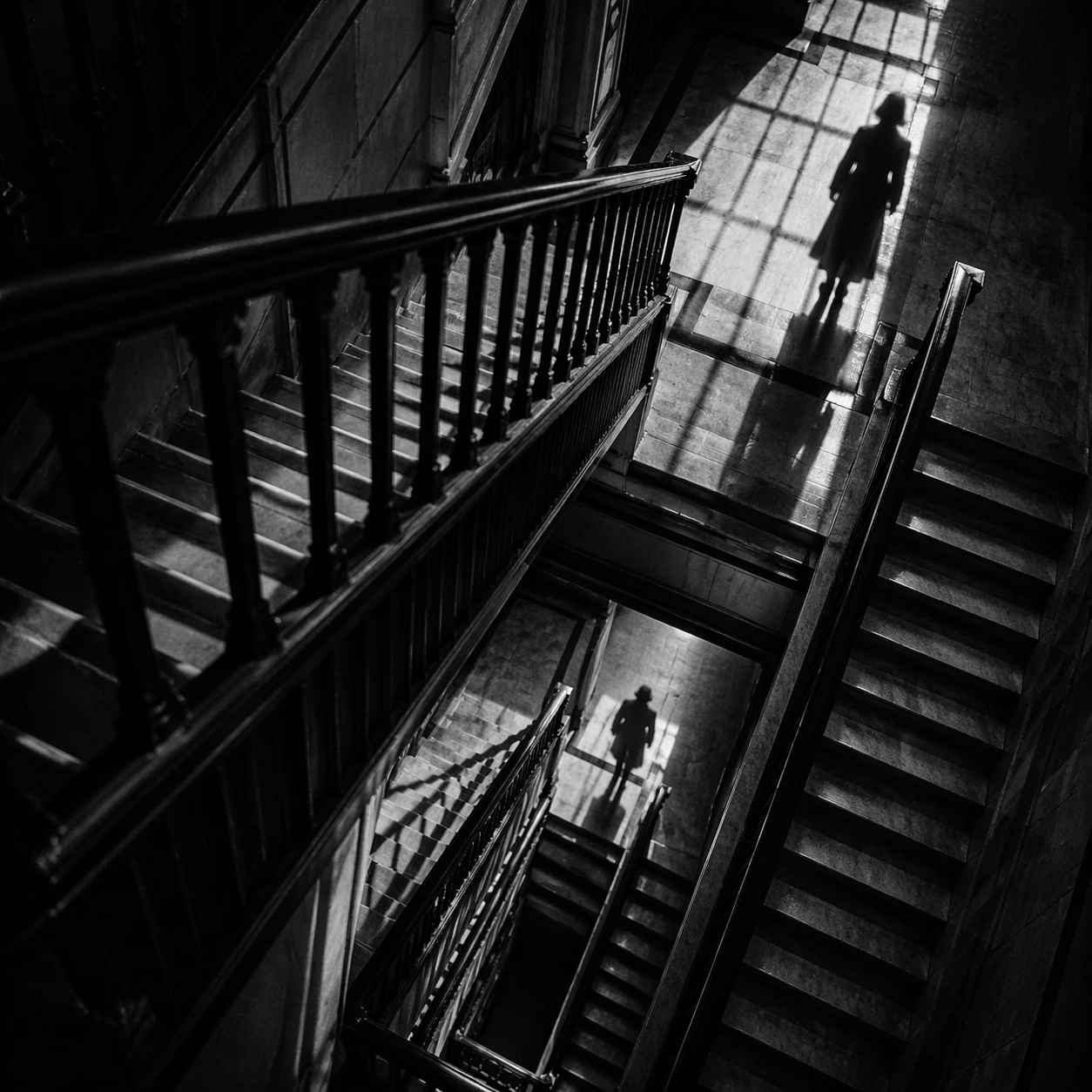
Example generated from “Suspense Staircase Shadow — Banister Pursuit”
GPT Image 2en

Scene: A square black-and-white thriller frame with hard contrast, deep blacks, silvery highlights, and geometric shadow patterns cast by railings, blinds, or stained glass. The camera should feel deliberate and predatory, often high above or pinned to an anxious architectural angle. Shoot diagonally across a multi-level stairwell so banister rails stack into dense stripes over a pale floor below. Subject: Build the image around stairs, shadows, landings, banisters, and one isolated figure whose presence is defined as much by silhouette as by body. Fear should come from spacing, emptiness, and the logic of light rather than from explicit violence. Two figures are visible only as separated shadows on different levels, one clearly gaining on the other. Important details: The governing grammar is suspense through architecture. Preserve crisp edges between light and shadow, polished floor reflections, severe stair geometry, and a sense of silent movement just before or after an event. Avoid modern clutter, color accents, or loose handheld energy. Keep bodies secondary and let the rail geometry do most of the emotional work. Use case: Suspense Staircase Shadow single study 4/9. Constraints: No readable text, no watermark, no logos, preserve exact 1:1 aspect ratio, no gore, no monsters, no readable signage, no casual daylight realism, no fog machine effect, no broken anatomy, no low-detail background, no accidental text fragments.
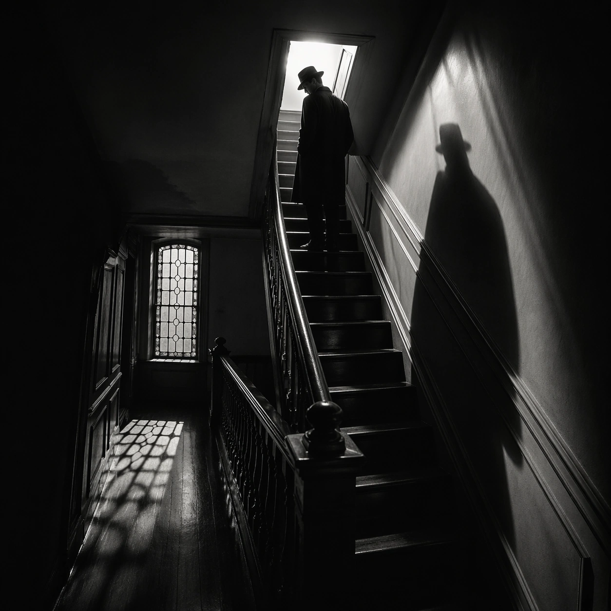
Example generated from “Suspense Staircase Shadow — Attic Hatch”
GPT Image 2en

Scene: A square black-and-white thriller frame with hard contrast, deep blacks, silvery highlights, and geometric shadow patterns cast by railings, blinds, or stained glass. The camera should feel deliberate and predatory, often high above or pinned to an anxious architectural angle. Show a tight final stair flight leading to a small attic hatch blazing with white light at the top. Subject: Build the image around stairs, shadows, landings, banisters, and one isolated figure whose presence is defined as much by silhouette as by body. Fear should come from spacing, emptiness, and the logic of light rather than from explicit violence. A man with hat brim lowered pauses two steps below the hatch while his shadow pours down the wall behind him. Important details: The governing grammar is suspense through architecture. Preserve crisp edges between light and shadow, polished floor reflections, severe stair geometry, and a sense of silent movement just before or after an event. Avoid modern clutter, color accents, or loose handheld energy. The contrast between the small bright square and the surrounding darkness should carry the whole composition. Use case: Suspense Staircase Shadow single study 5/9. Constraints: No readable text, no watermark, no logos, preserve exact 1:1 aspect ratio, no gore, no monsters, no readable signage, no casual daylight realism, no fog machine effect, no broken anatomy, no low-detail background, no accidental text fragments.
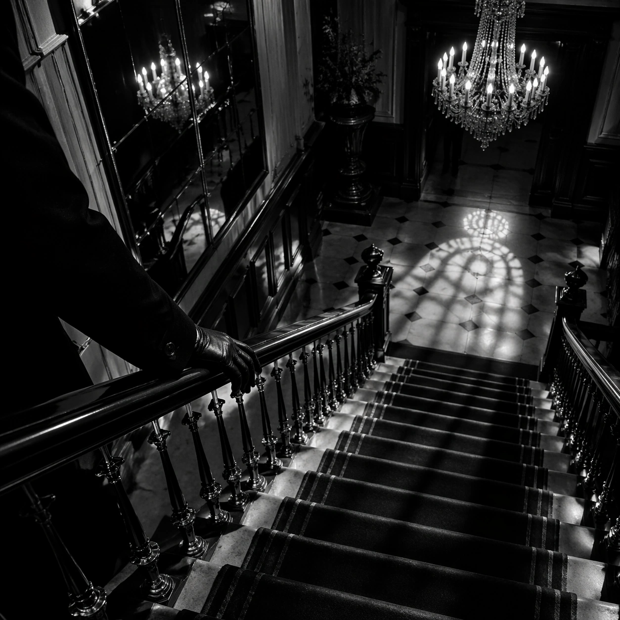
Example generated from “Suspense Staircase Shadow — Velvet Hall Descent”
GPT Image 2en

Scene: A square black-and-white thriller frame with hard contrast, deep blacks, silvery highlights, and geometric shadow patterns cast by railings, blinds, or stained glass. The camera should feel deliberate and predatory, often high above or pinned to an anxious architectural angle. Use a grand hall stair with velvet runner, mirrored wall panels, and one chandelier casting sharp pools of light onto the steps. Subject: Build the image around stairs, shadows, landings, banisters, and one isolated figure whose presence is defined as much by silhouette as by body. Fear should come from spacing, emptiness, and the logic of light rather than from explicit violence. A gloved hand trails along the banister while the body remains mostly outside frame, turning descent into a fragmentary threat. Important details: The governing grammar is suspense through architecture. Preserve crisp edges between light and shadow, polished floor reflections, severe stair geometry, and a sense of silent movement just before or after an event. Avoid modern clutter, color accents, or loose handheld energy. Favor gleaming banister metal, hard shadows, and a feeling of expensive danger over overt action. Use case: Suspense Staircase Shadow single study 6/9. Constraints: No readable text, no watermark, no logos, preserve exact 1:1 aspect ratio, no gore, no monsters, no readable signage, no casual daylight realism, no fog machine effect, no broken anatomy, no low-detail background, no accidental text fragments.
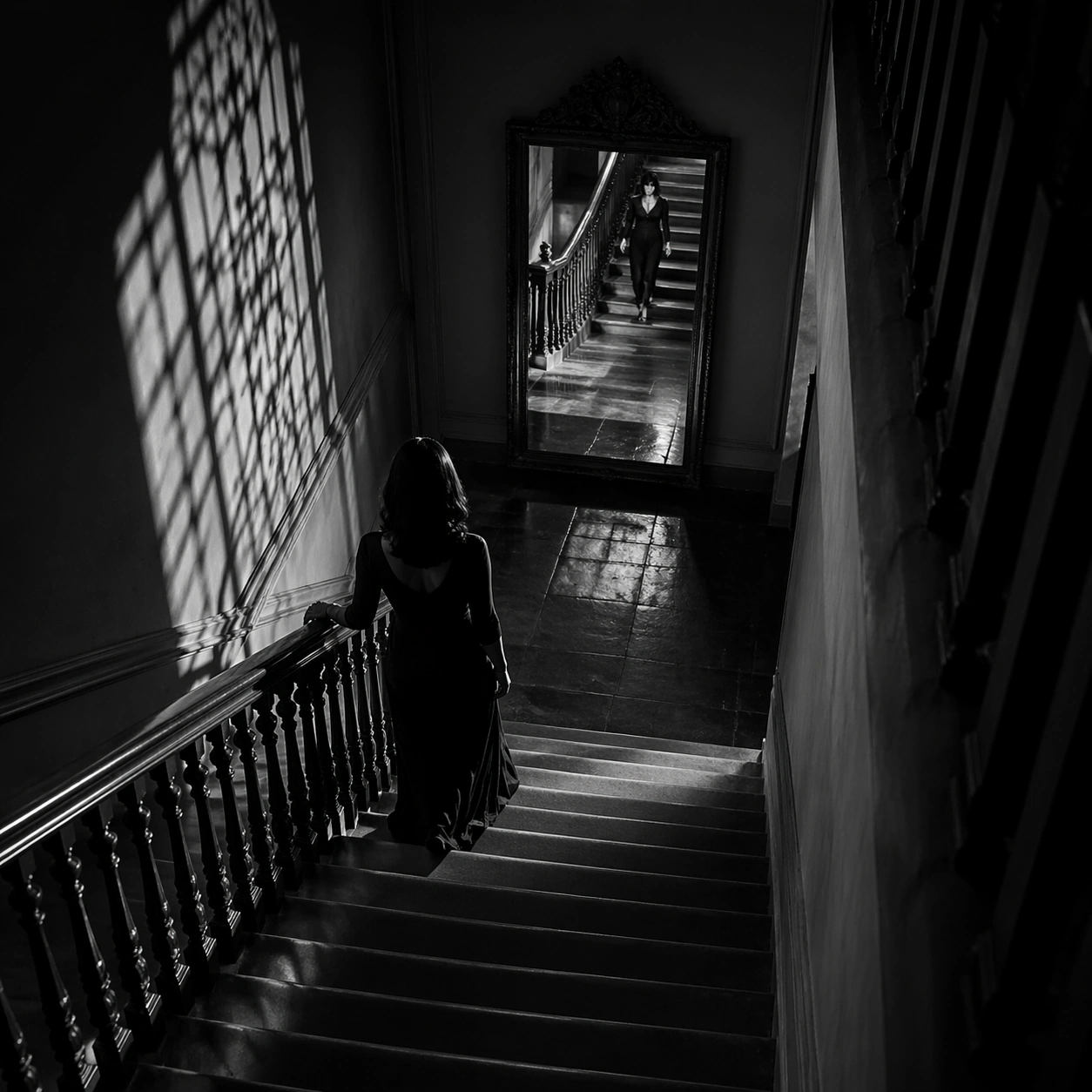
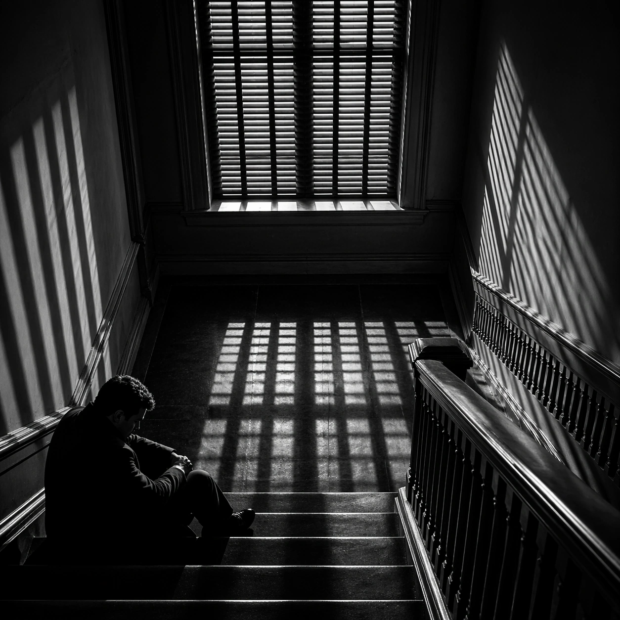
Example generated from “Suspense Staircase Shadow — Window Slat Trap”
GPT Image 2en

Scene: A square black-and-white thriller frame with hard contrast, deep blacks, silvery highlights, and geometric shadow patterns cast by railings, blinds, or stained glass. The camera should feel deliberate and predatory, often high above or pinned to an anxious architectural angle. Frame a square stair landing beneath a tall window fitted with slatted blinds that project prison-bar shadows over the floor. Subject: Build the image around stairs, shadows, landings, banisters, and one isolated figure whose presence is defined as much by silhouette as by body. Fear should come from spacing, emptiness, and the logic of light rather than from explicit violence. A seated figure waits on the lowest visible step with face half-hidden in darkness, as if trapped by the light itself. Important details: The governing grammar is suspense through architecture. Preserve crisp edges between light and shadow, polished floor reflections, severe stair geometry, and a sense of silent movement just before or after an event. Avoid modern clutter, color accents, or loose handheld energy. The barred shadow pattern should feel accusatory and architectural, not decorative. Use case: Suspense Staircase Shadow single study 7/9. Constraints: No readable text, no watermark, no logos, preserve exact 1:1 aspect ratio, no gore, no monsters, no readable signage, no casual daylight realism, no fog machine effect, no broken anatomy, no low-detail background, no accidental text fragments.
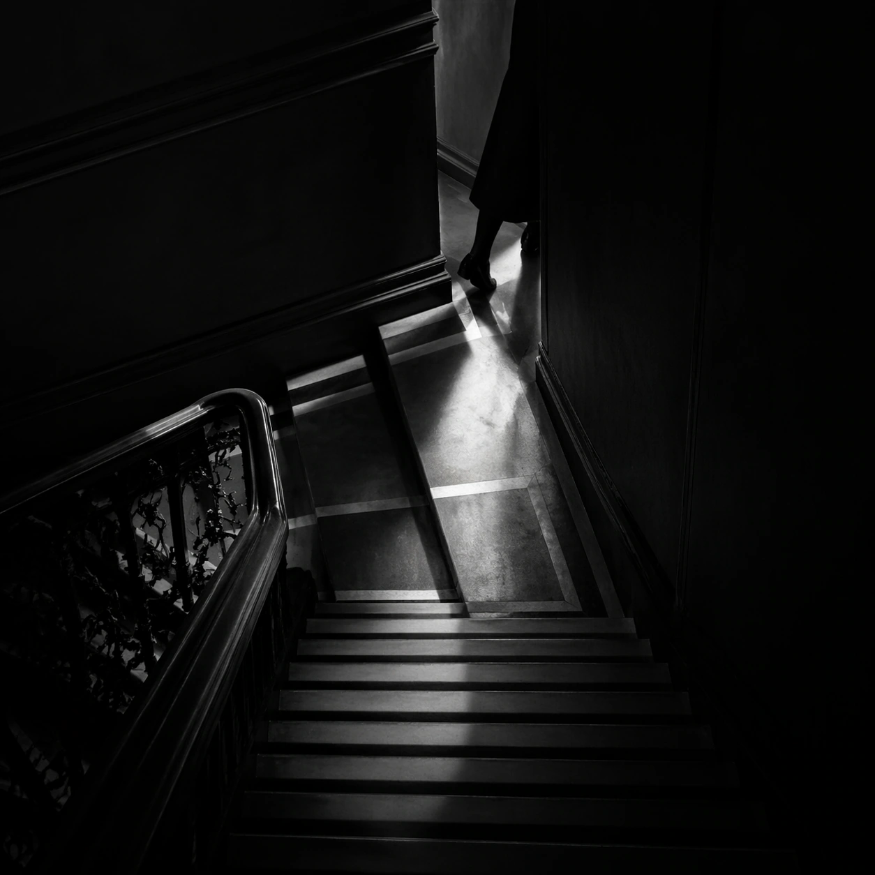
Example generated from “Suspense Staircase Shadow — Mirror Below”
GPT Image 2en

Scene: A square black-and-white thriller frame with hard contrast, deep blacks, silvery highlights, and geometric shadow patterns cast by railings, blinds, or stained glass. The camera should feel deliberate and predatory, often high above or pinned to an anxious architectural angle. Look down a stairwell toward a mirror at the bottom landing that catches a second view of the upper steps. Subject: Build the image around stairs, shadows, landings, banisters, and one isolated figure whose presence is defined as much by silhouette as by body. Fear should come from spacing, emptiness, and the logic of light rather than from explicit violence. A descending woman appears both directly and as reflection, creating uncertainty about distance and timing. Important details: The governing grammar is suspense through architecture. Preserve crisp edges between light and shadow, polished floor reflections, severe stair geometry, and a sense of silent movement just before or after an event. Avoid modern clutter, color accents, or loose handheld energy. Keep the mirror clean and believable, using duplication to sharpen suspense rather than create fantasy. Use case: Suspense Staircase Shadow single study 8/9. Constraints: No readable text, no watermark, no logos, preserve exact 1:1 aspect ratio, no gore, no monsters, no readable signage, no casual daylight realism, no fog machine effect, no broken anatomy, no low-detail background, no accidental text fragments.
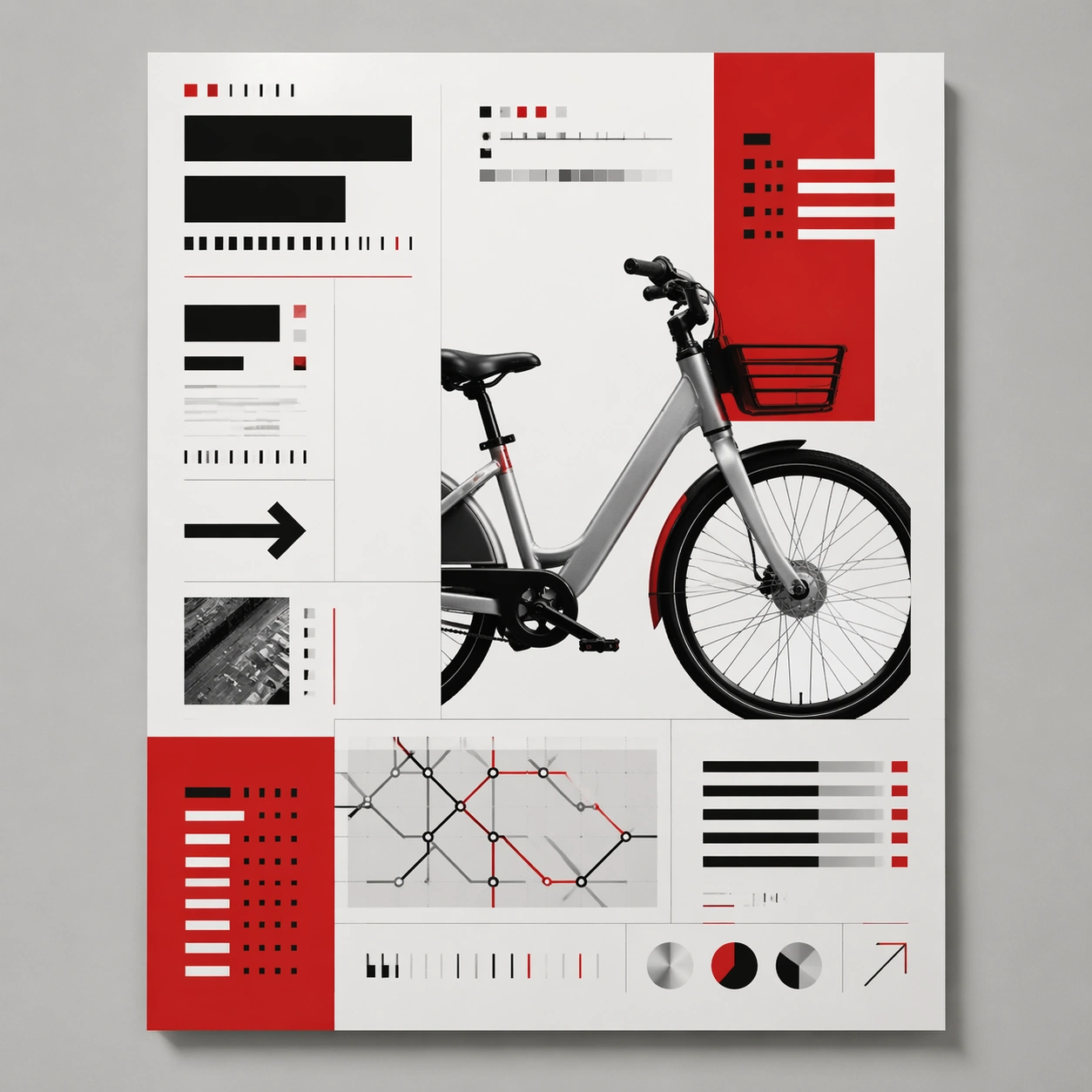
Example generated from “Suspense Staircase Shadow — Final Turn”
GPT Image 2en

Scene: A square black-and-white thriller frame with hard contrast, deep blacks, silvery highlights, and geometric shadow patterns cast by railings, blinds, or stained glass. The camera should feel deliberate and predatory, often high above or pinned to an anxious architectural angle. Use the last turning corner of a staircase, where one wall goes fully black and the next flight emerges into a thin strip of light. Subject: Build the image around stairs, shadows, landings, banisters, and one isolated figure whose presence is defined as much by silhouette as by body. Fear should come from spacing, emptiness, and the logic of light rather than from explicit violence. Only the lower legs of a person are visible mid-turn, making the rest of the body disappear around the corner. Important details: The governing grammar is suspense through architecture. Preserve crisp edges between light and shadow, polished floor reflections, severe stair geometry, and a sense of silent movement just before or after an event. Avoid modern clutter, color accents, or loose handheld energy. The disappearing body should feel more ominous than any explicit threat, with clean edges and no unnecessary props. Use case: Suspense Staircase Shadow single study 9/9. Constraints: No readable text, no watermark, no logos, preserve exact 1:1 aspect ratio, no gore, no monsters, no readable signage, no casual daylight realism, no fog machine effect, no broken anatomy, no low-detail background, no accidental text fragments.
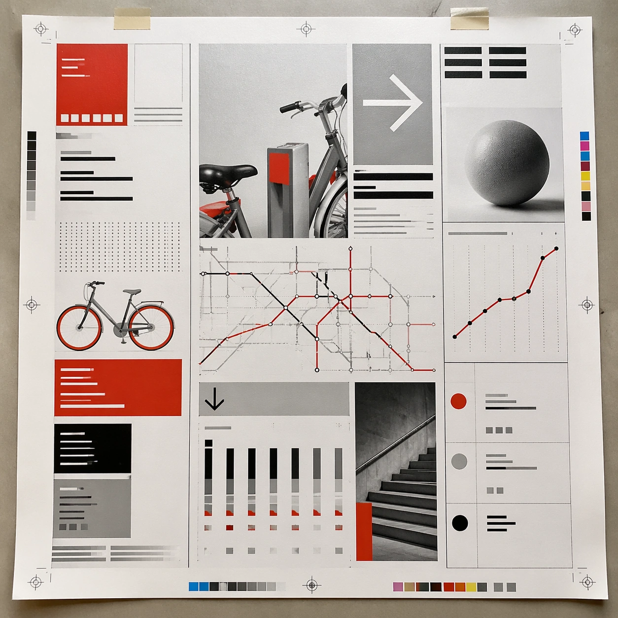
Example generated from “Swiss International Grid — Canonical One-Sheet”
GPT Image 2en

Scene: A square straight-on studio view of a pristine poster mounted on a matte wall with even museum lighting, crisp corners, and enough breathing room around the sheet for the full composition to read as an intentional object. The poster should express rigorous Swiss grid design with modular columns, disciplined margins, quiet asymmetry, and large white fields, using red, black, white, graphite gray, and occasional cool silver paper tone and a tactile surface appropriate to the medium. Subject: Build the flagship poster statement for this style, with the strongest hierarchy, the clearest subject silhouette, and the most disciplined balance between image field, pseudo-typography, and empty space. Use gallery objects, arrows, cropped still-life fragments, line charts, timetable bars, and alignment guides as the main visual ingredients, and organize them with grotesk typographic blocks, rules, and index markers rendered as non-readable layout forms. For the contemporary-subject axis, thread in shared bicycles, transit maps, and civic information cues reduced into a severe exhibition grid. The poster must feel like an original design object rather than a reproduction of any known work. Important details: Treat this as the cleanest thesis image in the set: the paper should look fresh, the inks or paint should feel deliberate, and every formal rule of the style should be easy to study at a glance. Preserve baseline precision, invisible column logic, severe spacing discipline, and crisp edge hierarchy. Keep every letterform abstract and non-readable, as if it were a typographic texture rather than language. Make the style unmistakable through composition, palette, surface behavior, and symbolic compression. no centered symmetry, no distressed paper, no decorative ornament, no playful doodles. Use case: Swiss Grid single study 1/9, establishing the cleanest museum-grade poster reading. Constraints: No readable text, no watermark, no logos, preserve exact 1:1 aspect ratio, no copyrighted characters, no real brand marks, no QR codes, no interface chrome, no accidental gibberish lettering.

Example generated from “Swiss International Grid — Print Proof Flatlay”
GPT Image 2en

Scene: A square overhead tabletop photograph of a fresh poster proof on neutral worktable paper, lit by cool daylight, with crop marks, tape tabs, and slight paper bow visible around the sheet. The poster should express rigorous Swiss grid design with modular columns, disciplined margins, quiet asymmetry, and large white fields, using red, black, white, graphite gray, and occasional cool silver paper tone and a tactile surface appropriate to the medium. Subject: Design the poster as a print-shop proof, preserving the same poster language while allowing production clues such as edge trims, registration targets, and process marks to frame the composition. Use gallery objects, arrows, cropped still-life fragments, line charts, timetable bars, and alignment guides as the main visual ingredients, and organize them with grotesk typographic blocks, rules, and index markers rendered as non-readable layout forms. For the contemporary-subject axis, thread in shared bicycles, transit maps, and civic information cues reduced into a severe exhibition grid. The poster must feel like an original design object rather than a reproduction of any known work. Important details: The image must still read as a finished poster concept, but it should carry believable print-process evidence and material tactility instead of gallery-wall perfection. Preserve baseline precision, invisible column logic, severe spacing discipline, and crisp edge hierarchy. Keep every letterform abstract and non-readable, as if it were a typographic texture rather than language. Make the style unmistakable through composition, palette, surface behavior, and symbolic compression. no centered symmetry, no distressed paper, no decorative ornament, no playful doodles. Use case: Swiss Grid single study 2/9, testing production realism and process evidence. Constraints: No readable text, no watermark, no logos, preserve exact 1:1 aspect ratio, no copyrighted characters, no real brand marks, no QR codes, no interface chrome, no accidental gibberish lettering.

Example generated from “Swiss International Grid — Transit Lightbox”
GPT Image 2en

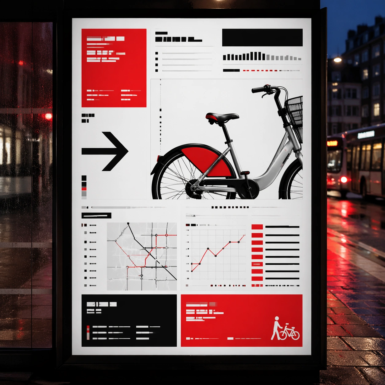
Scene: A square dusk street photograph of a backlit transit poster glowing inside glass, with faint rain reflections, soft city blur in the distance, and the poster remaining fully legible as a composition. The poster should express rigorous Swiss grid design with modular columns, disciplined margins, quiet asymmetry, and large white fields, using red, black, white, graphite gray, and occasional cool silver paper tone and a tactile surface appropriate to the medium. Subject: Adapt the poster into a public-facing lightbox version that still honors the original style grammar while feeling bold enough to stop a passerby from several meters away. Use gallery objects, arrows, cropped still-life fragments, line charts, timetable bars, and alignment guides as the main visual ingredients, and organize them with grotesk typographic blocks, rules, and index markers rendered as non-readable layout forms. For the contemporary-subject axis, thread in shared bicycles, transit maps, and civic information cues reduced into a severe exhibition grid. The poster must feel like an original design object rather than a reproduction of any known work. Important details: Let the style survive the illumination test: color blocking, silhouette contrast, and abstract lettering should stay controlled under bright internal light and reflective glass. Preserve baseline precision, invisible column logic, severe spacing discipline, and crisp edge hierarchy. Keep every letterform abstract and non-readable, as if it were a typographic texture rather than language. Make the style unmistakable through composition, palette, surface behavior, and symbolic compression. no centered symmetry, no distressed paper, no decorative ornament, no playful doodles. Use case: Swiss Grid single study 3/9, testing distance readability in public display. Constraints: No readable text, no watermark, no logos, preserve exact 1:1 aspect ratio, no copyrighted characters, no real brand marks, no QR codes, no interface chrome, no accidental gibberish lettering.

Example generated from “Swiss International Grid — Wheatpaste Wall Layer”
GPT Image 2en

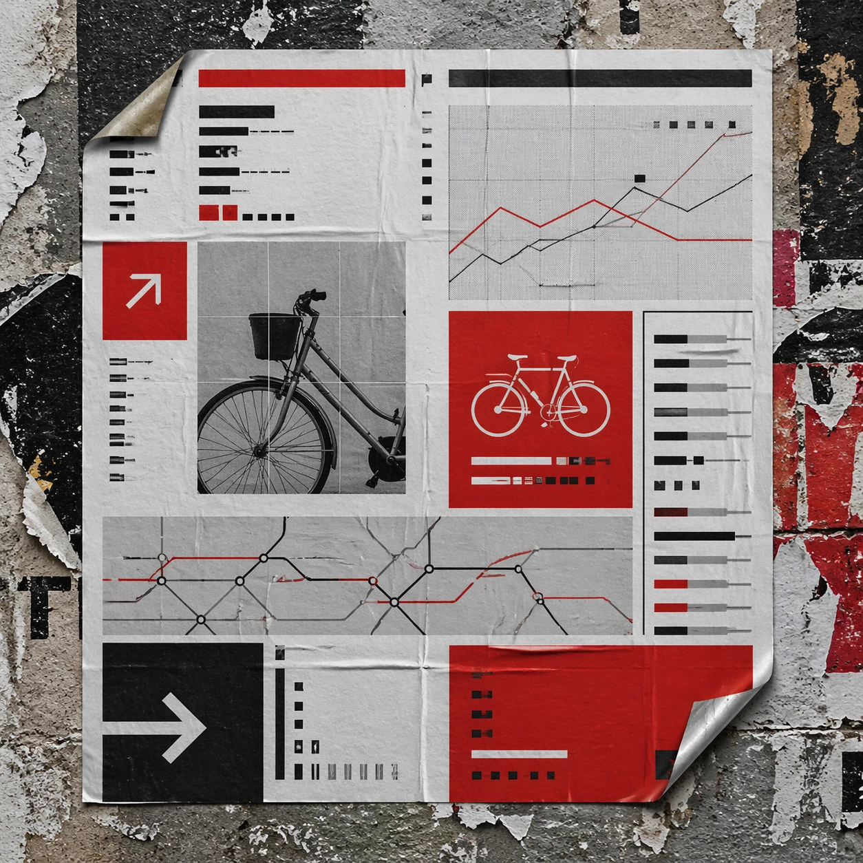
Scene: A square urban wall study with the poster pasted onto rough plaster among torn edges and older paper remnants, photographed in soft overcast light so texture, glue bubbles, and surface scars stay visible. The poster should express rigorous Swiss grid design with modular columns, disciplined margins, quiet asymmetry, and large white fields, using red, black, white, graphite gray, and occasional cool silver paper tone and a tactile surface appropriate to the medium. Subject: Create a version that feels made for the street, with the poster carrying enough formal force to survive abrasion, layering, and imperfect placement without losing its visual identity. Use gallery objects, arrows, cropped still-life fragments, line charts, timetable bars, and alignment guides as the main visual ingredients, and organize them with grotesk typographic blocks, rules, and index markers rendered as non-readable layout forms. For the contemporary-subject axis, thread in shared bicycles, transit maps, and civic information cues reduced into a severe exhibition grid. The poster must feel like an original design object rather than a reproduction of any known work. Important details: Keep the main design intact but let the environment add grit: lifted corners, tiny tears, wrinkled paper, and older color fragments around the perimeter should amplify the style rather than dilute it. Preserve baseline precision, invisible column logic, severe spacing discipline, and crisp edge hierarchy. Keep every letterform abstract and non-readable, as if it were a typographic texture rather than language. Make the style unmistakable through composition, palette, surface behavior, and symbolic compression. no centered symmetry, no distressed paper, no decorative ornament, no playful doodles. Use case: Swiss Grid single study 4/9, testing street-life durability and layered context. Constraints: No readable text, no watermark, no logos, preserve exact 1:1 aspect ratio, no copyrighted characters, no real brand marks, no QR codes, no interface chrome, no accidental gibberish lettering.

Example generated from “Swiss International Grid — Folded Archive Copy”
GPT Image 2en

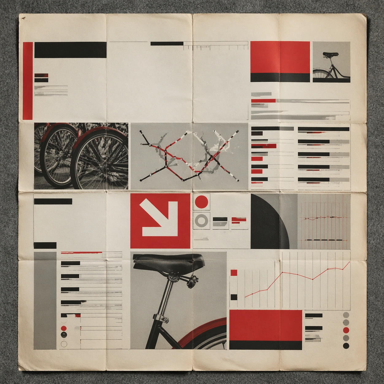
Scene: A square conservation-table view of a vintage poster laid on gray felt under raking light, with visible fold lines, softened corners, and subtle aging that still preserves the integrity of the image. The poster should express rigorous Swiss grid design with modular columns, disciplined margins, quiet asymmetry, and large white fields, using red, black, white, graphite gray, and occasional cool silver paper tone and a tactile surface appropriate to the medium. Subject: Present the poster as an archive copy that has been stored, unfolded, and carefully documented, letting age and handling reveal how the design holds up across time. Use gallery objects, arrows, cropped still-life fragments, line charts, timetable bars, and alignment guides as the main visual ingredients, and organize them with grotesk typographic blocks, rules, and index markers rendered as non-readable layout forms. For the contemporary-subject axis, thread in shared bicycles, transit maps, and civic information cues reduced into a severe exhibition grid. The poster must feel like an original design object rather than a reproduction of any known work. Important details: Aging must stay believable rather than theatrical: slight yellowing, fold memory, edge wear, and pigment variation should support the historical or crafted feeling of the style. Preserve baseline precision, invisible column logic, severe spacing discipline, and crisp edge hierarchy. Keep every letterform abstract and non-readable, as if it were a typographic texture rather than language. Make the style unmistakable through composition, palette, surface behavior, and symbolic compression. no centered symmetry, no distressed paper, no decorative ornament, no playful doodles. Use case: Swiss Grid single study 5/9, testing archival endurance and age character. Constraints: No readable text, no watermark, no logos, preserve exact 1:1 aspect ratio, no copyrighted characters, no real brand marks, no QR codes, no interface chrome, no accidental gibberish lettering.

Example generated from “Swiss International Grid — Twin Poster Diptych”
GPT Image 2en

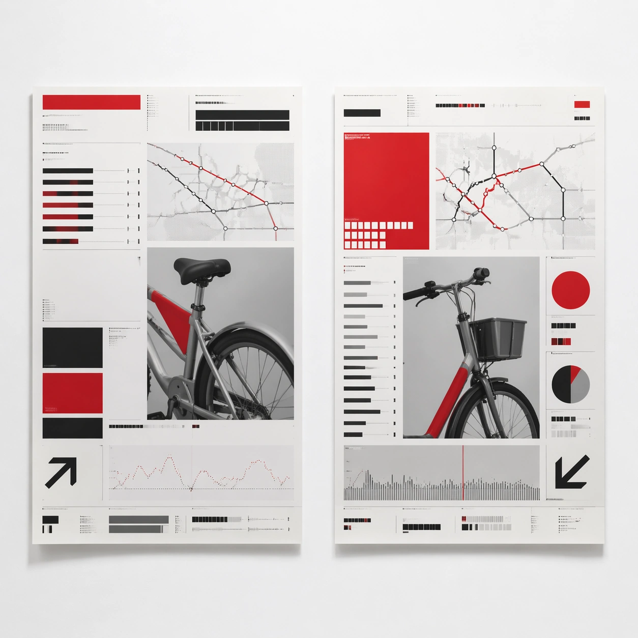
Scene: A square white-wall installation showing two companion posters hung side by side with equal spacing, photographed frontally so the pair reads as a designed conversation rather than two unrelated sheets. The poster should express rigorous Swiss grid design with modular columns, disciplined margins, quiet asymmetry, and large white fields, using red, black, white, graphite gray, and occasional cool silver paper tone and a tactile surface appropriate to the medium. Subject: Compose a matched diptych: two posters sharing one style system while splitting the narrative across paired motifs, mirrored masses, or complementary color emphasis. Use gallery objects, arrows, cropped still-life fragments, line charts, timetable bars, and alignment guides as the main visual ingredients, and organize them with grotesk typographic blocks, rules, and index markers rendered as non-readable layout forms. For the contemporary-subject axis, thread in shared bicycles, transit maps, and civic information cues reduced into a severe exhibition grid. The poster must feel like an original design object rather than a reproduction of any known work. Important details: Both halves should feel distinct yet inseparable. Preserve one coherent visual language, but let each sheet carry its own focal symbol and rhythm without readable wording. Preserve baseline precision, invisible column logic, severe spacing discipline, and crisp edge hierarchy. Keep every letterform abstract and non-readable, as if it were a typographic texture rather than language. Make the style unmistakable through composition, palette, surface behavior, and symbolic compression. no centered symmetry, no distressed paper, no decorative ornament, no playful doodles. Use case: Swiss Grid single study 6/9, testing system flexibility across a paired set. Constraints: No readable text, no watermark, no logos, preserve exact 1:1 aspect ratio, no copyrighted characters, no real brand marks, no QR codes, no interface chrome, no accidental gibberish lettering.

Example generated from “Swiss International Grid — Stacked Print Bundle”
GPT Image 2en

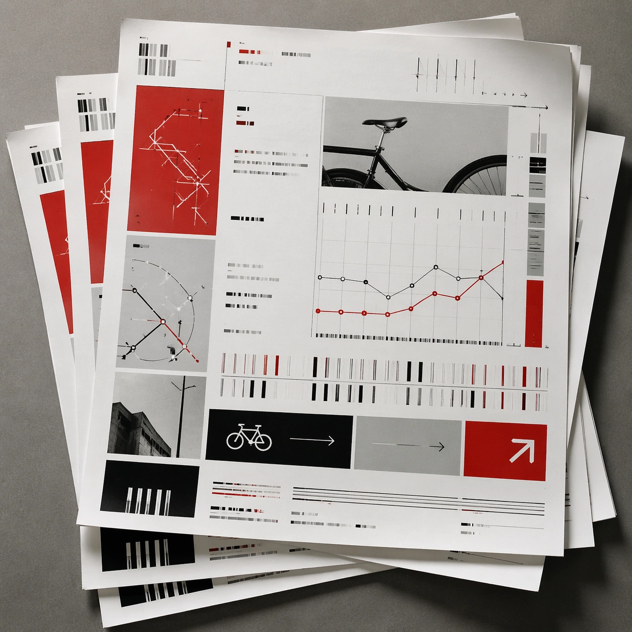
Scene: A square tabletop shot of several poster prints stacked and slightly fanned, with curled corners, offset edges, and soft directional light revealing paper thickness and ink behavior. The poster should express rigorous Swiss grid design with modular columns, disciplined margins, quiet asymmetry, and large white fields, using red, black, white, graphite gray, and occasional cool silver paper tone and a tactile surface appropriate to the medium. Subject: Design the top poster to dominate while nearby duplicate sheets echo the same composition, creating a tactile print-run scene rather than a single isolated sheet. Use gallery objects, arrows, cropped still-life fragments, line charts, timetable bars, and alignment guides as the main visual ingredients, and organize them with grotesk typographic blocks, rules, and index markers rendered as non-readable layout forms. For the contemporary-subject axis, thread in shared bicycles, transit maps, and civic information cues reduced into a severe exhibition grid. The poster must feel like an original design object rather than a reproduction of any known work. Important details: Use the stack to emphasize production character: edge shadows, repeated motifs peeking from beneath, and subtle misalignment should enrich the material reading without changing the core design. Preserve baseline precision, invisible column logic, severe spacing discipline, and crisp edge hierarchy. Keep every letterform abstract and non-readable, as if it were a typographic texture rather than language. Make the style unmistakable through composition, palette, surface behavior, and symbolic compression. no centered symmetry, no distressed paper, no decorative ornament, no playful doodles. Use case: Swiss Grid single study 7/9, testing print-run tactility and repeat presence. Constraints: No readable text, no watermark, no logos, preserve exact 1:1 aspect ratio, no copyrighted characters, no real brand marks, no QR codes, no interface chrome, no accidental gibberish lettering.

Example generated from “Swiss International Grid — Kiosk Night Glow”
GPT Image 2en

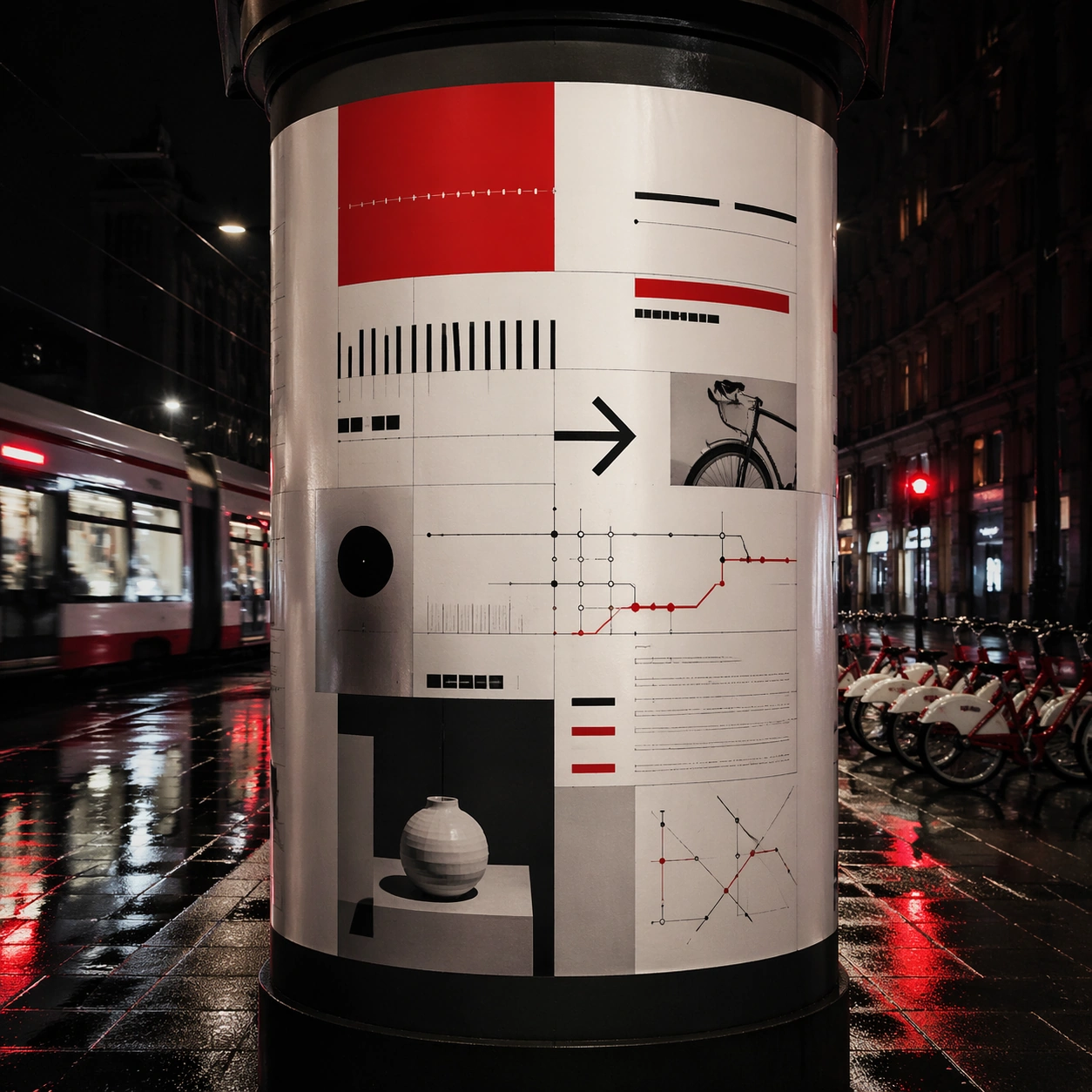
Scene: A square nighttime city view with the poster wrapping part of a cylindrical kiosk, wet pavement reflecting nearby light, and the composition holding together under moody urban illumination. The poster should express rigorous Swiss grid design with modular columns, disciplined margins, quiet asymmetry, and large white fields, using red, black, white, graphite gray, and occasional cool silver paper tone and a tactile surface appropriate to the medium. Subject: Reframe the design for a dramatic street-placement context, where the poster has to project style and mood through reflection, curvature, and surrounding darkness. Use gallery objects, arrows, cropped still-life fragments, line charts, timetable bars, and alignment guides as the main visual ingredients, and organize them with grotesk typographic blocks, rules, and index markers rendered as non-readable layout forms. For the contemporary-subject axis, thread in shared bicycles, transit maps, and civic information cues reduced into a severe exhibition grid. The poster must feel like an original design object rather than a reproduction of any known work. Important details: The design should remain instantly recognizable despite the cylindrical wrap. Preserve major blocks, symbolic shapes, and abstract title forms so the style still feels authoritative at night. Preserve baseline precision, invisible column logic, severe spacing discipline, and crisp edge hierarchy. Keep every letterform abstract and non-readable, as if it were a typographic texture rather than language. Make the style unmistakable through composition, palette, surface behavior, and symbolic compression. no centered symmetry, no distressed paper, no decorative ornament, no playful doodles. Use case: Swiss Grid single study 8/9, testing atmospheric display under rain and glow. Constraints: No readable text, no watermark, no logos, preserve exact 1:1 aspect ratio, no copyrighted characters, no real brand marks, no QR codes, no interface chrome, no accidental gibberish lettering.

Example generated from “Swiss International Grid — Contemporary Remix”
GPT Image 2en

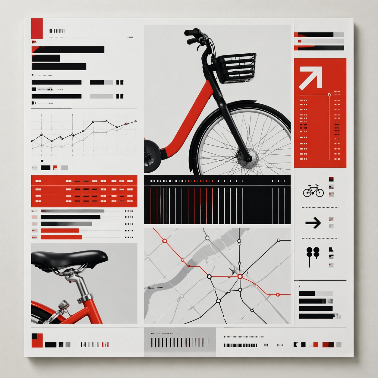
Scene: A square front-facing poster presentation on a clean neutral wall, lit like a premium print test, with crisp edges and a polished but still tactile finish appropriate to the style. The poster should express rigorous Swiss grid design with modular columns, disciplined margins, quiet asymmetry, and large white fields, using red, black, white, graphite gray, and occasional cool silver paper tone and a tactile surface appropriate to the medium. Subject: Apply the historical poster language to a contemporary urban subject so the old visual grammar proves it can carry present-day themes without losing authenticity or formal discipline. Use gallery objects, arrows, cropped still-life fragments, line charts, timetable bars, and alignment guides as the main visual ingredients, and organize them with grotesk typographic blocks, rules, and index markers rendered as non-readable layout forms. For the contemporary-subject axis, thread in shared bicycles, transit maps, and civic information cues reduced into a severe exhibition grid. The poster must feel like an original design object rather than a reproduction of any known work. Important details: This is not parody. The contemporary subject should feel genuinely absorbed into the style through palette, composition, symbolic compression, and non-readable lettering treatment. Preserve baseline precision, invisible column logic, severe spacing discipline, and crisp edge hierarchy. Keep every letterform abstract and non-readable, as if it were a typographic texture rather than language. Make the style unmistakable through composition, palette, surface behavior, and symbolic compression. no centered symmetry, no distressed paper, no decorative ornament, no playful doodles. Use case: Swiss Grid single study 9/9, testing historical grammar on a present-day subject. Constraints: No readable text, no watermark, no logos, preserve exact 1:1 aspect ratio, no copyrighted characters, no real brand marks, no QR codes, no interface chrome, no accidental gibberish lettering.

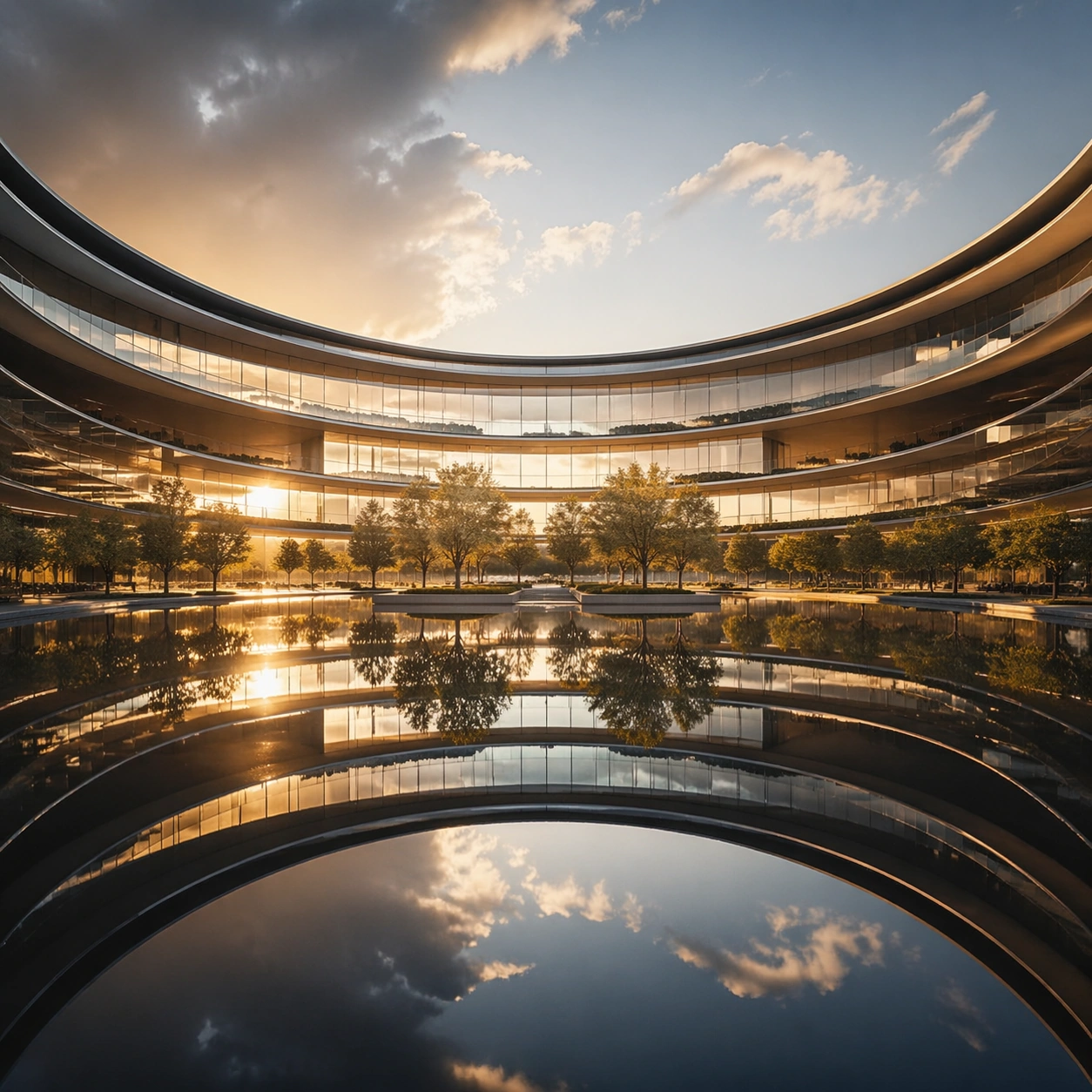
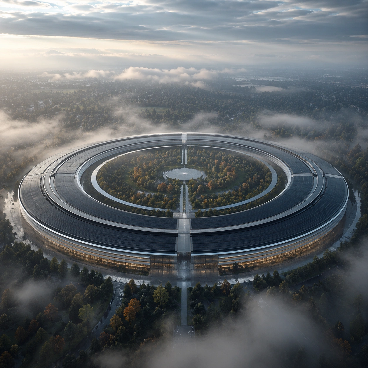
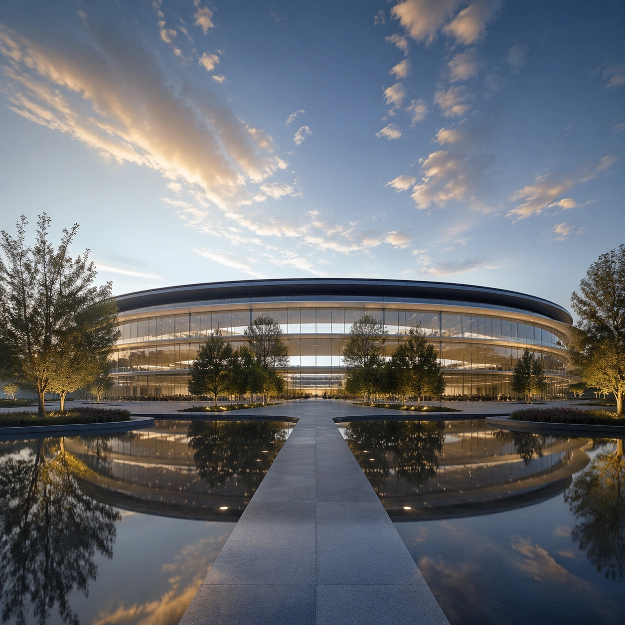
Example generated from “Symmetric Hdr Architecture — Hero Shot”
GPT Image 2en

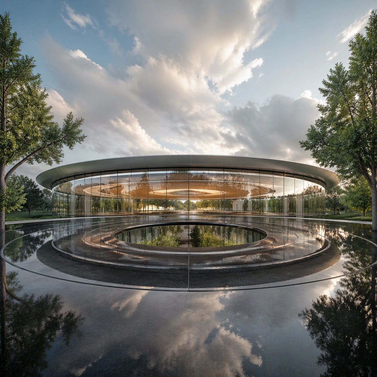
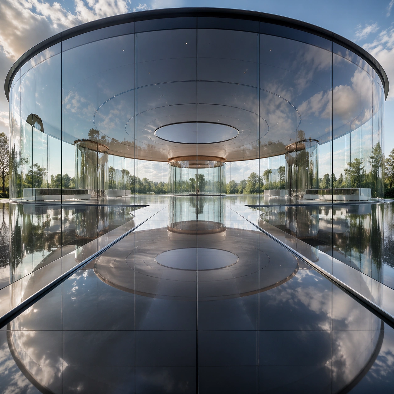
Scene: A square photographic image with intentional lens choice, coherent light, and a subject that feels observed rather than merely decorated. Build the frame around a definitive frame that establishes the subject’s strongest visual identity. Keep the lighting, camera distance, and spatial organization tuned for a high-signal research image rather than a casual snapshot. The image belongs to the Symmetric HDR Architecture theme and should feel immediately legible as a prompt atlas theme for symmetric hdr architecture, testing photorealism, world-knowledge, optical-illusion-geometry, commercial-mockup with gpt image 2.. Subject: Center the study on a definitive frame that establishes the subject’s strongest visual identity. Translate the theme into a concrete visual statement instead of an abstract mood board: the viewer should understand what kind of image this is, what is being tested, and why the composition is difficult. Use the slug idea of symmetric hdr architecture as a literal guide for subject matter, materials, and staging. If helpful, borrow the broad visual cues suggested by Apple Park, HDR, but keep the result original and specific to this study. Important details: The realism should come from timing, optics, and material response: atmosphere, contrast, depth, motion, and tiny physical cues all need to agree. Preserve a disciplined square composition, clear focal hierarchy, and enough secondary information to make the image feel complete rather than underspecified. The image should look polished, novel, and exhibition-ready, with topic-specific credibility coming from the way surfaces, structure, and visual language reinforce Symmetric HDR Architecture. Avoid generic filler elements that do not serve the main concept. Use case: Symmetric HDR Architecture single study 1/8, testing photorealism, world-knowledge, optical-illusion-geometry, commercial-mockup through the hero shot variation. Constraints: No readable text, no watermark, no logos, preserve exact 1:1 aspect ratio, no watermark, no cheap HDR excess, no unreadable signage, no fake stock-photo posing, no compositing seams, no arbitrary lens flare.

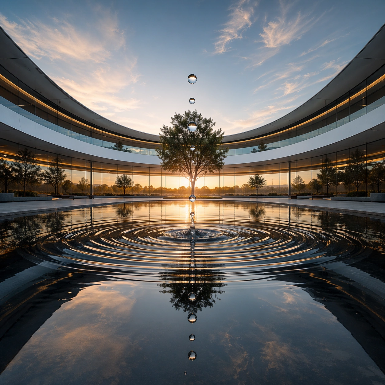
Example generated from “Symmetric Hdr Architecture — Macro Study”
GPT Image 2en

Scene: A square photographic image with intentional lens choice, coherent light, and a subject that feels observed rather than merely decorated. Build the frame around closer observation that reveals fine structure and optical behavior. Keep the lighting, camera distance, and spatial organization tuned for a high-signal research image rather than a casual snapshot. The image belongs to the Symmetric HDR Architecture theme and should feel immediately legible as a prompt atlas theme for symmetric hdr architecture, testing photorealism, world-knowledge, optical-illusion-geometry, commercial-mockup with gpt image 2.. Subject: Center the study on closer observation that reveals fine structure and optical behavior. Translate the theme into a concrete visual statement instead of an abstract mood board: the viewer should understand what kind of image this is, what is being tested, and why the composition is difficult. Use the slug idea of symmetric hdr architecture as a literal guide for subject matter, materials, and staging. If helpful, borrow the broad visual cues suggested by Apple Park, HDR, but keep the result original and specific to this study. Important details: The realism should come from timing, optics, and material response: atmosphere, contrast, depth, motion, and tiny physical cues all need to agree. Preserve a disciplined square composition, clear focal hierarchy, and enough secondary information to make the image feel complete rather than underspecified. The image should look polished, novel, and exhibition-ready, with topic-specific credibility coming from the way surfaces, structure, and visual language reinforce Symmetric HDR Architecture. Avoid generic filler elements that do not serve the main concept. Use case: Symmetric HDR Architecture single study 2/8, testing photorealism, world-knowledge, optical-illusion-geometry, commercial-mockup through the macro study variation. Constraints: No readable text, no watermark, no logos, preserve exact 1:1 aspect ratio, no watermark, no cheap HDR excess, no unreadable signage, no fake stock-photo posing, no compositing seams, no arbitrary lens flare.

Example generated from “Symmetric Hdr Architecture — Side Light Study”
GPT Image 2en

Scene: A square photographic image with intentional lens choice, coherent light, and a subject that feels observed rather than merely decorated. Build the frame around a directional-light treatment that increases form and drama. Keep the lighting, camera distance, and spatial organization tuned for a high-signal research image rather than a casual snapshot. The image belongs to the Symmetric HDR Architecture theme and should feel immediately legible as a prompt atlas theme for symmetric hdr architecture, testing photorealism, world-knowledge, optical-illusion-geometry, commercial-mockup with gpt image 2.. Subject: Center the study on a directional-light treatment that increases form and drama. Translate the theme into a concrete visual statement instead of an abstract mood board: the viewer should understand what kind of image this is, what is being tested, and why the composition is difficult. Use the slug idea of symmetric hdr architecture as a literal guide for subject matter, materials, and staging. If helpful, borrow the broad visual cues suggested by Apple Park, HDR, but keep the result original and specific to this study. Important details: The realism should come from timing, optics, and material response: atmosphere, contrast, depth, motion, and tiny physical cues all need to agree. Preserve a disciplined square composition, clear focal hierarchy, and enough secondary information to make the image feel complete rather than underspecified. The image should look polished, novel, and exhibition-ready, with topic-specific credibility coming from the way surfaces, structure, and visual language reinforce Symmetric HDR Architecture. Avoid generic filler elements that do not serve the main concept. Use case: Symmetric HDR Architecture single study 3/8, testing photorealism, world-knowledge, optical-illusion-geometry, commercial-mockup through the side light study variation. Constraints: No readable text, no watermark, no logos, preserve exact 1:1 aspect ratio, no watermark, no cheap HDR excess, no unreadable signage, no fake stock-photo posing, no compositing seams, no arbitrary lens flare.

Example generated from “Symmetric Hdr Architecture — Motion Moment”
GPT Image 2en

Scene: A square photographic image with intentional lens choice, coherent light, and a subject that feels observed rather than merely decorated. Build the frame around a time-sensitive or kinetic phenomenon captured at the right instant. Keep the lighting, camera distance, and spatial organization tuned for a high-signal research image rather than a casual snapshot. The image belongs to the Symmetric HDR Architecture theme and should feel immediately legible as a prompt atlas theme for symmetric hdr architecture, testing photorealism, world-knowledge, optical-illusion-geometry, commercial-mockup with gpt image 2.. Subject: Center the study on a time-sensitive or kinetic phenomenon captured at the right instant. Translate the theme into a concrete visual statement instead of an abstract mood board: the viewer should understand what kind of image this is, what is being tested, and why the composition is difficult. Use the slug idea of symmetric hdr architecture as a literal guide for subject matter, materials, and staging. If helpful, borrow the broad visual cues suggested by Apple Park, HDR, but keep the result original and specific to this study. Important details: The realism should come from timing, optics, and material response: atmosphere, contrast, depth, motion, and tiny physical cues all need to agree. Preserve a disciplined square composition, clear focal hierarchy, and enough secondary information to make the image feel complete rather than underspecified. The image should look polished, novel, and exhibition-ready, with topic-specific credibility coming from the way surfaces, structure, and visual language reinforce Symmetric HDR Architecture. Avoid generic filler elements that do not serve the main concept. Use case: Symmetric HDR Architecture single study 4/8, testing photorealism, world-knowledge, optical-illusion-geometry, commercial-mockup through the motion moment variation. Constraints: No readable text, no watermark, no logos, preserve exact 1:1 aspect ratio, no watermark, no cheap HDR excess, no unreadable signage, no fake stock-photo posing, no compositing seams, no arbitrary lens flare.

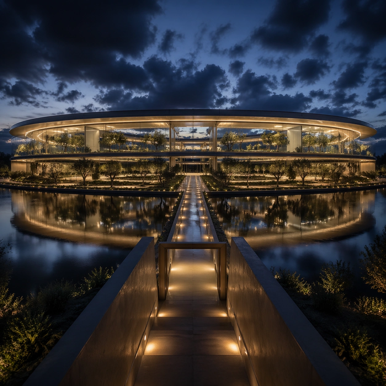
Example generated from “Symmetric Hdr Architecture — Low-Light Atlas”
GPT Image 2en

Scene: A square photographic image with intentional lens choice, coherent light, and a subject that feels observed rather than merely decorated. Build the frame around a dusk, night, or low-light frame with disciplined exposure. Keep the lighting, camera distance, and spatial organization tuned for a high-signal research image rather than a casual snapshot. The image belongs to the Symmetric HDR Architecture theme and should feel immediately legible as a prompt atlas theme for symmetric hdr architecture, testing photorealism, world-knowledge, optical-illusion-geometry, commercial-mockup with gpt image 2.. Subject: Center the study on a dusk, night, or low-light frame with disciplined exposure. Translate the theme into a concrete visual statement instead of an abstract mood board: the viewer should understand what kind of image this is, what is being tested, and why the composition is difficult. Use the slug idea of symmetric hdr architecture as a literal guide for subject matter, materials, and staging. If helpful, borrow the broad visual cues suggested by Apple Park, HDR, but keep the result original and specific to this study. Important details: The realism should come from timing, optics, and material response: atmosphere, contrast, depth, motion, and tiny physical cues all need to agree. Preserve a disciplined square composition, clear focal hierarchy, and enough secondary information to make the image feel complete rather than underspecified. The image should look polished, novel, and exhibition-ready, with topic-specific credibility coming from the way surfaces, structure, and visual language reinforce Symmetric HDR Architecture. Avoid generic filler elements that do not serve the main concept. Use case: Symmetric HDR Architecture single study 5/8, testing photorealism, world-knowledge, optical-illusion-geometry, commercial-mockup through the low-light atlas variation. Constraints: No readable text, no watermark, no logos, preserve exact 1:1 aspect ratio, no watermark, no cheap HDR excess, no unreadable signage, no fake stock-photo posing, no compositing seams, no arbitrary lens flare.

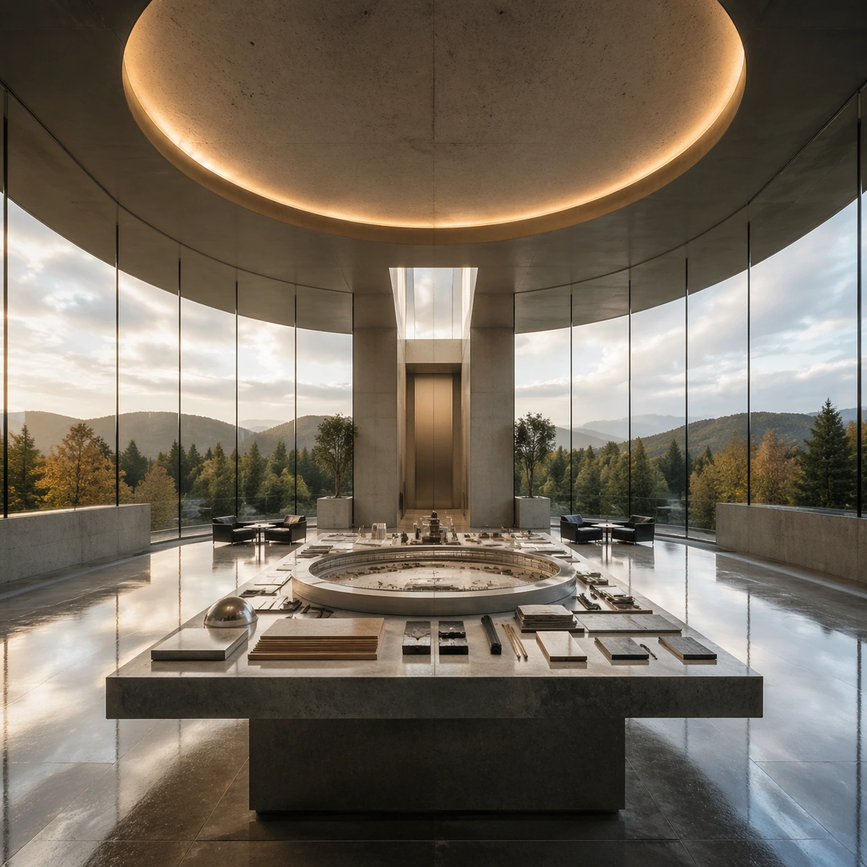
Example generated from “Symmetric Hdr Architecture — Specimen Table”
GPT Image 2en

Scene: A square photographic image with intentional lens choice, coherent light, and a subject that feels observed rather than merely decorated. Build the frame around a carefully arranged or comparative frame that still feels photographic. Keep the lighting, camera distance, and spatial organization tuned for a high-signal research image rather than a casual snapshot. The image belongs to the Symmetric HDR Architecture theme and should feel immediately legible as a prompt atlas theme for symmetric hdr architecture, testing photorealism, world-knowledge, optical-illusion-geometry, commercial-mockup with gpt image 2.. Subject: Center the study on a carefully arranged or comparative frame that still feels photographic. Translate the theme into a concrete visual statement instead of an abstract mood board: the viewer should understand what kind of image this is, what is being tested, and why the composition is difficult. Use the slug idea of symmetric hdr architecture as a literal guide for subject matter, materials, and staging. If helpful, borrow the broad visual cues suggested by Apple Park, HDR, but keep the result original and specific to this study. Important details: The realism should come from timing, optics, and material response: atmosphere, contrast, depth, motion, and tiny physical cues all need to agree. Preserve a disciplined square composition, clear focal hierarchy, and enough secondary information to make the image feel complete rather than underspecified. The image should look polished, novel, and exhibition-ready, with topic-specific credibility coming from the way surfaces, structure, and visual language reinforce Symmetric HDR Architecture. Avoid generic filler elements that do not serve the main concept. Use case: Symmetric HDR Architecture single study 6/8, testing photorealism, world-knowledge, optical-illusion-geometry, commercial-mockup through the specimen table variation. Constraints: No readable text, no watermark, no logos, preserve exact 1:1 aspect ratio, no watermark, no cheap HDR excess, no unreadable signage, no fake stock-photo posing, no compositing seams, no arbitrary lens flare.

Example generated from “Symmetric Hdr Architecture — Atmospheric View”
GPT Image 2en

Scene: A square photographic image with intentional lens choice, coherent light, and a subject that feels observed rather than merely decorated. Build the frame around weather, haze, or volumetric light used to deepen realism. Keep the lighting, camera distance, and spatial organization tuned for a high-signal research image rather than a casual snapshot. The image belongs to the Symmetric HDR Architecture theme and should feel immediately legible as a prompt atlas theme for symmetric hdr architecture, testing photorealism, world-knowledge, optical-illusion-geometry, commercial-mockup with gpt image 2.. Subject: Center the study on weather, haze, or volumetric light used to deepen realism. Translate the theme into a concrete visual statement instead of an abstract mood board: the viewer should understand what kind of image this is, what is being tested, and why the composition is difficult. Use the slug idea of symmetric hdr architecture as a literal guide for subject matter, materials, and staging. If helpful, borrow the broad visual cues suggested by Apple Park, HDR, but keep the result original and specific to this study. Important details: The realism should come from timing, optics, and material response: atmosphere, contrast, depth, motion, and tiny physical cues all need to agree. Preserve a disciplined square composition, clear focal hierarchy, and enough secondary information to make the image feel complete rather than underspecified. The image should look polished, novel, and exhibition-ready, with topic-specific credibility coming from the way surfaces, structure, and visual language reinforce Symmetric HDR Architecture. Avoid generic filler elements that do not serve the main concept. Use case: Symmetric HDR Architecture single study 7/8, testing photorealism, world-knowledge, optical-illusion-geometry, commercial-mockup through the atmospheric view variation. Constraints: No readable text, no watermark, no logos, preserve exact 1:1 aspect ratio, no watermark, no cheap HDR excess, no unreadable signage, no fake stock-photo posing, no compositing seams, no arbitrary lens flare.

Example generated from “Symmetric Hdr Architecture — Signature Frame”
GPT Image 2en

Scene: A square photographic image with intentional lens choice, coherent light, and a subject that feels observed rather than merely decorated. Build the frame around the most memorable final image for the topic. Keep the lighting, camera distance, and spatial organization tuned for a high-signal research image rather than a casual snapshot. The image belongs to the Symmetric HDR Architecture theme and should feel immediately legible as a prompt atlas theme for symmetric hdr architecture, testing photorealism, world-knowledge, optical-illusion-geometry, commercial-mockup with gpt image 2.. Subject: Center the study on the most memorable final image for the topic. Translate the theme into a concrete visual statement instead of an abstract mood board: the viewer should understand what kind of image this is, what is being tested, and why the composition is difficult. Use the slug idea of symmetric hdr architecture as a literal guide for subject matter, materials, and staging. If helpful, borrow the broad visual cues suggested by Apple Park, HDR, but keep the result original and specific to this study. Important details: The realism should come from timing, optics, and material response: atmosphere, contrast, depth, motion, and tiny physical cues all need to agree. Preserve a disciplined square composition, clear focal hierarchy, and enough secondary information to make the image feel complete rather than underspecified. The image should look polished, novel, and exhibition-ready, with topic-specific credibility coming from the way surfaces, structure, and visual language reinforce Symmetric HDR Architecture. Avoid generic filler elements that do not serve the main concept. Use case: Symmetric HDR Architecture single study 8/8, testing photorealism, world-knowledge, optical-illusion-geometry, commercial-mockup through the signature frame variation. Constraints: No readable text, no watermark, no logos, preserve exact 1:1 aspect ratio, no watermark, no cheap HDR excess, no unreadable signage, no fake stock-photo posing, no compositing seams, no arbitrary lens flare.

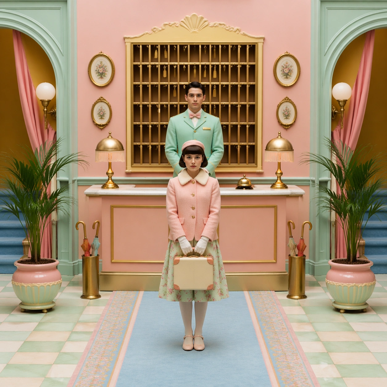
Example generated from “Symmetrical Pastel Dollhouse Cinematography — Hotel Lobby Portrait”
GPT Image 2en

Scene: A square cinematic frame built with absolute left-right symmetry and a straight-on camera at human height. The palette is powder pink, mint, butter yellow, pale blue, and faded coral, with soft daylight and a miniature dollhouse clarity. The architecture should feel handcrafted, tidy, slightly theatrical, and emotionally precise rather than casual or naturalistic. Stage the action in a narrow boutique hotel lobby with a reception desk centered beneath a brass key cabinet, matching potted plants at both edges, and a powder-blue carpet that divides the composition like a ruler line. Subject: Place one or two front-facing figures exactly on the central axis, with costumes, props, and furnishings arranged like curated museum pieces. The people should feel composed and deadpan, never candid, and the room must read as a cutaway stage set where every shelf, lamp, chair, and curtain participates in the symmetry. A young concierge in a pastel blazer stands perfectly still facing the lens, while a guest with a tiny suitcase mirrors the posture on the opposite side of the frame. Important details: The signature rules are central balance, flat frontal staging, pastel temperature control, crisp prop spacing, and a charming handmade scale. Preserve clean rectangles, color-coded rooms, disciplined eye-line, and the sense that the camera is respectfully observing an invented world. Avoid messy realism, loose camera motion, asymmetrical clutter, and dramatic lens distortion. The visual pleasure should come from the measured spacing of bell, lamp, umbrella stand, and framed wall ornaments, all aligned with almost obsessive care. Use case: Symmetrical Pastel Dollhouse Cinematography single study 1/9. Constraints: No readable text, no watermark, no logos, preserve exact 1:1 aspect ratio, no dutch angle, no chaotic crowd, no gritty grime, no harsh neon, no visible brand packaging, no broken anatomy, no low-detail background, no accidental text fragments.
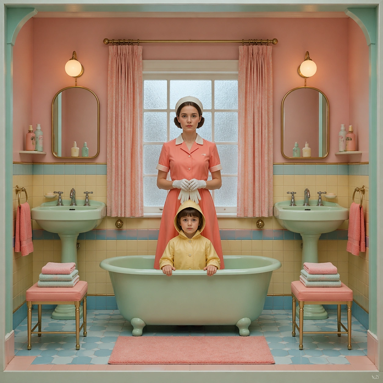
Example generated from “Symmetrical Pastel Dollhouse Cinematography — Bathroom Inspection”
GPT Image 2en

Scene: A square cinematic frame built with absolute left-right symmetry and a straight-on camera at human height. The palette is powder pink, mint, butter yellow, pale blue, and faded coral, with soft daylight and a miniature dollhouse clarity. The architecture should feel handcrafted, tidy, slightly theatrical, and emotionally precise rather than casual or naturalistic. Use a tiled pastel bathroom cut open like a display box, with twin sinks, twin mirrors, matching towels, and a mint bathtub centered beneath a frosted window. Subject: Place one or two front-facing figures exactly on the central axis, with costumes, props, and furnishings arranged like curated museum pieces. The people should feel composed and deadpan, never candid, and the room must read as a cutaway stage set where every shelf, lamp, chair, and curtain participates in the symmetry. A caretaker in a coral uniform stands centered between the sinks holding white gloves, while a child in a pale yellow raincoat looks directly at the viewer from the tub edge. Important details: The signature rules are central balance, flat frontal staging, pastel temperature control, crisp prop spacing, and a charming handmade scale. Preserve clean rectangles, color-coded rooms, disciplined eye-line, and the sense that the camera is respectfully observing an invented world. Avoid messy realism, loose camera motion, asymmetrical clutter, and dramatic lens distortion. Keep every bottle, soap dish, washcloth, and chrome fixture paired and evenly spaced so the room feels diagrammed but still tender. Use case: Symmetrical Pastel Dollhouse Cinematography single study 2/9. Constraints: No readable text, no watermark, no logos, preserve exact 1:1 aspect ratio, no dutch angle, no chaotic crowd, no gritty grime, no harsh neon, no visible brand packaging, no broken anatomy, no low-detail background, no accidental text fragments.
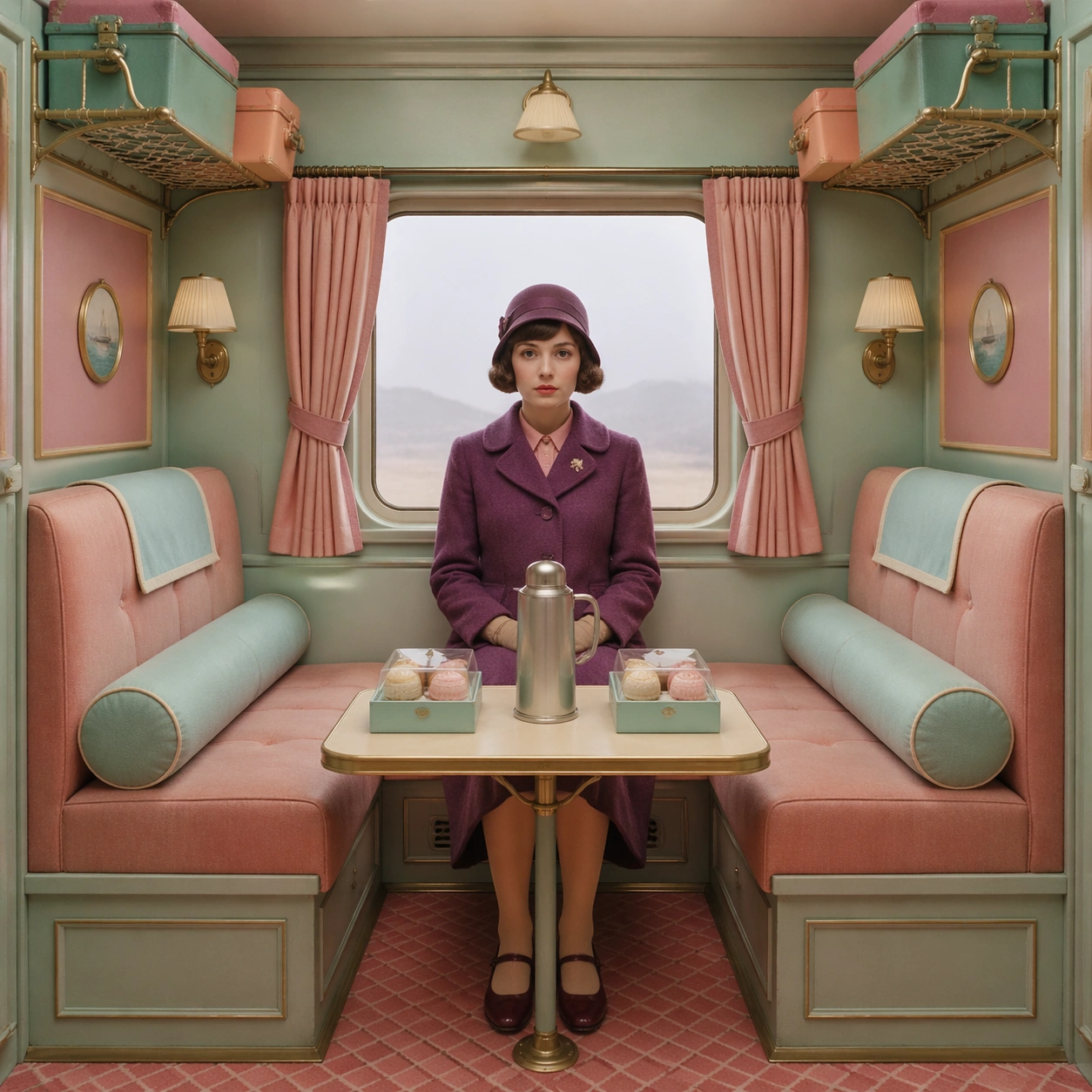
Example generated from “Symmetrical Pastel Dollhouse Cinematography — Train Compartment Pause”
GPT Image 2en

Scene: A square cinematic frame built with absolute left-right symmetry and a straight-on camera at human height. The palette is powder pink, mint, butter yellow, pale blue, and faded coral, with soft daylight and a miniature dollhouse clarity. The architecture should feel handcrafted, tidy, slightly theatrical, and emotionally precise rather than casual or naturalistic. Compose a train compartment as a rectangular jewel box, with equal luggage racks, matching curtains, and identical reading lamps framing a central window washed in pale gray daylight. Subject: Place one or two front-facing figures exactly on the central axis, with costumes, props, and furnishings arranged like curated museum pieces. The people should feel composed and deadpan, never candid, and the room must read as a cutaway stage set where every shelf, lamp, chair, and curtain participates in the symmetry. Seat a traveler in a plum coat on the exact centerline, knees together and hands folded, while two boxed pastries and a silver thermos sit on the table with measured spacing. Important details: The signature rules are central balance, flat frontal staging, pastel temperature control, crisp prop spacing, and a charming handmade scale. Preserve clean rectangles, color-coded rooms, disciplined eye-line, and the sense that the camera is respectfully observing an invented world. Avoid messy realism, loose camera motion, asymmetrical clutter, and dramatic lens distortion. The shot should suggest controlled stillness and handcrafted travel nostalgia, with every upholstered surface feeling tactile, crisp, and intentionally color-blocked. Use case: Symmetrical Pastel Dollhouse Cinematography single study 3/9. Constraints: No readable text, no watermark, no logos, preserve exact 1:1 aspect ratio, no dutch angle, no chaotic crowd, no gritty grime, no harsh neon, no visible brand packaging, no broken anatomy, no low-detail background, no accidental text fragments.
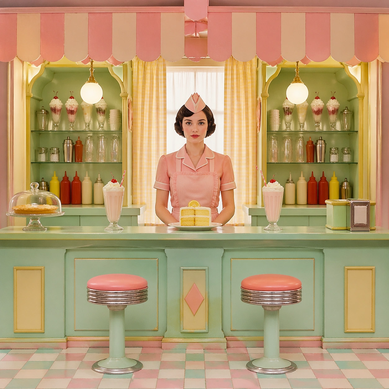
Example generated from “Symmetrical Pastel Dollhouse Cinematography — Lunch Counter Stillness”
GPT Image 2en

Scene: A square cinematic frame built with absolute left-right symmetry and a straight-on camera at human height. The palette is powder pink, mint, butter yellow, pale blue, and faded coral, with soft daylight and a miniature dollhouse clarity. The architecture should feel handcrafted, tidy, slightly theatrical, and emotionally precise rather than casual or naturalistic. Set the frame inside a compact luncheonette with a mint counter at the exact midpoint, a striped awning indoors, and mirrored condiment shelves on both sides under buttery afternoon light. Subject: Place one or two front-facing figures exactly on the central axis, with costumes, props, and furnishings arranged like curated museum pieces. The people should feel composed and deadpan, never candid, and the room must read as a cutaway stage set where every shelf, lamp, chair, and curtain participates in the symmetry. A server in a pink apron stands centered behind a plate of lemon cake, while two empty stools and two untouched milkshakes create an almost ceremonial sense of waiting. Important details: The signature rules are central balance, flat frontal staging, pastel temperature control, crisp prop spacing, and a charming handmade scale. Preserve clean rectangles, color-coded rooms, disciplined eye-line, and the sense that the camera is respectfully observing an invented world. Avoid messy realism, loose camera motion, asymmetrical clutter, and dramatic lens distortion. Preserve a toy-like scale in the stools, pastry dome, cash tray, and counter trim so the image reads like a collectible diorama rather than a busy restaurant. Use case: Symmetrical Pastel Dollhouse Cinematography single study 4/9. Constraints: No readable text, no watermark, no logos, preserve exact 1:1 aspect ratio, no dutch angle, no chaotic crowd, no gritty grime, no harsh neon, no visible brand packaging, no broken anatomy, no low-detail background, no accidental text fragments.
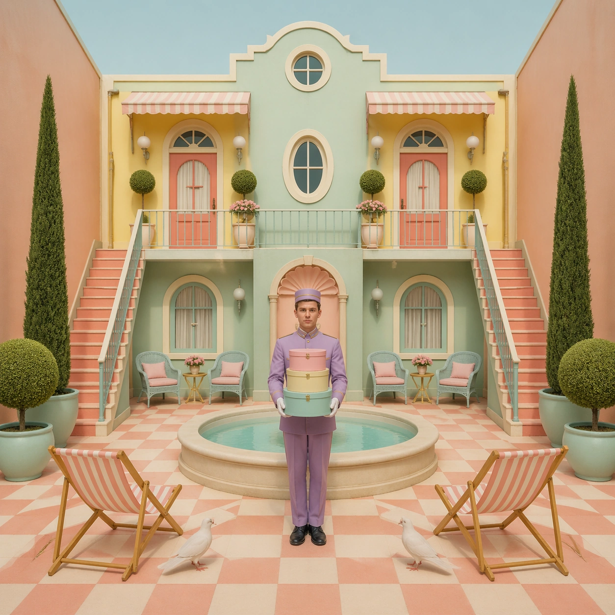
Example generated from “Symmetrical Pastel Dollhouse Cinematography — Courtyard Bellhop”
GPT Image 2en

Scene: A square cinematic frame built with absolute left-right symmetry and a straight-on camera at human height. The palette is powder pink, mint, butter yellow, pale blue, and faded coral, with soft daylight and a miniature dollhouse clarity. The architecture should feel handcrafted, tidy, slightly theatrical, and emotionally precise rather than casual or naturalistic. Open onto an enclosed hotel courtyard with a central fountain bowl, checkerboard paving, and two narrow staircases rising with identical angles toward matching balcony doors. Subject: Place one or two front-facing figures exactly on the central axis, with costumes, props, and furnishings arranged like curated museum pieces. The people should feel composed and deadpan, never candid, and the room must read as a cutaway stage set where every shelf, lamp, chair, and curtain participates in the symmetry. Place a bellhop in a lavender uniform on the fountain axis holding stacked hat boxes, while two doves and two folded deck chairs echo the geometry at equal distances. Important details: The signature rules are central balance, flat frontal staging, pastel temperature control, crisp prop spacing, and a charming handmade scale. Preserve clean rectangles, color-coded rooms, disciplined eye-line, and the sense that the camera is respectfully observing an invented world. Avoid messy realism, loose camera motion, asymmetrical clutter, and dramatic lens distortion. The courtyard should feel sunlit yet soft, with chalky pastel masonry, clipped hedges, and a deliberately reduced sense of scale that makes every object slightly precious. Use case: Symmetrical Pastel Dollhouse Cinematography single study 5/9. Constraints: No readable text, no watermark, no logos, preserve exact 1:1 aspect ratio, no dutch angle, no chaotic crowd, no gritty grime, no harsh neon, no visible brand packaging, no broken anatomy, no low-detail background, no accidental text fragments.
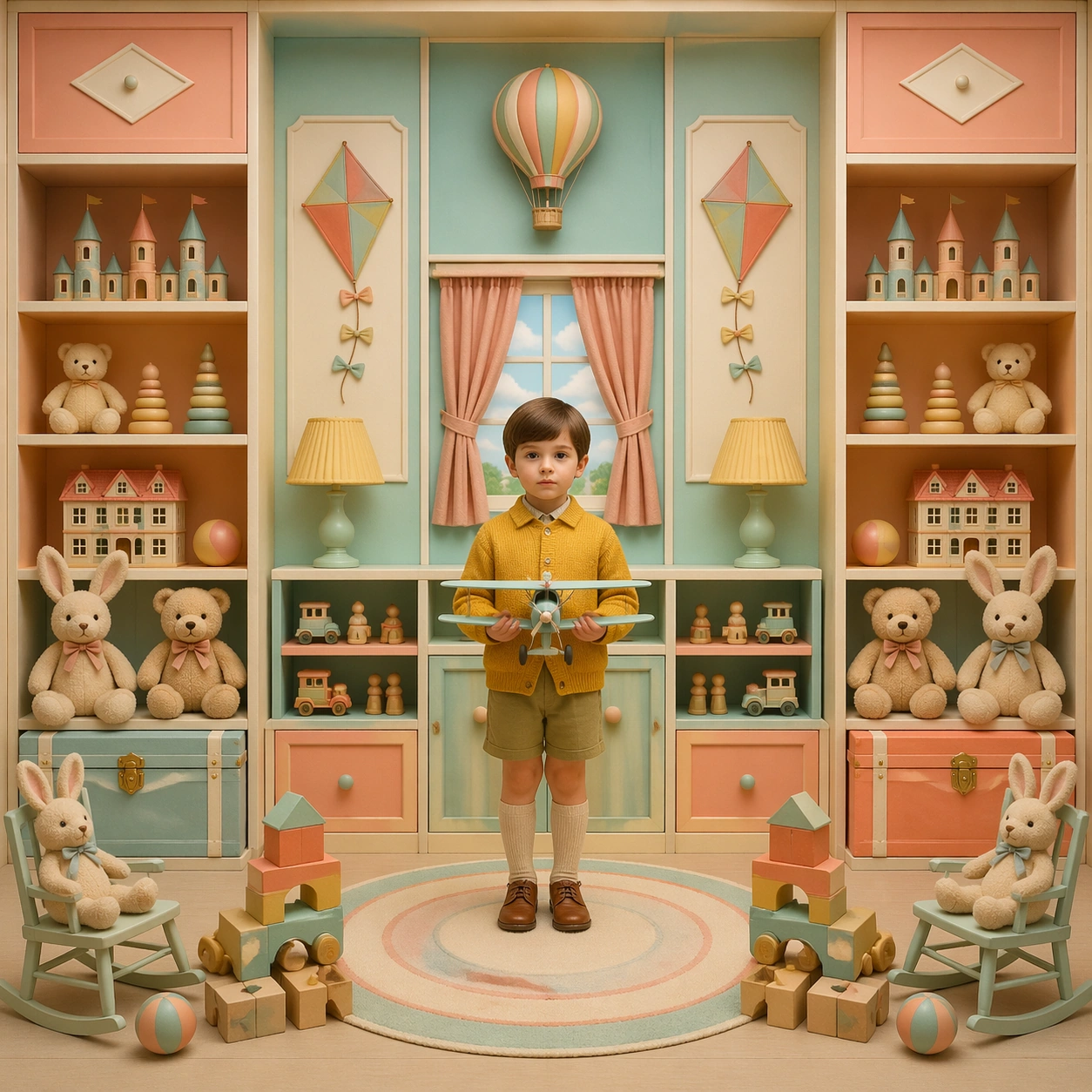
Example generated from “Symmetrical Pastel Dollhouse Cinematography — Playroom Inventory”
GPT Image 2en

Scene: A square cinematic frame built with absolute left-right symmetry and a straight-on camera at human height. The palette is powder pink, mint, butter yellow, pale blue, and faded coral, with soft daylight and a miniature dollhouse clarity. The architecture should feel handcrafted, tidy, slightly theatrical, and emotionally precise rather than casual or naturalistic. Construct a playroom as a frontal cabinet of compartments, with shelves, toy trunks, and painted wall panels balanced exactly left to right in peach, aqua, and cream. Subject: Place one or two front-facing figures exactly on the central axis, with costumes, props, and furnishings arranged like curated museum pieces. The people should feel composed and deadpan, never candid, and the room must read as a cutaway stage set where every shelf, lamp, chair, and curtain participates in the symmetry. A child in a mustard cardigan stands centered on a round rug holding a model airplane, while plush animals, blocks, and paper kites are arranged in disciplined bilateral order. Important details: The signature rules are central balance, flat frontal staging, pastel temperature control, crisp prop spacing, and a charming handmade scale. Preserve clean rectangles, color-coded rooms, disciplined eye-line, and the sense that the camera is respectfully observing an invented world. Avoid messy realism, loose camera motion, asymmetrical clutter, and dramatic lens distortion. Every toy should feel handmade and tactile, never branded or noisy, and the whole room should maintain a quiet catalog quality despite its cheerful color. Use case: Symmetrical Pastel Dollhouse Cinematography single study 6/9. Constraints: No readable text, no watermark, no logos, preserve exact 1:1 aspect ratio, no dutch angle, no chaotic crowd, no gritty grime, no harsh neon, no visible brand packaging, no broken anatomy, no low-detail background, no accidental text fragments.
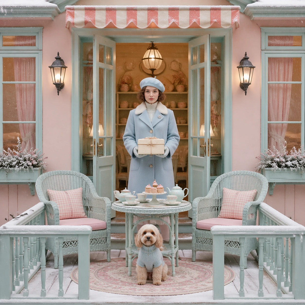
Example generated from “Symmetrical Pastel Dollhouse Cinematography — Winter Balcony Arrival”
GPT Image 2en

Scene: A square cinematic frame built with absolute left-right symmetry and a straight-on camera at human height. The palette is powder pink, mint, butter yellow, pale blue, and faded coral, with soft daylight and a miniature dollhouse clarity. The architecture should feel handcrafted, tidy, slightly theatrical, and emotionally precise rather than casual or naturalistic. Use a snow-dusted balcony facade with double doors, paired lanterns, and matching wicker chairs facing inward toward a centered tea table under cold pastel morning light. Subject: Place one or two front-facing figures exactly on the central axis, with costumes, props, and furnishings arranged like curated museum pieces. The people should feel composed and deadpan, never candid, and the room must read as a cutaway stage set where every shelf, lamp, chair, and curtain participates in the symmetry. A woman in a pale blue coat stands in the middle holding a boxed pastry string-tied in cream paper, while a small dog sits exactly on the rug medallion below her feet. Important details: The signature rules are central balance, flat frontal staging, pastel temperature control, crisp prop spacing, and a charming handmade scale. Preserve clean rectangles, color-coded rooms, disciplined eye-line, and the sense that the camera is respectfully observing an invented world. Avoid messy realism, loose camera motion, asymmetrical clutter, and dramatic lens distortion. Keep the snow gentle and graphic, the balcony rails evenly spaced, and the palette restrained so the image feels elegant, wistful, and composed instead of dramatic. Use case: Symmetrical Pastel Dollhouse Cinematography single study 7/9. Constraints: No readable text, no watermark, no logos, preserve exact 1:1 aspect ratio, no dutch angle, no chaotic crowd, no gritty grime, no harsh neon, no visible brand packaging, no broken anatomy, no low-detail background, no accidental text fragments.
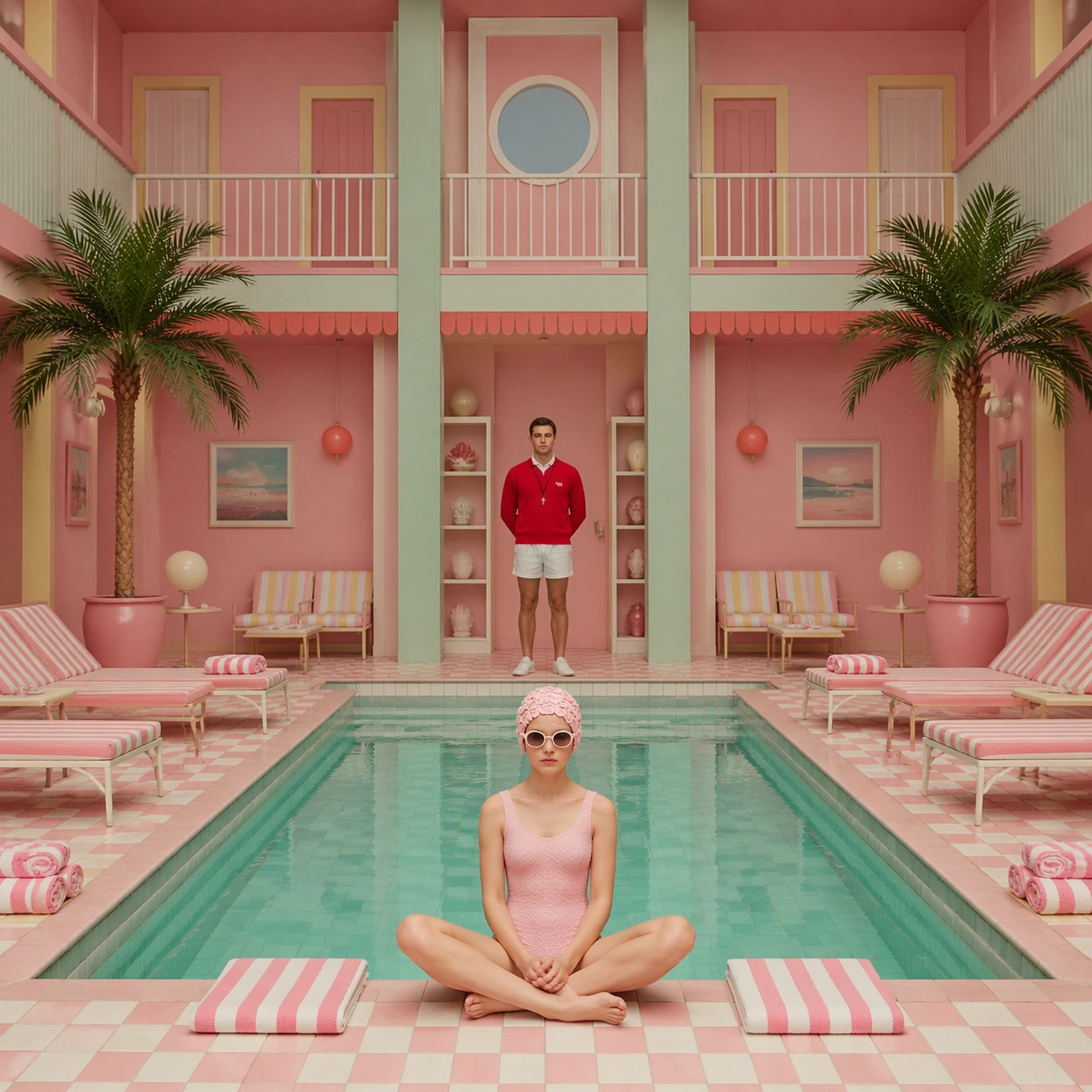
Example generated from “Symmetrical Pastel Dollhouse Cinematography — Poolside Direct Address”
GPT Image 2en

Scene: A square cinematic frame built with absolute left-right symmetry and a straight-on camera at human height. The palette is powder pink, mint, butter yellow, pale blue, and faded coral, with soft daylight and a miniature dollhouse clarity. The architecture should feel handcrafted, tidy, slightly theatrical, and emotionally precise rather than casual or naturalistic. Frame a rectangular indoor pool from the short end so the water becomes a centered strip of pale turquoise, flanked by identical loungers, striped towels, and potted palms. Subject: Place one or two front-facing figures exactly on the central axis, with costumes, props, and furnishings arranged like curated museum pieces. The people should feel composed and deadpan, never candid, and the room must read as a cutaway stage set where every shelf, lamp, chair, and curtain participates in the symmetry. A lifeguard in a tomato-red sweater stands at the far center facing the camera, while one swimmer sits at the pool edge in a mirrored pose that reinforces the severe order. Important details: The signature rules are central balance, flat frontal staging, pastel temperature control, crisp prop spacing, and a charming handmade scale. Preserve clean rectangles, color-coded rooms, disciplined eye-line, and the sense that the camera is respectfully observing an invented world. Avoid messy realism, loose camera motion, asymmetrical clutter, and dramatic lens distortion. The room should feel dry, quiet, and lightly whimsical, with candy-toned tiles and precise vertical lines controlling the eye from foreground to background. Use case: Symmetrical Pastel Dollhouse Cinematography single study 8/9. Constraints: No readable text, no watermark, no logos, preserve exact 1:1 aspect ratio, no dutch angle, no chaotic crowd, no gritty grime, no harsh neon, no visible brand packaging, no broken anatomy, no low-detail background, no accidental text fragments.
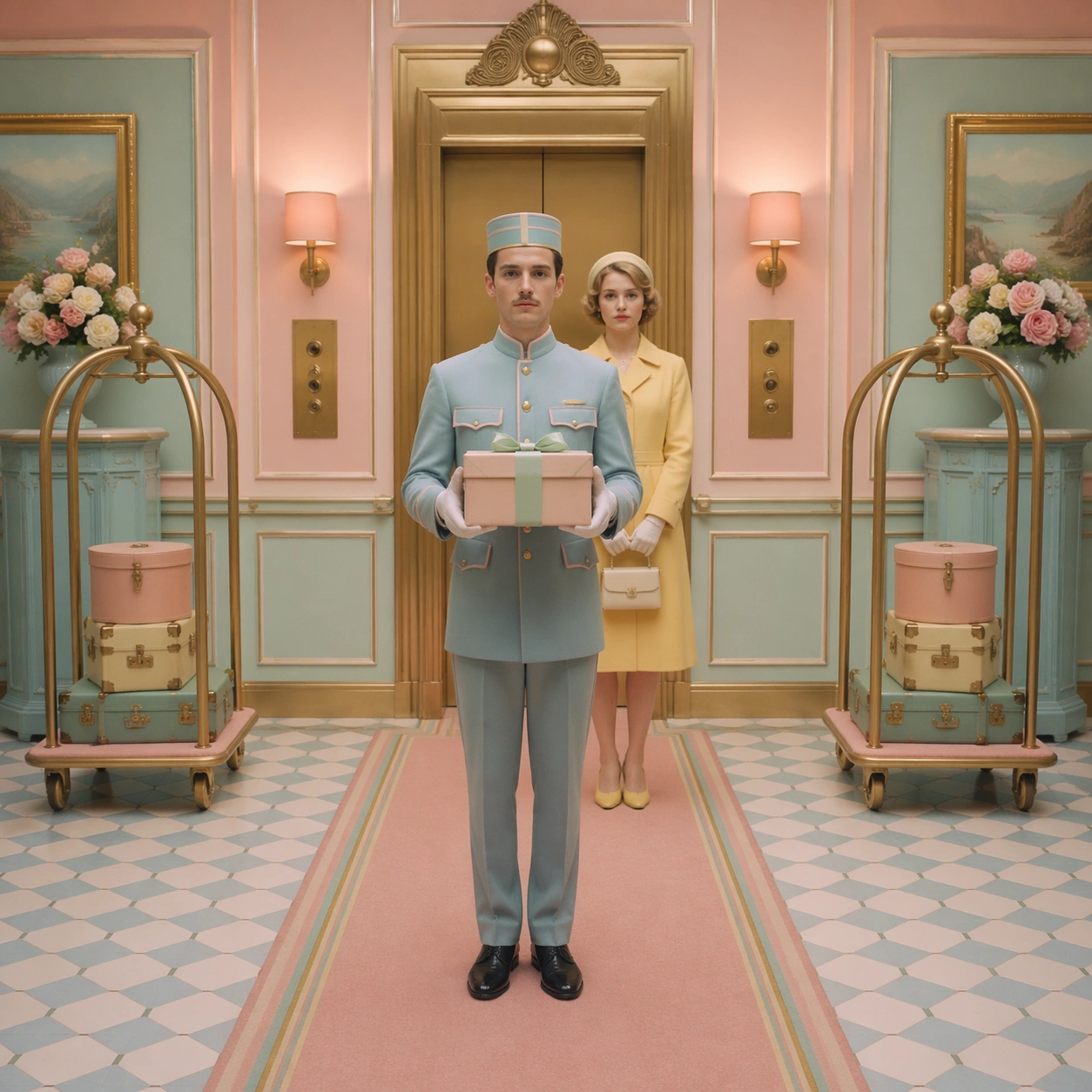
Example generated from “Symmetrical Pastel Dollhouse Cinematography — Elevator Ceremony”
GPT Image 2en

Scene: A square cinematic frame built with absolute left-right symmetry and a straight-on camera at human height. The palette is powder pink, mint, butter yellow, pale blue, and faded coral, with soft daylight and a miniature dollhouse clarity. The architecture should feel handcrafted, tidy, slightly theatrical, and emotionally precise rather than casual or naturalistic. Stage the image inside an elevator vestibule with centered brass doors, mirrored call panels, matching luggage carts, and a runner carpet splitting the composition into equal halves. Subject: Place one or two front-facing figures exactly on the central axis, with costumes, props, and furnishings arranged like curated museum pieces. The people should feel composed and deadpan, never candid, and the room must read as a cutaway stage set where every shelf, lamp, chair, and curtain participates in the symmetry. A porter stands square to the lens with white gloves and a parcel balanced at chest height, while a guest in a lemon coat waits two steps behind on the same axis. Important details: The signature rules are central balance, flat frontal staging, pastel temperature control, crisp prop spacing, and a charming handmade scale. Preserve clean rectangles, color-coded rooms, disciplined eye-line, and the sense that the camera is respectfully observing an invented world. Avoid messy realism, loose camera motion, asymmetrical clutter, and dramatic lens distortion. Let the charm come from the repetition of sconces, floor tiles, and parcel ribbons, all rendered with handmade neatness and pastel restraint. Use case: Symmetrical Pastel Dollhouse Cinematography single study 9/9. Constraints: No readable text, no watermark, no logos, preserve exact 1:1 aspect ratio, no dutch angle, no chaotic crowd, no gritty grime, no harsh neon, no visible brand packaging, no broken anatomy, no low-detail background, no accidental text fragments.
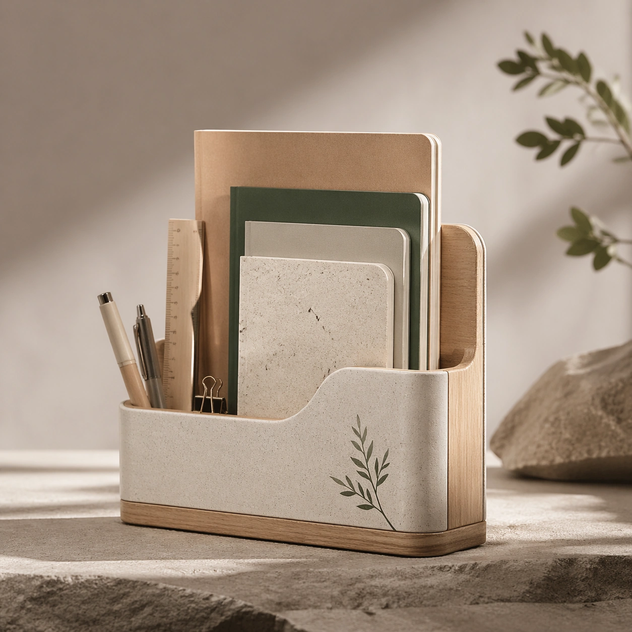
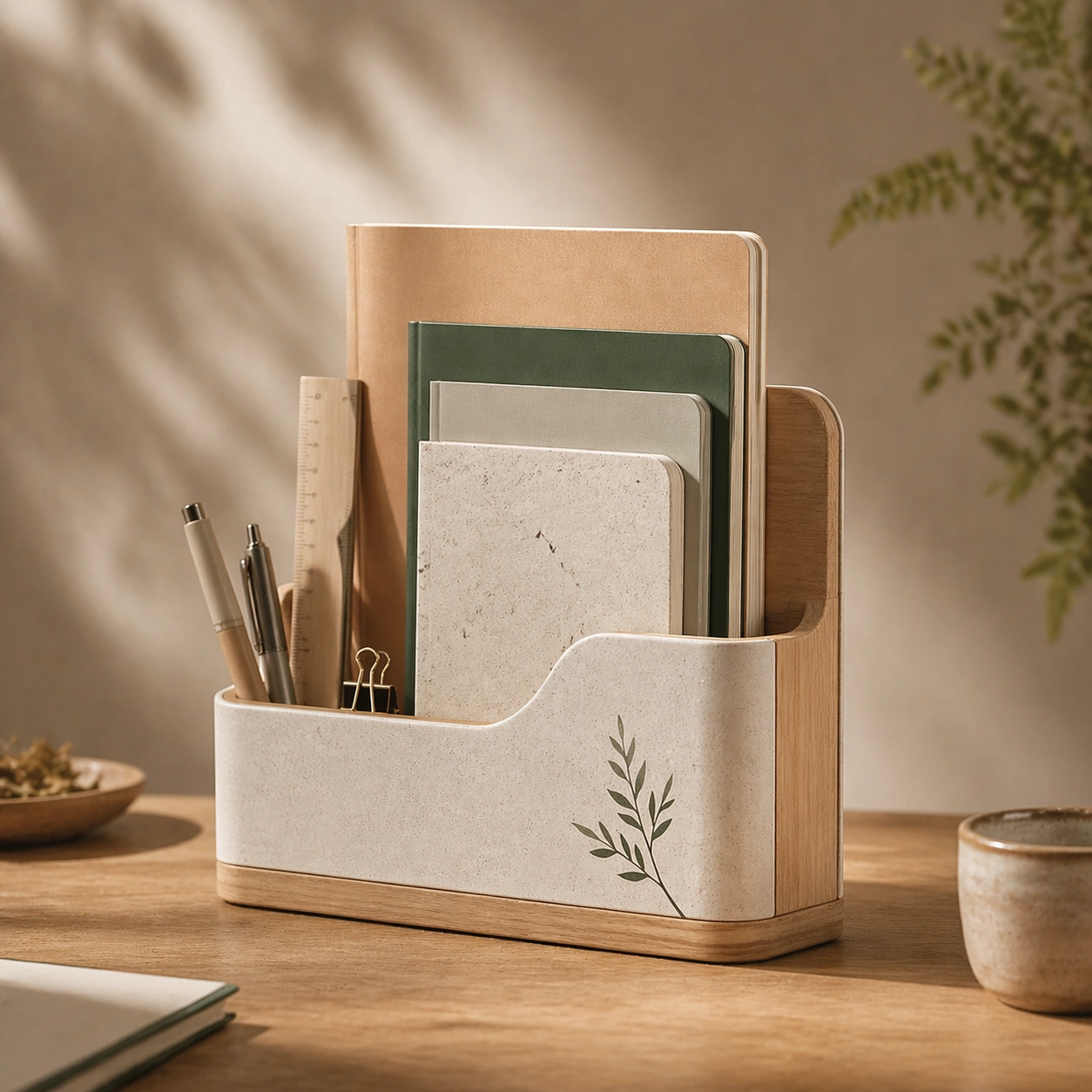
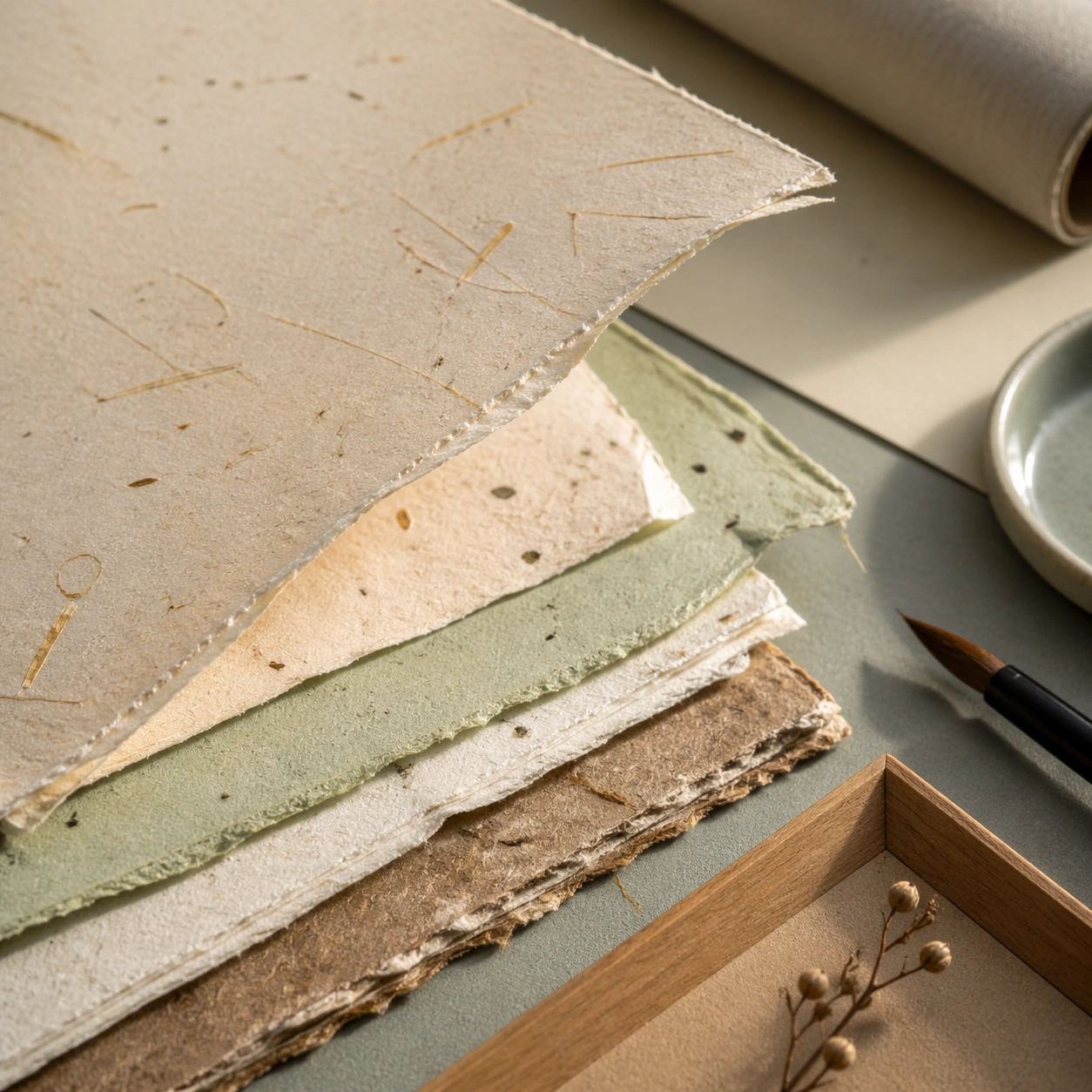
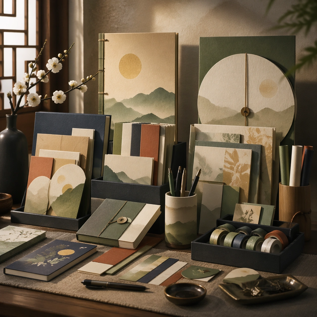
Example generated from “Taiwanese Paper And Stationery Lifestyle — Reference Anchor”
GPT Image 2en

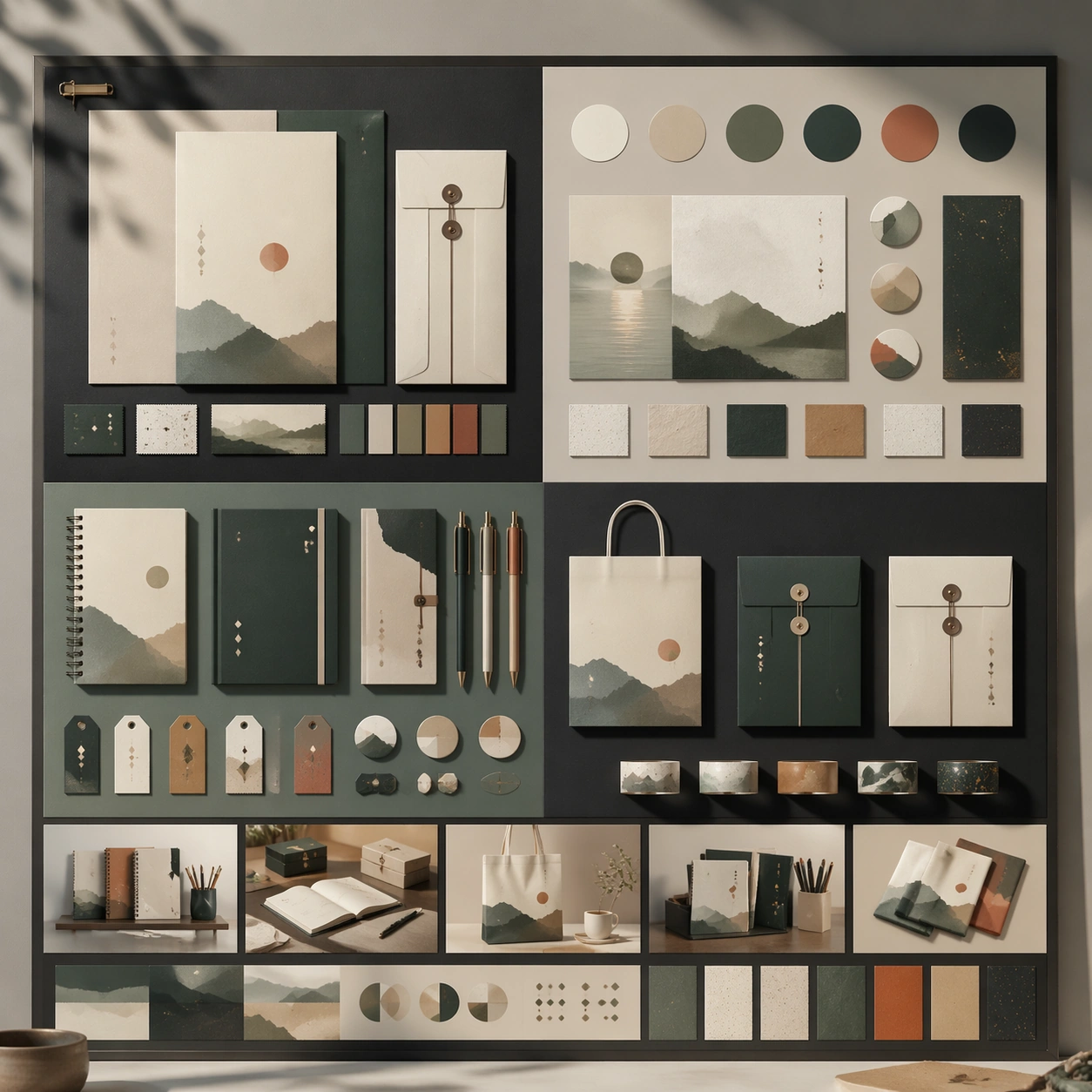
Scene: A square premium key-art frame built for a reference-dependent production series. Stage a reference anchor for taiwanese paper and stationery lifestyle taiwanese paper and stationery lifestyle with one unmistakable core subject and disciplined composition with controlled lighting, clear silhouette separation, and a camera setup that feels deliberate enough for campaign reuse. The composition should carry strong focal hierarchy, believable depth, and polished surface behavior while still staying stable enough to support downstream dependent variations. Subject: Center the image on a reference anchor for taiwanese paper and stationery lifestyle taiwanese paper and stationery lifestyle with one unmistakable core subject and disciplined composition. The result should feel like a concrete, shippable asset for a taiwanese paper and stationery lifestyle taiwanese paper and stationery lifestyle visual system, not a generic fantasy render. Build the subject with layered materials, stable anatomy or engineering logic, and enough specificity that later images can inherit the same underlying identity. This image is the root reference that defines continuity for the rest of the series. The viewer should immediately understand what is being preserved across the sequence and what is changing in this particular beat. Important details: establish the base identity, silhouette logic, palette rhythm, and layout system that downstream variations must preserve. Make continuity explicit through repeatable shape language, proportion control, and a coherent palette system. Changes in pose, angle, mood, rarity, weather, or layout should still feel downstream of one stable source. Avoid clutter that would confuse reference use. Any interface-like blocks or graphic surfaces must remain abstract and unreadable. Keep the image polished, original, and suitable for both gallery display and production review. Use case: taiwanese paper and stationery lifestyle taiwanese paper and stationery lifestyle series study 1/4, focused on reference anchor. Constraints: No readable text, no watermark, no logos, preserve exact 1:1 aspect ratio, no extra subject duplication, no noisy background, no broken continuity, no off-model redesign, no accidental franchise resemblance.

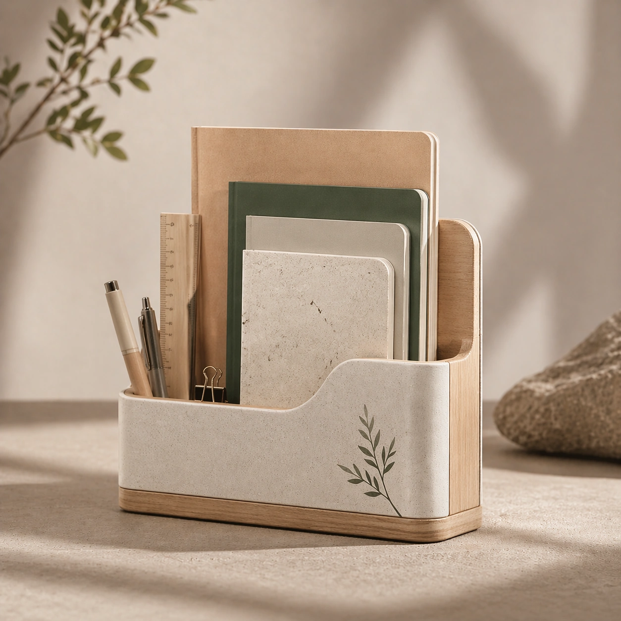
Example generated from “Taiwanese Paper And Stationery Lifestyle — Variation One”
GPT Image 2en

Scene: A square premium key-art frame built for a reference-dependent production series. Stage the same core concept reinterpreted through a first controlled variation for taiwanese paper and stationery lifestyle taiwanese paper and stationery lifestyle with controlled lighting, clear silhouette separation, and a camera setup that feels deliberate enough for campaign reuse. The composition should carry strong focal hierarchy, believable depth, and polished surface behavior while still staying stable enough to support downstream dependent variations. Subject: Center the image on the same core concept reinterpreted through a first controlled variation for taiwanese paper and stationery lifestyle taiwanese paper and stationery lifestyle. The result should feel like a concrete, shippable asset for a taiwanese paper and stationery lifestyle taiwanese paper and stationery lifestyle visual system, not a generic fantasy render. Build the subject with layered materials, stable anatomy or engineering logic, and enough specificity that later images can inherit the same underlying identity. Preserve the same core subject identity, silhouette logic, material language, and composition system from the reference image from the reference image while changing only what this variation needs. The viewer should immediately understand what is being preserved across the sequence and what is changing in this particular beat. Important details: change mood, framing, or emphasis while preserving the same underlying visual system and subject continuity. Make continuity explicit through repeatable shape language, proportion control, and a coherent palette system. Changes in pose, angle, mood, rarity, weather, or layout should still feel downstream of one stable source. Avoid clutter that would confuse reference use. Any interface-like blocks or graphic surfaces must remain abstract and unreadable. Keep the image polished, original, and suitable for both gallery display and production review. Use case: taiwanese paper and stationery lifestyle taiwanese paper and stationery lifestyle series study 2/4, focused on variation one. Constraints: No readable text, no watermark, no logos, preserve exact 1:1 aspect ratio, no unrelated redesign, no continuity drift, no broken continuity, no off-model redesign, no accidental franchise resemblance.

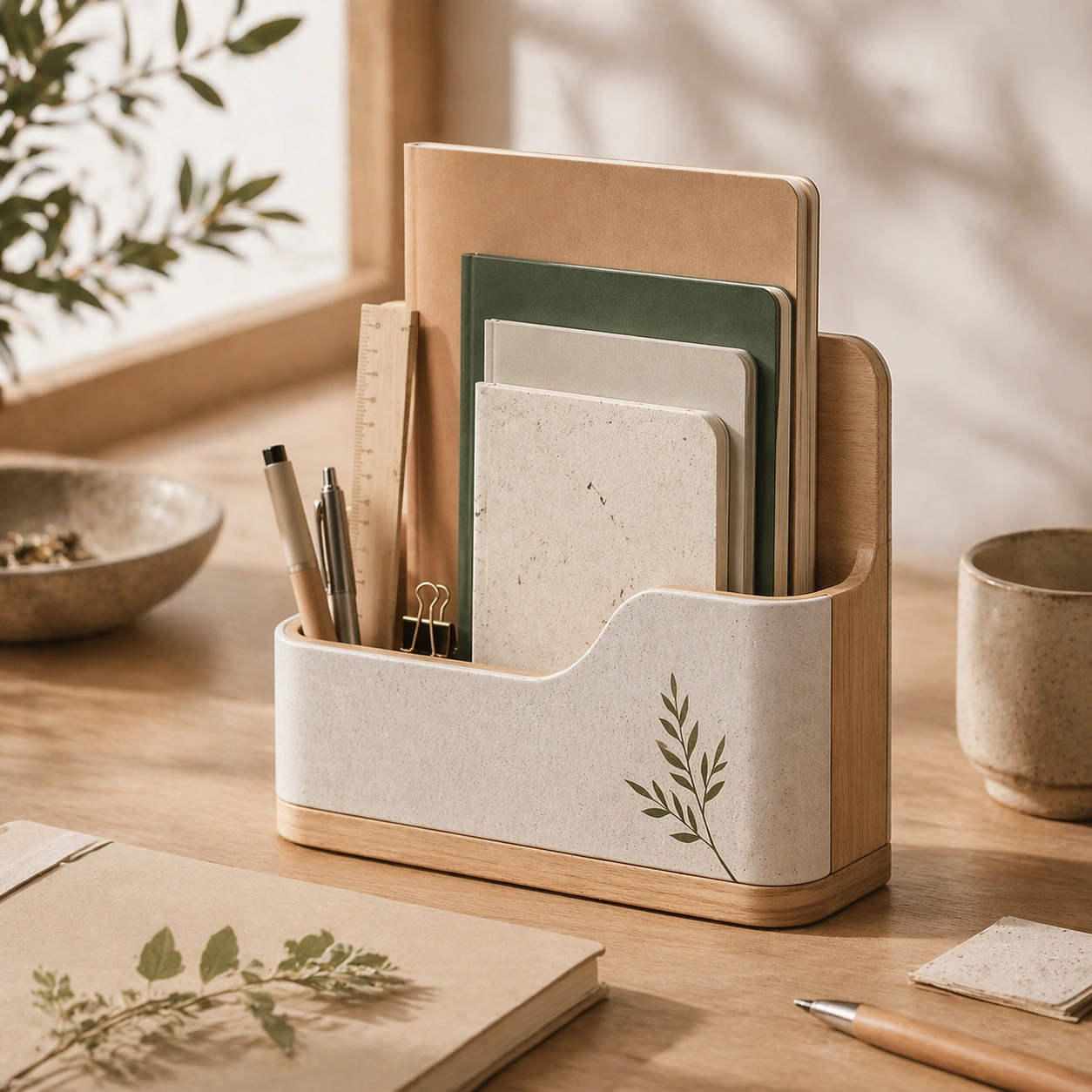
Example generated from “Taiwanese Paper And Stationery Lifestyle — Variation Two”
GPT Image 2en

Scene: A square premium key-art frame built for a reference-dependent production series. Stage the same core concept pushed into a second variation with different pacing or surface behavior for taiwanese paper and stationery lifestyle taiwanese paper and stationery lifestyle with controlled lighting, clear silhouette separation, and a camera setup that feels deliberate enough for campaign reuse. The composition should carry strong focal hierarchy, believable depth, and polished surface behavior while still staying stable enough to support downstream dependent variations. Subject: Center the image on the same core concept pushed into a second variation with different pacing or surface behavior for taiwanese paper and stationery lifestyle taiwanese paper and stationery lifestyle. The result should feel like a concrete, shippable asset for a taiwanese paper and stationery lifestyle taiwanese paper and stationery lifestyle visual system, not a generic fantasy render. Build the subject with layered materials, stable anatomy or engineering logic, and enough specificity that later images can inherit the same underlying identity. Preserve the same core subject identity, silhouette logic, material language, and composition system from the reference image from the reference image while changing only what this variation needs. The viewer should immediately understand what is being preserved across the sequence and what is changing in this particular beat. Important details: the viewer should still read one connected family rather than three disconnected ideas. Make continuity explicit through repeatable shape language, proportion control, and a coherent palette system. Changes in pose, angle, mood, rarity, weather, or layout should still feel downstream of one stable source. Avoid clutter that would confuse reference use. Any interface-like blocks or graphic surfaces must remain abstract and unreadable. Keep the image polished, original, and suitable for both gallery display and production review. Use case: taiwanese paper and stationery lifestyle taiwanese paper and stationery lifestyle series study 3/4, focused on variation two. Constraints: No readable text, no watermark, no logos, preserve exact 1:1 aspect ratio, no random props, no off-model shift, no broken continuity, no off-model redesign, no accidental franchise resemblance.

Example generated from “Taiwanese Paper And Stationery Lifestyle — Variation Three”
GPT Image 2en

Scene: A square premium key-art frame built for a reference-dependent production series. Stage the same core concept in a third polished variation that completes the reference-led set for taiwanese paper and stationery lifestyle taiwanese paper and stationery lifestyle with controlled lighting, clear silhouette separation, and a camera setup that feels deliberate enough for campaign reuse. The composition should carry strong focal hierarchy, believable depth, and polished surface behavior while still staying stable enough to support downstream dependent variations. Subject: Center the image on the same core concept in a third polished variation that completes the reference-led set for taiwanese paper and stationery lifestyle taiwanese paper and stationery lifestyle. The result should feel like a concrete, shippable asset for a taiwanese paper and stationery lifestyle taiwanese paper and stationery lifestyle visual system, not a generic fantasy render. Build the subject with layered materials, stable anatomy or engineering logic, and enough specificity that later images can inherit the same underlying identity. Preserve the same core subject identity, silhouette logic, material language, and composition system from the reference image from the reference image while changing only what this variation needs. The viewer should immediately understand what is being preserved across the sequence and what is changing in this particular beat. Important details: keep continuity obvious while introducing a fresh but coherent downstream use case. Make continuity explicit through repeatable shape language, proportion control, and a coherent palette system. Changes in pose, angle, mood, rarity, weather, or layout should still feel downstream of one stable source. Avoid clutter that would confuse reference use. Any interface-like blocks or graphic surfaces must remain abstract and unreadable. Keep the image polished, original, and suitable for both gallery display and production review. Use case: taiwanese paper and stationery lifestyle taiwanese paper and stationery lifestyle series study 4/4, focused on variation three. Constraints: No readable text, no watermark, no logos, preserve exact 1:1 aspect ratio, no franchise mimicry, no broken hierarchy, no broken continuity, no off-model redesign, no accidental franchise resemblance.

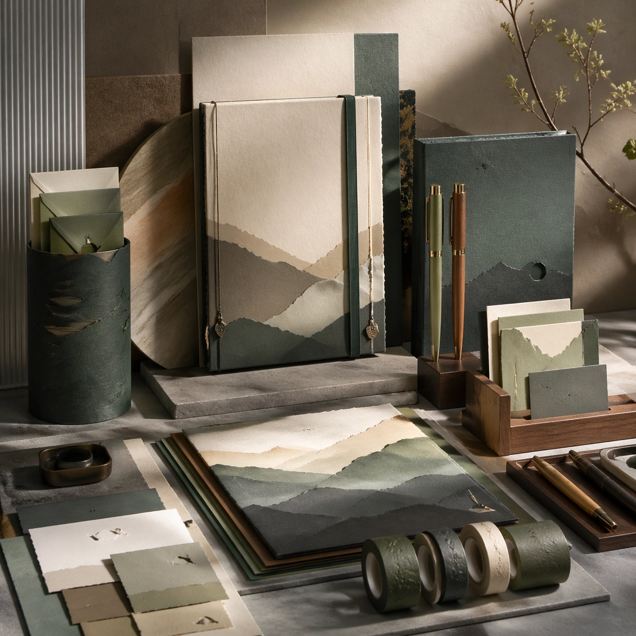
Example generated from “Taiwanese Paper And Stationery Lifestyle — Hero Study”
GPT Image 2en

Scene: A square production-ready image designed for a game-art review wall and a commercial gallery at the same time. Frame a flagship hero study for taiwanese paper and stationery lifestyle taiwanese paper and stationery lifestyle presented as a polished, production-ready surface with disciplined lighting, clean edge separation, and enough surrounding context to prove how the asset would behave in a real product surface. The camera, crop, and tonal balance should feel intentional rather than generic, with high readability at first glance and convincing material response under closer inspection. Subject: Center the study on a flagship hero study for taiwanese paper and stationery lifestyle taiwanese paper and stationery lifestyle presented as a polished, production-ready surface. Translate the topic into a concrete, shippable visual statement instead of a loose mood board. Build layered object relationships, believable surface finish, and strong silhouette grouping so the image reads immediately as part of a taiwanese paper and stationery lifestyle taiwanese paper and stationery lifestyle visual system. The subject should feel made for a live game pipeline: useful in store, UI, campaign, or art-review contexts, with visual hierarchy strong enough to survive aggressive cropping. Important details: make the core idea immediately legible and premium enough for gallery or campaign use. Keep every supporting element subordinate to the main read, and make category separation obvious through form, color zoning, depth, and material logic rather than words. Where panels, cards, badges, or interface blocks appear, they must look professionally structured but remain unreadable. The visual language should feel premium, original, and coherent across this package, with no filler clutter and no accidental resemblance to a specific shipped game IP. Use case: taiwanese paper and stationery lifestyle taiwanese paper and stationery lifestyle single study 1/5, focused on hero study. Constraints: No readable text, no watermark, no logos, preserve exact 1:1 aspect ratio, no generic stock staging, no readable text, no broken hierarchy, no generic stock-photo staging, no accidental UI gibberish.

Example generated from “Taiwanese Paper And Stationery Lifestyle — Detail Proof”
GPT Image 2en

Scene: A square production-ready image designed for a game-art review wall and a commercial gallery at the same time. Frame a detail-focused proof image for taiwanese paper and stationery lifestyle taiwanese paper and stationery lifestyle that zooms into the most important material or structural cue with disciplined lighting, clean edge separation, and enough surrounding context to prove how the asset would behave in a real product surface. The camera, crop, and tonal balance should feel intentional rather than generic, with high readability at first glance and convincing material response under closer inspection. Subject: Center the study on a detail-focused proof image for taiwanese paper and stationery lifestyle taiwanese paper and stationery lifestyle that zooms into the most important material or structural cue. Translate the topic into a concrete, shippable visual statement instead of a loose mood board. Build layered object relationships, believable surface finish, and strong silhouette grouping so the image reads immediately as part of a taiwanese paper and stationery lifestyle taiwanese paper and stationery lifestyle visual system. The subject should feel made for a live game pipeline: useful in store, UI, campaign, or art-review contexts, with visual hierarchy strong enough to survive aggressive cropping. Important details: micro detail should reinforce credibility without losing the main idea. Keep every supporting element subordinate to the main read, and make category separation obvious through form, color zoning, depth, and material logic rather than words. Where panels, cards, badges, or interface blocks appear, they must look professionally structured but remain unreadable. The visual language should feel premium, original, and coherent across this package, with no filler clutter and no accidental resemblance to a specific shipped game IP. Use case: taiwanese paper and stationery lifestyle taiwanese paper and stationery lifestyle single study 2/5, focused on detail proof. Constraints: No readable text, no watermark, no logos, preserve exact 1:1 aspect ratio, no unreadable clutter, no measurement text, no broken hierarchy, no generic stock-photo staging, no accidental UI gibberish.

Example generated from “Taiwanese Paper And Stationery Lifestyle — System Board”
GPT Image 2en

Scene: A square production-ready image designed for a game-art review wall and a commercial gallery at the same time. Frame a system-board layout for taiwanese paper and stationery lifestyle taiwanese paper and stationery lifestyle that organizes multiple related elements into one coherent review surface with disciplined lighting, clean edge separation, and enough surrounding context to prove how the asset would behave in a real product surface. The camera, crop, and tonal balance should feel intentional rather than generic, with high readability at first glance and convincing material response under closer inspection. Subject: Center the study on a system-board layout for taiwanese paper and stationery lifestyle taiwanese paper and stationery lifestyle that organizes multiple related elements into one coherent review surface. Translate the topic into a concrete, shippable visual statement instead of a loose mood board. Build layered object relationships, believable surface finish, and strong silhouette grouping so the image reads immediately as part of a taiwanese paper and stationery lifestyle taiwanese paper and stationery lifestyle visual system. The subject should feel made for a live game pipeline: useful in store, UI, campaign, or art-review contexts, with visual hierarchy strong enough to survive aggressive cropping. Important details: the board should feel design-ready and structured even though every label remains abstract. Keep every supporting element subordinate to the main read, and make category separation obvious through form, color zoning, depth, and material logic rather than words. Where panels, cards, badges, or interface blocks appear, they must look professionally structured but remain unreadable. The visual language should feel premium, original, and coherent across this package, with no filler clutter and no accidental resemblance to a specific shipped game IP. Use case: taiwanese paper and stationery lifestyle taiwanese paper and stationery lifestyle single study 3/5, focused on system board. Constraints: No readable text, no watermark, no logos, preserve exact 1:1 aspect ratio, no readable labels, no placeholder lorem ipsum, no broken hierarchy, no generic stock-photo staging, no accidental UI gibberish.

Example generated from “Taiwanese Paper And Stationery Lifestyle — Promo Crop”
GPT Image 2en

Scene: A square production-ready image designed for a game-art review wall and a commercial gallery at the same time. Frame a promo-oriented crop for taiwanese paper and stationery lifestyle taiwanese paper and stationery lifestyle optimized for social, storefront, or poster reuse with disciplined lighting, clean edge separation, and enough surrounding context to prove how the asset would behave in a real product surface. The camera, crop, and tonal balance should feel intentional rather than generic, with high readability at first glance and convincing material response under closer inspection. Subject: Center the study on a promo-oriented crop for taiwanese paper and stationery lifestyle taiwanese paper and stationery lifestyle optimized for social, storefront, or poster reuse. Translate the topic into a concrete, shippable visual statement instead of a loose mood board. Build layered object relationships, believable surface finish, and strong silhouette grouping so the image reads immediately as part of a taiwanese paper and stationery lifestyle taiwanese paper and stationery lifestyle visual system. The subject should feel made for a live game pipeline: useful in store, UI, campaign, or art-review contexts, with visual hierarchy strong enough to survive aggressive cropping. Important details: keep strong hierarchy and conversion energy without relying on explicit copy. Keep every supporting element subordinate to the main read, and make category separation obvious through form, color zoning, depth, and material logic rather than words. Where panels, cards, badges, or interface blocks appear, they must look professionally structured but remain unreadable. The visual language should feel premium, original, and coherent across this package, with no filler clutter and no accidental resemblance to a specific shipped game IP. Use case: taiwanese paper and stationery lifestyle taiwanese paper and stationery lifestyle single study 4/5, focused on promo crop. Constraints: No readable text, no watermark, no logos, preserve exact 1:1 aspect ratio, no slogans, no logos, no broken hierarchy, no generic stock-photo staging, no accidental UI gibberish.

Example generated from “Taiwanese Paper And Stationery Lifestyle — Finale Study”
GPT Image 2en

Scene: A square production-ready image designed for a game-art review wall and a commercial gallery at the same time. Frame a finale study for taiwanese paper and stationery lifestyle taiwanese paper and stationery lifestyle that pushes the topic to its most polished and complete expression with disciplined lighting, clean edge separation, and enough surrounding context to prove how the asset would behave in a real product surface. The camera, crop, and tonal balance should feel intentional rather than generic, with high readability at first glance and convincing material response under closer inspection. Subject: Center the study on a finale study for taiwanese paper and stationery lifestyle taiwanese paper and stationery lifestyle that pushes the topic to its most polished and complete expression. Translate the topic into a concrete, shippable visual statement instead of a loose mood board. Build layered object relationships, believable surface finish, and strong silhouette grouping so the image reads immediately as part of a taiwanese paper and stationery lifestyle taiwanese paper and stationery lifestyle visual system. The subject should feel made for a live game pipeline: useful in store, UI, campaign, or art-review contexts, with visual hierarchy strong enough to survive aggressive cropping. Important details: the closing image should feel definitive, high-signal, and suitable for feature placement. Keep every supporting element subordinate to the main read, and make category separation obvious through form, color zoning, depth, and material logic rather than words. Where panels, cards, badges, or interface blocks appear, they must look professionally structured but remain unreadable. The visual language should feel premium, original, and coherent across this package, with no filler clutter and no accidental resemblance to a specific shipped game IP. Use case: taiwanese paper and stationery lifestyle taiwanese paper and stationery lifestyle single study 5/5, focused on finale study. Constraints: No readable text, no watermark, no logos, preserve exact 1:1 aspect ratio, no text blocks, no derivative character likeness, no broken hierarchy, no generic stock-photo staging, no accidental UI gibberish.

Example generated from “Tarot Card Deck — Color Field Threshold”
GPT Image 2en

Scene: A square, gallery-ready composition with painterly surfaces, controlled negative space, and a deliberate fine-art presentation. Build the frame around a few dominant blocks or atmospheres of color with slow transitions and emotional weight. Keep the lighting, camera distance, and spatial organization tuned for a high-signal research image rather than a casual snapshot. The image belongs to the Tarot Card Deck theme and should feel immediately legible as a prompt atlas theme for tarot card deck, testing multi-image-reference with gpt image 2.. Subject: Center the study on a few dominant blocks or atmospheres of color with slow transitions and emotional weight. Translate the theme into a concrete visual statement instead of an abstract mood board: the viewer should understand what kind of image this is, what is being tested, and why the composition is difficult. Use the slug idea of tarot card deck as a literal guide for subject matter, materials, and staging. Important details: Focus on authored mark-making, hierarchy, rhythm, and a visual idea that reads immediately before the viewer inspects the brushwork. Preserve a disciplined square composition, clear focal hierarchy, and enough secondary information to make the image feel complete rather than underspecified. The image should look polished, novel, and exhibition-ready, with topic-specific credibility coming from the way surfaces, structure, and visual language reinforce Tarot Card Deck. Avoid generic filler elements that do not serve the main concept. Use case: Tarot Card Deck single study 2/8, testing multi-image-reference through the color field threshold variation. Constraints: No readable text, no watermark, no logos, preserve exact 1:1 aspect ratio, no direct copy of a known artwork, no comic speech bubbles, no accidental typography, no low-effort doodle energy, no muddy center, no fake museum label.

Example generated from “Tarot Card Deck — Fractured Figure Surge”
GPT Image 2en

Scene: A square, gallery-ready composition with painterly surfaces, controlled negative space, and a deliberate fine-art presentation. Build the frame around a figure-like presence that emerges and dissolves through broken strokes and unstable edges. Keep the lighting, camera distance, and spatial organization tuned for a high-signal research image rather than a casual snapshot. The image belongs to the Tarot Card Deck theme and should feel immediately legible as a prompt atlas theme for tarot card deck, testing multi-image-reference with gpt image 2.. Subject: Center the study on a figure-like presence that emerges and dissolves through broken strokes and unstable edges. Translate the theme into a concrete visual statement instead of an abstract mood board: the viewer should understand what kind of image this is, what is being tested, and why the composition is difficult. Use the slug idea of tarot card deck as a literal guide for subject matter, materials, and staging. Important details: Focus on authored mark-making, hierarchy, rhythm, and a visual idea that reads immediately before the viewer inspects the brushwork. Preserve a disciplined square composition, clear focal hierarchy, and enough secondary information to make the image feel complete rather than underspecified. The image should look polished, novel, and exhibition-ready, with topic-specific credibility coming from the way surfaces, structure, and visual language reinforce Tarot Card Deck. Avoid generic filler elements that do not serve the main concept. Use case: Tarot Card Deck single study 3/8, testing multi-image-reference through the fractured figure surge variation. Constraints: No readable text, no watermark, no logos, preserve exact 1:1 aspect ratio, no direct copy of a known artwork, no comic speech bubbles, no accidental typography, no low-effort doodle energy, no muddy center, no fake museum label.

Example generated from “Tarot Card Deck — Black Brush Choir”
GPT Image 2en

Scene: A square, gallery-ready composition with painterly surfaces, controlled negative space, and a deliberate fine-art presentation. Build the frame around large decisive black gestures that create rhythm, tension, and architectural pressure. Keep the lighting, camera distance, and spatial organization tuned for a high-signal research image rather than a casual snapshot. The image belongs to the Tarot Card Deck theme and should feel immediately legible as a prompt atlas theme for tarot card deck, testing multi-image-reference with gpt image 2.. Subject: Center the study on large decisive black gestures that create rhythm, tension, and architectural pressure. Translate the theme into a concrete visual statement instead of an abstract mood board: the viewer should understand what kind of image this is, what is being tested, and why the composition is difficult. Use the slug idea of tarot card deck as a literal guide for subject matter, materials, and staging. Important details: Focus on authored mark-making, hierarchy, rhythm, and a visual idea that reads immediately before the viewer inspects the brushwork. Preserve a disciplined square composition, clear focal hierarchy, and enough secondary information to make the image feel complete rather than underspecified. The image should look polished, novel, and exhibition-ready, with topic-specific credibility coming from the way surfaces, structure, and visual language reinforce Tarot Card Deck. Avoid generic filler elements that do not serve the main concept. Use case: Tarot Card Deck single study 4/8, testing multi-image-reference through the black brush choir variation. Constraints: No readable text, no watermark, no logos, preserve exact 1:1 aspect ratio, no direct copy of a known artwork, no comic speech bubbles, no accidental typography, no low-effort doodle energy, no muddy center, no fake museum label.

Example generated from “Tarot Card Deck — Studio Floor Afterimage”
GPT Image 2en

Scene: A square, gallery-ready composition with painterly surfaces, controlled negative space, and a deliberate fine-art presentation. Build the frame around evidence of process, splatter, drag, and layered correction without becoming documentary clutter. Keep the lighting, camera distance, and spatial organization tuned for a high-signal research image rather than a casual snapshot. The image belongs to the Tarot Card Deck theme and should feel immediately legible as a prompt atlas theme for tarot card deck, testing multi-image-reference with gpt image 2.. Subject: Center the study on evidence of process, splatter, drag, and layered correction without becoming documentary clutter. Translate the theme into a concrete visual statement instead of an abstract mood board: the viewer should understand what kind of image this is, what is being tested, and why the composition is difficult. Use the slug idea of tarot card deck as a literal guide for subject matter, materials, and staging. Important details: Focus on authored mark-making, hierarchy, rhythm, and a visual idea that reads immediately before the viewer inspects the brushwork. Preserve a disciplined square composition, clear focal hierarchy, and enough secondary information to make the image feel complete rather than underspecified. The image should look polished, novel, and exhibition-ready, with topic-specific credibility coming from the way surfaces, structure, and visual language reinforce Tarot Card Deck. Avoid generic filler elements that do not serve the main concept. Use case: Tarot Card Deck single study 5/8, testing multi-image-reference through the studio floor afterimage variation. Constraints: No readable text, no watermark, no logos, preserve exact 1:1 aspect ratio, no direct copy of a known artwork, no comic speech bubbles, no accidental typography, no low-effort doodle energy, no muddy center, no fake museum label.

Example generated from “Tarot Card Deck — 厚涂天气”
GPT Image 2en

Scene: A square, gallery-ready composition with painterly surfaces, controlled negative space, and a deliberate fine-art presentation. Build the frame around surface build-up, scrape marks, and thick tactile passages that feel meteorological. Keep the lighting, camera distance, and spatial organization tuned for a high-signal research image rather than a casual snapshot. The image belongs to the Tarot Card Deck theme and should feel immediately legible as a prompt atlas theme for tarot card deck, testing multi-image-reference with gpt image 2.. Subject: Center the study on surface build-up, scrape marks, and thick tactile passages that feel meteorological. Translate the theme into a concrete visual statement instead of an abstract mood board: the viewer should understand what kind of image this is, what is being tested, and why the composition is difficult. Use the slug idea of tarot card deck as a literal guide for subject matter, materials, and staging. Important details: Focus on authored mark-making, hierarchy, rhythm, and a visual idea that reads immediately before the viewer inspects the brushwork. Preserve a disciplined square composition, clear focal hierarchy, and enough secondary information to make the image feel complete rather than underspecified. The image should look polished, novel, and exhibition-ready, with topic-specific credibility coming from the way surfaces, structure, and visual language reinforce Tarot Card Deck. Avoid generic filler elements that do not serve the main concept. Use case: Tarot Card Deck single study 6/8, testing multi-image-reference through the 厚涂天气 variation. Constraints: No readable text, no watermark, no logos, preserve exact 1:1 aspect ratio, no direct copy of a known artwork, no comic speech bubbles, no accidental typography, no low-effort doodle energy, no muddy center, no fake museum label.

Example generated from “Tarot Card Deck — Gesture Architecture”
GPT Image 2en

Scene: A square, gallery-ready composition with painterly surfaces, controlled negative space, and a deliberate fine-art presentation. Build the frame around brush movement that locks into a hidden compositional scaffold rather than random motion. Keep the lighting, camera distance, and spatial organization tuned for a high-signal research image rather than a casual snapshot. The image belongs to the Tarot Card Deck theme and should feel immediately legible as a prompt atlas theme for tarot card deck, testing multi-image-reference with gpt image 2.. Subject: Center the study on brush movement that locks into a hidden compositional scaffold rather than random motion. Translate the theme into a concrete visual statement instead of an abstract mood board: the viewer should understand what kind of image this is, what is being tested, and why the composition is difficult. Use the slug idea of tarot card deck as a literal guide for subject matter, materials, and staging. Important details: Focus on authored mark-making, hierarchy, rhythm, and a visual idea that reads immediately before the viewer inspects the brushwork. Preserve a disciplined square composition, clear focal hierarchy, and enough secondary information to make the image feel complete rather than underspecified. The image should look polished, novel, and exhibition-ready, with topic-specific credibility coming from the way surfaces, structure, and visual language reinforce Tarot Card Deck. Avoid generic filler elements that do not serve the main concept. Use case: Tarot Card Deck single study 7/8, testing multi-image-reference through the gesture architecture variation. Constraints: No readable text, no watermark, no logos, preserve exact 1:1 aspect ratio, no direct copy of a known artwork, no comic speech bubbles, no accidental typography, no low-effort doodle energy, no muddy center, no fake museum label.

Example generated from “Tarot Card Deck — Museum Wall Hang”
GPT Image 2en

Scene: A square, gallery-ready composition with painterly surfaces, controlled negative space, and a deliberate fine-art presentation. Build the frame around a resolved exhibition-grade work whose internal balance feels complete and intentional. Keep the lighting, camera distance, and spatial organization tuned for a high-signal research image rather than a casual snapshot. The image belongs to the Tarot Card Deck theme and should feel immediately legible as a prompt atlas theme for tarot card deck, testing multi-image-reference with gpt image 2.. Subject: Center the study on a resolved exhibition-grade work whose internal balance feels complete and intentional. Translate the theme into a concrete visual statement instead of an abstract mood board: the viewer should understand what kind of image this is, what is being tested, and why the composition is difficult. Use the slug idea of tarot card deck as a literal guide for subject matter, materials, and staging. Important details: Focus on authored mark-making, hierarchy, rhythm, and a visual idea that reads immediately before the viewer inspects the brushwork. Preserve a disciplined square composition, clear focal hierarchy, and enough secondary information to make the image feel complete rather than underspecified. The image should look polished, novel, and exhibition-ready, with topic-specific credibility coming from the way surfaces, structure, and visual language reinforce Tarot Card Deck. Avoid generic filler elements that do not serve the main concept. Use case: Tarot Card Deck single study 8/8, testing multi-image-reference through the museum wall hang variation. Constraints: No readable text, no watermark, no logos, preserve exact 1:1 aspect ratio, no direct copy of a known artwork, no comic speech bubbles, no accidental typography, no low-effort doodle energy, no muddy center, no fake museum label.