PROMPTS · EXPLORAÇÃO CRIATIVA

Galeria de prompts

Explore prompts reais e exemplos gerados. Encontre inspiração para sua próxima missão criativa e copie o prompt completo grátis.

Exemplos
10,974
Modelos
17
Fontes
1277
10.974 exemplos de prompts · página 8 de 229
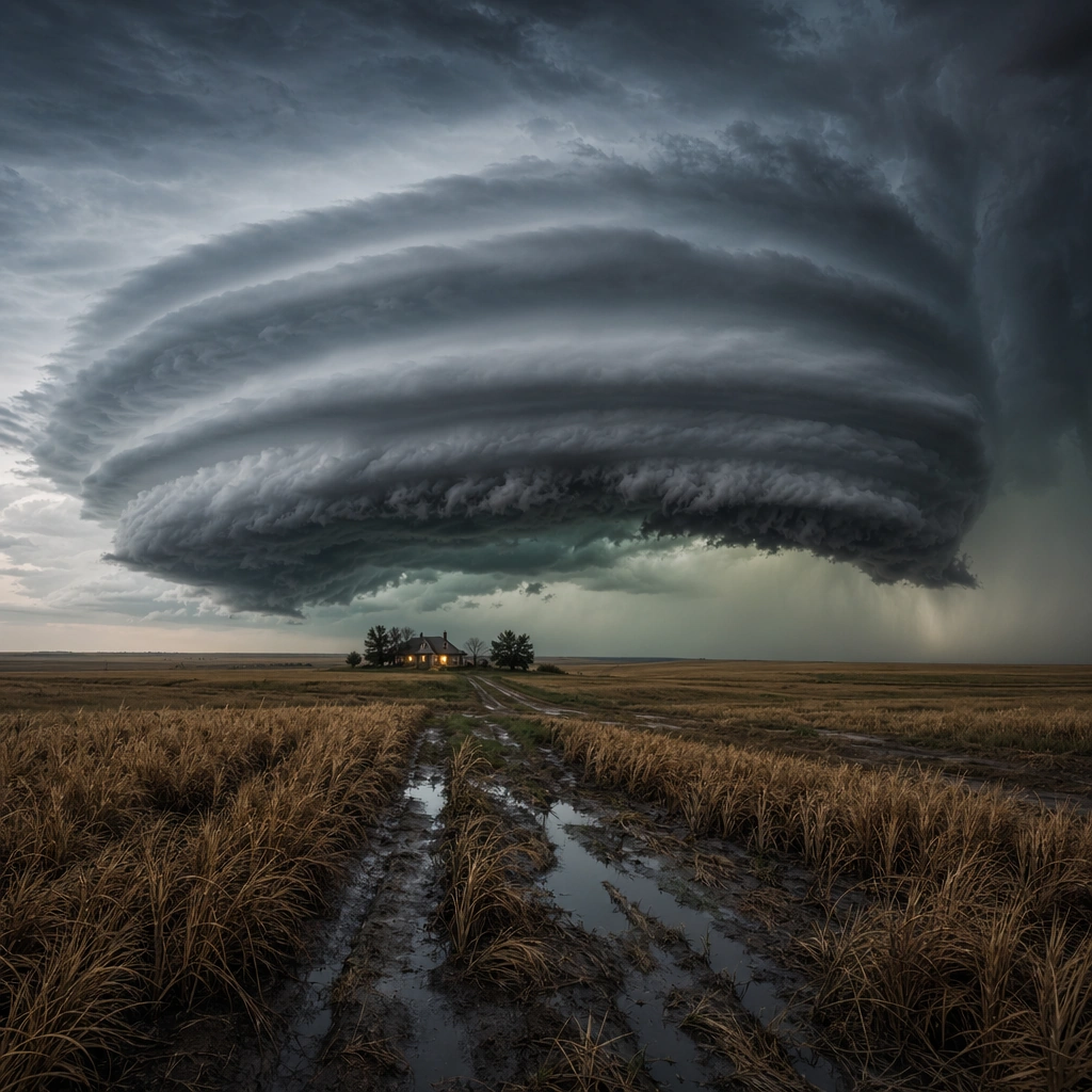
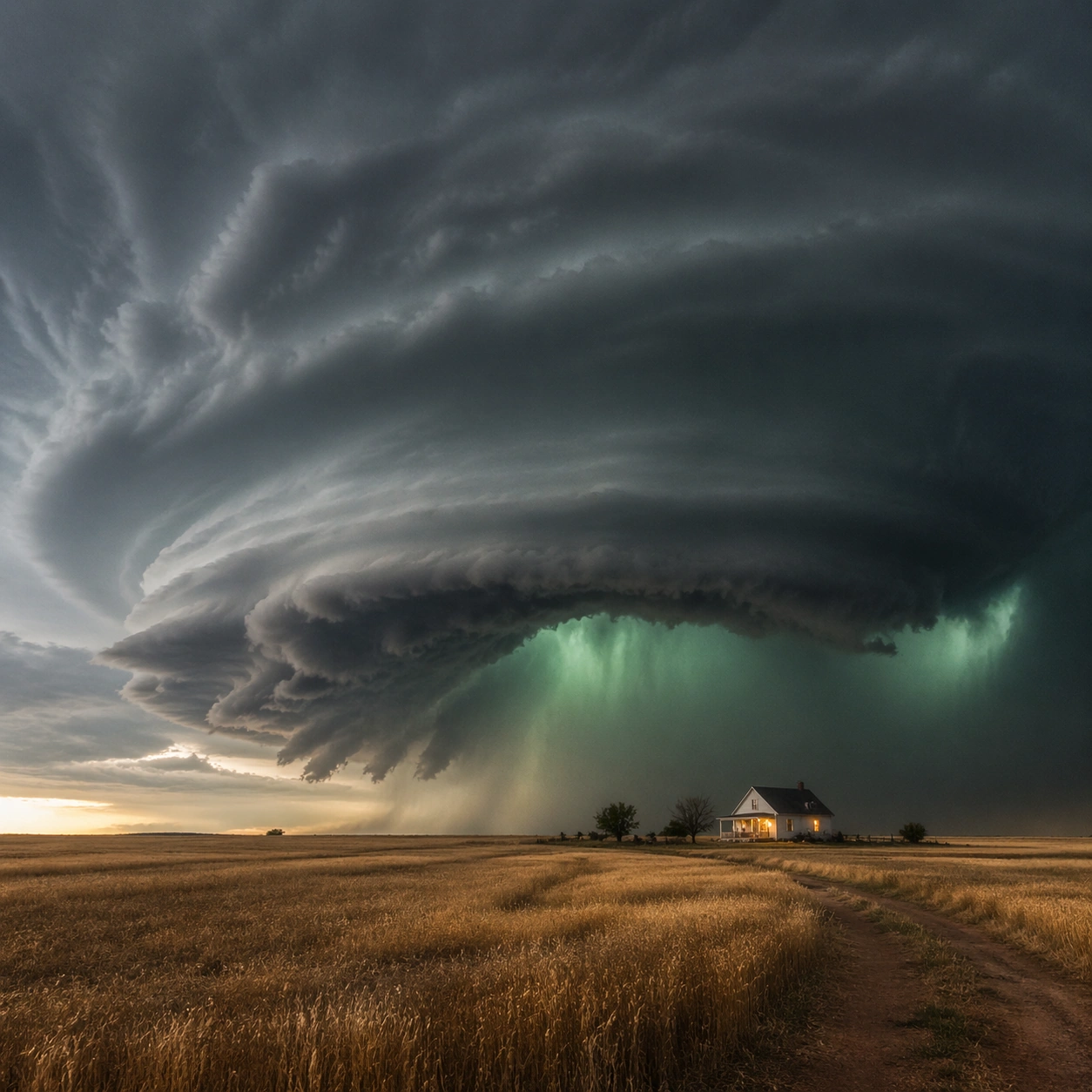
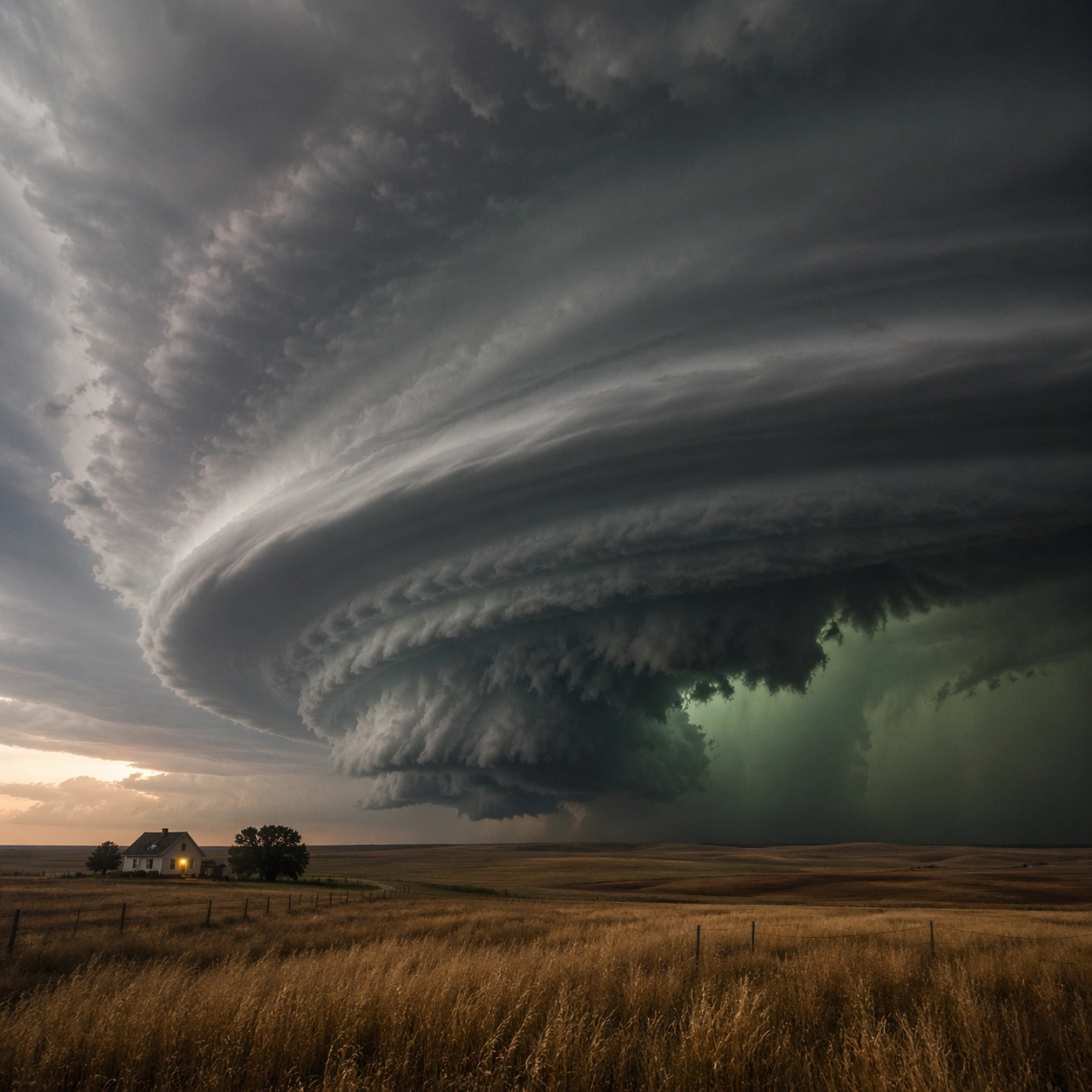
Example generated from “Supercell Plains Storm — Material Close”
GPT Image 2en

Scene: Create a square, photoreal landscape study of supercell plains storm. Compose it as surface texture and material transitions while still keeping the full environment recognizable, using a tighter medium-wide crop that gives more area to texture, fracture, grain, water, ice, lava, salt, or stone. Let texture remain readable without making the scene feel like a macro shot Keep the frame cinematic but disciplined, with a clear foreground, middle distance, and far mass so the viewer can measure real depth. The image should feel like a field photograph made with patience, precision, and sublime restraint rather than a fantasy matte painting. Subject: Show a rotating supercell thunderstorm over open plains, with a visible mesocyclone, green-tinted lower sky, golden wheat fields, and one isolated farmhouse with a lit porch. This variation should emphasize material realism check. The main landform must dominate the composition, but secondary elements should quietly explain how the place works: water paths, sediment lines, snow bands, surf, ash, wind streaks, stars, or human traces where appropriate. Everything in the image should support the same idea of scale and climate, so the scene reads as one coherent environment rather than a stack of spectacular details. Important details: Preserve storm-scale cloud rotation, believable shelf and inflow structure, tension between calm land and violent sky, and clear atmospheric depth across miles of open country. Micro-texture, edge wear, wetness, frost, dust, foam, or sediment should deepen realism rather than distract from scale. Keep geology, weather, and atmosphere physically believable. Use subtle micro-texture, tonal separation, and air perspective to reinforce distance. If a human, vehicle, tent, caravan, bird, or boat appears, it must remain tiny and subordinate to the landscape, functioning only as a scale witness. The composition should feel original, severe, and elegant, with no decorative filler and no imitation of any copyrighted visual property. Use case: Supercell Plains Storm single study 6/9, exploring the material realism check variation. Constraints: No readable text, no watermark, no logos, preserve exact 1:1 aspect ratio, no tornado touching down unless implied at a great distance, no apocalyptic debris, no city skyline, no lightning overload, no extreme macro abstraction, no plastic-looking surfaces, no shallow depth-of-field blur, no kitsch color grading, no artificial border, no split-panel treatment.
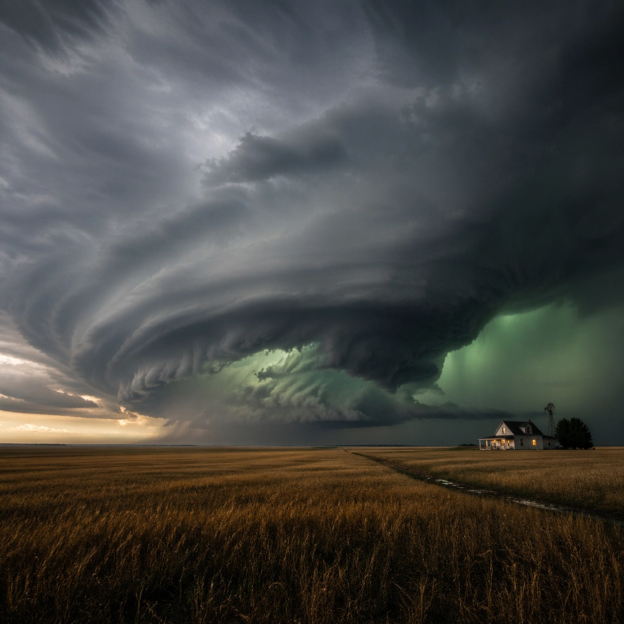
Example generated from “Supercell Plains Storm — Scale Witness”
GPT Image 2en

Scene: Create a square, photoreal landscape study of supercell plains storm. Compose it as a tiny human, animal, tent, vehicle, or craft that reveals the vastness of the environment, using a balanced frame where the witness remains small but unmistakable. Let the scale marker stay visible without becoming the true subject Keep the frame cinematic but disciplined, with a clear foreground, middle distance, and far mass so the viewer can measure real depth. The image should feel like a field photograph made with patience, precision, and sublime restraint rather than a fantasy matte painting. Subject: Show a rotating supercell thunderstorm over open plains, with a visible mesocyclone, green-tinted lower sky, golden wheat fields, and one isolated farmhouse with a lit porch. This variation should emphasize scale comparison. The main landform must dominate the composition, but secondary elements should quietly explain how the place works: water paths, sediment lines, snow bands, surf, ash, wind streaks, stars, or human traces where appropriate. Everything in the image should support the same idea of scale and climate, so the scene reads as one coherent environment rather than a stack of spectacular details. Important details: Preserve storm-scale cloud rotation, believable shelf and inflow structure, tension between calm land and violent sky, and clear atmospheric depth across miles of open country. The viewer should understand the environment first and the witness second, with clean spatial separation between them. Keep geology, weather, and atmosphere physically believable. Use subtle micro-texture, tonal separation, and air perspective to reinforce distance. If a human, vehicle, tent, caravan, bird, or boat appears, it must remain tiny and subordinate to the landscape, functioning only as a scale witness. The composition should feel original, severe, and elegant, with no decorative filler and no imitation of any copyrighted visual property. Use case: Supercell Plains Storm single study 7/9, exploring the scale comparison variation. Constraints: No readable text, no watermark, no logos, preserve exact 1:1 aspect ratio, no tornado touching down unless implied at a great distance, no apocalyptic debris, no city skyline, no lightning overload, no crowd scenes, no heroic close-up character framing, no busy gear pile, no kitsch color grading, no artificial border, no split-panel treatment.
Example generated from “Supercell Plains Storm — Abstract Rhythm”
GPT Image 2en

Scene: Create a square, photoreal landscape study of supercell plains storm. Compose it as the near-abstract rhythm of repeated natural forms, lines, and tonal bands, using a disciplined crop that approaches abstraction while remaining unmistakably a real place. Let shape and tonal cadence dominate before small narrative details Keep the frame cinematic but disciplined, with a clear foreground, middle distance, and far mass so the viewer can measure real depth. The image should feel like a field photograph made with patience, precision, and sublime restraint rather than a fantasy matte painting. Subject: Show a rotating supercell thunderstorm over open plains, with a visible mesocyclone, green-tinted lower sky, golden wheat fields, and one isolated farmhouse with a lit porch. This variation should emphasize formal composition study. The main landform must dominate the composition, but secondary elements should quietly explain how the place works: water paths, sediment lines, snow bands, surf, ash, wind streaks, stars, or human traces where appropriate. Everything in the image should support the same idea of scale and climate, so the scene reads as one coherent environment rather than a stack of spectacular details. Important details: Preserve storm-scale cloud rotation, believable shelf and inflow structure, tension between calm land and violent sky, and clear atmospheric depth across miles of open country. Pattern, repetition, and negative space should feel discovered in nature, not graphically imposed. Keep geology, weather, and atmosphere physically believable. Use subtle micro-texture, tonal separation, and air perspective to reinforce distance. If a human, vehicle, tent, caravan, bird, or boat appears, it must remain tiny and subordinate to the landscape, functioning only as a scale witness. The composition should feel original, severe, and elegant, with no decorative filler and no imitation of any copyrighted visual property. Use case: Supercell Plains Storm single study 8/9, exploring the formal composition study variation. Constraints: No readable text, no watermark, no logos, preserve exact 1:1 aspect ratio, no tornado touching down unless implied at a great distance, no apocalyptic debris, no city skyline, no lightning overload, no graphic overlays, no surreal floating elements, no ornamental symmetry cheats, no kitsch color grading, no artificial border, no split-panel treatment.

Example generated from “Supercell Plains Storm — Final Iconic”
GPT Image 2en

Scene: Create a square, photoreal landscape study of supercell plains storm. Compose it as the cleanest, most iconic summary of the whole landscape idea, using a distilled composition with one unforgettable silhouette or mass relationship and generous breathing room. Let the scene resolve into a memorable final image with strong legibility at thumbnail size Keep the frame cinematic but disciplined, with a clear foreground, middle distance, and far mass so the viewer can measure real depth. The image should feel like a field photograph made with patience, precision, and sublime restraint rather than a fantasy matte painting. Subject: Show a rotating supercell thunderstorm over open plains, with a visible mesocyclone, green-tinted lower sky, golden wheat fields, and one isolated farmhouse with a lit porch. This variation should emphasize iconic final plate. The main landform must dominate the composition, but secondary elements should quietly explain how the place works: water paths, sediment lines, snow bands, surf, ash, wind streaks, stars, or human traces where appropriate. Everything in the image should support the same idea of scale and climate, so the scene reads as one coherent environment rather than a stack of spectacular details. Important details: Preserve storm-scale cloud rotation, believable shelf and inflow structure, tension between calm land and violent sky, and clear atmospheric depth across miles of open country. Keep the frame spare, confident, and monumental, with every element earning its place. Keep geology, weather, and atmosphere physically believable. Use subtle micro-texture, tonal separation, and air perspective to reinforce distance. If a human, vehicle, tent, caravan, bird, or boat appears, it must remain tiny and subordinate to the landscape, functioning only as a scale witness. The composition should feel original, severe, and elegant, with no decorative filler and no imitation of any copyrighted visual property. Use case: Supercell Plains Storm single study 9/9, exploring the iconic final plate variation. Constraints: No readable text, no watermark, no logos, preserve exact 1:1 aspect ratio, no tornado touching down unless implied at a great distance, no apocalyptic debris, no city skyline, no lightning overload, no cluttered edges, no competing focal points, no visual noise in empty space, no kitsch color grading, no artificial border, no split-panel treatment.

Example generated from “Supplement And Health Product Trust Visuals — Bottle Ingredient Hero”
GPT Image 2en

Scene: A square primary product hero shot for Supplement and Health Product Trust Visuals. Compose it as a centered studio composition with one bottle, supporting ingredient forms, and calm data-like layout blocks. Use a palette of clean white, soft leaf green, amber glass, pale stone, and quiet navy accents, premium studio lighting with soft shadow discipline, and a mood of clean, compliant, and trust-building. The frame should feel like a real healthcare communication asset art-directed for professional delivery, not a stock photo, speculative concept render, or generic corporate template. Keep the camera distance, negative space, and depth cues disciplined so the image reads immediately even at thumbnail size. Subject: Center on a generic supplement bottle with abstract label zones, capsules, botanical ingredient fragments, and subtle scientific structure cues. Show enough surrounding context that the viewer understands the intended service surface, user situation, and institutional setting. Every object, person, diagram, device crop, or spatial cue should support clarity, trust, and practical use. If people appear, keep them anonymous, natural, privacy-safe, and grounded in believable body language rather than promotional posing. Important details: Maintain health-product communication built from ingredient logic, honest pack photography, subtle science cues, and retail-ready structure rather than hype. Make the product feel trustworthy through materials, lighting, and composition rather than through loud claims or glossy exaggeration. Use abstract icon shapes, color blocks, chart bars, interface modules, or non-legible placeholder microcopy whenever information structure is needed, but never readable text. Materials, spacing, lighting, and hierarchy should feel production-ready and healthcare-specific. Avoid generic lifestyle filler, decorative noise, or design gestures that do not reinforce the communication goal. Use case: Health Product single study 1/9 for a product detail page hero visual. Constraints: No readable text, no watermark, no logos, preserve exact 1:1 aspect ratio, no miracle-claim aesthetics, no aggressive bodybuilding energy, no luxury-beauty excess, no visible brand names, no sports-nutrition aggression, no beauty-brand sparkle.

Example generated from “Supplement And Health Product Trust Visuals — Gummy Family Lineup”
GPT Image 2en

Scene: A square product family lineup board for Supplement and Health Product Trust Visuals. Compose it as a disciplined pack lineup with flavor or benefit differentiation shown through color and shape systems. Use a palette of clean white, soft leaf green, amber glass, pale stone, and quiet navy accents, premium studio lighting with soft shadow discipline, and a mood of clean, compliant, and trust-building. The frame should feel like a real healthcare communication asset art-directed for professional delivery, not a stock photo, speculative concept render, or generic corporate template. Keep the camera distance, negative space, and depth cues disciplined so the image reads immediately even at thumbnail size. Subject: Center on a family of health gummies or soft supplements staged with transparent bowls, soft shadows, and non-legible benefit modules. Show enough surrounding context that the viewer understands the intended service surface, user situation, and institutional setting. Every object, person, diagram, device crop, or spatial cue should support clarity, trust, and practical use. If people appear, keep them anonymous, natural, privacy-safe, and grounded in believable body language rather than promotional posing. Important details: Maintain health-product communication built from ingredient logic, honest pack photography, subtle science cues, and retail-ready structure rather than hype. The lineup should show variety while preserving a strong trust layer and consistent compliant polish. Use abstract icon shapes, color blocks, chart bars, interface modules, or non-legible placeholder microcopy whenever information structure is needed, but never readable text. Materials, spacing, lighting, and hierarchy should feel production-ready and healthcare-specific. Avoid generic lifestyle filler, decorative noise, or design gestures that do not reinforce the communication goal. Use case: Health Product single study 2/9 for a supplement range overview board. Constraints: No readable text, no watermark, no logos, preserve exact 1:1 aspect ratio, no miracle-claim aesthetics, no aggressive bodybuilding energy, no luxury-beauty excess, no visible brand names, no candy-commercial chaos, no childish mascots.

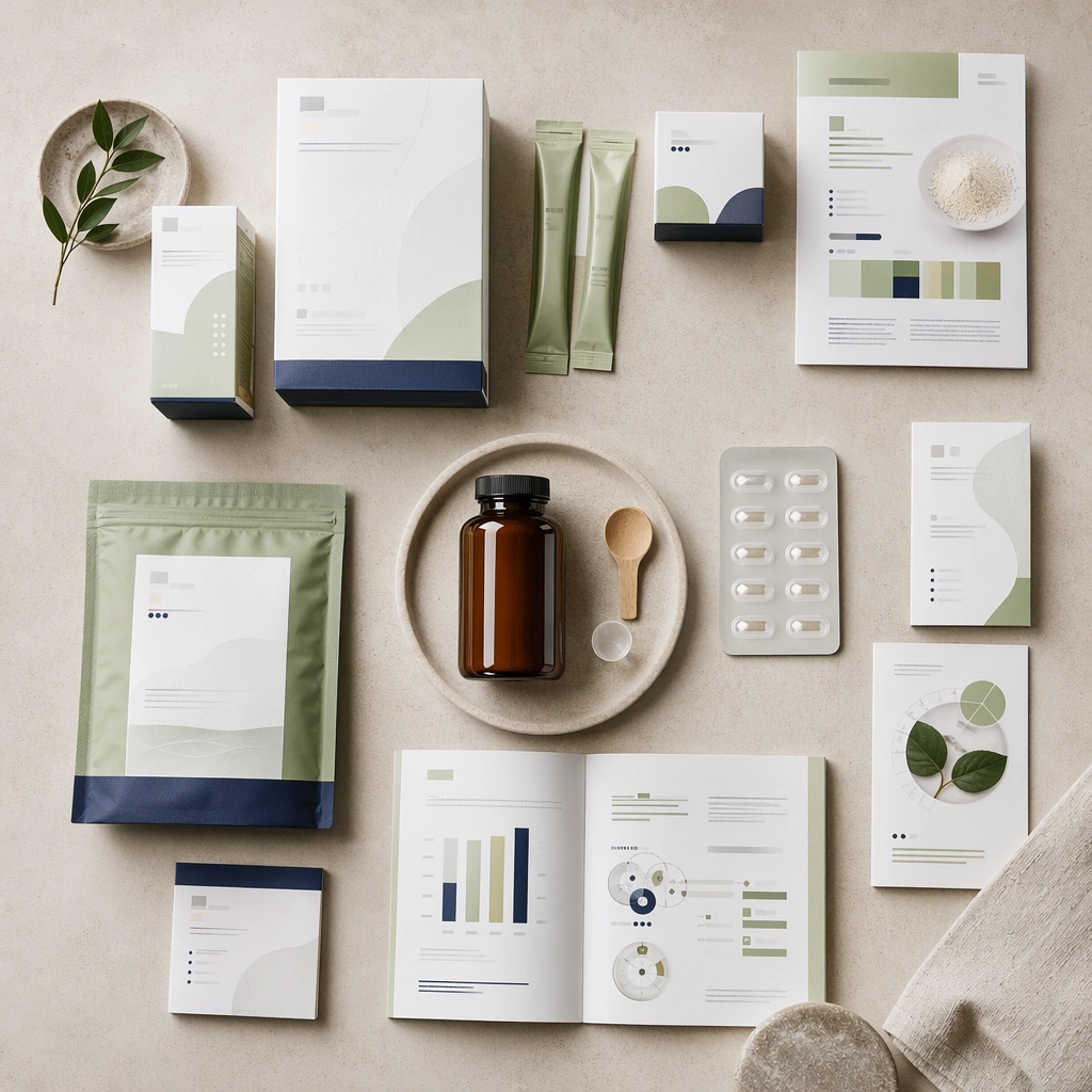
Example generated from “Supplement And Health Product Trust Visuals — Sachet and Box Flatlay”
GPT Image 2en

Scene: A square flatlay of retail packaging surfaces for Supplement and Health Product Trust Visuals. Compose it from directly above with cartons, sachets, leaflets, and dose accessories precisely spaced. Use a palette of clean white, soft leaf green, amber glass, pale stone, and quiet navy accents, premium studio lighting with soft shadow discipline, and a mood of clean, compliant, and trust-building. The frame should feel like a real healthcare communication asset art-directed for professional delivery, not a stock photo, speculative concept render, or generic corporate template. Keep the camera distance, negative space, and depth cues disciplined so the image reads immediately even at thumbnail size. Subject: Center on a coordinated health-product packaging set with minimal structural graphics, ingredient-color coding, and premium paper textures. Show enough surrounding context that the viewer understands the intended service surface, user situation, and institutional setting. Every object, person, diagram, device crop, or spatial cue should support clarity, trust, and practical use. If people appear, keep them anonymous, natural, privacy-safe, and grounded in believable body language rather than promotional posing. Important details: Maintain health-product communication built from ingredient logic, honest pack photography, subtle science cues, and retail-ready structure rather than hype. Convey maturity and retail readiness while avoiding pharmaceutical coldness or FMCG shouting. Use abstract icon shapes, color blocks, chart bars, interface modules, or non-legible placeholder microcopy whenever information structure is needed, but never readable text. Materials, spacing, lighting, and hierarchy should feel production-ready and healthcare-specific. Avoid generic lifestyle filler, decorative noise, or design gestures that do not reinforce the communication goal. Use case: Health Product single study 3/9 for a packaging system review board. Constraints: No readable text, no watermark, no logos, preserve exact 1:1 aspect ratio, no miracle-claim aesthetics, no aggressive bodybuilding energy, no luxury-beauty excess, no visible brand names, no pharmacy-drug confusion, no glossy supermarket clutter.

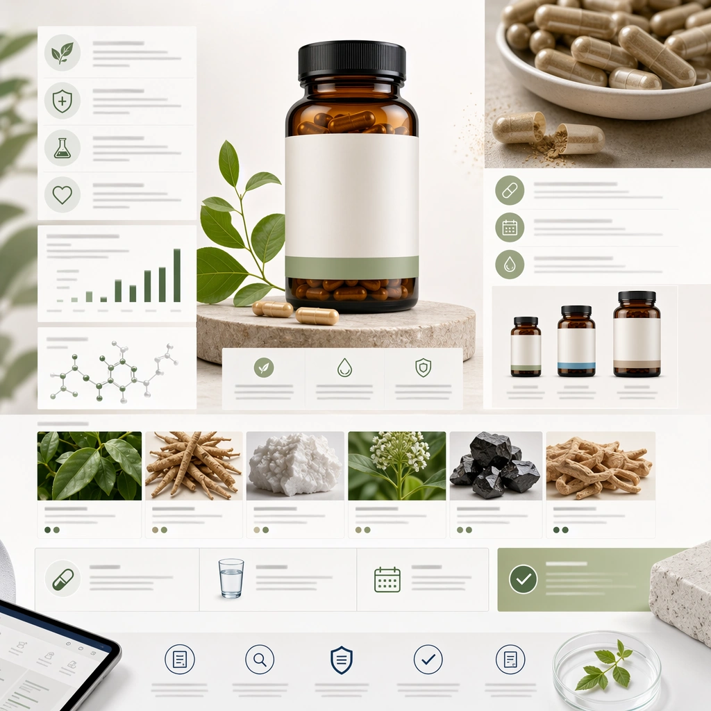
Example generated from “Supplement And Health Product Trust Visuals — Clean Label PDP Board”
GPT Image 2en

Scene: A square product detail page system board for Supplement and Health Product Trust Visuals. Compose it as a square mockup combining pack photography, ingredient story cards, and usage guidance modules. Use a palette of clean white, soft leaf green, amber glass, pale stone, and quiet navy accents, premium studio lighting with soft shadow discipline, and a mood of clean, compliant, and trust-building. The frame should feel like a real healthcare communication asset art-directed for professional delivery, not a stock photo, speculative concept render, or generic corporate template. Keep the camera distance, negative space, and depth cues disciplined so the image reads immediately even at thumbnail size. Subject: Center on a health-product page layout with bottle renders, capsule closeups, origin imagery, and clean compliance-minded placeholder blocks. Show enough surrounding context that the viewer understands the intended service surface, user situation, and institutional setting. Every object, person, diagram, device crop, or spatial cue should support clarity, trust, and practical use. If people appear, keep them anonymous, natural, privacy-safe, and grounded in believable body language rather than promotional posing. Important details: Maintain health-product communication built from ingredient logic, honest pack photography, subtle science cues, and retail-ready structure rather than hype. The layout should feel transparent and premium, with evidence-minded structure instead of dense technical jargon. Use abstract icon shapes, color blocks, chart bars, interface modules, or non-legible placeholder microcopy whenever information structure is needed, but never readable text. Materials, spacing, lighting, and hierarchy should feel production-ready and healthcare-specific. Avoid generic lifestyle filler, decorative noise, or design gestures that do not reinforce the communication goal. Use case: Health Product single study 4/9 for a clean-label product detail page concept. Constraints: No readable text, no watermark, no logos, preserve exact 1:1 aspect ratio, no miracle-claim aesthetics, no aggressive bodybuilding energy, no luxury-beauty excess, no visible brand names, no startup-tech gimmicks, no pseudo-medical intimidation.

Example generated from “Supplement And Health Product Trust Visuals — Routine Pack Trust Scene”
GPT Image 2en

Scene: A square daily routine lifestyle-commerce scene for Supplement and Health Product Trust Visuals. Compose it as a calm bathroom or kitchen counter environment with one product family integrated into normal life. Use a palette of clean white, soft leaf green, amber glass, pale stone, and quiet navy accents, premium studio lighting with soft shadow discipline, and a mood of clean, compliant, and trust-building. The frame should feel like a real healthcare communication asset art-directed for professional delivery, not a stock photo, speculative concept render, or generic corporate template. Keep the camera distance, negative space, and depth cues disciplined so the image reads immediately even at thumbnail size. Subject: Center on supplements staged alongside water, breakfast objects, and a simple routine tracker while still keeping the product as the hero. Show enough surrounding context that the viewer understands the intended service surface, user situation, and institutional setting. Every object, person, diagram, device crop, or spatial cue should support clarity, trust, and practical use. If people appear, keep them anonymous, natural, privacy-safe, and grounded in believable body language rather than promotional posing. Important details: Maintain health-product communication built from ingredient logic, honest pack photography, subtle science cues, and retail-ready structure rather than hype. Ground the image in believable daily use so the communication feels helpful and adult rather than aspirational hype. Use abstract icon shapes, color blocks, chart bars, interface modules, or non-legible placeholder microcopy whenever information structure is needed, but never readable text. Materials, spacing, lighting, and hierarchy should feel production-ready and healthcare-specific. Avoid generic lifestyle filler, decorative noise, or design gestures that do not reinforce the communication goal. Use case: Health Product single study 5/9 for a routine-oriented campaign visual. Constraints: No readable text, no watermark, no logos, preserve exact 1:1 aspect ratio, no miracle-claim aesthetics, no aggressive bodybuilding energy, no luxury-beauty excess, no visible brand names, no influencer vanity-table vibe, no cluttered pantry shot.

Example generated from “Supplement And Health Product Trust Visuals — Capsule Macro Material”
GPT Image 2en

Scene: A square macro ingredient and capsule study for Supplement and Health Product Trust Visuals. Compose it as a close-up material board with translucent capsules, powders, granules, and ingredient textures. Use a palette of clean white, soft leaf green, amber glass, pale stone, and quiet navy accents, premium studio lighting with soft shadow discipline, and a mood of clean, compliant, and trust-building. The frame should feel like a real healthcare communication asset art-directed for professional delivery, not a stock photo, speculative concept render, or generic corporate template. Keep the camera distance, negative space, and depth cues disciplined so the image reads immediately even at thumbnail size. Subject: Center on a refined macro visual exploring the tactile and material qualities of a supplement product without any label dependence. Show enough surrounding context that the viewer understands the intended service surface, user situation, and institutional setting. Every object, person, diagram, device crop, or spatial cue should support clarity, trust, and practical use. If people appear, keep them anonymous, natural, privacy-safe, and grounded in believable body language rather than promotional posing. Important details: Maintain health-product communication built from ingredient logic, honest pack photography, subtle science cues, and retail-ready structure rather than hype. The macro should suggest purity, measured formulation, and careful manufacturing rather than laboratory fiction. Use abstract icon shapes, color blocks, chart bars, interface modules, or non-legible placeholder microcopy whenever information structure is needed, but never readable text. Materials, spacing, lighting, and hierarchy should feel production-ready and healthcare-specific. Avoid generic lifestyle filler, decorative noise, or design gestures that do not reinforce the communication goal. Use case: Health Product single study 6/9 for an ingredient quality supporting asset. Constraints: No readable text, no watermark, no logos, preserve exact 1:1 aspect ratio, no miracle-claim aesthetics, no aggressive bodybuilding energy, no luxury-beauty excess, no visible brand names, no sci-fi chemistry glow, no medical-horror translucency.

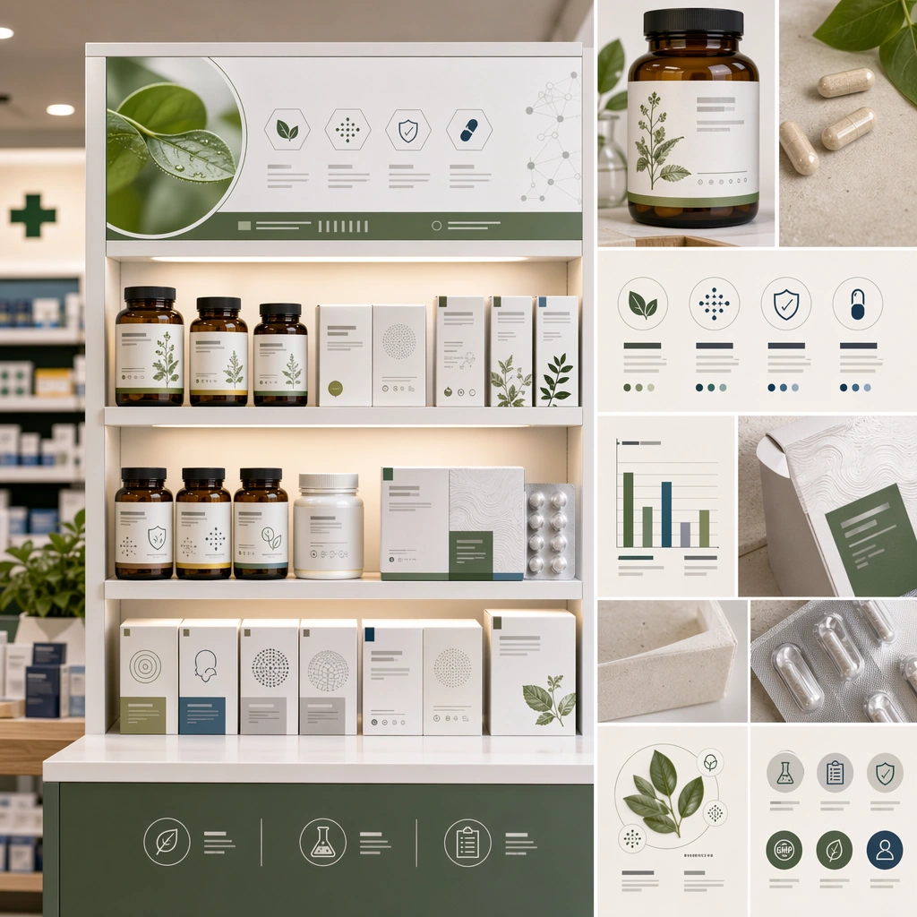
Example generated from “Supplement And Health Product Trust Visuals — Retail Shelf Comparison”
GPT Image 2en

Scene: A square retail shelf communication board for Supplement and Health Product Trust Visuals. Compose it as a shelf scene paired with close crop cards and packaging-detail modules. Use a palette of clean white, soft leaf green, amber glass, pale stone, and quiet navy accents, premium studio lighting with soft shadow discipline, and a mood of clean, compliant, and trust-building. The frame should feel like a real healthcare communication asset art-directed for professional delivery, not a stock photo, speculative concept render, or generic corporate template. Keep the camera distance, negative space, and depth cues disciplined so the image reads immediately even at thumbnail size. Subject: Center on a health-product line presented in a clean retail environment, showing how the identity stands out through structure and calmness rather than loud claims. Show enough surrounding context that the viewer understands the intended service surface, user situation, and institutional setting. Every object, person, diagram, device crop, or spatial cue should support clarity, trust, and practical use. If people appear, keep them anonymous, natural, privacy-safe, and grounded in believable body language rather than promotional posing. Important details: Maintain health-product communication built from ingredient logic, honest pack photography, subtle science cues, and retail-ready structure rather than hype. Keep the shelf believable and uncluttered, with compliant packaging cues and premium spacing. Use abstract icon shapes, color blocks, chart bars, interface modules, or non-legible placeholder microcopy whenever information structure is needed, but never readable text. Materials, spacing, lighting, and hierarchy should feel production-ready and healthcare-specific. Avoid generic lifestyle filler, decorative noise, or design gestures that do not reinforce the communication goal. Use case: Health Product single study 7/9 for a retail visibility study. Constraints: No readable text, no watermark, no logos, preserve exact 1:1 aspect ratio, no miracle-claim aesthetics, no aggressive bodybuilding energy, no luxury-beauty excess, no visible brand names, no supermarket chaos, no giant sale stickers.

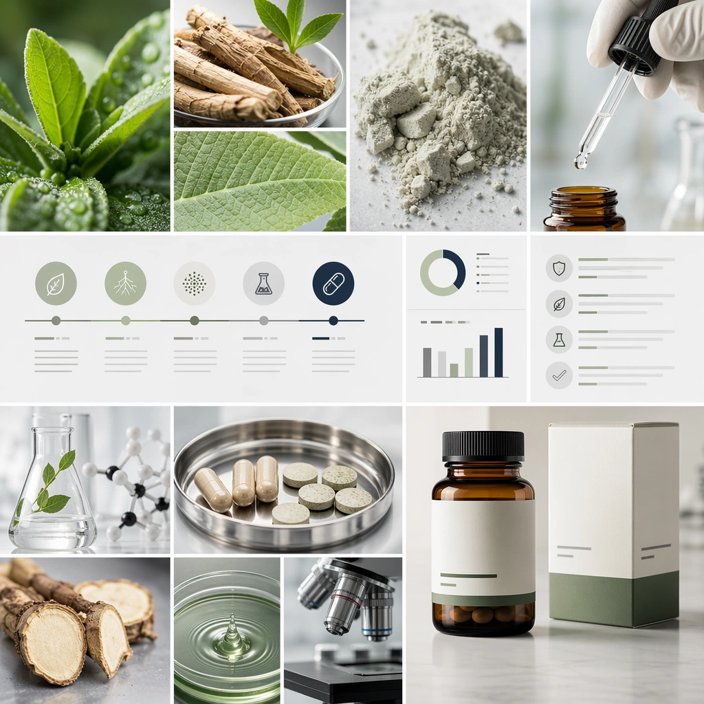
Example generated from “Supplement And Health Product Trust Visuals — Ingredient Origin Collage”
GPT Image 2en

Scene: A square ingredient origin storytelling board for Supplement and Health Product Trust Visuals. Compose it as a square collage of raw materials, extraction cues, and pack surfaces arranged with scientific restraint. Use a palette of clean white, soft leaf green, amber glass, pale stone, and quiet navy accents, premium studio lighting with soft shadow discipline, and a mood of clean, compliant, and trust-building. The frame should feel like a real healthcare communication asset art-directed for professional delivery, not a stock photo, speculative concept render, or generic corporate template. Keep the camera distance, negative space, and depth cues disciplined so the image reads immediately even at thumbnail size. Subject: Center on a visual story linking plant or mineral ingredients to the final product through tactile source imagery and subtle process fragments. Show enough surrounding context that the viewer understands the intended service surface, user situation, and institutional setting. Every object, person, diagram, device crop, or spatial cue should support clarity, trust, and practical use. If people appear, keep them anonymous, natural, privacy-safe, and grounded in believable body language rather than promotional posing. Important details: Maintain health-product communication built from ingredient logic, honest pack photography, subtle science cues, and retail-ready structure rather than hype. The collage should feel transparent and grounded, not mystical, rustic, or pseudo-naturalist. Use abstract icon shapes, color blocks, chart bars, interface modules, or non-legible placeholder microcopy whenever information structure is needed, but never readable text. Materials, spacing, lighting, and hierarchy should feel production-ready and healthcare-specific. Avoid generic lifestyle filler, decorative noise, or design gestures that do not reinforce the communication goal. Use case: Health Product single study 8/9 for an ingredient transparency campaign asset. Constraints: No readable text, no watermark, no logos, preserve exact 1:1 aspect ratio, no miracle-claim aesthetics, no aggressive bodybuilding energy, no luxury-beauty excess, no visible brand names, no exoticized wellness fantasy, no rustic-farm overkill.

Example generated from “Supplement And Health Product Trust Visuals — Compliance Ready Campaign Board”
GPT Image 2en

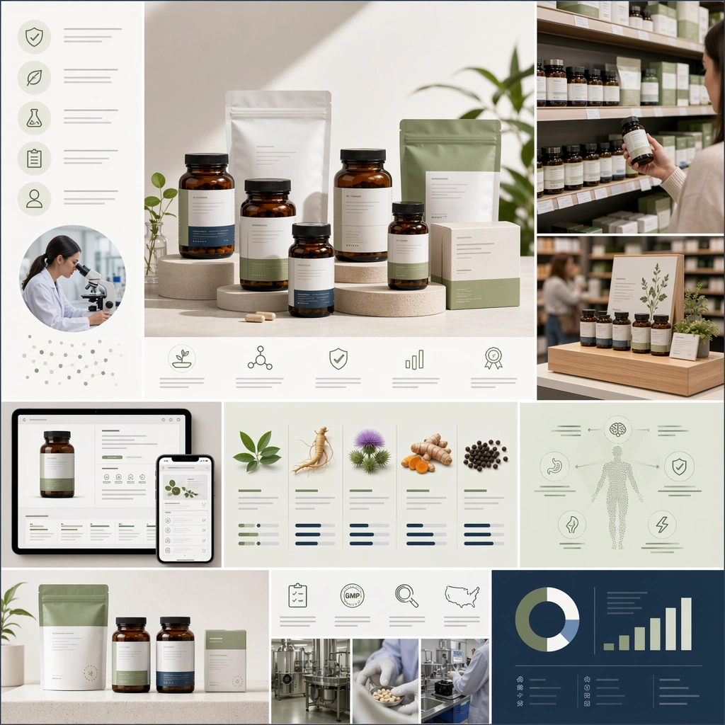
Scene: A square full campaign summary board for Supplement and Health Product Trust Visuals. Compose it as a final square toolkit with hero shot, retail scene, page mockup, and ingredient cards all visible together. Use a palette of clean white, soft leaf green, amber glass, pale stone, and quiet navy accents, premium studio lighting with soft shadow discipline, and a mood of clean, compliant, and trust-building. The frame should feel like a real healthcare communication asset art-directed for professional delivery, not a stock photo, speculative concept render, or generic corporate template. Keep the camera distance, negative space, and depth cues disciplined so the image reads immediately even at thumbnail size. Subject: Center on a scalable health-product visual system that can extend from product pages to retail displays and soft education surfaces. Show enough surrounding context that the viewer understands the intended service surface, user situation, and institutional setting. Every object, person, diagram, device crop, or spatial cue should support clarity, trust, and practical use. If people appear, keep them anonymous, natural, privacy-safe, and grounded in believable body language rather than promotional posing. Important details: Maintain health-product communication built from ingredient logic, honest pack photography, subtle science cues, and retail-ready structure rather than hype. The final board should clearly prove that trust, polish, and commercial appeal can coexist in health-product communication. Use abstract icon shapes, color blocks, chart bars, interface modules, or non-legible placeholder microcopy whenever information structure is needed, but never readable text. Materials, spacing, lighting, and hierarchy should feel production-ready and healthcare-specific. Avoid generic lifestyle filler, decorative noise, or design gestures that do not reinforce the communication goal. Use case: Health Product single study 9/9 for a complete supplement visual system summary. Constraints: No readable text, no watermark, no logos, preserve exact 1:1 aspect ratio, no miracle-claim aesthetics, no aggressive bodybuilding energy, no luxury-beauty excess, no visible brand names, no random mood-board scraps, no inconsistent pack families.

Example generated from “Sushi Sashimi Surgical Precision — Tuna Akami Lineup”
GPT Image 2en

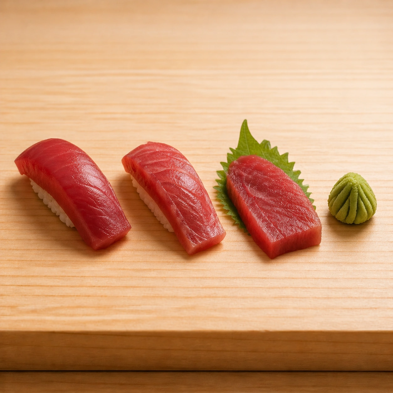
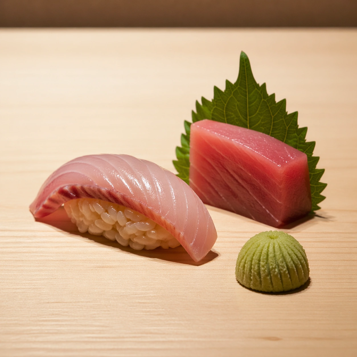
Scene: Create a square high-end sushi photograph on pale hinoki wood or a neutral omakase counter, lit with precise raking light that reveals grain in fish and separation in rice. The environment should feel silent, expensive, and almost clinical in its cleanliness. Space, alignment, and proportion matter as much as the ingredients themselves. Keep the exact counter angle, wood grain direction, spacing rhythm, and raking light established by the reference image so the series continuity remains immediate. The frame should stay spare and silent. Subject: Feature several pieces built around deep red tuna, including pristine nigiri and a sashimi slice with visible grain and a faint moist sheen. Rice grains should stay individually legible beneath the fish, and a restrained wasabi accent may sit nearby. The scene should feel colder, leaner, and incredibly exact. Important details: Every ingredient should reward macro inspection: fish grain direction, cut angle, moisture, knife marks, rice-grain separation, wasabi texture, shiso curl, and the grain of the wood beneath all need to remain distinct. The result should communicate mastery through restraint and surgical care rather than abundance. Preserve exact counter geometry, camera height, and spacing from the reference model while shifting the fish family to red tuna. Muscle grain, cut plane smoothness, and rice compression need to remain especially convincing at close range. Use case: Sushi and sashimi precision series study 2/9, adapting the anchor lineup to tuna grain and rice control. Constraints: No readable text, no watermark, no logos, preserve exact 1:1 aspect ratio, no soy sauce pools, no decorative restaurant clutter, no readable menu cards, no plastic sushi display look, no overloaded garnish, no torch marks, no spicy sauce drizzles, no sesame scatter.

Example generated from “Sushi Sashimi Surgical Precision — Sea Bream Silver Shear”
GPT Image 2en

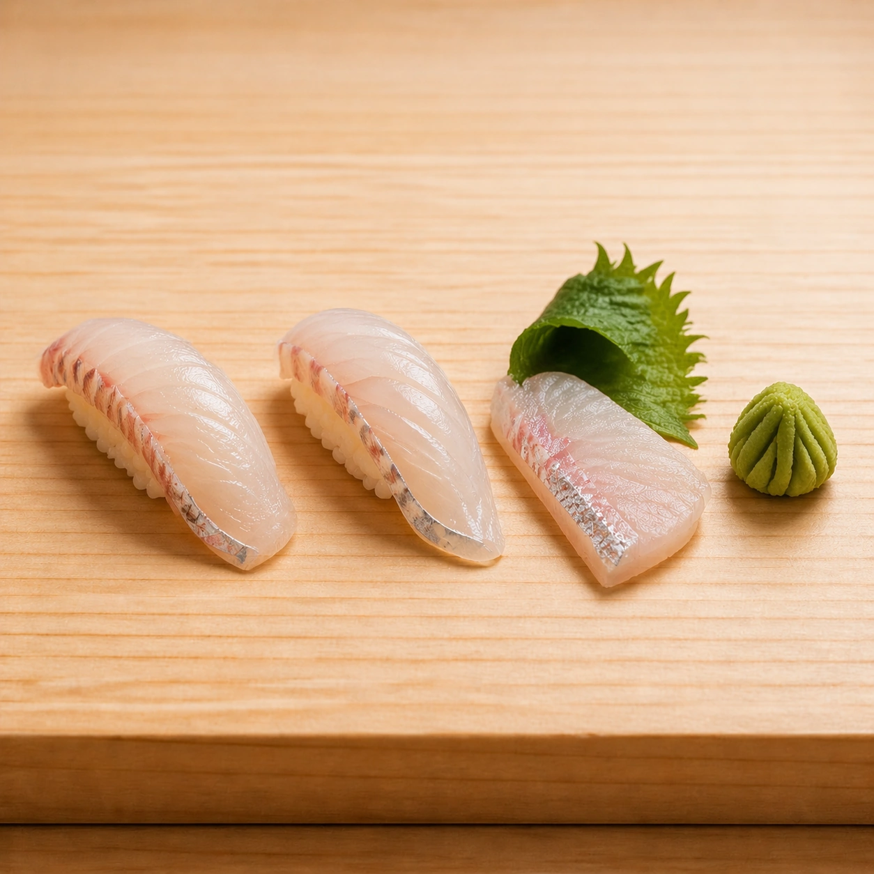
Scene: Create a square high-end sushi photograph on pale hinoki wood or a neutral omakase counter, lit with precise raking light that reveals grain in fish and separation in rice. The environment should feel silent, expensive, and almost clinical in its cleanliness. Space, alignment, and proportion matter as much as the ingredients themselves. Maintain the exact counter perspective, wood tone, spacing, and raking light from the reference image so the omakase sequence remains coherent. The atmosphere should stay quiet and nearly clinical. Subject: Present pale sea bream nigiri and sashimi with delicate translucency, subtle silver skin traces, and one curled shiso leaf as the only major accent. The fish slices should show knife discipline and soft internal striation, while the rice remains tight and countable. The composition should feel lighter and more ethereal than the tuna variation. Important details: Every ingredient should reward macro inspection: fish grain direction, cut angle, moisture, knife marks, rice-grain separation, wasabi texture, shiso curl, and the grain of the wood beneath all need to remain distinct. The result should communicate mastery through restraint and surgical care rather than abundance. Preserve exact counter geometry, spacing, and light logic from the reference model while emphasizing pale translucency, silver skin sheen, and delicate knife work. Rice grains must remain individually readable, never mashed into one mass. Use case: Sushi and sashimi precision series study 3/9, translating the anchor lineup into translucent white-fish precision. Constraints: No readable text, no watermark, no logos, preserve exact 1:1 aspect ratio, no soy sauce pools, no decorative restaurant clutter, no readable menu cards, no plastic sushi display look, no overloaded garnish, no citrus slices everywhere, no plated salad garnish, no decorative ceramic bowls.

Example generated from “Sushi Sashimi Surgical Precision — Uni Gunkan Vector”
GPT Image 2en

Scene: Create a square high-end sushi photograph on pale hinoki wood or a neutral omakase counter, lit with precise raking light that reveals grain in fish and separation in rice. The environment should feel silent, expensive, and almost clinical in its cleanliness. Space, alignment, and proportion matter as much as the ingredients themselves. Use the same counter framing, camera height, spacing rhythm, and raking light established by the reference image, allowing the darker nori and brighter roe tones to create the primary contrast. The wood surface should remain calm and pale. Subject: Show a compact uni gunkan alongside a matching sashimi or supplemental shellfish piece, with the sea urchin tongues appearing soft, glossy, and clearly segmented. The nori collar should look crisp and thin, and the rice beneath must remain structured. A tiny wasabi dome can complete the set. Important details: Every ingredient should reward macro inspection: fish grain direction, cut angle, moisture, knife marks, rice-grain separation, wasabi texture, shiso curl, and the grain of the wood beneath all need to remain distinct. The result should communicate mastery through restraint and surgical care rather than abundance. Preserve exact counter geometry, light direction, and spacing from the reference model while changing the material vocabulary toward soft roe, crisp nori, and marine gloss. The uni must avoid looking like generic orange puree and instead show delicate lobed texture. Use case: Sushi and sashimi precision series study 4/9, concluding the anchor lineup with uni and nori precision. Constraints: No readable text, no watermark, no logos, preserve exact 1:1 aspect ratio, no soy sauce pools, no decorative restaurant clutter, no readable menu cards, no plastic sushi display look, no overloaded garnish, no overloaded roe decorations, no sauce painting, no casual izakaya clutter.

Example generated from “Sushi Sashimi Surgical Precision — Sashimi Fan Study”
GPT Image 2en

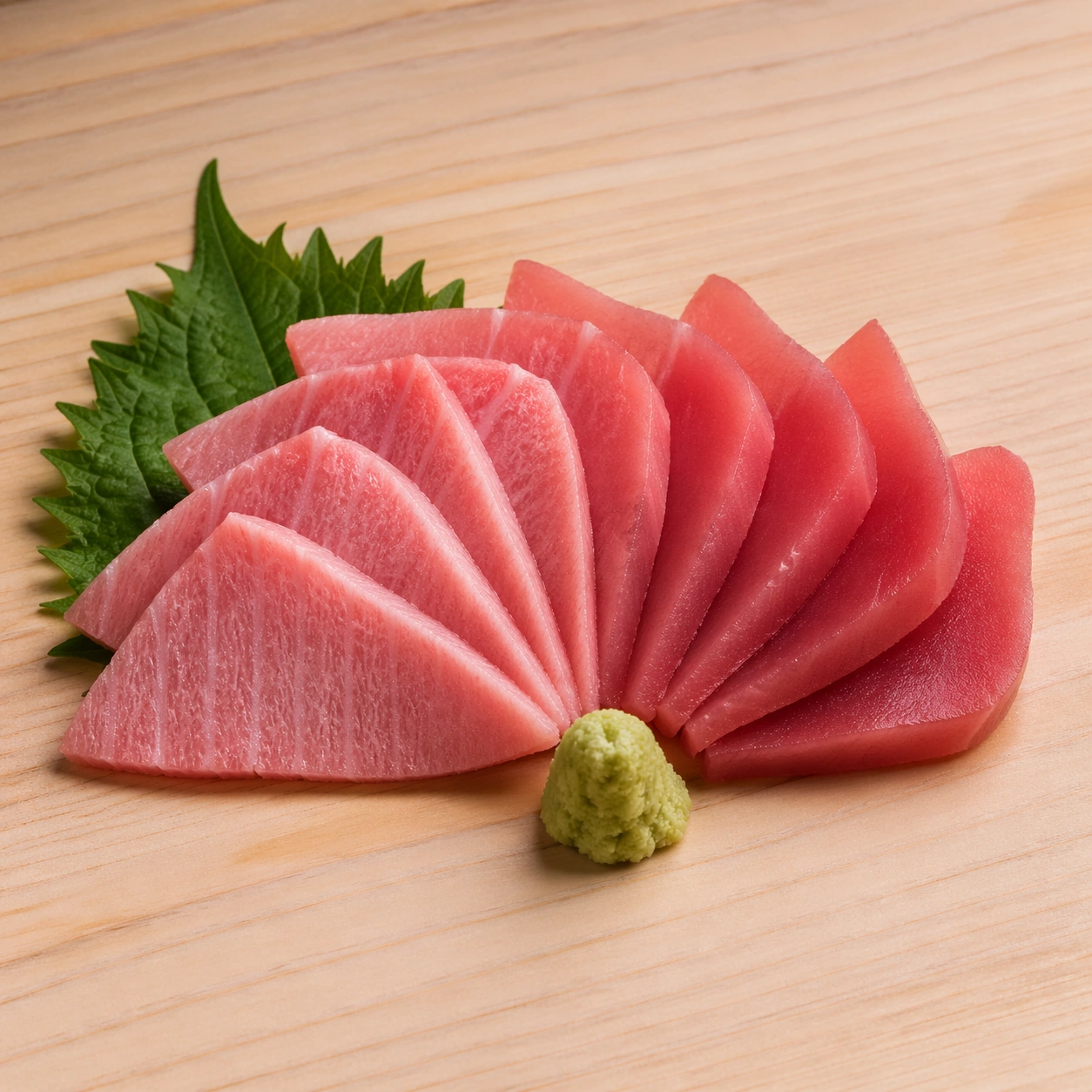
Scene: Create a square high-end sushi photograph on pale hinoki wood or a neutral omakase counter, lit with precise raking light that reveals grain in fish and separation in rice. The environment should feel silent, expensive, and almost clinical in its cleanliness. Space, alignment, and proportion matter as much as the ingredients themselves. Create a square overhead-to-slight-angle composition on pale wood or neutral stone, using restrained raking light and plenty of negative space. The mood should be calm and ceremonious. Subject: Arrange a fan of sashimi slices with exact spacing and consistent knife thickness, allowing the grain direction and translucency of the fish to read clearly from piece to piece. One shiso leaf and a tiny wasabi mound may anchor the arrangement, but the fish remains the entire story. The fan should feel deliberate and almost geometric. Important details: Every ingredient should reward macro inspection: fish grain direction, cut angle, moisture, knife marks, rice-grain separation, wasabi texture, shiso curl, and the grain of the wood beneath all need to remain distinct. The result should communicate mastery through restraint and surgical care rather than abundance. Focus on knife-clean edges, subtle moisture, and the variation between overlapping slices. The composition should feel like a material study of fish structure rather than a general seafood plate. Use case: Sushi and sashimi precision single study 5/9, isolating sashimi fan arrangement and slice discipline. Constraints: No readable text, no watermark, no logos, preserve exact 1:1 aspect ratio, no soy sauce pools, no decorative restaurant clutter, no readable menu cards, no plastic sushi display look, no overloaded garnish, no soy dish, no decorative flowers, no restaurant-table clutter.

Example generated from “Sushi Sashimi Surgical Precision — Rice Density Macro”
GPT Image 2en

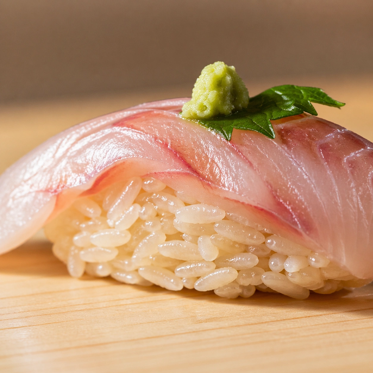
Scene: Create a square high-end sushi photograph on pale hinoki wood or a neutral omakase counter, lit with precise raking light that reveals grain in fish and separation in rice. The environment should feel silent, expensive, and almost clinical in its cleanliness. Space, alignment, and proportion matter as much as the ingredients themselves. Use a square macro frame on pale wood with shallow depth of field that still keeps the rice structure readable across the main bite. Soft side light should emphasize individual grains. Subject: Show one piece of nigiri close enough that the rice architecture becomes the main subject beneath a thin slice of fish. Individual grains should remain visible and lightly adhered, showing the precise compression needed to support the topping without becoming dense paste. The fish should provide context and contrast, not dominate. Important details: Every ingredient should reward macro inspection: fish grain direction, cut angle, moisture, knife marks, rice-grain separation, wasabi texture, shiso curl, and the grain of the wood beneath all need to remain distinct. The result should communicate mastery through restraint and surgical care rather than abundance. The success depends on grain-by-grain clarity, slight gloss from seasoned rice, and the pressure relationship between topping and rice bed. The bite should feel disciplined, airy, and expertly formed. Use case: Sushi and sashimi precision single study 6/9, making rice architecture the true hero of the frame. Constraints: No readable text, no watermark, no logos, preserve exact 1:1 aspect ratio, no soy sauce pools, no decorative restaurant clutter, no readable menu cards, no plastic sushi display look, no overloaded garnish, no sticky clumped rice, no sauce glossing everything, no garnish clutter.

Example generated from “Sushi Sashimi Surgical Precision — Wasabi Dome Balance”
GPT Image 2en

Scene: Create a square high-end sushi photograph on pale hinoki wood or a neutral omakase counter, lit with precise raking light that reveals grain in fish and separation in rice. The environment should feel silent, expensive, and almost clinical in its cleanliness. Space, alignment, and proportion matter as much as the ingredients themselves. Create a square minimalist counter photograph on hinoki or pale stone with broad negative space and precise top-side lighting. The scene should feel almost like a design study. Subject: Feature one immaculate wasabi dome beside one or two sushi elements, making the condiment geometry a meaningful part of the composition rather than an afterthought. The dome should show fine ridges and moist matte texture, while the neighboring fish and rice keep the culinary context intact. The arrangement should be sparse and exact. Important details: Every ingredient should reward macro inspection: fish grain direction, cut angle, moisture, knife marks, rice-grain separation, wasabi texture, shiso curl, and the grain of the wood beneath all need to remain distinct. The result should communicate mastery through restraint and surgical care rather than abundance. Make the wasabi feel freshly shaped and tactile rather than like generic green paste. The scene should prove that even a tiny condiment form participates in the precision language of high-end sushi. Use case: Sushi and sashimi precision single study 7/9, treating the wasabi dome as a formal element of omakase composition. Constraints: No readable text, no watermark, no logos, preserve exact 1:1 aspect ratio, no soy sauce pools, no decorative restaurant clutter, no readable menu cards, no plastic sushi display look, no overloaded garnish, no giant condiment portion, no bright neon green, no side-dish clutter.

Example generated from “Sushi Sashimi Surgical Precision — Knife Cut Board”
GPT Image 2en

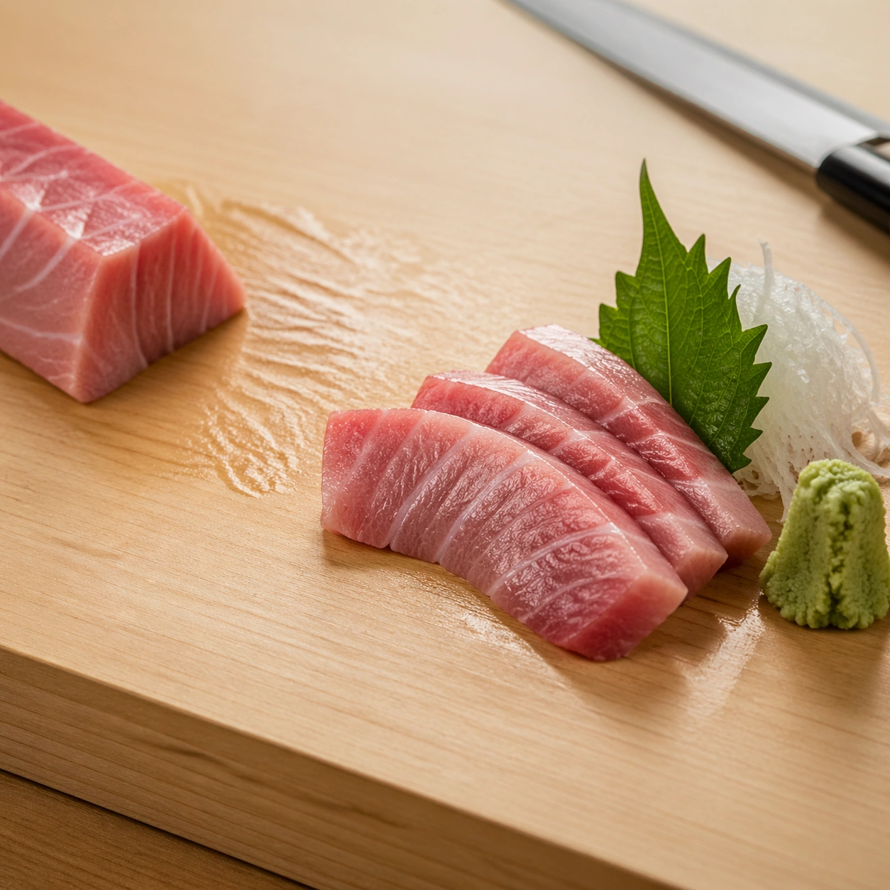
Scene: Create a square high-end sushi photograph on pale hinoki wood or a neutral omakase counter, lit with precise raking light that reveals grain in fish and separation in rice. The environment should feel silent, expensive, and almost clinical in its cleanliness. Space, alignment, and proportion matter as much as the ingredients themselves. Use a square three-quarter close view on a pale cutting board or hinoki block under calm raking light, keeping the environment clean enough to feel almost ceremonial. The board texture should remain visible but restrained. Subject: Show a few freshly cut sashimi slices arranged beside the zone where they were just portioned, with subtle knife traces in the moisture and grain direction of the fish. A long knife may rest softly out of focus at the edge of frame, never dominating the composition. The image should suggest mastery without showing hands. Important details: Every ingredient should reward macro inspection: fish grain direction, cut angle, moisture, knife marks, rice-grain separation, wasabi texture, shiso curl, and the grain of the wood beneath all need to remain distinct. The result should communicate mastery through restraint and surgical care rather than abundance. Emphasize cut planes, residual moisture, and the relationship between blade discipline and final slice geometry. The prep context should enrich the story while staying as immaculate as the service counter. Use case: Sushi and sashimi precision single study 8/9, shifting from finished service to the knife-work behind it. Constraints: No readable text, no watermark, no logos, preserve exact 1:1 aspect ratio, no soy sauce pools, no decorative restaurant clutter, no readable menu cards, no plastic sushi display look, no overloaded garnish, no fish market mess, no blood or offcuts, no readable knife branding.

Example generated from “Sushi Sashimi Surgical Precision — Cedar Box Omakase Grid”
GPT Image 2en

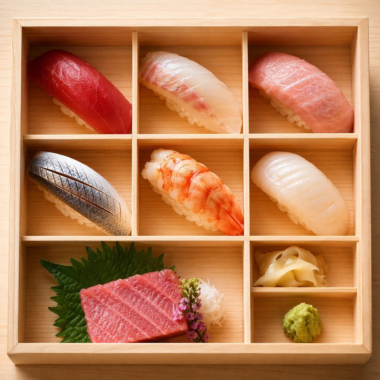
Scene: Create a square high-end sushi photograph on pale hinoki wood or a neutral omakase counter, lit with precise raking light that reveals grain in fish and separation in rice. The environment should feel silent, expensive, and almost clinical in its cleanliness. Space, alignment, and proportion matter as much as the ingredients themselves. Create a square overhead photograph of a cedar presentation box with compartments or clear spacing logic, lit by soft natural-looking light. The wood should feel fragrant, pale, and finely crafted. Subject: Arrange a small omakase assortment inside the box: several nigiri, a sashimi piece, one garnish compartment, and a precise wasabi element, all spaced with near-architectural control. The box should feel like an extension of the chef's discipline rather than packaging. The food must remain the hero. Important details: Every ingredient should reward macro inspection: fish grain direction, cut angle, moisture, knife marks, rice-grain separation, wasabi texture, shiso curl, and the grain of the wood beneath all need to remain distinct. The result should communicate mastery through restraint and surgical care rather than abundance. Balance order and appetite by making every compartment and spacing decision feel deliberate. Wood grain, rice separation, fish sheen, and the exact edges of each piece should all stay visible from above. Use case: Sushi and sashimi precision single study 9/9, broadening the topic into a cedar-box tasting grid. Constraints: No readable text, no watermark, no logos, preserve exact 1:1 aspect ratio, no soy sauce pools, no decorative restaurant clutter, no readable menu cards, no plastic sushi display look, no overloaded garnish, no disposable takeout cues, no soy packets, no printed branding.

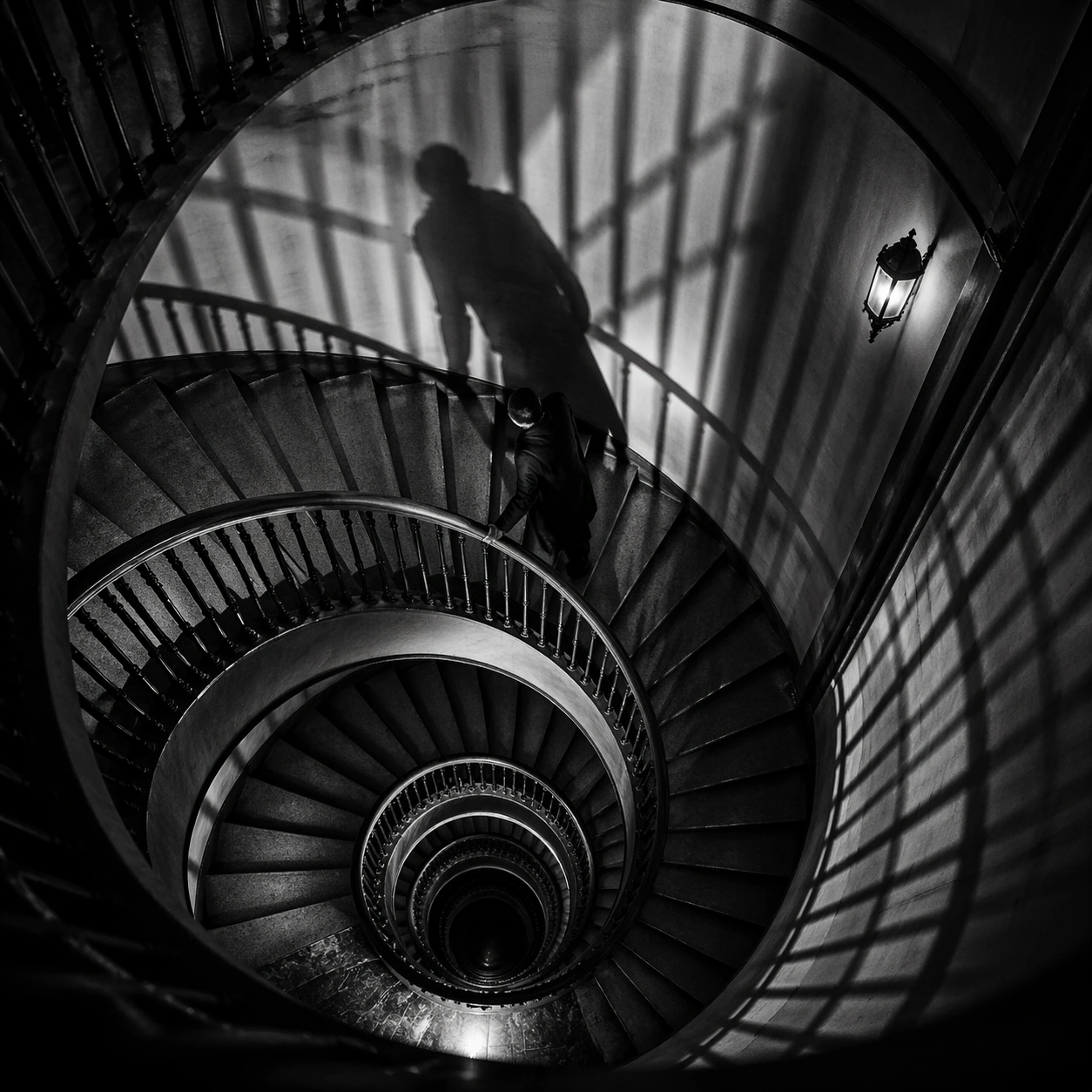
Example generated from “Suspense Staircase Shadow — Spiral Ascent”
GPT Image 2en

Scene: A square black-and-white thriller frame with hard contrast, deep blacks, silvery highlights, and geometric shadow patterns cast by railings, blinds, or stained glass. The camera should feel deliberate and predatory, often high above or pinned to an anxious architectural angle. Look straight down into a spiral staircase where the steps tighten toward a black center and blind-shadow bars cross the walls. Subject: Build the image around stairs, shadows, landings, banisters, and one isolated figure whose presence is defined as much by silhouette as by body. Fear should come from spacing, emptiness, and the logic of light rather than from explicit violence. A solitary figure climbs upward along the inner rail, stretched into a long dark shape by the overhead lamp. Important details: The governing grammar is suspense through architecture. Preserve crisp edges between light and shadow, polished floor reflections, severe stair geometry, and a sense of silent movement just before or after an event. Avoid modern clutter, color accents, or loose handheld energy. Make the geometry elegant and merciless, with the shadow almost functioning as a second character. Use case: Suspense Staircase Shadow single study 1/9. Constraints: No readable text, no watermark, no logos, preserve exact 1:1 aspect ratio, no gore, no monsters, no readable signage, no casual daylight realism, no fog machine effect, no broken anatomy, no low-detail background, no accidental text fragments.

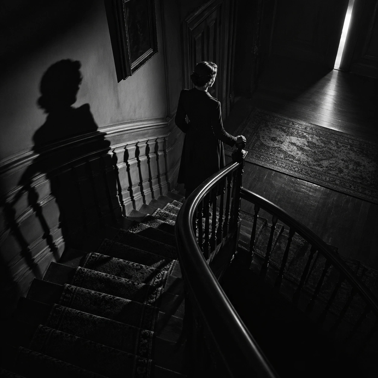
Example generated from “Suspense Staircase Shadow — Landing Listener”
GPT Image 2en

Scene: A square black-and-white thriller frame with hard contrast, deep blacks, silvery highlights, and geometric shadow patterns cast by railings, blinds, or stained glass. The camera should feel deliberate and predatory, often high above or pinned to an anxious architectural angle. Stage a half-lit landing with a curved banister, patterned runner, and a bright sliver of door light cutting in from off frame. Subject: Build the image around stairs, shadows, landings, banisters, and one isolated figure whose presence is defined as much by silhouette as by body. Fear should come from spacing, emptiness, and the logic of light rather than from explicit violence. A woman in a dark coat freezes near the banister, listening toward the unseen doorway while her shadow doubles along the wall. Important details: The governing grammar is suspense through architecture. Preserve crisp edges between light and shadow, polished floor reflections, severe stair geometry, and a sense of silent movement just before or after an event. Avoid modern clutter, color accents, or loose handheld energy. Use silence and clean tonal separation so the moment feels suspended between curiosity and dread. Use case: Suspense Staircase Shadow single study 2/9. Constraints: No readable text, no watermark, no logos, preserve exact 1:1 aspect ratio, no gore, no monsters, no readable signage, no casual daylight realism, no fog machine effect, no broken anatomy, no low-detail background, no accidental text fragments.

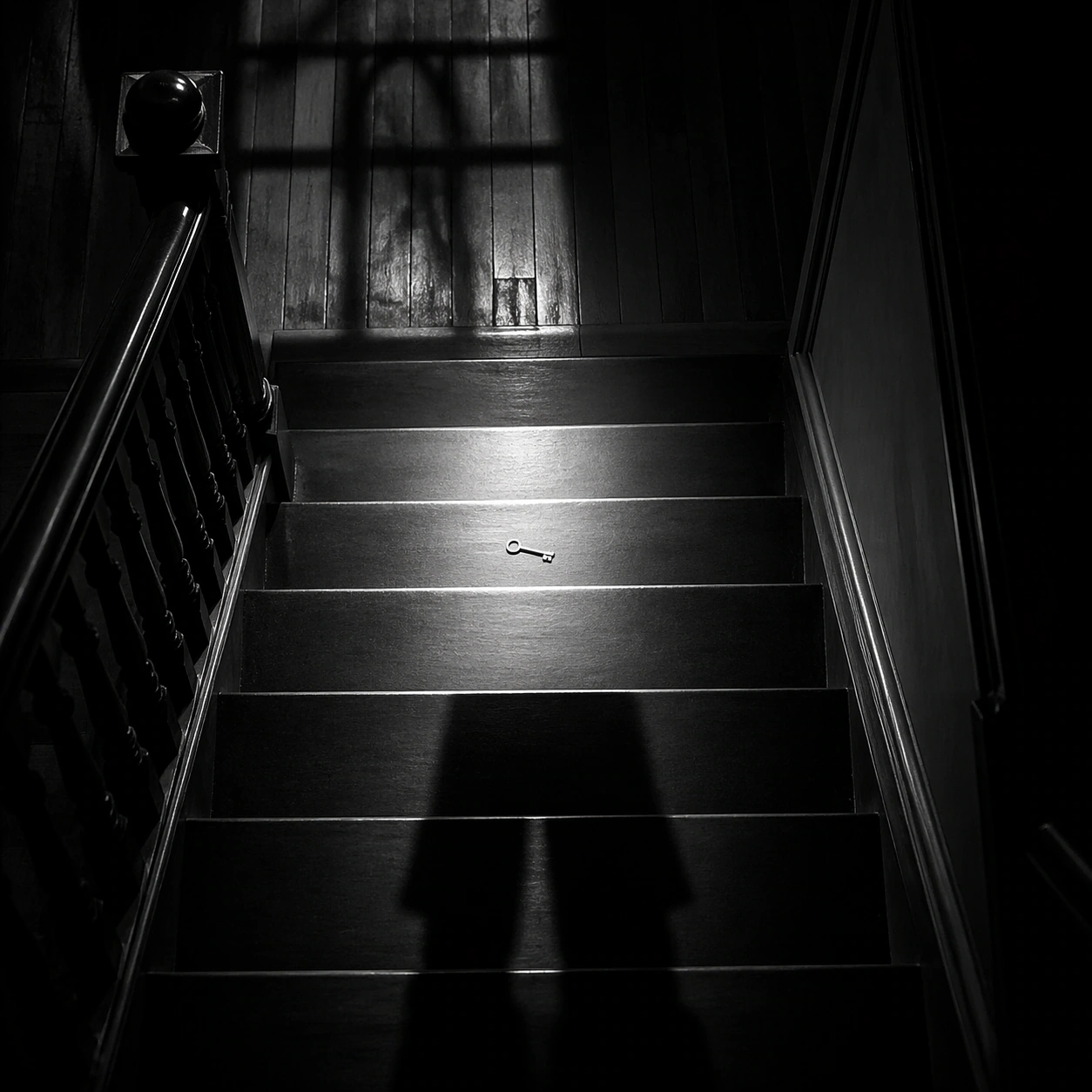
Example generated from “Suspense Staircase Shadow — Key On Step”
GPT Image 2en

Scene: A square black-and-white thriller frame with hard contrast, deep blacks, silvery highlights, and geometric shadow patterns cast by railings, blinds, or stained glass. The camera should feel deliberate and predatory, often high above or pinned to an anxious architectural angle. Use a narrow stair run with polished wood risers and a bright overhead beam that isolates the middle three steps. Subject: Build the image around stairs, shadows, landings, banisters, and one isolated figure whose presence is defined as much by silhouette as by body. Fear should come from spacing, emptiness, and the logic of light rather than from explicit violence. A single metal key lies on one illuminated step while the lower portion of a descending figure enters only as shadow. Important details: The governing grammar is suspense through architecture. Preserve crisp edges between light and shadow, polished floor reflections, severe stair geometry, and a sense of silent movement just before or after an event. Avoid modern clutter, color accents, or loose handheld energy. The image should feel almost absurdly simple, with suspense created by scale, emptiness, and the importance of a small object. Use case: Suspense Staircase Shadow single study 3/9. Constraints: No readable text, no watermark, no logos, preserve exact 1:1 aspect ratio, no gore, no monsters, no readable signage, no casual daylight realism, no fog machine effect, no broken anatomy, no low-detail background, no accidental text fragments.

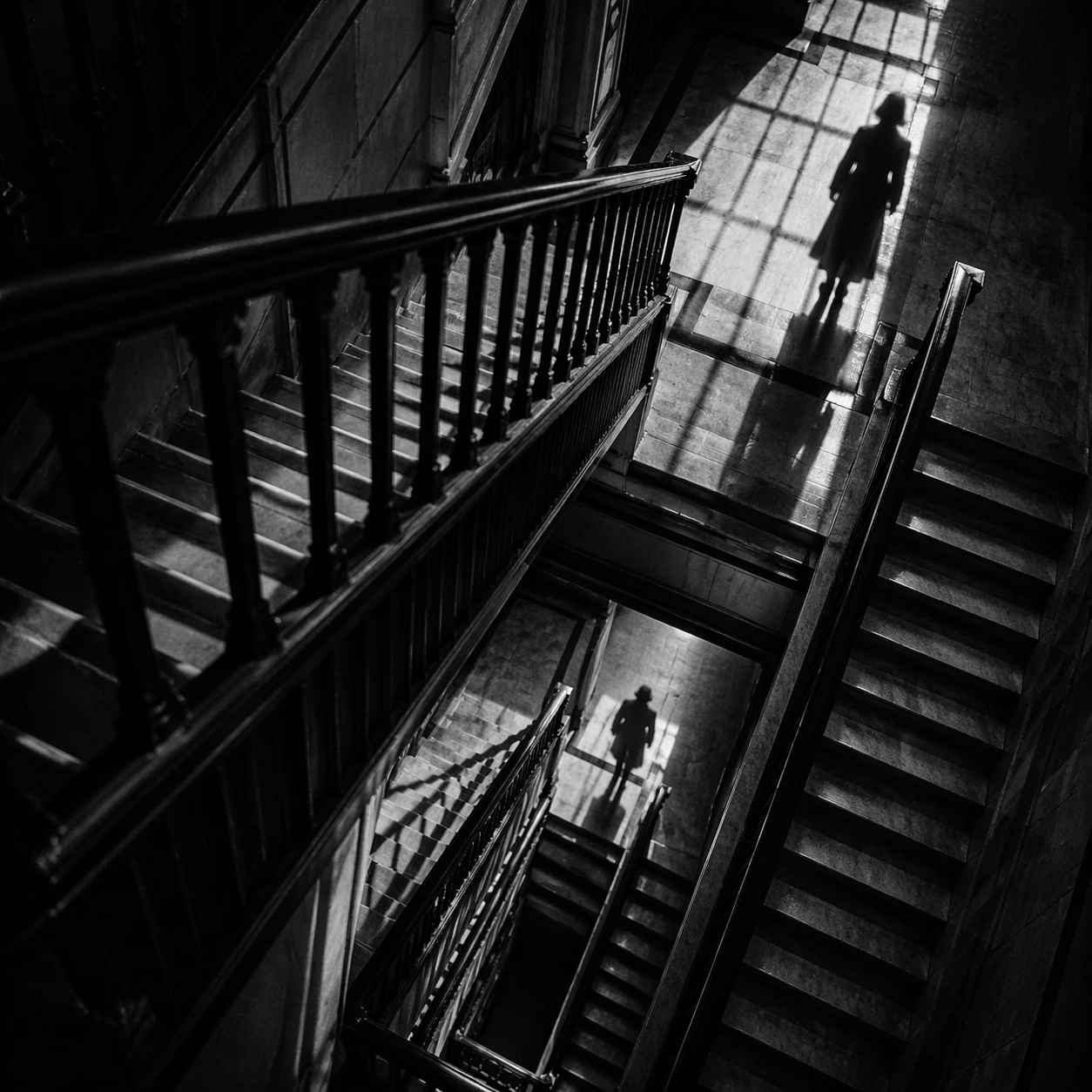
Example generated from “Suspense Staircase Shadow — Banister Pursuit”
GPT Image 2en

Scene: A square black-and-white thriller frame with hard contrast, deep blacks, silvery highlights, and geometric shadow patterns cast by railings, blinds, or stained glass. The camera should feel deliberate and predatory, often high above or pinned to an anxious architectural angle. Shoot diagonally across a multi-level stairwell so banister rails stack into dense stripes over a pale floor below. Subject: Build the image around stairs, shadows, landings, banisters, and one isolated figure whose presence is defined as much by silhouette as by body. Fear should come from spacing, emptiness, and the logic of light rather than from explicit violence. Two figures are visible only as separated shadows on different levels, one clearly gaining on the other. Important details: The governing grammar is suspense through architecture. Preserve crisp edges between light and shadow, polished floor reflections, severe stair geometry, and a sense of silent movement just before or after an event. Avoid modern clutter, color accents, or loose handheld energy. Keep bodies secondary and let the rail geometry do most of the emotional work. Use case: Suspense Staircase Shadow single study 4/9. Constraints: No readable text, no watermark, no logos, preserve exact 1:1 aspect ratio, no gore, no monsters, no readable signage, no casual daylight realism, no fog machine effect, no broken anatomy, no low-detail background, no accidental text fragments.

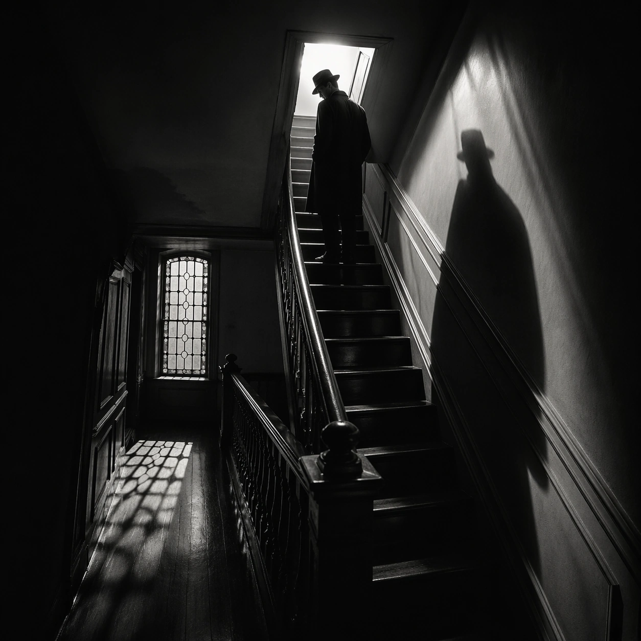
Example generated from “Suspense Staircase Shadow — Attic Hatch”
GPT Image 2en

Scene: A square black-and-white thriller frame with hard contrast, deep blacks, silvery highlights, and geometric shadow patterns cast by railings, blinds, or stained glass. The camera should feel deliberate and predatory, often high above or pinned to an anxious architectural angle. Show a tight final stair flight leading to a small attic hatch blazing with white light at the top. Subject: Build the image around stairs, shadows, landings, banisters, and one isolated figure whose presence is defined as much by silhouette as by body. Fear should come from spacing, emptiness, and the logic of light rather than from explicit violence. A man with hat brim lowered pauses two steps below the hatch while his shadow pours down the wall behind him. Important details: The governing grammar is suspense through architecture. Preserve crisp edges between light and shadow, polished floor reflections, severe stair geometry, and a sense of silent movement just before or after an event. Avoid modern clutter, color accents, or loose handheld energy. The contrast between the small bright square and the surrounding darkness should carry the whole composition. Use case: Suspense Staircase Shadow single study 5/9. Constraints: No readable text, no watermark, no logos, preserve exact 1:1 aspect ratio, no gore, no monsters, no readable signage, no casual daylight realism, no fog machine effect, no broken anatomy, no low-detail background, no accidental text fragments.

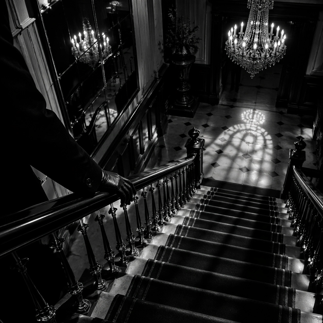
Example generated from “Suspense Staircase Shadow — Velvet Hall Descent”
GPT Image 2en

Scene: A square black-and-white thriller frame with hard contrast, deep blacks, silvery highlights, and geometric shadow patterns cast by railings, blinds, or stained glass. The camera should feel deliberate and predatory, often high above or pinned to an anxious architectural angle. Use a grand hall stair with velvet runner, mirrored wall panels, and one chandelier casting sharp pools of light onto the steps. Subject: Build the image around stairs, shadows, landings, banisters, and one isolated figure whose presence is defined as much by silhouette as by body. Fear should come from spacing, emptiness, and the logic of light rather than from explicit violence. A gloved hand trails along the banister while the body remains mostly outside frame, turning descent into a fragmentary threat. Important details: The governing grammar is suspense through architecture. Preserve crisp edges between light and shadow, polished floor reflections, severe stair geometry, and a sense of silent movement just before or after an event. Avoid modern clutter, color accents, or loose handheld energy. Favor gleaming banister metal, hard shadows, and a feeling of expensive danger over overt action. Use case: Suspense Staircase Shadow single study 6/9. Constraints: No readable text, no watermark, no logos, preserve exact 1:1 aspect ratio, no gore, no monsters, no readable signage, no casual daylight realism, no fog machine effect, no broken anatomy, no low-detail background, no accidental text fragments.

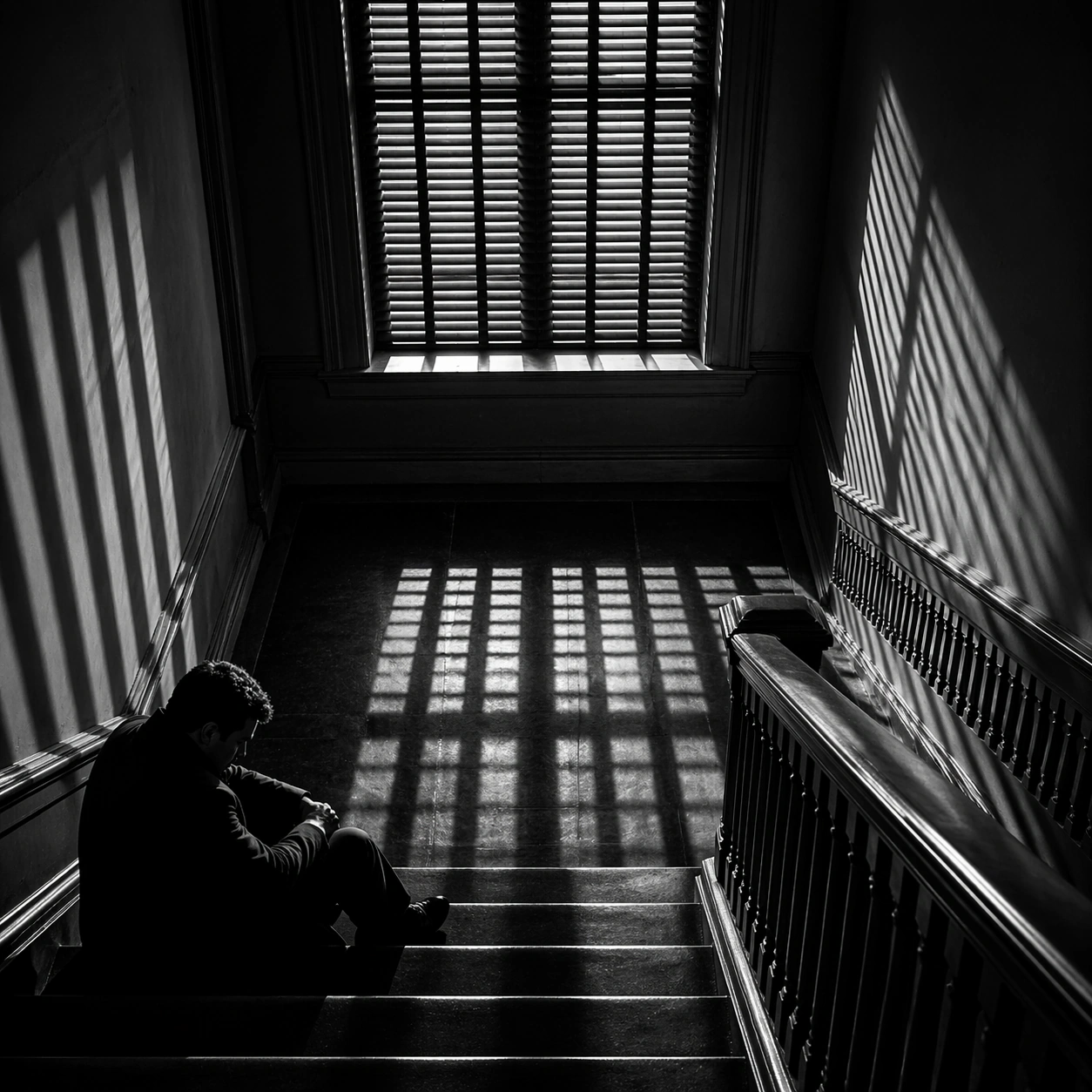
Example generated from “Suspense Staircase Shadow — Window Slat Trap”
GPT Image 2en

Scene: A square black-and-white thriller frame with hard contrast, deep blacks, silvery highlights, and geometric shadow patterns cast by railings, blinds, or stained glass. The camera should feel deliberate and predatory, often high above or pinned to an anxious architectural angle. Frame a square stair landing beneath a tall window fitted with slatted blinds that project prison-bar shadows over the floor. Subject: Build the image around stairs, shadows, landings, banisters, and one isolated figure whose presence is defined as much by silhouette as by body. Fear should come from spacing, emptiness, and the logic of light rather than from explicit violence. A seated figure waits on the lowest visible step with face half-hidden in darkness, as if trapped by the light itself. Important details: The governing grammar is suspense through architecture. Preserve crisp edges between light and shadow, polished floor reflections, severe stair geometry, and a sense of silent movement just before or after an event. Avoid modern clutter, color accents, or loose handheld energy. The barred shadow pattern should feel accusatory and architectural, not decorative. Use case: Suspense Staircase Shadow single study 7/9. Constraints: No readable text, no watermark, no logos, preserve exact 1:1 aspect ratio, no gore, no monsters, no readable signage, no casual daylight realism, no fog machine effect, no broken anatomy, no low-detail background, no accidental text fragments.

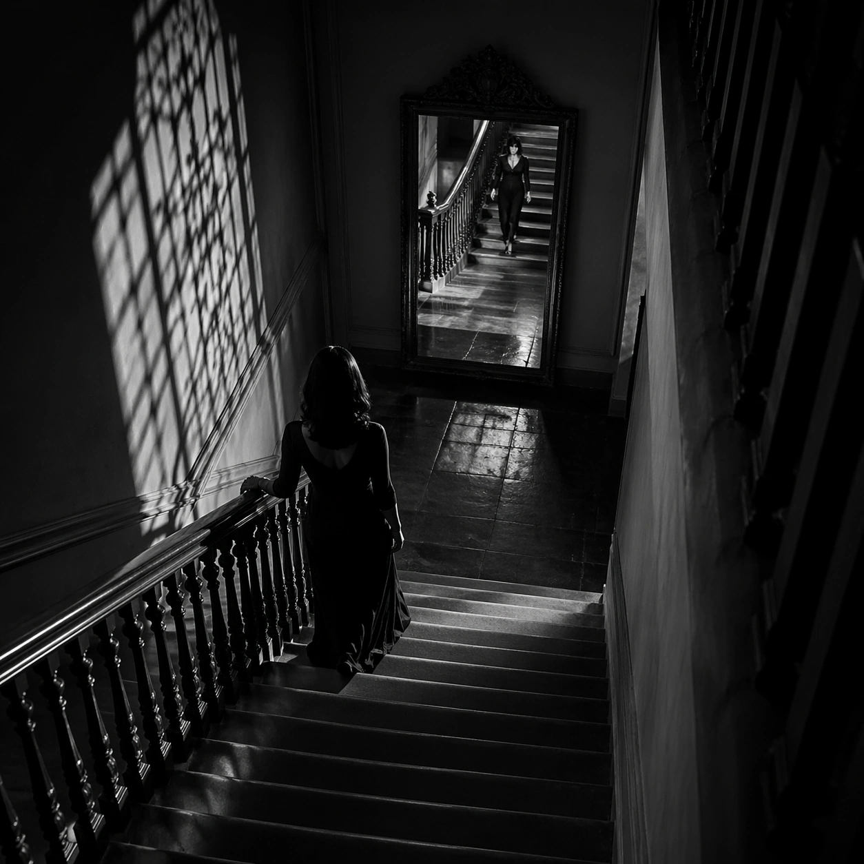
Example generated from “Suspense Staircase Shadow — Mirror Below”
GPT Image 2en

Scene: A square black-and-white thriller frame with hard contrast, deep blacks, silvery highlights, and geometric shadow patterns cast by railings, blinds, or stained glass. The camera should feel deliberate and predatory, often high above or pinned to an anxious architectural angle. Look down a stairwell toward a mirror at the bottom landing that catches a second view of the upper steps. Subject: Build the image around stairs, shadows, landings, banisters, and one isolated figure whose presence is defined as much by silhouette as by body. Fear should come from spacing, emptiness, and the logic of light rather than from explicit violence. A descending woman appears both directly and as reflection, creating uncertainty about distance and timing. Important details: The governing grammar is suspense through architecture. Preserve crisp edges between light and shadow, polished floor reflections, severe stair geometry, and a sense of silent movement just before or after an event. Avoid modern clutter, color accents, or loose handheld energy. Keep the mirror clean and believable, using duplication to sharpen suspense rather than create fantasy. Use case: Suspense Staircase Shadow single study 8/9. Constraints: No readable text, no watermark, no logos, preserve exact 1:1 aspect ratio, no gore, no monsters, no readable signage, no casual daylight realism, no fog machine effect, no broken anatomy, no low-detail background, no accidental text fragments.

Example generated from “Suspense Staircase Shadow — Final Turn”
GPT Image 2en

Scene: A square black-and-white thriller frame with hard contrast, deep blacks, silvery highlights, and geometric shadow patterns cast by railings, blinds, or stained glass. The camera should feel deliberate and predatory, often high above or pinned to an anxious architectural angle. Use the last turning corner of a staircase, where one wall goes fully black and the next flight emerges into a thin strip of light. Subject: Build the image around stairs, shadows, landings, banisters, and one isolated figure whose presence is defined as much by silhouette as by body. Fear should come from spacing, emptiness, and the logic of light rather than from explicit violence. Only the lower legs of a person are visible mid-turn, making the rest of the body disappear around the corner. Important details: The governing grammar is suspense through architecture. Preserve crisp edges between light and shadow, polished floor reflections, severe stair geometry, and a sense of silent movement just before or after an event. Avoid modern clutter, color accents, or loose handheld energy. The disappearing body should feel more ominous than any explicit threat, with clean edges and no unnecessary props. Use case: Suspense Staircase Shadow single study 9/9. Constraints: No readable text, no watermark, no logos, preserve exact 1:1 aspect ratio, no gore, no monsters, no readable signage, no casual daylight realism, no fog machine effect, no broken anatomy, no low-detail background, no accidental text fragments.

Example generated from “Swiss International Grid — Canonical One-Sheet”
GPT Image 2en

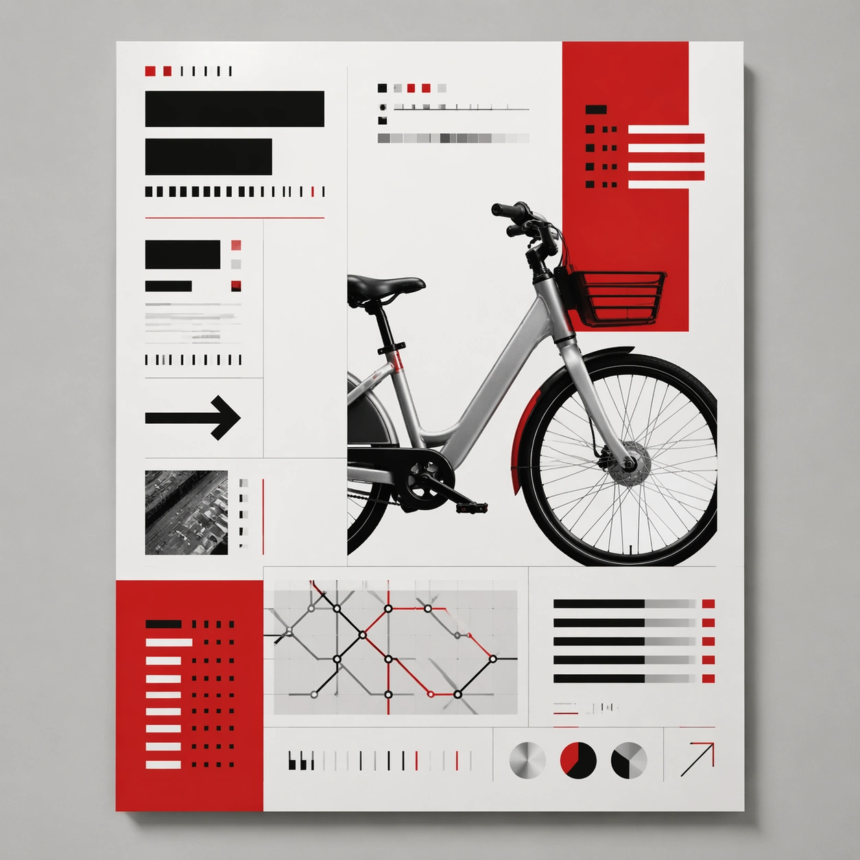
Scene: A square straight-on studio view of a pristine poster mounted on a matte wall with even museum lighting, crisp corners, and enough breathing room around the sheet for the full composition to read as an intentional object. The poster should express rigorous Swiss grid design with modular columns, disciplined margins, quiet asymmetry, and large white fields, using red, black, white, graphite gray, and occasional cool silver paper tone and a tactile surface appropriate to the medium. Subject: Build the flagship poster statement for this style, with the strongest hierarchy, the clearest subject silhouette, and the most disciplined balance between image field, pseudo-typography, and empty space. Use gallery objects, arrows, cropped still-life fragments, line charts, timetable bars, and alignment guides as the main visual ingredients, and organize them with grotesk typographic blocks, rules, and index markers rendered as non-readable layout forms. For the contemporary-subject axis, thread in shared bicycles, transit maps, and civic information cues reduced into a severe exhibition grid. The poster must feel like an original design object rather than a reproduction of any known work. Important details: Treat this as the cleanest thesis image in the set: the paper should look fresh, the inks or paint should feel deliberate, and every formal rule of the style should be easy to study at a glance. Preserve baseline precision, invisible column logic, severe spacing discipline, and crisp edge hierarchy. Keep every letterform abstract and non-readable, as if it were a typographic texture rather than language. Make the style unmistakable through composition, palette, surface behavior, and symbolic compression. no centered symmetry, no distressed paper, no decorative ornament, no playful doodles. Use case: Swiss Grid single study 1/9, establishing the cleanest museum-grade poster reading. Constraints: No readable text, no watermark, no logos, preserve exact 1:1 aspect ratio, no copyrighted characters, no real brand marks, no QR codes, no interface chrome, no accidental gibberish lettering.

Example generated from “Swiss International Grid — Print Proof Flatlay”
GPT Image 2en

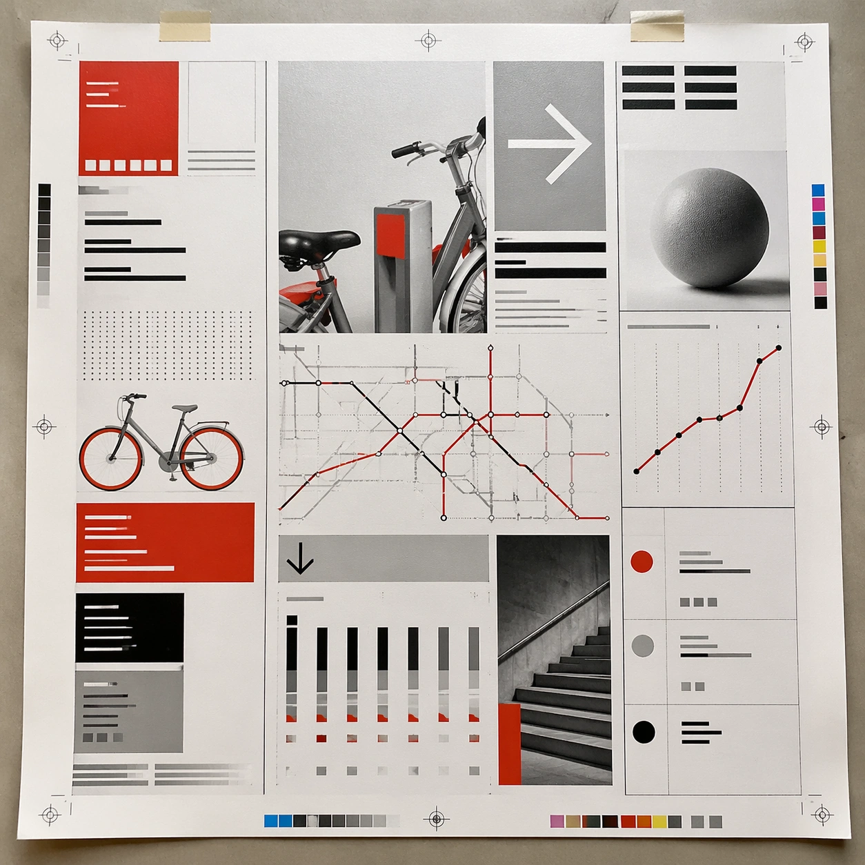
Scene: A square overhead tabletop photograph of a fresh poster proof on neutral worktable paper, lit by cool daylight, with crop marks, tape tabs, and slight paper bow visible around the sheet. The poster should express rigorous Swiss grid design with modular columns, disciplined margins, quiet asymmetry, and large white fields, using red, black, white, graphite gray, and occasional cool silver paper tone and a tactile surface appropriate to the medium. Subject: Design the poster as a print-shop proof, preserving the same poster language while allowing production clues such as edge trims, registration targets, and process marks to frame the composition. Use gallery objects, arrows, cropped still-life fragments, line charts, timetable bars, and alignment guides as the main visual ingredients, and organize them with grotesk typographic blocks, rules, and index markers rendered as non-readable layout forms. For the contemporary-subject axis, thread in shared bicycles, transit maps, and civic information cues reduced into a severe exhibition grid. The poster must feel like an original design object rather than a reproduction of any known work. Important details: The image must still read as a finished poster concept, but it should carry believable print-process evidence and material tactility instead of gallery-wall perfection. Preserve baseline precision, invisible column logic, severe spacing discipline, and crisp edge hierarchy. Keep every letterform abstract and non-readable, as if it were a typographic texture rather than language. Make the style unmistakable through composition, palette, surface behavior, and symbolic compression. no centered symmetry, no distressed paper, no decorative ornament, no playful doodles. Use case: Swiss Grid single study 2/9, testing production realism and process evidence. Constraints: No readable text, no watermark, no logos, preserve exact 1:1 aspect ratio, no copyrighted characters, no real brand marks, no QR codes, no interface chrome, no accidental gibberish lettering.

Example generated from “Swiss International Grid — Transit Lightbox”
GPT Image 2en

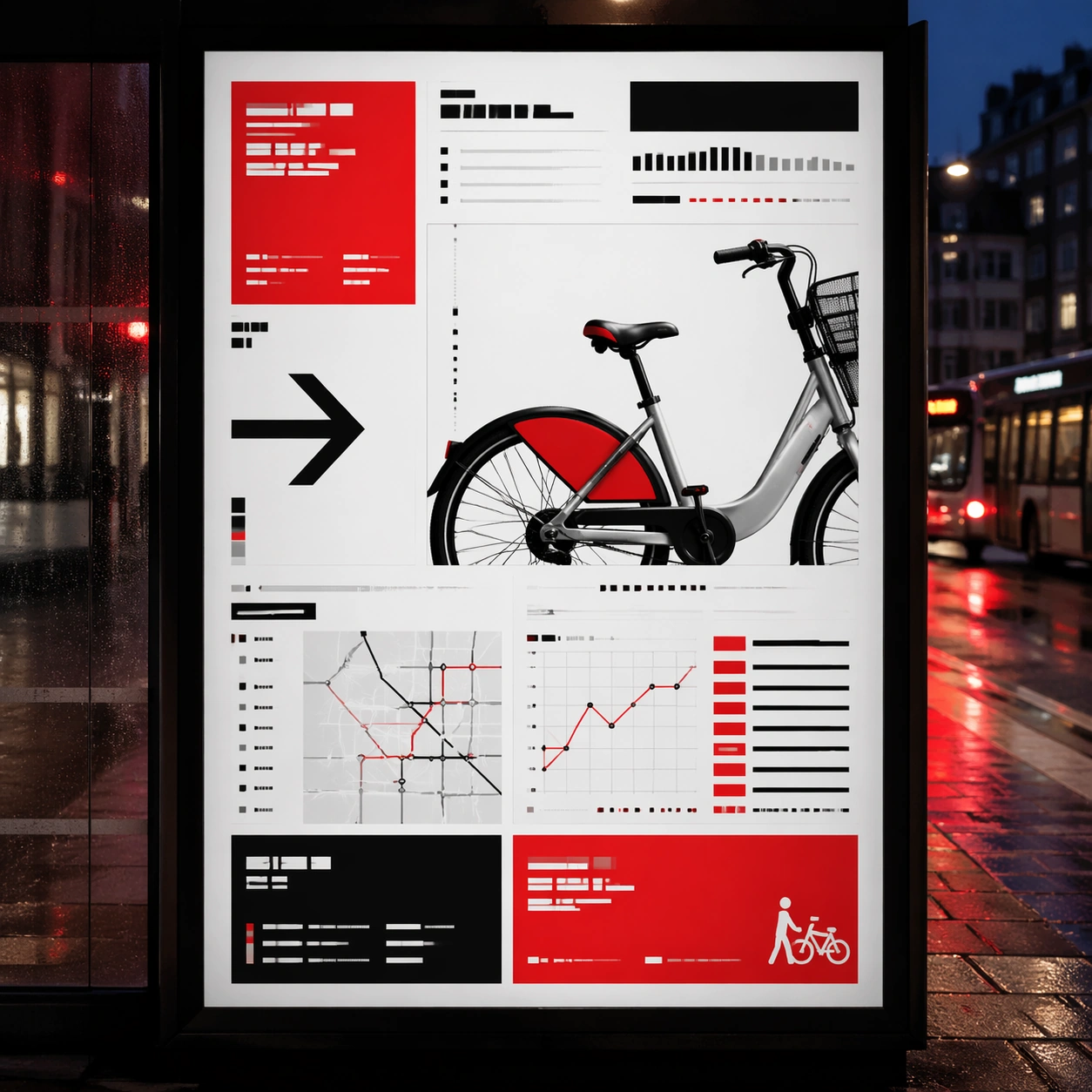
Scene: A square dusk street photograph of a backlit transit poster glowing inside glass, with faint rain reflections, soft city blur in the distance, and the poster remaining fully legible as a composition. The poster should express rigorous Swiss grid design with modular columns, disciplined margins, quiet asymmetry, and large white fields, using red, black, white, graphite gray, and occasional cool silver paper tone and a tactile surface appropriate to the medium. Subject: Adapt the poster into a public-facing lightbox version that still honors the original style grammar while feeling bold enough to stop a passerby from several meters away. Use gallery objects, arrows, cropped still-life fragments, line charts, timetable bars, and alignment guides as the main visual ingredients, and organize them with grotesk typographic blocks, rules, and index markers rendered as non-readable layout forms. For the contemporary-subject axis, thread in shared bicycles, transit maps, and civic information cues reduced into a severe exhibition grid. The poster must feel like an original design object rather than a reproduction of any known work. Important details: Let the style survive the illumination test: color blocking, silhouette contrast, and abstract lettering should stay controlled under bright internal light and reflective glass. Preserve baseline precision, invisible column logic, severe spacing discipline, and crisp edge hierarchy. Keep every letterform abstract and non-readable, as if it were a typographic texture rather than language. Make the style unmistakable through composition, palette, surface behavior, and symbolic compression. no centered symmetry, no distressed paper, no decorative ornament, no playful doodles. Use case: Swiss Grid single study 3/9, testing distance readability in public display. Constraints: No readable text, no watermark, no logos, preserve exact 1:1 aspect ratio, no copyrighted characters, no real brand marks, no QR codes, no interface chrome, no accidental gibberish lettering.

Example generated from “Swiss International Grid — Wheatpaste Wall Layer”
GPT Image 2en

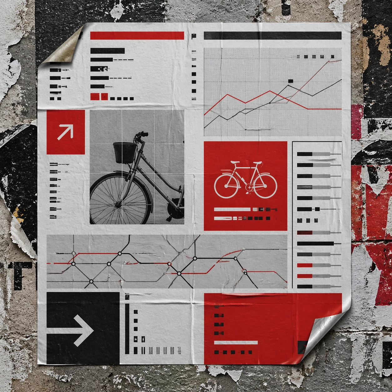
Scene: A square urban wall study with the poster pasted onto rough plaster among torn edges and older paper remnants, photographed in soft overcast light so texture, glue bubbles, and surface scars stay visible. The poster should express rigorous Swiss grid design with modular columns, disciplined margins, quiet asymmetry, and large white fields, using red, black, white, graphite gray, and occasional cool silver paper tone and a tactile surface appropriate to the medium. Subject: Create a version that feels made for the street, with the poster carrying enough formal force to survive abrasion, layering, and imperfect placement without losing its visual identity. Use gallery objects, arrows, cropped still-life fragments, line charts, timetable bars, and alignment guides as the main visual ingredients, and organize them with grotesk typographic blocks, rules, and index markers rendered as non-readable layout forms. For the contemporary-subject axis, thread in shared bicycles, transit maps, and civic information cues reduced into a severe exhibition grid. The poster must feel like an original design object rather than a reproduction of any known work. Important details: Keep the main design intact but let the environment add grit: lifted corners, tiny tears, wrinkled paper, and older color fragments around the perimeter should amplify the style rather than dilute it. Preserve baseline precision, invisible column logic, severe spacing discipline, and crisp edge hierarchy. Keep every letterform abstract and non-readable, as if it were a typographic texture rather than language. Make the style unmistakable through composition, palette, surface behavior, and symbolic compression. no centered symmetry, no distressed paper, no decorative ornament, no playful doodles. Use case: Swiss Grid single study 4/9, testing street-life durability and layered context. Constraints: No readable text, no watermark, no logos, preserve exact 1:1 aspect ratio, no copyrighted characters, no real brand marks, no QR codes, no interface chrome, no accidental gibberish lettering.

Example generated from “Swiss International Grid — Folded Archive Copy”
GPT Image 2en

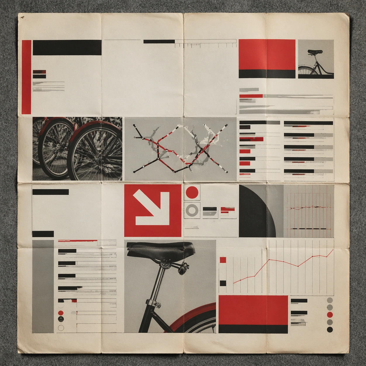
Scene: A square conservation-table view of a vintage poster laid on gray felt under raking light, with visible fold lines, softened corners, and subtle aging that still preserves the integrity of the image. The poster should express rigorous Swiss grid design with modular columns, disciplined margins, quiet asymmetry, and large white fields, using red, black, white, graphite gray, and occasional cool silver paper tone and a tactile surface appropriate to the medium. Subject: Present the poster as an archive copy that has been stored, unfolded, and carefully documented, letting age and handling reveal how the design holds up across time. Use gallery objects, arrows, cropped still-life fragments, line charts, timetable bars, and alignment guides as the main visual ingredients, and organize them with grotesk typographic blocks, rules, and index markers rendered as non-readable layout forms. For the contemporary-subject axis, thread in shared bicycles, transit maps, and civic information cues reduced into a severe exhibition grid. The poster must feel like an original design object rather than a reproduction of any known work. Important details: Aging must stay believable rather than theatrical: slight yellowing, fold memory, edge wear, and pigment variation should support the historical or crafted feeling of the style. Preserve baseline precision, invisible column logic, severe spacing discipline, and crisp edge hierarchy. Keep every letterform abstract and non-readable, as if it were a typographic texture rather than language. Make the style unmistakable through composition, palette, surface behavior, and symbolic compression. no centered symmetry, no distressed paper, no decorative ornament, no playful doodles. Use case: Swiss Grid single study 5/9, testing archival endurance and age character. Constraints: No readable text, no watermark, no logos, preserve exact 1:1 aspect ratio, no copyrighted characters, no real brand marks, no QR codes, no interface chrome, no accidental gibberish lettering.

Example generated from “Swiss International Grid — Twin Poster Diptych”
GPT Image 2en

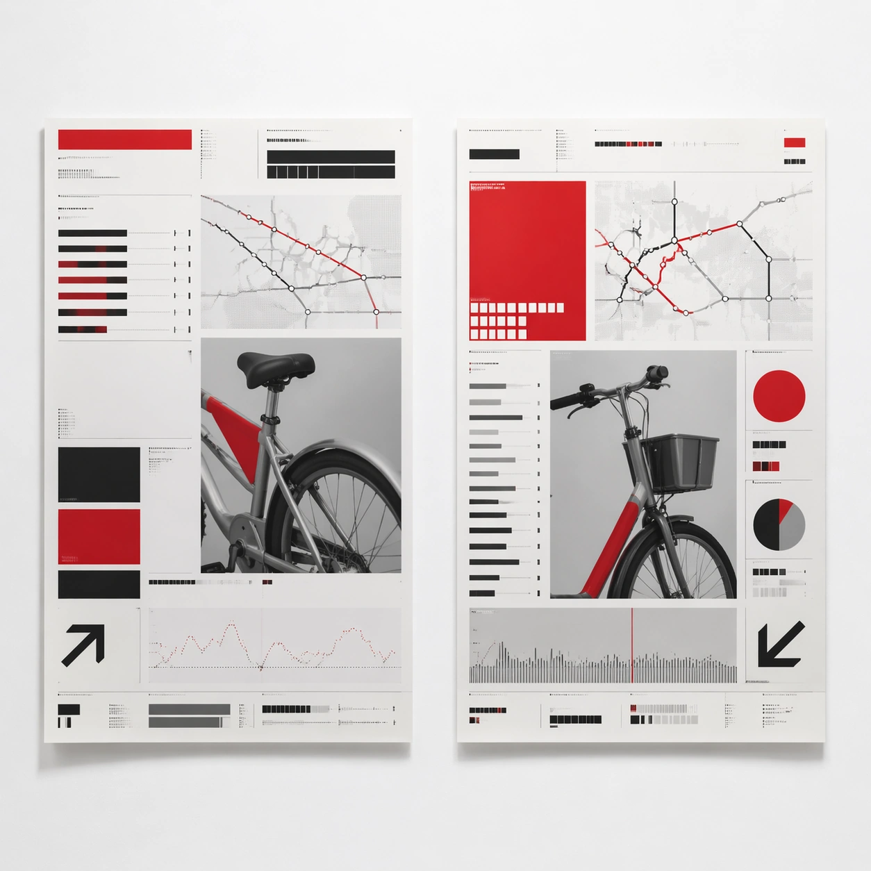
Scene: A square white-wall installation showing two companion posters hung side by side with equal spacing, photographed frontally so the pair reads as a designed conversation rather than two unrelated sheets. The poster should express rigorous Swiss grid design with modular columns, disciplined margins, quiet asymmetry, and large white fields, using red, black, white, graphite gray, and occasional cool silver paper tone and a tactile surface appropriate to the medium. Subject: Compose a matched diptych: two posters sharing one style system while splitting the narrative across paired motifs, mirrored masses, or complementary color emphasis. Use gallery objects, arrows, cropped still-life fragments, line charts, timetable bars, and alignment guides as the main visual ingredients, and organize them with grotesk typographic blocks, rules, and index markers rendered as non-readable layout forms. For the contemporary-subject axis, thread in shared bicycles, transit maps, and civic information cues reduced into a severe exhibition grid. The poster must feel like an original design object rather than a reproduction of any known work. Important details: Both halves should feel distinct yet inseparable. Preserve one coherent visual language, but let each sheet carry its own focal symbol and rhythm without readable wording. Preserve baseline precision, invisible column logic, severe spacing discipline, and crisp edge hierarchy. Keep every letterform abstract and non-readable, as if it were a typographic texture rather than language. Make the style unmistakable through composition, palette, surface behavior, and symbolic compression. no centered symmetry, no distressed paper, no decorative ornament, no playful doodles. Use case: Swiss Grid single study 6/9, testing system flexibility across a paired set. Constraints: No readable text, no watermark, no logos, preserve exact 1:1 aspect ratio, no copyrighted characters, no real brand marks, no QR codes, no interface chrome, no accidental gibberish lettering.

Example generated from “Swiss International Grid — Stacked Print Bundle”
GPT Image 2en

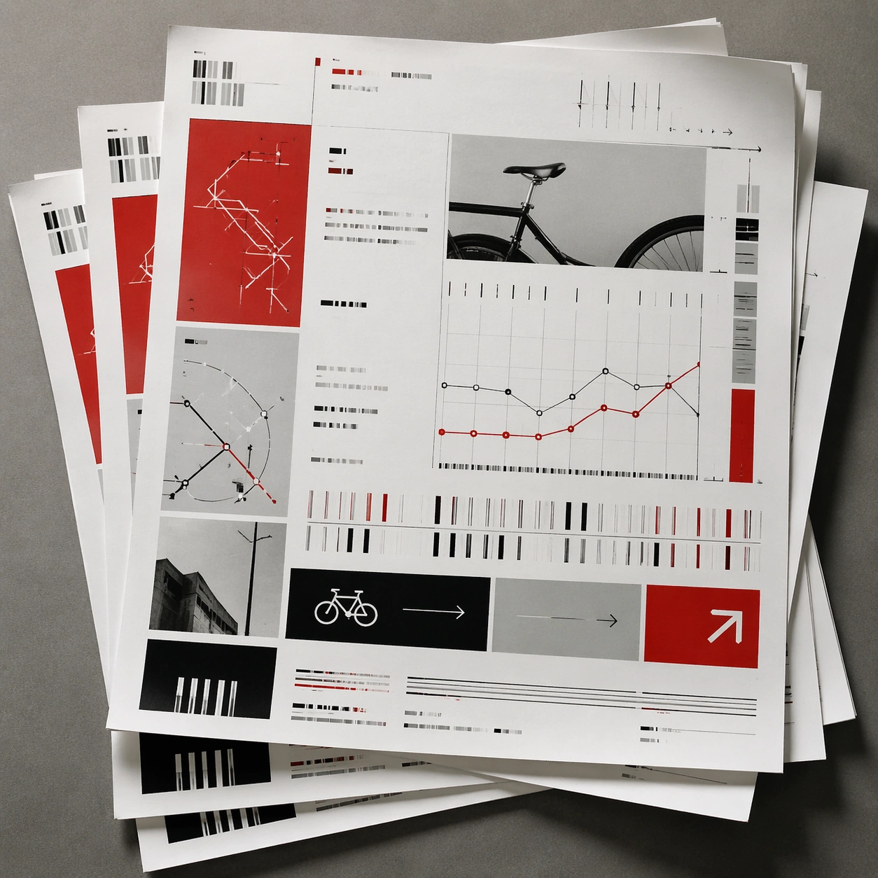
Scene: A square tabletop shot of several poster prints stacked and slightly fanned, with curled corners, offset edges, and soft directional light revealing paper thickness and ink behavior. The poster should express rigorous Swiss grid design with modular columns, disciplined margins, quiet asymmetry, and large white fields, using red, black, white, graphite gray, and occasional cool silver paper tone and a tactile surface appropriate to the medium. Subject: Design the top poster to dominate while nearby duplicate sheets echo the same composition, creating a tactile print-run scene rather than a single isolated sheet. Use gallery objects, arrows, cropped still-life fragments, line charts, timetable bars, and alignment guides as the main visual ingredients, and organize them with grotesk typographic blocks, rules, and index markers rendered as non-readable layout forms. For the contemporary-subject axis, thread in shared bicycles, transit maps, and civic information cues reduced into a severe exhibition grid. The poster must feel like an original design object rather than a reproduction of any known work. Important details: Use the stack to emphasize production character: edge shadows, repeated motifs peeking from beneath, and subtle misalignment should enrich the material reading without changing the core design. Preserve baseline precision, invisible column logic, severe spacing discipline, and crisp edge hierarchy. Keep every letterform abstract and non-readable, as if it were a typographic texture rather than language. Make the style unmistakable through composition, palette, surface behavior, and symbolic compression. no centered symmetry, no distressed paper, no decorative ornament, no playful doodles. Use case: Swiss Grid single study 7/9, testing print-run tactility and repeat presence. Constraints: No readable text, no watermark, no logos, preserve exact 1:1 aspect ratio, no copyrighted characters, no real brand marks, no QR codes, no interface chrome, no accidental gibberish lettering.

Example generated from “Swiss International Grid — Kiosk Night Glow”
GPT Image 2en

Scene: A square nighttime city view with the poster wrapping part of a cylindrical kiosk, wet pavement reflecting nearby light, and the composition holding together under moody urban illumination. The poster should express rigorous Swiss grid design with modular columns, disciplined margins, quiet asymmetry, and large white fields, using red, black, white, graphite gray, and occasional cool silver paper tone and a tactile surface appropriate to the medium. Subject: Reframe the design for a dramatic street-placement context, where the poster has to project style and mood through reflection, curvature, and surrounding darkness. Use gallery objects, arrows, cropped still-life fragments, line charts, timetable bars, and alignment guides as the main visual ingredients, and organize them with grotesk typographic blocks, rules, and index markers rendered as non-readable layout forms. For the contemporary-subject axis, thread in shared bicycles, transit maps, and civic information cues reduced into a severe exhibition grid. The poster must feel like an original design object rather than a reproduction of any known work. Important details: The design should remain instantly recognizable despite the cylindrical wrap. Preserve major blocks, symbolic shapes, and abstract title forms so the style still feels authoritative at night. Preserve baseline precision, invisible column logic, severe spacing discipline, and crisp edge hierarchy. Keep every letterform abstract and non-readable, as if it were a typographic texture rather than language. Make the style unmistakable through composition, palette, surface behavior, and symbolic compression. no centered symmetry, no distressed paper, no decorative ornament, no playful doodles. Use case: Swiss Grid single study 8/9, testing atmospheric display under rain and glow. Constraints: No readable text, no watermark, no logos, preserve exact 1:1 aspect ratio, no copyrighted characters, no real brand marks, no QR codes, no interface chrome, no accidental gibberish lettering.

Example generated from “Swiss International Grid — Contemporary Remix”
GPT Image 2en

Scene: A square front-facing poster presentation on a clean neutral wall, lit like a premium print test, with crisp edges and a polished but still tactile finish appropriate to the style. The poster should express rigorous Swiss grid design with modular columns, disciplined margins, quiet asymmetry, and large white fields, using red, black, white, graphite gray, and occasional cool silver paper tone and a tactile surface appropriate to the medium. Subject: Apply the historical poster language to a contemporary urban subject so the old visual grammar proves it can carry present-day themes without losing authenticity or formal discipline. Use gallery objects, arrows, cropped still-life fragments, line charts, timetable bars, and alignment guides as the main visual ingredients, and organize them with grotesk typographic blocks, rules, and index markers rendered as non-readable layout forms. For the contemporary-subject axis, thread in shared bicycles, transit maps, and civic information cues reduced into a severe exhibition grid. The poster must feel like an original design object rather than a reproduction of any known work. Important details: This is not parody. The contemporary subject should feel genuinely absorbed into the style through palette, composition, symbolic compression, and non-readable lettering treatment. Preserve baseline precision, invisible column logic, severe spacing discipline, and crisp edge hierarchy. Keep every letterform abstract and non-readable, as if it were a typographic texture rather than language. Make the style unmistakable through composition, palette, surface behavior, and symbolic compression. no centered symmetry, no distressed paper, no decorative ornament, no playful doodles. Use case: Swiss Grid single study 9/9, testing historical grammar on a present-day subject. Constraints: No readable text, no watermark, no logos, preserve exact 1:1 aspect ratio, no copyrighted characters, no real brand marks, no QR codes, no interface chrome, no accidental gibberish lettering.
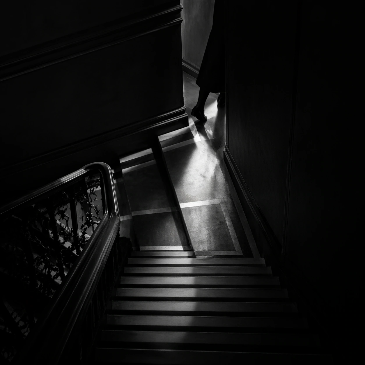
Example generated from “Symmetric Hdr Architecture — Hero Shot”
GPT Image 2en

Scene: A square photographic image with intentional lens choice, coherent light, and a subject that feels observed rather than merely decorated. Build the frame around a definitive frame that establishes the subject’s strongest visual identity. Keep the lighting, camera distance, and spatial organization tuned for a high-signal research image rather than a casual snapshot. The image belongs to the Symmetric HDR Architecture theme and should feel immediately legible as a prompt atlas theme for symmetric hdr architecture, testing photorealism, world-knowledge, optical-illusion-geometry, commercial-mockup with gpt image 2.. Subject: Center the study on a definitive frame that establishes the subject’s strongest visual identity. Translate the theme into a concrete visual statement instead of an abstract mood board: the viewer should understand what kind of image this is, what is being tested, and why the composition is difficult. Use the slug idea of symmetric hdr architecture as a literal guide for subject matter, materials, and staging. If helpful, borrow the broad visual cues suggested by Apple Park, HDR, but keep the result original and specific to this study. Important details: The realism should come from timing, optics, and material response: atmosphere, contrast, depth, motion, and tiny physical cues all need to agree. Preserve a disciplined square composition, clear focal hierarchy, and enough secondary information to make the image feel complete rather than underspecified. The image should look polished, novel, and exhibition-ready, with topic-specific credibility coming from the way surfaces, structure, and visual language reinforce Symmetric HDR Architecture. Avoid generic filler elements that do not serve the main concept. Use case: Symmetric HDR Architecture single study 1/8, testing photorealism, world-knowledge, optical-illusion-geometry, commercial-mockup through the hero shot variation. Constraints: No readable text, no watermark, no logos, preserve exact 1:1 aspect ratio, no watermark, no cheap HDR excess, no unreadable signage, no fake stock-photo posing, no compositing seams, no arbitrary lens flare.

Example generated from “Symmetric Hdr Architecture — Macro Study”
GPT Image 2en

Scene: A square photographic image with intentional lens choice, coherent light, and a subject that feels observed rather than merely decorated. Build the frame around closer observation that reveals fine structure and optical behavior. Keep the lighting, camera distance, and spatial organization tuned for a high-signal research image rather than a casual snapshot. The image belongs to the Symmetric HDR Architecture theme and should feel immediately legible as a prompt atlas theme for symmetric hdr architecture, testing photorealism, world-knowledge, optical-illusion-geometry, commercial-mockup with gpt image 2.. Subject: Center the study on closer observation that reveals fine structure and optical behavior. Translate the theme into a concrete visual statement instead of an abstract mood board: the viewer should understand what kind of image this is, what is being tested, and why the composition is difficult. Use the slug idea of symmetric hdr architecture as a literal guide for subject matter, materials, and staging. If helpful, borrow the broad visual cues suggested by Apple Park, HDR, but keep the result original and specific to this study. Important details: The realism should come from timing, optics, and material response: atmosphere, contrast, depth, motion, and tiny physical cues all need to agree. Preserve a disciplined square composition, clear focal hierarchy, and enough secondary information to make the image feel complete rather than underspecified. The image should look polished, novel, and exhibition-ready, with topic-specific credibility coming from the way surfaces, structure, and visual language reinforce Symmetric HDR Architecture. Avoid generic filler elements that do not serve the main concept. Use case: Symmetric HDR Architecture single study 2/8, testing photorealism, world-knowledge, optical-illusion-geometry, commercial-mockup through the macro study variation. Constraints: No readable text, no watermark, no logos, preserve exact 1:1 aspect ratio, no watermark, no cheap HDR excess, no unreadable signage, no fake stock-photo posing, no compositing seams, no arbitrary lens flare.

Example generated from “Symmetric Hdr Architecture — Side Light Study”
GPT Image 2en

Scene: A square photographic image with intentional lens choice, coherent light, and a subject that feels observed rather than merely decorated. Build the frame around a directional-light treatment that increases form and drama. Keep the lighting, camera distance, and spatial organization tuned for a high-signal research image rather than a casual snapshot. The image belongs to the Symmetric HDR Architecture theme and should feel immediately legible as a prompt atlas theme for symmetric hdr architecture, testing photorealism, world-knowledge, optical-illusion-geometry, commercial-mockup with gpt image 2.. Subject: Center the study on a directional-light treatment that increases form and drama. Translate the theme into a concrete visual statement instead of an abstract mood board: the viewer should understand what kind of image this is, what is being tested, and why the composition is difficult. Use the slug idea of symmetric hdr architecture as a literal guide for subject matter, materials, and staging. If helpful, borrow the broad visual cues suggested by Apple Park, HDR, but keep the result original and specific to this study. Important details: The realism should come from timing, optics, and material response: atmosphere, contrast, depth, motion, and tiny physical cues all need to agree. Preserve a disciplined square composition, clear focal hierarchy, and enough secondary information to make the image feel complete rather than underspecified. The image should look polished, novel, and exhibition-ready, with topic-specific credibility coming from the way surfaces, structure, and visual language reinforce Symmetric HDR Architecture. Avoid generic filler elements that do not serve the main concept. Use case: Symmetric HDR Architecture single study 3/8, testing photorealism, world-knowledge, optical-illusion-geometry, commercial-mockup through the side light study variation. Constraints: No readable text, no watermark, no logos, preserve exact 1:1 aspect ratio, no watermark, no cheap HDR excess, no unreadable signage, no fake stock-photo posing, no compositing seams, no arbitrary lens flare.

Example generated from “Symmetric Hdr Architecture — Motion Moment”
GPT Image 2en

Scene: A square photographic image with intentional lens choice, coherent light, and a subject that feels observed rather than merely decorated. Build the frame around a time-sensitive or kinetic phenomenon captured at the right instant. Keep the lighting, camera distance, and spatial organization tuned for a high-signal research image rather than a casual snapshot. The image belongs to the Symmetric HDR Architecture theme and should feel immediately legible as a prompt atlas theme for symmetric hdr architecture, testing photorealism, world-knowledge, optical-illusion-geometry, commercial-mockup with gpt image 2.. Subject: Center the study on a time-sensitive or kinetic phenomenon captured at the right instant. Translate the theme into a concrete visual statement instead of an abstract mood board: the viewer should understand what kind of image this is, what is being tested, and why the composition is difficult. Use the slug idea of symmetric hdr architecture as a literal guide for subject matter, materials, and staging. If helpful, borrow the broad visual cues suggested by Apple Park, HDR, but keep the result original and specific to this study. Important details: The realism should come from timing, optics, and material response: atmosphere, contrast, depth, motion, and tiny physical cues all need to agree. Preserve a disciplined square composition, clear focal hierarchy, and enough secondary information to make the image feel complete rather than underspecified. The image should look polished, novel, and exhibition-ready, with topic-specific credibility coming from the way surfaces, structure, and visual language reinforce Symmetric HDR Architecture. Avoid generic filler elements that do not serve the main concept. Use case: Symmetric HDR Architecture single study 4/8, testing photorealism, world-knowledge, optical-illusion-geometry, commercial-mockup through the motion moment variation. Constraints: No readable text, no watermark, no logos, preserve exact 1:1 aspect ratio, no watermark, no cheap HDR excess, no unreadable signage, no fake stock-photo posing, no compositing seams, no arbitrary lens flare.
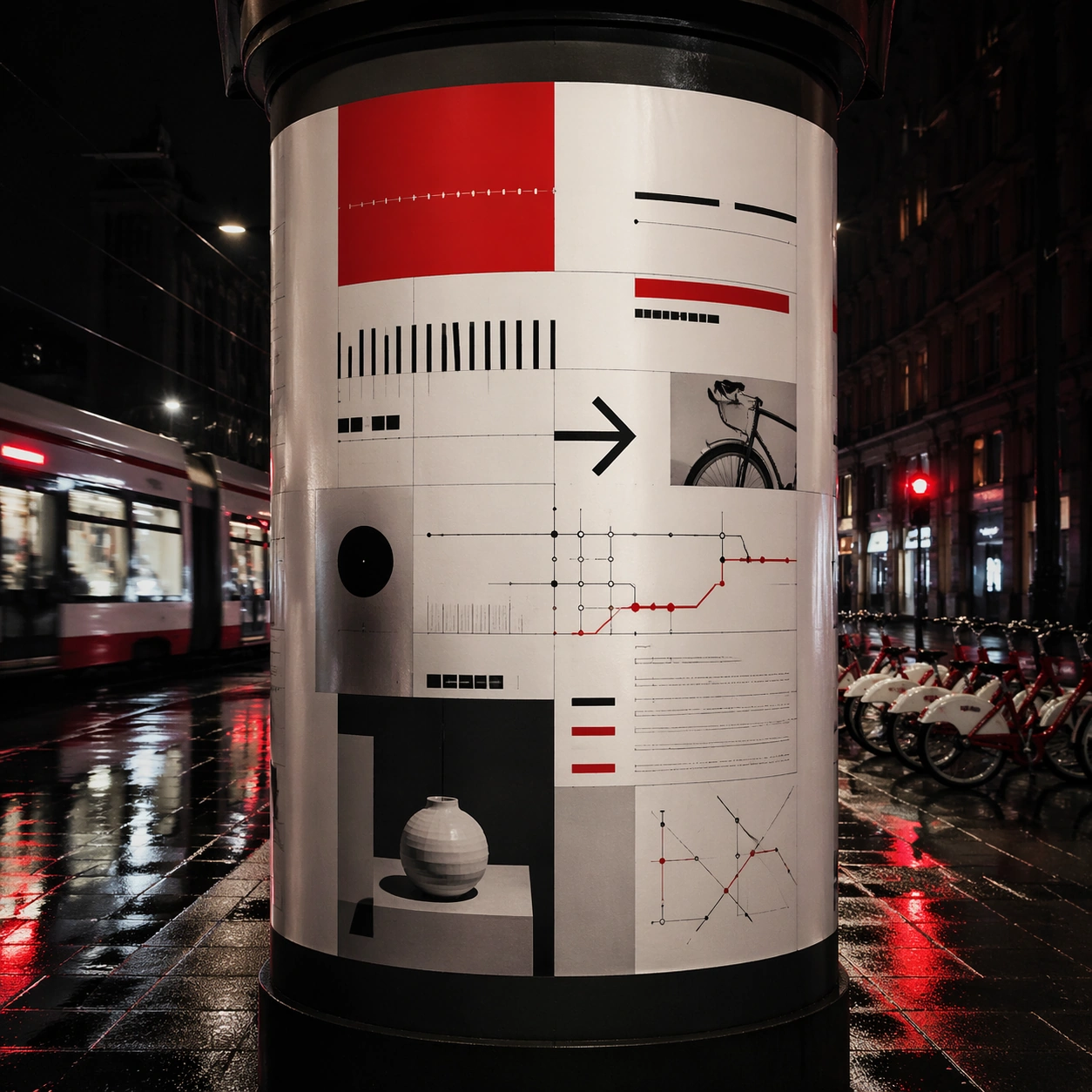
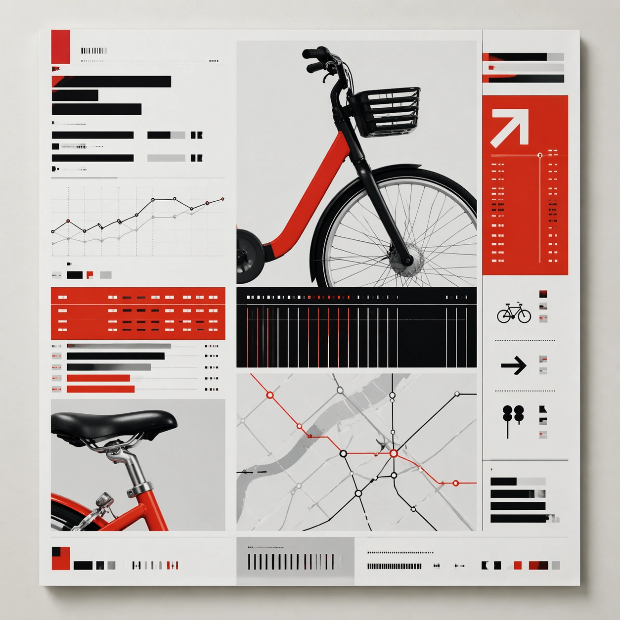
Example generated from “Symmetric Hdr Architecture — Low-Light Atlas”
GPT Image 2en

Scene: A square photographic image with intentional lens choice, coherent light, and a subject that feels observed rather than merely decorated. Build the frame around a dusk, night, or low-light frame with disciplined exposure. Keep the lighting, camera distance, and spatial organization tuned for a high-signal research image rather than a casual snapshot. The image belongs to the Symmetric HDR Architecture theme and should feel immediately legible as a prompt atlas theme for symmetric hdr architecture, testing photorealism, world-knowledge, optical-illusion-geometry, commercial-mockup with gpt image 2.. Subject: Center the study on a dusk, night, or low-light frame with disciplined exposure. Translate the theme into a concrete visual statement instead of an abstract mood board: the viewer should understand what kind of image this is, what is being tested, and why the composition is difficult. Use the slug idea of symmetric hdr architecture as a literal guide for subject matter, materials, and staging. If helpful, borrow the broad visual cues suggested by Apple Park, HDR, but keep the result original and specific to this study. Important details: The realism should come from timing, optics, and material response: atmosphere, contrast, depth, motion, and tiny physical cues all need to agree. Preserve a disciplined square composition, clear focal hierarchy, and enough secondary information to make the image feel complete rather than underspecified. The image should look polished, novel, and exhibition-ready, with topic-specific credibility coming from the way surfaces, structure, and visual language reinforce Symmetric HDR Architecture. Avoid generic filler elements that do not serve the main concept. Use case: Symmetric HDR Architecture single study 5/8, testing photorealism, world-knowledge, optical-illusion-geometry, commercial-mockup through the low-light atlas variation. Constraints: No readable text, no watermark, no logos, preserve exact 1:1 aspect ratio, no watermark, no cheap HDR excess, no unreadable signage, no fake stock-photo posing, no compositing seams, no arbitrary lens flare.

Example generated from “Symmetric Hdr Architecture — Specimen Table”
GPT Image 2en

Scene: A square photographic image with intentional lens choice, coherent light, and a subject that feels observed rather than merely decorated. Build the frame around a carefully arranged or comparative frame that still feels photographic. Keep the lighting, camera distance, and spatial organization tuned for a high-signal research image rather than a casual snapshot. The image belongs to the Symmetric HDR Architecture theme and should feel immediately legible as a prompt atlas theme for symmetric hdr architecture, testing photorealism, world-knowledge, optical-illusion-geometry, commercial-mockup with gpt image 2.. Subject: Center the study on a carefully arranged or comparative frame that still feels photographic. Translate the theme into a concrete visual statement instead of an abstract mood board: the viewer should understand what kind of image this is, what is being tested, and why the composition is difficult. Use the slug idea of symmetric hdr architecture as a literal guide for subject matter, materials, and staging. If helpful, borrow the broad visual cues suggested by Apple Park, HDR, but keep the result original and specific to this study. Important details: The realism should come from timing, optics, and material response: atmosphere, contrast, depth, motion, and tiny physical cues all need to agree. Preserve a disciplined square composition, clear focal hierarchy, and enough secondary information to make the image feel complete rather than underspecified. The image should look polished, novel, and exhibition-ready, with topic-specific credibility coming from the way surfaces, structure, and visual language reinforce Symmetric HDR Architecture. Avoid generic filler elements that do not serve the main concept. Use case: Symmetric HDR Architecture single study 6/8, testing photorealism, world-knowledge, optical-illusion-geometry, commercial-mockup through the specimen table variation. Constraints: No readable text, no watermark, no logos, preserve exact 1:1 aspect ratio, no watermark, no cheap HDR excess, no unreadable signage, no fake stock-photo posing, no compositing seams, no arbitrary lens flare.

Example generated from “Symmetric Hdr Architecture — Atmospheric View”
GPT Image 2en

Scene: A square photographic image with intentional lens choice, coherent light, and a subject that feels observed rather than merely decorated. Build the frame around weather, haze, or volumetric light used to deepen realism. Keep the lighting, camera distance, and spatial organization tuned for a high-signal research image rather than a casual snapshot. The image belongs to the Symmetric HDR Architecture theme and should feel immediately legible as a prompt atlas theme for symmetric hdr architecture, testing photorealism, world-knowledge, optical-illusion-geometry, commercial-mockup with gpt image 2.. Subject: Center the study on weather, haze, or volumetric light used to deepen realism. Translate the theme into a concrete visual statement instead of an abstract mood board: the viewer should understand what kind of image this is, what is being tested, and why the composition is difficult. Use the slug idea of symmetric hdr architecture as a literal guide for subject matter, materials, and staging. If helpful, borrow the broad visual cues suggested by Apple Park, HDR, but keep the result original and specific to this study. Important details: The realism should come from timing, optics, and material response: atmosphere, contrast, depth, motion, and tiny physical cues all need to agree. Preserve a disciplined square composition, clear focal hierarchy, and enough secondary information to make the image feel complete rather than underspecified. The image should look polished, novel, and exhibition-ready, with topic-specific credibility coming from the way surfaces, structure, and visual language reinforce Symmetric HDR Architecture. Avoid generic filler elements that do not serve the main concept. Use case: Symmetric HDR Architecture single study 7/8, testing photorealism, world-knowledge, optical-illusion-geometry, commercial-mockup through the atmospheric view variation. Constraints: No readable text, no watermark, no logos, preserve exact 1:1 aspect ratio, no watermark, no cheap HDR excess, no unreadable signage, no fake stock-photo posing, no compositing seams, no arbitrary lens flare.

Example generated from “Symmetric Hdr Architecture — Signature Frame”
GPT Image 2en

Scene: A square photographic image with intentional lens choice, coherent light, and a subject that feels observed rather than merely decorated. Build the frame around the most memorable final image for the topic. Keep the lighting, camera distance, and spatial organization tuned for a high-signal research image rather than a casual snapshot. The image belongs to the Symmetric HDR Architecture theme and should feel immediately legible as a prompt atlas theme for symmetric hdr architecture, testing photorealism, world-knowledge, optical-illusion-geometry, commercial-mockup with gpt image 2.. Subject: Center the study on the most memorable final image for the topic. Translate the theme into a concrete visual statement instead of an abstract mood board: the viewer should understand what kind of image this is, what is being tested, and why the composition is difficult. Use the slug idea of symmetric hdr architecture as a literal guide for subject matter, materials, and staging. If helpful, borrow the broad visual cues suggested by Apple Park, HDR, but keep the result original and specific to this study. Important details: The realism should come from timing, optics, and material response: atmosphere, contrast, depth, motion, and tiny physical cues all need to agree. Preserve a disciplined square composition, clear focal hierarchy, and enough secondary information to make the image feel complete rather than underspecified. The image should look polished, novel, and exhibition-ready, with topic-specific credibility coming from the way surfaces, structure, and visual language reinforce Symmetric HDR Architecture. Avoid generic filler elements that do not serve the main concept. Use case: Symmetric HDR Architecture single study 8/8, testing photorealism, world-knowledge, optical-illusion-geometry, commercial-mockup through the signature frame variation. Constraints: No readable text, no watermark, no logos, preserve exact 1:1 aspect ratio, no watermark, no cheap HDR excess, no unreadable signage, no fake stock-photo posing, no compositing seams, no arbitrary lens flare.

Example generated from “Symmetrical Pastel Dollhouse Cinematography — Hotel Lobby Portrait”
GPT Image 2en

Scene: A square cinematic frame built with absolute left-right symmetry and a straight-on camera at human height. The palette is powder pink, mint, butter yellow, pale blue, and faded coral, with soft daylight and a miniature dollhouse clarity. The architecture should feel handcrafted, tidy, slightly theatrical, and emotionally precise rather than casual or naturalistic. Stage the action in a narrow boutique hotel lobby with a reception desk centered beneath a brass key cabinet, matching potted plants at both edges, and a powder-blue carpet that divides the composition like a ruler line. Subject: Place one or two front-facing figures exactly on the central axis, with costumes, props, and furnishings arranged like curated museum pieces. The people should feel composed and deadpan, never candid, and the room must read as a cutaway stage set where every shelf, lamp, chair, and curtain participates in the symmetry. A young concierge in a pastel blazer stands perfectly still facing the lens, while a guest with a tiny suitcase mirrors the posture on the opposite side of the frame. Important details: The signature rules are central balance, flat frontal staging, pastel temperature control, crisp prop spacing, and a charming handmade scale. Preserve clean rectangles, color-coded rooms, disciplined eye-line, and the sense that the camera is respectfully observing an invented world. Avoid messy realism, loose camera motion, asymmetrical clutter, and dramatic lens distortion. The visual pleasure should come from the measured spacing of bell, lamp, umbrella stand, and framed wall ornaments, all aligned with almost obsessive care. Use case: Symmetrical Pastel Dollhouse Cinematography single study 1/9. Constraints: No readable text, no watermark, no logos, preserve exact 1:1 aspect ratio, no dutch angle, no chaotic crowd, no gritty grime, no harsh neon, no visible brand packaging, no broken anatomy, no low-detail background, no accidental text fragments.