PROMPTS · EXPLORACIÓN CREATIVA

Galería de prompts

Explora prompts reales y ejemplos generados. Encuentra inspiración para tu próxima misión creativa y copia gratis el prompt completo.

Ejemplos
6,699
Modelos
9
Fuentes
67
6699 ejemplos de prompts · página 13 de 140
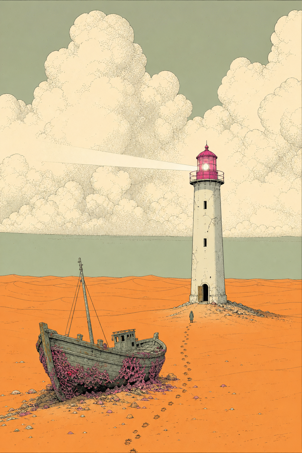
Example generated from “Surreal Desert Lighthouse Comics Concept — Shuryne · MIT”
GPT Image 2en

A lighthouse standing alone in an endless orange dune field, its lamp still turning and casting a visible beam across the sand. There is no sea anywhere. A wooden fishing boat lies beached at the tower's foot, its hull encrusted with pink coral, and a line of footprints leads from the boat to the open tower door. Drawn in the European bande dessinee tradition of Moebius: fine confident ink contour lines over flat matte color fields with no rendering or gradients, on a dusty sage and bone ground, with hot magenta and cadmium orange used sparingly as the only saturated accents. Enormous softly stippled cumulus fills the upper half of the frame. A tiny lone figure gives the scale. Clear, still, sun-bleached, retro-futurist.

Example generated from “Tea with a Giant Machine Comics Concept — Shuryne · MIT”
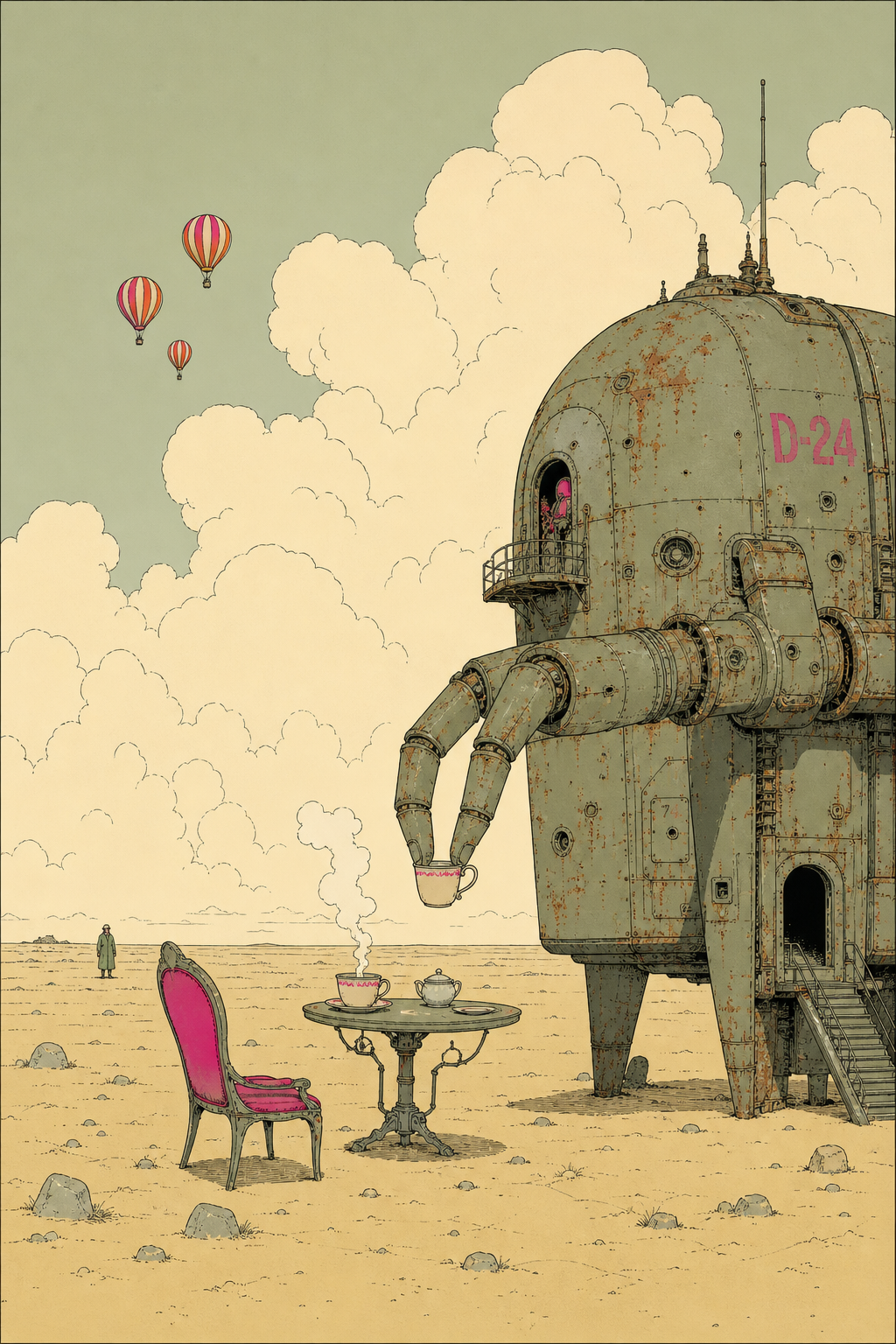
GPT Image 2en

A small table set for tea on an empty ochre plain. One cup steams; opposite it sits a vast rusted machine the size of a house, delicately pinching the handle of the second cup between two enormous fingers. The chair on the near side is empty and pushed back. Three striped balloons descend slowly in the far distance. Drawn in the European bande dessinee tradition of Moebius: fine confident ink contour lines over flat matte color fields with no rendering or gradients, on a dusty sage and bone ground, with hot magenta and cadmium orange used sparingly as the only saturated accents. Enormous softly stippled cumulus fills the upper half of the frame. A tiny lone figure gives the scale. Clear, still, sun-bleached, retro-futurist.

Example generated from “Lemons and Pewter Jug Oil-Style Still Life — Shuryne · MIT”
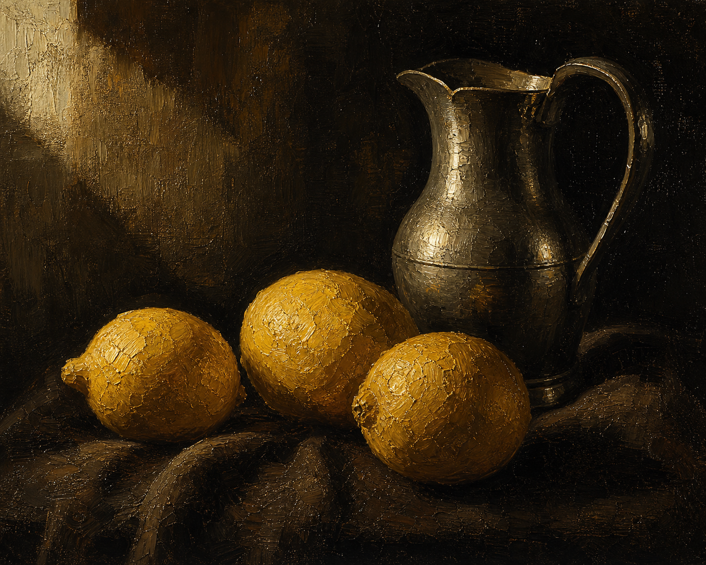
GPT Image 2en

An oil painting still life of three lemons and a pewter jug on a dark draped cloth, lit by a single window light from the upper left. Thick impasto highlights on the fruit skin, glazed transparent shadows, warm ochre and deep umber palette against near-black background. Visible brushwork and palette-knife texture, Old Master chiaroscuro, canvas weave showing through thin passages, rich varnished depth.

Example generated from “Overgrown Greenhouse Piano Novel Illustration — Shuryne · MIT”
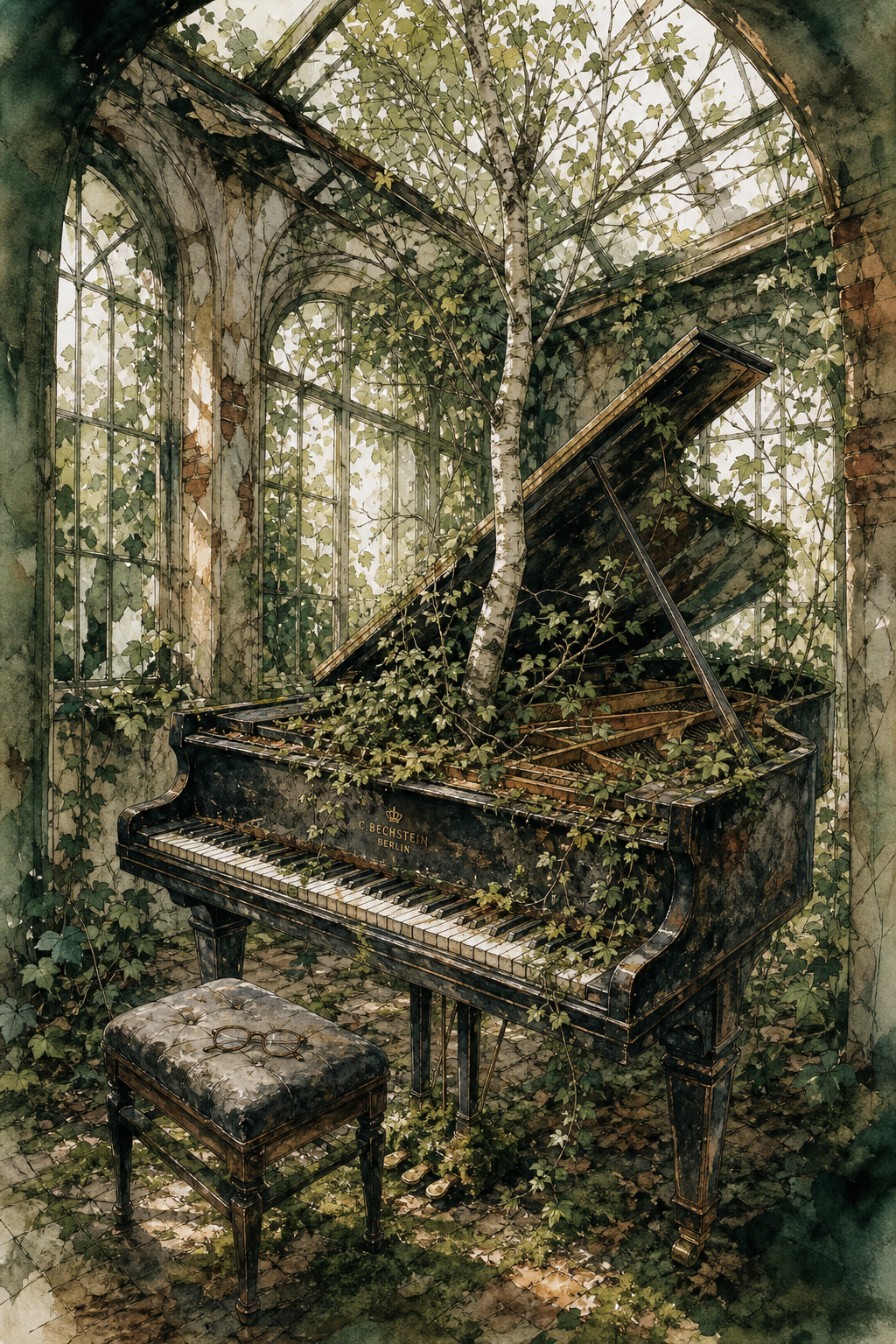
GPT Image 2en

A watercolor and pen-and-ink illustration plate from a novel, showing a grand piano abandoned in a derelict glasshouse. Ivy has grown through the broken panes and into the open lid, wrapping the strings; moss cushions the pedals and a young birch has rooted through the soundboard. A pair of reading glasses rests folded on the piano stool, clean and unweathered. Fine confident ink linework over loose granulating washes in sage, rust and bottle green, with the pigment allowed to pool and backrun at the edges. Shafts of dusty light fall through the ruined roof.

Example generated from “Unfinished Radio Log Novel-Cover Concept — Shuryne · MIT”
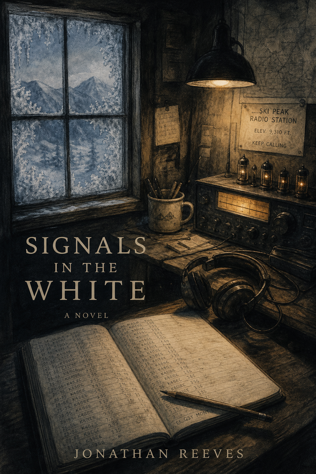
GPT Image 2en

A charcoal drawing with pale watercolor wash, composed like a book cover, showing the interior of a remote mountain radio station in winter. Frost has crept up the inside of the window. On the desk an open logbook is filled with hundreds of neat handwritten signal entries, and the last line breaks off mid-word with the pencil still lying across it. The headphones are off the hook and the valve set glows faintly. Compressed charcoal for the deep blacks, smudged with the hand, over thin washes of grey-blue and ochre. One warm lamp against a snow-blue window.

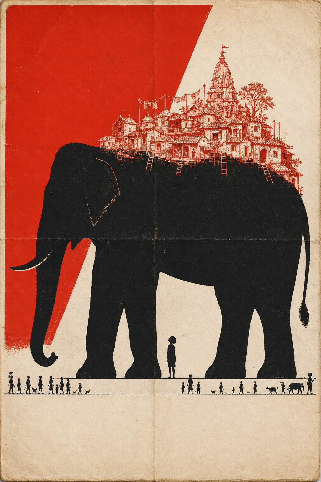
Example generated from “Elephant Carrying a Village Poster Concept — Shuryne · MIT”
GPT Image 2en

An immense elephant filling the sheet as a flat black silhouette, standing perfectly still. Between its front legs a very small child stands looking straight up. Drawn in fine red line across the elephant's back is an entire village — houses, ladders, washing lines, a temple — as though it has always been carried there. A two-color screenprinted poster using only vermilion red, dense black and paper white — no other hue, no gradients. A large flat red field dominates, the main subject reads as a bold black silhouette, and the secondary scene is drawn in fine red hatched linework. A row of very small silhouetted figures runs along the bottom edge to set the scale. Visible fold creases and slight paper aging. Generous negative space, clear empty band at the foot of the sheet where type would sit, and no legible text anywhere.

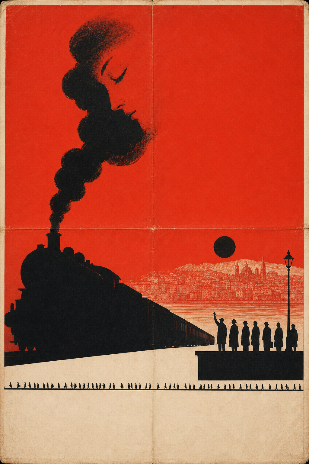
Example generated from “Last Train Smoke-Face Poster Concept — Shuryne · MIT”
GPT Image 2en

A long train leaving the frame as a single unbroken black silhouette, its smoke curling into a shape that resembles a sleeping face. On the platform a row of tiny silhouetted figures stands still; only one of them has an arm raised. The distant city is drawn in fine red hatching, and a solid black sun hangs low above it. A two-color screenprinted poster using only vermilion red, dense black and paper white — no other hue, no gradients. A large flat red field dominates, the main subject reads as a bold black silhouette, and the secondary scene is drawn in fine red hatched linework. A row of very small silhouetted figures runs along the bottom edge to set the scale. Visible fold creases and slight paper aging. Generous negative space, clear empty band at the foot of the sheet where type would sit, and no legible text anywhere.

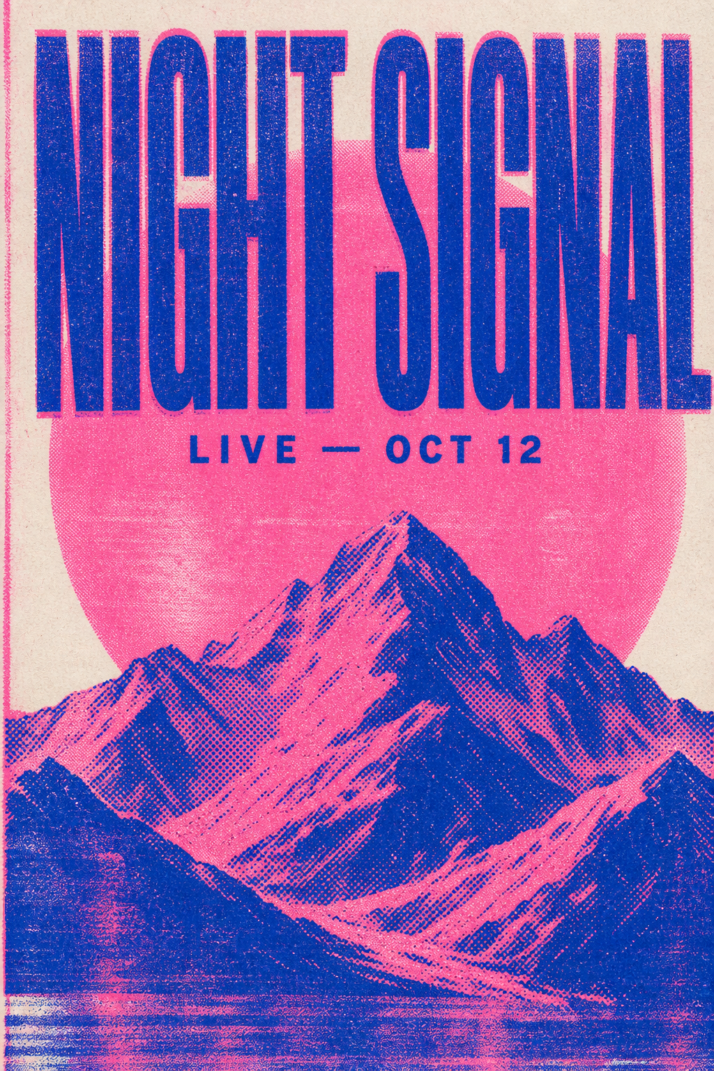
Example generated from “Night Signal Riso Concert-Poster Concept — Shuryne · MIT”
GPT Image 2en

A risograph-printed concert poster. Large condensed sans-serif type reads "NIGHT SIGNAL" across the upper third, with smaller text below reading "LIVE — OCT 12". Behind the type, an abstract halftone mountain range and a large circle. Two-color riso printing in fluorescent pink and blue only, visible ink misregistration, coarse halftone dot texture, uneven ink coverage and roller streaks, matte uncoated paper stock, bold flat graphic composition.

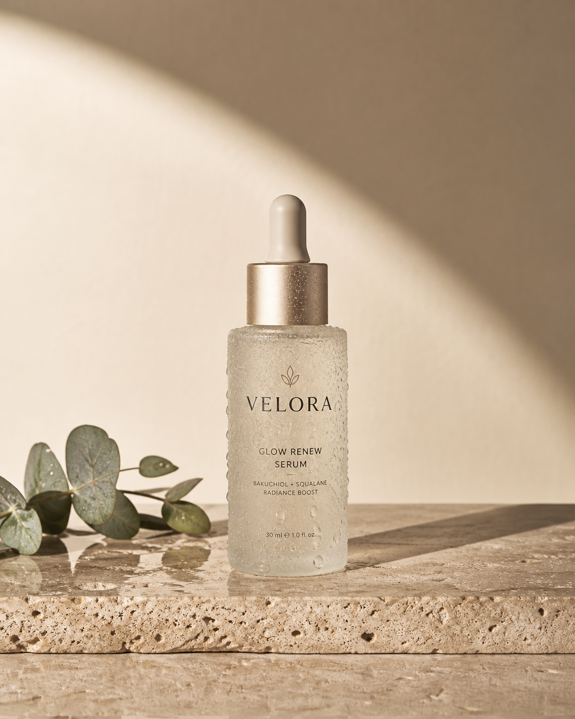
Example generated from “Frosted Serum Bottle Studio Product Concept — Shuryne · MIT”
GPT Image 2en

A frosted glass skincare serum bottle standing on a wet travertine slab, seen straight-on at eye level. Behind it, a single arc of soft morning light rakes across a warm sand-colored backdrop, casting one long clean shadow to the right. Droplets of condensation cling to the glass; the dropper cap is matte champagne metal. Minimal studio product photography, 100mm macro, f/8, crisp specular highlights, muted beige and sage palette, generous negative space at top.

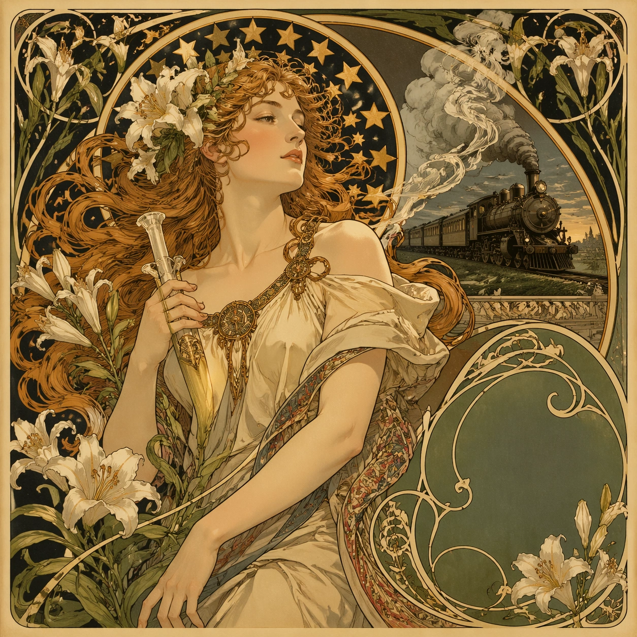
Example generated from “Art Nouveau Railway Poster Study — ChaosRealmsAI · MIT”
GPT Image 2en

Scene: A square 1:1 composition designed as a premium Art Nouveau Poster study. Design the frame like a high-end editorial image, with strong hierarchy, controlled cropping, and a composed pace between large shapes and small accents. Use lighting, color, and spatial staging that make the core idea legible in one glance while still rewarding close inspection. The frame should feel display-ready rather than like a rough concept sheet, with balanced brightness, deliberate negative space, and clear separation of foreground, midground, and background layers. Subject: Interpret Art Nouveau Poster through 新艺术运动 · 19 世纪末. Draw from this visual direction: Alphonse Mucha 风 · 飘发女子 + 星形光环 + 百合藤蔓 + 书法 typography · 广告海报(香槟 / 火车 / 烟草). Focus on an interpretation aimed at editorial clarity, symbolism, and immediate readability. Build a primary focal subject, secondary support forms, and a coherent environmental envelope so the scene feels complete and specific. Treat this as an independent study with no continuity requirement beyond the shared theme language. Important details: Carry forward the theme's distinguishing value: 装饰艺术巅峰 · 石版印刷工艺黄金年代 · 现代品牌高级感挪用. Reflect the tested capabilities through visible decisions related to text-rendering, structured-layout, style-transfer, commercial-mockup. 更强图中文字渲染与版式跟随;复杂结构化视觉和多面板构图能力. Aim for these acceptance cues: 一眼能看出这是高难度炫技主题,不像普通模板图; 核心创意和画面结构无需解释即可成立. Keep the image controlled, elegant, and intentionally composed, with no accidental filler elements. Use case: Art Nouveau Poster single study 1/8, exploring the topic as an independent editorial composition. Constraints: No readable text, no watermark, no logos, preserve exact 1:1 aspect ratio, no muddy focal point, no duplicate main subject, no collage seams, no broken margin geometry, no accidental extra text blocks.

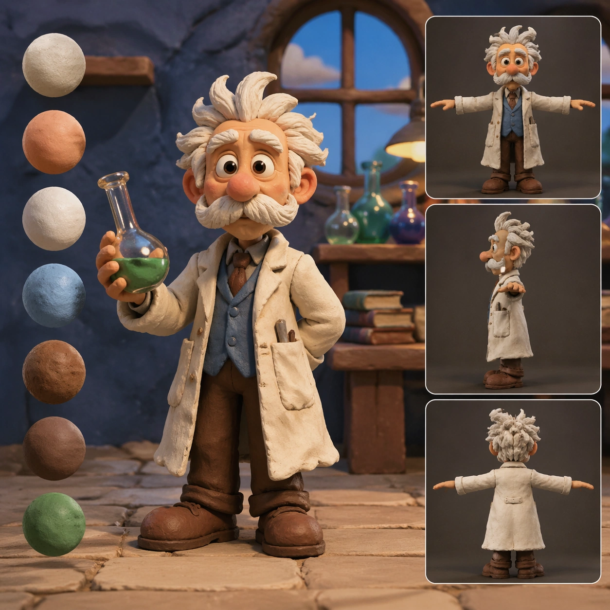
Example generated from “Clay Professor Character and Material Study — ChaosRealmsAI · MIT”
GPT Image 2en

Scene: A square CGI or design-visualization frame with calibrated lighting, intentional composition, and premium material rendering. Build the frame around a flagship render that establishes form, stance, and material identity. Keep the lighting, camera distance, and spatial organization tuned for a high-signal research image rather than a casual snapshot. The image belongs to the Claymation Style theme and should feel immediately legible as a prompt atlas theme for claymation style, testing multi-image-reference, physics-materials, style-transfer with gpt image 2.. Subject: Center the study on a flagship render that establishes form, stance, and material identity. Translate the theme into a concrete visual statement instead of an abstract mood board: the viewer should understand what kind of image this is, what is being tested, and why the composition is difficult. Use the slug idea of claymation style as a literal guide for subject matter, materials, and staging. If helpful, borrow the broad visual cues suggested by stop motion, but keep the result original and specific to this study. Important details: The model must feel engineered or art-directed rather than merely stylized: edges, seams, translucency, reflections, and scale cues should all hold up. Preserve a disciplined square composition, clear focal hierarchy, and enough secondary information to make the image feel complete rather than underspecified. The image should look polished, novel, and exhibition-ready, with topic-specific credibility coming from the way surfaces, structure, and visual language reinforce Claymation Style. Avoid generic filler elements that do not serve the main concept. Use case: Claymation Style single study 1/8, testing multi-image-reference, physics-materials, style-transfer through the hero model variation. Constraints: No readable text, no watermark, no logos, preserve exact 1:1 aspect ratio, no real brand logos, no low-poly shortcuts, no broken reflections, no muddy materials, no generic showroom clutter, no unreadable UI overlays.

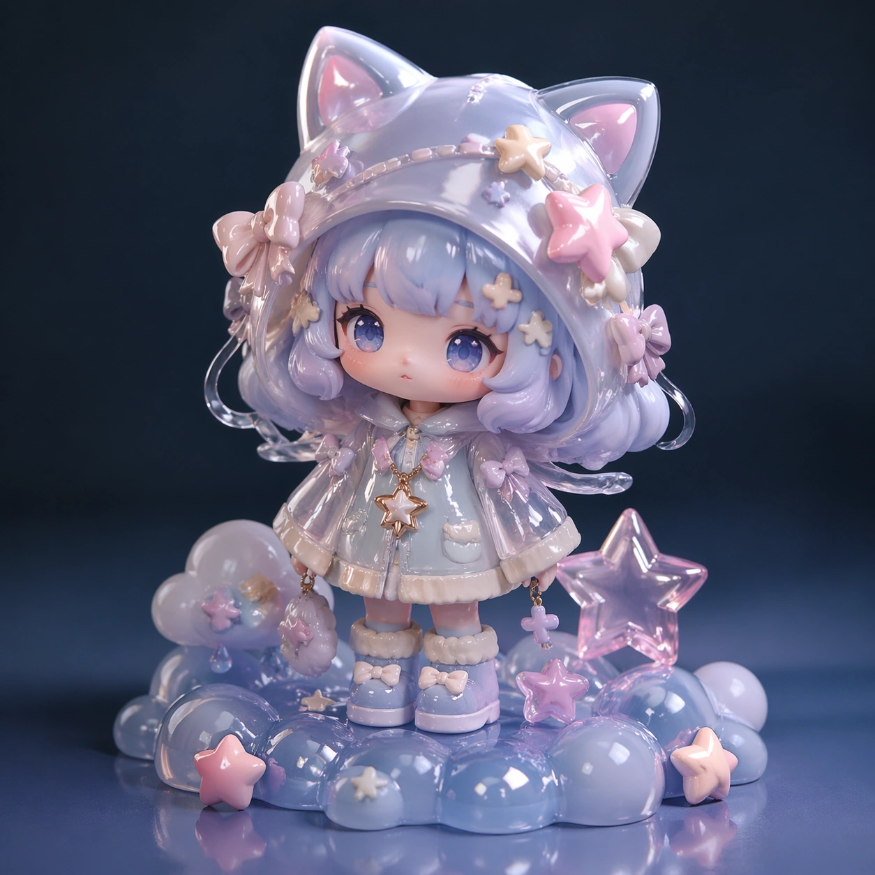
Example generated from “Pastel Cat-Eared Collectible Figurine Concept — ChaosRealmsAI · MIT”
GPT Image 2en

Scene: A square CGI or design-visualization frame with calibrated lighting, intentional composition, and premium material rendering. Build the frame around a flagship render that establishes form, stance, and material identity. Keep the lighting, camera distance, and spatial organization tuned for a high-signal research image rather than a casual snapshot. The image belongs to the Cute Blind Box Figurine theme and should feel immediately legible as a prompt atlas theme for cute blind box figurine, testing physics-materials, style-transfer with gpt image 2.. Subject: Center the study on a flagship render that establishes form, stance, and material identity. Translate the theme into a concrete visual statement instead of an abstract mood board: the viewer should understand what kind of image this is, what is being tested, and why the composition is difficult. Use the slug idea of cute blind box figurine as a literal guide for subject matter, materials, and staging. If helpful, borrow the broad visual cues suggested by POP MART, PVC, studio, but keep the result original and specific to this study. Important details: The model must feel engineered or art-directed rather than merely stylized: edges, seams, translucency, reflections, and scale cues should all hold up. Preserve a disciplined square composition, clear focal hierarchy, and enough secondary information to make the image feel complete rather than underspecified. The image should look polished, novel, and exhibition-ready, with topic-specific credibility coming from the way surfaces, structure, and visual language reinforce Cute Blind Box Figurine. Avoid generic filler elements that do not serve the main concept. Use case: Cute Blind Box Figurine single study 1/8, testing physics-materials, style-transfer through the hero model variation. Constraints: No readable text, no watermark, no logos, preserve exact 1:1 aspect ratio, no real brand logos, no low-poly shortcuts, no broken reflections, no muddy materials, no generic showroom clutter, no unreadable UI overlays.

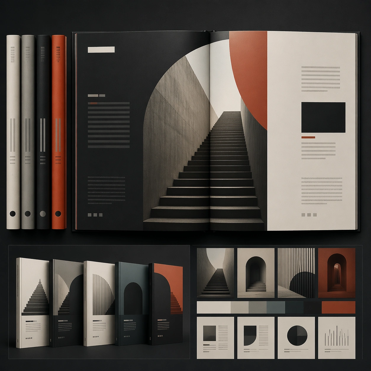
Example generated from “Architectural Book-Series Spread Mockup — ChaosRealmsAI · MIT”
GPT Image 2en

Scene: A square editorial or interface layout study with exact margins, confident grid structure, and premium print or screen presentation. Build the frame around a primary spread or headline surface with immediate hierarchy. Keep the lighting, camera distance, and spatial organization tuned for a high-signal research image rather than a casual snapshot. The image belongs to the Book Series Design theme and should feel immediately legible as a prompt atlas theme for book series design, testing text-rendering, structured-layout, style-transfer, commercial-mockup with gpt image 2.. Subject: Center the study on a primary spread or headline surface with immediate hierarchy. Translate the theme into a concrete visual statement instead of an abstract mood board: the viewer should understand what kind of image this is, what is being tested, and why the composition is difficult. Use the slug idea of book series design as a literal guide for subject matter, materials, and staging. Important details: Typography fields must stay unreadable, but hierarchy, rhythm, and page architecture should feel convincing enough for design review. Preserve a disciplined square composition, clear focal hierarchy, and enough secondary information to make the image feel complete rather than underspecified. The image should look polished, novel, and exhibition-ready, with topic-specific credibility coming from the way surfaces, structure, and visual language reinforce Book Series Design. Avoid generic filler elements that do not serve the main concept. Use case: Book Series Design single study 1/8, testing text-rendering, structured-layout, style-transfer, commercial-mockup through the hero spread variation. Constraints: No readable text, no watermark, no logos, preserve exact 1:1 aspect ratio, no readable text, no logo lockups from real brands, no broken grid, no arbitrary poster clutter, no malformed columns, no accidental lorem ipsum.

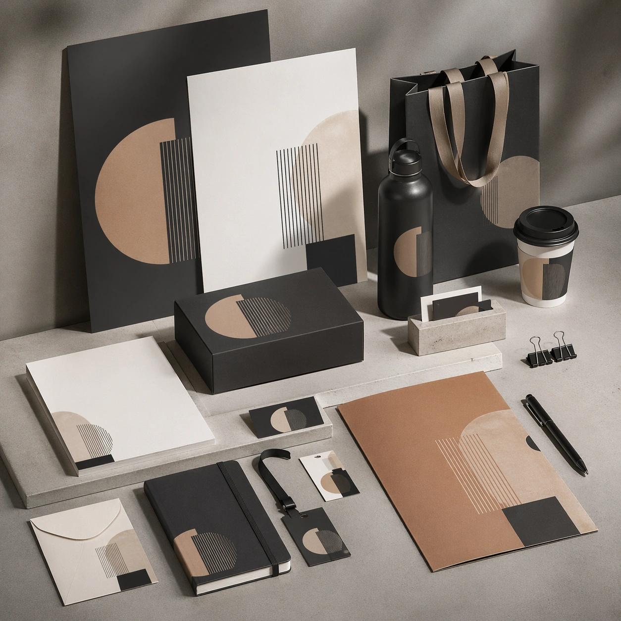
Example generated from “Monochrome Stationery Brand-System Mockup — ChaosRealmsAI · MIT”
GPT Image 2en

Scene: A square commercial presentation with realistic materials, clean staging, and believable product photography or retail lighting. Build the frame around a flagship hero setup that sells the overall system immediately. Keep the lighting, camera distance, and spatial organization tuned for a high-signal research image rather than a casual snapshot. The image belongs to the Brand Identity Mockup Set theme and should feel immediately legible as a prompt atlas theme for brand identity mockup set, testing text-rendering, structured-layout, commercial-mockup with gpt image 2.. Subject: Center the study on a flagship hero setup that sells the overall system immediately. Translate the theme into a concrete visual statement instead of an abstract mood board: the viewer should understand what kind of image this is, what is being tested, and why the composition is difficult. Use the slug idea of brand identity mockup set as a literal guide for subject matter, materials, and staging. If helpful, borrow the broad visual cues suggested by logo, but keep the result original and specific to this study. Important details: The mockup should feel saleable and design-ready: sharp edges, controlled reflections, credible paper or plastic behavior, and precise placement. Preserve a disciplined square composition, clear focal hierarchy, and enough secondary information to make the image feel complete rather than underspecified. The image should look polished, novel, and exhibition-ready, with topic-specific credibility coming from the way surfaces, structure, and visual language reinforce Brand Identity Mockup Set. Avoid generic filler elements that do not serve the main concept. Use case: Brand Identity Mockup Set single study 1/8, testing text-rendering, structured-layout, commercial-mockup through the hero mockup variation. Constraints: No readable text, no watermark, no logos, preserve exact 1:1 aspect ratio, no real brand names, no cheap stock-photo styling, no broken perspective, no watermark, no accidental readable packaging copy, no cluttered retail shelf unless intended.

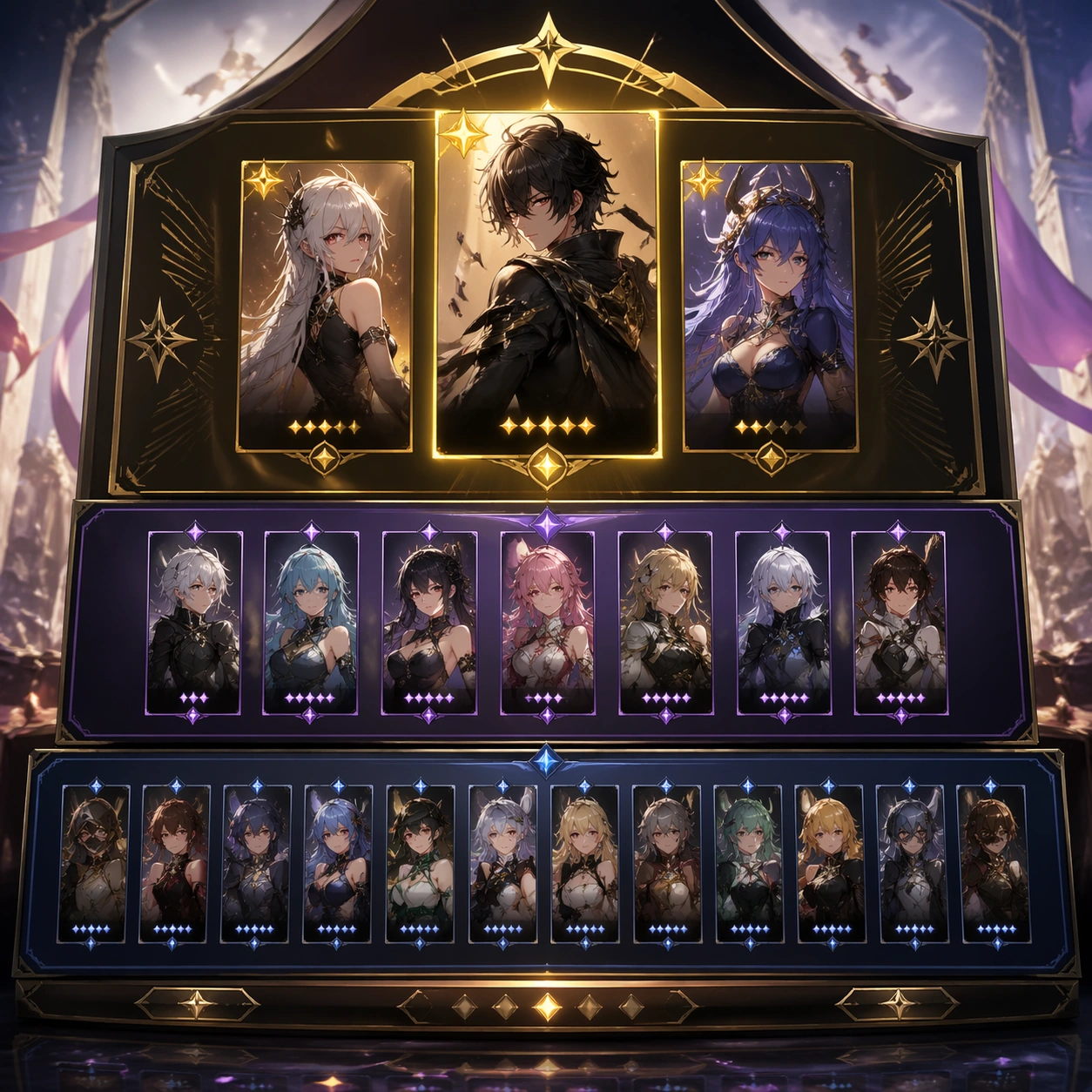
Example generated from “Fantasy Character-Roster Event Board — ChaosRealmsAI · MIT”
GPT Image 2en

Scene: A square production-ready image designed for a game-art review wall and a commercial gallery at the same time. Frame a lineup board arranging featured, supporting, and lower-rarity pool units into one polished event surface with disciplined lighting, clean edge separation, and enough surrounding context to prove how the asset would behave in a real product surface. The camera, crop, and tonal balance should feel intentional rather than generic, with high readability at first glance and convincing material response under closer inspection. Subject: Center the study on a lineup board arranging featured, supporting, and lower-rarity pool units into one polished event surface. Translate the topic into a concrete, shippable visual statement instead of a loose mood board. Build layered object relationships, believable surface finish, and strong silhouette grouping so the image reads immediately as part of Character Banner Gacha Pool Visuals. The subject should feel made for a live game pipeline: useful in store, UI, campaign, or art-review contexts, with visual hierarchy strong enough to survive aggressive cropping. Important details: hierarchy and desirability should be obvious even with abstract unreadable labels. Keep every supporting element subordinate to the main read, and make category separation obvious through form, color zoning, depth, and material logic rather than words. Where panels, cards, badges, or interface blocks appear, they must look professionally structured but remain unreadable. The visual language should feel premium, original, and coherent across this package, with no filler clutter and no accidental resemblance to a specific shipped game IP. Use case: Character Banner Gacha Pool Visuals single study 1/5, focused on pool lineup board. Constraints: No readable text, no watermark, no logos, preserve exact 1:1 aspect ratio, no readable roster names, no rates, no broken hierarchy, no generic stock-photo staging, no accidental UI gibberish.

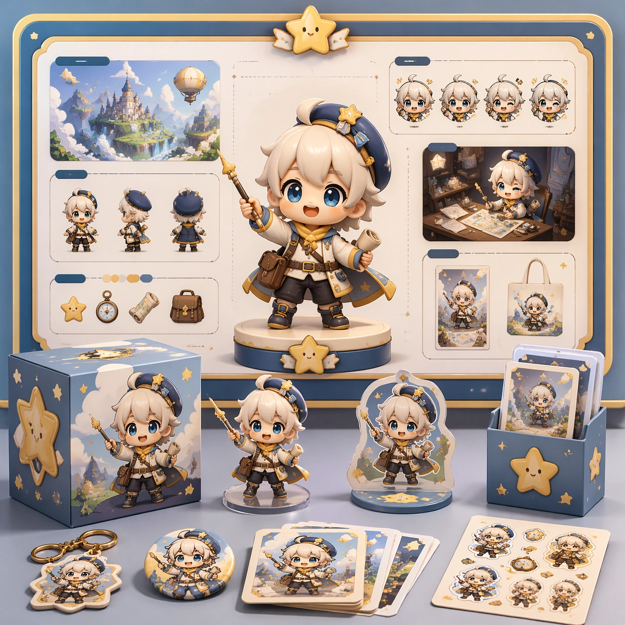
Example generated from “Chibi Mascot Merchandise Campaign Board — ChaosRealmsAI · MIT”
GPT Image 2en

Scene: A square retail-ready campaign visual for Chibi Franchise Campaign Pack, combining cute character appeal with polished commercial presentation. The composition should feel like a high-finish launch board: crisp packaging edges, collectible object staging, clean shelf or poster context, and vivid but controlled color. It should be immediately legible from far away, but still dense with charming small details that reward closer inspection. Subject: Build the image around Explainer Board, a frame that a charming information board that breaks the product or character world into clear visual sections. Translate Convert larger fictional universes into tightly art-directed chibi campaign systems that can span posters, stickers, key visuals, and merch-ready layouts. into one lovable mascot, figure, or product system that feels ready for posters, boxes, stickers, inserts, or point-of-sale material. The result should feel like a fresh research image with clear commercial focus rather than random fan art. The main subject must remain unmistakable even when surrounded by accessories and display pieces. Important details: Charm alone is not enough. Preserve clean silhouette recognition, convincing package construction, reliable prop scale, and structured layout logic so the image feels sellable. This theme studies style-transfer, multi-image-reference, commercial-mockup, structured-layout through a production-ready visual system. Avoid noisy clutter; every secondary element should reinforce collectibility, retail desirability, or explainer clarity. Aim for clear hierarchy, polished craft, and immediately usable campaign logic. Use case: Chibi Franchise Campaign Pack single study 1/5. Constraints: No readable text, no watermark, no logos, preserve exact 1:1 aspect ratio, no horror elements, no brand theft, no malformed packaging edges, no muddy mascot silhouette, no messy retail shelf, no chaotic prop overload.

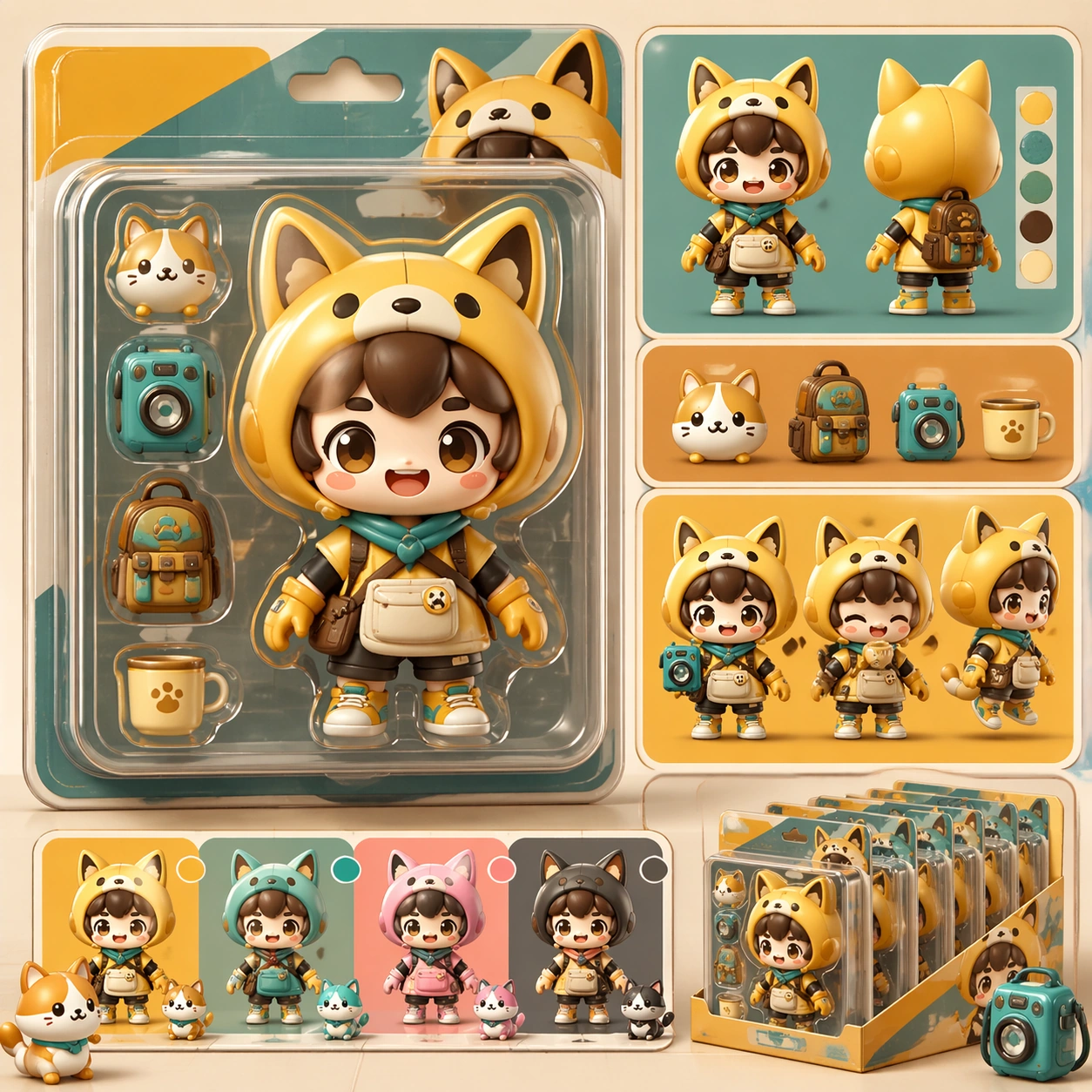
Example generated from “Collectible Figure Blister-Pack Explainer Board — ChaosRealmsAI · MIT”
GPT Image 2en

Scene: A square retail-ready campaign visual for Collector Figure Blister Ads, combining cute character appeal with polished commercial presentation. The composition should feel like a high-finish launch board: crisp packaging edges, collectible object staging, clean shelf or poster context, and vivid but controlled color. It should be immediately legible from far away, but still dense with charming small details that reward closer inspection. Subject: Build the image around Explainer Board, a frame that a charming information board that breaks the product or character world into clear visual sections. Translate Build campaign-ready blister-pack and collector-toy advertisements featuring super-deformed characters, accessories, rarity cues, and retail-style packaging polish. into one lovable mascot, figure, or product system that feels ready for posters, boxes, stickers, inserts, or point-of-sale material. The result should feel like a fresh research image with clear commercial focus rather than random fan art. The main subject must remain unmistakable even when surrounded by accessories and display pieces. Important details: Charm alone is not enough. Preserve clean silhouette recognition, convincing package construction, reliable prop scale, and structured layout logic so the image feels sellable. This theme studies commercial-mockup, style-transfer, structured-layout, photorealism through a production-ready visual system. Avoid noisy clutter; every secondary element should reinforce collectibility, retail desirability, or explainer clarity. Aim for clear hierarchy, polished craft, and immediately usable campaign logic. Use case: Collector Figure Blister Ads single study 1/5. Constraints: No readable text, no watermark, no logos, preserve exact 1:1 aspect ratio, no horror elements, no brand theft, no malformed packaging edges, no muddy mascot silhouette, no messy retail shelf, no chaotic prop overload.

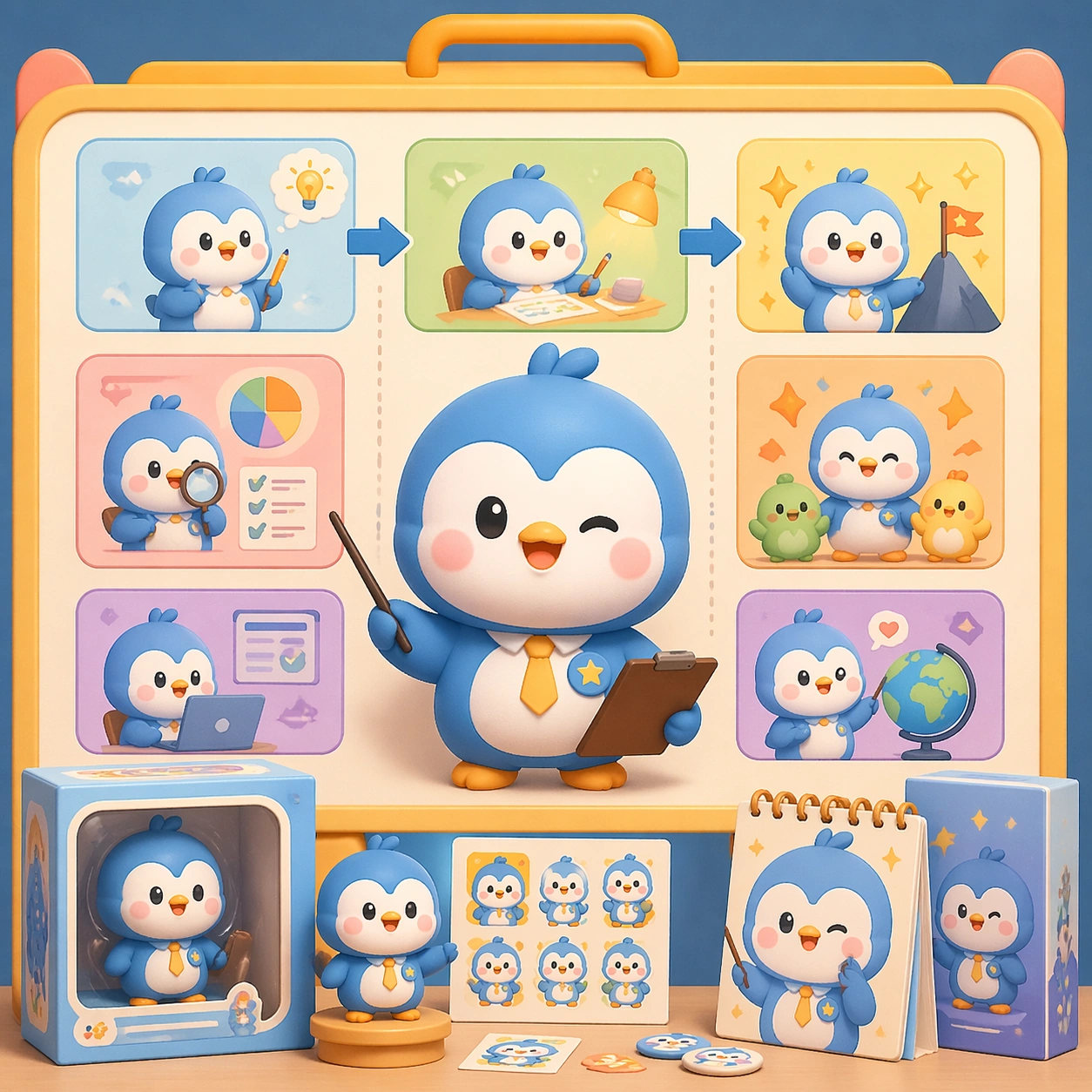
Example generated from “Penguin Mascot Product-Explainer Concept — ChaosRealmsAI · MIT”
GPT Image 2en

Scene: A square retail-ready campaign visual for Cute Product Explainer Poster, combining cute character appeal with polished commercial presentation. The composition should feel like a high-finish launch board: crisp packaging edges, collectible object staging, clean shelf or poster context, and vivid but controlled color. It should be immediately legible from far away, but still dense with charming small details that reward closer inspection. Subject: Build the image around Explainer Board, a frame that a charming information board that breaks the product or character world into clear visual sections. Translate Use chibi or mascot characters to explain complex products, workflows, or features through playful yet commercially clear explainer posters. into one lovable mascot, figure, or product system that feels ready for posters, boxes, stickers, inserts, or point-of-sale material. The result should feel like a fresh research image with clear commercial focus rather than random fan art. The main subject must remain unmistakable even when surrounded by accessories and display pieces. Important details: Charm alone is not enough. Preserve clean silhouette recognition, convincing package construction, reliable prop scale, and structured layout logic so the image feels sellable. This theme studies structured-layout, text-rendering, commercial-mockup, style-transfer through a production-ready visual system. Avoid noisy clutter; every secondary element should reinforce collectibility, retail desirability, or explainer clarity. Aim for clear hierarchy, polished craft, and immediately usable campaign logic. Use case: Cute Product Explainer Poster single study 1/5. Constraints: No readable text, no watermark, no logos, preserve exact 1:1 aspect ratio, no horror elements, no brand theft, no malformed packaging edges, no muddy mascot silhouette, no messy retail shelf, no chaotic prop overload.

Example generated from “Red-and-Blue Esports Faceoff Layout — ChaosRealmsAI · MIT”
GPT Image 2en

Scene: A square production-ready image designed for a game-art review wall and a commercial gallery at the same time. Frame a versus-focused crop that distills the matchday energy into a compact faceoff card with disciplined lighting, clean edge separation, and enough surrounding context to prove how the asset would behave in a real product surface. The camera, crop, and tonal balance should feel intentional rather than generic, with high readability at first glance and convincing material response under closer inspection. Subject: Center the study on a versus-focused crop that distills the matchday energy into a compact faceoff card. Translate the topic into a concrete, shippable visual statement instead of a loose mood board. Build layered object relationships, believable surface finish, and strong silhouette grouping so the image reads immediately as part of Esports Matchday Visual Kit. The subject should feel made for a live game pipeline: useful in store, UI, campaign, or art-review contexts, with visual hierarchy strong enough to survive aggressive cropping. Important details: the structure should feel instantly readable and intense on mobile surfaces. Keep every supporting element subordinate to the main read, and make category separation obvious through form, color zoning, depth, and material logic rather than words. Where panels, cards, badges, or interface blocks appear, they must look professionally structured but remain unreadable. The visual language should feel premium, original, and coherent across this package, with no filler clutter and no accidental resemblance to a specific shipped game IP. Use case: Esports Matchday Visual Kit single study 1/5, focused on versus banner crop. Constraints: No readable text, no watermark, no logos, preserve exact 1:1 aspect ratio, no readable team names, no scores, no broken hierarchy, no generic stock-photo staging, no accidental UI gibberish.

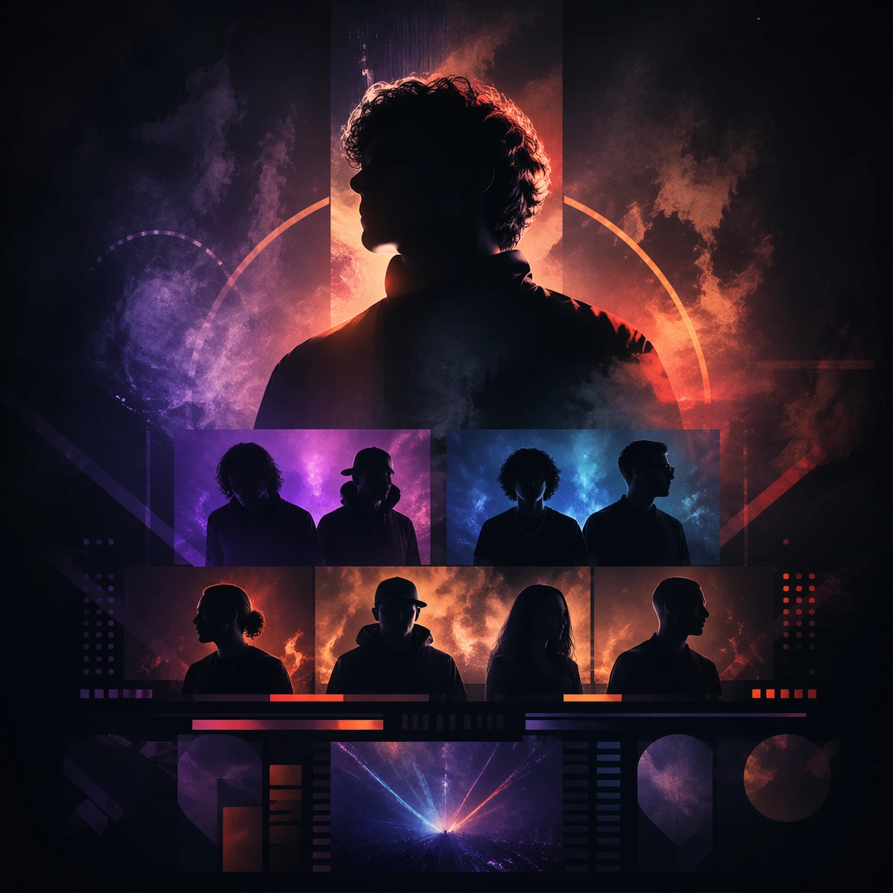
Example generated from “Festival Performer-Silhouette Social Tile — ChaosRealmsAI · MIT”
GPT Image 2en

Scene: A square social tile with a dark atmospheric field, stage-light haze, and a few artist silhouettes arranged in a premium layered composition. The tile should feel native to a festival rollout carousel, balancing clarity and mood in a shareable format. Subject: The subject is a compact performer hierarchy: one larger silhouette or portrait fragment supported by smaller artist bands and modular abstract blocks that imply lineup information. The image must communicate festival energy and curation without displaying readable names. Important details: Use layering, glow, and spacing to achieve a premium festival feel. Keep the tile immediately scannable and socially strong, but do not oversimplify into a generic event card. The silhouette hierarchy and atmospheric depth should carry the message. Use case: Festival Lineup single study 5/9 for the Festival Lineup Poster and Social Kit Prompt Atlas theme. Constraints: No readable text, no watermark, no logos, preserve exact 1:1 aspect ratio, no readable artist names, no sponsor logos, no platform UI, no emoji treatment, no oversized crowd scene

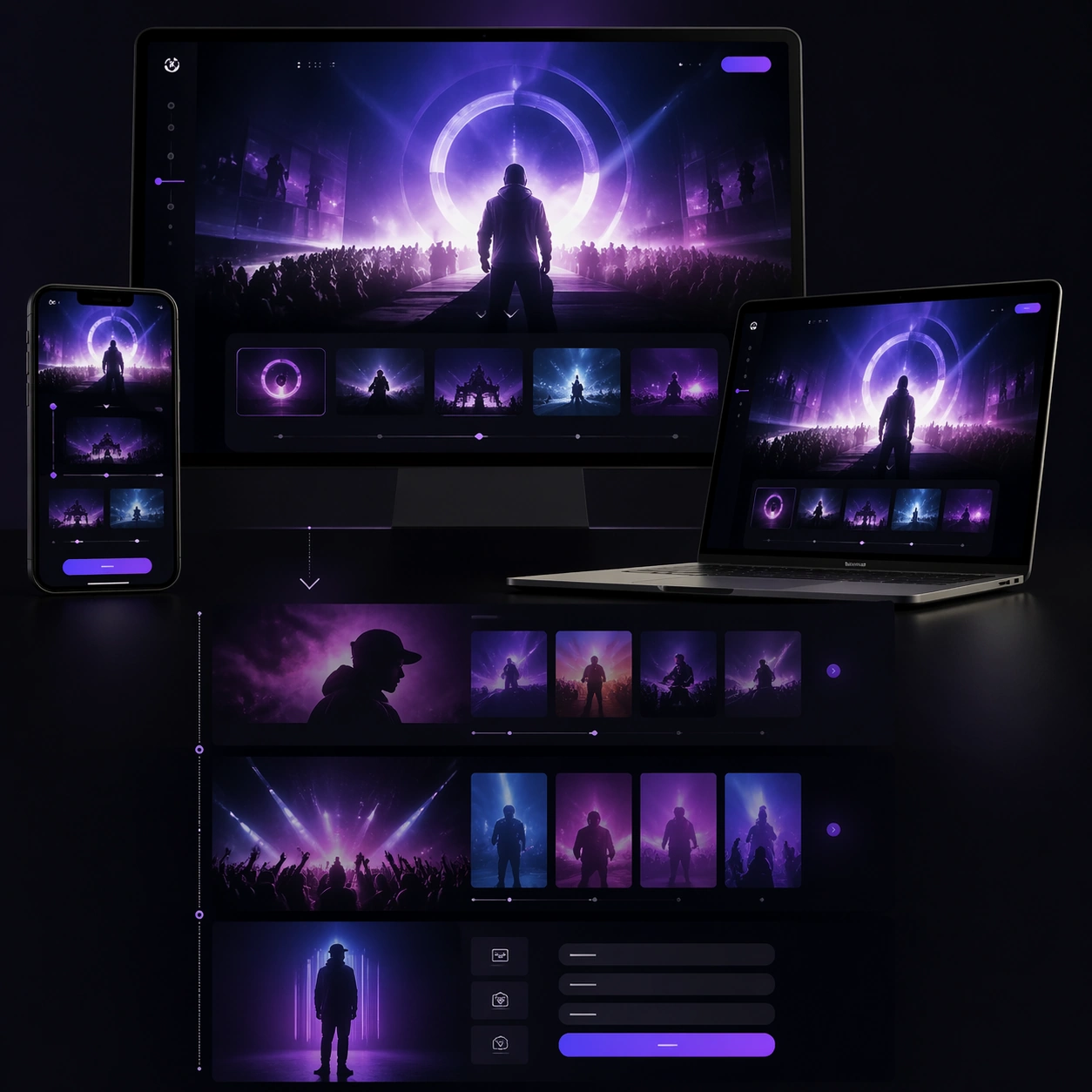
Example generated from “Multi-Device Festival Website Campaign Concept — ChaosRealmsAI · MIT”
GPT Image 2en

Scene: A square premium campaign composition with strong negative space, crisp hierarchy, and a polished presentation surface appropriate for Interactive Web Campaign Mockup. The image should feel like a proposal-ready marketing asset rather than a casual mockup, with deliberate pacing across foreground, midground, and background. Build the frame around 多设备 mockup + 滚动叙事 + 转化区, using lighting, device or media framing, and environment cues that suggest a real rollout system. Reference the spirit of 品牌联名、限定发售、演唱会巡演或电影宣发活动页的多屏宣传网页提案。 while keeping the result original and commercially plausible. Subject: Create a hero-first study with immediate recognition and strong campaign hierarchy. for the Interactive Web Campaign Mockup theme. The central visual system should read immediately, with a clear lead element, credible secondary support, and enough structural discipline to feel ready for a pitch deck, landing page, platform slot, poster wall, or social rollout. Use scale, spacing, and controlled perspective to imply a complete campaign logic instead of a single disconnected image. Where multiple surfaces or modules appear, keep them unified through one visual language. Important details: This topic is specifically about 多设备 mockup + 滚动叙事 + 转化区. 不仅要像静态网页,还要让人感觉得到滚动、悬停、切换等交互节奏。 更适合在一张图里表达多设备系统和网页叙事节奏。. Keep the composition believable as commercial art: premium lighting, consistent styling, modular hierarchy, and clear narrative emphasis. Success should align with these criteria: 桌面端和移动端在视觉语言上统一; 能感受到页面是有滚动层次和交互暗示的; hero、内容区、CTA 区不打架; 适合直接放进客户 pitch deck 或案例页. Capabilities in scope include structured-layout, commercial-mockup, text-rendering, world-knowledge. The image must feel designed for downstream rollout across formats even though it remains a single square study. Use case: Interactive Web Campaign Mockup single study 5/9. Constraints: No readable text, no watermark, no logos, preserve exact 1:1 aspect ratio, no random collage chaos, no broken perspective between surfaces, no muddy hierarchy, no generic template look, no low-resolution screen artifacts, no extraneous props.

Example generated from “Leaf-Pattern Latte Photography-Style Study — ChaosRealmsAI · MIT”
GPT Image 2en

Scene: A square photographic image with intentional lens choice, coherent light, and a subject that feels observed rather than merely decorated. Build the frame around a definitive frame that establishes the subject’s strongest visual identity. Keep the lighting, camera distance, and spatial organization tuned for a high-signal research image rather than a casual snapshot. The image belongs to the Latte Art Atlas theme and should feel immediately legible as a prompt atlas theme for latte art atlas, testing structured-layout, photorealism, style-transfer, commercial-mockup with gpt image 2.. Subject: Center the study on a definitive frame that establishes the subject’s strongest visual identity. Translate the theme into a concrete visual statement instead of an abstract mood board: the viewer should understand what kind of image this is, what is being tested, and why the composition is difficult. Use the slug idea of latte art atlas as a literal guide for subject matter, materials, and staging. Important details: The realism should come from timing, optics, and material response: atmosphere, contrast, depth, motion, and tiny physical cues all need to agree. Preserve a disciplined square composition, clear focal hierarchy, and enough secondary information to make the image feel complete rather than underspecified. The image should look polished, novel, and exhibition-ready, with topic-specific credibility coming from the way surfaces, structure, and visual language reinforce Latte Art Atlas. Avoid generic filler elements that do not serve the main concept. Use case: Latte Art Atlas single study 1/8, testing structured-layout, photorealism, style-transfer, commercial-mockup through the hero shot variation. Constraints: No readable text, no watermark, no logos, preserve exact 1:1 aspect ratio, no watermark, no cheap HDR excess, no unreadable signage, no fake stock-photo posing, no compositing seams, no arbitrary lens flare.

Example generated from “Circular Light-Painting Photography-Style Study — ChaosRealmsAI · MIT”
GPT Image 2en

Scene: A square photographic image with intentional lens choice, coherent light, and a subject that feels observed rather than merely decorated. Build the frame around a definitive frame that establishes the subject’s strongest visual identity. Keep the lighting, camera distance, and spatial organization tuned for a high-signal research image rather than a casual snapshot. The image belongs to the Long-Exposure Light Painting theme and should feel immediately legible as a prompt atlas theme for long-exposure light painting, testing photorealism with gpt image 2.. Subject: Center the study on a definitive frame that establishes the subject’s strongest visual identity. Translate the theme into a concrete visual statement instead of an abstract mood board: the viewer should understand what kind of image this is, what is being tested, and why the composition is difficult. Use the slug idea of long exposure light painting as a literal guide for subject matter, materials, and staging. If helpful, borrow the broad visual cues suggested by silky, s-30min, but keep the result original and specific to this study. Important details: The realism should come from timing, optics, and material response: atmosphere, contrast, depth, motion, and tiny physical cues all need to agree. Preserve a disciplined square composition, clear focal hierarchy, and enough secondary information to make the image feel complete rather than underspecified. The image should look polished, novel, and exhibition-ready, with topic-specific credibility coming from the way surfaces, structure, and visual language reinforce Long-Exposure Light Painting. Avoid generic filler elements that do not serve the main concept. Use case: Long-Exposure Light Painting single study 1/8, testing photorealism through the hero shot variation. Constraints: No readable text, no watermark, no logos, preserve exact 1:1 aspect ratio, no watermark, no cheap HDR excess, no unreadable signage, no fake stock-photo posing, no compositing seams, no arbitrary lens flare.

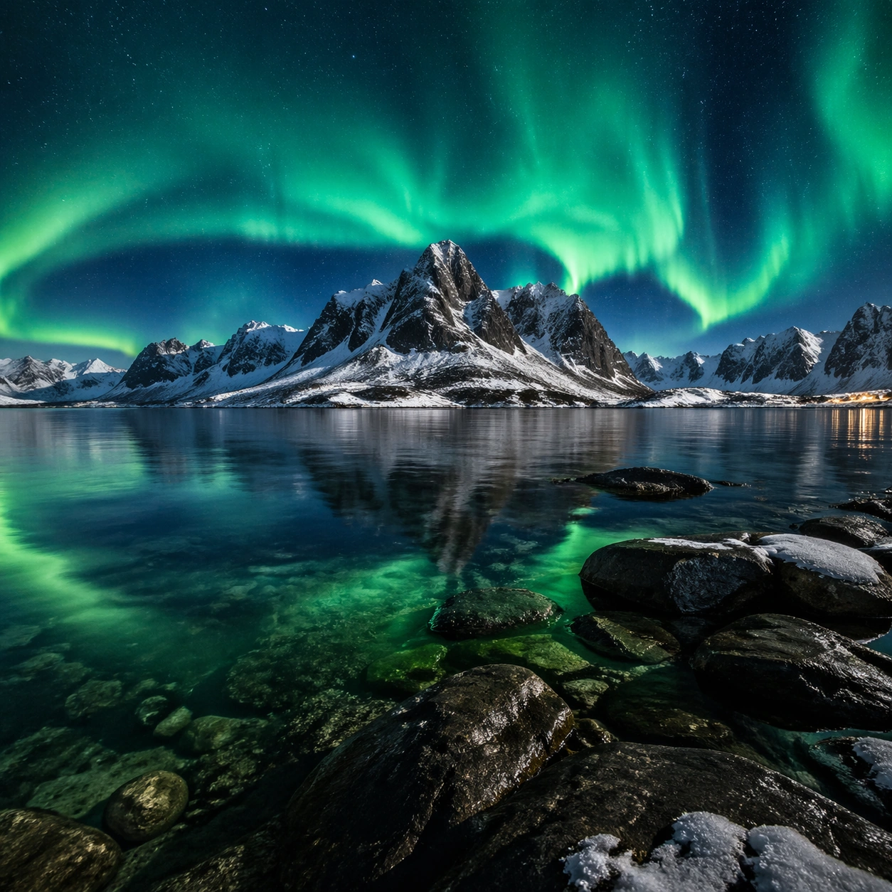
Example generated from “Aurora and Coastal Mountain Landscape Study — ChaosRealmsAI · MIT”
GPT Image 2en

Scene: A square photographic image with intentional lens choice, coherent light, and a subject that feels observed rather than merely decorated. Build the frame around a definitive frame that establishes the subject’s strongest visual identity. Keep the lighting, camera distance, and spatial organization tuned for a high-signal research image rather than a casual snapshot. The image belongs to the Natural Wonder Photography theme and should feel immediately legible as a prompt atlas theme for natural wonder photography, testing photorealism with gpt image 2.. Subject: Center the study on a definitive frame that establishes the subject’s strongest visual identity. Translate the theme into a concrete visual statement instead of an abstract mood board: the viewer should understand what kind of image this is, what is being tested, and why the composition is difficult. Use the slug idea of natural wonder photography as a literal guide for subject matter, materials, and staging. If helpful, borrow the broad visual cues suggested by Aurora, but keep the result original and specific to this study. Important details: The realism should come from timing, optics, and material response: atmosphere, contrast, depth, motion, and tiny physical cues all need to agree. Preserve a disciplined square composition, clear focal hierarchy, and enough secondary information to make the image feel complete rather than underspecified. The image should look polished, novel, and exhibition-ready, with topic-specific credibility coming from the way surfaces, structure, and visual language reinforce Natural Wonder Photography. Avoid generic filler elements that do not serve the main concept. Use case: Natural Wonder Photography single study 1/8, testing photorealism through the hero shot variation. Constraints: No readable text, no watermark, no logos, preserve exact 1:1 aspect ratio, no watermark, no cheap HDR excess, no unreadable signage, no fake stock-photo posing, no compositing seams, no arbitrary lens flare.

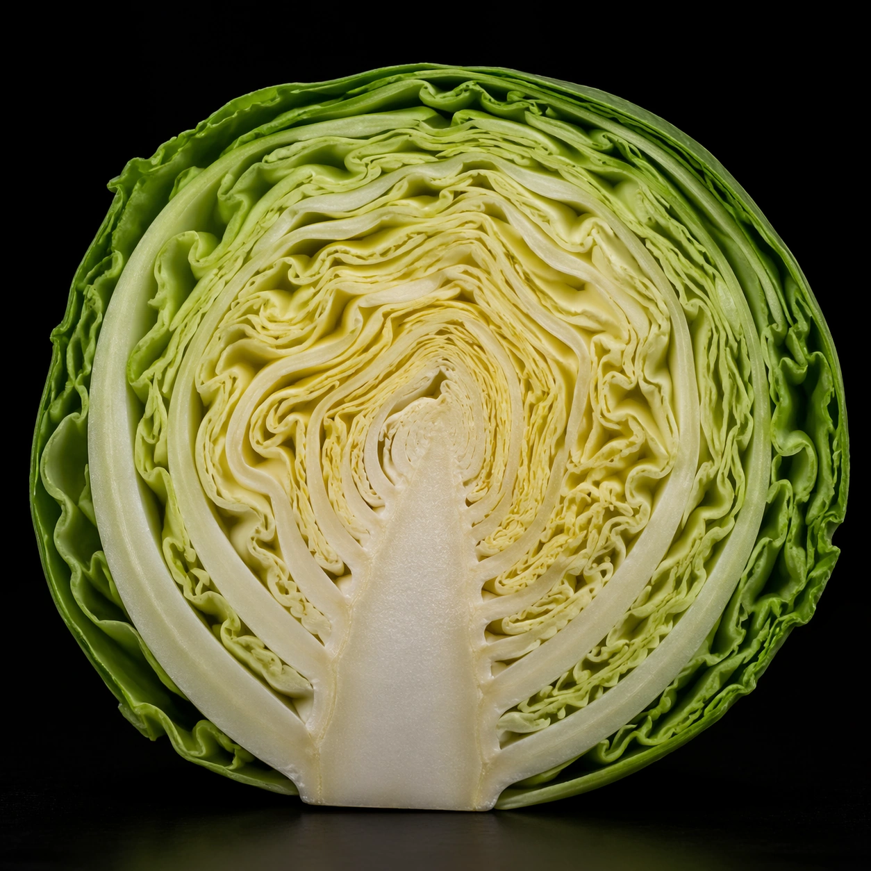
Example generated from “Cabbage Cross-Section Photography-Style Study — ChaosRealmsAI · MIT”
GPT Image 2en

Scene: A square photographic image with intentional lens choice, coherent light, and a subject that feels observed rather than merely decorated. Build the frame around a definitive frame that establishes the subject’s strongest visual identity. Keep the lighting, camera distance, and spatial organization tuned for a high-signal research image rather than a casual snapshot. The image belongs to the Food Cross-Section Atlas theme and should feel immediately legible as a prompt atlas theme for food cross-section atlas, testing structured-layout, photorealism, technical-diagram, commercial-mockup with gpt image 2.. Subject: Center the study on a definitive frame that establishes the subject’s strongest visual identity. Translate the theme into a concrete visual statement instead of an abstract mood board: the viewer should understand what kind of image this is, what is being tested, and why the composition is difficult. Use the slug idea of food cross section atlas as a literal guide for subject matter, materials, and staging. Important details: The realism should come from timing, optics, and material response: atmosphere, contrast, depth, motion, and tiny physical cues all need to agree. Preserve a disciplined square composition, clear focal hierarchy, and enough secondary information to make the image feel complete rather than underspecified. The image should look polished, novel, and exhibition-ready, with topic-specific credibility coming from the way surfaces, structure, and visual language reinforce Food Cross-Section Atlas. Avoid generic filler elements that do not serve the main concept. Use case: Food Cross-Section Atlas single study 1/8, testing structured-layout, photorealism, technical-diagram, commercial-mockup through the hero shot variation. Constraints: No readable text, no watermark, no logos, preserve exact 1:1 aspect ratio, no watermark, no cheap HDR excess, no unreadable signage, no fake stock-photo posing, no compositing seams, no arbitrary lens flare.

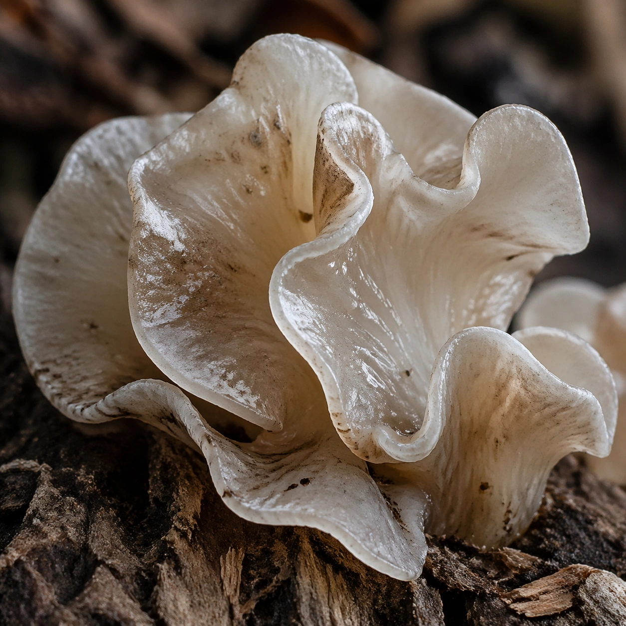
Example generated from “Translucent Organic Surface Macro Study — ChaosRealmsAI · MIT”
GPT Image 2en

Scene: A square material-focused image where lighting, scale, and surface behavior are the main event. Build the frame around the dominant material language shown with full confidence. Keep the lighting, camera distance, and spatial organization tuned for a high-signal research image rather than a casual snapshot. The image belongs to the Macro Real Texture theme and should feel immediately legible as a prompt atlas theme for macro real texture, testing photorealism, physics-materials with gpt image 2.. Subject: Center the study on the dominant material language shown with full confidence. Translate the theme into a concrete visual statement instead of an abstract mood board: the viewer should understand what kind of image this is, what is being tested, and why the composition is difficult. Use the slug idea of macro real texture as a literal guide for subject matter, materials, and staging. Important details: Microstructure matters: refraction, fibers, scratches, pores, edge wear, translucency, and dust should all feel physically specific. Preserve a disciplined square composition, clear focal hierarchy, and enough secondary information to make the image feel complete rather than underspecified. The image should look polished, novel, and exhibition-ready, with topic-specific credibility coming from the way surfaces, structure, and visual language reinforce Macro Real Texture. Avoid generic filler elements that do not serve the main concept. Use case: Macro Real Texture single study 1/8, testing photorealism, physics-materials through the surface hero variation. Constraints: No readable text, no watermark, no logos, preserve exact 1:1 aspect ratio, no generic stock macro, no broken scale cues, no plastic-looking texture when it should feel natural, no meaningless blur, no watermark, no fake labels.

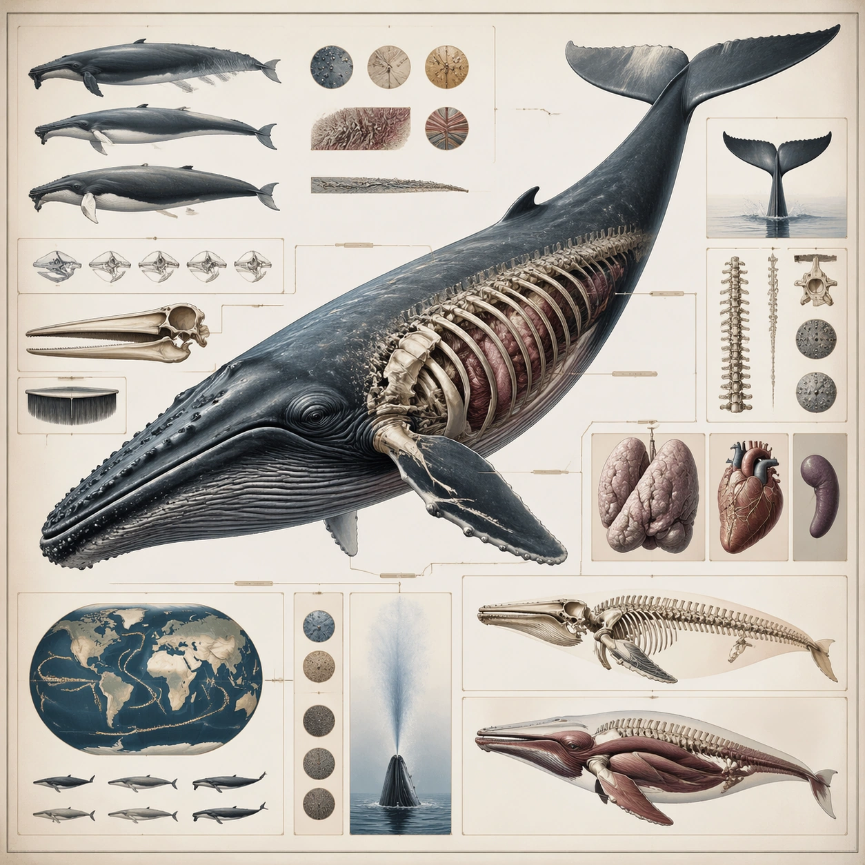
Example generated from “Whale Natural-History Plate Concept — ChaosRealmsAI · MIT”
GPT Image 2en

Scene: A square plate or board viewed straight-on, with crisp organization, disciplined spacing, and premium print clarity. Build the frame around a complete overview that establishes the system, subject boundaries, and visual hierarchy. Keep the lighting, camera distance, and spatial organization tuned for a high-signal research image rather than a casual snapshot. The image belongs to the Natural History Infographic theme and should feel immediately legible as a prompt atlas theme for natural history infographic, testing structured-layout with gpt image 2.. Subject: Center the study on a complete overview that establishes the system, subject boundaries, and visual hierarchy. Translate the theme into a concrete visual statement instead of an abstract mood board: the viewer should understand what kind of image this is, what is being tested, and why the composition is difficult. Use the slug idea of natural history infographic as a literal guide for subject matter, materials, and staging. Important details: The image should communicate logic through grouping, hierarchy, callouts, insets, and believable professional layout discipline rather than decorative noise. Preserve a disciplined square composition, clear focal hierarchy, and enough secondary information to make the image feel complete rather than underspecified. The image should look polished, novel, and exhibition-ready, with topic-specific credibility coming from the way surfaces, structure, and visual language reinforce Natural History Infographic. Avoid generic filler elements that do not serve the main concept. Use case: Natural History Infographic single study 1/8, testing structured-layout through the overview plate variation. Constraints: No readable text, no watermark, no logos, preserve exact 1:1 aspect ratio, no readable labels, no messy arrows, no random infographic decoration, no fake UI chrome unless the topic calls for it, no broken alignment, no meaningless clutter.

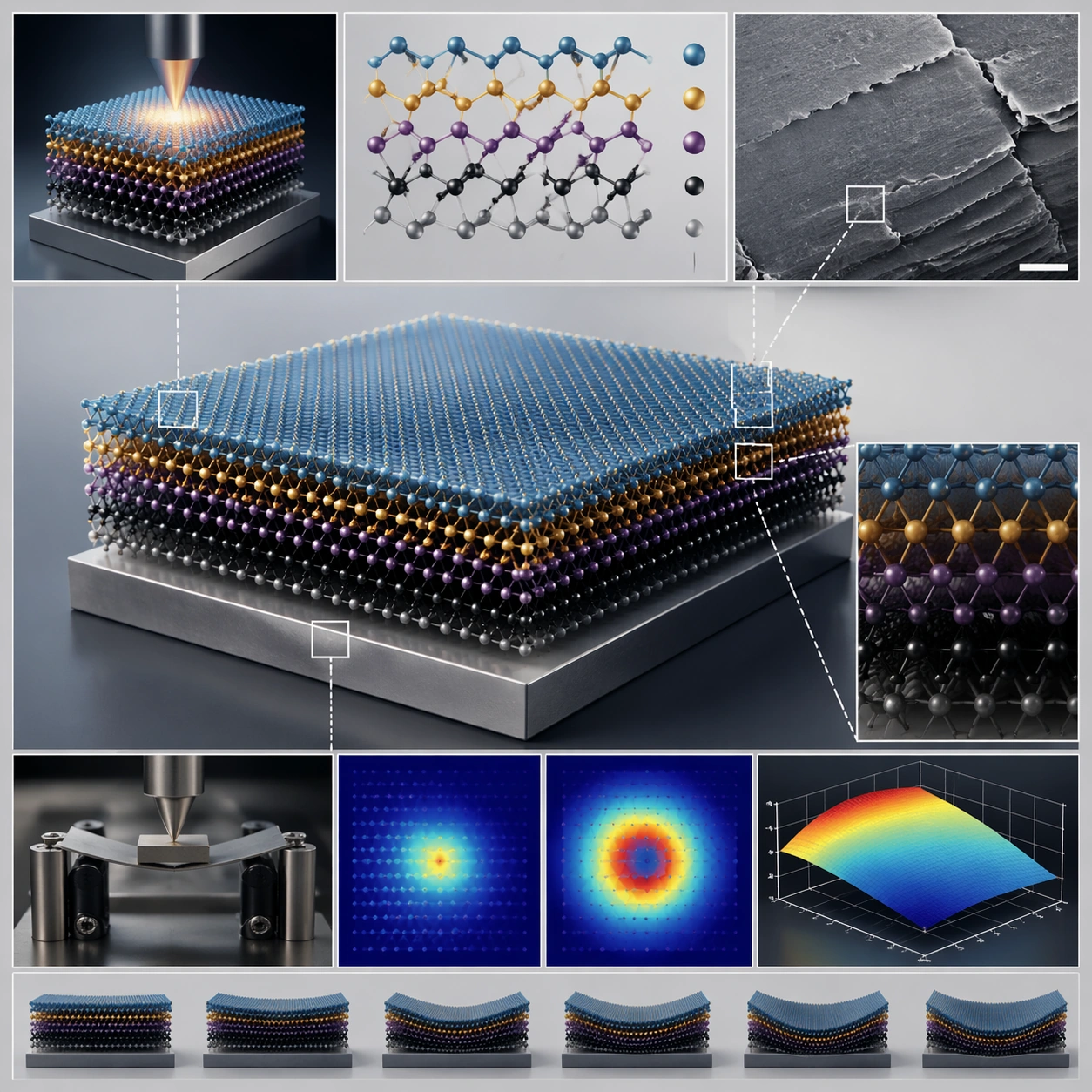
Example generated from “Layered-Material Research-Figure Layout Concept — ChaosRealmsAI · MIT”
GPT Image 2en

Scene: A square plate or board viewed straight-on, with crisp organization, disciplined spacing, and premium print clarity. Build the frame around a complete overview that establishes the system, subject boundaries, and visual hierarchy. Keep the lighting, camera distance, and spatial organization tuned for a high-signal research image rather than a casual snapshot. The image belongs to the Scientific Paper Figure theme and should feel immediately legible as a prompt atlas theme for scientific paper figure, testing physics-materials, commercial-mockup with gpt image 2.. Subject: Center the study on a complete overview that establishes the system, subject boundaries, and visual hierarchy. Translate the theme into a concrete visual statement instead of an abstract mood board: the viewer should understand what kind of image this is, what is being tested, and why the composition is difficult. Use the slug idea of scientific paper figure as a literal guide for subject matter, materials, and staging. If helpful, borrow the broad visual cues suggested by Nature, Science, but keep the result original and specific to this study. Important details: The image should communicate logic through grouping, hierarchy, callouts, insets, and believable professional layout discipline rather than decorative noise. Preserve a disciplined square composition, clear focal hierarchy, and enough secondary information to make the image feel complete rather than underspecified. The image should look polished, novel, and exhibition-ready, with topic-specific credibility coming from the way surfaces, structure, and visual language reinforce Scientific Paper Figure. Avoid generic filler elements that do not serve the main concept. Use case: Scientific Paper Figure single study 1/8, testing physics-materials, commercial-mockup through the overview plate variation. Constraints: No readable text, no watermark, no logos, preserve exact 1:1 aspect ratio, no readable labels, no messy arrows, no random infographic decoration, no fake UI chrome unless the topic calls for it, no broken alignment, no meaningless clutter.

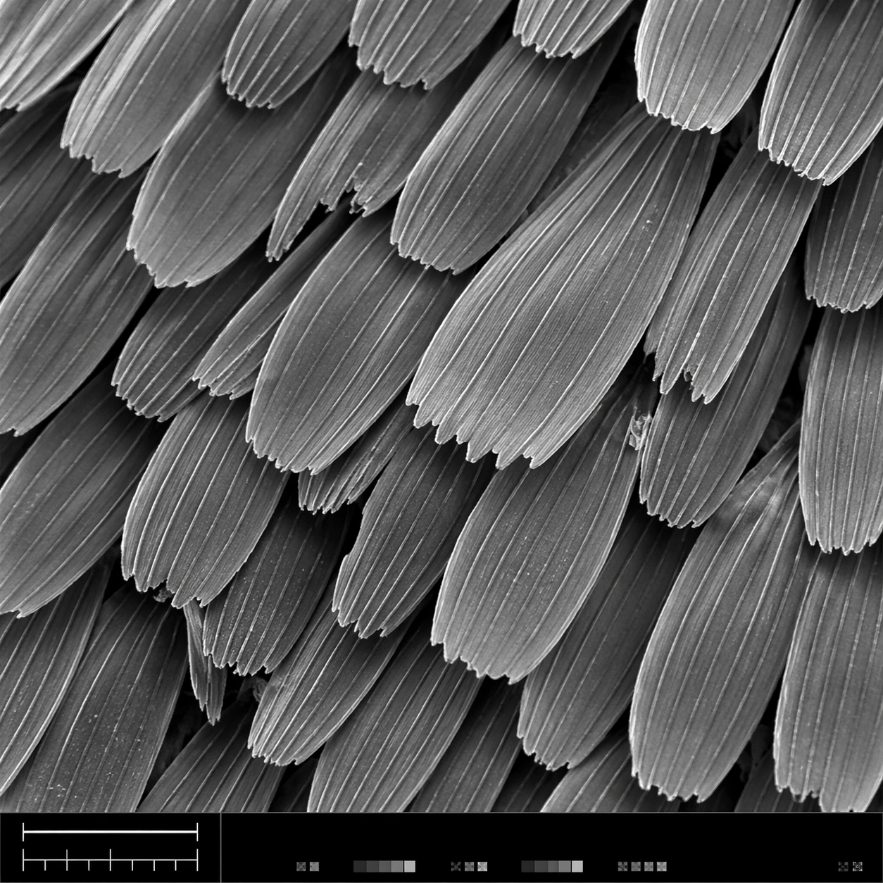
Example generated from “Butterfly-Scale SEM-Style Illustration — ChaosRealmsAI · MIT”
GPT Image 2en

Scene: A square scanning electron microscope plate, high magnification, cool monochrome grayscale with subtle silver contrast and crisp depth-of-field falloff. The specimen fills most of the frame, with a narrow bottom instrument-style strip containing a clean lower-left scale bar shape, calibration ticks, and tiny non-readable interface marks. Lighting feels like real SEM topographic shading, not studio photography. Subject: A butterfly wing surface seen as an overlapping field of microscopic scales. Each scale is a long flattened petal with ribbed longitudinal ridges, tiny cross struts, broken edges, and fine dust-like surface texture. The scales interlock in staggered rows like roof shingles, revealing depth gaps, occasional torn tips, and a few darker shadowed crevices between layers. Important details: The image must look like authentic SEM output: grayscale electron-imaging contrast, high-frequency microtexture, shallow relief shadows, clean scientific framing, no painterly brushwork. Preserve ordered biological geometry while allowing natural imperfections. The lower-left scale bar should be visible as a simple bar and tick structure, but no readable letters or numbers should appear. The bottom strip should feel like microscope capture metadata without legible text. Use case: SEM Microscopy single study 1/8, testing realistic grayscale microstructure for butterfly wing scales with structured instrument layout. Constraints: No readable text, no watermark, no logos, preserve exact 1:1 aspect ratio, no colorful illustration, no fantasy particles, no normal camera lens look, no flat wallpaper pattern, no giant specimen context, no oversized labels, no fake handwritten annotations.

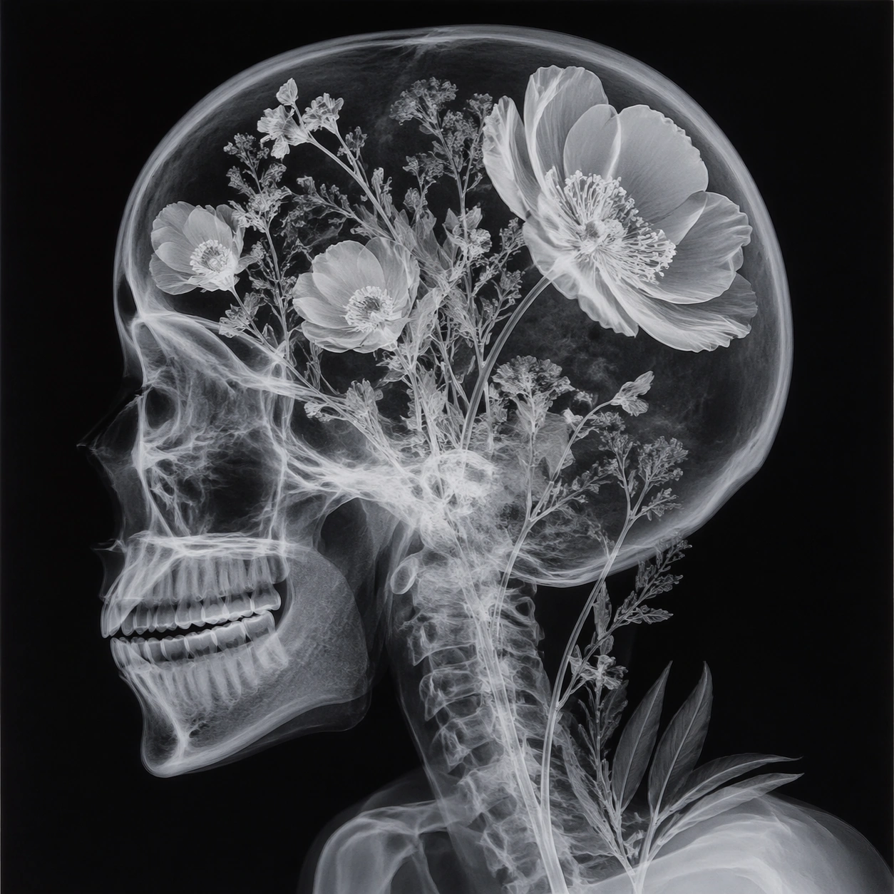
Example generated from “Floral X-Ray-Style Skull Artwork — ChaosRealmsAI · MIT”
GPT Image 2en

Scene: A square photographic image with intentional lens choice, coherent light, and a subject that feels observed rather than merely decorated. Build the frame around a definitive frame that establishes the subject’s strongest visual identity. Keep the lighting, camera distance, and spatial organization tuned for a high-signal research image rather than a casual snapshot. The image belongs to the X-Ray Art Photography theme and should feel immediately legible as a prompt atlas theme for x-ray art photography, testing photorealism, style-transfer, optical-illusion-geometry with gpt image 2.. Subject: Center the study on a definitive frame that establishes the subject’s strongest visual identity. Translate the theme into a concrete visual statement instead of an abstract mood board: the viewer should understand what kind of image this is, what is being tested, and why the composition is difficult. Use the slug idea of xray art photography as a literal guide for subject matter, materials, and staging. If helpful, borrow the broad visual cues suggested by iPhone, but keep the result original and specific to this study. Important details: The realism should come from timing, optics, and material response: atmosphere, contrast, depth, motion, and tiny physical cues all need to agree. Preserve a disciplined square composition, clear focal hierarchy, and enough secondary information to make the image feel complete rather than underspecified. The image should look polished, novel, and exhibition-ready, with topic-specific credibility coming from the way surfaces, structure, and visual language reinforce X-Ray Art Photography. Avoid generic filler elements that do not serve the main concept. Use case: X-Ray Art Photography single study 1/8, testing photorealism, style-transfer, optical-illusion-geometry through the hero shot variation. Constraints: No readable text, no watermark, no logos, preserve exact 1:1 aspect ratio, no watermark, no cheap HDR excess, no unreadable signage, no fake stock-photo posing, no compositing seams, no arbitrary lens flare.

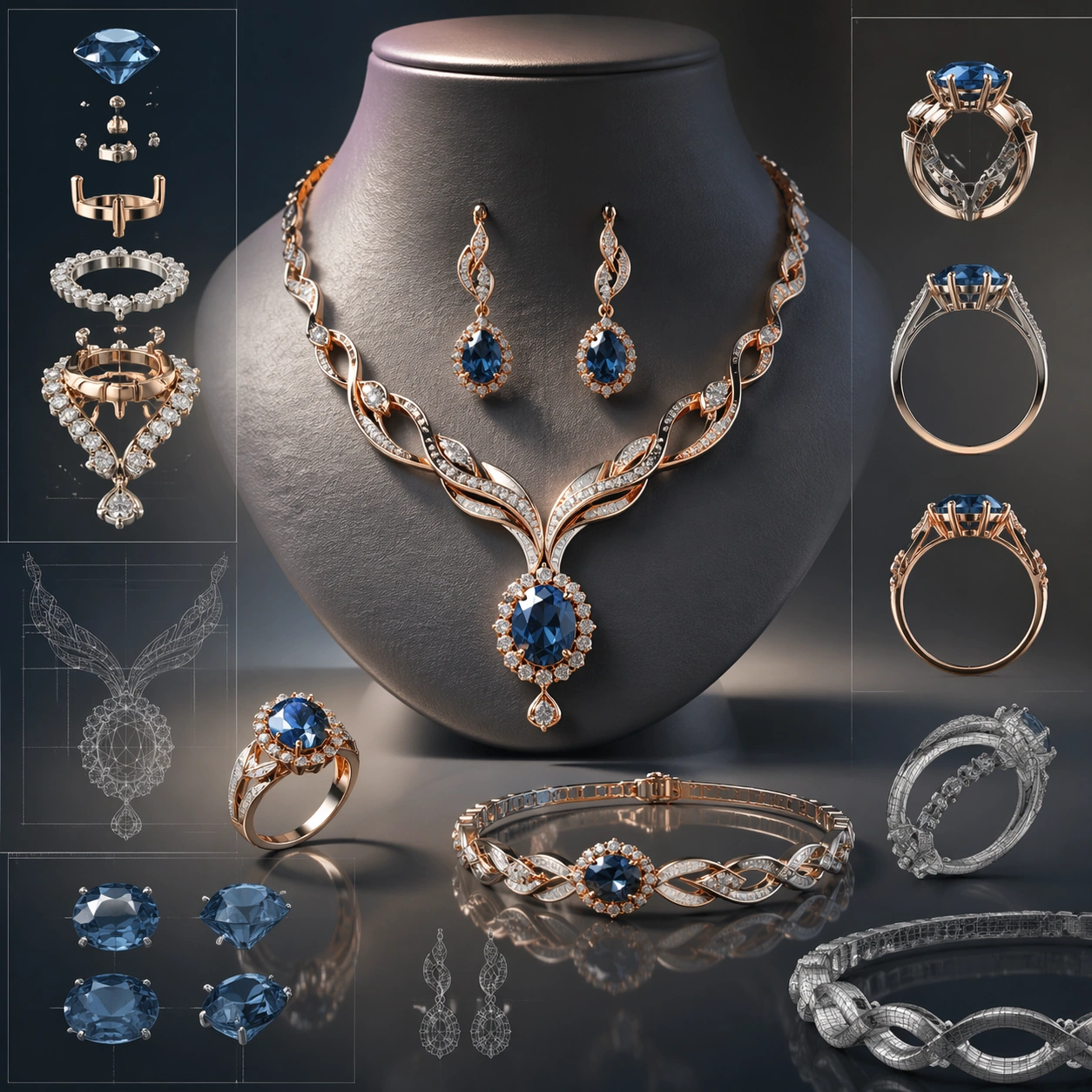
Example generated from “Blue-Gem Jewelry Collection Concept Board — ChaosRealmsAI · MIT”
GPT Image 2en

Scene: A square CGI or design-visualization frame with calibrated lighting, intentional composition, and premium material rendering. Build the frame around a flagship render that establishes form, stance, and material identity. Keep the lighting, camera distance, and spatial organization tuned for a high-signal research image rather than a casual snapshot. The image belongs to the Jewelry CAD Wearable Set theme and should feel immediately legible as a prompt atlas theme for jewelry cad wearable set, testing photorealism, physics-materials, technical-diagram, style-transfer, commercial-mockup with gpt image 2.. Subject: Center the study on a flagship render that establishes form, stance, and material identity. Translate the theme into a concrete visual statement instead of an abstract mood board: the viewer should understand what kind of image this is, what is being tested, and why the composition is difficult. Use the slug idea of jewelry cad wearable set as a literal guide for subject matter, materials, and staging. If helpful, borrow the broad visual cues suggested by CAD, Octane, iPhone, but keep the result original and specific to this study. Important details: The model must feel engineered or art-directed rather than merely stylized: edges, seams, translucency, reflections, and scale cues should all hold up. Preserve a disciplined square composition, clear focal hierarchy, and enough secondary information to make the image feel complete rather than underspecified. The image should look polished, novel, and exhibition-ready, with topic-specific credibility coming from the way surfaces, structure, and visual language reinforce Jewelry CAD Wearable Set. Avoid generic filler elements that do not serve the main concept. Use case: Jewelry CAD Wearable Set single study 1/8, testing photorealism, physics-materials, technical-diagram, style-transfer, commercial-mockup through the hero model variation. Constraints: No readable text, no watermark, no logos, preserve exact 1:1 aspect ratio, no real brand logos, no low-poly shortcuts, no broken reflections, no muddy materials, no generic showroom clutter, no unreadable UI overlays.

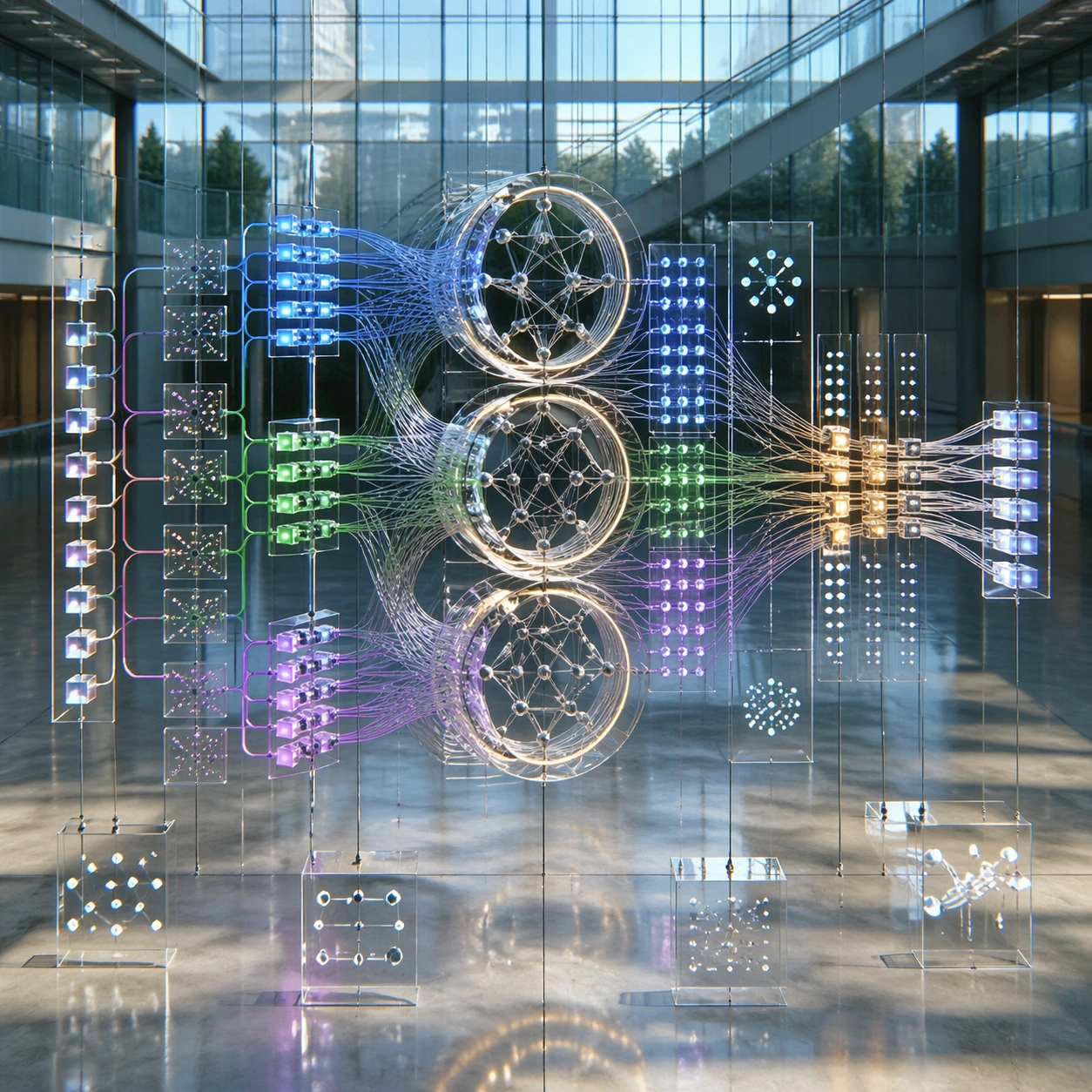
Example generated from “Transformer Attention Atrium Visual Metaphor — ChaosRealmsAI · MIT”
GPT Image 2en

Scene: A square photoreal image of a museum-scale glass atrium installation that looks like a neural network explaining itself. Use soft daylight, polished concrete, suspended translucent panels, and clean reflections. The camera is slightly elevated, looking into a layered architectural space where the diagram is physical, luminous, and readable without text. Subject: A Transformer self-attention process represented as a suspended kinetic sculpture. Rows of small glowing token prisms enter from the left, split into query, key, and value-like light paths, pass through multiple attention heads as nested rings, then recombine into a refined output ribbon on the right. Use color-coded flows, curved cables, transparent matrices, and small abstract annotation plaques made only of symbols, ticks, and dots. The structure should feel academic and meta: an AI model drawing its own internal attention map as a physical exhibit. Important details: The composition must make process logic visible: input sequence, parallel attention heads, weighted connections, merging, normalization-like layers, and output. Keep node spacing regular, avoid tangled spaghetti, and maintain clear depth separation between foreground paths and background panels. The image should balance photoreal materials with exact technical-diagram hierarchy. No literal equations are needed; the flow itself should explain the mechanism. Use case: Neural Network Self-Explanation single study 1/8, testing a Transformer self-attention process as a photoreal academic installation. Constraints: No readable text, no watermark, no logos, preserve exact 1:1 aspect ratio, no real model names, no code snippets, no private chain-of-thought, no random neon chaos, no impossible cable intersections, no generic brain icon, no unreadable clutter.

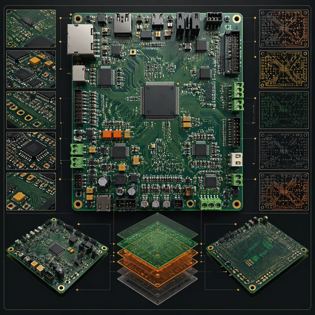
Example generated from “Circuit-Board Layout Visualization Concept — ChaosRealmsAI · MIT”
GPT Image 2en

Scene: A square plate or board viewed straight-on, with crisp organization, disciplined spacing, and premium print clarity. Build the frame around a complete overview that establishes the system, subject boundaries, and visual hierarchy. Keep the lighting, camera distance, and spatial organization tuned for a high-signal research image rather than a casual snapshot. The image belongs to the PCB Board Layout theme and should feel immediately legible as a prompt atlas theme for pcb board layout, testing structured-layout, photorealism, style-transfer, commercial-mockup with gpt image 2.. Subject: Center the study on a complete overview that establishes the system, subject boundaries, and visual hierarchy. Translate the theme into a concrete visual statement instead of an abstract mood board: the viewer should understand what kind of image this is, what is being tested, and why the composition is difficult. Use the slug idea of pcb board layout as a literal guide for subject matter, materials, and staging. If helpful, borrow the broad visual cues suggested by PCB, schematic, Arduino, but keep the result original and specific to this study. Important details: The image should communicate logic through grouping, hierarchy, callouts, insets, and believable professional layout discipline rather than decorative noise. Preserve a disciplined square composition, clear focal hierarchy, and enough secondary information to make the image feel complete rather than underspecified. The image should look polished, novel, and exhibition-ready, with topic-specific credibility coming from the way surfaces, structure, and visual language reinforce PCB Board Layout. Avoid generic filler elements that do not serve the main concept. Use case: PCB Board Layout single study 1/8, testing structured-layout, photorealism, style-transfer, commercial-mockup through the overview plate variation. Constraints: No readable text, no watermark, no logos, preserve exact 1:1 aspect ratio, no readable labels, no messy arrows, no random infographic decoration, no fake UI chrome unless the topic calls for it, no broken alignment, no meaningless clutter.

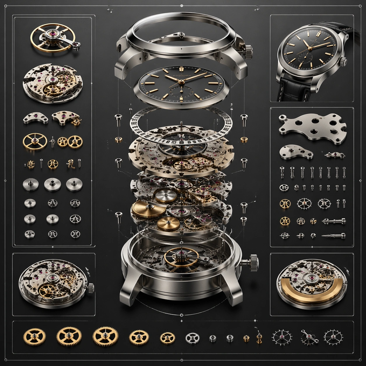
Example generated from “Mechanical Watch Exploded-View Concept Sheet — ChaosRealmsAI · MIT”
GPT Image 2en

Scene: A square plate or board viewed straight-on, with crisp organization, disciplined spacing, and premium print clarity. Build the frame around a complete overview that establishes the system, subject boundaries, and visual hierarchy. Keep the lighting, camera distance, and spatial organization tuned for a high-signal research image rather than a casual snapshot. The image belongs to the Precision Mechanical Exploded View theme and should feel immediately legible as a prompt atlas theme for precision mechanical exploded view, testing multi-image-reference, physics-materials, technical-diagram, commercial-mockup with gpt image 2.. Subject: Center the study on a complete overview that establishes the system, subject boundaries, and visual hierarchy. Translate the theme into a concrete visual statement instead of an abstract mood board: the viewer should understand what kind of image this is, what is being tested, and why the composition is difficult. Use the slug idea of precision mechanical exploded view as a literal guide for subject matter, materials, and staging. If helpful, borrow the broad visual cues suggested by exploded view, but keep the result original and specific to this study. Important details: The image should communicate logic through grouping, hierarchy, callouts, insets, and believable professional layout discipline rather than decorative noise. Preserve a disciplined square composition, clear focal hierarchy, and enough secondary information to make the image feel complete rather than underspecified. The image should look polished, novel, and exhibition-ready, with topic-specific credibility coming from the way surfaces, structure, and visual language reinforce Precision Mechanical Exploded View. Avoid generic filler elements that do not serve the main concept. Use case: Precision Mechanical Exploded View single study 1/8, testing multi-image-reference, physics-materials, technical-diagram, commercial-mockup through the overview plate variation. Constraints: No readable text, no watermark, no logos, preserve exact 1:1 aspect ratio, no readable labels, no messy arrows, no random infographic decoration, no fake UI chrome unless the topic calls for it, no broken alignment, no meaningless clutter.

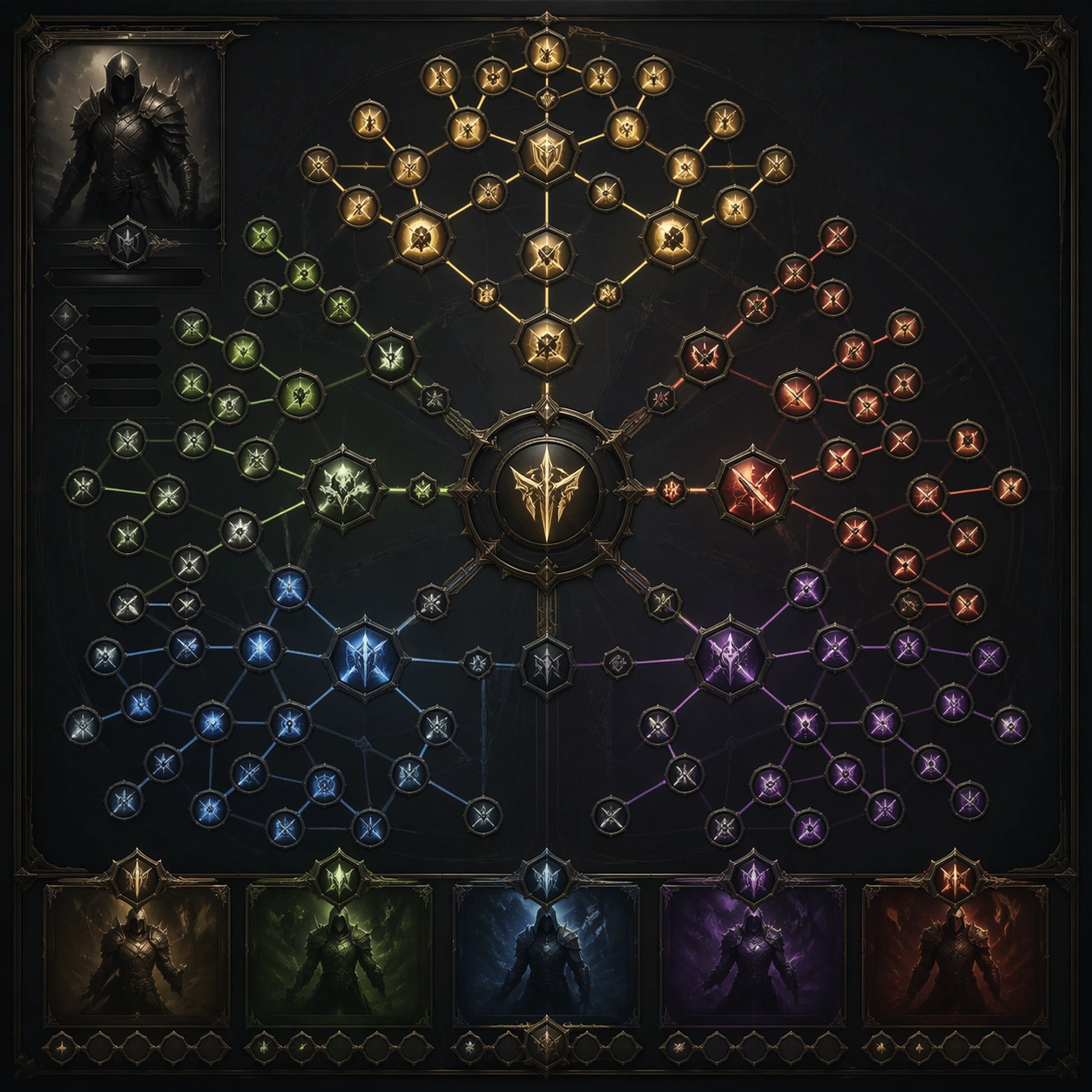
Example generated from “Fantasy Skill-Tree Interface Board — ChaosRealmsAI · MIT”
GPT Image 2en

Scene: A square production-ready image designed for a game-art review wall and a commercial gallery at the same time. Frame a full career skill tree spread with branching nodes, unlock gates, and class identity with disciplined lighting, clean edge separation, and enough surrounding context to prove how the asset would behave in a real product surface. The camera, crop, and tonal balance should feel intentional rather than generic, with high readability at first glance and convincing material response under closer inspection. Subject: Center the study on a full career skill tree spread with branching nodes, unlock gates, and class identity. Translate the topic into a concrete, shippable visual statement instead of a loose mood board. Build layered object relationships, believable surface finish, and strong silhouette grouping so the image reads immediately as part of Skill Tree Progression Sheet. The subject should feel made for a live game pipeline: useful in store, UI, campaign, or art-review contexts, with visual hierarchy strong enough to survive aggressive cropping. Important details: the tree should feel genuinely navigable with strong parent-child logic and icon grouping. Keep every supporting element subordinate to the main read, and make category separation obvious through form, color zoning, depth, and material logic rather than words. Where panels, cards, badges, or interface blocks appear, they must look professionally structured but remain unreadable. The visual language should feel premium, original, and coherent across this package, with no filler clutter and no accidental resemblance to a specific shipped game IP. Use case: Skill Tree Progression Sheet single study 1/9, focused on full skill tree. Constraints: No readable text, no watermark, no logos, preserve exact 1:1 aspect ratio, no readable node names, no numbers, no broken hierarchy, no generic stock-photo staging, no accidental UI gibberish.

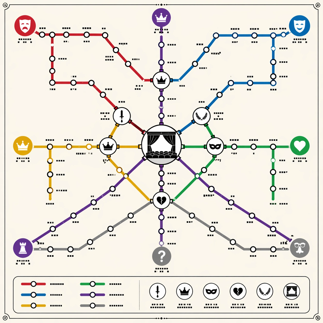
Example generated from “Shakespeare-Themed Transit-Map Visual Metaphor — ChaosRealmsAI · MIT”
GPT Image 2en

Scene: A square poster-style transit diagram on clean off-white paper, viewed straight-on with precise vector-like linework. The overall language should recall a premium city subway map: colored route lines, circular stations, transfer hubs, a small legend panel, and disciplined margins. Use warm ivory background, black station outlines, and six saturated but tasteful route colors. Keep the lighting flat and print-like, not photorealistic. Subject: A thematic subway map that abstracts Shakespeare's dramatic universe into routes. One red tragedy line, one blue comedy line, one gold history line, one green romance line, one violet power line, and one gray mistaken-identity line cross through a central interchange shaped like a stage. Station dots cluster as play-like narrative nodes, with larger transfer circles where themes overlap: ambition, exile, disguise, royal succession, revenge, and reconciliation. Small theater icons and mask symbols mark major route families. Important details: The map must look logically planned, not like random spaghetti. Lines should run at transit-map angles, mostly horizontal, vertical, or forty-five degrees, with clean bends, consistent station spacing, and clear crossings. Use tiny non-readable glyph blocks where labels would be; no actual readable words. The viewer should understand the knowledge abstraction through line color, transfers, icons, and hierarchy. Include a tidy legend area made of colored swatches and glyph marks, but no legible text. Use case: Thematic Subway Map single study 1/8, testing literary relationship abstraction through professional transit-map topology and transfer logic. Constraints: No readable text, no watermark, no logos, preserve exact 1:1 aspect ratio, no real transit authority branding, no map of London geography, no messy overlapping labels, no random colored noodles, no perspective tilt, no torn-paper texture.

Example generated from “Foldable Headphone Patent-Style Figure Study — ChaosRealmsAI · MIT”
GPT Image 2en

Scene: A clean portrait 4:5 patent drawing sheet on pure white background, black technical linework only, arranged like a formal USPTO-style figure plate. Subject: A foldable over-ear headphone mechanism shown in three views: FIG. 1 front perspective, FIG. 2 side hinge detail, and FIG. 3 exploded view of the ear cup, hinge, headband slider, cushion ring, and cable channel. Use numbered callouts 10, 12, 14, 16, 18, 20, 22, and 24 with thin leader lines. Important details: Precise monochrome vector-like line art, no shading except legal-style hatch lines, dashed lines for optional folded position, Arial-like small labels, consistent callout numbering, crisp exploded spacing, professional engineering drawing hierarchy, generous margins. Use case: Independent Prompt Atlas image testing text rendering, technical diagram structure, and patent-style multi-view layout. Constraints: Only readable text should be FIG. 1, FIG. 2, FIG. 3, and numeric callouts 10 through 24; no color, no logo, no watermark, no photorealistic render, no handwritten text, no cluttered notes, preserve exact 4:5 aspect ratio.

Example generated from “Vintage Newspaper Front-Page Layout Concept — ChaosRealmsAI · MIT”
GPT Image 2en

Scene: A square editorial or interface layout study with exact margins, confident grid structure, and premium print or screen presentation. Build the frame around a primary spread or headline surface with immediate hierarchy. Keep the lighting, camera distance, and spatial organization tuned for a high-signal research image rather than a casual snapshot. The image belongs to the Old Newspaper Front Page theme and should feel immediately legible as a prompt atlas theme for old newspaper front page, testing text-rendering, structured-layout, commercial-mockup with gpt image 2.. Subject: Center the study on a primary spread or headline surface with immediate hierarchy. Translate the theme into a concrete visual statement instead of an abstract mood board: the viewer should understand what kind of image this is, what is being tested, and why the composition is difficult. Use the slug idea of old newspaper front page as a literal guide for subject matter, materials, and staging. Important details: Typography fields must stay unreadable, but hierarchy, rhythm, and page architecture should feel convincing enough for design review. Preserve a disciplined square composition, clear focal hierarchy, and enough secondary information to make the image feel complete rather than underspecified. The image should look polished, novel, and exhibition-ready, with topic-specific credibility coming from the way surfaces, structure, and visual language reinforce Old Newspaper Front Page. Avoid generic filler elements that do not serve the main concept. Use case: Old Newspaper Front Page single study 1/8, testing text-rendering, structured-layout, commercial-mockup through the hero spread variation. Constraints: No readable text, no watermark, no logos, preserve exact 1:1 aspect ratio, no readable text, no logo lockups from real brands, no broken grid, no arbitrary poster clutter, no malformed columns, no accidental lorem ipsum.

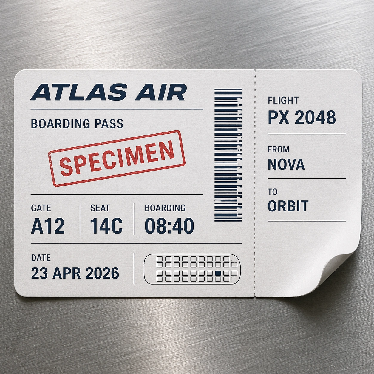
Example generated from “SPECIMEN Boarding-Pass Typography Mockup — ChaosRealmsAI · MIT”
GPT Image 2en

Scene: A square photorealistic commercial mockup of a fictional airline boarding pass resting on a brushed aluminum airport counter. The paper is slightly curled at one corner, with thermal-print sheen, tiny perforation marks, and soft overhead terminal light. The camera is straight-on with a slight natural shadow, close enough to inspect typography and material texture. Subject: Create a clearly fictional specimen boarding pass, not a usable ticket. The exact readable text should include: SPECIMEN, ATLAS AIR, BOARDING PASS, FLIGHT PX 2048, FROM NOVA, TO ORBIT, GATE A12, SEAT 14C, BOARDING 08:40, DATE 23 APR 2026. Include one barcode-like strip made of decorative non-scannable vertical marks and one seat-map miniature made of simple rectangles. Use no real airline logo, no QR code, and no real airport codes. Important details: The test is document realism: crisp hierarchy, airline-ticket spacing, microprint-like gray rules as unreadable texture, thermal ink density variation, ticket stub perforation, rounded punched corner, and believable paper fibers. Keep all specified text readable and correctly positioned. The barcode-like element must look visually convincing but intentionally nonfunctional. The specimen status should be obvious without destroying the premium ticket feel. Use case: Pseudo-Real Documents single study 1/8, testing readable ticket typography, fake barcode texture, and photoreal thermal paper material. Constraints: No readable text except the specified specimen boarding-pass strings, no watermark, no logos, preserve exact 1:1 aspect ratio, no real airline, no real airport code, no QR code, no scannable barcode, no personal name, no passport number, no extra flight data.

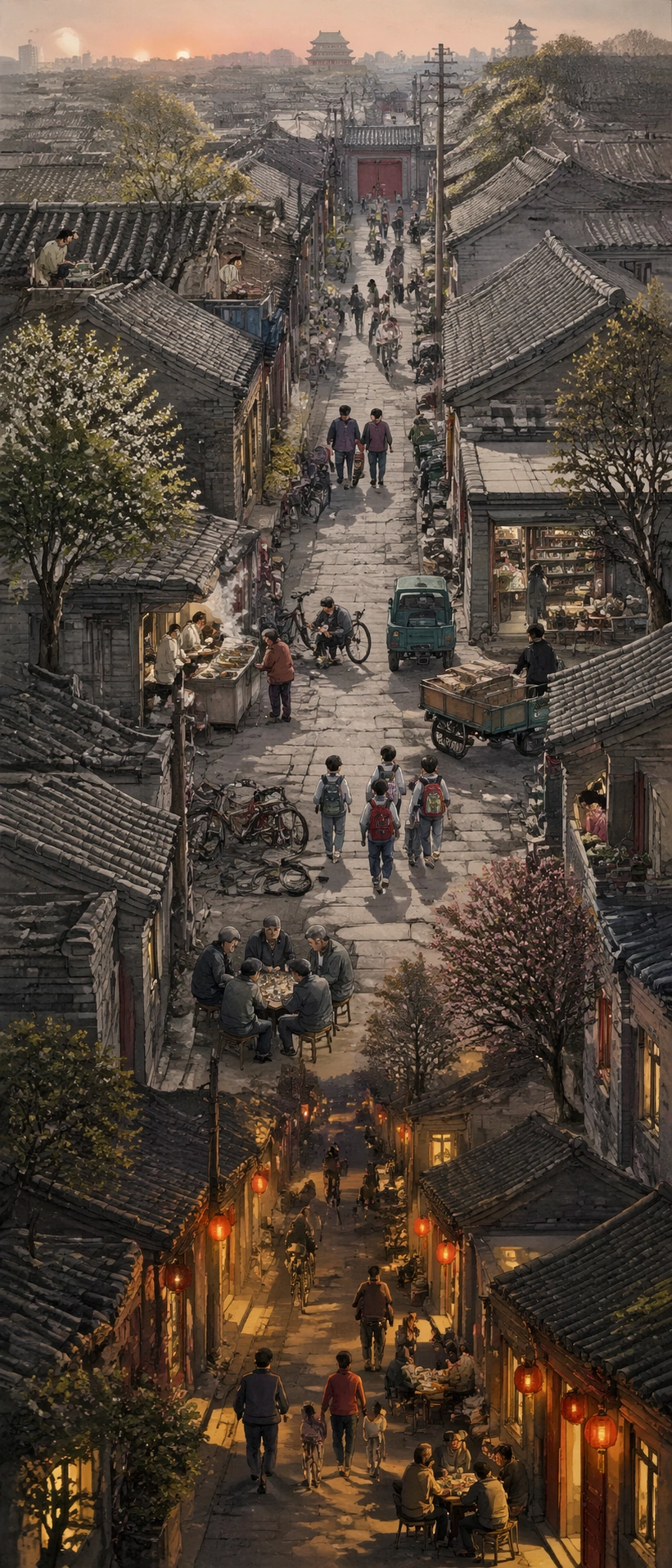
Example generated from “Beijing Hutong Vertical Narrative Scroll — ChaosRealmsAI · MIT”
GPT Image 2en

Scene: A single vertical 9:21 ultra-long scroll painting inspired by detailed urban reportage, viewed as one continuous hand-painted lane from top to bottom. The composition flows through an old Beijing hutong from dawn at the top, midday in the middle, and evening lantern light near the bottom. Subject: A modern version of a historical city scroll: courtyard gates, gray brick walls, tiled roofs, bicycle repair stall, breakfast steam, chess table, schoolchildren, delivery carts, small groceries, residents leaning from balconies, and cats only as tiny background silhouettes if present. The lane must feel continuous and navigable, not a collage of unrelated vignettes. Important details: Extreme vertical 9:21 framing, dense but legible local scenes, clear spatial continuity, soft ink-and-gouache texture, accurate north China architectural details, atmospheric perspective, repeated alley geometry that guides the eye downward, hundreds of small believable objects without turning into noise. Use case: Independent Prompt Atlas image for testing extreme aspect ratio stability, high-density narrative planning, and world-knowledge scene detail. Constraints: No readable text, no watermark, no logos, no floating labels, no modern app UI, no frame, no broken perspective, no random fantasy elements, preserve exact 9:21 vertical aspect ratio.

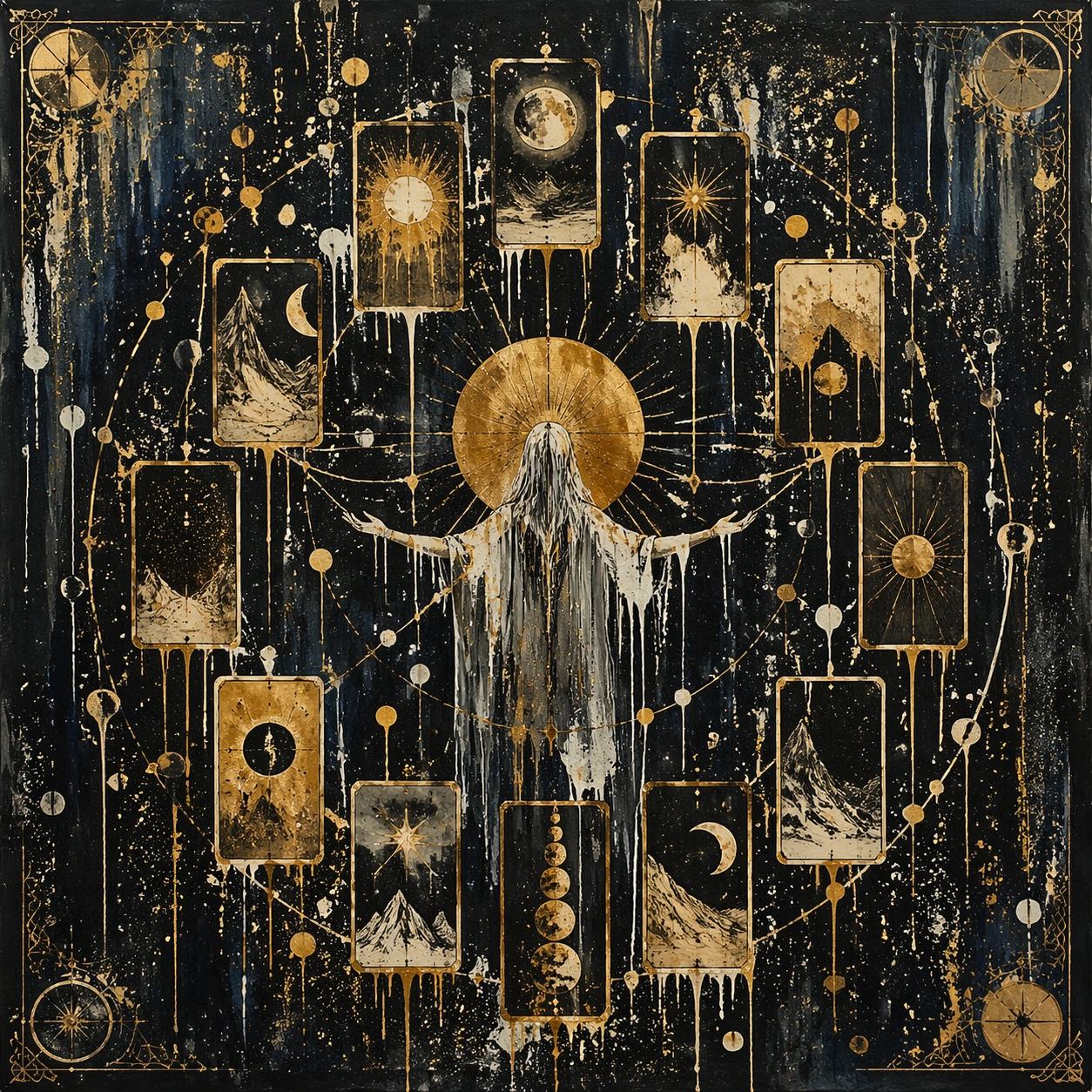
Example generated from “Tarot-Card Constellation Artwork — ChaosRealmsAI · MIT”
GPT Image 2en

Scene: A square, gallery-ready composition with painterly surfaces, controlled negative space, and a deliberate fine-art presentation. Build the frame around a dense all-over field of marks that feels suspended between chaos and structure. Keep the lighting, camera distance, and spatial organization tuned for a high-signal research image rather than a casual snapshot. The image belongs to the Tarot Card Deck theme and should feel immediately legible as a prompt atlas theme for tarot card deck, testing multi-image-reference with gpt image 2.. Subject: Center the study on a dense all-over field of marks that feels suspended between chaos and structure. Translate the theme into a concrete visual statement instead of an abstract mood board: the viewer should understand what kind of image this is, what is being tested, and why the composition is difficult. Use the slug idea of tarot card deck as a literal guide for subject matter, materials, and staging. Important details: Focus on authored mark-making, hierarchy, rhythm, and a visual idea that reads immediately before the viewer inspects the brushwork. Preserve a disciplined square composition, clear focal hierarchy, and enough secondary information to make the image feel complete rather than underspecified. The image should look polished, novel, and exhibition-ready, with topic-specific credibility coming from the way surfaces, structure, and visual language reinforce Tarot Card Deck. Avoid generic filler elements that do not serve the main concept. Use case: Tarot Card Deck single study 1/8, testing multi-image-reference through the drip constellation variation. Constraints: No readable text, no watermark, no logos, preserve exact 1:1 aspect ratio, no direct copy of a known artwork, no comic speech bubbles, no accidental typography, no low-effort doodle energy, no muddy center, no fake museum label.

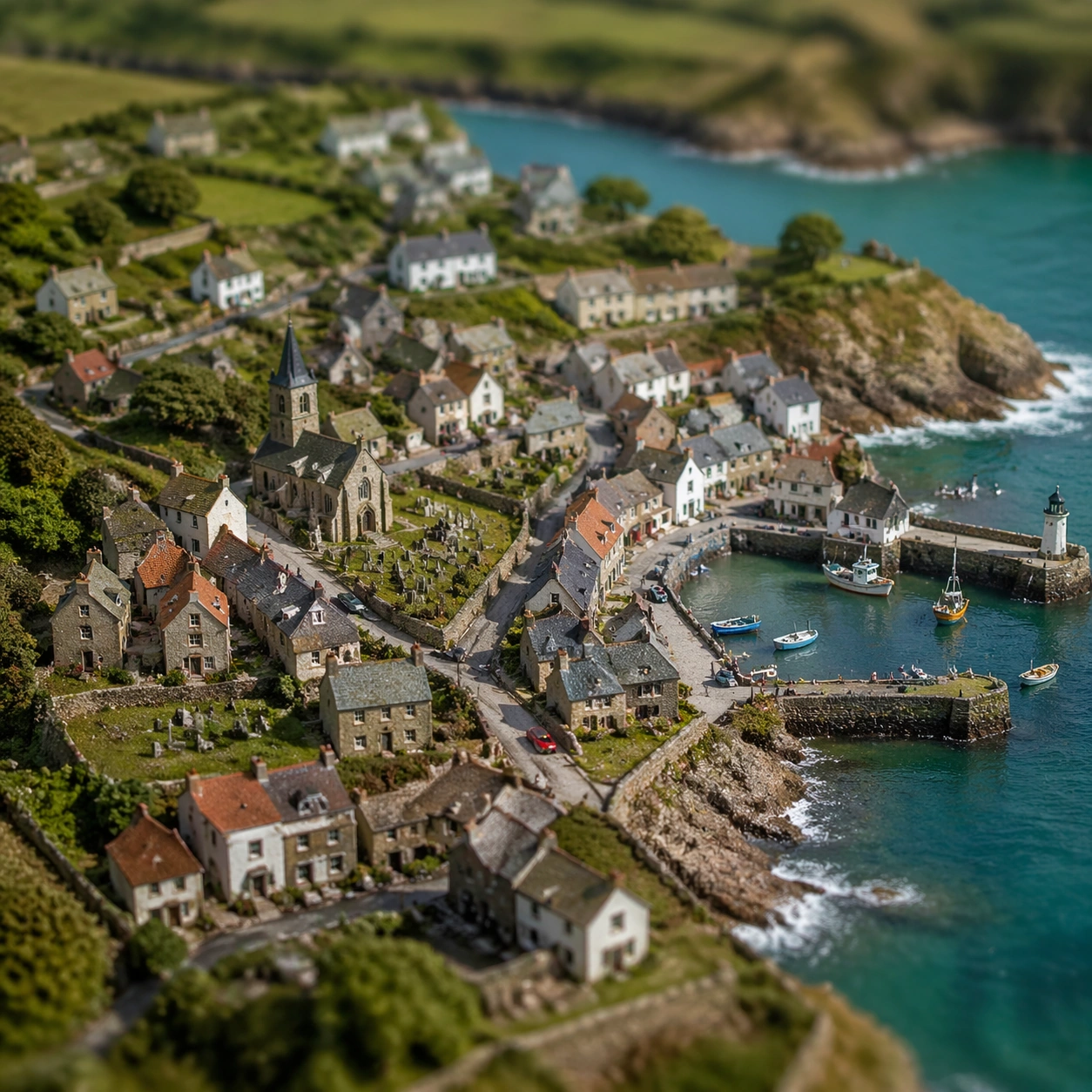
Example generated from “Miniature Coastal Village Photography-Style Study — ChaosRealmsAI · MIT”
GPT Image 2en

Scene: A square scene where miniature scale is believable through lens behavior, surface detail, and carefully staged environmental cues. Build the frame around a broad establishing world that reveals the miniature logic immediately. Keep the lighting, camera distance, and spatial organization tuned for a high-signal research image rather than a casual snapshot. The image belongs to the Tilt-Shift Miniature World theme and should feel immediately legible as a prompt atlas theme for tilt-shift miniature world, testing photorealism, physics-materials, style-transfer with gpt image 2.. Subject: Center the study on a broad establishing world that reveals the miniature logic immediately. Translate the theme into a concrete visual statement instead of an abstract mood board: the viewer should understand what kind of image this is, what is being tested, and why the composition is difficult. Use the slug idea of tilt shift miniature world as a literal guide for subject matter, materials, and staging. If helpful, borrow the broad visual cues suggested by tilt-shift, but keep the result original and specific to this study. Important details: The charm should come from credible micro-world logic: tiny infrastructure, scaled weathering, selective focus, and a clear sense of inhabited smallness. Preserve a disciplined square composition, clear focal hierarchy, and enough secondary information to make the image feel complete rather than underspecified. The image should look polished, novel, and exhibition-ready, with topic-specific credibility coming from the way surfaces, structure, and visual language reinforce Tilt-Shift Miniature World. Avoid generic filler elements that do not serve the main concept. Use case: Tilt-Shift Miniature World single study 1/8, testing photorealism, physics-materials, style-transfer through the village overview variation. Constraints: No readable text, no watermark, no logos, preserve exact 1:1 aspect ratio, no giant human hands, no obvious toy-store packaging, no random oversized props, no readable text, no flat diorama cuteness without realism, no muddy depth cues.

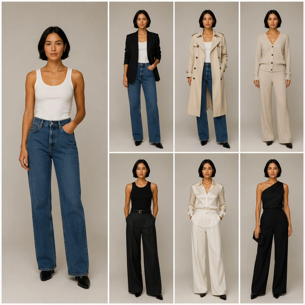
Example generated from “Synthetic Capsule-Wardrobe Consistency Board — ChaosRealmsAI · MIT”
GPT Image 2en

Scene: A square high-end studio try-on board on a neutral warm-gray set, photographed with softbox lighting and clean editorial spacing. The layout shows one larger source-like full-body view on the left and six smaller outfit results arranged in a precise grid on the right, all in the same camera height, lens feel, and lighting family. The mood is calm, premium, and clinically clear. Subject: A synthetic adult fashion model with the same oval face, short black bob haircut, medium warm skin tone, slim athletic body, straight posture, and relaxed closed-mouth expression in every panel. The clothing changes from a white tank and denim baseline into capsule wardrobe variants: black blazer, cream trench, ribbed knit set, wide-leg trousers, silk shirt, and minimalist evening separates. Jewelry, hair shape, face geometry, shoulder width, and body proportions must remain unchanged. Important details: This is an identity-lock virtual try-on board, not a character redesign. Preserve facial landmarks, eye spacing, jawline, nose bridge, lip shape, skin tone, neck length, hands, and height consistently. Let only garments, fabric drape, sleeve length, hemline, layering, and neutral styling change. Keep panels aligned so drift is easy to inspect. Use case: Virtual Try-On Identity Lock single study 1/8, testing whether a model can keep identity stable across multiple capsule wardrobe edits. Constraints: No readable text, no watermark, no logos, preserve exact 1:1 aspect ratio, no brand marks, no changed face, no changed body type, no extra people, no exaggerated makeup, no mismatched skin tone, no warped hands, no duplicate heads.

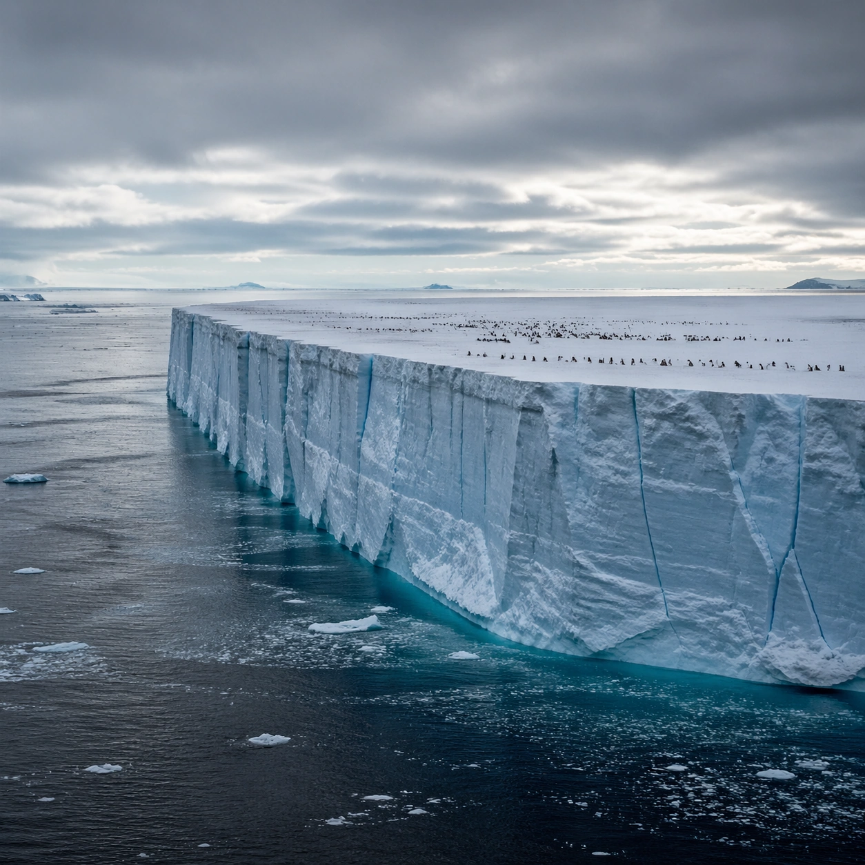
Example generated from “Antarctic Tabular-Iceberg Landscape Study — ChaosRealmsAI · MIT”
GPT Image 2en

Scene: Create a square, photoreal landscape study of antarctic tabular iceberg. Compose it as the clearest monument-scale establishing view, using a wide, level camera position with deep atmospheric recession and a calm, authoritative horizon. Let broad, sculpting natural light describe the major masses before it picks out the smaller details Keep the frame cinematic but disciplined, with a clear foreground, middle distance, and far mass so the viewer can measure real depth. The image should feel like a field photograph made with patience, precision, and sublime restraint rather than a fantasy matte painting. Subject: Show a vast Antarctic tabular iceberg adrift at sea, with one side dropping in a near-vertical ice cliff, blue fracture lines, open polar water, and a tiny penguin colony visible on the flat top. This variation should emphasize hero panorama. The main landform must dominate the composition, but secondary elements should quietly explain how the place works: water paths, sediment lines, snow bands, surf, ash, wind streaks, stars, or human traces where appropriate. Everything in the image should support the same idea of scale and climate, so the scene reads as one coherent environment rather than a stack of spectacular details. Important details: Preserve rectilinear iceberg geometry, sharp ice-edge scale, cold polar clarity, faint blue internal compression bands, and the unsettling simplicity of a floating frozen plateau. Keep one dominant landform, one secondary supporting rhythm, and a restrained scale witness so the scene reads immediately. Keep geology, weather, and atmosphere physically believable. Use subtle micro-texture, tonal separation, and air perspective to reinforce distance. If a human, vehicle, tent, caravan, bird, or boat appears, it must remain tiny and subordinate to the landscape, functioning only as a scale witness. The composition should feel original, severe, and elegant, with no decorative filler and no imitation of any copyrighted visual property. Use case: Antarctic Tabular Iceberg single study 1/9, exploring the hero panorama variation. Constraints: No readable text, no watermark, no logos, preserve exact 1:1 aspect ratio, no research station, no cruise liner, no aurora curtains, no whimsical cartoon penguins, no split-screen layout, no collage fragments, no exaggerated fisheye distortion, no kitsch color grading, no artificial border, no split-panel treatment.

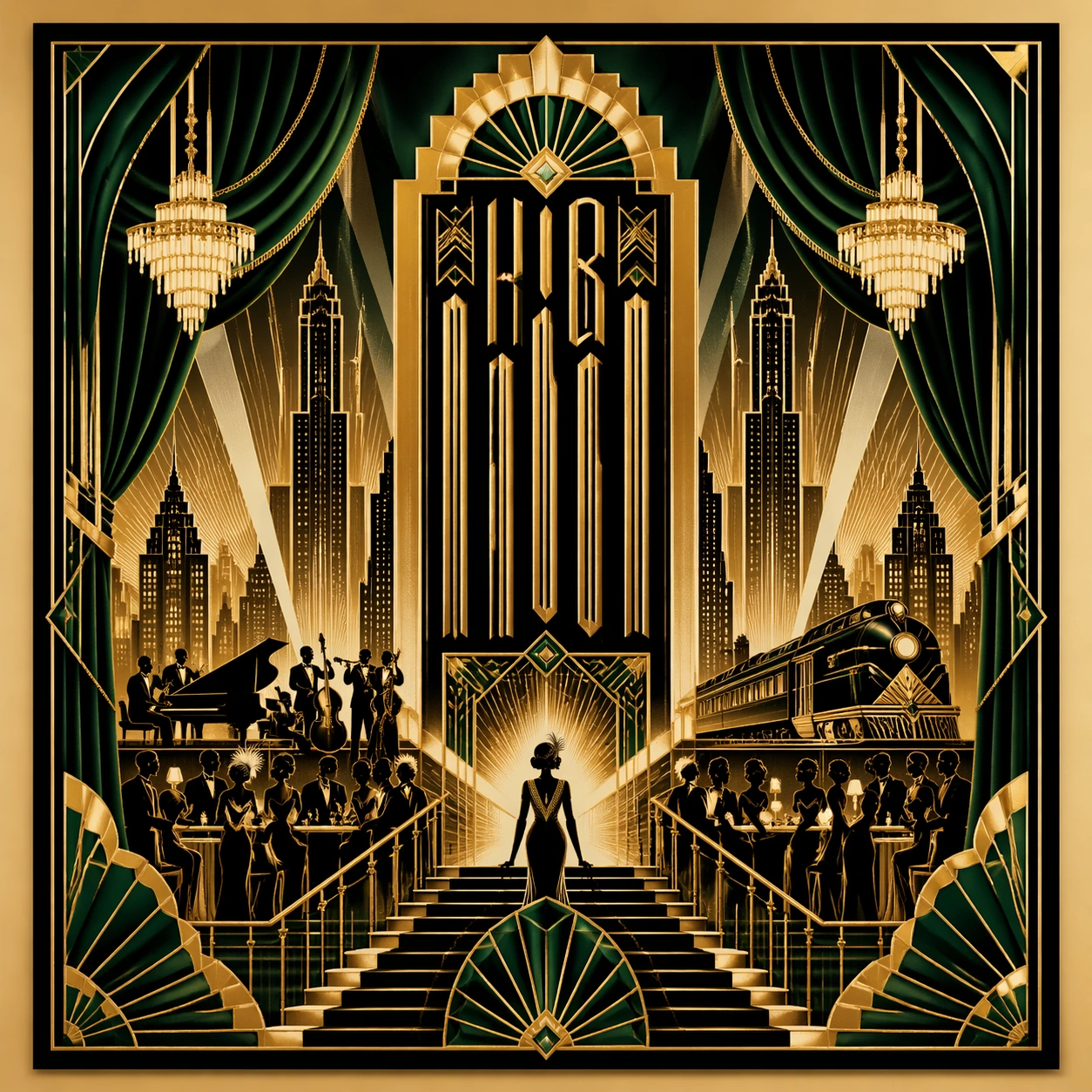
Example generated from “Art Deco Jazz-Theatre Poster Study — ChaosRealmsAI · MIT”
GPT Image 2en

Scene: A square straight-on studio view of a pristine poster mounted on a matte wall with even museum lighting, crisp corners, and enough breathing room around the sheet for the full composition to read as an intentional object. The poster should express luxury theatre-era deco symmetry with stepped arches, fan motifs, sunbursts, and jewel-like border framing, using metallic gold, deep black, emerald green, ivory, and restrained champagne highlights and a tactile surface appropriate to the medium. Subject: Build the flagship poster statement for this style, with the strongest hierarchy, the clearest subject silhouette, and the most disciplined balance between image field, pseudo-typography, and empty space. Use velvet curtains, skyline silhouettes, chandeliers, mirrored staircases, stage spotlights, and fan-shaped rays as the main visual ingredients, and organize them with tall condensed deco glyph blocks kept ornamental and non-readable. For the contemporary-subject axis, thread in a nocturnal rooftop jazz gala and sleek city train arrival absorbed into deco glamour. The poster must feel like an original design object rather than a reproduction of any known work. Important details: Treat this as the cleanest thesis image in the set: the paper should look fresh, the inks or paint should feel deliberate, and every formal rule of the style should be easy to study at a glance. Preserve mirror symmetry, thin metallic linework, precise ornament pacing, and elegant vertical emphasis. Keep every letterform abstract and non-readable, as if it were a typographic texture rather than language. Make the style unmistakable through composition, palette, surface behavior, and symbolic compression. no cheap glitter, no modern interface chrome, no casual streetwear, no cartoon softness. Use case: Art Deco Theatre single study 1/9, establishing the cleanest museum-grade poster reading. Constraints: No readable text, no watermark, no logos, preserve exact 1:1 aspect ratio, no copyrighted characters, no real brand marks, no QR codes, no interface chrome, no accidental gibberish lettering.
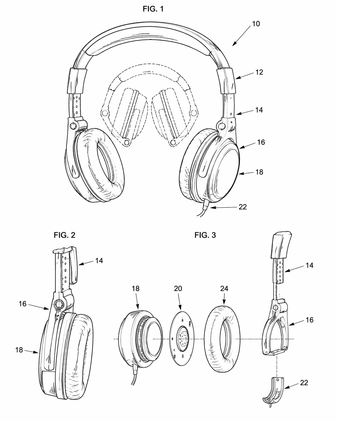
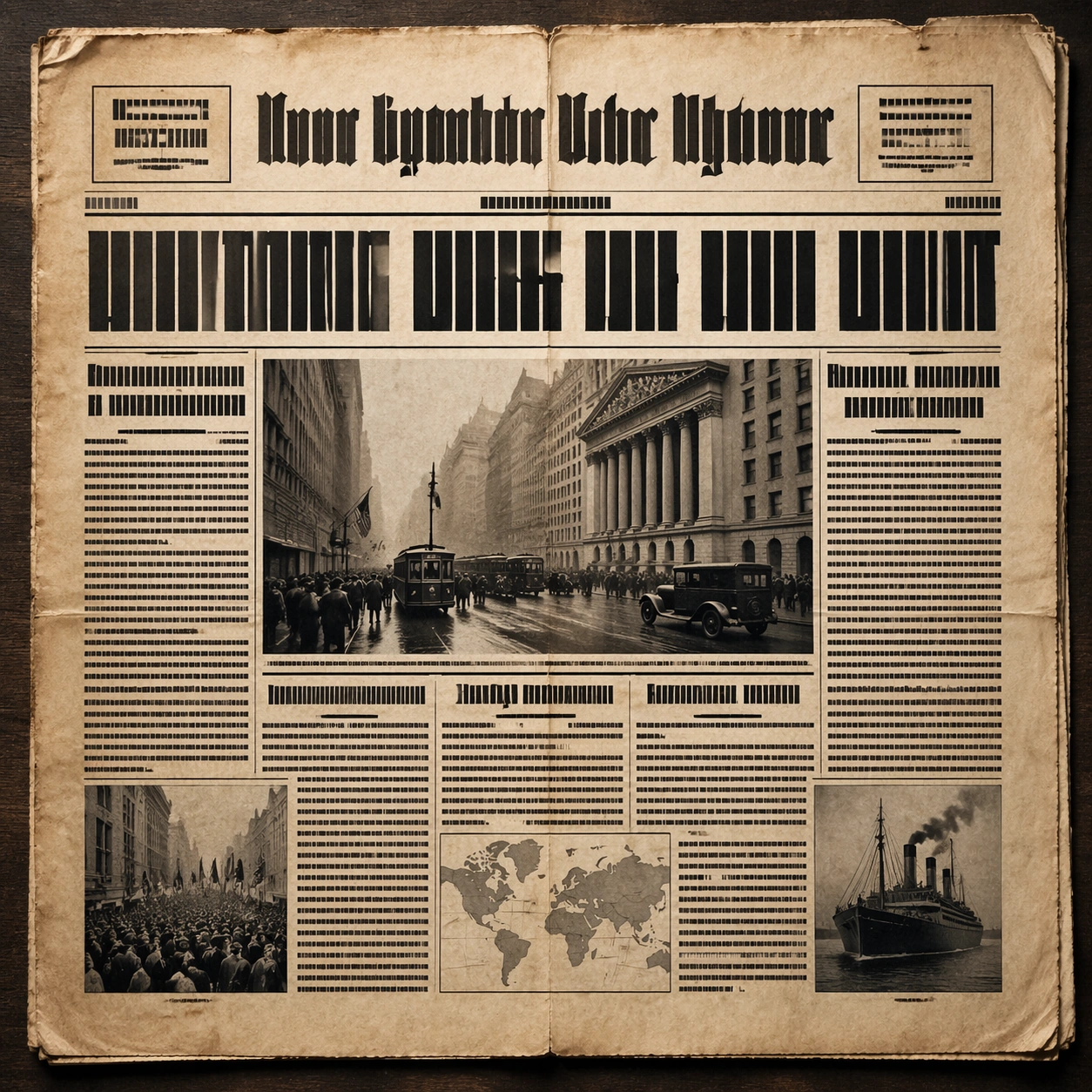
Example generated from “Automotive Cockpit Interface-State Concept Board — ChaosRealmsAI · MIT”
GPT Image 2en

Scene: A square flat-to-slightly-angled board with screen panels, clean reflections, dark neutral ground, and disciplined spacing. Compose the frame as a square key visual with disciplined camera placement, premium lighting control, and believable real-world scale. The tonal range should feel polished and intentional, with enough atmosphere to create depth without obscuring form. Keep contrast calibrated for launch, catalog, or research presentation use rather than casual snapshot aesthetics. Subject: Center original in-car interface states for navigation, energy, audio, and parking embedded into premium display surfaces. Make the subject feel original, production-aware, and clearly grounded in Automotive Interior Cockpit UI Hero. Treat this as an independent study that must feel complete and coherent without relying on any external reference image. The focal hierarchy should be immediate: primary form first, then material behavior, then supporting environmental cues that clarify use context and difficulty. Important details: Use automotive UI logic with abstract graphs, icon blocks, and map fields that remain non-readable. The board should feel like a real design review artifact rather than a fantasy dashboard collage. The visual language should still feel native to Automotive Interior Cockpit UI Hero, using disciplined industrial or campaign composition instead of generic stock photography. Use believable materials, engineering logic, and professional composition discipline. Reflections, shadows, edge breaks, texture scale, interface density, and small physical joints must all support realism. Avoid filler props, vague mood-board clutter, or any element that weakens the sense of a purpose-built industrial or automotive image. Use case: Cockpit UI single study 5/9 for Automotive Interior Cockpit UI Hero, built as image support-one. Constraints: No readable text, no watermark, no logos, preserve exact 1:1 aspect ratio, no readable text, no logos, no app-store iconography, no fantasy holograms, no navigation labels, no brand marks.

Example generated from “Bauhaus Bike-Share and Wayfinding Poster Study — ChaosRealmsAI · MIT”
GPT Image 2en

Scene: A square straight-on studio view of a pristine poster mounted on a matte wall with even museum lighting, crisp corners, and enough breathing room around the sheet for the full composition to read as an intentional object. The poster should express strict geometric modernism built from circles, bars, triangles, squares, and measured negative space, using cobalt blue, mustard yellow, cadmium red, black, and warm paper white and a tactile surface appropriate to the medium. Subject: Build the flagship poster statement for this style, with the strongest hierarchy, the clearest subject silhouette, and the most disciplined balance between image field, pseudo-typography, and empty space. Use modular furniture silhouettes, workshop tools, compass arcs, ruler lines, and architecture-school diagrams as the main visual ingredients, and organize them with geometric sans-serif blocks and numerals treated purely as non-readable forms. For the contemporary-subject axis, thread in a bike-share docking station and urban wayfinding elements reduced into pure geometry. The poster must feel like an original design object rather than a reproduction of any known work. Important details: Treat this as the cleanest thesis image in the set: the paper should look fresh, the inks or paint should feel deliberate, and every formal rule of the style should be easy to study at a glance. Preserve mathematical spacing, flat planes, hard edges, exact weight distribution, and clean asymmetry. Keep every letterform abstract and non-readable, as if it were a typographic texture rather than language. Make the style unmistakable through composition, palette, surface behavior, and symbolic compression. no decorative flourishes, no gradients, no photoreal portraits, no soft painterly blending. Use case: Bauhaus Poster single study 1/9, establishing the cleanest museum-grade poster reading. Constraints: No readable text, no watermark, no logos, preserve exact 1:1 aspect ratio, no copyrighted characters, no real brand marks, no QR codes, no interface chrome, no accidental gibberish lettering.

Example generated from “Norwegian-Fjord Landscape Study — ChaosRealmsAI · MIT”
GPT Image 2en

Scene: Create a square, photoreal landscape study of norwegian fjord deep cut. Compose it as the clearest monument-scale establishing view, using a wide, level camera position with deep atmospheric recession and a calm, authoritative horizon. Let broad, sculpting natural light describe the major masses before it picks out the smaller details Keep the frame cinematic but disciplined, with a clear foreground, middle distance, and far mass so the viewer can measure real depth. The image should feel like a field photograph made with patience, precision, and sublime restraint rather than a fantasy matte painting. Subject: Show a Norwegian fjord in afternoon light, with thousand-meter cliffs dropping into mirror-still dark water, waterfall ribbons descending the rock faces, and a small fishing boat leaving a white wake. This variation should emphasize hero panorama. The main landform must dominate the composition, but secondary elements should quietly explain how the place works: water paths, sediment lines, snow bands, surf, ash, wind streaks, stars, or human traces where appropriate. Everything in the image should support the same idea of scale and climate, so the scene reads as one coherent environment rather than a stack of spectacular details. Important details: Preserve sheer vertical drop, dark reflective water, wet rock detail, mist from waterfalls, and the sensation of glacial erosion cutting a deep, precise corridor through the mountains. Keep one dominant landform, one secondary supporting rhythm, and a restrained scale witness so the scene reads immediately. Keep geology, weather, and atmosphere physically believable. Use subtle micro-texture, tonal separation, and air perspective to reinforce distance. If a human, vehicle, tent, caravan, bird, or boat appears, it must remain tiny and subordinate to the landscape, functioning only as a scale witness. The composition should feel original, severe, and elegant, with no decorative filler and no imitation of any copyrighted visual property. Use case: Norwegian Fjord Deep Cut single study 1/9, exploring the hero panorama variation. Constraints: No readable text, no watermark, no logos, preserve exact 1:1 aspect ratio, no cruise ship, no town skyline, no suspension bridge, no tropical water color, no split-screen layout, no collage fragments, no exaggerated fisheye distortion, no kitsch color grading, no artificial border, no split-panel treatment.