プロンプト · 創作の探索

プロンプトギャラリー

実際のプロンプトと生成例を探索。次の創作に役立つヒントを見つけ、全文を無料でコピーできます。

生成例
10,974
モデル
17
出典
1277
10,974 件のプロンプト例 · ページ 13 / 229
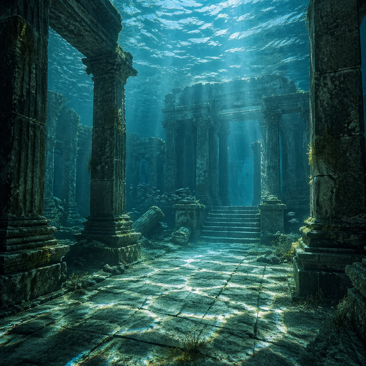
Example generated from “Underwater Caustics Temple — Reference Anchor”
GPT Image 2en

Scene: Create a square cinematic still for Underwater Caustics Temple. Use production-grade photoreal lighting, disciplined lens behavior, and a composition that feels like a finished key frame from an original film rather than a casual snapshot. A flooded ancient temple hall sits under clear seawater, where refracted sunlight ripples across columns, steps, and the stone floor in moving caustic bands, while the water body above remains bright and softly turbulent. Keep the camera in a disciplined anchor position so the full lighting event and the main spatial structure are immediately legible from edge to edge. Subject: Build a coherent original scene whose emotional center comes from atmosphere, light physics, and spatial clarity. Avoid relying on celebrity likeness, franchise iconography, or stylized illustration shortcuts. Weathered pillars, broken carvings, drifting silt, threadlike algae, and a single calm fish or small school gliding through the chamber should provide scale and life without turning the frame into an aquarium fantasy. This frame should lock the canonical arrangement, scale relationship, and emotional tone that the later dependent images inherit. Important details: Preserve a believable physical world with strong depth layering, careful color separation, and premium image discipline. Make the caustics physically convincing on hard stone surfaces, with believable attenuation, soft blue-green depth, particulate haze, and refraction logic that sells the image as a real submerged space rather than a digital backdrop. Use this image to establish the authoritative direction of light, atmospheric density, and structural silhouette for the package. Use case: Caustics Temple series study 1/9. Constraints: No readable text, no watermark, no logos, preserve exact 1:1 aspect ratio, no divers, no submarines, no treasure-chest cliches, no readable inscriptions, no cartoon coral overload.
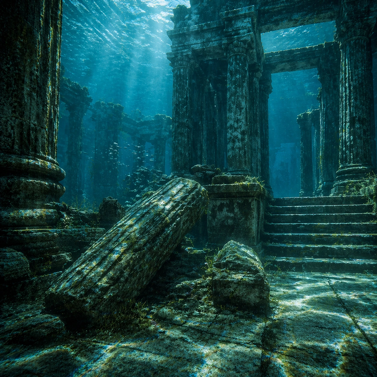
Example generated from “Underwater Caustics Temple — Closer Frame”
GPT Image 2en

Scene: Create a square cinematic still for Underwater Caustics Temple. Use production-grade photoreal lighting, disciplined lens behavior, and a composition that feels like a finished key frame from an original film rather than a casual snapshot. A flooded ancient temple hall sits under clear seawater, where refracted sunlight ripples across columns, steps, and the stone floor in moving caustic bands, while the water body above remains bright and softly turbulent. Move the camera closer or lower so the viewer feels more embedded inside the atmosphere while the same light direction and environment remain intact. Subject: Build a coherent original scene whose emotional center comes from atmosphere, light physics, and spatial clarity. Avoid relying on celebrity likeness, franchise iconography, or stylized illustration shortcuts. Weathered pillars, broken carvings, drifting silt, threadlike algae, and a single calm fish or small school gliding through the chamber should provide scale and life without turning the frame into an aquarium fantasy. Preserve the same world logic from the reference and let one human-scale or material-scale element become more prominent without stealing focus from the atmosphere. Important details: Preserve a believable physical world with strong depth layering, careful color separation, and premium image discipline. Make the caustics physically convincing on hard stone surfaces, with believable attenuation, soft blue-green depth, particulate haze, and refraction logic that sells the image as a real submerged space rather than a digital backdrop. Keep the palette family, structural read, and light behavior from image 01 while increasing immediacy and tactile presence. Use case: Caustics Temple series study 2/9. Constraints: No readable text, no watermark, no logos, preserve exact 1:1 aspect ratio, no divers, no submarines, no treasure-chest cliches, no readable inscriptions, no cartoon coral overload.
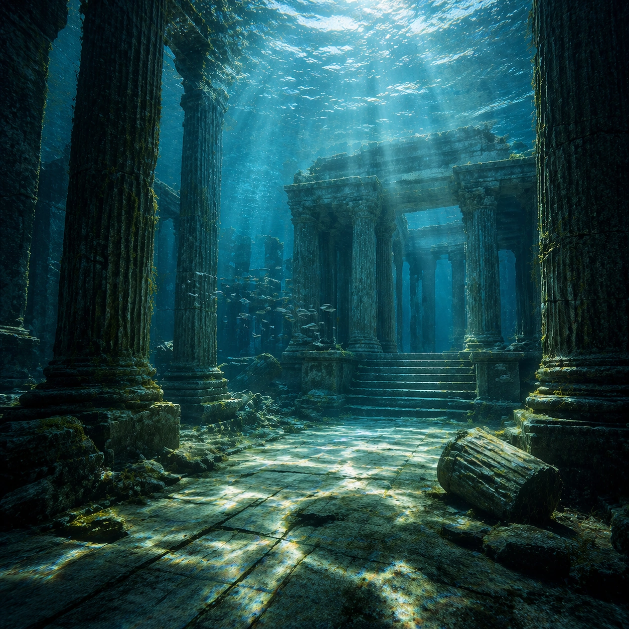
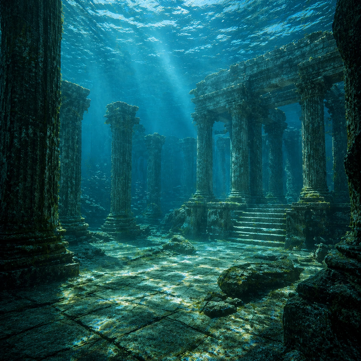
Example generated from “Underwater Caustics Temple — Spatial Counterpoint”
GPT Image 2en

Scene: Create a square cinematic still for Underwater Caustics Temple. Use production-grade photoreal lighting, disciplined lens behavior, and a composition that feels like a finished key frame from an original film rather than a casual snapshot. A flooded ancient temple hall sits under clear seawater, where refracted sunlight ripples across columns, steps, and the stone floor in moving caustic bands, while the water body above remains bright and softly turbulent. Shift to an oblique or lateral point of view that reveals different depth layers while staying inside the same place and the same atmospheric event. Subject: Build a coherent original scene whose emotional center comes from atmosphere, light physics, and spatial clarity. Avoid relying on celebrity likeness, franchise iconography, or stylized illustration shortcuts. Weathered pillars, broken carvings, drifting silt, threadlike algae, and a single calm fish or small school gliding through the chamber should provide scale and life without turning the frame into an aquarium fantasy. Hold the reference structure, but use the new angle to show secondary planes, foreground interruption, or a changed distance relationship. Important details: Preserve a believable physical world with strong depth layering, careful color separation, and premium image discipline. Make the caustics physically convincing on hard stone surfaces, with believable attenuation, soft blue-green depth, particulate haze, and refraction logic that sells the image as a real submerged space rather than a digital backdrop. The success condition is continuity with the reference plus a richer sense of depth, not a new location or a new lighting system. Use case: Caustics Temple series study 3/9. Constraints: No readable text, no watermark, no logos, preserve exact 1:1 aspect ratio, no divers, no submarines, no treasure-chest cliches, no readable inscriptions, no cartoon coral overload.
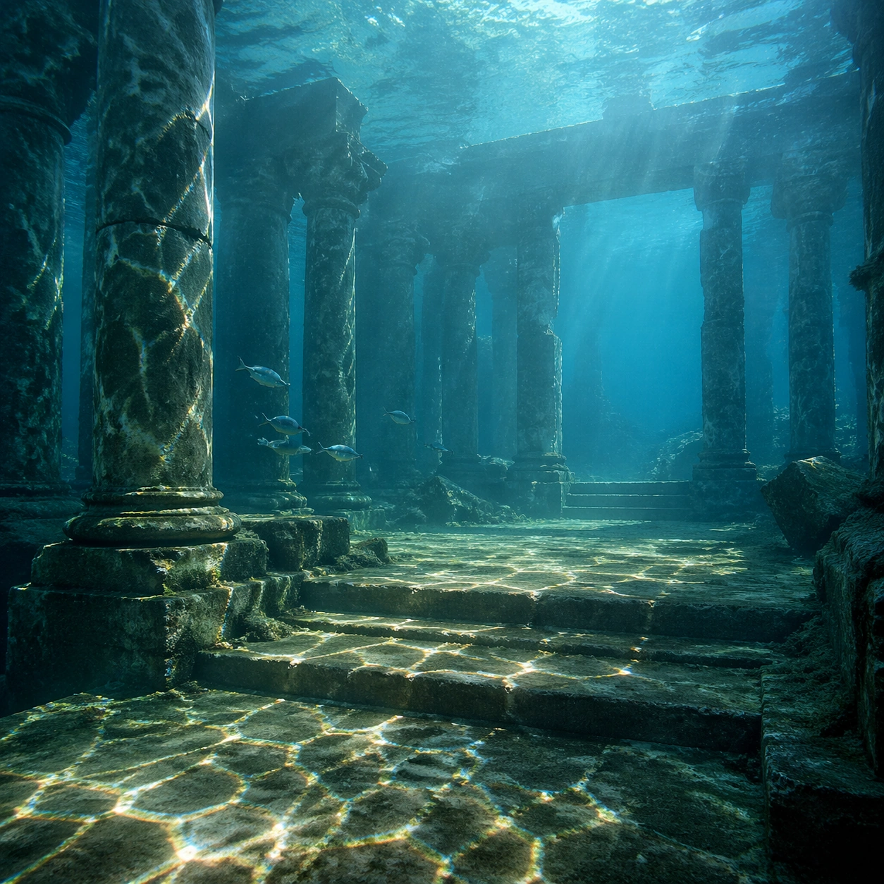
Example generated from “Underwater Caustics Temple — Climax Frame”
GPT Image 2en

Scene: Create a square cinematic still for Underwater Caustics Temple. Use production-grade photoreal lighting, disciplined lens behavior, and a composition that feels like a finished key frame from an original film rather than a casual snapshot. A flooded ancient temple hall sits under clear seawater, where refracted sunlight ripples across columns, steps, and the stone floor in moving caustic bands, while the water body above remains bright and softly turbulent. Push the composition toward the emotional peak of the same setup, with the most dramatic balance of brightness, shadow, or atmospheric density inside the established world. Subject: Build a coherent original scene whose emotional center comes from atmosphere, light physics, and spatial clarity. Avoid relying on celebrity likeness, franchise iconography, or stylized illustration shortcuts. Weathered pillars, broken carvings, drifting silt, threadlike algae, and a single calm fish or small school gliding through the chamber should provide scale and life without turning the frame into an aquarium fantasy. Everything should still read as the same location and same event, but framed for maximum narrative force and visual closure. Important details: Preserve a believable physical world with strong depth layering, careful color separation, and premium image discipline. Make the caustics physically convincing on hard stone surfaces, with believable attenuation, soft blue-green depth, particulate haze, and refraction logic that sells the image as a real submerged space rather than a digital backdrop. Make it feel like the strongest hero frame of the sequence without breaking continuity or introducing a new design language. Use case: Caustics Temple series study 4/9. Constraints: No readable text, no watermark, no logos, preserve exact 1:1 aspect ratio, no divers, no submarines, no treasure-chest cliches, no readable inscriptions, no cartoon coral overload.
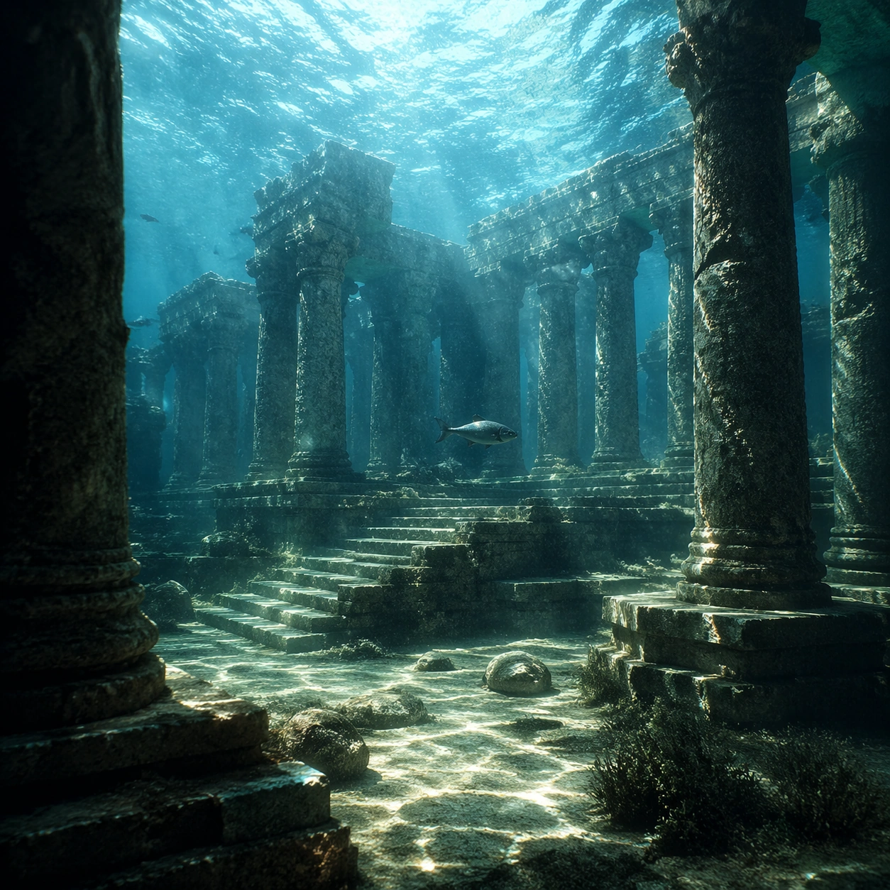
Example generated from “Underwater Caustics Temple — Surface Study”
GPT Image 2en

Scene: Create a square cinematic still for Underwater Caustics Temple. Use production-grade photoreal lighting, disciplined lens behavior, and a composition that feels like a finished key frame from an original film rather than a casual snapshot. A flooded ancient temple hall sits under clear seawater, where refracted sunlight ripples across columns, steps, and the stone floor in moving caustic bands, while the water body above remains bright and softly turbulent. Build an independent square study around the way atmosphere interacts with surfaces, keeping enough environmental context for the image to feel finished rather than cropped at random. Subject: Build a coherent original scene whose emotional center comes from atmosphere, light physics, and spatial clarity. Avoid relying on celebrity likeness, franchise iconography, or stylized illustration shortcuts. Weathered pillars, broken carvings, drifting silt, threadlike algae, and a single calm fish or small school gliding through the chamber should provide scale and life without turning the frame into an aquarium fantasy. Let textures, reflections, residue, moisture, dust, or particulate response become primary, while the broader setting remains clearly implied. Important details: Preserve a believable physical world with strong depth layering, careful color separation, and premium image discipline. Make the caustics physically convincing on hard stone surfaces, with believable attenuation, soft blue-green depth, particulate haze, and refraction logic that sells the image as a real submerged space rather than a digital backdrop. The key is material credibility under dramatic light, with micro-contrast and controlled mood supporting the theme. Use case: Caustics Temple single study 5/9. Constraints: No readable text, no watermark, no logos, preserve exact 1:1 aspect ratio, no divers, no submarines, no treasure-chest cliches, no readable inscriptions, no cartoon coral overload.
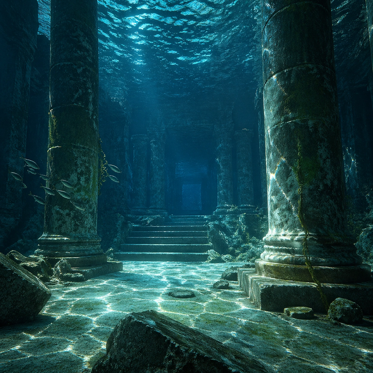
Example generated from “Underwater Caustics Temple — Silhouette Study”
GPT Image 2en

Scene: Create a square cinematic still for Underwater Caustics Temple. Use production-grade photoreal lighting, disciplined lens behavior, and a composition that feels like a finished key frame from an original film rather than a casual snapshot. A flooded ancient temple hall sits under clear seawater, where refracted sunlight ripples across columns, steps, and the stone floor in moving caustic bands, while the water body above remains bright and softly turbulent. Compose an independent frame where one human, animal, or object silhouette negotiates with the atmospheric light event in a clean, readable way. Subject: Build a coherent original scene whose emotional center comes from atmosphere, light physics, and spatial clarity. Avoid relying on celebrity likeness, franchise iconography, or stylized illustration shortcuts. Weathered pillars, broken carvings, drifting silt, threadlike algae, and a single calm fish or small school gliding through the chamber should provide scale and life without turning the frame into an aquarium fantasy. The silhouette should supply scale and emotional orientation, but the environment still needs to carry most of the storytelling weight. Important details: Preserve a believable physical world with strong depth layering, careful color separation, and premium image discipline. Make the caustics physically convincing on hard stone surfaces, with believable attenuation, soft blue-green depth, particulate haze, and refraction logic that sells the image as a real submerged space rather than a digital backdrop. Keep the silhouette simple and believable, avoiding poster-like graphic flattening while preserving strong contrast. Use case: Caustics Temple single study 6/9. Constraints: No readable text, no watermark, no logos, preserve exact 1:1 aspect ratio, no divers, no submarines, no treasure-chest cliches, no readable inscriptions, no cartoon coral overload.
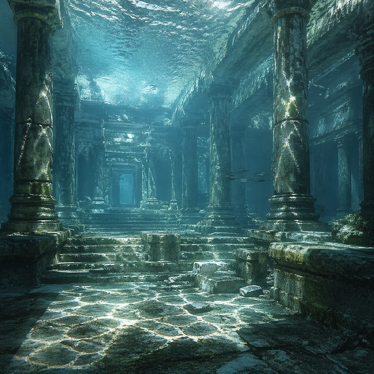
Example generated from “Underwater Caustics Temple — Transition Study”
GPT Image 2en

Scene: Create a square cinematic still for Underwater Caustics Temple. Use production-grade photoreal lighting, disciplined lens behavior, and a composition that feels like a finished key frame from an original film rather than a casual snapshot. A flooded ancient temple hall sits under clear seawater, where refracted sunlight ripples across columns, steps, and the stone floor in moving caustic bands, while the water body above remains bright and softly turbulent. Treat this as an adjacent moment before or after the main event, preserving the same topic language while letting the atmosphere shift slightly in intensity or position. Subject: Build a coherent original scene whose emotional center comes from atmosphere, light physics, and spatial clarity. Avoid relying on celebrity likeness, franchise iconography, or stylized illustration shortcuts. Weathered pillars, broken carvings, drifting silt, threadlike algae, and a single calm fish or small school gliding through the chamber should provide scale and life without turning the frame into an aquarium fantasy. Show the environment in transition, with clear evidence of recent motion, changing weather, or fading light, but without turning it into action spectacle. Important details: Preserve a believable physical world with strong depth layering, careful color separation, and premium image discipline. Make the caustics physically convincing on hard stone surfaces, with believable attenuation, soft blue-green depth, particulate haze, and refraction logic that sells the image as a real submerged space rather than a digital backdrop. Subtle temporal storytelling matters here more than maximal drama, so let traces, gradients, and environmental residue do the work. Use case: Caustics Temple single study 7/9. Constraints: No readable text, no watermark, no logos, preserve exact 1:1 aspect ratio, no divers, no submarines, no treasure-chest cliches, no readable inscriptions, no cartoon coral overload.
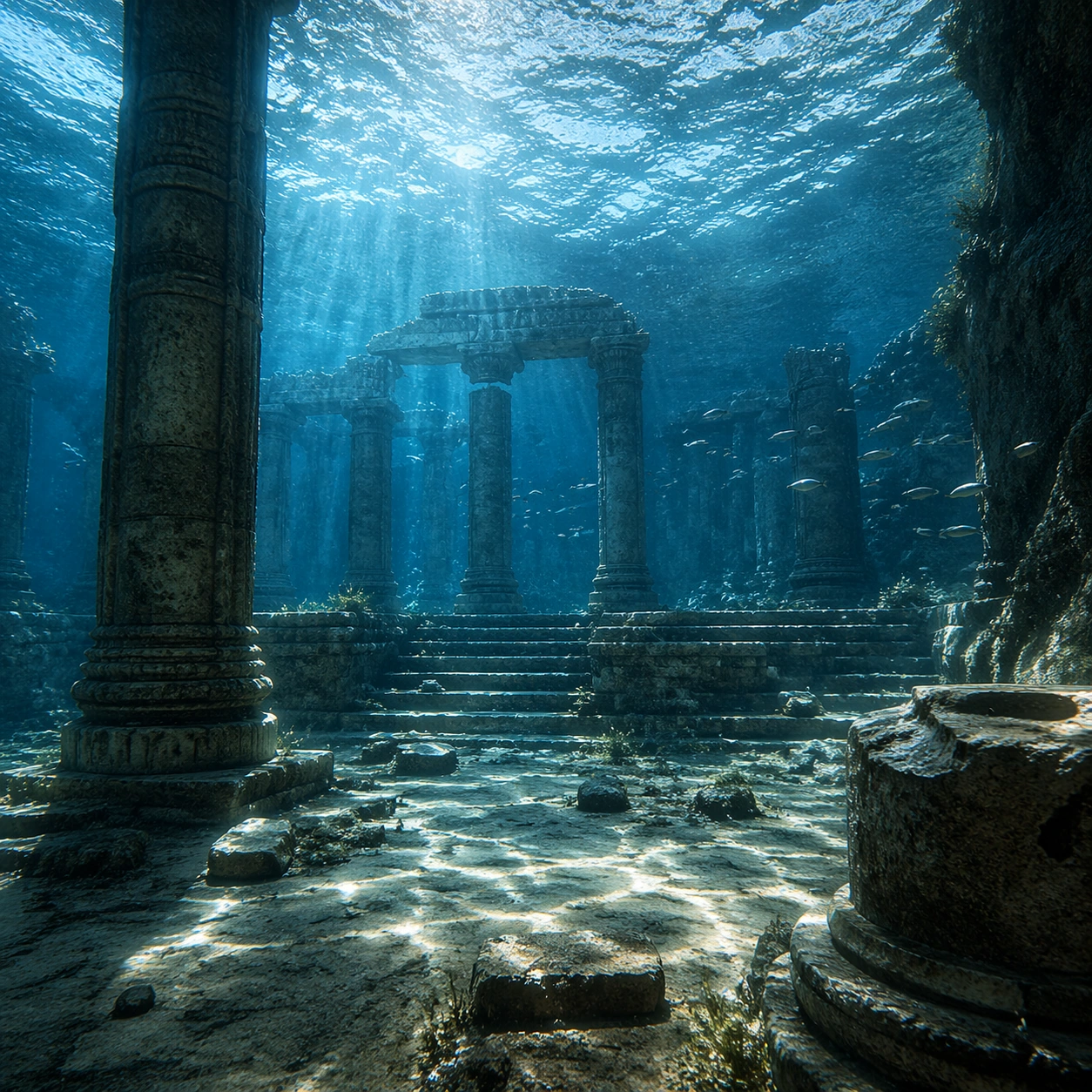
Example generated from “Underwater Caustics Temple — Wide Study”
GPT Image 2en

Scene: Create a square cinematic still for Underwater Caustics Temple. Use production-grade photoreal lighting, disciplined lens behavior, and a composition that feels like a finished key frame from an original film rather than a casual snapshot. A flooded ancient temple hall sits under clear seawater, where refracted sunlight ripples across columns, steps, and the stone floor in moving caustic bands, while the water body above remains bright and softly turbulent. Pull back enough to explain the broader geography or architectural envelope while keeping the square crop intentional and balanced. Subject: Build a coherent original scene whose emotional center comes from atmosphere, light physics, and spatial clarity. Avoid relying on celebrity likeness, franchise iconography, or stylized illustration shortcuts. Weathered pillars, broken carvings, drifting silt, threadlike algae, and a single calm fish or small school gliding through the chamber should provide scale and life without turning the frame into an aquarium fantasy. The wider frame should reveal how the main light or weather phenomenon organizes the surrounding world and not just the immediate subject. Important details: Preserve a believable physical world with strong depth layering, careful color separation, and premium image discipline. Make the caustics physically convincing on hard stone surfaces, with believable attenuation, soft blue-green depth, particulate haze, and refraction logic that sells the image as a real submerged space rather than a digital backdrop. Make scale legible through spacing, horizon control, and foreground-to-background separation rather than through extra props. Use case: Caustics Temple single study 8/9. Constraints: No readable text, no watermark, no logos, preserve exact 1:1 aspect ratio, no divers, no submarines, no treasure-chest cliches, no readable inscriptions, no cartoon coral overload.
Example generated from “Underwater Caustics Temple — Afterglow Study”
GPT Image 2en

Scene: Create a square cinematic still for Underwater Caustics Temple. Use production-grade photoreal lighting, disciplined lens behavior, and a composition that feels like a finished key frame from an original film rather than a casual snapshot. A flooded ancient temple hall sits under clear seawater, where refracted sunlight ripples across columns, steps, and the stone floor in moving caustic bands, while the water body above remains bright and softly turbulent. End on a quieter independent image that holds the residue of the topic atmosphere after its loudest moment has passed, while still feeling complete and exhibition-ready. Subject: Build a coherent original scene whose emotional center comes from atmosphere, light physics, and spatial clarity. Avoid relying on celebrity likeness, franchise iconography, or stylized illustration shortcuts. Weathered pillars, broken carvings, drifting silt, threadlike algae, and a single calm fish or small school gliding through the chamber should provide scale and life without turning the frame into an aquarium fantasy. The frame should suggest memory, aftermath, or lingering presence through environment first and only secondarily through any figure or object. Important details: Preserve a believable physical world with strong depth layering, careful color separation, and premium image discipline. Make the caustics physically convincing on hard stone surfaces, with believable attenuation, soft blue-green depth, particulate haze, and refraction logic that sells the image as a real submerged space rather than a digital backdrop. Favor restraint, believable light decay, and subtle narrative closure over spectacle or decorative excess. Use case: Caustics Temple single study 9/9. Constraints: No readable text, no watermark, no logos, preserve exact 1:1 aspect ratio, no divers, no submarines, no treasure-chest cliches, no readable inscriptions, no cartoon coral overload.
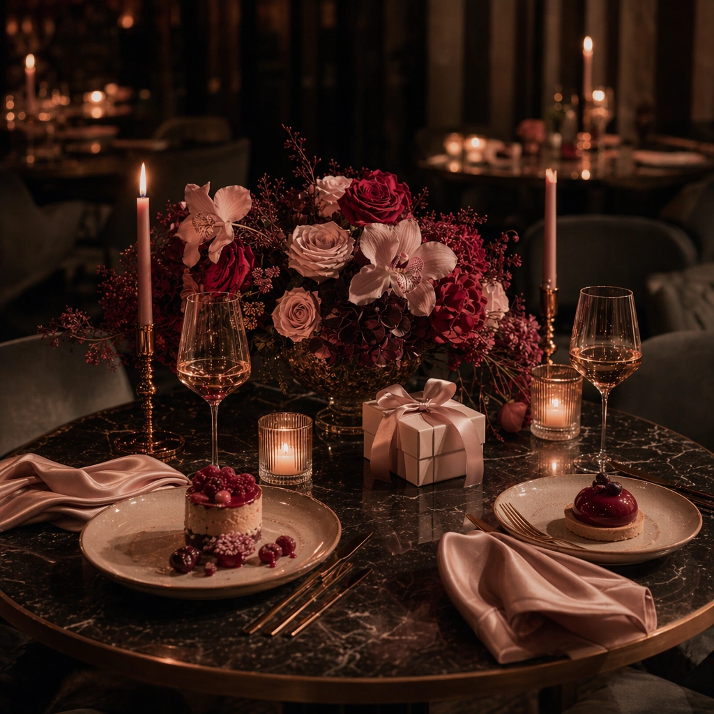
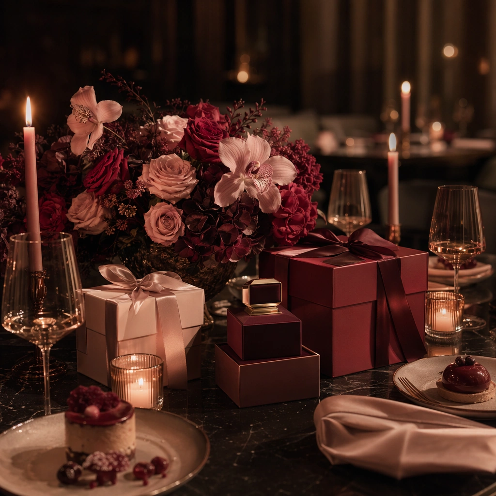
Example generated from “Valentines Romance Campaign System — Rose Dinner Anchor”
GPT Image 2en

Scene: Create a square premium Valentines campaign image set in a dim, elegant dining environment with soft blush highlights, deep wine red accents, candle glow, and controlled shadow. The frame should feel sensual but restrained, with polished table surfaces and enough spatial depth that the image reads as a real hospitality or gifting campaign hero rather than a generic romance wallpaper. Keep the light flattering, cinematic, and commercially usable. Subject: Center a curated table arrangement combining florals, wrapped gifts, glassware, satin ribbon, candles, dessert textures, and one carefully presented premium product form such as a jewelry box or fragrance-like silhouette. The objects should imply celebration, gifting, and evening intimacy without becoming cluttered or theatrical. Build the scene so gifting and dining coexist as one coherent commercial language. Important details: Lock the romance grammar here: muted blush, burgundy, warm candle amber, soft ivory, satin sheen, petal density, and a poised balance between intimacy and polish. Keep the composition sophisticated enough for premium retail, restaurants, and experiential brands. Every surface should feel tactically styled, from linen folds to glass reflections, with no cheap heart clichés or oversaturated pink overload. This is the anchor for the full Valentines system. Use case: Valentines series study 1/9. Constraints: No readable text, no watermark, no logos, preserve exact 1:1 aspect ratio, no readable menus, no obvious heart balloons, no cartoon cupid imagery, no celebrity romance styling, no brand marks, no crowded banquet, no novelty props, no harsh nightclub lighting.
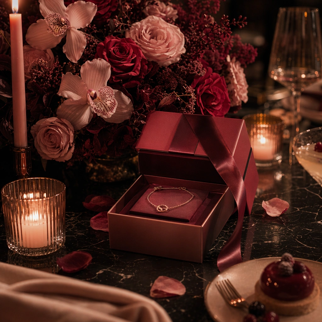
Example generated from “Valentines Romance Campaign System — Jewelry Gift Variation”
GPT Image 2en

Scene: Create a square dependent Valentines campaign visual in the same evening environment, keeping the same candle warmth, blush-and-burgundy palette, and polished hospitality depth, but move the framing slightly closer so the gifting moment reads as more concentrated and precious. The composition should still feel clearly connected to the reference image, as if it were another asset from the same campaign shoot rather than a different brand universe. Subject: Feature a refined jewelry presentation with a gift box, satin ribbon, petals, glass accents, and a small dessert or drink cue that ties the scene back to the dining context. Preserve the exact romance language, lighting angle, floral density, and material finish from the reference model while changing the product hierarchy toward intimate gifting. The result should feel premium, restrained, and highly reusable. Important details: Preserve exact campaign identity from the reference image: same light temperature, same petal logic, same textile richness, and the same balanced mix of desire and polish. Let jewelry be signaled through form and luxury presentation, not through logos or readable packaging. Surfaces should stay realistic and elegant, with believable reflections, clean box construction, and an atmosphere that supports gifting without becoming melodramatic. Use case: Valentines series study 2/9. Constraints: No readable text, no watermark, no logos, preserve exact 1:1 aspect ratio, preserve exact campaign identity from the reference image, no readable jewelry certificates, no ring-box clichés with giant diamonds, no cheap glitter, no visible brand marks, no oversaturated hot pink, no extra hands, no scattered confetti.

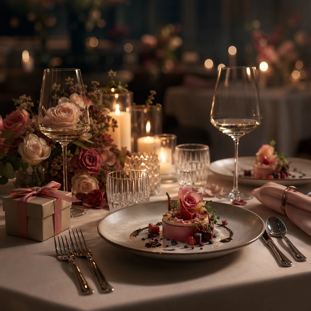
Example generated from “Valentines Romance Campaign System — Intimate Dining Variation”
GPT Image 2en

Scene: Create a square dependent campaign visual inside the same romantic environment, with the same soft candle glow, blush-burgundy palette, and layered restaurant depth, but widen the framing to prioritize the table setting and atmosphere. The camera should still feel tied to the anchor scene, preserving the same lens behavior and visual polish while turning the composition into a hospitality hero suitable for reservations, social rollout, or event promotion. Subject: Show an elegant two-place dinner setting with florals, dessert plating, glassware, folded napkins, and one discreet wrapped gift or premium token that keeps gifting logic alive. Preserve the exact color balance, floral character, satin accents, and light direction from the reference model while emphasizing the dining experience. The scene must remain tasteful, premium, and free of any readable restaurant materials. Important details: Maintain the exact campaign grammar from the reference image. Only shift the hierarchy toward tablescape and mood. Make plate glaze, linen folds, candle wax, glass refraction, and petal texture feel physically convincing. Avoid generic wedding vibes; this should read as a refined Valentines campaign for restaurants or experiential brands. The viewer should see unmistakable continuity with the anchor image while still getting a distinct deliverable surface. Use case: Valentines series study 3/9. Constraints: No readable text, no watermark, no logos, preserve exact 1:1 aspect ratio, preserve exact campaign identity from the reference image, no readable menus, no visible people dining, no wedding rings, no bouquet excess, no cheesy red neon, no logo glassware, no banquet-hall clutter.

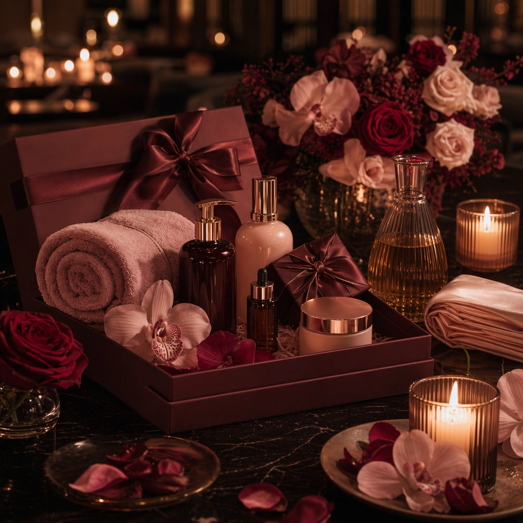
Example generated from “Valentines Romance Campaign System — Beauty Escape Variation”
GPT Image 2en

Scene: Create a square dependent Valentines image within the same romantic visual universe, keeping the identical candle-warm palette, satin surfaces, floral accents, and polished evening depth, but shift the staging toward a boutique beauty or spa-experience offer. Preserve the same cinematic softness from the anchor while making the arrangement cleaner and more object-centered, suitable for a premium service campaign or gifting package visual. Subject: Feature a refined arrangement of wrapped beauty items, folded towels or satin cloth, petals, candle vessels, and one premium gift box or tray that signals a shared romantic experience. Preserve the exact palette, material behavior, and floral-light grammar from the reference image while changing only the service category emphasis. The composition should feel intimate, elegant, and viable for a Valentines campaign aimed at beauty, wellness, or experiential gifting. Important details: Hold continuity tightly: same atmosphere, same luxurious restraint, same tactile standards, and same tasteful romance tone. Make cosmetics or treatment items read through silhouette and packaging form rather than through brand names or readable labels. The image should stay premium and sensual without crossing into lingerie cliché, nightclub excess, or generic pink-stock-photo territory. It should feel like one more precise surface in a unified romance system. Use case: Valentines series study 4/9. Constraints: No readable text, no watermark, no logos, preserve exact 1:1 aspect ratio, preserve exact campaign identity from the reference image, no readable labels, no lipstick marks, no human model, no lingerie styling, no giant heart props, no glitter explosion, no logo embossing.

Example generated from “Valentines Romance Campaign System — Florist Counter Hero”
GPT Image 2en

Scene: Create a square premium florist-counter image with soft afternoon window light, blush and wine-red florals, and polished stone or lacquer work surfaces. The scene should feel like a campaign image for a high-end flower studio rather than a market stall. Keep the composition controlled, layered, and commercially clear, with enough open space and object separation to support hero use in social, gifting guides, or seasonal landing pages. Subject: Show bouquets in different stages of preparation, satin ribbon, tissue, a wrapped stem bundle, clean scissors, and one elegantly boxed gift integrated into the florist environment. The frame should communicate romantic gifting through floral craft and premium service. Focus on bouquet structure, wrapping quality, and counter styling rather than on people, readable notes, or wedding symbolism. Important details: Use tasteful romance cues only: nuanced petals, calm ribbon folds, realistic wrapping paper, and a restrained luxurious palette. The image should feel giftable and contemporary, not cliché. Keep stems, petals, paper folds, and counter reflections materially persuasive. Everything should read as a usable brand visual for Valentines promotion without requiring text overlays or overt seasonal gimmicks. Use case: Valentines single study 5/9. Constraints: No readable text, no watermark, no logos, preserve exact 1:1 aspect ratio, no readable cards, no visible customer faces, no wedding veil cues, no giant heart balloons, no flower-shop logo, no cluttered stems on the floor, no cartoon décor, no oversaturated magenta.

Example generated from “Valentines Romance Campaign System — Candlelit Reservation Table”
GPT Image 2en

Scene: Create a square fine-dining atmosphere image in low candlelight with balanced darkness, reflective glass, and soft floral color. The camera should sit near table height so viewers feel invited into the experience without seeing people take over the frame. The composition needs to be elegant enough for hospitality marketing and structured enough that it still reads clearly at thumbnail scale and as a premium seasonal poster crop. Subject: Feature a carefully arranged two-place table setting with folded napkins, stemware, a small candle cluster, floral accents, plated dessert or appetizer detail, and one discreet gift object suggesting a romantic occasion. The table should look ready for guests rather than mid-meal. Focus on the promise of a refined Valentines evening, communicated through materials, lighting, and hospitality craft. Important details: Make the atmosphere intimate but not darkly muddy. Keep linen, plate glaze, metal cutlery, glass refractions, candle wax, and petal texture all convincing. Use restrained color so the scene stays upscale and tasteful. The result should feel like a hospitality brand asset that can carry romance without resorting to predictable heart symbols or crowded celebratory noise. Use case: Valentines single study 6/9. Constraints: No readable text, no watermark, no logos, preserve exact 1:1 aspect ratio, no readable menu cards, no diners in frame, no proposal cliché, no fake neon script, no branded bottles, no banquet clutter, no cheesy red sequins, no visible staff.

Example generated from “Valentines Romance Campaign System — Fragrance Gift Tray”
GPT Image 2en

Scene: Create a square tray-styling image under soft romantic light, with polished stone, satin cloth, blush florals, and glass reflections arranged into a premium product tableau. The frame should feel closer and more object-centric than a room scene, but still spacious enough to function as a finished campaign asset. Use disciplined luxury styling rather than heavy glamour or beauty-editorial excess. Subject: Center a tray holding fragrance-like bottles, a wrapped gift box, petals, ribbon, and one tactile accent such as a candle or ceramic dish. The objects should feel luxurious and gift-ready, yet non-branded and original. Build clear height variation and a believable product hierarchy so the viewer understands this as a Valentines gifting surface for beauty or lifestyle retail. Important details: Material realism and restraint are essential. Keep glass thickness, satin sheen, stone grain, petal softness, and metallic edges highly persuasive. Avoid readable packaging and avoid turning the scene into a generic cosmetics flatlay. The final image should feel like a premium seasonal asset that could sit in a social carousel, PDP hero crop, or experiential gifting ad. Use case: Valentines single study 7/9. Constraints: No readable text, no watermark, no logos, preserve exact 1:1 aspect ratio, no readable bottle labels, no lipstick smears, no mirror selfie cues, no human face, no logo boxes, no excessive pink fog, no glitter fallout, no crowded vanity mess.
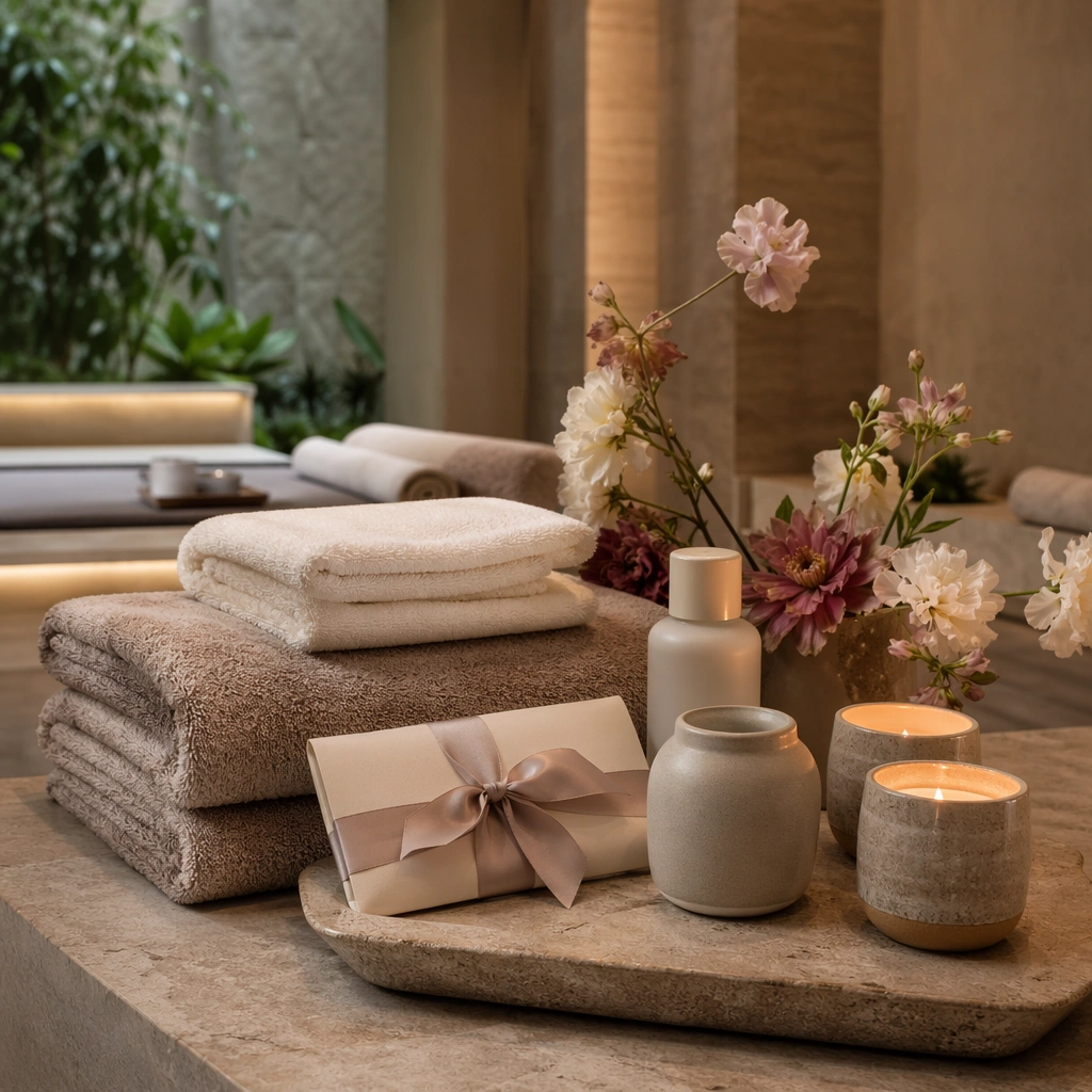
Example generated from “Valentines Romance Campaign System — Spa Weekend Arrival”
GPT Image 2en

Scene: Create a square premium spa-arrival scene with soft indirect light, stone surfaces, folded towels, and subtle floral accents. The mood should be calm, restorative, and gently romantic rather than overtly sensual. Keep the frame polished and commercial, like a hospitality or wellness campaign visual, with clean geometry and a convincing atmosphere of privacy, care, and high-end service. Subject: Feature a composed arrival setup with folded textiles, candle vessels, a tray, a wrapped gift or invitation envelope without readable text, floral stems, and one or two beauty or amenity silhouettes. The objects should suggest a Valentines weekend or shared wellness experience through gesture and arrangement rather than through explicit people or text. The composition must remain clean, premium, and gift-aware. Important details: Focus on tactile calm: stone grain, towel softness, candle glow, satin ribbon, and muted florals. Avoid pseudo-luxury clutter. Keep the palette restrained and elevated. The image should be suitable for resorts, spas, or experiential gifting brands that want romance cues without losing trust, serenity, or real-world hospitality polish. It needs to feel like a usable campaign frame rather than a moodboard fragment. Use case: Valentines single study 8/9. Constraints: No readable text, no watermark, no logos, preserve exact 1:1 aspect ratio, no readable stationery, no human bodies, no bath foam overload, no logo robes, no rose-petal carpet cliché, no crowded vanity, no fantasy palace interior, no pink neon.
Example generated from “Valentines Romance Campaign System — Confectionery Ribbon Box”
GPT Image 2en

Scene: Create a square premium confectionery campaign image with soft evening light, velvet shadows, and a polished tabletop presentation. Keep the frame close enough to celebrate the sweets and box structure, but wide enough that ribbon, florals, and plating details still build a finished commercial story. The mood should feel celebratory and luxurious without becoming sugary or childlike. Subject: Show an elegant confectionery gift box opened to reveal carefully arranged sweets, paired with ribbon, petals, small dessert plating accents, and one or two supporting table elements. The sweets should feel handcrafted and upscale, suitable for gifting. Let the box structure, paper quality, and edible textures work together to communicate romance through craft and generosity rather than through novelty symbols. Important details: Surface realism matters: ganache sheen, sugar dust, paperboard edges, ribbon folds, and plate glaze should all feel convincing. Keep color rich but tasteful. The scene should function as a premium seasonal food-and-gifting campaign asset, ready for hospitality, confectionery retail, or experiential gifting communication. Avoid loud candy-shop energy; this is mature, polished Valentines merchandising. Use case: Valentines single study 9/9. Constraints: No readable text, no watermark, no logos, preserve exact 1:1 aspect ratio, no readable chocolate labels, no cartoon hearts, no visible bite marks, no mass-market candy wrappers, no giant balloon props, no branded packaging, no messy crumbs, no oversaturated pinks.

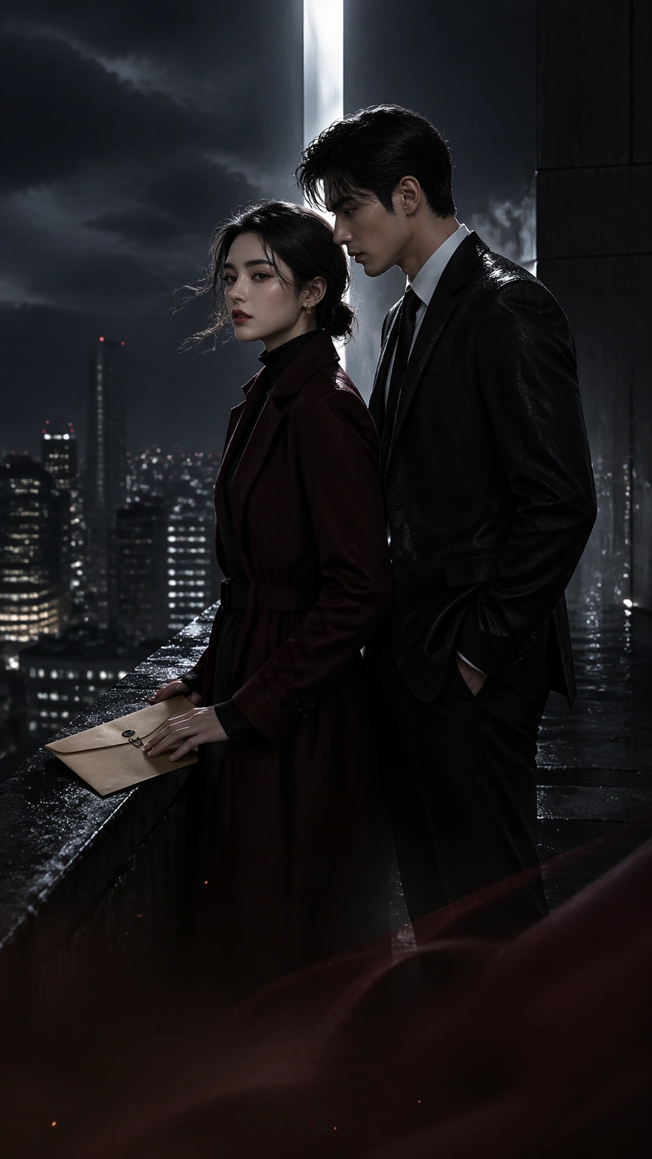
Example generated from “Vertical Drama Poster System — Rooftop Hook”
GPT Image 2en

Scene: A tall 9:16 mobile-first drama poster set on a luxury high-rise rooftop at night, with wet black stone, distant city bokeh, cold wind, and a narrow beam of white light cutting between rooftop structures. The composition must read instantly on a phone screen: strong top hook image, clear center relationship tension, and a calmer lower zone where a platform title block and episode badge could later sit without requiring real readable text. Keep the palette black, silver, burgundy, and muted skin tones. Subject: Establish the lead pair for a serialized vertical romance-revenge drama. A sharp-featured heiress in a fitted dark coat stands near the ledge with one hand on a legal envelope; behind her, half protective and half threatening, stands her bodyguard in a rain-marked black suit. Their faces should be close enough to imply contract intimacy yet far enough to preserve distrust. The city below should feel wealthy and dangerous, but the focus stays on their emotional geometry, costume clarity, and the sense that this image can anchor later episode-cover variants. Important details: This is the reference image for the series, so identity lock matters. Keep hair shape, height difference, coat silhouettes, and gaze pattern easy to preserve in later posters. The vertical layout should feel like a real app cover: clean upper silhouette, mid-frame emotional collision, subtle lower gradient for interface overlay, and decorative but unreadable label zones. Avoid stuffing the narrow frame. The poster should feel premium and addictive, not loud or trashy. Use case: Vertical Drama Poster System series study 1/9, establishing the lead couple and mobile-first poster grammar for a reference-dependent short-drama arc. Constraints: No readable text, no watermark, no logos, preserve exact 9:16 aspect ratio, no crowded skyline collage, no action fight pose, no extra side characters, no gaudy neon nightclub mood, no cartoon expressions, no broken anatomy, no platform UI screenshots.

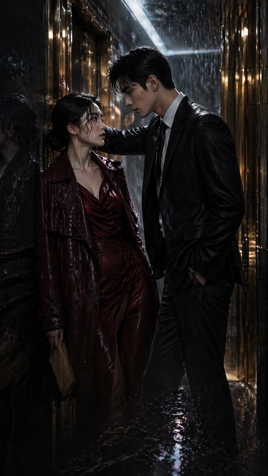
Example generated from “Vertical Drama Poster System — Rain Elevator Standoff”
GPT Image 2en

Scene: A tall 9:16 episode-cover poster inside a mirrored elevator lobby during heavy rain, with gold lift doors, water tracked across marble floor, and cool overhead light reflected in long vertical strips. The composition must remain instantly legible on mobile: a dramatic top third, a tight emotional midsection, and a restrained lower area where platform labels or episode markers could later sit as unreadable graphic blocks. Keep the palette deep charcoal, champagne gold, storm blue, and wine red. Subject: Using the referenced lead pair as the primary continuity source, preserve the same heiress and bodyguard identities, their height difference, face structure, hair silhouettes, and distrust-charged attraction. Move them into a rain-soaked elevator standoff: the heiress has just stepped out in a dark red dress under a soaked coat, and the bodyguard blocks the closing doors with one hand while looking directly at her. Their poses should intensify the relationship while clearly remaining the same characters from image 01. Rain droplets, coat texture, and mirrored reflections should add melodrama without cluttering the narrow frame. Important details: This image tests whether the poster system can evolve chapter to chapter while staying platform-clean. Keep the visual hierarchy disciplined: top rain atmosphere, center face tension, bottom quiet area for overlay. Preserve character continuity more than styling novelty. The poster should feel like a real vertical-drama app cover that could run as episode two artwork, with room for unreadable hook-badge shapes but no literal text. Use case: Vertical Drama Poster System series study 2/9, preserving the reference couple while translating them into a rain-soaked elevator episode cover. Constraints: No readable text, no watermark, no logos, preserve exact 9:16 aspect ratio, no cast swap, no extra paparazzi, no broad embrace, no empty white studio backdrop, no comic lightning effects, no overfilled lower frame, no platform UI buttons.

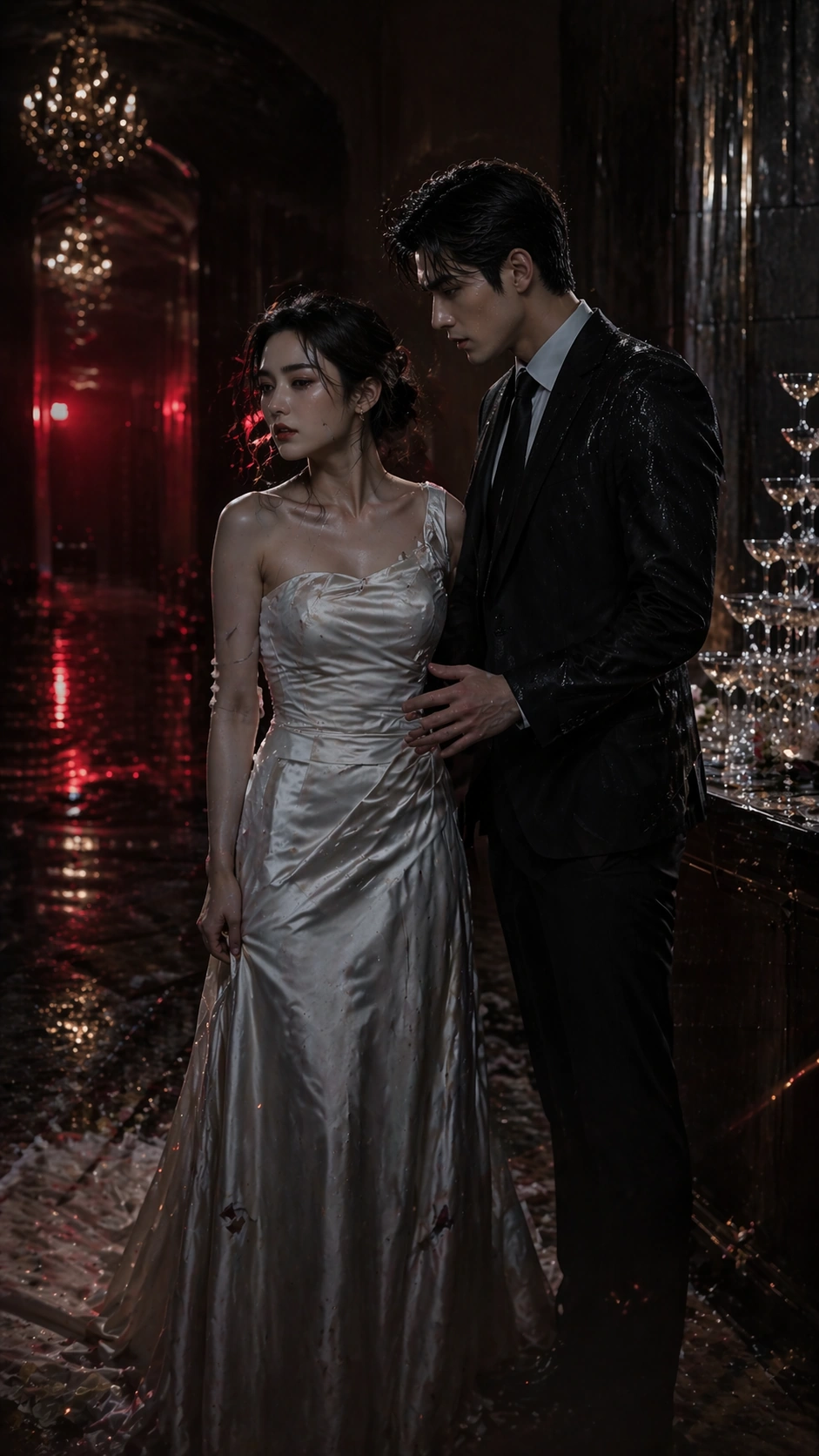
Example generated from “Vertical Drama Poster System — Wedding Fallout”
GPT Image 2en

Scene: A tall 9:16 mobile cover set in the side corridor of a luxury wedding hall after a public scandal, with champagne tower reflections, dropped white petals, warm gold chandeliers fading into darkness, and a slash of red emergency light from a distant exit sign glow that remains unreadable. The poster must be optimized for narrow-screen viewing: a strong high-contrast upper silhouette, a dramatic center interaction, and a lower third clear enough for imagined episode labels. Subject: Using the referenced image as the identity anchor, preserve the same heiress and bodyguard from image 01. The heiress now wears a damaged wedding gown with one glove missing; the bodyguard remains in a formal dark suit, one shoulder marked by thrown champagne or rain residue. They stand close in a private corridor moment after a ruined ceremony, with the bodyguard slightly reaching toward her while she turns away in anger and grief. Their height difference, hair silhouette, facial proportions, and mutual tension must still clearly match the reference pair. Important details: The poster should feel addictive and serialized without becoming tabloid. Keep the vertical hierarchy clean, the expressions intense but controlled, and the material details believable: satin folds, glass reflections, wilted petals, and marble shine. Suggest hook-driven platform packaging through reserved label zones and a quiet lower gradient, but never use readable text. The image must feel like an episode-cover escalation, not a bridal catalog or generic romance poster. Use case: Vertical Drama Poster System series study 3/9, testing whether the same leads can carry a scandal-wedding chapter cover in a narrow vertical frame. Constraints: No readable text, no watermark, no logos, preserve exact 9:16 aspect ratio, no wedding crowd, no kiss pose, no slapstick melodrama, no oversized props blocking faces, no glitter explosion, no costume redesign that loses character continuity, no platform interface overlay.

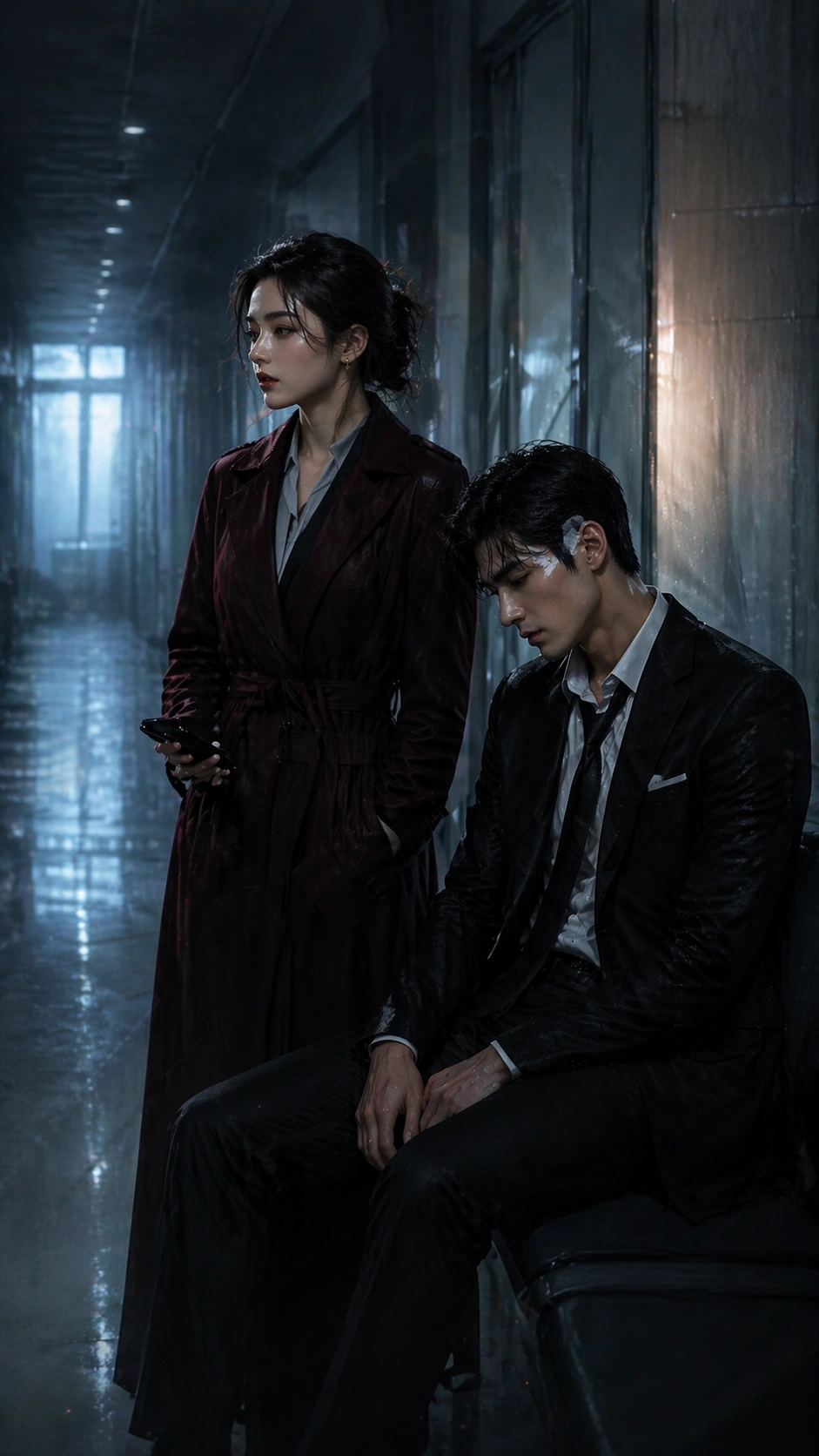
Example generated from “Vertical Drama Poster System — Hospital Truce”
GPT Image 2en

Scene: A tall 9:16 episode poster in a private hospital corridor before dawn, with sterile overhead lighting softened by blue morning haze, frosted glass panels, muted reflections on pale floor tiles, and one thin warm bedside glow leaking from an unseen room. The layout should feel engineered for mobile conversion: clear headroom for a hook image, central emotional scene, and a lower band quiet enough for future platform badges or titles that remain unreadable here. Subject: Using the referenced pair as the continuity source, preserve the same heiress and bodyguard from image 01, now worn down by accumulated conflict. The bodyguard sits injured on a hallway bench with shirt collar loosened and bandage at the temple; the heiress stands beside him in a severe coat over hospital visitor clothes, holding his phone but looking away to hide concern. Their poses should suggest a temporary truce and emotional turning point. Keep their faces, height relationship, hair shapes, and key costume language consistent with the reference poster. Important details: This image should prove that serial consistency can survive a quieter chapter. The vertical poster must remain clean, dramatic, and app-cover legible even though the action is minimal. Use corridor depth, glass reflections, bandage detail, and subdued body language instead of noisy plot props. The result should feel like an episode-cover cliffhanger that invites taps while still resembling polished commercial key art. Use case: Vertical Drama Poster System series study 4/9, testing a softer hospital-truce chapter while preserving the same reference couple and narrow-screen poster logic. Constraints: No readable text, no watermark, no logos, preserve exact 9:16 aspect ratio, no medical-drama clutter, no extra nurses, no comedy warmth, no giant medical monitors, no hand-holding cliché, no washed-out blank corridor, no visible app UI chrome.

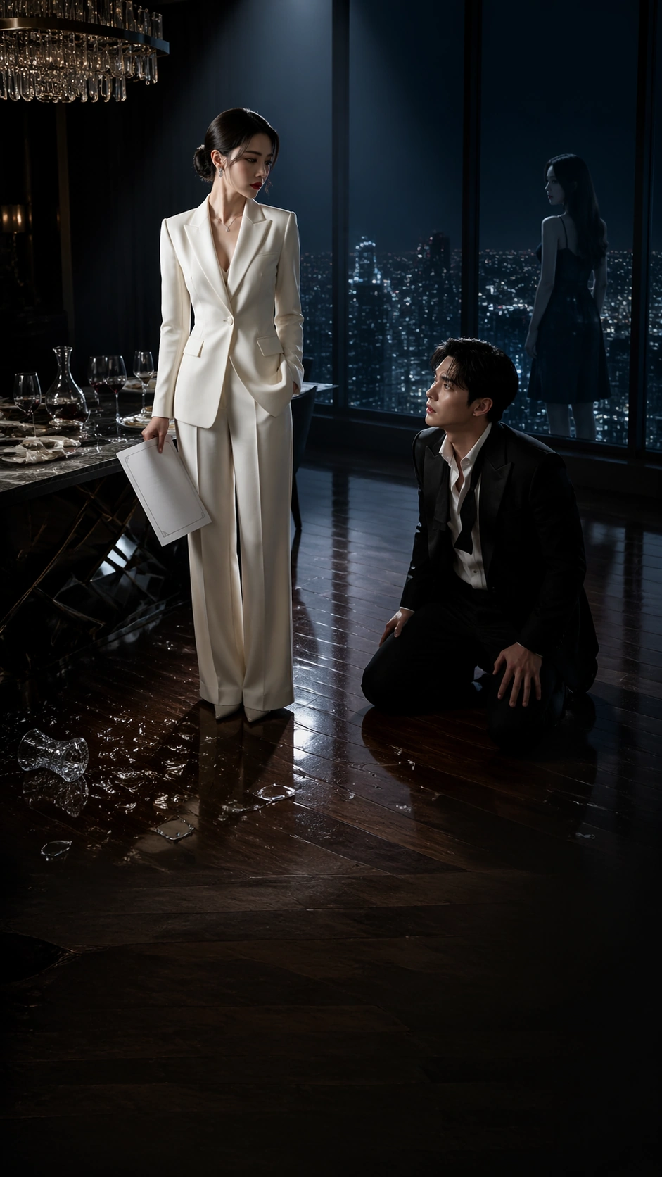
Example generated from “Vertical Drama Poster System — Penthouse Revenge Cover”
GPT Image 2en

Scene: A tall 9:16 short-drama cover inside a penthouse dining room at blue-black night, with floor-to-ceiling windows, a city of tiny lights, shattered crystal on polished wood, and a cold spotlight framing the central confrontation. The composition must work like a mobile app cover: a strong silhouette at top, a dominant emotional event in the middle, and a lower area calm enough for future title and badge placement without readable text. Use black, chrome, wine, and ivory as the main palette. Subject: Create a revenge-melodrama cover featuring a poised woman in a white suit holding divorce papers beside a half-cleared dinner table, while a wealthy man in a loosened tuxedo kneels slightly lower in frame after realizing he has lost control. A younger half-sister figure should appear only as a distant reflected silhouette in the window, not as a full competing lead. The drama should feel immediate and addictive, but the relationships and visual hierarchy must stay clear in the narrow vertical frame. Important details: The poster should feel like premium platform packaging rather than tabloid collage. Reserve structured space for unreadable title blocks, use reflective surfaces to imply wealth, and emphasize body language over prop clutter. The emotional hook must survive thumbnail scale: white suit, broken crystal, kneeling tuxedo, city night. No readable copy, but the layout should strongly suggest where copy would go. Use case: Vertical Drama Poster System single study 5/9, testing a revenge-penthouse short-drama hook in a clean mobile-first poster format. Constraints: No readable text, no watermark, no logos, preserve exact 9:16 aspect ratio, no cast crowding, no tabloid montage, no action slap, no giant ring-box prop, no cheap neon club palette, no social-media UI, no broken anatomy.

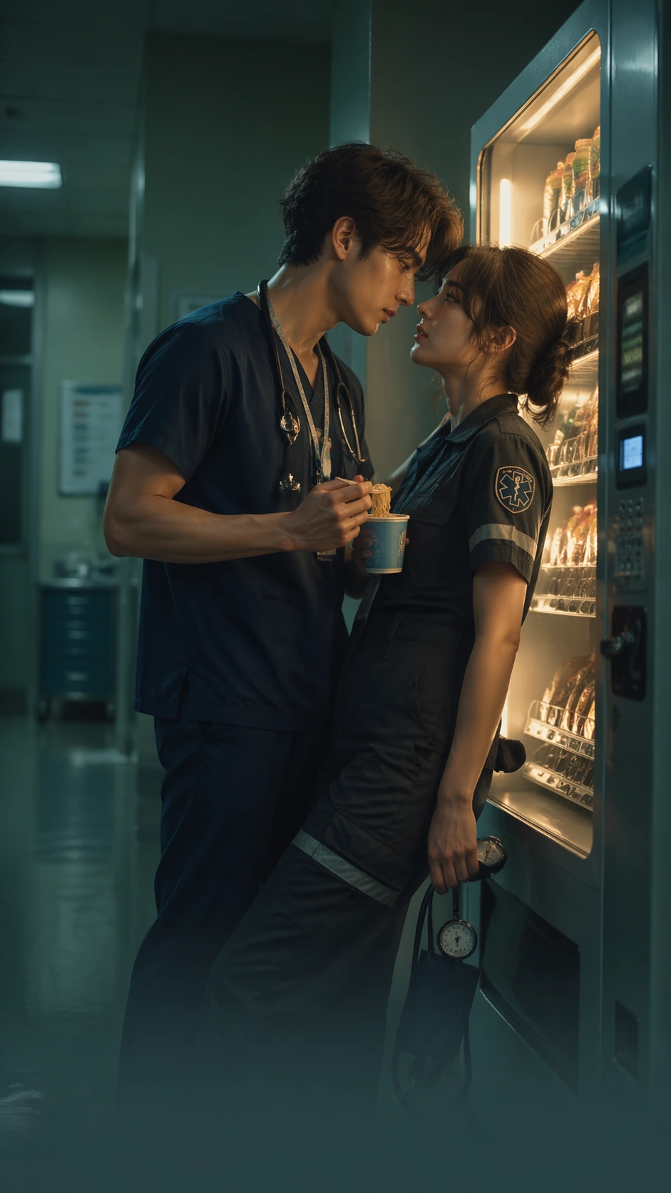
Example generated from “Vertical Drama Poster System — Night Shift Romance Cover”
GPT Image 2en

Scene: A tall 9:16 romance cover inside a hospital vending-machine alcove at 3 a.m., with dim fluorescent spill, stainless steel reflections, soft green walls, and one warm vending-machine glow illuminating tired faces. The poster should be optimized for phone screens: a compelling upper silhouette, a center emotional beat, and a lower quiet gradient for imagined title and episode-chip zones. Keep the palette cool mint, navy, pale skin tones, and one gentle warm amber highlight. Subject: Create a night-shift romance short-drama cover featuring an overworked resident doctor holding instant noodles and a sleep-deprived paramedic leaning against the vending machine with a blood-pressure cuff hanging from one wrist. Their bodies angle toward each other in an almost-kiss distance, but the mood is exhaustion and mutual dependence rather than glamour. Use eye lines, fatigue detail, and the narrow space between them to make the hook instantly legible on a mobile device. Important details: The image should feel platform-ready and addictive without becoming cheesy. Preserve realistic scrubs, ID-lanyard shapes that stay unreadable, vending-machine light, and hospital textures, but keep the frame uncluttered. The design logic should imply where a title, subtitle, and small platform badge would live while never actually rendering them. Emotional clarity at thumbnail scale matters more than background complexity. Use case: Vertical Drama Poster System single study 6/9, testing a night-shift romance hook in a narrow mobile-cover format. Constraints: No readable text, no watermark, no logos, preserve exact 9:16 aspect ratio, no medical emergency chaos, no giant heart graphics, no broad comedy, no crowded hallway extras, no app screenshot frame, no candy-colored rom-com palette, no broken hands or faces.

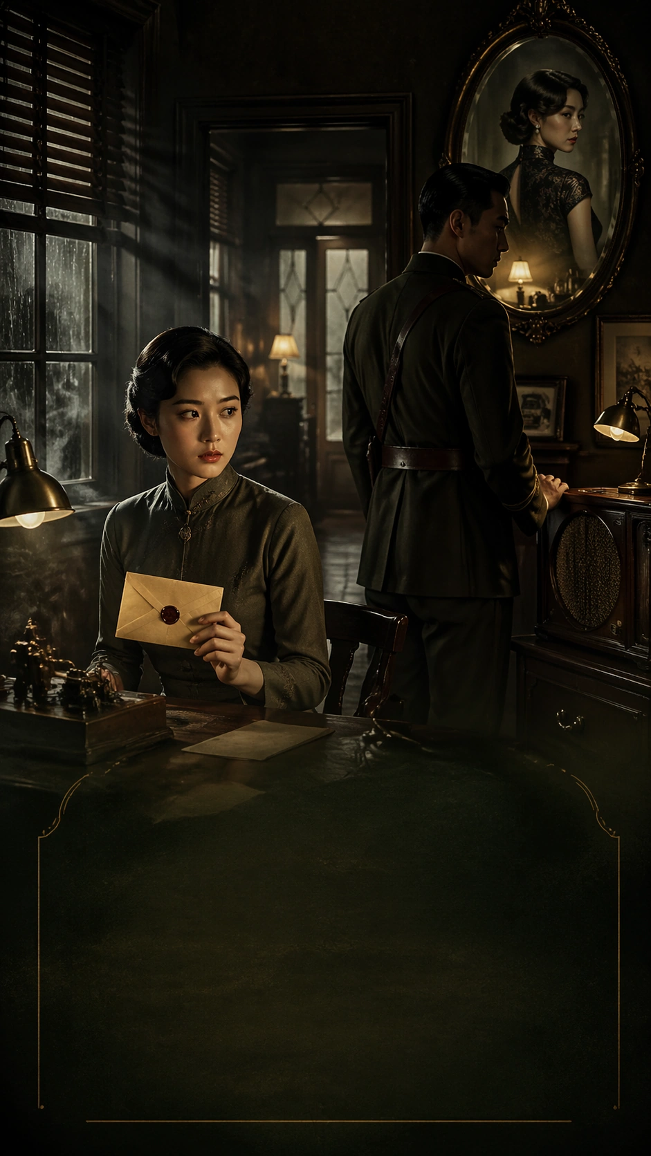
Example generated from “Vertical Drama Poster System — Republic Era Secret Cover”
GPT Image 2en

Scene: A tall 9:16 short-drama poster in a 1930s republic-era study lit by window blinds and amber desk lamps, with lacquer furniture, cigarette haze, rain on the glass, and a refined palette of sepia, forest green, black, and old gold. The composition must feel engineered for a vertical streaming cover, with a strong top silhouette, dense middle intrigue, and a quieter lower register that could support future title blocks or episode tabs without readable text. Subject: Create a republican-intrigue cover centered on a female code clerk holding a sealed telegram and a military officer in shadow standing beside a radio cabinet. A third figure, a wealthy young widow in a qipao, appears only through a reflected dressing-table mirror high in frame, hinting at betrayal. The mood should be tense, elegant, and serialized rather than nostalgic costume display. Make the hook legible through glance direction, telegram silhouette, and layered doorways. Important details: The visual grammar should mimic premium platform marketing for a period thriller. Preserve tactile wood, silk, brass, and rain textures, but do not overload the narrow frame with props. The poster must imply a space for unreadable title and episode graphics while remaining visually balanced on its own. Suspense should come from pose and composition, not from gunfire or loud action. Use case: Vertical Drama Poster System single study 7/9, testing a republic-era conspiracy premise in a disciplined mobile-cover layout. Constraints: No readable text, no watermark, no logos, preserve exact 9:16 aspect ratio, no war battlefield, no propaganda posters, no crowded extras, no exaggerated vintage filter, no cosplay stiffness, no comic action pose, no interface chrome.

Example generated from “Vertical Drama Poster System — Desert Exile Cover”
GPT Image 2en

Scene: A tall 9:16 exile-melodrama poster on the edge of a desert checkpoint at sunset, with windblown canvas, pale dust, military trucks reduced to distant shapes, and a narrow shaft of orange light against a storm-blue sky. The cover must read strongly on mobile: a striking upper sky band, a center human hook, and a lower area that could hold future unreadable title and badge elements. Use ochre, indigo, weathered khaki, and muted skin tones. Subject: Create a dramatic cover featuring a disgraced former diplomat in a torn linen suit standing beside a young translator wrapped in a desert scarf. They are separated from a convoy by a chain-link gate and one suitcase lying open in the dust. The relationship should be ambiguous: survival alliance, buried resentment, possible romance. Their silhouettes need to stay simple and legible in the narrow vertical frame, while the checkpoint world suggests political stakes without overpowering the human story. Important details: The image must feel like real platform packaging for a serialized exile drama, not a war-film poster. Keep the frame uncluttered, the wind and dust physically believable, and the emotional hook concentrated in posture, gaze, and the open suitcase. Suggest title and episode-chip zones through composition, but never render readable text. The cover should stay elegant even with harsh weather elements. Use case: Vertical Drama Poster System single study 8/9, testing an exile-road melodrama hook in a streamlined 9:16 poster system. Constraints: No readable text, no watermark, no logos, preserve exact 9:16 aspect ratio, no battlefield explosions, no crowded convoy action, no national flags, no heroic action pose, no documentary photo chaos, no giant desert vista swallowing the leads, no app UI screenshot.

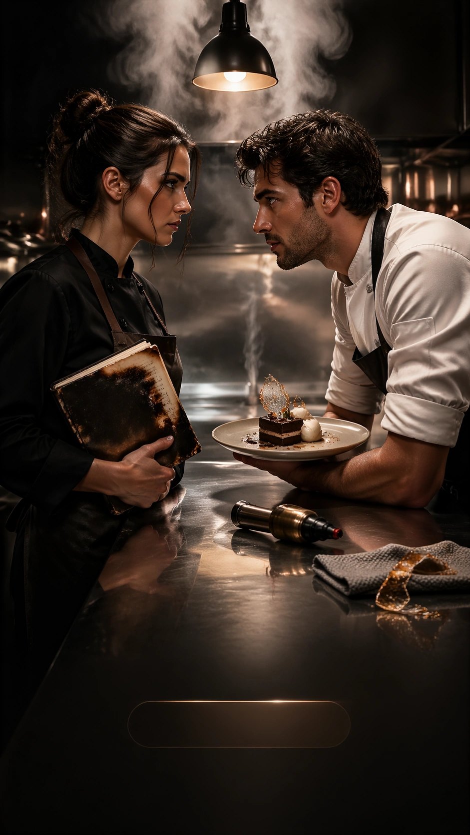
Example generated from “Vertical Drama Poster System — Chef Rivalry Cover”
GPT Image 2en

Scene: A tall 9:16 culinary-rivalry cover in a high-end restaurant prep kitchen after service, with stainless counters, steam haze, one hanging pendant lamp, and a palette of black, copper, cream, and deep basil green. The composition should feel tuned for app discovery surfaces: eye-catching top steam silhouette, center clash between leads, and a calmer lower band for future unreadable title and badge placement. Keep the environment tactile but controlled. Subject: Create a short-drama cover featuring two rival chefs. One is a disciplined woman in a dark apron holding a scorched recipe notebook; the other is a celebrated male chef in rolled sleeves, leaning across the counter with a plated dessert he has no right to finish. Their tension should read as rivalry with romantic undertow. A pastry blowtorch, folded kitchen towel, and one cracked sugar sculpture are enough to establish the world. The narrow frame must prioritize faces, hands, and emotional distance over broad kitchen coverage. Important details: The poster should sell a serialized food-industry melodrama, not a cooking show. Use steam, metal reflections, notebook texture, and plated dessert detail to create premium realism, but maintain strong vertical negative space so the composition still works as a platform cover. Suggest title and episode-chip zones with layout rhythm only. The hook must be instantly readable at thumbnail size: burnt notebook, stolen plate, eye contact. Use case: Vertical Drama Poster System single study 9/9, testing a chef-rivalry romance hook in a polished mobile-cover poster system. Constraints: No readable text, no watermark, no logos, preserve exact 9:16 aspect ratio, no cheerful cooking-show mood, no crowded brigade kitchen, no food close-up dominating the frame, no slapstick mess, no obvious TV studio lighting, no interface chrome, no broken hands.

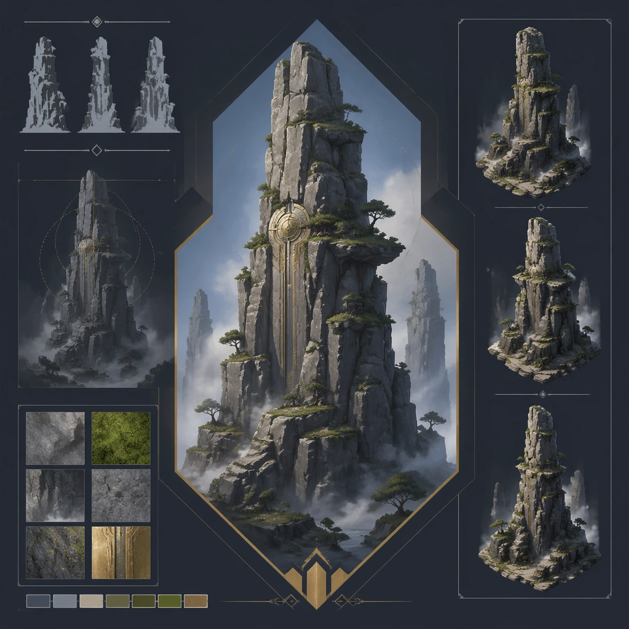
Example generated from “Vertical Landscape Pillar Composition — Reference Anchor”
GPT Image 2en

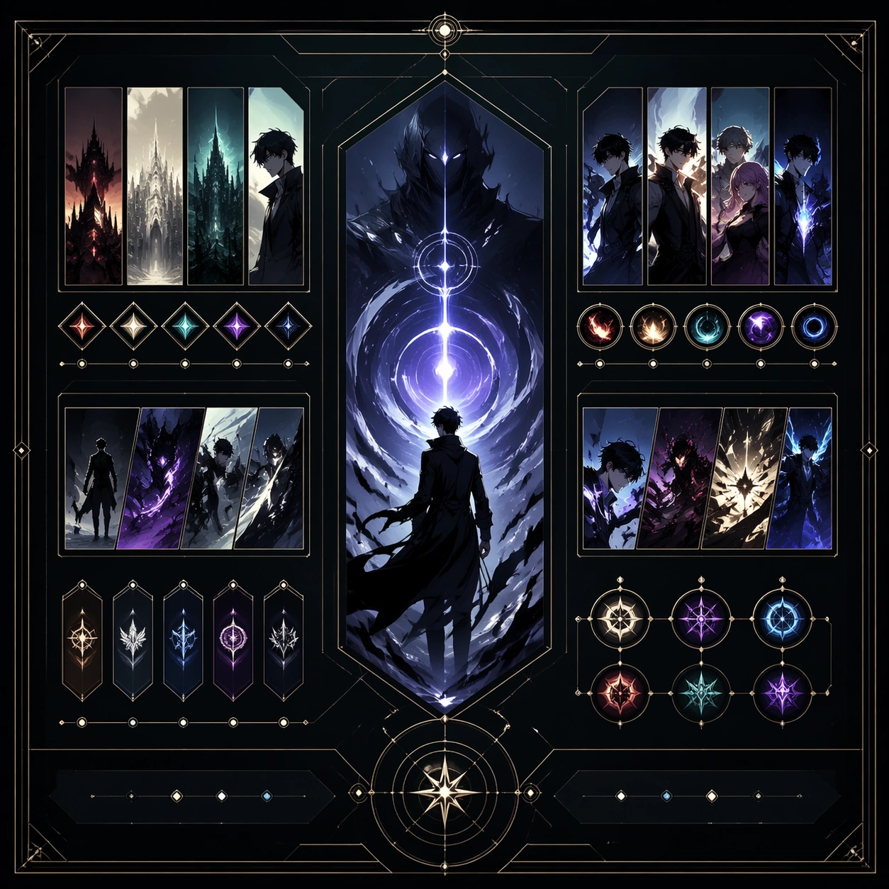
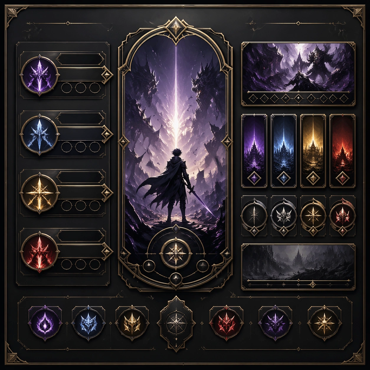
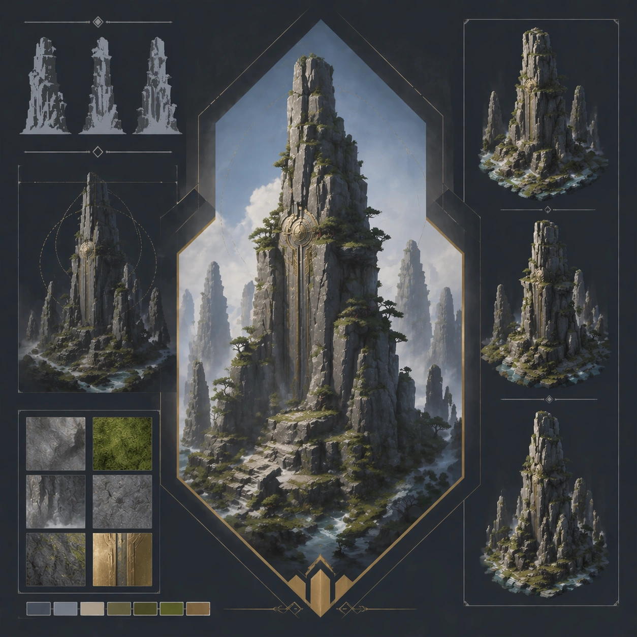
Scene: Create a square reference image for Vertical Landscape Pillar Composition. Build a reference anchor establishing the core system with a premium, production-ready finish. Use a polished modular board or campaign surface with clean spacing, premium game-UI finish, and clear focal hierarchy. The composition should feel intentional, clean, and reusable for gallery, research, campaign, or internal handoff contexts. Lighting must support readability first, with the main forms clearly separated from the background and enough breathing room for the system to stay legible at both hero scale and thumbnail scale. Subject: Center a coherent original game-art system built for premium production and marketing surfaces. For this image, focus on reference anchor. Keep the same system logic stable across screenshots, cards, banners, and overview boards. This image is the canonical anchor that later series images must follow. The viewer should immediately understand what role this surface plays inside a cohesive game-production asset pack. Important details: Lock framing, icon grammar, palette blocking, and surface hierarchy so the kit feels production-ready and consistent. Preserve the core silhouette, framing language, and material logic from the reference image while each variation changes function. Keep materials believable, edge hierarchy disciplined, and the visual language consistent with Vertical Scenery. Use abstract interface blocks or diagram accents when helpful, but avoid any readable language. The final result should feel like a deliberate production asset rather than a random illustration. Use case: Vertical Landscape Pillar Composition series study 1/9, designed as reference anchor within a cohesive asset pack. Constraints: No readable text, no watermark, no logos, preserve exact 1:1 aspect ratio, no unrelated objects, no broken visual hierarchy, no malformed anatomy or broken perspective, no random decorative clutter.

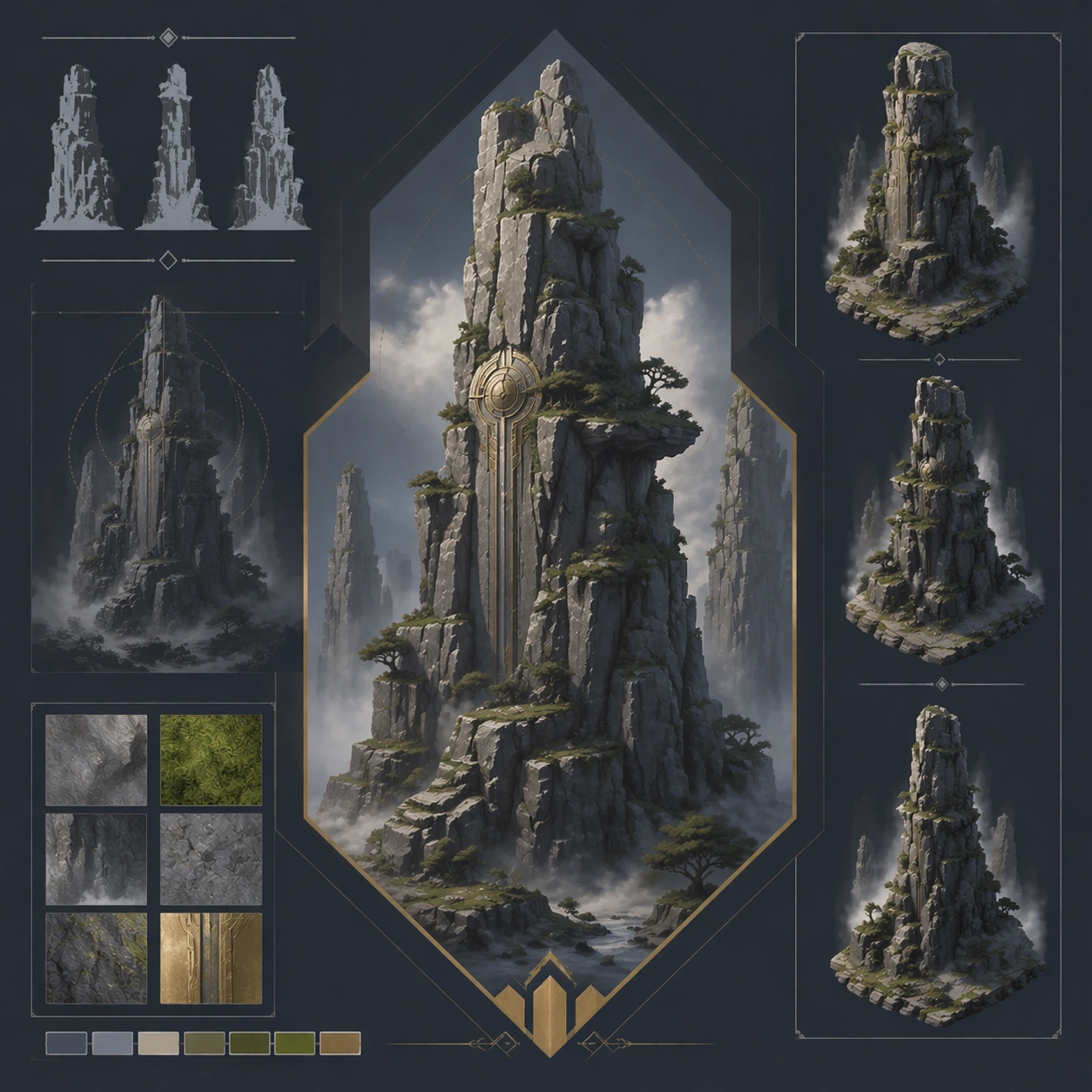
Example generated from “Vertical Landscape Pillar Composition — Variant One”
GPT Image 2en

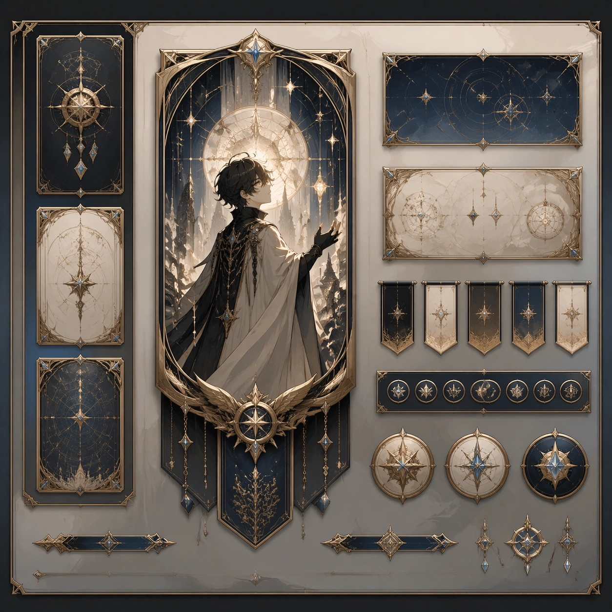
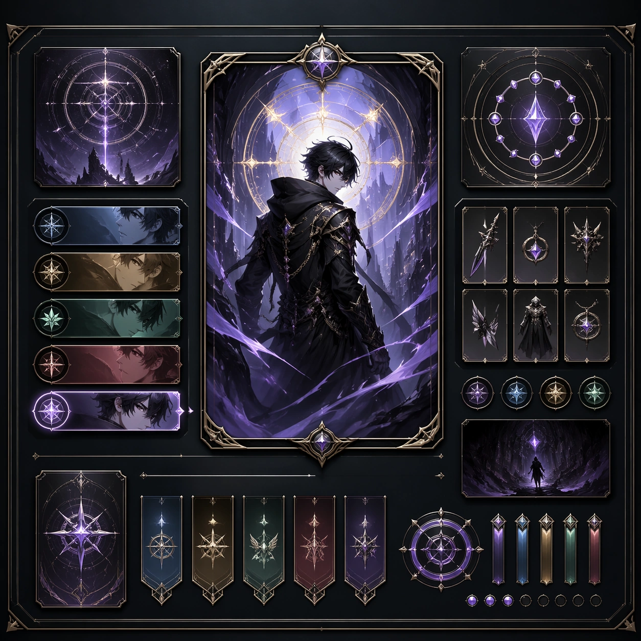
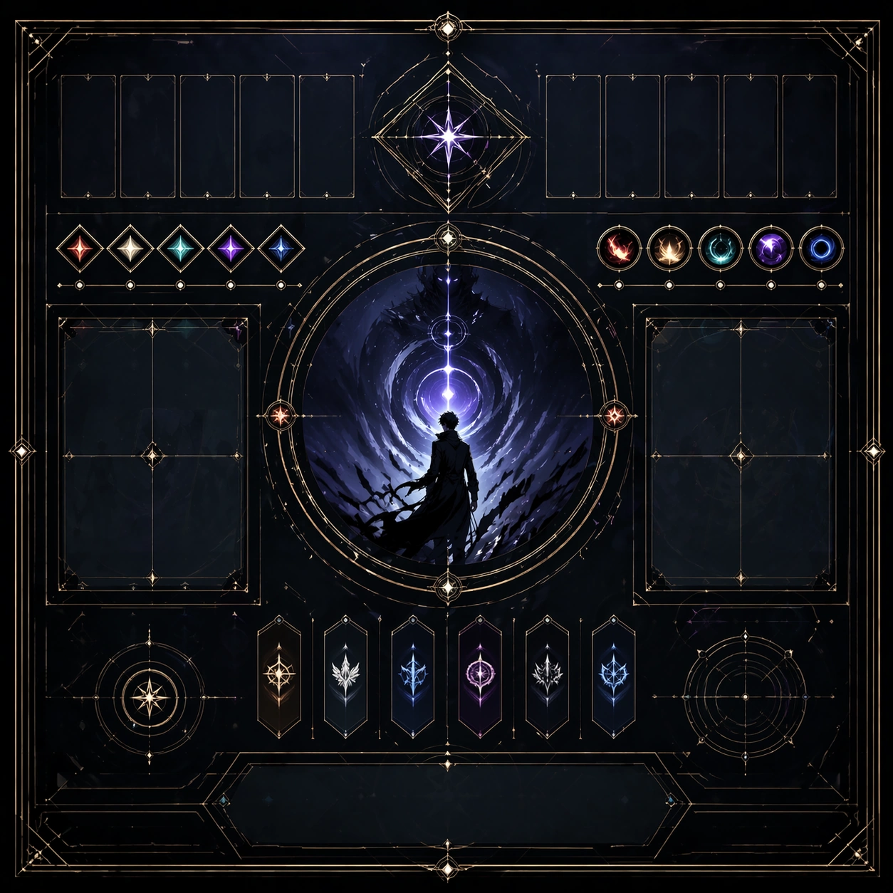
Scene: Create a square dependent image for Vertical Landscape Pillar Composition. Build a first controlled variation in the same system with a premium, production-ready finish. Use a polished modular board or campaign surface with clean spacing, premium game-UI finish, and clear focal hierarchy. The composition should feel intentional, clean, and reusable for gallery, research, campaign, or internal handoff contexts. Lighting must support readability first, with the main forms clearly separated from the background and enough breathing room for the system to stay legible at both hero scale and thumbnail scale. Subject: Center a coherent original game-art system built for premium production and marketing surfaces. For this image, focus on the intended support surface. Keep the same system logic stable across screenshots, cards, banners, and overview boards. Preserve exact identity or system logic from the reference image while changing only the intended variation axis. The viewer should immediately understand what role this surface plays inside a cohesive game-production asset pack. Important details: Lock framing, icon grammar, palette blocking, and surface hierarchy so the kit feels production-ready and consistent. Preserve the core silhouette, framing language, and material logic from the reference image while each variation changes function. Keep materials believable, edge hierarchy disciplined, and the visual language consistent with Vertical Scenery. Use abstract interface blocks or diagram accents when helpful, but avoid any readable language. The final result should feel like a deliberate production asset rather than a random illustration. Use case: Vertical Landscape Pillar Composition series study 2/9, designed as variant one within a cohesive asset pack. Constraints: No readable text, no watermark, no logos, preserve exact 1:1 aspect ratio, no unrelated objects, no broken visual hierarchy, no malformed anatomy or broken perspective, no random decorative clutter.

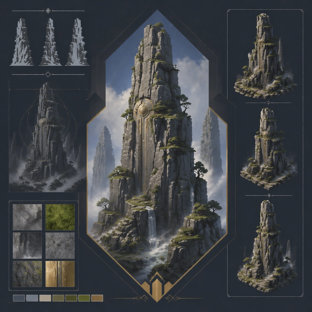
Example generated from “Vertical Landscape Pillar Composition — Variant Two”
GPT Image 2en

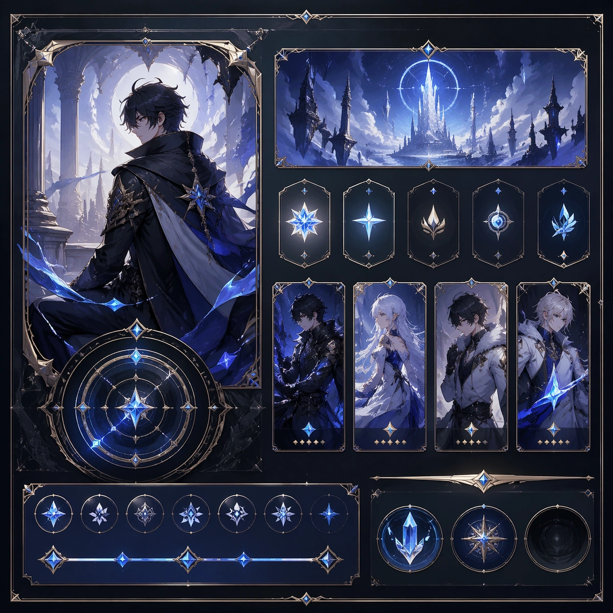
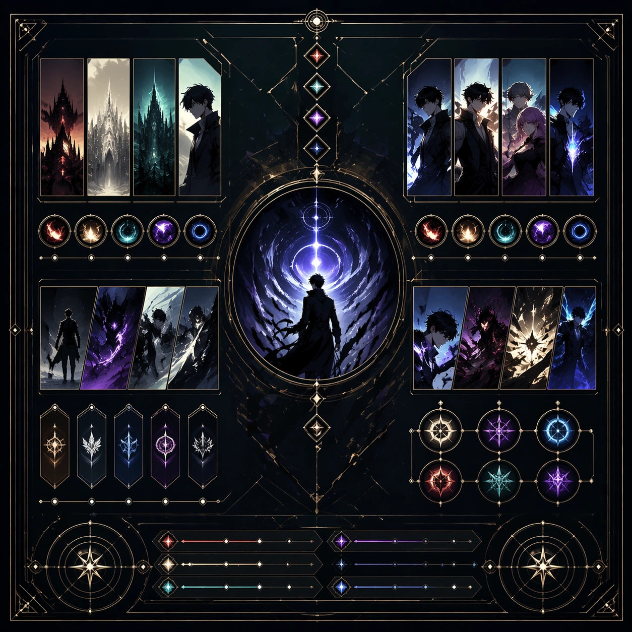
Scene: Create a square dependent image for Vertical Landscape Pillar Composition. Build a second controlled variation in the same system with a premium, production-ready finish. Use a polished modular board or campaign surface with clean spacing, premium game-UI finish, and clear focal hierarchy. The composition should feel intentional, clean, and reusable for gallery, research, campaign, or internal handoff contexts. Lighting must support readability first, with the main forms clearly separated from the background and enough breathing room for the system to stay legible at both hero scale and thumbnail scale. Subject: Center a coherent original game-art system built for premium production and marketing surfaces. For this image, focus on the intended support surface. Keep the same system logic stable across screenshots, cards, banners, and overview boards. Preserve exact identity or system logic from the reference image while changing only the intended variation axis. The viewer should immediately understand what role this surface plays inside a cohesive game-production asset pack. Important details: Lock framing, icon grammar, palette blocking, and surface hierarchy so the kit feels production-ready and consistent. Preserve the core silhouette, framing language, and material logic from the reference image while each variation changes function. Keep materials believable, edge hierarchy disciplined, and the visual language consistent with Vertical Scenery. Use abstract interface blocks or diagram accents when helpful, but avoid any readable language. The final result should feel like a deliberate production asset rather than a random illustration. Use case: Vertical Landscape Pillar Composition series study 3/9, designed as variant two within a cohesive asset pack. Constraints: No readable text, no watermark, no logos, preserve exact 1:1 aspect ratio, no unrelated objects, no broken visual hierarchy, no malformed anatomy or broken perspective, no random decorative clutter.

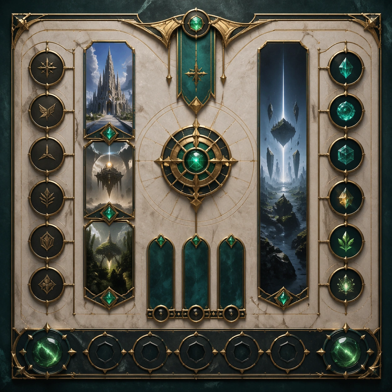
Example generated from “Vertical Landscape Pillar Composition — Variant Three”
GPT Image 2en

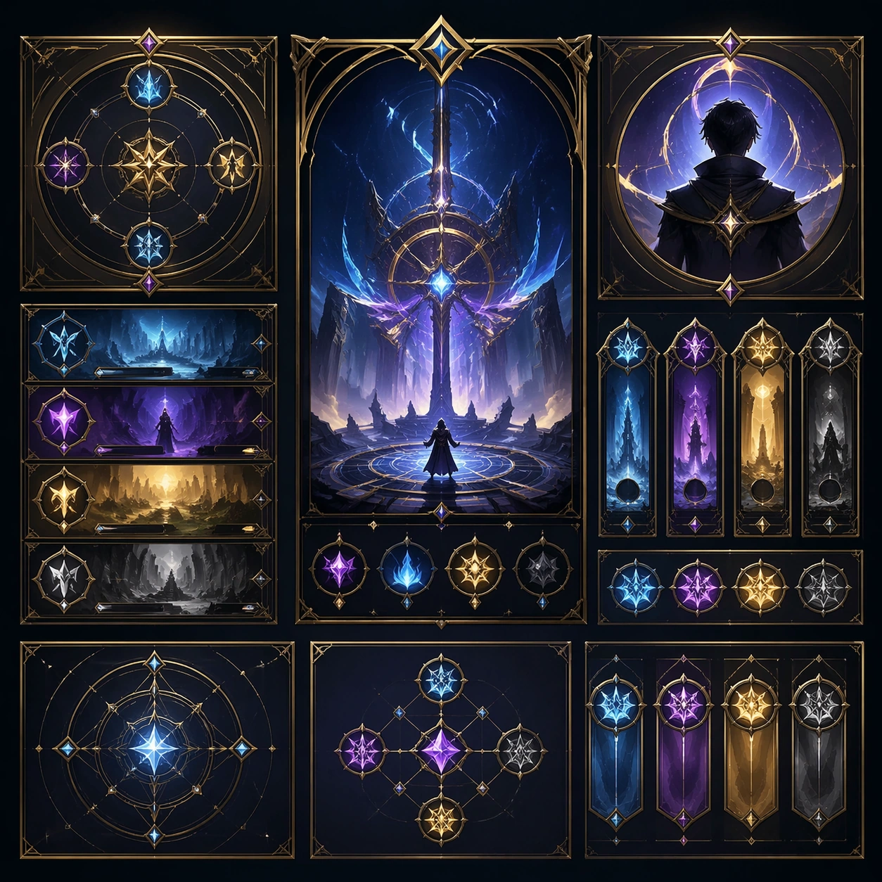
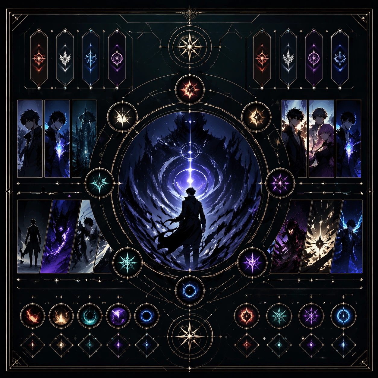
Scene: Create a square dependent image for Vertical Landscape Pillar Composition. Build a third controlled variation in the same system with a premium, production-ready finish. Use a polished modular board or campaign surface with clean spacing, premium game-UI finish, and clear focal hierarchy. The composition should feel intentional, clean, and reusable for gallery, research, campaign, or internal handoff contexts. Lighting must support readability first, with the main forms clearly separated from the background and enough breathing room for the system to stay legible at both hero scale and thumbnail scale. Subject: Center a coherent original game-art system built for premium production and marketing surfaces. For this image, focus on the intended support surface. Keep the same system logic stable across screenshots, cards, banners, and overview boards. Preserve exact identity or system logic from the reference image while changing only the intended variation axis. The viewer should immediately understand what role this surface plays inside a cohesive game-production asset pack. Important details: Lock framing, icon grammar, palette blocking, and surface hierarchy so the kit feels production-ready and consistent. Preserve the core silhouette, framing language, and material logic from the reference image while each variation changes function. Keep materials believable, edge hierarchy disciplined, and the visual language consistent with Vertical Scenery. Use abstract interface blocks or diagram accents when helpful, but avoid any readable language. The final result should feel like a deliberate production asset rather than a random illustration. Use case: Vertical Landscape Pillar Composition series study 4/9, designed as variant three within a cohesive asset pack. Constraints: No readable text, no watermark, no logos, preserve exact 1:1 aspect ratio, no unrelated objects, no broken visual hierarchy, no malformed anatomy or broken perspective, no random decorative clutter.

Example generated from “Vertical Landscape Pillar Composition — Support One”
GPT Image 2en

Scene: Create a square standalone support image for Vertical Landscape Pillar Composition. Build a support-surface study with a clear focal hierarchy and a finished professional surface. Use a polished modular board or campaign surface with clean spacing, premium game-UI finish, and clear focal hierarchy. The frame should feel self-contained and polished, with enough structure to explain the system even without the reference series, yet still obviously belonging to the same theme and production world. Subject: Show a coherent original game-art system built for premium production and marketing surfaces in a way that emphasizes the intended support surface. Keep the same system logic stable across screenshots, cards, banners, and overview boards. Even though this image is independent, the viewer should still recognize the same universe, same commercial logic, and same production intent as the core package. Important details: Lock framing, icon grammar, palette blocking, and surface hierarchy so the kit feels production-ready and consistent. Preserve the broader theme language through color, framing, material choices, and modular composition. Use clean panel rhythm, premium asset presentation, and believable detail density. The image should work equally well as a gallery study, research reference, and mock production deliverable. Use case: Vertical Landscape Pillar Composition single study 5/9, exploring support one as a support surface. Constraints: No readable text, no watermark, no logos, preserve exact 1:1 aspect ratio, no unrelated objects, no broken visual hierarchy, no visual noise that obscures the main surface, no accidental brand resemblance.

Example generated from “Vertical Landscape Pillar Composition — Support Two”
GPT Image 2en

Scene: Create a square standalone support image for Vertical Landscape Pillar Composition. Build a second support-surface study with a clear focal hierarchy and a finished professional surface. Use a polished modular board or campaign surface with clean spacing, premium game-UI finish, and clear focal hierarchy. The frame should feel self-contained and polished, with enough structure to explain the system even without the reference series, yet still obviously belonging to the same theme and production world. Subject: Show a coherent original game-art system built for premium production and marketing surfaces in a way that emphasizes the intended support surface. Keep the same system logic stable across screenshots, cards, banners, and overview boards. Even though this image is independent, the viewer should still recognize the same universe, same commercial logic, and same production intent as the core package. Important details: Lock framing, icon grammar, palette blocking, and surface hierarchy so the kit feels production-ready and consistent. Preserve the broader theme language through color, framing, material choices, and modular composition. Use clean panel rhythm, premium asset presentation, and believable detail density. The image should work equally well as a gallery study, research reference, and mock production deliverable. Use case: Vertical Landscape Pillar Composition single study 6/9, exploring support two as a support surface. Constraints: No readable text, no watermark, no logos, preserve exact 1:1 aspect ratio, no unrelated objects, no broken visual hierarchy, no visual noise that obscures the main surface, no accidental brand resemblance.

Example generated from “Vertical Landscape Pillar Composition — Support Three”
GPT Image 2en

Scene: Create a square standalone support image for Vertical Landscape Pillar Composition. Build a third support-surface study with a clear focal hierarchy and a finished professional surface. Use a polished modular board or campaign surface with clean spacing, premium game-UI finish, and clear focal hierarchy. The frame should feel self-contained and polished, with enough structure to explain the system even without the reference series, yet still obviously belonging to the same theme and production world. Subject: Show a coherent original game-art system built for premium production and marketing surfaces in a way that emphasizes the intended support surface. Keep the same system logic stable across screenshots, cards, banners, and overview boards. Even though this image is independent, the viewer should still recognize the same universe, same commercial logic, and same production intent as the core package. Important details: Lock framing, icon grammar, palette blocking, and surface hierarchy so the kit feels production-ready and consistent. Preserve the broader theme language through color, framing, material choices, and modular composition. Use clean panel rhythm, premium asset presentation, and believable detail density. The image should work equally well as a gallery study, research reference, and mock production deliverable. Use case: Vertical Landscape Pillar Composition single study 7/9, exploring support three as a support surface. Constraints: No readable text, no watermark, no logos, preserve exact 1:1 aspect ratio, no unrelated objects, no broken visual hierarchy, no visual noise that obscures the main surface, no accidental brand resemblance.

Example generated from “Vertical Landscape Pillar Composition — Support Four”
GPT Image 2en

Scene: Create a square standalone support image for Vertical Landscape Pillar Composition. Build a fourth support-surface study with a clear focal hierarchy and a finished professional surface. Use a polished modular board or campaign surface with clean spacing, premium game-UI finish, and clear focal hierarchy. The frame should feel self-contained and polished, with enough structure to explain the system even without the reference series, yet still obviously belonging to the same theme and production world. Subject: Show a coherent original game-art system built for premium production and marketing surfaces in a way that emphasizes the intended support surface. Keep the same system logic stable across screenshots, cards, banners, and overview boards. Even though this image is independent, the viewer should still recognize the same universe, same commercial logic, and same production intent as the core package. Important details: Lock framing, icon grammar, palette blocking, and surface hierarchy so the kit feels production-ready and consistent. Preserve the broader theme language through color, framing, material choices, and modular composition. Use clean panel rhythm, premium asset presentation, and believable detail density. The image should work equally well as a gallery study, research reference, and mock production deliverable. Use case: Vertical Landscape Pillar Composition single study 8/9, exploring support four as a support surface. Constraints: No readable text, no watermark, no logos, preserve exact 1:1 aspect ratio, no unrelated objects, no broken visual hierarchy, no visual noise that obscures the main surface, no accidental brand resemblance.

Example generated from “Vertical Landscape Pillar Composition — Support Five”
GPT Image 2en

Scene: Create a square standalone support image for Vertical Landscape Pillar Composition. Build a fifth support-surface study with a clear focal hierarchy and a finished professional surface. Use a polished modular board or campaign surface with clean spacing, premium game-UI finish, and clear focal hierarchy. The frame should feel self-contained and polished, with enough structure to explain the system even without the reference series, yet still obviously belonging to the same theme and production world. Subject: Show a coherent original game-art system built for premium production and marketing surfaces in a way that emphasizes the intended support surface. Keep the same system logic stable across screenshots, cards, banners, and overview boards. Even though this image is independent, the viewer should still recognize the same universe, same commercial logic, and same production intent as the core package. Important details: Lock framing, icon grammar, palette blocking, and surface hierarchy so the kit feels production-ready and consistent. Preserve the broader theme language through color, framing, material choices, and modular composition. Use clean panel rhythm, premium asset presentation, and believable detail density. The image should work equally well as a gallery study, research reference, and mock production deliverable. Use case: Vertical Landscape Pillar Composition single study 9/9, exploring support five as a support surface. Constraints: No readable text, no watermark, no logos, preserve exact 1:1 aspect ratio, no unrelated objects, no broken visual hierarchy, no visual noise that obscures the main surface, no accidental brand resemblance.

Example generated from “Vertical Webtoon Hook Chapter — Reference Anchor”
GPT Image 2en

Scene: Create a square reference image for Vertical Webtoon Hook Chapter. Build a reference anchor establishing the core system with a premium, production-ready finish. Use a polished modular board or campaign surface with clean spacing, premium game-UI finish, and clear focal hierarchy. The composition should feel intentional, clean, and reusable for gallery, research, campaign, or internal handoff contexts. Lighting must support readability first, with the main forms clearly separated from the background and enough breathing room for the system to stay legible at both hero scale and thumbnail scale. Subject: Center a coherent original game-art system built for premium production and marketing surfaces. For this image, focus on reference anchor. Keep the same system logic stable across screenshots, cards, banners, and overview boards. This image is the canonical anchor that later series images must follow. The viewer should immediately understand what role this surface plays inside a cohesive game-production asset pack. Important details: Lock framing, icon grammar, palette blocking, and surface hierarchy so the kit feels production-ready and consistent. Preserve the core silhouette, framing language, and material logic from the reference image while each variation changes function. Keep materials believable, edge hierarchy disciplined, and the visual language consistent with Webtoon Hook. Use abstract interface blocks or diagram accents when helpful, but avoid any readable language. The final result should feel like a deliberate production asset rather than a random illustration. Use case: Vertical Webtoon Hook Chapter series study 1/9, designed as reference anchor within a cohesive asset pack. Constraints: No readable text, no watermark, no logos, preserve exact 1:1 aspect ratio, no unrelated objects, no broken visual hierarchy, no malformed anatomy or broken perspective, no random decorative clutter.

Example generated from “Vertical Webtoon Hook Chapter — Variant One”
GPT Image 2en

Scene: Create a square dependent image for Vertical Webtoon Hook Chapter. Build a first controlled variation in the same system with a premium, production-ready finish. Use a polished modular board or campaign surface with clean spacing, premium game-UI finish, and clear focal hierarchy. The composition should feel intentional, clean, and reusable for gallery, research, campaign, or internal handoff contexts. Lighting must support readability first, with the main forms clearly separated from the background and enough breathing room for the system to stay legible at both hero scale and thumbnail scale. Subject: Center a coherent original game-art system built for premium production and marketing surfaces. For this image, focus on the intended support surface. Keep the same system logic stable across screenshots, cards, banners, and overview boards. Preserve exact identity or system logic from the reference image while changing only the intended variation axis. The viewer should immediately understand what role this surface plays inside a cohesive game-production asset pack. Important details: Lock framing, icon grammar, palette blocking, and surface hierarchy so the kit feels production-ready and consistent. Preserve the core silhouette, framing language, and material logic from the reference image while each variation changes function. Keep materials believable, edge hierarchy disciplined, and the visual language consistent with Webtoon Hook. Use abstract interface blocks or diagram accents when helpful, but avoid any readable language. The final result should feel like a deliberate production asset rather than a random illustration. Use case: Vertical Webtoon Hook Chapter series study 2/9, designed as variant one within a cohesive asset pack. Constraints: No readable text, no watermark, no logos, preserve exact 1:1 aspect ratio, no unrelated objects, no broken visual hierarchy, no malformed anatomy or broken perspective, no random decorative clutter.

Example generated from “Vertical Webtoon Hook Chapter — Variant Two”
GPT Image 2en

Scene: Create a square dependent image for Vertical Webtoon Hook Chapter. Build a second controlled variation in the same system with a premium, production-ready finish. Use a polished modular board or campaign surface with clean spacing, premium game-UI finish, and clear focal hierarchy. The composition should feel intentional, clean, and reusable for gallery, research, campaign, or internal handoff contexts. Lighting must support readability first, with the main forms clearly separated from the background and enough breathing room for the system to stay legible at both hero scale and thumbnail scale. Subject: Center a coherent original game-art system built for premium production and marketing surfaces. For this image, focus on the intended support surface. Keep the same system logic stable across screenshots, cards, banners, and overview boards. Preserve exact identity or system logic from the reference image while changing only the intended variation axis. The viewer should immediately understand what role this surface plays inside a cohesive game-production asset pack. Important details: Lock framing, icon grammar, palette blocking, and surface hierarchy so the kit feels production-ready and consistent. Preserve the core silhouette, framing language, and material logic from the reference image while each variation changes function. Keep materials believable, edge hierarchy disciplined, and the visual language consistent with Webtoon Hook. Use abstract interface blocks or diagram accents when helpful, but avoid any readable language. The final result should feel like a deliberate production asset rather than a random illustration. Use case: Vertical Webtoon Hook Chapter series study 3/9, designed as variant two within a cohesive asset pack. Constraints: No readable text, no watermark, no logos, preserve exact 1:1 aspect ratio, no unrelated objects, no broken visual hierarchy, no malformed anatomy or broken perspective, no random decorative clutter.

Example generated from “Vertical Webtoon Hook Chapter — Variant Three”
GPT Image 2en

Scene: Create a square dependent image for Vertical Webtoon Hook Chapter. Build a third controlled variation in the same system with a premium, production-ready finish. Use a polished modular board or campaign surface with clean spacing, premium game-UI finish, and clear focal hierarchy. The composition should feel intentional, clean, and reusable for gallery, research, campaign, or internal handoff contexts. Lighting must support readability first, with the main forms clearly separated from the background and enough breathing room for the system to stay legible at both hero scale and thumbnail scale. Subject: Center a coherent original game-art system built for premium production and marketing surfaces. For this image, focus on the intended support surface. Keep the same system logic stable across screenshots, cards, banners, and overview boards. Preserve exact identity or system logic from the reference image while changing only the intended variation axis. The viewer should immediately understand what role this surface plays inside a cohesive game-production asset pack. Important details: Lock framing, icon grammar, palette blocking, and surface hierarchy so the kit feels production-ready and consistent. Preserve the core silhouette, framing language, and material logic from the reference image while each variation changes function. Keep materials believable, edge hierarchy disciplined, and the visual language consistent with Webtoon Hook. Use abstract interface blocks or diagram accents when helpful, but avoid any readable language. The final result should feel like a deliberate production asset rather than a random illustration. Use case: Vertical Webtoon Hook Chapter series study 4/9, designed as variant three within a cohesive asset pack. Constraints: No readable text, no watermark, no logos, preserve exact 1:1 aspect ratio, no unrelated objects, no broken visual hierarchy, no malformed anatomy or broken perspective, no random decorative clutter.

Example generated from “Vertical Webtoon Hook Chapter — Support One”
GPT Image 2en

Scene: Create a square standalone support image for Vertical Webtoon Hook Chapter. Build a support-surface study with a clear focal hierarchy and a finished professional surface. Use a polished modular board or campaign surface with clean spacing, premium game-UI finish, and clear focal hierarchy. The frame should feel self-contained and polished, with enough structure to explain the system even without the reference series, yet still obviously belonging to the same theme and production world. Subject: Show a coherent original game-art system built for premium production and marketing surfaces in a way that emphasizes the intended support surface. Keep the same system logic stable across screenshots, cards, banners, and overview boards. Even though this image is independent, the viewer should still recognize the same universe, same commercial logic, and same production intent as the core package. Important details: Lock framing, icon grammar, palette blocking, and surface hierarchy so the kit feels production-ready and consistent. Preserve the broader theme language through color, framing, material choices, and modular composition. Use clean panel rhythm, premium asset presentation, and believable detail density. The image should work equally well as a gallery study, research reference, and mock production deliverable. Use case: Vertical Webtoon Hook Chapter single study 5/9, exploring support one as a support surface. Constraints: No readable text, no watermark, no logos, preserve exact 1:1 aspect ratio, no unrelated objects, no broken visual hierarchy, no visual noise that obscures the main surface, no accidental brand resemblance.

Example generated from “Vertical Webtoon Hook Chapter — Support Two”
GPT Image 2en

Scene: Create a square standalone support image for Vertical Webtoon Hook Chapter. Build a second support-surface study with a clear focal hierarchy and a finished professional surface. Use a polished modular board or campaign surface with clean spacing, premium game-UI finish, and clear focal hierarchy. The frame should feel self-contained and polished, with enough structure to explain the system even without the reference series, yet still obviously belonging to the same theme and production world. Subject: Show a coherent original game-art system built for premium production and marketing surfaces in a way that emphasizes the intended support surface. Keep the same system logic stable across screenshots, cards, banners, and overview boards. Even though this image is independent, the viewer should still recognize the same universe, same commercial logic, and same production intent as the core package. Important details: Lock framing, icon grammar, palette blocking, and surface hierarchy so the kit feels production-ready and consistent. Preserve the broader theme language through color, framing, material choices, and modular composition. Use clean panel rhythm, premium asset presentation, and believable detail density. The image should work equally well as a gallery study, research reference, and mock production deliverable. Use case: Vertical Webtoon Hook Chapter single study 6/9, exploring support two as a support surface. Constraints: No readable text, no watermark, no logos, preserve exact 1:1 aspect ratio, no unrelated objects, no broken visual hierarchy, no visual noise that obscures the main surface, no accidental brand resemblance.

Example generated from “Vertical Webtoon Hook Chapter — Support Three”
GPT Image 2en

Scene: Create a square standalone support image for Vertical Webtoon Hook Chapter. Build a third support-surface study with a clear focal hierarchy and a finished professional surface. Use a polished modular board or campaign surface with clean spacing, premium game-UI finish, and clear focal hierarchy. The frame should feel self-contained and polished, with enough structure to explain the system even without the reference series, yet still obviously belonging to the same theme and production world. Subject: Show a coherent original game-art system built for premium production and marketing surfaces in a way that emphasizes the intended support surface. Keep the same system logic stable across screenshots, cards, banners, and overview boards. Even though this image is independent, the viewer should still recognize the same universe, same commercial logic, and same production intent as the core package. Important details: Lock framing, icon grammar, palette blocking, and surface hierarchy so the kit feels production-ready and consistent. Preserve the broader theme language through color, framing, material choices, and modular composition. Use clean panel rhythm, premium asset presentation, and believable detail density. The image should work equally well as a gallery study, research reference, and mock production deliverable. Use case: Vertical Webtoon Hook Chapter single study 7/9, exploring support three as a support surface. Constraints: No readable text, no watermark, no logos, preserve exact 1:1 aspect ratio, no unrelated objects, no broken visual hierarchy, no visual noise that obscures the main surface, no accidental brand resemblance.

Example generated from “Vertical Webtoon Hook Chapter — Support Four”
GPT Image 2en

Scene: Create a square standalone support image for Vertical Webtoon Hook Chapter. Build a fourth support-surface study with a clear focal hierarchy and a finished professional surface. Use a polished modular board or campaign surface with clean spacing, premium game-UI finish, and clear focal hierarchy. The frame should feel self-contained and polished, with enough structure to explain the system even without the reference series, yet still obviously belonging to the same theme and production world. Subject: Show a coherent original game-art system built for premium production and marketing surfaces in a way that emphasizes the intended support surface. Keep the same system logic stable across screenshots, cards, banners, and overview boards. Even though this image is independent, the viewer should still recognize the same universe, same commercial logic, and same production intent as the core package. Important details: Lock framing, icon grammar, palette blocking, and surface hierarchy so the kit feels production-ready and consistent. Preserve the broader theme language through color, framing, material choices, and modular composition. Use clean panel rhythm, premium asset presentation, and believable detail density. The image should work equally well as a gallery study, research reference, and mock production deliverable. Use case: Vertical Webtoon Hook Chapter single study 8/9, exploring support four as a support surface. Constraints: No readable text, no watermark, no logos, preserve exact 1:1 aspect ratio, no unrelated objects, no broken visual hierarchy, no visual noise that obscures the main surface, no accidental brand resemblance.

Example generated from “Vertical Webtoon Hook Chapter — Support Five”
GPT Image 2en

Scene: Create a square standalone support image for Vertical Webtoon Hook Chapter. Build a fifth support-surface study with a clear focal hierarchy and a finished professional surface. Use a polished modular board or campaign surface with clean spacing, premium game-UI finish, and clear focal hierarchy. The frame should feel self-contained and polished, with enough structure to explain the system even without the reference series, yet still obviously belonging to the same theme and production world. Subject: Show a coherent original game-art system built for premium production and marketing surfaces in a way that emphasizes the intended support surface. Keep the same system logic stable across screenshots, cards, banners, and overview boards. Even though this image is independent, the viewer should still recognize the same universe, same commercial logic, and same production intent as the core package. Important details: Lock framing, icon grammar, palette blocking, and surface hierarchy so the kit feels production-ready and consistent. Preserve the broader theme language through color, framing, material choices, and modular composition. Use clean panel rhythm, premium asset presentation, and believable detail density. The image should work equally well as a gallery study, research reference, and mock production deliverable. Use case: Vertical Webtoon Hook Chapter single study 9/9, exploring support five as a support surface. Constraints: No readable text, no watermark, no logos, preserve exact 1:1 aspect ratio, no unrelated objects, no broken visual hierarchy, no visual noise that obscures the main surface, no accidental brand resemblance.

Example generated from “Virtual Try On Identity Lock — Runway Season Lock”
GPT Image 2en

Scene: A square runway-season comparison board with a dark graphite backstage floor, soft rim light, and a subtle reflective runway strip running horizontally through the composition. Eight evenly spaced full-body panels show the same model under consistent fashion-show lighting, with a larger central pose and smaller surrounding seasonal looks. The image should feel like a polished designer fitting review, not a catalog with labels. Subject: A synthetic adult model with copper-brown skin, close-cropped natural hair, high cheekbones, almond eyes, long neck, narrow shoulders, and an elegant upright stance. The identity is identical across all looks. Outfits move through four seasons: sheer spring organza coat, summer linen suit, autumn wool cape, winter quilted parka, plus four runway variations with sculptural sleeves, layered skirts, tailored trousers, and monochrome boots. The garments may be bold, but the person must remain the same. Important details: Lock the model identity harder than the clothing. Preserve facial structure, skin undertone, hairline, ear shape, neck, collarbone, limb length, and hand pose across every panel. Clothing may alter silhouette around the body through fabric volume, but the underlying body proportions must stay readable. Avoid creating a different model for dramatic fashion effects. Keep camera angle, head scale, and foot placement consistent. Use case: Virtual Try-On Identity Lock single study 2/8, testing seasonal runway garment changes while preserving one stable model identity. Constraints: No readable text, no watermark, no logos, preserve exact 1:1 aspect ratio, no brand signage, no face morphing, no skin-lightening, no body resizing, no swapped hairstyle, no crowd, no backstage clutter, no distorted limbs.

Example generated from “Virtual Try On Identity Lock — Outdoor Light Lock”
GPT Image 2en

Scene: A square outdoor virtual try-on sheet set in a sunlit city courtyard with pale stone walls, greenery, and late-afternoon shadows. The composition uses five full-body panels arranged like a clean editorial contact sheet, each panel shot from the same distance with the model standing on the same paving stones. Lighting changes subtly with believable outdoor bounce, but identity must remain stable. Subject: A synthetic adult model with fair olive skin, freckles across the nose, shoulder-length wavy auburn hair, soft square jaw, average height, and a relaxed natural stance. The first panel resembles a source look in a simple gray tee and straight jeans. The remaining panels try on a floral wrap dress, lightweight utility jacket with skirt, raincoat with boots, linen two-piece, and relaxed weekend overalls. The face, freckles, hair length, body mass, and posture rhythm must match across all panels. Important details: The challenge is preserving identity under environmental light and garment variety. Keep the same eyes, brow shape, nose, mouth, cheek freckles, hair volume, hand size, ankle shape, and shoulder width. Garments should wrap the body realistically, with correct fabric shadows and no pasted-on clothing. Outdoor shadows must not hide the face or alter skin color. Use consistent scale lines on the paving stones to make height drift visible. Use case: Virtual Try-On Identity Lock single study 3/8, testing outdoor-light try-on consistency without changing the model. Constraints: No readable text, no watermark, no logos, preserve exact 1:1 aspect ratio, no signage, no changed freckles, no altered hair length, no face retouching, no body slimming, no extra people, no harsh backlight, no clothing floating off the body.

Example generated from “Virtual Try On Identity Lock — Office Commute Lock”
GPT Image 2en

Scene: A square professional wardrobe try-on board inside a quiet modern office lobby with pale terrazzo flooring, glass reflections, and soft daylight from one side. Six full-body outfit states are arranged in two rows of three, with the same camera angle and a thin visual rhythm from the lobby columns. The composition is precise and useful, like a corporate styling review without written labels. Subject: A synthetic adult model with deep brown skin, shaved head, round face, broad nose, full lips, sturdy build, and calm direct gaze. The baseline look is a plain charcoal tee and dark trousers. The try-on variants include a navy suit, relaxed beige blazer, pleated midi skirt with shirt, structured vest and wide-leg pants, long wool coat, and smart-casual knit polo with cropped trousers. The model's face, head shape, skin tone, torso width, arm length, and stance must remain constant. Important details: Identity lock is the main visual rule. Keep the same facial geometry, scalp line, smile restraint, shoulder slope, waist position, knee height, hand shape, and shoe size in all panels. Clothing can signal different workplace dress codes, but must not make the model thinner, taller, younger, or more conventionally retouched. Maintain realistic garment seams, natural drape, office-appropriate colors, and consistent shadow direction. Use case: Virtual Try-On Identity Lock single study 4/8, testing workplace outfit edits while preserving face, body, and posture. Constraints: No readable text, no watermark, no logos, preserve exact 1:1 aspect ratio, no company marks, no changed skin tone, no altered head shape, no body reshaping, no extra models, no mirror duplicate faces, no distorted tailoring, no unreadable labels.