PROMPTS · EXPLORACIÓN CREATIVA

Galería de prompts

Explora prompts reales y ejemplos generados. Encuentra inspiración para tu próxima misión creativa y copia gratis el prompt completo.

Ejemplos
10,974
Modelos
17
Fuentes
1277
10.974 ejemplos de prompts · página 44 de 229
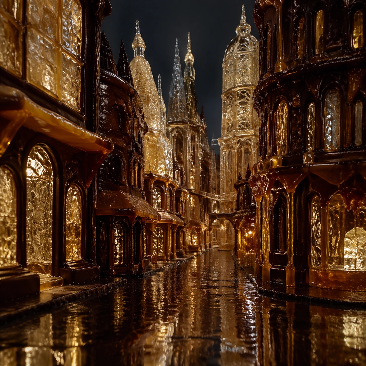
Example generated from “Impossible Candy Architecture — Night Rain Street”
GPT Image 2en

Scene: Create a square architectural photograph of an edible miniature city built from sugar and chocolate, lit like a serious built-environment hero shot rather than a whimsical craft display. The composition should imply scale through streets, openings, and tiny pathways while keeping the material identity unmistakably confectionary. Light must reveal translucency, lacework, caramel tension, and crystal sparkle without flattening the forms. Create a square street-level night photograph in the edible city after rain, with reflections stretching along dark chocolate pavement and glowing through translucent sugar facades. The camera should feel close enough to the street that the city briefly reads as full scale. Subject: Show a narrow avenue lined with sugar towers, caramel awnings, and chocolate storefront-like masses, all rendered without any readable signage. Wet reflections, crystal-lit windows, and a few tiny puddles should amplify the realism of the impossible materials. The city should feel moody, quiet, and architectural rather than cute. Important details: Treat the city as structurally plausible even when the materials are fantastical. Blown sugar should refract like fragile glass, pulled caramel should show tension and stretch, and dark chocolate should carry matte-to-satin variation where appropriate. The image should balance wonder with discipline, as if photographed for an architecture journal about impossible edible construction. Make the wet-surface physics convincing: glossy chocolate pavement, amber caramel reflections, and diffused light through sugar windows should all behave differently. The scene should prove the edible city can survive a cinematic street-level close-up. Use case: Candy architecture single study 7/9, testing the edible metropolis under night rain and reflections. Constraints: No readable text, no watermark, no logos, preserve exact 1:1 aspect ratio, no candy wrappers, no toy-town props, no gingerbread-house cliches, no cartoon palette overload, no readable signage, no umbrellas or people, no neon brand signs, no toy-car scale gags.

Example generated from “Impossible Candy Architecture — Sunrise Skyline”
GPT Image 2en

Scene: Create a square architectural photograph of an edible miniature city built from sugar and chocolate, lit like a serious built-environment hero shot rather than a whimsical craft display. The composition should imply scale through streets, openings, and tiny pathways while keeping the material identity unmistakably confectionary. Light must reveal translucency, lacework, caramel tension, and crystal sparkle without flattening the forms. Use a square panoramic-feeling skyline composition at sunrise, with low warm light passing through sugar towers and catching the edges of chocolate masses. The frame should feel serene, monumental, and professionally photographed. Subject: Present a layered skyline of cathedral spires, crystalline halls, caramel bridges, and darker chocolate blocks receding into atmospheric haze. The materials should remain clearly edible, but the city silhouette must read as coherent urban design rather than novelty sculpture. The sunrise should feel calm and expensive, not fantastical in a cartoon way. Important details: Treat the city as structurally plausible even when the materials are fantastical. Blown sugar should refract like fragile glass, pulled caramel should show tension and stretch, and dark chocolate should carry matte-to-satin variation where appropriate. The image should balance wonder with discipline, as if photographed for an architecture journal about impossible edible construction. The key is silhouette discipline: each edible tower and span needs a readable role in the skyline. Warm light through sugar and cool shadow on chocolate should create believable material contrast across the city. Use case: Candy architecture single study 8/9, turning the edible metropolis into a sunrise skyline photograph. Constraints: No readable text, no watermark, no logos, preserve exact 1:1 aspect ratio, no candy wrappers, no toy-town props, no gingerbread-house cliches, no cartoon palette overload, no readable signage, no flying candy pieces, no fireworks, no theme-park mood.
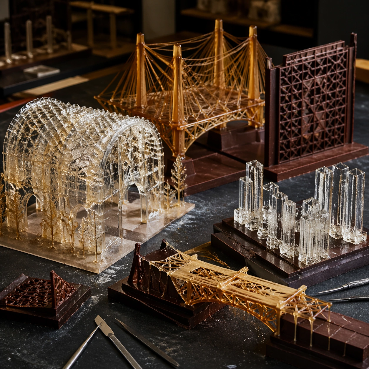
Example generated from “Impossible Candy Architecture — Structural Maquette Table”
GPT Image 2en

Scene: Create a square architectural photograph of an edible miniature city built from sugar and chocolate, lit like a serious built-environment hero shot rather than a whimsical craft display. The composition should imply scale through streets, openings, and tiny pathways while keeping the material identity unmistakably confectionary. Light must reveal translucency, lacework, caramel tension, and crystal sparkle without flattening the forms. Create a square tabletop studio image inside a quiet model workshop, using neutral light and a dark worktable that makes the confection structures feel precious. The framing should resemble an architect documenting maquettes before presentation. Subject: Show several edible structural models arranged across the table: one sugar vault, one caramel truss, one chocolate lattice wall, one crystal column cluster, and a partially assembled bridge segment. The pieces should feel like serious studies of span, enclosure, and material behavior rather than dessert decorations. Small metal drafting tools may appear as quiet context. Important details: Treat the city as structurally plausible even when the materials are fantastical. Blown sugar should refract like fragile glass, pulled caramel should show tension and stretch, and dark chocolate should carry matte-to-satin variation where appropriate. The image should balance wonder with discipline, as if photographed for an architecture journal about impossible edible construction. Highlight differences in material purpose: sugar for enclosure and glow, caramel for tension, chocolate for frame and skin. The image should communicate iterative design thinking inside the same impossible culinary architecture world. Use case: Candy architecture single study 9/9, reducing the edible city to a table of structural maquettes. Constraints: No readable text, no watermark, no logos, preserve exact 1:1 aspect ratio, no candy wrappers, no toy-town props, no gingerbread-house cliches, no cartoon palette overload, no readable signage, no blueprint text, no pastry shop trays, no random candy scatter.

Example generated from “In Image Translation — English Source Poster”
GPT Image 2en

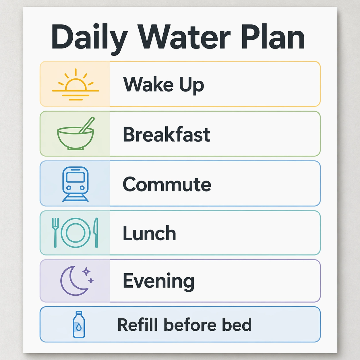
Scene: A square product-design infographic poster, straight-on like a finished localization proof on a light gray studio wall. Use a calm modern palette of white, graphite, fresh blue, soft green, and warm yellow. The lighting is even and bright so every text block is legible. The poster has a precise modular grid with a large headline at top, four rounded schedule cards in the middle, and one small footer strip at bottom. Subject: Create the English source artwork for a hydration routine poster. The exact readable English text must be: headline Daily Water Plan; card labels Wake Up, Breakfast, Commute, Lunch, Evening; footer Refill before bed. Each label sits inside a designed text box beside a simple line icon: sunrise, bowl, train, plate, moon, and bottle. Typography is clean sans serif, consistent weight, with generous spacing. Important details: This is the reference for later in-image translation, so the layout must be unusually stable and measurable. Keep all text boxes aligned to the same grid, icons locked to the left of their labels, equal card heights, consistent corner radius, and no extra decorative copy. Leave enough room in every box for translated strings while still looking like a polished English poster. Use case: In-Image Translation series study 1/8, establishing the English source layout for multilingual poster localization. Constraints: No readable text except the specified English strings, no watermark, no logos, preserve exact 1:1 aspect ratio, no misspellings, no extra labels, no skewed perspective, no fake brand marks, no tiny unreadable typography.

Example generated from “In Image Translation — Japanese Localized Poster”
GPT Image 2en

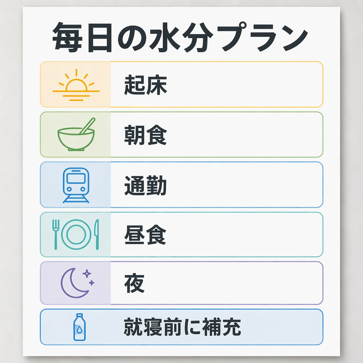
Scene: Use the reference image as the locked source poster. Keep the same square crop, same straight-on wall presentation, same color palette, same modular grid, same line icons, same card sizes, and same footer position. The image should look like the same design file after a professional Japanese localization pass, not like a new poster or a loose remake. Subject: Replace only the English text with Japanese while preserving the typography hierarchy and approximate visual weight. The exact readable Japanese text must be: headline 毎日の水分プラン; card labels 起床, 朝食, 通勤, 昼食, 夜; footer 就寝前に補充. Keep the headline in the same top area, each card label beside its original icon, and the footer inside the same bottom strip. The translated characters should be crisp, balanced, and naturally typeset. Important details: The core test is in-image translation with typography preservation. Do not move icons, resize cards, change colors, add new ornaments, or redesign the schedule. Japanese strings may be slightly wider or narrower than English, but they must stay centered in the same boxes and retain the original label rhythm. Preserve line spacing, corner radius, margins, icon scale, and overall visual identity from image 01. Use case: In-Image Translation series study 2/8, translating the source poster into Japanese while keeping the visual system fixed. Constraints: No readable text except the specified Japanese strings, no watermark, no logos, preserve exact 1:1 aspect ratio, no English leftovers, no random kana, no broken characters, no shifted icons, no changed poster structure.

Example generated from “In Image Translation — Korean Localized Poster”
GPT Image 2en

Scene: Use the reference image as the locked source poster. Maintain the same square, front-facing poster proof, neutral studio wall, bright even lighting, white card surfaces, graphite typography color, blue and green accent blocks, and warm yellow highlights. The finished result must feel like a Korean language export from the same design system. Subject: Replace only the English text with Korean. The exact readable Korean text must be: headline 매일 물 마시기 계획; card labels 기상, 아침 식사, 출근, 점심, 저녁; footer 잠들기 전에 채우기. Keep every phrase inside the same original text zone: the headline at the top, five schedule labels in the middle cards, and the footer in the bottom strip. Characters should be crisp Hangul, visually centered, and typeset with a clean sans serif rhythm. Important details: The challenge is to preserve typography and layout while the language changes length and density. Do not change the poster's card order, icon locations, container sizes, margin grid, background color, or visual hierarchy. The Korean text can use natural spacing, but it must keep the same baseline feeling and not collide with icons. Make the result inspectable as a before-and-after localization artifact. Use case: In-Image Translation series study 3/8, translating the source poster into Korean while preserving text boxes and composition. Constraints: No readable text except the specified Korean strings, no watermark, no logos, preserve exact 1:1 aspect ratio, no English leftovers, no garbled Hangul, no duplicate labels, no altered icons, no redesigned layout.

Example generated from “In Image Translation — Arabic Localized Poster”
GPT Image 2en

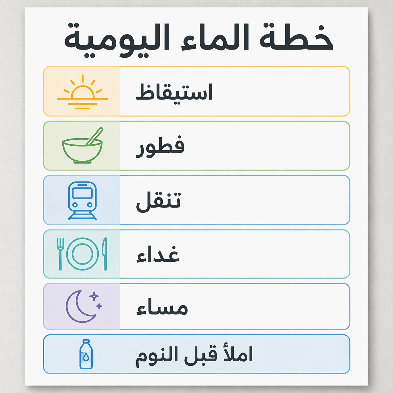
Scene: Use the reference image as the locked source poster, but localize it for Arabic while keeping the square gallery crop and professional design proof quality. Preserve the same card grid, same soft gray wall, same white poster surface, same icon style, same blue, green, yellow, and graphite palette. The output should show a careful right-to-left localization pass without becoming a different poster. Subject: Replace only the English text with Arabic. The exact readable Arabic text must be: headline خطة الماء اليومية; card labels استيقاظ, فطور, تنقل, غداء, مساء; footer املأ قبل النوم. Keep every translated phrase in the equivalent text box, with right-to-left shaping, correct connected Arabic forms, and balanced weight. Icons may remain in their original locations from the reference, but each label must align naturally within its card and stay visually matched to the source hierarchy. Important details: This study tests whether in-image translation can handle script direction, shaping, and layout preservation together. Do not mirror the entire poster unless needed for the text flow; preserve the original visual identity, colors, card sizes, icon scale, footer strip, and headline prominence. Arabic text must look intentionally typeset, not pasted or distorted. Use case: In-Image Translation series study 4/8, translating the source poster into Arabic while preserving the original poster design. Constraints: No readable text except the specified Arabic strings, no watermark, no logos, preserve exact 1:1 aspect ratio, no English leftovers, no broken Arabic joining, no random marks, no shifted cards, no changed color system.

Example generated from “In Image Translation — Ingredient Label Sheet”
GPT Image 2en

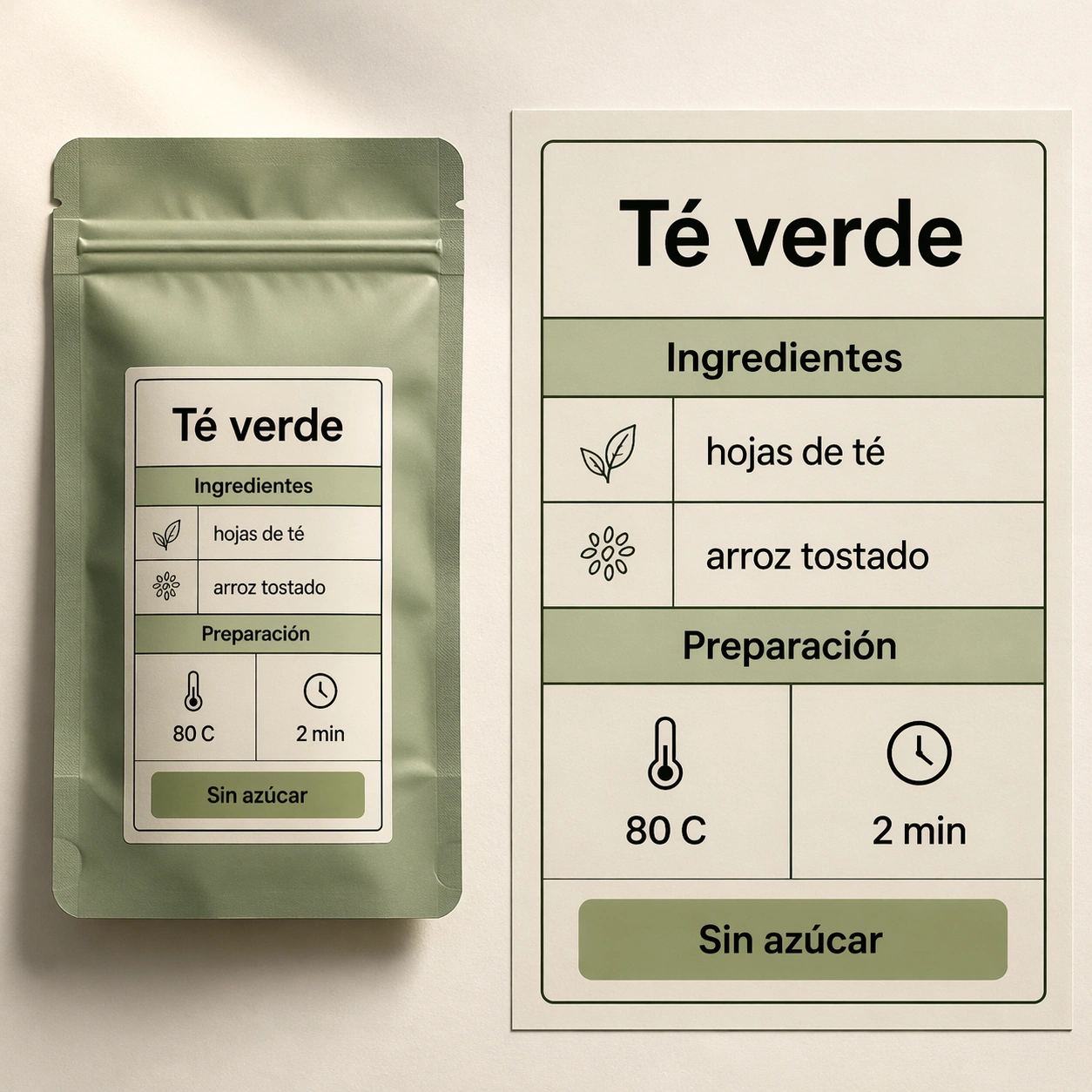
Scene: A square studio photograph style image of a premium tea pouch lying flat beside a magnified label proof sheet. The background is warm off-white paper, lit from the upper left with soft shadows. The design language is commercial packaging: clean black text, sage green blocks, small line dividers, and a precise nutrition-label-like grid. The label fills most of the frame and must be easy to inspect. Subject: Create a Spanish localization of a compact ingredient and brewing label. The exact readable Spanish text must be: Té verde, Ingredientes, hojas de té, arroz tostado, Preparación, 80 C, 2 min, Sin azúcar. Arrange these strings in a realistic package label with the same visual role that English text would occupy: product name at top, section headings, ingredient rows, brewing settings, and a small claim badge. Keep the packaging generic with no brand name. Important details: This tests translation in a dense commercial mockup where text must fit small containers. Preserve a strict grid, sharp label borders, consistent numeral style, even padding, and readable accents. The Spanish text should look naturally typeset, not randomly scattered. Make the surface tactile and plausible, but prioritize clear text and localization discipline over decorative packaging noise. Use case: In-Image Translation single study 6/8, testing localized packaging text inside a compact ingredient label layout. Constraints: No readable text except the specified Spanish strings, no watermark, no logos, preserve exact 1:1 aspect ratio, no real brand, no random certification marks, no misspelled accents, no unreadable microtext, no cluttered label grid.

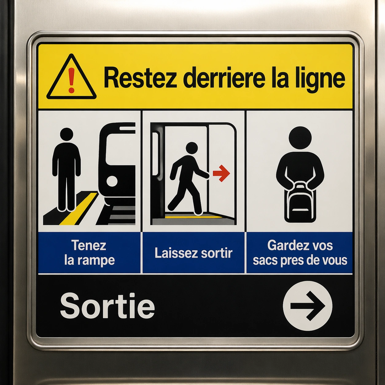
Example generated from “In Image Translation — Transit Safety Panel”
GPT Image 2en

Scene: A square crop of a transit safety panel inside a clean metro carriage, photographed straight-on with stainless steel edges and soft overhead light. The panel is a finished public-information graphic with four pictogram boxes, a headline band, and a lower instruction strip. Use high contrast safety colors: white, black, signal yellow, muted blue, and a small red accent. Subject: Show a French localization of a transit safety instruction panel. The exact readable French text must be: Restez derriere la ligne, Tenez la rampe, Laissez sortir, Gardez vos sacs pres de vous, Sortie. Place the main warning in the headline band, three instructions under pictograms in the middle boxes, and the exit label beside a clean arrow in the lower strip. Typography should be sober, transit-grade, and readable, with no brand system or route names. Important details: The challenge is maintaining a public-safety layout while translating the text. Keep pictograms aligned, box borders crisp, icon scale consistent, and the baseline grid stable. French accents should render correctly where used, and the text must not spill outside boxes. The panel should look like a professionally localized safety graphic, not an improvised poster. Use case: In-Image Translation single study 7/8, testing translated safety instructions with pictogram alignment and strict readability. Constraints: No readable text except the specified French strings, no watermark, no logos, preserve exact 1:1 aspect ratio, no metro brand, no route numbers, no extra warnings, no garbled accents, no angled unreadable panel.

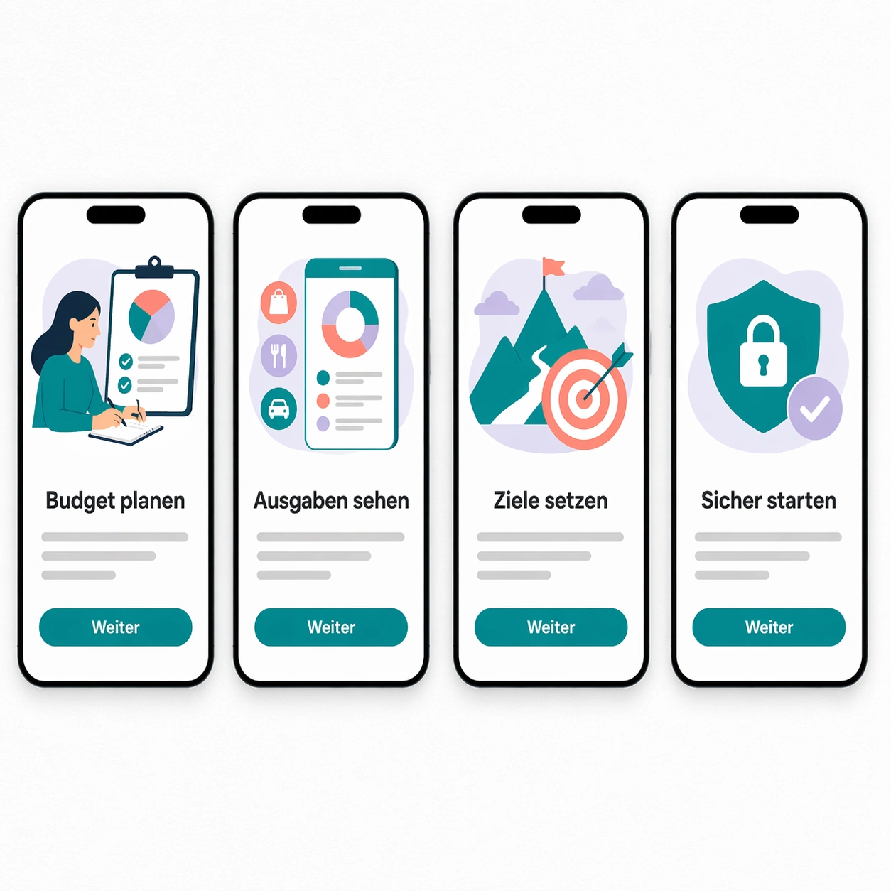
Example generated from “In Image Translation — App Onboarding Board”
GPT Image 2en

Scene: A square product mockup showing four mobile app onboarding screens laid out on a white design board. The board is viewed straight-on with subtle paper grain, soft shadows under each phone frame, and a restrained digital palette of black, white, teal, coral, and pale lavender. Each screen has an illustration area, a headline, a short body line, and one pill-shaped button. Subject: Create a German localization of a calm finance app onboarding sequence. The exact readable German text must be: Budget planen, Ausgaben sehen, Ziele setzen, Sicher starten, Weiter. Use Budget planen, Ausgaben sehen, Ziele setzen, Sicher starten as the four screen headlines, and Weiter as the button label repeated once per screen. Body text should be represented by non-readable gray placeholder lines only, not real words. The phones should look like a polished UI handoff, with identical layout between screens. Important details: The translation task is to keep UI hierarchy stable despite longer German compounds. Headlines must fit their existing containers without squeezing awkwardly, buttons must keep the same width and radius, and screen spacing must stay even. Preserve all icon and illustration areas, maintain consistent font weight, and keep the localized text crisp enough to audit. Use case: In-Image Translation single study 8/8, testing app UI localization where translated strings must fit repeated screen templates. Constraints: No readable text except the specified German strings, no watermark, no logos, preserve exact 1:1 aspect ratio, no app brand, no real currency symbols, no extra UI copy, no misspelled German, no overlapping labels.

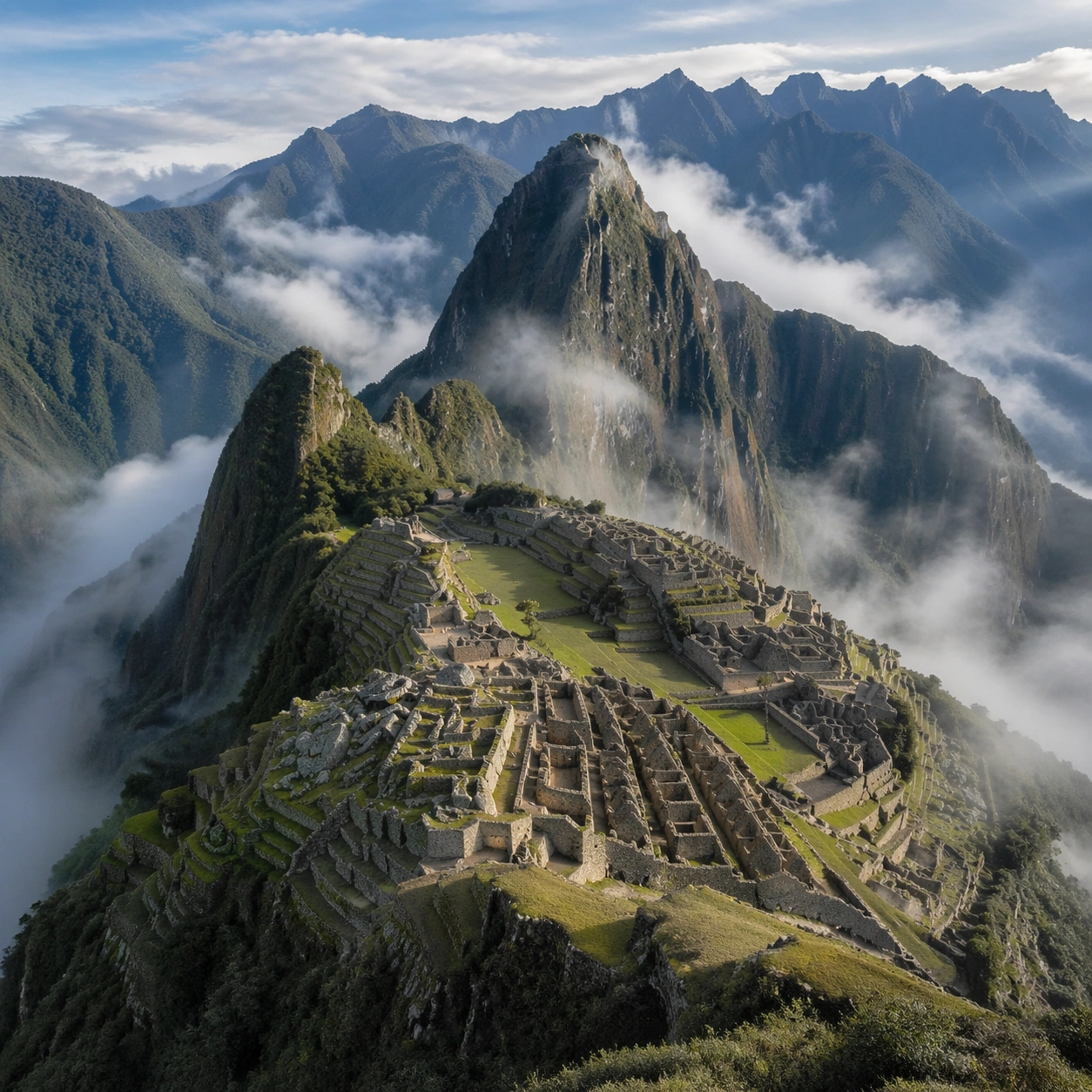
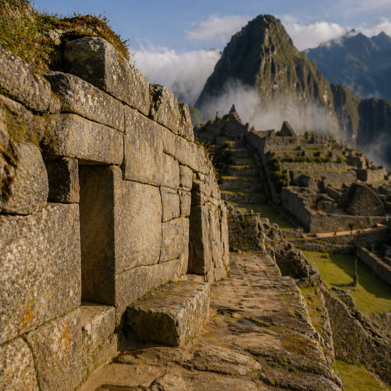
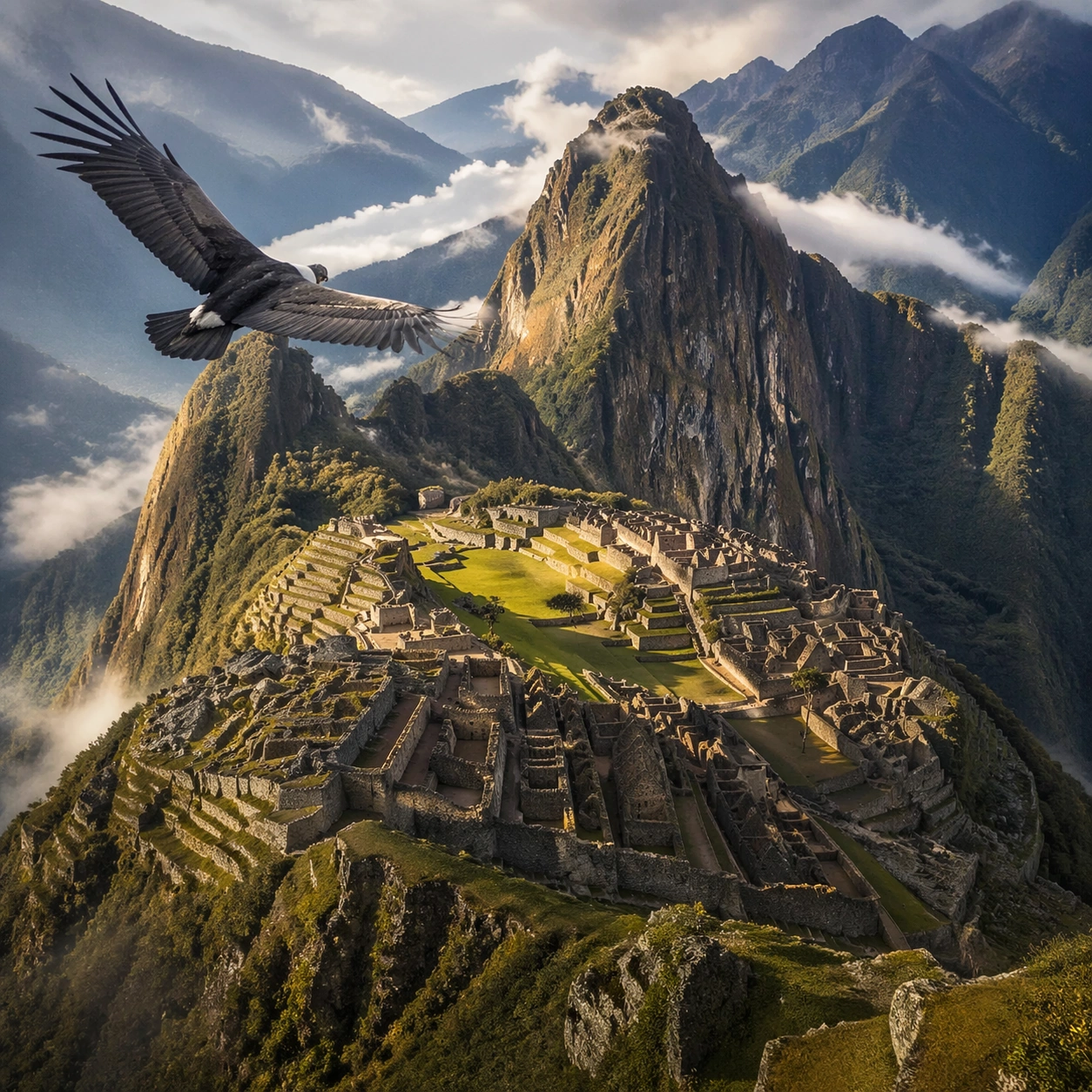
Example generated from “Inca Machu Picchu Condor View — Reference Anchor”
GPT Image 2en

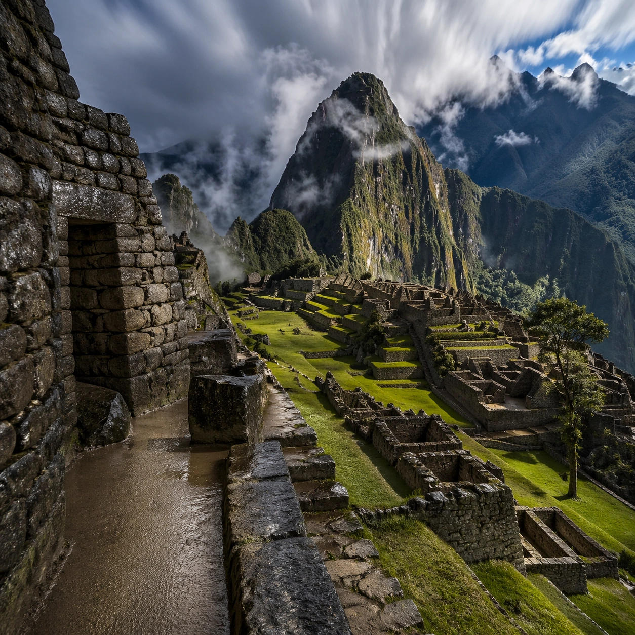
Scene: A square documentary image composed like a premium archaeology magazine feature. Use cool Andean dawn blue, pale cloud white, wet stone gray, and muted terrace green. Frame Machu Picchu seen from a condor-height perspective, with terraces, temples, and steep ridges emerging through early valley mist with crisp depth layering, restrained contrast, and subtle atmospheric depth so the scene feels excavated, observed, and historically grounded rather than theatrical or game-like. Keep the light directional but believable, as if captured during a careful field visit. Subject: Center the image on Machu Picchu seen from a condor-height perspective, with terraces, temples, and steep ridges emerging through early valley mist. Include culturally accurate surface logic, region-specific setting, and believable human-scale cues in stairs, doorways, cut blocks, relief edges, or water depth. Shapes, carvings, masonry joints, and site wear should feel studied from real archaeology, with no generic ancient-world mashup and no ornamental filler borrowed from another civilization. Important details: Keep the site unmistakably Inca, with exact terrace cadence, dry-stone precision, mountain topography, and sacred urban ordering that follows the ridge instead of flattening into a generic hilltop ruin. Emphasize precision-fitted Inca stone, terraced grass, mountain fog, wet granite edges, and sharp ridge silhouettes. Keep inscriptions, painted registers, symbolic motifs, or carved bands visually plausible but not readable. Preserve a museum-grade balance between beauty and evidence: light should reveal relief depth, edge wear, repairs, sediment traces, and excavation context without turning the site into fantasy spectacle. The composition should feel like a definitive reference frame that later variations can inherit exactly. Use case: Inca Machu Picchu Condor View series study 1/9. Constraints: No readable text, no watermark, no logos, preserve exact 1:1 aspect ratio, no fantasy floating islands, no helicopters, no modern handrails, no sci-fi structures, no tourists, no anachronistic props, no collage layout, no exaggerated fantasy lighting.

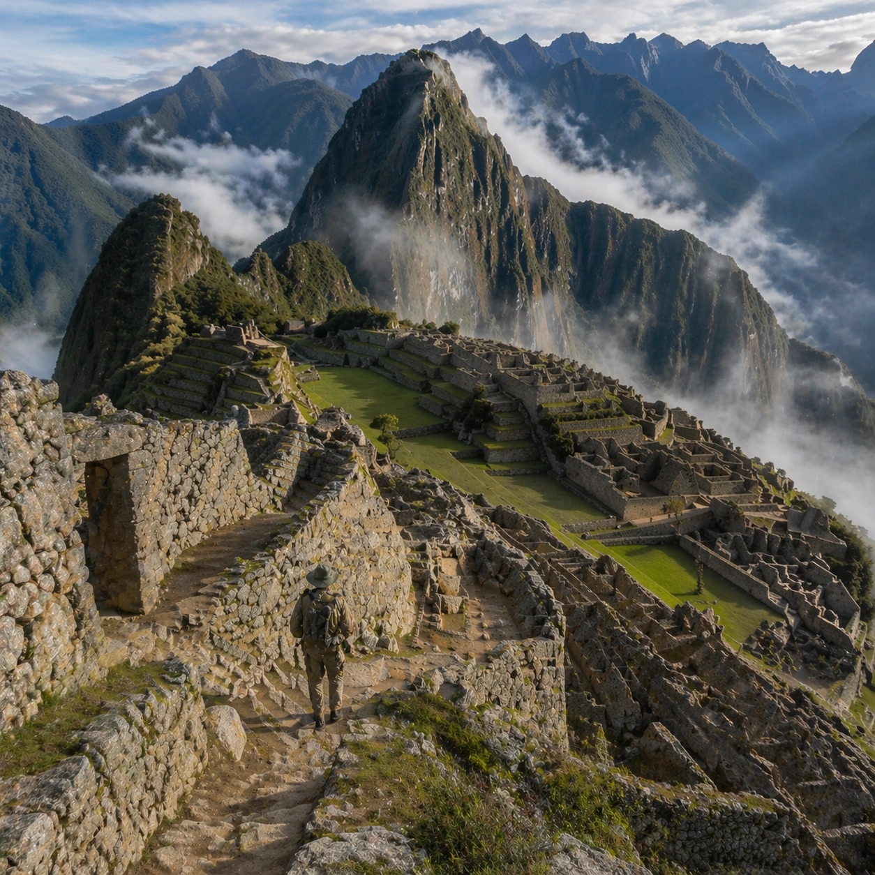
Example generated from “Inca Machu Picchu Condor View — Human Scale Reveal”
GPT Image 2en

Scene: A square follow-up field image from the same site, slightly closer and lower than the reference anchor, with careful documentary framing and the same material palette. The camera should feel physically present inside the archaeological space, using natural light, soft depth separation, and one clear human figure to explain scale without turning the image into lifestyle photography. Subject: Show the same site identity established in the reference anchor, now with an archaeologist, conservator, or field researcher moving through the scene in practical neutral clothing. The person should be small relative to the monument and clearly secondary to the architecture, water, or painted wall system. Keep the main forms, structural rhythm, and civilizational markers unchanged. Important details: Preserve the exact site identity, base geometry, material behavior, and cultural signatures from the reference model. Only vary vantage, gesture, and scale cues. Keep the site unmistakably Inca, with exact terrace cadence, dry-stone precision, mountain topography, and sacred urban ordering that follows the ridge instead of flattening into a generic hilltop ruin. Human presence should clarify stair height, wall size, carving depth, or spatial compression while respecting conservation protocol and historical seriousness. Keep any tools understated and generic, with no readable labels. The image must still look like a rigorous archaeological record first and a dramatic scene second. Use case: Inca Machu Picchu Condor View series study 2/9. Constraints: No readable text, no watermark, no logos, preserve exact 1:1 aspect ratio, preserve exact site identity from the reference image, no fantasy floating islands, no helicopters, no modern handrails, no sci-fi structures, no fashion editorial styling, no crowd, no cinematic props.

Example generated from “Inca Machu Picchu Condor View — Surface Close Study”
GPT Image 2en

Scene: A square close study framed within the same site established by the reference anchor. Use a tight crop, shallow but believable depth of field, and raking light that reveals tactile evidence in surface relief, pigment, tool marks, moisture, or marine wear. The image should feel like a museum conservation photograph elevated to gallery quality. Subject: Focus on a materially rich portion of the same site: carved edges, painted plaster, fitted stone, root-wrapped masonry, submerged paving, or quarry-cut facial planes depending on the civilization. The composition should remain anchored to the original location and show enough surrounding context that viewers still recognize the parent site rather than mistaking it for an unrelated artifact. Important details: Preserve the exact site identity from the reference model while shifting emphasis to forensic surface evidence. Keep the site unmistakably Inca, with exact terrace cadence, dry-stone precision, mountain topography, and sacred urban ordering that follows the ridge instead of flattening into a generic hilltop ruin. Make micro-texture, fracture lines, pigment retention, water wear, plant interaction, dust, or chisel traces visually persuasive. Avoid decorative clutter. Every mark should feel like evidence of making, weathering, excavation, or conservation. Keep any symbolic marks non-legible and historically appropriate, and make the light reveal depth without flattening the material richness. Use case: Inca Machu Picchu Condor View series study 3/9. Constraints: No readable text, no watermark, no logos, preserve exact 1:1 aspect ratio, preserve exact site identity from the reference image, no fantasy floating islands, no helicopters, no modern handrails, no sci-fi structures, no isolated floating artifact, no studio backdrop, no fake macro abstraction.

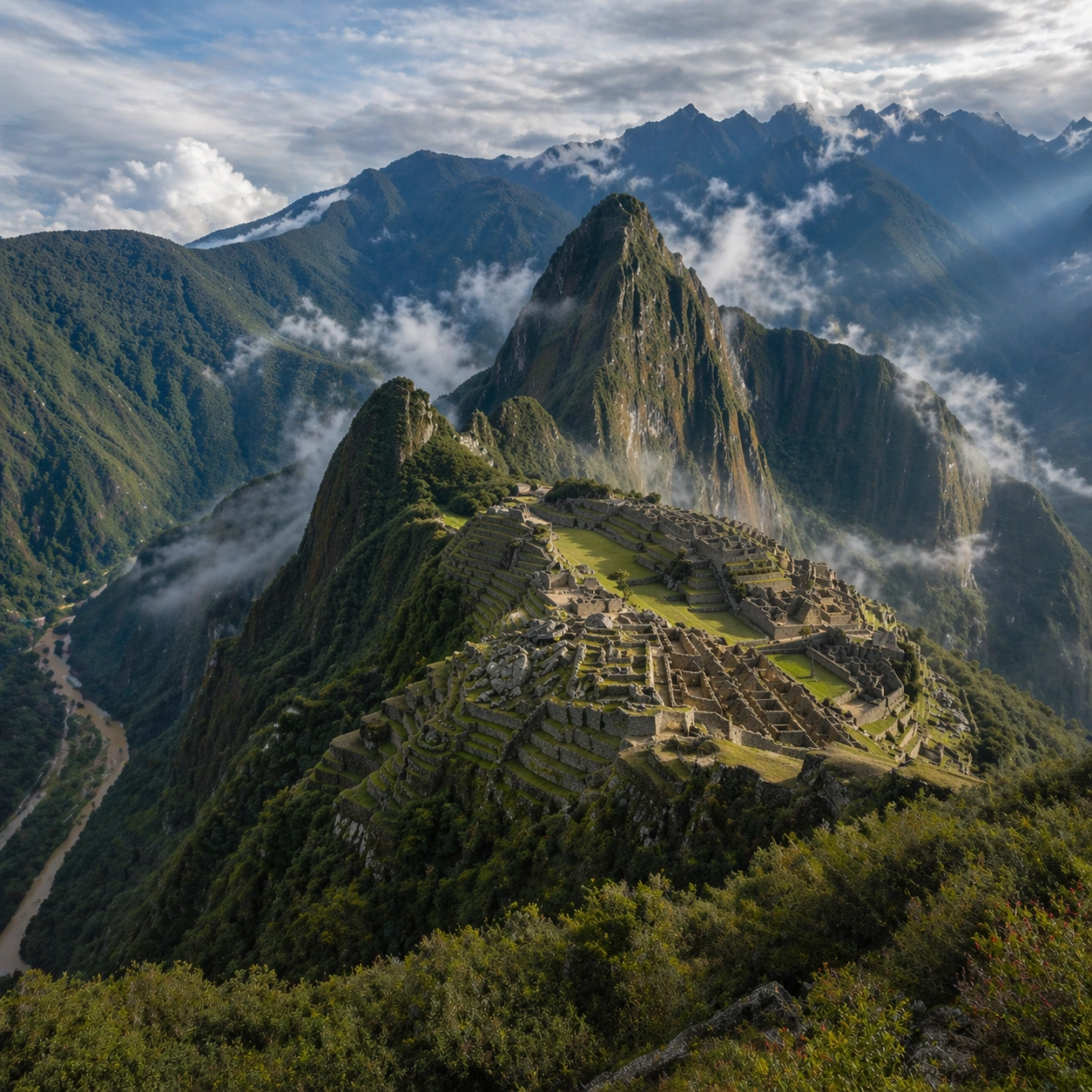
Example generated from “Inca Machu Picchu Condor View — Atmospheric Wide Reveal”
GPT Image 2en

Scene: A square wide reveal of the same site under a slightly different environmental condition, with more surrounding geography or architecture visible while keeping the anchor landmark dominant. Use disciplined composition, atmospheric perspective, and natural light behavior so the image feels like a patient field photograph captured after the reference shot rather than a different fantasy set. Subject: Show the same site identity with broader context: approaches, terraces, ring walls, canyon slot, canopy volume, quarry slope, or chamber boundaries depending on the location. The anchor structure must remain instantly recognizable. Environmental scale should deepen understanding of why the site is placed here and how people, water, topography, or vegetation shape the experience of the monument. Important details: Preserve the exact landmark, materials, and civilizational cues from the reference model while allowing wider framing and a different atmospheric emphasis. Keep the site unmistakably Inca, with exact terrace cadence, dry-stone precision, mountain topography, and sacred urban ordering that follows the ridge instead of flattening into a generic hilltop ruin. Use geography and environmental systems to add meaning: drainage, mist, current, valley depth, roots, irrigation, or enclosure logic. The image should feel both beautiful and evidentiary, with no compositional tricks that break continuity with the established site. Use case: Inca Machu Picchu Condor View series study 4/9. Constraints: No readable text, no watermark, no logos, preserve exact 1:1 aspect ratio, preserve exact site identity from the reference image, no fantasy floating islands, no helicopters, no modern handrails, no sci-fi structures, no unrelated landmarks, no speculative mashup architecture, no posterized grading.

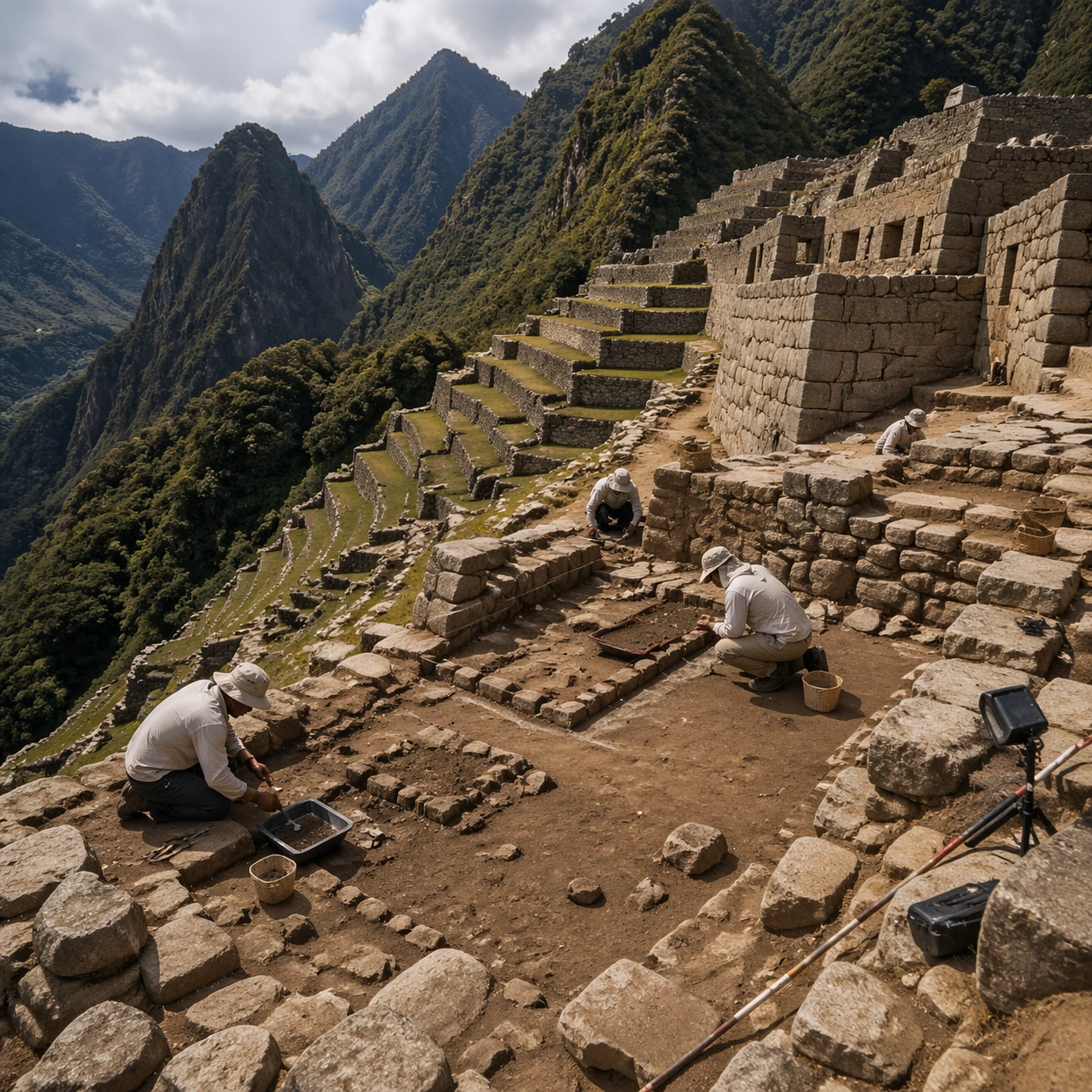
Example generated from “Inca Machu Picchu Condor View — Excavation Overview”
GPT Image 2en

Scene: A square independent archaeology study composed from a slightly elevated fieldwork viewpoint. Use balanced natural light, crisp evidence hierarchy, and practical site organization so the image feels publishable in a museum report and still visually strong enough for a gallery wall. The frame should explain where excavation is happening without relying on readable markers or diagrams. Subject: Show a high terrace fieldwork view with measured stone sectors, path edges, and researchers recording agricultural and ceremonial relationships across the site. Include grounded human traces such as ladders, trays, brushes, baskets, light rigs, or measuring tools only when they support archaeological realism and remain visually secondary. The site should stay culturally specific, with architecture, surface treatment, sediment, and environmental context all belonging to the correct civilization rather than a generic dig. Important details: Keep the site unmistakably Inca, with exact terrace cadence, dry-stone precision, mountain topography, and sacred urban ordering that follows the ridge instead of flattening into a generic hilltop ruin. Prioritize evidence relationships: exposed layers, cleaned edges, protected surfaces, loose fragments, and transitions between buried and revealed material. Let color, wear, and composition explain what has just been uncovered. The image must feel methodical rather than adventurous. Keep any site tags, notes, or markers abstract and unreadable. Avoid sensational treasure imagery and keep the atmosphere scholarly, patient, and materially convincing. Use case: Inca Machu Picchu Condor View single study 5/9. Constraints: No readable text, no watermark, no logos, preserve exact 1:1 aspect ratio, no fantasy floating islands, no helicopters, no modern handrails, no sci-fi structures, no treasure-chest clichés, no action-movie posing, no arbitrary props, no infographic overlay.

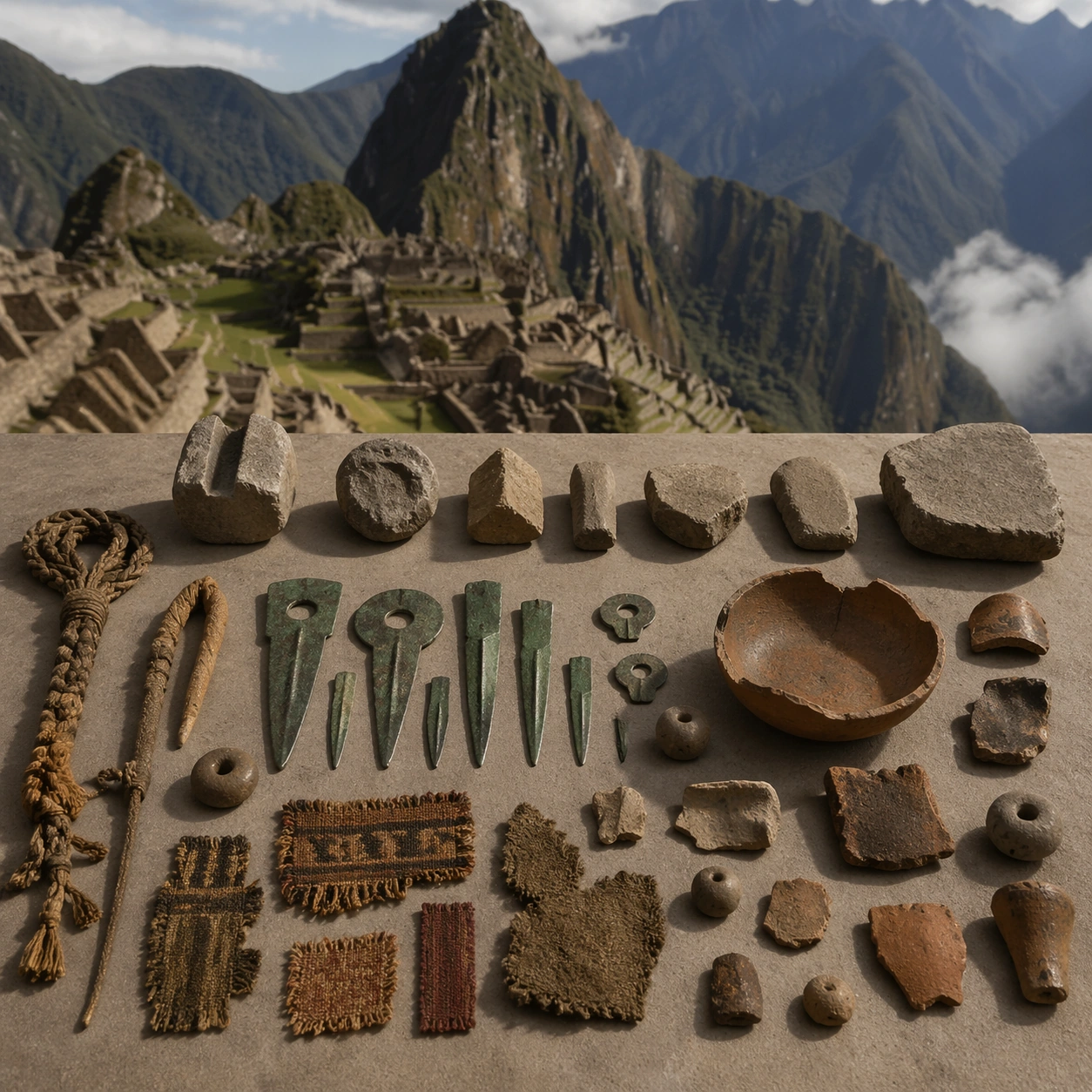
Example generated from “Inca Machu Picchu Condor View — Artifact Tableau”
GPT Image 2en

Scene: A square artifact and material study arranged like a high-end conservation photograph. Use soft directional light, controlled shadow falloff, and a neutral work surface so every fragment reads clearly. The image should feel intimate and scientific, but still rich enough to communicate the broader civilization through craft, wear, and material vocabulary alone. Subject: Present worked stone samples, textile fragments, ceramic pieces, tupu pins, and rope measurement tools arranged for close study. Arrange the pieces with disciplined spacing and believable conservation handling. Include enough variation in scale, finish, and damage state to suggest excavation reality rather than a perfectly staged luxury still life. Nothing should look modern or decorative for its own sake; every object must feel like evidence tied to the same cultural world as the main topic. Important details: Emphasize tactile surfaces, honest aging, and historically grounded material behavior. Keep the site unmistakably Inca, with exact terrace cadence, dry-stone precision, mountain topography, and sacred urban ordering that follows the ridge instead of flattening into a generic hilltop ruin. Show abrasion, dust, corrosion, cracks, mineral bloom, pigment retention, or edge polish where appropriate. Keep the arrangement orderly but not sterile, as if prepared for a serious cataloging session. No readable labels, no museum placards, and no visual shortcuts that turn the study into product photography detached from archaeology. Use case: Inca Machu Picchu Condor View single study 6/9. Constraints: No readable text, no watermark, no logos, preserve exact 1:1 aspect ratio, no fantasy floating islands, no helicopters, no modern handrails, no sci-fi structures, no luxury advertising gloss, no floating objects, no velvet jewelry styling, no unrelated tools.

Example generated from “Inca Machu Picchu Condor View — Light Shift Study”
GPT Image 2en

Scene: A square mood variation from the same civilization theme, built around clear post-rain mountain light with faster cloud motion, stronger ridge contrast, and reflective wet stone across the same landscape. The image should stay grounded in field realism while testing how different illumination changes material reading, atmosphere, and emotional register. Keep the frame self-contained and coherent, as if photographed during a second visit under altered conditions. Subject: Show a culturally accurate site or interior connected to the same world as the main topic, but not as a direct dependency on the series reference. The focus should be on how light transforms relief, color, moisture, water, dust, or vegetation while preserving archaeological credibility. Architectural forms, objects, and setting must still belong to the same civilization with no cross-cultural contamination. Important details: Keep the site unmistakably Inca, with exact terrace cadence, dry-stone precision, mountain topography, and sacred urban ordering that follows the ridge instead of flattening into a generic hilltop ruin. Use the shift in light to reveal different evidence than the other studies: pigment glow, root sheen, caustics, wet stone, canyon shadow, marine haze, terrace depth, or quarry moisture. Keep the result serious and observational rather than romanticized. Non-readable motifs are acceptable, but there should be no signs, captions, or modern display devices. The image should feel like a rigorous visual experiment in historical atmosphere. Use case: Inca Machu Picchu Condor View single study 7/9. Constraints: No readable text, no watermark, no logos, preserve exact 1:1 aspect ratio, no fantasy floating islands, no helicopters, no modern handrails, no sci-fi structures, no theatrical color filters, no supernatural effects, no montage composition, no glossy concept-art exaggeration.

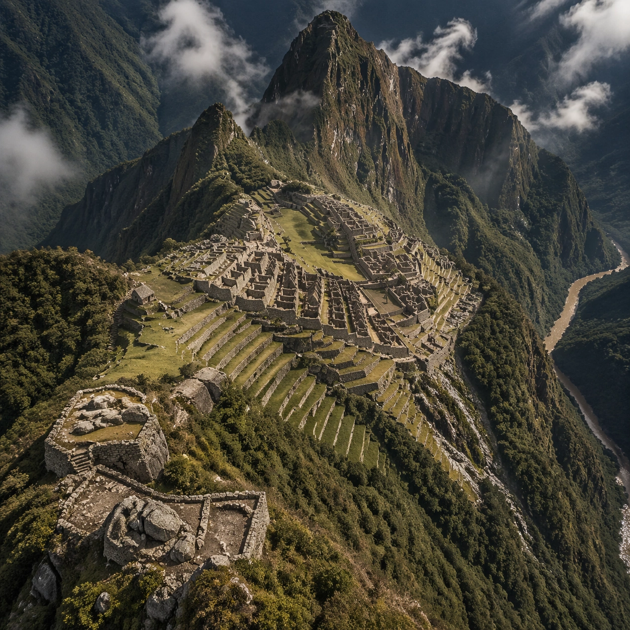
Example generated from “Inca Machu Picchu Condor View — Survey Perspective”
GPT Image 2en

Scene: A square survey-oriented image that explains spatial logic with the clarity of an expert field overview while still reading as a finished artwork. Use a stable elevated vantage, clean depth layering, and enough visible terrain or architecture to make relationships legible without turning the frame into a literal map. The scene should feel analytical and cinematic at the same time. Subject: Show a disciplined aerial survey perspective that explains terrace sequences, sacred precincts, path networks, and the drop into the Urubamba valley. Organize the composition so paths, terraces, walls, courtyards, chambers, canals, root systems, or quarry clusters can be read as a coherent system. The image should reveal how the civilization used land, water, elevation, enclosure, or monumentality. Keep all architecture, materials, and environmental details consistent with the correct place and period. Important details: Keep the site unmistakably Inca, with exact terrace cadence, dry-stone precision, mountain topography, and sacred urban ordering that follows the ridge instead of flattening into a generic hilltop ruin. This image should reward close looking by showing infrastructural logic: how stone courses align, how water moves, how rooms connect, how carved masses sit inside geology, or how vegetation interacts with built form. Avoid explicit annotation. Let composition, light, and scale cues do the explanatory work. Keep any measuring elements generic and unreadable, and make the image feel like serious research made visually elegant. Use case: Inca Machu Picchu Condor View single study 8/9. Constraints: No readable text, no watermark, no logos, preserve exact 1:1 aspect ratio, no fantasy floating islands, no helicopters, no modern handrails, no sci-fi structures, no infographic arrows, no split-screen layout, no impossible aerial geometry, no unrelated settlements.

Example generated from “Inca Machu Picchu Condor View — Editorial Reconstruction”
GPT Image 2en

Scene: A square hero image designed for a museum wall graphic or flagship magazine cover, but without any actual typography. Use strong focal hierarchy, refined contrast, and a polished finish that still feels rooted in archaeological evidence. The frame should look complete on its own and communicate why this civilization remains visually unforgettable. Subject: Build the image around a premium editorial reconstruction that prioritizes geographic precision, condor-scale grandeur, and quiet archaeological awe. Present architecture, artifacts, environment, and atmosphere as one coherent statement. The composition can be more distilled than a field snapshot, but it must remain culturally specific, materially persuasive, and free of fantasy shorthand. Nothing should feel like a movie poster or commercial franchise imitation. Important details: Keep the site unmistakably Inca, with exact terrace cadence, dry-stone precision, mountain topography, and sacred urban ordering that follows the ridge instead of flattening into a generic hilltop ruin. Distill the site or cultural world into one decisive visual argument: place, craft, weathering, engineering, and memory. Use the strongest material signatures from this civilization and let them sit in a believable environment with controlled dramatic weight. Keep any carved or painted symbols non-readable. The result should look like responsible high-end visual storytelling for research and public interpretation, not a spectacle-first matte painting. Use case: Inca Machu Picchu Condor View single study 9/9. Constraints: No readable text, no watermark, no logos, preserve exact 1:1 aspect ratio, no fantasy floating islands, no helicopters, no modern handrails, no sci-fi structures, no movie-poster tropes, no overdesigned framing devices, no collage layout, no brand-like iconography.

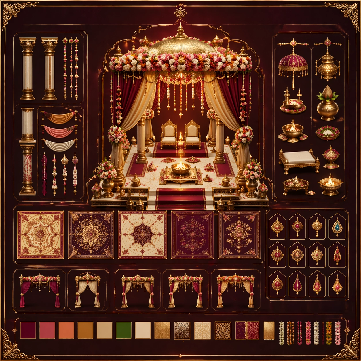
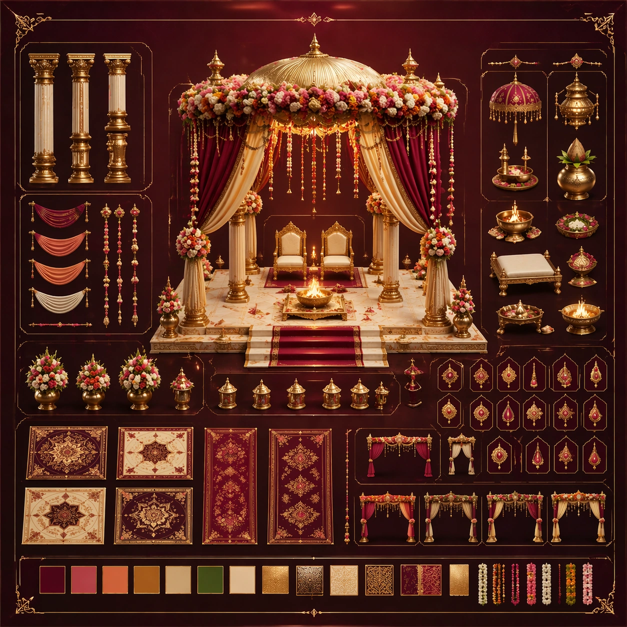
Example generated from “Indian Wedding Ceremonial Maximalism — Reference Anchor”
GPT Image 2en

Scene: Create a square reference image for Indian Wedding Ceremonial Maximalism. Build a reference anchor establishing the core system with a premium, production-ready finish. Use a polished modular board or campaign surface with clean spacing, premium game-UI finish, and clear focal hierarchy. The composition should feel intentional, clean, and reusable for gallery, research, campaign, or internal handoff contexts. Lighting must support readability first, with the main forms clearly separated from the background and enough breathing room for the system to stay legible at both hero scale and thumbnail scale. Subject: Center a coherent original game-art system built for premium production and marketing surfaces. For this image, focus on reference anchor. Keep the same system logic stable across screenshots, cards, banners, and overview boards. This image is the canonical anchor that later series images must follow. The viewer should immediately understand what role this surface plays inside a cohesive game-production asset pack. Important details: Lock framing, icon grammar, palette blocking, and surface hierarchy so the kit feels production-ready and consistent. Preserve the core silhouette, framing language, and material logic from the reference image while each variation changes function. Keep materials believable, edge hierarchy disciplined, and the visual language consistent with Indian Wedding. Use abstract interface blocks or diagram accents when helpful, but avoid any readable language. The final result should feel like a deliberate production asset rather than a random illustration. Use case: Indian Wedding Ceremonial Maximalism series study 1/9, designed as reference anchor within a cohesive asset pack. Constraints: No readable text, no watermark, no logos, preserve exact 1:1 aspect ratio, no unrelated objects, no broken visual hierarchy, no malformed anatomy or broken perspective, no random decorative clutter.

Example generated from “Indian Wedding Ceremonial Maximalism — Variant One”
GPT Image 2en

Scene: Create a square dependent image for Indian Wedding Ceremonial Maximalism. Build a first controlled variation in the same system with a premium, production-ready finish. Use a polished modular board or campaign surface with clean spacing, premium game-UI finish, and clear focal hierarchy. The composition should feel intentional, clean, and reusable for gallery, research, campaign, or internal handoff contexts. Lighting must support readability first, with the main forms clearly separated from the background and enough breathing room for the system to stay legible at both hero scale and thumbnail scale. Subject: Center a coherent original game-art system built for premium production and marketing surfaces. For this image, focus on the intended support surface. Keep the same system logic stable across screenshots, cards, banners, and overview boards. Preserve exact identity or system logic from the reference image while changing only the intended variation axis. The viewer should immediately understand what role this surface plays inside a cohesive game-production asset pack. Important details: Lock framing, icon grammar, palette blocking, and surface hierarchy so the kit feels production-ready and consistent. Preserve the core silhouette, framing language, and material logic from the reference image while each variation changes function. Keep materials believable, edge hierarchy disciplined, and the visual language consistent with Indian Wedding. Use abstract interface blocks or diagram accents when helpful, but avoid any readable language. The final result should feel like a deliberate production asset rather than a random illustration. Use case: Indian Wedding Ceremonial Maximalism series study 2/9, designed as variant one within a cohesive asset pack. Constraints: No readable text, no watermark, no logos, preserve exact 1:1 aspect ratio, no unrelated objects, no broken visual hierarchy, no malformed anatomy or broken perspective, no random decorative clutter.

Example generated from “Indian Wedding Ceremonial Maximalism — Variant Two”
GPT Image 2en

Scene: Create a square dependent image for Indian Wedding Ceremonial Maximalism. Build a second controlled variation in the same system with a premium, production-ready finish. Use a polished modular board or campaign surface with clean spacing, premium game-UI finish, and clear focal hierarchy. The composition should feel intentional, clean, and reusable for gallery, research, campaign, or internal handoff contexts. Lighting must support readability first, with the main forms clearly separated from the background and enough breathing room for the system to stay legible at both hero scale and thumbnail scale. Subject: Center a coherent original game-art system built for premium production and marketing surfaces. For this image, focus on the intended support surface. Keep the same system logic stable across screenshots, cards, banners, and overview boards. Preserve exact identity or system logic from the reference image while changing only the intended variation axis. The viewer should immediately understand what role this surface plays inside a cohesive game-production asset pack. Important details: Lock framing, icon grammar, palette blocking, and surface hierarchy so the kit feels production-ready and consistent. Preserve the core silhouette, framing language, and material logic from the reference image while each variation changes function. Keep materials believable, edge hierarchy disciplined, and the visual language consistent with Indian Wedding. Use abstract interface blocks or diagram accents when helpful, but avoid any readable language. The final result should feel like a deliberate production asset rather than a random illustration. Use case: Indian Wedding Ceremonial Maximalism series study 3/9, designed as variant two within a cohesive asset pack. Constraints: No readable text, no watermark, no logos, preserve exact 1:1 aspect ratio, no unrelated objects, no broken visual hierarchy, no malformed anatomy or broken perspective, no random decorative clutter.

Example generated from “Indian Wedding Ceremonial Maximalism — Variant Three”
GPT Image 2en

Scene: Create a square dependent image for Indian Wedding Ceremonial Maximalism. Build a third controlled variation in the same system with a premium, production-ready finish. Use a polished modular board or campaign surface with clean spacing, premium game-UI finish, and clear focal hierarchy. The composition should feel intentional, clean, and reusable for gallery, research, campaign, or internal handoff contexts. Lighting must support readability first, with the main forms clearly separated from the background and enough breathing room for the system to stay legible at both hero scale and thumbnail scale. Subject: Center a coherent original game-art system built for premium production and marketing surfaces. For this image, focus on the intended support surface. Keep the same system logic stable across screenshots, cards, banners, and overview boards. Preserve exact identity or system logic from the reference image while changing only the intended variation axis. The viewer should immediately understand what role this surface plays inside a cohesive game-production asset pack. Important details: Lock framing, icon grammar, palette blocking, and surface hierarchy so the kit feels production-ready and consistent. Preserve the core silhouette, framing language, and material logic from the reference image while each variation changes function. Keep materials believable, edge hierarchy disciplined, and the visual language consistent with Indian Wedding. Use abstract interface blocks or diagram accents when helpful, but avoid any readable language. The final result should feel like a deliberate production asset rather than a random illustration. Use case: Indian Wedding Ceremonial Maximalism series study 4/9, designed as variant three within a cohesive asset pack. Constraints: No readable text, no watermark, no logos, preserve exact 1:1 aspect ratio, no unrelated objects, no broken visual hierarchy, no malformed anatomy or broken perspective, no random decorative clutter.

Example generated from “Indian Wedding Ceremonial Maximalism — Support One”
GPT Image 2en

Scene: Create a square standalone support image for Indian Wedding Ceremonial Maximalism. Build a support-surface study with a clear focal hierarchy and a finished professional surface. Use a polished modular board or campaign surface with clean spacing, premium game-UI finish, and clear focal hierarchy. The frame should feel self-contained and polished, with enough structure to explain the system even without the reference series, yet still obviously belonging to the same theme and production world. Subject: Show a coherent original game-art system built for premium production and marketing surfaces in a way that emphasizes the intended support surface. Keep the same system logic stable across screenshots, cards, banners, and overview boards. Even though this image is independent, the viewer should still recognize the same universe, same commercial logic, and same production intent as the core package. Important details: Lock framing, icon grammar, palette blocking, and surface hierarchy so the kit feels production-ready and consistent. Preserve the broader theme language through color, framing, material choices, and modular composition. Use clean panel rhythm, premium asset presentation, and believable detail density. The image should work equally well as a gallery study, research reference, and mock production deliverable. Use case: Indian Wedding Ceremonial Maximalism single study 5/9, exploring support one as a support surface. Constraints: No readable text, no watermark, no logos, preserve exact 1:1 aspect ratio, no unrelated objects, no broken visual hierarchy, no visual noise that obscures the main surface, no accidental brand resemblance.

Example generated from “Indian Wedding Ceremonial Maximalism — Support Two”
GPT Image 2en

Scene: Create a square standalone support image for Indian Wedding Ceremonial Maximalism. Build a second support-surface study with a clear focal hierarchy and a finished professional surface. Use a polished modular board or campaign surface with clean spacing, premium game-UI finish, and clear focal hierarchy. The frame should feel self-contained and polished, with enough structure to explain the system even without the reference series, yet still obviously belonging to the same theme and production world. Subject: Show a coherent original game-art system built for premium production and marketing surfaces in a way that emphasizes the intended support surface. Keep the same system logic stable across screenshots, cards, banners, and overview boards. Even though this image is independent, the viewer should still recognize the same universe, same commercial logic, and same production intent as the core package. Important details: Lock framing, icon grammar, palette blocking, and surface hierarchy so the kit feels production-ready and consistent. Preserve the broader theme language through color, framing, material choices, and modular composition. Use clean panel rhythm, premium asset presentation, and believable detail density. The image should work equally well as a gallery study, research reference, and mock production deliverable. Use case: Indian Wedding Ceremonial Maximalism single study 6/9, exploring support two as a support surface. Constraints: No readable text, no watermark, no logos, preserve exact 1:1 aspect ratio, no unrelated objects, no broken visual hierarchy, no visual noise that obscures the main surface, no accidental brand resemblance.

Example generated from “Indian Wedding Ceremonial Maximalism — Support Three”
GPT Image 2en

Scene: Create a square standalone support image for Indian Wedding Ceremonial Maximalism. Build a third support-surface study with a clear focal hierarchy and a finished professional surface. Use a polished modular board or campaign surface with clean spacing, premium game-UI finish, and clear focal hierarchy. The frame should feel self-contained and polished, with enough structure to explain the system even without the reference series, yet still obviously belonging to the same theme and production world. Subject: Show a coherent original game-art system built for premium production and marketing surfaces in a way that emphasizes the intended support surface. Keep the same system logic stable across screenshots, cards, banners, and overview boards. Even though this image is independent, the viewer should still recognize the same universe, same commercial logic, and same production intent as the core package. Important details: Lock framing, icon grammar, palette blocking, and surface hierarchy so the kit feels production-ready and consistent. Preserve the broader theme language through color, framing, material choices, and modular composition. Use clean panel rhythm, premium asset presentation, and believable detail density. The image should work equally well as a gallery study, research reference, and mock production deliverable. Use case: Indian Wedding Ceremonial Maximalism single study 7/9, exploring support three as a support surface. Constraints: No readable text, no watermark, no logos, preserve exact 1:1 aspect ratio, no unrelated objects, no broken visual hierarchy, no visual noise that obscures the main surface, no accidental brand resemblance.

Example generated from “Indian Wedding Ceremonial Maximalism — Support Four”
GPT Image 2en

Scene: Create a square standalone support image for Indian Wedding Ceremonial Maximalism. Build a fourth support-surface study with a clear focal hierarchy and a finished professional surface. Use a polished modular board or campaign surface with clean spacing, premium game-UI finish, and clear focal hierarchy. The frame should feel self-contained and polished, with enough structure to explain the system even without the reference series, yet still obviously belonging to the same theme and production world. Subject: Show a coherent original game-art system built for premium production and marketing surfaces in a way that emphasizes the intended support surface. Keep the same system logic stable across screenshots, cards, banners, and overview boards. Even though this image is independent, the viewer should still recognize the same universe, same commercial logic, and same production intent as the core package. Important details: Lock framing, icon grammar, palette blocking, and surface hierarchy so the kit feels production-ready and consistent. Preserve the broader theme language through color, framing, material choices, and modular composition. Use clean panel rhythm, premium asset presentation, and believable detail density. The image should work equally well as a gallery study, research reference, and mock production deliverable. Use case: Indian Wedding Ceremonial Maximalism single study 8/9, exploring support four as a support surface. Constraints: No readable text, no watermark, no logos, preserve exact 1:1 aspect ratio, no unrelated objects, no broken visual hierarchy, no visual noise that obscures the main surface, no accidental brand resemblance.

Example generated from “Indian Wedding Ceremonial Maximalism — Support Five”
GPT Image 2en

Scene: Create a square standalone support image for Indian Wedding Ceremonial Maximalism. Build a fifth support-surface study with a clear focal hierarchy and a finished professional surface. Use a polished modular board or campaign surface with clean spacing, premium game-UI finish, and clear focal hierarchy. The frame should feel self-contained and polished, with enough structure to explain the system even without the reference series, yet still obviously belonging to the same theme and production world. Subject: Show a coherent original game-art system built for premium production and marketing surfaces in a way that emphasizes the intended support surface. Keep the same system logic stable across screenshots, cards, banners, and overview boards. Even though this image is independent, the viewer should still recognize the same universe, same commercial logic, and same production intent as the core package. Important details: Lock framing, icon grammar, palette blocking, and surface hierarchy so the kit feels production-ready and consistent. Preserve the broader theme language through color, framing, material choices, and modular composition. Use clean panel rhythm, premium asset presentation, and believable detail density. The image should work equally well as a gallery study, research reference, and mock production deliverable. Use case: Indian Wedding Ceremonial Maximalism single study 9/9, exploring support five as a support surface. Constraints: No readable text, no watermark, no logos, preserve exact 1:1 aspect ratio, no unrelated objects, no broken visual hierarchy, no visual noise that obscures the main surface, no accidental brand resemblance.

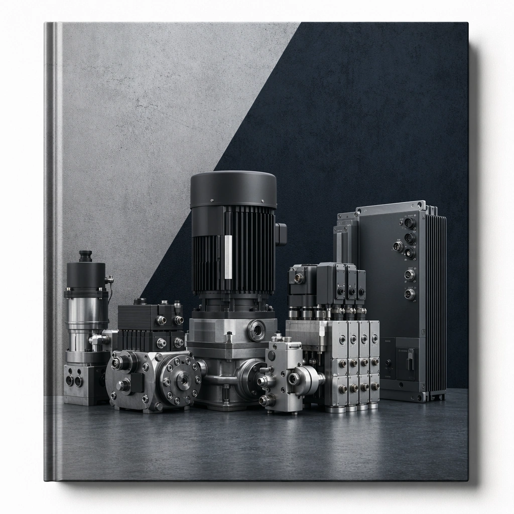
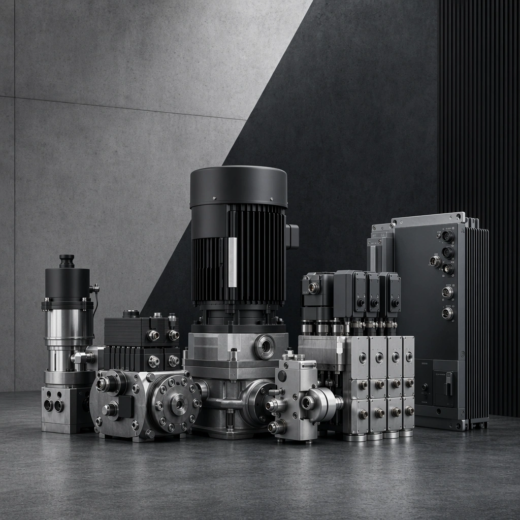
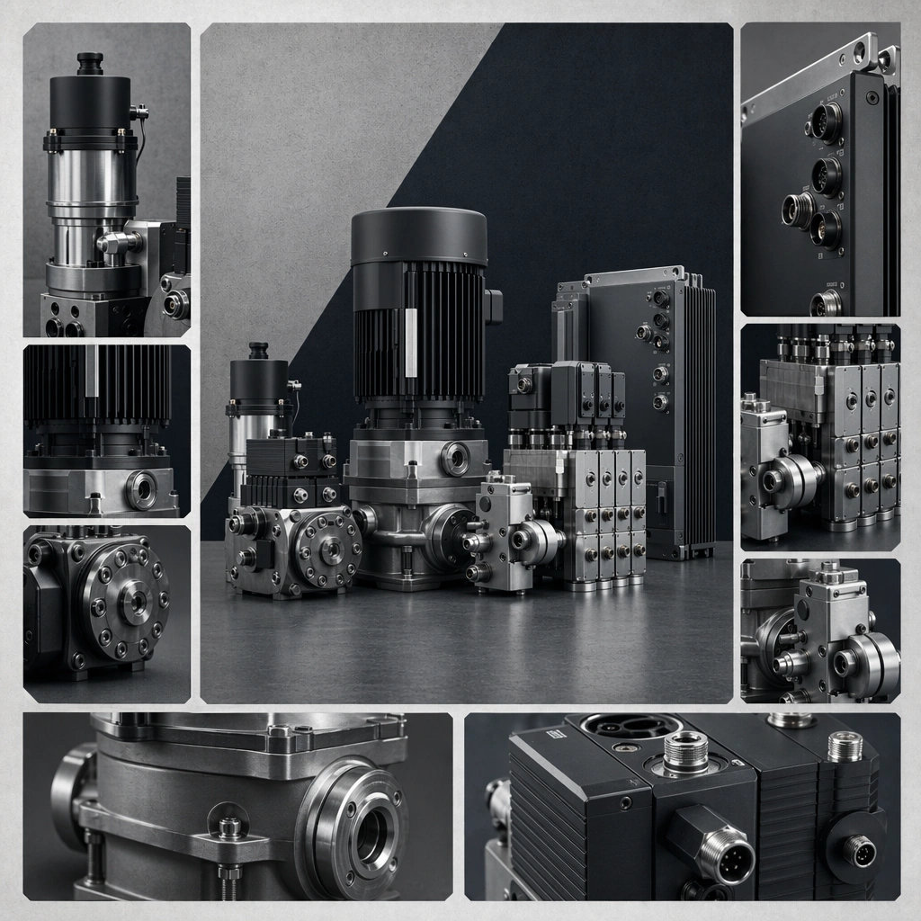
Example generated from “Industrial Catalog Cover And Spread System — Reference Cover”
GPT Image 2en

Scene: A square cover mockup held almost straight-on with soft studio light, premium paper texture, and carefully controlled edge shadows. Compose the frame as a square key visual with disciplined camera placement, premium lighting control, and believable real-world scale. The tonal range should feel polished and intentional, with enough atmosphere to create depth without obscuring form. Keep contrast calibrated for launch, catalog, or research presentation use rather than casual snapshot aesthetics. Subject: Center an original industrial equipment family consisting of compact pumps, valve modules, and control boxes with consistent material language and premium hard-surface detailing. Make the subject feel original, production-aware, and clearly grounded in Industrial Catalog Cover and Spread System. For this series image, preserve exact core subject identity, proportions, base geometry, and material language from the reference image whenever continuity matters. The focal hierarchy should be immediate: primary form first, then material behavior, then supporting environmental cues that clarify use context and difficulty. Important details: Show one hero product-family arrangement with disciplined negative space, editorial confidence, and strong cover composition fit for industrial publishing. Preserve exact product-family language, material palette, industrial category, and editorial hierarchy across the series. Layouts must feel catalog-realistic while containing no readable text. Use believable materials, engineering logic, and professional composition discipline. Reflections, shadows, edge breaks, texture scale, interface density, and small physical joints must all support realism. Avoid filler props, vague mood-board clutter, or any element that weakens the sense of a purpose-built industrial or automotive image. Use case: Catalog System series study 1/9 for Industrial Catalog Cover and Spread System, built as image 01-reference-anchor. Constraints: No readable text, no watermark, no logos, preserve exact 1:1 aspect ratio, no readable text, no logos, no lorem ipsum, no cheap stock props, no unrelated products, no fake brand typography.

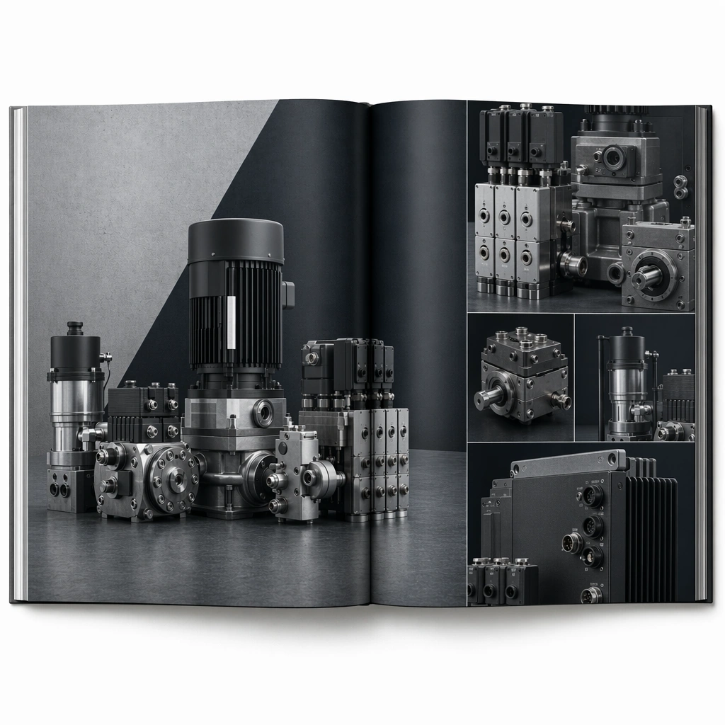
Example generated from “Industrial Catalog Cover And Spread System — Hero Spread”
GPT Image 2en

Scene: A square open-spread editorial mockup with clean fold, bright neutral light, and structured zones across both pages. Compose the frame as a square key visual with disciplined camera placement, premium lighting control, and believable real-world scale. The tonal range should feel polished and intentional, with enough atmosphere to create depth without obscuring form. Keep contrast calibrated for launch, catalog, or research presentation use rather than casual snapshot aesthetics. Subject: Center an original industrial equipment family consisting of compact pumps, valve modules, and control boxes with consistent material language and premium hard-surface detailing. Make the subject feel original, production-aware, and clearly grounded in Industrial Catalog Cover and Spread System. For this series image, preserve exact core subject identity, proportions, base geometry, and material language from the reference image whenever continuity matters. The focal hierarchy should be immediate: primary form first, then material behavior, then supporting environmental cues that clarify use context and difficulty. Important details: Preserve the exact product family while showing one large hero image and supporting detail modules. The spread should feel premium and legible without using copy. Preserve exact product-family language, material palette, industrial category, and editorial hierarchy across the series. Layouts must feel catalog-realistic while containing no readable text. Use believable materials, engineering logic, and professional composition discipline. Reflections, shadows, edge breaks, texture scale, interface density, and small physical joints must all support realism. Avoid filler props, vague mood-board clutter, or any element that weakens the sense of a purpose-built industrial or automotive image. Use case: Catalog System series study 2/9 for Industrial Catalog Cover and Spread System, built as image 02-context-shift. Constraints: No readable text, no watermark, no logos, preserve exact 1:1 aspect ratio, no readable text, no logos, no lorem ipsum, no cheap stock props, no unrelated products, no fake brand typography.

Example generated from “Industrial Catalog Cover And Spread System — Lineup Spread”
GPT Image 2en

Scene: A square editorial spread with disciplined grid, even lighting, and premium product cutouts arranged in clear hierarchy. Compose the frame as a square key visual with disciplined camera placement, premium lighting control, and believable real-world scale. The tonal range should feel polished and intentional, with enough atmosphere to create depth without obscuring form. Keep contrast calibrated for launch, catalog, or research presentation use rather than casual snapshot aesthetics. Subject: Center an original industrial equipment family consisting of compact pumps, valve modules, and control boxes with consistent material language and premium hard-surface detailing. Make the subject feel original, production-aware, and clearly grounded in Industrial Catalog Cover and Spread System. For this series image, preserve exact core subject identity, proportions, base geometry, and material language from the reference image whenever continuity matters. The focal hierarchy should be immediate: primary form first, then material behavior, then supporting environmental cues that clarify use context and difficulty. Important details: Use layout order and product variation logic as the main storytelling device. The page should feel like real industrial editorial design, not a mood board. Preserve exact product-family language, material palette, industrial category, and editorial hierarchy across the series. Layouts must feel catalog-realistic while containing no readable text. Use believable materials, engineering logic, and professional composition discipline. Reflections, shadows, edge breaks, texture scale, interface density, and small physical joints must all support realism. Avoid filler props, vague mood-board clutter, or any element that weakens the sense of a purpose-built industrial or automotive image. Use case: Catalog System series study 3/9 for Industrial Catalog Cover and Spread System, built as image 03-surface-study. Constraints: No readable text, no watermark, no logos, preserve exact 1:1 aspect ratio, no readable text, no logos, no lorem ipsum, no cheap stock props, no unrelated products, no fake brand typography.

Example generated from “Industrial Catalog Cover And Spread System — Feature Page”
GPT Image 2en

Scene: A square feature-page board with one dominant product crop, multiple detail windows, and premium editorial lighting over a neutral paper ground. Compose the frame as a square key visual with disciplined camera placement, premium lighting control, and believable real-world scale. The tonal range should feel polished and intentional, with enough atmosphere to create depth without obscuring form. Keep contrast calibrated for launch, catalog, or research presentation use rather than casual snapshot aesthetics. Subject: Center an original industrial equipment family consisting of compact pumps, valve modules, and control boxes with consistent material language and premium hard-surface detailing. Make the subject feel original, production-aware, and clearly grounded in Industrial Catalog Cover and Spread System. For this series image, preserve exact core subject identity, proportions, base geometry, and material language from the reference image whenever continuity matters. The focal hierarchy should be immediate: primary form first, then material behavior, then supporting environmental cues that clarify use context and difficulty. Important details: Preserve the exact same product family and turn the layout into a sellable, non-readable, feature-driven catalog communication surface. Preserve exact product-family language, material palette, industrial category, and editorial hierarchy across the series. Layouts must feel catalog-realistic while containing no readable text. Use believable materials, engineering logic, and professional composition discipline. Reflections, shadows, edge breaks, texture scale, interface density, and small physical joints must all support realism. Avoid filler props, vague mood-board clutter, or any element that weakens the sense of a purpose-built industrial or automotive image. Use case: Catalog System series study 4/9 for Industrial Catalog Cover and Spread System, built as image 04-presentation-master. Constraints: No readable text, no watermark, no logos, preserve exact 1:1 aspect ratio, no readable text, no logos, no lorem ipsum, no cheap stock props, no unrelated products, no fake brand typography.

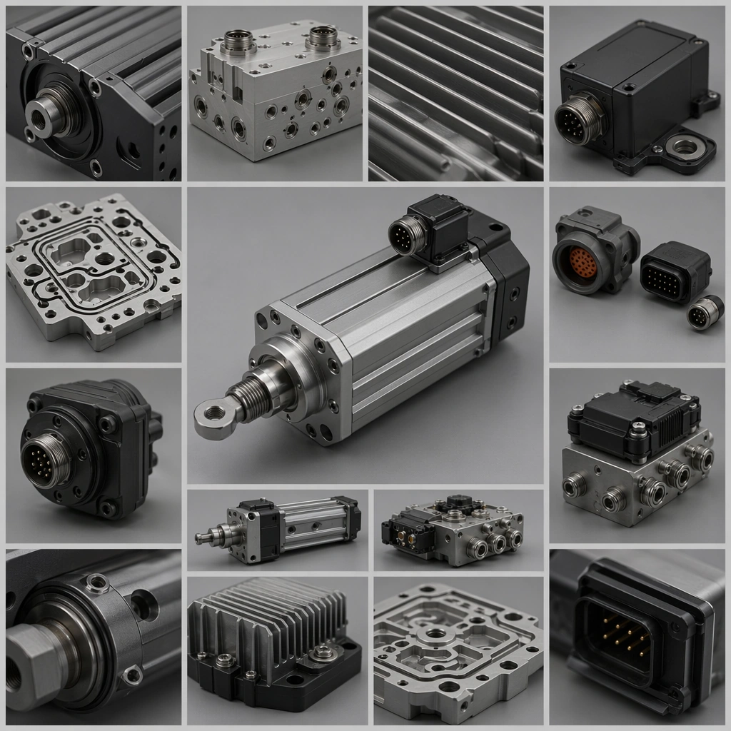
Example generated from “Industrial Catalog Cover And Spread System — Detail Page Board”
GPT Image 2en

Scene: A square editorial board with image windows, product fragments, soft studio light, and consistent page-development structure. Compose the frame as a square key visual with disciplined camera placement, premium lighting control, and believable real-world scale. The tonal range should feel polished and intentional, with enough atmosphere to create depth without obscuring form. Keep contrast calibrated for launch, catalog, or research presentation use rather than casual snapshot aesthetics. Subject: Center original industrial detail photography arranged into a persuasive page-development board with no readable copy. Make the subject feel original, production-aware, and clearly grounded in Industrial Catalog Cover and Spread System. Treat this as an independent study that must feel complete and coherent without relying on any external reference image. The focal hierarchy should be immediate: primary form first, then material behavior, then supporting environmental cues that clarify use context and difficulty. Important details: Keep every block intentional and non-readable. The board should feel like a real working surface used to refine catalog hierarchy and emphasis. The visual language should still feel native to Industrial Catalog Cover and Spread System, using disciplined industrial or campaign composition instead of generic stock photography. Use believable materials, engineering logic, and professional composition discipline. Reflections, shadows, edge breaks, texture scale, interface density, and small physical joints must all support realism. Avoid filler props, vague mood-board clutter, or any element that weakens the sense of a purpose-built industrial or automotive image. Use case: Catalog System single study 6/9 for Industrial Catalog Cover and Spread System, built as image support-two. Constraints: No readable text, no watermark, no logos, preserve exact 1:1 aspect ratio, no readable text, no logos, no lorem ipsum, no random office clutter, no unrelated consumer props, no fake brand marks.

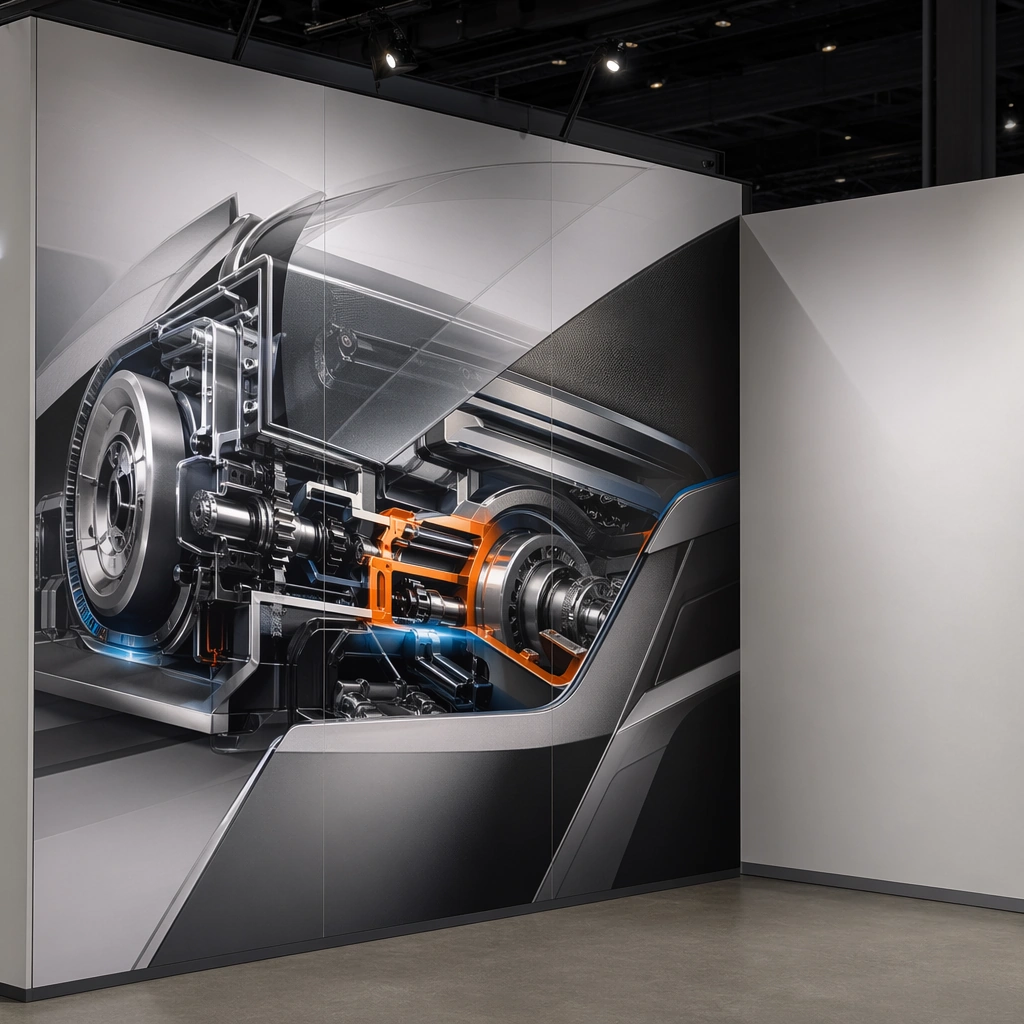
Example generated from “Industrial Catalog Cover And Spread System — Trade Show Wall”
GPT Image 2en

Scene: A square booth-corner environment with one printed wall panel, controlled fair lighting, and believable modular construction. Compose the frame as a square key visual with disciplined camera placement, premium lighting control, and believable real-world scale. The tonal range should feel polished and intentional, with enough atmosphere to create depth without obscuring form. Keep contrast calibrated for launch, catalog, or research presentation use rather than casual snapshot aesthetics. Subject: Center original industrial product visuals shown across a premium booth wall in a logo-free exhibition context. Make the subject feel original, production-aware, and clearly grounded in Industrial Catalog Cover and Spread System. Treat this as an independent study that must feel complete and coherent without relying on any external reference image. The focal hierarchy should be immediate: primary form first, then material behavior, then supporting environmental cues that clarify use context and difficulty. Important details: Graphics must stay abstract and text-free while the booth feels real and commercially useful. The wall should read as exhibition-ready, not as a speculative concept drawing. The visual language should still feel native to Industrial Catalog Cover and Spread System, using disciplined industrial or campaign composition instead of generic stock photography. Use believable materials, engineering logic, and professional composition discipline. Reflections, shadows, edge breaks, texture scale, interface density, and small physical joints must all support realism. Avoid filler props, vague mood-board clutter, or any element that weakens the sense of a purpose-built industrial or automotive image. Use case: Catalog System single study 7/9 for Industrial Catalog Cover and Spread System, built as image support-three. Constraints: No readable text, no watermark, no logos, preserve exact 1:1 aspect ratio, no readable text, no logos, no lorem ipsum, no random office clutter, no unrelated consumer props, no fake brand marks.

Example generated from “Industrial Catalog Cover And Spread System — Product Card Grid”
GPT Image 2en

Scene: A square grid board with multiple card-sized zones, crisp even light, and strict spacing across repeated product layouts. Compose the frame as a square key visual with disciplined camera placement, premium lighting control, and believable real-world scale. The tonal range should feel polished and intentional, with enough atmosphere to create depth without obscuring form. Keep contrast calibrated for launch, catalog, or research presentation use rather than casual snapshot aesthetics. Subject: Center original industrial products repeated across card formats with varying crop strategies and hierarchy treatments. Make the subject feel original, production-aware, and clearly grounded in Industrial Catalog Cover and Spread System. Treat this as an independent study that must feel complete and coherent without relying on any external reference image. The focal hierarchy should be immediate: primary form first, then material behavior, then supporting environmental cues that clarify use context and difficulty. Important details: Keep the hierarchy obvious without readable copy. The value should come from disciplined editing rhythm, product clarity, and print-minded composition. The visual language should still feel native to Industrial Catalog Cover and Spread System, using disciplined industrial or campaign composition instead of generic stock photography. Use believable materials, engineering logic, and professional composition discipline. Reflections, shadows, edge breaks, texture scale, interface density, and small physical joints must all support realism. Avoid filler props, vague mood-board clutter, or any element that weakens the sense of a purpose-built industrial or automotive image. Use case: Catalog System single study 8/9 for Industrial Catalog Cover and Spread System, built as image support-four. Constraints: No readable text, no watermark, no logos, preserve exact 1:1 aspect ratio, no readable text, no logos, no lorem ipsum, no random office clutter, no unrelated consumer props, no fake brand marks.

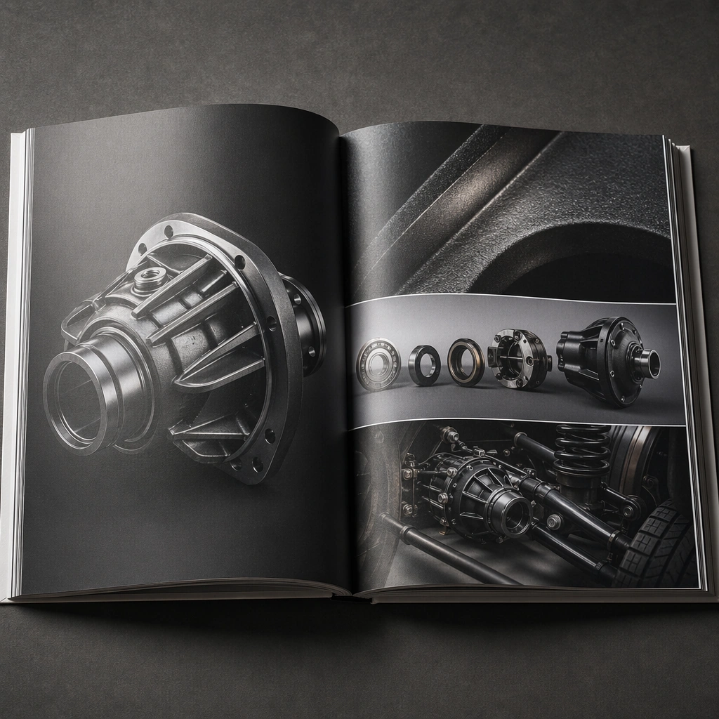
Example generated from “Industrial Catalog Cover And Spread System — Sample Book Spread”
GPT Image 2en

Scene: A square open sample-book shot with tactile paper, binding shadow, and premium natural light over a physical printed object. Compose the frame as a square key visual with disciplined camera placement, premium lighting control, and believable real-world scale. The tonal range should feel polished and intentional, with enough atmosphere to create depth without obscuring form. Keep contrast calibrated for launch, catalog, or research presentation use rather than casual snapshot aesthetics. Subject: Center original industrial product imagery arranged into a polished sample spread with editorial rhythm and no readable typography. Make the subject feel original, production-aware, and clearly grounded in Industrial Catalog Cover and Spread System. Treat this as an independent study that must feel complete and coherent without relying on any external reference image. The focal hierarchy should be immediate: primary form first, then material behavior, then supporting environmental cues that clarify use context and difficulty. Important details: Emphasize print-object realism and editorial composition. The spread should feel approved, expensive, and ready for client-facing review. The visual language should still feel native to Industrial Catalog Cover and Spread System, using disciplined industrial or campaign composition instead of generic stock photography. Use believable materials, engineering logic, and professional composition discipline. Reflections, shadows, edge breaks, texture scale, interface density, and small physical joints must all support realism. Avoid filler props, vague mood-board clutter, or any element that weakens the sense of a purpose-built industrial or automotive image. Use case: Catalog System single study 9/9 for Industrial Catalog Cover and Spread System, built as image support-five. Constraints: No readable text, no watermark, no logos, preserve exact 1:1 aspect ratio, no readable text, no logos, no lorem ipsum, no random office clutter, no unrelated consumer props, no fake brand marks.

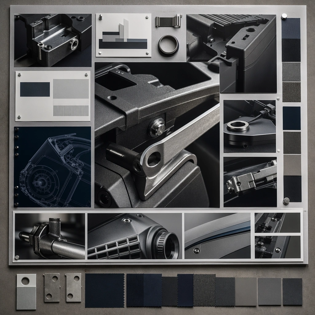
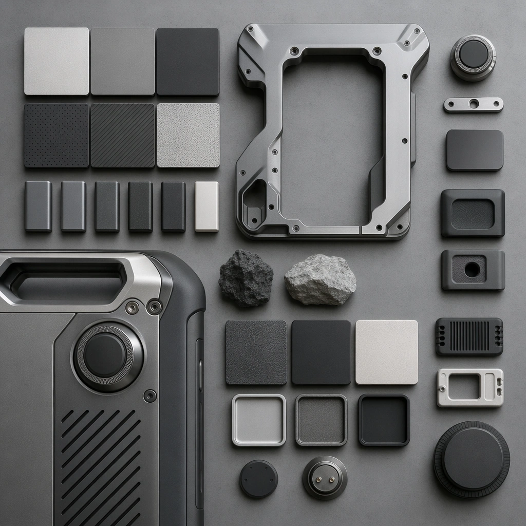
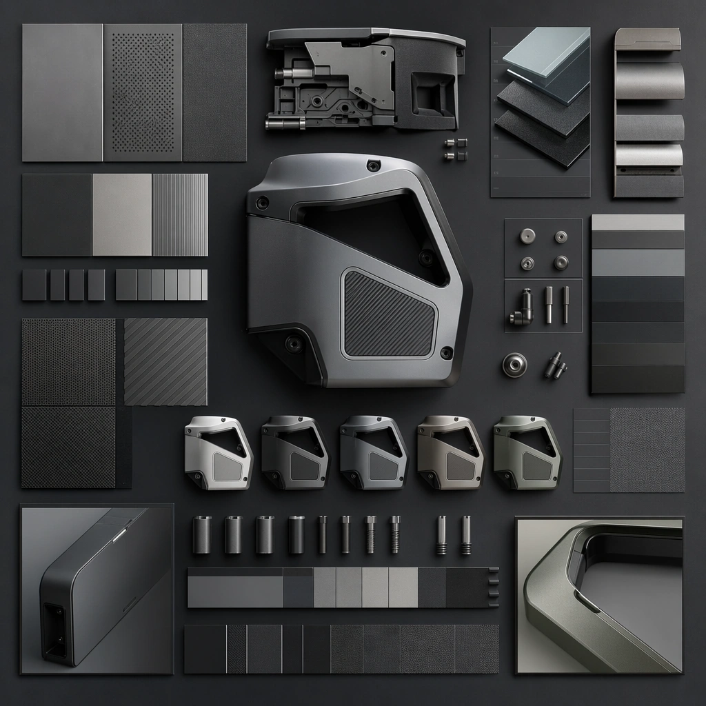
Example generated from “Industrial Material Finish Study Board — Reference Finish Board”
GPT Image 2en

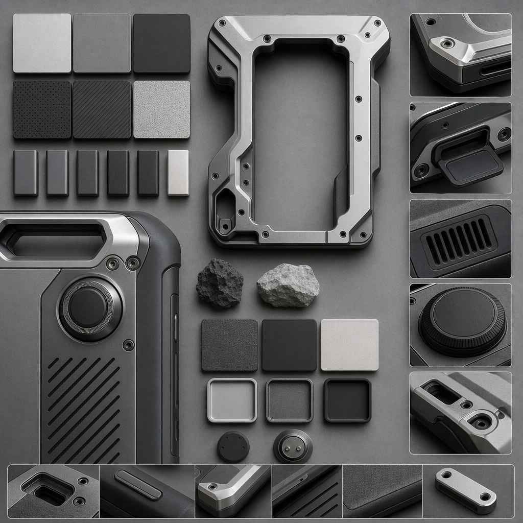
Scene: A square material board photographed straight-on with soft studio light, neutral ground, and carefully controlled shadow depth. Compose the frame as a square key visual with disciplined camera placement, premium lighting control, and believable real-world scale. The tonal range should feel polished and intentional, with enough atmosphere to create depth without obscuring form. Keep contrast calibrated for launch, catalog, or research presentation use rather than casual snapshot aesthetics. Subject: Center an original industrial product finish family featuring anodized aluminum, bead-blasted magnesium, textured polymer, molded rubber, and satin ceramic coating applied to one coherent device platform. Make the subject feel original, production-aware, and clearly grounded in Industrial Material Finish Study Board. For this series image, preserve exact core subject identity, proportions, base geometry, and material language from the reference image whenever continuity matters. The focal hierarchy should be immediate: primary form first, then material behavior, then supporting environmental cues that clarify use context and difficulty. Important details: Show multiple finish zones, product fragments, material chips, and one anchor object crop with disciplined spacing. The board should feel premium, technical, and genuinely useful. Preserve exact finish palette, substrate relationships, edge treatments, and micro-texture logic across the series. The work should feel like an industrial-design materials deck, not a random mood board. Use believable materials, engineering logic, and professional composition discipline. Reflections, shadows, edge breaks, texture scale, interface density, and small physical joints must all support realism. Avoid filler props, vague mood-board clutter, or any element that weakens the sense of a purpose-built industrial or automotive image. Use case: Material Study series study 1/9 for Industrial Material Finish Study Board, built as image 01-reference-anchor. Constraints: No readable text, no watermark, no logos, preserve exact 1:1 aspect ratio, no readable labels, no logos, no paint drips, no decorative clutter, no fabric swatches, no unrealistic CGI glow.

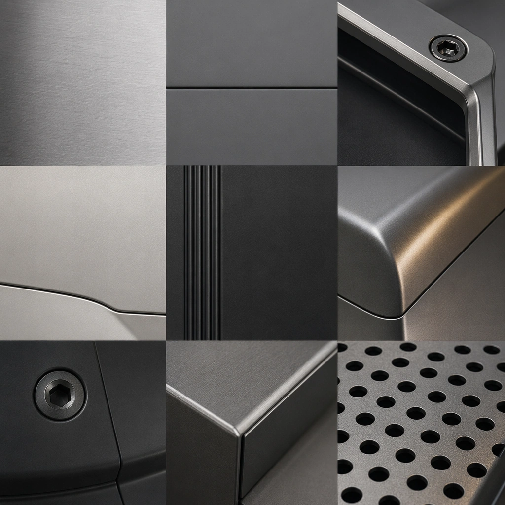
Example generated from “Industrial Material Finish Study Board — Macro Metal Study”
GPT Image 2en

Scene: A square macro board with grazing light, tight crop, and highly controlled reflections across metallic surfaces. Compose the frame as a square key visual with disciplined camera placement, premium lighting control, and believable real-world scale. The tonal range should feel polished and intentional, with enough atmosphere to create depth without obscuring form. Keep contrast calibrated for launch, catalog, or research presentation use rather than casual snapshot aesthetics. Subject: Center an original industrial product finish family featuring anodized aluminum, bead-blasted magnesium, textured polymer, molded rubber, and satin ceramic coating applied to one coherent device platform. Make the subject feel original, production-aware, and clearly grounded in Industrial Material Finish Study Board. For this series image, preserve exact core subject identity, proportions, base geometry, and material language from the reference image whenever continuity matters. The focal hierarchy should be immediate: primary form first, then material behavior, then supporting environmental cues that clarify use context and difficulty. Important details: Preserve the same finish family while highlighting brushed grain, pore structure, chamfers, coating consistency, and precise edge quality. Keep the result analytical, not abstract. Preserve exact finish palette, substrate relationships, edge treatments, and micro-texture logic across the series. The work should feel like an industrial-design materials deck, not a random mood board. Use believable materials, engineering logic, and professional composition discipline. Reflections, shadows, edge breaks, texture scale, interface density, and small physical joints must all support realism. Avoid filler props, vague mood-board clutter, or any element that weakens the sense of a purpose-built industrial or automotive image. Use case: Material Study series study 2/9 for Industrial Material Finish Study Board, built as image 02-context-shift. Constraints: No readable text, no watermark, no logos, preserve exact 1:1 aspect ratio, no readable labels, no logos, no paint drips, no decorative clutter, no fabric swatches, no unrealistic CGI glow.

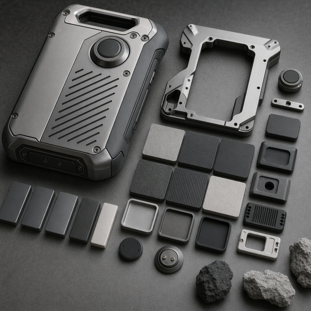
Example generated from “Industrial Material Finish Study Board — Polymer Rubber Comparison”
GPT Image 2en

Scene: A square close comparison board with even light, clean sample separation, and subtle shadow depth under multiple material fragments. Compose the frame as a square key visual with disciplined camera placement, premium lighting control, and believable real-world scale. The tonal range should feel polished and intentional, with enough atmosphere to create depth without obscuring form. Keep contrast calibrated for launch, catalog, or research presentation use rather than casual snapshot aesthetics. Subject: Center an original industrial product finish family featuring anodized aluminum, bead-blasted magnesium, textured polymer, molded rubber, and satin ceramic coating applied to one coherent device platform. Make the subject feel original, production-aware, and clearly grounded in Industrial Material Finish Study Board. For this series image, preserve exact core subject identity, proportions, base geometry, and material language from the reference image whenever continuity matters. The focal hierarchy should be immediate: primary form first, then material behavior, then supporting environmental cues that clarify use context and difficulty. Important details: Emphasize tactile contrast, edge precision, substrate honesty, and assembly realism. The board should feel rooted in real industrial CMF decision-making. Preserve exact finish palette, substrate relationships, edge treatments, and micro-texture logic across the series. The work should feel like an industrial-design materials deck, not a random mood board. Use believable materials, engineering logic, and professional composition discipline. Reflections, shadows, edge breaks, texture scale, interface density, and small physical joints must all support realism. Avoid filler props, vague mood-board clutter, or any element that weakens the sense of a purpose-built industrial or automotive image. Use case: Material Study series study 3/9 for Industrial Material Finish Study Board, built as image 03-surface-study. Constraints: No readable text, no watermark, no logos, preserve exact 1:1 aspect ratio, no readable labels, no logos, no paint drips, no decorative clutter, no fabric swatches, no unrealistic CGI glow.

Example generated from “Industrial Material Finish Study Board — Composite Review Board”
GPT Image 2en

Scene: A square composite presentation board with one larger hero fragment, supporting detail windows, and refined design-review contrast. Compose the frame as a square key visual with disciplined camera placement, premium lighting control, and believable real-world scale. The tonal range should feel polished and intentional, with enough atmosphere to create depth without obscuring form. Keep contrast calibrated for launch, catalog, or research presentation use rather than casual snapshot aesthetics. Subject: Center an original industrial product finish family featuring anodized aluminum, bead-blasted magnesium, textured polymer, molded rubber, and satin ceramic coating applied to one coherent device platform. Make the subject feel original, production-aware, and clearly grounded in Industrial Material Finish Study Board. For this series image, preserve exact core subject identity, proportions, base geometry, and material language from the reference image whenever continuity matters. The focal hierarchy should be immediate: primary form first, then material behavior, then supporting environmental cues that clarify use context and difficulty. Important details: Turn the same finish language into a persuasive review artifact with strong hierarchy, product relevance, and tactile credibility across every crop. Preserve exact finish palette, substrate relationships, edge treatments, and micro-texture logic across the series. The work should feel like an industrial-design materials deck, not a random mood board. Use believable materials, engineering logic, and professional composition discipline. Reflections, shadows, edge breaks, texture scale, interface density, and small physical joints must all support realism. Avoid filler props, vague mood-board clutter, or any element that weakens the sense of a purpose-built industrial or automotive image. Use case: Material Study series study 4/9 for Industrial Material Finish Study Board, built as image 04-presentation-master. Constraints: No readable text, no watermark, no logos, preserve exact 1:1 aspect ratio, no readable labels, no logos, no paint drips, no decorative clutter, no fabric swatches, no unrealistic CGI glow.

Example generated from “Industrial Material Finish Study Board — Micro Scratch Control”
GPT Image 2en

Scene: A square macro setup with controlled specular light, ultra-clean crop, and premium restraint over metallic and coated surfaces. Compose the frame as a square key visual with disciplined camera placement, premium lighting control, and believable real-world scale. The tonal range should feel polished and intentional, with enough atmosphere to create depth without obscuring form. Keep contrast calibrated for launch, catalog, or research presentation use rather than casual snapshot aesthetics. Subject: Center original finish zones showing subtle realistic micro marks without grime, damage, or distress. Make the subject feel original, production-aware, and clearly grounded in Industrial Material Finish Study Board. Treat this as an independent study that must feel complete and coherent without relying on any external reference image. The focal hierarchy should be immediate: primary form first, then material behavior, then supporting environmental cues that clarify use context and difficulty. Important details: Keep the surface premium and production-ready. This should read as quality-control and material-behavior study, not as patina fetish or weathering art. The visual language should still feel native to Industrial Material Finish Study Board, using disciplined industrial or campaign composition instead of generic stock photography. Use believable materials, engineering logic, and professional composition discipline. Reflections, shadows, edge breaks, texture scale, interface density, and small physical joints must all support realism. Avoid filler props, vague mood-board clutter, or any element that weakens the sense of a purpose-built industrial or automotive image. Use case: Material Study single study 6/9 for Industrial Material Finish Study Board, built as image support-two. Constraints: No readable text, no watermark, no logos, preserve exact 1:1 aspect ratio, no readable labels, no logos, no decorative lifestyle props, no fantasy texture, no chaotic palettes, no distressed damage.

Example generated from “Industrial Material Finish Study Board — Grip Texture Macro”
GPT Image 2en

Scene: A square grazing-light closeup with strong shadow relief over textured surfaces and carefully controlled depth of field. Compose the frame as a square key visual with disciplined camera placement, premium lighting control, and believable real-world scale. The tonal range should feel polished and intentional, with enough atmosphere to create depth without obscuring form. Keep contrast calibrated for launch, catalog, or research presentation use rather than casual snapshot aesthetics. Subject: Center original grip zones with knurling, stipple, ribbing, chamfers, and crisp edge transitions. Make the subject feel original, production-aware, and clearly grounded in Industrial Material Finish Study Board. Treat this as an independent study that must feel complete and coherent without relying on any external reference image. The focal hierarchy should be immediate: primary form first, then material behavior, then supporting environmental cues that clarify use context and difficulty. Important details: The pattern should feel engineered for comfort and control rather than decorative ornament. Every micro feature needs a functional reason to exist. The visual language should still feel native to Industrial Material Finish Study Board, using disciplined industrial or campaign composition instead of generic stock photography. Use believable materials, engineering logic, and professional composition discipline. Reflections, shadows, edge breaks, texture scale, interface density, and small physical joints must all support realism. Avoid filler props, vague mood-board clutter, or any element that weakens the sense of a purpose-built industrial or automotive image. Use case: Material Study single study 7/9 for Industrial Material Finish Study Board, built as image support-three. Constraints: No readable text, no watermark, no logos, preserve exact 1:1 aspect ratio, no readable labels, no logos, no decorative lifestyle props, no fantasy texture, no chaotic palettes, no distressed damage.

Example generated from “Industrial Material Finish Study Board — Finish Comparison Pillar”
GPT Image 2en

Scene: A square comparison setup with repeated product fragments under identical light and strict alignment across finish variants. Compose the frame as a square key visual with disciplined camera placement, premium lighting control, and believable real-world scale. The tonal range should feel polished and intentional, with enough atmosphere to create depth without obscuring form. Keep contrast calibrated for launch, catalog, or research presentation use rather than casual snapshot aesthetics. Subject: Center one original industrial form repeated in several finish executions with disciplined color and reflectance differences. Make the subject feel original, production-aware, and clearly grounded in Industrial Material Finish Study Board. Treat this as an independent study that must feel complete and coherent without relying on any external reference image. The focal hierarchy should be immediate: primary form first, then material behavior, then supporting environmental cues that clarify use context and difficulty. Important details: Use comparison logic, not spectacle. The interest should come from subtle but meaningful changes in finish behavior and tactile implication. The visual language should still feel native to Industrial Material Finish Study Board, using disciplined industrial or campaign composition instead of generic stock photography. Use believable materials, engineering logic, and professional composition discipline. Reflections, shadows, edge breaks, texture scale, interface density, and small physical joints must all support realism. Avoid filler props, vague mood-board clutter, or any element that weakens the sense of a purpose-built industrial or automotive image. Use case: Material Study single study 8/9 for Industrial Material Finish Study Board, built as image support-four. Constraints: No readable text, no watermark, no logos, preserve exact 1:1 aspect ratio, no readable labels, no logos, no decorative lifestyle props, no fantasy texture, no chaotic palettes, no distressed damage.

Example generated from “Industrial Material Finish Study Board — Design Review Sheet”
GPT Image 2en

Scene: A square presentation sheet with clean zoning, refined board aesthetics, and premium studio illumination across every fragment. Compose the frame as a square key visual with disciplined camera placement, premium lighting control, and believable real-world scale. The tonal range should feel polished and intentional, with enough atmosphere to create depth without obscuring form. Keep contrast calibrated for launch, catalog, or research presentation use rather than casual snapshot aesthetics. Subject: Center original industrial finish assets organized into a persuasive review-ready layout with no readable copy. Make the subject feel original, production-aware, and clearly grounded in Industrial Material Finish Study Board. Treat this as an independent study that must feel complete and coherent without relying on any external reference image. The focal hierarchy should be immediate: primary form first, then material behavior, then supporting environmental cues that clarify use context and difficulty. Important details: Keep the sheet non-readable but highly convincing as a design-review artifact. The hierarchy should feel mature, persuasive, and grounded in real CMF workflows. The visual language should still feel native to Industrial Material Finish Study Board, using disciplined industrial or campaign composition instead of generic stock photography. Use believable materials, engineering logic, and professional composition discipline. Reflections, shadows, edge breaks, texture scale, interface density, and small physical joints must all support realism. Avoid filler props, vague mood-board clutter, or any element that weakens the sense of a purpose-built industrial or automotive image. Use case: Material Study single study 9/9 for Industrial Material Finish Study Board, built as image support-five. Constraints: No readable text, no watermark, no logos, preserve exact 1:1 aspect ratio, no readable labels, no logos, no decorative lifestyle props, no fantasy texture, no chaotic palettes, no distressed damage.

Example generated from “Industrial Product Exploded View Suite — Device Hero”
GPT Image 2en

Scene: A square product pedestal scene with soft directional studio light, neutral background, and precise material rendering. Compose the frame as a square key visual with disciplined camera placement, premium lighting control, and believable real-world scale. The tonal range should feel polished and intentional, with enough atmosphere to create depth without obscuring form. Keep contrast calibrated for launch, catalog, or research presentation use rather than casual snapshot aesthetics. Subject: Center an original industrial handheld measurement device with magnesium shell, rubberized grips, gasket seams, vent slots, internal battery bay, and dense but plausible fastener logic. Make the subject feel original, production-aware, and clearly grounded in Industrial Product Exploded View Suite. For this series image, preserve exact core subject identity, proportions, base geometry, and material language from the reference image whenever continuity matters. The focal hierarchy should be immediate: primary form first, then material behavior, then supporting environmental cues that clarify use context and difficulty. Important details: Show the complete device clearly with believable grip geometry, vents, seams, interfaces, and a sense of premium industrial precision suitable for professional documentation. Preserve exact external form, part hierarchy, material palette, and engineering plausibility across the series. Separation distances must stay clean and readable. Internal parts should feel manufacturable rather than ornamental. Use believable materials, engineering logic, and professional composition discipline. Reflections, shadows, edge breaks, texture scale, interface density, and small physical joints must all support realism. Avoid filler props, vague mood-board clutter, or any element that weakens the sense of a purpose-built industrial or automotive image. Use case: Exploded Views series study 1/9 for Industrial Product Exploded View Suite, built as image 01-reference-anchor. Constraints: No readable text, no watermark, no logos, preserve exact 1:1 aspect ratio, no readable labels, no logos, no impossible levitation clutter, no magic components, no random colorful wires, no messy arrows.

Example generated from “Industrial Product Exploded View Suite — Primary Explosion”
GPT Image 2en

Scene: A square straight-on technical plate with neutral light, crisp spacing, and strong part hierarchy over a clean background. Compose the frame as a square key visual with disciplined camera placement, premium lighting control, and believable real-world scale. The tonal range should feel polished and intentional, with enough atmosphere to create depth without obscuring form. Keep contrast calibrated for launch, catalog, or research presentation use rather than casual snapshot aesthetics. Subject: Center an original industrial handheld measurement device with magnesium shell, rubberized grips, gasket seams, vent slots, internal battery bay, and dense but plausible fastener logic. Make the subject feel original, production-aware, and clearly grounded in Industrial Product Exploded View Suite. For this series image, preserve exact core subject identity, proportions, base geometry, and material language from the reference image whenever continuity matters. The focal hierarchy should be immediate: primary form first, then material behavior, then supporting environmental cues that clarify use context and difficulty. Important details: Preserve the exact device identity while separating shell, battery door, display module, and core housing in a disciplined engineering rhythm that is easy to scan. Preserve exact external form, part hierarchy, material palette, and engineering plausibility across the series. Separation distances must stay clean and readable. Internal parts should feel manufacturable rather than ornamental. Use believable materials, engineering logic, and professional composition discipline. Reflections, shadows, edge breaks, texture scale, interface density, and small physical joints must all support realism. Avoid filler props, vague mood-board clutter, or any element that weakens the sense of a purpose-built industrial or automotive image. Use case: Exploded Views series study 2/9 for Industrial Product Exploded View Suite, built as image 02-context-shift. Constraints: No readable text, no watermark, no logos, preserve exact 1:1 aspect ratio, no readable labels, no logos, no impossible levitation clutter, no magic components, no random colorful wires, no messy arrows.

Example generated from “Industrial Product Exploded View Suite — Subsystem Cut”
GPT Image 2en

Scene: A square technical board with disciplined spacing, soft top light, and subtle cast shadows adding depth to separated components. Compose the frame as a square key visual with disciplined camera placement, premium lighting control, and believable real-world scale. The tonal range should feel polished and intentional, with enough atmosphere to create depth without obscuring form. Keep contrast calibrated for launch, catalog, or research presentation use rather than casual snapshot aesthetics. Subject: Center an original industrial handheld measurement device with magnesium shell, rubberized grips, gasket seams, vent slots, internal battery bay, and dense but plausible fastener logic. Make the subject feel original, production-aware, and clearly grounded in Industrial Product Exploded View Suite. For this series image, preserve exact core subject identity, proportions, base geometry, and material language from the reference image whenever continuity matters. The focal hierarchy should be immediate: primary form first, then material behavior, then supporting environmental cues that clarify use context and difficulty. Important details: Reveal PCB, battery, seals, structural ribs, and sensor block while keeping the same device recognizable. The logic should feel like something a real engineering team could build. Preserve exact external form, part hierarchy, material palette, and engineering plausibility across the series. Separation distances must stay clean and readable. Internal parts should feel manufacturable rather than ornamental. Use believable materials, engineering logic, and professional composition discipline. Reflections, shadows, edge breaks, texture scale, interface density, and small physical joints must all support realism. Avoid filler props, vague mood-board clutter, or any element that weakens the sense of a purpose-built industrial or automotive image. Use case: Exploded Views series study 3/9 for Industrial Product Exploded View Suite, built as image 03-surface-study. Constraints: No readable text, no watermark, no logos, preserve exact 1:1 aspect ratio, no readable labels, no logos, no impossible levitation clutter, no magic components, no random colorful wires, no messy arrows.

Example generated from “Industrial Product Exploded View Suite — Poster Resolution”
GPT Image 2en

Scene: A square premium poster plate with dramatic but controlled contrast, one hero angle, and surrounding exploded sub-parts organized with clean geometry. Compose the frame as a square key visual with disciplined camera placement, premium lighting control, and believable real-world scale. The tonal range should feel polished and intentional, with enough atmosphere to create depth without obscuring form. Keep contrast calibrated for launch, catalog, or research presentation use rather than casual snapshot aesthetics. Subject: Center an original industrial handheld measurement device with magnesium shell, rubberized grips, gasket seams, vent slots, internal battery bay, and dense but plausible fastener logic. Make the subject feel original, production-aware, and clearly grounded in Industrial Product Exploded View Suite. For this series image, preserve exact core subject identity, proportions, base geometry, and material language from the reference image whenever continuity matters. The focal hierarchy should be immediate: primary form first, then material behavior, then supporting environmental cues that clarify use context and difficulty. Important details: Balance exhibition polish with technical clarity so the image feels both aspirational and genuinely useful for industrial storytelling. Preserve exact external form, part hierarchy, material palette, and engineering plausibility across the series. Separation distances must stay clean and readable. Internal parts should feel manufacturable rather than ornamental. Use believable materials, engineering logic, and professional composition discipline. Reflections, shadows, edge breaks, texture scale, interface density, and small physical joints must all support realism. Avoid filler props, vague mood-board clutter, or any element that weakens the sense of a purpose-built industrial or automotive image. Use case: Exploded Views series study 4/9 for Industrial Product Exploded View Suite, built as image 04-presentation-master. Constraints: No readable text, no watermark, no logos, preserve exact 1:1 aspect ratio, no readable labels, no logos, no impossible levitation clutter, no magic components, no random colorful wires, no messy arrows.