Document original
GPT Image 2 · en
Scene:
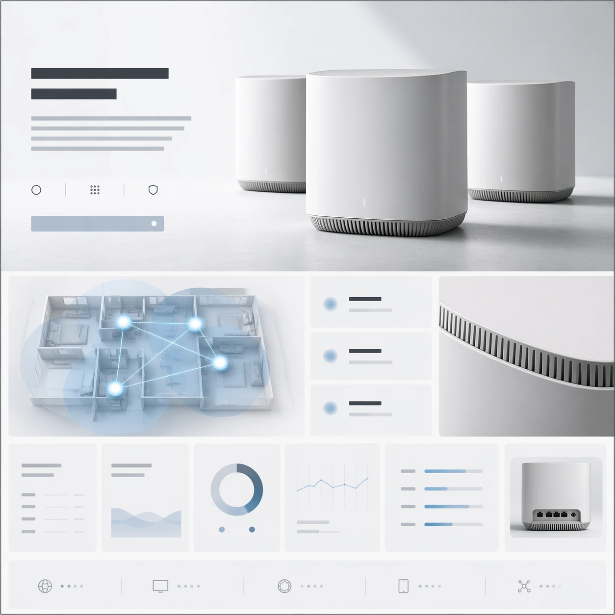
A square premium landing-page still for a mesh-router system, arranged like a high-end networking product website. The page uses a restrained palette of matte white, soft gray, pale blue, and graphite, with a bright minimal background and precise grid discipline. The composition should imply a hero section at the top, then a network-coverage story, then a performance-and-specification row below, all integrated into one square frame with elegant whitespace.

Subject:
Feature a set of sculptural mesh-router units with rounded edges, vent detailing, and a refined industrial form, arranged as a hero trio with one main unit forward and two supporting nodes behind it. Surround them with a landing-page layout built from abstract headline blocks, network-diagram panels, signal-zone cards, and a precise specification grid made of clean rectangular modules without readable words. Add one simplified top-down coverage visualization using glowing nodes and lines, and one close crop revealing vent texture and material finish. The hardware objects should remain the primary focal point.

Important details:
This should feel like premium infrastructure branding, not commodity electronics marketing. The routers must look believable, sculpted, and desirable, with careful seams, venting, and premium matte material treatment. The webpage layout should communicate trust, coverage, and system elegance through hierarchy, spacing, and well-controlled module rhythm. Keep the image minimal, confident, and visually intelligent, with no unnecessary clutter or generic smart-home clichés.

Use case:
Premium Product Landing Page single study 9/9, testing a mesh-network launch page with product grouping, coverage storytelling, and a clean premium spec grid.

Constraints:
No readable text, no watermark, no logos, preserve exact 1:1 aspect ratio, no browser chrome, no server-rack environment, no cartoon wifi icons, no smart-home family photo, no excessive blue glow, no cheap plastic feel, no distorted router geometry.
Mode d’emploi
- Copiez le prompt original complet, paramètres compris.
- Adaptez le sujet, le texte et la composition à vos besoins.
- Utilisez un outil externe compatible ; vérifiez l’accès et le résultat.
Avant de commencer
- Vérifiez si une image de référence est nécessaire. La compatibilité ne prouve pas le modèle utilisé pour cet exemple.
- Vérifiez noms, chiffres et textes ; les versions du modèle peuvent produire des résultats différents.