Document original
GPT Image 2 · en
Scene:
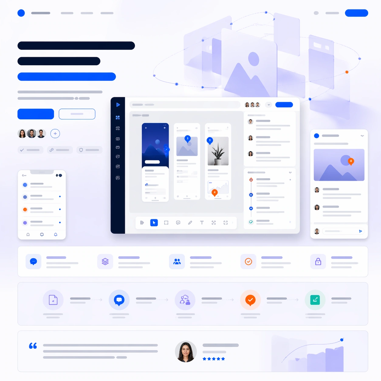
A square software launch-page still with cool white, lavender gray, cobalt, and signal orange accents, composed like a premium design-tool website first screen with supporting sections below. Use a clean studio background, floating panels, and carefully spaced interface layers so the frame feels modern and collaborative rather than sterile. The layout should clearly separate hero, features, workflow proof, and final CTA.

Subject:
Place a wide desktop screenshot for a design review platform at the center, showing an artboard canvas, threaded comment pins, side inspector cards, and a compact approval timeline. Add two smaller supporting crops: one mobile notification view and one zoomed review detail card. Around these, compose a launch-page hierarchy with abstract headline bars, a CTA pair, a row of feature blocks, a process diagram strip, and a testimonial band. Behind the screenshots, add a soft geometric hero illustration of translucent rectangles orbiting around a central canvas plane.

Important details:
This should look like a real software launch page where product proof and marketing rhythm reinforce each other. Keep the UI credible for a collaborative design-review tool, with consistent panel language and precise spacing. The page must communicate workflow clearly through layout, not through readable words. Treat all text zones as elegant placeholder bars, badge pills, and icon shapes. Avoid collage chaos: each screen, module, and supporting element needs a deliberate place in the vertical story from hero statement to proof to conversion.

Use case:
App Launch Hero System single study 4/9, testing whether a collaborative design-tool launch page can integrate dense interface proof with clean brand storytelling.

Constraints:
No readable text, no watermark, no logos, preserve exact 1:1 aspect ratio, no browser chrome, no generic dribbble-shot clutter, no unrealistic 3D laptops, no overlapping UI chaos, no fake brand marks, no broken perspective on panels.
Mode d’emploi
- Copiez le prompt original complet, paramètres compris.
- Adaptez le sujet, le texte et la composition à vos besoins.
- Utilisez un outil externe compatible ; vérifiez l’accès et le résultat.
Avant de commencer
- Vérifiez si une image de référence est nécessaire. La compatibilité ne prouve pas le modèle utilisé pour cet exemple.
- Vérifiez noms, chiffres et textes ; les versions du modèle peuvent produire des résultats différents.