PROMPTS · EXPLORATION CRÉATIVE

Galerie de prompts

Explorez des prompts réels et leurs exemples générés. Trouvez l’inspiration pour votre prochaine mission créative et copiez le texte intégral gratuitement.

Exemples
10,974
Modèles
17
Sources
1277
10 974 exemples de prompts · page 28 sur 229
Example generated from “Sahara Dune Wave Sunrise — Atmosphere Event”
GPT Image 2en

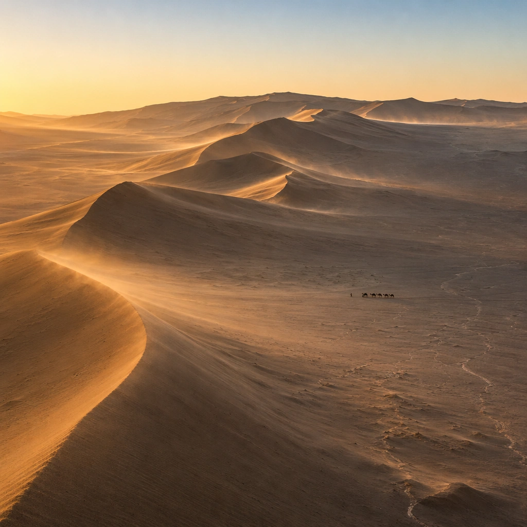
Scene: Create a square, photoreal landscape study of sahara dune wave at sunrise. Compose it as the moment when weather, particles, or moving air become the main dramatic agent, using a stable documentary framing that lets the environmental event stay legible. Let the air itself carry visible density through haze, spray, ash, dust, snow, or storm structure Keep the frame cinematic but disciplined, with a clear foreground, middle distance, and far mass so the viewer can measure real depth. The image should feel like a field photograph made with patience, precision, and sublime restraint rather than a fantasy matte painting. Subject: Show a monumental desert dune field at sunrise, with crescent dunes shaped like frozen ocean waves, a warm-to-cool sky gradient, and a lone camel caravan crossing the valley floor. This variation should emphasize weather-driven study. The main landform must dominate the composition, but secondary elements should quietly explain how the place works: water paths, sediment lines, snow bands, surf, ash, wind streaks, stars, or human traces where appropriate. Everything in the image should support the same idea of scale and climate, so the scene reads as one coherent environment rather than a stack of spectacular details. Important details: Preserve clean wind-carved ridges, believable sand grain behavior, long low sunrise shadows, smooth atmospheric perspective, and the impression that the dunes are planetary-scale waves made of sand. The atmosphere must feel physically plausible and tied to terrain, wind direction, temperature, and moisture. Keep geology, weather, and atmosphere physically believable. Use subtle micro-texture, tonal separation, and air perspective to reinforce distance. If a human, vehicle, tent, caravan, bird, or boat appears, it must remain tiny and subordinate to the landscape, functioning only as a scale witness. The composition should feel original, severe, and elegant, with no decorative filler and no imitation of any copyrighted visual property. Use case: Sahara Dune Wave at Sunrise single study 4/9, exploring the weather-driven study variation. Constraints: No readable text, no watermark, no logos, preserve exact 1:1 aspect ratio, no vegetation, no roads, no buildings, no oasis clichés, no disaster-movie excess, no impossible lightning clutter, no synthetic smoke plumes, no kitsch color grading, no artificial border, no split-panel treatment.
Example generated from “Sahara Dune Wave Sunrise — Light Contrast”
GPT Image 2en

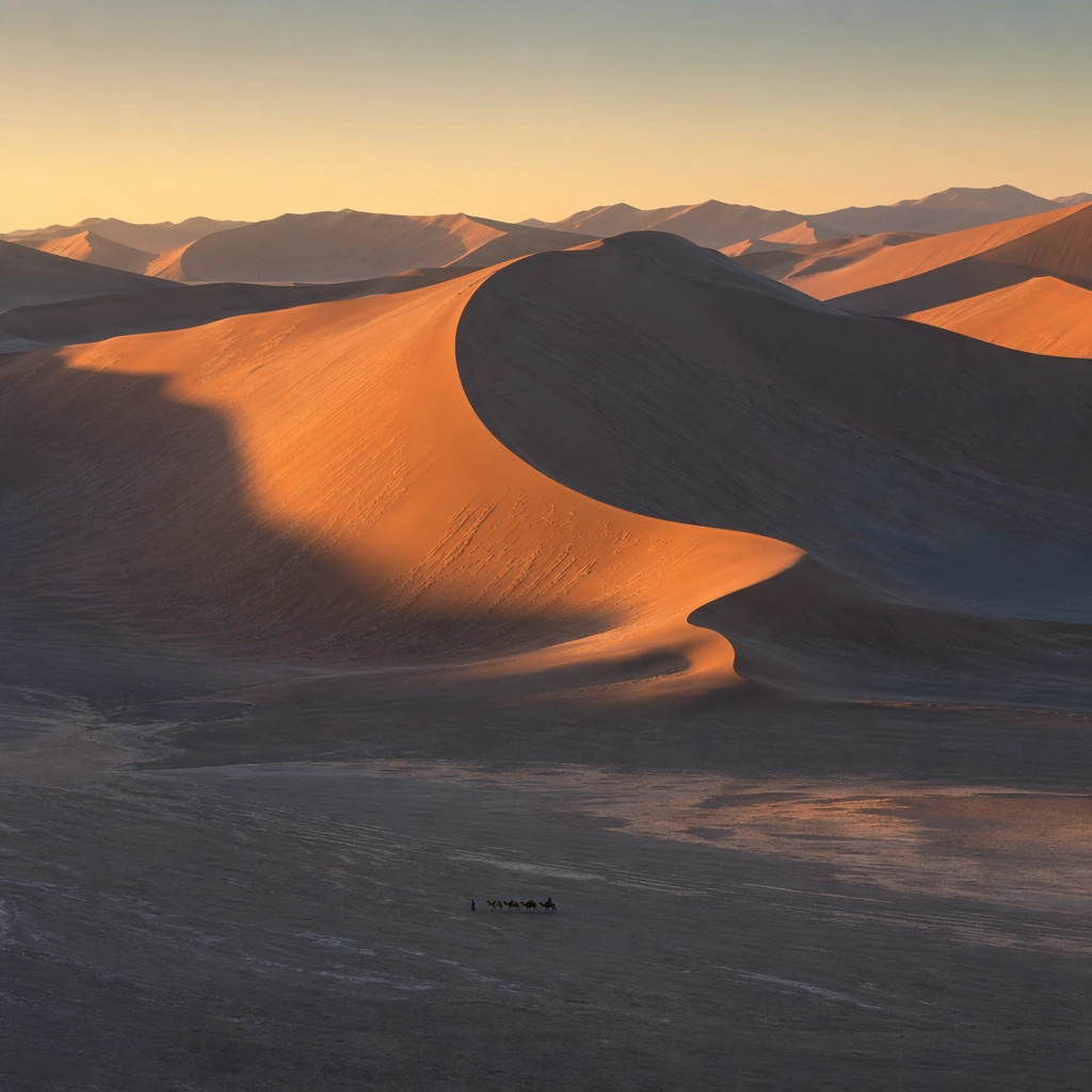
Scene: Create a square, photoreal landscape study of sahara dune wave at sunrise. Compose it as directional light carving sharp separation between illuminated and shadowed forms, using a composition built around light falloff, shadow shape, and reflective control rather than camera gimmicks. Let one strong light source create crisp hierarchy and believable color temperature shifts Keep the frame cinematic but disciplined, with a clear foreground, middle distance, and far mass so the viewer can measure real depth. The image should feel like a field photograph made with patience, precision, and sublime restraint rather than a fantasy matte painting. Subject: Show a monumental desert dune field at sunrise, with crescent dunes shaped like frozen ocean waves, a warm-to-cool sky gradient, and a lone camel caravan crossing the valley floor. This variation should emphasize light-structure study. The main landform must dominate the composition, but secondary elements should quietly explain how the place works: water paths, sediment lines, snow bands, surf, ash, wind streaks, stars, or human traces where appropriate. Everything in the image should support the same idea of scale and climate, so the scene reads as one coherent environment rather than a stack of spectacular details. Important details: Preserve clean wind-carved ridges, believable sand grain behavior, long low sunrise shadows, smooth atmospheric perspective, and the impression that the dunes are planetary-scale waves made of sand. Surface brightness, shadow depth, and reflected light should all agree with the material and weather conditions. Keep geology, weather, and atmosphere physically believable. Use subtle micro-texture, tonal separation, and air perspective to reinforce distance. If a human, vehicle, tent, caravan, bird, or boat appears, it must remain tiny and subordinate to the landscape, functioning only as a scale witness. The composition should feel original, severe, and elegant, with no decorative filler and no imitation of any copyrighted visual property. Use case: Sahara Dune Wave at Sunrise single study 5/9, exploring the light-structure study variation. Constraints: No readable text, no watermark, no logos, preserve exact 1:1 aspect ratio, no vegetation, no roads, no buildings, no oasis clichés, no blown highlights, no muddy blacks, no theatrical stage lighting, no kitsch color grading, no artificial border, no split-panel treatment.

Example generated from “Sahara Dune Wave Sunrise — Material Close”
GPT Image 2en

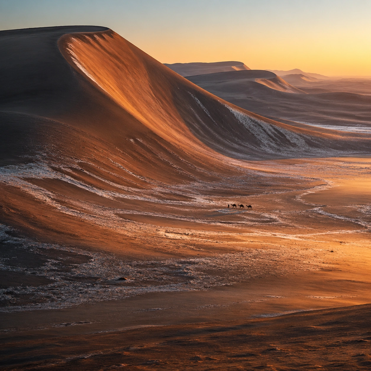
Scene: Create a square, photoreal landscape study of sahara dune wave at sunrise. Compose it as surface texture and material transitions while still keeping the full environment recognizable, using a tighter medium-wide crop that gives more area to texture, fracture, grain, water, ice, lava, salt, or stone. Let texture remain readable without making the scene feel like a macro shot Keep the frame cinematic but disciplined, with a clear foreground, middle distance, and far mass so the viewer can measure real depth. The image should feel like a field photograph made with patience, precision, and sublime restraint rather than a fantasy matte painting. Subject: Show a monumental desert dune field at sunrise, with crescent dunes shaped like frozen ocean waves, a warm-to-cool sky gradient, and a lone camel caravan crossing the valley floor. This variation should emphasize material realism check. The main landform must dominate the composition, but secondary elements should quietly explain how the place works: water paths, sediment lines, snow bands, surf, ash, wind streaks, stars, or human traces where appropriate. Everything in the image should support the same idea of scale and climate, so the scene reads as one coherent environment rather than a stack of spectacular details. Important details: Preserve clean wind-carved ridges, believable sand grain behavior, long low sunrise shadows, smooth atmospheric perspective, and the impression that the dunes are planetary-scale waves made of sand. Micro-texture, edge wear, wetness, frost, dust, foam, or sediment should deepen realism rather than distract from scale. Keep geology, weather, and atmosphere physically believable. Use subtle micro-texture, tonal separation, and air perspective to reinforce distance. If a human, vehicle, tent, caravan, bird, or boat appears, it must remain tiny and subordinate to the landscape, functioning only as a scale witness. The composition should feel original, severe, and elegant, with no decorative filler and no imitation of any copyrighted visual property. Use case: Sahara Dune Wave at Sunrise single study 6/9, exploring the material realism check variation. Constraints: No readable text, no watermark, no logos, preserve exact 1:1 aspect ratio, no vegetation, no roads, no buildings, no oasis clichés, no extreme macro abstraction, no plastic-looking surfaces, no shallow depth-of-field blur, no kitsch color grading, no artificial border, no split-panel treatment.

Example generated from “Sahara Dune Wave Sunrise — Scale Witness”
GPT Image 2en

Scene: Create a square, photoreal landscape study of sahara dune wave at sunrise. Compose it as a tiny human, animal, tent, vehicle, or craft that reveals the vastness of the environment, using a balanced frame where the witness remains small but unmistakable. Let the scale marker stay visible without becoming the true subject Keep the frame cinematic but disciplined, with a clear foreground, middle distance, and far mass so the viewer can measure real depth. The image should feel like a field photograph made with patience, precision, and sublime restraint rather than a fantasy matte painting. Subject: Show a monumental desert dune field at sunrise, with crescent dunes shaped like frozen ocean waves, a warm-to-cool sky gradient, and a lone camel caravan crossing the valley floor. This variation should emphasize scale comparison. The main landform must dominate the composition, but secondary elements should quietly explain how the place works: water paths, sediment lines, snow bands, surf, ash, wind streaks, stars, or human traces where appropriate. Everything in the image should support the same idea of scale and climate, so the scene reads as one coherent environment rather than a stack of spectacular details. Important details: Preserve clean wind-carved ridges, believable sand grain behavior, long low sunrise shadows, smooth atmospheric perspective, and the impression that the dunes are planetary-scale waves made of sand. The viewer should understand the environment first and the witness second, with clean spatial separation between them. Keep geology, weather, and atmosphere physically believable. Use subtle micro-texture, tonal separation, and air perspective to reinforce distance. If a human, vehicle, tent, caravan, bird, or boat appears, it must remain tiny and subordinate to the landscape, functioning only as a scale witness. The composition should feel original, severe, and elegant, with no decorative filler and no imitation of any copyrighted visual property. Use case: Sahara Dune Wave at Sunrise single study 7/9, exploring the scale comparison variation. Constraints: No readable text, no watermark, no logos, preserve exact 1:1 aspect ratio, no vegetation, no roads, no buildings, no oasis clichés, no crowd scenes, no heroic close-up character framing, no busy gear pile, no kitsch color grading, no artificial border, no split-panel treatment.

Example generated from “Sahara Dune Wave Sunrise — Abstract Rhythm”
GPT Image 2en

Scene: Create a square, photoreal landscape study of sahara dune wave at sunrise. Compose it as the near-abstract rhythm of repeated natural forms, lines, and tonal bands, using a disciplined crop that approaches abstraction while remaining unmistakably a real place. Let shape and tonal cadence dominate before small narrative details Keep the frame cinematic but disciplined, with a clear foreground, middle distance, and far mass so the viewer can measure real depth. The image should feel like a field photograph made with patience, precision, and sublime restraint rather than a fantasy matte painting. Subject: Show a monumental desert dune field at sunrise, with crescent dunes shaped like frozen ocean waves, a warm-to-cool sky gradient, and a lone camel caravan crossing the valley floor. This variation should emphasize formal composition study. The main landform must dominate the composition, but secondary elements should quietly explain how the place works: water paths, sediment lines, snow bands, surf, ash, wind streaks, stars, or human traces where appropriate. Everything in the image should support the same idea of scale and climate, so the scene reads as one coherent environment rather than a stack of spectacular details. Important details: Preserve clean wind-carved ridges, believable sand grain behavior, long low sunrise shadows, smooth atmospheric perspective, and the impression that the dunes are planetary-scale waves made of sand. Pattern, repetition, and negative space should feel discovered in nature, not graphically imposed. Keep geology, weather, and atmosphere physically believable. Use subtle micro-texture, tonal separation, and air perspective to reinforce distance. If a human, vehicle, tent, caravan, bird, or boat appears, it must remain tiny and subordinate to the landscape, functioning only as a scale witness. The composition should feel original, severe, and elegant, with no decorative filler and no imitation of any copyrighted visual property. Use case: Sahara Dune Wave at Sunrise single study 8/9, exploring the formal composition study variation. Constraints: No readable text, no watermark, no logos, preserve exact 1:1 aspect ratio, no vegetation, no roads, no buildings, no oasis clichés, no graphic overlays, no surreal floating elements, no ornamental symmetry cheats, no kitsch color grading, no artificial border, no split-panel treatment.
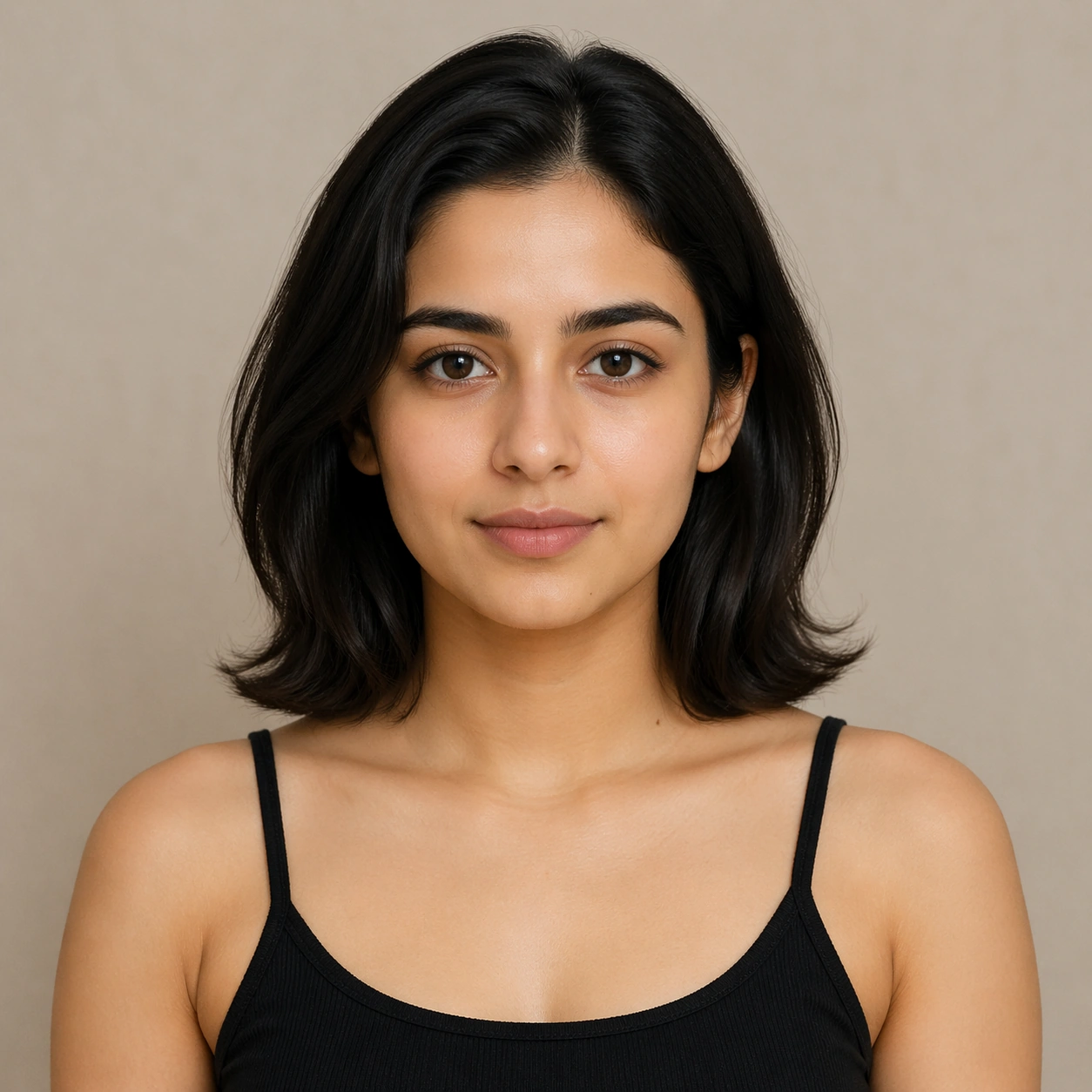
Example generated from “Sahara Dune Wave Sunrise — Final Iconic”
GPT Image 2en

Scene: Create a square, photoreal landscape study of sahara dune wave at sunrise. Compose it as the cleanest, most iconic summary of the whole landscape idea, using a distilled composition with one unforgettable silhouette or mass relationship and generous breathing room. Let the scene resolve into a memorable final image with strong legibility at thumbnail size Keep the frame cinematic but disciplined, with a clear foreground, middle distance, and far mass so the viewer can measure real depth. The image should feel like a field photograph made with patience, precision, and sublime restraint rather than a fantasy matte painting. Subject: Show a monumental desert dune field at sunrise, with crescent dunes shaped like frozen ocean waves, a warm-to-cool sky gradient, and a lone camel caravan crossing the valley floor. This variation should emphasize iconic final plate. The main landform must dominate the composition, but secondary elements should quietly explain how the place works: water paths, sediment lines, snow bands, surf, ash, wind streaks, stars, or human traces where appropriate. Everything in the image should support the same idea of scale and climate, so the scene reads as one coherent environment rather than a stack of spectacular details. Important details: Preserve clean wind-carved ridges, believable sand grain behavior, long low sunrise shadows, smooth atmospheric perspective, and the impression that the dunes are planetary-scale waves made of sand. Keep the frame spare, confident, and monumental, with every element earning its place. Keep geology, weather, and atmosphere physically believable. Use subtle micro-texture, tonal separation, and air perspective to reinforce distance. If a human, vehicle, tent, caravan, bird, or boat appears, it must remain tiny and subordinate to the landscape, functioning only as a scale witness. The composition should feel original, severe, and elegant, with no decorative filler and no imitation of any copyrighted visual property. Use case: Sahara Dune Wave at Sunrise single study 9/9, exploring the iconic final plate variation. Constraints: No readable text, no watermark, no logos, preserve exact 1:1 aspect ratio, no vegetation, no roads, no buildings, no oasis clichés, no cluttered edges, no competing focal points, no visual noise in empty space, no kitsch color grading, no artificial border, no split-panel treatment.
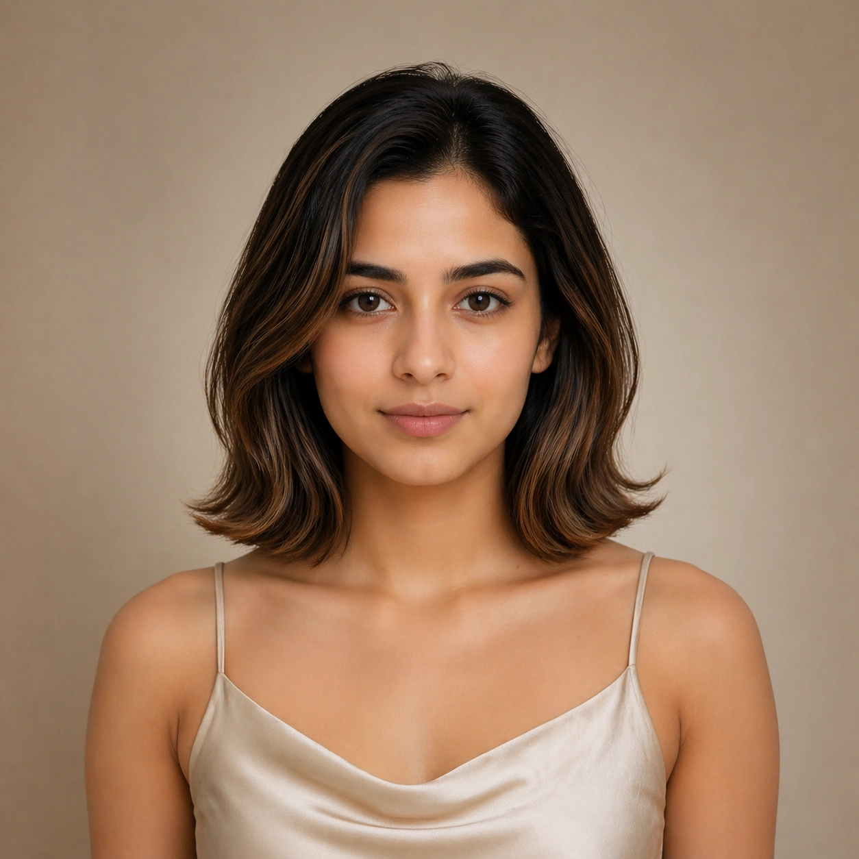
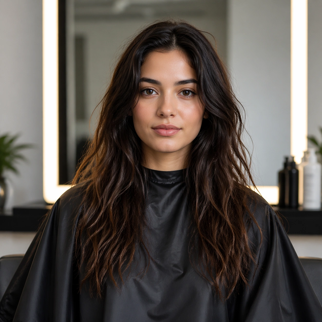
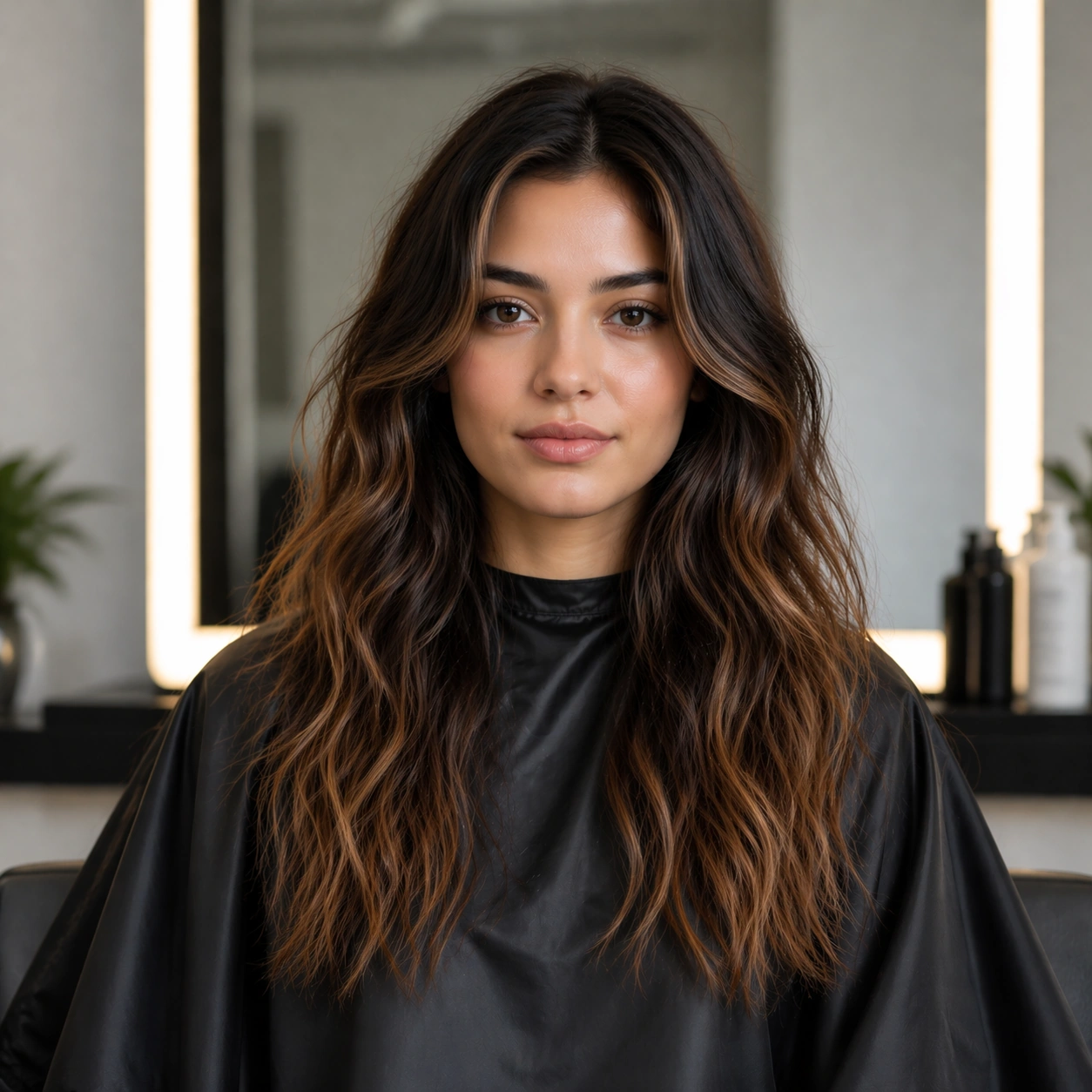
Example generated from “Salon Color Makeover Campaign — Reference Natural Base”
GPT Image 2en

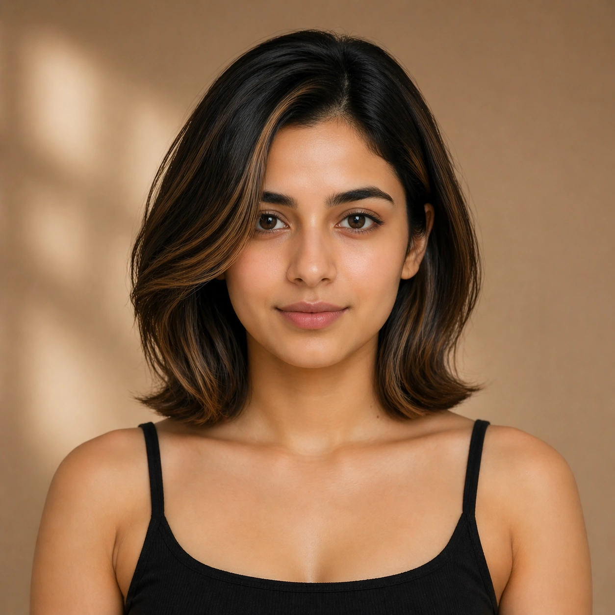
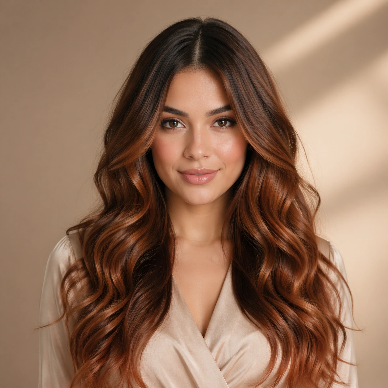
Scene: Create a square 1:1 portrait image for Salon Color Makeover Campaign. Use a clean approval-style studio portrait with neutral light, simple wardrobe, and enough facial visibility to lock identity perfectly. The frame should feel like a finished professional deliverable rather than a casual snapshot, with clear lens discipline, believable light falloff, and a palette that directly supports Design salon-ready hair-color makeover campaigns that highlight believable before-after change, hair texture, and beauty-advertising polish.. Keep enough surrounding space and compositional control for gallery, research, campaign, or approval-board reuse while staying photoreal and human-scaled. Subject: Center one salon model with neutral beige skin, collarbone-length dark hair, a clean oval face, and a precise hairline built for controlled color changes. Establish the exact same face, hair base, skin tone family, and body proportions that every transformation image must preserve. Use the example direction from the brief as grounding context: Design salon-ready hair-color makeover campaigns that highlight believable before-after change, hair texture, and beauty-advertising polish.. Wardrobe, lighting, environment, and pose may shift to serve this variation, but the viewer must immediately understand that the same reference identity is still in front of the camera. Important details: This backlog line is difficult because Design salon-ready hair-color makeover campaigns that highlight believable before-after change, hair texture, and beauty-advertising polish.. Preserve skin tone family, bone structure, eye spacing, nose shape, mouth shape, hairline logic, shoulder width, and overall body read across the entire series. preserve exact face / hair base / body proportions from the reference model. This baseline must read like the trustworthy approval frame before switching anything. Avoid the common failure described in the brief: ordinary image models often lose likeness once styling, lighting, or layout changes enter the frame. Success should feel like the result should feel professionally usable, coherent, and clearly built around one stable human identity. Use case: Salon Color Makeover Campaign series study 1/9, the natural baseline look. Constraints: No readable text, no watermark, no logos, preserve exact 1:1 aspect ratio, preserve exact face / hair base / body proportions from the reference model, no heavy styling, no logo wardrobe, no beauty filter, no extra subjects.

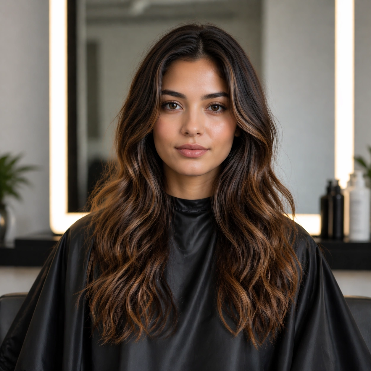
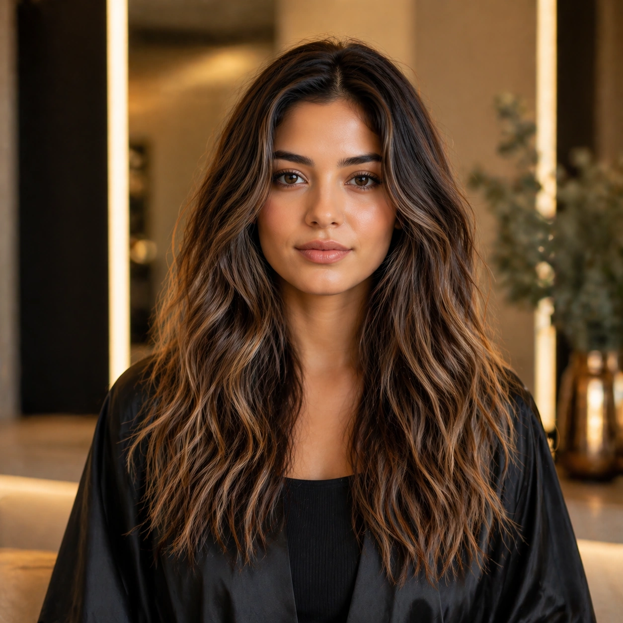
Example generated from “Salon Color Makeover Campaign — Look Switch One”
GPT Image 2en

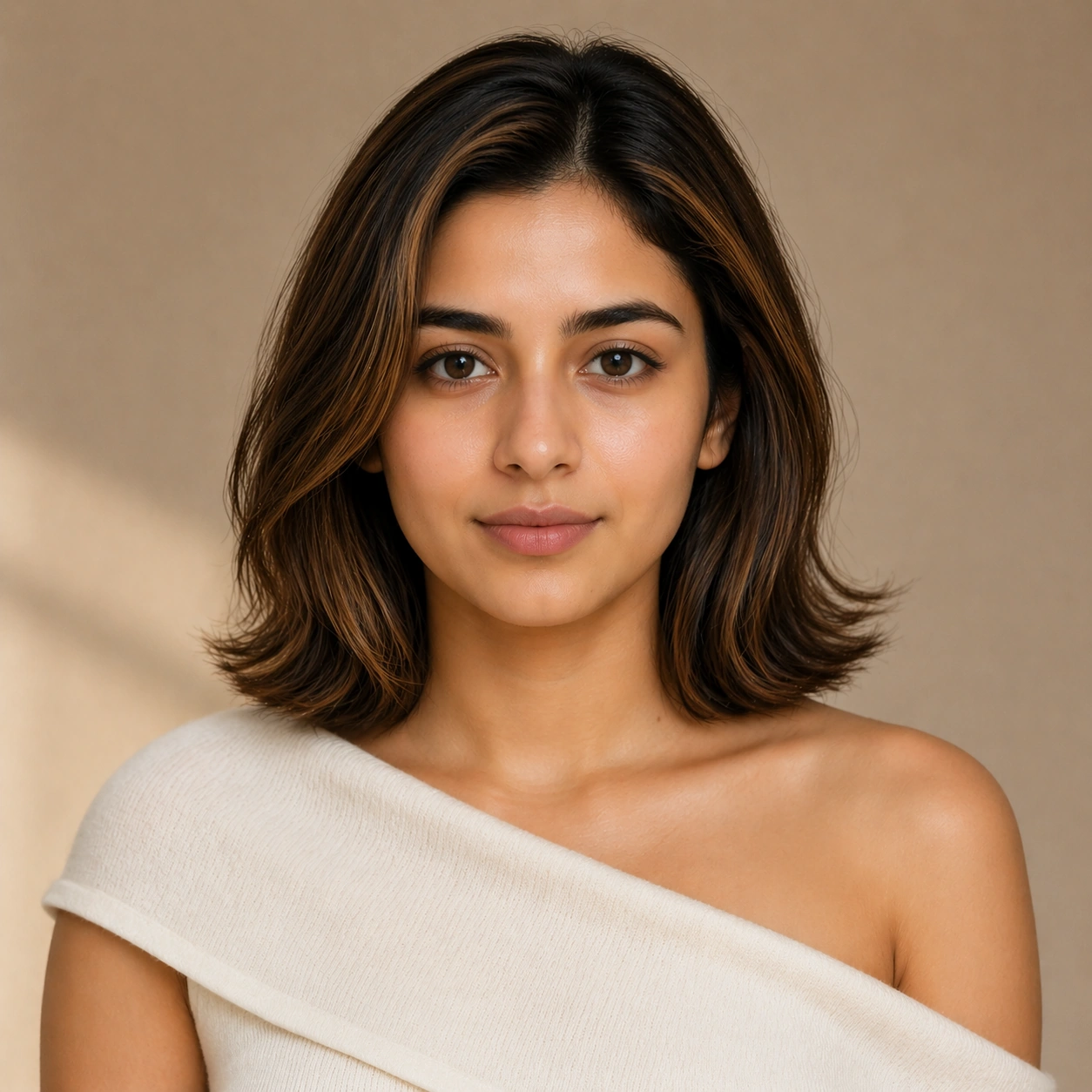
Scene: Create a square 1:1 portrait image for Salon Color Makeover Campaign. Use a premium portrait frame with one clear change direction and enough negative space to judge styling cleanly. The frame should feel like a finished professional deliverable rather than a casual snapshot, with clear lens discipline, believable light falloff, and a palette that directly supports Design salon-ready hair-color makeover campaigns that highlight believable before-after change, hair texture, and beauty-advertising polish.. Keep enough surrounding space and compositional control for gallery, research, campaign, or approval-board reuse while staying photoreal and human-scaled. Subject: Center one salon model with neutral beige skin, collarbone-length dark hair, a clean oval face, and a precise hairline built for controlled color changes. Keep the exact same person from the reference while executing the first major change requested by the topic, whether hair, makeup, wardrobe, grooming, or professional read. Use the example direction from the brief as grounding context: Design salon-ready hair-color makeover campaigns that highlight believable before-after change, hair texture, and beauty-advertising polish.. Wardrobe, lighting, environment, and pose may shift to serve this variation, but the viewer must immediately understand that the same reference identity is still in front of the camera. Important details: This backlog line is difficult because Design salon-ready hair-color makeover campaigns that highlight believable before-after change, hair texture, and beauty-advertising polish.. Preserve skin tone family, bone structure, eye spacing, nose shape, mouth shape, hairline logic, shoulder width, and overall body read across the entire series. preserve exact face / hair base / body proportions from the reference model. The switch must be obvious, but the identity must remain stronger than the styling change. Avoid the common failure described in the brief: ordinary image models often lose likeness once styling, lighting, or layout changes enter the frame. Success should feel like the result should feel professionally usable, coherent, and clearly built around one stable human identity. Use case: Salon Color Makeover Campaign series study 2/9, the first controlled transformation. Constraints: No readable text, no watermark, no logos, preserve exact 1:1 aspect ratio, preserve exact face / hair base / body proportions from the reference model, no face redraw, no changed age unless explicitly asked, no costume-party exaggeration, no new body shape.

Example generated from “Salon Color Makeover Campaign — Look Switch Two”
GPT Image 2en

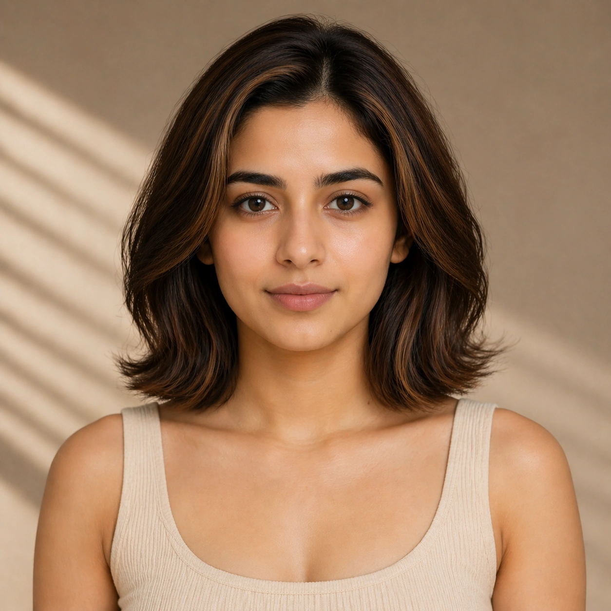
Scene: Create a square 1:1 portrait image for Salon Color Makeover Campaign. Use a square commercial portrait proof with similar camera logic and controlled light. The frame should feel like a finished professional deliverable rather than a casual snapshot, with clear lens discipline, believable light falloff, and a palette that directly supports Design salon-ready hair-color makeover campaigns that highlight believable before-after change, hair texture, and beauty-advertising polish.. Keep enough surrounding space and compositional control for gallery, research, campaign, or approval-board reuse while staying photoreal and human-scaled. Subject: Center one salon model with neutral beige skin, collarbone-length dark hair, a clean oval face, and a precise hairline built for controlled color changes. Preserve the same face and body while moving to a second transformation state that still feels plausible for the same person. Use the example direction from the brief as grounding context: Design salon-ready hair-color makeover campaigns that highlight believable before-after change, hair texture, and beauty-advertising polish.. Wardrobe, lighting, environment, and pose may shift to serve this variation, but the viewer must immediately understand that the same reference identity is still in front of the camera. Important details: This backlog line is difficult because Design salon-ready hair-color makeover campaigns that highlight believable before-after change, hair texture, and beauty-advertising polish.. Preserve skin tone family, bone structure, eye spacing, nose shape, mouth shape, hairline logic, shoulder width, and overall body read across the entire series. preserve exact face / hair base / body proportions from the reference model. Hairline logic, eye spacing, lip shape, and shoulder width must remain exact. Avoid the common failure described in the brief: ordinary image models often lose likeness once styling, lighting, or layout changes enter the frame. Success should feel like the result should feel professionally usable, coherent, and clearly built around one stable human identity. Use case: Salon Color Makeover Campaign series study 3/9, the second controlled transformation. Constraints: No readable text, no watermark, no logos, preserve exact 1:1 aspect ratio, preserve exact face / hair base / body proportions from the reference model, no hairstyle that changes skull shape, no enlarged eyes, no body morphing, no logo props.

Example generated from “Salon Color Makeover Campaign — Look Switch Three”
GPT Image 2en

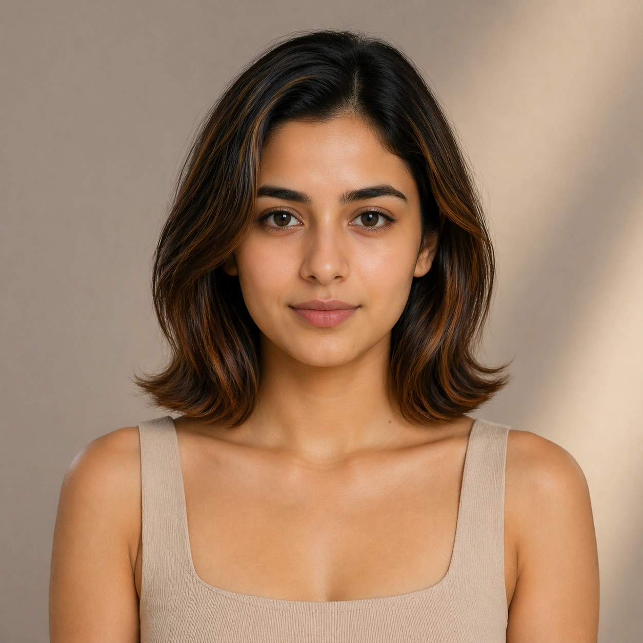
Scene: Create a square 1:1 portrait image for Salon Color Makeover Campaign. Use a slightly bolder campaign-like frame with disciplined crop and clean light falloff. The frame should feel like a finished professional deliverable rather than a casual snapshot, with clear lens discipline, believable light falloff, and a palette that directly supports Design salon-ready hair-color makeover campaigns that highlight believable before-after change, hair texture, and beauty-advertising polish.. Keep enough surrounding space and compositional control for gallery, research, campaign, or approval-board reuse while staying photoreal and human-scaled. Subject: Center one salon model with neutral beige skin, collarbone-length dark hair, a clean oval face, and a precise hairline built for controlled color changes. Apply a third styling direction while holding the same reference identity with no drift in age, ethnicity, or face structure. Use the example direction from the brief as grounding context: Design salon-ready hair-color makeover campaigns that highlight believable before-after change, hair texture, and beauty-advertising polish.. Wardrobe, lighting, environment, and pose may shift to serve this variation, but the viewer must immediately understand that the same reference identity is still in front of the camera. Important details: This backlog line is difficult because Design salon-ready hair-color makeover campaigns that highlight believable before-after change, hair texture, and beauty-advertising polish.. Preserve skin tone family, bone structure, eye spacing, nose shape, mouth shape, hairline logic, shoulder width, and overall body read across the entire series. preserve exact face / hair base / body proportions from the reference model. The image should prove range under control rather than spectacle for spectacle alone. Avoid the common failure described in the brief: ordinary image models often lose likeness once styling, lighting, or layout changes enter the frame. Success should feel like the result should feel professionally usable, coherent, and clearly built around one stable human identity. Use case: Salon Color Makeover Campaign series study 4/9, the third controlled transformation. Constraints: No readable text, no watermark, no logos, preserve exact 1:1 aspect ratio, preserve exact face / hair base / body proportions from the reference model, no gimmick costume, no false lashes that change eye shape, no surreal hair physics, no second person.

Example generated from “Salon Color Makeover Campaign — Look Switch Four”
GPT Image 2en

Scene: Create a square 1:1 portrait image for Salon Color Makeover Campaign. Use a close or mid-shot portrait that privileges detail and approval clarity over background storytelling. The frame should feel like a finished professional deliverable rather than a casual snapshot, with clear lens discipline, believable light falloff, and a palette that directly supports Design salon-ready hair-color makeover campaigns that highlight believable before-after change, hair texture, and beauty-advertising polish.. Keep enough surrounding space and compositional control for gallery, research, campaign, or approval-board reuse while staying photoreal and human-scaled. Subject: Center one salon model with neutral beige skin, collarbone-length dark hair, a clean oval face, and a precise hairline built for controlled color changes. Keep the same exact subject while introducing another visible shift in style language, finish, or mood tied directly to the topic brief. Use the example direction from the brief as grounding context: Design salon-ready hair-color makeover campaigns that highlight believable before-after change, hair texture, and beauty-advertising polish.. Wardrobe, lighting, environment, and pose may shift to serve this variation, but the viewer must immediately understand that the same reference identity is still in front of the camera. Important details: This backlog line is difficult because Design salon-ready hair-color makeover campaigns that highlight believable before-after change, hair texture, and beauty-advertising polish.. Preserve skin tone family, bone structure, eye spacing, nose shape, mouth shape, hairline logic, shoulder width, and overall body read across the entire series. preserve exact face / hair base / body proportions from the reference model. Micro-details may change, but likeness, skin tone family, and body read cannot. Avoid the common failure described in the brief: ordinary image models often lose likeness once styling, lighting, or layout changes enter the frame. Success should feel like the result should feel professionally usable, coherent, and clearly built around one stable human identity. Use case: Salon Color Makeover Campaign series study 5/9, the fourth controlled transformation. Constraints: No readable text, no watermark, no logos, preserve exact 1:1 aspect ratio, preserve exact face / hair base / body proportions from the reference model, no retouch blur, no facial asymmetry drift, no extra accessories noise, no unreadable product text.

Example generated from “Salon Color Makeover Campaign — Look Switch Five”
GPT Image 2en

Scene: Create a square 1:1 portrait image for Salon Color Makeover Campaign. Use a square portrait with polished commercial finish and enough room to see styling structure clearly. The frame should feel like a finished professional deliverable rather than a casual snapshot, with clear lens discipline, believable light falloff, and a palette that directly supports Design salon-ready hair-color makeover campaigns that highlight believable before-after change, hair texture, and beauty-advertising polish.. Keep enough surrounding space and compositional control for gallery, research, campaign, or approval-board reuse while staying photoreal and human-scaled. Subject: Center one salon model with neutral beige skin, collarbone-length dark hair, a clean oval face, and a precise hairline built for controlled color changes. Push to a fifth variation while preserving exact face / hair base / body proportions from the reference model. This should still feel like one person being art-directed, not re-generated from scratch. Use the example direction from the brief as grounding context: Design salon-ready hair-color makeover campaigns that highlight believable before-after change, hair texture, and beauty-advertising polish.. Wardrobe, lighting, environment, and pose may shift to serve this variation, but the viewer must immediately understand that the same reference identity is still in front of the camera. Important details: This backlog line is difficult because Design salon-ready hair-color makeover campaigns that highlight believable before-after change, hair texture, and beauty-advertising polish.. Preserve skin tone family, bone structure, eye spacing, nose shape, mouth shape, hairline logic, shoulder width, and overall body read across the entire series. preserve exact face / hair base / body proportions from the reference model. Keep continuity stronger than novelty. Avoid the common failure described in the brief: ordinary image models often lose likeness once styling, lighting, or layout changes enter the frame. Success should feel like the result should feel professionally usable, coherent, and clearly built around one stable human identity. Use case: Salon Color Makeover Campaign series study 6/9, the fifth controlled transformation. Constraints: No readable text, no watermark, no logos, preserve exact 1:1 aspect ratio, preserve exact face / hair base / body proportions from the reference model, no gender drift unless explicitly relevant, no unrelated props, no costume confusion, no body-scale jump.

Example generated from “Salon Color Makeover Campaign — Look Switch Six”
GPT Image 2en

Scene: Create a square 1:1 portrait image for Salon Color Makeover Campaign. Use a final single-look variation with confident but restrained campaign polish. The frame should feel like a finished professional deliverable rather than a casual snapshot, with clear lens discipline, believable light falloff, and a palette that directly supports Design salon-ready hair-color makeover campaigns that highlight believable before-after change, hair texture, and beauty-advertising polish.. Keep enough surrounding space and compositional control for gallery, research, campaign, or approval-board reuse while staying photoreal and human-scaled. Subject: Center one salon model with neutral beige skin, collarbone-length dark hair, a clean oval face, and a precise hairline built for controlled color changes. Use the same person again in a sixth styling state, making sure recognition is instant before the viewer notices what changed. Use the example direction from the brief as grounding context: Design salon-ready hair-color makeover campaigns that highlight believable before-after change, hair texture, and beauty-advertising polish.. Wardrobe, lighting, environment, and pose may shift to serve this variation, but the viewer must immediately understand that the same reference identity is still in front of the camera. Important details: This backlog line is difficult because Design salon-ready hair-color makeover campaigns that highlight believable before-after change, hair texture, and beauty-advertising polish.. Preserve skin tone family, bone structure, eye spacing, nose shape, mouth shape, hairline logic, shoulder width, and overall body read across the entire series. preserve exact face / hair base / body proportions from the reference model. The transformation should feel deliberate, premium, and usable in a real salon, beauty, fashion, or casting workflow. Avoid the common failure described in the brief: ordinary image models often lose likeness once styling, lighting, or layout changes enter the frame. Success should feel like the result should feel professionally usable, coherent, and clearly built around one stable human identity. Use case: Salon Color Makeover Campaign series study 7/9, the sixth controlled transformation. Constraints: No readable text, no watermark, no logos, preserve exact 1:1 aspect ratio, preserve exact face / hair base / body proportions from the reference model, no hidden face, no perspective warp, no dramatic environment change, no AI-gloss artifacts.

Example generated from “Salon Color Makeover Campaign — Detail Proof Board”
GPT Image 2en

Scene: Create a square 1:1 portrait image for Salon Color Makeover Campaign. Use a square composition that can include multiple tight crops or one richer close-up, but still reads as one coherent portrait asset. The frame should feel like a finished professional deliverable rather than a casual snapshot, with clear lens discipline, believable light falloff, and a palette that directly supports Design salon-ready hair-color makeover campaigns that highlight believable before-after change, hair texture, and beauty-advertising polish.. Keep enough surrounding space and compositional control for gallery, research, campaign, or approval-board reuse while staying photoreal and human-scaled. Subject: Center one salon model with neutral beige skin, collarbone-length dark hair, a clean oval face, and a precise hairline built for controlled color changes. Stay locked to the same identity while emphasizing the evidence of the switch: hair texture, makeup finish, beard line, garment detail, or aging cues depending on the topic. Use the example direction from the brief as grounding context: Design salon-ready hair-color makeover campaigns that highlight believable before-after change, hair texture, and beauty-advertising polish.. Wardrobe, lighting, environment, and pose may shift to serve this variation, but the viewer must immediately understand that the same reference identity is still in front of the camera. Important details: This backlog line is difficult because Design salon-ready hair-color makeover campaigns that highlight believable before-after change, hair texture, and beauty-advertising polish.. Preserve skin tone family, bone structure, eye spacing, nose shape, mouth shape, hairline logic, shoulder width, and overall body read across the entire series. preserve exact face / hair base / body proportions from the reference model. This frame should support professional review and decision making without readable text. Avoid the common failure described in the brief: ordinary image models often lose likeness once styling, lighting, or layout changes enter the frame. Success should feel like the result should feel professionally usable, coherent, and clearly built around one stable human identity. Use case: Salon Color Makeover Campaign series study 8/9, a detail-proof or comparison board. Constraints: No readable text, no watermark, no logos, preserve exact 1:1 aspect ratio, preserve exact face / hair base / body proportions from the reference model, no readable labels, no broken panel alignment, no detached close-up fragments, no face drift.

Example generated from “Salon Color Makeover Campaign — Campaign Finale”
GPT Image 2en

Scene: Create a square 1:1 portrait image for Salon Color Makeover Campaign. Use a square commercial finish with strong portrait presence, premium negative space, and final-asset confidence. The frame should feel like a finished professional deliverable rather than a casual snapshot, with clear lens discipline, believable light falloff, and a palette that directly supports Design salon-ready hair-color makeover campaigns that highlight believable before-after change, hair texture, and beauty-advertising polish.. Keep enough surrounding space and compositional control for gallery, research, campaign, or approval-board reuse while staying photoreal and human-scaled. Subject: Center one salon model with neutral beige skin, collarbone-length dark hair, a clean oval face, and a precise hairline built for controlled color changes. Resolve the same identity into a final hero image that proves the transformation line can ship as a real campaign, promo board, or salon approval visual. Use the example direction from the brief as grounding context: Design salon-ready hair-color makeover campaigns that highlight believable before-after change, hair texture, and beauty-advertising polish.. Wardrobe, lighting, environment, and pose may shift to serve this variation, but the viewer must immediately understand that the same reference identity is still in front of the camera. Important details: This backlog line is difficult because Design salon-ready hair-color makeover campaigns that highlight believable before-after change, hair texture, and beauty-advertising polish.. Preserve skin tone family, bone structure, eye spacing, nose shape, mouth shape, hairline logic, shoulder width, and overall body read across the entire series. preserve exact face / hair base / body proportions from the reference model. The final degree of polish cannot erase the exact same-person read established in image 01. Avoid the common failure described in the brief: ordinary image models often lose likeness once styling, lighting, or layout changes enter the frame. Success should feel like the result should feel professionally usable, coherent, and clearly built around one stable human identity. Use case: Salon Color Makeover Campaign series study 9/9, a polished campaign finale. Constraints: No readable text, no watermark, no logos, preserve exact 1:1 aspect ratio, preserve exact face / hair base / body proportions from the reference model, no readable copy, no logos, no poster clutter, no identity reset.

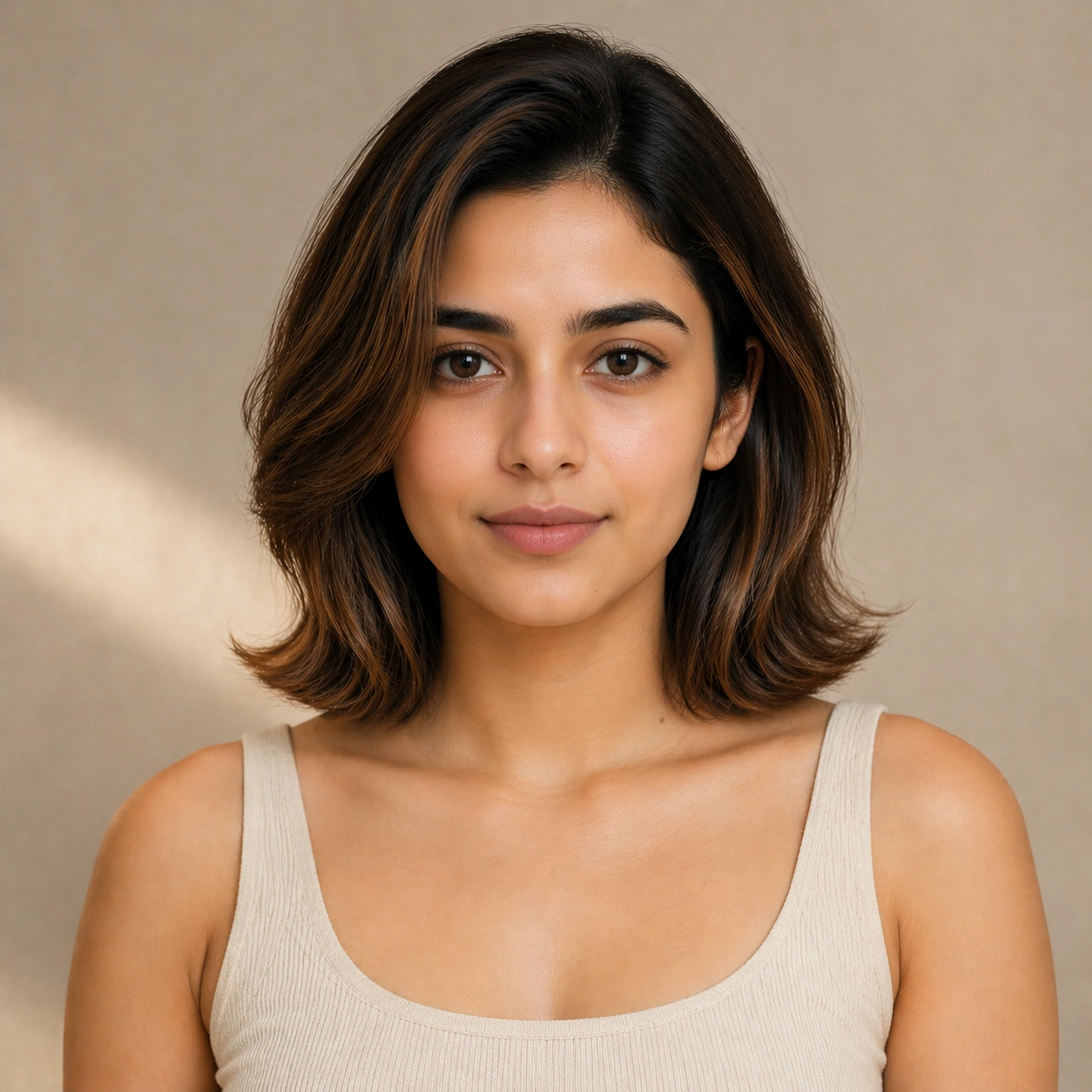
Example generated from “Salon Color Makeover Promo — Anchor Portrait”
GPT Image 2en

Scene: A square commercial beauty-or-fashion image designed like a polished campaign proof for Salon Color Makeover Promo. Keep the camera discipline clear and believable: portrait-oriented within the square, premium studio light, controlled tonal contrast, and enough surrounding negative space to feel like an ad layout without relying on readable typography. The image should look production-ready, with realistic skin, hair, fabric, and makeup rendering that supports identity locking instead of distracting from it. Subject: Build the frame around one clearly recognizable person. Anchor Portrait should feel like a specific transformation step that defines the exact face, camera angle, skin texture, and model identity that later images must preserve. The face structure, age, body proportions, and general camera position must stay consistent with the same-person premise of Create salon-grade makeover campaigns built around one person moving through before, during, and after hair color transformations with ad-ready polish.. Styling, wardrobe, grooming, makeup, hair, or pose can evolve, but the viewer must believe it is unquestionably the same subject across the whole theme. Use a premium editorial-commercial tone rather than a casual portrait session. Important details: The visual test is identity consistency under change. Preserve stable bone structure, eye spacing, nose shape, lip volume, skin tone family, and believable texture response. Let the transformation be visible through styling choices instead of facial drift. This theme studies editing-workflow, photorealism, commercial-mockup, structured-layout through a production-ready visual system. Make the composition clean enough for client review, with professional grooming fidelity and enough detail for salon, beauty, or fashion decision-making. Aim for clear hierarchy, polished craft, and immediately usable campaign logic. Use case: Salon Color Makeover Promo series study 1/4. Constraints: No readable text, no watermark, no logos, preserve exact 1:1 aspect ratio, no face drift, no inconsistent age shift, no extra limbs, no duplicate person, no asymmetric eye placement, no beauty-editorial chaos.

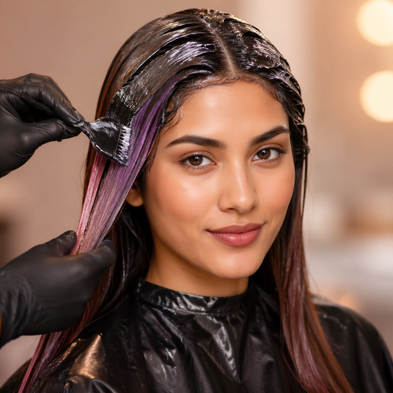
Example generated from “Salon Color Makeover Promo — First Switch”
GPT Image 2en

Scene: A square commercial beauty-or-fashion image designed like a polished campaign proof for Salon Color Makeover Promo. Keep the camera discipline clear and believable: portrait-oriented within the square, premium studio light, controlled tonal contrast, and enough surrounding negative space to feel like an ad layout without relying on readable typography. The image should look production-ready, with realistic skin, hair, fabric, and makeup rendering that supports identity locking instead of distracting from it. Subject: Build the frame around one clearly recognizable person. First Switch should feel like a specific transformation step that keeps the same identity but changes the styling direction in a clear and controlled way. The face structure, age, body proportions, and general camera position must stay consistent with the same-person premise of Create salon-grade makeover campaigns built around one person moving through before, during, and after hair color transformations with ad-ready polish.. Styling, wardrobe, grooming, makeup, hair, or pose can evolve, but the viewer must believe it is unquestionably the same subject across the whole theme. Use a premium editorial-commercial tone rather than a casual portrait session. Important details: The visual test is identity consistency under change. Preserve stable bone structure, eye spacing, nose shape, lip volume, skin tone family, and believable texture response. Let the transformation be visible through styling choices instead of facial drift. This theme studies editing-workflow, photorealism, commercial-mockup, structured-layout through a production-ready visual system. Make the composition clean enough for client review, with professional grooming fidelity and enough detail for salon, beauty, or fashion decision-making. Aim for clear hierarchy, polished craft, and immediately usable campaign logic. Use case: Salon Color Makeover Promo series study 2/4. Constraints: No readable text, no watermark, no logos, preserve exact 1:1 aspect ratio, no face drift, no inconsistent age shift, no extra limbs, no duplicate person, no asymmetric eye placement, no beauty-editorial chaos.

Example generated from “Salon Color Makeover Promo — Second Switch”
GPT Image 2en

Scene: A square commercial beauty-or-fashion image designed like a polished campaign proof for Salon Color Makeover Promo. Keep the camera discipline clear and believable: portrait-oriented within the square, premium studio light, controlled tonal contrast, and enough surrounding negative space to feel like an ad layout without relying on readable typography. The image should look production-ready, with realistic skin, hair, fabric, and makeup rendering that supports identity locking instead of distracting from it. Subject: Build the frame around one clearly recognizable person. Second Switch should feel like a specific transformation step that pushes the same identity into a more dramatic transformation without face drift. The face structure, age, body proportions, and general camera position must stay consistent with the same-person premise of Create salon-grade makeover campaigns built around one person moving through before, during, and after hair color transformations with ad-ready polish.. Styling, wardrobe, grooming, makeup, hair, or pose can evolve, but the viewer must believe it is unquestionably the same subject across the whole theme. Use a premium editorial-commercial tone rather than a casual portrait session. Important details: The visual test is identity consistency under change. Preserve stable bone structure, eye spacing, nose shape, lip volume, skin tone family, and believable texture response. Let the transformation be visible through styling choices instead of facial drift. This theme studies editing-workflow, photorealism, commercial-mockup, structured-layout through a production-ready visual system. Make the composition clean enough for client review, with professional grooming fidelity and enough detail for salon, beauty, or fashion decision-making. Aim for clear hierarchy, polished craft, and immediately usable campaign logic. Use case: Salon Color Makeover Promo series study 3/4. Constraints: No readable text, no watermark, no logos, preserve exact 1:1 aspect ratio, no face drift, no inconsistent age shift, no extra limbs, no duplicate person, no asymmetric eye placement, no beauty-editorial chaos.

Example generated from “Salon Color Makeover Promo — Campaign Finish”
GPT Image 2en

Scene: A square commercial beauty-or-fashion image designed like a polished campaign proof for Salon Color Makeover Promo. Keep the camera discipline clear and believable: portrait-oriented within the square, premium studio light, controlled tonal contrast, and enough surrounding negative space to feel like an ad layout without relying on readable typography. The image should look production-ready, with realistic skin, hair, fabric, and makeup rendering that supports identity locking instead of distracting from it. Subject: Build the frame around one clearly recognizable person. Campaign Finish should feel like a specific transformation step that turns the locked identity into a polished campaign-ready hero frame. The face structure, age, body proportions, and general camera position must stay consistent with the same-person premise of Create salon-grade makeover campaigns built around one person moving through before, during, and after hair color transformations with ad-ready polish.. Styling, wardrobe, grooming, makeup, hair, or pose can evolve, but the viewer must believe it is unquestionably the same subject across the whole theme. Use a premium editorial-commercial tone rather than a casual portrait session. Important details: The visual test is identity consistency under change. Preserve stable bone structure, eye spacing, nose shape, lip volume, skin tone family, and believable texture response. Let the transformation be visible through styling choices instead of facial drift. This theme studies editing-workflow, photorealism, commercial-mockup, structured-layout through a production-ready visual system. Make the composition clean enough for client review, with professional grooming fidelity and enough detail for salon, beauty, or fashion decision-making. Aim for clear hierarchy, polished craft, and immediately usable campaign logic. Use case: Salon Color Makeover Promo series study 4/4. Constraints: No readable text, no watermark, no logos, preserve exact 1:1 aspect ratio, no face drift, no inconsistent age shift, no extra limbs, no duplicate person, no asymmetric eye placement, no beauty-editorial chaos.

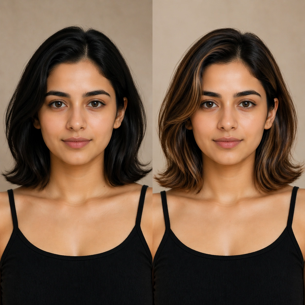
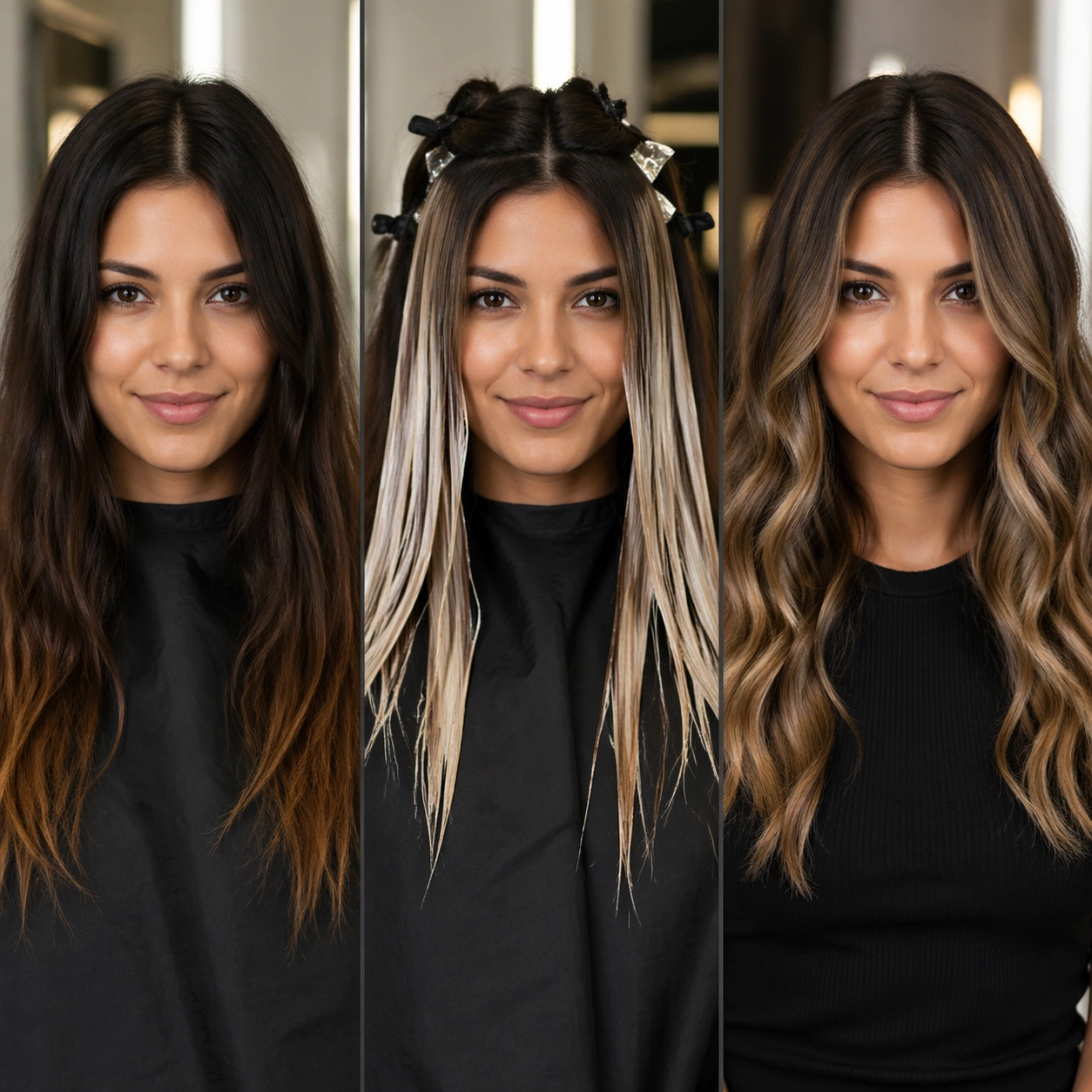
Example generated from “Salon Color Makeover Promo — Before After Board”
GPT Image 2en

Scene: A square commercial beauty-or-fashion image designed like a polished campaign proof for Salon Color Makeover Promo. Keep the camera discipline clear and believable: portrait-oriented within the square, premium studio light, controlled tonal contrast, and enough surrounding negative space to feel like an ad layout without relying on readable typography. The image should look production-ready, with realistic skin, hair, fabric, and makeup rendering that supports identity locking instead of distracting from it. Subject: Build the frame around one clearly recognizable person. Before After Board should feel like a specific transformation step that a disciplined comparison layout making transformation logic instantly legible. The face structure, age, body proportions, and general camera position must stay consistent with the same-person premise of Create salon-grade makeover campaigns built around one person moving through before, during, and after hair color transformations with ad-ready polish.. Styling, wardrobe, grooming, makeup, hair, or pose can evolve, but the viewer must believe it is unquestionably the same subject across the whole theme. Use a premium editorial-commercial tone rather than a casual portrait session. Important details: The visual test is identity consistency under change. Preserve stable bone structure, eye spacing, nose shape, lip volume, skin tone family, and believable texture response. Let the transformation be visible through styling choices instead of facial drift. This theme studies editing-workflow, photorealism, commercial-mockup, structured-layout through a production-ready visual system. Make the composition clean enough for client review, with professional grooming fidelity and enough detail for salon, beauty, or fashion decision-making. Aim for clear hierarchy, polished craft, and immediately usable campaign logic. Use case: Salon Color Makeover Promo single study 1/5. Constraints: No readable text, no watermark, no logos, preserve exact 1:1 aspect ratio, no face drift, no inconsistent age shift, no extra limbs, no duplicate person, no asymmetric eye placement, no beauty-editorial chaos.

Example generated from “Salon Color Makeover Promo — Detail Close-up”
GPT Image 2en

Scene: A square commercial beauty-or-fashion image designed like a polished campaign proof for Salon Color Makeover Promo. Keep the camera discipline clear and believable: portrait-oriented within the square, premium studio light, controlled tonal contrast, and enough surrounding negative space to feel like an ad layout without relying on readable typography. The image should look production-ready, with realistic skin, hair, fabric, and makeup rendering that supports identity locking instead of distracting from it. Subject: Build the frame around one clearly recognizable person. Detail Close-up should feel like a specific transformation step that a close-up study focusing on texture, finish, and precise beauty or garment details. The face structure, age, body proportions, and general camera position must stay consistent with the same-person premise of Create salon-grade makeover campaigns built around one person moving through before, during, and after hair color transformations with ad-ready polish.. Styling, wardrobe, grooming, makeup, hair, or pose can evolve, but the viewer must believe it is unquestionably the same subject across the whole theme. Use a premium editorial-commercial tone rather than a casual portrait session. Important details: The visual test is identity consistency under change. Preserve stable bone structure, eye spacing, nose shape, lip volume, skin tone family, and believable texture response. Let the transformation be visible through styling choices instead of facial drift. This theme studies editing-workflow, photorealism, commercial-mockup, structured-layout through a production-ready visual system. Make the composition clean enough for client review, with professional grooming fidelity and enough detail for salon, beauty, or fashion decision-making. Aim for clear hierarchy, polished craft, and immediately usable campaign logic. Use case: Salon Color Makeover Promo single study 3/5. Constraints: No readable text, no watermark, no logos, preserve exact 1:1 aspect ratio, no face drift, no inconsistent age shift, no extra limbs, no duplicate person, no asymmetric eye placement, no beauty-editorial chaos.

Example generated from “Salon Color Makeover Promo — Promo Poster”
GPT Image 2en

Scene: A square commercial beauty-or-fashion image designed like a polished campaign proof for Salon Color Makeover Promo. Keep the camera discipline clear and believable: portrait-oriented within the square, premium studio light, controlled tonal contrast, and enough surrounding negative space to feel like an ad layout without relying on readable typography. The image should look production-ready, with realistic skin, hair, fabric, and makeup rendering that supports identity locking instead of distracting from it. Subject: Build the frame around one clearly recognizable person. Promo Poster should feel like a specific transformation step that a polished advertisement frame turning the same identity into a finished commercial visual. The face structure, age, body proportions, and general camera position must stay consistent with the same-person premise of Create salon-grade makeover campaigns built around one person moving through before, during, and after hair color transformations with ad-ready polish.. Styling, wardrobe, grooming, makeup, hair, or pose can evolve, but the viewer must believe it is unquestionably the same subject across the whole theme. Use a premium editorial-commercial tone rather than a casual portrait session. Important details: The visual test is identity consistency under change. Preserve stable bone structure, eye spacing, nose shape, lip volume, skin tone family, and believable texture response. Let the transformation be visible through styling choices instead of facial drift. This theme studies editing-workflow, photorealism, commercial-mockup, structured-layout through a production-ready visual system. Make the composition clean enough for client review, with professional grooming fidelity and enough detail for salon, beauty, or fashion decision-making. Aim for clear hierarchy, polished craft, and immediately usable campaign logic. Use case: Salon Color Makeover Promo single study 4/5. Constraints: No readable text, no watermark, no logos, preserve exact 1:1 aspect ratio, no face drift, no inconsistent age shift, no extra limbs, no duplicate person, no asymmetric eye placement, no beauty-editorial chaos.

Example generated from “Salt Flat Mirror Bolivia — Main Panorama”
GPT Image 2en

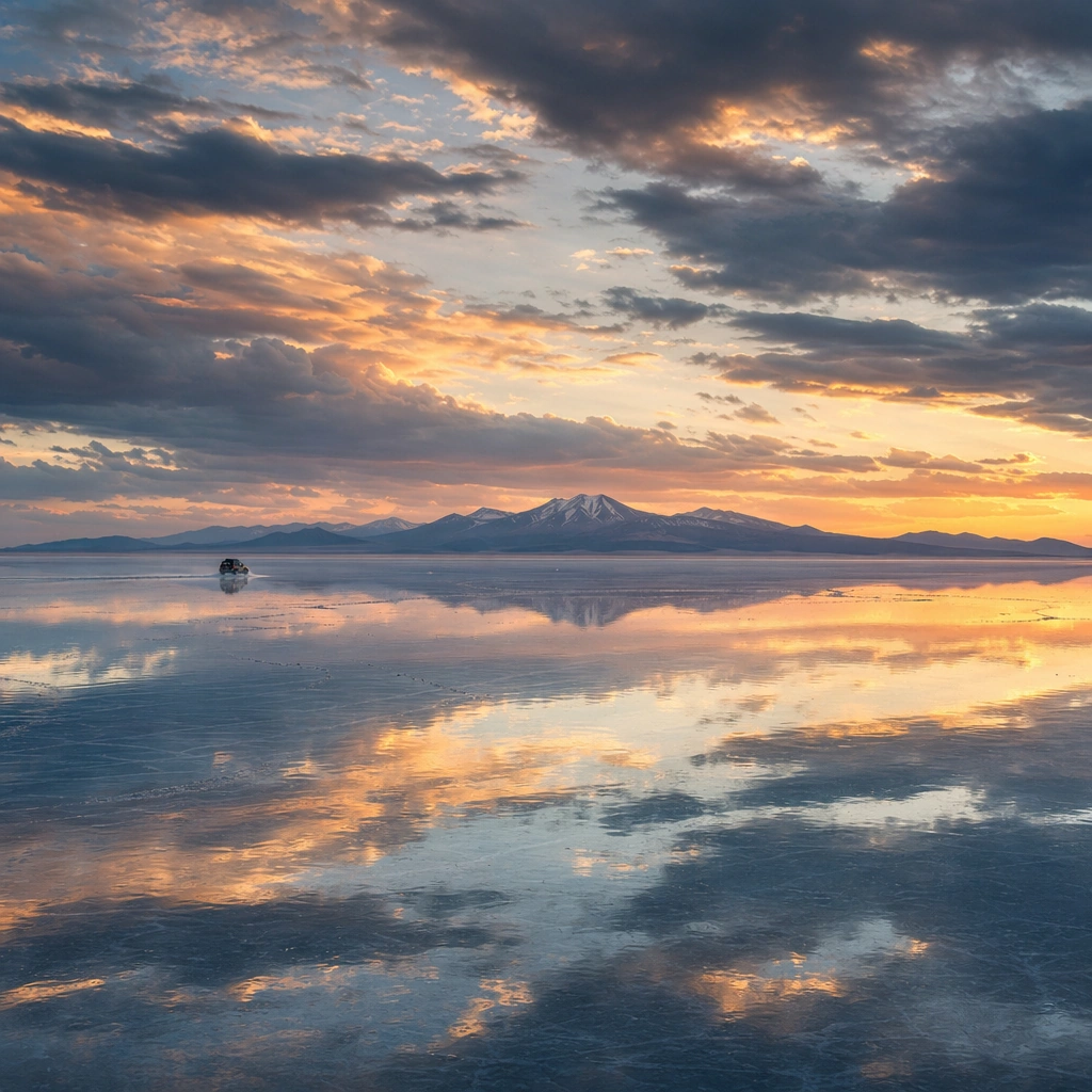
Scene: Create a square, photoreal landscape study of bolivian salt flat mirror. Compose it as the clearest monument-scale establishing view, using a wide, level camera position with deep atmospheric recession and a calm, authoritative horizon. Let broad, sculpting natural light describe the major masses before it picks out the smaller details Keep the frame cinematic but disciplined, with a clear foreground, middle distance, and far mass so the viewer can measure real depth. The image should feel like a field photograph made with patience, precision, and sublime restraint rather than a fantasy matte painting. Subject: Show a flooded Bolivian salt flat at sunset with a near-perfect mirror surface reflecting cloud towers, a vanishing horizon, and a single jeep sending one subtle ripple across the water film. This variation should emphasize hero panorama. The main landform must dominate the composition, but secondary elements should quietly explain how the place works: water paths, sediment lines, snow bands, surf, ash, wind streaks, stars, or human traces where appropriate. Everything in the image should support the same idea of scale and climate, so the scene reads as one coherent environment rather than a stack of spectacular details. Important details: Preserve horizon loss, razor-thin water over salt, exact mirror behavior, soft sunset color mirrored above and below, and a clean sense of infinite horizontal space. Keep one dominant landform, one secondary supporting rhythm, and a restrained scale witness so the scene reads immediately. Keep geology, weather, and atmosphere physically believable. Use subtle micro-texture, tonal separation, and air perspective to reinforce distance. If a human, vehicle, tent, caravan, bird, or boat appears, it must remain tiny and subordinate to the landscape, functioning only as a scale witness. The composition should feel original, severe, and elegant, with no decorative filler and no imitation of any copyrighted visual property. Use case: Bolivian Salt Flat Mirror single study 1/9, exploring the hero panorama variation. Constraints: No readable text, no watermark, no logos, preserve exact 1:1 aspect ratio, no extra vehicles, no crowd of tourists, no giant props, no surreal floating islands, no split-screen layout, no collage fragments, no exaggerated fisheye distortion, no kitsch color grading, no artificial border, no split-panel treatment.
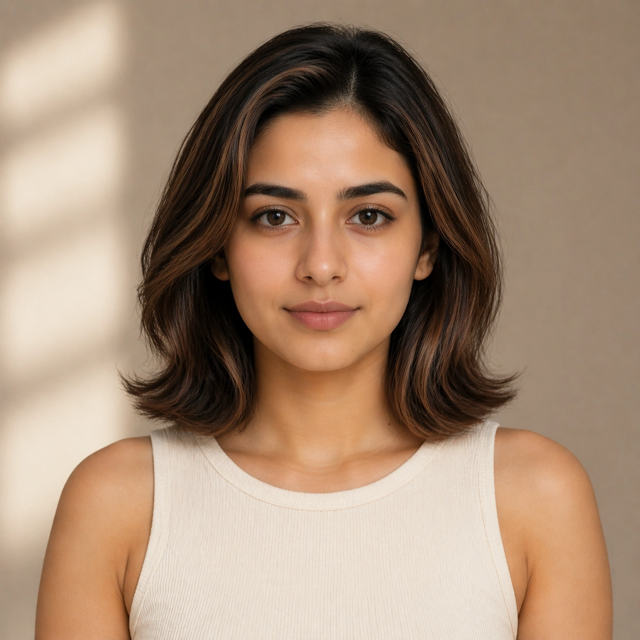
Example generated from “Livestream Room Promo Tile System — Support Three”
GPT Image 2en

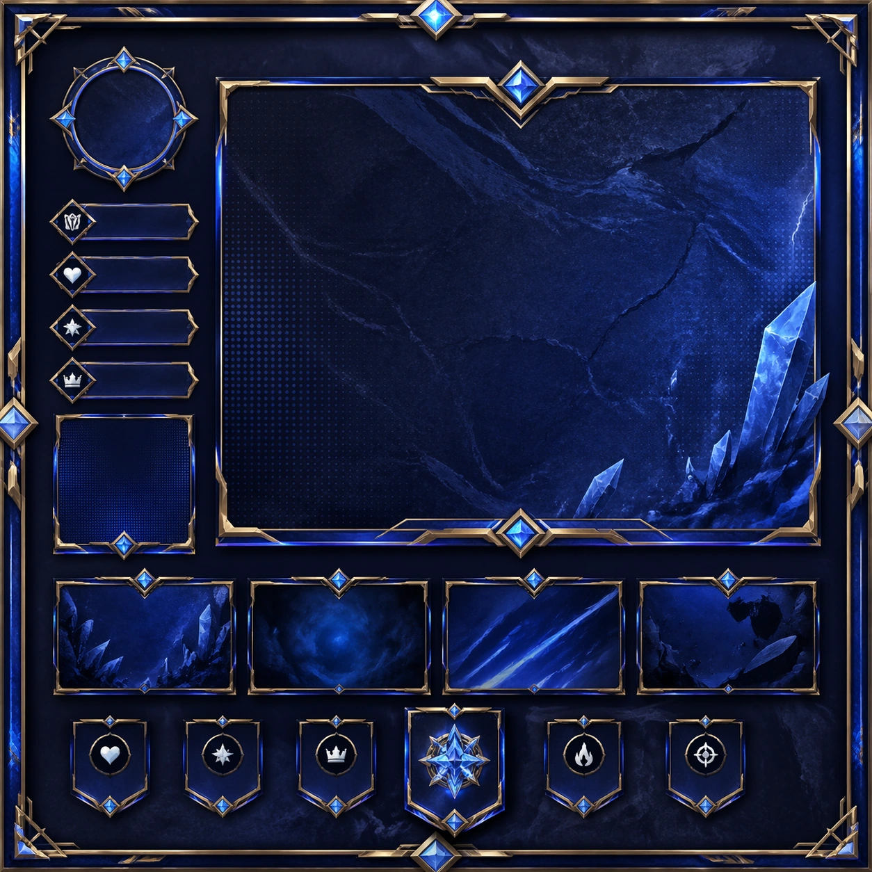
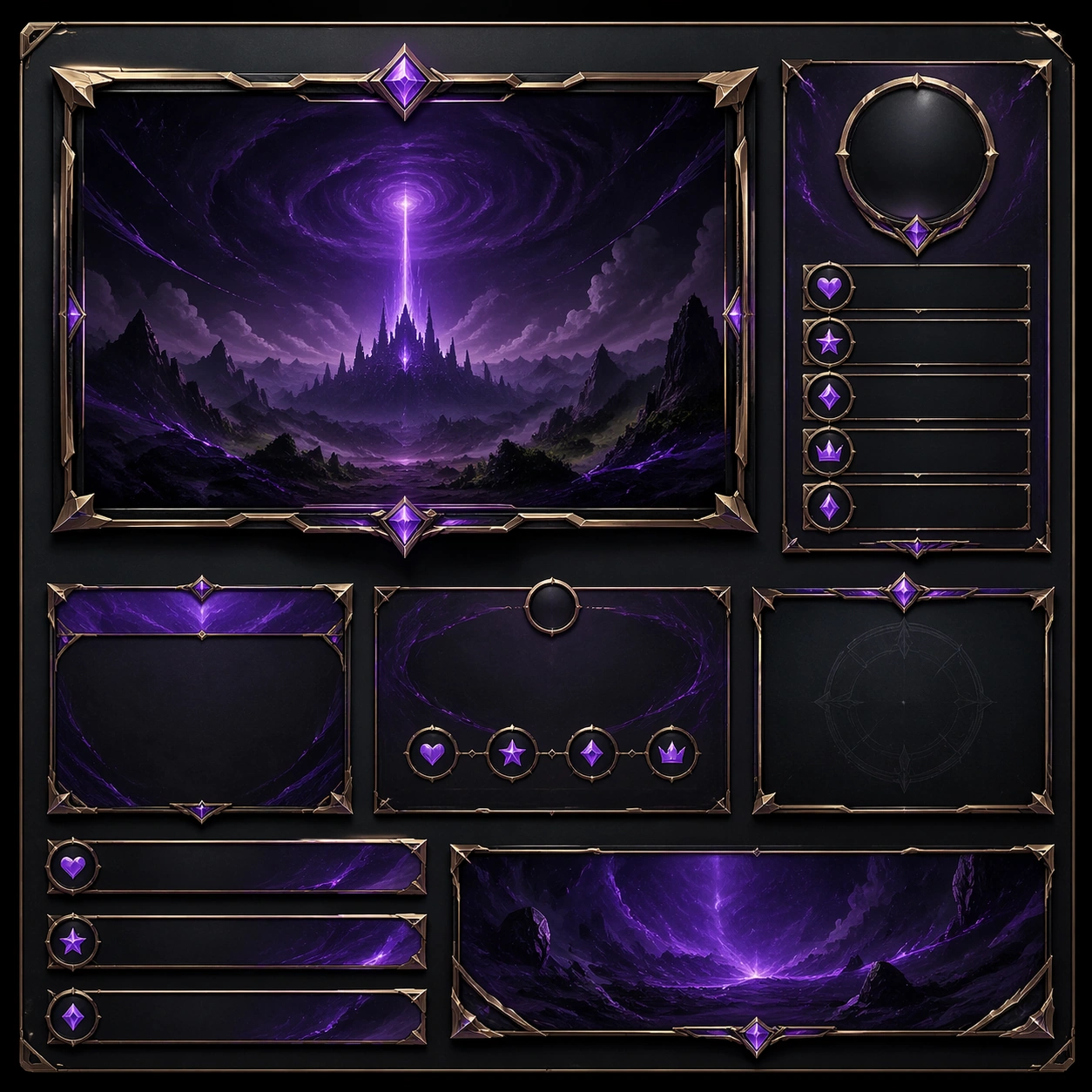
Scene: Create a square standalone support image for Livestream Room Promo Tile System. Build a third support-surface study with a clear focal hierarchy and a finished professional surface. Use a polished modular board or campaign surface with clean spacing, premium game-UI finish, and clear focal hierarchy. The frame should feel self-contained and polished, with enough structure to explain the system even without the reference series, yet still obviously belonging to the same theme and production world. Subject: Show a coherent original game-art system built for premium production and marketing surfaces in a way that emphasizes the intended support surface. Keep the same system logic stable across screenshots, cards, banners, and overview boards. Even though this image is independent, the viewer should still recognize the same universe, same commercial logic, and same production intent as the core package. Important details: Lock framing, icon grammar, palette blocking, and surface hierarchy so the kit feels production-ready and consistent. Preserve the broader theme language through color, framing, material choices, and modular composition. Use clean panel rhythm, premium asset presentation, and believable detail density. The image should work equally well as a gallery study, research reference, and mock production deliverable. Use case: Livestream Room Promo Tile System single study 7/9, exploring support three as a support surface. Constraints: No readable text, no watermark, no logos, preserve exact 1:1 aspect ratio, no unrelated objects, no broken visual hierarchy, no visual noise that obscures the main surface, no accidental brand resemblance.
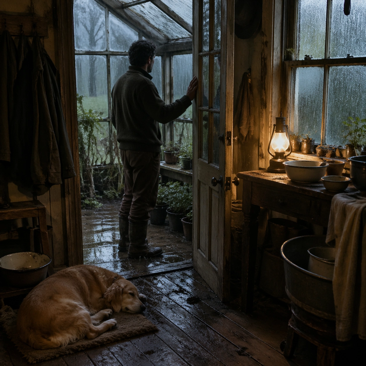
Example generated from “Livestream Room Promo Tile System — Support Four”
GPT Image 2en

Scene: Create a square standalone support image for Livestream Room Promo Tile System. Build a fourth support-surface study with a clear focal hierarchy and a finished professional surface. Use a polished modular board or campaign surface with clean spacing, premium game-UI finish, and clear focal hierarchy. The frame should feel self-contained and polished, with enough structure to explain the system even without the reference series, yet still obviously belonging to the same theme and production world. Subject: Show a coherent original game-art system built for premium production and marketing surfaces in a way that emphasizes the intended support surface. Keep the same system logic stable across screenshots, cards, banners, and overview boards. Even though this image is independent, the viewer should still recognize the same universe, same commercial logic, and same production intent as the core package. Important details: Lock framing, icon grammar, palette blocking, and surface hierarchy so the kit feels production-ready and consistent. Preserve the broader theme language through color, framing, material choices, and modular composition. Use clean panel rhythm, premium asset presentation, and believable detail density. The image should work equally well as a gallery study, research reference, and mock production deliverable. Use case: Livestream Room Promo Tile System single study 8/9, exploring support four as a support surface. Constraints: No readable text, no watermark, no logos, preserve exact 1:1 aspect ratio, no unrelated objects, no broken visual hierarchy, no visual noise that obscures the main surface, no accidental brand resemblance.
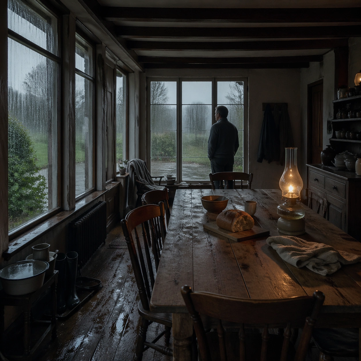
Example generated from “Livestream Room Promo Tile System — Support Five”
GPT Image 2en

Scene: Create a square standalone support image for Livestream Room Promo Tile System. Build a fifth support-surface study with a clear focal hierarchy and a finished professional surface. Use a polished modular board or campaign surface with clean spacing, premium game-UI finish, and clear focal hierarchy. The frame should feel self-contained and polished, with enough structure to explain the system even without the reference series, yet still obviously belonging to the same theme and production world. Subject: Show a coherent original game-art system built for premium production and marketing surfaces in a way that emphasizes the intended support surface. Keep the same system logic stable across screenshots, cards, banners, and overview boards. Even though this image is independent, the viewer should still recognize the same universe, same commercial logic, and same production intent as the core package. Important details: Lock framing, icon grammar, palette blocking, and surface hierarchy so the kit feels production-ready and consistent. Preserve the broader theme language through color, framing, material choices, and modular composition. Use clean panel rhythm, premium asset presentation, and believable detail density. The image should work equally well as a gallery study, research reference, and mock production deliverable. Use case: Livestream Room Promo Tile System single study 9/9, exploring support five as a support surface. Constraints: No readable text, no watermark, no logos, preserve exact 1:1 aspect ratio, no unrelated objects, no broken visual hierarchy, no visual noise that obscures the main surface, no accidental brand resemblance.
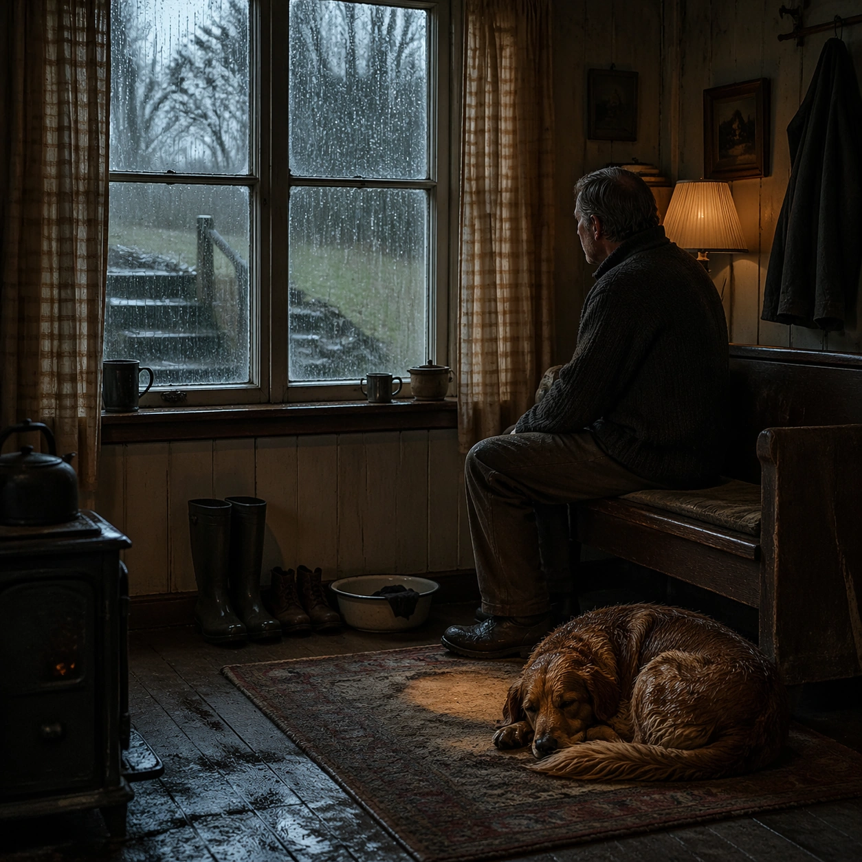
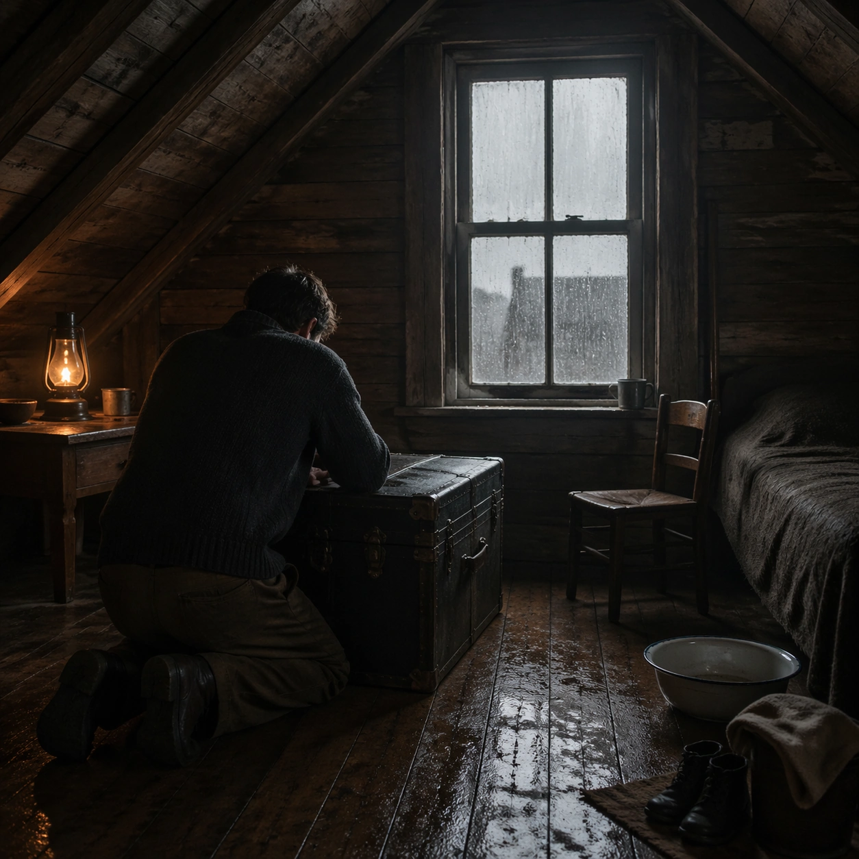
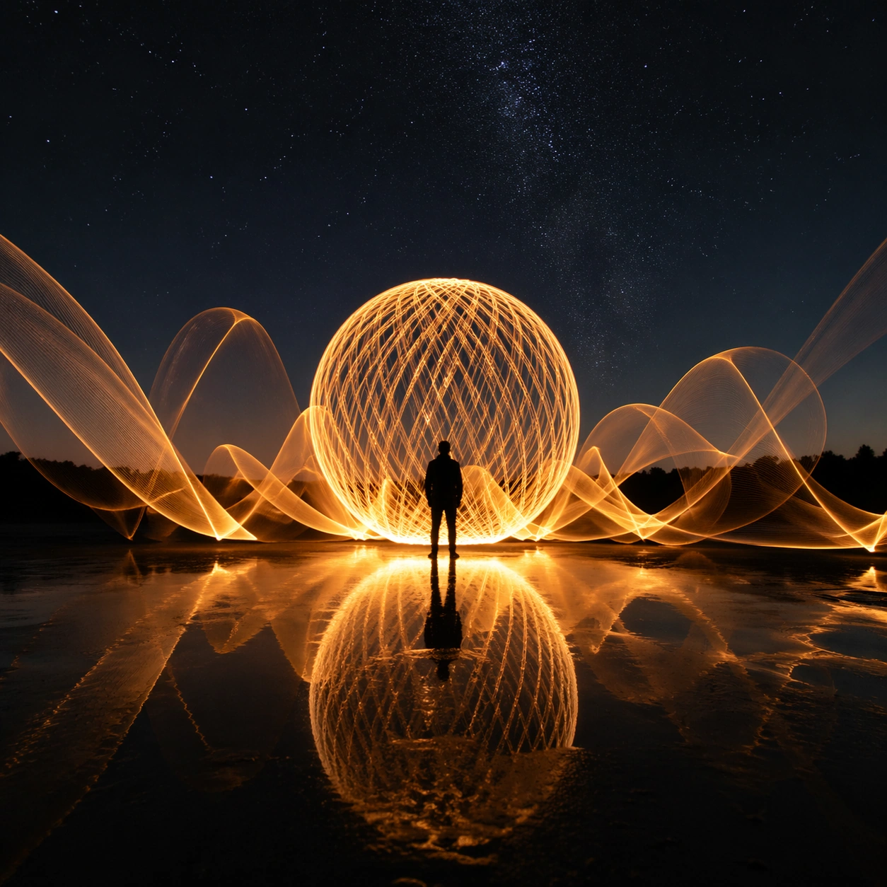
Example generated from “Long Exposure Light Painting — Macro Study”
GPT Image 2en

Scene: A square photographic image with intentional lens choice, coherent light, and a subject that feels observed rather than merely decorated. Build the frame around closer observation that reveals fine structure and optical behavior. Keep the lighting, camera distance, and spatial organization tuned for a high-signal research image rather than a casual snapshot. The image belongs to the Long-Exposure Light Painting theme and should feel immediately legible as a prompt atlas theme for long-exposure light painting, testing photorealism with gpt image 2.. Subject: Center the study on closer observation that reveals fine structure and optical behavior. Translate the theme into a concrete visual statement instead of an abstract mood board: the viewer should understand what kind of image this is, what is being tested, and why the composition is difficult. Use the slug idea of long exposure light painting as a literal guide for subject matter, materials, and staging. If helpful, borrow the broad visual cues suggested by silky, s-30min, but keep the result original and specific to this study. Important details: The realism should come from timing, optics, and material response: atmosphere, contrast, depth, motion, and tiny physical cues all need to agree. Preserve a disciplined square composition, clear focal hierarchy, and enough secondary information to make the image feel complete rather than underspecified. The image should look polished, novel, and exhibition-ready, with topic-specific credibility coming from the way surfaces, structure, and visual language reinforce Long-Exposure Light Painting. Avoid generic filler elements that do not serve the main concept. Use case: Long-Exposure Light Painting single study 2/8, testing photorealism through the macro study variation. Constraints: No readable text, no watermark, no logos, preserve exact 1:1 aspect ratio, no watermark, no cheap HDR excess, no unreadable signage, no fake stock-photo posing, no compositing seams, no arbitrary lens flare.

Example generated from “Long Exposure Light Painting — Side Light Study”
GPT Image 2en

Scene: A square photographic image with intentional lens choice, coherent light, and a subject that feels observed rather than merely decorated. Build the frame around a directional-light treatment that increases form and drama. Keep the lighting, camera distance, and spatial organization tuned for a high-signal research image rather than a casual snapshot. The image belongs to the Long-Exposure Light Painting theme and should feel immediately legible as a prompt atlas theme for long-exposure light painting, testing photorealism with gpt image 2.. Subject: Center the study on a directional-light treatment that increases form and drama. Translate the theme into a concrete visual statement instead of an abstract mood board: the viewer should understand what kind of image this is, what is being tested, and why the composition is difficult. Use the slug idea of long exposure light painting as a literal guide for subject matter, materials, and staging. If helpful, borrow the broad visual cues suggested by silky, s-30min, but keep the result original and specific to this study. Important details: The realism should come from timing, optics, and material response: atmosphere, contrast, depth, motion, and tiny physical cues all need to agree. Preserve a disciplined square composition, clear focal hierarchy, and enough secondary information to make the image feel complete rather than underspecified. The image should look polished, novel, and exhibition-ready, with topic-specific credibility coming from the way surfaces, structure, and visual language reinforce Long-Exposure Light Painting. Avoid generic filler elements that do not serve the main concept. Use case: Long-Exposure Light Painting single study 3/8, testing photorealism through the side light study variation. Constraints: No readable text, no watermark, no logos, preserve exact 1:1 aspect ratio, no watermark, no cheap HDR excess, no unreadable signage, no fake stock-photo posing, no compositing seams, no arbitrary lens flare.

Example generated from “Long Exposure Light Painting — Motion Moment”
GPT Image 2en

Scene: A square photographic image with intentional lens choice, coherent light, and a subject that feels observed rather than merely decorated. Build the frame around a time-sensitive or kinetic phenomenon captured at the right instant. Keep the lighting, camera distance, and spatial organization tuned for a high-signal research image rather than a casual snapshot. The image belongs to the Long-Exposure Light Painting theme and should feel immediately legible as a prompt atlas theme for long-exposure light painting, testing photorealism with gpt image 2.. Subject: Center the study on a time-sensitive or kinetic phenomenon captured at the right instant. Translate the theme into a concrete visual statement instead of an abstract mood board: the viewer should understand what kind of image this is, what is being tested, and why the composition is difficult. Use the slug idea of long exposure light painting as a literal guide for subject matter, materials, and staging. If helpful, borrow the broad visual cues suggested by silky, s-30min, but keep the result original and specific to this study. Important details: The realism should come from timing, optics, and material response: atmosphere, contrast, depth, motion, and tiny physical cues all need to agree. Preserve a disciplined square composition, clear focal hierarchy, and enough secondary information to make the image feel complete rather than underspecified. The image should look polished, novel, and exhibition-ready, with topic-specific credibility coming from the way surfaces, structure, and visual language reinforce Long-Exposure Light Painting. Avoid generic filler elements that do not serve the main concept. Use case: Long-Exposure Light Painting single study 4/8, testing photorealism through the motion moment variation. Constraints: No readable text, no watermark, no logos, preserve exact 1:1 aspect ratio, no watermark, no cheap HDR excess, no unreadable signage, no fake stock-photo posing, no compositing seams, no arbitrary lens flare.

Example generated from “Long Exposure Light Painting — Low-Light Atlas”
GPT Image 2en

Scene: A square photographic image with intentional lens choice, coherent light, and a subject that feels observed rather than merely decorated. Build the frame around a dusk, night, or low-light frame with disciplined exposure. Keep the lighting, camera distance, and spatial organization tuned for a high-signal research image rather than a casual snapshot. The image belongs to the Long-Exposure Light Painting theme and should feel immediately legible as a prompt atlas theme for long-exposure light painting, testing photorealism with gpt image 2.. Subject: Center the study on a dusk, night, or low-light frame with disciplined exposure. Translate the theme into a concrete visual statement instead of an abstract mood board: the viewer should understand what kind of image this is, what is being tested, and why the composition is difficult. Use the slug idea of long exposure light painting as a literal guide for subject matter, materials, and staging. If helpful, borrow the broad visual cues suggested by silky, s-30min, but keep the result original and specific to this study. Important details: The realism should come from timing, optics, and material response: atmosphere, contrast, depth, motion, and tiny physical cues all need to agree. Preserve a disciplined square composition, clear focal hierarchy, and enough secondary information to make the image feel complete rather than underspecified. The image should look polished, novel, and exhibition-ready, with topic-specific credibility coming from the way surfaces, structure, and visual language reinforce Long-Exposure Light Painting. Avoid generic filler elements that do not serve the main concept. Use case: Long-Exposure Light Painting single study 5/8, testing photorealism through the low-light atlas variation. Constraints: No readable text, no watermark, no logos, preserve exact 1:1 aspect ratio, no watermark, no cheap HDR excess, no unreadable signage, no fake stock-photo posing, no compositing seams, no arbitrary lens flare.

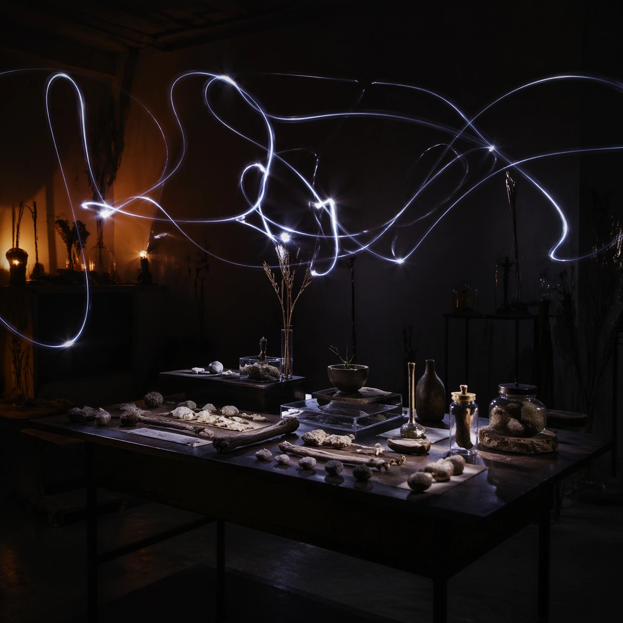
Example generated from “Long Exposure Light Painting — Specimen Table”
GPT Image 2en

Scene: A square photographic image with intentional lens choice, coherent light, and a subject that feels observed rather than merely decorated. Build the frame around a carefully arranged or comparative frame that still feels photographic. Keep the lighting, camera distance, and spatial organization tuned for a high-signal research image rather than a casual snapshot. The image belongs to the Long-Exposure Light Painting theme and should feel immediately legible as a prompt atlas theme for long-exposure light painting, testing photorealism with gpt image 2.. Subject: Center the study on a carefully arranged or comparative frame that still feels photographic. Translate the theme into a concrete visual statement instead of an abstract mood board: the viewer should understand what kind of image this is, what is being tested, and why the composition is difficult. Use the slug idea of long exposure light painting as a literal guide for subject matter, materials, and staging. If helpful, borrow the broad visual cues suggested by silky, s-30min, but keep the result original and specific to this study. Important details: The realism should come from timing, optics, and material response: atmosphere, contrast, depth, motion, and tiny physical cues all need to agree. Preserve a disciplined square composition, clear focal hierarchy, and enough secondary information to make the image feel complete rather than underspecified. The image should look polished, novel, and exhibition-ready, with topic-specific credibility coming from the way surfaces, structure, and visual language reinforce Long-Exposure Light Painting. Avoid generic filler elements that do not serve the main concept. Use case: Long-Exposure Light Painting single study 6/8, testing photorealism through the specimen table variation. Constraints: No readable text, no watermark, no logos, preserve exact 1:1 aspect ratio, no watermark, no cheap HDR excess, no unreadable signage, no fake stock-photo posing, no compositing seams, no arbitrary lens flare.

Example generated from “Long Exposure Light Painting — Atmospheric View”
GPT Image 2en

Scene: A square photographic image with intentional lens choice, coherent light, and a subject that feels observed rather than merely decorated. Build the frame around weather, haze, or volumetric light used to deepen realism. Keep the lighting, camera distance, and spatial organization tuned for a high-signal research image rather than a casual snapshot. The image belongs to the Long-Exposure Light Painting theme and should feel immediately legible as a prompt atlas theme for long-exposure light painting, testing photorealism with gpt image 2.. Subject: Center the study on weather, haze, or volumetric light used to deepen realism. Translate the theme into a concrete visual statement instead of an abstract mood board: the viewer should understand what kind of image this is, what is being tested, and why the composition is difficult. Use the slug idea of long exposure light painting as a literal guide for subject matter, materials, and staging. If helpful, borrow the broad visual cues suggested by silky, s-30min, but keep the result original and specific to this study. Important details: The realism should come from timing, optics, and material response: atmosphere, contrast, depth, motion, and tiny physical cues all need to agree. Preserve a disciplined square composition, clear focal hierarchy, and enough secondary information to make the image feel complete rather than underspecified. The image should look polished, novel, and exhibition-ready, with topic-specific credibility coming from the way surfaces, structure, and visual language reinforce Long-Exposure Light Painting. Avoid generic filler elements that do not serve the main concept. Use case: Long-Exposure Light Painting single study 7/8, testing photorealism through the atmospheric view variation. Constraints: No readable text, no watermark, no logos, preserve exact 1:1 aspect ratio, no watermark, no cheap HDR excess, no unreadable signage, no fake stock-photo posing, no compositing seams, no arbitrary lens flare.

Example generated from “Long Exposure Light Painting — Signature Frame”
GPT Image 2en

Scene: A square photographic image with intentional lens choice, coherent light, and a subject that feels observed rather than merely decorated. Build the frame around the most memorable final image for the topic. Keep the lighting, camera distance, and spatial organization tuned for a high-signal research image rather than a casual snapshot. The image belongs to the Long-Exposure Light Painting theme and should feel immediately legible as a prompt atlas theme for long-exposure light painting, testing photorealism with gpt image 2.. Subject: Center the study on the most memorable final image for the topic. Translate the theme into a concrete visual statement instead of an abstract mood board: the viewer should understand what kind of image this is, what is being tested, and why the composition is difficult. Use the slug idea of long exposure light painting as a literal guide for subject matter, materials, and staging. If helpful, borrow the broad visual cues suggested by silky, s-30min, but keep the result original and specific to this study. Important details: The realism should come from timing, optics, and material response: atmosphere, contrast, depth, motion, and tiny physical cues all need to agree. Preserve a disciplined square composition, clear focal hierarchy, and enough secondary information to make the image feel complete rather than underspecified. The image should look polished, novel, and exhibition-ready, with topic-specific credibility coming from the way surfaces, structure, and visual language reinforce Long-Exposure Light Painting. Avoid generic filler elements that do not serve the main concept. Use case: Long-Exposure Light Painting single study 8/8, testing photorealism through the signature frame variation. Constraints: No readable text, no watermark, no logos, preserve exact 1:1 aspect ratio, no watermark, no cheap HDR excess, no unreadable signage, no fake stock-photo posing, no compositing seams, no arbitrary lens flare.

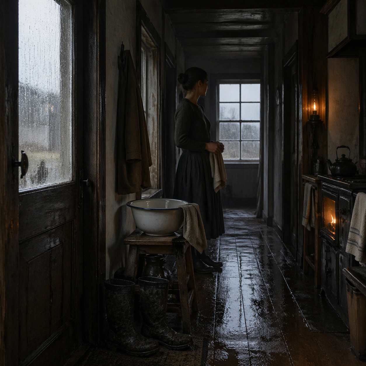
Example generated from “Long Gaze Rain Interior — Hallway Basin”
GPT Image 2en

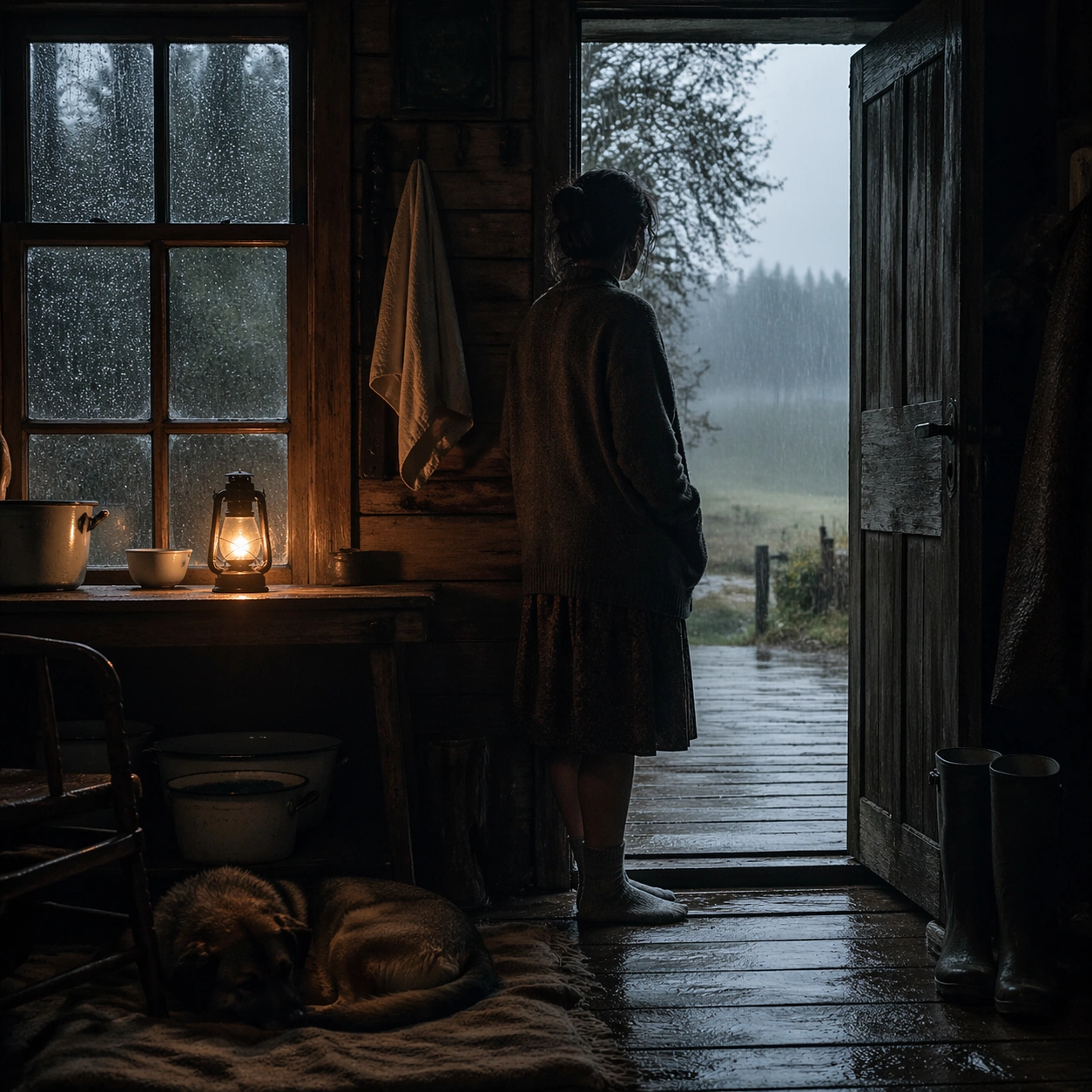
Scene: A square interior image held in patient stillness, with rain sliding down window glass, damp wood, muted blue-gray daylight, and one warm pool of lamplight or stove light inside. The room should feel inhabited but quiet, with time stretched by weather and silence rather than by spectacle. Use a long dim hallway with a wash basin on a stool, wet boots near the door, and gray rain visible through a distant window. Subject: Use one seated or standing figure, sometimes accompanied by a sleeping animal or simple domestic object, positioned so the window and the room share emotional weight. The human presence should be understated, contemplative, and integrated into the architecture. A figure stands halfway down the hall holding a towel, paused in the middle of an ordinary task. Important details: The grammar depends on slow observation: wet glass, old timber, worn textiles, steam, puddled boots, enamel basins, and practical light. Preserve physical realism and spiritual quiet without turning the scene into fantasy, melodrama, or rustic cliche. The perspective should be calm and unforced, with the basin, door, and window quietly balancing each other. Use case: Long Gaze Through Rain Interior single study 2/9. Constraints: No readable text, no watermark, no logos, preserve exact 1:1 aspect ratio, no readable text, no obvious luxury styling, no dramatic storm destruction, no modern electronics dominating the room, no theatrical color grading, no broken anatomy, no low-detail background, no accidental text fragments.

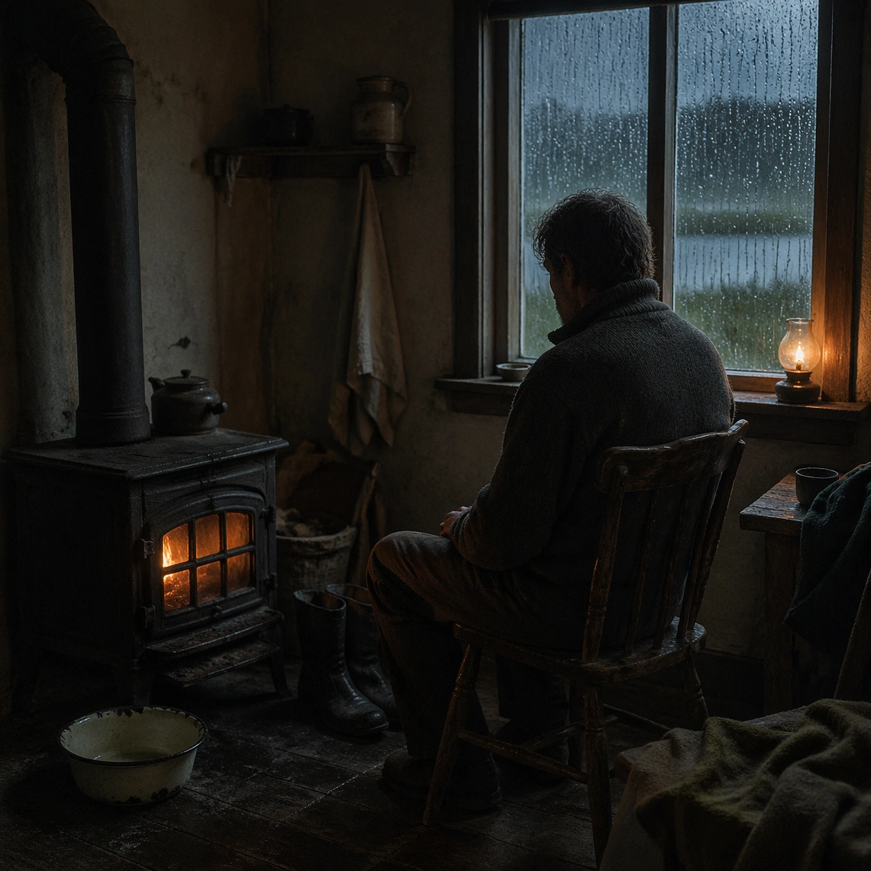
Example generated from “Long Gaze Rain Interior — Stove Room Vigil”
GPT Image 2en

Scene: A square interior image held in patient stillness, with rain sliding down window glass, damp wood, muted blue-gray daylight, and one warm pool of lamplight or stove light inside. The room should feel inhabited but quiet, with time stretched by weather and silence rather than by spectacle. Place a cast-iron stove in a modest room where warm orange light competes with cool rain light from a nearby window. Subject: Use one seated or standing figure, sometimes accompanied by a sleeping animal or simple domestic object, positioned so the window and the room share emotional weight. The human presence should be understated, contemplative, and integrated into the architecture. A person sits beside the stove on a wooden chair with shoulders slightly forward, neither reading nor speaking. Important details: The grammar depends on slow observation: wet glass, old timber, worn textiles, steam, puddled boots, enamel basins, and practical light. Preserve physical realism and spiritual quiet without turning the scene into fantasy, melodrama, or rustic cliche. Let the glow remain humble, and keep the rain beyond the window softly insistent rather than dramatic. Use case: Long Gaze Through Rain Interior single study 3/9. Constraints: No readable text, no watermark, no logos, preserve exact 1:1 aspect ratio, no readable text, no obvious luxury styling, no dramatic storm destruction, no modern electronics dominating the room, no theatrical color grading, no broken anatomy, no low-detail background, no accidental text fragments.

Example generated from “Long Gaze Rain Interior — Library Chair”
GPT Image 2en

Scene: A square interior image held in patient stillness, with rain sliding down window glass, damp wood, muted blue-gray daylight, and one warm pool of lamplight or stove light inside. The room should feel inhabited but quiet, with time stretched by weather and silence rather than by spectacle. Use a small room lined with shelves, a lamp pool on the floor, and rain making vertical tracks down the window beyond the books. Subject: Use one seated or standing figure, sometimes accompanied by a sleeping animal or simple domestic object, positioned so the window and the room share emotional weight. The human presence should be understated, contemplative, and integrated into the architecture. A figure sits in a simple chair facing away from the shelves toward the rain, as if listening instead of reading. Important details: The grammar depends on slow observation: wet glass, old timber, worn textiles, steam, puddled boots, enamel basins, and practical light. Preserve physical realism and spiritual quiet without turning the scene into fantasy, melodrama, or rustic cliche. Books should feel used and ordinary, with the emotional focus staying on posture, weather, and room tone. Use case: Long Gaze Through Rain Interior single study 4/9. Constraints: No readable text, no watermark, no logos, preserve exact 1:1 aspect ratio, no readable text, no obvious luxury styling, no dramatic storm destruction, no modern electronics dominating the room, no theatrical color grading, no broken anatomy, no low-detail background, no accidental text fragments.

Example generated from “Long Gaze Rain Interior — Greenhouse Threshold”
GPT Image 2en

Scene: A square interior image held in patient stillness, with rain sliding down window glass, damp wood, muted blue-gray daylight, and one warm pool of lamplight or stove light inside. The room should feel inhabited but quiet, with time stretched by weather and silence rather than by spectacle. Show a damp threshold between house and greenhouse, with fogged panes, hanging coats, and wet soil tracked lightly across the floor. Subject: Use one seated or standing figure, sometimes accompanied by a sleeping animal or simple domestic object, positioned so the window and the room share emotional weight. The human presence should be understated, contemplative, and integrated into the architecture. A figure stands with one hand on the doorframe looking into the rainy greenhouse while a dog sleeps just inside the room. Important details: The grammar depends on slow observation: wet glass, old timber, worn textiles, steam, puddled boots, enamel basins, and practical light. Preserve physical realism and spiritual quiet without turning the scene into fantasy, melodrama, or rustic cliche. Balance plant humidity and domestic stillness so the threshold itself becomes the emotional subject. Use case: Long Gaze Through Rain Interior single study 5/9. Constraints: No readable text, no watermark, no logos, preserve exact 1:1 aspect ratio, no readable text, no obvious luxury styling, no dramatic storm destruction, no modern electronics dominating the room, no theatrical color grading, no broken anatomy, no low-detail background, no accidental text fragments.

Example generated from “Long Gaze Rain Interior — Empty Dining Room”
GPT Image 2en

Scene: A square interior image held in patient stillness, with rain sliding down window glass, damp wood, muted blue-gray daylight, and one warm pool of lamplight or stove light inside. The room should feel inhabited but quiet, with time stretched by weather and silence rather than by spectacle. Stage a dining room with one lamp left on, an unfinished loaf of bread, and rain blurring the garden beyond tall windows. Subject: Use one seated or standing figure, sometimes accompanied by a sleeping animal or simple domestic object, positioned so the window and the room share emotional weight. The human presence should be understated, contemplative, and integrated into the architecture. A solitary figure stands at the far end of the room with hands in pockets, small inside the long table and chairs. Important details: The grammar depends on slow observation: wet glass, old timber, worn textiles, steam, puddled boots, enamel basins, and practical light. Preserve physical realism and spiritual quiet without turning the scene into fantasy, melodrama, or rustic cliche. The composition should make empty furniture feel emotionally active without becoming theatrical or gothic. Use case: Long Gaze Through Rain Interior single study 6/9. Constraints: No readable text, no watermark, no logos, preserve exact 1:1 aspect ratio, no readable text, no obvious luxury styling, no dramatic storm destruction, no modern electronics dominating the room, no theatrical color grading, no broken anatomy, no low-detail background, no accidental text fragments.

Example generated from “Long Gaze Rain Interior — Dog By Lamp”
GPT Image 2en

Scene: A square interior image held in patient stillness, with rain sliding down window glass, damp wood, muted blue-gray daylight, and one warm pool of lamplight or stove light inside. The room should feel inhabited but quiet, with time stretched by weather and silence rather than by spectacle. Use a modest sitting room with a shaded lamp, damp curtains, and rainwater shining faintly on the outside steps seen through the window. Subject: Use one seated or standing figure, sometimes accompanied by a sleeping animal or simple domestic object, positioned so the window and the room share emotional weight. The human presence should be understated, contemplative, and integrated into the architecture. A tired figure sits on a bench while a wet dog sleeps curled on the rug inside the lamp pool. Important details: The grammar depends on slow observation: wet glass, old timber, worn textiles, steam, puddled boots, enamel basins, and practical light. Preserve physical realism and spiritual quiet without turning the scene into fantasy, melodrama, or rustic cliche. The warmth should feel earned and fragile, not cozy in a decorative sense, with fabric and fur textures quietly observed. Use case: Long Gaze Through Rain Interior single study 7/9. Constraints: No readable text, no watermark, no logos, preserve exact 1:1 aspect ratio, no readable text, no obvious luxury styling, no dramatic storm destruction, no modern electronics dominating the room, no theatrical color grading, no broken anatomy, no low-detail background, no accidental text fragments.

Example generated from “Long Gaze Rain Interior — Attic Trunk”
GPT Image 2en

Scene: A square interior image held in patient stillness, with rain sliding down window glass, damp wood, muted blue-gray daylight, and one warm pool of lamplight or stove light inside. The room should feel inhabited but quiet, with time stretched by weather and silence rather than by spectacle. Set the scene in an attic room with sloped ceiling, one trunk, and a narrow rain-streaked window carrying pale gray light over rough boards. Subject: Use one seated or standing figure, sometimes accompanied by a sleeping animal or simple domestic object, positioned so the window and the room share emotional weight. The human presence should be understated, contemplative, and integrated into the architecture. A figure kneels beside the trunk without opening it, absorbed in memory or hesitation rather than action. Important details: The grammar depends on slow observation: wet glass, old timber, worn textiles, steam, puddled boots, enamel basins, and practical light. Preserve physical realism and spiritual quiet without turning the scene into fantasy, melodrama, or rustic cliche. Keep the room spare and tactile, with the tension held inside posture, weather, and withheld motion. Use case: Long Gaze Through Rain Interior single study 8/9. Constraints: No readable text, no watermark, no logos, preserve exact 1:1 aspect ratio, no readable text, no obvious luxury styling, no dramatic storm destruction, no modern electronics dominating the room, no theatrical color grading, no broken anatomy, no low-detail background, no accidental text fragments.

Example generated from “Long Gaze Rain Interior — Doorway To Rain”
GPT Image 2en

Scene: A square interior image held in patient stillness, with rain sliding down window glass, damp wood, muted blue-gray daylight, and one warm pool of lamplight or stove light inside. The room should feel inhabited but quiet, with time stretched by weather and silence rather than by spectacle. End with an open doorway framing silver rain outside, while the interior remains dim except for one weak lamp and wet boards near the threshold. Subject: Use one seated or standing figure, sometimes accompanied by a sleeping animal or simple domestic object, positioned so the window and the room share emotional weight. The human presence should be understated, contemplative, and integrated into the architecture. A figure stands just inside the door in stocking feet, looking out as if measuring whether to step into the rain. Important details: The grammar depends on slow observation: wet glass, old timber, worn textiles, steam, puddled boots, enamel basins, and practical light. Preserve physical realism and spiritual quiet without turning the scene into fantasy, melodrama, or rustic cliche. The doorway should operate as a spiritual border between weather and shelter, with no dramatic gesture required. Use case: Long Gaze Through Rain Interior single study 9/9. Constraints: No readable text, no watermark, no logos, preserve exact 1:1 aspect ratio, no readable text, no obvious luxury styling, no dramatic storm destruction, no modern electronics dominating the room, no theatrical color grading, no broken anatomy, no low-detail background, no accidental text fragments.

Example generated from “Loot Consumable Icon Family — Healing Kit Hero”
GPT Image 2en

Scene: A square production-ready image designed for a game-art review wall and a commercial gallery at the same time. Frame a premium collectible render of a healing kit with clean studio light and color-coded medical surfaces with disciplined lighting, clean edge separation, and enough surrounding context to prove how the asset would behave in a real product surface. The camera, crop, and tonal balance should feel intentional rather than generic, with high readability at first glance and convincing material response under closer inspection. Subject: Center the study on a premium collectible render of a healing kit with clean studio light and color-coded medical surfaces. Translate the topic into a concrete, shippable visual statement instead of a loose mood board. Build layered object relationships, believable surface finish, and strong silhouette grouping so the image reads immediately as part of Loot Consumable Icon Family. The subject should feel made for a live game pipeline: useful in store, UI, campaign, or art-review contexts, with visual hierarchy strong enough to survive aggressive cropping. Important details: the object should feel instantly readable at icon size through bold shape, latch logic, and controlled glow accents. Keep every supporting element subordinate to the main read, and make category separation obvious through form, color zoning, depth, and material logic rather than words. Where panels, cards, badges, or interface blocks appear, they must look professionally structured but remain unreadable. The visual language should feel premium, original, and coherent across this package, with no filler clutter and no accidental resemblance to a specific shipped game IP. Use case: Loot Consumable Icon Family single study 1/9, focused on healing kit hero. Constraints: No readable text, no watermark, no logos, preserve exact 1:1 aspect ratio, no real medical logos, no gore, no broken hierarchy, no generic stock-photo staging, no accidental UI gibberish.

Example generated from “Loot Consumable Icon Family — Ammo Box Study”
GPT Image 2en

Scene: A square production-ready image designed for a game-art review wall and a commercial gallery at the same time. Frame a compact ammo box icon study with reinforced corners, closure mechanics, and strong silhouette blocking with disciplined lighting, clean edge separation, and enough surrounding context to prove how the asset would behave in a real product surface. The camera, crop, and tonal balance should feel intentional rather than generic, with high readability at first glance and convincing material response under closer inspection. Subject: Center the study on a compact ammo box icon study with reinforced corners, closure mechanics, and strong silhouette blocking. Translate the topic into a concrete, shippable visual statement instead of a loose mood board. Build layered object relationships, believable surface finish, and strong silhouette grouping so the image reads immediately as part of Loot Consumable Icon Family. The subject should feel made for a live game pipeline: useful in store, UI, campaign, or art-review contexts, with visual hierarchy strong enough to survive aggressive cropping. Important details: the form must remain unmistakable when shrunk while still rewarding close inspection with believable materials. Keep every supporting element subordinate to the main read, and make category separation obvious through form, color zoning, depth, and material logic rather than words. Where panels, cards, badges, or interface blocks appear, they must look professionally structured but remain unreadable. The visual language should feel premium, original, and coherent across this package, with no filler clutter and no accidental resemblance to a specific shipped game IP. Use case: Loot Consumable Icon Family single study 2/9, focused on ammo box study. Constraints: No readable text, no watermark, no logos, preserve exact 1:1 aspect ratio, no bullet brand marks, no war slogans, no broken hierarchy, no generic stock-photo staging, no accidental UI gibberish.

Example generated from “Loot Consumable Icon Family — Artifact Shard Core”
GPT Image 2en

Scene: A square production-ready image designed for a game-art review wall and a commercial gallery at the same time. Frame a luminous artifact shard icon rendered like a rare loot pickup with layered internal glow with disciplined lighting, clean edge separation, and enough surrounding context to prove how the asset would behave in a real product surface. The camera, crop, and tonal balance should feel intentional rather than generic, with high readability at first glance and convincing material response under closer inspection. Subject: Center the study on a luminous artifact shard icon rendered like a rare loot pickup with layered internal glow. Translate the topic into a concrete, shippable visual statement instead of a loose mood board. Build layered object relationships, believable surface finish, and strong silhouette grouping so the image reads immediately as part of Loot Consumable Icon Family. The subject should feel made for a live game pipeline: useful in store, UI, campaign, or art-review contexts, with visual hierarchy strong enough to survive aggressive cropping. Important details: the shard should read as magical or advanced without becoming an unreadable light blob. Keep every supporting element subordinate to the main read, and make category separation obvious through form, color zoning, depth, and material logic rather than words. Where panels, cards, badges, or interface blocks appear, they must look professionally structured but remain unreadable. The visual language should feel premium, original, and coherent across this package, with no filler clutter and no accidental resemblance to a specific shipped game IP. Use case: Loot Consumable Icon Family single study 3/9, focused on artifact shard core. Constraints: No readable text, no watermark, no logos, preserve exact 1:1 aspect ratio, no runic text, no logo crest, no broken hierarchy, no generic stock-photo staging, no accidental UI gibberish.

Example generated from “Loot Consumable Icon Family — Keycard Access Badge”
GPT Image 2en

Scene: A square production-ready image designed for a game-art review wall and a commercial gallery at the same time. Frame a keycard or access badge icon built around clean geometry, cut corners, and scarcity cues with disciplined lighting, clean edge separation, and enough surrounding context to prove how the asset would behave in a real product surface. The camera, crop, and tonal balance should feel intentional rather than generic, with high readability at first glance and convincing material response under closer inspection. Subject: Center the study on a keycard or access badge icon built around clean geometry, cut corners, and scarcity cues. Translate the topic into a concrete, shippable visual statement instead of a loose mood board. Build layered object relationships, believable surface finish, and strong silhouette grouping so the image reads immediately as part of Loot Consumable Icon Family. The subject should feel made for a live game pipeline: useful in store, UI, campaign, or art-review contexts, with visual hierarchy strong enough to survive aggressive cropping. Important details: make the item readable through color zoning and mechanical purpose rather than text labels. Keep every supporting element subordinate to the main read, and make category separation obvious through form, color zoning, depth, and material logic rather than words. Where panels, cards, badges, or interface blocks appear, they must look professionally structured but remain unreadable. The visual language should feel premium, original, and coherent across this package, with no filler clutter and no accidental resemblance to a specific shipped game IP. Use case: Loot Consumable Icon Family single study 4/9, focused on keycard access badge. Constraints: No readable text, no watermark, no logos, preserve exact 1:1 aspect ratio, no readable numbers, no corporate marks, no broken hierarchy, no generic stock-photo staging, no accidental UI gibberish.

Example generated from “Loot Consumable Icon Family — Currency Token Stack”
GPT Image 2en

Scene: A square production-ready image designed for a game-art review wall and a commercial gallery at the same time. Frame a stack of premium currency tokens or chips with strong edge rhythm and collectible shine with disciplined lighting, clean edge separation, and enough surrounding context to prove how the asset would behave in a real product surface. The camera, crop, and tonal balance should feel intentional rather than generic, with high readability at first glance and convincing material response under closer inspection. Subject: Center the study on a stack of premium currency tokens or chips with strong edge rhythm and collectible shine. Translate the topic into a concrete, shippable visual statement instead of a loose mood board. Build layered object relationships, believable surface finish, and strong silhouette grouping so the image reads immediately as part of Loot Consumable Icon Family. The subject should feel made for a live game pipeline: useful in store, UI, campaign, or art-review contexts, with visual hierarchy strong enough to survive aggressive cropping. Important details: the token family should feel valuable and easy to distinguish from all other loot types. Keep every supporting element subordinate to the main read, and make category separation obvious through form, color zoning, depth, and material logic rather than words. Where panels, cards, badges, or interface blocks appear, they must look professionally structured but remain unreadable. The visual language should feel premium, original, and coherent across this package, with no filler clutter and no accidental resemblance to a specific shipped game IP. Use case: Loot Consumable Icon Family single study 5/9, focused on currency token stack. Constraints: No readable text, no watermark, no logos, preserve exact 1:1 aspect ratio, no coin denominations, no logos, no broken hierarchy, no generic stock-photo staging, no accidental UI gibberish.

Example generated from “Loot Consumable Icon Family — Five Icon Overview Board”
GPT Image 2en

Scene: A square production-ready image designed for a game-art review wall and a commercial gallery at the same time. Frame an overview board arranging the loot icon family into one polished system sheet with disciplined lighting, clean edge separation, and enough surrounding context to prove how the asset would behave in a real product surface. The camera, crop, and tonal balance should feel intentional rather than generic, with high readability at first glance and convincing material response under closer inspection. Subject: Center the study on an overview board arranging the loot icon family into one polished system sheet. Translate the topic into a concrete, shippable visual statement instead of a loose mood board. Build layered object relationships, believable surface finish, and strong silhouette grouping so the image reads immediately as part of Loot Consumable Icon Family. The subject should feel made for a live game pipeline: useful in store, UI, campaign, or art-review contexts, with visual hierarchy strong enough to survive aggressive cropping. Important details: spacing, rarity cues, and category separation should make the family feel immediately usable by a UI team. Keep every supporting element subordinate to the main read, and make category separation obvious through form, color zoning, depth, and material logic rather than words. Where panels, cards, badges, or interface blocks appear, they must look professionally structured but remain unreadable. The visual language should feel premium, original, and coherent across this package, with no filler clutter and no accidental resemblance to a specific shipped game IP. Use case: Loot Consumable Icon Family single study 6/9, focused on five icon overview board. Constraints: No readable text, no watermark, no logos, preserve exact 1:1 aspect ratio, no readable labels, no placeholder text, no broken hierarchy, no generic stock-photo staging, no accidental UI gibberish.

Example generated from “Loot Consumable Icon Family — Rarity Color Pass”
GPT Image 2en

Scene: A square production-ready image designed for a game-art review wall and a commercial gallery at the same time. Frame a color-pass study showing how the icon family adapts across rarity bands without losing clarity with disciplined lighting, clean edge separation, and enough surrounding context to prove how the asset would behave in a real product surface. The camera, crop, and tonal balance should feel intentional rather than generic, with high readability at first glance and convincing material response under closer inspection. Subject: Center the study on a color-pass study showing how the icon family adapts across rarity bands without losing clarity. Translate the topic into a concrete, shippable visual statement instead of a loose mood board. Build layered object relationships, believable surface finish, and strong silhouette grouping so the image reads immediately as part of Loot Consumable Icon Family. The subject should feel made for a live game pipeline: useful in store, UI, campaign, or art-review contexts, with visual hierarchy strong enough to survive aggressive cropping. Important details: the upgrade logic should feel deliberate, consistent, and small-size friendly. Keep every supporting element subordinate to the main read, and make category separation obvious through form, color zoning, depth, and material logic rather than words. Where panels, cards, badges, or interface blocks appear, they must look professionally structured but remain unreadable. The visual language should feel premium, original, and coherent across this package, with no filler clutter and no accidental resemblance to a specific shipped game IP. Use case: Loot Consumable Icon Family single study 7/9, focused on rarity color pass. Constraints: No readable text, no watermark, no logos, preserve exact 1:1 aspect ratio, no swatch codes, no text legend, no broken hierarchy, no generic stock-photo staging, no accidental UI gibberish.