PROMPTS · EXPLORATION CRÉATIVE

Galerie de prompts

Explorez des prompts réels et leurs exemples générés. Trouvez l’inspiration pour votre prochaine mission créative et copiez le texte intégral gratuitement.

Exemples
10,974
Modèles
17
Sources
1277
10 974 exemples de prompts · page 27 sur 229
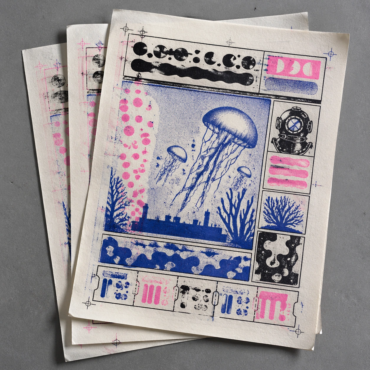
Example generated from “Risograph Misprint — Aquarium Flyer Misprint”
GPT Image 2en

Scene: A square photorealistic tabletop shot of a small stack of Risograph flyers, with the top flyer slightly askew and two duplicate sheets visible underneath. The paper is matte cream stock on a gray studio surface, lit by cool daylight. The top print uses fluorescent pink, cobalt blue, and black with rough halftone texture, ink pooling, and light paper curl at one corner. Subject: An imaginary aquarium-club flyer drawn in independent-comic style: jellyfish, bubble columns, a fish tank silhouette, coral shapes, and a simplified diver helmet arranged in a structured poster grid. The flyer has abstract blocks where a title and schedule would be, plus tiny pseudo-ticket shapes along the bottom edge. All lettering is non-readable graphic texture. Important details: Make the misprint specific and physical. The top flyer has a visible feed skew: the cobalt blue plate is rotated slightly clockwise, fluorescent pink bubbles are shifted left, and black keylines remain straight. The duplicate sheets underneath show partial offset transfer and faint ghost ink. Include registration crosses that do not align, coarse screen dots in the water, small ink voids in the jellyfish, and scuffed paper edges. Use case: Risograph Misprint single study 7/8, testing stacked flyer realism with skewed multi-plate registration and offset transfer. Constraints: No readable text, no watermark, no logos, preserve exact 1:1 aspect ratio, no real aquarium name, no ticket barcode, no full-color digital flyer, no glossy paper, no wet ink puddles, no human hands, no clean vector perfection.
Example generated from “Risograph Misprint — Street Cat Comic Page”
GPT Image 2en

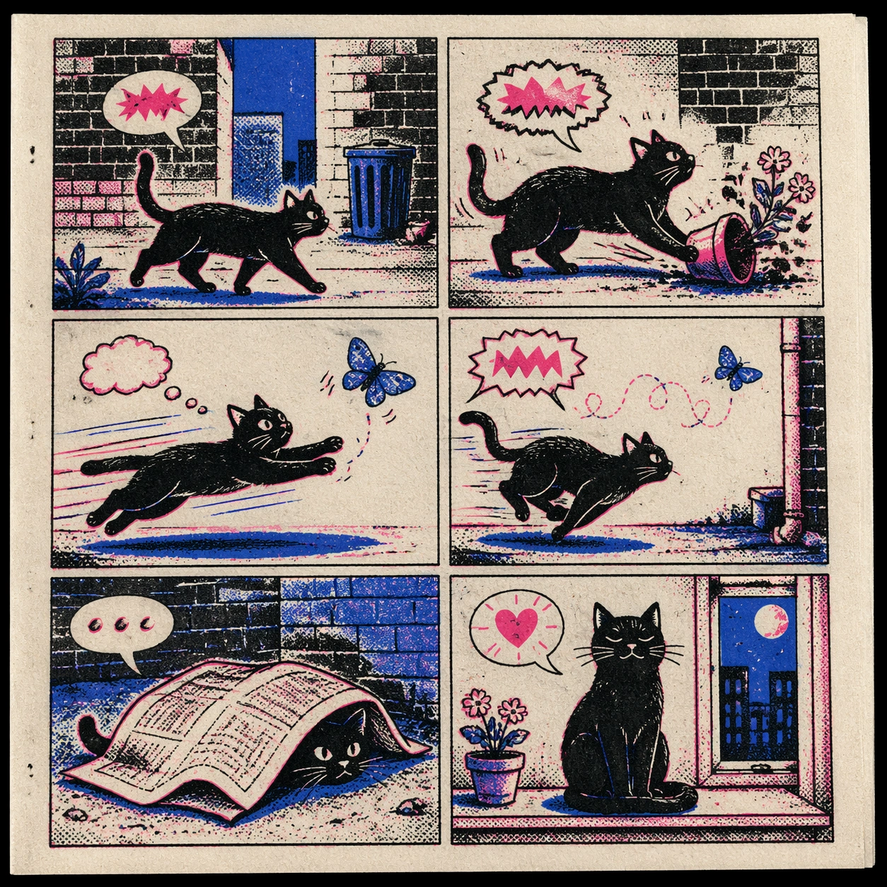
Scene: A square photorealistic scan-like view of a single Risograph comic page on cream paper, with a small black scanner shadow at one edge and visible paper grain. The page is laid out as a clean six-panel independent comic, but it remains one square gallery image. The palette is strict fluorescent pink, cobalt blue, black ink, and off-white paper, with coarse halftone and uneven ink pressure. Subject: A wordless street-cat comic page: a black cat crosses an alley, knocks over a flower pot, chases a blue moth, hides under a newspaper-like blank sheet, and finally sits proudly on a windowsill. The panels include gutters, expressive motion lines, small pseudo-speech bubbles, and unreadable sound-effect shapes. The cat, alley bricks, window, flower pot, and moth should remain clear despite the limited color system. Important details: The print flaws must be visible but not destroy readability. Shift fluorescent pink accent shapes 1-2mm from black linework, let cobalt blue shadow blocks drift slightly upward, and add black ink drag in dense brick hatching. Include halftone dots, paper fibers, small pinholes, speckled voids, and slightly uneven panel borders. The result should feel like a collectible 1980s underground comic misprint. Use case: Risograph Misprint single study 8/8, testing a structured six-panel comic page with physical Riso misregistration and ink artifacts. Constraints: No readable text, no watermark, no logos, preserve exact 1:1 aspect ratio, no real comic title, no brand marks, no full-color digital comic, no glossy paper, no human hands, no random broken panel order, no photorealistic cat photo.

Example generated from “Risograph Zine Handmade — Print Proof Flatlay”
GPT Image 2en

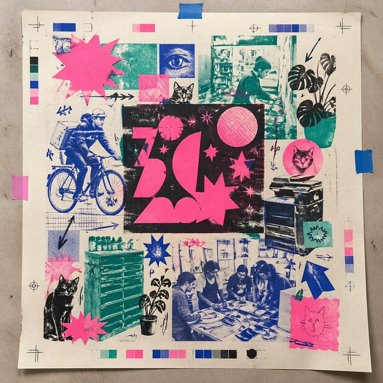
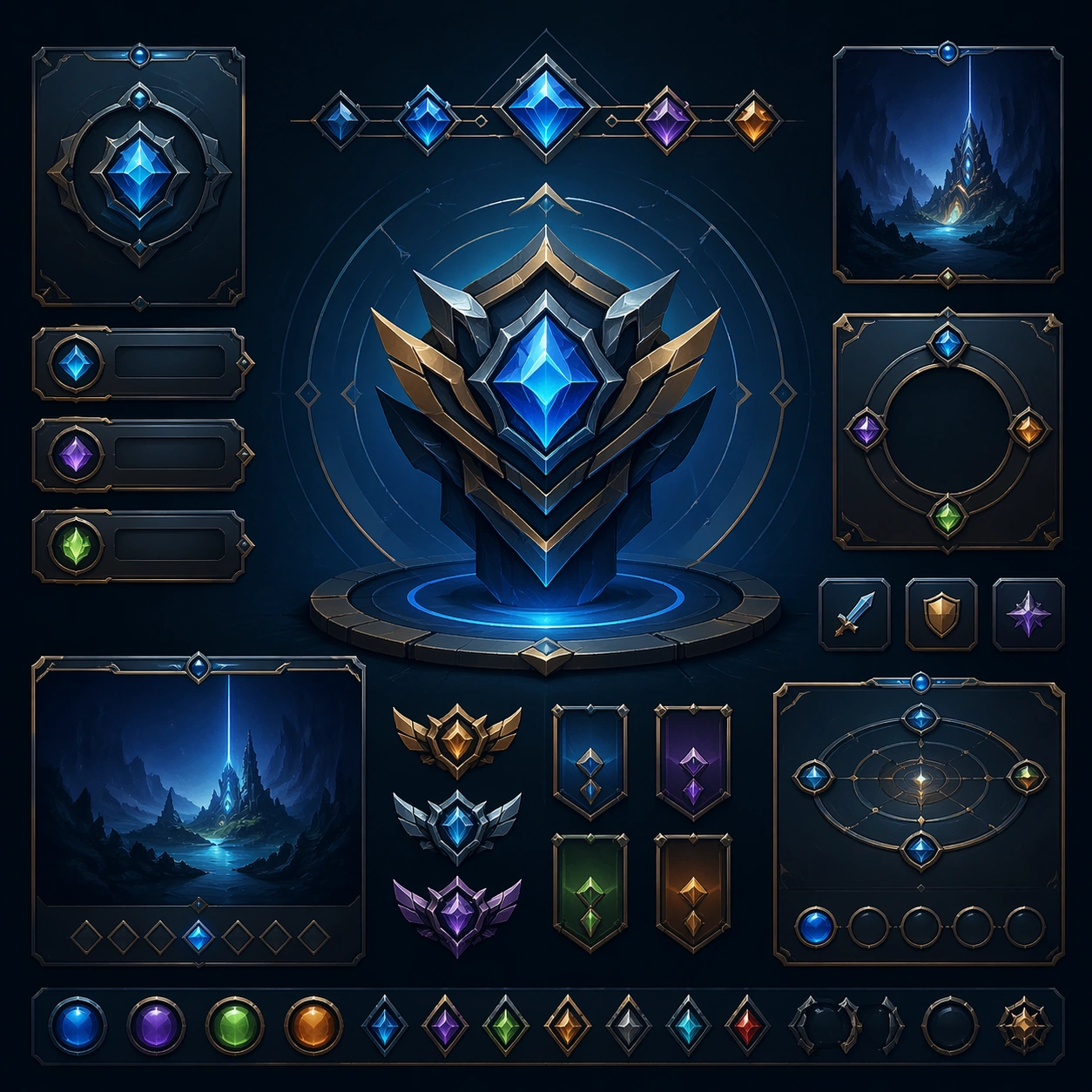
Scene: A square overhead tabletop photograph of a fresh poster proof on neutral worktable paper, lit by cool daylight, with crop marks, tape tabs, and slight paper bow visible around the sheet. The poster should express DIY risograph poster language with fluorescent layers, halftone dots, soy-ink soak, copier artifacts, and handmade zine rhythm, using fluorescent pink, teal, ultramarine, black, and fibrous cream paper and a tactile surface appropriate to the medium. Subject: Design the poster as a print-shop proof, preserving the same poster language while allowing production clues such as edge trims, registration targets, and process marks to frame the composition. Use club-flyer stars, bicycles, cats, plants, arrows, sticker bursts, notebook doodles, and photocopy shadows as the main visual ingredients, and organize them with xerox-like title blocks, stickers, and captions treated as energetic but non-readable print texture. For the contemporary-subject axis, thread in community workshops, late-night print studios, and messenger bikes folded into a zine-launch poster system. The poster must feel like an original design object rather than a reproduction of any known work. Important details: The image must still read as a finished poster concept, but it should carry believable print-process evidence and material tactility instead of gallery-wall perfection. Preserve plate drift, dot grain, bleed-through, paper curl, and independent-publisher roughness. Keep every letterform abstract and non-readable, as if it were a typographic texture rather than language. Make the style unmistakable through composition, palette, surface behavior, and symbolic compression. no full-CMYK smoothness, no perfect vector edges, no glossy magazine finish, no sterile product polish. Use case: Risograph Zine single study 2/9, testing production realism and process evidence. Constraints: No readable text, no watermark, no logos, preserve exact 1:1 aspect ratio, no copyrighted characters, no real brand marks, no QR codes, no interface chrome, no accidental gibberish lettering.
Example generated from “Risograph Zine Handmade — Transit Lightbox”
GPT Image 2en

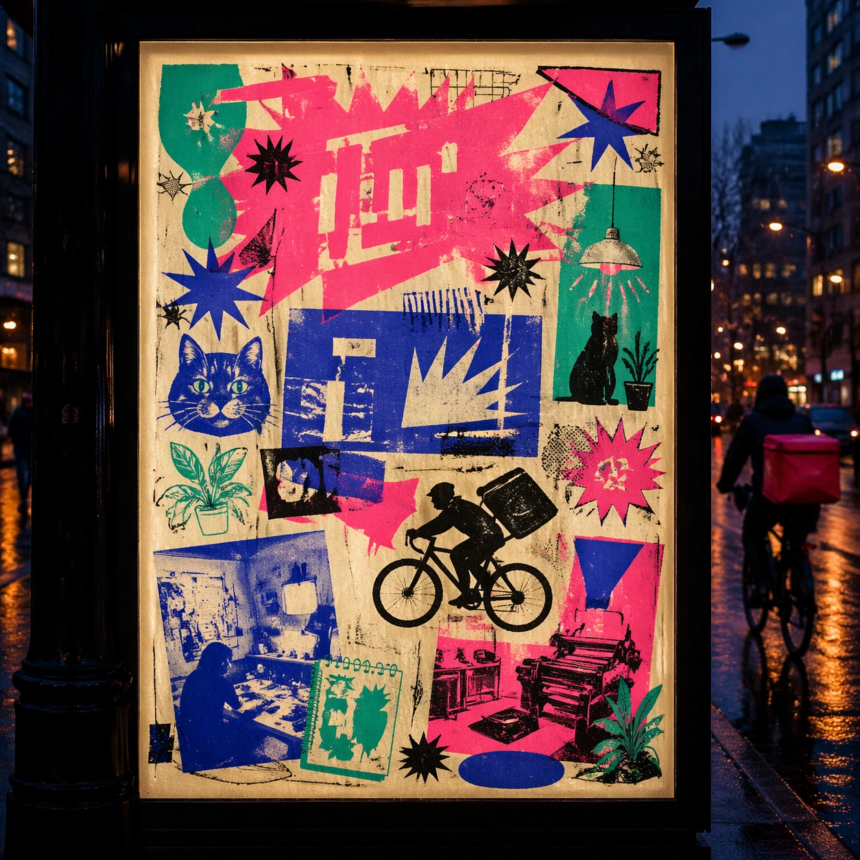
Scene: A square dusk street photograph of a backlit transit poster glowing inside glass, with faint rain reflections, soft city blur in the distance, and the poster remaining fully legible as a composition. The poster should express DIY risograph poster language with fluorescent layers, halftone dots, soy-ink soak, copier artifacts, and handmade zine rhythm, using fluorescent pink, teal, ultramarine, black, and fibrous cream paper and a tactile surface appropriate to the medium. Subject: Adapt the poster into a public-facing lightbox version that still honors the original style grammar while feeling bold enough to stop a passerby from several meters away. Use club-flyer stars, bicycles, cats, plants, arrows, sticker bursts, notebook doodles, and photocopy shadows as the main visual ingredients, and organize them with xerox-like title blocks, stickers, and captions treated as energetic but non-readable print texture. For the contemporary-subject axis, thread in community workshops, late-night print studios, and messenger bikes folded into a zine-launch poster system. The poster must feel like an original design object rather than a reproduction of any known work. Important details: Let the style survive the illumination test: color blocking, silhouette contrast, and abstract lettering should stay controlled under bright internal light and reflective glass. Preserve plate drift, dot grain, bleed-through, paper curl, and independent-publisher roughness. Keep every letterform abstract and non-readable, as if it were a typographic texture rather than language. Make the style unmistakable through composition, palette, surface behavior, and symbolic compression. no full-CMYK smoothness, no perfect vector edges, no glossy magazine finish, no sterile product polish. Use case: Risograph Zine single study 3/9, testing distance readability in public display. Constraints: No readable text, no watermark, no logos, preserve exact 1:1 aspect ratio, no copyrighted characters, no real brand marks, no QR codes, no interface chrome, no accidental gibberish lettering.

Example generated from “Risograph Zine Handmade — Wheatpaste Wall Layer”
GPT Image 2en

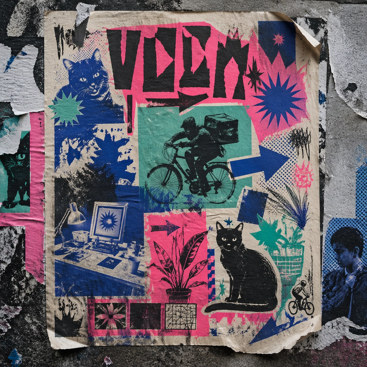
Scene: A square urban wall study with the poster pasted onto rough plaster among torn edges and older paper remnants, photographed in soft overcast light so texture, glue bubbles, and surface scars stay visible. The poster should express DIY risograph poster language with fluorescent layers, halftone dots, soy-ink soak, copier artifacts, and handmade zine rhythm, using fluorescent pink, teal, ultramarine, black, and fibrous cream paper and a tactile surface appropriate to the medium. Subject: Create a version that feels made for the street, with the poster carrying enough formal force to survive abrasion, layering, and imperfect placement without losing its visual identity. Use club-flyer stars, bicycles, cats, plants, arrows, sticker bursts, notebook doodles, and photocopy shadows as the main visual ingredients, and organize them with xerox-like title blocks, stickers, and captions treated as energetic but non-readable print texture. For the contemporary-subject axis, thread in community workshops, late-night print studios, and messenger bikes folded into a zine-launch poster system. The poster must feel like an original design object rather than a reproduction of any known work. Important details: Keep the main design intact but let the environment add grit: lifted corners, tiny tears, wrinkled paper, and older color fragments around the perimeter should amplify the style rather than dilute it. Preserve plate drift, dot grain, bleed-through, paper curl, and independent-publisher roughness. Keep every letterform abstract and non-readable, as if it were a typographic texture rather than language. Make the style unmistakable through composition, palette, surface behavior, and symbolic compression. no full-CMYK smoothness, no perfect vector edges, no glossy magazine finish, no sterile product polish. Use case: Risograph Zine single study 4/9, testing street-life durability and layered context. Constraints: No readable text, no watermark, no logos, preserve exact 1:1 aspect ratio, no copyrighted characters, no real brand marks, no QR codes, no interface chrome, no accidental gibberish lettering.

Example generated from “Risograph Zine Handmade — Folded Archive Copy”
GPT Image 2en

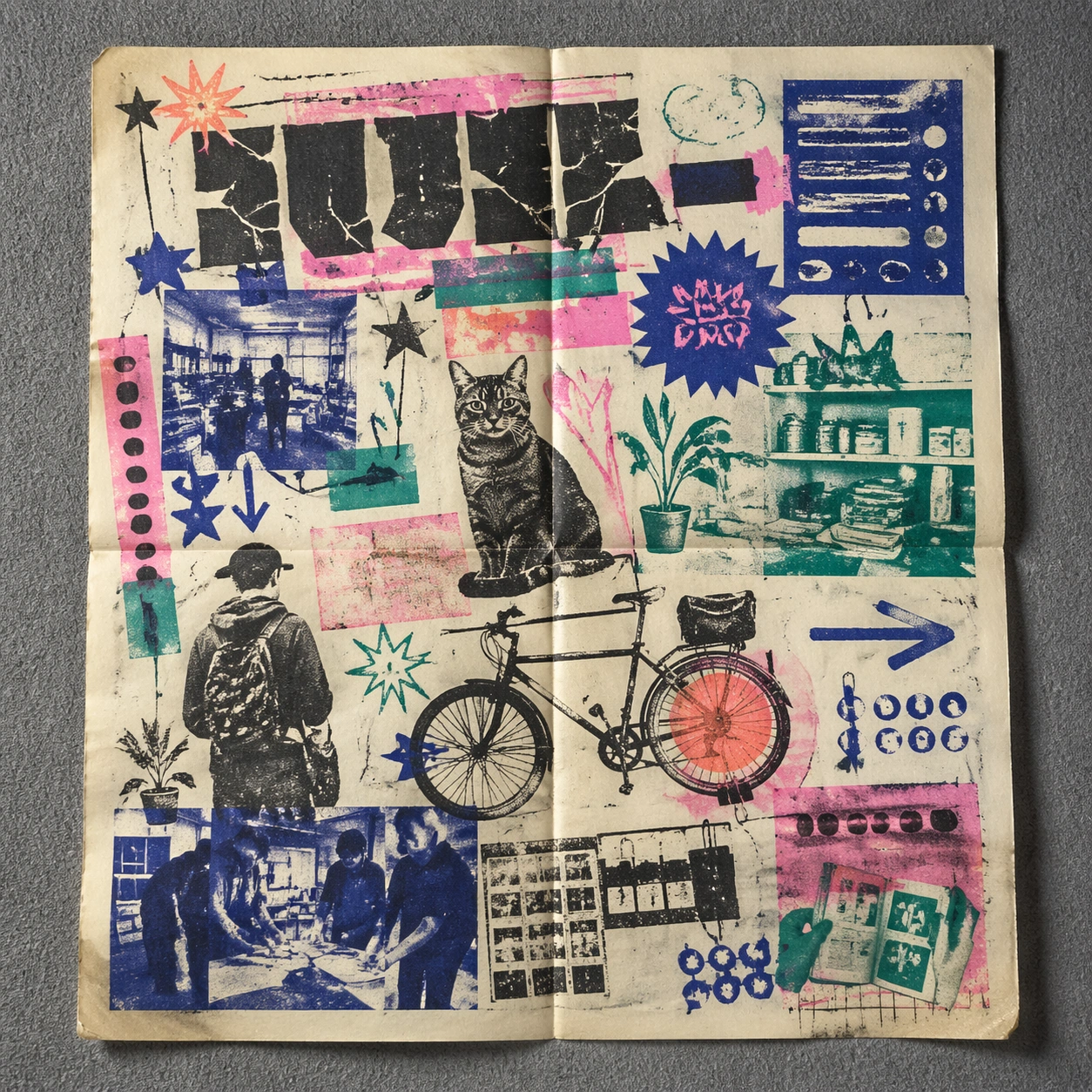
Scene: A square conservation-table view of a vintage poster laid on gray felt under raking light, with visible fold lines, softened corners, and subtle aging that still preserves the integrity of the image. The poster should express DIY risograph poster language with fluorescent layers, halftone dots, soy-ink soak, copier artifacts, and handmade zine rhythm, using fluorescent pink, teal, ultramarine, black, and fibrous cream paper and a tactile surface appropriate to the medium. Subject: Present the poster as an archive copy that has been stored, unfolded, and carefully documented, letting age and handling reveal how the design holds up across time. Use club-flyer stars, bicycles, cats, plants, arrows, sticker bursts, notebook doodles, and photocopy shadows as the main visual ingredients, and organize them with xerox-like title blocks, stickers, and captions treated as energetic but non-readable print texture. For the contemporary-subject axis, thread in community workshops, late-night print studios, and messenger bikes folded into a zine-launch poster system. The poster must feel like an original design object rather than a reproduction of any known work. Important details: Aging must stay believable rather than theatrical: slight yellowing, fold memory, edge wear, and pigment variation should support the historical or crafted feeling of the style. Preserve plate drift, dot grain, bleed-through, paper curl, and independent-publisher roughness. Keep every letterform abstract and non-readable, as if it were a typographic texture rather than language. Make the style unmistakable through composition, palette, surface behavior, and symbolic compression. no full-CMYK smoothness, no perfect vector edges, no glossy magazine finish, no sterile product polish. Use case: Risograph Zine single study 5/9, testing archival endurance and age character. Constraints: No readable text, no watermark, no logos, preserve exact 1:1 aspect ratio, no copyrighted characters, no real brand marks, no QR codes, no interface chrome, no accidental gibberish lettering.

Example generated from “Risograph Zine Handmade — Twin Poster Diptych”
GPT Image 2en

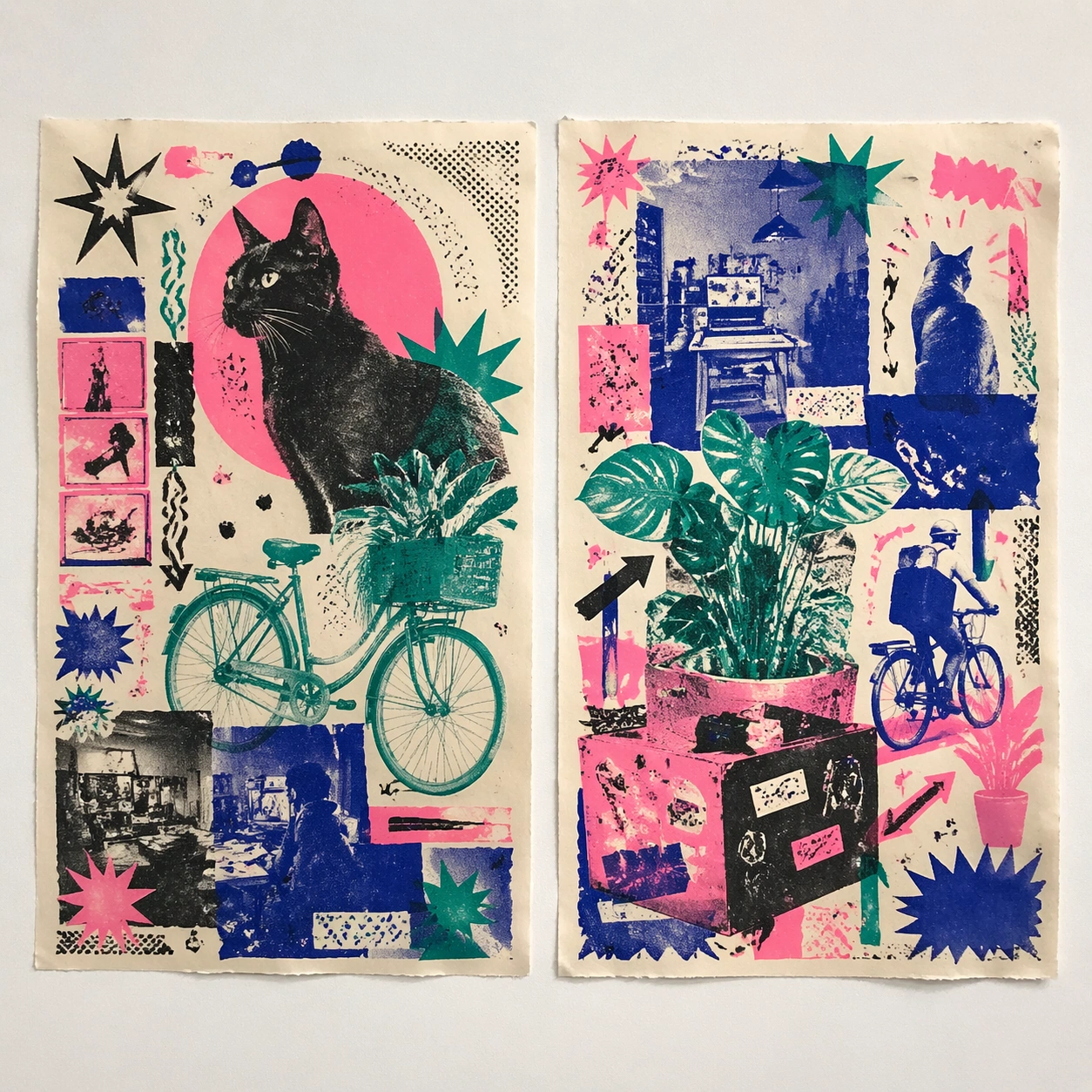
Scene: A square white-wall installation showing two companion posters hung side by side with equal spacing, photographed frontally so the pair reads as a designed conversation rather than two unrelated sheets. The poster should express DIY risograph poster language with fluorescent layers, halftone dots, soy-ink soak, copier artifacts, and handmade zine rhythm, using fluorescent pink, teal, ultramarine, black, and fibrous cream paper and a tactile surface appropriate to the medium. Subject: Compose a matched diptych: two posters sharing one style system while splitting the narrative across paired motifs, mirrored masses, or complementary color emphasis. Use club-flyer stars, bicycles, cats, plants, arrows, sticker bursts, notebook doodles, and photocopy shadows as the main visual ingredients, and organize them with xerox-like title blocks, stickers, and captions treated as energetic but non-readable print texture. For the contemporary-subject axis, thread in community workshops, late-night print studios, and messenger bikes folded into a zine-launch poster system. The poster must feel like an original design object rather than a reproduction of any known work. Important details: Both halves should feel distinct yet inseparable. Preserve one coherent visual language, but let each sheet carry its own focal symbol and rhythm without readable wording. Preserve plate drift, dot grain, bleed-through, paper curl, and independent-publisher roughness. Keep every letterform abstract and non-readable, as if it were a typographic texture rather than language. Make the style unmistakable through composition, palette, surface behavior, and symbolic compression. no full-CMYK smoothness, no perfect vector edges, no glossy magazine finish, no sterile product polish. Use case: Risograph Zine single study 6/9, testing system flexibility across a paired set. Constraints: No readable text, no watermark, no logos, preserve exact 1:1 aspect ratio, no copyrighted characters, no real brand marks, no QR codes, no interface chrome, no accidental gibberish lettering.

Example generated from “Risograph Zine Handmade — Stacked Print Bundle”
GPT Image 2en

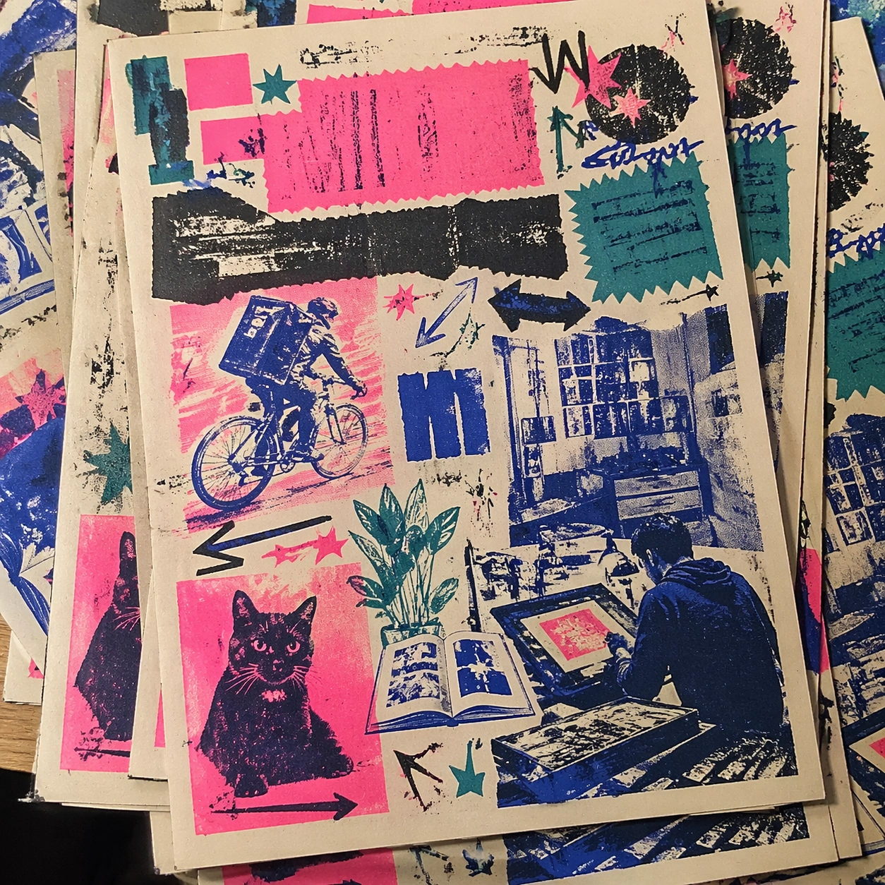
Scene: A square tabletop shot of several poster prints stacked and slightly fanned, with curled corners, offset edges, and soft directional light revealing paper thickness and ink behavior. The poster should express DIY risograph poster language with fluorescent layers, halftone dots, soy-ink soak, copier artifacts, and handmade zine rhythm, using fluorescent pink, teal, ultramarine, black, and fibrous cream paper and a tactile surface appropriate to the medium. Subject: Design the top poster to dominate while nearby duplicate sheets echo the same composition, creating a tactile print-run scene rather than a single isolated sheet. Use club-flyer stars, bicycles, cats, plants, arrows, sticker bursts, notebook doodles, and photocopy shadows as the main visual ingredients, and organize them with xerox-like title blocks, stickers, and captions treated as energetic but non-readable print texture. For the contemporary-subject axis, thread in community workshops, late-night print studios, and messenger bikes folded into a zine-launch poster system. The poster must feel like an original design object rather than a reproduction of any known work. Important details: Use the stack to emphasize production character: edge shadows, repeated motifs peeking from beneath, and subtle misalignment should enrich the material reading without changing the core design. Preserve plate drift, dot grain, bleed-through, paper curl, and independent-publisher roughness. Keep every letterform abstract and non-readable, as if it were a typographic texture rather than language. Make the style unmistakable through composition, palette, surface behavior, and symbolic compression. no full-CMYK smoothness, no perfect vector edges, no glossy magazine finish, no sterile product polish. Use case: Risograph Zine single study 7/9, testing print-run tactility and repeat presence. Constraints: No readable text, no watermark, no logos, preserve exact 1:1 aspect ratio, no copyrighted characters, no real brand marks, no QR codes, no interface chrome, no accidental gibberish lettering.

Example generated from “Risograph Zine Handmade — Kiosk Night Glow”
GPT Image 2en

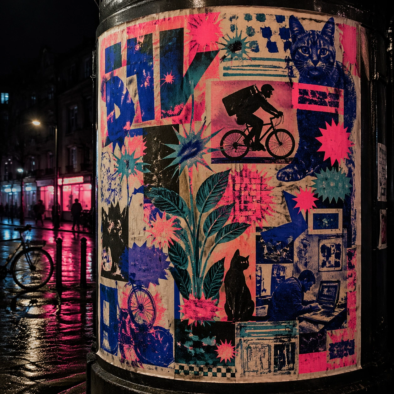
Scene: A square nighttime city view with the poster wrapping part of a cylindrical kiosk, wet pavement reflecting nearby light, and the composition holding together under moody urban illumination. The poster should express DIY risograph poster language with fluorescent layers, halftone dots, soy-ink soak, copier artifacts, and handmade zine rhythm, using fluorescent pink, teal, ultramarine, black, and fibrous cream paper and a tactile surface appropriate to the medium. Subject: Reframe the design for a dramatic street-placement context, where the poster has to project style and mood through reflection, curvature, and surrounding darkness. Use club-flyer stars, bicycles, cats, plants, arrows, sticker bursts, notebook doodles, and photocopy shadows as the main visual ingredients, and organize them with xerox-like title blocks, stickers, and captions treated as energetic but non-readable print texture. For the contemporary-subject axis, thread in community workshops, late-night print studios, and messenger bikes folded into a zine-launch poster system. The poster must feel like an original design object rather than a reproduction of any known work. Important details: The design should remain instantly recognizable despite the cylindrical wrap. Preserve major blocks, symbolic shapes, and abstract title forms so the style still feels authoritative at night. Preserve plate drift, dot grain, bleed-through, paper curl, and independent-publisher roughness. Keep every letterform abstract and non-readable, as if it were a typographic texture rather than language. Make the style unmistakable through composition, palette, surface behavior, and symbolic compression. no full-CMYK smoothness, no perfect vector edges, no glossy magazine finish, no sterile product polish. Use case: Risograph Zine single study 8/9, testing atmospheric display under rain and glow. Constraints: No readable text, no watermark, no logos, preserve exact 1:1 aspect ratio, no copyrighted characters, no real brand marks, no QR codes, no interface chrome, no accidental gibberish lettering.

Example generated from “Risograph Zine Handmade — Contemporary Remix”
GPT Image 2en

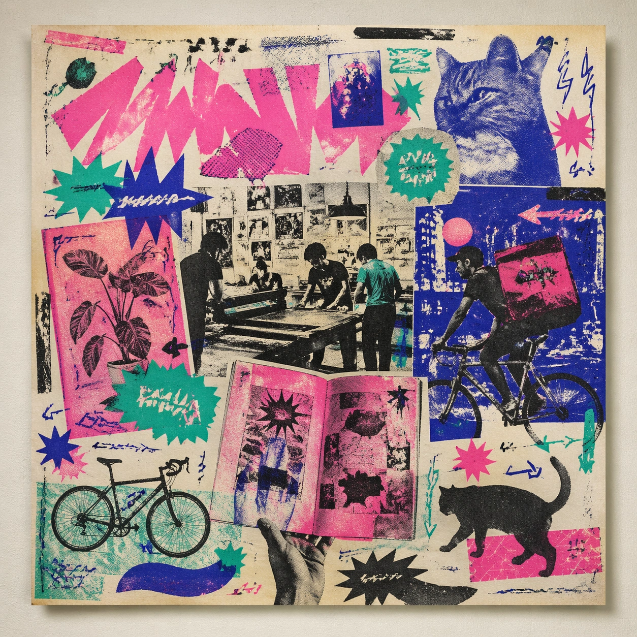
Scene: A square front-facing poster presentation on a clean neutral wall, lit like a premium print test, with crisp edges and a polished but still tactile finish appropriate to the style. The poster should express DIY risograph poster language with fluorescent layers, halftone dots, soy-ink soak, copier artifacts, and handmade zine rhythm, using fluorescent pink, teal, ultramarine, black, and fibrous cream paper and a tactile surface appropriate to the medium. Subject: Apply the historical poster language to a contemporary urban subject so the old visual grammar proves it can carry present-day themes without losing authenticity or formal discipline. Use club-flyer stars, bicycles, cats, plants, arrows, sticker bursts, notebook doodles, and photocopy shadows as the main visual ingredients, and organize them with xerox-like title blocks, stickers, and captions treated as energetic but non-readable print texture. For the contemporary-subject axis, thread in community workshops, late-night print studios, and messenger bikes folded into a zine-launch poster system. The poster must feel like an original design object rather than a reproduction of any known work. Important details: This is not parody. The contemporary subject should feel genuinely absorbed into the style through palette, composition, symbolic compression, and non-readable lettering treatment. Preserve plate drift, dot grain, bleed-through, paper curl, and independent-publisher roughness. Keep every letterform abstract and non-readable, as if it were a typographic texture rather than language. Make the style unmistakable through composition, palette, surface behavior, and symbolic compression. no full-CMYK smoothness, no perfect vector edges, no glossy magazine finish, no sterile product polish. Use case: Risograph Zine single study 9/9, testing historical grammar on a present-day subject. Constraints: No readable text, no watermark, no logos, preserve exact 1:1 aspect ratio, no copyrighted characters, no real brand marks, no QR codes, no interface chrome, no accidental gibberish lettering.

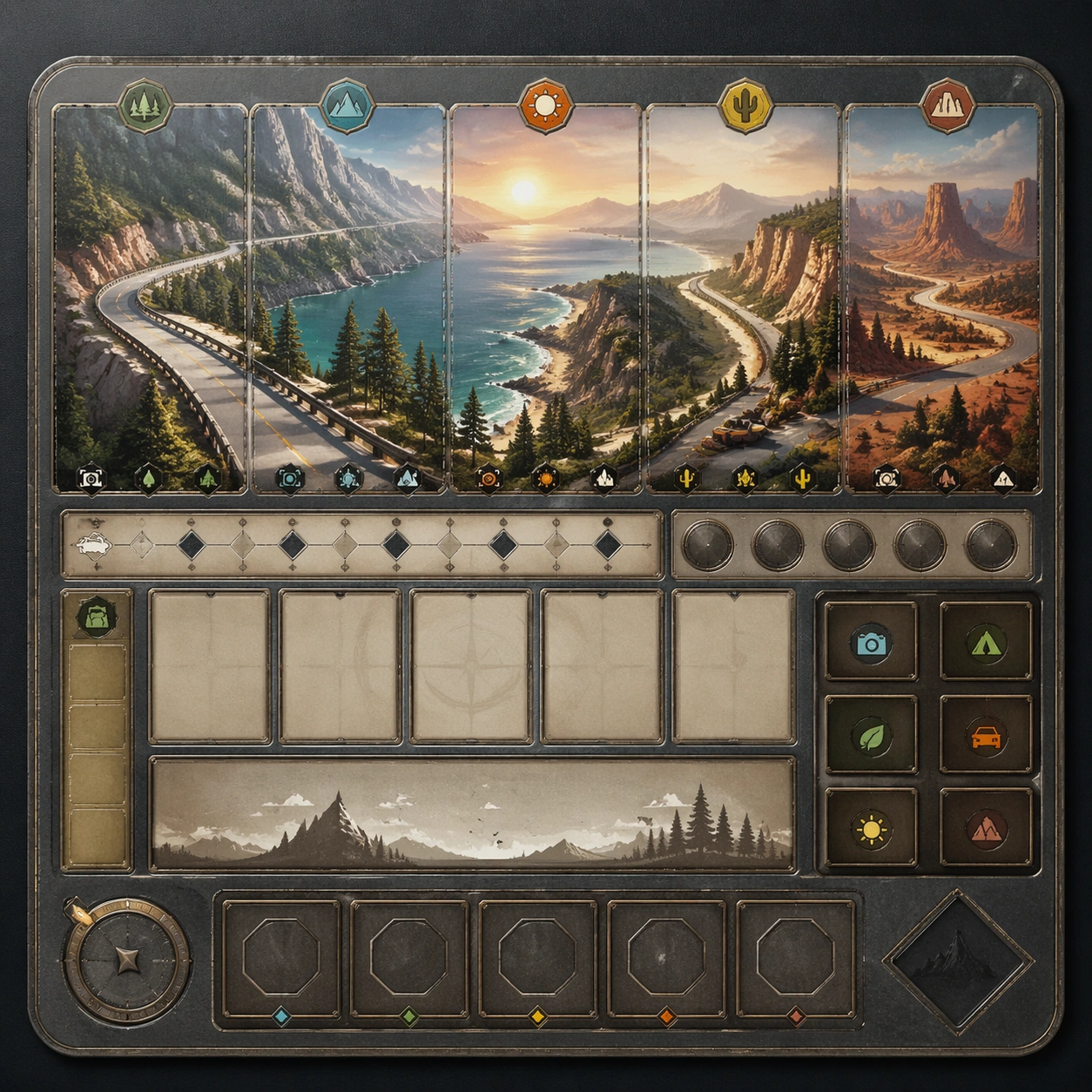
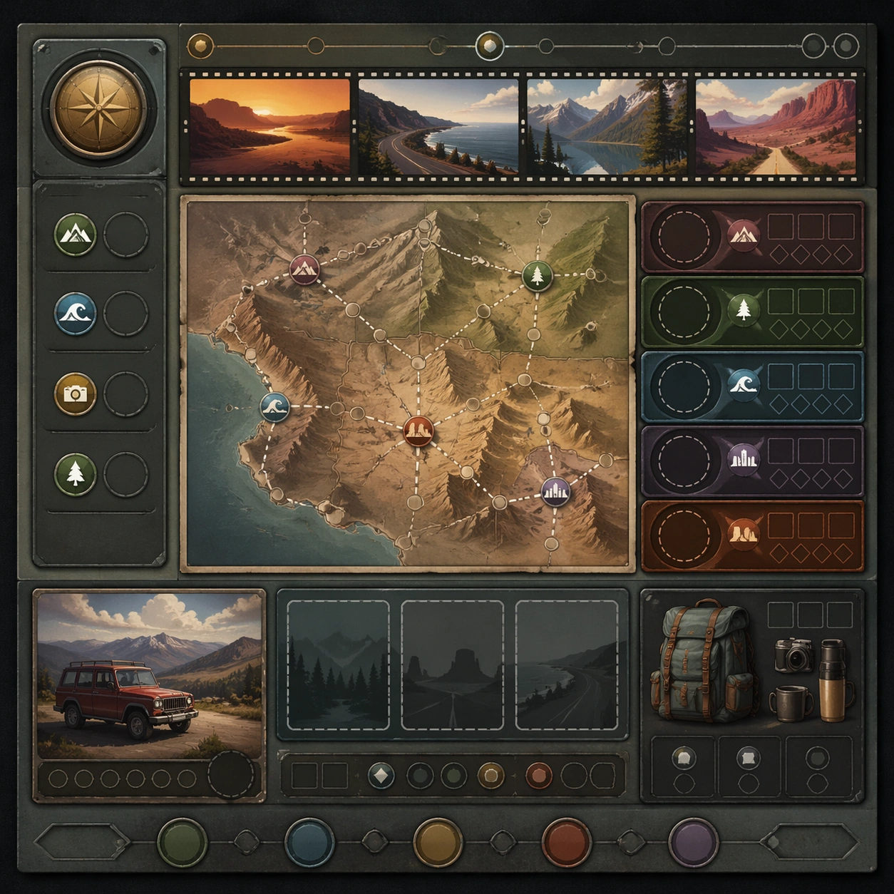
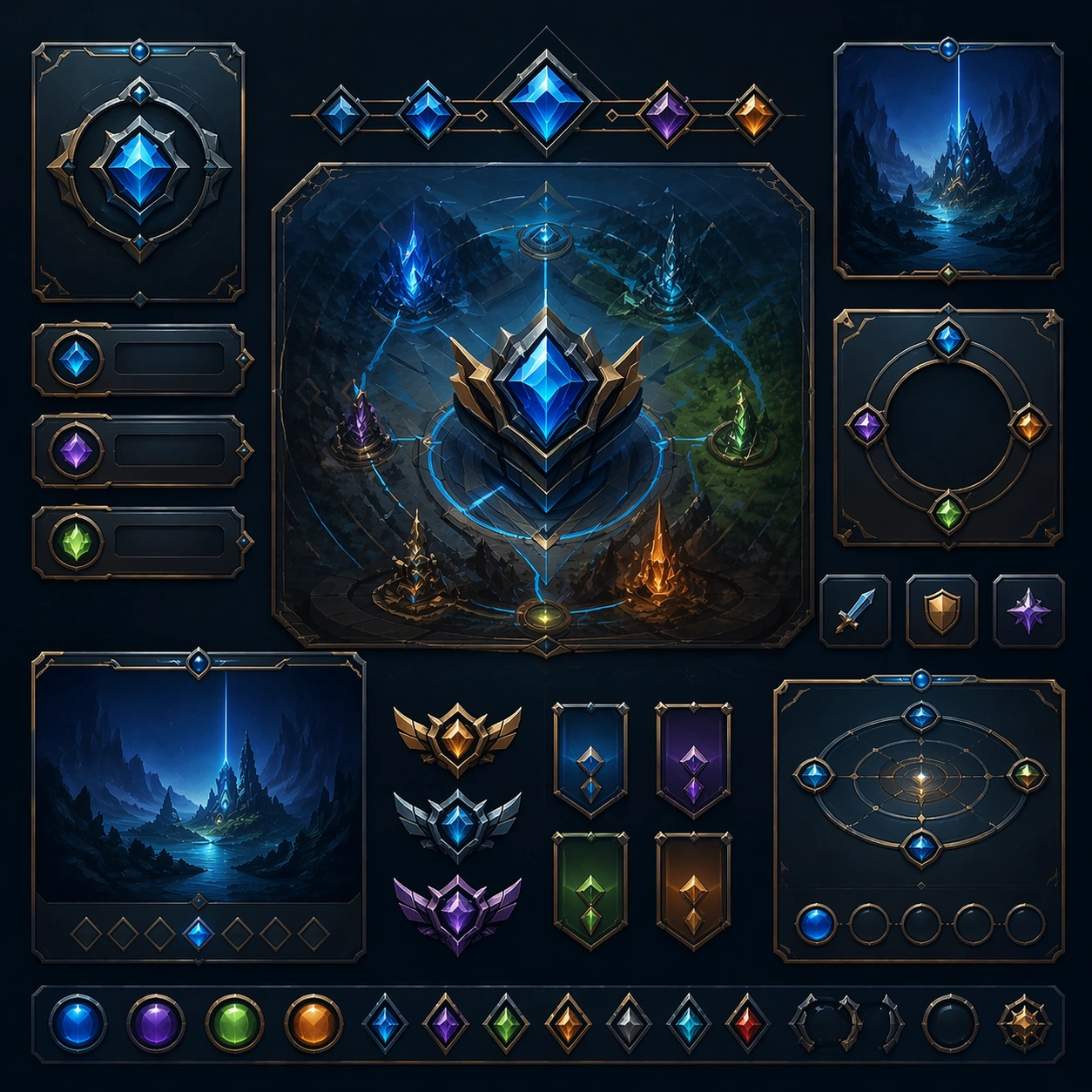
Example generated from “Roadtrip Overlook Cinematic Set — Reference Anchor”
GPT Image 2en

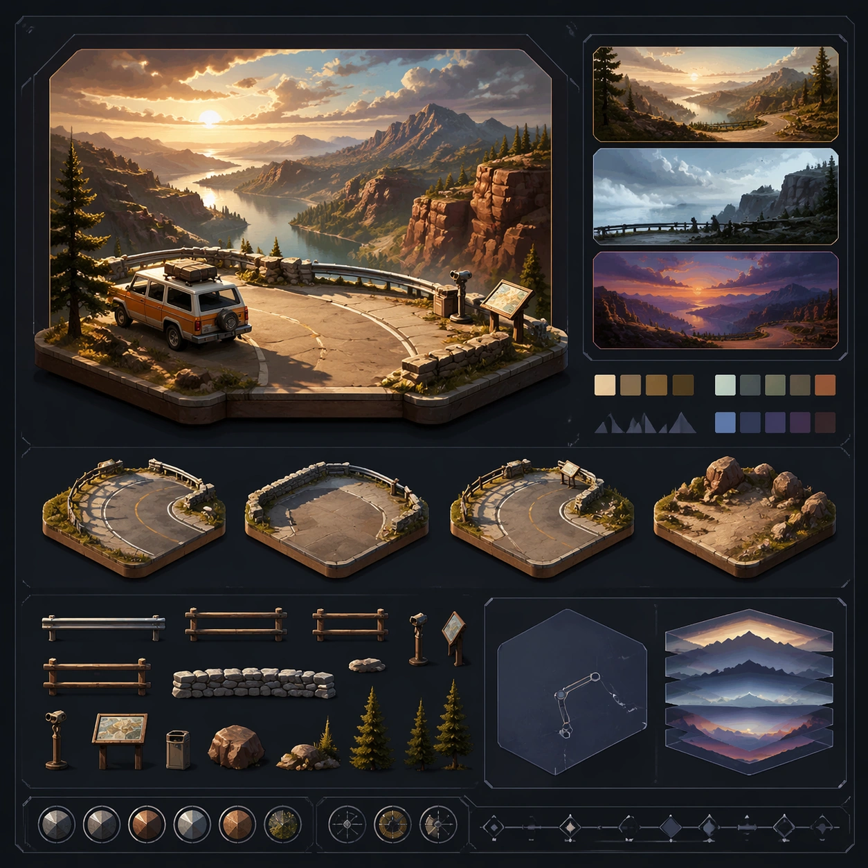
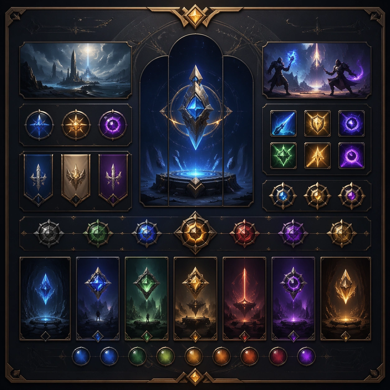
Scene: Create a square reference image for Roadtrip Overlook Cinematic Set. Build a reference anchor establishing the core system with a premium, production-ready finish. Use a polished modular board or campaign surface with clean spacing, premium game-UI finish, and clear focal hierarchy. The composition should feel intentional, clean, and reusable for gallery, research, campaign, or internal handoff contexts. Lighting must support readability first, with the main forms clearly separated from the background and enough breathing room for the system to stay legible at both hero scale and thumbnail scale. Subject: Center a coherent original game-art system built for premium production and marketing surfaces. For this image, focus on reference anchor. Keep the same system logic stable across screenshots, cards, banners, and overview boards. This image is the canonical anchor that later series images must follow. The viewer should immediately understand what role this surface plays inside a cohesive game-production asset pack. Important details: Lock framing, icon grammar, palette blocking, and surface hierarchy so the kit feels production-ready and consistent. Preserve the core silhouette, framing language, and material logic from the reference image while each variation changes function. Keep materials believable, edge hierarchy disciplined, and the visual language consistent with Roadtrip Overlooks. Use abstract interface blocks or diagram accents when helpful, but avoid any readable language. The final result should feel like a deliberate production asset rather than a random illustration. Use case: Roadtrip Overlook Cinematic Set series study 1/9, designed as reference anchor within a cohesive asset pack. Constraints: No readable text, no watermark, no logos, preserve exact 1:1 aspect ratio, no unrelated objects, no broken visual hierarchy, no malformed anatomy or broken perspective, no random decorative clutter.

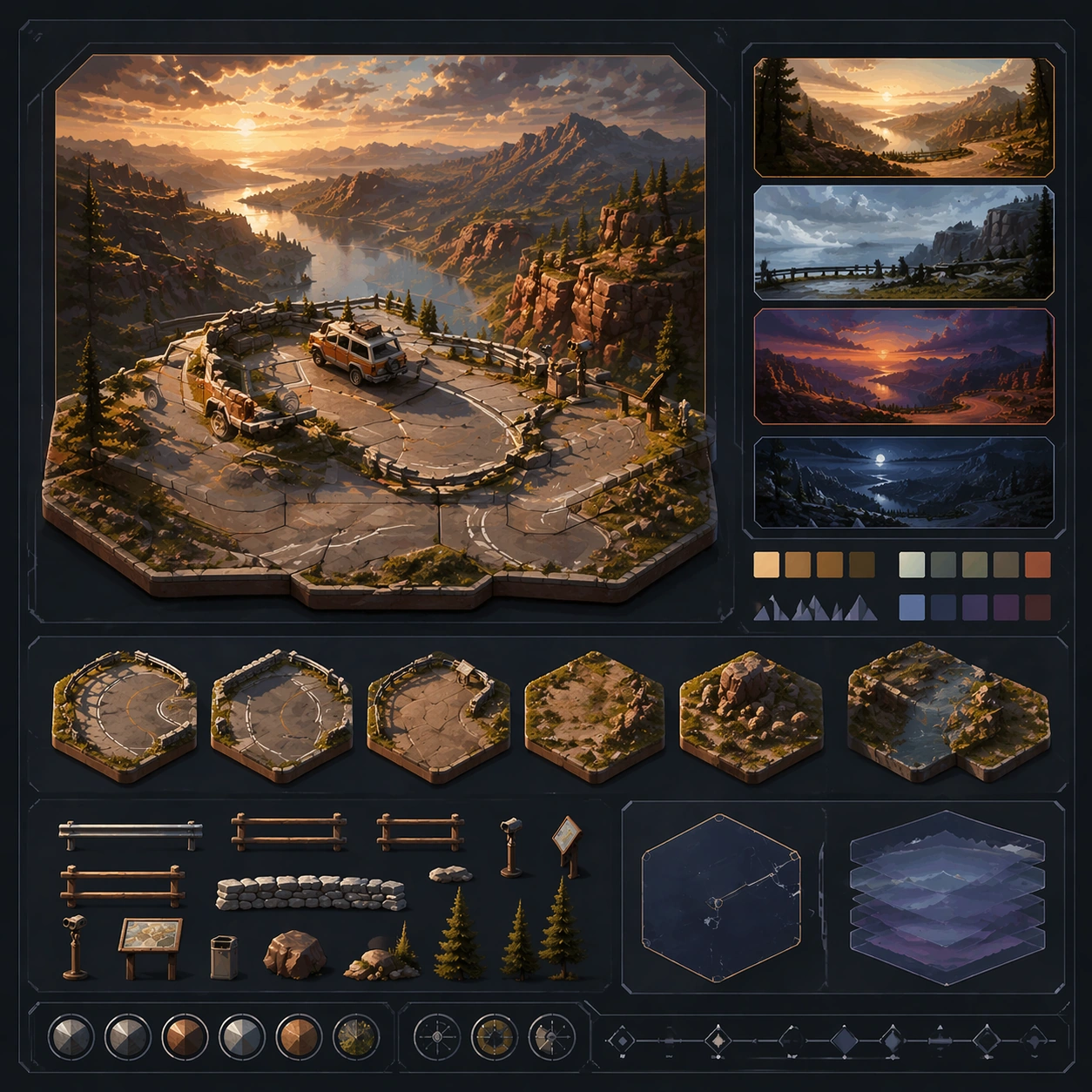
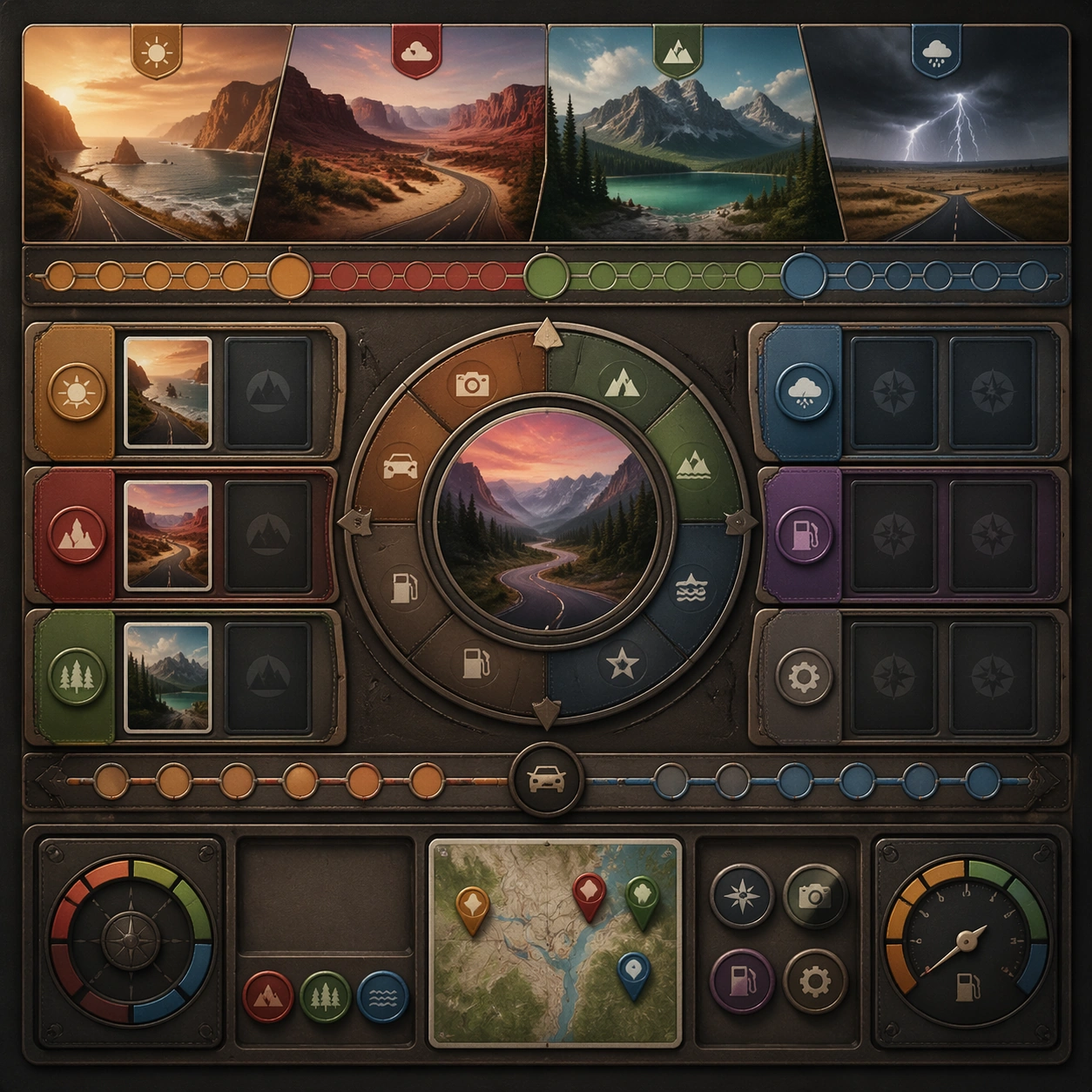
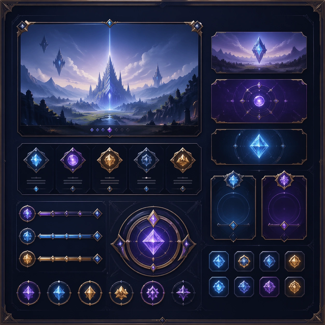
Example generated from “Roadtrip Overlook Cinematic Set — Variant One”
GPT Image 2en

Scene: Create a square dependent image for Roadtrip Overlook Cinematic Set. Build a first controlled variation in the same system with a premium, production-ready finish. Use a polished modular board or campaign surface with clean spacing, premium game-UI finish, and clear focal hierarchy. The composition should feel intentional, clean, and reusable for gallery, research, campaign, or internal handoff contexts. Lighting must support readability first, with the main forms clearly separated from the background and enough breathing room for the system to stay legible at both hero scale and thumbnail scale. Subject: Center a coherent original game-art system built for premium production and marketing surfaces. For this image, focus on the intended support surface. Keep the same system logic stable across screenshots, cards, banners, and overview boards. Preserve exact identity or system logic from the reference image while changing only the intended variation axis. The viewer should immediately understand what role this surface plays inside a cohesive game-production asset pack. Important details: Lock framing, icon grammar, palette blocking, and surface hierarchy so the kit feels production-ready and consistent. Preserve the core silhouette, framing language, and material logic from the reference image while each variation changes function. Keep materials believable, edge hierarchy disciplined, and the visual language consistent with Roadtrip Overlooks. Use abstract interface blocks or diagram accents when helpful, but avoid any readable language. The final result should feel like a deliberate production asset rather than a random illustration. Use case: Roadtrip Overlook Cinematic Set series study 2/9, designed as variant one within a cohesive asset pack. Constraints: No readable text, no watermark, no logos, preserve exact 1:1 aspect ratio, no unrelated objects, no broken visual hierarchy, no malformed anatomy or broken perspective, no random decorative clutter.

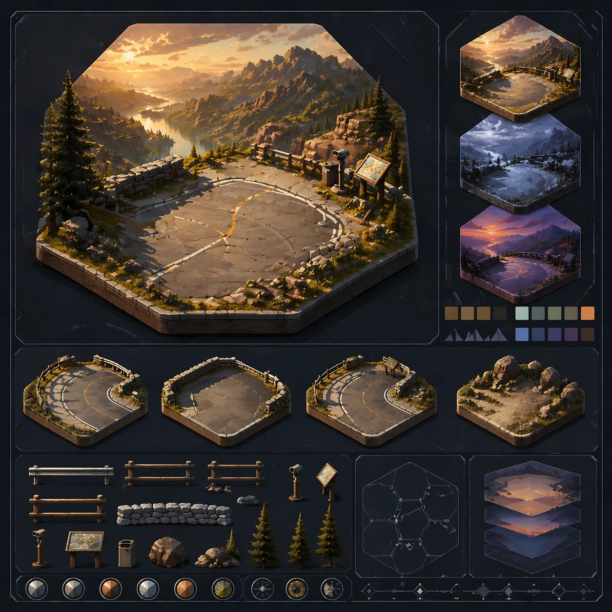
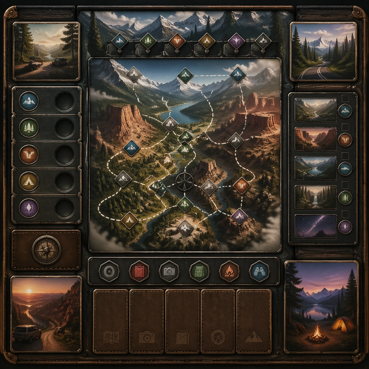
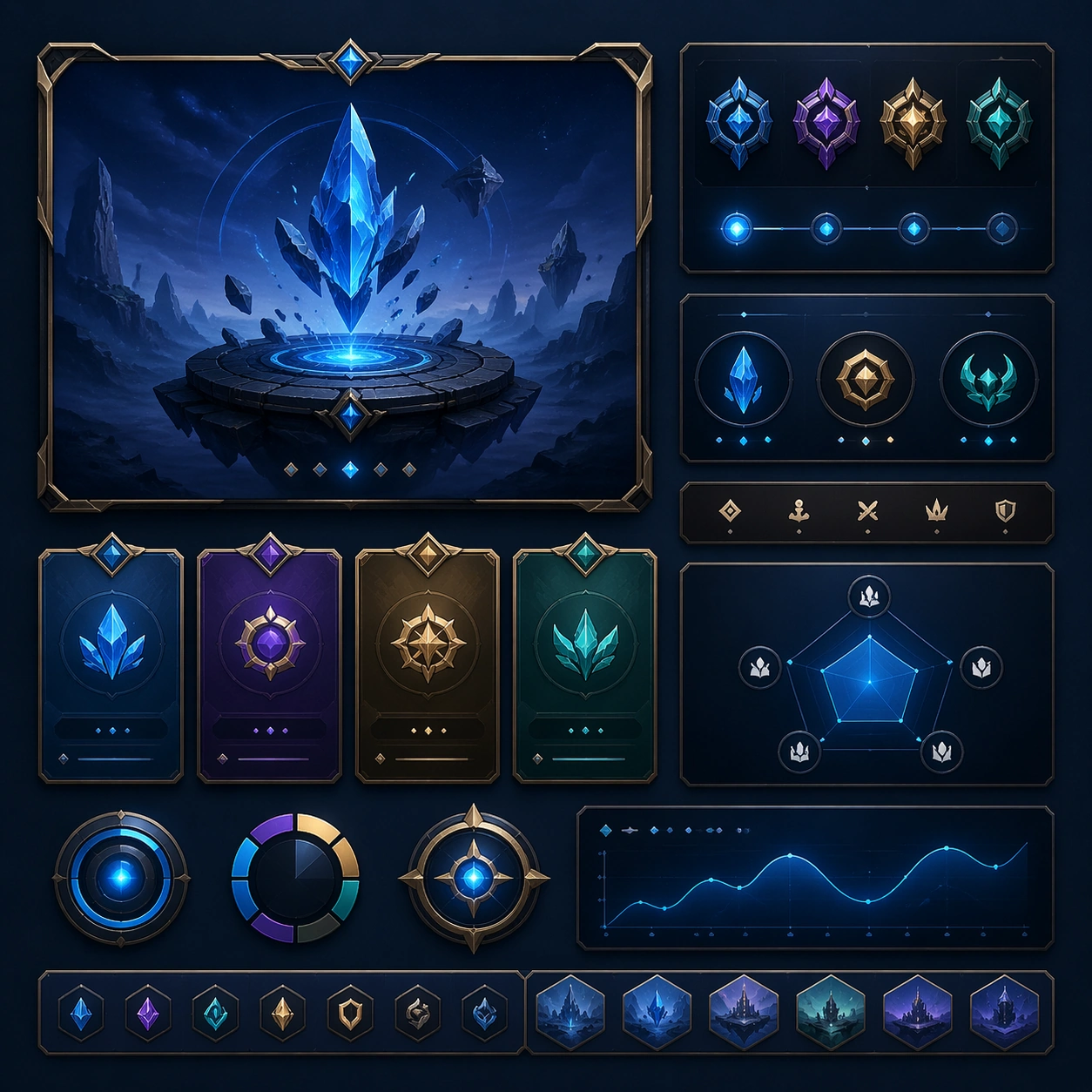
Example generated from “Roadtrip Overlook Cinematic Set — Variant Two”
GPT Image 2en

Scene: Create a square dependent image for Roadtrip Overlook Cinematic Set. Build a second controlled variation in the same system with a premium, production-ready finish. Use a polished modular board or campaign surface with clean spacing, premium game-UI finish, and clear focal hierarchy. The composition should feel intentional, clean, and reusable for gallery, research, campaign, or internal handoff contexts. Lighting must support readability first, with the main forms clearly separated from the background and enough breathing room for the system to stay legible at both hero scale and thumbnail scale. Subject: Center a coherent original game-art system built for premium production and marketing surfaces. For this image, focus on the intended support surface. Keep the same system logic stable across screenshots, cards, banners, and overview boards. Preserve exact identity or system logic from the reference image while changing only the intended variation axis. The viewer should immediately understand what role this surface plays inside a cohesive game-production asset pack. Important details: Lock framing, icon grammar, palette blocking, and surface hierarchy so the kit feels production-ready and consistent. Preserve the core silhouette, framing language, and material logic from the reference image while each variation changes function. Keep materials believable, edge hierarchy disciplined, and the visual language consistent with Roadtrip Overlooks. Use abstract interface blocks or diagram accents when helpful, but avoid any readable language. The final result should feel like a deliberate production asset rather than a random illustration. Use case: Roadtrip Overlook Cinematic Set series study 3/9, designed as variant two within a cohesive asset pack. Constraints: No readable text, no watermark, no logos, preserve exact 1:1 aspect ratio, no unrelated objects, no broken visual hierarchy, no malformed anatomy or broken perspective, no random decorative clutter.

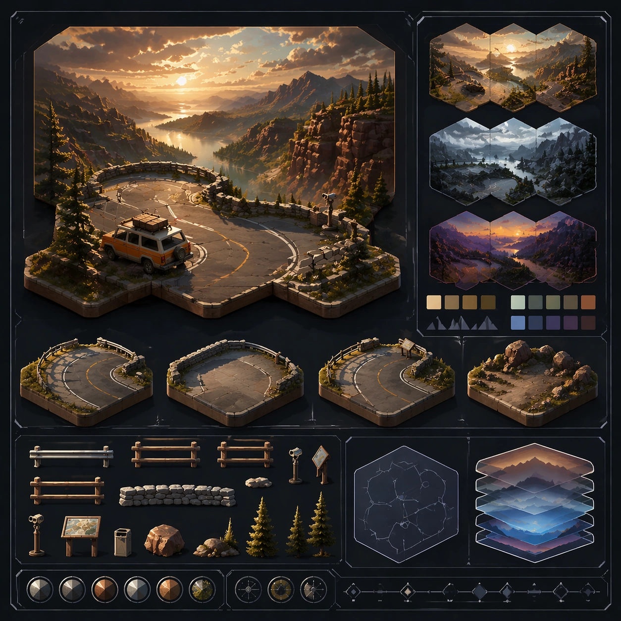
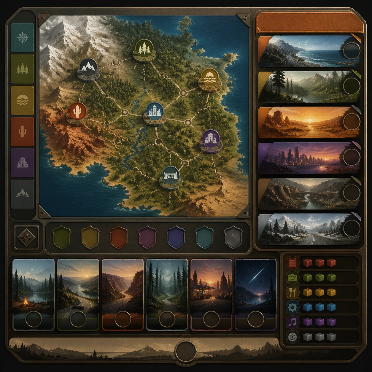
Example generated from “Roadtrip Overlook Cinematic Set — Variant Three”
GPT Image 2en

Scene: Create a square dependent image for Roadtrip Overlook Cinematic Set. Build a third controlled variation in the same system with a premium, production-ready finish. Use a polished modular board or campaign surface with clean spacing, premium game-UI finish, and clear focal hierarchy. The composition should feel intentional, clean, and reusable for gallery, research, campaign, or internal handoff contexts. Lighting must support readability first, with the main forms clearly separated from the background and enough breathing room for the system to stay legible at both hero scale and thumbnail scale. Subject: Center a coherent original game-art system built for premium production and marketing surfaces. For this image, focus on the intended support surface. Keep the same system logic stable across screenshots, cards, banners, and overview boards. Preserve exact identity or system logic from the reference image while changing only the intended variation axis. The viewer should immediately understand what role this surface plays inside a cohesive game-production asset pack. Important details: Lock framing, icon grammar, palette blocking, and surface hierarchy so the kit feels production-ready and consistent. Preserve the core silhouette, framing language, and material logic from the reference image while each variation changes function. Keep materials believable, edge hierarchy disciplined, and the visual language consistent with Roadtrip Overlooks. Use abstract interface blocks or diagram accents when helpful, but avoid any readable language. The final result should feel like a deliberate production asset rather than a random illustration. Use case: Roadtrip Overlook Cinematic Set series study 4/9, designed as variant three within a cohesive asset pack. Constraints: No readable text, no watermark, no logos, preserve exact 1:1 aspect ratio, no unrelated objects, no broken visual hierarchy, no malformed anatomy or broken perspective, no random decorative clutter.

Example generated from “Roadtrip Overlook Cinematic Set — Support One”
GPT Image 2en

Scene: Create a square standalone support image for Roadtrip Overlook Cinematic Set. Build a support-surface study with a clear focal hierarchy and a finished professional surface. Use a polished modular board or campaign surface with clean spacing, premium game-UI finish, and clear focal hierarchy. The frame should feel self-contained and polished, with enough structure to explain the system even without the reference series, yet still obviously belonging to the same theme and production world. Subject: Show a coherent original game-art system built for premium production and marketing surfaces in a way that emphasizes the intended support surface. Keep the same system logic stable across screenshots, cards, banners, and overview boards. Even though this image is independent, the viewer should still recognize the same universe, same commercial logic, and same production intent as the core package. Important details: Lock framing, icon grammar, palette blocking, and surface hierarchy so the kit feels production-ready and consistent. Preserve the broader theme language through color, framing, material choices, and modular composition. Use clean panel rhythm, premium asset presentation, and believable detail density. The image should work equally well as a gallery study, research reference, and mock production deliverable. Use case: Roadtrip Overlook Cinematic Set single study 5/9, exploring support one as a support surface. Constraints: No readable text, no watermark, no logos, preserve exact 1:1 aspect ratio, no unrelated objects, no broken visual hierarchy, no visual noise that obscures the main surface, no accidental brand resemblance.

Example generated from “Roadtrip Overlook Cinematic Set — Support Two”
GPT Image 2en

Scene: Create a square standalone support image for Roadtrip Overlook Cinematic Set. Build a second support-surface study with a clear focal hierarchy and a finished professional surface. Use a polished modular board or campaign surface with clean spacing, premium game-UI finish, and clear focal hierarchy. The frame should feel self-contained and polished, with enough structure to explain the system even without the reference series, yet still obviously belonging to the same theme and production world. Subject: Show a coherent original game-art system built for premium production and marketing surfaces in a way that emphasizes the intended support surface. Keep the same system logic stable across screenshots, cards, banners, and overview boards. Even though this image is independent, the viewer should still recognize the same universe, same commercial logic, and same production intent as the core package. Important details: Lock framing, icon grammar, palette blocking, and surface hierarchy so the kit feels production-ready and consistent. Preserve the broader theme language through color, framing, material choices, and modular composition. Use clean panel rhythm, premium asset presentation, and believable detail density. The image should work equally well as a gallery study, research reference, and mock production deliverable. Use case: Roadtrip Overlook Cinematic Set single study 6/9, exploring support two as a support surface. Constraints: No readable text, no watermark, no logos, preserve exact 1:1 aspect ratio, no unrelated objects, no broken visual hierarchy, no visual noise that obscures the main surface, no accidental brand resemblance.

Example generated from “Roadtrip Overlook Cinematic Set — Support Three”
GPT Image 2en

Scene: Create a square standalone support image for Roadtrip Overlook Cinematic Set. Build a third support-surface study with a clear focal hierarchy and a finished professional surface. Use a polished modular board or campaign surface with clean spacing, premium game-UI finish, and clear focal hierarchy. The frame should feel self-contained and polished, with enough structure to explain the system even without the reference series, yet still obviously belonging to the same theme and production world. Subject: Show a coherent original game-art system built for premium production and marketing surfaces in a way that emphasizes the intended support surface. Keep the same system logic stable across screenshots, cards, banners, and overview boards. Even though this image is independent, the viewer should still recognize the same universe, same commercial logic, and same production intent as the core package. Important details: Lock framing, icon grammar, palette blocking, and surface hierarchy so the kit feels production-ready and consistent. Preserve the broader theme language through color, framing, material choices, and modular composition. Use clean panel rhythm, premium asset presentation, and believable detail density. The image should work equally well as a gallery study, research reference, and mock production deliverable. Use case: Roadtrip Overlook Cinematic Set single study 7/9, exploring support three as a support surface. Constraints: No readable text, no watermark, no logos, preserve exact 1:1 aspect ratio, no unrelated objects, no broken visual hierarchy, no visual noise that obscures the main surface, no accidental brand resemblance.

Example generated from “Roadtrip Overlook Cinematic Set — Support Four”
GPT Image 2en

Scene: Create a square standalone support image for Roadtrip Overlook Cinematic Set. Build a fourth support-surface study with a clear focal hierarchy and a finished professional surface. Use a polished modular board or campaign surface with clean spacing, premium game-UI finish, and clear focal hierarchy. The frame should feel self-contained and polished, with enough structure to explain the system even without the reference series, yet still obviously belonging to the same theme and production world. Subject: Show a coherent original game-art system built for premium production and marketing surfaces in a way that emphasizes the intended support surface. Keep the same system logic stable across screenshots, cards, banners, and overview boards. Even though this image is independent, the viewer should still recognize the same universe, same commercial logic, and same production intent as the core package. Important details: Lock framing, icon grammar, palette blocking, and surface hierarchy so the kit feels production-ready and consistent. Preserve the broader theme language through color, framing, material choices, and modular composition. Use clean panel rhythm, premium asset presentation, and believable detail density. The image should work equally well as a gallery study, research reference, and mock production deliverable. Use case: Roadtrip Overlook Cinematic Set single study 8/9, exploring support four as a support surface. Constraints: No readable text, no watermark, no logos, preserve exact 1:1 aspect ratio, no unrelated objects, no broken visual hierarchy, no visual noise that obscures the main surface, no accidental brand resemblance.

Example generated from “Roadtrip Overlook Cinematic Set — Support Five”
GPT Image 2en

Scene: Create a square standalone support image for Roadtrip Overlook Cinematic Set. Build a fifth support-surface study with a clear focal hierarchy and a finished professional surface. Use a polished modular board or campaign surface with clean spacing, premium game-UI finish, and clear focal hierarchy. The frame should feel self-contained and polished, with enough structure to explain the system even without the reference series, yet still obviously belonging to the same theme and production world. Subject: Show a coherent original game-art system built for premium production and marketing surfaces in a way that emphasizes the intended support surface. Keep the same system logic stable across screenshots, cards, banners, and overview boards. Even though this image is independent, the viewer should still recognize the same universe, same commercial logic, and same production intent as the core package. Important details: Lock framing, icon grammar, palette blocking, and surface hierarchy so the kit feels production-ready and consistent. Preserve the broader theme language through color, framing, material choices, and modular composition. Use clean panel rhythm, premium asset presentation, and believable detail density. The image should work equally well as a gallery study, research reference, and mock production deliverable. Use case: Roadtrip Overlook Cinematic Set single study 9/9, exploring support five as a support surface. Constraints: No readable text, no watermark, no logos, preserve exact 1:1 aspect ratio, no unrelated objects, no broken visual hierarchy, no visual noise that obscures the main surface, no accidental brand resemblance.

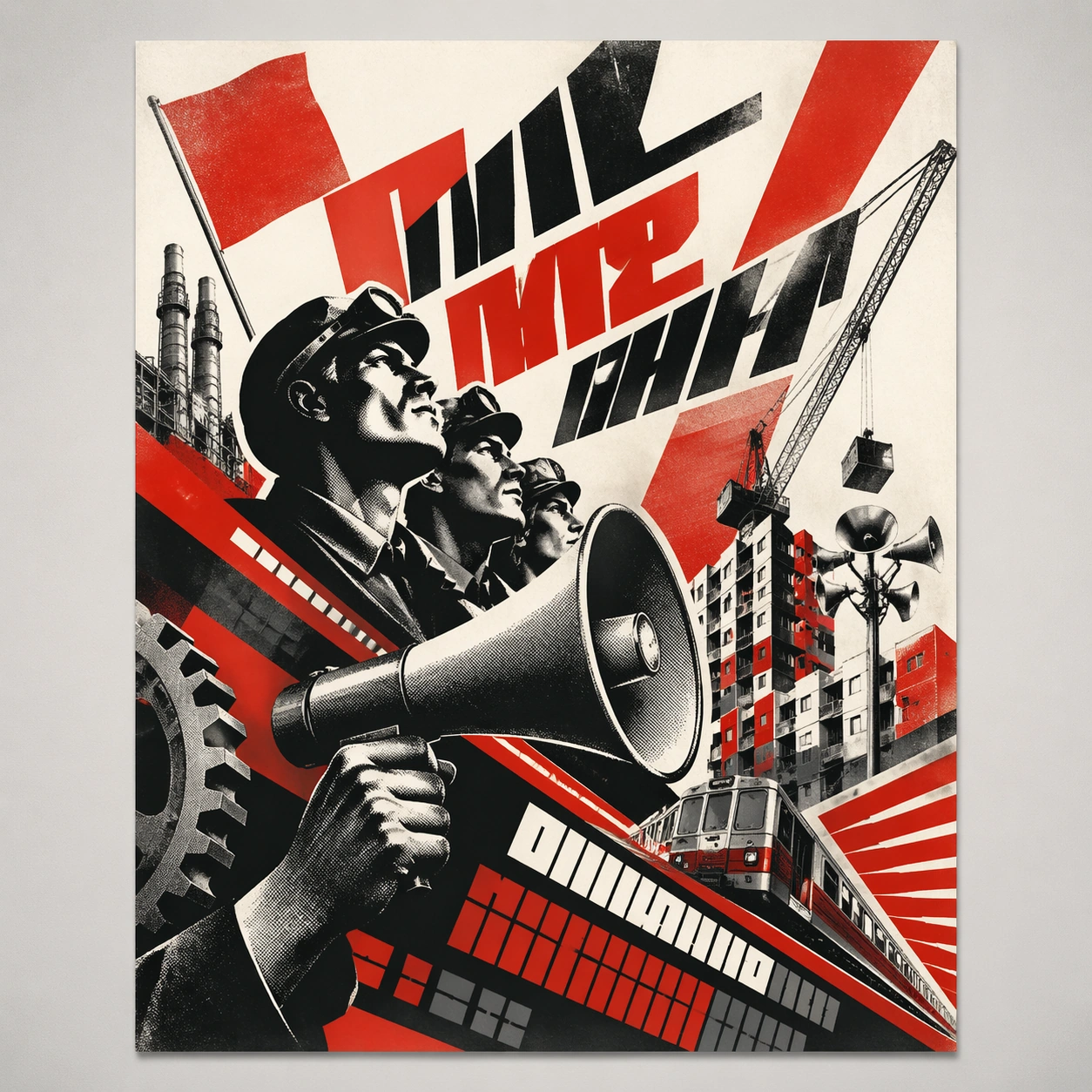
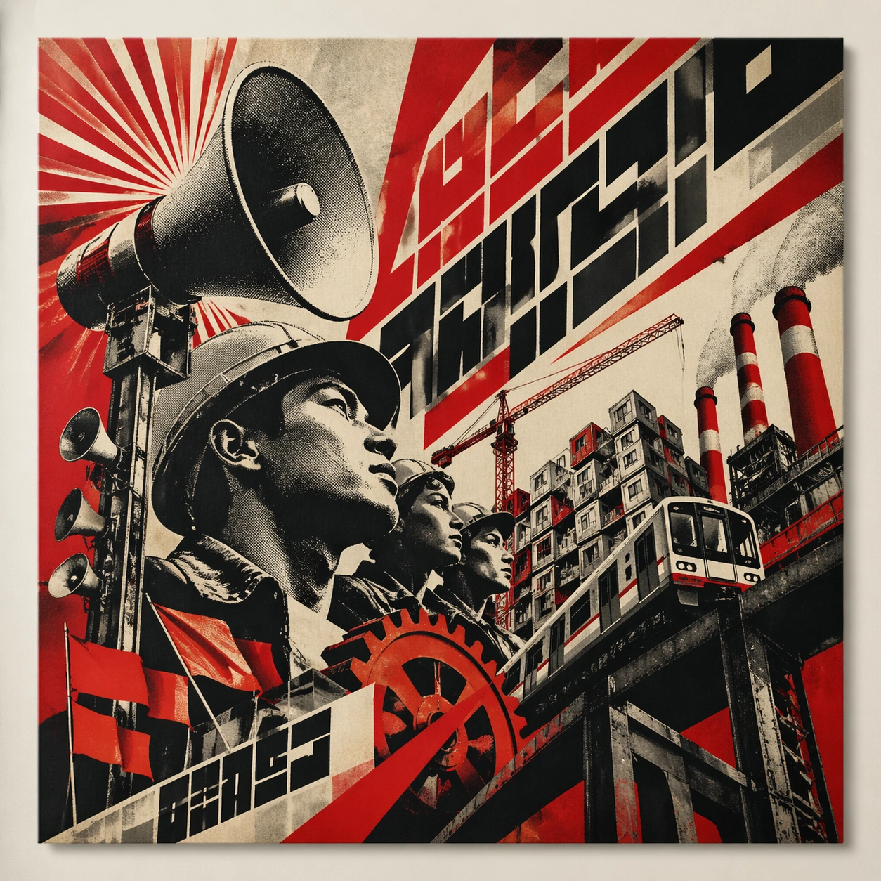
Example generated from “Russian Constructivist Revolution — Canonical One-Sheet”
GPT Image 2en

Scene: A square straight-on studio view of a pristine poster mounted on a matte wall with even museum lighting, crisp corners, and enough breathing room around the sheet for the full composition to read as an intentional object. The poster should express agitated constructivist geometry driven by diagonals, wedges, ray bursts, and halftone photomontage fragments, using revolutionary red, bone white, black, and steel gray with sharp contrast and a tactile surface appropriate to the medium. Subject: Build the flagship poster statement for this style, with the strongest hierarchy, the clearest subject silhouette, and the most disciplined balance between image field, pseudo-typography, and empty space. Use megaphones, gears, worker profiles, factory towers, flags, and industrial beams as the main visual ingredients, and organize them with heavy angular pseudo-Cyrillic slogan blocks kept abstract and non-readable. For the contemporary-subject axis, thread in public transit megaphones, cranes, and modular housing blocks pushed into militant diagonal rhythm. The poster must feel like an original design object rather than a reproduction of any known work. Important details: Treat this as the cleanest thesis image in the set: the paper should look fresh, the inks or paint should feel deliberate, and every formal rule of the style should be easy to study at a glance. Preserve diagonal force, abrupt scale shifts, posterized cutout shadows, and coarse print grain. Keep every letterform abstract and non-readable, as if it were a typographic texture rather than language. Make the style unmistakable through composition, palette, surface behavior, and symbolic compression. no soft curves, no pastel palette, no decorative nostalgia, no polished luxury finish. Use case: Constructivist single study 1/9, establishing the cleanest museum-grade poster reading. Constraints: No readable text, no watermark, no logos, preserve exact 1:1 aspect ratio, no copyrighted characters, no real brand marks, no QR codes, no interface chrome, no accidental gibberish lettering.

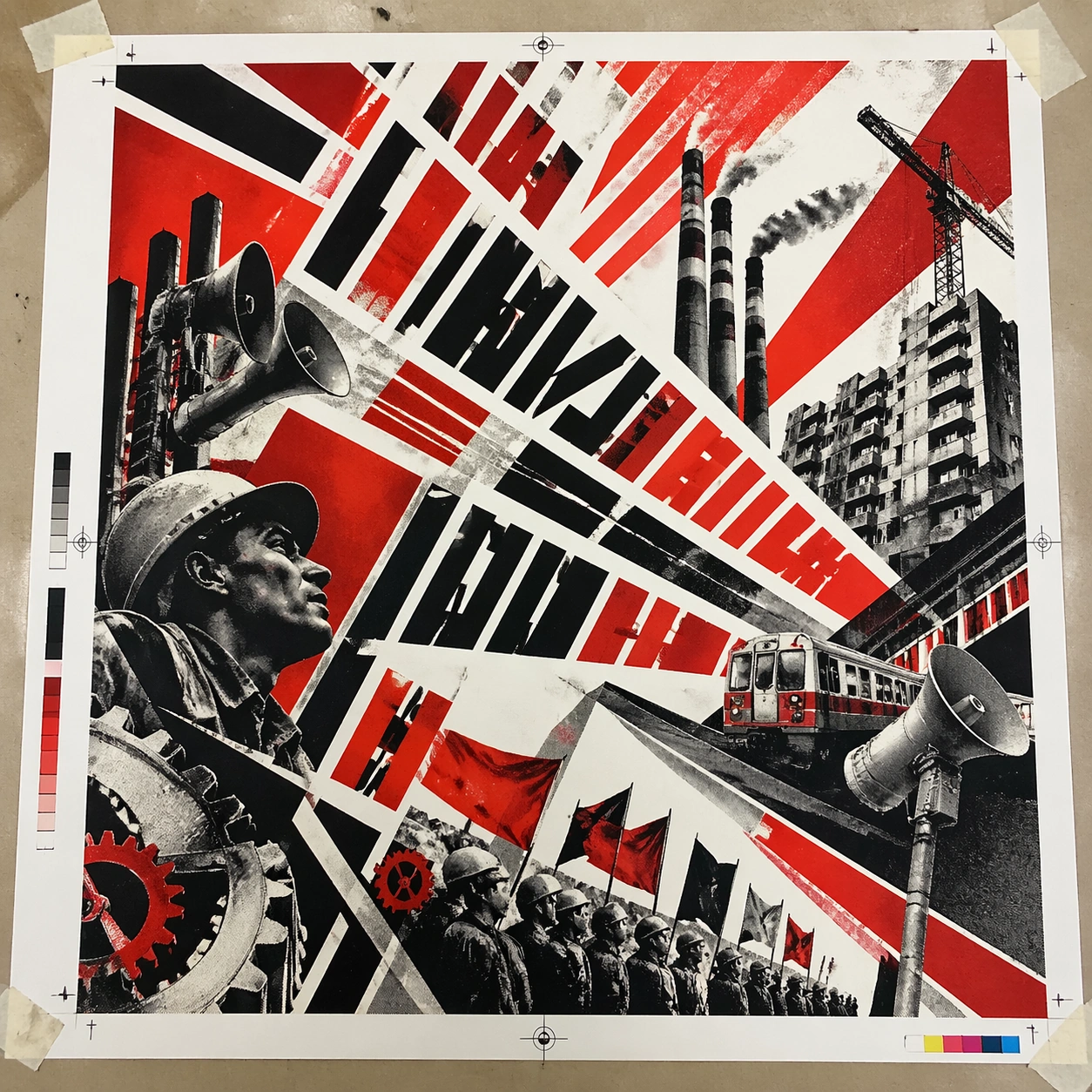
Example generated from “Russian Constructivist Revolution — Print Proof Flatlay”
GPT Image 2en

Scene: A square overhead tabletop photograph of a fresh poster proof on neutral worktable paper, lit by cool daylight, with crop marks, tape tabs, and slight paper bow visible around the sheet. The poster should express agitated constructivist geometry driven by diagonals, wedges, ray bursts, and halftone photomontage fragments, using revolutionary red, bone white, black, and steel gray with sharp contrast and a tactile surface appropriate to the medium. Subject: Design the poster as a print-shop proof, preserving the same poster language while allowing production clues such as edge trims, registration targets, and process marks to frame the composition. Use megaphones, gears, worker profiles, factory towers, flags, and industrial beams as the main visual ingredients, and organize them with heavy angular pseudo-Cyrillic slogan blocks kept abstract and non-readable. For the contemporary-subject axis, thread in public transit megaphones, cranes, and modular housing blocks pushed into militant diagonal rhythm. The poster must feel like an original design object rather than a reproduction of any known work. Important details: The image must still read as a finished poster concept, but it should carry believable print-process evidence and material tactility instead of gallery-wall perfection. Preserve diagonal force, abrupt scale shifts, posterized cutout shadows, and coarse print grain. Keep every letterform abstract and non-readable, as if it were a typographic texture rather than language. Make the style unmistakable through composition, palette, surface behavior, and symbolic compression. no soft curves, no pastel palette, no decorative nostalgia, no polished luxury finish. Use case: Constructivist single study 2/9, testing production realism and process evidence. Constraints: No readable text, no watermark, no logos, preserve exact 1:1 aspect ratio, no copyrighted characters, no real brand marks, no QR codes, no interface chrome, no accidental gibberish lettering.
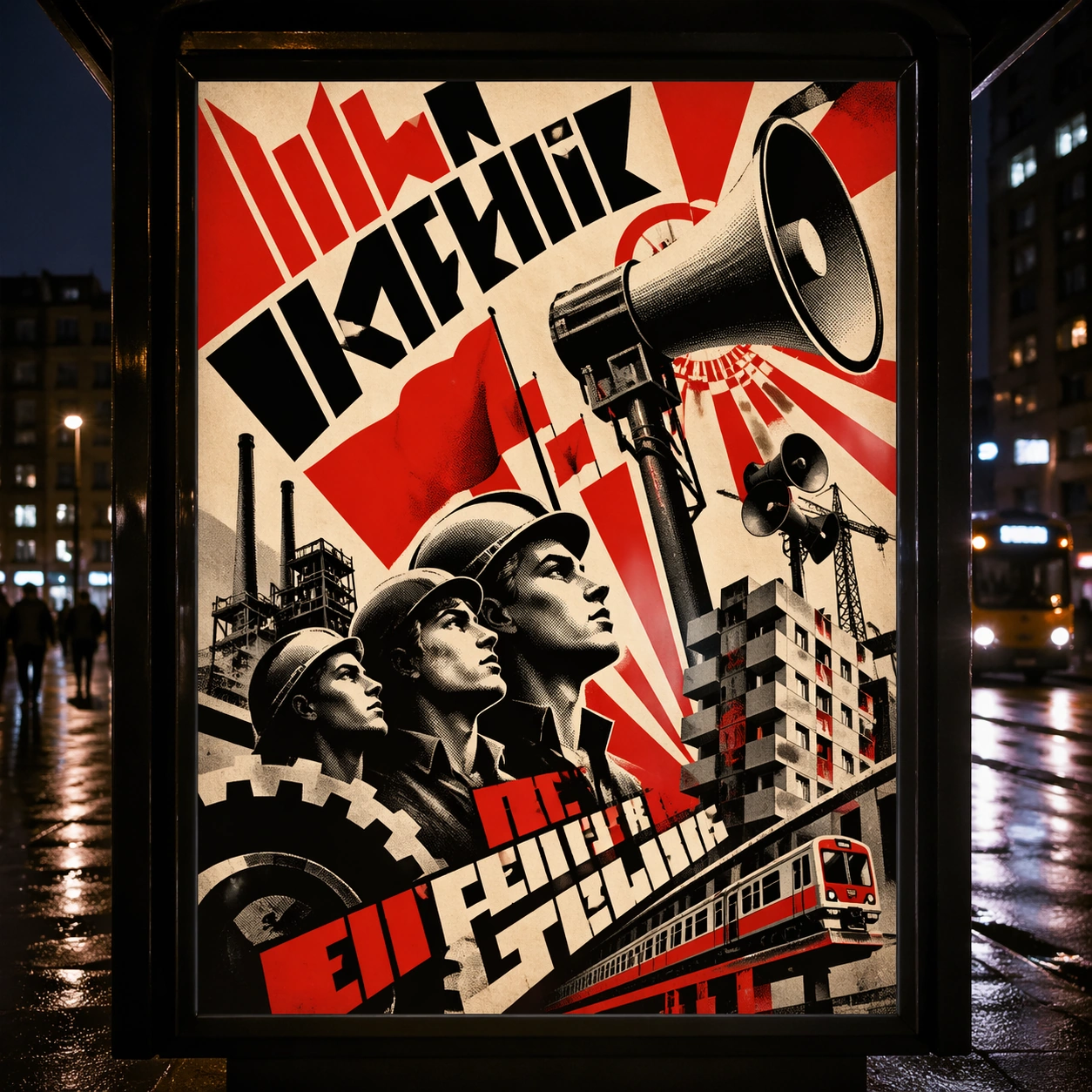
Example generated from “Russian Constructivist Revolution — Transit Lightbox”
GPT Image 2en

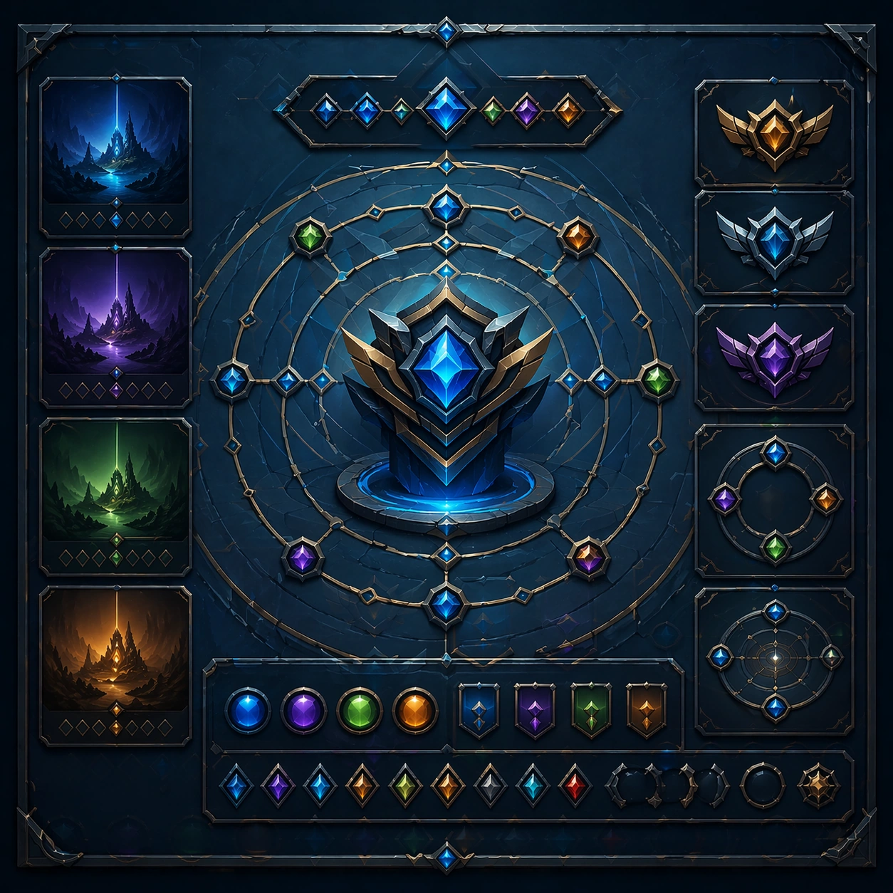
Scene: A square dusk street photograph of a backlit transit poster glowing inside glass, with faint rain reflections, soft city blur in the distance, and the poster remaining fully legible as a composition. The poster should express agitated constructivist geometry driven by diagonals, wedges, ray bursts, and halftone photomontage fragments, using revolutionary red, bone white, black, and steel gray with sharp contrast and a tactile surface appropriate to the medium. Subject: Adapt the poster into a public-facing lightbox version that still honors the original style grammar while feeling bold enough to stop a passerby from several meters away. Use megaphones, gears, worker profiles, factory towers, flags, and industrial beams as the main visual ingredients, and organize them with heavy angular pseudo-Cyrillic slogan blocks kept abstract and non-readable. For the contemporary-subject axis, thread in public transit megaphones, cranes, and modular housing blocks pushed into militant diagonal rhythm. The poster must feel like an original design object rather than a reproduction of any known work. Important details: Let the style survive the illumination test: color blocking, silhouette contrast, and abstract lettering should stay controlled under bright internal light and reflective glass. Preserve diagonal force, abrupt scale shifts, posterized cutout shadows, and coarse print grain. Keep every letterform abstract and non-readable, as if it were a typographic texture rather than language. Make the style unmistakable through composition, palette, surface behavior, and symbolic compression. no soft curves, no pastel palette, no decorative nostalgia, no polished luxury finish. Use case: Constructivist single study 3/9, testing distance readability in public display. Constraints: No readable text, no watermark, no logos, preserve exact 1:1 aspect ratio, no copyrighted characters, no real brand marks, no QR codes, no interface chrome, no accidental gibberish lettering.

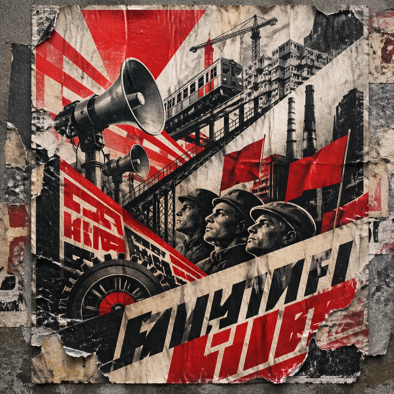
Example generated from “Russian Constructivist Revolution — Wheatpaste Wall Layer”
GPT Image 2en

Scene: A square urban wall study with the poster pasted onto rough plaster among torn edges and older paper remnants, photographed in soft overcast light so texture, glue bubbles, and surface scars stay visible. The poster should express agitated constructivist geometry driven by diagonals, wedges, ray bursts, and halftone photomontage fragments, using revolutionary red, bone white, black, and steel gray with sharp contrast and a tactile surface appropriate to the medium. Subject: Create a version that feels made for the street, with the poster carrying enough formal force to survive abrasion, layering, and imperfect placement without losing its visual identity. Use megaphones, gears, worker profiles, factory towers, flags, and industrial beams as the main visual ingredients, and organize them with heavy angular pseudo-Cyrillic slogan blocks kept abstract and non-readable. For the contemporary-subject axis, thread in public transit megaphones, cranes, and modular housing blocks pushed into militant diagonal rhythm. The poster must feel like an original design object rather than a reproduction of any known work. Important details: Keep the main design intact but let the environment add grit: lifted corners, tiny tears, wrinkled paper, and older color fragments around the perimeter should amplify the style rather than dilute it. Preserve diagonal force, abrupt scale shifts, posterized cutout shadows, and coarse print grain. Keep every letterform abstract and non-readable, as if it were a typographic texture rather than language. Make the style unmistakable through composition, palette, surface behavior, and symbolic compression. no soft curves, no pastel palette, no decorative nostalgia, no polished luxury finish. Use case: Constructivist single study 4/9, testing street-life durability and layered context. Constraints: No readable text, no watermark, no logos, preserve exact 1:1 aspect ratio, no copyrighted characters, no real brand marks, no QR codes, no interface chrome, no accidental gibberish lettering.

Example generated from “Russian Constructivist Revolution — Folded Archive Copy”
GPT Image 2en

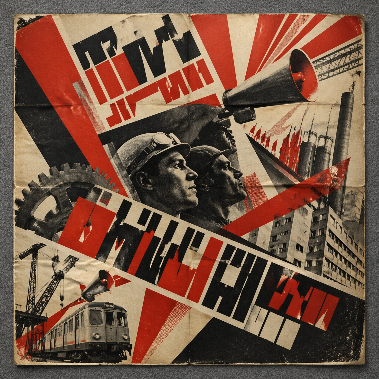
Scene: A square conservation-table view of a vintage poster laid on gray felt under raking light, with visible fold lines, softened corners, and subtle aging that still preserves the integrity of the image. The poster should express agitated constructivist geometry driven by diagonals, wedges, ray bursts, and halftone photomontage fragments, using revolutionary red, bone white, black, and steel gray with sharp contrast and a tactile surface appropriate to the medium. Subject: Present the poster as an archive copy that has been stored, unfolded, and carefully documented, letting age and handling reveal how the design holds up across time. Use megaphones, gears, worker profiles, factory towers, flags, and industrial beams as the main visual ingredients, and organize them with heavy angular pseudo-Cyrillic slogan blocks kept abstract and non-readable. For the contemporary-subject axis, thread in public transit megaphones, cranes, and modular housing blocks pushed into militant diagonal rhythm. The poster must feel like an original design object rather than a reproduction of any known work. Important details: Aging must stay believable rather than theatrical: slight yellowing, fold memory, edge wear, and pigment variation should support the historical or crafted feeling of the style. Preserve diagonal force, abrupt scale shifts, posterized cutout shadows, and coarse print grain. Keep every letterform abstract and non-readable, as if it were a typographic texture rather than language. Make the style unmistakable through composition, palette, surface behavior, and symbolic compression. no soft curves, no pastel palette, no decorative nostalgia, no polished luxury finish. Use case: Constructivist single study 5/9, testing archival endurance and age character. Constraints: No readable text, no watermark, no logos, preserve exact 1:1 aspect ratio, no copyrighted characters, no real brand marks, no QR codes, no interface chrome, no accidental gibberish lettering.

Example generated from “Russian Constructivist Revolution — Twin Poster Diptych”
GPT Image 2en

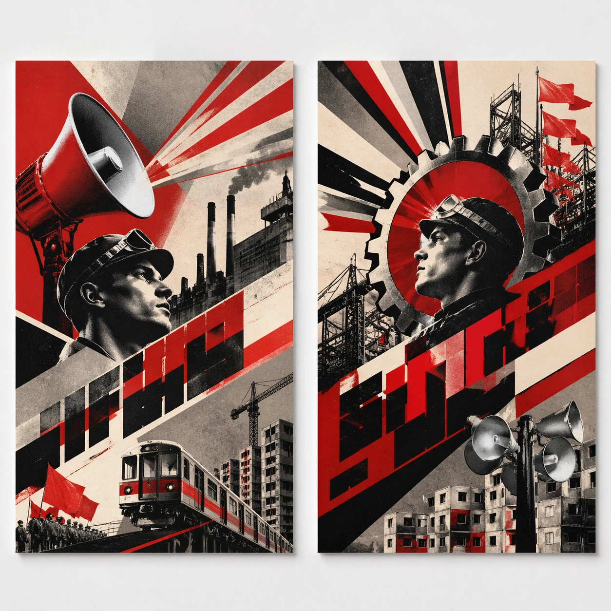
Scene: A square white-wall installation showing two companion posters hung side by side with equal spacing, photographed frontally so the pair reads as a designed conversation rather than two unrelated sheets. The poster should express agitated constructivist geometry driven by diagonals, wedges, ray bursts, and halftone photomontage fragments, using revolutionary red, bone white, black, and steel gray with sharp contrast and a tactile surface appropriate to the medium. Subject: Compose a matched diptych: two posters sharing one style system while splitting the narrative across paired motifs, mirrored masses, or complementary color emphasis. Use megaphones, gears, worker profiles, factory towers, flags, and industrial beams as the main visual ingredients, and organize them with heavy angular pseudo-Cyrillic slogan blocks kept abstract and non-readable. For the contemporary-subject axis, thread in public transit megaphones, cranes, and modular housing blocks pushed into militant diagonal rhythm. The poster must feel like an original design object rather than a reproduction of any known work. Important details: Both halves should feel distinct yet inseparable. Preserve one coherent visual language, but let each sheet carry its own focal symbol and rhythm without readable wording. Preserve diagonal force, abrupt scale shifts, posterized cutout shadows, and coarse print grain. Keep every letterform abstract and non-readable, as if it were a typographic texture rather than language. Make the style unmistakable through composition, palette, surface behavior, and symbolic compression. no soft curves, no pastel palette, no decorative nostalgia, no polished luxury finish. Use case: Constructivist single study 6/9, testing system flexibility across a paired set. Constraints: No readable text, no watermark, no logos, preserve exact 1:1 aspect ratio, no copyrighted characters, no real brand marks, no QR codes, no interface chrome, no accidental gibberish lettering.

Example generated from “Russian Constructivist Revolution — Stacked Print Bundle”
GPT Image 2en

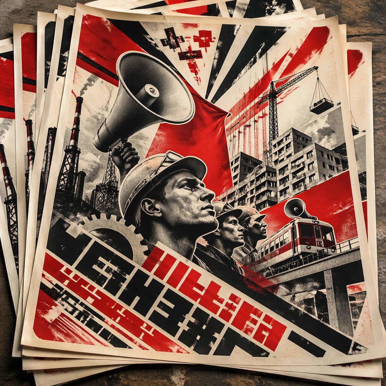
Scene: A square tabletop shot of several poster prints stacked and slightly fanned, with curled corners, offset edges, and soft directional light revealing paper thickness and ink behavior. The poster should express agitated constructivist geometry driven by diagonals, wedges, ray bursts, and halftone photomontage fragments, using revolutionary red, bone white, black, and steel gray with sharp contrast and a tactile surface appropriate to the medium. Subject: Design the top poster to dominate while nearby duplicate sheets echo the same composition, creating a tactile print-run scene rather than a single isolated sheet. Use megaphones, gears, worker profiles, factory towers, flags, and industrial beams as the main visual ingredients, and organize them with heavy angular pseudo-Cyrillic slogan blocks kept abstract and non-readable. For the contemporary-subject axis, thread in public transit megaphones, cranes, and modular housing blocks pushed into militant diagonal rhythm. The poster must feel like an original design object rather than a reproduction of any known work. Important details: Use the stack to emphasize production character: edge shadows, repeated motifs peeking from beneath, and subtle misalignment should enrich the material reading without changing the core design. Preserve diagonal force, abrupt scale shifts, posterized cutout shadows, and coarse print grain. Keep every letterform abstract and non-readable, as if it were a typographic texture rather than language. Make the style unmistakable through composition, palette, surface behavior, and symbolic compression. no soft curves, no pastel palette, no decorative nostalgia, no polished luxury finish. Use case: Constructivist single study 7/9, testing print-run tactility and repeat presence. Constraints: No readable text, no watermark, no logos, preserve exact 1:1 aspect ratio, no copyrighted characters, no real brand marks, no QR codes, no interface chrome, no accidental gibberish lettering.

Example generated from “Russian Constructivist Revolution — Kiosk Night Glow”
GPT Image 2en

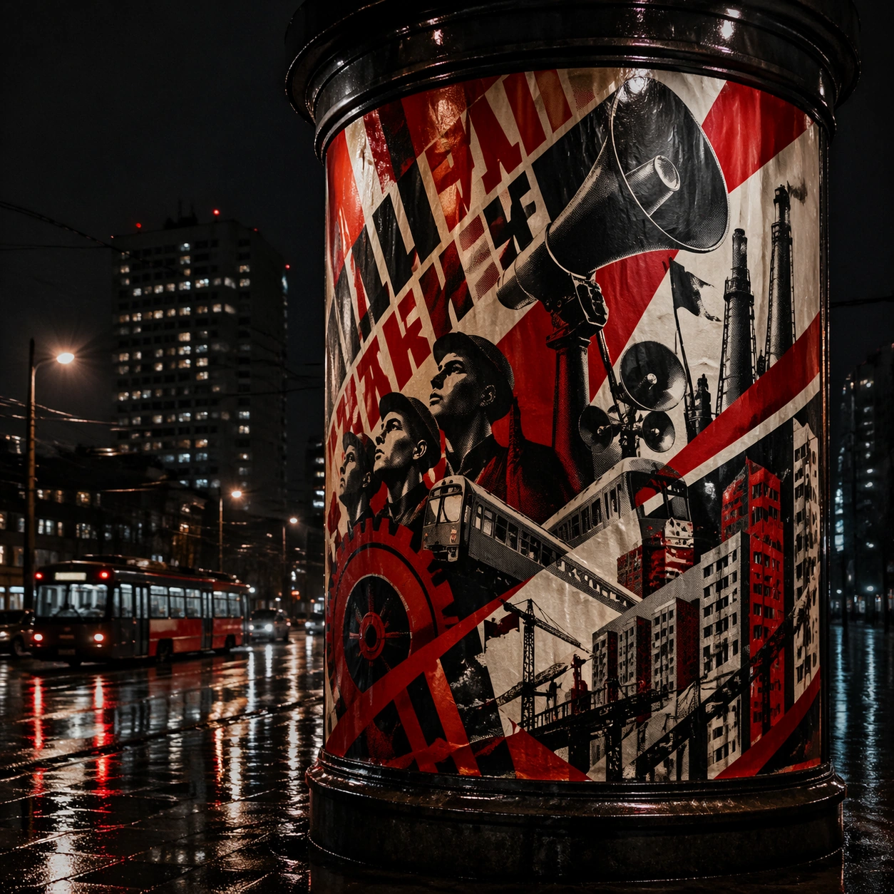
Scene: A square nighttime city view with the poster wrapping part of a cylindrical kiosk, wet pavement reflecting nearby light, and the composition holding together under moody urban illumination. The poster should express agitated constructivist geometry driven by diagonals, wedges, ray bursts, and halftone photomontage fragments, using revolutionary red, bone white, black, and steel gray with sharp contrast and a tactile surface appropriate to the medium. Subject: Reframe the design for a dramatic street-placement context, where the poster has to project style and mood through reflection, curvature, and surrounding darkness. Use megaphones, gears, worker profiles, factory towers, flags, and industrial beams as the main visual ingredients, and organize them with heavy angular pseudo-Cyrillic slogan blocks kept abstract and non-readable. For the contemporary-subject axis, thread in public transit megaphones, cranes, and modular housing blocks pushed into militant diagonal rhythm. The poster must feel like an original design object rather than a reproduction of any known work. Important details: The design should remain instantly recognizable despite the cylindrical wrap. Preserve major blocks, symbolic shapes, and abstract title forms so the style still feels authoritative at night. Preserve diagonal force, abrupt scale shifts, posterized cutout shadows, and coarse print grain. Keep every letterform abstract and non-readable, as if it were a typographic texture rather than language. Make the style unmistakable through composition, palette, surface behavior, and symbolic compression. no soft curves, no pastel palette, no decorative nostalgia, no polished luxury finish. Use case: Constructivist single study 8/9, testing atmospheric display under rain and glow. Constraints: No readable text, no watermark, no logos, preserve exact 1:1 aspect ratio, no copyrighted characters, no real brand marks, no QR codes, no interface chrome, no accidental gibberish lettering.

Example generated from “Russian Constructivist Revolution — Contemporary Remix”
GPT Image 2en

Scene: A square front-facing poster presentation on a clean neutral wall, lit like a premium print test, with crisp edges and a polished but still tactile finish appropriate to the style. The poster should express agitated constructivist geometry driven by diagonals, wedges, ray bursts, and halftone photomontage fragments, using revolutionary red, bone white, black, and steel gray with sharp contrast and a tactile surface appropriate to the medium. Subject: Apply the historical poster language to a contemporary urban subject so the old visual grammar proves it can carry present-day themes without losing authenticity or formal discipline. Use megaphones, gears, worker profiles, factory towers, flags, and industrial beams as the main visual ingredients, and organize them with heavy angular pseudo-Cyrillic slogan blocks kept abstract and non-readable. For the contemporary-subject axis, thread in public transit megaphones, cranes, and modular housing blocks pushed into militant diagonal rhythm. The poster must feel like an original design object rather than a reproduction of any known work. Important details: This is not parody. The contemporary subject should feel genuinely absorbed into the style through palette, composition, symbolic compression, and non-readable lettering treatment. Preserve diagonal force, abrupt scale shifts, posterized cutout shadows, and coarse print grain. Keep every letterform abstract and non-readable, as if it were a typographic texture rather than language. Make the style unmistakable through composition, palette, surface behavior, and symbolic compression. no soft curves, no pastel palette, no decorative nostalgia, no polished luxury finish. Use case: Constructivist single study 9/9, testing historical grammar on a present-day subject. Constraints: No readable text, no watermark, no logos, preserve exact 1:1 aspect ratio, no copyrighted characters, no real brand marks, no QR codes, no interface chrome, no accidental gibberish lettering.

Example generated from “Saas Landing Hero System — Reference Anchor”
GPT Image 2en

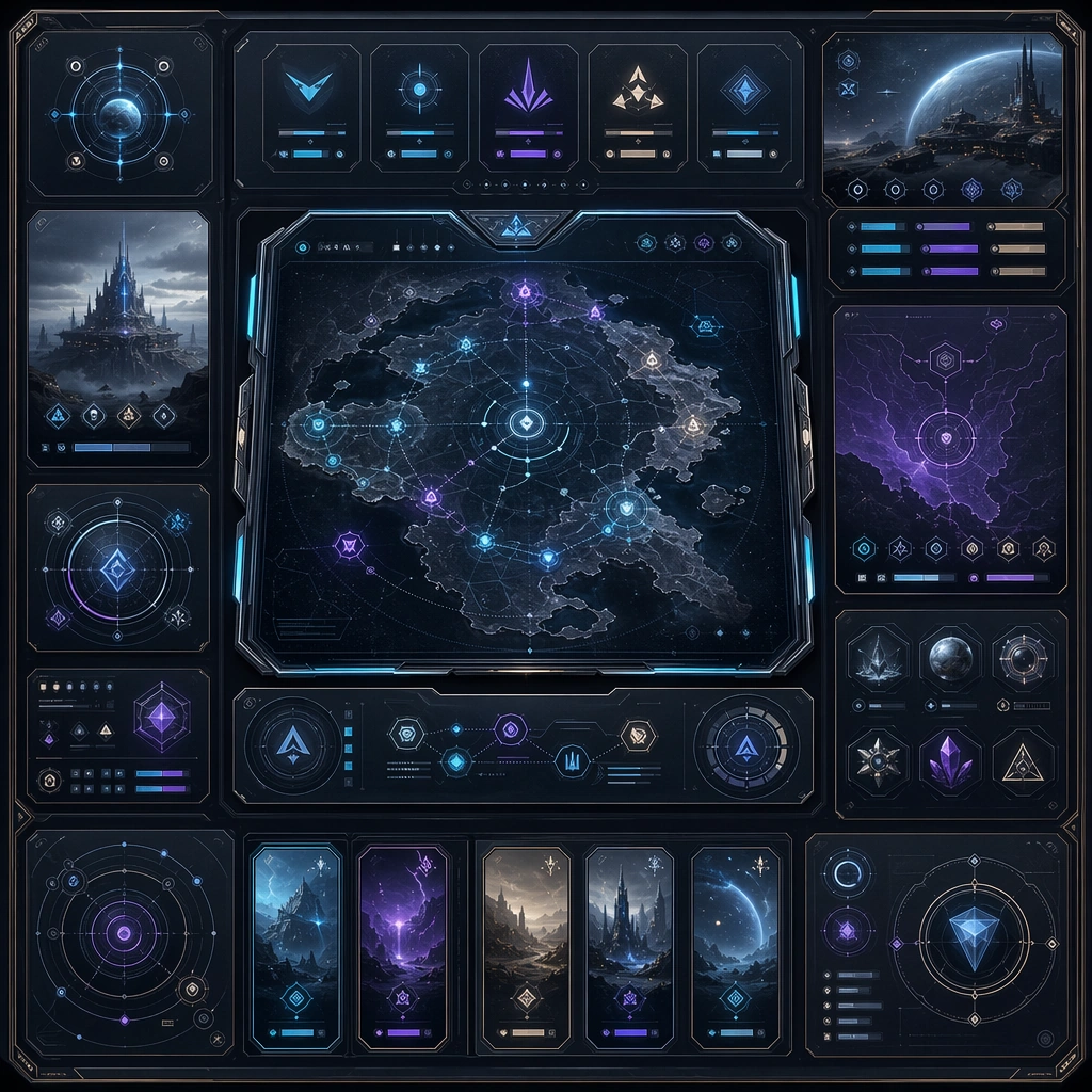
Scene: Create a square reference image for SaaS Landing Hero System. Build a reference anchor establishing the core system with a premium, production-ready finish. Use a polished modular board or campaign surface with clean spacing, premium game-UI finish, and clear focal hierarchy. The composition should feel intentional, clean, and reusable for gallery, research, campaign, or internal handoff contexts. Lighting must support readability first, with the main forms clearly separated from the background and enough breathing room for the system to stay legible at both hero scale and thumbnail scale. Subject: Center a coherent original game-art system built for premium production and marketing surfaces. For this image, focus on reference anchor. Keep the same system logic stable across screenshots, cards, banners, and overview boards. This image is the canonical anchor that later series images must follow. The viewer should immediately understand what role this surface plays inside a cohesive game-production asset pack. Important details: Lock framing, icon grammar, palette blocking, and surface hierarchy so the kit feels production-ready and consistent. Preserve the core silhouette, framing language, and material logic from the reference image while each variation changes function. Keep materials believable, edge hierarchy disciplined, and the visual language consistent with SaaS Hero. Use abstract interface blocks or diagram accents when helpful, but avoid any readable language. The final result should feel like a deliberate production asset rather than a random illustration. Use case: SaaS Landing Hero System series study 1/9, designed as reference anchor within a cohesive asset pack. Constraints: No readable text, no watermark, no logos, preserve exact 1:1 aspect ratio, no unrelated objects, no broken visual hierarchy, no malformed anatomy or broken perspective, no random decorative clutter.

Example generated from “Saas Landing Hero System — Variant One”
GPT Image 2en

Scene: Create a square dependent image for SaaS Landing Hero System. Build a first controlled variation in the same system with a premium, production-ready finish. Use a polished modular board or campaign surface with clean spacing, premium game-UI finish, and clear focal hierarchy. The composition should feel intentional, clean, and reusable for gallery, research, campaign, or internal handoff contexts. Lighting must support readability first, with the main forms clearly separated from the background and enough breathing room for the system to stay legible at both hero scale and thumbnail scale. Subject: Center a coherent original game-art system built for premium production and marketing surfaces. For this image, focus on the intended support surface. Keep the same system logic stable across screenshots, cards, banners, and overview boards. Preserve exact identity or system logic from the reference image while changing only the intended variation axis. The viewer should immediately understand what role this surface plays inside a cohesive game-production asset pack. Important details: Lock framing, icon grammar, palette blocking, and surface hierarchy so the kit feels production-ready and consistent. Preserve the core silhouette, framing language, and material logic from the reference image while each variation changes function. Keep materials believable, edge hierarchy disciplined, and the visual language consistent with SaaS Hero. Use abstract interface blocks or diagram accents when helpful, but avoid any readable language. The final result should feel like a deliberate production asset rather than a random illustration. Use case: SaaS Landing Hero System series study 2/9, designed as variant one within a cohesive asset pack. Constraints: No readable text, no watermark, no logos, preserve exact 1:1 aspect ratio, no unrelated objects, no broken visual hierarchy, no malformed anatomy or broken perspective, no random decorative clutter.

Example generated from “Saas Landing Hero System — Variant Two”
GPT Image 2en

Scene: Create a square dependent image for SaaS Landing Hero System. Build a second controlled variation in the same system with a premium, production-ready finish. Use a polished modular board or campaign surface with clean spacing, premium game-UI finish, and clear focal hierarchy. The composition should feel intentional, clean, and reusable for gallery, research, campaign, or internal handoff contexts. Lighting must support readability first, with the main forms clearly separated from the background and enough breathing room for the system to stay legible at both hero scale and thumbnail scale. Subject: Center a coherent original game-art system built for premium production and marketing surfaces. For this image, focus on the intended support surface. Keep the same system logic stable across screenshots, cards, banners, and overview boards. Preserve exact identity or system logic from the reference image while changing only the intended variation axis. The viewer should immediately understand what role this surface plays inside a cohesive game-production asset pack. Important details: Lock framing, icon grammar, palette blocking, and surface hierarchy so the kit feels production-ready and consistent. Preserve the core silhouette, framing language, and material logic from the reference image while each variation changes function. Keep materials believable, edge hierarchy disciplined, and the visual language consistent with SaaS Hero. Use abstract interface blocks or diagram accents when helpful, but avoid any readable language. The final result should feel like a deliberate production asset rather than a random illustration. Use case: SaaS Landing Hero System series study 3/9, designed as variant two within a cohesive asset pack. Constraints: No readable text, no watermark, no logos, preserve exact 1:1 aspect ratio, no unrelated objects, no broken visual hierarchy, no malformed anatomy or broken perspective, no random decorative clutter.

Example generated from “Saas Landing Hero System — Support One”
GPT Image 2en

Scene: Create a square standalone support image for SaaS Landing Hero System. Build a support-surface study with a clear focal hierarchy and a finished professional surface. Use a polished modular board or campaign surface with clean spacing, premium game-UI finish, and clear focal hierarchy. The frame should feel self-contained and polished, with enough structure to explain the system even without the reference series, yet still obviously belonging to the same theme and production world. Subject: Show a coherent original game-art system built for premium production and marketing surfaces in a way that emphasizes the intended support surface. Keep the same system logic stable across screenshots, cards, banners, and overview boards. Even though this image is independent, the viewer should still recognize the same universe, same commercial logic, and same production intent as the core package. Important details: Lock framing, icon grammar, palette blocking, and surface hierarchy so the kit feels production-ready and consistent. Preserve the broader theme language through color, framing, material choices, and modular composition. Use clean panel rhythm, premium asset presentation, and believable detail density. The image should work equally well as a gallery study, research reference, and mock production deliverable. Use case: SaaS Landing Hero System single study 5/9, exploring support one as a support surface. Constraints: No readable text, no watermark, no logos, preserve exact 1:1 aspect ratio, no unrelated objects, no broken visual hierarchy, no visual noise that obscures the main surface, no accidental brand resemblance.

Example generated from “Saas Landing Hero System — Support Two”
GPT Image 2en

Scene: Create a square standalone support image for SaaS Landing Hero System. Build a second support-surface study with a clear focal hierarchy and a finished professional surface. Use a polished modular board or campaign surface with clean spacing, premium game-UI finish, and clear focal hierarchy. The frame should feel self-contained and polished, with enough structure to explain the system even without the reference series, yet still obviously belonging to the same theme and production world. Subject: Show a coherent original game-art system built for premium production and marketing surfaces in a way that emphasizes the intended support surface. Keep the same system logic stable across screenshots, cards, banners, and overview boards. Even though this image is independent, the viewer should still recognize the same universe, same commercial logic, and same production intent as the core package. Important details: Lock framing, icon grammar, palette blocking, and surface hierarchy so the kit feels production-ready and consistent. Preserve the broader theme language through color, framing, material choices, and modular composition. Use clean panel rhythm, premium asset presentation, and believable detail density. The image should work equally well as a gallery study, research reference, and mock production deliverable. Use case: SaaS Landing Hero System single study 6/9, exploring support two as a support surface. Constraints: No readable text, no watermark, no logos, preserve exact 1:1 aspect ratio, no unrelated objects, no broken visual hierarchy, no visual noise that obscures the main surface, no accidental brand resemblance.

Example generated from “Saas Landing Hero System — Support Three”
GPT Image 2en

Scene: Create a square standalone support image for SaaS Landing Hero System. Build a third support-surface study with a clear focal hierarchy and a finished professional surface. Use a polished modular board or campaign surface with clean spacing, premium game-UI finish, and clear focal hierarchy. The frame should feel self-contained and polished, with enough structure to explain the system even without the reference series, yet still obviously belonging to the same theme and production world. Subject: Show a coherent original game-art system built for premium production and marketing surfaces in a way that emphasizes the intended support surface. Keep the same system logic stable across screenshots, cards, banners, and overview boards. Even though this image is independent, the viewer should still recognize the same universe, same commercial logic, and same production intent as the core package. Important details: Lock framing, icon grammar, palette blocking, and surface hierarchy so the kit feels production-ready and consistent. Preserve the broader theme language through color, framing, material choices, and modular composition. Use clean panel rhythm, premium asset presentation, and believable detail density. The image should work equally well as a gallery study, research reference, and mock production deliverable. Use case: SaaS Landing Hero System single study 7/9, exploring support three as a support surface. Constraints: No readable text, no watermark, no logos, preserve exact 1:1 aspect ratio, no unrelated objects, no broken visual hierarchy, no visual noise that obscures the main surface, no accidental brand resemblance.

Example generated from “Saas Landing Hero System — Support Four”
GPT Image 2en

Scene: Create a square standalone support image for SaaS Landing Hero System. Build a fourth support-surface study with a clear focal hierarchy and a finished professional surface. Use a polished modular board or campaign surface with clean spacing, premium game-UI finish, and clear focal hierarchy. The frame should feel self-contained and polished, with enough structure to explain the system even without the reference series, yet still obviously belonging to the same theme and production world. Subject: Show a coherent original game-art system built for premium production and marketing surfaces in a way that emphasizes the intended support surface. Keep the same system logic stable across screenshots, cards, banners, and overview boards. Even though this image is independent, the viewer should still recognize the same universe, same commercial logic, and same production intent as the core package. Important details: Lock framing, icon grammar, palette blocking, and surface hierarchy so the kit feels production-ready and consistent. Preserve the broader theme language through color, framing, material choices, and modular composition. Use clean panel rhythm, premium asset presentation, and believable detail density. The image should work equally well as a gallery study, research reference, and mock production deliverable. Use case: SaaS Landing Hero System single study 8/9, exploring support four as a support surface. Constraints: No readable text, no watermark, no logos, preserve exact 1:1 aspect ratio, no unrelated objects, no broken visual hierarchy, no visual noise that obscures the main surface, no accidental brand resemblance.

Example generated from “Saas Landing Hero System — Support Five”
GPT Image 2en

Scene: Create a square standalone support image for SaaS Landing Hero System. Build a fifth support-surface study with a clear focal hierarchy and a finished professional surface. Use a polished modular board or campaign surface with clean spacing, premium game-UI finish, and clear focal hierarchy. The frame should feel self-contained and polished, with enough structure to explain the system even without the reference series, yet still obviously belonging to the same theme and production world. Subject: Show a coherent original game-art system built for premium production and marketing surfaces in a way that emphasizes the intended support surface. Keep the same system logic stable across screenshots, cards, banners, and overview boards. Even though this image is independent, the viewer should still recognize the same universe, same commercial logic, and same production intent as the core package. Important details: Lock framing, icon grammar, palette blocking, and surface hierarchy so the kit feels production-ready and consistent. Preserve the broader theme language through color, framing, material choices, and modular composition. Use clean panel rhythm, premium asset presentation, and believable detail density. The image should work equally well as a gallery study, research reference, and mock production deliverable. Use case: SaaS Landing Hero System single study 9/9, exploring support five as a support surface. Constraints: No readable text, no watermark, no logos, preserve exact 1:1 aspect ratio, no unrelated objects, no broken visual hierarchy, no visual noise that obscures the main surface, no accidental brand resemblance.

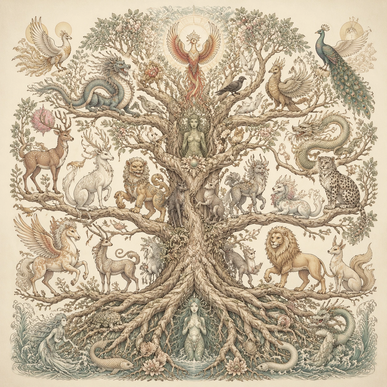
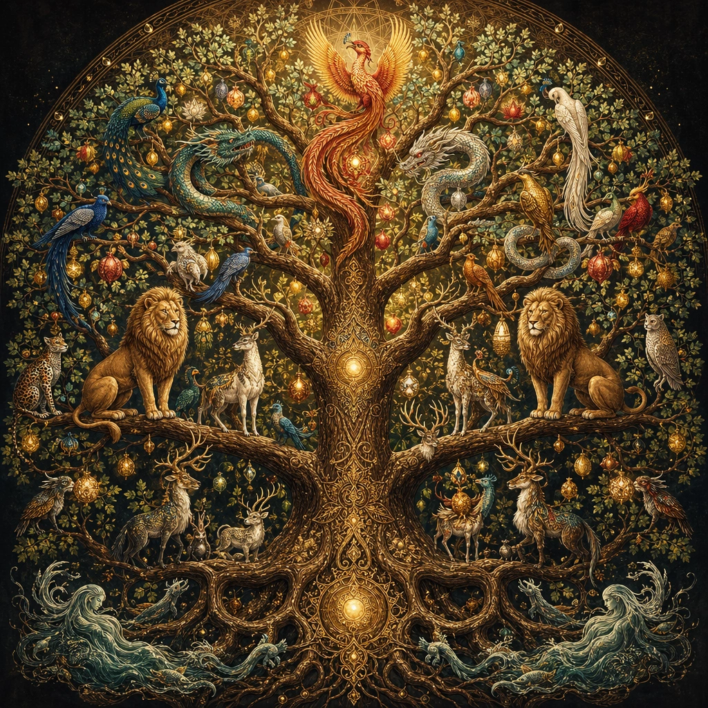
Example generated from “Sacred Tree Of Life Bestiary — Canopy Census”
GPT Image 2en

Scene: Build a square image around one towering tree-of-life composition seen straight on, with the trunk, roots, and branch architecture organizing every creature placement. Even when the image becomes crowded, the tree should remain the structural anchor and the viewer should be able to understand the vertical hierarchy from roots to canopy at a glance. Present it like an illuminated natural history plate with calm frontal symmetry and soft dawn light. Keep the square crop exact, the camera flat, and the tonal design disciplined enough that structure stays clear at poster scale and under close inspection. Subject: Populate the tree with a broad, respectful census of mythic creatures from different sacred traditions: luminous birds, antlered guardians, scaled sky-serpents, leonine protectors, river spirits, horned deer, long-tailed phoenix forms, and other symbolic beings. They should feel related by one illustration language and one ecosystem of reverence rather than like a collage of unrelated references. Focus this variation on a balanced full-tree census with many creatures distributed across four clear canopy strata and one commanding trunk. The composition should feel complete and singular, as though one finished artifact has been resolved with full conviction rather than one fragment pulled from a larger sheet. Important details: Creature variety is important, but unity matters more. Keep silhouettes distinct, branch placements intentional, and the trunk texture richly developed. Use light, fruit, leaves, bark patterns, and root geometry to connect the inhabitants into one ordered cosmology with clear zones and no empty dead layers. Keep each layer legible, using branch rhythm and subtle color zoning so multiple creatures can coexist without visual collision. Preserve crisp edge behavior, stable hierarchy, and enough fine information that the image rewards slow viewing without losing the main read from a distance. Use case: Tree of Life Bestiary single study 1/9, designed as a self-contained sacred-geometry image with a distinct material and compositional emphasis. Constraints: No readable text, no watermark, no logos, preserve exact 1:1 aspect ratio, no comedic fantasy creatures, no modern mascot styling, no random landscape background stealing focus, no readable labels, no chaotic overlap between animals, no broken tree anatomy, no tangled branches hiding forms, no sentimental fairy-tale mood, no empty lower trunk.
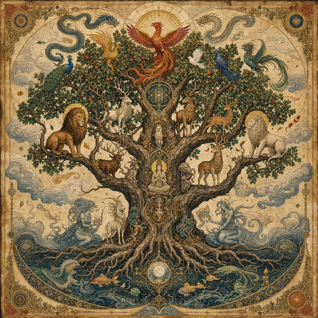
Example generated from “Sacred Tree Of Life Bestiary — Roots and Underworld Keepers”
GPT Image 2en

Scene: Build a square image around one towering tree-of-life composition seen straight on, with the trunk, roots, and branch architecture organizing every creature placement. Even when the image becomes crowded, the tree should remain the structural anchor and the viewer should be able to understand the vertical hierarchy from roots to canopy at a glance. Use earthy low light and a strong vertical axis, keeping the camera square to the tree. Keep the square crop exact, the camera flat, and the tonal design disciplined enough that structure stays clear at poster scale and under close inspection. Subject: Populate the tree with a broad, respectful census of mythic creatures from different sacred traditions: luminous birds, antlered guardians, scaled sky-serpents, leonine protectors, river spirits, horned deer, long-tailed phoenix forms, and other symbolic beings. They should feel related by one illustration language and one ecosystem of reverence rather than like a collage of unrelated references. Focus this variation on a root-heavy composition emphasizing subterranean guardians, serpentine spirits, and ancient bark geometry below the central trunk. The composition should feel complete and singular, as though one finished artifact has been resolved with full conviction rather than one fragment pulled from a larger sheet. Important details: Creature variety is important, but unity matters more. Keep silhouettes distinct, branch placements intentional, and the trunk texture richly developed. Use light, fruit, leaves, bark patterns, and root geometry to connect the inhabitants into one ordered cosmology with clear zones and no empty dead layers. The root system must feel as carefully designed as the canopy, with creatures nested into its logic rather than pasted around it. Preserve crisp edge behavior, stable hierarchy, and enough fine information that the image rewards slow viewing without losing the main read from a distance. Use case: Tree of Life Bestiary single study 2/9, designed as a self-contained sacred-geometry image with a distinct material and compositional emphasis. Constraints: No readable text, no watermark, no logos, preserve exact 1:1 aspect ratio, no comedic fantasy creatures, no modern mascot styling, no random landscape background stealing focus, no readable labels, no chaotic overlap between animals, no broken tree anatomy, no horror aesthetic, no muddy soil blur, no broken root symmetry.
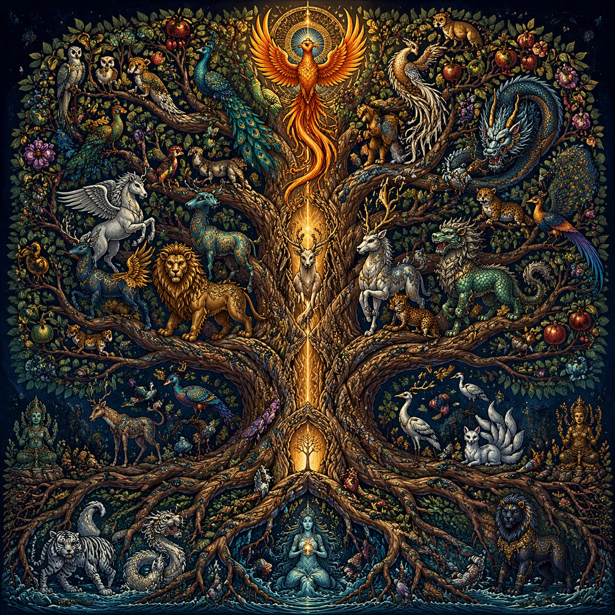
Example generated from “Sacred Tree Of Life Bestiary — Dawn Birds and Serpents”
GPT Image 2en

Scene: Build a square image around one towering tree-of-life composition seen straight on, with the trunk, roots, and branch architecture organizing every creature placement. Even when the image becomes crowded, the tree should remain the structural anchor and the viewer should be able to understand the vertical hierarchy from roots to canopy at a glance. Let the light rise from below and behind, but keep every contour readable and the composition frontal. Keep the square crop exact, the camera flat, and the tonal design disciplined enough that structure stays clear at poster scale and under close inspection. Subject: Populate the tree with a broad, respectful census of mythic creatures from different sacred traditions: luminous birds, antlered guardians, scaled sky-serpents, leonine protectors, river spirits, horned deer, long-tailed phoenix forms, and other symbolic beings. They should feel related by one illustration language and one ecosystem of reverence rather than like a collage of unrelated references. Focus this variation on a sunrise study balancing radiant birds in the upper branches with elegant serpentine forms coiling through lower arcs. The composition should feel complete and singular, as though one finished artifact has been resolved with full conviction rather than one fragment pulled from a larger sheet. Important details: Creature variety is important, but unity matters more. Keep silhouettes distinct, branch placements intentional, and the trunk texture richly developed. Use light, fruit, leaves, bark patterns, and root geometry to connect the inhabitants into one ordered cosmology with clear zones and no empty dead layers. Use plumage, scales, and bark patterns as repeating rhythms that unify the image without flattening species differences. Preserve crisp edge behavior, stable hierarchy, and enough fine information that the image rewards slow viewing without losing the main read from a distance. Use case: Tree of Life Bestiary single study 3/9, designed as a self-contained sacred-geometry image with a distinct material and compositional emphasis. Constraints: No readable text, no watermark, no logos, preserve exact 1:1 aspect ratio, no comedic fantasy creatures, no modern mascot styling, no random landscape background stealing focus, no readable labels, no chaotic overlap between animals, no broken tree anatomy, no action-battle posing, no messy wing overlap, no random sunrise landscape.
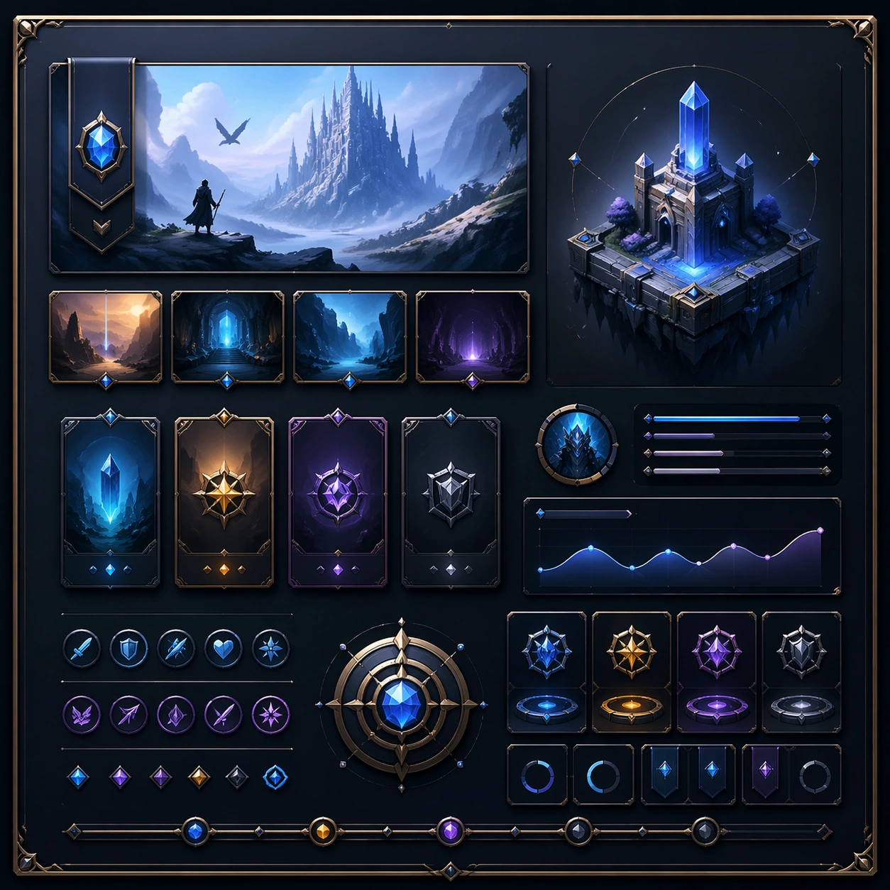
Example generated from “Sacred Tree Of Life Bestiary — Moonlit Branch Court”
GPT Image 2en

Scene: Build a square image around one towering tree-of-life composition seen straight on, with the trunk, roots, and branch architecture organizing every creature placement. Even when the image becomes crowded, the tree should remain the structural anchor and the viewer should be able to understand the vertical hierarchy from roots to canopy at a glance. Keep the palette cool and restrained, with luminous highlights reserved for eyes, fruit, and key branch junctions. Keep the square crop exact, the camera flat, and the tonal design disciplined enough that structure stays clear at poster scale and under close inspection. Subject: Populate the tree with a broad, respectful census of mythic creatures from different sacred traditions: luminous birds, antlered guardians, scaled sky-serpents, leonine protectors, river spirits, horned deer, long-tailed phoenix forms, and other symbolic beings. They should feel related by one illustration language and one ecosystem of reverence rather than like a collage of unrelated references. Focus this variation on a nocturnal court of pale creatures, silver leaves, and moonlit bark arranged with ceremonial stillness. The composition should feel complete and singular, as though one finished artifact has been resolved with full conviction rather than one fragment pulled from a larger sheet. Important details: Creature variety is important, but unity matters more. Keep silhouettes distinct, branch placements intentional, and the trunk texture richly developed. Use light, fruit, leaves, bark patterns, and root geometry to connect the inhabitants into one ordered cosmology with clear zones and no empty dead layers. Night mood should deepen hierarchy, not hide anatomy; branch layers and creature rankings must stay clear. Preserve crisp edge behavior, stable hierarchy, and enough fine information that the image rewards slow viewing without losing the main read from a distance. Use case: Tree of Life Bestiary single study 4/9, designed as a self-contained sacred-geometry image with a distinct material and compositional emphasis. Constraints: No readable text, no watermark, no logos, preserve exact 1:1 aspect ratio, no comedic fantasy creatures, no modern mascot styling, no random landscape background stealing focus, no readable labels, no chaotic overlap between animals, no broken tree anatomy, no spooky haunted-tree tropes, no fog cover, no glowing cartoon eyes.
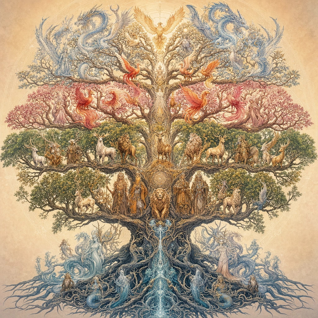
Example generated from “Sacred Tree Of Life Bestiary — Ivory Herbal Panel”
GPT Image 2en

Scene: Build a square image around one towering tree-of-life composition seen straight on, with the trunk, roots, and branch architecture organizing every creature placement. Even when the image becomes crowded, the tree should remain the structural anchor and the viewer should be able to understand the vertical hierarchy from roots to canopy at a glance. Render it as a refined paper panel with pale pigments and meticulous line control. Keep the square crop exact, the camera flat, and the tonal design disciplined enough that structure stays clear at poster scale and under close inspection. Subject: Populate the tree with a broad, respectful census of mythic creatures from different sacred traditions: luminous birds, antlered guardians, scaled sky-serpents, leonine protectors, river spirits, horned deer, long-tailed phoenix forms, and other symbolic beings. They should feel related by one illustration language and one ecosystem of reverence rather than like a collage of unrelated references. Focus this variation on an archival ivory study where the tree reads like a scholarly herbal-bestiary plate with many precise creature profiles. The composition should feel complete and singular, as though one finished artifact has been resolved with full conviction rather than one fragment pulled from a larger sheet. Important details: Creature variety is important, but unity matters more. Keep silhouettes distinct, branch placements intentional, and the trunk texture richly developed. Use light, fruit, leaves, bark patterns, and root geometry to connect the inhabitants into one ordered cosmology with clear zones and no empty dead layers. Use leaf clusters and fruit forms to bridge species transitions, keeping the overall silhouette elegant and centered. Preserve crisp edge behavior, stable hierarchy, and enough fine information that the image rewards slow viewing without losing the main read from a distance. Use case: Tree of Life Bestiary single study 5/9, designed as a self-contained sacred-geometry image with a distinct material and compositional emphasis. Constraints: No readable text, no watermark, no logos, preserve exact 1:1 aspect ratio, no comedic fantasy creatures, no modern mascot styling, no random landscape background stealing focus, no readable labels, no chaotic overlap between animals, no broken tree anatomy, no readable marginal notes, no botanical clutter overload, no washed-out anatomy.
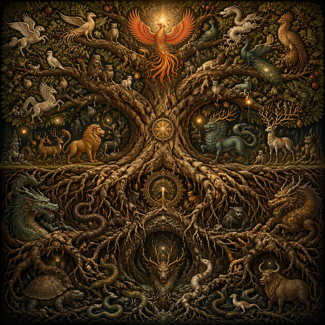
Example generated from “Sacred Tree Of Life Bestiary — Storm Axis Vellum”
GPT Image 2en

Scene: Build a square image around one towering tree-of-life composition seen straight on, with the trunk, roots, and branch architecture organizing every creature placement. Even when the image becomes crowded, the tree should remain the structural anchor and the viewer should be able to understand the vertical hierarchy from roots to canopy at a glance. Allow motion in the foliage and cloud bands, but keep the trunk and branch geometry stable and frontal. Keep the square crop exact, the camera flat, and the tonal design disciplined enough that structure stays clear at poster scale and under close inspection. Subject: Populate the tree with a broad, respectful census of mythic creatures from different sacred traditions: luminous birds, antlered guardians, scaled sky-serpents, leonine protectors, river spirits, horned deer, long-tailed phoenix forms, and other symbolic beings. They should feel related by one illustration language and one ecosystem of reverence rather than like a collage of unrelated references. Focus this variation on a dramatic vellum study where winds bend leaves around an unwavering sacred axis populated by vigilant beings. The composition should feel complete and singular, as though one finished artifact has been resolved with full conviction rather than one fragment pulled from a larger sheet. Important details: Creature variety is important, but unity matters more. Keep silhouettes distinct, branch placements intentional, and the trunk texture richly developed. Use light, fruit, leaves, bark patterns, and root geometry to connect the inhabitants into one ordered cosmology with clear zones and no empty dead layers. Creature placement should resist chaos and prove that the whole composition is still governed by sacred order. Preserve crisp edge behavior, stable hierarchy, and enough fine information that the image rewards slow viewing without losing the main read from a distance. Use case: Tree of Life Bestiary single study 6/9, designed as a self-contained sacred-geometry image with a distinct material and compositional emphasis. Constraints: No readable text, no watermark, no logos, preserve exact 1:1 aspect ratio, no comedic fantasy creatures, no modern mascot styling, no random landscape background stealing focus, no readable labels, no chaotic overlap between animals, no broken tree anatomy, no tornado spectacle, no snapped branches, no random lightning bolts.
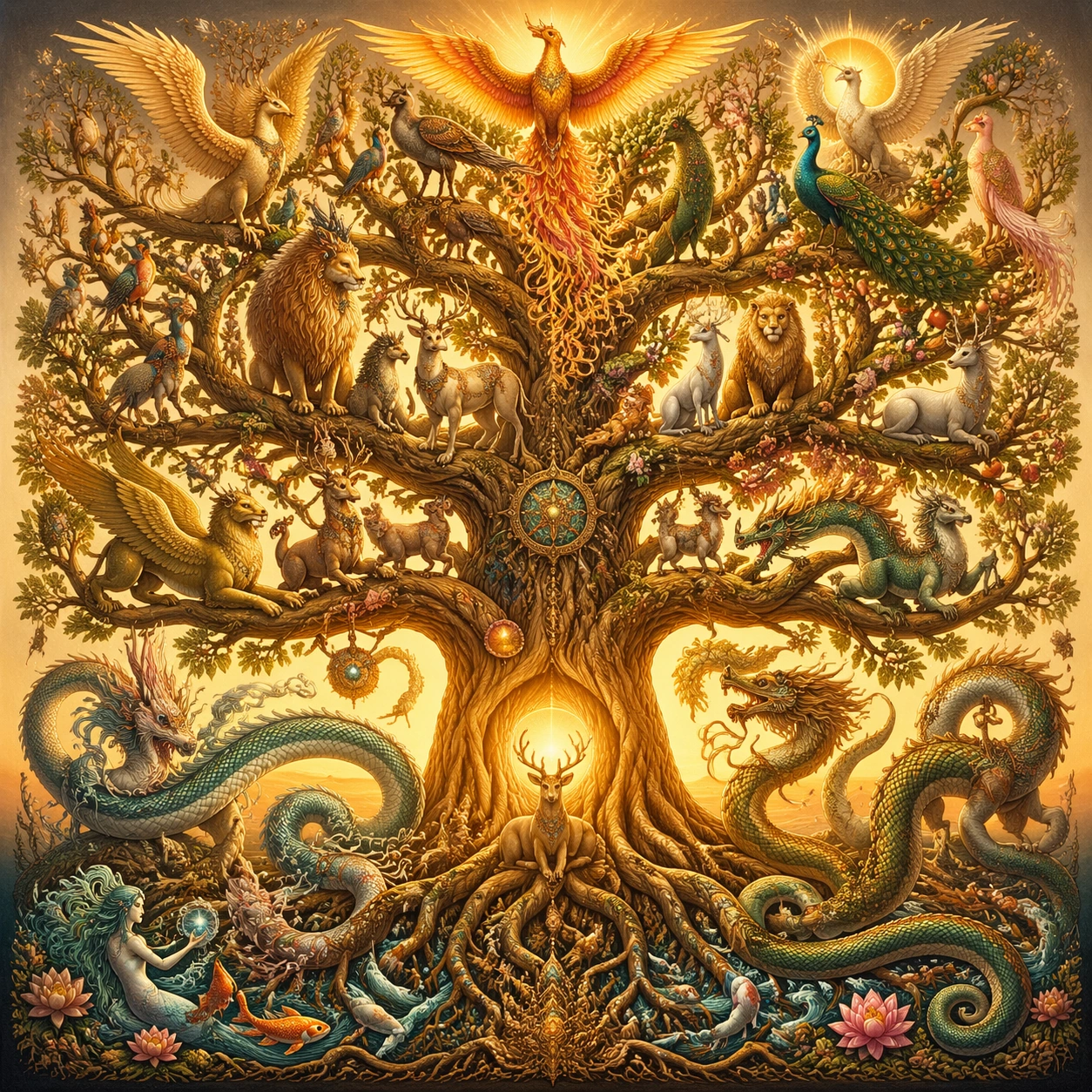
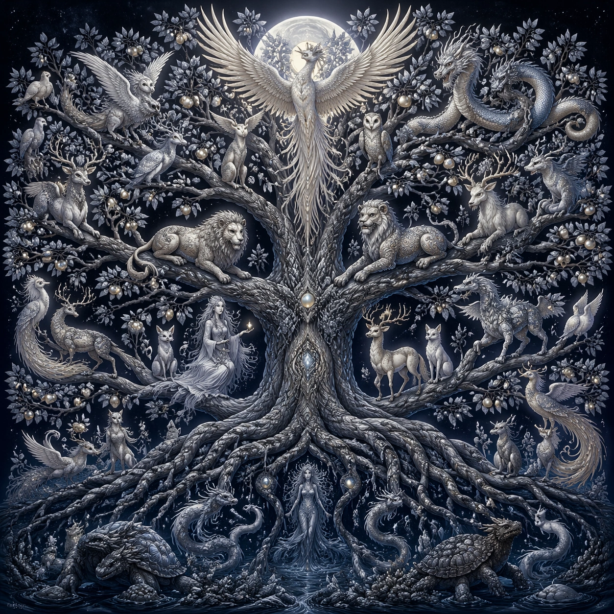
Example generated from “Sacred Tree Of Life Bestiary — Jewel Feather Procession”
GPT Image 2en

Scene: Build a square image around one towering tree-of-life composition seen straight on, with the trunk, roots, and branch architecture organizing every creature placement. Even when the image becomes crowded, the tree should remain the structural anchor and the viewer should be able to understand the vertical hierarchy from roots to canopy at a glance. Use rich but disciplined color, with the brightest accents concentrated near the central vertical ascent. Keep the square crop exact, the camera flat, and the tonal design disciplined enough that structure stays clear at poster scale and under close inspection. Subject: Populate the tree with a broad, respectful census of mythic creatures from different sacred traditions: luminous birds, antlered guardians, scaled sky-serpents, leonine protectors, river spirits, horned deer, long-tailed phoenix forms, and other symbolic beings. They should feel related by one illustration language and one ecosystem of reverence rather than like a collage of unrelated references. Focus this variation on a rich jewel-toned version where plumage, scales, fur, and fruit create one ceremonial upward procession. The composition should feel complete and singular, as though one finished artifact has been resolved with full conviction rather than one fragment pulled from a larger sheet. Important details: Creature variety is important, but unity matters more. Keep silhouettes distinct, branch placements intentional, and the trunk texture richly developed. Use light, fruit, leaves, bark patterns, and root geometry to connect the inhabitants into one ordered cosmology with clear zones and no empty dead layers. Material variation should enrich the species roster, yet every form must still belong to one coherent painted world. Preserve crisp edge behavior, stable hierarchy, and enough fine information that the image rewards slow viewing without losing the main read from a distance. Use case: Tree of Life Bestiary single study 7/9, designed as a self-contained sacred-geometry image with a distinct material and compositional emphasis. Constraints: No readable text, no watermark, no logos, preserve exact 1:1 aspect ratio, no comedic fantasy creatures, no modern mascot styling, no random landscape background stealing focus, no readable labels, no chaotic overlap between animals, no broken tree anatomy, no carnival color explosion, no costume-page collage, no empty branch gaps.

Example generated from “Sacred Tree Of Life Bestiary — Winter Bare Geometry”
GPT Image 2en

Scene: Build a square image around one towering tree-of-life composition seen straight on, with the trunk, roots, and branch architecture organizing every creature placement. Even when the image becomes crowded, the tree should remain the structural anchor and the viewer should be able to understand the vertical hierarchy from roots to canopy at a glance. Keep the image stark, elegant, and frontal, with muted tones and strong negative space around the branch network. Keep the square crop exact, the camera flat, and the tonal design disciplined enough that structure stays clear at poster scale and under close inspection. Subject: Populate the tree with a broad, respectful census of mythic creatures from different sacred traditions: luminous birds, antlered guardians, scaled sky-serpents, leonine protectors, river spirits, horned deer, long-tailed phoenix forms, and other symbolic beings. They should feel related by one illustration language and one ecosystem of reverence rather than like a collage of unrelated references. Focus this variation on a stripped winter study where bare branch geometry reveals the full structural intelligence of the tree and creature placements. The composition should feel complete and singular, as though one finished artifact has been resolved with full conviction rather than one fragment pulled from a larger sheet. Important details: Creature variety is important, but unity matters more. Keep silhouettes distinct, branch placements intentional, and the trunk texture richly developed. Use light, fruit, leaves, bark patterns, and root geometry to connect the inhabitants into one ordered cosmology with clear zones and no empty dead layers. Even with fewer leaves, the picture should feel complete through branch mathematics, bark texture, and poised inhabitants. Preserve crisp edge behavior, stable hierarchy, and enough fine information that the image rewards slow viewing without losing the main read from a distance. Use case: Tree of Life Bestiary single study 8/9, designed as a self-contained sacred-geometry image with a distinct material and compositional emphasis. Constraints: No readable text, no watermark, no logos, preserve exact 1:1 aspect ratio, no comedic fantasy creatures, no modern mascot styling, no random landscape background stealing focus, no readable labels, no chaotic overlap between animals, no broken tree anatomy, no dead-tree horror, no excessive snow scene, no lost upper silhouette.

Example generated from “Sacred Tree Of Life Bestiary — Luminous Fruit Altar”
GPT Image 2en

Scene: Build a square image around one towering tree-of-life composition seen straight on, with the trunk, roots, and branch architecture organizing every creature placement. Even when the image becomes crowded, the tree should remain the structural anchor and the viewer should be able to understand the vertical hierarchy from roots to canopy at a glance. Present it as a precious devotional image with the trunk perfectly centered and the square frame fully used. Keep the square crop exact, the camera flat, and the tonal design disciplined enough that structure stays clear at poster scale and under close inspection. Subject: Populate the tree with a broad, respectful census of mythic creatures from different sacred traditions: luminous birds, antlered guardians, scaled sky-serpents, leonine protectors, river spirits, horned deer, long-tailed phoenix forms, and other symbolic beings. They should feel related by one illustration language and one ecosystem of reverence rather than like a collage of unrelated references. Focus this variation on a ceremonial study where radiant fruit, hanging lights, and attentive creatures turn the tree into an altar-like vertical cosmos. The composition should feel complete and singular, as though one finished artifact has been resolved with full conviction rather than one fragment pulled from a larger sheet. Important details: Creature variety is important, but unity matters more. Keep silhouettes distinct, branch placements intentional, and the trunk texture richly developed. Use light, fruit, leaves, bark patterns, and root geometry to connect the inhabitants into one ordered cosmology with clear zones and no empty dead layers. Use fruit glow to guide the eye between root, trunk, branch, and crown, always preserving creature readability and arboreal dignity. Preserve crisp edge behavior, stable hierarchy, and enough fine information that the image rewards slow viewing without losing the main read from a distance. Use case: Tree of Life Bestiary single study 9/9, designed as a self-contained sacred-geometry image with a distinct material and compositional emphasis. Constraints: No readable text, no watermark, no logos, preserve exact 1:1 aspect ratio, no comedic fantasy creatures, no modern mascot styling, no random landscape background stealing focus, no readable labels, no chaotic overlap between animals, no broken tree anatomy, no literal shrine furniture, no human worshippers, no random decorative garlands.

Example generated from “Sahara Dune Wave Sunrise — Main Panorama”
GPT Image 2en

Scene: Create a square, photoreal landscape study of sahara dune wave at sunrise. Compose it as the clearest monument-scale establishing view, using a wide, level camera position with deep atmospheric recession and a calm, authoritative horizon. Let broad, sculpting natural light describe the major masses before it picks out the smaller details Keep the frame cinematic but disciplined, with a clear foreground, middle distance, and far mass so the viewer can measure real depth. The image should feel like a field photograph made with patience, precision, and sublime restraint rather than a fantasy matte painting. Subject: Show a monumental desert dune field at sunrise, with crescent dunes shaped like frozen ocean waves, a warm-to-cool sky gradient, and a lone camel caravan crossing the valley floor. This variation should emphasize hero panorama. The main landform must dominate the composition, but secondary elements should quietly explain how the place works: water paths, sediment lines, snow bands, surf, ash, wind streaks, stars, or human traces where appropriate. Everything in the image should support the same idea of scale and climate, so the scene reads as one coherent environment rather than a stack of spectacular details. Important details: Preserve clean wind-carved ridges, believable sand grain behavior, long low sunrise shadows, smooth atmospheric perspective, and the impression that the dunes are planetary-scale waves made of sand. Keep one dominant landform, one secondary supporting rhythm, and a restrained scale witness so the scene reads immediately. Keep geology, weather, and atmosphere physically believable. Use subtle micro-texture, tonal separation, and air perspective to reinforce distance. If a human, vehicle, tent, caravan, bird, or boat appears, it must remain tiny and subordinate to the landscape, functioning only as a scale witness. The composition should feel original, severe, and elegant, with no decorative filler and no imitation of any copyrighted visual property. Use case: Sahara Dune Wave at Sunrise single study 1/9, exploring the hero panorama variation. Constraints: No readable text, no watermark, no logos, preserve exact 1:1 aspect ratio, no vegetation, no roads, no buildings, no oasis clichés, no split-screen layout, no collage fragments, no exaggerated fisheye distortion, no kitsch color grading, no artificial border, no split-panel treatment.

Example generated from “Sahara Dune Wave Sunrise — Foreground Path”
GPT Image 2en

Scene: Create a square, photoreal landscape study of sahara dune wave at sunrise. Compose it as a ground-level entry path that pulls the viewer into the terrain, using a lower vantage with a strong foreground element such as a ridge line, shoreline, stream, boot track, or wet surface leading inward. Let the foreground remain tactile and detailed while the distance opens gradually Keep the frame cinematic but disciplined, with a clear foreground, middle distance, and far mass so the viewer can measure real depth. The image should feel like a field photograph made with patience, precision, and sublime restraint rather than a fantasy matte painting. Subject: Show a monumental desert dune field at sunrise, with crescent dunes shaped like frozen ocean waves, a warm-to-cool sky gradient, and a lone camel caravan crossing the valley floor. This variation should emphasize foreground-led composition. The main landform must dominate the composition, but secondary elements should quietly explain how the place works: water paths, sediment lines, snow bands, surf, ash, wind streaks, stars, or human traces where appropriate. Everything in the image should support the same idea of scale and climate, so the scene reads as one coherent environment rather than a stack of spectacular details. Important details: Preserve clean wind-carved ridges, believable sand grain behavior, long low sunrise shadows, smooth atmospheric perspective, and the impression that the dunes are planetary-scale waves made of sand. The image should reward close looking through layered depth cues rather than pure spectacle alone. Keep geology, weather, and atmosphere physically believable. Use subtle micro-texture, tonal separation, and air perspective to reinforce distance. If a human, vehicle, tent, caravan, bird, or boat appears, it must remain tiny and subordinate to the landscape, functioning only as a scale witness. The composition should feel original, severe, and elegant, with no decorative filler and no imitation of any copyrighted visual property. Use case: Sahara Dune Wave at Sunrise single study 2/9, exploring the foreground-led composition variation. Constraints: No readable text, no watermark, no logos, preserve exact 1:1 aspect ratio, no vegetation, no roads, no buildings, no oasis clichés, no blocked foreground, no random props, no awkward dead zone in the lower third, no kitsch color grading, no artificial border, no split-panel treatment.

Example generated from “Sahara Dune Wave Sunrise — Aerial Geometry”
GPT Image 2en

Scene: Create a square, photoreal landscape study of sahara dune wave at sunrise. Compose it as the planform geometry and overall shape logic of the landscape, using an elevated oblique aerial view that still preserves believable scale and natural topography. Let light reveal contour, fracture, and pattern instead of flattening the terrain Keep the frame cinematic but disciplined, with a clear foreground, middle distance, and far mass so the viewer can measure real depth. The image should feel like a field photograph made with patience, precision, and sublime restraint rather than a fantasy matte painting. Subject: Show a monumental desert dune field at sunrise, with crescent dunes shaped like frozen ocean waves, a warm-to-cool sky gradient, and a lone camel caravan crossing the valley floor. This variation should emphasize aerial scale read. The main landform must dominate the composition, but secondary elements should quietly explain how the place works: water paths, sediment lines, snow bands, surf, ash, wind streaks, stars, or human traces where appropriate. Everything in the image should support the same idea of scale and climate, so the scene reads as one coherent environment rather than a stack of spectacular details. Important details: Preserve clean wind-carved ridges, believable sand grain behavior, long low sunrise shadows, smooth atmospheric perspective, and the impression that the dunes are planetary-scale waves made of sand. Emphasize rhythm, repetition, and large-form geometry without losing physical realism. Keep geology, weather, and atmosphere physically believable. Use subtle micro-texture, tonal separation, and air perspective to reinforce distance. If a human, vehicle, tent, caravan, bird, or boat appears, it must remain tiny and subordinate to the landscape, functioning only as a scale witness. The composition should feel original, severe, and elegant, with no decorative filler and no imitation of any copyrighted visual property. Use case: Sahara Dune Wave at Sunrise single study 3/9, exploring the aerial scale read variation. Constraints: No readable text, no watermark, no logos, preserve exact 1:1 aspect ratio, no vegetation, no roads, no buildings, no oasis clichés, no map labels, no diagram arrows, no satellite-interface graphics, no kitsch color grading, no artificial border, no split-panel treatment.