PROMPTS · EXPLORATION CRÉATIVE

Galerie de prompts

Explorez des prompts réels et leurs exemples générés. Trouvez l’inspiration pour votre prochaine mission créative et copiez le texte intégral gratuitement.

Exemples
10,974
Modèles
17
Sources
1277
10 974 exemples de prompts · page 9 sur 229
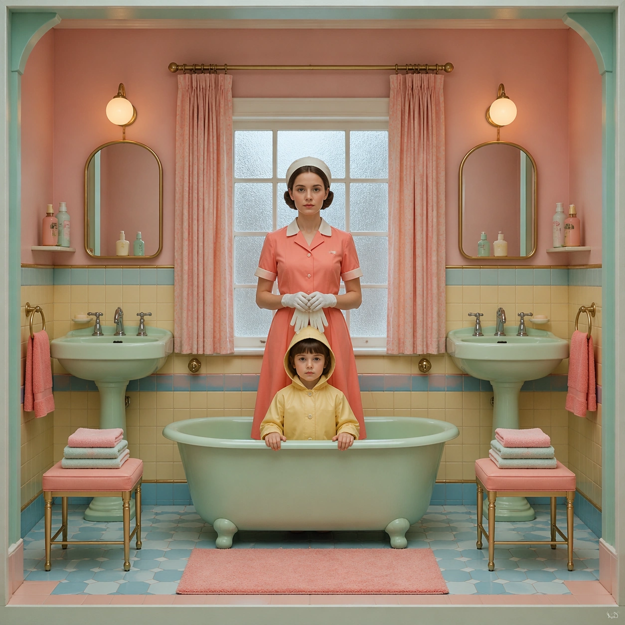
Example generated from “Symmetrical Pastel Dollhouse Cinematography — Bathroom Inspection”
GPT Image 2en

Scene: A square cinematic frame built with absolute left-right symmetry and a straight-on camera at human height. The palette is powder pink, mint, butter yellow, pale blue, and faded coral, with soft daylight and a miniature dollhouse clarity. The architecture should feel handcrafted, tidy, slightly theatrical, and emotionally precise rather than casual or naturalistic. Use a tiled pastel bathroom cut open like a display box, with twin sinks, twin mirrors, matching towels, and a mint bathtub centered beneath a frosted window. Subject: Place one or two front-facing figures exactly on the central axis, with costumes, props, and furnishings arranged like curated museum pieces. The people should feel composed and deadpan, never candid, and the room must read as a cutaway stage set where every shelf, lamp, chair, and curtain participates in the symmetry. A caretaker in a coral uniform stands centered between the sinks holding white gloves, while a child in a pale yellow raincoat looks directly at the viewer from the tub edge. Important details: The signature rules are central balance, flat frontal staging, pastel temperature control, crisp prop spacing, and a charming handmade scale. Preserve clean rectangles, color-coded rooms, disciplined eye-line, and the sense that the camera is respectfully observing an invented world. Avoid messy realism, loose camera motion, asymmetrical clutter, and dramatic lens distortion. Keep every bottle, soap dish, washcloth, and chrome fixture paired and evenly spaced so the room feels diagrammed but still tender. Use case: Symmetrical Pastel Dollhouse Cinematography single study 2/9. Constraints: No readable text, no watermark, no logos, preserve exact 1:1 aspect ratio, no dutch angle, no chaotic crowd, no gritty grime, no harsh neon, no visible brand packaging, no broken anatomy, no low-detail background, no accidental text fragments.
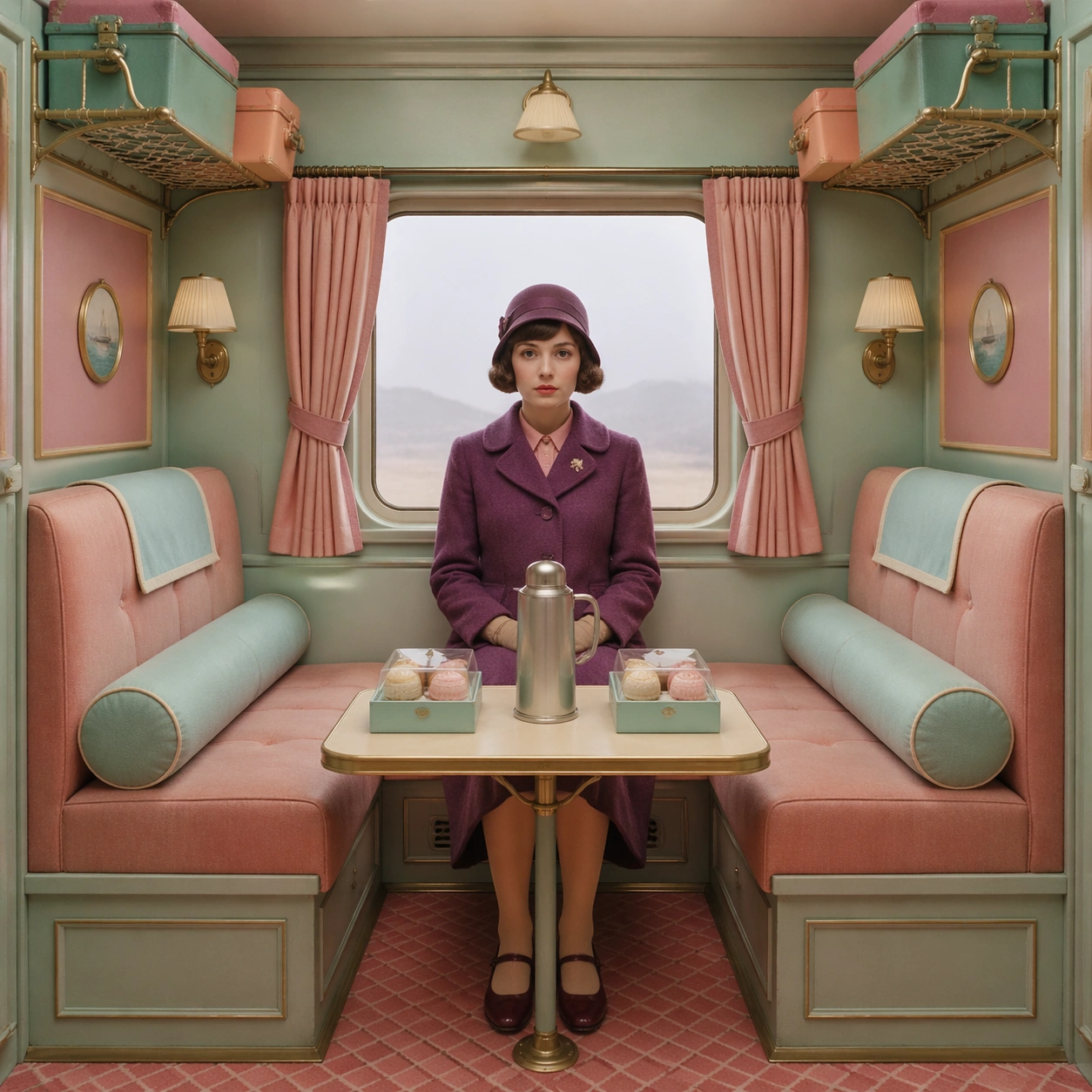
Example generated from “Symmetrical Pastel Dollhouse Cinematography — Train Compartment Pause”
GPT Image 2en

Scene: A square cinematic frame built with absolute left-right symmetry and a straight-on camera at human height. The palette is powder pink, mint, butter yellow, pale blue, and faded coral, with soft daylight and a miniature dollhouse clarity. The architecture should feel handcrafted, tidy, slightly theatrical, and emotionally precise rather than casual or naturalistic. Compose a train compartment as a rectangular jewel box, with equal luggage racks, matching curtains, and identical reading lamps framing a central window washed in pale gray daylight. Subject: Place one or two front-facing figures exactly on the central axis, with costumes, props, and furnishings arranged like curated museum pieces. The people should feel composed and deadpan, never candid, and the room must read as a cutaway stage set where every shelf, lamp, chair, and curtain participates in the symmetry. Seat a traveler in a plum coat on the exact centerline, knees together and hands folded, while two boxed pastries and a silver thermos sit on the table with measured spacing. Important details: The signature rules are central balance, flat frontal staging, pastel temperature control, crisp prop spacing, and a charming handmade scale. Preserve clean rectangles, color-coded rooms, disciplined eye-line, and the sense that the camera is respectfully observing an invented world. Avoid messy realism, loose camera motion, asymmetrical clutter, and dramatic lens distortion. The shot should suggest controlled stillness and handcrafted travel nostalgia, with every upholstered surface feeling tactile, crisp, and intentionally color-blocked. Use case: Symmetrical Pastel Dollhouse Cinematography single study 3/9. Constraints: No readable text, no watermark, no logos, preserve exact 1:1 aspect ratio, no dutch angle, no chaotic crowd, no gritty grime, no harsh neon, no visible brand packaging, no broken anatomy, no low-detail background, no accidental text fragments.
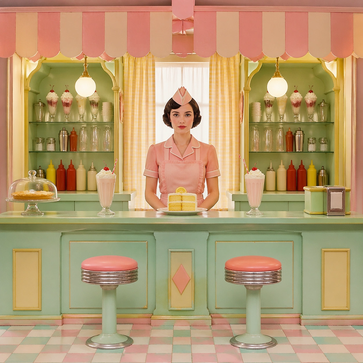
Example generated from “Symmetrical Pastel Dollhouse Cinematography — Lunch Counter Stillness”
GPT Image 2en

Scene: A square cinematic frame built with absolute left-right symmetry and a straight-on camera at human height. The palette is powder pink, mint, butter yellow, pale blue, and faded coral, with soft daylight and a miniature dollhouse clarity. The architecture should feel handcrafted, tidy, slightly theatrical, and emotionally precise rather than casual or naturalistic. Set the frame inside a compact luncheonette with a mint counter at the exact midpoint, a striped awning indoors, and mirrored condiment shelves on both sides under buttery afternoon light. Subject: Place one or two front-facing figures exactly on the central axis, with costumes, props, and furnishings arranged like curated museum pieces. The people should feel composed and deadpan, never candid, and the room must read as a cutaway stage set where every shelf, lamp, chair, and curtain participates in the symmetry. A server in a pink apron stands centered behind a plate of lemon cake, while two empty stools and two untouched milkshakes create an almost ceremonial sense of waiting. Important details: The signature rules are central balance, flat frontal staging, pastel temperature control, crisp prop spacing, and a charming handmade scale. Preserve clean rectangles, color-coded rooms, disciplined eye-line, and the sense that the camera is respectfully observing an invented world. Avoid messy realism, loose camera motion, asymmetrical clutter, and dramatic lens distortion. Preserve a toy-like scale in the stools, pastry dome, cash tray, and counter trim so the image reads like a collectible diorama rather than a busy restaurant. Use case: Symmetrical Pastel Dollhouse Cinematography single study 4/9. Constraints: No readable text, no watermark, no logos, preserve exact 1:1 aspect ratio, no dutch angle, no chaotic crowd, no gritty grime, no harsh neon, no visible brand packaging, no broken anatomy, no low-detail background, no accidental text fragments.
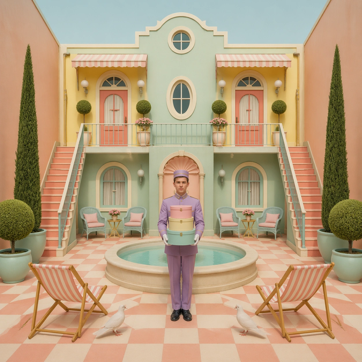
Example generated from “Symmetrical Pastel Dollhouse Cinematography — Courtyard Bellhop”
GPT Image 2en

Scene: A square cinematic frame built with absolute left-right symmetry and a straight-on camera at human height. The palette is powder pink, mint, butter yellow, pale blue, and faded coral, with soft daylight and a miniature dollhouse clarity. The architecture should feel handcrafted, tidy, slightly theatrical, and emotionally precise rather than casual or naturalistic. Open onto an enclosed hotel courtyard with a central fountain bowl, checkerboard paving, and two narrow staircases rising with identical angles toward matching balcony doors. Subject: Place one or two front-facing figures exactly on the central axis, with costumes, props, and furnishings arranged like curated museum pieces. The people should feel composed and deadpan, never candid, and the room must read as a cutaway stage set where every shelf, lamp, chair, and curtain participates in the symmetry. Place a bellhop in a lavender uniform on the fountain axis holding stacked hat boxes, while two doves and two folded deck chairs echo the geometry at equal distances. Important details: The signature rules are central balance, flat frontal staging, pastel temperature control, crisp prop spacing, and a charming handmade scale. Preserve clean rectangles, color-coded rooms, disciplined eye-line, and the sense that the camera is respectfully observing an invented world. Avoid messy realism, loose camera motion, asymmetrical clutter, and dramatic lens distortion. The courtyard should feel sunlit yet soft, with chalky pastel masonry, clipped hedges, and a deliberately reduced sense of scale that makes every object slightly precious. Use case: Symmetrical Pastel Dollhouse Cinematography single study 5/9. Constraints: No readable text, no watermark, no logos, preserve exact 1:1 aspect ratio, no dutch angle, no chaotic crowd, no gritty grime, no harsh neon, no visible brand packaging, no broken anatomy, no low-detail background, no accidental text fragments.
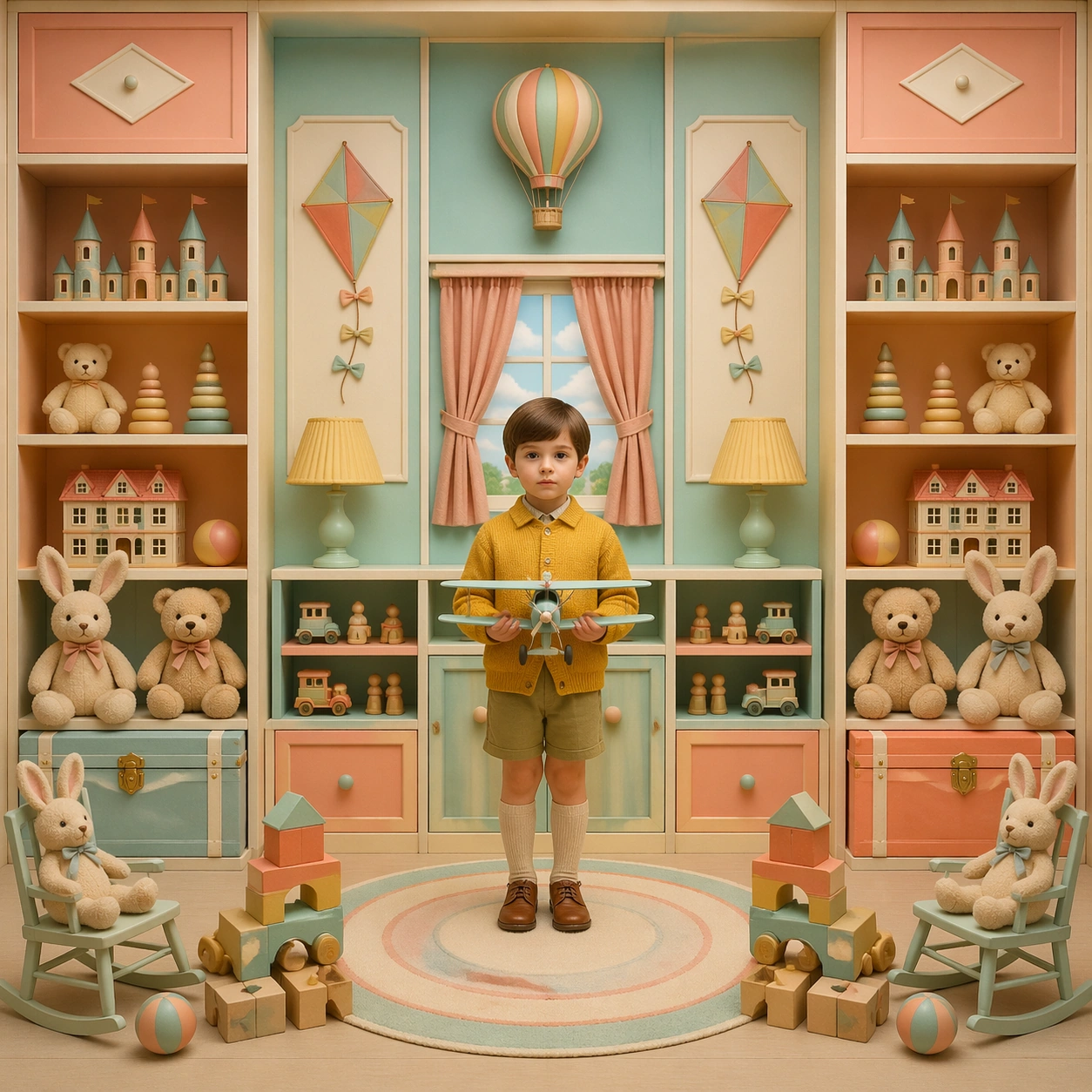
Example generated from “Symmetrical Pastel Dollhouse Cinematography — Playroom Inventory”
GPT Image 2en

Scene: A square cinematic frame built with absolute left-right symmetry and a straight-on camera at human height. The palette is powder pink, mint, butter yellow, pale blue, and faded coral, with soft daylight and a miniature dollhouse clarity. The architecture should feel handcrafted, tidy, slightly theatrical, and emotionally precise rather than casual or naturalistic. Construct a playroom as a frontal cabinet of compartments, with shelves, toy trunks, and painted wall panels balanced exactly left to right in peach, aqua, and cream. Subject: Place one or two front-facing figures exactly on the central axis, with costumes, props, and furnishings arranged like curated museum pieces. The people should feel composed and deadpan, never candid, and the room must read as a cutaway stage set where every shelf, lamp, chair, and curtain participates in the symmetry. A child in a mustard cardigan stands centered on a round rug holding a model airplane, while plush animals, blocks, and paper kites are arranged in disciplined bilateral order. Important details: The signature rules are central balance, flat frontal staging, pastel temperature control, crisp prop spacing, and a charming handmade scale. Preserve clean rectangles, color-coded rooms, disciplined eye-line, and the sense that the camera is respectfully observing an invented world. Avoid messy realism, loose camera motion, asymmetrical clutter, and dramatic lens distortion. Every toy should feel handmade and tactile, never branded or noisy, and the whole room should maintain a quiet catalog quality despite its cheerful color. Use case: Symmetrical Pastel Dollhouse Cinematography single study 6/9. Constraints: No readable text, no watermark, no logos, preserve exact 1:1 aspect ratio, no dutch angle, no chaotic crowd, no gritty grime, no harsh neon, no visible brand packaging, no broken anatomy, no low-detail background, no accidental text fragments.
Example generated from “Symmetrical Pastel Dollhouse Cinematography — Winter Balcony Arrival”
GPT Image 2en

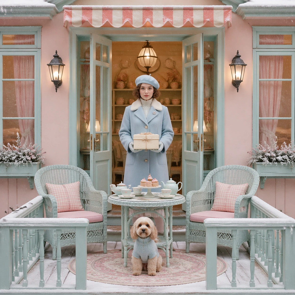
Scene: A square cinematic frame built with absolute left-right symmetry and a straight-on camera at human height. The palette is powder pink, mint, butter yellow, pale blue, and faded coral, with soft daylight and a miniature dollhouse clarity. The architecture should feel handcrafted, tidy, slightly theatrical, and emotionally precise rather than casual or naturalistic. Use a snow-dusted balcony facade with double doors, paired lanterns, and matching wicker chairs facing inward toward a centered tea table under cold pastel morning light. Subject: Place one or two front-facing figures exactly on the central axis, with costumes, props, and furnishings arranged like curated museum pieces. The people should feel composed and deadpan, never candid, and the room must read as a cutaway stage set where every shelf, lamp, chair, and curtain participates in the symmetry. A woman in a pale blue coat stands in the middle holding a boxed pastry string-tied in cream paper, while a small dog sits exactly on the rug medallion below her feet. Important details: The signature rules are central balance, flat frontal staging, pastel temperature control, crisp prop spacing, and a charming handmade scale. Preserve clean rectangles, color-coded rooms, disciplined eye-line, and the sense that the camera is respectfully observing an invented world. Avoid messy realism, loose camera motion, asymmetrical clutter, and dramatic lens distortion. Keep the snow gentle and graphic, the balcony rails evenly spaced, and the palette restrained so the image feels elegant, wistful, and composed instead of dramatic. Use case: Symmetrical Pastel Dollhouse Cinematography single study 7/9. Constraints: No readable text, no watermark, no logos, preserve exact 1:1 aspect ratio, no dutch angle, no chaotic crowd, no gritty grime, no harsh neon, no visible brand packaging, no broken anatomy, no low-detail background, no accidental text fragments.
Example generated from “Symmetrical Pastel Dollhouse Cinematography — Poolside Direct Address”
GPT Image 2en

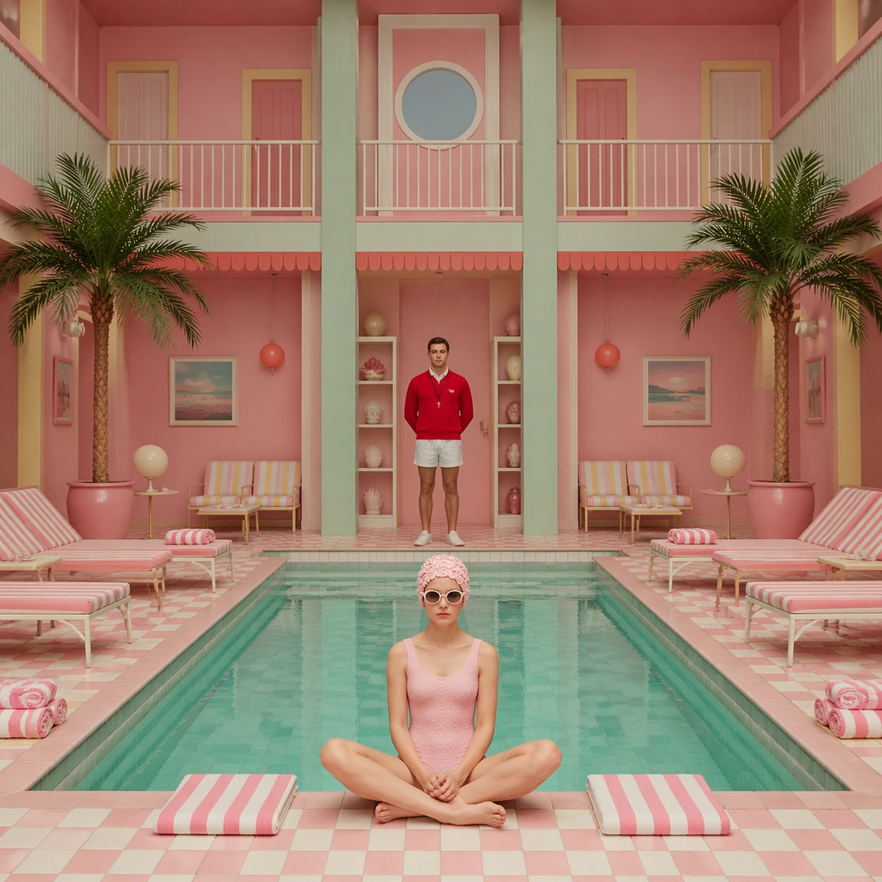
Scene: A square cinematic frame built with absolute left-right symmetry and a straight-on camera at human height. The palette is powder pink, mint, butter yellow, pale blue, and faded coral, with soft daylight and a miniature dollhouse clarity. The architecture should feel handcrafted, tidy, slightly theatrical, and emotionally precise rather than casual or naturalistic. Frame a rectangular indoor pool from the short end so the water becomes a centered strip of pale turquoise, flanked by identical loungers, striped towels, and potted palms. Subject: Place one or two front-facing figures exactly on the central axis, with costumes, props, and furnishings arranged like curated museum pieces. The people should feel composed and deadpan, never candid, and the room must read as a cutaway stage set where every shelf, lamp, chair, and curtain participates in the symmetry. A lifeguard in a tomato-red sweater stands at the far center facing the camera, while one swimmer sits at the pool edge in a mirrored pose that reinforces the severe order. Important details: The signature rules are central balance, flat frontal staging, pastel temperature control, crisp prop spacing, and a charming handmade scale. Preserve clean rectangles, color-coded rooms, disciplined eye-line, and the sense that the camera is respectfully observing an invented world. Avoid messy realism, loose camera motion, asymmetrical clutter, and dramatic lens distortion. The room should feel dry, quiet, and lightly whimsical, with candy-toned tiles and precise vertical lines controlling the eye from foreground to background. Use case: Symmetrical Pastel Dollhouse Cinematography single study 8/9. Constraints: No readable text, no watermark, no logos, preserve exact 1:1 aspect ratio, no dutch angle, no chaotic crowd, no gritty grime, no harsh neon, no visible brand packaging, no broken anatomy, no low-detail background, no accidental text fragments.
Example generated from “Symmetrical Pastel Dollhouse Cinematography — Elevator Ceremony”
GPT Image 2en

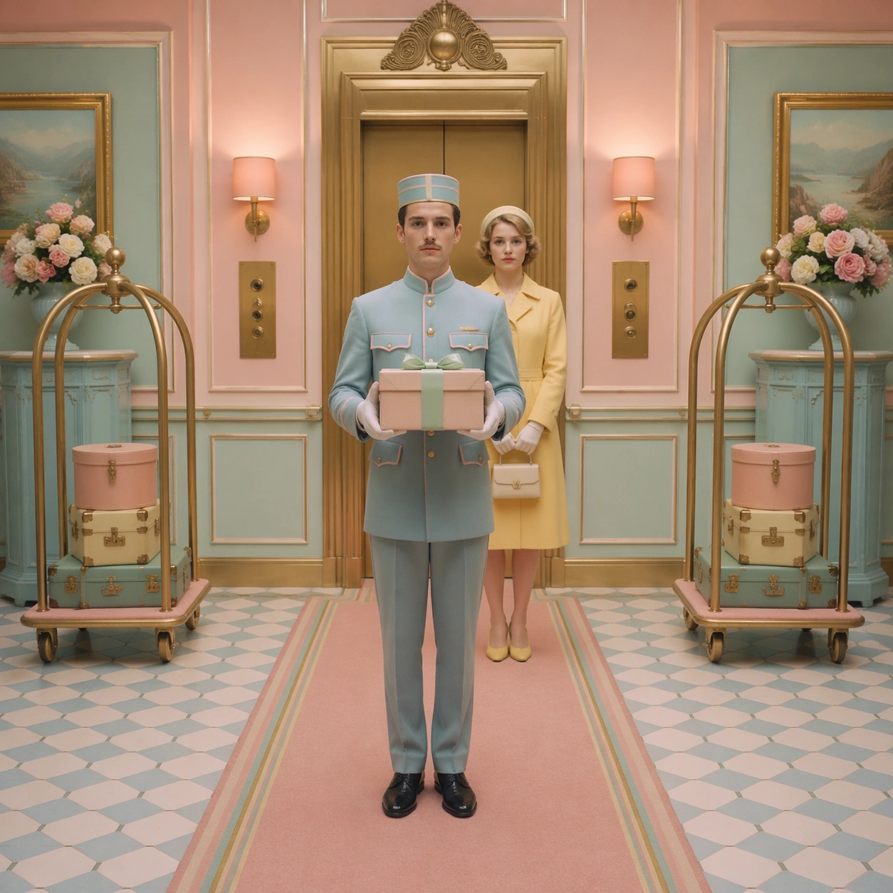
Scene: A square cinematic frame built with absolute left-right symmetry and a straight-on camera at human height. The palette is powder pink, mint, butter yellow, pale blue, and faded coral, with soft daylight and a miniature dollhouse clarity. The architecture should feel handcrafted, tidy, slightly theatrical, and emotionally precise rather than casual or naturalistic. Stage the image inside an elevator vestibule with centered brass doors, mirrored call panels, matching luggage carts, and a runner carpet splitting the composition into equal halves. Subject: Place one or two front-facing figures exactly on the central axis, with costumes, props, and furnishings arranged like curated museum pieces. The people should feel composed and deadpan, never candid, and the room must read as a cutaway stage set where every shelf, lamp, chair, and curtain participates in the symmetry. A porter stands square to the lens with white gloves and a parcel balanced at chest height, while a guest in a lemon coat waits two steps behind on the same axis. Important details: The signature rules are central balance, flat frontal staging, pastel temperature control, crisp prop spacing, and a charming handmade scale. Preserve clean rectangles, color-coded rooms, disciplined eye-line, and the sense that the camera is respectfully observing an invented world. Avoid messy realism, loose camera motion, asymmetrical clutter, and dramatic lens distortion. Let the charm come from the repetition of sconces, floor tiles, and parcel ribbons, all rendered with handmade neatness and pastel restraint. Use case: Symmetrical Pastel Dollhouse Cinematography single study 9/9. Constraints: No readable text, no watermark, no logos, preserve exact 1:1 aspect ratio, no dutch angle, no chaotic crowd, no gritty grime, no harsh neon, no visible brand packaging, no broken anatomy, no low-detail background, no accidental text fragments.
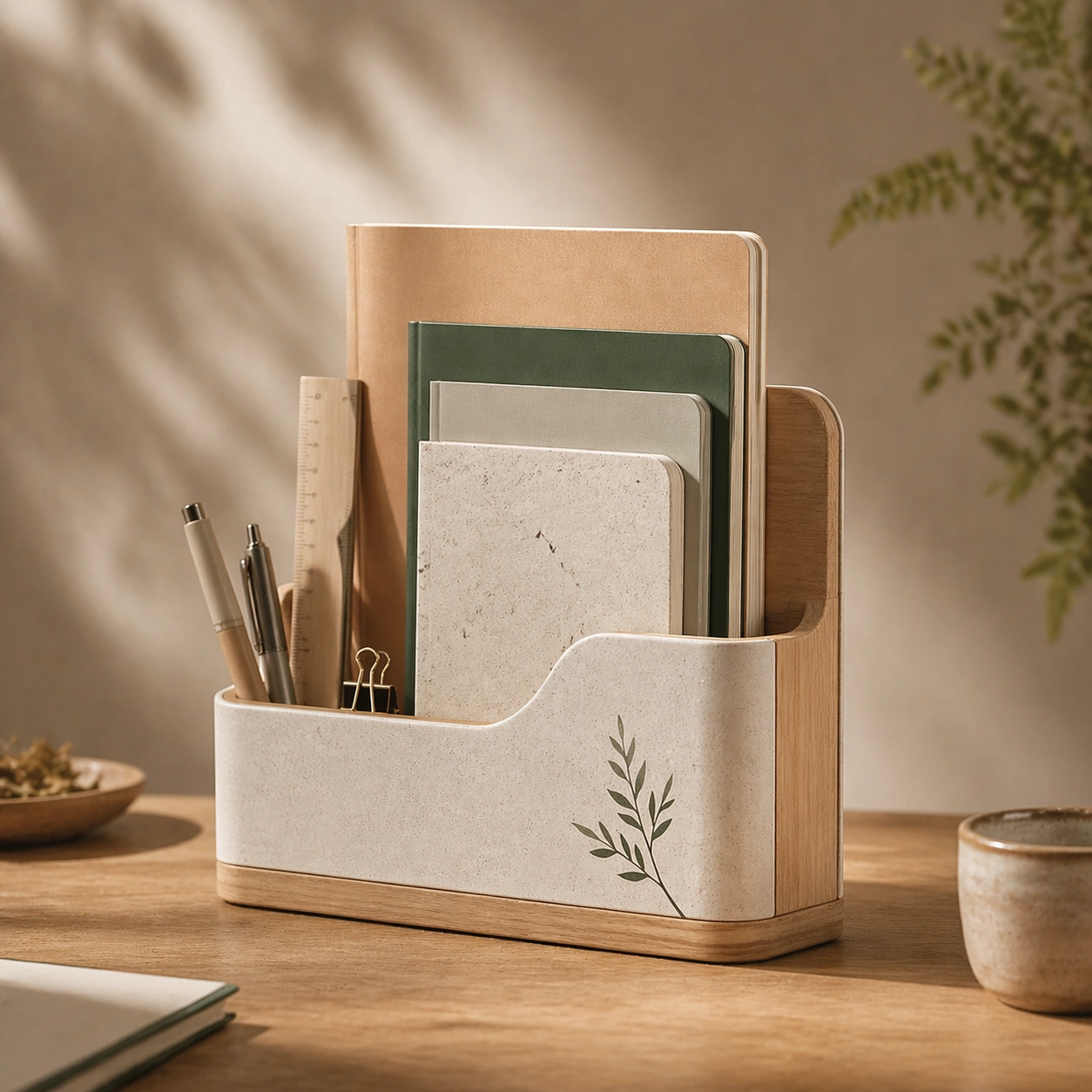
Example generated from “Taiwanese Paper And Stationery Lifestyle — Reference Anchor”
GPT Image 2en

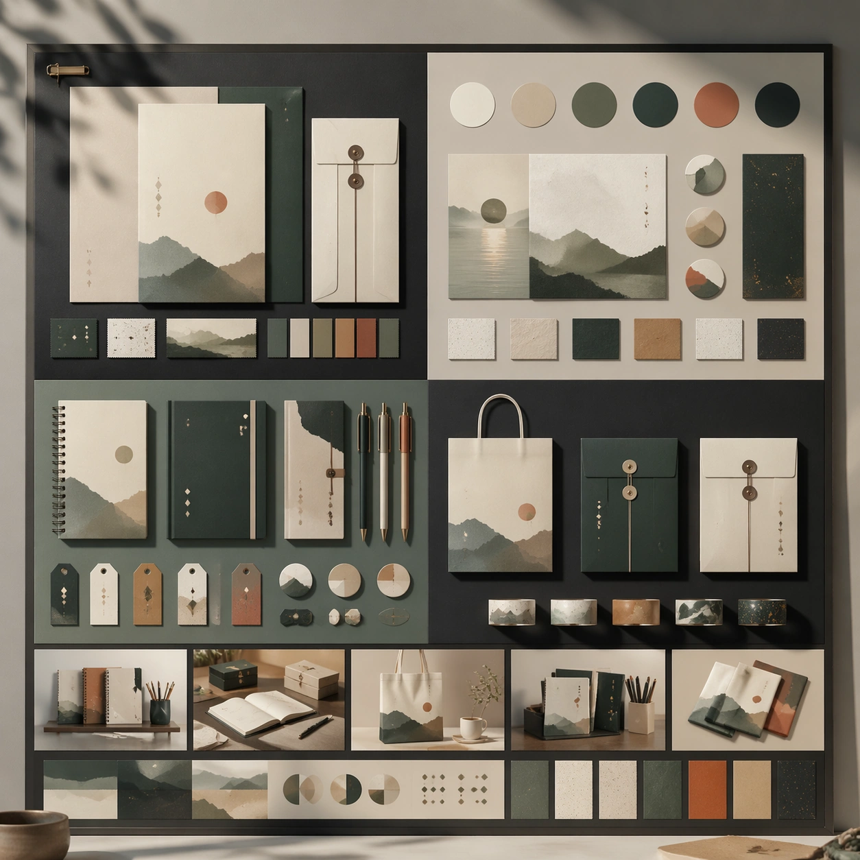
Scene: A square premium key-art frame built for a reference-dependent production series. Stage a reference anchor for taiwanese paper and stationery lifestyle taiwanese paper and stationery lifestyle with one unmistakable core subject and disciplined composition with controlled lighting, clear silhouette separation, and a camera setup that feels deliberate enough for campaign reuse. The composition should carry strong focal hierarchy, believable depth, and polished surface behavior while still staying stable enough to support downstream dependent variations. Subject: Center the image on a reference anchor for taiwanese paper and stationery lifestyle taiwanese paper and stationery lifestyle with one unmistakable core subject and disciplined composition. The result should feel like a concrete, shippable asset for a taiwanese paper and stationery lifestyle taiwanese paper and stationery lifestyle visual system, not a generic fantasy render. Build the subject with layered materials, stable anatomy or engineering logic, and enough specificity that later images can inherit the same underlying identity. This image is the root reference that defines continuity for the rest of the series. The viewer should immediately understand what is being preserved across the sequence and what is changing in this particular beat. Important details: establish the base identity, silhouette logic, palette rhythm, and layout system that downstream variations must preserve. Make continuity explicit through repeatable shape language, proportion control, and a coherent palette system. Changes in pose, angle, mood, rarity, weather, or layout should still feel downstream of one stable source. Avoid clutter that would confuse reference use. Any interface-like blocks or graphic surfaces must remain abstract and unreadable. Keep the image polished, original, and suitable for both gallery display and production review. Use case: taiwanese paper and stationery lifestyle taiwanese paper and stationery lifestyle series study 1/4, focused on reference anchor. Constraints: No readable text, no watermark, no logos, preserve exact 1:1 aspect ratio, no extra subject duplication, no noisy background, no broken continuity, no off-model redesign, no accidental franchise resemblance.

Example generated from “Taiwanese Paper And Stationery Lifestyle — Variation One”
GPT Image 2en

Scene: A square premium key-art frame built for a reference-dependent production series. Stage the same core concept reinterpreted through a first controlled variation for taiwanese paper and stationery lifestyle taiwanese paper and stationery lifestyle with controlled lighting, clear silhouette separation, and a camera setup that feels deliberate enough for campaign reuse. The composition should carry strong focal hierarchy, believable depth, and polished surface behavior while still staying stable enough to support downstream dependent variations. Subject: Center the image on the same core concept reinterpreted through a first controlled variation for taiwanese paper and stationery lifestyle taiwanese paper and stationery lifestyle. The result should feel like a concrete, shippable asset for a taiwanese paper and stationery lifestyle taiwanese paper and stationery lifestyle visual system, not a generic fantasy render. Build the subject with layered materials, stable anatomy or engineering logic, and enough specificity that later images can inherit the same underlying identity. Preserve the same core subject identity, silhouette logic, material language, and composition system from the reference image from the reference image while changing only what this variation needs. The viewer should immediately understand what is being preserved across the sequence and what is changing in this particular beat. Important details: change mood, framing, or emphasis while preserving the same underlying visual system and subject continuity. Make continuity explicit through repeatable shape language, proportion control, and a coherent palette system. Changes in pose, angle, mood, rarity, weather, or layout should still feel downstream of one stable source. Avoid clutter that would confuse reference use. Any interface-like blocks or graphic surfaces must remain abstract and unreadable. Keep the image polished, original, and suitable for both gallery display and production review. Use case: taiwanese paper and stationery lifestyle taiwanese paper and stationery lifestyle series study 2/4, focused on variation one. Constraints: No readable text, no watermark, no logos, preserve exact 1:1 aspect ratio, no unrelated redesign, no continuity drift, no broken continuity, no off-model redesign, no accidental franchise resemblance.

Example generated from “Taiwanese Paper And Stationery Lifestyle — Variation Two”
GPT Image 2en

Scene: A square premium key-art frame built for a reference-dependent production series. Stage the same core concept pushed into a second variation with different pacing or surface behavior for taiwanese paper and stationery lifestyle taiwanese paper and stationery lifestyle with controlled lighting, clear silhouette separation, and a camera setup that feels deliberate enough for campaign reuse. The composition should carry strong focal hierarchy, believable depth, and polished surface behavior while still staying stable enough to support downstream dependent variations. Subject: Center the image on the same core concept pushed into a second variation with different pacing or surface behavior for taiwanese paper and stationery lifestyle taiwanese paper and stationery lifestyle. The result should feel like a concrete, shippable asset for a taiwanese paper and stationery lifestyle taiwanese paper and stationery lifestyle visual system, not a generic fantasy render. Build the subject with layered materials, stable anatomy or engineering logic, and enough specificity that later images can inherit the same underlying identity. Preserve the same core subject identity, silhouette logic, material language, and composition system from the reference image from the reference image while changing only what this variation needs. The viewer should immediately understand what is being preserved across the sequence and what is changing in this particular beat. Important details: the viewer should still read one connected family rather than three disconnected ideas. Make continuity explicit through repeatable shape language, proportion control, and a coherent palette system. Changes in pose, angle, mood, rarity, weather, or layout should still feel downstream of one stable source. Avoid clutter that would confuse reference use. Any interface-like blocks or graphic surfaces must remain abstract and unreadable. Keep the image polished, original, and suitable for both gallery display and production review. Use case: taiwanese paper and stationery lifestyle taiwanese paper and stationery lifestyle series study 3/4, focused on variation two. Constraints: No readable text, no watermark, no logos, preserve exact 1:1 aspect ratio, no random props, no off-model shift, no broken continuity, no off-model redesign, no accidental franchise resemblance.

Example generated from “Taiwanese Paper And Stationery Lifestyle — Variation Three”
GPT Image 2en

Scene: A square premium key-art frame built for a reference-dependent production series. Stage the same core concept in a third polished variation that completes the reference-led set for taiwanese paper and stationery lifestyle taiwanese paper and stationery lifestyle with controlled lighting, clear silhouette separation, and a camera setup that feels deliberate enough for campaign reuse. The composition should carry strong focal hierarchy, believable depth, and polished surface behavior while still staying stable enough to support downstream dependent variations. Subject: Center the image on the same core concept in a third polished variation that completes the reference-led set for taiwanese paper and stationery lifestyle taiwanese paper and stationery lifestyle. The result should feel like a concrete, shippable asset for a taiwanese paper and stationery lifestyle taiwanese paper and stationery lifestyle visual system, not a generic fantasy render. Build the subject with layered materials, stable anatomy or engineering logic, and enough specificity that later images can inherit the same underlying identity. Preserve the same core subject identity, silhouette logic, material language, and composition system from the reference image from the reference image while changing only what this variation needs. The viewer should immediately understand what is being preserved across the sequence and what is changing in this particular beat. Important details: keep continuity obvious while introducing a fresh but coherent downstream use case. Make continuity explicit through repeatable shape language, proportion control, and a coherent palette system. Changes in pose, angle, mood, rarity, weather, or layout should still feel downstream of one stable source. Avoid clutter that would confuse reference use. Any interface-like blocks or graphic surfaces must remain abstract and unreadable. Keep the image polished, original, and suitable for both gallery display and production review. Use case: taiwanese paper and stationery lifestyle taiwanese paper and stationery lifestyle series study 4/4, focused on variation three. Constraints: No readable text, no watermark, no logos, preserve exact 1:1 aspect ratio, no franchise mimicry, no broken hierarchy, no broken continuity, no off-model redesign, no accidental franchise resemblance.

Example generated from “Taiwanese Paper And Stationery Lifestyle — Hero Study”
GPT Image 2en

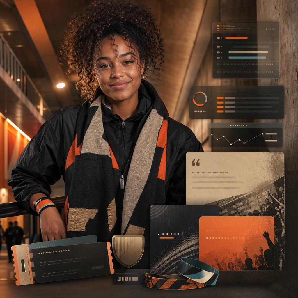
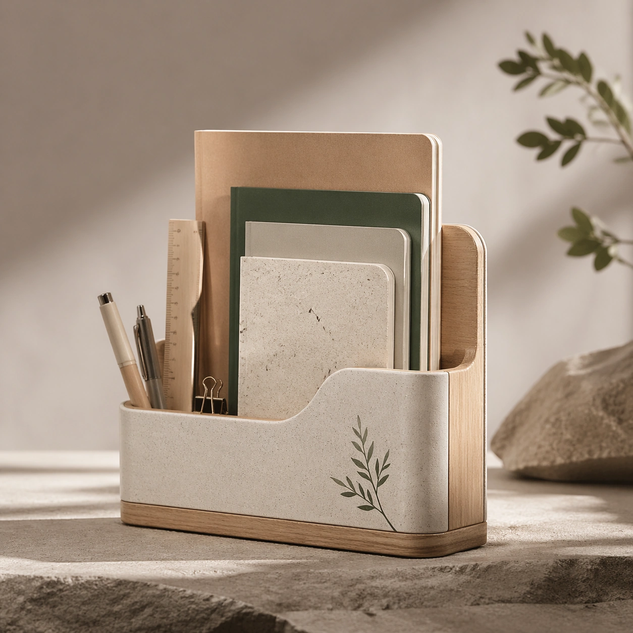
Scene: A square production-ready image designed for a game-art review wall and a commercial gallery at the same time. Frame a flagship hero study for taiwanese paper and stationery lifestyle taiwanese paper and stationery lifestyle presented as a polished, production-ready surface with disciplined lighting, clean edge separation, and enough surrounding context to prove how the asset would behave in a real product surface. The camera, crop, and tonal balance should feel intentional rather than generic, with high readability at first glance and convincing material response under closer inspection. Subject: Center the study on a flagship hero study for taiwanese paper and stationery lifestyle taiwanese paper and stationery lifestyle presented as a polished, production-ready surface. Translate the topic into a concrete, shippable visual statement instead of a loose mood board. Build layered object relationships, believable surface finish, and strong silhouette grouping so the image reads immediately as part of a taiwanese paper and stationery lifestyle taiwanese paper and stationery lifestyle visual system. The subject should feel made for a live game pipeline: useful in store, UI, campaign, or art-review contexts, with visual hierarchy strong enough to survive aggressive cropping. Important details: make the core idea immediately legible and premium enough for gallery or campaign use. Keep every supporting element subordinate to the main read, and make category separation obvious through form, color zoning, depth, and material logic rather than words. Where panels, cards, badges, or interface blocks appear, they must look professionally structured but remain unreadable. The visual language should feel premium, original, and coherent across this package, with no filler clutter and no accidental resemblance to a specific shipped game IP. Use case: taiwanese paper and stationery lifestyle taiwanese paper and stationery lifestyle single study 1/5, focused on hero study. Constraints: No readable text, no watermark, no logos, preserve exact 1:1 aspect ratio, no generic stock staging, no readable text, no broken hierarchy, no generic stock-photo staging, no accidental UI gibberish.

Example generated from “Taiwanese Paper And Stationery Lifestyle — Detail Proof”
GPT Image 2en

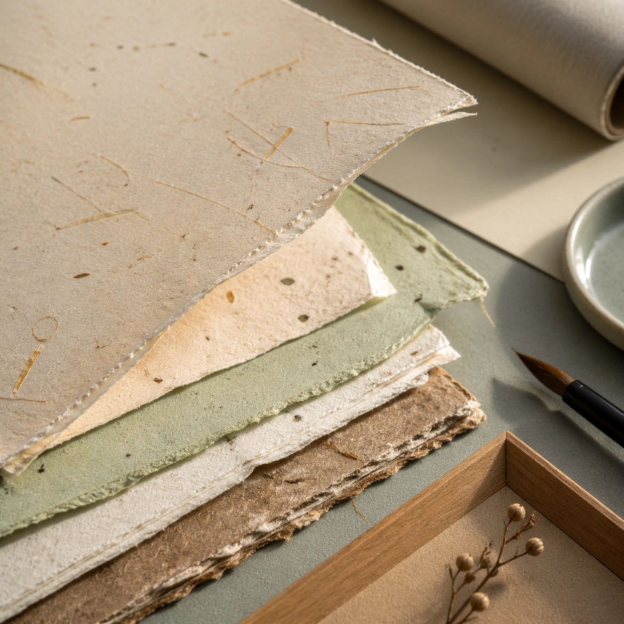
Scene: A square production-ready image designed for a game-art review wall and a commercial gallery at the same time. Frame a detail-focused proof image for taiwanese paper and stationery lifestyle taiwanese paper and stationery lifestyle that zooms into the most important material or structural cue with disciplined lighting, clean edge separation, and enough surrounding context to prove how the asset would behave in a real product surface. The camera, crop, and tonal balance should feel intentional rather than generic, with high readability at first glance and convincing material response under closer inspection. Subject: Center the study on a detail-focused proof image for taiwanese paper and stationery lifestyle taiwanese paper and stationery lifestyle that zooms into the most important material or structural cue. Translate the topic into a concrete, shippable visual statement instead of a loose mood board. Build layered object relationships, believable surface finish, and strong silhouette grouping so the image reads immediately as part of a taiwanese paper and stationery lifestyle taiwanese paper and stationery lifestyle visual system. The subject should feel made for a live game pipeline: useful in store, UI, campaign, or art-review contexts, with visual hierarchy strong enough to survive aggressive cropping. Important details: micro detail should reinforce credibility without losing the main idea. Keep every supporting element subordinate to the main read, and make category separation obvious through form, color zoning, depth, and material logic rather than words. Where panels, cards, badges, or interface blocks appear, they must look professionally structured but remain unreadable. The visual language should feel premium, original, and coherent across this package, with no filler clutter and no accidental resemblance to a specific shipped game IP. Use case: taiwanese paper and stationery lifestyle taiwanese paper and stationery lifestyle single study 2/5, focused on detail proof. Constraints: No readable text, no watermark, no logos, preserve exact 1:1 aspect ratio, no unreadable clutter, no measurement text, no broken hierarchy, no generic stock-photo staging, no accidental UI gibberish.

Example generated from “Taiwanese Paper And Stationery Lifestyle — System Board”
GPT Image 2en

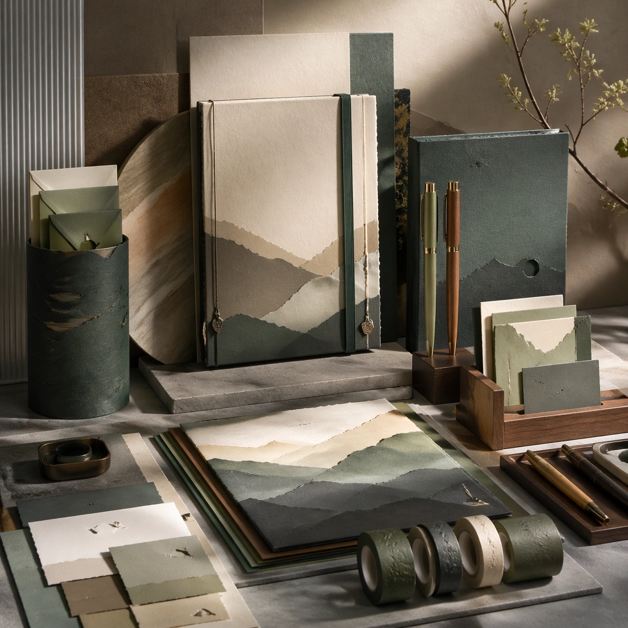
Scene: A square production-ready image designed for a game-art review wall and a commercial gallery at the same time. Frame a system-board layout for taiwanese paper and stationery lifestyle taiwanese paper and stationery lifestyle that organizes multiple related elements into one coherent review surface with disciplined lighting, clean edge separation, and enough surrounding context to prove how the asset would behave in a real product surface. The camera, crop, and tonal balance should feel intentional rather than generic, with high readability at first glance and convincing material response under closer inspection. Subject: Center the study on a system-board layout for taiwanese paper and stationery lifestyle taiwanese paper and stationery lifestyle that organizes multiple related elements into one coherent review surface. Translate the topic into a concrete, shippable visual statement instead of a loose mood board. Build layered object relationships, believable surface finish, and strong silhouette grouping so the image reads immediately as part of a taiwanese paper and stationery lifestyle taiwanese paper and stationery lifestyle visual system. The subject should feel made for a live game pipeline: useful in store, UI, campaign, or art-review contexts, with visual hierarchy strong enough to survive aggressive cropping. Important details: the board should feel design-ready and structured even though every label remains abstract. Keep every supporting element subordinate to the main read, and make category separation obvious through form, color zoning, depth, and material logic rather than words. Where panels, cards, badges, or interface blocks appear, they must look professionally structured but remain unreadable. The visual language should feel premium, original, and coherent across this package, with no filler clutter and no accidental resemblance to a specific shipped game IP. Use case: taiwanese paper and stationery lifestyle taiwanese paper and stationery lifestyle single study 3/5, focused on system board. Constraints: No readable text, no watermark, no logos, preserve exact 1:1 aspect ratio, no readable labels, no placeholder lorem ipsum, no broken hierarchy, no generic stock-photo staging, no accidental UI gibberish.

Example generated from “Taiwanese Paper And Stationery Lifestyle — Promo Crop”
GPT Image 2en

Scene: A square production-ready image designed for a game-art review wall and a commercial gallery at the same time. Frame a promo-oriented crop for taiwanese paper and stationery lifestyle taiwanese paper and stationery lifestyle optimized for social, storefront, or poster reuse with disciplined lighting, clean edge separation, and enough surrounding context to prove how the asset would behave in a real product surface. The camera, crop, and tonal balance should feel intentional rather than generic, with high readability at first glance and convincing material response under closer inspection. Subject: Center the study on a promo-oriented crop for taiwanese paper and stationery lifestyle taiwanese paper and stationery lifestyle optimized for social, storefront, or poster reuse. Translate the topic into a concrete, shippable visual statement instead of a loose mood board. Build layered object relationships, believable surface finish, and strong silhouette grouping so the image reads immediately as part of a taiwanese paper and stationery lifestyle taiwanese paper and stationery lifestyle visual system. The subject should feel made for a live game pipeline: useful in store, UI, campaign, or art-review contexts, with visual hierarchy strong enough to survive aggressive cropping. Important details: keep strong hierarchy and conversion energy without relying on explicit copy. Keep every supporting element subordinate to the main read, and make category separation obvious through form, color zoning, depth, and material logic rather than words. Where panels, cards, badges, or interface blocks appear, they must look professionally structured but remain unreadable. The visual language should feel premium, original, and coherent across this package, with no filler clutter and no accidental resemblance to a specific shipped game IP. Use case: taiwanese paper and stationery lifestyle taiwanese paper and stationery lifestyle single study 4/5, focused on promo crop. Constraints: No readable text, no watermark, no logos, preserve exact 1:1 aspect ratio, no slogans, no logos, no broken hierarchy, no generic stock-photo staging, no accidental UI gibberish.

Example generated from “Taiwanese Paper And Stationery Lifestyle — Finale Study”
GPT Image 2en

Scene: A square production-ready image designed for a game-art review wall and a commercial gallery at the same time. Frame a finale study for taiwanese paper and stationery lifestyle taiwanese paper and stationery lifestyle that pushes the topic to its most polished and complete expression with disciplined lighting, clean edge separation, and enough surrounding context to prove how the asset would behave in a real product surface. The camera, crop, and tonal balance should feel intentional rather than generic, with high readability at first glance and convincing material response under closer inspection. Subject: Center the study on a finale study for taiwanese paper and stationery lifestyle taiwanese paper and stationery lifestyle that pushes the topic to its most polished and complete expression. Translate the topic into a concrete, shippable visual statement instead of a loose mood board. Build layered object relationships, believable surface finish, and strong silhouette grouping so the image reads immediately as part of a taiwanese paper and stationery lifestyle taiwanese paper and stationery lifestyle visual system. The subject should feel made for a live game pipeline: useful in store, UI, campaign, or art-review contexts, with visual hierarchy strong enough to survive aggressive cropping. Important details: the closing image should feel definitive, high-signal, and suitable for feature placement. Keep every supporting element subordinate to the main read, and make category separation obvious through form, color zoning, depth, and material logic rather than words. Where panels, cards, badges, or interface blocks appear, they must look professionally structured but remain unreadable. The visual language should feel premium, original, and coherent across this package, with no filler clutter and no accidental resemblance to a specific shipped game IP. Use case: taiwanese paper and stationery lifestyle taiwanese paper and stationery lifestyle single study 5/5, focused on finale study. Constraints: No readable text, no watermark, no logos, preserve exact 1:1 aspect ratio, no text blocks, no derivative character likeness, no broken hierarchy, no generic stock-photo staging, no accidental UI gibberish.

Example generated from “Tarot Card Deck — Color Field Threshold”
GPT Image 2en

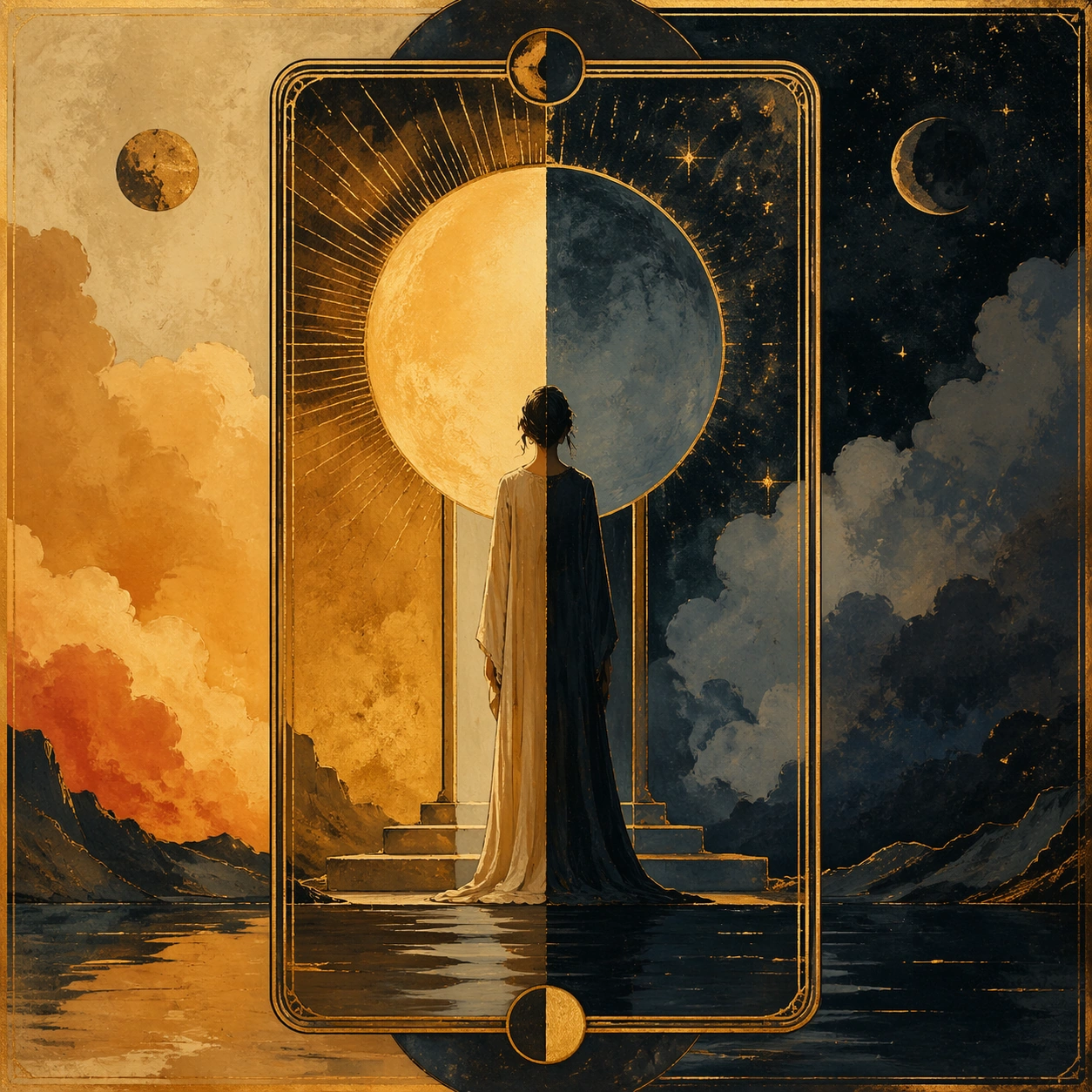
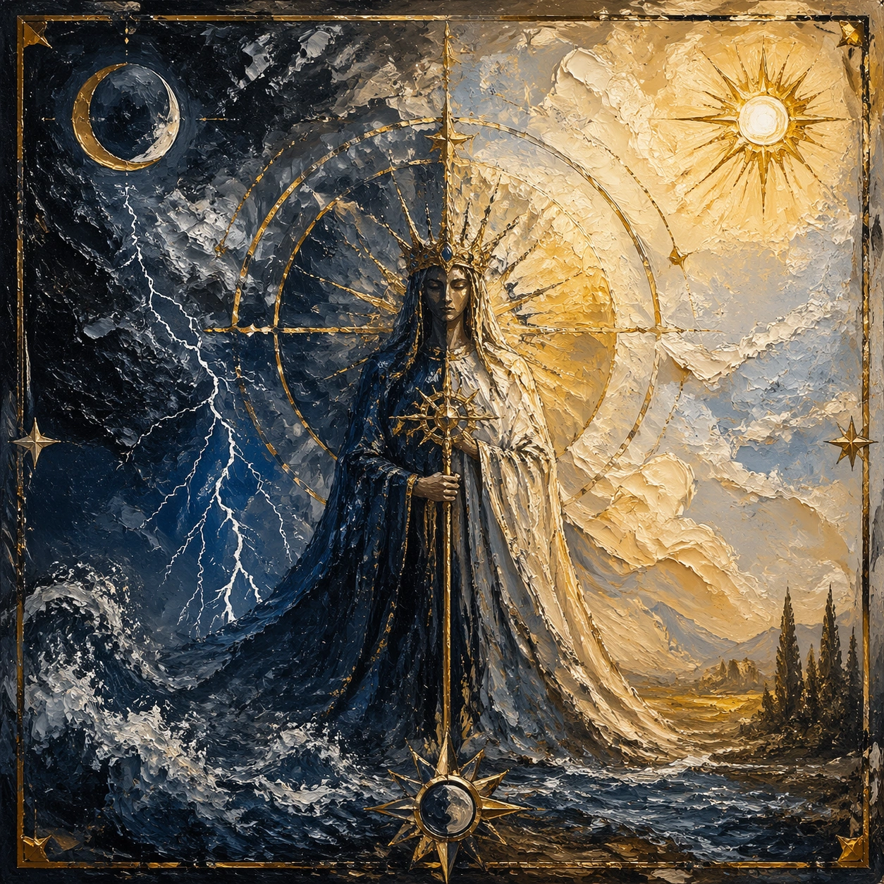
Scene: A square, gallery-ready composition with painterly surfaces, controlled negative space, and a deliberate fine-art presentation. Build the frame around a few dominant blocks or atmospheres of color with slow transitions and emotional weight. Keep the lighting, camera distance, and spatial organization tuned for a high-signal research image rather than a casual snapshot. The image belongs to the Tarot Card Deck theme and should feel immediately legible as a prompt atlas theme for tarot card deck, testing multi-image-reference with gpt image 2.. Subject: Center the study on a few dominant blocks or atmospheres of color with slow transitions and emotional weight. Translate the theme into a concrete visual statement instead of an abstract mood board: the viewer should understand what kind of image this is, what is being tested, and why the composition is difficult. Use the slug idea of tarot card deck as a literal guide for subject matter, materials, and staging. Important details: Focus on authored mark-making, hierarchy, rhythm, and a visual idea that reads immediately before the viewer inspects the brushwork. Preserve a disciplined square composition, clear focal hierarchy, and enough secondary information to make the image feel complete rather than underspecified. The image should look polished, novel, and exhibition-ready, with topic-specific credibility coming from the way surfaces, structure, and visual language reinforce Tarot Card Deck. Avoid generic filler elements that do not serve the main concept. Use case: Tarot Card Deck single study 2/8, testing multi-image-reference through the color field threshold variation. Constraints: No readable text, no watermark, no logos, preserve exact 1:1 aspect ratio, no direct copy of a known artwork, no comic speech bubbles, no accidental typography, no low-effort doodle energy, no muddy center, no fake museum label.

Example generated from “Tarot Card Deck — Fractured Figure Surge”
GPT Image 2en

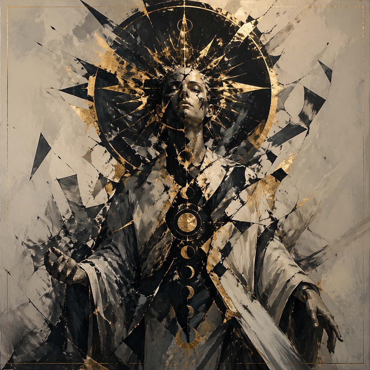
Scene: A square, gallery-ready composition with painterly surfaces, controlled negative space, and a deliberate fine-art presentation. Build the frame around a figure-like presence that emerges and dissolves through broken strokes and unstable edges. Keep the lighting, camera distance, and spatial organization tuned for a high-signal research image rather than a casual snapshot. The image belongs to the Tarot Card Deck theme and should feel immediately legible as a prompt atlas theme for tarot card deck, testing multi-image-reference with gpt image 2.. Subject: Center the study on a figure-like presence that emerges and dissolves through broken strokes and unstable edges. Translate the theme into a concrete visual statement instead of an abstract mood board: the viewer should understand what kind of image this is, what is being tested, and why the composition is difficult. Use the slug idea of tarot card deck as a literal guide for subject matter, materials, and staging. Important details: Focus on authored mark-making, hierarchy, rhythm, and a visual idea that reads immediately before the viewer inspects the brushwork. Preserve a disciplined square composition, clear focal hierarchy, and enough secondary information to make the image feel complete rather than underspecified. The image should look polished, novel, and exhibition-ready, with topic-specific credibility coming from the way surfaces, structure, and visual language reinforce Tarot Card Deck. Avoid generic filler elements that do not serve the main concept. Use case: Tarot Card Deck single study 3/8, testing multi-image-reference through the fractured figure surge variation. Constraints: No readable text, no watermark, no logos, preserve exact 1:1 aspect ratio, no direct copy of a known artwork, no comic speech bubbles, no accidental typography, no low-effort doodle energy, no muddy center, no fake museum label.

Example generated from “Tarot Card Deck — Black Brush Choir”
GPT Image 2en

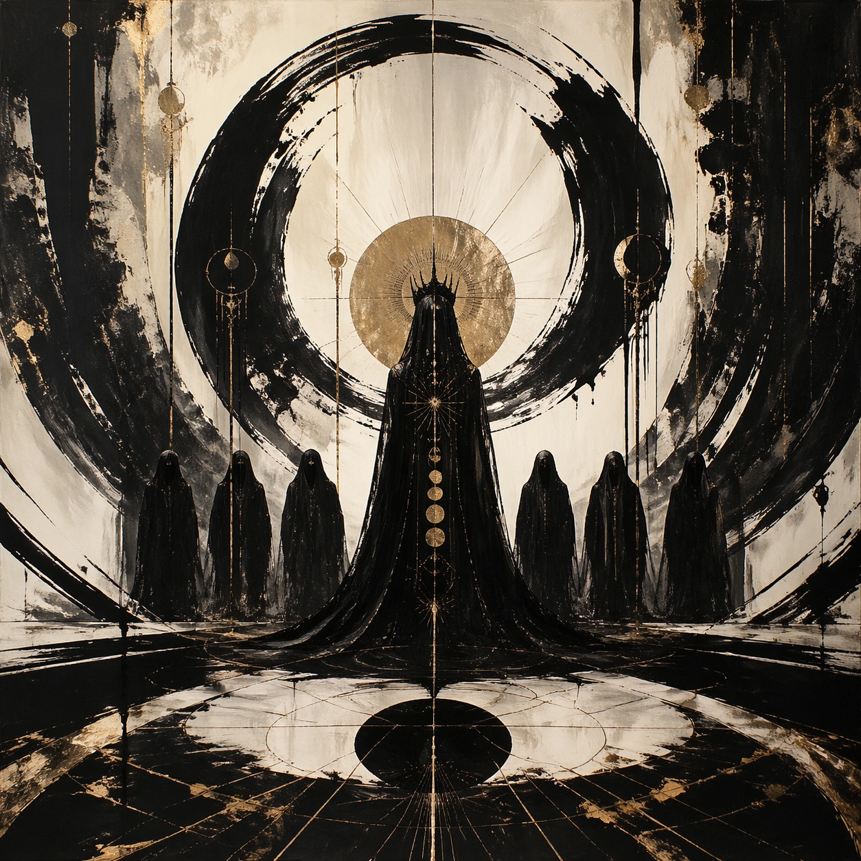
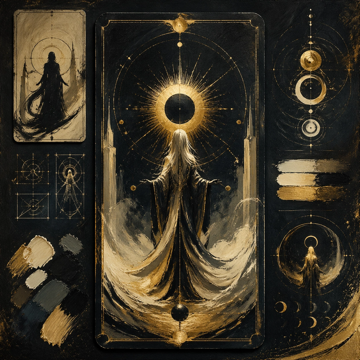
Scene: A square, gallery-ready composition with painterly surfaces, controlled negative space, and a deliberate fine-art presentation. Build the frame around large decisive black gestures that create rhythm, tension, and architectural pressure. Keep the lighting, camera distance, and spatial organization tuned for a high-signal research image rather than a casual snapshot. The image belongs to the Tarot Card Deck theme and should feel immediately legible as a prompt atlas theme for tarot card deck, testing multi-image-reference with gpt image 2.. Subject: Center the study on large decisive black gestures that create rhythm, tension, and architectural pressure. Translate the theme into a concrete visual statement instead of an abstract mood board: the viewer should understand what kind of image this is, what is being tested, and why the composition is difficult. Use the slug idea of tarot card deck as a literal guide for subject matter, materials, and staging. Important details: Focus on authored mark-making, hierarchy, rhythm, and a visual idea that reads immediately before the viewer inspects the brushwork. Preserve a disciplined square composition, clear focal hierarchy, and enough secondary information to make the image feel complete rather than underspecified. The image should look polished, novel, and exhibition-ready, with topic-specific credibility coming from the way surfaces, structure, and visual language reinforce Tarot Card Deck. Avoid generic filler elements that do not serve the main concept. Use case: Tarot Card Deck single study 4/8, testing multi-image-reference through the black brush choir variation. Constraints: No readable text, no watermark, no logos, preserve exact 1:1 aspect ratio, no direct copy of a known artwork, no comic speech bubbles, no accidental typography, no low-effort doodle energy, no muddy center, no fake museum label.

Example generated from “Tarot Card Deck — Studio Floor Afterimage”
GPT Image 2en

Scene: A square, gallery-ready composition with painterly surfaces, controlled negative space, and a deliberate fine-art presentation. Build the frame around evidence of process, splatter, drag, and layered correction without becoming documentary clutter. Keep the lighting, camera distance, and spatial organization tuned for a high-signal research image rather than a casual snapshot. The image belongs to the Tarot Card Deck theme and should feel immediately legible as a prompt atlas theme for tarot card deck, testing multi-image-reference with gpt image 2.. Subject: Center the study on evidence of process, splatter, drag, and layered correction without becoming documentary clutter. Translate the theme into a concrete visual statement instead of an abstract mood board: the viewer should understand what kind of image this is, what is being tested, and why the composition is difficult. Use the slug idea of tarot card deck as a literal guide for subject matter, materials, and staging. Important details: Focus on authored mark-making, hierarchy, rhythm, and a visual idea that reads immediately before the viewer inspects the brushwork. Preserve a disciplined square composition, clear focal hierarchy, and enough secondary information to make the image feel complete rather than underspecified. The image should look polished, novel, and exhibition-ready, with topic-specific credibility coming from the way surfaces, structure, and visual language reinforce Tarot Card Deck. Avoid generic filler elements that do not serve the main concept. Use case: Tarot Card Deck single study 5/8, testing multi-image-reference through the studio floor afterimage variation. Constraints: No readable text, no watermark, no logos, preserve exact 1:1 aspect ratio, no direct copy of a known artwork, no comic speech bubbles, no accidental typography, no low-effort doodle energy, no muddy center, no fake museum label.

Example generated from “Tarot Card Deck — 厚涂天气”
GPT Image 2en

Scene: A square, gallery-ready composition with painterly surfaces, controlled negative space, and a deliberate fine-art presentation. Build the frame around surface build-up, scrape marks, and thick tactile passages that feel meteorological. Keep the lighting, camera distance, and spatial organization tuned for a high-signal research image rather than a casual snapshot. The image belongs to the Tarot Card Deck theme and should feel immediately legible as a prompt atlas theme for tarot card deck, testing multi-image-reference with gpt image 2.. Subject: Center the study on surface build-up, scrape marks, and thick tactile passages that feel meteorological. Translate the theme into a concrete visual statement instead of an abstract mood board: the viewer should understand what kind of image this is, what is being tested, and why the composition is difficult. Use the slug idea of tarot card deck as a literal guide for subject matter, materials, and staging. Important details: Focus on authored mark-making, hierarchy, rhythm, and a visual idea that reads immediately before the viewer inspects the brushwork. Preserve a disciplined square composition, clear focal hierarchy, and enough secondary information to make the image feel complete rather than underspecified. The image should look polished, novel, and exhibition-ready, with topic-specific credibility coming from the way surfaces, structure, and visual language reinforce Tarot Card Deck. Avoid generic filler elements that do not serve the main concept. Use case: Tarot Card Deck single study 6/8, testing multi-image-reference through the 厚涂天气 variation. Constraints: No readable text, no watermark, no logos, preserve exact 1:1 aspect ratio, no direct copy of a known artwork, no comic speech bubbles, no accidental typography, no low-effort doodle energy, no muddy center, no fake museum label.

Example generated from “Tarot Card Deck — Gesture Architecture”
GPT Image 2en

Scene: A square, gallery-ready composition with painterly surfaces, controlled negative space, and a deliberate fine-art presentation. Build the frame around brush movement that locks into a hidden compositional scaffold rather than random motion. Keep the lighting, camera distance, and spatial organization tuned for a high-signal research image rather than a casual snapshot. The image belongs to the Tarot Card Deck theme and should feel immediately legible as a prompt atlas theme for tarot card deck, testing multi-image-reference with gpt image 2.. Subject: Center the study on brush movement that locks into a hidden compositional scaffold rather than random motion. Translate the theme into a concrete visual statement instead of an abstract mood board: the viewer should understand what kind of image this is, what is being tested, and why the composition is difficult. Use the slug idea of tarot card deck as a literal guide for subject matter, materials, and staging. Important details: Focus on authored mark-making, hierarchy, rhythm, and a visual idea that reads immediately before the viewer inspects the brushwork. Preserve a disciplined square composition, clear focal hierarchy, and enough secondary information to make the image feel complete rather than underspecified. The image should look polished, novel, and exhibition-ready, with topic-specific credibility coming from the way surfaces, structure, and visual language reinforce Tarot Card Deck. Avoid generic filler elements that do not serve the main concept. Use case: Tarot Card Deck single study 7/8, testing multi-image-reference through the gesture architecture variation. Constraints: No readable text, no watermark, no logos, preserve exact 1:1 aspect ratio, no direct copy of a known artwork, no comic speech bubbles, no accidental typography, no low-effort doodle energy, no muddy center, no fake museum label.

Example generated from “Tarot Card Deck — Museum Wall Hang”
GPT Image 2en

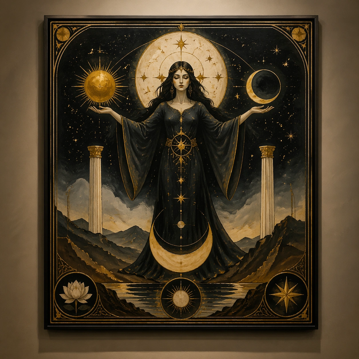
Scene: A square, gallery-ready composition with painterly surfaces, controlled negative space, and a deliberate fine-art presentation. Build the frame around a resolved exhibition-grade work whose internal balance feels complete and intentional. Keep the lighting, camera distance, and spatial organization tuned for a high-signal research image rather than a casual snapshot. The image belongs to the Tarot Card Deck theme and should feel immediately legible as a prompt atlas theme for tarot card deck, testing multi-image-reference with gpt image 2.. Subject: Center the study on a resolved exhibition-grade work whose internal balance feels complete and intentional. Translate the theme into a concrete visual statement instead of an abstract mood board: the viewer should understand what kind of image this is, what is being tested, and why the composition is difficult. Use the slug idea of tarot card deck as a literal guide for subject matter, materials, and staging. Important details: Focus on authored mark-making, hierarchy, rhythm, and a visual idea that reads immediately before the viewer inspects the brushwork. Preserve a disciplined square composition, clear focal hierarchy, and enough secondary information to make the image feel complete rather than underspecified. The image should look polished, novel, and exhibition-ready, with topic-specific credibility coming from the way surfaces, structure, and visual language reinforce Tarot Card Deck. Avoid generic filler elements that do not serve the main concept. Use case: Tarot Card Deck single study 8/8, testing multi-image-reference through the museum wall hang variation. Constraints: No readable text, no watermark, no logos, preserve exact 1:1 aspect ratio, no direct copy of a known artwork, no comic speech bubbles, no accidental typography, no low-effort doodle energy, no muddy center, no fake museum label.

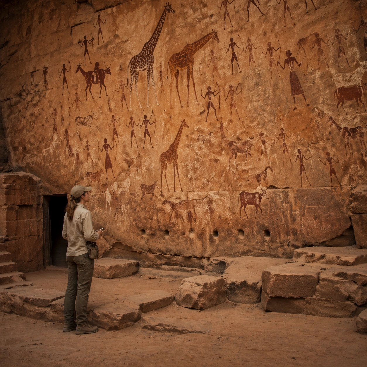
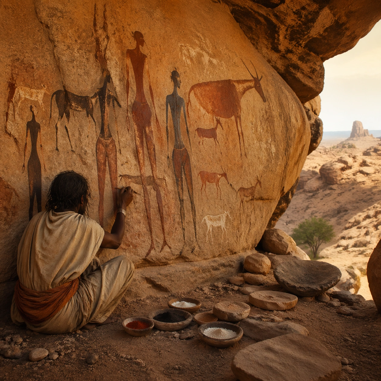
Example generated from “Tassili Rock Art Living — Reference Anchor”
GPT Image 2en

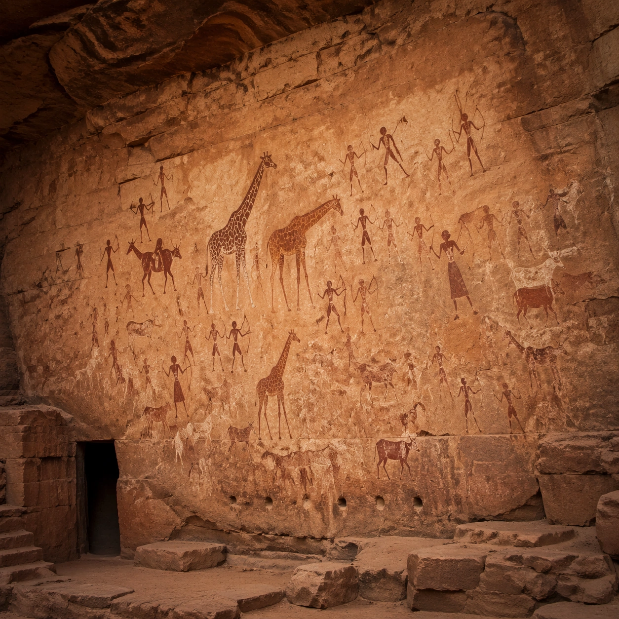
Scene: A square documentary image composed like a premium archaeology magazine feature. Use warm Sahara sandstone, dusty red-brown pigment, muted ivory chalk, and low dusk light. Frame a Tassili sandstone wall filled with prehistoric painted figures, giraffes, dancers, and hunters that seem gently volumetric without becoming fantasy creatures with crisp depth layering, restrained contrast, and subtle atmospheric depth so the scene feels excavated, observed, and historically grounded rather than theatrical or game-like. Keep the light directional but believable, as if captured during a careful field visit. Subject: Center the image on a Tassili sandstone wall filled with prehistoric painted figures, giraffes, dancers, and hunters that seem gently volumetric without becoming fantasy creatures. Include culturally accurate surface logic, region-specific setting, and believable human-scale cues in stairs, doorways, cut blocks, relief edges, or water depth. Shapes, carvings, masonry joints, and site wear should feel studied from real archaeology, with no generic ancient-world mashup and no ornamental filler borrowed from another civilization. Important details: Keep the imagery recognizably North African rock art, with elongated figures, animal profile logic, archaeological weathering, and only a restrained suggestion of volume emerging from the painted surface. Emphasize sandstone shelter walls, mineral pigment residues, dust-softened ledges, weathering crust, and subtle low-relief transitions where painting meets stone. Keep inscriptions, painted registers, symbolic motifs, or carved bands visually plausible but not readable. Preserve a museum-grade balance between beauty and evidence: light should reveal relief depth, edge wear, repairs, sediment traces, and excavation context without turning the site into fantasy spectacle. The composition should feel like a definitive reference frame that later variations can inherit exactly. Use case: Tassili Rock Art Coming Alive series study 1/9. Constraints: No readable text, no watermark, no logos, preserve exact 1:1 aspect ratio, no glowing magic portals, no comic-book action poses, no modern graffiti, no surreal monsters, no tourists, no anachronistic props, no collage layout, no exaggerated fantasy lighting.

Example generated from “Tassili Rock Art Living — Human Scale Reveal”
GPT Image 2en

Scene: A square follow-up field image from the same site, slightly closer and lower than the reference anchor, with careful documentary framing and the same material palette. The camera should feel physically present inside the archaeological space, using natural light, soft depth separation, and one clear human figure to explain scale without turning the image into lifestyle photography. Subject: Show the same site identity established in the reference anchor, now with an archaeologist, conservator, or field researcher moving through the scene in practical neutral clothing. The person should be small relative to the monument and clearly secondary to the architecture, water, or painted wall system. Keep the main forms, structural rhythm, and civilizational markers unchanged. Important details: Preserve the exact site identity, base geometry, material behavior, and cultural signatures from the reference model. Only vary vantage, gesture, and scale cues. Keep the imagery recognizably North African rock art, with elongated figures, animal profile logic, archaeological weathering, and only a restrained suggestion of volume emerging from the painted surface. Human presence should clarify stair height, wall size, carving depth, or spatial compression while respecting conservation protocol and historical seriousness. Keep any tools understated and generic, with no readable labels. The image must still look like a rigorous archaeological record first and a dramatic scene second. Use case: Tassili Rock Art Coming Alive series study 2/9. Constraints: No readable text, no watermark, no logos, preserve exact 1:1 aspect ratio, preserve exact site identity from the reference image, no glowing magic portals, no comic-book action poses, no modern graffiti, no surreal monsters, no fashion editorial styling, no crowd, no cinematic props.

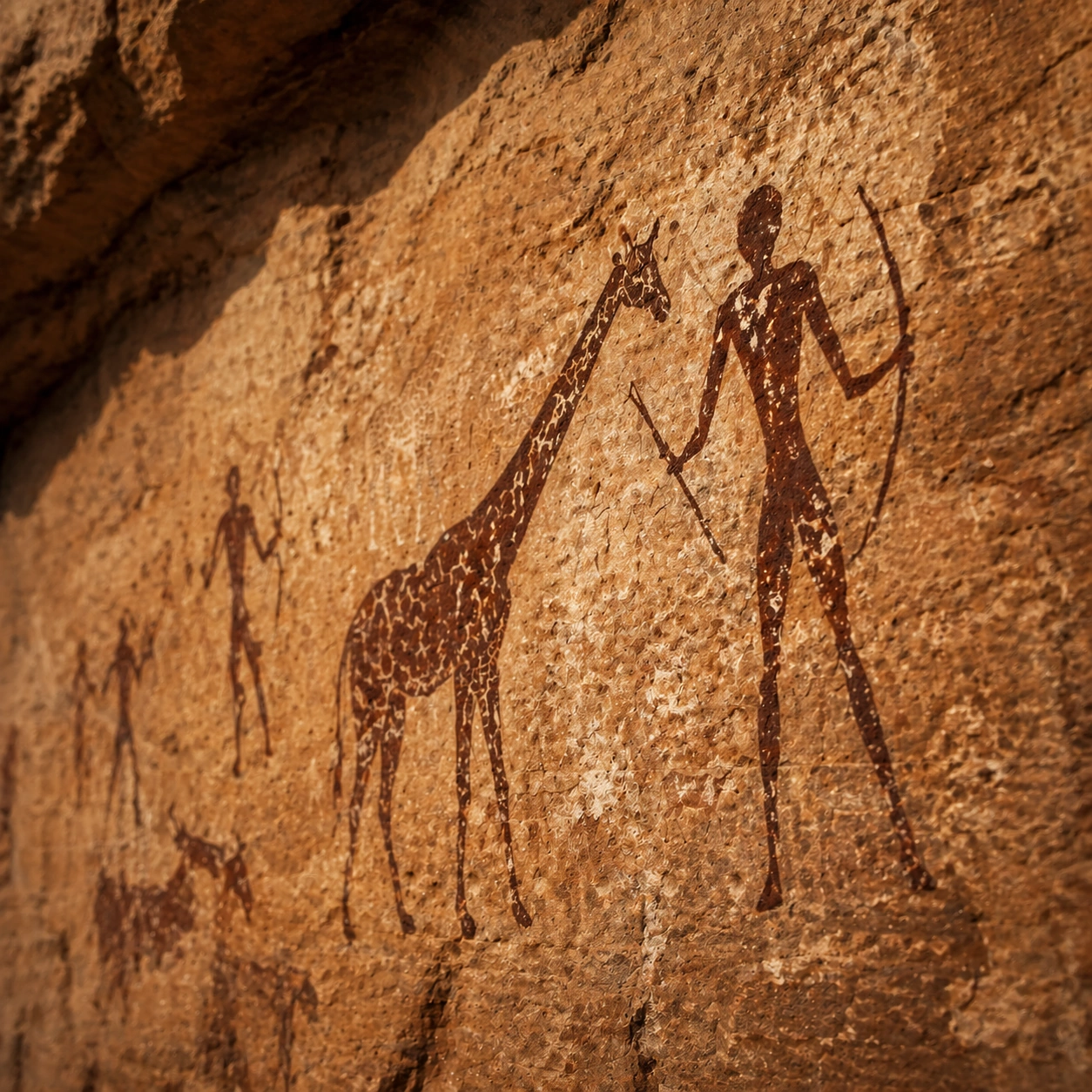
Example generated from “Tassili Rock Art Living — Surface Close Study”
GPT Image 2en

Scene: A square close study framed within the same site established by the reference anchor. Use a tight crop, shallow but believable depth of field, and raking light that reveals tactile evidence in surface relief, pigment, tool marks, moisture, or marine wear. The image should feel like a museum conservation photograph elevated to gallery quality. Subject: Focus on a materially rich portion of the same site: carved edges, painted plaster, fitted stone, root-wrapped masonry, submerged paving, or quarry-cut facial planes depending on the civilization. The composition should remain anchored to the original location and show enough surrounding context that viewers still recognize the parent site rather than mistaking it for an unrelated artifact. Important details: Preserve the exact site identity from the reference model while shifting emphasis to forensic surface evidence. Keep the imagery recognizably North African rock art, with elongated figures, animal profile logic, archaeological weathering, and only a restrained suggestion of volume emerging from the painted surface. Make micro-texture, fracture lines, pigment retention, water wear, plant interaction, dust, or chisel traces visually persuasive. Avoid decorative clutter. Every mark should feel like evidence of making, weathering, excavation, or conservation. Keep any symbolic marks non-legible and historically appropriate, and make the light reveal depth without flattening the material richness. Use case: Tassili Rock Art Coming Alive series study 3/9. Constraints: No readable text, no watermark, no logos, preserve exact 1:1 aspect ratio, preserve exact site identity from the reference image, no glowing magic portals, no comic-book action poses, no modern graffiti, no surreal monsters, no isolated floating artifact, no studio backdrop, no fake macro abstraction.

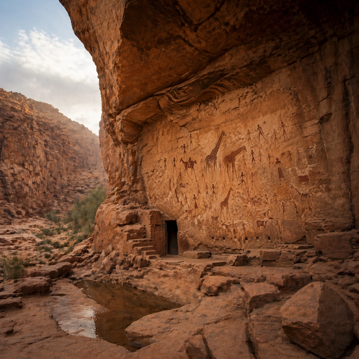
Example generated from “Tassili Rock Art Living — Atmospheric Wide Reveal”
GPT Image 2en

Scene: A square wide reveal of the same site under a slightly different environmental condition, with more surrounding geography or architecture visible while keeping the anchor landmark dominant. Use disciplined composition, atmospheric perspective, and natural light behavior so the image feels like a patient field photograph captured after the reference shot rather than a different fantasy set. Subject: Show the same site identity with broader context: approaches, terraces, ring walls, canyon slot, canopy volume, quarry slope, or chamber boundaries depending on the location. The anchor structure must remain instantly recognizable. Environmental scale should deepen understanding of why the site is placed here and how people, water, topography, or vegetation shape the experience of the monument. Important details: Preserve the exact landmark, materials, and civilizational cues from the reference model while allowing wider framing and a different atmospheric emphasis. Keep the imagery recognizably North African rock art, with elongated figures, animal profile logic, archaeological weathering, and only a restrained suggestion of volume emerging from the painted surface. Use geography and environmental systems to add meaning: drainage, mist, current, valley depth, roots, irrigation, or enclosure logic. The image should feel both beautiful and evidentiary, with no compositional tricks that break continuity with the established site. Use case: Tassili Rock Art Coming Alive series study 4/9. Constraints: No readable text, no watermark, no logos, preserve exact 1:1 aspect ratio, preserve exact site identity from the reference image, no glowing magic portals, no comic-book action poses, no modern graffiti, no surreal monsters, no unrelated landmarks, no speculative mashup architecture, no posterized grading.

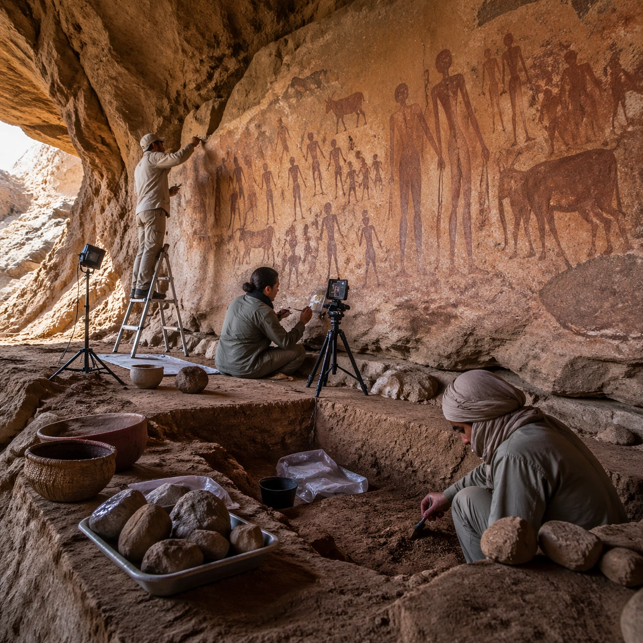
Example generated from “Tassili Rock Art Living — Excavation Overview”
GPT Image 2en

Scene: A square independent archaeology study composed from a slightly elevated fieldwork viewpoint. Use balanced natural light, crisp evidence hierarchy, and practical site organization so the image feels publishable in a museum report and still visually strong enough for a gallery wall. The frame should explain where excavation is happening without relying on readable markers or diagrams. Subject: Show a rock shelter documentation scene with careful raking light, measured photography equipment, and researchers tracking pigment preservation across the wall. Include grounded human traces such as ladders, trays, brushes, baskets, light rigs, or measuring tools only when they support archaeological realism and remain visually secondary. The site should stay culturally specific, with architecture, surface treatment, sediment, and environmental context all belonging to the correct civilization rather than a generic dig. Important details: Keep the imagery recognizably North African rock art, with elongated figures, animal profile logic, archaeological weathering, and only a restrained suggestion of volume emerging from the painted surface. Prioritize evidence relationships: exposed layers, cleaned edges, protected surfaces, loose fragments, and transitions between buried and revealed material. Let color, wear, and composition explain what has just been uncovered. The image must feel methodical rather than adventurous. Keep any site tags, notes, or markers abstract and unreadable. Avoid sensational treasure imagery and keep the atmosphere scholarly, patient, and materially convincing. Use case: Tassili Rock Art Coming Alive single study 5/9. Constraints: No readable text, no watermark, no logos, preserve exact 1:1 aspect ratio, no glowing magic portals, no comic-book action poses, no modern graffiti, no surreal monsters, no treasure-chest clichés, no action-movie posing, no arbitrary props, no infographic overlay.

Example generated from “Tassili Rock Art Living — Artifact Tableau”
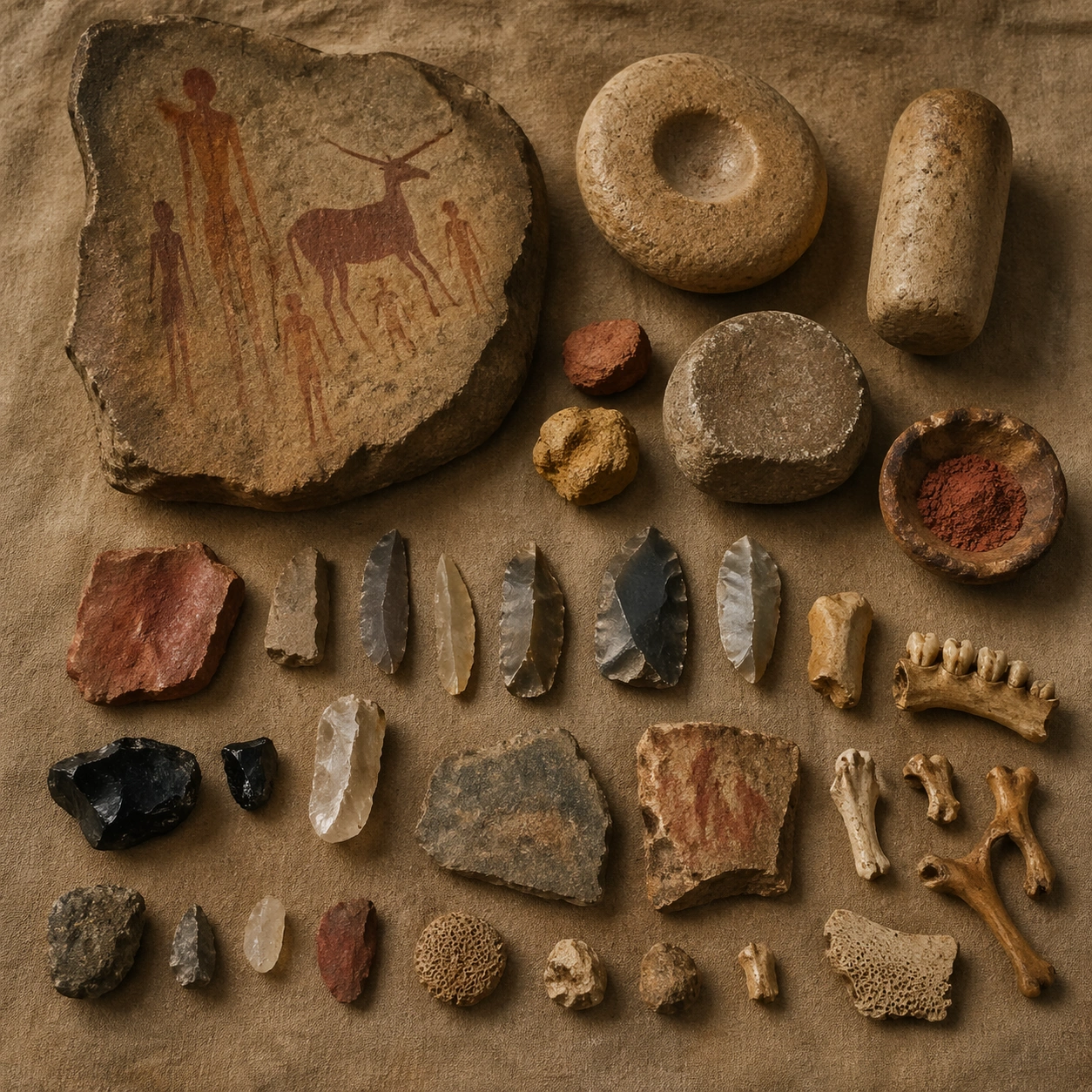
GPT Image 2en

Scene: A square artifact and material study arranged like a high-end conservation photograph. Use soft directional light, controlled shadow falloff, and a neutral work surface so every fragment reads clearly. The image should feel intimate and scientific, but still rich enough to communicate the broader civilization through craft, wear, and material vocabulary alone. Subject: Present pigment stones, grinding tools, stone flakes, faunal fragments, and documented samples arranged on a desert field cloth. Arrange the pieces with disciplined spacing and believable conservation handling. Include enough variation in scale, finish, and damage state to suggest excavation reality rather than a perfectly staged luxury still life. Nothing should look modern or decorative for its own sake; every object must feel like evidence tied to the same cultural world as the main topic. Important details: Emphasize tactile surfaces, honest aging, and historically grounded material behavior. Keep the imagery recognizably North African rock art, with elongated figures, animal profile logic, archaeological weathering, and only a restrained suggestion of volume emerging from the painted surface. Show abrasion, dust, corrosion, cracks, mineral bloom, pigment retention, or edge polish where appropriate. Keep the arrangement orderly but not sterile, as if prepared for a serious cataloging session. No readable labels, no museum placards, and no visual shortcuts that turn the study into product photography detached from archaeology. Use case: Tassili Rock Art Coming Alive single study 6/9. Constraints: No readable text, no watermark, no logos, preserve exact 1:1 aspect ratio, no glowing magic portals, no comic-book action poses, no modern graffiti, no surreal monsters, no luxury advertising gloss, no floating objects, no velvet jewelry styling, no unrelated tools.

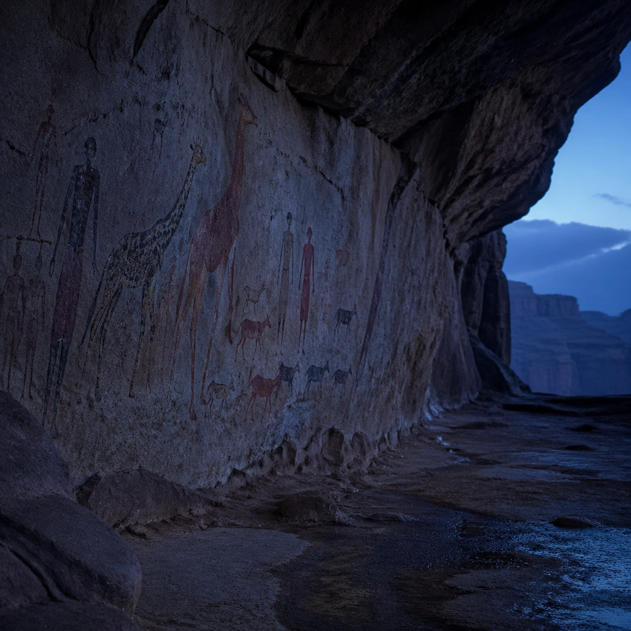
Example generated from “Tassili Rock Art Living — Light Shift Study”
GPT Image 2en

Scene: A square mood variation from the same civilization theme, built around cooler twilight light that emphasizes rock relief, shelter depth, and the subtle boundary between flat image and low volume. The image should stay grounded in field realism while testing how different illumination changes material reading, atmosphere, and emotional register. Keep the frame self-contained and coherent, as if photographed during a second visit under altered conditions. Subject: Show a culturally accurate site or interior connected to the same world as the main topic, but not as a direct dependency on the series reference. The focus should be on how light transforms relief, color, moisture, water, dust, or vegetation while preserving archaeological credibility. Architectural forms, objects, and setting must still belong to the same civilization with no cross-cultural contamination. Important details: Keep the imagery recognizably North African rock art, with elongated figures, animal profile logic, archaeological weathering, and only a restrained suggestion of volume emerging from the painted surface. Use the shift in light to reveal different evidence than the other studies: pigment glow, root sheen, caustics, wet stone, canyon shadow, marine haze, terrace depth, or quarry moisture. Keep the result serious and observational rather than romanticized. Non-readable motifs are acceptable, but there should be no signs, captions, or modern display devices. The image should feel like a rigorous visual experiment in historical atmosphere. Use case: Tassili Rock Art Coming Alive single study 7/9. Constraints: No readable text, no watermark, no logos, preserve exact 1:1 aspect ratio, no glowing magic portals, no comic-book action poses, no modern graffiti, no surreal monsters, no theatrical color filters, no supernatural effects, no montage composition, no glossy concept-art exaggeration.

Example generated from “Tassili Rock Art Living — Survey Perspective”
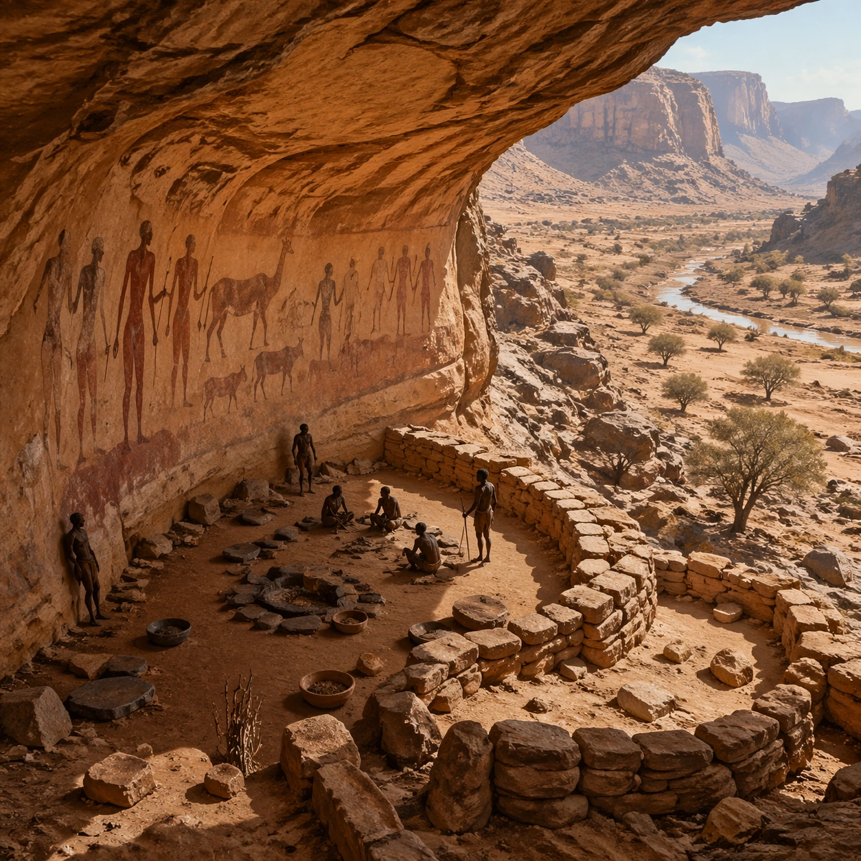
GPT Image 2en

Scene: A square survey-oriented image that explains spatial logic with the clarity of an expert field overview while still reading as a finished artwork. Use a stable elevated vantage, clean depth layering, and enough visible terrain or architecture to make relationships legible without turning the frame into a literal map. The scene should feel analytical and cinematic at the same time. Subject: Show a shelter-wide survey perspective that shows wall curvature, figure placement, floor deposits, and the environmental setting of the painted chamber. Organize the composition so paths, terraces, walls, courtyards, chambers, canals, root systems, or quarry clusters can be read as a coherent system. The image should reveal how the civilization used land, water, elevation, enclosure, or monumentality. Keep all architecture, materials, and environmental details consistent with the correct place and period. Important details: Keep the imagery recognizably North African rock art, with elongated figures, animal profile logic, archaeological weathering, and only a restrained suggestion of volume emerging from the painted surface. This image should reward close looking by showing infrastructural logic: how stone courses align, how water moves, how rooms connect, how carved masses sit inside geology, or how vegetation interacts with built form. Avoid explicit annotation. Let composition, light, and scale cues do the explanatory work. Keep any measuring elements generic and unreadable, and make the image feel like serious research made visually elegant. Use case: Tassili Rock Art Coming Alive single study 8/9. Constraints: No readable text, no watermark, no logos, preserve exact 1:1 aspect ratio, no glowing magic portals, no comic-book action poses, no modern graffiti, no surreal monsters, no infographic arrows, no split-screen layout, no impossible aerial geometry, no unrelated settlements.
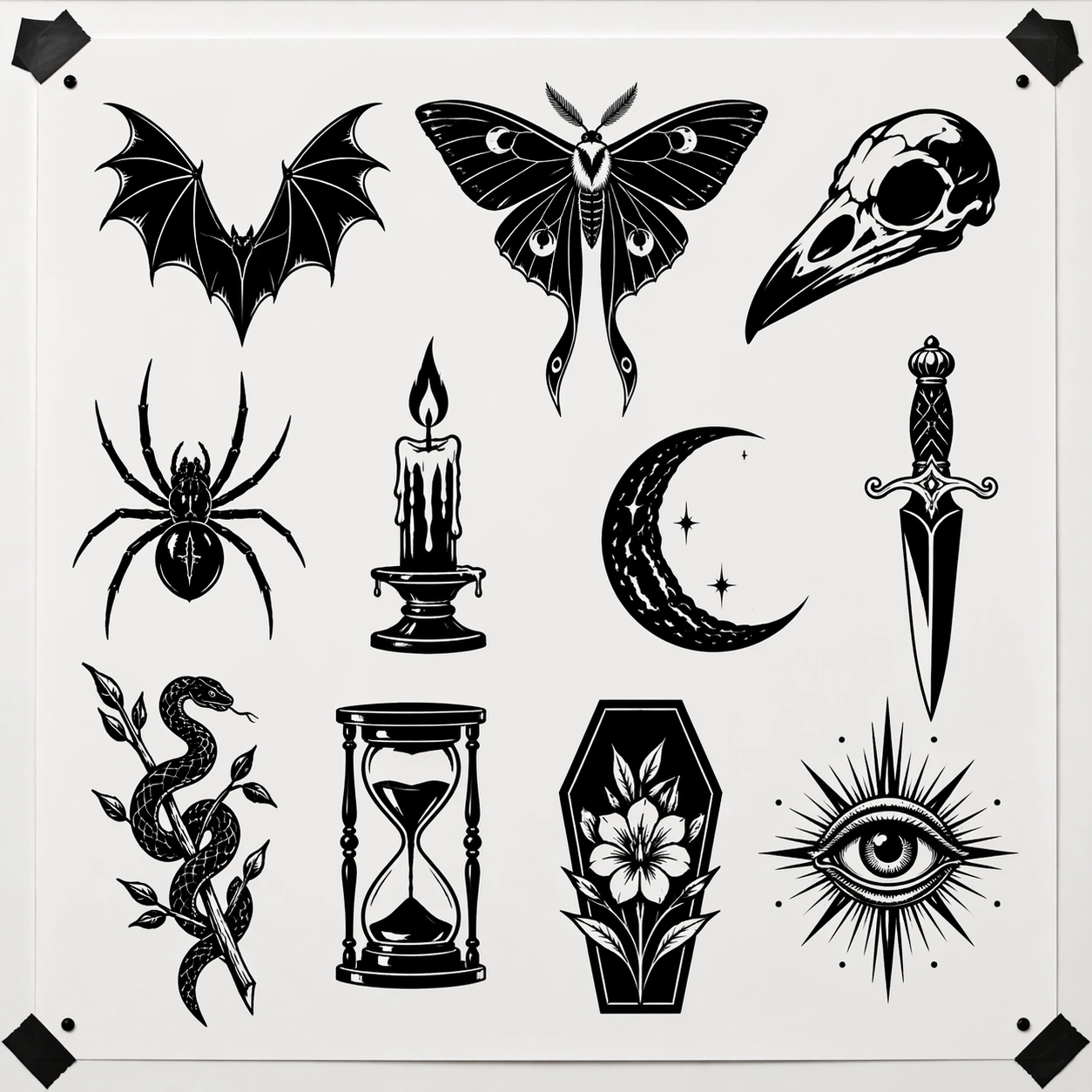
Example generated from “Tassili Rock Art Living — Editorial Reconstruction”
GPT Image 2en

Scene: A square hero image designed for a museum wall graphic or flagship magazine cover, but without any actual typography. Use strong focal hierarchy, refined contrast, and a polished finish that still feels rooted in archaeological evidence. The frame should look complete on its own and communicate why this civilization remains visually unforgettable. Subject: Build the image around a serious editorial reconstruction that treats the paintings as living human evidence, not fantasy animation. Present architecture, artifacts, environment, and atmosphere as one coherent statement. The composition can be more distilled than a field snapshot, but it must remain culturally specific, materially persuasive, and free of fantasy shorthand. Nothing should feel like a movie poster or commercial franchise imitation. Important details: Keep the imagery recognizably North African rock art, with elongated figures, animal profile logic, archaeological weathering, and only a restrained suggestion of volume emerging from the painted surface. Distill the site or cultural world into one decisive visual argument: place, craft, weathering, engineering, and memory. Use the strongest material signatures from this civilization and let them sit in a believable environment with controlled dramatic weight. Keep any carved or painted symbols non-readable. The result should look like responsible high-end visual storytelling for research and public interpretation, not a spectacle-first matte painting. Use case: Tassili Rock Art Coming Alive single study 9/9. Constraints: No readable text, no watermark, no logos, preserve exact 1:1 aspect ratio, no glowing magic portals, no comic-book action poses, no modern graffiti, no surreal monsters, no movie-poster tropes, no overdesigned framing devices, no collage layout, no brand-like iconography.

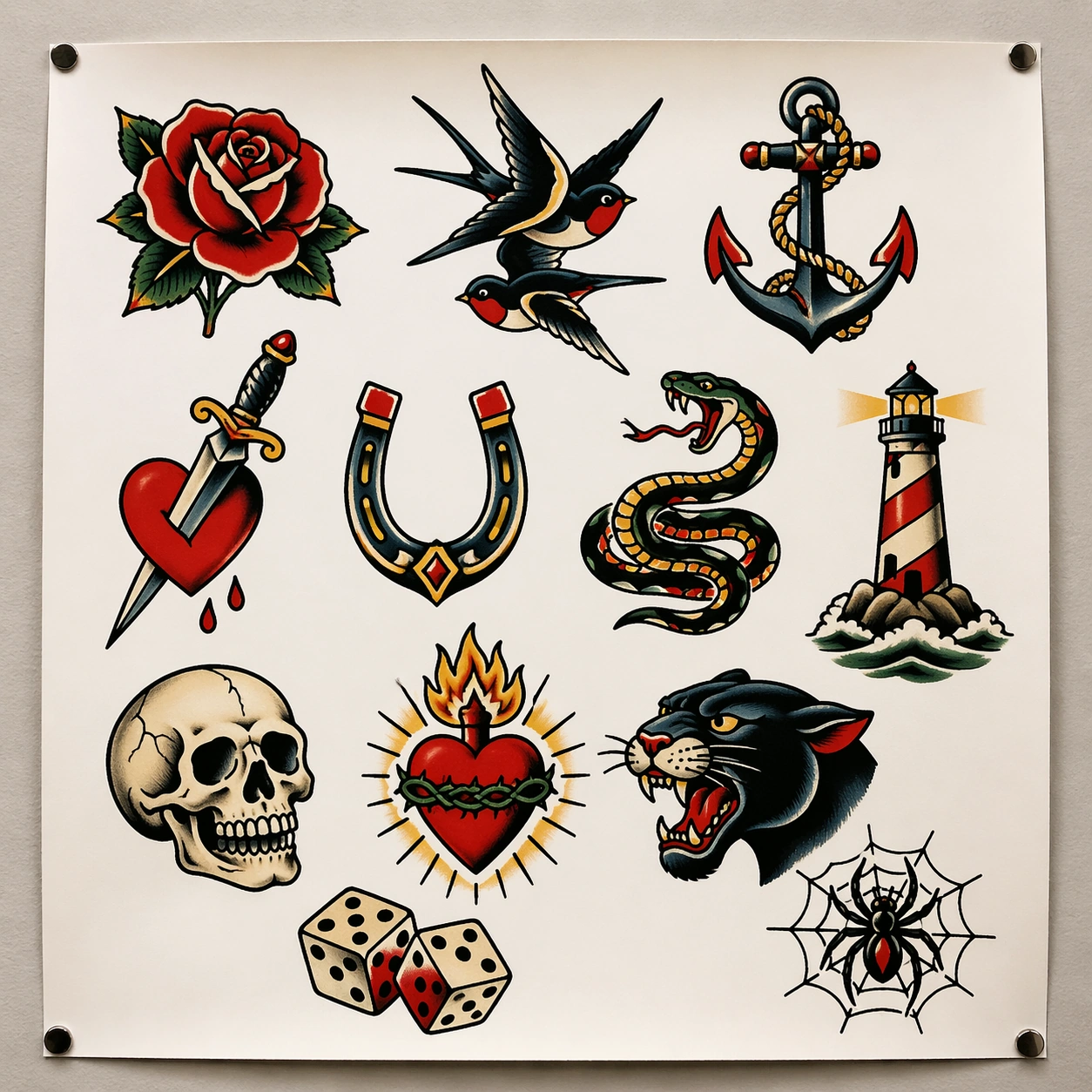
Example generated from “Tattoo Flash Sheet — Classic Parlor Wall”
GPT Image 2en

Scene: A square straight-on photograph of a single bright white flash sheet pinned to a neutral tattoo studio wall, lit by soft overhead shop lighting with very slight paper curl at the corners and faint shadows from the pins. The sheet should fill most of the frame and read like a clean commercial presentation surface, with balanced margins and enough empty white space for each design to breathe. Subject: Create a classic American traditional tattoo flash sheet containing around twelve isolated motifs arranged in a disciplined gridless salon layout. Include a red rose, swallow pair, ship anchor, dagger through heart, horseshoe, snake coil, lighthouse, skull, sacred heart, panther head, lucky dice, and webbed spider. Every motif should be fully self-contained, outlined in bold black, and colored with the restrained old-school palette of red, yellow, green, navy, cream, and black. The drawings must look ready for customers to choose from, not like decorative poster art or scrapbook stickers. Important details: The core visual rule is tattoo-parlor usability. Each design must have strong silhouette separation, even line weight, controlled fill areas, and consistent shading logic. Preserve generous white paper between motifs, small crop-safe margins, and a believable studio-wall presentation. The image should feel commercial and contemporary, even while the motifs come from traditional flash language. Avoid painterly rendering, background scenery, and extra props that distract from the sheet itself. Use case: Tattoo Flash Sheet single study 1/8, establishing a clean parlor-ready old-school flash board with many independent selectable motifs. Constraints: No readable text, no watermark, no logos, preserve exact 1:1 aspect ratio, no skin, no tattooed human body, no illegible scribble labels, no poster frame, no collage overlap, no glossy 3D render finish.

Example generated from “Tattoo Flash Sheet — Blackwork Night Creatures”
GPT Image 2en

Scene: A square flat flash-sheet presentation photographed straight-on against a clean matte white backing board inside a contemporary tattoo studio. Lighting is bright and neutral, revealing crisp paper texture, black ink saturation, and generous negative space. The page should feel archival and precise, as if prepared for a client consultation wall or portfolio binder. Subject: Design a pure blackwork tattoo flash sheet with around eleven nocturnal or ominous motifs: bat wings, luna moth, raven skull, spider, candle flame, crescent moon, dagger, snake wrapped around a branch, hourglass, coffin bloom, and all-seeing eye. Each icon should be isolated and composed as a tattoo-ready emblem, using heavy black masses, sharp negative cutouts, and controlled line detail rather than grayscale painting. The composition should feel cohesive as a substyle collection, but each individual motif must remain distinct and selectable. No motif should touch another, and every silhouette should read instantly from a distance. Important details: The key rule is discipline of black ink. Favor solid fills, skin-break thinking translated into white paper gaps, and precise ornamental symmetry where appropriate. The sheet must feel like a professional blackwork artist's flash offering, not a gothic poster. Keep the board clean, with optional tiny registration dots or tape corners as nonverbal shop cues, but no captions. The tension comes from balancing darkness of motif with cleanliness of layout. Use case: Tattoo Flash Sheet single study 2/8, testing commercial blackwork presentation with strong silhouette readability and no reliance on color. Constraints: No readable text, no watermark, no logos, preserve exact 1:1 aspect ratio, no gray airbrush portrait, no textured paper stains, no overlapping motifs, no human body, no neon color, no decorative background scene.

Example generated from “Tattoo Flash Sheet — Western Roadside Charms”
GPT Image 2en

Scene: A square flash sheet lying flat on a spotless drafting table, photographed from directly above so the white paper becomes a clean field for evenly spaced tattoo motifs. Light is crisp and studio neutral, with only faint edge shadows and a subtle hint of masking tape at two corners. The page should feel like a product-ready design sheet from a modern custom tattoo parlor. Subject: Create a western roadside themed flash sheet with about twelve independent motifs: cowboy boot, prickly pear cactus, motel key fob, revolver holster without gun, rattlesnake, horseshoe, spur, roadside sign shape without readable words, highway sunset, matchbook, whiskey glass, and desert rose. Render the motifs in a contemporary tattoo-flash language that mixes American traditional color blocking with a slightly polished commercial finish. Each emblem must be isolated, fully framed by white paper, and strong enough to be chosen individually by a client. Important details: The important control point is motif variety within a unified retail sheet. Keep line weights confident, color fills restrained, and shadows minimal. The page should read as body-art inventory rather than illustration editorial. Use dusty red, mustard, turquoise, black, cream, and cactus green, with enough white space so the table never feels crowded. Avoid turning the sheet into a narrative western poster or a scrapbook page. Use case: Tattoo Flash Sheet single study 3/8, testing themed commercial flash with multiple independent western motifs and disciplined paper layout. Constraints: No readable text, no watermark, no logos, preserve exact 1:1 aspect ratio, no full desert scene background, no human cowboy portrait, no collage overlap, no fake brand marks, no glossy sticker sheen, no tattooed skin.

Example generated from “Tattoo Flash Sheet — Lucky Love Icons”
GPT Image 2en

Scene: A square front-facing flash sheet mounted on a pale cream pinboard in a boutique tattoo studio, lit softly so the white paper remains bright while the colored inks stay saturated and tactile. The board fills the frame with a little breathing room around the edges, and the sheet looks freshly printed, flat, and ready for walk-in clients to browse. Subject: Build a lively flash sheet of around thirteen lucky and romantic icons: ribboned heart, lock and key, pair of cherries, swallow, starburst ring, hand fan, playing card suit cluster, tiny cupid arrow, teacup with steam heart, perfume bottle, lipstick kiss icon, lucky clover, and dice wrapped in ribbon. The motifs should feel modern, playful, and commercial while still grounded in tattoo flash conventions such as bold outer line, clean fill shapes, selective highlights, and independent composition. The arrangement should feel curated rather than mechanically gridded, with motifs balancing each other across the page. Important details: This sheet succeeds when the imagery is sweet without becoming kawaii sticker clutter. Preserve tattoo practicality: decisive outlines, limited color families, and enough white negative space around every piece. Use cherry red, bubblegum pink, cream, black, mint, and gold accents, but keep the paper itself dominant. The overall impression should be a tattoo shop flash board for charming small pieces, not a stationery product mockup. Use case: Tattoo Flash Sheet single study 4/8, testing a playful romantic flash set that still reads as professional tattoo inventory. Constraints: No readable text, no watermark, no logos, preserve exact 1:1 aspect ratio, no glitter explosion background, no sticker drop shadows, no human hands, no fashion magazine cover styling, no overlapping motifs, no plastic toy rendering.

Example generated from “Tattoo Flash Sheet — Maritime Memory Sheet”
GPT Image 2en

Scene: A square tattoo flash sheet displayed against a slightly warm white wall in a nautical-themed but contemporary tattoo studio, photographed straight-on with soft even light. The paper should appear crisp and substantial, with tiny pinholes, natural margin spacing, and just enough environmental shadow to feel physically present without distracting from the artwork. Subject: Design a maritime memory flash sheet with approximately twelve isolated motifs: clipper ship, lighthouse, rope-wrapped anchor, mermaid bust, compass rose, storm cloud over waves, shell, gull, bottle with tiny sea scene, lifebuoy, ship wheel, and dagger crossing a rope heart. The visual language should blend classic sailor tattoo heritage with tidy modern shop presentation. Each emblem must be ready to tattoo as an independent piece, using confident outlines, flat but rich color blocks, and modest stylized shading rather than painterly realism. Important details: The success condition is recognizable sailor flash without nostalgia turning muddy. Keep spacing generous and the palette controlled with navy, crimson, seafoam, cream, gold, and black. The sheet should feel like a real consultation-wall product that respects tattoo production constraints: no overcomplicated micro detail, no motifs touching, no decorative frame, no surrounding beach scene. Maintain the balance between heritage symbolism and retail clarity. Use case: Tattoo Flash Sheet single study 5/8, testing nautical flash vocabulary on a clean modern sheet that still feels rooted in tattoo history. Constraints: No readable text, no watermark, no logos, preserve exact 1:1 aspect ratio, no full ocean background, no photoreal sailor portrait, no aged parchment effect, no sticker-style drop shadows, no overlapping motifs, no body skin context.

Example generated from “Tattoo Flash Sheet — Floral Dagger Study”
GPT Image 2en

Scene: A square overhead studio capture of a pristine white tattoo flash sheet resting on a metal-edged worktable, with diffuse daylight from above and very light shadowing along the page edges. The framing is clinical and presentation-driven, like a portfolio page being documented for a tattoo artist archive. Leave generous white margins so the motifs feel collectible and easy to compare. Subject: Create a floral-and-blade flash sheet containing around ten independent tattoo designs built from daggers, roses, peonies, thorn vines, spider lilies, tulips, iris blooms, ribbon wraps, broken stem clusters, and a single butterfly crossing one blade. The compositions should feel sharper and more elegant than basic parlor flash, but still ready for skin translation: bold line foundation, controlled line taper, deliberate color pockets, and strong mid-size silhouettes. Each motif should sit on its own, with no connecting background flourishes. Important details: The visual challenge is balancing softness of flower petals with the hard geometry of blades. Keep the sheet feeling commercial and body-art specific, not like botanical illustration or packaging art. Use burgundy, blush pink, dark olive, muted gold, silver-gray, and black outlines. Maintain consistent paper rhythm, with motifs distributed across the page in a way that feels curated by an experienced tattooer. Avoid excess filigree and avoid delicate details that would disappear at tattoo scale. Use case: Tattoo Flash Sheet single study 6/8, testing whether a more elegant floral-dagger substyle can still read as practical flash-sheet inventory. Constraints: No readable text, no watermark, no logos, preserve exact 1:1 aspect ratio, no bouquet background, no blood, no fantasy swords, no overlapping motifs, no perfume-ad illustration styling, no human body, no glossy foil effects.

Example generated from “Tattoo Flash Sheet — Pet Memorial Charms”
GPT Image 2en

Scene: A square front-facing flash sheet pinned to a pale gray consultation-board wall in a friendly neighborhood tattoo studio, illuminated with soft natural light that keeps the white paper clean and the ink colors calm. The sheet should feel personal and emotionally gentle while still being organized like a professional service offering. Subject: Create a pet memorial flash sheet with roughly eleven isolated motifs suitable for commemorative tattoos: sleeping cat portrait medallion, dog head cameo, paw print charm, collar buckle, favorite tennis ball, fish toy, ribbon heart, house silhouette with tiny bowl, moon over whiskers, framed tag shape without readable text, and bouquet wrapped around a leash knot. The page should feel intentionally designed for clients choosing small-to-medium memorial pieces. Use a visual language that blends classic flash clarity with softer sentimental styling, not photographic pet portrait realism. Important details: The important rule is emotional restraint. Keep the motifs tender and specific, but still tattoo-ready with strong outlines, limited fill complexity, and clear silhouette. Preserve white paper dominance and respectful spacing so the sheet feels consultative rather than crowded. Use muted blues, dusty rose, warm cream, olive, and black. The presentation must stay commercial and shop-realistic, avoiding scrapbook craft cues or greeting-card sentimentality. Use case: Tattoo Flash Sheet single study 7/8, testing whether memorial subject matter can be handled with parlor-ready clarity and quiet emotional tone. Constraints: No readable text, no watermark, no logos, preserve exact 1:1 aspect ratio, no realistic fur-photo collage, no human portrait, no candles on a grave, no overlapping motifs, no glitter effects, no tattooed skin background.

Example generated from “Tattoo Flash Sheet — City Pop Flash Board”
GPT Image 2en

Scene: A square straight-on studio image of a white flash sheet clipped to a metal display rail in a modern urban tattoo shop. The wall is neutral and clean, lit by bright gallery-like overhead fixtures that keep colors crisp and the paper texture visible. The frame should feel commercial, contemporary, and body-art specific rather than editorial or lifestyle styled. Subject: Design a city-pop tattoo flash sheet with around twelve independent modern urban motifs: bodega cat, sneakers, taxi roof light, soda cup with straw, portable cassette player, pigeon silhouette, basketball hoop, apartment fire escape fragment, deli flower bouquet, subway token-like coin without text, lightning-bolt headphones, and bubble-star sunglasses. The art should bridge tattoo flash conventions with contemporary street retail taste. Each emblem must be bold, separate, and tattoo-ready, using clean outlines, simplified fill blocks, selective highlights, and disciplined empty paper around every design. Important details: The sheet should feel current without drifting into sticker-brand illustration. Keep the commercial flash logic first: isolated choices on a white page, consistent line confidence, and balanced spacing. The palette can use cobalt, safety orange, cherry red, mint, black, silver-gray, and cream, but avoid visual noise. The overall impression should be a flash board that a city-based tattoo studio could genuinely hang for walk-in clients who want modern small pieces. Use case: Tattoo Flash Sheet single study 8/8, testing a contemporary urban flash collection that stays clean, legible, and commercially believable. Constraints: No readable text, no watermark, no logos, preserve exact 1:1 aspect ratio, no full street scene background, no fashion model, no sticker pack overlap, no shiny plastic packaging, no human body, no chaotic graffiti wall behind the sheet.

Example generated from “Team Brand And Fan Social Rollout — Reference Club Identity”
GPT Image 2en

Scene: Create a square club identity hero poster for Team Rollout, using a fictional club-culture world with bold supporter colors, fabric texture, floodlit haze, and premium social-poster polish. The frame should feel commercial, polished, and immediately useful for a real client deliverable rather than a one-off art experiment. Keep the composition readable at thumbnail scale while still rewarding a closer look with layered depth, clean negative space, and strong directional light. Build the image so it clearly supports sports communication, with enough modular structure to imply information architecture without relying on literal words. Subject: Center the image on one original lead athlete framed against organized supporter silhouettes, scarf patterns, and abstract banners, arranged as lead athlete before fan wall. Treat the subject as original and brandless, with believable apparel construction, realistic body proportions, and strong emotional legibility. Surround the subject with supporting environmental cues that reinforce the category but never overpower the main figure. All secondary objects, props, and background elements should strengthen the same professional sports or fitness context. Important details: This first image must establish the full reference system for later derivatives: club-neutral poster geometry, non-readable social modules, and merch-adjacent textile energy. The emotional tone should read as supporter pride. Make the visual language reusable, disciplined, and commercially credible, with clean edges, coherent light behavior, and obvious hierarchy. Abstract panels, diagram bands, or stat-like modules are welcome, but they must remain non-readable and subordinate to the main visual message. The result should feel original, specific, and ready to anchor a larger package. Use case: Team Rollout series study 1/9, the reference image for the package. Constraints: No readable text, no watermark, no logos, preserve exact 1:1 aspect ratio, no brand marks, no copied famous team or product identity, no generic stock-photo stiffness, no cluttered background noise, no celebrity likenesses.

Example generated from “Team Brand And Fan Social Rollout — Rivalry Pulse Tile”
GPT Image 2en

Scene: Build a square rivalry pulse tile derived from the reference image for Team Rollout. Preserve the exact world established by the reference image, including the same palette family, lighting direction, environmental logic, and surface finish. The new frame should feel like a deliberate extension of one campaign system, not a separate concept. Shift the hierarchy to suit this use case, but keep the overall composition commercial, polished, and ready for real rollout. Subject: Use the same original subject identity and anchor cues introduced by the reference image, now organized as same athlete against opposing color field. Keep faces, hair logic, body proportions, apparel or product construction, and major supporting forms consistent with the reference. Allow only the layout emphasis, pose, crop, and contextual energy to change so the result clearly belongs to the same package. Important details: Continuity is the main challenge. Preserve the exact reference language for color, materials, framing rhythm, and overall brandless campaign grammar while steering the tone toward compressed confrontation. Keep any stat blocks, schedule modules, arrows, badges, or callout panels non-readable. The derivative should prove that the same art direction can handle a different communication task without losing identity or utility. Make it credible for production use, with clean edges, intentional spacing, and no random decorative elements. Use case: Team Rollout series study 2/9, a derivative surface linked to 01-reference-club-identity. Constraints: No readable text, no watermark, no logos, preserve exact 1:1 aspect ratio, no new subject identity, no brand marks, no palette drift, no unrelated props, no collage chaos, no copied public-figure styling.
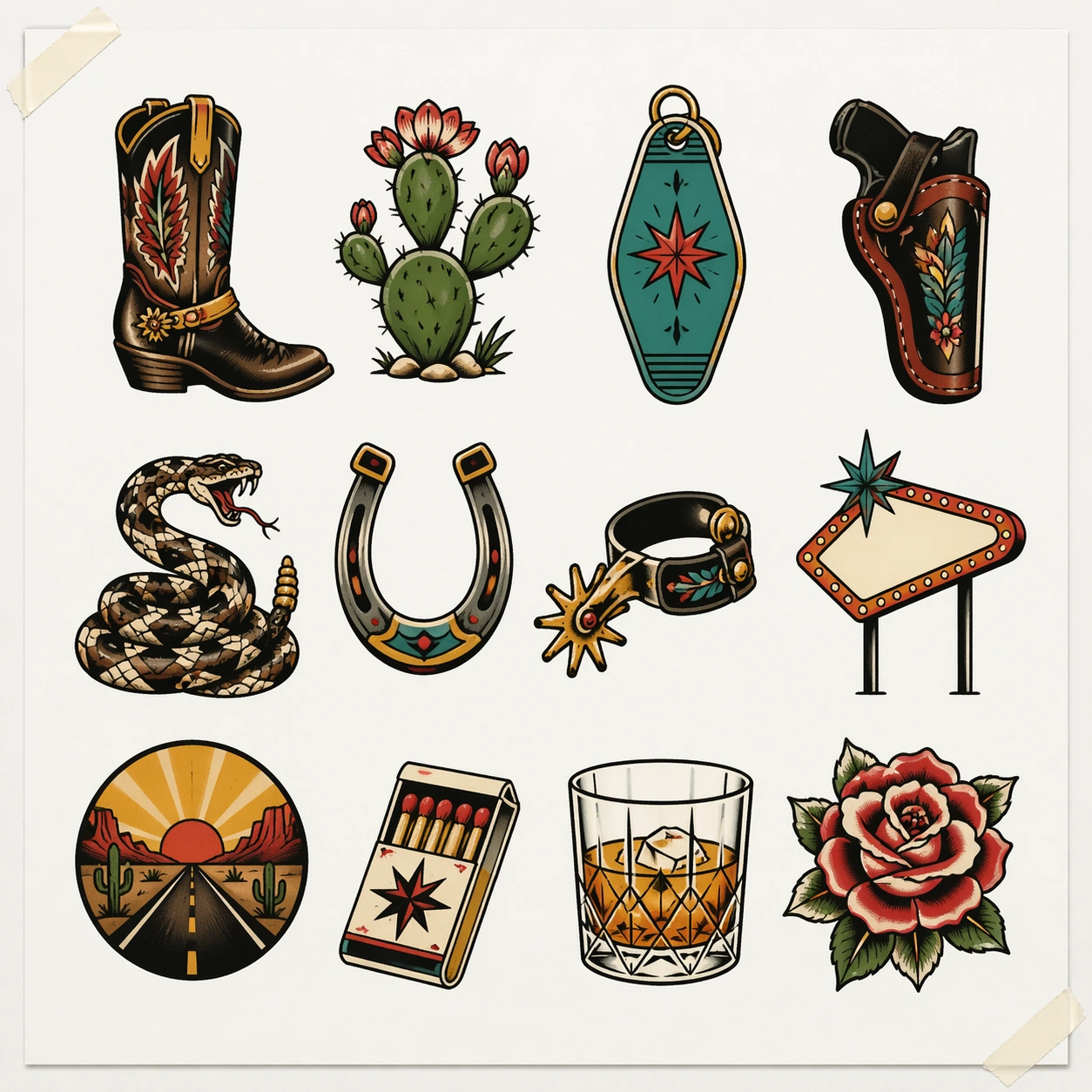
Example generated from “Team Brand And Fan Social Rollout — Home Crowd Poster”
GPT Image 2en

Scene: Build a square home crowd poster derived from the reference image for Team Rollout. Preserve the exact world established by the reference image, including the same palette family, lighting direction, environmental logic, and surface finish. The new frame should feel like a deliberate extension of one campaign system, not a separate concept. Shift the hierarchy to suit this use case, but keep the overall composition commercial, polished, and ready for real rollout. Subject: Use the same original subject identity and anchor cues introduced by the reference image, now organized as same athlete with visible supporter layers. Keep faces, hair logic, body proportions, apparel or product construction, and major supporting forms consistent with the reference. Allow only the layout emphasis, pose, crop, and contextual energy to change so the result clearly belongs to the same package. Important details: Continuity is the main challenge. Preserve the exact reference language for color, materials, framing rhythm, and overall brandless campaign grammar while steering the tone toward collective belonging. Keep any stat blocks, schedule modules, arrows, badges, or callout panels non-readable. The derivative should prove that the same art direction can handle a different communication task without losing identity or utility. Make it credible for production use, with clean edges, intentional spacing, and no random decorative elements. Use case: Team Rollout series study 3/9, a derivative surface linked to 01-reference-club-identity. Constraints: No readable text, no watermark, no logos, preserve exact 1:1 aspect ratio, no new subject identity, no brand marks, no palette drift, no unrelated props, no collage chaos, no copied public-figure styling.
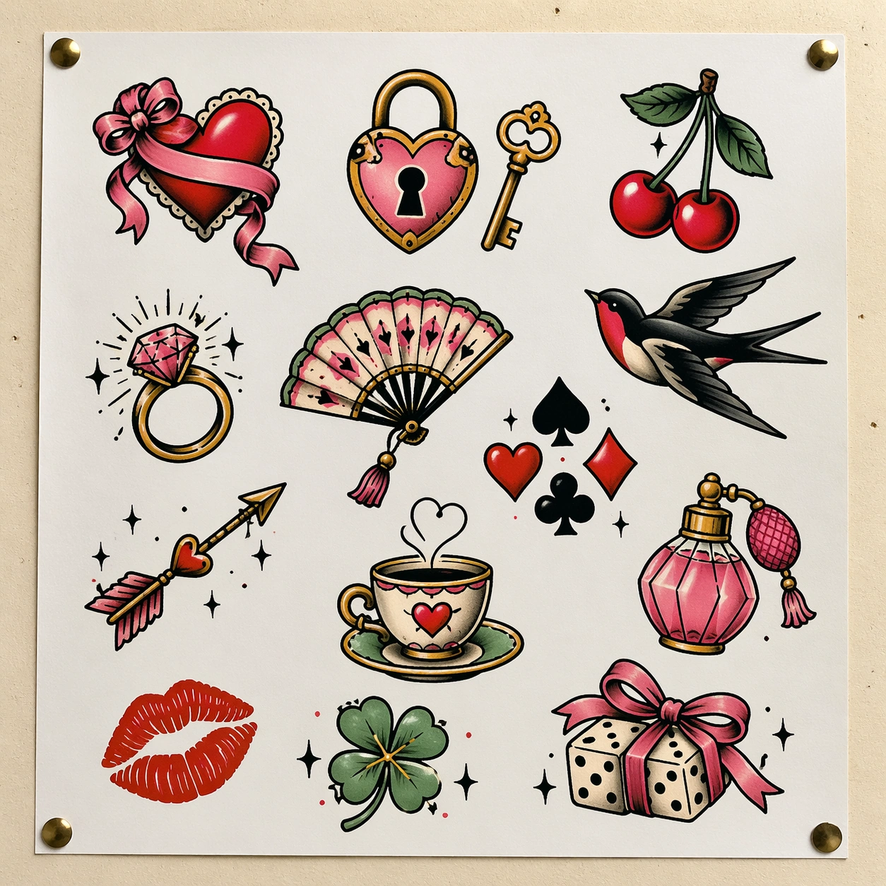
Example generated from “Team Brand And Fan Social Rollout — Merch Drop Variant”
GPT Image 2en

Scene: Build a square merch drop social variant derived from the reference image for Team Rollout. Preserve the exact world established by the reference image, including the same palette family, lighting direction, environmental logic, and surface finish. The new frame should feel like a deliberate extension of one campaign system, not a separate concept. Shift the hierarchy to suit this use case, but keep the overall composition commercial, polished, and ready for real rollout. Subject: Use the same original subject identity and anchor cues introduced by the reference image, now organized as same athlete in related warmup layer. Keep faces, hair logic, body proportions, apparel or product construction, and major supporting forms consistent with the reference. Allow only the layout emphasis, pose, crop, and contextual energy to change so the result clearly belongs to the same package. Important details: Continuity is the main challenge. Preserve the exact reference language for color, materials, framing rhythm, and overall brandless campaign grammar while steering the tone toward fashion-forward energy. Keep any stat blocks, schedule modules, arrows, badges, or callout panels non-readable. The derivative should prove that the same art direction can handle a different communication task without losing identity or utility. Make it credible for production use, with clean edges, intentional spacing, and no random decorative elements. Use case: Team Rollout series study 4/9, a derivative surface linked to 01-reference-club-identity. Constraints: No readable text, no watermark, no logos, preserve exact 1:1 aspect ratio, no new subject identity, no brand marks, no palette drift, no unrelated props, no collage chaos, no copied public-figure styling.
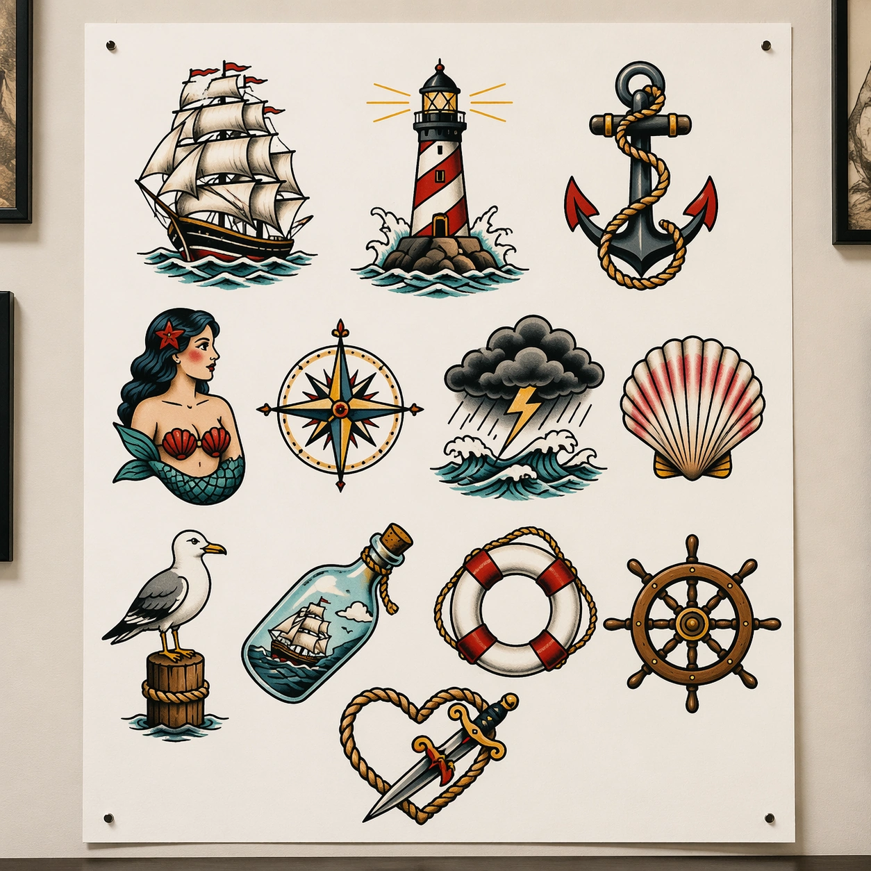
Example generated from “Team Brand And Fan Social Rollout — Chant Night Social”
GPT Image 2en

Scene: Create a square supporter-night social tile for Team Rollout, using team-social storytelling driven by supporter texture, urban club identity, and brandless sports-fashion polish. The composition should read as a practical, production-ready sports or fitness surface with a clear hierarchy, premium lighting, and obvious commercial intent. Keep the environment specific enough to feel real, but leave enough control in the layout for non-readable information modules, campaign blocks, or visualized metrics. Aim for a finish that works for a brand, club, app, academy, or event operator. Subject: Build the image around fan leader amid raised silhouettes. The subject should be original, believable, and free of any real-brand or celebrity cues. Use realistic apparel, safe body mechanics when movement is visible, and environmental props that support the category without clutter. The subject must stay visually dominant so the design still works as a communication asset rather than a pure scene study. Important details: The mood should read as collective intensity. Treat layout, light, and supporting graphic structure as part of one polished delivery surface. Any schedule blocks, metric panels, quote zones, badges, or path diagrams must stay abstract and non-readable. Prioritize usefulness, clarity, and category truth over spectacle. The image should feel distinct from the series package while still belonging naturally to the same topic and business use case. Use case: Team Rollout single study 5/9, an independent rollout surface for the topic. Constraints: No readable text, no watermark, no logos, preserve exact 1:1 aspect ratio, no brand marks, no public-figure resemblance, no generic stock layout, no cluttered UI imitation, no accidental copyrighted insignia.
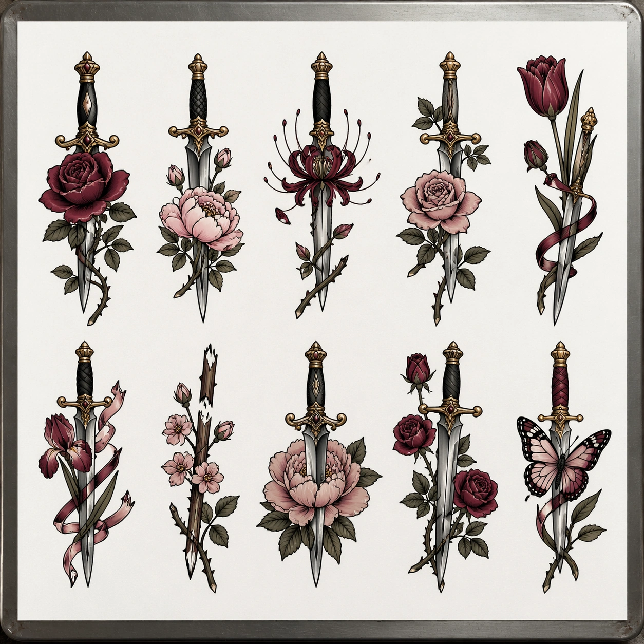
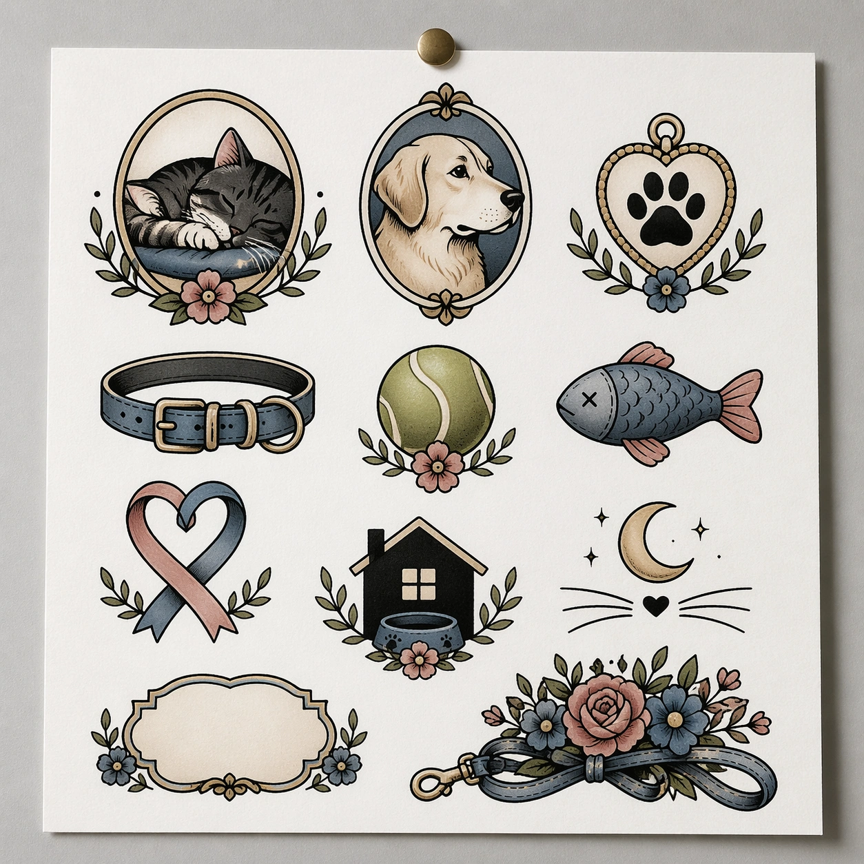
Example generated from “Team Brand And Fan Social Rollout — Away Trip Fan Pass”
GPT Image 2en

Scene: Create a square away-trip fan pass for Team Rollout, using team-social storytelling driven by supporter texture, urban club identity, and brandless sports-fashion polish. The composition should read as a practical, production-ready sports or fitness surface with a clear hierarchy, premium lighting, and obvious commercial intent. Keep the environment specific enough to feel real, but leave enough control in the layout for non-readable information modules, campaign blocks, or visualized metrics. Aim for a finish that works for a brand, club, app, academy, or event operator. Subject: Build the image around supporter in transit context. The subject should be original, believable, and free of any real-brand or celebrity cues. Use realistic apparel, safe body mechanics when movement is visible, and environmental props that support the category without clutter. The subject must stay visually dominant so the design still works as a communication asset rather than a pure scene study. Important details: The mood should read as travel-day momentum. Treat layout, light, and supporting graphic structure as part of one polished delivery surface. Any schedule blocks, metric panels, quote zones, badges, or path diagrams must stay abstract and non-readable. Prioritize usefulness, clarity, and category truth over spectacle. The image should feel distinct from the series package while still belonging naturally to the same topic and business use case. Use case: Team Rollout single study 6/9, an independent rollout surface for the topic. Constraints: No readable text, no watermark, no logos, preserve exact 1:1 aspect ratio, no brand marks, no public-figure resemblance, no generic stock layout, no cluttered UI imitation, no accidental copyrighted insignia.

Example generated from “Team Brand And Fan Social Rollout — Supporter Club Membership”
GPT Image 2en

Scene: Create a square supporter membership asset for Team Rollout, using team-social storytelling driven by supporter texture, urban club identity, and brandless sports-fashion polish. The composition should read as a practical, production-ready sports or fitness surface with a clear hierarchy, premium lighting, and obvious commercial intent. Keep the environment specific enough to feel real, but leave enough control in the layout for non-readable information modules, campaign blocks, or visualized metrics. Aim for a finish that works for a brand, club, app, academy, or event operator. Subject: Build the image around fan portrait with card modules. The subject should be original, believable, and free of any real-brand or celebrity cues. Use realistic apparel, safe body mechanics when movement is visible, and environmental props that support the category without clutter. The subject must stay visually dominant so the design still works as a communication asset rather than a pure scene study. Important details: The mood should read as warm belonging. Treat layout, light, and supporting graphic structure as part of one polished delivery surface. Any schedule blocks, metric panels, quote zones, badges, or path diagrams must stay abstract and non-readable. Prioritize usefulness, clarity, and category truth over spectacle. The image should feel distinct from the series package while still belonging naturally to the same topic and business use case. Use case: Team Rollout single study 7/9, an independent rollout surface for the topic. Constraints: No readable text, no watermark, no logos, preserve exact 1:1 aspect ratio, no brand marks, no public-figure resemblance, no generic stock layout, no cluttered UI imitation, no accidental copyrighted insignia.