In Image Translation — Transit Safety Panel

In Image Translation — Transit Safety Panel

Documento originale

GPT Image 2 · en

Scene:
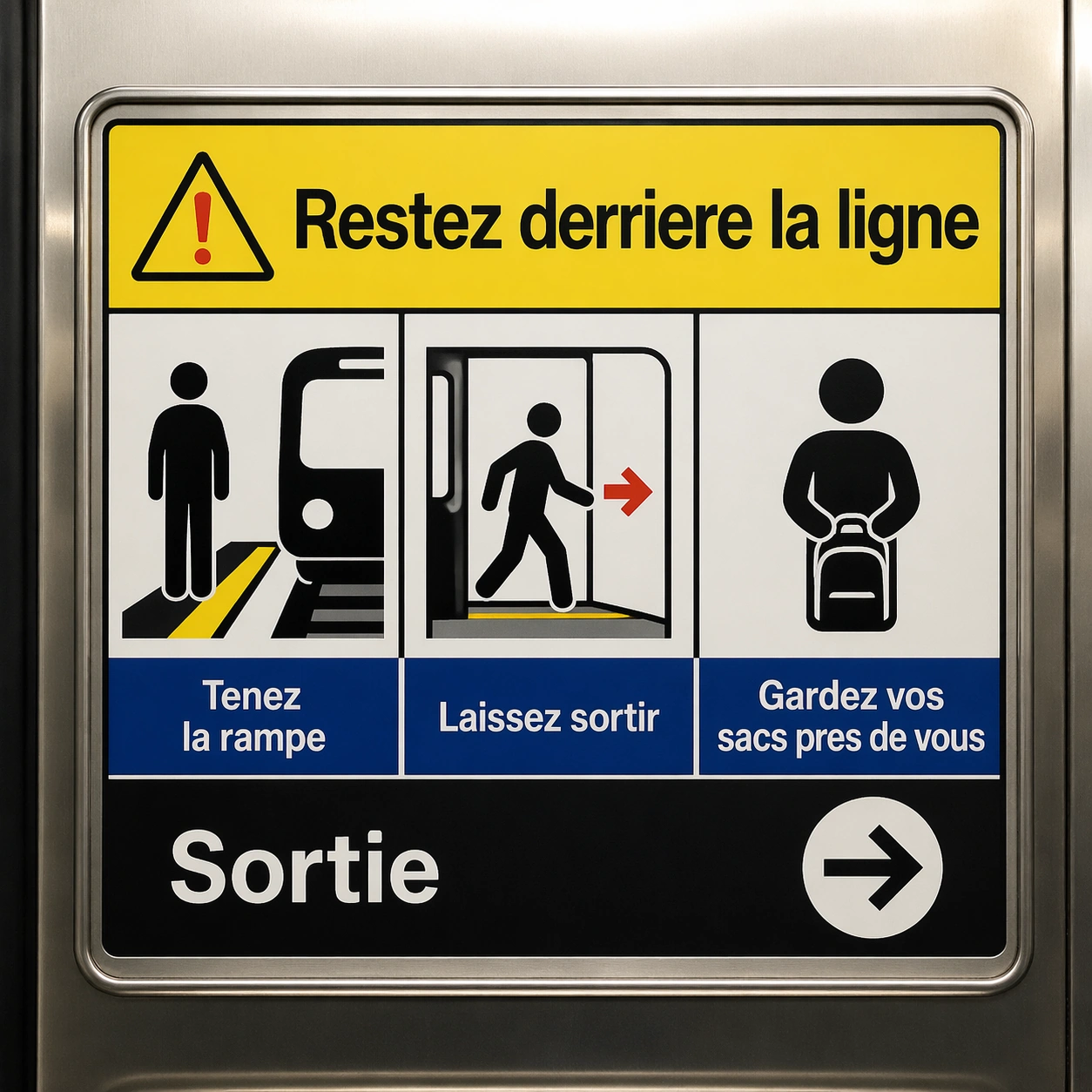
A square crop of a transit safety panel inside a clean metro carriage, photographed straight-on with stainless steel edges and soft overhead light. The panel is a finished public-information graphic with four pictogram boxes, a headline band, and a lower instruction strip. Use high contrast safety colors: white, black, signal yellow, muted blue, and a small red accent.

Subject:
Show a French localization of a transit safety instruction panel. The exact readable French text must be: Restez derriere la ligne, Tenez la rampe, Laissez sortir, Gardez vos sacs pres de vous, Sortie. Place the main warning in the headline band, three instructions under pictograms in the middle boxes, and the exit label beside a clean arrow in the lower strip. Typography should be sober, transit-grade, and readable, with no brand system or route names.

Important details:
The challenge is maintaining a public-safety layout while translating the text. Keep pictograms aligned, box borders crisp, icon scale consistent, and the baseline grid stable. French accents should render correctly where used, and the text must not spill outside boxes. The panel should look like a professionally localized safety graphic, not an improvised poster.

Use case:
In-Image Translation single study 7/8, testing translated safety instructions with pictogram alignment and strict readability.

Constraints:
No readable text except the specified French strings, no watermark, no logos, preserve exact 1:1 aspect ratio, no metro brand, no route numbers, no extra warnings, no garbled accents, no angled unreadable panel.

Come usare

  1. Copia tutto il prompt originale, inclusi i parametri.
  2. Adatta soggetto, testo e composizione alle tue esigenze.
  3. Usa uno strumento esterno compatibile; verifica accesso e risultato.

Prima di iniziare

  • Controlla se serve un’immagine di riferimento. La compatibilità non prova il modello usato per l’esempio.
  • Verifica nomi, numeri e testi; i risultati cambiano con le versioni del modello.
Esempi simili

In Image Translation — Japanese Localized Poster
GPT Image 2en

Scene: Use the reference image as the locked source poster. Keep the same square crop, same straight-on wall presentation, same color palette, same modular grid, same line icons, same card sizes, and same footer position. The image should look like the same design file after a pr

In Image Translation — Arabic Localized Poster
GPT Image 2en

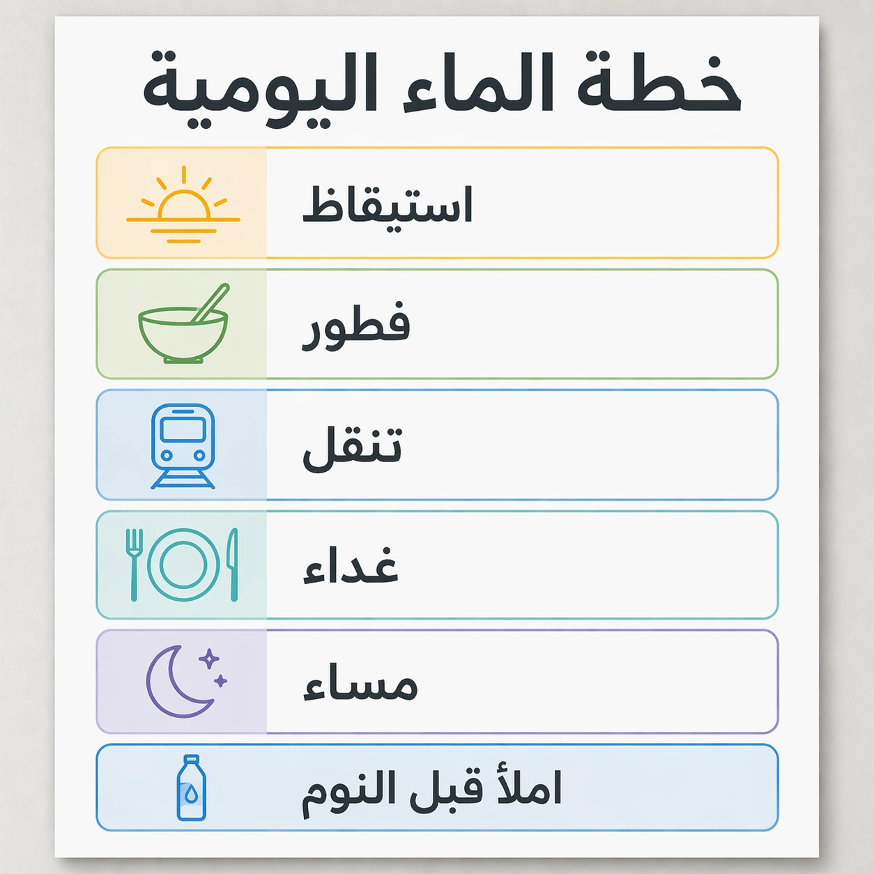
Scene: Use the reference image as the locked source poster, but localize it for Arabic while keeping the square gallery crop and professional design proof quality. Preserve the same card grid, same soft gray wall, same white poster surface, same icon style, same blue, green, yell

In Image Translation — English Source Poster
GPT Image 2en

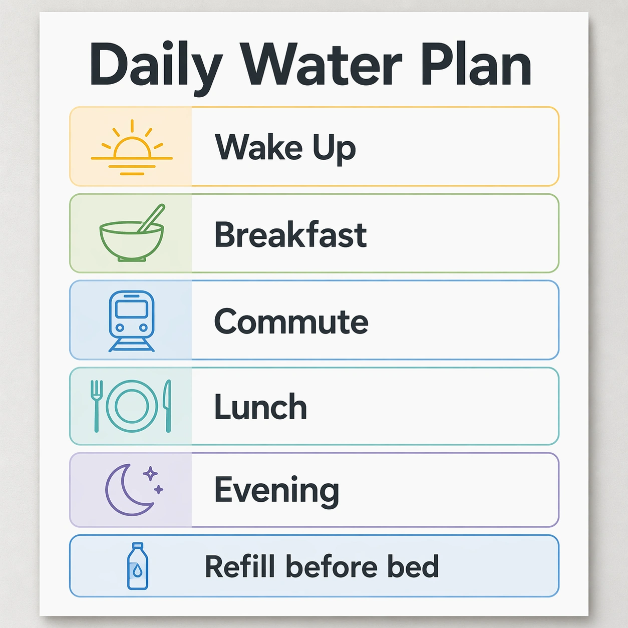
Scene: A square product-design infographic poster, straight-on like a finished localization proof on a light gray studio wall. Use a calm modern palette of white, graphite, fresh blue, soft green, and warm yellow. The lighting is even and bright so every text block is legible. Th

In Image Translation — App Onboarding Board
GPT Image 2en

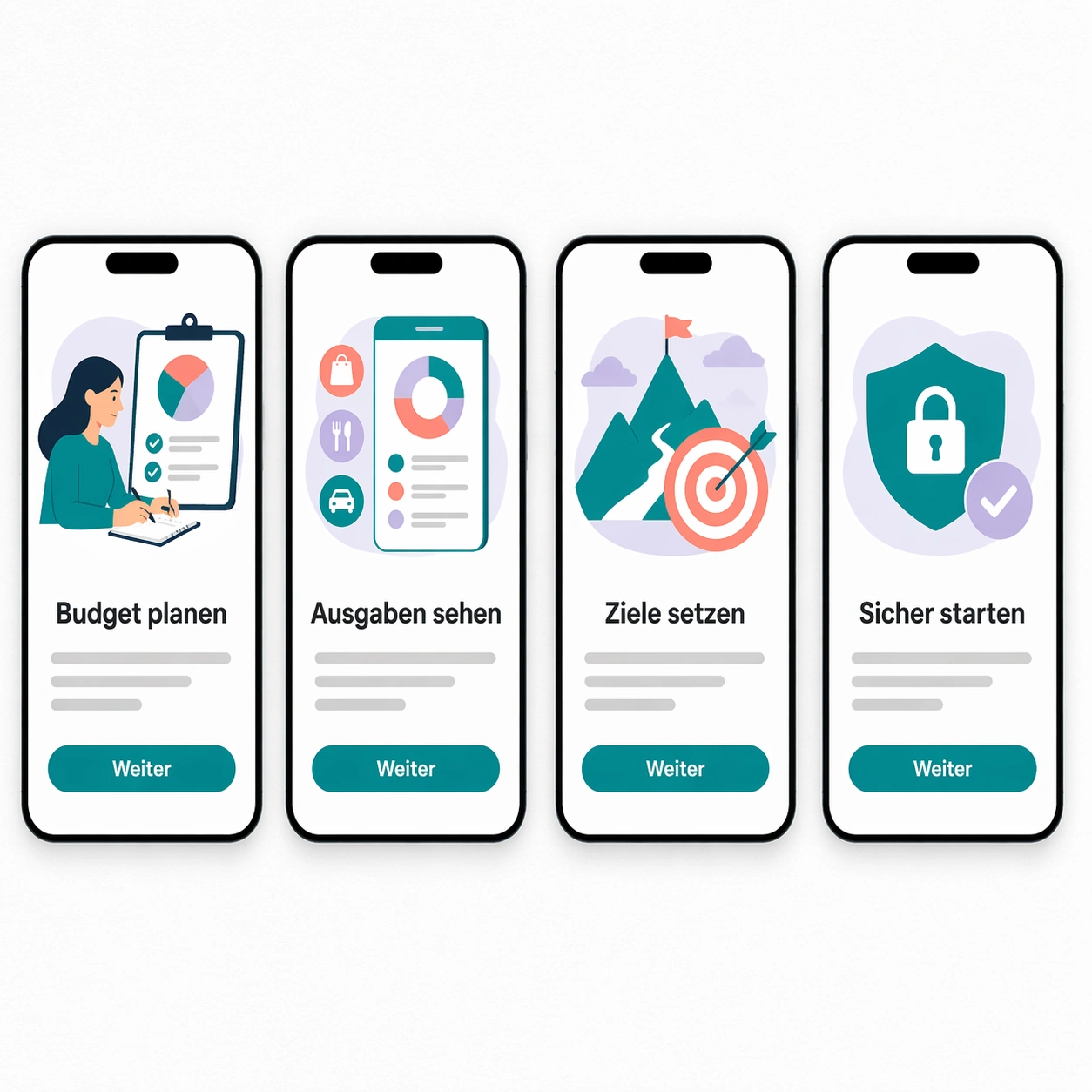
Scene: A square product mockup showing four mobile app onboarding screens laid out on a white design board. The board is viewed straight-on with subtle paper grain, soft shadows under each phone frame, and a restrained digital palette of black, white, teal, coral, and pale lavend

In Image Translation — Korean Localized Poster
GPT Image 2en

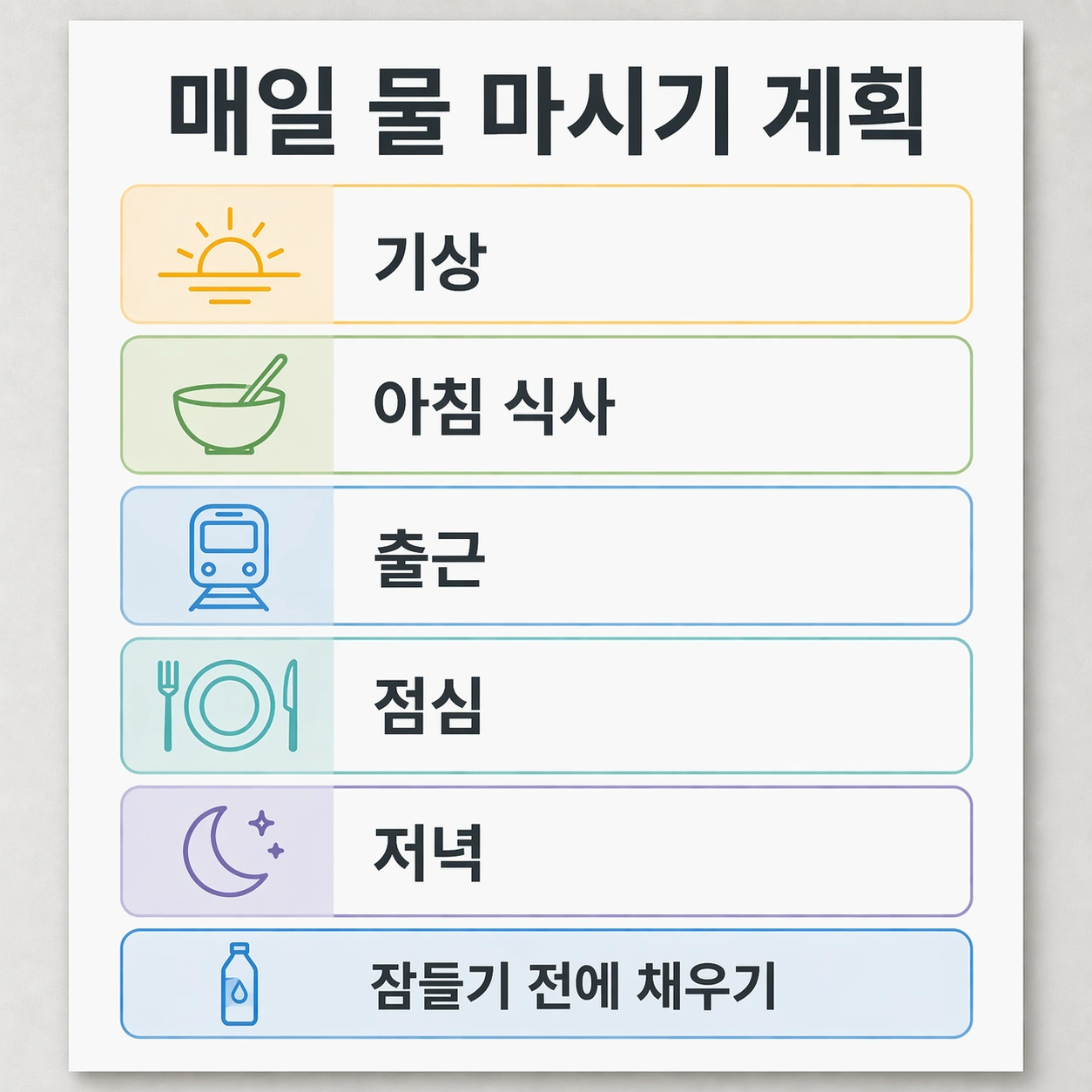
Scene: Use the reference image as the locked source poster. Maintain the same square, front-facing poster proof, neutral studio wall, bright even lighting, white card surfaces, graphite typography color, blue and green accent blocks, and warm yellow highlights. The finished resul

In Image Translation — Ingredient Label Sheet
GPT Image 2en

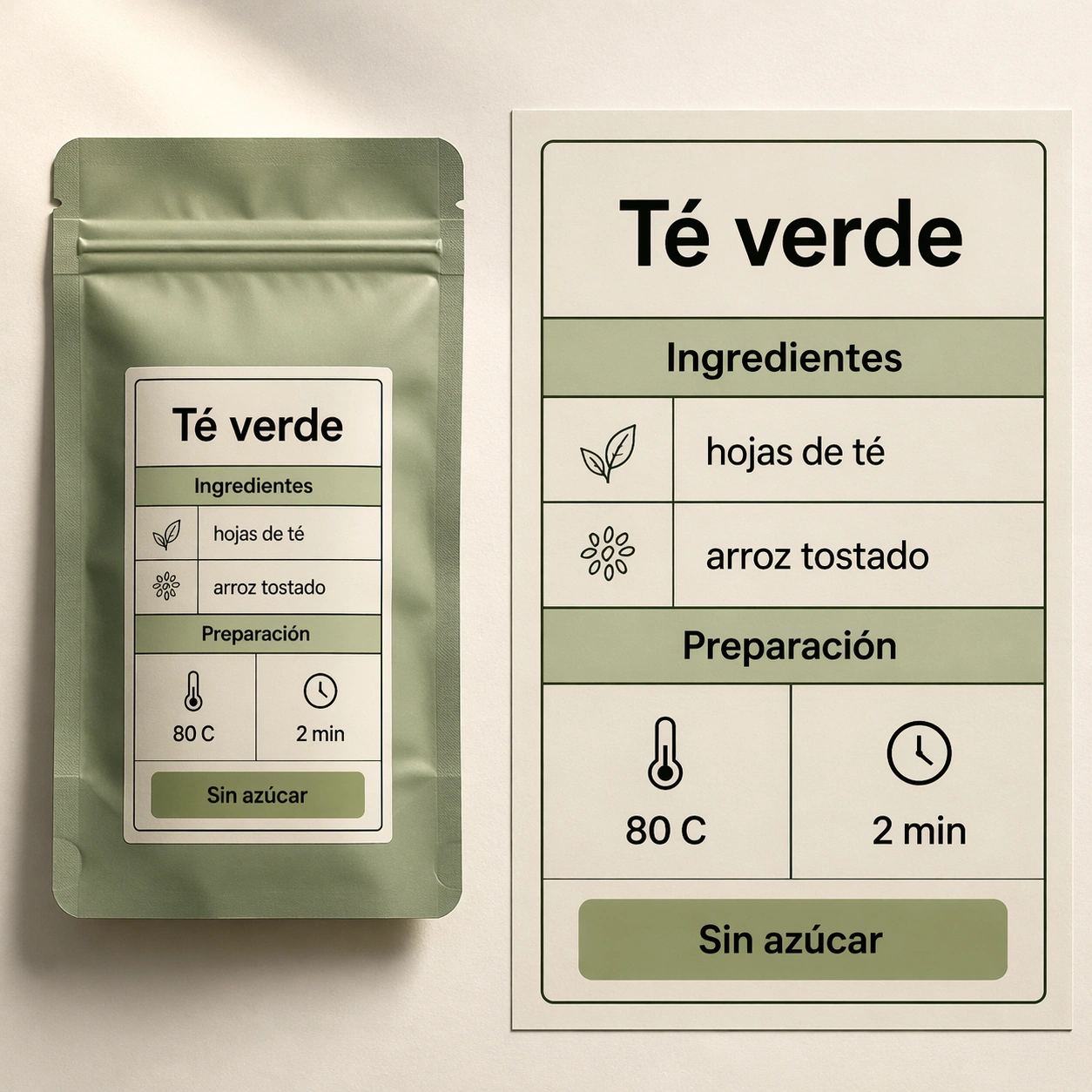
Scene: A square studio photograph style image of a premium tea pouch lying flat beside a magnified label proof sheet. The background is warm off-white paper, lit from the upper left with soft shadows. The design language is commercial packaging: clean black text, sage green block