Documento originale
GPT Image 2 · en
Scene:
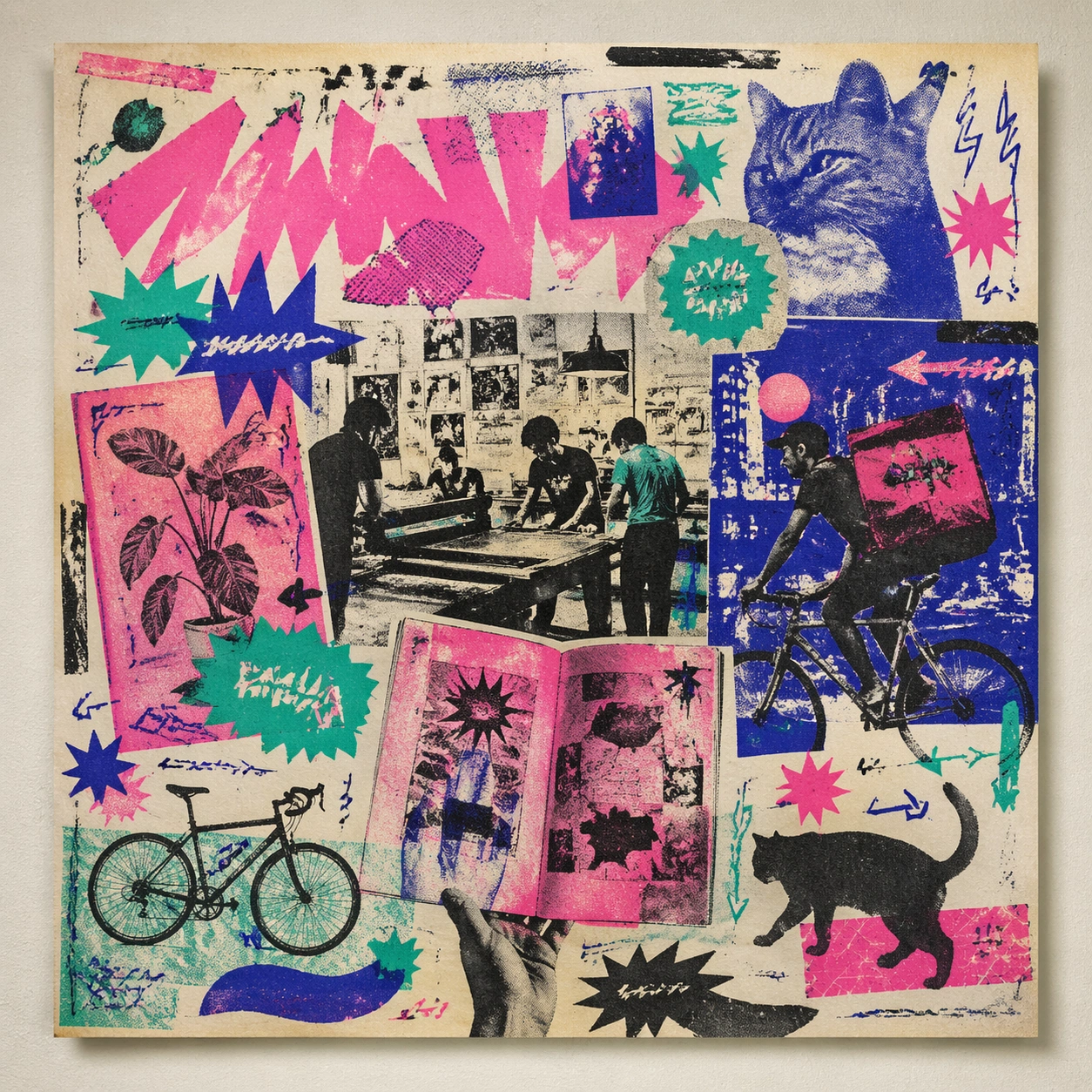
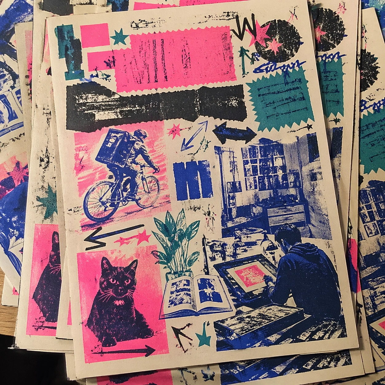
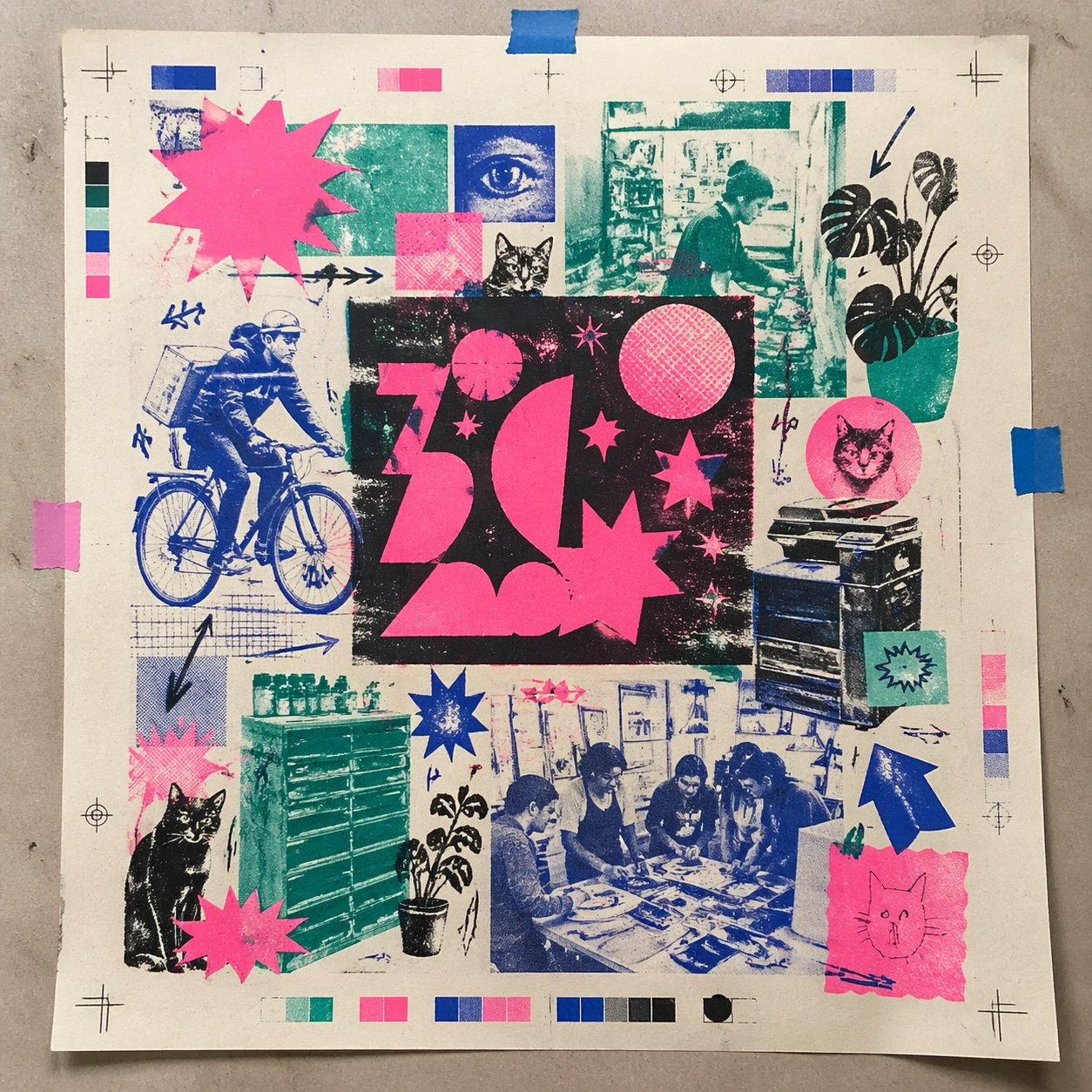
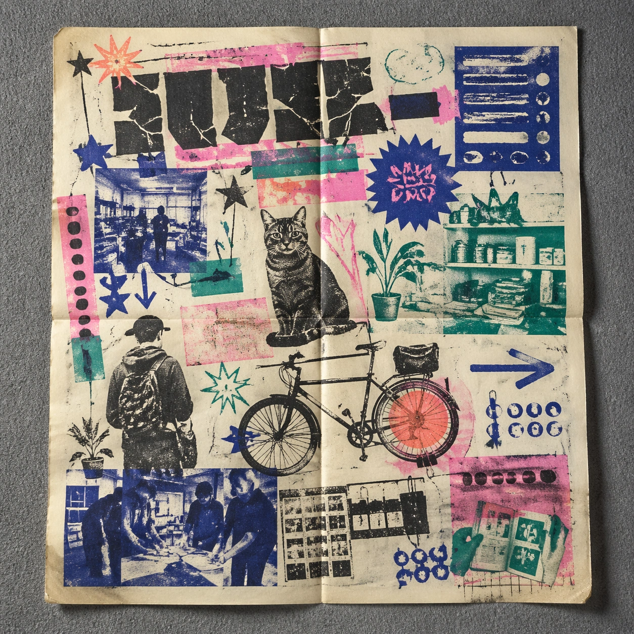
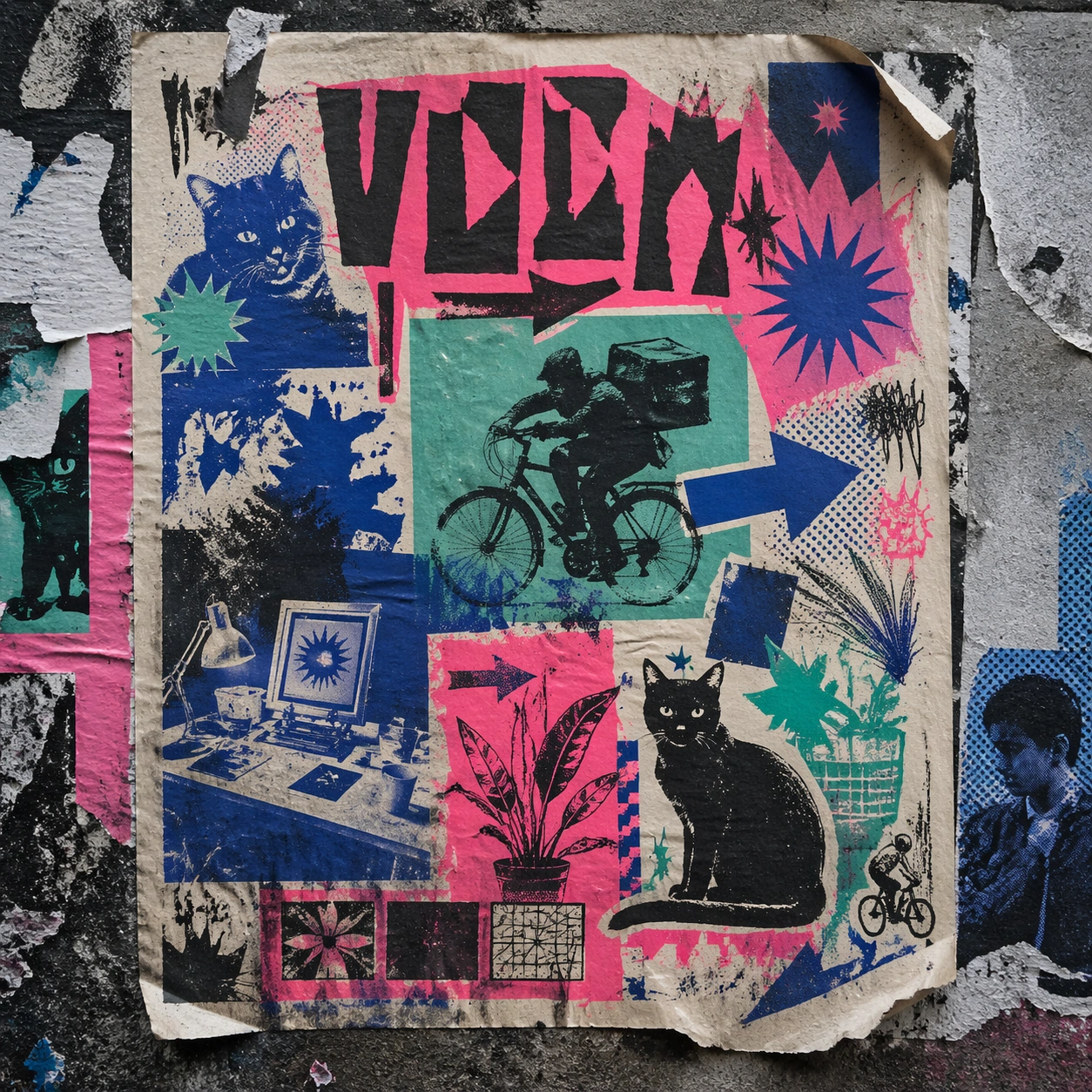
A square urban wall study with the poster pasted onto rough plaster among torn edges and older paper remnants, photographed in soft overcast light so texture, glue bubbles, and surface scars stay visible. The poster should express DIY risograph poster language with fluorescent layers, halftone dots, soy-ink soak, copier artifacts, and handmade zine rhythm, using fluorescent pink, teal, ultramarine, black, and fibrous cream paper and a tactile surface appropriate to the medium.

Subject:
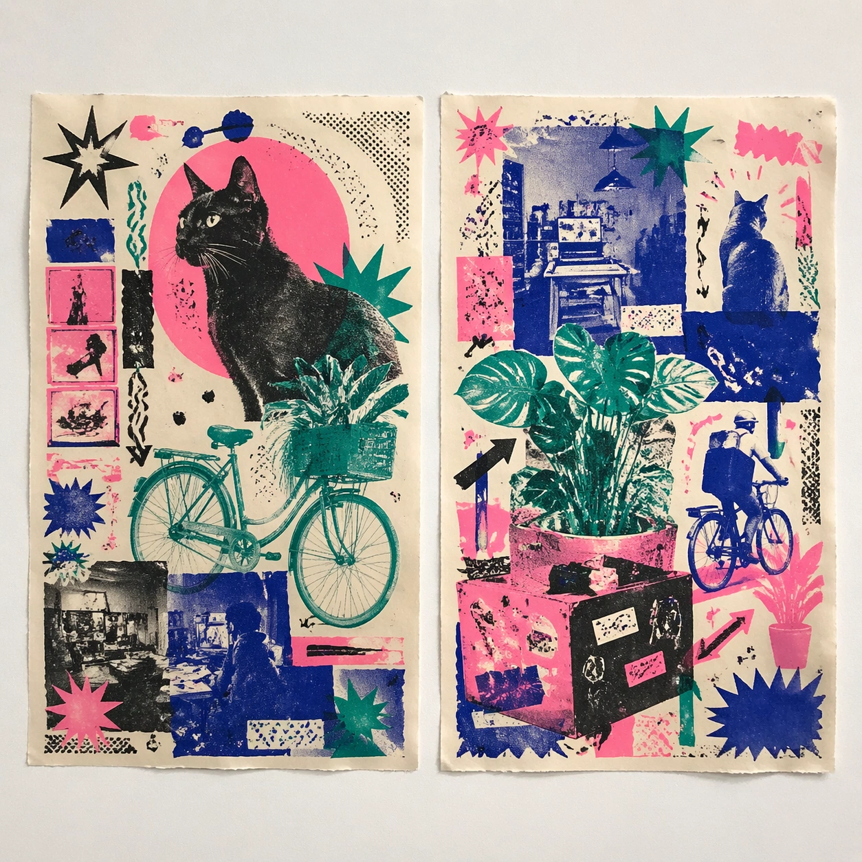
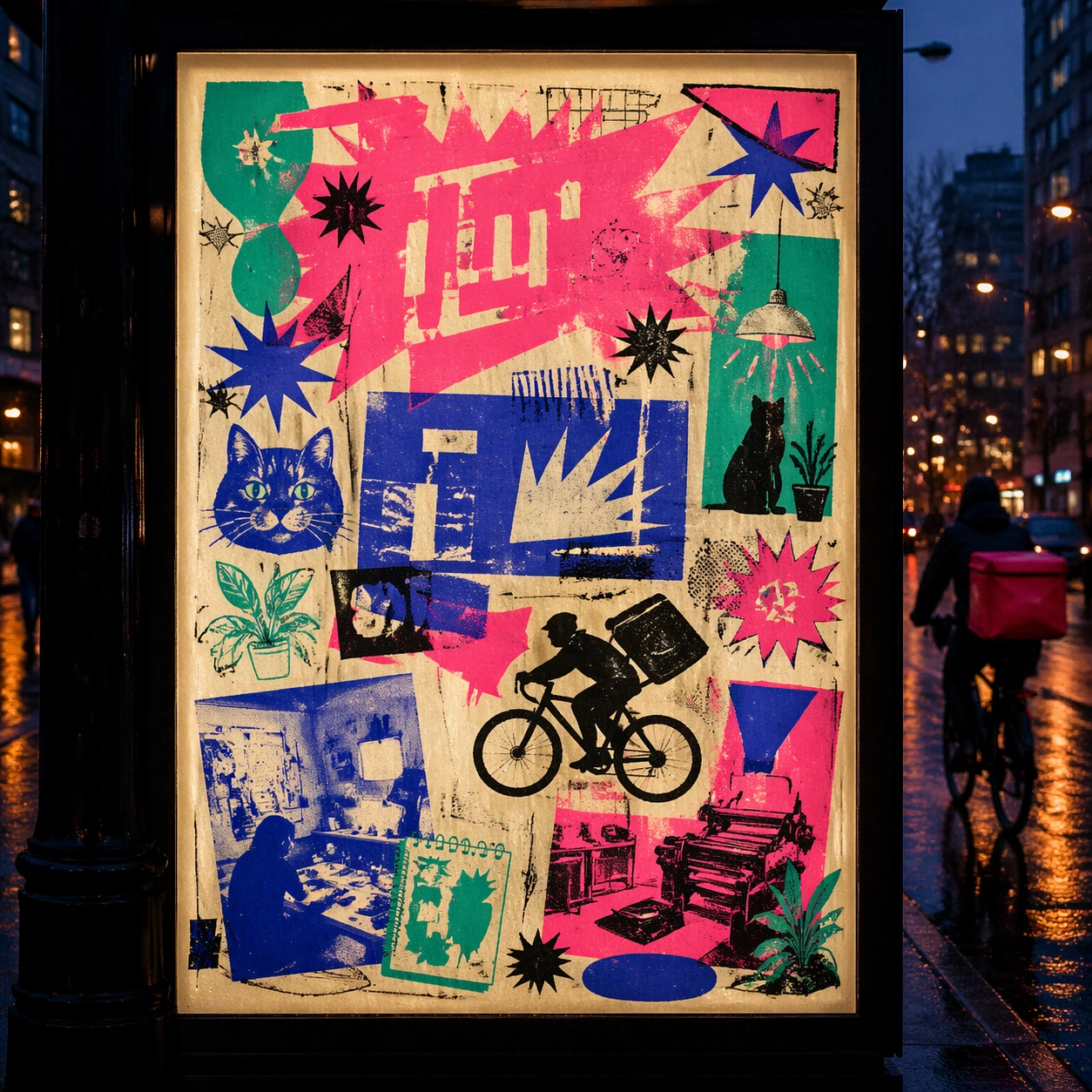
Create a version that feels made for the street, with the poster carrying enough formal force to survive abrasion, layering, and imperfect placement without losing its visual identity. Use club-flyer stars, bicycles, cats, plants, arrows, sticker bursts, notebook doodles, and photocopy shadows as the main visual ingredients, and organize them with xerox-like title blocks, stickers, and captions treated as energetic but non-readable print texture. For the contemporary-subject axis, thread in community workshops, late-night print studios, and messenger bikes folded into a zine-launch poster system. The poster must feel like an original design object rather than a reproduction of any known work.

Important details:
Keep the main design intact but let the environment add grit: lifted corners, tiny tears, wrinkled paper, and older color fragments around the perimeter should amplify the style rather than dilute it. Preserve plate drift, dot grain, bleed-through, paper curl, and independent-publisher roughness. Keep every letterform abstract and non-readable, as if it were a typographic texture rather than language. Make the style unmistakable through composition, palette, surface behavior, and symbolic compression. no full-CMYK smoothness, no perfect vector edges, no glossy magazine finish, no sterile product polish.

Use case:
Risograph Zine single study 4/9, testing street-life durability and layered context.

Constraints:
No readable text, no watermark, no logos, preserve exact 1:1 aspect ratio, no copyrighted characters, no real brand marks, no QR codes, no interface chrome, no accidental gibberish lettering.
Come usare
- Copia tutto il prompt originale, inclusi i parametri.
- Adatta soggetto, testo e composizione alle tue esigenze.
- Usa uno strumento esterno compatibile; verifica accesso e risultato.
Prima di iniziare
- Controlla se serve un’immagine di riferimento. La compatibilità non prova il modello usato per l’esempio.
- Verifica nomi, numeri e testi; i risultati cambiano con le versioni del modello.