Documento originale
GPT Image 2 · en
Scene:
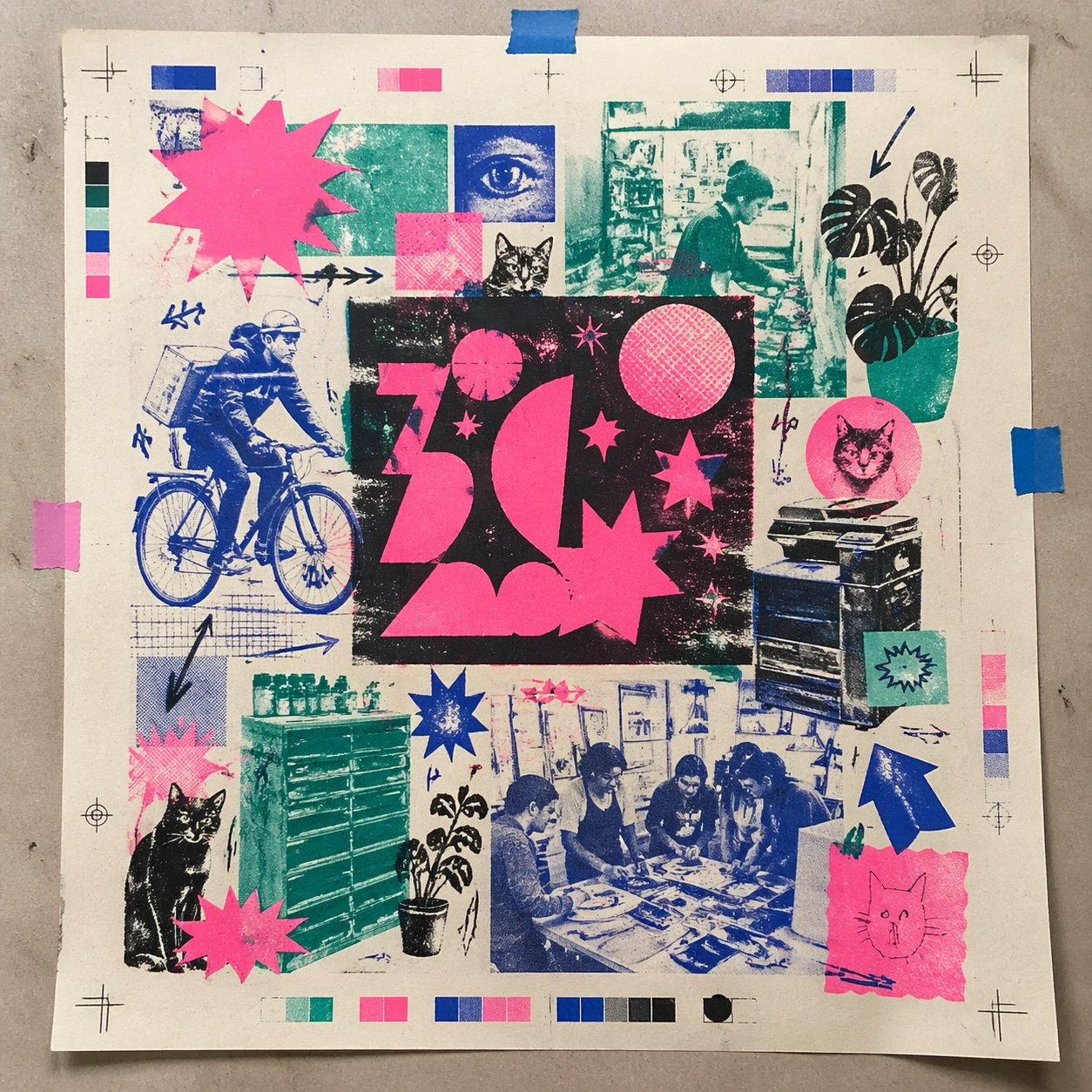
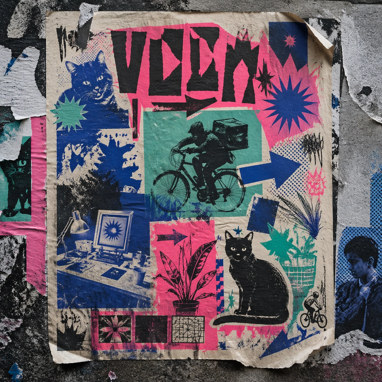
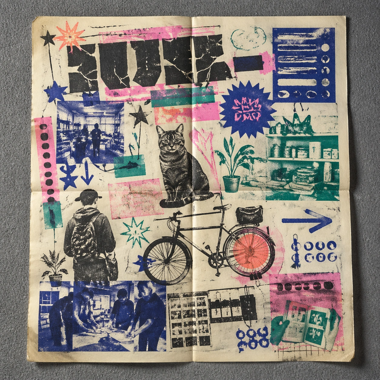
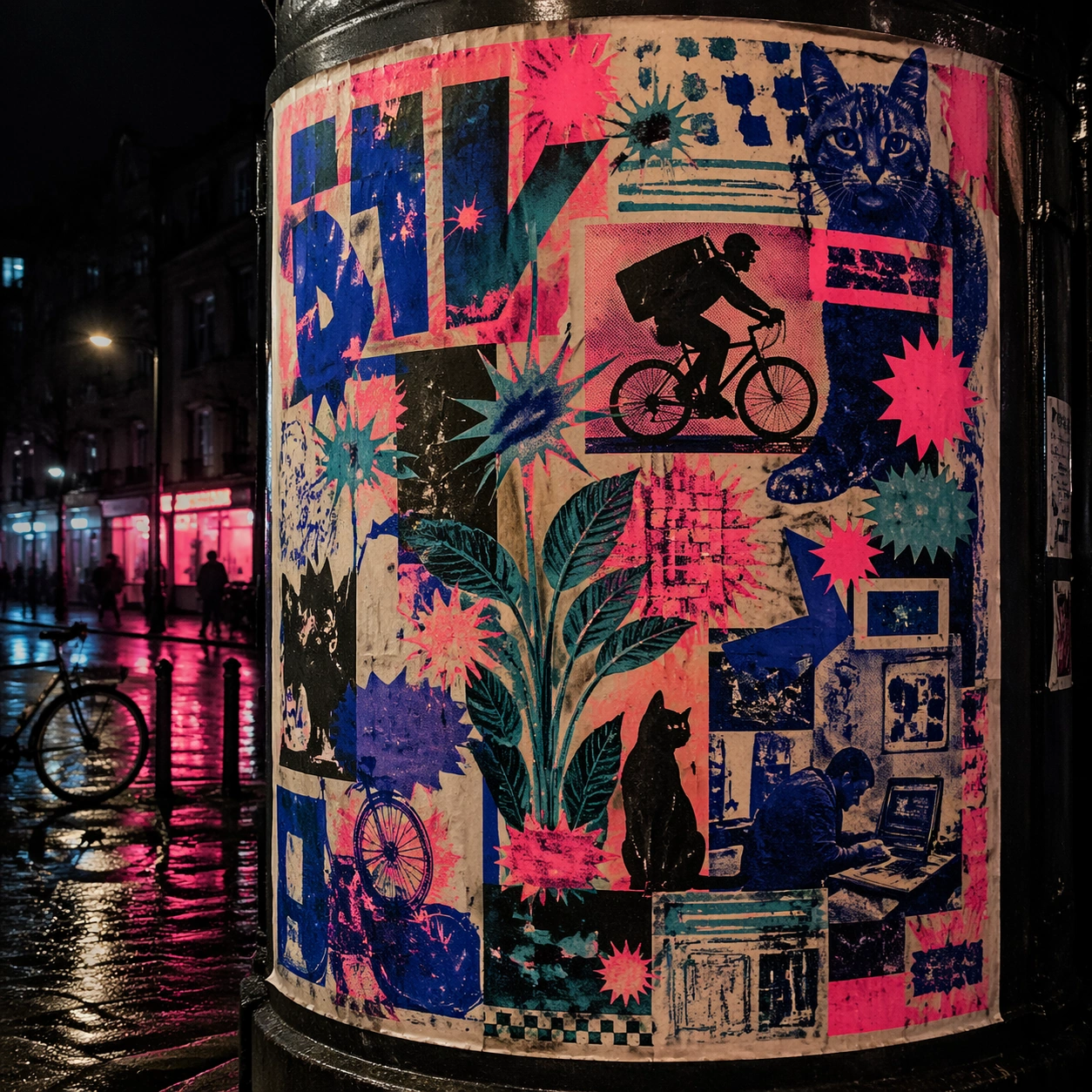
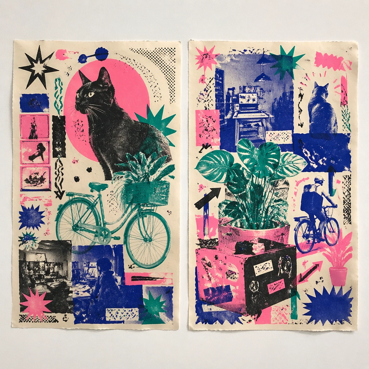
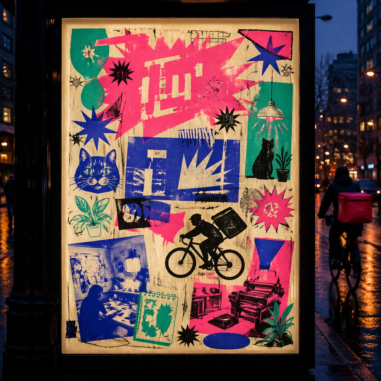
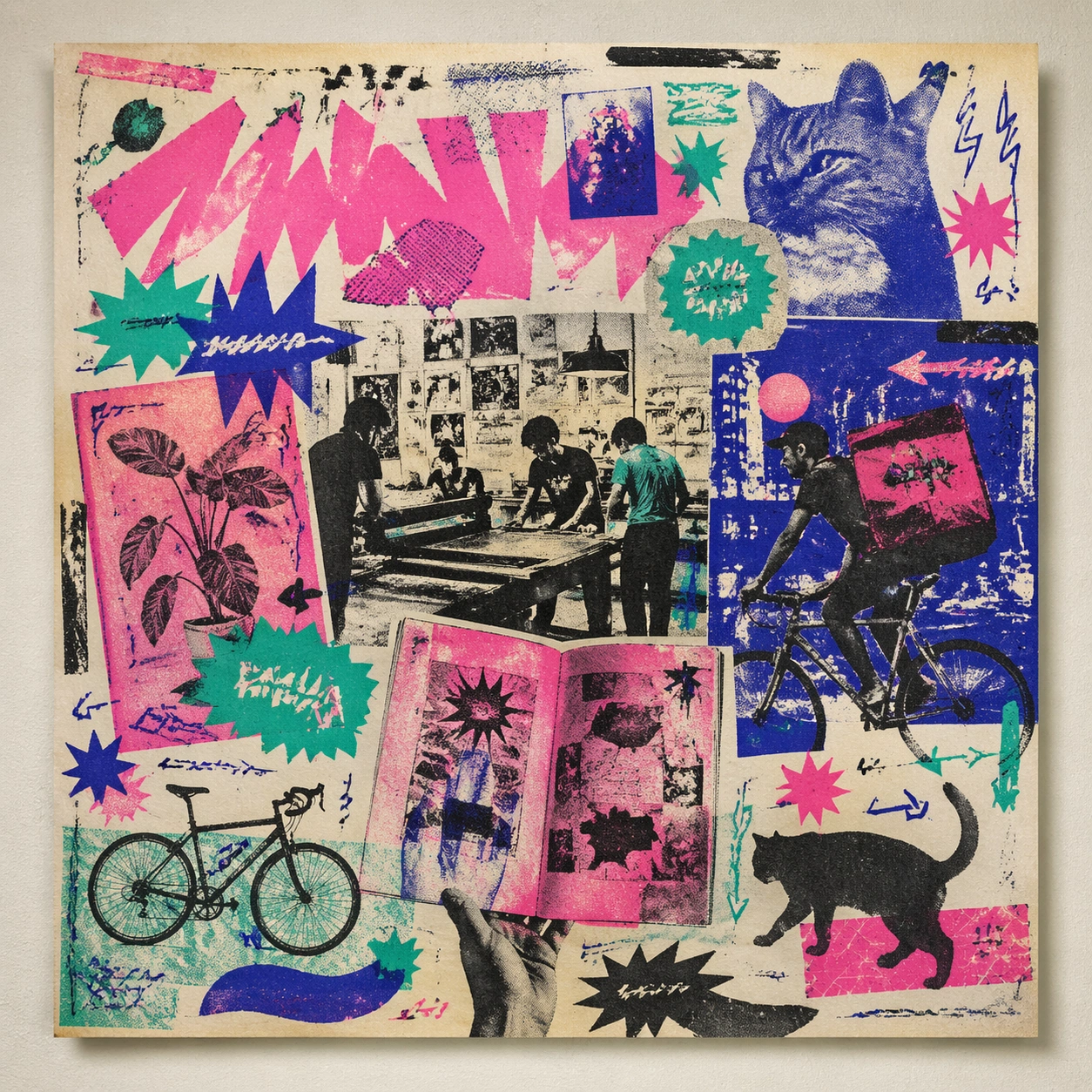
A square front-facing poster presentation on a clean neutral wall, lit like a premium print test, with crisp edges and a polished but still tactile finish appropriate to the style. The poster should express DIY risograph poster language with fluorescent layers, halftone dots, soy-ink soak, copier artifacts, and handmade zine rhythm, using fluorescent pink, teal, ultramarine, black, and fibrous cream paper and a tactile surface appropriate to the medium.

Subject:
Apply the historical poster language to a contemporary urban subject so the old visual grammar proves it can carry present-day themes without losing authenticity or formal discipline. Use club-flyer stars, bicycles, cats, plants, arrows, sticker bursts, notebook doodles, and photocopy shadows as the main visual ingredients, and organize them with xerox-like title blocks, stickers, and captions treated as energetic but non-readable print texture. For the contemporary-subject axis, thread in community workshops, late-night print studios, and messenger bikes folded into a zine-launch poster system. The poster must feel like an original design object rather than a reproduction of any known work.

Important details:
This is not parody. The contemporary subject should feel genuinely absorbed into the style through palette, composition, symbolic compression, and non-readable lettering treatment. Preserve plate drift, dot grain, bleed-through, paper curl, and independent-publisher roughness. Keep every letterform abstract and non-readable, as if it were a typographic texture rather than language. Make the style unmistakable through composition, palette, surface behavior, and symbolic compression. no full-CMYK smoothness, no perfect vector edges, no glossy magazine finish, no sterile product polish.

Use case:
Risograph Zine single study 9/9, testing historical grammar on a present-day subject.

Constraints:
No readable text, no watermark, no logos, preserve exact 1:1 aspect ratio, no copyrighted characters, no real brand marks, no QR codes, no interface chrome, no accidental gibberish lettering.
Come usare
- Copia tutto il prompt originale, inclusi i parametri.
- Adatta soggetto, testo e composizione alle tue esigenze.
- Usa uno strumento esterno compatibile; verifica accesso e risultato.
Prima di iniziare
- Controlla se serve un’immagine di riferimento. La compatibilità non prova il modello usato per l’esempio.
- Verifica nomi, numeri e testi; i risultati cambiano con le versioni del modello.