PROMPT · ESPLORAZIONE CREATIVA

Galleria di prompt

Esplora prompt reali ed esempi generati. Trova ispirazione per la prossima missione creativa e copia gratuitamente il prompt completo.

Esempi
6,699
Modelli
9
Fonti
67
6699 esempi di prompt · pagina 16 di 140
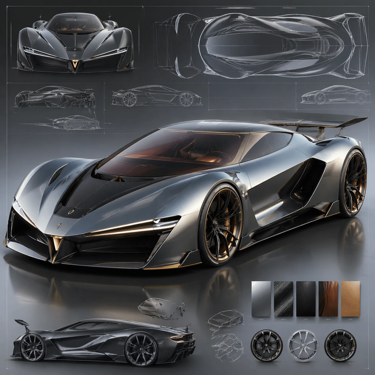
Example generated from “Automotive Concept Presentation — ChaosRealmsAI · MIT”
GPT Image 2en

Scene: A square CGI or design-visualization frame with calibrated lighting, intentional composition, and premium material rendering. Build the frame around a flagship render that establishes form, stance, and material identity. Keep the lighting, camera distance, and spatial organization tuned for a high-signal research image rather than a casual snapshot. The image belongs to the Automotive Concept Art theme and should feel immediately legible as a prompt atlas theme for automotive concept art, testing technical-diagram, style-transfer, commercial-mockup with gpt image 2.. Subject: Center the study on a flagship render that establishes form, stance, and material identity. Translate the theme into a concrete visual statement instead of an abstract mood board: the viewer should understand what kind of image this is, what is being tested, and why the composition is difficult. Use the slug idea of automotive concept art as a literal guide for subject matter, materials, and staging. Important details: The model must feel engineered or art-directed rather than merely stylized: edges, seams, translucency, reflections, and scale cues should all hold up. Preserve a disciplined square composition, clear focal hierarchy, and enough secondary information to make the image feel complete rather than underspecified. The image should look polished, novel, and exhibition-ready, with topic-specific credibility coming from the way surfaces, structure, and visual language reinforce Automotive Concept Art. Avoid generic filler elements that do not serve the main concept. Use case: Automotive Concept Art single study 1/8, testing technical-diagram, style-transfer, commercial-mockup through the hero model variation. Constraints: No readable text, no watermark, no logos, preserve exact 1:1 aspect ratio, no real brand logos, no low-poly shortcuts, no broken reflections, no muddy materials, no generic showroom clutter, no unreadable UI overlays.
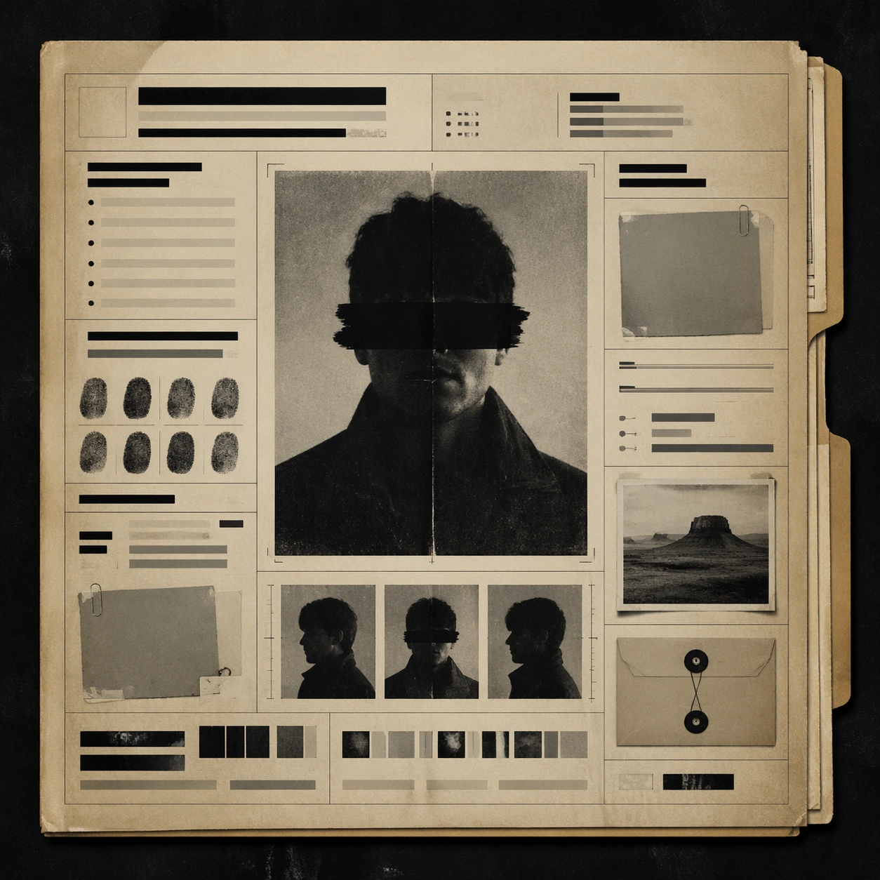
Example generated from “Fictional Archive Dossier — ChaosRealmsAI · MIT”
GPT Image 2en

Scene: A square editorial or interface layout study with exact margins, confident grid structure, and premium print or screen presentation. Build the frame around a primary spread or headline surface with immediate hierarchy. Keep the lighting, camera distance, and spatial organization tuned for a high-signal research image rather than a casual snapshot. The image belongs to the Archive Aesthetic File theme and should feel immediately legible as a prompt atlas theme for archive aesthetic file, testing text-rendering, structured-layout with gpt image 2.. Subject: Center the study on a primary spread or headline surface with immediate hierarchy. Translate the theme into a concrete visual statement instead of an abstract mood board: the viewer should understand what kind of image this is, what is being tested, and why the composition is difficult. Use the slug idea of archive aesthetic file as a literal guide for subject matter, materials, and staging. If helpful, borrow the broad visual cues suggested by Old West Wanted, FBI, but keep the result original and specific to this study. Important details: Typography fields must stay unreadable, but hierarchy, rhythm, and page architecture should feel convincing enough for design review. Preserve a disciplined square composition, clear focal hierarchy, and enough secondary information to make the image feel complete rather than underspecified. The image should look polished, novel, and exhibition-ready, with topic-specific credibility coming from the way surfaces, structure, and visual language reinforce Archive Aesthetic File. Avoid generic filler elements that do not serve the main concept. Use case: Archive Aesthetic File single study 1/8, testing text-rendering, structured-layout through the hero spread variation. Constraints: No readable text, no watermark, no logos, preserve exact 1:1 aspect ratio, no readable text, no logo lockups from real brands, no broken grid, no arbitrary poster clutter, no malformed columns, no accidental lorem ipsum.

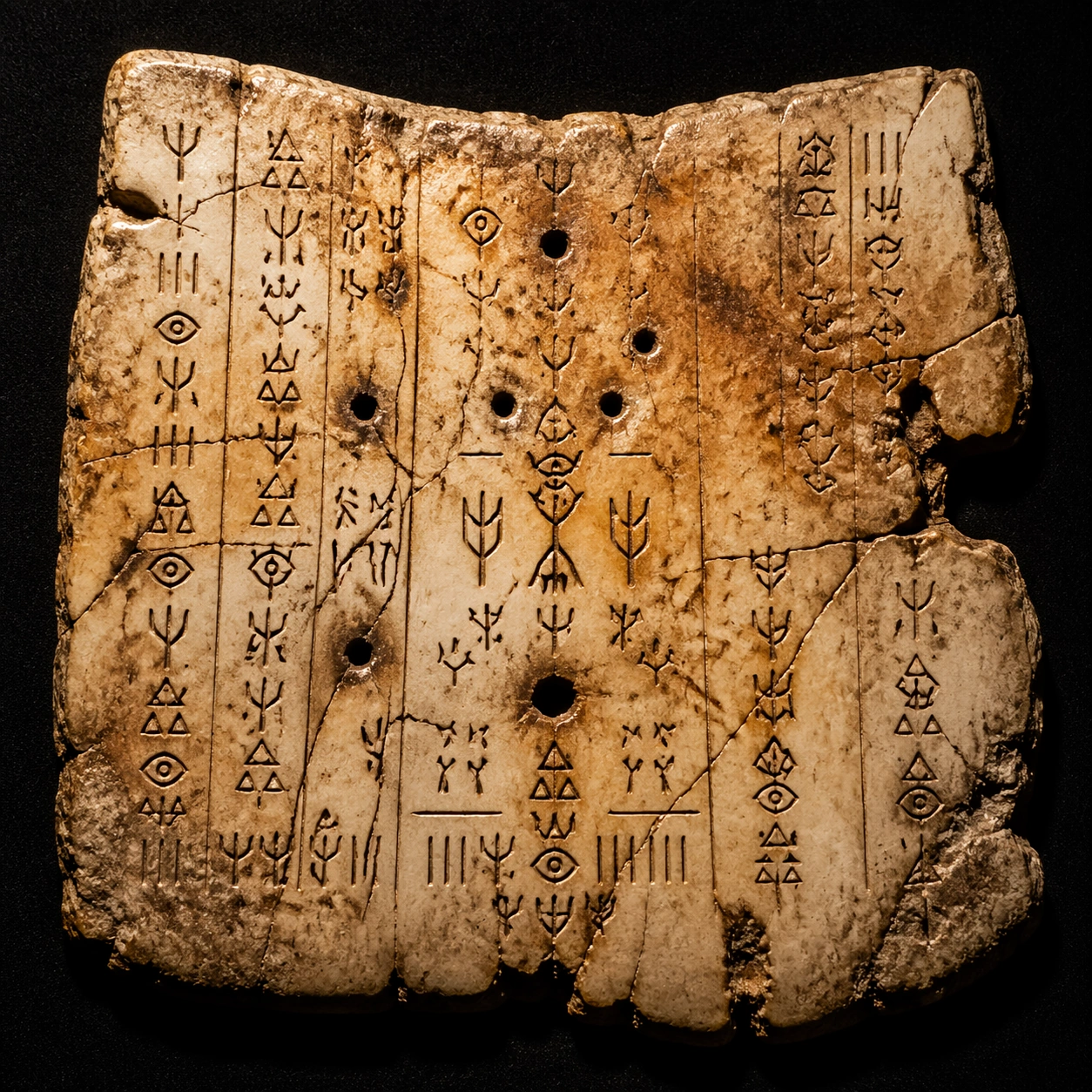
Example generated from “Fictional Oracle-Bone Artifact — ChaosRealmsAI · MIT”
GPT Image 2en

Scene: Square studio photograph of a cracked oracle-bone display panel on black felt, lit with a narrow warm beam and soft museum spill. The bone surface is ivory, amber, and smoke-brown, with scorched divination pits, hairline fractures, and tiny mineral deposits. The arrangement should feel like a high-end exhibition object, not a textbook diagram. Subject: An independent fictional oracle-bone symbol system. The surface contains carved glyphs inspired by the idea of bone inscriptions but not copying real oracle bone script. Symbols are built from antler forks, seed triangles, rain hooks, nested eye marks, and short tally cuts. Several repeated compounds appear in columns and around burn marks, implying questions, omens, and responses without using any readable language. Important details: Create a believable pseudo-decoder artifact through visual organization alone. Include small separated zones, repeated radicals, careful alignment, and a few emphasized central glyph clusters. The glyphs must be sharp enough to inspect, with consistent carving depth and spacing. Avoid decorative chaos: the viewer should sense a grammar, even though no real text is present. The artifact should balance archaeological realism with fantasy worldbuilding craft. Use case: Fictional Symbol System single study 5/8, testing an independent bone-inscription artifact with controlled invented glyph repetition. Constraints: No readable text, no watermark, no logos, preserve exact 1:1 aspect ratio, no Latin letters, no real alphabets, no real Chinese oracle script, no museum caption card, no translation labels, no modern pen marks, no random scratches pretending to be writing.

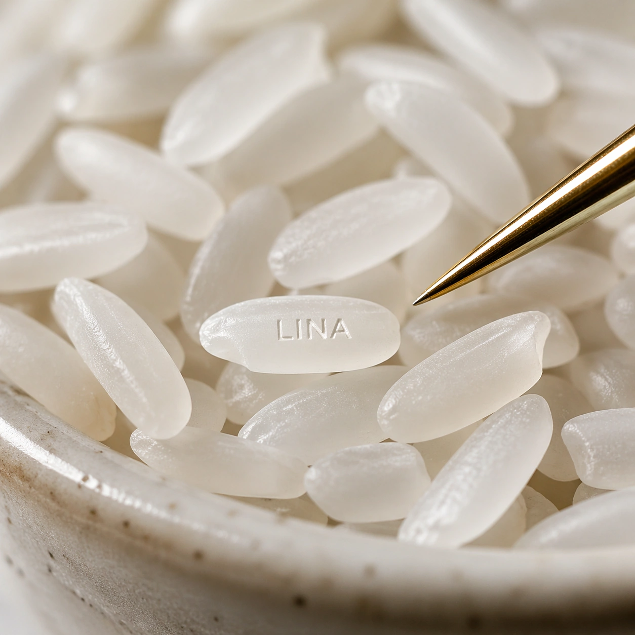
Example generated from “LINA Engraved Rice Grain — ChaosRealmsAI · MIT”
GPT Image 2en

Scene: A square extreme macro photograph of a shallow ceramic dish filled with uncooked white rice, lit by a bright diffused window and a small specular highlight from the side. The color palette is ivory, pale gray, and a single warm gold accent from a jeweler's tweezer tip. Depth of field is very shallow, but one rice grain in the front third is sharply focused. Subject: Among dozens of plain rice grains, exactly one selected grain carries a tiny engraved name reading "LINA". The letters are carved into the rice surface, not painted, following the long axis of the grain. Use realistic rice translucency, powdery starch texture, and microscopic edge shadows inside the cuts. A fine jeweler's tweezer can point toward the marked grain without touching or covering the name. Important details: The visual test is pixel-level target selection: the viewer must notice that only one grain is personalized while the surrounding grains remain blank. The word "LINA" must be small, centered, and readable, with clean Roman capitals and no extra letters. Avoid turning the image into a graphic poster; it should feel like a high-end custom keepsake photographed under a macro lens. Use case: Micro-Engraved Jewelry single study 5/8, testing readable micro text on a rice-grain keepsake among visually similar objects. Constraints: No readable text except the specified name "LINA", no watermark, no logos, preserve exact 1:1 aspect ratio, no labels on the dish, no scattered letters, no more than one engraved grain, no ink-like black writing, no oversized word, no illegible scratches.

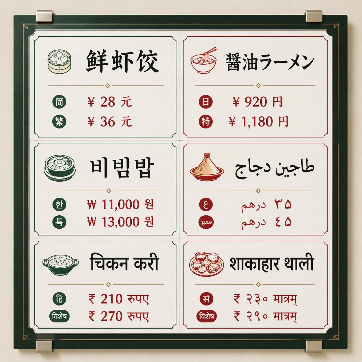
Example generated from “Six-Panel Multiscript Menu — ChaosRealmsAI · MIT”
GPT Image 2en

Scene: A square front-facing commercial poster photographed as a clean wall-mounted menu board inside a bright international food hall. Use crisp studio lighting, a neutral off-white wall, subtle metal clips, and a disciplined grid with generous margins. The color palette should mix charcoal ink, warm tomato red, jade green, and small brass dividers, with enough contrast for every script block to be readable. Subject: A multilingual market menu titled by visual hierarchy rather than brand identity: six equal menu panels arranged in two columns and three rows. Each panel contains one large dish name and two short price-like glyph groups rendered in a different writing system: simplified Chinese, Japanese kana/kanji, Korean hangul, Arabic, Devanagari Hindi, and Sanskrit-style Devanagari. Keep the panels visually parallel so the viewer can compare script density, baseline rhythm, and spacing. Important details: The core test is non-Latin text rendering inside a strict commercial layout. Letterforms must be clean, separated by script family, aligned to their own baselines, and not melt into decorative marks. Use real-looking menu typography with consistent padding, thin rules, small food icons, and clear typographic hierarchy. Avoid fake brand marks; make the poster feel usable as a food hall production proof. Use case: Multi-Script Poster single study 1/8, testing a dense six-language menu board with readable script blocks and stable grid alignment. Constraints: No readable text outside the specified multilingual menu copy, no watermark, no logos, preserve exact 1:1 aspect ratio, no Latin fallback labels, no random extra characters, no mirrored scripts, no misshapen baselines, no smeared letter clusters, no fake QR codes.

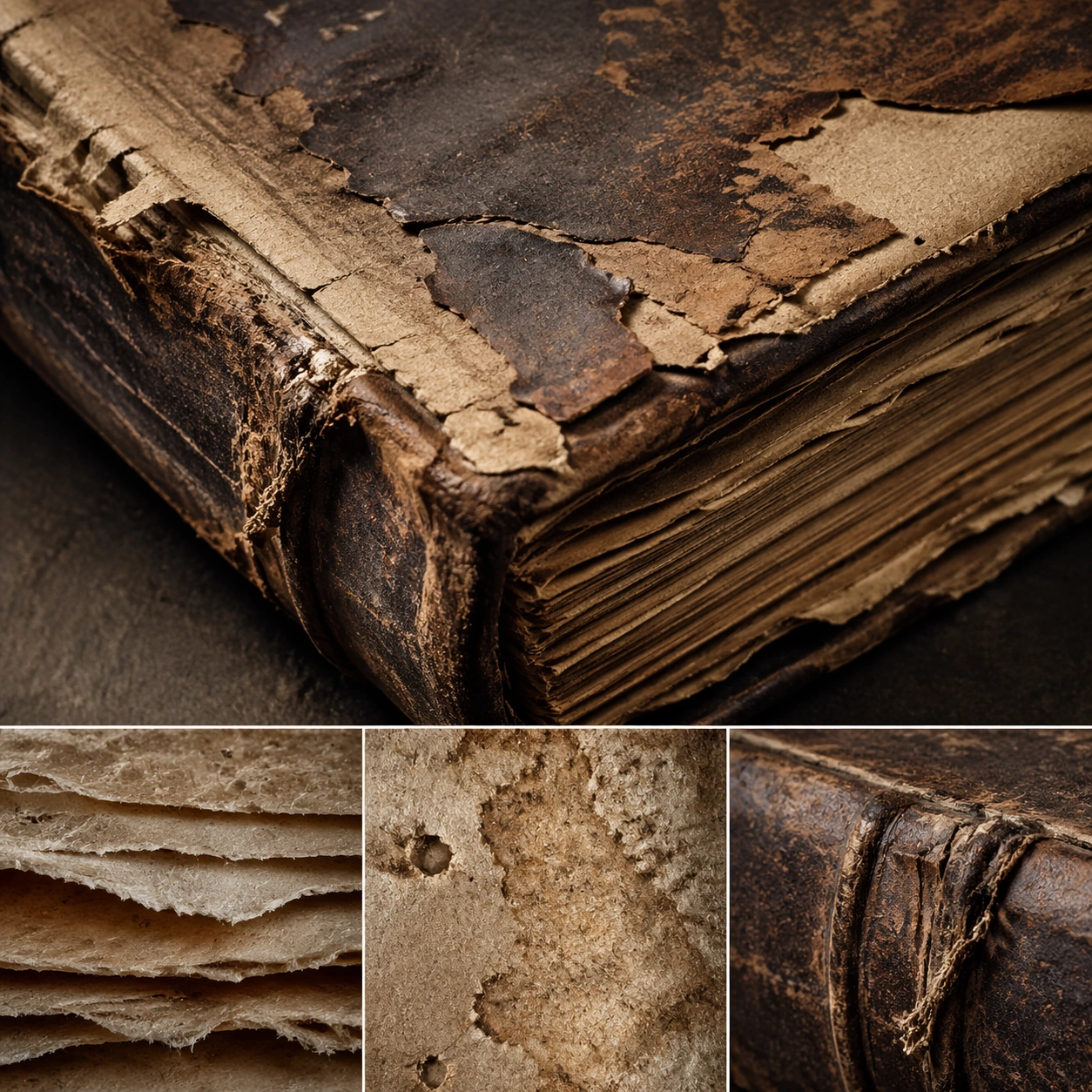
Example generated from “Aged Book Material Study — ChaosRealmsAI · MIT”
GPT Image 2en

Scene: A square material-focused image where lighting, scale, and surface behavior are the main event. Build the frame around the dominant material language shown with full confidence. Keep the lighting, camera distance, and spatial organization tuned for a high-signal research image rather than a casual snapshot. The image belongs to the Ancient Book Restoration theme and should feel immediately legible as a prompt atlas theme for ancient book restoration, testing world-knowledge, editing-workflow with gpt image 2.. Subject: Center the study on the dominant material language shown with full confidence. Translate the theme into a concrete visual statement instead of an abstract mood board: the viewer should understand what kind of image this is, what is being tested, and why the composition is difficult. Use the slug idea of ancient book restoration as a literal guide for subject matter, materials, and staging. Important details: Microstructure matters: refraction, fibers, scratches, pores, edge wear, translucency, and dust should all feel physically specific. Preserve a disciplined square composition, clear focal hierarchy, and enough secondary information to make the image feel complete rather than underspecified. The image should look polished, novel, and exhibition-ready, with topic-specific credibility coming from the way surfaces, structure, and visual language reinforce Ancient Book Restoration. Avoid generic filler elements that do not serve the main concept. Use case: Ancient Book Restoration single study 1/8, testing world-knowledge, editing-workflow through the surface hero variation. Constraints: No readable text, no watermark, no logos, preserve exact 1:1 aspect ratio, no generic stock macro, no broken scale cues, no plastic-looking texture when it should feel natural, no meaningless blur, no watermark, no fake labels.

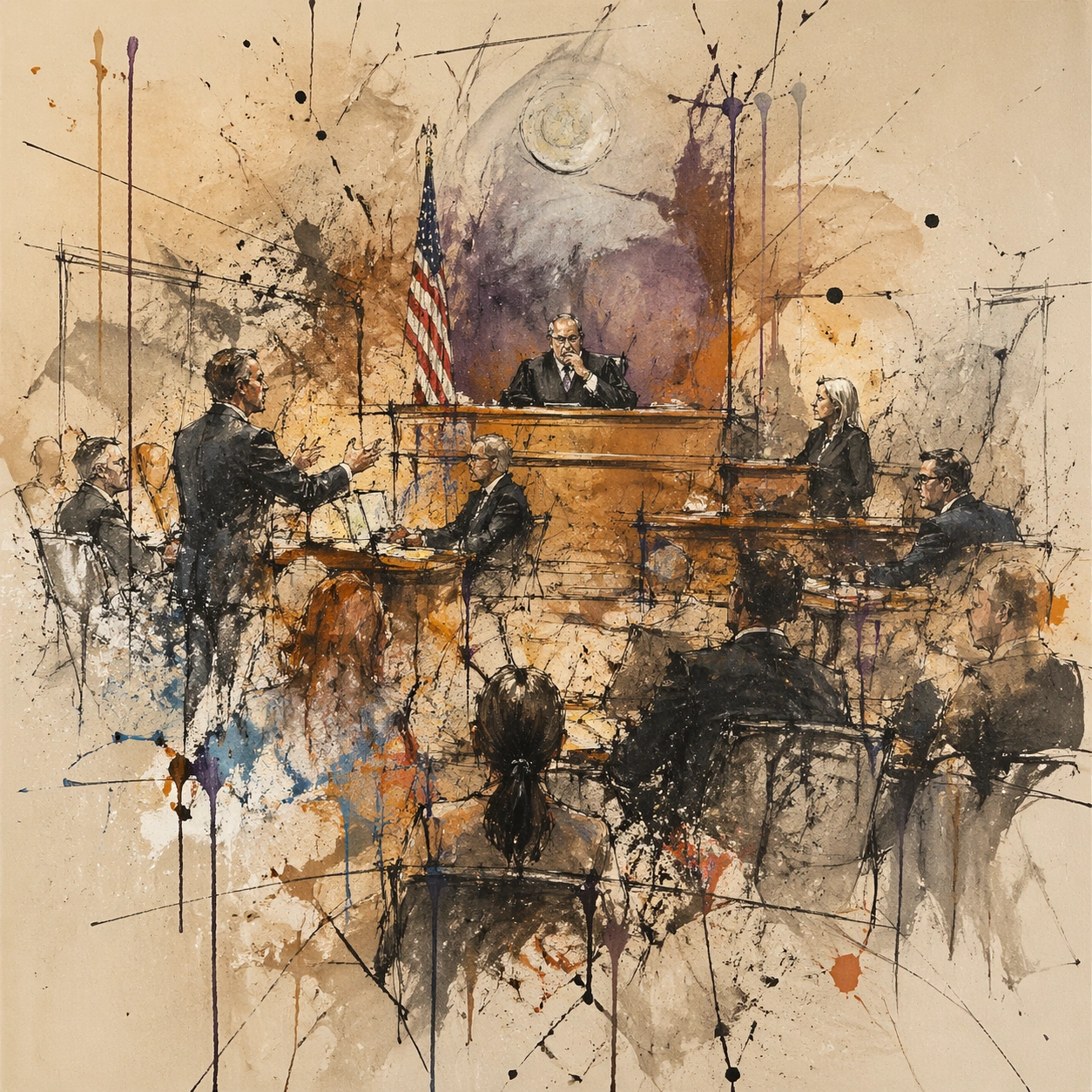
Example generated from “Expressive Fictional Courtroom Sketch — ChaosRealmsAI · MIT”
GPT Image 2en

Scene: A square, gallery-ready composition with painterly surfaces, controlled negative space, and a deliberate fine-art presentation. Build the frame around a dense all-over field of marks that feels suspended between chaos and structure. Keep the lighting, camera distance, and spatial organization tuned for a high-signal research image rather than a casual snapshot. The image belongs to the Courtroom Sketch theme and should feel immediately legible as a prompt atlas theme for courtroom sketch, testing photorealism, world-knowledge, style-transfer with gpt image 2.. Subject: Center the study on a dense all-over field of marks that feels suspended between chaos and structure. Translate the theme into a concrete visual statement instead of an abstract mood board: the viewer should understand what kind of image this is, what is being tested, and why the composition is difficult. Use the slug idea of courtroom sketch as a literal guide for subject matter, materials, and staging. Important details: Focus on authored mark-making, hierarchy, rhythm, and a visual idea that reads immediately before the viewer inspects the brushwork. Preserve a disciplined square composition, clear focal hierarchy, and enough secondary information to make the image feel complete rather than underspecified. The image should look polished, novel, and exhibition-ready, with topic-specific credibility coming from the way surfaces, structure, and visual language reinforce Courtroom Sketch. Avoid generic filler elements that do not serve the main concept. Use case: Courtroom Sketch single study 1/8, testing photorealism, world-knowledge, style-transfer through the drip constellation variation. Constraints: No readable text, no watermark, no logos, preserve exact 1:1 aspect ratio, no direct copy of a known artwork, no comic speech bubbles, no accidental typography, no low-effort doodle energy, no muddy center, no fake museum label.

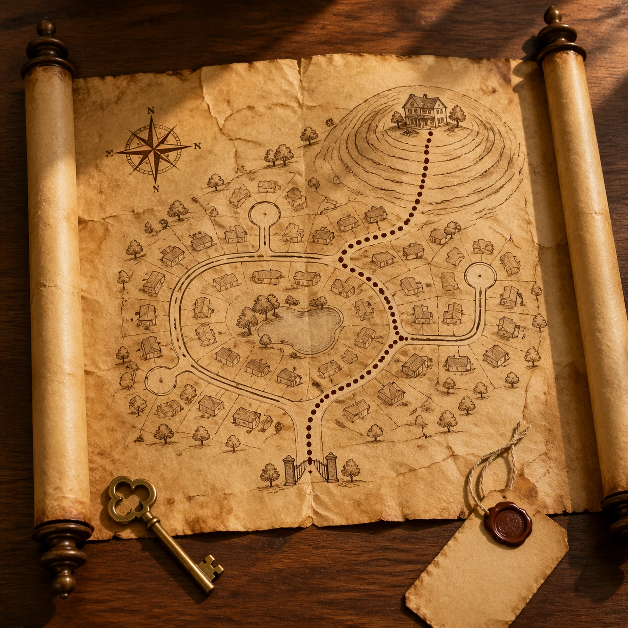
Example generated from “Fictional Neighborhood Treasure Scroll — ChaosRealmsAI · MIT”
GPT Image 2en

Scene: A square overhead product photograph of a rolled parchment neighborhood map partly unfurled on a walnut desk, with a brass house key, blank seal tag, and soft afternoon light. The paper edges are curled, the ink is brown and faded, and the desk casts realistic shadows under the scroll rods. The scene should feel like a premium real-estate closing gift rather than a fantasy poster. Subject: Convert a modern suburban neighborhood route into an antique treasure-map artifact. Show a plausible loop road, three cul-de-sacs, a small park pond, and a dotted path leading from a gate-like entrance icon to a hilltop house symbol. Preserve map logic: roads connect cleanly, the dotted path follows accessible streets, and the house destination sits at the end of the route. Use no street labels or readable sales copy. Important details: The visual language should prove data-format transformation: modern property-access topology becomes old parchment without losing practical route structure. Include a wind rose, small sketched trees, contour-like ink rings around the hill, subtle fold creases, tea stains, and wax-colored smudges. Materials must be physically credible: parchment translucency at thin edges, ink bleed in fibers, brass key tarnish, and shadows matching the scroll height. Use case: Maps to Treasure Map single study 5/8, testing a real-estate neighborhood map converted into a tactile treasure-map closing gift. Constraints: No readable text, no watermark, no logos, preserve exact 1:1 aspect ratio, no real estate brand, no address labels, no price tag, no impossible disconnected roads, no random island coastline, no route that crosses buildings, no glossy poster paper.

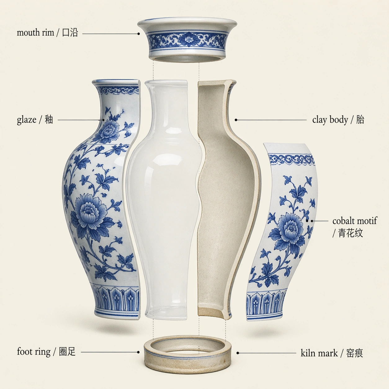
Example generated from “Porcelain Vase Exploded Illustration — ChaosRealmsAI · MIT”
GPT Image 2en

Scene: A square museum conservation diagram on pale cream paper, rendered as a clean orthographic exploded cutaway of a porcelain vase. Use bright but soft studio lighting, delicate blue-and-white ceramic color, graphite leader lines, and subtle drop shadows under separated layers. The style should sit between a catalog plate and a technical restoration note. Subject: Show a blue-white porcelain vase separated into its structural and surface layers: mouth rim lifted slightly, glaze layer peeling outward as a transparent shell, clay body cross-section visible, painted cobalt motif isolated on one floating sheet, and foot ring shown below. Include only these readable bilingual labels: glaze / 釉, clay body / 胎, cobalt motif / 青花纹, mouth rim / 口沿, foot ring / 圈足, kiln mark / 窑痕. The vase remains elegant and museum-like, not broken rubble. Important details: The material behavior must be credible: porcelain is thin, hard, slightly translucent at edges; glaze is glossy and continuous; cobalt pigment sits under the glaze; the foot ring has unglazed texture. Keep labels aligned around the object with no leader-line tangles. The image should explain construction and craft at a glance. Use case: Museum Exploded View single study 5/8, testing a porcelain artifact cutaway with bilingual technical callouts. Constraints: No readable text except the specified bilingual labels, no watermark, no logos, preserve exact 1:1 aspect ratio, no shattered vase, no modern barcode, no random dynasty stamp, no cluttered restoration tools, no illegible micro labels.

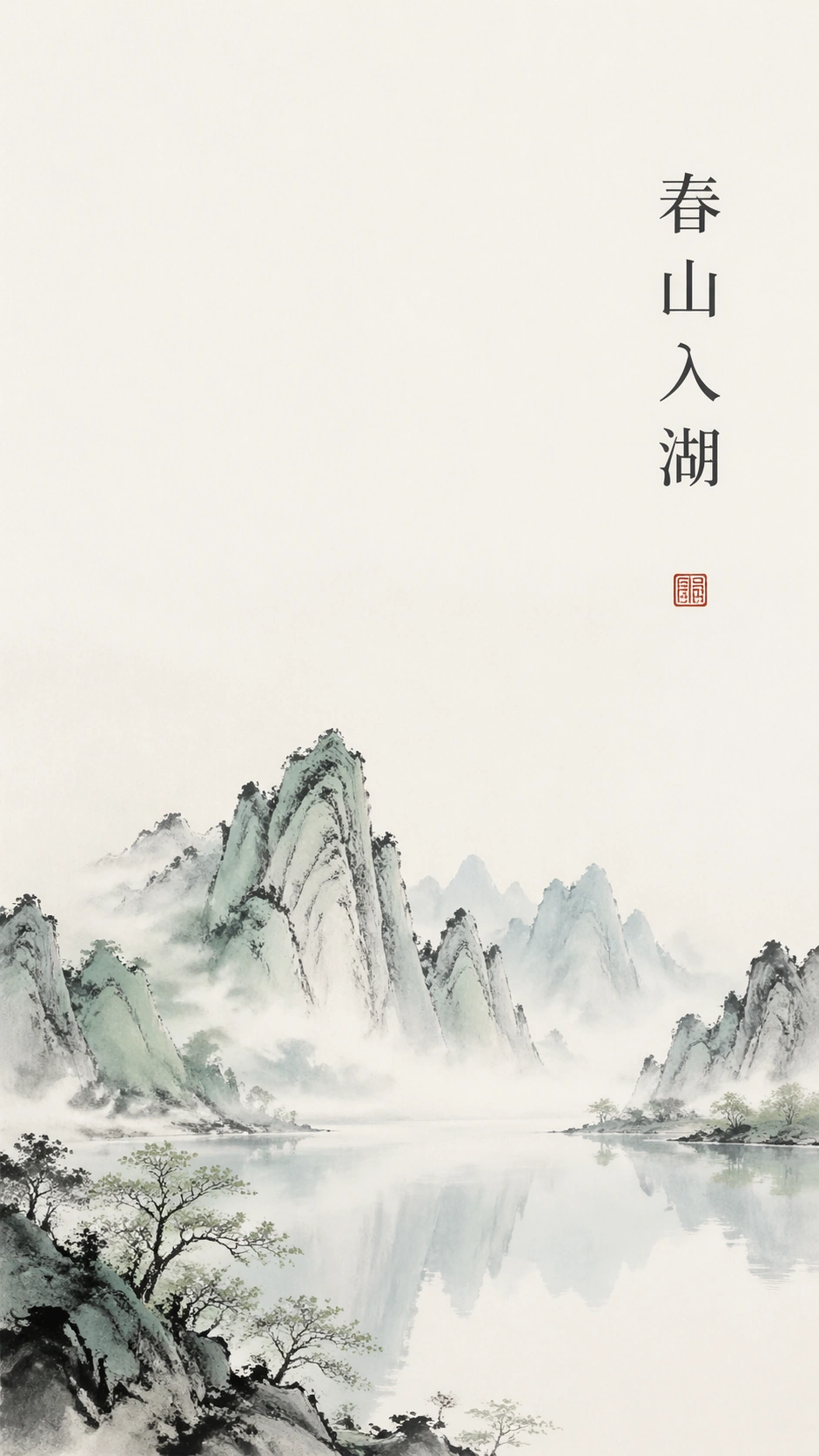
Example generated from “春山入湖 · Spring Ink Poster — ChaosRealmsAI · MIT”
GPT Image 2en

Scene: A vertical 9:16 luxury poster on matte warm-white paper, front-facing and perfectly flat, with about sixty-five percent open negative space. Use a quiet spring palette of celadon green, mist blue, pale ink gray, and off-white. The upper two thirds should feel calm and airy, while the lower third carries the main landscape gesture. Lighting is soft and even, like a premium gallery print photographed for a brand deck. Subject: A new Chinese ink landscape with jagged distant mountains rising from a still central lake. The mountains are rendered with sparse ink washes, dry brush edges, and a few mineral-green accents; the lake is a horizontal mist band that reflects the peaks with almost no detail. Place one readable vertical Chinese title, "春山入湖", near the upper right, set in elegant modern Song-style typography, black-gray ink, generous tracking, and precise alignment. Important details: Keep the design minimal and commercial-ready. The title must be clean, correctly ordered, and the only readable text. The mountains must look like contemporary ink, not fantasy concept art; the lake must sit calmly in the middle, not become an ocean. Leave large unmarked paper areas, balance asymmetry carefully, and add only one tiny abstract cinnabar seal block with no readable characters. Use case: New Chinese Ink Poster single study 1/8, testing vertical white space, readable Chinese title placement, and refined spring mountain-water composition. Constraints: No readable text outside the specified Chinese title, no watermark, no logos, preserve exact 9:16 aspect ratio, no frame, no busy texture, no saturated neon color, no tourist-photo realism, no random calligraphy strokes, no extra seals with characters.

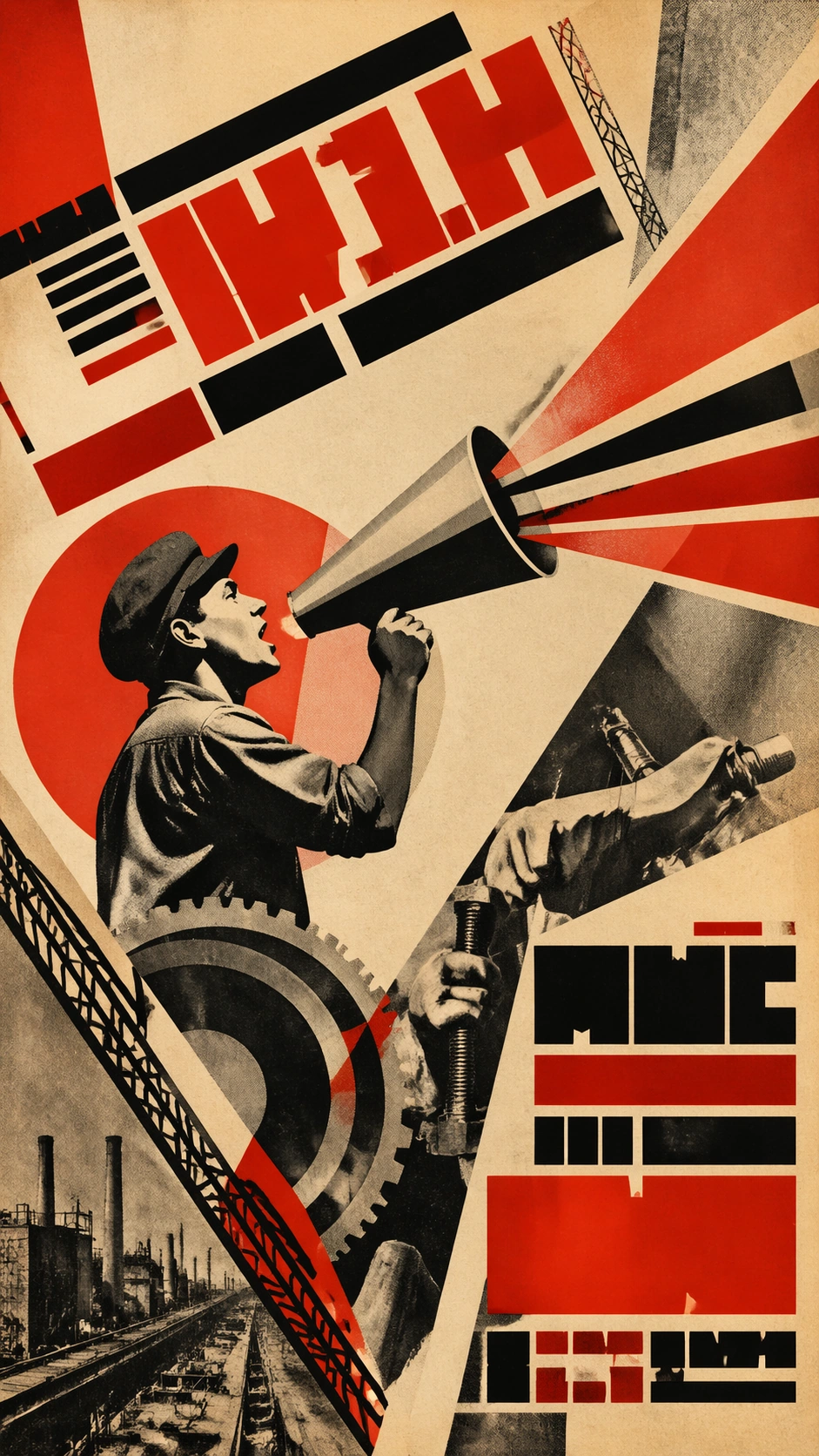
Example generated from “Constructivist Megaphone Poster Study — ChaosRealmsAI · MIT”
GPT Image 2en

Scene: A vertical 9:16 fictional museum-study poster inspired by early twentieth-century constructivist political graphic design. The composition is sharp, diagonal, and geometric: red and black wedges, cream paper, photomontage texture, halftone grain, and asymmetric blocks. Large headline areas appear as bold abstract block-letter shapes and bars, but they must remain unreadable. The poster should feel like a design-history specimen, not an active campaign. Subject: A stylized worker-like figure in profile holds a megaphone made from angular paper shapes, projecting triangular sound beams across the page. Around the figure are industrial circles, cropped gears, diagonal scaffolding, and photomontage fragments of anonymous hands and tools. No real political emblems, national symbols, party marks, or recognizable leaders appear. The figure is symbolic and invented, with strong graphic silhouette and controlled visual hierarchy. Important details: Emphasize constructivist layout logic: severe diagonals, limited palette, hard-edged geometry, overprinted red ink, rough paper, halftone fragments, and tension between image and typography fields. The unreadable headline blocks should occupy believable poster positions at top and lower right. Keep the composition historically informed without copying a specific known poster. It must read as educational style transfer and structured layout research. Use case: Propaganda Poster History single study 1/8, an independent constructivist poster-language specimen for design-history comparison. Constraints: No readable text, no watermark, no logos, preserve exact 9:16 vertical aspect ratio, no real party symbols, no real leader likeness, no actual slogan, no contemporary election reference, no clean digital gradient.

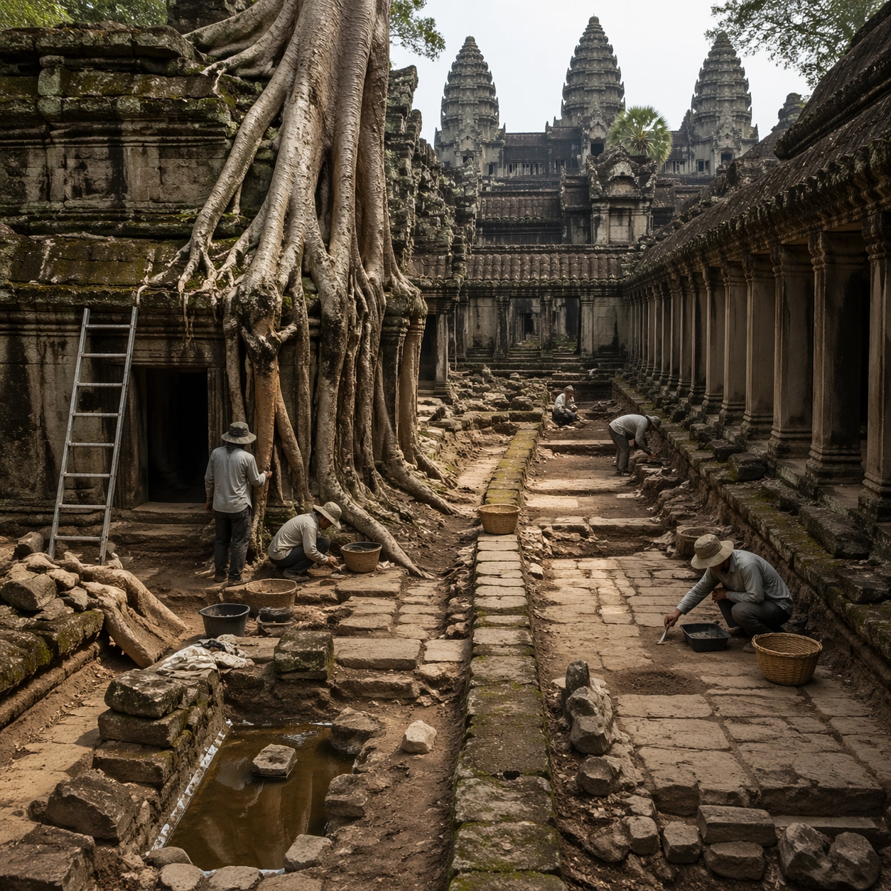
Example generated from “Imagined Khmer Archaeology Fieldwork — ChaosRealmsAI · MIT”
GPT Image 2en

Scene: A square independent archaeology study composed from a slightly elevated fieldwork viewpoint. Use balanced natural light, crisp evidence hierarchy, and practical site organization so the image feels publishable in a museum report and still visually strong enough for a gallery wall. The frame should explain where excavation is happening without relying on readable markers or diagrams. Subject: Show a root-bound court with selective clearing, measured pathways, drainage traces, and archaeologists studying where living wood meets carved stone. Include grounded human traces such as ladders, trays, brushes, baskets, light rigs, or measuring tools only when they support archaeological realism and remain visually secondary. The site should stay culturally specific, with architecture, surface treatment, sediment, and environmental context all belonging to the correct civilization rather than a generic dig. Important details: Keep the site recognizably Khmer, with disciplined tower silhouettes, naga-era stone logic, gallery rhythm, and roots that wrap around built forms instead of replacing them with fantasy tree sculpture. Prioritize evidence relationships: exposed layers, cleaned edges, protected surfaces, loose fragments, and transitions between buried and revealed material. Let color, wear, and composition explain what has just been uncovered. The image must feel methodical rather than adventurous. Keep any site tags, notes, or markers abstract and unreadable. Avoid sensational treasure imagery and keep the atmosphere scholarly, patient, and materially convincing. Use case: Angkor Wat Overgrown Symbiosis single study 5/9. Constraints: No readable text, no watermark, no logos, preserve exact 1:1 aspect ratio, no fantasy elves, no glowing magic runes, no steel catwalks, no modern park signage, no treasure-chest clichés, no action-movie posing, no arbitrary props, no infographic overlay.

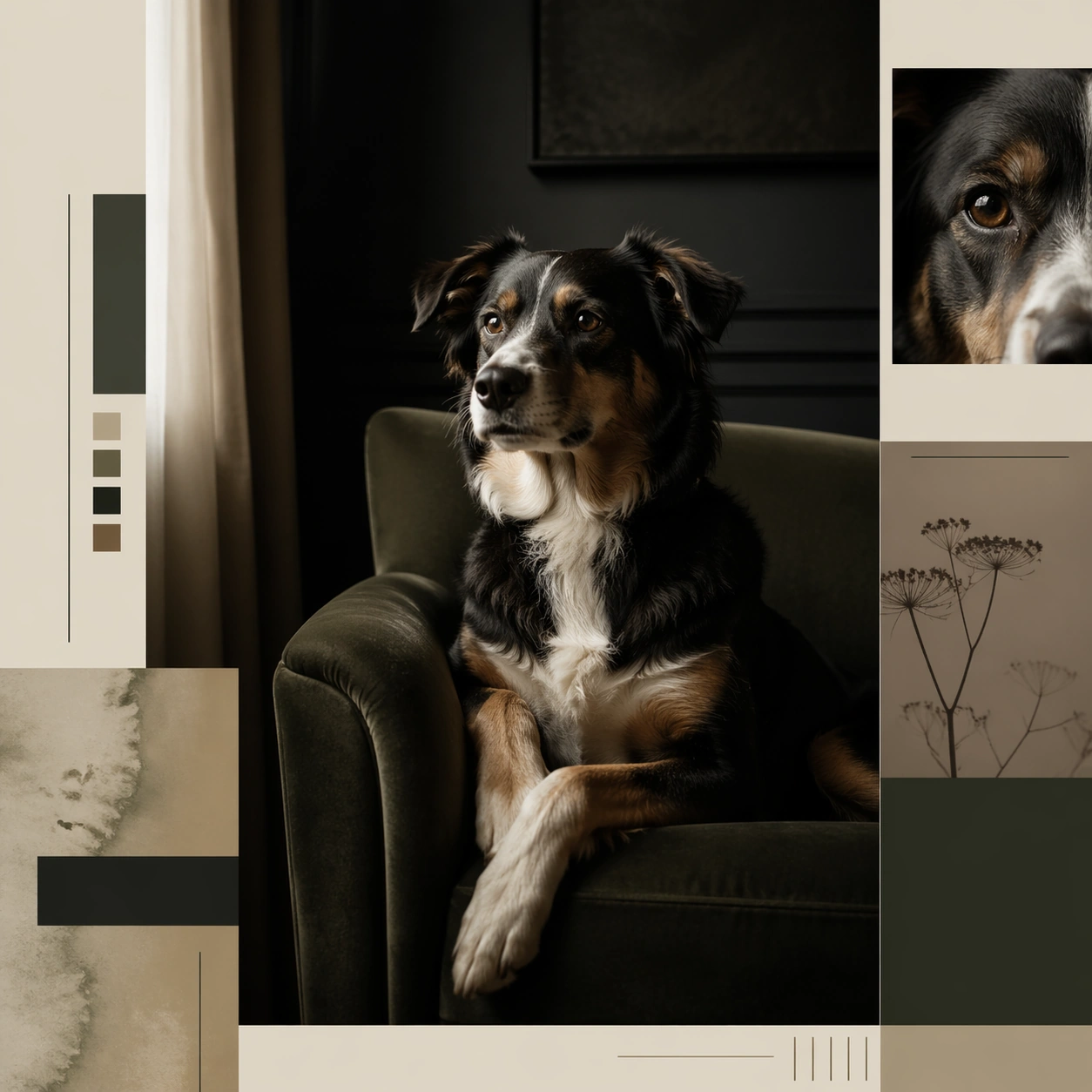
Example generated from “Dog Portrait Editorial Opener — ChaosRealmsAI · MIT”
GPT Image 2en

Scene: A square editorial spread opener or magazine board that combines photoreal animal portraiture with layout fragments, negative space, and sophisticated art direction. The animal should read as a character with presence and point of view, but never become a cartoon mascot or a human impersonation. Keep the image useful for brand editorials, cultural magazines, nonprofit storytelling, or visual essays where personality and atmosphere matter as much as realism. Use a moody domestic interior with one armchair, side light, and layout columns framing the portrait like a magazine opener. Subject: Focus on one animal in a setting that supports a distinct personality cue such as quiet confidence, urban wit, eccentric elegance, patient age, or tactile curiosity. Use real anatomy, plausible behavior, and emotionally controlled lighting. The animal may be framed with objects, set pieces, or composition motifs, but the scene must still feel truthful to the species and grounded in editorial photography logic. Show a medium dog seated with calm intelligence, looking slightly past camera as if holding a private opinion about the room. Important details: Use magazine-like hierarchy: one hero image, supporting crop windows, abstract text columns, margin bars, or pull quote blocks without readable words. The result should feel authored and surprising, not like a stock portrait dropped into a template. Aim for mood, specificity, and a polished sense of visual journalism. Let environment, gesture, and styling carry the personality instead of costumes or overt anthropomorphism. The image should feel serious, witty, and highly publishable, balancing portrait depth with elegant editorial spacing. Use case: Animal Character Editorial Spread Set single study 1/9, dog column opening spread for a commercially reusable prompt atlas example. Constraints: No readable text, no watermark, no logos, preserve exact 1:1 aspect ratio, no human clothes on animals, no cartoon facial exaggeration, no readable magazine text, no mascot smile effects, no fake celebrity parody, no novelty prop overload, no pipe-smoking parody, no human wardrobe, no kitschy study décor.

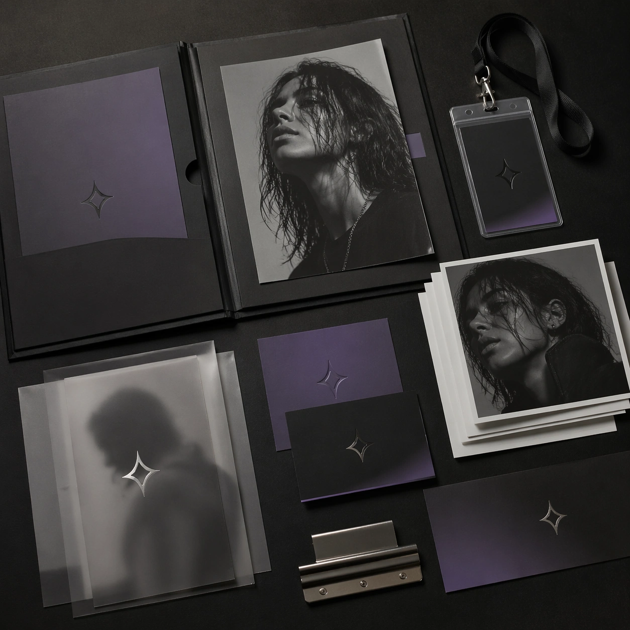
Example generated from “Artist Press Kit Desk Mockup — ChaosRealmsAI · MIT”
GPT Image 2en

Scene: A square overhead desk photograph with an open press folder, stacked portrait cards, translucent inserts, credential sleeve, and metallic binding hardware arranged with editorial neatness. Lighting should be soft and expensive, showing paper texture, sleeve transparency, and the subtle tactile quality of a premium artist press package. Subject: The subject is a complete artist press-kit surface rather than one hero portrait: a folder system, cropped headshots, abstract emblem cards, matte paper inserts, and a lanyard-like credential laid out with deliberate spacing. Everything should imply a coherent artist brand language without showing readable names or publication text. Important details: Keep the composition practical and believable for the music industry. Materials matter: coated card stock, brushed metal clip, translucent vellum, and a muted monochrome palette with one controlled accent color. The desk should not feel like an office supply ad; it should feel like a refined music-publicity toolkit built around one clear artist identity. Use case: Artist Kit single study 5/9 for the Artist Identity Portrait and Brand Kit Prompt Atlas theme. Constraints: No readable text, no watermark, no logos, preserve exact 1:1 aspect ratio, no laptop, no coffee cup, no stationery clutter, no visible corporate office branding, no readable paperwork

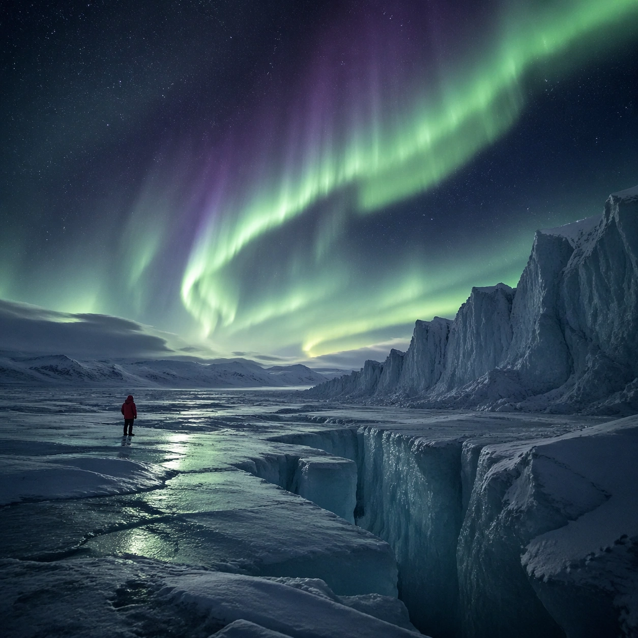
Example generated from “Aurora Glacier Cinematic Still — ChaosRealmsAI · MIT”
GPT Image 2en

Scene: Create a square cinematic still for Aurora Glacier Silent Theatre. Use production-grade photoreal lighting, disciplined lens behavior, and a composition that feels like a finished key frame from an original film rather than a casual snapshot. An Arctic glacier plain opens under a sweeping aurora curtain, with deep night sky, luminous green and faint violet ribbons overhead, fractured ice catching reflected color, and a breath-frozen atmosphere that feels almost soundless. Build an independent square study around the way atmosphere interacts with surfaces, keeping enough environmental context for the image to feel finished rather than cropped at random. Subject: Build a coherent original scene whose emotional center comes from atmosphere, light physics, and spatial clarity. Avoid relying on celebrity likeness, franchise iconography, or stylized illustration shortcuts. A solitary human figure in a red parka should appear tiny against the glacier geometry, while crevasses, wind-scoured snow, and ice walls provide a strong sense of scale without cluttering the frame. Let textures, reflections, residue, moisture, dust, or particulate response become primary, while the broader setting remains clearly implied. Important details: Preserve a believable physical world with strong depth layering, careful color separation, and premium image discipline. Keep the aurora soft and physically plausible rather than graphic, with believable ice reflectance, low-angle moonless ambient light, and careful contrast so the red parka remains a scale marker rather than a fashion focal point. The key is material credibility under dramatic light, with micro-contrast and controlled mood supporting the theme. Use case: Aurora Glacier single study 5/9. Constraints: No readable text, no watermark, no logos, preserve exact 1:1 aspect ratio, no tents, no readable expedition logos, no fantasy animals, no saturated nightclub colors, no fireworks effect.

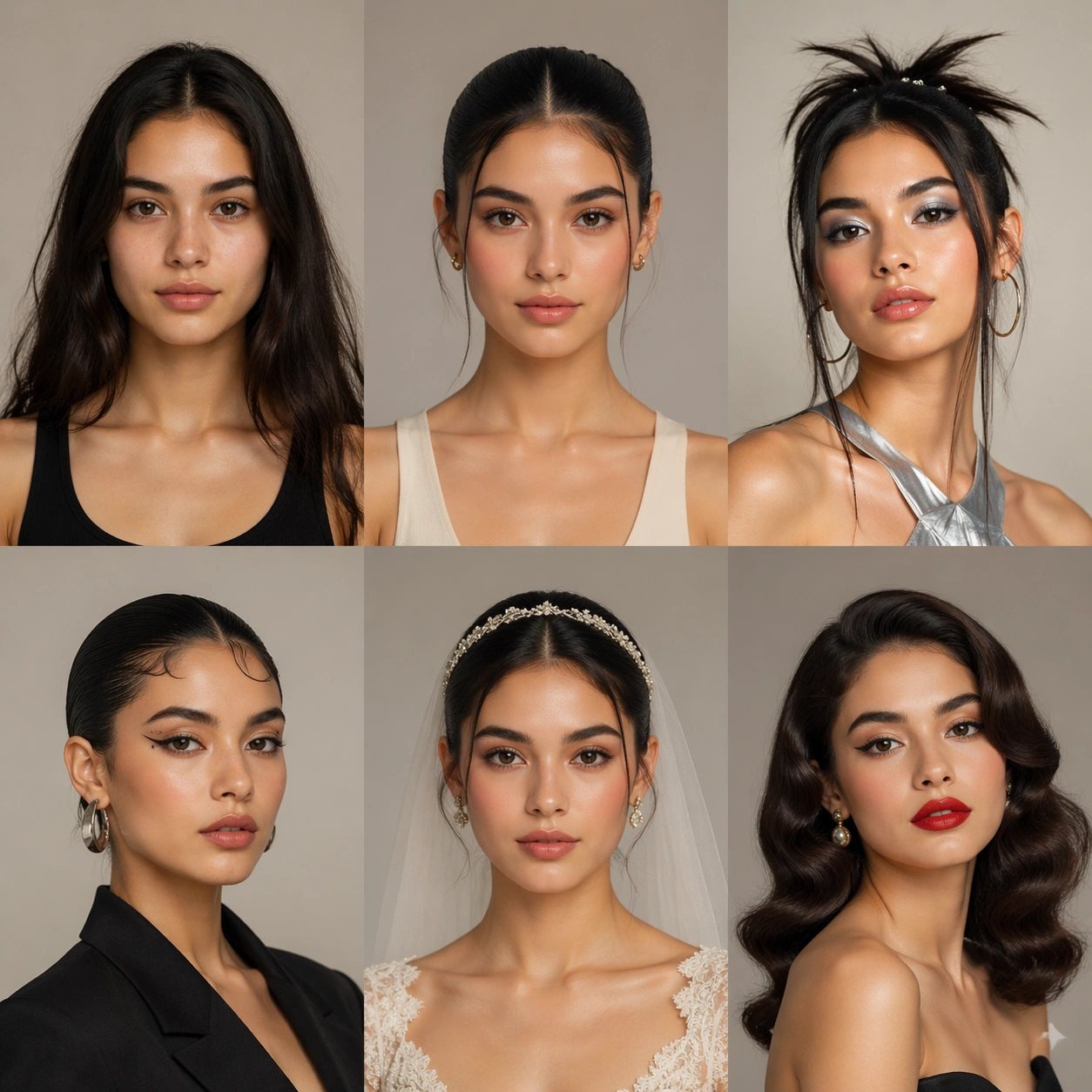
Example generated from “Six-Look Beauty Styling Comparison — ChaosRealmsAI · MIT”
GPT Image 2en

Scene: A square commercial beauty-or-fashion image designed like a polished campaign proof for Beauty Look Era Switchboard. Keep the camera discipline clear and believable: portrait-oriented within the square, premium studio light, controlled tonal contrast, and enough surrounding negative space to feel like an ad layout without relying on readable typography. The image should look production-ready, with realistic skin, hair, fabric, and makeup rendering that supports identity locking instead of distracting from it. Subject: Build the frame around one clearly recognizable person. Before After Board should feel like a specific transformation step that a disciplined comparison layout making transformation logic instantly legible. The face structure, age, body proportions, and general camera position must stay consistent with the same-person premise of Transform one face across distinct beauty directions such as clean-girl, Y2K, runway editorial, bridal, and retro glamour while preserving recognizability.. Styling, wardrobe, grooming, makeup, hair, or pose can evolve, but the viewer must believe it is unquestionably the same subject across the whole theme. Use a premium editorial-commercial tone rather than a casual portrait session. Important details: The visual test is identity consistency under change. Preserve stable bone structure, eye spacing, nose shape, lip volume, skin tone family, and believable texture response. Let the transformation be visible through styling choices instead of facial drift. This theme studies editing-workflow, multi-image-reference, photorealism, commercial-mockup through a production-ready visual system. Make the composition clean enough for client review, with professional grooming fidelity and enough detail for salon, beauty, or fashion decision-making. Aim for clear hierarchy, polished craft, and immediately usable campaign logic. Use case: Beauty Look Era Switchboard single study 1/5. Constraints: No readable text, no watermark, no logos, preserve exact 1:1 aspect ratio, no face drift, no inconsistent age shift, no extra limbs, no duplicate person, no asymmetric eye placement, no beauty-editorial chaos.

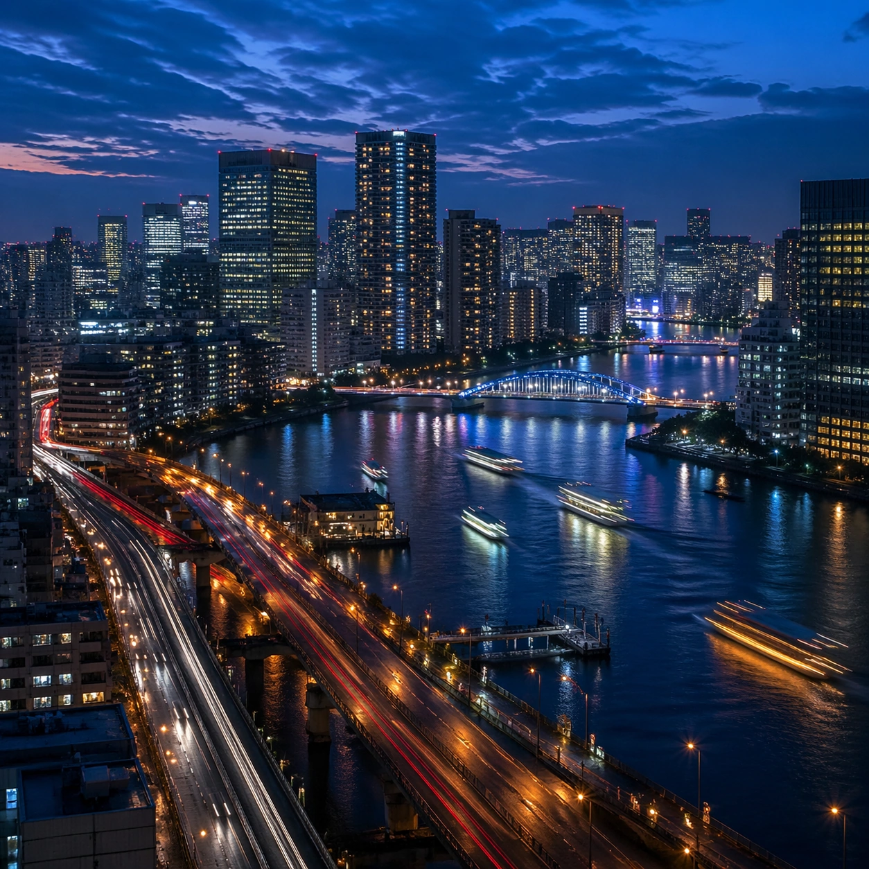
Example generated from “Blue Hour Riverside Metropolis — ChaosRealmsAI · MIT”
GPT Image 2en

Scene: Create a square cinematic still for Blue Hour Metropolis Long Exposure. Use production-grade photoreal lighting, disciplined lens behavior, and a composition that feels like a finished key frame from an original film rather than a casual snapshot. A dense riverside metropolis is captured at the exact transition of blue hour, where the sky holds deep cobalt, windows begin to glow warm gold, traffic turns into elegant light trails, and water reflects both cool atmosphere and neon accents. Build an independent square study around the way atmosphere interacts with surfaces, keeping enough environmental context for the image to feel finished rather than cropped at random. Subject: Build a coherent original scene whose emotional center comes from atmosphere, light physics, and spatial clarity. Avoid relying on celebrity likeness, franchise iconography, or stylized illustration shortcuts. Skyscrapers, bridges, riverbanks, layered roads, and a few boats or ferries should form a coherent urban rhythm, with architecture believable and anonymous rather than tied to any one landmark identity. Let textures, reflections, residue, moisture, dust, or particulate response become primary, while the broader setting remains clearly implied. Important details: Preserve a believable physical world with strong depth layering, careful color separation, and premium image discipline. Control color temperature precisely, keeping the cool ambient sky separate from warm occupancy lights, with long-exposure motion on roads and water that feels polished, metropolitan, and technically disciplined. The key is material credibility under dramatic light, with micro-contrast and controlled mood supporting the theme. Use case: Blue Hour City single study 5/9. Constraints: No readable text, no watermark, no logos, preserve exact 1:1 aspect ratio, no readable billboards, no famous landmark mimicry, no fireworks, no science-fiction holograms, no empty skyline.

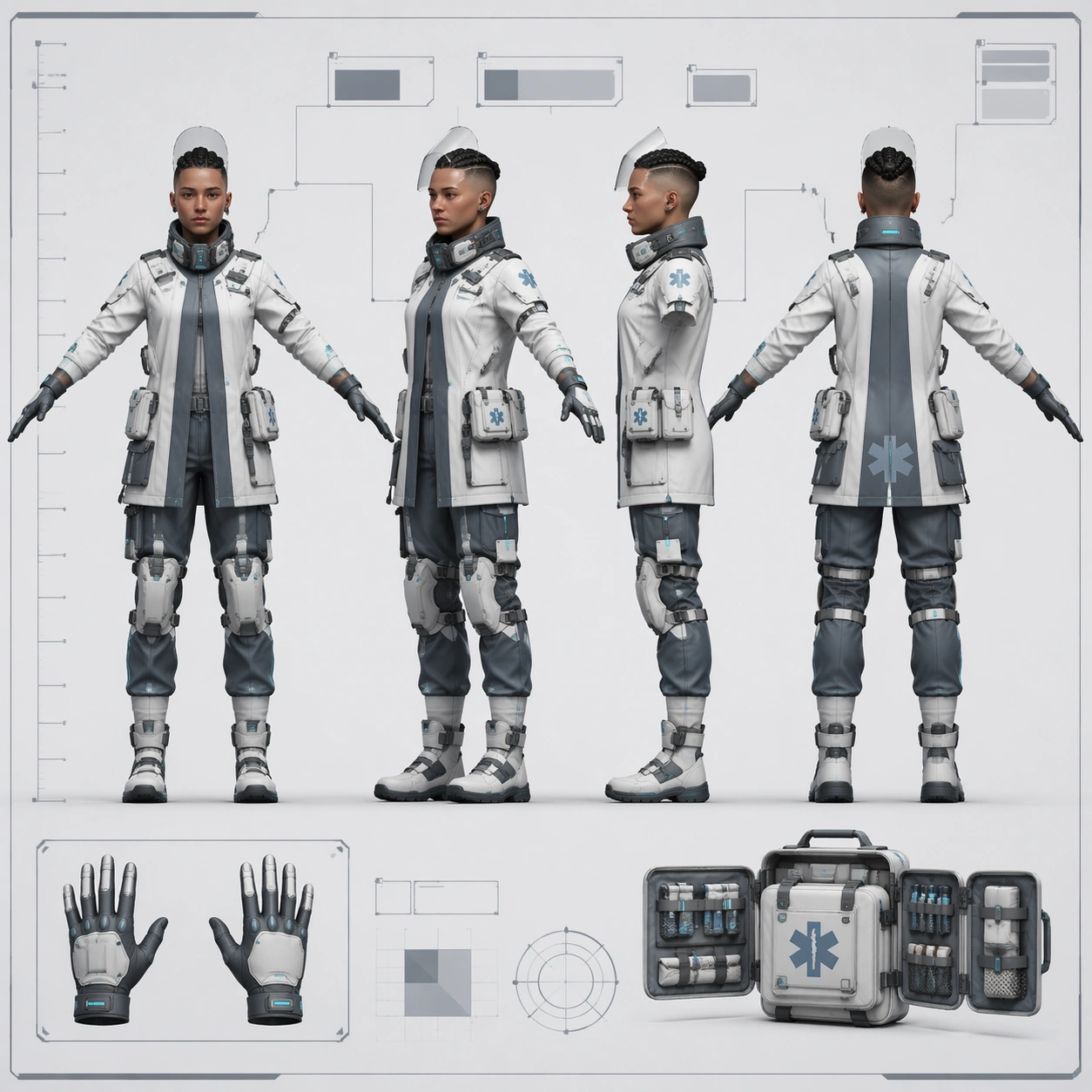
Example generated from “Arcology Medic Four-View Concept — ChaosRealmsAI · MIT”
GPT Image 2en

Scene: A square game-studio character turnaround sheet displayed as a pristine concept-art document on a pale clinical board. Lighting is even and cool, with crisp paper edges, faint guide lines, and clear negative space around the figures. The overall visual language is medical-industrial rather than cinematic, with quiet blue-gray tones and precise layout balance. Subject: Create one original arcology medic shown in four aligned full-body views on the same sheet: front, forty-five-degree, side, and back, all in a relaxed T-pose. The medic is a lean urban emergency specialist with shaved sides and a tightly braided crown, translucent face shield resting up, compact respirator collar, layered white and slate treatment jacket, soft cyan bio-monitor strips, articulated knee braces, and modular medical pouches distributed consistently around the waist. Include one or two secondary insets for gloved hands and a fold-out trauma kit, but keep the main four views dominant. Important details: This is a technical character sheet, so maintain exact identity and proportion consistency across all four views. Keep head size, shoulder width, coat seam placement, pouch count, brace geometry, and boot silhouette stable. Show believable material distinctions: wipe-clean fabric, translucent polymer visor, matte rubber seals, brushed clips, and reflective safety edging. Add a non-readable height ruler and abstract callout boxes with no letters. The sheet should feel ready for a production handoff, not like a poster or comic panel. Use case: Character Turnaround single study 5/8, testing a medical-industrial four-view sheet with strong technical-diagram discipline. Constraints: No readable text, no watermark, no logos, preserve exact 1:1 aspect ratio, no dramatic hospital background, no extra pose, no weapon, no floating hologram UI, no inconsistent pouch placement, no broken anatomy across views.

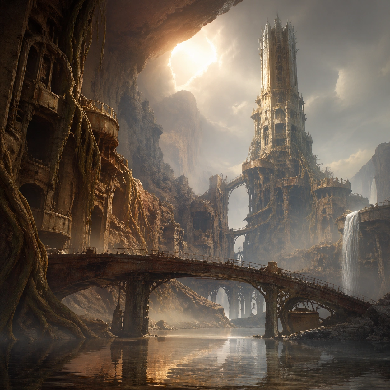
Example generated from “Canyon Citadel Loading-Screen Art — ChaosRealmsAI · MIT”
GPT Image 2en

Scene: A square polished loading-screen hero composition for the same fictional canyon biome, with a grand cinematic camera, clean negative space, and layered atmosphere designed for a chapter or region splash image. The frame should feel more composed and poster-like than the reference, while still grounded in the same world language of cliffs, roots, ruins, and water. Subject: The biome appears as a premium game environment artwork: the landmark tower, a foreground bridge, reflective water, and one strong sky break all align into a single iconic composition. The subject remains the place itself, not a figure. Every architectural element should imply climbable paths, explored ruins, and story-rich history embedded in the environment. Important details: The goal is brandable clarity rather than pure concept-art chaos. Use strong silhouette hierarchy, rich but believable atmosphere, and material contrast between wet rock, ancient roots, rusted metal, and pale fog. Keep the mood high-end and collectible, like a chapter key art that could sit on a website hero panel or regional landing page. No readable text anywhere. Use case: Biome Pack single study 5/9, turning the biome into a polished chapter-level loading screen asset. Constraints: No readable text, no watermark, no logos, preserve exact 1:1 aspect ratio, no readable text, no characters, no vehicles, no random monsters, no cluttered foreground props, no broken perspective

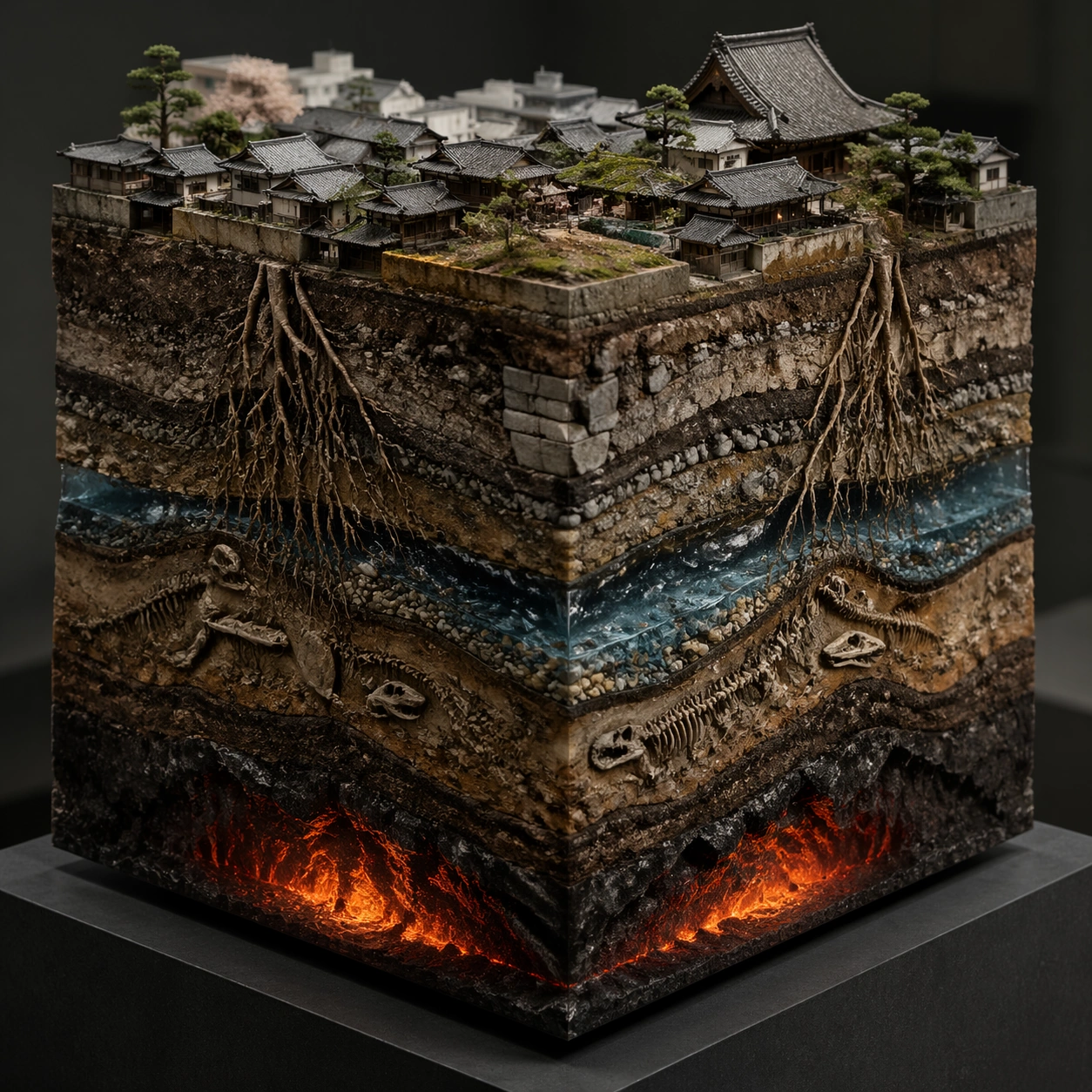
Example generated from “Kyoto Rooftop Geological Diorama — ChaosRealmsAI · MIT”
GPT Image 2en

Scene: A square studio photograph of a hyperreal diorama cube floating above a matte charcoal plinth, lit with soft museum lighting and a crisp three-quarter view. The cube is about the size of a shoebox, with the top face visible and all four vertical faces cut away like a scientific specimen. Use natural colors, fine dust, tiny shadows, and shallow depth of field without hiding the cube edges. Subject: The top surface is a miniature Kyoto rooftop district with clay tile roofs, a small temple gable, narrow alleys, moss, rain gutters, and tiny garden trees. The four side faces expose different hidden layers: compact city fill and stone foundations, tangled tree roots descending from courtyard pines, a blue-gray aquifer seam with pebbles and wet sand, dinosaur fossil fragments embedded in older strata, and a warm lava chamber glowing far below. Important details: The cube must read as one coherent object, not separate panels. Each side face should align with the top surface and show believable stratigraphy, material boundaries, roots crossing layers, water pockets, fossil cavities, and glowing volcanic depth. Keep the cut edges sharp and physically plausible. The image should feel both collectible and scientific, like an impossible museum display with precise information hierarchy. Use case: Hyperreal Diorama Cube single study 1/8, testing a Kyoto rooftop surface combined with geological, biological, fossil, aquifer, and lava cutaway layers. Constraints: No readable text, no watermark, no logos, preserve exact 1:1 aspect ratio, no floating labels, no disconnected slices, no muddy layer boundaries, no cartoon miniature style, no impossible shadows, no oversized people, no cropped cube corners.

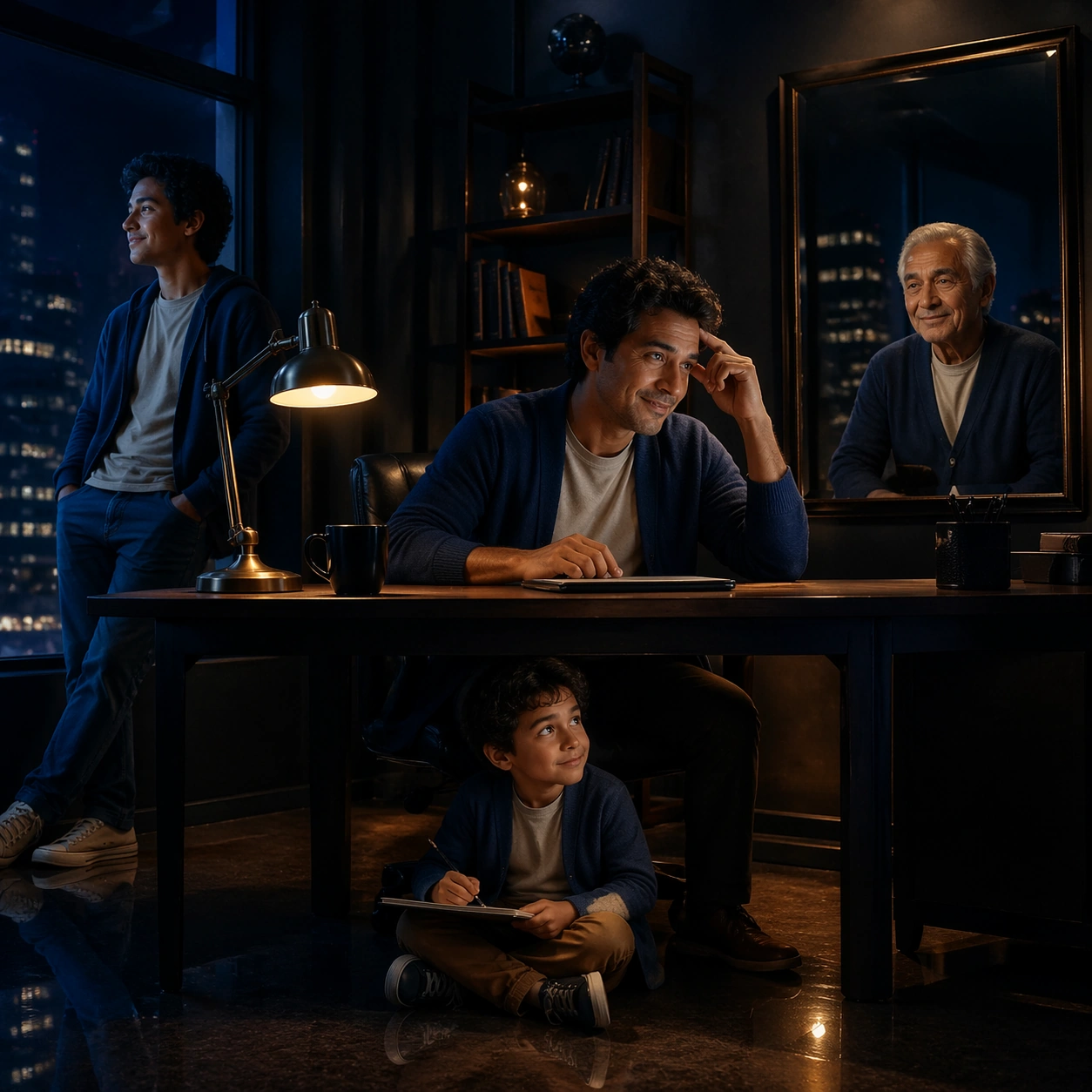
Example generated from “Four Ages in a Midnight Office — ChaosRealmsAI · MIT”
GPT Image 2en

Scene: A square cinematic office at night, seen from a calm three-quarter angle. The room has a desk, a soft desk lamp, tall windows with city lights, shelves, a wall mirror, and a polished floor reflection. Use deep navy shadows, warm amber lamp light, and controlled negative space so multiple figures remain easy to read. Subject: Show the same man at four life stages sharing the office: child sitting under the desk with a sketchbook, teenager leaning against the window, adult working at the desk, and elderly version reflected in the wall mirror. Preserve identity through the same broad brow, round eyes, slight gap-toothed smile, and a blue cardigan motif adapted across ages. Each version should feel physically present or reflected in the same room, not pasted from separate images. Important details: The emotional concept is a person surrounded by earlier and later selves while making a decision. Keep the office geometry coherent, with reflections and shadows obeying the room. Age differences should be clear but connected through facial structure, posture echoes, and the blue clothing motif. The composition should feel like one surreal photograph with cinematic polish. Use case: Mirror Worlds single study 5/8, testing same-person age consistency and mirror logic in an office scene without references. Constraints: No readable text, no watermark, no logos, preserve exact 1:1 aspect ratio, no extra coworkers, no readable documents, no horror tone, no inconsistent facial traits, no broken mirror perspective, no cluttered desk pile.

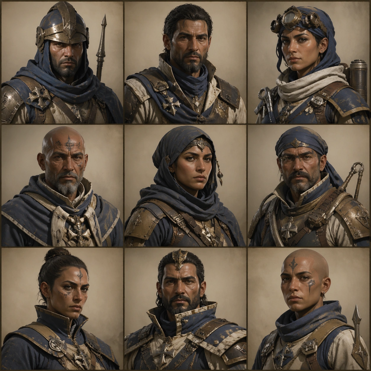
Example generated from “Desert Faction NPC Portrait Grid — ChaosRealmsAI · MIT”
GPT Image 2en

Scene: Create a square portrait-grid sheet with nine bust crops arranged in precise rows, each cell lit consistently like in-game dialogue art capture. Keep the overall frame square, polished, and production-ready game art bible presentation with crisp panel rhythm, believable costume construction, and enough visual hierarchy for downstream UI or documentation reuse. Let materials, lighting, and spacing feel intentional enough for gallery, research, campaign, or approval-board reuse without depending on readable text. Subject: Use multiple NPC types from the same faction and prove that faces, collars, insignia strips, and emotional range all stay regionally coherent. Ground the image inside a wind-carved desert citadel faction with oxidized bronze, indigo cloth, pale bone accents, practical leather, and a sun-faded military-monastic attitude. Use multiple adult NPC archetypes such as guard, quartermaster, medic, machinist, scout, priest, and captain, but keep them visually linked through the same regional craft language and social hierarchy. Important details: Keep insignia geometry, rank markers, cloth layering, tool silhouettes, and color hierarchy coherent across every role so the cast reads like one population rather than unrelated hero concepts. Cells should feel made for dialogue UI export, not random moodboard collage. Vary age read and role, but hold the faction language steady. Treat this frame as an independent study that still honors the same overall theme and production logic. Favor believable production craft, clean hierarchy, and reusable visual logic over empty spectacle or random decoration. Use case: NPC Faction Casting Sheet single study 5/9, dialogue portrait coverage for one coherent NPC population. Constraints: No readable text, no watermark, no logos, preserve exact 1:1 aspect ratio, no readable names, no floating UI chrome, no celebrity likeness, no modern casualwear.

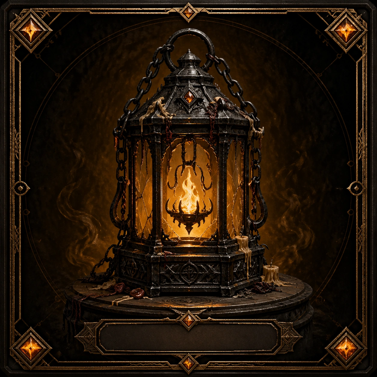
Example generated from “Cursed Lantern Collectible Lore Card — ChaosRealmsAI · MIT”
GPT Image 2en

Scene: Create a square collectible lore card with a premium codex layout, centered object pedestal, dark velvet background, and restrained bronze frame accents. The card should feel like an in-game archive page rather than a loose still life: one large relic in the middle, blank plaque areas, faint decorative border geometry, and a controlled halo of smoky amber light. Keep the composition symmetrical enough to read as a collectible card while still feeling tactile and dramatic. Subject: The relic is a haunted lantern reliquary made from blackened iron, cracked amber glass, soot-dark chains, and a suspended pale flame that seems trapped inside a small cage of ritual hooks. The base is engraved with abstract warding marks that remain unreadable. Tiny melted wax drips, old ash, and a few seal-thread knots imply repeated attempts to contain whatever spirit once lived inside it. The lantern should feel dangerous yet treasured, as if players would keep it for both lore and power. Important details: Make the object itself tell the story. The iron should feel scorched and old, the amber glass should glow from within, and the flame should look eerie but controlled rather than explosive. The card frame language must suggest rarity through shape, metallic trim, and gemlike insets, not through words. Preserve strong silhouette clarity and make the relic feel worthy of a codex entry, reward card, or quest archive. Avoid generic fantasy clutter; every surface detail should reinforce age, containment, and cursed value. Use case: Relic Artifact Lore Card Set single study 1/9. Constraints: No readable text, no watermark, no logos, preserve exact 1:1 aspect ratio, no modern lantern parts, no extra weapons, no character portrait, no random skull overload, no noisy particle storm, no broken card frame.

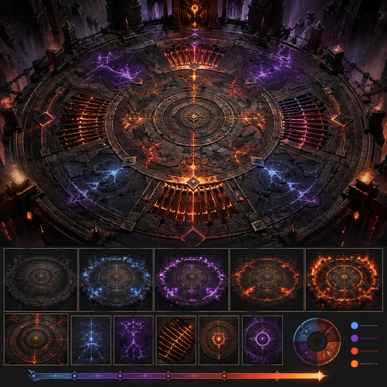
Example generated from “Boss Arena Hazard Floor Board — ChaosRealmsAI · MIT”
GPT Image 2en

Scene: A square production-ready image designed for a game-art review wall and a commercial gallery at the same time. Frame a floor-centric board that isolates the arena mechanic language through cracks, sigils, vents, or hazard panels with disciplined lighting, clean edge separation, and enough surrounding context to prove how the asset would behave in a real product surface. The camera, crop, and tonal balance should feel intentional rather than generic, with high readability at first glance and convincing material response under closer inspection. Subject: Center the study on a floor-centric board that isolates the arena mechanic language through cracks, sigils, vents, or hazard panels. Translate the topic into a concrete, shippable visual statement instead of a loose mood board. Build layered object relationships, believable surface finish, and strong silhouette grouping so the image reads immediately as part of Boss Arena Phase Keyframes. The subject should feel made for a live game pipeline: useful in store, UI, campaign, or art-review contexts, with visual hierarchy strong enough to survive aggressive cropping. Important details: the design should teach encounter logic without any readable labels. Keep every supporting element subordinate to the main read, and make category separation obvious through form, color zoning, depth, and material logic rather than words. Where panels, cards, badges, or interface blocks appear, they must look professionally structured but remain unreadable. The visual language should feel premium, original, and coherent across this package, with no filler clutter and no accidental resemblance to a specific shipped game IP. Use case: Boss Arena Phase Keyframes single study 1/5, focused on mechanic floor board. Constraints: No readable text, no watermark, no logos, preserve exact 1:1 aspect ratio, no text callouts, no arrows, no broken hierarchy, no generic stock-photo staging, no accidental UI gibberish.

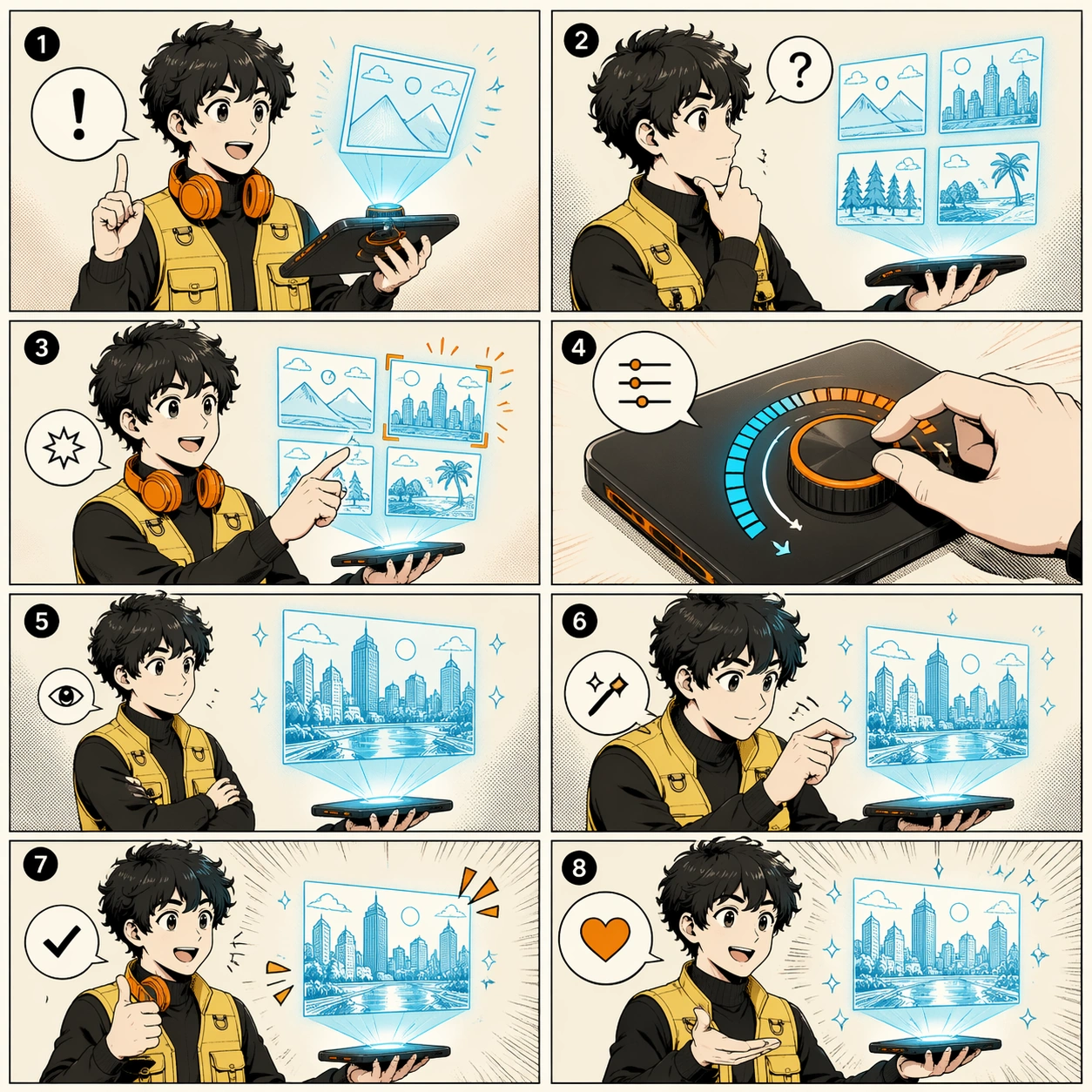
Example generated from “Eight-Panel Inventor Product Demo — ChaosRealmsAI · MIT”
GPT Image 2en

Scene: A square eight-panel product-demo comic page, exactly eight panels in a 2 by 4 grid, clean manga-inspired line art, crisp panel borders, soft screen tones, and a restrained black, cream, cyan, and orange palette. Subject: A consistent young inventor character demonstrates a floating image-making tablet across all eight panels. The character has curly dark hair, a yellow utility vest, black turtleneck, and orange headphones. The tablet projects small picture panels, then the inventor compares them, adjusts a dial, and presents a polished final image in the last panel. Important details: Strong character consistency across panels, clear commercial demo storytelling, coherent panel-to-panel action, readable gesture language, pseudo-dialogue bubbles, simple sound-effect shapes, no dependency on reference images. The page should feel like a launch storyboard that could be used in a product presentation. Use case: Independent comic single image, testing whether one prompt can produce a complete eight-panel product demonstration with consistent character and prop design. Constraints: Exactly eight panels, no real logos, no watermark, no readable text, no extra main characters, no broken panel grid, no photorealism, no cluttered UI, preserve exact 1:1 aspect ratio.

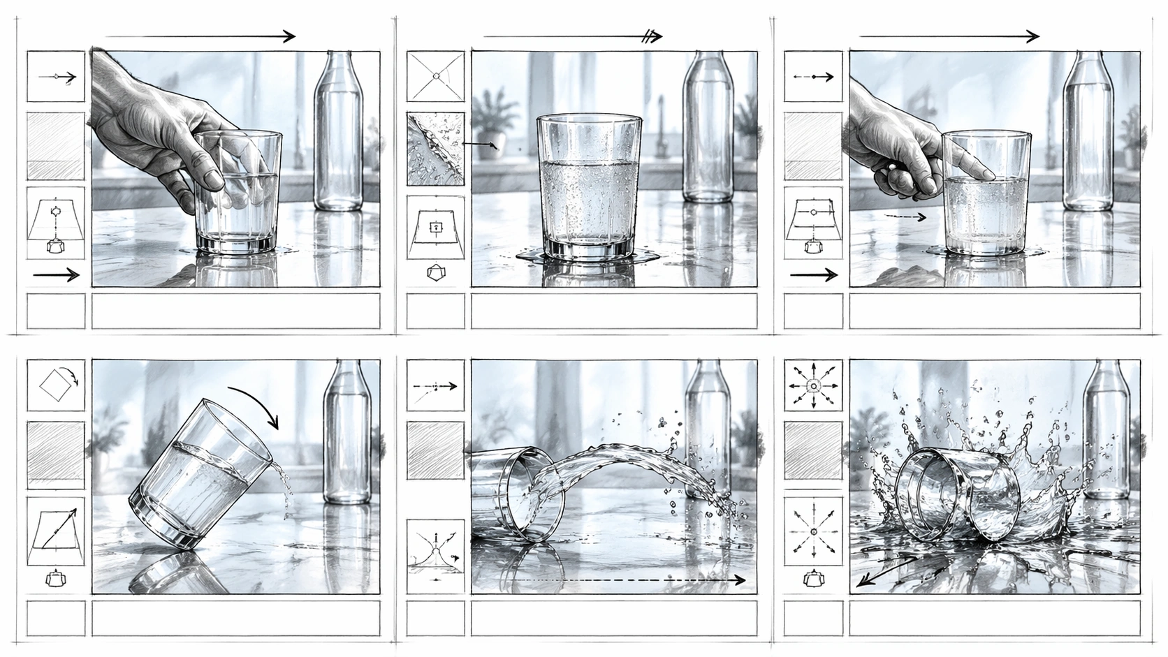
Example generated from “Six-Panel Beverage Spill Storyboard — ChaosRealmsAI · MIT”
GPT Image 2en

Scene: A horizontal 16:9 advertising storyboard sheet drawn in pencil, gray marker, and pale blue wash, arranged as six equal panels in a clean 2 by 3 grid. Each panel includes abstract production-note blocks, camera arrows, and blank caption strips with no readable words. The board plans a tabletop beverage commercial in a bright kitchen studio with reflective glass, polished stone, and controlled splash lighting. Subject: The six panels follow one physical action: a hand sets down a clear tumbler, condensation beads form on the glass, a second hand nudges it, the tumbler tips in slow motion, liquid arcs across the stone counter, and the final panel shows a dramatic splash frozen around the fallen glass. A plain unbranded bottle silhouette sits in the background as a product placeholder, never showing a label. The hand, glass, bottle, and counter remain consistent across the sequence. Important details: The board must feel useful for production: precise camera framing, arrows for dolly and tilt movement, cutaway insert boxes, notes bands, and clear physical continuity from upright glass to spill. Emphasize physics-materials: transparent glass refraction, water surface tension, droplets, splash direction, condensation, countertop reflections, and gravity. Keep the style as storyboard pencil work, not a finished advertisement render. All notation should be graphic and unreadable. Use case: Film Storyboard Sequence single study 5/8, an independent tabletop commercial board testing material physics and production layout. Constraints: No readable text, no watermark, no logos, preserve exact 16:9 horizontal aspect ratio, no brand label, no broken six-panel grid, no impossible liquid direction, no extra products, no full-color polished ad comp.

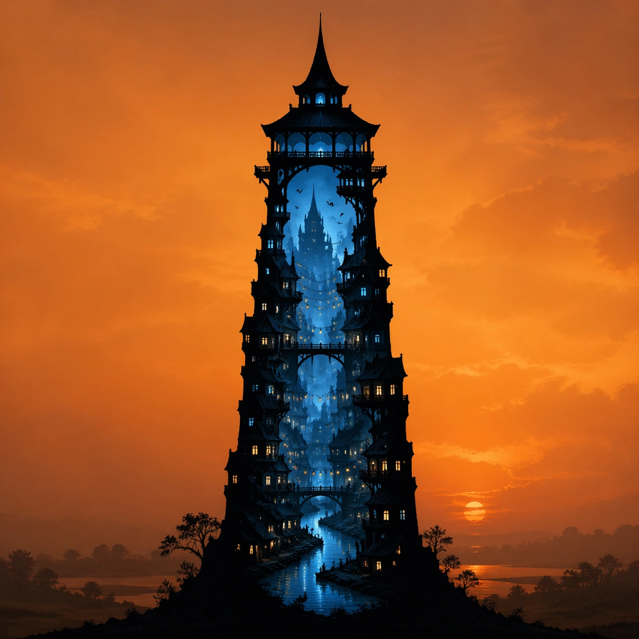
Example generated from “A Blue City Inside a Dusk Tower — ChaosRealmsAI · MIT”
GPT Image 2en

Scene: A square poster-like composition with a single tall tower centered against a warm orange dusk sky. The outside field is quiet, misty, and minimal, with soft amber haze and low contrast so the tower silhouette dominates immediately. The image should feel like a high-impact editorial illustration with precise hierarchy: bold outer shape first, intricate inner world second. Subject: A pure black silhouette of a solitary tower, but the tower is not solid fill. Inside the tower outline is a complete dusk city in miniature: stacked windows, narrow buildings, tiny bridges, a winding river, lantern strings, rooftops, silhouettes of birds, and cold blue city light glowing through the interior. The tower top, walls, and base remain readable as one continuous iconic shape. Important details: The silhouette is a container, not a boundary decoration. Every city detail must stay inside the tower contour, with no spillover beyond the black edge. The outer contour must be razor sharp and solid black, while the interior world can reveal blue light, depth layers, and tiny atmospheric details. Keep a clear temperature contrast: warm orange mist outside, cool blue city inside. Use case: Silhouette Universe independent study 1/3, demonstrating the tower outline as a narrative container. Constraints: No readable text, no watermark, no logos, preserve exact 1:1 aspect ratio, no broken silhouette edges, no white halo, no extra people outside the outline.

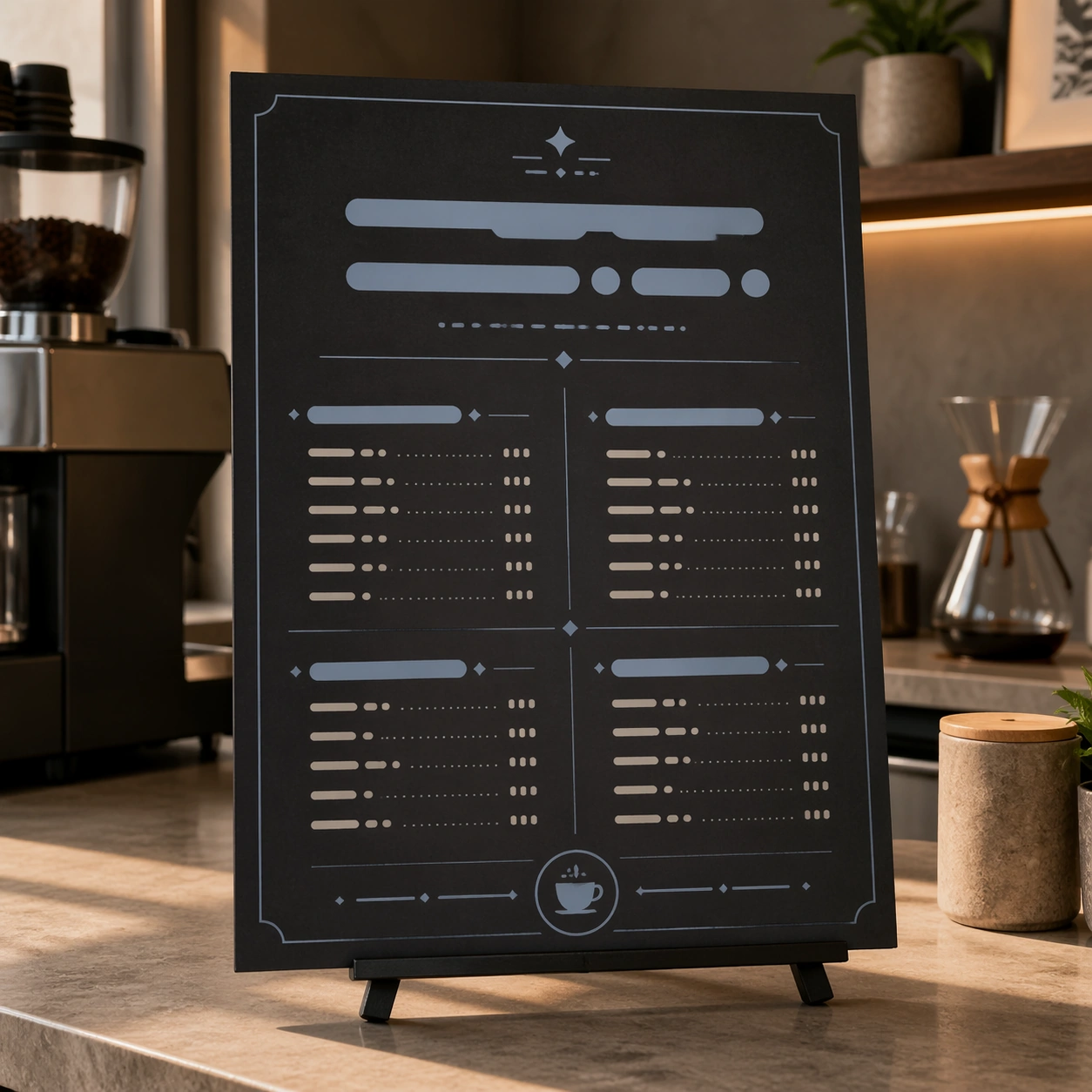
Example generated from “Charcoal Cafe Menu Board Mockup — ChaosRealmsAI · MIT”
GPT Image 2en

Scene: Square crop of a cafe counter design review scene, soft morning light, neutral stone counter, and a single menu board mockup standing upright on a small easel. The image is polished commercial editorial realism with quiet shadows and precise layout. The board is not a real menu: all text areas are abstract bars, dots, and glyph-like marks. Subject: Show one finished menu board that visually implies several conversational edits have been applied: the background changed from bright daytime cream to a warmer evening charcoal, one left-side pastry illustration removed cleanly, the main abstract title area enlarged, and the accent color shifted cooler. Keep the menu category blocks, price-like rows made of unreadable marks, small coffee cup icon, and border grid aligned and consistent. Important details: The point is not a before-after split; it is the result of an edit workflow that required semantic understanding. The removed pastry area should be repaired with matching board texture and spacing. The larger heading should push nearby abstract rows downward without crowding. The cooler color should affect icons, dividers, and highlights while the cafe counter environment remains natural. The composition should feel usable by a designer evaluating whether the edit respected the original layout. Use case: Conversational Editing Workflow single study 5/8, testing a mask-free menu revision with object removal, hierarchy adjustment, and color tuning. Constraints: No readable text, no watermark, no logos, preserve exact 1:1 aspect ratio, no real cafe brand, no split-screen comparison, no UI overlay, no misspelled words, no human hands, no cluttered countertop.

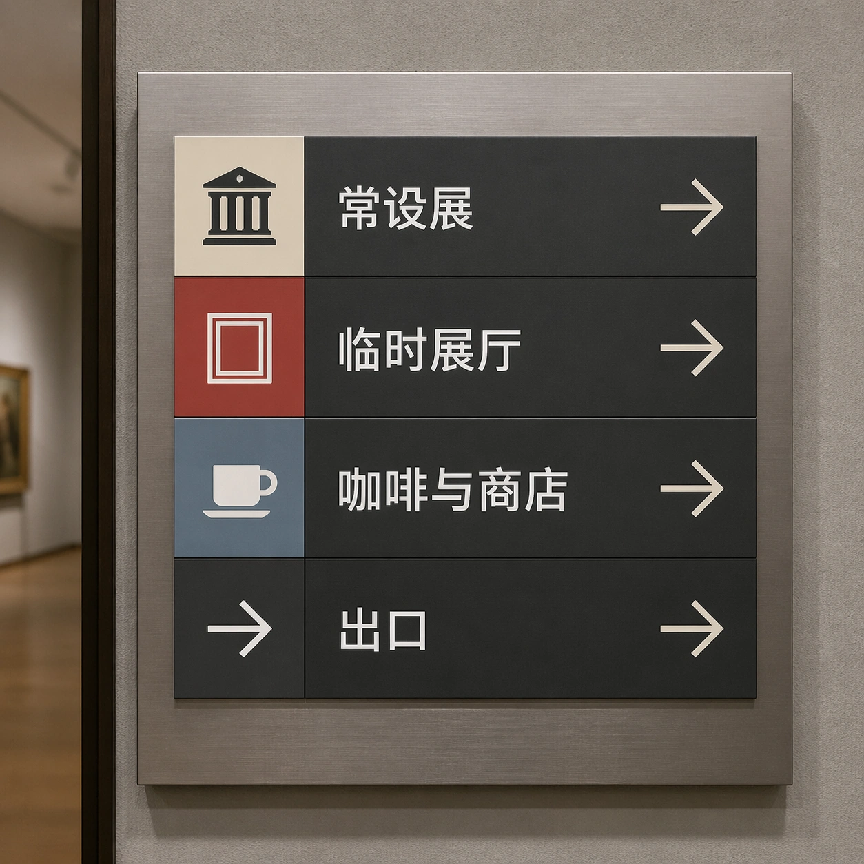
Example generated from “Chinese Museum Wayfinding Mockup — ChaosRealmsAI · MIT”
GPT Image 2en

Scene: A square close-up of a museum wayfinding placard mounted on brushed aluminum beside a gallery doorway. The camera is straight-on with slight environmental depth at the edges, soft museum lighting, neutral gray walls, and a restrained institutional palette of charcoal, cream, muted red, and pale blue. The sign is divided into three perfectly aligned rows with icon columns and bilingual-looking spacing. Subject: Show a finished Chinese localization of an English museum sign while implying the original layout is preserved. The exact readable Chinese text must be: 常设展, 临时展厅, 咖啡与商店, 出口. Each phrase appears in a clean sans serif style, replacing where English labels would have been, beside simple pictograms for collection, gallery, cup, and arrow. The sign should look production ready, with exact baseline alignment and even optical margins. Important details: The point is not just multilingual text; it is text replacement inside a pre-existing wayfinding grid. Keep icon positions fixed, keep row heights equal, keep the arrows and pictograms crisp, and make all Chinese characters readable at thumbnail scale. The sign should show professional localization discipline: no crowding, no mismatched font weights, no accidental extra copy, and no redesign. Use case: In-Image Translation single study 5/8, testing translated signage text inside a strict wayfinding layout. Constraints: No readable text except the specified Chinese strings, no watermark, no logos, preserve exact 1:1 aspect ratio, no fake museum brand, no misshaped Chinese characters, no handwritten style, no perspective distortion, no extra labels.

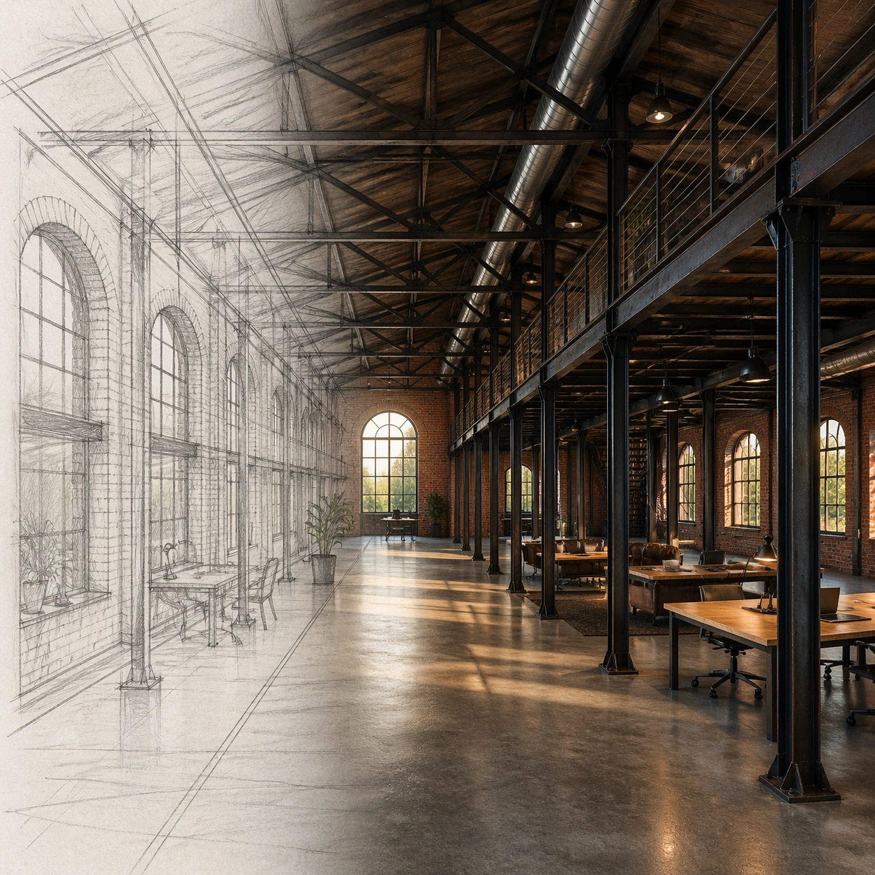
Example generated from “Warehouse Loft Sketch-to-Render Concept — ChaosRealmsAI · MIT”
GPT Image 2en

Scene: A square architectural visualization arranged as a clean before-and-after transformation without readable labels: a loose pencil sketch occupies the left third as translucent graphite linework, while the right two thirds resolve into a photoreal interior render. The viewpoint, horizon, column spacing, and window rhythm align across both halves, making the conversion easy to read. Light is late afternoon, warm but natural, with balanced shadows. Subject: An old brick warehouse converted into a loft workspace. The sketch side shows arched industrial windows, steel columns, a mezzanine edge, exposed roof trusses, and a long central circulation path. The photoreal side renders the same layout with aged red brick, blackened steel, polished concrete floor, large restored windows, simple worktables, a mezzanine guardrail, and ceiling ducts following the sketched truss bays. Important details: The drawing-to-render relationship must be structurally faithful: window arches, column grid, mezzanine height, truss spacing, floor perspective, and central path must stay locked between sketch and render. Do not turn the scene into a generic luxury office. Use plausible adaptive-reuse details, scale cues, material weathering, and real construction logic. The sketch layer can remain visible at the boundary, but the final image should mostly read as photoreal architecture. Use case: Sketch to Photoreal Render single study 5/8, testing independent conversion from a warehouse interior sketch into a faithful photoreal adaptive-reuse render. Constraints: No readable text, no watermark, no logos, preserve exact 1:1 aspect ratio, no floating furniture, no impossible beams, no extra window rows, no ornate hotel styling, no people dominating the scene.
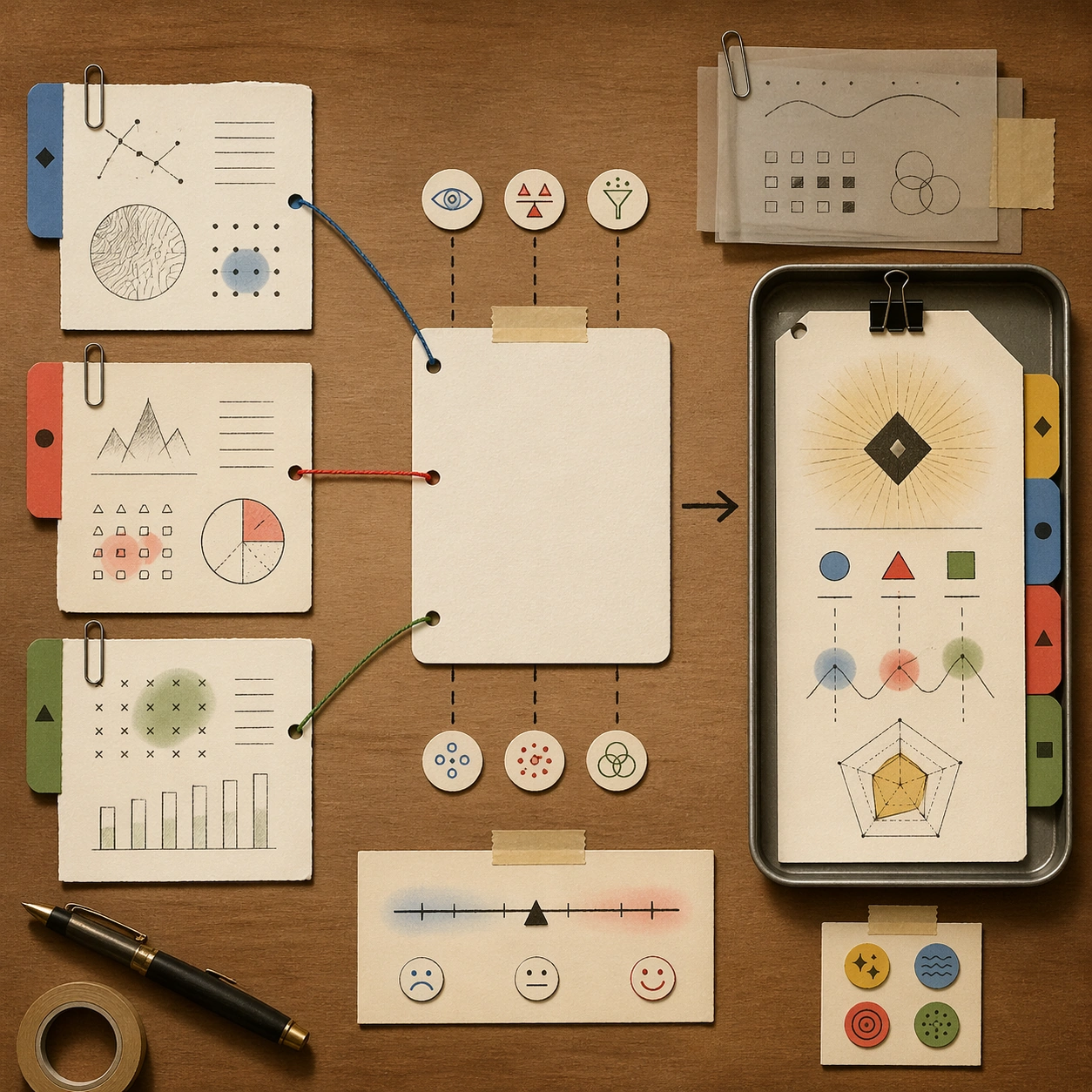
Example generated from “Analyst Reasoning Workbench Illustration — ChaosRealmsAI · MIT”
GPT Image 2en

Scene: A quiet top-down studio illustration of an analyst workbench, square crop, warm desk surface, soft afternoon light, and carefully arranged paper layers. The style is polished editorial illustration with tactile paper texture, graphite lines, and restrained accent colors. Subject: A complete visual reasoning workspace: one central blank research card, three source cards, a small uncertainty scale, colored string connections, tiny icon stickers, and a final decision tray. The arrangement shows how messy inputs become a structured conclusion. The cards contain only non-readable glyph marks and abstract chart shapes, not real words or numbers. Important details: Clear information architecture, visible reasoning sequence from left to right, balanced negative space, precise alignment, and subtle handmade imperfections. Include paper clips, transparent overlays, arrows, and color-coded evidence groups. The image should look like thinking made visible without exposing literal text. Use case: Independent Thinking Mode single image, testing whether a complex reasoning workflow can become a clear editorial object composition. Constraints: No readable text, no real data, no company names, no logos, no watermark, no photorealistic laptop screen, no cluttered desk mess, no human hands, preserve exact 1:1 aspect ratio.
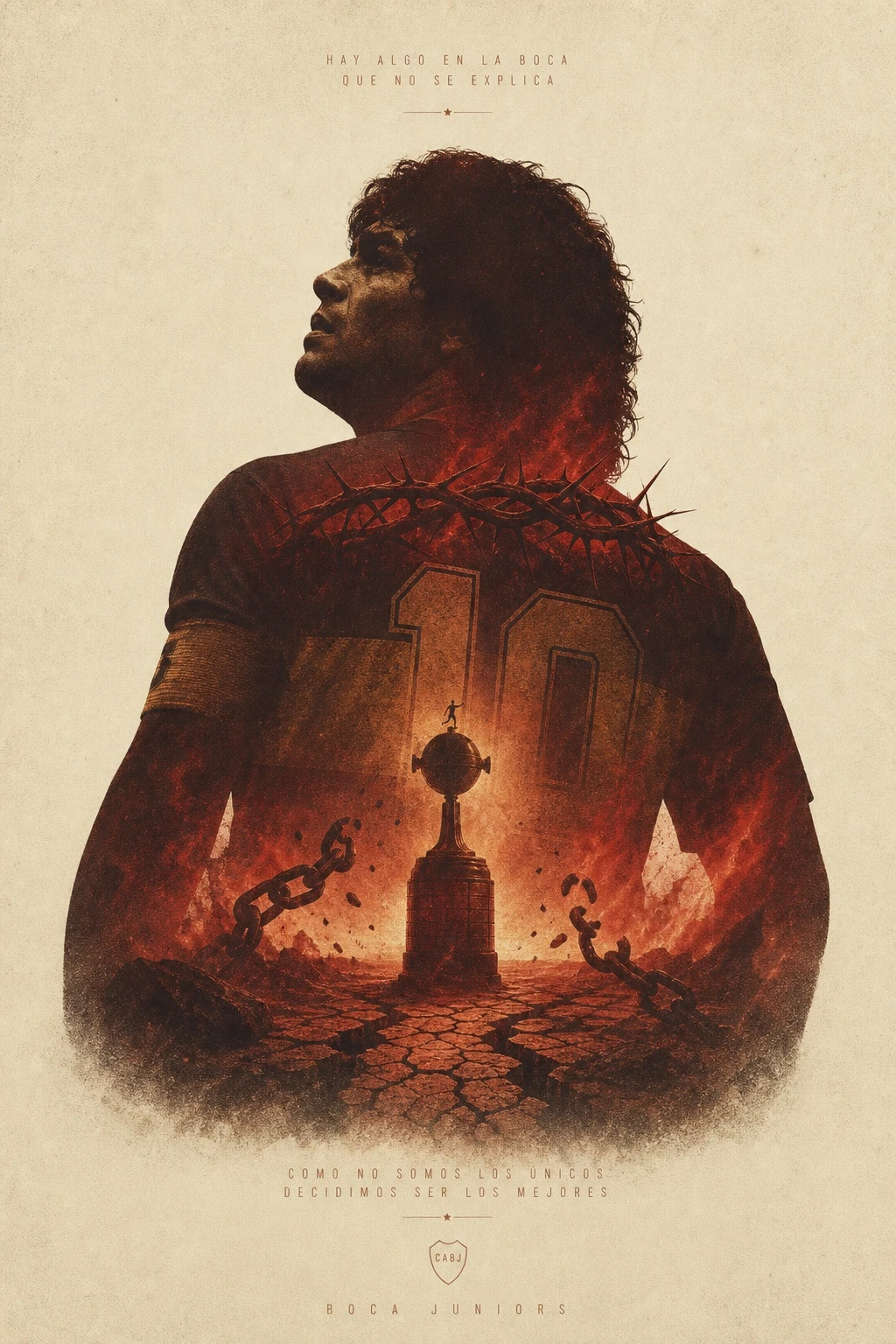
Example generated from “AI Football Double-exposure Poster Study — ClawLabs AI · MIT”
GPT Image 2en

Generate a highly finished, epic-feeling art poster with a double exposure composition on a cream/off-white background. Team: [TEAM_NAME]. A large silhouette of [SUBJECT] occupies the main body of the composition, with [ELEMENT_1], [ELEMENT_2], [ELEMENT_3], [ELEMENT_4], and [ELEMENT_5] fused inside the silhouette. The overall color palette is dominated by [PRIMARY_COLOR] and earthy ochre/brown tones, evoking an oppressive, resolute, and strongly fatalistic mood. Keep the elements minimal and uncluttered, with generous negative space. Apply a printed grain texture throughout. Avoid overly sharp details on the elements, but maintain an epic, cinematic quality — like an official theatrical animated feature film poster. Vertical/portrait orientation. If any text appears in the image, it should use a thin/light-weight typeface.

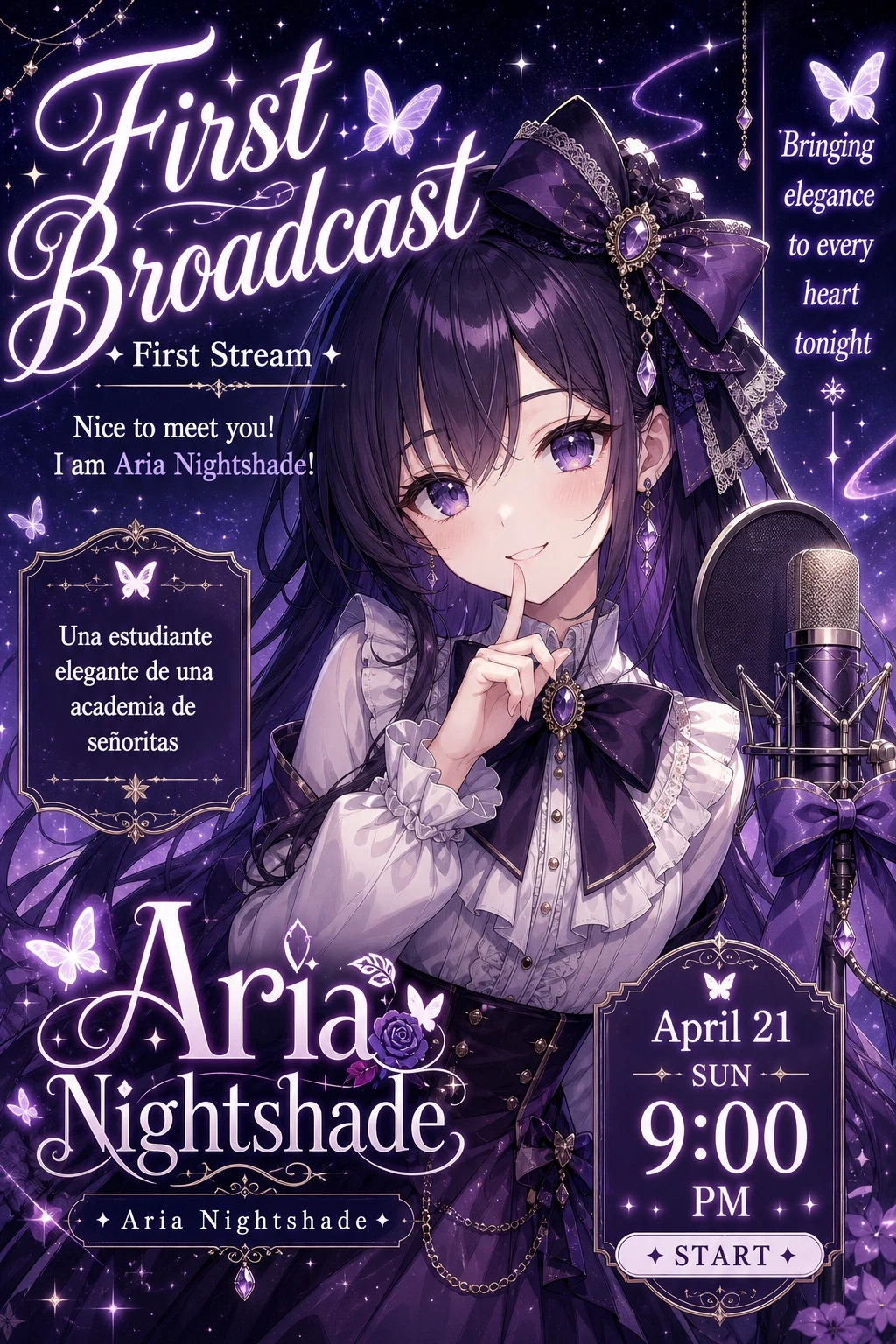
Example generated from “Fictional VTuber Debut Poster — ClawLabs AI · MIT”
GPT Image 2en

Design a VTuber debut livestream thumbnail illustration. The character is an anime girl with long dark purple hair, purple eyes, wearing a frilly white blouse, a dark purple bow tie, and a large decorative hair bow. She strikes a cute pose with one finger raised to her lips. On the right side of the frame, place a condenser microphone fitted with a pop filter and decorated with a purple ribbon. The background depicts a magical starry night sky filled with sparkles and glowing butterflies, rendered in a purple and white color palette. Layout the typography as follows: - Top left: large, bold text in a cursive English style displaying the main title [MAIN_TITLE], with a subtitle line reading 'First Stream' beneath it, followed by a second line reading 'Nice to meet you! I am [CHARACTER_NAME_EN]!' - Middle left: a decorative text box containing the character's description: [CHARACTER_DESCRIPTION] - Bottom left: a logo-style text displaying the character's name [CHARACTER_NAME], with a smaller subtext showing the romanized name [CHARACTER_NAME_EN] - Top right: vertical text displaying the catchphrase [CATCHPHRASE] - Bottom right: a decorative pill-shaped badge showing the stream date and time [STREAM_DATETIME], with a small subtext reading '✦ START ✦'

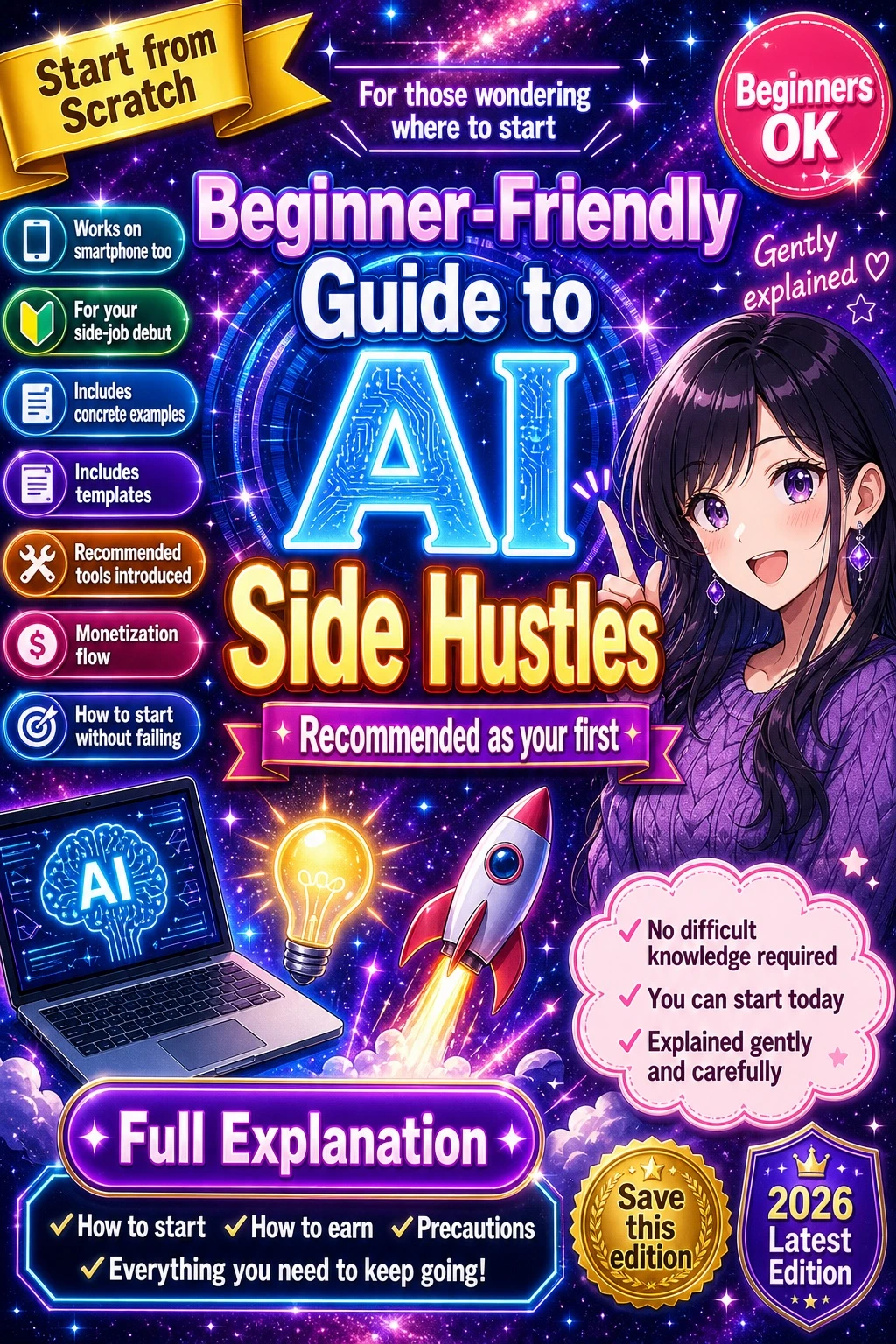
Example generated from “Fictional Anime Course-ad Layout — ClawLabs AI · MIT”
GPT Image 2en

Design a vibrant promotional banner thumbnail in an anime illustration style, featuring a cosmic galaxy background with neon glow effects and high-density typography with glowing text effects. Background: a purple, pink, and blue starry space nebula. Character (positioned on the right side of the composition): a smiling young woman pointing upward with her right index finger. She has long [HAIR_COLOR] hair, purple drop earrings, and a textured purple sweater. Center typography: - Small top text: "For those wondering where to start" - Main title: [MAIN_TITLE] - Subtitle: "Recommended as your first" - Floating text near the character: "Gently explained ♡" Top-left corner: a yellow ribbon banner reading [RIBBON_TEXT]. Top-right corner: a pink circle badge reading "Beginners OK". Left column: a vertical stack of seven pill-shaped badges reading: 1. "Works on smartphone too" with a phone icon 2. "For your side-job debut" with a beginner mark icon 3. "Includes concrete examples" 4. "Includes templates" 5. "Recommended tools introduced" 6. "Monetization flow" 7. "How to start without failing" Bottom-left graphics: three icons - a laptop displaying an AI circuit brain graphic, a glowing lightbulb, and a rocket ship taking off. Bottom-center: a large purple button reading [BUTTON_TEXT], with a checklist text below it reading "✓How to start ✓How to earn ✓Precautions ✓Everything you need to keep going!". Bottom-right: a pink cloud shape containing three bullet points: - "✓No difficult knowledge required" - "✓You can start today" - "✓Explained gently and carefully" Also include a gold medal seal reading "Save this edition" and a purple badge reading [YEAR_BADGE_TEXT].

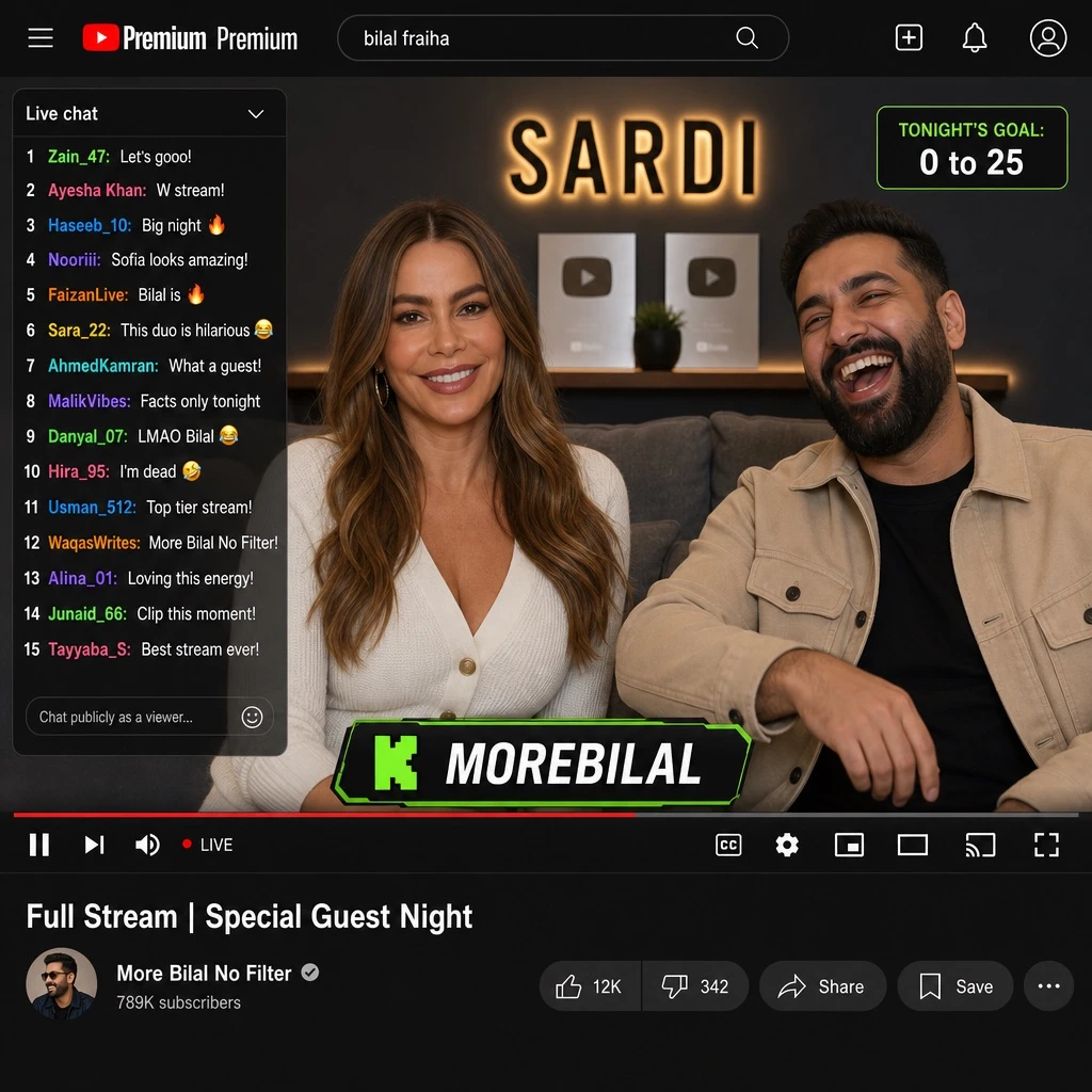
Example generated from “AI Livestream Video-call Interface Mockup — ClawLabs AI · MIT”
GPT Image 2en

Design a mockup of a livestream video-call user interface. Top navigation bar: a [BRAND] logo, a search bar containing the query '[SEARCH_QUERY]', and 3 icons. Video player area: two subjects on screen - a [FEMALE_GUEST] wearing a white cardigan, and a bearded man in a beige jacket laughing; the background shows a couch, two silver play-button icons, and a logo reading '[LOGO_TEXT]'. Overlay elements: a live chat panel on the left side with 15 messages showing colored usernames and white text; a goal tracker in the top right corner reading 'TONIGHT'S GOAL: 0 to 25'; a banner at the bottom center reading 'K [STREAMER_NAME]'. Include 10 player control icons below the video. Beneath the player, show video details: title '[VIDEO_TITLE]', channel name '[CHANNEL_NAME]', and 5 action buttons.

Example generated from “Fictional Anime-film Pitch Board — ClawLabs AI · MIT”
GPT Image 2en

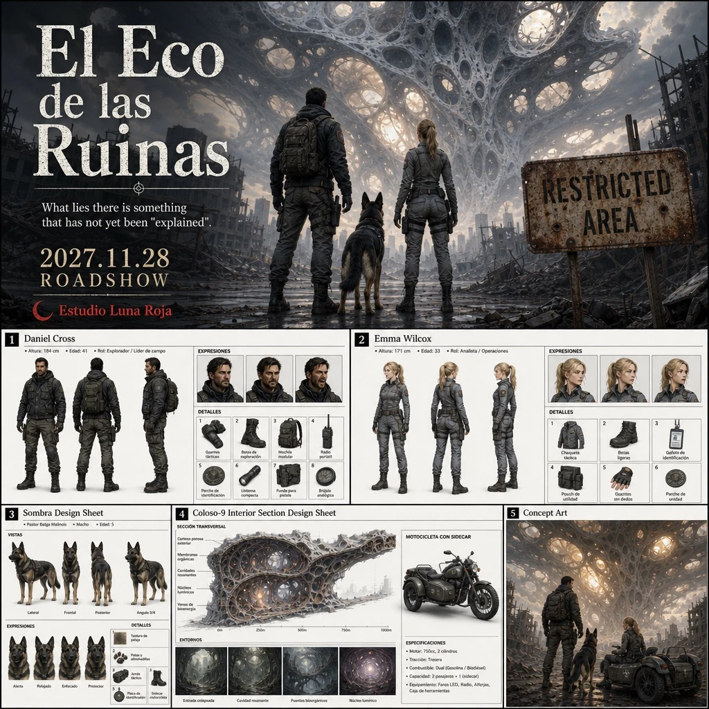
Design a two-part anime movie production pitch document, split into a top and bottom section. Top section: a large cinematic movie poster in anime film style. Show a man, a woman, and a dog standing on a ruined city street, viewed from behind, all facing toward a colossal, porous, web-like alien structure that dominates the sky above them. A rusty sign reading 'RESTRICTED AREA' is visible on the right side of the frame. Overlay the poster with typography: the movie title '[MOVIE_TITLE]', the release date '[RELEASE_DATE]', the tagline 'What lies there is something that has not yet been "explained".', and the studio credit '[STUDIO_NAME]'. Bottom section: a grid of five detailed reference sheets beneath the poster. 1. Character reference sheet titled '[MALE_CHARACTER_NAME]': male protagonist wearing a dark tactical jacket and cargo pants, shown in 3 full-body poses (front, back, side), 3 facial expressions, and 8 detail callouts covering gloves, boots, backpack, and radio. 2. Character reference sheet titled '[FEMALE_CHARACTER_NAME]': female protagonist wearing a grey tactical uniform, shown in 3 full-body poses (front, back, side), 3 facial expressions, and 6 detail callouts covering jacket, boots, ID badge, and pouch. 3. Animal character reference sheet titled '[DOG_NAME] Design Sheet': a dog companion shown in 4 full-body poses (side, front, back, angled), 4 expressions, and 5 detail callouts covering fur texture, paws, and a motorcycle sidecar. 4. Environment and vehicle reference sheet titled '[STRUCTURE_NAME] Interior Section Design Sheet': one large cross-section diagram of the porous alien structure, 4 smaller environment thumbnails, and 1 motorcycle design featuring the characters. 5. Concept art panel titled 'Concept Art': a scene illustration showing the male character, the female character, and the dog with a motorcycle sidecar parked in front of the glowing, porous alien structure. Overall style: cinematic anime film production document, high-quality poster illustration on top, clean technical reference sheet layout on the bottom, high level of detail, professional pitch deck presentation.

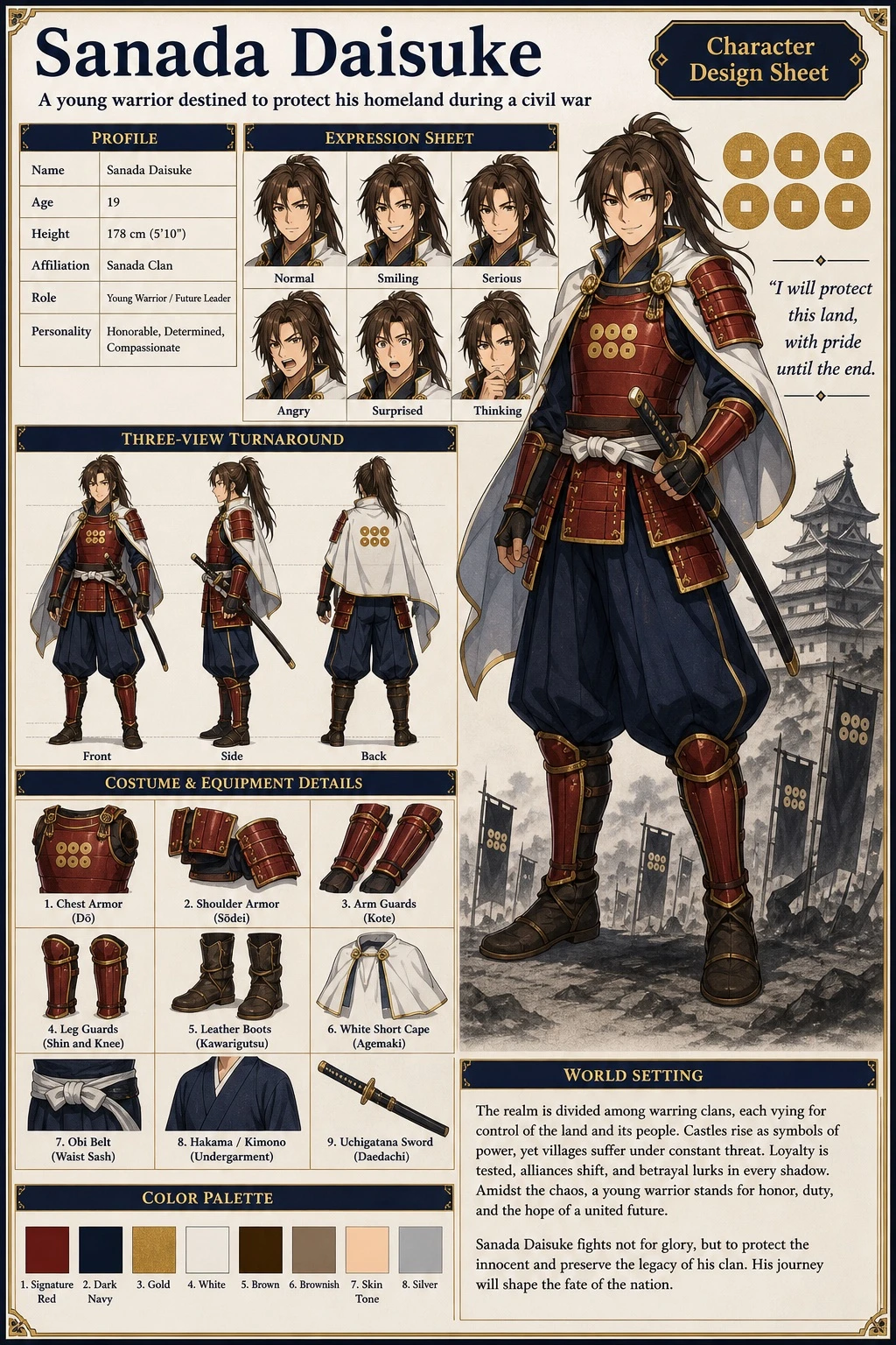
Example generated from “Anime Samurai Character-design Sheet — ClawLabs AI · MIT”
GPT Image 2en

Create an anime-style character reference sheet (settei/model sheet) for a character named [CHARACTER_NAME]. Character appearance: a young warrior with long brown hair, wearing samurai-inspired armor with a [MAIN_COLOR] chest plate and guards, a [SECONDARY_COLOR] pleated hakama, and a white short cape. Layout: at the top, a header showing the title '[CHARACTER_NAME]', a subtitle reading '[CHARACTER_CONCEPT]', and a small badge labeled 'Character Design Sheet'. On the right side, place a large full-body standing pose with a confident smile as the main portrait; behind the character add background elements including an [EMBLEM_DESIGN] emblem, a quote reading '[CATCHPHRASE]', and a monochrome Japanese castle with army banners positioned at the bottom right. Include the following labeled sections: 'Profile' in the top-left, containing a table with 6 rows of descriptive text; 'Three-View Turnaround' in the mid-left, showing 3 poses labeled Front, Side, and Back; 'Expression Sheet' in the top-center, showing 6 expressions labeled Normal, Smiling, Serious, Angry, Surprised, and Thinking; 'Costume & Equipment Details' in the bottom-left, showing 9 labeled close-ups: chest armor, shoulder armor, arm guards (kote), leg guards (shin and knee), leather boots, white short cape, obi belt, hakama/kimono section, and uchigatana sword; 'Color Palette' in the bottom-center, showing 8 labeled swatches: signature red, dark navy, gold, white, brown, brownish, skin tone, and silver; and 'World Setting' in the bottom-center-right, containing a paragraph of text describing the setting.

Example generated from “Anime Key-animation Layout Study — ClawLabs AI · MIT”
GPT Image 2en

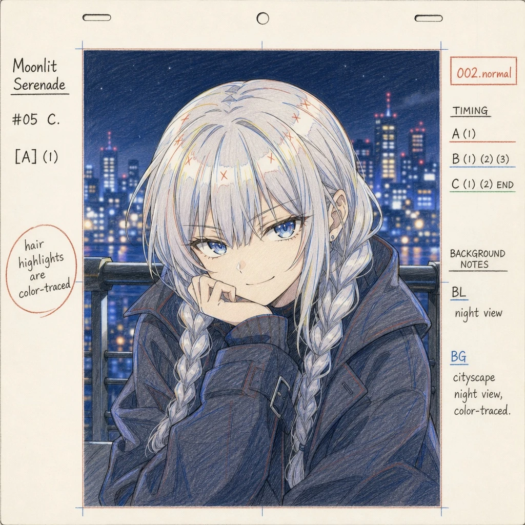
Create an anime production layout sheet in the traditional colored pencil genga (key animation drawing) style. The subject is [CHARACTER_NAME], an anime girl with [HAIR_COLOR] hair styled in twin braids with bangs, blue eyes, and wearing a dark oversized coat, posed with a [EXPRESSION] expression. The background depicts [BACKGROUND_SCENE], rendered in soft focus. The layout includes: standard animation paper peg holes along the top edge; on the left margin, the series title '[ANIME_TITLE]', production codes '#05 C.' and '[A] (1)', and a circled handwritten note reading 'hair highlights are color-traced' in [LANGUAGE]; on the right margin, a red box labeled '002.normal', timing layers labeled 'A (1)', 'B (1) (2) (3)', and 'C (1) (2) END', and background notes reading 'BL night view' and 'BG cityscape night view, color-traced' in [LANGUAGE].

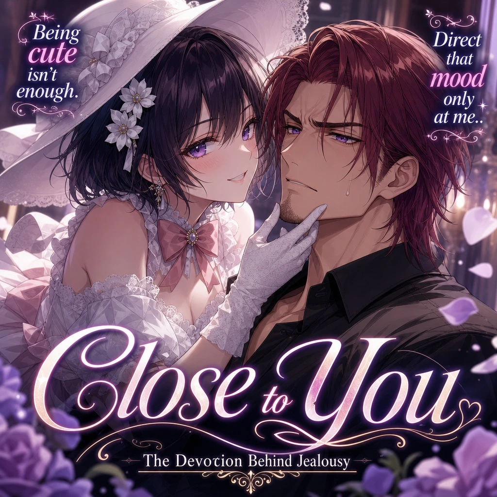
Example generated from “Fictional Romantic Novel-cover Illustration — ClawLabs AI · MIT”
GPT Image 2en

An anime-style light novel cover illustration featuring two characters in an intimate pose. On the left, a young woman with short dark hair, purple eyes, wearing a white hat, a frilly white dress with a pink bow tie, white gloves, and two white flower hairpins. She has an affectionate, teasing smile and is gently touching the chin of the man next to her. On the right, an adult man with [HAIR_COLOR] hair parted in the middle, purple eyes, and a light goatee. He is wearing a black button-down shirt and has a slightly annoyed, reluctant expression with a sweat drop on his cheek. The scene features soft, romantic lighting with out-of-focus purple flower petals in the foreground corners. The image includes several text elements in [LANGUAGE]: a large stylized main title at the bottom reading [MAIN_TITLE], a subtitle below it reading [SUBTITLE], stylized text in the top left reading [LEFT_QUOTE], and stylized text in the top right reading [RIGHT_QUOTE].

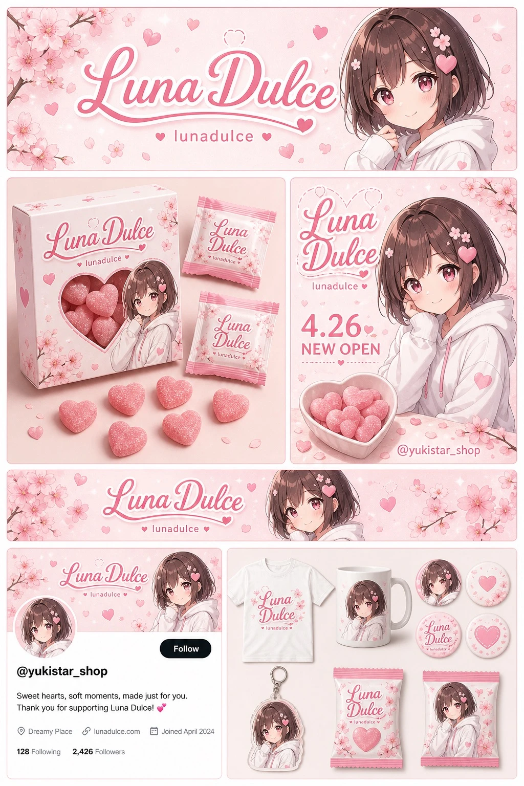
Example generated from “Fictional Anime Character Brand Collection — ClawLabs AI · MIT”
GPT Image 2en

Design a complete brand identity and merchandise design board. Theme: color palette of [THEME_COLOR] and white, with a recurring motif of [MOTIF] and pink hearts. Character: an anime girl with short brown bob hair, pink eyes, wearing a white hoodie, with a gentle smile. Branding: main logo text '[CHARACTER_NAME]' and sub logo text '[CHARACTER_SUBTEXT]'. Layout sections: (1) Header banner at the top featuring a large main logo, sub logo, cherry blossom graphics, and a character portrait on the right. (2) Product packaging in the middle-left area showing one square box with a heart-shaped transparent window revealing pink heart candies, a character illustration printed on the box, two individual candy wrappers, and five scattered heart candies. (3) Promotional poster in the middle-right area with a character portrait, a heart-shaped candy bowl, the main logo, the text '[PROMO_TEXT]', and the text '[SOCIAL_HANDLE]'. (4) A horizontal web banner in the lower-middle area featuring the main logo, cherry blossoms, and a character portrait on the right. (5) A social media profile mockup at the bottom-left with a header image containing the logo, one circular profile picture, the handle '[SOCIAL_HANDLE]', one follow button, and mock bio text. (6) A merchandise collection at the bottom-right showing nine items: one white t-shirt with the logo, one white mug with the character, four round pin badges, one acrylic keychain, and two candy packets.

Example generated from “Tea-brand Mascot Design Book — ClawLabs AI · MIT”
GPT Image 2en

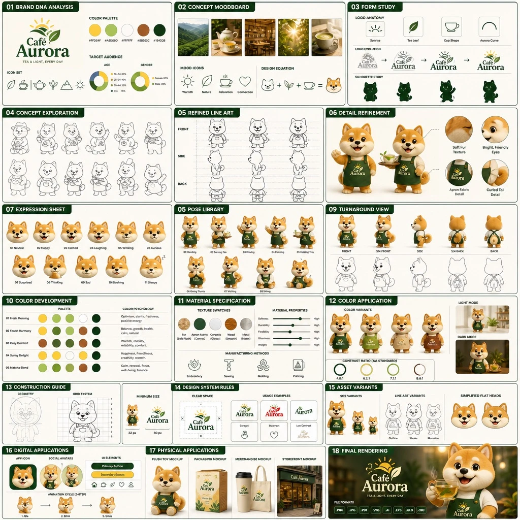
Create an 18-panel brand identity and character design document, arranged in a grid of 3 columns by 6 rows. The brand is called [BRAND_NAME], operating in the [INDUSTRY] industry, with a color palette of [PRIMARY_COLOR], [SECONDARY_COLOR], white, brown, and dark green. The main subject is [CHARACTER_DESCRIPTION]. The 18 sections should be labeled and structured as follows: 01 BRAND DNA ANALYSIS — logo, 5 color swatches, 6 icons, target audience charts; 02 CONCEPT MOODBOARD — 5 photo references, 4 mood icons, a design equation; 03 FORM STUDY — 4 logo anatomy icons, 4 evolution steps, 4 silhouettes; 04 CONCEPT EXPLORATION — 12 line-art character sketches; 05 REFINED LINE ART — 3 rows of front and side line art with proportion guides; 06 DETAIL REFINEMENT — 2 full-body renders with labels, 4 circular close-ups; 07 EXPRESSION SHEET — 11 3D rendered head expressions; 08 POSE LIBRARY — 9 full-body 3D rendered poses; 09 TURNAROUND VIEW — 5 full-body 3D renders with 5 matching line-art views; 10 COLOR DEVELOPMENT — 5 rows of 5-color palettes with color psychology text; 11 MATERIAL SPECIFICATION — 5 texture swatches, property sliders, 4 manufacturing icons; 12 COLOR APPLICATION — 4 color variant renders, 2 light/dark renders, 4 contrast rating circles; 13 CONSTRUCTION GUIDE — 2 line-art diagrams for geometry and grid; 14 DESIGN SYSTEM RULES — minimum size icons, clear space diagram, 4 usage examples; 15 ASSET VARIANTS — 3 size variants, 3 line-art variants, 3 simplified flat heads; 16 DIGITAL APPLICATIONS — 1 app icon, 2 social avatars, UI elements, a 3-step animation cycle; 17 PHYSICAL APPLICATIONS — plush toy mockup, packaging mockup, merchandise mockup, storefront mockup; 18 FINAL RENDERING — a large high-resolution 3D render of the mascot holding tea, the logo, and a file format list. Each section title should appear in [LANGUAGE], formatted as a professional branding presentation document.

Example generated from “Fictional Idol Merchandise Flyer — ClawLabs AI · MIT”
GPT Image 2en

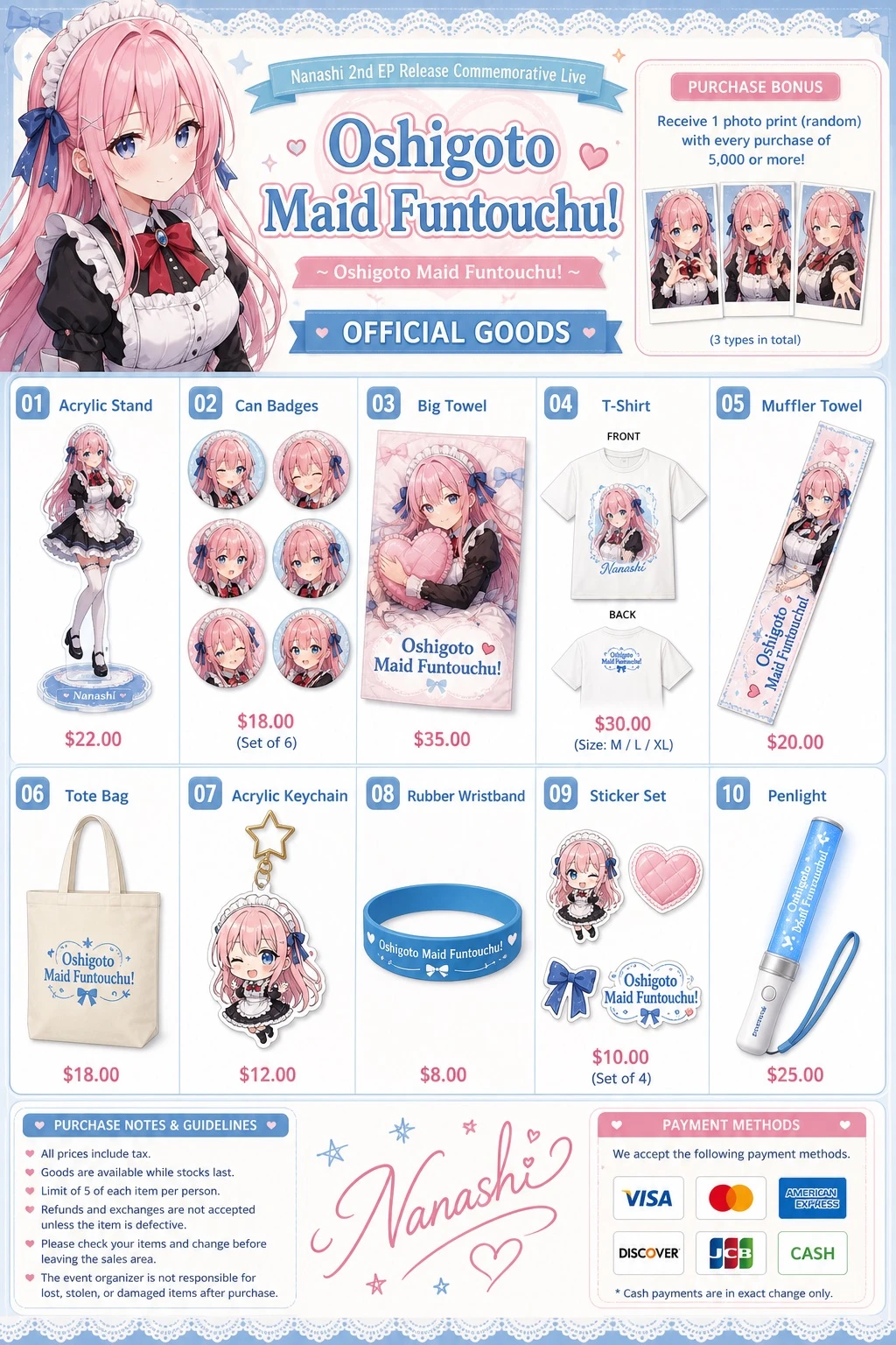
Design an anime idol merchandise catalog flyer, realistic photography style with clean commercial UI layout, using a [THEME_COLORS] color scheme throughout. Feature an anime girl character named [CHARACTER_NAME] with long [HAIR_COLOR] hair, blue eyes, wearing [OUTFIT] accented with blue hair ribbons. Header layout: on the left, an upper body portrait of the character looking slightly to the side; in the center, a top banner reading '[CHARACTER_NAME] 2nd EP Release Commemorative Live', a main title reading '[EVENT_TITLE]', a subtitle reading '~ [EVENT_SUBTITLE] ~', and a section header labeled 'OFFICIAL GOODS'; on the right, a purchase bonus info box containing three small rectangular photo prints. Merchandise grid with ten numbered items, each clearly labeled and illustrated: 01 Acrylic Stand — full body acrylic stand of the character; 02 Can Badges — set of 6 circular can badges featuring different facial expressions; 03 Big Towel — large rectangular towel showing the character holding a heart pillow; 04 T-Shirt — white t-shirt showing the FRONT with character graphic and BACK with small logo; 05 Muffler Towel — long narrow muffler towel with character art and logo; 06 Tote Bag — canvas tote bag with blue logo; 07 Acrylic Keychain — chibi character acrylic keychain with a star-shaped clasp; 08 Rubber Wristband — blue silicone wristband with logo; 09 Sticker Set — set of 4 visible stickers depicting chibi character, heart, ribbon bow, and logo; 10 Penlight — blue glowing concert penlight. Footer layout: on the left, a purchase notes and guidelines box; in the center, the character's signature '[CHARACTER_NAME]' with hand-drawn hearts and stars; on the right, a payment methods box.

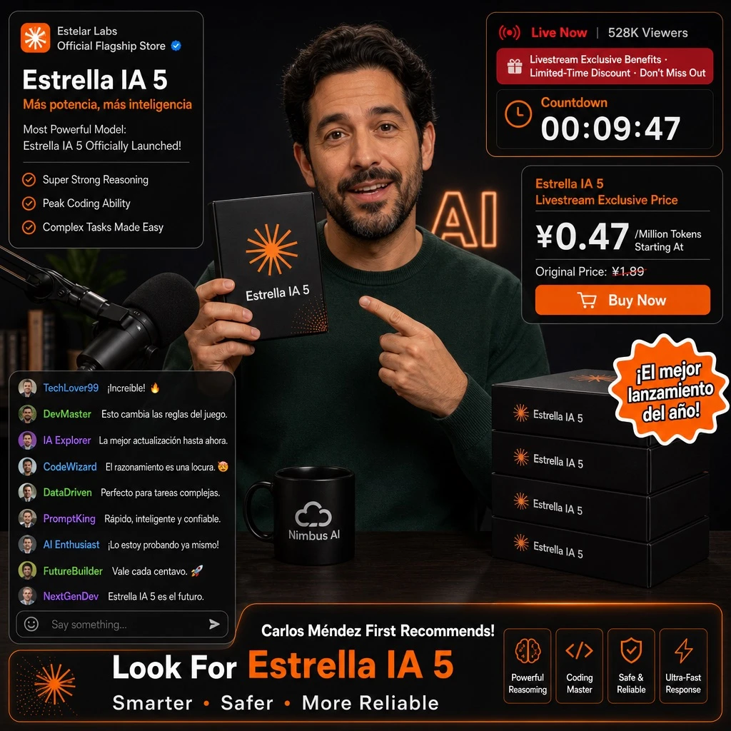
Example generated from “Fictional AI Product-launch Livestream UI — ClawLabs AI · MIT”
GPT Image 2en

Design an e-commerce livestream screenshot mockup. Scene: the main subject is [PERSON], wearing a dark green crewneck sweater, holding a black product box in one hand while pointing at it with the other. The setting is a dark studio with a microphone visible on the left side and faint 'AI' lettering glowing in the background. Props include a black mug printed with a white [BRAND_A] logo, and a stack of four black product boxes positioned on the right side of the frame. Product design: the box is black with an orange asterisk or sunburst logo, and the product name '[PRODUCT_NAME]' printed on the front. UI overlays: - Top-left product info panel: brand tag '[BRAND_B] Official Flagship Store', title '[PRODUCT_NAME]', subtitle '[MAIN_HEADLINE]', sub-subtitle 'Most Powerful Model: [PRODUCT_NAME] Officially Launched!', and three bullet points reading 'Super Strong Reasoning', 'Peak Coding Ability', 'Complex Tasks Made Easy'. - Top-right live status panel: viewer info 'Live Now | 528K Viewers', a promotional banner reading 'Livestream Exclusive Benefits · Limited-Time Discount · Don't Miss Out', and a countdown timer showing 'Countdown 00:09:47'. - Middle-right price card: header '[PRODUCT_NAME] Livestream Exclusive Price', price displayed as '¥[PROMO_PRICE]/Million Tokens Starting At', original price 'Original Price: ¥1.89', and a button labeled 'Buy Now'. - Bottom-left chat panel: nine chat messages visible, with an input box placeholder reading 'Say something...'. - Bottom-right banner: headline '[PERSON] First Recommends! Look For [PRODUCT_NAME]', subheadline 'Smarter · Safer · More Reliable', and four feature tags: 'Powerful Reasoning', 'Coding Master', 'Safe & Reliable', 'Ultra-Fast Response'. - A floating sticker element positioned over the product boxes on the middle-right, displaying the text '[STICKER_TEXT]'.

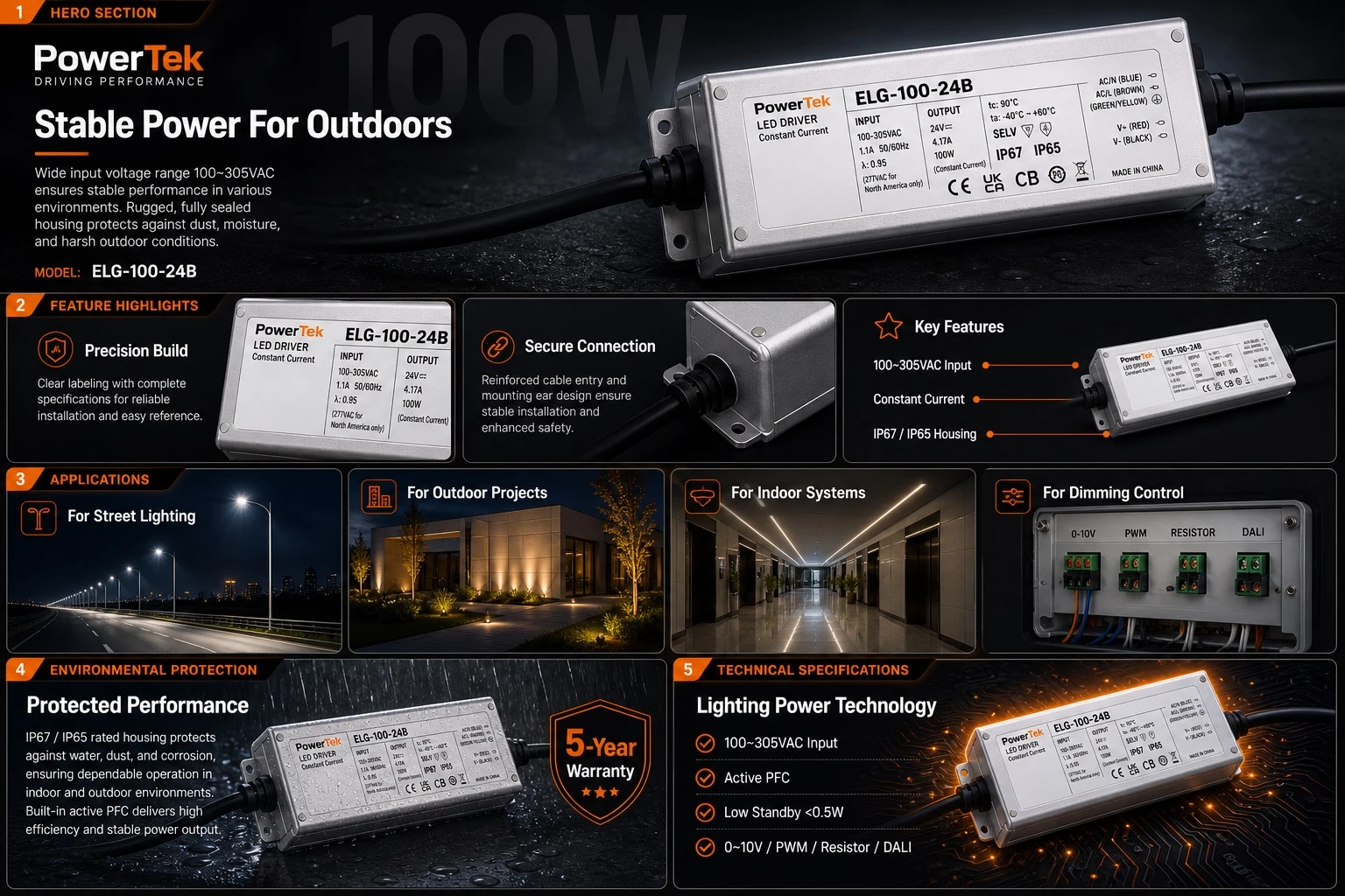
Example generated from “LED-driver Product Infographic Concept — ClawLabs AI · MIT”
GPT Image 2en

Design a dark-mode e-commerce product infographic with [ACCENT_COLOR] accent highlights, showcasing a 100W Constant Current LED Driver with a rectangular silver metal housing, black cables on both ends, and a detailed specification label, for the brand [BRAND] model [PRODUCT_MODEL]. Structure the layout in five sections: (1) Hero Section — brand logo top left, headline '[HEADLINE]', subtext describing wide input voltage and protected housing, a large angled product shot, and a faded '100W' watermark in the background; (2) Feature Highlights, three panels — 'Precision Build' with a close-up of the specification label, 'Secure Connection' with a close-up of the cable entry and mounting ear, and 'Key Features' with an angled product shot and three callout lines pointing to the text '100~305VAC Input', 'Constant Current', and 'IP67 / IP65 Housing'; (3) Applications, four panels — 'For Street Lighting' showing a nighttime highway illuminated by streetlights, 'For Outdoor Projects' showing a modern building exterior with architectural landscape lighting, 'For Indoor Systems' showing a modern commercial hallway with linear ceiling lights, and 'For Dimming Control' showing an electrical control box labeled '0-10V', 'PWM', 'RESISTOR', 'DALI'; (4) Environmental Protection — the product resting on a wet surface with water droplets and a rain effect, headline 'Protected Performance', description text about indoor/outdoor use and active PFC, and a badge reading '[WARRANTY_YEARS]-Year Warranty'; (5) Technical Specifications — headline 'Lighting Power Technology', four checkmark bullet points reading '100~305VAC Input', 'Active PFC', 'Low Standby <0.5W', and '0~10V / PWM / Resistor / DALI', with the product shot glowing on a high-tech circuit board background.

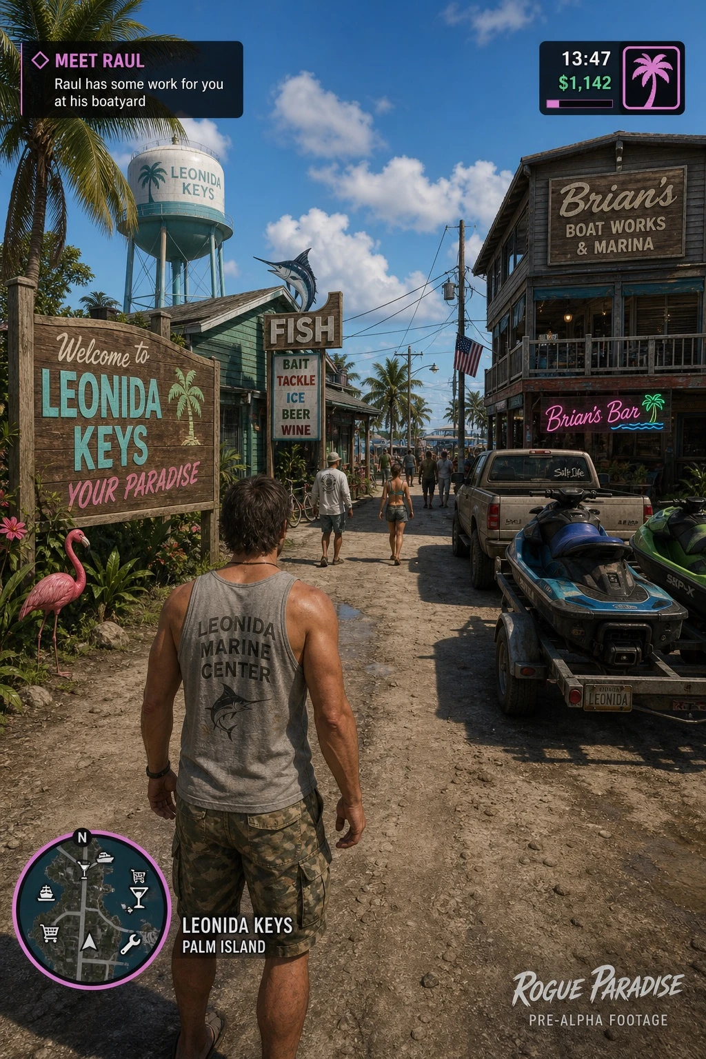
Example generated from “Fictional Tropical Open-world Game HUD — ClawLabs AI · MIT”
GPT Image 2en

Create a video game screenshot mockup in third-person over-the-shoulder perspective. The main character is a male protagonist seen from behind, wearing a grey tank top with the graphic text '[SHIRT_GRAPHIC]' printed on it, paired with camouflage cargo shorts. The setting is a tropical coastal town on a dirt road, under a sunny daytime sky with scattered clouds. On the left side of the scene, place a wooden welcome sign reading 'Welcome to [LOCATION_NAME] YOUR PARADISE', a pink plastic flamingo, tropical foliage, and a distant water tower. In the center, show a green building with a 'FISH' sign featuring a marlin graphic, another sign reading 'BAIT TACKLE ICE BEER WINE', and pedestrians walking along the street. On the right side, include a two-story wooden building labeled '[OWNER_NAME]'s Boat Works & Marina' with a neon sign reading '[OWNER_NAME]'s Bar', a parked pickup truck, and jet skis loaded on a trailer. Overlay five UI elements typical of an open-world game HUD: (1) top-left, a mission objective box with the text '[MISSION_TITLE]' followed by '[MISSION_DESCRIPTION]'; (2) top-right, a status HUD showing '13:47' and '$1,142' next to a pink palm tree icon; (3) bottom-left, a circular minimap with a purple border and white map icons including an 'N' marking north; (4) to the right of the minimap, location text reading '[LOCATION_NAME]' above 'PALM ISLAND'; (5) bottom-right, a watermark reading '[GAME_TITLE]' above 'PRE-ALPHA FOOTAGE'.

Example generated from “Wind-inspired Character-design Sheet — ClawLabs AI · MIT”
GPT Image 2en

Design a character reference sheet that personifies [CONCEPT] as if it were a living character, showing front, side, and back turnaround views along with a few expressive poses that reflect its personality traits. Include a small color palette swatch and keep the overall presentation clean and professional, in the style of a standard character-design settei sheet.

Example generated from “Fictional Startup Presentation Cover — 3:2 Source Preview — ClawLabs AI · MIT”
GPT Image 2en

Create a premium 4:3 presentation cover slide introducing [BRAND], the AI-native presentation platform from [BRAND_URL]. Style: Elegant, minimal, modern, premium startup aesthetic. Similar to high-end brand guideline covers (in the style of leading tech companies). Soft gradient background with subtle depth, clean whitespace, refined typography, polished editorial layout. Main title: [BRAND] Subtitle: AI PRESENTATION PLATFORM Body copy (small elegant text): Turn raw ideas into polished, high-impact presentations. Start from notes, docs, links, or existing decks. Generate beautiful, on-brand slides with AI. Edit freely on a flexible canvas. Export to PPT, PDF, or publish as a website. Feature highlights (small premium labels): STORY-FIRST ON-BRAND DESIGN AI EDITING FREEFORM CANVAS PPT EXPORT TEAM COLLABORATION Bottom-right elegant logo text: [BRAND] Visual feeling: Business-class premium, strategy deck quality, consulting-grade presentation, slightly futuristic but highly professional. Composition: Clean editorial balance, asymmetrical layout, strong whitespace, presentation software hero shot feeling. Aspect ratio: 4:3 Language: English only

Example generated from “Fictional Surreal Comedy Poster Set — ClawLabs AI · MIT”
GPT Image 2en

A movie poster featuring a seemingly realistic yet subtly bizarre older man dressed in women's clothing, presented in 4 variations, achieving the level of professional graphic design production. The concept and setting itself should evoke the feeling of 'are they seriously making a movie out of this?' — a surreal, deadpan comedy that takes itself completely seriously yet is impossible not to laugh at. The title and broadcast information text should be displayed in [LANGUAGE].