PROMPTS · KREATIV ENTDECKEN

Prompt-Galerie

Echte Prompts und erzeugte Beispiele erkunden. Inspiration für Ihre nächste kreative Mission finden und den vollständigen Prompt kostenlos kopieren.

Beispiele
10,950
Modelle
15
Quellen
1269
10.950 Prompt-Beispiele · Seite 16 von 229
Example generated from “Workout Progress Share Card System — Community Challenge Card”
GPT Image 2en

Scene: Build a square community challenge card derived from the reference image for Progress Cards. Preserve the exact world established by the reference image, including the same palette family, lighting direction, environmental logic, and surface finish. The new frame should feel like a deliberate extension of one campaign system, not a separate concept. Shift the hierarchy to suit this use case, but keep the overall composition commercial, polished, and ready for real rollout. Subject: Use the same original subject identity and anchor cues introduced by the reference image, now organized as same user plus abstract participant signals. Keep faces, hair logic, body proportions, apparel or product construction, and major supporting forms consistent with the reference. Allow only the layout emphasis, pose, crop, and contextual energy to change so the result clearly belongs to the same package. Important details: Continuity is the main challenge. Preserve the exact reference language for color, materials, framing rhythm, and overall brandless campaign grammar while steering the tone toward social motivation. Keep any stat blocks, schedule modules, arrows, badges, or callout panels non-readable. The derivative should prove that the same art direction can handle a different communication task without losing identity or utility. Make it credible for production use, with clean edges, intentional spacing, and no random decorative elements. Use case: Progress Cards series study 4/9, a derivative surface linked to 01-reference-achievement-card. Constraints: No readable text, no watermark, no logos, preserve exact 1:1 aspect ratio, no new subject identity, no brand marks, no palette drift, no unrelated props, no collage chaos, no copied public-figure styling.


Example generated from “Workout Progress Share Card System — Weekly Ring Summary”
GPT Image 2en

Scene: Create a square weekly ring summary card for Progress Cards, using fitness-app and community progress sharing with visualized momentum, clear mobile hierarchy, and emotionally positive polish. The composition should read as a practical, production-ready sports or fitness surface with a clear hierarchy, premium lighting, and obvious commercial intent. Keep the environment specific enough to feel real, but leave enough control in the layout for non-readable information modules, campaign blocks, or visualized metrics. Aim for a finish that works for a brand, club, app, academy, or event operator. Subject: Build the image around user with weekly visualization layers. The subject should be original, believable, and free of any real-brand or celebrity cues. Use realistic apparel, safe body mechanics when movement is visible, and environmental props that support the category without clutter. The subject must stay visually dominant so the design still works as a communication asset rather than a pure scene study. Important details: The mood should read as reflective reward. Treat layout, light, and supporting graphic structure as part of one polished delivery surface. Any schedule blocks, metric panels, quote zones, badges, or path diagrams must stay abstract and non-readable. Prioritize usefulness, clarity, and category truth over spectacle. The image should feel distinct from the series package while still belonging naturally to the same topic and business use case. Use case: Progress Cards single study 5/9, an independent rollout surface for the topic. Constraints: No readable text, no watermark, no logos, preserve exact 1:1 aspect ratio, no brand marks, no public-figure resemblance, no generic stock layout, no cluttered UI imitation, no accidental copyrighted insignia.

Example generated from “Workout Progress Share Card System — Heart-rate Recovery Share”
GPT Image 2en

Scene: Create a square recovery insight share card for Progress Cards, using fitness-app and community progress sharing with visualized momentum, clear mobile hierarchy, and emotionally positive polish. The composition should read as a practical, production-ready sports or fitness surface with a clear hierarchy, premium lighting, and obvious commercial intent. Keep the environment specific enough to feel real, but leave enough control in the layout for non-readable information modules, campaign blocks, or visualized metrics. Aim for a finish that works for a brand, club, app, academy, or event operator. Subject: Build the image around user after cooldown. The subject should be original, believable, and free of any real-brand or celebrity cues. Use realistic apparel, safe body mechanics when movement is visible, and environmental props that support the category without clutter. The subject must stay visually dominant so the design still works as a communication asset rather than a pure scene study. Important details: The mood should read as cool composed clarity. Treat layout, light, and supporting graphic structure as part of one polished delivery surface. Any schedule blocks, metric panels, quote zones, badges, or path diagrams must stay abstract and non-readable. Prioritize usefulness, clarity, and category truth over spectacle. The image should feel distinct from the series package while still belonging naturally to the same topic and business use case. Use case: Progress Cards single study 6/9, an independent rollout surface for the topic. Constraints: No readable text, no watermark, no logos, preserve exact 1:1 aspect ratio, no brand marks, no public-figure resemblance, no generic stock layout, no cluttered UI imitation, no accidental copyrighted insignia.

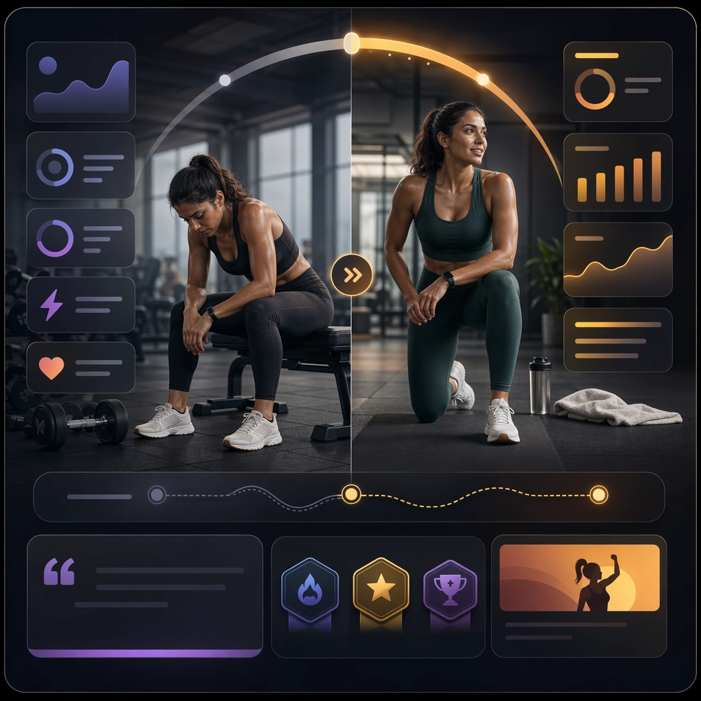
Example generated from “Workout Progress Share Card System — Before and After Training Grid”
GPT Image 2en

Scene: Create a square training-state comparison card for Progress Cards, using fitness-app and community progress sharing with visualized momentum, clear mobile hierarchy, and emotionally positive polish. The composition should read as a practical, production-ready sports or fitness surface with a clear hierarchy, premium lighting, and obvious commercial intent. Keep the environment specific enough to feel real, but leave enough control in the layout for non-readable information modules, campaign blocks, or visualized metrics. Aim for a finish that works for a brand, club, app, academy, or event operator. Subject: Build the image around same user in two session states. The subject should be original, believable, and free of any real-brand or celebrity cues. Use realistic apparel, safe body mechanics when movement is visible, and environmental props that support the category without clutter. The subject must stay visually dominant so the design still works as a communication asset rather than a pure scene study. Important details: The mood should read as respectful contrast. Treat layout, light, and supporting graphic structure as part of one polished delivery surface. Any schedule blocks, metric panels, quote zones, badges, or path diagrams must stay abstract and non-readable. Prioritize usefulness, clarity, and category truth over spectacle. The image should feel distinct from the series package while still belonging naturally to the same topic and business use case. Use case: Progress Cards single study 7/9, an independent rollout surface for the topic. Constraints: No readable text, no watermark, no logos, preserve exact 1:1 aspect ratio, no brand marks, no public-figure resemblance, no generic stock layout, no cluttered UI imitation, no accidental copyrighted insignia.

Example generated from “Workout Progress Share Card System — Marathon Build Phase Card”
GPT Image 2en

Scene: Create a square endurance build-phase card for Progress Cards, using fitness-app and community progress sharing with visualized momentum, clear mobile hierarchy, and emotionally positive polish. The composition should read as a practical, production-ready sports or fitness surface with a clear hierarchy, premium lighting, and obvious commercial intent. Keep the environment specific enough to feel real, but leave enough control in the layout for non-readable information modules, campaign blocks, or visualized metrics. Aim for a finish that works for a brand, club, app, academy, or event operator. Subject: Build the image around runner with phase modules. The subject should be original, believable, and free of any real-brand or celebrity cues. Use realistic apparel, safe body mechanics when movement is visible, and environmental props that support the category without clutter. The subject must stay visually dominant so the design still works as a communication asset rather than a pure scene study. Important details: The mood should read as long-horizon ambition. Treat layout, light, and supporting graphic structure as part of one polished delivery surface. Any schedule blocks, metric panels, quote zones, badges, or path diagrams must stay abstract and non-readable. Prioritize usefulness, clarity, and category truth over spectacle. The image should feel distinct from the series package while still belonging naturally to the same topic and business use case. Use case: Progress Cards single study 8/9, an independent rollout surface for the topic. Constraints: No readable text, no watermark, no logos, preserve exact 1:1 aspect ratio, no brand marks, no public-figure resemblance, no generic stock layout, no cluttered UI imitation, no accidental copyrighted insignia.

Example generated from “Workout Progress Share Card System — Habit Consistency Badge Board”
GPT Image 2en

Scene: Create a square habit-consistency badge board for Progress Cards, using fitness-app and community progress sharing with visualized momentum, clear mobile hierarchy, and emotionally positive polish. The composition should read as a practical, production-ready sports or fitness surface with a clear hierarchy, premium lighting, and obvious commercial intent. Keep the environment specific enough to feel real, but leave enough control in the layout for non-readable information modules, campaign blocks, or visualized metrics. Aim for a finish that works for a brand, club, app, academy, or event operator. Subject: Build the image around smiling user with clustered badge modules. The subject should be original, believable, and free of any real-brand or celebrity cues. Use realistic apparel, safe body mechanics when movement is visible, and environmental props that support the category without clutter. The subject must stay visually dominant so the design still works as a communication asset rather than a pure scene study. Important details: The mood should read as steady satisfaction. Treat layout, light, and supporting graphic structure as part of one polished delivery surface. Any schedule blocks, metric panels, quote zones, badges, or path diagrams must stay abstract and non-readable. Prioritize usefulness, clarity, and category truth over spectacle. The image should feel distinct from the series package while still belonging naturally to the same topic and business use case. Use case: Progress Cards single study 9/9, an independent rollout surface for the topic. Constraints: No readable text, no watermark, no logos, preserve exact 1:1 aspect ratio, no brand marks, no public-figure resemblance, no generic stock layout, no cluttered UI imitation, no accidental copyrighted insignia.

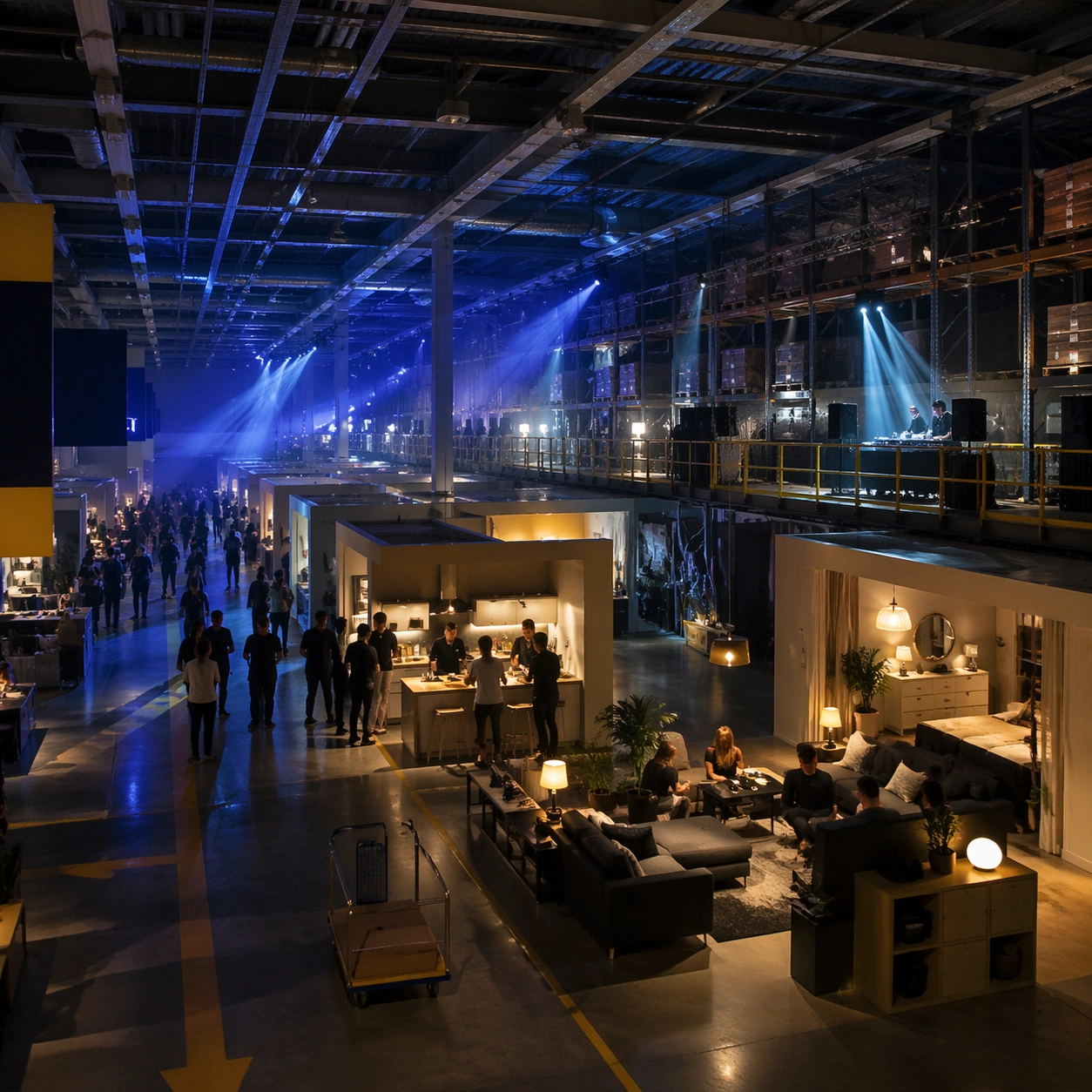
Example generated from “World Knowledge Reconstruction — Flatpack Nightclub”
GPT Image 2en

Scene: A square photorealistic architectural interior at night, viewed from a slightly elevated corner like a polished design-magazine photograph. The space is a vast Scandinavian flat-pack furniture warehouse converted into a temporary nightclub, with cool blue ceiling structure, warm yellow wayfinding bands, polished concrete floors, and theatrical beams of light cutting through haze. The camera should reveal both the original retail circulation logic and the new event atmosphere. Subject: The main subject is a recognizable big-box furniture store interior transformed after hours: staged living-room islands become lounge booths, modular kitchen displays become cocktail counters, warehouse pallet racks become balcony-like DJ platforms, and the original one-way showroom path becomes a dance route. Keep the architecture disciplined: high grid ceiling, exposed ducts, sample room vignettes, flat-pack shelf bays, carts, lighting rails, and simple Nordic furniture silhouettes. Important details: World-knowledge reconstruction is the test. The scene must feel like a real flat-pack furniture megastore, not a generic club. Preserve the scale, aisle widths, maze-like showroom sequence, product staging, cafeteria-like practicality, and blue-yellow commercial color logic while avoiding any actual brand marks. Crowd silhouettes may be present but secondary; furniture, signage shapes, warehouse structure, and retail navigation must remain readable. Use case: World Knowledge Reconstruction single study 1/8, testing retail architecture, commercial mockup logic, and photoreal after-hours transformation. Constraints: No readable text, no watermark, no logos, preserve exact 1:1 aspect ratio, no actual brand name, no luxury nightclub cliche replacing the store architecture, no chaotic crowd hiding the retail layout, no fantasy props.

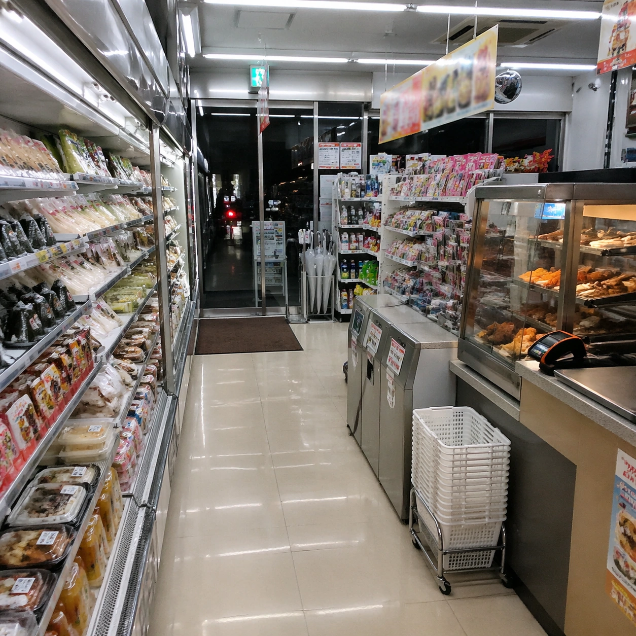
Example generated from “World Knowledge Reconstruction — Konbini Aisle”
GPT Image 2en

Scene: A square photorealistic interior view inside a Japanese convenience store at late evening, camera at standing eye level looking diagonally down a narrow aisle. The lighting is bright, cool, and fluorescent, with glossy floor reflections, dense shelf rhythm, and a glass storefront glow visible in the background. The image should feel ordinary, specific, and operational rather than staged. Subject: The subject is a meticulously reconstructed konbini aisle: bento and onigiri refrigerators along one side, hot snack warmer near the counter, magazine rack, drink coolers, umbrella stand by the entrance, small trash and recycling station, compact checkout counter, payment terminal, tiny baskets, and seasonal promotional shelf islands. Include product rows as colored packages and price-card shapes, but keep all writing as unreadable blocks and strokes. Important details: Real-world knowledge matters more than decoration. Maintain Japanese convenience-store density, clean modular shelving, vertical cooler doors, small aisle widths, careful product category grouping, bright ceiling panels, tiled or polished floor, and the sense that every object has a practical retail purpose. Avoid generic supermarket scale, American gas-station clutter, luxury boutique styling, or fantasy signage. The scene should be culturally legible through layout and objects without relying on readable labels. Use case: World Knowledge Reconstruction single study 3/8, testing cultural retail detail, photoreal interior layout, and dense merchandise organization. Constraints: No readable text, no watermark, no logos, preserve exact 1:1 aspect ratio, no real store brand, no manga illustration style, no oversized supermarket aisles, no random Asian stereotypes, no empty shelves, no distorted product rows.

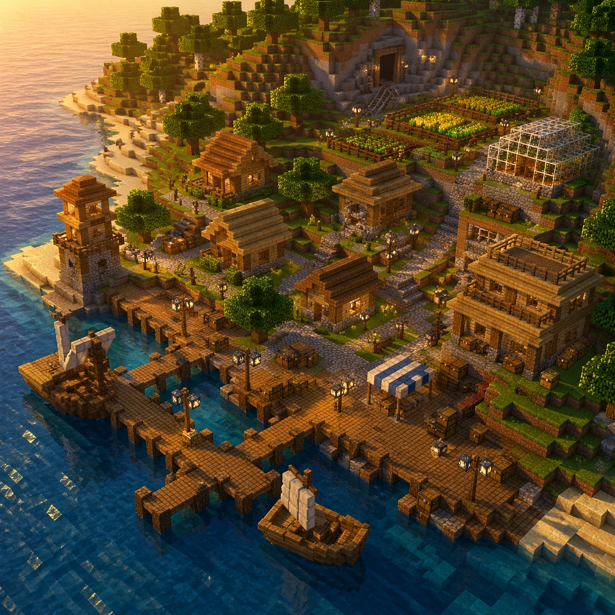
Example generated from “World Knowledge Reconstruction — Voxel Port Town”
GPT Image 2en

Scene: A square isometric game-world view at golden hour, high enough to read a whole voxel coastal settlement while still showing individual block materials. The mood is adventurous and crisp, with warm sunlight, square shadows, blue water, and a clean horizon. The image should resemble a familiar block-building sandbox world but must avoid any official branding or UI overlays. Subject: The subject is a reconstructed voxel port town built from world knowledge of block logic: stepped wooden docks, cube-plank houses, cobblestone paths, lantern posts, farm plots with grid crops, blocky cliffs, simple boats, a small watchtower, mine entrance, glass-paned greenhouse, and terraced roofs. Water should be composed of square reflective surfaces, trees should use cubic leaves and trunk blocks, and terrain should reveal layered dirt, grass, sand, and stone. Important details: The test is style-transfer plus spatial reasoning. Everything must obey block scale and axis-aligned construction: no smooth curved architecture, no photoreal materials, no triangular roofs unless made from stair-like blocks, and no arbitrary fantasy shapes. The town needs believable game-play logic: paths connect houses to docks, farms sit on flat terraces, storage chests and crafting-like work areas are implied as block objects, and the mine entrance aligns with exposed stone. Use case: World Knowledge Reconstruction single study 4/8, testing voxel world knowledge, style-transfer, and navigable settlement layout. Constraints: No readable text, no watermark, no logos, preserve exact 1:1 aspect ratio, no official game title, no UI inventory bar, no round realistic objects, no non-block architecture, no chaotic floating islands, no extra branded characters.
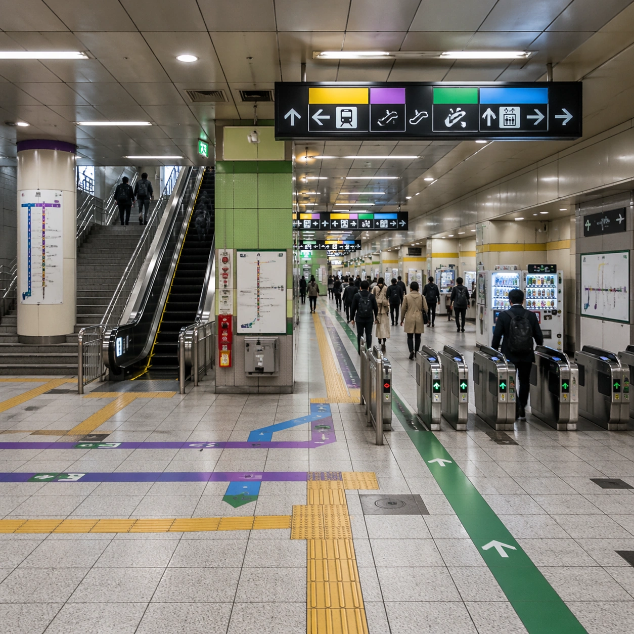
Example generated from “World Knowledge Reconstruction — Subway Transfer Hall”
GPT Image 2en

Scene: A square photorealistic urban transit interior, viewed from a wide concourse corner with strong one-point perspective. The lighting is bright but slightly metallic, with tiled floors, ceiling panels, stainless railings, and colored line bands guiding passengers through a large underground transfer hall. The composition should be dense, legible, and architecturally plausible. Subject: The subject is a major East Asian subway transfer station reconstructed from real-world transit logic without showing any real operator marks. Include platform stairs, escalators, tactile paving strips, fare-gate banks, overhead sign boxes with unreadable symbols, route color bands, wall-mounted map panels as abstract diagrams, emergency equipment boxes, vending machines, and commuters moving through separated flows. The image should capture how a transfer space works, not just how it looks. Important details: Preserve circulation hierarchy: gates lead to paid area, escalators align with directional signage, tactile paving follows walk paths, colored route bands remain consistent, and crowd movement leaves clear lanes. Surfaces should feel like public infrastructure: durable tile, metal, glass, fluorescent panels, and modular maintenance access doors. Avoid airport terminals, shopping malls, fantasy train halls, or generic tunnels. All textual information must be pseudo-text; legibility comes from layout, icons, and color coding. Use case: World Knowledge Reconstruction single study 5/8, testing transit architecture, wayfinding structure, and culturally specific public-infrastructure knowledge. Constraints: No readable text, no watermark, no logos, preserve exact 1:1 aspect ratio, no real subway brand, no impossible stairs, no disconnected escalators, no overcrowding that hides wayfinding, no luxury mall styling, no outdoor train tracks.
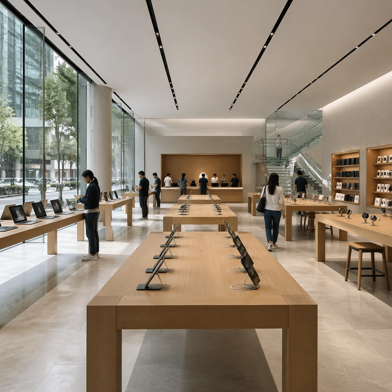
Example generated from “World Knowledge Reconstruction — Flagship Electronics Store”
GPT Image 2en

Scene: A square photorealistic commercial interior in soft morning light, viewed from just inside a glass-front flagship electronics store. The space is calm, minimalist, and precisely organized: pale stone floor, large glass facade, thin metal frames, warm wood tables, hidden lighting, and a few customers spaced naturally through the room. The visual tone should be premium but not branded. Subject: The subject is a reconstructed contemporary flagship consumer-electronics retail store without any actual logos. Show long wooden display tables arranged in a strict grid, tablets and laptops as slim dark rectangles, phone stands with charging tethers, wall display niches, accessory shelving, a support counter at the back, ceiling tracks, product demo stools, and a transparent staircase or mezzanine hinted in the background. Staff may be visible as understated figures in plain shirts, secondary to the space. Important details: This is a commercial world-knowledge test: the store should feel like a real global flagship, with disciplined product spacing, museum-like table placement, clean glass envelope, hidden service logic, and high-end material restraint. Avoid mall kiosk clutter, visible brand marks, bargain retail signage, futuristic holograms, or generic furniture showroom. Devices must be plausible in scale and layout; the interior should work as a functioning store with customer circulation and service zones. Use case: World Knowledge Reconstruction single study 6/8, testing premium retail memory, commercial mockup discipline, and photoreal spatial organization. Constraints: No readable text, no watermark, no logos, preserve exact 1:1 aspect ratio, no actual technology brand, no giant glowing product names, no cluttered sale signs, no sci-fi interface projections, no impossible glass reflections.

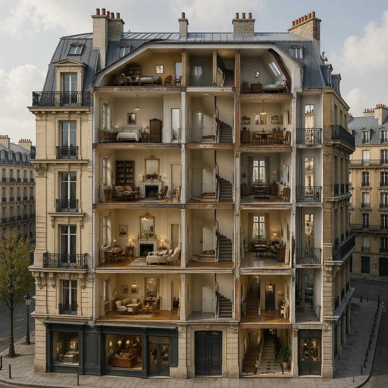
Example generated from “World Knowledge Reconstruction — Paris Apartment Cutaway”
GPT Image 2en

Scene: A square editorial architectural cutaway of a Parisian Haussmann apartment building, shown in refined semi-photoreal illustration with soft daylight and precise construction detail. The facade is opened like a section model so the viewer can see multiple floors at once, but the exterior street frontage, mansard roof, wrought-iron balconies, cream limestone, and tall windows remain recognizable. Subject: The subject is a reconstructed classic Paris apartment block: ground-floor shopfront rhythm rendered without readable signs, piano nobile with taller ceilings, stacked apartments with fireplaces and parquet floors, narrow service stair, inner courtyard glimpse, attic chambres under the mansard roof, zinc roof planes, dormer windows, chimneys, balcony railings, and street-level stone base. Each room should contain plausible furniture and daily-life traces without becoming cluttered. Important details: The challenge is architectural and cultural knowledge, not fantasy dollhouse decoration. Preserve vertical hierarchy, facade proportions, French window spacing, wrought iron, herringbone parquet, marble fireplaces, ceiling moldings, and service-core logic. The section should be spatially coherent: floors align, walls have thickness, stairs connect levels, and the roof geometry matches the facade. Avoid generic European castle elements, modern glass towers, suburban house layouts, or impossible room stacking. Use case: World Knowledge Reconstruction single study 7/8, testing historic architecture memory, structured cutaway reasoning, and culturally specific interior detail. Constraints: No readable text, no watermark, no logos, preserve exact 1:1 aspect ratio, no fantasy palace decor, no disconnected rooms, no impossible staircases, no modern luxury penthouse replacing the historic building, no oversized people.
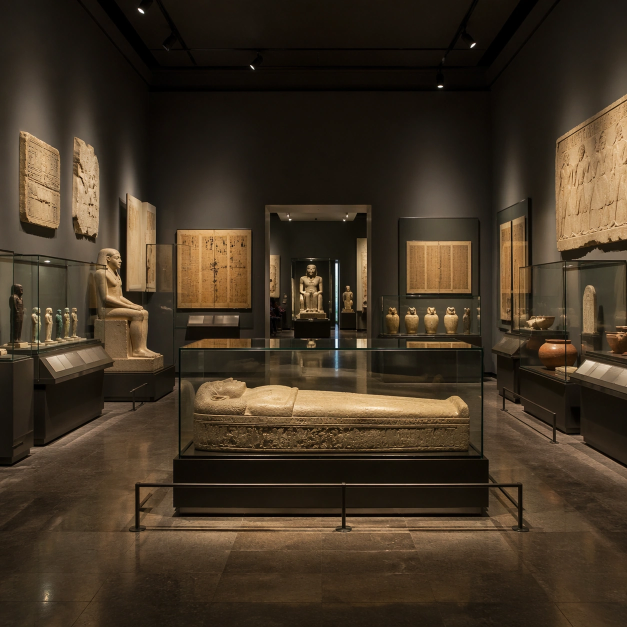
Example generated from “World Knowledge Reconstruction — Museum Egypt Gallery”
GPT Image 2en

Scene: A square photorealistic museum gallery interior, viewed from the center of a dim but carefully lit ancient Egypt exhibition hall. The atmosphere is quiet, scholarly, and realistic: dark neutral walls, warm spotlights, glass vitrines, polished floor reflections, wide visitor paths, and clear object groupings. The camera should show the entire display system, not just one artifact. Subject: The subject is a reconstructed major-museum Egypt gallery without any real museum branding. Include a central stone sarcophagus case, wall relief fragments, small ushabti-like figures in vitrines, pottery, canopic-jar-like silhouettes, a seated statue, papyrus-colored panels rendered as unreadable texture, conservation mounts, label rails as blank blocks, low barriers, and controlled lighting. Visitors are sparse and small so the artifact layout remains dominant. Important details: World knowledge must appear through curatorial logic: objects grouped by type and scale, fragile pieces behind glass, large stone items on plinths, neutral conservation lighting, accessible circulation, and restrained museum architecture. The gallery should avoid theme-park spectacle, treasure-room fantasy, glowing curses, incorrect pyramid interiors, or random gold overload. Text panels may exist as design blocks but cannot contain readable words; the image must communicate museum organization through display placement and material accuracy. Use case: World Knowledge Reconstruction single study 8/8, testing museum display systems, archaeological object knowledge, and photoreal cultural-space reconstruction. Constraints: No readable text, no watermark, no logos, preserve exact 1:1 aspect ratio, no real museum name, no fantasy magic effects, no tomb tunnel, no piles of gold, no crowded tourists blocking cases, no distorted artifact scale.

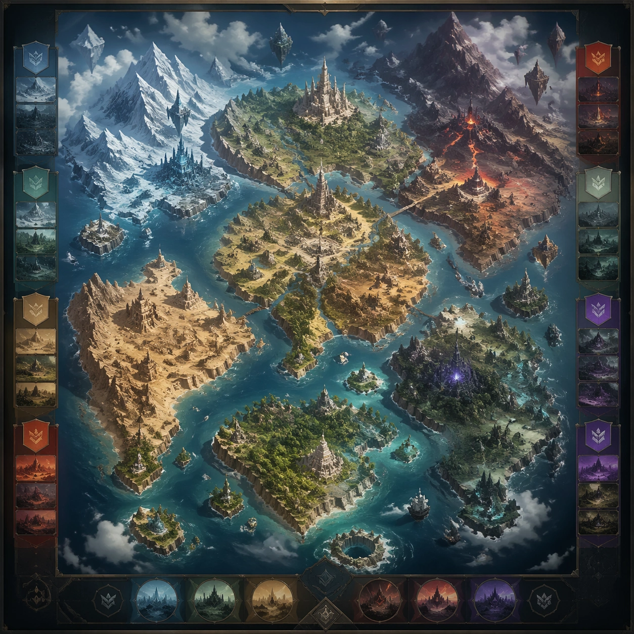
Example generated from “World Region Map Poster System — Overworld Poster”
GPT Image 2en

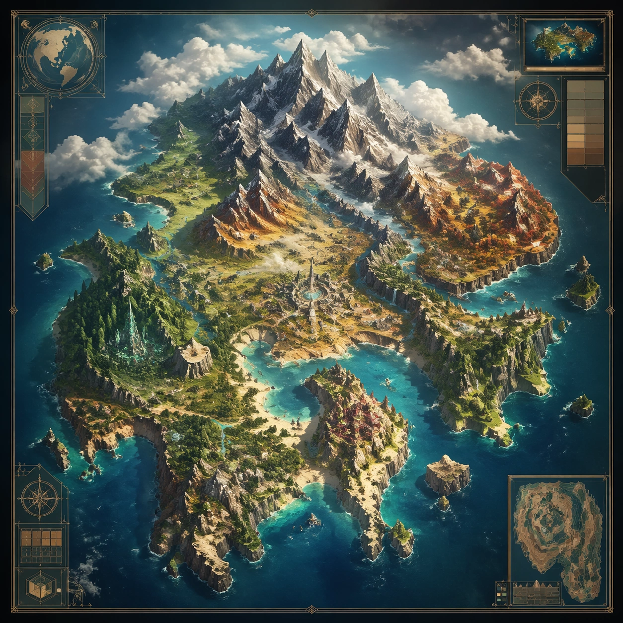
Scene: A square production-ready image designed for a game-art review wall and a commercial gallery at the same time. Frame a square poster treatment of the full overworld with continent shape, travel rhythm, and iconic landmark hierarchy with disciplined lighting, clean edge separation, and enough surrounding context to prove how the asset would behave in a real product surface. The camera, crop, and tonal balance should feel intentional rather than generic, with high readability at first glance and convincing material response under closer inspection. Subject: Center the study on a square poster treatment of the full overworld with continent shape, travel rhythm, and iconic landmark hierarchy. Translate the topic into a concrete, shippable visual statement instead of a loose mood board. Build layered object relationships, believable surface finish, and strong silhouette grouping so the image reads immediately as part of World Region Map Poster System. The subject should feel made for a live game pipeline: useful in store, UI, campaign, or art-review contexts, with visual hierarchy strong enough to survive aggressive cropping. Important details: the map should feel navigable and aspirational rather than decorative wallpaper. Keep every supporting element subordinate to the main read, and make category separation obvious through form, color zoning, depth, and material logic rather than words. Where panels, cards, badges, or interface blocks appear, they must look professionally structured but remain unreadable. The visual language should feel premium, original, and coherent across this package, with no filler clutter and no accidental resemblance to a specific shipped game IP. Use case: World Region Map Poster System single study 1/9, focused on overworld poster. Constraints: No readable text, no watermark, no logos, preserve exact 1:1 aspect ratio, no readable place names, no compass labels, no broken hierarchy, no generic stock-photo staging, no accidental UI gibberish.

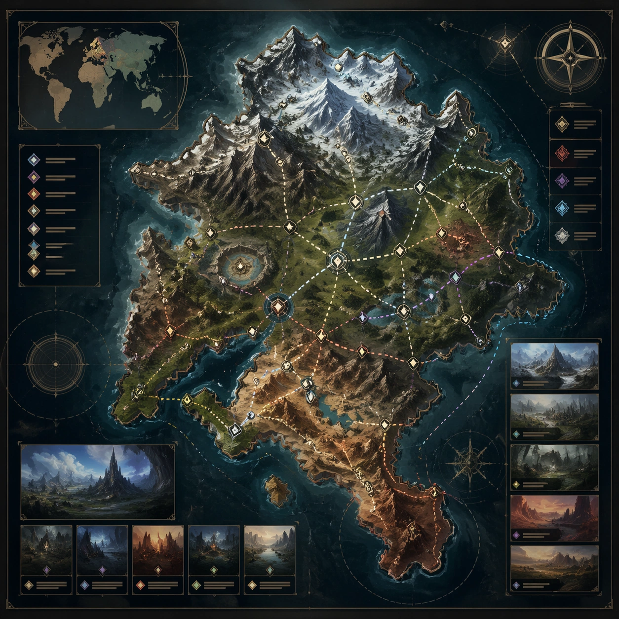
Example generated from “World Region Map Poster System — Single Region Annotated Map”
GPT Image 2en

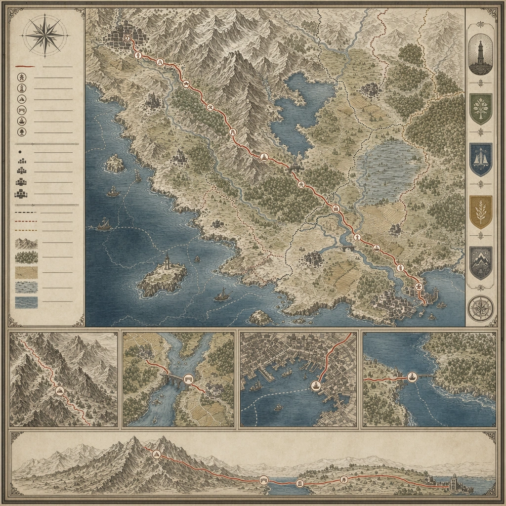
Scene: A square production-ready image designed for a game-art review wall and a commercial gallery at the same time. Frame a focused map of one region with inset logic, routes, and landmark emphasis with disciplined lighting, clean edge separation, and enough surrounding context to prove how the asset would behave in a real product surface. The camera, crop, and tonal balance should feel intentional rather than generic, with high readability at first glance and convincing material response under closer inspection. Subject: Center the study on a focused map of one region with inset logic, routes, and landmark emphasis. Translate the topic into a concrete, shippable visual statement instead of a loose mood board. Build layered object relationships, believable surface finish, and strong silhouette grouping so the image reads immediately as part of World Region Map Poster System. The subject should feel made for a live game pipeline: useful in store, UI, campaign, or art-review contexts, with visual hierarchy strong enough to survive aggressive cropping. Important details: annotation structure should feel convincing even though all marks remain abstract and unreadable. Keep every supporting element subordinate to the main read, and make category separation obvious through form, color zoning, depth, and material logic rather than words. Where panels, cards, badges, or interface blocks appear, they must look professionally structured but remain unreadable. The visual language should feel premium, original, and coherent across this package, with no filler clutter and no accidental resemblance to a specific shipped game IP. Use case: World Region Map Poster System single study 2/9, focused on single region annotated map. Constraints: No readable text, no watermark, no logos, preserve exact 1:1 aspect ratio, no legible labels, no number keys, no broken hierarchy, no generic stock-photo staging, no accidental UI gibberish.

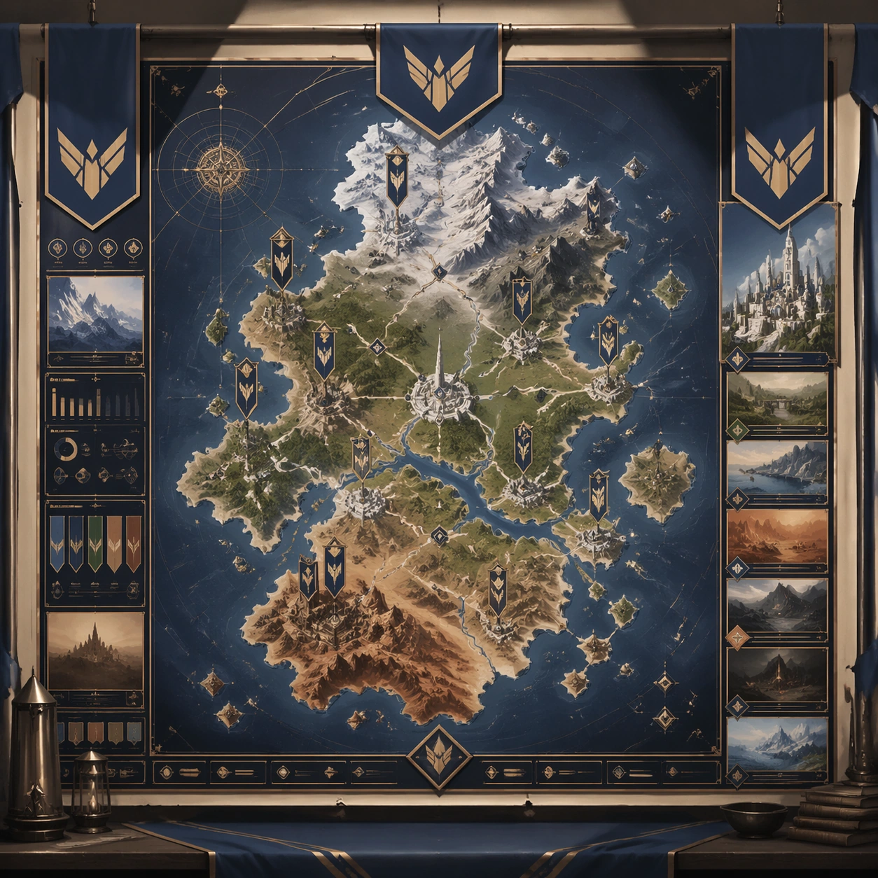
Example generated from “World Region Map Poster System — Faction Travel Poster”
GPT Image 2en

Scene: A square production-ready image designed for a game-art review wall and a commercial gallery at the same time. Frame a travel-poster style region map filtered through one faction’s cultural aesthetic with disciplined lighting, clean edge separation, and enough surrounding context to prove how the asset would behave in a real product surface. The camera, crop, and tonal balance should feel intentional rather than generic, with high readability at first glance and convincing material response under closer inspection. Subject: Center the study on a travel-poster style region map filtered through one faction’s cultural aesthetic. Translate the topic into a concrete, shippable visual statement instead of a loose mood board. Build layered object relationships, believable surface finish, and strong silhouette grouping so the image reads immediately as part of World Region Map Poster System. The subject should feel made for a live game pipeline: useful in store, UI, campaign, or art-review contexts, with visual hierarchy strong enough to survive aggressive cropping. Important details: blend propaganda mood with usable geography and strong point-of-interest cues. Keep every supporting element subordinate to the main read, and make category separation obvious through form, color zoning, depth, and material logic rather than words. Where panels, cards, badges, or interface blocks appear, they must look professionally structured but remain unreadable. The visual language should feel premium, original, and coherent across this package, with no filler clutter and no accidental resemblance to a specific shipped game IP. Use case: World Region Map Poster System single study 3/9, focused on faction travel poster. Constraints: No readable text, no watermark, no logos, preserve exact 1:1 aspect ratio, no slogans, no logos, no broken hierarchy, no generic stock-photo staging, no accidental UI gibberish.

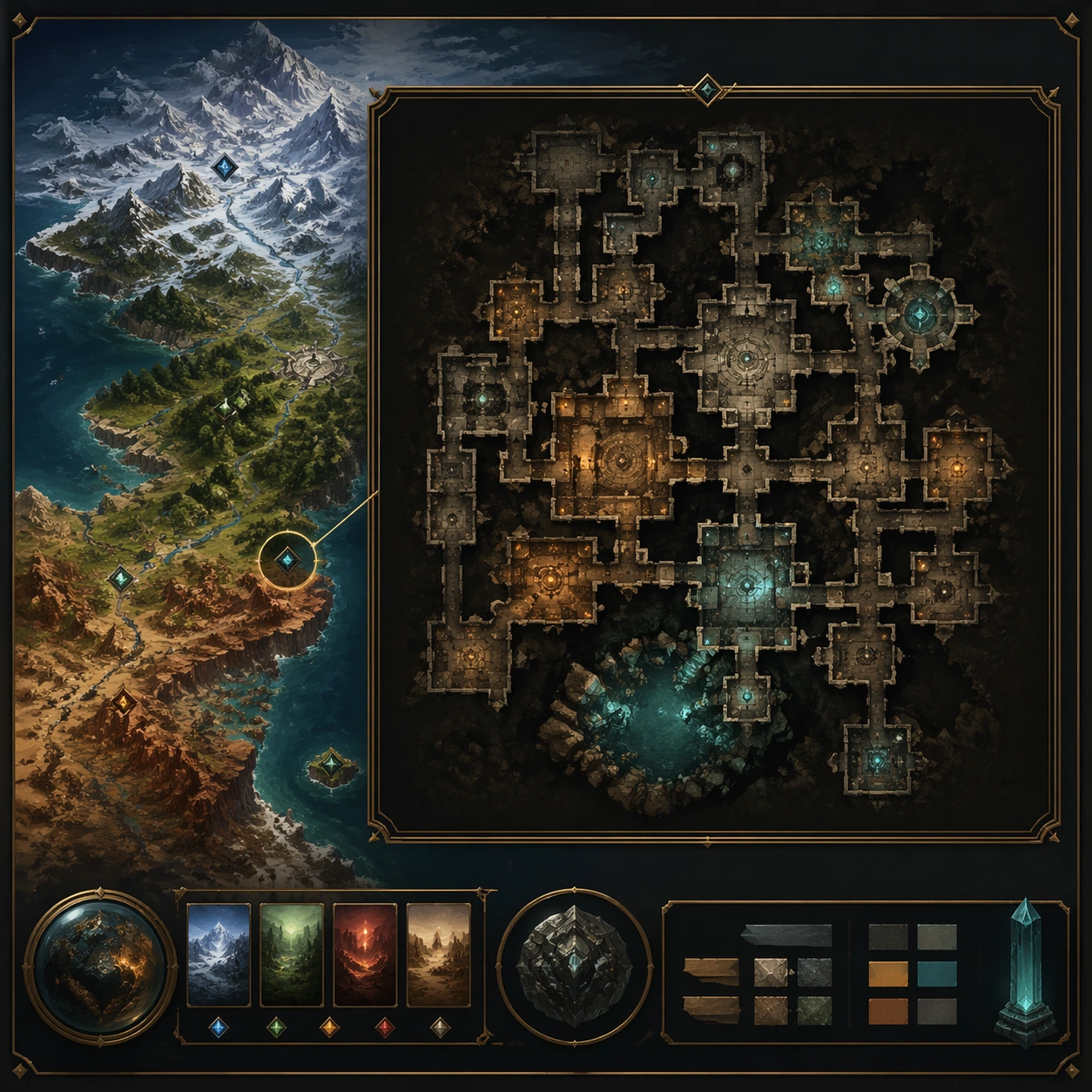
Example generated from “World Region Map Poster System — Dungeon Inset Map”
GPT Image 2en

Scene: A square production-ready image designed for a game-art review wall and a commercial gallery at the same time. Frame a dungeon inset map that nests inside a larger regional presentation with disciplined lighting, clean edge separation, and enough surrounding context to prove how the asset would behave in a real product surface. The camera, crop, and tonal balance should feel intentional rather than generic, with high readability at first glance and convincing material response under closer inspection. Subject: Center the study on a dungeon inset map that nests inside a larger regional presentation. Translate the topic into a concrete, shippable visual statement instead of a loose mood board. Build layered object relationships, believable surface finish, and strong silhouette grouping so the image reads immediately as part of World Region Map Poster System. The subject should feel made for a live game pipeline: useful in store, UI, campaign, or art-review contexts, with visual hierarchy strong enough to survive aggressive cropping. Important details: depth hierarchy should make the inset feel connected to the world instead of floating arbitrarily. Keep every supporting element subordinate to the main read, and make category separation obvious through form, color zoning, depth, and material logic rather than words. Where panels, cards, badges, or interface blocks appear, they must look professionally structured but remain unreadable. The visual language should feel premium, original, and coherent across this package, with no filler clutter and no accidental resemblance to a specific shipped game IP. Use case: World Region Map Poster System single study 4/9, focused on dungeon inset map. Constraints: No readable text, no watermark, no logos, preserve exact 1:1 aspect ratio, no readable room names, no arrows, no broken hierarchy, no generic stock-photo staging, no accidental UI gibberish.

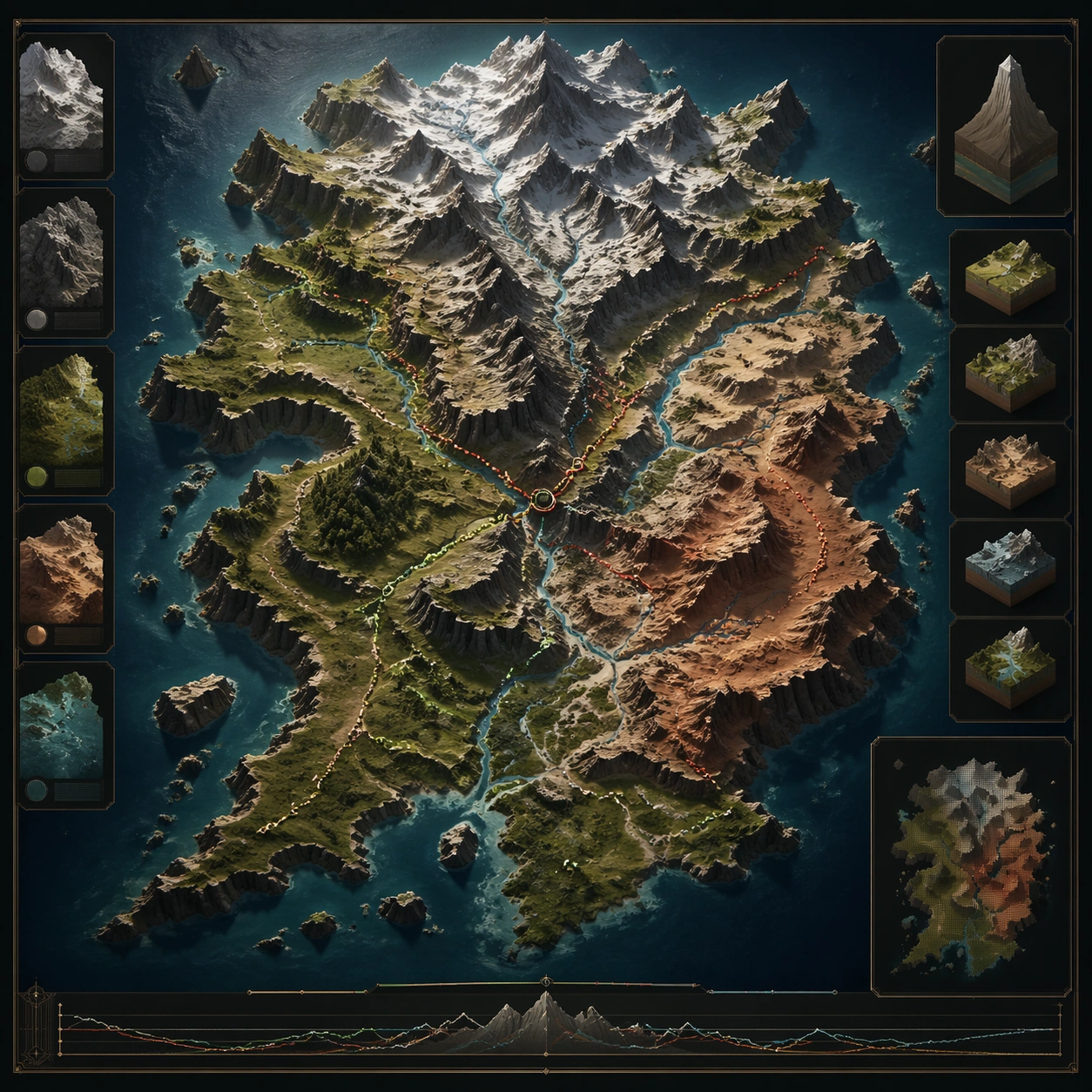
Example generated from “World Region Map Poster System — Terrain Relief Study”
GPT Image 2en

Scene: A square production-ready image designed for a game-art review wall and a commercial gallery at the same time. Frame a terrain-relief map study emphasizing elevation, cliffs, river systems, and route pressure with disciplined lighting, clean edge separation, and enough surrounding context to prove how the asset would behave in a real product surface. The camera, crop, and tonal balance should feel intentional rather than generic, with high readability at first glance and convincing material response under closer inspection. Subject: Center the study on a terrain-relief map study emphasizing elevation, cliffs, river systems, and route pressure. Translate the topic into a concrete, shippable visual statement instead of a loose mood board. Build layered object relationships, believable surface finish, and strong silhouette grouping so the image reads immediately as part of World Region Map Poster System. The subject should feel made for a live game pipeline: useful in store, UI, campaign, or art-review contexts, with visual hierarchy strong enough to survive aggressive cropping. Important details: surface treatment should make navigation logic and environmental character easy to read. Keep every supporting element subordinate to the main read, and make category separation obvious through form, color zoning, depth, and material logic rather than words. Where panels, cards, badges, or interface blocks appear, they must look professionally structured but remain unreadable. The visual language should feel premium, original, and coherent across this package, with no filler clutter and no accidental resemblance to a specific shipped game IP. Use case: World Region Map Poster System single study 5/9, focused on terrain relief study. Constraints: No readable text, no watermark, no logos, preserve exact 1:1 aspect ratio, no topo numbers, no text legend, no broken hierarchy, no generic stock-photo staging, no accidental UI gibberish.

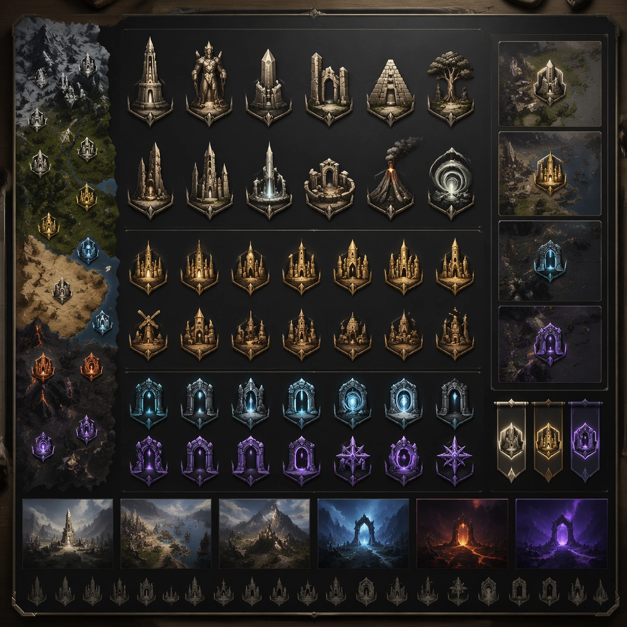
Example generated from “World Region Map Poster System — Landmark Icon System”
GPT Image 2en

Scene: A square production-ready image designed for a game-art review wall and a commercial gallery at the same time. Frame an icon system board for region landmarks, settlements, and traversal gates with disciplined lighting, clean edge separation, and enough surrounding context to prove how the asset would behave in a real product surface. The camera, crop, and tonal balance should feel intentional rather than generic, with high readability at first glance and convincing material response under closer inspection. Subject: Center the study on an icon system board for region landmarks, settlements, and traversal gates. Translate the topic into a concrete, shippable visual statement instead of a loose mood board. Build layered object relationships, believable surface finish, and strong silhouette grouping so the image reads immediately as part of World Region Map Poster System. The subject should feel made for a live game pipeline: useful in store, UI, campaign, or art-review contexts, with visual hierarchy strong enough to survive aggressive cropping. Important details: icons should feel like a coherent map language rather than random symbols. Keep every supporting element subordinate to the main read, and make category separation obvious through form, color zoning, depth, and material logic rather than words. Where panels, cards, badges, or interface blocks appear, they must look professionally structured but remain unreadable. The visual language should feel premium, original, and coherent across this package, with no filler clutter and no accidental resemblance to a specific shipped game IP. Use case: World Region Map Poster System single study 6/9, focused on landmark icon system. Constraints: No readable text, no watermark, no logos, preserve exact 1:1 aspect ratio, no labels, no UI copy, no broken hierarchy, no generic stock-photo staging, no accidental UI gibberish.

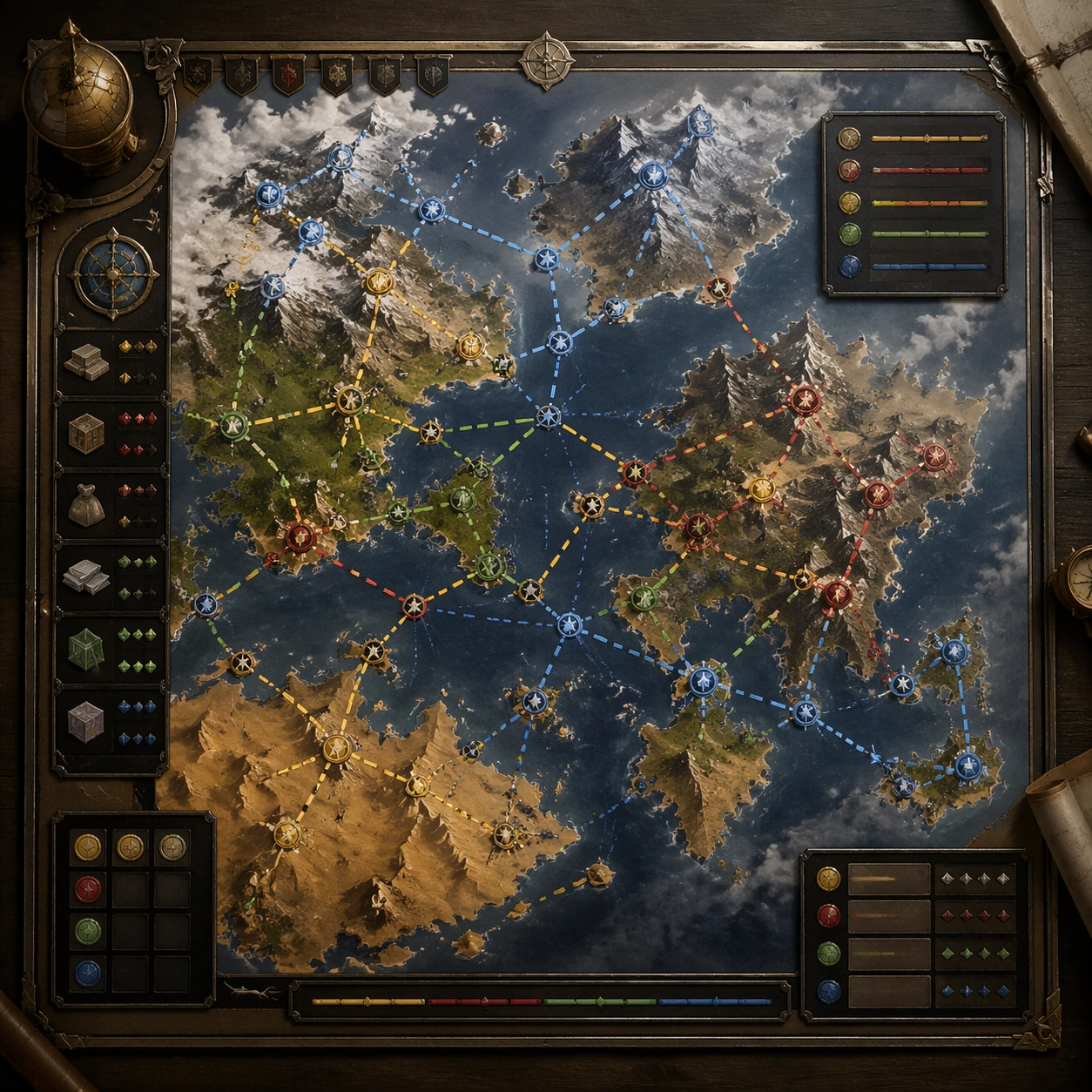
Example generated from “World Region Map Poster System — Merchant Route Board”
GPT Image 2en

Scene: A square production-ready image designed for a game-art review wall and a commercial gallery at the same time. Frame a logistics-focused route board showing trade flow, chokepoints, and safe passages across the map with disciplined lighting, clean edge separation, and enough surrounding context to prove how the asset would behave in a real product surface. The camera, crop, and tonal balance should feel intentional rather than generic, with high readability at first glance and convincing material response under closer inspection. Subject: Center the study on a logistics-focused route board showing trade flow, chokepoints, and safe passages across the map. Translate the topic into a concrete, shippable visual statement instead of a loose mood board. Build layered object relationships, believable surface finish, and strong silhouette grouping so the image reads immediately as part of World Region Map Poster System. The subject should feel made for a live game pipeline: useful in store, UI, campaign, or art-review contexts, with visual hierarchy strong enough to survive aggressive cropping. Important details: the structure should imply world economy and risk without readable annotations. Keep every supporting element subordinate to the main read, and make category separation obvious through form, color zoning, depth, and material logic rather than words. Where panels, cards, badges, or interface blocks appear, they must look professionally structured but remain unreadable. The visual language should feel premium, original, and coherent across this package, with no filler clutter and no accidental resemblance to a specific shipped game IP. Use case: World Region Map Poster System single study 7/9, focused on merchant route board. Constraints: No readable text, no watermark, no logos, preserve exact 1:1 aspect ratio, no currency text, no arrows with labels, no broken hierarchy, no generic stock-photo staging, no accidental UI gibberish.

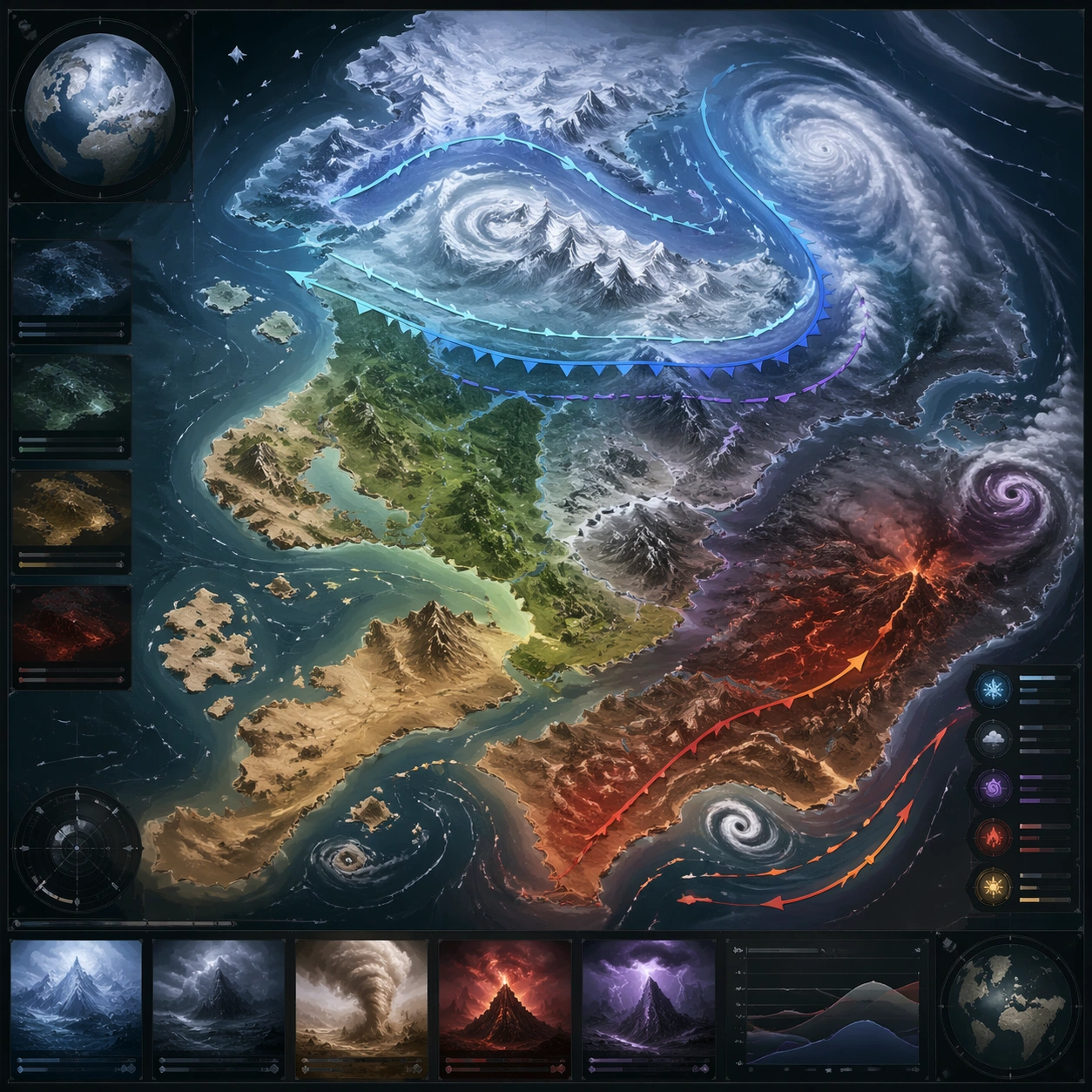
Example generated from “World Region Map Poster System — Weather Front Map”
GPT Image 2en

Scene: A square production-ready image designed for a game-art review wall and a commercial gallery at the same time. Frame a weather-variant regional map showing storm belts, snow lines, ash zones, or seasonal shifts with disciplined lighting, clean edge separation, and enough surrounding context to prove how the asset would behave in a real product surface. The camera, crop, and tonal balance should feel intentional rather than generic, with high readability at first glance and convincing material response under closer inspection. Subject: Center the study on a weather-variant regional map showing storm belts, snow lines, ash zones, or seasonal shifts. Translate the topic into a concrete, shippable visual statement instead of a loose mood board. Build layered object relationships, believable surface finish, and strong silhouette grouping so the image reads immediately as part of World Region Map Poster System. The subject should feel made for a live game pipeline: useful in store, UI, campaign, or art-review contexts, with visual hierarchy strong enough to survive aggressive cropping. Important details: visual overlays should clarify climatic pressure while keeping the base map readable. Keep every supporting element subordinate to the main read, and make category separation obvious through form, color zoning, depth, and material logic rather than words. Where panels, cards, badges, or interface blocks appear, they must look professionally structured but remain unreadable. The visual language should feel premium, original, and coherent across this package, with no filler clutter and no accidental resemblance to a specific shipped game IP. Use case: World Region Map Poster System single study 8/9, focused on weather front map. Constraints: No readable text, no watermark, no logos, preserve exact 1:1 aspect ratio, no text forecast, no numerals, no broken hierarchy, no generic stock-photo staging, no accidental UI gibberish.

Example generated from “World Region Map Poster System — Tourism Poster Crop”
GPT Image 2en

Scene: A square production-ready image designed for a game-art review wall and a commercial gallery at the same time. Frame a poster crop that packages one map region as a destination image for sharing or promotion with disciplined lighting, clean edge separation, and enough surrounding context to prove how the asset would behave in a real product surface. The camera, crop, and tonal balance should feel intentional rather than generic, with high readability at first glance and convincing material response under closer inspection. Subject: Center the study on a poster crop that packages one map region as a destination image for sharing or promotion. Translate the topic into a concrete, shippable visual statement instead of a loose mood board. Build layered object relationships, believable surface finish, and strong silhouette grouping so the image reads immediately as part of World Region Map Poster System. The subject should feel made for a live game pipeline: useful in store, UI, campaign, or art-review contexts, with visual hierarchy strong enough to survive aggressive cropping. Important details: make it seductive and atmospheric while preserving map logic and geography. Keep every supporting element subordinate to the main read, and make category separation obvious through form, color zoning, depth, and material logic rather than words. Where panels, cards, badges, or interface blocks appear, they must look professionally structured but remain unreadable. The visual language should feel premium, original, and coherent across this package, with no filler clutter and no accidental resemblance to a specific shipped game IP. Use case: World Region Map Poster System single study 9/9, focused on tourism poster crop. Constraints: No readable text, no watermark, no logos, preserve exact 1:1 aspect ratio, no tagline text, no stamps, no broken hierarchy, no generic stock-photo staging, no accidental UI gibberish.

Example generated from “Worldbuilding Atlas Map And Legend Set — Capital District Inset”
GPT Image 2en

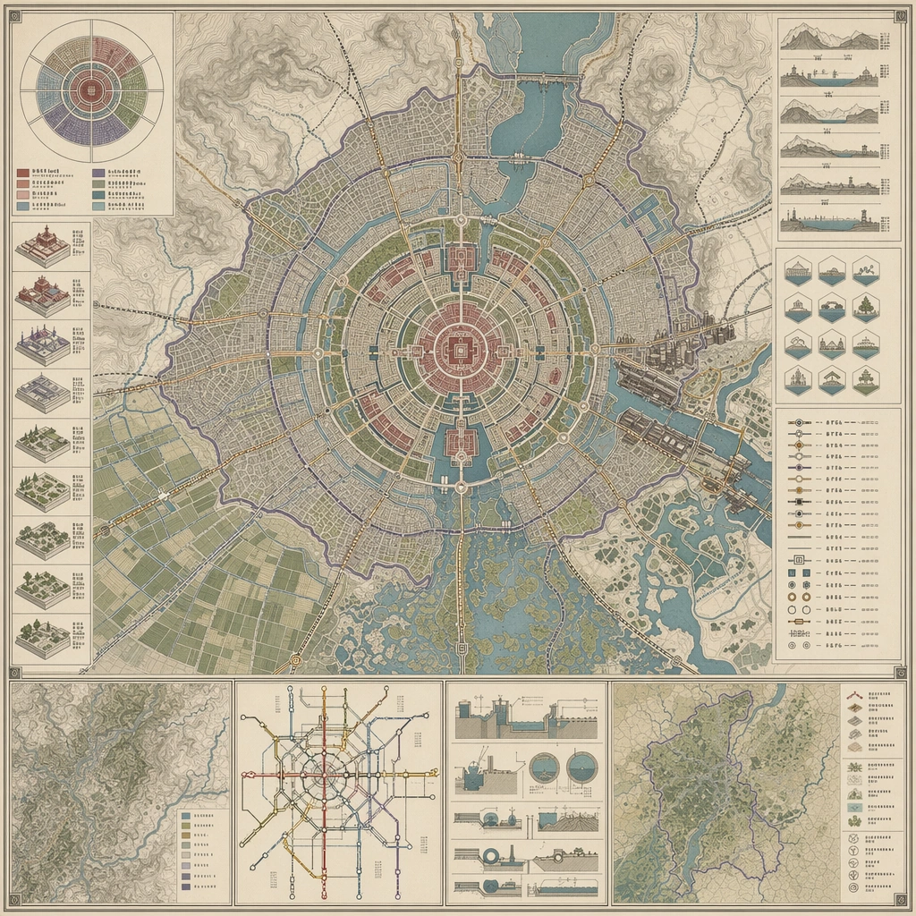
Scene: Design a square atlas or legend sheet that stands alone as a worldbuilding artifact. The layout should feel publishable, with clear map priority, supporting insets, and believable information density. Compose an inset-style district atlas where radial roads, civic precincts, water systems, and neighborhood fabrics are mapped within one square board. Subject: Show a map-driven system such as district boundaries, migration routes, underground rails, climate zones, pilgrimage paths, or maritime networks. The cartography should imply social, political, or environmental logic beyond pure decoration. The map should read as a functioning capital region, revealing hierarchy between ceremonial center, service zones, and dense urban edges. Important details: Favor disciplined line work, restrained palette coding, and coherent terrain abstraction. The board should communicate world structure even though no readable labels are present. Let line discipline and inset logic do the storytelling instead of decorative icon overload. Preserve cartographic causality so routes, borders, resources, and environmental features all make sense together. Use case: Atlas Set single study 1/5, designed as a self-contained support image for this topic. Constraints: No readable text, no watermark, no logos, preserve exact 1:1 aspect ratio, no readable labels, no game-minimap UI, no random decorative monsters, no travel-brochure icons, no fantasy castle postcard framing.

Example generated from “Worldbuilding Atlas Map And Legend Set — Underground Rail Atlas”
GPT Image 2en

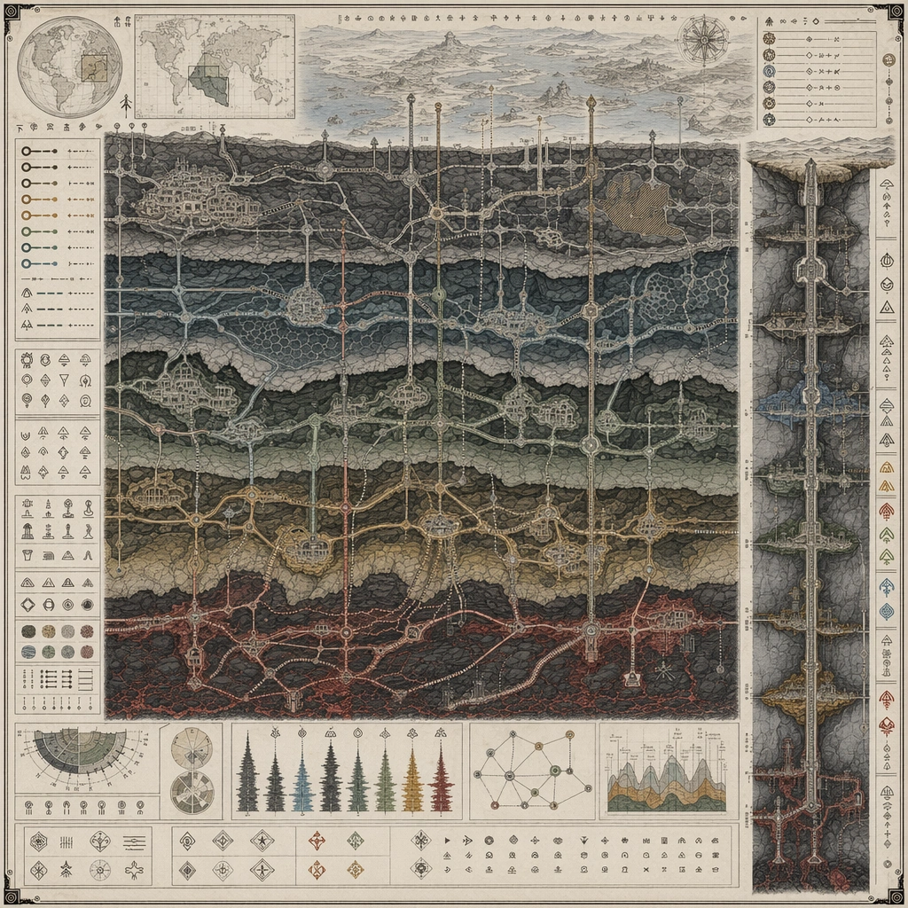
Scene: Design a square atlas or legend sheet that stands alone as a worldbuilding artifact. The layout should feel publishable, with clear map priority, supporting insets, and believable information density. Build a map that cuts beneath the surface world, showing tunnel layers, junction nodes, shaft access, and underground districts in a structured plate. Subject: Show a map-driven system such as district boundaries, migration routes, underground rails, climate zones, pilgrimage paths, or maritime networks. The cartography should imply social, political, or environmental logic beyond pure decoration. The main protagonist is route logic, with surface insets only supporting the subsurface transport story. Important details: Favor disciplined line work, restrained palette coding, and coherent terrain abstraction. The board should communicate world structure even though no readable labels are present. The sheet should feel infrastructural and world-rich, balancing abstraction with believable access patterns. Preserve cartographic causality so routes, borders, resources, and environmental features all make sense together. Use case: Atlas Set single study 2/5, designed as a self-contained support image for this topic. Constraints: No readable text, no watermark, no logos, preserve exact 1:1 aspect ratio, no readable labels, no game-minimap UI, no random decorative monsters, no travel-brochure icons, no modern metro logo design.

Example generated from “Worldbuilding Atlas Map And Legend Set — Storm Belt Navigation Chart”
GPT Image 2en

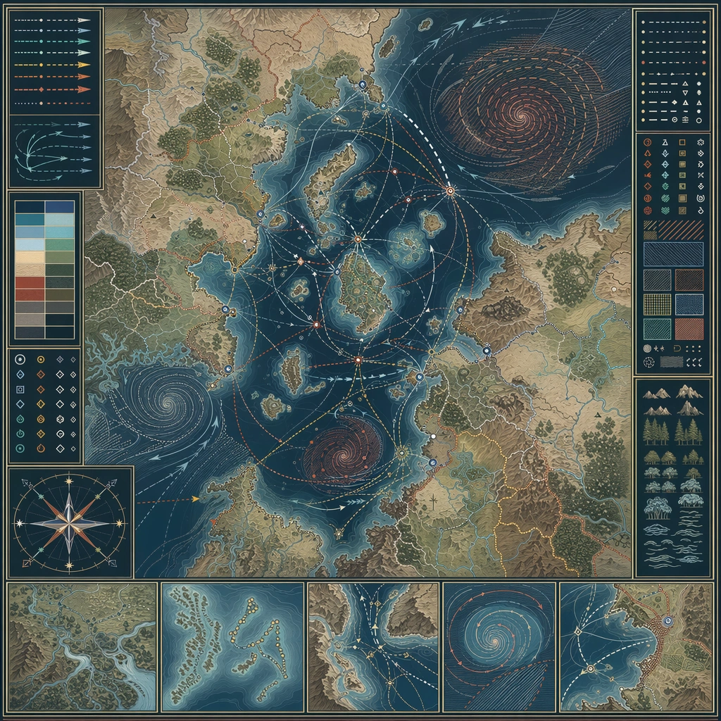
Scene: Design a square atlas or legend sheet that stands alone as a worldbuilding artifact. The layout should feel publishable, with clear map priority, supporting insets, and believable information density. Design a square chart where sea routes, wind belts, storm spirals, and safe harbors are composed into a disciplined navigation board. Subject: Show a map-driven system such as district boundaries, migration routes, underground rails, climate zones, pilgrimage paths, or maritime networks. The cartography should imply social, political, or environmental logic beyond pure decoration. The map should explain how travel adapts to weather cycles and hazardous zones across one region. Important details: Favor disciplined line work, restrained palette coding, and coherent terrain abstraction. The board should communicate world structure even though no readable labels are present. Make atmospheric risk legible through pattern and route behavior, not through decorative weather painting. Preserve cartographic causality so routes, borders, resources, and environmental features all make sense together. Use case: Atlas Set single study 3/5, designed as a self-contained support image for this topic. Constraints: No readable text, no watermark, no logos, preserve exact 1:1 aspect ratio, no readable labels, no game-minimap UI, no random decorative monsters, no travel-brochure icons, no pirate fantasy motifs.

Example generated from “Worldbuilding Atlas Map And Legend Set — Pilgrimage Route Sheet”
GPT Image 2en

Scene: Design a square atlas or legend sheet that stands alone as a worldbuilding artifact. The layout should feel publishable, with clear map priority, supporting insets, and believable information density. Compose a route-focused board where one pilgrimage path crosses mountains, water, settlements, and symbolic waystations inside a quiet cartographic frame. Subject: Show a map-driven system such as district boundaries, migration routes, underground rails, climate zones, pilgrimage paths, or maritime networks. The cartography should imply social, political, or environmental logic beyond pure decoration. The sheet should reveal social and geographic structure through the route itself, not through text or figures. Important details: Favor disciplined line work, restrained palette coding, and coherent terrain abstraction. The board should communicate world structure even though no readable labels are present. Use rhythm, inset details, and terrain abstraction to make the journey read clearly across the square. Preserve cartographic causality so routes, borders, resources, and environmental features all make sense together. Use case: Atlas Set single study 4/5, designed as a self-contained support image for this topic. Constraints: No readable text, no watermark, no logos, preserve exact 1:1 aspect ratio, no readable labels, no game-minimap UI, no random decorative monsters, no travel-brochure icons, no religious icon illustration overload.

Example generated from “Xiaohongshu List Note Carousel — Reference Anchor”
GPT Image 2en

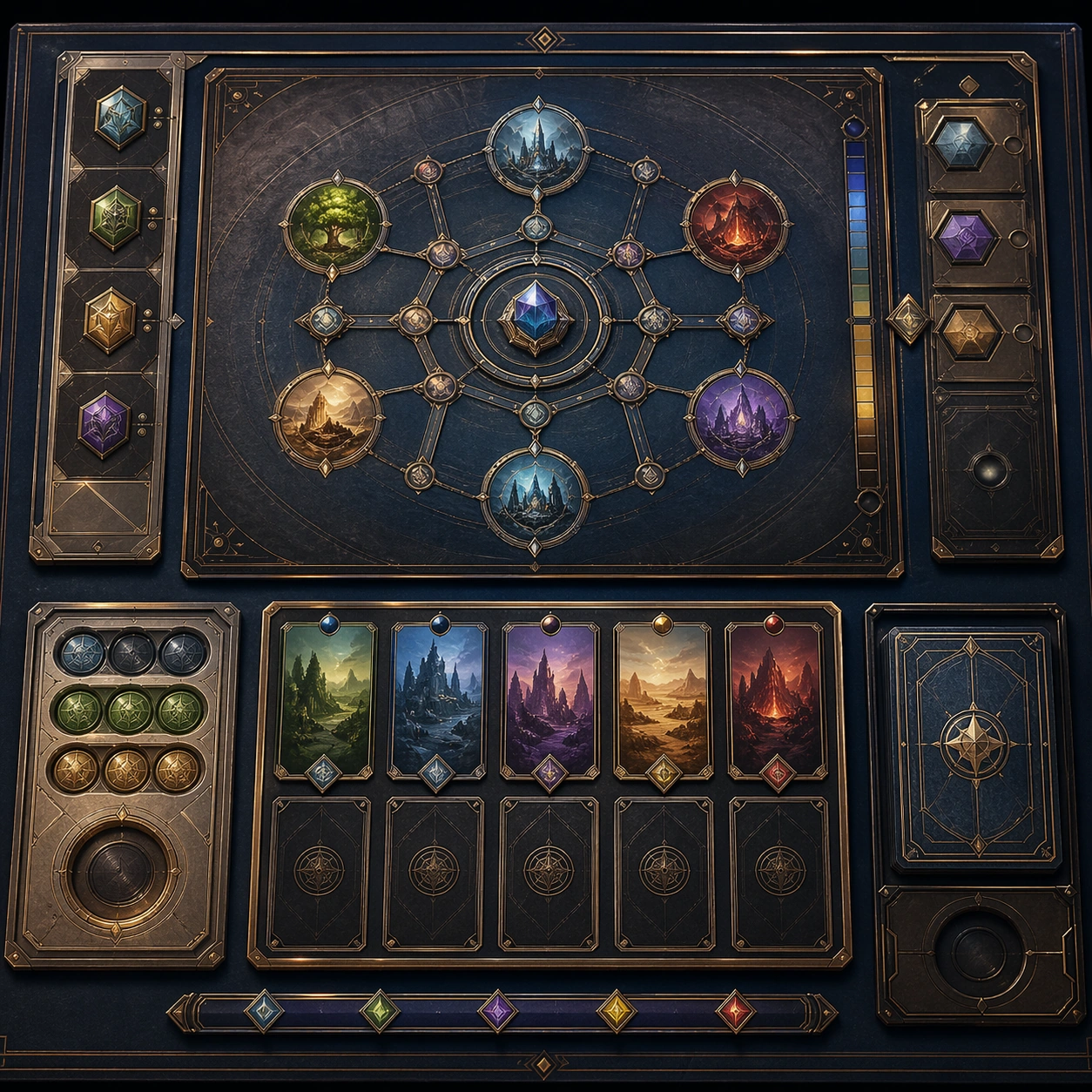
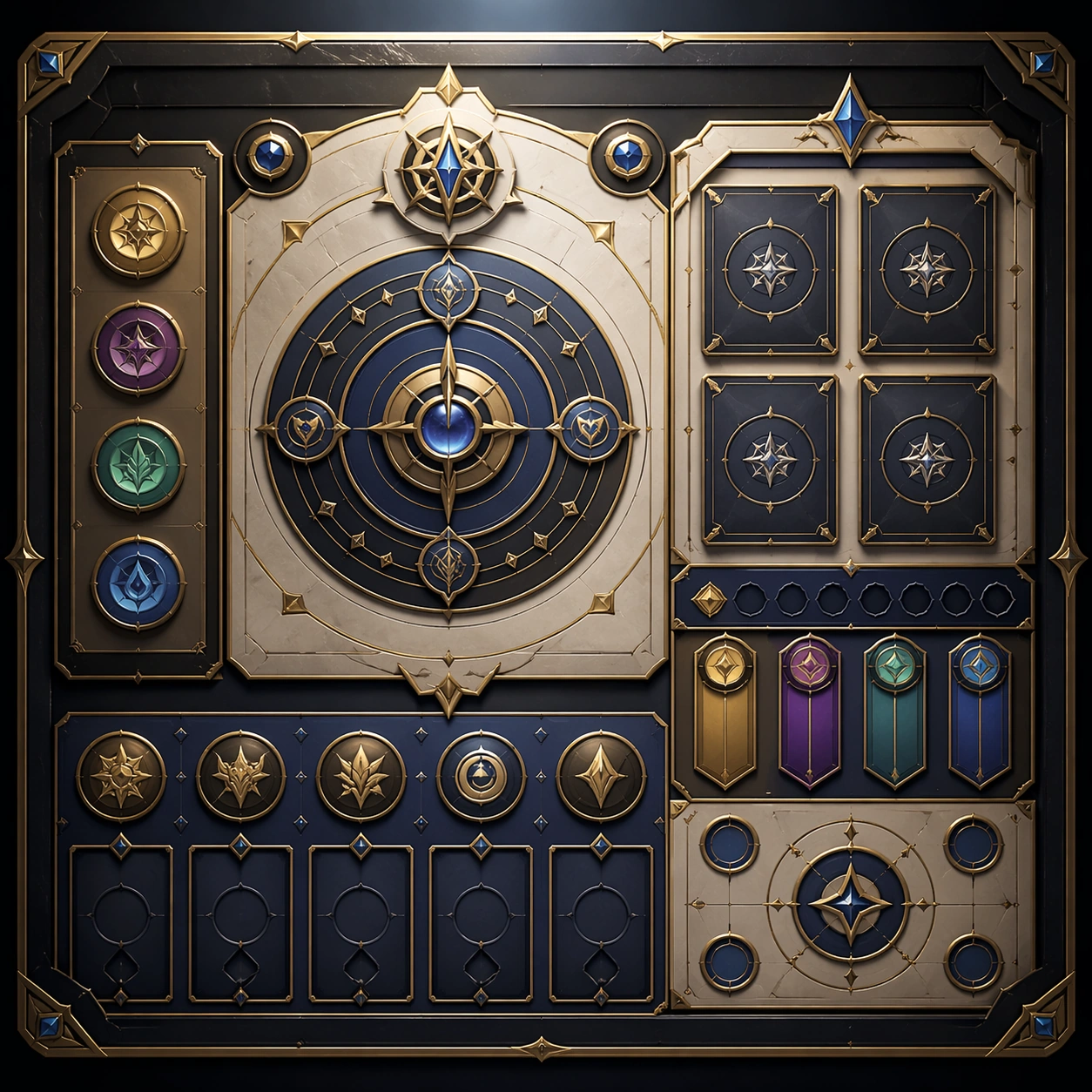
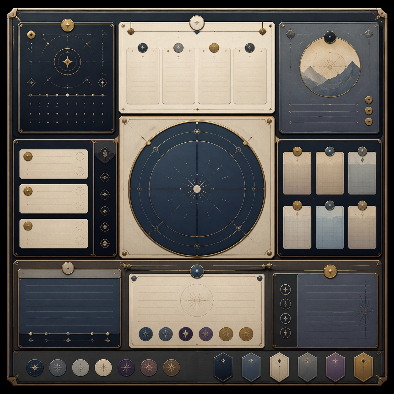
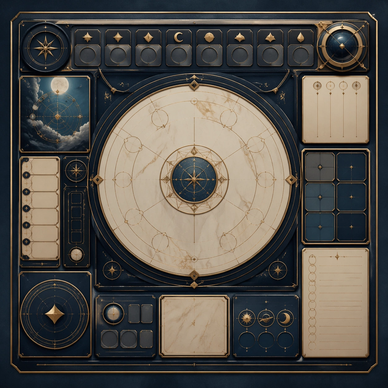
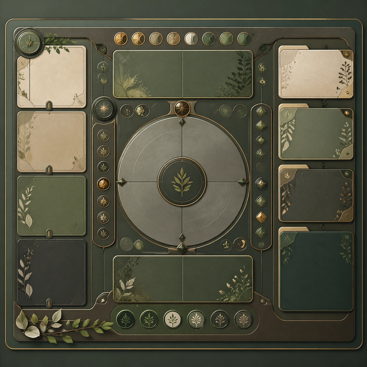
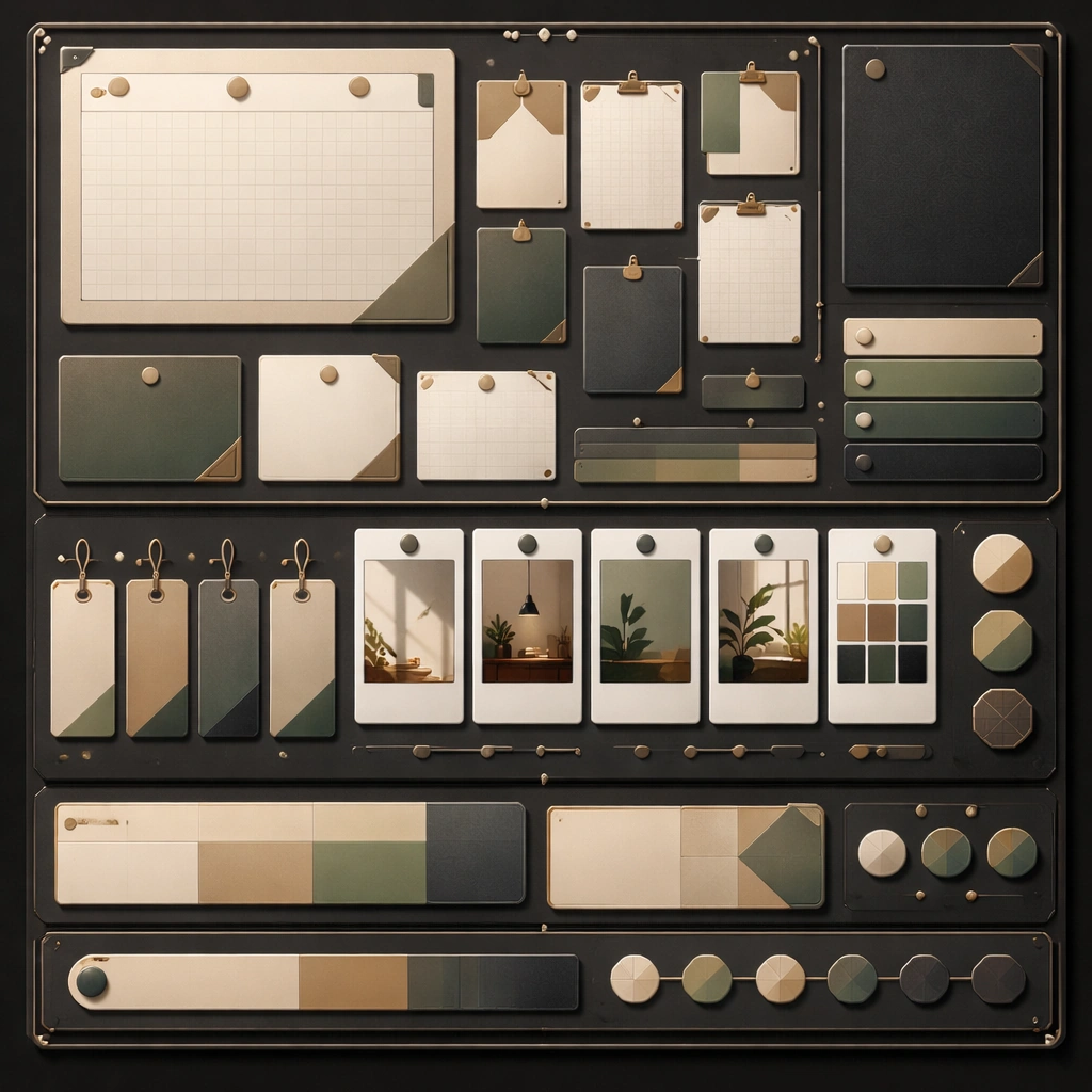
Scene: Create a square reference image for lifestyle note carousel. Build a reference anchor establishing the core system with a premium, production-ready finish. Use a polished modular board or campaign surface with clean spacing, premium game-UI finish, and clear focal hierarchy. The composition should feel intentional, clean, and reusable for gallery, research, campaign, or internal handoff contexts. Lighting must support readability first, with the main forms clearly separated from the background and enough breathing room for the system to stay legible at both hero scale and thumbnail scale. Subject: Center a coherent original game-art system built for premium production and marketing surfaces. For this image, focus on reference anchor. Keep the same system logic stable across screenshots, cards, banners, and overview boards. This image is the canonical anchor that later series images must follow. The viewer should immediately understand what role this surface plays inside a cohesive game-production asset pack. Important details: Lock framing, icon grammar, palette blocking, and surface hierarchy so the kit feels production-ready and consistent. Preserve the core silhouette, framing language, and material logic from the reference image while each variation changes function. Keep materials believable, edge hierarchy disciplined, and the visual language consistent with lifestyle-note Lists. Use abstract interface blocks or diagram accents when helpful, but avoid any readable language. The final result should feel like a deliberate production asset rather than a random illustration. Use case: lifestyle note carousel series study 1/9, designed as reference anchor within a cohesive asset pack. Constraints: No readable text, no watermark, no logos, preserve exact 1:1 aspect ratio, no unrelated objects, no broken visual hierarchy, no malformed anatomy or broken perspective, no random decorative clutter.

Example generated from “Xiaohongshu List Note Carousel — Variant One”
GPT Image 2en

Scene: Create a square dependent image for lifestyle note carousel. Build a first controlled variation in the same system with a premium, production-ready finish. Use a polished modular board or campaign surface with clean spacing, premium game-UI finish, and clear focal hierarchy. The composition should feel intentional, clean, and reusable for gallery, research, campaign, or internal handoff contexts. Lighting must support readability first, with the main forms clearly separated from the background and enough breathing room for the system to stay legible at both hero scale and thumbnail scale. Subject: Center a coherent original game-art system built for premium production and marketing surfaces. For this image, focus on the intended support surface. Keep the same system logic stable across screenshots, cards, banners, and overview boards. Preserve exact identity or system logic from the reference image while changing only the intended variation axis. The viewer should immediately understand what role this surface plays inside a cohesive game-production asset pack. Important details: Lock framing, icon grammar, palette blocking, and surface hierarchy so the kit feels production-ready and consistent. Preserve the core silhouette, framing language, and material logic from the reference image while each variation changes function. Keep materials believable, edge hierarchy disciplined, and the visual language consistent with lifestyle-note Lists. Use abstract interface blocks or diagram accents when helpful, but avoid any readable language. The final result should feel like a deliberate production asset rather than a random illustration. Use case: lifestyle note carousel series study 2/9, designed as variant one within a cohesive asset pack. Constraints: No readable text, no watermark, no logos, preserve exact 1:1 aspect ratio, no unrelated objects, no broken visual hierarchy, no malformed anatomy or broken perspective, no random decorative clutter.

Example generated from “Xiaohongshu List Note Carousel — Variant Two”
GPT Image 2en

Scene: Create a square dependent image for lifestyle note carousel. Build a second controlled variation in the same system with a premium, production-ready finish. Use a polished modular board or campaign surface with clean spacing, premium game-UI finish, and clear focal hierarchy. The composition should feel intentional, clean, and reusable for gallery, research, campaign, or internal handoff contexts. Lighting must support readability first, with the main forms clearly separated from the background and enough breathing room for the system to stay legible at both hero scale and thumbnail scale. Subject: Center a coherent original game-art system built for premium production and marketing surfaces. For this image, focus on the intended support surface. Keep the same system logic stable across screenshots, cards, banners, and overview boards. Preserve exact identity or system logic from the reference image while changing only the intended variation axis. The viewer should immediately understand what role this surface plays inside a cohesive game-production asset pack. Important details: Lock framing, icon grammar, palette blocking, and surface hierarchy so the kit feels production-ready and consistent. Preserve the core silhouette, framing language, and material logic from the reference image while each variation changes function. Keep materials believable, edge hierarchy disciplined, and the visual language consistent with lifestyle-note Lists. Use abstract interface blocks or diagram accents when helpful, but avoid any readable language. The final result should feel like a deliberate production asset rather than a random illustration. Use case: lifestyle note carousel series study 3/9, designed as variant two within a cohesive asset pack. Constraints: No readable text, no watermark, no logos, preserve exact 1:1 aspect ratio, no unrelated objects, no broken visual hierarchy, no malformed anatomy or broken perspective, no random decorative clutter.

Example generated from “Xiaohongshu List Note Carousel — Variant Three”
GPT Image 2en

Scene: Create a square dependent image for lifestyle note carousel. Build a third controlled variation in the same system with a premium, production-ready finish. Use a polished modular board or campaign surface with clean spacing, premium game-UI finish, and clear focal hierarchy. The composition should feel intentional, clean, and reusable for gallery, research, campaign, or internal handoff contexts. Lighting must support readability first, with the main forms clearly separated from the background and enough breathing room for the system to stay legible at both hero scale and thumbnail scale. Subject: Center a coherent original game-art system built for premium production and marketing surfaces. For this image, focus on the intended support surface. Keep the same system logic stable across screenshots, cards, banners, and overview boards. Preserve exact identity or system logic from the reference image while changing only the intended variation axis. The viewer should immediately understand what role this surface plays inside a cohesive game-production asset pack. Important details: Lock framing, icon grammar, palette blocking, and surface hierarchy so the kit feels production-ready and consistent. Preserve the core silhouette, framing language, and material logic from the reference image while each variation changes function. Keep materials believable, edge hierarchy disciplined, and the visual language consistent with lifestyle-note Lists. Use abstract interface blocks or diagram accents when helpful, but avoid any readable language. The final result should feel like a deliberate production asset rather than a random illustration. Use case: lifestyle note carousel series study 4/9, designed as variant three within a cohesive asset pack. Constraints: No readable text, no watermark, no logos, preserve exact 1:1 aspect ratio, no unrelated objects, no broken visual hierarchy, no malformed anatomy or broken perspective, no random decorative clutter.

Example generated from “Xiaohongshu List Note Carousel — Support One”
GPT Image 2en

Scene: Create a square standalone support image for lifestyle note carousel. Build a support-surface study with a clear focal hierarchy and a finished professional surface. Use a polished modular board or campaign surface with clean spacing, premium game-UI finish, and clear focal hierarchy. The frame should feel self-contained and polished, with enough structure to explain the system even without the reference series, yet still obviously belonging to the same theme and production world. Subject: Show a coherent original game-art system built for premium production and marketing surfaces in a way that emphasizes the intended support surface. Keep the same system logic stable across screenshots, cards, banners, and overview boards. Even though this image is independent, the viewer should still recognize the same universe, same commercial logic, and same production intent as the core package. Important details: Lock framing, icon grammar, palette blocking, and surface hierarchy so the kit feels production-ready and consistent. Preserve the broader theme language through color, framing, material choices, and modular composition. Use clean panel rhythm, premium asset presentation, and believable detail density. The image should work equally well as a gallery study, research reference, and mock production deliverable. Use case: lifestyle note carousel single study 5/9, exploring support one as a support surface. Constraints: No readable text, no watermark, no logos, preserve exact 1:1 aspect ratio, no unrelated objects, no broken visual hierarchy, no visual noise that obscures the main surface, no accidental brand resemblance.

Example generated from “Xiaohongshu List Note Carousel — Support Two”
GPT Image 2en

Scene: Create a square standalone support image for lifestyle note carousel. Build a second support-surface study with a clear focal hierarchy and a finished professional surface. Use a polished modular board or campaign surface with clean spacing, premium game-UI finish, and clear focal hierarchy. The frame should feel self-contained and polished, with enough structure to explain the system even without the reference series, yet still obviously belonging to the same theme and production world. Subject: Show a coherent original game-art system built for premium production and marketing surfaces in a way that emphasizes the intended support surface. Keep the same system logic stable across screenshots, cards, banners, and overview boards. Even though this image is independent, the viewer should still recognize the same universe, same commercial logic, and same production intent as the core package. Important details: Lock framing, icon grammar, palette blocking, and surface hierarchy so the kit feels production-ready and consistent. Preserve the broader theme language through color, framing, material choices, and modular composition. Use clean panel rhythm, premium asset presentation, and believable detail density. The image should work equally well as a gallery study, research reference, and mock production deliverable. Use case: lifestyle note carousel single study 6/9, exploring support two as a support surface. Constraints: No readable text, no watermark, no logos, preserve exact 1:1 aspect ratio, no unrelated objects, no broken visual hierarchy, no visual noise that obscures the main surface, no accidental brand resemblance.

Example generated from “Xiaohongshu List Note Carousel — Support Three”
GPT Image 2en

Scene: Create a square standalone support image for lifestyle note carousel. Build a third support-surface study with a clear focal hierarchy and a finished professional surface. Use a polished modular board or campaign surface with clean spacing, premium game-UI finish, and clear focal hierarchy. The frame should feel self-contained and polished, with enough structure to explain the system even without the reference series, yet still obviously belonging to the same theme and production world. Subject: Show a coherent original game-art system built for premium production and marketing surfaces in a way that emphasizes the intended support surface. Keep the same system logic stable across screenshots, cards, banners, and overview boards. Even though this image is independent, the viewer should still recognize the same universe, same commercial logic, and same production intent as the core package. Important details: Lock framing, icon grammar, palette blocking, and surface hierarchy so the kit feels production-ready and consistent. Preserve the broader theme language through color, framing, material choices, and modular composition. Use clean panel rhythm, premium asset presentation, and believable detail density. The image should work equally well as a gallery study, research reference, and mock production deliverable. Use case: lifestyle note carousel single study 7/9, exploring support three as a support surface. Constraints: No readable text, no watermark, no logos, preserve exact 1:1 aspect ratio, no unrelated objects, no broken visual hierarchy, no visual noise that obscures the main surface, no accidental brand resemblance.

Example generated from “Xiaohongshu List Note Carousel — Support Four”
GPT Image 2en

Scene: Create a square standalone support image for lifestyle note carousel. Build a fourth support-surface study with a clear focal hierarchy and a finished professional surface. Use a polished modular board or campaign surface with clean spacing, premium game-UI finish, and clear focal hierarchy. The frame should feel self-contained and polished, with enough structure to explain the system even without the reference series, yet still obviously belonging to the same theme and production world. Subject: Show a coherent original game-art system built for premium production and marketing surfaces in a way that emphasizes the intended support surface. Keep the same system logic stable across screenshots, cards, banners, and overview boards. Even though this image is independent, the viewer should still recognize the same universe, same commercial logic, and same production intent as the core package. Important details: Lock framing, icon grammar, palette blocking, and surface hierarchy so the kit feels production-ready and consistent. Preserve the broader theme language through color, framing, material choices, and modular composition. Use clean panel rhythm, premium asset presentation, and believable detail density. The image should work equally well as a gallery study, research reference, and mock production deliverable. Use case: lifestyle note carousel single study 8/9, exploring support four as a support surface. Constraints: No readable text, no watermark, no logos, preserve exact 1:1 aspect ratio, no unrelated objects, no broken visual hierarchy, no visual noise that obscures the main surface, no accidental brand resemblance.

Example generated from “Xiaohongshu List Note Carousel — Support Five”
GPT Image 2en

Scene: Create a square standalone support image for lifestyle note carousel. Build a fifth support-surface study with a clear focal hierarchy and a finished professional surface. Use a polished modular board or campaign surface with clean spacing, premium game-UI finish, and clear focal hierarchy. The frame should feel self-contained and polished, with enough structure to explain the system even without the reference series, yet still obviously belonging to the same theme and production world. Subject: Show a coherent original game-art system built for premium production and marketing surfaces in a way that emphasizes the intended support surface. Keep the same system logic stable across screenshots, cards, banners, and overview boards. Even though this image is independent, the viewer should still recognize the same universe, same commercial logic, and same production intent as the core package. Important details: Lock framing, icon grammar, palette blocking, and surface hierarchy so the kit feels production-ready and consistent. Preserve the broader theme language through color, framing, material choices, and modular composition. Use clean panel rhythm, premium asset presentation, and believable detail density. The image should work equally well as a gallery study, research reference, and mock production deliverable. Use case: lifestyle note carousel single study 9/9, exploring support five as a support surface. Constraints: No readable text, no watermark, no logos, preserve exact 1:1 aspect ratio, no unrelated objects, no broken visual hierarchy, no visual noise that obscures the main surface, no accidental brand resemblance.

Example generated from “Xiaohongshu Room And Desk Aesthetic Notes — Reference Anchor”
GPT Image 2en

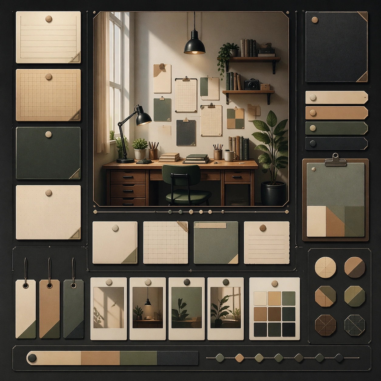
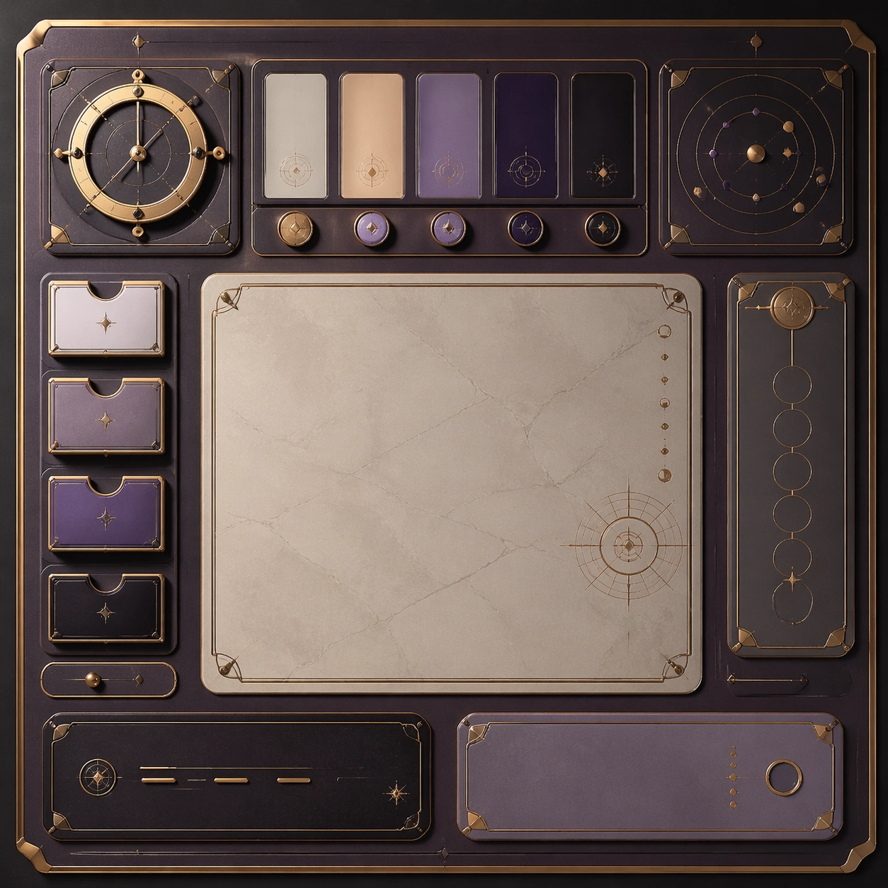
Scene: Create a square reference image for room and desk aesthetic note system. Build a reference anchor establishing the core system with a premium, production-ready finish. Use a polished modular board or campaign surface with clean spacing, premium game-UI finish, and clear focal hierarchy. The composition should feel intentional, clean, and reusable for gallery, research, campaign, or internal handoff contexts. Lighting must support readability first, with the main forms clearly separated from the background and enough breathing room for the system to stay legible at both hero scale and thumbnail scale. Subject: Center a coherent original game-art system built for premium production and marketing surfaces. For this image, focus on reference anchor. Keep the same system logic stable across screenshots, cards, banners, and overview boards. This image is the canonical anchor that later series images must follow. The viewer should immediately understand what role this surface plays inside a cohesive game-production asset pack. Important details: Lock framing, icon grammar, palette blocking, and surface hierarchy so the kit feels production-ready and consistent. Preserve the core silhouette, framing language, and material logic from the reference image while each variation changes function. Keep materials believable, edge hierarchy disciplined, and the visual language consistent with Desk Notes. Use abstract interface blocks or diagram accents when helpful, but avoid any readable language. The final result should feel like a deliberate production asset rather than a random illustration. Use case: room and desk aesthetic note system series study 1/9, designed as reference anchor within a cohesive asset pack. Constraints: No readable text, no watermark, no logos, preserve exact 1:1 aspect ratio, no unrelated objects, no broken visual hierarchy, no malformed anatomy or broken perspective, no random decorative clutter.

Example generated from “Xiaohongshu Room And Desk Aesthetic Notes — Variant One”
GPT Image 2en

Scene: Create a square dependent image for room and desk aesthetic note system. Build a first controlled variation in the same system with a premium, production-ready finish. Use a polished modular board or campaign surface with clean spacing, premium game-UI finish, and clear focal hierarchy. The composition should feel intentional, clean, and reusable for gallery, research, campaign, or internal handoff contexts. Lighting must support readability first, with the main forms clearly separated from the background and enough breathing room for the system to stay legible at both hero scale and thumbnail scale. Subject: Center a coherent original game-art system built for premium production and marketing surfaces. For this image, focus on the intended support surface. Keep the same system logic stable across screenshots, cards, banners, and overview boards. Preserve exact identity or system logic from the reference image while changing only the intended variation axis. The viewer should immediately understand what role this surface plays inside a cohesive game-production asset pack. Important details: Lock framing, icon grammar, palette blocking, and surface hierarchy so the kit feels production-ready and consistent. Preserve the core silhouette, framing language, and material logic from the reference image while each variation changes function. Keep materials believable, edge hierarchy disciplined, and the visual language consistent with Desk Notes. Use abstract interface blocks or diagram accents when helpful, but avoid any readable language. The final result should feel like a deliberate production asset rather than a random illustration. Use case: room and desk aesthetic note system series study 2/9, designed as variant one within a cohesive asset pack. Constraints: No readable text, no watermark, no logos, preserve exact 1:1 aspect ratio, no unrelated objects, no broken visual hierarchy, no malformed anatomy or broken perspective, no random decorative clutter.

Example generated from “Xiaohongshu Room And Desk Aesthetic Notes — Variant Two”
GPT Image 2en

Scene: Create a square dependent image for room and desk aesthetic note system. Build a second controlled variation in the same system with a premium, production-ready finish. Use a polished modular board or campaign surface with clean spacing, premium game-UI finish, and clear focal hierarchy. The composition should feel intentional, clean, and reusable for gallery, research, campaign, or internal handoff contexts. Lighting must support readability first, with the main forms clearly separated from the background and enough breathing room for the system to stay legible at both hero scale and thumbnail scale. Subject: Center a coherent original game-art system built for premium production and marketing surfaces. For this image, focus on the intended support surface. Keep the same system logic stable across screenshots, cards, banners, and overview boards. Preserve exact identity or system logic from the reference image while changing only the intended variation axis. The viewer should immediately understand what role this surface plays inside a cohesive game-production asset pack. Important details: Lock framing, icon grammar, palette blocking, and surface hierarchy so the kit feels production-ready and consistent. Preserve the core silhouette, framing language, and material logic from the reference image while each variation changes function. Keep materials believable, edge hierarchy disciplined, and the visual language consistent with Desk Notes. Use abstract interface blocks or diagram accents when helpful, but avoid any readable language. The final result should feel like a deliberate production asset rather than a random illustration. Use case: room and desk aesthetic note system series study 3/9, designed as variant two within a cohesive asset pack. Constraints: No readable text, no watermark, no logos, preserve exact 1:1 aspect ratio, no unrelated objects, no broken visual hierarchy, no malformed anatomy or broken perspective, no random decorative clutter.

Example generated from “Xiaohongshu Room And Desk Aesthetic Notes — Variant Three”
GPT Image 2en

Scene: Create a square dependent image for room and desk aesthetic note system. Build a third controlled variation in the same system with a premium, production-ready finish. Use a polished modular board or campaign surface with clean spacing, premium game-UI finish, and clear focal hierarchy. The composition should feel intentional, clean, and reusable for gallery, research, campaign, or internal handoff contexts. Lighting must support readability first, with the main forms clearly separated from the background and enough breathing room for the system to stay legible at both hero scale and thumbnail scale. Subject: Center a coherent original game-art system built for premium production and marketing surfaces. For this image, focus on the intended support surface. Keep the same system logic stable across screenshots, cards, banners, and overview boards. Preserve exact identity or system logic from the reference image while changing only the intended variation axis. The viewer should immediately understand what role this surface plays inside a cohesive game-production asset pack. Important details: Lock framing, icon grammar, palette blocking, and surface hierarchy so the kit feels production-ready and consistent. Preserve the core silhouette, framing language, and material logic from the reference image while each variation changes function. Keep materials believable, edge hierarchy disciplined, and the visual language consistent with Desk Notes. Use abstract interface blocks or diagram accents when helpful, but avoid any readable language. The final result should feel like a deliberate production asset rather than a random illustration. Use case: room and desk aesthetic note system series study 4/9, designed as variant three within a cohesive asset pack. Constraints: No readable text, no watermark, no logos, preserve exact 1:1 aspect ratio, no unrelated objects, no broken visual hierarchy, no malformed anatomy or broken perspective, no random decorative clutter.

Example generated from “Xiaohongshu Room And Desk Aesthetic Notes — Support One”
GPT Image 2en

Scene: Create a square standalone support image for room and desk aesthetic note system. Build a support-surface study with a clear focal hierarchy and a finished professional surface. Use a polished modular board or campaign surface with clean spacing, premium game-UI finish, and clear focal hierarchy. The frame should feel self-contained and polished, with enough structure to explain the system even without the reference series, yet still obviously belonging to the same theme and production world. Subject: Show a coherent original game-art system built for premium production and marketing surfaces in a way that emphasizes the intended support surface. Keep the same system logic stable across screenshots, cards, banners, and overview boards. Even though this image is independent, the viewer should still recognize the same universe, same commercial logic, and same production intent as the core package. Important details: Lock framing, icon grammar, palette blocking, and surface hierarchy so the kit feels production-ready and consistent. Preserve the broader theme language through color, framing, material choices, and modular composition. Use clean panel rhythm, premium asset presentation, and believable detail density. The image should work equally well as a gallery study, research reference, and mock production deliverable. Use case: room and desk aesthetic note system single study 5/9, exploring support one as a support surface. Constraints: No readable text, no watermark, no logos, preserve exact 1:1 aspect ratio, no unrelated objects, no broken visual hierarchy, no visual noise that obscures the main surface, no accidental brand resemblance.

Example generated from “Xiaohongshu Room And Desk Aesthetic Notes — Support Two”
GPT Image 2en

Scene: Create a square standalone support image for room and desk aesthetic note system. Build a second support-surface study with a clear focal hierarchy and a finished professional surface. Use a polished modular board or campaign surface with clean spacing, premium game-UI finish, and clear focal hierarchy. The frame should feel self-contained and polished, with enough structure to explain the system even without the reference series, yet still obviously belonging to the same theme and production world. Subject: Show a coherent original game-art system built for premium production and marketing surfaces in a way that emphasizes the intended support surface. Keep the same system logic stable across screenshots, cards, banners, and overview boards. Even though this image is independent, the viewer should still recognize the same universe, same commercial logic, and same production intent as the core package. Important details: Lock framing, icon grammar, palette blocking, and surface hierarchy so the kit feels production-ready and consistent. Preserve the broader theme language through color, framing, material choices, and modular composition. Use clean panel rhythm, premium asset presentation, and believable detail density. The image should work equally well as a gallery study, research reference, and mock production deliverable. Use case: room and desk aesthetic note system single study 6/9, exploring support two as a support surface. Constraints: No readable text, no watermark, no logos, preserve exact 1:1 aspect ratio, no unrelated objects, no broken visual hierarchy, no visual noise that obscures the main surface, no accidental brand resemblance.

Example generated from “Xiaohongshu Room And Desk Aesthetic Notes — Support Three”
GPT Image 2en

Scene: Create a square standalone support image for room and desk aesthetic note system. Build a third support-surface study with a clear focal hierarchy and a finished professional surface. Use a polished modular board or campaign surface with clean spacing, premium game-UI finish, and clear focal hierarchy. The frame should feel self-contained and polished, with enough structure to explain the system even without the reference series, yet still obviously belonging to the same theme and production world. Subject: Show a coherent original game-art system built for premium production and marketing surfaces in a way that emphasizes the intended support surface. Keep the same system logic stable across screenshots, cards, banners, and overview boards. Even though this image is independent, the viewer should still recognize the same universe, same commercial logic, and same production intent as the core package. Important details: Lock framing, icon grammar, palette blocking, and surface hierarchy so the kit feels production-ready and consistent. Preserve the broader theme language through color, framing, material choices, and modular composition. Use clean panel rhythm, premium asset presentation, and believable detail density. The image should work equally well as a gallery study, research reference, and mock production deliverable. Use case: room and desk aesthetic note system single study 7/9, exploring support three as a support surface. Constraints: No readable text, no watermark, no logos, preserve exact 1:1 aspect ratio, no unrelated objects, no broken visual hierarchy, no visual noise that obscures the main surface, no accidental brand resemblance.

Example generated from “Xiaohongshu Room And Desk Aesthetic Notes — Support Four”
GPT Image 2en

Scene: Create a square standalone support image for room and desk aesthetic note system. Build a fourth support-surface study with a clear focal hierarchy and a finished professional surface. Use a polished modular board or campaign surface with clean spacing, premium game-UI finish, and clear focal hierarchy. The frame should feel self-contained and polished, with enough structure to explain the system even without the reference series, yet still obviously belonging to the same theme and production world. Subject: Show a coherent original game-art system built for premium production and marketing surfaces in a way that emphasizes the intended support surface. Keep the same system logic stable across screenshots, cards, banners, and overview boards. Even though this image is independent, the viewer should still recognize the same universe, same commercial logic, and same production intent as the core package. Important details: Lock framing, icon grammar, palette blocking, and surface hierarchy so the kit feels production-ready and consistent. Preserve the broader theme language through color, framing, material choices, and modular composition. Use clean panel rhythm, premium asset presentation, and believable detail density. The image should work equally well as a gallery study, research reference, and mock production deliverable. Use case: room and desk aesthetic note system single study 8/9, exploring support four as a support surface. Constraints: No readable text, no watermark, no logos, preserve exact 1:1 aspect ratio, no unrelated objects, no broken visual hierarchy, no visual noise that obscures the main surface, no accidental brand resemblance.

Example generated from “Xiaohongshu Room And Desk Aesthetic Notes — Support Five”
GPT Image 2en

Scene: Create a square standalone support image for room and desk aesthetic note system. Build a fifth support-surface study with a clear focal hierarchy and a finished professional surface. Use a polished modular board or campaign surface with clean spacing, premium game-UI finish, and clear focal hierarchy. The frame should feel self-contained and polished, with enough structure to explain the system even without the reference series, yet still obviously belonging to the same theme and production world. Subject: Show a coherent original game-art system built for premium production and marketing surfaces in a way that emphasizes the intended support surface. Keep the same system logic stable across screenshots, cards, banners, and overview boards. Even though this image is independent, the viewer should still recognize the same universe, same commercial logic, and same production intent as the core package. Important details: Lock framing, icon grammar, palette blocking, and surface hierarchy so the kit feels production-ready and consistent. Preserve the broader theme language through color, framing, material choices, and modular composition. Use clean panel rhythm, premium asset presentation, and believable detail density. The image should work equally well as a gallery study, research reference, and mock production deliverable. Use case: room and desk aesthetic note system single study 9/9, exploring support five as a support surface. Constraints: No readable text, no watermark, no logos, preserve exact 1:1 aspect ratio, no unrelated objects, no broken visual hierarchy, no visual noise that obscures the main surface, no accidental brand resemblance.

Example generated from “Xiaohongshu Skincare Proof Journal System — Reference Anchor”
GPT Image 2en

Scene: A square premium key-art frame built for a reference-dependent production series. Stage a reference anchor for lifestyle social note skincare proof journal system lifestyle social note skincare proof journal system with one unmistakable core subject and disciplined composition with controlled lighting, clear silhouette separation, and a camera setup that feels deliberate enough for campaign reuse. The composition should carry strong focal hierarchy, believable depth, and polished surface behavior while still staying stable enough to support downstream dependent variations. Subject: Center the image on a reference anchor for lifestyle social note skincare proof journal system lifestyle social note skincare proof journal system with one unmistakable core subject and disciplined composition. The result should feel like a concrete, shippable asset for a lifestyle social note skincare proof journal system lifestyle social note skincare proof journal system visual system, not a generic fantasy render. Build the subject with layered materials, stable anatomy or engineering logic, and enough specificity that later images can inherit the same underlying identity. This image is the root reference that defines continuity for the rest of the series. The viewer should immediately understand what is being preserved across the sequence and what is changing in this particular beat. Important details: establish the base identity, silhouette logic, palette rhythm, and layout system that downstream variations must preserve. Make continuity explicit through repeatable shape language, proportion control, and a coherent palette system. Changes in pose, angle, mood, rarity, weather, or layout should still feel downstream of one stable source. Avoid clutter that would confuse reference use. Any interface-like blocks or graphic surfaces must remain abstract and unreadable. Keep the image polished, original, and suitable for both gallery display and production review. Use case: lifestyle social note skincare proof journal system lifestyle social note skincare proof journal system series study 1/4, focused on reference anchor. Constraints: No readable text, no watermark, no logos, preserve exact 1:1 aspect ratio, no extra subject duplication, no noisy background, no broken continuity, no off-model redesign, no accidental franchise resemblance.

Example generated from “Xiaohongshu Skincare Proof Journal System — Variation One”
GPT Image 2en

Scene: A square premium key-art frame built for a reference-dependent production series. Stage the same core concept reinterpreted through a first controlled variation for lifestyle social note skincare proof journal system lifestyle social note skincare proof journal system with controlled lighting, clear silhouette separation, and a camera setup that feels deliberate enough for campaign reuse. The composition should carry strong focal hierarchy, believable depth, and polished surface behavior while still staying stable enough to support downstream dependent variations. Subject: Center the image on the same core concept reinterpreted through a first controlled variation for lifestyle social note skincare proof journal system lifestyle social note skincare proof journal system. The result should feel like a concrete, shippable asset for a lifestyle social note skincare proof journal system lifestyle social note skincare proof journal system visual system, not a generic fantasy render. Build the subject with layered materials, stable anatomy or engineering logic, and enough specificity that later images can inherit the same underlying identity. Preserve the same core subject identity, silhouette logic, material language, and composition system from the reference image from the reference image while changing only what this variation needs. The viewer should immediately understand what is being preserved across the sequence and what is changing in this particular beat. Important details: change mood, framing, or emphasis while preserving the same underlying visual system and subject continuity. Make continuity explicit through repeatable shape language, proportion control, and a coherent palette system. Changes in pose, angle, mood, rarity, weather, or layout should still feel downstream of one stable source. Avoid clutter that would confuse reference use. Any interface-like blocks or graphic surfaces must remain abstract and unreadable. Keep the image polished, original, and suitable for both gallery display and production review. Use case: lifestyle social note skincare proof journal system lifestyle social note skincare proof journal system series study 2/4, focused on variation one. Constraints: No readable text, no watermark, no logos, preserve exact 1:1 aspect ratio, no unrelated redesign, no continuity drift, no broken continuity, no off-model redesign, no accidental franchise resemblance.

Example generated from “Xiaohongshu Skincare Proof Journal System — Variation Two”
GPT Image 2en

Scene: A square premium key-art frame built for a reference-dependent production series. Stage the same core concept pushed into a second variation with different pacing or surface behavior for lifestyle social note skincare proof journal system lifestyle social note skincare proof journal system with controlled lighting, clear silhouette separation, and a camera setup that feels deliberate enough for campaign reuse. The composition should carry strong focal hierarchy, believable depth, and polished surface behavior while still staying stable enough to support downstream dependent variations. Subject: Center the image on the same core concept pushed into a second variation with different pacing or surface behavior for lifestyle social note skincare proof journal system lifestyle social note skincare proof journal system. The result should feel like a concrete, shippable asset for a lifestyle social note skincare proof journal system lifestyle social note skincare proof journal system visual system, not a generic fantasy render. Build the subject with layered materials, stable anatomy or engineering logic, and enough specificity that later images can inherit the same underlying identity. Preserve the same core subject identity, silhouette logic, material language, and composition system from the reference image from the reference image while changing only what this variation needs. The viewer should immediately understand what is being preserved across the sequence and what is changing in this particular beat. Important details: the viewer should still read one connected family rather than three disconnected ideas. Make continuity explicit through repeatable shape language, proportion control, and a coherent palette system. Changes in pose, angle, mood, rarity, weather, or layout should still feel downstream of one stable source. Avoid clutter that would confuse reference use. Any interface-like blocks or graphic surfaces must remain abstract and unreadable. Keep the image polished, original, and suitable for both gallery display and production review. Use case: lifestyle social note skincare proof journal system lifestyle social note skincare proof journal system series study 3/4, focused on variation two. Constraints: No readable text, no watermark, no logos, preserve exact 1:1 aspect ratio, no random props, no off-model shift, no broken continuity, no off-model redesign, no accidental franchise resemblance.

Example generated from “Xiaohongshu Skincare Proof Journal System — Variation Three”
GPT Image 2en

Scene: A square premium key-art frame built for a reference-dependent production series. Stage the same core concept in a third polished variation that completes the reference-led set for lifestyle social note skincare proof journal system lifestyle social note skincare proof journal system with controlled lighting, clear silhouette separation, and a camera setup that feels deliberate enough for campaign reuse. The composition should carry strong focal hierarchy, believable depth, and polished surface behavior while still staying stable enough to support downstream dependent variations. Subject: Center the image on the same core concept in a third polished variation that completes the reference-led set for lifestyle social note skincare proof journal system lifestyle social note skincare proof journal system. The result should feel like a concrete, shippable asset for a lifestyle social note skincare proof journal system lifestyle social note skincare proof journal system visual system, not a generic fantasy render. Build the subject with layered materials, stable anatomy or engineering logic, and enough specificity that later images can inherit the same underlying identity. Preserve the same core subject identity, silhouette logic, material language, and composition system from the reference image from the reference image while changing only what this variation needs. The viewer should immediately understand what is being preserved across the sequence and what is changing in this particular beat. Important details: keep continuity obvious while introducing a fresh but coherent downstream use case. Make continuity explicit through repeatable shape language, proportion control, and a coherent palette system. Changes in pose, angle, mood, rarity, weather, or layout should still feel downstream of one stable source. Avoid clutter that would confuse reference use. Any interface-like blocks or graphic surfaces must remain abstract and unreadable. Keep the image polished, original, and suitable for both gallery display and production review. Use case: lifestyle social note skincare proof journal system lifestyle social note skincare proof journal system series study 4/4, focused on variation three. Constraints: No readable text, no watermark, no logos, preserve exact 1:1 aspect ratio, no franchise mimicry, no broken hierarchy, no broken continuity, no off-model redesign, no accidental franchise resemblance.