PROMPT · ESPLORAZIONE CREATIVA

Galleria di prompt

Esplora prompt reali ed esempi generati. Trova ispirazione per la prossima missione creativa e copia gratuitamente il prompt completo.

Esempi
10,974
Modelli
17
Fonti
1277
10.974 esempi di prompt · pagina 32 di 229
Example generated from “Menu Cover And Spread Food System — Dessert Insert Grid”
GPT Image 2en

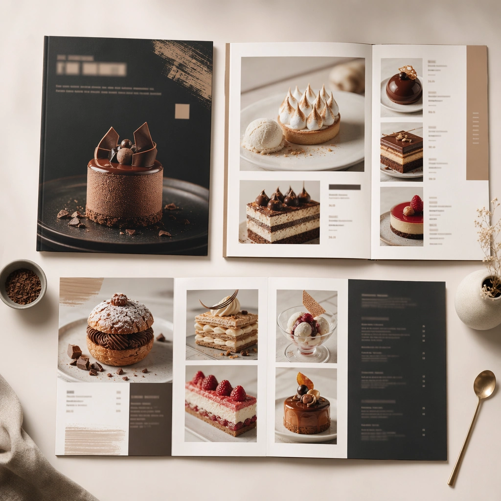
Scene: Compose a square menu-design mockup that combines printed surfaces, structured page hierarchy, and appetizing food photography into one coherent brand-authored system. The page layouts should feel intentional and premium, with strong margins, modular blocks, and realistic print or board materials even though all textual zones remain unreadable. Shoot a square overhead or slight-angle view of a printed insert on a clean table, emphasizing crisp print edges and repeated image modules. Subject: The menu should communicate category structure, hero dish placement, and brand tone through composition, image framing, typographic blocks, and page rhythm rather than through readable copy. Food imagery must stay believable and publication-ready. Show several dessert images organized into a structured grid with abstract text zones and refined color blocks. Important details: This topic tests layout reasoning as much as food styling. Preserve clean grids, realistic paper behavior, credible shadows, and strong focal hierarchy between cover, spreads, dish photos, and placeholder text zones. Text-like marks can exist only as abstract or unreadable forms; clarity must come from design structure. This image should feel fully self-contained while still belonging to the same broader topic and commercial world. The image should feel like a polished editorial page: evenly spaced, premium, and clearly organized without relying on readable language. Use case: Menu System single study 9/9, built for Prompt Atlas coverage of a food and beverage commercial visual system. Constraints: No readable text, no watermark, no logos, preserve exact 1:1 aspect ratio, no readable text, no logos, no fake menu prices, no warped paper errors, no amateur flyer clutter, no chaotic collage, no obvious software UI chrome, no magazine masthead, no visible software crop marks, no chaotic collage.
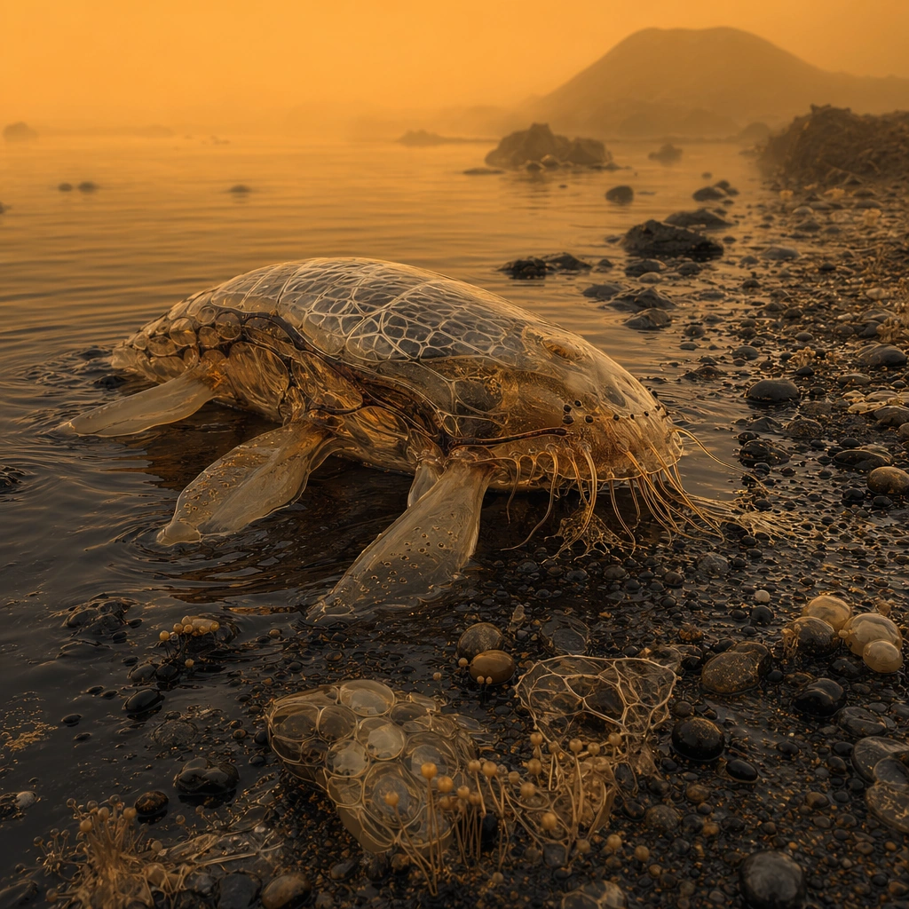
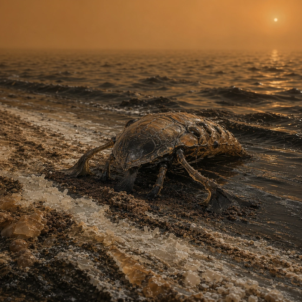
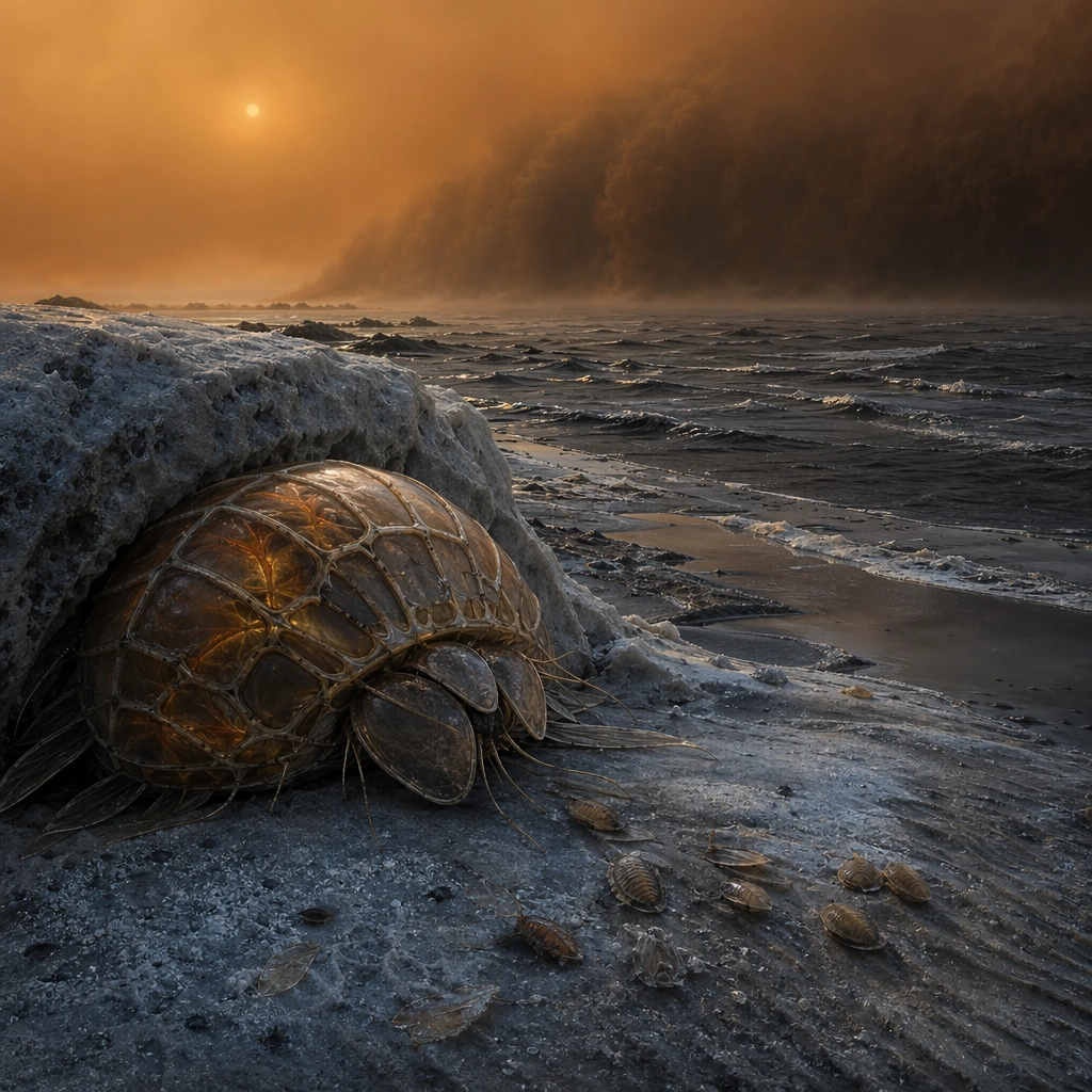
Example generated from “Methane Sea Titan Creature — Shoreline Emergence”
GPT Image 2en

Scene: Create a square shoreline scene on a Titan-like moon, with a low black methane sea, pebbled hydrocarbon shore, and thick orange atmospheric haze swallowing the distance. The light should be dim and diffuse, giving the whole frame a frigid stillness rather than terrestrial drama. Build the frame as a square natural history study with disciplined composition, believable lighting, and enough environmental evidence to explain how this organism or system functions without any caption. Keep the image polished, observational, and suitable for a research gallery rather than pulp fantasy spectacle. Subject: Show a large translucent shoreline organism just emerging from the liquid, with internal circulation channels, insulated surface membranes, and low-slung limbs or paddles adapted for both swimming and slow movement across cold shore sediment. The creature should feel cautious and heavy in the weak light. Show the anatomy, habitat interaction, and scale cues clearly so the viewer can infer locomotion, feeding, reproduction, or ecological role from the visual alone. Every visible structure should feel evolved for a purpose, with layered foreground, midground, and background information that rewards close inspection. Important details: Assume the organism lives in hydrocarbon seas at extreme cold. Tissues, circulation, buoyancy, and sensory structures should reflect cryogenic chemistry, heavy haze, weak sunlight, and a shoreline shaped by methane waves and hydrocarbon sediment. Cryogenic plausibility is essential. Surface textures should look waxy, glassy, and flexible at low temperature, while the body plan suggests hydrocarbon buoyancy and careful heat conservation. Avoid familiar fish or reptile patterns. Favor coherent biology over decorative excess: tissues, shells, membranes, spores, tendrils, fins, silica lattices, or atmospheric sacs should all follow one material logic. Preserve a convincing relationship between the environment and the body plan, use restrained color hierarchy, and make the image feel like a serious speculative field record rather than a random monster concept. Use case: Methane Sea Creature of Titan single study 1/9. Constraints: No readable text, no watermark, no logos, preserve exact 1:1 aspect ratio, no Earth ocean blue, no dinosaur copy, no heroic monster stance, no space-suit humans, no accidental brand resemblance, no direct copy of known terrestrial species, no cartoon simplification.

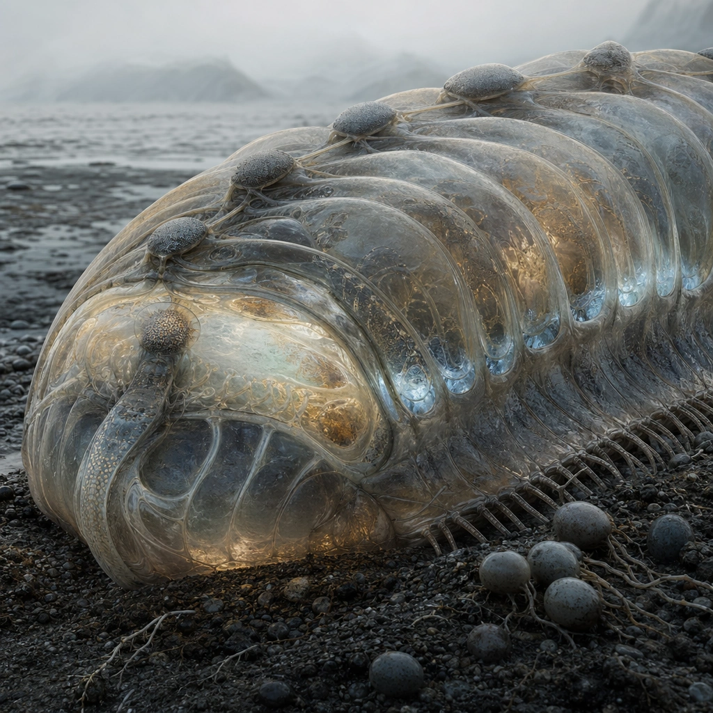
Example generated from “Methane Sea Titan Creature — Translucent Vascular Closeup”
GPT Image 2en

Scene: Move close to the body so the square frame is dominated by translucent tissue, frost haze, and dim shoreline context. Internal channels should glow softly through the body with amber and pale blue variations, visible only because the atmosphere remains so dark and diffuse. Build the frame as a square natural history study with disciplined composition, believable lighting, and enough environmental evidence to explain how this organism or system functions without any caption. Keep the image polished, observational, and suitable for a research gallery rather than pulp fantasy spectacle. Subject: Focus on the circulation system, structural ribs, and skin layers that keep hydrocarbon fluids moving at cryogenic temperature. The anatomy should feel alien but knowable, with clear distinctions between support tissue, circulation pathways, and sensory surfaces. Show the anatomy, habitat interaction, and scale cues clearly so the viewer can infer locomotion, feeding, reproduction, or ecological role from the visual alone. Every visible structure should feel evolved for a purpose, with layered foreground, midground, and background information that rewards close inspection. Important details: Assume the organism lives in hydrocarbon seas at extreme cold. Tissues, circulation, buoyancy, and sensory structures should reflect cryogenic chemistry, heavy haze, weak sunlight, and a shoreline shaped by methane waves and hydrocarbon sediment. Material realism matters most here. The body should look neither gelatinous nor glass sculpture; instead it should read as a cold-adapted biological membrane with depth, opacity changes, and localized luminescence tied to chemistry or warmth. Favor coherent biology over decorative excess: tissues, shells, membranes, spores, tendrils, fins, silica lattices, or atmospheric sacs should all follow one material logic. Preserve a convincing relationship between the environment and the body plan, use restrained color hierarchy, and make the image feel like a serious speculative field record rather than a random monster concept. Use case: Methane Sea Creature of Titan single study 2/9. Constraints: No readable text, no watermark, no logos, preserve exact 1:1 aspect ratio, no medical x-ray look, no neon tubing, no jellyfish copy, no glossy product-shot finish, no accidental brand resemblance, no direct copy of known terrestrial species, no cartoon simplification.

Example generated from “Methane Sea Titan Creature — Methane Wave Foraging”
GPT Image 2en

Scene: Set the image along a gently rippled methane shoreline where incoming dark waves leave bands of frosted residue and organic slush. The atmosphere should stay dim and orange, with faint wind texture visible across the liquid surface. Build the frame as a square natural history study with disciplined composition, believable lighting, and enough environmental evidence to explain how this organism or system functions without any caption. Keep the image polished, observational, and suitable for a research gallery rather than pulp fantasy spectacle. Subject: Show the organism probing deposited material with chemical sensors, unfolding feeding membranes, or rasping nutrient films from the shore. Its posture should communicate energy thrift and careful adaptation to a cold, slow world. Show the anatomy, habitat interaction, and scale cues clearly so the viewer can infer locomotion, feeding, reproduction, or ecological role from the visual alone. Every visible structure should feel evolved for a purpose, with layered foreground, midground, and background information that rewards close inspection. Important details: Assume the organism lives in hydrocarbon seas at extreme cold. Tissues, circulation, buoyancy, and sensory structures should reflect cryogenic chemistry, heavy haze, weak sunlight, and a shoreline shaped by methane waves and hydrocarbon sediment. The feeding behavior must fit the setting. Shoreline chemistry, sediment texture, and body mechanics should all reinforce a non-water ecosystem driven by hydrocarbon transport and sparse resources. Favor coherent biology over decorative excess: tissues, shells, membranes, spores, tendrils, fins, silica lattices, or atmospheric sacs should all follow one material logic. Preserve a convincing relationship between the environment and the body plan, use restrained color hierarchy, and make the image feel like a serious speculative field record rather than a random monster concept. Use case: Methane Sea Creature of Titan single study 3/9. Constraints: No readable text, no watermark, no logos, preserve exact 1:1 aspect ratio, no beach-surf imagery, no fish-copy feeding pose, no bright foam, no terrestrial seaweed, no accidental brand resemblance, no direct copy of known terrestrial species, no cartoon simplification.

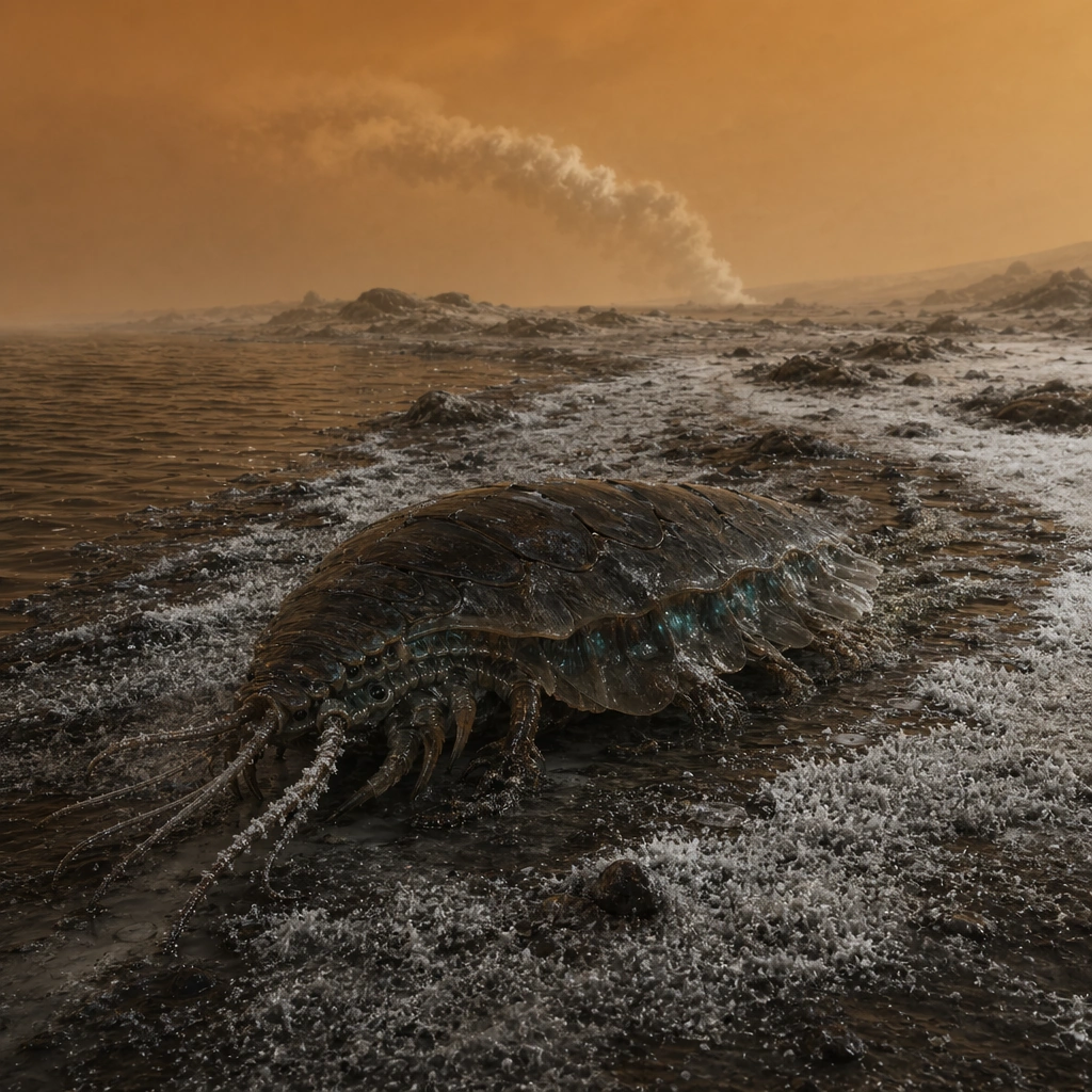
Example generated from “Methane Sea Titan Creature — Cryovolcanic Plume Crossing”
GPT Image 2en

Scene: Build a wide cryogenic landscape where a faint distant cryovolcanic plume rises into the orange sky and condenses back onto the ground as pale frost. The square composition should feel desolate, cold, and geologically active without becoming explosive. Build the frame as a square natural history study with disciplined composition, believable lighting, and enough environmental evidence to explain how this organism or system functions without any caption. Keep the image polished, observational, and suitable for a research gallery rather than pulp fantasy spectacle. Subject: Show one mature creature moving across rough, dark terrain as it navigates plume fallout, perhaps attracted by fresh chemicals or warmth. The body should display weather resistance, traction structures, and insulation tuned for this harsher ground. Show the anatomy, habitat interaction, and scale cues clearly so the viewer can infer locomotion, feeding, reproduction, or ecological role from the visual alone. Every visible structure should feel evolved for a purpose, with layered foreground, midground, and background information that rewards close inspection. Important details: Assume the organism lives in hydrocarbon seas at extreme cold. Tissues, circulation, buoyancy, and sensory structures should reflect cryogenic chemistry, heavy haze, weak sunlight, and a shoreline shaped by methane waves and hydrocarbon sediment. Keep the geology and biology tightly coupled. Frost deposition, surface crust, and the creature’s route should all imply a real ecological opportunity linked to cryovolcanic chemistry. Favor coherent biology over decorative excess: tissues, shells, membranes, spores, tendrils, fins, silica lattices, or atmospheric sacs should all follow one material logic. Preserve a convincing relationship between the environment and the body plan, use restrained color hierarchy, and make the image feel like a serious speculative field record rather than a random monster concept. Use case: Methane Sea Creature of Titan single study 4/9. Constraints: No readable text, no watermark, no logos, preserve exact 1:1 aspect ratio, no lava eruption, no fire, no volcano-on-Earth cues, no action-movie pacing, no accidental brand resemblance, no direct copy of known terrestrial species, no cartoon simplification.

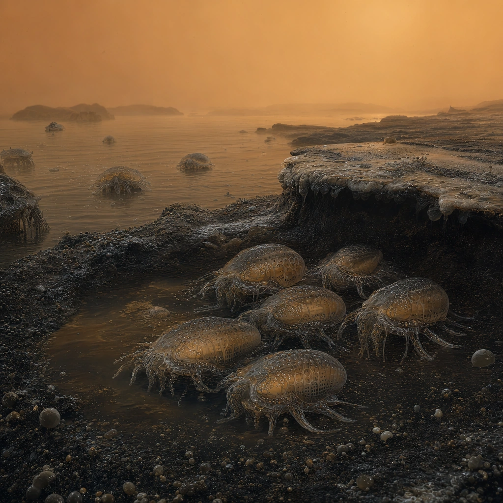
Example generated from “Methane Sea Titan Creature — Juvenile Huddle Basin”
GPT Image 2en

Scene: Create a quiet basin scene shielded from wind, where the orange haze softens the horizon and dark shore material holds faint traces of recent liquid movement. The square frame should feel intimate and protective compared with the harsher open coast. Build the frame as a square natural history study with disciplined composition, believable lighting, and enough environmental evidence to explain how this organism or system functions without any caption. Keep the image polished, observational, and suitable for a research gallery rather than pulp fantasy spectacle. Subject: Focus on several smaller juvenile forms pressed together or partially sheltered by basin edges, showing clear developmental differences from adults in transparency, proportion, and insulation. A few older guardians or environmental traces can imply parental behavior or passive refuge use. Show the anatomy, habitat interaction, and scale cues clearly so the viewer can infer locomotion, feeding, reproduction, or ecological role from the visual alone. Every visible structure should feel evolved for a purpose, with layered foreground, midground, and background information that rewards close inspection. Important details: Assume the organism lives in hydrocarbon seas at extreme cold. Tissues, circulation, buoyancy, and sensory structures should reflect cryogenic chemistry, heavy haze, weak sunlight, and a shoreline shaped by methane waves and hydrocarbon sediment. The cluster should communicate survival strategy in a cryogenic environment: reduced exposure, shared chemistry, and careful use of terrain. Avoid sentimental baby-animal cues and keep the juveniles biologically serious. Favor coherent biology over decorative excess: tissues, shells, membranes, spores, tendrils, fins, silica lattices, or atmospheric sacs should all follow one material logic. Preserve a convincing relationship between the environment and the body plan, use restrained color hierarchy, and make the image feel like a serious speculative field record rather than a random monster concept. Use case: Methane Sea Creature of Titan single study 5/9. Constraints: No readable text, no watermark, no logos, preserve exact 1:1 aspect ratio, no cute mascot look, no mammal cuddle cues, no warm campfire analogy, no bright colors, no accidental brand resemblance, no direct copy of known terrestrial species, no cartoon simplification.

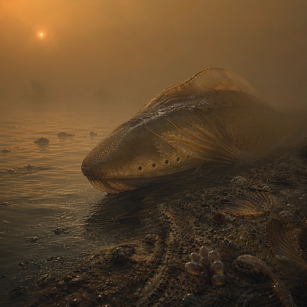
Example generated from “Methane Sea Titan Creature — Sonar Organ Display”
GPT Image 2en

Scene: Compose a side-lit environmental portrait in thick haze so that only the front half of the animal and nearby shoreline are clearly visible. Weak orange light should graze the body, revealing specialized sensing ridges, cavities, or antenna-like structures. Build the frame as a square natural history study with disciplined composition, believable lighting, and enough environmental evidence to explain how this organism or system functions without any caption. Keep the image polished, observational, and suitable for a research gallery rather than pulp fantasy spectacle. Subject: Center on the sensory organs that help the creature navigate murky hydrocarbon seas and haze-heavy air. The organs should appear integrated into the body plan rather than tacked on as dramatic appendages. Show the anatomy, habitat interaction, and scale cues clearly so the viewer can infer locomotion, feeding, reproduction, or ecological role from the visual alone. Every visible structure should feel evolved for a purpose, with layered foreground, midground, and background information that rewards close inspection. Important details: Assume the organism lives in hydrocarbon seas at extreme cold. Tissues, circulation, buoyancy, and sensory structures should reflect cryogenic chemistry, heavy haze, weak sunlight, and a shoreline shaped by methane waves and hydrocarbon sediment. Sensory anatomy should be plausible for low light, dense atmosphere, and cold liquid. Show structural support, protective coatings, and a believable relation to the creature’s movement and foraging behavior. Favor coherent biology over decorative excess: tissues, shells, membranes, spores, tendrils, fins, silica lattices, or atmospheric sacs should all follow one material logic. Preserve a convincing relationship between the environment and the body plan, use restrained color hierarchy, and make the image feel like a serious speculative field record rather than a random monster concept. Use case: Methane Sea Creature of Titan single study 6/9. Constraints: No readable text, no watermark, no logos, preserve exact 1:1 aspect ratio, no insect antenna copy, no sci-fi radar dish, no monster-face closeup, no glowing cyberpunk accents, no accidental brand resemblance, no direct copy of known terrestrial species, no cartoon simplification.

Example generated from “Methane Sea Titan Creature — Stormfront Shelter Ridge”
GPT Image 2en

Scene: Show the approach of a hydrocarbon storm front over dark sea and shore, with the ridge creating a partial shelter in the foreground. The orange atmosphere should turn denser and more opaque toward the storm while remaining readable in the calmer foreground. Build the frame as a square natural history study with disciplined composition, believable lighting, and enough environmental evidence to explain how this organism or system functions without any caption. Keep the image polished, observational, and suitable for a research gallery rather than pulp fantasy spectacle. Subject: Depict the organism lowering its profile, sealing surface vents, and using terrain to reduce exposure. The scene should capture environmental strategy rather than fear or action spectacle. Show the anatomy, habitat interaction, and scale cues clearly so the viewer can infer locomotion, feeding, reproduction, or ecological role from the visual alone. Every visible structure should feel evolved for a purpose, with layered foreground, midground, and background information that rewards close inspection. Important details: Assume the organism lives in hydrocarbon seas at extreme cold. Tissues, circulation, buoyancy, and sensory structures should reflect cryogenic chemistry, heavy haze, weak sunlight, and a shoreline shaped by methane waves and hydrocarbon sediment. Wind direction, wave texture, and body posture must align. This is a cold-weather survival image where geology and anatomy work together against a hostile atmospheric event. Favor coherent biology over decorative excess: tissues, shells, membranes, spores, tendrils, fins, silica lattices, or atmospheric sacs should all follow one material logic. Preserve a convincing relationship between the environment and the body plan, use restrained color hierarchy, and make the image feel like a serious speculative field record rather than a random monster concept. Use case: Methane Sea Creature of Titan single study 7/9. Constraints: No readable text, no watermark, no logos, preserve exact 1:1 aspect ratio, no hurricane disaster scene, no lightning hero pose, no Earth rainstorm look, no fire or sparks, no accidental brand resemblance, no direct copy of known terrestrial species, no cartoon simplification.

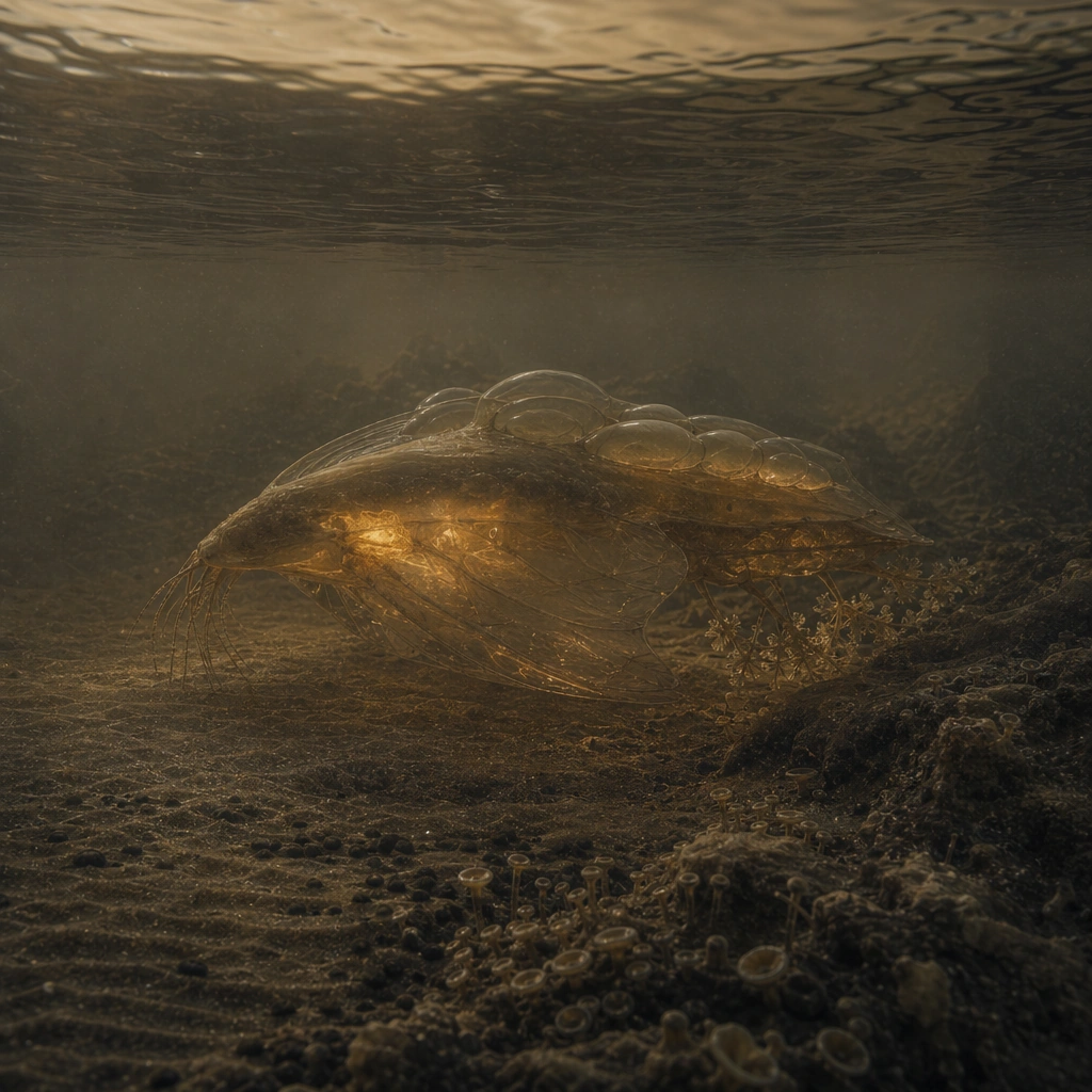
Example generated from “Methane Sea Titan Creature — Undersea Glow Silhouette”
GPT Image 2en

Scene: Take the viewpoint just at or below the liquid surface so the square frame peers through dark translucent methane toward a submerged body near shore. Distortion, suspended particles, and dim shoreline light should make the image quiet and uncanny rather than cinematic. Build the frame as a square natural history study with disciplined composition, believable lighting, and enough environmental evidence to explain how this organism or system functions without any caption. Keep the image polished, observational, and suitable for a research gallery rather than pulp fantasy spectacle. Subject: Show the animal as a soft internal glow silhouette with enough visible structure to read fins, circulation paths, and body posture. The undersea setting should clarify how the organism uses both liquid and air margins during its lifecycle. Show the anatomy, habitat interaction, and scale cues clearly so the viewer can infer locomotion, feeding, reproduction, or ecological role from the visual alone. Every visible structure should feel evolved for a purpose, with layered foreground, midground, and background information that rewards close inspection. Important details: Assume the organism lives in hydrocarbon seas at extreme cold. Tissues, circulation, buoyancy, and sensory structures should reflect cryogenic chemistry, heavy haze, weak sunlight, and a shoreline shaped by methane waves and hydrocarbon sediment. Liquid methane should not behave like clear tropical water. Keep it dense, dark, and slightly obscuring, with lighting and color filtered by hydrocarbon conditions rather than Earth-ocean assumptions. Favor coherent biology over decorative excess: tissues, shells, membranes, spores, tendrils, fins, silica lattices, or atmospheric sacs should all follow one material logic. Preserve a convincing relationship between the environment and the body plan, use restrained color hierarchy, and make the image feel like a serious speculative field record rather than a random monster concept. Use case: Methane Sea Creature of Titan single study 8/9. Constraints: No readable text, no watermark, no logos, preserve exact 1:1 aspect ratio, no scuba feel, no blue water, no shark silhouette trope, no neon underglow, no accidental brand resemblance, no direct copy of known terrestrial species, no cartoon simplification.

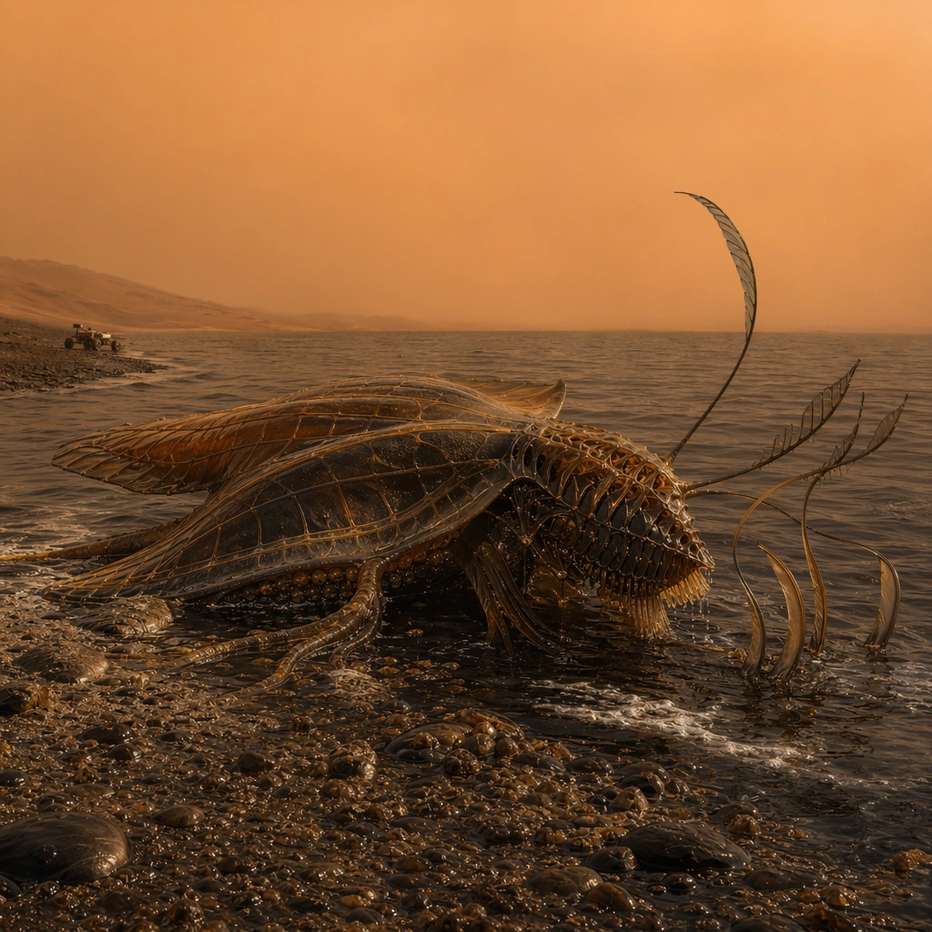
Example generated from “Methane Sea Titan Creature — Survey Rover Encounter”
GPT Image 2en

Scene: Frame the scene from low on the shore with a small distant rover at the edge of the composition and the organism dominating the middle ground. The atmosphere should remain orange, cold, and dusty, with the methane sea forming a dark horizon line. Build the frame as a square natural history study with disciplined composition, believable lighting, and enough environmental evidence to explain how this organism or system functions without any caption. Keep the image polished, observational, and suitable for a research gallery rather than pulp fantasy spectacle. Subject: Use the rover only as a scale cue while keeping the wildlife central. The creature should look curious or indifferent, not aggressive, and its size and texture should become easier to judge because of the nearby machine. Show the anatomy, habitat interaction, and scale cues clearly so the viewer can infer locomotion, feeding, reproduction, or ecological role from the visual alone. Every visible structure should feel evolved for a purpose, with layered foreground, midground, and background information that rewards close inspection. Important details: Assume the organism lives in hydrocarbon seas at extreme cold. Tissues, circulation, buoyancy, and sensory structures should reflect cryogenic chemistry, heavy haze, weak sunlight, and a shoreline shaped by methane waves and hydrocarbon sediment. The encounter should feel like field observation, not conflict. Preserve the shoreline ecology and cryogenic realism while using the rover sparingly to anchor human understanding of scale. Favor coherent biology over decorative excess: tissues, shells, membranes, spores, tendrils, fins, silica lattices, or atmospheric sacs should all follow one material logic. Preserve a convincing relationship between the environment and the body plan, use restrained color hierarchy, and make the image feel like a serious speculative field record rather than a random monster concept. Use case: Methane Sea Creature of Titan single study 9/9. Constraints: No readable text, no watermark, no logos, preserve exact 1:1 aspect ratio, no weaponized rover, no battle scene, no readable interface text, no human astronaut in frame, no accidental brand resemblance, no direct copy of known terrestrial species, no cartoon simplification.

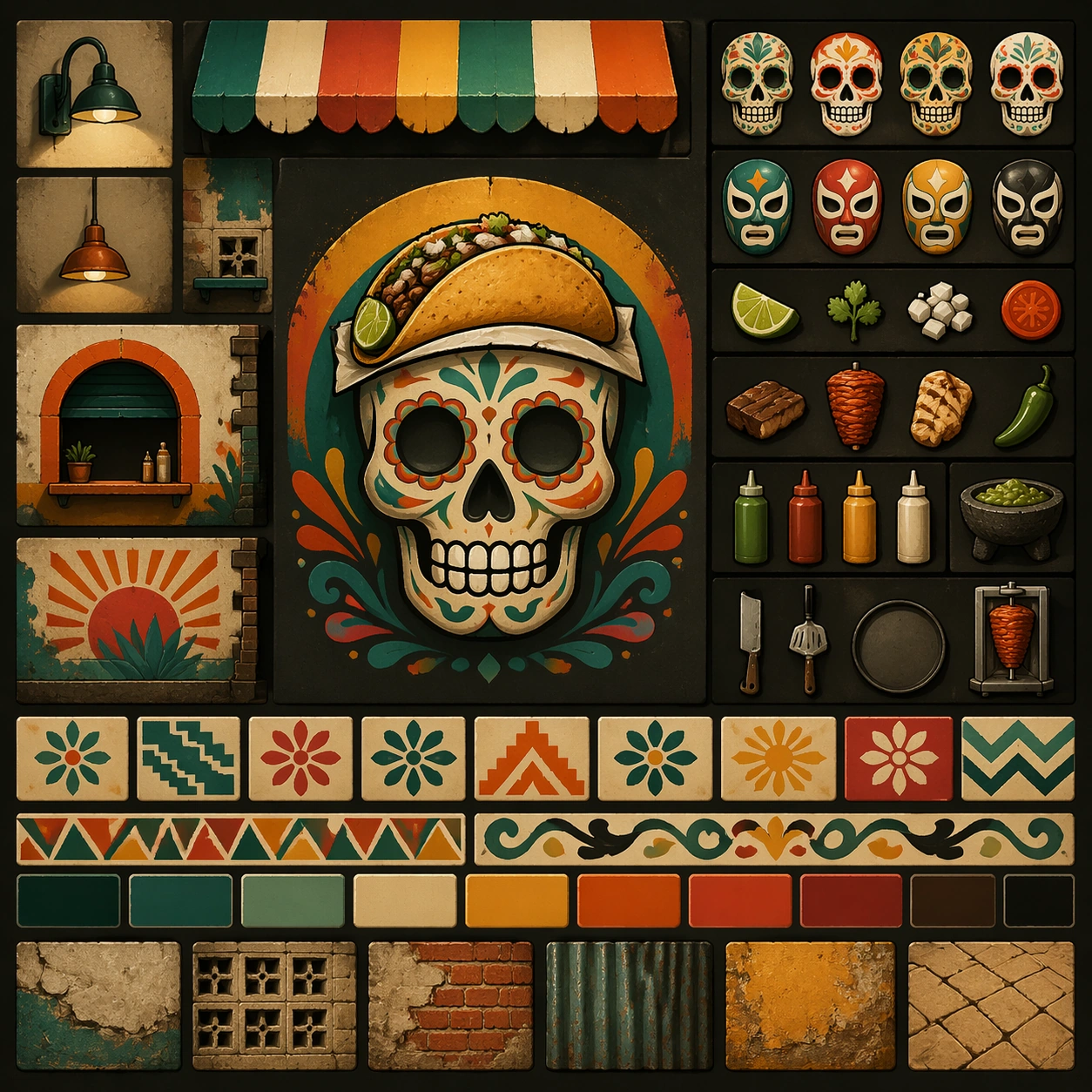
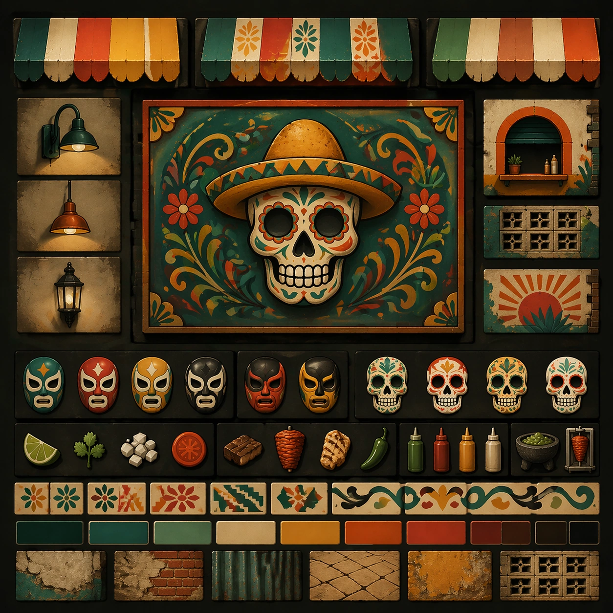
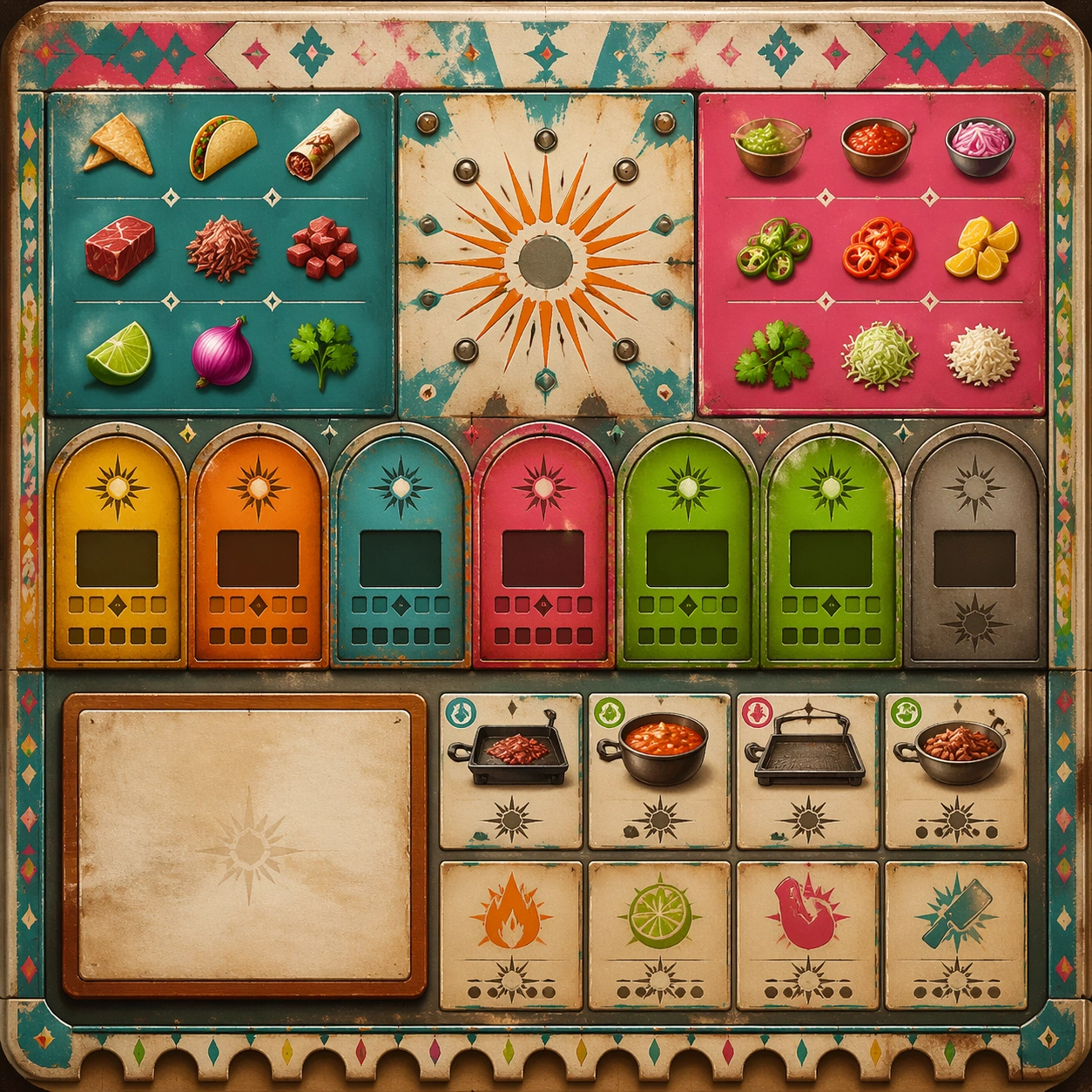
Example generated from “Mexican Street Graphics And Taqueria Language — Reference Anchor”
GPT Image 2en

Scene: Create a square reference image for Mexican Street Graphics and Taqueria Language. Build a reference anchor establishing the core system with a premium, production-ready finish. Use a polished modular board or campaign surface with clean spacing, premium game-UI finish, and clear focal hierarchy. The composition should feel intentional, clean, and reusable for gallery, research, campaign, or internal handoff contexts. Lighting must support readability first, with the main forms clearly separated from the background and enough breathing room for the system to stay legible at both hero scale and thumbnail scale. Subject: Center a coherent original game-art system built for premium production and marketing surfaces. For this image, focus on reference anchor. Keep the same system logic stable across screenshots, cards, banners, and overview boards. This image is the canonical anchor that later series images must follow. The viewer should immediately understand what role this surface plays inside a cohesive game-production asset pack. Important details: Lock framing, icon grammar, palette blocking, and surface hierarchy so the kit feels production-ready and consistent. Preserve the core silhouette, framing language, and material logic from the reference image while each variation changes function. Keep materials believable, edge hierarchy disciplined, and the visual language consistent with Taqueria Style. Use abstract interface blocks or diagram accents when helpful, but avoid any readable language. The final result should feel like a deliberate production asset rather than a random illustration. Use case: Mexican Street Graphics and Taqueria Language series study 1/9, designed as reference anchor within a cohesive asset pack. Constraints: No readable text, no watermark, no logos, preserve exact 1:1 aspect ratio, no unrelated objects, no broken visual hierarchy, no malformed anatomy or broken perspective, no random decorative clutter.

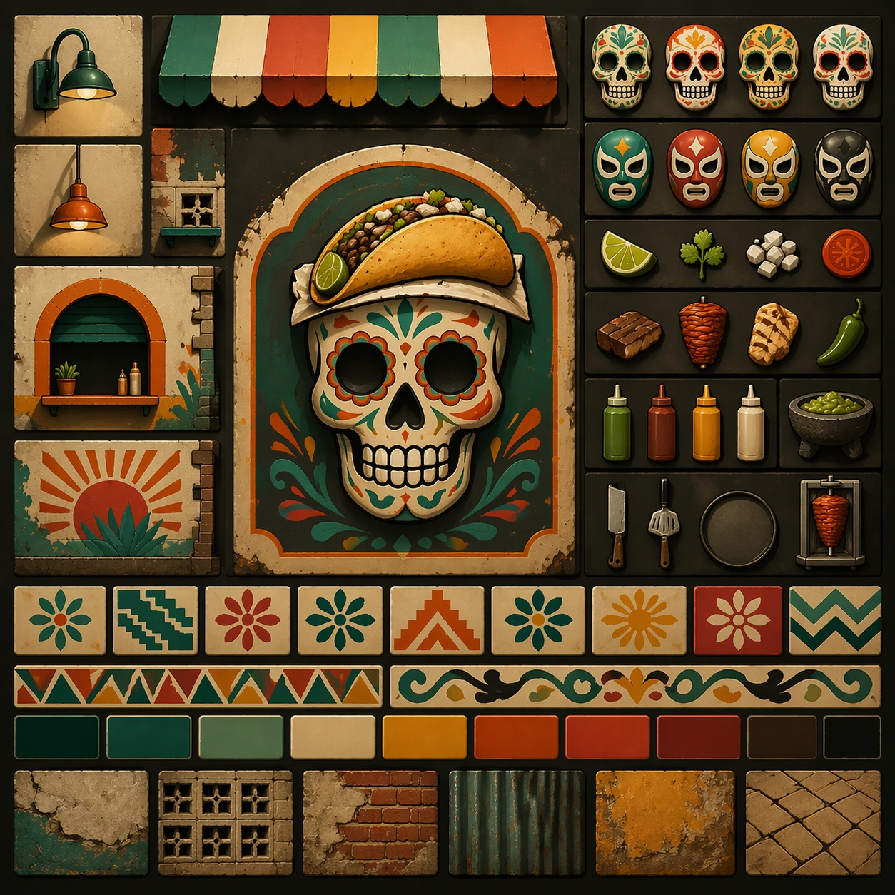
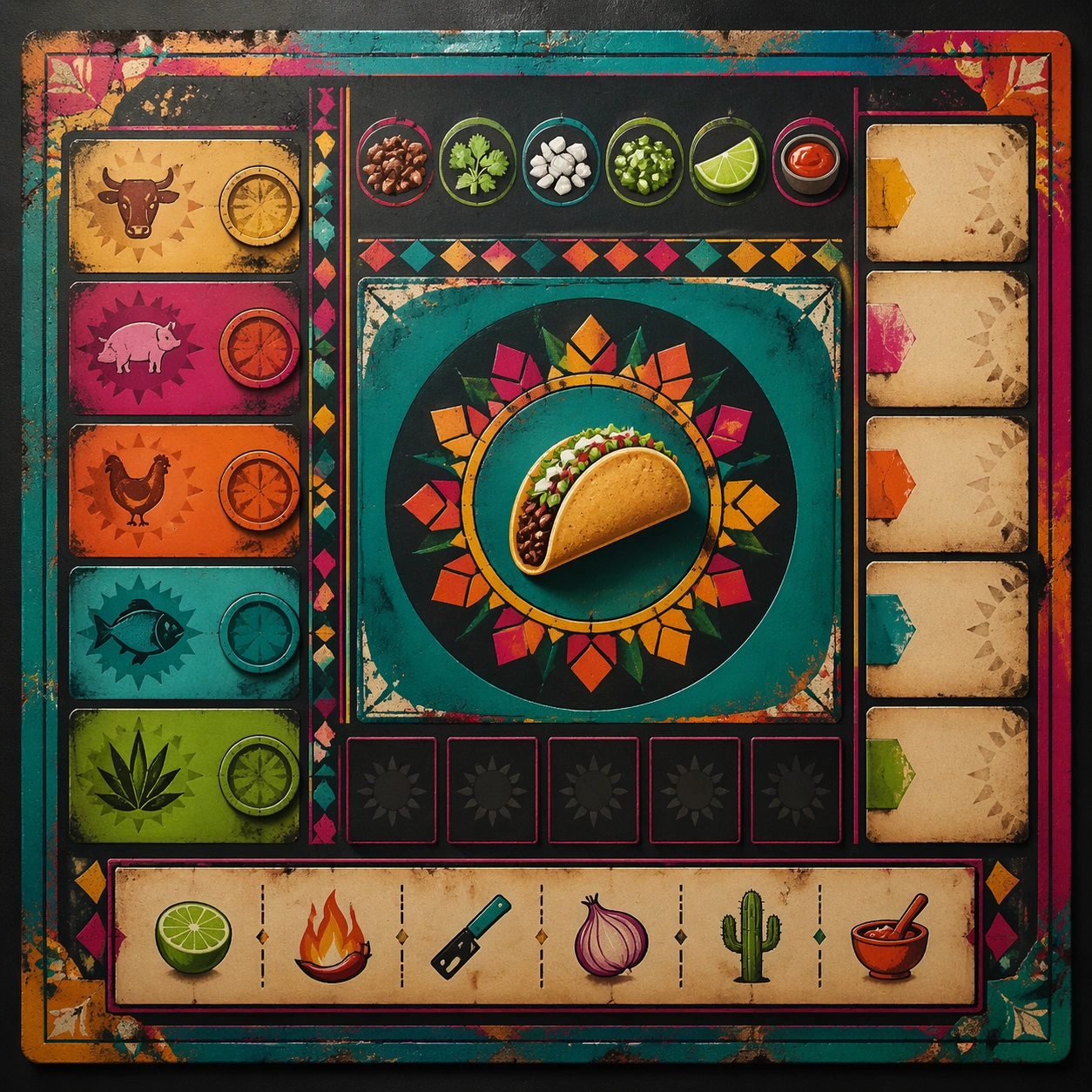
Example generated from “Mexican Street Graphics And Taqueria Language — Variant One”
GPT Image 2en

Scene: Create a square dependent image for Mexican Street Graphics and Taqueria Language. Build a first controlled variation in the same system with a premium, production-ready finish. Use a polished modular board or campaign surface with clean spacing, premium game-UI finish, and clear focal hierarchy. The composition should feel intentional, clean, and reusable for gallery, research, campaign, or internal handoff contexts. Lighting must support readability first, with the main forms clearly separated from the background and enough breathing room for the system to stay legible at both hero scale and thumbnail scale. Subject: Center a coherent original game-art system built for premium production and marketing surfaces. For this image, focus on the intended support surface. Keep the same system logic stable across screenshots, cards, banners, and overview boards. Preserve exact identity or system logic from the reference image while changing only the intended variation axis. The viewer should immediately understand what role this surface plays inside a cohesive game-production asset pack. Important details: Lock framing, icon grammar, palette blocking, and surface hierarchy so the kit feels production-ready and consistent. Preserve the core silhouette, framing language, and material logic from the reference image while each variation changes function. Keep materials believable, edge hierarchy disciplined, and the visual language consistent with Taqueria Style. Use abstract interface blocks or diagram accents when helpful, but avoid any readable language. The final result should feel like a deliberate production asset rather than a random illustration. Use case: Mexican Street Graphics and Taqueria Language series study 2/9, designed as variant one within a cohesive asset pack. Constraints: No readable text, no watermark, no logos, preserve exact 1:1 aspect ratio, no unrelated objects, no broken visual hierarchy, no malformed anatomy or broken perspective, no random decorative clutter.
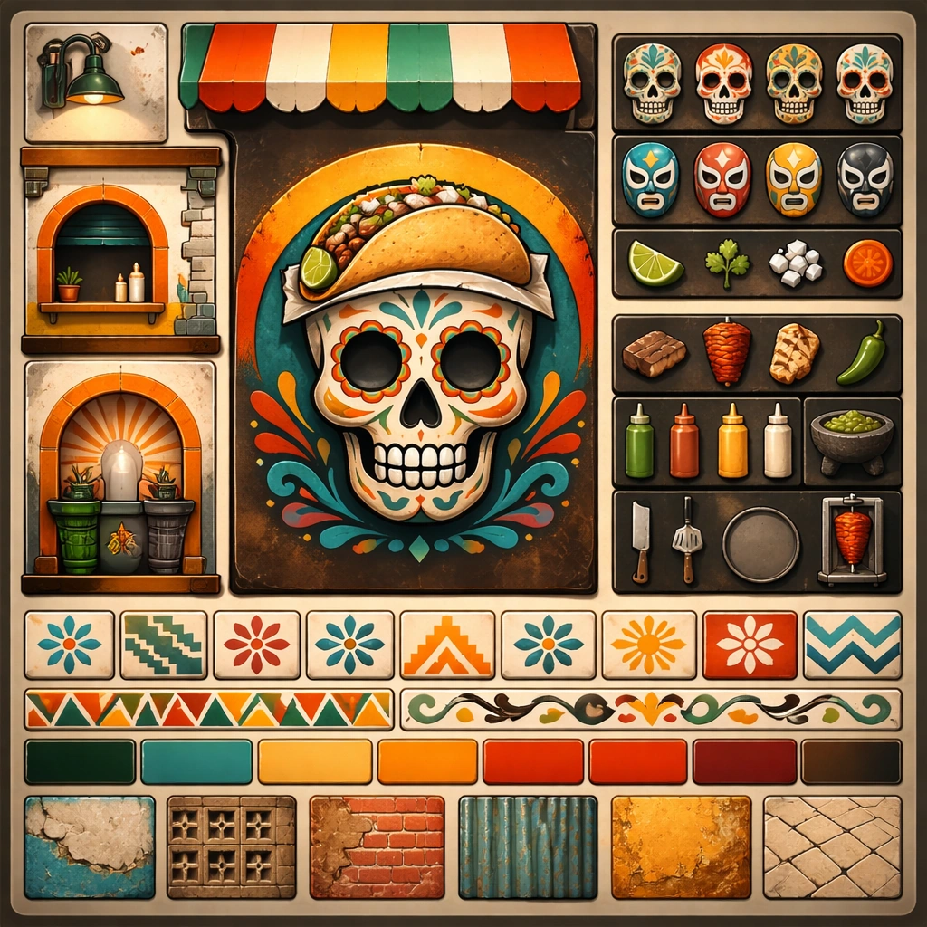
Example generated from “Mexican Street Graphics And Taqueria Language — Variant Two”
GPT Image 2en

Scene: Create a square dependent image for Mexican Street Graphics and Taqueria Language. Build a second controlled variation in the same system with a premium, production-ready finish. Use a polished modular board or campaign surface with clean spacing, premium game-UI finish, and clear focal hierarchy. The composition should feel intentional, clean, and reusable for gallery, research, campaign, or internal handoff contexts. Lighting must support readability first, with the main forms clearly separated from the background and enough breathing room for the system to stay legible at both hero scale and thumbnail scale. Subject: Center a coherent original game-art system built for premium production and marketing surfaces. For this image, focus on the intended support surface. Keep the same system logic stable across screenshots, cards, banners, and overview boards. Preserve exact identity or system logic from the reference image while changing only the intended variation axis. The viewer should immediately understand what role this surface plays inside a cohesive game-production asset pack. Important details: Lock framing, icon grammar, palette blocking, and surface hierarchy so the kit feels production-ready and consistent. Preserve the core silhouette, framing language, and material logic from the reference image while each variation changes function. Keep materials believable, edge hierarchy disciplined, and the visual language consistent with Taqueria Style. Use abstract interface blocks or diagram accents when helpful, but avoid any readable language. The final result should feel like a deliberate production asset rather than a random illustration. Use case: Mexican Street Graphics and Taqueria Language series study 3/9, designed as variant two within a cohesive asset pack. Constraints: No readable text, no watermark, no logos, preserve exact 1:1 aspect ratio, no unrelated objects, no broken visual hierarchy, no malformed anatomy or broken perspective, no random decorative clutter.

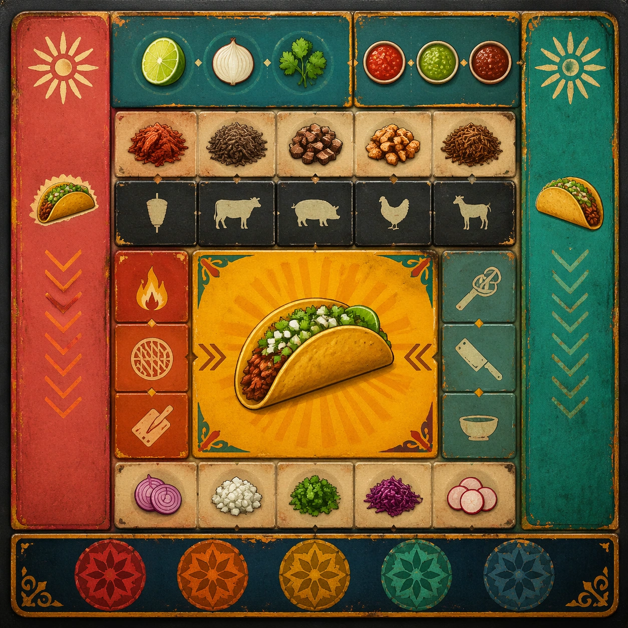
Example generated from “Mexican Street Graphics And Taqueria Language — Variant Three”
GPT Image 2en

Scene: Create a square dependent image for Mexican Street Graphics and Taqueria Language. Build a third controlled variation in the same system with a premium, production-ready finish. Use a polished modular board or campaign surface with clean spacing, premium game-UI finish, and clear focal hierarchy. The composition should feel intentional, clean, and reusable for gallery, research, campaign, or internal handoff contexts. Lighting must support readability first, with the main forms clearly separated from the background and enough breathing room for the system to stay legible at both hero scale and thumbnail scale. Subject: Center a coherent original game-art system built for premium production and marketing surfaces. For this image, focus on the intended support surface. Keep the same system logic stable across screenshots, cards, banners, and overview boards. Preserve exact identity or system logic from the reference image while changing only the intended variation axis. The viewer should immediately understand what role this surface plays inside a cohesive game-production asset pack. Important details: Lock framing, icon grammar, palette blocking, and surface hierarchy so the kit feels production-ready and consistent. Preserve the core silhouette, framing language, and material logic from the reference image while each variation changes function. Keep materials believable, edge hierarchy disciplined, and the visual language consistent with Taqueria Style. Use abstract interface blocks or diagram accents when helpful, but avoid any readable language. The final result should feel like a deliberate production asset rather than a random illustration. Use case: Mexican Street Graphics and Taqueria Language series study 4/9, designed as variant three within a cohesive asset pack. Constraints: No readable text, no watermark, no logos, preserve exact 1:1 aspect ratio, no unrelated objects, no broken visual hierarchy, no malformed anatomy or broken perspective, no random decorative clutter.

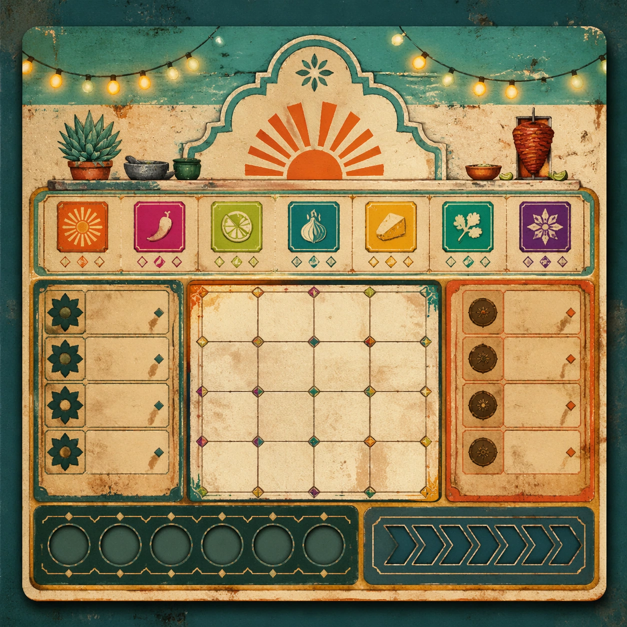
Example generated from “Mexican Street Graphics And Taqueria Language — Support One”
GPT Image 2en

Scene: Create a square standalone support image for Mexican Street Graphics and Taqueria Language. Build a support-surface study with a clear focal hierarchy and a finished professional surface. Use a polished modular board or campaign surface with clean spacing, premium game-UI finish, and clear focal hierarchy. The frame should feel self-contained and polished, with enough structure to explain the system even without the reference series, yet still obviously belonging to the same theme and production world. Subject: Show a coherent original game-art system built for premium production and marketing surfaces in a way that emphasizes the intended support surface. Keep the same system logic stable across screenshots, cards, banners, and overview boards. Even though this image is independent, the viewer should still recognize the same universe, same commercial logic, and same production intent as the core package. Important details: Lock framing, icon grammar, palette blocking, and surface hierarchy so the kit feels production-ready and consistent. Preserve the broader theme language through color, framing, material choices, and modular composition. Use clean panel rhythm, premium asset presentation, and believable detail density. The image should work equally well as a gallery study, research reference, and mock production deliverable. Use case: Mexican Street Graphics and Taqueria Language single study 5/9, exploring support one as a support surface. Constraints: No readable text, no watermark, no logos, preserve exact 1:1 aspect ratio, no unrelated objects, no broken visual hierarchy, no visual noise that obscures the main surface, no accidental brand resemblance.

Example generated from “Mexican Street Graphics And Taqueria Language — Support Two”
GPT Image 2en

Scene: Create a square standalone support image for Mexican Street Graphics and Taqueria Language. Build a second support-surface study with a clear focal hierarchy and a finished professional surface. Use a polished modular board or campaign surface with clean spacing, premium game-UI finish, and clear focal hierarchy. The frame should feel self-contained and polished, with enough structure to explain the system even without the reference series, yet still obviously belonging to the same theme and production world. Subject: Show a coherent original game-art system built for premium production and marketing surfaces in a way that emphasizes the intended support surface. Keep the same system logic stable across screenshots, cards, banners, and overview boards. Even though this image is independent, the viewer should still recognize the same universe, same commercial logic, and same production intent as the core package. Important details: Lock framing, icon grammar, palette blocking, and surface hierarchy so the kit feels production-ready and consistent. Preserve the broader theme language through color, framing, material choices, and modular composition. Use clean panel rhythm, premium asset presentation, and believable detail density. The image should work equally well as a gallery study, research reference, and mock production deliverable. Use case: Mexican Street Graphics and Taqueria Language single study 6/9, exploring support two as a support surface. Constraints: No readable text, no watermark, no logos, preserve exact 1:1 aspect ratio, no unrelated objects, no broken visual hierarchy, no visual noise that obscures the main surface, no accidental brand resemblance.

Example generated from “Mexican Street Graphics And Taqueria Language — Support Three”
GPT Image 2en

Scene: Create a square standalone support image for Mexican Street Graphics and Taqueria Language. Build a third support-surface study with a clear focal hierarchy and a finished professional surface. Use a polished modular board or campaign surface with clean spacing, premium game-UI finish, and clear focal hierarchy. The frame should feel self-contained and polished, with enough structure to explain the system even without the reference series, yet still obviously belonging to the same theme and production world. Subject: Show a coherent original game-art system built for premium production and marketing surfaces in a way that emphasizes the intended support surface. Keep the same system logic stable across screenshots, cards, banners, and overview boards. Even though this image is independent, the viewer should still recognize the same universe, same commercial logic, and same production intent as the core package. Important details: Lock framing, icon grammar, palette blocking, and surface hierarchy so the kit feels production-ready and consistent. Preserve the broader theme language through color, framing, material choices, and modular composition. Use clean panel rhythm, premium asset presentation, and believable detail density. The image should work equally well as a gallery study, research reference, and mock production deliverable. Use case: Mexican Street Graphics and Taqueria Language single study 7/9, exploring support three as a support surface. Constraints: No readable text, no watermark, no logos, preserve exact 1:1 aspect ratio, no unrelated objects, no broken visual hierarchy, no visual noise that obscures the main surface, no accidental brand resemblance.

Example generated from “Mexican Street Graphics And Taqueria Language — Support Four”
GPT Image 2en

Scene: Create a square standalone support image for Mexican Street Graphics and Taqueria Language. Build a fourth support-surface study with a clear focal hierarchy and a finished professional surface. Use a polished modular board or campaign surface with clean spacing, premium game-UI finish, and clear focal hierarchy. The frame should feel self-contained and polished, with enough structure to explain the system even without the reference series, yet still obviously belonging to the same theme and production world. Subject: Show a coherent original game-art system built for premium production and marketing surfaces in a way that emphasizes the intended support surface. Keep the same system logic stable across screenshots, cards, banners, and overview boards. Even though this image is independent, the viewer should still recognize the same universe, same commercial logic, and same production intent as the core package. Important details: Lock framing, icon grammar, palette blocking, and surface hierarchy so the kit feels production-ready and consistent. Preserve the broader theme language through color, framing, material choices, and modular composition. Use clean panel rhythm, premium asset presentation, and believable detail density. The image should work equally well as a gallery study, research reference, and mock production deliverable. Use case: Mexican Street Graphics and Taqueria Language single study 8/9, exploring support four as a support surface. Constraints: No readable text, no watermark, no logos, preserve exact 1:1 aspect ratio, no unrelated objects, no broken visual hierarchy, no visual noise that obscures the main surface, no accidental brand resemblance.

Example generated from “Mexican Street Graphics And Taqueria Language — Support Five”
GPT Image 2en

Scene: Create a square standalone support image for Mexican Street Graphics and Taqueria Language. Build a fifth support-surface study with a clear focal hierarchy and a finished professional surface. Use a polished modular board or campaign surface with clean spacing, premium game-UI finish, and clear focal hierarchy. The frame should feel self-contained and polished, with enough structure to explain the system even without the reference series, yet still obviously belonging to the same theme and production world. Subject: Show a coherent original game-art system built for premium production and marketing surfaces in a way that emphasizes the intended support surface. Keep the same system logic stable across screenshots, cards, banners, and overview boards. Even though this image is independent, the viewer should still recognize the same universe, same commercial logic, and same production intent as the core package. Important details: Lock framing, icon grammar, palette blocking, and surface hierarchy so the kit feels production-ready and consistent. Preserve the broader theme language through color, framing, material choices, and modular composition. Use clean panel rhythm, premium asset presentation, and believable detail density. The image should work equally well as a gallery study, research reference, and mock production deliverable. Use case: Mexican Street Graphics and Taqueria Language single study 9/9, exploring support five as a support surface. Constraints: No readable text, no watermark, no logos, preserve exact 1:1 aspect ratio, no unrelated objects, no broken visual hierarchy, no visual noise that obscures the main surface, no accidental brand resemblance.

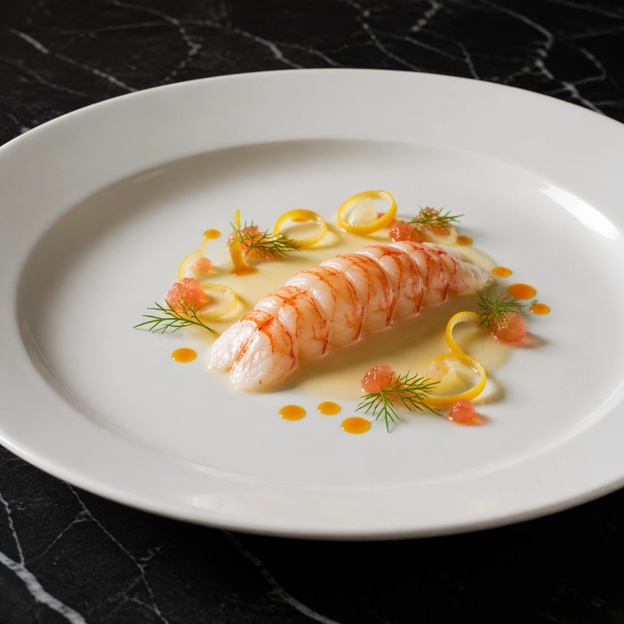
Example generated from “Michelin Plate Hero Shot — Langoustine Citrus Ribbon”
GPT Image 2en

Scene: A square commercial food photograph shot at a shallow 45 degree angle so the rim of a wide white porcelain plate remains visible against a black marble tabletop. Use clean directional side light from the left with soft shadow falloff and controlled highlights on glaze and shellfish. The frame should feel like a premium restaurant launch image with ample breathing room, calm contrast, and no rustic clutter. Subject: Present a single poached langoustine tail as the hero element, set on a pale ivory sauce with curled ribbons of compressed citrus peel, small fennel fronds, translucent grapefruit pearls, and a few precise dots of orange oil. The langoustine should look tender and moist, with subtle coral color variation and natural segmented structure. The garnish forms a loose spiral that guides the eye without overwhelming the main ingredient. Keep the plate elegant and contemporary, with a small tasting-menu portion and meticulous spacing. Important details: The seafood anatomy must remain believable: clear segment definition, slight sheen, and no cartoonish oversizing. Citrus ribbons should look thin, pliable, and freshly cut, not plastic. Sauce viscosity, oil separation, and porcelain reflections should read as real photography. This image depends on world knowledge of refined seafood plating, where restraint, freshness, and visual precision matter more than abundance. Use case: Michelin Plate Hero Shot single study 2/8, focused on a refined langoustine composition with citrus-driven movement. Constraints: No readable text, no watermark, no logos, preserve exact 1:1 aspect ratio, no utensils, no hands, no table props, no rustic wood, no overfilled plate, no duplicated shellfish, no messy splashes, no unnatural neon color.

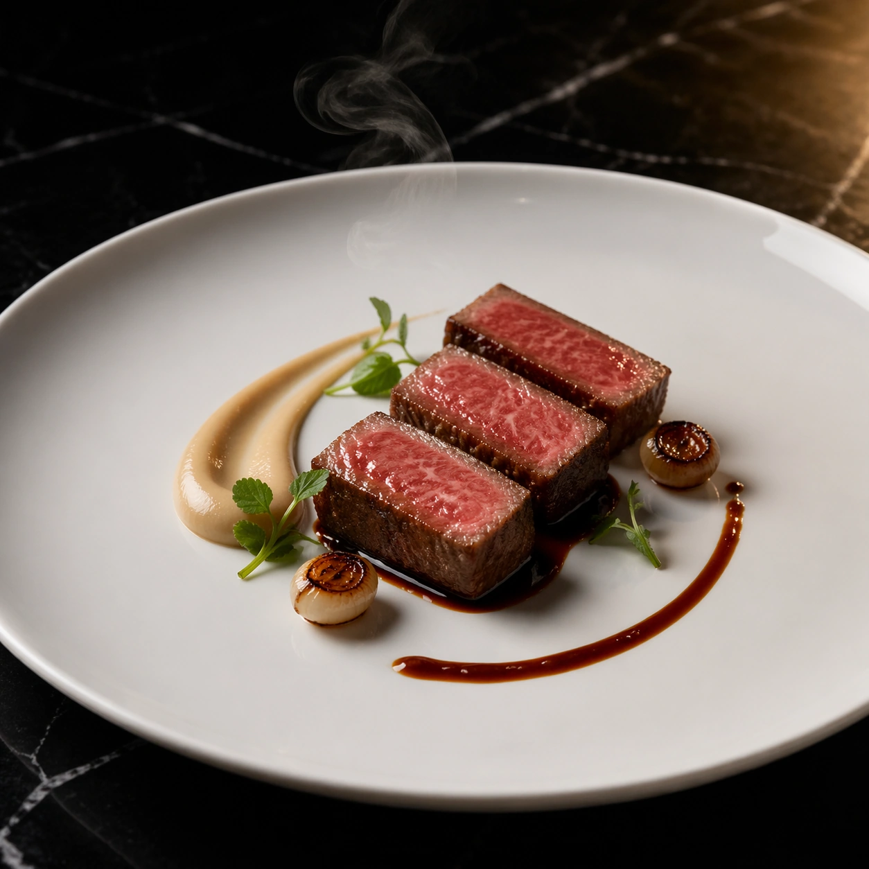
Example generated from “Michelin Plate Hero Shot — Wagyu Smoke Lacquer”
GPT Image 2en

Scene: A square steak hero shot framed from a slightly elevated three-quarter angle, with a large white porcelain plate resting on polished black marble under controlled overhead light and a narrow warm side kicker. The lighting should reveal lacquered surfaces, gentle steam, and plate curvature while keeping the background clean and dark. The image must feel like a high-budget restaurant advertising visual rather than casual dining photography. Subject: Feature three neatly sliced pieces of medium-rare wagyu beef arranged in a staggered line over a glossy dark glaze. Add a small smoked onion puree swoosh, a few charred pearl onions, tiny mustard greens, and one precise arc of reduced jus. The beef should show realistic marbling, moist cut faces, and a restrained amount of rendered fat sheen. Use a very small portion, plated like a tasting course, with one faint wisp of smoke or vapor rising near the meat to imply heat and service timing. Important details: Wagyu texture must be convincing, with fine marbling and correct pink center rather than raw or overcooked extremes. Keep the glaze reflective but controlled, and avoid barbecue styling. The plate should read as European fine dining: minimal components, strong negative space, and exact sauce geometry. Every garnish must support the meat and not turn the plate into a busy still life. Use case: Michelin Plate Hero Shot single study 3/8, focused on premium wagyu treatment with lacquered surfaces and restrained drama. Constraints: No readable text, no watermark, no logos, preserve exact 1:1 aspect ratio, no steak knife, no hands, no wooden board, no oversized ribeye slab, no casual grill marks, no messy grease, no extra side dishes, no cartoon smoke clouds.

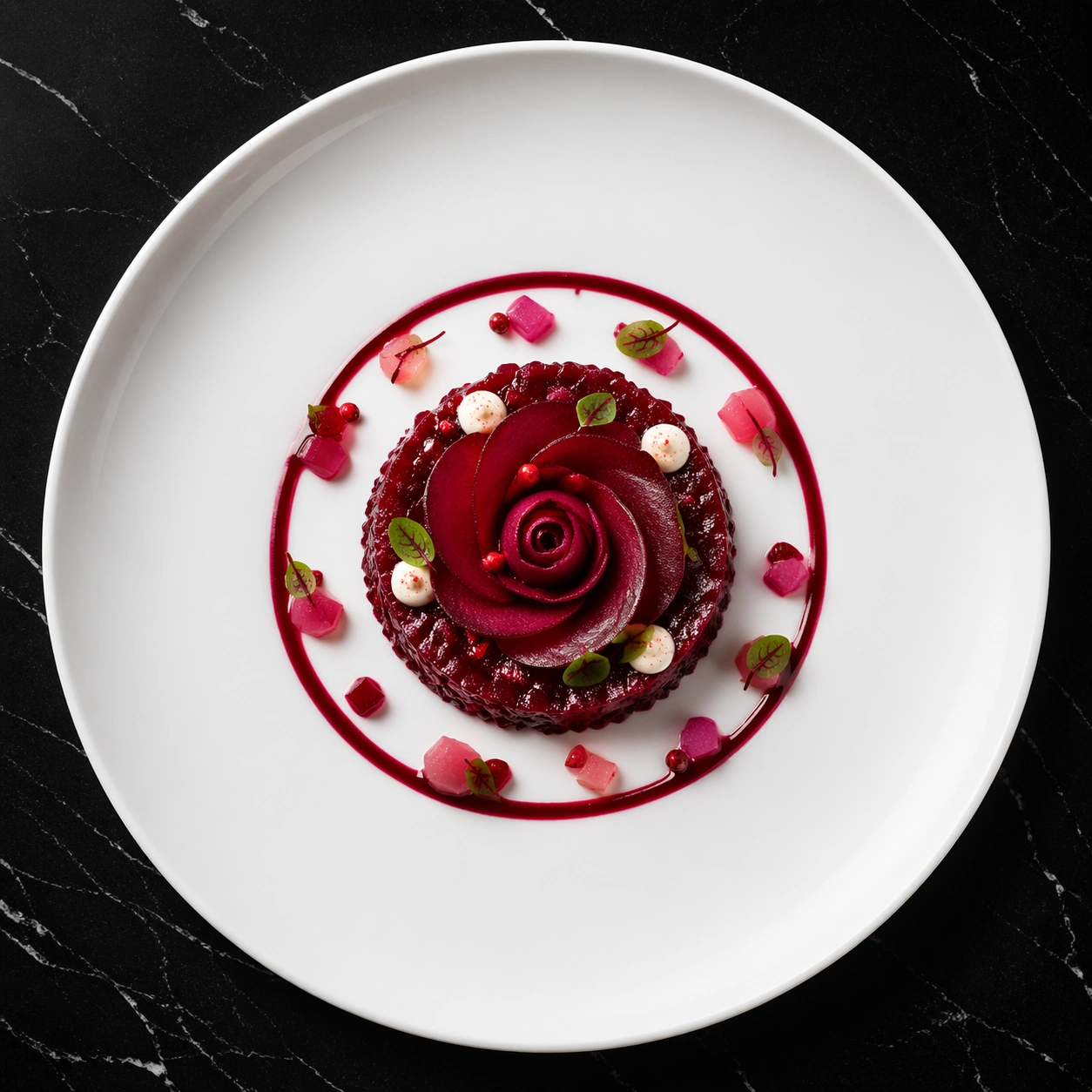
Example generated from “Michelin Plate Hero Shot — Beetroot Rose Tartare”
GPT Image 2en

Scene: A square overhead hero shot on a pure black marble surface with subtle reflection, featuring a wide-rim white porcelain plate under crisp top light and a softer fill from the lower right. The frame should feel clean, feminine, and deliberate, like a seasonal tasting-menu campaign image. Negative space is important: let the plate breathe and keep the overall composition centered but not static. Subject: Create an elegant beetroot tartare formed into a low circular mound, topped with paper-thin concentric rose-like slices of beet, tiny pink peppercorn accents, micro sorrel leaves, and a few dots of pale horseradish cream. Around the tartare, place a restrained ring of ruby beet reduction and a small scatter of translucent pickled vegetable cubes. The palette should stay within deep burgundy, blush pink, ivory, and a touch of green, with the tartare reading as refined vegetable-focused gastronomy rather than rustic salad. Important details: The beet texture must look real: moist but not wet, finely cut, and lightly glossy. Rose slices should appear thin and delicate, with natural organic irregularity. Porcelain cleanliness, sauce edge control, and microgreen placement matter as much as the ingredients themselves. This image should demonstrate that a vegetable course can carry the same premium hero-shot gravity as seafood or meat. Use case: Michelin Plate Hero Shot single study 4/8, focused on a jewel-toned beet tartare plated with floral precision. Constraints: No readable text, no watermark, no logos, preserve exact 1:1 aspect ratio, no cutlery, no linen, no rustic crumbs, no oversized salad volume, no sloppy beet stains outside the intended sauce, no cheese shavings, no extra bowls, no casual bistro styling.

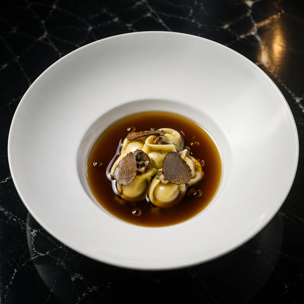
Example generated from “Michelin Plate Hero Shot — Truffle Broth Island”
GPT Image 2en

Scene: A square fine-dining photograph captured from a slightly elevated angle, showing a broad white bowl-plate on glossy black marble under cool top light and a gentle warm side reflection. The image should feel calm and expensive, with the kind of lighting used for menu covers or chef collaboration campaigns. Keep the composition minimal and centered, with the shallow bowl shape clearly visible. Subject: In the center of the bowl, place a small island of handmade stuffed pasta and mushroom duxelles, surrounded by a dark clear truffle broth poured to a perfectly level ring. Add a few paper-thin black truffle slices, tiny chive batons, and restrained droplets of brown butter near the edge of the island. The pasta should appear delicate and freshly cooked, with subtle folds and a satin finish. The broth must look transparent yet deeply colored, showing reflections and depth without becoming muddy. Important details: This study depends on believable culinary physics: the liquid level should be clean, the pasta edges slightly swollen from cooking, and truffle slices thin enough to curl naturally. Avoid rustic soup cues. The plate should read as a luxury tasting course where the dark broth amplifies the pale central island. Negative space inside the bowl is as important as the garnish count. Use case: Michelin Plate Hero Shot single study 5/8, focused on a truffle broth composition with precise liquid control and minimal garnish. Constraints: No readable text, no watermark, no logos, preserve exact 1:1 aspect ratio, no spoon, no bread, no splashed broth on the rim, no oversized soup serving, no cloudy liquid, no excessive herb scatter, no extra dishes, no rustic ceramic bowl.

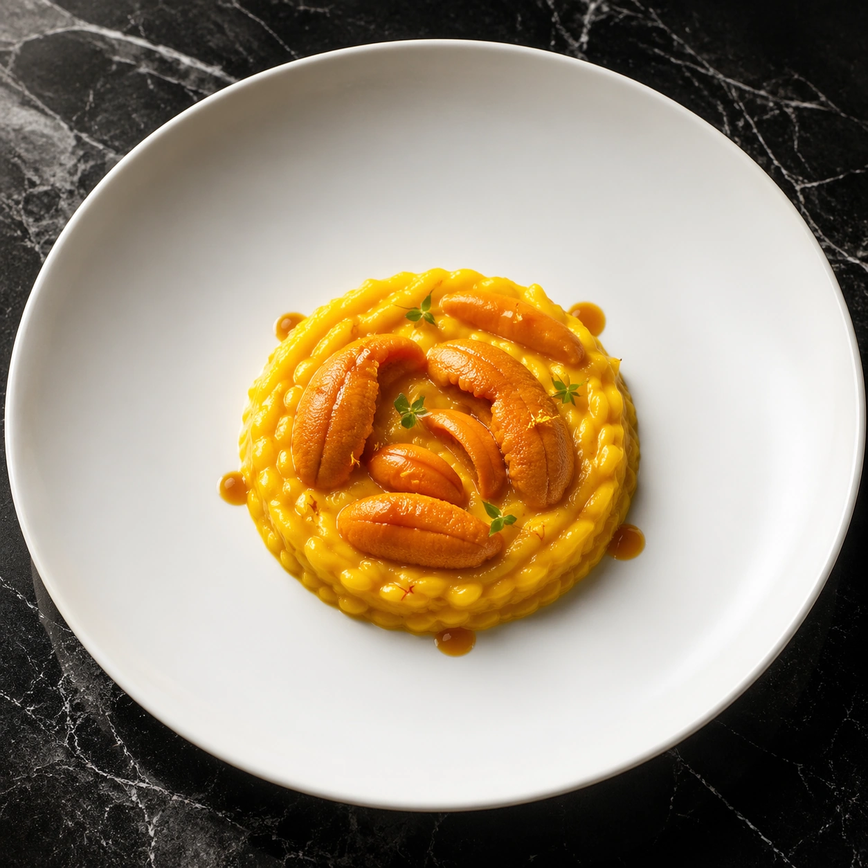
Example generated from “Michelin Plate Hero Shot — Sea Urchin Saffron Spiral”
GPT Image 2en

Scene: A square luxury food image shot from overhead with a slight tilt, showing a clean white porcelain coupe plate on black marble. Use bright but soft top lighting with a subtle side highlight to reveal glossy sauce, creamy textures, and porcelain curvature. The frame should feel Mediterranean and luminous while remaining minimal and commercially polished. Subject: Plate a small saffron risotto or creamy grain base in a tight spiral, topped with several realistic tongues of sea urchin, tiny fennel pollen dusting, micro herbs, and a few precise droplets of shellfish glaze. The saffron base should glow warm golden yellow, while the sea urchin adds richer orange tones and a soft marine texture. Arrange the urchin in a way that feels chef-planned rather than scattered. A minimal halo of sauce and a few tiny citrus zest threads can add energy without clutter. Important details: Sea urchin must look anatomically believable, delicate, and slightly glossy, never rubbery. The risotto or grain base should look creamy and luxurious without becoming soupy. This is a fine-dining composition built on ingredient knowledge: premium roe texture, saffron color, restrained herb usage, and a plate that communicates cost and precision. Keep the marble background quiet and avoid any casual seafood-restaurant cues. Use case: Michelin Plate Hero Shot single study 6/8, focused on a luminous saffron and sea urchin plate with high-end ingredient realism. Constraints: No readable text, no watermark, no logos, preserve exact 1:1 aspect ratio, no shells on the plate, no lemons cut in half, no cluttered garnish pile, no oversized risotto portion, no messy drips, no rustic seafood styling, no extra bowls, no fake bright-orange plastic texture.

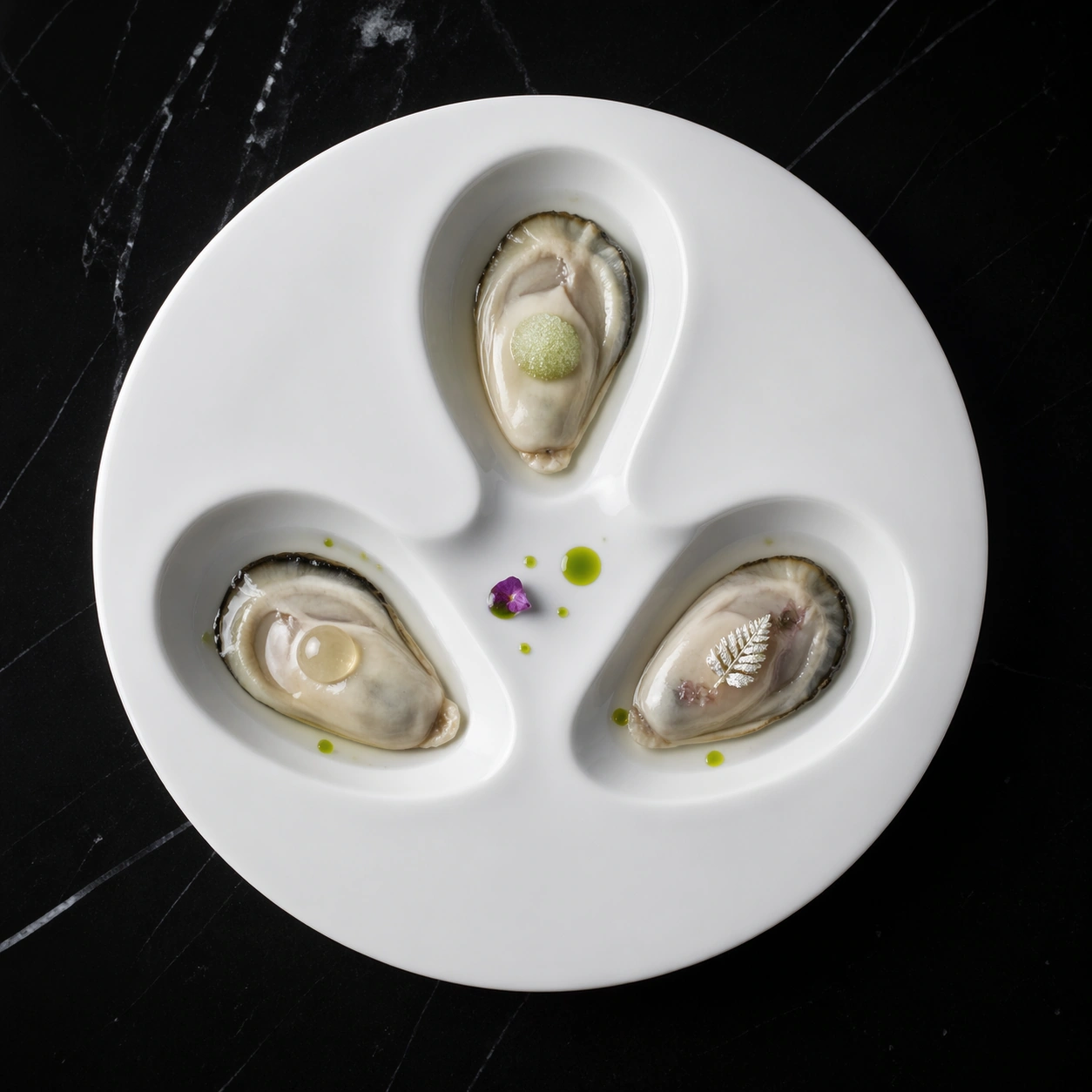
Example generated from “Michelin Plate Hero Shot — Oyster Pearl Minimalism”
GPT Image 2en

Scene: A square editorial food hero shot captured from directly above, using a single white porcelain plate on a nearly pure black marble slab with faint polished reflections. The light is crisp, frontal, and high-end, like a beauty campaign for a tasting menu. The composition should feel almost graphic in its simplicity, with large negative space and only a few carefully placed highlights. Subject: Arrange three opened oysters, removed from their rough outer shells and presented in smooth white porcelain tasting spoons or porcelain depressions integrated into the plate. Each oyster is topped differently but within one visual system: one with a small pearl-like sphere of cucumber granita, one with a translucent champagne gel bead, and one with a tiny silvered herb leaf and clear mignonette sheen. Add only a few microscopic dots of green oil and perhaps one edible flower petal fragment for balance. The overall effect should be icy, saline, and minimal. Important details: The oyster flesh must look wet, tender, and anatomically correct, with realistic translucency and gentle folds. Garnishes should stay tiny and luxurious, not decorative clutter. The plate must read as Michelin minimalism, where premium ingredients and exact spacing create the drama. Keep every edge pristine and let the white porcelain contrast against the black stone without additional props. Use case: Michelin Plate Hero Shot single study 7/8, focused on extreme minimalism and ingredient luxury in an oyster course. Constraints: No readable text, no watermark, no logos, preserve exact 1:1 aspect ratio, no rough oyster shells scattered around, no lemon wedges, no ice bed, no cutlery, no table decor, no oversized garnish, no seafood platter abundance, no casual raw-bar styling.

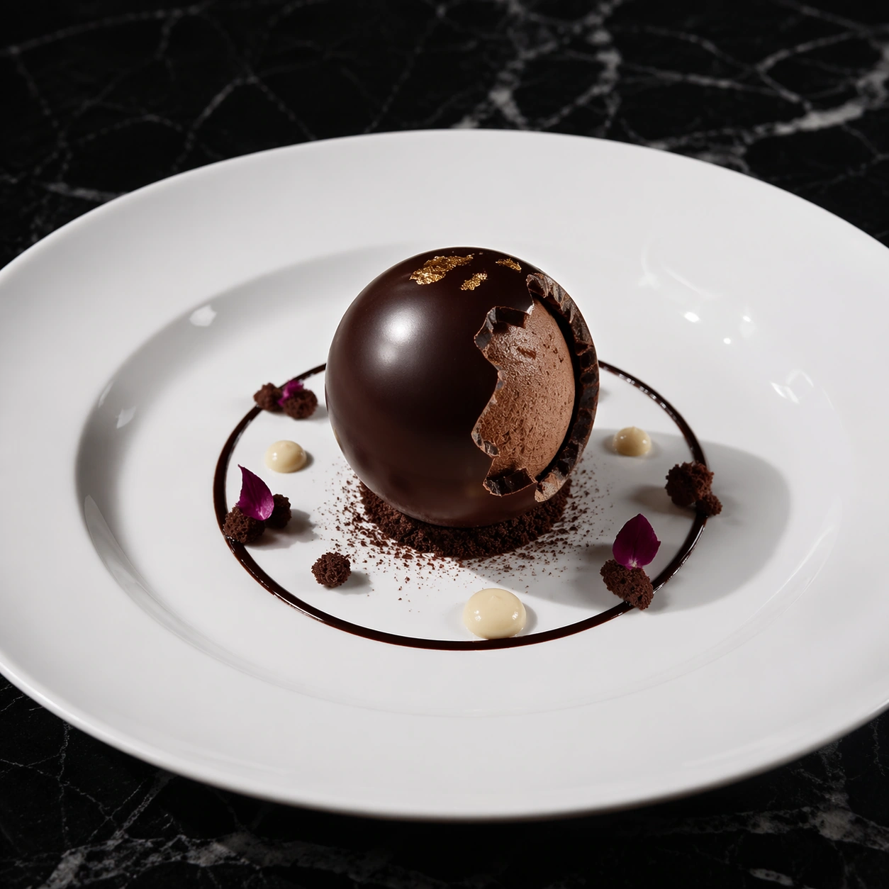
Example generated from “Michelin Plate Hero Shot — Chocolate Orchid Sphere”
GPT Image 2en

Scene: A square dessert hero shot photographed from a slightly elevated front angle, with a pristine white porcelain plate on black marble under bright top light and a narrow side accent that catches gloss and cocoa texture. The framing should be luxurious and modern, with the dessert isolated like a jewel in a campaign photograph. Keep the background uncluttered and the mood elegant rather than playful. Subject: At the center of the plate, place a dark chocolate sphere with a flawless tempered sheen, partially opened or delicately fractured to reveal a lighter mousse interior. Surround it with a thin ring of glossy sauce, a few crumbs of cocoa sable, tiny orchid petals in muted magenta, and two or three dots of pale vanilla creme. A touch of edible metallic leaf or powdered cocoa can add contrast, but the dessert must stay disciplined and premium. The portion should feel like a tasting-menu finale rather than a bakery product. Important details: Chocolate temper, shell thickness, mousse texture, and crumb scale must read as real pastry work. Avoid novelty-dessert excess. The plate should communicate chef-driven precision, with high contrast between dark chocolate, white porcelain, and restrained floral accents. The image also needs commercial polish: immaculate reflections, crisp shadows, controlled highlights, and no visual confusion between sauce, glaze, and shell. Use case: Michelin Plate Hero Shot single study 8/8, focused on a dramatic plated dessert with premium pastry realism. Constraints: No readable text, no watermark, no logos, preserve exact 1:1 aspect ratio, no ice cream scoop, no cutlery, no dripping molten mess, no oversized cake portion, no candy decorations, no rustic dessert plate, no extra props, no cartoon shine, no colorful bakery styling.

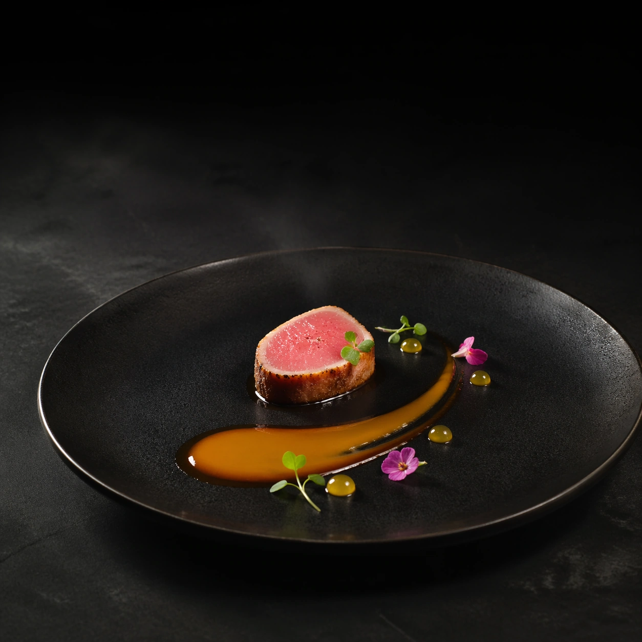
Example generated from “Michelin Three Star Plate Art — Black Plate Anchor”
GPT Image 2en

Scene: Create a square editorial food photograph built around a matte black ceramic plate resting on a charcoal surface, lit with a narrow overhead spotlight and a softer side fill that keeps the rim readable. The camera should sit between overhead and three-quarter view so the food has sculptural depth while the negative space still feels architectural. The surrounding darkness must stay controlled, velvety, and luxurious rather than flat or muddy. The plate should sit slightly low in frame so the upper half becomes a field of dark negative space, with a gentle falloff that feels like a fine-dining campaign image. A trace of condensation on the plate edge and a soft reflected highlight in the glaze should make the ceramic feel real without distracting from the food. Subject: Place a small medallion of lightly seared pink tuna just off center, with one curved streak of shellfish reduction sweeping across the plate like a brush stroke. Add three micro herb sprigs, a pair of tiny edible blossoms, and a few translucent citrus gel dots clustered with deliberate asymmetry. The portion must feel exacting and intentionally modest, as if a chef stopped plating the instant balance was achieved. Important details: Treat every garnish as if it was placed with tweezers: micro herbs, tiny petals, translucent glaze, and faint steam must all feel physically credible. Keep the plate rim immaculate, the portion restrained, and the composition balanced so the dish reads as sculpture rather than comfort food. Luxury should come from precision, timing, and restraint instead of abundance. This first image is the visual reference for the entire package, so the plate diameter, lens height, shadow softness, and negative-space geometry must feel stable and repeatable. The sauce should show believable viscosity with slightly tapered edges, and every garnish should feel individually intentional rather than scattered. Use case: Three-star plate art series study 1/9, establishing the anchor plating language for later variations. Constraints: No readable text, no watermark, no logos, preserve exact 1:1 aspect ratio, no rustic mess, no oversized portions, no cutlery, no napkins, no casual dining props, no accidental symmetry that kills the chef-made feel, no visible fingerprints, no smeared rim, no extra side dishes.

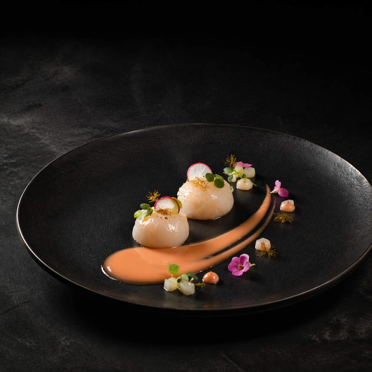
Example generated from “Michelin Three Star Plate Art — Scallop Crescent”
GPT Image 2en

Scene: Create a square editorial food photograph built around a matte black ceramic plate resting on a charcoal surface, lit with a narrow overhead spotlight and a softer side fill that keeps the rim readable. The camera should sit between overhead and three-quarter view so the food has sculptural depth while the negative space still feels architectural. The surrounding darkness must stay controlled, velvety, and luxurious rather than flat or muddy. Keep the same plate scale, camera height, and overall empty-space distribution from the reference image, so the viewer recognizes the same restaurant photography system immediately. The lighting should remain narrow and controlled, with a satin highlight passing across the ceramic and a gentle shadow under the protein. Subject: Replace the tuna with two barely opaque sea scallops arranged along the same compositional arc, finished with a pale coral beurre blanc and a paper-thin radish crescent. Introduce a few tiny bronze fennel tips and a restrained spoon of pear dice that adds texture without breaking the minimalist discipline. The dish should feel colder, brighter, and more marine, but still unmistakably part of the same plating family. Important details: Treat every garnish as if it was placed with tweezers: micro herbs, tiny petals, translucent glaze, and faint steam must all feel physically credible. Keep the plate rim immaculate, the portion restrained, and the composition balanced so the dish reads as sculpture rather than comfort food. Luxury should come from precision, timing, and restraint instead of abundance. Preserve exact plate diameter, camera height, negative-space ratio, and lighting family from the reference model while only changing the plated ingredients. The scallop surface should show believable moisture and delicate muscle striation, while the sauce keeps the same viscosity logic and elegant taper as the anchor image. Use case: Three-star plate art series study 2/9, translating the anchor composition into a cooler scallop expression. Constraints: No readable text, no watermark, no logos, preserve exact 1:1 aspect ratio, no rustic mess, no oversized portions, no cutlery, no napkins, no casual dining props, no accidental symmetry that kills the chef-made feel, no excessive garnish clutter, no melted butter puddles, no rustic shell fragments.

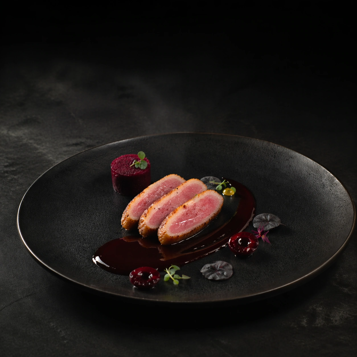
Example generated from “Michelin Three Star Plate Art — Duck Breast Ribbon”
GPT Image 2en

Scene: Create a square editorial food photograph built around a matte black ceramic plate resting on a charcoal surface, lit with a narrow overhead spotlight and a softer side fill that keeps the rim readable. The camera should sit between overhead and three-quarter view so the food has sculptural depth while the negative space still feels architectural. The surrounding darkness must stay controlled, velvety, and luxurious rather than flat or muddy. Maintain the reference camera angle and negative-space geometry so the dish reads as another movement within one tasting-menu sequence. The background should stay dark and quiet, while the controlled spotlight pulls a subtle shine from the sauce and leaves the outer rim in soft shadow. Subject: Set three narrow slices of rosy duck breast along the same visual path used by the reference dish, with a dark cherry jus ribbon crossing beneath them. Add a compressed beet cylinder, two lacquered berry halves, and a few near-black leaves that echo the plate without disappearing into it. The arrangement should feel like a warmer savory course, more autumnal and dense, yet still severely edited. Important details: Treat every garnish as if it was placed with tweezers: micro herbs, tiny petals, translucent glaze, and faint steam must all feel physically credible. Keep the plate rim immaculate, the portion restrained, and the composition balanced so the dish reads as sculpture rather than comfort food. Luxury should come from precision, timing, and restraint instead of abundance. Preserve exact plate diameter, camera height, light placement, and breathing room from the reference model while only changing the protein family and accent colors. The duck fat sheen, fine slicing edges, and glossy jus must feel real at macro distance, and the garnish count must stay disciplined. Use case: Three-star plate art series study 3/9, shifting the anchor system into a richer duck course. Constraints: No readable text, no watermark, no logos, preserve exact 1:1 aspect ratio, no rustic mess, no oversized portions, no cutlery, no napkins, no casual dining props, no accidental symmetry that kills the chef-made feel, no rustic carving board cues, no thick gravy, no crowded vegetable pile.

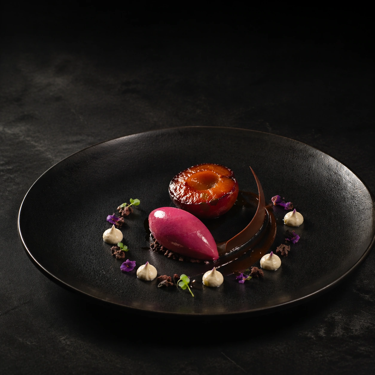
Example generated from “Michelin Three Star Plate Art — Plum Dessert Orbit”
GPT Image 2en

Scene: Create a square editorial food photograph built around a matte black ceramic plate resting on a charcoal surface, lit with a narrow overhead spotlight and a softer side fill that keeps the rim readable. The camera should sit between overhead and three-quarter view so the food has sculptural depth while the negative space still feels architectural. The surrounding darkness must stay controlled, velvety, and luxurious rather than flat or muddy. Hold the exact reference plate geometry, camera height, and negative-space balance, but let the lighting become slightly glossier so sugar, glaze, and cold cream textures catch more sparkle. The environment should remain otherwise identical, like the dessert course photographed at the same table under the same campaign setup. Subject: Build a tiny dessert orbit from a plum mousse quenelle, a thin chocolate arc, one halved roasted plum, and a restrained ring of vanilla cream. Scatter a few cocoa nibs and microscopic violet petals near the sauce path so the image keeps the same asymmetrical logic while clearly becoming dessert. The portion should feel refined, jewel-like, and tightly edited rather than playful. Important details: Treat every garnish as if it was placed with tweezers: micro herbs, tiny petals, translucent glaze, and faint steam must all feel physically credible. Keep the plate rim immaculate, the portion restrained, and the composition balanced so the dish reads as sculpture rather than comfort food. Luxury should come from precision, timing, and restraint instead of abundance. Preserve exact plate diameter, lens height, and empty-space discipline from the reference model while only shifting temperature, texture, and ingredient family. The fruit glaze should look taut and reflective, the cream should hold fine piping ridges, and the chocolate piece should cast a crisp believable shadow. Use case: Three-star plate art series study 4/9, concluding the anchor system with a tightly controlled dessert plate. Constraints: No readable text, no watermark, no logos, preserve exact 1:1 aspect ratio, no rustic mess, no oversized portions, no cutlery, no napkins, no casual dining props, no accidental symmetry that kills the chef-made feel, no sugar dust everywhere, no oversized pastry elements, no cafe-style decoration.

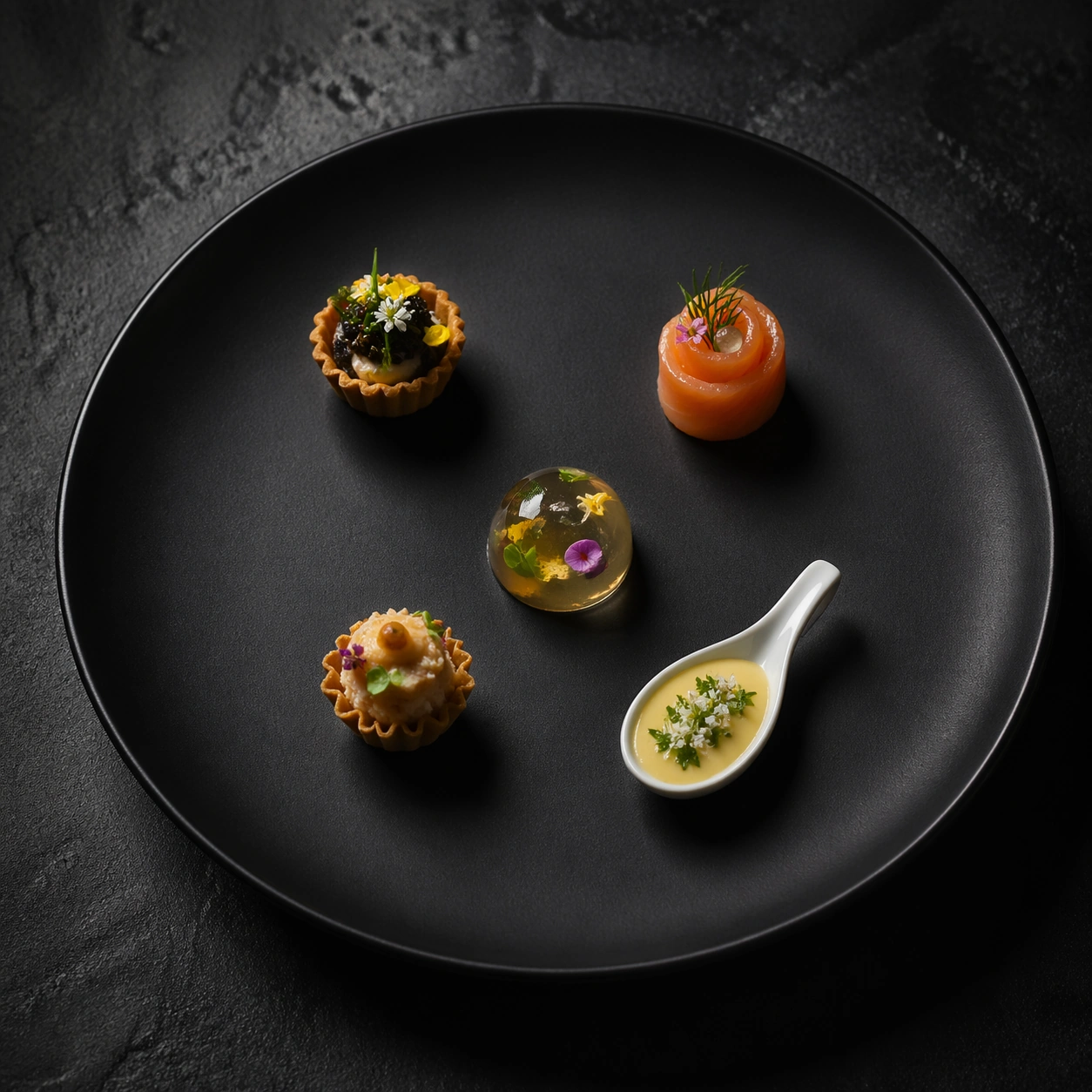
Example generated from “Michelin Three Star Plate Art — Amuse-Bouche Constellation”
GPT Image 2en

Scene: Create a square editorial food photograph built around a matte black ceramic plate resting on a charcoal surface, lit with a narrow overhead spotlight and a softer side fill that keeps the rim readable. The camera should sit between overhead and three-quarter view so the food has sculptural depth while the negative space still feels architectural. The surrounding darkness must stay controlled, velvety, and luxurious rather than flat or muddy. Create a square top-down photograph of a dark stone slab under soft theatrical light, with generous empty margins and a quiet restaurant-table atmosphere stripped of everything except the food. The slab should feel expensive and minimally reflective, with enough micro texture to separate it from a flat black background. Subject: Arrange five tiny amuse-bouche pieces in a loose constellation: one tart shell, one smoked fish rosette, one gel dome, one miniature croustade, and one herb-topped custard spoon. Each bite must be visibly distinct in shape and texture, yet the spacing between them should feel as carefully composed as the bites themselves. The result should look like a progression of ideas rather than a crowded sampler platter. Important details: Treat every garnish as if it was placed with tweezers: micro herbs, tiny petals, translucent glaze, and faint steam must all feel physically credible. Keep the plate rim immaculate, the portion restrained, and the composition balanced so the dish reads as sculpture rather than comfort food. Luxury should come from precision, timing, and restraint instead of abundance. Emphasize disciplined spacing, micro garnish control, and believable differences in crisp, creamy, and glossy textures. Each bite should feel executable by a top tasting-menu kitchen, with rims clean, ingredients proportionate, and tiny details sharp enough to reward close inspection. Use case: Three-star plate art single study 5/9, exploring a constellation-style amuse-bouche layout. Constraints: No readable text, no watermark, no logos, preserve exact 1:1 aspect ratio, no rustic mess, no oversized portions, no cutlery, no napkins, no casual dining props, no accidental symmetry that kills the chef-made feel, no menu cards, no glassware, no crumbs scattered randomly.

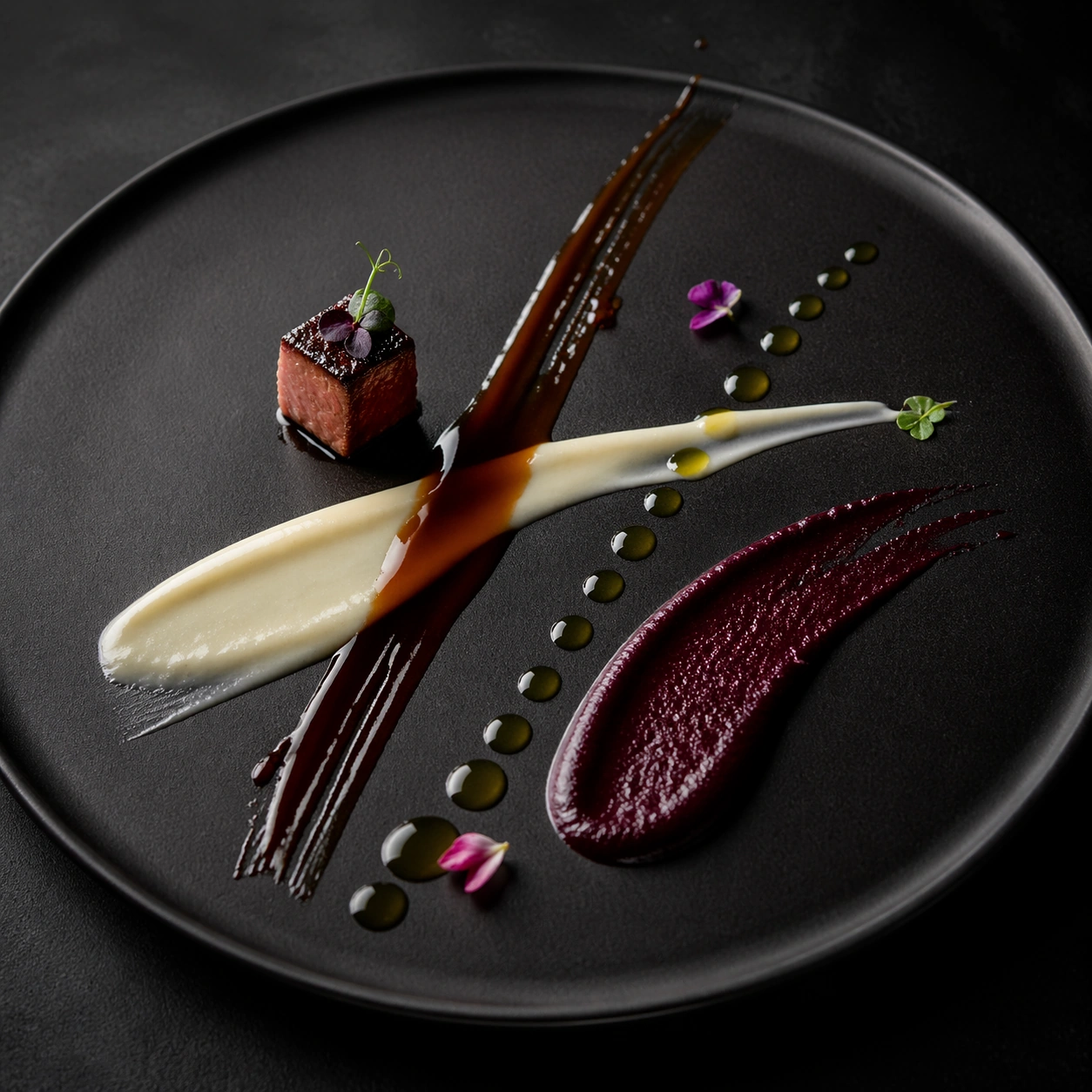
Example generated from “Michelin Three Star Plate Art — Sauce Calligraphy Study”
GPT Image 2en

Scene: Create a square editorial food photograph built around a matte black ceramic plate resting on a charcoal surface, lit with a narrow overhead spotlight and a softer side fill that keeps the rim readable. The camera should sit between overhead and three-quarter view so the food has sculptural depth while the negative space still feels architectural. The surrounding darkness must stay controlled, velvety, and luxurious rather than flat or muddy. Use a square close-up composition on matte black ceramic with the frame tight enough to turn the surface into an abstract stage for sauce behavior. Soft grazing light should reveal thickness, gloss, and drag marks while keeping the overall mood clean and high-end rather than messy or process-oriented. Subject: Show four distinct sauce gestures crossing the plate at different angles: a glossy brown reduction, a pale cream stroke, a translucent herb oil bead line, and a dense fruit coulis smear. Add only a few micro garnishes and one tiny protein cube as scale anchors, so the focus remains on viscosity, taper, and edge quality. The gestures should read as intentional chef marks, not accidental spills. Important details: Treat every garnish as if it was placed with tweezers: micro herbs, tiny petals, translucent glaze, and faint steam must all feel physically credible. Keep the plate rim immaculate, the portion restrained, and the composition balanced so the dish reads as sculpture rather than comfort food. Luxury should come from precision, timing, and restraint instead of abundance. Make each sauce physically distinct through shine, opacity, drag resistance, and edge breakup. The negative space between marks matters as much as the marks themselves, and every accent should reinforce the idea that a chef is drawing with edible matter under exact control. Use case: Three-star plate art single study 6/9, isolating sauce behavior as the hero subject. Constraints: No readable text, no watermark, no logos, preserve exact 1:1 aspect ratio, no rustic mess, no oversized portions, no cutlery, no napkins, no casual dining props, no accidental symmetry that kills the chef-made feel, no splatter chaos, no thick puddles, no visible squeeze bottles.

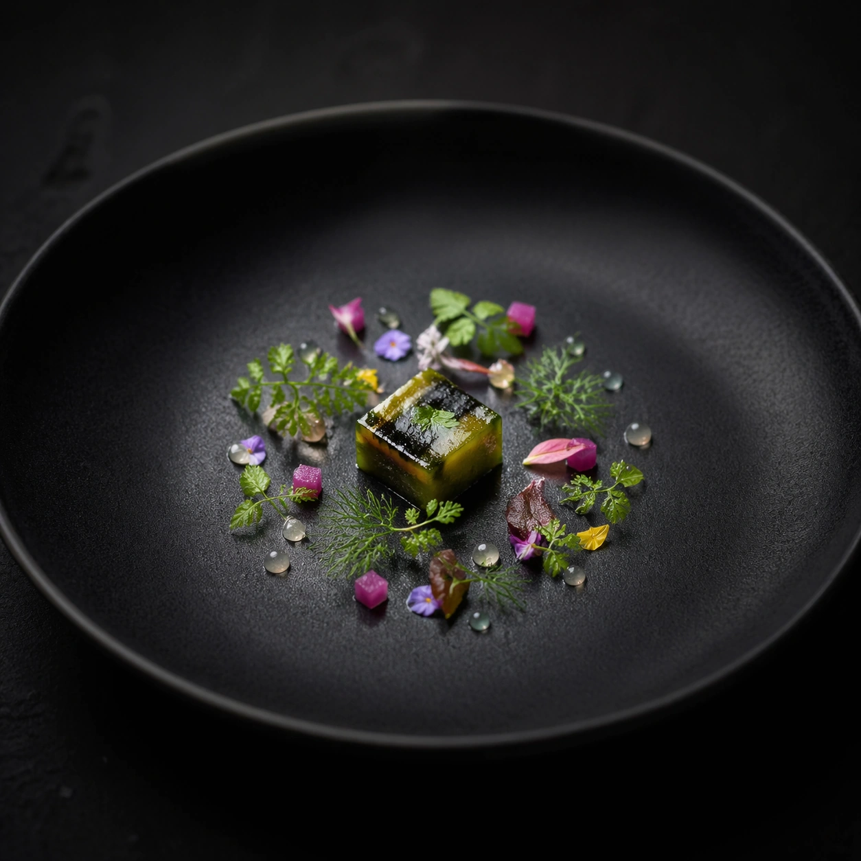
Example generated from “Michelin Three Star Plate Art — Garnish Micro Meadow”
GPT Image 2en

Scene: Create a square editorial food photograph built around a matte black ceramic plate resting on a charcoal surface, lit with a narrow overhead spotlight and a softer side fill that keeps the rim readable. The camera should sit between overhead and three-quarter view so the food has sculptural depth while the negative space still feels architectural. The surrounding darkness must stay controlled, velvety, and luxurious rather than flat or muddy. Build a square macro food photograph on a dark plate with shallow depth of field that still keeps the primary garnish field readable. Lighting should be soft and directional, turning droplets, fine stems, and tiny leaves into crisp sculptural elements against a subdued black ground. Subject: Center one very small bite-sized piece of glazed vegetable terrine, then surround it with a micro meadow of chervil tips, bronze fennel, minute flower petals, tiny pickled onion cubes, and translucent gel pearls. Every element should feel hand placed one at a time, with slight natural irregularity but unmistakable intent. The composition should be lush at macro scale while remaining minimal at plate scale. Important details: Treat every garnish as if it was placed with tweezers: micro herbs, tiny petals, translucent glaze, and faint steam must all feel physically credible. Keep the plate rim immaculate, the portion restrained, and the composition balanced so the dish reads as sculpture rather than comfort food. Luxury should come from precision, timing, and restraint instead of abundance. Prioritize freshness cues such as subtle moisture, crisp leaf edges, and minute color variation across the greens. The garnish field must feel luxurious and alive rather than decorative filler, and the center bite should remain the quiet anchor that keeps the image from turning into chaos. Use case: Three-star plate art single study 7/9, testing how much life can exist inside a tiny garnish field. Constraints: No readable text, no watermark, no logos, preserve exact 1:1 aspect ratio, no rustic mess, no oversized portions, no cutlery, no napkins, no casual dining props, no accidental symmetry that kills the chef-made feel, no bouquet-like bunches, no muddy greens, no casual scattering.

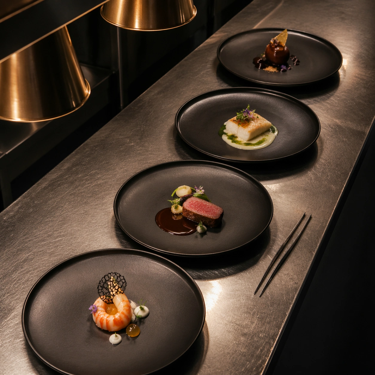
Example generated from “Michelin Three Star Plate Art — Chef Pass Overhead”
GPT Image 2en

Scene: Create a square editorial food photograph built around a matte black ceramic plate resting on a charcoal surface, lit with a narrow overhead spotlight and a softer side fill that keeps the rim readable. The camera should sit between overhead and three-quarter view so the food has sculptural depth while the negative space still feels architectural. The surrounding darkness must stay controlled, velvety, and luxurious rather than flat or muddy. Create a square overhead image of a stainless chef pass under warm service lights, but keep the crop disciplined so the scene still feels elegant and editorial. The metal should show restrained reflections and slight use, while the plates create a rhythmic dark pattern against the brighter pass surface. Subject: Show four completed black plates in a precise diagonal line, each with a different minimalist course already finished and ready to leave the kitchen. Include only the faintest clues of service such as one pair of tweezers placed aside and a subtle reflection from a heat lamp, without introducing people or disorder. The scene should communicate high-pressure refinement rather than bustling chaos. Important details: Treat every garnish as if it was placed with tweezers: micro herbs, tiny petals, translucent glaze, and faint steam must all feel physically credible. Keep the plate rim immaculate, the portion restrained, and the composition balanced so the dish reads as sculpture rather than comfort food. Luxury should come from precision, timing, and restraint instead of abundance. Keep every plate distinct yet clearly part of one house style through negative space, restrained garnish, and sauce discipline. The stainless surface must feel real, but the plates remain the heroes, and the image should suggest process and perfection at the same time. Use case: Three-star plate art single study 8/9, extending the topic into the service-pass environment. Constraints: No readable text, no watermark, no logos, preserve exact 1:1 aspect ratio, no rustic mess, no oversized portions, no cutlery, no napkins, no casual dining props, no accidental symmetry that kills the chef-made feel, no chefs in frame, no ticket printer paper, no dirty towels.

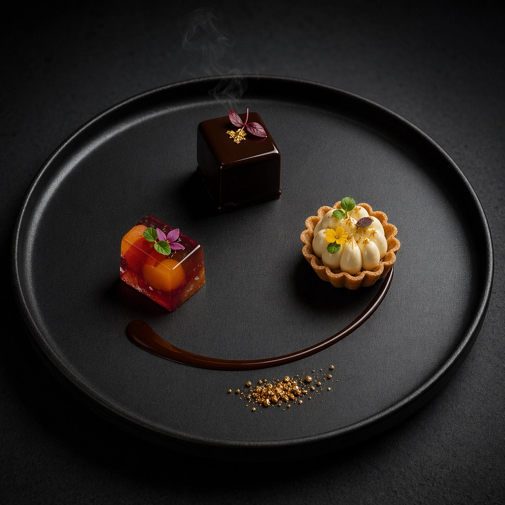
Example generated from “Michelin Three Star Plate Art — Petit Four Void”
GPT Image 2en

Scene: Create a square editorial food photograph built around a matte black ceramic plate resting on a charcoal surface, lit with a narrow overhead spotlight and a softer side fill that keeps the rim readable. The camera should sit between overhead and three-quarter view so the food has sculptural depth while the negative space still feels architectural. The surrounding darkness must stay controlled, velvety, and luxurious rather than flat or muddy. Use a square three-quarter composition on black ceramic with a dark neutral background, lit so the dessert pieces feel crisp and jewel-like without losing the atmospheric shadows around them. The surrounding empty space should be generous enough that the arrangement feels ceremonial and almost architectural. Subject: Arrange three tiny petit fours with strict spacing: a glazed chocolate cube, a fruit gel jewel, and a miniature tart with piped cream. Add a single curved sauce line and one cluster of gold-toned crumbs so the dessert reads as the final whisper of a tasting menu rather than a plated pastry course. Scale, shine, and spacing should all feel intentionally precious. Important details: Treat every garnish as if it was placed with tweezers: micro herbs, tiny petals, translucent glaze, and faint steam must all feel physically credible. Keep the plate rim immaculate, the portion restrained, and the composition balanced so the dish reads as sculpture rather than comfort food. Luxury should come from precision, timing, and restraint instead of abundance. The small desserts need distinct material identities: mirror glaze, delicate shell, airy cream, and translucent gel should each register immediately. The image should feel like an ending note defined by silence, polish, and the confidence to leave most of the plate empty. Use case: Three-star plate art single study 9/9, treating the final petit four course as a sculptural void. Constraints: No readable text, no watermark, no logos, preserve exact 1:1 aspect ratio, no rustic mess, no oversized portions, no cutlery, no napkins, no casual dining props, no accidental symmetry that kills the chef-made feel, no cafe pastry abundance, no scattered sugar dust, no extra utensils.

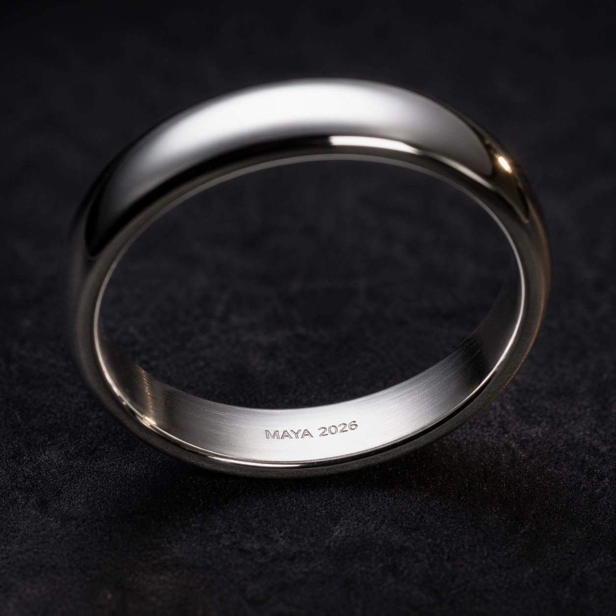
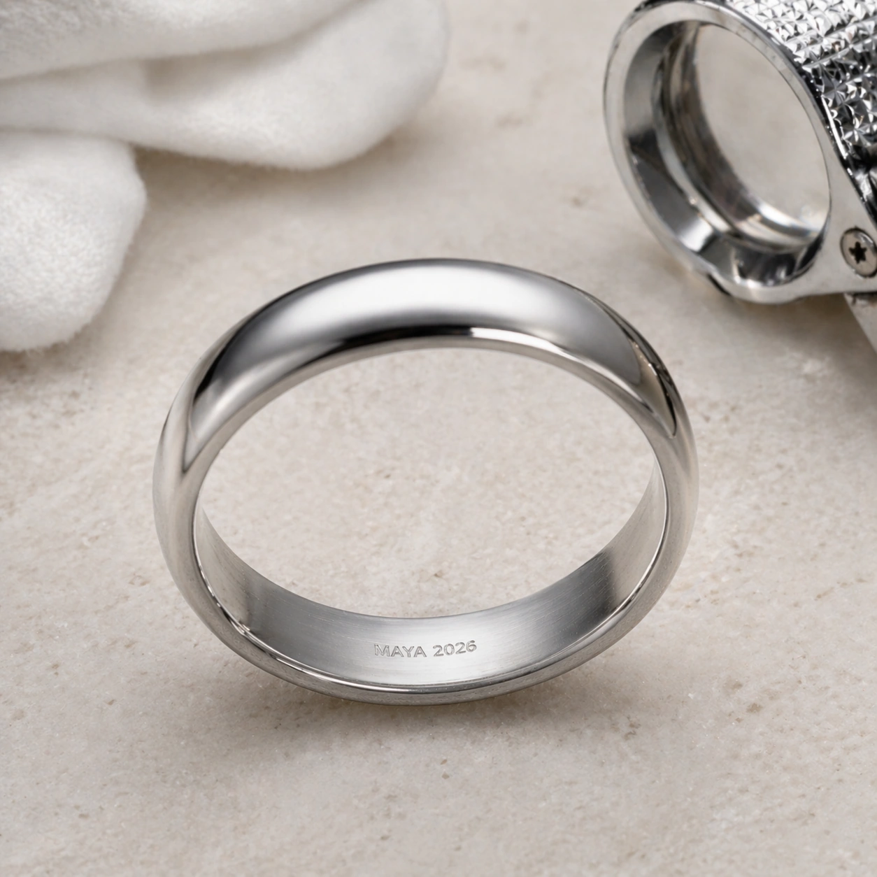
Example generated from “Micro Engraved Jewelry — Reference Ring”
GPT Image 2en

Scene: A square macro product photograph on a dark charcoal velvet surface, lit with a soft overhead strip light and a small warm rim light. The camera looks slightly into the inner wall of a platinum ring, using shallow depth of field but keeping the engraving area crisp. The tone is quiet, luxury, and high-contrast, with realistic metal reflections and no distracting props. Subject: A single polished platinum band standing at a slight angle, large enough to show the inside curve. On the inner wall, place a tiny engraved phrase exactly reading "MAYA 2026". The lettering should be shallow-cut, centered on the visible inner arc, aligned to the ring curvature, and visibly etched into the metal rather than printed on top. The rest of the band stays clean and unbranded. Important details: Pixel-level placement matters: the inscription must be very small but legible under macro viewing, with consistent letter spacing, no extra marks, and no distorted characters. Preserve the circular ring geometry, reflective platinum, hairline scratches, and microscopic engraving shadows. This is the reference image for the series, so the ring silhouette, inner-wall text zone, and exact phrase must be stable for later variants. Use case: Micro-Engraved Jewelry series study 1/8, establishing the reference ring and its exact micro-inscription placement. Constraints: No readable text except the specified phrase "MAYA 2026", no watermark, no logos, preserve exact 1:1 aspect ratio, no brand marks, no giant typography, no misspelled inscription, no extra dates, no decorative lettering outside the inner ring.

Example generated from “Micro Engraved Jewelry — Wedding Band Gold”
GPT Image 2en

Scene: A square macro studio photograph with a warmer palette than the reference: champagne highlights, deep brown velvet, and a narrow strip of reflected light running along a gold ring. The camera angle should closely echo the reference image, looking into the inner wall so the same engraving zone is visible. Use shallow depth of field, but keep the inner inscription in the sharpest plane. Subject: Transform the reference ring into an 18k yellow-gold wedding band while preserving the same band silhouette, inner-wall engraving position, and exact inscription phrase "MAYA 2026". The letters must remain small, clean, and carved into the inside curve. Add subtle gold grain, fine polish marks, and a realistic beveled edge, but do not change the proportions or move the text away from the visible inner arc. Important details: This is a continuity test: the viewer should recognize the same ring geometry and inscription placement from image 01, only translated into gold and warmer wedding lighting. The micro text must be readable without becoming oversized; it should follow the curve, cast tiny shadow grooves, and avoid blobs or repeated characters. Maintain luxury commercial realism and physically plausible metal reflections. Use case: Micro-Engraved Jewelry series study 2/8, testing reference-preserved micro text on a gold wedding-band material variant. Constraints: No readable text except the specified phrase "MAYA 2026", no watermark, no logos, preserve exact 1:1 aspect ratio, no brand marks, no external caption, no incorrect phrase, no duplicated inscription, no flat printed text, no warped ring shape.

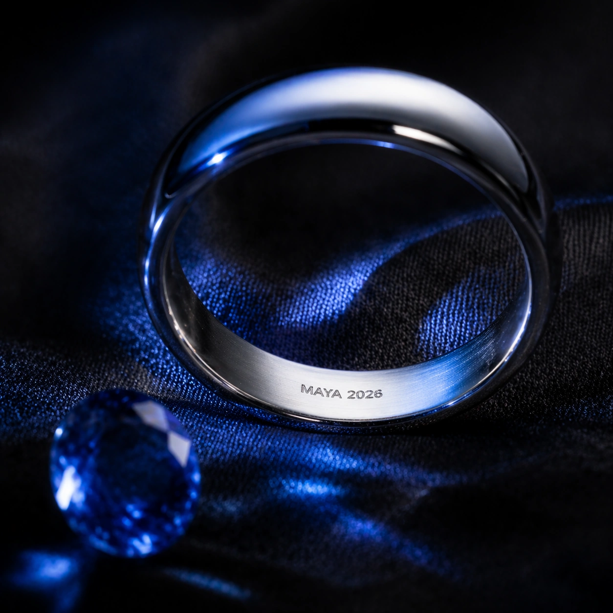
Example generated from “Micro Engraved Jewelry — Sapphire Shadow”
GPT Image 2en

Scene: A square luxury macro photograph with cool blue caustic shadows cast from a nearby sapphire, set on matte black silk. The ring is angled like the reference so the viewer can see into the inner wall, but the lighting is more dramatic, with blue reflections crossing the metal and a dark falloff around the edges. Keep the engraving plane crisp despite the shallow depth of field. Subject: Use the referenced ring as the same physical object and preserve the exact inner-wall micro-engraving phrase "MAYA 2026". Place a loose oval sapphire just outside the ring, partly blurred, so it creates blue reflections without covering the inscription. The band may read as white gold or platinum, but the visible inner arc, letter placement, and overall ring silhouette must match the reference. Important details: The challenge is tiny readable text under complex reflective lighting. The inscription must remain carved, aligned to the inner curve, and not swallowed by sapphire shadows. Letterforms should be precise and evenly spaced, with no extra symbols. Use micro scratches, polished bevels, and realistic blue reflected highlights to show material physics while keeping the text zone controlled and legible. Use case: Micro-Engraved Jewelry series study 3/8, testing reference-preserved micro text under gemstone reflections and shadow complexity. Constraints: No readable text except the specified phrase "MAYA 2026", no watermark, no logos, preserve exact 1:1 aspect ratio, no brand marks, no text on the gemstone, no hidden captions, no duplicate phrase, no blocked engraving, no fantasy glow, no illegible letter noise.

Example generated from “Micro Engraved Jewelry — Retail Macro”
GPT Image 2en

Scene: A square premium e-commerce macro shot on a pale stone jewelry tray, bright but soft, with clean reflections and a practical retail-catalog feeling. The composition should feel ready for a product detail page: centered ring, controlled highlights, and a small jeweler loupe placed nearby but not covering the band. The camera still looks into the inner wall so the engraving area remains visible. Subject: Use the referenced ring as the same product and preserve the exact inner-wall inscription "MAYA 2026". The ring should appear freshly cleaned, with the tiny letters inside the band shown as shallow engraving. Add a loupe, white gloves, or tray texture only as secondary context; the micro-inscription remains the hero detail. Keep the ring proportions, visible arc, and text placement consistent with image 01. Important details: This version tests commercial usability: the image should look like a realistic custom-jewelry listing where the buyer can verify the exact inscription. The text must be readable at macro scale, not replaced by generic scratches. The engraving should be physically recessed, aligned to the curve, and free of extra characters. Maintain precise metal reflections, clean stone texture, and restrained luxury styling. Use case: Micro-Engraved Jewelry series study 4/8, testing whether the reference micro-inscription remains product-page legible in a retail macro setup. Constraints: No readable text except the specified phrase "MAYA 2026", no watermark, no logos, preserve exact 1:1 aspect ratio, no brand labels, no printed cards, no price tags, no oversized inscription, no wrong name, no mirror-reversed letters, no clutter hiding the inner wall.

Example generated from “Micro Engraved Jewelry — Locket Edge Script”
GPT Image 2en

Scene: A square macro photograph of an open oval gold locket resting on deep green velvet, with soft antique-window lighting and gentle falloff at the corners. The camera is close enough to show the hinge, rim, and scratched inner lip. The mood is intimate and heirloom-like, with warm gold reflections and a darker background that helps the micro inscription read clearly. Subject: On the thin inner rim of the locket, engrave a tiny curved phrase exactly reading "ALWAYS NEAR". The phrase follows the oval edge and fits naturally into the metal lip, as if done by a master jeweler. The locket interior may hold an empty brushed-metal recess or subtle mother-of-pearl texture, but no photo and no other writing. The engraved phrase is the only semantic detail. Important details: The core challenge is curved micro text on a narrow jewelry edge. The letters must be readable, evenly spaced, and aligned along the oval rim without floating away from the metal surface. Show shallow cut grooves, tiny burrs, patina in the recesses, and realistic specular highlights. Keep the phrase emotionally legible while preserving the scale; it should look genuinely tiny, not like a large caption pasted onto the locket. Use case: Micro-Engraved Jewelry single study 6/8, testing curved readable inscription on a locket rim for sentimental customization. Constraints: No readable text except the specified phrase "ALWAYS NEAR", no watermark, no logos, preserve exact 1:1 aspect ratio, no brand stamp, no portrait text, no extra initials, no misspelling, no flat printed lettering, no oversized phrase, no warped oval geometry.

Example generated from “Micro Engraved Jewelry — Watch Gear Initials”
GPT Image 2en

Scene: A square horology macro photograph inside a mechanical watch movement, lit with cool white workbench light and a precise overhead reflection. The frame shows layered brass gears, ruby bearings, brushed steel bridges, and a jeweler's screwdriver blurred near the edge. The palette is gold, steel, ruby red, and deep shadow, with crisp detail on one small gear tooth ring. Subject: On a tiny exposed brass gear near the center, engrave the initials "A+J" along the curved face between the teeth. The letters must be micro-sized but readable, recessed into the brass, and aligned to the circular gear geometry. The surrounding watch parts should remain technically plausible and unbranded: screws, jewels, bridges, and teeth at correct scale, with no dial numbers or maker text visible. Important details: This image tests readable micro typography inside a dense mechanical object. The inscription should not look like a floating overlay; it must bend with the gear, catch light in the groove, and remain distinct from machining marks. Maintain realistic watchmaking material physics: fine oil sheen, polished bevels, dust specks, and alternating brushed and polished surfaces. The viewer should understand this as a hidden custom engraving, not a logo. Use case: Micro-Engraved Jewelry single study 7/8, testing tiny readable initials on a mechanically detailed watch component. Constraints: No readable text except the specified initials "A+J", no watermark, no logos, preserve exact 1:1 aspect ratio, no watch brand, no dial numerals, no serial numbers, no extra initials, no misplaced plus sign, no floating text, no impossible melted gear teeth.

Example generated from “Micro Macro Infographic — Cell Galaxy Echo”
GPT Image 2en

Scene: A square science-editorial infographic plate with a restrained black background, soft rim lighting, and a precise two-panel layout. The left half is a photorealistic microscope view; the right half is a deep-space telescope-style view. A narrow central bridge contains thin curved comparison lines, small abstract glyph marks, and transparent scale rings, but no readable text. The image should feel like a premium museum exhibit graphic rather than a textbook page. Subject: Left panel: a luminous cell culture seen through a microscope, with translucent membranes, branching cytoskeleton fibers, glowing nuclei, and tiny vesicles suspended in fluid. Right panel: a spiral galaxy and surrounding star field with dust lanes, bright core, and faint satellite clusters. The two halves should echo one another: nuclei align with galaxy cores, cytoskeleton threads rhyme with spiral arms, and vesicles rhyme with star clusters. Important details: Use a clean vertical split that still feels unified through matching composition, color, and annotation geometry. Add subtle scale ticks, circles, and connector arcs that point from micro features to macro analogues without becoming literal labels. Keep the science-inspired materials plausible: wet cellular translucency on the left, vacuum-dark cosmic depth on the right. The comparison must be instantly legible at thumbnail size and rich under close inspection. Use case: Micro-Macro Infographic single study 1/8, comparing cellular structure and galactic structure through shared visual organization. Constraints: No readable text, no watermark, no logos, preserve exact 1:1 aspect ratio, no real data claims, no fake labels, no astrology symbols, no medical diagnosis, no chaotic collage, no split-screen mismatch, no overbright neon wash.

Example generated from “Micro Macro Infographic — Neuron Cosmic Web”
GPT Image 2en

Scene: A square dark-background infographic with an elegant diagonal comparison layout. The upper-left region shows a microscope-like neural network; the lower-right region shows a cosmic web simulation aesthetic. Between them, translucent overlay lines and small non-readable symbols trace matching branching patterns. Lighting is dramatic but controlled, with cyan, violet, and warm white accents against deep charcoal. Subject: The micro side shows neurons suspended in a shallow biological gel: cell bodies, dendrite branches, axon-like cables, synapse dots, and subtle membrane texture. The macro side shows galaxy filaments and voids: bright clusters connected by long luminous threads, with dark empty spaces between them. The central bridge should make the analogy visible by aligning neuron cell bodies with galaxy clusters and dendrites with cosmic filaments. Important details: The image must not claim the two systems are scientifically identical; it should present a visual analogy through structured composition. Use consistent branch spacing, matching glow intensity, and clean connector arcs. Include small magnifier circles that crop details from each side, but keep their contents non-textual. The layout should be readable as a high-end science magazine cover: balanced negative space, no clutter, clear hierarchy, and plausible microscopic and astronomical textures. Use case: Micro-Macro Infographic single study 2/8, comparing neural branching and the cosmic web as a reasoning-composition challenge. Constraints: No readable text, no watermark, no logos, preserve exact 1:1 aspect ratio, no literal brain icon, no astrology, no fake equations, no real patient data, no random neon spaghetti, no overcrowded labels, no claim-style typography.

Example generated from “Micro Macro Infographic — Stomata City Grid”
GPT Image 2en

Scene: A square bright editorial infographic on warm off-white background, split into two coordinated panels with a shared geometric grid. The left panel is a macro-microscope view of a leaf surface; the right panel is an aerial city plan at dawn. Fine gray alignment guides, small color-coded dots, and blank caption bars organize the page without readable text. The overall mood is clean, ecological, and architectural. Subject: Left panel: a high-detail leaf epidermis with green cells, stomata openings, waxy cuticle texture, and subtle veins visible beneath the surface. Right panel: a city grid with parks, courtyards, streets, rooftops, and small plazas seen from directly above. The stomata openings correspond visually to courtyards and transit hubs, while leaf veins rhyme with green corridors and roads. Important details: Make the comparison precise and elegant. Use matching top-down viewpoints on both sides, the same scale of repeated oval and polygon forms, and thin connector lines that cross a central gutter. The left side should feel biologically plausible, with moist cellular texture and organic variation. The right side should feel like a real planned city, not an abstract circuit board. Use muted green, slate, cream, and sunrise gold; keep the infographic readable without literal labels. Use case: Micro-Macro Infographic single study 3/8, comparing leaf stomata patterns with city-grid planning through structured visual analogy. Constraints: No readable text, no watermark, no logos, preserve exact 1:1 aspect ratio, no real city names, no map labels, no fake street text, no oversimplified leaf cartoon, no circuit-board confusion, no cluttered annotation layer.

Example generated from “Micro Macro Infographic — Bone Coral Architecture”
GPT Image 2en

Scene: A square photorealistic science infographic with a soft studio-gray background and a balanced triptych structure: microscopic bone lattice on the left, central transition column, coral reef architecture on the right. The layout uses thin white dividers, translucent callout circles, and small non-readable glyph marks. Lighting is sculptural and tactile, emphasizing porous material surfaces. Subject: Left panel: trabecular bone seen at high magnification, with ivory struts, porous cavities, subtle mineral grain, and realistic shadowing. Right panel: a coral reef wall photographed underwater, with branching coral, porous limestone, small fish silhouettes, and blue water depth. The central transition column blends the two structures as matched load-bearing lattices, showing how voids and struts create strength and habitat. Important details: The comparison should be material-driven, not merely decorative. Match pore scale, branching angles, and light direction across both panels. The bone must not look like dead coral, and the coral must remain alive and underwater; the bridge is about architecture and porosity. Use small arrows and magnifier circles to point at analogous voids, arches, and struts without text. Keep the composition calm, premium, and scientifically plausible. Use case: Micro-Macro Infographic single study 4/8, comparing trabecular bone structure with coral reef architecture and porous load paths. Constraints: No readable text, no watermark, no logos, preserve exact 1:1 aspect ratio, no gore, no medical diagnosis, no dead reef imagery, no fake labels, no chaotic aquarium scene, no low-detail sponge texture, no overlaid paragraphs.

Example generated from “Micro Macro Infographic — Capillary River Delta”
GPT Image 2en

Scene: A square split-panel infographic on a deep blue-black background with luminous red and gold accents. The left side shows a microvascular network under magnification; the right side shows a satellite-like river delta. A central vertical spine contains clean connector arcs, small scale circles, and blank legend blocks. The mood is serious, precise, and cinematic, with high contrast but readable detail. Subject: Left panel: branching capillaries in translucent tissue, with red blood cells as tiny discs flowing through thin vessels, soft membrane texture, and realistic depth. Right panel: a river delta seen from high above, with branching channels, sediment fans, marsh islands, and reflective water. The comparison should reveal how fluid transport branches from trunk to fine channels in both biological and geographic systems. Important details: Make flow direction visually clear without text: use subtle arrowheads, particle trails, and brightness gradients. Match the branching hierarchy on both sides from thick main channels to fine terminals. Avoid making the capillary side look like a literal map, and avoid making the delta look like veins; each side keeps its own material truth. The central connector system should help viewers understand the analogy in one glance. Use case: Micro-Macro Infographic single study 5/8, comparing capillary flow networks with river delta branching in a structured science plate. Constraints: No readable text, no watermark, no logos, preserve exact 1:1 aspect ratio, no gore, no medical diagnosis, no fake map labels, no real place names, no blood splatter, no chaotic red-blue abstraction, no unreadable legend text.

Example generated from “Micro Macro Infographic — Crystal Mountain Range”
GPT Image 2en

Scene: A square premium science infographic with a pale mineral-gray background, crisp studio lighting, and a central mirrored composition. The lower-left quadrant shows a microscopic crystal surface; the upper-right quadrant shows an alpine mountain range. Thin diagonal guides, transparent elevation contours, and small non-readable symbols connect matching ridges and facets across the page. Subject: Micro side: a close-up crystal lattice surface with faceted transparent quartz, tiny fractures, growth steps, dust-like inclusions, and accurate refraction. Macro side: a snow-covered mountain range with sharp ridgelines, glacial valleys, rock faces, and atmospheric haze. The shared visual idea is faceted geometry: crystal growth planes echo mountain ridges, fracture lines echo valleys, and light glints repeat across scales. Important details: Render both materials convincingly: glassy crystal transparency and cold mountain atmosphere should feel physically distinct. Use matching diagonal rhythm rather than identical shapes. Add a few small cross-section slices and contour-like rings as visual explanation, but no words. The composition should feel like a philosophical science poster: beautiful, clear, and disciplined. Avoid overdecorating with fantasy sparkles or making the mountains look like gemstones. Use case: Micro-Macro Infographic single study 6/8, comparing crystal growth facets with mountain range geometry and material light behavior. Constraints: No readable text, no watermark, no logos, preserve exact 1:1 aspect ratio, no fake geological labels, no fantasy magic crystals, no impossible floating mountains, no chaotic shards, no glitter overload, no text-heavy poster layout.

Example generated from “Micro Macro Infographic — Skin Desert Dunes”
GPT Image 2en

Scene: A square warm-toned editorial infographic with a soft beige background, divided by a gentle S-shaped comparison boundary. The left side is a macro skin-surface close-up under scientific lighting; the right side is an aerial desert dune landscape at sunset. Fine contour lines, small blank callout tabs, and transparent circles tie the two halves together without readable text. Subject: Left panel: detailed human skin texture at very close range, showing pores, fine ridges, soft peach fuzz, subtle oil highlights, and natural color variation. Right panel: desert dunes from above, with wind-carved ridges, shadowed troughs, small dry shrubs, and golden sand gradients. The shared visual language is surface topology: pore depressions echo dune basins, skin ridges echo sand ripples, and fine hairs echo sparse desert vegetation. Important details: Keep the comparison respectful and scientific, not cosmetic advertising. The skin should look natural and healthy, not medical or glamor retouched. The desert should feel vast but organized, not a random sand texture. Use contour overlays and matched light direction to reveal surface physics. The image should be calm, tactile, and visually obvious as a micro-macro topology comparison. Use case: Micro-Macro Infographic single study 7/8, comparing skin microtopography with desert dune formations through surface pattern reasoning. Constraints: No readable text, no watermark, no logos, preserve exact 1:1 aspect ratio, no beauty-product branding, no medical diagnosis, no wounds, no glamour portrait, no fake map labels, no repetitive sand wallpaper, no intrusive text blocks.