PROMPT · ESPLORAZIONE CREATIVA

Galleria di prompt

Esplora prompt reali ed esempi generati. Trova ispirazione per la prossima missione creativa e copia gratuitamente il prompt completo.

Esempi
10,974
Modelli
17
Fonti
1277
10.974 esempi di prompt · pagina 48 di 229
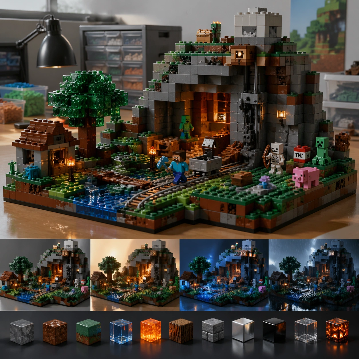
Example generated from “Lego Scene Rebuild — Signature Render”
GPT Image 2en

Scene: A square CGI or design-visualization frame with calibrated lighting, intentional composition, and premium material rendering. Build the frame around the most complete and persuasive final render for the theme. Keep the lighting, camera distance, and spatial organization tuned for a high-signal research image rather than a casual snapshot. The image belongs to the Lego Scene Rebuild theme and should feel immediately legible as a prompt atlas theme for lego scene rebuild, testing physics-materials, style-transfer, commercial-mockup with gpt image 2.. Subject: Center the study on the most complete and persuasive final render for the theme. Translate the theme into a concrete visual statement instead of an abstract mood board: the viewer should understand what kind of image this is, what is being tested, and why the composition is difficult. Use the slug idea of lego scene rebuild as a literal guide for subject matter, materials, and staging. If helpful, borrow the broad visual cues suggested by Minecraft, studio, but keep the result original and specific to this study. Important details: The model must feel engineered or art-directed rather than merely stylized: edges, seams, translucency, reflections, and scale cues should all hold up. Preserve a disciplined square composition, clear focal hierarchy, and enough secondary information to make the image feel complete rather than underspecified. The image should look polished, novel, and exhibition-ready, with topic-specific credibility coming from the way surfaces, structure, and visual language reinforce Lego Scene Rebuild. Avoid generic filler elements that do not serve the main concept. Use case: Lego Scene Rebuild single study 8/8, testing physics-materials, style-transfer, commercial-mockup through the signature render variation. Constraints: No readable text, no watermark, no logos, preserve exact 1:1 aspect ratio, no real brand logos, no low-poly shortcuts, no broken reflections, no muddy materials, no generic showroom clutter, no unreadable UI overlays.
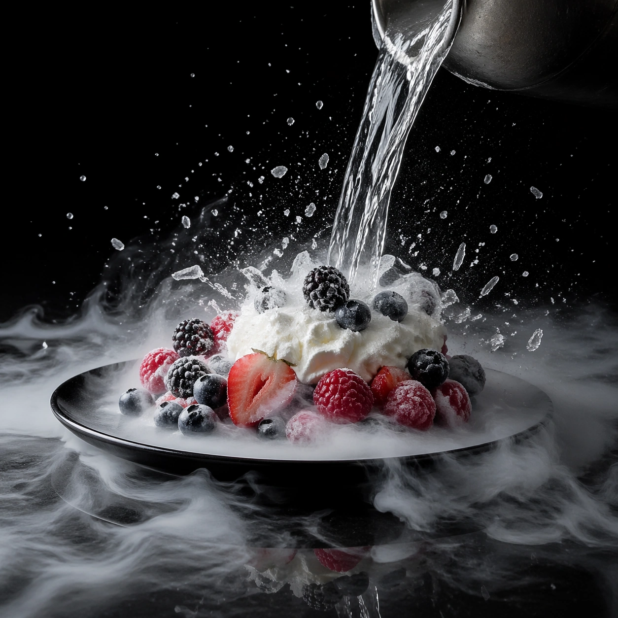

Example generated from “Liquid Nitrogen Frozen Moment — Frozen Pour Anchor”
GPT Image 2en

Scene: Create a square ultra-high-speed food photograph on a dark stage with precise flash freezing every crystal, fragment, and droplet. Cold vapor should sink and spread along the surface rather than billow upward like theatrical smoke. The scene must feel like a controlled scientific capture of an extreme thermal event, with deep blacks, disciplined highlights, and severe physical clarity. Place the action on a black reflective stage with the camera at a slightly low three-quarter angle so the vapor layer can spread visibly across the floor plane. Crisp flash should isolate the cold medium, the target food, and the first crystallizing edges against a near-black background. Subject: Capture the instant a clear cryogenic stream pours over a plated cluster of berries and softly whipped cream, with vapor rolling outward and the first frost crystals forming on the surfaces. Tiny droplets and fragments should suspend in air, but the core geometry of the dish must remain legible. The moment should feel exact, dangerous, and beautiful. Important details: The key challenge is believable thermal physics: frost bloom, brittle fracture, vapor density, wet-to-frozen transitions, and the texture of suddenly shocked food all need to feel accurate. Motion can be violent, but the image should remain legible and elegant. Every fragment must still read as part of a real food object. This first image establishes the camera angle, flash logic, vapor density, and black-stage reflection behavior for the series, so every physical cue must feel stable enough for later variations to inherit. The vapor must sink believably and the forming frost should register at micro scale. Use case: Liquid nitrogen frozen moment series study 1/9, defining the anchor capture of a cryogenic pour. Constraints: No readable text, no watermark, no logos, preserve exact 1:1 aspect ratio, no fire effects, no sci-fi blue laser glow, no generic splash stock-photo look, no readable gauges, no dramatic stage props, no exploding liquid sheet without cause, no dry-ice party mood, no readable equipment branding.


Example generated from “Liquid Nitrogen Frozen Moment — Rose Shatter Burst”
GPT Image 2en

Scene: Create a square ultra-high-speed food photograph on a dark stage with precise flash freezing every crystal, fragment, and droplet. Cold vapor should sink and spread along the surface rather than billow upward like theatrical smoke. The scene must feel like a controlled scientific capture of an extreme thermal event, with deep blacks, disciplined highlights, and severe physical clarity. Keep the exact stage angle, black reflective base, flash crispness, and sinking vapor behavior from the reference image so the cryogenic system remains consistent. The light should catch thin petal edges and ice crystals without turning them metallic. Subject: Show a deep red edible rose at the instant it shatters after freezing, with petals splintering into crisp fragments and frost radiating along each vein. A faint remnant of the cryogenic pour may still appear at the edge of frame, but the flower is the hero event. The motion should feel brittle and directional, not like a generic explosion. Important details: The key challenge is believable thermal physics: frost bloom, brittle fracture, vapor density, wet-to-frozen transitions, and the texture of suddenly shocked food all need to feel accurate. Motion can be violent, but the image should remain legible and elegant. Every fragment must still read as part of a real food object. Preserve exact stage geometry, flash timing feel, and vapor logic from the reference model while shifting the subject from plated dish to botanical garnish. Petal fragments should vary in size and thickness, and frost must accumulate along real structural lines. Use case: Liquid nitrogen frozen moment series study 2/9, translating the anchor stage into a rose-shatter event. Constraints: No readable text, no watermark, no logos, preserve exact 1:1 aspect ratio, no fire effects, no sci-fi blue laser glow, no generic splash stock-photo look, no readable gauges, no dramatic stage props, no fireworks spark effect, no floral confetti randomness, no upward smoke plume.

Example generated from “Liquid Nitrogen Frozen Moment — Berry Split Cloud”
GPT Image 2en

Scene: Create a square ultra-high-speed food photograph on a dark stage with precise flash freezing every crystal, fragment, and droplet. Cold vapor should sink and spread along the surface rather than billow upward like theatrical smoke. The scene must feel like a controlled scientific capture of an extreme thermal event, with deep blacks, disciplined highlights, and severe physical clarity. Maintain the exact black-stage angle, flash discipline, and low vapor sheet from the reference image so the series continuity remains unmistakable. The reflections should stay subtle, allowing the fruit fragments and frost to dominate the frame. Subject: Capture several ripe berries at the instant they split under cryogenic stress, with skins peeling back, frozen juice crystals scattering, and tiny seeds suspended around the rupture. The cluster should remain centered enough to read as one event rather than random debris. The image must feel brutally precise. Important details: The key challenge is believable thermal physics: frost bloom, brittle fracture, vapor density, wet-to-frozen transitions, and the texture of suddenly shocked food all need to feel accurate. Motion can be violent, but the image should remain legible and elegant. Every fragment must still read as part of a real food object. Preserve exact stage geometry, flash character, and gravity-aware vapor from the reference model while emphasizing skin tension, wet crystal breakup, and seed detail. The fracture pattern should suggest real berry structure and moisture content. Use case: Liquid nitrogen frozen moment series study 3/9, using the anchor stage to study berry rupture and ice spray. Constraints: No readable text, no watermark, no logos, preserve exact 1:1 aspect ratio, no fire effects, no sci-fi blue laser glow, no generic splash stock-photo look, no readable gauges, no dramatic stage props, no syrup splash aesthetics, no candy-like seed colors, no chaotic particle field.

Example generated from “Liquid Nitrogen Frozen Moment — Crystallizing Cream Wave”
GPT Image 2en

Scene: Create a square ultra-high-speed food photograph on a dark stage with precise flash freezing every crystal, fragment, and droplet. Cold vapor should sink and spread along the surface rather than billow upward like theatrical smoke. The scene must feel like a controlled scientific capture of an extreme thermal event, with deep blacks, disciplined highlights, and severe physical clarity. Use the same black-stage camera angle, flash clarity, and sinking vapor layer from the reference image, but let the subject spread wider across the frame so texture transformation becomes the star. The lighting should emphasize ridges, peaks, and crystal formation on a pale surface. Subject: Show a soft ribbon of whipped cream or semifreddo mixture at the exact instant it hardens under a cryogenic hit, with the outer edges crisping into frost while the center still reads creamy. Tiny shards and cold mist can lift from the surface, but the wave form must remain elegant and sculptural. The image should turn softness into architecture. Important details: The key challenge is believable thermal physics: frost bloom, brittle fracture, vapor density, wet-to-frozen transitions, and the texture of suddenly shocked food all need to feel accurate. Motion can be violent, but the image should remain legible and elegant. Every fragment must still read as part of a real food object. Preserve exact stage logic, flash character, and vapor behavior from the reference model while foregrounding the phase change from soft cream to brittle crystalline crust. The contrast between glossy softness and icy opacity must feel especially convincing. Use case: Liquid nitrogen frozen moment series study 4/9, closing the anchor system with a cream-to-crystal transition. Constraints: No readable text, no watermark, no logos, preserve exact 1:1 aspect ratio, no fire effects, no sci-fi blue laser glow, no generic splash stock-photo look, no readable gauges, no dramatic stage props, no milk splash tropes, no overexposed white clipping, no abstract smoke cloud.

Example generated from “Liquid Nitrogen Frozen Moment — Herb Fracture Macro”
GPT Image 2en

Scene: Create a square ultra-high-speed food photograph on a dark stage with precise flash freezing every crystal, fragment, and droplet. Cold vapor should sink and spread along the surface rather than billow upward like theatrical smoke. The scene must feel like a controlled scientific capture of an extreme thermal event, with deep blacks, disciplined highlights, and severe physical clarity. Use a square macro setup on a dark neutral stage with side flash and low vapor hugging the surface. The framing should be tight enough to make the herb structure feel monumental. Subject: Show several thin herb sprigs or edible leaves at the instant they snap and splinter after cryogenic treatment, with frost tracing the veins and tiny shards lifting away. Moisture crystals should cling to edges and stems. The image should feel botanical and culinary at once. Important details: The key challenge is believable thermal physics: frost bloom, brittle fracture, vapor density, wet-to-frozen transitions, and the texture of suddenly shocked food all need to feel accurate. Motion can be violent, but the image should remain legible and elegant. Every fragment must still read as part of a real food object. The success of the image depends on scale clarity: veins, frost grains, stem fibers, and brittle break lines all need to remain visible. The herb must still look edible, not dry or dead. Use case: Liquid nitrogen frozen moment single study 6/9, magnifying the brittle fracture of frozen herbs. Constraints: No readable text, no watermark, no logos, preserve exact 1:1 aspect ratio, no fire effects, no sci-fi blue laser glow, no generic splash stock-photo look, no readable gauges, no dramatic stage props, no flower-petal confetti aesthetic, no fake snow, no smoky blur.

Example generated from “Liquid Nitrogen Frozen Moment — Chocolate Shell Frost Crack”
GPT Image 2en

Scene: Create a square ultra-high-speed food photograph on a dark stage with precise flash freezing every crystal, fragment, and droplet. Cold vapor should sink and spread along the surface rather than billow upward like theatrical smoke. The scene must feel like a controlled scientific capture of an extreme thermal event, with deep blacks, disciplined highlights, and severe physical clarity. Create a square close studio image on a dark stage with crisp directional flash that catches both the mirror-like shell and the cold vapor at its base. The scene should feel premium and controlled. Subject: Show a thin tempered chocolate shell at the instant a cold shock creates branching cracks and a few flying fragments, revealing a colder lighter interior beneath. Frost should just begin to bloom around the fractures without fully obscuring the glossy outer lacquer. The object should feel dessert-like yet almost architectural. Important details: The key challenge is believable thermal physics: frost bloom, brittle fracture, vapor density, wet-to-frozen transitions, and the texture of suddenly shocked food all need to feel accurate. Motion can be violent, but the image should remain legible and elegant. Every fragment must still read as part of a real food object. The key contrast is glossy tempered reflection versus sudden brittle cracking and frost intrusion. Crack paths, fragment thickness, and vapor spread need to feel physically coherent. Use case: Liquid nitrogen frozen moment single study 7/9, examining cryogenic fracture in a tempered chocolate shell. Constraints: No readable text, no watermark, no logos, preserve exact 1:1 aspect ratio, no fire effects, no sci-fi blue laser glow, no generic splash stock-photo look, no readable gauges, no dramatic stage props, no molten chocolate, no candy bar appearance, no extra decorative drizzle.

Example generated from “Liquid Nitrogen Frozen Moment — Citrus Vapor Cascade”
GPT Image 2en

Scene: Create a square ultra-high-speed food photograph on a dark stage with precise flash freezing every crystal, fragment, and droplet. Cold vapor should sink and spread along the surface rather than billow upward like theatrical smoke. The scene must feel like a controlled scientific capture of an extreme thermal event, with deep blacks, disciplined highlights, and severe physical clarity. Use a square three-quarter dark-stage composition with backlight strong enough to make citrus flesh glow through the rind and segments. Low cold vapor should cascade around the fruit like a dense waterfall across the surface. Subject: Present one or two thick citrus slices as a cryogenic stream passes over them, freezing surface moisture and lifting fine icy droplets from the exposed pulp. Segment membranes, rind pores, and tiny frost crystals must remain visible. The event should feel luminous, acidic, and sharply physical. Important details: The key challenge is believable thermal physics: frost bloom, brittle fracture, vapor density, wet-to-frozen transitions, and the texture of suddenly shocked food all need to feel accurate. Motion can be violent, but the image should remain legible and elegant. Every fragment must still read as part of a real food object. Translucent pulp, wet membranes, and newly forming frost need to coexist convincingly. The vapor should feel heavy and downward-moving, framing the fruit rather than hiding it. Use case: Liquid nitrogen frozen moment single study 8/9, contrasting glowing citrus translucency with heavy cold vapor. Constraints: No readable text, no watermark, no logos, preserve exact 1:1 aspect ratio, no fire effects, no sci-fi blue laser glow, no generic splash stock-photo look, no readable gauges, no dramatic stage props, no juice splash cliches, no tropical cocktail styling, no fake blue freeze tint.

Example generated from “Liquid Nitrogen Frozen Moment — Meringue Collapse Freeze”
GPT Image 2en

Scene: Create a square ultra-high-speed food photograph on a dark stage with precise flash freezing every crystal, fragment, and droplet. Cold vapor should sink and spread along the surface rather than billow upward like theatrical smoke. The scene must feel like a controlled scientific capture of an extreme thermal event, with deep blacks, disciplined highlights, and severe physical clarity. Create a square dark-stage action image with crisp flash and selective side light that reveals both airy volume and sudden hardening. The background must stay empty so the fragile structure remains readable. Subject: Show a light meringue nest or tower at the instant cryogenic shock causes part of it to collapse while outer ridges freeze into brittle crystalline edges. Powdery fragments, tiny peaks, and vapor all interact in one suspended moment. The image should feel paradoxical: airy and brittle at once. Important details: The key challenge is believable thermal physics: frost bloom, brittle fracture, vapor density, wet-to-frozen transitions, and the texture of suddenly shocked food all need to feel accurate. Motion can be violent, but the image should remain legible and elegant. Every fragment must still read as part of a real food object. Make the meringue read as sugar foam transformed by cold, with fine bubble structure still visible inside the broken pieces. The collapse pattern should feel delicate and gravity-driven, not explosive. Use case: Liquid nitrogen frozen moment single study 9/9, capturing the fragile collapse of meringue under extreme cold. Constraints: No readable text, no watermark, no logos, preserve exact 1:1 aspect ratio, no fire effects, no sci-fi blue laser glow, no generic splash stock-photo look, no readable gauges, no dramatic stage props, no bakery countertop context, no confectionery sprinkles, no soft-focus haze.

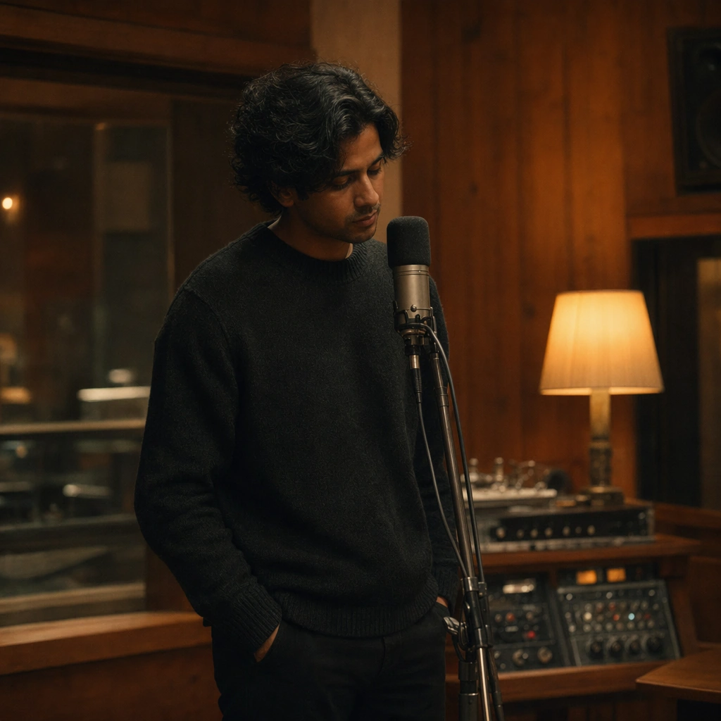
Example generated from “Live Session Poster And Recording Room Aesthetic — Reference Control Room Session”
GPT Image 2en

Scene: A square live-session still set in a warmly lit recording control room with wood paneling, muted acoustic treatment, softly glowing analog meters, and a single practical lamp. The camera is close enough to feel intimate but wide enough to show the room identity, creating the sense of a believable stripped-back performance recording. Subject: An invented musician sits with a hollow-body guitar and relaxed posture, wearing a dark knit layer and simple trousers. This first image must lock the exact face, hair base, skin tone, body proportions, wardrobe silhouette, and recording-room palette that later live-session images will preserve. Important details: The performance mood should feel honest and intimate, not stagey. Use realistic instrument posture, believable room acoustics, warm practical light, and subtle equipment presence. The room is as important as the artist: wood grain, lamp glow, meter lights, and acoustic surfaces together create the identity of the session environment. Use case: Live Session series study 1/9 for the Live Session Poster and Recording Room Aesthetic Prompt Atlas theme. Constraints: No readable text, no watermark, no logos, preserve exact 1:1 aspect ratio, no audience, no giant stage lighting, no flashy fashion styling, no brand labels on gear, no cluttered producer desk, no readable session notes

Example generated from “Live Session Poster And Recording Room Aesthetic — Piano Corner Take”
GPT Image 2en

Scene: A square live-session still in the same recording environment, now framed near an upright piano corner with warm side light and a little more shadow. The room must still read as the same session space, with similar wood and acoustic textures, only shifting the focal corner and instrument presence. Subject: Preserve the exact same musician from the reference image with identical face shape, hair base, skin tone, body proportions, and styling baseline. The artist now leans near the piano or rests a hand on it, while keeping the same understated live-session attitude and believable musician presence. Important details: Keep intimacy, realism, and room continuity absolute. The piano should extend the session story without turning the scene into a formal recital. Lamp glow, analog detail, and acoustic surfaces should still anchor the environment. This must feel like another still from the same recording day, not a new photoshoot. Use case: Live Session series study 2/9 for the Live Session Poster and Recording Room Aesthetic Prompt Atlas theme. Constraints: No readable text, no watermark, no logos, preserve exact 1:1 aspect ratio, preserve the exact reference face, hair base, and body proportions; no stage glamour, no extra bandmates, no sheet-music text, no glossy music-video styling, no visible brand names on the instrument

Example generated from “Live Session Poster And Recording Room Aesthetic — Microphone Stand Take”
GPT Image 2en

Scene: A square session still in the same recording room, now composed around a single microphone stand, warm lamp spill, and softly receding acoustic walls. The camera should feel present but unobtrusive, like documentation of a real vocal take inside a stripped-back session. Subject: Preserve the exact same musician from the reference image, including face shape, hair base, skin tone, body proportions, and wardrobe silhouette. The artist stands or leans toward a simple microphone stand with quiet concentration, remaining the same person from the root image rather than a restyled campaign character. Important details: The microphone is a context cue, not the main spectacle. Keep the room tactile and believable, the expression focused, and the lighting gentle. This should feel like a true session poster still that could promote a live recording or acoustic release without exaggeration or brand-heavy studio fetishism. Use case: Live Session series study 3/9 for the Live Session Poster and Recording Room Aesthetic Prompt Atlas theme. Constraints: No readable text, no watermark, no logos, preserve exact 1:1 aspect ratio, preserve the exact reference face, hair base, and body proportions; no pop-star stage pose, no crowd, no booth glass text, no visible gear brand, no dramatic concert beams

Example generated from “Live Session Poster And Recording Room Aesthetic — Midnight Drum Room”
GPT Image 2en

Scene: A square live-session still in the same broader studio world, now framed toward a compact drum-room corner with low midnight light, soft practical glow, and darker wood surfaces. The room should feel like a neighboring pocket of the same recording environment, not a totally different venue. Subject: Preserve the exact same musician from the reference image with identical face shape, hair base, skin tone, body proportions, and styling baseline. The artist is now positioned near a modest drum setup, maintaining the same understated authenticity and intimate session presence rather than performing theatrically. Important details: Let the drum kit add rhythmic context without taking over. Maintain the same warm room palette, same acoustic intimacy, and same believable musician behavior. This should read as the same artist and same recording session evolving across corners of one real studio environment. Use case: Live Session series study 4/9 for the Live Session Poster and Recording Room Aesthetic Prompt Atlas theme. Constraints: No readable text, no watermark, no logos, preserve exact 1:1 aspect ratio, preserve the exact reference face, hair base, and body proportions; no concert stage lighting, no drummer double, no readable notes, no large crowd kit spectacle, no visible brand marks on drums

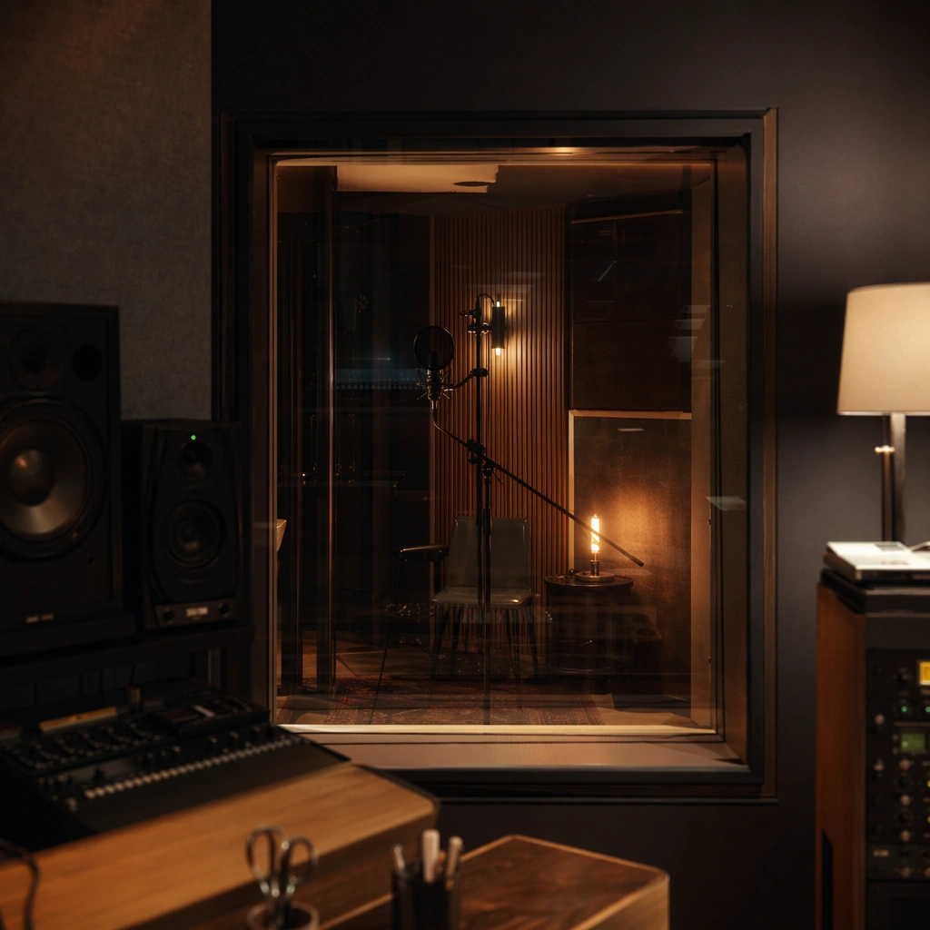
Example generated from “Live Session Poster And Recording Room Aesthetic — Isolation Booth Window”
GPT Image 2en

Scene: A square interior view through studio glass into an isolation booth, with warm practical light, soft reflections, and a minimal microphone silhouette inside. The image should feel quiet, intimate, and documentary, as if capturing a session in progress without spectacle. Subject: The subject is the threshold between rooms: glass reflections, a mic silhouette, acoustic panel texture, and the glow of a small lamp or meter inside the booth. It should evoke recording presence even without showing a full person. Important details: Keep the reflections subtle and the atmosphere believable. The booth should feel like part of a real studio, not a sci-fi chamber. This image should support a live-session campaign by showing the emotional architecture of recording rather than the performance itself. Use case: Live Session single study 6/9 for the Live Session Poster and Recording Room Aesthetic Prompt Atlas theme. Constraints: No readable text, no watermark, no logos, preserve exact 1:1 aspect ratio, no readable notes on glass, no brand logos, no large computer monitors, no excessive neon, no visible crowd or spectators

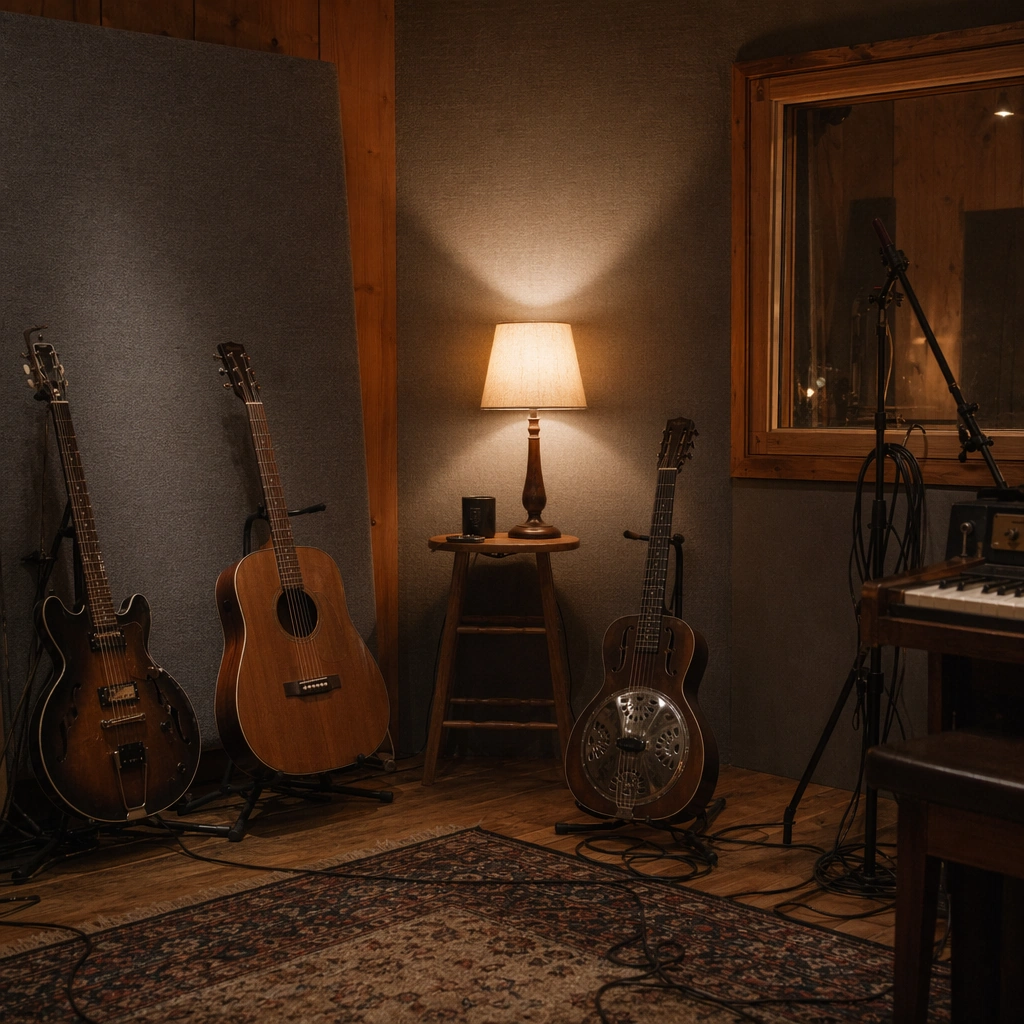
Example generated from “Live Session Poster And Recording Room Aesthetic — Instrument Rack Corner”
GPT Image 2en

Scene: A square corner of a recording room with several instruments on stands, a warm lamp glow, soft wall shadow, and enough negative space to feel poster-friendly. The composition should feel intentionally framed, not like random storage documentation. Subject: The subject is the arrangement of instruments and space: guitars, stands, cables, wood grain, and acoustic fabric creating a quiet sense of a session paused between takes. The room itself should carry as much emotional weight as the objects. Important details: Use tactile realism and restrained styling. The instruments should feel used, the room should feel inhabited, and the lighting should support intimacy rather than dramatic spectacle. This is supporting imagery for a live-session aesthetic, not a product catalog. Use case: Live Session single study 7/9 for the Live Session Poster and Recording Room Aesthetic Prompt Atlas theme. Constraints: No readable text, no watermark, no logos, preserve exact 1:1 aspect ratio, no brand names on instruments, no cluttered storage mess, no bright retail lighting, no readable posters on walls, no synthetic showroom look

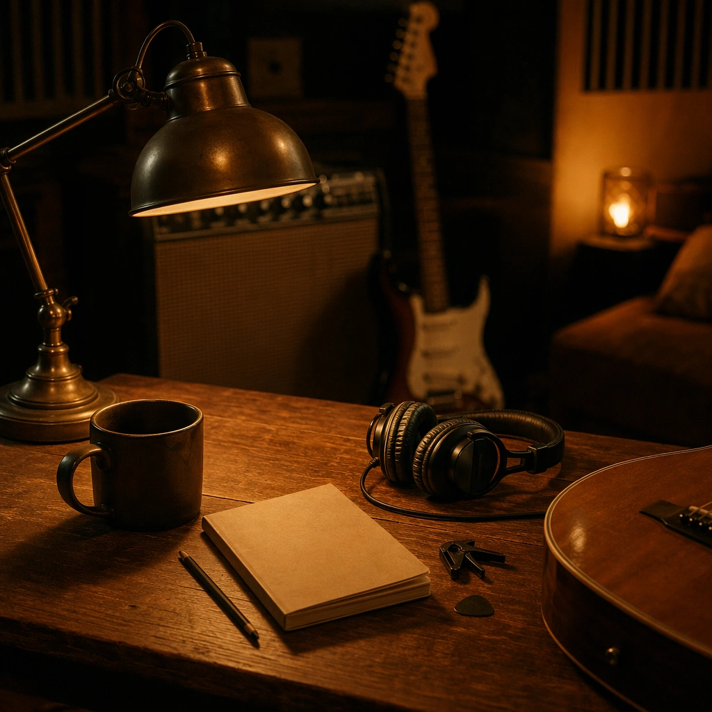
Example generated from “Live Session Poster And Recording Room Aesthetic — Lamp and Lyric Notebook”
GPT Image 2en

Scene: A square desk-side still life in a recording room with one warm lamp, a closed notebook or folded paper, pencil, and soft shadow gradients across wood grain. The frame should feel intimate and creative, evoking songwriting and preparation without needing a visible performer. Subject: The subject is a small zone of process: a closed notebook, a lamp pool, and a few carefully placed objects that suggest a music session in motion. The notebook must stay unreadable and secondary to the overall room atmosphere. Important details: The mood should be quiet, thoughtful, and tactile. Use warm shadow, wood texture, and just enough object detail to imply artistic work. This should support a live-session campaign as an emotional process image, not as stationery photography or office styling. Use case: Live Session single study 8/9 for the Live Session Poster and Recording Room Aesthetic Prompt Atlas theme. Constraints: No readable text, no watermark, no logos, preserve exact 1:1 aspect ratio, no readable handwriting, no laptop screen, no office-supply clutter, no visible brand products, no bright daylight spilling in

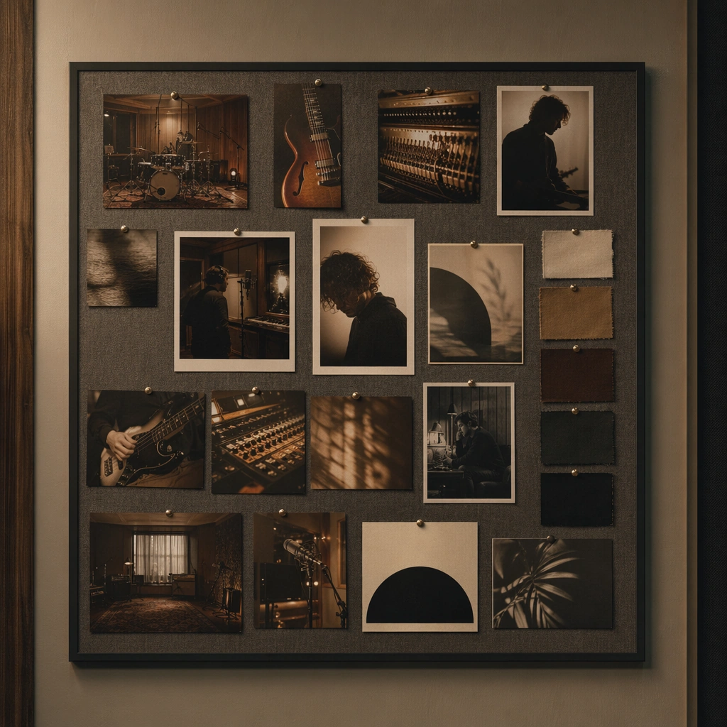
Example generated from “Live Session Poster And Recording Room Aesthetic — Session Poster Pinboard”
GPT Image 2en

Scene: A square wall pinboard inside a studio, holding a curated arrangement of session stills, room textures, portrait fragments, and abstract promo prints. The camera faces the board directly so it reads like a compact campaign-development surface inside the recording environment. Subject: The subject is the live-session visual family itself: pinned images of instruments, warm rooms, portrait silhouettes, and mood swatches arranged with editorial care. The board should imply campaign planning and aesthetic cohesion without any readable notes or text labels. Important details: Keep the board disciplined and believable, not scrapbook-like. Pins, paper curl, and wall texture can add realism, but the composition should remain clean enough to function as a polished visual-reference image. This is a bridge between recording atmosphere and promotional rollout. Use case: Live Session single study 9/9 for the Live Session Poster and Recording Room Aesthetic Prompt Atlas theme. Constraints: No readable text, no watermark, no logos, preserve exact 1:1 aspect ratio, no readable notes, no moodboard software UI, no random magazine cutouts, no bright colors breaking the room mood, no cluttered desk elements in front

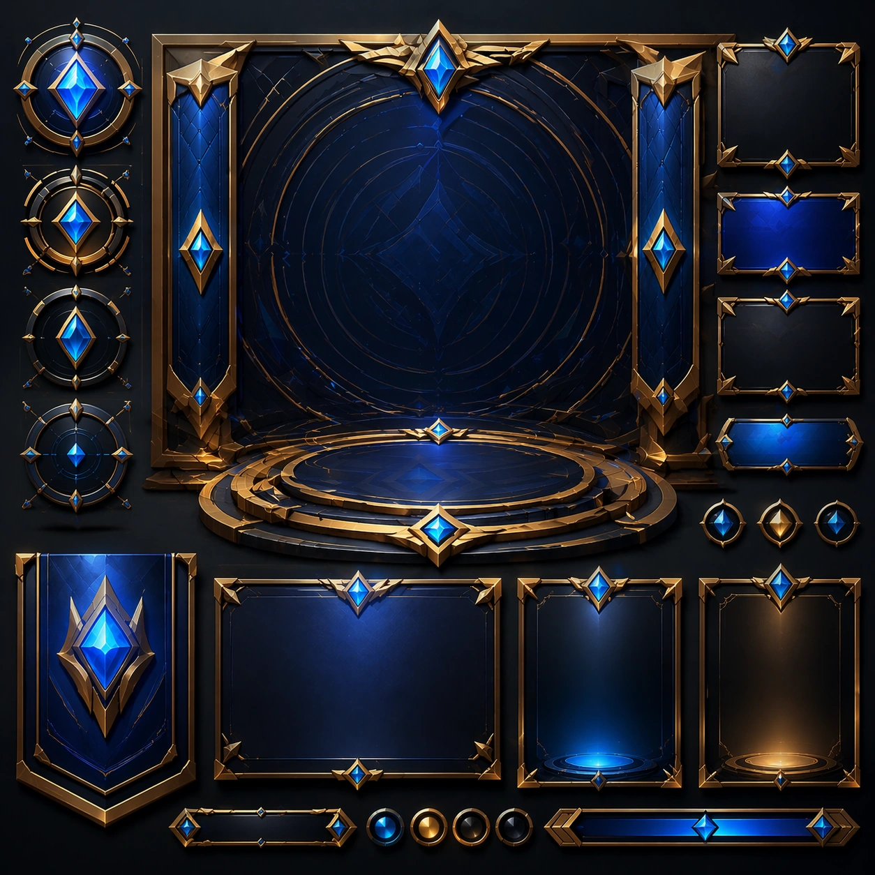
Example generated from “Livestream Host And Product Stage Visuals — Reference Anchor”
GPT Image 2en

Scene: Create a square reference image for Livestream Host and Product Stage Visuals. Build a reference anchor establishing the core system with a premium, production-ready finish. Use a polished modular board or campaign surface with clean spacing, premium game-UI finish, and clear focal hierarchy. The composition should feel intentional, clean, and reusable for gallery, research, campaign, or internal handoff contexts. Lighting must support readability first, with the main forms clearly separated from the background and enough breathing room for the system to stay legible at both hero scale and thumbnail scale. Subject: Center a coherent original game-art system built for premium production and marketing surfaces. For this image, focus on reference anchor. Keep the same system logic stable across screenshots, cards, banners, and overview boards. This image is the canonical anchor that later series images must follow. The viewer should immediately understand what role this surface plays inside a cohesive game-production asset pack. Important details: Lock framing, icon grammar, palette blocking, and surface hierarchy so the kit feels production-ready and consistent. Preserve the core silhouette, framing language, and material logic from the reference image while each variation changes function. Keep materials believable, edge hierarchy disciplined, and the visual language consistent with Host Stage. Use abstract interface blocks or diagram accents when helpful, but avoid any readable language. The final result should feel like a deliberate production asset rather than a random illustration. Use case: Livestream Host and Product Stage Visuals series study 1/9, designed as reference anchor within a cohesive asset pack. Constraints: No readable text, no watermark, no logos, preserve exact 1:1 aspect ratio, no unrelated objects, no broken visual hierarchy, no malformed anatomy or broken perspective, no random decorative clutter.

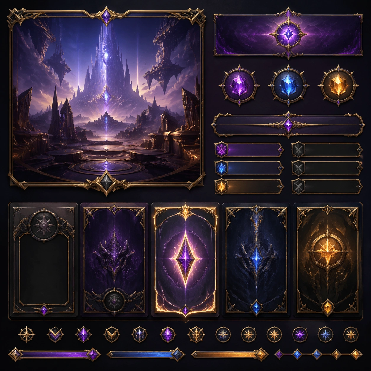
Example generated from “Livestream Host And Product Stage Visuals — Variant One”
GPT Image 2en

Scene: Create a square dependent image for Livestream Host and Product Stage Visuals. Build a first controlled variation in the same system with a premium, production-ready finish. Use a polished modular board or campaign surface with clean spacing, premium game-UI finish, and clear focal hierarchy. The composition should feel intentional, clean, and reusable for gallery, research, campaign, or internal handoff contexts. Lighting must support readability first, with the main forms clearly separated from the background and enough breathing room for the system to stay legible at both hero scale and thumbnail scale. Subject: Center a coherent original game-art system built for premium production and marketing surfaces. For this image, focus on the intended support surface. Keep the same system logic stable across screenshots, cards, banners, and overview boards. Preserve exact identity or system logic from the reference image while changing only the intended variation axis. The viewer should immediately understand what role this surface plays inside a cohesive game-production asset pack. Important details: Lock framing, icon grammar, palette blocking, and surface hierarchy so the kit feels production-ready and consistent. Preserve the core silhouette, framing language, and material logic from the reference image while each variation changes function. Keep materials believable, edge hierarchy disciplined, and the visual language consistent with Host Stage. Use abstract interface blocks or diagram accents when helpful, but avoid any readable language. The final result should feel like a deliberate production asset rather than a random illustration. Use case: Livestream Host and Product Stage Visuals series study 2/9, designed as variant one within a cohesive asset pack. Constraints: No readable text, no watermark, no logos, preserve exact 1:1 aspect ratio, no unrelated objects, no broken visual hierarchy, no malformed anatomy or broken perspective, no random decorative clutter.

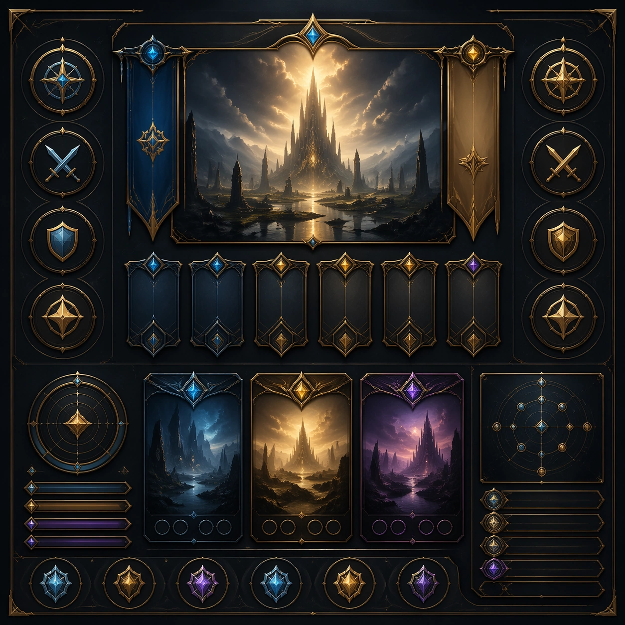
Example generated from “Livestream Host And Product Stage Visuals — Variant Two”
GPT Image 2en

Scene: Create a square dependent image for Livestream Host and Product Stage Visuals. Build a second controlled variation in the same system with a premium, production-ready finish. Use a polished modular board or campaign surface with clean spacing, premium game-UI finish, and clear focal hierarchy. The composition should feel intentional, clean, and reusable for gallery, research, campaign, or internal handoff contexts. Lighting must support readability first, with the main forms clearly separated from the background and enough breathing room for the system to stay legible at both hero scale and thumbnail scale. Subject: Center a coherent original game-art system built for premium production and marketing surfaces. For this image, focus on the intended support surface. Keep the same system logic stable across screenshots, cards, banners, and overview boards. Preserve exact identity or system logic from the reference image while changing only the intended variation axis. The viewer should immediately understand what role this surface plays inside a cohesive game-production asset pack. Important details: Lock framing, icon grammar, palette blocking, and surface hierarchy so the kit feels production-ready and consistent. Preserve the core silhouette, framing language, and material logic from the reference image while each variation changes function. Keep materials believable, edge hierarchy disciplined, and the visual language consistent with Host Stage. Use abstract interface blocks or diagram accents when helpful, but avoid any readable language. The final result should feel like a deliberate production asset rather than a random illustration. Use case: Livestream Host and Product Stage Visuals series study 3/9, designed as variant two within a cohesive asset pack. Constraints: No readable text, no watermark, no logos, preserve exact 1:1 aspect ratio, no unrelated objects, no broken visual hierarchy, no malformed anatomy or broken perspective, no random decorative clutter.

Example generated from “Livestream Host And Product Stage Visuals — Variant Three”
GPT Image 2en

Scene: Create a square dependent image for Livestream Host and Product Stage Visuals. Build a third controlled variation in the same system with a premium, production-ready finish. Use a polished modular board or campaign surface with clean spacing, premium game-UI finish, and clear focal hierarchy. The composition should feel intentional, clean, and reusable for gallery, research, campaign, or internal handoff contexts. Lighting must support readability first, with the main forms clearly separated from the background and enough breathing room for the system to stay legible at both hero scale and thumbnail scale. Subject: Center a coherent original game-art system built for premium production and marketing surfaces. For this image, focus on the intended support surface. Keep the same system logic stable across screenshots, cards, banners, and overview boards. Preserve exact identity or system logic from the reference image while changing only the intended variation axis. The viewer should immediately understand what role this surface plays inside a cohesive game-production asset pack. Important details: Lock framing, icon grammar, palette blocking, and surface hierarchy so the kit feels production-ready and consistent. Preserve the core silhouette, framing language, and material logic from the reference image while each variation changes function. Keep materials believable, edge hierarchy disciplined, and the visual language consistent with Host Stage. Use abstract interface blocks or diagram accents when helpful, but avoid any readable language. The final result should feel like a deliberate production asset rather than a random illustration. Use case: Livestream Host and Product Stage Visuals series study 4/9, designed as variant three within a cohesive asset pack. Constraints: No readable text, no watermark, no logos, preserve exact 1:1 aspect ratio, no unrelated objects, no broken visual hierarchy, no malformed anatomy or broken perspective, no random decorative clutter.

Example generated from “Livestream Host And Product Stage Visuals — Support One”
GPT Image 2en

Scene: Create a square standalone support image for Livestream Host and Product Stage Visuals. Build a support-surface study with a clear focal hierarchy and a finished professional surface. Use a polished modular board or campaign surface with clean spacing, premium game-UI finish, and clear focal hierarchy. The frame should feel self-contained and polished, with enough structure to explain the system even without the reference series, yet still obviously belonging to the same theme and production world. Subject: Show a coherent original game-art system built for premium production and marketing surfaces in a way that emphasizes the intended support surface. Keep the same system logic stable across screenshots, cards, banners, and overview boards. Even though this image is independent, the viewer should still recognize the same universe, same commercial logic, and same production intent as the core package. Important details: Lock framing, icon grammar, palette blocking, and surface hierarchy so the kit feels production-ready and consistent. Preserve the broader theme language through color, framing, material choices, and modular composition. Use clean panel rhythm, premium asset presentation, and believable detail density. The image should work equally well as a gallery study, research reference, and mock production deliverable. Use case: Livestream Host and Product Stage Visuals single study 5/9, exploring support one as a support surface. Constraints: No readable text, no watermark, no logos, preserve exact 1:1 aspect ratio, no unrelated objects, no broken visual hierarchy, no visual noise that obscures the main surface, no accidental brand resemblance.

Example generated from “Livestream Host And Product Stage Visuals — Support Two”
GPT Image 2en

Scene: Create a square standalone support image for Livestream Host and Product Stage Visuals. Build a second support-surface study with a clear focal hierarchy and a finished professional surface. Use a polished modular board or campaign surface with clean spacing, premium game-UI finish, and clear focal hierarchy. The frame should feel self-contained and polished, with enough structure to explain the system even without the reference series, yet still obviously belonging to the same theme and production world. Subject: Show a coherent original game-art system built for premium production and marketing surfaces in a way that emphasizes the intended support surface. Keep the same system logic stable across screenshots, cards, banners, and overview boards. Even though this image is independent, the viewer should still recognize the same universe, same commercial logic, and same production intent as the core package. Important details: Lock framing, icon grammar, palette blocking, and surface hierarchy so the kit feels production-ready and consistent. Preserve the broader theme language through color, framing, material choices, and modular composition. Use clean panel rhythm, premium asset presentation, and believable detail density. The image should work equally well as a gallery study, research reference, and mock production deliverable. Use case: Livestream Host and Product Stage Visuals single study 6/9, exploring support two as a support surface. Constraints: No readable text, no watermark, no logos, preserve exact 1:1 aspect ratio, no unrelated objects, no broken visual hierarchy, no visual noise that obscures the main surface, no accidental brand resemblance.

Example generated from “Livestream Host And Product Stage Visuals — Support Three”
GPT Image 2en

Scene: Create a square standalone support image for Livestream Host and Product Stage Visuals. Build a third support-surface study with a clear focal hierarchy and a finished professional surface. Use a polished modular board or campaign surface with clean spacing, premium game-UI finish, and clear focal hierarchy. The frame should feel self-contained and polished, with enough structure to explain the system even without the reference series, yet still obviously belonging to the same theme and production world. Subject: Show a coherent original game-art system built for premium production and marketing surfaces in a way that emphasizes the intended support surface. Keep the same system logic stable across screenshots, cards, banners, and overview boards. Even though this image is independent, the viewer should still recognize the same universe, same commercial logic, and same production intent as the core package. Important details: Lock framing, icon grammar, palette blocking, and surface hierarchy so the kit feels production-ready and consistent. Preserve the broader theme language through color, framing, material choices, and modular composition. Use clean panel rhythm, premium asset presentation, and believable detail density. The image should work equally well as a gallery study, research reference, and mock production deliverable. Use case: Livestream Host and Product Stage Visuals single study 7/9, exploring support three as a support surface. Constraints: No readable text, no watermark, no logos, preserve exact 1:1 aspect ratio, no unrelated objects, no broken visual hierarchy, no visual noise that obscures the main surface, no accidental brand resemblance.

Example generated from “Livestream Host And Product Stage Visuals — Support Four”
GPT Image 2en

Scene: Create a square standalone support image for Livestream Host and Product Stage Visuals. Build a fourth support-surface study with a clear focal hierarchy and a finished professional surface. Use a polished modular board or campaign surface with clean spacing, premium game-UI finish, and clear focal hierarchy. The frame should feel self-contained and polished, with enough structure to explain the system even without the reference series, yet still obviously belonging to the same theme and production world. Subject: Show a coherent original game-art system built for premium production and marketing surfaces in a way that emphasizes the intended support surface. Keep the same system logic stable across screenshots, cards, banners, and overview boards. Even though this image is independent, the viewer should still recognize the same universe, same commercial logic, and same production intent as the core package. Important details: Lock framing, icon grammar, palette blocking, and surface hierarchy so the kit feels production-ready and consistent. Preserve the broader theme language through color, framing, material choices, and modular composition. Use clean panel rhythm, premium asset presentation, and believable detail density. The image should work equally well as a gallery study, research reference, and mock production deliverable. Use case: Livestream Host and Product Stage Visuals single study 8/9, exploring support four as a support surface. Constraints: No readable text, no watermark, no logos, preserve exact 1:1 aspect ratio, no unrelated objects, no broken visual hierarchy, no visual noise that obscures the main surface, no accidental brand resemblance.

Example generated from “Livestream Host And Product Stage Visuals — Support Five”
GPT Image 2en

Scene: Create a square standalone support image for Livestream Host and Product Stage Visuals. Build a fifth support-surface study with a clear focal hierarchy and a finished professional surface. Use a polished modular board or campaign surface with clean spacing, premium game-UI finish, and clear focal hierarchy. The frame should feel self-contained and polished, with enough structure to explain the system even without the reference series, yet still obviously belonging to the same theme and production world. Subject: Show a coherent original game-art system built for premium production and marketing surfaces in a way that emphasizes the intended support surface. Keep the same system logic stable across screenshots, cards, banners, and overview boards. Even though this image is independent, the viewer should still recognize the same universe, same commercial logic, and same production intent as the core package. Important details: Lock framing, icon grammar, palette blocking, and surface hierarchy so the kit feels production-ready and consistent. Preserve the broader theme language through color, framing, material choices, and modular composition. Use clean panel rhythm, premium asset presentation, and believable detail density. The image should work equally well as a gallery study, research reference, and mock production deliverable. Use case: Livestream Host and Product Stage Visuals single study 9/9, exploring support five as a support surface. Constraints: No readable text, no watermark, no logos, preserve exact 1:1 aspect ratio, no unrelated objects, no broken visual hierarchy, no visual noise that obscures the main surface, no accidental brand resemblance.

Example generated from “Livestream Product Pin Card Family — Reference Anchor”
GPT Image 2en

Scene: Create a square reference image for Livestream Product Pin Card Family. Build a reference anchor establishing the core system with a premium, production-ready finish. Use a polished modular board or campaign surface with clean spacing, premium game-UI finish, and clear focal hierarchy. The composition should feel intentional, clean, and reusable for gallery, research, campaign, or internal handoff contexts. Lighting must support readability first, with the main forms clearly separated from the background and enough breathing room for the system to stay legible at both hero scale and thumbnail scale. Subject: Center a coherent original game-art system built for premium production and marketing surfaces. For this image, focus on reference anchor. Keep the same system logic stable across screenshots, cards, banners, and overview boards. This image is the canonical anchor that later series images must follow. The viewer should immediately understand what role this surface plays inside a cohesive game-production asset pack. Important details: Lock framing, icon grammar, palette blocking, and surface hierarchy so the kit feels production-ready and consistent. Preserve the core silhouette, framing language, and material logic from the reference image while each variation changes function. Keep materials believable, edge hierarchy disciplined, and the visual language consistent with Pin Cards. Use abstract interface blocks or diagram accents when helpful, but avoid any readable language. The final result should feel like a deliberate production asset rather than a random illustration. Use case: Livestream Product Pin Card Family series study 1/9, designed as reference anchor within a cohesive asset pack. Constraints: No readable text, no watermark, no logos, preserve exact 1:1 aspect ratio, no unrelated objects, no broken visual hierarchy, no malformed anatomy or broken perspective, no random decorative clutter.

Example generated from “Livestream Product Pin Card Family — Variant One”
GPT Image 2en

Scene: Create a square dependent image for Livestream Product Pin Card Family. Build a first controlled variation in the same system with a premium, production-ready finish. Use a polished modular board or campaign surface with clean spacing, premium game-UI finish, and clear focal hierarchy. The composition should feel intentional, clean, and reusable for gallery, research, campaign, or internal handoff contexts. Lighting must support readability first, with the main forms clearly separated from the background and enough breathing room for the system to stay legible at both hero scale and thumbnail scale. Subject: Center a coherent original game-art system built for premium production and marketing surfaces. For this image, focus on the intended support surface. Keep the same system logic stable across screenshots, cards, banners, and overview boards. Preserve exact identity or system logic from the reference image while changing only the intended variation axis. The viewer should immediately understand what role this surface plays inside a cohesive game-production asset pack. Important details: Lock framing, icon grammar, palette blocking, and surface hierarchy so the kit feels production-ready and consistent. Preserve the core silhouette, framing language, and material logic from the reference image while each variation changes function. Keep materials believable, edge hierarchy disciplined, and the visual language consistent with Pin Cards. Use abstract interface blocks or diagram accents when helpful, but avoid any readable language. The final result should feel like a deliberate production asset rather than a random illustration. Use case: Livestream Product Pin Card Family series study 2/9, designed as variant one within a cohesive asset pack. Constraints: No readable text, no watermark, no logos, preserve exact 1:1 aspect ratio, no unrelated objects, no broken visual hierarchy, no malformed anatomy or broken perspective, no random decorative clutter.

Example generated from “Livestream Product Pin Card Family — Variant Two”
GPT Image 2en

Scene: Create a square dependent image for Livestream Product Pin Card Family. Build a second controlled variation in the same system with a premium, production-ready finish. Use a polished modular board or campaign surface with clean spacing, premium game-UI finish, and clear focal hierarchy. The composition should feel intentional, clean, and reusable for gallery, research, campaign, or internal handoff contexts. Lighting must support readability first, with the main forms clearly separated from the background and enough breathing room for the system to stay legible at both hero scale and thumbnail scale. Subject: Center a coherent original game-art system built for premium production and marketing surfaces. For this image, focus on the intended support surface. Keep the same system logic stable across screenshots, cards, banners, and overview boards. Preserve exact identity or system logic from the reference image while changing only the intended variation axis. The viewer should immediately understand what role this surface plays inside a cohesive game-production asset pack. Important details: Lock framing, icon grammar, palette blocking, and surface hierarchy so the kit feels production-ready and consistent. Preserve the core silhouette, framing language, and material logic from the reference image while each variation changes function. Keep materials believable, edge hierarchy disciplined, and the visual language consistent with Pin Cards. Use abstract interface blocks or diagram accents when helpful, but avoid any readable language. The final result should feel like a deliberate production asset rather than a random illustration. Use case: Livestream Product Pin Card Family series study 3/9, designed as variant two within a cohesive asset pack. Constraints: No readable text, no watermark, no logos, preserve exact 1:1 aspect ratio, no unrelated objects, no broken visual hierarchy, no malformed anatomy or broken perspective, no random decorative clutter.

Example generated from “Livestream Product Pin Card Family — Variant Three”
GPT Image 2en

Scene: Create a square dependent image for Livestream Product Pin Card Family. Build a third controlled variation in the same system with a premium, production-ready finish. Use a polished modular board or campaign surface with clean spacing, premium game-UI finish, and clear focal hierarchy. The composition should feel intentional, clean, and reusable for gallery, research, campaign, or internal handoff contexts. Lighting must support readability first, with the main forms clearly separated from the background and enough breathing room for the system to stay legible at both hero scale and thumbnail scale. Subject: Center a coherent original game-art system built for premium production and marketing surfaces. For this image, focus on the intended support surface. Keep the same system logic stable across screenshots, cards, banners, and overview boards. Preserve exact identity or system logic from the reference image while changing only the intended variation axis. The viewer should immediately understand what role this surface plays inside a cohesive game-production asset pack. Important details: Lock framing, icon grammar, palette blocking, and surface hierarchy so the kit feels production-ready and consistent. Preserve the core silhouette, framing language, and material logic from the reference image while each variation changes function. Keep materials believable, edge hierarchy disciplined, and the visual language consistent with Pin Cards. Use abstract interface blocks or diagram accents when helpful, but avoid any readable language. The final result should feel like a deliberate production asset rather than a random illustration. Use case: Livestream Product Pin Card Family series study 4/9, designed as variant three within a cohesive asset pack. Constraints: No readable text, no watermark, no logos, preserve exact 1:1 aspect ratio, no unrelated objects, no broken visual hierarchy, no malformed anatomy or broken perspective, no random decorative clutter.

Example generated from “Livestream Product Pin Card Family — Support One”
GPT Image 2en

Scene: Create a square standalone support image for Livestream Product Pin Card Family. Build a support-surface study with a clear focal hierarchy and a finished professional surface. Use a polished modular board or campaign surface with clean spacing, premium game-UI finish, and clear focal hierarchy. The frame should feel self-contained and polished, with enough structure to explain the system even without the reference series, yet still obviously belonging to the same theme and production world. Subject: Show a coherent original game-art system built for premium production and marketing surfaces in a way that emphasizes the intended support surface. Keep the same system logic stable across screenshots, cards, banners, and overview boards. Even though this image is independent, the viewer should still recognize the same universe, same commercial logic, and same production intent as the core package. Important details: Lock framing, icon grammar, palette blocking, and surface hierarchy so the kit feels production-ready and consistent. Preserve the broader theme language through color, framing, material choices, and modular composition. Use clean panel rhythm, premium asset presentation, and believable detail density. The image should work equally well as a gallery study, research reference, and mock production deliverable. Use case: Livestream Product Pin Card Family single study 5/9, exploring support one as a support surface. Constraints: No readable text, no watermark, no logos, preserve exact 1:1 aspect ratio, no unrelated objects, no broken visual hierarchy, no visual noise that obscures the main surface, no accidental brand resemblance.

Example generated from “Livestream Product Pin Card Family — Support Two”
GPT Image 2en

Scene: Create a square standalone support image for Livestream Product Pin Card Family. Build a second support-surface study with a clear focal hierarchy and a finished professional surface. Use a polished modular board or campaign surface with clean spacing, premium game-UI finish, and clear focal hierarchy. The frame should feel self-contained and polished, with enough structure to explain the system even without the reference series, yet still obviously belonging to the same theme and production world. Subject: Show a coherent original game-art system built for premium production and marketing surfaces in a way that emphasizes the intended support surface. Keep the same system logic stable across screenshots, cards, banners, and overview boards. Even though this image is independent, the viewer should still recognize the same universe, same commercial logic, and same production intent as the core package. Important details: Lock framing, icon grammar, palette blocking, and surface hierarchy so the kit feels production-ready and consistent. Preserve the broader theme language through color, framing, material choices, and modular composition. Use clean panel rhythm, premium asset presentation, and believable detail density. The image should work equally well as a gallery study, research reference, and mock production deliverable. Use case: Livestream Product Pin Card Family single study 6/9, exploring support two as a support surface. Constraints: No readable text, no watermark, no logos, preserve exact 1:1 aspect ratio, no unrelated objects, no broken visual hierarchy, no visual noise that obscures the main surface, no accidental brand resemblance.

Example generated from “Livestream Product Pin Card Family — Support Three”
GPT Image 2en

Scene: Create a square standalone support image for Livestream Product Pin Card Family. Build a third support-surface study with a clear focal hierarchy and a finished professional surface. Use a polished modular board or campaign surface with clean spacing, premium game-UI finish, and clear focal hierarchy. The frame should feel self-contained and polished, with enough structure to explain the system even without the reference series, yet still obviously belonging to the same theme and production world. Subject: Show a coherent original game-art system built for premium production and marketing surfaces in a way that emphasizes the intended support surface. Keep the same system logic stable across screenshots, cards, banners, and overview boards. Even though this image is independent, the viewer should still recognize the same universe, same commercial logic, and same production intent as the core package. Important details: Lock framing, icon grammar, palette blocking, and surface hierarchy so the kit feels production-ready and consistent. Preserve the broader theme language through color, framing, material choices, and modular composition. Use clean panel rhythm, premium asset presentation, and believable detail density. The image should work equally well as a gallery study, research reference, and mock production deliverable. Use case: Livestream Product Pin Card Family single study 7/9, exploring support three as a support surface. Constraints: No readable text, no watermark, no logos, preserve exact 1:1 aspect ratio, no unrelated objects, no broken visual hierarchy, no visual noise that obscures the main surface, no accidental brand resemblance.

Example generated from “Livestream Product Pin Card Family — Support Four”
GPT Image 2en

Scene: Create a square standalone support image for Livestream Product Pin Card Family. Build a fourth support-surface study with a clear focal hierarchy and a finished professional surface. Use a polished modular board or campaign surface with clean spacing, premium game-UI finish, and clear focal hierarchy. The frame should feel self-contained and polished, with enough structure to explain the system even without the reference series, yet still obviously belonging to the same theme and production world. Subject: Show a coherent original game-art system built for premium production and marketing surfaces in a way that emphasizes the intended support surface. Keep the same system logic stable across screenshots, cards, banners, and overview boards. Even though this image is independent, the viewer should still recognize the same universe, same commercial logic, and same production intent as the core package. Important details: Lock framing, icon grammar, palette blocking, and surface hierarchy so the kit feels production-ready and consistent. Preserve the broader theme language through color, framing, material choices, and modular composition. Use clean panel rhythm, premium asset presentation, and believable detail density. The image should work equally well as a gallery study, research reference, and mock production deliverable. Use case: Livestream Product Pin Card Family single study 8/9, exploring support four as a support surface. Constraints: No readable text, no watermark, no logos, preserve exact 1:1 aspect ratio, no unrelated objects, no broken visual hierarchy, no visual noise that obscures the main surface, no accidental brand resemblance.

Example generated from “Livestream Product Pin Card Family — Support Five”
GPT Image 2en

Scene: Create a square standalone support image for Livestream Product Pin Card Family. Build a fifth support-surface study with a clear focal hierarchy and a finished professional surface. Use a polished modular board or campaign surface with clean spacing, premium game-UI finish, and clear focal hierarchy. The frame should feel self-contained and polished, with enough structure to explain the system even without the reference series, yet still obviously belonging to the same theme and production world. Subject: Show a coherent original game-art system built for premium production and marketing surfaces in a way that emphasizes the intended support surface. Keep the same system logic stable across screenshots, cards, banners, and overview boards. Even though this image is independent, the viewer should still recognize the same universe, same commercial logic, and same production intent as the core package. Important details: Lock framing, icon grammar, palette blocking, and surface hierarchy so the kit feels production-ready and consistent. Preserve the broader theme language through color, framing, material choices, and modular composition. Use clean panel rhythm, premium asset presentation, and believable detail density. The image should work equally well as a gallery study, research reference, and mock production deliverable. Use case: Livestream Product Pin Card Family single study 9/9, exploring support five as a support surface. Constraints: No readable text, no watermark, no logos, preserve exact 1:1 aspect ratio, no unrelated objects, no broken visual hierarchy, no visual noise that obscures the main surface, no accidental brand resemblance.

Example generated from “Livestream Room Promo Tile System — Reference Anchor”
GPT Image 2en

Scene: Create a square reference image for Livestream Room Promo Tile System. Build a reference anchor establishing the core system with a premium, production-ready finish. Use a polished modular board or campaign surface with clean spacing, premium game-UI finish, and clear focal hierarchy. The composition should feel intentional, clean, and reusable for gallery, research, campaign, or internal handoff contexts. Lighting must support readability first, with the main forms clearly separated from the background and enough breathing room for the system to stay legible at both hero scale and thumbnail scale. Subject: Center a coherent original game-art system built for premium production and marketing surfaces. For this image, focus on reference anchor. Keep the same system logic stable across screenshots, cards, banners, and overview boards. This image is the canonical anchor that later series images must follow. The viewer should immediately understand what role this surface plays inside a cohesive game-production asset pack. Important details: Lock framing, icon grammar, palette blocking, and surface hierarchy so the kit feels production-ready and consistent. Preserve the core silhouette, framing language, and material logic from the reference image while each variation changes function. Keep materials believable, edge hierarchy disciplined, and the visual language consistent with Live Tiles. Use abstract interface blocks or diagram accents when helpful, but avoid any readable language. The final result should feel like a deliberate production asset rather than a random illustration. Use case: Livestream Room Promo Tile System series study 1/9, designed as reference anchor within a cohesive asset pack. Constraints: No readable text, no watermark, no logos, preserve exact 1:1 aspect ratio, no unrelated objects, no broken visual hierarchy, no malformed anatomy or broken perspective, no random decorative clutter.

Example generated from “Livestream Room Promo Tile System — Variant One”
GPT Image 2en

Scene: Create a square dependent image for Livestream Room Promo Tile System. Build a first controlled variation in the same system with a premium, production-ready finish. Use a polished modular board or campaign surface with clean spacing, premium game-UI finish, and clear focal hierarchy. The composition should feel intentional, clean, and reusable for gallery, research, campaign, or internal handoff contexts. Lighting must support readability first, with the main forms clearly separated from the background and enough breathing room for the system to stay legible at both hero scale and thumbnail scale. Subject: Center a coherent original game-art system built for premium production and marketing surfaces. For this image, focus on the intended support surface. Keep the same system logic stable across screenshots, cards, banners, and overview boards. Preserve exact identity or system logic from the reference image while changing only the intended variation axis. The viewer should immediately understand what role this surface plays inside a cohesive game-production asset pack. Important details: Lock framing, icon grammar, palette blocking, and surface hierarchy so the kit feels production-ready and consistent. Preserve the core silhouette, framing language, and material logic from the reference image while each variation changes function. Keep materials believable, edge hierarchy disciplined, and the visual language consistent with Live Tiles. Use abstract interface blocks or diagram accents when helpful, but avoid any readable language. The final result should feel like a deliberate production asset rather than a random illustration. Use case: Livestream Room Promo Tile System series study 2/9, designed as variant one within a cohesive asset pack. Constraints: No readable text, no watermark, no logos, preserve exact 1:1 aspect ratio, no unrelated objects, no broken visual hierarchy, no malformed anatomy or broken perspective, no random decorative clutter.

Example generated from “Livestream Room Promo Tile System — Variant Two”
GPT Image 2en

Scene: Create a square dependent image for Livestream Room Promo Tile System. Build a second controlled variation in the same system with a premium, production-ready finish. Use a polished modular board or campaign surface with clean spacing, premium game-UI finish, and clear focal hierarchy. The composition should feel intentional, clean, and reusable for gallery, research, campaign, or internal handoff contexts. Lighting must support readability first, with the main forms clearly separated from the background and enough breathing room for the system to stay legible at both hero scale and thumbnail scale. Subject: Center a coherent original game-art system built for premium production and marketing surfaces. For this image, focus on the intended support surface. Keep the same system logic stable across screenshots, cards, banners, and overview boards. Preserve exact identity or system logic from the reference image while changing only the intended variation axis. The viewer should immediately understand what role this surface plays inside a cohesive game-production asset pack. Important details: Lock framing, icon grammar, palette blocking, and surface hierarchy so the kit feels production-ready and consistent. Preserve the core silhouette, framing language, and material logic from the reference image while each variation changes function. Keep materials believable, edge hierarchy disciplined, and the visual language consistent with Live Tiles. Use abstract interface blocks or diagram accents when helpful, but avoid any readable language. The final result should feel like a deliberate production asset rather than a random illustration. Use case: Livestream Room Promo Tile System series study 3/9, designed as variant two within a cohesive asset pack. Constraints: No readable text, no watermark, no logos, preserve exact 1:1 aspect ratio, no unrelated objects, no broken visual hierarchy, no malformed anatomy or broken perspective, no random decorative clutter.

Example generated from “Livestream Room Promo Tile System — Variant Three”
GPT Image 2en

Scene: Create a square dependent image for Livestream Room Promo Tile System. Build a third controlled variation in the same system with a premium, production-ready finish. Use a polished modular board or campaign surface with clean spacing, premium game-UI finish, and clear focal hierarchy. The composition should feel intentional, clean, and reusable for gallery, research, campaign, or internal handoff contexts. Lighting must support readability first, with the main forms clearly separated from the background and enough breathing room for the system to stay legible at both hero scale and thumbnail scale. Subject: Center a coherent original game-art system built for premium production and marketing surfaces. For this image, focus on the intended support surface. Keep the same system logic stable across screenshots, cards, banners, and overview boards. Preserve exact identity or system logic from the reference image while changing only the intended variation axis. The viewer should immediately understand what role this surface plays inside a cohesive game-production asset pack. Important details: Lock framing, icon grammar, palette blocking, and surface hierarchy so the kit feels production-ready and consistent. Preserve the core silhouette, framing language, and material logic from the reference image while each variation changes function. Keep materials believable, edge hierarchy disciplined, and the visual language consistent with Live Tiles. Use abstract interface blocks or diagram accents when helpful, but avoid any readable language. The final result should feel like a deliberate production asset rather than a random illustration. Use case: Livestream Room Promo Tile System series study 4/9, designed as variant three within a cohesive asset pack. Constraints: No readable text, no watermark, no logos, preserve exact 1:1 aspect ratio, no unrelated objects, no broken visual hierarchy, no malformed anatomy or broken perspective, no random decorative clutter.

Example generated from “Livestream Room Promo Tile System — Support One”
GPT Image 2en

Scene: Create a square standalone support image for Livestream Room Promo Tile System. Build a support-surface study with a clear focal hierarchy and a finished professional surface. Use a polished modular board or campaign surface with clean spacing, premium game-UI finish, and clear focal hierarchy. The frame should feel self-contained and polished, with enough structure to explain the system even without the reference series, yet still obviously belonging to the same theme and production world. Subject: Show a coherent original game-art system built for premium production and marketing surfaces in a way that emphasizes the intended support surface. Keep the same system logic stable across screenshots, cards, banners, and overview boards. Even though this image is independent, the viewer should still recognize the same universe, same commercial logic, and same production intent as the core package. Important details: Lock framing, icon grammar, palette blocking, and surface hierarchy so the kit feels production-ready and consistent. Preserve the broader theme language through color, framing, material choices, and modular composition. Use clean panel rhythm, premium asset presentation, and believable detail density. The image should work equally well as a gallery study, research reference, and mock production deliverable. Use case: Livestream Room Promo Tile System single study 5/9, exploring support one as a support surface. Constraints: No readable text, no watermark, no logos, preserve exact 1:1 aspect ratio, no unrelated objects, no broken visual hierarchy, no visual noise that obscures the main surface, no accidental brand resemblance.

Example generated from “Livestream Room Promo Tile System — Support Two”
GPT Image 2en

Scene: Create a square standalone support image for Livestream Room Promo Tile System. Build a second support-surface study with a clear focal hierarchy and a finished professional surface. Use a polished modular board or campaign surface with clean spacing, premium game-UI finish, and clear focal hierarchy. The frame should feel self-contained and polished, with enough structure to explain the system even without the reference series, yet still obviously belonging to the same theme and production world. Subject: Show a coherent original game-art system built for premium production and marketing surfaces in a way that emphasizes the intended support surface. Keep the same system logic stable across screenshots, cards, banners, and overview boards. Even though this image is independent, the viewer should still recognize the same universe, same commercial logic, and same production intent as the core package. Important details: Lock framing, icon grammar, palette blocking, and surface hierarchy so the kit feels production-ready and consistent. Preserve the broader theme language through color, framing, material choices, and modular composition. Use clean panel rhythm, premium asset presentation, and believable detail density. The image should work equally well as a gallery study, research reference, and mock production deliverable. Use case: Livestream Room Promo Tile System single study 6/9, exploring support two as a support surface. Constraints: No readable text, no watermark, no logos, preserve exact 1:1 aspect ratio, no unrelated objects, no broken visual hierarchy, no visual noise that obscures the main surface, no accidental brand resemblance.

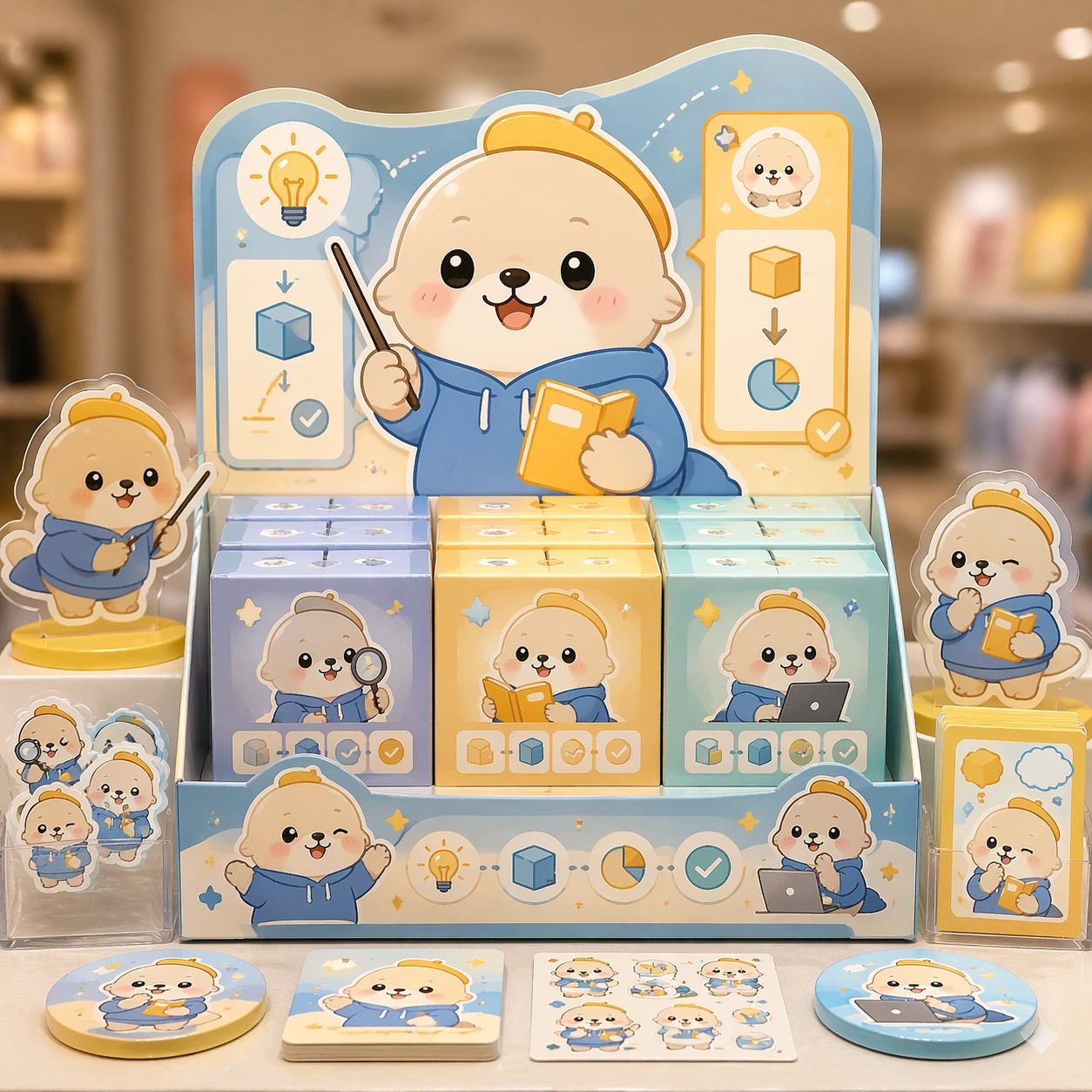
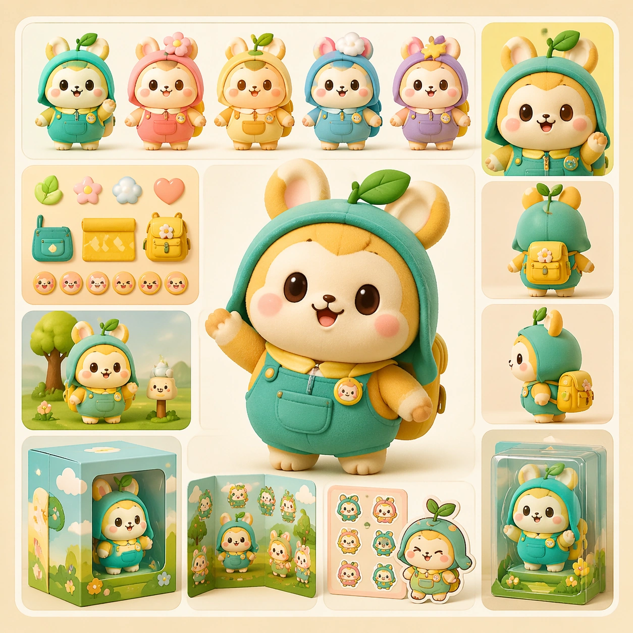
Example generated from “Cute Product Explainer Poster — Shelf Launch Variant”
GPT Image 2en

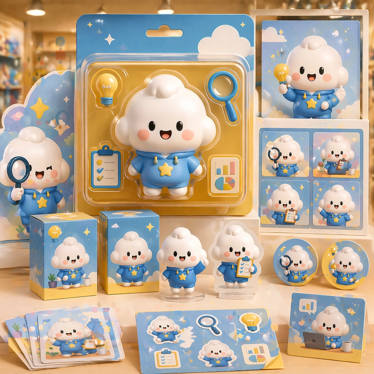
Scene: A square retail-ready campaign visual for Cute Product Explainer Poster, combining cute character appeal with polished commercial presentation. The composition should feel like a high-finish launch board: crisp packaging edges, collectible object staging, clean shelf or poster context, and vivid but controlled color. It should be immediately legible from far away, but still dense with charming small details that reward closer inspection. Subject: Build the image around Shelf Launch Variant, a frame that translates the same mascot package into a shelf-ready launch composition. Translate Use chibi or mascot characters to explain complex products, workflows, or features through playful yet commercially clear explainer posters. into one lovable mascot, figure, or product system that feels ready for posters, boxes, stickers, inserts, or point-of-sale material. The result should feel like a fresh research image with clear commercial focus rather than random fan art. The main subject must remain unmistakable even when surrounded by accessories and display pieces. Important details: Charm alone is not enough. Preserve clean silhouette recognition, convincing package construction, reliable prop scale, and structured layout logic so the image feels sellable. This theme studies structured-layout, text-rendering, commercial-mockup, style-transfer through a production-ready visual system. Avoid noisy clutter; every secondary element should reinforce collectibility, retail desirability, or explainer clarity. Aim for clear hierarchy, polished craft, and immediately usable campaign logic. Use case: Cute Product Explainer Poster series study 3/4. Constraints: No readable text, no watermark, no logos, preserve exact 1:1 aspect ratio, no horror elements, no brand theft, no malformed packaging edges, no muddy mascot silhouette, no messy retail shelf, no chaotic prop overload.

Example generated from “Cute Product Explainer Poster — Premium Collab Box”
GPT Image 2en

Scene: A square retail-ready campaign visual for Cute Product Explainer Poster, combining cute character appeal with polished commercial presentation. The composition should feel like a high-finish launch board: crisp packaging edges, collectible object staging, clean shelf or poster context, and vivid but controlled color. It should be immediately legible from far away, but still dense with charming small details that reward closer inspection. Subject: Build the image around Premium Collab Box, a frame that elevates the same character system into a premium collaboration box visual. Translate Use chibi or mascot characters to explain complex products, workflows, or features through playful yet commercially clear explainer posters. into one lovable mascot, figure, or product system that feels ready for posters, boxes, stickers, inserts, or point-of-sale material. The result should feel like a fresh research image with clear commercial focus rather than random fan art. The main subject must remain unmistakable even when surrounded by accessories and display pieces. Important details: Charm alone is not enough. Preserve clean silhouette recognition, convincing package construction, reliable prop scale, and structured layout logic so the image feels sellable. This theme studies structured-layout, text-rendering, commercial-mockup, style-transfer through a production-ready visual system. Avoid noisy clutter; every secondary element should reinforce collectibility, retail desirability, or explainer clarity. Aim for clear hierarchy, polished craft, and immediately usable campaign logic. Use case: Cute Product Explainer Poster series study 4/4. Constraints: No readable text, no watermark, no logos, preserve exact 1:1 aspect ratio, no horror elements, no brand theft, no malformed packaging edges, no muddy mascot silhouette, no messy retail shelf, no chaotic prop overload.

Example generated from “Cute Product Explainer Poster — Merch Preview”
GPT Image 2en

Scene: A square retail-ready campaign visual for Cute Product Explainer Poster, combining cute character appeal with polished commercial presentation. The composition should feel like a high-finish launch board: crisp packaging edges, collectible object staging, clean shelf or poster context, and vivid but controlled color. It should be immediately legible from far away, but still dense with charming small details that reward closer inspection. Subject: Build the image around Merch Preview, a frame that a merchandise-forward visual showing accessories, stickers, tags, or bonus items. Translate Use chibi or mascot characters to explain complex products, workflows, or features through playful yet commercially clear explainer posters. into one lovable mascot, figure, or product system that feels ready for posters, boxes, stickers, inserts, or point-of-sale material. The result should feel like a fresh research image with clear commercial focus rather than random fan art. The main subject must remain unmistakable even when surrounded by accessories and display pieces. Important details: Charm alone is not enough. Preserve clean silhouette recognition, convincing package construction, reliable prop scale, and structured layout logic so the image feels sellable. This theme studies structured-layout, text-rendering, commercial-mockup, style-transfer through a production-ready visual system. Avoid noisy clutter; every secondary element should reinforce collectibility, retail desirability, or explainer clarity. Aim for clear hierarchy, polished craft, and immediately usable campaign logic. Use case: Cute Product Explainer Poster single study 2/5. Constraints: No readable text, no watermark, no logos, preserve exact 1:1 aspect ratio, no horror elements, no brand theft, no malformed packaging edges, no muddy mascot silhouette, no messy retail shelf, no chaotic prop overload.

Example generated from “Cute Product Explainer Poster — Counter Display”
GPT Image 2en

Scene: A square retail-ready campaign visual for Cute Product Explainer Poster, combining cute character appeal with polished commercial presentation. The composition should feel like a high-finish launch board: crisp packaging edges, collectible object staging, clean shelf or poster context, and vivid but controlled color. It should be immediately legible from far away, but still dense with charming small details that reward closer inspection. Subject: Build the image around Counter Display, a frame that a point-of-sale display study that proves the system can live in store. Translate Use chibi or mascot characters to explain complex products, workflows, or features through playful yet commercially clear explainer posters. into one lovable mascot, figure, or product system that feels ready for posters, boxes, stickers, inserts, or point-of-sale material. The result should feel like a fresh research image with clear commercial focus rather than random fan art. The main subject must remain unmistakable even when surrounded by accessories and display pieces. Important details: Charm alone is not enough. Preserve clean silhouette recognition, convincing package construction, reliable prop scale, and structured layout logic so the image feels sellable. This theme studies structured-layout, text-rendering, commercial-mockup, style-transfer through a production-ready visual system. Avoid noisy clutter; every secondary element should reinforce collectibility, retail desirability, or explainer clarity. Aim for clear hierarchy, polished craft, and immediately usable campaign logic. Use case: Cute Product Explainer Poster single study 3/5. Constraints: No readable text, no watermark, no logos, preserve exact 1:1 aspect ratio, no horror elements, no brand theft, no malformed packaging edges, no muddy mascot silhouette, no messy retail shelf, no chaotic prop overload.

Example generated from “Cute Product Explainer Poster — Launch Poster”
GPT Image 2en

Scene: A square retail-ready campaign visual for Cute Product Explainer Poster, combining cute character appeal with polished commercial presentation. The composition should feel like a high-finish launch board: crisp packaging edges, collectible object staging, clean shelf or poster context, and vivid but controlled color. It should be immediately legible from far away, but still dense with charming small details that reward closer inspection. Subject: Build the image around Launch Poster, a frame that a clean release poster with cute emotional pull and unmistakable product focus. Translate Use chibi or mascot characters to explain complex products, workflows, or features through playful yet commercially clear explainer posters. into one lovable mascot, figure, or product system that feels ready for posters, boxes, stickers, inserts, or point-of-sale material. The result should feel like a fresh research image with clear commercial focus rather than random fan art. The main subject must remain unmistakable even when surrounded by accessories and display pieces. Important details: Charm alone is not enough. Preserve clean silhouette recognition, convincing package construction, reliable prop scale, and structured layout logic so the image feels sellable. This theme studies structured-layout, text-rendering, commercial-mockup, style-transfer through a production-ready visual system. Avoid noisy clutter; every secondary element should reinforce collectibility, retail desirability, or explainer clarity. Aim for clear hierarchy, polished craft, and immediately usable campaign logic. Use case: Cute Product Explainer Poster single study 4/5. Constraints: No readable text, no watermark, no logos, preserve exact 1:1 aspect ratio, no horror elements, no brand theft, no malformed packaging edges, no muddy mascot silhouette, no messy retail shelf, no chaotic prop overload.

Example generated from “Cute Product Explainer Poster — Collector Sheet”
GPT Image 2en

Scene: A square retail-ready campaign visual for Cute Product Explainer Poster, combining cute character appeal with polished commercial presentation. The composition should feel like a high-finish launch board: crisp packaging edges, collectible object staging, clean shelf or poster context, and vivid but controlled color. It should be immediately legible from far away, but still dense with charming small details that reward closer inspection. Subject: Build the image around Collector Sheet, a frame that a collector-oriented overview image unifying variants, icons, and packaging cues. Translate Use chibi or mascot characters to explain complex products, workflows, or features through playful yet commercially clear explainer posters. into one lovable mascot, figure, or product system that feels ready for posters, boxes, stickers, inserts, or point-of-sale material. The result should feel like a fresh research image with clear commercial focus rather than random fan art. The main subject must remain unmistakable even when surrounded by accessories and display pieces. Important details: Charm alone is not enough. Preserve clean silhouette recognition, convincing package construction, reliable prop scale, and structured layout logic so the image feels sellable. This theme studies structured-layout, text-rendering, commercial-mockup, style-transfer through a production-ready visual system. Avoid noisy clutter; every secondary element should reinforce collectibility, retail desirability, or explainer clarity. Aim for clear hierarchy, polished craft, and immediately usable campaign logic. Use case: Cute Product Explainer Poster single study 5/5. Constraints: No readable text, no watermark, no logos, preserve exact 1:1 aspect ratio, no horror elements, no brand theft, no malformed packaging edges, no muddy mascot silhouette, no messy retail shelf, no chaotic prop overload.

Example generated from “Dashboard Data Visualization — Overview Plate”
GPT Image 2en

Scene: A square plate or board viewed straight-on, with crisp organization, disciplined spacing, and premium print clarity. Build the frame around a complete overview that establishes the system, subject boundaries, and visual hierarchy. Keep the lighting, camera distance, and spatial organization tuned for a high-signal research image rather than a casual snapshot. The image belongs to the Dashboard Data Visualization theme and should feel immediately legible as a prompt atlas theme for dashboard data visualization, testing structured-layout, technical-diagram, reasoning-composition with gpt image 2.. Subject: Center the study on a complete overview that establishes the system, subject boundaries, and visual hierarchy. Translate the theme into a concrete visual statement instead of an abstract mood board: the viewer should understand what kind of image this is, what is being tested, and why the composition is difficult. Use the slug idea of dashboard data visualization as a literal guide for subject matter, materials, and staging. If helpful, borrow the broad visual cues suggested by CO2, UI, but keep the result original and specific to this study. Important details: The image should communicate logic through grouping, hierarchy, callouts, insets, and believable professional layout discipline rather than decorative noise. Preserve a disciplined square composition, clear focal hierarchy, and enough secondary information to make the image feel complete rather than underspecified. The image should look polished, novel, and exhibition-ready, with topic-specific credibility coming from the way surfaces, structure, and visual language reinforce Dashboard Data Visualization. Avoid generic filler elements that do not serve the main concept. Use case: Dashboard Data Visualization single study 1/8, testing structured-layout, technical-diagram, reasoning-composition through the overview plate variation. Constraints: No readable text, no watermark, no logos, preserve exact 1:1 aspect ratio, no readable labels, no messy arrows, no random infographic decoration, no fake UI chrome unless the topic calls for it, no broken alignment, no meaningless clutter.