詳しい説明
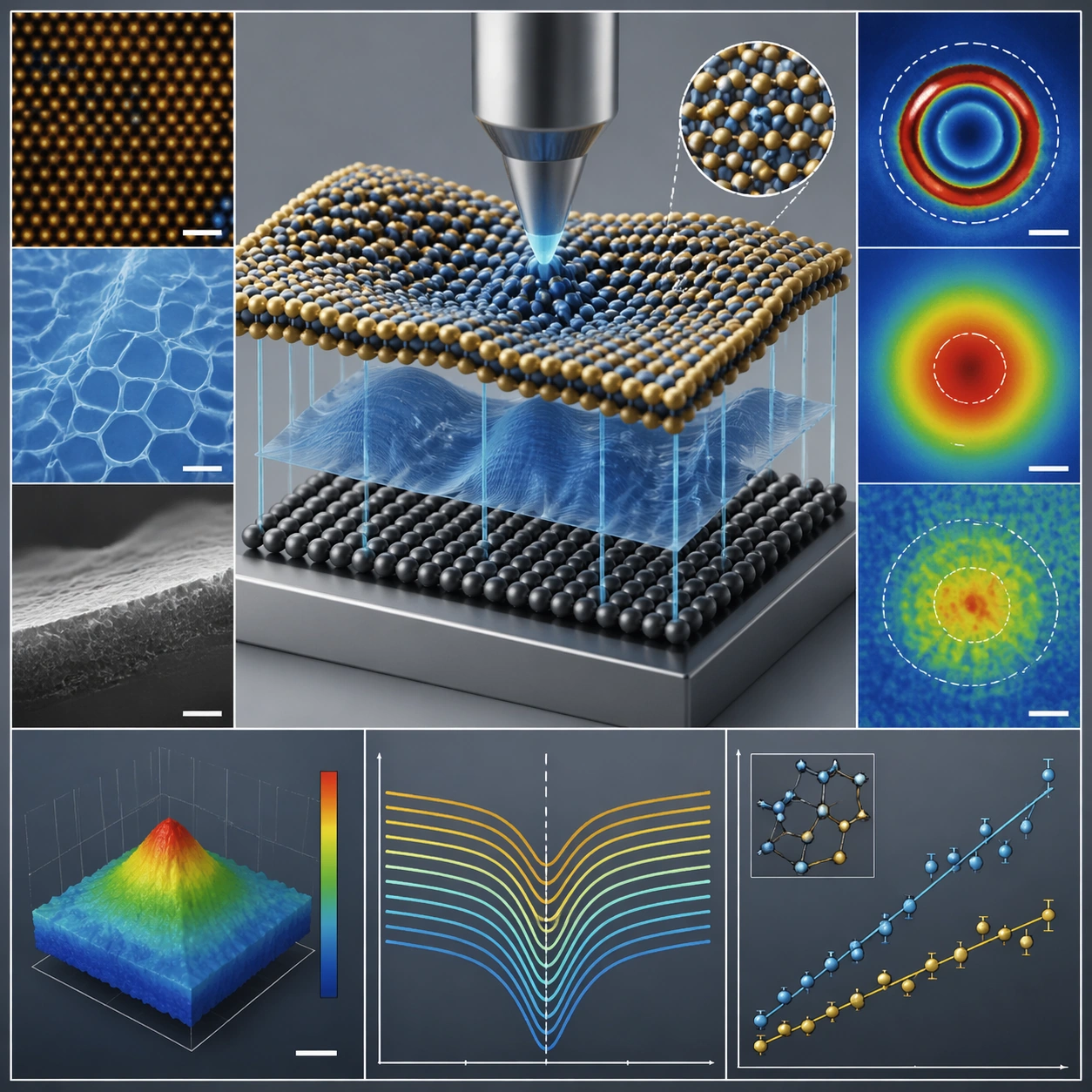
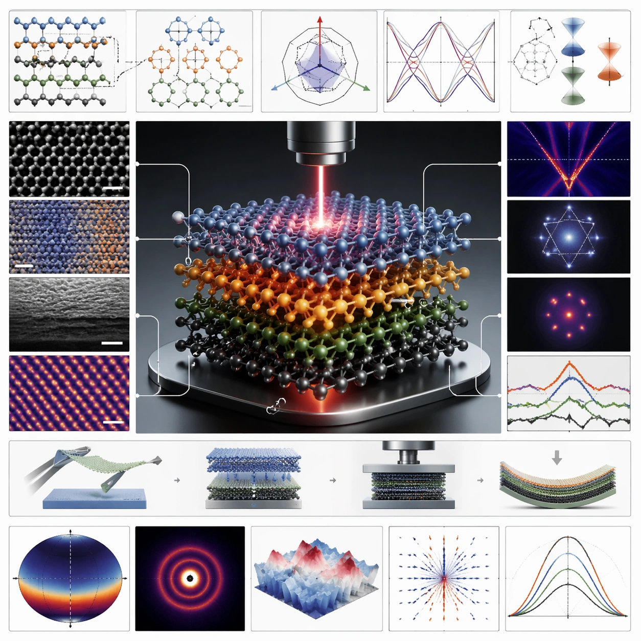
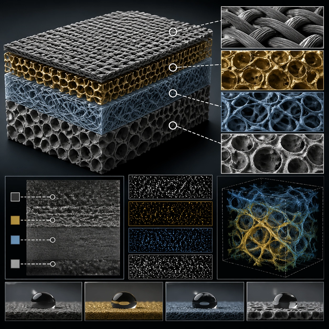
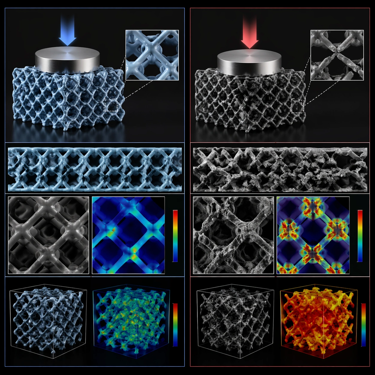
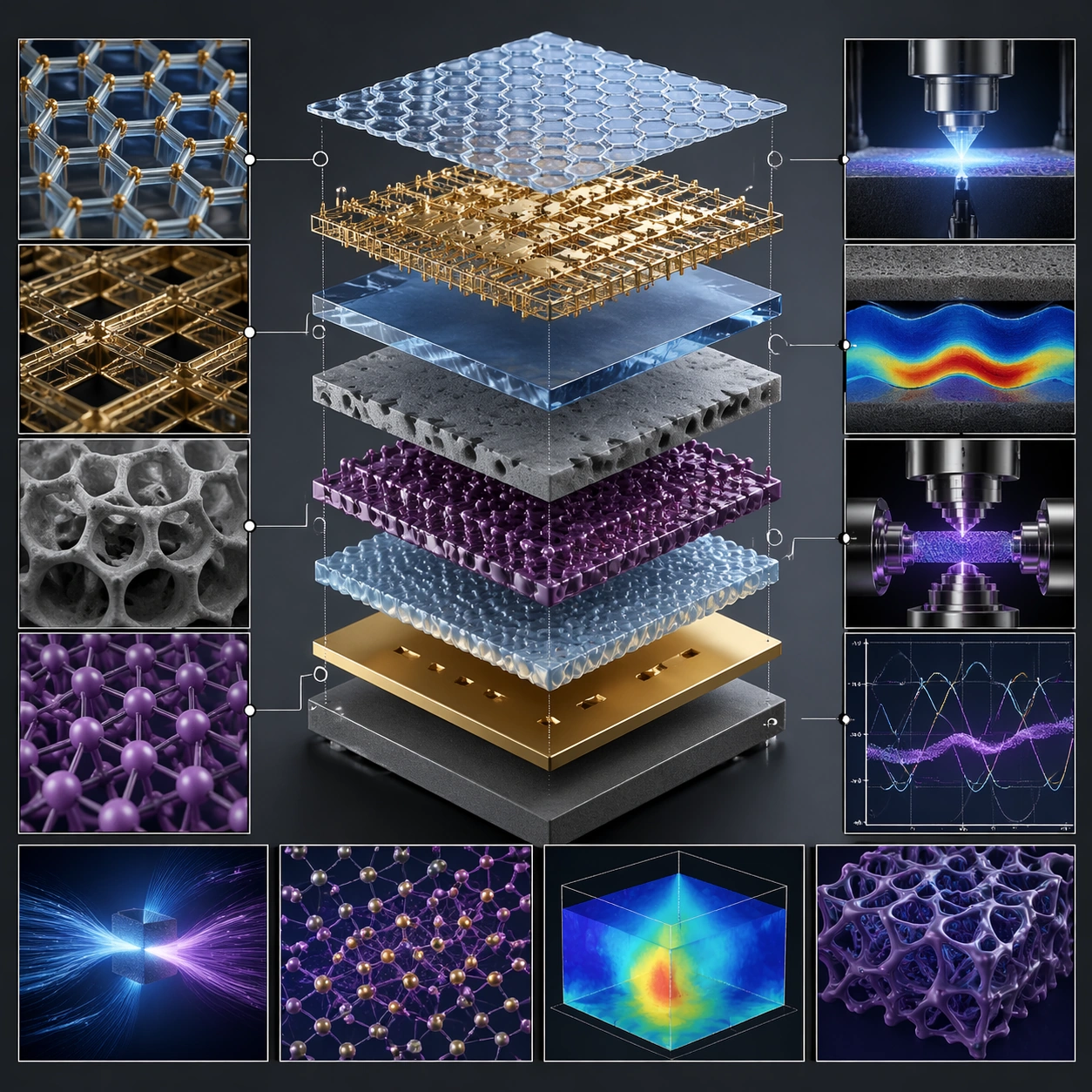
この構図は複数の層を共通の垂直軸に沿って離し、組み立て順序を画面の主題にします。公開例では透明、金属、多孔質、格子状の層が中央に並び、周辺の小さなパネルが表面や示唆的な機能を補います。暗い背景と青・金・紫の反復が、細かなパネルと中央の構造をつないでいます。単独の写実的な物体より、部品同士の関係を伝えたい概念図やプレゼンテーションの方向付けに向きます。
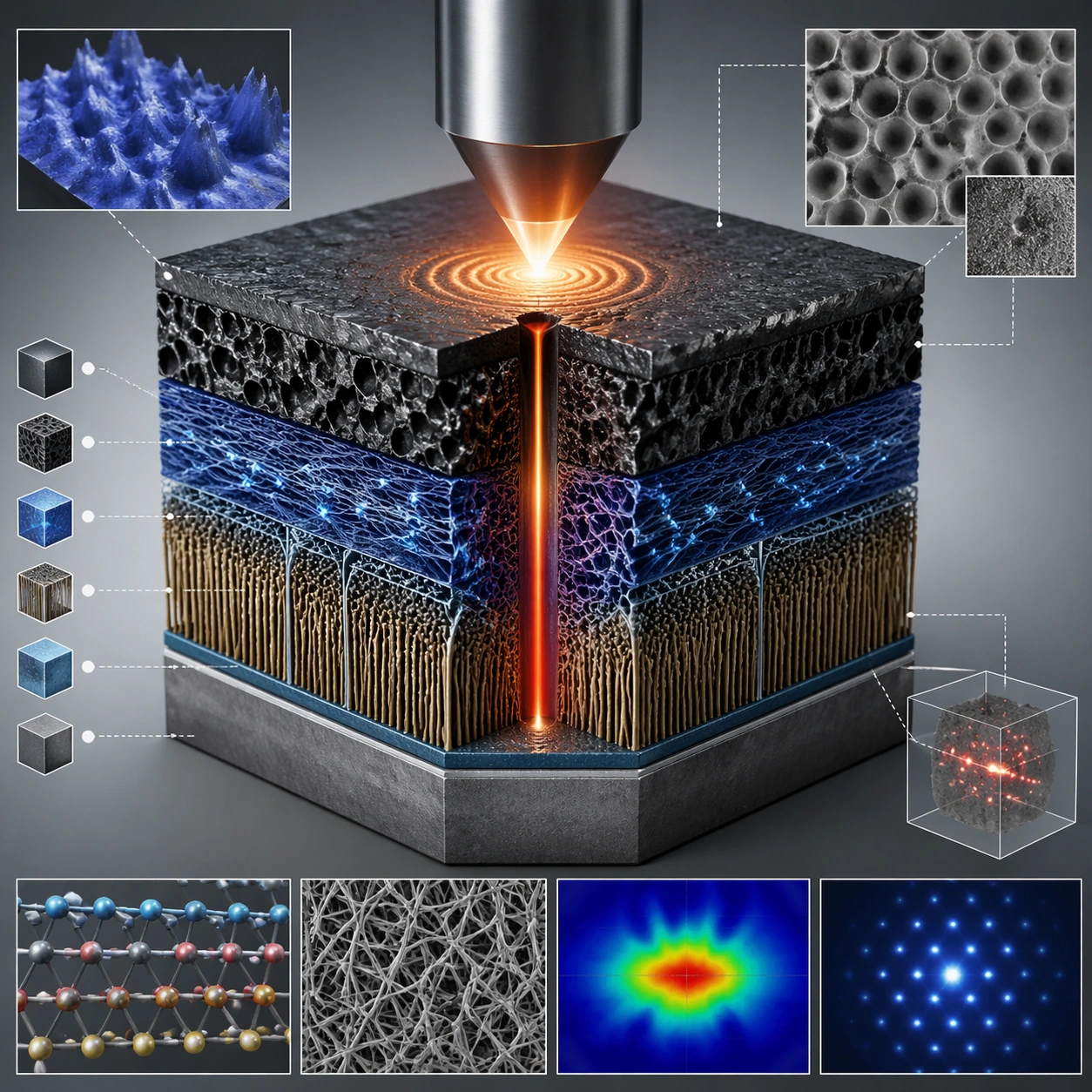
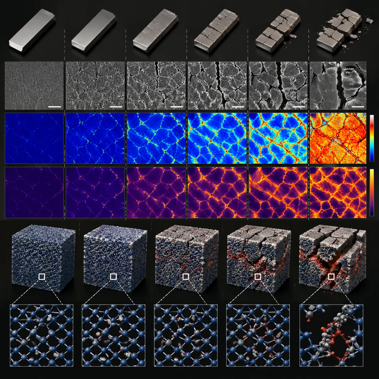
原文は読めるラベルを避けるよう指定していますが、例にはグラフやヒートマップに似た表現があります。これらは生成イラストであり、測定値や材料の性能を示す証拠ではありません。技術資料に使うなら実際の部品順序を与え、必要なグラフを検証済みの図に置き換え、正確なラベルを後から組みます。正方形のレイアウトは構図の出発点で、検証済み科学図ではありません。
用意するもの
- 完全な原文 Prompt。改変時には自分の材料、部品順序、対象読者を用意する。
- 後から加える技術注記のための、確認済みラベルやデータ。
- この事例には必須参照画像の依存関係が記録されていない。追加の参照画像は別の改変に当たる。
得られるもの
- 分離した積層構造と詳細パネルを組み合わせた 1:1 の概念イメージ。
- 確認と注記を加えるためのイラストであり、実験画像や再現可能な設計仕様ではない。
使い方
- 実際の部品順序と拡大すべき箇所を決める。主題を改変しても、保存された原文はそのまま残す。
- 中央構造、明確な間隔、正方形の枠を保つ。原文はロゴ、透かし、読めるラベルを除外しているため、文字組みを別に計画する。
- 全体画像を見て、不可能な接続、重複部品、誤解を招くグラフ、別の層を指す引き出し線を確認する。
- レイアウトツールで検証済みラベルとデータを加える。縮小表示と納品サイズの両方を確認し、説明用イラストとしての役割を明示する。
制約と確認事項
- 層の順序、固定箇所、詳細パネルとの接続が説明対象に合っているか確認する。
- 生成曲線、ヒートマップ、顕微鏡風の模様や材料表面は、物性や測定結果の証拠にはならない。
- 小さくしても主構造が読めるようにする。詳細パネルが多すぎると説明を妨げる。
- 作者のメタデータは GPT Image 2 を示す。正確な API 変種と元の生成は独立に再現されていない。
よくある質問
実験結果の図として使えますか?
保存画像は生成された概念イラストです。研究図には検証済み実験データと正確な部品関係を使い、掲載先の規則に従ってイラストの役割を示してください。ギャラリー画像は測定の出典にはなりません。
実際のラベルはどう追加しますか?
原文は読める文字を明確に避けています。余白を確保し、画像確認後にラベルを組む方法が実用的です。別の Prompt で条件を変える場合は、ここに残す完全な原文と改変版を区別します。
表示画像を入力としてアップロードする必要がありますか?
これは作者が公開した出力例で、この事例の必須入力画像として記録されたものではありません。完全な Prompt と出力を対応させて保存しており、同じ画像の再生成を保証するものではありません。
原文
GPT Image 2 · en
Scene:
A square plate or board viewed straight-on, with crisp organization, disciplined spacing, and premium print clarity. Build the frame around components separated clearly enough to reveal construction and dependency. Keep the lighting, camera distance, and spatial organization tuned for a high-signal research image rather than a casual snapshot. The image belongs to the Scientific Paper Figure theme and should feel immediately legible as a prompt atlas theme for scientific paper figure, testing physics-materials, commercial-mockup with gpt image 2..

Subject:
Center the study on components separated clearly enough to reveal construction and dependency. Translate the theme into a concrete visual statement instead of an abstract mood board: the viewer should understand what kind of image this is, what is being tested, and why the composition is difficult. Use the slug idea of scientific paper figure as a literal guide for subject matter, materials, and staging. If helpful, borrow the broad visual cues suggested by Nature, Science, but keep the result original and specific to this study.

Important details:
The image should communicate logic through grouping, hierarchy, callouts, insets, and believable professional layout discipline rather than decorative noise. Preserve a disciplined square composition, clear focal hierarchy, and enough secondary information to make the image feel complete rather than underspecified. The image should look polished, novel, and exhibition-ready, with topic-specific credibility coming from the way surfaces, structure, and visual language reinforce Scientific Paper Figure. Avoid generic filler elements that do not serve the main concept.

Use case:
Scientific Paper Figure single study 7/8, testing physics-materials, commercial-mockup through the exploded system variation.

Constraints:
No readable text, no watermark, no logos, preserve exact 1:1 aspect ratio, no readable labels, no messy arrows, no random infographic decoration, no fake UI chrome unless the topic calls for it, no broken alignment, no meaningless clutter.