
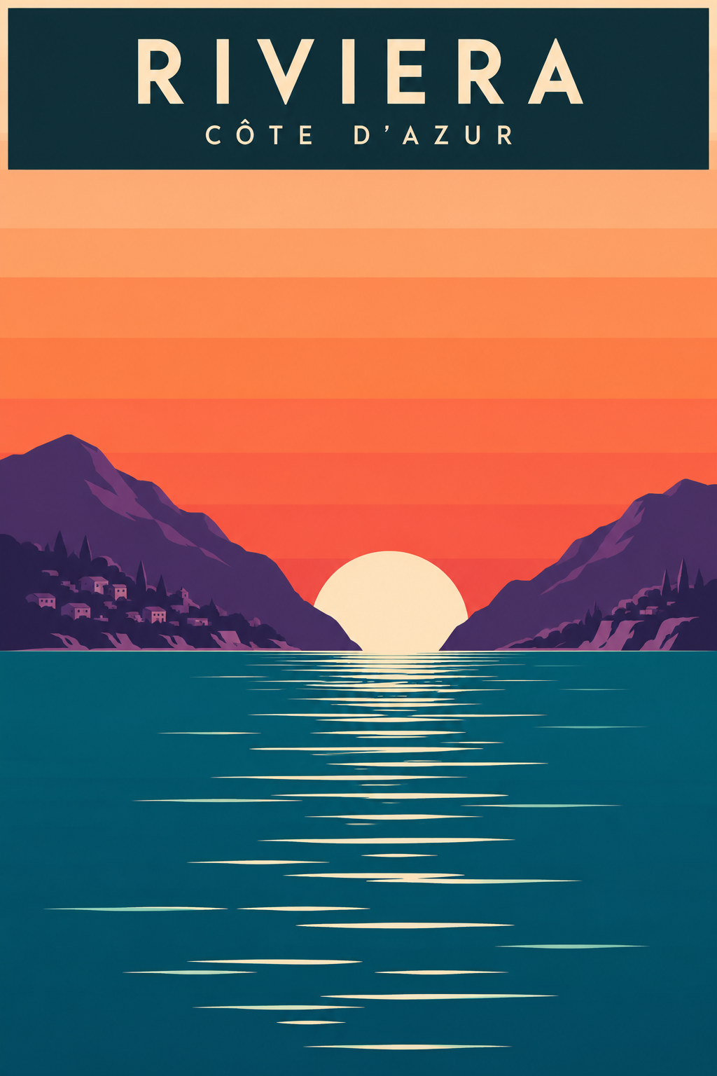
Retro flat vector travel poster: a striped peach and orange sunset sky, a pale sun setting between two violet mountains, a deep teal sea with thin white reflection lines, a dark title bar at the top, 2:3 aspect ratio.
パラメータを含む元のプロンプト全体をコピーします。 被写体、文字、構図を自分の要件に置き換えます。 対応する外部ツールで使用し、利用条件と結果を確認します。
Retro flat vector travel poster: a striped peach and orange sunset sky, a pale sun setting between two violet mountains, a deep teal sea with thin white reflection lines, a dark title bar at the top, 2:3 aspect ratio.
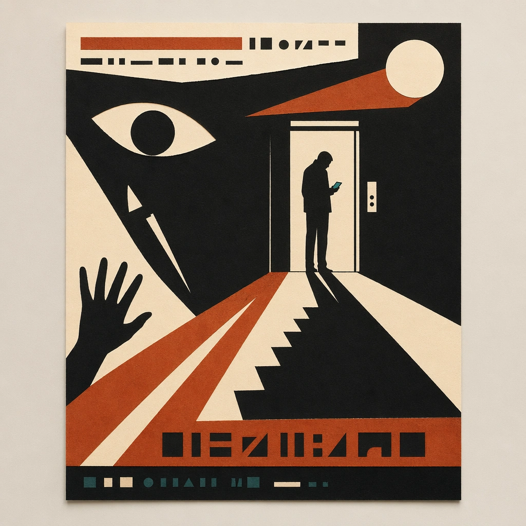
Scene: A square straight-on studio view of a pristine poster mounted on a matte wall with even museum lighting, crisp corners, and enough breathing room around the sheet for the full composition to read as an intentional object. The poster should express mid-century minimalist paper-cut poster language driven by torn shapes, narrative negative space, and three-color restraint, using matte black, rust orange, cream, and a very limited dark teal accent and a tactile surface appropriate to the medium. Subject: Build the flagship poster statement for this style, with the strongest hierarchy, the clearest subject silhouette, and the most disciplined balance between image field, pseudo-typography, and empty space. Use single silhouettes, staircases, hands, knives, eyes, circles, doorways, and dramatic shadows as the main visual ingredients, and organize them with simple cut-paper title bars and glyph fragments kept abstract and unreadable. For the contemporary-subject axis, thread in ride-share lanes, phone glare, and elevator doors converted into severe paper-cut suspense. The poster must feel like an original design object rather than a reproduction of any known work. Important details: Treat this as the cleanest thesis image in the set: the paper should look fresh, the inks or paint should feel deliberate, and every formal rule of the style should be easy to study at a glance. Preserve deliberate imbalance, clean cut contours, visible paper fibers, and story told through absence as much as presence. Keep every letterform abstract and non-readable, as if it were a typographic texture rather than language. Make the style unmistakable through composition, palette, surface behavior, and symbolic compression. no glossy gradients, no tiny fiddly detail, no photoreal rendering, no ornamental clutter. Use case: Paper-Cut Film single study 1/9, establishing the cleanest museum-grade poster reading. Constraints: No readable text, no watermark, no logos, preserve exact 1:1 aspect ratio, no copyrighted characters, no real brand marks, no QR codes, no interface chrome, no accidental gibberish lettering.
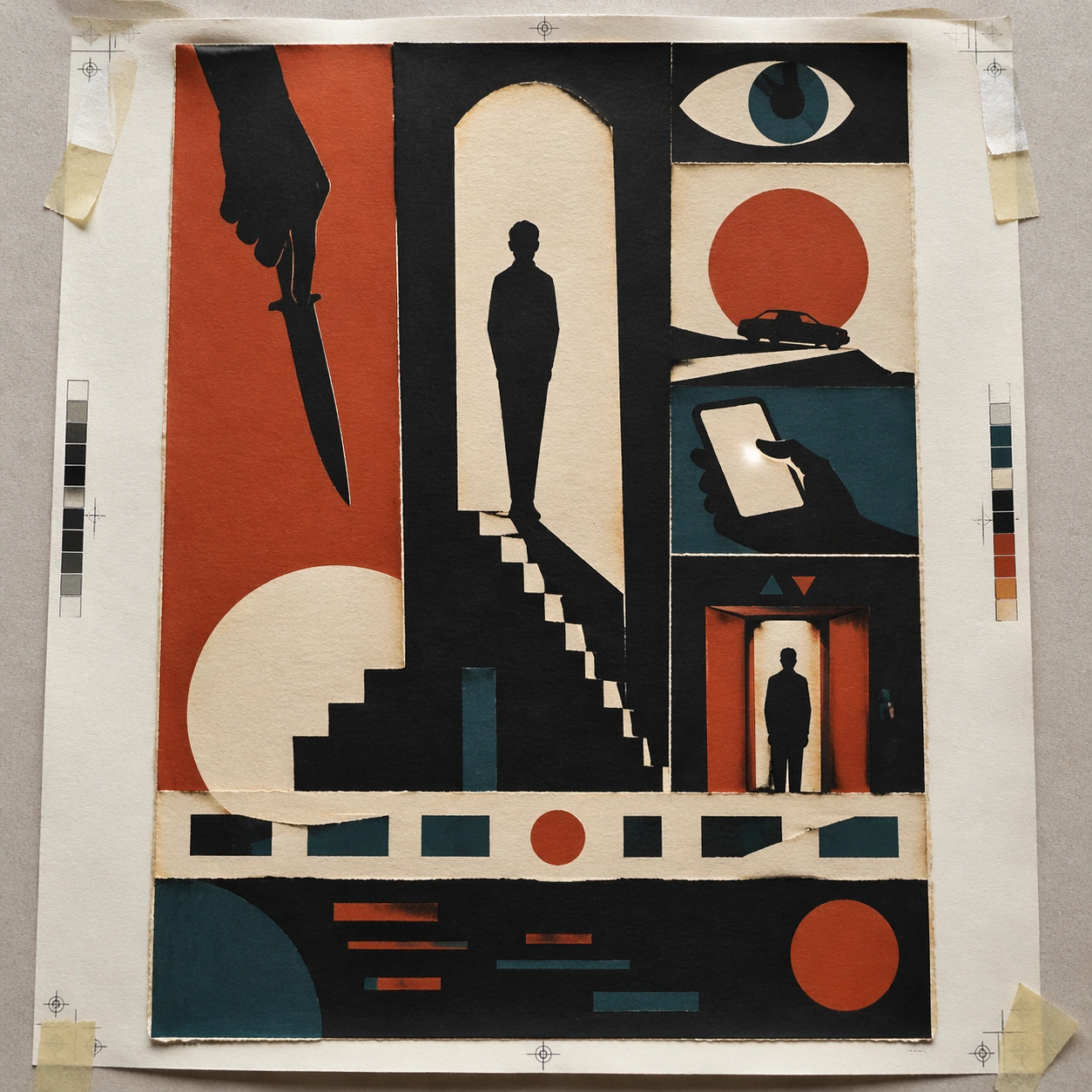
Scene: A square overhead tabletop photograph of a fresh poster proof on neutral worktable paper, lit by cool daylight, with crop marks, tape tabs, and slight paper bow visible around the sheet. The poster should express mid-century minimalist paper-cut poster language driven by torn shapes, narrative negative space, and three-color restraint, using matte black, rust orange, cream, and a very limited dark teal accent and a tactile surface appropriate to the medium. Subject: Design the poster as a print-shop proof, preserving the same poster language while allowing production clues such as edge trims, registration targets, and process marks to frame the composition. Use single silhouettes, staircases, hands, knives, eyes, circles, doorways, and dramatic shadows as the main visual ingredients, and organize them with simple cut-paper title bars and glyph fragments kept abstract and unreadable. For the contemporary-subject axis, thread in ride-share lanes, phone glare, and elevator doors converted into severe paper-cut suspense. The poster must feel like an original design object rather than a reproduction of any known work. Important details: The image must still read as a finished poster concept, but it should carry believable print-process evidence and material tactility instead of gallery-wall perfection. Preserve deliberate imbalance, clean cut contours, visible paper fibers, and story told through absence as much as presence. Keep every letterform abstract and non-readable, as if it were a typographic texture rather than language. Make the style unmistakable through composition, palette, surface behavior, and symbolic compression. no glossy gradients, no tiny fiddly detail, no photoreal rendering, no ornamental clutter. Use case: Paper-Cut Film single study 2/9, testing production realism and process evidence. Constraints: No readable text, no watermark, no logos, preserve exact 1:1 aspect ratio, no copyrighted characters, no real brand marks, no QR codes, no interface chrome, no accidental gibberish lettering.
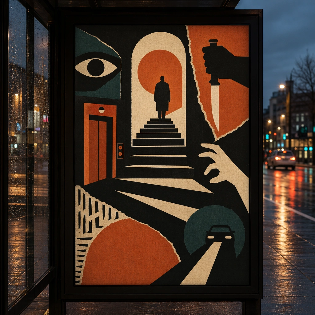
Scene: A square dusk street photograph of a backlit transit poster glowing inside glass, with faint rain reflections, soft city blur in the distance, and the poster remaining fully legible as a composition. The poster should express mid-century minimalist paper-cut poster language driven by torn shapes, narrative negative space, and three-color restraint, using matte black, rust orange, cream, and a very limited dark teal accent and a tactile surface appropriate to the medium. Subject: Adapt the poster into a public-facing lightbox version that still honors the original style grammar while feeling bold enough to stop a passerby from several meters away. Use single silhouettes, staircases, hands, knives, eyes, circles, doorways, and dramatic shadows as the main visual ingredients, and organize them with simple cut-paper title bars and glyph fragments kept abstract and unreadable. For the contemporary-subject axis, thread in ride-share lanes, phone glare, and elevator doors converted into severe paper-cut suspense. The poster must feel like an original design object rather than a reproduction of any known work. Important details: Let the style survive the illumination test: color blocking, silhouette contrast, and abstract lettering should stay controlled under bright internal light and reflective glass. Preserve deliberate imbalance, clean cut contours, visible paper fibers, and story told through absence as much as presence. Keep every letterform abstract and non-readable, as if it were a typographic texture rather than language. Make the style unmistakable through composition, palette, surface behavior, and symbolic compression. no glossy gradients, no tiny fiddly detail, no photoreal rendering, no ornamental clutter. Use case: Paper-Cut Film single study 3/9, testing distance readability in public display. Constraints: No readable text, no watermark, no logos, preserve exact 1:1 aspect ratio, no copyrighted characters, no real brand marks, no QR codes, no interface chrome, no accidental gibberish lettering.
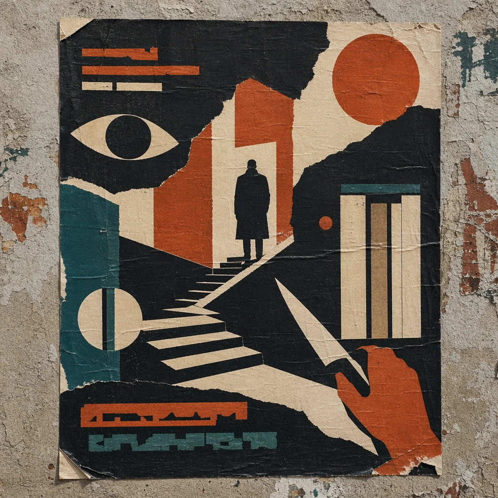
Scene: A square urban wall study with the poster pasted onto rough plaster among torn edges and older paper remnants, photographed in soft overcast light so texture, glue bubbles, and surface scars stay visible. The poster should express mid-century minimalist paper-cut poster language driven by torn shapes, narrative negative space, and three-color restraint, using matte black, rust orange, cream, and a very limited dark teal accent and a tactile surface appropriate to the medium. Subject: Create a version that feels made for the street, with the poster carrying enough formal force to survive abrasion, layering, and imperfect placement without losing its visual identity. Use single silhouettes, staircases, hands, knives, eyes, circles, doorways, and dramatic shadows as the main visual ingredients, and organize them with simple cut-paper title bars and glyph fragments kept abstract and unreadable. For the contemporary-subject axis, thread in ride-share lanes, phone glare, and elevator doors converted into severe paper-cut suspense. The poster must feel like an original design object rather than a reproduction of any known work. Important details: Keep the main design intact but let the environment add grit: lifted corners, tiny tears, wrinkled paper, and older color fragments around the perimeter should amplify the style rather than dilute it. Preserve deliberate imbalance, clean cut contours, visible paper fibers, and story told through absence as much as presence. Keep every letterform abstract and non-readable, as if it were a typographic texture rather than language. Make the style unmistakable through composition, palette, surface behavior, and symbolic compression. no glossy gradients, no tiny fiddly detail, no photoreal rendering, no ornamental clutter. Use case: Paper-Cut Film single study 4/9, testing street-life durability and layered context. Constraints: No readable text, no watermark, no logos, preserve exact 1:1 aspect ratio, no copyrighted characters, no real brand marks, no QR codes, no interface chrome, no accidental gibberish lettering.
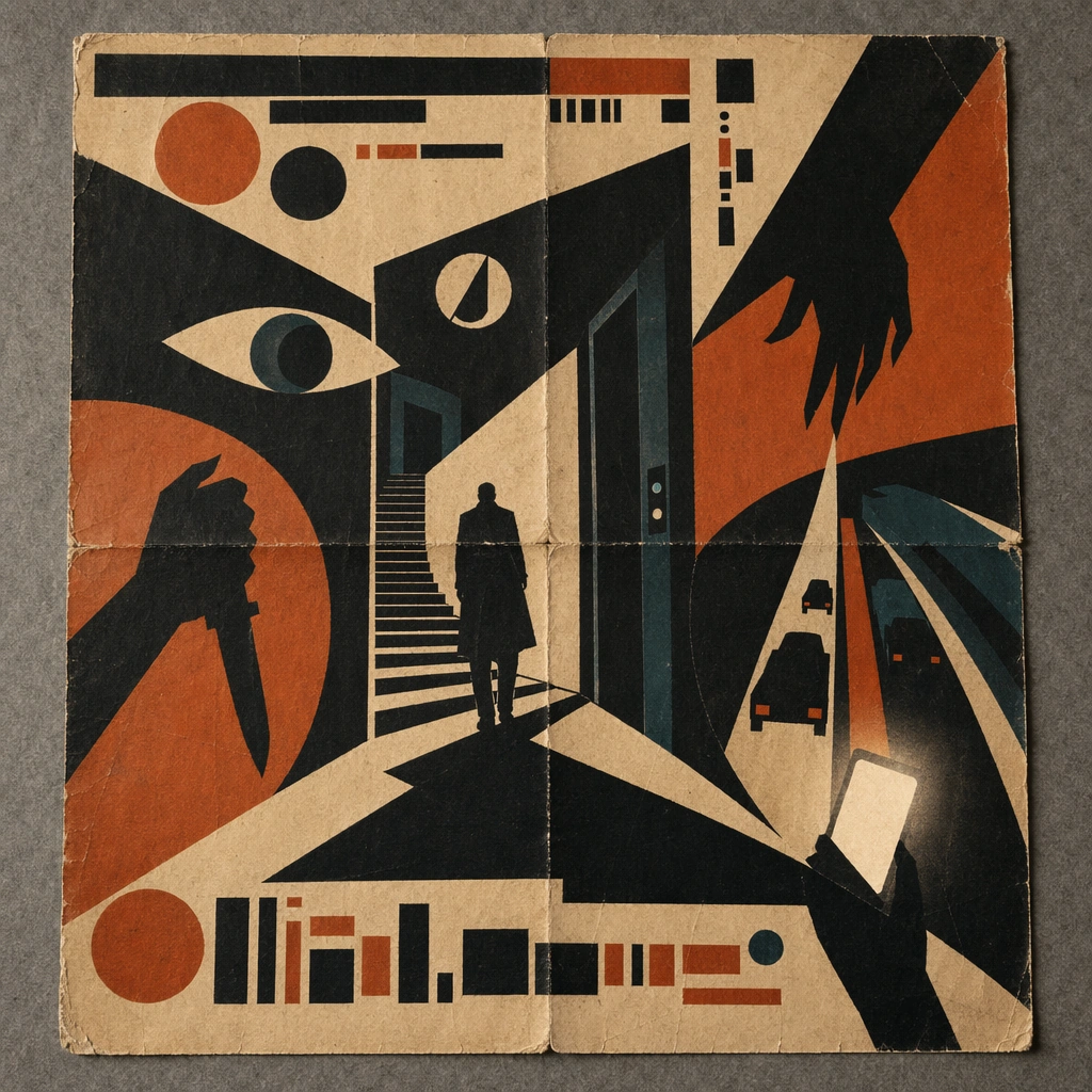
Scene: A square conservation-table view of a vintage poster laid on gray felt under raking light, with visible fold lines, softened corners, and subtle aging that still preserves the integrity of the image. The poster should express mid-century minimalist paper-cut poster language driven by torn shapes, narrative negative space, and three-color restraint, using matte black, rust orange, cream, and a very limited dark teal accent and a tactile surface appropriate to the medium. Subject: Present the poster as an archive copy that has been stored, unfolded, and carefully documented, letting age and handling reveal how the design holds up across time. Use single silhouettes, staircases, hands, knives, eyes, circles, doorways, and dramatic shadows as the main visual ingredients, and organize them with simple cut-paper title bars and glyph fragments kept abstract and unreadable. For the contemporary-subject axis, thread in ride-share lanes, phone glare, and elevator doors converted into severe paper-cut suspense. The poster must feel like an original design object rather than a reproduction of any known work. Important details: Aging must stay believable rather than theatrical: slight yellowing, fold memory, edge wear, and pigment variation should support the historical or crafted feeling of the style. Preserve deliberate imbalance, clean cut contours, visible paper fibers, and story told through absence as much as presence. Keep every letterform abstract and non-readable, as if it were a typographic texture rather than language. Make the style unmistakable through composition, palette, surface behavior, and symbolic compression. no glossy gradients, no tiny fiddly detail, no photoreal rendering, no ornamental clutter. Use case: Paper-Cut Film single study 5/9, testing archival endurance and age character. Constraints: No readable text, no watermark, no logos, preserve exact 1:1 aspect ratio, no copyrighted characters, no real brand marks, no QR codes, no interface chrome, no accidental gibberish lettering.
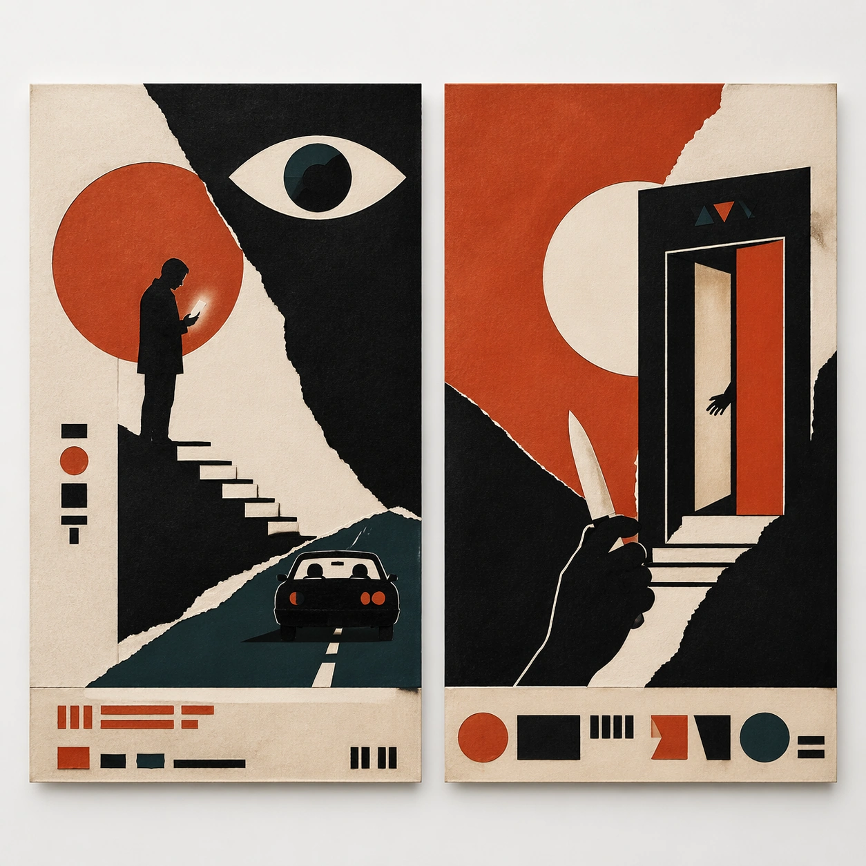
Scene: A square white-wall installation showing two companion posters hung side by side with equal spacing, photographed frontally so the pair reads as a designed conversation rather than two unrelated sheets. The poster should express mid-century minimalist paper-cut poster language driven by torn shapes, narrative negative space, and three-color restraint, using matte black, rust orange, cream, and a very limited dark teal accent and a tactile surface appropriate to the medium. Subject: Compose a matched diptych: two posters sharing one style system while splitting the narrative across paired motifs, mirrored masses, or complementary color emphasis. Use single silhouettes, staircases, hands, knives, eyes, circles, doorways, and dramatic shadows as the main visual ingredients, and organize them with simple cut-paper title bars and glyph fragments kept abstract and unreadable. For the contemporary-subject axis, thread in ride-share lanes, phone glare, and elevator doors converted into severe paper-cut suspense. The poster must feel like an original design object rather than a reproduction of any known work. Important details: Both halves should feel distinct yet inseparable. Preserve one coherent visual language, but let each sheet carry its own focal symbol and rhythm without readable wording. Preserve deliberate imbalance, clean cut contours, visible paper fibers, and story told through absence as much as presence. Keep every letterform abstract and non-readable, as if it were a typographic texture rather than language. Make the style unmistakable through composition, palette, surface behavior, and symbolic compression. no glossy gradients, no tiny fiddly detail, no photoreal rendering, no ornamental clutter. Use case: Paper-Cut Film single study 6/9, testing system flexibility across a paired set. Constraints: No readable text, no watermark, no logos, preserve exact 1:1 aspect ratio, no copyrighted characters, no real brand marks, no QR codes, no interface chrome, no accidental gibberish lettering.
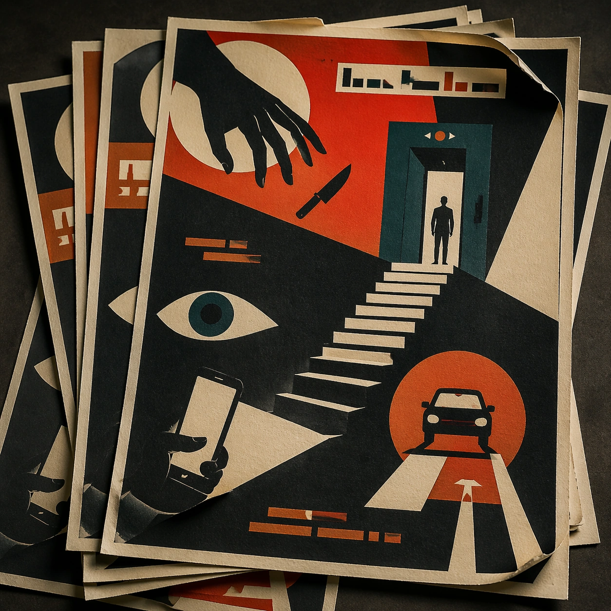
Scene: A square tabletop shot of several poster prints stacked and slightly fanned, with curled corners, offset edges, and soft directional light revealing paper thickness and ink behavior. The poster should express mid-century minimalist paper-cut poster language driven by torn shapes, narrative negative space, and three-color restraint, using matte black, rust orange, cream, and a very limited dark teal accent and a tactile surface appropriate to the medium. Subject: Design the top poster to dominate while nearby duplicate sheets echo the same composition, creating a tactile print-run scene rather than a single isolated sheet. Use single silhouettes, staircases, hands, knives, eyes, circles, doorways, and dramatic shadows as the main visual ingredients, and organize them with simple cut-paper title bars and glyph fragments kept abstract and unreadable. For the contemporary-subject axis, thread in ride-share lanes, phone glare, and elevator doors converted into severe paper-cut suspense. The poster must feel like an original design object rather than a reproduction of any known work. Important details: Use the stack to emphasize production character: edge shadows, repeated motifs peeking from beneath, and subtle misalignment should enrich the material reading without changing the core design. Preserve deliberate imbalance, clean cut contours, visible paper fibers, and story told through absence as much as presence. Keep every letterform abstract and non-readable, as if it were a typographic texture rather than language. Make the style unmistakable through composition, palette, surface behavior, and symbolic compression. no glossy gradients, no tiny fiddly detail, no photoreal rendering, no ornamental clutter. Use case: Paper-Cut Film single study 7/9, testing print-run tactility and repeat presence. Constraints: No readable text, no watermark, no logos, preserve exact 1:1 aspect ratio, no copyrighted characters, no real brand marks, no QR codes, no interface chrome, no accidental gibberish lettering.