プロンプト · 創作の探索

プロンプトギャラリー

実際のプロンプトと生成例を探索。次の創作に役立つヒントを見つけ、全文を無料でコピーできます。

生成例
10,974
モデル
17
出典
1277
10,974 件のプロンプト例 · ページ 15 / 229
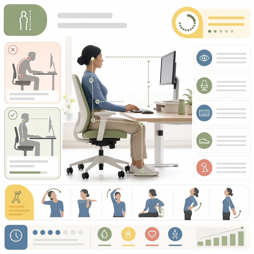
Example generated from “Wellness And Prevention Education Cards — Posture Reset Card”
GPT Image 2en

Scene: A square posture and desk-health card for Wellness and Prevention Education Cards. Compose it as a clean educational tile with body silhouettes, desk object arrangements, and movement prompts. Use a palette of fresh white, sage green, butter yellow, muted coral, and soft denim blue, bright editorial lighting with cheerful softness, and a mood of uplifting, practical, and habit-forming. The frame should feel like a real healthcare communication asset art-directed for professional delivery, not a stock photo, speculative concept render, or generic corporate template. Keep the camera distance, negative space, and depth cues disciplined so the image reads immediately even at thumbnail size. Subject: Center on a posture-prevention card covering seated alignment, screen height, stretch intervals, and workstation adjustments. Show enough surrounding context that the viewer understands the intended service surface, user situation, and institutional setting. Every object, person, diagram, device crop, or spatial cue should support clarity, trust, and practical use. If people appear, keep them anonymous, natural, privacy-safe, and grounded in believable body language rather than promotional posing. Important details: Maintain prevention education expressed through card-based compositions, small daily-life scenes, simple diagrams, and social-friendly rhythm without empty lifestyle fluff. Use clear comparison and rhythm so the card feels actionable at a glance without becoming a dense ergonomic manual. Use abstract icon shapes, color blocks, chart bars, interface modules, or non-legible placeholder microcopy whenever information structure is needed, but never readable text. Materials, spacing, lighting, and hierarchy should feel production-ready and healthcare-specific. Avoid generic lifestyle filler, decorative noise, or design gestures that do not reinforce the communication goal. Use case: Wellness Cards single study 2/9 for a posture reset prevention card. Constraints: No readable text, no watermark, no logos, preserve exact 1:1 aspect ratio, no influencer-product placement, no unrealistic body perfection, no childish clip-art tone, no information overload, no gym-brand attitude, no medical-textbook rigidity.
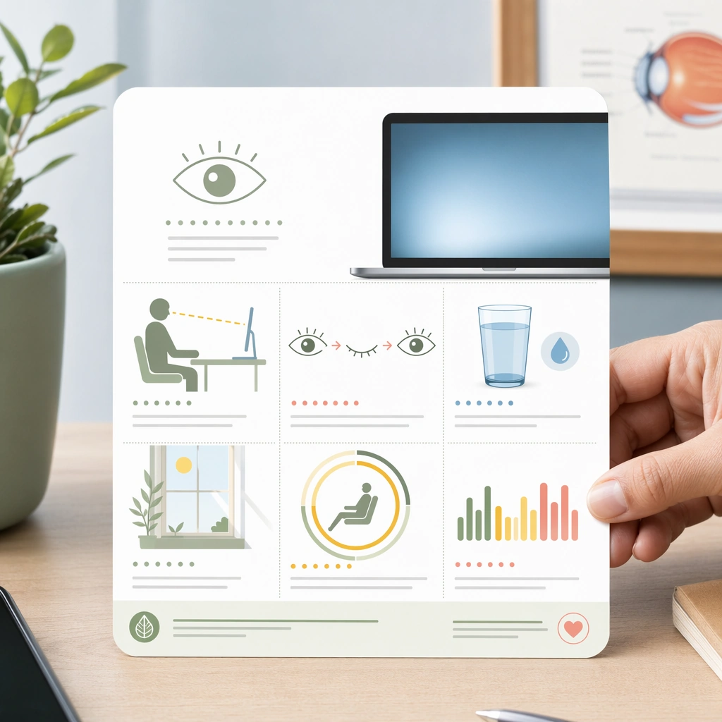
Example generated from “Wellness And Prevention Education Cards — Eye Strain Break Card”
GPT Image 2en

Scene: A square screen-break reminder card for Wellness and Prevention Education Cards. Compose it with monitor glow, soft eye diagrams, and break-timer modules arranged into a friendly square. Use a palette of fresh white, sage green, butter yellow, muted coral, and soft denim blue, bright editorial lighting with cheerful softness, and a mood of uplifting, practical, and habit-forming. The frame should feel like a real healthcare communication asset art-directed for professional delivery, not a stock photo, speculative concept render, or generic corporate template. Keep the camera distance, negative space, and depth cues disciplined so the image reads immediately even at thumbnail size. Subject: Center on an eye-strain prevention card showing device use, distance cues, blinking, hydration, and daylight balance in one coherent layout. Show enough surrounding context that the viewer understands the intended service surface, user situation, and institutional setting. Every object, person, diagram, device crop, or spatial cue should support clarity, trust, and practical use. If people appear, keep them anonymous, natural, privacy-safe, and grounded in believable body language rather than promotional posing. Important details: Maintain prevention education expressed through card-based compositions, small daily-life scenes, simple diagrams, and social-friendly rhythm without empty lifestyle fluff. Make the piece feel digital-age relevant while preserving healthcare credibility and calm. Use abstract icon shapes, color blocks, chart bars, interface modules, or non-legible placeholder microcopy whenever information structure is needed, but never readable text. Materials, spacing, lighting, and hierarchy should feel production-ready and healthcare-specific. Avoid generic lifestyle filler, decorative noise, or design gestures that do not reinforce the communication goal. Use case: Wellness Cards single study 3/9 for an eye-health social or waiting-room card. Constraints: No readable text, no watermark, no logos, preserve exact 1:1 aspect ratio, no influencer-product placement, no unrealistic body perfection, no childish clip-art tone, no information overload, no app-startup aesthetic, no neon tech palette.

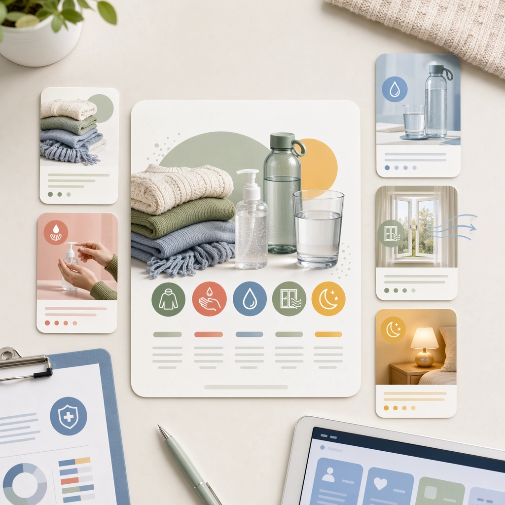
Example generated from “Wellness And Prevention Education Cards — Seasonal Immunity Card”
GPT Image 2en

Scene: A square seasonal prevention card for Wellness and Prevention Education Cards. Compose it as a card family preview with one hero tile and several supporting habit modules. Use a palette of fresh white, sage green, butter yellow, muted coral, and soft denim blue, bright editorial lighting with cheerful softness, and a mood of uplifting, practical, and habit-forming. The frame should feel like a real healthcare communication asset art-directed for professional delivery, not a stock photo, speculative concept render, or generic corporate template. Keep the camera distance, negative space, and depth cues disciplined so the image reads immediately even at thumbnail size. Subject: Center on a seasonal wellness card featuring layered clothing, hand hygiene, hydration, ventilation, and sleep support objects. Show enough surrounding context that the viewer understands the intended service surface, user situation, and institutional setting. Every object, person, diagram, device crop, or spatial cue should support clarity, trust, and practical use. If people appear, keep them anonymous, natural, privacy-safe, and grounded in believable body language rather than promotional posing. Important details: Maintain prevention education expressed through card-based compositions, small daily-life scenes, simple diagrams, and social-friendly rhythm without empty lifestyle fluff. Treat immunity as habit education rather than miracle-product promotion, using grounded household imagery. Use abstract icon shapes, color blocks, chart bars, interface modules, or non-legible placeholder microcopy whenever information structure is needed, but never readable text. Materials, spacing, lighting, and hierarchy should feel production-ready and healthcare-specific. Avoid generic lifestyle filler, decorative noise, or design gestures that do not reinforce the communication goal. Use case: Wellness Cards single study 4/9 for a seasonal prevention card for clinics. Constraints: No readable text, no watermark, no logos, preserve exact 1:1 aspect ratio, no influencer-product placement, no unrealistic body perfection, no childish clip-art tone, no information overload, no supplement-ad look, no fear-based virus imagery.

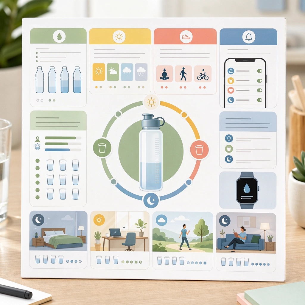
Example generated from “Wellness And Prevention Education Cards — Hydration Reminder Board”
GPT Image 2en

Scene: A square hydration support board for Wellness and Prevention Education Cards. Compose it as a crisp card board with bottle shapes, schedule rings, and activity context scenes. Use a palette of fresh white, sage green, butter yellow, muted coral, and soft denim blue, bright editorial lighting with cheerful softness, and a mood of uplifting, practical, and habit-forming. The frame should feel like a real healthcare communication asset art-directed for professional delivery, not a stock photo, speculative concept render, or generic corporate template. Keep the camera distance, negative space, and depth cues disciplined so the image reads immediately even at thumbnail size. Subject: Center on a hydration education asset linking fluid intake, weather, activity, and gentle reminder systems across the day. Show enough surrounding context that the viewer understands the intended service surface, user situation, and institutional setting. Every object, person, diagram, device crop, or spatial cue should support clarity, trust, and practical use. If people appear, keep them anonymous, natural, privacy-safe, and grounded in believable body language rather than promotional posing. Important details: Maintain prevention education expressed through card-based compositions, small daily-life scenes, simple diagrams, and social-friendly rhythm without empty lifestyle fluff. The visual story should feel friendly and everyday, with measured pacing rather than sports-drink marketing energy. Use abstract icon shapes, color blocks, chart bars, interface modules, or non-legible placeholder microcopy whenever information structure is needed, but never readable text. Materials, spacing, lighting, and hierarchy should feel production-ready and healthcare-specific. Avoid generic lifestyle filler, decorative noise, or design gestures that do not reinforce the communication goal. Use case: Wellness Cards single study 5/9 for a hydration habit support card. Constraints: No readable text, no watermark, no logos, preserve exact 1:1 aspect ratio, no influencer-product placement, no unrealistic body perfection, no childish clip-art tone, no information overload, no performance-sports branding, no sugary-drink cues.

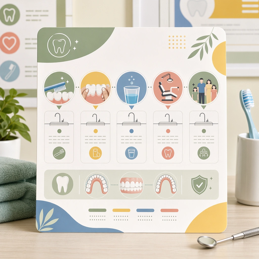
Example generated from “Wellness And Prevention Education Cards — Oral Care Step Card”
GPT Image 2en

Scene: A square oral-care routine card for Wellness and Prevention Education Cards. Compose it as a clean sequence card with sink objects, tooth diagrams, and timing markers. Use a palette of fresh white, sage green, butter yellow, muted coral, and soft denim blue, bright editorial lighting with cheerful softness, and a mood of uplifting, practical, and habit-forming. The frame should feel like a real healthcare communication asset art-directed for professional delivery, not a stock photo, speculative concept render, or generic corporate template. Keep the camera distance, negative space, and depth cues disciplined so the image reads immediately even at thumbnail size. Subject: Center on an oral-care prevention card showing brushing, flossing, rinsing, checkup cadence, and child-to-adult family applicability. Show enough surrounding context that the viewer understands the intended service surface, user situation, and institutional setting. Every object, person, diagram, device crop, or spatial cue should support clarity, trust, and practical use. If people appear, keep them anonymous, natural, privacy-safe, and grounded in believable body language rather than promotional posing. Important details: Maintain prevention education expressed through card-based compositions, small daily-life scenes, simple diagrams, and social-friendly rhythm without empty lifestyle fluff. Keep the diagrams simplified and bright, avoiding cartoon dentistry or cosmetic-whitening advertising. Use abstract icon shapes, color blocks, chart bars, interface modules, or non-legible placeholder microcopy whenever information structure is needed, but never readable text. Materials, spacing, lighting, and hierarchy should feel production-ready and healthcare-specific. Avoid generic lifestyle filler, decorative noise, or design gestures that do not reinforce the communication goal. Use case: Wellness Cards single study 6/9 for an oral-health education card. Constraints: No readable text, no watermark, no logos, preserve exact 1:1 aspect ratio, no influencer-product placement, no unrealistic body perfection, no childish clip-art tone, no information overload, no glossy toothpaste-ad vibe, no exaggerated smiling models.
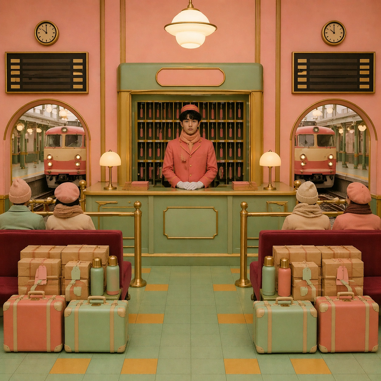
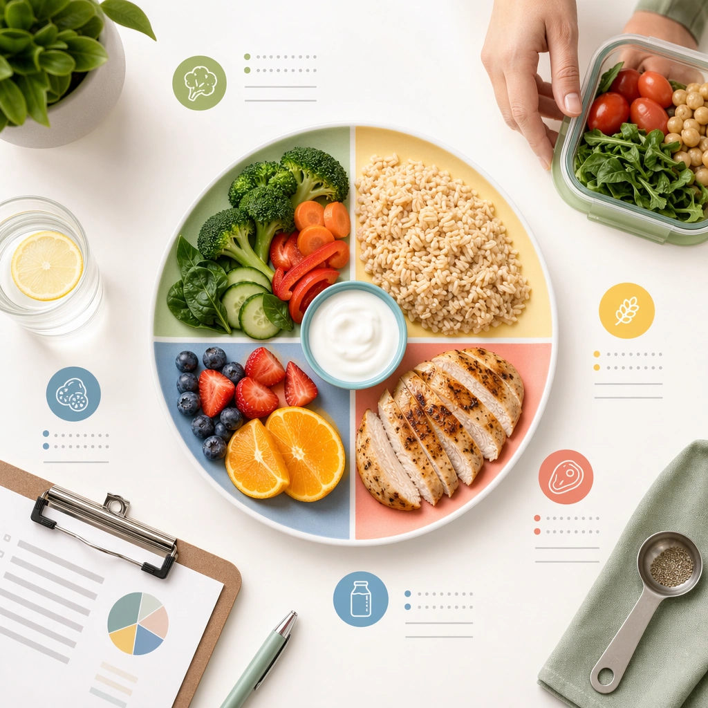
Example generated from “Wellness And Prevention Education Cards — Balanced Meal Plate Card”
GPT Image 2en

Scene: A square nutrition guidance card for Wellness and Prevention Education Cards. Compose it as a plate-centered educational tile with food groups, portion hints, and meal-prep objects. Use a palette of fresh white, sage green, butter yellow, muted coral, and soft denim blue, bright editorial lighting with cheerful softness, and a mood of uplifting, practical, and habit-forming. The frame should feel like a real healthcare communication asset art-directed for professional delivery, not a stock photo, speculative concept render, or generic corporate template. Keep the camera distance, negative space, and depth cues disciplined so the image reads immediately even at thumbnail size. Subject: Center on a prevention card translating balanced eating into an appealing but realistic home-meal visual system. Show enough surrounding context that the viewer understands the intended service surface, user situation, and institutional setting. Every object, person, diagram, device crop, or spatial cue should support clarity, trust, and practical use. If people appear, keep them anonymous, natural, privacy-safe, and grounded in believable body language rather than promotional posing. Important details: Maintain prevention education expressed through card-based compositions, small daily-life scenes, simple diagrams, and social-friendly rhythm without empty lifestyle fluff. Show ordinary foods, reasonable portions, and calm color coding rather than aspirational gourmet styling. Use abstract icon shapes, color blocks, chart bars, interface modules, or non-legible placeholder microcopy whenever information structure is needed, but never readable text. Materials, spacing, lighting, and hierarchy should feel production-ready and healthcare-specific. Avoid generic lifestyle filler, decorative noise, or design gestures that do not reinforce the communication goal. Use case: Wellness Cards single study 7/9 for a balanced meal education card. Constraints: No readable text, no watermark, no logos, preserve exact 1:1 aspect ratio, no influencer-product placement, no unrealistic body perfection, no childish clip-art tone, no information overload, no diet-culture messaging, no restaurant-ad plating.

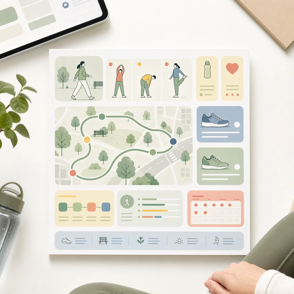
Example generated from “Wellness And Prevention Education Cards — Walking Routine Card”
GPT Image 2en

Scene: A square daily walking encouragement card for Wellness and Prevention Education Cards. Compose it as a square social-style card with route icons, footwear objects, and progress blocks. Use a palette of fresh white, sage green, butter yellow, muted coral, and soft denim blue, bright editorial lighting with cheerful softness, and a mood of uplifting, practical, and habit-forming. The frame should feel like a real healthcare communication asset art-directed for professional delivery, not a stock photo, speculative concept render, or generic corporate template. Keep the camera distance, negative space, and depth cues disciplined so the image reads immediately even at thumbnail size. Subject: Center on a movement-prevention asset showing short walking routines, warm-up cues, safe urban or park settings, and habit tracking modules. Show enough surrounding context that the viewer understands the intended service surface, user situation, and institutional setting. Every object, person, diagram, device crop, or spatial cue should support clarity, trust, and practical use. If people appear, keep them anonymous, natural, privacy-safe, and grounded in believable body language rather than promotional posing. Important details: Maintain prevention education expressed through card-based compositions, small daily-life scenes, simple diagrams, and social-friendly rhythm without empty lifestyle fluff. The tone should encourage sustainable movement for ordinary people, not athletic optimization. Use abstract icon shapes, color blocks, chart bars, interface modules, or non-legible placeholder microcopy whenever information structure is needed, but never readable text. Materials, spacing, lighting, and hierarchy should feel production-ready and healthcare-specific. Avoid generic lifestyle filler, decorative noise, or design gestures that do not reinforce the communication goal. Use case: Wellness Cards single study 8/9 for a daily movement prevention card. Constraints: No readable text, no watermark, no logos, preserve exact 1:1 aspect ratio, no influencer-product placement, no unrealistic body perfection, no childish clip-art tone, no information overload, no fitness-brand campaign styling, no competitive sport energy.

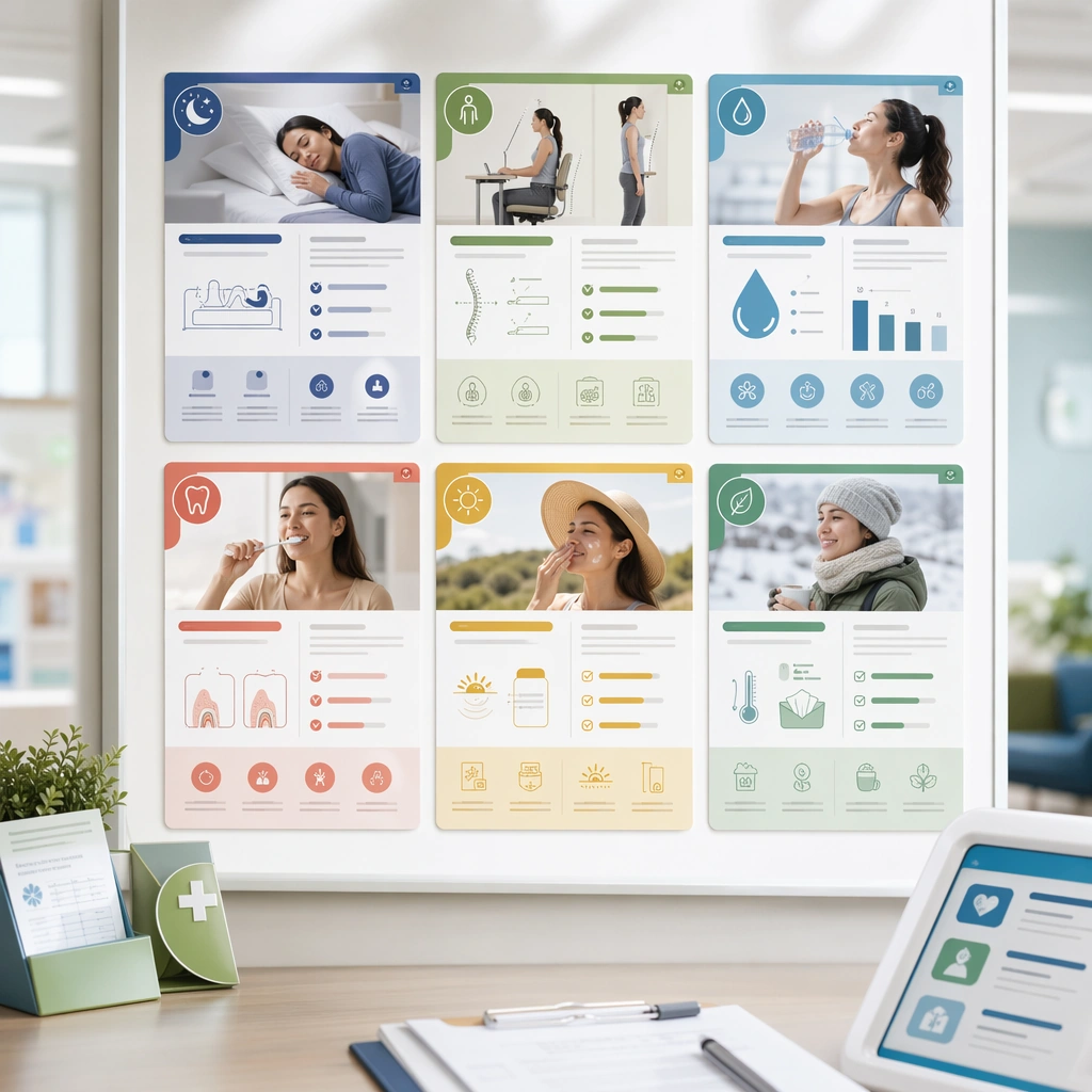
Example generated from “Wellness And Prevention Education Cards — Preventive Card Grid”
GPT Image 2en

Scene: A square card system summary board for Wellness and Prevention Education Cards. Compose it as a grid of multiple prevention cards displayed together with consistent margins and production realism. Use a palette of fresh white, sage green, butter yellow, muted coral, and soft denim blue, bright editorial lighting with cheerful softness, and a mood of uplifting, practical, and habit-forming. The frame should feel like a real healthcare communication asset art-directed for professional delivery, not a stock photo, speculative concept render, or generic corporate template. Keep the camera distance, negative space, and depth cues disciplined so the image reads immediately even at thumbnail size. Subject: Center on a family of prevention education cards covering sleep, posture, hydration, oral care, and seasonal habits under one visual system. Show enough surrounding context that the viewer understands the intended service surface, user situation, and institutional setting. Every object, person, diagram, device crop, or spatial cue should support clarity, trust, and practical use. If people appear, keep them anonymous, natural, privacy-safe, and grounded in believable body language rather than promotional posing. Important details: Maintain prevention education expressed through card-based compositions, small daily-life scenes, simple diagrams, and social-friendly rhythm without empty lifestyle fluff. The board should prove the set can scale across many topics while staying warm, medically grounded, and social-friendly. Use abstract icon shapes, color blocks, chart bars, interface modules, or non-legible placeholder microcopy whenever information structure is needed, but never readable text. Materials, spacing, lighting, and hierarchy should feel production-ready and healthcare-specific. Avoid generic lifestyle filler, decorative noise, or design gestures that do not reinforce the communication goal. Use case: Wellness Cards single study 9/9 for a complete wellness card system summary. Constraints: No readable text, no watermark, no logos, preserve exact 1:1 aspect ratio, no influencer-product placement, no unrealistic body perfection, no childish clip-art tone, no information overload, no random content collage, no inconsistent illustration styles.

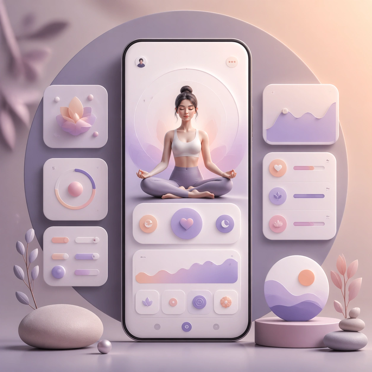
Example generated from “Wellness App Soft Premium Ui System — Reference Anchor”
GPT Image 2en

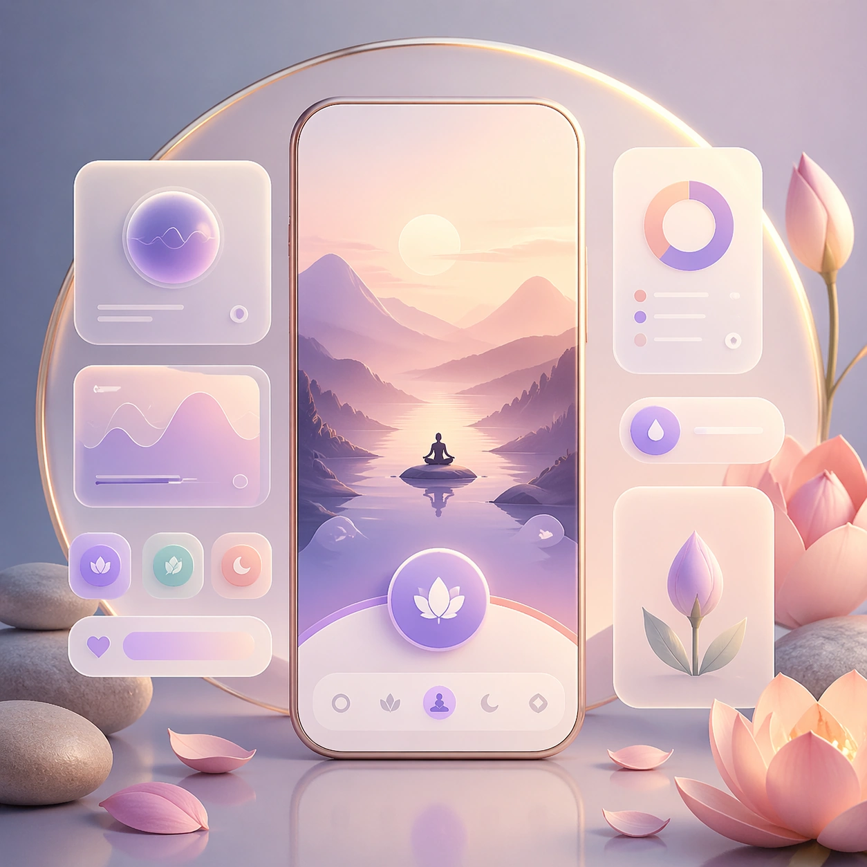
Scene: A square premium key-art frame built for a reference-dependent production series. Stage a reference anchor for wellness app soft premium ui system wellness app soft premium ui system with one unmistakable core subject and disciplined composition with controlled lighting, clear silhouette separation, and a camera setup that feels deliberate enough for campaign reuse. The composition should carry strong focal hierarchy, believable depth, and polished surface behavior while still staying stable enough to support downstream dependent variations. Subject: Center the image on a reference anchor for wellness app soft premium ui system wellness app soft premium ui system with one unmistakable core subject and disciplined composition. The result should feel like a concrete, shippable asset for a wellness app soft premium ui system wellness app soft premium ui system visual system, not a generic fantasy render. Build the subject with layered materials, stable anatomy or engineering logic, and enough specificity that later images can inherit the same underlying identity. This image is the root reference that defines continuity for the rest of the series. The viewer should immediately understand what is being preserved across the sequence and what is changing in this particular beat. Important details: establish the base identity, silhouette logic, palette rhythm, and layout system that downstream variations must preserve. Make continuity explicit through repeatable shape language, proportion control, and a coherent palette system. Changes in pose, angle, mood, rarity, weather, or layout should still feel downstream of one stable source. Avoid clutter that would confuse reference use. Any interface-like blocks or graphic surfaces must remain abstract and unreadable. Keep the image polished, original, and suitable for both gallery display and production review. Use case: wellness app soft premium ui system wellness app soft premium ui system series study 1/4, focused on reference anchor. Constraints: No readable text, no watermark, no logos, preserve exact 1:1 aspect ratio, no extra subject duplication, no noisy background, no broken continuity, no off-model redesign, no accidental franchise resemblance.
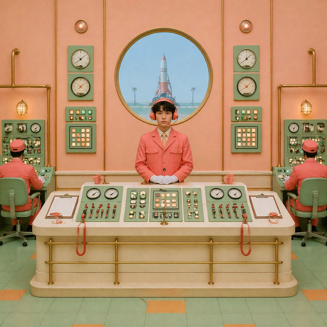
Example generated from “Wellness App Soft Premium Ui System — Variation One”
GPT Image 2en

Scene: A square premium key-art frame built for a reference-dependent production series. Stage the same core concept reinterpreted through a first controlled variation for wellness app soft premium ui system wellness app soft premium ui system with controlled lighting, clear silhouette separation, and a camera setup that feels deliberate enough for campaign reuse. The composition should carry strong focal hierarchy, believable depth, and polished surface behavior while still staying stable enough to support downstream dependent variations. Subject: Center the image on the same core concept reinterpreted through a first controlled variation for wellness app soft premium ui system wellness app soft premium ui system. The result should feel like a concrete, shippable asset for a wellness app soft premium ui system wellness app soft premium ui system visual system, not a generic fantasy render. Build the subject with layered materials, stable anatomy or engineering logic, and enough specificity that later images can inherit the same underlying identity. Preserve the same core subject identity, silhouette logic, material language, and composition system from the reference image from the reference image while changing only what this variation needs. The viewer should immediately understand what is being preserved across the sequence and what is changing in this particular beat. Important details: change mood, framing, or emphasis while preserving the same underlying visual system and subject continuity. Make continuity explicit through repeatable shape language, proportion control, and a coherent palette system. Changes in pose, angle, mood, rarity, weather, or layout should still feel downstream of one stable source. Avoid clutter that would confuse reference use. Any interface-like blocks or graphic surfaces must remain abstract and unreadable. Keep the image polished, original, and suitable for both gallery display and production review. Use case: wellness app soft premium ui system wellness app soft premium ui system series study 2/4, focused on variation one. Constraints: No readable text, no watermark, no logos, preserve exact 1:1 aspect ratio, no unrelated redesign, no continuity drift, no broken continuity, no off-model redesign, no accidental franchise resemblance.
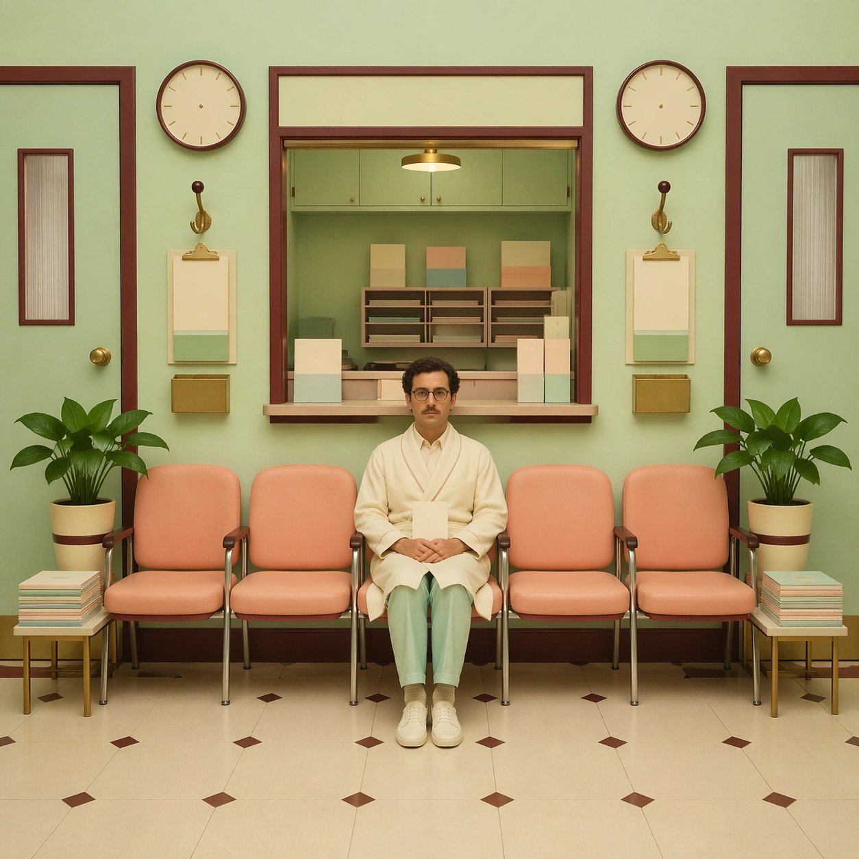
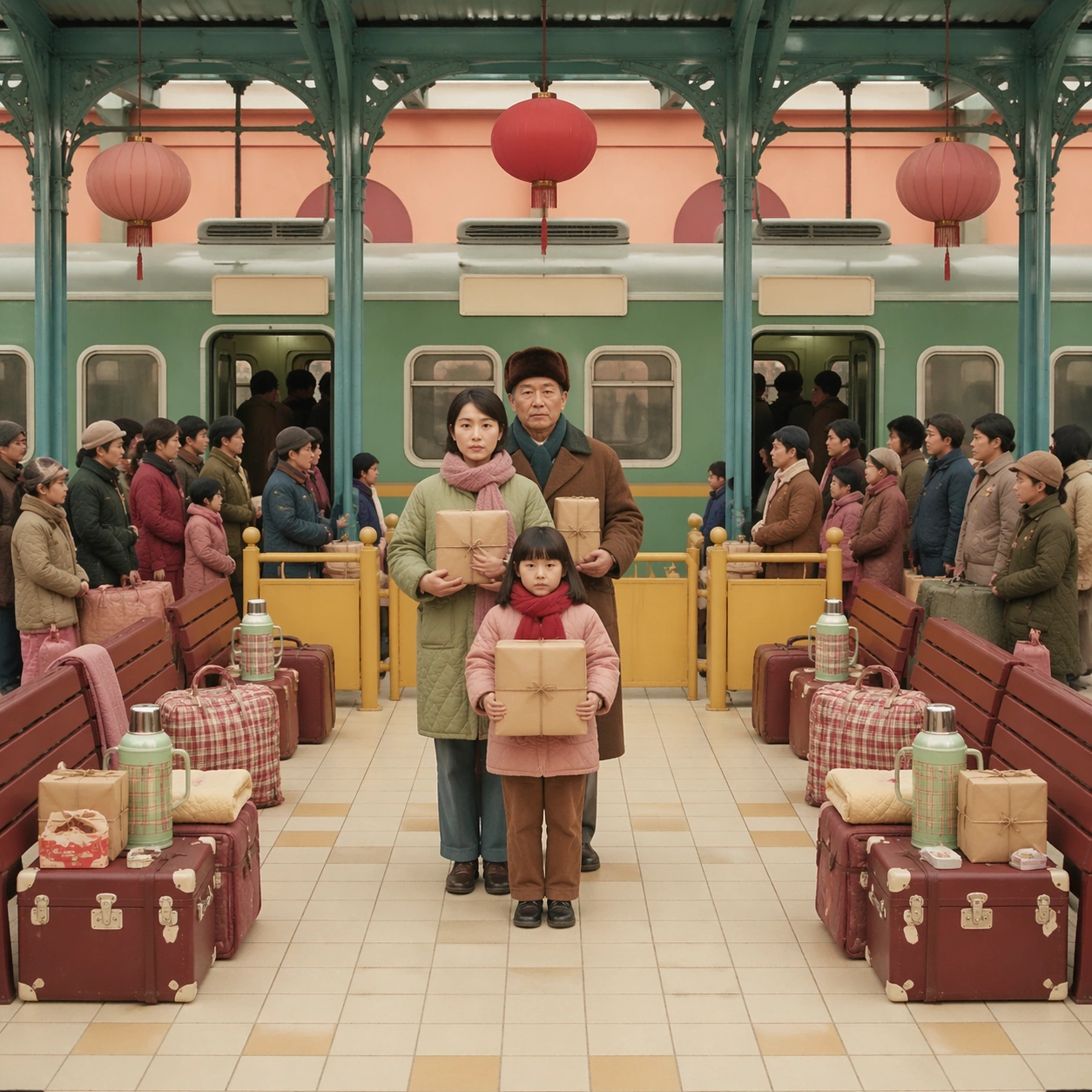
Example generated from “Wellness App Soft Premium Ui System — Variation Two”
GPT Image 2en

Scene: A square premium key-art frame built for a reference-dependent production series. Stage the same core concept pushed into a second variation with different pacing or surface behavior for wellness app soft premium ui system wellness app soft premium ui system with controlled lighting, clear silhouette separation, and a camera setup that feels deliberate enough for campaign reuse. The composition should carry strong focal hierarchy, believable depth, and polished surface behavior while still staying stable enough to support downstream dependent variations. Subject: Center the image on the same core concept pushed into a second variation with different pacing or surface behavior for wellness app soft premium ui system wellness app soft premium ui system. The result should feel like a concrete, shippable asset for a wellness app soft premium ui system wellness app soft premium ui system visual system, not a generic fantasy render. Build the subject with layered materials, stable anatomy or engineering logic, and enough specificity that later images can inherit the same underlying identity. Preserve the same core subject identity, silhouette logic, material language, and composition system from the reference image from the reference image while changing only what this variation needs. The viewer should immediately understand what is being preserved across the sequence and what is changing in this particular beat. Important details: the viewer should still read one connected family rather than three disconnected ideas. Make continuity explicit through repeatable shape language, proportion control, and a coherent palette system. Changes in pose, angle, mood, rarity, weather, or layout should still feel downstream of one stable source. Avoid clutter that would confuse reference use. Any interface-like blocks or graphic surfaces must remain abstract and unreadable. Keep the image polished, original, and suitable for both gallery display and production review. Use case: wellness app soft premium ui system wellness app soft premium ui system series study 3/4, focused on variation two. Constraints: No readable text, no watermark, no logos, preserve exact 1:1 aspect ratio, no random props, no off-model shift, no broken continuity, no off-model redesign, no accidental franchise resemblance.

Example generated from “Wellness App Soft Premium Ui System — Variation Three”
GPT Image 2en

Scene: A square premium key-art frame built for a reference-dependent production series. Stage the same core concept in a third polished variation that completes the reference-led set for wellness app soft premium ui system wellness app soft premium ui system with controlled lighting, clear silhouette separation, and a camera setup that feels deliberate enough for campaign reuse. The composition should carry strong focal hierarchy, believable depth, and polished surface behavior while still staying stable enough to support downstream dependent variations. Subject: Center the image on the same core concept in a third polished variation that completes the reference-led set for wellness app soft premium ui system wellness app soft premium ui system. The result should feel like a concrete, shippable asset for a wellness app soft premium ui system wellness app soft premium ui system visual system, not a generic fantasy render. Build the subject with layered materials, stable anatomy or engineering logic, and enough specificity that later images can inherit the same underlying identity. Preserve the same core subject identity, silhouette logic, material language, and composition system from the reference image from the reference image while changing only what this variation needs. The viewer should immediately understand what is being preserved across the sequence and what is changing in this particular beat. Important details: keep continuity obvious while introducing a fresh but coherent downstream use case. Make continuity explicit through repeatable shape language, proportion control, and a coherent palette system. Changes in pose, angle, mood, rarity, weather, or layout should still feel downstream of one stable source. Avoid clutter that would confuse reference use. Any interface-like blocks or graphic surfaces must remain abstract and unreadable. Keep the image polished, original, and suitable for both gallery display and production review. Use case: wellness app soft premium ui system wellness app soft premium ui system series study 4/4, focused on variation three. Constraints: No readable text, no watermark, no logos, preserve exact 1:1 aspect ratio, no franchise mimicry, no broken hierarchy, no broken continuity, no off-model redesign, no accidental franchise resemblance.

Example generated from “Wellness App Soft Premium Ui System — Hero Study”
GPT Image 2en

Scene: A square production-ready image designed for a game-art review wall and a commercial gallery at the same time. Frame a flagship hero study for wellness app soft premium ui system wellness app soft premium ui system presented as a polished, production-ready surface with disciplined lighting, clean edge separation, and enough surrounding context to prove how the asset would behave in a real product surface. The camera, crop, and tonal balance should feel intentional rather than generic, with high readability at first glance and convincing material response under closer inspection. Subject: Center the study on a flagship hero study for wellness app soft premium ui system wellness app soft premium ui system presented as a polished, production-ready surface. Translate the topic into a concrete, shippable visual statement instead of a loose mood board. Build layered object relationships, believable surface finish, and strong silhouette grouping so the image reads immediately as part of a wellness app soft premium ui system wellness app soft premium ui system visual system. The subject should feel made for a live game pipeline: useful in store, UI, campaign, or art-review contexts, with visual hierarchy strong enough to survive aggressive cropping. Important details: make the core idea immediately legible and premium enough for gallery or campaign use. Keep every supporting element subordinate to the main read, and make category separation obvious through form, color zoning, depth, and material logic rather than words. Where panels, cards, badges, or interface blocks appear, they must look professionally structured but remain unreadable. The visual language should feel premium, original, and coherent across this package, with no filler clutter and no accidental resemblance to a specific shipped game IP. Use case: wellness app soft premium ui system wellness app soft premium ui system single study 1/5, focused on hero study. Constraints: No readable text, no watermark, no logos, preserve exact 1:1 aspect ratio, no generic stock staging, no readable text, no broken hierarchy, no generic stock-photo staging, no accidental UI gibberish.

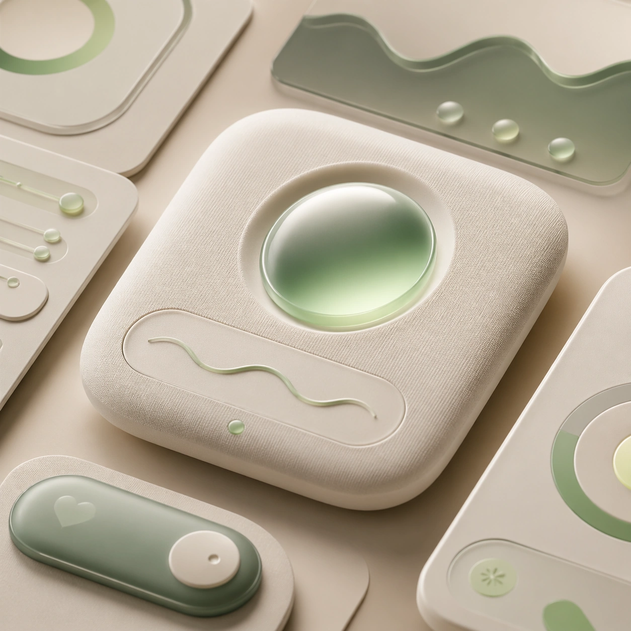
Example generated from “Wellness App Soft Premium Ui System — Detail Proof”
GPT Image 2en

Scene: A square production-ready image designed for a game-art review wall and a commercial gallery at the same time. Frame a detail-focused proof image for wellness app soft premium ui system wellness app soft premium ui system that zooms into the most important material or structural cue with disciplined lighting, clean edge separation, and enough surrounding context to prove how the asset would behave in a real product surface. The camera, crop, and tonal balance should feel intentional rather than generic, with high readability at first glance and convincing material response under closer inspection. Subject: Center the study on a detail-focused proof image for wellness app soft premium ui system wellness app soft premium ui system that zooms into the most important material or structural cue. Translate the topic into a concrete, shippable visual statement instead of a loose mood board. Build layered object relationships, believable surface finish, and strong silhouette grouping so the image reads immediately as part of a wellness app soft premium ui system wellness app soft premium ui system visual system. The subject should feel made for a live game pipeline: useful in store, UI, campaign, or art-review contexts, with visual hierarchy strong enough to survive aggressive cropping. Important details: micro detail should reinforce credibility without losing the main idea. Keep every supporting element subordinate to the main read, and make category separation obvious through form, color zoning, depth, and material logic rather than words. Where panels, cards, badges, or interface blocks appear, they must look professionally structured but remain unreadable. The visual language should feel premium, original, and coherent across this package, with no filler clutter and no accidental resemblance to a specific shipped game IP. Use case: wellness app soft premium ui system wellness app soft premium ui system single study 2/5, focused on detail proof. Constraints: No readable text, no watermark, no logos, preserve exact 1:1 aspect ratio, no unreadable clutter, no measurement text, no broken hierarchy, no generic stock-photo staging, no accidental UI gibberish.

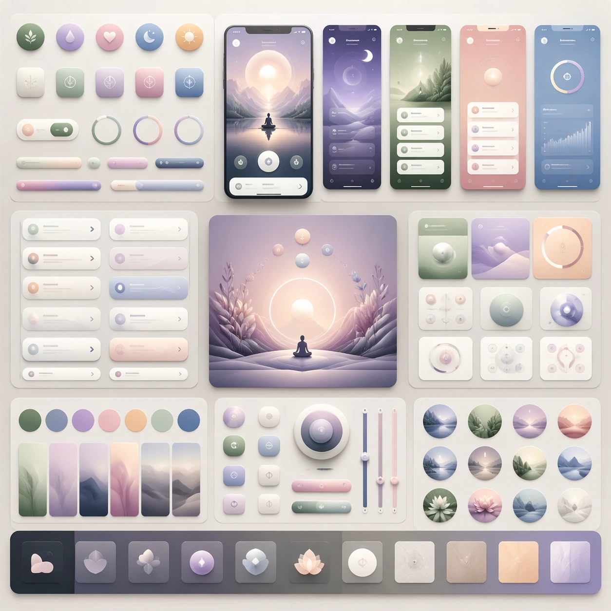
Example generated from “Wellness App Soft Premium Ui System — System Board”
GPT Image 2en

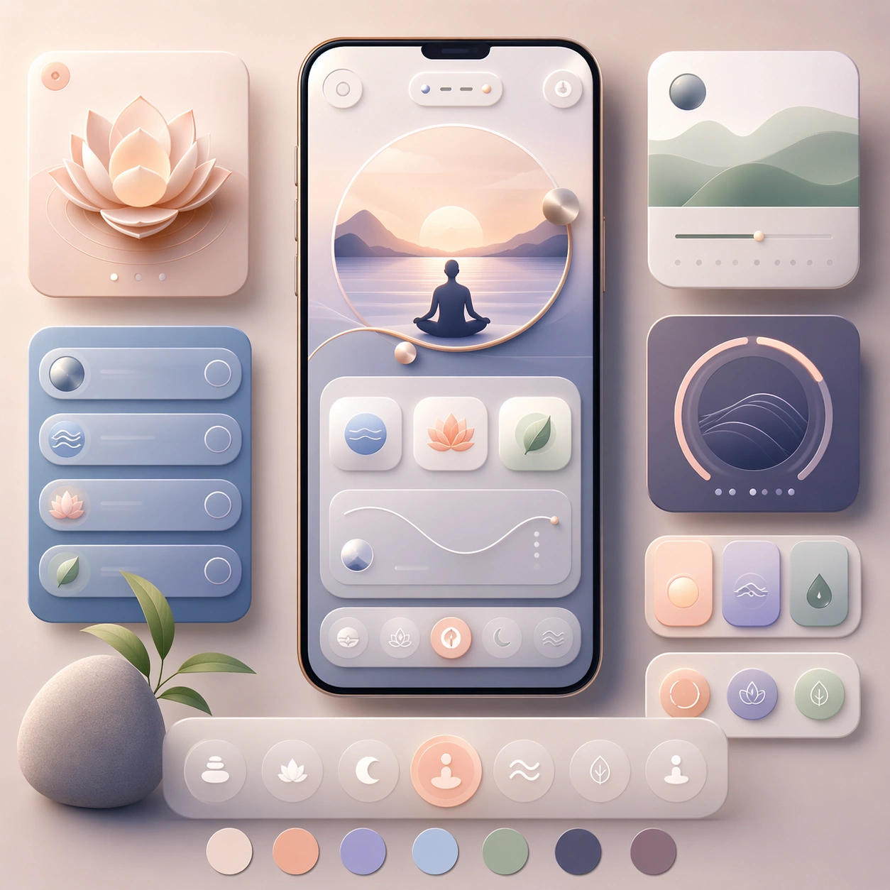
Scene: A square production-ready image designed for a game-art review wall and a commercial gallery at the same time. Frame a system-board layout for wellness app soft premium ui system wellness app soft premium ui system that organizes multiple related elements into one coherent review surface with disciplined lighting, clean edge separation, and enough surrounding context to prove how the asset would behave in a real product surface. The camera, crop, and tonal balance should feel intentional rather than generic, with high readability at first glance and convincing material response under closer inspection. Subject: Center the study on a system-board layout for wellness app soft premium ui system wellness app soft premium ui system that organizes multiple related elements into one coherent review surface. Translate the topic into a concrete, shippable visual statement instead of a loose mood board. Build layered object relationships, believable surface finish, and strong silhouette grouping so the image reads immediately as part of a wellness app soft premium ui system wellness app soft premium ui system visual system. The subject should feel made for a live game pipeline: useful in store, UI, campaign, or art-review contexts, with visual hierarchy strong enough to survive aggressive cropping. Important details: the board should feel design-ready and structured even though every label remains abstract. Keep every supporting element subordinate to the main read, and make category separation obvious through form, color zoning, depth, and material logic rather than words. Where panels, cards, badges, or interface blocks appear, they must look professionally structured but remain unreadable. The visual language should feel premium, original, and coherent across this package, with no filler clutter and no accidental resemblance to a specific shipped game IP. Use case: wellness app soft premium ui system wellness app soft premium ui system single study 3/5, focused on system board. Constraints: No readable text, no watermark, no logos, preserve exact 1:1 aspect ratio, no readable labels, no placeholder lorem ipsum, no broken hierarchy, no generic stock-photo staging, no accidental UI gibberish.

Example generated from “Wellness App Soft Premium Ui System — Promo Crop”
GPT Image 2en

Scene: A square production-ready image designed for a game-art review wall and a commercial gallery at the same time. Frame a promo-oriented crop for wellness app soft premium ui system wellness app soft premium ui system optimized for social, storefront, or poster reuse with disciplined lighting, clean edge separation, and enough surrounding context to prove how the asset would behave in a real product surface. The camera, crop, and tonal balance should feel intentional rather than generic, with high readability at first glance and convincing material response under closer inspection. Subject: Center the study on a promo-oriented crop for wellness app soft premium ui system wellness app soft premium ui system optimized for social, storefront, or poster reuse. Translate the topic into a concrete, shippable visual statement instead of a loose mood board. Build layered object relationships, believable surface finish, and strong silhouette grouping so the image reads immediately as part of a wellness app soft premium ui system wellness app soft premium ui system visual system. The subject should feel made for a live game pipeline: useful in store, UI, campaign, or art-review contexts, with visual hierarchy strong enough to survive aggressive cropping. Important details: keep strong hierarchy and conversion energy without relying on explicit copy. Keep every supporting element subordinate to the main read, and make category separation obvious through form, color zoning, depth, and material logic rather than words. Where panels, cards, badges, or interface blocks appear, they must look professionally structured but remain unreadable. The visual language should feel premium, original, and coherent across this package, with no filler clutter and no accidental resemblance to a specific shipped game IP. Use case: wellness app soft premium ui system wellness app soft premium ui system single study 4/5, focused on promo crop. Constraints: No readable text, no watermark, no logos, preserve exact 1:1 aspect ratio, no slogans, no logos, no broken hierarchy, no generic stock-photo staging, no accidental UI gibberish.

Example generated from “Wellness App Soft Premium Ui System — Finale Study”
GPT Image 2en

Scene: A square production-ready image designed for a game-art review wall and a commercial gallery at the same time. Frame a finale study for wellness app soft premium ui system wellness app soft premium ui system that pushes the topic to its most polished and complete expression with disciplined lighting, clean edge separation, and enough surrounding context to prove how the asset would behave in a real product surface. The camera, crop, and tonal balance should feel intentional rather than generic, with high readability at first glance and convincing material response under closer inspection. Subject: Center the study on a finale study for wellness app soft premium ui system wellness app soft premium ui system that pushes the topic to its most polished and complete expression. Translate the topic into a concrete, shippable visual statement instead of a loose mood board. Build layered object relationships, believable surface finish, and strong silhouette grouping so the image reads immediately as part of a wellness app soft premium ui system wellness app soft premium ui system visual system. The subject should feel made for a live game pipeline: useful in store, UI, campaign, or art-review contexts, with visual hierarchy strong enough to survive aggressive cropping. Important details: the closing image should feel definitive, high-signal, and suitable for feature placement. Keep every supporting element subordinate to the main read, and make category separation obvious through form, color zoning, depth, and material logic rather than words. Where panels, cards, badges, or interface blocks appear, they must look professionally structured but remain unreadable. The visual language should feel premium, original, and coherent across this package, with no filler clutter and no accidental resemblance to a specific shipped game IP. Use case: wellness app soft premium ui system wellness app soft premium ui system single study 5/5, focused on finale study. Constraints: No readable text, no watermark, no logos, preserve exact 1:1 aspect ratio, no text blocks, no derivative character likeness, no broken hierarchy, no generic stock-photo staging, no accidental UI gibberish.

Example generated from “Wellness Retreat And Therapy Campaign Kit — Retreat Arrival Hero”
GPT Image 2en

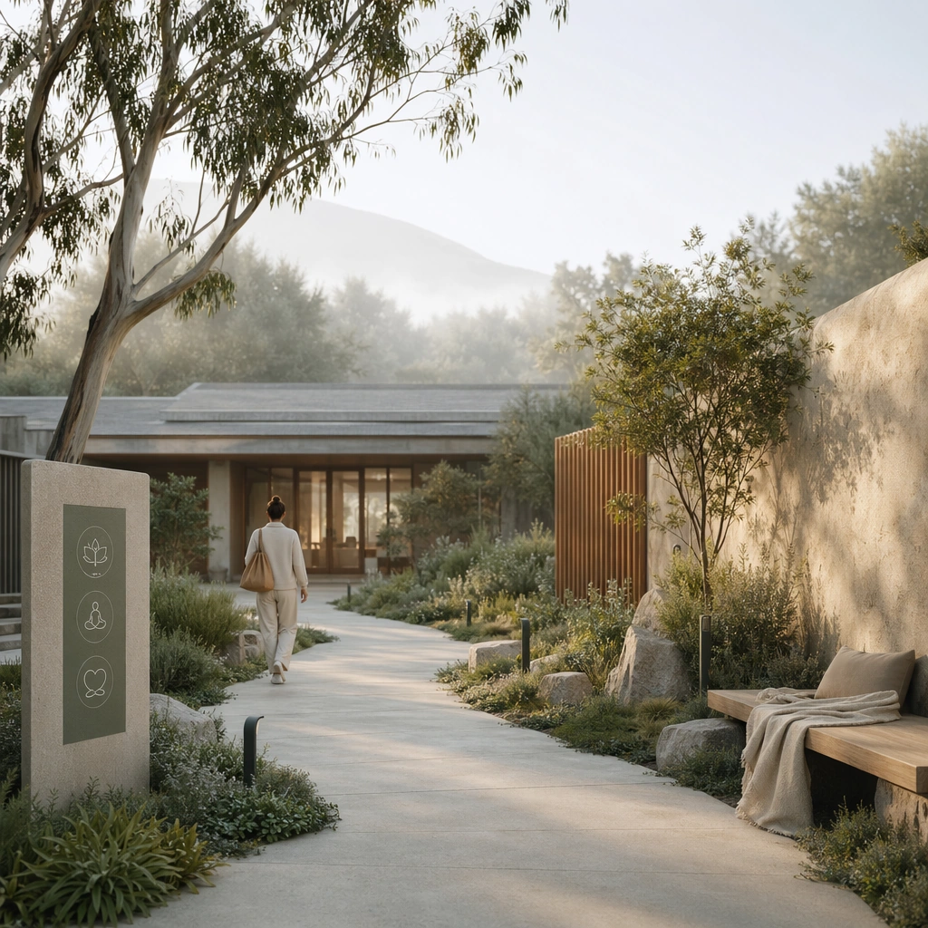
Scene: A square retreat campaign hero image for Wellness Retreat and Therapy Campaign Kit. Compose it as a welcoming approach scene with entry path, architecture, and one calm human figure integrated into the landscape. Use a palette of stone white, eucalyptus green, mist gray, warm sand, and muted clay, soft natural light with restorative atmosphere, and a mood of calm, restorative, and emotionally safe. The frame should feel like a real healthcare communication asset art-directed for professional delivery, not a stock photo, speculative concept render, or generic corporate template. Keep the camera distance, negative space, and depth cues disciplined so the image reads immediately even at thumbnail size. Subject: Center on a wellness retreat arrival moment featuring understated architecture, natural materials, soft signage, and a sense of privacy and safety. Show enough surrounding context that the viewer understands the intended service surface, user situation, and institutional setting. Every object, person, diagram, device crop, or spatial cue should support clarity, trust, and practical use. If people appear, keep them anonymous, natural, privacy-safe, and grounded in believable body language rather than promotional posing. Important details: Maintain wellness and therapy communication built from serene spaces, grounded human presence, gentle editorial structure, and service clarity instead of vague luxury-spa imagery. The atmosphere should suggest restoration and clear service intent, avoiding hotel marketing or escapist fantasy. Use abstract icon shapes, color blocks, chart bars, interface modules, or non-legible placeholder microcopy whenever information structure is needed, but never readable text. Materials, spacing, lighting, and hierarchy should feel production-ready and healthcare-specific. Avoid generic lifestyle filler, decorative noise, or design gestures that do not reinforce the communication goal. Use case: Wellness Retreat single study 1/9 for a wellness retreat landing hero. Constraints: No readable text, no watermark, no logos, preserve exact 1:1 aspect ratio, no pseudo-spiritual cliches, no resort-luxury excess, no influencer posing, no mystical healing props, no infinity-pool luxury cues, no vacation-brochure excess.

Example generated from “Wellness Retreat And Therapy Campaign Kit — Therapy Room Service Page”
GPT Image 2en

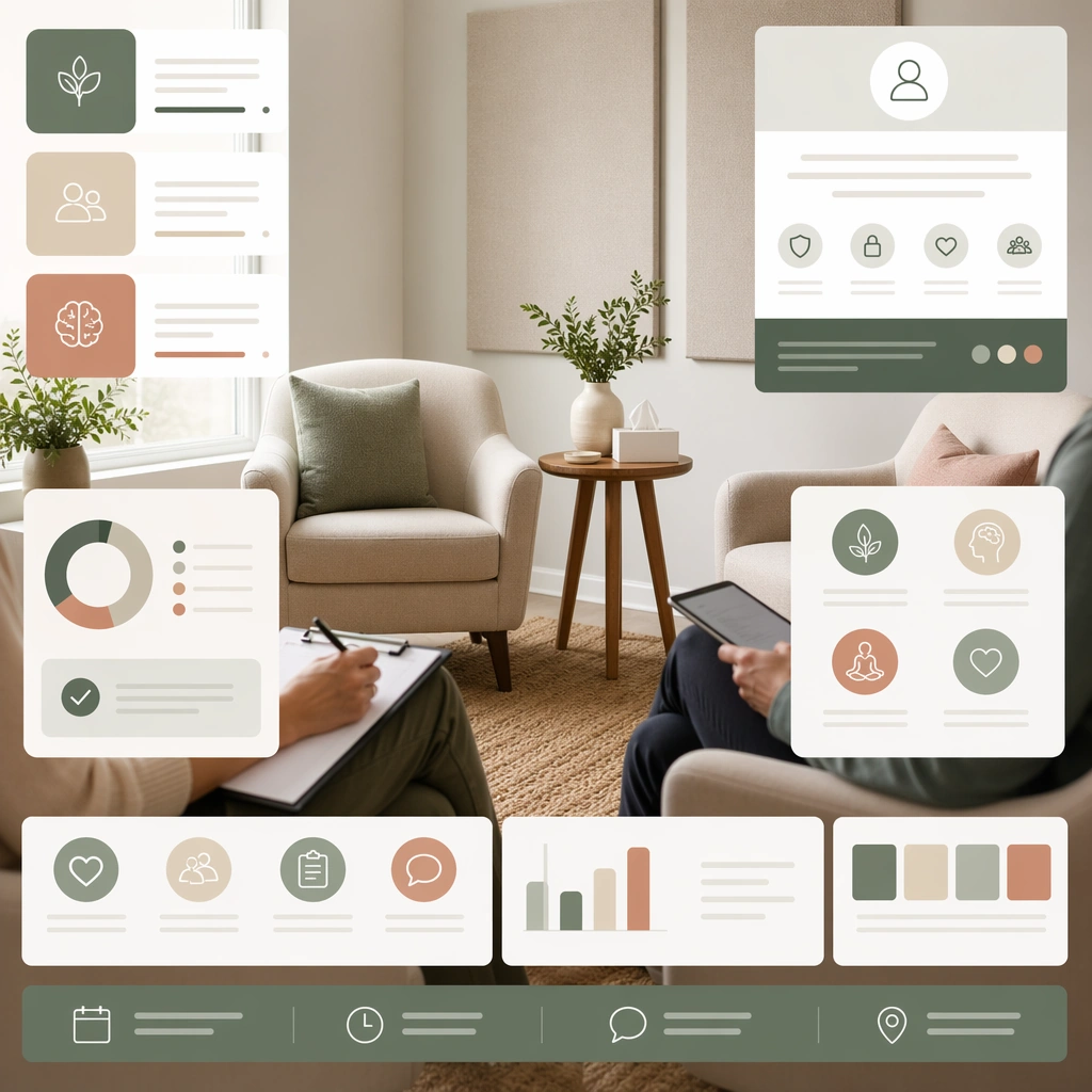
Scene: A square therapy service-page board for Wellness Retreat and Therapy Campaign Kit. Compose it as a square web-like composition combining room photography, service modules, and supportive visual hierarchy. Use a palette of stone white, eucalyptus green, mist gray, warm sand, and muted clay, soft natural light with restorative atmosphere, and a mood of calm, restorative, and emotionally safe. The frame should feel like a real healthcare communication asset art-directed for professional delivery, not a stock photo, speculative concept render, or generic corporate template. Keep the camera distance, negative space, and depth cues disciplined so the image reads immediately even at thumbnail size. Subject: Center on a therapy room with neutral furniture, soft textures, acoustic control, note-taking surfaces, and trust-oriented service cards. Show enough surrounding context that the viewer understands the intended service surface, user situation, and institutional setting. Every object, person, diagram, device crop, or spatial cue should support clarity, trust, and practical use. If people appear, keep them anonymous, natural, privacy-safe, and grounded in believable body language rather than promotional posing. Important details: Maintain wellness and therapy communication built from serene spaces, grounded human presence, gentle editorial structure, and service clarity instead of vague luxury-spa imagery. The communication must make therapy feel accessible, private, and professionally held rather than overly styled. Use abstract icon shapes, color blocks, chart bars, interface modules, or non-legible placeholder microcopy whenever information structure is needed, but never readable text. Materials, spacing, lighting, and hierarchy should feel production-ready and healthcare-specific. Avoid generic lifestyle filler, decorative noise, or design gestures that do not reinforce the communication goal. Use case: Wellness Retreat single study 2/9 for a therapy service page concept. Constraints: No readable text, no watermark, no logos, preserve exact 1:1 aspect ratio, no pseudo-spiritual cliches, no resort-luxury excess, no influencer posing, no mystical healing props, no dark moody cinema, no lifestyle-magazine glamour.

Example generated from “Wellness Retreat And Therapy Campaign Kit — Breathing Session Poster”
GPT Image 2en

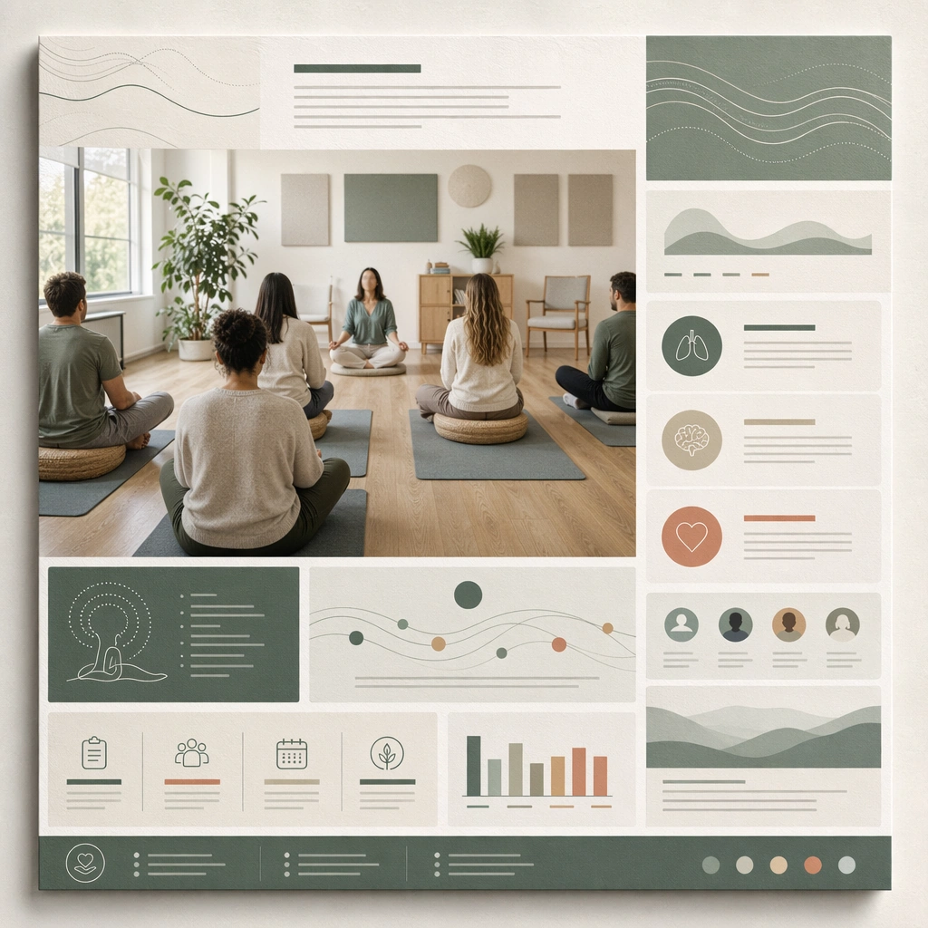
Scene: A square breathing class poster mockup for Wellness Retreat and Therapy Campaign Kit. Compose it as a print poster board with one group-session image and structured support modules. Use a palette of stone white, eucalyptus green, mist gray, warm sand, and muted clay, soft natural light with restorative atmosphere, and a mood of calm, restorative, and emotionally safe. The frame should feel like a real healthcare communication asset art-directed for professional delivery, not a stock photo, speculative concept render, or generic corporate template. Keep the camera distance, negative space, and depth cues disciplined so the image reads immediately even at thumbnail size. Subject: Center on a calm guided-breathing session with mats, stools, daylight, and abstract breath-pattern graphics supporting the composition. Show enough surrounding context that the viewer understands the intended service surface, user situation, and institutional setting. Every object, person, diagram, device crop, or spatial cue should support clarity, trust, and practical use. If people appear, keep them anonymous, natural, privacy-safe, and grounded in believable body language rather than promotional posing. Important details: Maintain wellness and therapy communication built from serene spaces, grounded human presence, gentle editorial structure, and service clarity instead of vague luxury-spa imagery. Keep the session believable and grounded in simple facilitation, not spiritual spectacle or fitness branding. Use abstract icon shapes, color blocks, chart bars, interface modules, or non-legible placeholder microcopy whenever information structure is needed, but never readable text. Materials, spacing, lighting, and hierarchy should feel production-ready and healthcare-specific. Avoid generic lifestyle filler, decorative noise, or design gestures that do not reinforce the communication goal. Use case: Wellness Retreat single study 3/9 for a guided breathing workshop poster. Constraints: No readable text, no watermark, no logos, preserve exact 1:1 aspect ratio, no pseudo-spiritual cliches, no resort-luxury excess, no influencer posing, no mystical healing props, no incense-mysticism imagery, no yoga-brand aesthetic overload.

Example generated from “Wellness Retreat And Therapy Campaign Kit — Recovery Program Brochure”
GPT Image 2en

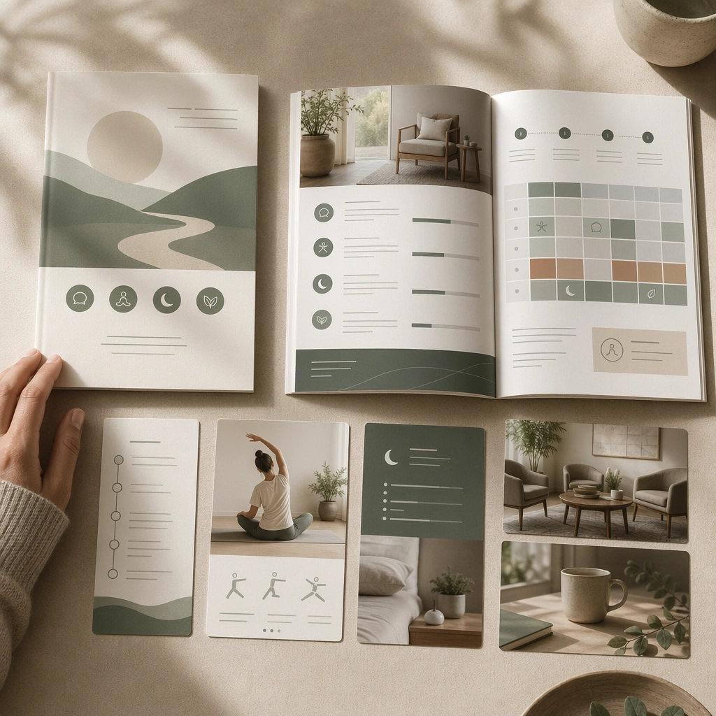
Scene: A square recovery-program brochure mockup for Wellness Retreat and Therapy Campaign Kit. Compose it as a layered print presentation with cover, inside spread, and environmental supporting images. Use a palette of stone white, eucalyptus green, mist gray, warm sand, and muted clay, soft natural light with restorative atmosphere, and a mood of calm, restorative, and emotionally safe. The frame should feel like a real healthcare communication asset art-directed for professional delivery, not a stock photo, speculative concept render, or generic corporate template. Keep the camera distance, negative space, and depth cues disciplined so the image reads immediately even at thumbnail size. Subject: Center on a brochure for a restorative multi-day program combining counseling, gentle movement, sleep support, and quiet environment cues. Show enough surrounding context that the viewer understands the intended service surface, user situation, and institutional setting. Every object, person, diagram, device crop, or spatial cue should support clarity, trust, and practical use. If people appear, keep them anonymous, natural, privacy-safe, and grounded in believable body language rather than promotional posing. Important details: Maintain wellness and therapy communication built from serene spaces, grounded human presence, gentle editorial structure, and service clarity instead of vague luxury-spa imagery. Use hospitality-level polish only in service of reassurance and clarity, never indulgent luxury positioning. Use abstract icon shapes, color blocks, chart bars, interface modules, or non-legible placeholder microcopy whenever information structure is needed, but never readable text. Materials, spacing, lighting, and hierarchy should feel production-ready and healthcare-specific. Avoid generic lifestyle filler, decorative noise, or design gestures that do not reinforce the communication goal. Use case: Wellness Retreat single study 4/9 for a recovery program brochure concept. Constraints: No readable text, no watermark, no logos, preserve exact 1:1 aspect ratio, no pseudo-spiritual cliches, no resort-luxury excess, no influencer posing, no mystical healing props, no five-star resort cues, no medical ward starkness.

Example generated from “Wellness Retreat And Therapy Campaign Kit — Group Wellness Calendar Board”
GPT Image 2en

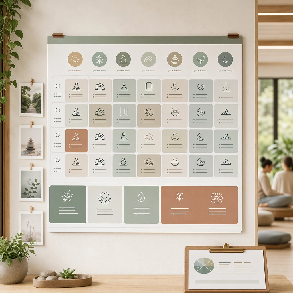
Scene: A square group-program schedule board for Wellness Retreat and Therapy Campaign Kit. Compose it as a modular board of session tiles, place imagery, and rhythm-oriented time blocks. Use a palette of stone white, eucalyptus green, mist gray, warm sand, and muted clay, soft natural light with restorative atmosphere, and a mood of calm, restorative, and emotionally safe. The frame should feel like a real healthcare communication asset art-directed for professional delivery, not a stock photo, speculative concept render, or generic corporate template. Keep the camera distance, negative space, and depth cues disciplined so the image reads immediately even at thumbnail size. Subject: Center on a calm group-wellness offering with recurring classes, therapy circles, journaling sessions, and meal or rest periods represented visually. Show enough surrounding context that the viewer understands the intended service surface, user situation, and institutional setting. Every object, person, diagram, device crop, or spatial cue should support clarity, trust, and practical use. If people appear, keep them anonymous, natural, privacy-safe, and grounded in believable body language rather than promotional posing. Important details: Maintain wellness and therapy communication built from serene spaces, grounded human presence, gentle editorial structure, and service clarity instead of vague luxury-spa imagery. The calendar should feel structured enough to be useful while still holding a restorative emotional tone. Use abstract icon shapes, color blocks, chart bars, interface modules, or non-legible placeholder microcopy whenever information structure is needed, but never readable text. Materials, spacing, lighting, and hierarchy should feel production-ready and healthcare-specific. Avoid generic lifestyle filler, decorative noise, or design gestures that do not reinforce the communication goal. Use case: Wellness Retreat single study 5/9 for a retreat or therapy schedule overview. Constraints: No readable text, no watermark, no logos, preserve exact 1:1 aspect ratio, no pseudo-spiritual cliches, no resort-luxury excess, no influencer posing, no mystical healing props, no readable timetable text, no conference-event vibe.

Example generated from “Wellness Retreat And Therapy Campaign Kit — Sound Therapy Social Tile”
GPT Image 2en

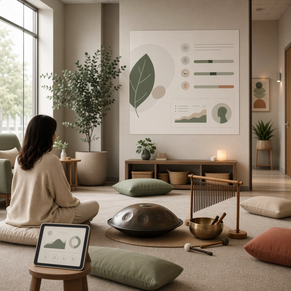
Scene: A square social-ready service tile for Wellness Retreat and Therapy Campaign Kit. Compose it as a polished square tile with one immersive room scene and a few supporting service indicators. Use a palette of stone white, eucalyptus green, mist gray, warm sand, and muted clay, soft natural light with restorative atmosphere, and a mood of calm, restorative, and emotionally safe. The frame should feel like a real healthcare communication asset art-directed for professional delivery, not a stock photo, speculative concept render, or generic corporate template. Keep the camera distance, negative space, and depth cues disciplined so the image reads immediately even at thumbnail size. Subject: Center on a gentle sound-therapy environment using cushions, acoustic instruments, warm neutrals, and low sensory intensity. Show enough surrounding context that the viewer understands the intended service surface, user situation, and institutional setting. Every object, person, diagram, device crop, or spatial cue should support clarity, trust, and practical use. If people appear, keep them anonymous, natural, privacy-safe, and grounded in believable body language rather than promotional posing. Important details: Maintain wellness and therapy communication built from serene spaces, grounded human presence, gentle editorial structure, and service clarity instead of vague luxury-spa imagery. Present the service as quiet professional care, not trend-driven alternative wellness spectacle. Use abstract icon shapes, color blocks, chart bars, interface modules, or non-legible placeholder microcopy whenever information structure is needed, but never readable text. Materials, spacing, lighting, and hierarchy should feel production-ready and healthcare-specific. Avoid generic lifestyle filler, decorative noise, or design gestures that do not reinforce the communication goal. Use case: Wellness Retreat single study 6/9 for a social tile for a sound therapy offering. Constraints: No readable text, no watermark, no logos, preserve exact 1:1 aspect ratio, no pseudo-spiritual cliches, no resort-luxury excess, no influencer posing, no mystical healing props, no psychedelic effects, no festival visuals.

Example generated from “Wellness Retreat And Therapy Campaign Kit — Private Counseling Brand Shot”
GPT Image 2en

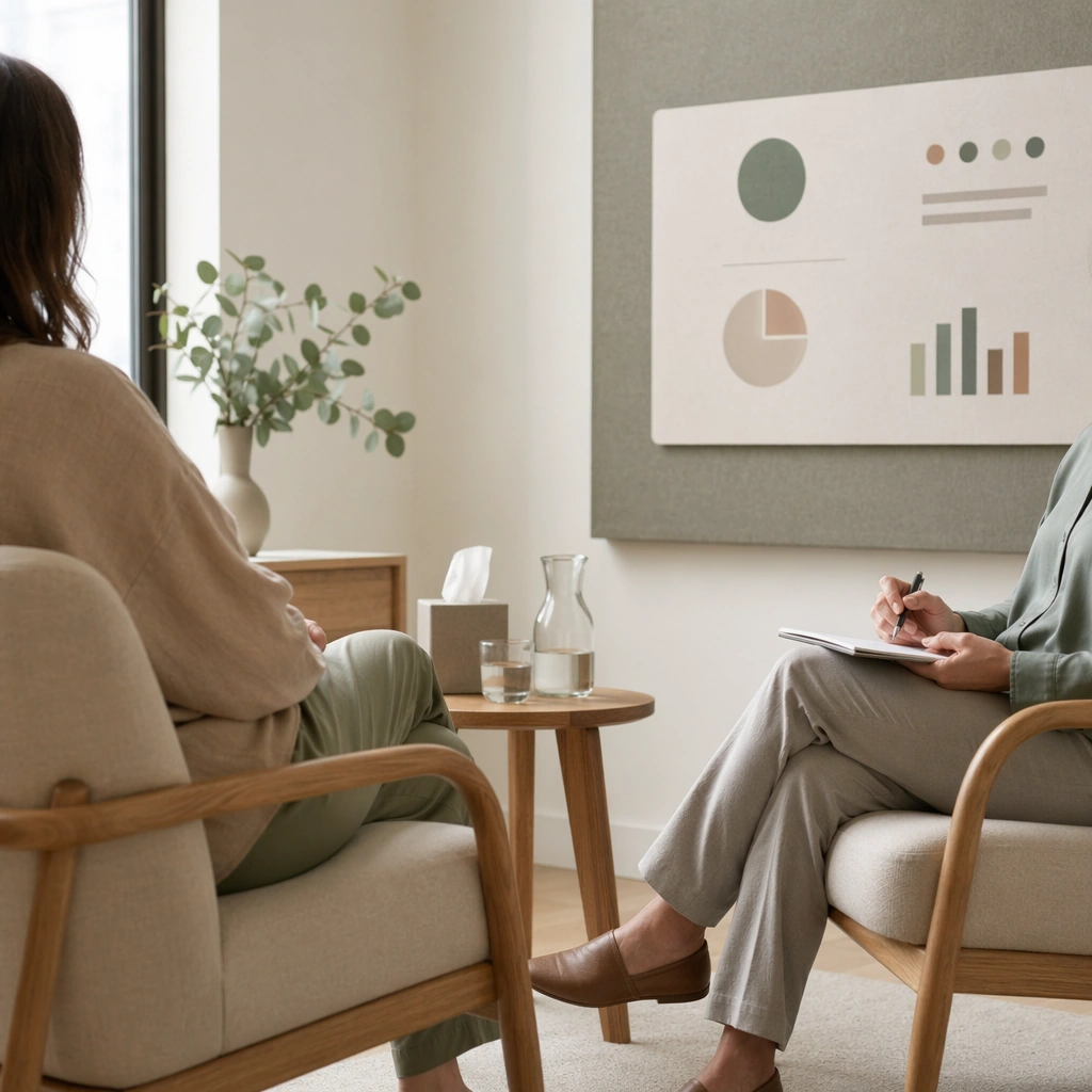
Scene: A square private counseling brand photograph for Wellness Retreat and Therapy Campaign Kit. Compose it as a restrained portrait-in-space image where room design and human posture work together. Use a palette of stone white, eucalyptus green, mist gray, warm sand, and muted clay, soft natural light with restorative atmosphere, and a mood of calm, restorative, and emotionally safe. The frame should feel like a real healthcare communication asset art-directed for professional delivery, not a stock photo, speculative concept render, or generic corporate template. Keep the camera distance, negative space, and depth cues disciplined so the image reads immediately even at thumbnail size. Subject: Center on a therapist and client implied through body language or partial silhouettes inside a calm counseling room with warm materials and soft daylight. Show enough surrounding context that the viewer understands the intended service surface, user situation, and institutional setting. Every object, person, diagram, device crop, or spatial cue should support clarity, trust, and practical use. If people appear, keep them anonymous, natural, privacy-safe, and grounded in believable body language rather than promotional posing. Important details: Maintain wellness and therapy communication built from serene spaces, grounded human presence, gentle editorial structure, and service clarity instead of vague luxury-spa imagery. Keep privacy central by avoiding identifiable faces while still conveying trust, listening, and professional containment. Use abstract icon shapes, color blocks, chart bars, interface modules, or non-legible placeholder microcopy whenever information structure is needed, but never readable text. Materials, spacing, lighting, and hierarchy should feel production-ready and healthcare-specific. Avoid generic lifestyle filler, decorative noise, or design gestures that do not reinforce the communication goal. Use case: Wellness Retreat single study 7/9 for a counseling service brand image. Constraints: No readable text, no watermark, no logos, preserve exact 1:1 aspect ratio, no pseudo-spiritual cliches, no resort-luxury excess, no influencer posing, no mystical healing props, no melodrama, no exploitative emotional display.

Example generated from “Wellness Retreat And Therapy Campaign Kit — Nature Walk Campaign Frame”
GPT Image 2en

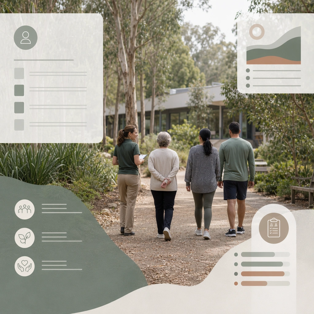
Scene: A square guided nature-walk campaign frame for Wellness Retreat and Therapy Campaign Kit. Compose it as an outdoor wellness image with structured editorial overlays and clear service cues. Use a palette of stone white, eucalyptus green, mist gray, warm sand, and muted clay, soft natural light with restorative atmosphere, and a mood of calm, restorative, and emotionally safe. The frame should feel like a real healthcare communication asset art-directed for professional delivery, not a stock photo, speculative concept render, or generic corporate template. Keep the camera distance, negative space, and depth cues disciplined so the image reads immediately even at thumbnail size. Subject: Center on a small guided walking group or single participant in a quiet natural setting connected to a retreat or therapy program. Show enough surrounding context that the viewer understands the intended service surface, user situation, and institutional setting. Every object, person, diagram, device crop, or spatial cue should support clarity, trust, and practical use. If people appear, keep them anonymous, natural, privacy-safe, and grounded in believable body language rather than promotional posing. Important details: Maintain wellness and therapy communication built from serene spaces, grounded human presence, gentle editorial structure, and service clarity instead of vague luxury-spa imagery. Nature should support recovery and reflection rather than become adventure tourism or wilderness spectacle. Use abstract icon shapes, color blocks, chart bars, interface modules, or non-legible placeholder microcopy whenever information structure is needed, but never readable text. Materials, spacing, lighting, and hierarchy should feel production-ready and healthcare-specific. Avoid generic lifestyle filler, decorative noise, or design gestures that do not reinforce the communication goal. Use case: Wellness Retreat single study 8/9 for a campaign visual for outdoor recovery programming. Constraints: No readable text, no watermark, no logos, preserve exact 1:1 aspect ratio, no pseudo-spiritual cliches, no resort-luxury excess, no influencer posing, no mystical healing props, no travel-ad postcard tone, no extreme landscape grandeur.

Example generated from “Wellness Retreat And Therapy Campaign Kit — Full Campaign Asset Sheet”
GPT Image 2en

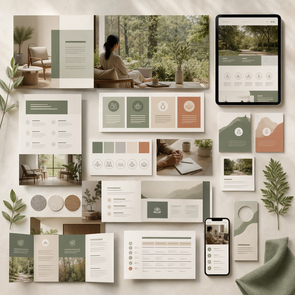
Scene: A square campaign system summary board for Wellness Retreat and Therapy Campaign Kit. Compose it as a final toolkit showing hero images, brochure fragments, service tiles, and environmental photography together. Use a palette of stone white, eucalyptus green, mist gray, warm sand, and muted clay, soft natural light with restorative atmosphere, and a mood of calm, restorative, and emotionally safe. The frame should feel like a real healthcare communication asset art-directed for professional delivery, not a stock photo, speculative concept render, or generic corporate template. Keep the camera distance, negative space, and depth cues disciplined so the image reads immediately even at thumbnail size. Subject: Center on a coherent visual system for retreat and therapy communication spanning web, print, and social surfaces. Show enough surrounding context that the viewer understands the intended service surface, user situation, and institutional setting. Every object, person, diagram, device crop, or spatial cue should support clarity, trust, and practical use. If people appear, keep them anonymous, natural, privacy-safe, and grounded in believable body language rather than promotional posing. Important details: Maintain wellness and therapy communication built from serene spaces, grounded human presence, gentle editorial structure, and service clarity instead of vague luxury-spa imagery. The sheet should demonstrate that calmness, credibility, and commercial usability can coexist across a full campaign kit. Use abstract icon shapes, color blocks, chart bars, interface modules, or non-legible placeholder microcopy whenever information structure is needed, but never readable text. Materials, spacing, lighting, and hierarchy should feel production-ready and healthcare-specific. Avoid generic lifestyle filler, decorative noise, or design gestures that do not reinforce the communication goal. Use case: Wellness Retreat single study 9/9 for a complete wellness campaign system summary. Constraints: No readable text, no watermark, no logos, preserve exact 1:1 aspect ratio, no pseudo-spiritual cliches, no resort-luxury excess, no influencer posing, no mystical healing props, no disconnected lifestyle collage, no mixed luxury and clinical extremes.

Example generated from “Wellness Spa Retreat Interior Language — Arrival Lounge Anchor”
GPT Image 2en

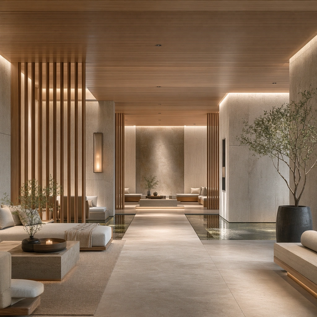
Scene: Create a square architectural reference still for Wellness Spa Retreat Interior Language. Use a wide still of the retreat arrival lounge with water feature and layered seating and treat the frame like a premium interior or architecture editorial photograph with disciplined perspective, readable depth from foreground to background, and enough negative space for the spatial hierarchy to breathe. Light the scene so water, stone, wood, and restorative quiet feel immediate, using pale stone, oat linen, soft oak, warm steam gray, and muted mineral green as the governing tonal range. The composition must read as a high-end commercial image that could sit inside wellness campaigns, resort editorials, treatment-menu visuals, and concept decks. Subject: Show a wellness retreat interior with pale oak slats, honed limestone, still water channels, linen drapery, brushed metal details, and a low-stimulation atmosphere. Center the primary wellness arrival composition, tactile materials, and hushed atmosphere. This is the canonical reference image for the package, so the major proportions, material transitions, fixture families, and circulation logic must feel highly specific and internally coherent rather than generic luxury styling. Let the viewer understand how the space is organized within a single glance, with foreground anchors, a clear middle zone, and a resolved background termination. Important details: Lock the oak-and-stone material pairing, water reflections, linen softness, hidden lighting, and slow, restorative spatial rhythm. Surfaces should feel tactile and believable: stone veining must stay plausible, metals should have disciplined reflectance, fabrics should show natural weight, and concealed lighting should shape the volume instead of flattening it. Use abstract signage, menu, label, or caption zones only as unreadable graphic hints. The image should feel practical for downstream design reviews and polished enough for public-facing campaign use. Use case: Wellness Spa Retreat Interior Language series study 1/9, establishing the canonical retreat identity for the series. Constraints: No readable text, no watermark, no logos, preserve exact 1:1 aspect ratio, no crowded resort guests, no tropical cliché overload, no neon wellness signs, no beauty-product branding, no chaotic reflections, no reception desk clutter.

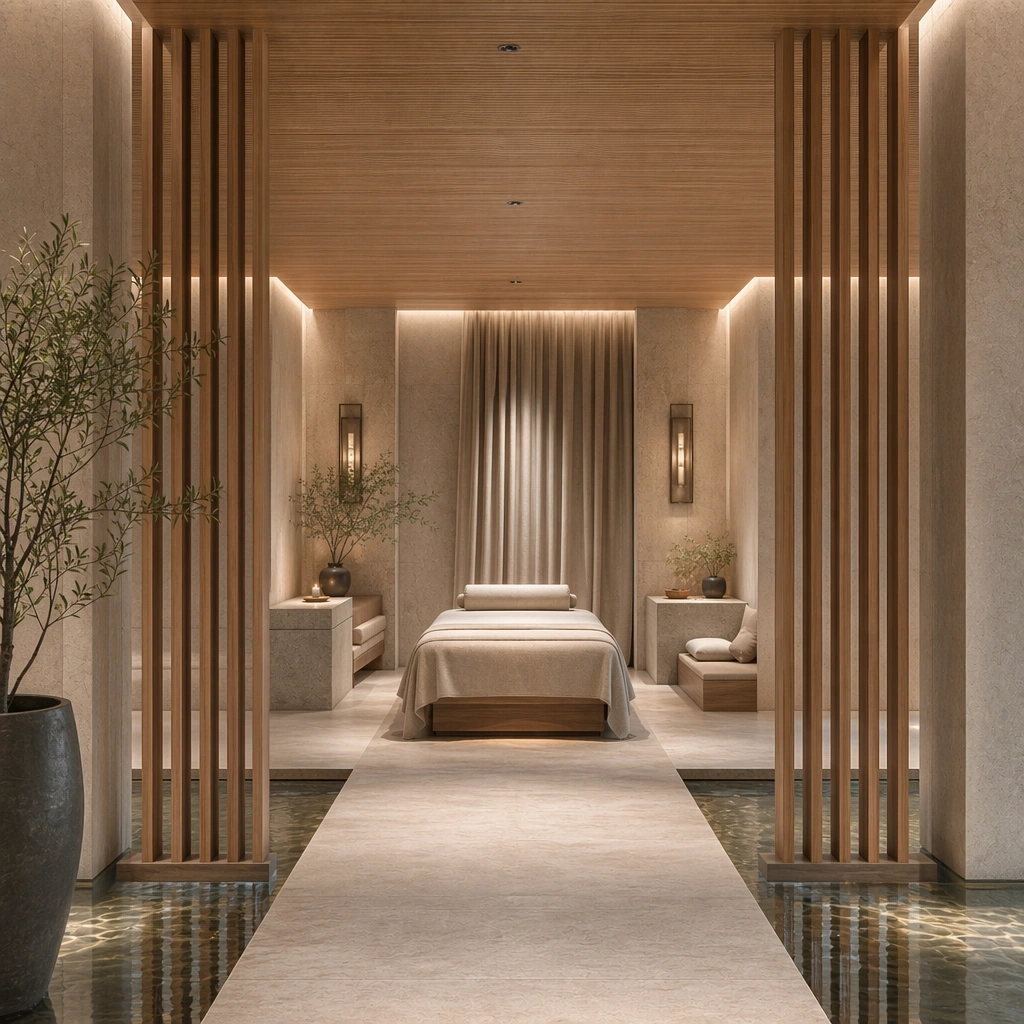
Example generated from “Wellness Spa Retreat Interior Language — Treatment Room Balance”
GPT Image 2en

Scene: Create a square reference-dependent architecture still for Wellness Spa Retreat Interior Language. Use a calm angle from the threshold into a treatment room with bed and side alcoves while keeping the same lens discipline, editorial polish, and material believability established by the reference image. The lighting can shift to support the intended mood, but the space must still feel like the same authored project with a stable viewpoint logic, convincing depth separation, and clean commercial-photography finish. Keep pale stone, oat linen, soft oak, warm steam gray, and muted mineral green as the governing tonal range even when the emphasis changes. Subject: Show a wellness retreat interior with pale oak slats, honed limestone, still water channels, linen drapery, brushed metal details, and a low-stimulation atmosphere. Focus on the exact same retreat language from the reference image, now emphasizing the treatment environment and sensory restraint. Preserve exact architectural identity, plan logic, material palette, fixture family, and circulation cues from the reference image while changing only the intended emphasis described here. The viewer should immediately recognize the same project, not a loose cousin, with matching silhouette logic, aligned detailing, and consistent brand atmosphere. Important details: Preserve the oak-and-stone material pairing, water reflections, linen softness, hidden lighting, and slow, restorative spatial rhythm. Any abstract wayfinding, menu, wall-label, or packaging zones must stay unreadable and subordinate to the spatial image. Joinery, edges, reflections, and lighting should remain realistic enough for an operator or design team to treat the image as a credible reference. The variation should feel deliberate and commercially useful, proving that one locked spatial language can flex across multiple campaign or editorial surfaces. Use case: Wellness Spa Retreat Interior Language series study 2/9, extending private therapy calm while preserving the same retreat identity. Constraints: No readable text, no watermark, no logos, preserve exact 1:1 aspect ratio, preserve exact architectural identity from the reference image, no crowded resort guests, no tropical cliché overload, no neon wellness signs, no beauty-product branding, no chaotic reflections, no people on the bed.

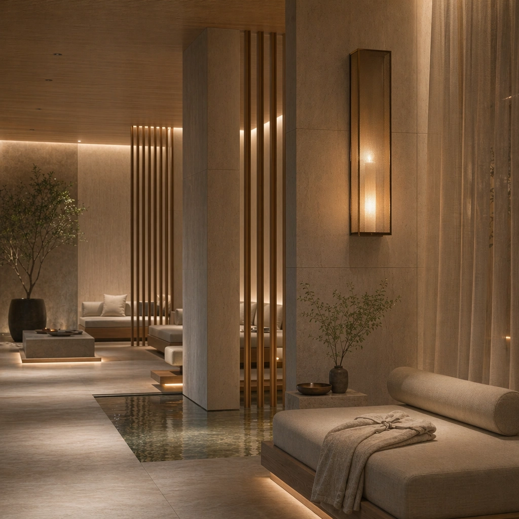
Example generated from “Wellness Spa Retreat Interior Language — Resting Alcove Twilight”
GPT Image 2en

Scene: Create a square reference-dependent architecture still for Wellness Spa Retreat Interior Language. Use a twilight composition focused on a resting alcove beside a soft lantern wall while keeping the same lens discipline, editorial polish, and material believability established by the reference image. The lighting can shift to support the intended mood, but the space must still feel like the same authored project with a stable viewpoint logic, convincing depth separation, and clean commercial-photography finish. Keep pale stone, oat linen, soft oak, warm steam gray, and muted mineral green as the governing tonal range even when the emphasis changes. Subject: Show a wellness retreat interior with pale oak slats, honed limestone, still water channels, linen drapery, brushed metal details, and a low-stimulation atmosphere. Focus on the exact same retreat language from the reference image, now emphasizing evening calm, folded robes, and intimate scale. Preserve exact architectural identity, plan logic, material palette, fixture family, and circulation cues from the reference image while changing only the intended emphasis described here. The viewer should immediately recognize the same project, not a loose cousin, with matching silhouette logic, aligned detailing, and consistent brand atmosphere. Important details: Preserve the oak-and-stone material pairing, water reflections, linen softness, hidden lighting, and slow, restorative spatial rhythm. Any abstract wayfinding, menu, wall-label, or packaging zones must stay unreadable and subordinate to the spatial image. Joinery, edges, reflections, and lighting should remain realistic enough for an operator or design team to treat the image as a credible reference. The variation should feel deliberate and commercially useful, proving that one locked spatial language can flex across multiple campaign or editorial surfaces. Use case: Wellness Spa Retreat Interior Language series study 4/9, extending the post-treatment rest mood within the same identity. Constraints: No readable text, no watermark, no logos, preserve exact 1:1 aspect ratio, preserve exact architectural identity from the reference image, no crowded resort guests, no tropical cliché overload, no neon wellness signs, no beauty-product branding, no chaotic reflections, no candles everywhere.

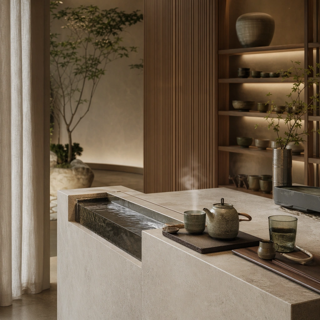
Example generated from “Wellness Spa Retreat Interior Language — Tea Ritual Bar”
GPT Image 2en

Scene: Create a square standalone support study for Wellness Spa Retreat Interior Language. Use a square still of a tea ritual bar with stone basin, ceramics, and quiet shelving and frame it like a premium commercial still or design-editorial crop with clear focal hierarchy, disciplined perspective, and enough breathing room for the materials and objects to read at both thumbnail and full size. Keep pale stone, oat linen, soft oak, warm steam gray, and muted mineral green as the tonal guide so the image still belongs to the same theme family, and light the scene in a controlled way that emphasizes texture, edge quality, and authored atmosphere over spectacle. Subject: Show a wellness retreat interior with pale oak slats, honed limestone, still water channels, linen drapery, brushed metal details, and a low-stimulation atmosphere. In this support study, focus on crafted tea service, mineral textures, and low-stimulus styling. The image should work independently, yet it must still feel like it belongs to the same broader world of Spa Retreat. Make the space, props, and detailing useful for real campaign, editorial, or design-review contexts rather than moodboard abstraction. Important details: Carry forward the broader language of the oak-and-stone material pairing, water reflections, linen softness, hidden lighting, and slow, restorative spatial rhythm, but let this image prove a new support surface or secondary deliverable. Material realism is essential: wood grain, metal sheen, glass edges, textiles, and stone should feel physically plausible and carefully art directed. Any graphic panels, labels, menus, packaging, or captions must stay abstract and unreadable. The overall result should feel reusable for wellness campaigns, resort editorials, treatment-menu visuals, and concept decks, with enough structure that a creative or operations team could build on it. Use case: Wellness Spa Retreat Interior Language single study 5/9, exploring support imagery for wellness hospitality storytelling. Constraints: No readable text, no watermark, no logos, preserve exact 1:1 aspect ratio, no crowded resort guests, no tropical cliché overload, no neon wellness signs, no beauty-product branding, no chaotic reflections, no readable tea packaging.

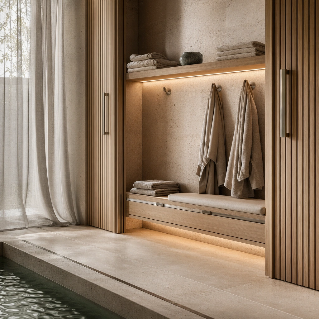
Example generated from “Wellness Spa Retreat Interior Language — Robe Storage Niche”
GPT Image 2en

Scene: Create a square standalone support study for Wellness Spa Retreat Interior Language. Use a robe-storage niche with folded textiles, bench, and concealed lighting and frame it like a premium commercial still or design-editorial crop with clear focal hierarchy, disciplined perspective, and enough breathing room for the materials and objects to read at both thumbnail and full size. Keep pale stone, oat linen, soft oak, warm steam gray, and muted mineral green as the tonal guide so the image still belongs to the same theme family, and light the scene in a controlled way that emphasizes texture, edge quality, and authored atmosphere over spectacle. Subject: Show a wellness retreat interior with pale oak slats, honed limestone, still water channels, linen drapery, brushed metal details, and a low-stimulation atmosphere. In this support study, focus on linen tactility, joinery calm, and spa utility with luxury restraint. The image should work independently, yet it must still feel like it belongs to the same broader world of Spa Retreat. Make the space, props, and detailing useful for real campaign, editorial, or design-review contexts rather than moodboard abstraction. Important details: Carry forward the broader language of the oak-and-stone material pairing, water reflections, linen softness, hidden lighting, and slow, restorative spatial rhythm, but let this image prove a new support surface or secondary deliverable. Material realism is essential: wood grain, metal sheen, glass edges, textiles, and stone should feel physically plausible and carefully art directed. Any graphic panels, labels, menus, packaging, or captions must stay abstract and unreadable. The overall result should feel reusable for wellness campaigns, resort editorials, treatment-menu visuals, and concept decks, with enough structure that a creative or operations team could build on it. Use case: Wellness Spa Retreat Interior Language single study 6/9, exploring support study for retreat amenity planning. Constraints: No readable text, no watermark, no logos, preserve exact 1:1 aspect ratio, no crowded resort guests, no tropical cliché overload, no neon wellness signs, no beauty-product branding, no chaotic reflections, no labeled lockers.

Example generated from “Wellness Spa Retreat Interior Language — Vanity Basin Macro”
GPT Image 2en

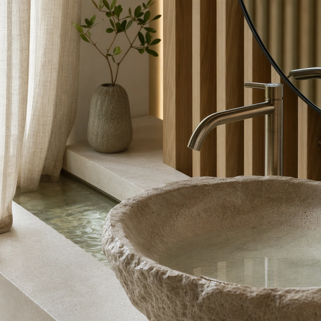
Scene: Create a square standalone support study for Wellness Spa Retreat Interior Language. Use a close macro still of a sculpted stone basin, brushed metal faucet, and mirror edge and frame it like a premium commercial still or design-editorial crop with clear focal hierarchy, disciplined perspective, and enough breathing room for the materials and objects to read at both thumbnail and full size. Keep pale stone, oat linen, soft oak, warm steam gray, and muted mineral green as the tonal guide so the image still belongs to the same theme family, and light the scene in a controlled way that emphasizes texture, edge quality, and authored atmosphere over spectacle. Subject: Show a wellness retreat interior with pale oak slats, honed limestone, still water channels, linen drapery, brushed metal details, and a low-stimulation atmosphere. In this support study, focus on surface detail, water softness, and premium finishing accuracy. The image should work independently, yet it must still feel like it belongs to the same broader world of Spa Retreat. Make the space, props, and detailing useful for real campaign, editorial, or design-review contexts rather than moodboard abstraction. Important details: Carry forward the broader language of the oak-and-stone material pairing, water reflections, linen softness, hidden lighting, and slow, restorative spatial rhythm, but let this image prove a new support surface or secondary deliverable. Material realism is essential: wood grain, metal sheen, glass edges, textiles, and stone should feel physically plausible and carefully art directed. Any graphic panels, labels, menus, packaging, or captions must stay abstract and unreadable. The overall result should feel reusable for wellness campaigns, resort editorials, treatment-menu visuals, and concept decks, with enough structure that a creative or operations team could build on it. Use case: Wellness Spa Retreat Interior Language single study 7/9, exploring detail photography for spa design presentations. Constraints: No readable text, no watermark, no logos, preserve exact 1:1 aspect ratio, no crowded resort guests, no tropical cliché overload, no neon wellness signs, no beauty-product branding, no chaotic reflections, no cosmetic brand labels.

Example generated from “Wellness Spa Retreat Interior Language — Sunken Bath Suite”
GPT Image 2en

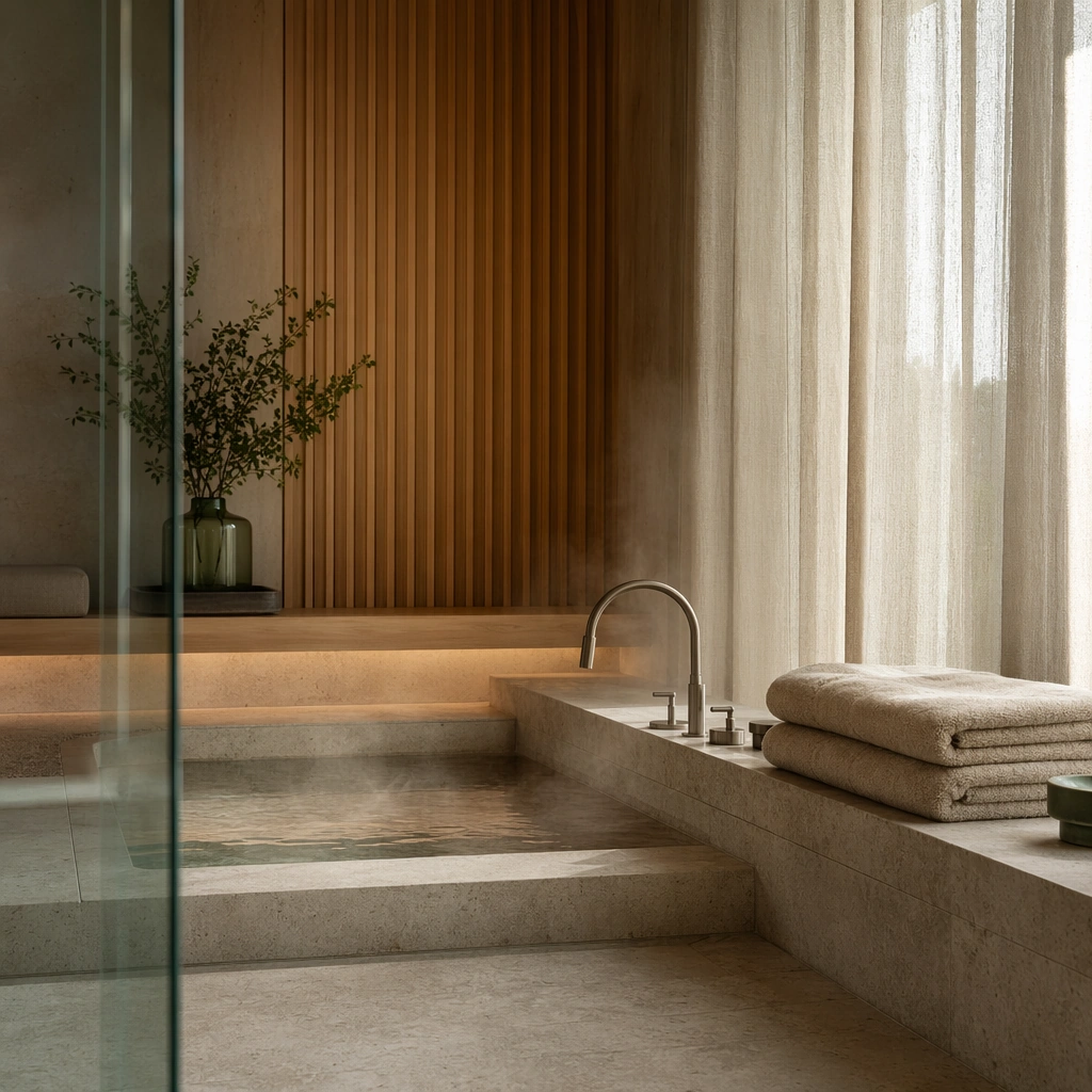
Scene: Create a square standalone support study for Wellness Spa Retreat Interior Language. Use a composed still of a private bath suite with step-down tub and filtered light and frame it like a premium commercial still or design-editorial crop with clear focal hierarchy, disciplined perspective, and enough breathing room for the materials and objects to read at both thumbnail and full size. Keep pale stone, oat linen, soft oak, warm steam gray, and muted mineral green as the tonal guide so the image still belongs to the same theme family, and light the scene in a controlled way that emphasizes texture, edge quality, and authored atmosphere over spectacle. Subject: Show a wellness retreat interior with pale oak slats, honed limestone, still water channels, linen drapery, brushed metal details, and a low-stimulation atmosphere. In this support study, focus on stone edges, mist, towels, and retreat-like intimacy. The image should work independently, yet it must still feel like it belongs to the same broader world of Spa Retreat. Make the space, props, and detailing useful for real campaign, editorial, or design-review contexts rather than moodboard abstraction. Important details: Carry forward the broader language of the oak-and-stone material pairing, water reflections, linen softness, hidden lighting, and slow, restorative spatial rhythm, but let this image prove a new support surface or secondary deliverable. Material realism is essential: wood grain, metal sheen, glass edges, textiles, and stone should feel physically plausible and carefully art directed. Any graphic panels, labels, menus, packaging, or captions must stay abstract and unreadable. The overall result should feel reusable for wellness campaigns, resort editorials, treatment-menu visuals, and concept decks, with enough structure that a creative or operations team could build on it. Use case: Wellness Spa Retreat Interior Language single study 8/9, exploring support image for private wellness accommodations. Constraints: No readable text, no watermark, no logos, preserve exact 1:1 aspect ratio, no crowded resort guests, no tropical cliché overload, no neon wellness signs, no beauty-product branding, no chaotic reflections, no petals or cliché romance props.

Example generated from “Wellness Spa Retreat Interior Language — Material and Scent Board”
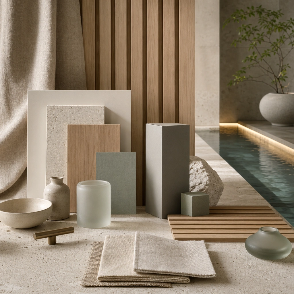
GPT Image 2en

Scene: Create a square standalone support study for Wellness Spa Retreat Interior Language. Use a tabletop board of limestone, oak, woven linen, ceramic vessels, and abstract scent objects and frame it like a premium commercial still or design-editorial crop with clear focal hierarchy, disciplined perspective, and enough breathing room for the materials and objects to read at both thumbnail and full size. Keep pale stone, oat linen, soft oak, warm steam gray, and muted mineral green as the tonal guide so the image still belongs to the same theme family, and light the scene in a controlled way that emphasizes texture, edge quality, and authored atmosphere over spectacle. Subject: Show a wellness retreat interior with pale oak slats, honed limestone, still water channels, linen drapery, brushed metal details, and a low-stimulation atmosphere. In this support study, focus on wellness-brand sensory language arranged like a material review board. The image should work independently, yet it must still feel like it belongs to the same broader world of Spa Retreat. Make the space, props, and detailing useful for real campaign, editorial, or design-review contexts rather than moodboard abstraction. Important details: Carry forward the broader language of the oak-and-stone material pairing, water reflections, linen softness, hidden lighting, and slow, restorative spatial rhythm, but let this image prove a new support surface or secondary deliverable. Material realism is essential: wood grain, metal sheen, glass edges, textiles, and stone should feel physically plausible and carefully art directed. Any graphic panels, labels, menus, packaging, or captions must stay abstract and unreadable. The overall result should feel reusable for wellness campaigns, resort editorials, treatment-menu visuals, and concept decks, with enough structure that a creative or operations team could build on it. Use case: Wellness Spa Retreat Interior Language single study 9/9, exploring support surface for spa concept approvals and brand workshops. Constraints: No readable text, no watermark, no logos, preserve exact 1:1 aspect ratio, no crowded resort guests, no tropical cliché overload, no neon wellness signs, no beauty-product branding, no chaotic reflections, no readable fragrance labels.

Example generated from “Wes Anderson Language — Lobby Clerk”
GPT Image 2en

Scene: A square film-poster composition inside a fictional municipal capsule hotel lobby, photographed straight-on with a perfectly centered vanishing point and no camera tilt. The room is built like a miniature stage set: flat even lighting, powder pink walls, mint green floor tiles, mustard trim, and shallow theatrical depth. The central desk divides the image horizontally, with identical key cubbies, lamps, potted plants, and elevator doors mirrored on both sides. Subject: One young lobby clerk stands exactly on the center axis behind the counter, facing the camera with a calm deadpan expression. The clerk wears a neatly pressed coral uniform, a tiny round cap, white gloves, and polished shoes visible below the counter gap. Around the clerk are symmetrical props: brass bell, stacked envelopes, room keys, a ledger with blank pages, two rotary phones, and two matching suitcases placed like punctuation marks. Important details: This is the reference image for the series visual language. Preserve centered-axis geometry, bilateral symmetry, pastel candy color, flat frontal staging, precise prop alignment, handcrafted set texture, and a quiet cinematic mood. All signs, ledgers, key tags, and wall labels must be blank or abstract blocks, never readable words. The image should feel like a complete fictional movie poster without typography. Use case: Wes Anderson Language series study 1/8, establishing the reference grammar for the institutional fanout. Constraints: No readable text, no watermark, no logos, preserve exact 1:1 aspect ratio, no celebrity likeness, no named film references, no messy asymmetry, no modern glossy corporate lobby, no dramatic shadows, no extra characters.

Example generated from “Wes Anderson Language — Clinic Reception”
GPT Image 2en

Scene: A square frontal view of a tiny neighborhood clinic reception room, built with the same central-axis stage logic as the reference lobby. The camera is locked straight ahead at chest height. Lighting is soft, dry, and even, with no realistic hospital glare. The color palette shifts to seafoam green walls, peach privacy curtains, butter yellow chairs, red-brown linoleum, and cream medical cabinets arranged in mirrored pairs. Subject: The same central clerk from the reference image now works as a clinic receptionist, still standing exactly on the vertical centerline and facing the camera with the same calm deadpan posture. Keep the coral uniform silhouette recognizable but adapt it with a pale clinic apron, small cap, gloves, and a simple name badge shape with no text. Around the clerk are symmetrical clinic props: two identical waiting chairs, twin wall clocks with blank faces, clipboards with empty forms, glass medicine jars, a balanced pair of houseplants, and two closed examination doors. Important details: Use the reference image as the primary guide for identity, posture, composition, prop spacing, flat miniature-set texture, pastel color discipline, and quiet comic timing. The room must clearly read as a clinic without gore, medical distress, or real branding. All charts, forms, labels, clock faces, and badges must be blank graphic shapes. Maintain exact bilateral symmetry except for tiny natural surface imperfections. Use case: Wes Anderson Language series study 2/8, transferring the reference grammar from lobby to clinic reception. Constraints: No readable text, no watermark, no logos, preserve exact 1:1 aspect ratio, no celebrity likeness, no named film references, no real hospital brand, no blood, no emergency scene, no crowded waiting room, no tilted camera.

Example generated from “Wes Anderson Language — Rail Ticket Hall”
GPT Image 2en

Scene: A square, straight-on ticket hall for an imaginary winter rail station during a peak travel season, staged like a handcrafted miniature set. The camera faces the counter head-on, with the centerline running through the clerk, ticket window, ceiling lamp, floor tile seam, and distant platform doorway. Use warm ivory lighting, dusty rose walls, celadon ticket counters, burgundy benches, brass railings, and neat rows of small luggage arranged as mirrored color blocks. Subject: The same central clerk from the reference image stands behind the ticket window, facing the viewer with the same neutral expression and compact posture. The coral uniform remains recognizable, now with a wool scarf and square cap suitable for a rail station. On both sides are paired travelers seen only as simplified seated silhouettes or partial shoulders, symmetrical stacks of parcels tied with string, matching thermos bottles, blank departure boards, and two arched platform doors framing a small train nose in the background. Important details: Use the reference image to preserve the central character identity, flat frontal staging, miniature prop rhythm, pastel discipline, and exact bilateral layout. The scene must evoke mass holiday travel through luggage density, queues, winter coats, and rail architecture, while remaining orderly and graphic rather than chaotic. Departure boards, tickets, parcel labels, and platform signs must contain only abstract bars or blank panels, not readable text. Use case: Wes Anderson Language series study 3/8, transferring the reference grammar into a spring travel rail station scene. Constraints: No readable text, no watermark, no logos, preserve exact 1:1 aspect ratio, no celebrity likeness, no named film references, no real railway branding, no overcrowded chaos, no photoreal news style, no diagonal perspective, no illegible extra signage.

Example generated from “Wes Anderson Language — Launch Control”
GPT Image 2en

Scene: A square frontal launch-control room for a fictional small orbital mission, composed with the same centered-axis grammar as the reference. The camera is perfectly level, facing a central console beneath a circular observation window. The palette is unusual and controlled: pale apricot walls, mint instrument panels, cream consoles, red toggle caps, powder blue window glow, and matte brass handrails. Everything feels like a practical miniature set rather than a glossy science-fiction render. Subject: The same central clerk from the reference image stands at the main console, facing the viewer with the same quiet deadpan expression. Keep the coral uniform identity, now adapted with a short utility jacket, headset shape, and white gloves. Behind the clerk, the observation window frames a tiny rocket on a distant pad, centered exactly above the character's head. On both sides are mirrored analog dials, blank status panels, paired technicians seen as simplified seated figures, two coffee cups, two clipboards, and matching cable loops. Important details: Use the reference image to preserve identity continuity, symmetrical prop choreography, flat frontal lighting, pastel production design, and miniature-world tactility. The scene must read as launch control without using real aerospace logos, readable mission text, or generic blue-black sci-fi atmosphere. All screens and panels should show abstract color blocks, dots, lines, and gauges only. The rocket view must remain centered and small, not explosive or dramatic. Use case: Wes Anderson Language series study 4/8, transferring the reference grammar into a fictional orbital launch room. Constraints: No readable text, no watermark, no logos, preserve exact 1:1 aspect ratio, no celebrity likeness, no named film references, no real space-company branding, no explosion, no dark futuristic interface, no tilted camera, no cluttered unreadable screens.

Example generated from “Wes Anderson Language — Hospital Waiting Room”
GPT Image 2en

Scene: A square frontal poster-like view of a municipal hospital waiting room, composed with severe bilateral symmetry and a centered vertical axis. The camera is level and static, looking directly at a row of pastel chairs and a reception window. Use soft high-key lighting, pale pistachio walls, peach chair cushions, cream floor tiles, oxblood trim, and small brass fixtures. The whole scene should feel like a carefully built miniature interior photographed as a movie still. Subject: At the center sits a single patient in a neat robe, facing the camera with a calm deadpan expression and hands folded over a numbered paper slip that has no readable marks. Around the patient, identical empty chairs extend left and right. Two potted plants, two wall clocks with blank faces, two doors, two coat hooks, and two stacks of magazines create a precise mirrored rhythm. The reception window behind the patient contains an absent nurse station with blank forms and abstract colored tabs. Important details: The challenge is to transfer a recognizable director-like visual language using concrete traits: strict central axis, flat frontal staging, pastel candy palette, miniature-set texture, dry comic stillness, and exact prop choreography. The waiting room must remain believable as a hospital but not grim, chaotic, or clinical-white. Every chart, sign, ticket, magazine, and form must be blank or abstract, with no readable letters or numbers. Use case: Wes Anderson Language single study 5/8, independent transfer into a hospital waiting room. Constraints: No readable text, no watermark, no logos, preserve exact 1:1 aspect ratio, no celebrity likeness, no named film references, no gore, no emergency scene, no real hospital brand, no crowded composition, no dramatic angled perspective.

Example generated from “Wes Anderson Language — Spring Travel Platform”
GPT Image 2en

Scene: A square, straight-on view of a crowded but orderly railway platform during a fictional spring travel rush. The image is composed like a centered stage set: the platform roof, tile grid, bench rows, luggage stacks, and train doors all align to a strict middle axis. Use clear winter daylight, faded teal beams, peach walls, maroon luggage, cream tiles, butter yellow ticket barriers, and soft red lantern shapes with no text. Subject: A family of three stands exactly in the center facing the camera: grandparent, parent, and child arranged in a compact vertical triangle, each holding simple parcels tied with string. On both sides, travelers become balanced repeating groups rather than chaos: matching thermos bottles, checked bags, quilted coats, paper snack boxes, folded blankets, and two train doors behind them. The train is present as a pastel green carriage with blank destination panels and rounded windows. Important details: The visual language must be controlled through geometry and production design: central frontal gaze, bilateral symmetry, deadpan stillness, miniature-like props, pastel color blocking, and carefully repeated luggage motifs. The travel-rush idea should be readable from density, winter clothing, family grouping, platform architecture, and parcels, but the composition must not become documentary clutter. All signage, tickets, train panels, package labels, and lanterns must remain blank or abstract shapes. Use case: Wes Anderson Language single study 6/8, independent transfer into a spring travel railway platform. Constraints: No readable text, no watermark, no logos, preserve exact 1:1 aspect ratio, no celebrity likeness, no named film references, no real railway branding, no unsafe crowd crush, no photojournalistic chaos, no diagonal station perspective, no extra typography.

Example generated from “Wes Anderson Language — Orbital Launch Breakfast”
GPT Image 2en

Scene: A square frontal breakfast room overlooking a fictional orbital launch pad, staged with strict central symmetry. The camera looks across a long cafeteria table toward one round window where a small rocket stands on the horizon, centered like a tabletop ornament. The room is softly lit before dawn, using powder blue shadows, apricot walls, mint tableware, cream uniforms, cherry red switch caps, and warm yellow pastry tones. Subject: At the center of the table sits a mission director eating breakfast alone, facing the camera with a calm, unreadable expression. The director wears a simple cream jumpsuit with a blank patch and a neat headset. On the table, mirrored objects form a ceremonial still life: two boiled eggs, two coffee cups, two folded napkins, two analog countdown clocks with blank faces, two stacks of toast, and two small control panels showing only dots and colored bars. The rocket beyond the window is tiny, vertical, and quiet. Important details: This image should merge launch-control world knowledge with a deadpan pastel film-poster language: central axis, frontal gaze, miniature set design, carefully balanced props, analog equipment, and dry humor from the breakfast ritual before a huge event. The rocket launch must be understood through architecture, consoles, window view, headset, and mission-room details, not through readable labels or corporate branding. Keep the mood gentle, precise, and strangely domestic. Use case: Wes Anderson Language single study 7/8, independent transfer into a fictional orbital launch breakfast scene. Constraints: No readable text, no watermark, no logos, preserve exact 1:1 aspect ratio, no celebrity likeness, no named film references, no real space-company branding, no explosion, no dramatic smoke plume, no dark futuristic control room, no busy unreadable screens.

Example generated from “Wes Anderson Language — Archive Product Shelf”
GPT Image 2en

Scene: A square commercial archive shelf photographed straight-on like a miniature museum display, with perfect bilateral symmetry and flat catalog lighting. The shelf is divided into tidy cubbies painted dusty pink, mint, cream, and mustard. Each cubby contains a product-like object, but the display behaves more like a fictional film prop department than a real store: precise spacing, matte paper textures, tiny shadows, and a centered vertical axis. Subject: At the center stands a small uniformed shop archivist facing the camera from behind a waist-high display counter. Around the archivist are mirrored rows of fictional product packages: sardine tins, perfume boxes, seed packets, biscuit cartons, medicine bottles, matchboxes, and folded hotel towels. Every package has decorative color fields, stripes, borders, stamps, and blank label panels, but no readable text. Two brass desk lamps, two receipt spikes, two small ladders, and two potted plants complete the symmetrical product tableau. Important details: This is a commercial-mockup stress test for visual language transfer without typography: the image must look like a finished branded product shelf while avoiding actual words, logos, or real brands. Preserve central-axis staging, pastel palette, deadpan archivist portrait, handcrafted prop design, tidy grid layout, and subtle paper and tin material differences. The result should feel usable as a campaign visual or gallery poster, not a chaotic collection of packages. Use case: Wes Anderson Language single study 8/8, independent transfer into a commercial archive shelf mockup. Constraints: No readable text, no watermark, no logos, preserve exact 1:1 aspect ratio, no celebrity likeness, no named film references, no real brand packaging, no barcode, no price tag, no cluttered retail aisle, no distorted product grid.

Example generated from “West African Wax Print Fashion System — Reference Anchor”
GPT Image 2en

Scene: Create a square reference image for West African Wax Print Fashion System. Build a reference anchor establishing the core system with a premium, production-ready finish. Use a polished modular board or campaign surface with clean spacing, premium game-UI finish, and clear focal hierarchy. The composition should feel intentional, clean, and reusable for gallery, research, campaign, or internal handoff contexts. Lighting must support readability first, with the main forms clearly separated from the background and enough breathing room for the system to stay legible at both hero scale and thumbnail scale. Subject: Center a coherent original game-art system built for premium production and marketing surfaces. For this image, focus on reference anchor. Keep the same system logic stable across screenshots, cards, banners, and overview boards. This image is the canonical anchor that later series images must follow. The viewer should immediately understand what role this surface plays inside a cohesive game-production asset pack. Important details: Lock framing, icon grammar, palette blocking, and surface hierarchy so the kit feels production-ready and consistent. Preserve the core silhouette, framing language, and material logic from the reference image while each variation changes function. Keep materials believable, edge hierarchy disciplined, and the visual language consistent with Wax Print. Use abstract interface blocks or diagram accents when helpful, but avoid any readable language. The final result should feel like a deliberate production asset rather than a random illustration. Use case: West African Wax Print Fashion System series study 1/9, designed as reference anchor within a cohesive asset pack. Constraints: No readable text, no watermark, no logos, preserve exact 1:1 aspect ratio, no unrelated objects, no broken visual hierarchy, no malformed anatomy or broken perspective, no random decorative clutter.

Example generated from “West African Wax Print Fashion System — Variant One”
GPT Image 2en

Scene: Create a square dependent image for West African Wax Print Fashion System. Build a first controlled variation in the same system with a premium, production-ready finish. Use a polished modular board or campaign surface with clean spacing, premium game-UI finish, and clear focal hierarchy. The composition should feel intentional, clean, and reusable for gallery, research, campaign, or internal handoff contexts. Lighting must support readability first, with the main forms clearly separated from the background and enough breathing room for the system to stay legible at both hero scale and thumbnail scale. Subject: Center a coherent original game-art system built for premium production and marketing surfaces. For this image, focus on the intended support surface. Keep the same system logic stable across screenshots, cards, banners, and overview boards. Preserve exact identity or system logic from the reference image while changing only the intended variation axis. The viewer should immediately understand what role this surface plays inside a cohesive game-production asset pack. Important details: Lock framing, icon grammar, palette blocking, and surface hierarchy so the kit feels production-ready and consistent. Preserve the core silhouette, framing language, and material logic from the reference image while each variation changes function. Keep materials believable, edge hierarchy disciplined, and the visual language consistent with Wax Print. Use abstract interface blocks or diagram accents when helpful, but avoid any readable language. The final result should feel like a deliberate production asset rather than a random illustration. Use case: West African Wax Print Fashion System series study 2/9, designed as variant one within a cohesive asset pack. Constraints: No readable text, no watermark, no logos, preserve exact 1:1 aspect ratio, no unrelated objects, no broken visual hierarchy, no malformed anatomy or broken perspective, no random decorative clutter.

Example generated from “West African Wax Print Fashion System — Variant Two”
GPT Image 2en

Scene: Create a square dependent image for West African Wax Print Fashion System. Build a second controlled variation in the same system with a premium, production-ready finish. Use a polished modular board or campaign surface with clean spacing, premium game-UI finish, and clear focal hierarchy. The composition should feel intentional, clean, and reusable for gallery, research, campaign, or internal handoff contexts. Lighting must support readability first, with the main forms clearly separated from the background and enough breathing room for the system to stay legible at both hero scale and thumbnail scale. Subject: Center a coherent original game-art system built for premium production and marketing surfaces. For this image, focus on the intended support surface. Keep the same system logic stable across screenshots, cards, banners, and overview boards. Preserve exact identity or system logic from the reference image while changing only the intended variation axis. The viewer should immediately understand what role this surface plays inside a cohesive game-production asset pack. Important details: Lock framing, icon grammar, palette blocking, and surface hierarchy so the kit feels production-ready and consistent. Preserve the core silhouette, framing language, and material logic from the reference image while each variation changes function. Keep materials believable, edge hierarchy disciplined, and the visual language consistent with Wax Print. Use abstract interface blocks or diagram accents when helpful, but avoid any readable language. The final result should feel like a deliberate production asset rather than a random illustration. Use case: West African Wax Print Fashion System series study 3/9, designed as variant two within a cohesive asset pack. Constraints: No readable text, no watermark, no logos, preserve exact 1:1 aspect ratio, no unrelated objects, no broken visual hierarchy, no malformed anatomy or broken perspective, no random decorative clutter.

Example generated from “West African Wax Print Fashion System — Variant Three”
GPT Image 2en

Scene: Create a square dependent image for West African Wax Print Fashion System. Build a third controlled variation in the same system with a premium, production-ready finish. Use a polished modular board or campaign surface with clean spacing, premium game-UI finish, and clear focal hierarchy. The composition should feel intentional, clean, and reusable for gallery, research, campaign, or internal handoff contexts. Lighting must support readability first, with the main forms clearly separated from the background and enough breathing room for the system to stay legible at both hero scale and thumbnail scale. Subject: Center a coherent original game-art system built for premium production and marketing surfaces. For this image, focus on the intended support surface. Keep the same system logic stable across screenshots, cards, banners, and overview boards. Preserve exact identity or system logic from the reference image while changing only the intended variation axis. The viewer should immediately understand what role this surface plays inside a cohesive game-production asset pack. Important details: Lock framing, icon grammar, palette blocking, and surface hierarchy so the kit feels production-ready and consistent. Preserve the core silhouette, framing language, and material logic from the reference image while each variation changes function. Keep materials believable, edge hierarchy disciplined, and the visual language consistent with Wax Print. Use abstract interface blocks or diagram accents when helpful, but avoid any readable language. The final result should feel like a deliberate production asset rather than a random illustration. Use case: West African Wax Print Fashion System series study 4/9, designed as variant three within a cohesive asset pack. Constraints: No readable text, no watermark, no logos, preserve exact 1:1 aspect ratio, no unrelated objects, no broken visual hierarchy, no malformed anatomy or broken perspective, no random decorative clutter.

Example generated from “West African Wax Print Fashion System — Support One”
GPT Image 2en

Scene: Create a square standalone support image for West African Wax Print Fashion System. Build a support-surface study with a clear focal hierarchy and a finished professional surface. Use a polished modular board or campaign surface with clean spacing, premium game-UI finish, and clear focal hierarchy. The frame should feel self-contained and polished, with enough structure to explain the system even without the reference series, yet still obviously belonging to the same theme and production world. Subject: Show a coherent original game-art system built for premium production and marketing surfaces in a way that emphasizes the intended support surface. Keep the same system logic stable across screenshots, cards, banners, and overview boards. Even though this image is independent, the viewer should still recognize the same universe, same commercial logic, and same production intent as the core package. Important details: Lock framing, icon grammar, palette blocking, and surface hierarchy so the kit feels production-ready and consistent. Preserve the broader theme language through color, framing, material choices, and modular composition. Use clean panel rhythm, premium asset presentation, and believable detail density. The image should work equally well as a gallery study, research reference, and mock production deliverable. Use case: West African Wax Print Fashion System single study 5/9, exploring support one as a support surface. Constraints: No readable text, no watermark, no logos, preserve exact 1:1 aspect ratio, no unrelated objects, no broken visual hierarchy, no visual noise that obscures the main surface, no accidental brand resemblance.

Example generated from “West African Wax Print Fashion System — Support Two”
GPT Image 2en

Scene: Create a square standalone support image for West African Wax Print Fashion System. Build a second support-surface study with a clear focal hierarchy and a finished professional surface. Use a polished modular board or campaign surface with clean spacing, premium game-UI finish, and clear focal hierarchy. The frame should feel self-contained and polished, with enough structure to explain the system even without the reference series, yet still obviously belonging to the same theme and production world. Subject: Show a coherent original game-art system built for premium production and marketing surfaces in a way that emphasizes the intended support surface. Keep the same system logic stable across screenshots, cards, banners, and overview boards. Even though this image is independent, the viewer should still recognize the same universe, same commercial logic, and same production intent as the core package. Important details: Lock framing, icon grammar, palette blocking, and surface hierarchy so the kit feels production-ready and consistent. Preserve the broader theme language through color, framing, material choices, and modular composition. Use clean panel rhythm, premium asset presentation, and believable detail density. The image should work equally well as a gallery study, research reference, and mock production deliverable. Use case: West African Wax Print Fashion System single study 6/9, exploring support two as a support surface. Constraints: No readable text, no watermark, no logos, preserve exact 1:1 aspect ratio, no unrelated objects, no broken visual hierarchy, no visual noise that obscures the main surface, no accidental brand resemblance.