PROMPTS · KREATIV ENTDECKEN

Prompt-Galerie

Echte Prompts und erzeugte Beispiele erkunden. Inspiration für Ihre nächste kreative Mission finden und den vollständigen Prompt kostenlos kopieren.

Beispiele
6,699
Modelle
9
Quellen
67
6.699 Prompt-Beispiele · Seite 15 von 140
Example generated from “Polar Survey Suit and Equipment Board — ChaosRealmsAI · MIT”
GPT Image 2en

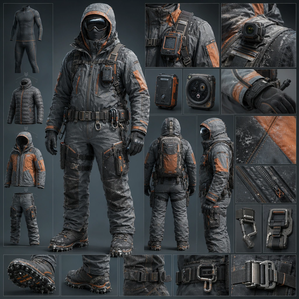
Scene: Design a square equipment concept board for one wearable product family or suit configuration, keeping silhouette clarity and material realism at the center. The board may use a full-body subject, cropped details, or organized accessories as long as the system stays legible. Compose a square board with one full-body cold-weather suit, thermal layering details, sensor modules, and anti-slip boot close-ups. Subject: Show a complete gear identity with clear task cues such as rescue, survey, reef work, cargo handling, agriculture, or courier transit. The suit should feel worn and usable, not merely styled. The system should feel built for prolonged field work through insulation, weather sealing, and instrument access. Important details: Favor seam logic, hardware placement, and believable material transitions over surface decoration. Each image should feel like part of a wider product ecosystem even when it stands alone. Use restrained color and realistic bulk so the rig feels professional and ergonomic. Preserve ergonomic realism so weight, protection, mobility, and access all make sense on the body. Use case: Suitline System single study 1/5, designed as a self-contained support image for this topic. Constraints: No readable text, no watermark, no logos, preserve exact 1:1 aspect ratio, no cosplay costume styling, no giant weapons, no fashion runway theatrics, no real-world brand marks, no expedition costume nostalgia.
Example generated from “Urban Micro-Mobility Concept Lineup — ChaosRealmsAI · MIT”
GPT Image 2en

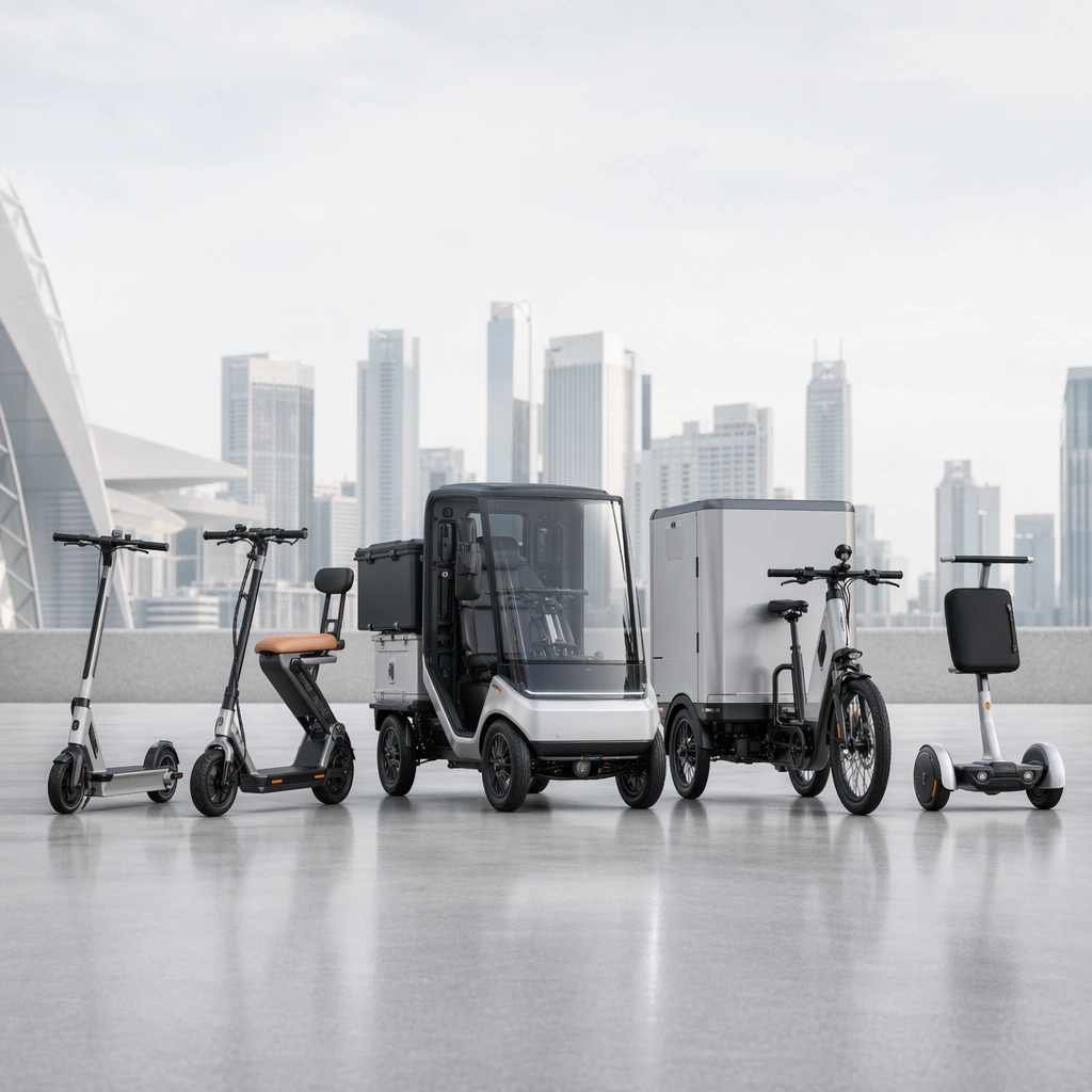
Scene: A square lineup shot with a white-gray city backdrop, precision product lighting, and even spacing across multiple design proposals. Compose the frame as a square key visual with disciplined camera placement, premium lighting control, and believable real-world scale. The tonal range should feel polished and intentional, with enough atmosphere to create depth without obscuring form. Keep contrast calibrated for launch, catalog, or research presentation use rather than casual snapshot aesthetics. Subject: Center several original micro-mobility devices arranged as one family of coherent industrial design concepts. Make the subject feel original, production-aware, and clearly grounded in Future Mobility Concept Surface Set. Treat this as an independent study that must feel complete and coherent without relying on any external reference image. The focal hierarchy should be immediate: primary form first, then material behavior, then supporting environmental cues that clarify use context and difficulty. Important details: Focus on believable packaging, wheel geometry, rider scale, and urban utility. The lineup should feel like a credible design portfolio rather than a toy collection. The visual language should still feel native to Future Mobility Concept Surface Set, using disciplined industrial or campaign composition instead of generic stock photography. Use believable materials, engineering logic, and professional composition discipline. Reflections, shadows, edge breaks, texture scale, interface density, and small physical joints must all support realism. Avoid filler props, vague mood-board clutter, or any element that weakens the sense of a purpose-built industrial or automotive image. Use case: Mobility Concept single study 5/9 for Future Mobility Concept Surface Set, built as image support-one. Constraints: No readable text, no watermark, no logos, preserve exact 1:1 aspect ratio, no readable text, no logos, no cyberpunk clutter, no impossible mechanics, no fantasy weaponry, no dystopian grime.

Example generated from “Gallery Plinth and Spotlight Study — ChaosRealmsAI · MIT”
GPT Image 2en

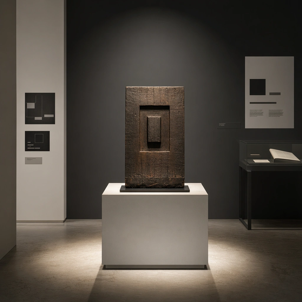
Scene: Create a square standalone support study for Gallery Exhibition Spatial Sequence. Use a front-on plinth composition under a tight spotlight pool and frame it like a premium commercial still or design-editorial crop with clear focal hierarchy, disciplined perspective, and enough breathing room for the materials and objects to read at both thumbnail and full size. Keep chalk white, charcoal gray, pale concrete, soft shadow black, and controlled spotlight warmth as the tonal guide so the image still belongs to the same theme family, and light the scene in a controlled way that emphasizes texture, edge quality, and authored atmosphere over spectacle. Subject: Show a gallery and exhibition environment with disciplined white and charcoal volumes, precise spotlighting, plinths, archival display furniture, abstract wall-label zones, and carefully paced emptiness. In this support study, focus on shadow edge precision, pedestal proportion, and artwork breathing room. The image should work independently, yet it must still feel like it belongs to the same broader world of Gallery Sequence. Make the space, props, and detailing useful for real campaign, editorial, or design-review contexts rather than moodboard abstraction. Important details: Carry forward the broader language of the wall-label rhythm, plinth geometry, spotlight language, floor material, and slow exhibition pacing, but let this image prove a new support surface or secondary deliverable. Material realism is essential: wood grain, metal sheen, glass edges, textiles, and stone should feel physically plausible and carefully art directed. Any graphic panels, labels, menus, packaging, or captions must stay abstract and unreadable. The overall result should feel reusable for museum campaigns, exhibition proposals, cultural editorials, and spatial storytelling decks, with enough structure that a creative or operations team could build on it. Use case: Gallery Exhibition Spatial Sequence single study 5/9, exploring support still for display-furniture and lighting reviews. Constraints: No readable text, no watermark, no logos, preserve exact 1:1 aspect ratio, no crowds, no readable wall text, no security barriers, no colorful trade-show clutter, no random gifts-shop products, no readable labels.

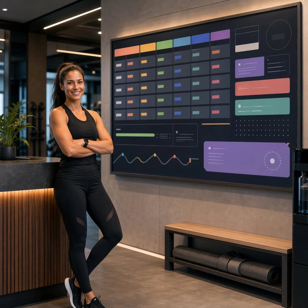
Example generated from “Gym Reception Schedule Board Concept — ChaosRealmsAI · MIT”
GPT Image 2en

Scene: Create a square class schedule board for Gym Brand, using gym-brand communication with clean architecture, membership-friendly structure, and premium local-acquisition polish. The composition should read as a practical, production-ready sports or fitness surface with a clear hierarchy, premium lighting, and obvious commercial intent. Keep the environment specific enough to feel real, but leave enough control in the layout for non-readable information modules, campaign blocks, or visualized metrics. Aim for a finish that works for a brand, club, app, academy, or event operator. Subject: Build the image around trainer near reception or class corridor. The subject should be original, believable, and free of any real-brand or celebrity cues. Use realistic apparel, safe body mechanics when movement is visible, and environmental props that support the category without clutter. The subject must stay visually dominant so the design still works as a communication asset rather than a pure scene study. Important details: The mood should read as organized accessibility. Treat layout, light, and supporting graphic structure as part of one polished delivery surface. Any schedule blocks, metric panels, quote zones, badges, or path diagrams must stay abstract and non-readable. Prioritize usefulness, clarity, and category truth over spectacle. The image should feel distinct from the series package while still belonging naturally to the same topic and business use case. Use case: Gym Brand single study 5/9, an independent rollout surface for the topic. Constraints: No readable text, no watermark, no logos, preserve exact 1:1 aspect ratio, no brand marks, no public-figure resemblance, no generic stock layout, no cluttered UI imitation, no accidental copyrighted insignia.
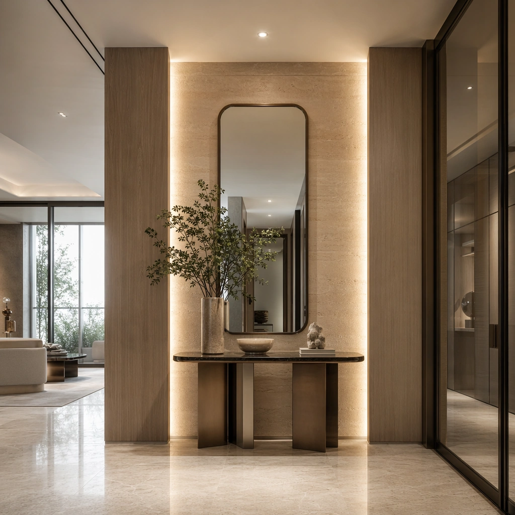
Example generated from “Residential Foyer Console and Mirror — ChaosRealmsAI · MIT”
GPT Image 2en

Scene: Create a square standalone support study for High-End Residential Showflat System. Use a front-on foyer study with console, mirror, lighting niche, and stone wall and frame it like a premium commercial still or design-editorial crop with clear focal hierarchy, disciplined perspective, and enough breathing room for the materials and objects to read at both thumbnail and full size. Keep pale oak, soft taupe, creamy travertine, smoke gray glass, and gentle daylight silver as the tonal guide so the image still belongs to the same theme family, and light the scene in a controlled way that emphasizes texture, edge quality, and authored atmosphere over spectacle. Subject: Show a high-end residential showflat with full-height glazing, pale oak wall panels, creamy stone flooring, sculptural furniture, restrained art objects, and polished property-marketing clarity. In this support study, focus on arrival styling, mirror proportion, and subtle property-luxury cues. The image should work independently, yet it must still feel like it belongs to the same broader world of Showflat System. Make the space, props, and detailing useful for real campaign, editorial, or design-review contexts rather than moodboard abstraction. Important details: Carry forward the broader language of the glazing rhythm, oak panel detailing, stone floor tone, furniture silhouettes, softly styled decor, and real-estate presentation polish, but let this image prove a new support surface or secondary deliverable. Material realism is essential: wood grain, metal sheen, glass edges, textiles, and stone should feel physically plausible and carefully art directed. Any graphic panels, labels, menus, packaging, or captions must stay abstract and unreadable. The overall result should feel reusable for property launches, brochure stills, sales-gallery walls, and premium listing presentations, with enough structure that a creative or operations team could build on it. Use case: High-End Residential Showflat System single study 5/9, exploring entry vignette for real-estate editorial use. Constraints: No readable text, no watermark, no logos, preserve exact 1:1 aspect ratio, no family photos, no clutter, no toy-like decor, no messy cables, no cheap staging tricks, no house keys with logos.

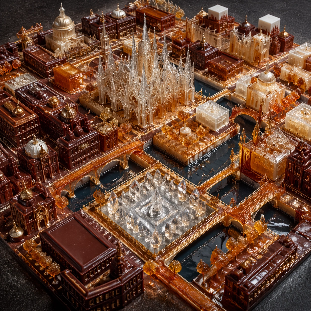
Example generated from “Edible Sugar and Chocolate City Masterplan — ChaosRealmsAI · MIT”
GPT Image 2en

Scene: Create a square architectural photograph of an edible miniature city built from sugar and chocolate, lit like a serious built-environment hero shot rather than a whimsical craft display. The composition should imply scale through streets, openings, and tiny pathways while keeping the material identity unmistakably confectionary. Light must reveal translucency, lacework, caramel tension, and crystal sparkle without flattening the forms. Create a square aerial photograph looking down over an edible city on a dark neutral base, lit like a professional architecture model rather than a dessert table. Distinct districts should be readable through massing, color temperature, and material family. Subject: Show cathedrals of sugar, caramel bridge corridors, chocolate hotel blocks, and crystalline plazas all connected by precise street grids and water channels. The layout should feel intentional enough to function as a masterplan, with different edible materials assigned to specific urban roles. The city must remain confectionary in material detail while reading clearly as urban form. Important details: Treat the city as structurally plausible even when the materials are fantastical. Blown sugar should refract like fragile glass, pulled caramel should show tension and stretch, and dark chocolate should carry matte-to-satin variation where appropriate. The image should balance wonder with discipline, as if photographed for an architecture journal about impossible edible construction. Prioritize zoning clarity, street hierarchy, and believable transitions between material districts. The image should feel like an atlas plate for an impossible edible metropolis, not a random candy pile seen from above. Use case: Candy architecture single study 5/9, documenting the edible city as a coherent aerial masterplan. Constraints: No readable text, no watermark, no logos, preserve exact 1:1 aspect ratio, no candy wrappers, no toy-town props, no gingerbread-house cliches, no cartoon palette overload, no readable signage, no board-game tokens, no paper labels, no rainbow chaos.

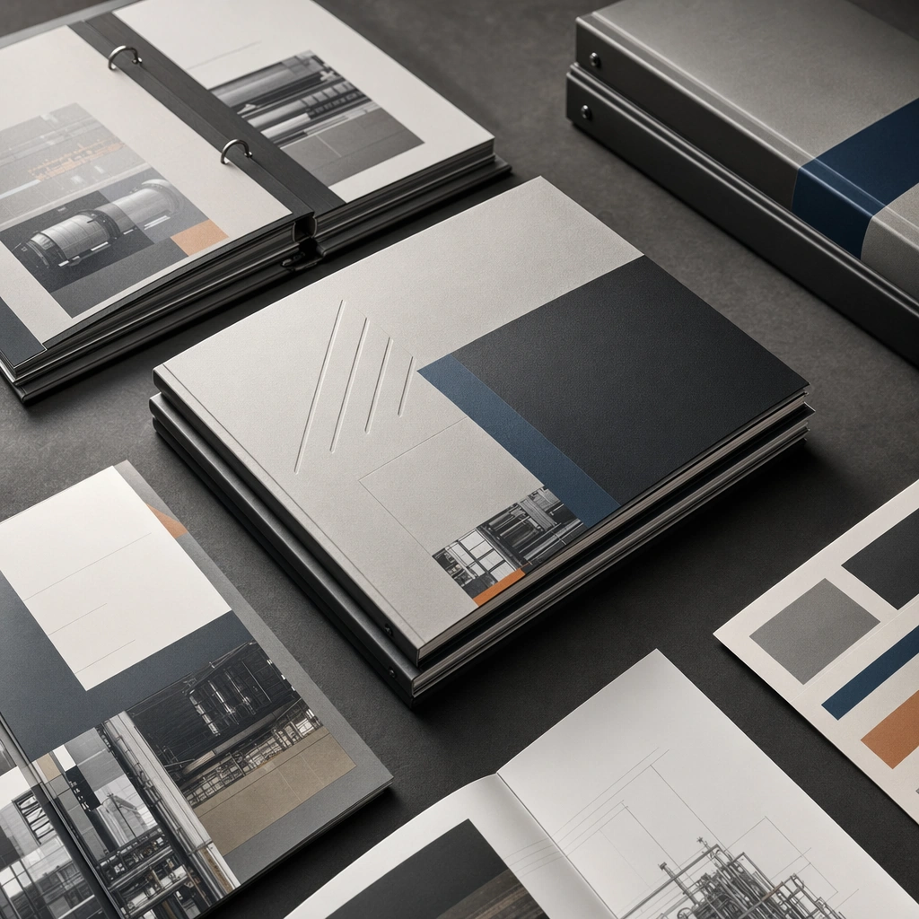
Example generated from “Industrial Catalog Binder Cover Stack — ChaosRealmsAI · MIT”
GPT Image 2en

Scene: A square tabletop mockup with stacked binders, soft daylight, and refined paper texture across multiple printed objects. Compose the frame as a square key visual with disciplined camera placement, premium lighting control, and believable real-world scale. The tonal range should feel polished and intentional, with enough atmosphere to create depth without obscuring form. Keep contrast calibrated for launch, catalog, or research presentation use rather than casual snapshot aesthetics. Subject: Center original industrial catalog covers represented as non-readable abstract editorial surfaces. Make the subject feel original, production-aware, and clearly grounded in Industrial Catalog Cover and Spread System. Treat this as an independent study that must feel complete and coherent without relying on any external reference image. The focal hierarchy should be immediate: primary form first, then material behavior, then supporting environmental cues that clarify use context and difficulty. Important details: Sell material quality, print finish, and presentation polish. The image should feel like a real industrial sales kit prepared for a client meeting. The visual language should still feel native to Industrial Catalog Cover and Spread System, using disciplined industrial or campaign composition instead of generic stock photography. Use believable materials, engineering logic, and professional composition discipline. Reflections, shadows, edge breaks, texture scale, interface density, and small physical joints must all support realism. Avoid filler props, vague mood-board clutter, or any element that weakens the sense of a purpose-built industrial or automotive image. Use case: Catalog System single study 5/9 for Industrial Catalog Cover and Spread System, built as image support-one. Constraints: No readable text, no watermark, no logos, preserve exact 1:1 aspect ratio, no readable text, no logos, no lorem ipsum, no random office clutter, no unrelated consumer props, no fake brand marks.

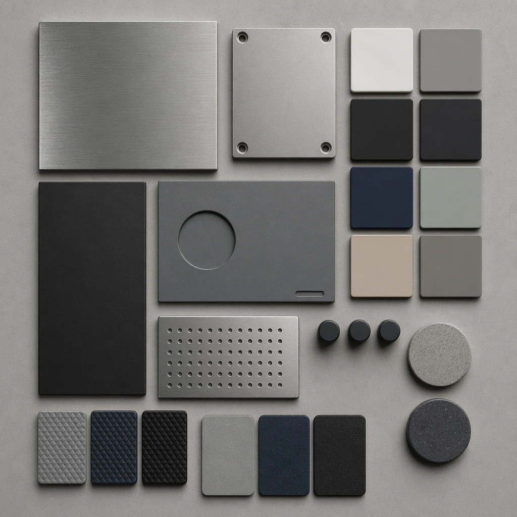
Example generated from “Industrial CMF Material Swatch Array — ChaosRealmsAI · MIT”
GPT Image 2en

Scene: A square top-down CMF board with neat spacing, soft edge shadows, and neutral daylight-balanced illumination. Compose the frame as a square key visual with disciplined camera placement, premium lighting control, and believable real-world scale. The tonal range should feel polished and intentional, with enough atmosphere to create depth without obscuring form. Keep contrast calibrated for launch, catalog, or research presentation use rather than casual snapshot aesthetics. Subject: Center original material chips for anodized metal, matte polymer, rubber, and ceramic coating organized with industrial precision. Make the subject feel original, production-aware, and clearly grounded in Industrial Material Finish Study Board. Treat this as an independent study that must feel complete and coherent without relying on any external reference image. The focal hierarchy should be immediate: primary form first, then material behavior, then supporting environmental cues that clarify use context and difficulty. Important details: Stress sample precision and product relevance instead of decorative craft mood. The board should feel native to an industrial design studio. The visual language should still feel native to Industrial Material Finish Study Board, using disciplined industrial or campaign composition instead of generic stock photography. Use believable materials, engineering logic, and professional composition discipline. Reflections, shadows, edge breaks, texture scale, interface density, and small physical joints must all support realism. Avoid filler props, vague mood-board clutter, or any element that weakens the sense of a purpose-built industrial or automotive image. Use case: Material Study single study 5/9 for Industrial Material Finish Study Board, built as image support-one. Constraints: No readable text, no watermark, no logos, preserve exact 1:1 aspect ratio, no readable labels, no logos, no decorative lifestyle props, no fantasy texture, no chaotic palettes, no distressed damage.

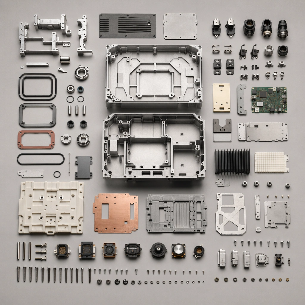
Example generated from “Industrial Device Parts Kit Flatlay — ChaosRealmsAI · MIT”
GPT Image 2en

Scene: A square top-down workbench board with neutral ground, soft precision light, and crisp part spacing. Compose the frame as a square key visual with disciplined camera placement, premium lighting control, and believable real-world scale. The tonal range should feel polished and intentional, with enough atmosphere to create depth without obscuring form. Keep contrast calibrated for launch, catalog, or research presentation use rather than casual snapshot aesthetics. Subject: Center original industrial-device components grouped by system, material, and size with highly controlled organization. Make the subject feel original, production-aware, and clearly grounded in Industrial Product Exploded View Suite. Treat this as an independent study that must feel complete and coherent without relying on any external reference image. The focal hierarchy should be immediate: primary form first, then material behavior, then supporting environmental cues that clarify use context and difficulty. Important details: Use clean spacing and believable engineering categories without readable part numbers. The board should feel fit for catalog or teardown communication. The visual language should still feel native to Industrial Product Exploded View Suite, using disciplined industrial or campaign composition instead of generic stock photography. Use believable materials, engineering logic, and professional composition discipline. Reflections, shadows, edge breaks, texture scale, interface density, and small physical joints must all support realism. Avoid filler props, vague mood-board clutter, or any element that weakens the sense of a purpose-built industrial or automotive image. Use case: Exploded Views single study 5/9 for Industrial Product Exploded View Suite, built as image support-one. Constraints: No readable text, no watermark, no logos, preserve exact 1:1 aspect ratio, no readable labels, no logos, no fantasy glowing cores, no chaotic wire nests, no meaningless arrows, no decorative clutter.

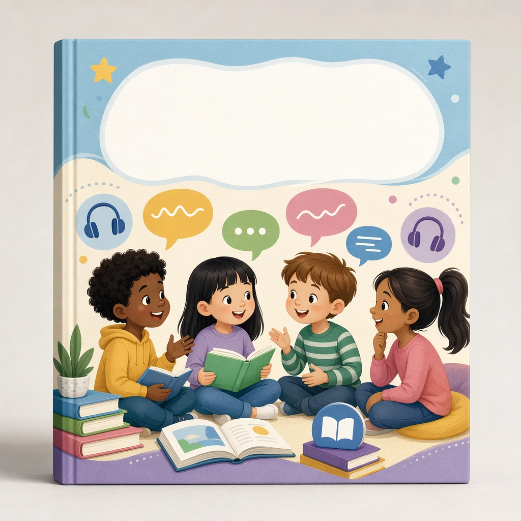
Example generated from “Language Club Course Cover Mockup — ChaosRealmsAI · MIT”
GPT Image 2en

Scene: Create a square single-cover mockup against a soft studio backdrop with crisp print texture and clean shelf-lighting logic. The asset should feel like an ecommerce-ready course tile for a language club or reading program. Keep the square frame balanced, calm, and production-ready so the asset can serve gallery review, research comparison, and real educational delivery at the same time. Subject: Use friendly speech bubbles, books, listening icons, and conversation scenes inside a disciplined course-cover frame with blank title space. The cover should feel inviting, educational, and easy to classify within a larger catalog. The subject arrangement should feel complete and self-contained, able to stand alone as a real supporting deliverable inside the same education business line. Important details: Keep the structure highly intentional, with strong hierarchy and clear modularity. The goal is a believable product-shelf asset, not a generic poster. Keep the visual hierarchy modular, commercially believable, and clearly tied to a real educational use case rather than a generic mood board. Use case: Kids Course Cover and Module Family single study 1/5, language club cover. Constraints: No readable text, no watermark, no logos, preserve exact 1:1 aspect ratio, no readable course names, no logos, no fake ratings, no crowded marketplace clutter, no generic stock templates, no IP likeness.

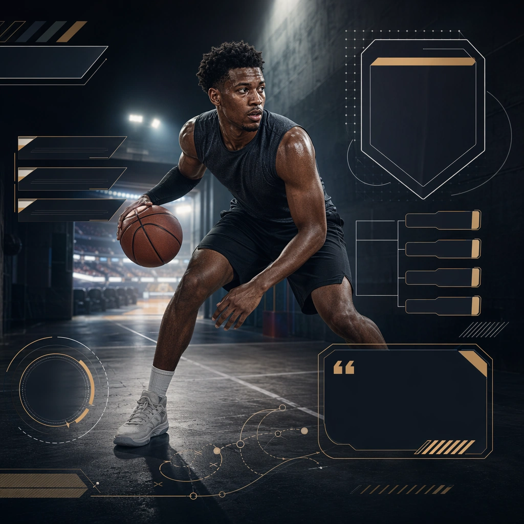
Example generated from “Basketball Season Opening Social Tile — ChaosRealmsAI · MIT”
GPT Image 2en

Scene: Create a square opening weekend tile for League Launch, using season-opening sports marketing with schedule-ready layout logic, neutral league prestige, and event-scale atmosphere. The composition should read as a practical, production-ready sports or fitness surface with a clear hierarchy, premium lighting, and obvious commercial intent. Keep the environment specific enough to feel real, but leave enough control in the layout for non-readable information modules, campaign blocks, or visualized metrics. Aim for a finish that works for a brand, club, app, academy, or event operator. Subject: Build the image around single athlete with fixture blocks. The subject should be original, believable, and free of any real-brand or celebrity cues. Use realistic apparel, safe body mechanics when movement is visible, and environmental props that support the category without clutter. The subject must stay visually dominant so the design still works as a communication asset rather than a pure scene study. Important details: The mood should read as official excitement. Treat layout, light, and supporting graphic structure as part of one polished delivery surface. Any schedule blocks, metric panels, quote zones, badges, or path diagrams must stay abstract and non-readable. Prioritize usefulness, clarity, and category truth over spectacle. The image should feel distinct from the series package while still belonging naturally to the same topic and business use case. Use case: League Launch single study 5/9, an independent rollout surface for the topic. Constraints: No readable text, no watermark, no logos, preserve exact 1:1 aspect ratio, no brand marks, no public-figure resemblance, no generic stock layout, no cluttered UI imitation, no accidental copyrighted insignia.
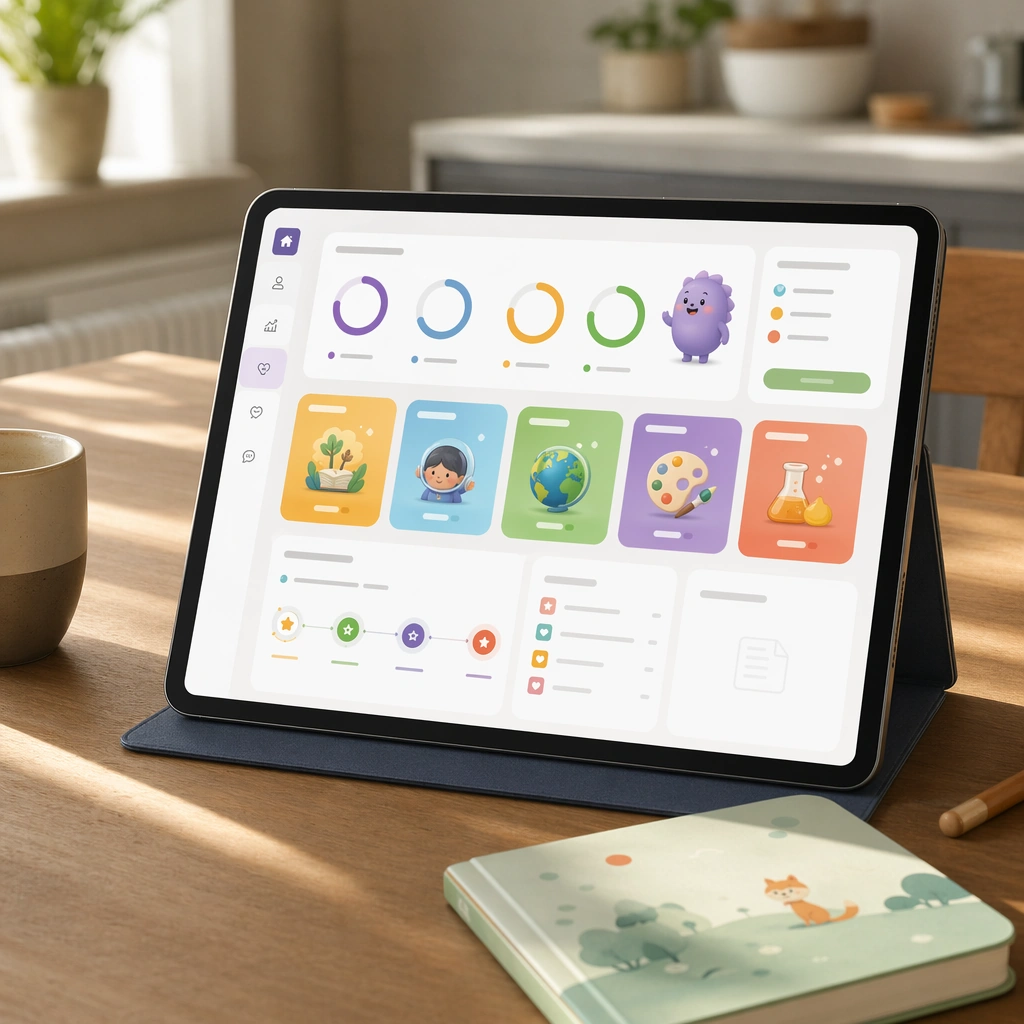
Example generated from “Parent Learning Dashboard Tablet Concept — ChaosRealmsAI · MIT”
GPT Image 2en

Scene: Create a square product composition showing a tablet on a quiet kitchen table with soft daylight, a cup, and a child-safe notebook nearby. The screen should feel calm and trustworthy, like a family-oriented companion dashboard for a premium learning app. Keep the square frame balanced, calm, and production-ready so the asset can serve gallery review, research comparison, and real educational delivery at the same time. Subject: Use visual progress rings, subject modules, mascot summaries, and blank report cards to communicate activity, milestones, and next steps without readable text. The dashboard should feel informative for adults while staying visually tied to the child-facing app universe. The subject arrangement should feel complete and self-contained, able to stand alone as a real supporting deliverable inside the same education business line. Important details: Balance reassurance and structure. The layout should be spacious, rational, and polished, proving that the product line can serve both children and caregivers without changing brands. Keep the visual hierarchy modular, commercially believable, and clearly tied to a real educational use case rather than a generic mood board. Use case: Learning App Onboarding and Lesson UI single study 1/5, parent dashboard tablet. Constraints: No readable text, no watermark, no logos, preserve exact 1:1 aspect ratio, no readable UI copy, no logos, no generic game loot clutter, no brand watermarks, no impossible screen perspective, no app-store badges.
Example generated from “Frozen Sorbet Impact Study — ChaosRealmsAI · MIT”
GPT Image 2en

Scene: Create a square ultra-high-speed food photograph on a dark stage with precise flash freezing every crystal, fragment, and droplet. Cold vapor should sink and spread along the surface rather than billow upward like theatrical smoke. The scene must feel like a controlled scientific capture of an extreme thermal event, with deep blacks, disciplined highlights, and severe physical clarity. Create a square dark-stage action image with crisp flash and a shallow glossy floor, keeping the overall mood scientific and severe. The background should stay deep black so the pale frozen fragments stand out with maximum clarity. Subject: Show a compact scoop or quenelle of sorbet impacting the surface and breaking into brittle shards, icy dust, and small faceted chunks. A little cold vapor should spread outward along the floor plane as the impact occurs. The fragments must remain clearly readable as sorbet, not generic ice. Important details: The key challenge is believable thermal physics: frost bloom, brittle fracture, vapor density, wet-to-frozen transitions, and the texture of suddenly shocked food all need to feel accurate. Motion can be violent, but the image should remain legible and elegant. Every fragment must still read as part of a real food object. Focus on granular frozen texture, fracture edge sharpness, and how the impact converts a smooth scoop into angular crystalline debris. The scene should feel physically inevitable rather than stylized for spectacle. Use case: Liquid nitrogen frozen moment single study 5/9, testing brittle impact in frozen sorbet. Constraints: No readable text, no watermark, no logos, preserve exact 1:1 aspect ratio, no fire effects, no sci-fi blue laser glow, no generic splash stock-photo look, no readable gauges, no dramatic stage props, no colorful sprinkles, no gelatin bounce look, no blurred motion.

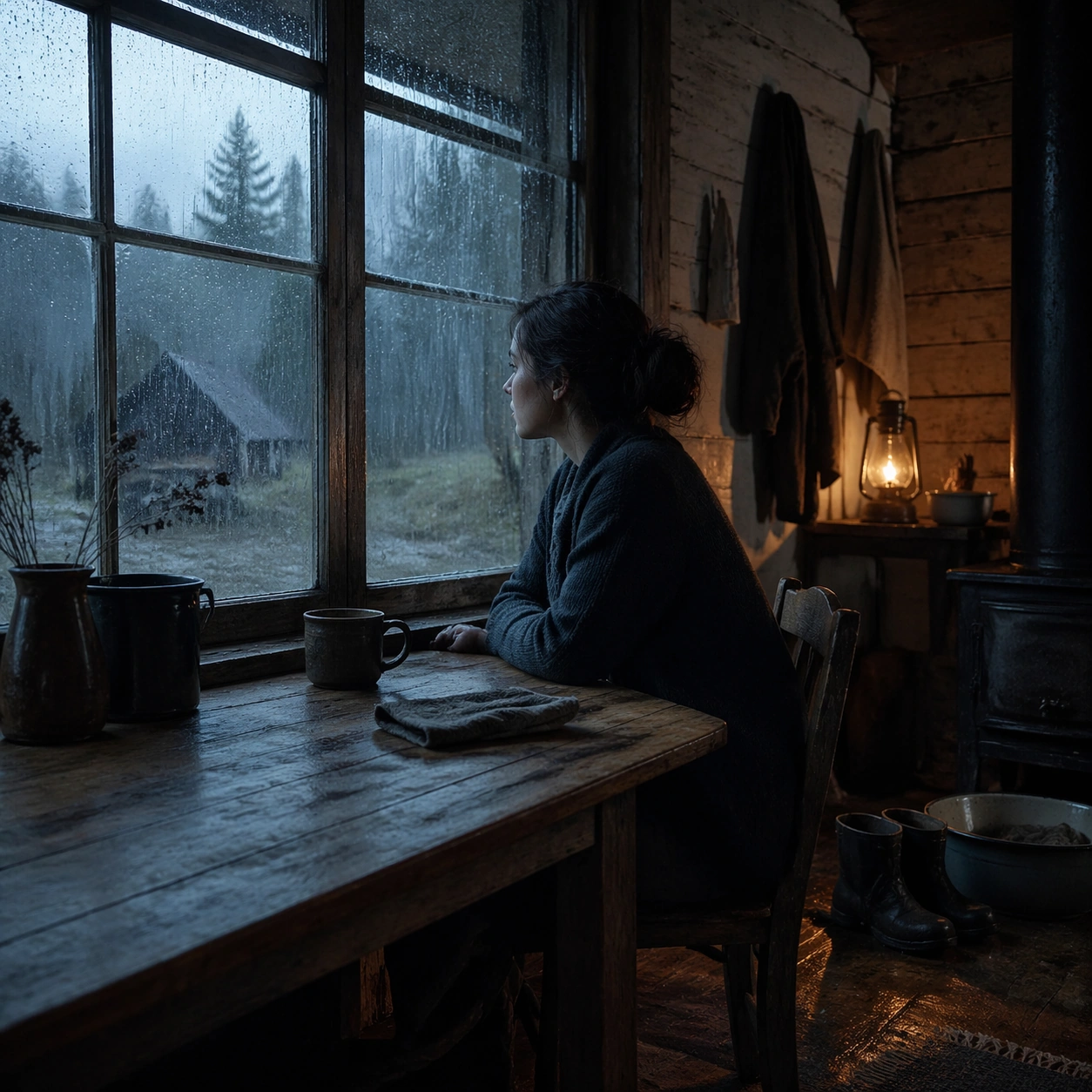
Example generated from “Quiet Rain-Window Table Scene — ChaosRealmsAI · MIT”
GPT Image 2en

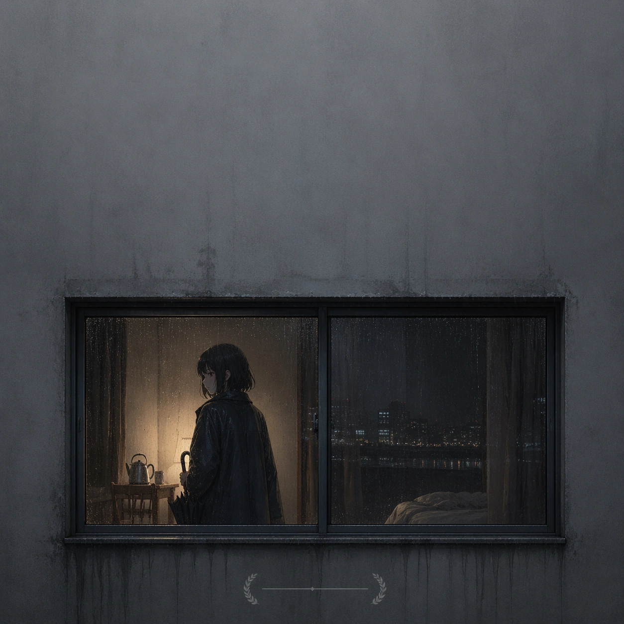
Scene: A square interior image held in patient stillness, with rain sliding down window glass, damp wood, muted blue-gray daylight, and one warm pool of lamplight or stove light inside. The room should feel inhabited but quiet, with time stretched by weather and silence rather than by spectacle. Show a wooden table pushed close to a rain-streaked window, with blue exterior light softening the edges of a ceramic cup and folded hands. Subject: Use one seated or standing figure, sometimes accompanied by a sleeping animal or simple domestic object, positioned so the window and the room share emotional weight. The human presence should be understated, contemplative, and integrated into the architecture. A solitary figure sits at the table in profile, not doing anything except watching rain collect and slide down the pane. Important details: The grammar depends on slow observation: wet glass, old timber, worn textiles, steam, puddled boots, enamel basins, and practical light. Preserve physical realism and spiritual quiet without turning the scene into fantasy, melodrama, or rustic cliche. Keep the room modest and tactile, with moisture and wood grain carrying the emotional tone. Use case: Long Gaze Through Rain Interior single study 1/9. Constraints: No readable text, no watermark, no logos, preserve exact 1:1 aspect ratio, no readable text, no obvious luxury styling, no dramatic storm destruction, no modern electronics dominating the room, no theatrical color grading, no broken anatomy, no low-detail background, no accidental text fragments.

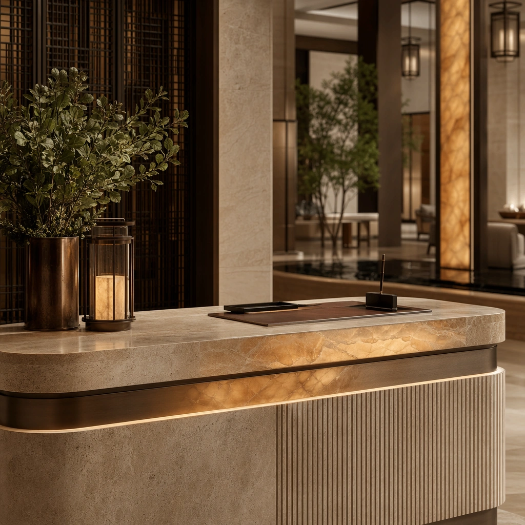
Example generated from “Stone Hotel Check-In Island Detail — ChaosRealmsAI · MIT”
GPT Image 2en

Scene: Create a square standalone support study for Luxury Hotel Lobby Arrival System. Use a close editorial crop of the stone check-in island under calm top light and frame it like a premium commercial still or design-editorial crop with clear focal hierarchy, disciplined perspective, and enough breathing room for the materials and objects to read at both thumbnail and full size. Keep warm limestone, honey amber, muted bronze, deep olive planting, and soft charcoal shadows as the tonal guide so the image still belongs to the same theme family, and light the scene in a controlled way that emphasizes texture, edge quality, and authored atmosphere over spectacle. Subject: Show a grand luxury hotel lobby with limestone slabs, smoked bronze screens, amber onyx accents, sculpted concierge islands, mirror-still water details, and a calm hospitality atmosphere. In this support study, focus on material precision, edge radius, tabletop accessories, and soft reflected glow. The image should work independently, yet it must still feel like it belongs to the same broader world of Hotel Lobby. Make the space, props, and detailing useful for real campaign, editorial, or design-review contexts rather than moodboard abstraction. Important details: Carry forward the broader language of the portal proportions, stone-and-bronze palette, concierge desk geometry, lantern rhythm, seating family, and abstract wayfinding zones, but let this image prove a new support surface or secondary deliverable. Material realism is essential: wood grain, metal sheen, glass edges, textiles, and stone should feel physically plausible and carefully art directed. Any graphic panels, labels, menus, packaging, or captions must stay abstract and unreadable. The overall result should feel reusable for campaign stills, hospitality editorials, investor decks, and operator handoff boards, with enough structure that a creative or operations team could build on it. Use case: Luxury Hotel Lobby Arrival System single study 5/9, exploring front desk detail photography for hospitality brand systems. Constraints: No readable text, no watermark, no logos, preserve exact 1:1 aspect ratio, no guests, no staff, no suitcases scattered everywhere, no casino mood, no festive balloons, no readable paperwork.

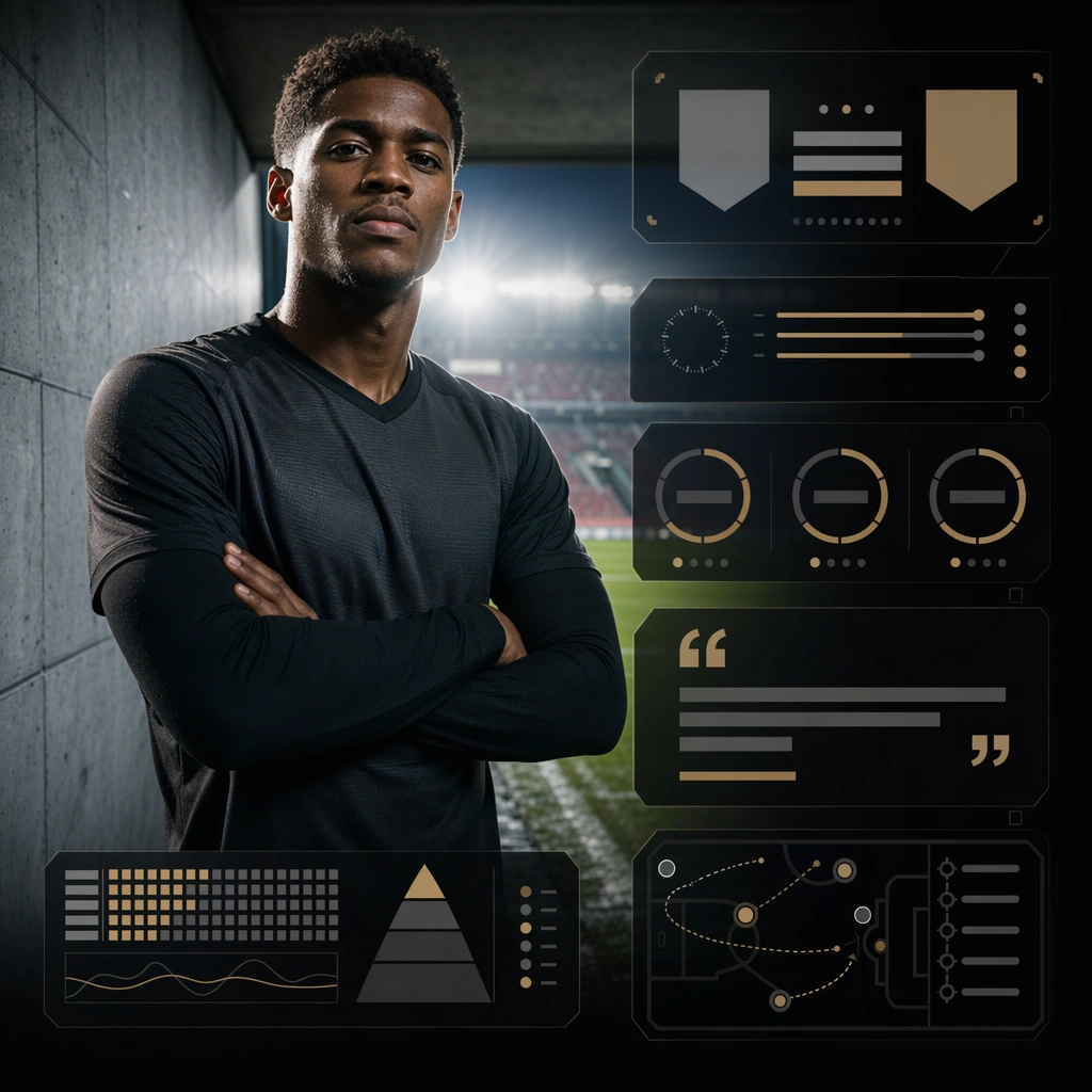
Example generated from “Prematch Athlete Portrait Social Tile — ChaosRealmsAI · MIT”
GPT Image 2en

Scene: Create a square prematch social tile for Matchday System, using premium sports-media packaging built around stadium light, clean panel hierarchy, and brandless matchday communication. The composition should read as a practical, production-ready sports or fitness surface with a clear hierarchy, premium lighting, and obvious commercial intent. Keep the environment specific enough to feel real, but leave enough control in the layout for non-readable information modules, campaign blocks, or visualized metrics. Aim for a finish that works for a brand, club, app, academy, or event operator. Subject: Build the image around single athlete near tunnel light. The subject should be original, believable, and free of any real-brand or celebrity cues. Use realistic apparel, safe body mechanics when movement is visible, and environmental props that support the category without clutter. The subject must stay visually dominant so the design still works as a communication asset rather than a pure scene study. Important details: The mood should read as close portrait confidence. Treat layout, light, and supporting graphic structure as part of one polished delivery surface. Any schedule blocks, metric panels, quote zones, badges, or path diagrams must stay abstract and non-readable. Prioritize usefulness, clarity, and category truth over spectacle. The image should feel distinct from the series package while still belonging naturally to the same topic and business use case. Use case: Matchday System single study 5/9, an independent rollout surface for the topic. Constraints: No readable text, no watermark, no logos, preserve exact 1:1 aspect ratio, no brand marks, no public-figure resemblance, no generic stock layout, no cluttered UI imitation, no accidental copyrighted insignia.

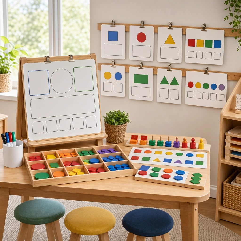
Example generated from “Picture-Based Math Learning Station — ChaosRealmsAI · MIT”
GPT Image 2en

Scene: Show a square classroom station scene with a small whiteboard, tray of manipulatives, clipped concept cards, and a few child-height stools arranged neatly under bright natural light. The composition should feel like a teaching-resource brochure image, not a candid classroom snapshot. Keep the square frame balanced, calm, and production-ready so the asset can serve gallery review, research comparison, and real educational delivery at the same time. Subject: The station should visually explain matching, sorting, comparing, and building patterns through movable pieces, blank response zones, and spatial grouping. Keep the tools young-child friendly, robust, and clearly part of a cohesive pedagogical system. The subject arrangement should feel complete and self-contained, able to stand alone as a real supporting deliverable inside the same education business line. Important details: Favor structure and usability over decoration. The station must read instantly as a real instructional setup that teachers could replicate, while staying warm, calm, and commercially polished. Keep the visual hierarchy modular, commercially believable, and clearly tied to a real educational use case rather than a generic mood board. Use case: Math Concept Visual Card Set single study 2/5, whiteboard math station. Constraints: No readable text, no watermark, no logos, preserve exact 1:1 aspect ratio, no readable equations, no numerals, no logos, no messy classroom clutter, no generic stock-photo styling, no broken manipulatives.

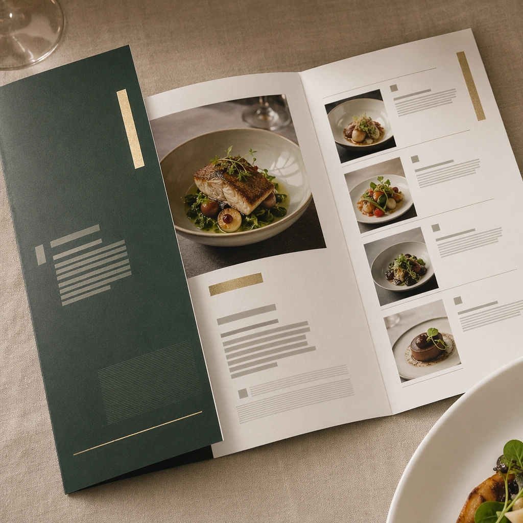
Example generated from “Fine-Dining Folded Menu Mockup — ChaosRealmsAI · MIT”
GPT Image 2en

Scene: Compose a square menu-design mockup that combines printed surfaces, structured page hierarchy, and appetizing food photography into one coherent brand-authored system. The page layouts should feel intentional and premium, with strong margins, modular blocks, and realistic print or board materials even though all textual zones remain unreadable. Use a clean square still life on a linen-covered table with one folded menu object, one plate edge, and soft service lighting. Subject: The menu should communicate category structure, hero dish placement, and brand tone through composition, image framing, typographic blocks, and page rhythm rather than through readable copy. Food imagery must stay believable and publication-ready. Treat the folded menu as a luxury hospitality object with unreadable but intentional text zones and subtle dish-image integration. Important details: This topic tests layout reasoning as much as food styling. Preserve clean grids, realistic paper behavior, credible shadows, and strong focal hierarchy between cover, spreads, dish photos, and placeholder text zones. Text-like marks can exist only as abstract or unreadable forms; clarity must come from design structure. This image should feel fully self-contained while still belonging to the same broader topic and commercial world. Paper thickness, fold precision, foil-like accent blocks, and spatial calm should make the menu feel expensive and ceremonial. Use case: Menu System single study 5/9, built for Prompt Atlas coverage of a food and beverage commercial visual system. Constraints: No readable text, no watermark, no logos, preserve exact 1:1 aspect ratio, no readable text, no logos, no fake menu prices, no warped paper errors, no amateur flyer clutter, no chaotic collage, no obvious software UI chrome, no legible script, no wedding invitation look, no stationery clutter.

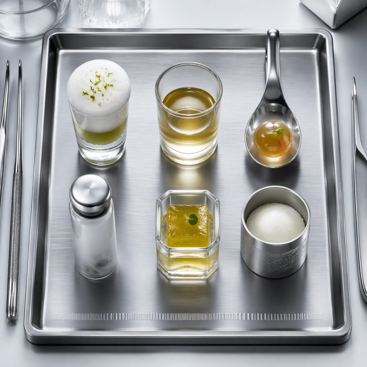
Example generated from “Experimental Kitchen Tasting Flight — ChaosRealmsAI · MIT”
GPT Image 2en

Scene: Create a square studio photograph on a white laboratory bench or brushed steel prep surface, lit with cool overhead light and crisp backlight that gives transparent ingredients a scientific presence. The composition should feel clinical and premium at once, with careful reflections on glass, faint low vapor, and enough negative space to keep the experiment-like staging legible. Nothing should feel messy or improvised. Create a square top-down still life on a brushed aluminum tray resting on a white lab table, with cool overhead light and crisp soft shadows. The arrangement should feel like a tasting flight from an experimental kitchen rather than a school laboratory, with disciplined spacing and no clutter. Subject: Place six miniature vessels in a grid: one foamed shooter, one clear broth shot, one spherified bite in a spoon, one smoke-filled vial, one gel cube cup, and one cold sorbet canister. Each vessel should be visually distinct yet belong to one coherent scientific plating language. Tiny stainless tools can appear at the tray edge as context, but they must remain secondary. Important details: Make every transparent or semi-transparent material physically convincing: gels, sugar glass, vapor, condensation, foam, and liquid membranes all need distinct behavior. The scene should suggest a chef-scientist workflow, where precision plating meets controlled experimentation. Abstract annotation devices are acceptable only as blank bars, etched marks, or geometry with no readable characters. Emphasize clean glass edges, controlled reflections, and distinct material behavior across foam, liquid, gel, and vapor. The tray should feel presentation-ready, almost like a premium product mockup for edible experiments. Use case: Molecular gastronomy lab single study 5/9, expanding the theme into a tasting-flight overview. Constraints: No readable text, no watermark, no logos, preserve exact 1:1 aspect ratio, no handwritten formulas, no visible brand labware, no classroom clutter, no sloppy spills, no cartoon science props, no readable graduations, no messy condensation puddles, no cafeteria tray feel.

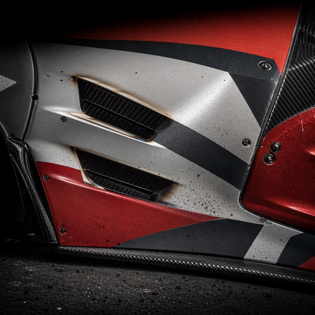
Example generated from “Motorsport Carbon and Livery Detail — ChaosRealmsAI · MIT”
GPT Image 2en

Scene: A square motorsport surface macro with harsh directional light, crisp texture, and dark surrounding falloff. Compose the frame as a square key visual with disciplined camera placement, premium lighting control, and believable real-world scale. The tonal range should feel polished and intentional, with enough atmosphere to create depth without obscuring form. Keep contrast calibrated for launch, catalog, or research presentation use rather than casual snapshot aesthetics. Subject: Center an original race-car body fragment showing livery bands, carbon weave, fasteners, vents, and subtle heat discoloration. Make the subject feel original, production-aware, and clearly grounded in Motorsport Livery and Track Promo Set. Treat this as an independent study that must feel complete and coherent without relying on any external reference image. The focal hierarchy should be immediate: primary form first, then material behavior, then supporting environmental cues that clarify use context and difficulty. Important details: Stress tactile realism, graphic discipline, and high-end fabrication quality without any readable branding or exaggerated battle damage. The visual language should still feel native to Motorsport Livery and Track Promo Set, using disciplined industrial or campaign composition instead of generic stock photography. Use believable materials, engineering logic, and professional composition discipline. Reflections, shadows, edge breaks, texture scale, interface density, and small physical joints must all support realism. Avoid filler props, vague mood-board clutter, or any element that weakens the sense of a purpose-built industrial or automotive image. Use case: Motorsport Promo single study 5/9 for Motorsport Livery and Track Promo Set, built as image support-one. Constraints: No readable text, no watermark, no logos, preserve exact 1:1 aspect ratio, no sponsor logos, no readable digits, no copyrighted circuit signage, no real team branding, no crowd chaos.

Example generated from “Dark-Garage Vehicle Launch Silhouette — ChaosRealmsAI · MIT”
GPT Image 2en

Scene: A square dark garage threshold with narrow strips of cool rim light, deep negative space, and subtle airborne dust controlled by a single back source. Compose the frame as a square key visual with disciplined camera placement, premium lighting control, and believable real-world scale. The tonal range should feel polished and intentional, with enough atmosphere to create depth without obscuring form. Keep contrast calibrated for launch, catalog, or research presentation use rather than casual snapshot aesthetics. Subject: Center an original launch vehicle held mostly in silhouette, with only surfacing edges, wheel arcs, and lamp traces visible. Make the subject feel original, production-aware, and clearly grounded in New Car Launch Key Visual System. Treat this as an independent study that must feel complete and coherent without relying on any external reference image. The focal hierarchy should be immediate: primary form first, then material behavior, then supporting environmental cues that clarify use context and difficulty. Important details: Use disciplined darkness and high-recognition outline logic to create desire without collapsing into a generic black box. The frame should feel intentional, premium, and unmistakably automotive. The visual language should still feel native to New Car Launch Key Visual System, using disciplined industrial or campaign composition instead of generic stock photography. Use believable materials, engineering logic, and professional composition discipline. Reflections, shadows, edge breaks, texture scale, interface density, and small physical joints must all support realism. Avoid filler props, vague mood-board clutter, or any element that weakens the sense of a purpose-built industrial or automotive image. Use case: Car Launch single study 5/9 for New Car Launch Key Visual System, built as image support-one. Constraints: No readable text, no watermark, no logos, preserve exact 1:1 aspect ratio, no readable text, no logos, no badge lettering, no license plate numbers, no unrelated consumer clutter.

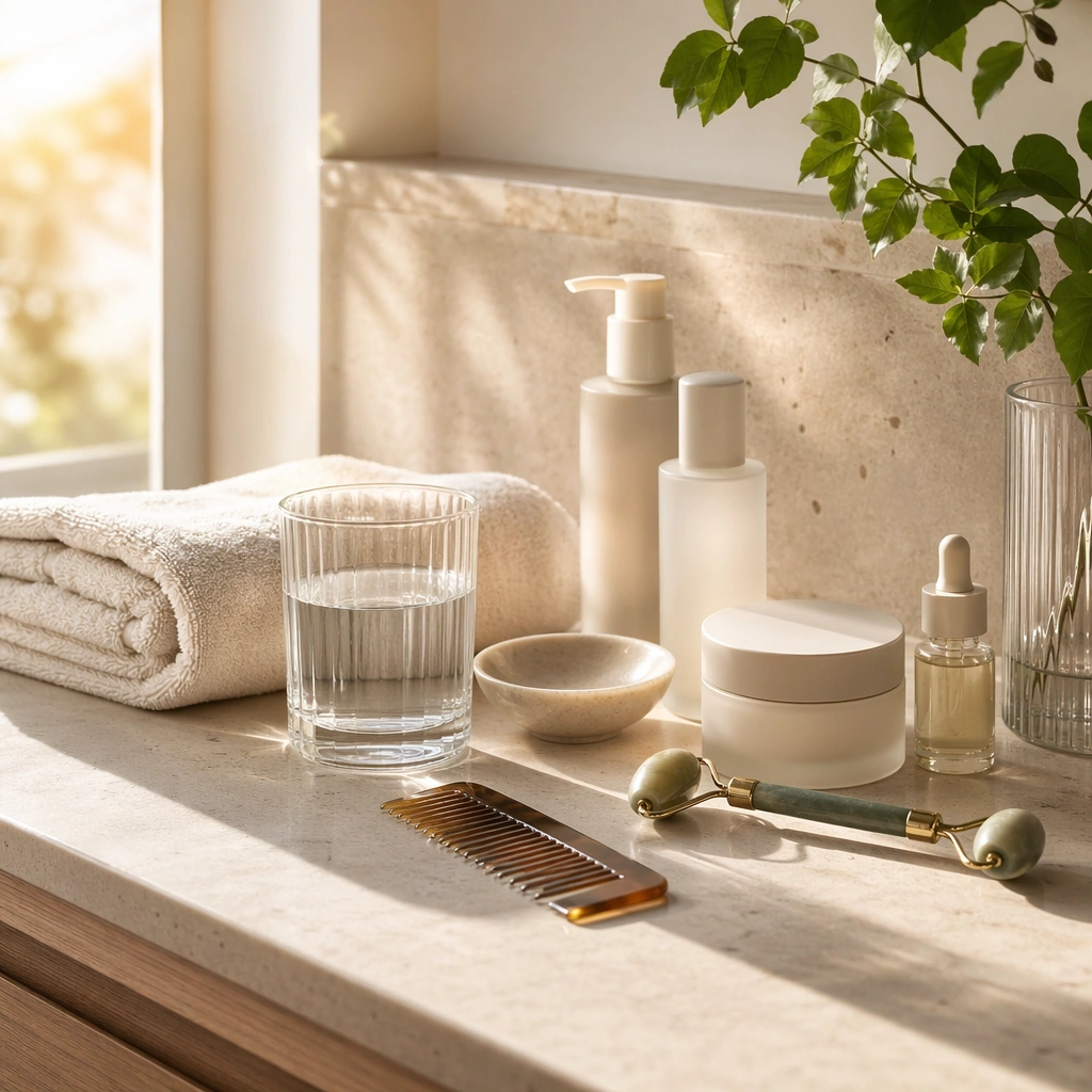
Example generated from “Sunlit Self-Care Bathroom Ritual — ChaosRealmsAI · MIT”
GPT Image 2en

Scene: Create a square bathroom or vanity-side image filled with gentle sunrise light, pale stone, clear glass, and fresh clean surfaces. The scene should feel polished and restorative, like a premium wellness or self-care campaign. Keep the composition airy and uncluttered, with realistic morning atmosphere and enough commercial precision that the image can support New Year reset messaging across beauty, wellness, or lifestyle brands. Subject: Show a ritual setup with folded towel, skincare-like containers without readable labels, a glass of water, plant detail, and one or two neatly placed grooming tools. The arrangement should communicate a fresh start through care and order rather than through overt seasonal props. Focus on cleanliness, light, and the sensory promise of a calmer beginning to a new cycle. Important details: Material credibility is essential. Make stone, glass, ceramic, fabric, and soft skin-adjacent products feel tactile and premium. Keep color restrained and modern. The result should be suitable for wellness, beauty, or lifestyle New Year campaigns that want optimism and discipline without falling into sterile minimalism or party-to-reset cliché. Use case: New Year Renewal single study 5/9. Constraints: No readable text, no watermark, no logos, preserve exact 1:1 aspect ratio, no readable labels, no visible person, no makeup chaos, no holiday décor, no logo packaging, no mirror text, no messy sink, no cold hospital feel.

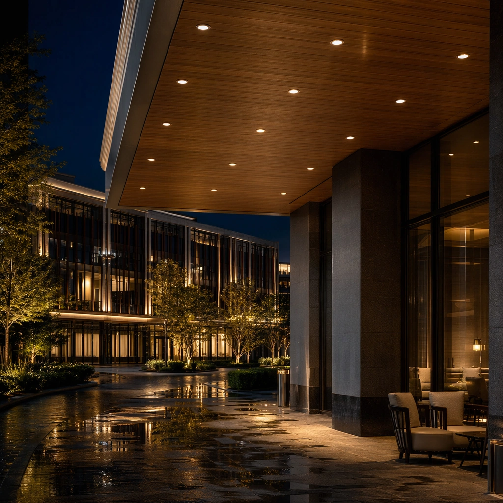
Example generated from “Night Architecture Canopy Lighting Detail — ChaosRealmsAI · MIT”
GPT Image 2en

Scene: Create a square standalone support study for Night Architecture Lighting Photography Set. Use a close night still under a canopy showing downlights, soffit texture, and reflected sheen and frame it like a premium commercial still or design-editorial crop with clear focal hierarchy, disciplined perspective, and enough breathing room for the materials and objects to read at both thumbnail and full size. Keep deep blue-black night, warm gold light, cool silver reflections, and restrained amber interior spill as the tonal guide so the image still belongs to the same theme family, and light the scene in a controlled way that emphasizes texture, edge quality, and authored atmosphere over spectacle. Subject: Show a night-architecture photography subject with layered facade lighting, wet pavement reflections, atmospheric civic calm, controlled interior glow, and a clearly recognizable silhouette. In this support study, focus on lighting hardware discipline, glow control, and tactile finishes. The image should work independently, yet it must still feel like it belongs to the same broader world of Night Architecture. Make the space, props, and detailing useful for real campaign, editorial, or design-review contexts rather than moodboard abstraction. Important details: Carry forward the broader language of the building silhouette, lighting hierarchy, reflection logic, civic atmosphere, and disciplined night-photography realism, but let this image prove a new support surface or secondary deliverable. Material realism is essential: wood grain, metal sheen, glass edges, textiles, and stone should feel physically plausible and carefully art directed. Any graphic panels, labels, menus, packaging, or captions must stay abstract and unreadable. The overall result should feel reusable for hospitality night campaigns, architecture editorials, lighting-design decks, and city-brand presentations, with enough structure that a creative or operations team could build on it. Use case: Night Architecture Lighting Photography Set single study 5/9, exploring support image for lighting-detail reviews. Constraints: No readable text, no watermark, no logos, preserve exact 1:1 aspect ratio, no fireworks, no traffic light streak overload, no readable signage, no festival screens, no people crowding the foreground, no readable entrance text.

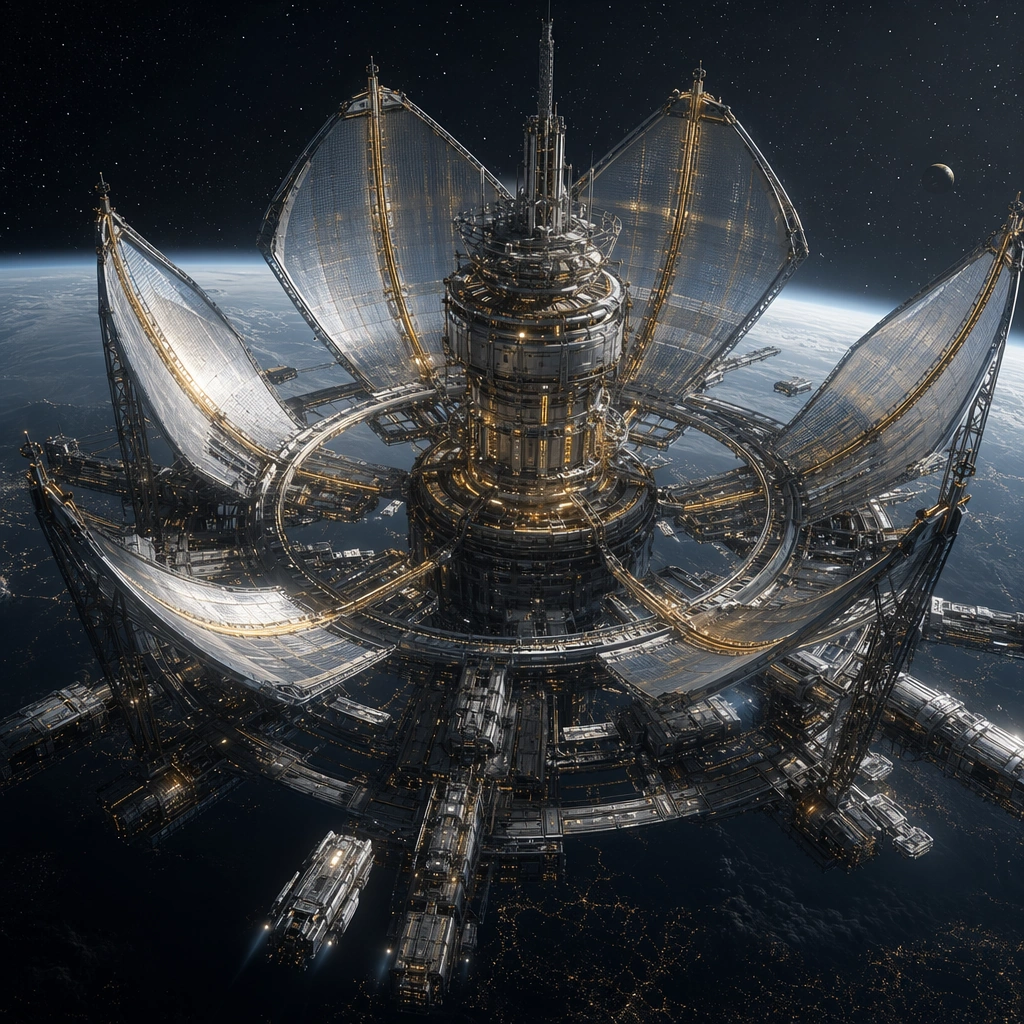
Example generated from “Orbital Energy Harvesting Megastructure — ChaosRealmsAI · MIT”
GPT Image 2en

Scene: Design a square key-art study for speculative orbital infrastructure with strong depth, silent space atmosphere, and enough detail to feel like a finished professional concept poster. Treat each image as a distinct program or mission context rather than a small variation on the same frame. Compose a square poster view of an energy megastructure where reflective harvest sails and power-routing ribs wrap around a compact orbital core above a dark planet. Subject: Show one legible orbital typology with disciplined silhouette, clear traffic logic, and small human or vehicle cues that reveal the scale without turning the composition into a crowded fleet battle. The design should feel commercially useful for worldbuilding, editorial, or launch-visual surfaces. Make the main read about utility and scale: harvesting petals, maintenance docks, sparse crew vehicles, and disciplined power trunks instead of weaponized shapes. Important details: Favor sharp hierarchy, credible modular engineering, and a palette of cool metals balanced by one environmental accent color. Each image should feel singular, but it must still belong to the same broader orbital design category with believable infrastructure grammar. Let one warm gold accent define the energy logic against an otherwise cool metallic palette so the image feels industrial and commercially legible. Preserve internal logic in docking, circulation, and maintenance access so the megastructure feels buildable rather than decorative. Use case: Orbital Vistas single study 1/5, designed as a self-contained support image for this topic. Constraints: No readable text, no watermark, no logos, preserve exact 1:1 aspect ratio, no fantasy insignia, no heroic movie-poster characters, no crowded battle fleets, no readable station markings, no fantasy sun temple forms.

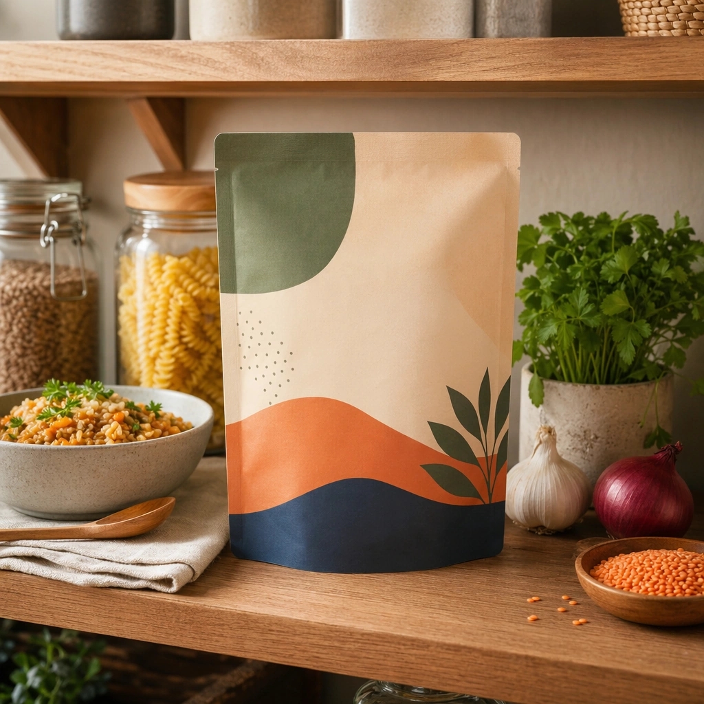
Example generated from “Packaged Food Pantry Shelf Hero — ChaosRealmsAI · MIT”
GPT Image 2en

Scene: Compose a square packaged-food lifestyle image that connects shelf-ready packaging with actual household use, serving, and meal preparation. The frame should feel commercially precise but lived in, showing how the package belongs inside a believable kitchen, pantry, or dining context rather than isolated white-background product photography. Use a square crop of a well-organized pantry shelf with one hero package forward-facing and adjacent household items softly supporting it. Subject: The package must stay clearly visible and physically plausible, while the prepared food, ingredients, bowls, or serving scene demonstrate real usage and appetite appeal. Let the packaging be central while the surrounding jars, bowls, or ingredients establish a believable pantry environment. Important details: This topic tests bridge-building between package design and lived food context. Preserve realistic kitchen materials, pantry organization, serving logic, and package handling so the brand feels trustworthy and useful. If abstract label areas appear, they must remain unreadable; trust should come from materials, cooking cues, and scene credibility rather than literal copy. This image should feel fully self-contained while still belonging to the same broader topic and commercial world. Shelf spacing, container materials, and light falloff should feel real and aspirational without looking sterile or over-staged. Use case: Food Package Scenes single study 5/9, built for Prompt Atlas coverage of a food and beverage commercial visual system. Constraints: No readable text, no watermark, no logos, preserve exact 1:1 aspect ratio, no readable text, no logos, no sterile white studio void, no messy family chaos, no unrealistic packaging scale, no cluttered supermarket shelf wall, no grocery-store aisle, no readable shelf tags, no clutter avalanche.

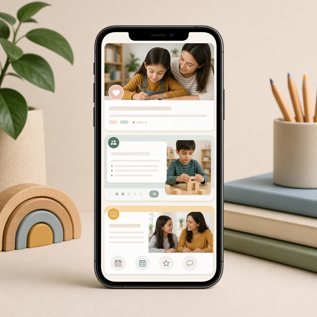
Example generated from “Parent Education Mobile Feed Concept — ChaosRealmsAI · MIT”
GPT Image 2en

Scene: Create a square product composition with a smartphone displaying a clean stack of parent-education posts against a soft backdrop. The scene should feel like a communications-strategy mockup for a modern school or enrichment brand. Keep the square frame balanced, calm, and production-ready so the asset can serve gallery review, research comparison, and real educational delivery at the same time. Subject: Use a sequence of visual post cards with photos, icons, empty headline bars, and gentle dividers to suggest an organized ongoing feed. The mobile presentation should emphasize clarity, trust, and easy scanning over attention-seeking tricks. The subject arrangement should feel complete and self-contained, able to stand alone as a real supporting deliverable inside the same education business line. Important details: Keep the feed believable and brand-ready. Each card should feel like part of one coherent publishing system that respects parents time and attention. Keep the visual hierarchy modular, commercially believable, and clearly tied to a real educational use case rather than a generic mood board. Use case: Parent Communication Education Carousel single study 1/5, phone feed overview. Constraints: No readable text, no watermark, no logos, preserve exact 1:1 aspect ratio, no readable copy, no logos, no influencer aesthetics, no chaotic collage clutter, no fake app badges, no celebrity faces.

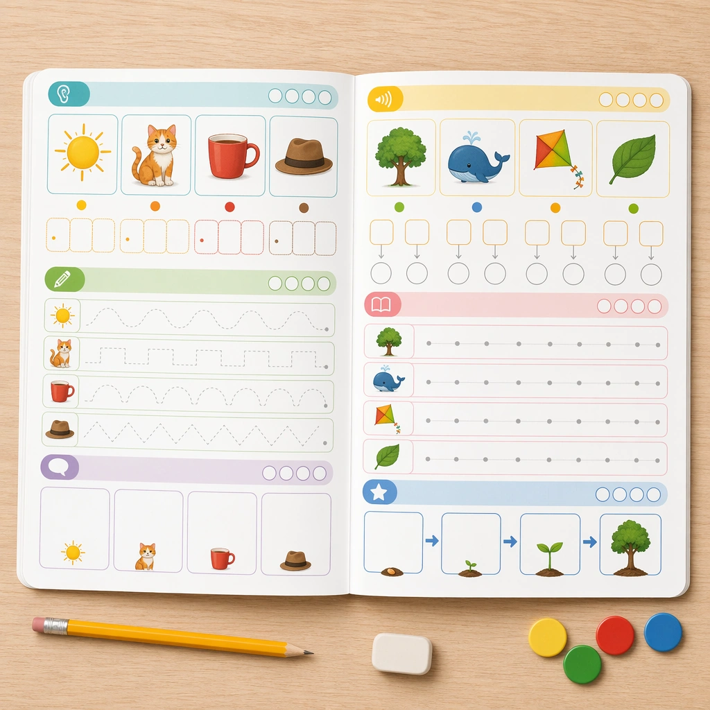
Example generated from “Picture Phonics Workbook Spread Concept — ChaosRealmsAI · MIT”
GPT Image 2en

Scene: Create a square top-down view of an open literacy workbook on a pale oak desk, with rounded page corners, tidy binding, and crisp studio-classroom lighting. The spread should feel like a premium retail workbook preview, balanced between usability and polished presentation. Keep the square frame balanced, calm, and production-ready so the asset can serve gallery review, research comparison, and real educational delivery at the same time. Subject: Use two facing pages filled with picture-based phonics exercises, blank tracing lines, icon-led directions, and empty progress markers. Add a pencil, a soft eraser, and a few counters as supporting props, but keep the workbook pages dominant and highly legible. The subject arrangement should feel complete and self-contained, able to stand alone as a real supporting deliverable inside the same education business line. Important details: The design must communicate developmental pacing through spacing, color-coded modules, and obvious response zones instead of real words. It should look like something a teacher would recognize as production-ready for young learners and parents alike. Keep the visual hierarchy modular, commercially believable, and clearly tied to a real educational use case rather than a generic mood board. Use case: Phonics and Reading Practice Sheet single study 1/5, workbook spread. Constraints: No readable text, no watermark, no logos, preserve exact 1:1 aspect ratio, no readable text, no real letters, no logos, no teacher scribbles, no chaotic classroom mess, no broken magnets.

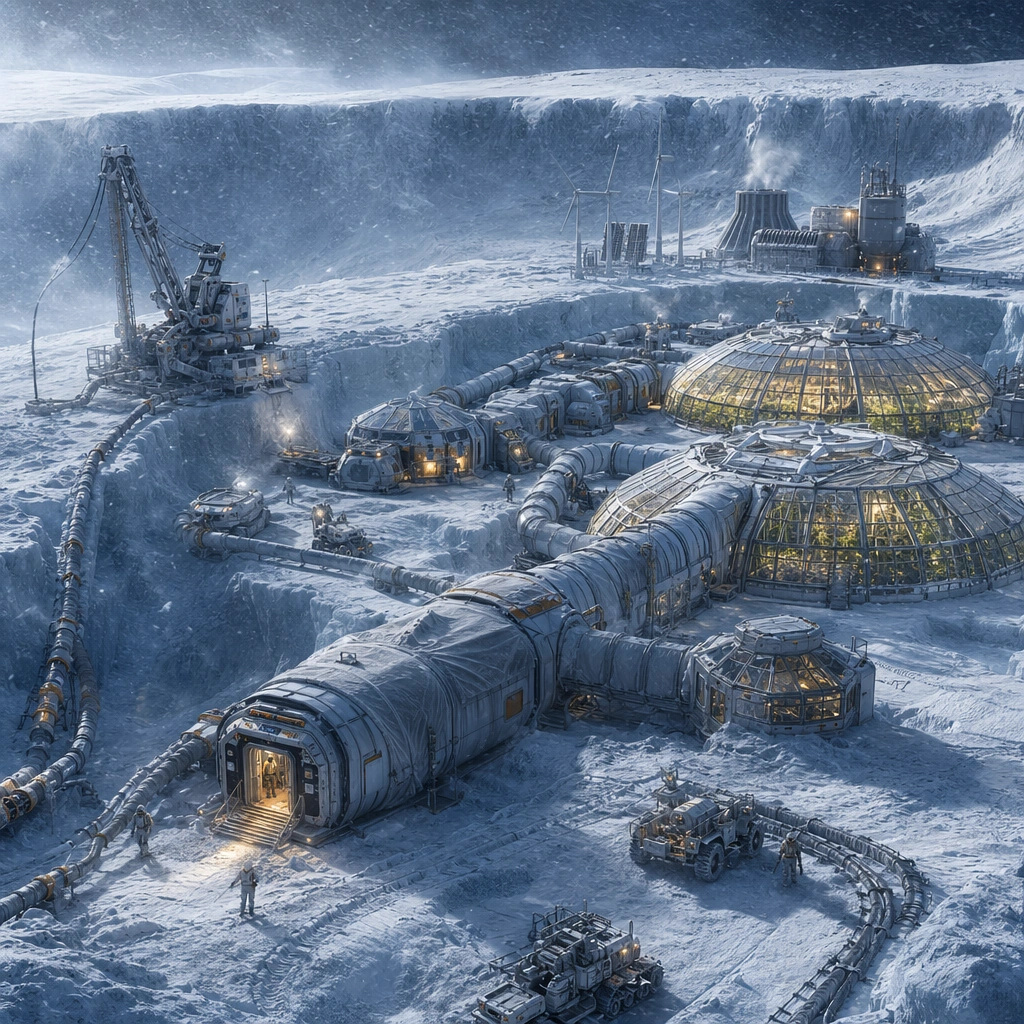
Example generated from “Ice-Crater Bioresearch Base Concept — ChaosRealmsAI · MIT”
GPT Image 2en

Scene: Design a square concept image for one planetary survival installation, making the environment harsh but legible and the infrastructure specific enough for a real worldbuilding deck. The camera should always reveal at least one core habitat, one utility or extraction system, and one clear environmental stressor. Compose a blue-white crater rim with insulated modules, ice tunnels, and greenhouse domes glowing against a severe frozen landscape. Subject: Show a complete survival ecosystem with believable shelter, energy, mobility, and work routines. Small rovers or suited crew can appear as scale cues, but the installation itself should remain the main protagonist. Make the research mission clear through sample locks, heated circulation, rover trenches, and sheltered observation decks. Important details: Use pressure-rated geometry, practical weathering, and environmental contrast to distinguish climate, terrain, and base function. Each image should feel mission-specific while staying rooted in frontier engineering rather than fantasy spectacle. The scene should feel scientifically grounded and survival-driven, with every warm light and enclosure explained by climate pressure. Preserve daily operational logic in shelter, energy, mobility, and maintenance so each base feels sustainably inhabited. Use case: Frontier Base single study 1/5, designed as a self-contained support image for this topic. Constraints: No readable text, no watermark, no logos, preserve exact 1:1 aspect ratio, no alien-monster attack scenes, no unreadable base markings, no generic movie war camp look, no decorative spaceship clutter, no fantasy ice palace forms.

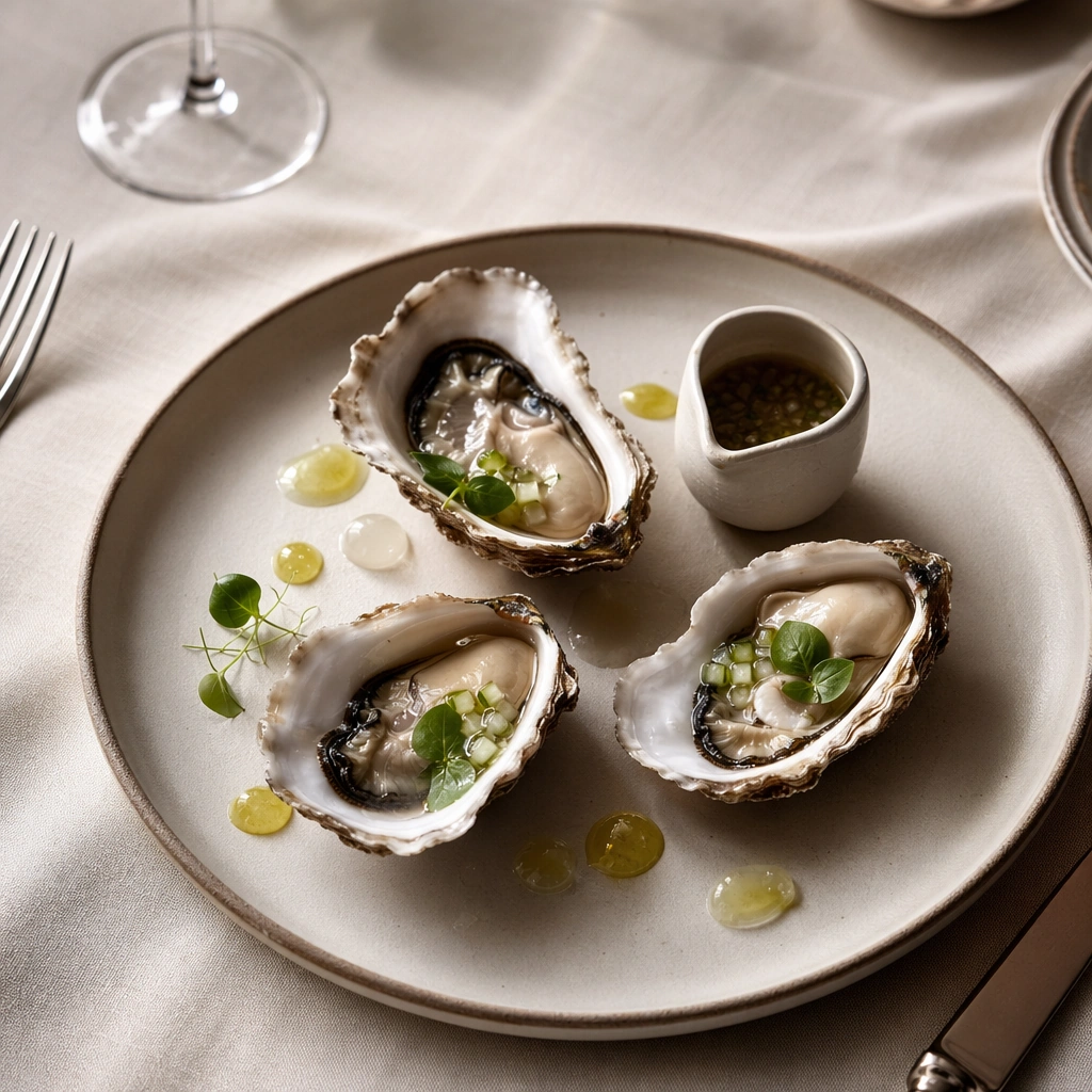
Example generated from “Oyster First-Course Overhead Editorial — ChaosRealmsAI · MIT”
GPT Image 2en

Scene: Compose a square restaurant editorial food photograph with a controlled three-quarter camera angle, tactile linen, brushed metal cutlery used sparingly at the edge of frame, and lighting that feels like a real dining room service captured by a magazine photographer. Keep the tonal range warm, dimensional, and refined, with enough negative space around the plate for the image to function as a hero asset rather than a crowded snapshot. Switch to a near-overhead camera while keeping the same premium restaurant styling, shallow ambient shadow, and elegant spacing between elements. Subject: The food must read as a true signature dish developed by a serious kitchen: precise portions, believable sauce behavior, carefully considered garnish, and a table context that suggests a coherent restaurant identity instead of generic luxury styling. Arrange opened oysters, citrus gel, chilled metal accents, and one small sauce vessel as a composed first-course editorial. Important details: Restaurant credibility matters more than spectacle. Preserve appetizing moisture, plausible ingredient hierarchy, and disciplined prop styling. Every crumb, herb leaf, ceramic reflection, and fold in the table linen should support the editorial story while keeping the dish unmistakably central. This image should feel fully self-contained while still belonging to the same broader topic and commercial world. The frame should feel crisp, cold, and expensive, with believable shell moisture, controlled reflections, and strong plate-to-table relationships. Use case: Signature Dishes single study 5/9, built for Prompt Atlas coverage of a food and beverage commercial visual system. Constraints: No readable text, no watermark, no logos, preserve exact 1:1 aspect ratio, no plastic-looking food, no overloaded garnish, no sloppy sauce smears, no cartoon color saturation, no stock-photo posing, no messy background clutter, no seafood tower, no crushed-ice excess, no beach props.

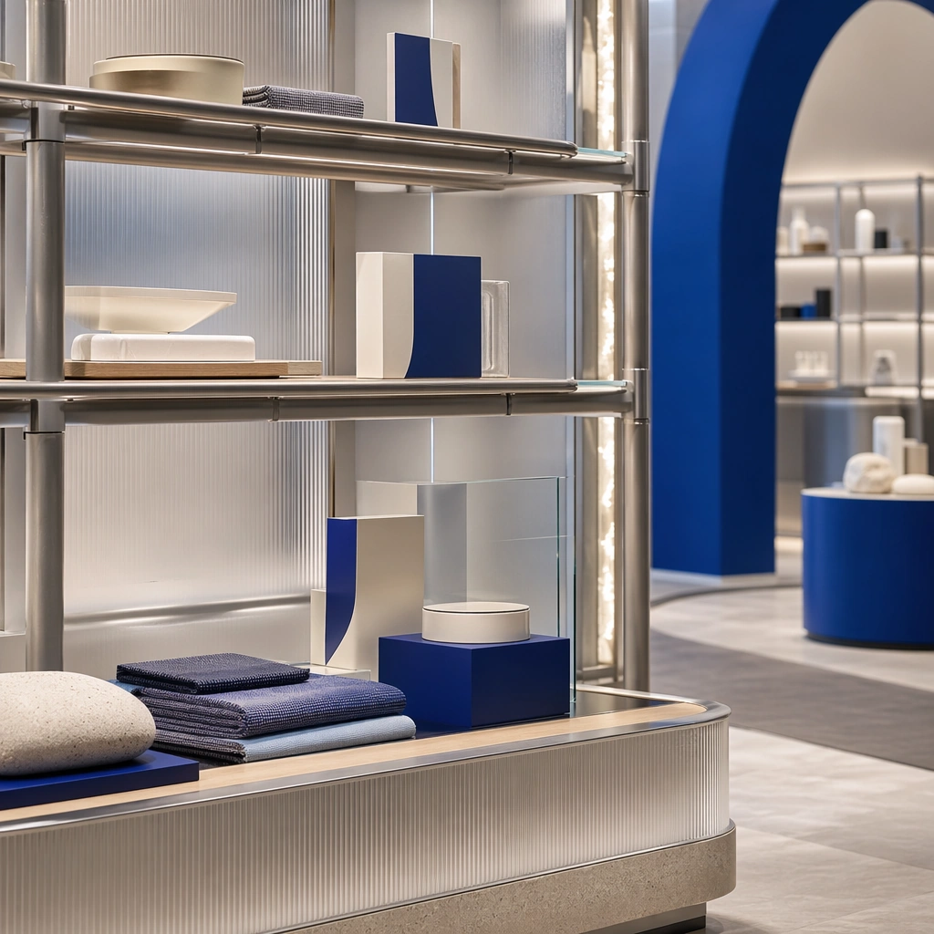
Example generated from “Pop-Up Shop Merchandise Shelf Detail — ChaosRealmsAI · MIT”
GPT Image 2en

Scene: Create a square standalone support study for Pop-up Shop and Event Installation Kit. Use a close still of a modular merch shelf with packaging shapes and sculpted risers and frame it like a premium commercial still or design-editorial crop with clear focal hierarchy, disciplined perspective, and enough breathing room for the materials and objects to read at both thumbnail and full size. Keep soft neutral base with one strong accent color, translucent whites, brushed metal, and controlled event lighting as the tonal guide so the image still belongs to the same theme family, and light the scene in a controlled way that emphasizes texture, edge quality, and authored atmosphere over spectacle. Subject: Show a modular pop-up and event installation built from tubular frames, translucent panels, bold but refined color blocks, sculpted counters, photo-op arches, and a circulation path designed for sharing and recall. In this support study, focus on retail order, object spacing, and event-brand polish. The image should work independently, yet it must still feel like it belongs to the same broader world of Pop-up Kit. Make the space, props, and detailing useful for real campaign, editorial, or design-review contexts rather than moodboard abstraction. Important details: Carry forward the broader language of the tubular frame language, translucent panel system, accent-color blocking, modular counters, and camera-friendly circulation, but let this image prove a new support surface or secondary deliverable. Material realism is essential: wood grain, metal sheen, glass edges, textiles, and stone should feel physically plausible and carefully art directed. Any graphic panels, labels, menus, packaging, or captions must stay abstract and unreadable. The overall result should feel reusable for brand activations, launch events, campaign recaps, and experiential pitch decks, with enough structure that a creative or operations team could build on it. Use case: Pop-up Shop and Event Installation Kit single study 5/9, exploring support image for fixture and merchandise planning. Constraints: No readable text, no watermark, no logos, preserve exact 1:1 aspect ratio, no crowds, no branded slogans, no cheap balloon decor, no stage truss overload, no festival chaos, no readable labels.

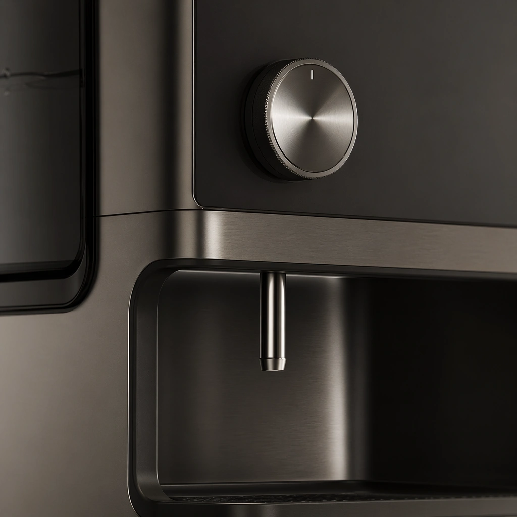
Example generated from “Premium Appliance Knob and Spout Detail — ChaosRealmsAI · MIT”
GPT Image 2en

Scene: A square macro product shot with soft grazing light, restrained reflections, and a calm luxury tonal range. Compose the frame as a square key visual with disciplined camera placement, premium lighting control, and believable real-world scale. The tonal range should feel polished and intentional, with enough atmosphere to create depth without obscuring form. Keep contrast calibrated for launch, catalog, or research presentation use rather than casual snapshot aesthetics. Subject: Center an original appliance detail zone showing a control knob, spout, seam, touch surface, and surrounding finish transitions. Make the subject feel original, production-aware, and clearly grounded in Premium Appliance Lifestyle Launch Set. Treat this as an independent study that must feel complete and coherent without relying on any external reference image. The focal hierarchy should be immediate: primary form first, then material behavior, then supporting environmental cues that clarify use context and difficulty. Important details: Stress tactile quality, manufacturable detailing, and subtle use precision. The crop should feel rich and useful, not merely decorative. The visual language should still feel native to Premium Appliance Lifestyle Launch Set, using disciplined industrial or campaign composition instead of generic stock photography. Use believable materials, engineering logic, and professional composition discipline. Reflections, shadows, edge breaks, texture scale, interface density, and small physical joints must all support realism. Avoid filler props, vague mood-board clutter, or any element that weakens the sense of a purpose-built industrial or automotive image. Use case: Appliance Launch single study 5/9 for Premium Appliance Lifestyle Launch Set, built as image support-one. Constraints: No readable text, no watermark, no logos, preserve exact 1:1 aspect ratio, no logos, no readable labels, no food-brand packaging, no influencer clutter, no unrealistic steam, no decorative overload.

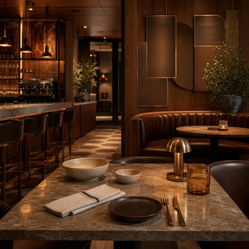
Example generated from “Restaurant Tabletop Brand Editorial — ChaosRealmsAI · MIT”
GPT Image 2en

Scene: Create a square standalone support study for Restaurant Cafe Space Brand Integration. Use a square tabletop still with ceramics, cutlery, folded napkin, and stone surface and frame it like a premium commercial still or design-editorial crop with clear focal hierarchy, disciplined perspective, and enough breathing room for the materials and objects to read at both thumbnail and full size. Keep toasted oak, espresso brown, muted cream, oxidized brass, and warm tungsten amber as the tonal guide so the image still belongs to the same theme family, and light the scene in a controlled way that emphasizes texture, edge quality, and authored atmosphere over spectacle. Subject: Show a restaurant and cafe interior where oak, oxidized metal, patterned tile, leather banquettes, softly glowing pendants, and abstract menu surfaces feel authored as one brand system. In this support study, focus on table styling, material coordination, and restaurant-brand restraint. The image should work independently, yet it must still feel like it belongs to the same broader world of Cafe Space. Make the space, props, and detailing useful for real campaign, editorial, or design-review contexts rather than moodboard abstraction. Important details: Carry forward the broader language of the tile language, oak-and-metal pairings, banquette shapes, bar geometry, pendant rhythm, and abstract menu-display zones, but let this image prove a new support surface or secondary deliverable. Material realism is essential: wood grain, metal sheen, glass edges, textiles, and stone should feel physically plausible and carefully art directed. Any graphic panels, labels, menus, packaging, or captions must stay abstract and unreadable. The overall result should feel reusable for restaurant launches, cafe campaigns, hospitality editorials, and concept pitch boards, with enough structure that a creative or operations team could build on it. Use case: Restaurant Cafe Space Brand Integration single study 5/9, exploring support image for dining brand storytelling. Constraints: No readable text, no watermark, no logos, preserve exact 1:1 aspect ratio, no crowded diners, no readable menus, no food-delivery branding, no messy plates, no random neon slogans, no readable paper menu.

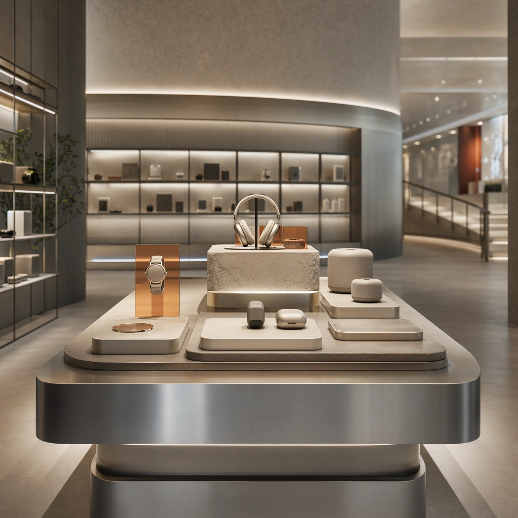
Example generated from “Flagship Store Product Table Detail — ChaosRealmsAI · MIT”
GPT Image 2en

Scene: Create a square standalone support study for Retail Flagship Store Experience System. Use a close still of a hero product table under focused top light and frame it like a premium commercial still or design-editorial crop with clear focal hierarchy, disciplined perspective, and enough breathing room for the materials and objects to read at both thumbnail and full size. Keep soft concrete gray, brushed silver, warm white light, muted sand stone, and one restrained accent tone as the tonal guide so the image still belongs to the same theme family, and light the scene in a controlled way that emphasizes texture, edge quality, and authored atmosphere over spectacle. Subject: Show a premium flagship retail interior with sculpted display fixtures, integrated light bands, neutral stone floors, brushed aluminum rails, translucent resin accents, and an immersive circulation plan. In this support study, focus on surface material, riser hierarchy, and premium object spacing. The image should work independently, yet it must still feel like it belongs to the same broader world of Flagship Store. Make the space, props, and detailing useful for real campaign, editorial, or design-review contexts rather than moodboard abstraction. Important details: Carry forward the broader language of the hero fixture shapes, integrated lighting bands, resin accents, circulation loop, and premium product-display grammar, but let this image prove a new support surface or secondary deliverable. Material realism is essential: wood grain, metal sheen, glass edges, textiles, and stone should feel physically plausible and carefully art directed. Any graphic panels, labels, menus, packaging, or captions must stay abstract and unreadable. The overall result should feel reusable for retail launch decks, store-design reviews, campaign stills, and experiential pitch boards, with enough structure that a creative or operations team could build on it. Use case: Retail Flagship Store Experience System single study 5/9, exploring support image for merchandising presentations. Constraints: No readable text, no watermark, no logos, preserve exact 1:1 aspect ratio, no crowds, no cash-register clutter, no readable price tags, no seasonal sale props, no random mannequins everywhere, no readable packaging.

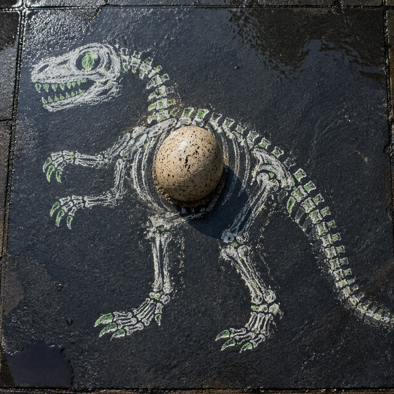
Example generated from “Chalk Dinosaur Egg — ChaosRealmsAI · MIT”
GPT Image 2en

Scene: A square overhead photograph of a dark slate sidewalk panel after light rain, bright enough to reveal chalk dust, stone grain, and tiny wet speckles. The camera is straight down, with cool daylight from the upper left and a few shallow puddle reflections near the edges. The composition should feel like a real street surface where a child's flat chalk drawing has been interrupted by a physically present object. Subject: A large white and green chalk drawing of a simple dinosaur skeleton sprawls across the slate. The dinosaur is clearly flat: broken chalk texture, powdery edges, rubbed joints, and simple two-dimensional bones. At the center of its rib cage sits a photoreal speckled dinosaur egg, about the size of a grapefruit, with matte shell texture, tiny cracks, damp grit on its base, and natural rounded volume. Important details: The egg must be the only 3D object and must cast a believable oval shadow across the chalk ribs. It should cover and interrupt several chalk lines, proving it sits above the drawing, while nearby chalk dust gathers around its contact point. The slate surface, chalk, wet speckles, and shell must stay materially distinct. Avoid making the dinosaur itself dimensional; the spectacle comes from a flat extinct creature appearing to hold a real egg. Use case: 2D and 3D Medium Collision single study 5/8, testing chalk drawing, wet stone, contact shadow, and one real object occupying the drawn anatomy. Constraints: No readable text, no watermark, no logos, preserve exact 1:1 aspect ratio, no footprints, no extra toys, no 3D dinosaur bones, no illustrated egg, no nest, no frame, no dramatic low angle.

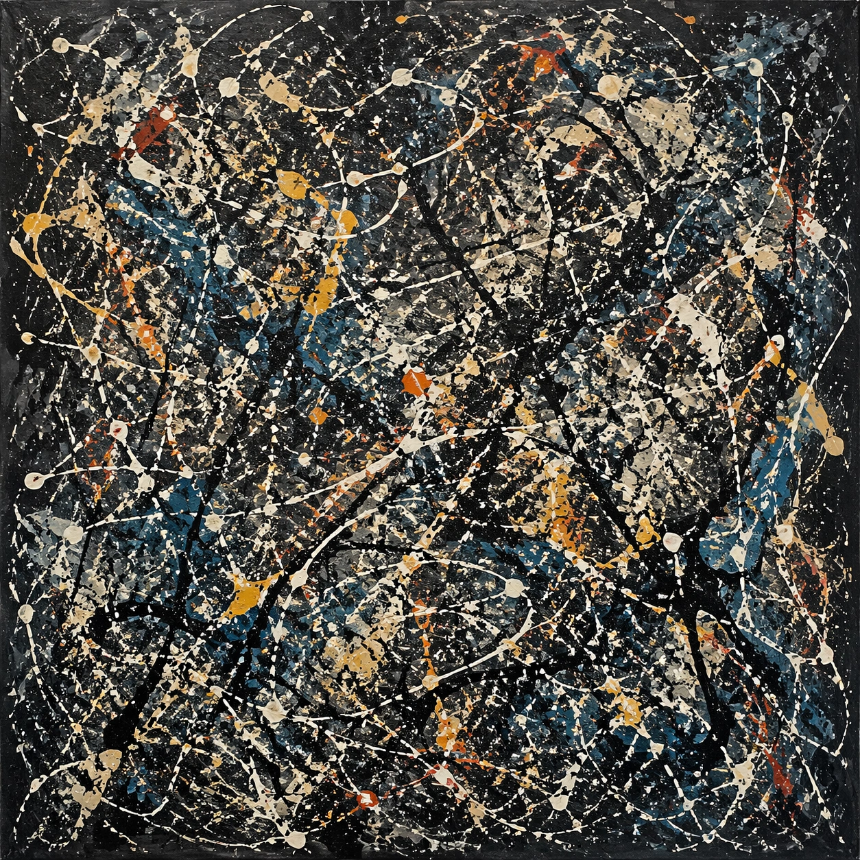
Example generated from “Drip Constellation — ChaosRealmsAI · MIT”
GPT Image 2en

Scene: A square, gallery-ready composition with painterly surfaces, controlled negative space, and a deliberate fine-art presentation. Build the frame around a dense all-over field of marks that feels suspended between chaos and structure. Keep the lighting, camera distance, and spatial organization tuned for a high-signal research image rather than a casual snapshot. The image belongs to the Abstract Expressionism Study theme and should feel immediately legible as a prompt atlas theme for abstract expressionism study, testing style-transfer with gpt image 2.. Subject: Center the study on a dense all-over field of marks that feels suspended between chaos and structure. Translate the theme into a concrete visual statement instead of an abstract mood board: the viewer should understand what kind of image this is, what is being tested, and why the composition is difficult. Use the slug idea of abstract expressionism study as a literal guide for subject matter, materials, and staging. If helpful, borrow the broad visual cues suggested by Pollock, Rothko, de Kooning, Kline, but keep the result original and specific to this study. Important details: Focus on authored mark-making, hierarchy, rhythm, and a visual idea that reads immediately before the viewer inspects the brushwork. Preserve a disciplined square composition, clear focal hierarchy, and enough secondary information to make the image feel complete rather than underspecified. The image should look polished, novel, and exhibition-ready, with topic-specific credibility coming from the way surfaces, structure, and visual language reinforce Abstract Expressionism Study. Avoid generic filler elements that do not serve the main concept. Use case: Abstract Expressionism Study single study 1/8, testing style-transfer through the drip constellation variation. Constraints: No readable text, no watermark, no logos, preserve exact 1:1 aspect ratio, no direct copy of a known artwork, no comic speech bubbles, no accidental typography, no low-effort doodle energy, no muddy center, no fake museum label.

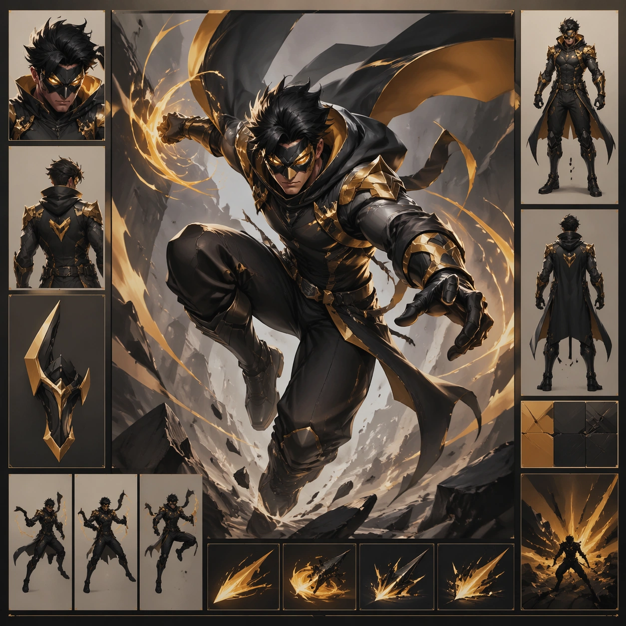
Example generated from “Action-Comic Hero Concept Sheet — ChaosRealmsAI · MIT”
GPT Image 2en

Scene: A square production-ready image designed for a game-art review wall and a commercial gallery at the same time. Frame a flagship hero study for action beat comic page action beat comic page presented as a polished, production-ready surface with disciplined lighting, clean edge separation, and enough surrounding context to prove how the asset would behave in a real product surface. The camera, crop, and tonal balance should feel intentional rather than generic, with high readability at first glance and convincing material response under closer inspection. Subject: Center the study on a flagship hero study for action beat comic page action beat comic page presented as a polished, production-ready surface. Translate the topic into a concrete, shippable visual statement instead of a loose mood board. Build layered object relationships, believable surface finish, and strong silhouette grouping so the image reads immediately as part of a action beat comic page action beat comic page visual system. The subject should feel made for a live game pipeline: useful in store, UI, campaign, or art-review contexts, with visual hierarchy strong enough to survive aggressive cropping. Important details: make the core idea immediately legible and premium enough for gallery or campaign use. Keep every supporting element subordinate to the main read, and make category separation obvious through form, color zoning, depth, and material logic rather than words. Where panels, cards, badges, or interface blocks appear, they must look professionally structured but remain unreadable. The visual language should feel premium, original, and coherent across this package, with no filler clutter and no accidental resemblance to a specific shipped game IP. Use case: action beat comic page action beat comic page single study 1/5, focused on hero study. Constraints: No readable text, no watermark, no logos, preserve exact 1:1 aspect ratio, no generic stock staging, no readable text, no broken hierarchy, no generic stock-photo staging, no accidental UI gibberish.

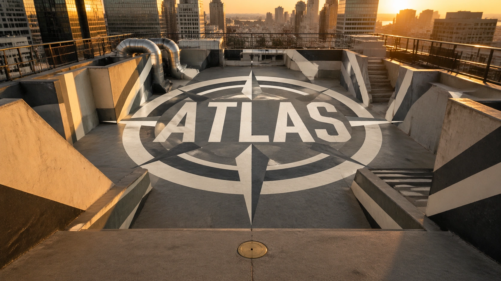
Example generated from “Rooftop Atlas Mark — ChaosRealmsAI · MIT”
GPT Image 2en

Scene: A high rooftop terrace photographed from a single marked viewing point at golden hour, looking down across concrete slabs, railings, stair walls, air ducts, and painted floor zones. The camera is exactly at the intended illusion viewpoint. Subject: A large anamorphic floor-and-wall painting is stretched across many surfaces so that from this camera angle it resolves into the clean readable word ATLAS inside a simple circular compass mark. Outside the resolved viewpoint, the painted pieces are visibly distorted across different planes. Important details: Photorealistic architectural photography, wide-angle lens, accurate perspective convergence, painted matte pigments on concrete, subtle shadows proving the surfaces are real, one small brass viewing marker on the terrace floor, crisp geometry, strong but believable optical illusion. Use case: Independent Prompt Atlas image testing optical-illusion geometry, readable text placement, and perspective reasoning in one generated image. Constraints: Only readable text should be ATLAS inside the illusion, no real brand logos, no watermark, no extra signage, no drone view, no impossible floating shapes, preserve exact 16:9 aspect ratio.

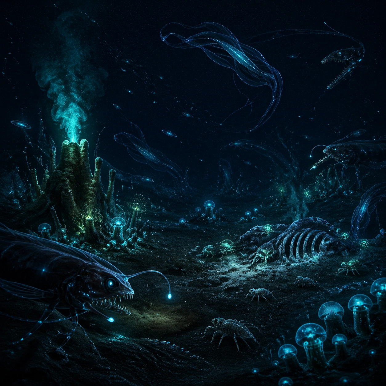
Example generated from “Abyssal Bioluminescent Ecosystem — ChaosRealmsAI · MIT”
GPT Image 2en

Scene: Create a wide abyssal seafloor panorama at roughly four thousand meters depth, viewed from slightly above the sediment plain. The frame should feel almost black at first glance, then gradually reveal blue, teal, and acid-green points of living light across vents, shells, drifting bodies, and suspended marine snow. Build the frame as a square natural history study with disciplined composition, believable lighting, and enough environmental evidence to explain how this organism or system functions without any caption. Keep the image polished, observational, and suitable for a research gallery rather than pulp fantasy spectacle. Subject: Focus on a complete community: lure-jawed hunters hovering near the edges, pulsing sessile colonies rooted in the mud, ribbon medusae drifting through the water column, and small scavengers tracing luminous paths between carcass falls and mineral seeps. Show the anatomy, habitat interaction, and scale cues clearly so the viewer can infer locomotion, feeding, reproduction, or ecological role from the visual alone. Every visible structure should feel evolved for a purpose, with layered foreground, midground, and background information that rewards close inspection. Important details: Treat the abyss as a high-pressure ecosystem where light is scarce, energy is expensive, and every glow pattern carries a function such as luring prey, signaling kin, masking silhouette edges, or attracting symbiotic cleaners. Emphasize pressure-shaped anatomy, soft sediment plumes, faint particulate haze, and distinct glow signatures for each clade so the viewer can read trophic roles at a glance. Keep the illumination physically plausible, with bright organs softly haloing nearby surfaces rather than flooding the whole environment. Favor coherent biology over decorative excess: tissues, shells, membranes, spores, tendrils, fins, silica lattices, or atmospheric sacs should all follow one material logic. Preserve a convincing relationship between the environment and the body plan, use restrained color hierarchy, and make the image feel like a serious speculative field record rather than a random monster concept. Use case: Abyssal Bioluminescent Ecosystem single study 1/9. Constraints: No readable text, no watermark, no logos, preserve exact 1:1 aspect ratio, no diver, no submarine, no sunbeams, no surface-water clarity, no volcanic lava look, no accidental brand resemblance, no direct copy of known terrestrial species, no cartoon simplification.

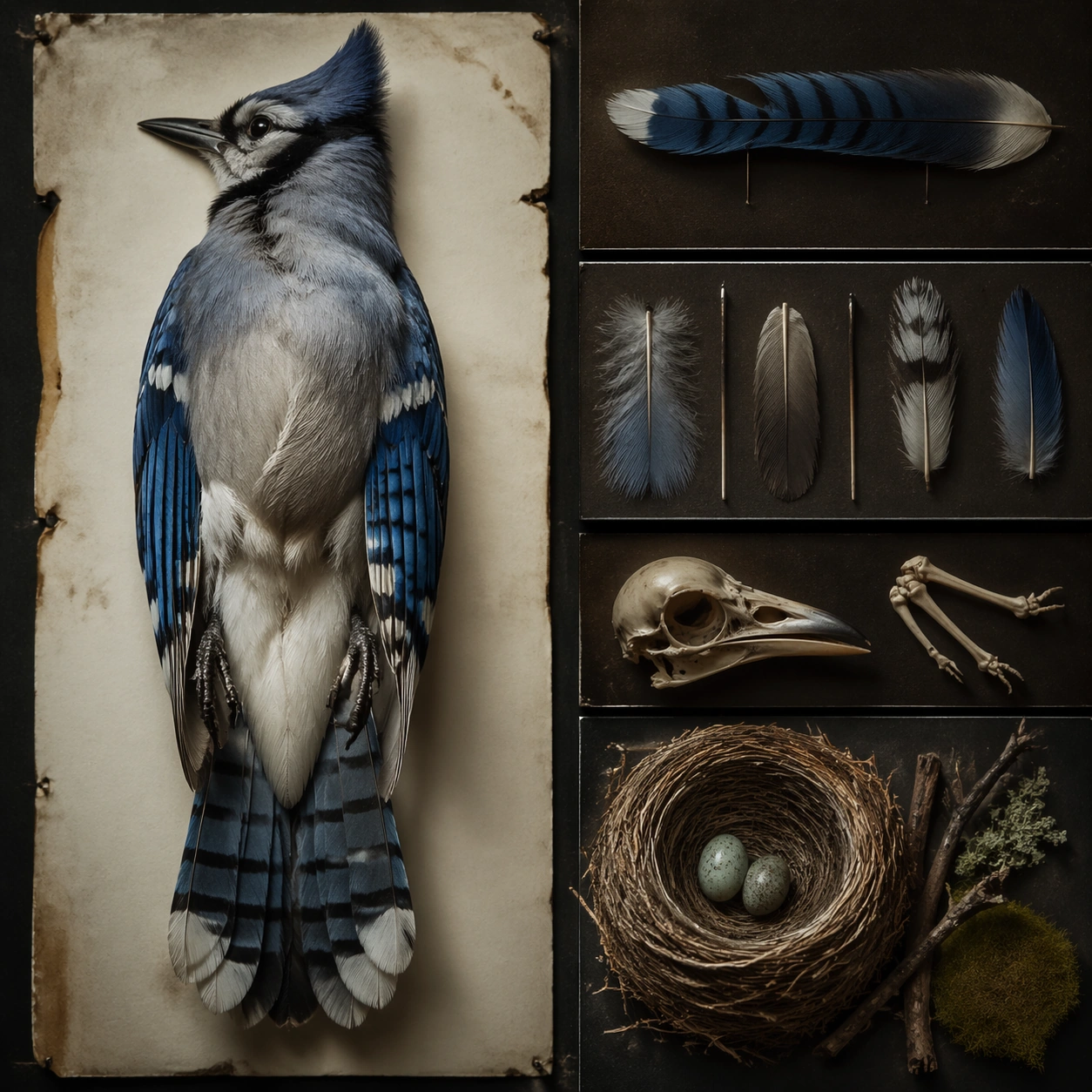
Example generated from “Bird Specimen Display — ChaosRealmsAI · MIT”
GPT Image 2en

Scene: A square photographic image with intentional lens choice, coherent light, and a subject that feels observed rather than merely decorated. Build the frame around a definitive frame that establishes the subject’s strongest visual identity. Keep the lighting, camera distance, and spatial organization tuned for a high-signal research image rather than a casual snapshot. The image belongs to the Audubon Specimen Atlas theme and should feel immediately legible as a prompt atlas theme for audubon specimen atlas, testing structured-layout, technical-diagram with gpt image 2.. Subject: Center the study on a definitive frame that establishes the subject’s strongest visual identity. Translate the theme into a concrete visual statement instead of an abstract mood board: the viewer should understand what kind of image this is, what is being tested, and why the composition is difficult. Use the slug idea of audubon specimen atlas as a literal guide for subject matter, materials, and staging. If helpful, borrow the broad visual cues suggested by John James Audubon, Maria Sibylla Merian, but keep the result original and specific to this study. Important details: The realism should come from timing, optics, and material response: atmosphere, contrast, depth, motion, and tiny physical cues all need to agree. Preserve a disciplined square composition, clear focal hierarchy, and enough secondary information to make the image feel complete rather than underspecified. The image should look polished, novel, and exhibition-ready, with topic-specific credibility coming from the way surfaces, structure, and visual language reinforce Audubon Specimen Atlas. Avoid generic filler elements that do not serve the main concept. Use case: Audubon Specimen Atlas single study 1/8, testing structured-layout, technical-diagram through the hero shot variation. Constraints: No readable text, no watermark, no logos, preserve exact 1:1 aspect ratio, no watermark, no cheap HDR excess, no unreadable signage, no fake stock-photo posing, no compositing seams, no arbitrary lens flare.

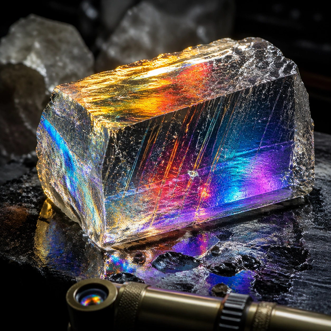
Example generated from “Prismatic Material Macro — ChaosRealmsAI · MIT”
GPT Image 2en

Scene: A square material-focused image where lighting, scale, and surface behavior are the main event. Build the frame around the dominant material language shown with full confidence. Keep the lighting, camera distance, and spatial organization tuned for a high-signal research image rather than a casual snapshot. The image belongs to the Complex Optics Materials theme and should feel immediately legible as a prompt atlas theme for complex optics materials, testing photorealism, physics-materials, reasoning-composition with gpt image 2.. Subject: Center the study on the dominant material language shown with full confidence. Translate the theme into a concrete visual statement instead of an abstract mood board: the viewer should understand what kind of image this is, what is being tested, and why the composition is difficult. Use the slug idea of complex optics materials as a literal guide for subject matter, materials, and staging. Important details: Microstructure matters: refraction, fibers, scratches, pores, edge wear, translucency, and dust should all feel physically specific. Preserve a disciplined square composition, clear focal hierarchy, and enough secondary information to make the image feel complete rather than underspecified. The image should look polished, novel, and exhibition-ready, with topic-specific credibility coming from the way surfaces, structure, and visual language reinforce Complex Optics Materials. Avoid generic filler elements that do not serve the main concept. Use case: Complex Optics Materials single study 1/8, testing photorealism, physics-materials, reasoning-composition through the surface hero variation. Constraints: No readable text, no watermark, no logos, preserve exact 1:1 aspect ratio, no generic stock macro, no broken scale cues, no plastic-looking texture when it should feel natural, no meaningless blur, no watermark, no fake labels.

Example generated from “Silicon Scout Field Sketch — ChaosRealmsAI · MIT”
GPT Image 2en

Scene: Render a cream field-journal page viewed straight on, with a principal side-profile study occupying the center and subtle pen-and-wash shadows grounding it on the paper. The page should feel handled, observational, and elegant, with quiet warm desert tones embedded in the illustration rather than modern digital gloss. Build the frame as a square natural history study with disciplined composition, believable lighting, and enough environmental evidence to explain how this organism or system functions without any caption. Keep the image polished, observational, and suitable for a research gallery rather than pulp fantasy spectacle. Subject: Depict a mobile silicon scout organism with faceted load-bearing limbs, a crystal sensor crest, abrasion-smoothed ventral plates, and mineral intake grooves along the lower body. Surround the main profile with a few smaller inset views of foot structure and crest orientation, but keep the page visually calm. Show the anatomy, habitat interaction, and scale cues clearly so the viewer can infer locomotion, feeding, reproduction, or ecological role from the visual alone. Every visible structure should feel evolved for a purpose, with layered foreground, midground, and background information that rewards close inspection. Important details: Assume these organisms use mineral accretion, fracture repair, thermal gradients, and electrochemical surfaces instead of flesh-heavy metabolisms. Forms should look feasible for an arid silicon ecology: faceted growth, abrasive wear, and slow but purposeful movement across sand and rock. The page must read as serious natural history illustration: crisp line work, restrained wash color, and careful emphasis on how fracture lines also function as joints, heat fins, or growth seams. Avoid decorative gem fantasy and instead show wear, dust accumulation, and field-use plausibility. Favor coherent biology over decorative excess: tissues, shells, membranes, spores, tendrils, fins, silica lattices, or atmospheric sacs should all follow one material logic. Preserve a convincing relationship between the environment and the body plan, use restrained color hierarchy, and make the image feel like a serious speculative field record rather than a random monster concept. Use case: Crystal Silicon Lifeform Field Sketch single study 1/9. Constraints: No readable text, no watermark, no logos, preserve exact 1:1 aspect ratio, no readable labels, no blueprint neon, no jewelry glamour, no polished fantasy crystal monster, no accidental brand resemblance, no direct copy of known terrestrial species, no cartoon simplification.

Example generated from “Floating Forest on an Exoplanet — ChaosRealmsAI · MIT”
GPT Image 2en

Scene: Create a wide environmental survey of a low-gravity plain beneath a drifting archipelago of forest canopies. The square frame should include several floating tree masses at different distances, long root tendrils hanging toward the ground, and a violet-gold sky with visible atmospheric depth rather than fantasy haze. Build the frame as a square natural history study with disciplined composition, believable lighting, and enough environmental evidence to explain how this organism or system functions without any caption. Keep the image polished, observational, and suitable for a research gallery rather than pulp fantasy spectacle. Subject: Show the ecosystem as a complete vertical system: mature canopy islands overhead, ground vegetation adapted to shade pulses below, and small glider fauna moving between hanging roots. The floating masses should feel heavy yet suspended by plausible buoyant anatomy and air movement. Show the anatomy, habitat interaction, and scale cues clearly so the viewer can infer locomotion, feeding, reproduction, or ecological role from the visual alone. Every visible structure should feel evolved for a purpose, with layered foreground, midground, and background information that rewards close inspection. Important details: Assume low gravity, persistent updrafts, and buoyant tissues let mature canopy masses hover while root tendrils still harvest minerals and moisture from the ground. Organisms should visibly respond to vertical distance, drifting substrates, and unstable aerial habitat. Make the canopy islands structurally convincing by showing gas-filled trunk chambers, braided root cables, and erosion-resistant soil mats clinging to the upper masses. Avoid arbitrary levitation; everything should suggest adaptation to updrafts, low gravity, and nutrient transport. Favor coherent biology over decorative excess: tissues, shells, membranes, spores, tendrils, fins, silica lattices, or atmospheric sacs should all follow one material logic. Preserve a convincing relationship between the environment and the body plan, use restrained color hierarchy, and make the image feel like a serious speculative field record rather than a random monster concept. Use case: Exoplanet Floating Forest single study 1/9. Constraints: No readable text, no watermark, no logos, preserve exact 1:1 aspect ratio, no magic levitation effect, no floating rocks with no biology, no fantasy castle silhouettes, no readable signage, no accidental brand resemblance, no direct copy of known terrestrial species, no cartoon simplification.

Example generated from “Fluid and Smoke Studio Study — ChaosRealmsAI · MIT”
GPT Image 2en

Scene: A square photographic image with intentional lens choice, coherent light, and a subject that feels observed rather than merely decorated. Build the frame around a definitive frame that establishes the subject’s strongest visual identity. Keep the lighting, camera distance, and spatial organization tuned for a high-signal research image rather than a casual snapshot. The image belongs to the Fluid Smoke Explosion theme and should feel immediately legible as a prompt atlas theme for fluid smoke explosion, testing physics-materials, commercial-mockup with gpt image 2.. Subject: Center the study on a definitive frame that establishes the subject’s strongest visual identity. Translate the theme into a concrete visual statement instead of an abstract mood board: the viewer should understand what kind of image this is, what is being tested, and why the composition is difficult. Use the slug idea of fluid smoke explosion as a literal guide for subject matter, materials, and staging. Important details: The realism should come from timing, optics, and material response: atmosphere, contrast, depth, motion, and tiny physical cues all need to agree. Preserve a disciplined square composition, clear focal hierarchy, and enough secondary information to make the image feel complete rather than underspecified. The image should look polished, novel, and exhibition-ready, with topic-specific credibility coming from the way surfaces, structure, and visual language reinforce Fluid Smoke Explosion. Avoid generic filler elements that do not serve the main concept. Use case: Fluid Smoke Explosion single study 1/8, testing physics-materials, commercial-mockup through the hero shot variation. Constraints: No readable text, no watermark, no logos, preserve exact 1:1 aspect ratio, no watermark, no cheap HDR excess, no unreadable signage, no fake stock-photo posing, no compositing seams, no arbitrary lens flare.

Example generated from “Hopeful Adoption Portrait Poster — ChaosRealmsAI · MIT”
GPT Image 2en

Scene: A square adoption or rescue awareness visual designed for nonprofits, shelters, and community campaigns. Combine documentary style pet portraiture with organized communication layout, placeholder information zones, and enough polish to work across posters, social posts, event promotion, or donor materials. The frame should invite empathy and action without relying on guilt, shock, or clutter. Keep the visual system warm, dignified, and highly reusable. Use a clean neutral backdrop or tidy shelter corner with warm light and poster-like layout bands arranged around the animal portrait. Subject: Focus on one rescue or adoption story cue: hopeful portrait, foster care, bonded pair, senior pet dignity, volunteer support, event outreach, or successful home placement. Animals must remain central and treated with respect. Human presence can appear when it reinforces care or belonging, but the image should never become generic family advertising. The emotional tone should be humane, honest, and forward looking. Feature a rescue dog or cat looking directly at the camera with calm alertness and visible individuality rather than generic cuteness. Important details: Use clean nonprofit design signals such as modular card framing, gentle color blocks, bulletin space, and social-native hierarchy without readable text. Shelter environments should appear tidy and humane, not bleak. Show resilience, companionship, and possibility. The result should feel immediately useful for a real rescue team building an awareness kit, volunteer pack, event series, or donation appeal with credible imagery. The image should make the pet feel unforgettable and adoptable while preserving dignity and real world honesty. Use case: Adoption and Rescue Awareness Kit single study 1/9, hopeful portrait poster for a commercially reusable prompt atlas example. Constraints: No readable text, no watermark, no logos, preserve exact 1:1 aspect ratio, no trauma sensationalism, no chain fence misery clichés, no readable slogans, no disaster exploitation, no cluttered shelter chaos, no pity pose manipulation, no sad dark vignette, no shabby neglect styling, no cartoon poster effects.

Example generated from “Album Rollout Still Life — ChaosRealmsAI · MIT”
GPT Image 2en

Scene: A square editorial still life photographed from a slight overhead angle on a brushed metal table, with folded sleeves, translucent plastic, chrome jewelry, and reflected circular light patterns arranged as if they belong to a deluxe album gatefold. The lighting should be low, glossy, and tactile, with cool cobalt shadows and thin ember highlights on edges and corners. Subject: The subject is not a person but a coherent family of release objects: an abstract sleeve, a translucent insert, a metallic pendant echoing the halo motif, scattered photographic contact prints without readable text, and a slim cassette-like object tucked into the composition. The arrangement must feel like a believable music-package spread rather than a random fashion flat lay. Important details: Keep the visual language tied to a premium record rollout: disciplined spacing, empty panels where title blocks could live later, and a strong sense of collectible material quality. Reflections should reinforce the circular motif without becoming a literal logo. The composition should communicate release identity, sequencing, and tactile desire using light, finish, and layout rhythm rather than words. Use case: Album Rollout single study 5/9 for the Album Cover and Single Rollout System Prompt Atlas theme. Constraints: No readable text, no watermark, no logos, preserve exact 1:1 aspect ratio, no human face, no brand labels, no price tags, no chaotic clutter, no food or lifestyle objects unrelated to music packaging

Example generated from “AI Notebook Launch Page — ChaosRealmsAI · MIT”
GPT Image 2en

Scene: A square premium SaaS launch-page still shown front-on like the first viewport and first supporting modules of a polished website. Use a quiet cream-to-stone background, thin graphite dividers, and one soft aurora-like gradient behind the hero. The page should feel expensive, calm, and organized, with strong vertical rhythm from hero area to feature cards to CTA strip. Subject: Center a laptop product screenshot for an AI notebook assistant, with a companion mobile screen floating to one side. The desktop screen should imply a clean note editor, threaded side panel, and highlighted insight cards, while the phone shows a compact daily summary. Around the screenshots, build a believable launch-page hierarchy using abstract headline bars, short paragraph blocks, a two-button CTA row, three feature cards, and a testimonial module with avatar circles. Add a subtle hero illustration of paper sheets turning into light ribbons behind the screens. Important details: The composition must feel like a real app launch page rather than a collage of UI. Product screenshots are the proof, hero art supports the story, and the lower modules establish conversion logic. Keep alignment precise, spacing generous, and the screenshot language consistent across devices. Typography zones should remain unreadable, appearing as elegant bars and glyph-like textures rather than actual copy. The page needs a clear premium product-marketing cadence from top hero to social proof to download section. Use case: App Launch Hero System single study 1/9, testing whether screenshot-led SaaS hero design can coexist with abstract brand art and strong conversion hierarchy. Constraints: No readable text, no watermark, no logos, preserve exact 1:1 aspect ratio, no browser chrome, no cluttered dashboard overload, no fake lorem ipsum, no stock-photo humans dominating the frame, no messy overlapping cards, no distorted laptop or phone perspective.

Example generated from “Productivity App Launch Mockup — ChaosRealmsAI · MIT”
GPT Image 2en

Scene: A square launch-page board for a consumer productivity app, composed as a premium design presentation with one central phone render, two secondary screen crops, and surrounding modular landing-page sections. Use bright daylight studio lighting, soft white surfaces, deep slate blue accents, muted mint highlights, and a few disciplined coral signals. The view is front-facing with slight depth from shadows and layered cards, giving the board a polished commercial realism. Subject: Design a believable focus-and-planning app marketing page kit. The main phone should show a quiet dashboard with task stacks, scheduling blocks, a concentration timer, and progress rings. Around it, show supporting modules for feature explanation, screenshot detail, and store-promo extension, all using the same rounded UI language and careful spacing. The composition should feel ready for a real launch campaign, with enough device realism to look trustworthy and enough layout structure to read as a formal marketing page rather than a random mockup. Any copy areas must be represented as elegant abstract bars instead of readable words. Important details: Keep the device materials realistic, the interface crisp, and the module hierarchy easy to scan. Make the selling points feel calm, capable, and mature rather than flashy. The board should balance product storytelling, screenshot credibility, and premium restraint. Every section should look intentionally designed for conversion, App Store extension, and editorial product marketing. Use case: App Launch Marketing Page Kit single study 1/5, testing a premium productivity launch angle. Constraints: No readable text, no watermark, no logos, preserve exact 1:1 aspect ratio, no exaggerated fantasy effects, no crowded widget chaos, no warped phone geometry, no duplicate inconsistent interfaces, no lifestyle hands.

Example generated from “Rain-Window Festival Poster — ChaosRealmsAI · MIT”
GPT Image 2en

Scene: A square festival-poster composition with a vast pale gray field and a single rain-streaked apartment window occupying the lower middle third. The framing is static, calm, and slightly distant, like a prestigious arthouse one-sheet photographed for a museum wall. Light is dim blue-gray with one warm tungsten glow behind the glass. Large untouched negative space must dominate the upper half, reserving natural blank zones where title and credits would normally sit without showing readable text. Subject: Behind the window stands an anime-coded young woman with a short black bob, slim shoulders, and a dark coat still wet from rain. She is seen in three-quarter profile, not facing camera, holding a folded umbrella at her side. Her silhouette remains simple and immediately legible, while the tiny room behind her carries selective clues: a chair, a kettle, one unmade bed corner, and a narrow strip of city lights reflected on the pane. The character should feel specific and emotionally recognizable without looking like a direct copy of any existing IP. Important details: This must behave like a premium Cannes or A24-adjacent one-sheet. Keep the layout sparse, the color palette limited to wet concrete gray, muted navy, tobacco amber, and a trace of pale skin tone. Use very fine rain texture and subtle glass reflections, but avoid busy detail. Preserve a disciplined poster hierarchy with one visual anchor, one blank title zone, and a thin understated block where festival laurels or credits might belong as abstract marks only. Use case: Arthouse One-Sheet Anime Remake single study 1/9, focused on melancholy urban restraint and negative-space control. Constraints: No readable text, no watermark, no logos, preserve exact 1:1 aspect ratio, no crowded collage, no glossy blockbuster lighting, no oversized eyes, no extra floating graphic elements.