プロンプト · 創作の探索

プロンプトギャラリー

実際のプロンプトと生成例を探索。次の創作に役立つヒントを見つけ、全文を無料でコピーできます。

生成例
10,974
モデル
17
出典
1277
10,974 件のプロンプト例 · ページ 39 / 229
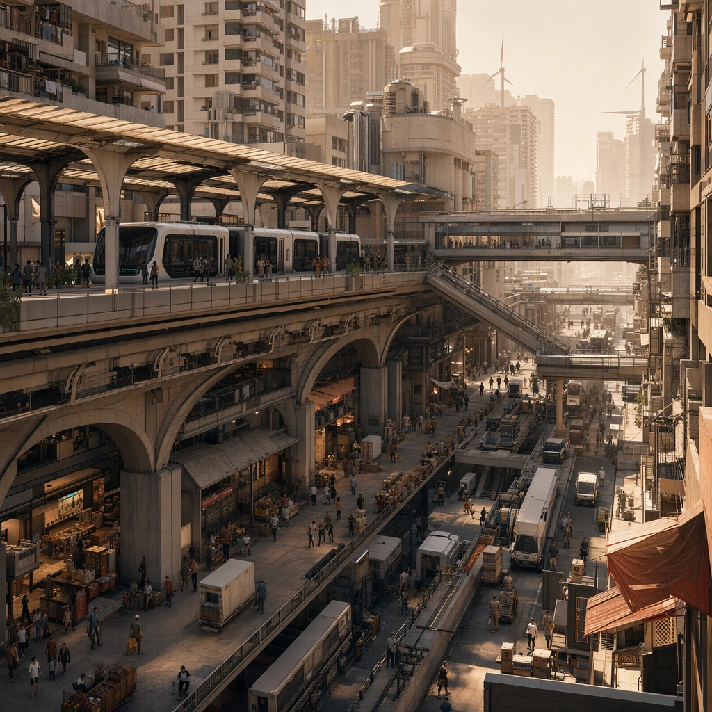
Example generated from “Future City Layered Transport World — Desert Shade Mobility Core”
GPT Image 2en

Scene: Design a square urban concept image that sells one future-city mobility idea clearly enough for an editorial spread, launch visual, or worldbuilding board. The framing should always reveal at least two transport layers and one strong lived-in density cue. Show a sun-blasted city center protected by canopied transit decks, deep arcades, and wind-tempered circulation routes. Subject: Show a complete district-scale mobility ecosystem with believable housing, transit, commerce, and utility access. Human presence can appear as tiny commuters, riders, or maintenance workers, but the main protagonist is the city system itself. The district should read as climate-responsive, with cooling shade, cargo lanes, pedestrian cover, and housing density all integrated into one system. Important details: Use depth layering, disciplined architecture families, and just enough weather or atmosphere to create mood without erasing the logic of roads, bridges, lines, and occupancy. The result should feel specific to a place and function, not like an all-purpose neon metropolis. Favor dusty neutrals, pale metals, and deep shadows while keeping the movement hierarchy extremely clear. Preserve credible circulation between transport levels so every district reads as somewhere people could actually move through and inhabit. Use case: Future City single study 3/5, designed as a self-contained support image for this topic. Constraints: No readable text, no watermark, no logos, preserve exact 1:1 aspect ratio, no superhero chase scenes, no floating random platforms without support, no unreadable giant signage, no sterile empty plazas, no shiny utopian emptiness.
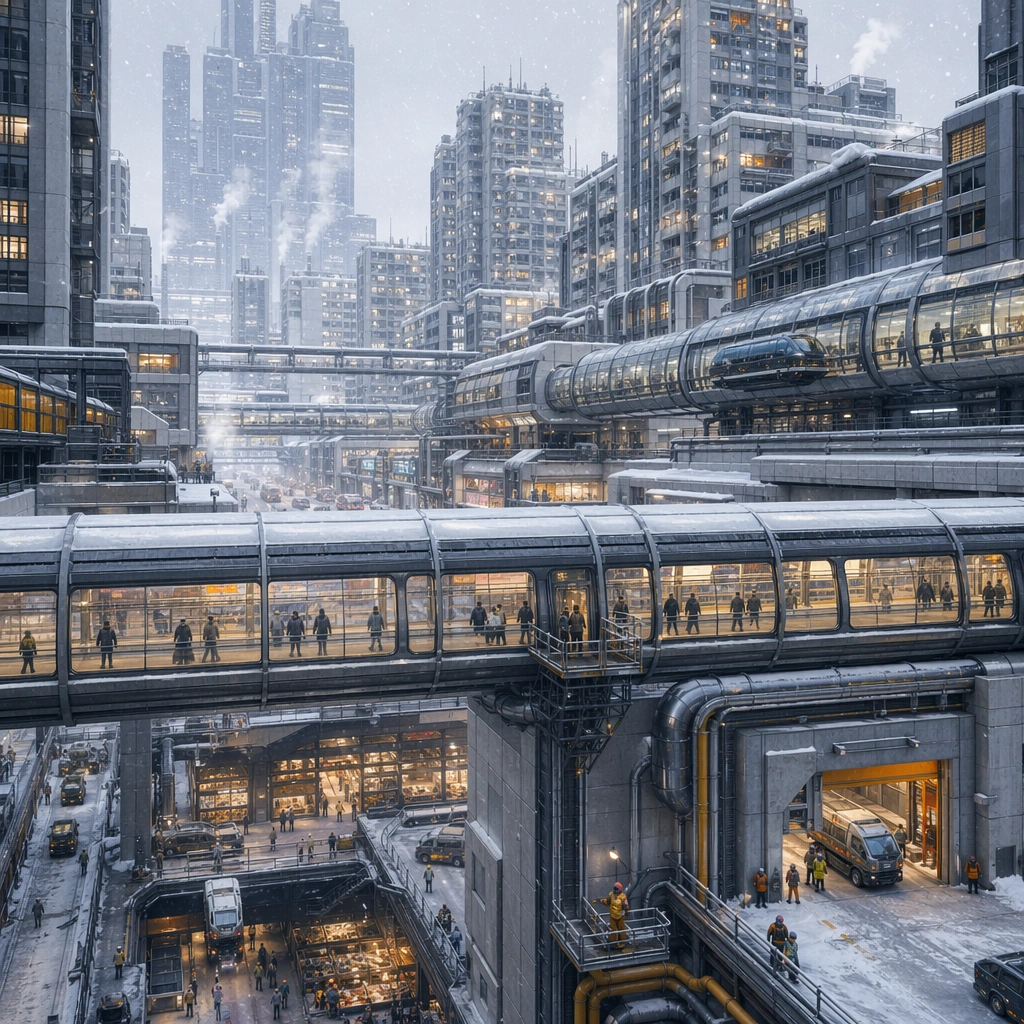
Example generated from “Future City Layered Transport World — Arctic Enclosed Skyway”
GPT Image 2en

Scene: Design a square urban concept image that sells one future-city mobility idea clearly enough for an editorial spread, launch visual, or worldbuilding board. The framing should always reveal at least two transport layers and one strong lived-in density cue. Design a snow-bright district where enclosed skyways stitch together housing blocks, transit tubes, and sheltered market courts. Subject: Show a complete district-scale mobility ecosystem with believable housing, transit, commerce, and utility access. Human presence can appear as tiny commuters, riders, or maintenance workers, but the main protagonist is the city system itself. Make cold-climate survival and movement the protagonists through enclosed circulation, thermal airlocks, and visible utility routing. Important details: Use depth layering, disciplined architecture families, and just enough weather or atmosphere to create mood without erasing the logic of roads, bridges, lines, and occupancy. The result should feel specific to a place and function, not like an all-purpose neon metropolis. The image should feel inhabited and practical, not sterile, with enough warmth in windows and public rooms to suggest daily life. Preserve credible circulation between transport levels so every district reads as somewhere people could actually move through and inhabit. Use case: Future City single study 4/5, designed as a self-contained support image for this topic. Constraints: No readable text, no watermark, no logos, preserve exact 1:1 aspect ratio, no superhero chase scenes, no floating random platforms without support, no unreadable giant signage, no sterile empty plazas, no polar fantasy research dome clichés.

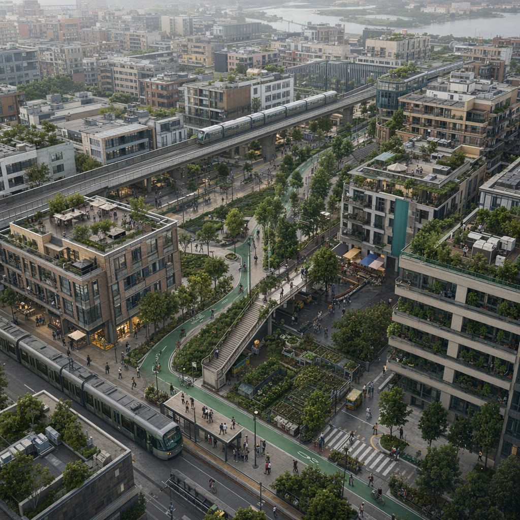
Example generated from “Future City Layered Transport World — Civic Green Loop”
GPT Image 2en

Scene: Design a square urban concept image that sells one future-city mobility idea clearly enough for an editorial spread, launch visual, or worldbuilding board. The framing should always reveal at least two transport layers and one strong lived-in density cue. Compose a neighborhood from above where a green mobility loop threads through midrise housing, tram stops, and civic terraces. Subject: Show a complete district-scale mobility ecosystem with believable housing, transit, commerce, and utility access. Human presence can appear as tiny commuters, riders, or maintenance workers, but the main protagonist is the city system itself. Show how transit, public planting, and everyday amenities coexist without surrendering density or efficiency. Important details: Use depth layering, disciplined architecture families, and just enough weather or atmosphere to create mood without erasing the logic of roads, bridges, lines, and occupancy. The result should feel specific to a place and function, not like an all-purpose neon metropolis. The district should feel plausible for a real planning board, with readable circulation, believable public space, and minimal decorative excess. Preserve credible circulation between transport levels so every district reads as somewhere people could actually move through and inhabit. Use case: Future City single study 5/5, designed as a self-contained support image for this topic. Constraints: No readable text, no watermark, no logos, preserve exact 1:1 aspect ratio, no superhero chase scenes, no floating random platforms without support, no unreadable giant signage, no sterile empty plazas, no suburban emptiness, no giant sculptural gimmicks.

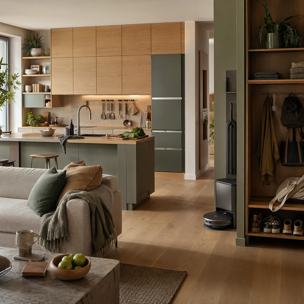
Example generated from “Future Domestic Life Environment Visions — Domestic Habitat Anchor”
GPT Image 2en

Scene: Create a square near-future domestic interior that feels photographed for an editorial concept spread rather than a sterile showroom. Light should feel natural and inhabitable, with enough softness to imply routine use while preserving product and spatial clarity. The framing should reveal both room layout and the material relationship between furniture, appliances, storage, and circulation. Frame a combined kitchen and living zone with morning light, adaptable counters, soft seating, and an organized entry shelf visible in the same square composition. Subject: Center the image on a believable domestic system where appliances, furnishings, utilities, and personal habits have evolved slightly into the future without losing everyday realism. The space should feel occupied by real people with routines, maintenance, and storage needs, even if those people are only implied through objects and traces. Establish the reference domestic language through one coherent appliance family, modular cabinetry, quiet robotics, and everyday traces such as cups, produce, and folded textiles. Important details: Prioritize near-future plausibility over flashy gimmicks. Small workflow clues, quiet automation, adaptable surfaces, and durable materials should explain how the room supports daily life. Use refined but grounded color, tactile surfaces, and careful object hierarchy so the results remain useful for brand inspiration and editorial concept work. The anchor image should define the palette, spatial density, and degree of futurism so later variants can stay within the same believable household world. Resolve the anchor rules that later reference-dependent variants must inherit, especially the cabinetry geometry, appliance language, soft material palette, and lived-in storage logic. Use case: Future Domestic series study 1/4, designed as a reusable core-system image for this topic. Constraints: No readable text, no watermark, no logos, preserve exact 1:1 aspect ratio, no luxury showroom emptiness, no perfect sterile sci-fi lab look, no floating hologram clutter, no unreadable brand marks, no empty luxury penthouse feel.

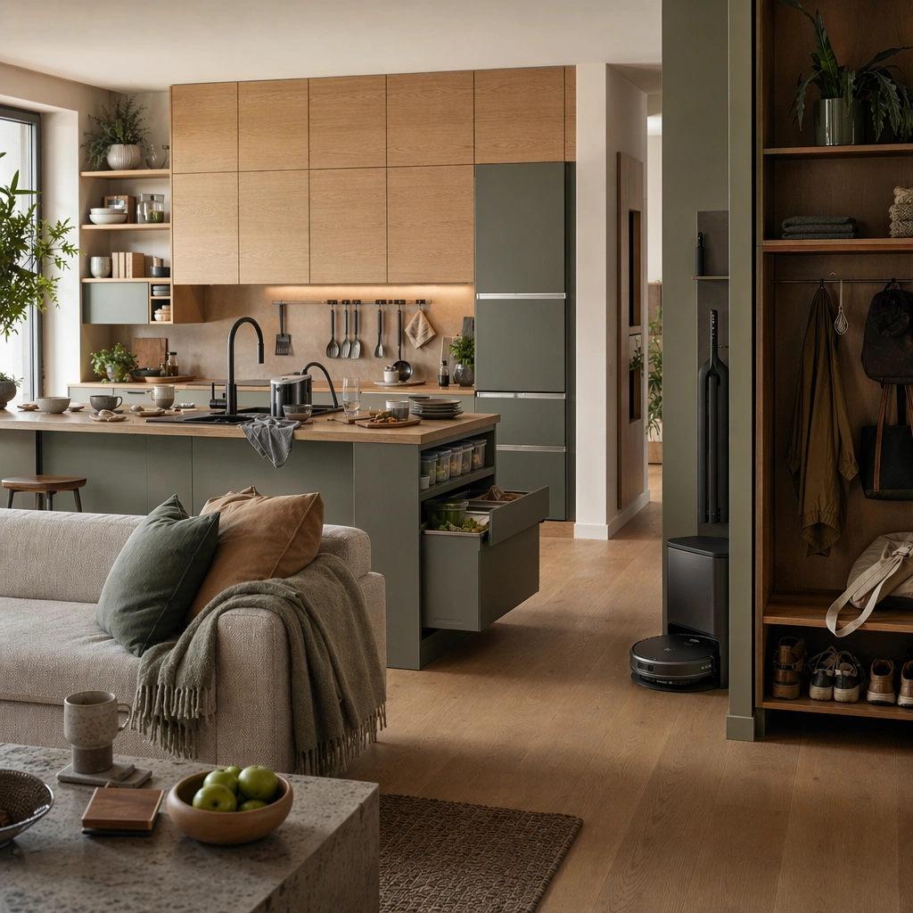
Example generated from “Future Domestic Life Environment Visions — Breakfast Cleanup Routine”
GPT Image 2en

Scene: Create a square near-future domestic interior that feels photographed for an editorial concept spread rather than a sterile showroom. Light should feel natural and inhabitable, with enough softness to imply routine use while preserving product and spatial clarity. The framing should reveal both room layout and the material relationship between furniture, appliances, storage, and circulation. Keep the same room family but shift the moment to post-breakfast with soft daylight, half-cleared surfaces, and a compact cleaning device active near the sink. Subject: Center the image on a believable domestic system where appliances, furnishings, utilities, and personal habits have evolved slightly into the future without losing everyday realism. The space should feel occupied by real people with routines, maintenance, and storage needs, even if those people are only implied through objects and traces. Preserve the reference cabinetry, appliance shapes, and seating logic while foregrounding dish flow, food storage, and cleanup choreography. Important details: Prioritize near-future plausibility over flashy gimmicks. Small workflow clues, quiet automation, adaptable surfaces, and durable materials should explain how the room supports daily life. Use refined but grounded color, tactile surfaces, and careful object hierarchy so the results remain useful for brand inspiration and editorial concept work. The image should feel organized and human, using routine traces rather than clutter to show that the space is actively used. Preserve the exact structural language established by the reference image, especially the cabinetry geometry, appliance language, soft material palette, and lived-in storage logic. Use case: Future Domestic series study 2/4, designed as a reusable core-system image for this topic. Constraints: No readable text, no watermark, no logos, preserve exact 1:1 aspect ratio, no luxury showroom emptiness, no perfect sterile sci-fi lab look, no floating hologram clutter, no unreadable brand marks, no messy chaos, no robotic spectacle.

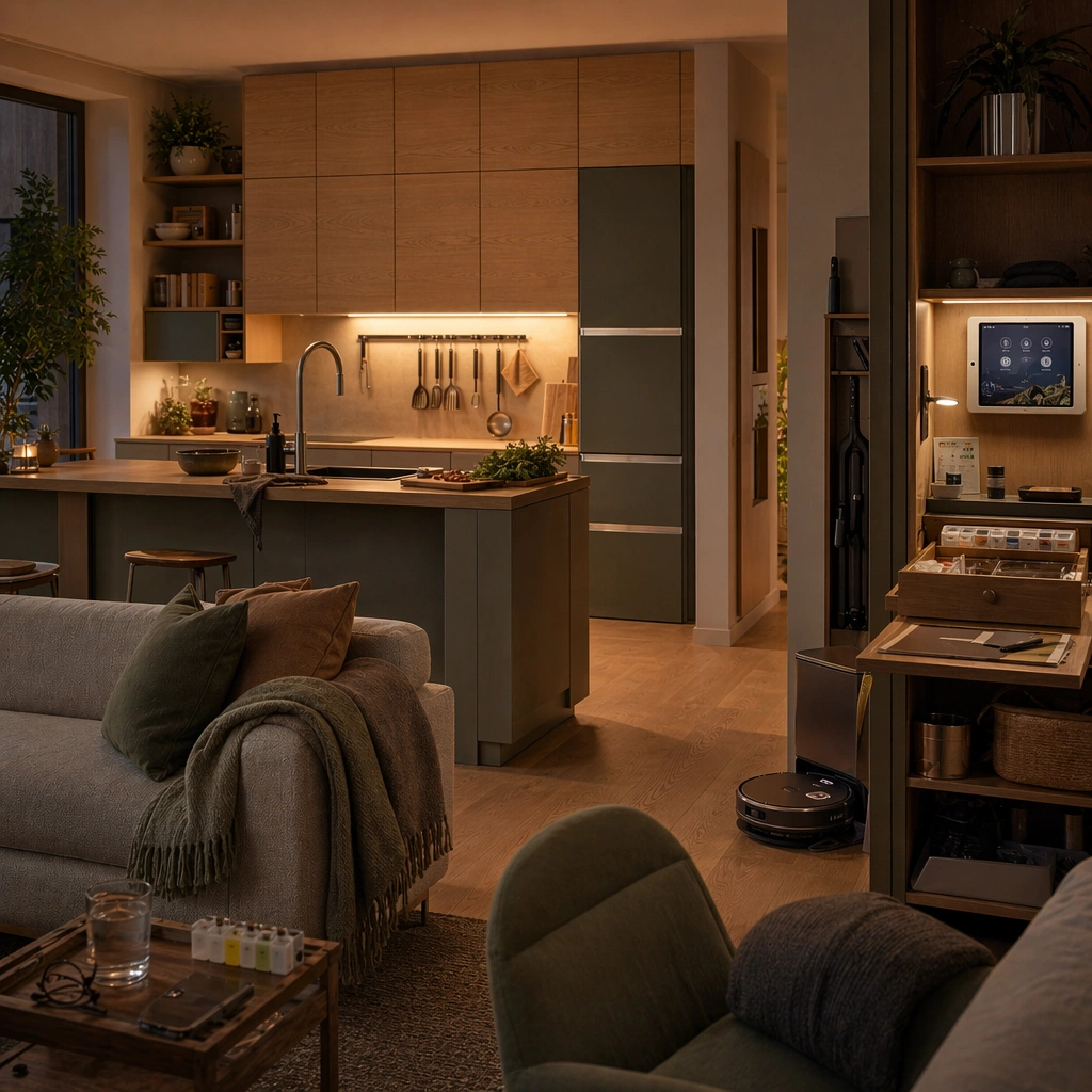
Example generated from “Future Domestic Life Environment Visions — Evening Remote Care Nook”
GPT Image 2en

Scene: Create a square near-future domestic interior that feels photographed for an editorial concept spread rather than a sterile showroom. Light should feel natural and inhabitable, with enough softness to imply routine use while preserving product and spatial clarity. The framing should reveal both room layout and the material relationship between furniture, appliances, storage, and circulation. Render the same material family in an evening setting where a quiet care nook, warm side lighting, and integrated communication surfaces sit beside the living zone. Subject: Center the image on a believable domestic system where appliances, furnishings, utilities, and personal habits have evolved slightly into the future without losing everyday realism. The space should feel occupied by real people with routines, maintenance, and storage needs, even if those people are only implied through objects and traces. Keep the reference furniture and cabinetry language intact while highlighting remote-care tools, medication storage, and comfortable seating for longer use. Important details: Prioritize near-future plausibility over flashy gimmicks. Small workflow clues, quiet automation, adaptable surfaces, and durable materials should explain how the room supports daily life. Use refined but grounded color, tactile surfaces, and careful object hierarchy so the results remain useful for brand inspiration and editorial concept work. This should read as domestic support infrastructure, not futuristic medical theater, with care routines embedded gently into the home. Preserve the exact structural language established by the reference image, especially the cabinetry geometry, appliance language, soft material palette, and lived-in storage logic. Use case: Future Domestic series study 3/4, designed as a reusable core-system image for this topic. Constraints: No readable text, no watermark, no logos, preserve exact 1:1 aspect ratio, no luxury showroom emptiness, no perfect sterile sci-fi lab look, no floating hologram clutter, no unreadable brand marks, no hospital aesthetic, no glowing sci-fi panels.

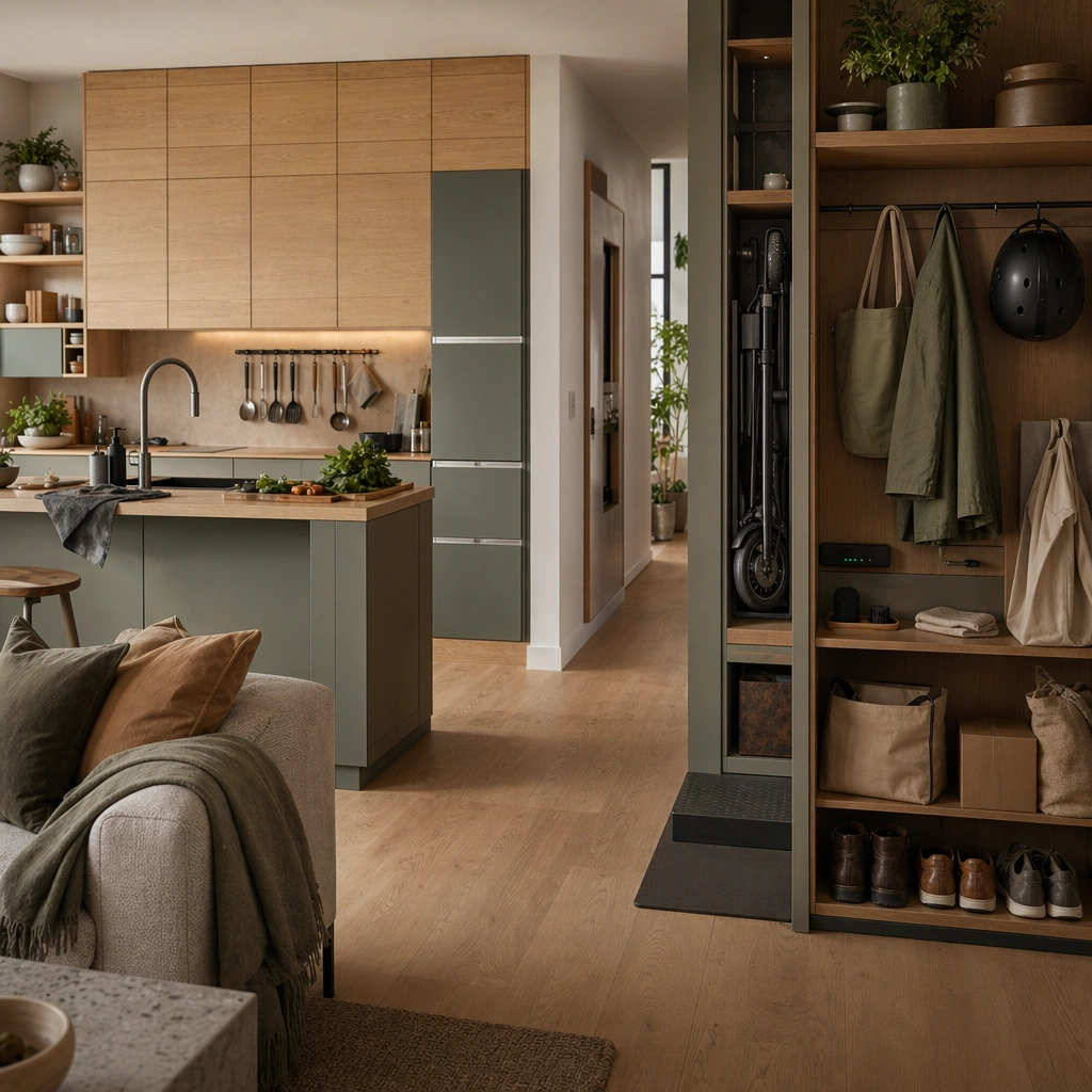
Example generated from “Future Domestic Life Environment Visions — Micro Mobility Entry Bay”
GPT Image 2en

Scene: Create a square near-future domestic interior that feels photographed for an editorial concept spread rather than a sterile showroom. Light should feel natural and inhabitable, with enough softness to imply routine use while preserving product and spatial clarity. The framing should reveal both room layout and the material relationship between furniture, appliances, storage, and circulation. Shift the view toward an entry-adjacent storage bay where folded micro-mobility devices, shoe care, package intake, and charging surfaces sit beside the same home core. Subject: Center the image on a believable domestic system where appliances, furnishings, utilities, and personal habits have evolved slightly into the future without losing everyday realism. The space should feel occupied by real people with routines, maintenance, and storage needs, even if those people are only implied through objects and traces. Preserve the anchor material palette and cabinetry family while making circulation, arrival rituals, and charging logic more prominent. Important details: Prioritize near-future plausibility over flashy gimmicks. Small workflow clues, quiet automation, adaptable surfaces, and durable materials should explain how the room supports daily life. Use refined but grounded color, tactile surfaces, and careful object hierarchy so the results remain useful for brand inspiration and editorial concept work. The scene should feel urban and practical, showing how future domestic life extends from the doorway inward through believable routines. Preserve the exact structural language established by the reference image, especially the cabinetry geometry, appliance language, soft material palette, and lived-in storage logic. Use case: Future Domestic series study 4/4, designed as a reusable core-system image for this topic. Constraints: No readable text, no watermark, no logos, preserve exact 1:1 aspect ratio, no luxury showroom emptiness, no perfect sterile sci-fi lab look, no floating hologram clutter, no unreadable brand marks, no gadget showroom piles.

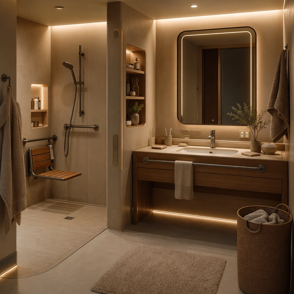
Example generated from “Future Domestic Life Environment Visions — Elder Care Bathroom”
GPT Image 2en

Scene: Design a square near-future living environment study that feels immediately usable as a brand-inspiration image or speculative editorial visual. The scene should show one complete routine surface, not just decorative furniture styling. Design a warm, barrier-conscious bathroom with soft anti-slip materials, integrated supports, seated washing options, and clear night-light guidance. Subject: Focus on a believable room or shared domestic node where human habits, object placement, and light all imply how the space is used every day. Technology should feel embedded in materials, fixtures, and workflows instead of floating as abstract holograms. Focus on dignity and usability through fixture placement, gentle automation, and materials that support care without feeling clinical. Important details: Keep the design humane, tactile, and slightly imperfect so it reads as lived-in. Surfaces, storage, and appliance behavior should all support a credible near-future domestic routine. The room should look premium but ordinary enough to feel buildable in a real housing context. Preserve habitual realism in object placement, cleaning, storage, and circulation so every room feels actually inhabited. Use case: Future Domestic single study 2/5, designed as a self-contained support image for this topic. Constraints: No readable text, no watermark, no logos, preserve exact 1:1 aspect ratio, no generic smart-home wallpaper, no unrealistic levitating furniture, no fashion-shoot posing, no readable packaging copy, no hospital whitebox look.

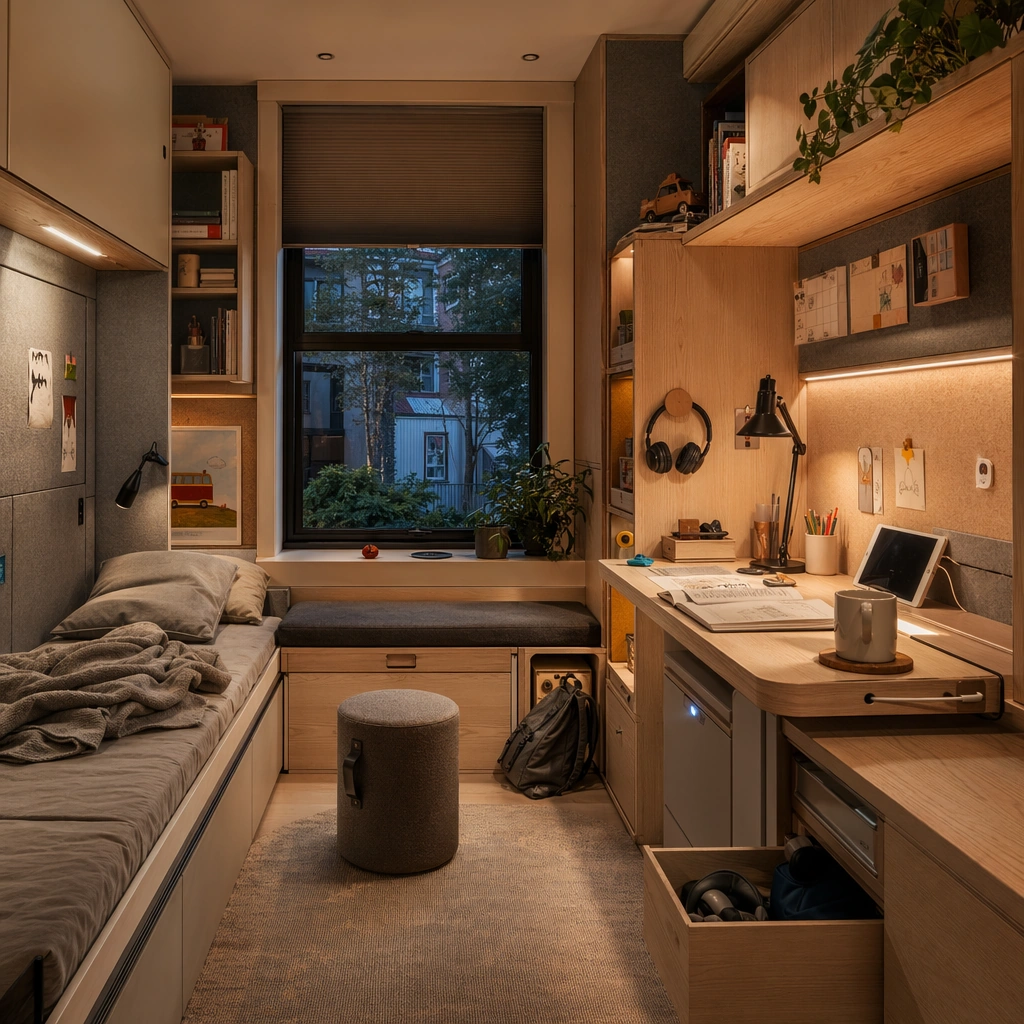
Example generated from “Future Domestic Life Environment Visions — Child Study Bedroom”
GPT Image 2en

Scene: Design a square near-future living environment study that feels immediately usable as a brand-inspiration image or speculative editorial visual. The scene should show one complete routine surface, not just decorative furniture styling. Show a compact bedroom with transformable study surfaces, tucked-away storage, warm reading light, and quiet acoustic treatment. Subject: Focus on a believable room or shared domestic node where human habits, object placement, and light all imply how the space is used every day. Technology should feel embedded in materials, fixtures, and workflows instead of floating as abstract holograms. The room should support school, play, and sleep through furniture logic and object placement rather than novelty gadgets. Important details: Keep the design humane, tactile, and slightly imperfect so it reads as lived-in. Surfaces, storage, and appliance behavior should all support a credible near-future domestic routine. Let scale, safety, and routine flexibility define the space so it feels relevant to real families. Preserve habitual realism in object placement, cleaning, storage, and circulation so every room feels actually inhabited. Use case: Future Domestic single study 3/5, designed as a self-contained support image for this topic. Constraints: No readable text, no watermark, no logos, preserve exact 1:1 aspect ratio, no generic smart-home wallpaper, no unrealistic levitating furniture, no fashion-shoot posing, no readable packaging copy, no toy-store overload.

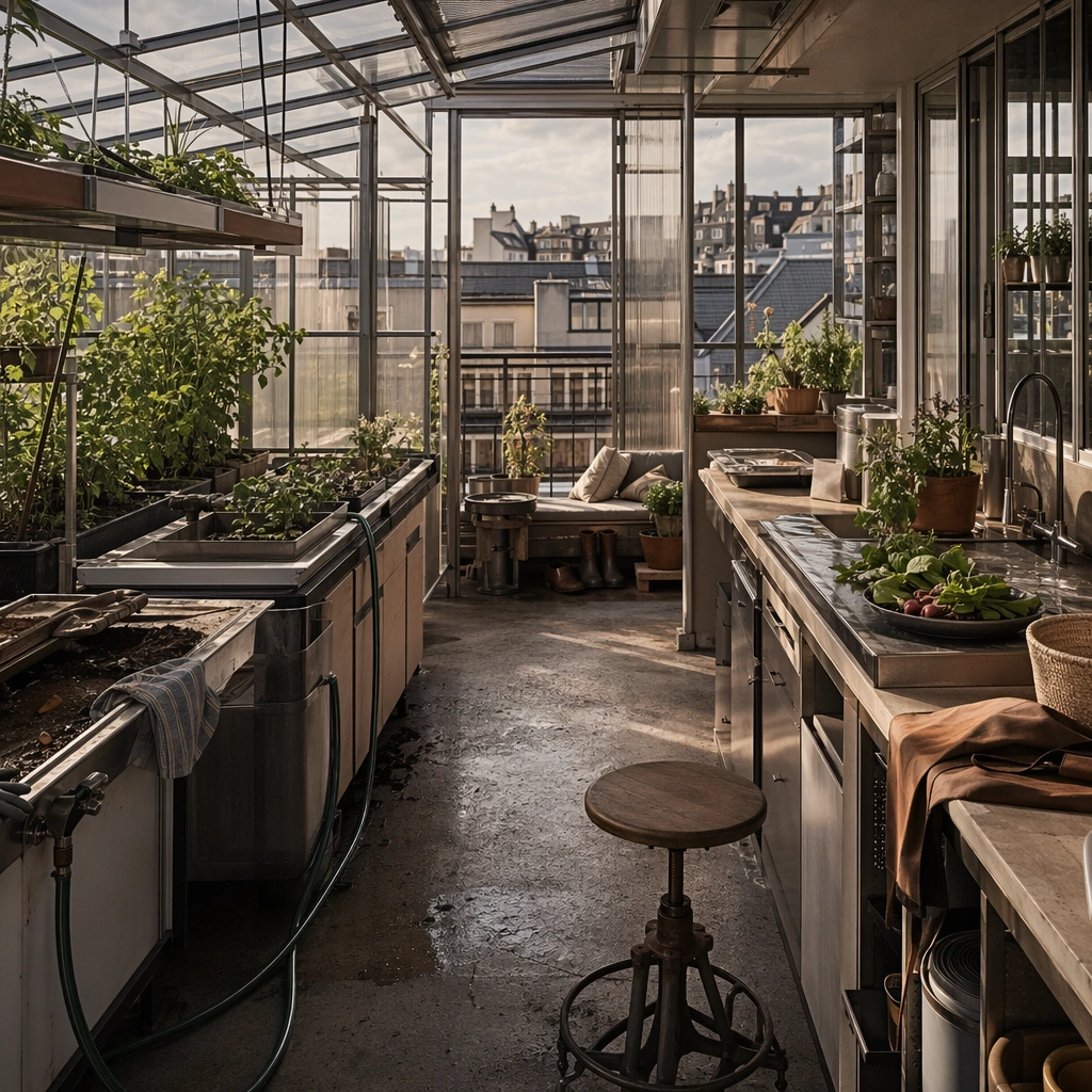
Example generated from “Future Domestic Life Environment Visions — Community Rooftop Greenhouse”
GPT Image 2en

Scene: Design a square near-future living environment study that feels immediately usable as a brand-inspiration image or speculative editorial visual. The scene should show one complete routine surface, not just decorative furniture styling. Compose a sheltered rooftop greenhouse with planting benches, storage lockers, irrigation surfaces, and a view back toward surrounding homes. Subject: Focus on a believable room or shared domestic node where human habits, object placement, and light all imply how the space is used every day. Technology should feel embedded in materials, fixtures, and workflows instead of floating as abstract holograms. Treat the greenhouse as part of everyday domestic life, with harvest prep, seating, and tool care integrated into the same environment. Important details: Keep the design humane, tactile, and slightly imperfect so it reads as lived-in. Surfaces, storage, and appliance behavior should all support a credible near-future domestic routine. The image should feel communal, productive, and realistic rather than utopian or rustic. Preserve habitual realism in object placement, cleaning, storage, and circulation so every room feels actually inhabited. Use case: Future Domestic single study 4/5, designed as a self-contained support image for this topic. Constraints: No readable text, no watermark, no logos, preserve exact 1:1 aspect ratio, no generic smart-home wallpaper, no unrealistic levitating furniture, no fashion-shoot posing, no readable packaging copy, no pastoral farmhouse styling.

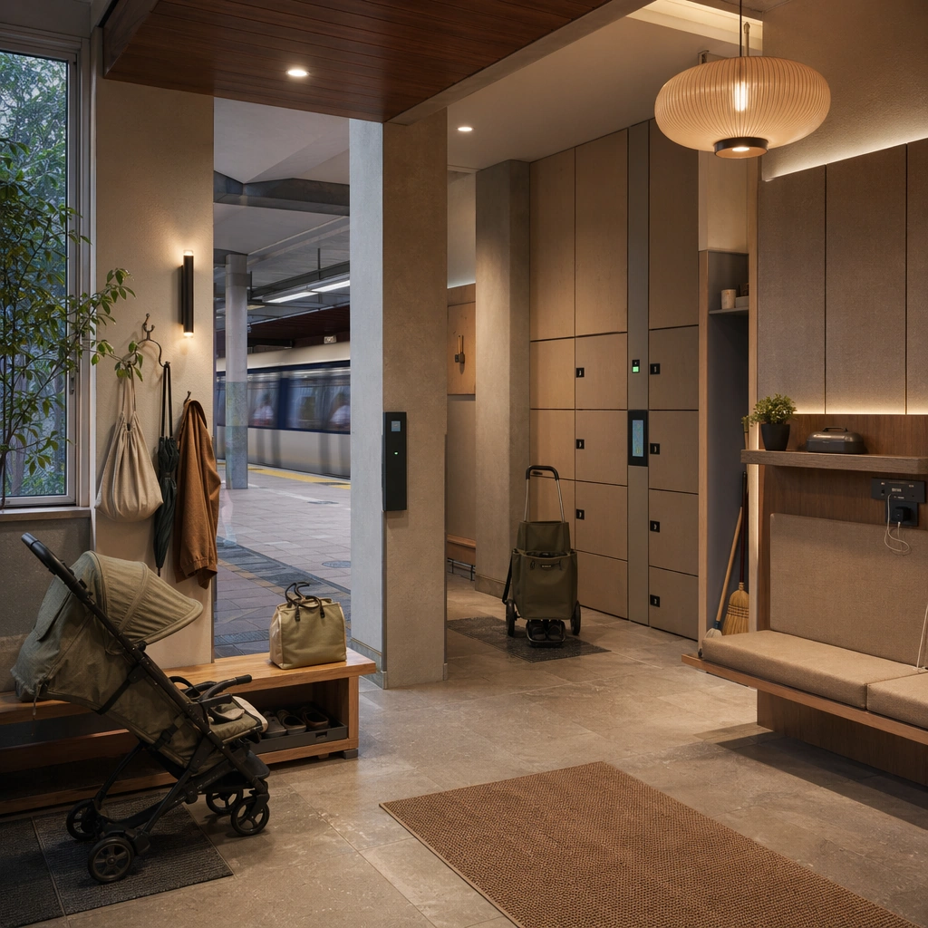
Example generated from “Future Domestic Life Environment Visions — Transit Linked Lobby”
GPT Image 2en

Scene: Design a square near-future living environment study that feels immediately usable as a brand-inspiration image or speculative editorial visual. The scene should show one complete routine surface, not just decorative furniture styling. Show a midrise residential lobby connected directly to a transit node, with lockers, seating, stroller parking, and digital access surfaces embedded cleanly into the architecture. Subject: Focus on a believable room or shared domestic node where human habits, object placement, and light all imply how the space is used every day. Technology should feel embedded in materials, fixtures, and workflows instead of floating as abstract holograms. The space should feel like the first domestic room of the building, balancing security, movement, waiting, and casual neighbor contact. Important details: Keep the design humane, tactile, and slightly imperfect so it reads as lived-in. Surfaces, storage, and appliance behavior should all support a credible near-future domestic routine. Keep the environment calm and plausible, with material durability and daily flow carrying more weight than flashy interfaces. Preserve habitual realism in object placement, cleaning, storage, and circulation so every room feels actually inhabited. Use case: Future Domestic single study 5/5, designed as a self-contained support image for this topic. Constraints: No readable text, no watermark, no logos, preserve exact 1:1 aspect ratio, no generic smart-home wallpaper, no unrealistic levitating furniture, no fashion-shoot posing, no readable packaging copy, no corporate office lobby feel.

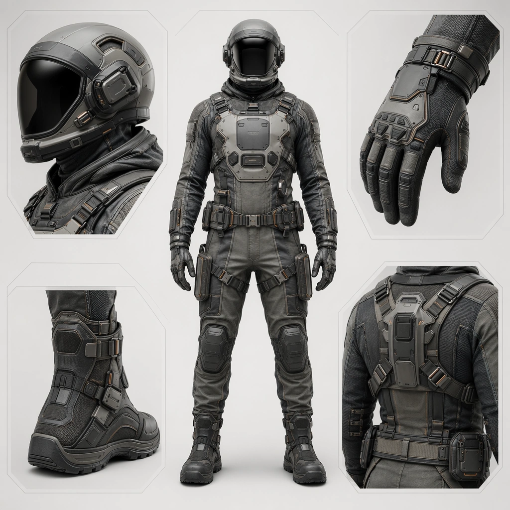
Example generated from “Future Equipment And Suitline System — Suitline Anchor”
GPT Image 2en

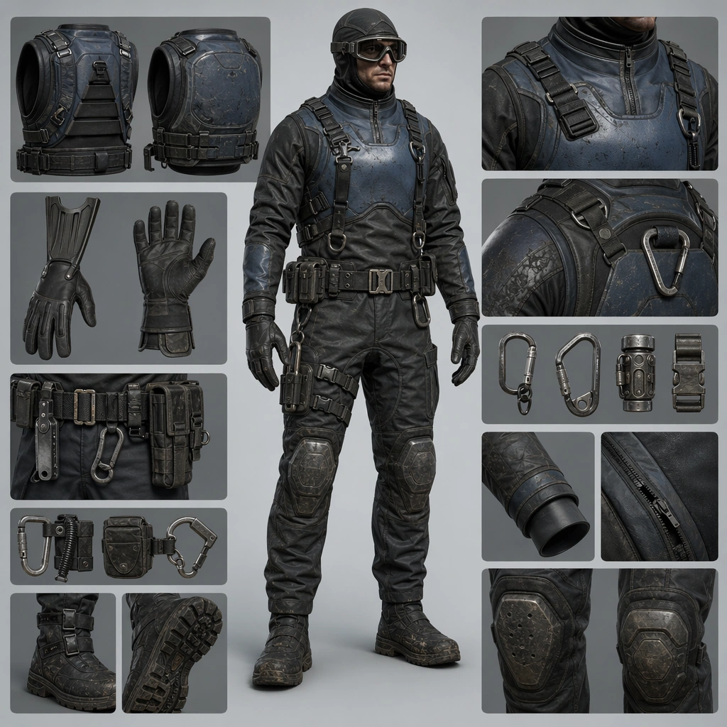
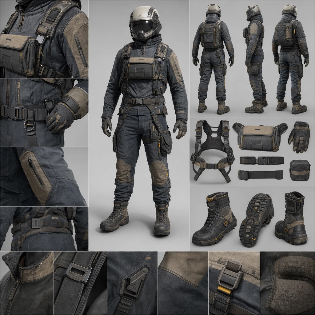
Scene: Create a square product-board image for a future wearable system, balancing full-body presentation, material close-ups, and family-level design coherence. The lighting should feel commercial and physical, revealing fabric, shell, seals, and hardware clearly without flattening the subject. Use a controlled studio or minimal contextual environment that supports readability. Present a neutral full-body wearer centered in the square with detail windows for helmet, glove, boot, and utility harness against a clean product-board background. Subject: Center the image on one coherent suitline: helmet, torso shell, seam system, gloves, boots, harness points, and modular attachments should all read as parts of one product family. The wearer can appear neutral and upright, but the real protagonist is the design system and its task identity. Establish the reference family through one core suit, one compact accessory rail, one chest interface zone, and clearly matched fasteners across all components. Important details: Treat the board as a commercial concept surface. Materials, fastening logic, body protection, comfort cues, and accessory placement must all feel intentional. The suite should look ready for campaign imagery, product family boards, or advanced apparel concept work rather than as a costume illustration. The first image should lock silhouette, material palette, seam rhythm, and attachment strategy so later variants preserve the same family identity. Resolve the anchor rules that later reference-dependent variants must inherit, especially the helmet profile, seam architecture, fastening language, and modular accessory family. Use case: Suitline System series study 1/4, designed as a reusable core-system image for this topic. Constraints: No readable text, no watermark, no logos, preserve exact 1:1 aspect ratio, no superhero spandex cues, no military insignia, no readable labels, no impossible body proportions, no dramatic action pose.

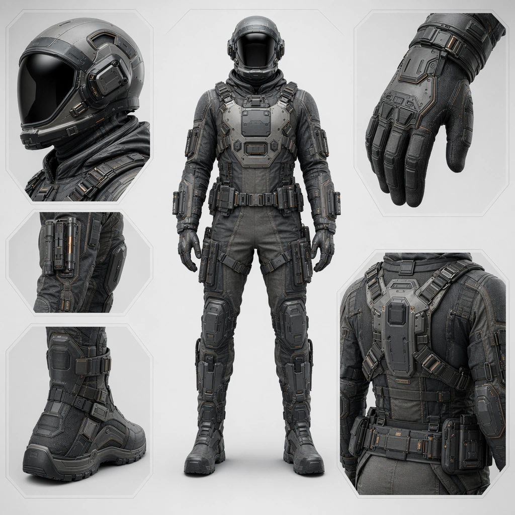
Example generated from “Future Equipment And Suitline System — Extravehicular Engineering Variant”
GPT Image 2en

Scene: Create a square product-board image for a future wearable system, balancing full-body presentation, material close-ups, and family-level design coherence. The lighting should feel commercial and physical, revealing fabric, shell, seals, and hardware clearly without flattening the subject. Use a controlled studio or minimal contextual environment that supports readability. Keep the same body and board language but add reinforced joint covers, external tool mounts, and exposure-ready sealing in a cool technical lighting setup. Subject: Center the image on one coherent suitline: helmet, torso shell, seam system, gloves, boots, harness points, and modular attachments should all read as parts of one product family. The wearer can appear neutral and upright, but the real protagonist is the design system and its task identity. Preserve the reference helmet shape, seam architecture, and hardware family while shifting the configuration toward field engineering durability. Important details: Treat the board as a commercial concept surface. Materials, fastening logic, body protection, comfort cues, and accessory placement must all feel intentional. The suite should look ready for campaign imagery, product family boards, or advanced apparel concept work rather than as a costume illustration. The variant should feel like a product extension rather than a different brand, with clear continuity in every fastening and shell decision. Preserve the exact structural language established by the reference image, especially the helmet profile, seam architecture, fastening language, and modular accessory family. Use case: Suitline System series study 2/4, designed as a reusable core-system image for this topic. Constraints: No readable text, no watermark, no logos, preserve exact 1:1 aspect ratio, no superhero spandex cues, no military insignia, no readable labels, no impossible body proportions, no bulky astronaut parody.

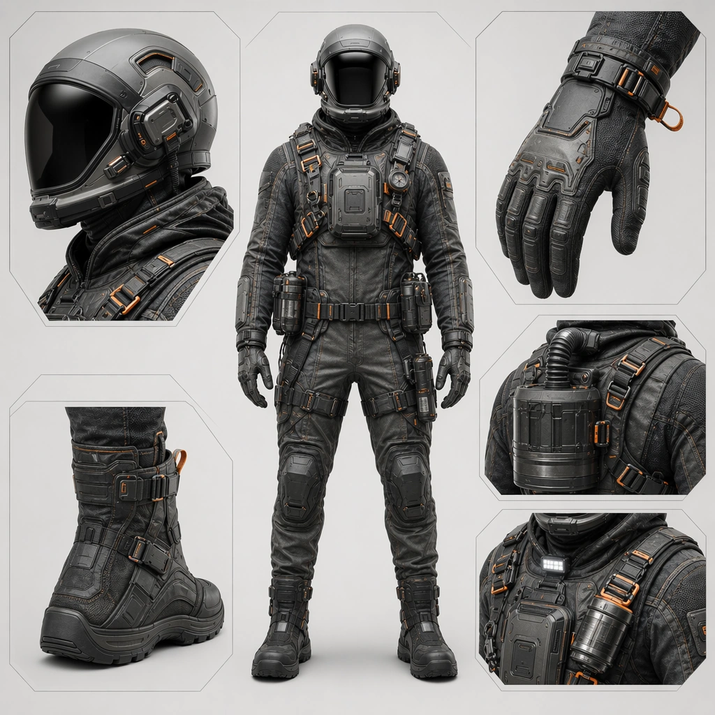
Example generated from “Future Equipment And Suitline System — Hazard Response Variant”
GPT Image 2en

Scene: Create a square product-board image for a future wearable system, balancing full-body presentation, material close-ups, and family-level design coherence. The lighting should feel commercial and physical, revealing fabric, shell, seals, and hardware clearly without flattening the subject. Use a controlled studio or minimal contextual environment that supports readability. Retain the same presentation style while introducing filter modules, quick-release harnessing, and contamination-management details under crisp commercial light. Subject: Center the image on one coherent suitline: helmet, torso shell, seam system, gloves, boots, harness points, and modular attachments should all read as parts of one product family. The wearer can appear neutral and upright, but the real protagonist is the design system and its task identity. Keep the base helmet and seam family intact while emphasizing emergency function, visibility accents, and rapid-deploy accessories. Important details: Treat the board as a commercial concept surface. Materials, fastening logic, body protection, comfort cues, and accessory placement must all feel intentional. The suite should look ready for campaign imagery, product family boards, or advanced apparel concept work rather than as a costume illustration. Hazard readiness must feel credible and product-like, not militarized or theatrical. Preserve the exact structural language established by the reference image, especially the helmet profile, seam architecture, fastening language, and modular accessory family. Use case: Suitline System series study 3/4, designed as a reusable core-system image for this topic. Constraints: No readable text, no watermark, no logos, preserve exact 1:1 aspect ratio, no superhero spandex cues, no military insignia, no readable labels, no impossible body proportions, no tactical commando styling.

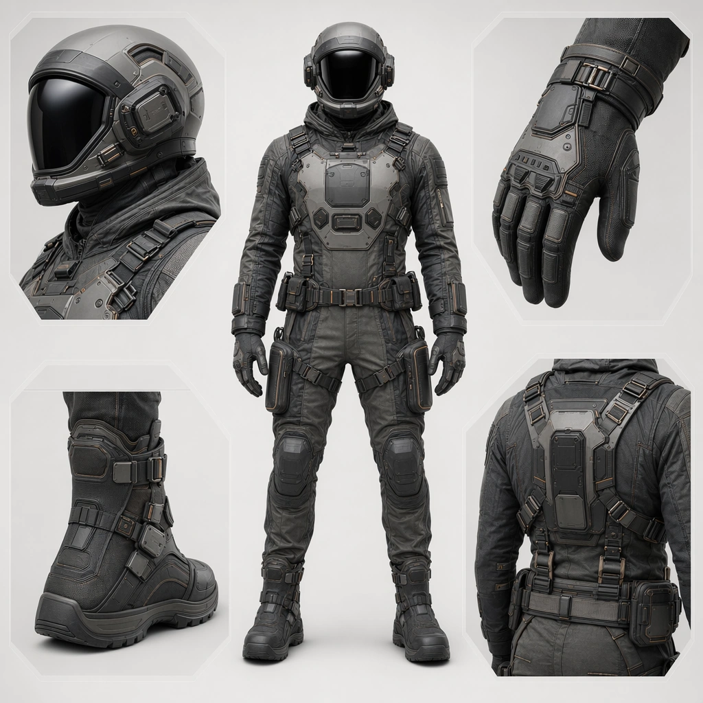
Example generated from “Future Equipment And Suitline System — Civilian Cargo Variant”
GPT Image 2en

Scene: Create a square product-board image for a future wearable system, balancing full-body presentation, material close-ups, and family-level design coherence. The lighting should feel commercial and physical, revealing fabric, shell, seals, and hardware clearly without flattening the subject. Use a controlled studio or minimal contextual environment that supports readability. Show the familiar suitline on a neutral wearer with cargo-support frames, package interface points, and comfort-driven material adjustments. Subject: Center the image on one coherent suitline: helmet, torso shell, seam system, gloves, boots, harness points, and modular attachments should all read as parts of one product family. The wearer can appear neutral and upright, but the real protagonist is the design system and its task identity. Preserve the anchor silhouette and hardware grammar while making the system feel suited to everyday industrial or transit labor rather than danger. Important details: Treat the board as a commercial concept surface. Materials, fastening logic, body protection, comfort cues, and accessory placement must all feel intentional. The suite should look ready for campaign imagery, product family boards, or advanced apparel concept work rather than as a costume illustration. The result should feel market-ready and humane, proving the family can span serious work categories without losing identity. Preserve the exact structural language established by the reference image, especially the helmet profile, seam architecture, fastening language, and modular accessory family. Use case: Suitline System series study 4/4, designed as a reusable core-system image for this topic. Constraints: No readable text, no watermark, no logos, preserve exact 1:1 aspect ratio, no superhero spandex cues, no military insignia, no readable labels, no impossible body proportions, no battle armor cues.

Example generated from “Future Equipment And Suitline System — Urban Rescue Suit”
GPT Image 2en

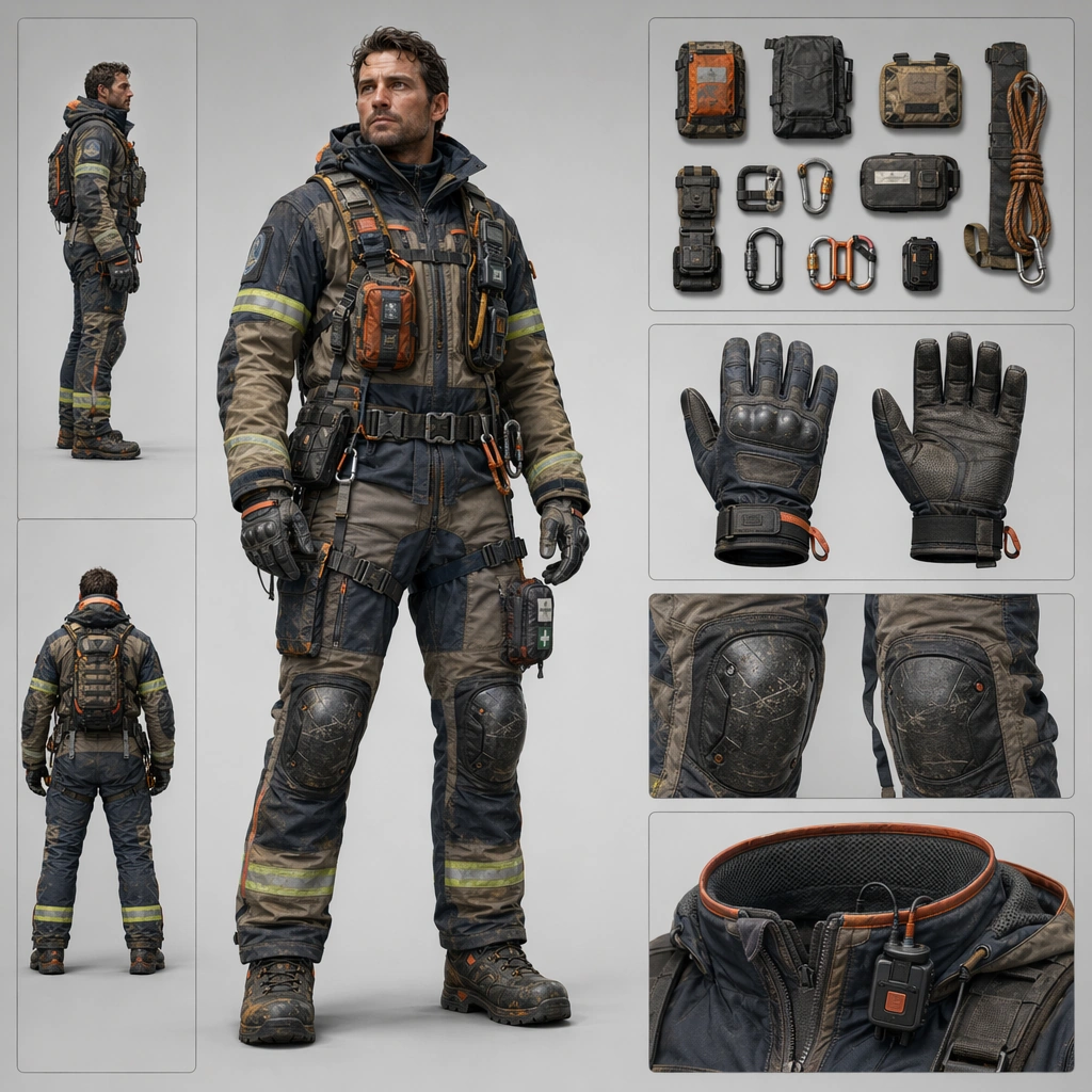
Scene: Design a square equipment concept board for one wearable product family or suit configuration, keeping silhouette clarity and material realism at the center. The board may use a full-body subject, cropped details, or organized accessories as long as the system stays legible. Show a commercial board with one standing rescuer configuration, rapid-access attachments, and detail panels for gloves, knee protection, and comms collar. Subject: Show a complete gear identity with clear task cues such as rescue, survey, reef work, cargo handling, agriculture, or courier transit. The suit should feel worn and usable, not merely styled. The suit should communicate trust, speed, and robustness without becoming militarized. Important details: Favor seam logic, hardware placement, and believable material transitions over surface decoration. Each image should feel like part of a wider product ecosystem even when it stands alone. Visibility accents and tool access should be integrated cleanly into the family design rather than pasted on as emergency clichés. Preserve ergonomic realism so weight, protection, mobility, and access all make sense on the body. Use case: Suitline System single study 2/5, designed as a self-contained support image for this topic. Constraints: No readable text, no watermark, no logos, preserve exact 1:1 aspect ratio, no cosplay costume styling, no giant weapons, no fashion runway theatrics, no real-world brand marks, no firefighter stereotype costume.

Example generated from “Future Equipment And Suitline System — Reef Maintenance Exoshell”
GPT Image 2en

Scene: Design a square equipment concept board for one wearable product family or suit configuration, keeping silhouette clarity and material realism at the center. The board may use a full-body subject, cropped details, or organized accessories as long as the system stays legible. Design a board with a water-ready suit, modular buoyancy shells, glove fins, and corrosion-resistant hardware presented with calm studio clarity. Subject: Show a complete gear identity with clear task cues such as rescue, survey, reef work, cargo handling, agriculture, or courier transit. The suit should feel worn and usable, not merely styled. The gear should balance aquatic movement, tool use, and body protection in a coherent marine product language. Important details: Favor seam logic, hardware placement, and believable material transitions over surface decoration. Each image should feel like part of a wider product ecosystem even when it stands alone. Keep the suit elegant and practical, avoiding both diving nostalgia and superhero wetsuit styling. Preserve ergonomic realism so weight, protection, mobility, and access all make sense on the body. Use case: Suitline System single study 3/5, designed as a self-contained support image for this topic. Constraints: No readable text, no watermark, no logos, preserve exact 1:1 aspect ratio, no cosplay costume styling, no giant weapons, no fashion runway theatrics, no real-world brand marks, no fantasy scuba aesthetic.

Example generated from “Future Equipment And Suitline System — Agricultural Dusk Gear”
GPT Image 2en

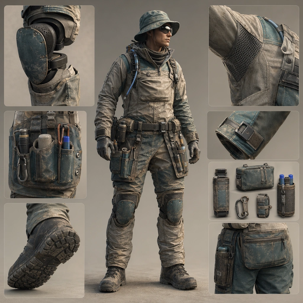
Scene: Design a square equipment concept board for one wearable product family or suit configuration, keeping silhouette clarity and material realism at the center. The board may use a full-body subject, cropped details, or organized accessories as long as the system stays legible. Compose a wearable board with dust-resistant fabrics, tool aprons, flexible knee systems, and soft evening light that reveals texture and practicality. Subject: Show a complete gear identity with clear task cues such as rescue, survey, reef work, cargo handling, agriculture, or courier transit. The suit should feel worn and usable, not merely styled. The suit should read as everyday advanced labor gear with modularity, comfort, and durability at the center. Important details: Favor seam logic, hardware placement, and believable material transitions over surface decoration. Each image should feel like part of a wider product ecosystem even when it stands alone. This is a product family for real work, so posture, materials, and utility should feel grounded and repeatable. Preserve ergonomic realism so weight, protection, mobility, and access all make sense on the body. Use case: Suitline System single study 4/5, designed as a self-contained support image for this topic. Constraints: No readable text, no watermark, no logos, preserve exact 1:1 aspect ratio, no cosplay costume styling, no giant weapons, no fashion runway theatrics, no real-world brand marks, no pastoral costume romance.

Example generated from “Future Equipment And Suitline System — Lunar Courier Kit”
GPT Image 2en

Scene: Design a square equipment concept board for one wearable product family or suit configuration, keeping silhouette clarity and material realism at the center. The board may use a full-body subject, cropped details, or organized accessories as long as the system stays legible. Present a streamlined suit with compact helmet, parcel harness, glove docking, and boot traction studies arranged on a clean product-board layout. Subject: Show a complete gear identity with clear task cues such as rescue, survey, reef work, cargo handling, agriculture, or courier transit. The suit should feel worn and usable, not merely styled. The gear should feel optimized for speed, repeat use, and comfort while staying recognizably part of a disciplined product family. Important details: Favor seam logic, hardware placement, and believable material transitions over surface decoration. Each image should feel like part of a wider product ecosystem even when it stands alone. Favor clear hardware logic and body balance over spectacle so the kit feels commercially plausible. Preserve ergonomic realism so weight, protection, mobility, and access all make sense on the body. Use case: Suitline System single study 5/5, designed as a self-contained support image for this topic. Constraints: No readable text, no watermark, no logos, preserve exact 1:1 aspect ratio, no cosplay costume styling, no giant weapons, no fashion runway theatrics, no real-world brand marks, no superhero messenger vibe.

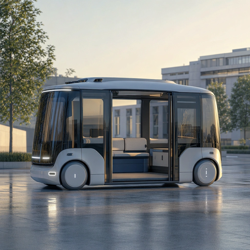
Example generated from “Future Mobility Concept Surface Set — Reference Pod”
GPT Image 2en

Scene: A square clean future-street setting at soft morning light with reflective pavement, calm civic geometry, and restrained environmental detail. Compose the frame as a square key visual with disciplined camera placement, premium lighting control, and believable real-world scale. The tonal range should feel polished and intentional, with enough atmosphere to create depth without obscuring form. Keep contrast calibrated for launch, catalog, or research presentation use rather than casual snapshot aesthetics. Subject: Center an original compact autonomous urban mobility pod with panoramic glass corners, sliding side access, concealed sensors, soft-edge body surfacing, and modular seating visible through the cabin. Make the subject feel original, production-aware, and clearly grounded in Future Mobility Concept Surface Set. For this series image, preserve exact core subject identity, proportions, base geometry, and material language from the reference image whenever continuity matters. The focal hierarchy should be immediate: primary form first, then material behavior, then supporting environmental cues that clarify use context and difficulty. Important details: Show the full pod clearly, including cabin, access door, wheel treatment, and lighting signature. The image should feel visionary yet practical enough for industrial discussion. Preserve exact pod silhouette, glazing proportions, door strategy, wheel enclosure logic, and lighting signature across the series. The concept should feel forward-looking but manufacturable within a plausible near-future city. Use believable materials, engineering logic, and professional composition discipline. Reflections, shadows, edge breaks, texture scale, interface density, and small physical joints must all support realism. Avoid filler props, vague mood-board clutter, or any element that weakens the sense of a purpose-built industrial or automotive image. Use case: Mobility Concept series study 1/9 for Future Mobility Concept Surface Set, built as image 01-reference-anchor. Constraints: No readable text, no watermark, no logos, preserve exact 1:1 aspect ratio, no logos, no cyberpunk clutter, no hologram overload, no flying parts, no dystopian debris, no weaponized cues.

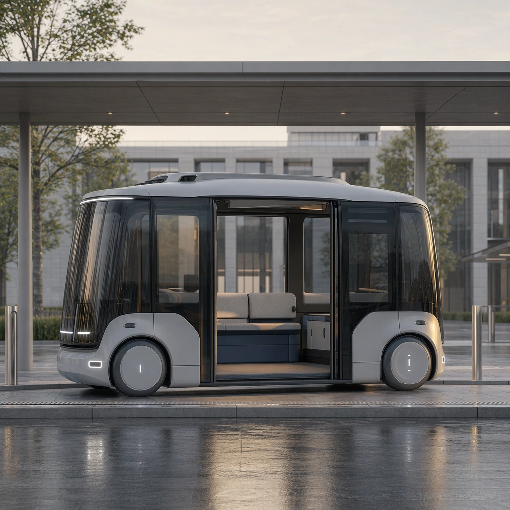
Example generated from “Future Mobility Concept Surface Set — Station Arrival”
GPT Image 2en

Scene: A square intermodal curbside station with clean canopies, muted daylight, generous circulation space, and civic material restraint. Compose the frame as a square key visual with disciplined camera placement, premium lighting control, and believable real-world scale. The tonal range should feel polished and intentional, with enough atmosphere to create depth without obscuring form. Keep contrast calibrated for launch, catalog, or research presentation use rather than casual snapshot aesthetics. Subject: Center an original compact autonomous urban mobility pod with panoramic glass corners, sliding side access, concealed sensors, soft-edge body surfacing, and modular seating visible through the cabin. Make the subject feel original, production-aware, and clearly grounded in Future Mobility Concept Surface Set. For this series image, preserve exact core subject identity, proportions, base geometry, and material language from the reference image whenever continuity matters. The focal hierarchy should be immediate: primary form first, then material behavior, then supporting environmental cues that clarify use context and difficulty. Important details: Keep the exact pod identity while stressing door access, curb alignment, boarding usability, and a trustworthy sense of shared-transport service design. Preserve exact pod silhouette, glazing proportions, door strategy, wheel enclosure logic, and lighting signature across the series. The concept should feel forward-looking but manufacturable within a plausible near-future city. Use believable materials, engineering logic, and professional composition discipline. Reflections, shadows, edge breaks, texture scale, interface density, and small physical joints must all support realism. Avoid filler props, vague mood-board clutter, or any element that weakens the sense of a purpose-built industrial or automotive image. Use case: Mobility Concept series study 2/9 for Future Mobility Concept Surface Set, built as image 02-context-shift. Constraints: No readable text, no watermark, no logos, preserve exact 1:1 aspect ratio, no logos, no cyberpunk clutter, no hologram overload, no flying parts, no dystopian debris, no weaponized cues.

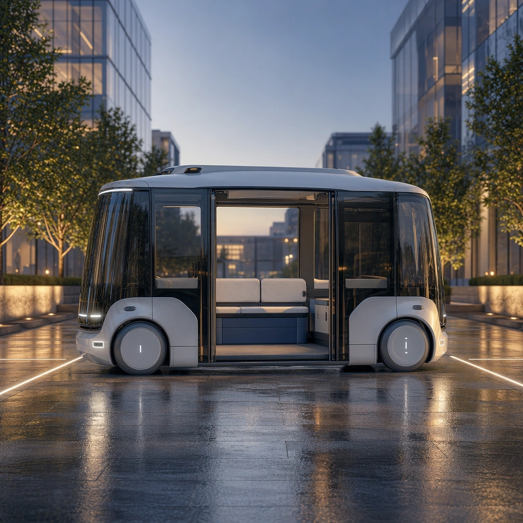
Example generated from “Future Mobility Concept Surface Set — Night Safety Loop”
GPT Image 2en

Scene: A square evening mobility corridor with soft rain residue, clear lane lights, warm-cool contrast, and welcoming urban scale. Compose the frame as a square key visual with disciplined camera placement, premium lighting control, and believable real-world scale. The tonal range should feel polished and intentional, with enough atmosphere to create depth without obscuring form. Keep contrast calibrated for launch, catalog, or research presentation use rather than casual snapshot aesthetics. Subject: Center an original compact autonomous urban mobility pod with panoramic glass corners, sliding side access, concealed sensors, soft-edge body surfacing, and modular seating visible through the cabin. Make the subject feel original, production-aware, and clearly grounded in Future Mobility Concept Surface Set. For this series image, preserve exact core subject identity, proportions, base geometry, and material language from the reference image whenever continuity matters. The focal hierarchy should be immediate: primary form first, then material behavior, then supporting environmental cues that clarify use context and difficulty. Important details: Emphasize lighting behavior, glazing transparency, and reassuring atmosphere instead of futuristic aggression. The pod should look safe, calm, and productively integrated into the city. Preserve exact pod silhouette, glazing proportions, door strategy, wheel enclosure logic, and lighting signature across the series. The concept should feel forward-looking but manufacturable within a plausible near-future city. Use believable materials, engineering logic, and professional composition discipline. Reflections, shadows, edge breaks, texture scale, interface density, and small physical joints must all support realism. Avoid filler props, vague mood-board clutter, or any element that weakens the sense of a purpose-built industrial or automotive image. Use case: Mobility Concept series study 3/9 for Future Mobility Concept Surface Set, built as image 03-surface-study. Constraints: No readable text, no watermark, no logos, preserve exact 1:1 aspect ratio, no logos, no cyberpunk clutter, no hologram overload, no flying parts, no dystopian debris, no weaponized cues.

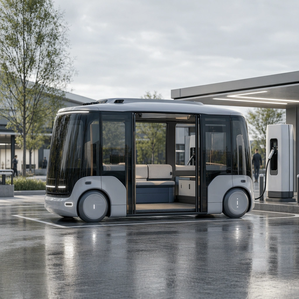
Example generated from “Future Mobility Concept Surface Set — Service Dock View”
GPT Image 2en

Scene: A square mobility-service dock with bright overcast light, minimal staff presence, clean charging infrastructure, and precise ground markings. Compose the frame as a square key visual with disciplined camera placement, premium lighting control, and believable real-world scale. The tonal range should feel polished and intentional, with enough atmosphere to create depth without obscuring form. Keep contrast calibrated for launch, catalog, or research presentation use rather than casual snapshot aesthetics. Subject: Center an original compact autonomous urban mobility pod with panoramic glass corners, sliding side access, concealed sensors, soft-edge body surfacing, and modular seating visible through the cabin. Make the subject feel original, production-aware, and clearly grounded in Future Mobility Concept Surface Set. For this series image, preserve exact core subject identity, proportions, base geometry, and material language from the reference image whenever continuity matters. The focal hierarchy should be immediate: primary form first, then material behavior, then supporting environmental cues that clarify use context and difficulty. Important details: Use the environment to show maintenance readiness and system maturity while preserving the pod as the same recognizable product family with consistent geometry and finish behavior. Preserve exact pod silhouette, glazing proportions, door strategy, wheel enclosure logic, and lighting signature across the series. The concept should feel forward-looking but manufacturable within a plausible near-future city. Use believable materials, engineering logic, and professional composition discipline. Reflections, shadows, edge breaks, texture scale, interface density, and small physical joints must all support realism. Avoid filler props, vague mood-board clutter, or any element that weakens the sense of a purpose-built industrial or automotive image. Use case: Mobility Concept series study 4/9 for Future Mobility Concept Surface Set, built as image 04-presentation-master. Constraints: No readable text, no watermark, no logos, preserve exact 1:1 aspect ratio, no logos, no cyberpunk clutter, no hologram overload, no flying parts, no dystopian debris, no weaponized cues.

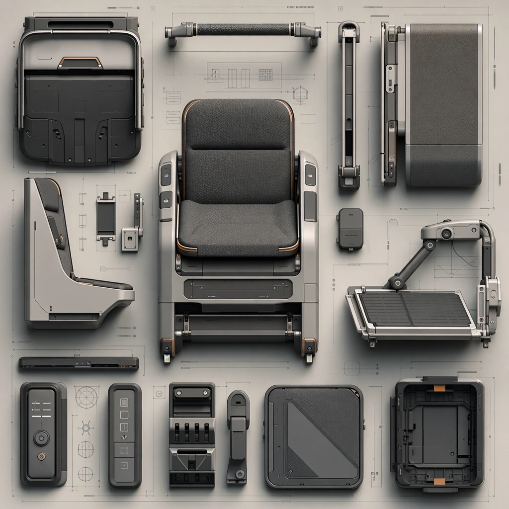
Example generated from “Future Mobility Concept Surface Set — Interior Module Board”
GPT Image 2en

Scene: A square industrial-design board with top-down clarity, soft shadows, and refined arrangement over a neutral technical ground. Compose the frame as a square key visual with disciplined camera placement, premium lighting control, and believable real-world scale. The tonal range should feel polished and intentional, with enough atmosphere to create depth without obscuring form. Keep contrast calibrated for launch, catalog, or research presentation use rather than casual snapshot aesthetics. Subject: Center original shared-mobility seating, accessibility, and interface modules laid out as a coherent concept system. Make the subject feel original, production-aware, and clearly grounded in Future Mobility Concept Surface Set. Treat this as an independent study that must feel complete and coherent without relying on any external reference image. The focal hierarchy should be immediate: primary form first, then material behavior, then supporting environmental cues that clarify use context and difficulty. Important details: Use non-readable diagrams, believable joinery, and careful hardware relationships. The board should feel fit for a concept review with industrial and transport teams. The visual language should still feel native to Future Mobility Concept Surface Set, using disciplined industrial or campaign composition instead of generic stock photography. Use believable materials, engineering logic, and professional composition discipline. Reflections, shadows, edge breaks, texture scale, interface density, and small physical joints must all support realism. Avoid filler props, vague mood-board clutter, or any element that weakens the sense of a purpose-built industrial or automotive image. Use case: Mobility Concept single study 6/9 for Future Mobility Concept Surface Set, built as image support-two. Constraints: No readable text, no watermark, no logos, preserve exact 1:1 aspect ratio, no readable text, no logos, no cyberpunk clutter, no impossible mechanics, no fantasy weaponry, no dystopian grime.

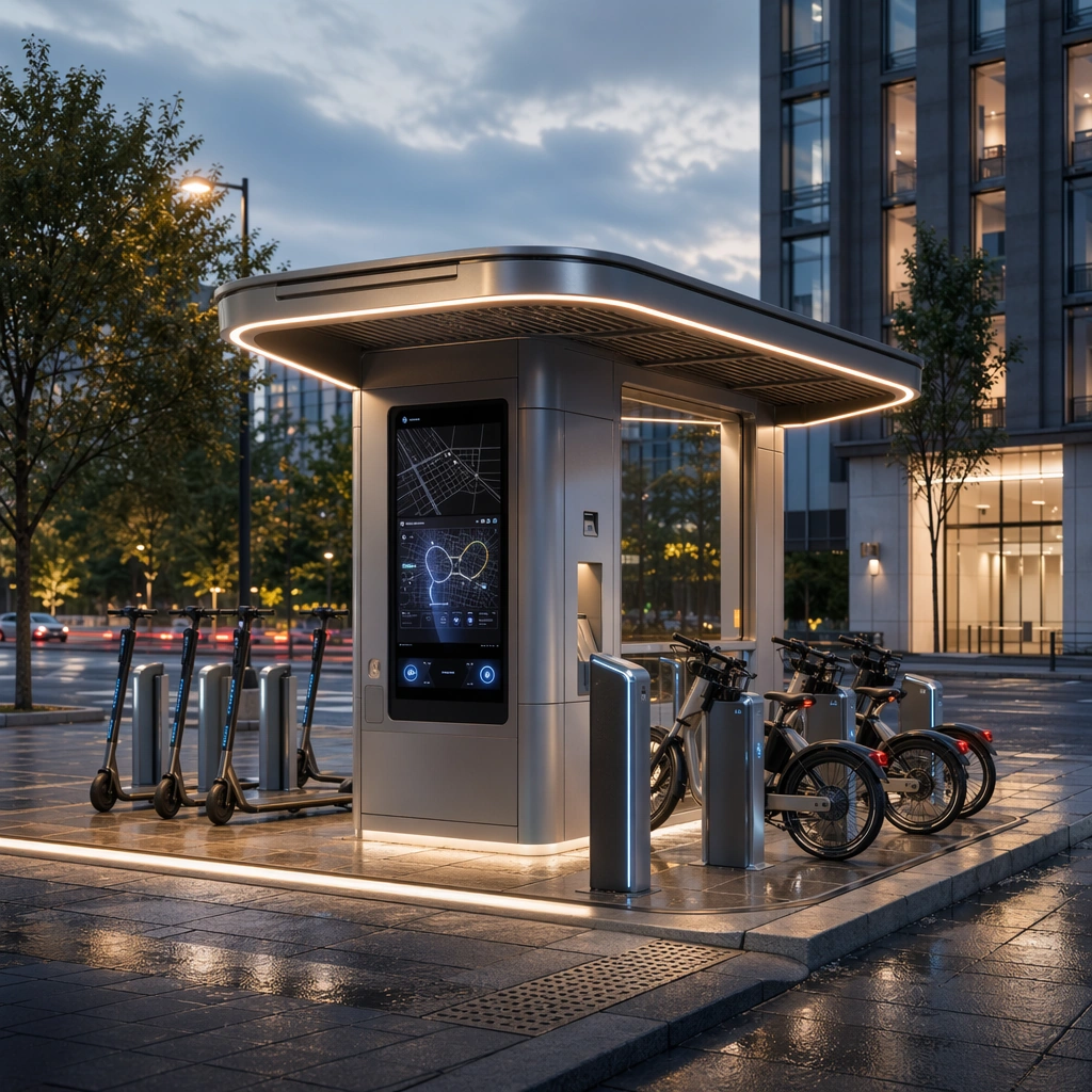
Example generated from “Future Mobility Concept Surface Set — Urban Network Kiosk”
GPT Image 2en

Scene: A square streetside kiosk environment at dusk with integrated lighting, clean civic materials, and subtle rain sheen on the ground. Compose the frame as a square key visual with disciplined camera placement, premium lighting control, and believable real-world scale. The tonal range should feel polished and intentional, with enough atmosphere to create depth without obscuring form. Keep contrast calibrated for launch, catalog, or research presentation use rather than casual snapshot aesthetics. Subject: Center an original mobility-service kiosk with docking cues, route abstractions, ambient light, and premium public-infrastructure detailing. Make the subject feel original, production-aware, and clearly grounded in Future Mobility Concept Surface Set. Treat this as an independent study that must feel complete and coherent without relying on any external reference image. The focal hierarchy should be immediate: primary form first, then material behavior, then supporting environmental cues that clarify use context and difficulty. Important details: Keep the system plausible, legible, and logo-free. The kiosk should feel like part of a real mobility network, not a generic smart-city prop. The visual language should still feel native to Future Mobility Concept Surface Set, using disciplined industrial or campaign composition instead of generic stock photography. Use believable materials, engineering logic, and professional composition discipline. Reflections, shadows, edge breaks, texture scale, interface density, and small physical joints must all support realism. Avoid filler props, vague mood-board clutter, or any element that weakens the sense of a purpose-built industrial or automotive image. Use case: Mobility Concept single study 7/9 for Future Mobility Concept Surface Set, built as image support-three. Constraints: No readable text, no watermark, no logos, preserve exact 1:1 aspect ratio, no readable text, no logos, no cyberpunk clutter, no impossible mechanics, no fantasy weaponry, no dystopian grime.

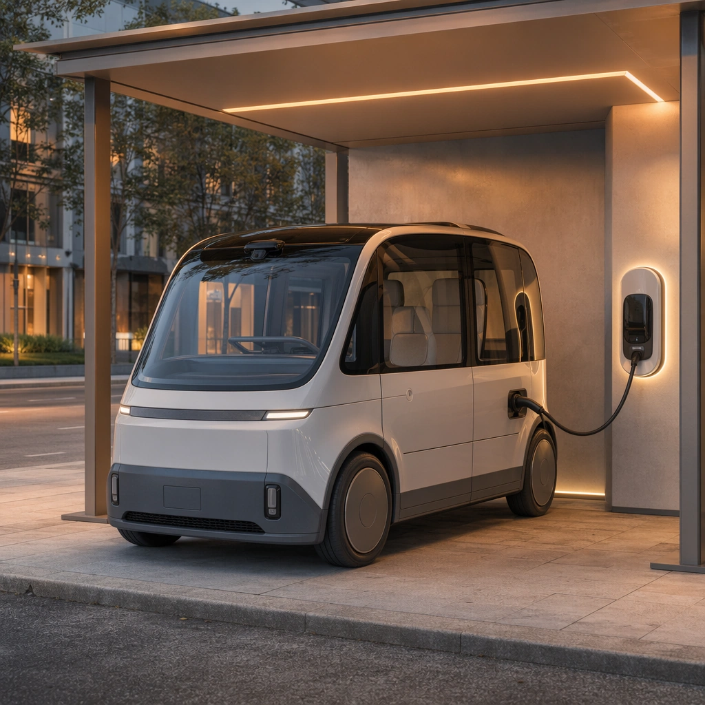
Example generated from “Future Mobility Concept Surface Set — Charging Ritual”
GPT Image 2en

Scene: A square sheltered curbside charging bay with warm evening light, clean paving, and minimal weather texture. Compose the frame as a square key visual with disciplined camera placement, premium lighting control, and believable real-world scale. The tonal range should feel polished and intentional, with enough atmosphere to create depth without obscuring form. Keep contrast calibrated for launch, catalog, or research presentation use rather than casual snapshot aesthetics. Subject: Center an original mobility pod or compact vehicle interacting with a simple, believable charging interface. Make the subject feel original, production-aware, and clearly grounded in Future Mobility Concept Surface Set. Treat this as an independent study that must feel complete and coherent without relying on any external reference image. The focal hierarchy should be immediate: primary form first, then material behavior, then supporting environmental cues that clarify use context and difficulty. Important details: Sell trust, cleanliness, and product maturity instead of techno-fetish spectacle. The scene should show ownership confidence and urban integration. The visual language should still feel native to Future Mobility Concept Surface Set, using disciplined industrial or campaign composition instead of generic stock photography. Use believable materials, engineering logic, and professional composition discipline. Reflections, shadows, edge breaks, texture scale, interface density, and small physical joints must all support realism. Avoid filler props, vague mood-board clutter, or any element that weakens the sense of a purpose-built industrial or automotive image. Use case: Mobility Concept single study 8/9 for Future Mobility Concept Surface Set, built as image support-four. Constraints: No readable text, no watermark, no logos, preserve exact 1:1 aspect ratio, no readable text, no logos, no cyberpunk clutter, no impossible mechanics, no fantasy weaponry, no dystopian grime.

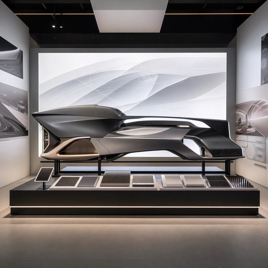
Example generated from “Future Mobility Concept Surface Set — Innovation Exhibit Mockup”
GPT Image 2en

Scene: A square exhibition corner with one large lightbox, clean plinths, diffuse ambient glow, and carefully controlled visitor-scale space. Compose the frame as a square key visual with disciplined camera placement, premium lighting control, and believable real-world scale. The tonal range should feel polished and intentional, with enough atmosphere to create depth without obscuring form. Keep contrast calibrated for launch, catalog, or research presentation use rather than casual snapshot aesthetics. Subject: Center original future-mobility visuals presented across a premium exhibit environment with physical display structure. Make the subject feel original, production-aware, and clearly grounded in Future Mobility Concept Surface Set. Treat this as an independent study that must feel complete and coherent without relying on any external reference image. The focal hierarchy should be immediate: primary form first, then material behavior, then supporting environmental cues that clarify use context and difficulty. Important details: Keep exhibit graphics abstract and non-readable while the physical installation feels completely plausible. The result should communicate credibility and ambition together. The visual language should still feel native to Future Mobility Concept Surface Set, using disciplined industrial or campaign composition instead of generic stock photography. Use believable materials, engineering logic, and professional composition discipline. Reflections, shadows, edge breaks, texture scale, interface density, and small physical joints must all support realism. Avoid filler props, vague mood-board clutter, or any element that weakens the sense of a purpose-built industrial or automotive image. Use case: Mobility Concept single study 9/9 for Future Mobility Concept Surface Set, built as image support-five. Constraints: No readable text, no watermark, no logos, preserve exact 1:1 aspect ratio, no readable text, no logos, no cyberpunk clutter, no impossible mechanics, no fantasy weaponry, no dystopian grime.

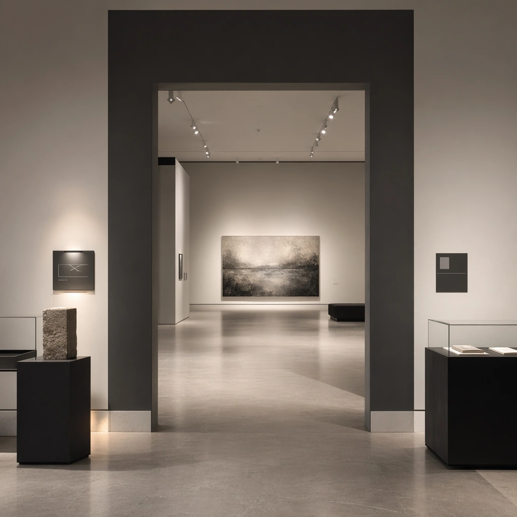
Example generated from “Gallery Exhibition Spatial Sequence — Threshold Room Anchor”
GPT Image 2en

Scene: Create a square architectural reference still for Gallery Exhibition Spatial Sequence. Use a square entry view into the first exhibition room with one major work and caption zones and treat the frame like a premium interior or architecture editorial photograph with disciplined perspective, readable depth from foreground to background, and enough negative space for the spatial hierarchy to breathe. Light the scene so spatial pacing, wall-label logic, and non-generic exhibition atmosphere feel immediate, using chalk white, charcoal gray, pale concrete, soft shadow black, and controlled spotlight warmth as the governing tonal range. The composition must read as a high-end commercial image that could sit inside museum campaigns, exhibition proposals, cultural editorials, and spatial storytelling decks. Subject: Show a gallery and exhibition environment with disciplined white and charcoal volumes, precise spotlighting, plinths, archival display furniture, abstract wall-label zones, and carefully paced emptiness. Center the exhibition’s threshold pacing, light gradient, and curatorial calm. This is the canonical reference image for the package, so the major proportions, material transitions, fixture families, and circulation logic must feel highly specific and internally coherent rather than generic luxury styling. Let the viewer understand how the space is organized within a single glance, with foreground anchors, a clear middle zone, and a resolved background termination. Important details: Lock the wall-label rhythm, plinth geometry, spotlight language, floor material, and slow exhibition pacing. Surfaces should feel tactile and believable: stone veining must stay plausible, metals should have disciplined reflectance, fabrics should show natural weight, and concealed lighting should shape the volume instead of flattening it. Use abstract signage, menu, label, or caption zones only as unreadable graphic hints. The image should feel practical for downstream design reviews and polished enough for public-facing campaign use. Use case: Gallery Exhibition Spatial Sequence series study 1/9, establishing the canonical sequence identity for the package. Constraints: No readable text, no watermark, no logos, preserve exact 1:1 aspect ratio, no crowds, no readable wall text, no security barriers, no colorful trade-show clutter, no random gifts-shop products, no readable title wall.
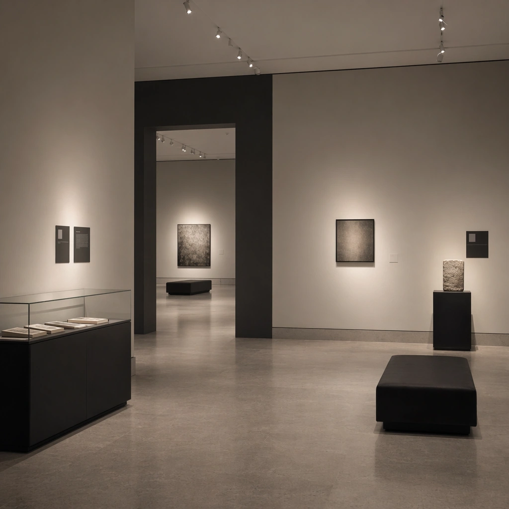
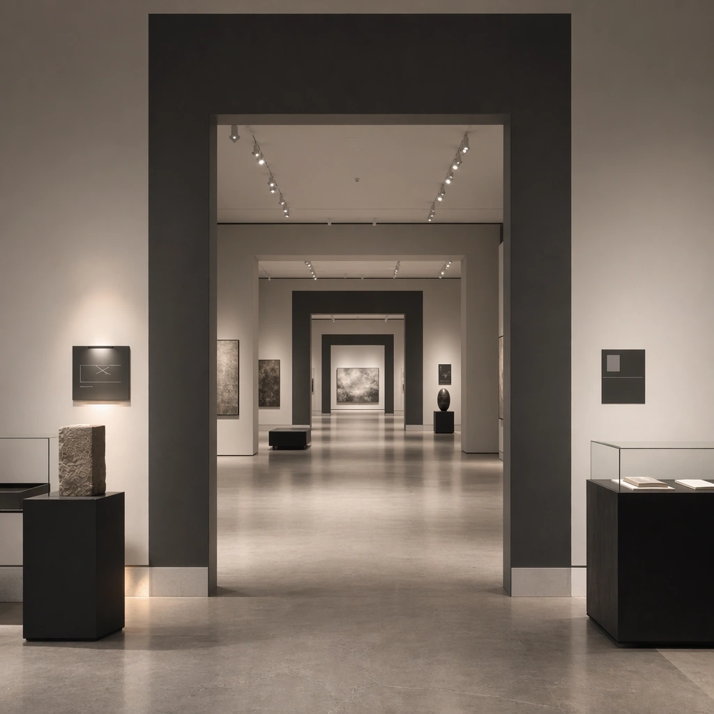
Example generated from “Gallery Exhibition Spatial Sequence — Main Hall Sequence”
GPT Image 2en

Scene: Create a square reference-dependent architecture still for Gallery Exhibition Spatial Sequence. Use a deeper view through the main hall showing multiple sightline beats and framed works while keeping the same lens discipline, editorial polish, and material believability established by the reference image. The lighting can shift to support the intended mood, but the space must still feel like the same authored project with a stable viewpoint logic, convincing depth separation, and clean commercial-photography finish. Keep chalk white, charcoal gray, pale concrete, soft shadow black, and controlled spotlight warmth as the governing tonal range even when the emphasis changes. Subject: Show a gallery and exhibition environment with disciplined white and charcoal volumes, precise spotlighting, plinths, archival display furniture, abstract wall-label zones, and carefully paced emptiness. Focus on the exact same exhibition from the reference image, now emphasizing procession, spacing, and visual rhythm. Preserve exact architectural identity, plan logic, material palette, fixture family, and circulation cues from the reference image while changing only the intended emphasis described here. The viewer should immediately recognize the same project, not a loose cousin, with matching silhouette logic, aligned detailing, and consistent brand atmosphere. Important details: Preserve the wall-label rhythm, plinth geometry, spotlight language, floor material, and slow exhibition pacing. Any abstract wayfinding, menu, wall-label, or packaging zones must stay unreadable and subordinate to the spatial image. Joinery, edges, reflections, and lighting should remain realistic enough for an operator or design team to treat the image as a credible reference. The variation should feel deliberate and commercially useful, proving that one locked spatial language can flex across multiple campaign or editorial surfaces. Use case: Gallery Exhibition Spatial Sequence series study 2/9, extending the central pacing logic while preserving the same exhibition identity. Constraints: No readable text, no watermark, no logos, preserve exact 1:1 aspect ratio, preserve exact architectural identity from the reference image, no crowds, no readable wall text, no security barriers, no colorful trade-show clutter, no random gifts-shop products, no crowd barriers.
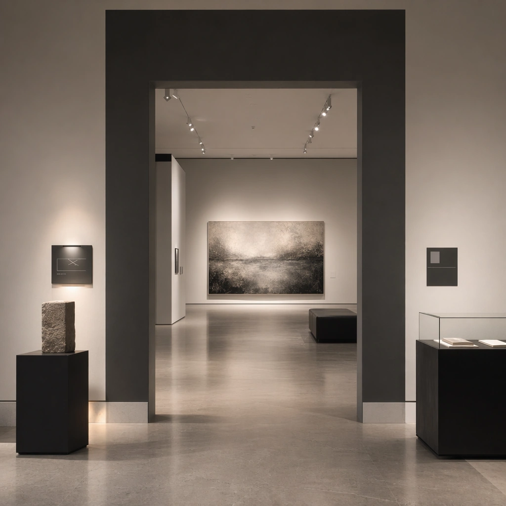
Example generated from “Gallery Exhibition Spatial Sequence — Side Gallery Intimacy”
GPT Image 2en

Scene: Create a square reference-dependent architecture still for Gallery Exhibition Spatial Sequence. Use a quieter side-gallery composition with a bench and lower light level while keeping the same lens discipline, editorial polish, and material believability established by the reference image. The lighting can shift to support the intended mood, but the space must still feel like the same authored project with a stable viewpoint logic, convincing depth separation, and clean commercial-photography finish. Keep chalk white, charcoal gray, pale concrete, soft shadow black, and controlled spotlight warmth as the governing tonal range even when the emphasis changes. Subject: Show a gallery and exhibition environment with disciplined white and charcoal volumes, precise spotlighting, plinths, archival display furniture, abstract wall-label zones, and carefully paced emptiness. Focus on the exact same exhibition from the reference image, now emphasizing intimacy, pause, and smaller-format display moments. Preserve exact architectural identity, plan logic, material palette, fixture family, and circulation cues from the reference image while changing only the intended emphasis described here. The viewer should immediately recognize the same project, not a loose cousin, with matching silhouette logic, aligned detailing, and consistent brand atmosphere. Important details: Preserve the wall-label rhythm, plinth geometry, spotlight language, floor material, and slow exhibition pacing. Any abstract wayfinding, menu, wall-label, or packaging zones must stay unreadable and subordinate to the spatial image. Joinery, edges, reflections, and lighting should remain realistic enough for an operator or design team to treat the image as a credible reference. The variation should feel deliberate and commercially useful, proving that one locked spatial language can flex across multiple campaign or editorial surfaces. Use case: Gallery Exhibition Spatial Sequence series study 3/9, extending the contemplative side chamber within the same curatorial system. Constraints: No readable text, no watermark, no logos, preserve exact 1:1 aspect ratio, preserve exact architectural identity from the reference image, no crowds, no readable wall text, no security barriers, no colorful trade-show clutter, no random gifts-shop products, no readable captions.
Example generated from “Gallery Exhibition Spatial Sequence — Exit Reflection Chamber”
GPT Image 2en

Scene: Create a square reference-dependent architecture still for Gallery Exhibition Spatial Sequence. Use a final-room composition with reflective surfaces and one seating element near the exit while keeping the same lens discipline, editorial polish, and material believability established by the reference image. The lighting can shift to support the intended mood, but the space must still feel like the same authored project with a stable viewpoint logic, convincing depth separation, and clean commercial-photography finish. Keep chalk white, charcoal gray, pale concrete, soft shadow black, and controlled spotlight warmth as the governing tonal range even when the emphasis changes. Subject: Show a gallery and exhibition environment with disciplined white and charcoal volumes, precise spotlighting, plinths, archival display furniture, abstract wall-label zones, and carefully paced emptiness. Focus on the exact same exhibition from the reference image, now emphasizing decompression and end-of-route mood. Preserve exact architectural identity, plan logic, material palette, fixture family, and circulation cues from the reference image while changing only the intended emphasis described here. The viewer should immediately recognize the same project, not a loose cousin, with matching silhouette logic, aligned detailing, and consistent brand atmosphere. Important details: Preserve the wall-label rhythm, plinth geometry, spotlight language, floor material, and slow exhibition pacing. Any abstract wayfinding, menu, wall-label, or packaging zones must stay unreadable and subordinate to the spatial image. Joinery, edges, reflections, and lighting should remain realistic enough for an operator or design team to treat the image as a credible reference. The variation should feel deliberate and commercially useful, proving that one locked spatial language can flex across multiple campaign or editorial surfaces. Use case: Gallery Exhibition Spatial Sequence series study 4/9, extending the closing spatial beat inside the same exhibition identity. Constraints: No readable text, no watermark, no logos, preserve exact 1:1 aspect ratio, preserve exact architectural identity from the reference image, no crowds, no readable wall text, no security barriers, no colorful trade-show clutter, no random gifts-shop products, no gift shop merchandise.
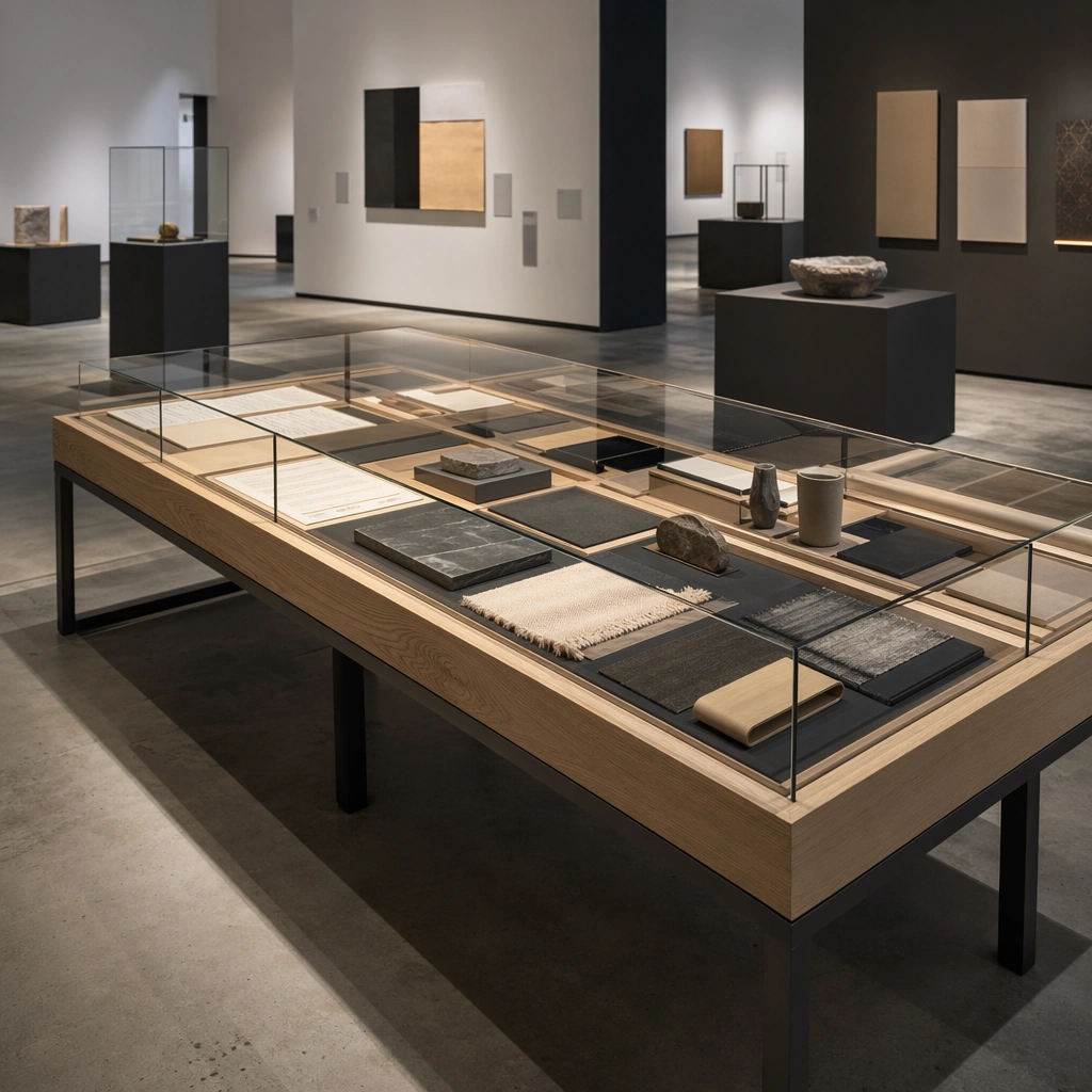
Example generated from “Gallery Exhibition Spatial Sequence — Archival Display Table”
GPT Image 2en

Scene: Create a square standalone support study for Gallery Exhibition Spatial Sequence. Use an overhead-oblique view of an archival display table with abstract documents and objects and frame it like a premium commercial still or design-editorial crop with clear focal hierarchy, disciplined perspective, and enough breathing room for the materials and objects to read at both thumbnail and full size. Keep chalk white, charcoal gray, pale concrete, soft shadow black, and controlled spotlight warmth as the tonal guide so the image still belongs to the same theme family, and light the scene in a controlled way that emphasizes texture, edge quality, and authored atmosphere over spectacle. Subject: Show a gallery and exhibition environment with disciplined white and charcoal volumes, precise spotlighting, plinths, archival display furniture, abstract wall-label zones, and carefully paced emptiness. In this support study, focus on museum-grade table framing, glass reflections, and curatorial order. The image should work independently, yet it must still feel like it belongs to the same broader world of Gallery Sequence. Make the space, props, and detailing useful for real campaign, editorial, or design-review contexts rather than moodboard abstraction. Important details: Carry forward the broader language of the wall-label rhythm, plinth geometry, spotlight language, floor material, and slow exhibition pacing, but let this image prove a new support surface or secondary deliverable. Material realism is essential: wood grain, metal sheen, glass edges, textiles, and stone should feel physically plausible and carefully art directed. Any graphic panels, labels, menus, packaging, or captions must stay abstract and unreadable. The overall result should feel reusable for museum campaigns, exhibition proposals, cultural editorials, and spatial storytelling decks, with enough structure that a creative or operations team could build on it. Use case: Gallery Exhibition Spatial Sequence single study 6/9, exploring support image for archive-display planning. Constraints: No readable text, no watermark, no logos, preserve exact 1:1 aspect ratio, no crowds, no readable wall text, no security barriers, no colorful trade-show clutter, no random gifts-shop products, no legible documents.
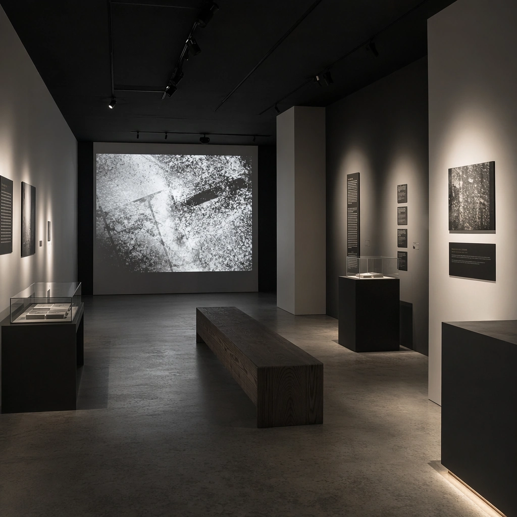
Example generated from “Gallery Exhibition Spatial Sequence — Projection Chamber”
GPT Image 2en

Scene: Create a square standalone support study for Gallery Exhibition Spatial Sequence. Use a dark projection room with bench seating and soft image glow on walls and frame it like a premium commercial still or design-editorial crop with clear focal hierarchy, disciplined perspective, and enough breathing room for the materials and objects to read at both thumbnail and full size. Keep chalk white, charcoal gray, pale concrete, soft shadow black, and controlled spotlight warmth as the tonal guide so the image still belongs to the same theme family, and light the scene in a controlled way that emphasizes texture, edge quality, and authored atmosphere over spectacle. Subject: Show a gallery and exhibition environment with disciplined white and charcoal volumes, precise spotlighting, plinths, archival display furniture, abstract wall-label zones, and carefully paced emptiness. In this support study, focus on light spill, acoustic darkness, and immersive sequencing. The image should work independently, yet it must still feel like it belongs to the same broader world of Gallery Sequence. Make the space, props, and detailing useful for real campaign, editorial, or design-review contexts rather than moodboard abstraction. Important details: Carry forward the broader language of the wall-label rhythm, plinth geometry, spotlight language, floor material, and slow exhibition pacing, but let this image prove a new support surface or secondary deliverable. Material realism is essential: wood grain, metal sheen, glass edges, textiles, and stone should feel physically plausible and carefully art directed. Any graphic panels, labels, menus, packaging, or captions must stay abstract and unreadable. The overall result should feel reusable for museum campaigns, exhibition proposals, cultural editorials, and spatial storytelling decks, with enough structure that a creative or operations team could build on it. Use case: Gallery Exhibition Spatial Sequence single study 7/9, exploring support still for media-room planning in exhibitions. Constraints: No readable text, no watermark, no logos, preserve exact 1:1 aspect ratio, no crowds, no readable wall text, no security barriers, no colorful trade-show clutter, no random gifts-shop products, no recognizable movie frames.
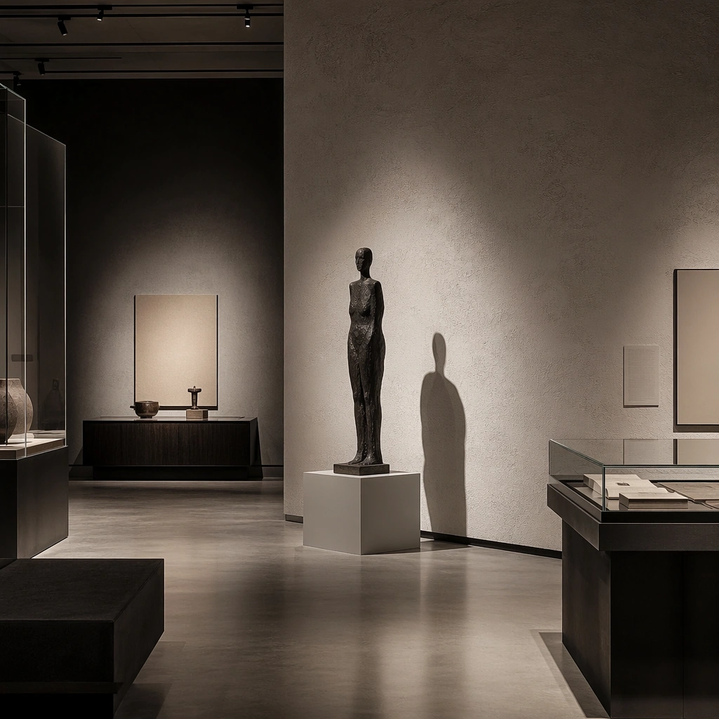
Example generated from “Gallery Exhibition Spatial Sequence — Sculpture Shadow Wall”
GPT Image 2en

Scene: Create a square standalone support study for Gallery Exhibition Spatial Sequence. Use a sculpture silhouette casting a long shadow against a textured wall and frame it like a premium commercial still or design-editorial crop with clear focal hierarchy, disciplined perspective, and enough breathing room for the materials and objects to read at both thumbnail and full size. Keep chalk white, charcoal gray, pale concrete, soft shadow black, and controlled spotlight warmth as the tonal guide so the image still belongs to the same theme family, and light the scene in a controlled way that emphasizes texture, edge quality, and authored atmosphere over spectacle. Subject: Show a gallery and exhibition environment with disciplined white and charcoal volumes, precise spotlighting, plinths, archival display furniture, abstract wall-label zones, and carefully paced emptiness. In this support study, focus on light-to-object relation, negative space, and gallery drama. The image should work independently, yet it must still feel like it belongs to the same broader world of Gallery Sequence. Make the space, props, and detailing useful for real campaign, editorial, or design-review contexts rather than moodboard abstraction. Important details: Carry forward the broader language of the wall-label rhythm, plinth geometry, spotlight language, floor material, and slow exhibition pacing, but let this image prove a new support surface or secondary deliverable. Material realism is essential: wood grain, metal sheen, glass edges, textiles, and stone should feel physically plausible and carefully art directed. Any graphic panels, labels, menus, packaging, or captions must stay abstract and unreadable. The overall result should feel reusable for museum campaigns, exhibition proposals, cultural editorials, and spatial storytelling decks, with enough structure that a creative or operations team could build on it. Use case: Gallery Exhibition Spatial Sequence single study 8/9, exploring support image for art-direction mood within exhibitions. Constraints: No readable text, no watermark, no logos, preserve exact 1:1 aspect ratio, no crowds, no readable wall text, no security barriers, no colorful trade-show clutter, no random gifts-shop products, no dramatic crowd silhouettes.
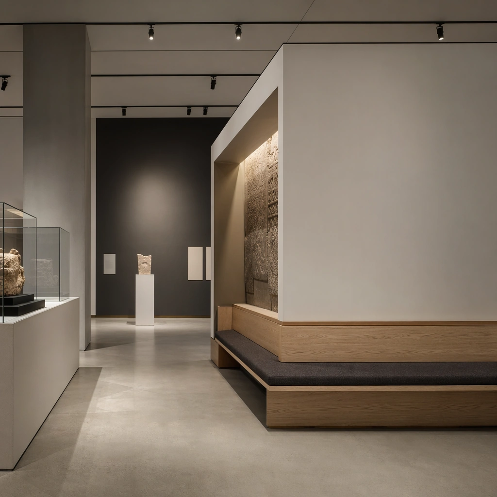
Example generated from “Gallery Exhibition Spatial Sequence — Installation Seating Bay”
GPT Image 2en

Scene: Create a square standalone support study for Gallery Exhibition Spatial Sequence. Use a seating bay integrated beside a large installation volume and frame it like a premium commercial still or design-editorial crop with clear focal hierarchy, disciplined perspective, and enough breathing room for the materials and objects to read at both thumbnail and full size. Keep chalk white, charcoal gray, pale concrete, soft shadow black, and controlled spotlight warmth as the tonal guide so the image still belongs to the same theme family, and light the scene in a controlled way that emphasizes texture, edge quality, and authored atmosphere over spectacle. Subject: Show a gallery and exhibition environment with disciplined white and charcoal volumes, precise spotlighting, plinths, archival display furniture, abstract wall-label zones, and carefully paced emptiness. In this support study, focus on visitor pause logic, bench design, and safe circulation clarity. The image should work independently, yet it must still feel like it belongs to the same broader world of Gallery Sequence. Make the space, props, and detailing useful for real campaign, editorial, or design-review contexts rather than moodboard abstraction. Important details: Carry forward the broader language of the wall-label rhythm, plinth geometry, spotlight language, floor material, and slow exhibition pacing, but let this image prove a new support surface or secondary deliverable. Material realism is essential: wood grain, metal sheen, glass edges, textiles, and stone should feel physically plausible and carefully art directed. Any graphic panels, labels, menus, packaging, or captions must stay abstract and unreadable. The overall result should feel reusable for museum campaigns, exhibition proposals, cultural editorials, and spatial storytelling decks, with enough structure that a creative or operations team could build on it. Use case: Gallery Exhibition Spatial Sequence single study 9/9, exploring support still for audience-experience planning. Constraints: No readable text, no watermark, no logos, preserve exact 1:1 aspect ratio, no crowds, no readable wall text, no security barriers, no colorful trade-show clutter, no random gifts-shop products, no readable directional text.
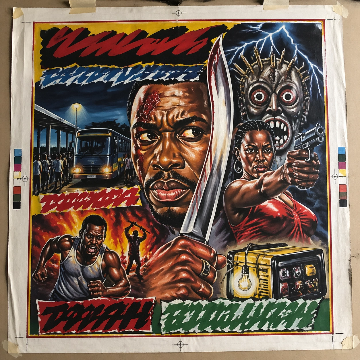
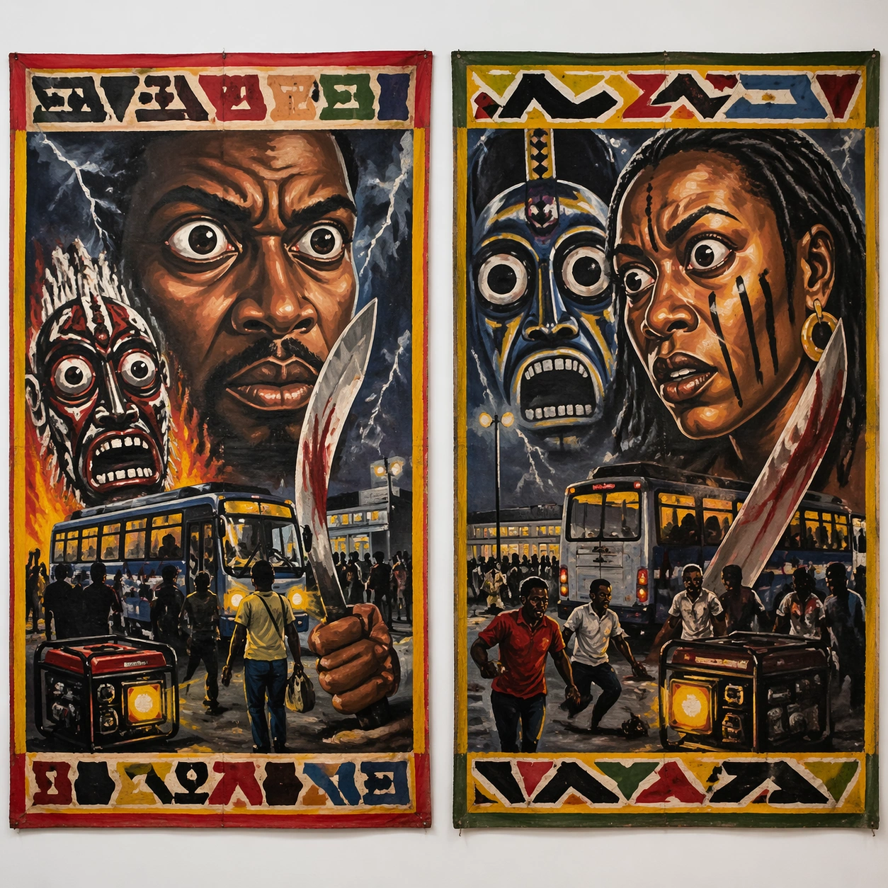
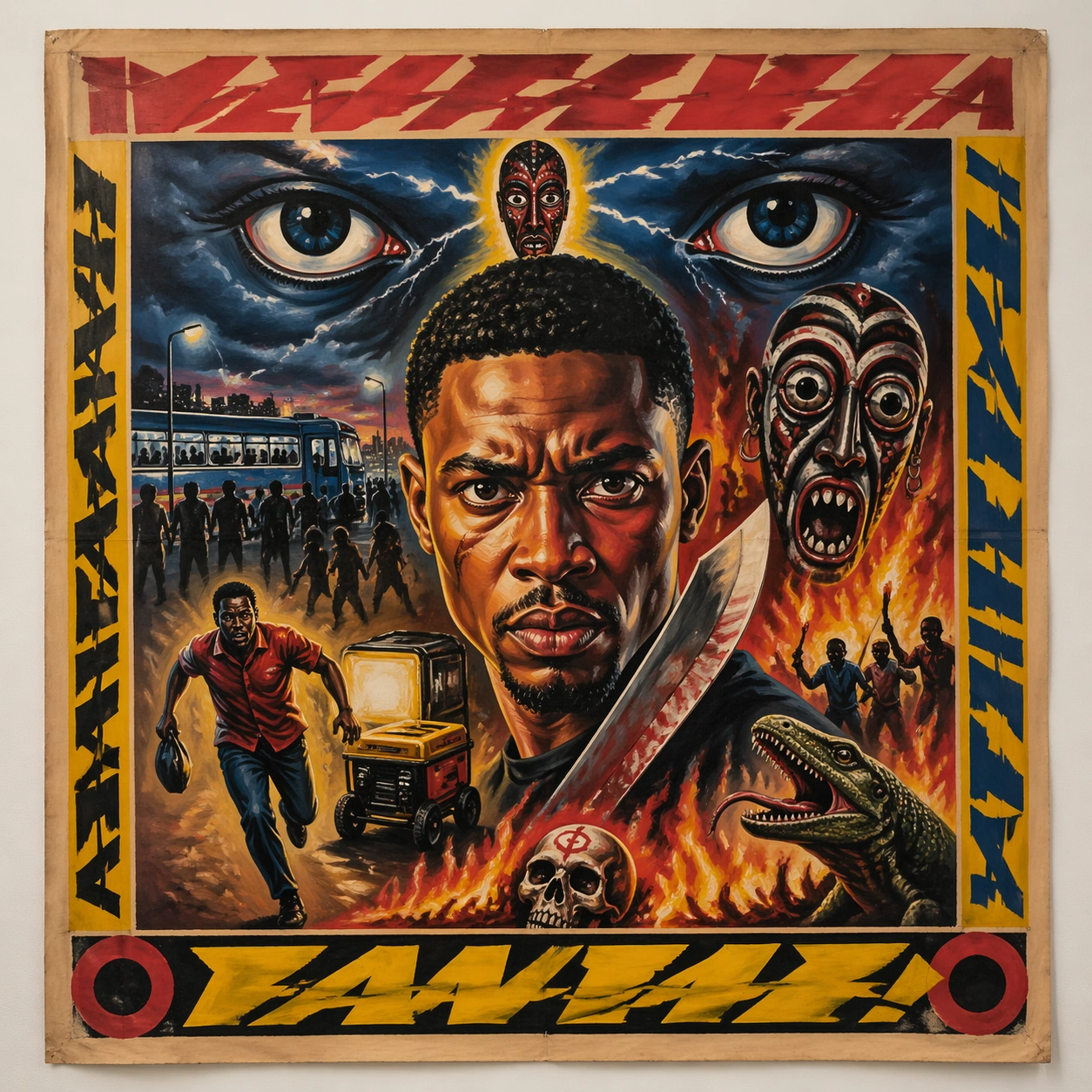
Example generated from “Ghanaian Movie Poster Raw — Canonical One-Sheet”
GPT Image 2en

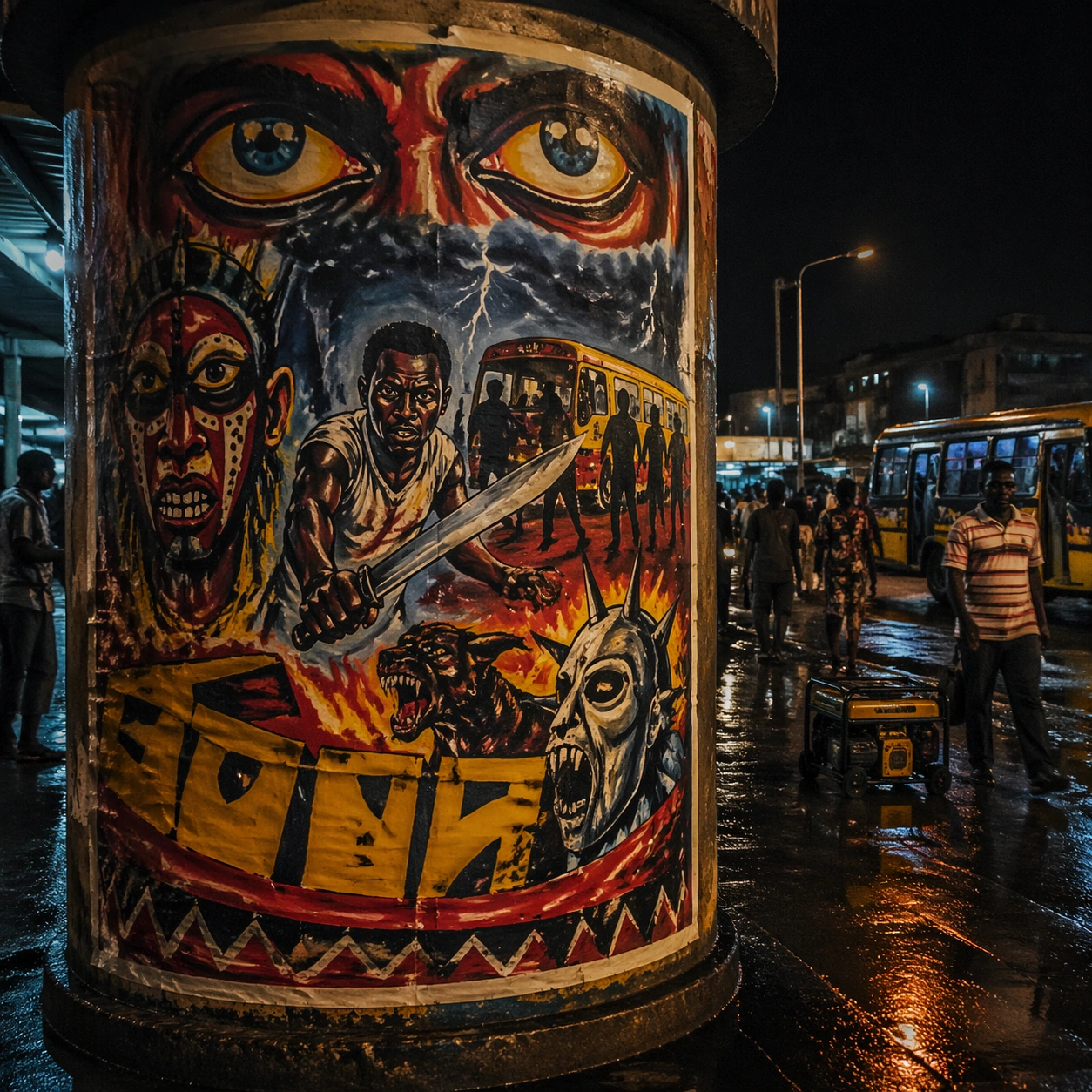
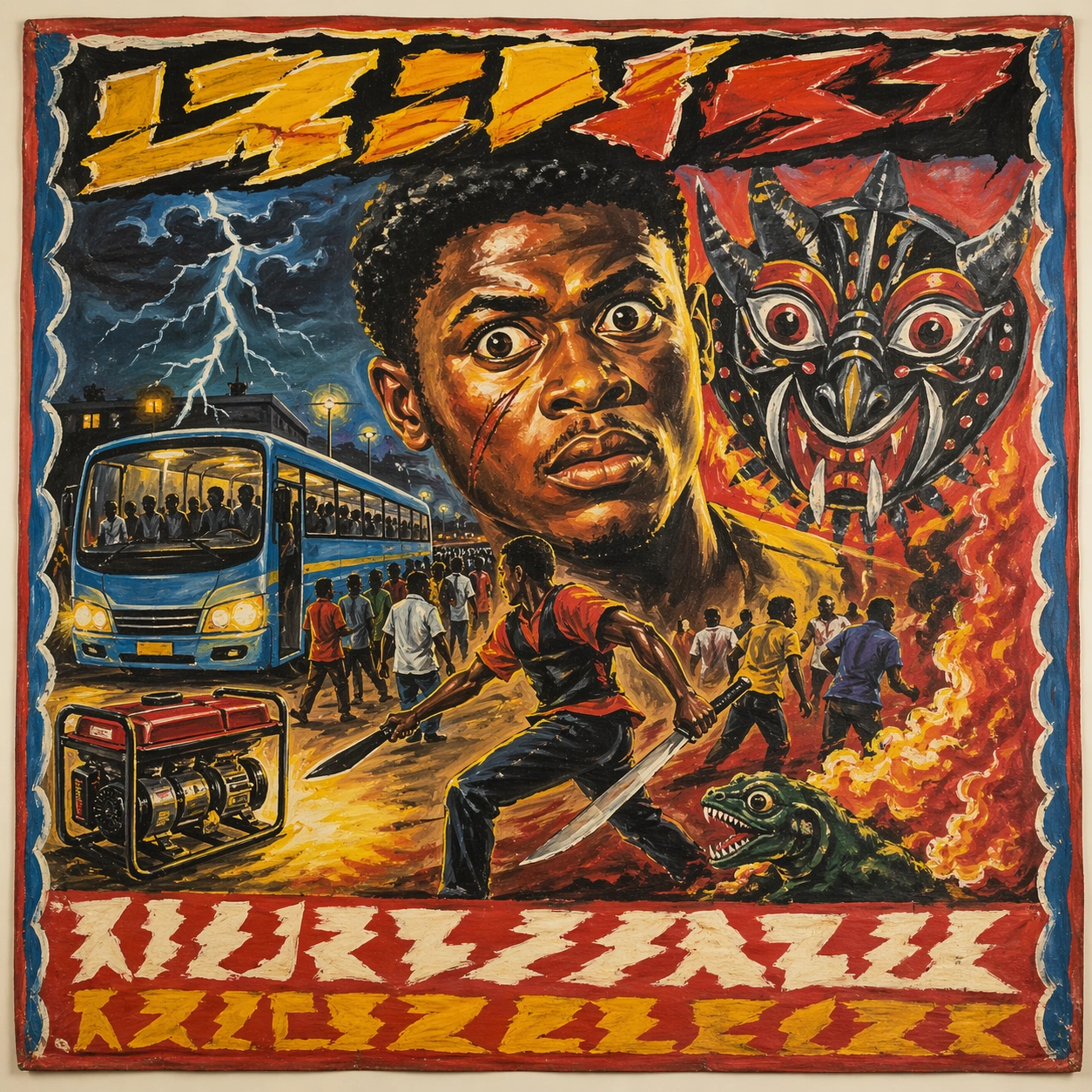
Scene: A square straight-on studio view of a pristine poster mounted on a matte wall with even museum lighting, crisp corners, and enough breathing room around the sheet for the full composition to read as an intentional object. The poster should express raw market-poster painting on rough cloth or board with fearless scale distortion and thick visible brushwork, using saturated red, yellow, green, blue, black, and sun-faded cloth neutrals and a tactile surface appropriate to the medium. Subject: Build the flagship poster statement for this style, with the strongest hierarchy, the clearest subject silhouette, and the most disciplined balance between image field, pseudo-typography, and empty space. Use giant eyes, action poses, storm skies, spirit masks, blades, creatures, flames, and hand-painted borders as the main visual ingredients, and organize them with brush-painted pseudo-titles and framing bands kept emphatic but unreadable. For the contemporary-subject axis, thread in a night bus station, generator glow, and urban hustle translated into a bold hand-painted thriller advertisement. The poster must feel like an original design object rather than a reproduction of any known work. Important details: Treat this as the cleanest thesis image in the set: the paper should look fresh, the inks or paint should feel deliberate, and every formal rule of the style should be easy to study at a glance. Preserve oversized portrait dominance, uneven brush edges, hand-mixed paint, energetic anatomy distortion, and local-market immediacy. Keep every letterform abstract and non-readable, as if it were a typographic texture rather than language. Make the style unmistakable through composition, palette, surface behavior, and symbolic compression. no smooth digital airbrush, no clean vector geometry, no subtle luxury minimalism, no photographic polish. Use case: Ghana Hand-Painted single study 1/9, establishing the cleanest museum-grade poster reading. Constraints: No readable text, no watermark, no logos, preserve exact 1:1 aspect ratio, no copyrighted characters, no real brand marks, no QR codes, no interface chrome, no accidental gibberish lettering.

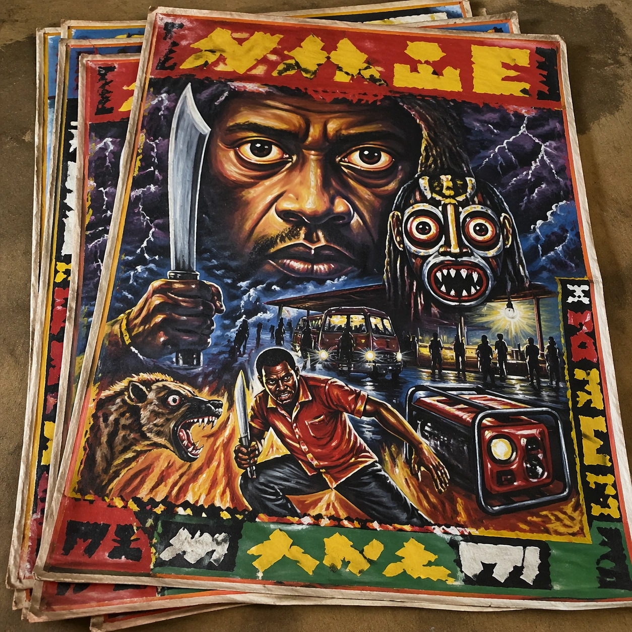
Example generated from “Ghanaian Movie Poster Raw — Print Proof Flatlay”
GPT Image 2en

Scene: A square overhead tabletop photograph of a fresh poster proof on neutral worktable paper, lit by cool daylight, with crop marks, tape tabs, and slight paper bow visible around the sheet. The poster should express raw market-poster painting on rough cloth or board with fearless scale distortion and thick visible brushwork, using saturated red, yellow, green, blue, black, and sun-faded cloth neutrals and a tactile surface appropriate to the medium. Subject: Design the poster as a print-shop proof, preserving the same poster language while allowing production clues such as edge trims, registration targets, and process marks to frame the composition. Use giant eyes, action poses, storm skies, spirit masks, blades, creatures, flames, and hand-painted borders as the main visual ingredients, and organize them with brush-painted pseudo-titles and framing bands kept emphatic but unreadable. For the contemporary-subject axis, thread in a night bus station, generator glow, and urban hustle translated into a bold hand-painted thriller advertisement. The poster must feel like an original design object rather than a reproduction of any known work. Important details: The image must still read as a finished poster concept, but it should carry believable print-process evidence and material tactility instead of gallery-wall perfection. Preserve oversized portrait dominance, uneven brush edges, hand-mixed paint, energetic anatomy distortion, and local-market immediacy. Keep every letterform abstract and non-readable, as if it were a typographic texture rather than language. Make the style unmistakable through composition, palette, surface behavior, and symbolic compression. no smooth digital airbrush, no clean vector geometry, no subtle luxury minimalism, no photographic polish. Use case: Ghana Hand-Painted single study 2/9, testing production realism and process evidence. Constraints: No readable text, no watermark, no logos, preserve exact 1:1 aspect ratio, no copyrighted characters, no real brand marks, no QR codes, no interface chrome, no accidental gibberish lettering.

Example generated from “Ghanaian Movie Poster Raw — Transit Lightbox”
GPT Image 2en

Scene: A square dusk street photograph of a backlit transit poster glowing inside glass, with faint rain reflections, soft city blur in the distance, and the poster remaining fully legible as a composition. The poster should express raw market-poster painting on rough cloth or board with fearless scale distortion and thick visible brushwork, using saturated red, yellow, green, blue, black, and sun-faded cloth neutrals and a tactile surface appropriate to the medium. Subject: Adapt the poster into a public-facing lightbox version that still honors the original style grammar while feeling bold enough to stop a passerby from several meters away. Use giant eyes, action poses, storm skies, spirit masks, blades, creatures, flames, and hand-painted borders as the main visual ingredients, and organize them with brush-painted pseudo-titles and framing bands kept emphatic but unreadable. For the contemporary-subject axis, thread in a night bus station, generator glow, and urban hustle translated into a bold hand-painted thriller advertisement. The poster must feel like an original design object rather than a reproduction of any known work. Important details: Let the style survive the illumination test: color blocking, silhouette contrast, and abstract lettering should stay controlled under bright internal light and reflective glass. Preserve oversized portrait dominance, uneven brush edges, hand-mixed paint, energetic anatomy distortion, and local-market immediacy. Keep every letterform abstract and non-readable, as if it were a typographic texture rather than language. Make the style unmistakable through composition, palette, surface behavior, and symbolic compression. no smooth digital airbrush, no clean vector geometry, no subtle luxury minimalism, no photographic polish. Use case: Ghana Hand-Painted single study 3/9, testing distance readability in public display. Constraints: No readable text, no watermark, no logos, preserve exact 1:1 aspect ratio, no copyrighted characters, no real brand marks, no QR codes, no interface chrome, no accidental gibberish lettering.
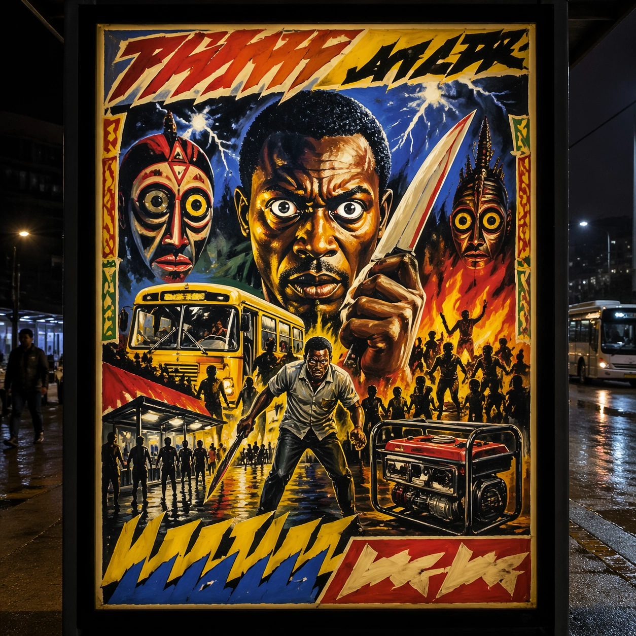
Example generated from “Ghanaian Movie Poster Raw — Wheatpaste Wall Layer”
GPT Image 2en

Scene: A square urban wall study with the poster pasted onto rough plaster among torn edges and older paper remnants, photographed in soft overcast light so texture, glue bubbles, and surface scars stay visible. The poster should express raw market-poster painting on rough cloth or board with fearless scale distortion and thick visible brushwork, using saturated red, yellow, green, blue, black, and sun-faded cloth neutrals and a tactile surface appropriate to the medium. Subject: Create a version that feels made for the street, with the poster carrying enough formal force to survive abrasion, layering, and imperfect placement without losing its visual identity. Use giant eyes, action poses, storm skies, spirit masks, blades, creatures, flames, and hand-painted borders as the main visual ingredients, and organize them with brush-painted pseudo-titles and framing bands kept emphatic but unreadable. For the contemporary-subject axis, thread in a night bus station, generator glow, and urban hustle translated into a bold hand-painted thriller advertisement. The poster must feel like an original design object rather than a reproduction of any known work. Important details: Keep the main design intact but let the environment add grit: lifted corners, tiny tears, wrinkled paper, and older color fragments around the perimeter should amplify the style rather than dilute it. Preserve oversized portrait dominance, uneven brush edges, hand-mixed paint, energetic anatomy distortion, and local-market immediacy. Keep every letterform abstract and non-readable, as if it were a typographic texture rather than language. Make the style unmistakable through composition, palette, surface behavior, and symbolic compression. no smooth digital airbrush, no clean vector geometry, no subtle luxury minimalism, no photographic polish. Use case: Ghana Hand-Painted single study 4/9, testing street-life durability and layered context. Constraints: No readable text, no watermark, no logos, preserve exact 1:1 aspect ratio, no copyrighted characters, no real brand marks, no QR codes, no interface chrome, no accidental gibberish lettering.

Example generated from “Ghanaian Movie Poster Raw — Folded Archive Copy”
GPT Image 2en

Scene: A square conservation-table view of a vintage poster laid on gray felt under raking light, with visible fold lines, softened corners, and subtle aging that still preserves the integrity of the image. The poster should express raw market-poster painting on rough cloth or board with fearless scale distortion and thick visible brushwork, using saturated red, yellow, green, blue, black, and sun-faded cloth neutrals and a tactile surface appropriate to the medium. Subject: Present the poster as an archive copy that has been stored, unfolded, and carefully documented, letting age and handling reveal how the design holds up across time. Use giant eyes, action poses, storm skies, spirit masks, blades, creatures, flames, and hand-painted borders as the main visual ingredients, and organize them with brush-painted pseudo-titles and framing bands kept emphatic but unreadable. For the contemporary-subject axis, thread in a night bus station, generator glow, and urban hustle translated into a bold hand-painted thriller advertisement. The poster must feel like an original design object rather than a reproduction of any known work. Important details: Aging must stay believable rather than theatrical: slight yellowing, fold memory, edge wear, and pigment variation should support the historical or crafted feeling of the style. Preserve oversized portrait dominance, uneven brush edges, hand-mixed paint, energetic anatomy distortion, and local-market immediacy. Keep every letterform abstract and non-readable, as if it were a typographic texture rather than language. Make the style unmistakable through composition, palette, surface behavior, and symbolic compression. no smooth digital airbrush, no clean vector geometry, no subtle luxury minimalism, no photographic polish. Use case: Ghana Hand-Painted single study 5/9, testing archival endurance and age character. Constraints: No readable text, no watermark, no logos, preserve exact 1:1 aspect ratio, no copyrighted characters, no real brand marks, no QR codes, no interface chrome, no accidental gibberish lettering.

Example generated from “Ghanaian Movie Poster Raw — Twin Poster Diptych”
GPT Image 2en

Scene: A square white-wall installation showing two companion posters hung side by side with equal spacing, photographed frontally so the pair reads as a designed conversation rather than two unrelated sheets. The poster should express raw market-poster painting on rough cloth or board with fearless scale distortion and thick visible brushwork, using saturated red, yellow, green, blue, black, and sun-faded cloth neutrals and a tactile surface appropriate to the medium. Subject: Compose a matched diptych: two posters sharing one style system while splitting the narrative across paired motifs, mirrored masses, or complementary color emphasis. Use giant eyes, action poses, storm skies, spirit masks, blades, creatures, flames, and hand-painted borders as the main visual ingredients, and organize them with brush-painted pseudo-titles and framing bands kept emphatic but unreadable. For the contemporary-subject axis, thread in a night bus station, generator glow, and urban hustle translated into a bold hand-painted thriller advertisement. The poster must feel like an original design object rather than a reproduction of any known work. Important details: Both halves should feel distinct yet inseparable. Preserve one coherent visual language, but let each sheet carry its own focal symbol and rhythm without readable wording. Preserve oversized portrait dominance, uneven brush edges, hand-mixed paint, energetic anatomy distortion, and local-market immediacy. Keep every letterform abstract and non-readable, as if it were a typographic texture rather than language. Make the style unmistakable through composition, palette, surface behavior, and symbolic compression. no smooth digital airbrush, no clean vector geometry, no subtle luxury minimalism, no photographic polish. Use case: Ghana Hand-Painted single study 6/9, testing system flexibility across a paired set. Constraints: No readable text, no watermark, no logos, preserve exact 1:1 aspect ratio, no copyrighted characters, no real brand marks, no QR codes, no interface chrome, no accidental gibberish lettering.
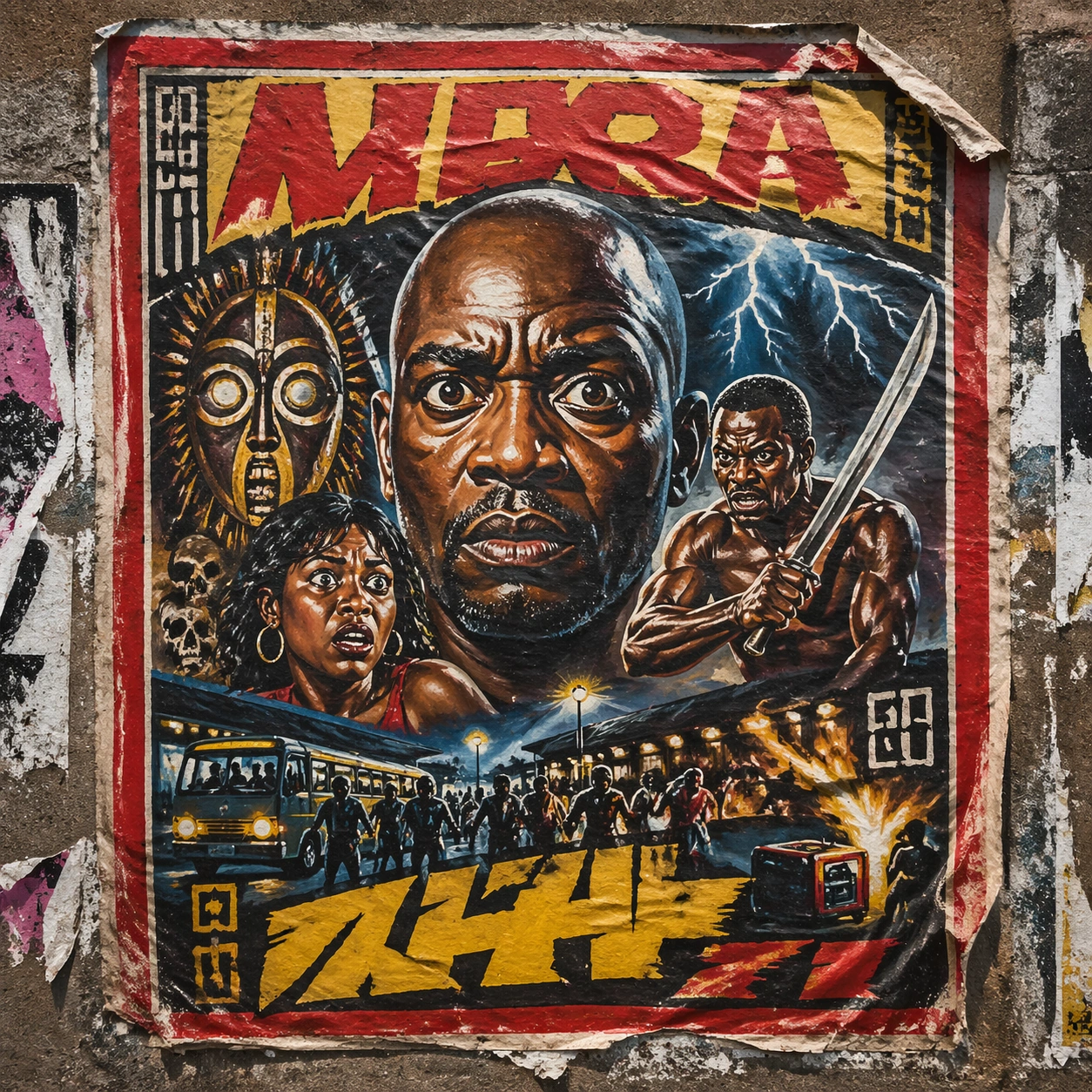
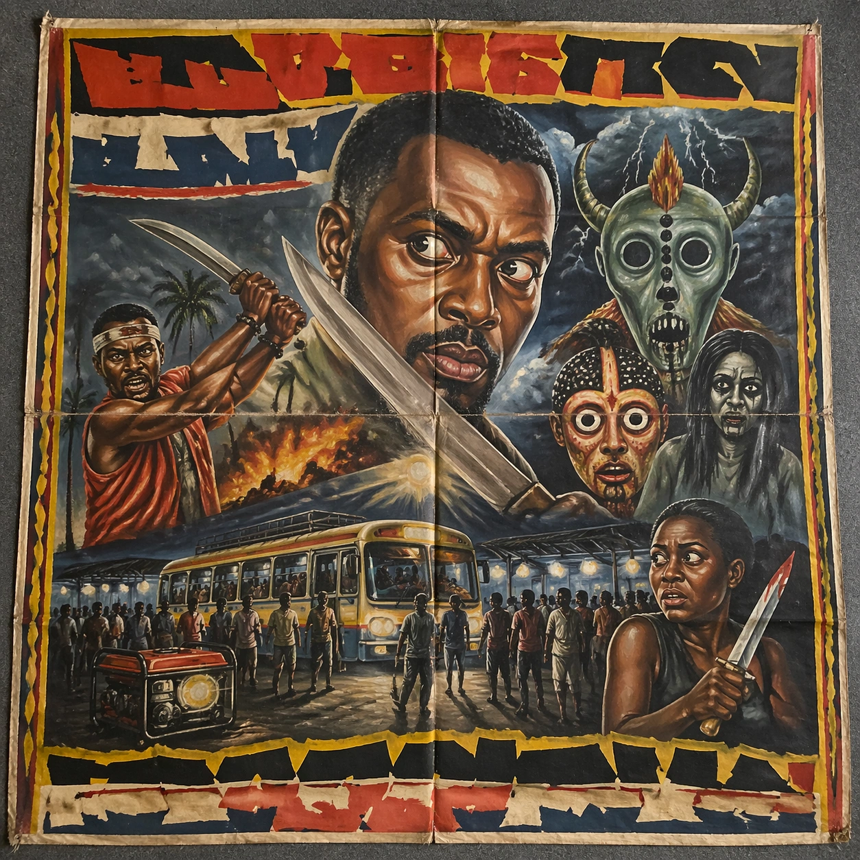
Example generated from “Ghanaian Movie Poster Raw — Stacked Print Bundle”
GPT Image 2en

Scene: A square tabletop shot of several poster prints stacked and slightly fanned, with curled corners, offset edges, and soft directional light revealing paper thickness and ink behavior. The poster should express raw market-poster painting on rough cloth or board with fearless scale distortion and thick visible brushwork, using saturated red, yellow, green, blue, black, and sun-faded cloth neutrals and a tactile surface appropriate to the medium. Subject: Design the top poster to dominate while nearby duplicate sheets echo the same composition, creating a tactile print-run scene rather than a single isolated sheet. Use giant eyes, action poses, storm skies, spirit masks, blades, creatures, flames, and hand-painted borders as the main visual ingredients, and organize them with brush-painted pseudo-titles and framing bands kept emphatic but unreadable. For the contemporary-subject axis, thread in a night bus station, generator glow, and urban hustle translated into a bold hand-painted thriller advertisement. The poster must feel like an original design object rather than a reproduction of any known work. Important details: Use the stack to emphasize production character: edge shadows, repeated motifs peeking from beneath, and subtle misalignment should enrich the material reading without changing the core design. Preserve oversized portrait dominance, uneven brush edges, hand-mixed paint, energetic anatomy distortion, and local-market immediacy. Keep every letterform abstract and non-readable, as if it were a typographic texture rather than language. Make the style unmistakable through composition, palette, surface behavior, and symbolic compression. no smooth digital airbrush, no clean vector geometry, no subtle luxury minimalism, no photographic polish. Use case: Ghana Hand-Painted single study 7/9, testing print-run tactility and repeat presence. Constraints: No readable text, no watermark, no logos, preserve exact 1:1 aspect ratio, no copyrighted characters, no real brand marks, no QR codes, no interface chrome, no accidental gibberish lettering.

Example generated from “Ghanaian Movie Poster Raw — Kiosk Night Glow”
GPT Image 2en

Scene: A square nighttime city view with the poster wrapping part of a cylindrical kiosk, wet pavement reflecting nearby light, and the composition holding together under moody urban illumination. The poster should express raw market-poster painting on rough cloth or board with fearless scale distortion and thick visible brushwork, using saturated red, yellow, green, blue, black, and sun-faded cloth neutrals and a tactile surface appropriate to the medium. Subject: Reframe the design for a dramatic street-placement context, where the poster has to project style and mood through reflection, curvature, and surrounding darkness. Use giant eyes, action poses, storm skies, spirit masks, blades, creatures, flames, and hand-painted borders as the main visual ingredients, and organize them with brush-painted pseudo-titles and framing bands kept emphatic but unreadable. For the contemporary-subject axis, thread in a night bus station, generator glow, and urban hustle translated into a bold hand-painted thriller advertisement. The poster must feel like an original design object rather than a reproduction of any known work. Important details: The design should remain instantly recognizable despite the cylindrical wrap. Preserve major blocks, symbolic shapes, and abstract title forms so the style still feels authoritative at night. Preserve oversized portrait dominance, uneven brush edges, hand-mixed paint, energetic anatomy distortion, and local-market immediacy. Keep every letterform abstract and non-readable, as if it were a typographic texture rather than language. Make the style unmistakable through composition, palette, surface behavior, and symbolic compression. no smooth digital airbrush, no clean vector geometry, no subtle luxury minimalism, no photographic polish. Use case: Ghana Hand-Painted single study 8/9, testing atmospheric display under rain and glow. Constraints: No readable text, no watermark, no logos, preserve exact 1:1 aspect ratio, no copyrighted characters, no real brand marks, no QR codes, no interface chrome, no accidental gibberish lettering.

Example generated from “Ghanaian Movie Poster Raw — Contemporary Remix”
GPT Image 2en

Scene: A square front-facing poster presentation on a clean neutral wall, lit like a premium print test, with crisp edges and a polished but still tactile finish appropriate to the style. The poster should express raw market-poster painting on rough cloth or board with fearless scale distortion and thick visible brushwork, using saturated red, yellow, green, blue, black, and sun-faded cloth neutrals and a tactile surface appropriate to the medium. Subject: Apply the historical poster language to a contemporary urban subject so the old visual grammar proves it can carry present-day themes without losing authenticity or formal discipline. Use giant eyes, action poses, storm skies, spirit masks, blades, creatures, flames, and hand-painted borders as the main visual ingredients, and organize them with brush-painted pseudo-titles and framing bands kept emphatic but unreadable. For the contemporary-subject axis, thread in a night bus station, generator glow, and urban hustle translated into a bold hand-painted thriller advertisement. The poster must feel like an original design object rather than a reproduction of any known work. Important details: This is not parody. The contemporary subject should feel genuinely absorbed into the style through palette, composition, symbolic compression, and non-readable lettering treatment. Preserve oversized portrait dominance, uneven brush edges, hand-mixed paint, energetic anatomy distortion, and local-market immediacy. Keep every letterform abstract and non-readable, as if it were a typographic texture rather than language. Make the style unmistakable through composition, palette, surface behavior, and symbolic compression. no smooth digital airbrush, no clean vector geometry, no subtle luxury minimalism, no photographic polish. Use case: Ghana Hand-Painted single study 9/9, testing historical grammar on a present-day subject. Constraints: No readable text, no watermark, no logos, preserve exact 1:1 aspect ratio, no copyrighted characters, no real brand marks, no QR codes, no interface chrome, no accidental gibberish lettering.

Example generated from “Ghibli Countergenre — Reference Rocket Garden”
GPT Image 2en

Scene: A square storybook frame looking across a coastal launch valley at early dawn, with a tall white orbital rocket and service gantry centered slightly left, green terraced hills in the foreground, shallow mist around the pad, and a luminous peach-blue sky painted with soft watercolor gradation. The camera is at hilltop eye level, far enough back to show the full vehicle, the pad deck, a reflective water channel, and tiny maintenance carts, while still feeling intimate and calm. Subject: The main subject is a real launch complex translated into a tender hand-painted animated-film world. The rocket should read as technically plausible, cylindrical, and heavy-lift capable, with frost on the lower tank, soot-streaked engine skirt, venting vapor, latticework umbilicals, and grounded piping. Around it, the facility feels lived in rather than militarized: paper lantern work lights, mossy concrete, small utility sheds with patched roofs, a bicycle leaning near a fence, and birds circling the gantry. No people need to dominate, but hints of human care should be visible in the tools, catwalks, and weathered paint. Important details: Preserve a soft watercolor-and-cel aesthetic, warm pastoral mood, clean rocket proportions, and legible launch hardware. The countergenre effect depends on keeping the engineering believable while the emotional tone stays gentle and domestic. Smoke vents must feel cool and low-pressure, not explosive. Colors should stay muted sage, cream, rust, pale sky blue, and warm amber. Every object should feel hand-painted, but not childish or simplified into a toy. Use case: Ghibli Countergenre series study 1/8, establishing the reference rocket, pad, valley, and camera logic for later dependent shots. Constraints: No readable text, no watermark, no logos, preserve exact 1:1 aspect ratio, no exaggerated anime eyes, no giant robots, no fantasy castle silhouettes, no glossy sci-fi chrome, no launch viewed from space, no extra rockets.

Example generated from “Ghibli Countergenre — Fueling Lantern Hour”
GPT Image 2en

Scene: A square frame from the same hillside viewpoint and distance as the reference image, now set in blue hour just after sunset. The launch valley is dimmer, lanterns and sodium work lights glow softly through mist, and the rocket stands in the same position beside the same gantry, reflected in wet concrete and narrow irrigation channels. Low clouds hang over the hills, and the scene should feel hushed rather than dramatic. Subject: Show the same orbital rocket during cryogenic fueling. White vapor spills slowly around the lower tank and pad deck, the umbilical arm is connected in the same place, frost bands build on the body, and a few tiny technicians in rain capes move near tool carts and hoses. The facility must remain the same one established in the reference: same tower silhouette, same service buildings, same ridge lines, same drainage canal, same patched stair railings. The emotional twist is that a technically intense fueling operation reads like an evening village ritual, with lanterns, puddles, and patient preparation. Important details: Preserve identity continuity from image 01: same rocket diameter, nose shape, engine skirt, gantry spacing, camera angle, and valley layout. The style should remain hand-painted and tactile, with watercolor skies, soft edge control, and subtle cel shading, but the hardware cannot become vague. Use cool indigo, moss green, cream, and warm amber accents. Keep the fueling vapor dense and believable near the ground, not stylized into magical clouds. Use case: Ghibli Countergenre series study 2/8, testing whether a realistic fueling scene can retain reference identity inside a soft animated-film atmosphere. Constraints: No readable text, no watermark, no logos, preserve exact 1:1 aspect ratio, no second launch vehicle, no fireworks, no military spectacle, no fantasy creatures, no cockpit close-up, no hard-edged neon cyberpunk lighting.

Example generated from “Ghibli Countergenre — Ignition Under Paper Sky”
GPT Image 2en

Scene: A square composition from the same hill-facing camera position as the first two images, now at first light during ignition. The sky is pale cream and dusty rose, layered like thin paper wash, while the valley grasses bend away from the pad. The rocket and gantry keep the same framing and scale, with the pad still fully visible and the hills wrapping around the launch site. Subject: Show the same rocket at the instant engines have started but before the vehicle has cleared the tower. Dense exhaust expands across the trench and spills over the concrete like rolling storm surf, with orange-white engine glow under the base and water deluge bursting upward. Small service buildings, railings, pipes, and the irrigation channel should still be recognizable through the haze. The contrast of the theme is essential: the scene must depict true launch power and heavy machinery, yet the overall feeling should still be humane, lyrical, and painterly, as if a dangerous industrial ritual has been translated into a compassionate animated world. Important details: Preserve the exact identity from image 01: same rocket proportions, same tower geometry, same pad layout, same hillside silhouette, same camera height. The exhaust should feel physical and weighty, not abstract cotton. Keep the palette controlled: warm cream flame, soot gray, pale coral sky, muted green hills, and amber highlights in windows and lantern remnants. The image must remain readable as a launch pad, not a fantasy bonfire or volcanic eruption. Use case: Ghibli Countergenre series study 3/8, testing continuity through the hardest phase change: ignition without losing either engineering clarity or the tender visual language. Constraints: No readable text, no watermark, no logos, preserve exact 1:1 aspect ratio, no multiple towers, no mushroom-cloud apocalypse, no spacecraft in orbit, no stylized magical aura, no giant human figure in the foreground.

Example generated from “Ghibli Countergenre — Ascent Over Rice Clouds”
GPT Image 2en

Scene: A square frame from the same valley overlook and approximate camera height as the earlier series images, now moments after liftoff. The rocket has risen above the tower but remains centered in the composition, with the pad, gantry, canal, terraces, and far hills still visible below. Morning clouds sit low and puffy across the valley like rice-steam layers, catching warm sunlight in pale gold and cream. Subject: Depict the same rocket climbing cleanly, with a bright but controlled exhaust column descending into the launch trench and a widening cloud field rolling across the ground. The gantry should remain recognizable below, confirming that this is the same site and not a generic ascent painting. The rocket body needs to match the reference identity exactly: same tank segmentation, nose profile, interstage placement, engine spacing, and weathered coloration. The countergenre payoff is that the violent physics of ascent are rendered with extraordinary gentleness in the surrounding world: terraced hills, reeds bending by the canal, distant houses, and birds scattering at the edge of the smoke. Important details: Keep the animated-film treatment soft and lyrical but do not romanticize away the mechanics. Exhaust must read as hot and forceful, with clear directional thrust and ground interaction. Avoid dramatic fisheye distortion. Use a bright morning palette of cream, celadon, pale blue, rust, and soft charcoal. Preserve the same composition family and environment memory from image 01 so the series reads as one continuous event sequence. Use case: Ghibli Countergenre series study 4/8, completing the continuity arc with a liftoff image that still feels intimate, pastoral, and technically anchored. Constraints: No readable text, no watermark, no logos, preserve exact 1:1 aspect ratio, no orbital view, no extra spacecraft, no military jets, no stylized starfield, no city skyline swap, no comedic caricature proportions.