プロンプト · 創作の探索

プロンプトギャラリー

実際のプロンプトと生成例を探索。次の創作に役立つヒントを見つけ、全文を無料でコピーできます。

生成例
10,974
モデル
17
出典
1277
10,974 件のプロンプト例 · ページ 50 / 229
Example generated from “Desert Dusk Monolith — Transition Study”
GPT Image 2en

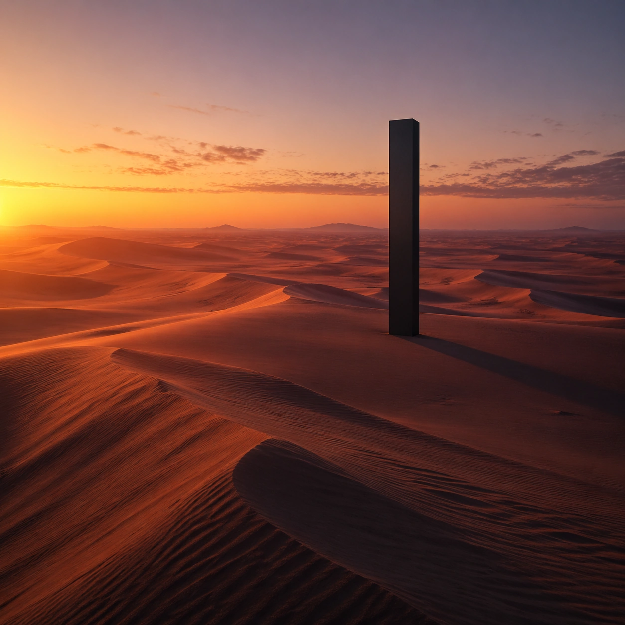
Scene: Create a square cinematic still for Desert Dusk Monolith. Use production-grade photoreal lighting, disciplined lens behavior, and a composition that feels like a finished key frame from an original film rather than a casual snapshot. A severe desert dune field stretches to the horizon at sunset, where the last light turns the crests copper and rose, the far sky cools toward violet, and one dark monolith stands with absolute stillness above the wind-shaped sand. Treat this as an adjacent moment before or after the main event, preserving the same topic language while letting the atmosphere shift slightly in intensity or position. Subject: Build a coherent original scene whose emotional center comes from atmosphere, light physics, and spatial clarity. Avoid relying on celebrity likeness, franchise iconography, or stylized illustration shortcuts. The monolith, long shadow, dune ridges, and the empty horizon line should dominate, with no unnecessary props, because the image depends on scale tension between one silent object and an immense landscape. Show the environment in transition, with clear evidence of recent motion, changing weather, or fading light, but without turning it into action spectacle. Important details: Preserve a believable physical world with strong depth layering, careful color separation, and premium image discipline. Keep the geometry minimal but not sterile, using precise shadow direction, tactile sand micro-relief, clean sky gradient, and disciplined negative space so the frame feels monumental rather than decorative. Subtle temporal storytelling matters here more than maximal drama, so let traces, gradients, and environmental residue do the work. Use case: Desert Monolith single study 7/9. Constraints: No readable text, no watermark, no logos, preserve exact 1:1 aspect ratio, no ruins, no spaceships, no readable markings on the monolith, no crowds, no surreal floating objects.


Example generated from “Desert Dusk Monolith — Wide Study”
GPT Image 2en

Scene: Create a square cinematic still for Desert Dusk Monolith. Use production-grade photoreal lighting, disciplined lens behavior, and a composition that feels like a finished key frame from an original film rather than a casual snapshot. A severe desert dune field stretches to the horizon at sunset, where the last light turns the crests copper and rose, the far sky cools toward violet, and one dark monolith stands with absolute stillness above the wind-shaped sand. Pull back enough to explain the broader geography or architectural envelope while keeping the square crop intentional and balanced. Subject: Build a coherent original scene whose emotional center comes from atmosphere, light physics, and spatial clarity. Avoid relying on celebrity likeness, franchise iconography, or stylized illustration shortcuts. The monolith, long shadow, dune ridges, and the empty horizon line should dominate, with no unnecessary props, because the image depends on scale tension between one silent object and an immense landscape. The wider frame should reveal how the main light or weather phenomenon organizes the surrounding world and not just the immediate subject. Important details: Preserve a believable physical world with strong depth layering, careful color separation, and premium image discipline. Keep the geometry minimal but not sterile, using precise shadow direction, tactile sand micro-relief, clean sky gradient, and disciplined negative space so the frame feels monumental rather than decorative. Make scale legible through spacing, horizon control, and foreground-to-background separation rather than through extra props. Use case: Desert Monolith single study 8/9. Constraints: No readable text, no watermark, no logos, preserve exact 1:1 aspect ratio, no ruins, no spaceships, no readable markings on the monolith, no crowds, no surreal floating objects.
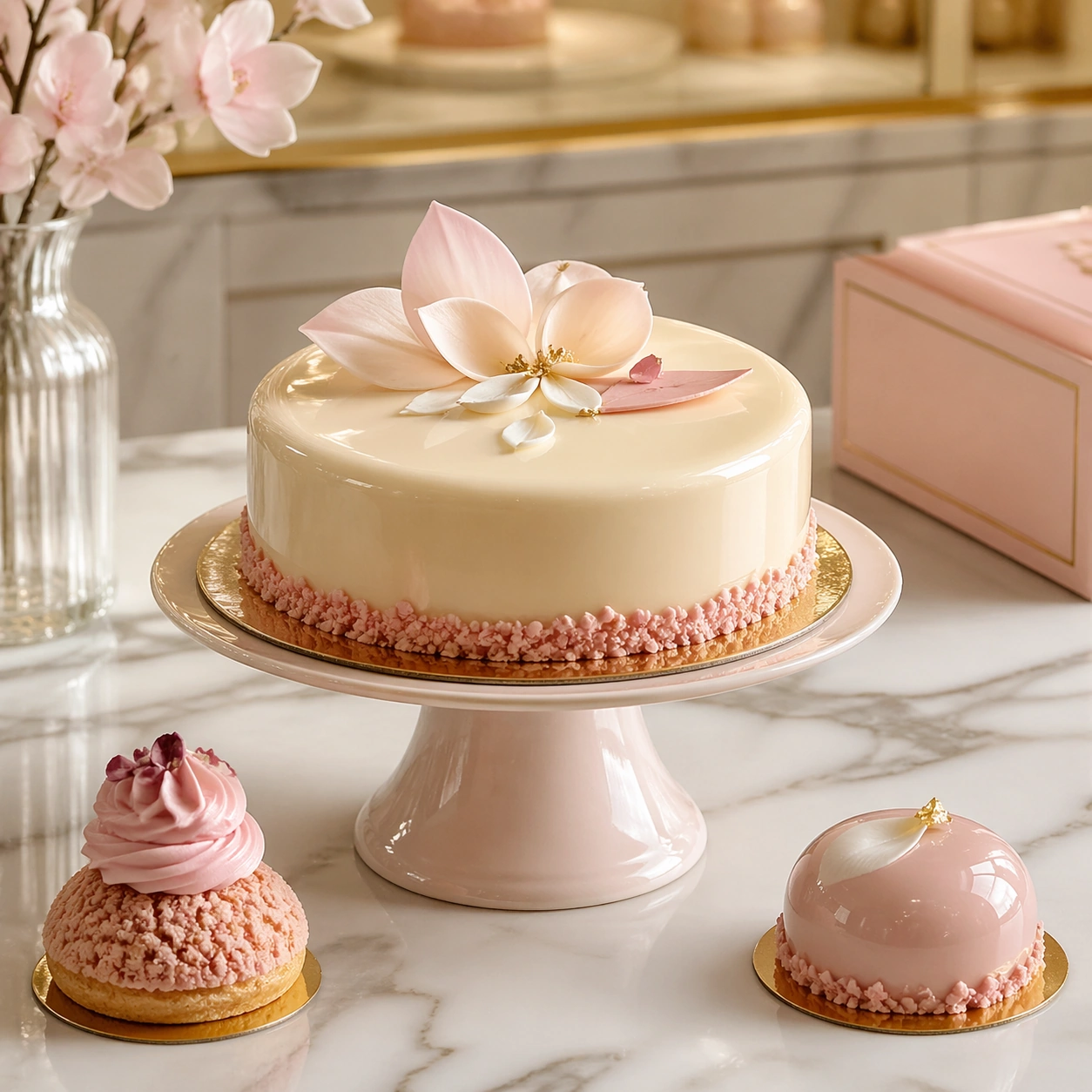
Example generated from “Desert Dusk Monolith — Afterglow Study”
GPT Image 2en

Scene: Create a square cinematic still for Desert Dusk Monolith. Use production-grade photoreal lighting, disciplined lens behavior, and a composition that feels like a finished key frame from an original film rather than a casual snapshot. A severe desert dune field stretches to the horizon at sunset, where the last light turns the crests copper and rose, the far sky cools toward violet, and one dark monolith stands with absolute stillness above the wind-shaped sand. End on a quieter independent image that holds the residue of the topic atmosphere after its loudest moment has passed, while still feeling complete and exhibition-ready. Subject: Build a coherent original scene whose emotional center comes from atmosphere, light physics, and spatial clarity. Avoid relying on celebrity likeness, franchise iconography, or stylized illustration shortcuts. The monolith, long shadow, dune ridges, and the empty horizon line should dominate, with no unnecessary props, because the image depends on scale tension between one silent object and an immense landscape. The frame should suggest memory, aftermath, or lingering presence through environment first and only secondarily through any figure or object. Important details: Preserve a believable physical world with strong depth layering, careful color separation, and premium image discipline. Keep the geometry minimal but not sterile, using precise shadow direction, tactile sand micro-relief, clean sky gradient, and disciplined negative space so the frame feels monumental rather than decorative. Favor restraint, believable light decay, and subtle narrative closure over spectacle or decorative excess. Use case: Desert Monolith single study 9/9. Constraints: No readable text, no watermark, no logos, preserve exact 1:1 aspect ratio, no ruins, no spaceships, no readable markings on the monolith, no crowds, no surreal floating objects.
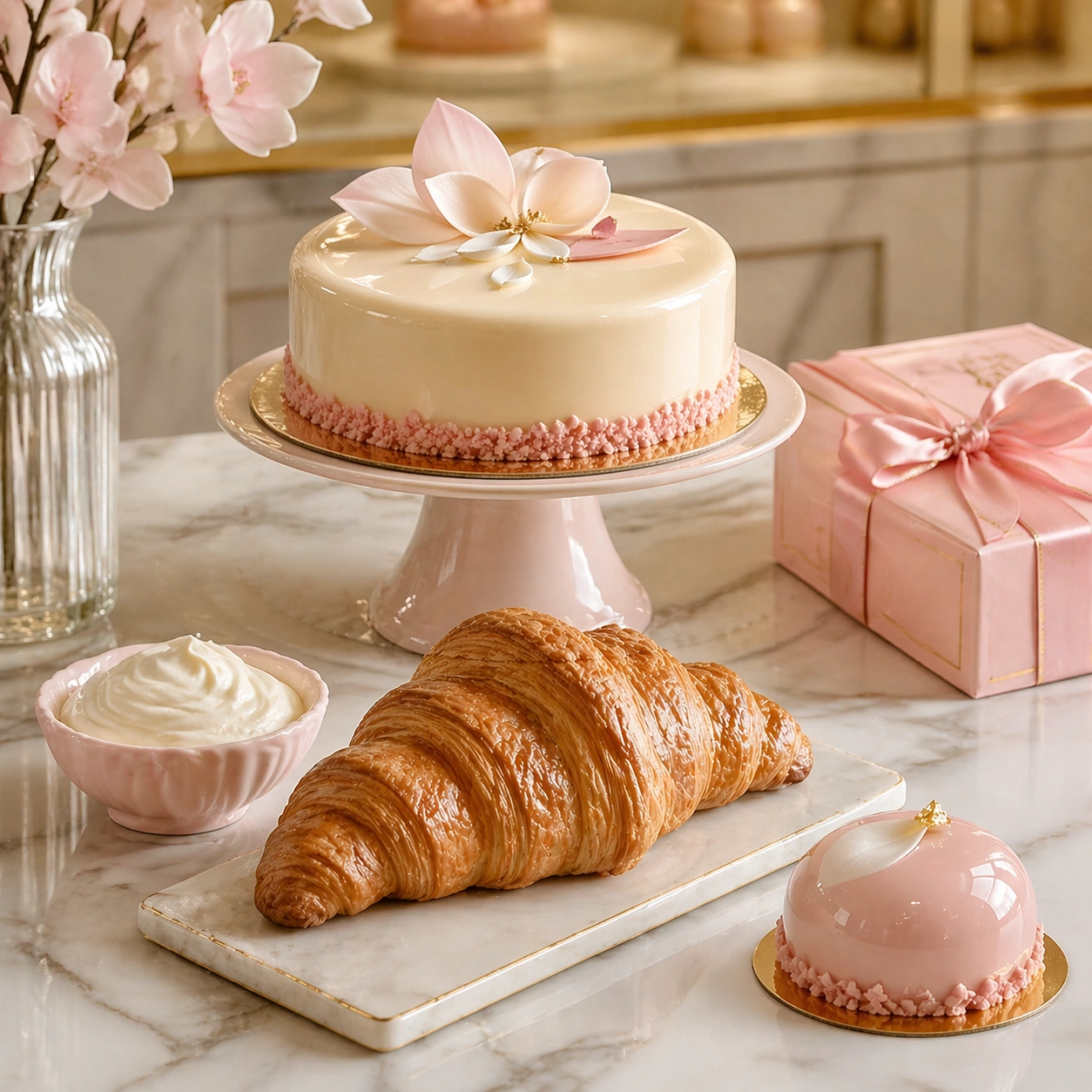
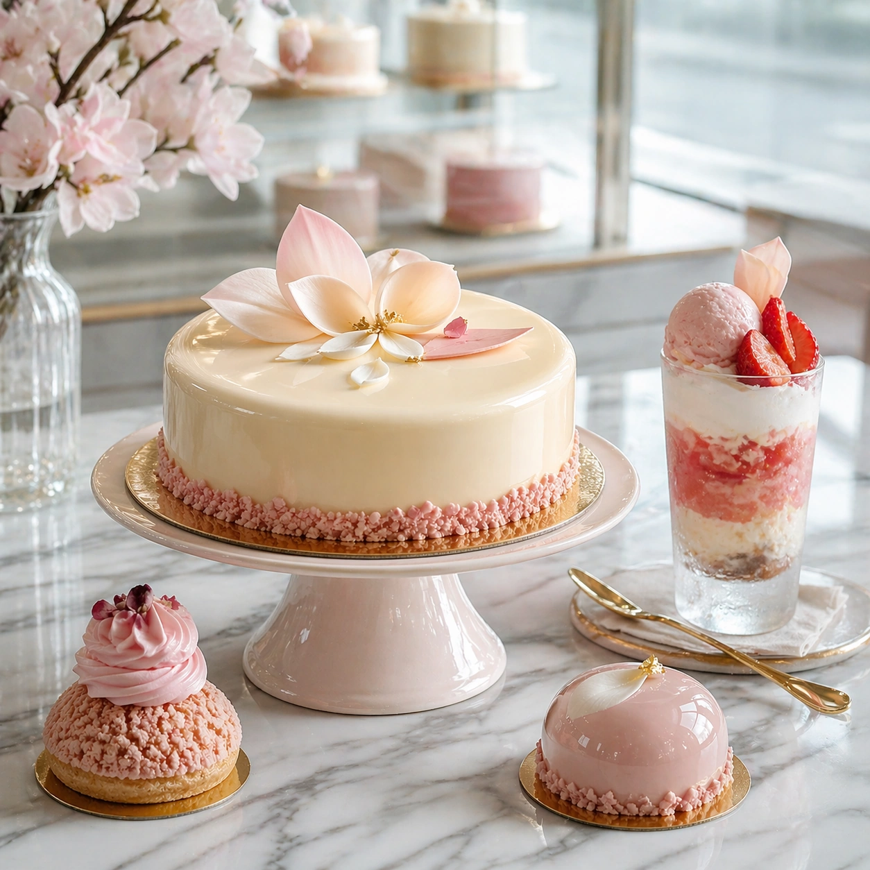
Example generated from “Dessert Patisserie Brand Visual System — Salon Display Anchor”
GPT Image 2en

Scene: Compose a square premium patisserie image with polished but believable boutique lighting, elegant marble or lacquer surfaces, and a sweet-shop atmosphere that feels brand-authored rather than generic. The camera should preserve product clarity, shape definition, and shelf or counter context while leaving enough breathing room for campaign placement. Use soft daylight mixed with warm case lighting so the image feels like an upscale pastry salon at opening hour, with clean reflections and controlled highlights. Subject: The desserts must look crafted by a high-end pastry kitchen: clean lamination, glossy glaze, stable cream structure, crisp edges, and packaging or display surfaces that reinforce a coherent dessert identity. Feature an elegant entremet cake on a pedestal with two supporting pastries and one subtle packaging accent in the background. Important details: Sweetness should come from color control, finish quality, and material nuance, not from visual clutter. Preserve believable pastry engineering, boutique display logic, and refined merchandising cues so the images can support brand storytelling across retail, packaging, and editorial use. This image establishes the reference system for the series, including camera height, tabletop discipline, prop family, and color control that later images must inherit. This image must define the full visual system for the series: restrained pastel palette, premium materials, clear merchandising rhythm, and high-fidelity pastry finish. Use case: Dessert Brand series study 1/9, built for Prompt Atlas coverage of a food and beverage commercial visual system. Constraints: No readable text, no watermark, no logos, preserve exact 1:1 aspect ratio, no candy-color overload, no plastic frosting, no supermarket clutter, no cartoon decorations, no melted textures that break realism, no childish party props, no birthday candles, no cartoon toppers, no supermarket bakery trays.
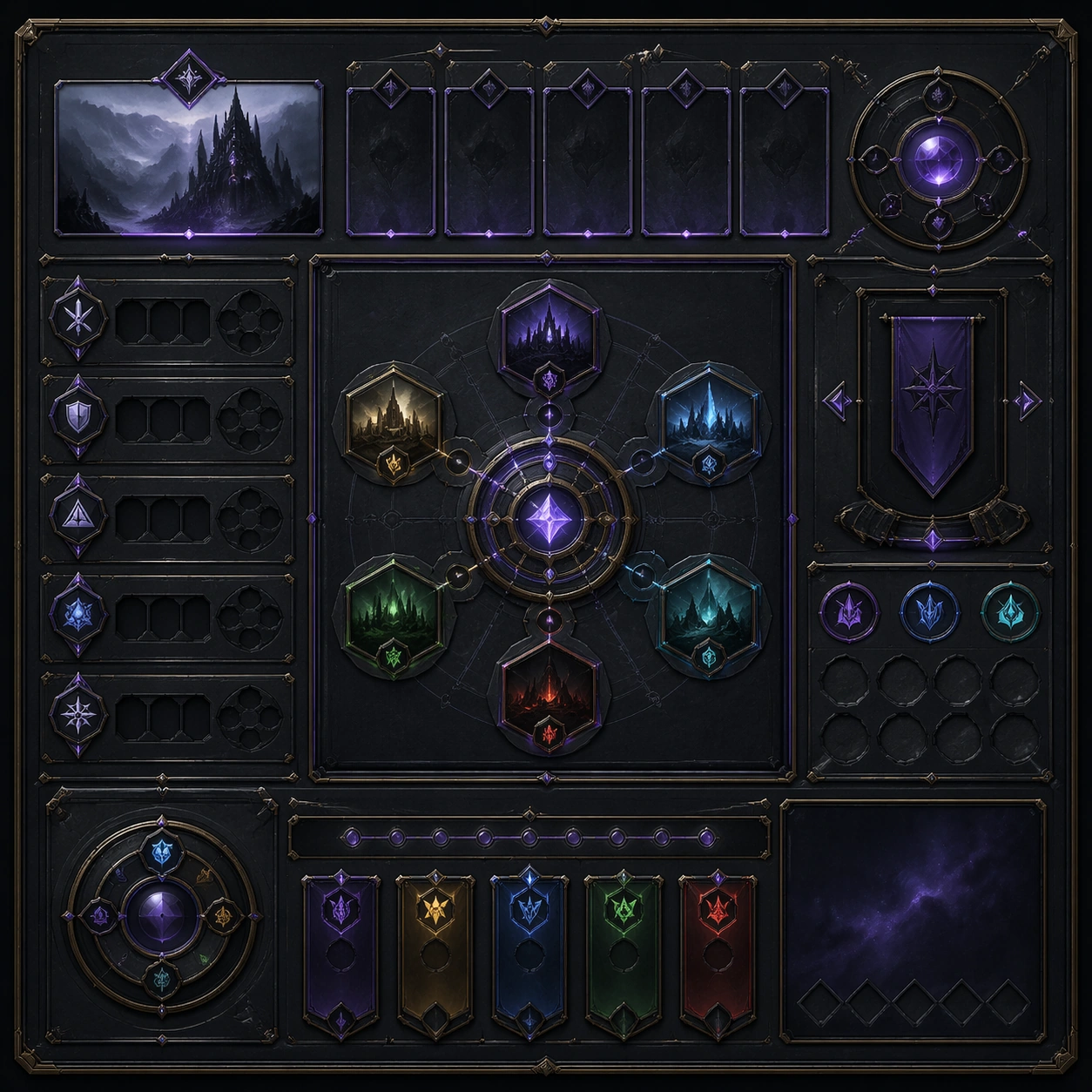
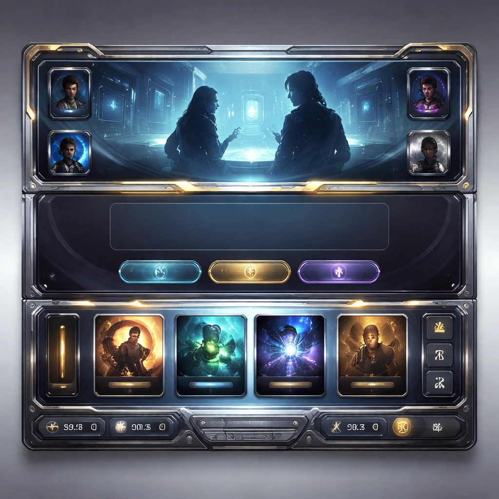
Example generated from “Dessert Patisserie Brand Visual System — Croissant Ribbon”
GPT Image 2en

Scene: Compose a square premium patisserie image with polished but believable boutique lighting, elegant marble or lacquer surfaces, and a sweet-shop atmosphere that feels brand-authored rather than generic. The camera should preserve product clarity, shape definition, and shelf or counter context while leaving enough breathing room for campaign placement. Keep the same salon camera height and marble-counter atmosphere, but let the light reveal crisp lamination, buttery gold tones, and one folded ribbon-like package accent. Subject: The desserts must look crafted by a high-end pastry kitchen: clean lamination, glossy glaze, stable cream structure, crisp edges, and packaging or display surfaces that reinforce a coherent dessert identity. Show a croissant or viennoiserie centerpiece with precise layers, a small dish of cream or jam, and packaging details that feel aligned with the same brand family. Important details: Sweetness should come from color control, finish quality, and material nuance, not from visual clutter. Preserve believable pastry engineering, boutique display logic, and refined merchandising cues so the images can support brand storytelling across retail, packaging, and editorial use. Preserve the exact camera height, lens feel, prop family, tabletop scale, palette discipline, and brand logic established by 01-salon-display-anchor. Preserve the reference palette, counter spacing, and display sophistication while emphasizing flaky structure, thin glaze, and realistic pastry lift. Use case: Dessert Brand series study 2/9, built for Prompt Atlas coverage of a food and beverage commercial visual system. Constraints: No readable text, no watermark, no logos, preserve exact 1:1 aspect ratio, no candy-color overload, no plastic frosting, no supermarket clutter, no cartoon decorations, no melted textures that break realism, no childish party props, no rustic paper bag clutter, no café breakfast spread, no chocolate overload.
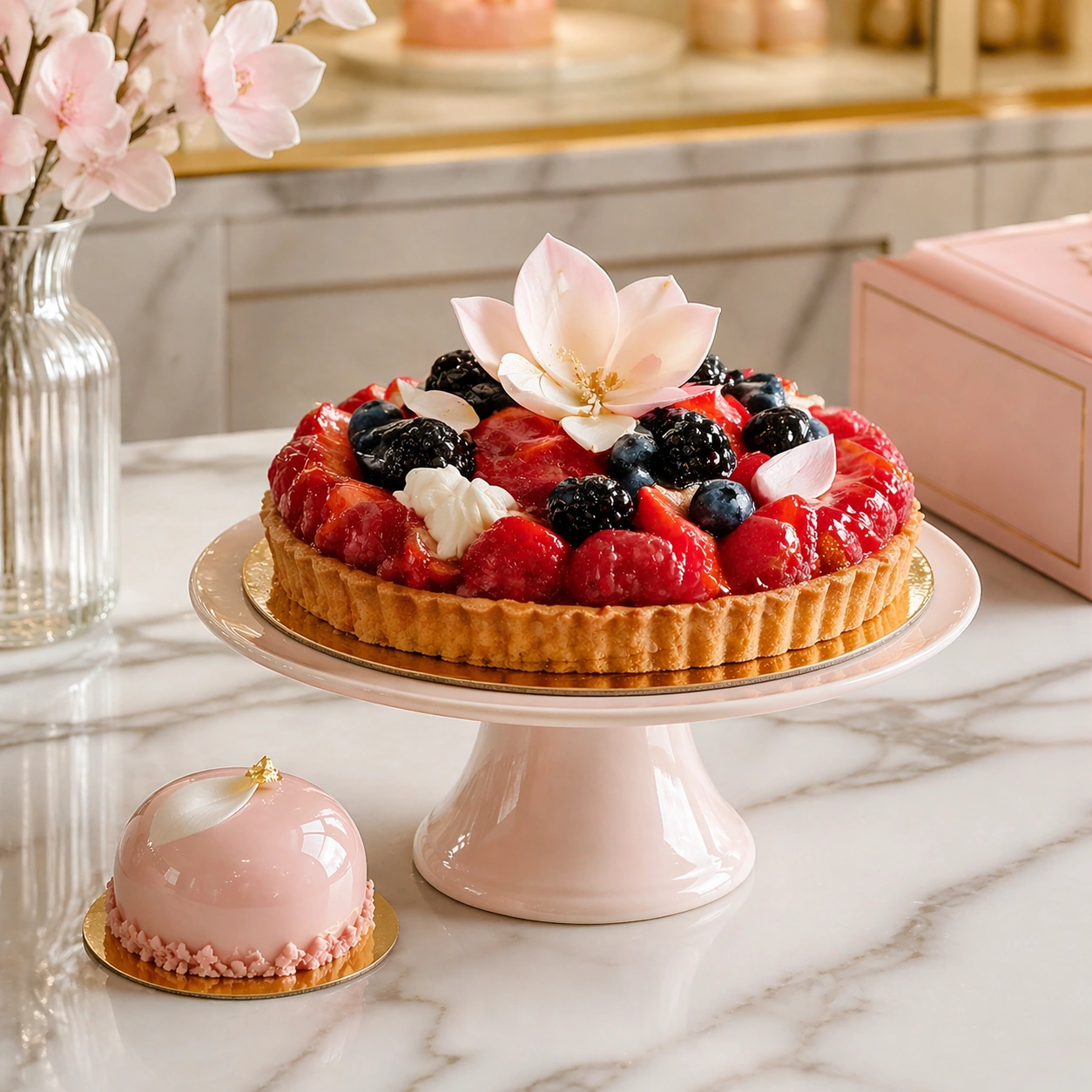
Example generated from “Dessert Patisserie Brand Visual System — Berry Tart Salon”
GPT Image 2en

Scene: Compose a square premium patisserie image with polished but believable boutique lighting, elegant marble or lacquer surfaces, and a sweet-shop atmosphere that feels brand-authored rather than generic. The camera should preserve product clarity, shape definition, and shelf or counter context while leaving enough breathing room for campaign placement. Retain the same polished boutique setting and quiet reflections, with a slightly brighter tonal lift to support berry gloss and pastry precision. Subject: The desserts must look crafted by a high-end pastry kitchen: clean lamination, glossy glaze, stable cream structure, crisp edges, and packaging or display surfaces that reinforce a coherent dessert identity. Present a berry tart with mirror-finish fruit, clean cream piping, and one minimal secondary pastry so the frame reads like a luxury display edit. Important details: Sweetness should come from color control, finish quality, and material nuance, not from visual clutter. Preserve believable pastry engineering, boutique display logic, and refined merchandising cues so the images can support brand storytelling across retail, packaging, and editorial use. Preserve the exact camera height, lens feel, prop family, tabletop scale, palette discipline, and brand logic established by 01-salon-display-anchor. The display cadence, surface finish, and package language should stay locked to the anchor image, even as color intensity and fruit texture become more vibrant. Use case: Dessert Brand series study 3/9, built for Prompt Atlas coverage of a food and beverage commercial visual system. Constraints: No readable text, no watermark, no logos, preserve exact 1:1 aspect ratio, no candy-color overload, no plastic frosting, no supermarket clutter, no cartoon decorations, no melted textures that break realism, no childish party props, no farmhouse styling, no dripping fruit syrup, no picnic props.

Example generated from “Dessert Patisserie Brand Visual System — Gelato Window Cup”
GPT Image 2en

Scene: Compose a square premium patisserie image with polished but believable boutique lighting, elegant marble or lacquer surfaces, and a sweet-shop atmosphere that feels brand-authored rather than generic. The camera should preserve product clarity, shape definition, and shelf or counter context while leaving enough breathing room for campaign placement. Maintain the same dessert-brand framing and counter logic, but cool the light slightly to support frosted glass, pale cream tones, and a window-side shimmer. Subject: The desserts must look crafted by a high-end pastry kitchen: clean lamination, glossy glaze, stable cream structure, crisp edges, and packaging or display surfaces that reinforce a coherent dessert identity. Show a premium gelato or parfait cup with layered textures, fruit accent, and refined packaging cues integrated into the patisserie environment. Important details: Sweetness should come from color control, finish quality, and material nuance, not from visual clutter. Preserve believable pastry engineering, boutique display logic, and refined merchandising cues so the images can support brand storytelling across retail, packaging, and editorial use. Preserve the exact camera height, lens feel, prop family, tabletop scale, palette discipline, and brand logic established by 01-salon-display-anchor. Keep the reference display discipline and material hierarchy intact while making cold condensation, spoon reflections, and layered dessert structure fully believable. Use case: Dessert Brand series study 4/9, built for Prompt Atlas coverage of a food and beverage commercial visual system. Constraints: No readable text, no watermark, no logos, preserve exact 1:1 aspect ratio, no candy-color overload, no plastic frosting, no supermarket clutter, no cartoon decorations, no melted textures that break realism, no childish party props, no plastic spoon, no amusement-park styling, no oversized sundae build.

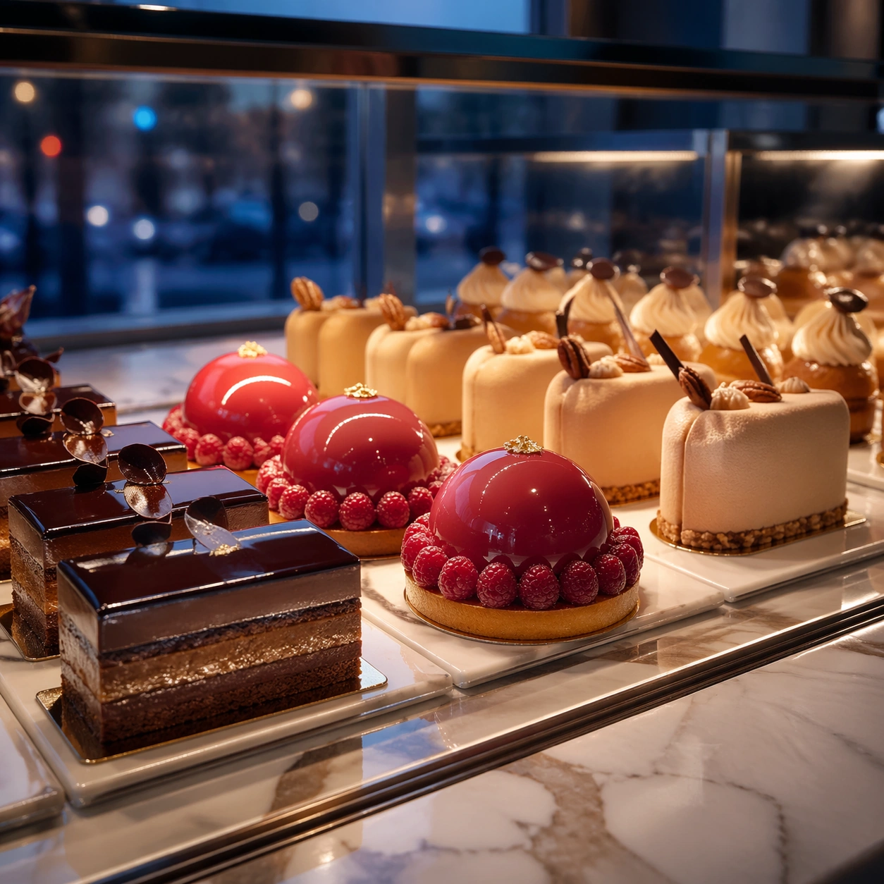
Example generated from “Dessert Patisserie Brand Visual System — Pastry Case Twilight”
GPT Image 2en

Scene: Compose a square premium patisserie image with polished but believable boutique lighting, elegant marble or lacquer surfaces, and a sweet-shop atmosphere that feels brand-authored rather than generic. The camera should preserve product clarity, shape definition, and shelf or counter context while leaving enough breathing room for campaign placement. Frame a square crop of a glass pastry case at blue hour, balancing interior warm light with cooler ambient reflections from the shopfront. Subject: The desserts must look crafted by a high-end pastry kitchen: clean lamination, glossy glaze, stable cream structure, crisp edges, and packaging or display surfaces that reinforce a coherent dessert identity. Show several hero pastries aligned in a premium display case, with one standout item catching the eye and the rest supporting a consistent retail rhythm. Important details: Sweetness should come from color control, finish quality, and material nuance, not from visual clutter. Preserve believable pastry engineering, boutique display logic, and refined merchandising cues so the images can support brand storytelling across retail, packaging, and editorial use. This image should feel fully self-contained while still belonging to the same broader topic and commercial world. Glass cleanliness, reflected highlights, shelf spacing, and pastry scale all need to feel real so the image can sell a believable high-end dessert environment. Use case: Dessert Brand single study 6/9, built for Prompt Atlas coverage of a food and beverage commercial visual system. Constraints: No readable text, no watermark, no logos, preserve exact 1:1 aspect ratio, no candy-color overload, no plastic frosting, no supermarket clutter, no cartoon decorations, no melted textures that break realism, no childish party props, no crowded bakery stock, no visible staff faces, no fluorescent supermarket light.

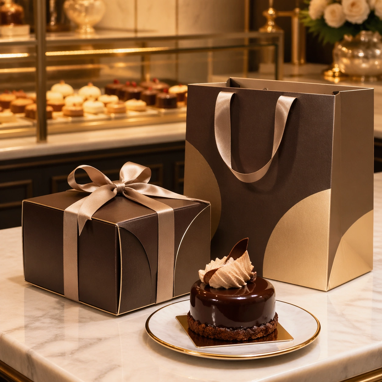
Example generated from “Dessert Patisserie Brand Visual System — Ribbon Bag Counter”
GPT Image 2en

Scene: Compose a square premium patisserie image with polished but believable boutique lighting, elegant marble or lacquer surfaces, and a sweet-shop atmosphere that feels brand-authored rather than generic. The camera should preserve product clarity, shape definition, and shelf or counter context while leaving enough breathing room for campaign placement. Use a waist-high camera and a boutique counter with one shopping bag, one pastry box, and a polished pastry resting on a tray under soft warm light. Subject: The desserts must look crafted by a high-end pastry kitchen: clean lamination, glossy glaze, stable cream structure, crisp edges, and packaging or display surfaces that reinforce a coherent dessert identity. Center the relationship between premium dessert packaging and the actual pastry, showing how the brand travels from counter to takeaway moment. Important details: Sweetness should come from color control, finish quality, and material nuance, not from visual clutter. Preserve believable pastry engineering, boutique display logic, and refined merchandising cues so the images can support brand storytelling across retail, packaging, and editorial use. This image should feel fully self-contained while still belonging to the same broader topic and commercial world. Paper thickness, ribbon curves, metal tray reflections, and pastry finish should communicate a premium retail brand without leaning on readable logo copy. Use case: Dessert Brand single study 7/9, built for Prompt Atlas coverage of a food and beverage commercial visual system. Constraints: No readable text, no watermark, no logos, preserve exact 1:1 aspect ratio, no candy-color overload, no plastic frosting, no supermarket clutter, no cartoon decorations, no melted textures that break realism, no childish party props, no barcode stickers, no receipt clutter, no disposable fast-food cues.

Example generated from “Dessert Patisserie Brand Visual System — Petit Four Grid”
GPT Image 2en

Scene: Compose a square premium patisserie image with polished but believable boutique lighting, elegant marble or lacquer surfaces, and a sweet-shop atmosphere that feels brand-authored rather than generic. The camera should preserve product clarity, shape definition, and shelf or counter context while leaving enough breathing room for campaign placement. Shoot from high above with a strict square crop and a pale lacquer surface, letting tiny shadows define spacing and repetition. Subject: The desserts must look crafted by a high-end pastry kitchen: clean lamination, glossy glaze, stable cream structure, crisp edges, and packaging or display surfaces that reinforce a coherent dessert identity. Arrange a grid of miniature cakes, bonbons, and fruit gels so each piece is distinct but the overall composition feels like one elegant merchandising system. Important details: Sweetness should come from color control, finish quality, and material nuance, not from visual clutter. Preserve believable pastry engineering, boutique display logic, and refined merchandising cues so the images can support brand storytelling across retail, packaging, and editorial use. This image should feel fully self-contained while still belonging to the same broader topic and commercial world. Uniform spacing, micro texture, glaze realism, and palette restraint are critical; the image should feel like a premium catalog board for a pastry collection. Use case: Dessert Brand single study 8/9, built for Prompt Atlas coverage of a food and beverage commercial visual system. Constraints: No readable text, no watermark, no logos, preserve exact 1:1 aspect ratio, no candy-color overload, no plastic frosting, no supermarket clutter, no cartoon decorations, no melted textures that break realism, no childish party props, no rainbow overload, no childish candy mix, no broken pieces.

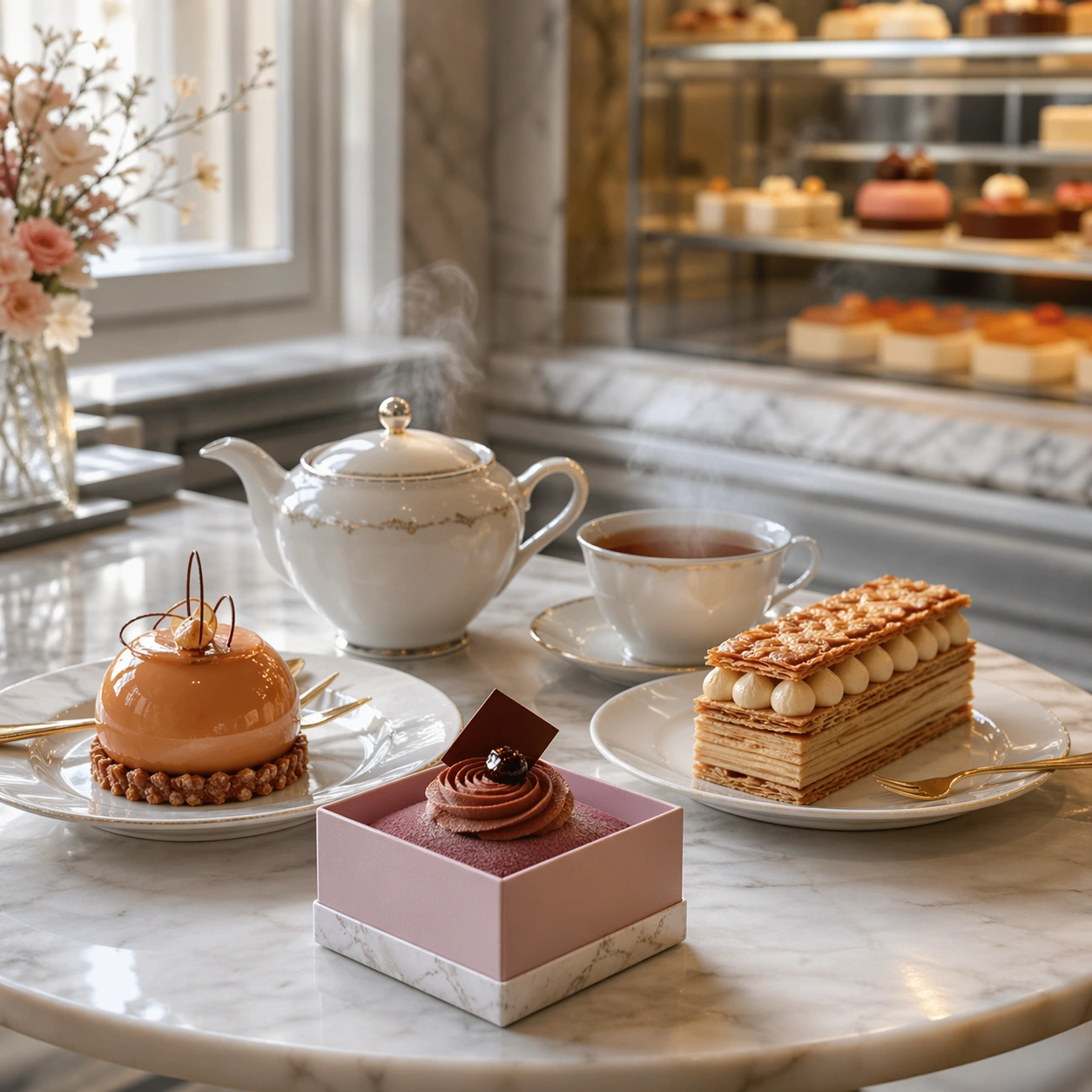
Example generated from “Dessert Patisserie Brand Visual System — Afternoon Tea Window”
GPT Image 2en

Scene: Compose a square premium patisserie image with polished but believable boutique lighting, elegant marble or lacquer surfaces, and a sweet-shop atmosphere that feels brand-authored rather than generic. The camera should preserve product clarity, shape definition, and shelf or counter context while leaving enough breathing room for campaign placement. Use diffused window light, a small marble table, and a softly blurred shop interior so the frame feels calm, aspirational, and lived in. Subject: The desserts must look crafted by a high-end pastry kitchen: clean lamination, glossy glaze, stable cream structure, crisp edges, and packaging or display surfaces that reinforce a coherent dessert identity. Show a tea set with two plated pastries and one small boxed dessert, creating a believable afternoon tea moment inside the same dessert brand world. Important details: Sweetness should come from color control, finish quality, and material nuance, not from visual clutter. Preserve believable pastry engineering, boutique display logic, and refined merchandising cues so the images can support brand storytelling across retail, packaging, and editorial use. This image should feel fully self-contained while still belonging to the same broader topic and commercial world. Tea steam, porcelain reflection, glaze highlights, and crumb discipline should all feel controlled, with enough softness to suggest hospitality without losing product sharpness. Use case: Dessert Brand single study 9/9, built for Prompt Atlas coverage of a food and beverage commercial visual system. Constraints: No readable text, no watermark, no logos, preserve exact 1:1 aspect ratio, no candy-color overload, no plastic frosting, no supermarket clutter, no cartoon decorations, no melted textures that break realism, no childish party props, no readable menu, no crowded café patrons, no oversized brunch food.

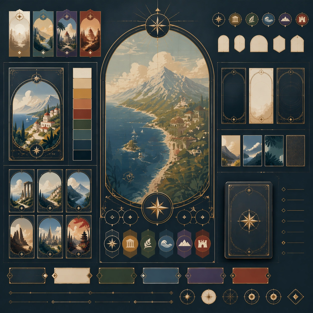
Example generated from “Destination Poster Grand Tour Language — Reference Anchor”
GPT Image 2en

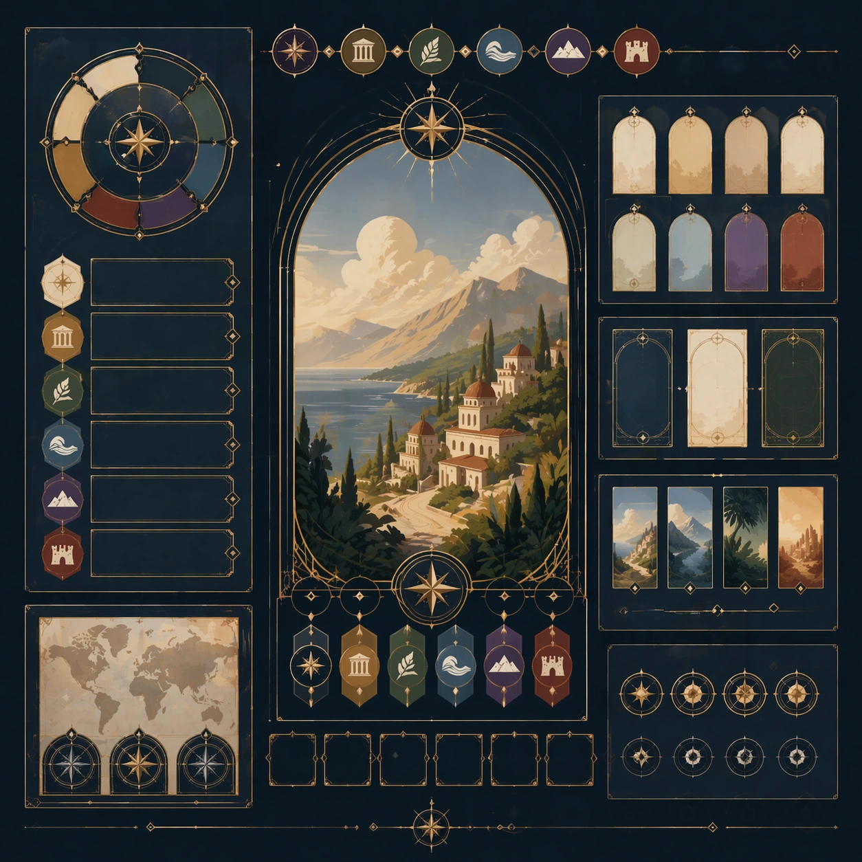
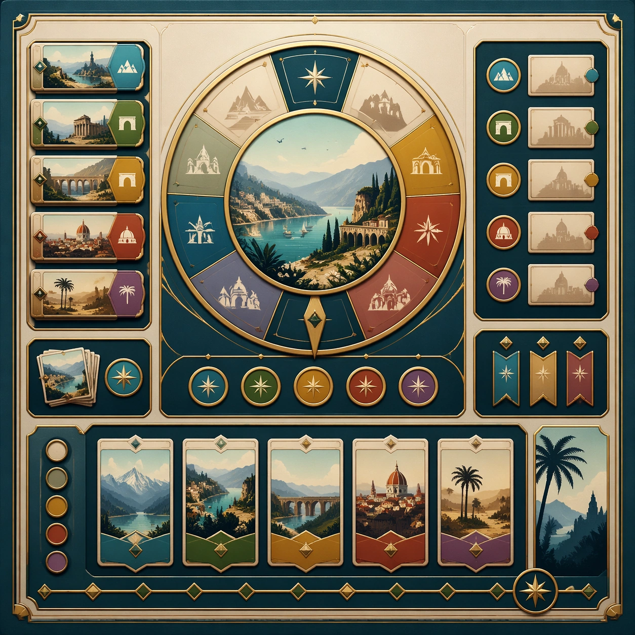
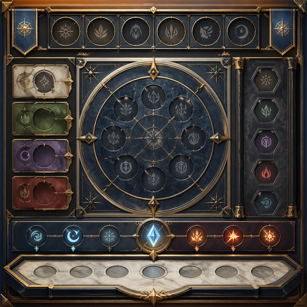
Scene: Create a square reference image for Destination Poster Grand Tour Language. Build a reference anchor establishing the core system with a premium, production-ready finish. Use a polished modular board or campaign surface with clean spacing, premium game-UI finish, and clear focal hierarchy. The composition should feel intentional, clean, and reusable for gallery, research, campaign, or internal handoff contexts. Lighting must support readability first, with the main forms clearly separated from the background and enough breathing room for the system to stay legible at both hero scale and thumbnail scale. Subject: Center a coherent original game-art system built for premium production and marketing surfaces. For this image, focus on reference anchor. Keep the same system logic stable across screenshots, cards, banners, and overview boards. This image is the canonical anchor that later series images must follow. The viewer should immediately understand what role this surface plays inside a cohesive game-production asset pack. Important details: Lock framing, icon grammar, palette blocking, and surface hierarchy so the kit feels production-ready and consistent. Preserve the core silhouette, framing language, and material logic from the reference image while each variation changes function. Keep materials believable, edge hierarchy disciplined, and the visual language consistent with Destination Posters. Use abstract interface blocks or diagram accents when helpful, but avoid any readable language. The final result should feel like a deliberate production asset rather than a random illustration. Use case: Destination Poster Grand Tour Language series study 1/9, designed as reference anchor within a cohesive asset pack. Constraints: No readable text, no watermark, no logos, preserve exact 1:1 aspect ratio, no unrelated objects, no broken visual hierarchy, no malformed anatomy or broken perspective, no random decorative clutter.

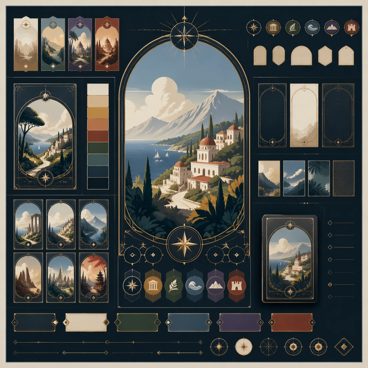
Example generated from “Destination Poster Grand Tour Language — Variant One”
GPT Image 2en

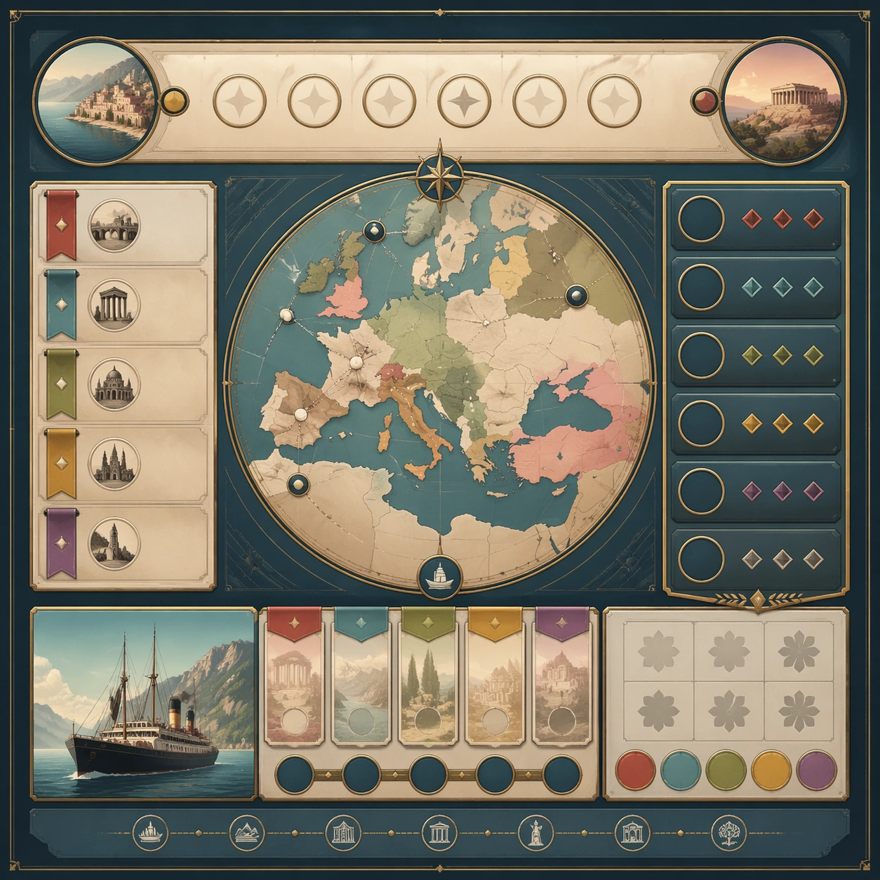
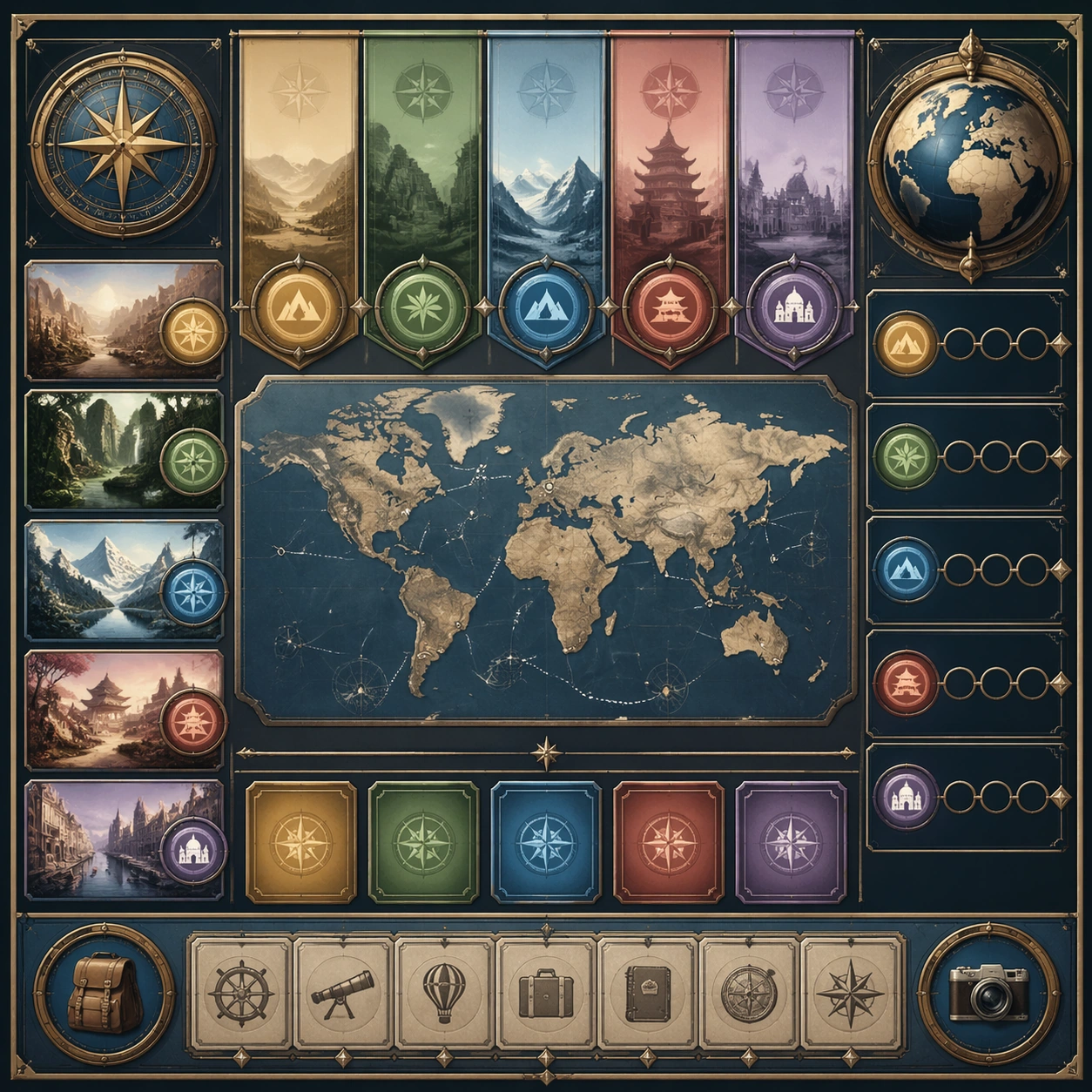
Scene: Create a square dependent image for Destination Poster Grand Tour Language. Build a first controlled variation in the same system with a premium, production-ready finish. Use a polished modular board or campaign surface with clean spacing, premium game-UI finish, and clear focal hierarchy. The composition should feel intentional, clean, and reusable for gallery, research, campaign, or internal handoff contexts. Lighting must support readability first, with the main forms clearly separated from the background and enough breathing room for the system to stay legible at both hero scale and thumbnail scale. Subject: Center a coherent original game-art system built for premium production and marketing surfaces. For this image, focus on the intended support surface. Keep the same system logic stable across screenshots, cards, banners, and overview boards. Preserve exact identity or system logic from the reference image while changing only the intended variation axis. The viewer should immediately understand what role this surface plays inside a cohesive game-production asset pack. Important details: Lock framing, icon grammar, palette blocking, and surface hierarchy so the kit feels production-ready and consistent. Preserve the core silhouette, framing language, and material logic from the reference image while each variation changes function. Keep materials believable, edge hierarchy disciplined, and the visual language consistent with Destination Posters. Use abstract interface blocks or diagram accents when helpful, but avoid any readable language. The final result should feel like a deliberate production asset rather than a random illustration. Use case: Destination Poster Grand Tour Language series study 2/9, designed as variant one within a cohesive asset pack. Constraints: No readable text, no watermark, no logos, preserve exact 1:1 aspect ratio, no unrelated objects, no broken visual hierarchy, no malformed anatomy or broken perspective, no random decorative clutter.

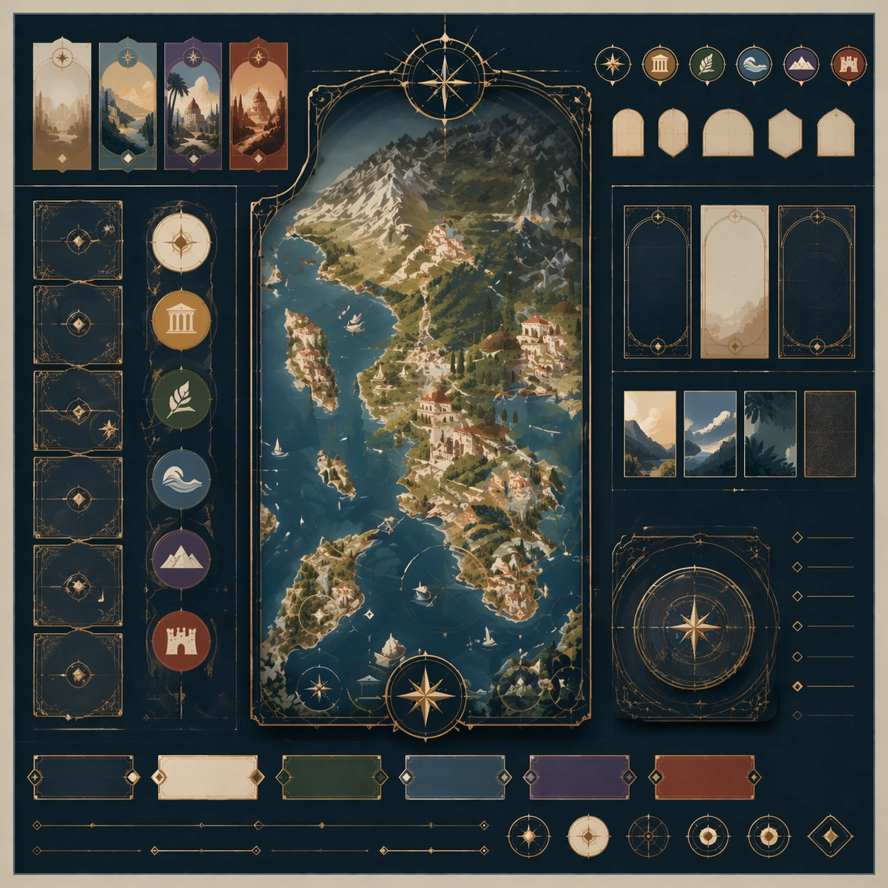
Example generated from “Destination Poster Grand Tour Language — Variant Two”
GPT Image 2en

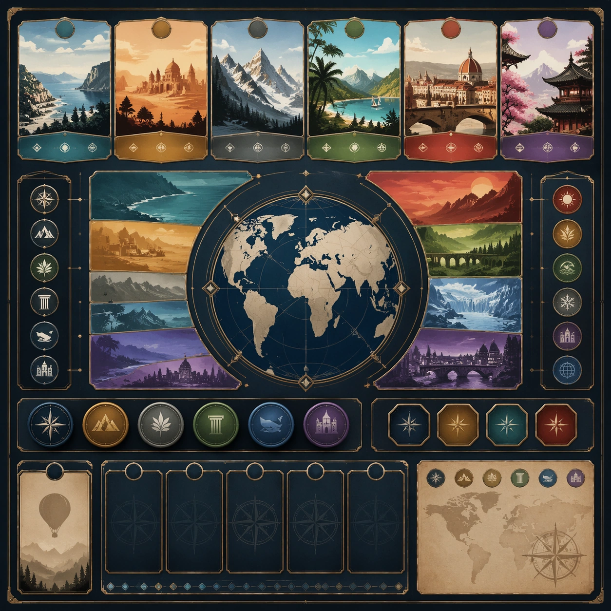
Scene: Create a square dependent image for Destination Poster Grand Tour Language. Build a second controlled variation in the same system with a premium, production-ready finish. Use a polished modular board or campaign surface with clean spacing, premium game-UI finish, and clear focal hierarchy. The composition should feel intentional, clean, and reusable for gallery, research, campaign, or internal handoff contexts. Lighting must support readability first, with the main forms clearly separated from the background and enough breathing room for the system to stay legible at both hero scale and thumbnail scale. Subject: Center a coherent original game-art system built for premium production and marketing surfaces. For this image, focus on the intended support surface. Keep the same system logic stable across screenshots, cards, banners, and overview boards. Preserve exact identity or system logic from the reference image while changing only the intended variation axis. The viewer should immediately understand what role this surface plays inside a cohesive game-production asset pack. Important details: Lock framing, icon grammar, palette blocking, and surface hierarchy so the kit feels production-ready and consistent. Preserve the core silhouette, framing language, and material logic from the reference image while each variation changes function. Keep materials believable, edge hierarchy disciplined, and the visual language consistent with Destination Posters. Use abstract interface blocks or diagram accents when helpful, but avoid any readable language. The final result should feel like a deliberate production asset rather than a random illustration. Use case: Destination Poster Grand Tour Language series study 3/9, designed as variant two within a cohesive asset pack. Constraints: No readable text, no watermark, no logos, preserve exact 1:1 aspect ratio, no unrelated objects, no broken visual hierarchy, no malformed anatomy or broken perspective, no random decorative clutter.

Example generated from “Destination Poster Grand Tour Language — Variant Three”
GPT Image 2en

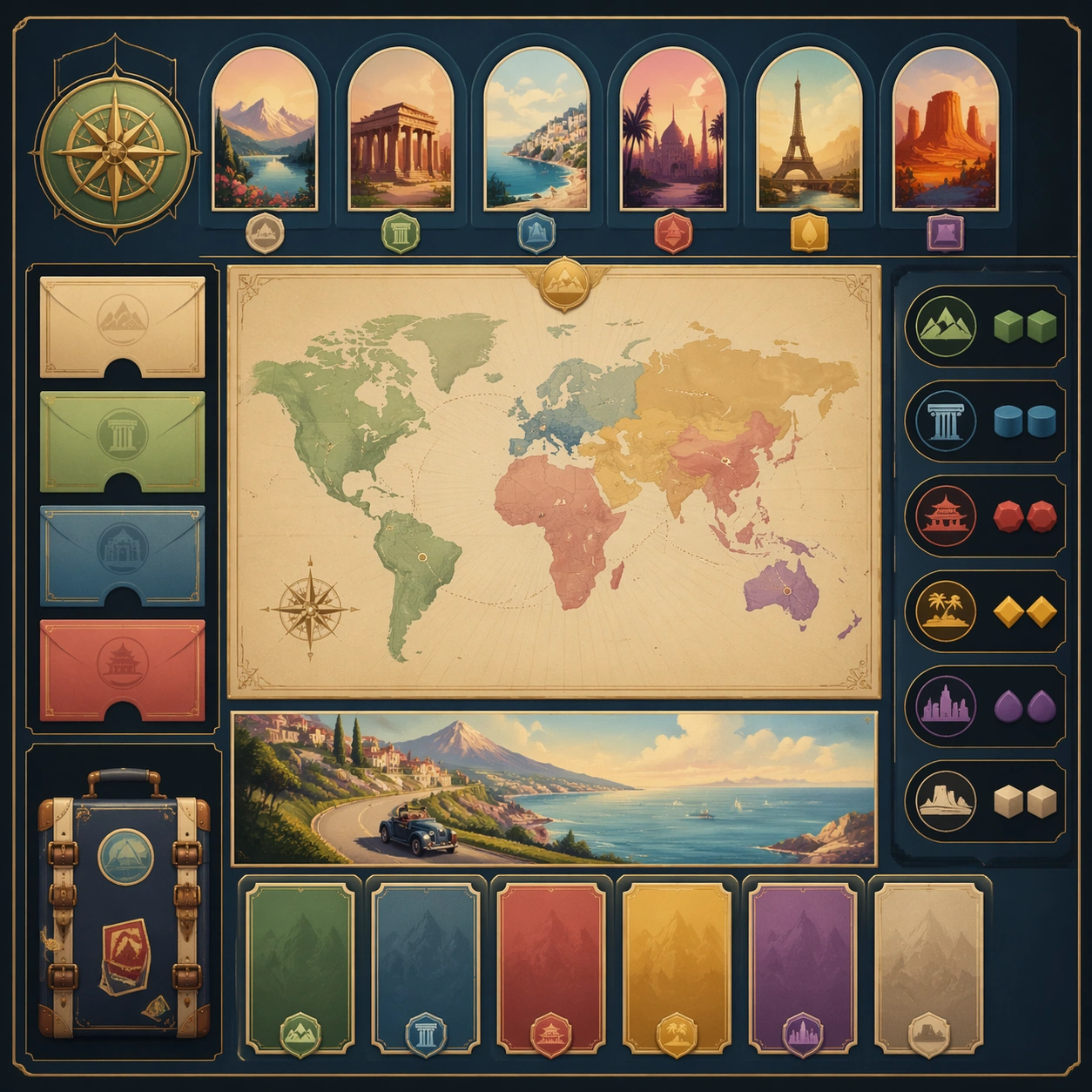
Scene: Create a square dependent image for Destination Poster Grand Tour Language. Build a third controlled variation in the same system with a premium, production-ready finish. Use a polished modular board or campaign surface with clean spacing, premium game-UI finish, and clear focal hierarchy. The composition should feel intentional, clean, and reusable for gallery, research, campaign, or internal handoff contexts. Lighting must support readability first, with the main forms clearly separated from the background and enough breathing room for the system to stay legible at both hero scale and thumbnail scale. Subject: Center a coherent original game-art system built for premium production and marketing surfaces. For this image, focus on the intended support surface. Keep the same system logic stable across screenshots, cards, banners, and overview boards. Preserve exact identity or system logic from the reference image while changing only the intended variation axis. The viewer should immediately understand what role this surface plays inside a cohesive game-production asset pack. Important details: Lock framing, icon grammar, palette blocking, and surface hierarchy so the kit feels production-ready and consistent. Preserve the core silhouette, framing language, and material logic from the reference image while each variation changes function. Keep materials believable, edge hierarchy disciplined, and the visual language consistent with Destination Posters. Use abstract interface blocks or diagram accents when helpful, but avoid any readable language. The final result should feel like a deliberate production asset rather than a random illustration. Use case: Destination Poster Grand Tour Language series study 4/9, designed as variant three within a cohesive asset pack. Constraints: No readable text, no watermark, no logos, preserve exact 1:1 aspect ratio, no unrelated objects, no broken visual hierarchy, no malformed anatomy or broken perspective, no random decorative clutter.

Example generated from “Destination Poster Grand Tour Language — Support One”
GPT Image 2en

Scene: Create a square standalone support image for Destination Poster Grand Tour Language. Build a support-surface study with a clear focal hierarchy and a finished professional surface. Use a polished modular board or campaign surface with clean spacing, premium game-UI finish, and clear focal hierarchy. The frame should feel self-contained and polished, with enough structure to explain the system even without the reference series, yet still obviously belonging to the same theme and production world. Subject: Show a coherent original game-art system built for premium production and marketing surfaces in a way that emphasizes the intended support surface. Keep the same system logic stable across screenshots, cards, banners, and overview boards. Even though this image is independent, the viewer should still recognize the same universe, same commercial logic, and same production intent as the core package. Important details: Lock framing, icon grammar, palette blocking, and surface hierarchy so the kit feels production-ready and consistent. Preserve the broader theme language through color, framing, material choices, and modular composition. Use clean panel rhythm, premium asset presentation, and believable detail density. The image should work equally well as a gallery study, research reference, and mock production deliverable. Use case: Destination Poster Grand Tour Language single study 5/9, exploring support one as a support surface. Constraints: No readable text, no watermark, no logos, preserve exact 1:1 aspect ratio, no unrelated objects, no broken visual hierarchy, no visual noise that obscures the main surface, no accidental brand resemblance.

Example generated from “Destination Poster Grand Tour Language — Support Two”
GPT Image 2en

Scene: Create a square standalone support image for Destination Poster Grand Tour Language. Build a second support-surface study with a clear focal hierarchy and a finished professional surface. Use a polished modular board or campaign surface with clean spacing, premium game-UI finish, and clear focal hierarchy. The frame should feel self-contained and polished, with enough structure to explain the system even without the reference series, yet still obviously belonging to the same theme and production world. Subject: Show a coherent original game-art system built for premium production and marketing surfaces in a way that emphasizes the intended support surface. Keep the same system logic stable across screenshots, cards, banners, and overview boards. Even though this image is independent, the viewer should still recognize the same universe, same commercial logic, and same production intent as the core package. Important details: Lock framing, icon grammar, palette blocking, and surface hierarchy so the kit feels production-ready and consistent. Preserve the broader theme language through color, framing, material choices, and modular composition. Use clean panel rhythm, premium asset presentation, and believable detail density. The image should work equally well as a gallery study, research reference, and mock production deliverable. Use case: Destination Poster Grand Tour Language single study 6/9, exploring support two as a support surface. Constraints: No readable text, no watermark, no logos, preserve exact 1:1 aspect ratio, no unrelated objects, no broken visual hierarchy, no visual noise that obscures the main surface, no accidental brand resemblance.

Example generated from “Destination Poster Grand Tour Language — Support Three”
GPT Image 2en

Scene: Create a square standalone support image for Destination Poster Grand Tour Language. Build a third support-surface study with a clear focal hierarchy and a finished professional surface. Use a polished modular board or campaign surface with clean spacing, premium game-UI finish, and clear focal hierarchy. The frame should feel self-contained and polished, with enough structure to explain the system even without the reference series, yet still obviously belonging to the same theme and production world. Subject: Show a coherent original game-art system built for premium production and marketing surfaces in a way that emphasizes the intended support surface. Keep the same system logic stable across screenshots, cards, banners, and overview boards. Even though this image is independent, the viewer should still recognize the same universe, same commercial logic, and same production intent as the core package. Important details: Lock framing, icon grammar, palette blocking, and surface hierarchy so the kit feels production-ready and consistent. Preserve the broader theme language through color, framing, material choices, and modular composition. Use clean panel rhythm, premium asset presentation, and believable detail density. The image should work equally well as a gallery study, research reference, and mock production deliverable. Use case: Destination Poster Grand Tour Language single study 7/9, exploring support three as a support surface. Constraints: No readable text, no watermark, no logos, preserve exact 1:1 aspect ratio, no unrelated objects, no broken visual hierarchy, no visual noise that obscures the main surface, no accidental brand resemblance.

Example generated from “Destination Poster Grand Tour Language — Support Four”
GPT Image 2en

Scene: Create a square standalone support image for Destination Poster Grand Tour Language. Build a fourth support-surface study with a clear focal hierarchy and a finished professional surface. Use a polished modular board or campaign surface with clean spacing, premium game-UI finish, and clear focal hierarchy. The frame should feel self-contained and polished, with enough structure to explain the system even without the reference series, yet still obviously belonging to the same theme and production world. Subject: Show a coherent original game-art system built for premium production and marketing surfaces in a way that emphasizes the intended support surface. Keep the same system logic stable across screenshots, cards, banners, and overview boards. Even though this image is independent, the viewer should still recognize the same universe, same commercial logic, and same production intent as the core package. Important details: Lock framing, icon grammar, palette blocking, and surface hierarchy so the kit feels production-ready and consistent. Preserve the broader theme language through color, framing, material choices, and modular composition. Use clean panel rhythm, premium asset presentation, and believable detail density. The image should work equally well as a gallery study, research reference, and mock production deliverable. Use case: Destination Poster Grand Tour Language single study 8/9, exploring support four as a support surface. Constraints: No readable text, no watermark, no logos, preserve exact 1:1 aspect ratio, no unrelated objects, no broken visual hierarchy, no visual noise that obscures the main surface, no accidental brand resemblance.

Example generated from “Destination Poster Grand Tour Language — Support Five”
GPT Image 2en

Scene: Create a square standalone support image for Destination Poster Grand Tour Language. Build a fifth support-surface study with a clear focal hierarchy and a finished professional surface. Use a polished modular board or campaign surface with clean spacing, premium game-UI finish, and clear focal hierarchy. The frame should feel self-contained and polished, with enough structure to explain the system even without the reference series, yet still obviously belonging to the same theme and production world. Subject: Show a coherent original game-art system built for premium production and marketing surfaces in a way that emphasizes the intended support surface. Keep the same system logic stable across screenshots, cards, banners, and overview boards. Even though this image is independent, the viewer should still recognize the same universe, same commercial logic, and same production intent as the core package. Important details: Lock framing, icon grammar, palette blocking, and surface hierarchy so the kit feels production-ready and consistent. Preserve the broader theme language through color, framing, material choices, and modular composition. Use clean panel rhythm, premium asset presentation, and believable detail density. The image should work equally well as a gallery study, research reference, and mock production deliverable. Use case: Destination Poster Grand Tour Language single study 9/9, exploring support five as a support surface. Constraints: No readable text, no watermark, no logos, preserve exact 1:1 aspect ratio, no unrelated objects, no broken visual hierarchy, no visual noise that obscures the main surface, no accidental brand resemblance.

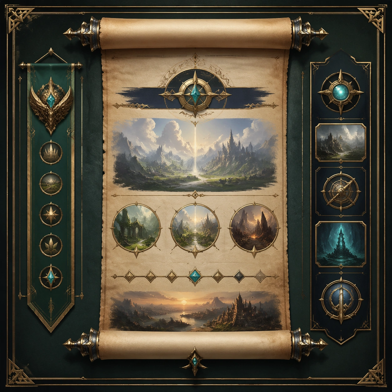
Example generated from “Detail Page Story Scroll — Reference Anchor”
GPT Image 2en

Scene: Create a square reference image for Detail Page Story Scroll. Build a reference anchor establishing the core system with a premium, production-ready finish. Use a polished modular board or campaign surface with clean spacing, premium game-UI finish, and clear focal hierarchy. The composition should feel intentional, clean, and reusable for gallery, research, campaign, or internal handoff contexts. Lighting must support readability first, with the main forms clearly separated from the background and enough breathing room for the system to stay legible at both hero scale and thumbnail scale. Subject: Center a coherent original game-art system built for premium production and marketing surfaces. For this image, focus on reference anchor. Keep the same system logic stable across screenshots, cards, banners, and overview boards. This image is the canonical anchor that later series images must follow. The viewer should immediately understand what role this surface plays inside a cohesive game-production asset pack. Important details: Lock framing, icon grammar, palette blocking, and surface hierarchy so the kit feels production-ready and consistent. Preserve the core silhouette, framing language, and material logic from the reference image while each variation changes function. Keep materials believable, edge hierarchy disciplined, and the visual language consistent with Detail Scroll. Use abstract interface blocks or diagram accents when helpful, but avoid any readable language. The final result should feel like a deliberate production asset rather than a random illustration. Use case: Detail Page Story Scroll series study 1/9, designed as reference anchor within a cohesive asset pack. Constraints: No readable text, no watermark, no logos, preserve exact 1:1 aspect ratio, no unrelated objects, no broken visual hierarchy, no malformed anatomy or broken perspective, no random decorative clutter.

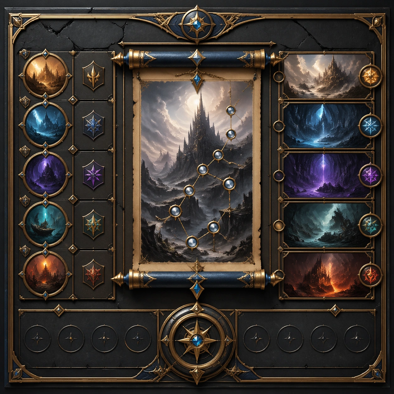
Example generated from “Detail Page Story Scroll — Variant One”
GPT Image 2en

Scene: Create a square dependent image for Detail Page Story Scroll. Build a first controlled variation in the same system with a premium, production-ready finish. Use a polished modular board or campaign surface with clean spacing, premium game-UI finish, and clear focal hierarchy. The composition should feel intentional, clean, and reusable for gallery, research, campaign, or internal handoff contexts. Lighting must support readability first, with the main forms clearly separated from the background and enough breathing room for the system to stay legible at both hero scale and thumbnail scale. Subject: Center a coherent original game-art system built for premium production and marketing surfaces. For this image, focus on the intended support surface. Keep the same system logic stable across screenshots, cards, banners, and overview boards. Preserve exact identity or system logic from the reference image while changing only the intended variation axis. The viewer should immediately understand what role this surface plays inside a cohesive game-production asset pack. Important details: Lock framing, icon grammar, palette blocking, and surface hierarchy so the kit feels production-ready and consistent. Preserve the core silhouette, framing language, and material logic from the reference image while each variation changes function. Keep materials believable, edge hierarchy disciplined, and the visual language consistent with Detail Scroll. Use abstract interface blocks or diagram accents when helpful, but avoid any readable language. The final result should feel like a deliberate production asset rather than a random illustration. Use case: Detail Page Story Scroll series study 2/9, designed as variant one within a cohesive asset pack. Constraints: No readable text, no watermark, no logos, preserve exact 1:1 aspect ratio, no unrelated objects, no broken visual hierarchy, no malformed anatomy or broken perspective, no random decorative clutter.

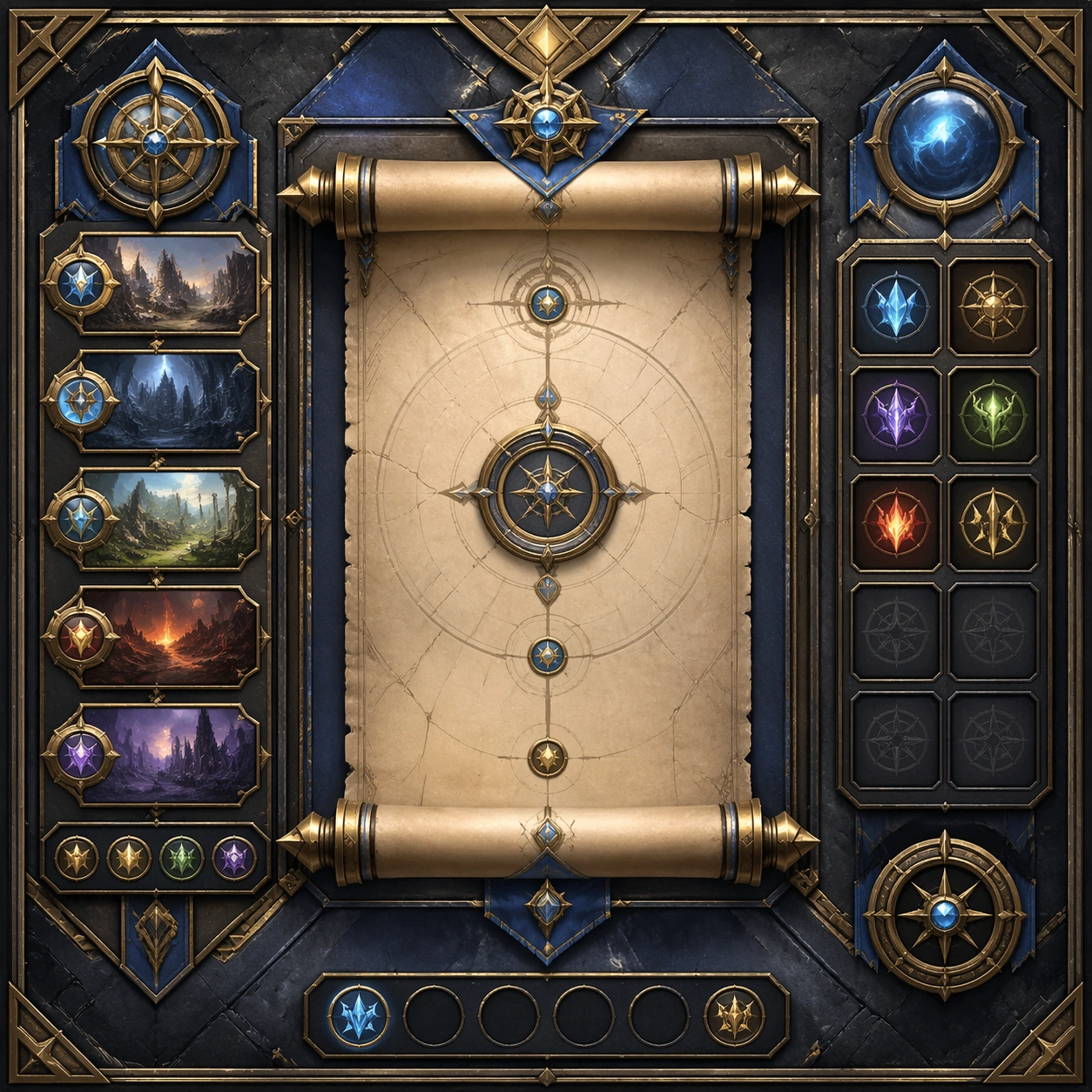
Example generated from “Detail Page Story Scroll — Variant Two”
GPT Image 2en

Scene: Create a square dependent image for Detail Page Story Scroll. Build a second controlled variation in the same system with a premium, production-ready finish. Use a polished modular board or campaign surface with clean spacing, premium game-UI finish, and clear focal hierarchy. The composition should feel intentional, clean, and reusable for gallery, research, campaign, or internal handoff contexts. Lighting must support readability first, with the main forms clearly separated from the background and enough breathing room for the system to stay legible at both hero scale and thumbnail scale. Subject: Center a coherent original game-art system built for premium production and marketing surfaces. For this image, focus on the intended support surface. Keep the same system logic stable across screenshots, cards, banners, and overview boards. Preserve exact identity or system logic from the reference image while changing only the intended variation axis. The viewer should immediately understand what role this surface plays inside a cohesive game-production asset pack. Important details: Lock framing, icon grammar, palette blocking, and surface hierarchy so the kit feels production-ready and consistent. Preserve the core silhouette, framing language, and material logic from the reference image while each variation changes function. Keep materials believable, edge hierarchy disciplined, and the visual language consistent with Detail Scroll. Use abstract interface blocks or diagram accents when helpful, but avoid any readable language. The final result should feel like a deliberate production asset rather than a random illustration. Use case: Detail Page Story Scroll series study 3/9, designed as variant two within a cohesive asset pack. Constraints: No readable text, no watermark, no logos, preserve exact 1:1 aspect ratio, no unrelated objects, no broken visual hierarchy, no malformed anatomy or broken perspective, no random decorative clutter.

Example generated from “Detail Page Story Scroll — Variant Three”
GPT Image 2en

Scene: Create a square dependent image for Detail Page Story Scroll. Build a third controlled variation in the same system with a premium, production-ready finish. Use a polished modular board or campaign surface with clean spacing, premium game-UI finish, and clear focal hierarchy. The composition should feel intentional, clean, and reusable for gallery, research, campaign, or internal handoff contexts. Lighting must support readability first, with the main forms clearly separated from the background and enough breathing room for the system to stay legible at both hero scale and thumbnail scale. Subject: Center a coherent original game-art system built for premium production and marketing surfaces. For this image, focus on the intended support surface. Keep the same system logic stable across screenshots, cards, banners, and overview boards. Preserve exact identity or system logic from the reference image while changing only the intended variation axis. The viewer should immediately understand what role this surface plays inside a cohesive game-production asset pack. Important details: Lock framing, icon grammar, palette blocking, and surface hierarchy so the kit feels production-ready and consistent. Preserve the core silhouette, framing language, and material logic from the reference image while each variation changes function. Keep materials believable, edge hierarchy disciplined, and the visual language consistent with Detail Scroll. Use abstract interface blocks or diagram accents when helpful, but avoid any readable language. The final result should feel like a deliberate production asset rather than a random illustration. Use case: Detail Page Story Scroll series study 4/9, designed as variant three within a cohesive asset pack. Constraints: No readable text, no watermark, no logos, preserve exact 1:1 aspect ratio, no unrelated objects, no broken visual hierarchy, no malformed anatomy or broken perspective, no random decorative clutter.

Example generated from “Detail Page Story Scroll — Support One”
GPT Image 2en

Scene: Create a square standalone support image for Detail Page Story Scroll. Build a support-surface study with a clear focal hierarchy and a finished professional surface. Use a polished modular board or campaign surface with clean spacing, premium game-UI finish, and clear focal hierarchy. The frame should feel self-contained and polished, with enough structure to explain the system even without the reference series, yet still obviously belonging to the same theme and production world. Subject: Show a coherent original game-art system built for premium production and marketing surfaces in a way that emphasizes the intended support surface. Keep the same system logic stable across screenshots, cards, banners, and overview boards. Even though this image is independent, the viewer should still recognize the same universe, same commercial logic, and same production intent as the core package. Important details: Lock framing, icon grammar, palette blocking, and surface hierarchy so the kit feels production-ready and consistent. Preserve the broader theme language through color, framing, material choices, and modular composition. Use clean panel rhythm, premium asset presentation, and believable detail density. The image should work equally well as a gallery study, research reference, and mock production deliverable. Use case: Detail Page Story Scroll single study 5/9, exploring support one as a support surface. Constraints: No readable text, no watermark, no logos, preserve exact 1:1 aspect ratio, no unrelated objects, no broken visual hierarchy, no visual noise that obscures the main surface, no accidental brand resemblance.

Example generated from “Detail Page Story Scroll — Support Two”
GPT Image 2en

Scene: Create a square standalone support image for Detail Page Story Scroll. Build a second support-surface study with a clear focal hierarchy and a finished professional surface. Use a polished modular board or campaign surface with clean spacing, premium game-UI finish, and clear focal hierarchy. The frame should feel self-contained and polished, with enough structure to explain the system even without the reference series, yet still obviously belonging to the same theme and production world. Subject: Show a coherent original game-art system built for premium production and marketing surfaces in a way that emphasizes the intended support surface. Keep the same system logic stable across screenshots, cards, banners, and overview boards. Even though this image is independent, the viewer should still recognize the same universe, same commercial logic, and same production intent as the core package. Important details: Lock framing, icon grammar, palette blocking, and surface hierarchy so the kit feels production-ready and consistent. Preserve the broader theme language through color, framing, material choices, and modular composition. Use clean panel rhythm, premium asset presentation, and believable detail density. The image should work equally well as a gallery study, research reference, and mock production deliverable. Use case: Detail Page Story Scroll single study 6/9, exploring support two as a support surface. Constraints: No readable text, no watermark, no logos, preserve exact 1:1 aspect ratio, no unrelated objects, no broken visual hierarchy, no visual noise that obscures the main surface, no accidental brand resemblance.

Example generated from “Detail Page Story Scroll — Support Three”
GPT Image 2en

Scene: Create a square standalone support image for Detail Page Story Scroll. Build a third support-surface study with a clear focal hierarchy and a finished professional surface. Use a polished modular board or campaign surface with clean spacing, premium game-UI finish, and clear focal hierarchy. The frame should feel self-contained and polished, with enough structure to explain the system even without the reference series, yet still obviously belonging to the same theme and production world. Subject: Show a coherent original game-art system built for premium production and marketing surfaces in a way that emphasizes the intended support surface. Keep the same system logic stable across screenshots, cards, banners, and overview boards. Even though this image is independent, the viewer should still recognize the same universe, same commercial logic, and same production intent as the core package. Important details: Lock framing, icon grammar, palette blocking, and surface hierarchy so the kit feels production-ready and consistent. Preserve the broader theme language through color, framing, material choices, and modular composition. Use clean panel rhythm, premium asset presentation, and believable detail density. The image should work equally well as a gallery study, research reference, and mock production deliverable. Use case: Detail Page Story Scroll single study 7/9, exploring support three as a support surface. Constraints: No readable text, no watermark, no logos, preserve exact 1:1 aspect ratio, no unrelated objects, no broken visual hierarchy, no visual noise that obscures the main surface, no accidental brand resemblance.

Example generated from “Detail Page Story Scroll — Support Four”
GPT Image 2en

Scene: Create a square standalone support image for Detail Page Story Scroll. Build a fourth support-surface study with a clear focal hierarchy and a finished professional surface. Use a polished modular board or campaign surface with clean spacing, premium game-UI finish, and clear focal hierarchy. The frame should feel self-contained and polished, with enough structure to explain the system even without the reference series, yet still obviously belonging to the same theme and production world. Subject: Show a coherent original game-art system built for premium production and marketing surfaces in a way that emphasizes the intended support surface. Keep the same system logic stable across screenshots, cards, banners, and overview boards. Even though this image is independent, the viewer should still recognize the same universe, same commercial logic, and same production intent as the core package. Important details: Lock framing, icon grammar, palette blocking, and surface hierarchy so the kit feels production-ready and consistent. Preserve the broader theme language through color, framing, material choices, and modular composition. Use clean panel rhythm, premium asset presentation, and believable detail density. The image should work equally well as a gallery study, research reference, and mock production deliverable. Use case: Detail Page Story Scroll single study 8/9, exploring support four as a support surface. Constraints: No readable text, no watermark, no logos, preserve exact 1:1 aspect ratio, no unrelated objects, no broken visual hierarchy, no visual noise that obscures the main surface, no accidental brand resemblance.

Example generated from “Detail Page Story Scroll — Support Five”
GPT Image 2en

Scene: Create a square standalone support image for Detail Page Story Scroll. Build a fifth support-surface study with a clear focal hierarchy and a finished professional surface. Use a polished modular board or campaign surface with clean spacing, premium game-UI finish, and clear focal hierarchy. The frame should feel self-contained and polished, with enough structure to explain the system even without the reference series, yet still obviously belonging to the same theme and production world. Subject: Show a coherent original game-art system built for premium production and marketing surfaces in a way that emphasizes the intended support surface. Keep the same system logic stable across screenshots, cards, banners, and overview boards. Even though this image is independent, the viewer should still recognize the same universe, same commercial logic, and same production intent as the core package. Important details: Lock framing, icon grammar, palette blocking, and surface hierarchy so the kit feels production-ready and consistent. Preserve the broader theme language through color, framing, material choices, and modular composition. Use clean panel rhythm, premium asset presentation, and believable detail density. The image should work equally well as a gallery study, research reference, and mock production deliverable. Use case: Detail Page Story Scroll single study 9/9, exploring support five as a support surface. Constraints: No readable text, no watermark, no logos, preserve exact 1:1 aspect ratio, no unrelated objects, no broken visual hierarchy, no visual noise that obscures the main surface, no accidental brand resemblance.

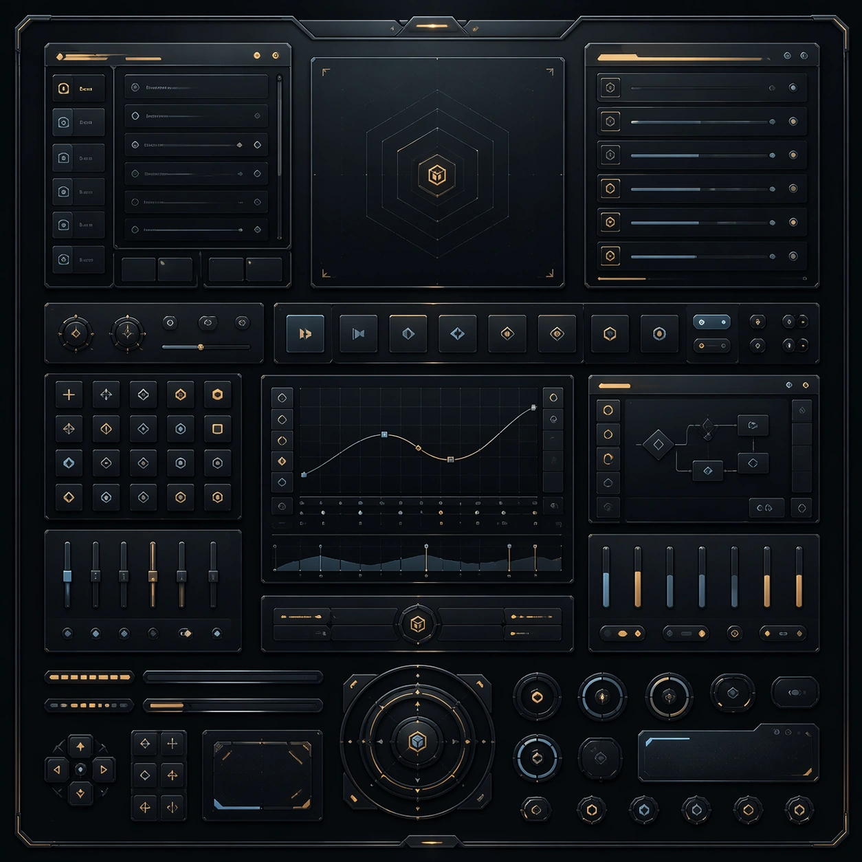
Example generated from “Developer Tool Dark Ui Refinement Set — Reference Anchor”
GPT Image 2en

Scene: Create a square reference image for Developer Tool Dark UI Refinement Set. Build a reference anchor establishing the core system with a premium, production-ready finish. Use a polished modular board or campaign surface with clean spacing, premium game-UI finish, and clear focal hierarchy. The composition should feel intentional, clean, and reusable for gallery, research, campaign, or internal handoff contexts. Lighting must support readability first, with the main forms clearly separated from the background and enough breathing room for the system to stay legible at both hero scale and thumbnail scale. Subject: Center a coherent original game-art system built for premium production and marketing surfaces. For this image, focus on reference anchor. Keep the same system logic stable across screenshots, cards, banners, and overview boards. This image is the canonical anchor that later series images must follow. The viewer should immediately understand what role this surface plays inside a cohesive game-production asset pack. Important details: Lock framing, icon grammar, palette blocking, and surface hierarchy so the kit feels production-ready and consistent. Preserve the core silhouette, framing language, and material logic from the reference image while each variation changes function. Keep materials believable, edge hierarchy disciplined, and the visual language consistent with Dev Dark UI. Use abstract interface blocks or diagram accents when helpful, but avoid any readable language. The final result should feel like a deliberate production asset rather than a random illustration. Use case: Developer Tool Dark UI Refinement Set series study 1/9, designed as reference anchor within a cohesive asset pack. Constraints: No readable text, no watermark, no logos, preserve exact 1:1 aspect ratio, no unrelated objects, no broken visual hierarchy, no malformed anatomy or broken perspective, no random decorative clutter.

Example generated from “Developer Tool Dark Ui Refinement Set — Variant One”
GPT Image 2en

Scene: Create a square dependent image for Developer Tool Dark UI Refinement Set. Build a first controlled variation in the same system with a premium, production-ready finish. Use a polished modular board or campaign surface with clean spacing, premium game-UI finish, and clear focal hierarchy. The composition should feel intentional, clean, and reusable for gallery, research, campaign, or internal handoff contexts. Lighting must support readability first, with the main forms clearly separated from the background and enough breathing room for the system to stay legible at both hero scale and thumbnail scale. Subject: Center a coherent original game-art system built for premium production and marketing surfaces. For this image, focus on the intended support surface. Keep the same system logic stable across screenshots, cards, banners, and overview boards. Preserve exact identity or system logic from the reference image while changing only the intended variation axis. The viewer should immediately understand what role this surface plays inside a cohesive game-production asset pack. Important details: Lock framing, icon grammar, palette blocking, and surface hierarchy so the kit feels production-ready and consistent. Preserve the core silhouette, framing language, and material logic from the reference image while each variation changes function. Keep materials believable, edge hierarchy disciplined, and the visual language consistent with Dev Dark UI. Use abstract interface blocks or diagram accents when helpful, but avoid any readable language. The final result should feel like a deliberate production asset rather than a random illustration. Use case: Developer Tool Dark UI Refinement Set series study 2/9, designed as variant one within a cohesive asset pack. Constraints: No readable text, no watermark, no logos, preserve exact 1:1 aspect ratio, no unrelated objects, no broken visual hierarchy, no malformed anatomy or broken perspective, no random decorative clutter.

Example generated from “Developer Tool Dark Ui Refinement Set — Variant Two”
GPT Image 2en

Scene: Create a square dependent image for Developer Tool Dark UI Refinement Set. Build a second controlled variation in the same system with a premium, production-ready finish. Use a polished modular board or campaign surface with clean spacing, premium game-UI finish, and clear focal hierarchy. The composition should feel intentional, clean, and reusable for gallery, research, campaign, or internal handoff contexts. Lighting must support readability first, with the main forms clearly separated from the background and enough breathing room for the system to stay legible at both hero scale and thumbnail scale. Subject: Center a coherent original game-art system built for premium production and marketing surfaces. For this image, focus on the intended support surface. Keep the same system logic stable across screenshots, cards, banners, and overview boards. Preserve exact identity or system logic from the reference image while changing only the intended variation axis. The viewer should immediately understand what role this surface plays inside a cohesive game-production asset pack. Important details: Lock framing, icon grammar, palette blocking, and surface hierarchy so the kit feels production-ready and consistent. Preserve the core silhouette, framing language, and material logic from the reference image while each variation changes function. Keep materials believable, edge hierarchy disciplined, and the visual language consistent with Dev Dark UI. Use abstract interface blocks or diagram accents when helpful, but avoid any readable language. The final result should feel like a deliberate production asset rather than a random illustration. Use case: Developer Tool Dark UI Refinement Set series study 3/9, designed as variant two within a cohesive asset pack. Constraints: No readable text, no watermark, no logos, preserve exact 1:1 aspect ratio, no unrelated objects, no broken visual hierarchy, no malformed anatomy or broken perspective, no random decorative clutter.

Example generated from “Developer Tool Dark Ui Refinement Set — Variant Three”
GPT Image 2en

Scene: Create a square dependent image for Developer Tool Dark UI Refinement Set. Build a third controlled variation in the same system with a premium, production-ready finish. Use a polished modular board or campaign surface with clean spacing, premium game-UI finish, and clear focal hierarchy. The composition should feel intentional, clean, and reusable for gallery, research, campaign, or internal handoff contexts. Lighting must support readability first, with the main forms clearly separated from the background and enough breathing room for the system to stay legible at both hero scale and thumbnail scale. Subject: Center a coherent original game-art system built for premium production and marketing surfaces. For this image, focus on the intended support surface. Keep the same system logic stable across screenshots, cards, banners, and overview boards. Preserve exact identity or system logic from the reference image while changing only the intended variation axis. The viewer should immediately understand what role this surface plays inside a cohesive game-production asset pack. Important details: Lock framing, icon grammar, palette blocking, and surface hierarchy so the kit feels production-ready and consistent. Preserve the core silhouette, framing language, and material logic from the reference image while each variation changes function. Keep materials believable, edge hierarchy disciplined, and the visual language consistent with Dev Dark UI. Use abstract interface blocks or diagram accents when helpful, but avoid any readable language. The final result should feel like a deliberate production asset rather than a random illustration. Use case: Developer Tool Dark UI Refinement Set series study 4/9, designed as variant three within a cohesive asset pack. Constraints: No readable text, no watermark, no logos, preserve exact 1:1 aspect ratio, no unrelated objects, no broken visual hierarchy, no malformed anatomy or broken perspective, no random decorative clutter.

Example generated from “Developer Tool Dark Ui Refinement Set — Support One”
GPT Image 2en

Scene: Create a square standalone support image for Developer Tool Dark UI Refinement Set. Build a support-surface study with a clear focal hierarchy and a finished professional surface. Use a polished modular board or campaign surface with clean spacing, premium game-UI finish, and clear focal hierarchy. The frame should feel self-contained and polished, with enough structure to explain the system even without the reference series, yet still obviously belonging to the same theme and production world. Subject: Show a coherent original game-art system built for premium production and marketing surfaces in a way that emphasizes the intended support surface. Keep the same system logic stable across screenshots, cards, banners, and overview boards. Even though this image is independent, the viewer should still recognize the same universe, same commercial logic, and same production intent as the core package. Important details: Lock framing, icon grammar, palette blocking, and surface hierarchy so the kit feels production-ready and consistent. Preserve the broader theme language through color, framing, material choices, and modular composition. Use clean panel rhythm, premium asset presentation, and believable detail density. The image should work equally well as a gallery study, research reference, and mock production deliverable. Use case: Developer Tool Dark UI Refinement Set single study 5/9, exploring support one as a support surface. Constraints: No readable text, no watermark, no logos, preserve exact 1:1 aspect ratio, no unrelated objects, no broken visual hierarchy, no visual noise that obscures the main surface, no accidental brand resemblance.

Example generated from “Developer Tool Dark Ui Refinement Set — Support Two”
GPT Image 2en

Scene: Create a square standalone support image for Developer Tool Dark UI Refinement Set. Build a second support-surface study with a clear focal hierarchy and a finished professional surface. Use a polished modular board or campaign surface with clean spacing, premium game-UI finish, and clear focal hierarchy. The frame should feel self-contained and polished, with enough structure to explain the system even without the reference series, yet still obviously belonging to the same theme and production world. Subject: Show a coherent original game-art system built for premium production and marketing surfaces in a way that emphasizes the intended support surface. Keep the same system logic stable across screenshots, cards, banners, and overview boards. Even though this image is independent, the viewer should still recognize the same universe, same commercial logic, and same production intent as the core package. Important details: Lock framing, icon grammar, palette blocking, and surface hierarchy so the kit feels production-ready and consistent. Preserve the broader theme language through color, framing, material choices, and modular composition. Use clean panel rhythm, premium asset presentation, and believable detail density. The image should work equally well as a gallery study, research reference, and mock production deliverable. Use case: Developer Tool Dark UI Refinement Set single study 6/9, exploring support two as a support surface. Constraints: No readable text, no watermark, no logos, preserve exact 1:1 aspect ratio, no unrelated objects, no broken visual hierarchy, no visual noise that obscures the main surface, no accidental brand resemblance.

Example generated from “Developer Tool Dark Ui Refinement Set — Support Three”
GPT Image 2en

Scene: Create a square standalone support image for Developer Tool Dark UI Refinement Set. Build a third support-surface study with a clear focal hierarchy and a finished professional surface. Use a polished modular board or campaign surface with clean spacing, premium game-UI finish, and clear focal hierarchy. The frame should feel self-contained and polished, with enough structure to explain the system even without the reference series, yet still obviously belonging to the same theme and production world. Subject: Show a coherent original game-art system built for premium production and marketing surfaces in a way that emphasizes the intended support surface. Keep the same system logic stable across screenshots, cards, banners, and overview boards. Even though this image is independent, the viewer should still recognize the same universe, same commercial logic, and same production intent as the core package. Important details: Lock framing, icon grammar, palette blocking, and surface hierarchy so the kit feels production-ready and consistent. Preserve the broader theme language through color, framing, material choices, and modular composition. Use clean panel rhythm, premium asset presentation, and believable detail density. The image should work equally well as a gallery study, research reference, and mock production deliverable. Use case: Developer Tool Dark UI Refinement Set single study 7/9, exploring support three as a support surface. Constraints: No readable text, no watermark, no logos, preserve exact 1:1 aspect ratio, no unrelated objects, no broken visual hierarchy, no visual noise that obscures the main surface, no accidental brand resemblance.

Example generated from “Developer Tool Dark Ui Refinement Set — Support Four”
GPT Image 2en

Scene: Create a square standalone support image for Developer Tool Dark UI Refinement Set. Build a fourth support-surface study with a clear focal hierarchy and a finished professional surface. Use a polished modular board or campaign surface with clean spacing, premium game-UI finish, and clear focal hierarchy. The frame should feel self-contained and polished, with enough structure to explain the system even without the reference series, yet still obviously belonging to the same theme and production world. Subject: Show a coherent original game-art system built for premium production and marketing surfaces in a way that emphasizes the intended support surface. Keep the same system logic stable across screenshots, cards, banners, and overview boards. Even though this image is independent, the viewer should still recognize the same universe, same commercial logic, and same production intent as the core package. Important details: Lock framing, icon grammar, palette blocking, and surface hierarchy so the kit feels production-ready and consistent. Preserve the broader theme language through color, framing, material choices, and modular composition. Use clean panel rhythm, premium asset presentation, and believable detail density. The image should work equally well as a gallery study, research reference, and mock production deliverable. Use case: Developer Tool Dark UI Refinement Set single study 8/9, exploring support four as a support surface. Constraints: No readable text, no watermark, no logos, preserve exact 1:1 aspect ratio, no unrelated objects, no broken visual hierarchy, no visual noise that obscures the main surface, no accidental brand resemblance.

Example generated from “Developer Tool Dark Ui Refinement Set — Support Five”
GPT Image 2en

Scene: Create a square standalone support image for Developer Tool Dark UI Refinement Set. Build a fifth support-surface study with a clear focal hierarchy and a finished professional surface. Use a polished modular board or campaign surface with clean spacing, premium game-UI finish, and clear focal hierarchy. The frame should feel self-contained and polished, with enough structure to explain the system even without the reference series, yet still obviously belonging to the same theme and production world. Subject: Show a coherent original game-art system built for premium production and marketing surfaces in a way that emphasizes the intended support surface. Keep the same system logic stable across screenshots, cards, banners, and overview boards. Even though this image is independent, the viewer should still recognize the same universe, same commercial logic, and same production intent as the core package. Important details: Lock framing, icon grammar, palette blocking, and surface hierarchy so the kit feels production-ready and consistent. Preserve the broader theme language through color, framing, material choices, and modular composition. Use clean panel rhythm, premium asset presentation, and believable detail density. The image should work equally well as a gallery study, research reference, and mock production deliverable. Use case: Developer Tool Dark UI Refinement Set single study 9/9, exploring support five as a support surface. Constraints: No readable text, no watermark, no logos, preserve exact 1:1 aspect ratio, no unrelated objects, no broken visual hierarchy, no visual noise that obscures the main surface, no accidental brand resemblance.

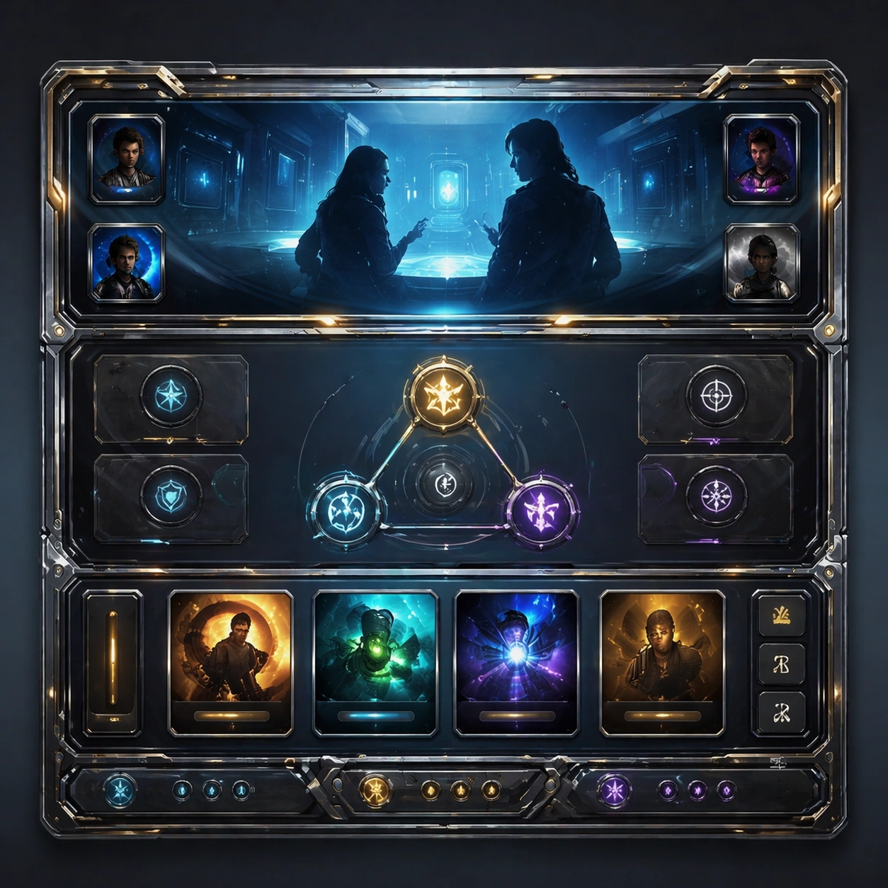
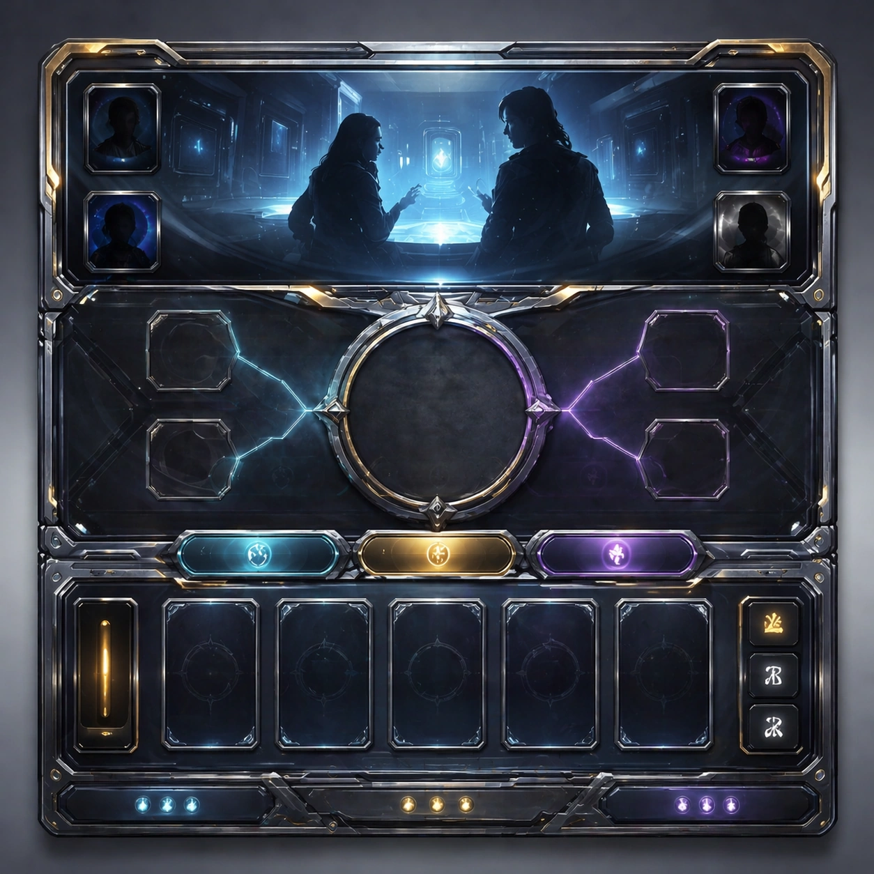
Example generated from “Dialogue Room Scene Board — Reference Anchor”
GPT Image 2en

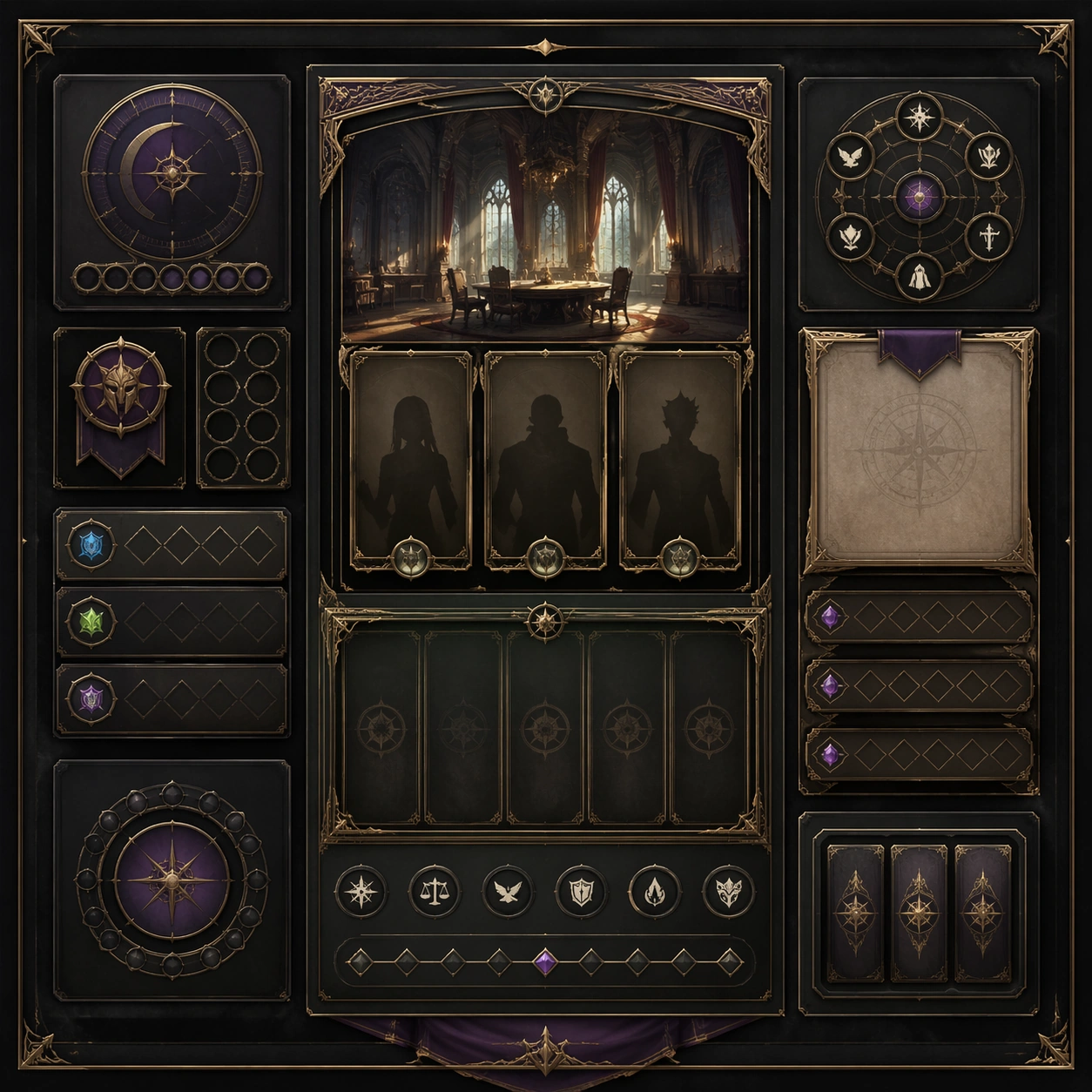
Scene: Create a square reference image for Dialogue Room Scene Board. Build a reference anchor establishing the core system with a premium, production-ready finish. Use a polished modular board or campaign surface with clean spacing, premium game-UI finish, and clear focal hierarchy. The composition should feel intentional, clean, and reusable for gallery, research, campaign, or internal handoff contexts. Lighting must support readability first, with the main forms clearly separated from the background and enough breathing room for the system to stay legible at both hero scale and thumbnail scale. Subject: Center a coherent original game-art system built for premium production and marketing surfaces. For this image, focus on reference anchor. Keep the same system logic stable across screenshots, cards, banners, and overview boards. This image is the canonical anchor that later series images must follow. The viewer should immediately understand what role this surface plays inside a cohesive game-production asset pack. Important details: Lock framing, icon grammar, palette blocking, and surface hierarchy so the kit feels production-ready and consistent. Preserve the core silhouette, framing language, and material logic from the reference image while each variation changes function. Keep materials believable, edge hierarchy disciplined, and the visual language consistent with Dialogue Scene. Use abstract interface blocks or diagram accents when helpful, but avoid any readable language. The final result should feel like a deliberate production asset rather than a random illustration. Use case: Dialogue Room Scene Board series study 1/9, designed as reference anchor within a cohesive asset pack. Constraints: No readable text, no watermark, no logos, preserve exact 1:1 aspect ratio, no unrelated objects, no broken visual hierarchy, no malformed anatomy or broken perspective, no random decorative clutter.

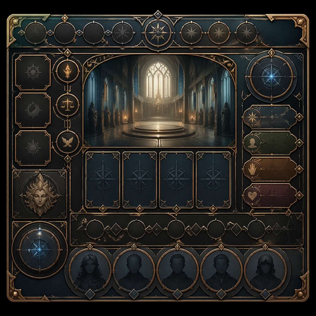
Example generated from “Dialogue Room Scene Board — Variant One”
GPT Image 2en

Scene: Create a square dependent image for Dialogue Room Scene Board. Build a first controlled variation in the same system with a premium, production-ready finish. Use a polished modular board or campaign surface with clean spacing, premium game-UI finish, and clear focal hierarchy. The composition should feel intentional, clean, and reusable for gallery, research, campaign, or internal handoff contexts. Lighting must support readability first, with the main forms clearly separated from the background and enough breathing room for the system to stay legible at both hero scale and thumbnail scale. Subject: Center a coherent original game-art system built for premium production and marketing surfaces. For this image, focus on the intended support surface. Keep the same system logic stable across screenshots, cards, banners, and overview boards. Preserve exact identity or system logic from the reference image while changing only the intended variation axis. The viewer should immediately understand what role this surface plays inside a cohesive game-production asset pack. Important details: Lock framing, icon grammar, palette blocking, and surface hierarchy so the kit feels production-ready and consistent. Preserve the core silhouette, framing language, and material logic from the reference image while each variation changes function. Keep materials believable, edge hierarchy disciplined, and the visual language consistent with Dialogue Scene. Use abstract interface blocks or diagram accents when helpful, but avoid any readable language. The final result should feel like a deliberate production asset rather than a random illustration. Use case: Dialogue Room Scene Board series study 2/9, designed as variant one within a cohesive asset pack. Constraints: No readable text, no watermark, no logos, preserve exact 1:1 aspect ratio, no unrelated objects, no broken visual hierarchy, no malformed anatomy or broken perspective, no random decorative clutter.

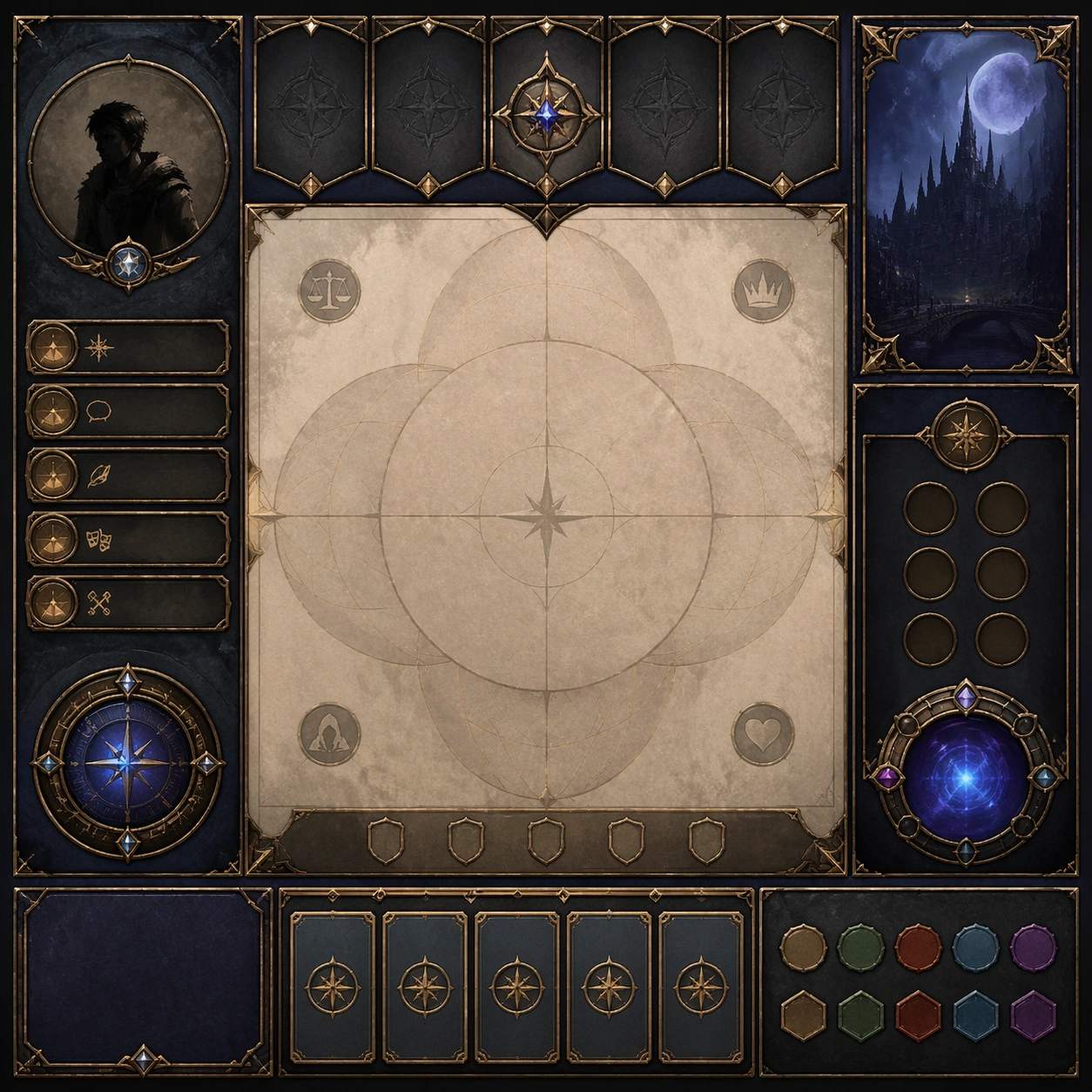
Example generated from “Dialogue Room Scene Board — Variant Two”
GPT Image 2en

Scene: Create a square dependent image for Dialogue Room Scene Board. Build a second controlled variation in the same system with a premium, production-ready finish. Use a polished modular board or campaign surface with clean spacing, premium game-UI finish, and clear focal hierarchy. The composition should feel intentional, clean, and reusable for gallery, research, campaign, or internal handoff contexts. Lighting must support readability first, with the main forms clearly separated from the background and enough breathing room for the system to stay legible at both hero scale and thumbnail scale. Subject: Center a coherent original game-art system built for premium production and marketing surfaces. For this image, focus on the intended support surface. Keep the same system logic stable across screenshots, cards, banners, and overview boards. Preserve exact identity or system logic from the reference image while changing only the intended variation axis. The viewer should immediately understand what role this surface plays inside a cohesive game-production asset pack. Important details: Lock framing, icon grammar, palette blocking, and surface hierarchy so the kit feels production-ready and consistent. Preserve the core silhouette, framing language, and material logic from the reference image while each variation changes function. Keep materials believable, edge hierarchy disciplined, and the visual language consistent with Dialogue Scene. Use abstract interface blocks or diagram accents when helpful, but avoid any readable language. The final result should feel like a deliberate production asset rather than a random illustration. Use case: Dialogue Room Scene Board series study 3/9, designed as variant two within a cohesive asset pack. Constraints: No readable text, no watermark, no logos, preserve exact 1:1 aspect ratio, no unrelated objects, no broken visual hierarchy, no malformed anatomy or broken perspective, no random decorative clutter.

Example generated from “Dialogue Room Scene Board — Variant Three”
GPT Image 2en

Scene: Create a square dependent image for Dialogue Room Scene Board. Build a third controlled variation in the same system with a premium, production-ready finish. Use a polished modular board or campaign surface with clean spacing, premium game-UI finish, and clear focal hierarchy. The composition should feel intentional, clean, and reusable for gallery, research, campaign, or internal handoff contexts. Lighting must support readability first, with the main forms clearly separated from the background and enough breathing room for the system to stay legible at both hero scale and thumbnail scale. Subject: Center a coherent original game-art system built for premium production and marketing surfaces. For this image, focus on the intended support surface. Keep the same system logic stable across screenshots, cards, banners, and overview boards. Preserve exact identity or system logic from the reference image while changing only the intended variation axis. The viewer should immediately understand what role this surface plays inside a cohesive game-production asset pack. Important details: Lock framing, icon grammar, palette blocking, and surface hierarchy so the kit feels production-ready and consistent. Preserve the core silhouette, framing language, and material logic from the reference image while each variation changes function. Keep materials believable, edge hierarchy disciplined, and the visual language consistent with Dialogue Scene. Use abstract interface blocks or diagram accents when helpful, but avoid any readable language. The final result should feel like a deliberate production asset rather than a random illustration. Use case: Dialogue Room Scene Board series study 4/9, designed as variant three within a cohesive asset pack. Constraints: No readable text, no watermark, no logos, preserve exact 1:1 aspect ratio, no unrelated objects, no broken visual hierarchy, no malformed anatomy or broken perspective, no random decorative clutter.

Example generated from “Dialogue Room Scene Board — Support One”
GPT Image 2en

Scene: Create a square standalone support image for Dialogue Room Scene Board. Build a support-surface study with a clear focal hierarchy and a finished professional surface. Use a polished modular board or campaign surface with clean spacing, premium game-UI finish, and clear focal hierarchy. The frame should feel self-contained and polished, with enough structure to explain the system even without the reference series, yet still obviously belonging to the same theme and production world. Subject: Show a coherent original game-art system built for premium production and marketing surfaces in a way that emphasizes the intended support surface. Keep the same system logic stable across screenshots, cards, banners, and overview boards. Even though this image is independent, the viewer should still recognize the same universe, same commercial logic, and same production intent as the core package. Important details: Lock framing, icon grammar, palette blocking, and surface hierarchy so the kit feels production-ready and consistent. Preserve the broader theme language through color, framing, material choices, and modular composition. Use clean panel rhythm, premium asset presentation, and believable detail density. The image should work equally well as a gallery study, research reference, and mock production deliverable. Use case: Dialogue Room Scene Board single study 5/9, exploring support one as a support surface. Constraints: No readable text, no watermark, no logos, preserve exact 1:1 aspect ratio, no unrelated objects, no broken visual hierarchy, no visual noise that obscures the main surface, no accidental brand resemblance.

Example generated from “Dialogue Room Scene Board — Support Two”
GPT Image 2en

Scene: Create a square standalone support image for Dialogue Room Scene Board. Build a second support-surface study with a clear focal hierarchy and a finished professional surface. Use a polished modular board or campaign surface with clean spacing, premium game-UI finish, and clear focal hierarchy. The frame should feel self-contained and polished, with enough structure to explain the system even without the reference series, yet still obviously belonging to the same theme and production world. Subject: Show a coherent original game-art system built for premium production and marketing surfaces in a way that emphasizes the intended support surface. Keep the same system logic stable across screenshots, cards, banners, and overview boards. Even though this image is independent, the viewer should still recognize the same universe, same commercial logic, and same production intent as the core package. Important details: Lock framing, icon grammar, palette blocking, and surface hierarchy so the kit feels production-ready and consistent. Preserve the broader theme language through color, framing, material choices, and modular composition. Use clean panel rhythm, premium asset presentation, and believable detail density. The image should work equally well as a gallery study, research reference, and mock production deliverable. Use case: Dialogue Room Scene Board single study 6/9, exploring support two as a support surface. Constraints: No readable text, no watermark, no logos, preserve exact 1:1 aspect ratio, no unrelated objects, no broken visual hierarchy, no visual noise that obscures the main surface, no accidental brand resemblance.

Example generated from “Dialogue Room Scene Board — Support Three”
GPT Image 2en

Scene: Create a square standalone support image for Dialogue Room Scene Board. Build a third support-surface study with a clear focal hierarchy and a finished professional surface. Use a polished modular board or campaign surface with clean spacing, premium game-UI finish, and clear focal hierarchy. The frame should feel self-contained and polished, with enough structure to explain the system even without the reference series, yet still obviously belonging to the same theme and production world. Subject: Show a coherent original game-art system built for premium production and marketing surfaces in a way that emphasizes the intended support surface. Keep the same system logic stable across screenshots, cards, banners, and overview boards. Even though this image is independent, the viewer should still recognize the same universe, same commercial logic, and same production intent as the core package. Important details: Lock framing, icon grammar, palette blocking, and surface hierarchy so the kit feels production-ready and consistent. Preserve the broader theme language through color, framing, material choices, and modular composition. Use clean panel rhythm, premium asset presentation, and believable detail density. The image should work equally well as a gallery study, research reference, and mock production deliverable. Use case: Dialogue Room Scene Board single study 7/9, exploring support three as a support surface. Constraints: No readable text, no watermark, no logos, preserve exact 1:1 aspect ratio, no unrelated objects, no broken visual hierarchy, no visual noise that obscures the main surface, no accidental brand resemblance.

Example generated from “Dialogue Room Scene Board — Support Four”
GPT Image 2en

Scene: Create a square standalone support image for Dialogue Room Scene Board. Build a fourth support-surface study with a clear focal hierarchy and a finished professional surface. Use a polished modular board or campaign surface with clean spacing, premium game-UI finish, and clear focal hierarchy. The frame should feel self-contained and polished, with enough structure to explain the system even without the reference series, yet still obviously belonging to the same theme and production world. Subject: Show a coherent original game-art system built for premium production and marketing surfaces in a way that emphasizes the intended support surface. Keep the same system logic stable across screenshots, cards, banners, and overview boards. Even though this image is independent, the viewer should still recognize the same universe, same commercial logic, and same production intent as the core package. Important details: Lock framing, icon grammar, palette blocking, and surface hierarchy so the kit feels production-ready and consistent. Preserve the broader theme language through color, framing, material choices, and modular composition. Use clean panel rhythm, premium asset presentation, and believable detail density. The image should work equally well as a gallery study, research reference, and mock production deliverable. Use case: Dialogue Room Scene Board single study 8/9, exploring support four as a support surface. Constraints: No readable text, no watermark, no logos, preserve exact 1:1 aspect ratio, no unrelated objects, no broken visual hierarchy, no visual noise that obscures the main surface, no accidental brand resemblance.

Example generated from “Dialogue Room Scene Board — Support Five”
GPT Image 2en

Scene: Create a square standalone support image for Dialogue Room Scene Board. Build a fifth support-surface study with a clear focal hierarchy and a finished professional surface. Use a polished modular board or campaign surface with clean spacing, premium game-UI finish, and clear focal hierarchy. The frame should feel self-contained and polished, with enough structure to explain the system even without the reference series, yet still obviously belonging to the same theme and production world. Subject: Show a coherent original game-art system built for premium production and marketing surfaces in a way that emphasizes the intended support surface. Keep the same system logic stable across screenshots, cards, banners, and overview boards. Even though this image is independent, the viewer should still recognize the same universe, same commercial logic, and same production intent as the core package. Important details: Lock framing, icon grammar, palette blocking, and surface hierarchy so the kit feels production-ready and consistent. Preserve the broader theme language through color, framing, material choices, and modular composition. Use clean panel rhythm, premium asset presentation, and believable detail density. The image should work equally well as a gallery study, research reference, and mock production deliverable. Use case: Dialogue Room Scene Board single study 9/9, exploring support five as a support surface. Constraints: No readable text, no watermark, no logos, preserve exact 1:1 aspect ratio, no unrelated objects, no broken visual hierarchy, no visual noise that obscures the main surface, no accidental brand resemblance.

Example generated from “Dim Sum Miniature Atlas — Linen Specimen Anchor”
GPT Image 2en

Scene: Create a square museum-atlas photograph of dim sum presented on natural linen or pale neutral textile, lit with calm daylight and restrained shadow. The composition should feel archival, specimen-like, and quietly luxurious rather than crowded or banquet-style. Blank museum tabs, bamboo details, and shallow steam are acceptable so long as no readable characters appear anywhere. Arrange the composition as a square overhead specimen tray on warm linen, with four dim sum pieces spaced evenly and photographed under soft morning-like daylight. Small bamboo or ceramic supports may appear at the edges, but the overall frame should remain quiet and archival. Subject: Show four iconic pieces as a starter atlas set: one translucent shrimp dumpling, one open-topped shumai, one steamed bun, and one wrapped glutinous parcel. Each item should be complete, carefully spaced, and slightly elevated by the fabric texture beneath it. A couple of blank specimen tabs with brush-like abstract marks may sit nearby without forming readable text. Important details: Make the dumplings feel handcrafted and specific: pleat count, skin thickness, translucency, filling pressure, steam moisture, and wrapper folds all need to be believable. The museum treatment should elevate the food without turning it into abstraction. Every item should still look edible, warm, and tactile. This first image establishes the linen tone, top-down geometry, steam softness, and specimen spacing for the series, so the atmosphere must feel stable and repeatable. Wrapper translucency, pleat accuracy, and moisture should all feel believable at close inspection. Use case: Dim sum miniature atlas series study 1/9, defining the archive-like specimen tray for later variations. Constraints: No readable text, no watermark, no logos, preserve exact 1:1 aspect ratio, no banquet table clutter, no readable calligraphy, no sauce spills, no glossy menu styling, no plastic steamer look, no soy sauce dishes, no chopsticks, no banquet platters.