プロンプト · 創作の探索

プロンプトギャラリー

実際のプロンプトと生成例を探索。次の創作に役立つヒントを見つけ、全文を無料でコピーできます。

生成例
10,974
モデル
17
出典
1277
10,974 件のプロンプト例 · ページ 7 / 229
Example generated from “Streaming Banner And Canvas Promo Set — Artist Channel Header Study”
GPT Image 2en

Scene: A square composition derived from banner logic: broad negative space, one clear performer presence, atmospheric depth, and subtle horizon layers compressed into a centered tile. The frame should behave like a design study for an artist-channel header reimagined inside a square crop. Subject: One invented musician stands within a spacious atmospheric field while abstract header bands, distant architecture, and soft light gradients create the sense of a larger panoramic world. The composition should test whether banner logic can still feel elegant when compressed into a square. Important details: Use negative space and silhouette discipline as the main storytelling devices. The subject must remain immediately legible while the environment hints at a larger campaign world. This should feel like professional streaming promo design exploration rather than a literal software interface mockup. Use case: Streaming Promo single study 9/9 for the Streaming Banner and Canvas Promo Set Prompt Atlas theme. Constraints: No readable text, no watermark, no logos, preserve exact 1:1 aspect ratio, no platform icons, no readable header text, no crowd, no over-detailed skyline, no collage fragments

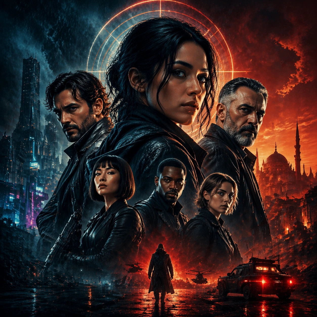
Example generated from “Streaming Thumbnail Campaign — Reference Key Art”
GPT Image 2en

Scene: A square entertainment marketing key visual for Streaming Thumbnail Campaign, designed like a polished campaign asset ready for posters, covers, feeds, or street placement. The composition should have immediate impact from a distance while still carrying layered detail up close. Keep the lighting dramatic, the hierarchy bold, and the framing tight enough to feel like real promotional art instead of a casual illustration. Subject: Center the piece on Reference Key Art, a frame that locks the cast hierarchy, focal rhythm, and signature sales composition for the series. Translate Develop thumbnail sets for streaming platforms that hold up at tiny sizes while staying cohesive across rows, genres, and recommendation surfaces. into a concrete campaign image with clear protagonist hierarchy, supporting world-building cues, and unmistakable promotional intent. The viewer should understand the genre, the ensemble relationships, and the commercial purpose at a glance without relying on readable text or existing brand marks. Important details: The challenge is disciplined hype. Preserve focal hierarchy, readable silhouette separation, strong foreground-background layering, and a convincing balance between character energy and structured layout. This theme studies structured-layout, commercial-mockup, reasoning-composition, editing-workflow through a production-ready visual system. Even if typography is unreadable, space for title blocks, badges, or platform framing should feel intentionally designed. Aim for clear hierarchy, polished craft, and immediately usable campaign logic. Use case: Streaming Thumbnail Campaign series study 1/4. Constraints: No readable text, no watermark, no logos, preserve exact 1:1 aspect ratio, no broken anatomy, no unreadable hierarchy collapse, no muddy montage, no accidental real movie logos, no random filler characters, no off-topic props.

Example generated from “Streaming Thumbnail Campaign — Character Surge”
GPT Image 2en

Scene: A square entertainment marketing key visual for Streaming Thumbnail Campaign, designed like a polished campaign asset ready for posters, covers, feeds, or street placement. The composition should have immediate impact from a distance while still carrying layered detail up close. Keep the lighting dramatic, the hierarchy bold, and the framing tight enough to feel like real promotional art instead of a casual illustration. Subject: Center the piece on Character Surge, a frame that pushes the same poster language toward a more aggressive character-first emphasis. Translate Develop thumbnail sets for streaming platforms that hold up at tiny sizes while staying cohesive across rows, genres, and recommendation surfaces. into a concrete campaign image with clear protagonist hierarchy, supporting world-building cues, and unmistakable promotional intent. The viewer should understand the genre, the ensemble relationships, and the commercial purpose at a glance without relying on readable text or existing brand marks. Important details: The challenge is disciplined hype. Preserve focal hierarchy, readable silhouette separation, strong foreground-background layering, and a convincing balance between character energy and structured layout. This theme studies structured-layout, commercial-mockup, reasoning-composition, editing-workflow through a production-ready visual system. Even if typography is unreadable, space for title blocks, badges, or platform framing should feel intentionally designed. Aim for clear hierarchy, polished craft, and immediately usable campaign logic. Use case: Streaming Thumbnail Campaign series study 2/4. Constraints: No readable text, no watermark, no logos, preserve exact 1:1 aspect ratio, no broken anatomy, no unreadable hierarchy collapse, no muddy montage, no accidental real movie logos, no random filler characters, no off-topic props.

Example generated from “Streaming Thumbnail Campaign — Genre Pivot”
GPT Image 2en

Scene: A square entertainment marketing key visual for Streaming Thumbnail Campaign, designed like a polished campaign asset ready for posters, covers, feeds, or street placement. The composition should have immediate impact from a distance while still carrying layered detail up close. Keep the lighting dramatic, the hierarchy bold, and the framing tight enough to feel like real promotional art instead of a casual illustration. Subject: Center the piece on Genre Pivot, a frame that keeps the hierarchy but bends color, props, and supporting scenes toward a different subgenre. Translate Develop thumbnail sets for streaming platforms that hold up at tiny sizes while staying cohesive across rows, genres, and recommendation surfaces. into a concrete campaign image with clear protagonist hierarchy, supporting world-building cues, and unmistakable promotional intent. The viewer should understand the genre, the ensemble relationships, and the commercial purpose at a glance without relying on readable text or existing brand marks. Important details: The challenge is disciplined hype. Preserve focal hierarchy, readable silhouette separation, strong foreground-background layering, and a convincing balance between character energy and structured layout. This theme studies structured-layout, commercial-mockup, reasoning-composition, editing-workflow through a production-ready visual system. Even if typography is unreadable, space for title blocks, badges, or platform framing should feel intentionally designed. Aim for clear hierarchy, polished craft, and immediately usable campaign logic. Use case: Streaming Thumbnail Campaign series study 3/4. Constraints: No readable text, no watermark, no logos, preserve exact 1:1 aspect ratio, no broken anatomy, no unreadable hierarchy collapse, no muddy montage, no accidental real movie logos, no random filler characters, no off-topic props.

Example generated from “Streaming Thumbnail Campaign — Teaser Card”
GPT Image 2en

Scene: A square entertainment marketing key visual for Streaming Thumbnail Campaign, designed like a polished campaign asset ready for posters, covers, feeds, or street placement. The composition should have immediate impact from a distance while still carrying layered detail up close. Keep the lighting dramatic, the hierarchy bold, and the framing tight enough to feel like real promotional art instead of a casual illustration. Subject: Center the piece on Teaser Card, a frame that a compact mystery-first promo asset built for anticipation and visual tension. Translate Develop thumbnail sets for streaming platforms that hold up at tiny sizes while staying cohesive across rows, genres, and recommendation surfaces. into a concrete campaign image with clear protagonist hierarchy, supporting world-building cues, and unmistakable promotional intent. The viewer should understand the genre, the ensemble relationships, and the commercial purpose at a glance without relying on readable text or existing brand marks. Important details: The challenge is disciplined hype. Preserve focal hierarchy, readable silhouette separation, strong foreground-background layering, and a convincing balance between character energy and structured layout. This theme studies structured-layout, commercial-mockup, reasoning-composition, editing-workflow through a production-ready visual system. Even if typography is unreadable, space for title blocks, badges, or platform framing should feel intentionally designed. Aim for clear hierarchy, polished craft, and immediately usable campaign logic. Use case: Streaming Thumbnail Campaign single study 1/5. Constraints: No readable text, no watermark, no logos, preserve exact 1:1 aspect ratio, no broken anatomy, no unreadable hierarchy collapse, no muddy montage, no accidental real movie logos, no random filler characters, no off-topic props.

Example generated from “Streaming Thumbnail Campaign — Countdown Poster”
GPT Image 2en

Scene: A square entertainment marketing key visual for Streaming Thumbnail Campaign, designed like a polished campaign asset ready for posters, covers, feeds, or street placement. The composition should have immediate impact from a distance while still carrying layered detail up close. Keep the lighting dramatic, the hierarchy bold, and the framing tight enough to feel like real promotional art instead of a casual illustration. Subject: Center the piece on Countdown Poster, a frame that a countdown-ready campaign poster with bold hierarchy and tight emotional framing. Translate Develop thumbnail sets for streaming platforms that hold up at tiny sizes while staying cohesive across rows, genres, and recommendation surfaces. into a concrete campaign image with clear protagonist hierarchy, supporting world-building cues, and unmistakable promotional intent. The viewer should understand the genre, the ensemble relationships, and the commercial purpose at a glance without relying on readable text or existing brand marks. Important details: The challenge is disciplined hype. Preserve focal hierarchy, readable silhouette separation, strong foreground-background layering, and a convincing balance between character energy and structured layout. This theme studies structured-layout, commercial-mockup, reasoning-composition, editing-workflow through a production-ready visual system. Even if typography is unreadable, space for title blocks, badges, or platform framing should feel intentionally designed. Aim for clear hierarchy, polished craft, and immediately usable campaign logic. Use case: Streaming Thumbnail Campaign single study 2/5. Constraints: No readable text, no watermark, no logos, preserve exact 1:1 aspect ratio, no broken anatomy, no unreadable hierarchy collapse, no muddy montage, no accidental real movie logos, no random filler characters, no off-topic props.

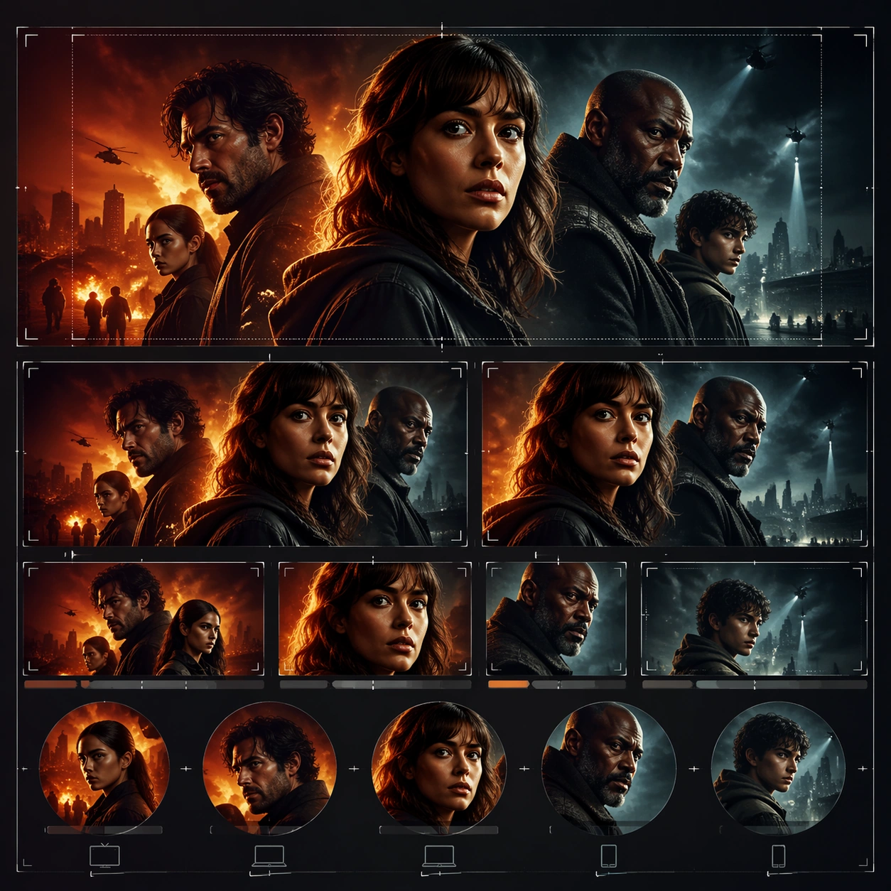
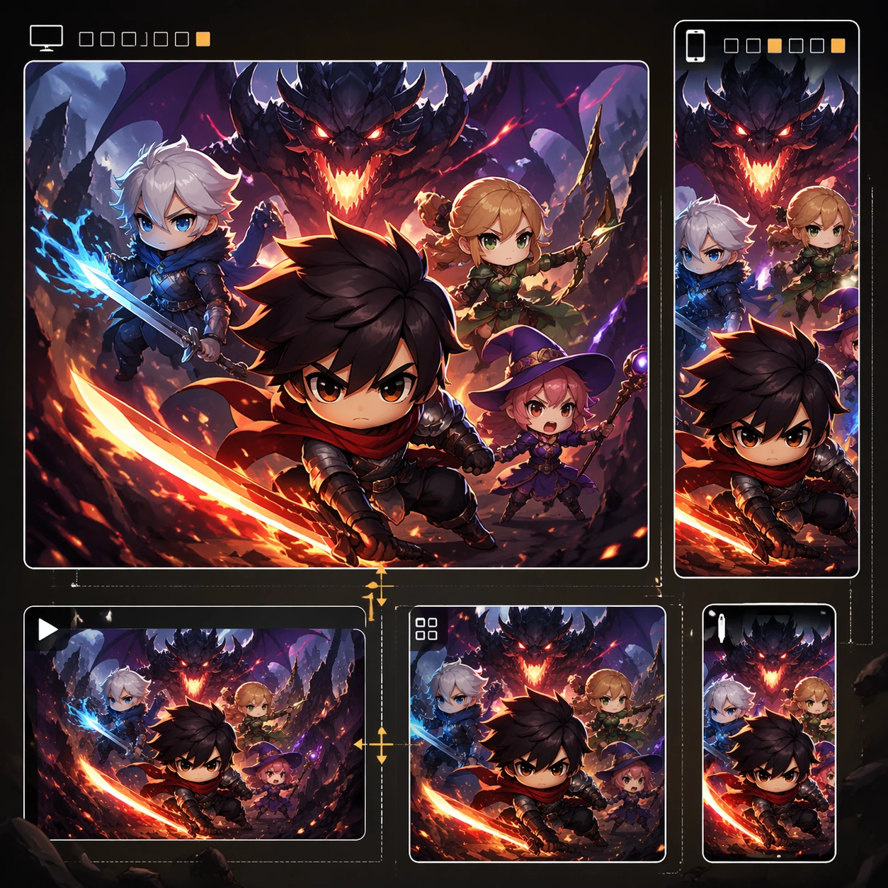
Example generated from “Streaming Thumbnail Campaign — Platform Crop Board”
GPT Image 2en

Scene: A square entertainment marketing key visual for Streaming Thumbnail Campaign, designed like a polished campaign asset ready for posters, covers, feeds, or street placement. The composition should have immediate impact from a distance while still carrying layered detail up close. Keep the lighting dramatic, the hierarchy bold, and the framing tight enough to feel like real promotional art instead of a casual illustration. Subject: Center the piece on Platform Crop Board, a frame that a preview board showing how one campaign reads across multiple crop logics. Translate Develop thumbnail sets for streaming platforms that hold up at tiny sizes while staying cohesive across rows, genres, and recommendation surfaces. into a concrete campaign image with clear protagonist hierarchy, supporting world-building cues, and unmistakable promotional intent. The viewer should understand the genre, the ensemble relationships, and the commercial purpose at a glance without relying on readable text or existing brand marks. Important details: The challenge is disciplined hype. Preserve focal hierarchy, readable silhouette separation, strong foreground-background layering, and a convincing balance between character energy and structured layout. This theme studies structured-layout, commercial-mockup, reasoning-composition, editing-workflow through a production-ready visual system. Even if typography is unreadable, space for title blocks, badges, or platform framing should feel intentionally designed. Aim for clear hierarchy, polished craft, and immediately usable campaign logic. Use case: Streaming Thumbnail Campaign single study 3/5. Constraints: No readable text, no watermark, no logos, preserve exact 1:1 aspect ratio, no broken anatomy, no unreadable hierarchy collapse, no muddy montage, no accidental real movie logos, no random filler characters, no off-topic props.

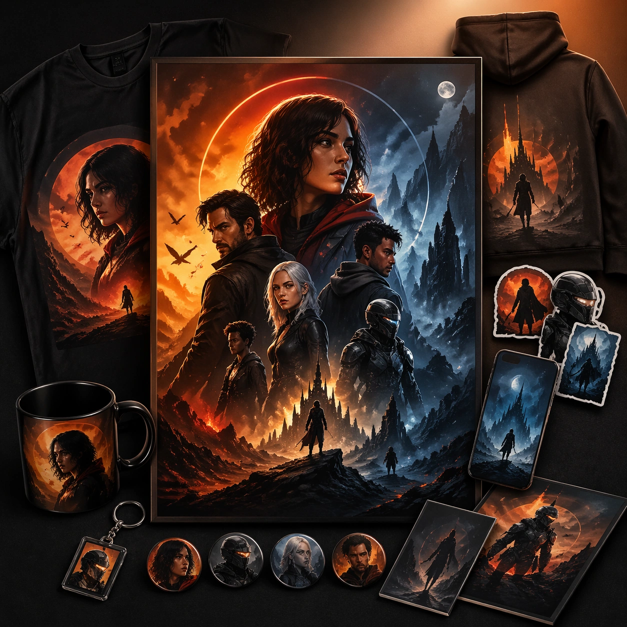
Example generated from “Streaming Thumbnail Campaign — Merch Sell Sheet”
GPT Image 2en

Scene: A square entertainment marketing key visual for Streaming Thumbnail Campaign, designed like a polished campaign asset ready for posters, covers, feeds, or street placement. The composition should have immediate impact from a distance while still carrying layered detail up close. Keep the lighting dramatic, the hierarchy bold, and the framing tight enough to feel like real promotional art instead of a casual illustration. Subject: Center the piece on Merch Sell Sheet, a frame that a supporting sell-sheet style visual connecting the campaign to collectible or retail energy. Translate Develop thumbnail sets for streaming platforms that hold up at tiny sizes while staying cohesive across rows, genres, and recommendation surfaces. into a concrete campaign image with clear protagonist hierarchy, supporting world-building cues, and unmistakable promotional intent. The viewer should understand the genre, the ensemble relationships, and the commercial purpose at a glance without relying on readable text or existing brand marks. Important details: The challenge is disciplined hype. Preserve focal hierarchy, readable silhouette separation, strong foreground-background layering, and a convincing balance between character energy and structured layout. This theme studies structured-layout, commercial-mockup, reasoning-composition, editing-workflow through a production-ready visual system. Even if typography is unreadable, space for title blocks, badges, or platform framing should feel intentionally designed. Aim for clear hierarchy, polished craft, and immediately usable campaign logic. Use case: Streaming Thumbnail Campaign single study 5/5. Constraints: No readable text, no watermark, no logos, preserve exact 1:1 aspect ratio, no broken anatomy, no unreadable hierarchy collapse, no muddy montage, no accidental real movie logos, no random filler characters, no off-topic props.

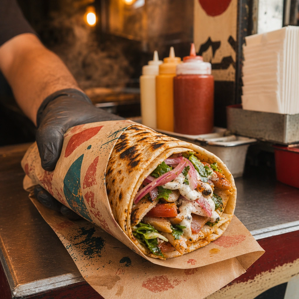
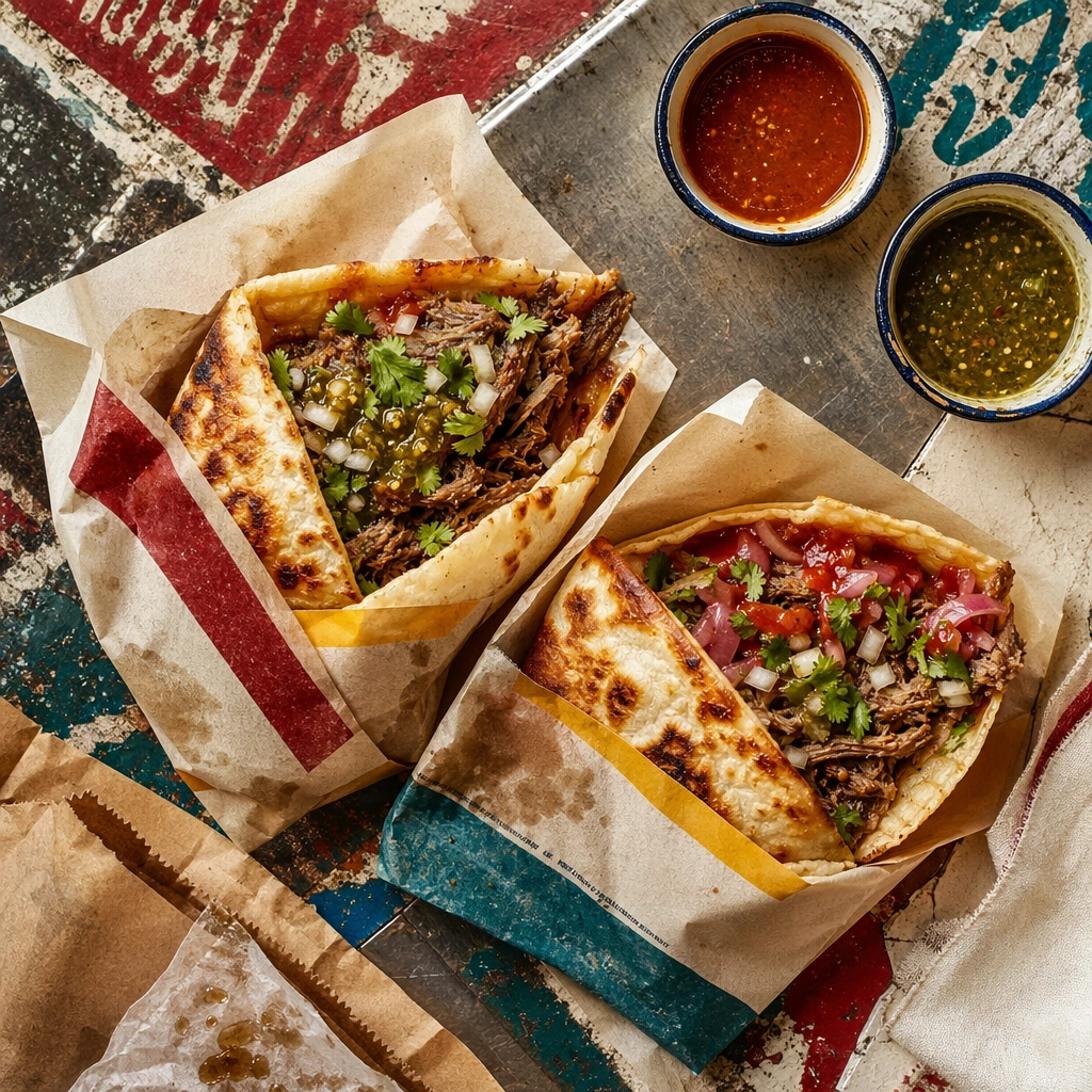
Example generated from “Street Food Vernacular Brand Kit — Stall Anchor”
GPT Image 2en

Scene: Compose a square street-food brand image that feels rooted in vernacular signage, fast service, handheld eating, and dense local texture without copying any specific real-world brand or famous location. The frame should feel energetic and commercial, with heat, packaging, and human-scale surfaces that suggest a busy street-food context. Use a square evening or late-afternoon crop of a compact food stall with warm practical lights, metal surfaces, and layered materials that feel genuinely used. Subject: The food must look handheld, immediate, and physically satisfying, while the brand kit emerges through color, paper, enamel, painted surfaces, stall materials, and abstract signage forms rather than readable names. Center one signature handheld food item at the counter while the stall surfaces, paper wraps, and non-legible sign-painted textures define the brand world around it. Important details: This topic depends on cultural and retail credibility. Preserve believable stall materials, quick-service rhythms, food wrapping logic, and the layered density of a small-footprint brand environment. Use sign-painting, stencil-like marks, or abstract lettering forms only as non-legible texture; the identity should come from visual language, not copied brands or readable text. This image establishes the reference system for the series, including camera height, tabletop discipline, prop family, and color control that later images must inherit. This anchor image must establish the identity kit for the series: wrapper palette, condiment organization, counter wear, and a fast-service mood that still feels curated. Use case: Street Food Kit series study 1/9, built for Prompt Atlas coverage of a food and beverage commercial visual system. Constraints: No readable text, no watermark, no logos, preserve exact 1:1 aspect ratio, no readable text, no logos, no famous landmarks, no franchise styling, no tourist-poster cliché, no fake AI neon overload, no generic festival booth, no readable stall name, no giant tourist crowd, no celebrity chef portrait.

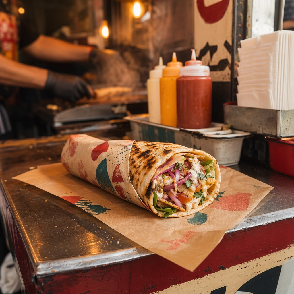
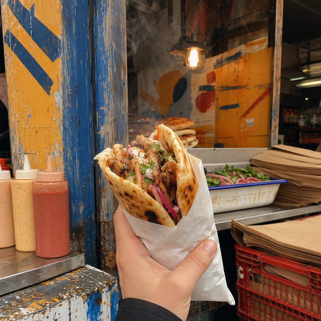
Example generated from “Street Food Vernacular Brand Kit — Handheld Wrap Shot”
GPT Image 2en

Scene: Compose a square street-food brand image that feels rooted in vernacular signage, fast service, handheld eating, and dense local texture without copying any specific real-world brand or famous location. The frame should feel energetic and commercial, with heat, packaging, and human-scale surfaces that suggest a busy street-food context. Preserve the same lighting mood, paper palette, and street counter materials, but crop closer so the wrapped food dominates the square frame. Subject: The food must look handheld, immediate, and physically satisfying, while the brand kit emerges through color, paper, enamel, painted surfaces, stall materials, and abstract signage forms rather than readable names. Show one handheld wrap, taco, sandwich, or skewer bundle being held or presented, with vivid filling structure and wrapper realism. Important details: This topic depends on cultural and retail credibility. Preserve believable stall materials, quick-service rhythms, food wrapping logic, and the layered density of a small-footprint brand environment. Use sign-painting, stencil-like marks, or abstract lettering forms only as non-legible texture; the identity should come from visual language, not copied brands or readable text. Preserve the exact camera height, lens feel, prop family, tabletop scale, palette discipline, and brand logic established by 01-stall-anchor. Keep the series anchor visible through paper treatment, condiment hints, and stall color language while making the food feel immediate and genuinely hot. Use case: Street Food Kit series study 2/9, built for Prompt Atlas coverage of a food and beverage commercial visual system. Constraints: No readable text, no watermark, no logos, preserve exact 1:1 aspect ratio, no readable text, no logos, no famous landmarks, no franchise styling, no tourist-poster cliché, no fake AI neon overload, no generic festival booth, no full face, no influencer selfie angle, no franchise packaging.

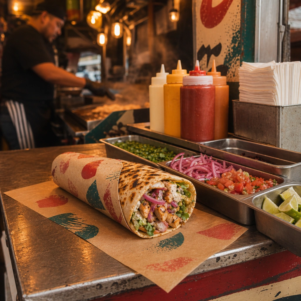
Example generated from “Street Food Vernacular Brand Kit — Counter Condiment Array”
GPT Image 2en

Scene: Compose a square street-food brand image that feels rooted in vernacular signage, fast service, handheld eating, and dense local texture without copying any specific real-world brand or famous location. The frame should feel energetic and commercial, with heat, packaging, and human-scale surfaces that suggest a busy street-food context. Maintain the same stall materials and warm practical lighting, but widen just enough to show sauce bottles, chopped garnishes, and prep containers in a disciplined layout. Subject: The food must look handheld, immediate, and physically satisfying, while the brand kit emerges through color, paper, enamel, painted surfaces, stall materials, and abstract signage forms rather than readable names. Feature the signature food alongside an organized condiment station that feels authentic to a fast-moving street-food setup. Important details: This topic depends on cultural and retail credibility. Preserve believable stall materials, quick-service rhythms, food wrapping logic, and the layered density of a small-footprint brand environment. Use sign-painting, stencil-like marks, or abstract lettering forms only as non-legible texture; the identity should come from visual language, not copied brands or readable text. Preserve the exact camera height, lens feel, prop family, tabletop scale, palette discipline, and brand logic established by 01-stall-anchor. The identity system from the anchor image must stay intact through packaging color, counter texture, and painted-surface cues, even as prep tools and sauces become more visible. Use case: Street Food Kit series study 3/9, built for Prompt Atlas coverage of a food and beverage commercial visual system. Constraints: No readable text, no watermark, no logos, preserve exact 1:1 aspect ratio, no readable text, no logos, no famous landmarks, no franchise styling, no tourist-poster cliché, no fake AI neon overload, no generic festival booth, no ingredient chaos, no readable labels, no sterile studio emptiness.

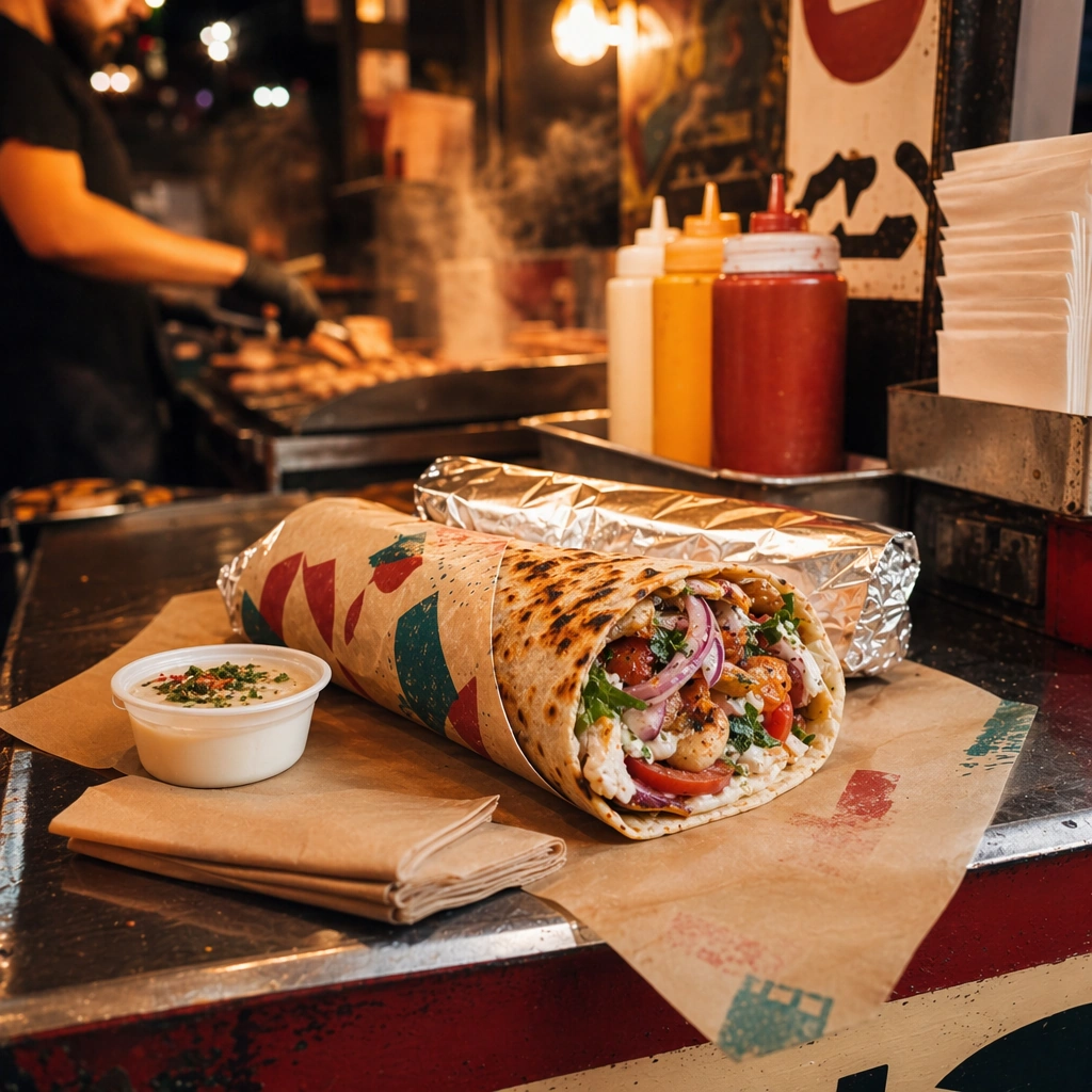
Example generated from “Street Food Vernacular Brand Kit — Night Market Takeaway Kit”
GPT Image 2en

Scene: Compose a square street-food brand image that feels rooted in vernacular signage, fast service, handheld eating, and dense local texture without copying any specific real-world brand or famous location. The frame should feel energetic and commercial, with heat, packaging, and human-scale surfaces that suggest a busy street-food context. Retain the exact stall palette and materials but pivot into a dusk or night-market mood with stronger highlights, reflective wrappers, and compact takeaway grouping. Subject: The food must look handheld, immediate, and physically satisfying, while the brand kit emerges through color, paper, enamel, painted surfaces, stall materials, and abstract signage forms rather than readable names. Show the hero street-food item packaged for takeaway with one side sauce, napkin, and branded-feeling paper treatment that remains non-legible. Important details: This topic depends on cultural and retail credibility. Preserve believable stall materials, quick-service rhythms, food wrapping logic, and the layered density of a small-footprint brand environment. Use sign-painting, stencil-like marks, or abstract lettering forms only as non-legible texture; the identity should come from visual language, not copied brands or readable text. Preserve the exact camera height, lens feel, prop family, tabletop scale, palette discipline, and brand logic established by 01-stall-anchor. Preserve the reference system through wrapper design, stall color, and lighting temperature while making portability and night ordering the new story. Use case: Street Food Kit series study 4/9, built for Prompt Atlas coverage of a food and beverage commercial visual system. Constraints: No readable text, no watermark, no logos, preserve exact 1:1 aspect ratio, no readable text, no logos, no famous landmarks, no franchise styling, no tourist-poster cliché, no fake AI neon overload, no generic festival booth, no motorbike delivery gear, no readable receipts, no festival fireworks.

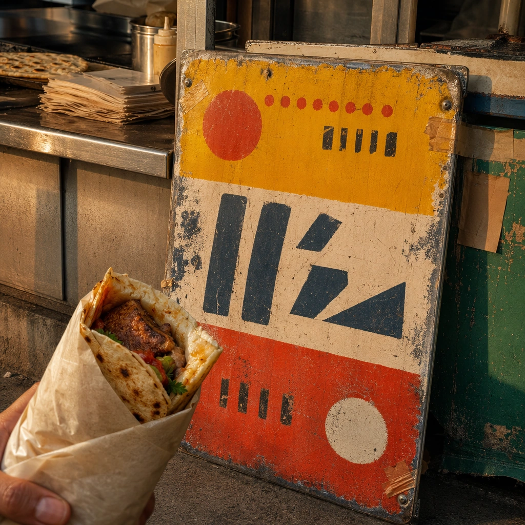
Example generated from “Street Food Vernacular Brand Kit — Enamel Sign Board”
GPT Image 2en

Scene: Compose a square street-food brand image that feels rooted in vernacular signage, fast service, handheld eating, and dense local texture without copying any specific real-world brand or famous location. The frame should feel energetic and commercial, with heat, packaging, and human-scale surfaces that suggest a busy street-food context. Use a square crop of one enamel or painted sign board leaning near a street-food counter, lit with warm directional light that reveals scratches and age. Subject: The food must look handheld, immediate, and physically satisfying, while the brand kit emerges through color, paper, enamel, painted surfaces, stall materials, and abstract signage forms rather than readable names. Pair the sign surface with a small hero food cue or wrapper so the board feels part of a living brand kit instead of a disconnected prop. Important details: This topic depends on cultural and retail credibility. Preserve believable stall materials, quick-service rhythms, food wrapping logic, and the layered density of a small-footprint brand environment. Use sign-painting, stencil-like marks, or abstract lettering forms only as non-legible texture; the identity should come from visual language, not copied brands or readable text. This image should feel fully self-contained while still belonging to the same broader topic and commercial world. Texture is essential: chipped enamel, brushed paint, taped corners, and metal fasteners should all feel believable and useful for campaign storytelling. Use case: Street Food Kit single study 5/9, built for Prompt Atlas coverage of a food and beverage commercial visual system. Constraints: No readable text, no watermark, no logos, preserve exact 1:1 aspect ratio, no readable text, no logos, no famous landmarks, no franchise styling, no tourist-poster cliché, no fake AI neon overload, no generic festival booth, no readable slogans, no famous transit iconography, no souvenir-shop vibe.

Example generated from “Street Food Vernacular Brand Kit — Paper Wrap Flatlay”
GPT Image 2en

Scene: Compose a square street-food brand image that feels rooted in vernacular signage, fast service, handheld eating, and dense local texture without copying any specific real-world brand or famous location. The frame should feel energetic and commercial, with heat, packaging, and human-scale surfaces that suggest a busy street-food context. Shoot from overhead on a work-worn counter or tile surface, arranging wrappers, food, and sauce cups into a tight square composition. Subject: The food must look handheld, immediate, and physically satisfying, while the brand kit emerges through color, paper, enamel, painted surfaces, stall materials, and abstract signage forms rather than readable names. Make the paper wrap treatment central, with folds, grease marks, and color accents that feel used and practical while still photogenic. Important details: This topic depends on cultural and retail credibility. Preserve believable stall materials, quick-service rhythms, food wrapping logic, and the layered density of a small-footprint brand environment. Use sign-painting, stencil-like marks, or abstract lettering forms only as non-legible texture; the identity should come from visual language, not copied brands or readable text. This image should feel fully self-contained while still belonging to the same broader topic and commercial world. The image should communicate speed and authenticity through materials, not mess. Grease, paper grain, and folded corners must look real but controlled. Use case: Street Food Kit single study 6/9, built for Prompt Atlas coverage of a food and beverage commercial visual system. Constraints: No readable text, no watermark, no logos, preserve exact 1:1 aspect ratio, no readable text, no logos, no famous landmarks, no franchise styling, no tourist-poster cliché, no fake AI neon overload, no generic festival booth, no full meal clutter, no readable stamps, no pristine untouched prop styling.

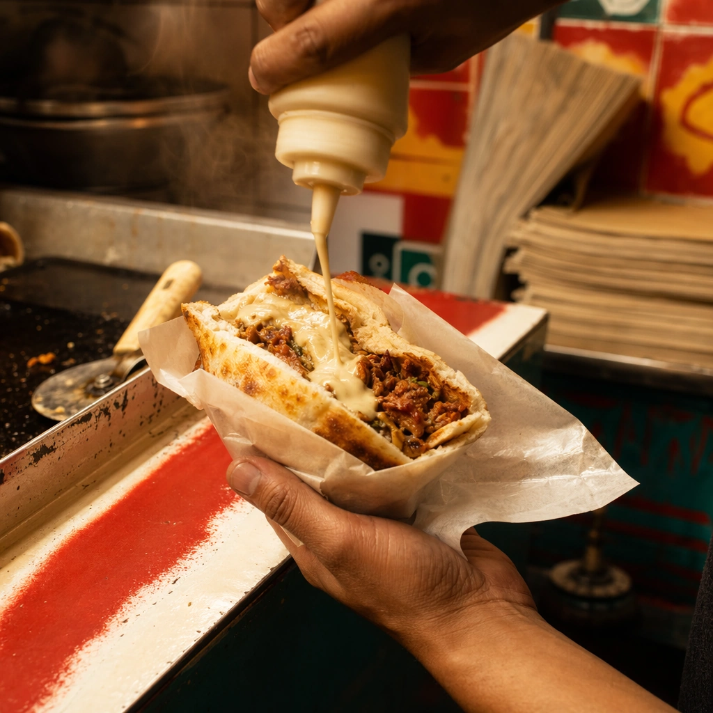
Example generated from “Street Food Vernacular Brand Kit — Sauce Squeeze Action”
GPT Image 2en

Scene: Compose a square street-food brand image that feels rooted in vernacular signage, fast service, handheld eating, and dense local texture without copying any specific real-world brand or famous location. The frame should feel energetic and commercial, with heat, packaging, and human-scale surfaces that suggest a busy street-food context. Use a square close crop of a food item on the counter as sauce is applied, with shallow background depth and warm stall light. Subject: The food must look handheld, immediate, and physically satisfying, while the brand kit emerges through color, paper, enamel, painted surfaces, stall materials, and abstract signage forms rather than readable names. The frame should center the food and the sauce motion, using the hand only as a service cue rather than a portrait subject. Important details: This topic depends on cultural and retail credibility. Preserve believable stall materials, quick-service rhythms, food wrapping logic, and the layered density of a small-footprint brand environment. Use sign-painting, stencil-like marks, or abstract lettering forms only as non-legible texture; the identity should come from visual language, not copied brands or readable text. This image should feel fully self-contained while still belonging to the same broader topic and commercial world. Motion needs to feel real: squeeze pressure, sauce viscosity, wrapper tension, and heat from the food should all align physically. Use case: Street Food Kit single study 7/9, built for Prompt Atlas coverage of a food and beverage commercial visual system. Constraints: No readable text, no watermark, no logos, preserve exact 1:1 aspect ratio, no readable text, no logos, no famous landmarks, no franchise styling, no tourist-poster cliché, no fake AI neon overload, no generic festival booth, no chef portrait, no messy splatter, no branded bottle labels.

Example generated from “Street Food Vernacular Brand Kit — Crate Display Corner”
GPT Image 2en

Scene: Compose a square street-food brand image that feels rooted in vernacular signage, fast service, handheld eating, and dense local texture without copying any specific real-world brand or famous location. The frame should feel energetic and commercial, with heat, packaging, and human-scale surfaces that suggest a busy street-food context. Compose a square corner view of a stall or storefront using crates, stacked paper goods, and one food hero under mixed daylight and practical light. Subject: The food must look handheld, immediate, and physically satisfying, while the brand kit emerges through color, paper, enamel, painted surfaces, stall materials, and abstract signage forms rather than readable names. Treat the display as a mini brand environment, where ingredients and packaging reinforce the street-food concept without becoming a grocery scene. Important details: This topic depends on cultural and retail credibility. Preserve believable stall materials, quick-service rhythms, food wrapping logic, and the layered density of a small-footprint brand environment. Use sign-painting, stencil-like marks, or abstract lettering forms only as non-legible texture; the identity should come from visual language, not copied brands or readable text. This image should feel fully self-contained while still belonging to the same broader topic and commercial world. Wood wear, plastic crate texture, paper stack edges, and food freshness should all feel plausible and grounded in daily service. Use case: Street Food Kit single study 8/9, built for Prompt Atlas coverage of a food and beverage commercial visual system. Constraints: No readable text, no watermark, no logos, preserve exact 1:1 aspect ratio, no readable text, no logos, no famous landmarks, no franchise styling, no tourist-poster cliché, no fake AI neon overload, no generic festival booth, no supermarket produce section, no readable stickers, no clean showroom sterility.

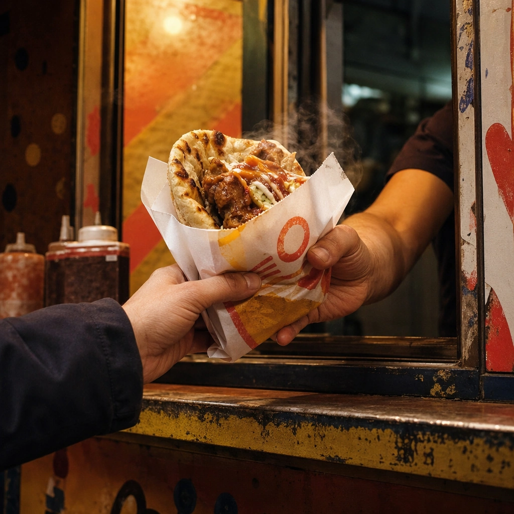
Example generated from “Street Food Vernacular Brand Kit — Rush Hour Service Window”
GPT Image 2en

Scene: Compose a square street-food brand image that feels rooted in vernacular signage, fast service, handheld eating, and dense local texture without copying any specific real-world brand or famous location. The frame should feel energetic and commercial, with heat, packaging, and human-scale surfaces that suggest a busy street-food context. Frame a square crop at a service window with warm lights, partial hands, and a narrow counter zone that feels busy but controlled. Subject: The food must look handheld, immediate, and physically satisfying, while the brand kit emerges through color, paper, enamel, painted surfaces, stall materials, and abstract signage forms rather than readable names. Keep the hero food, wrapper, and service gesture central so the image communicates quick turnover and human immediacy. Important details: This topic depends on cultural and retail credibility. Preserve believable stall materials, quick-service rhythms, food wrapping logic, and the layered density of a small-footprint brand environment. Use sign-painting, stencil-like marks, or abstract lettering forms only as non-legible texture; the identity should come from visual language, not copied brands or readable text. This image should feel fully self-contained while still belonging to the same broader topic and commercial world. The mood should feel crowded in implication, not in clutter. Counter wear, wrapper folds, and light reflections should do the storytelling. Use case: Street Food Kit single study 9/9, built for Prompt Atlas coverage of a food and beverage commercial visual system. Constraints: No readable text, no watermark, no logos, preserve exact 1:1 aspect ratio, no readable text, no logos, no famous landmarks, no franchise styling, no tourist-poster cliché, no fake AI neon overload, no generic festival booth, no readable queue numbers, no visible cash register screen, no identifiable faces.

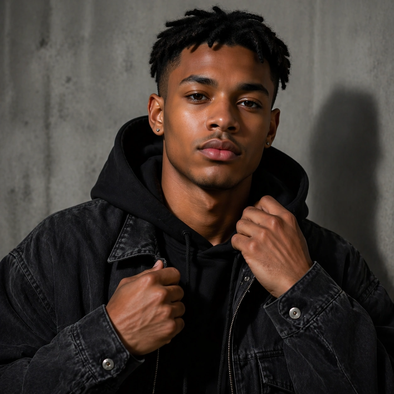
Example generated from “Streetwear Drop Campaign Portraits — Reference Drop Anchor”
GPT Image 2en

Scene: Create a square 1:1 portrait image for Streetwear Drop Campaign Portraits. Use a clean campaign setup with neutral concrete or studio wall, premium directional light, and strong youth-casting energy. The frame should feel like a finished professional deliverable rather than a casual snapshot, with clear lens discipline, believable light falloff, and a palette that directly supports Create streetwear launch portraits that blend fashion attitude, youth casting, and campaign-ready framing across posters, covers, and product pages.. Keep enough surrounding space and compositional control for gallery, research, campaign, or approval-board reuse while staying photoreal and human-scaled. Subject: Center one young streetwear talent with medium brown skin, cropped twists, relaxed athletic proportions, and a confident direct gaze. Establish the exact same face, hair base, and body proportions that later drop variations must preserve. Use the example direction from the brief as grounding context: Create streetwear launch portraits that blend fashion attitude, youth casting, and campaign-ready framing across posters, covers, and product pages.. Wardrobe, lighting, environment, and pose may shift to serve this variation, but the viewer must immediately understand that the same reference identity is still in front of the camera. Important details: This backlog line is difficult because Create streetwear launch portraits that blend fashion attitude, youth casting, and campaign-ready framing across posters, covers, and product pages.. Preserve skin tone family, bone structure, eye spacing, nose shape, mouth shape, hairline logic, shoulder width, and overall body read across the entire series. preserve exact face / hair base / body proportions from the reference model. Wardrobe should feel logo-safe, contemporary, and plausible for a real brand rollout. Avoid the common failure described in the brief: ordinary image models often lose likeness once styling, lighting, or layout changes enter the frame. Success should feel like the result should feel professionally usable, coherent, and clearly built around one stable human identity. Use case: Streetwear Drop Campaign Portraits series study 1/9, the baseline streetwear campaign portrait. Constraints: No readable text, no watermark, no logos, preserve exact 1:1 aspect ratio, preserve exact face / hair base / body proportions from the reference model, no logos, no crowd, no oversized sneakers in face, no body distortion.

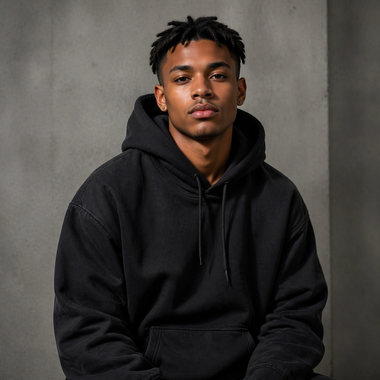
Example generated from “Streetwear Drop Campaign Portraits — Hoodie Hero”
GPT Image 2en

Scene: Create a square 1:1 portrait image for Streetwear Drop Campaign Portraits. Use a square fashion-ad portrait with crisp fabric folds, subtle texture, and confident direct gaze. The frame should feel like a finished professional deliverable rather than a casual snapshot, with clear lens discipline, believable light falloff, and a palette that directly supports Create streetwear launch portraits that blend fashion attitude, youth casting, and campaign-ready framing across posters, covers, and product pages.. Keep enough surrounding space and compositional control for gallery, research, campaign, or approval-board reuse while staying photoreal and human-scaled. Subject: Center one young streetwear talent with medium brown skin, cropped twists, relaxed athletic proportions, and a confident direct gaze. Use the same model and identity while making a hoodie or sweatshirt the visual focus. Use the example direction from the brief as grounding context: Create streetwear launch portraits that blend fashion attitude, youth casting, and campaign-ready framing across posters, covers, and product pages.. Wardrobe, lighting, environment, and pose may shift to serve this variation, but the viewer must immediately understand that the same reference identity is still in front of the camera. Important details: This backlog line is difficult because Create streetwear launch portraits that blend fashion attitude, youth casting, and campaign-ready framing across posters, covers, and product pages.. Preserve skin tone family, bone structure, eye spacing, nose shape, mouth shape, hairline logic, shoulder width, and overall body read across the entire series. preserve exact face / hair base / body proportions from the reference model. Garment emphasis can change, but the person must remain exact. Avoid the common failure described in the brief: ordinary image models often lose likeness once styling, lighting, or layout changes enter the frame. Success should feel like the result should feel professionally usable, coherent, and clearly built around one stable human identity. Use case: Streetwear Drop Campaign Portraits series study 2/9, a hoodie-first campaign hero. Constraints: No readable text, no watermark, no logos, preserve exact 1:1 aspect ratio, preserve exact face / hair base / body proportions from the reference model, no new facial features, no giant hood shadow hiding face, no logo print, no random props.

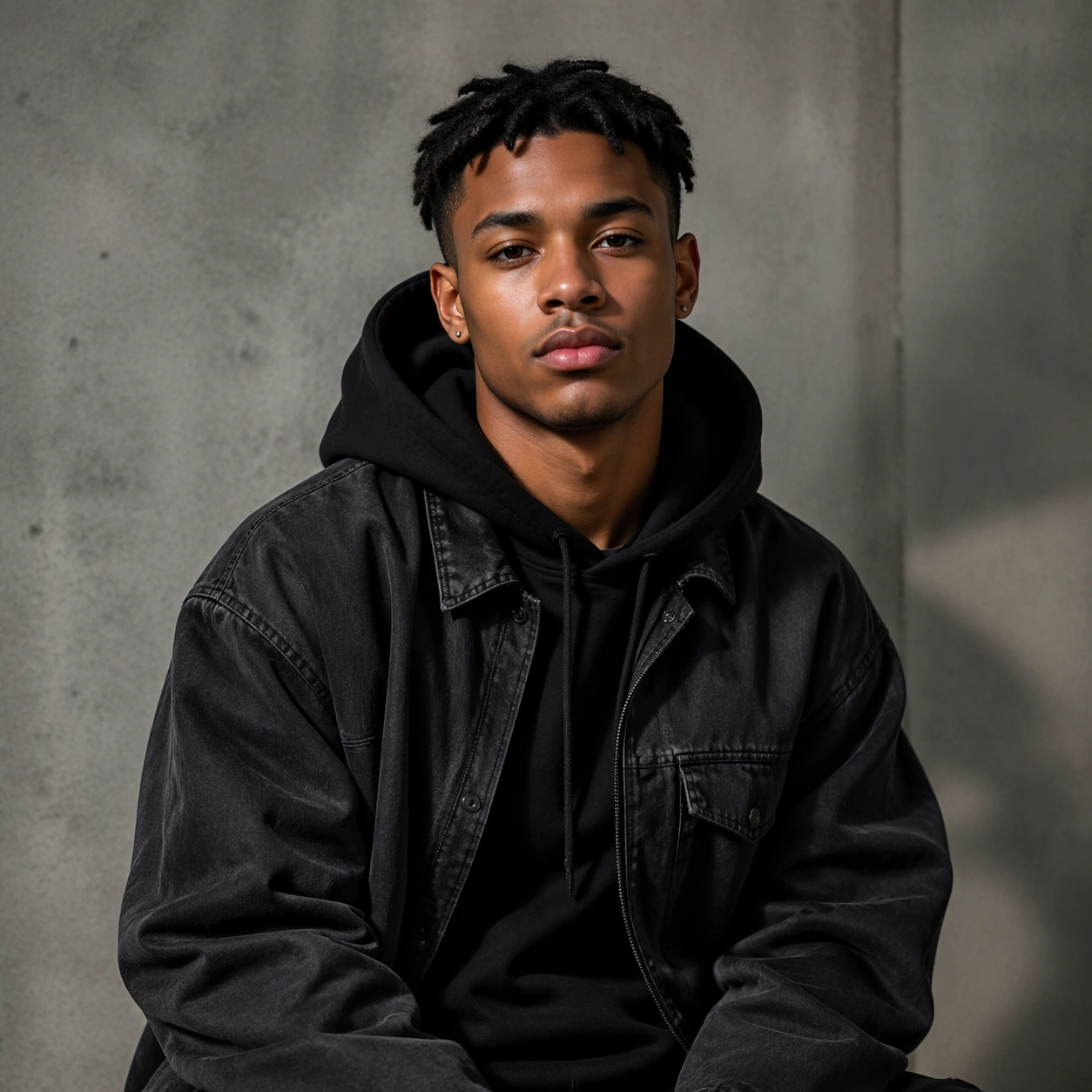
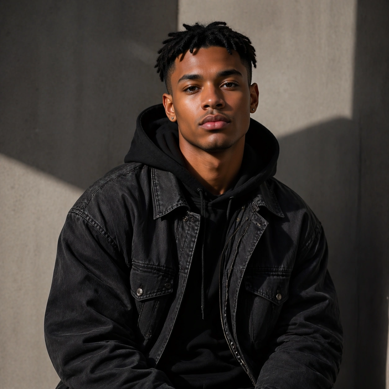
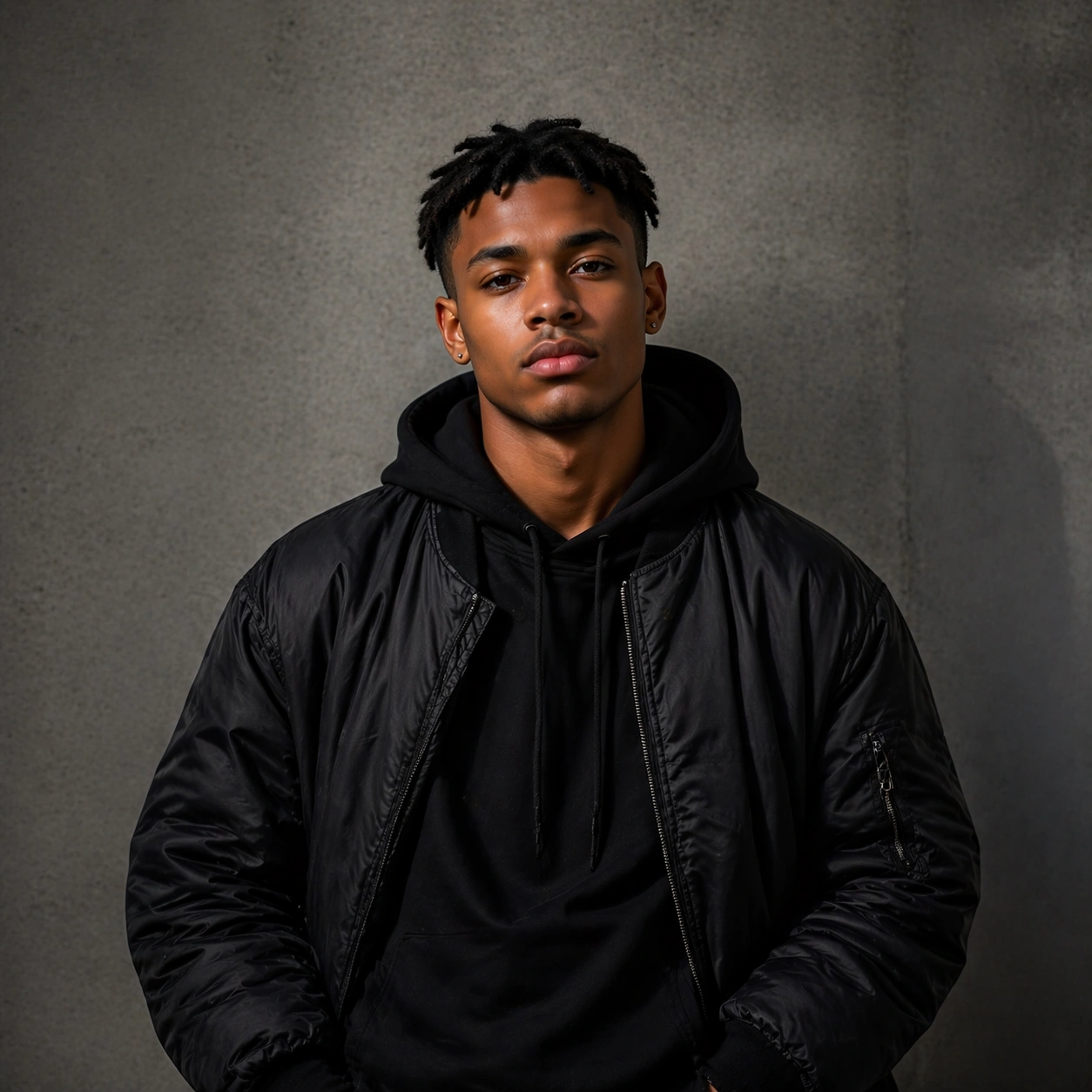
Example generated from “Streetwear Drop Campaign Portraits — Varsity Layer”
GPT Image 2en

Scene: Create a square 1:1 portrait image for Streetwear Drop Campaign Portraits. Use a sharper fashion-light setup that shows jacket structure, collar detail, and a clear shoulder line. The frame should feel like a finished professional deliverable rather than a casual snapshot, with clear lens discipline, believable light falloff, and a palette that directly supports Create streetwear launch portraits that blend fashion attitude, youth casting, and campaign-ready framing across posters, covers, and product pages.. Keep enough surrounding space and compositional control for gallery, research, campaign, or approval-board reuse while staying photoreal and human-scaled. Subject: Center one young streetwear talent with medium brown skin, cropped twists, relaxed athletic proportions, and a confident direct gaze. Keep the reference identity locked while shifting styling toward layered streetwear with clean casting attitude. Use the example direction from the brief as grounding context: Create streetwear launch portraits that blend fashion attitude, youth casting, and campaign-ready framing across posters, covers, and product pages.. Wardrobe, lighting, environment, and pose may shift to serve this variation, but the viewer must immediately understand that the same reference identity is still in front of the camera. Important details: This backlog line is difficult because Create streetwear launch portraits that blend fashion attitude, youth casting, and campaign-ready framing across posters, covers, and product pages.. Preserve skin tone family, bone structure, eye spacing, nose shape, mouth shape, hairline logic, shoulder width, and overall body read across the entire series. preserve exact face / hair base / body proportions from the reference model. This should feel like one real drop, not a different brand or different talent. Avoid the common failure described in the brief: ordinary image models often lose likeness once styling, lighting, or layout changes enter the frame. Success should feel like the result should feel professionally usable, coherent, and clearly built around one stable human identity. Use case: Streetwear Drop Campaign Portraits series study 3/9, a layered streetwear portrait. Constraints: No readable text, no watermark, no logos, preserve exact 1:1 aspect ratio, preserve exact face / hair base / body proportions from the reference model, no off-model beard or hair, no cartoon accessories, no brand text, no costume mismatch.

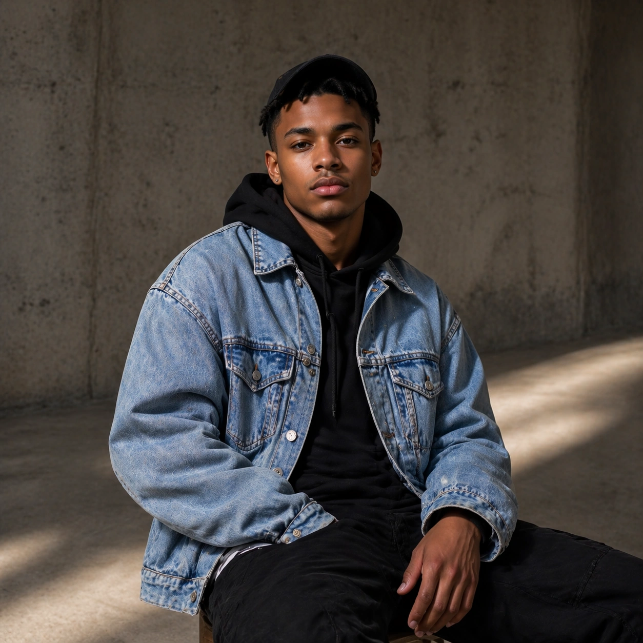
Example generated from “Streetwear Drop Campaign Portraits — Cap And Denim”
GPT Image 2en

Scene: Create a square 1:1 portrait image for Streetwear Drop Campaign Portraits. Use a campaign frame with quiet urban texture, measured shadow, and a slightly looser crop. The frame should feel like a finished professional deliverable rather than a casual snapshot, with clear lens discipline, believable light falloff, and a palette that directly supports Create streetwear launch portraits that blend fashion attitude, youth casting, and campaign-ready framing across posters, covers, and product pages.. Keep enough surrounding space and compositional control for gallery, research, campaign, or approval-board reuse while staying photoreal and human-scaled. Subject: Center one young streetwear talent with medium brown skin, cropped twists, relaxed athletic proportions, and a confident direct gaze. Introduce a cap or denim layer only if it keeps the same face visible and preserves the same head size, jawline, and hair base as the reference. Use the example direction from the brief as grounding context: Create streetwear launch portraits that blend fashion attitude, youth casting, and campaign-ready framing across posters, covers, and product pages.. Wardrobe, lighting, environment, and pose may shift to serve this variation, but the viewer must immediately understand that the same reference identity is still in front of the camera. Important details: This backlog line is difficult because Create streetwear launch portraits that blend fashion attitude, youth casting, and campaign-ready framing across posters, covers, and product pages.. Preserve skin tone family, bone structure, eye spacing, nose shape, mouth shape, hairline logic, shoulder width, and overall body read across the entire series. preserve exact face / hair base / body proportions from the reference model. Accessories should support styling, not obscure identity. Avoid the common failure described in the brief: ordinary image models often lose likeness once styling, lighting, or layout changes enter the frame. Success should feel like the result should feel professionally usable, coherent, and clearly built around one stable human identity. Use case: Streetwear Drop Campaign Portraits series study 4/9, a cap-and-denim variation. Constraints: No readable text, no watermark, no logos, preserve exact 1:1 aspect ratio, preserve exact face / hair base / body proportions from the reference model, no hat shadow hiding eyes, no face shrink, no background graffiti text, no second cast member.

Example generated from “Streetwear Drop Campaign Portraits — Detail Crop Hands”
GPT Image 2en

Scene: Create a square 1:1 portrait image for Streetwear Drop Campaign Portraits. Use a closer portrait focusing on cuffs, zipper pulls, hands, and face in the same frame with premium texture control. The frame should feel like a finished professional deliverable rather than a casual snapshot, with clear lens discipline, believable light falloff, and a palette that directly supports Create streetwear launch portraits that blend fashion attitude, youth casting, and campaign-ready framing across posters, covers, and product pages.. Keep enough surrounding space and compositional control for gallery, research, campaign, or approval-board reuse while staying photoreal and human-scaled. Subject: Center one young streetwear talent with medium brown skin, cropped twists, relaxed athletic proportions, and a confident direct gaze. Stay with the same model while moving closer to garment detail and hand gesture. Hands must remain believable and belong to the same person. Use the example direction from the brief as grounding context: Create streetwear launch portraits that blend fashion attitude, youth casting, and campaign-ready framing across posters, covers, and product pages.. Wardrobe, lighting, environment, and pose may shift to serve this variation, but the viewer must immediately understand that the same reference identity is still in front of the camera. Important details: This backlog line is difficult because Create streetwear launch portraits that blend fashion attitude, youth casting, and campaign-ready framing across posters, covers, and product pages.. Preserve skin tone family, bone structure, eye spacing, nose shape, mouth shape, hairline logic, shoulder width, and overall body read across the entire series. preserve exact face / hair base / body proportions from the reference model. This frame proves the drop can support detail crops without identity drift. Avoid the common failure described in the brief: ordinary image models often lose likeness once styling, lighting, or layout changes enter the frame. Success should feel like the result should feel professionally usable, coherent, and clearly built around one stable human identity. Use case: Streetwear Drop Campaign Portraits series study 5/9, a detail crop with hands and garment finish. Constraints: No readable text, no watermark, no logos, preserve exact 1:1 aspect ratio, preserve exact face / hair base / body proportions from the reference model, no broken fingers, no giant jewelry branding, no unreadable patches, no face drift.

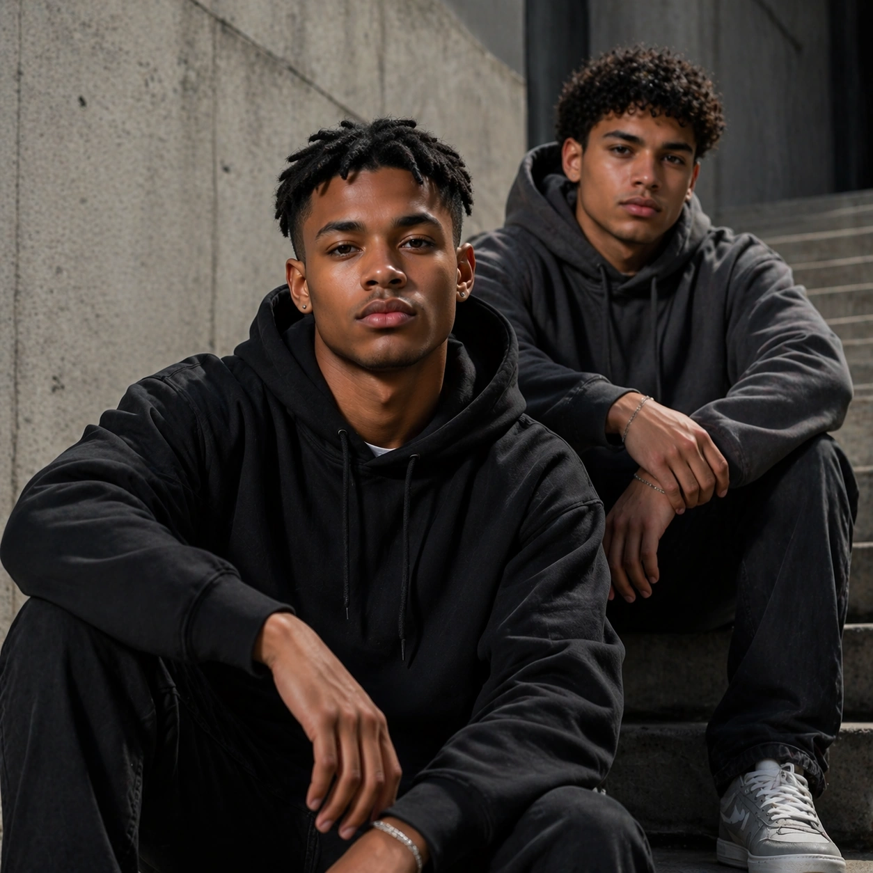
Example generated from “Streetwear Drop Campaign Portraits — Duo Cast Street Step”
GPT Image 2en

Scene: Create a square 1:1 portrait image for Streetwear Drop Campaign Portraits. Use a square campaign frame on steps or sidewalk where the reference model remains primary and a secondary cast partner supports the mood. The frame should feel like a finished professional deliverable rather than a casual snapshot, with clear lens discipline, believable light falloff, and a palette that directly supports Create streetwear launch portraits that blend fashion attitude, youth casting, and campaign-ready framing across posters, covers, and product pages.. Keep enough surrounding space and compositional control for gallery, research, campaign, or approval-board reuse while staying photoreal and human-scaled. Subject: Center one young streetwear talent with medium brown skin, cropped twists, relaxed athletic proportions, and a confident direct gaze. The same reference model must remain the unmistakable lead subject even if one second person briefly joins the frame. Preserve exact face / hair base / body proportions from the reference model. Use the example direction from the brief as grounding context: Create streetwear launch portraits that blend fashion attitude, youth casting, and campaign-ready framing across posters, covers, and product pages.. Wardrobe, lighting, environment, and pose may shift to serve this variation, but the viewer must immediately understand that the same reference identity is still in front of the camera. Important details: This backlog line is difficult because Create streetwear launch portraits that blend fashion attitude, youth casting, and campaign-ready framing across posters, covers, and product pages.. Preserve skin tone family, bone structure, eye spacing, nose shape, mouth shape, hairline logic, shoulder width, and overall body read across the entire series. preserve exact face / hair base / body proportions from the reference model. Use the extra cast only to sell streetwear community energy, not to replace the hero. Avoid the common failure described in the brief: ordinary image models often lose likeness once styling, lighting, or layout changes enter the frame. Success should feel like the result should feel professionally usable, coherent, and clearly built around one stable human identity. Use case: Streetwear Drop Campaign Portraits series study 6/9, a duo-cast campaign variation. Constraints: No readable text, no watermark, no logos, preserve exact 1:1 aspect ratio, preserve exact face / hair base / body proportions from the reference model, no identity swap, no crowd, no logo bag, no ambiguous lead subject.

Example generated from “Streetwear Drop Campaign Portraits — Poster Cover”
GPT Image 2en

Scene: Create a square 1:1 portrait image for Streetwear Drop Campaign Portraits. Use a cleaner, more graphic portrait crop with strong negative space and release-campaign confidence. The frame should feel like a finished professional deliverable rather than a casual snapshot, with clear lens discipline, believable light falloff, and a palette that directly supports Create streetwear launch portraits that blend fashion attitude, youth casting, and campaign-ready framing across posters, covers, and product pages.. Keep enough surrounding space and compositional control for gallery, research, campaign, or approval-board reuse while staying photoreal and human-scaled. Subject: Center one young streetwear talent with medium brown skin, cropped twists, relaxed athletic proportions, and a confident direct gaze. Turn the same subject into a cover-style frame that could survive poster or launch-card usage without readable type. Use the example direction from the brief as grounding context: Create streetwear launch portraits that blend fashion attitude, youth casting, and campaign-ready framing across posters, covers, and product pages.. Wardrobe, lighting, environment, and pose may shift to serve this variation, but the viewer must immediately understand that the same reference identity is still in front of the camera. Important details: This backlog line is difficult because Create streetwear launch portraits that blend fashion attitude, youth casting, and campaign-ready framing across posters, covers, and product pages.. Preserve skin tone family, bone structure, eye spacing, nose shape, mouth shape, hairline logic, shoulder width, and overall body read across the entire series. preserve exact face / hair base / body proportions from the reference model. The model should feel aspirational but still exactly anchored to image 01. Avoid the common failure described in the brief: ordinary image models often lose likeness once styling, lighting, or layout changes enter the frame. Success should feel like the result should feel professionally usable, coherent, and clearly built around one stable human identity. Use case: Streetwear Drop Campaign Portraits series study 7/9, a poster-like streetwear cover. Constraints: No readable text, no watermark, no logos, preserve exact 1:1 aspect ratio, preserve exact face / hair base / body proportions from the reference model, no fake logos, no readable slogans, no distorted jacket proportions, no fake magazine masthead.

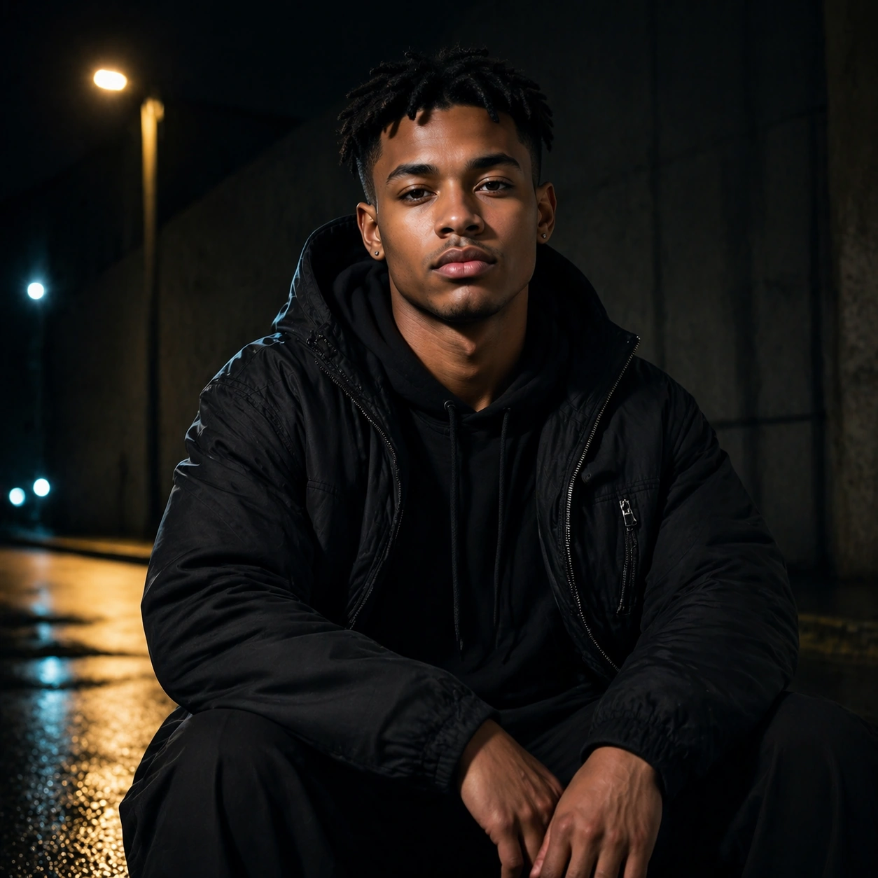
Example generated from “Streetwear Drop Campaign Portraits — Night Rimlight Portrait”
GPT Image 2en

Scene: Create a square 1:1 portrait image for Streetwear Drop Campaign Portraits. Use a darker frame with sodium or cool rim light, subtle pavement reflection, and still-clear facial readability. The frame should feel like a finished professional deliverable rather than a casual snapshot, with clear lens discipline, believable light falloff, and a palette that directly supports Create streetwear launch portraits that blend fashion attitude, youth casting, and campaign-ready framing across posters, covers, and product pages.. Keep enough surrounding space and compositional control for gallery, research, campaign, or approval-board reuse while staying photoreal and human-scaled. Subject: Center one young streetwear talent with medium brown skin, cropped twists, relaxed athletic proportions, and a confident direct gaze. Use moodier urban light while keeping the exact same face, hairstyle base, and body scale from the reference. Use the example direction from the brief as grounding context: Create streetwear launch portraits that blend fashion attitude, youth casting, and campaign-ready framing across posters, covers, and product pages.. Wardrobe, lighting, environment, and pose may shift to serve this variation, but the viewer must immediately understand that the same reference identity is still in front of the camera. Important details: This backlog line is difficult because Create streetwear launch portraits that blend fashion attitude, youth casting, and campaign-ready framing across posters, covers, and product pages.. Preserve skin tone family, bone structure, eye spacing, nose shape, mouth shape, hairline logic, shoulder width, and overall body read across the entire series. preserve exact face / hair base / body proportions from the reference model. Atmosphere may deepen, but likeness must stay stable. Avoid the common failure described in the brief: ordinary image models often lose likeness once styling, lighting, or layout changes enter the frame. Success should feel like the result should feel professionally usable, coherent, and clearly built around one stable human identity. Use case: Streetwear Drop Campaign Portraits series study 8/9, a night-lit streetwear portrait. Constraints: No readable text, no watermark, no logos, preserve exact 1:1 aspect ratio, preserve exact face / hair base / body proportions from the reference model, no neon overload, no rainstorm chaos, no hidden face, no unrelated skyline spectacle.

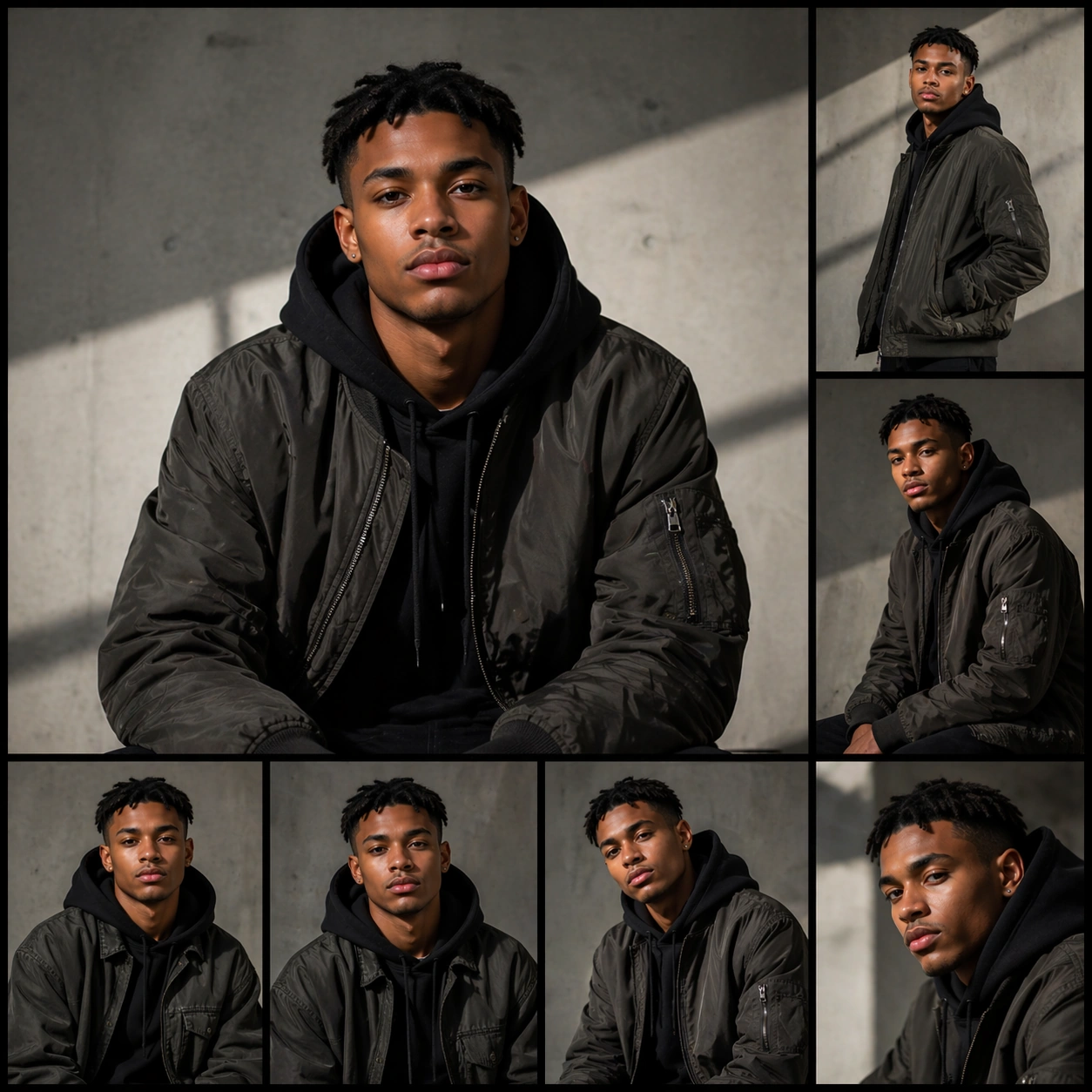
Example generated from “Streetwear Drop Campaign Portraits — Campaign Contact Sheet”
GPT Image 2en

Scene: Create a square 1:1 portrait image for Streetwear Drop Campaign Portraits. Use a square layout combining portrait-first photography with restrained campaign-board cues and tidy panel structure. The frame should feel like a finished professional deliverable rather than a casual snapshot, with clear lens discipline, believable light falloff, and a palette that directly supports Create streetwear launch portraits that blend fashion attitude, youth casting, and campaign-ready framing across posters, covers, and product pages.. Keep enough surrounding space and compositional control for gallery, research, campaign, or approval-board reuse while staying photoreal and human-scaled. Subject: Center one young streetwear talent with medium brown skin, cropped twists, relaxed athletic proportions, and a confident direct gaze. Resolve the same identity into a finished drop-campaign board or approval layout without readable text or logos. Use the example direction from the brief as grounding context: Create streetwear launch portraits that blend fashion attitude, youth casting, and campaign-ready framing across posters, covers, and product pages.. Wardrobe, lighting, environment, and pose may shift to serve this variation, but the viewer must immediately understand that the same reference identity is still in front of the camera. Important details: This backlog line is difficult because Create streetwear launch portraits that blend fashion attitude, youth casting, and campaign-ready framing across posters, covers, and product pages.. Preserve skin tone family, bone structure, eye spacing, nose shape, mouth shape, hairline logic, shoulder width, and overall body read across the entire series. preserve exact face / hair base / body proportions from the reference model. Presentation can become more structured, but the same hero talent must still dominate every crop. Avoid the common failure described in the brief: ordinary image models often lose likeness once styling, lighting, or layout changes enter the frame. Success should feel like the result should feel professionally usable, coherent, and clearly built around one stable human identity. Use case: Streetwear Drop Campaign Portraits series study 9/9, a final campaign-board finish. Constraints: No readable text, no watermark, no logos, preserve exact 1:1 aspect ratio, preserve exact face / hair base / body proportions from the reference model, no readable captions, no brand logo, no broken panel alignment, no collage confusion.

Example generated from “Summer Escape Brand Campaign Set — Resort Arrival Anchor”
GPT Image 2en

Scene: Create a square premium summer campaign image under bright coastal or resort light with high sun clarity, crisp shadows, pale stone, turquoise water reflections, citrus accents, and linen-soft warmth. The frame should feel like a brand world for light vacation and seasonal appetite rather than a travel postcard. Keep the image polished, high-end, and commercially useful across beverage, fashion, travel, or home-lifestyle campaign surfaces. Subject: Center a composed leisure-arrival arrangement with travel bag, towel or linen, drink or fruit cue, sunglasses-like accessory shapes, and a few architectural or poolside elements that suggest immediate escape. The subject should communicate movement away from routine and toward premium rest. Build distinct foreground and background layers so the scene reads both as an aspirational lifestyle image and as a reusable campaign anchor. Important details: Lock the summer grammar here: clean sun, cool water reflections, pale natural surfaces, citrus freshness, light textiles, and premium breathing room. Avoid overpacked vacation clichés. The anchor should feel editorial and commercial at once, able to support travel, beverage, fashion, beauty, or home brands that want a polished summer-escape visual language. Use case: Summer Escape series study 1/9. Constraints: No readable text, no watermark, no logos, preserve exact 1:1 aspect ratio, no readable travel tags, no brand logos, no crowd, no tropical cliché overload, no cruise-ship feel, no loud inflatable toys, no text on towels, no cheap souvenir props.

Example generated from “Summer Escape Brand Campaign Set — Beach Club Variation”
GPT Image 2en

Scene: Create a square dependent summer image in the exact same bright escape world, preserving the same sun quality, turquoise reflection, pale stone, and citrus-linen palette from the reference image, but shift the framing toward a beach-club accessory scene. The continuity should feel exact, as though the same campaign shoot has moved a few steps toward a more style-led leisure surface. Subject: Feature beach-club accessories such as bag, sandals, hat-like form, towel, drink cue, and polished seasonal objects arranged into one premium leisure composition. Preserve exact visual identity from the reference model while changing the category emphasis. The subject should feel aspirational, brand-neutral, and suitable for fashion, hospitality, or travel campaign rollout. Important details: Keep the same premium summer grammar: bright but not harsh, airy but not empty, tactile but not cluttered. Materials such as woven texture, leather, linen, glass, and stone should feel real. The image should remain usable as a commercial hero asset for summer retail and seasonal brand storytelling. Use case: Summer Escape series study 2/9. Constraints: No readable text, no watermark, no logos, preserve exact 1:1 aspect ratio, preserve exact campaign identity from the reference image, no readable labels, no crowd, no loud novelty floaties, no logo sandals, no beach-trash realism, no tropical cliché props, no saturated party vibe.

Example generated from “Summer Escape Brand Campaign Set — Citrus Beverage Variation”
GPT Image 2en

Scene: Create a square dependent summer campaign image in the same resort-lit environment, preserving the exact sun, water reflections, pale mineral surfaces, and citrus-linen palette from the reference image, but tighten the composition around a premium cold beverage story. The image should still feel obviously part of the anchor world while becoming more appetite-driven and product-centered. Subject: Show chilled beverage vessels, citrus slices, condensation, tray or tabletop support, linen, and one or two travel or leisure accents integrated into a premium summer setting. Preserve exact campaign identity from the reference model while changing emphasis toward thirst, refreshment, and appetite. Keep the objects original, non-branded, and commercially persuasive. Important details: Condensation, glass, ice, citrus texture, stone heat, and reflected water light must all feel convincing. Keep the composition clean and aspirational. This should function as a summer beverage campaign hero while still living inside the same broader escape system established by the reference image. Use case: Summer Escape series study 3/9. Constraints: No readable text, no watermark, no logos, preserve exact 1:1 aspect ratio, preserve exact campaign identity from the reference image, no readable labels, no soda-brand cues, no party clutter, no cocktail-menu text, no crowd, no cheap beach-bar décor, no overly tropical fruit pile.

Example generated from “Summer Escape Brand Campaign Set — Linen Travel Variation”
GPT Image 2en

Scene: Create a square dependent summer image within the same bright escape world, preserving the exact high-sun clarity, water reflections, pale surfaces, and citrus accents from the reference image, but widen the composition into a polished travel-set or room-arrival arrangement. The continuity should feel exact, with the same premium leisure language applied to a more tactile textile and packing story. Subject: Feature folded linen garments or textiles, travel accessories, bag, sunglasses-like form, and a few bright seasonal cues arranged into a calm premium summer composition. Preserve exact visual identity from the reference model while shifting emphasis toward wardrobe and travel preparation. The result should feel aspirational, brand-neutral, and useful for fashion, hotel, or lifestyle summer rollout. Important details: Fabric realism matters. Linen weave, leather trim, glass, stone, and sunlit shadow edges should all feel tactile and convincing. Keep the space breathable and refined. The image should read as one more polished deliverable from the same summer campaign, not a different aesthetic or a generic flatlay. Use case: Summer Escape series study 4/9. Constraints: No readable text, no watermark, no logos, preserve exact 1:1 aspect ratio, preserve exact campaign identity from the reference image, no readable garment labels, no logos, no crowd, no suitcase airport tags, no tropical cliché props, no messy packing, no cheap beach souvenirs.

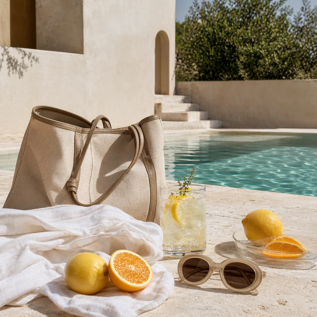
Example generated from “Summer Escape Brand Campaign Set — Poolside Still Life”
GPT Image 2en

Scene: Create a square poolside still life under sharp summer sun with crisp shadows, reflected water caustics, pale stone, and controlled color pops from citrus or textiles. The frame should feel polished and aspirational rather than casual vacation photography. Keep the composition art-directed and commercially clean, with enough negative space and surface definition that the image can work across hospitality, beverage, fashion, or travel brand campaigns. Subject: Show a towel, beverage glass, fruit, accessory forms, and pool edge arranged into a coherent premium leisure scene. The subject should communicate heat relief, comfort, and escape through object relationships and light rather than through visible people. Focus on tactile materials and the subtle discipline of a high-end summer setup. Important details: Surface realism is crucial. Stone heat, water shimmer, citrus texture, fabric weave, condensation, and shadow geometry should all feel convincing. Keep the palette bright but tasteful. The image should behave like a versatile campaign asset for summer escape messaging without slipping into generic influencer beach content. Use case: Summer Escape single study 5/9. Constraints: No readable text, no watermark, no logos, preserve exact 1:1 aspect ratio, no readable labels, no logos, no inflatable toy cliché, no crowd, no messy sunscreen clutter, no cruise-ship vibe, no neon party colors, no text on towels.

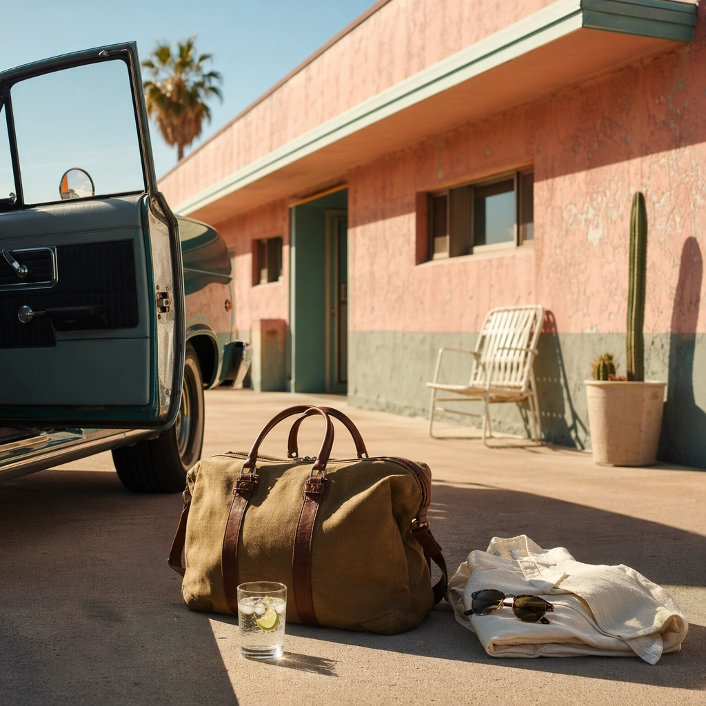
Example generated from “Summer Escape Brand Campaign Set — Roadside Motel Leisure”
GPT Image 2en

Scene: Create a square summer travel image with bright late-afternoon light, sun-faded architectural color, warm pavement, and a polished roadside-motel atmosphere. The frame should feel cinematic and premium, not retro-kitsch parody. Use strong architecture, selective props, and measured heat haze to communicate a brief stop inside a larger escape narrative. Subject: Show a motel or roadside setup with bag, cool drink, linen, sunglasses-like form, car edge or doorway, and simple travel objects arranged into a scene of pause and relief. The subject should communicate freedom, route-change, and temporary leisure without visible branding or travel-text signage. Keep it original, tactile, and commercially sharp. Important details: Light quality and material wear matter. Painted wall texture, chrome, fabric, glass, and hot concrete should all read clearly. The result should support travel, beverage, or lifestyle summer campaigns with a more narrative, road-trip inflection. Avoid nostalgia cliché and keep the tone elegant, current, and highly usable. Keep the frame precise enough for gallery, research, and campaign reuse, with believable materials and a strong thumbnail read. Use case: Summer Escape single study 6/9. Constraints: No readable text, no watermark, no logos, preserve exact 1:1 aspect ratio, no readable motel signs, no car logos, no crowd, no retro-kitsch overload, no route-number text, no cheap souvenir props, no messy parking lot trash, no neon-night palette.

Example generated from “Summer Escape Brand Campaign Set — Fruit Market Refreshment”
GPT Image 2en

Scene: Create a square produce-and-refreshment campaign image under bright summer daylight with fabric shade, crisp color, and enough structure that the frame feels premium rather than documentary. The scene should celebrate appetite and freshness in a way useful for beverage, grocery, travel, or lifestyle campaigns. Keep the composition intentional, breathable, and polished. Subject: Show fruit display, chilled drink cue, basket or crate forms, linen, and one or two travel or leisure accents arranged into a coherent summer refreshment image. The subject should communicate abundance, brightness, and thirst relief without becoming crowded or rustic. Focus on material freshness, color grouping, and a clear commercial mood. Important details: Fruit skin texture, condensation, woven fibers, shade cloth, and sunlit edges should all feel real. Keep the palette vibrant but disciplined. The final image should function as a support asset for seasonal appetite-driven campaigns, with enough originality to avoid generic market photography. Keep the frame precise enough for gallery, research, and campaign reuse, with believable materials and a strong thumbnail read. Use case: Summer Escape single study 7/9. Constraints: No readable text, no watermark, no logos, preserve exact 1:1 aspect ratio, no readable price signs, no logos, no crowd, no messy market chaos, no rustic cliché overload, no cheap picnic props, no muddy shadows, no text on packaging.

Example generated from “Summer Escape Brand Campaign Set — Room Arrival Cooldown”
GPT Image 2en

Scene: Create a square hotel-room or villa-arrival image with cool interior shade, a slice of bright exterior sun, and a polished feeling of relief from heat. The frame should feel calm, premium, and commercially useful for travel or lifestyle branding. Use architecture, textiles, and a few well-placed objects to show the transition from active summer heat into rest. Subject: Show a bed or seating edge, folded linen, drink or fruit cue, travel bag, and one or two accessories arranged into a believable arrival scene. The subject should communicate ease, comfort, and refined pause without visible people or readable hotel materials. Keep it tactile, original, and clearly summer-oriented. Important details: Texture and temperature contrast matter most. Linen softness, cool wall shadow, glass condensation, warm sun spill, and smooth flooring should all feel convincing. The result should support hotel, fashion, or travel summer campaigns that want a calm, restorative surface rather than an outdoor spectacle. Keep the frame precise enough for gallery, research, and campaign reuse, with believable materials and a strong thumbnail read. Use case: Summer Escape single study 8/9. Constraints: No readable text, no watermark, no logos, preserve exact 1:1 aspect ratio, no readable room numbers, no hotel logos, no crowd, no towel animals, no tropical cliché décor, no minibar clutter, no beach-sand mess, no text on objects.

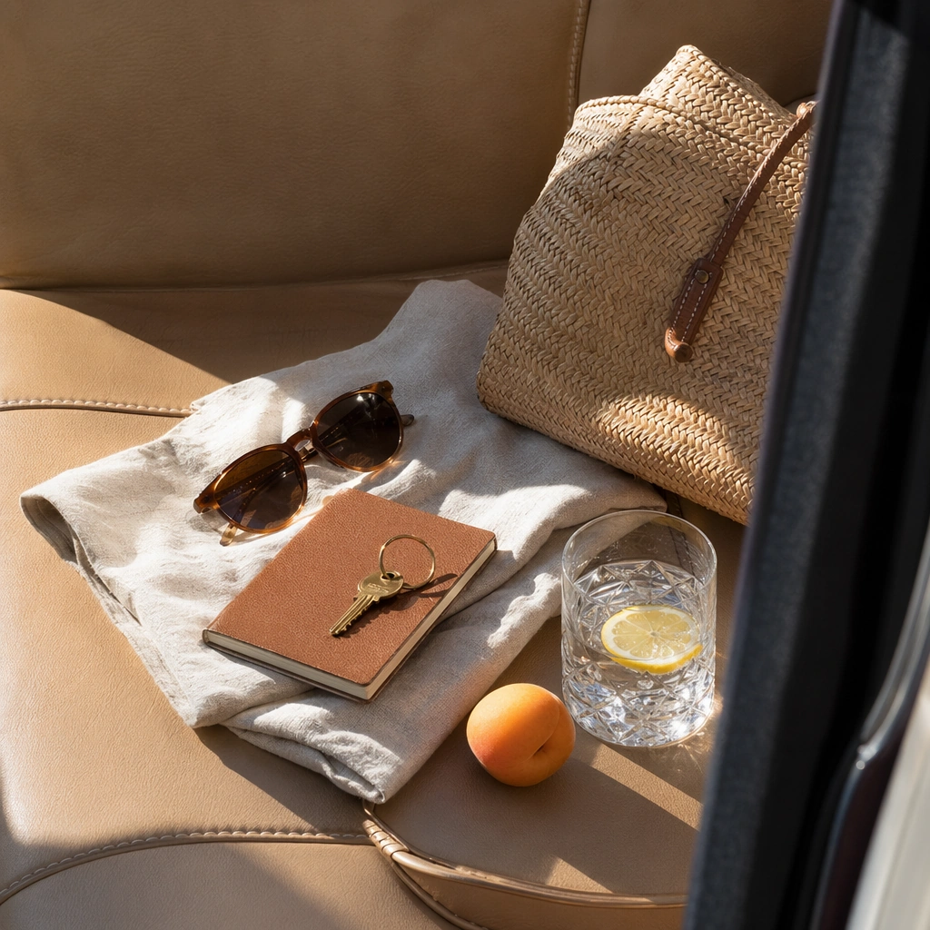
Example generated from “Summer Escape Brand Campaign Set — Travel Detail Seat Study”
GPT Image 2en

Scene: Create a square close travel-detail image with bright side light, shallow but believable depth, and a premium editorial crop. The setting can be a car, lounge seat, or transit-adjacent resting place, but it should remain airy and summery. Keep the composition focused on tactile travel pleasure rather than on crowded narrative. Subject: Focus on a seat edge, bag, folded linen, sunglasses-like form, drink or fruit cue, and one or two travel objects arranged into a concise premium summer story. The subject should communicate readiness, comfort, and movement through texture and placement. Make the details feel plausible and brand-neutral. Important details: Leather, woven fibers, linen, glass, and sunlit shadow edges should all feel precise. The image should serve as a support crop for travel, fashion, or hospitality summer campaigns. Avoid generic airport imagery and avoid overloading the frame with props. Tactile luxury and warm-season mobility are the main signals. Keep the frame precise enough for gallery, research, and campaign reuse, with believable materials and a strong thumbnail read. Use case: Summer Escape single study 9/9. Constraints: No readable text, no watermark, no logos, preserve exact 1:1 aspect ratio, no readable baggage tags, no brand logos, no crowd, no passport text, no airport signage, no messy clutter, no tropical cliché props, no hard flash aesthetic.

Example generated from “Super Deformed Trailer Cover — Reference Key Art”
GPT Image 2en

Scene: A square entertainment marketing key visual for Super-Deformed Trailer Cover, designed like a polished campaign asset ready for posters, covers, feeds, or street placement. The composition should have immediate impact from a distance while still carrying layered detail up close. Keep the lighting dramatic, the hierarchy bold, and the framing tight enough to feel like real promotional art instead of a casual illustration. Subject: Center the piece on Reference Key Art, a frame that locks the cast hierarchy, focal rhythm, and signature sales composition for the series. Translate Create high-click trailer covers and promo posters using exaggerated super-deformed character styling, strong expressions, and clean headline zones. into a concrete campaign image with clear protagonist hierarchy, supporting world-building cues, and unmistakable promotional intent. The viewer should understand the genre, the ensemble relationships, and the commercial purpose at a glance without relying on readable text or existing brand marks. Important details: The challenge is disciplined hype. Preserve focal hierarchy, readable silhouette separation, strong foreground-background layering, and a convincing balance between character energy and structured layout. This theme studies style-transfer, structured-layout, commercial-mockup, editing-workflow through a production-ready visual system. Even if typography is unreadable, space for title blocks, badges, or platform framing should feel intentionally designed. Aim for clear hierarchy, polished craft, and immediately usable campaign logic. Use case: Super-Deformed Trailer Cover series study 1/4. Constraints: No readable text, no watermark, no logos, preserve exact 1:1 aspect ratio, no broken anatomy, no unreadable hierarchy collapse, no muddy montage, no accidental real movie logos, no random filler characters, no off-topic props.

Example generated from “Super Deformed Trailer Cover — Character Surge”
GPT Image 2en

Scene: A square entertainment marketing key visual for Super-Deformed Trailer Cover, designed like a polished campaign asset ready for posters, covers, feeds, or street placement. The composition should have immediate impact from a distance while still carrying layered detail up close. Keep the lighting dramatic, the hierarchy bold, and the framing tight enough to feel like real promotional art instead of a casual illustration. Subject: Center the piece on Character Surge, a frame that pushes the same poster language toward a more aggressive character-first emphasis. Translate Create high-click trailer covers and promo posters using exaggerated super-deformed character styling, strong expressions, and clean headline zones. into a concrete campaign image with clear protagonist hierarchy, supporting world-building cues, and unmistakable promotional intent. The viewer should understand the genre, the ensemble relationships, and the commercial purpose at a glance without relying on readable text or existing brand marks. Important details: The challenge is disciplined hype. Preserve focal hierarchy, readable silhouette separation, strong foreground-background layering, and a convincing balance between character energy and structured layout. This theme studies style-transfer, structured-layout, commercial-mockup, editing-workflow through a production-ready visual system. Even if typography is unreadable, space for title blocks, badges, or platform framing should feel intentionally designed. Aim for clear hierarchy, polished craft, and immediately usable campaign logic. Use case: Super-Deformed Trailer Cover series study 2/4. Constraints: No readable text, no watermark, no logos, preserve exact 1:1 aspect ratio, no broken anatomy, no unreadable hierarchy collapse, no muddy montage, no accidental real movie logos, no random filler characters, no off-topic props.

Example generated from “Super Deformed Trailer Cover — Genre Pivot”
GPT Image 2en

Scene: A square entertainment marketing key visual for Super-Deformed Trailer Cover, designed like a polished campaign asset ready for posters, covers, feeds, or street placement. The composition should have immediate impact from a distance while still carrying layered detail up close. Keep the lighting dramatic, the hierarchy bold, and the framing tight enough to feel like real promotional art instead of a casual illustration. Subject: Center the piece on Genre Pivot, a frame that keeps the hierarchy but bends color, props, and supporting scenes toward a different subgenre. Translate Create high-click trailer covers and promo posters using exaggerated super-deformed character styling, strong expressions, and clean headline zones. into a concrete campaign image with clear protagonist hierarchy, supporting world-building cues, and unmistakable promotional intent. The viewer should understand the genre, the ensemble relationships, and the commercial purpose at a glance without relying on readable text or existing brand marks. Important details: The challenge is disciplined hype. Preserve focal hierarchy, readable silhouette separation, strong foreground-background layering, and a convincing balance between character energy and structured layout. This theme studies style-transfer, structured-layout, commercial-mockup, editing-workflow through a production-ready visual system. Even if typography is unreadable, space for title blocks, badges, or platform framing should feel intentionally designed. Aim for clear hierarchy, polished craft, and immediately usable campaign logic. Use case: Super-Deformed Trailer Cover series study 3/4. Constraints: No readable text, no watermark, no logos, preserve exact 1:1 aspect ratio, no broken anatomy, no unreadable hierarchy collapse, no muddy montage, no accidental real movie logos, no random filler characters, no off-topic props.

Example generated from “Super Deformed Trailer Cover — Finale Ensemble”
GPT Image 2en

Scene: A square entertainment marketing key visual for Super-Deformed Trailer Cover, designed like a polished campaign asset ready for posters, covers, feeds, or street placement. The composition should have immediate impact from a distance while still carrying layered detail up close. Keep the lighting dramatic, the hierarchy bold, and the framing tight enough to feel like real promotional art instead of a casual illustration. Subject: Center the piece on Finale Ensemble, a frame that expands the same layout into a climax-heavy ensemble poster without losing readability. Translate Create high-click trailer covers and promo posters using exaggerated super-deformed character styling, strong expressions, and clean headline zones. into a concrete campaign image with clear protagonist hierarchy, supporting world-building cues, and unmistakable promotional intent. The viewer should understand the genre, the ensemble relationships, and the commercial purpose at a glance without relying on readable text or existing brand marks. Important details: The challenge is disciplined hype. Preserve focal hierarchy, readable silhouette separation, strong foreground-background layering, and a convincing balance between character energy and structured layout. This theme studies style-transfer, structured-layout, commercial-mockup, editing-workflow through a production-ready visual system. Even if typography is unreadable, space for title blocks, badges, or platform framing should feel intentionally designed. Aim for clear hierarchy, polished craft, and immediately usable campaign logic. Use case: Super-Deformed Trailer Cover series study 4/4. Constraints: No readable text, no watermark, no logos, preserve exact 1:1 aspect ratio, no broken anatomy, no unreadable hierarchy collapse, no muddy montage, no accidental real movie logos, no random filler characters, no off-topic props.

Example generated from “Super Deformed Trailer Cover — Teaser Card”
GPT Image 2en

Scene: A square entertainment marketing key visual for Super-Deformed Trailer Cover, designed like a polished campaign asset ready for posters, covers, feeds, or street placement. The composition should have immediate impact from a distance while still carrying layered detail up close. Keep the lighting dramatic, the hierarchy bold, and the framing tight enough to feel like real promotional art instead of a casual illustration. Subject: Center the piece on Teaser Card, a frame that a compact mystery-first promo asset built for anticipation and visual tension. Translate Create high-click trailer covers and promo posters using exaggerated super-deformed character styling, strong expressions, and clean headline zones. into a concrete campaign image with clear protagonist hierarchy, supporting world-building cues, and unmistakable promotional intent. The viewer should understand the genre, the ensemble relationships, and the commercial purpose at a glance without relying on readable text or existing brand marks. Important details: The challenge is disciplined hype. Preserve focal hierarchy, readable silhouette separation, strong foreground-background layering, and a convincing balance between character energy and structured layout. This theme studies style-transfer, structured-layout, commercial-mockup, editing-workflow through a production-ready visual system. Even if typography is unreadable, space for title blocks, badges, or platform framing should feel intentionally designed. Aim for clear hierarchy, polished craft, and immediately usable campaign logic. Use case: Super-Deformed Trailer Cover single study 1/5. Constraints: No readable text, no watermark, no logos, preserve exact 1:1 aspect ratio, no broken anatomy, no unreadable hierarchy collapse, no muddy montage, no accidental real movie logos, no random filler characters, no off-topic props.

Example generated from “Super Deformed Trailer Cover — Countdown Poster”
GPT Image 2en

Scene: A square entertainment marketing key visual for Super-Deformed Trailer Cover, designed like a polished campaign asset ready for posters, covers, feeds, or street placement. The composition should have immediate impact from a distance while still carrying layered detail up close. Keep the lighting dramatic, the hierarchy bold, and the framing tight enough to feel like real promotional art instead of a casual illustration. Subject: Center the piece on Countdown Poster, a frame that a countdown-ready campaign poster with bold hierarchy and tight emotional framing. Translate Create high-click trailer covers and promo posters using exaggerated super-deformed character styling, strong expressions, and clean headline zones. into a concrete campaign image with clear protagonist hierarchy, supporting world-building cues, and unmistakable promotional intent. The viewer should understand the genre, the ensemble relationships, and the commercial purpose at a glance without relying on readable text or existing brand marks. Important details: The challenge is disciplined hype. Preserve focal hierarchy, readable silhouette separation, strong foreground-background layering, and a convincing balance between character energy and structured layout. This theme studies style-transfer, structured-layout, commercial-mockup, editing-workflow through a production-ready visual system. Even if typography is unreadable, space for title blocks, badges, or platform framing should feel intentionally designed. Aim for clear hierarchy, polished craft, and immediately usable campaign logic. Use case: Super-Deformed Trailer Cover single study 2/5. Constraints: No readable text, no watermark, no logos, preserve exact 1:1 aspect ratio, no broken anatomy, no unreadable hierarchy collapse, no muddy montage, no accidental real movie logos, no random filler characters, no off-topic props.

Example generated from “Super Deformed Trailer Cover — Platform Crop Board”
GPT Image 2en

Scene: A square entertainment marketing key visual for Super-Deformed Trailer Cover, designed like a polished campaign asset ready for posters, covers, feeds, or street placement. The composition should have immediate impact from a distance while still carrying layered detail up close. Keep the lighting dramatic, the hierarchy bold, and the framing tight enough to feel like real promotional art instead of a casual illustration. Subject: Center the piece on Platform Crop Board, a frame that a preview board showing how one campaign reads across multiple crop logics. Translate Create high-click trailer covers and promo posters using exaggerated super-deformed character styling, strong expressions, and clean headline zones. into a concrete campaign image with clear protagonist hierarchy, supporting world-building cues, and unmistakable promotional intent. The viewer should understand the genre, the ensemble relationships, and the commercial purpose at a glance without relying on readable text or existing brand marks. Important details: The challenge is disciplined hype. Preserve focal hierarchy, readable silhouette separation, strong foreground-background layering, and a convincing balance between character energy and structured layout. This theme studies style-transfer, structured-layout, commercial-mockup, editing-workflow through a production-ready visual system. Even if typography is unreadable, space for title blocks, badges, or platform framing should feel intentionally designed. Aim for clear hierarchy, polished craft, and immediately usable campaign logic. Use case: Super-Deformed Trailer Cover single study 3/5. Constraints: No readable text, no watermark, no logos, preserve exact 1:1 aspect ratio, no broken anatomy, no unreadable hierarchy collapse, no muddy montage, no accidental real movie logos, no random filler characters, no off-topic props.

Example generated from “Super Deformed Trailer Cover — Merch Sell Sheet”
GPT Image 2en

Scene: A square entertainment marketing key visual for Super-Deformed Trailer Cover, designed like a polished campaign asset ready for posters, covers, feeds, or street placement. The composition should have immediate impact from a distance while still carrying layered detail up close. Keep the lighting dramatic, the hierarchy bold, and the framing tight enough to feel like real promotional art instead of a casual illustration. Subject: Center the piece on Merch Sell Sheet, a frame that a supporting sell-sheet style visual connecting the campaign to collectible or retail energy. Translate Create high-click trailer covers and promo posters using exaggerated super-deformed character styling, strong expressions, and clean headline zones. into a concrete campaign image with clear protagonist hierarchy, supporting world-building cues, and unmistakable promotional intent. The viewer should understand the genre, the ensemble relationships, and the commercial purpose at a glance without relying on readable text or existing brand marks. Important details: The challenge is disciplined hype. Preserve focal hierarchy, readable silhouette separation, strong foreground-background layering, and a convincing balance between character energy and structured layout. This theme studies style-transfer, structured-layout, commercial-mockup, editing-workflow through a production-ready visual system. Even if typography is unreadable, space for title blocks, badges, or platform framing should feel intentionally designed. Aim for clear hierarchy, polished craft, and immediately usable campaign logic. Use case: Super-Deformed Trailer Cover single study 5/5. Constraints: No readable text, no watermark, no logos, preserve exact 1:1 aspect ratio, no broken anatomy, no unreadable hierarchy collapse, no muddy montage, no accidental real movie logos, no random filler characters, no off-topic props.

Example generated from “Supercell Plains Storm — Main Panorama”
GPT Image 2en

Scene: Create a square, photoreal landscape study of supercell plains storm. Compose it as the clearest monument-scale establishing view, using a wide, level camera position with deep atmospheric recession and a calm, authoritative horizon. Let broad, sculpting natural light describe the major masses before it picks out the smaller details Keep the frame cinematic but disciplined, with a clear foreground, middle distance, and far mass so the viewer can measure real depth. The image should feel like a field photograph made with patience, precision, and sublime restraint rather than a fantasy matte painting. Subject: Show a rotating supercell thunderstorm over open plains, with a visible mesocyclone, green-tinted lower sky, golden wheat fields, and one isolated farmhouse with a lit porch. This variation should emphasize hero panorama. The main landform must dominate the composition, but secondary elements should quietly explain how the place works: water paths, sediment lines, snow bands, surf, ash, wind streaks, stars, or human traces where appropriate. Everything in the image should support the same idea of scale and climate, so the scene reads as one coherent environment rather than a stack of spectacular details. Important details: Preserve storm-scale cloud rotation, believable shelf and inflow structure, tension between calm land and violent sky, and clear atmospheric depth across miles of open country. Keep one dominant landform, one secondary supporting rhythm, and a restrained scale witness so the scene reads immediately. Keep geology, weather, and atmosphere physically believable. Use subtle micro-texture, tonal separation, and air perspective to reinforce distance. If a human, vehicle, tent, caravan, bird, or boat appears, it must remain tiny and subordinate to the landscape, functioning only as a scale witness. The composition should feel original, severe, and elegant, with no decorative filler and no imitation of any copyrighted visual property. Use case: Supercell Plains Storm single study 1/9, exploring the hero panorama variation. Constraints: No readable text, no watermark, no logos, preserve exact 1:1 aspect ratio, no tornado touching down unless implied at a great distance, no apocalyptic debris, no city skyline, no lightning overload, no split-screen layout, no collage fragments, no exaggerated fisheye distortion, no kitsch color grading, no artificial border, no split-panel treatment.

Example generated from “Supercell Plains Storm — Foreground Path”
GPT Image 2en

Scene: Create a square, photoreal landscape study of supercell plains storm. Compose it as a ground-level entry path that pulls the viewer into the terrain, using a lower vantage with a strong foreground element such as a ridge line, shoreline, stream, boot track, or wet surface leading inward. Let the foreground remain tactile and detailed while the distance opens gradually Keep the frame cinematic but disciplined, with a clear foreground, middle distance, and far mass so the viewer can measure real depth. The image should feel like a field photograph made with patience, precision, and sublime restraint rather than a fantasy matte painting. Subject: Show a rotating supercell thunderstorm over open plains, with a visible mesocyclone, green-tinted lower sky, golden wheat fields, and one isolated farmhouse with a lit porch. This variation should emphasize foreground-led composition. The main landform must dominate the composition, but secondary elements should quietly explain how the place works: water paths, sediment lines, snow bands, surf, ash, wind streaks, stars, or human traces where appropriate. Everything in the image should support the same idea of scale and climate, so the scene reads as one coherent environment rather than a stack of spectacular details. Important details: Preserve storm-scale cloud rotation, believable shelf and inflow structure, tension between calm land and violent sky, and clear atmospheric depth across miles of open country. The image should reward close looking through layered depth cues rather than pure spectacle alone. Keep geology, weather, and atmosphere physically believable. Use subtle micro-texture, tonal separation, and air perspective to reinforce distance. If a human, vehicle, tent, caravan, bird, or boat appears, it must remain tiny and subordinate to the landscape, functioning only as a scale witness. The composition should feel original, severe, and elegant, with no decorative filler and no imitation of any copyrighted visual property. Use case: Supercell Plains Storm single study 2/9, exploring the foreground-led composition variation. Constraints: No readable text, no watermark, no logos, preserve exact 1:1 aspect ratio, no tornado touching down unless implied at a great distance, no apocalyptic debris, no city skyline, no lightning overload, no blocked foreground, no random props, no awkward dead zone in the lower third, no kitsch color grading, no artificial border, no split-panel treatment.

Example generated from “Supercell Plains Storm — Aerial Geometry”
GPT Image 2en

Scene: Create a square, photoreal landscape study of supercell plains storm. Compose it as the planform geometry and overall shape logic of the landscape, using an elevated oblique aerial view that still preserves believable scale and natural topography. Let light reveal contour, fracture, and pattern instead of flattening the terrain Keep the frame cinematic but disciplined, with a clear foreground, middle distance, and far mass so the viewer can measure real depth. The image should feel like a field photograph made with patience, precision, and sublime restraint rather than a fantasy matte painting. Subject: Show a rotating supercell thunderstorm over open plains, with a visible mesocyclone, green-tinted lower sky, golden wheat fields, and one isolated farmhouse with a lit porch. This variation should emphasize aerial scale read. The main landform must dominate the composition, but secondary elements should quietly explain how the place works: water paths, sediment lines, snow bands, surf, ash, wind streaks, stars, or human traces where appropriate. Everything in the image should support the same idea of scale and climate, so the scene reads as one coherent environment rather than a stack of spectacular details. Important details: Preserve storm-scale cloud rotation, believable shelf and inflow structure, tension between calm land and violent sky, and clear atmospheric depth across miles of open country. Emphasize rhythm, repetition, and large-form geometry without losing physical realism. Keep geology, weather, and atmosphere physically believable. Use subtle micro-texture, tonal separation, and air perspective to reinforce distance. If a human, vehicle, tent, caravan, bird, or boat appears, it must remain tiny and subordinate to the landscape, functioning only as a scale witness. The composition should feel original, severe, and elegant, with no decorative filler and no imitation of any copyrighted visual property. Use case: Supercell Plains Storm single study 3/9, exploring the aerial scale read variation. Constraints: No readable text, no watermark, no logos, preserve exact 1:1 aspect ratio, no tornado touching down unless implied at a great distance, no apocalyptic debris, no city skyline, no lightning overload, no map labels, no diagram arrows, no satellite-interface graphics, no kitsch color grading, no artificial border, no split-panel treatment.

Example generated from “Supercell Plains Storm — Atmosphere Event”
GPT Image 2en

Scene: Create a square, photoreal landscape study of supercell plains storm. Compose it as the moment when weather, particles, or moving air become the main dramatic agent, using a stable documentary framing that lets the environmental event stay legible. Let the air itself carry visible density through haze, spray, ash, dust, snow, or storm structure Keep the frame cinematic but disciplined, with a clear foreground, middle distance, and far mass so the viewer can measure real depth. The image should feel like a field photograph made with patience, precision, and sublime restraint rather than a fantasy matte painting. Subject: Show a rotating supercell thunderstorm over open plains, with a visible mesocyclone, green-tinted lower sky, golden wheat fields, and one isolated farmhouse with a lit porch. This variation should emphasize weather-driven study. The main landform must dominate the composition, but secondary elements should quietly explain how the place works: water paths, sediment lines, snow bands, surf, ash, wind streaks, stars, or human traces where appropriate. Everything in the image should support the same idea of scale and climate, so the scene reads as one coherent environment rather than a stack of spectacular details. Important details: Preserve storm-scale cloud rotation, believable shelf and inflow structure, tension between calm land and violent sky, and clear atmospheric depth across miles of open country. The atmosphere must feel physically plausible and tied to terrain, wind direction, temperature, and moisture. Keep geology, weather, and atmosphere physically believable. Use subtle micro-texture, tonal separation, and air perspective to reinforce distance. If a human, vehicle, tent, caravan, bird, or boat appears, it must remain tiny and subordinate to the landscape, functioning only as a scale witness. The composition should feel original, severe, and elegant, with no decorative filler and no imitation of any copyrighted visual property. Use case: Supercell Plains Storm single study 4/9, exploring the weather-driven study variation. Constraints: No readable text, no watermark, no logos, preserve exact 1:1 aspect ratio, no tornado touching down unless implied at a great distance, no apocalyptic debris, no city skyline, no lightning overload, no disaster-movie excess, no impossible lightning clutter, no synthetic smoke plumes, no kitsch color grading, no artificial border, no split-panel treatment.

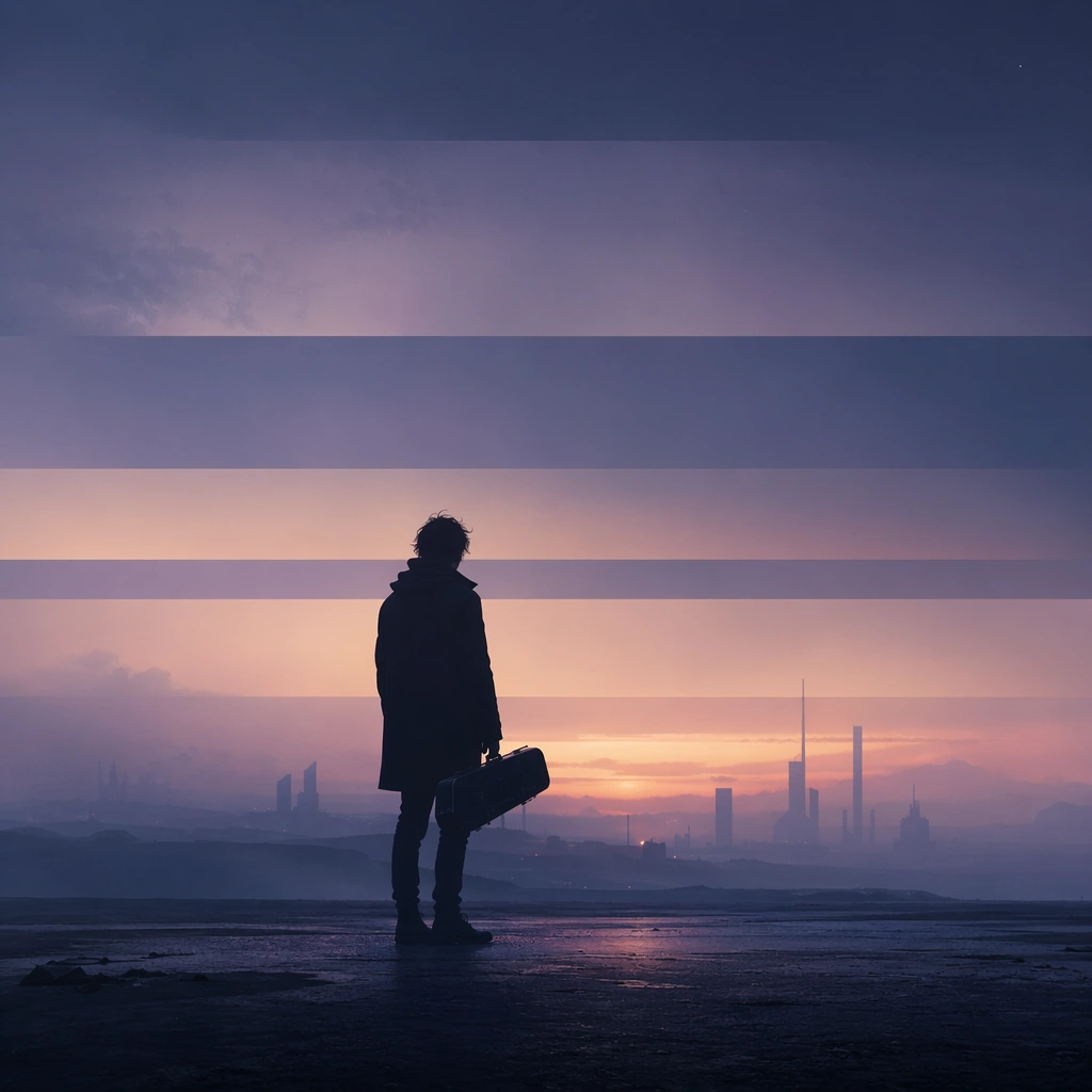
Example generated from “Supercell Plains Storm — Light Contrast”
GPT Image 2en

Scene: Create a square, photoreal landscape study of supercell plains storm. Compose it as directional light carving sharp separation between illuminated and shadowed forms, using a composition built around light falloff, shadow shape, and reflective control rather than camera gimmicks. Let one strong light source create crisp hierarchy and believable color temperature shifts Keep the frame cinematic but disciplined, with a clear foreground, middle distance, and far mass so the viewer can measure real depth. The image should feel like a field photograph made with patience, precision, and sublime restraint rather than a fantasy matte painting. Subject: Show a rotating supercell thunderstorm over open plains, with a visible mesocyclone, green-tinted lower sky, golden wheat fields, and one isolated farmhouse with a lit porch. This variation should emphasize light-structure study. The main landform must dominate the composition, but secondary elements should quietly explain how the place works: water paths, sediment lines, snow bands, surf, ash, wind streaks, stars, or human traces where appropriate. Everything in the image should support the same idea of scale and climate, so the scene reads as one coherent environment rather than a stack of spectacular details. Important details: Preserve storm-scale cloud rotation, believable shelf and inflow structure, tension between calm land and violent sky, and clear atmospheric depth across miles of open country. Surface brightness, shadow depth, and reflected light should all agree with the material and weather conditions. Keep geology, weather, and atmosphere physically believable. Use subtle micro-texture, tonal separation, and air perspective to reinforce distance. If a human, vehicle, tent, caravan, bird, or boat appears, it must remain tiny and subordinate to the landscape, functioning only as a scale witness. The composition should feel original, severe, and elegant, with no decorative filler and no imitation of any copyrighted visual property. Use case: Supercell Plains Storm single study 5/9, exploring the light-structure study variation. Constraints: No readable text, no watermark, no logos, preserve exact 1:1 aspect ratio, no tornado touching down unless implied at a great distance, no apocalyptic debris, no city skyline, no lightning overload, no blown highlights, no muddy blacks, no theatrical stage lighting, no kitsch color grading, no artificial border, no split-panel treatment.