원본 문서
GPT Image 2 · en
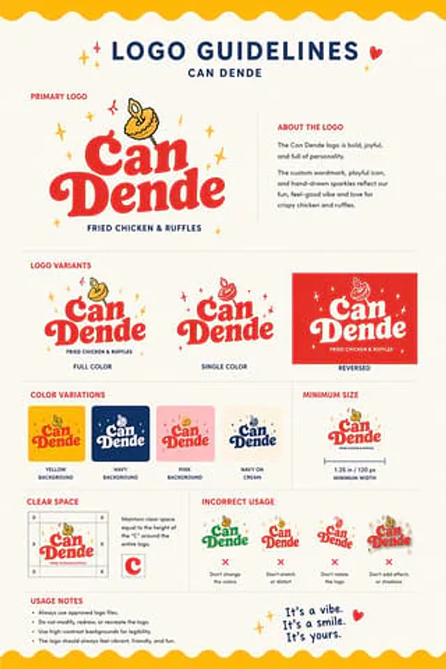
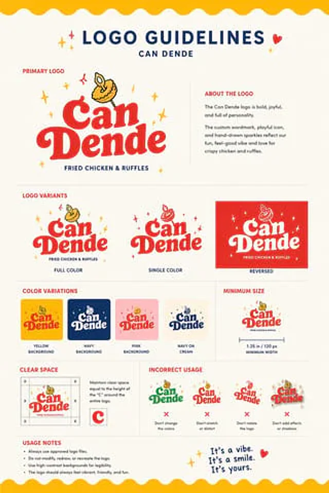
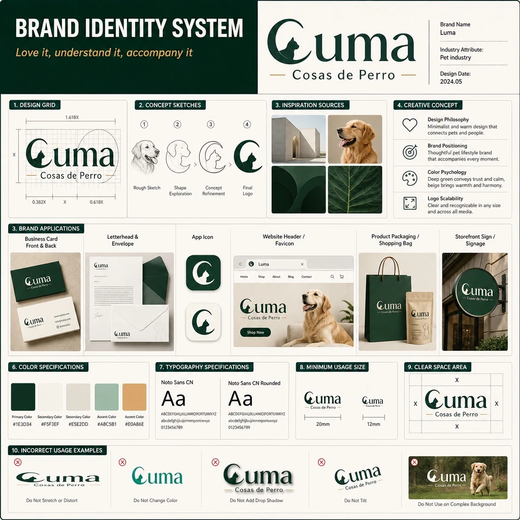
Design a brand identity system presentation board (UI poster style, realistic render), similar to a professional brand guideline deck used for client presentations.

Header: title text 'BRAND IDENTITY SYSTEM', with slogan text '[SLOGAN]' displayed beneath it.

Main logo section: primary logotype text '[BRAND_NAME]' with subtitle '[BRAND_CHINESE_NAME]', design feature described as [MAIN_SUBJECT]. Metadata labels beside the logo read: 'Brand Name', 'Industry Attribute: [INDUSTRY]', and 'Design Date: 2024.05'.

Layout sections arranged in a structured grid:
1. Design Grid (1 item): the logo displayed with architectural grid lines and golden ratio measurement guides.
2. Concept Sketches (4 items): evolution steps showing progression from a rough dog sketch to the final geometric logo.
3. Inspiration Sources (4 items): a moodboard with images including minimalist architecture, a golden retriever dog, and dark green geometric shapes.
4. Creative Concept (4 items): text blocks paired with minimalist icons explaining the design philosophy, brand positioning, color psychology, and logo scalability.
5. Brand Applications (6 items) labeled: 'Business Card Front & Back', 'Letterhead & Envelope', 'App Icon', 'Website Header / Favicon', 'Product Packaging / Shopping Bag', and 'Storefront Sign / Signage'. Mockups show business cards, envelopes, app icons, a website header featuring a dog, paper shopping bags, and a storefront sign.
6. Color Specifications (5 swatches) labeled 'Primary Color', 'Secondary Color', 'Accent Color', with color values: [PRIMARY_COLOR], #F5F3EF, #E5E2DD, #A8C5B1, #E0A86E.
7. Typography Specifications (2 samples) labeled '[FONT_NAME_1]' and '[FONT_NAME_2]', showing typography specimens with 'Aa', the full alphabet, and numerals.
8. Minimum Usage Size (2 items): minimum logo size specifications shown at 20mm and 12mm.
9. Clear Space Area (1 item): the logo surrounded by a bounding box with 'X' markers indicating required clear space margins.
10. Incorrect Usage Examples (5 items) labeled: 'Do Not Stretch or Distort', 'Do Not Change Color', 'Do Not Add Drop Shadow', 'Do Not Tilt', and 'Do Not Use on Complex Background'. Show examples of incorrect logo usage: stretched, wrong color, with a drop shadow, tilted, and placed over a busy photographic background.

Overall style: clean, professional grid layout typical of a modern brand guideline board, realistic UI poster rendering with balanced whitespace and consistent typographic hierarchy.
사용 방법
- 매개변수를 포함한 전체 원본 프롬프트를 복사하세요.
- 주제, 문구, 구도를 자신의 요구에 맞게 바꾸세요.
- 호환되는 외부 도구에서 사용하고 이용 조건과 결과를 확인하세요.
시작 전 확인
- 참조 이미지가 필요한지 확인하세요. 호환 표시는 해당 모델로 이 예시를 생성했다는 뜻이 아닙니다.
- 이름, 수치, 이미지 속 문구를 확인하세요. 모델 버전에 따라 결과가 다를 수 있습니다.