Original document
GPT Image 2 · en
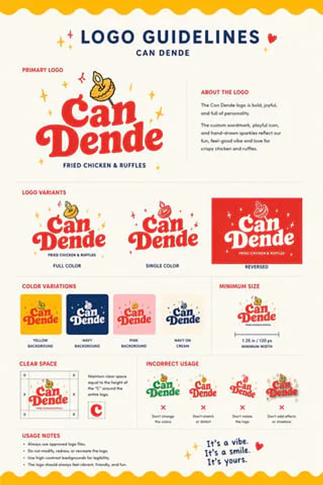
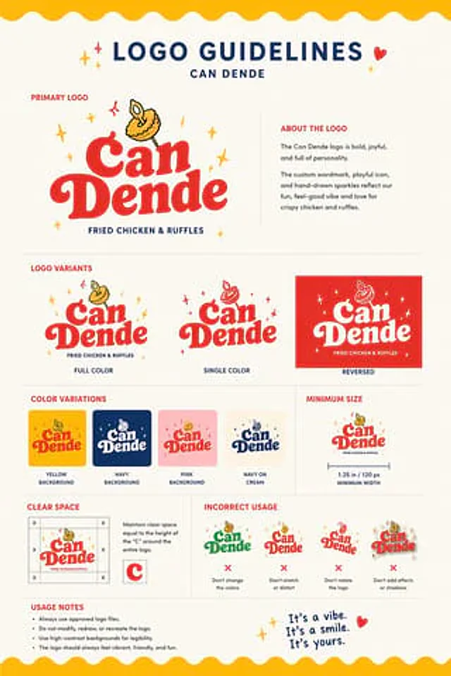
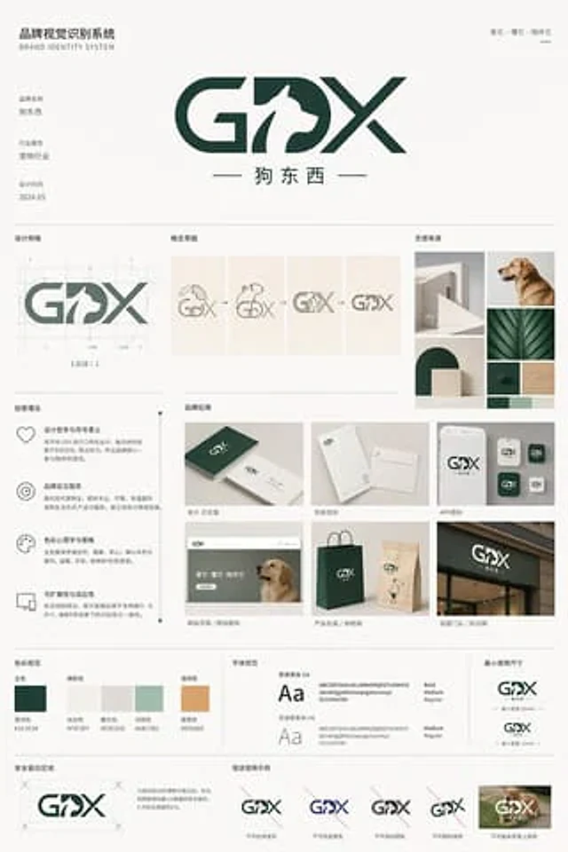
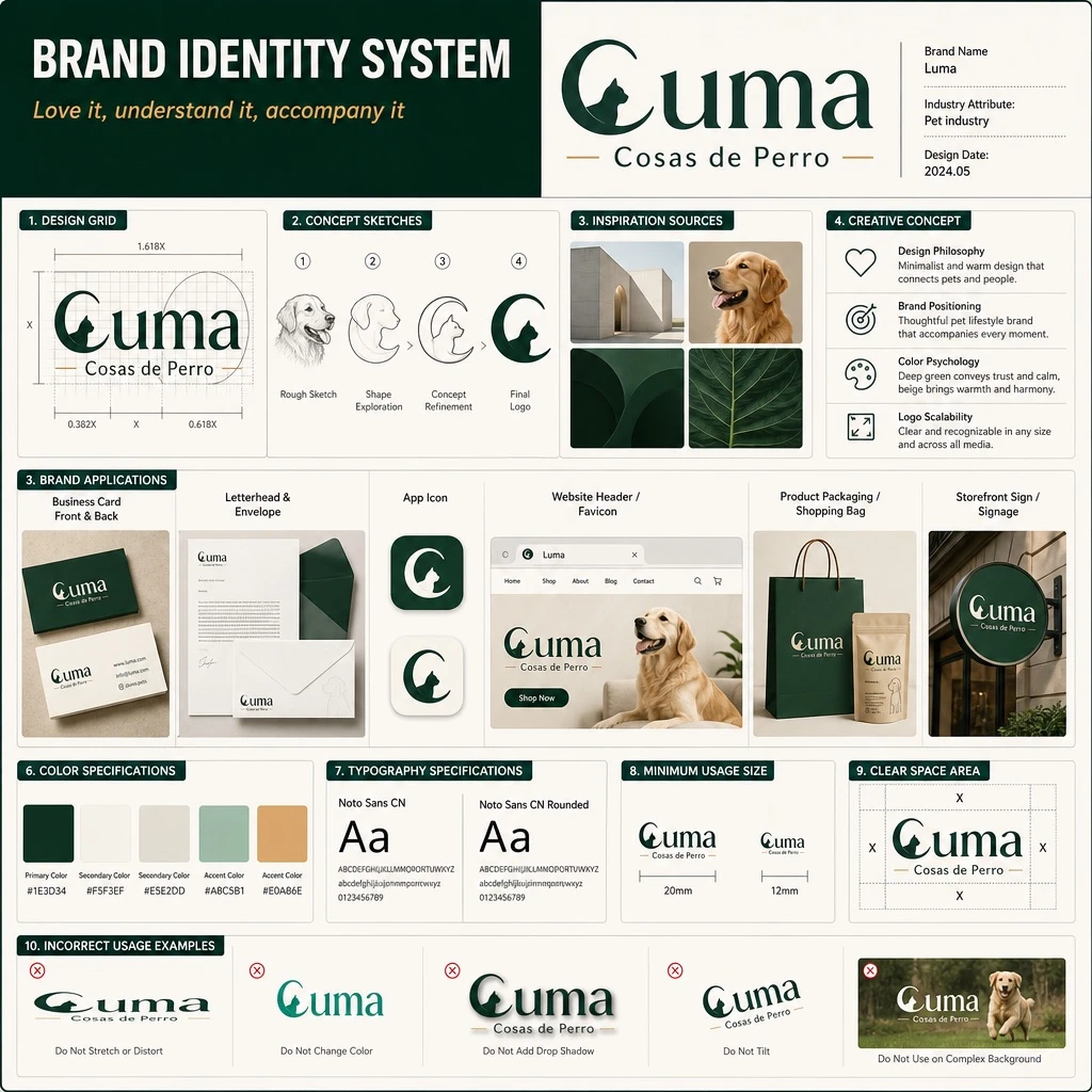
Design a brand identity system presentation board (UI poster style, realistic render), similar to a professional brand guideline deck used for client presentations.

Header: title text 'BRAND IDENTITY SYSTEM', with slogan text '[SLOGAN]' displayed beneath it.

Main logo section: primary logotype text '[BRAND_NAME]' with subtitle '[BRAND_CHINESE_NAME]', design feature described as [MAIN_SUBJECT]. Metadata labels beside the logo read: 'Brand Name', 'Industry Attribute: [INDUSTRY]', and 'Design Date: 2024.05'.

Layout sections arranged in a structured grid:
1. Design Grid (1 item): the logo displayed with architectural grid lines and golden ratio measurement guides.
2. Concept Sketches (4 items): evolution steps showing progression from a rough dog sketch to the final geometric logo.
3. Inspiration Sources (4 items): a moodboard with images including minimalist architecture, a golden retriever dog, and dark green geometric shapes.
4. Creative Concept (4 items): text blocks paired with minimalist icons explaining the design philosophy, brand positioning, color psychology, and logo scalability.
5. Brand Applications (6 items) labeled: 'Business Card Front & Back', 'Letterhead & Envelope', 'App Icon', 'Website Header / Favicon', 'Product Packaging / Shopping Bag', and 'Storefront Sign / Signage'. Mockups show business cards, envelopes, app icons, a website header featuring a dog, paper shopping bags, and a storefront sign.
6. Color Specifications (5 swatches) labeled 'Primary Color', 'Secondary Color', 'Accent Color', with color values: [PRIMARY_COLOR], #F5F3EF, #E5E2DD, #A8C5B1, #E0A86E.
7. Typography Specifications (2 samples) labeled '[FONT_NAME_1]' and '[FONT_NAME_2]', showing typography specimens with 'Aa', the full alphabet, and numerals.
8. Minimum Usage Size (2 items): minimum logo size specifications shown at 20mm and 12mm.
9. Clear Space Area (1 item): the logo surrounded by a bounding box with 'X' markers indicating required clear space margins.
10. Incorrect Usage Examples (5 items) labeled: 'Do Not Stretch or Distort', 'Do Not Change Color', 'Do Not Add Drop Shadow', 'Do Not Tilt', and 'Do Not Use on Complex Background'. Show examples of incorrect logo usage: stretched, wrong color, with a drop shadow, tilted, and placed over a busy photographic background.

Overall style: clean, professional grid layout typical of a modern brand guideline board, realistic UI poster rendering with balanced whitespace and consistent typographic hierarchy.
How to use
- Copy the complete original prompt, including any parameters.
- Replace the subject, text and composition with your own requirements.
- Use a compatible external tool; check its current access conditions and review the result.
Before you start
- Check whether a reference image is required. A compatible model label does not mean this example was generated with that model.
- Keep names, figures and visible text accurate; results can vary between model versions.