원본 문서
GPT Image 2 · en
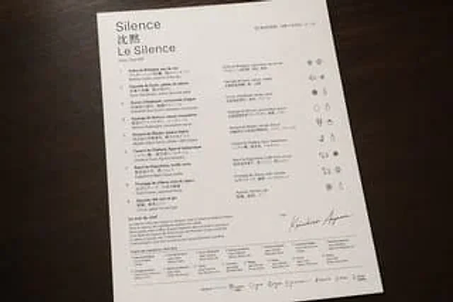
A realistic, overhead photograph showcases a luxurious tasting menu printed on glossy white textured paper, placed on a dark walnut wood table, bathed in soft, warm ambient light and natural shadows. The menu, positioned vertically and slightly rotated clockwise, occupies most of the image, with clean margins around the edges. The design embodies a minimalist high-end dining style, featuring elegant typography, ample white space, precise alignment, and sophisticated black and gray tones. The restaurant logo is located in the upper left corner, arranged in three stacked lines: one line in large serif font.{argument name="restaurant name" default="Silence"} Below the title are two Chinese characters for "silence," followed by a line of large serif French text reading "Le Silence." Below the title is a line of smaller text displaying the address "Ginza, Tokyo B3F." The upper right corner shows a line of French date text, followed by Japanese date text.{argument name="date text" default="April 22, 2026 (Reiwa 8)"} The main content is divided into three vertical sections: a numbered list of dishes on the left, a translated list of dishes in the middle, and an icon column on the far right. The left-hand list contains nine numbered dishes, from 1 to 9. Each dish has a French title, a Japanese subtitle, and an English description of the ingredients below. The nine visible dish titles are: "Huître de Bretagne, eau de mer", "Daurade de Kyoto, pétale de sakura", "Oursin d'Hokkaidō, consommé d'algue", "Asperge de Nemuro, sauce mousseline", "Homard de Miyako, bisque légère", "Canard de Challans, figue et balsamique", "Boeuf de Kagoshima, truffe noire", "Fromage de chèvre, miel du Japon", and "Agrume, thé vert et gin". The middle list repeats these nine dishes in a second compact column, including French titles and Japanese descriptions. The rightmost column contains nine rows of horizontal icons aligned with the dishes, each displaying a small, monochrome hand-drawn pictogram of an ingredient or allergen; some rows have two icons, some have three, for a total of 19 icons. Near the bottom left is an area titled "Le mot du chef" (The mot of chef), followed by a short French text in small serif font. Below that is an area titled "Origine des ingrédients" (Origin of Ingredients), containing a two-line grid of ingredient origins, listing 15 numbered origin entries in extremely small text. In the bottom right quadrant is a small "Chef" label, above which is a large, flowing handwritten signature.{argument name="chef name" default="Keiichiro Aoyama"} The bottom edge features a thin horizontal line and a centered allergen information line containing seven small outline icons and labels: shellfish, crustaceans, eggs, fish, dairy, gluten, and sulfites. Each label is in French, with Japanese text below. The overall design evokes a high-end Michelin-style menu, showcasing restrained editing, perfect spacing, delicate paper texture, clear and legible text hierarchy, and a realistic photographic quality rather than a flat scan.사용 방법
- 매개변수를 포함한 전체 원본 프롬프트를 복사하세요.
- 주제, 문구, 구도를 자신의 요구에 맞게 바꾸세요.
- 호환되는 외부 도구에서 사용하고 이용 조건과 결과를 확인하세요.
시작 전 확인
- 참조 이미지가 필요한지 확인하세요. 호환 표시는 해당 모델로 이 예시를 생성했다는 뜻이 아닙니다.
- 이름, 수치, 이미지 속 문구를 확인하세요. 모델 버전에 따라 결과가 다를 수 있습니다.