원본 문서
GPT Image 2 · en
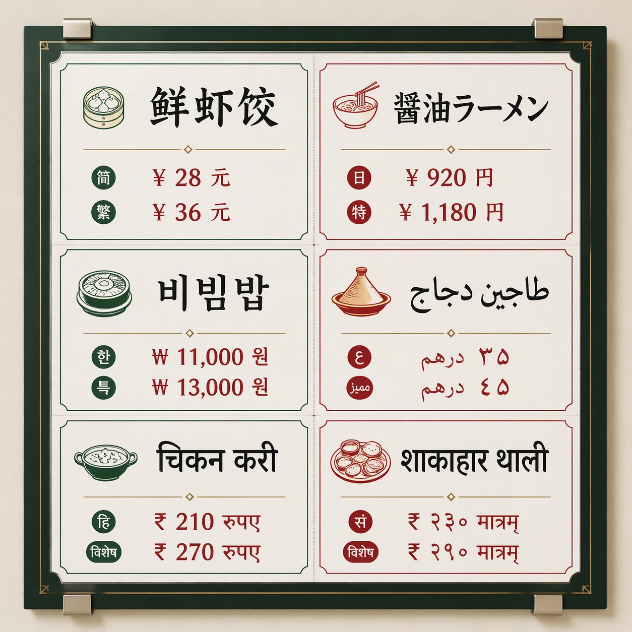
Scene:
A square front-facing commercial poster photographed as a clean wall-mounted menu board inside a bright international food hall. Use crisp studio lighting, a neutral off-white wall, subtle metal clips, and a disciplined grid with generous margins. The color palette should mix charcoal ink, warm tomato red, jade green, and small brass dividers, with enough contrast for every script block to be readable.

Subject:
A multilingual market menu titled by visual hierarchy rather than brand identity: six equal menu panels arranged in two columns and three rows. Each panel contains one large dish name and two short price-like glyph groups rendered in a different writing system: simplified Chinese, Japanese kana/kanji, Korean hangul, Arabic, Devanagari Hindi, and Sanskrit-style Devanagari. Keep the panels visually parallel so the viewer can compare script density, baseline rhythm, and spacing.

Important details:
The core test is non-Latin text rendering inside a strict commercial layout. Letterforms must be clean, separated by script family, aligned to their own baselines, and not melt into decorative marks. Use real-looking menu typography with consistent padding, thin rules, small food icons, and clear typographic hierarchy. Avoid fake brand marks; make the poster feel usable as a food hall production proof.

Use case:
Multi-Script Poster single study 1/8, testing a dense six-language menu board with readable script blocks and stable grid alignment.

Constraints:
No readable text outside the specified multilingual menu copy, no watermark, no logos, preserve exact 1:1 aspect ratio, no Latin fallback labels, no random extra characters, no mirrored scripts, no misshapen baselines, no smeared letter clusters, no fake QR codes.
사용 방법
- 매개변수를 포함한 전체 원본 프롬프트를 복사하세요.
- 주제, 문구, 구도를 자신의 요구에 맞게 바꾸세요.
- 호환되는 외부 도구에서 사용하고 이용 조건과 결과를 확인하세요.
시작 전 확인
- 참조 이미지가 필요한지 확인하세요. 호환 표시는 해당 모델로 이 예시를 생성했다는 뜻이 아닙니다.
- 이름, 수치, 이미지 속 문구를 확인하세요. 모델 버전에 따라 결과가 다를 수 있습니다.