시각적 설명

단계, 라벨, 관계를 어떻게 구성하는지 살펴보세요. 확인된 사실을 제공하고 결과의 라벨을 모두 검토하세요.

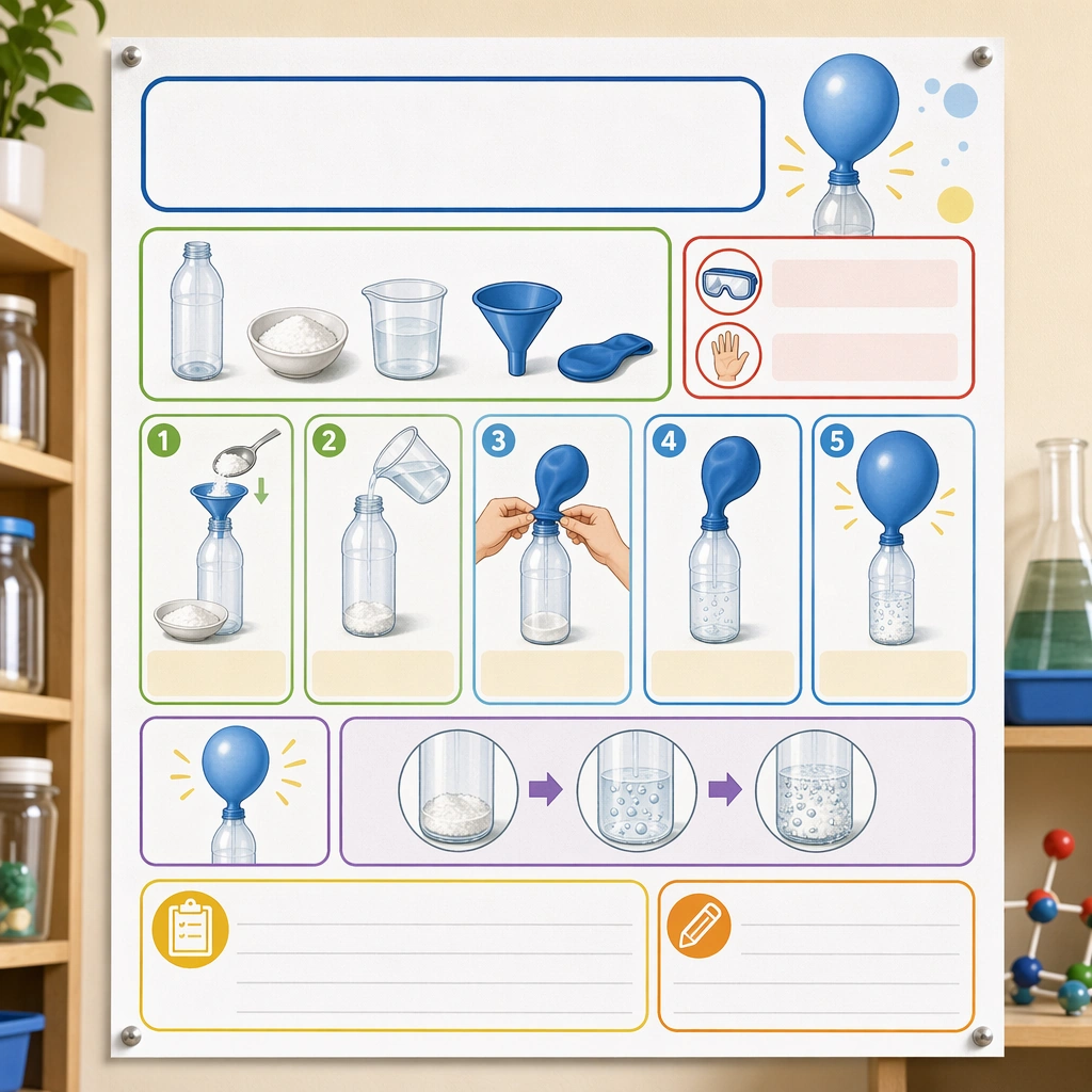
Science Kids Experiment Poster System — Reference Experiment Poster
GPT Image 2en

Scene: Create a square straight-on poster mockup pinned on a classroom science wall, lit with bright but soft daylight. The poster should feel like a real educational deliverable, with crisp print texture, clean margins, and enough context from nearby shelves and jars to suggest a science corner without competing for attention. Keep the square frame balanced, calm, and production-ready so the asset can serve gallery review, research comparison, and real educational delivery at the same time. Subject: Design the poster around one simple classroom experiment shown through picture-led setup, step panels, safety icons, material trays, and outcome illustrations. Use a clear visual progression with generous blank title and note areas so the poster feels genuinely teachable and easy to localize later. The subject matter should feel intentionally selected for a coherent curriculum family rather than like a random decorative assortment. Important details: The system should feel safe, lively, and methodical at once: rounded modules, playful but not silly color coding, obvious sequence logic, and illustration cues that children can follow with minimal adult translation. It must read as a scalable poster template for many experiments. Preserve the same poster grid, step-panel proportions, icon weight, blank instruction bars, and safety-callout rhythm from the reference poster. Use variation only in the teaching content, supporting props, and scene-specific mood while preserving the core visual system exactly. Use case: Science Kids Experiment Poster System series study 1/4, reference experiment poster. Constraints: No readable text, no watermark, no logos, preserve exact 1:1 aspect ratio, no readable copy, no chemical formulas, no logos, no dangerous realism, no lab-brand signage, no chaotic clutter.
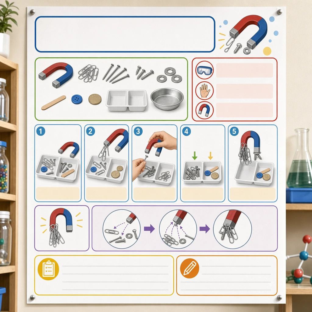
Science Kids Experiment Poster System — Magnet Exploration Board
GPT Image 2en

Scene: Render the same square straight-on poster on the classroom wall, with the same soft daylight, print realism, and supporting science-corner props held in the background. The image should read as another approved poster in the same school-ready series. Keep the square frame balanced, calm, and production-ready so the asset can serve gallery review, research comparison, and real educational delivery at the same time. Subject: Build the experiment around horseshoe magnets, metal and non-metal test objects, sorting trays, and attraction paths shown through friendly diagrams and step panels. Make the poster instantly understandable through imagery and sequence rather than text, while staying visually rich enough to feel like a real published classroom asset. The subject matter should feel intentionally selected for a coherent curriculum family rather than like a random decorative assortment. Important details: Every structural rule from the reference poster must remain intact, especially the module grid, safety cue placement, blank headline zones, and pictogram weight. Variation should come from object behavior and discovery energy, not from a new graphic system. Preserve the same poster grid, step-panel proportions, icon weight, blank instruction bars, and safety-callout rhythm from the reference poster. Use variation only in the teaching content, supporting props, and scene-specific mood while preserving the core visual system exactly. Use case: Science Kids Experiment Poster System series study 3/4, magnet exploration board. Constraints: No readable text, no watermark, no logos, preserve exact 1:1 aspect ratio, no readable copy, no chemical formulas, no logos, no dangerous realism, no lab-brand signage, no chaotic clutter.
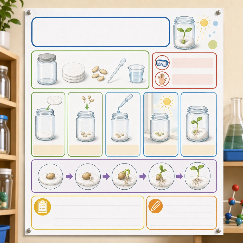
Science Kids Experiment Poster System — Seed Growth Board
GPT Image 2en

Scene: Return to the exact same square poster mockup composition and classroom wall context established by the reference poster. It should feel like a calm observational companion piece in the same STEM poster line, ready for both classroom display and curriculum packaging. Keep the square frame balanced, calm, and production-ready so the asset can serve gallery review, research comparison, and real educational delivery at the same time. Subject: Focus on a seed-in-jar or cotton-pad growth experiment with materials, daily observation steps, root and sprout stages, and comparison icons organized into the familiar poster grid. Use blank note panels and timeline-like visual slots without any actual writing. The subject matter should feel intentionally selected for a coherent curriculum family rather than like a random decorative assortment. Important details: Keep the poster architecture locked to the reference image while shifting the experiment mood toward slow observation and care. The result should prove that the template can handle high-energy reaction experiments and gentle life-science studies equally well. Preserve the same poster grid, step-panel proportions, icon weight, blank instruction bars, and safety-callout rhythm from the reference poster. Use variation only in the teaching content, supporting props, and scene-specific mood while preserving the core visual system exactly. Use case: Science Kids Experiment Poster System series study 4/4, seed growth board. Constraints: No readable text, no watermark, no logos, preserve exact 1:1 aspect ratio, no readable copy, no chemical formulas, no logos, no dangerous realism, no lab-brand signage, no chaotic clutter.
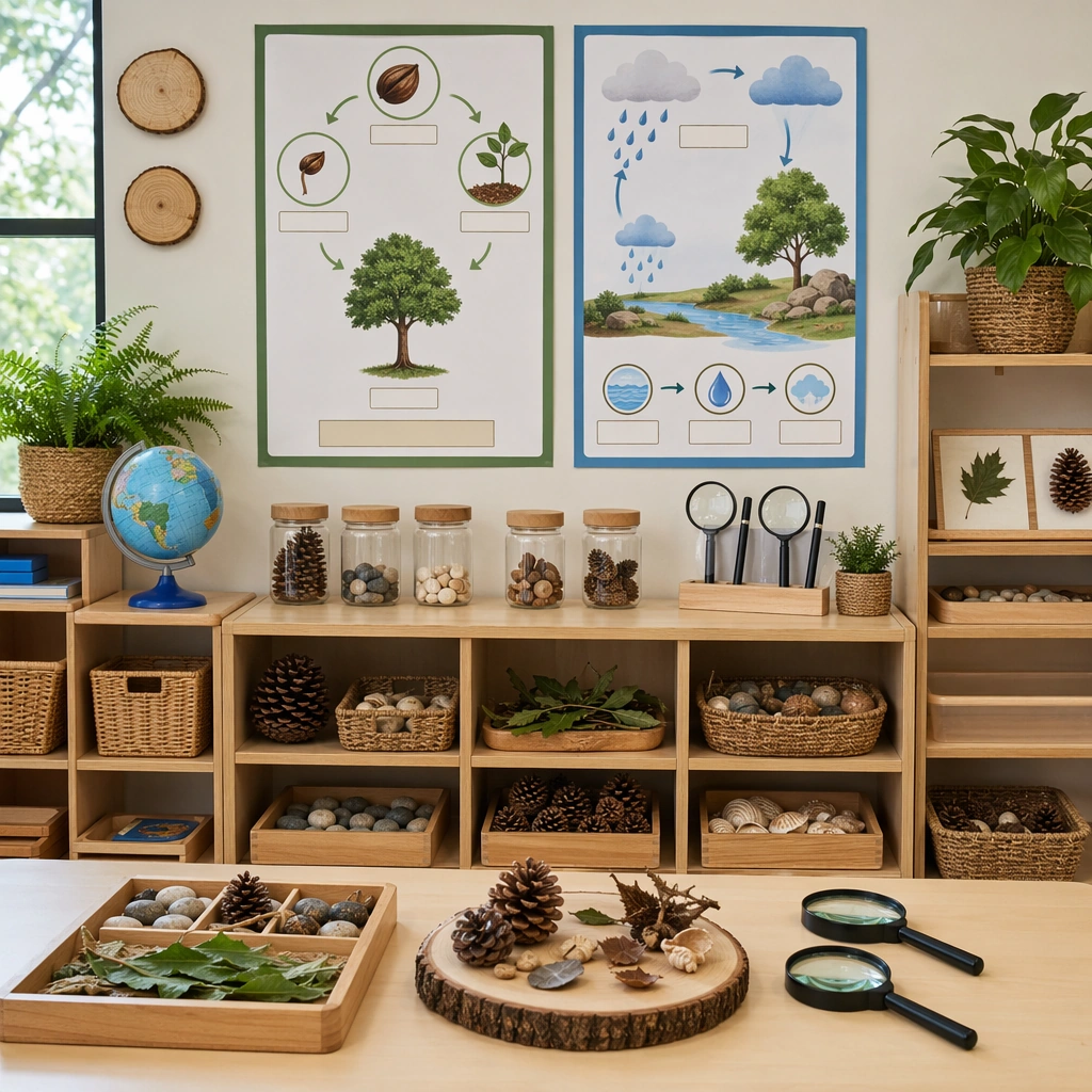
Science Kids Experiment Poster System — Science Corner Wall
GPT Image 2en

Scene: Show a square classroom science corner photographed straight-on with bright natural light, tidy shelving, and a central display wall. The scene should feel realistic for a primary classroom but still polished enough for a prospectus or teaching-resource catalog. Keep the square frame balanced, calm, and production-ready so the asset can serve gallery review, research comparison, and real educational delivery at the same time. Subject: Combine one or two experiment posters with jars, magnifiers, trays, and natural specimens arranged in a coherent educational vignette. The wall should communicate curiosity and order through image-led labels, blank tabs, and strong visual grouping rather than through written content. The subject arrangement should feel complete and self-contained, able to stand alone as a real supporting deliverable inside the same education business line. Important details: Emphasize classroom credibility and accessibility. The display should feel achievable, safe, and scalable, proving that the poster language can extend into an entire science-learning environment. Keep the visual hierarchy modular, commercially believable, and clearly tied to a real educational use case rather than a generic mood board. Use case: Science Kids Experiment Poster System single study 1/5, science corner wall. Constraints: No readable text, no watermark, no logos, preserve exact 1:1 aspect ratio, no readable text, no brand logos, no unsafe flames, no dangerous chemicals, no crowded lab realism, no cluttered props.

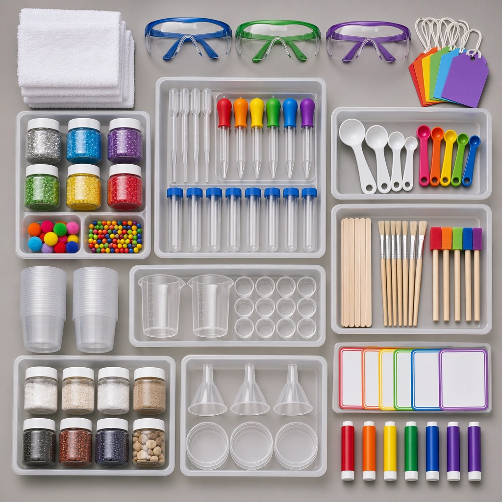
Science Kids Experiment Poster System — Safety Supply Flatlay
GPT Image 2en

Scene: Create a square overhead flatlay on a neutral lab-classroom surface with trays, goggles, droppers, jars, spoons, towels, and colorful experiment tools carefully spaced under clean studio light. The image should feel like a trustworthy school-supply bundle, not a messy science-table snapshot. Keep the square frame balanced, calm, and production-ready so the asset can serve gallery review, research comparison, and real educational delivery at the same time. Subject: Make each tool child-safe and easy to understand visually, with grouped components suggesting different experiment types and blank color-coded markers standing in for labels. The arrangement should imply readiness, organization, and repeat classroom use. The subject arrangement should feel complete and self-contained, able to stand alone as a real supporting deliverable inside the same education business line. Important details: Keep the hierarchy clear and catalog-ready. Surfaces should be clean, materials tactile, and the entire kit should feel more like an education product than a generic craft assortment. Keep the visual hierarchy modular, commercially believable, and clearly tied to a real educational use case rather than a generic mood board. Use case: Science Kids Experiment Poster System single study 2/5, safety supply flatlay. Constraints: No readable text, no watermark, no logos, preserve exact 1:1 aspect ratio, no readable text, no brand logos, no unsafe flames, no dangerous chemicals, no crowded lab realism, no cluttered props.

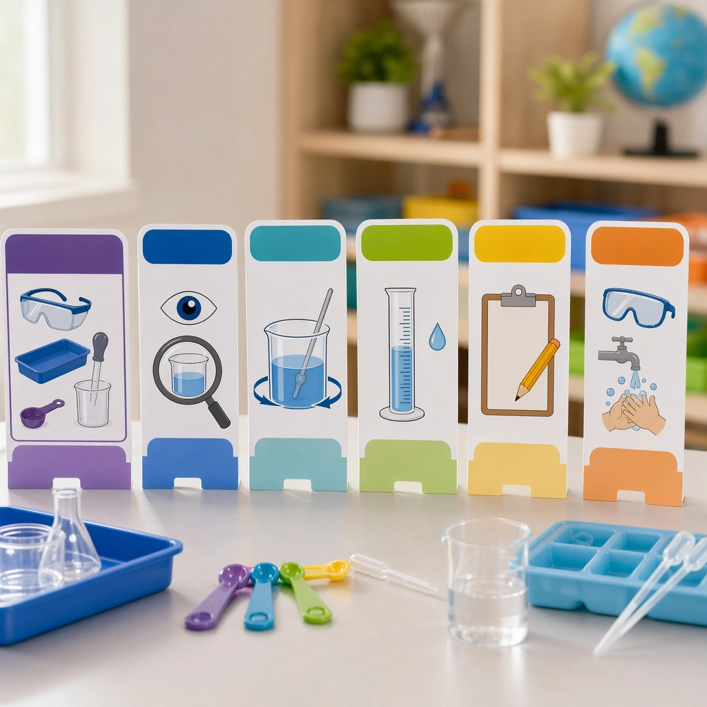
Science Kids Experiment Poster System — Step Card Standees
GPT Image 2en

Scene: Render a square tabletop scene with several upright step cards on a science table, shallow depth of field, and crisp side lighting that highlights coated card stock. The setup should feel like a product launch image for a classroom experiment accessory line. Keep the square frame balanced, calm, and production-ready so the asset can serve gallery review, research comparison, and real educational delivery at the same time. Subject: Each standee uses pictorial step cues, material icons, safety reminders, and blank heading bars, arranged so children could follow an experiment sequence visually from left to right. Add a few beakers and trays in the background, but keep the standees dominant. The subject arrangement should feel complete and self-contained, able to stand alone as a real supporting deliverable inside the same education business line. Important details: The cards should look durable, teacher-friendly, and easy to localize later. Their proportions, icon style, and color coding should suggest a broader poster system, even though this is an independent support asset. Keep the visual hierarchy modular, commercially believable, and clearly tied to a real educational use case rather than a generic mood board. Use case: Science Kids Experiment Poster System single study 3/5, step card standees. Constraints: No readable text, no watermark, no logos, preserve exact 1:1 aspect ratio, no readable text, no brand logos, no unsafe flames, no dangerous chemicals, no crowded lab realism, no cluttered props.

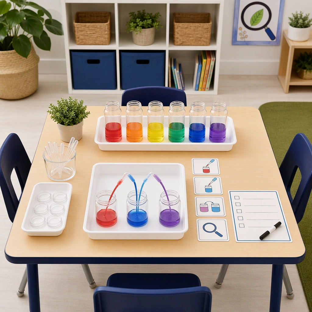
Science Kids Experiment Poster System — Tabletop Demo Setup
GPT Image 2en

Scene: Show a square classroom demo table from a slightly elevated angle, with trays, jars, pipettes, and one small experiment setup arranged under bright educational lighting. The image should feel like a practical hero visual for a school science program campaign. Keep the square frame balanced, calm, and production-ready so the asset can serve gallery review, research comparison, and real educational delivery at the same time. Subject: Use a single clear experiment station with orderly materials, picture cues, and a blank checklist card, making the setup feel both exciting and well-managed. The table should look ready for children to gather around, but still safe and intentional. The subject arrangement should feel complete and self-contained, able to stand alone as a real supporting deliverable inside the same education business line. Important details: Avoid theatrical laboratory drama. The asset should center on clarity, trust, and child-scale discovery, proving that everyday science can be marketed visually without slipping into generic stock imagery. Keep the visual hierarchy modular, commercially believable, and clearly tied to a real educational use case rather than a generic mood board. Use case: Science Kids Experiment Poster System single study 4/5, tabletop demo setup. Constraints: No readable text, no watermark, no logos, preserve exact 1:1 aspect ratio, no readable text, no brand logos, no unsafe flames, no dangerous chemicals, no crowded lab realism, no cluttered props.

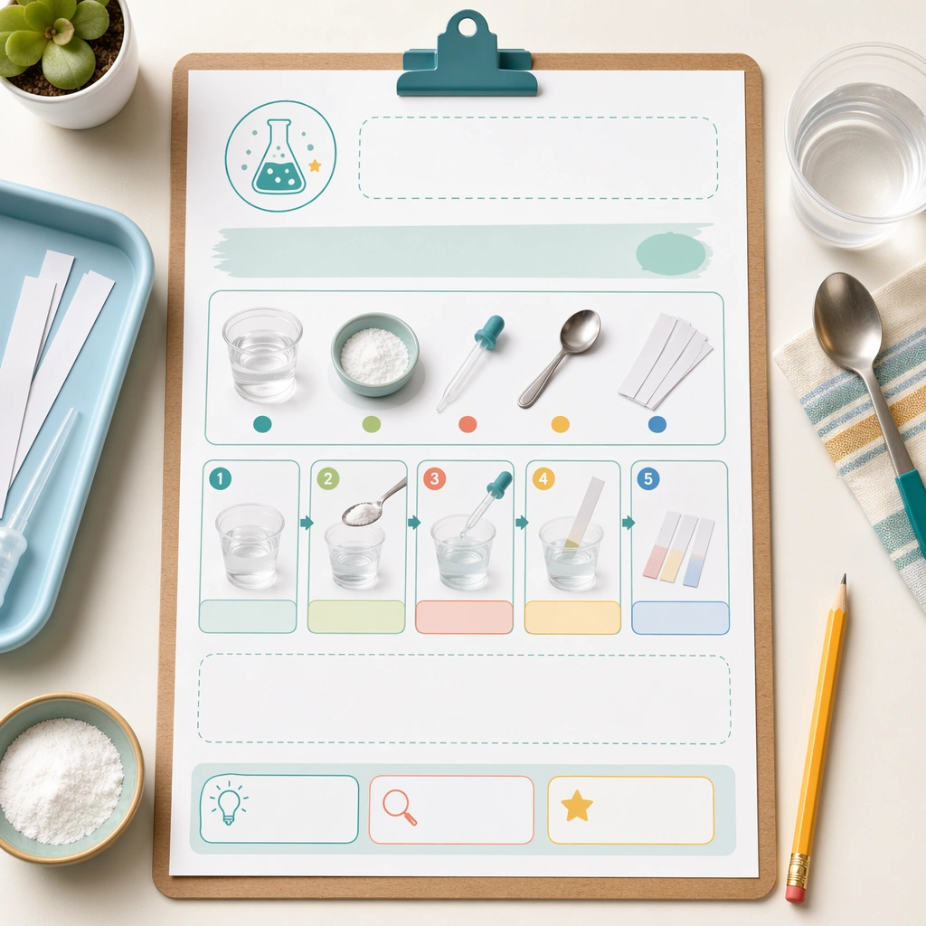
Science Kids Experiment Poster System — Family Take-Home Sheet
GPT Image 2en

Scene: Create a square editorial mockup of a family take-home sheet clipped to a board with a few experiment supplies and a pencil nearby. The composition should look like a polished parent-resource cover image from a school or after-school science program. Keep the square frame balanced, calm, and production-ready so the asset can serve gallery review, research comparison, and real educational delivery at the same time. Subject: The sheet should show a home-safe experiment sequence through pictures, material clusters, and simple progress blocks, with large blank regions where instructions could later be typeset. Everything should feel friendly enough for families and structured enough for formal programs. The subject arrangement should feel complete and self-contained, able to stand alone as a real supporting deliverable inside the same education business line. Important details: Use calm colors, clear modular spacing, and obvious visual hierarchy. The image should prove that the science poster system can stretch beyond classroom walls into home-learning communication. Keep the visual hierarchy modular, commercially believable, and clearly tied to a real educational use case rather than a generic mood board. Use case: Science Kids Experiment Poster System single study 5/5, family take-home sheet. Constraints: No readable text, no watermark, no logos, preserve exact 1:1 aspect ratio, no readable text, no brand logos, no unsafe flames, no dangerous chemicals, no crowded lab realism, no cluttered props.

사용 방법

  1. 매개변수를 포함한 전체 원본 프롬프트를 복사하세요.
  2. 주제, 문구, 구도를 자신의 요구에 맞게 바꾸세요.
  3. 호환되는 외부 도구에서 사용하고 이용 조건과 결과를 확인하세요.

시작 전 확인

  • 참조 이미지가 필요한지 확인하세요. 호환 표시는 해당 모델로 이 예시를 생성했다는 뜻이 아닙니다.
  • 이름, 수치, 이미지 속 문구를 확인하세요. 모델 버전에 따라 결과가 다를 수 있습니다.

선별 컬렉션