프롬프트 · 창작 탐험

프롬프트 갤러리

실제 프롬프트와 생성 예시를 탐색하세요. 다음 창작 임무를 위한 영감을 찾고 전체 프롬프트를 무료로 복사하세요.

예시
10,974
모델
17
출처
1277
10,974 개의 프롬프트 예시 · 페이지 25 / 229
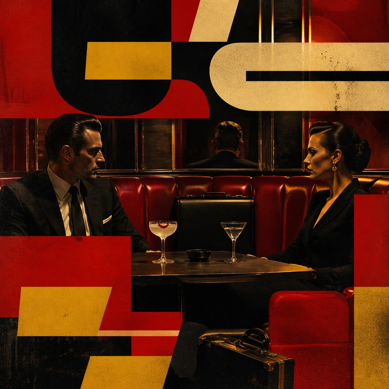
Example generated from “Pulpy Typography Violence Poster — Neon Lounge Standoff”
GPT Image 2en

Scene: A square poster-like composition with loud red, tobacco yellow, nicotine cream, and deep black arranged in flat graphic blocks over a staged crime tableau. The lighting should feel hard and directional, but the overall image should still read as a designed print object rather than a literal movie still. Create a low-lit cocktail lounge with ruby banquettes, mirrored wall strips, and hard rectangular overlays that feel like printed typography stripped of letters. Subject: Focus on an implied act of violence or aftermath through frozen props, bodies held in stiff poses, diner booths, cheap motel details, briefcases, dashboard reflections, or nightclub furniture. The people should feel iconic and deadpan, with tension communicated through placement and color rather than explicit gore. Two sharply dressed figures face each other across a table with one untouched drink and one scarlet lipstick smear on the rim. Important details: The crucial visual rule is the collision of graphic poster language and static pulp staging. Use oversized non-readable letterform-like shapes, caption bars, drop-shadow slabs, and paper-print textures without introducing actual words. Preserve bold silhouette hierarchy, cropped tension, and cynical cool. Use the overlays to punch the image into poster space while the lounge remains tactile, cynical, and still. Use case: Pulpy Typography Over Violent Tableau single study 6/9. Constraints: No readable text, no watermark, no logos, preserve exact 1:1 aspect ratio, no readable text, no logos, no explicit gore, no dismemberment, no recognizable brand packaging, no comic speech balloons, no broken anatomy, no low-detail background, no accidental text fragments.

Example generated from “Pulpy Typography Violence Poster — Dashboard Escape”
GPT Image 2en

Scene: A square poster-like composition with loud red, tobacco yellow, nicotine cream, and deep black arranged in flat graphic blocks over a staged crime tableau. The lighting should feel hard and directional, but the overall image should still read as a designed print object rather than a literal movie still. Shoot through a windshield at night so dashboard chrome, wiper arcs, and streetlights become graphic bands over a dark road. Subject: Focus on an implied act of violence or aftermath through frozen props, bodies held in stiff poses, diner booths, cheap motel details, briefcases, dashboard reflections, or nightclub furniture. The people should feel iconic and deadpan, with tension communicated through placement and color rather than explicit gore. A driver glances into the mirror while a passenger seat holds a torn envelope and a red stain on folded maps. Important details: The crucial visual rule is the collision of graphic poster language and static pulp staging. Use oversized non-readable letterform-like shapes, caption bars, drop-shadow slabs, and paper-print textures without introducing actual words. Preserve bold silhouette hierarchy, cropped tension, and cynical cool. Let the car interior remain sharply arranged, with the sense of danger coming from color placement and cropping rather than motion blur. Use case: Pulpy Typography Over Violent Tableau single study 7/9. Constraints: No readable text, no watermark, no logos, preserve exact 1:1 aspect ratio, no readable text, no logos, no explicit gore, no dismemberment, no recognizable brand packaging, no comic speech balloons, no broken anatomy, no low-detail background, no accidental text fragments.

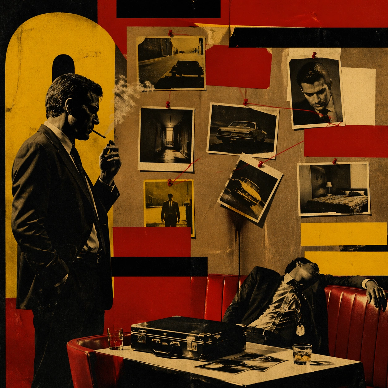
Example generated from “Pulpy Typography Violence Poster — Butcher Paper Wall”
GPT Image 2en

Scene: A square poster-like composition with loud red, tobacco yellow, nicotine cream, and deep black arranged in flat graphic blocks over a staged crime tableau. The lighting should feel hard and directional, but the overall image should still read as a designed print object rather than a literal movie still. Build a back-room evidence wall from brown butcher paper, taped photographs, pushpins, and flat blocks of yellow and red that mimic aggressive poster typography. Subject: Focus on an implied act of violence or aftermath through frozen props, bodies held in stiff poses, diner booths, cheap motel details, briefcases, dashboard reflections, or nightclub furniture. The people should feel iconic and deadpan, with tension communicated through placement and color rather than explicit gore. A single investigator stands in profile smoking beside the wall while one pinned photo droops and leaves a dark stain beneath it. Important details: The crucial visual rule is the collision of graphic poster language and static pulp staging. Use oversized non-readable letterform-like shapes, caption bars, drop-shadow slabs, and paper-print textures without introducing actual words. Preserve bold silhouette hierarchy, cropped tension, and cynical cool. The board should feel designed, not chaotic, with hard spacing and strong planar hierarchy dominating the narrative clues. Use case: Pulpy Typography Over Violent Tableau single study 8/9. Constraints: No readable text, no watermark, no logos, preserve exact 1:1 aspect ratio, no readable text, no logos, no explicit gore, no dismemberment, no recognizable brand packaging, no comic speech balloons, no broken anatomy, no low-detail background, no accidental text fragments.
Example generated from “Pulpy Typography Violence Poster — Roulette Freeze”
GPT Image 2en

Scene: A square poster-like composition with loud red, tobacco yellow, nicotine cream, and deep black arranged in flat graphic blocks over a staged crime tableau. The lighting should feel hard and directional, but the overall image should still read as a designed print object rather than a literal movie still. Use a casino roulette table from above at a slight diagonal, with concentric circles and bold cream bars compressing the image into a printed cover aesthetic. Subject: Focus on an implied act of violence or aftermath through frozen props, bodies held in stiff poses, diner booths, cheap motel details, briefcases, dashboard reflections, or nightclub furniture. The people should feel iconic and deadpan, with tension communicated through placement and color rather than explicit gore. A gloved hand hangs above scattered chips while a dark crimson droplet on the felt suggests the exact instant after a silent betrayal. Important details: The crucial visual rule is the collision of graphic poster language and static pulp staging. Use oversized non-readable letterform-like shapes, caption bars, drop-shadow slabs, and paper-print textures without introducing actual words. Preserve bold silhouette hierarchy, cropped tension, and cynical cool. Keep the scene elegant, graphic, and cynical, emphasizing controlled shapes over explicit brutality. Use case: Pulpy Typography Over Violent Tableau single study 9/9. Constraints: No readable text, no watermark, no logos, preserve exact 1:1 aspect ratio, no readable text, no logos, no explicit gore, no dismemberment, no recognizable brand packaging, no comic speech balloons, no broken anatomy, no low-detail background, no accidental text fragments.
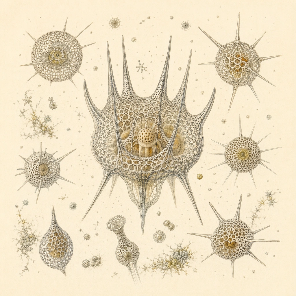
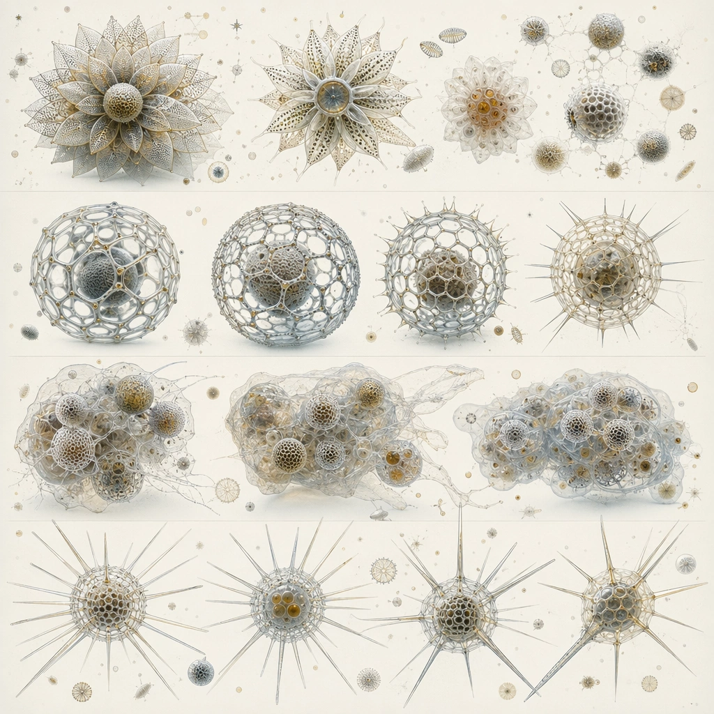
Example generated from “Radiolarian Marine Sculpture — Radial Crown Plate”
GPT Image 2en

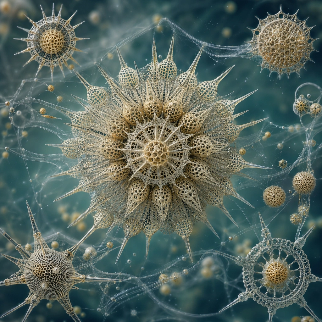
Scene: Create a square scientific plate on warm cream paper, viewed straight on with disciplined museum lighting and no environmental clutter. Several crown-like silica skeletons should be spaced evenly with enough breathing room to admire their architecture without flattening them into decorative wallpaper. Build the frame as a square natural history study with disciplined composition, believable lighting, and enough environmental evidence to explain how this organism or system functions without any caption. Keep the image polished, observational, and suitable for a research gallery rather than pulp fantasy spectacle. Subject: Feature related radiolarian forms built from radial spokes, perforated shells, and fine spines that suggest both buoyancy control and predator deterrence. One larger specimen can anchor the plate while smaller companions reveal variation in crown density, symmetry, and pore size. Show the anatomy, habitat interaction, and scale cues clearly so the viewer can infer locomotion, feeding, reproduction, or ecological role from the visual alone. Every visible structure should feel evolved for a purpose, with layered foreground, midground, and background information that rewards close inspection. Important details: Treat radiolarians as silica-skeleton plankton whose geometry serves buoyancy, defense, feeding, and reproduction. Even the most ornate forms should follow repeatable structural rules, radial symmetry variants, lattice thickness logic, and believable microscopic scale. Use microscopy precision in line weight, surface porosity, and translucency. The image should feel biologically exacting, with every silica lattice appearing deposited by growth rather than manufactured as ornament. Favor coherent biology over decorative excess: tissues, shells, membranes, spores, tendrils, fins, silica lattices, or atmospheric sacs should all follow one material logic. Preserve a convincing relationship between the environment and the body plan, use restrained color hierarchy, and make the image feel like a serious speculative field record rather than a random monster concept. Use case: Radiolarian Marine Sculpture Atlas single study 1/9. Constraints: No readable text, no watermark, no logos, preserve exact 1:1 aspect ratio, no readable labels, no jewelry catalog styling, no fantasy mandala effects, no metallic shine, no accidental brand resemblance, no direct copy of known terrestrial species, no cartoon simplification.

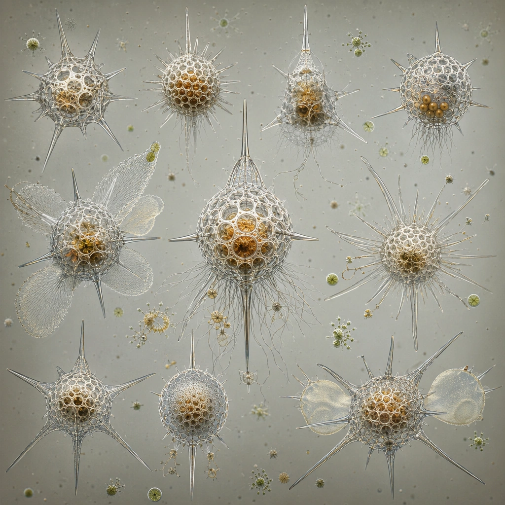
Example generated from “Radiolarian Marine Sculpture — Lattice Spear Array”
GPT Image 2en

Scene: Arrange the image as a clean array on a muted neutral background, with slight drop shadows or tonal depth that keep the specimens dimensional but not theatrical. The square should read like a comparative microscopy board prepared for publication. Build the frame as a square natural history study with disciplined composition, believable lighting, and enough environmental evidence to explain how this organism or system functions without any caption. Keep the image polished, observational, and suitable for a research gallery rather than pulp fantasy spectacle. Subject: Present several spear-rayed shell types whose extended spines create different defensive and drifting strategies. Each specimen should be clearly distinct while remaining part of one lineage. Show the anatomy, habitat interaction, and scale cues clearly so the viewer can infer locomotion, feeding, reproduction, or ecological role from the visual alone. Every visible structure should feel evolved for a purpose, with layered foreground, midground, and background information that rewards close inspection. Important details: Treat radiolarians as silica-skeleton plankton whose geometry serves buoyancy, defense, feeding, and reproduction. Even the most ornate forms should follow repeatable structural rules, radial symmetry variants, lattice thickness logic, and believable microscopic scale. Maintain structural rigor in spine thickness, node repetition, and shell porosity. Decorative beauty is welcome, but it must arise from credible skeleton growth and ecological logic, not arbitrary filigree. Favor coherent biology over decorative excess: tissues, shells, membranes, spores, tendrils, fins, silica lattices, or atmospheric sacs should all follow one material logic. Preserve a convincing relationship between the environment and the body plan, use restrained color hierarchy, and make the image feel like a serious speculative field record rather than a random monster concept. Use case: Radiolarian Marine Sculpture Atlas single study 2/9. Constraints: No readable text, no watermark, no logos, preserve exact 1:1 aspect ratio, no ornamental wallpaper repeat, no gemstones, no readable grid numbers, no shiny chrome, no accidental brand resemblance, no direct copy of known terrestrial species, no cartoon simplification.

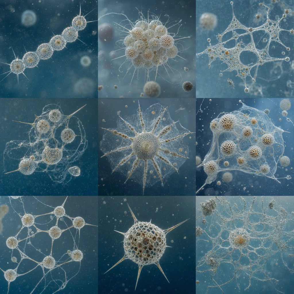
Example generated from “Radiolarian Marine Sculpture — Colonial Drift Grid”
GPT Image 2en

Scene: Build a square grid composition where each cell-like zone contains a different colonial radiolarian cluster suspended in subtle water-toned space. The board should remain highly organized while still suggesting microscopic life in fluid rather than dead specimens on paper. Build the frame as a square natural history study with disciplined composition, believable lighting, and enough environmental evidence to explain how this organism or system functions without any caption. Keep the image polished, observational, and suitable for a research gallery rather than pulp fantasy spectacle. Subject: Show linked chains, clustered spheres, and netted colonies whose shared silica structures suggest cooperation in buoyancy or feeding. Variations between colonies should be legible through architecture, not through random color shifts. Show the anatomy, habitat interaction, and scale cues clearly so the viewer can infer locomotion, feeding, reproduction, or ecological role from the visual alone. Every visible structure should feel evolved for a purpose, with layered foreground, midground, and background information that rewards close inspection. Important details: Treat radiolarians as silica-skeleton plankton whose geometry serves buoyancy, defense, feeding, and reproduction. Even the most ornate forms should follow repeatable structural rules, radial symmetry variants, lattice thickness logic, and believable microscopic scale. Use spacing, translucency, and scale with scientific restraint. The clusters should feel delicate and plausible, with connective elements that look grown and secreted, not welded or digitally constructed. Favor coherent biology over decorative excess: tissues, shells, membranes, spores, tendrils, fins, silica lattices, or atmospheric sacs should all follow one material logic. Preserve a convincing relationship between the environment and the body plan, use restrained color hierarchy, and make the image feel like a serious speculative field record rather than a random monster concept. Use case: Radiolarian Marine Sculpture Atlas single study 3/9. Constraints: No readable text, no watermark, no logos, preserve exact 1:1 aspect ratio, no infographic labels, no abstract data-art look, no bright candy palette, no decorative symmetry for its own sake, no accidental brand resemblance, no direct copy of known terrestrial species, no cartoon simplification.

Example generated from “Radiolarian Marine Sculpture — Silica Spine Rosette”
GPT Image 2en

Scene: Compose a polished plate around one dominant rosette specimen surrounded by a few smaller relatives on a softly toned background. The overall mood should be archival, delicate, and exact, like a flagship plate from a marine microfauna atlas. Build the frame as a square natural history study with disciplined composition, believable lighting, and enough environmental evidence to explain how this organism or system functions without any caption. Keep the image polished, observational, and suitable for a research gallery rather than pulp fantasy spectacle. Subject: Center on dense spoke patterns, nested shells, and radiating spines that imply anti-predator architecture and drag control in the water column. The smaller companion forms should help the viewer compare how rosette geometry can diversify. Show the anatomy, habitat interaction, and scale cues clearly so the viewer can infer locomotion, feeding, reproduction, or ecological role from the visual alone. Every visible structure should feel evolved for a purpose, with layered foreground, midground, and background information that rewards close inspection. Important details: Treat radiolarians as silica-skeleton plankton whose geometry serves buoyancy, defense, feeding, and reproduction. Even the most ornate forms should follow repeatable structural rules, radial symmetry variants, lattice thickness logic, and believable microscopic scale. Emphasize the silica material itself: translucent, brittle, porous, and mathematically ordered but biologically grown. Avoid floral sentimentality and keep the structures unmistakably microscopic and marine. Favor coherent biology over decorative excess: tissues, shells, membranes, spores, tendrils, fins, silica lattices, or atmospheric sacs should all follow one material logic. Preserve a convincing relationship between the environment and the body plan, use restrained color hierarchy, and make the image feel like a serious speculative field record rather than a random monster concept. Use case: Radiolarian Marine Sculpture Atlas single study 4/9. Constraints: No readable text, no watermark, no logos, preserve exact 1:1 aspect ratio, no flower petals, no mandala abstraction, no polished metal, no readable captions, no accidental brand resemblance, no direct copy of known terrestrial species, no cartoon simplification.

Example generated from “Radiolarian Marine Sculpture — Predator Cage Form”
GPT Image 2en

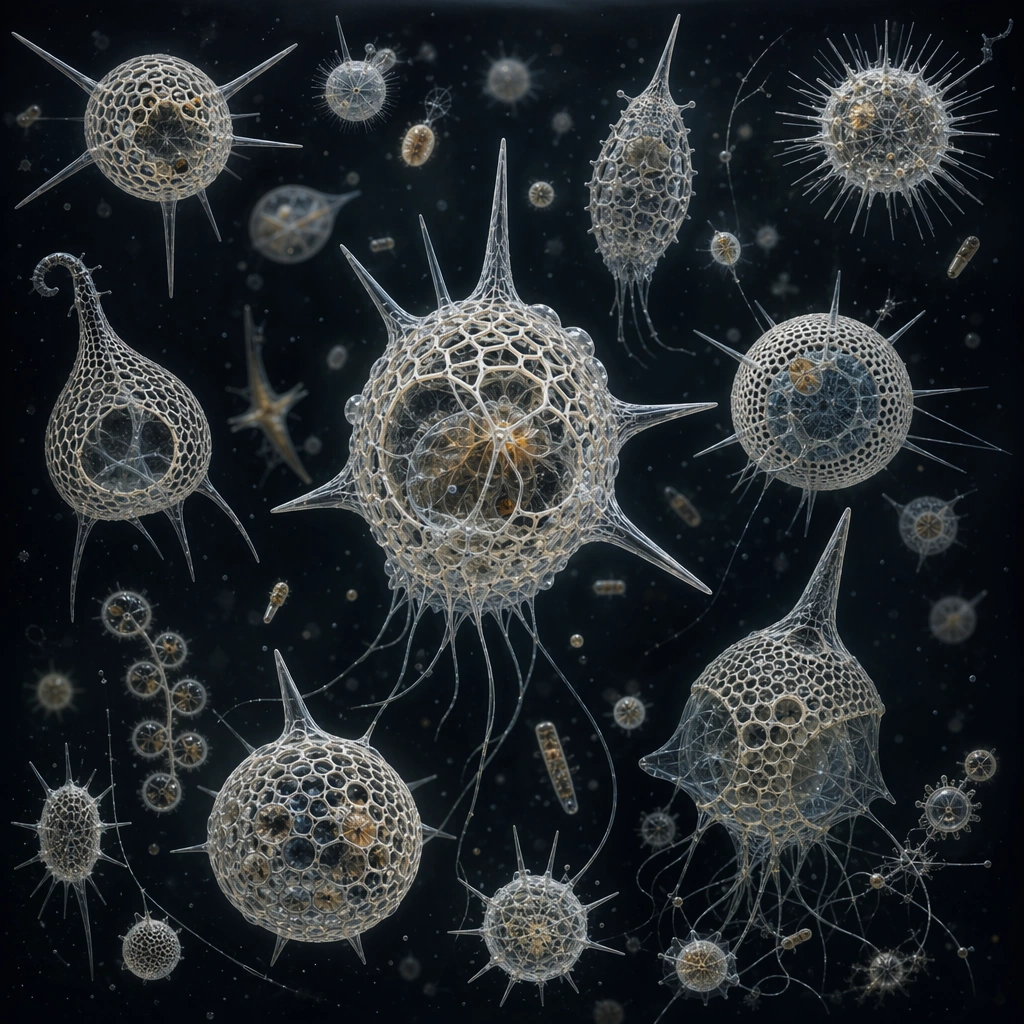
Scene: Use a dark neutral microscopy backdrop rather than cream paper for this plate, letting pale silica skeletons glow softly against the depth. The square composition should still feel organized and scientific, with careful specimen spacing and subtle sense of suspension. Build the frame as a square natural history study with disciplined composition, believable lighting, and enough environmental evidence to explain how this organism or system functions without any caption. Keep the image polished, observational, and suitable for a research gallery rather than pulp fantasy spectacle. Subject: Feature cage-like shell forms with inward-pointing spines, feeding chambers, and trap geometries suggesting micro-predation. Include a few related variants to show how the cage strategy can diversify across lineages. Show the anatomy, habitat interaction, and scale cues clearly so the viewer can infer locomotion, feeding, reproduction, or ecological role from the visual alone. Every visible structure should feel evolved for a purpose, with layered foreground, midground, and background information that rewards close inspection. Important details: Treat radiolarians as silica-skeleton plankton whose geometry serves buoyancy, defense, feeding, and reproduction. Even the most ornate forms should follow repeatable structural rules, radial symmetry variants, lattice thickness logic, and believable microscopic scale. Keep the specimens elegant but not sinister. Their predatory function should be legible through geometry and pore arrangement, while the microscopy atmosphere remains cool and disciplined. Favor coherent biology over decorative excess: tissues, shells, membranes, spores, tendrils, fins, silica lattices, or atmospheric sacs should all follow one material logic. Preserve a convincing relationship between the environment and the body plan, use restrained color hierarchy, and make the image feel like a serious speculative field record rather than a random monster concept. Use case: Radiolarian Marine Sculpture Atlas single study 5/9. Constraints: No readable text, no watermark, no logos, preserve exact 1:1 aspect ratio, no horror vibe, no monster-face illusion, no neon glow, no sci-fi mechanical cages, no accidental brand resemblance, no direct copy of known terrestrial species, no cartoon simplification.

Example generated from “Radiolarian Marine Sculpture — Reproductive Bloom Sheet”
GPT Image 2en

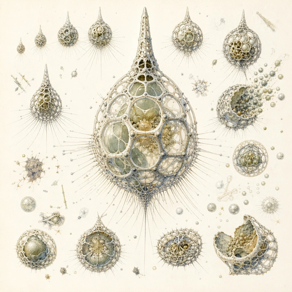
Scene: Arrange a cream scientific sheet that compares several growth or reproductive states of one radiolarian lineage. The page should feel careful and developmental, with one main mature form and surrounding earlier or altered states. Build the frame as a square natural history study with disciplined composition, believable lighting, and enough environmental evidence to explain how this organism or system functions without any caption. Keep the image polished, observational, and suitable for a research gallery rather than pulp fantasy spectacle. Subject: Show budding lattice expansion, spore-like release bodies, and shell remodeling that supports reproduction or seasonal bloom formation. The specimens should remain clearly related while displaying meaningful structural change. Show the anatomy, habitat interaction, and scale cues clearly so the viewer can infer locomotion, feeding, reproduction, or ecological role from the visual alone. Every visible structure should feel evolved for a purpose, with layered foreground, midground, and background information that rewards close inspection. Important details: Treat radiolarians as silica-skeleton plankton whose geometry serves buoyancy, defense, feeding, and reproduction. Even the most ornate forms should follow repeatable structural rules, radial symmetry variants, lattice thickness logic, and believable microscopic scale. The comparative logic matters more than visual spectacle. Use consistent scale cues, line discipline, and silica texture so the sheet reads as a developmental study rather than decorative variation. Favor coherent biology over decorative excess: tissues, shells, membranes, spores, tendrils, fins, silica lattices, or atmospheric sacs should all follow one material logic. Preserve a convincing relationship between the environment and the body plan, use restrained color hierarchy, and make the image feel like a serious speculative field record rather than a random monster concept. Use case: Radiolarian Marine Sculpture Atlas single study 6/9. Constraints: No readable text, no watermark, no logos, preserve exact 1:1 aspect ratio, no readable annotations, no infographic arrows, no fantasy blossom metaphor, no unrelated background scenery, no accidental brand resemblance, no direct copy of known terrestrial species, no cartoon simplification.

Example generated from “Radiolarian Marine Sculpture — Abyssal Snow Cluster”
GPT Image 2en

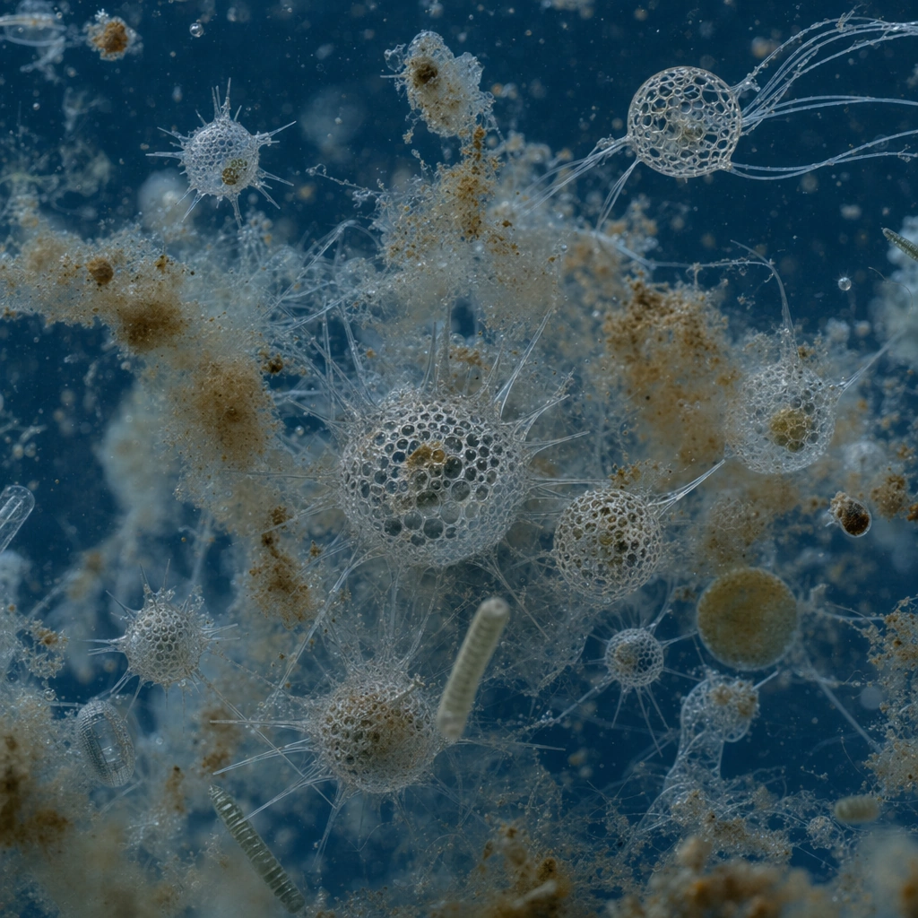
Scene: Create a microscopy-style scene with a dim blue water background, where marine-snow particles and several delicate radiolarian clusters drift together. The square frame should feel like a live microscopic field rather than a museum plate, but still maintain composition discipline. Build the frame as a square natural history study with disciplined composition, believable lighting, and enough environmental evidence to explain how this organism or system functions without any caption. Keep the image polished, observational, and suitable for a research gallery rather than pulp fantasy spectacle. Subject: Focus on how fragile skeletal forms travel with organic debris and planktonic aggregates. Some specimens can be partially occluded by marine snow to reinforce the sense of active suspension. Show the anatomy, habitat interaction, and scale cues clearly so the viewer can infer locomotion, feeding, reproduction, or ecological role from the visual alone. Every visible structure should feel evolved for a purpose, with layered foreground, midground, and background information that rewards close inspection. Important details: Treat radiolarians as silica-skeleton plankton whose geometry serves buoyancy, defense, feeding, and reproduction. Even the most ornate forms should follow repeatable structural rules, radial symmetry variants, lattice thickness logic, and believable microscopic scale. Keep the scene subtle and scientific. The contrast between drifting particulate matter and precise silica architecture should create the beauty, not dramatic lighting or fantasy effects. Favor coherent biology over decorative excess: tissues, shells, membranes, spores, tendrils, fins, silica lattices, or atmospheric sacs should all follow one material logic. Preserve a convincing relationship between the environment and the body plan, use restrained color hierarchy, and make the image feel like a serious speculative field record rather than a random monster concept. Use case: Radiolarian Marine Sculpture Atlas single study 7/9. Constraints: No readable text, no watermark, no logos, preserve exact 1:1 aspect ratio, no space-scene resemblance, no starfield abstraction, no neon glows, no readable overlays, no accidental brand resemblance, no direct copy of known terrestrial species, no cartoon simplification.

Example generated from “Radiolarian Marine Sculpture — Comparative Morphology Board”
GPT Image 2en

Scene: Build a highly legible square comparison board on cream or pale gray, with specimens arranged so the eye can move from simple shells to complex lattices. The layout should feel editorially clean but still unmistakably scientific. Build the frame as a square natural history study with disciplined composition, believable lighting, and enough environmental evidence to explain how this organism or system functions without any caption. Keep the image polished, observational, and suitable for a research gallery rather than pulp fantasy spectacle. Subject: Include at least four distinct skeleton strategies: rosette, cage, colonial, and spear-rayed forms. Each should occupy a clear zone of the board and feel related through material but different in function. Show the anatomy, habitat interaction, and scale cues clearly so the viewer can infer locomotion, feeding, reproduction, or ecological role from the visual alone. Every visible structure should feel evolved for a purpose, with layered foreground, midground, and background information that rewards close inspection. Important details: Treat radiolarians as silica-skeleton plankton whose geometry serves buoyancy, defense, feeding, and reproduction. Even the most ornate forms should follow repeatable structural rules, radial symmetry variants, lattice thickness logic, and believable microscopic scale. Clarity is the goal. Preserve fine pores, translucency, and repeating structural motifs while preventing the board from becoming crowded or purely ornamental. Favor coherent biology over decorative excess: tissues, shells, membranes, spores, tendrils, fins, silica lattices, or atmospheric sacs should all follow one material logic. Preserve a convincing relationship between the environment and the body plan, use restrained color hierarchy, and make the image feel like a serious speculative field record rather than a random monster concept. Use case: Radiolarian Marine Sculpture Atlas single study 8/9. Constraints: No readable text, no watermark, no logos, preserve exact 1:1 aspect ratio, no text labels, no UI cards, no decorative wallpaper rhythm, no metallic highlights, no accidental brand resemblance, no direct copy of known terrestrial species, no cartoon simplification.

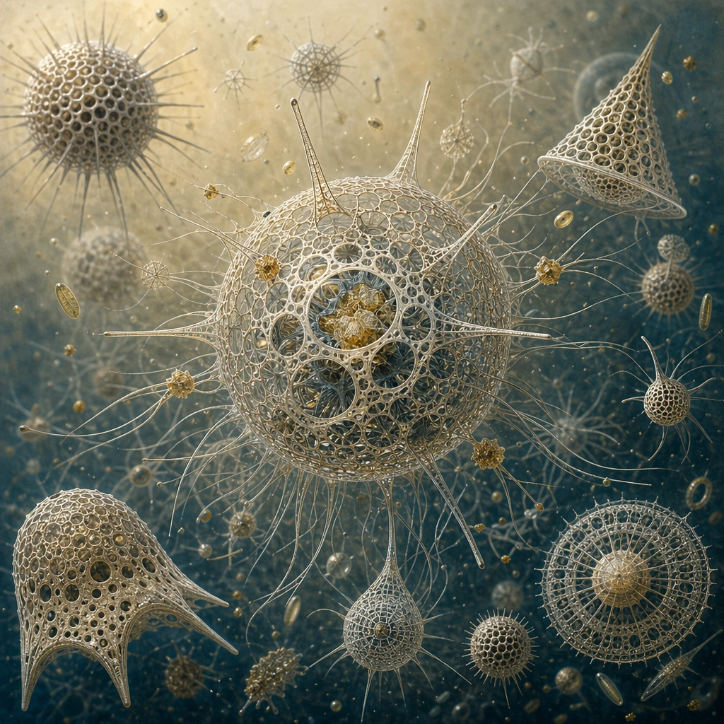
Example generated from “Radiolarian Marine Sculpture — Museum Atlas Cover”
GPT Image 2en

Scene: Finish with a refined atlas-cover composition that gathers several iconic radiolarian forms into one square image on a warm archival ground. The balance should feel curatorial and elegant, like the frontispiece of a prestigious marine microfauna volume. Build the frame as a square natural history study with disciplined composition, believable lighting, and enough environmental evidence to explain how this organism or system functions without any caption. Keep the image polished, observational, and suitable for a research gallery rather than pulp fantasy spectacle. Subject: Arrange a dominant centerpiece specimen with supporting forms around it, maintaining depth and relation without turning them into cutout stickers. The composition should synthesize the package while preserving scientific seriousness. Show the anatomy, habitat interaction, and scale cues clearly so the viewer can infer locomotion, feeding, reproduction, or ecological role from the visual alone. Every visible structure should feel evolved for a purpose, with layered foreground, midground, and background information that rewards close inspection. Important details: Treat radiolarians as silica-skeleton plankton whose geometry serves buoyancy, defense, feeding, and reproduction. Even the most ornate forms should follow repeatable structural rules, radial symmetry variants, lattice thickness logic, and believable microscopic scale. Beauty should come from precision, spacing, and silica geometry. The image must feel like a real scientific-art object, not a decorative poster using microscopic motifs as ornament. Favor coherent biology over decorative excess: tissues, shells, membranes, spores, tendrils, fins, silica lattices, or atmospheric sacs should all follow one material logic. Preserve a convincing relationship between the environment and the body plan, use restrained color hierarchy, and make the image feel like a serious speculative field record rather than a random monster concept. Use case: Radiolarian Marine Sculpture Atlas single study 9/9. Constraints: No readable text, no watermark, no logos, preserve exact 1:1 aspect ratio, no readable title text, no fashion-editorial styling, no abstract mandala cover, no flat icon treatment, no accidental brand resemblance, no direct copy of known terrestrial species, no cartoon simplification.

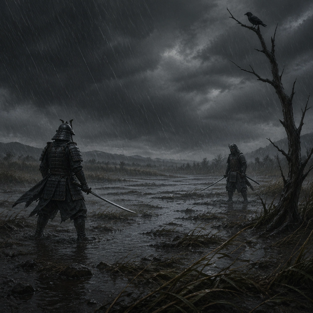
Example generated from “Rain Wind Samurai Duel — Flooded Plain Stand”
GPT Image 2en

Scene: A square outdoor battlefield image shaped by violent weather: slanting rain, flattened reeds, mud spray, charcoal clouds, and wind carving motion through fabric and grass. The palette should stay restrained in charcoal, wet brown, muted steel, and deep moss, with nature overpowering the people within it. Show a wide flooded plain under hard slant rain, with shallow water rippling around the duel ground and one dead branch rising at the edge. Subject: The subject is two lone armored duelists facing each other across open ground, bamboo edges, flooded fields, or broken terrain. Their poses should feel precise and ritualized, with tension coming from stance, distance, and weather rather than from explicit impact. Two armored fighters face each other at measured distance, knees soft and blades low, while a crow waits on the branch. Important details: The core language is discipline against elemental force. Preserve historically inspired layered armor, soaked cloth, muddy terrain, reeds bent by wind, and the sense that rain itself is a character. Avoid fantasy powers, impossible weapons, or decorative heroic posing. The emotional weight should come from the rain, the silence before motion, and the tiny human scale inside the weather. Use case: Rain Wind Samurai Duel Field single study 1/9. Constraints: No readable text, no watermark, no logos, preserve exact 1:1 aspect ratio, no readable banners, no bright saturated armor, no fantasy monsters, no gore splatter, no stylized comic effects, no broken anatomy, no low-detail background, no accidental text fragments.
Example generated from “Rain Wind Samurai Duel — Reed Marsh Draw”
GPT Image 2en

Scene: A square outdoor battlefield image shaped by violent weather: slanting rain, flattened reeds, mud spray, charcoal clouds, and wind carving motion through fabric and grass. The palette should stay restrained in charcoal, wet brown, muted steel, and deep moss, with nature overpowering the people within it. Use a marsh of bending reeds and black water channels, with wind flattening the plants into long diagonal strokes. Subject: The subject is two lone armored duelists facing each other across open ground, bamboo edges, flooded fields, or broken terrain. Their poses should feel precise and ritualized, with tension coming from stance, distance, and weather rather than from explicit impact. One duelist has just begun to draw their blade while the other remains perfectly still across the mud. Important details: The core language is discipline against elemental force. Preserve historically inspired layered armor, soaked cloth, muddy terrain, reeds bent by wind, and the sense that rain itself is a character. Avoid fantasy powers, impossible weapons, or decorative heroic posing. Keep the gesture minimal and precise, making the reeds and rain carry most of the kinetic energy. Use case: Rain Wind Samurai Duel Field single study 2/9. Constraints: No readable text, no watermark, no logos, preserve exact 1:1 aspect ratio, no readable banners, no bright saturated armor, no fantasy monsters, no gore splatter, no stylized comic effects, no broken anatomy, no low-detail background, no accidental text fragments.
Example generated from “Rain Wind Samurai Duel — Bamboo Ridge”
GPT Image 2en

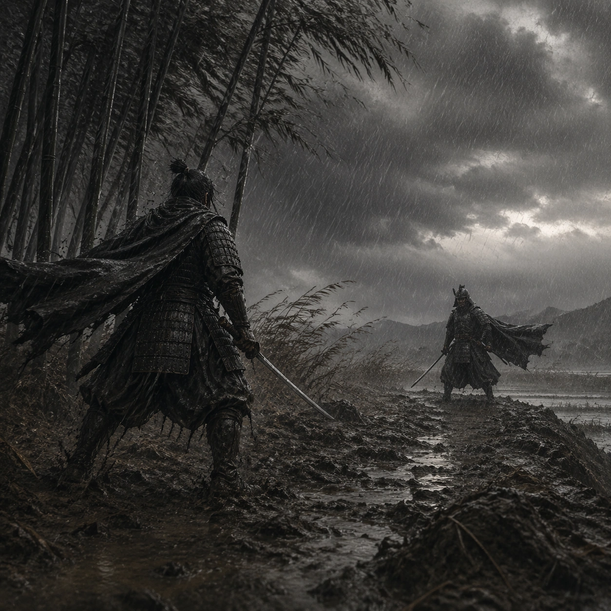
Scene: A square outdoor battlefield image shaped by violent weather: slanting rain, flattened reeds, mud spray, charcoal clouds, and wind carving motion through fabric and grass. The palette should stay restrained in charcoal, wet brown, muted steel, and deep moss, with nature overpowering the people within it. Place the confrontation on a muddy ridge below dark bamboo, with rain streaking almost sideways through the trunks. Subject: The subject is two lone armored duelists facing each other across open ground, bamboo edges, flooded fields, or broken terrain. Their poses should feel precise and ritualized, with tension coming from stance, distance, and weather rather than from explicit impact. Two figures in traditional armor stand offset on the ridge, cloaks snapping in opposite directions from the wind. Important details: The core language is discipline against elemental force. Preserve historically inspired layered armor, soaked cloth, muddy terrain, reeds bent by wind, and the sense that rain itself is a character. Avoid fantasy powers, impossible weapons, or decorative heroic posing. The bamboo should frame but not decorate, reinforcing the disciplined vertical rhythm of the scene. Use case: Rain Wind Samurai Duel Field single study 3/9. Constraints: No readable text, no watermark, no logos, preserve exact 1:1 aspect ratio, no readable banners, no bright saturated armor, no fantasy monsters, no gore splatter, no stylized comic effects, no broken anatomy, no low-detail background, no accidental text fragments.
Example generated from “Rain Wind Samurai Duel — Broken Fence Crossing”
GPT Image 2en

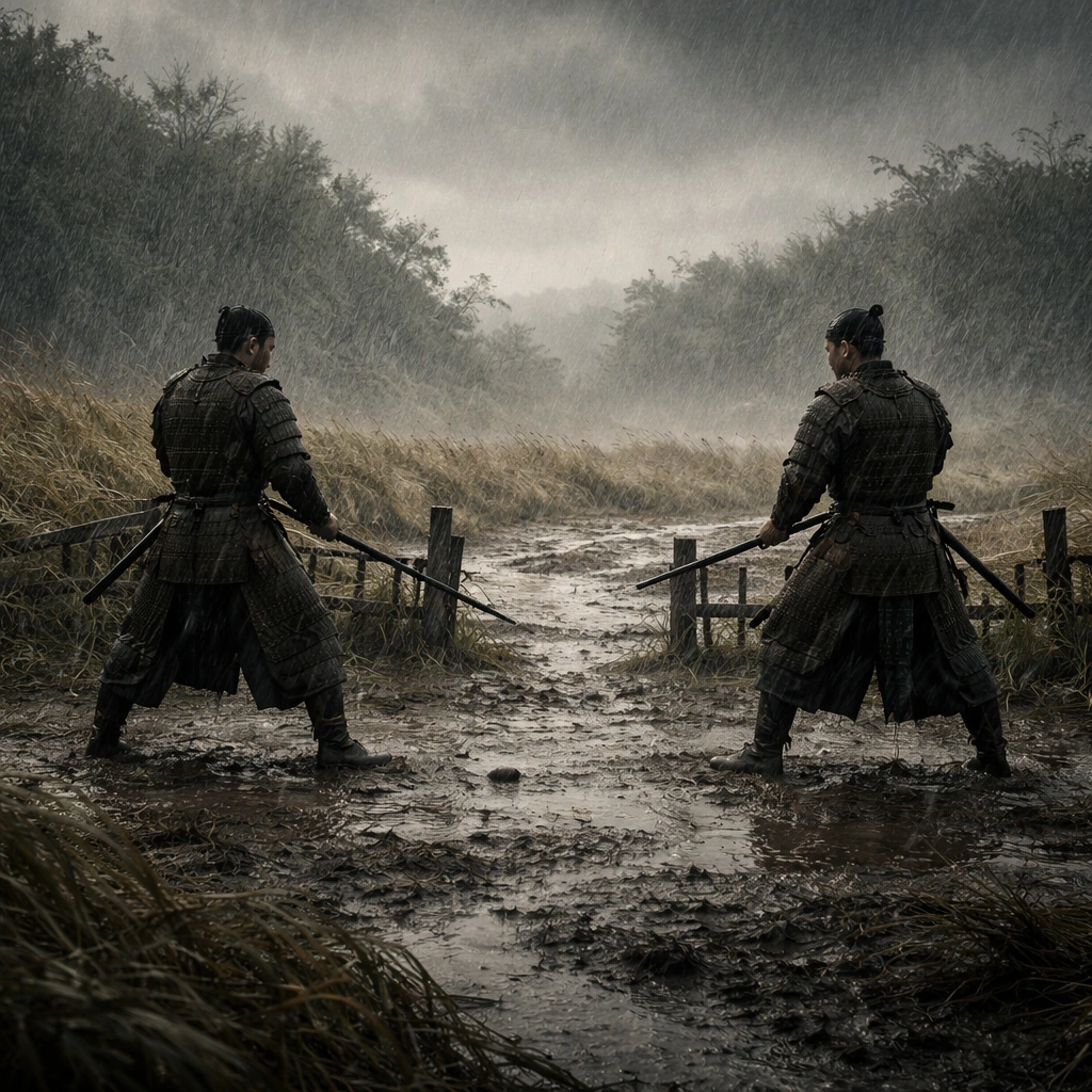
Scene: A square outdoor battlefield image shaped by violent weather: slanting rain, flattened reeds, mud spray, charcoal clouds, and wind carving motion through fabric and grass. The palette should stay restrained in charcoal, wet brown, muted steel, and deep moss, with nature overpowering the people within it. Show a field cut by a broken fence line and puddled track, with heavy rain turning the soil black and reflective. Subject: The subject is two lone armored duelists facing each other across open ground, bamboo edges, flooded fields, or broken terrain. Their poses should feel precise and ritualized, with tension coming from stance, distance, and weather rather than from explicit impact. The duelists stand on opposite sides of the broken fence opening, sharing one invisible line of movement through the gap. Important details: The core language is discipline against elemental force. Preserve historically inspired layered armor, soaked cloth, muddy terrain, reeds bent by wind, and the sense that rain itself is a character. Avoid fantasy powers, impossible weapons, or decorative heroic posing. Let the fence fragments and puddles deepen the composition without distracting from the poised bodies. Use case: Rain Wind Samurai Duel Field single study 4/9. Constraints: No readable text, no watermark, no logos, preserve exact 1:1 aspect ratio, no readable banners, no bright saturated armor, no fantasy monsters, no gore splatter, no stylized comic effects, no broken anatomy, no low-detail background, no accidental text fragments.
Example generated from “Rain Wind Samurai Duel — Shrine Gate Distance”
GPT Image 2en

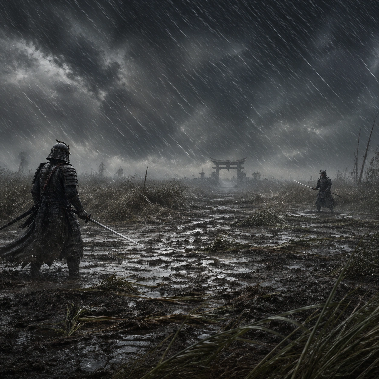
Scene: A square outdoor battlefield image shaped by violent weather: slanting rain, flattened reeds, mud spray, charcoal clouds, and wind carving motion through fabric and grass. The palette should stay restrained in charcoal, wet brown, muted steel, and deep moss, with nature overpowering the people within it. Use a weathered gate on the far horizon, barely visible through rain, while the duel takes place on open muddy ground in front of it. Subject: The subject is two lone armored duelists facing each other across open ground, bamboo edges, flooded fields, or broken terrain. Their poses should feel precise and ritualized, with tension coming from stance, distance, and weather rather than from explicit impact. The two fighters stand far apart enough that the distance itself feels like part of the ritual. Important details: The core language is discipline against elemental force. Preserve historically inspired layered armor, soaked cloth, muddy terrain, reeds bent by wind, and the sense that rain itself is a character. Avoid fantasy powers, impossible weapons, or decorative heroic posing. Keep the gate modest and atmospheric, with the open field and rain curtain doing the main dramatic work. Use case: Rain Wind Samurai Duel Field single study 5/9. Constraints: No readable text, no watermark, no logos, preserve exact 1:1 aspect ratio, no readable banners, no bright saturated armor, no fantasy monsters, no gore splatter, no stylized comic effects, no broken anatomy, no low-detail background, no accidental text fragments.
Example generated from “Rain Wind Samurai Duel — Wind Bent Grass”
GPT Image 2en

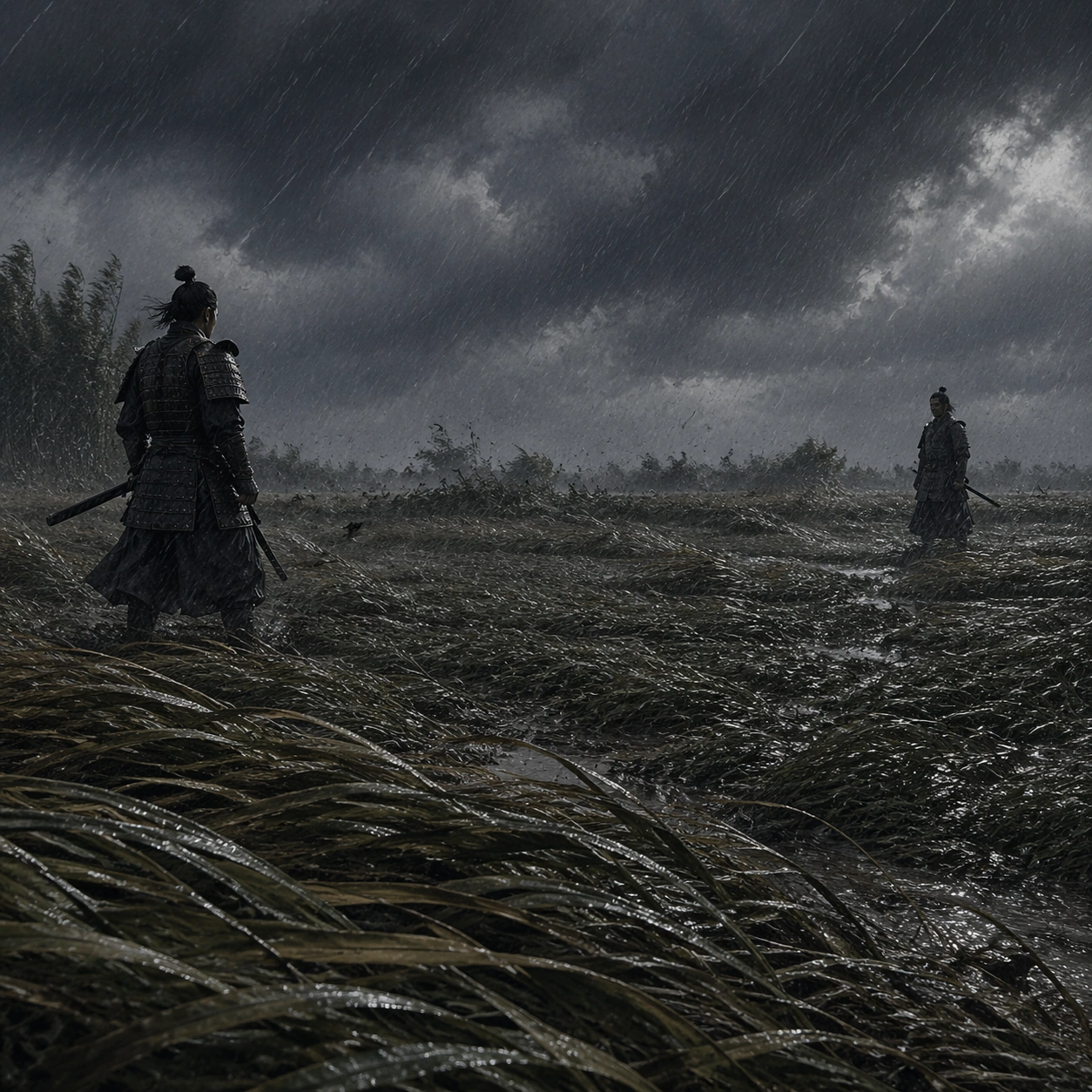
Scene: A square outdoor battlefield image shaped by violent weather: slanting rain, flattened reeds, mud spray, charcoal clouds, and wind carving motion through fabric and grass. The palette should stay restrained in charcoal, wet brown, muted steel, and deep moss, with nature overpowering the people within it. Set the scene in tall wet grass bent nearly flat by wind, with low dark sky and water beading along every blade. Subject: The subject is two lone armored duelists facing each other across open ground, bamboo edges, flooded fields, or broken terrain. Their poses should feel precise and ritualized, with tension coming from stance, distance, and weather rather than from explicit impact. The duelists stand in opposing profiles, blades still sheathed, communicating pressure through stance alone. Important details: The core language is discipline against elemental force. Preserve historically inspired layered armor, soaked cloth, muddy terrain, reeds bent by wind, and the sense that rain itself is a character. Avoid fantasy powers, impossible weapons, or decorative heroic posing. Make the grass movement directional and forceful so the weather feels stronger than the people. Use case: Rain Wind Samurai Duel Field single study 6/9. Constraints: No readable text, no watermark, no logos, preserve exact 1:1 aspect ratio, no readable banners, no bright saturated armor, no fantasy monsters, no gore splatter, no stylized comic effects, no broken anatomy, no low-detail background, no accidental text fragments.
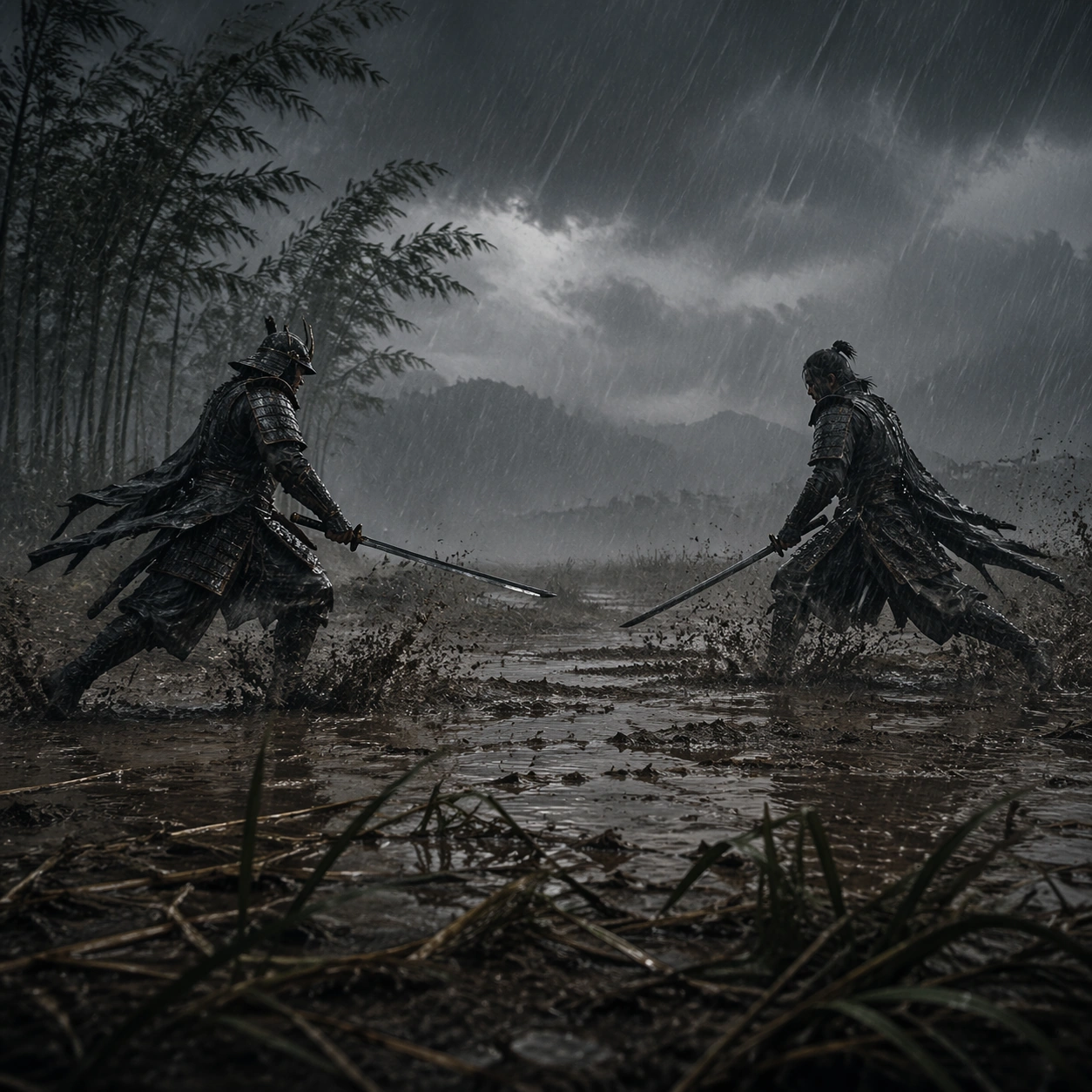
Example generated from “Rain Wind Samurai Duel — Mud Splash Charge”
GPT Image 2en

Scene: A square outdoor battlefield image shaped by violent weather: slanting rain, flattened reeds, mud spray, charcoal clouds, and wind carving motion through fabric and grass. The palette should stay restrained in charcoal, wet brown, muted steel, and deep moss, with nature overpowering the people within it. Capture the first instant of motion on a muddy field where both fighters surge forward and the rain explodes off the ground in dark spray. Subject: The subject is two lone armored duelists facing each other across open ground, bamboo edges, flooded fields, or broken terrain. Their poses should feel precise and ritualized, with tension coming from stance, distance, and weather rather than from explicit impact. The bodies remain readable and disciplined, not acrobatic, with one committed forward step from each side. Important details: The core language is discipline against elemental force. Preserve historically inspired layered armor, soaked cloth, muddy terrain, reeds bent by wind, and the sense that rain itself is a character. Avoid fantasy powers, impossible weapons, or decorative heroic posing. The energy should still feel heavy and real, driven by footing, rain, and cloth weight rather than fantasy speed. Use case: Rain Wind Samurai Duel Field single study 7/9. Constraints: No readable text, no watermark, no logos, preserve exact 1:1 aspect ratio, no readable banners, no bright saturated armor, no fantasy monsters, no gore splatter, no stylized comic effects, no broken anatomy, no low-detail background, no accidental text fragments.
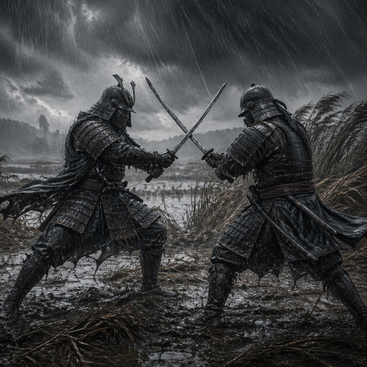
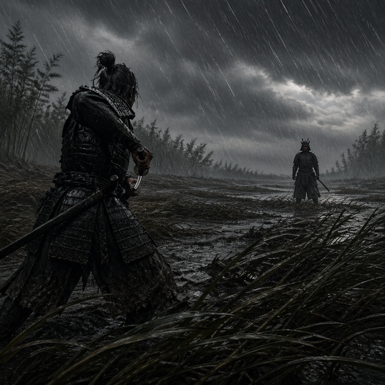
Example generated from “Rain Wind Samurai Duel — Sword Lock In Rain”
GPT Image 2en

Scene: A square outdoor battlefield image shaped by violent weather: slanting rain, flattened reeds, mud spray, charcoal clouds, and wind carving motion through fabric and grass. The palette should stay restrained in charcoal, wet brown, muted steel, and deep moss, with nature overpowering the people within it. Use a close mid-distance frame where the fighters finally meet in a crossed-blade lock amid streaming rain and blowing reeds. Subject: The subject is two lone armored duelists facing each other across open ground, bamboo edges, flooded fields, or broken terrain. Their poses should feel precise and ritualized, with tension coming from stance, distance, and weather rather than from explicit impact. Both helmets and soaked armor remain visible, but the weather and tension of the locked blades dominate the emotion. Important details: The core language is discipline against elemental force. Preserve historically inspired layered armor, soaked cloth, muddy terrain, reeds bent by wind, and the sense that rain itself is a character. Avoid fantasy powers, impossible weapons, or decorative heroic posing. Preserve the physical strain of stance and footing without introducing graphic injury or spectacle excess. Use case: Rain Wind Samurai Duel Field single study 8/9. Constraints: No readable text, no watermark, no logos, preserve exact 1:1 aspect ratio, no readable banners, no bright saturated armor, no fantasy monsters, no gore splatter, no stylized comic effects, no broken anatomy, no low-detail background, no accidental text fragments.
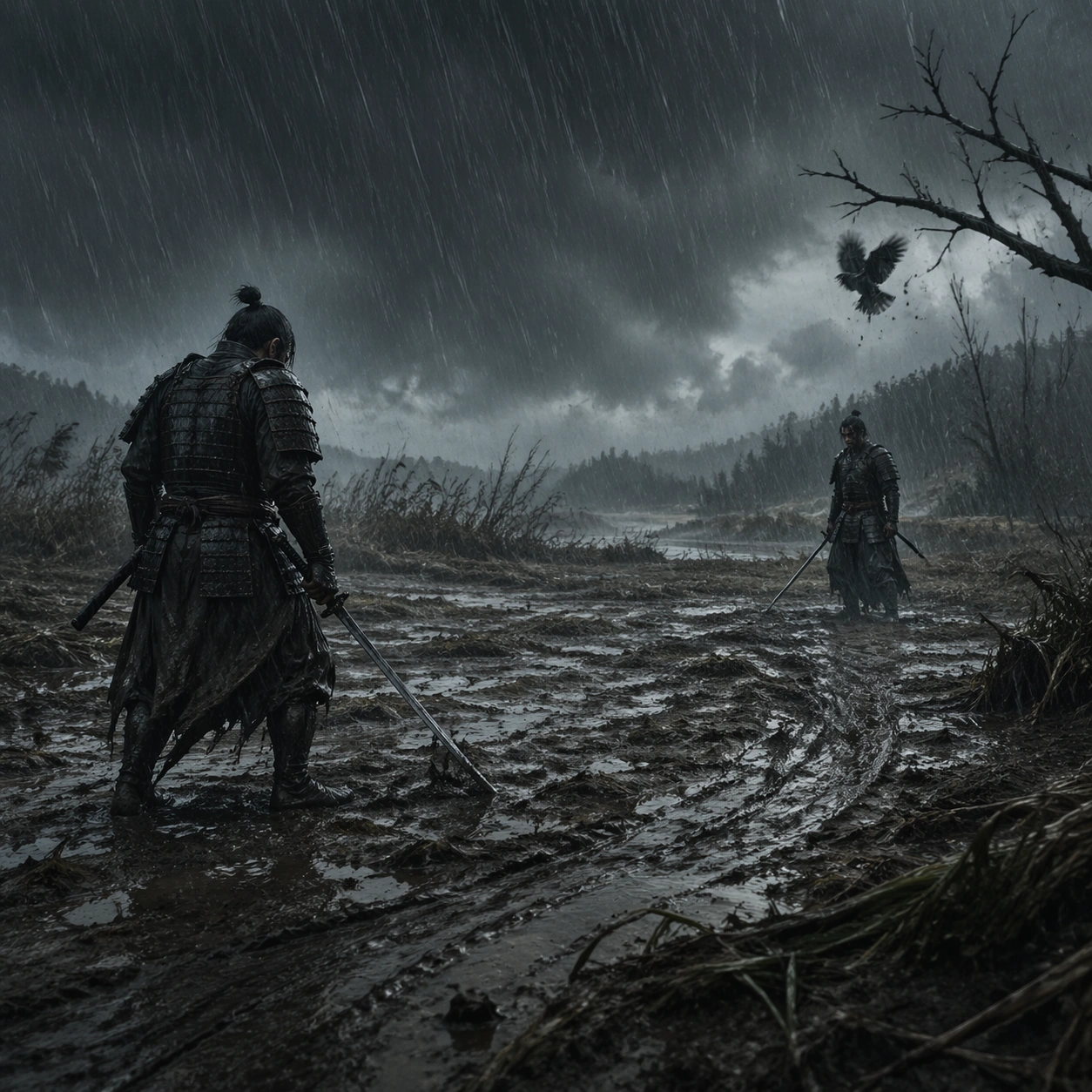
Example generated from “Rain Wind Samurai Duel — Crow Aftermath”
GPT Image 2en

Scene: A square outdoor battlefield image shaped by violent weather: slanting rain, flattened reeds, mud spray, charcoal clouds, and wind carving motion through fabric and grass. The palette should stay restrained in charcoal, wet brown, muted steel, and deep moss, with nature overpowering the people within it. End on the muddy field moments after the clash, with rain still falling hard, one crow dropping from a dead branch, and the ground showing fresh slide marks. Subject: The subject is two lone armored duelists facing each other across open ground, bamboo edges, flooded fields, or broken terrain. Their poses should feel precise and ritualized, with tension coming from stance, distance, and weather rather than from explicit impact. The two duelists stand separated again, one slightly bowed, the other holding still, leaving the outcome unresolved. Important details: The core language is discipline against elemental force. Preserve historically inspired layered armor, soaked cloth, muddy terrain, reeds bent by wind, and the sense that rain itself is a character. Avoid fantasy powers, impossible weapons, or decorative heroic posing. Keep the ambiguity and weather stronger than any triumph, so the final image feels tragic and elemental. Use case: Rain Wind Samurai Duel Field single study 9/9. Constraints: No readable text, no watermark, no logos, preserve exact 1:1 aspect ratio, no readable banners, no bright saturated armor, no fantasy monsters, no gore splatter, no stylized comic effects, no broken anatomy, no low-detail background, no accidental text fragments.
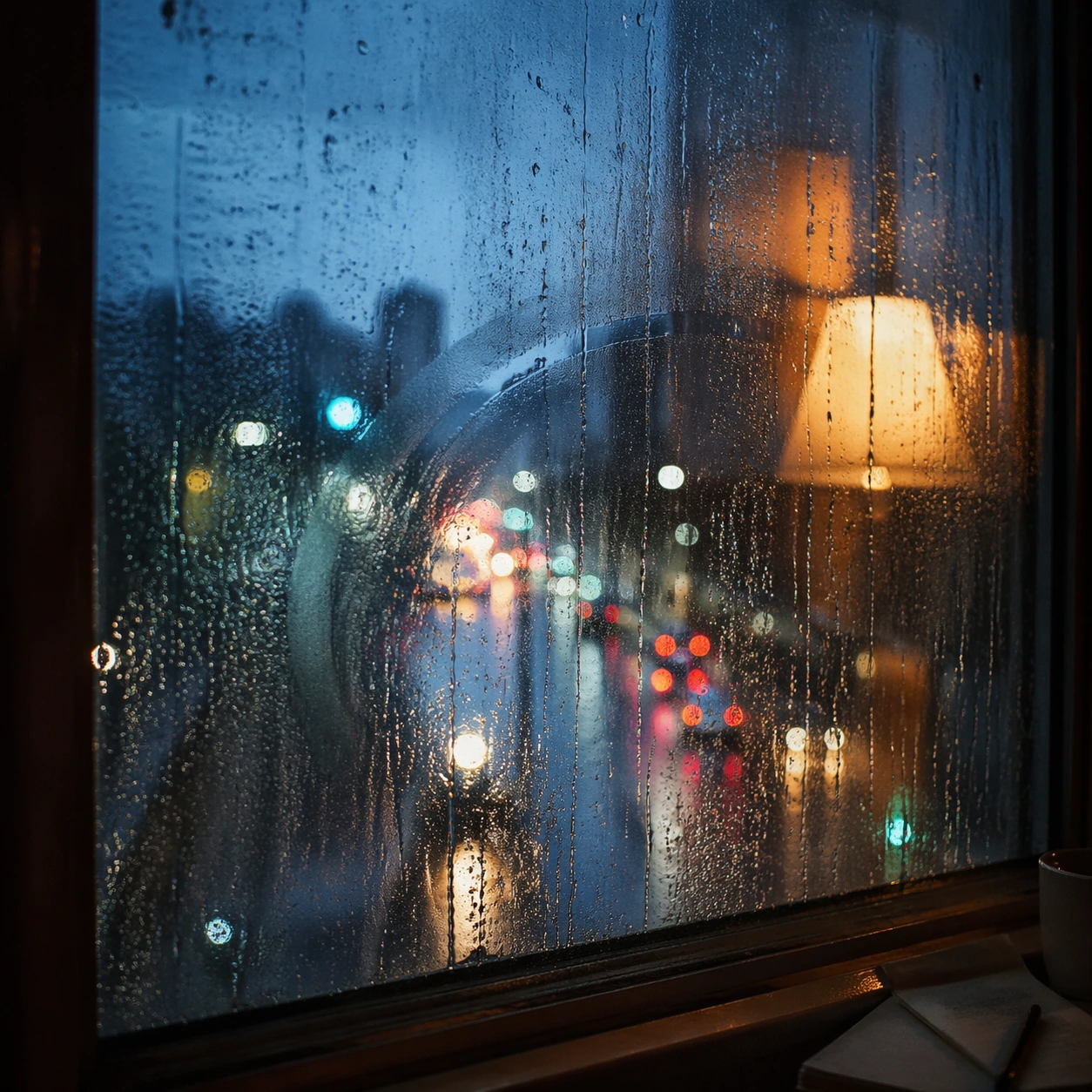
Example generated from “Rain Window Memory — Reference Anchor”
GPT Image 2en

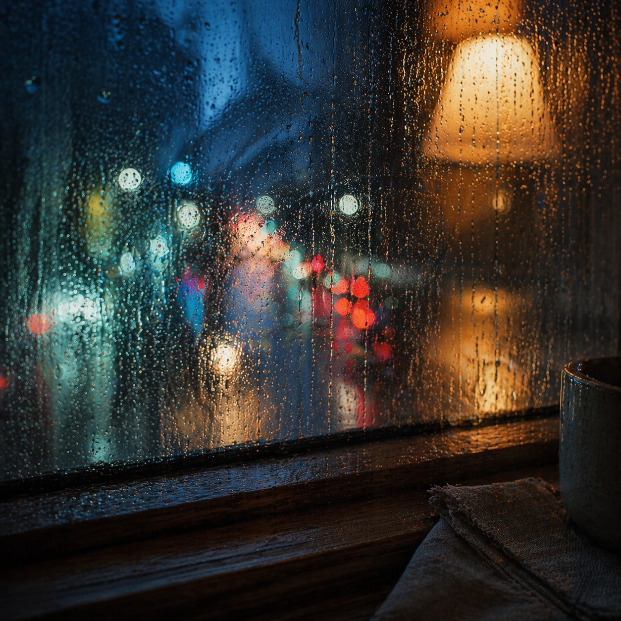
Scene: Create a square cinematic still for Rain Window Memory. Use production-grade photoreal lighting, disciplined lens behavior, and a composition that feels like a finished key frame from an original film rather than a casual snapshot. A rain-covered window fills much of the frame while the city outside dissolves into cool bokeh circles and smeared light trails, and a warm interior lamp reflection hovers on the glass without overpowering the weathered surface. Keep the camera in a disciplined anchor position so the full lighting event and the main spatial structure are immediately legible from edge to edge. Subject: Build a coherent original scene whose emotional center comes from atmosphere, light physics, and spatial clarity. Avoid relying on celebrity likeness, franchise iconography, or stylized illustration shortcuts. The subject is the interaction of droplets, finger-smear traces, condensation, reflected room light, and soft urban color beyond the pane, with any human presence implied indirectly rather than shown as a posed portrait. This frame should lock the canonical arrangement, scale relationship, and emotional tone that the later dependent images inherit. Important details: Preserve a believable physical world with strong depth layering, careful color separation, and premium image discipline. Render droplet scale, gravity-driven streaking, condensation edges, and double reflections with high fidelity, preserving a restrained emotional intimacy that feels personal and cinematic instead of sentimental or glossy. Use this image to establish the authoritative direction of light, atmospheric density, and structural silhouette for the package. Use case: Rain Window series study 1/9. Constraints: No readable text, no watermark, no logos, preserve exact 1:1 aspect ratio, no readable street signs, no brand logos, no full face pressed to the glass, no cartoon heart iconography, no perfect symmetrical droplets.

Example generated from “Rain Window Memory — Closer Frame”
GPT Image 2en

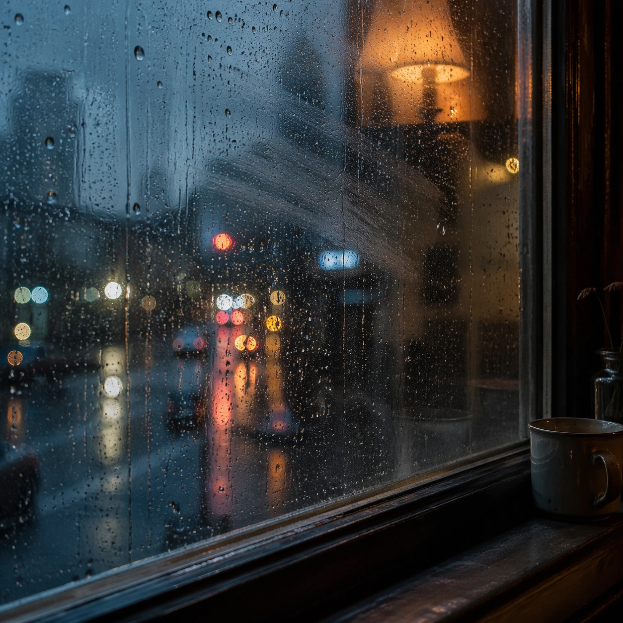
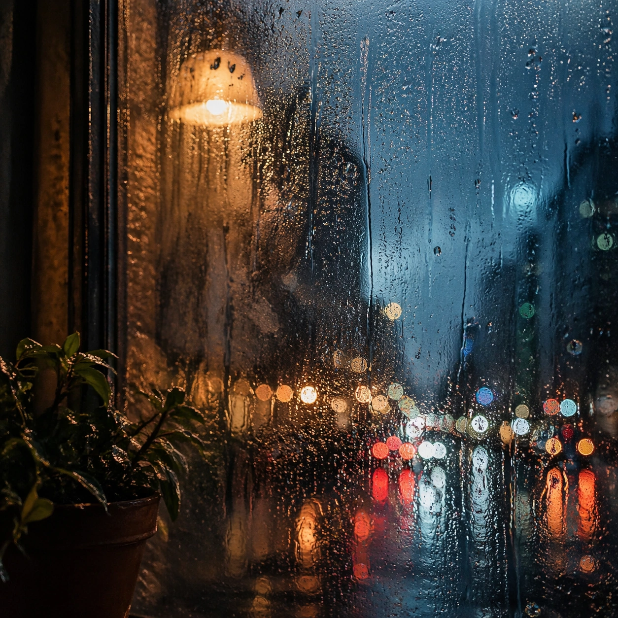
Scene: Create a square cinematic still for Rain Window Memory. Use production-grade photoreal lighting, disciplined lens behavior, and a composition that feels like a finished key frame from an original film rather than a casual snapshot. A rain-covered window fills much of the frame while the city outside dissolves into cool bokeh circles and smeared light trails, and a warm interior lamp reflection hovers on the glass without overpowering the weathered surface. Move the camera closer or lower so the viewer feels more embedded inside the atmosphere while the same light direction and environment remain intact. Subject: Build a coherent original scene whose emotional center comes from atmosphere, light physics, and spatial clarity. Avoid relying on celebrity likeness, franchise iconography, or stylized illustration shortcuts. The subject is the interaction of droplets, finger-smear traces, condensation, reflected room light, and soft urban color beyond the pane, with any human presence implied indirectly rather than shown as a posed portrait. Preserve the same world logic from the reference and let one human-scale or material-scale element become more prominent without stealing focus from the atmosphere. Important details: Preserve a believable physical world with strong depth layering, careful color separation, and premium image discipline. Render droplet scale, gravity-driven streaking, condensation edges, and double reflections with high fidelity, preserving a restrained emotional intimacy that feels personal and cinematic instead of sentimental or glossy. Keep the palette family, structural read, and light behavior from image 01 while increasing immediacy and tactile presence. Use case: Rain Window series study 2/9. Constraints: No readable text, no watermark, no logos, preserve exact 1:1 aspect ratio, no readable street signs, no brand logos, no full face pressed to the glass, no cartoon heart iconography, no perfect symmetrical droplets.

Example generated from “Rain Window Memory — Spatial Counterpoint”
GPT Image 2en

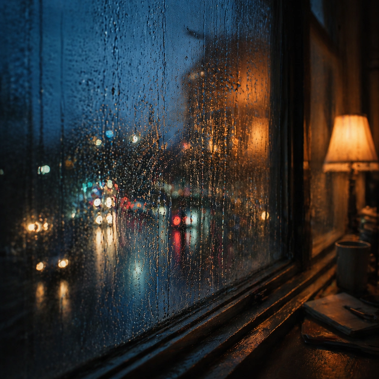
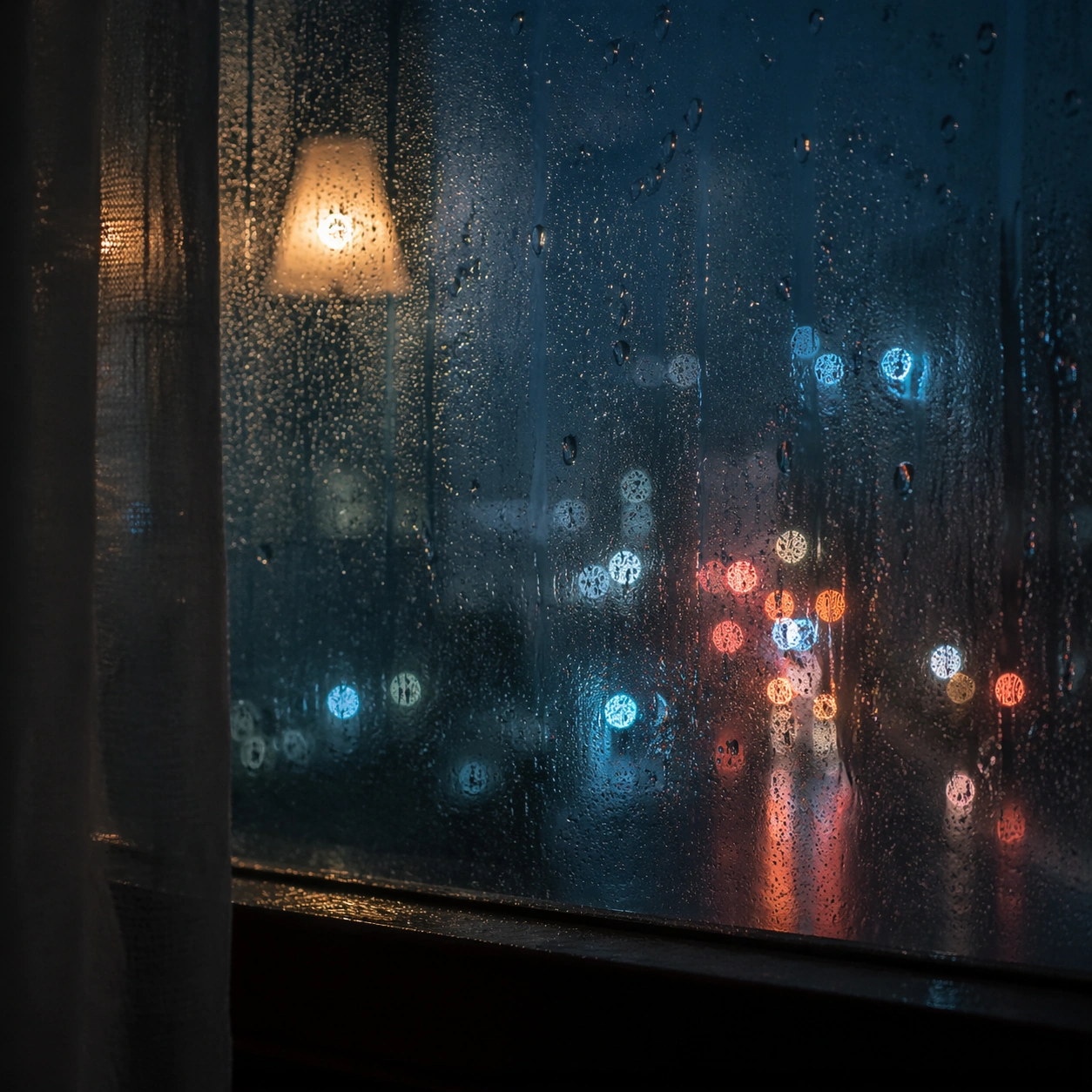
Scene: Create a square cinematic still for Rain Window Memory. Use production-grade photoreal lighting, disciplined lens behavior, and a composition that feels like a finished key frame from an original film rather than a casual snapshot. A rain-covered window fills much of the frame while the city outside dissolves into cool bokeh circles and smeared light trails, and a warm interior lamp reflection hovers on the glass without overpowering the weathered surface. Shift to an oblique or lateral point of view that reveals different depth layers while staying inside the same place and the same atmospheric event. Subject: Build a coherent original scene whose emotional center comes from atmosphere, light physics, and spatial clarity. Avoid relying on celebrity likeness, franchise iconography, or stylized illustration shortcuts. The subject is the interaction of droplets, finger-smear traces, condensation, reflected room light, and soft urban color beyond the pane, with any human presence implied indirectly rather than shown as a posed portrait. Hold the reference structure, but use the new angle to show secondary planes, foreground interruption, or a changed distance relationship. Important details: Preserve a believable physical world with strong depth layering, careful color separation, and premium image discipline. Render droplet scale, gravity-driven streaking, condensation edges, and double reflections with high fidelity, preserving a restrained emotional intimacy that feels personal and cinematic instead of sentimental or glossy. The success condition is continuity with the reference plus a richer sense of depth, not a new location or a new lighting system. Use case: Rain Window series study 3/9. Constraints: No readable text, no watermark, no logos, preserve exact 1:1 aspect ratio, no readable street signs, no brand logos, no full face pressed to the glass, no cartoon heart iconography, no perfect symmetrical droplets.

Example generated from “Rain Window Memory — Climax Frame”
GPT Image 2en

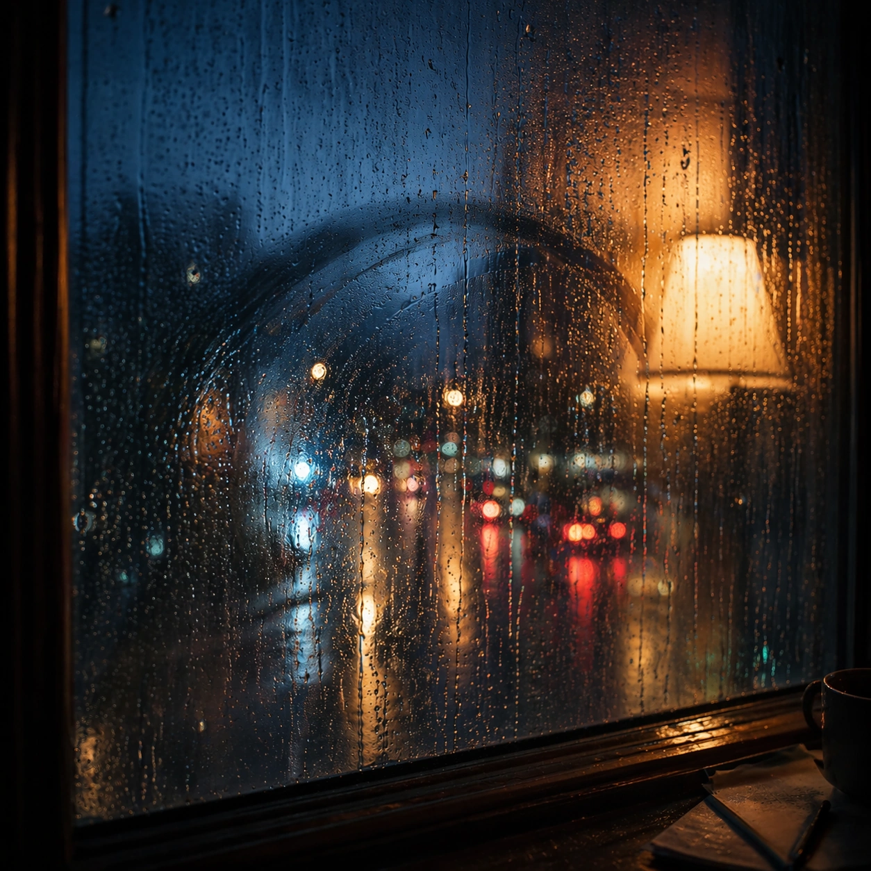
Scene: Create a square cinematic still for Rain Window Memory. Use production-grade photoreal lighting, disciplined lens behavior, and a composition that feels like a finished key frame from an original film rather than a casual snapshot. A rain-covered window fills much of the frame while the city outside dissolves into cool bokeh circles and smeared light trails, and a warm interior lamp reflection hovers on the glass without overpowering the weathered surface. Push the composition toward the emotional peak of the same setup, with the most dramatic balance of brightness, shadow, or atmospheric density inside the established world. Subject: Build a coherent original scene whose emotional center comes from atmosphere, light physics, and spatial clarity. Avoid relying on celebrity likeness, franchise iconography, or stylized illustration shortcuts. The subject is the interaction of droplets, finger-smear traces, condensation, reflected room light, and soft urban color beyond the pane, with any human presence implied indirectly rather than shown as a posed portrait. Everything should still read as the same location and same event, but framed for maximum narrative force and visual closure. Important details: Preserve a believable physical world with strong depth layering, careful color separation, and premium image discipline. Render droplet scale, gravity-driven streaking, condensation edges, and double reflections with high fidelity, preserving a restrained emotional intimacy that feels personal and cinematic instead of sentimental or glossy. Make it feel like the strongest hero frame of the sequence without breaking continuity or introducing a new design language. Use case: Rain Window series study 4/9. Constraints: No readable text, no watermark, no logos, preserve exact 1:1 aspect ratio, no readable street signs, no brand logos, no full face pressed to the glass, no cartoon heart iconography, no perfect symmetrical droplets.

Example generated from “Rain Window Memory — Surface Study”
GPT Image 2en

Scene: Create a square cinematic still for Rain Window Memory. Use production-grade photoreal lighting, disciplined lens behavior, and a composition that feels like a finished key frame from an original film rather than a casual snapshot. A rain-covered window fills much of the frame while the city outside dissolves into cool bokeh circles and smeared light trails, and a warm interior lamp reflection hovers on the glass without overpowering the weathered surface. Build an independent square study around the way atmosphere interacts with surfaces, keeping enough environmental context for the image to feel finished rather than cropped at random. Subject: Build a coherent original scene whose emotional center comes from atmosphere, light physics, and spatial clarity. Avoid relying on celebrity likeness, franchise iconography, or stylized illustration shortcuts. The subject is the interaction of droplets, finger-smear traces, condensation, reflected room light, and soft urban color beyond the pane, with any human presence implied indirectly rather than shown as a posed portrait. Let textures, reflections, residue, moisture, dust, or particulate response become primary, while the broader setting remains clearly implied. Important details: Preserve a believable physical world with strong depth layering, careful color separation, and premium image discipline. Render droplet scale, gravity-driven streaking, condensation edges, and double reflections with high fidelity, preserving a restrained emotional intimacy that feels personal and cinematic instead of sentimental or glossy. The key is material credibility under dramatic light, with micro-contrast and controlled mood supporting the theme. Use case: Rain Window single study 5/9. Constraints: No readable text, no watermark, no logos, preserve exact 1:1 aspect ratio, no readable street signs, no brand logos, no full face pressed to the glass, no cartoon heart iconography, no perfect symmetrical droplets.

Example generated from “Rain Window Memory — Silhouette Study”
GPT Image 2en

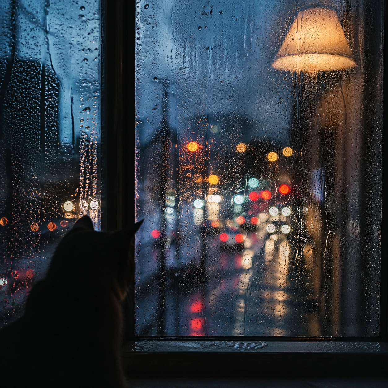
Scene: Create a square cinematic still for Rain Window Memory. Use production-grade photoreal lighting, disciplined lens behavior, and a composition that feels like a finished key frame from an original film rather than a casual snapshot. A rain-covered window fills much of the frame while the city outside dissolves into cool bokeh circles and smeared light trails, and a warm interior lamp reflection hovers on the glass without overpowering the weathered surface. Compose an independent frame where one human, animal, or object silhouette negotiates with the atmospheric light event in a clean, readable way. Subject: Build a coherent original scene whose emotional center comes from atmosphere, light physics, and spatial clarity. Avoid relying on celebrity likeness, franchise iconography, or stylized illustration shortcuts. The subject is the interaction of droplets, finger-smear traces, condensation, reflected room light, and soft urban color beyond the pane, with any human presence implied indirectly rather than shown as a posed portrait. The silhouette should supply scale and emotional orientation, but the environment still needs to carry most of the storytelling weight. Important details: Preserve a believable physical world with strong depth layering, careful color separation, and premium image discipline. Render droplet scale, gravity-driven streaking, condensation edges, and double reflections with high fidelity, preserving a restrained emotional intimacy that feels personal and cinematic instead of sentimental or glossy. Keep the silhouette simple and believable, avoiding poster-like graphic flattening while preserving strong contrast. Use case: Rain Window single study 6/9. Constraints: No readable text, no watermark, no logos, preserve exact 1:1 aspect ratio, no readable street signs, no brand logos, no full face pressed to the glass, no cartoon heart iconography, no perfect symmetrical droplets.

Example generated from “Rain Window Memory — Transition Study”
GPT Image 2en

Scene: Create a square cinematic still for Rain Window Memory. Use production-grade photoreal lighting, disciplined lens behavior, and a composition that feels like a finished key frame from an original film rather than a casual snapshot. A rain-covered window fills much of the frame while the city outside dissolves into cool bokeh circles and smeared light trails, and a warm interior lamp reflection hovers on the glass without overpowering the weathered surface. Treat this as an adjacent moment before or after the main event, preserving the same topic language while letting the atmosphere shift slightly in intensity or position. Subject: Build a coherent original scene whose emotional center comes from atmosphere, light physics, and spatial clarity. Avoid relying on celebrity likeness, franchise iconography, or stylized illustration shortcuts. The subject is the interaction of droplets, finger-smear traces, condensation, reflected room light, and soft urban color beyond the pane, with any human presence implied indirectly rather than shown as a posed portrait. Show the environment in transition, with clear evidence of recent motion, changing weather, or fading light, but without turning it into action spectacle. Important details: Preserve a believable physical world with strong depth layering, careful color separation, and premium image discipline. Render droplet scale, gravity-driven streaking, condensation edges, and double reflections with high fidelity, preserving a restrained emotional intimacy that feels personal and cinematic instead of sentimental or glossy. Subtle temporal storytelling matters here more than maximal drama, so let traces, gradients, and environmental residue do the work. Use case: Rain Window single study 7/9. Constraints: No readable text, no watermark, no logos, preserve exact 1:1 aspect ratio, no readable street signs, no brand logos, no full face pressed to the glass, no cartoon heart iconography, no perfect symmetrical droplets.

Example generated from “Rain Window Memory — Wide Study”
GPT Image 2en

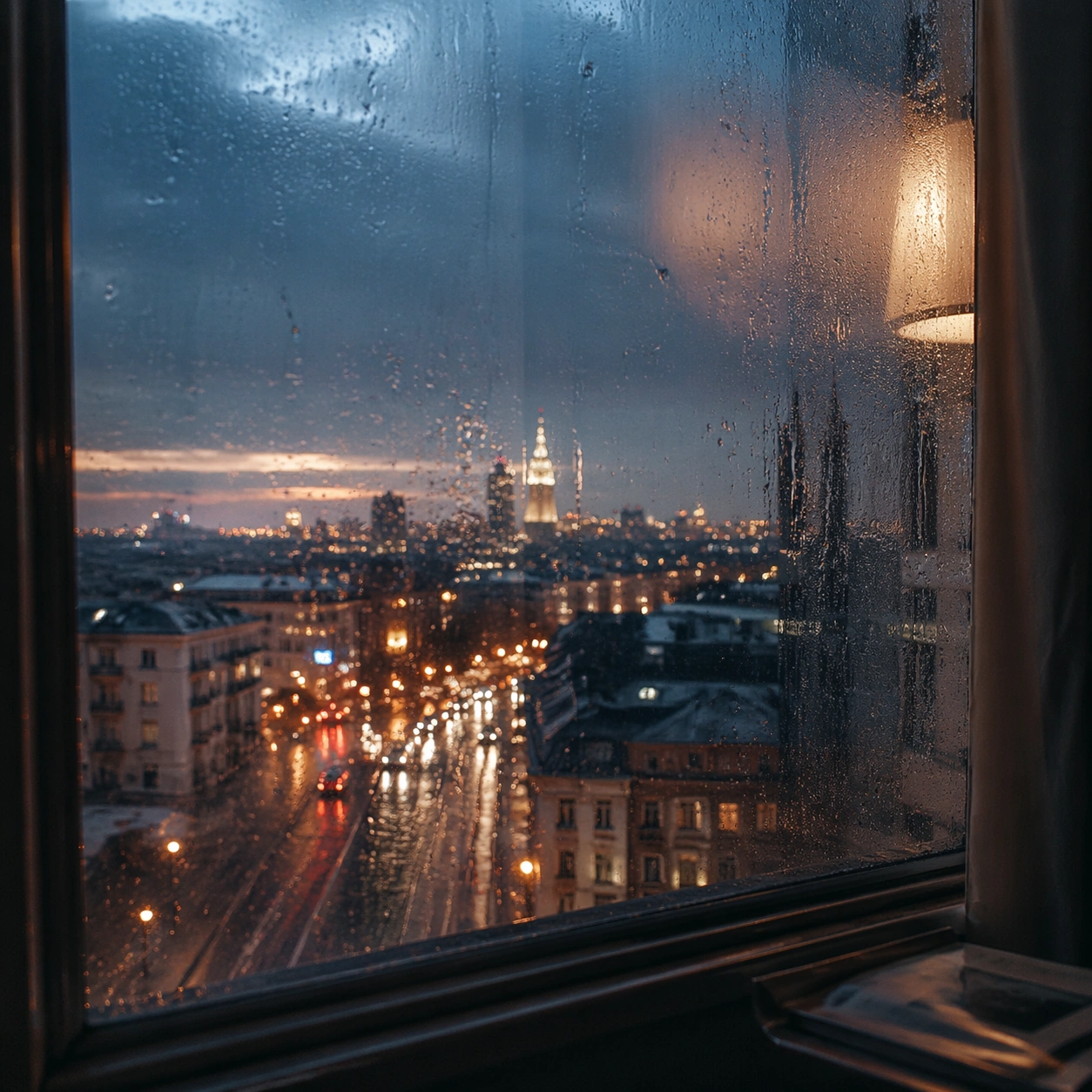
Scene: Create a square cinematic still for Rain Window Memory. Use production-grade photoreal lighting, disciplined lens behavior, and a composition that feels like a finished key frame from an original film rather than a casual snapshot. A rain-covered window fills much of the frame while the city outside dissolves into cool bokeh circles and smeared light trails, and a warm interior lamp reflection hovers on the glass without overpowering the weathered surface. Pull back enough to explain the broader geography or architectural envelope while keeping the square crop intentional and balanced. Subject: Build a coherent original scene whose emotional center comes from atmosphere, light physics, and spatial clarity. Avoid relying on celebrity likeness, franchise iconography, or stylized illustration shortcuts. The subject is the interaction of droplets, finger-smear traces, condensation, reflected room light, and soft urban color beyond the pane, with any human presence implied indirectly rather than shown as a posed portrait. The wider frame should reveal how the main light or weather phenomenon organizes the surrounding world and not just the immediate subject. Important details: Preserve a believable physical world with strong depth layering, careful color separation, and premium image discipline. Render droplet scale, gravity-driven streaking, condensation edges, and double reflections with high fidelity, preserving a restrained emotional intimacy that feels personal and cinematic instead of sentimental or glossy. Make scale legible through spacing, horizon control, and foreground-to-background separation rather than through extra props. Use case: Rain Window single study 8/9. Constraints: No readable text, no watermark, no logos, preserve exact 1:1 aspect ratio, no readable street signs, no brand logos, no full face pressed to the glass, no cartoon heart iconography, no perfect symmetrical droplets.

Example generated from “Rain Window Memory — Afterglow Study”
GPT Image 2en

Scene: Create a square cinematic still for Rain Window Memory. Use production-grade photoreal lighting, disciplined lens behavior, and a composition that feels like a finished key frame from an original film rather than a casual snapshot. A rain-covered window fills much of the frame while the city outside dissolves into cool bokeh circles and smeared light trails, and a warm interior lamp reflection hovers on the glass without overpowering the weathered surface. End on a quieter independent image that holds the residue of the topic atmosphere after its loudest moment has passed, while still feeling complete and exhibition-ready. Subject: Build a coherent original scene whose emotional center comes from atmosphere, light physics, and spatial clarity. Avoid relying on celebrity likeness, franchise iconography, or stylized illustration shortcuts. The subject is the interaction of droplets, finger-smear traces, condensation, reflected room light, and soft urban color beyond the pane, with any human presence implied indirectly rather than shown as a posed portrait. The frame should suggest memory, aftermath, or lingering presence through environment first and only secondarily through any figure or object. Important details: Preserve a believable physical world with strong depth layering, careful color separation, and premium image discipline. Render droplet scale, gravity-driven streaking, condensation edges, and double reflections with high fidelity, preserving a restrained emotional intimacy that feels personal and cinematic instead of sentimental or glossy. Favor restraint, believable light decay, and subtle narrative closure over spectacle or decorative excess. Use case: Rain Window single study 9/9. Constraints: No readable text, no watermark, no logos, preserve exact 1:1 aspect ratio, no readable street signs, no brand logos, no full face pressed to the glass, no cartoon heart iconography, no perfect symmetrical droplets.

Example generated from “Ramadan And Eid Hospitality Campaign — Evening Table Anchor”
GPT Image 2en

Scene: Create a square premium hospitality campaign image at evening with warm lantern light, deep blue twilight shadows, gold accents, and refined architectural calm. The environment should feel respectful, welcoming, and commercially polished, suitable for hotels, dining brands, or gifting campaigns around Ramadan and Eid. Use a table or hosting surface with believable spatial depth and a serene atmosphere rather than spectacle. Subject: Center a carefully arranged hospitality scene with dates, tableware, textiles, lantern-adjacent lighting, elegant serving pieces, and one or two gift elements. The objects should communicate generosity, evening gathering, and thoughtful presentation. Keep the composition grounded in hospitality and care, with no readable script and no generic luxury clichés that erase cultural specificity. Important details: Lock the campaign grammar here: warm evening glow, calm blue depth, refined geometry, rich but respectful textiles, hospitality-first composition, and premium material realism. The anchor should feel culturally aware and operationally flexible across hotel, retail, dining, or gifting campaign surfaces. Avoid decorative excess. Let dignity, warmth, and generosity carry the image. Use case: Ramadan/Eid series study 1/9. Constraints: No readable text, no watermark, no logos, preserve exact 1:1 aspect ratio, no readable calligraphy, no logo packaging, no crowd, no fantasy palace set, no stereotype overload, no stage-performance lighting, no visible alcohol, no kitsch lantern tunnel.

Example generated from “Ramadan And Eid Hospitality Campaign — Hotel Iftar Variation”
GPT Image 2en

Scene: Create a square dependent hospitality image in the exact same evening-lit world, preserving the same warm lantern glow, blue shadow depth, gold accents, and calm respect from the reference image, but widen the composition into a polished hotel iftar setting. The frame should remain unmistakably part of the same campaign family while becoming more architectural and table-service oriented. Subject: Show an elegant iftar table or lounge setup with serving pieces, dates, glassware, textiles, and subtle gift-ready elements. Preserve exact lighting, palette, and hospitality identity from the reference model while shifting emphasis toward hotel service and evening gathering. The scene should feel welcoming, premium, and suitable for real hospitality marketing. Important details: Preserve exact campaign identity from the reference image. The variation should deepen the hosting context without changing the visual language. Make stone, metal, glass, woven fabric, and ambient light all feel convincing. Avoid generic luxury clichés and keep the mood respectful, serene, and commercially useful for seasonal hospitality rollout. Use case: Ramadan/Eid series study 2/9. Constraints: No readable text, no watermark, no logos, preserve exact 1:1 aspect ratio, preserve exact campaign identity from the reference image, no readable menus, no crowd, no logo tableware, no alcohol, no palace fantasy, no overdecorated stage feel, no stereotype caricature.
Example generated from “Ramadan And Eid Hospitality Campaign — Perfume Hamper Variation”
GPT Image 2en

Scene: Create a square dependent gifting image within the same respectful evening campaign world, keeping the exact warm lantern light, blue shadow balance, gold accents, and premium calm from the reference image, but tighten the composition around a gift hamper or tray. The visual continuity should feel exact, as if the same brand world has simply focused on gifting for Eid or evening hospitality. Subject: Center an elegant hamper or tray containing fragrance-like bottles, textiles, dates or sweets, serving pieces, and premium gift packaging arranged into a cohesive offering. Preserve exact hospitality mood, palette, and material language from the reference model while shifting toward gifting. The result should remain brand-neutral, respectful, and commercially plausible for upscale seasonal gifting. Important details: Maintain the reference identity precisely. The gifting tier can rise, but the tone must stay calm and dignified. Make glass, metal, paper, fabric, and ambient light highly believable. Avoid logo dependence or luxury clichés that feel disconnected from hospitality. The scene should work for retail, hotel gifting, or premium seasonal commerce. Use case: Ramadan/Eid series study 3/9. Constraints: No readable text, no watermark, no logos, preserve exact 1:1 aspect ratio, preserve exact campaign identity from the reference image, no readable labels, no logo boxes, no alcohol bottles, no crowd, no fantasy palace, no gaudy gold overload, no stereotype props.

Example generated from “Ramadan And Eid Hospitality Campaign — Dessert Spread Variation”
GPT Image 2en

Scene: Create a square dependent hospitality image in the same evening-lit environment, preserving the exact warm lantern glow, blue ambient depth, and refined textile-material language from the reference image, but organize the composition around a dessert and serving spread. The scene should still feel clearly connected to the anchor while becoming more table-rich and abundance-focused. Subject: Show a composed spread of sweets, dates, tea or coffee service, serving vessels, and one subtle gift element arranged into a premium hosting image. Preserve exact campaign identity from the reference model while changing the emphasis toward celebratory food and hospitality. The spread should look real, respectful, and suitable for hospitality or retail communication during the season. Important details: Keep the mood generous but measured. Surface realism matters: glaze, metal, pastry texture, fabric weave, and lantern light should all feel persuasive. The image should behave like a premium seasonal asset for restaurants, hotels, or gifting brands. It must remain calm, culturally informed, and free of spectacle-heavy distraction. Use case: Ramadan/Eid series study 4/9. Constraints: No readable text, no watermark, no logos, preserve exact 1:1 aspect ratio, preserve exact campaign identity from the reference image, no readable menu cards, no alcohol, no crowd, no logo plates, no fantasy palace, no overdecorated stage set, no stereotype props.

Example generated from “Ramadan And Eid Hospitality Campaign — Crescent Window Suhoor”
GPT Image 2en

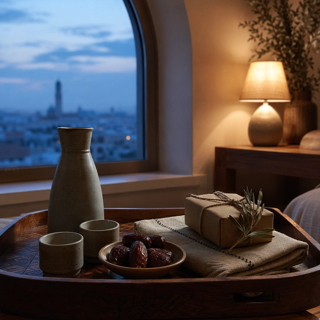
Scene: Create a square pre-dawn hospitality image with cool blue window light, soft warm interior lamp glow, and a calm intimate atmosphere. The frame should feel contemplative and premium rather than dramatic. Use a small table or tray setup with careful spacing and believable architectural context so the scene can support respectful seasonal storytelling or hospitality communication. Subject: Show a simple but elegant pre-dawn meal or preparation setup with tableware, dates, beverage vessel, folded textile, and one subtle decorative or gifting element. The subject should communicate care, quiet routine, and gentle anticipation through object arrangement. Keep everything original, non-branded, and free of readable script. Important details: Restraint matters. Use light, reflection, textile texture, and the contrast between cool dawn and warm interior tones to create emotional depth. The image should feel suitable for hospitality, lifestyle, or campaign storytelling around early-morning ritual and care. Avoid spectacle and avoid flattening the scene into generic minimalism. Keep the frame precise enough for gallery, research, and campaign reuse, with believable materials and a strong thumbnail read. Use case: Ramadan/Eid single study 5/9. Constraints: No readable text, no watermark, no logos, preserve exact 1:1 aspect ratio, no readable script, no logo packaging, no crowd, no fantasy palace, no alcohol, no stage-lighting drama, no cliché moon cartoon, no exaggerated luxury clutter.

Example generated from “Ramadan And Eid Hospitality Campaign — Serving Tray Closeup”
GPT Image 2en

Scene: Create a square close-up hospitality image with warm evening light, shallow but believable depth of field, and strong tactile focus. The crop should feel like a premium editorial detail from a larger campaign, not a random macro shot. Keep the tray and surrounding surfaces legible enough that the hospitality context remains clear and usable for campaign support. Subject: Focus on a serving tray with dates, cups, small sweets, textile edge, and one gift-ready packaging or fragrance silhouette nearby. The arrangement should communicate care, hosting, and refinement through a small number of objects. Emphasize craftsmanship, table discipline, and the dignity of presentation rather than decorative excess. Important details: Micro-texture carries the frame. Metal, ceramic, woven fabric, food surfaces, and warm light must all feel real. The image should support premium hospitality, gifting, or editorial campaign use during Ramadan and Eid season. Keep it respectful and elevated, avoiding stereotype overload or generic luxury noise. Keep the frame precise enough for gallery, research, and campaign reuse, with believable materials and a strong thumbnail read. Use case: Ramadan/Eid single study 6/9. Constraints: No readable text, no watermark, no logos, preserve exact 1:1 aspect ratio, no readable labels, no logo cups, no alcohol, no crowded buffet, no fantasy props, no stage-lit glamour, no hands dominating frame, no exaggerated ornament overload.

Example generated from “Ramadan And Eid Hospitality Campaign — Family Place Setting”
GPT Image 2en

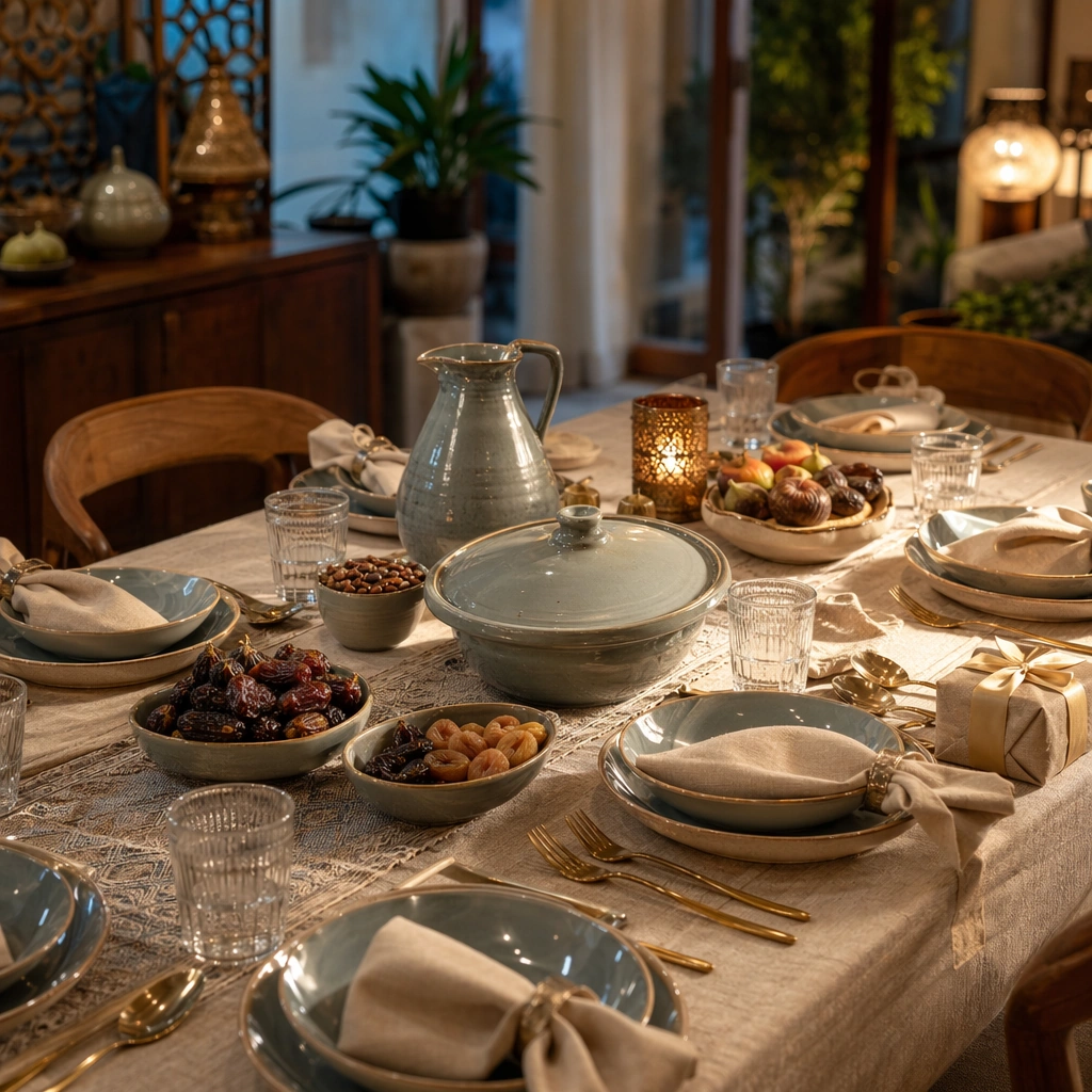
Scene: Create a square table-setting campaign image with warm evening light, calm blue-shadow depth, and a home-hospitality atmosphere that feels premium and respectful. The frame should suggest a family gathering without showing many faces. Use elegant composition, polished tableware, and believable room context so the image can support hospitality, retail, or lifestyle messaging. Subject: Show several place settings, serving pieces, dates, beverage vessels, folded textiles, and one subtle gifting cue arranged for shared evening hospitality. The table should feel ready and welcoming, not already in use. Focus on generosity, order, and care through the arrangement of objects and spatial rhythm rather than through portrait emotion or readable notes. Important details: Material accuracy and cultural respect matter. Keep linens, ceramics, metal, food texture, and ambient light all persuasive. The image should feel useful for hotels, supermarkets, dining brands, or premium retailers speaking about togetherness and hosting during the season. Avoid clichés and avoid flattening the scene into anonymous luxury minimalism. Use case: Ramadan/Eid single study 7/9. Constraints: No readable text, no watermark, no logos, preserve exact 1:1 aspect ratio, no readable cards, no crowd, no logo plates, no alcohol, no fantasy palace, no stage-lit spectacle, no stereotype props, no visible TV or modern clutter.

Example generated from “Ramadan And Eid Hospitality Campaign — Boutique Gift Display”
GPT Image 2en

Scene: Create a square boutique display image with refined evening light, premium shelving or plinths, and a calm sense of generosity. The frame should feel like a campaign visual for upscale retail during Ramadan and Eid, not a mall snapshot. Use composed architecture, elegant packaging density, and a palette that supports warmth and respect without becoming flashy. Subject: Show a display of gift boxes, fragrance or care silhouettes, textile accents, serving pieces, and lantern-adjacent light arranged into a curated retail story. The subject should communicate thoughtful gifting and hospitality through presentation quality. Keep everything non-branded, original, and free of readable script or overt religious text. Important details: Display logic matters: spacing, height variation, material contrast, and lighting should all feel intentional and premium. The image should work for retail, hotel boutique, or lifestyle-brand campaigns during the season. Preserve dignity and specificity through object choice and atmosphere rather than through cliché decoration. Keep the frame precise enough for gallery, research, and campaign reuse, with believable materials and a strong thumbnail read. Use case: Ramadan/Eid single study 8/9. Constraints: No readable text, no watermark, no logos, preserve exact 1:1 aspect ratio, no readable script, no logo packaging, no alcohol, no crowd, no glitter overload, no fantasy palace, no mascot décor, no generic luxury clutter.

Example generated from “Ramadan And Eid Hospitality Campaign — Courtyard Evening Lanterns”
GPT Image 2en

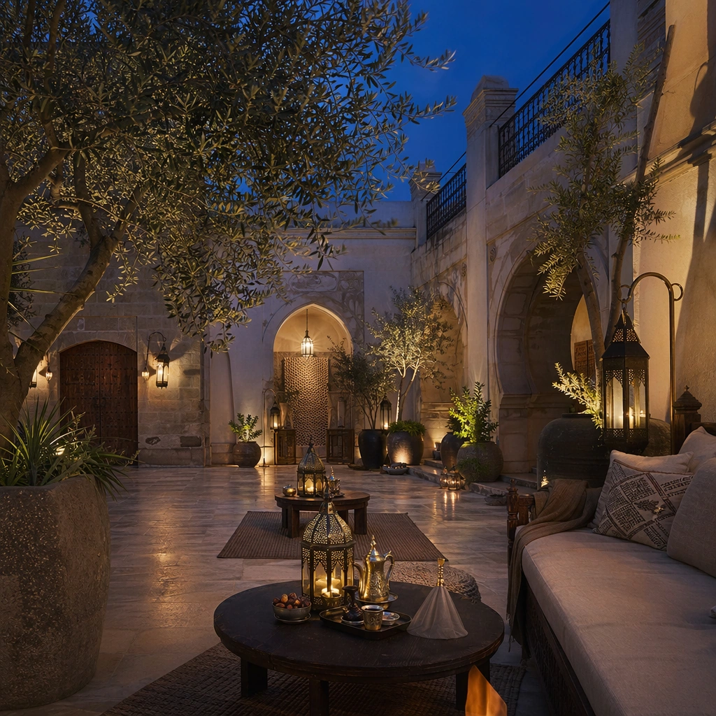
Scene: Create a square courtyard-at-evening image with warm lantern light, blue twilight sky, elegant stone or plaster architecture, and a quiet atmosphere of gathering. The frame should feel premium and real, suitable for hospitality or travel campaigns. Use architectural depth, soft reflections, and restrained seasonal details to create a powerful yet respectful evening scene. Subject: Show a courtyard with seating or low tables, lantern glow, textiles, greenery, and one or two hospitality cues that suggest shared evening welcome. Keep people minimal or absent. The subject should communicate place, warmth, and generosity through architecture and staging rather than through readable signage or spectacle-heavy décor. Important details: Architecture and light quality must feel convincing. Stone, plaster, textiles, plant life, and lantern metal should all read clearly. The image should support hotel, travel, dining, or lifestyle campaigns during Ramadan and Eid. Keep the tone serene, premium, and grounded, never theme-park exoticized or overly generic. Keep the frame precise enough for gallery, research, and campaign reuse, with believable materials and a strong thumbnail read. Use case: Ramadan/Eid single study 9/9. Constraints: No readable text, no watermark, no logos, preserve exact 1:1 aspect ratio, no readable signage, no logo décor, no fantasy palace excess, no crowd, no alcohol, no stage performance, no stereotype overload, no fireworks.

Example generated from “Reaction Meme Still System — Reference Anchor”
GPT Image 2en

Scene: Create a square reference image for Reaction Meme Still System. Build a reference anchor establishing the core system with a premium, production-ready finish. Use a polished modular board or campaign surface with clean spacing, premium game-UI finish, and clear focal hierarchy. The composition should feel intentional, clean, and reusable for gallery, research, campaign, or internal handoff contexts. Lighting must support readability first, with the main forms clearly separated from the background and enough breathing room for the system to stay legible at both hero scale and thumbnail scale. Subject: Center a coherent original game-art system built for premium production and marketing surfaces. For this image, focus on reference anchor. Keep the same system logic stable across screenshots, cards, banners, and overview boards. This image is the canonical anchor that later series images must follow. The viewer should immediately understand what role this surface plays inside a cohesive game-production asset pack. Important details: Lock framing, icon grammar, palette blocking, and surface hierarchy so the kit feels production-ready and consistent. Preserve the core silhouette, framing language, and material logic from the reference image while each variation changes function. Keep materials believable, edge hierarchy disciplined, and the visual language consistent with Reaction Memes. Use abstract interface blocks or diagram accents when helpful, but avoid any readable language. The final result should feel like a deliberate production asset rather than a random illustration. Use case: Reaction Meme Still System series study 1/9, designed as reference anchor within a cohesive asset pack. Constraints: No readable text, no watermark, no logos, preserve exact 1:1 aspect ratio, no unrelated objects, no broken visual hierarchy, no malformed anatomy or broken perspective, no random decorative clutter.

Example generated from “Reaction Meme Still System — Variant One”
GPT Image 2en

Scene: Create a square dependent image for Reaction Meme Still System. Build a first controlled variation in the same system with a premium, production-ready finish. Use a polished modular board or campaign surface with clean spacing, premium game-UI finish, and clear focal hierarchy. The composition should feel intentional, clean, and reusable for gallery, research, campaign, or internal handoff contexts. Lighting must support readability first, with the main forms clearly separated from the background and enough breathing room for the system to stay legible at both hero scale and thumbnail scale. Subject: Center a coherent original game-art system built for premium production and marketing surfaces. For this image, focus on the intended support surface. Keep the same system logic stable across screenshots, cards, banners, and overview boards. Preserve exact identity or system logic from the reference image while changing only the intended variation axis. The viewer should immediately understand what role this surface plays inside a cohesive game-production asset pack. Important details: Lock framing, icon grammar, palette blocking, and surface hierarchy so the kit feels production-ready and consistent. Preserve the core silhouette, framing language, and material logic from the reference image while each variation changes function. Keep materials believable, edge hierarchy disciplined, and the visual language consistent with Reaction Memes. Use abstract interface blocks or diagram accents when helpful, but avoid any readable language. The final result should feel like a deliberate production asset rather than a random illustration. Use case: Reaction Meme Still System series study 2/9, designed as variant one within a cohesive asset pack. Constraints: No readable text, no watermark, no logos, preserve exact 1:1 aspect ratio, no unrelated objects, no broken visual hierarchy, no malformed anatomy or broken perspective, no random decorative clutter.

Example generated from “Reaction Meme Still System — Variant Two”
GPT Image 2en

Scene: Create a square dependent image for Reaction Meme Still System. Build a second controlled variation in the same system with a premium, production-ready finish. Use a polished modular board or campaign surface with clean spacing, premium game-UI finish, and clear focal hierarchy. The composition should feel intentional, clean, and reusable for gallery, research, campaign, or internal handoff contexts. Lighting must support readability first, with the main forms clearly separated from the background and enough breathing room for the system to stay legible at both hero scale and thumbnail scale. Subject: Center a coherent original game-art system built for premium production and marketing surfaces. For this image, focus on the intended support surface. Keep the same system logic stable across screenshots, cards, banners, and overview boards. Preserve exact identity or system logic from the reference image while changing only the intended variation axis. The viewer should immediately understand what role this surface plays inside a cohesive game-production asset pack. Important details: Lock framing, icon grammar, palette blocking, and surface hierarchy so the kit feels production-ready and consistent. Preserve the core silhouette, framing language, and material logic from the reference image while each variation changes function. Keep materials believable, edge hierarchy disciplined, and the visual language consistent with Reaction Memes. Use abstract interface blocks or diagram accents when helpful, but avoid any readable language. The final result should feel like a deliberate production asset rather than a random illustration. Use case: Reaction Meme Still System series study 3/9, designed as variant two within a cohesive asset pack. Constraints: No readable text, no watermark, no logos, preserve exact 1:1 aspect ratio, no unrelated objects, no broken visual hierarchy, no malformed anatomy or broken perspective, no random decorative clutter.

Example generated from “Reaction Meme Still System — Variant Three”
GPT Image 2en

Scene: Create a square dependent image for Reaction Meme Still System. Build a third controlled variation in the same system with a premium, production-ready finish. Use a polished modular board or campaign surface with clean spacing, premium game-UI finish, and clear focal hierarchy. The composition should feel intentional, clean, and reusable for gallery, research, campaign, or internal handoff contexts. Lighting must support readability first, with the main forms clearly separated from the background and enough breathing room for the system to stay legible at both hero scale and thumbnail scale. Subject: Center a coherent original game-art system built for premium production and marketing surfaces. For this image, focus on the intended support surface. Keep the same system logic stable across screenshots, cards, banners, and overview boards. Preserve exact identity or system logic from the reference image while changing only the intended variation axis. The viewer should immediately understand what role this surface plays inside a cohesive game-production asset pack. Important details: Lock framing, icon grammar, palette blocking, and surface hierarchy so the kit feels production-ready and consistent. Preserve the core silhouette, framing language, and material logic from the reference image while each variation changes function. Keep materials believable, edge hierarchy disciplined, and the visual language consistent with Reaction Memes. Use abstract interface blocks or diagram accents when helpful, but avoid any readable language. The final result should feel like a deliberate production asset rather than a random illustration. Use case: Reaction Meme Still System series study 4/9, designed as variant three within a cohesive asset pack. Constraints: No readable text, no watermark, no logos, preserve exact 1:1 aspect ratio, no unrelated objects, no broken visual hierarchy, no malformed anatomy or broken perspective, no random decorative clutter.

Example generated from “Reaction Meme Still System — Support One”
GPT Image 2en

Scene: Create a square standalone support image for Reaction Meme Still System. Build a support-surface study with a clear focal hierarchy and a finished professional surface. Use a polished modular board or campaign surface with clean spacing, premium game-UI finish, and clear focal hierarchy. The frame should feel self-contained and polished, with enough structure to explain the system even without the reference series, yet still obviously belonging to the same theme and production world. Subject: Show a coherent original game-art system built for premium production and marketing surfaces in a way that emphasizes the intended support surface. Keep the same system logic stable across screenshots, cards, banners, and overview boards. Even though this image is independent, the viewer should still recognize the same universe, same commercial logic, and same production intent as the core package. Important details: Lock framing, icon grammar, palette blocking, and surface hierarchy so the kit feels production-ready and consistent. Preserve the broader theme language through color, framing, material choices, and modular composition. Use clean panel rhythm, premium asset presentation, and believable detail density. The image should work equally well as a gallery study, research reference, and mock production deliverable. Use case: Reaction Meme Still System single study 5/9, exploring support one as a support surface. Constraints: No readable text, no watermark, no logos, preserve exact 1:1 aspect ratio, no unrelated objects, no broken visual hierarchy, no visual noise that obscures the main surface, no accidental brand resemblance.

Example generated from “Reaction Meme Still System — Support Two”
GPT Image 2en

Scene: Create a square standalone support image for Reaction Meme Still System. Build a second support-surface study with a clear focal hierarchy and a finished professional surface. Use a polished modular board or campaign surface with clean spacing, premium game-UI finish, and clear focal hierarchy. The frame should feel self-contained and polished, with enough structure to explain the system even without the reference series, yet still obviously belonging to the same theme and production world. Subject: Show a coherent original game-art system built for premium production and marketing surfaces in a way that emphasizes the intended support surface. Keep the same system logic stable across screenshots, cards, banners, and overview boards. Even though this image is independent, the viewer should still recognize the same universe, same commercial logic, and same production intent as the core package. Important details: Lock framing, icon grammar, palette blocking, and surface hierarchy so the kit feels production-ready and consistent. Preserve the broader theme language through color, framing, material choices, and modular composition. Use clean panel rhythm, premium asset presentation, and believable detail density. The image should work equally well as a gallery study, research reference, and mock production deliverable. Use case: Reaction Meme Still System single study 6/9, exploring support two as a support surface. Constraints: No readable text, no watermark, no logos, preserve exact 1:1 aspect ratio, no unrelated objects, no broken visual hierarchy, no visual noise that obscures the main surface, no accidental brand resemblance.

Example generated from “Reaction Meme Still System — Support Three”
GPT Image 2en

Scene: Create a square standalone support image for Reaction Meme Still System. Build a third support-surface study with a clear focal hierarchy and a finished professional surface. Use a polished modular board or campaign surface with clean spacing, premium game-UI finish, and clear focal hierarchy. The frame should feel self-contained and polished, with enough structure to explain the system even without the reference series, yet still obviously belonging to the same theme and production world. Subject: Show a coherent original game-art system built for premium production and marketing surfaces in a way that emphasizes the intended support surface. Keep the same system logic stable across screenshots, cards, banners, and overview boards. Even though this image is independent, the viewer should still recognize the same universe, same commercial logic, and same production intent as the core package. Important details: Lock framing, icon grammar, palette blocking, and surface hierarchy so the kit feels production-ready and consistent. Preserve the broader theme language through color, framing, material choices, and modular composition. Use clean panel rhythm, premium asset presentation, and believable detail density. The image should work equally well as a gallery study, research reference, and mock production deliverable. Use case: Reaction Meme Still System single study 7/9, exploring support three as a support surface. Constraints: No readable text, no watermark, no logos, preserve exact 1:1 aspect ratio, no unrelated objects, no broken visual hierarchy, no visual noise that obscures the main surface, no accidental brand resemblance.

Example generated from “Reaction Meme Still System — Support Four”
GPT Image 2en

Scene: Create a square standalone support image for Reaction Meme Still System. Build a fourth support-surface study with a clear focal hierarchy and a finished professional surface. Use a polished modular board or campaign surface with clean spacing, premium game-UI finish, and clear focal hierarchy. The frame should feel self-contained and polished, with enough structure to explain the system even without the reference series, yet still obviously belonging to the same theme and production world. Subject: Show a coherent original game-art system built for premium production and marketing surfaces in a way that emphasizes the intended support surface. Keep the same system logic stable across screenshots, cards, banners, and overview boards. Even though this image is independent, the viewer should still recognize the same universe, same commercial logic, and same production intent as the core package. Important details: Lock framing, icon grammar, palette blocking, and surface hierarchy so the kit feels production-ready and consistent. Preserve the broader theme language through color, framing, material choices, and modular composition. Use clean panel rhythm, premium asset presentation, and believable detail density. The image should work equally well as a gallery study, research reference, and mock production deliverable. Use case: Reaction Meme Still System single study 8/9, exploring support four as a support surface. Constraints: No readable text, no watermark, no logos, preserve exact 1:1 aspect ratio, no unrelated objects, no broken visual hierarchy, no visual noise that obscures the main surface, no accidental brand resemblance.