Oryginalny dokument
GPT Image 2 · en
Scene:
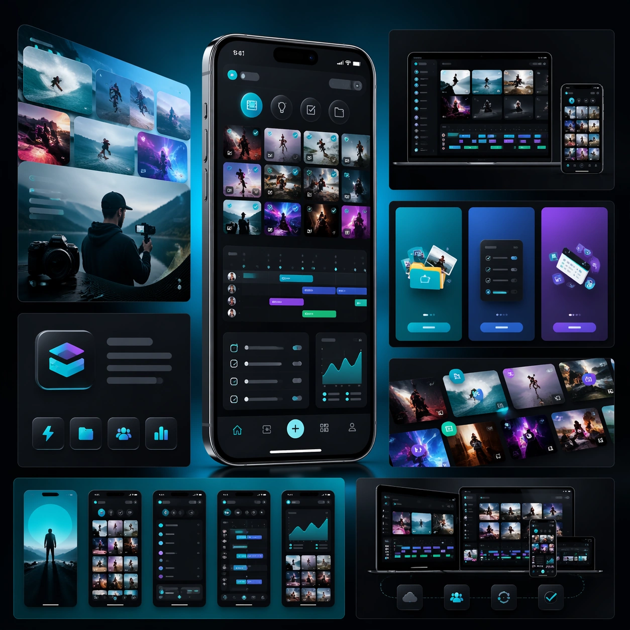
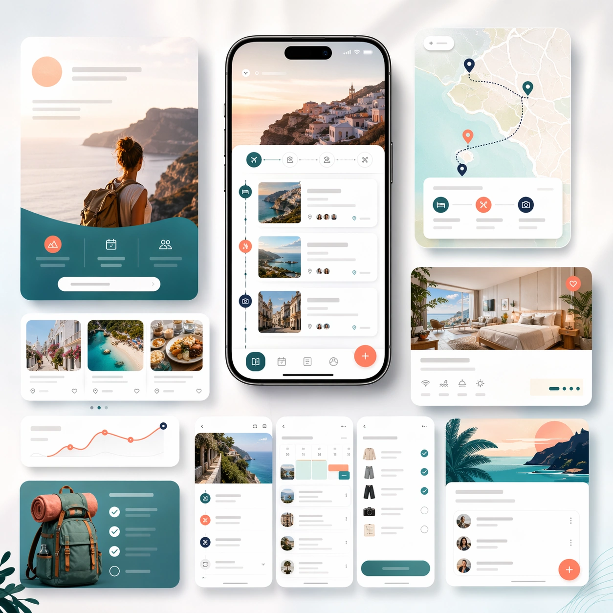
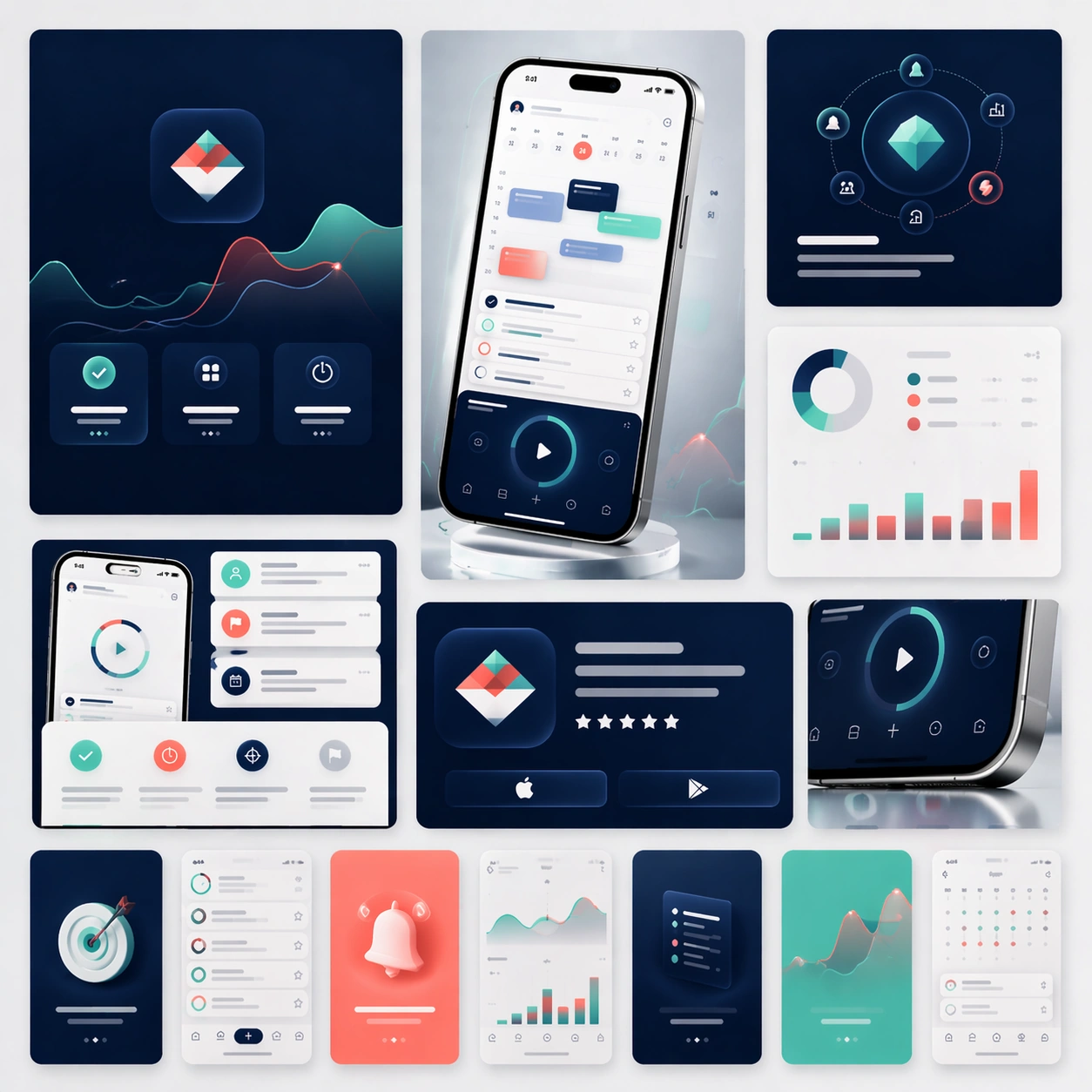
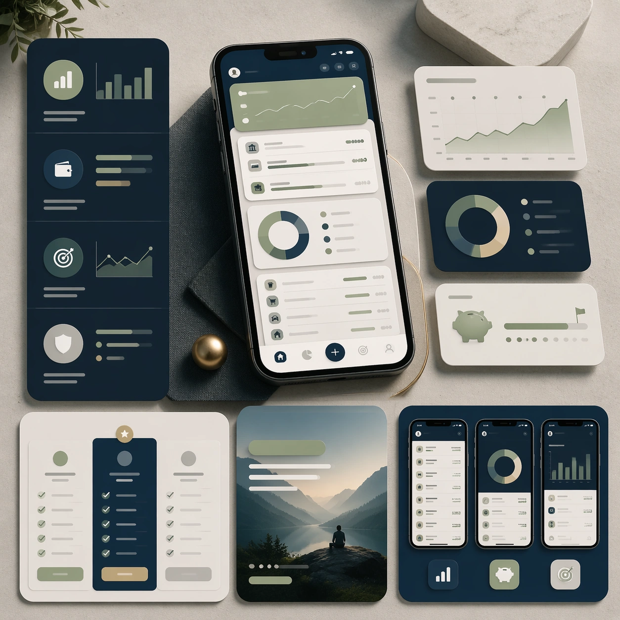
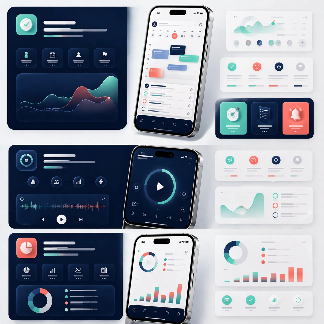
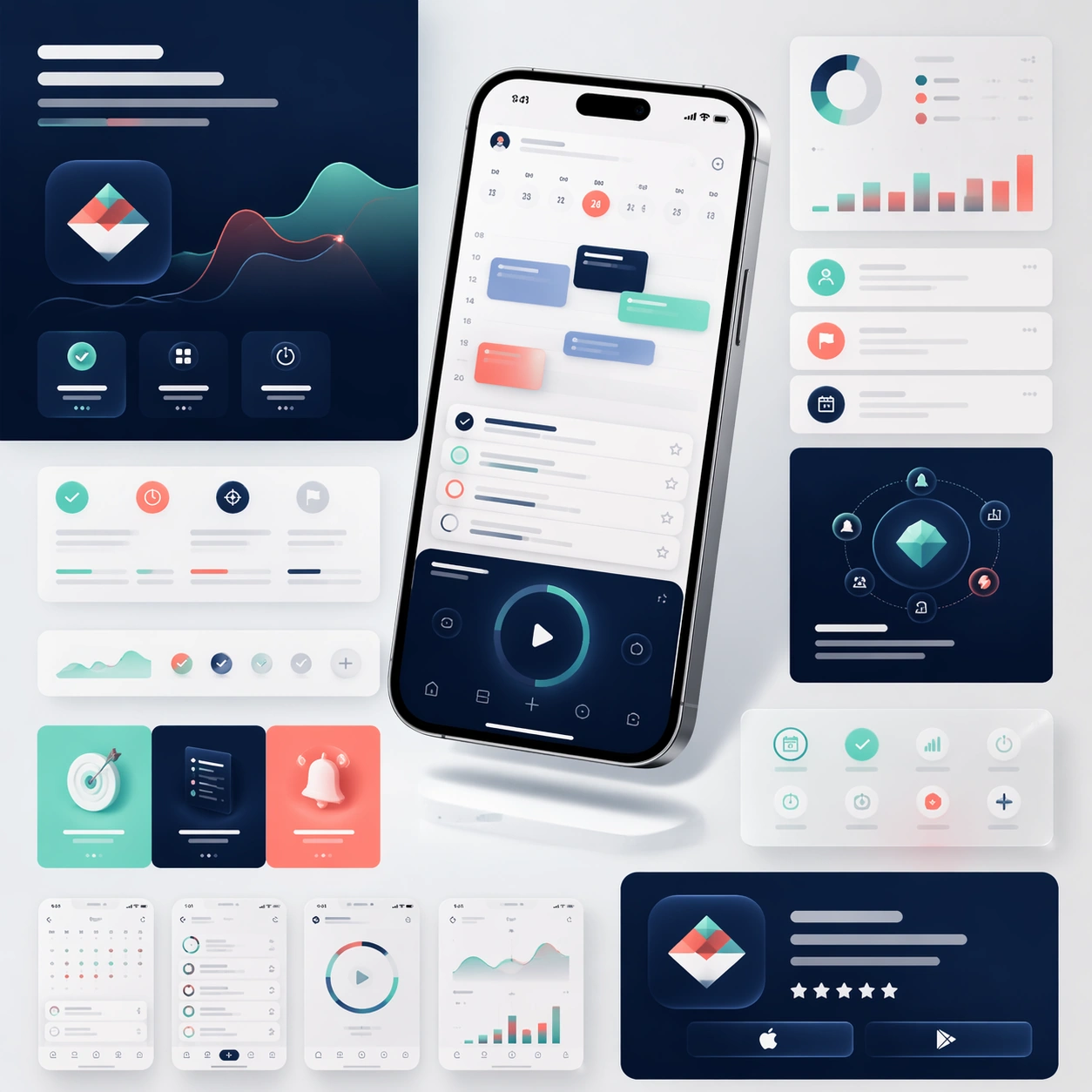
A square product-marketing board for a newly launched mobile productivity app, composed like a polished campaign key visual rather than a simple mockup sheet. Show one hero smartphone floating slightly above a bright studio surface, surrounded by cropped landing-page modules, soft gradient color fields, subtle shadow planes, and a few glassy interface fragments. The camera is straight-on with a mild top-down bias so the design reads like a premium marketing page assembled into a single square showcase. Keep the lighting crisp, commercial, and believable, with a calm palette of deep navy, cool mint, soft coral, and brushed silver.

Subject:
Establish the reference identity for the full series. The hero phone should display a coherent app interface with a dashboard, calendar blocks, tidy task cards, focus timer elements, and small chart accents. Around the phone, place abstract feature callout modules, screenshot strips, and App Store style promotional tiles using the same design language. The app should feel real, consumer-friendly, and launch-ready, but any text must remain unreadable placeholder bars and glyph-like marks. Show enough of the interface system that later images can clearly preserve the same screen hierarchy, icon style, corner radius, hardware proportions, and visual tone.

Important details:
The composition must feel like a full marketing-page toolkit collapsed into one elegant board. Keep device reflections subtle, bezels thin, shadows soft, and spacing deliberate. Use structured layout logic, realistic glass and metal materials, and disciplined UI rhythm rather than chaotic floating widgets. The image should communicate premium launch readiness, clear feature storytelling, and store-extension potential without relying on readable copy.

Use case:
App Launch Marketing Page Kit series study 1/4, establishing the core identity reference for all launch extensions.

Constraints:
No readable text, no watermark, no logos, preserve exact 1:1 aspect ratio, no fake brand names, no extra hands, no duplicate phones with mismatched UI, no warped device frames, no cluttered background props.
Jak używać
- Skopiuj cały oryginalny prompt wraz z parametrami.
- Dostosuj temat, tekst i kompozycję do swoich potrzeb.
- Użyj zgodnego narzędzia zewnętrznego; sprawdź warunki dostępu i wynik.
Przed rozpoczęciem
- Sprawdź, czy potrzebny jest obraz referencyjny. Zgodność nie potwierdza modelu użytego do przykładu.
- Sprawdź nazwy, liczby i napisy; wyniki zależą od wersji modelu.