
Oryginalny dokument
GPT Image 2 · en
Scene:
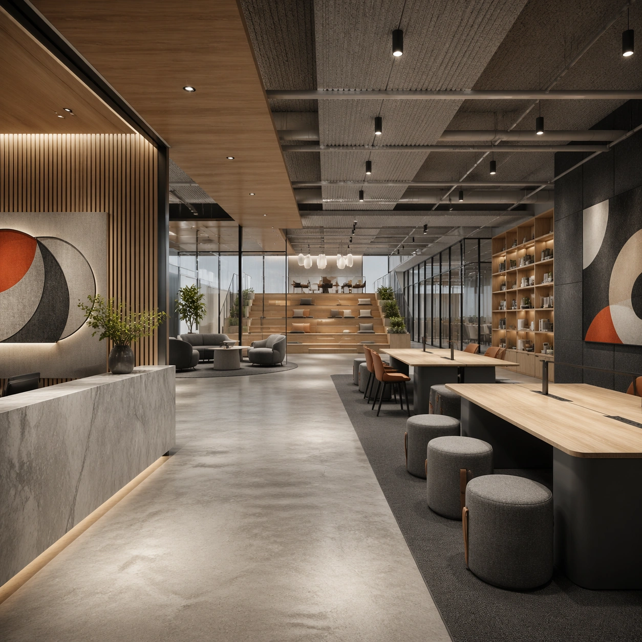
Create a square architectural reference still for Creative Studio and Office Brand Floor. Use a wide entry view that reveals reception, townhall seating, and the main collaborative volume and treat the frame like a premium interior or architecture editorial photograph with disciplined perspective, readable depth from foreground to background, and enough negative space for the spatial hierarchy to breathe. Light the scene so collaboration, material calm, and authored workplace identity feel immediate, using warm gray, natural oak, charcoal felt, off-white surfaces, and one controlled accent hue as the governing tonal range. The composition must read as a high-end commercial image that could sit inside office leasing decks, employer-brand campaigns, interior editorials, and workspace design reviews.

Subject:
Show a branded creative studio and office floor with modular collaboration tables, acoustic felt panels, smoked glass partitions, library shelving, soft lounge seating, and clear company personality. Center the office’s first impression, brand atmosphere, and circulation hierarchy. This is the canonical reference image for the package, so the major proportions, material transitions, fixture families, and circulation logic must feel highly specific and internally coherent rather than generic luxury styling. Let the viewer understand how the space is organized within a single glance, with foreground anchors, a clear middle zone, and a resolved background termination.

Important details:
Lock the table system, acoustic materials, glass-partition rhythm, informal lounge furniture, and abstract brand-graphic zones. Surfaces should feel tactile and believable: stone veining must stay plausible, metals should have disciplined reflectance, fabrics should show natural weight, and concealed lighting should shape the volume instead of flattening it. Use abstract signage, menu, label, or caption zones only as unreadable graphic hints. The image should feel practical for downstream design reviews and polished enough for public-facing campaign use.

Use case:
Creative Studio and Office Brand Floor series study 1/9, establishing the canonical workplace identity for the package.

Constraints:
No readable text, no watermark, no logos, preserve exact 1:1 aspect ratio, no office workers, no readable whiteboard text, no startup cliché neon, no messy desks, no cheap task-chair overload, no lobby turnstiles dominating.
Jak używać
- Skopiuj cały oryginalny prompt wraz z parametrami.
- Dostosuj temat, tekst i kompozycję do swoich potrzeb.
- Użyj zgodnego narzędzia zewnętrznego; sprawdź warunki dostępu i wynik.
Przed rozpoczęciem
- Sprawdź, czy potrzebny jest obraz referencyjny. Zgodność nie potwierdza modelu użytego do przykładu.
- Sprawdź nazwy, liczby i napisy; wyniki zależą od wersji modelu.