Oryginalny dokument
GPT Image 2 · en
Scene:
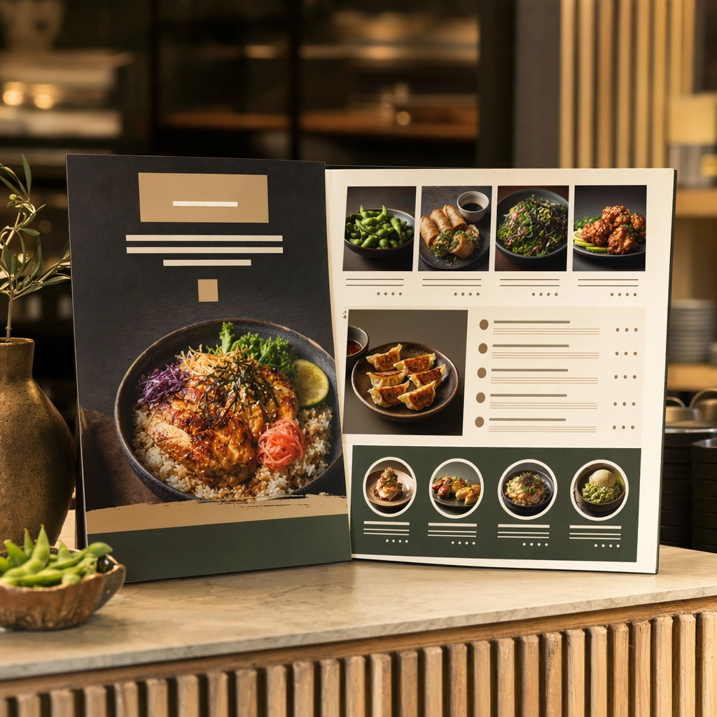
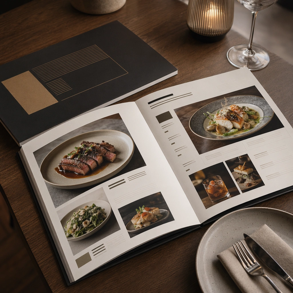
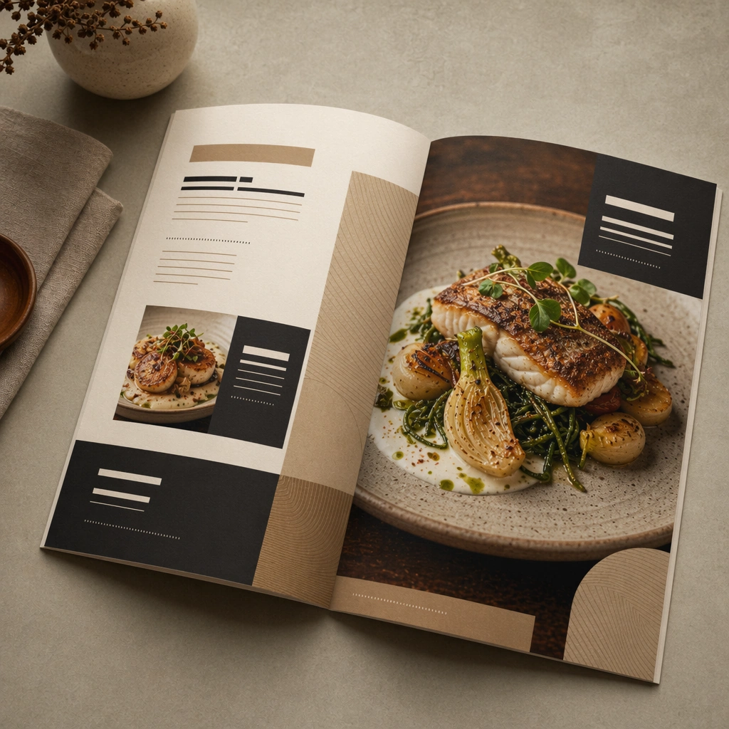
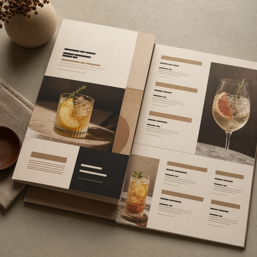
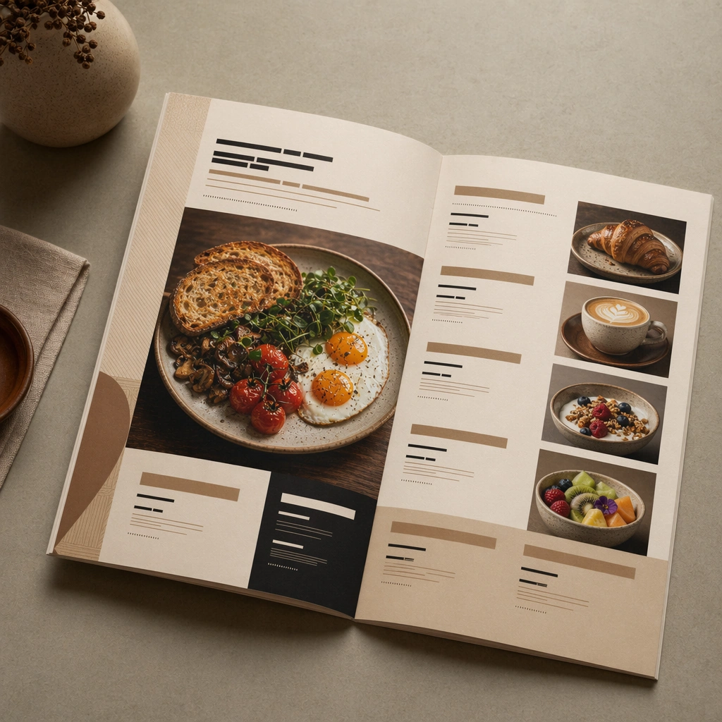
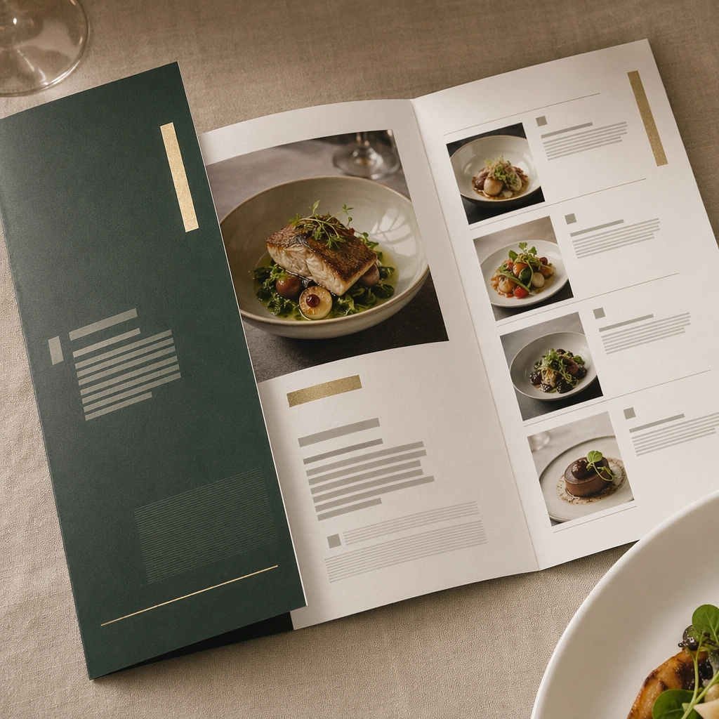
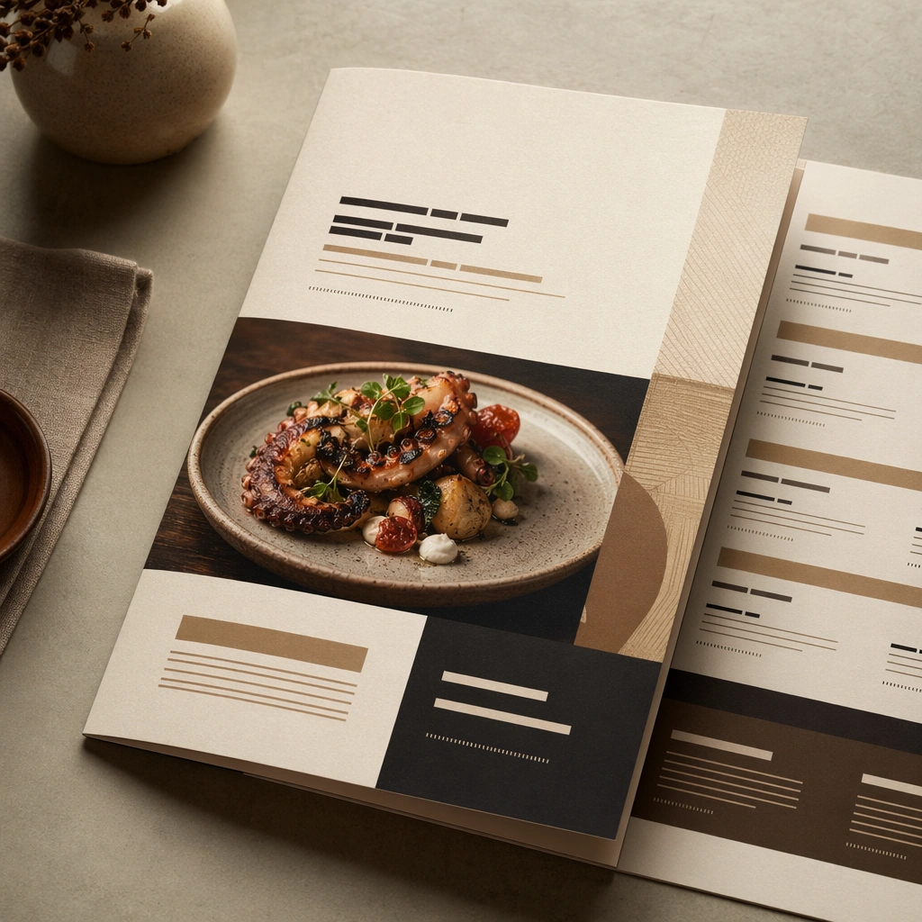
Compose a square menu-design mockup that combines printed surfaces, structured page hierarchy, and appetizing food photography into one coherent brand-authored system. The page layouts should feel intentional and premium, with strong margins, modular blocks, and realistic print or board materials even though all textual zones remain unreadable. Use a three-quarter tabletop view showing a printed menu cover on premium stock, one edge of an interior spread, and soft restaurant light defining paper depth.

Subject:
The menu should communicate category structure, hero dish placement, and brand tone through composition, image framing, typographic blocks, and page rhythm rather than through readable copy. Food imagery must stay believable and publication-ready. Feature one hero dish image integrated into the cover with bold but unreadable typographic blocks, category dividers, and clean margin structure.

Important details:
This topic tests layout reasoning as much as food styling. Preserve clean grids, realistic paper behavior, credible shadows, and strong focal hierarchy between cover, spreads, dish photos, and placeholder text zones. Text-like marks can exist only as abstract or unreadable forms; clarity must come from design structure. This image establishes the reference system for the series, including camera height, tabletop discipline, prop family, and color control that later images must inherit. This image must establish the menu system for the series: disciplined grid, realistic paper grain, consistent photography style, and placeholder text zones that feel designed but not legible.

Use case:
Menu System series study 1/9, built for Prompt Atlas coverage of a food and beverage commercial visual system.

Constraints:
No readable text, no watermark, no logos, preserve exact 1:1 aspect ratio, no readable text, no logos, no fake menu prices, no warped paper errors, no amateur flyer clutter, no chaotic collage, no obvious software UI chrome, no legible letters, no visible software editor, no warped spiral notebook aesthetic.
Jak używać
- Skopiuj cały oryginalny prompt wraz z parametrami.
- Dostosuj temat, tekst i kompozycję do swoich potrzeb.
- Użyj zgodnego narzędzia zewnętrznego; sprawdź warunki dostępu i wynik.
Przed rozpoczęciem
- Sprawdź, czy potrzebny jest obraz referencyjny. Zgodność nie potwierdza modelu użytego do przykładu.
- Sprawdź nazwy, liczby i napisy; wyniki zależą od wersji modelu.