Oryginalny dokument
GPT Image 2 · en
Scene:
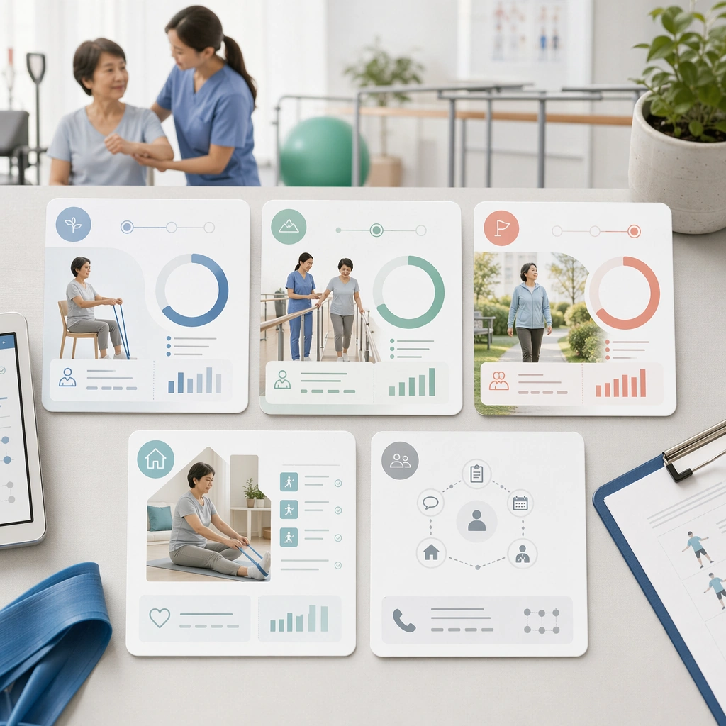
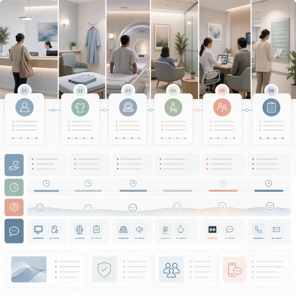
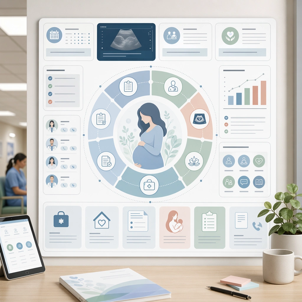
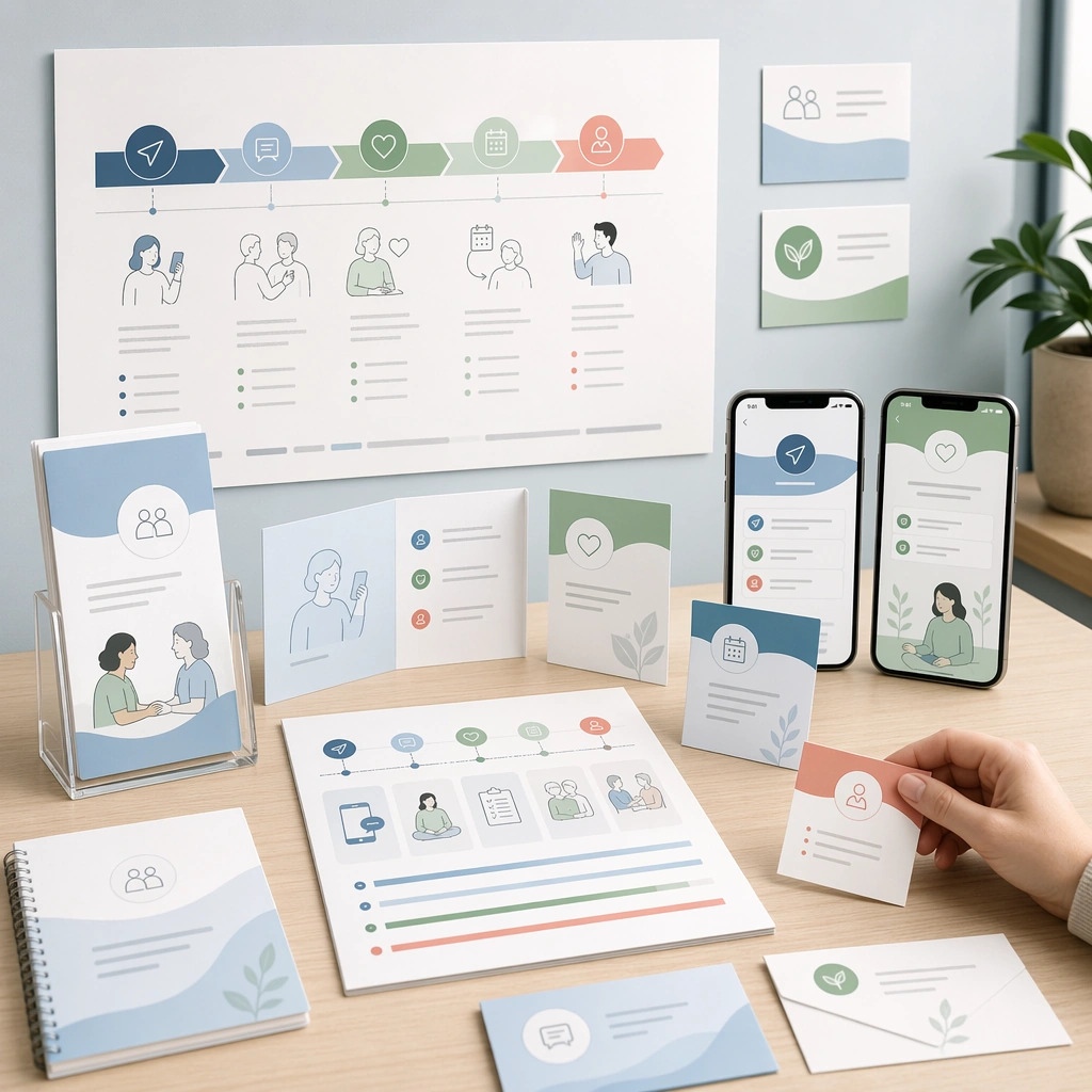
A square discharge explainer system for Patient Journey Explainer System. Compose it as a branching but highly controlled flowchart translated into an editorial square board. Use a palette of soft white, mist blue, sea-glass green, muted coral accents, and warm neutral grays, even editorial lighting with crisp, low-anxiety contrast, and a mood of clear, supportive, and process-oriented. The frame should feel like a real healthcare communication asset art-directed for professional delivery, not a stock photo, speculative concept render, or generic corporate template. Keep the camera distance, negative space, and depth cues disciplined so the image reads immediately even at thumbnail size.

Subject:
Center on the transition from discharge desk to transportation, medication pickup, home setup, self-care checks, and follow-up contact. Show enough surrounding context that the viewer understands the intended service surface, user situation, and institutional setting. Every object, person, diagram, device crop, or spatial cue should support clarity, trust, and practical use. If people appear, keep them anonymous, natural, privacy-safe, and grounded in believable body language rather than promotional posing.

Important details:
Maintain patient-journey communication built from sequencing, touchpoint mapping, low-anxiety illustrations, and interface-like clarity without dense textbook complexity. Use environmental cues from home and clinic together so the handoff between settings feels explicit and reassuring. Use abstract icon shapes, color blocks, chart bars, interface modules, or non-legible placeholder microcopy whenever information structure is needed, but never readable text. Materials, spacing, lighting, and hierarchy should feel production-ready and healthcare-specific. Avoid generic lifestyle filler, decorative noise, or design gestures that do not reinforce the communication goal.

Use case:
Patient Journey single study 4/9 for a discharge and recovery journey guide.

Constraints:
No readable text, no watermark, no logos, preserve exact 1:1 aspect ratio, no graphic medical scenes, no confusing maze compositions, no dark fear-based tone, no overcrowded information walls, no hospital-maze confusion, no sharp warning colors.
Jak używać
- Skopiuj cały oryginalny prompt wraz z parametrami.
- Dostosuj temat, tekst i kompozycję do swoich potrzeb.
- Użyj zgodnego narzędzia zewnętrznego; sprawdź warunki dostępu i wynik.
Przed rozpoczęciem
- Sprawdź, czy potrzebny jest obraz referencyjny. Zgodność nie potwierdza modelu użytego do przykładu.
- Sprawdź nazwy, liczby i napisy; wyniki zależą od wersji modelu.