Oryginalny dokument
GPT Image 2 · en
Scene:
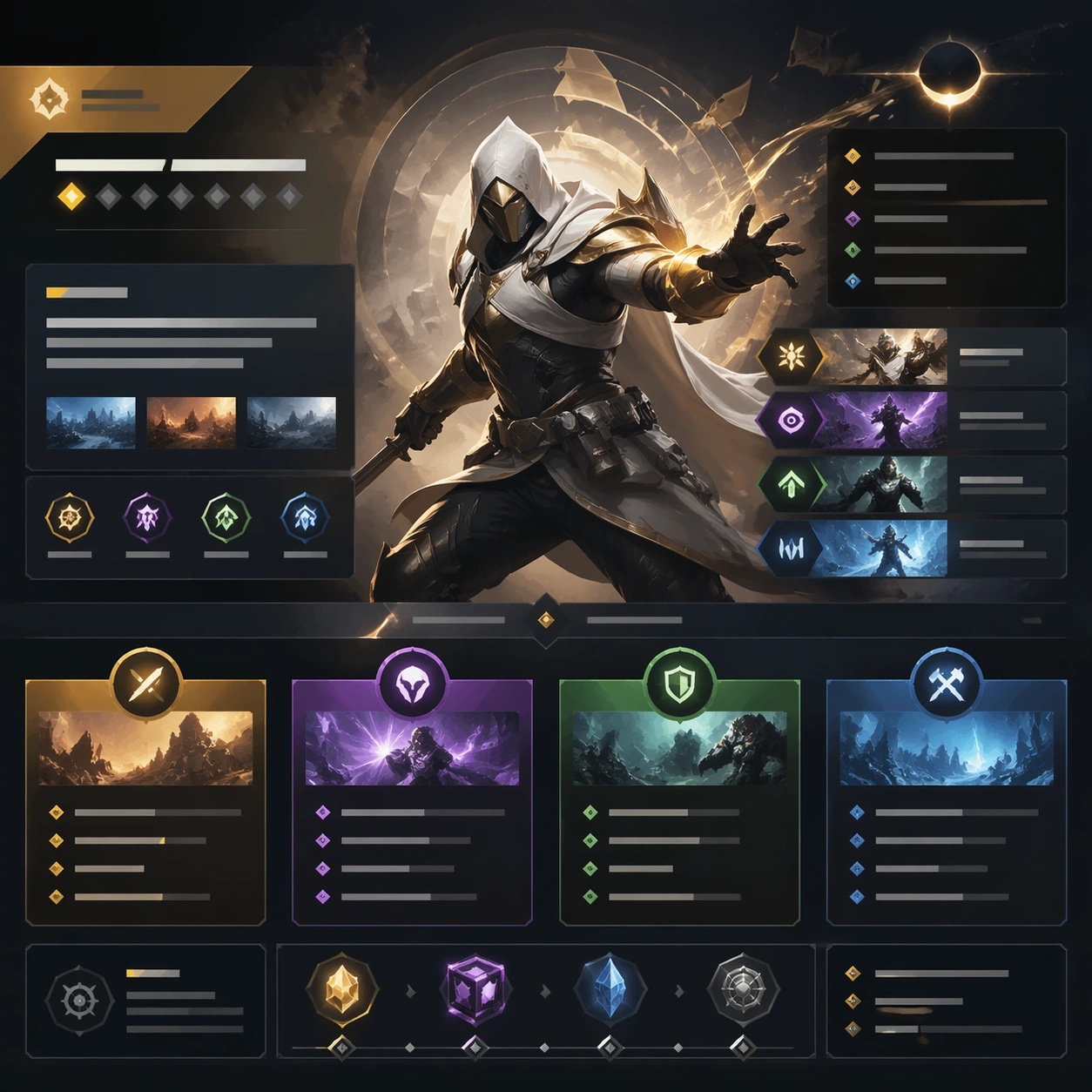
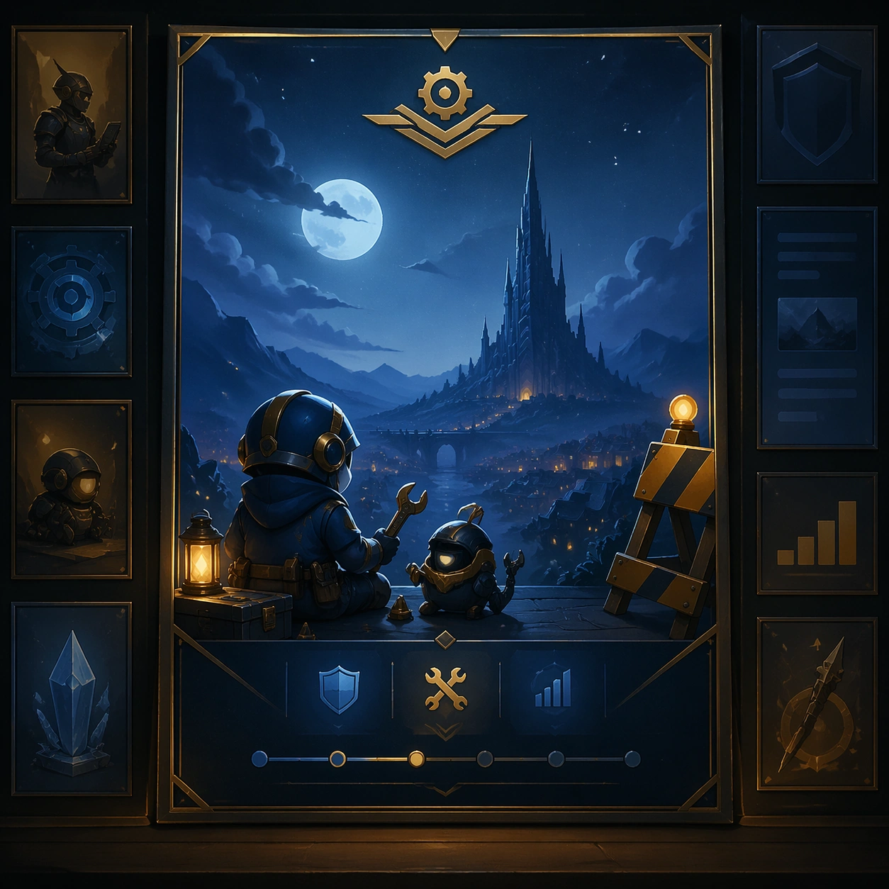
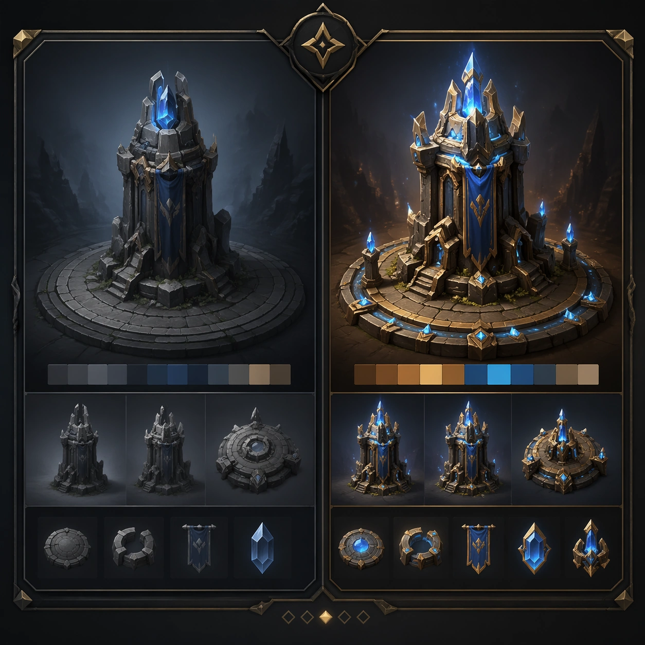
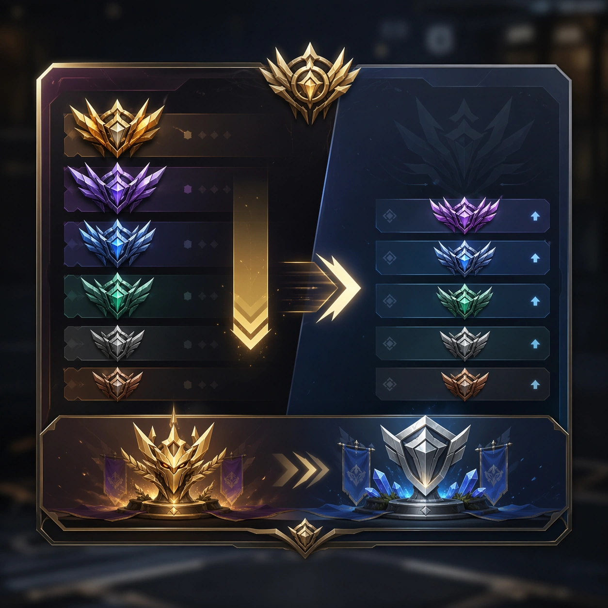
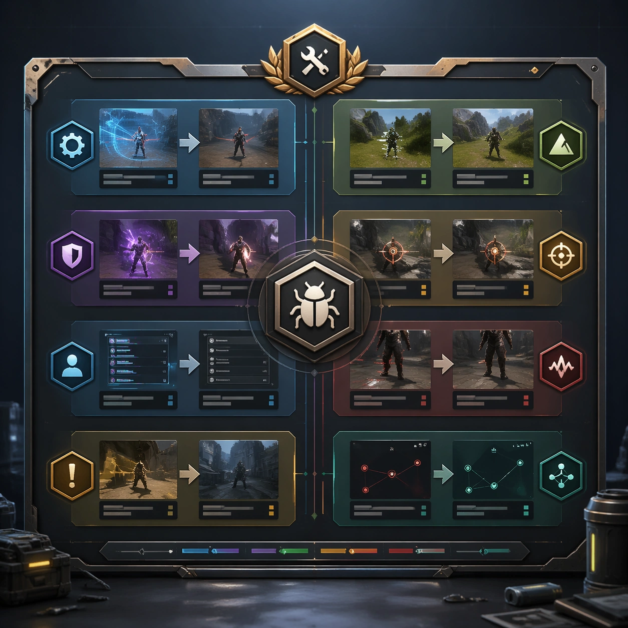
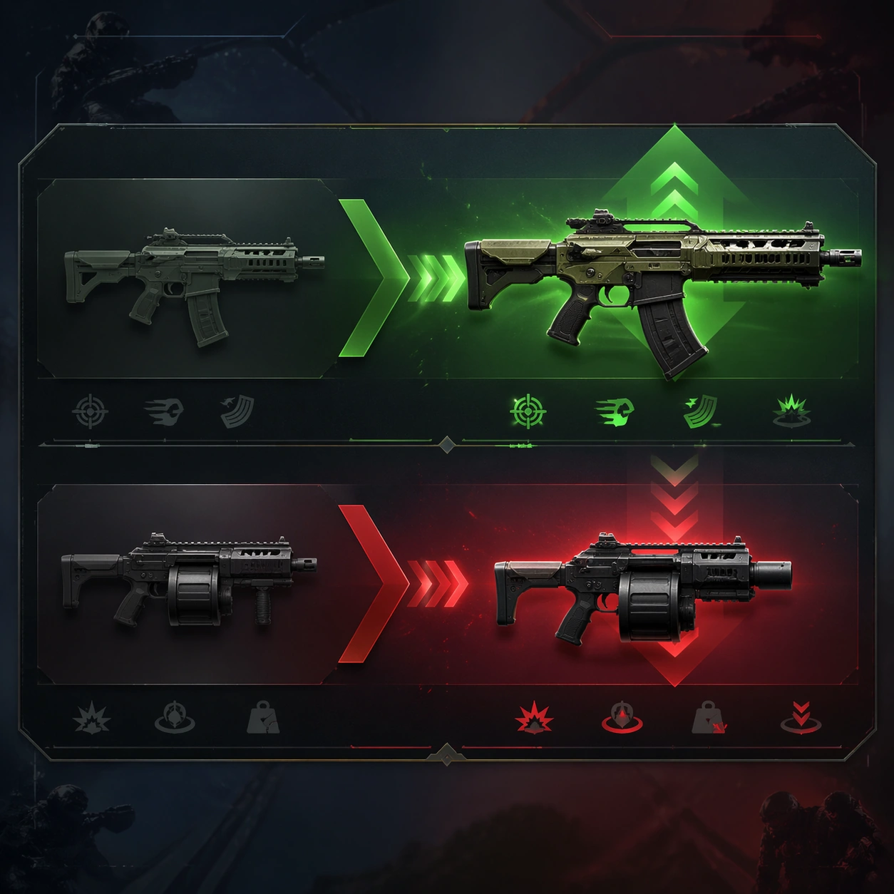
A square production-ready image designed for a game-art review wall and a commercial gallery at the same time. Frame a comparison strip visualizing one weapon buff and another nerf through silhouettes and arrows-like composition with disciplined lighting, clean edge separation, and enough surrounding context to prove how the asset would behave in a real product surface. The camera, crop, and tonal balance should feel intentional rather than generic, with high readability at first glance and convincing material response under closer inspection.

Subject:
Center the study on a comparison strip visualizing one weapon buff and another nerf through silhouettes and arrows-like composition. Translate the topic into a concrete, shippable visual statement instead of a loose mood board. Build layered object relationships, believable surface finish, and strong silhouette grouping so the image reads immediately as part of Patch Notes Visual Explainer. The subject should feel made for a live game pipeline: useful in store, UI, campaign, or art-review contexts, with visual hierarchy strong enough to survive aggressive cropping.

Important details:
balance change should read through graphics and object emphasis rather than text. Keep every supporting element subordinate to the main read, and make category separation obvious through form, color zoning, depth, and material logic rather than words. Where panels, cards, badges, or interface blocks appear, they must look professionally structured but remain unreadable. The visual language should feel premium, original, and coherent across this package, with no filler clutter and no accidental resemblance to a specific shipped game IP.

Use case:
Patch Notes Visual Explainer single study 2/9, focused on weapon buff nerf strip.

Constraints:
No readable text, no watermark, no logos, preserve exact 1:1 aspect ratio, no legible numbers, no bars with text, no broken hierarchy, no generic stock-photo staging, no accidental UI gibberish.
Jak używać
- Skopiuj cały oryginalny prompt wraz z parametrami.
- Dostosuj temat, tekst i kompozycję do swoich potrzeb.
- Użyj zgodnego narzędzia zewnętrznego; sprawdź warunki dostępu i wynik.
Przed rozpoczęciem
- Sprawdź, czy potrzebny jest obraz referencyjny. Zgodność nie potwierdza modelu użytego do przykładu.
- Sprawdź nazwy, liczby i napisy; wyniki zależą od wersji modelu.