PROMPTY · TWÓRCZE ODKRYWANIE

Galeria promptów

Odkrywaj prawdziwe prompty i wygenerowane przykłady. Znajdź inspirację do kolejnej twórczej misji i kopiuj pełne prompty bezpłatnie.

Przykłady
10,974
Modele
17
Źródła
1277
10 974 przykładów promptów · strona 19 z 229
Example generated from “Painting Character Ootd — Reference Portrait Grid”
GPT Image 2en

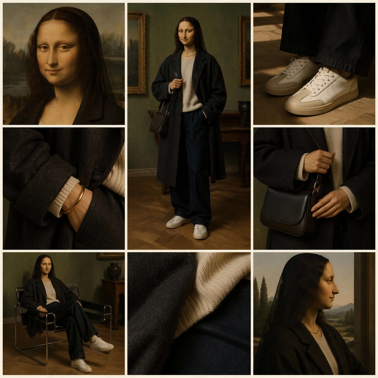
Scene: A square fashion editorial image that looks like a social media outfit-of-the-day grid, arranged as a clean 3 by 3 collage with thin ivory gutters and no readable interface text. The lighting is soft museum daylight mixed with modern studio fill. The palette combines aged varnish amber, deep green, warm black, cream, and muted denim blue, with the center panel slightly dominant but still locked into the grid. Subject: A Renaissance oil-painting sitter inspired by a famous half-length portrait: oval face, dark veil, softly folded hands, reserved enigmatic expression, and smoky sfumato skin tones. Keep the head, hair veil, gaze, and painterly face fully classical, but replace the torso with a carefully styled modern outfit: oversized charcoal coat, cream knit layer, relaxed dark trousers, plain pale sneakers, a small structured shoulder bag, and simple metal jewelry with no logos. Important details: The nine panels should read as one coherent OOTD post: center full-body fit check, corner crop of the painted face, shoe detail, sleeve texture, bag detail, mirror pose, seated pose, fabric close-up, and profile silhouette. Preserve the same sitter identity in every visible face. Use painted head and hands against believable modern garments, with clear fashion styling and precise grid hierarchy. Use case: Painting Character OOTD series study 1/8, establishing the identity and layout reference for later outfit edits. Constraints: No readable text, no watermark, no logos, preserve exact 1:1 aspect ratio, no brand marks, no distorted hands, no extra duplicate faces, no broken grid gutters, no photorealistic head replacement.
Example generated from “Painting Character Ootd — Streetwear Layering”
GPT Image 2en

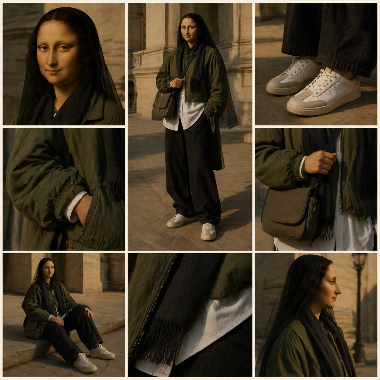
Scene: A square social-feed fashion collage using the same 3 by 3 grid structure as the reference image, with thin ivory gutters, balanced panel spacing, and no readable UI. The mood is late-afternoon city light outside a stone museum, mixing old master warmth with contemporary street photography. Keep the composition polished, editorial, and legible at thumbnail size. Subject: The same Renaissance oil-painting sitter from the reference image must appear across the grid with the identical oval face, dark veil, calm gaze, folded-hand poise, and softly modeled painterly skin. The clothing changes to modern streetwear layering: cropped technical jacket in moss green, long white shirt hem, wide washed-black trousers, understated court-style sneakers, canvas crossbody pouch, ribbed socks, and a matte charcoal scarf. The head remains painted and antique while the outfit materials read modern. Important details: Use the reference as the primary identity and layout guide. Preserve the sitter's face shape, veil silhouette, expression, and calm frontal presence across all visible panels. The grid should include a center full-body fit check, face crop, shoe crop, jacket detail, crossbody pouch detail, walking pose, seated curb pose, sleeve texture, and profile crop. Every panel must share one subject, one outfit system, and one coherent lighting direction. Use case: Painting Character OOTD series study 2/8, testing reference-based identity retention during a streetwear outfit edit. Constraints: No readable text, no watermark, no logos, preserve exact 1:1 aspect ratio, no brand marks, no changed face identity, no extra characters, no broken grid alignment, no modernizing the oil-painted head.

Example generated from “Painting Character Ootd — Gallery Tailoring”
GPT Image 2en

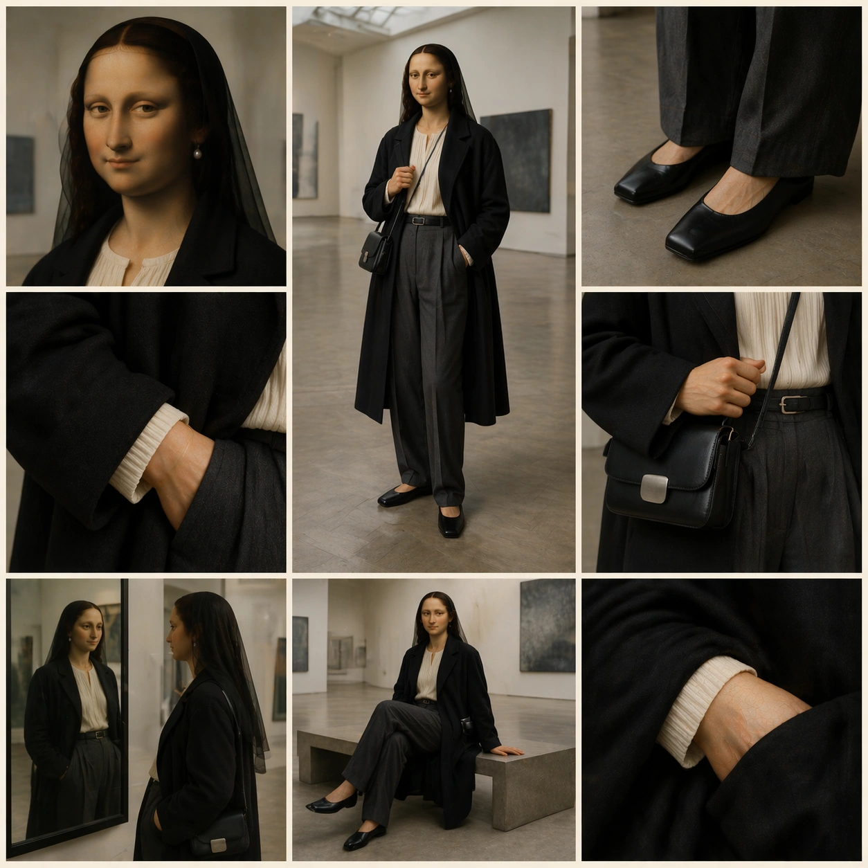
Scene: A square nine-panel outfit collage set inside a quiet contemporary gallery with polished concrete, pale walls, and indirect skylight. Keep the same clean social-grid rhythm as the reference image: thin ivory gutters, no readable UI labels, and a dominant central fit-check panel surrounded by eight supporting fashion details. The color temperature is neutral, refined, and bright enough to show fabric texture. Subject: The same Renaissance oil-painting sitter from the reference image appears with unchanged painted head, dark veil, soft face modeling, calm gaze, and composed posture. The outfit becomes minimalist gallery tailoring: long ink-black wool overcoat, collarless ivory blouse, high-waisted charcoal pleated trousers, square-toe leather flats, slim sculptural belt, small brushed-metal clasp bag, and a single pearl-like earring. The face and veil remain old-master oil painting; the garments are contemporary and tactile. Important details: Use the reference to lock identity, face proportions, expression, veil outline, and 3 by 3 grid structure. The center panel is a full-body gallery fit check. Surrounding panels show a three-quarter portrait, sleeve drape, trouser pleats, flat shoe, bag clasp, mirror reflection, seated bench pose, and a close crop where painted hand meets modern wool. The grid must feel like one editorial post, not nine unrelated images. Use case: Painting Character OOTD series study 3/8, testing whether a refined tailoring edit can preserve the same painted character and structured layout. Constraints: No readable text, no watermark, no logos, preserve exact 1:1 aspect ratio, no brand marks, no face drift, no mismatched outfits between panels, no warped gallery architecture, no photorealistic replacement for the painted head.

Example generated from “Painting Character Ootd — Studio Athleisure”
GPT Image 2en

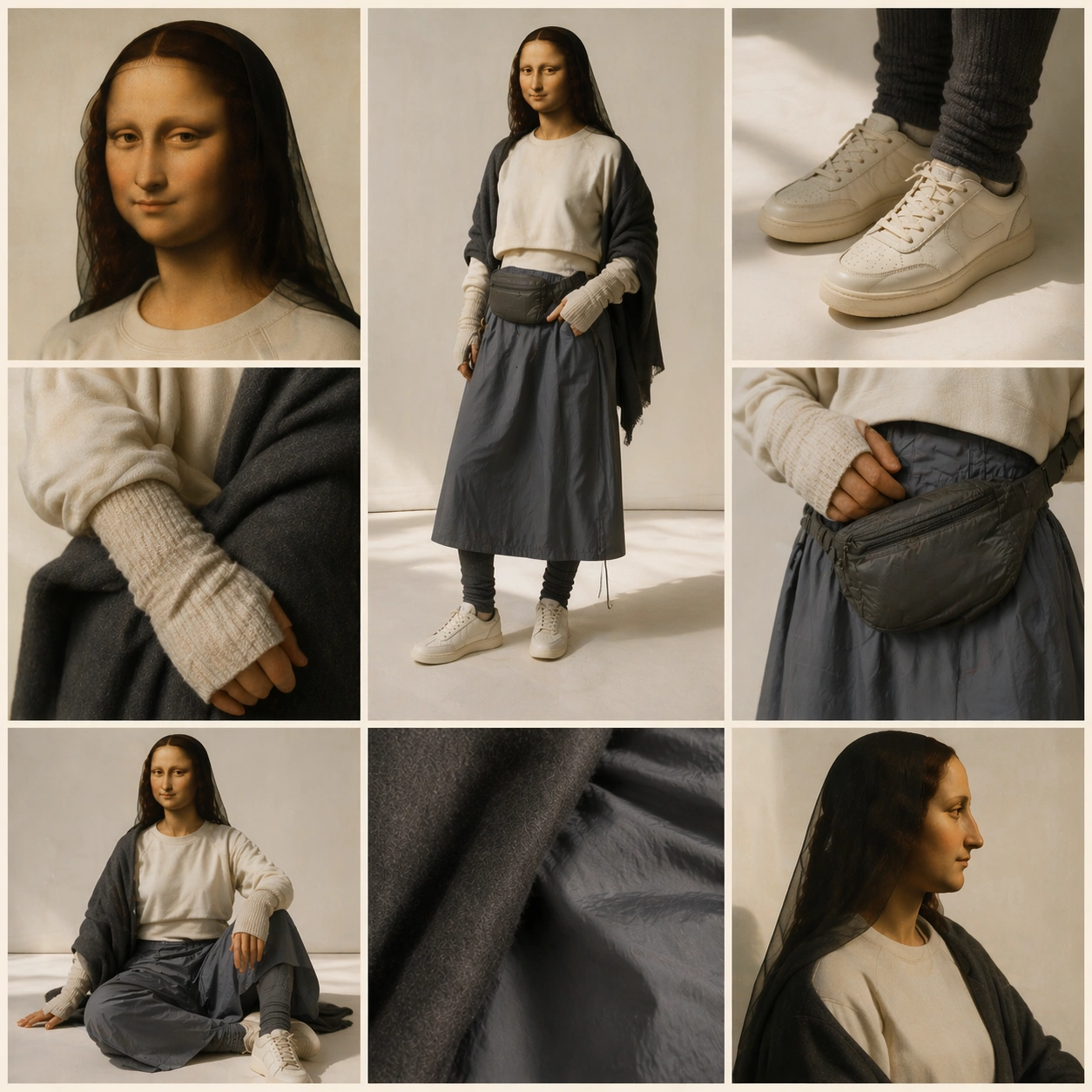
Scene: A square 3 by 3 outfit grid photographed in a clean daylight studio with pale paper backdrop, softbox reflections, and subtle floor shadows. Preserve the reference image's social-feed collage grammar: thin ivory gutters, central full-body panel, eight surrounding detail panels, no readable UI text, and a controlled editorial rhythm. The mood is lighter and more casual than the reference but still museum-aware. Subject: The same Renaissance oil-painting sitter from the reference image appears with the identical painted oval face, dark veil, softened sfumato features, quiet gaze, and composed hands. The outfit shifts to elevated athleisure: cropped oatmeal sweatshirt, long technical skirt in slate gray, ribbed leggings, minimal off-white trainers, quilted nylon belt bag, thin knit arm warmers, and a soft charcoal wrap. Keep the head antique and oil-painted while the clothing reads modern, tactile, and wearable. Important details: Use the first image as the primary reference for identity and grid layout. The center panel should be a full-body studio fit check; supporting panels show face crop, trainer detail, belt bag, knit sleeve, skirt fabric, standing side view, seated floor pose, and a painted hand resting against modern nylon. All panels must retain one consistent subject and outfit, with no drift in facial identity or garment color. Use case: Painting Character OOTD series study 4/8, testing casual modern outfit editing while preserving the painted portrait identity. Constraints: No readable text, no watermark, no logos, preserve exact 1:1 aspect ratio, no brand marks, no altered face, no extra models, no panel misalignment, no glossy synthetic skin, no replacing the oil-paint texture.

Example generated from “Painting Character Ootd — Pearl Earring Fit Check”
GPT Image 2en

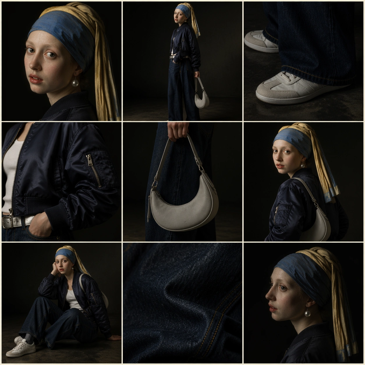
Scene: A square fashion collage arranged as a crisp 3 by 3 social-feed outfit grid with thin cream gutters, clean margins, and no readable interface text. The lighting echoes a northern studio: dark background, cool side light, luminous skin tones, and small highlights on fabric and jewelry. The full composition should feel like a luxury editorial post made from an old painting and a modern wardrobe session. Subject: A young painted portrait figure inspired by a Dutch golden-age tronie, with a blue-and-gold head wrap, pearl earring, turned shoulder, parted lips, and softly glazed face. Preserve the painted head and luminous old-master surface, but style the body in modern outfit pieces: cropped navy bomber, white ribbed tank, wide indigo denim, silver belt, pale low-profile sneakers, and a compact crescent bag. The sitter appears in multiple grid panels as the same person. Important details: Each panel should serve a fashion purpose: center full-body fit check, close-up of the head wrap and pearl, sneaker crop, bomber sleeve detail, bag silhouette, three-quarter portrait, seated pose, denim texture, and shadowed profile. The painted head must remain visibly historical while the garments read contemporary. Keep the nine panels aligned and visually related through consistent lighting, color, and identity. Use case: Painting Character OOTD single study 5/8, an independent art-history fit-check layout without reference dependencies. Constraints: No readable text, no watermark, no logos, preserve exact 1:1 aspect ratio, no brand marks, no extra people, no changed head wrap, no mismatched outfit pieces, no broken grid, no photographic face replacement.
Example generated from “Painting Character Ootd — Baroque Tailor Carousel”
GPT Image 2en

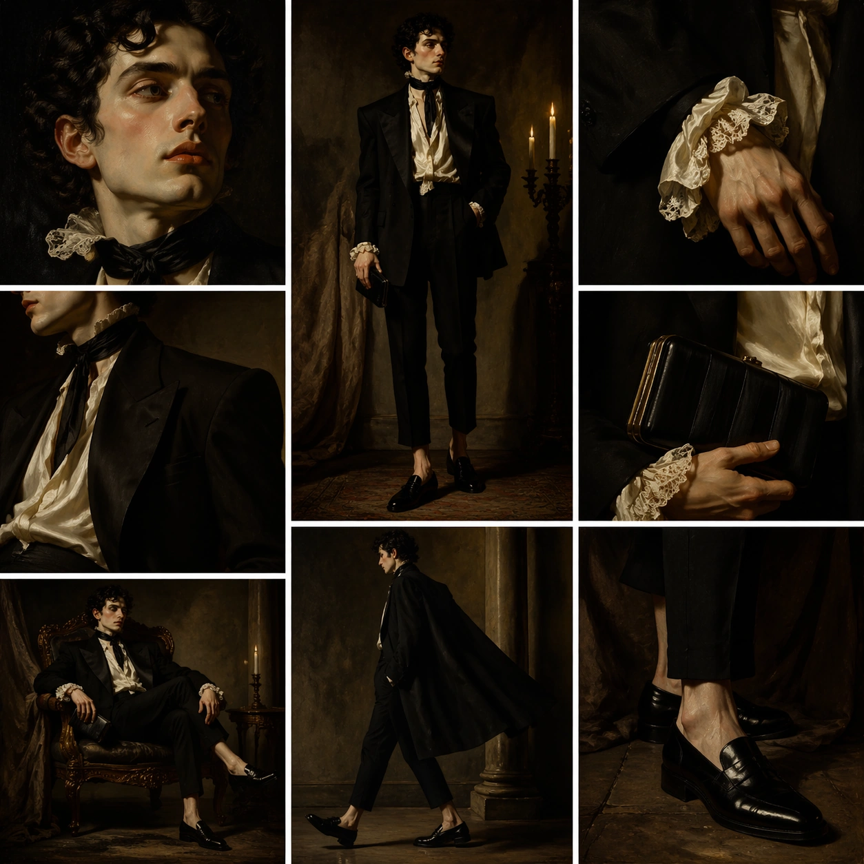
Scene: A square editorial image designed like a social media carousel preview collapsed into a 3 by 3 grid. Use dramatic Baroque chiaroscuro, warm candlelit highlights, deep umber shadows, and crisp ivory gutters between panels. The layout must feel controlled and modern even though the light and pose language are theatrical. No readable captions, icons, labels, or UI text should appear. Subject: A Baroque noble portrait figure with powdered skin, dark curled hair, lace collar remnants, intense side glance, and painterly brushwork. The head and hands remain old-master oil paint, but the outfit is modern architectural tailoring: black oversized blazer with sculptural shoulders, cream silk shirt, tapered cropped trousers, polished black loafers, narrow satin neck scarf, and a small hard-shell clutch. The same figure appears across all visible panels as one fashion subject. Important details: The grid should include center full-body stance, dramatic face crop, hand and cuff close-up, blazer shoulder profile, loafer crop, clutch detail, seated chair pose, walking cape-like silhouette, and fabric texture under candlelight. Preserve the contrast between historic painted flesh and contemporary garments. The composition tests structured layout, fashion styling, and style transfer, so each crop must be purposeful and cleanly separated. Use case: Painting Character OOTD single study 6/8, an independent Baroque tailoring translation for the outfit-grid theme. Constraints: No readable text, no watermark, no logos, preserve exact 1:1 aspect ratio, no brand marks, no extra models, no modern face retouching, no random costume armor, no broken panel gutters, no inconsistent outfit across panels.

Example generated from “Painting Character Ootd — Ukiyo-e Street Style”
GPT Image 2en

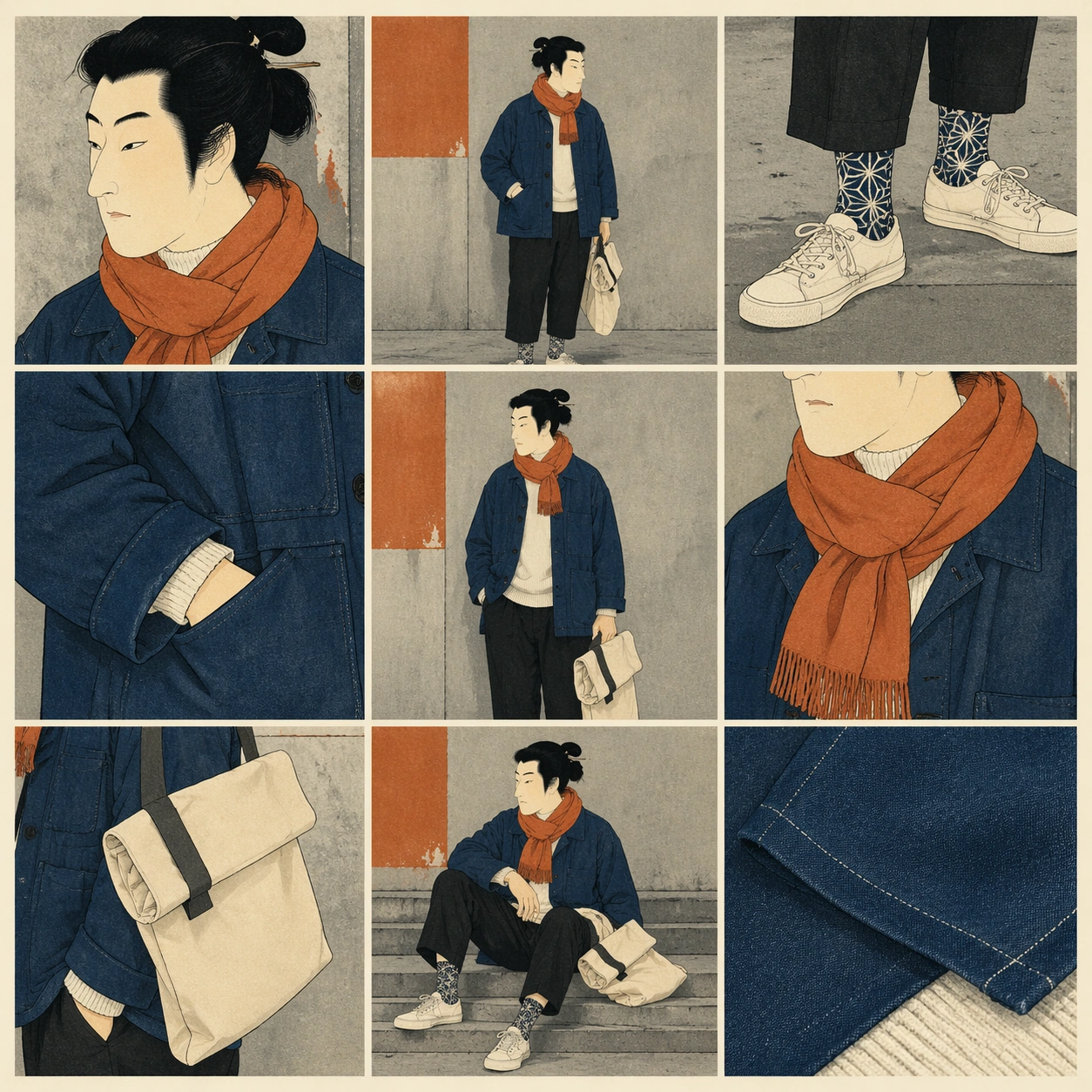
Scene: A square fashion composition using a precise 3 by 3 outfit grid, with flat paper texture, pale washi gutters, and a palette of indigo, persimmon, black ink, cream, and muted concrete gray. The lighting is graphic and even, halfway between a woodblock print and a street-style editorial shoot. The grid must read as a modern social-feed OOTD layout without any readable text. Subject: A painted figure inspired by ukiyo-e portrait traditions: elegant profile, black lacquered hair shape, calm narrow eyes, pale face, and simplified ink contours. Keep the head and facial language visibly woodblock-like, but dress the body in contemporary city layers: oversized indigo chore jacket, cropped black trousers, cream high-neck knit, plain canvas sneakers, folded tote bag, patterned socks, and a persimmon scarf. The person repeats across panels as one consistent subject. Important details: The nine panels should balance flat graphic design with fashion utility: center full-body fit check, face profile crop, sneaker and sock detail, chore jacket sleeve, scarf knot, tote fold, walking crosswalk pose, seated step pose, and textile close-up. Preserve ukiyo-e line economy in the head and hair while making the clothing modern and wearable. Keep all gutters straight, all panel crops intentional, and all colors consistent. Use case: Painting Character OOTD single study 7/8, an independent woodblock-inspired street-style grid. Constraints: No readable text, no watermark, no logos, preserve exact 1:1 aspect ratio, no brand marks, no extra people, no anime style, no randomized print text, no broken grid, no replacing the woodblock head with a photographic face.

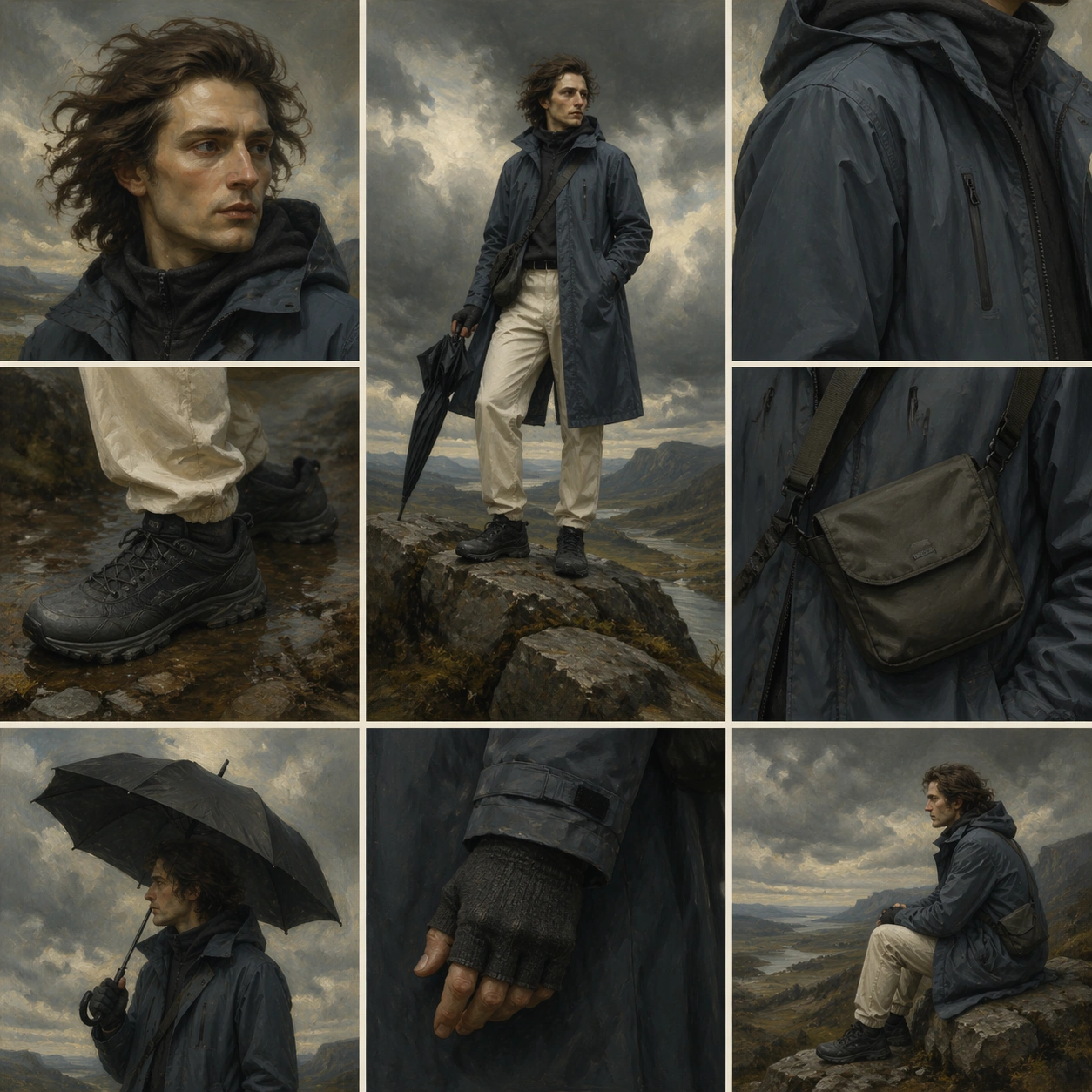
Example generated from “Painting Character Ootd — Romantic Cloud Coat”
GPT Image 2en

Scene: A square 3 by 3 fashion grid set against a stormy Romantic landscape background, with pale gutters, soft mist, windswept light, and dramatic cloud breaks. The image should feel like a museum painting escaped into a contemporary outerwear editorial. Keep the social-feed structure clear and modern, with no readable captions, handles, numbers, or interface labels. Subject: A Romantic-era painted wanderer with windblown hair, pale contemplative face, distant gaze, and brushy oil texture. The head and hands stay historical and painterly, but the outfit becomes contemporary cold-weather styling: long slate-blue technical raincoat, charcoal wool hood layer, cream thermal trousers, rugged plain hiking shoes, compact crossbody field bag, fingerless knit gloves, and a matte black umbrella used as a prop. The same person appears consistently in every face or body crop. Important details: Use the grid as an outfit breakdown: center full-body stance on a rocky overlook, face crop in wind, raincoat seam detail, hiking shoe crop, bag strap close-up, umbrella silhouette, seated boulder pose, gloved hand detail, and distant side profile. The historical head must contrast with modern weatherproof materials, while the cloudscape and fashion panels remain disciplined and readable. Avoid fantasy costume cues; this is an OOTD editorial. Use case: Painting Character OOTD single study 8/8, an independent Romantic landscape outerwear grid. Constraints: No readable text, no watermark, no logos, preserve exact 1:1 aspect ratio, no brand marks, no extra figures, no fantasy armor, no illegible panel structure, no changed face between panels, no photographic skin replacing the painted head.

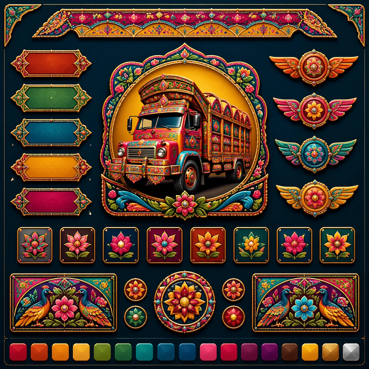
Example generated from “Pakistani Truck Art Commercial Remix — Reference Anchor”
GPT Image 2en

Scene: Create a square reference image for Pakistani Truck Art Commercial Remix. Build a reference anchor establishing the core system with a premium, production-ready finish. Use a polished modular board or campaign surface with clean spacing, premium game-UI finish, and clear focal hierarchy. The composition should feel intentional, clean, and reusable for gallery, research, campaign, or internal handoff contexts. Lighting must support readability first, with the main forms clearly separated from the background and enough breathing room for the system to stay legible at both hero scale and thumbnail scale. Subject: Center a coherent original game-art system built for premium production and marketing surfaces. For this image, focus on reference anchor. Keep the same system logic stable across screenshots, cards, banners, and overview boards. This image is the canonical anchor that later series images must follow. The viewer should immediately understand what role this surface plays inside a cohesive game-production asset pack. Important details: Lock framing, icon grammar, palette blocking, and surface hierarchy so the kit feels production-ready and consistent. Preserve the core silhouette, framing language, and material logic from the reference image while each variation changes function. Keep materials believable, edge hierarchy disciplined, and the visual language consistent with Truck Art. Use abstract interface blocks or diagram accents when helpful, but avoid any readable language. The final result should feel like a deliberate production asset rather than a random illustration. Use case: Pakistani Truck Art Commercial Remix series study 1/9, designed as reference anchor within a cohesive asset pack. Constraints: No readable text, no watermark, no logos, preserve exact 1:1 aspect ratio, no unrelated objects, no broken visual hierarchy, no malformed anatomy or broken perspective, no random decorative clutter.

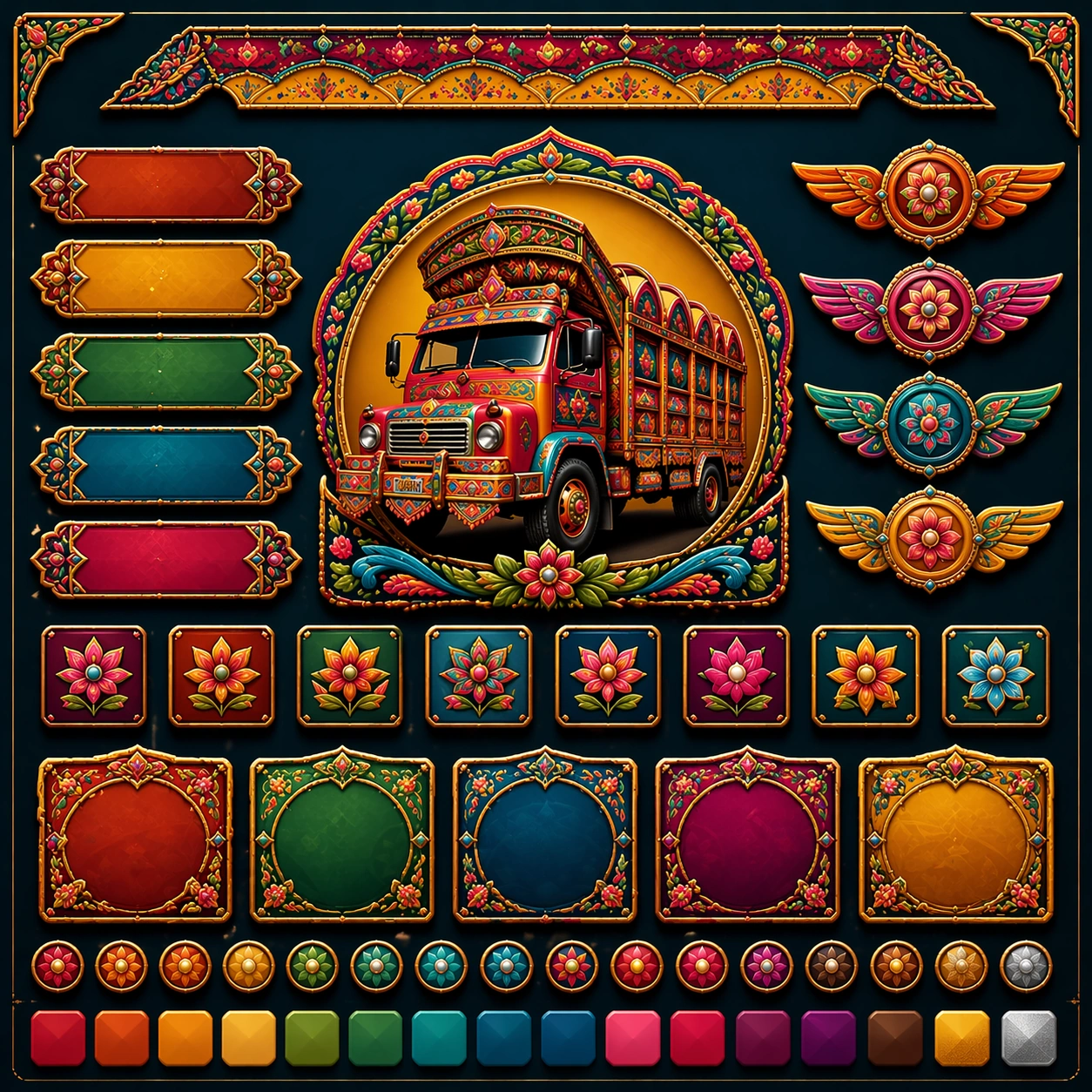
Example generated from “Pakistani Truck Art Commercial Remix — Variant One”
GPT Image 2en

Scene: Create a square dependent image for Pakistani Truck Art Commercial Remix. Build a first controlled variation in the same system with a premium, production-ready finish. Use a polished modular board or campaign surface with clean spacing, premium game-UI finish, and clear focal hierarchy. The composition should feel intentional, clean, and reusable for gallery, research, campaign, or internal handoff contexts. Lighting must support readability first, with the main forms clearly separated from the background and enough breathing room for the system to stay legible at both hero scale and thumbnail scale. Subject: Center a coherent original game-art system built for premium production and marketing surfaces. For this image, focus on the intended support surface. Keep the same system logic stable across screenshots, cards, banners, and overview boards. Preserve exact identity or system logic from the reference image while changing only the intended variation axis. The viewer should immediately understand what role this surface plays inside a cohesive game-production asset pack. Important details: Lock framing, icon grammar, palette blocking, and surface hierarchy so the kit feels production-ready and consistent. Preserve the core silhouette, framing language, and material logic from the reference image while each variation changes function. Keep materials believable, edge hierarchy disciplined, and the visual language consistent with Truck Art. Use abstract interface blocks or diagram accents when helpful, but avoid any readable language. The final result should feel like a deliberate production asset rather than a random illustration. Use case: Pakistani Truck Art Commercial Remix series study 2/9, designed as variant one within a cohesive asset pack. Constraints: No readable text, no watermark, no logos, preserve exact 1:1 aspect ratio, no unrelated objects, no broken visual hierarchy, no malformed anatomy or broken perspective, no random decorative clutter.

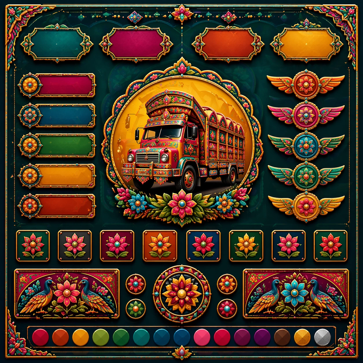
Example generated from “Pakistani Truck Art Commercial Remix — Variant Two”
GPT Image 2en

Scene: Create a square dependent image for Pakistani Truck Art Commercial Remix. Build a second controlled variation in the same system with a premium, production-ready finish. Use a polished modular board or campaign surface with clean spacing, premium game-UI finish, and clear focal hierarchy. The composition should feel intentional, clean, and reusable for gallery, research, campaign, or internal handoff contexts. Lighting must support readability first, with the main forms clearly separated from the background and enough breathing room for the system to stay legible at both hero scale and thumbnail scale. Subject: Center a coherent original game-art system built for premium production and marketing surfaces. For this image, focus on the intended support surface. Keep the same system logic stable across screenshots, cards, banners, and overview boards. Preserve exact identity or system logic from the reference image while changing only the intended variation axis. The viewer should immediately understand what role this surface plays inside a cohesive game-production asset pack. Important details: Lock framing, icon grammar, palette blocking, and surface hierarchy so the kit feels production-ready and consistent. Preserve the core silhouette, framing language, and material logic from the reference image while each variation changes function. Keep materials believable, edge hierarchy disciplined, and the visual language consistent with Truck Art. Use abstract interface blocks or diagram accents when helpful, but avoid any readable language. The final result should feel like a deliberate production asset rather than a random illustration. Use case: Pakistani Truck Art Commercial Remix series study 3/9, designed as variant two within a cohesive asset pack. Constraints: No readable text, no watermark, no logos, preserve exact 1:1 aspect ratio, no unrelated objects, no broken visual hierarchy, no malformed anatomy or broken perspective, no random decorative clutter.

Example generated from “Pakistani Truck Art Commercial Remix — Variant Three”
GPT Image 2en

Scene: Create a square dependent image for Pakistani Truck Art Commercial Remix. Build a third controlled variation in the same system with a premium, production-ready finish. Use a polished modular board or campaign surface with clean spacing, premium game-UI finish, and clear focal hierarchy. The composition should feel intentional, clean, and reusable for gallery, research, campaign, or internal handoff contexts. Lighting must support readability first, with the main forms clearly separated from the background and enough breathing room for the system to stay legible at both hero scale and thumbnail scale. Subject: Center a coherent original game-art system built for premium production and marketing surfaces. For this image, focus on the intended support surface. Keep the same system logic stable across screenshots, cards, banners, and overview boards. Preserve exact identity or system logic from the reference image while changing only the intended variation axis. The viewer should immediately understand what role this surface plays inside a cohesive game-production asset pack. Important details: Lock framing, icon grammar, palette blocking, and surface hierarchy so the kit feels production-ready and consistent. Preserve the core silhouette, framing language, and material logic from the reference image while each variation changes function. Keep materials believable, edge hierarchy disciplined, and the visual language consistent with Truck Art. Use abstract interface blocks or diagram accents when helpful, but avoid any readable language. The final result should feel like a deliberate production asset rather than a random illustration. Use case: Pakistani Truck Art Commercial Remix series study 4/9, designed as variant three within a cohesive asset pack. Constraints: No readable text, no watermark, no logos, preserve exact 1:1 aspect ratio, no unrelated objects, no broken visual hierarchy, no malformed anatomy or broken perspective, no random decorative clutter.

Example generated from “Pakistani Truck Art Commercial Remix — Support One”
GPT Image 2en

Scene: Create a square standalone support image for Pakistani Truck Art Commercial Remix. Build a support-surface study with a clear focal hierarchy and a finished professional surface. Use a polished modular board or campaign surface with clean spacing, premium game-UI finish, and clear focal hierarchy. The frame should feel self-contained and polished, with enough structure to explain the system even without the reference series, yet still obviously belonging to the same theme and production world. Subject: Show a coherent original game-art system built for premium production and marketing surfaces in a way that emphasizes the intended support surface. Keep the same system logic stable across screenshots, cards, banners, and overview boards. Even though this image is independent, the viewer should still recognize the same universe, same commercial logic, and same production intent as the core package. Important details: Lock framing, icon grammar, palette blocking, and surface hierarchy so the kit feels production-ready and consistent. Preserve the broader theme language through color, framing, material choices, and modular composition. Use clean panel rhythm, premium asset presentation, and believable detail density. The image should work equally well as a gallery study, research reference, and mock production deliverable. Use case: Pakistani Truck Art Commercial Remix single study 5/9, exploring support one as a support surface. Constraints: No readable text, no watermark, no logos, preserve exact 1:1 aspect ratio, no unrelated objects, no broken visual hierarchy, no visual noise that obscures the main surface, no accidental brand resemblance.

Example generated from “Pakistani Truck Art Commercial Remix — Support Two”
GPT Image 2en

Scene: Create a square standalone support image for Pakistani Truck Art Commercial Remix. Build a second support-surface study with a clear focal hierarchy and a finished professional surface. Use a polished modular board or campaign surface with clean spacing, premium game-UI finish, and clear focal hierarchy. The frame should feel self-contained and polished, with enough structure to explain the system even without the reference series, yet still obviously belonging to the same theme and production world. Subject: Show a coherent original game-art system built for premium production and marketing surfaces in a way that emphasizes the intended support surface. Keep the same system logic stable across screenshots, cards, banners, and overview boards. Even though this image is independent, the viewer should still recognize the same universe, same commercial logic, and same production intent as the core package. Important details: Lock framing, icon grammar, palette blocking, and surface hierarchy so the kit feels production-ready and consistent. Preserve the broader theme language through color, framing, material choices, and modular composition. Use clean panel rhythm, premium asset presentation, and believable detail density. The image should work equally well as a gallery study, research reference, and mock production deliverable. Use case: Pakistani Truck Art Commercial Remix single study 6/9, exploring support two as a support surface. Constraints: No readable text, no watermark, no logos, preserve exact 1:1 aspect ratio, no unrelated objects, no broken visual hierarchy, no visual noise that obscures the main surface, no accidental brand resemblance.

Example generated from “Pakistani Truck Art Commercial Remix — Support Three”
GPT Image 2en

Scene: Create a square standalone support image for Pakistani Truck Art Commercial Remix. Build a third support-surface study with a clear focal hierarchy and a finished professional surface. Use a polished modular board or campaign surface with clean spacing, premium game-UI finish, and clear focal hierarchy. The frame should feel self-contained and polished, with enough structure to explain the system even without the reference series, yet still obviously belonging to the same theme and production world. Subject: Show a coherent original game-art system built for premium production and marketing surfaces in a way that emphasizes the intended support surface. Keep the same system logic stable across screenshots, cards, banners, and overview boards. Even though this image is independent, the viewer should still recognize the same universe, same commercial logic, and same production intent as the core package. Important details: Lock framing, icon grammar, palette blocking, and surface hierarchy so the kit feels production-ready and consistent. Preserve the broader theme language through color, framing, material choices, and modular composition. Use clean panel rhythm, premium asset presentation, and believable detail density. The image should work equally well as a gallery study, research reference, and mock production deliverable. Use case: Pakistani Truck Art Commercial Remix single study 7/9, exploring support three as a support surface. Constraints: No readable text, no watermark, no logos, preserve exact 1:1 aspect ratio, no unrelated objects, no broken visual hierarchy, no visual noise that obscures the main surface, no accidental brand resemblance.

Example generated from “Pakistani Truck Art Commercial Remix — Support Four”
GPT Image 2en

Scene: Create a square standalone support image for Pakistani Truck Art Commercial Remix. Build a fourth support-surface study with a clear focal hierarchy and a finished professional surface. Use a polished modular board or campaign surface with clean spacing, premium game-UI finish, and clear focal hierarchy. The frame should feel self-contained and polished, with enough structure to explain the system even without the reference series, yet still obviously belonging to the same theme and production world. Subject: Show a coherent original game-art system built for premium production and marketing surfaces in a way that emphasizes the intended support surface. Keep the same system logic stable across screenshots, cards, banners, and overview boards. Even though this image is independent, the viewer should still recognize the same universe, same commercial logic, and same production intent as the core package. Important details: Lock framing, icon grammar, palette blocking, and surface hierarchy so the kit feels production-ready and consistent. Preserve the broader theme language through color, framing, material choices, and modular composition. Use clean panel rhythm, premium asset presentation, and believable detail density. The image should work equally well as a gallery study, research reference, and mock production deliverable. Use case: Pakistani Truck Art Commercial Remix single study 8/9, exploring support four as a support surface. Constraints: No readable text, no watermark, no logos, preserve exact 1:1 aspect ratio, no unrelated objects, no broken visual hierarchy, no visual noise that obscures the main surface, no accidental brand resemblance.

Example generated from “Pakistani Truck Art Commercial Remix — Support Five”
GPT Image 2en

Scene: Create a square standalone support image for Pakistani Truck Art Commercial Remix. Build a fifth support-surface study with a clear focal hierarchy and a finished professional surface. Use a polished modular board or campaign surface with clean spacing, premium game-UI finish, and clear focal hierarchy. The frame should feel self-contained and polished, with enough structure to explain the system even without the reference series, yet still obviously belonging to the same theme and production world. Subject: Show a coherent original game-art system built for premium production and marketing surfaces in a way that emphasizes the intended support surface. Keep the same system logic stable across screenshots, cards, banners, and overview boards. Even though this image is independent, the viewer should still recognize the same universe, same commercial logic, and same production intent as the core package. Important details: Lock framing, icon grammar, palette blocking, and surface hierarchy so the kit feels production-ready and consistent. Preserve the broader theme language through color, framing, material choices, and modular composition. Use clean panel rhythm, premium asset presentation, and believable detail density. The image should work equally well as a gallery study, research reference, and mock production deliverable. Use case: Pakistani Truck Art Commercial Remix single study 9/9, exploring support five as a support surface. Constraints: No readable text, no watermark, no logos, preserve exact 1:1 aspect ratio, no unrelated objects, no broken visual hierarchy, no visual noise that obscures the main surface, no accidental brand resemblance.

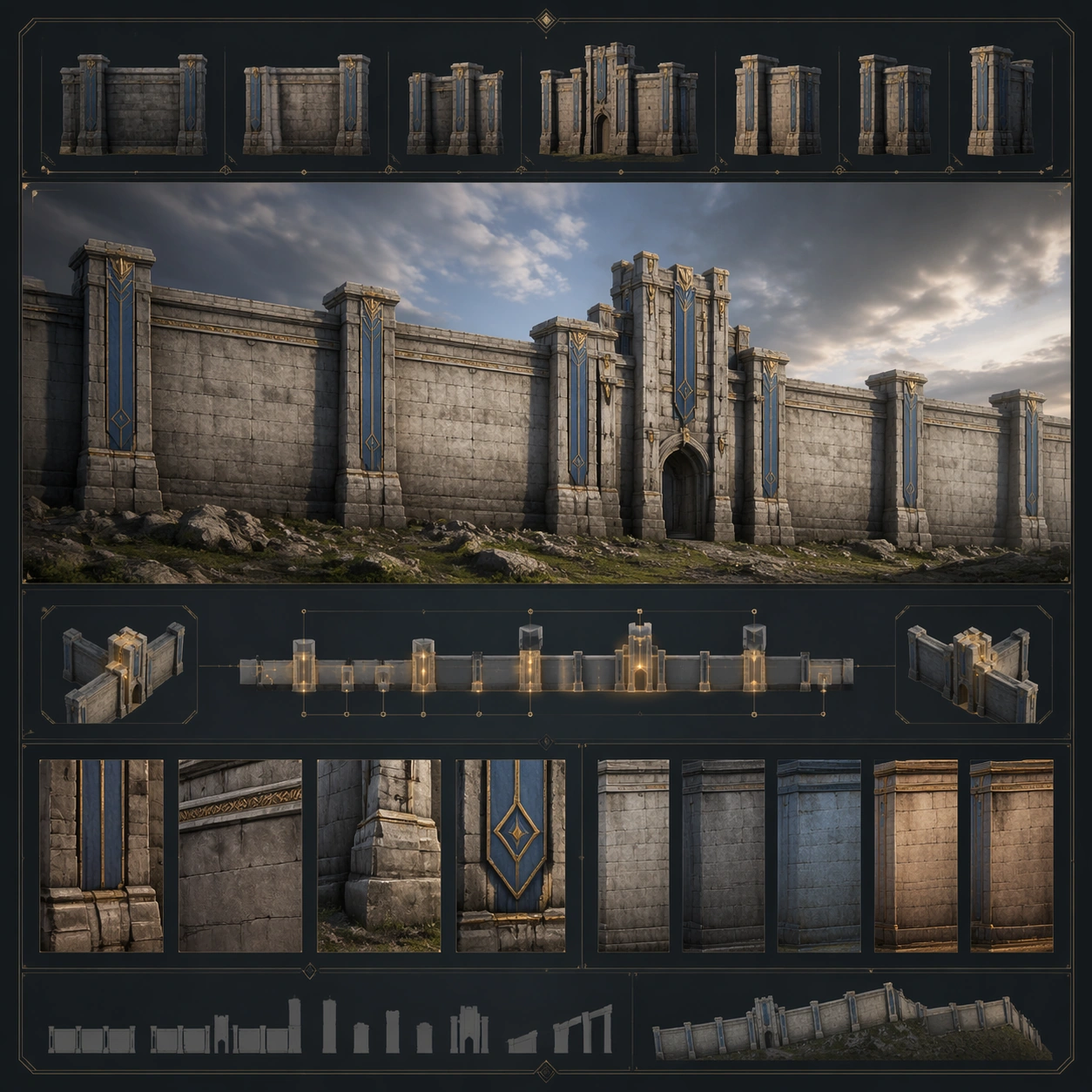
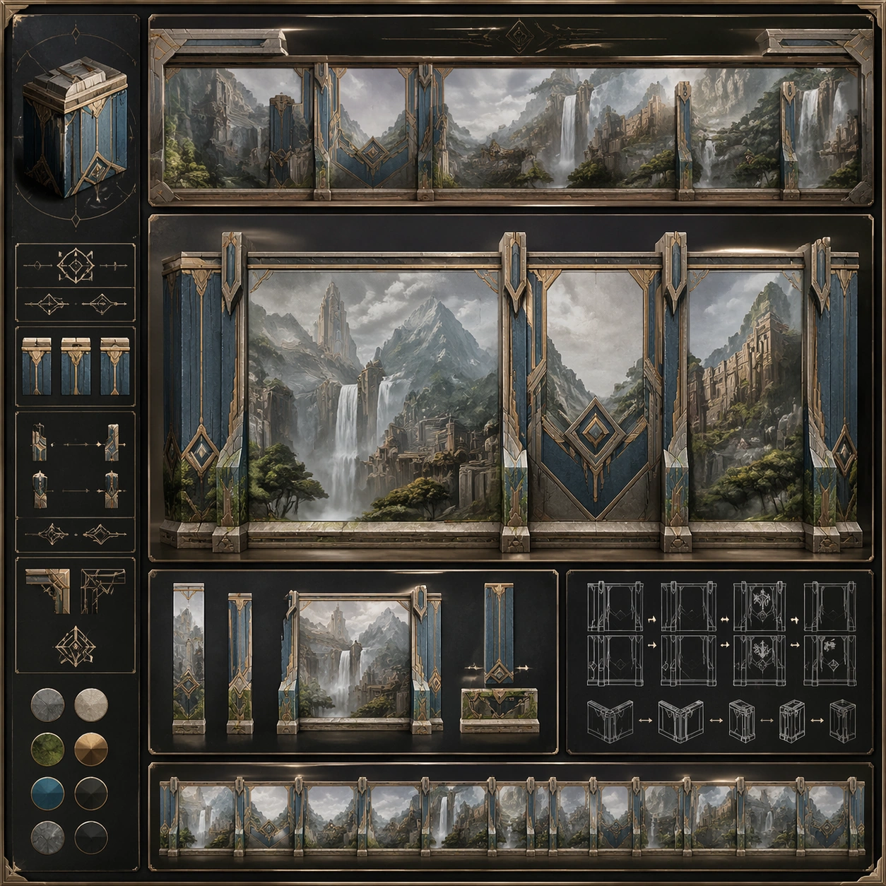
Example generated from “Panoramic Wallscape Continuity System — Reference Anchor”
GPT Image 2en

Scene: Create a square reference image for Panoramic Wallscape Continuity System. Build a reference anchor establishing the core system with a premium, production-ready finish. Use a polished modular board or campaign surface with clean spacing, premium game-UI finish, and clear focal hierarchy. The composition should feel intentional, clean, and reusable for gallery, research, campaign, or internal handoff contexts. Lighting must support readability first, with the main forms clearly separated from the background and enough breathing room for the system to stay legible at both hero scale and thumbnail scale. Subject: Center a coherent original game-art system built for premium production and marketing surfaces. For this image, focus on reference anchor. Keep the same system logic stable across screenshots, cards, banners, and overview boards. This image is the canonical anchor that later series images must follow. The viewer should immediately understand what role this surface plays inside a cohesive game-production asset pack. Important details: Lock framing, icon grammar, palette blocking, and surface hierarchy so the kit feels production-ready and consistent. Preserve the core silhouette, framing language, and material logic from the reference image while each variation changes function. Keep materials believable, edge hierarchy disciplined, and the visual language consistent with Panoramic Walls. Use abstract interface blocks or diagram accents when helpful, but avoid any readable language. The final result should feel like a deliberate production asset rather than a random illustration. Use case: Panoramic Wallscape Continuity System series study 1/9, designed as reference anchor within a cohesive asset pack. Constraints: No readable text, no watermark, no logos, preserve exact 1:1 aspect ratio, no unrelated objects, no broken visual hierarchy, no malformed anatomy or broken perspective, no random decorative clutter.

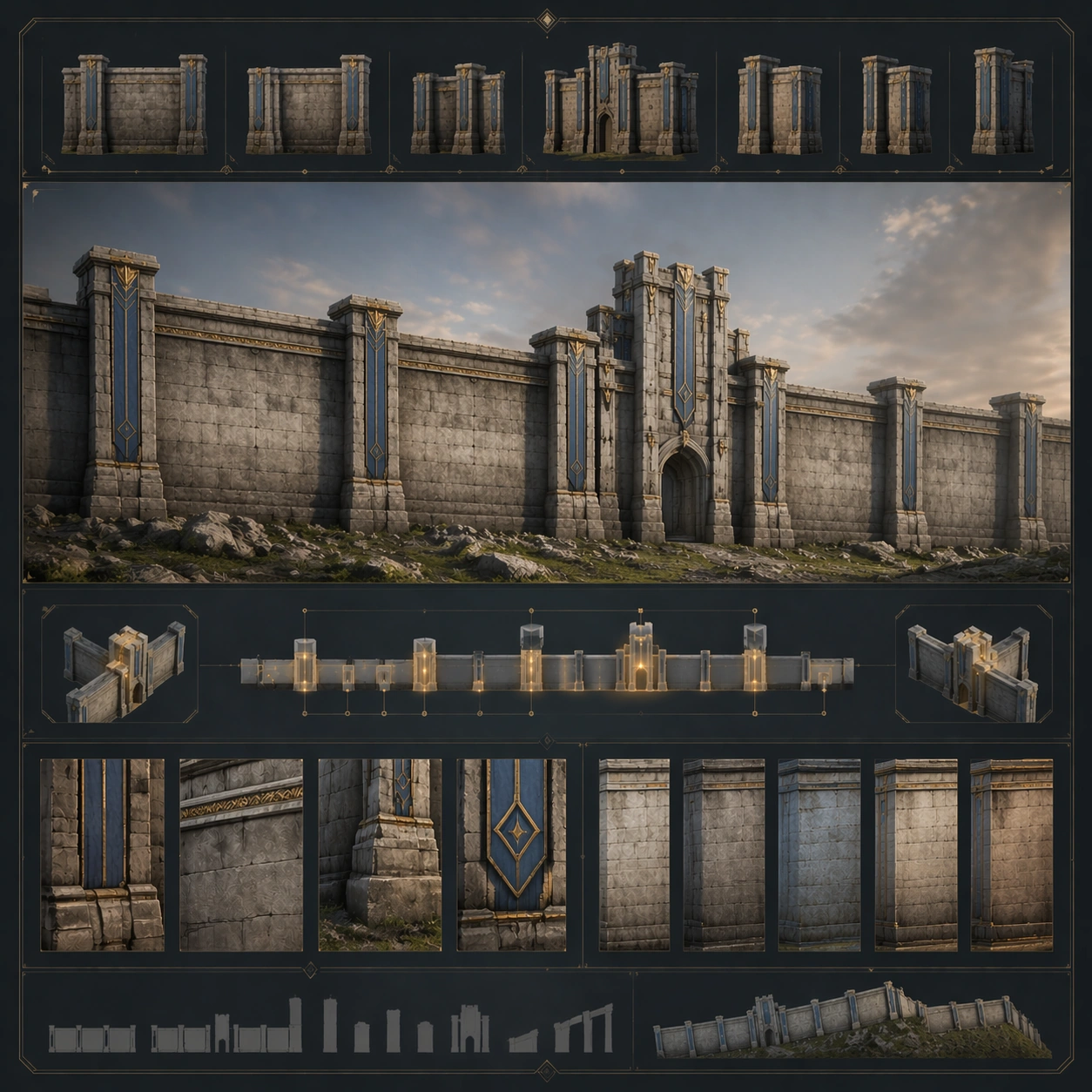
Example generated from “Panoramic Wallscape Continuity System — Variant One”
GPT Image 2en

Scene: Create a square dependent image for Panoramic Wallscape Continuity System. Build a first controlled variation in the same system with a premium, production-ready finish. Use a polished modular board or campaign surface with clean spacing, premium game-UI finish, and clear focal hierarchy. The composition should feel intentional, clean, and reusable for gallery, research, campaign, or internal handoff contexts. Lighting must support readability first, with the main forms clearly separated from the background and enough breathing room for the system to stay legible at both hero scale and thumbnail scale. Subject: Center a coherent original game-art system built for premium production and marketing surfaces. For this image, focus on the intended support surface. Keep the same system logic stable across screenshots, cards, banners, and overview boards. Preserve exact identity or system logic from the reference image while changing only the intended variation axis. The viewer should immediately understand what role this surface plays inside a cohesive game-production asset pack. Important details: Lock framing, icon grammar, palette blocking, and surface hierarchy so the kit feels production-ready and consistent. Preserve the core silhouette, framing language, and material logic from the reference image while each variation changes function. Keep materials believable, edge hierarchy disciplined, and the visual language consistent with Panoramic Walls. Use abstract interface blocks or diagram accents when helpful, but avoid any readable language. The final result should feel like a deliberate production asset rather than a random illustration. Use case: Panoramic Wallscape Continuity System series study 2/9, designed as variant one within a cohesive asset pack. Constraints: No readable text, no watermark, no logos, preserve exact 1:1 aspect ratio, no unrelated objects, no broken visual hierarchy, no malformed anatomy or broken perspective, no random decorative clutter.

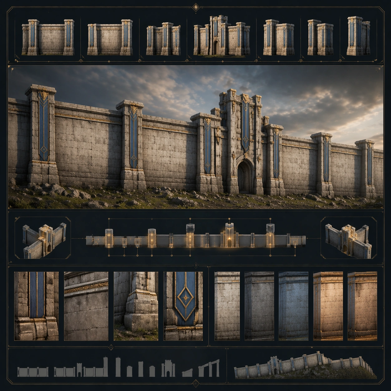
Example generated from “Panoramic Wallscape Continuity System — Variant Two”
GPT Image 2en

Scene: Create a square dependent image for Panoramic Wallscape Continuity System. Build a second controlled variation in the same system with a premium, production-ready finish. Use a polished modular board or campaign surface with clean spacing, premium game-UI finish, and clear focal hierarchy. The composition should feel intentional, clean, and reusable for gallery, research, campaign, or internal handoff contexts. Lighting must support readability first, with the main forms clearly separated from the background and enough breathing room for the system to stay legible at both hero scale and thumbnail scale. Subject: Center a coherent original game-art system built for premium production and marketing surfaces. For this image, focus on the intended support surface. Keep the same system logic stable across screenshots, cards, banners, and overview boards. Preserve exact identity or system logic from the reference image while changing only the intended variation axis. The viewer should immediately understand what role this surface plays inside a cohesive game-production asset pack. Important details: Lock framing, icon grammar, palette blocking, and surface hierarchy so the kit feels production-ready and consistent. Preserve the core silhouette, framing language, and material logic from the reference image while each variation changes function. Keep materials believable, edge hierarchy disciplined, and the visual language consistent with Panoramic Walls. Use abstract interface blocks or diagram accents when helpful, but avoid any readable language. The final result should feel like a deliberate production asset rather than a random illustration. Use case: Panoramic Wallscape Continuity System series study 3/9, designed as variant two within a cohesive asset pack. Constraints: No readable text, no watermark, no logos, preserve exact 1:1 aspect ratio, no unrelated objects, no broken visual hierarchy, no malformed anatomy or broken perspective, no random decorative clutter.

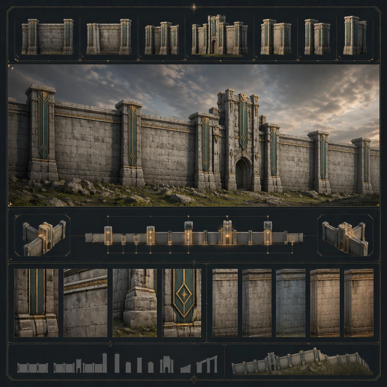
Example generated from “Panoramic Wallscape Continuity System — Variant Three”
GPT Image 2en

Scene: Create a square dependent image for Panoramic Wallscape Continuity System. Build a third controlled variation in the same system with a premium, production-ready finish. Use a polished modular board or campaign surface with clean spacing, premium game-UI finish, and clear focal hierarchy. The composition should feel intentional, clean, and reusable for gallery, research, campaign, or internal handoff contexts. Lighting must support readability first, with the main forms clearly separated from the background and enough breathing room for the system to stay legible at both hero scale and thumbnail scale. Subject: Center a coherent original game-art system built for premium production and marketing surfaces. For this image, focus on the intended support surface. Keep the same system logic stable across screenshots, cards, banners, and overview boards. Preserve exact identity or system logic from the reference image while changing only the intended variation axis. The viewer should immediately understand what role this surface plays inside a cohesive game-production asset pack. Important details: Lock framing, icon grammar, palette blocking, and surface hierarchy so the kit feels production-ready and consistent. Preserve the core silhouette, framing language, and material logic from the reference image while each variation changes function. Keep materials believable, edge hierarchy disciplined, and the visual language consistent with Panoramic Walls. Use abstract interface blocks or diagram accents when helpful, but avoid any readable language. The final result should feel like a deliberate production asset rather than a random illustration. Use case: Panoramic Wallscape Continuity System series study 4/9, designed as variant three within a cohesive asset pack. Constraints: No readable text, no watermark, no logos, preserve exact 1:1 aspect ratio, no unrelated objects, no broken visual hierarchy, no malformed anatomy or broken perspective, no random decorative clutter.

Example generated from “Panoramic Wallscape Continuity System — Support One”
GPT Image 2en

Scene: Create a square standalone support image for Panoramic Wallscape Continuity System. Build a support-surface study with a clear focal hierarchy and a finished professional surface. Use a polished modular board or campaign surface with clean spacing, premium game-UI finish, and clear focal hierarchy. The frame should feel self-contained and polished, with enough structure to explain the system even without the reference series, yet still obviously belonging to the same theme and production world. Subject: Show a coherent original game-art system built for premium production and marketing surfaces in a way that emphasizes the intended support surface. Keep the same system logic stable across screenshots, cards, banners, and overview boards. Even though this image is independent, the viewer should still recognize the same universe, same commercial logic, and same production intent as the core package. Important details: Lock framing, icon grammar, palette blocking, and surface hierarchy so the kit feels production-ready and consistent. Preserve the broader theme language through color, framing, material choices, and modular composition. Use clean panel rhythm, premium asset presentation, and believable detail density. The image should work equally well as a gallery study, research reference, and mock production deliverable. Use case: Panoramic Wallscape Continuity System single study 5/9, exploring support one as a support surface. Constraints: No readable text, no watermark, no logos, preserve exact 1:1 aspect ratio, no unrelated objects, no broken visual hierarchy, no visual noise that obscures the main surface, no accidental brand resemblance.

Example generated from “Panoramic Wallscape Continuity System — Support Two”
GPT Image 2en

Scene: Create a square standalone support image for Panoramic Wallscape Continuity System. Build a second support-surface study with a clear focal hierarchy and a finished professional surface. Use a polished modular board or campaign surface with clean spacing, premium game-UI finish, and clear focal hierarchy. The frame should feel self-contained and polished, with enough structure to explain the system even without the reference series, yet still obviously belonging to the same theme and production world. Subject: Show a coherent original game-art system built for premium production and marketing surfaces in a way that emphasizes the intended support surface. Keep the same system logic stable across screenshots, cards, banners, and overview boards. Even though this image is independent, the viewer should still recognize the same universe, same commercial logic, and same production intent as the core package. Important details: Lock framing, icon grammar, palette blocking, and surface hierarchy so the kit feels production-ready and consistent. Preserve the broader theme language through color, framing, material choices, and modular composition. Use clean panel rhythm, premium asset presentation, and believable detail density. The image should work equally well as a gallery study, research reference, and mock production deliverable. Use case: Panoramic Wallscape Continuity System single study 6/9, exploring support two as a support surface. Constraints: No readable text, no watermark, no logos, preserve exact 1:1 aspect ratio, no unrelated objects, no broken visual hierarchy, no visual noise that obscures the main surface, no accidental brand resemblance.

Example generated from “Panoramic Wallscape Continuity System — Support Three”
GPT Image 2en

Scene: Create a square standalone support image for Panoramic Wallscape Continuity System. Build a third support-surface study with a clear focal hierarchy and a finished professional surface. Use a polished modular board or campaign surface with clean spacing, premium game-UI finish, and clear focal hierarchy. The frame should feel self-contained and polished, with enough structure to explain the system even without the reference series, yet still obviously belonging to the same theme and production world. Subject: Show a coherent original game-art system built for premium production and marketing surfaces in a way that emphasizes the intended support surface. Keep the same system logic stable across screenshots, cards, banners, and overview boards. Even though this image is independent, the viewer should still recognize the same universe, same commercial logic, and same production intent as the core package. Important details: Lock framing, icon grammar, palette blocking, and surface hierarchy so the kit feels production-ready and consistent. Preserve the broader theme language through color, framing, material choices, and modular composition. Use clean panel rhythm, premium asset presentation, and believable detail density. The image should work equally well as a gallery study, research reference, and mock production deliverable. Use case: Panoramic Wallscape Continuity System single study 7/9, exploring support three as a support surface. Constraints: No readable text, no watermark, no logos, preserve exact 1:1 aspect ratio, no unrelated objects, no broken visual hierarchy, no visual noise that obscures the main surface, no accidental brand resemblance.

Example generated from “Panoramic Wallscape Continuity System — Support Four”
GPT Image 2en

Scene: Create a square standalone support image for Panoramic Wallscape Continuity System. Build a fourth support-surface study with a clear focal hierarchy and a finished professional surface. Use a polished modular board or campaign surface with clean spacing, premium game-UI finish, and clear focal hierarchy. The frame should feel self-contained and polished, with enough structure to explain the system even without the reference series, yet still obviously belonging to the same theme and production world. Subject: Show a coherent original game-art system built for premium production and marketing surfaces in a way that emphasizes the intended support surface. Keep the same system logic stable across screenshots, cards, banners, and overview boards. Even though this image is independent, the viewer should still recognize the same universe, same commercial logic, and same production intent as the core package. Important details: Lock framing, icon grammar, palette blocking, and surface hierarchy so the kit feels production-ready and consistent. Preserve the broader theme language through color, framing, material choices, and modular composition. Use clean panel rhythm, premium asset presentation, and believable detail density. The image should work equally well as a gallery study, research reference, and mock production deliverable. Use case: Panoramic Wallscape Continuity System single study 8/9, exploring support four as a support surface. Constraints: No readable text, no watermark, no logos, preserve exact 1:1 aspect ratio, no unrelated objects, no broken visual hierarchy, no visual noise that obscures the main surface, no accidental brand resemblance.

Example generated from “Panoramic Wallscape Continuity System — Support Five”
GPT Image 2en

Scene: Create a square standalone support image for Panoramic Wallscape Continuity System. Build a fifth support-surface study with a clear focal hierarchy and a finished professional surface. Use a polished modular board or campaign surface with clean spacing, premium game-UI finish, and clear focal hierarchy. The frame should feel self-contained and polished, with enough structure to explain the system even without the reference series, yet still obviously belonging to the same theme and production world. Subject: Show a coherent original game-art system built for premium production and marketing surfaces in a way that emphasizes the intended support surface. Keep the same system logic stable across screenshots, cards, banners, and overview boards. Even though this image is independent, the viewer should still recognize the same universe, same commercial logic, and same production intent as the core package. Important details: Lock framing, icon grammar, palette blocking, and surface hierarchy so the kit feels production-ready and consistent. Preserve the broader theme language through color, framing, material choices, and modular composition. Use clean panel rhythm, premium asset presentation, and believable detail density. The image should work equally well as a gallery study, research reference, and mock production deliverable. Use case: Panoramic Wallscape Continuity System single study 9/9, exploring support five as a support surface. Constraints: No readable text, no watermark, no logos, preserve exact 1:1 aspect ratio, no unrelated objects, no broken visual hierarchy, no visual noise that obscures the main surface, no accidental brand resemblance.

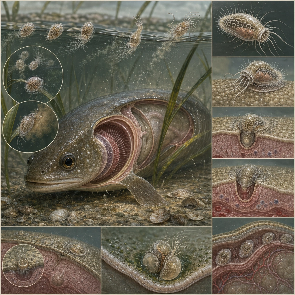
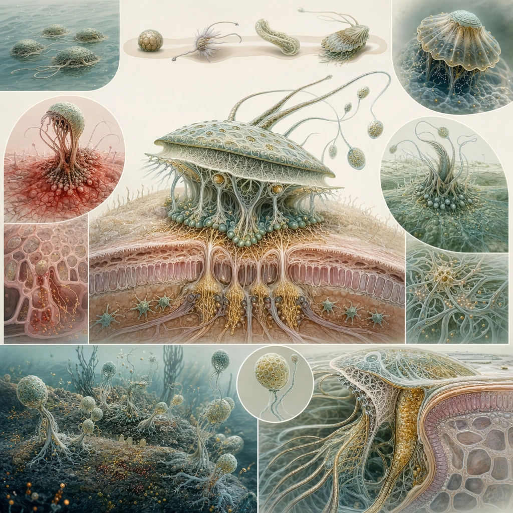
Example generated from “Parasite Mutualism Life Cycle — Estuary Host Entry”
GPT Image 2en

Scene: Design a square educational poster with one dominant central illustration and supporting lifecycle panels arranged around it. Use a restrained medical-natural history palette on a pale background so the board feels publishable and clear without readable labels. Build the frame as a square natural history study with disciplined composition, believable lighting, and enough environmental evidence to explain how this organism or system functions without any caption. Keep the image polished, observational, and suitable for a research gallery rather than pulp fantasy spectacle. Subject: Focus on the first host-entry stage in an estuarine animal, showing free-swimming larvae, attachment anatomy, and the initial tissue interface. The board should combine environmental context with close-up anatomy, making the host relationship understandable at a glance. Show the anatomy, habitat interaction, and scale cues clearly so the viewer can infer locomotion, feeding, reproduction, or ecological role from the visual alone. Every visible structure should feel evolved for a purpose, with layered foreground, midground, and background information that rewards close inspection. Important details: Assume the organism changes ecological role by life stage. Early phases may exploit host tissue, later phases may provide immune modulation, pollination, cleaning, or nutrient transfer. The lifecycle must read as coherent biology rather than arbitrary plot twists. Sequence and credibility matter. Show how the organism locates the host, penetrates or adheres, and begins a parasitic phase using believable structures. Keep the host anatomy medically grounded and the parasite alien but plausible. Favor coherent biology over decorative excess: tissues, shells, membranes, spores, tendrils, fins, silica lattices, or atmospheric sacs should all follow one material logic. Preserve a convincing relationship between the environment and the body plan, use restrained color hierarchy, and make the image feel like a serious speculative field record rather than a random monster concept. Use case: Parasite-Mutualism Life Cycle Poster single study 1/9. Constraints: No readable text, no watermark, no logos, preserve exact 1:1 aspect ratio, no gore, no horror poster vibe, no readable arrows or captions, no cartoon simplification, no accidental brand resemblance, no direct copy of known terrestrial species, no cartoon simplification.

Example generated from “Parasite Mutualism Life Cycle — Gill Nursery Stage”
GPT Image 2en

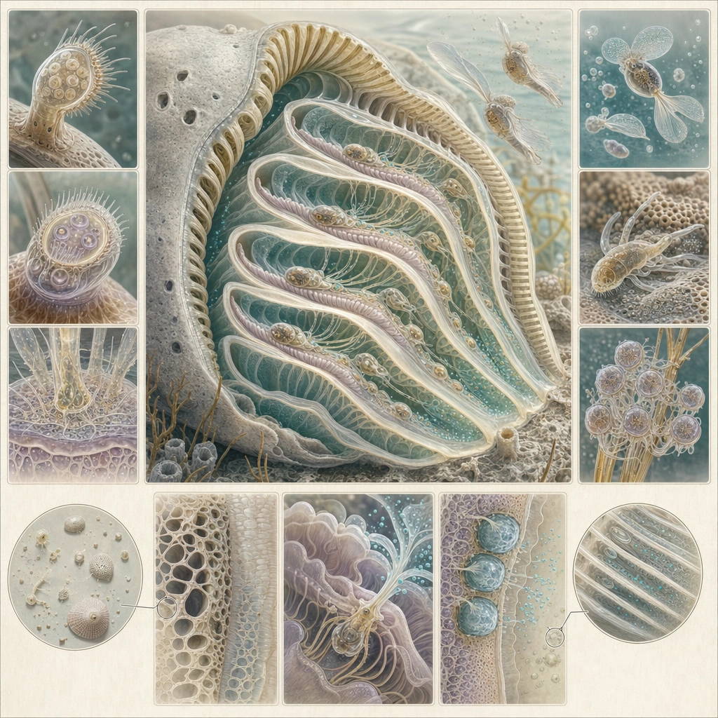
Scene: Compose the poster around a cutaway view of a gill chamber on a pale clinical-natural history background. Supporting panels should radiate around the main cutaway in a clear but label-free layout, using shape and alignment to communicate order. Build the frame as a square natural history study with disciplined composition, believable lighting, and enough environmental evidence to explain how this organism or system functions without any caption. Keep the image polished, observational, and suitable for a research gallery rather than pulp fantasy spectacle. Subject: Show larvae lodged within protected gill folds, feeding lightly on host fluids while secreting compounds that reduce inflammation and improve oxygen exchange enough to keep the host alive. Include magnified insets of attachment organs and secretory tissue. Show the anatomy, habitat interaction, and scale cues clearly so the viewer can infer locomotion, feeding, reproduction, or ecological role from the visual alone. Every visible structure should feel evolved for a purpose, with layered foreground, midground, and background information that rewards close inspection. Important details: Assume the organism changes ecological role by life stage. Early phases may exploit host tissue, later phases may provide immune modulation, pollination, cleaning, or nutrient transfer. The lifecycle must read as coherent biology rather than arbitrary plot twists. The paradox of harm and benefit should be visible. The organism is parasitic, yet it must not destroy the host during this phase. Use anatomy and panel relationships to make that balance clear without text. Favor coherent biology over decorative excess: tissues, shells, membranes, spores, tendrils, fins, silica lattices, or atmospheric sacs should all follow one material logic. Preserve a convincing relationship between the environment and the body plan, use restrained color hierarchy, and make the image feel like a serious speculative field record rather than a random monster concept. Use case: Parasite-Mutualism Life Cycle Poster single study 2/9. Constraints: No readable text, no watermark, no logos, preserve exact 1:1 aspect ratio, no body-horror imagery, no blood emphasis, no readable notation, no glossy pharma ad style, no accidental brand resemblance, no direct copy of known terrestrial species, no cartoon simplification.

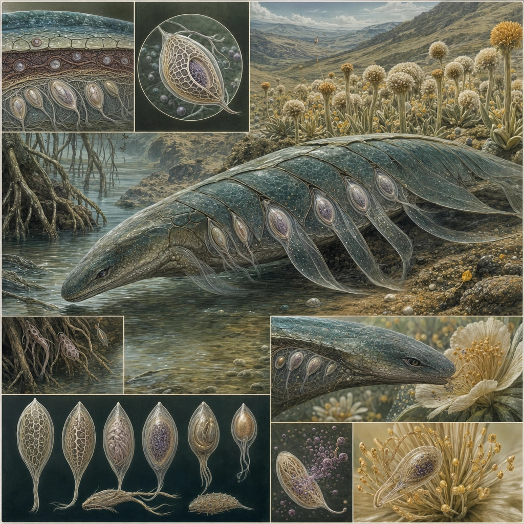
Example generated from “Parasite Mutualism Life Cycle — Migratory Carrier Phase”
GPT Image 2en

Scene: Create a square poster with a strong diagonal flow that implies movement from one habitat to another, while retaining a clean scientific layout. One major host figure should anchor the board, with smaller supporting panels clarifying transport-stage anatomy and dispersal context. Build the frame as a square natural history study with disciplined composition, believable lighting, and enough environmental evidence to explain how this organism or system functions without any caption. Keep the image polished, observational, and suitable for a research gallery rather than pulp fantasy spectacle. Subject: Focus on a migratory carrier animal that transports the organism externally or in a low-impact internal compartment. The parasite should appear dormant or streamlined during transit, visibly adapted for surviving host movement rather than active feeding. Show the anatomy, habitat interaction, and scale cues clearly so the viewer can infer locomotion, feeding, reproduction, or ecological role from the visual alone. Every visible structure should feel evolved for a purpose, with layered foreground, midground, and background information that rewards close inspection. Important details: Assume the organism changes ecological role by life stage. Early phases may exploit host tissue, later phases may provide immune modulation, pollination, cleaning, or nutrient transfer. The lifecycle must read as coherent biology rather than arbitrary plot twists. Explain the ecological logic of transport through composition. Distinct habitat fragments, body orientation, and developmental morphology should show why this host is useful in the life cycle and how the organism changes behavior during travel. Favor coherent biology over decorative excess: tissues, shells, membranes, spores, tendrils, fins, silica lattices, or atmospheric sacs should all follow one material logic. Preserve a convincing relationship between the environment and the body plan, use restrained color hierarchy, and make the image feel like a serious speculative field record rather than a random monster concept. Use case: Parasite-Mutualism Life Cycle Poster single study 3/9. Constraints: No readable text, no watermark, no logos, preserve exact 1:1 aspect ratio, no adventure-poster drama, no readable route maps, no random arrows, no cartoon host expression, no accidental brand resemblance, no direct copy of known terrestrial species, no cartoon simplification.
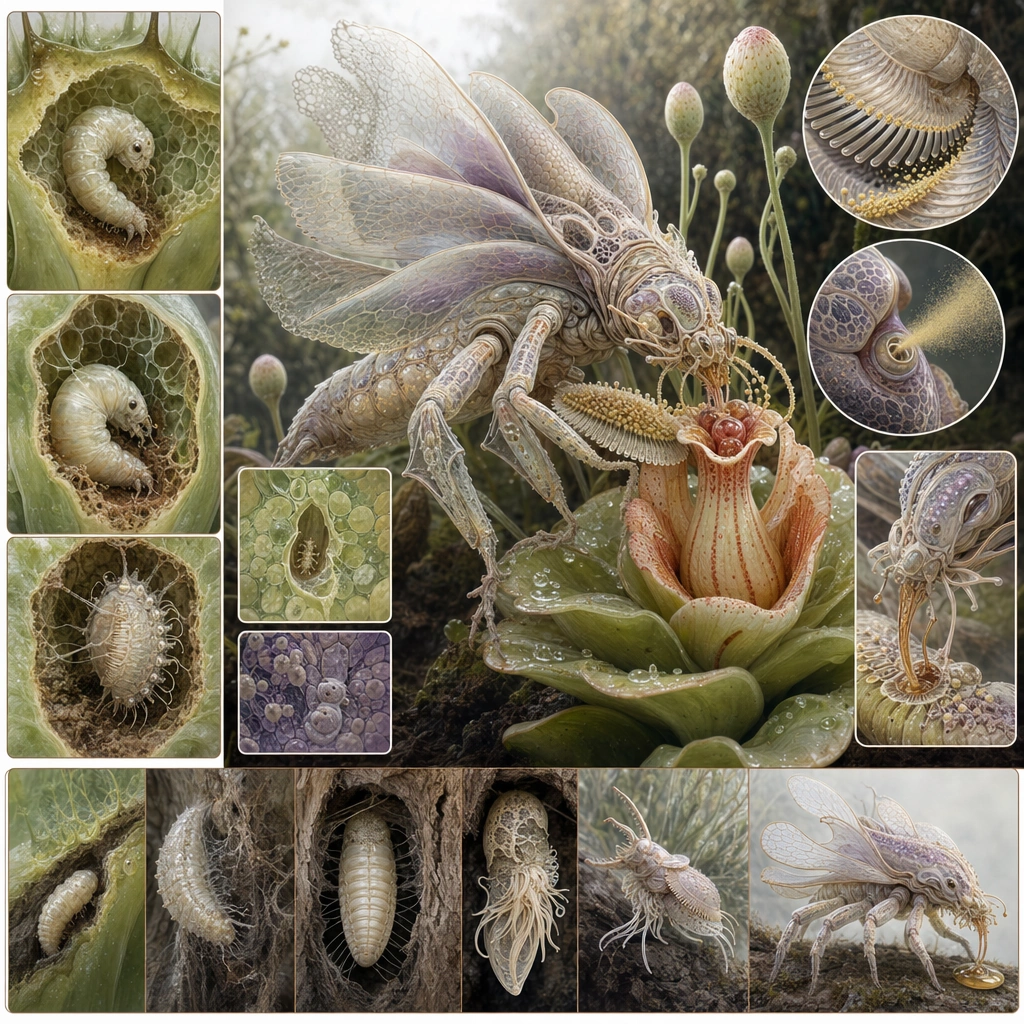
Example generated from “Parasite Mutualism Life Cycle — Pollen Broker Symbiosis”
GPT Image 2en

Scene: Design a botanical-lifecycle poster on a bright but restrained field-guide background, with clean diagram zones arranged around a central adult-stage illustration. The composition should feel educational, elegant, and easy to parse without any written text. Build the frame as a square natural history study with disciplined composition, believable lighting, and enough environmental evidence to explain how this organism or system functions without any caption. Keep the image polished, observational, and suitable for a research gallery rather than pulp fantasy spectacle. Subject: Show the adult organism interacting with flowering or spore-bearing host structures in a way that benefits reproduction while also feeding itself. Include close views of carrying surfaces, release structures, and how the host tolerates or welcomes the visitor at this stage. Show the anatomy, habitat interaction, and scale cues clearly so the viewer can infer locomotion, feeding, reproduction, or ecological role from the visual alone. Every visible structure should feel evolved for a purpose, with layered foreground, midground, and background information that rewards close inspection. Important details: Assume the organism changes ecological role by life stage. Early phases may exploit host tissue, later phases may provide immune modulation, pollination, cleaning, or nutrient transfer. The lifecycle must read as coherent biology rather than arbitrary plot twists. The key idea is role reversal: the same lineage that harmed one host earlier now provides ecological service to another. Make this shift visible through anatomy, posture, and board sequencing. Favor coherent biology over decorative excess: tissues, shells, membranes, spores, tendrils, fins, silica lattices, or atmospheric sacs should all follow one material logic. Preserve a convincing relationship between the environment and the body plan, use restrained color hierarchy, and make the image feel like a serious speculative field record rather than a random monster concept. Use case: Parasite-Mutualism Life Cycle Poster single study 4/9. Constraints: No readable text, no watermark, no logos, preserve exact 1:1 aspect ratio, no butterfly copy, no decorative infographic icons, no readable arrows, no whimsical children-book style, no accidental brand resemblance, no direct copy of known terrestrial species, no cartoon simplification.

Example generated from “Parasite Mutualism Life Cycle — Immune Truce Closeup”
GPT Image 2en

Scene: Center the poster on a magnified anatomical interface between host tissue and the organism, using a pale clinical background and clearly separated panel regions. The image should feel like a research explainer board translated into elegant visual form. Build the frame as a square natural history study with disciplined composition, believable lighting, and enough environmental evidence to explain how this organism or system functions without any caption. Keep the image polished, observational, and suitable for a research gallery rather than pulp fantasy spectacle. Subject: Depict attachment membranes, secretory nodules, and host tissue remodeling that together create a temporary stable relationship. Small supporting vignettes can compare inflamed versus stabilized states without relying on labels or numbers. Show the anatomy, habitat interaction, and scale cues clearly so the viewer can infer locomotion, feeding, reproduction, or ecological role from the visual alone. Every visible structure should feel evolved for a purpose, with layered foreground, midground, and background information that rewards close inspection. Important details: Assume the organism changes ecological role by life stage. Early phases may exploit host tissue, later phases may provide immune modulation, pollination, cleaning, or nutrient transfer. The lifecycle must read as coherent biology rather than arbitrary plot twists. This board should read as biological reasoning made visible. Micro-anatomy, color coding, and layout rhythm should communicate negotiation between damage and benefit without becoming abstract medical graphics. Favor coherent biology over decorative excess: tissues, shells, membranes, spores, tendrils, fins, silica lattices, or atmospheric sacs should all follow one material logic. Preserve a convincing relationship between the environment and the body plan, use restrained color hierarchy, and make the image feel like a serious speculative field record rather than a random monster concept. Use case: Parasite-Mutualism Life Cycle Poster single study 5/9. Constraints: No readable text, no watermark, no logos, preserve exact 1:1 aspect ratio, no readable captions, no horror flesh textures, no UI-dashboard look, no pharma-brand resemblance, no accidental brand resemblance, no direct copy of known terrestrial species, no cartoon simplification.

Example generated from “Parasite Mutualism Life Cycle — Reproductive Release Diagram”
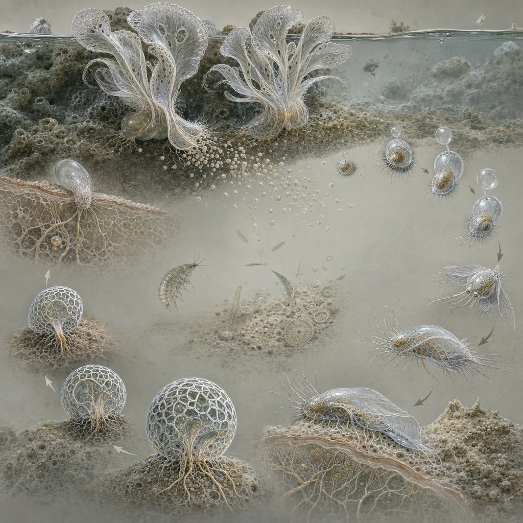
GPT Image 2en

Scene: Arrange a square staged diagram board with a clear top-to-bottom or circular sequence, using shape and spacing to imply order without any text. Background tones should remain restrained so that anatomy and stage transitions stay easy to read. Build the frame as a square natural history study with disciplined composition, believable lighting, and enough environmental evidence to explain how this organism or system functions without any caption. Keep the image polished, observational, and suitable for a research gallery rather than pulp fantasy spectacle. Subject: Show mature adults producing or releasing propagules into water, air, or a substrate relevant to the next host stage. Each stage should reveal a meaningful morphological change tied to dispersal success. Show the anatomy, habitat interaction, and scale cues clearly so the viewer can infer locomotion, feeding, reproduction, or ecological role from the visual alone. Every visible structure should feel evolved for a purpose, with layered foreground, midground, and background information that rewards close inspection. Important details: Assume the organism changes ecological role by life stage. Early phases may exploit host tissue, later phases may provide immune modulation, pollination, cleaning, or nutrient transfer. The lifecycle must read as coherent biology rather than arbitrary plot twists. Sequence must be visually explicit. The board should explain timing, transformation, and release strategy through repeated forms, not through labels. Maintain medical-naturalist seriousness throughout. Favor coherent biology over decorative excess: tissues, shells, membranes, spores, tendrils, fins, silica lattices, or atmospheric sacs should all follow one material logic. Preserve a convincing relationship between the environment and the body plan, use restrained color hierarchy, and make the image feel like a serious speculative field record rather than a random monster concept. Use case: Parasite-Mutualism Life Cycle Poster single study 6/9. Constraints: No readable text, no watermark, no logos, preserve exact 1:1 aspect ratio, no readable numbering, no comic panels, no fantasy magic burst, no gore, no accidental brand resemblance, no direct copy of known terrestrial species, no cartoon simplification.

Example generated from “Parasite Mutualism Life Cycle — Multi Host Cycle Wheel”
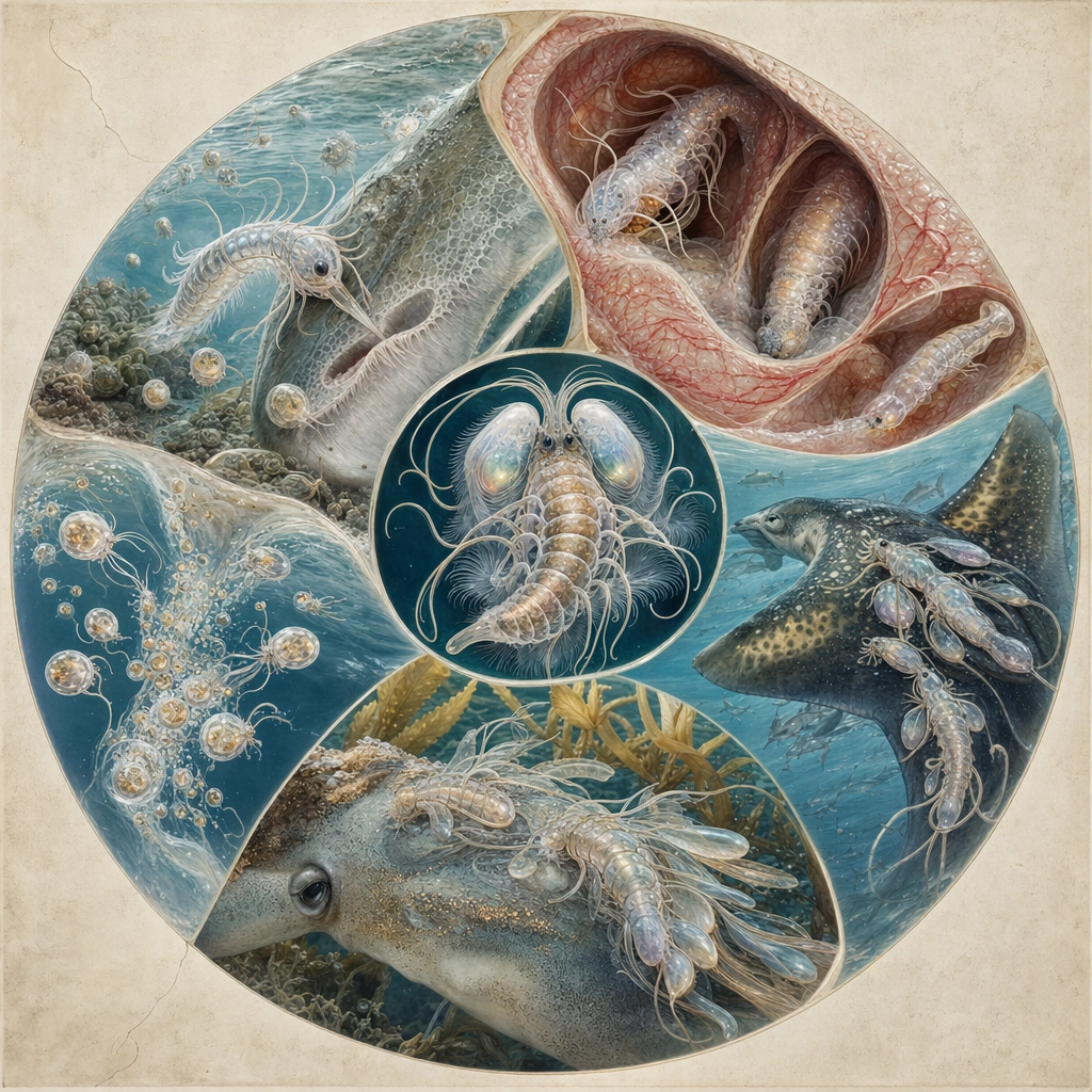
GPT Image 2en

Scene: Design a polished square board with a circular lifecycle composition occupying most of the frame on a pale scientific background. Each segment of the wheel should contain enough habitat and anatomical detail to explain one transition without relying on text. Build the frame as a square natural history study with disciplined composition, believable lighting, and enough environmental evidence to explain how this organism or system functions without any caption. Keep the image polished, observational, and suitable for a research gallery rather than pulp fantasy spectacle. Subject: Integrate aquatic entry, protected nursery, migratory transport, mutualistic adult phase, and reproductive release in one coherent cycle. Hosts should be visually distinct yet harmonized through color and layout so the system reads as one organism’s journey. Show the anatomy, habitat interaction, and scale cues clearly so the viewer can infer locomotion, feeding, reproduction, or ecological role from the visual alone. Every visible structure should feel evolved for a purpose, with layered foreground, midground, and background information that rewards close inspection. Important details: Assume the organism changes ecological role by life stage. Early phases may exploit host tissue, later phases may provide immune modulation, pollination, cleaning, or nutrient transfer. The lifecycle must read as coherent biology rather than arbitrary plot twists. The wheel must feel editorially clean and biologically rigorous. Use repetition, orientation, and contrast to show order, causality, and ecological role changes without becoming a generic infographic template. Favor coherent biology over decorative excess: tissues, shells, membranes, spores, tendrils, fins, silica lattices, or atmospheric sacs should all follow one material logic. Preserve a convincing relationship between the environment and the body plan, use restrained color hierarchy, and make the image feel like a serious speculative field record rather than a random monster concept. Use case: Parasite-Mutualism Life Cycle Poster single study 7/9. Constraints: No readable text, no watermark, no logos, preserve exact 1:1 aspect ratio, no readable arrows, no dashboard UI boxes, no flat iconography, no corporate presentation style, no accidental brand resemblance, no direct copy of known terrestrial species, no cartoon simplification.

Example generated from “Parasite Mutualism Life Cycle — Classroom Poster Finale”
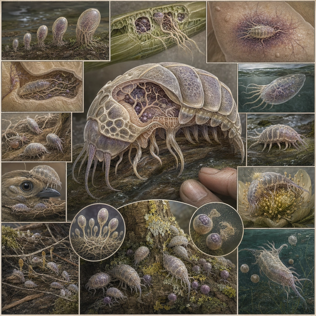
GPT Image 2en

Scene: Finish with a fully composed classroom-style poster that balances a central hero diagram with smaller supporting lifecycle scenes, all inside a square educational layout. The board should feel complete, polished, and ready for gallery or research presentation. Build the frame as a square natural history study with disciplined composition, believable lighting, and enough environmental evidence to explain how this organism or system functions without any caption. Keep the image polished, observational, and suitable for a research gallery rather than pulp fantasy spectacle. Subject: Present the organism’s full ecological story across multiple hosts and roles while keeping anatomy credible and layout coherent. The composition should invite long study, with each region rewarding inspection even without readable text. Show the anatomy, habitat interaction, and scale cues clearly so the viewer can infer locomotion, feeding, reproduction, or ecological role from the visual alone. Every visible structure should feel evolved for a purpose, with layered foreground, midground, and background information that rewards close inspection. Important details: Assume the organism changes ecological role by life stage. Early phases may exploit host tissue, later phases may provide immune modulation, pollination, cleaning, or nutrient transfer. The lifecycle must read as coherent biology rather than arbitrary plot twists. Think like a natural history educator: clarity first, beauty second, but both should be present. The final poster should summarize the package without flattening it into sterile graphic design. Favor coherent biology over decorative excess: tissues, shells, membranes, spores, tendrils, fins, silica lattices, or atmospheric sacs should all follow one material logic. Preserve a convincing relationship between the environment and the body plan, use restrained color hierarchy, and make the image feel like a serious speculative field record rather than a random monster concept. Use case: Parasite-Mutualism Life Cycle Poster single study 9/9. Constraints: No readable text, no watermark, no logos, preserve exact 1:1 aspect ratio, no readable typography, no school-clipart style, no corporate infographic look, no horror poster cues, no accidental brand resemblance, no direct copy of known terrestrial species, no cartoon simplification.
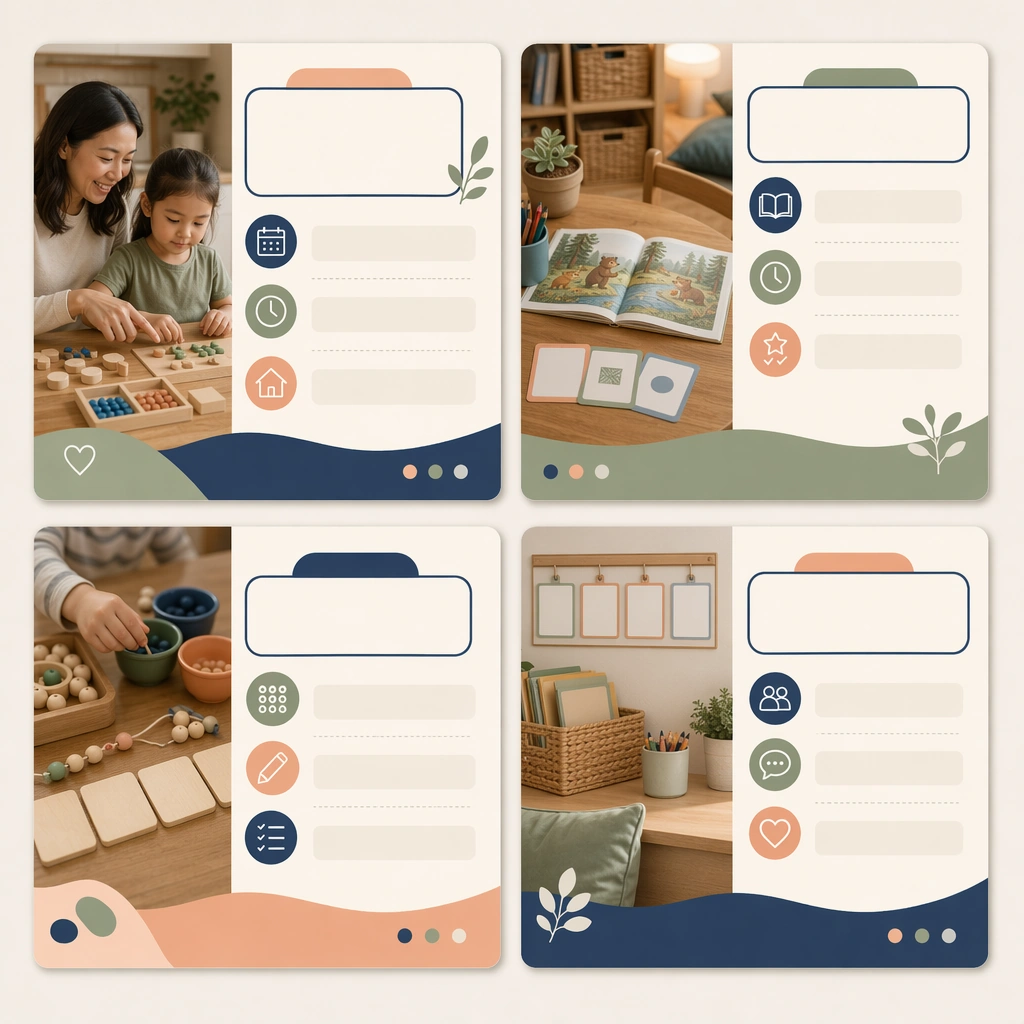
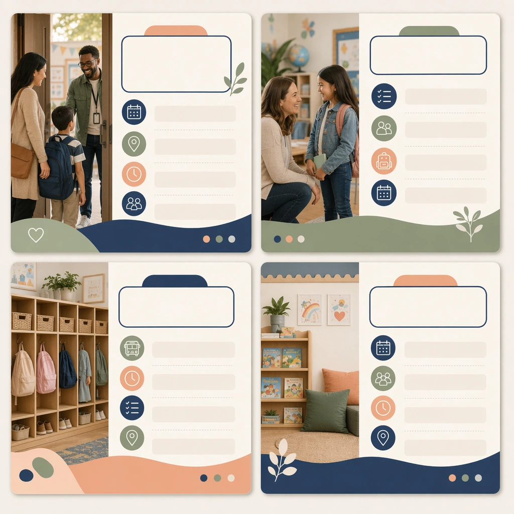
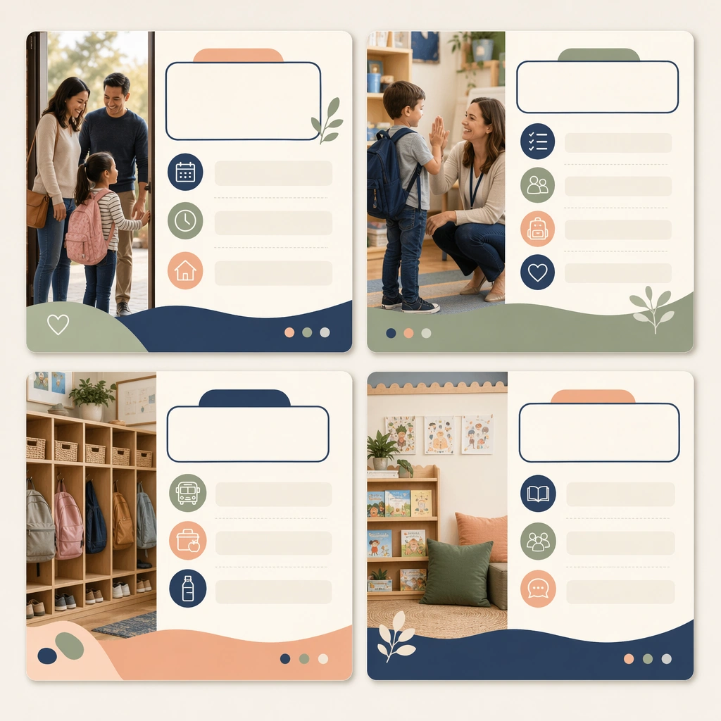
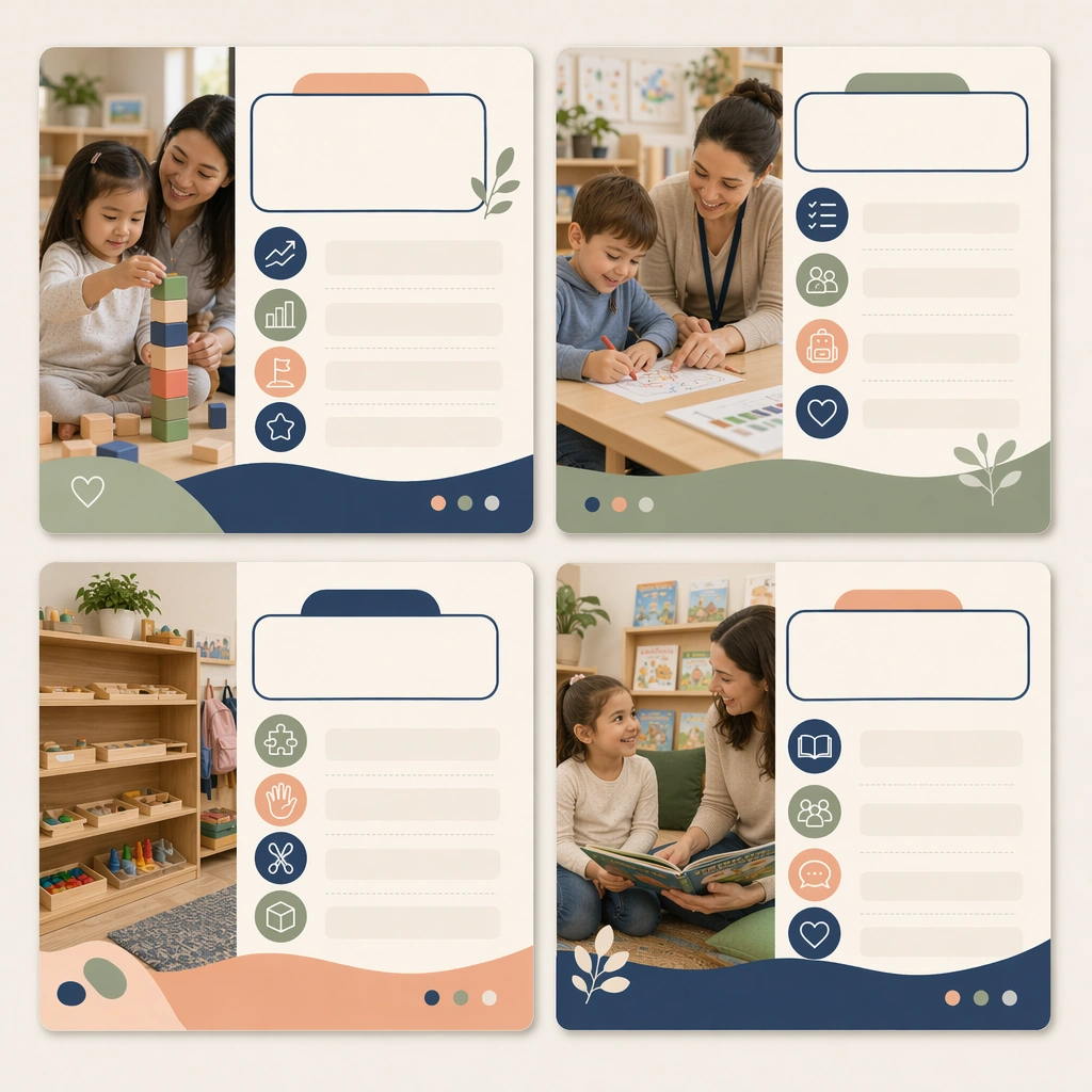
Example generated from “Parent Communication Education Carousel — Reference Welcome Carousel”
GPT Image 2en

Scene: Create a square social-carousel presentation showing four coordinated cards on a clean neutral backdrop, viewed straight-on with crisp print-and-screen realism. The cards should feel like polished parent-communication assets for a school or education brand, blending calm photography, icons, and blank editorial text zones. Keep the square frame balanced, calm, and production-ready so the asset can serve gallery review, research comparison, and real educational delivery at the same time. Subject: Focus the first set on a welcome or orientation message, using caring family imagery, classroom detail photos, routine icons, and modular content panels. The system should feel supportive and informative, not promotional or flashy. The subject matter should feel intentionally selected for a coherent curriculum family rather than like a random decorative assortment. Important details: Lock a repeatable communication design: stable margins, card corners, image-to-panel ratio, and a reassuring palette of soft navy, sage, peach, and cream. The carousel must look truly reusable across many school-home communication topics. Preserve the same square carousel-card frame, photo crop style, icon rhythm, blank headline areas, and family-trust color system from the reference card set. Use variation only in the teaching content, supporting props, and scene-specific mood while preserving the core visual system exactly. Use case: Parent Communication Education Carousel series study 1/4, reference welcome carousel. Constraints: No readable text, no watermark, no logos, preserve exact 1:1 aspect ratio, no readable social captions, no logos, no app-interface clutter, no influencer styling, no chaotic sticker overload, no celebrity likeness.

Example generated from “Parent Communication Education Carousel — Milestone Update Carousel”
GPT Image 2en

Scene: Keep the same square carousel-card presentation, straight-on viewpoint, and polished social-media mockup style from the reference image. The set should look like another post from the same school communications calendar, maintaining visual trust and brand continuity. Keep the square frame balanced, calm, and production-ready so the asset can serve gallery review, research comparison, and real educational delivery at the same time. Subject: Use progress icons, child activity photos, calm data-like shapes, and blank insight panels to suggest developmental milestones or learning moments without displaying any readable copy. The cards should balance warmth with professional clarity. The subject matter should feel intentionally selected for a coherent curriculum family rather than like a random decorative assortment. Important details: Preserve the reference system precisely: same card structure, palette, image crop logic, and icon weight. Variation should come from the message topic and supporting imagery, not from a new visual language. Preserve the same square carousel-card frame, photo crop style, icon rhythm, blank headline areas, and family-trust color system from the reference card set. Use variation only in the teaching content, supporting props, and scene-specific mood while preserving the core visual system exactly. Use case: Parent Communication Education Carousel series study 2/4, milestone update carousel. Constraints: No readable text, no watermark, no logos, preserve exact 1:1 aspect ratio, no readable social captions, no logos, no app-interface clutter, no influencer styling, no chaotic sticker overload, no celebrity likeness.

Example generated from “Parent Communication Education Carousel — Home Practice Carousel”
GPT Image 2en

Scene: Render the same square four-card carousel arrangement with identical spacing and polished presentation, now centered on home-learning support. The image should feel like a practical social post parents would save, though all copy areas remain blank. Keep the square frame balanced, calm, and production-ready so the asset can serve gallery review, research comparison, and real educational delivery at the same time. Subject: Use tabletop activity photos, gentle icon diagrams, visual routine steps, and blank checklist bars to suggest short at-home learning rituals. The content should feel specific, calm, and truly educational rather than like lifestyle fluff. The subject matter should feel intentionally selected for a coherent curriculum family rather than like a random decorative assortment. Important details: Keep the reference structure locked, especially the card framing, color hierarchy, and space for future typography. The carousel should prove the same template can handle instructional advice while staying highly approachable. Preserve the same square carousel-card frame, photo crop style, icon rhythm, blank headline areas, and family-trust color system from the reference card set. Use variation only in the teaching content, supporting props, and scene-specific mood while preserving the core visual system exactly. Use case: Parent Communication Education Carousel series study 3/4, home practice carousel. Constraints: No readable text, no watermark, no logos, preserve exact 1:1 aspect ratio, no readable social captions, no logos, no app-interface clutter, no influencer styling, no chaotic sticker overload, no celebrity likeness.

Example generated from “Parent Communication Education Carousel — Event Reminder Carousel”
GPT Image 2en

Scene: Return to the same square card-system presentation, straight-on mockup angle, and family-trust design language from the reference carousel. The set should feel like a coordinated reminder post for an upcoming school event or open classroom moment. Keep the square frame balanced, calm, and production-ready so the asset can serve gallery review, research comparison, and real educational delivery at the same time. Subject: Use calendar icons, photo snippets of classrooms and families, location markers, simple schedule blocks, and blank callout panels arranged for quick scanning. The communication should feel organized and reassuring, with no sense of commercial pressure. The subject matter should feel intentionally selected for a coherent curriculum family rather than like a random decorative assortment. Important details: Preserve the entire reference framework while shifting the content toward logistics and reminder cues. The final set should confirm that one disciplined carousel system can cover multiple high-frequency school-home communication needs. Preserve the same square carousel-card frame, photo crop style, icon rhythm, blank headline areas, and family-trust color system from the reference card set. Use variation only in the teaching content, supporting props, and scene-specific mood while preserving the core visual system exactly. Use case: Parent Communication Education Carousel series study 4/4, event reminder carousel. Constraints: No readable text, no watermark, no logos, preserve exact 1:1 aspect ratio, no readable social captions, no logos, no app-interface clutter, no influencer styling, no chaotic sticker overload, no celebrity likeness.

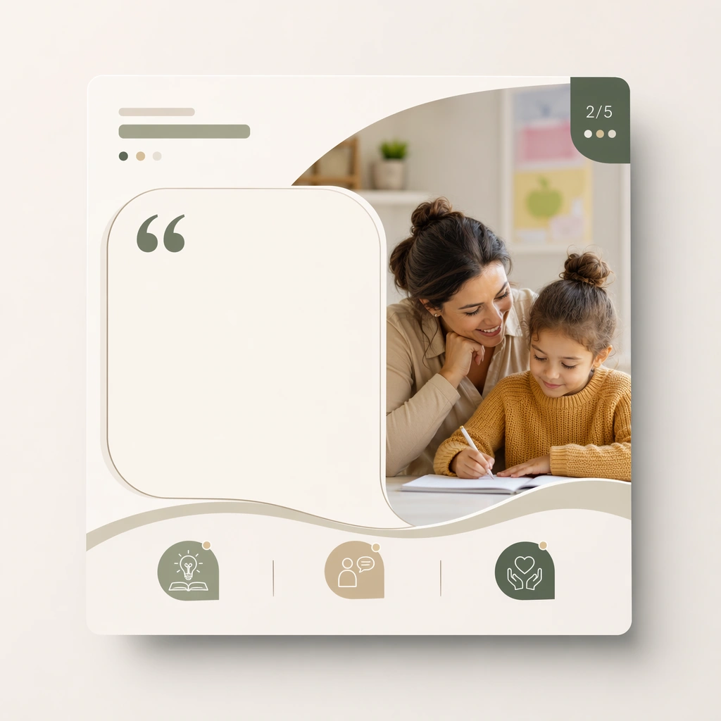
Example generated from “Parent Communication Education Carousel — Square Quote Card”
GPT Image 2en

Scene: Show a square editorial social card floating on a minimal background with crisp lighting and premium digital-mockup polish. The composition should feel calm, expert, and suitable for a school or child-development content brand. Keep the square frame balanced, calm, and production-ready so the asset can serve gallery review, research comparison, and real educational delivery at the same time. Subject: Use one strong family or classroom image, a large blank quote area, and small icon accents that suggest expert advice or reflective guidance. The card should look polished and highly shareable without leaning into lifestyle-blog cliches. The subject arrangement should feel complete and self-contained, able to stand alone as a real supporting deliverable inside the same education business line. Important details: Favor compositional discipline and emotional trust. The design should prove that parent-facing advice can be made visually compelling without loud trends or heavy branding. Keep the visual hierarchy modular, commercially believable, and clearly tied to a real educational use case rather than a generic mood board. Use case: Parent Communication Education Carousel single study 2/5, square quote card. Constraints: No readable text, no watermark, no logos, preserve exact 1:1 aspect ratio, no readable copy, no logos, no influencer aesthetics, no chaotic collage clutter, no fake app badges, no celebrity faces.

Example generated from “Parent Communication Education Carousel — Print Handout Adaptation”
GPT Image 2en

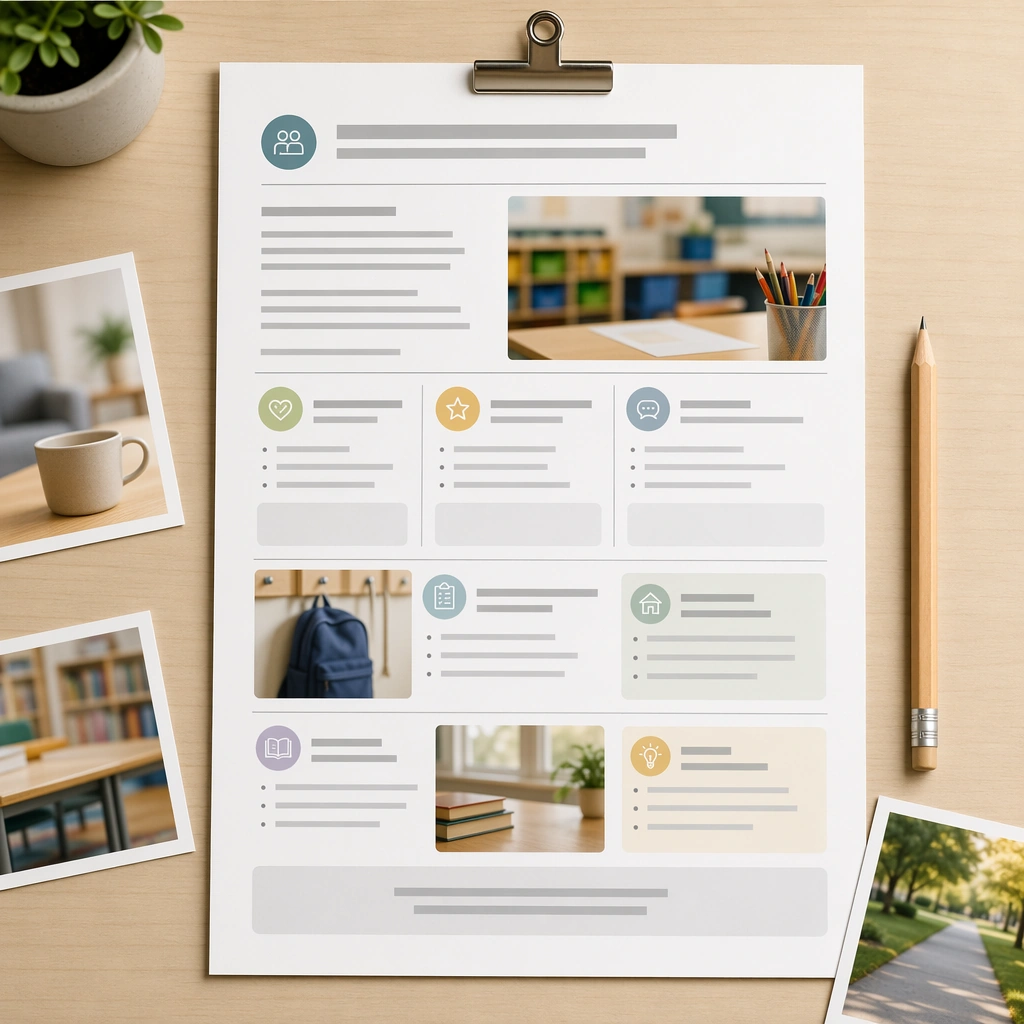
Scene: Render a square top-down mockup of a printed parent handout on a desk with a clip, pencil, and a few supporting photo blocks. The image should look like a real school-home communication sheet prepared for backpacks, notice folders, or front-desk pickup. Keep the square frame balanced, calm, and production-ready so the asset can serve gallery review, research comparison, and real educational delivery at the same time. Subject: The handout should use modular photo areas, icon-led sections, blank advice blocks, and gentle hierarchy that turns a carousel topic into a printable format. It must feel substantial and trustworthy without becoming bureaucratic. The subject arrangement should feel complete and self-contained, able to stand alone as a real supporting deliverable inside the same education business line. Important details: Keep the layout airy, useful, and production-aware. The asset should show that one communication topic can translate smoothly between social and print surfaces. Keep the visual hierarchy modular, commercially believable, and clearly tied to a real educational use case rather than a generic mood board. Use case: Parent Communication Education Carousel single study 3/5, print handout adaptation. Constraints: No readable text, no watermark, no logos, preserve exact 1:1 aspect ratio, no readable copy, no logos, no influencer aesthetics, no chaotic collage clutter, no fake app badges, no celebrity faces.

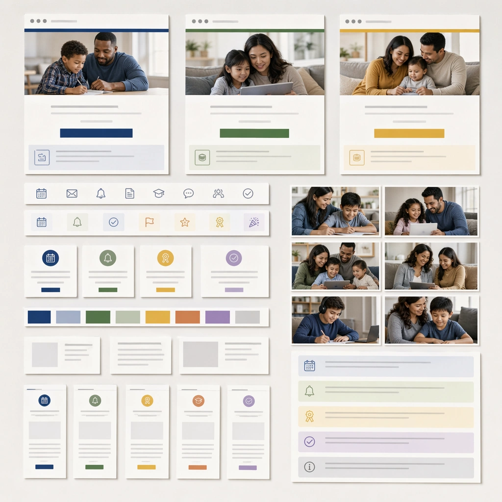
Example generated from “Parent Communication Education Carousel — Email Header Board”
GPT Image 2en

Scene: Create a square editorial system board showing several email-header mockups, icon strips, and content modules pinned on a clean neutral background. The image should feel like a communications-design review artifact for an education organization. Keep the square frame balanced, calm, and production-ready so the asset can serve gallery review, research comparison, and real educational delivery at the same time. Subject: Use banner crops, family photos, calendar icons, reminder badges, and blank intro bands to suggest welcome emails, reminders, and milestone updates. The pieces should look modular enough to be assembled into a real campaign sequence. The subject arrangement should feel complete and self-contained, able to stand alone as a real supporting deliverable inside the same education business line. Important details: Keep the board structured and quiet, with obvious reuse logic. The design should read as serious communication infrastructure, not just decoration. Keep the visual hierarchy modular, commercially believable, and clearly tied to a real educational use case rather than a generic mood board. Use case: Parent Communication Education Carousel single study 4/5, email header board. Constraints: No readable text, no watermark, no logos, preserve exact 1:1 aspect ratio, no readable copy, no logos, no influencer aesthetics, no chaotic collage clutter, no fake app badges, no celebrity faces.

Example generated from “Parent Communication Education Carousel — Community Bulletin Collage”
GPT Image 2en

Scene: Show a square community bulletin board with pinned school notices, family photos, icon cards, and blank message panels under natural light. The composition should feel lived-in but still well designed, suitable for an entry hall or neighborhood learning center. Keep the square frame balanced, calm, and production-ready so the asset can serve gallery review, research comparison, and real educational delivery at the same time. Subject: Mix multiple card sizes and message types while keeping the hierarchy calm and comprehensible. The board should suggest updates, reminders, celebrations, and support resources without relying on readable copy. The subject arrangement should feel complete and self-contained, able to stand alone as a real supporting deliverable inside the same education business line. Important details: Use texture and layering carefully so the collage stays organized. The asset should prove the communication system can move off-screen into real shared spaces while keeping trust and clarity. Keep the visual hierarchy modular, commercially believable, and clearly tied to a real educational use case rather than a generic mood board. Use case: Parent Communication Education Carousel single study 5/5, community bulletin collage. Constraints: No readable text, no watermark, no logos, preserve exact 1:1 aspect ratio, no readable copy, no logos, no influencer aesthetics, no chaotic collage clutter, no fake app badges, no celebrity faces.

Example generated from “Parody Movie Poster Remix — Reference Anchor”
GPT Image 2en

Scene: Create a square reference image for Parody Movie Poster Remix. Build a reference anchor establishing the core system with a premium, production-ready finish. Use a polished modular board or campaign surface with clean spacing, premium game-UI finish, and clear focal hierarchy. The composition should feel intentional, clean, and reusable for gallery, research, campaign, or internal handoff contexts. Lighting must support readability first, with the main forms clearly separated from the background and enough breathing room for the system to stay legible at both hero scale and thumbnail scale. Subject: Center a coherent original game-art system built for premium production and marketing surfaces. For this image, focus on reference anchor. Keep the same system logic stable across screenshots, cards, banners, and overview boards. This image is the canonical anchor that later series images must follow. The viewer should immediately understand what role this surface plays inside a cohesive game-production asset pack. Important details: Lock framing, icon grammar, palette blocking, and surface hierarchy so the kit feels production-ready and consistent. Preserve the core silhouette, framing language, and material logic from the reference image while each variation changes function. Keep materials believable, edge hierarchy disciplined, and the visual language consistent with Parody Poster. Use abstract interface blocks or diagram accents when helpful, but avoid any readable language. The final result should feel like a deliberate production asset rather than a random illustration. Use case: Parody Movie Poster Remix series study 1/9, designed as reference anchor within a cohesive asset pack. Constraints: No readable text, no watermark, no logos, preserve exact 1:1 aspect ratio, no unrelated objects, no broken visual hierarchy, no malformed anatomy or broken perspective, no random decorative clutter.

Example generated from “Parody Movie Poster Remix — Variant One”
GPT Image 2en

Scene: Create a square dependent image for Parody Movie Poster Remix. Build a first controlled variation in the same system with a premium, production-ready finish. Use a polished modular board or campaign surface with clean spacing, premium game-UI finish, and clear focal hierarchy. The composition should feel intentional, clean, and reusable for gallery, research, campaign, or internal handoff contexts. Lighting must support readability first, with the main forms clearly separated from the background and enough breathing room for the system to stay legible at both hero scale and thumbnail scale. Subject: Center a coherent original game-art system built for premium production and marketing surfaces. For this image, focus on the intended support surface. Keep the same system logic stable across screenshots, cards, banners, and overview boards. Preserve exact identity or system logic from the reference image while changing only the intended variation axis. The viewer should immediately understand what role this surface plays inside a cohesive game-production asset pack. Important details: Lock framing, icon grammar, palette blocking, and surface hierarchy so the kit feels production-ready and consistent. Preserve the core silhouette, framing language, and material logic from the reference image while each variation changes function. Keep materials believable, edge hierarchy disciplined, and the visual language consistent with Parody Poster. Use abstract interface blocks or diagram accents when helpful, but avoid any readable language. The final result should feel like a deliberate production asset rather than a random illustration. Use case: Parody Movie Poster Remix series study 2/9, designed as variant one within a cohesive asset pack. Constraints: No readable text, no watermark, no logos, preserve exact 1:1 aspect ratio, no unrelated objects, no broken visual hierarchy, no malformed anatomy or broken perspective, no random decorative clutter.

Example generated from “Parody Movie Poster Remix — Variant Two”
GPT Image 2en

Scene: Create a square dependent image for Parody Movie Poster Remix. Build a second controlled variation in the same system with a premium, production-ready finish. Use a polished modular board or campaign surface with clean spacing, premium game-UI finish, and clear focal hierarchy. The composition should feel intentional, clean, and reusable for gallery, research, campaign, or internal handoff contexts. Lighting must support readability first, with the main forms clearly separated from the background and enough breathing room for the system to stay legible at both hero scale and thumbnail scale. Subject: Center a coherent original game-art system built for premium production and marketing surfaces. For this image, focus on the intended support surface. Keep the same system logic stable across screenshots, cards, banners, and overview boards. Preserve exact identity or system logic from the reference image while changing only the intended variation axis. The viewer should immediately understand what role this surface plays inside a cohesive game-production asset pack. Important details: Lock framing, icon grammar, palette blocking, and surface hierarchy so the kit feels production-ready and consistent. Preserve the core silhouette, framing language, and material logic from the reference image while each variation changes function. Keep materials believable, edge hierarchy disciplined, and the visual language consistent with Parody Poster. Use abstract interface blocks or diagram accents when helpful, but avoid any readable language. The final result should feel like a deliberate production asset rather than a random illustration. Use case: Parody Movie Poster Remix series study 3/9, designed as variant two within a cohesive asset pack. Constraints: No readable text, no watermark, no logos, preserve exact 1:1 aspect ratio, no unrelated objects, no broken visual hierarchy, no malformed anatomy or broken perspective, no random decorative clutter.

Example generated from “Parody Movie Poster Remix — Variant Three”
GPT Image 2en

Scene: Create a square dependent image for Parody Movie Poster Remix. Build a third controlled variation in the same system with a premium, production-ready finish. Use a polished modular board or campaign surface with clean spacing, premium game-UI finish, and clear focal hierarchy. The composition should feel intentional, clean, and reusable for gallery, research, campaign, or internal handoff contexts. Lighting must support readability first, with the main forms clearly separated from the background and enough breathing room for the system to stay legible at both hero scale and thumbnail scale. Subject: Center a coherent original game-art system built for premium production and marketing surfaces. For this image, focus on the intended support surface. Keep the same system logic stable across screenshots, cards, banners, and overview boards. Preserve exact identity or system logic from the reference image while changing only the intended variation axis. The viewer should immediately understand what role this surface plays inside a cohesive game-production asset pack. Important details: Lock framing, icon grammar, palette blocking, and surface hierarchy so the kit feels production-ready and consistent. Preserve the core silhouette, framing language, and material logic from the reference image while each variation changes function. Keep materials believable, edge hierarchy disciplined, and the visual language consistent with Parody Poster. Use abstract interface blocks or diagram accents when helpful, but avoid any readable language. The final result should feel like a deliberate production asset rather than a random illustration. Use case: Parody Movie Poster Remix series study 4/9, designed as variant three within a cohesive asset pack. Constraints: No readable text, no watermark, no logos, preserve exact 1:1 aspect ratio, no unrelated objects, no broken visual hierarchy, no malformed anatomy or broken perspective, no random decorative clutter.

Example generated from “Parody Movie Poster Remix — Support One”
GPT Image 2en

Scene: Create a square standalone support image for Parody Movie Poster Remix. Build a support-surface study with a clear focal hierarchy and a finished professional surface. Use a polished modular board or campaign surface with clean spacing, premium game-UI finish, and clear focal hierarchy. The frame should feel self-contained and polished, with enough structure to explain the system even without the reference series, yet still obviously belonging to the same theme and production world. Subject: Show a coherent original game-art system built for premium production and marketing surfaces in a way that emphasizes the intended support surface. Keep the same system logic stable across screenshots, cards, banners, and overview boards. Even though this image is independent, the viewer should still recognize the same universe, same commercial logic, and same production intent as the core package. Important details: Lock framing, icon grammar, palette blocking, and surface hierarchy so the kit feels production-ready and consistent. Preserve the broader theme language through color, framing, material choices, and modular composition. Use clean panel rhythm, premium asset presentation, and believable detail density. The image should work equally well as a gallery study, research reference, and mock production deliverable. Use case: Parody Movie Poster Remix single study 5/9, exploring support one as a support surface. Constraints: No readable text, no watermark, no logos, preserve exact 1:1 aspect ratio, no unrelated objects, no broken visual hierarchy, no visual noise that obscures the main surface, no accidental brand resemblance.

Example generated from “Parody Movie Poster Remix — Support Two”
GPT Image 2en

Scene: Create a square standalone support image for Parody Movie Poster Remix. Build a second support-surface study with a clear focal hierarchy and a finished professional surface. Use a polished modular board or campaign surface with clean spacing, premium game-UI finish, and clear focal hierarchy. The frame should feel self-contained and polished, with enough structure to explain the system even without the reference series, yet still obviously belonging to the same theme and production world. Subject: Show a coherent original game-art system built for premium production and marketing surfaces in a way that emphasizes the intended support surface. Keep the same system logic stable across screenshots, cards, banners, and overview boards. Even though this image is independent, the viewer should still recognize the same universe, same commercial logic, and same production intent as the core package. Important details: Lock framing, icon grammar, palette blocking, and surface hierarchy so the kit feels production-ready and consistent. Preserve the broader theme language through color, framing, material choices, and modular composition. Use clean panel rhythm, premium asset presentation, and believable detail density. The image should work equally well as a gallery study, research reference, and mock production deliverable. Use case: Parody Movie Poster Remix single study 6/9, exploring support two as a support surface. Constraints: No readable text, no watermark, no logos, preserve exact 1:1 aspect ratio, no unrelated objects, no broken visual hierarchy, no visual noise that obscures the main surface, no accidental brand resemblance.