PROMPTY · TWÓRCZE ODKRYWANIE

Galeria promptów

Odkrywaj prawdziwe prompty i wygenerowane przykłady. Znajdź inspirację do kolejnej twórczej misji i kopiuj pełne prompty bezpłatnie.

Przykłady
10,974
Modele
17
Źródła
1277
10 974 przykładów promptów · strona 36 z 229
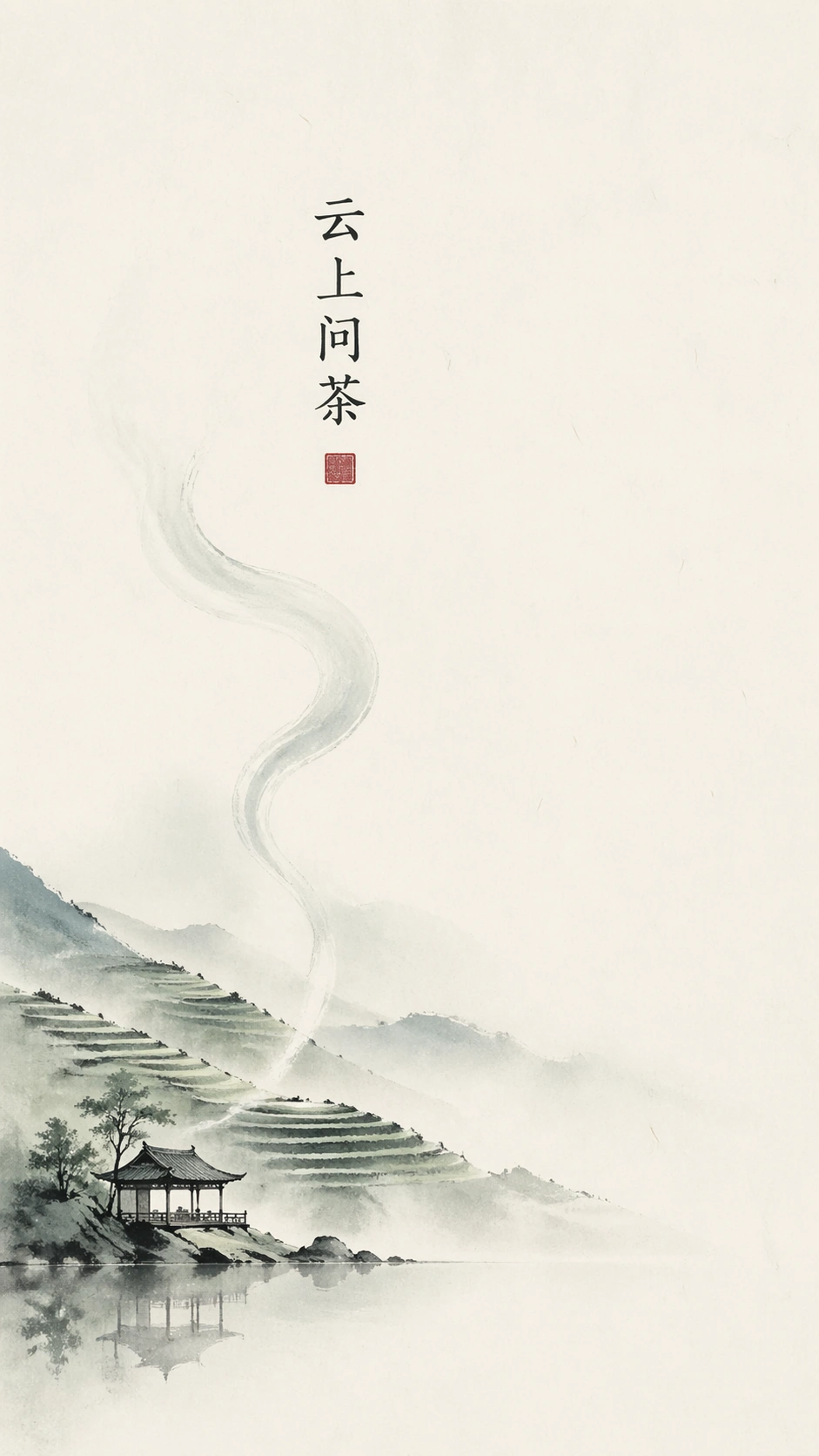
Example generated from “New Chinese Ink Poster — Tea House Launch”
GPT Image 2en

Scene: A vertical 9:16 premium tea-brand launch poster, designed as a flat print on ivory rice paper. Keep the composition spacious, with roughly seventy percent quiet blank paper and a low-saturation palette of pale tea green, fog blue, charcoal ink, and faint warm gray. The poster should feel modern, expensive, and calm, with no photography frame and no decorative border. Subject: At the bottom left, a minimal ink silhouette of a mountain tea house sits beside a small reflective pond. Thin terraces climb into mist behind it, drawn with broken ink lines and diluted green wash. A single steam-like brushstroke rises upward, becoming part of the empty space. Place the readable Chinese title "云上问茶" in a small vertical block near the upper center-left, using refined modern calligraphic typography that is legible but not loud. Important details: The design must read as new Chinese commercial minimalism, not an old scroll reproduction. Typography, landscape, and blank space should form a clean hierarchy: title first, mist gesture second, tea house third. The tea house must be recognizable with a roofline, posts, and reflection, but it should stay tiny. Use one abstract red seal square without characters as a visual anchor. Do not add package copy, prices, dates, or brand logos. Use case: New Chinese Ink Poster single study 2/8, testing commercial tea-poster layout, small readable Chinese title, and disciplined negative space. Constraints: No readable text outside the specified Chinese title, no watermark, no logos, preserve exact 9:16 aspect ratio, no product package, no tea leaves close-up, no busy mountain village, no random seals, no illegible fake characters, no saturated gold luxury effects.
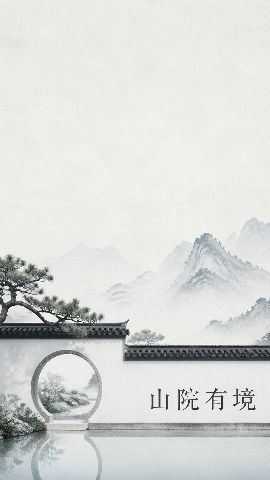
Example generated from “New Chinese Ink Poster — Residence Courtyard”
GPT Image 2en

Scene: A vertical 9:16 real-estate cultural poster on pale gray-white textured paper, front-facing and gallery-clean. Use a low-saturation palette of mist blue, light stone gray, diluted ink, and subtle spring green. The top half must remain almost empty, while the lower half contains a calm architectural ink scene with enough breathing room for luxury positioning. Subject: A new Chinese courtyard residence is suggested with only a few precise elements: a white wall, dark tiled eave, moon gate, one pine branch, and a thin reflective water strip. Behind it, faint mountain silhouettes dissolve into pale wash. Place the readable Chinese title "山院有境" horizontally near the lower right, set in modern Song-style type with ample spacing and a quiet dark-ink tone. The title should feel like a property campaign headline without any brand mark. Important details: The poster must balance commercial mockup clarity with traditional ink restraint. Architecture should be elegant and minimal, not a detailed rendering. Keep the white wall and moon gate crisp enough to read, while the mountains stay atmospheric. No sales text, no phone numbers, no floor plans, and no logo. The title should be the only readable text, aligned cleanly to the geometry of the wall and waterline. Use case: New Chinese Ink Poster single study 3/8, testing real-estate poster structure, architectural minimalism, and controlled Chinese headline rendering. Constraints: No readable text outside the specified Chinese title, no watermark, no logos, preserve exact 9:16 aspect ratio, no people, no cars, no dense urban skyline, no ornate palace detail, no gold foil overload, no fake property data, no tilted perspective.

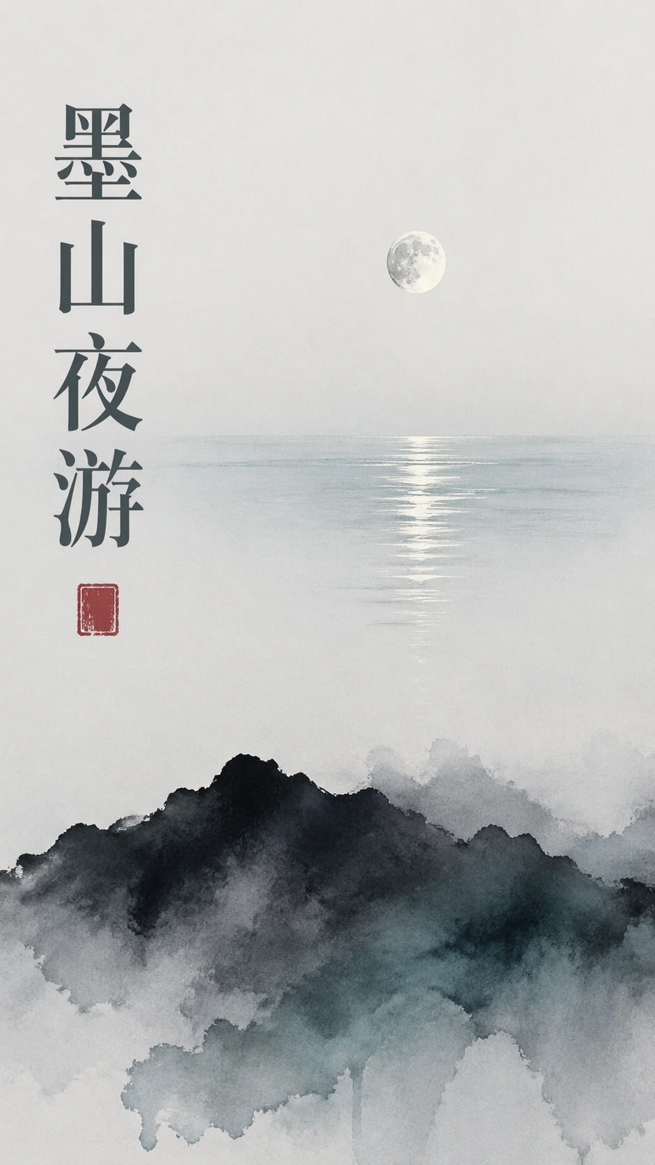
Example generated from “New Chinese Ink Poster — Museum Night”
GPT Image 2en

Scene: A vertical 9:16 museum exhibition poster on cold white matte stock, composed with strong empty space and a refined night palette. Use ink black, mist blue, pale gray, and a very small amount of muted teal. The poster should feel like a contemporary cultural institution campaign, photographed flat with crisp paper edges and no visible wall or frame. Subject: A single ink-wash mountain ridge appears near the bottom, almost like a shadow. Above it floats a small moon reflected in a narrow lake band, leaving the majority of the poster open and silent. Place the readable Chinese title "墨山夜游" in a vertical column along the left third, using elegant high-contrast Chinese typography, stable baseline spacing, and dark gray ink. A tiny abstract red seal block may sit below the title, but it must contain no readable characters. Important details: The layout should show clear poster hierarchy without extra event details: title column, moon, lake reflection, ridge, and negative space. The mountain should be atmospheric rather than photorealistic; the moon should be subtle, not glowing like a fantasy planet. Preserve a premium museum tone, with precise margins and no crowded decoration. The title must be legible and not broken into random strokes. Use case: New Chinese Ink Poster single study 4/8, testing cultural poster hierarchy, night ink mood, and stable vertical Chinese title composition. Constraints: No readable text outside the specified Chinese title, no watermark, no logos, preserve exact 9:16 aspect ratio, no dates, no ticket prices, no museum emblem, no starry sky clutter, no neon glow, no heavy black background, no illegible calligraphy.

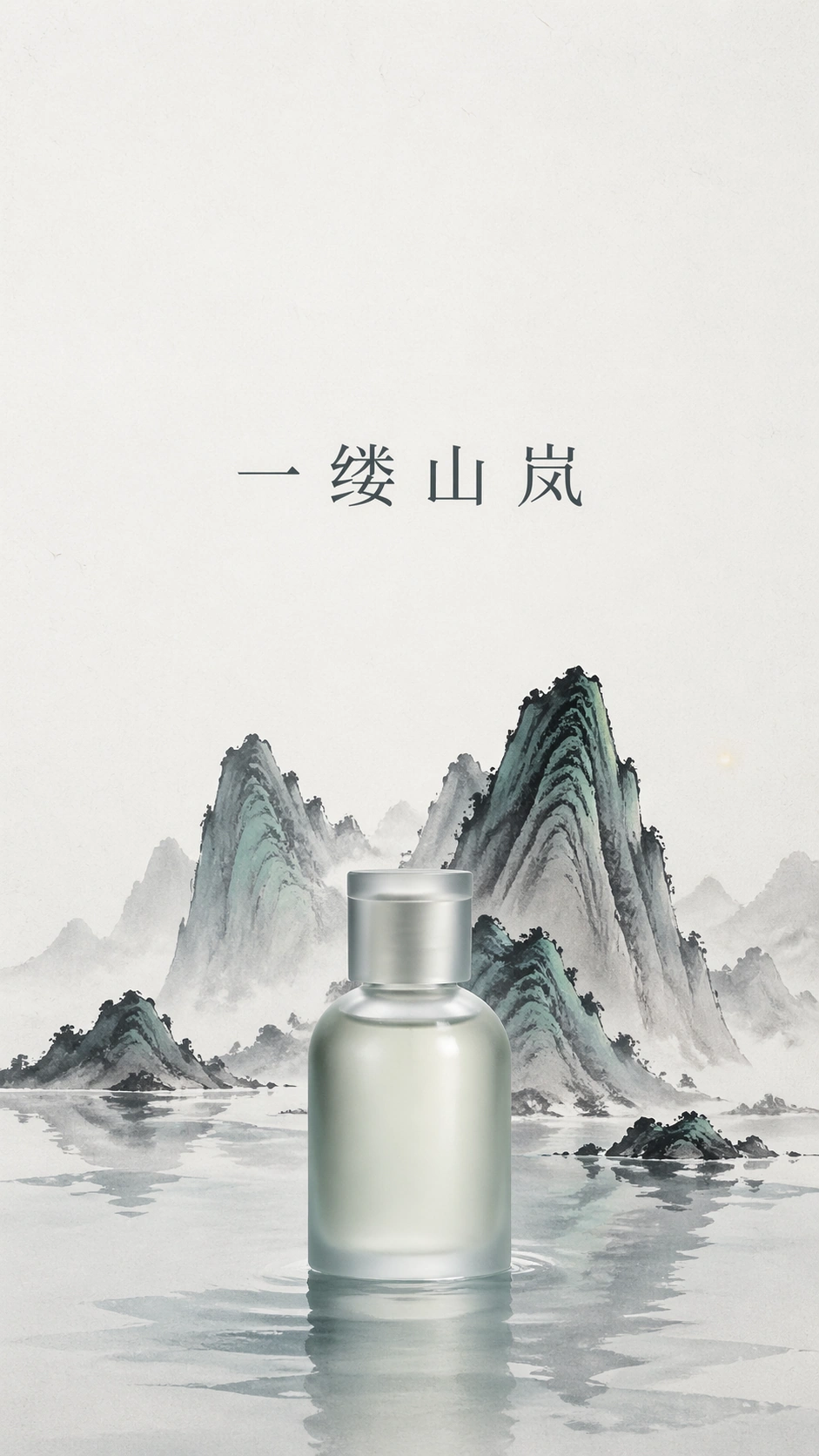
Example generated from “New Chinese Ink Poster — Fragrance Bottle”
GPT Image 2en

Scene: A vertical 9:16 luxury fragrance campaign poster printed on soft white paper, front-facing and minimal. Use a restrained palette of pale ink gray, mist blue, celadon green, and one extremely subtle warm highlight. The upper half should be almost empty, while the lower center holds a refined ink landscape and a small product-like silhouette without any brand identity. Subject: A translucent frosted glass fragrance bottle sits at the bottom center, simplified and unbranded, half emerging from a shallow ink lake. Behind it, a few steep ink mountains rise like a miniature stage set, with green mineral wash only on select ridges. Place the readable Chinese title "一缕山岚" horizontally above the bottle with careful modern Song-style letterforms, generous spacing, and a calm dark-gray tone. No other copy appears. Important details: This is a commercial mockup, but it must not become a logo advertisement. The bottle should be photoreal enough to show frosted glass, soft reflection, and a faint shadow on the paper, while the landscape remains ink-wash and flat. The title should align to the bottle axis without crowding it. Preserve sixty percent or more clean negative space, and make the transition between product object and painted lake feel elegant rather than surreal. Use case: New Chinese Ink Poster single study 5/8, testing luxury product-poster composition, restrained mixed media, and readable Chinese headline spacing. Constraints: No readable text outside the specified Chinese title, no watermark, no logos, preserve exact 9:16 aspect ratio, no brand label on the bottle, no barcode, no price copy, no ornate perfume cap, no saturated metallic gold, no cluttered floral background.

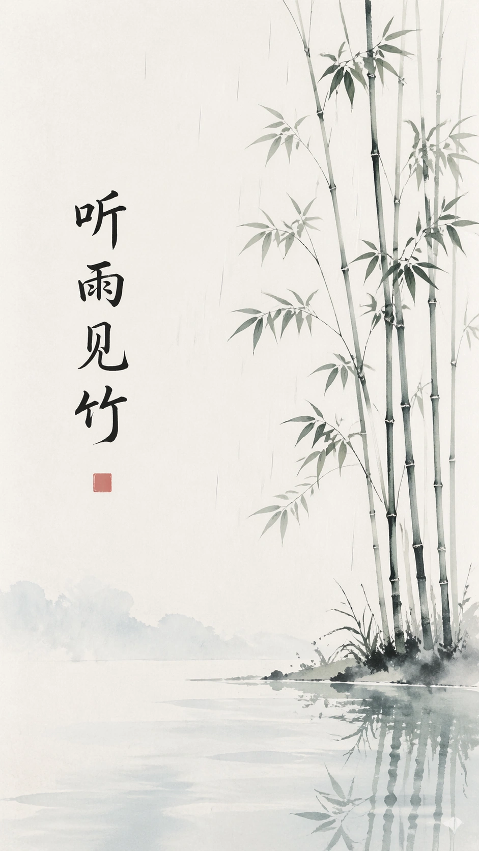
Example generated from “New Chinese Ink Poster — Bamboo Rain”
GPT Image 2en

Scene: A vertical 9:16 poster on cool off-white paper, designed with modern Chinese ink restraint and a rainy spring atmosphere. The page should be mostly blank, with thin vertical movement concentrated along the right edge and a low horizontal wash near the bottom. Use pale bamboo green, diluted ink black, fog blue, and light gray. The image must remain clean enough for a premium cultural brand poster. Subject: A sparse bamboo grove is suggested by five or six slender ink stalks and soft leaf clusters, leaving large open paper areas. Fine rain lines fall through the empty space but remain delicate, not noisy. A shallow lake wash at the bottom catches faint bamboo reflections. Place the readable Chinese title "听雨见竹" vertically near the left third, balanced against the bamboo on the right, using refined modern calligraphy with stable character shapes. Important details: The poster tests whether many fine lines can stay orderly in an extreme vertical composition. Rain, bamboo, title, and reflection must not merge into visual clutter. The Chinese title must remain the only readable text and should not look like random brush marks. Keep the luxury feeling through restraint: ample margins, balanced asymmetry, no decorative border, and one very small abstract red seal block without characters. Use case: New Chinese Ink Poster single study 6/8, testing fine-line ink structure, readable vertical Chinese type, and calm 9:16 negative-space control. Constraints: No readable text outside the specified Chinese title, no watermark, no logos, preserve exact 9:16 aspect ratio, no dense bamboo forest, no birds, no people, no storm clouds, no saturated emerald, no fake handwritten gibberish, no frame.

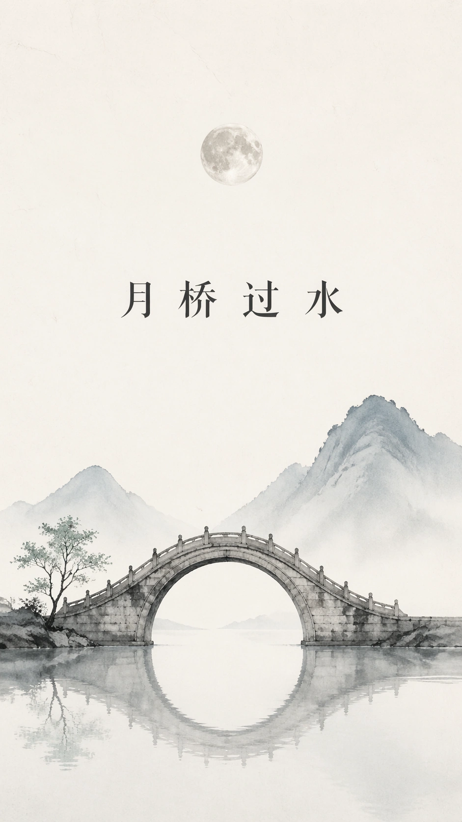
Example generated from “New Chinese Ink Poster — Moon Bridge”
GPT Image 2en

Scene: A vertical 9:16 new Chinese ink poster on smooth rice-white paper, composed with a wide empty upper field and a quiet architectural scene near the lower third. Use low-saturation mist blue, pale gray, charcoal ink, and a small celadon accent. The poster should feel like a refined cultural travel campaign, but without any brand mark or destination logo. Subject: A single arched stone moon bridge crosses a narrow lake, drawn in minimal ink with softened edges and a faint mirrored reflection. Behind it, two distant mountains fade into mist and a small round moon hangs high in the open space. Place the readable Chinese title "月桥过水" horizontally below the moon but above the bridge, with elegant modern Song-style typography and exact spacing between the four characters. Important details: Keep the bridge simple and iconic, not a detailed tourist illustration. The open sky must remain mostly blank, with only the moon and title interrupting it. The title should be crisp, centered on a stable invisible grid, and the only readable text. The bridge reflection should align with the waterline, proving structured layout control. Add no explanatory copy; let the mountain, bridge, water, and title carry the poster. Use case: New Chinese Ink Poster single study 7/8, testing architectural ink iconography, centered Chinese headline rendering, and spacious vertical travel-poster composition. Constraints: No readable text outside the specified Chinese title, no watermark, no logos, preserve exact 9:16 aspect ratio, no tourists, no lantern festival clutter, no saturated sunset, no fake destination branding, no heavy border, no broken bridge reflection.

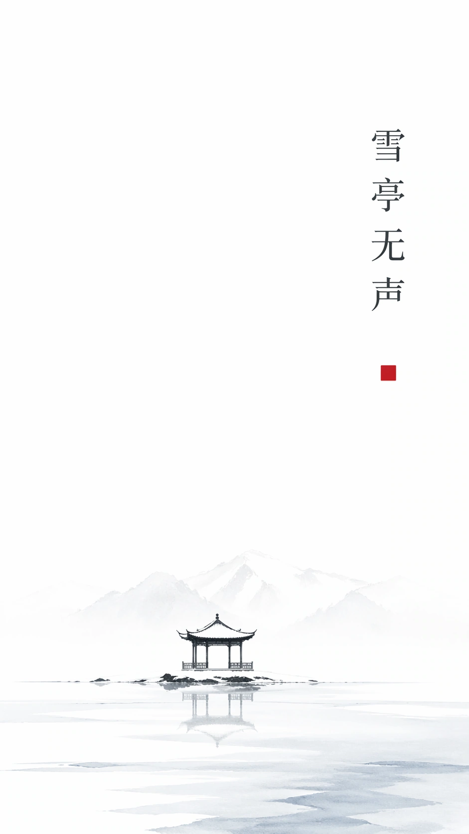
Example generated from “New Chinese Ink Poster — Snow Pavilion”
GPT Image 2en

Scene: A vertical 9:16 winter ink poster on matte white paper, using extreme restraint and a cold low-saturation palette. Most of the page is untouched snow-white negative space, with pale ink gray and fog blue concentrated near the bottom. The lighting is even and quiet, like a premium seasonal cultural poster photographed straight-on for a design archive. Subject: A tiny lakeside pavilion sits in the lower center, drawn with a few black ink roof strokes and light gray posts. Snow-covered mountain shapes almost disappear behind it, and a narrow frozen lake reflects the pavilion with minimal detail. Place the readable Chinese title "雪亭无声" vertically near the upper right, using elegant dark-gray Song-style typography with ample spacing and exact character order. Important details: The poster must prove that minimal information can still feel complete. Snow is represented through blank paper, not white paint effects. The pavilion should be small but clear, the mountains nearly abstract, and the lake reflection calm. The Chinese title must stay crisp and readable, not broken into faux calligraphy. Keep the layout luxurious and quiet, with no extra copy, no logo, no decorative border, and only one small abstract red square without characters if needed for balance. Use case: New Chinese Ink Poster single study 8/8, testing extreme white-space control, winter ink mood, and clean vertical Chinese text rendering. Constraints: No readable text outside the specified Chinese title, no watermark, no logos, preserve exact 9:16 aspect ratio, no people, no animals, no heavy snowfall texture, no holiday decoration, no saturated red accents, no random calligraphy fragments, no picture frame.
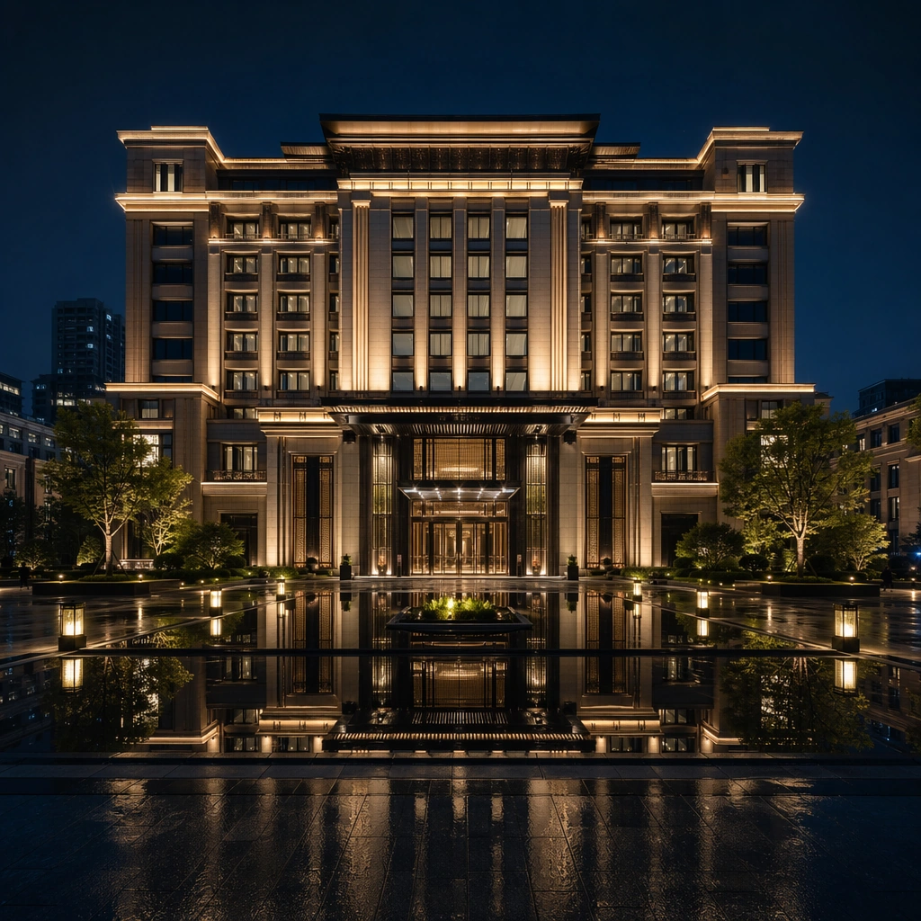
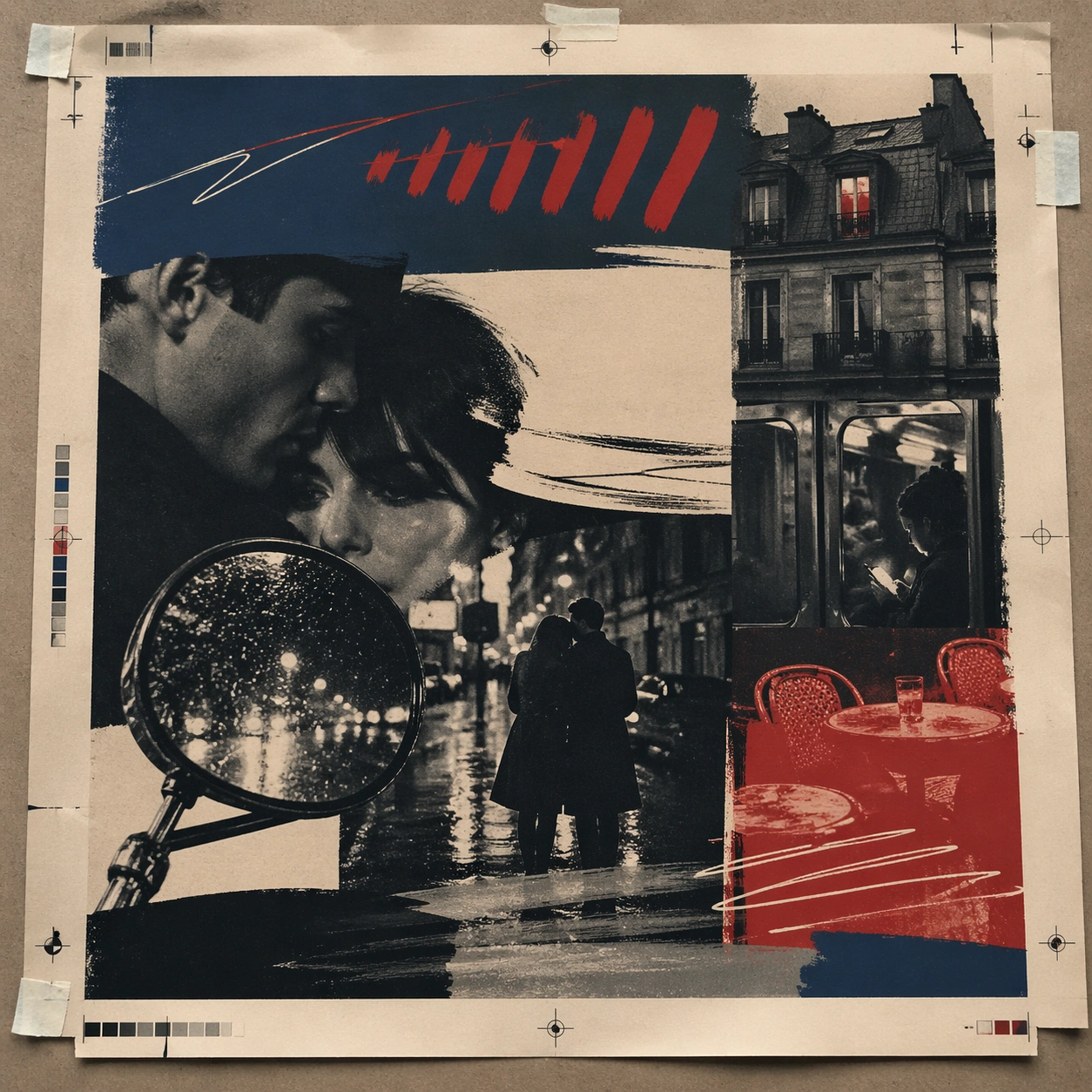
Example generated from “New Wave French Film Poster — Print Proof Flatlay”
GPT Image 2en

Scene: A square overhead tabletop photograph of a fresh poster proof on neutral worktable paper, lit by cool daylight, with crop marks, tape tabs, and slight paper bow visible around the sheet. The poster should express 1960s art-house poster grammar with radical photo crop, offset grain, hand-painted marks, and emotional empty space, using inky blue, carmine red, warm cream, charcoal, and cigarette-smoke gray and a tactile surface appropriate to the medium. Subject: Design the poster as a print-shop proof, preserving the same poster language while allowing production clues such as edge trims, registration targets, and process marks to frame the composition. Use street couples, scooter mirrors, apartment windows, rain-slick pavement, camera flash, and cafe tables as the main visual ingredients, and organize them with handwritten sweeps and sans blocks that feel gestural but stay non-readable. For the contemporary-subject axis, thread in a late-night metro ride and smartphone glow transformed into a melancholic art-house romance surface. The poster must feel like an original design object rather than a reproduction of any known work. Important details: The image must still read as a finished poster concept, but it should carry believable print-process evidence and material tactility instead of gallery-wall perfection. Preserve abrupt crop decisions, mood ambiguity, rough screen-print texture, and tension between photo and mark-making. Keep every letterform abstract and non-readable, as if it were a typographic texture rather than language. Make the style unmistakable through composition, palette, surface behavior, and symbolic compression. no blockbuster gloss, no readable credits, no hyper-polished skin retouching, no superhero spectacle. Use case: French New Wave single study 2/9, testing production realism and process evidence. Constraints: No readable text, no watermark, no logos, preserve exact 1:1 aspect ratio, no copyrighted characters, no real brand marks, no QR codes, no interface chrome, no accidental gibberish lettering.

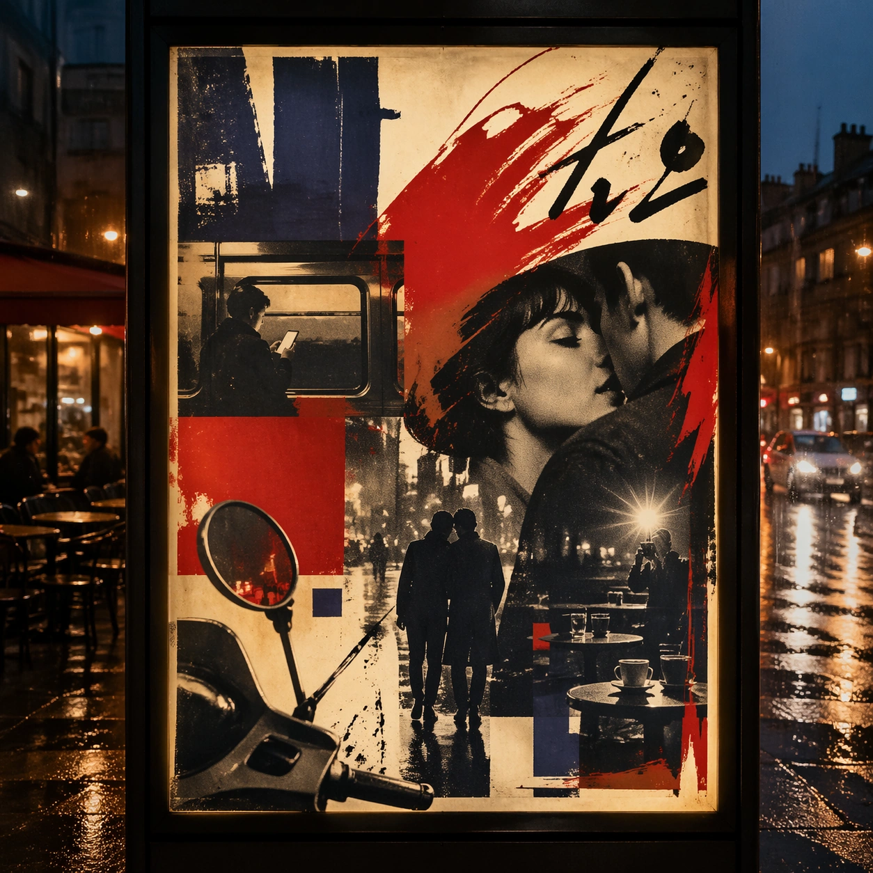
Example generated from “New Wave French Film Poster — Transit Lightbox”
GPT Image 2en

Scene: A square dusk street photograph of a backlit transit poster glowing inside glass, with faint rain reflections, soft city blur in the distance, and the poster remaining fully legible as a composition. The poster should express 1960s art-house poster grammar with radical photo crop, offset grain, hand-painted marks, and emotional empty space, using inky blue, carmine red, warm cream, charcoal, and cigarette-smoke gray and a tactile surface appropriate to the medium. Subject: Adapt the poster into a public-facing lightbox version that still honors the original style grammar while feeling bold enough to stop a passerby from several meters away. Use street couples, scooter mirrors, apartment windows, rain-slick pavement, camera flash, and cafe tables as the main visual ingredients, and organize them with handwritten sweeps and sans blocks that feel gestural but stay non-readable. For the contemporary-subject axis, thread in a late-night metro ride and smartphone glow transformed into a melancholic art-house romance surface. The poster must feel like an original design object rather than a reproduction of any known work. Important details: Let the style survive the illumination test: color blocking, silhouette contrast, and abstract lettering should stay controlled under bright internal light and reflective glass. Preserve abrupt crop decisions, mood ambiguity, rough screen-print texture, and tension between photo and mark-making. Keep every letterform abstract and non-readable, as if it were a typographic texture rather than language. Make the style unmistakable through composition, palette, surface behavior, and symbolic compression. no blockbuster gloss, no readable credits, no hyper-polished skin retouching, no superhero spectacle. Use case: French New Wave single study 3/9, testing distance readability in public display. Constraints: No readable text, no watermark, no logos, preserve exact 1:1 aspect ratio, no copyrighted characters, no real brand marks, no QR codes, no interface chrome, no accidental gibberish lettering.

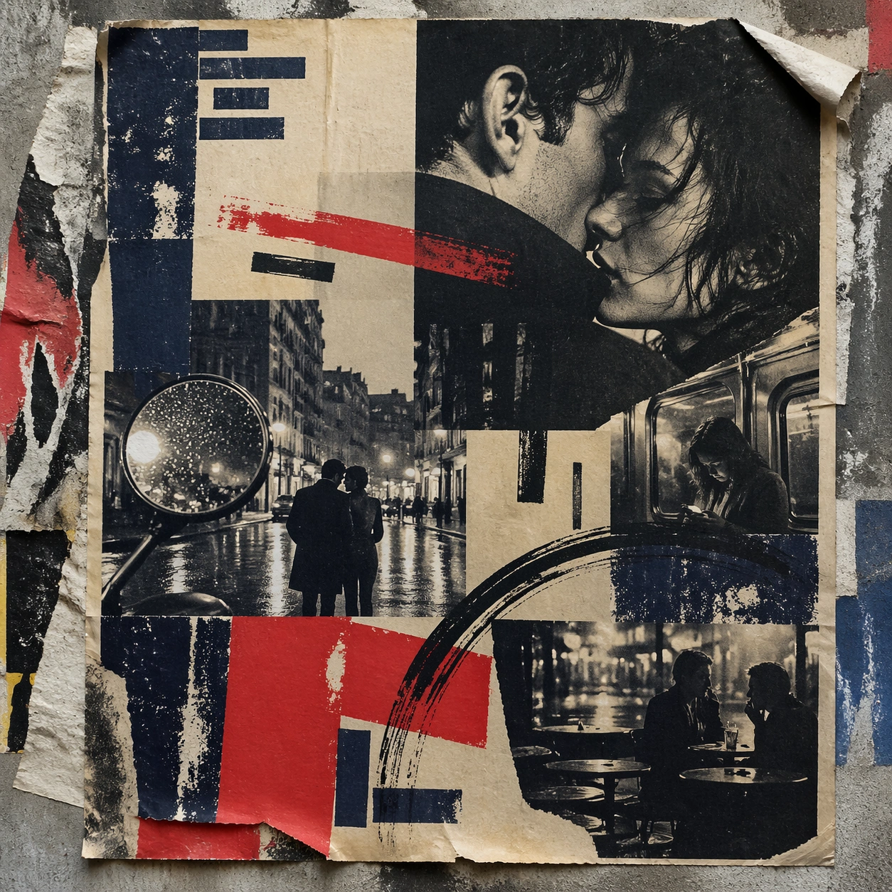
Example generated from “New Wave French Film Poster — Wheatpaste Wall Layer”
GPT Image 2en

Scene: A square urban wall study with the poster pasted onto rough plaster among torn edges and older paper remnants, photographed in soft overcast light so texture, glue bubbles, and surface scars stay visible. The poster should express 1960s art-house poster grammar with radical photo crop, offset grain, hand-painted marks, and emotional empty space, using inky blue, carmine red, warm cream, charcoal, and cigarette-smoke gray and a tactile surface appropriate to the medium. Subject: Create a version that feels made for the street, with the poster carrying enough formal force to survive abrasion, layering, and imperfect placement without losing its visual identity. Use street couples, scooter mirrors, apartment windows, rain-slick pavement, camera flash, and cafe tables as the main visual ingredients, and organize them with handwritten sweeps and sans blocks that feel gestural but stay non-readable. For the contemporary-subject axis, thread in a late-night metro ride and smartphone glow transformed into a melancholic art-house romance surface. The poster must feel like an original design object rather than a reproduction of any known work. Important details: Keep the main design intact but let the environment add grit: lifted corners, tiny tears, wrinkled paper, and older color fragments around the perimeter should amplify the style rather than dilute it. Preserve abrupt crop decisions, mood ambiguity, rough screen-print texture, and tension between photo and mark-making. Keep every letterform abstract and non-readable, as if it were a typographic texture rather than language. Make the style unmistakable through composition, palette, surface behavior, and symbolic compression. no blockbuster gloss, no readable credits, no hyper-polished skin retouching, no superhero spectacle. Use case: French New Wave single study 4/9, testing street-life durability and layered context. Constraints: No readable text, no watermark, no logos, preserve exact 1:1 aspect ratio, no copyrighted characters, no real brand marks, no QR codes, no interface chrome, no accidental gibberish lettering.

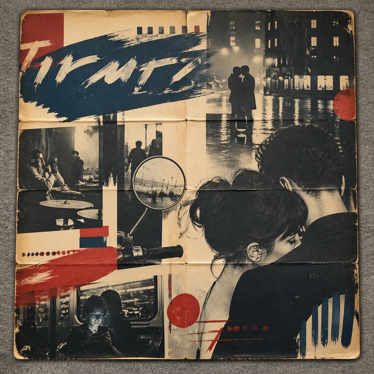
Example generated from “New Wave French Film Poster — Folded Archive Copy”
GPT Image 2en

Scene: A square conservation-table view of a vintage poster laid on gray felt under raking light, with visible fold lines, softened corners, and subtle aging that still preserves the integrity of the image. The poster should express 1960s art-house poster grammar with radical photo crop, offset grain, hand-painted marks, and emotional empty space, using inky blue, carmine red, warm cream, charcoal, and cigarette-smoke gray and a tactile surface appropriate to the medium. Subject: Present the poster as an archive copy that has been stored, unfolded, and carefully documented, letting age and handling reveal how the design holds up across time. Use street couples, scooter mirrors, apartment windows, rain-slick pavement, camera flash, and cafe tables as the main visual ingredients, and organize them with handwritten sweeps and sans blocks that feel gestural but stay non-readable. For the contemporary-subject axis, thread in a late-night metro ride and smartphone glow transformed into a melancholic art-house romance surface. The poster must feel like an original design object rather than a reproduction of any known work. Important details: Aging must stay believable rather than theatrical: slight yellowing, fold memory, edge wear, and pigment variation should support the historical or crafted feeling of the style. Preserve abrupt crop decisions, mood ambiguity, rough screen-print texture, and tension between photo and mark-making. Keep every letterform abstract and non-readable, as if it were a typographic texture rather than language. Make the style unmistakable through composition, palette, surface behavior, and symbolic compression. no blockbuster gloss, no readable credits, no hyper-polished skin retouching, no superhero spectacle. Use case: French New Wave single study 5/9, testing archival endurance and age character. Constraints: No readable text, no watermark, no logos, preserve exact 1:1 aspect ratio, no copyrighted characters, no real brand marks, no QR codes, no interface chrome, no accidental gibberish lettering.

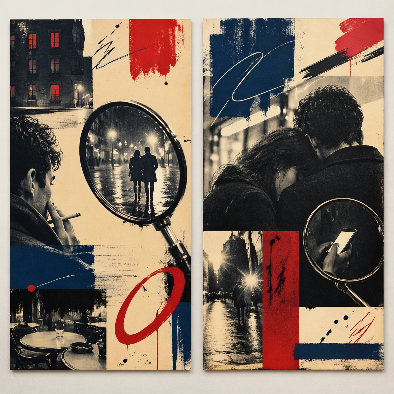
Example generated from “New Wave French Film Poster — Twin Poster Diptych”
GPT Image 2en

Scene: A square white-wall installation showing two companion posters hung side by side with equal spacing, photographed frontally so the pair reads as a designed conversation rather than two unrelated sheets. The poster should express 1960s art-house poster grammar with radical photo crop, offset grain, hand-painted marks, and emotional empty space, using inky blue, carmine red, warm cream, charcoal, and cigarette-smoke gray and a tactile surface appropriate to the medium. Subject: Compose a matched diptych: two posters sharing one style system while splitting the narrative across paired motifs, mirrored masses, or complementary color emphasis. Use street couples, scooter mirrors, apartment windows, rain-slick pavement, camera flash, and cafe tables as the main visual ingredients, and organize them with handwritten sweeps and sans blocks that feel gestural but stay non-readable. For the contemporary-subject axis, thread in a late-night metro ride and smartphone glow transformed into a melancholic art-house romance surface. The poster must feel like an original design object rather than a reproduction of any known work. Important details: Both halves should feel distinct yet inseparable. Preserve one coherent visual language, but let each sheet carry its own focal symbol and rhythm without readable wording. Preserve abrupt crop decisions, mood ambiguity, rough screen-print texture, and tension between photo and mark-making. Keep every letterform abstract and non-readable, as if it were a typographic texture rather than language. Make the style unmistakable through composition, palette, surface behavior, and symbolic compression. no blockbuster gloss, no readable credits, no hyper-polished skin retouching, no superhero spectacle. Use case: French New Wave single study 6/9, testing system flexibility across a paired set. Constraints: No readable text, no watermark, no logos, preserve exact 1:1 aspect ratio, no copyrighted characters, no real brand marks, no QR codes, no interface chrome, no accidental gibberish lettering.

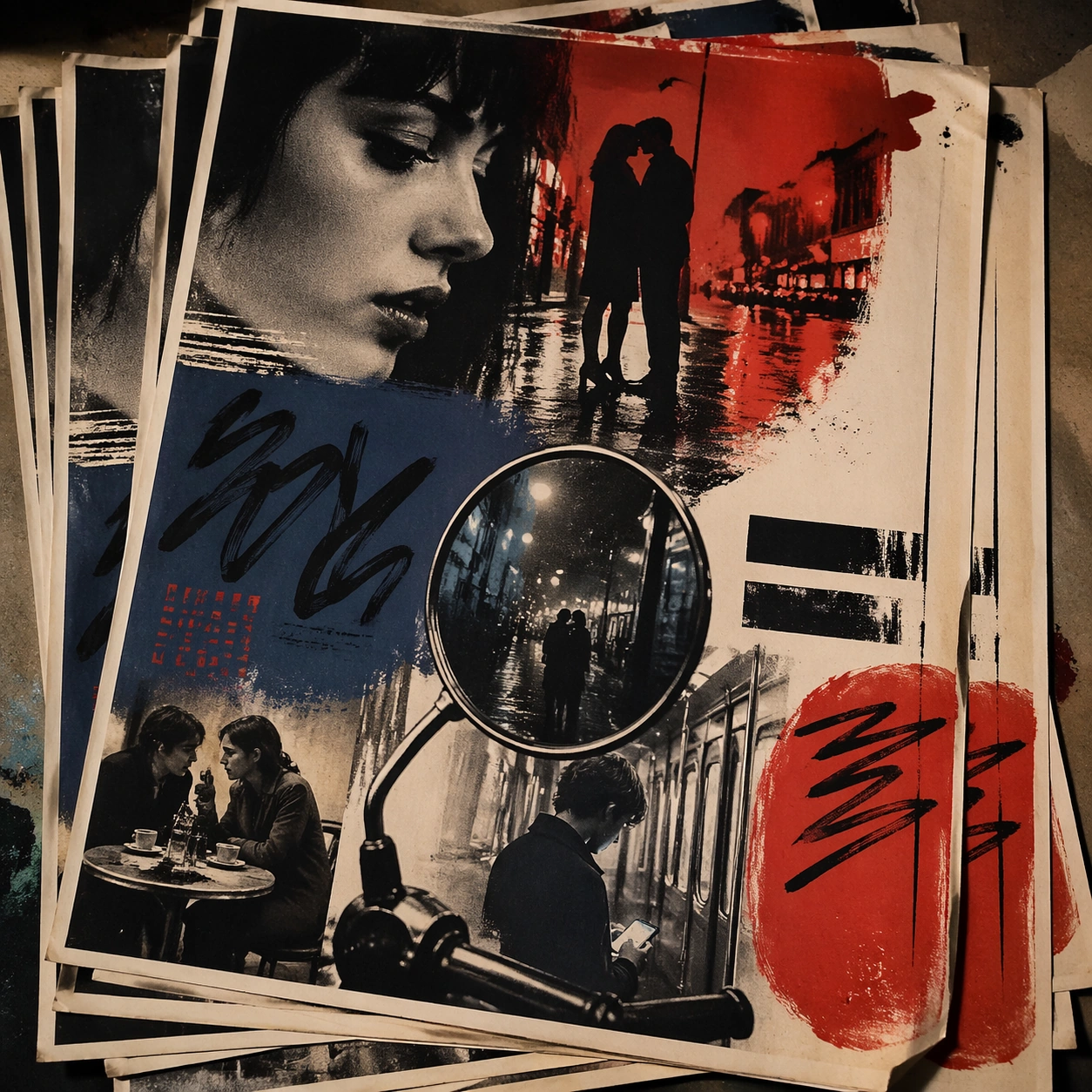
Example generated from “New Wave French Film Poster — Stacked Print Bundle”
GPT Image 2en

Scene: A square tabletop shot of several poster prints stacked and slightly fanned, with curled corners, offset edges, and soft directional light revealing paper thickness and ink behavior. The poster should express 1960s art-house poster grammar with radical photo crop, offset grain, hand-painted marks, and emotional empty space, using inky blue, carmine red, warm cream, charcoal, and cigarette-smoke gray and a tactile surface appropriate to the medium. Subject: Design the top poster to dominate while nearby duplicate sheets echo the same composition, creating a tactile print-run scene rather than a single isolated sheet. Use street couples, scooter mirrors, apartment windows, rain-slick pavement, camera flash, and cafe tables as the main visual ingredients, and organize them with handwritten sweeps and sans blocks that feel gestural but stay non-readable. For the contemporary-subject axis, thread in a late-night metro ride and smartphone glow transformed into a melancholic art-house romance surface. The poster must feel like an original design object rather than a reproduction of any known work. Important details: Use the stack to emphasize production character: edge shadows, repeated motifs peeking from beneath, and subtle misalignment should enrich the material reading without changing the core design. Preserve abrupt crop decisions, mood ambiguity, rough screen-print texture, and tension between photo and mark-making. Keep every letterform abstract and non-readable, as if it were a typographic texture rather than language. Make the style unmistakable through composition, palette, surface behavior, and symbolic compression. no blockbuster gloss, no readable credits, no hyper-polished skin retouching, no superhero spectacle. Use case: French New Wave single study 7/9, testing print-run tactility and repeat presence. Constraints: No readable text, no watermark, no logos, preserve exact 1:1 aspect ratio, no copyrighted characters, no real brand marks, no QR codes, no interface chrome, no accidental gibberish lettering.

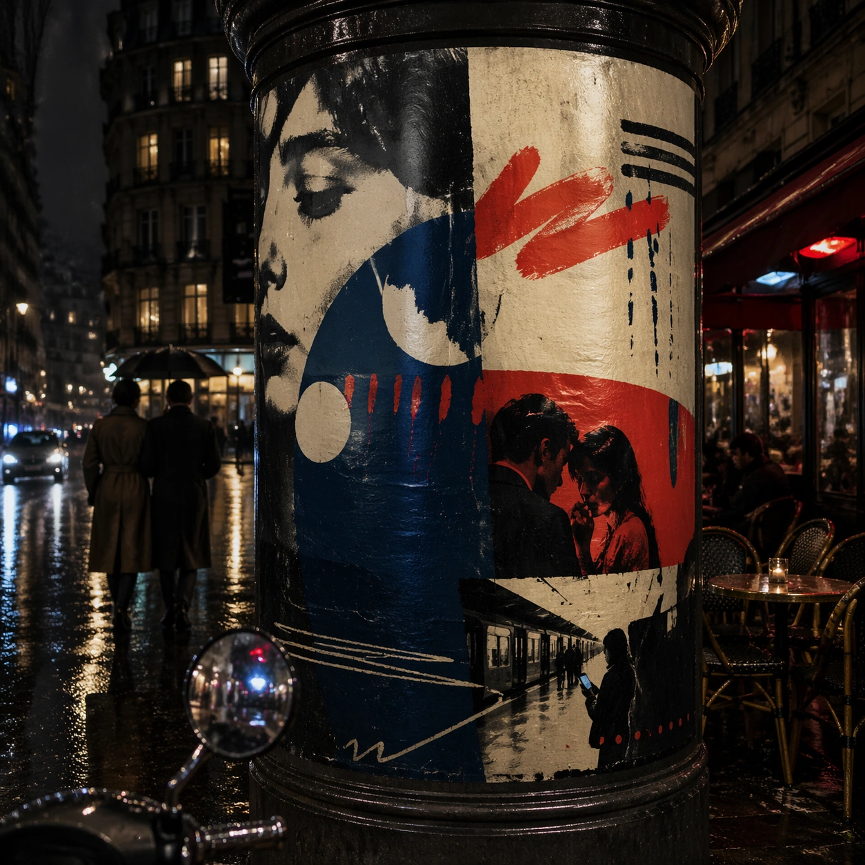
Example generated from “New Wave French Film Poster — Kiosk Night Glow”
GPT Image 2en

Scene: A square nighttime city view with the poster wrapping part of a cylindrical kiosk, wet pavement reflecting nearby light, and the composition holding together under moody urban illumination. The poster should express 1960s art-house poster grammar with radical photo crop, offset grain, hand-painted marks, and emotional empty space, using inky blue, carmine red, warm cream, charcoal, and cigarette-smoke gray and a tactile surface appropriate to the medium. Subject: Reframe the design for a dramatic street-placement context, where the poster has to project style and mood through reflection, curvature, and surrounding darkness. Use street couples, scooter mirrors, apartment windows, rain-slick pavement, camera flash, and cafe tables as the main visual ingredients, and organize them with handwritten sweeps and sans blocks that feel gestural but stay non-readable. For the contemporary-subject axis, thread in a late-night metro ride and smartphone glow transformed into a melancholic art-house romance surface. The poster must feel like an original design object rather than a reproduction of any known work. Important details: The design should remain instantly recognizable despite the cylindrical wrap. Preserve major blocks, symbolic shapes, and abstract title forms so the style still feels authoritative at night. Preserve abrupt crop decisions, mood ambiguity, rough screen-print texture, and tension between photo and mark-making. Keep every letterform abstract and non-readable, as if it were a typographic texture rather than language. Make the style unmistakable through composition, palette, surface behavior, and symbolic compression. no blockbuster gloss, no readable credits, no hyper-polished skin retouching, no superhero spectacle. Use case: French New Wave single study 8/9, testing atmospheric display under rain and glow. Constraints: No readable text, no watermark, no logos, preserve exact 1:1 aspect ratio, no copyrighted characters, no real brand marks, no QR codes, no interface chrome, no accidental gibberish lettering.

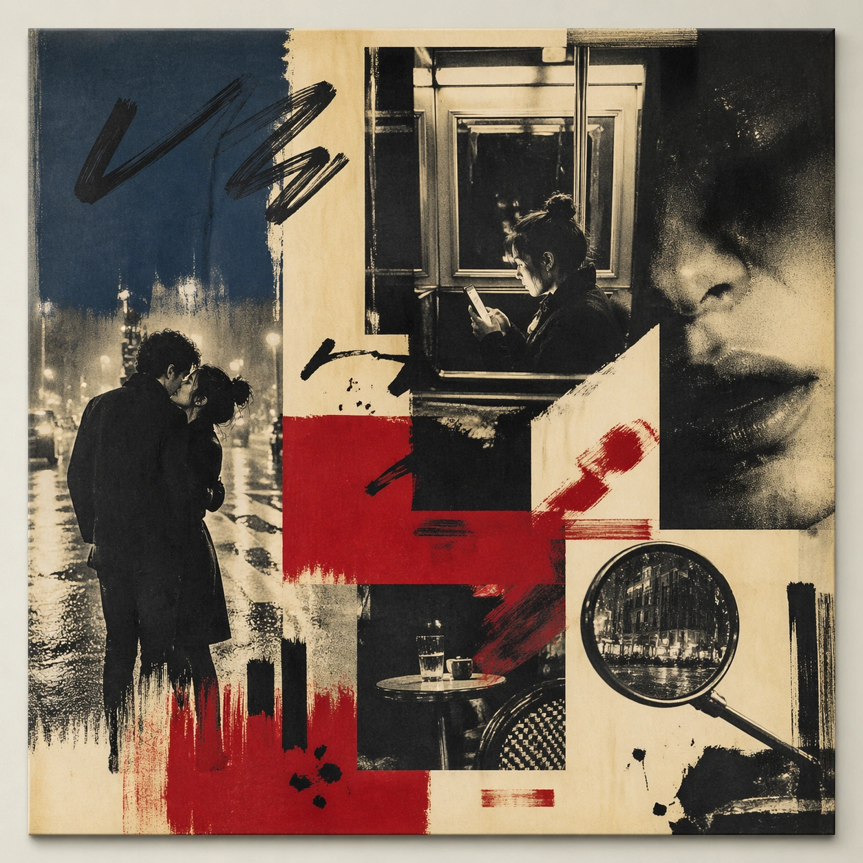
Example generated from “New Wave French Film Poster — Contemporary Remix”
GPT Image 2en

Scene: A square front-facing poster presentation on a clean neutral wall, lit like a premium print test, with crisp edges and a polished but still tactile finish appropriate to the style. The poster should express 1960s art-house poster grammar with radical photo crop, offset grain, hand-painted marks, and emotional empty space, using inky blue, carmine red, warm cream, charcoal, and cigarette-smoke gray and a tactile surface appropriate to the medium. Subject: Apply the historical poster language to a contemporary urban subject so the old visual grammar proves it can carry present-day themes without losing authenticity or formal discipline. Use street couples, scooter mirrors, apartment windows, rain-slick pavement, camera flash, and cafe tables as the main visual ingredients, and organize them with handwritten sweeps and sans blocks that feel gestural but stay non-readable. For the contemporary-subject axis, thread in a late-night metro ride and smartphone glow transformed into a melancholic art-house romance surface. The poster must feel like an original design object rather than a reproduction of any known work. Important details: This is not parody. The contemporary subject should feel genuinely absorbed into the style through palette, composition, symbolic compression, and non-readable lettering treatment. Preserve abrupt crop decisions, mood ambiguity, rough screen-print texture, and tension between photo and mark-making. Keep every letterform abstract and non-readable, as if it were a typographic texture rather than language. Make the style unmistakable through composition, palette, surface behavior, and symbolic compression. no blockbuster gloss, no readable credits, no hyper-polished skin retouching, no superhero spectacle. Use case: French New Wave single study 9/9, testing historical grammar on a present-day subject. Constraints: No readable text, no watermark, no logos, preserve exact 1:1 aspect ratio, no copyrighted characters, no real brand marks, no QR codes, no interface chrome, no accidental gibberish lettering.

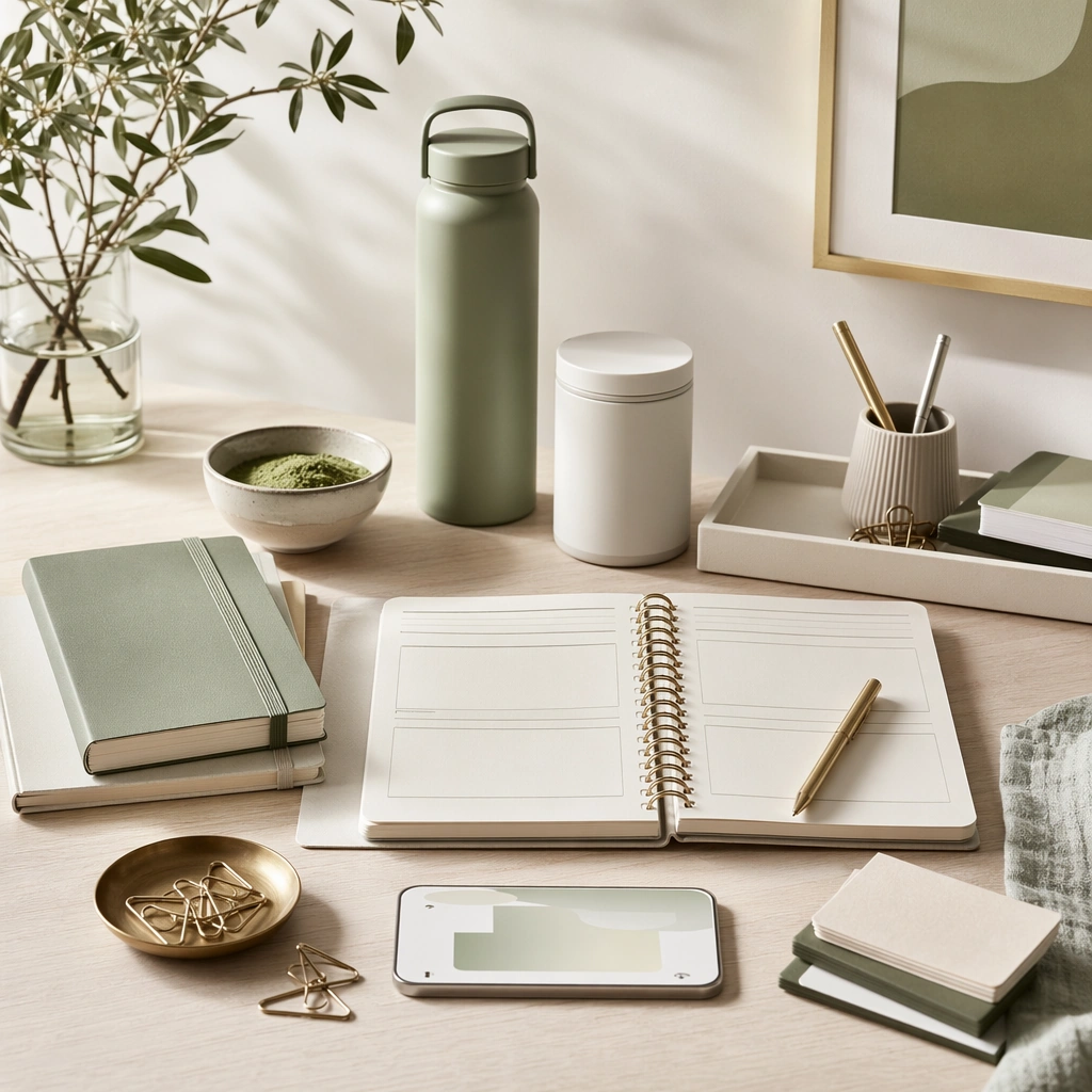
Example generated from “New Year Renewal Campaign Family — Fresh Desk Anchor”
GPT Image 2en

Scene: Create a square premium New Year campaign image filled with clean morning light, pale neutrals, soft green accents, and optimistic metallic details. The environment should feel like a polished reset moment rather than a party aftermath. Use an organized desk or lifestyle surface with depth, clarity, and enough spatial breathing room that the image can anchor a fresh-cycle campaign for brands focused on progress, structure, and new beginnings. Subject: Center a disciplined arrangement of planner-like materials without readable text, healthy product silhouettes, tidy containers, a phone or device-like object with abstract interface glow, and a few lifestyle cues that suggest ambition and reset. The objects should feel aspirational but practical, blending home, wellness, and productivity into one coherent New Year visual language rather than one narrow category. Important details: Lock the renewal grammar here: bright natural light, calm neutrals, soft green and brass accents, precise organization, and an atmosphere of achievable progress. Keep surfaces premium and modern, with believable materials and a balance between warmth and order. This anchor should feel reusable across fitness, home, learning, finance, and planning brands without losing its specific New Year reset energy. Use case: New Year Renewal series study 1/9. Constraints: No readable text, no watermark, no logos, preserve exact 1:1 aspect ratio, no fireworks, no party confetti, no readable planner text, no champagne cues, no overcrowded desk, no logo devices, no messy cables, no calendar numerals.

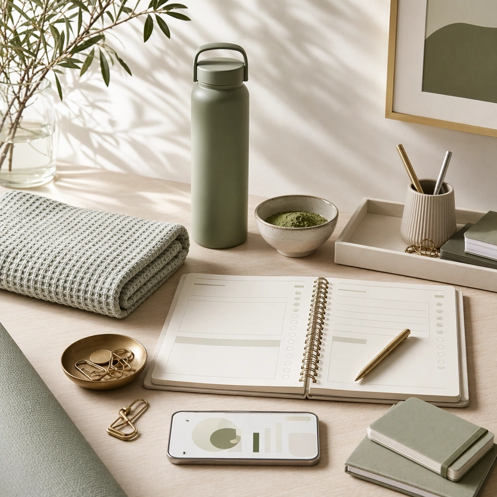
Example generated from “New Year Renewal Campaign Family — Fitness Reset Variation”
GPT Image 2en

Scene: Create a square dependent campaign image in the exact same bright morning environment, with identical fresh neutrals, soft green accents, and disciplined surface styling from the reference image, but reframe slightly to introduce a wellness or movement emphasis. The image should still feel like part of the same campaign shoot, preserving the calm optimism of the anchor while shifting toward a more active reset story. Subject: Feature clean fitness-adjacent objects such as a towel, bottle, mat edge, neatly arranged essentials, and abstract planning or progress cues without readable text. Preserve the exact material language, light direction, and organized optimism from the reference model while changing the category focus to fitness renewal. The objects should feel premium, realistic, and highly reusable for a New Year wellness campaign. Important details: Preserve exact campaign identity from the reference image: same lighting, same palette, same surface cleanliness, and the same balance between aspiration and practicality. The scene should signal movement and habit formation through object choice and composition, not through slogans. Keep everything believable, minimal, and commercially sharp, with no generic gym clichés or overcharged sports styling. Use case: New Year Renewal series study 2/9. Constraints: No readable text, no watermark, no logos, preserve exact 1:1 aspect ratio, preserve exact campaign identity from the reference image, no readable app screens, no visible people, no dumbbells dominating frame, no neon gym light, no logos, no sweat drama, no party leftovers.

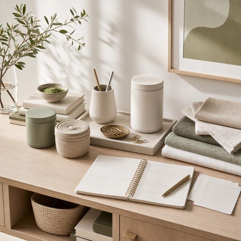
Example generated from “New Year Renewal Campaign Family — Home Reset Variation”
GPT Image 2en

Scene: Create a square dependent image that remains in the same clean morning-lit environment, with the same pale palette, green accents, and polished organization from the reference image, but widen the composition to suggest a home-reset surface. The frame should still read as part of one campaign family while becoming more domestic and storage-oriented through subtle environmental cues. Subject: Show tidy storage vessels, folded textiles, a tray, plant or ceramic accents, and a few abstract planning or checklist cues with no readable language. Preserve exact visual identity from the reference image while changing the emphasis toward decluttering and home refresh. The scene should feel elevated, practical, and commercially applicable to home goods, organizational products, or wellness-adjacent brands. Important details: Continuity matters more than novelty. Keep the same calm optimism, the same light temperature, the same spacing discipline, and the same refined material palette from the reference model. Make storage and reset feel aspirational through order and texture rather than through staged perfection or unrealistic emptiness. The final image should behave like a reusable New Year home-refresh hero asset. Use case: New Year Renewal series study 3/9. Constraints: No readable text, no watermark, no logos, preserve exact 1:1 aspect ratio, preserve exact campaign identity from the reference image, no readable labels, no moving-box chaos, no family photo frames, no logos, no maximalist décor, no dark moody lighting, no party debris.

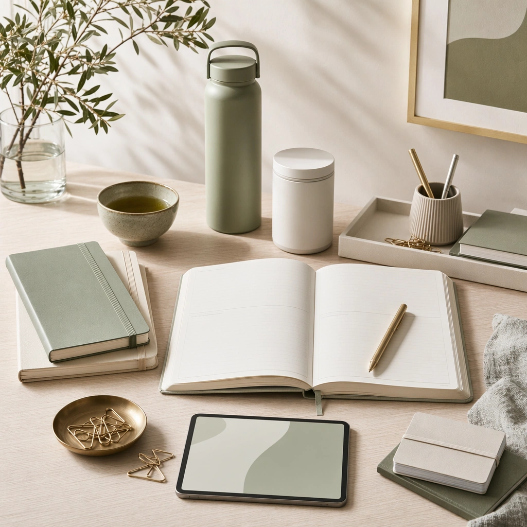
Example generated from “New Year Renewal Campaign Family — Learning Planner Variation”
GPT Image 2en

Scene: Create a square dependent campaign image within the same bright reset environment, preserving the exact morning light, pale neutrals, and quietly optimistic styling from the reference image, while shifting the composition toward learning and goal setting. Keep the space airy and precise, as if it were another deliverable from the same production day, with strong commercial polish and a clear premium-stationery feel. Subject: Feature notebooks without readable text, tidy pens, a device-like object, clean desk tools, and small ritual cues such as tea, glass, or plant life that support a learning reset story. Preserve exact palette blocking, material behavior, and compositional discipline from the reference image while changing the category emphasis. The arrangement should feel useful for education, productivity, or planning-led New Year campaigns. Important details: Hold continuity tightly. The difference should come from the tools of intention, not from a new aesthetic. Keep paper stock, pen finishes, ceramic texture, glass reflections, and soft daylight highly believable. The final result should communicate focus, structure, and fresh momentum without relying on readable resolutions, calendars, or motivational text. Use case: New Year Renewal series study 4/9. Constraints: No readable text, no watermark, no logos, preserve exact 1:1 aspect ratio, preserve exact campaign identity from the reference image, no readable notes, no visible year numerals, no party décor, no logo laptop, no messy desk, no dramatic night light, no academic classroom setting.

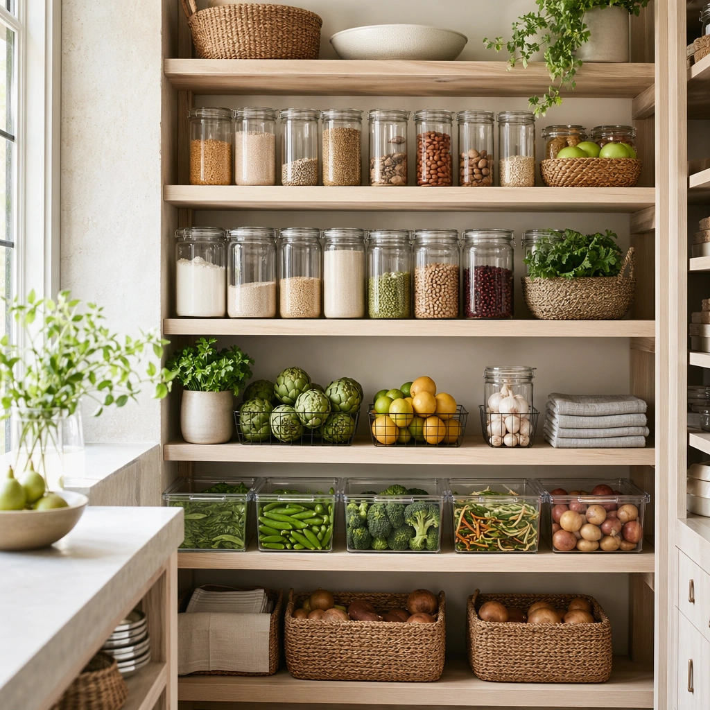
Example generated from “New Year Renewal Campaign Family — Organized Pantry Reset”
GPT Image 2en

Scene: Create a square kitchen or pantry image with crisp daylight, tidy shelving, pale natural materials, and a fresh practical mood. The frame should feel like a campaign asset for organization, meal prep, or healthy routine, not a cookbook shot. Keep composition clean and balanced, with strong visual order and a believable domestic scale that supports New Year reset storytelling. Subject: Show neatly arranged jars without readable labels, fresh produce, folded linens, trays, and storage pieces organized into a persuasive pantry reset scene. The objects should imply discipline, nourishment, and a calmer household rhythm. Focus on cleanliness and planning through arrangement rather than on visible people or inspirational text. Important details: Surface logic matters: glass thickness, produce freshness, shelf materials, linen texture, and daylight should all read clearly. Avoid perfection so severe that the scene becomes lifeless, but keep enough order that the image carries a strong reset message. This should feel useful for grocery, home, appliance, or wellness-adjacent New Year campaigns. Use case: New Year Renewal single study 6/9. Constraints: No readable text, no watermark, no logos, preserve exact 1:1 aspect ratio, no readable labels, no family photos, no brand packaging, no chaotic grocery spill, no holiday leftovers, no neon food colors, no crowded kitchen tools, no visible recipe text.

Example generated from “New Year Renewal Campaign Family — Goal Board Object Study”
GPT Image 2en

Scene: Create a square front-facing object board on a pale neutral background with crisp directional light and calm graphic structure. The image should feel like a premium planning concept board translated into physical objects, with clear grouping and abstraction. Use layout discipline rather than readable text to communicate ambition, progress, and the idea of a fresh annual cycle. Subject: Arrange notebooks without readable writing, markers, geometric tabs, personal-care cues, exercise objects, coins or budgeting tokens, and small lifestyle items into a coherent goal-board composition. Each cluster should imply a different reset domain without feeling literal or overcrowded. The subject should feel useful for campaign ideation, social storytelling, or editorial support around New Year intention-setting. Important details: Treat this as a design problem. Keep spacing, color balance, and object hierarchy precise. Materials should remain tactile and real, but the layout must be clean enough to read as one composed board. The image should communicate structured ambition and practical optimism without visible resolutions, dates, or slogans. It needs to look polished, current, and reusable. Use case: New Year Renewal single study 7/9. Constraints: No readable text, no watermark, no logos, preserve exact 1:1 aspect ratio, no readable notes, no year numerals, no logo products, no scrapbook mess, no motivational text, no glitter décor, no excessive props, no childish stickers.

Example generated from “New Year Renewal Campaign Family — Finance Clarity Desktop”
GPT Image 2en

Scene: Create a square desktop campaign image with calm morning light, pale gray and green accents, subtle metallic detail, and a precise high-trust layout. The environment should feel like a premium personal-finance or planning brand surface, but with no readable interface content. Keep the composition uncluttered, thoughtful, and quietly confident rather than aggressive or tech-bro flashy. Subject: Show a device-like screen with abstract chart shapes, notebook forms, pen, glass, card-like objects, and small organizing tools arranged into a financial reset scene. The subject should communicate budgeting, clarity, and controlled ambition through hierarchy and object choice. Everything must remain non-branded and free of readable numbers while still feeling like a genuine finance-adjacent campaign surface. Important details: Trust comes from control. Use soft light, crisp edges, believable reflections, and restrained data-like geometry. The image should feel useful for banking, fintech, or planning brands that want New Year momentum without shouting. Keep materials premium and familiar. The board should imply measurable progress without any actual ledger text or dashboard labels. Use case: New Year Renewal single study 8/9. Constraints: No readable text, no watermark, no logos, preserve exact 1:1 aspect ratio, no readable charts, no currency symbols, no logo cards, no crypto cliché, no neon tech glow, no messy receipts, no calculator with readable display, no office cubicle vibe.

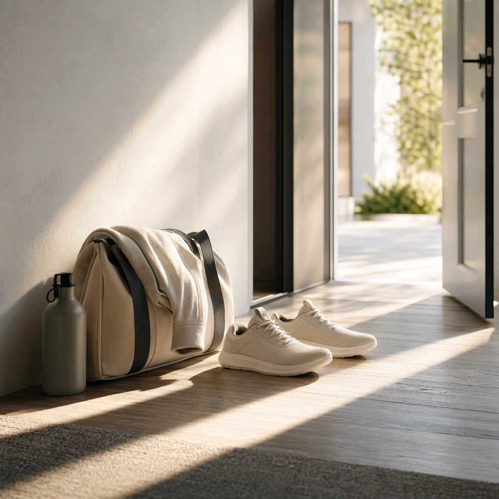
Example generated from “New Year Renewal Campaign Family — Running Start Corridor”
GPT Image 2en

Scene: Create a square corridor or entryway image flooded with crisp morning light and a sense of forward motion. The frame should feel like a premium lifestyle campaign surface about getting moving, not a sports editorial. Use architecture, long shadows, and selective object placement to imply a strong first step into a renewed routine, with enough negative space and polish for commercial reuse. Subject: Show movement cues such as shoes, a bag, a folded layer, water bottle, or doorway threshold aligned into one clean narrative about leaving for a morning routine. Keep any human presence implied rather than central. The subject should communicate momentum, discipline, and readiness through objects, shadow, and spatial direction rather than visible slogans or athletics spectacle. Important details: Give the image confidence and calm. Light quality, floor texture, fabric, rubber, and wall material should all feel real. Avoid heroic sports clichés. This is a New Year momentum visual for wellness, lifestyle, education, or productivity brands that want to sell the promise of a clean start with authentic everyday specificity. Use case: New Year Renewal single study 9/9. Constraints: No readable text, no watermark, no logos, preserve exact 1:1 aspect ratio, no readable shoe branding, no visible athlete portrait, no gym crowd, no finish-line symbolism, no party confetti, no logo water bottle, no dramatic stadium lighting, no motivational text.

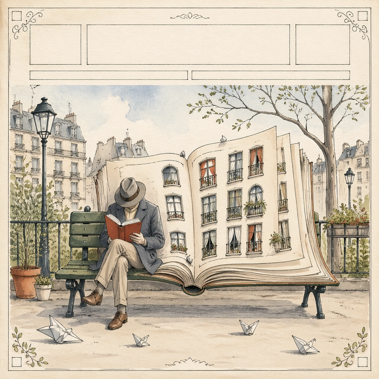
Example generated from “New Yorker Editorial — Reference Cover”
GPT Image 2en

Scene: A square fictional highbrow magazine cover illustration, viewed perfectly straight-on as a finished printed page on warm off-white paper. Use thin graphite ink lines, transparent watercolor fills, gentle paper grain, and a quiet daylight palette of cream, slate, muted red, moss green, and pale blue. Leave a clean blank masthead band at the top made of abstract empty blocks, with a delicate hand-drawn ornamental border around the page. Subject: The central visual pun shows a lone city reader sitting on a park bench while the bench slowly becomes an open book, and the book pages turn into small apartment windows. The reader is simple and anonymous, drawn with elegant line economy, a coat, shoes, and a tilted hat. Around the figure, tiny balcony plants, street lamps, pigeons replaced by folded paper shapes, and window curtains create an urban literary world without clutter. Important details: This is the reference cover language for the series. Preserve square magazine-cover hierarchy, top blank masthead area, generous margins, ornamental corner flourishes, hand-drawn contour lines, restrained watercolor wash, and a single readable metaphor. All title areas, issue details, and cover lines must be blank bars or abstract marks, never real letters. The image should feel like an award-winning editorial cover rather than a poster template. Use case: New Yorker Editorial series study 1/8, establishing the shared magazine cover grammar for the fanout series. Constraints: No readable text, no watermark, no logos, preserve exact 1:1 aspect ratio, no real magazine name, no celebrity likeness, no dense typography, no glossy photo realism, no chaotic collage, no heavy black border.

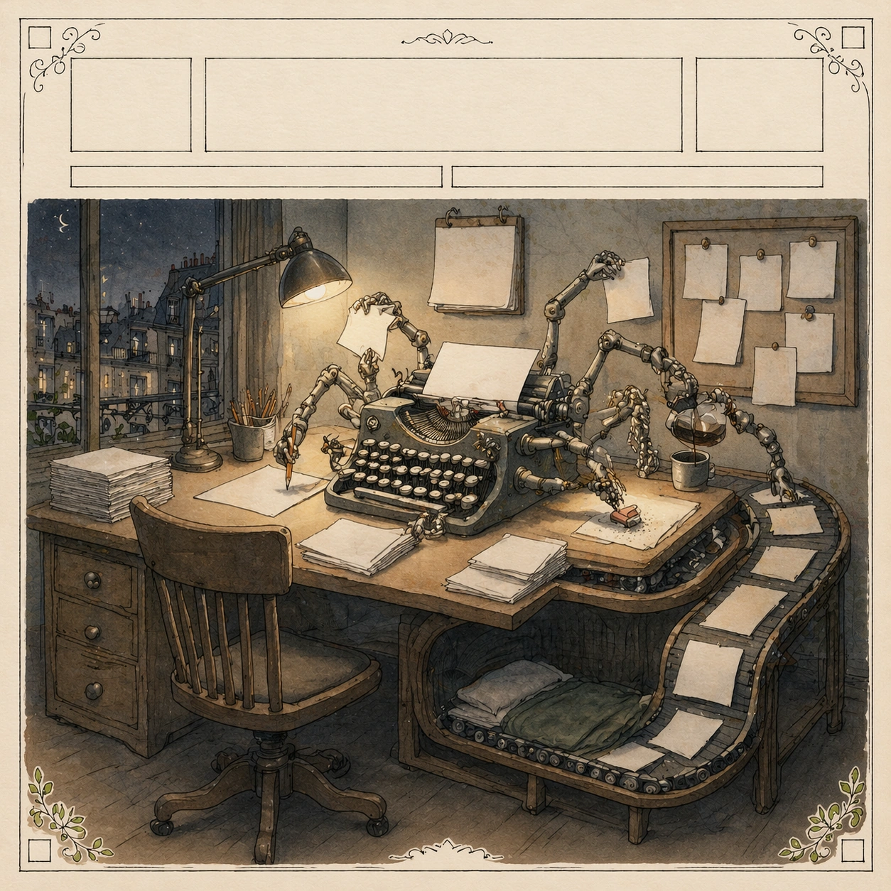
Example generated from “New Yorker Editorial — AI Labor Desk”
GPT Image 2en

Scene: Use the reference cover as the primary guide for the same square fictional magazine-cover format: straight-on printed page, warm off-white paper, blank masthead band, delicate ornamental border, thin graphite linework, transparent watercolor fills, and calm editorial lighting. Keep the page hierarchy, margins, corner flourishes, and refined hand-drawn texture consistent with image 01. Subject: The new central metaphor shows a nighttime office desk where a human editor's chair is empty, but many tiny mechanical hands emerge from a typewriter-like machine to sort paper, sharpen pencils, pour coffee, erase mistakes, and pin blank notes. The desk surface bends into a conveyor belt, and the belt loops back into a small sleeping cot under the desk. One simple desk lamp lights the whole scene like a stage, making the labor cycle visible without any written labels. Important details: Preserve the shared cover language from the reference while changing the narrative to AI-era labor. The metaphor must be readable through objects: automation, invisible work, editorial production, exhaustion, and recursion. All papers, notes, calendar pages, screen areas, and typewriter keys must contain blank shapes or unreadable marks only. Keep the composition elegant and witty, with one central idea, controlled negative space, clear object silhouettes, and no software interface. Use case: New Yorker Editorial series study 2/8, testing whether the reference cover grammar can carry an AI labor metaphor. Constraints: No readable text, no watermark, no logos, preserve exact 1:1 aspect ratio, no real magazine name, no real AI product branding, no robot mascot, no cluttered office mess, no horror machinery, no photorealistic computer screen.

Example generated from “New Yorker Editorial — Social Window Grid”
GPT Image 2en

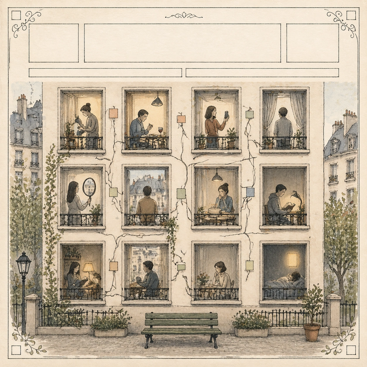
Scene: Use the reference cover as the primary guide for a square fictional magazine cover on off-white paper, with the same blank masthead band, thin ornamental border, graphite contour lines, transparent watercolor washes, and restrained urban palette. The camera is straight-on, the printed page is flat, and the margins remain generous and balanced. Subject: The central metaphor shows an apartment facade arranged like a social media grid, but every window contains a person alone in a different quiet pose. One person waters a plant, one eats dinner, one lifts a phone as if taking a picture, one waits beside a birthday cake with blank candles, one looks into a mirror that reflects another window, and one sleeps under a glowing rectangle of light. The window frames connect with thin vine-like notification shapes, yet no one actually meets. A small courtyard at the bottom contains a single shared bench that remains empty. Important details: Preserve the shared cover grammar from image 01 while making loneliness legible through layout. The grid must be structured and readable, not a busy comic page. Windows should align cleanly, figures should remain anonymous and simple, and phone screens or note areas must be abstract colored rectangles with no readable icons or letters. The humor should be melancholic and precise: connected frames, disconnected lives, delicate watercolor restraint. Use case: New Yorker Editorial series study 3/8, testing the reference cover system on a social-network loneliness metaphor. Constraints: No readable text, no watermark, no logos, preserve exact 1:1 aspect ratio, no real app interface, no brand colors, no speech bubbles, no dense crowd scene, no dark cyberpunk mood, no broken window grid.

Example generated from “New Yorker Editorial — Climate Umbrella”
GPT Image 2en

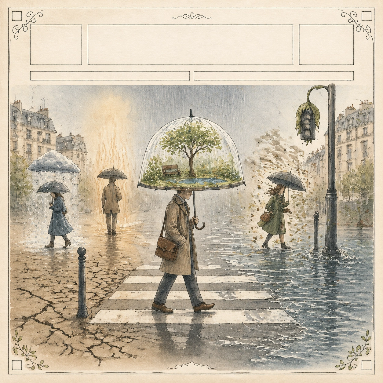
Scene: Use the reference cover as the primary guide for the same square fictional magazine-cover page: blank masthead band, warm paper, hand-drawn ornamental border, graphite linework, transparent watercolor, and quiet editorial contrast. Keep the page flat, centered, and refined, with no real typography and no glossy poster finish. Subject: The central metaphor shows a city crosswalk in soft rain where a commuter holds an umbrella that is actually a tiny greenhouse dome. Inside the transparent umbrella, a miniature garden thrives with a small tree, moss, a bench, and a blue puddle. Outside the umbrella, the street is dry and cracked on one side, flooded on the other, and a traffic light droops like a wilting flower. Other pedestrians carry normal umbrellas that cast little weather systems: one snow cloud, one heat shimmer, one gust of leaves. The main commuter remains calm but small against the city. Important details: Preserve the shared cover language from image 01 while expressing climate change through a clean visual pun, not disaster spectacle. The transparent greenhouse umbrella must be clear, delicate, and central. Use watercolor gradients for rain, heat, and floodwater, but keep boundaries readable. All signs, street markings, signal panels, and shop awnings must be blank or abstract. The page should feel witty, uneasy, and suitable for a serious editorial cover. Use case: New Yorker Editorial series study 4/8, testing the reference cover grammar on a climate anxiety metaphor. Constraints: No readable text, no watermark, no logos, preserve exact 1:1 aspect ratio, no real city brand, no apocalyptic firestorm, no crowded street chaos, no photorealistic weather render, no broken ornamental border, no heavy black sky.

Example generated from “New Yorker Editorial — Subway Notification Garden”
GPT Image 2en

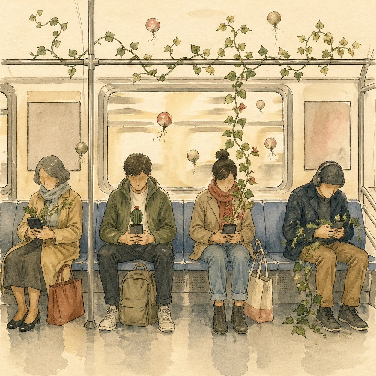
Scene: A square magazine-style editorial illustration of a subway car interior, viewed from a calm frontal angle with shallow perspective and soft morning light. Use hand-drawn graphite outlines, transparent watercolor fills, warm cream paper texture, muted transit colors, and a few restrained red and green accents. The composition should be organized like a single-panel magazine illustration, not a storyboard or advertising poster. Subject: Several anonymous commuters sit apart on a bench, each holding a small phone that has turned into a potted plant. One phone sprouts ivy around a wrist, another grows a tiny cactus, another has a flowering vine climbing toward the overhead rail. The rail itself bends into a trellis, and notification bubbles become round seed pods floating above the seats. The commuters look absorbed but gentle, as if tending private gardens without noticing one another. The subway windows show only abstract tunnel light. Important details: The visual pun must be immediate: attention economies as indoor gardening, connection as separate cultivation. Keep the layout structured, with clear bench rhythm, repeated phone-planter forms, and negative space around each figure. All route maps, signs, phone screens, ads, and labels must be blank blocks or unreadable decorative marks. Preserve editorial restraint, fine linework, pale watercolor shadows, and a witty melancholy mood. Use case: New Yorker Editorial single study 5/8, testing an independent social technology metaphor in hand-drawn magazine style. Constraints: No readable text, no watermark, no logos, preserve exact 1:1 aspect ratio, no real transit branding, no real app icons, no speech bubbles, no crowded subway crush, no photorealistic faces, no saturated neon palette.

Example generated from “New Yorker Editorial — Robot Copy Desk”
GPT Image 2en

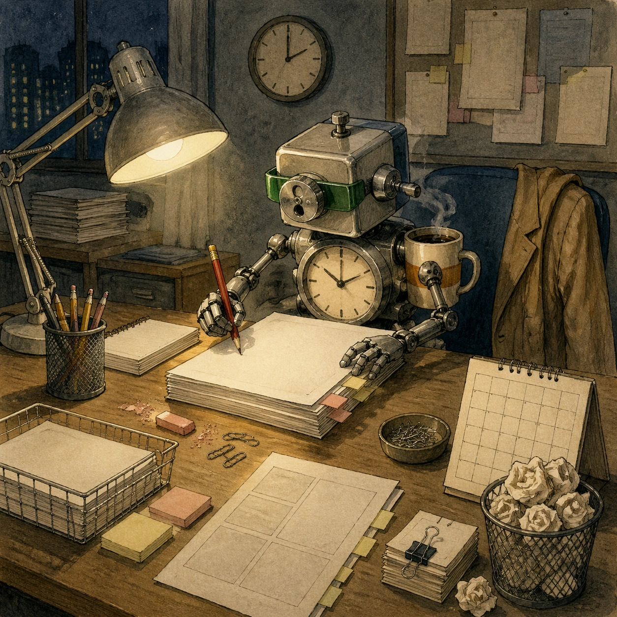
Scene: A square editorial illustration of a newspaper copy desk after midnight, drawn in fine graphite lines with muted watercolor washes on warm cream paper. The camera looks slightly down at a tidy but lived-in desk, with a lamp pool of yellow light, blue-gray shadows, and carefully organized objects. The image must read as a single polished magazine illustration with clear hierarchy and no readable printed matter. Subject: At the desk sits a small old-fashioned robot wearing a green visor, carefully editing a stack of blank pages with a red pencil. The robot's body is made from a pencil sharpener, a clock, and a coffee cup, suggesting human routines absorbed into a machine. Around it are neatly arranged style sheets, eraser crumbs, a blank calendar, paper clips, and a tiny wastebasket filled with crumpled pages that resemble wilted flowers. A human coat hangs on the chair back, implying the person has stepped away or been replaced. Important details: The metaphor should be layered but readable: automation doing editorial judgment, human craft displaced but not mocked, work culture continuing through objects. Keep the robot humble and mechanical, not cute branded merchandise. All papers, calendar blocks, sticky notes, and page marks must remain unreadable. Use precise object spacing, visible pencil texture, transparent watercolor, and a restrained palette. The scene should feel witty, humane, and slightly uneasy. Use case: New Yorker Editorial single study 6/8, testing AI-era labor as an independent editorial desk metaphor. Constraints: No readable text, no watermark, no logos, preserve exact 1:1 aspect ratio, no real newspaper name, no real AI product, no screen UI, no chrome sci-fi robot, no messy pileup, no dramatic horror lighting.
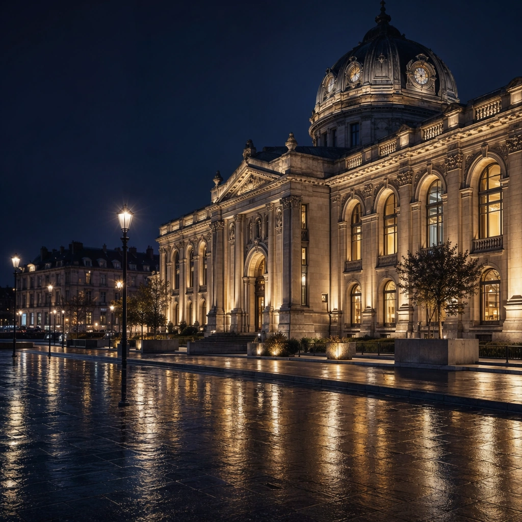
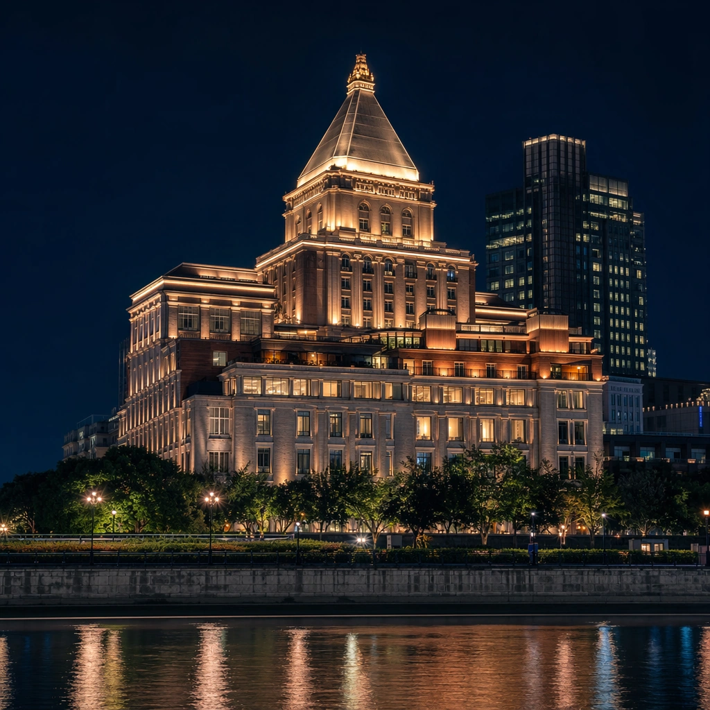
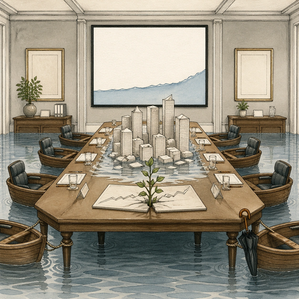
Example generated from “New Yorker Editorial — Flooded Boardroom”
GPT Image 2en

Scene: A square magazine editorial illustration of a corporate boardroom, drawn straight-on with calm architectural symmetry, fine ink outlines, transparent watercolor, and warm cream paper grain. The room is bright enough to inspect every symbolic detail, using soft gray walls, walnut table tones, pale blue water, and a few restrained green accents. The image should feel elegant and satirical rather than catastrophic. Subject: A long boardroom table sits in ankle-deep water, but the executives are absent. Their empty chairs have become small rowboats tied to the table legs. On the tabletop, a miniature city skyline made of stacked blank report pages slowly sinks into a shallow reflecting pool. A potted plant grows through a cracked financial chart shape that has no numbers. At the far wall, a large blank presentation screen shows only a simple rising blue waterline, not text. One umbrella hangs neatly from a chair as if prepared too late. Important details: The climate metaphor must be readable through structured objects: decision room, delayed response, rising water, fragile paper city, and empty authority. Keep the boardroom geometry precise and uncluttered. All documents, charts, plaques, name cards, and presentation areas must contain unreadable marks or blank shapes. Preserve editorial wit, disciplined layout, clean reflections, and watercolor softness. Avoid disaster-movie spectacle; this is a quiet institutional satire. Use case: New Yorker Editorial single study 7/8, testing climate-change reasoning through a structured boardroom metaphor. Constraints: No readable text, no watermark, no logos, preserve exact 1:1 aspect ratio, no real company branding, no visible stock ticker, no drowning people, no apocalyptic destruction, no photorealistic flood simulation, no chaotic debris.
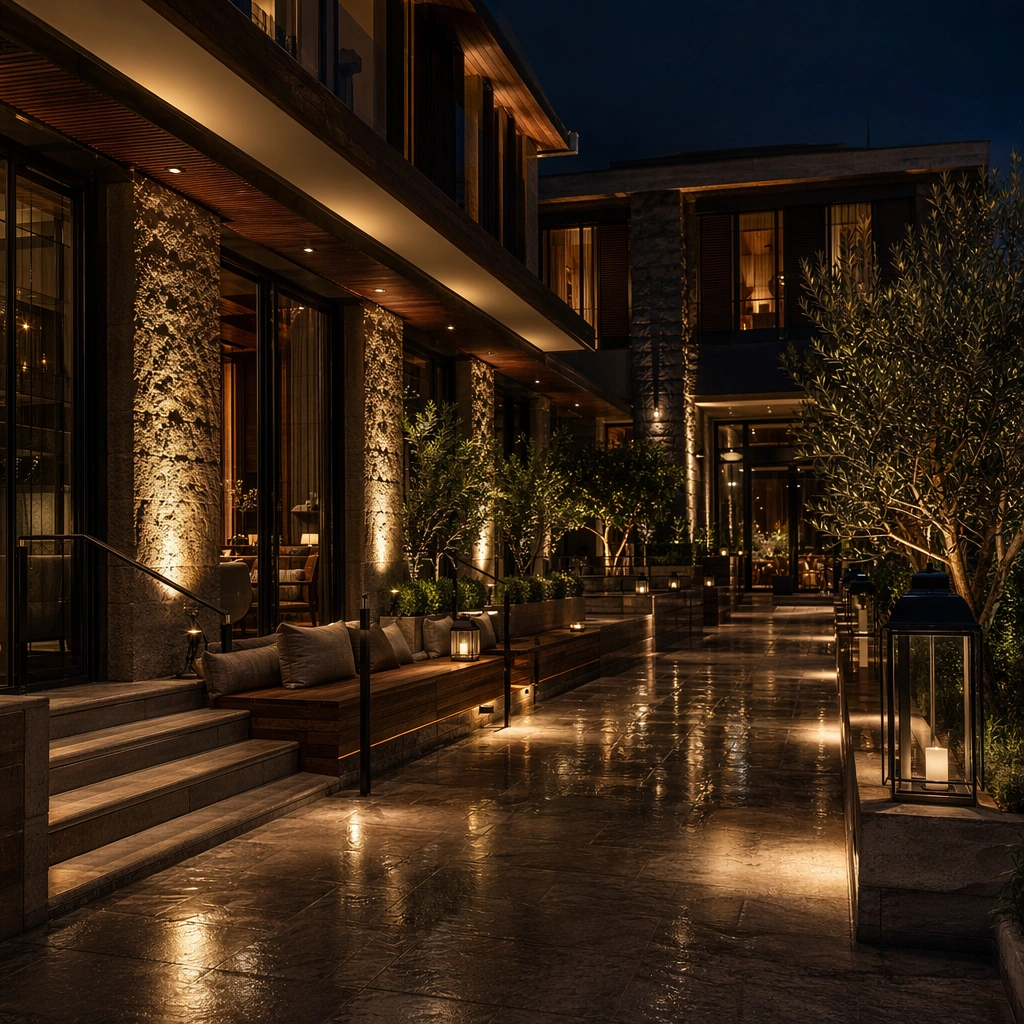
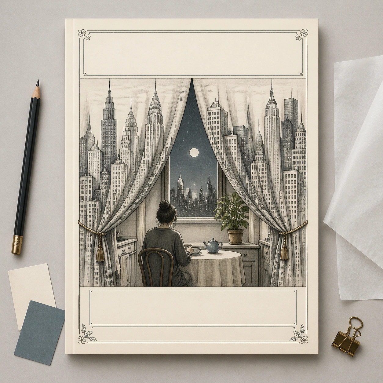
Example generated from “New Yorker Editorial — Magazine Cover Mockup”
GPT Image 2en

Scene: A square commercial mockup of a fictional literary magazine cover lying flat on a designer's review table, photographed straight-on with soft studio light. The cover itself is an editorial illustration in thin graphite line and restrained watercolor on cream paper. Around the page are only minimal physical review objects: a pencil, two blank color swatches, a folded tracing-paper overlay, and a small binder clip. Keep the whole composition clean, premium, and gallery-ready. Subject: The cover illustration shows a city skyline arranged as a set of theater curtains opening onto a tiny kitchen table scene. A single anonymous person sits at the table, while the skyscraper curtains reveal moonlight, a houseplant, and a tea cup, turning public city life into private domestic performance. The top masthead band and lower cover-line areas are present as elegant blank bars, and the decorative border uses tiny abstract floral corners. No letters, numbers, brand marks, or real publication identifiers appear anywhere. Important details: This image tests commercial mockup clarity without relying on actual typography. The viewer should understand it as a finished high-end editorial cover presentation through paper texture, precise margins, cover hierarchy, and surrounding design-review props. The cover art must still carry a readable metaphor: city as stage, private loneliness as performance. Keep the mockup straight, uncluttered, and plausible for a media pitch board. Use case: New Yorker Editorial single study 8/8, testing a commercial magazine-cover mockup with blank typography and editorial visual pun. Constraints: No readable text, no watermark, no logos, preserve exact 1:1 aspect ratio, no real magazine name, no fake barcode, no price tag, no UI screenshot, no angled perspective, no cluttered desk, no glossy plastic cover.

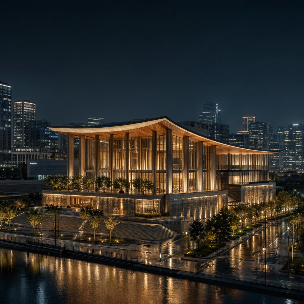
Example generated from “Night Architecture Lighting Photography Set — Blue Hour Anchor”
GPT Image 2en

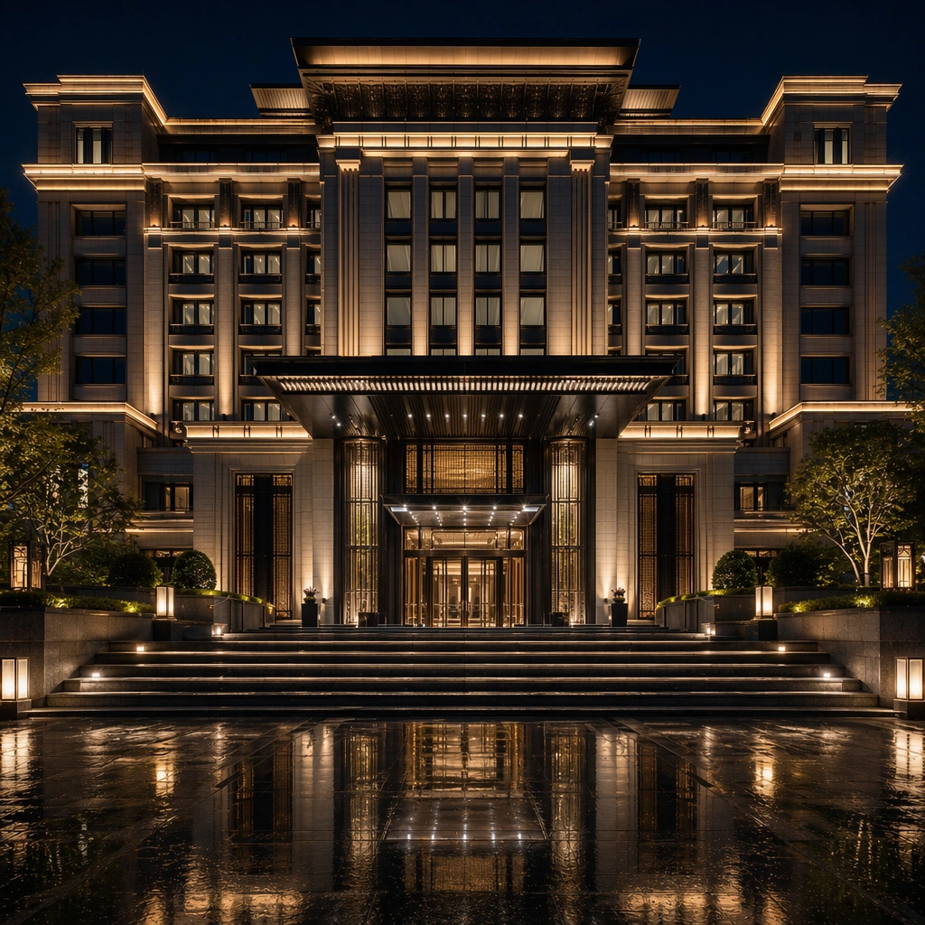
Scene: Create a square architectural reference still for Night Architecture Lighting Photography Set. Use a square blue-hour hero view with the full building reflected in wet paving or water and treat the frame like a premium interior or architecture editorial photograph with disciplined perspective, readable depth from foreground to background, and enough negative space for the spatial hierarchy to breathe. Light the scene so facade lighting, reflections, and civic nighttime atmosphere feel immediate, using deep blue-black night, warm gold light, cool silver reflections, and restrained amber interior spill as the governing tonal range. The composition must read as a high-end commercial image that could sit inside hospitality night campaigns, architecture editorials, lighting-design decks, and city-brand presentations. Subject: Show a night-architecture photography subject with layered facade lighting, wet pavement reflections, atmospheric civic calm, controlled interior glow, and a clearly recognizable silhouette. Center the project’s overall night identity, facade glow hierarchy, and calm civic setting. This is the canonical reference image for the package, so the major proportions, material transitions, fixture families, and circulation logic must feel highly specific and internally coherent rather than generic luxury styling. Let the viewer understand how the space is organized within a single glance, with foreground anchors, a clear middle zone, and a resolved background termination. Important details: Lock the building silhouette, lighting hierarchy, reflection logic, civic atmosphere, and disciplined night-photography realism. Surfaces should feel tactile and believable: stone veining must stay plausible, metals should have disciplined reflectance, fabrics should show natural weight, and concealed lighting should shape the volume instead of flattening it. Use abstract signage, menu, label, or caption zones only as unreadable graphic hints. The image should feel practical for downstream design reviews and polished enough for public-facing campaign use. Use case: Night Architecture Lighting Photography Set series study 1/9, establishing the canonical night-photography identity for the package. Constraints: No readable text, no watermark, no logos, preserve exact 1:1 aspect ratio, no fireworks, no traffic light streak overload, no readable signage, no festival screens, no people crowding the foreground, no giant moon effect.

Example generated from “Night Architecture Lighting Photography Set — Facade Glow Close”
GPT Image 2en

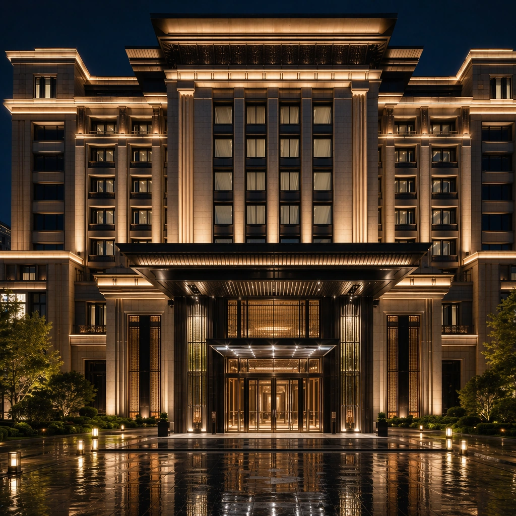
Scene: Create a square reference-dependent architecture still for Night Architecture Lighting Photography Set. Use a closer angle toward the lit facade planes and lower entry while keeping the same lens discipline, editorial polish, and material believability established by the reference image. The lighting can shift to support the intended mood, but the space must still feel like the same authored project with a stable viewpoint logic, convincing depth separation, and clean commercial-photography finish. Keep deep blue-black night, warm gold light, cool silver reflections, and restrained amber interior spill as the governing tonal range even when the emphasis changes. Subject: Show a night-architecture photography subject with layered facade lighting, wet pavement reflections, atmospheric civic calm, controlled interior glow, and a clearly recognizable silhouette. Focus on the exact same building from the reference image, now emphasizing layered lighting temperatures and detail visibility. Preserve exact architectural identity, plan logic, material palette, fixture family, and circulation cues from the reference image while changing only the intended emphasis described here. The viewer should immediately recognize the same project, not a loose cousin, with matching silhouette logic, aligned detailing, and consistent brand atmosphere. Important details: Preserve the building silhouette, lighting hierarchy, reflection logic, civic atmosphere, and disciplined night-photography realism. Any abstract wayfinding, menu, wall-label, or packaging zones must stay unreadable and subordinate to the spatial image. Joinery, edges, reflections, and lighting should remain realistic enough for an operator or design team to treat the image as a credible reference. The variation should feel deliberate and commercially useful, proving that one locked spatial language can flex across multiple campaign or editorial surfaces. Use case: Night Architecture Lighting Photography Set series study 2/9, extending facade-lighting nuance while preserving the same building identity. Constraints: No readable text, no watermark, no logos, preserve exact 1:1 aspect ratio, preserve exact architectural identity from the reference image, no fireworks, no traffic light streak overload, no readable signage, no festival screens, no people crowding the foreground, no lens flare overload.

Example generated from “Night Architecture Lighting Photography Set — Bridge Reflection View”
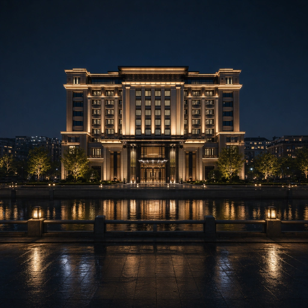
GPT Image 2en

Scene: Create a square reference-dependent architecture still for Night Architecture Lighting Photography Set. Use a longer lens view from across a bridge, river edge, or reflective street plane while keeping the same lens discipline, editorial polish, and material believability established by the reference image. The lighting can shift to support the intended mood, but the space must still feel like the same authored project with a stable viewpoint logic, convincing depth separation, and clean commercial-photography finish. Keep deep blue-black night, warm gold light, cool silver reflections, and restrained amber interior spill as the governing tonal range even when the emphasis changes. Subject: Show a night-architecture photography subject with layered facade lighting, wet pavement reflections, atmospheric civic calm, controlled interior glow, and a clearly recognizable silhouette. Focus on the exact same building from the reference image, now emphasizing city context and reflected geometry. Preserve exact architectural identity, plan logic, material palette, fixture family, and circulation cues from the reference image while changing only the intended emphasis described here. The viewer should immediately recognize the same project, not a loose cousin, with matching silhouette logic, aligned detailing, and consistent brand atmosphere. Important details: Preserve the building silhouette, lighting hierarchy, reflection logic, civic atmosphere, and disciplined night-photography realism. Any abstract wayfinding, menu, wall-label, or packaging zones must stay unreadable and subordinate to the spatial image. Joinery, edges, reflections, and lighting should remain realistic enough for an operator or design team to treat the image as a credible reference. The variation should feel deliberate and commercially useful, proving that one locked spatial language can flex across multiple campaign or editorial surfaces. Use case: Night Architecture Lighting Photography Set series study 3/9, extending urban-night context inside the same lighting identity. Constraints: No readable text, no watermark, no logos, preserve exact 1:1 aspect ratio, preserve exact architectural identity from the reference image, no fireworks, no traffic light streak overload, no readable signage, no festival screens, no people crowding the foreground, no skyline clutter.

Example generated from “Night Architecture Lighting Photography Set — Entry Stair Light Wash”
GPT Image 2en

Scene: Create a square reference-dependent architecture still for Night Architecture Lighting Photography Set. Use a lower-angle composition toward the entry stair and illuminated wall surfaces while keeping the same lens discipline, editorial polish, and material believability established by the reference image. The lighting can shift to support the intended mood, but the space must still feel like the same authored project with a stable viewpoint logic, convincing depth separation, and clean commercial-photography finish. Keep deep blue-black night, warm gold light, cool silver reflections, and restrained amber interior spill as the governing tonal range even when the emphasis changes. Subject: Show a night-architecture photography subject with layered facade lighting, wet pavement reflections, atmospheric civic calm, controlled interior glow, and a clearly recognizable silhouette. Focus on the exact same building from the reference image, now emphasizing pedestrian-scale lighting and threshold drama. Preserve exact architectural identity, plan logic, material palette, fixture family, and circulation cues from the reference image while changing only the intended emphasis described here. The viewer should immediately recognize the same project, not a loose cousin, with matching silhouette logic, aligned detailing, and consistent brand atmosphere. Important details: Preserve the building silhouette, lighting hierarchy, reflection logic, civic atmosphere, and disciplined night-photography realism. Any abstract wayfinding, menu, wall-label, or packaging zones must stay unreadable and subordinate to the spatial image. Joinery, edges, reflections, and lighting should remain realistic enough for an operator or design team to treat the image as a credible reference. The variation should feel deliberate and commercially useful, proving that one locked spatial language can flex across multiple campaign or editorial surfaces. Use case: Night Architecture Lighting Photography Set series study 4/9, extending arrival lighting within the same nighttime system. Constraints: No readable text, no watermark, no logos, preserve exact 1:1 aspect ratio, preserve exact architectural identity from the reference image, no fireworks, no traffic light streak overload, no readable signage, no festival screens, no people crowding the foreground, no people on the steps.

Example generated from “Night Architecture Lighting Photography Set — Wet Pavement Composition”
GPT Image 2en

Scene: Create a square standalone support study for Night Architecture Lighting Photography Set. Use a composition where the building appears strongly through wet pavement reflections in the foreground and frame it like a premium commercial still or design-editorial crop with clear focal hierarchy, disciplined perspective, and enough breathing room for the materials and objects to read at both thumbnail and full size. Keep deep blue-black night, warm gold light, cool silver reflections, and restrained amber interior spill as the tonal guide so the image still belongs to the same theme family, and light the scene in a controlled way that emphasizes texture, edge quality, and authored atmosphere over spectacle. Subject: Show a night-architecture photography subject with layered facade lighting, wet pavement reflections, atmospheric civic calm, controlled interior glow, and a clearly recognizable silhouette. In this support study, focus on night reflection control, paving texture, and cinematic calm. The image should work independently, yet it must still feel like it belongs to the same broader world of Night Architecture. Make the space, props, and detailing useful for real campaign, editorial, or design-review contexts rather than moodboard abstraction. Important details: Carry forward the broader language of the building silhouette, lighting hierarchy, reflection logic, civic atmosphere, and disciplined night-photography realism, but let this image prove a new support surface or secondary deliverable. Material realism is essential: wood grain, metal sheen, glass edges, textiles, and stone should feel physically plausible and carefully art directed. Any graphic panels, labels, menus, packaging, or captions must stay abstract and unreadable. The overall result should feel reusable for hospitality night campaigns, architecture editorials, lighting-design decks, and city-brand presentations, with enough structure that a creative or operations team could build on it. Use case: Night Architecture Lighting Photography Set single study 6/9, exploring support still for campaign hero crops and editorials. Constraints: No readable text, no watermark, no logos, preserve exact 1:1 aspect ratio, no fireworks, no traffic light streak overload, no readable signage, no festival screens, no people crowding the foreground, no car headlights blasting the frame.

Example generated from “Night Architecture Lighting Photography Set — Rooftop Light Crown”
GPT Image 2en

Scene: Create a square standalone support study for Night Architecture Lighting Photography Set. Use a telephoto study of the illuminated roofline or crown at night and frame it like a premium commercial still or design-editorial crop with clear focal hierarchy, disciplined perspective, and enough breathing room for the materials and objects to read at both thumbnail and full size. Keep deep blue-black night, warm gold light, cool silver reflections, and restrained amber interior spill as the tonal guide so the image still belongs to the same theme family, and light the scene in a controlled way that emphasizes texture, edge quality, and authored atmosphere over spectacle. Subject: Show a night-architecture photography subject with layered facade lighting, wet pavement reflections, atmospheric civic calm, controlled interior glow, and a clearly recognizable silhouette. In this support study, focus on top-of-building identity, restraint, and skyline legibility. The image should work independently, yet it must still feel like it belongs to the same broader world of Night Architecture. Make the space, props, and detailing useful for real campaign, editorial, or design-review contexts rather than moodboard abstraction. Important details: Carry forward the broader language of the building silhouette, lighting hierarchy, reflection logic, civic atmosphere, and disciplined night-photography realism, but let this image prove a new support surface or secondary deliverable. Material realism is essential: wood grain, metal sheen, glass edges, textiles, and stone should feel physically plausible and carefully art directed. Any graphic panels, labels, menus, packaging, or captions must stay abstract and unreadable. The overall result should feel reusable for hospitality night campaigns, architecture editorials, lighting-design decks, and city-brand presentations, with enough structure that a creative or operations team could build on it. Use case: Night Architecture Lighting Photography Set single study 7/9, exploring support image for lighting-designer presentations. Constraints: No readable text, no watermark, no logos, preserve exact 1:1 aspect ratio, no fireworks, no traffic light streak overload, no readable signage, no festival screens, no people crowding the foreground, no aircraft or drones.

Example generated from “Night Architecture Lighting Photography Set — Courtyard Lantern Gradient”
GPT Image 2en

Scene: Create a square standalone support study for Night Architecture Lighting Photography Set. Use an intimate courtyard night still with subtle lantern layers and facade glow and frame it like a premium commercial still or design-editorial crop with clear focal hierarchy, disciplined perspective, and enough breathing room for the materials and objects to read at both thumbnail and full size. Keep deep blue-black night, warm gold light, cool silver reflections, and restrained amber interior spill as the tonal guide so the image still belongs to the same theme family, and light the scene in a controlled way that emphasizes texture, edge quality, and authored atmosphere over spectacle. Subject: Show a night-architecture photography subject with layered facade lighting, wet pavement reflections, atmospheric civic calm, controlled interior glow, and a clearly recognizable silhouette. In this support study, focus on human-scale warmth, shadow gradation, and nighttime hospitality atmosphere. The image should work independently, yet it must still feel like it belongs to the same broader world of Night Architecture. Make the space, props, and detailing useful for real campaign, editorial, or design-review contexts rather than moodboard abstraction. Important details: Carry forward the broader language of the building silhouette, lighting hierarchy, reflection logic, civic atmosphere, and disciplined night-photography realism, but let this image prove a new support surface or secondary deliverable. Material realism is essential: wood grain, metal sheen, glass edges, textiles, and stone should feel physically plausible and carefully art directed. Any graphic panels, labels, menus, packaging, or captions must stay abstract and unreadable. The overall result should feel reusable for hospitality night campaigns, architecture editorials, lighting-design decks, and city-brand presentations, with enough structure that a creative or operations team could build on it. Use case: Night Architecture Lighting Photography Set single study 8/9, exploring support still for exterior secondary-space lighting. Constraints: No readable text, no watermark, no logos, preserve exact 1:1 aspect ratio, no fireworks, no traffic light streak overload, no readable signage, no festival screens, no people crowding the foreground, no outdoor party setup.

Example generated from “Night Architecture Lighting Photography Set — Distant Skyline Insert”
GPT Image 2en

Scene: Create a square standalone support study for Night Architecture Lighting Photography Set. Use a more distant night view where the building sits within a broader urban skyline but remains the main focal point and frame it like a premium commercial still or design-editorial crop with clear focal hierarchy, disciplined perspective, and enough breathing room for the materials and objects to read at both thumbnail and full size. Keep deep blue-black night, warm gold light, cool silver reflections, and restrained amber interior spill as the tonal guide so the image still belongs to the same theme family, and light the scene in a controlled way that emphasizes texture, edge quality, and authored atmosphere over spectacle. Subject: Show a night-architecture photography subject with layered facade lighting, wet pavement reflections, atmospheric civic calm, controlled interior glow, and a clearly recognizable silhouette. In this support study, focus on city context, silhouette recognition, and disciplined exposure balance. The image should work independently, yet it must still feel like it belongs to the same broader world of Night Architecture. Make the space, props, and detailing useful for real campaign, editorial, or design-review contexts rather than moodboard abstraction. Important details: Carry forward the broader language of the building silhouette, lighting hierarchy, reflection logic, civic atmosphere, and disciplined night-photography realism, but let this image prove a new support surface or secondary deliverable. Material realism is essential: wood grain, metal sheen, glass edges, textiles, and stone should feel physically plausible and carefully art directed. Any graphic panels, labels, menus, packaging, or captions must stay abstract and unreadable. The overall result should feel reusable for hospitality night campaigns, architecture editorials, lighting-design decks, and city-brand presentations, with enough structure that a creative or operations team could build on it. Use case: Night Architecture Lighting Photography Set single study 9/9, exploring support image for city-brand and press uses. Constraints: No readable text, no watermark, no logos, preserve exact 1:1 aspect ratio, no fireworks, no traffic light streak overload, no readable signage, no festival screens, no people crowding the foreground, no other buildings with readable logos.

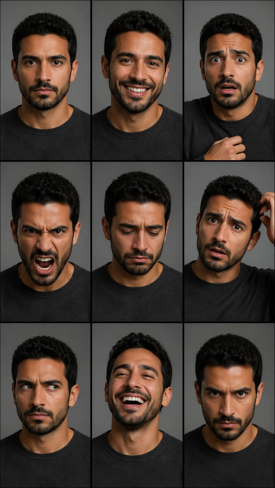
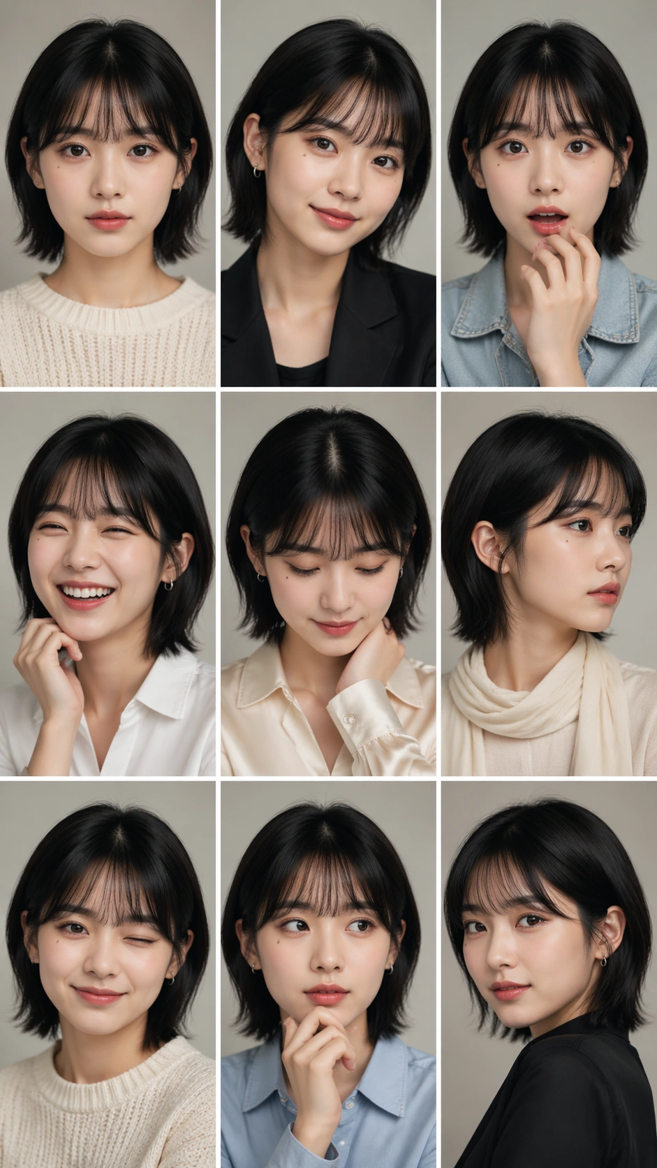
Example generated from “Nine Expression Portrait Grid — Reference Idol Sheet”
GPT Image 2en

Scene: A vertical 9:16 portrait sheet arranged as an exact 3 by 3 grid with nine equal cells, thin white gutters, and a clean studio-photobook look. The background is soft warm gray in every cell, with consistent beauty lighting, shallow depth of field, and polished Korean idol portrait styling. The sheet has no readable captions, labels, numbers, or interface elements; the structure must be carried by the grid alone. Subject: One young adult performer appears in all nine cells as the same person: same oval face, clear skin texture, dark almond eyes, straight black chin-length hair with a soft fringe, small beauty mark below the left eye, and natural lip shape. The wardrobe is coordinated but varies subtly by cell: cream knit, black blazer, pale denim jacket, white shirt, satin collar, soft scarf, simple earrings, and no logos. Each cell shows a different expression and pose: calm front gaze, small smile, surprise, laughter, shy downward glance, serious profile, wink, thoughtful hand near chin, and confident three-quarter pose. Important details: This is the reference image for the series. The face must remain recognizably identical across all nine panels while expressions, head angles, hands, and outfit details change. Keep cell borders straight, cell sizes equal, and lighting direction coherent. Avoid turning the nine portraits into nine different people. The grid should read like an idol photobook contact sheet or social teaser, with precise static consistency rather than narrative action. Use case: Nine-Expression Portrait Grid series study 1/8, establishing the face identity and 3x3 layout reference. Constraints: No readable text, no watermark, no logos, preserve exact 9:16 vertical aspect ratio, no brand marks, no duplicate cropped heads outside cells, no mismatched eye color, no distorted hands, no broken gutters, no extra subjects.

Example generated from “Nine Expression Portrait Grid — Soft Album Sheet”
GPT Image 2en

Scene: A vertical 9:16 soft album portrait sheet with the same exact 3 by 3 grid geometry as the reference: nine equal cells, thin white gutters, clean edges, no labels, and a quiet editorial rhythm. The background becomes pale cream and powder blue fabric, with diffused window light, gentle film grain, and a calm photobook mood. Every cell should feel like part of one album package rather than nine unrelated snapshots. Subject: Use the reference image as the primary guide for the same young performer's face, chin-length black hair, soft fringe, dark almond eyes, beauty mark below the left eye, lip shape, and facial proportions. The styling changes to a gentle album concept: white cotton shirt, light blue cardigan, cream scarf, pearl-like stud earring, pale denim, soft knit vest, and simple natural makeup. The nine expressions are sleepy calm, shy smile, wide laughter, quiet sadness, curious raised eyebrow, warm direct gaze, cheek-in-hand thoughtfulness, surprised open eyes, and serene profile. Important details: Identity consistency is the main challenge. The viewer must believe every panel shows the same person even as expression, head angle, crop, hand placement, and outfit layers shift. Keep the grid mathematically clean, with all gutters straight and all cells equally sized. Maintain consistent skin tone, eye shape, hair length, and beauty mark placement. Avoid magazine text, sticker decorations, duplicate faces outside the grid, or heavy retouching that erases the subject's stable features. Use case: Nine-Expression Portrait Grid series study 3/8, testing reference-based identity consistency in a soft album concept. Constraints: No readable text, no watermark, no logos, preserve exact 9:16 vertical aspect ratio, no brand marks, no changed face identity, no extra subjects, no broken cell sizes, no mismatched beauty mark, no distorted hands.

Example generated from “Nine Expression Portrait Grid — Street Casting Sheet”
GPT Image 2en

Scene: A vertical 9:16 street-casting portrait sheet using the same 3 by 3 grid structure as the reference image: nine equal cells, thin white gutters, clean border logic, and no readable captions. The setting changes to overcast urban daylight with neutral concrete walls, subway-tile texture, glass reflections, and a casual editorial street-casting mood. The layout must stay strict even though the portraits feel more spontaneous. Subject: Use the reference as the primary identity guide. The same young performer appears in all nine cells with the same oval face, dark almond eyes, chin-length black hair with soft fringe, beauty mark below the left eye, and stable lip shape. Styling becomes casual streetwear without logos: black bomber jacket, white ribbed tee, gray hoodie, washed denim, plain canvas tote strap, silver ear cuff, and minimal makeup. The nine expressions are neutral casting stare, quick grin, laughing side turn, skeptical eyebrow, surprised phone-call reaction without showing a phone, soft profile, playful tongue-in-cheek smile, thoughtful downward gaze, and confident hands-in-pockets pose. Important details: Preserve identity from image 01 while allowing street-style variation in pose and crop. Keep each cell a clean portrait or half-body portrait, not a full street scene. The face should not age, change ethnicity, change eye color, or change hair length. The grid must remain exact, with clear gutters and no overlapping panels. Backgrounds can vary slightly but should share one urban casting-session environment and consistent overcast light. Use case: Nine-Expression Portrait Grid series study 4/8, testing identity lock in a casual street-casting portrait sheet. Constraints: No readable text, no watermark, no logos, preserve exact 9:16 vertical aspect ratio, no brand marks, no changed face identity, no extra people, no broken grid alignment, no mismatched hair, no street signs.

Example generated from “Nine Expression Portrait Grid — Family Album Matriarch”
GPT Image 2en

Scene: A vertical 9:16 family-album portrait sheet arranged as an exact 3 by 3 grid with nine equal cells, thin cream gutters, and warm domestic daylight. The cells share a tasteful living-room setting with linen curtains, framed family photographs rendered too soft to read, a wooden chair, and muted floral textiles. The overall image should feel like a carefully designed family archive page, but without any readable dates, captions, names, or labels. Subject: One elderly woman appears in all nine cells as the same person: silver bob haircut, warm brown eyes, fine smile lines, oval glasses, small jade pendant, and a navy cardigan over a pale blouse. The poses and expressions vary while identity remains stable: calm front portrait, broad grandmotherly smile, playful side-eye, thoughtful profile, surprised laugh, gentle sadness, hands folded with pride, cheek resting on hand, and confident direct gaze. Some cells show subtle wardrobe additions such as shawl, apron, or pearl-like earring, but the face and age remain unchanged. Important details: This is an independent same-subject consistency study. Every cell must show the same matriarch, not nine relatives. Keep glasses shape, hair length, skin tone, facial structure, and pendant consistent. The family-album mood should support the portrait grid without introducing extra people. Maintain exact grid geometry, equal cell sizes, clean gutters, and coherent warm light. The expressions should be emotionally distinct and easy to compare at a glance. Use case: Nine-Expression Portrait Grid single study 5/8, testing family-album identity consistency in a 3x3 portrait sheet. Constraints: No readable text, no watermark, no logos, preserve exact 9:16 vertical aspect ratio, no brand marks, no extra family members, no changed age, no broken grid gutters, no mismatched glasses, no duplicated background faces.

Example generated from “Nine Expression Portrait Grid — Actor Audition Contact Sheet”
GPT Image 2en

Scene: A vertical 9:16 actor audition contact sheet composed as a strict 3 by 3 grid with nine equal cells, thin black gutters, and neutral gray casting-studio backgrounds. The lighting is clean and practical, like professional headshot tests, with slight variation in intensity but no dramatic scene changes. There are no readable role labels, slate boards, names, numbers, or agency marks; the expressions and poses must carry the structure. Subject: One adult actor appears in all nine cells as the same person: medium skin tone, short curly dark hair, defined cheekbones, straight nose, close-trimmed beard, dark eyes, and a plain charcoal crewneck. The actor performs nine distinct audition beats: neutral slate gaze, warm commercial smile, fear, anger, quiet grief, comic confusion, suspicious side glance, relieved laugh, and intense heroic stare. Hands may enter some frames for acting gesture, but every cell should remain a portrait or chest-up crop. Important details: The contact sheet must demonstrate controlled expression variation while preserving the same face. Keep beard length, hairline, eye shape, facial proportions, and wardrobe consistent across all nine cells. The differences should be emotional performance, head angle, and pose, not identity drift. Maintain perfectly aligned grid gutters and equal cell sizes. The casting-studio realism should be plain and useful, not decorative, so evaluators can compare expression control clearly. Use case: Nine-Expression Portrait Grid single study 6/8, testing actor-audition expression range with strict identity consistency. Constraints: No readable text, no watermark, no logos, preserve exact 9:16 vertical aspect ratio, no brand marks, no slate text, no extra actors, no changing beard or hairline, no broken grid, no inconsistent clothing.

Example generated from “Nine Expression Portrait Grid — Athlete Media Day”
GPT Image 2en

Scene: A vertical 9:16 sports media-day portrait sheet arranged as a precise 3 by 3 grid with nine equal cells, thin white gutters, and a clean arena back-wall environment. The background uses soft team-color lighting in navy, silver, and warm white, but contains no readable sponsor boards, team names, numbers, or logos. The sheet should feel like official pre-season media photography built for comparing one athlete's expressions. Subject: One professional athlete appears in all nine cells as the same person: athletic build, deep brown skin, close-cropped hair, strong jaw, small scar over the right eyebrow, and bright focused eyes. The outfit is a plain unbranded warm-up jacket or sleeveless training top in navy and white, varying only by zipped collar, towel, or wrist tape. The nine expressions and poses are game-face intensity, relaxed smile, roar of celebration, skeptical side look, focused downward breath, laughing with head tilted back, hands crossed with confidence, surprised raised brows, and calm profile. Important details: Identity consistency is essential: keep the scar, jawline, skin tone, haircut, and eye shape stable in every cell. Do not invent different teammates or change the athlete's sport-specific body language into unrelated costumes. The grid should remain perfectly aligned, with equal cells and consistent crop scale. Lighting can add energy, but the face must stay readable and photoreal. The absence of logos should not make the media-day setting vague; use posture, lighting, and athletic styling. Use case: Nine-Expression Portrait Grid single study 7/8, testing athlete media-day expression consistency in a structured 3x3 sheet. Constraints: No readable text, no watermark, no logos, preserve exact 9:16 vertical aspect ratio, no brand marks, no jersey numbers, no extra athletes, no changed scar placement, no broken gutters, no distorted hands.

Example generated from “Nine Expression Portrait Grid — Wedding Emotion Study”
GPT Image 2en

Scene: A vertical 9:16 wedding portrait emotion study arranged as an exact 3 by 3 grid with nine equal cells, thin ivory gutters, and soft natural window light. The background is a quiet bridal preparation room with sheer curtains, pale flowers, a wooden vanity, and blurred fabric textures. No invitations, vows, signage, dates, names, monograms, or readable decorations appear anywhere. The grid should feel elegant and emotionally clear. Subject: One bride appears in all nine cells as the same person: warm olive skin, dark wavy shoulder-length hair, arched brows, distinctive dimple on the right cheek, small nose stud, and a simple off-white satin dress with no brand details. The nine expressions and poses are serene front gaze, joyful laugh, nervous smile, tearful eyes, surprised delight, contemplative profile, playful veil gesture, deep breath with eyes closed, and confident direct gaze. Makeup, hair, jewelry, and dress remain consistent, with only veil position and hand pose changing. Important details: This independent study tests emotional range without identity drift. Keep the dimple, nose stud, brows, hair length, skin tone, and dress neckline stable in every cell. Each panel should show a distinct wedding-day feeling, not a different bride. Maintain equal cell dimensions, straight gutters, coherent soft light, and elegant crop scale. The subject can turn or gesture, but no bridesmaids, partners, photographers, or extra faces should enter the cells. Use case: Nine-Expression Portrait Grid single study 8/8, testing wedding portrait emotion range inside a structured 3x3 grid. Constraints: No readable text, no watermark, no logos, preserve exact 9:16 vertical aspect ratio, no brand marks, no extra people, no changed dress neckline, no missing dimple, no broken grid, no duplicated hands.

Example generated from “Noir Character Poster Portraits — Reference Character Anchor”
GPT Image 2en

Scene: Create a square 1:1 portrait image for Noir Character Poster Portraits. Use a premium story-led portrait setup with calm atmosphere, cinematic light discipline, and enough detail to define the recurring character. The frame should feel like a finished professional deliverable rather than a casual snapshot, with clear lens discipline, believable light falloff, and a palette that directly supports Create moody noir-style character portraits that sit between still photography and key art, with shadow-led lighting and strong psychological framing.. Keep enough surrounding space and compositional control for gallery, research, campaign, or approval-board reuse while staying photoreal and human-scaled. Subject: Center one noir lead with pale skin, dark wavy hair, sharp cheekbones, and guarded eyes. Establish the exact face, hair base, body proportions, and costume baseline that later story beats must preserve. Use the example direction from the brief as grounding context: Create moody noir-style character portraits that sit between still photography and key art, with shadow-led lighting and strong psychological framing.. Wardrobe, lighting, environment, and pose may shift to serve this variation, but the viewer must immediately understand that the same reference identity is still in front of the camera. Important details: This backlog line is difficult because Create moody noir-style character portraits that sit between still photography and key art, with shadow-led lighting and strong psychological framing.. Preserve skin tone family, bone structure, eye spacing, nose shape, mouth shape, hairline logic, shoulder width, and overall body read across the entire series. preserve exact face / hair base / body proportions from the reference model. This is the anchor portrait for a narrative sequence, so recognition matters more than spectacle. Avoid the common failure described in the brief: ordinary image models often lose likeness once styling, lighting, or layout changes enter the frame. Success should feel like the result should feel professionally usable, coherent, and clearly built around one stable human identity. Use case: Noir Character Poster Portraits series study 1/9, the baseline character portrait. Constraints: No readable text, no watermark, no logos, preserve exact 1:1 aspect ratio, preserve exact face / hair base / body proportions from the reference model, no crowd, no unreadable poster text, no genre clutter, no face ambiguity.

Example generated from “Noir Character Poster Portraits — Interior Scene”
GPT Image 2en

Scene: Create a square 1:1 portrait image for Noir Character Poster Portraits. Use a carefully staged room or interior with motivated light, layered depth, and one clear emotional focus. The frame should feel like a finished professional deliverable rather than a casual snapshot, with clear lens discipline, believable light falloff, and a palette that directly supports Create moody noir-style character portraits that sit between still photography and key art, with shadow-led lighting and strong psychological framing.. Keep enough surrounding space and compositional control for gallery, research, campaign, or approval-board reuse while staying photoreal and human-scaled. Subject: Center one noir lead with pale skin, dark wavy hair, sharp cheekbones, and guarded eyes. Place the same character into a story situation without changing who they are. Preserve the anchor identity even as costume texture or environment becomes richer. Use the example direction from the brief as grounding context: Create moody noir-style character portraits that sit between still photography and key art, with shadow-led lighting and strong psychological framing.. Wardrobe, lighting, environment, and pose may shift to serve this variation, but the viewer must immediately understand that the same reference identity is still in front of the camera. Important details: This backlog line is difficult because Create moody noir-style character portraits that sit between still photography and key art, with shadow-led lighting and strong psychological framing.. Preserve skin tone family, bone structure, eye spacing, nose shape, mouth shape, hairline logic, shoulder width, and overall body read across the entire series. preserve exact face / hair base / body proportions from the reference model. The scene may feel cinematic, but likeness still outranks atmosphere. Avoid the common failure described in the brief: ordinary image models often lose likeness once styling, lighting, or layout changes enter the frame. Success should feel like the result should feel professionally usable, coherent, and clearly built around one stable human identity. Use case: Noir Character Poster Portraits series study 2/9, an interior story beat. Constraints: No readable text, no watermark, no logos, preserve exact 1:1 aspect ratio, preserve exact face / hair base / body proportions from the reference model, no extra protagonists, no busy set dressing, no drastic age shift, no unrelated props.