PROMPTY · TWÓRCZE ODKRYWANIE

Galeria promptów

Odkrywaj prawdziwe prompty i wygenerowane przykłady. Znajdź inspirację do kolejnej twórczej misji i kopiuj pełne prompty bezpłatnie.

Przykłady
10,974
Modele
17
Źródła
1277
10 974 przykładów promptów · strona 46 z 229
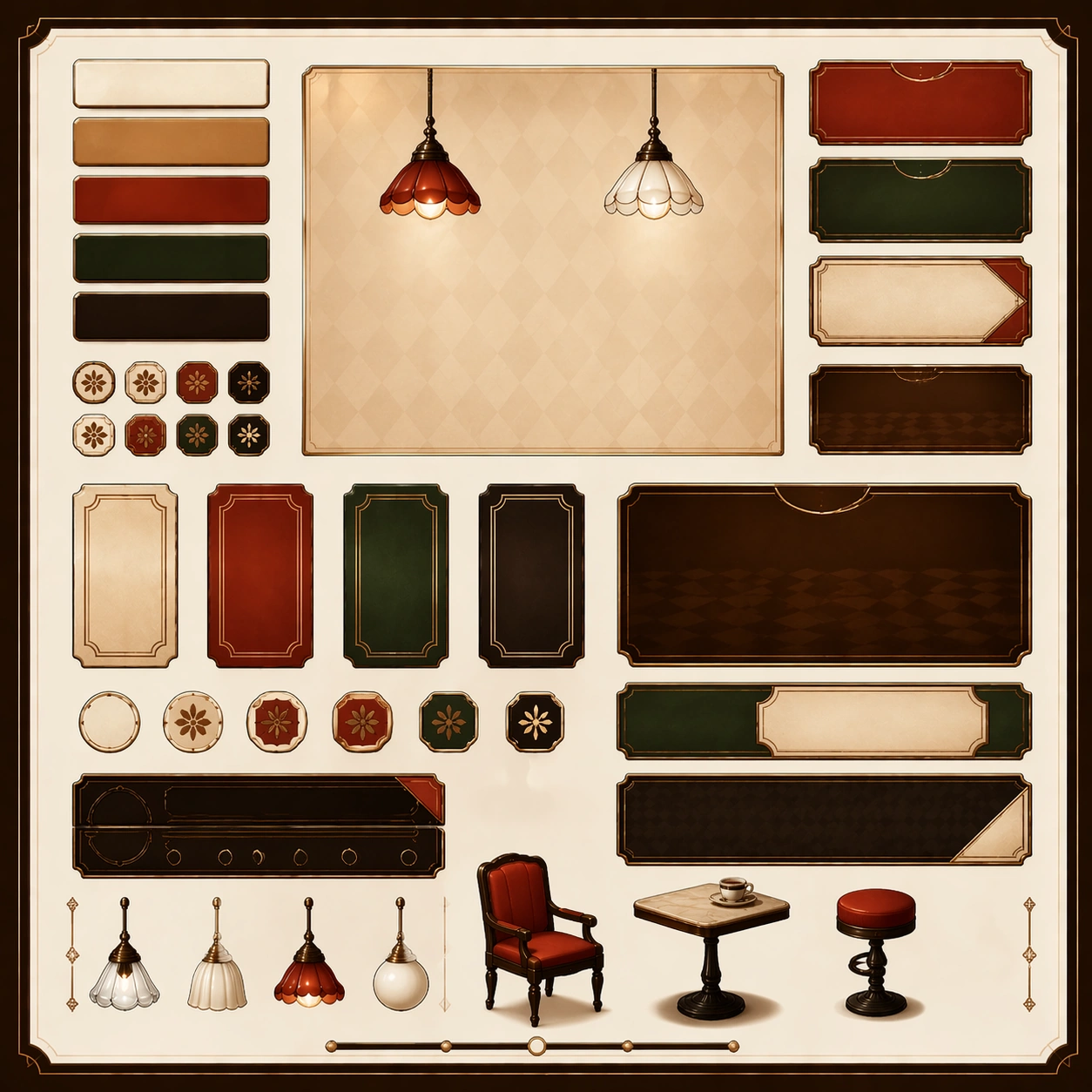
Example generated from “Japanese Kissaten Retro Editorial — Variant Two”
GPT Image 2en

Scene: Create a square dependent image for Japanese Kissaten Retro Editorial. Build a second controlled variation in the same system with a premium, production-ready finish. Use a polished modular board or campaign surface with clean spacing, premium game-UI finish, and clear focal hierarchy. The composition should feel intentional, clean, and reusable for gallery, research, campaign, or internal handoff contexts. Lighting must support readability first, with the main forms clearly separated from the background and enough breathing room for the system to stay legible at both hero scale and thumbnail scale. Subject: Center a coherent original game-art system built for premium production and marketing surfaces. For this image, focus on the intended support surface. Keep the same system logic stable across screenshots, cards, banners, and overview boards. Preserve exact identity or system logic from the reference image while changing only the intended variation axis. The viewer should immediately understand what role this surface plays inside a cohesive game-production asset pack. Important details: Lock framing, icon grammar, palette blocking, and surface hierarchy so the kit feels production-ready and consistent. Preserve the core silhouette, framing language, and material logic from the reference image while each variation changes function. Keep materials believable, edge hierarchy disciplined, and the visual language consistent with Kissaten. Use abstract interface blocks or diagram accents when helpful, but avoid any readable language. The final result should feel like a deliberate production asset rather than a random illustration. Use case: Japanese Kissaten Retro Editorial series study 3/9, designed as variant two within a cohesive asset pack. Constraints: No readable text, no watermark, no logos, preserve exact 1:1 aspect ratio, no unrelated objects, no broken visual hierarchy, no malformed anatomy or broken perspective, no random decorative clutter.
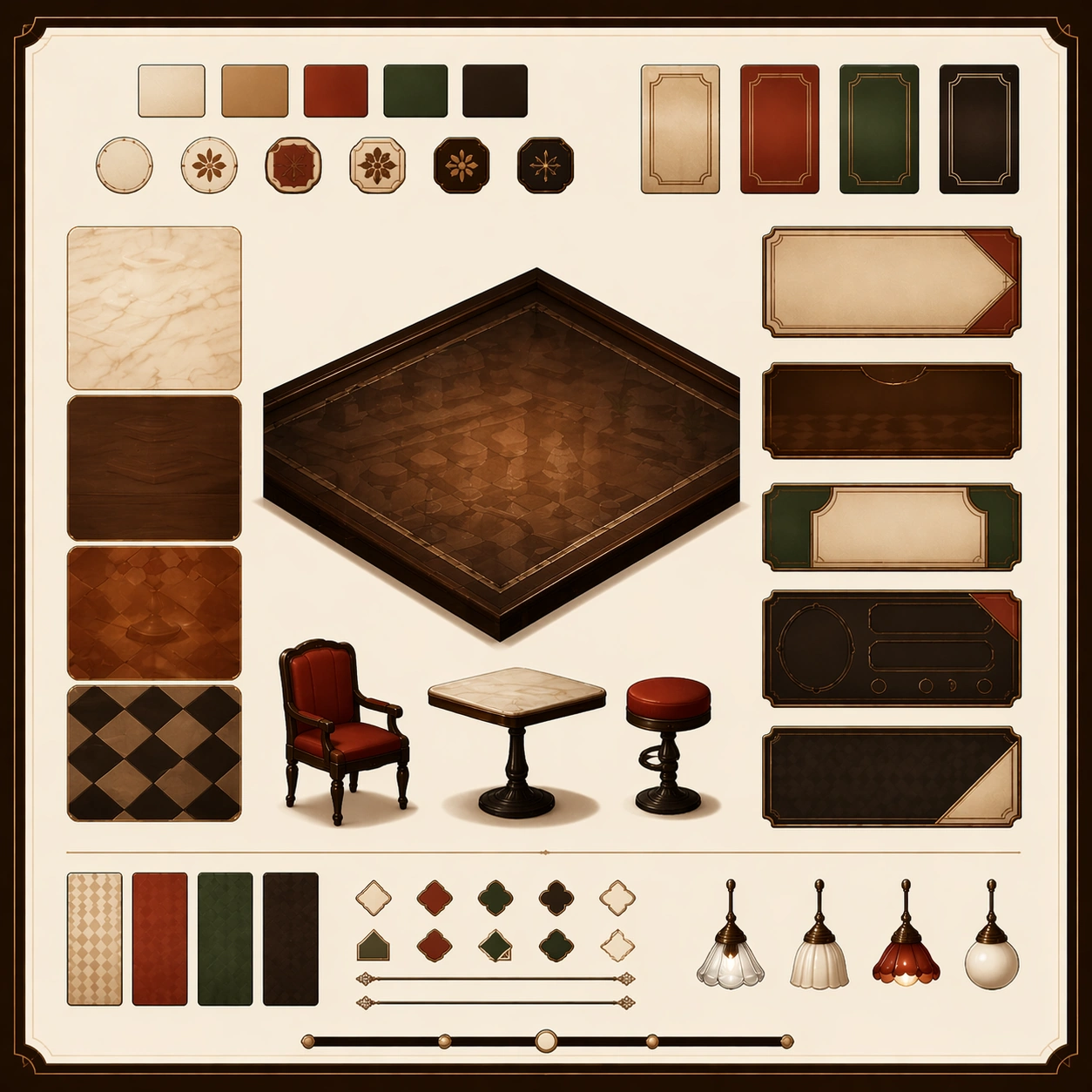
Example generated from “Japanese Kissaten Retro Editorial — Variant Three”
GPT Image 2en

Scene: Create a square dependent image for Japanese Kissaten Retro Editorial. Build a third controlled variation in the same system with a premium, production-ready finish. Use a polished modular board or campaign surface with clean spacing, premium game-UI finish, and clear focal hierarchy. The composition should feel intentional, clean, and reusable for gallery, research, campaign, or internal handoff contexts. Lighting must support readability first, with the main forms clearly separated from the background and enough breathing room for the system to stay legible at both hero scale and thumbnail scale. Subject: Center a coherent original game-art system built for premium production and marketing surfaces. For this image, focus on the intended support surface. Keep the same system logic stable across screenshots, cards, banners, and overview boards. Preserve exact identity or system logic from the reference image while changing only the intended variation axis. The viewer should immediately understand what role this surface plays inside a cohesive game-production asset pack. Important details: Lock framing, icon grammar, palette blocking, and surface hierarchy so the kit feels production-ready and consistent. Preserve the core silhouette, framing language, and material logic from the reference image while each variation changes function. Keep materials believable, edge hierarchy disciplined, and the visual language consistent with Kissaten. Use abstract interface blocks or diagram accents when helpful, but avoid any readable language. The final result should feel like a deliberate production asset rather than a random illustration. Use case: Japanese Kissaten Retro Editorial series study 4/9, designed as variant three within a cohesive asset pack. Constraints: No readable text, no watermark, no logos, preserve exact 1:1 aspect ratio, no unrelated objects, no broken visual hierarchy, no malformed anatomy or broken perspective, no random decorative clutter.
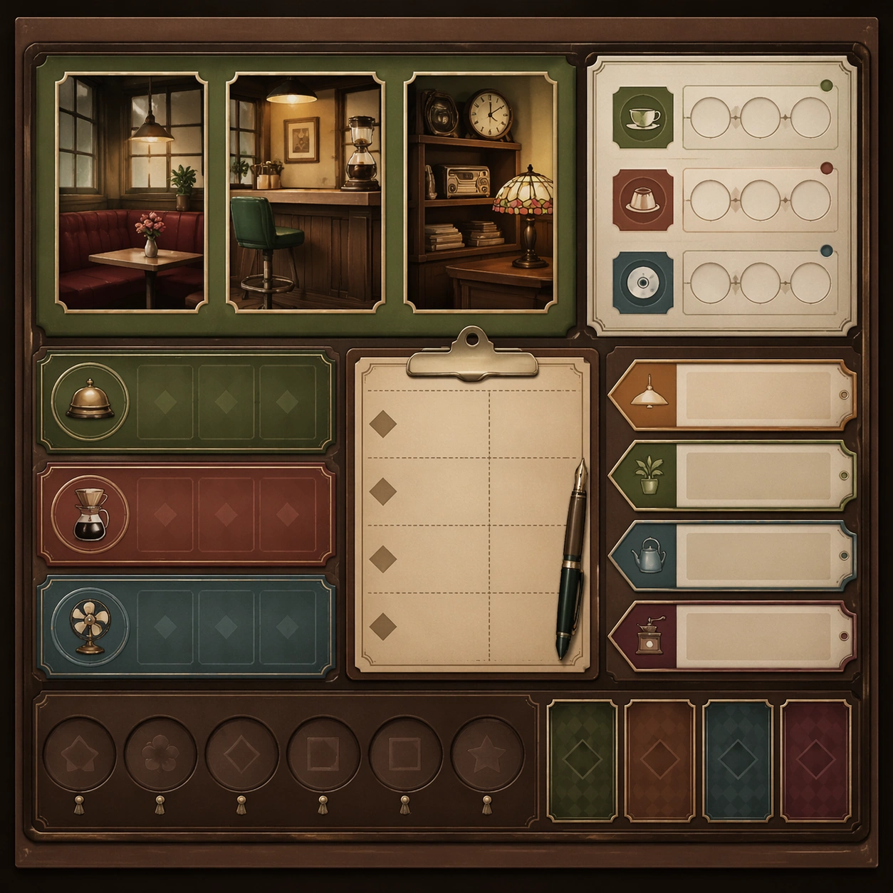
Example generated from “Japanese Kissaten Retro Editorial — Support One”
GPT Image 2en

Scene: Create a square standalone support image for Japanese Kissaten Retro Editorial. Build a support-surface study with a clear focal hierarchy and a finished professional surface. Use a polished modular board or campaign surface with clean spacing, premium game-UI finish, and clear focal hierarchy. The frame should feel self-contained and polished, with enough structure to explain the system even without the reference series, yet still obviously belonging to the same theme and production world. Subject: Show a coherent original game-art system built for premium production and marketing surfaces in a way that emphasizes the intended support surface. Keep the same system logic stable across screenshots, cards, banners, and overview boards. Even though this image is independent, the viewer should still recognize the same universe, same commercial logic, and same production intent as the core package. Important details: Lock framing, icon grammar, palette blocking, and surface hierarchy so the kit feels production-ready and consistent. Preserve the broader theme language through color, framing, material choices, and modular composition. Use clean panel rhythm, premium asset presentation, and believable detail density. The image should work equally well as a gallery study, research reference, and mock production deliverable. Use case: Japanese Kissaten Retro Editorial single study 5/9, exploring support one as a support surface. Constraints: No readable text, no watermark, no logos, preserve exact 1:1 aspect ratio, no unrelated objects, no broken visual hierarchy, no visual noise that obscures the main surface, no accidental brand resemblance.

Example generated from “Japanese Kissaten Retro Editorial — Support Two”
GPT Image 2en

Scene: Create a square standalone support image for Japanese Kissaten Retro Editorial. Build a second support-surface study with a clear focal hierarchy and a finished professional surface. Use a polished modular board or campaign surface with clean spacing, premium game-UI finish, and clear focal hierarchy. The frame should feel self-contained and polished, with enough structure to explain the system even without the reference series, yet still obviously belonging to the same theme and production world. Subject: Show a coherent original game-art system built for premium production and marketing surfaces in a way that emphasizes the intended support surface. Keep the same system logic stable across screenshots, cards, banners, and overview boards. Even though this image is independent, the viewer should still recognize the same universe, same commercial logic, and same production intent as the core package. Important details: Lock framing, icon grammar, palette blocking, and surface hierarchy so the kit feels production-ready and consistent. Preserve the broader theme language through color, framing, material choices, and modular composition. Use clean panel rhythm, premium asset presentation, and believable detail density. The image should work equally well as a gallery study, research reference, and mock production deliverable. Use case: Japanese Kissaten Retro Editorial single study 6/9, exploring support two as a support surface. Constraints: No readable text, no watermark, no logos, preserve exact 1:1 aspect ratio, no unrelated objects, no broken visual hierarchy, no visual noise that obscures the main surface, no accidental brand resemblance.

Example generated from “Japanese Kissaten Retro Editorial — Support Three”
GPT Image 2en

Scene: Create a square standalone support image for Japanese Kissaten Retro Editorial. Build a third support-surface study with a clear focal hierarchy and a finished professional surface. Use a polished modular board or campaign surface with clean spacing, premium game-UI finish, and clear focal hierarchy. The frame should feel self-contained and polished, with enough structure to explain the system even without the reference series, yet still obviously belonging to the same theme and production world. Subject: Show a coherent original game-art system built for premium production and marketing surfaces in a way that emphasizes the intended support surface. Keep the same system logic stable across screenshots, cards, banners, and overview boards. Even though this image is independent, the viewer should still recognize the same universe, same commercial logic, and same production intent as the core package. Important details: Lock framing, icon grammar, palette blocking, and surface hierarchy so the kit feels production-ready and consistent. Preserve the broader theme language through color, framing, material choices, and modular composition. Use clean panel rhythm, premium asset presentation, and believable detail density. The image should work equally well as a gallery study, research reference, and mock production deliverable. Use case: Japanese Kissaten Retro Editorial single study 7/9, exploring support three as a support surface. Constraints: No readable text, no watermark, no logos, preserve exact 1:1 aspect ratio, no unrelated objects, no broken visual hierarchy, no visual noise that obscures the main surface, no accidental brand resemblance.

Example generated from “Japanese Kissaten Retro Editorial — Support Four”
GPT Image 2en

Scene: Create a square standalone support image for Japanese Kissaten Retro Editorial. Build a fourth support-surface study with a clear focal hierarchy and a finished professional surface. Use a polished modular board or campaign surface with clean spacing, premium game-UI finish, and clear focal hierarchy. The frame should feel self-contained and polished, with enough structure to explain the system even without the reference series, yet still obviously belonging to the same theme and production world. Subject: Show a coherent original game-art system built for premium production and marketing surfaces in a way that emphasizes the intended support surface. Keep the same system logic stable across screenshots, cards, banners, and overview boards. Even though this image is independent, the viewer should still recognize the same universe, same commercial logic, and same production intent as the core package. Important details: Lock framing, icon grammar, palette blocking, and surface hierarchy so the kit feels production-ready and consistent. Preserve the broader theme language through color, framing, material choices, and modular composition. Use clean panel rhythm, premium asset presentation, and believable detail density. The image should work equally well as a gallery study, research reference, and mock production deliverable. Use case: Japanese Kissaten Retro Editorial single study 8/9, exploring support four as a support surface. Constraints: No readable text, no watermark, no logos, preserve exact 1:1 aspect ratio, no unrelated objects, no broken visual hierarchy, no visual noise that obscures the main surface, no accidental brand resemblance.

Example generated from “Japanese Kissaten Retro Editorial — Support Five”
GPT Image 2en

Scene: Create a square standalone support image for Japanese Kissaten Retro Editorial. Build a fifth support-surface study with a clear focal hierarchy and a finished professional surface. Use a polished modular board or campaign surface with clean spacing, premium game-UI finish, and clear focal hierarchy. The frame should feel self-contained and polished, with enough structure to explain the system even without the reference series, yet still obviously belonging to the same theme and production world. Subject: Show a coherent original game-art system built for premium production and marketing surfaces in a way that emphasizes the intended support surface. Keep the same system logic stable across screenshots, cards, banners, and overview boards. Even though this image is independent, the viewer should still recognize the same universe, same commercial logic, and same production intent as the core package. Important details: Lock framing, icon grammar, palette blocking, and surface hierarchy so the kit feels production-ready and consistent. Preserve the broader theme language through color, framing, material choices, and modular composition. Use clean panel rhythm, premium asset presentation, and believable detail density. The image should work equally well as a gallery study, research reference, and mock production deliverable. Use case: Japanese Kissaten Retro Editorial single study 9/9, exploring support five as a support surface. Constraints: No readable text, no watermark, no logos, preserve exact 1:1 aspect ratio, no unrelated objects, no broken visual hierarchy, no visual noise that obscures the main surface, no accidental brand resemblance.

Example generated from “Japanese Ukiyoe Modern Remix — Print Proof Flatlay”
GPT Image 2en

Scene: A square overhead tabletop photograph of a fresh poster proof on neutral worktable paper, lit by cool daylight, with crop marks, tape tabs, and slight paper bow visible around the sheet. The poster should express woodblock poster language with flat color planes, carved keylines, wave patterns, cloud voids, and compressed perspective, using indigo, vermilion, muted cream, smoky pine green, and weathered charcoal outlines and a tactile surface appropriate to the medium. Subject: Design the poster as a print-shop proof, preserving the same poster language while allowing production clues such as edge trims, registration targets, and process marks to frame the composition. Use bridges, river spray, layered robes, lantern shapes, rain bands, cloud scrolls, and urban commuters as the main visual ingredients, and organize them with cartouche-like title seals and vertical blocks rendered as abstract non-readable forms. For the contemporary-subject axis, thread in a city cyclist crossing a bridge in rain with phone light and train wires translated into woodblock logic. The poster must feel like an original design object rather than a reproduction of any known work. Important details: The image must still read as a finished poster concept, but it should carry believable print-process evidence and material tactility instead of gallery-wall perfection. Preserve visible contour line discipline, flat depth stacking, patterned water, and rhythmic empty sky fields. Keep every letterform abstract and non-readable, as if it were a typographic texture rather than language. Make the style unmistakable through composition, palette, surface behavior, and symbolic compression. no glossy digital gradients, no lens blur, no hyperreal reflections, no cinematic depth-of-field. Use case: Ukiyo-e Remix single study 2/9, testing production realism and process evidence. Constraints: No readable text, no watermark, no logos, preserve exact 1:1 aspect ratio, no copyrighted characters, no real brand marks, no QR codes, no interface chrome, no accidental gibberish lettering.

Example generated from “Japanese Ukiyoe Modern Remix — Transit Lightbox”
GPT Image 2en

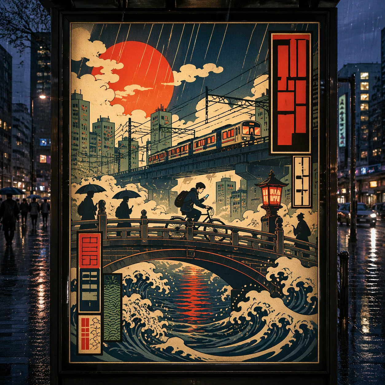
Scene: A square dusk street photograph of a backlit transit poster glowing inside glass, with faint rain reflections, soft city blur in the distance, and the poster remaining fully legible as a composition. The poster should express woodblock poster language with flat color planes, carved keylines, wave patterns, cloud voids, and compressed perspective, using indigo, vermilion, muted cream, smoky pine green, and weathered charcoal outlines and a tactile surface appropriate to the medium. Subject: Adapt the poster into a public-facing lightbox version that still honors the original style grammar while feeling bold enough to stop a passerby from several meters away. Use bridges, river spray, layered robes, lantern shapes, rain bands, cloud scrolls, and urban commuters as the main visual ingredients, and organize them with cartouche-like title seals and vertical blocks rendered as abstract non-readable forms. For the contemporary-subject axis, thread in a city cyclist crossing a bridge in rain with phone light and train wires translated into woodblock logic. The poster must feel like an original design object rather than a reproduction of any known work. Important details: Let the style survive the illumination test: color blocking, silhouette contrast, and abstract lettering should stay controlled under bright internal light and reflective glass. Preserve visible contour line discipline, flat depth stacking, patterned water, and rhythmic empty sky fields. Keep every letterform abstract and non-readable, as if it were a typographic texture rather than language. Make the style unmistakable through composition, palette, surface behavior, and symbolic compression. no glossy digital gradients, no lens blur, no hyperreal reflections, no cinematic depth-of-field. Use case: Ukiyo-e Remix single study 3/9, testing distance readability in public display. Constraints: No readable text, no watermark, no logos, preserve exact 1:1 aspect ratio, no copyrighted characters, no real brand marks, no QR codes, no interface chrome, no accidental gibberish lettering.

Example generated from “Japanese Ukiyoe Modern Remix — Wheatpaste Wall Layer”
GPT Image 2en

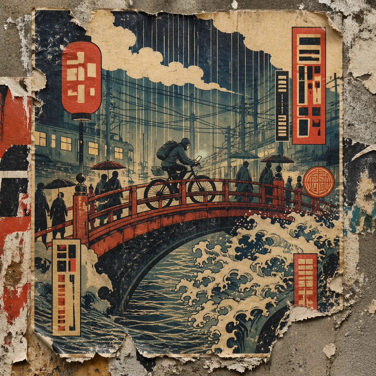
Scene: A square urban wall study with the poster pasted onto rough plaster among torn edges and older paper remnants, photographed in soft overcast light so texture, glue bubbles, and surface scars stay visible. The poster should express woodblock poster language with flat color planes, carved keylines, wave patterns, cloud voids, and compressed perspective, using indigo, vermilion, muted cream, smoky pine green, and weathered charcoal outlines and a tactile surface appropriate to the medium. Subject: Create a version that feels made for the street, with the poster carrying enough formal force to survive abrasion, layering, and imperfect placement without losing its visual identity. Use bridges, river spray, layered robes, lantern shapes, rain bands, cloud scrolls, and urban commuters as the main visual ingredients, and organize them with cartouche-like title seals and vertical blocks rendered as abstract non-readable forms. For the contemporary-subject axis, thread in a city cyclist crossing a bridge in rain with phone light and train wires translated into woodblock logic. The poster must feel like an original design object rather than a reproduction of any known work. Important details: Keep the main design intact but let the environment add grit: lifted corners, tiny tears, wrinkled paper, and older color fragments around the perimeter should amplify the style rather than dilute it. Preserve visible contour line discipline, flat depth stacking, patterned water, and rhythmic empty sky fields. Keep every letterform abstract and non-readable, as if it were a typographic texture rather than language. Make the style unmistakable through composition, palette, surface behavior, and symbolic compression. no glossy digital gradients, no lens blur, no hyperreal reflections, no cinematic depth-of-field. Use case: Ukiyo-e Remix single study 4/9, testing street-life durability and layered context. Constraints: No readable text, no watermark, no logos, preserve exact 1:1 aspect ratio, no copyrighted characters, no real brand marks, no QR codes, no interface chrome, no accidental gibberish lettering.

Example generated from “Japanese Ukiyoe Modern Remix — Folded Archive Copy”
GPT Image 2en

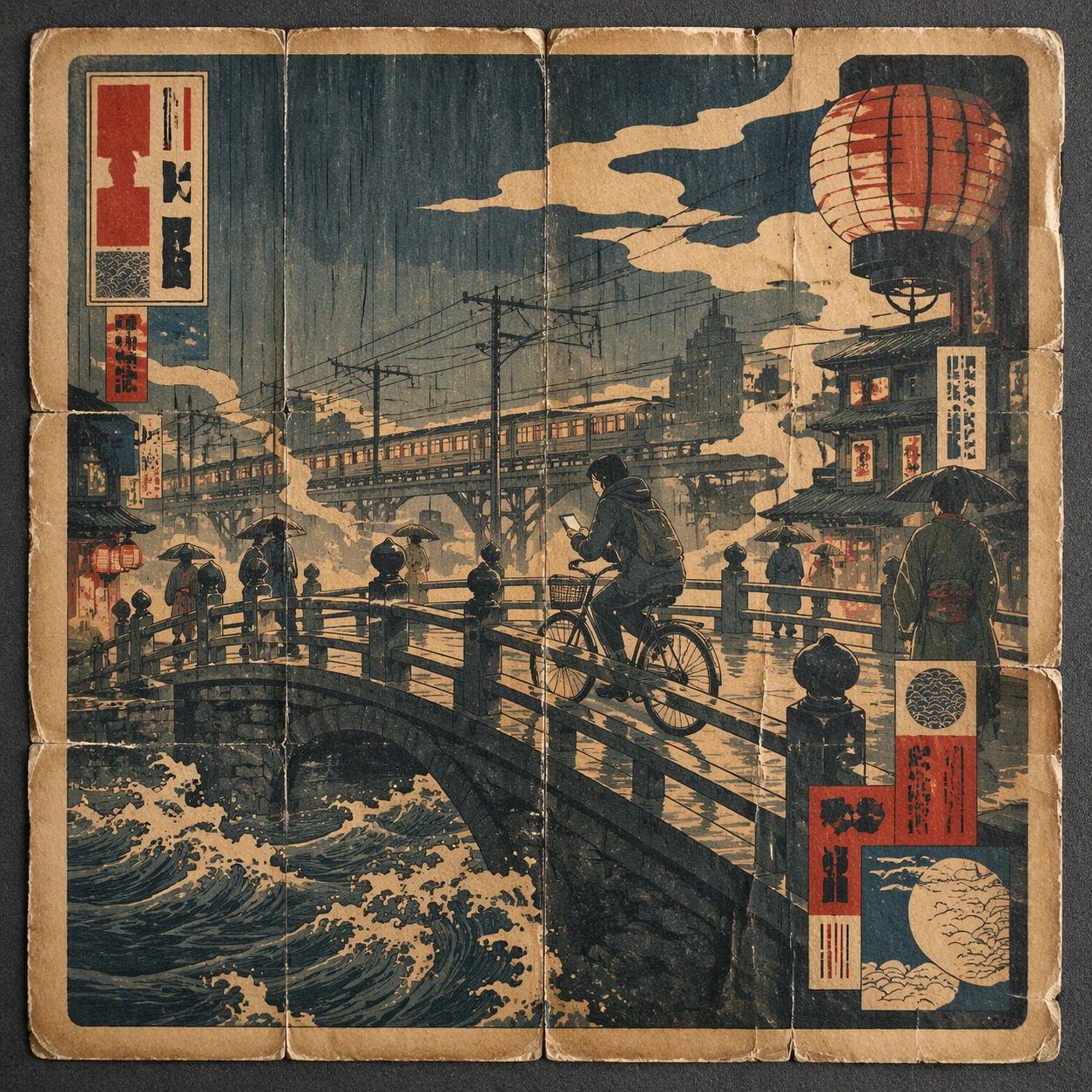
Scene: A square conservation-table view of a vintage poster laid on gray felt under raking light, with visible fold lines, softened corners, and subtle aging that still preserves the integrity of the image. The poster should express woodblock poster language with flat color planes, carved keylines, wave patterns, cloud voids, and compressed perspective, using indigo, vermilion, muted cream, smoky pine green, and weathered charcoal outlines and a tactile surface appropriate to the medium. Subject: Present the poster as an archive copy that has been stored, unfolded, and carefully documented, letting age and handling reveal how the design holds up across time. Use bridges, river spray, layered robes, lantern shapes, rain bands, cloud scrolls, and urban commuters as the main visual ingredients, and organize them with cartouche-like title seals and vertical blocks rendered as abstract non-readable forms. For the contemporary-subject axis, thread in a city cyclist crossing a bridge in rain with phone light and train wires translated into woodblock logic. The poster must feel like an original design object rather than a reproduction of any known work. Important details: Aging must stay believable rather than theatrical: slight yellowing, fold memory, edge wear, and pigment variation should support the historical or crafted feeling of the style. Preserve visible contour line discipline, flat depth stacking, patterned water, and rhythmic empty sky fields. Keep every letterform abstract and non-readable, as if it were a typographic texture rather than language. Make the style unmistakable through composition, palette, surface behavior, and symbolic compression. no glossy digital gradients, no lens blur, no hyperreal reflections, no cinematic depth-of-field. Use case: Ukiyo-e Remix single study 5/9, testing archival endurance and age character. Constraints: No readable text, no watermark, no logos, preserve exact 1:1 aspect ratio, no copyrighted characters, no real brand marks, no QR codes, no interface chrome, no accidental gibberish lettering.

Example generated from “Japanese Ukiyoe Modern Remix — Twin Poster Diptych”
GPT Image 2en

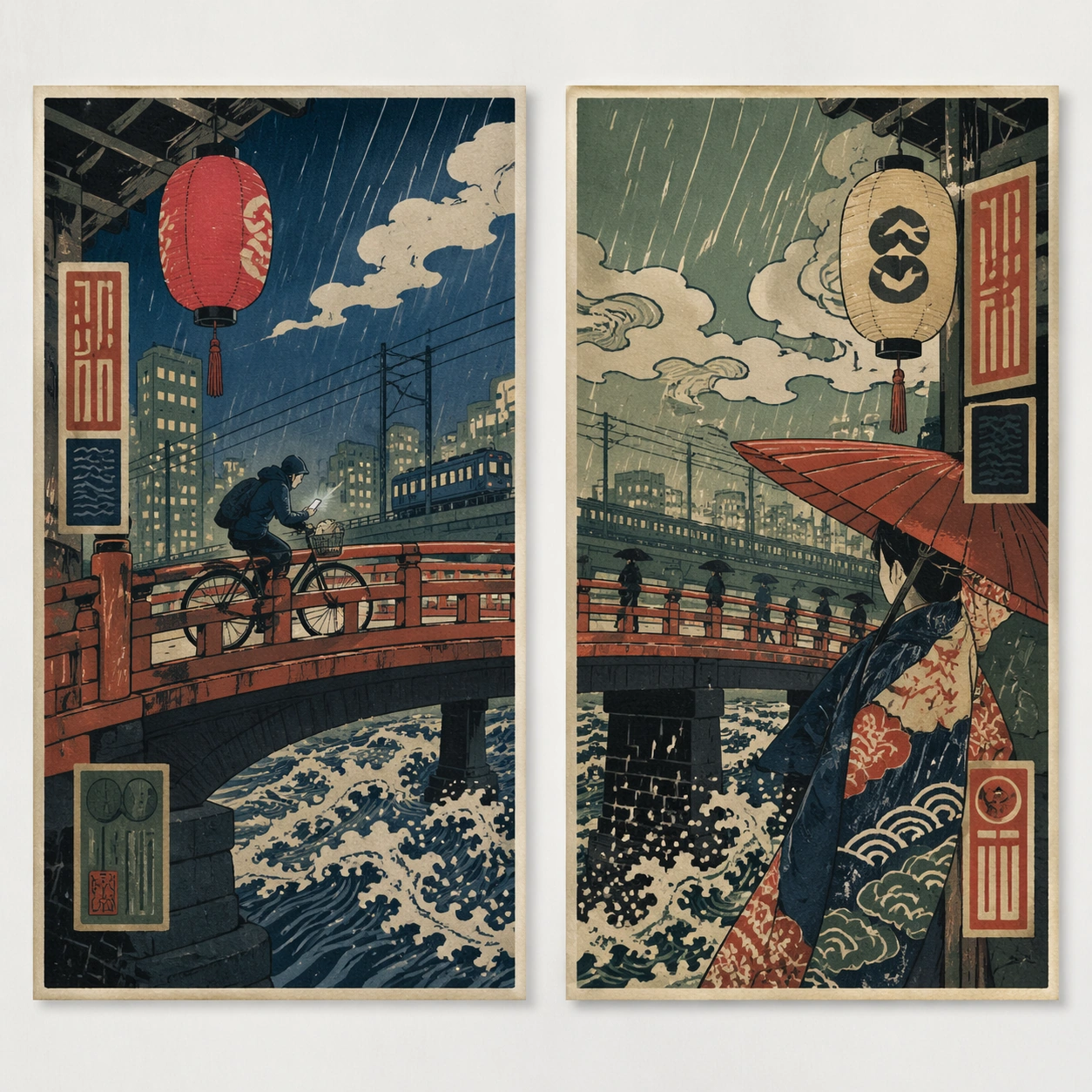
Scene: A square white-wall installation showing two companion posters hung side by side with equal spacing, photographed frontally so the pair reads as a designed conversation rather than two unrelated sheets. The poster should express woodblock poster language with flat color planes, carved keylines, wave patterns, cloud voids, and compressed perspective, using indigo, vermilion, muted cream, smoky pine green, and weathered charcoal outlines and a tactile surface appropriate to the medium. Subject: Compose a matched diptych: two posters sharing one style system while splitting the narrative across paired motifs, mirrored masses, or complementary color emphasis. Use bridges, river spray, layered robes, lantern shapes, rain bands, cloud scrolls, and urban commuters as the main visual ingredients, and organize them with cartouche-like title seals and vertical blocks rendered as abstract non-readable forms. For the contemporary-subject axis, thread in a city cyclist crossing a bridge in rain with phone light and train wires translated into woodblock logic. The poster must feel like an original design object rather than a reproduction of any known work. Important details: Both halves should feel distinct yet inseparable. Preserve one coherent visual language, but let each sheet carry its own focal symbol and rhythm without readable wording. Preserve visible contour line discipline, flat depth stacking, patterned water, and rhythmic empty sky fields. Keep every letterform abstract and non-readable, as if it were a typographic texture rather than language. Make the style unmistakable through composition, palette, surface behavior, and symbolic compression. no glossy digital gradients, no lens blur, no hyperreal reflections, no cinematic depth-of-field. Use case: Ukiyo-e Remix single study 6/9, testing system flexibility across a paired set. Constraints: No readable text, no watermark, no logos, preserve exact 1:1 aspect ratio, no copyrighted characters, no real brand marks, no QR codes, no interface chrome, no accidental gibberish lettering.

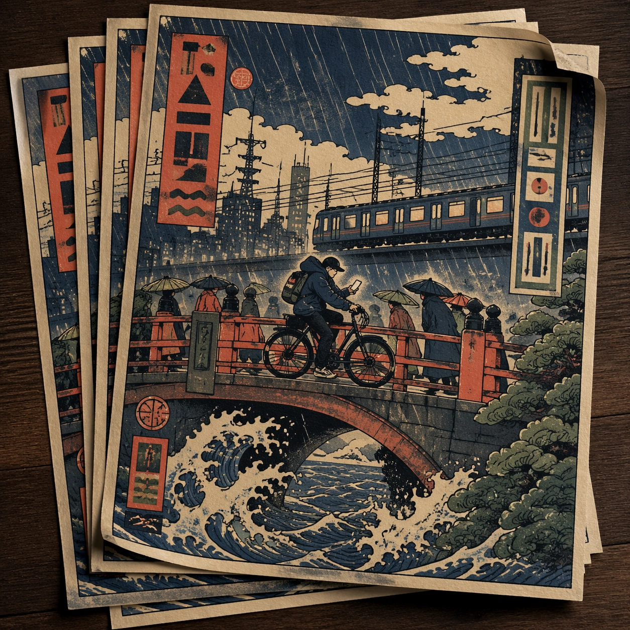
Example generated from “Japanese Ukiyoe Modern Remix — Stacked Print Bundle”
GPT Image 2en

Scene: A square tabletop shot of several poster prints stacked and slightly fanned, with curled corners, offset edges, and soft directional light revealing paper thickness and ink behavior. The poster should express woodblock poster language with flat color planes, carved keylines, wave patterns, cloud voids, and compressed perspective, using indigo, vermilion, muted cream, smoky pine green, and weathered charcoal outlines and a tactile surface appropriate to the medium. Subject: Design the top poster to dominate while nearby duplicate sheets echo the same composition, creating a tactile print-run scene rather than a single isolated sheet. Use bridges, river spray, layered robes, lantern shapes, rain bands, cloud scrolls, and urban commuters as the main visual ingredients, and organize them with cartouche-like title seals and vertical blocks rendered as abstract non-readable forms. For the contemporary-subject axis, thread in a city cyclist crossing a bridge in rain with phone light and train wires translated into woodblock logic. The poster must feel like an original design object rather than a reproduction of any known work. Important details: Use the stack to emphasize production character: edge shadows, repeated motifs peeking from beneath, and subtle misalignment should enrich the material reading without changing the core design. Preserve visible contour line discipline, flat depth stacking, patterned water, and rhythmic empty sky fields. Keep every letterform abstract and non-readable, as if it were a typographic texture rather than language. Make the style unmistakable through composition, palette, surface behavior, and symbolic compression. no glossy digital gradients, no lens blur, no hyperreal reflections, no cinematic depth-of-field. Use case: Ukiyo-e Remix single study 7/9, testing print-run tactility and repeat presence. Constraints: No readable text, no watermark, no logos, preserve exact 1:1 aspect ratio, no copyrighted characters, no real brand marks, no QR codes, no interface chrome, no accidental gibberish lettering.

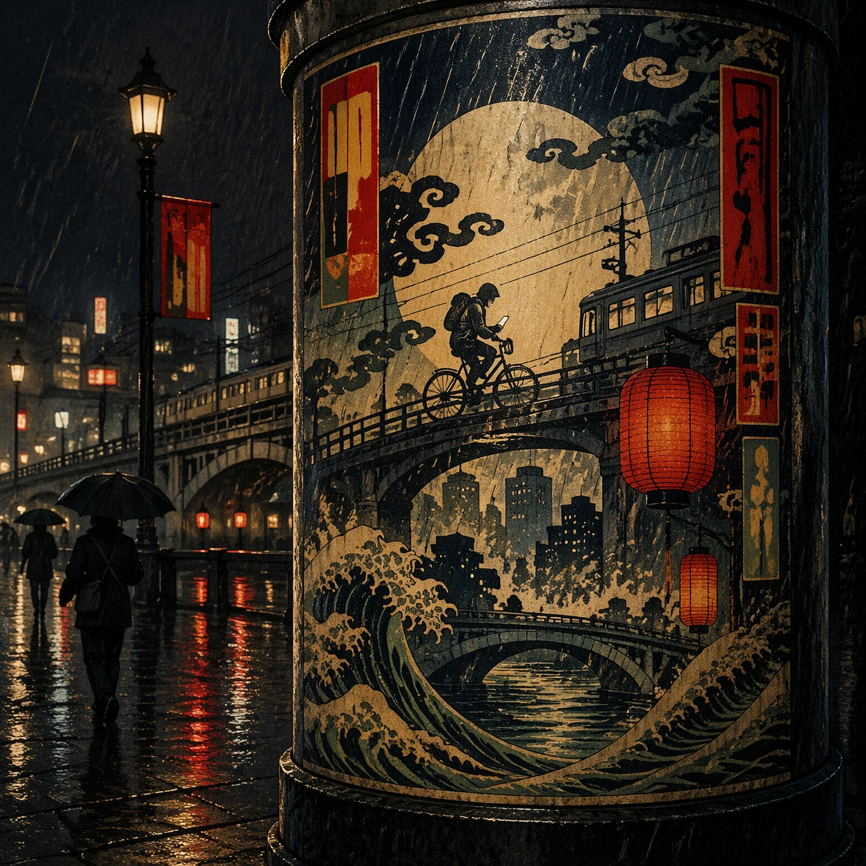
Example generated from “Japanese Ukiyoe Modern Remix — Kiosk Night Glow”
GPT Image 2en

Scene: A square nighttime city view with the poster wrapping part of a cylindrical kiosk, wet pavement reflecting nearby light, and the composition holding together under moody urban illumination. The poster should express woodblock poster language with flat color planes, carved keylines, wave patterns, cloud voids, and compressed perspective, using indigo, vermilion, muted cream, smoky pine green, and weathered charcoal outlines and a tactile surface appropriate to the medium. Subject: Reframe the design for a dramatic street-placement context, where the poster has to project style and mood through reflection, curvature, and surrounding darkness. Use bridges, river spray, layered robes, lantern shapes, rain bands, cloud scrolls, and urban commuters as the main visual ingredients, and organize them with cartouche-like title seals and vertical blocks rendered as abstract non-readable forms. For the contemporary-subject axis, thread in a city cyclist crossing a bridge in rain with phone light and train wires translated into woodblock logic. The poster must feel like an original design object rather than a reproduction of any known work. Important details: The design should remain instantly recognizable despite the cylindrical wrap. Preserve major blocks, symbolic shapes, and abstract title forms so the style still feels authoritative at night. Preserve visible contour line discipline, flat depth stacking, patterned water, and rhythmic empty sky fields. Keep every letterform abstract and non-readable, as if it were a typographic texture rather than language. Make the style unmistakable through composition, palette, surface behavior, and symbolic compression. no glossy digital gradients, no lens blur, no hyperreal reflections, no cinematic depth-of-field. Use case: Ukiyo-e Remix single study 8/9, testing atmospheric display under rain and glow. Constraints: No readable text, no watermark, no logos, preserve exact 1:1 aspect ratio, no copyrighted characters, no real brand marks, no QR codes, no interface chrome, no accidental gibberish lettering.

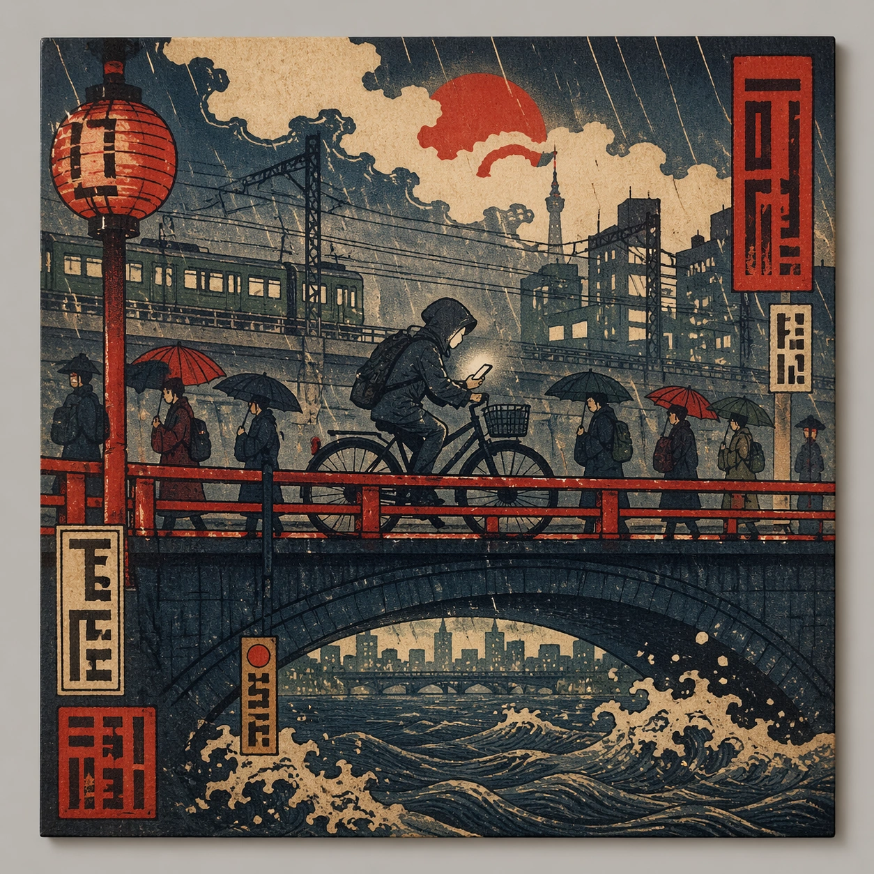
Example generated from “Japanese Ukiyoe Modern Remix — Contemporary Remix”
GPT Image 2en

Scene: A square front-facing poster presentation on a clean neutral wall, lit like a premium print test, with crisp edges and a polished but still tactile finish appropriate to the style. The poster should express woodblock poster language with flat color planes, carved keylines, wave patterns, cloud voids, and compressed perspective, using indigo, vermilion, muted cream, smoky pine green, and weathered charcoal outlines and a tactile surface appropriate to the medium. Subject: Apply the historical poster language to a contemporary urban subject so the old visual grammar proves it can carry present-day themes without losing authenticity or formal discipline. Use bridges, river spray, layered robes, lantern shapes, rain bands, cloud scrolls, and urban commuters as the main visual ingredients, and organize them with cartouche-like title seals and vertical blocks rendered as abstract non-readable forms. For the contemporary-subject axis, thread in a city cyclist crossing a bridge in rain with phone light and train wires translated into woodblock logic. The poster must feel like an original design object rather than a reproduction of any known work. Important details: This is not parody. The contemporary subject should feel genuinely absorbed into the style through palette, composition, symbolic compression, and non-readable lettering treatment. Preserve visible contour line discipline, flat depth stacking, patterned water, and rhythmic empty sky fields. Keep every letterform abstract and non-readable, as if it were a typographic texture rather than language. Make the style unmistakable through composition, palette, surface behavior, and symbolic compression. no glossy digital gradients, no lens blur, no hyperreal reflections, no cinematic depth-of-field. Use case: Ukiyo-e Remix single study 9/9, testing historical grammar on a present-day subject. Constraints: No readable text, no watermark, no logos, preserve exact 1:1 aspect ratio, no copyrighted characters, no real brand marks, no QR codes, no interface chrome, no accidental gibberish lettering.

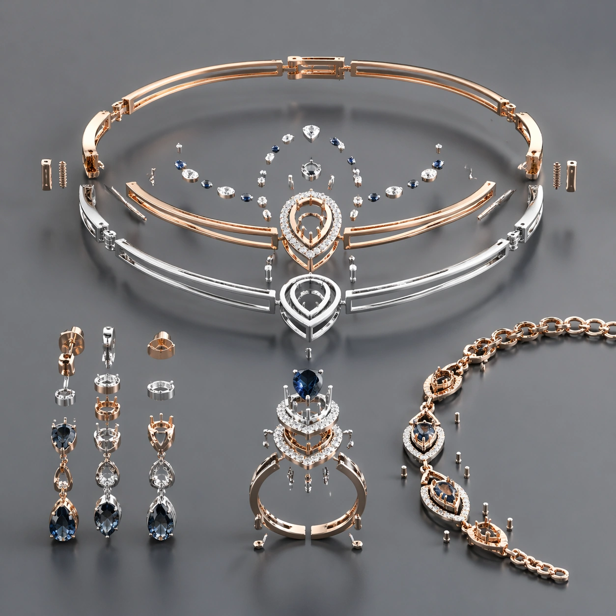
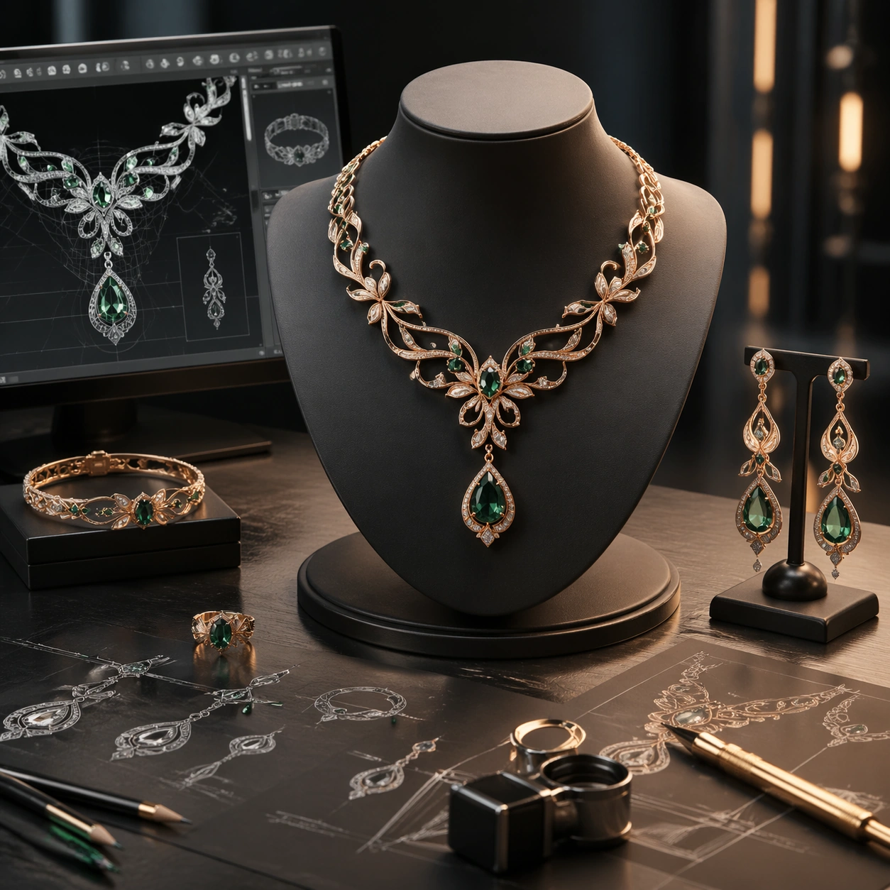
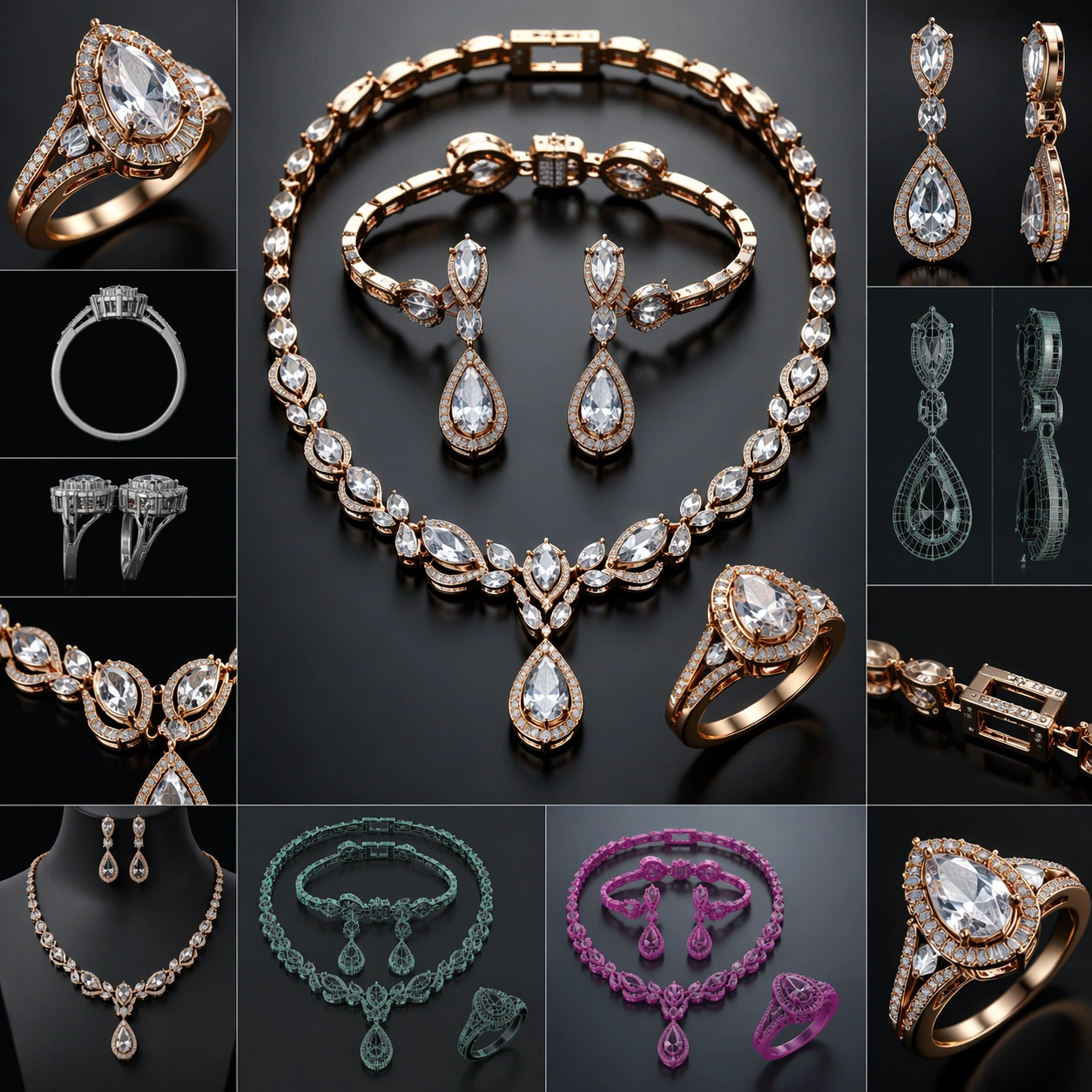
Example generated from “Jewelry Cad Wearable Set — Exploded Arrangement”
GPT Image 2en

Scene: A square CGI or design-visualization frame with calibrated lighting, intentional composition, and premium material rendering. Build the frame around components or accessories separated with clean studio logic. Keep the lighting, camera distance, and spatial organization tuned for a high-signal research image rather than a casual snapshot. The image belongs to the Jewelry CAD Wearable Set theme and should feel immediately legible as a prompt atlas theme for jewelry cad wearable set, testing photorealism, physics-materials, technical-diagram, style-transfer, commercial-mockup with gpt image 2.. Subject: Center the study on components or accessories separated with clean studio logic. Translate the theme into a concrete visual statement instead of an abstract mood board: the viewer should understand what kind of image this is, what is being tested, and why the composition is difficult. Use the slug idea of jewelry cad wearable set as a literal guide for subject matter, materials, and staging. If helpful, borrow the broad visual cues suggested by CAD, Octane, iPhone, but keep the result original and specific to this study. Important details: The model must feel engineered or art-directed rather than merely stylized: edges, seams, translucency, reflections, and scale cues should all hold up. Preserve a disciplined square composition, clear focal hierarchy, and enough secondary information to make the image feel complete rather than underspecified. The image should look polished, novel, and exhibition-ready, with topic-specific credibility coming from the way surfaces, structure, and visual language reinforce Jewelry CAD Wearable Set. Avoid generic filler elements that do not serve the main concept. Use case: Jewelry CAD Wearable Set single study 2/8, testing photorealism, physics-materials, technical-diagram, style-transfer, commercial-mockup through the exploded arrangement variation. Constraints: No readable text, no watermark, no logos, preserve exact 1:1 aspect ratio, no real brand logos, no low-poly shortcuts, no broken reflections, no muddy materials, no generic showroom clutter, no unreadable UI overlays.

Example generated from “Jewelry Cad Wearable Set — Material Pass”
GPT Image 2en

Scene: A square CGI or design-visualization frame with calibrated lighting, intentional composition, and premium material rendering. Build the frame around the same design idea pushed through surface richness and shader control. Keep the lighting, camera distance, and spatial organization tuned for a high-signal research image rather than a casual snapshot. The image belongs to the Jewelry CAD Wearable Set theme and should feel immediately legible as a prompt atlas theme for jewelry cad wearable set, testing photorealism, physics-materials, technical-diagram, style-transfer, commercial-mockup with gpt image 2.. Subject: Center the study on the same design idea pushed through surface richness and shader control. Translate the theme into a concrete visual statement instead of an abstract mood board: the viewer should understand what kind of image this is, what is being tested, and why the composition is difficult. Use the slug idea of jewelry cad wearable set as a literal guide for subject matter, materials, and staging. If helpful, borrow the broad visual cues suggested by CAD, Octane, iPhone, but keep the result original and specific to this study. Important details: The model must feel engineered or art-directed rather than merely stylized: edges, seams, translucency, reflections, and scale cues should all hold up. Preserve a disciplined square composition, clear focal hierarchy, and enough secondary information to make the image feel complete rather than underspecified. The image should look polished, novel, and exhibition-ready, with topic-specific credibility coming from the way surfaces, structure, and visual language reinforce Jewelry CAD Wearable Set. Avoid generic filler elements that do not serve the main concept. Use case: Jewelry CAD Wearable Set single study 3/8, testing photorealism, physics-materials, technical-diagram, style-transfer, commercial-mockup through the material pass variation. Constraints: No readable text, no watermark, no logos, preserve exact 1:1 aspect ratio, no real brand logos, no low-poly shortcuts, no broken reflections, no muddy materials, no generic showroom clutter, no unreadable UI overlays.

Example generated from “Jewelry Cad Wearable Set — Studio Turn”
GPT Image 2en

Scene: A square CGI or design-visualization frame with calibrated lighting, intentional composition, and premium material rendering. Build the frame around a presentation angle that reveals volume and silhouette clearly. Keep the lighting, camera distance, and spatial organization tuned for a high-signal research image rather than a casual snapshot. The image belongs to the Jewelry CAD Wearable Set theme and should feel immediately legible as a prompt atlas theme for jewelry cad wearable set, testing photorealism, physics-materials, technical-diagram, style-transfer, commercial-mockup with gpt image 2.. Subject: Center the study on a presentation angle that reveals volume and silhouette clearly. Translate the theme into a concrete visual statement instead of an abstract mood board: the viewer should understand what kind of image this is, what is being tested, and why the composition is difficult. Use the slug idea of jewelry cad wearable set as a literal guide for subject matter, materials, and staging. If helpful, borrow the broad visual cues suggested by CAD, Octane, iPhone, but keep the result original and specific to this study. Important details: The model must feel engineered or art-directed rather than merely stylized: edges, seams, translucency, reflections, and scale cues should all hold up. Preserve a disciplined square composition, clear focal hierarchy, and enough secondary information to make the image feel complete rather than underspecified. The image should look polished, novel, and exhibition-ready, with topic-specific credibility coming from the way surfaces, structure, and visual language reinforce Jewelry CAD Wearable Set. Avoid generic filler elements that do not serve the main concept. Use case: Jewelry CAD Wearable Set single study 4/8, testing photorealism, physics-materials, technical-diagram, style-transfer, commercial-mockup through the studio turn variation. Constraints: No readable text, no watermark, no logos, preserve exact 1:1 aspect ratio, no real brand logos, no low-poly shortcuts, no broken reflections, no muddy materials, no generic showroom clutter, no unreadable UI overlays.

Example generated from “Jewelry Cad Wearable Set — Scale Comparison”
GPT Image 2en

Scene: A square CGI or design-visualization frame with calibrated lighting, intentional composition, and premium material rendering. Build the frame around supporting context that clarifies proportion and use without becoming literal advertising. Keep the lighting, camera distance, and spatial organization tuned for a high-signal research image rather than a casual snapshot. The image belongs to the Jewelry CAD Wearable Set theme and should feel immediately legible as a prompt atlas theme for jewelry cad wearable set, testing photorealism, physics-materials, technical-diagram, style-transfer, commercial-mockup with gpt image 2.. Subject: Center the study on supporting context that clarifies proportion and use without becoming literal advertising. Translate the theme into a concrete visual statement instead of an abstract mood board: the viewer should understand what kind of image this is, what is being tested, and why the composition is difficult. Use the slug idea of jewelry cad wearable set as a literal guide for subject matter, materials, and staging. If helpful, borrow the broad visual cues suggested by CAD, Octane, iPhone, but keep the result original and specific to this study. Important details: The model must feel engineered or art-directed rather than merely stylized: edges, seams, translucency, reflections, and scale cues should all hold up. Preserve a disciplined square composition, clear focal hierarchy, and enough secondary information to make the image feel complete rather than underspecified. The image should look polished, novel, and exhibition-ready, with topic-specific credibility coming from the way surfaces, structure, and visual language reinforce Jewelry CAD Wearable Set. Avoid generic filler elements that do not serve the main concept. Use case: Jewelry CAD Wearable Set single study 5/8, testing photorealism, physics-materials, technical-diagram, style-transfer, commercial-mockup through the scale comparison variation. Constraints: No readable text, no watermark, no logos, preserve exact 1:1 aspect ratio, no real brand logos, no low-poly shortcuts, no broken reflections, no muddy materials, no generic showroom clutter, no unreadable UI overlays.

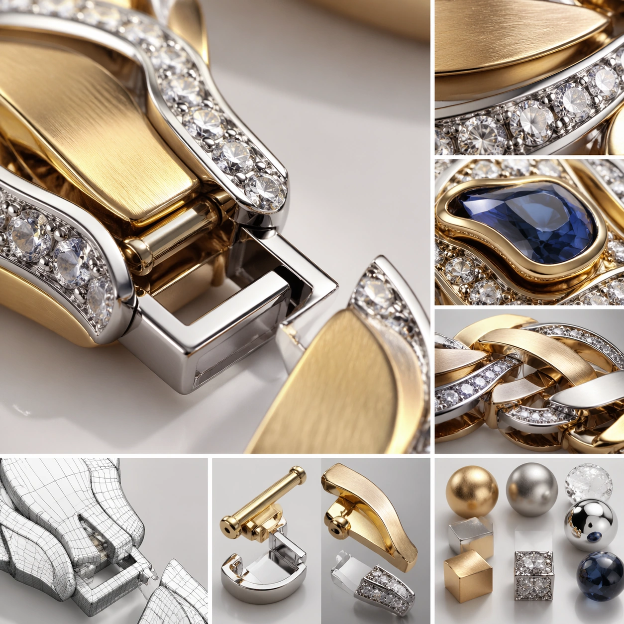
Example generated from “Jewelry Cad Wearable Set — Detail Closeup”
GPT Image 2en

Scene: A square CGI or design-visualization frame with calibrated lighting, intentional composition, and premium material rendering. Build the frame around macro rendering of joints, textures, or finish transitions. Keep the lighting, camera distance, and spatial organization tuned for a high-signal research image rather than a casual snapshot. The image belongs to the Jewelry CAD Wearable Set theme and should feel immediately legible as a prompt atlas theme for jewelry cad wearable set, testing photorealism, physics-materials, technical-diagram, style-transfer, commercial-mockup with gpt image 2.. Subject: Center the study on macro rendering of joints, textures, or finish transitions. Translate the theme into a concrete visual statement instead of an abstract mood board: the viewer should understand what kind of image this is, what is being tested, and why the composition is difficult. Use the slug idea of jewelry cad wearable set as a literal guide for subject matter, materials, and staging. If helpful, borrow the broad visual cues suggested by CAD, Octane, iPhone, but keep the result original and specific to this study. Important details: The model must feel engineered or art-directed rather than merely stylized: edges, seams, translucency, reflections, and scale cues should all hold up. Preserve a disciplined square composition, clear focal hierarchy, and enough secondary information to make the image feel complete rather than underspecified. The image should look polished, novel, and exhibition-ready, with topic-specific credibility coming from the way surfaces, structure, and visual language reinforce Jewelry CAD Wearable Set. Avoid generic filler elements that do not serve the main concept. Use case: Jewelry CAD Wearable Set single study 6/8, testing photorealism, physics-materials, technical-diagram, style-transfer, commercial-mockup through the detail closeup variation. Constraints: No readable text, no watermark, no logos, preserve exact 1:1 aspect ratio, no real brand logos, no low-poly shortcuts, no broken reflections, no muddy materials, no generic showroom clutter, no unreadable UI overlays.

Example generated from “Jewelry Cad Wearable Set — 环境展示”
GPT Image 2en

Scene: A square CGI or design-visualization frame with calibrated lighting, intentional composition, and premium material rendering. Build the frame around the design placed into a context that tests realism and narrative. Keep the lighting, camera distance, and spatial organization tuned for a high-signal research image rather than a casual snapshot. The image belongs to the Jewelry CAD Wearable Set theme and should feel immediately legible as a prompt atlas theme for jewelry cad wearable set, testing photorealism, physics-materials, technical-diagram, style-transfer, commercial-mockup with gpt image 2.. Subject: Center the study on the design placed into a context that tests realism and narrative. Translate the theme into a concrete visual statement instead of an abstract mood board: the viewer should understand what kind of image this is, what is being tested, and why the composition is difficult. Use the slug idea of jewelry cad wearable set as a literal guide for subject matter, materials, and staging. If helpful, borrow the broad visual cues suggested by CAD, Octane, iPhone, but keep the result original and specific to this study. Important details: The model must feel engineered or art-directed rather than merely stylized: edges, seams, translucency, reflections, and scale cues should all hold up. Preserve a disciplined square composition, clear focal hierarchy, and enough secondary information to make the image feel complete rather than underspecified. The image should look polished, novel, and exhibition-ready, with topic-specific credibility coming from the way surfaces, structure, and visual language reinforce Jewelry CAD Wearable Set. Avoid generic filler elements that do not serve the main concept. Use case: Jewelry CAD Wearable Set single study 7/8, testing photorealism, physics-materials, technical-diagram, style-transfer, commercial-mockup through the 环境展示 variation. Constraints: No readable text, no watermark, no logos, preserve exact 1:1 aspect ratio, no real brand logos, no low-poly shortcuts, no broken reflections, no muddy materials, no generic showroom clutter, no unreadable UI overlays.

Example generated from “Jewelry Cad Wearable Set — Signature Render”
GPT Image 2en

Scene: A square CGI or design-visualization frame with calibrated lighting, intentional composition, and premium material rendering. Build the frame around the most complete and persuasive final render for the theme. Keep the lighting, camera distance, and spatial organization tuned for a high-signal research image rather than a casual snapshot. The image belongs to the Jewelry CAD Wearable Set theme and should feel immediately legible as a prompt atlas theme for jewelry cad wearable set, testing photorealism, physics-materials, technical-diagram, style-transfer, commercial-mockup with gpt image 2.. Subject: Center the study on the most complete and persuasive final render for the theme. Translate the theme into a concrete visual statement instead of an abstract mood board: the viewer should understand what kind of image this is, what is being tested, and why the composition is difficult. Use the slug idea of jewelry cad wearable set as a literal guide for subject matter, materials, and staging. If helpful, borrow the broad visual cues suggested by CAD, Octane, iPhone, but keep the result original and specific to this study. Important details: The model must feel engineered or art-directed rather than merely stylized: edges, seams, translucency, reflections, and scale cues should all hold up. Preserve a disciplined square composition, clear focal hierarchy, and enough secondary information to make the image feel complete rather than underspecified. The image should look polished, novel, and exhibition-ready, with topic-specific credibility coming from the way surfaces, structure, and visual language reinforce Jewelry CAD Wearable Set. Avoid generic filler elements that do not serve the main concept. Use case: Jewelry CAD Wearable Set single study 8/8, testing photorealism, physics-materials, technical-diagram, style-transfer, commercial-mockup through the signature render variation. Constraints: No readable text, no watermark, no logos, preserve exact 1:1 aspect ratio, no real brand logos, no low-poly shortcuts, no broken reflections, no muddy materials, no generic showroom clutter, no unreadable UI overlays.

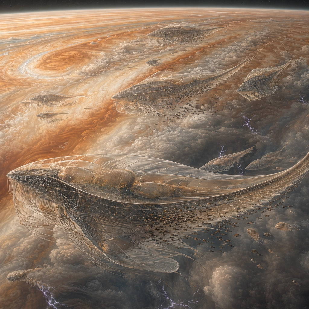
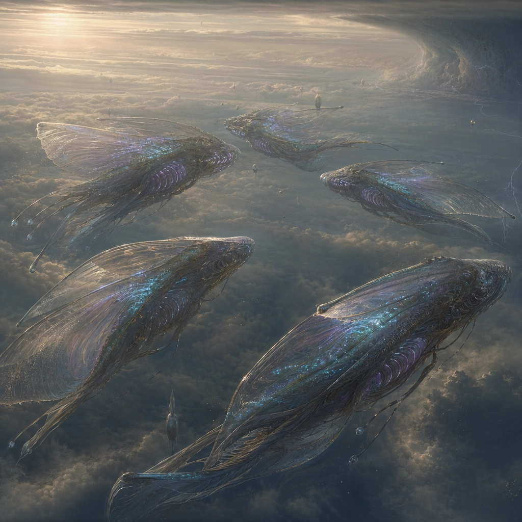
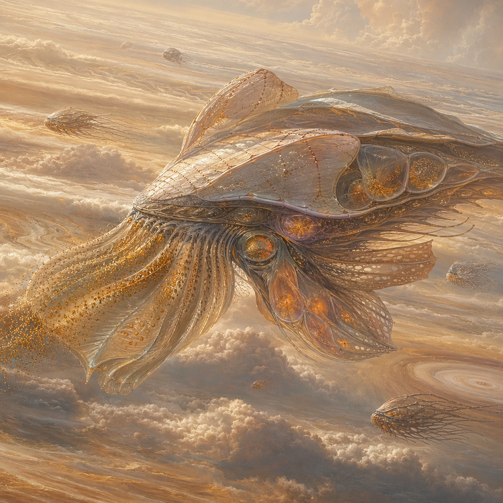
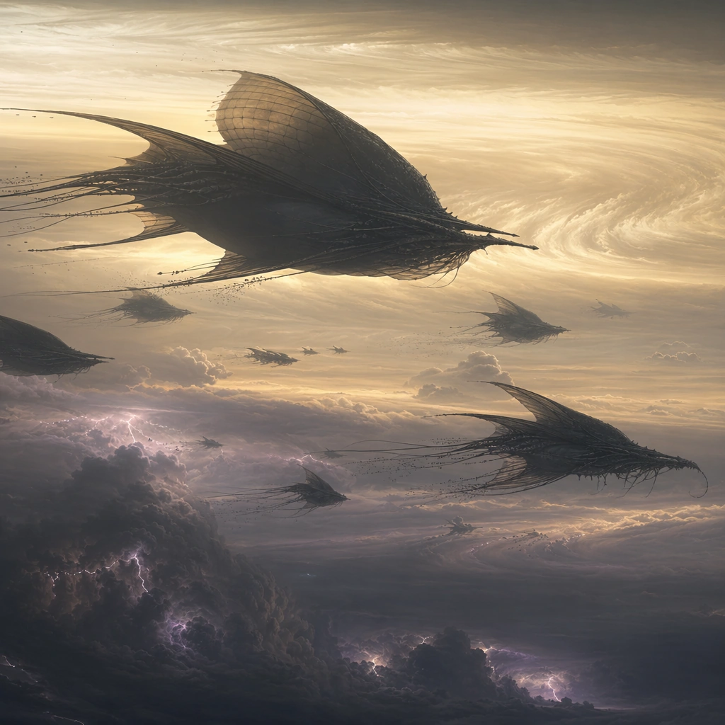
Example generated from “Jovian Cloud Whale Migration — Migration Band Overview”
GPT Image 2en

Scene: Create a remote wide view from a high observer platform above a Jupiter-like atmosphere, with vast orange, cream, and rust cloud bands curving beneath the square frame. Several enormous aerial leviathans should move in loose formation along one nutrient-rich band while distant lightning flickers far below. Build the frame as a square natural history study with disciplined composition, believable lighting, and enough environmental evidence to explain how this organism or system functions without any caption. Keep the image polished, observational, and suitable for a research gallery rather than pulp fantasy spectacle. Subject: Show the migration as purposeful and ecological: mature adults, smaller followers, and occasional symbiotic riders or cleaner swarms traveling together. The giants should read as buoyant lifeforms with translucent gas sacs, trailing fins, and filter structures adapted to atmospheric feeding. Show the anatomy, habitat interaction, and scale cues clearly so the viewer can infer locomotion, feeding, reproduction, or ecological role from the visual alone. Every visible structure should feel evolved for a purpose, with layered foreground, midground, and background information that rewards close inspection. Important details: Assume these giants maintain buoyancy with gas-filled tissues, membrane sails, and chemistry-driven metabolism in a dense upper atmosphere. Their behavior should respond to pressure bands, storm fronts, nutrient aerosols, and electrical weather rather than ocean analogies pasted into the sky. Scale is essential. Use curvature, storm depth, and atmospheric layering to make the animals feel hundreds of meters long without losing anatomical credibility. Avoid turning them into fantasy dragons or sea mammals dropped into the sky. Favor coherent biology over decorative excess: tissues, shells, membranes, spores, tendrils, fins, silica lattices, or atmospheric sacs should all follow one material logic. Preserve a convincing relationship between the environment and the body plan, use restrained color hierarchy, and make the image feel like a serious speculative field record rather than a random monster concept. Use case: Jovian Cloud Whale Migration single study 1/9. Constraints: No readable text, no watermark, no logos, preserve exact 1:1 aspect ratio, no spaceship battle, no Earth whale copy, no fantasy dragons, no hard mechanical surfaces, no accidental brand resemblance, no direct copy of known terrestrial species, no cartoon simplification.

Example generated from “Jovian Cloud Whale Migration — Juvenile Underbelly Close”
GPT Image 2en

Scene: Frame the viewer just beneath a passing juvenile giant, with its underbelly filling the upper part of the square and layered clouds dropping away below. Soft amber atmospheric light should filter through semi-translucent buoyancy tissues while storm shadows drift in the distance. Build the frame as a square natural history study with disciplined composition, believable lighting, and enough environmental evidence to explain how this organism or system functions without any caption. Keep the image polished, observational, and suitable for a research gallery rather than pulp fantasy spectacle. Subject: Focus on ventral filter folds, gas bladders, stabilizing fins, and sensory whisker structures shaped by dense air flow. The juvenile should look lighter and more flexible than an adult, with growth seams and less armored surfaces. Show the anatomy, habitat interaction, and scale cues clearly so the viewer can infer locomotion, feeding, reproduction, or ecological role from the visual alone. Every visible structure should feel evolved for a purpose, with layered foreground, midground, and background information that rewards close inspection. Important details: Assume these giants maintain buoyancy with gas-filled tissues, membrane sails, and chemistry-driven metabolism in a dense upper atmosphere. Their behavior should respond to pressure bands, storm fronts, nutrient aerosols, and electrical weather rather than ocean analogies pasted into the sky. Keep the anatomy aerodynamic and biologically coherent. Membranes should billow with pressure, tissues should show gradations of density, and the creature should feel born to swim through gas rather than water. Favor coherent biology over decorative excess: tissues, shells, membranes, spores, tendrils, fins, silica lattices, or atmospheric sacs should all follow one material logic. Preserve a convincing relationship between the environment and the body plan, use restrained color hierarchy, and make the image feel like a serious speculative field record rather than a random monster concept. Use case: Jovian Cloud Whale Migration single study 2/9. Constraints: No readable text, no watermark, no logos, preserve exact 1:1 aspect ratio, no dolphin face, no bird wings, no mechanical airship look, no cartoon expression, no accidental brand resemblance, no direct copy of known terrestrial species, no cartoon simplification.

Example generated from “Jovian Cloud Whale Migration — Storm Front Breach”
GPT Image 2en

Scene: Show a tense atmospheric crossing where a migration line meets the edge of a storm front. The square composition should hold bright cloud-top light on one side, deep bruised turbulence on the other, and layered lightning far below to emphasize vertical depth. Build the frame as a square natural history study with disciplined composition, believable lighting, and enough environmental evidence to explain how this organism or system functions without any caption. Keep the image polished, observational, and suitable for a research gallery rather than pulp fantasy spectacle. Subject: Feature several giants adjusting posture as they enter unstable air, with trailing fins tightening, buoyancy chambers compressing, and escort species clustering in their wake. The moment should capture adaptation to weather, not cinematic combat. Show the anatomy, habitat interaction, and scale cues clearly so the viewer can infer locomotion, feeding, reproduction, or ecological role from the visual alone. Every visible structure should feel evolved for a purpose, with layered foreground, midground, and background information that rewards close inspection. Important details: Assume these giants maintain buoyancy with gas-filled tissues, membrane sails, and chemistry-driven metabolism in a dense upper atmosphere. Their behavior should respond to pressure bands, storm fronts, nutrient aerosols, and electrical weather rather than ocean analogies pasted into the sky. The storm must feel meteorological and huge. Cloud density, turbulence, and electrical flashes should all inform how bodies orient and flex. Keep the animals graceful, heavy, and believable in motion. Favor coherent biology over decorative excess: tissues, shells, membranes, spores, tendrils, fins, silica lattices, or atmospheric sacs should all follow one material logic. Preserve a convincing relationship between the environment and the body plan, use restrained color hierarchy, and make the image feel like a serious speculative field record rather than a random monster concept. Use case: Jovian Cloud Whale Migration single study 3/9. Constraints: No readable text, no watermark, no logos, preserve exact 1:1 aspect ratio, no explosion effects, no battle scene, no superhero framing, no Earth thunderstorm horizon, no accidental brand resemblance, no direct copy of known terrestrial species, no cartoon simplification.

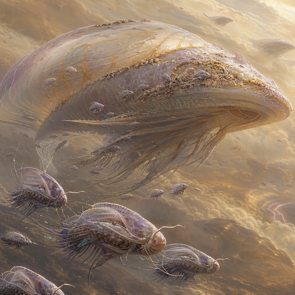
Example generated from “Jovian Cloud Whale Migration — Symbiont Cleaner Swarm”
GPT Image 2en

Scene: Compose a calm upper-atmosphere maintenance scene with one large giant nearly stationary relative to the frame and a swarm of small symbionts circling it in soft golden cloud light. The background should remain expansive and atmospheric, with layered cloud bands and no hard horizon. Build the frame as a square natural history study with disciplined composition, believable lighting, and enough environmental evidence to explain how this organism or system functions without any caption. Keep the image polished, observational, and suitable for a research gallery rather than pulp fantasy spectacle. Subject: Focus on the interaction between cleaner organisms and the host: parasites removed from membrane seams, mineral crust scraped from vents, and electrostatic debris harvested from the skin. The host should tolerate the swarm as part of normal migration ecology. Show the anatomy, habitat interaction, and scale cues clearly so the viewer can infer locomotion, feeding, reproduction, or ecological role from the visual alone. Every visible structure should feel evolved for a purpose, with layered foreground, midground, and background information that rewards close inspection. Important details: Assume these giants maintain buoyancy with gas-filled tissues, membrane sails, and chemistry-driven metabolism in a dense upper atmosphere. Their behavior should respond to pressure bands, storm fronts, nutrient aerosols, and electrical weather rather than ocean analogies pasted into the sky. The relationship should feel mutualistic and specific. Give the cleaners body plans suited to clinging in dense wind and harvesting surface resources, while the host skin shows wear, growth, and biofilm-like deposits that justify the behavior. Favor coherent biology over decorative excess: tissues, shells, membranes, spores, tendrils, fins, silica lattices, or atmospheric sacs should all follow one material logic. Preserve a convincing relationship between the environment and the body plan, use restrained color hierarchy, and make the image feel like a serious speculative field record rather than a random monster concept. Use case: Jovian Cloud Whale Migration single study 4/9. Constraints: No readable text, no watermark, no logos, preserve exact 1:1 aspect ratio, no fish-remora copy, no mechanical drones, no cute mascot swarm, no flat studio background, no accidental brand resemblance, no direct copy of known terrestrial species, no cartoon simplification.

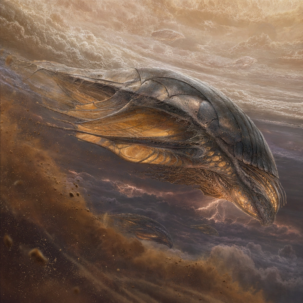
Example generated from “Jovian Cloud Whale Migration — Lightning Shadow Descent”
GPT Image 2en

Scene: Set the view on a dramatic but observational descent through stacked cloud layers, with an adult giant angling downward into darker atmospheric bands. Lightning should illuminate the underside of the scene intermittently, revealing depth without turning the image into a spectacle poster. Build the frame as a square natural history study with disciplined composition, believable lighting, and enough environmental evidence to explain how this organism or system functions without any caption. Keep the image polished, observational, and suitable for a research gallery rather than pulp fantasy spectacle. Subject: Show the adult’s ventral sails, ballast organs, and muscular steering ridges working together as it leaves calmer air for a chemically richer layer. The body should look heavier, older, and more scarred than juvenile forms. Show the anatomy, habitat interaction, and scale cues clearly so the viewer can infer locomotion, feeding, reproduction, or ecological role from the visual alone. Every visible structure should feel evolved for a purpose, with layered foreground, midground, and background information that rewards close inspection. Important details: Assume these giants maintain buoyancy with gas-filled tissues, membrane sails, and chemistry-driven metabolism in a dense upper atmosphere. Their behavior should respond to pressure bands, storm fronts, nutrient aerosols, and electrical weather rather than ocean analogies pasted into the sky. Use lighting to reveal function: membranes thin enough to glow at the edges, denser support tissues along load lines, and pressure-adapted contours that make sense in a fluid atmosphere. The descent should feel careful and energy-aware. Favor coherent biology over decorative excess: tissues, shells, membranes, spores, tendrils, fins, silica lattices, or atmospheric sacs should all follow one material logic. Preserve a convincing relationship between the environment and the body plan, use restrained color hierarchy, and make the image feel like a serious speculative field record rather than a random monster concept. Use case: Jovian Cloud Whale Migration single study 5/9. Constraints: No readable text, no watermark, no logos, preserve exact 1:1 aspect ratio, no monster attack pose, no aircraft comparison, no shark-like jaws, no fantasy god-ray dramatics, no accidental brand resemblance, no direct copy of known terrestrial species, no cartoon simplification.

Example generated from “Jovian Cloud Whale Migration — Mating Chorus Ring”
GPT Image 2en

Scene: Build a serene upper-atmosphere display scene where several adults circle one another in a broad ring through pale cloud, lit by soft lateral light from the high atmosphere above. The square frame should feel spacious and ritualized. Build the frame as a square natural history study with disciplined composition, believable lighting, and enough environmental evidence to explain how this organism or system functions without any caption. Keep the image polished, observational, and suitable for a research gallery rather than pulp fantasy spectacle. Subject: Focus on the coordinated posture of the adults: inflated resonance sacs, extended trailing fins, and synchronized color shifts or bioluminescent cues that suggest acoustic or electrical courtship. Keep the animals massive and dignified rather than theatrical. Show the anatomy, habitat interaction, and scale cues clearly so the viewer can infer locomotion, feeding, reproduction, or ecological role from the visual alone. Every visible structure should feel evolved for a purpose, with layered foreground, midground, and background information that rewards close inspection. Important details: Assume these giants maintain buoyancy with gas-filled tissues, membrane sails, and chemistry-driven metabolism in a dense upper atmosphere. Their behavior should respond to pressure bands, storm fronts, nutrient aerosols, and electrical weather rather than ocean analogies pasted into the sky. The display must arise from the species’ material and ecological logic. Show how membranes, gas volume, and atmospheric acoustics shape the courtship behavior, and avoid any ornamental fantasy plumage that lacks function. Favor coherent biology over decorative excess: tissues, shells, membranes, spores, tendrils, fins, silica lattices, or atmospheric sacs should all follow one material logic. Preserve a convincing relationship between the environment and the body plan, use restrained color hierarchy, and make the image feel like a serious speculative field record rather than a random monster concept. Use case: Jovian Cloud Whale Migration single study 6/9. Constraints: No readable text, no watermark, no logos, preserve exact 1:1 aspect ratio, no flock-of-birds copy, no ballroom symmetry, no heart-shape gimmick, no spectacle fireworks, no accidental brand resemblance, no direct copy of known terrestrial species, no cartoon simplification.

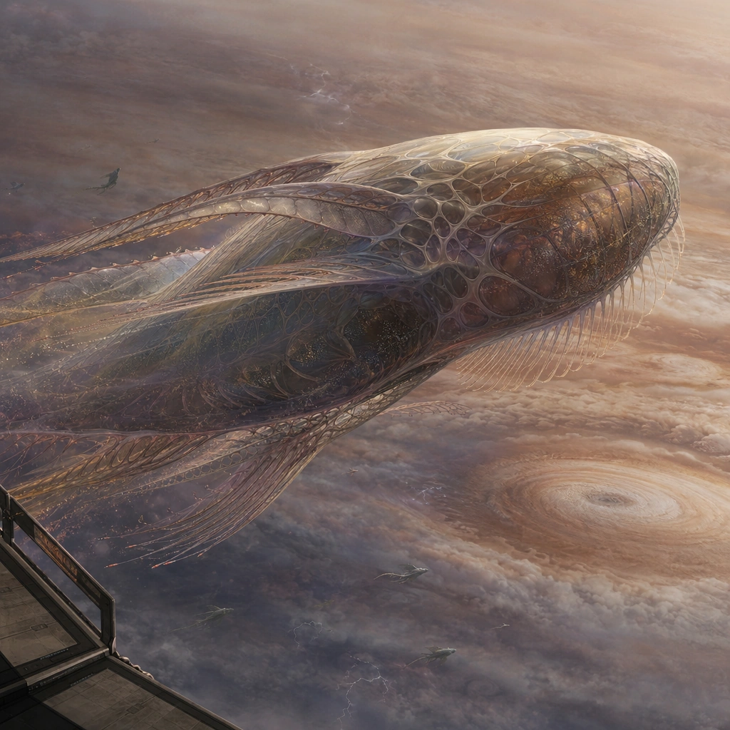
Example generated from “Jovian Cloud Whale Migration — Observer Platform Pass”
GPT Image 2en

Scene: Frame the scene from just outside a sparse observation platform looking into the open atmosphere, using the platform only as a subtle edge element for scale. One enormous migratory animal should pass nearby with the gas giant bands curving far below. Build the frame as a square natural history study with disciplined composition, believable lighting, and enough environmental evidence to explain how this organism or system functions without any caption. Keep the image polished, observational, and suitable for a research gallery rather than pulp fantasy spectacle. Subject: The giant should dominate the frame while still leaving room for the atmospheric backdrop. Show skin detail, fin articulation, and the slow confidence of a creature adapted to immense scale and long-distance movement. Show the anatomy, habitat interaction, and scale cues clearly so the viewer can infer locomotion, feeding, reproduction, or ecological role from the visual alone. Every visible structure should feel evolved for a purpose, with layered foreground, midground, and background information that rewards close inspection. Important details: Assume these giants maintain buoyancy with gas-filled tissues, membrane sails, and chemistry-driven metabolism in a dense upper atmosphere. Their behavior should respond to pressure bands, storm fronts, nutrient aerosols, and electrical weather rather than ocean analogies pasted into the sky. Use the platform sparingly; this remains a wildlife image, not a technology illustration. The purpose is to calibrate scale and texture while preserving the wonder and realism of upper-atmosphere biology. Favor coherent biology over decorative excess: tissues, shells, membranes, spores, tendrils, fins, silica lattices, or atmospheric sacs should all follow one material logic. Preserve a convincing relationship between the environment and the body plan, use restrained color hierarchy, and make the image feel like a serious speculative field record rather than a random monster concept. Use case: Jovian Cloud Whale Migration single study 7/9. Constraints: No readable text, no watermark, no logos, preserve exact 1:1 aspect ratio, no cockpit interior, no military hardware, no space battle, no readable instrument text, no accidental brand resemblance, no direct copy of known terrestrial species, no cartoon simplification.

Example generated from “Jovian Cloud Whale Migration — High Altitude Feeding”
GPT Image 2en

Scene: Show a bright upper-band feeding zone where sunlight diffuses through thin aerosols and paints the clouds in pale gold and cream. The square frame should feel cleaner and calmer than the storm images, with subtle ribboning that indicates nutrient-rich flow. Build the frame as a square natural history study with disciplined composition, believable lighting, and enough environmental evidence to explain how this organism or system functions without any caption. Keep the image polished, observational, and suitable for a research gallery rather than pulp fantasy spectacle. Subject: Focus on one individual opening broad filter membranes and channeling aerosol-rich gas through internal processing chambers. Small attendant organisms and particulate streaks can help explain flow direction and feeding efficiency. Show the anatomy, habitat interaction, and scale cues clearly so the viewer can infer locomotion, feeding, reproduction, or ecological role from the visual alone. Every visible structure should feel evolved for a purpose, with layered foreground, midground, and background information that rewards close inspection. Important details: Assume these giants maintain buoyancy with gas-filled tissues, membrane sails, and chemistry-driven metabolism in a dense upper atmosphere. Their behavior should respond to pressure bands, storm fronts, nutrient aerosols, and electrical weather rather than ocean analogies pasted into the sky. Make the feeding method visually understandable through body mechanics, membrane shape, and cloud chemistry cues. This is atmospheric grazing, not predatory action, so keep the mood patient and ecological. Favor coherent biology over decorative excess: tissues, shells, membranes, spores, tendrils, fins, silica lattices, or atmospheric sacs should all follow one material logic. Preserve a convincing relationship between the environment and the body plan, use restrained color hierarchy, and make the image feel like a serious speculative field record rather than a random monster concept. Use case: Jovian Cloud Whale Migration single study 8/9. Constraints: No readable text, no watermark, no logos, preserve exact 1:1 aspect ratio, no baleen whale copy, no vacuum-machine look, no Earth sky blue, no mechanical intake vents, no accidental brand resemblance, no direct copy of known terrestrial species, no cartoon simplification.

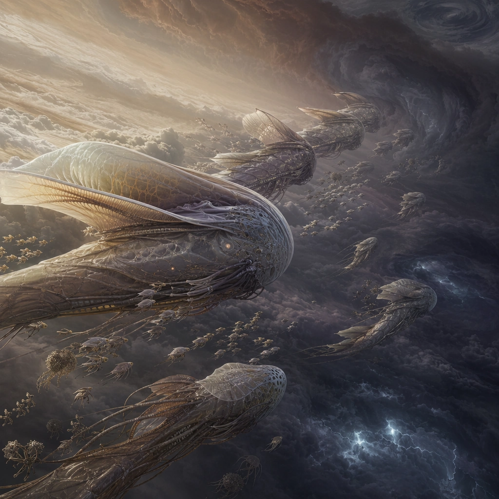
Example generated from “Jovian Cloud Whale Migration — Dawn Band Silhouettes”
GPT Image 2en

Scene: Finish with a dawn silhouette scene where the migration ribbon is seen in profile against luminous upper clouds and darker storm belts below. The square composition should feel quiet and monumental, emphasizing procession more than detail. Build the frame as a square natural history study with disciplined composition, believable lighting, and enough environmental evidence to explain how this organism or system functions without any caption. Keep the image polished, observational, and suitable for a research gallery rather than pulp fantasy spectacle. Subject: Show multiple giants at staggered distances so their differing sizes, life stages, and glide postures read as one living procession. Even in silhouette, their buoyancy organs and trailing fins should remain distinct and biologically specific. Show the anatomy, habitat interaction, and scale cues clearly so the viewer can infer locomotion, feeding, reproduction, or ecological role from the visual alone. Every visible structure should feel evolved for a purpose, with layered foreground, midground, and background information that rewards close inspection. Important details: Assume these giants maintain buoyancy with gas-filled tissues, membrane sails, and chemistry-driven metabolism in a dense upper atmosphere. Their behavior should respond to pressure bands, storm fronts, nutrient aerosols, and electrical weather rather than ocean analogies pasted into the sky. Use restrained lighting and spacing to convey a migratory system spanning enormous atmospheric distance. The image should feel like the closing plate of a planetary wildlife atlas, not a logo or fantasy banner. Favor coherent biology over decorative excess: tissues, shells, membranes, spores, tendrils, fins, silica lattices, or atmospheric sacs should all follow one material logic. Preserve a convincing relationship between the environment and the body plan, use restrained color hierarchy, and make the image feel like a serious speculative field record rather than a random monster concept. Use case: Jovian Cloud Whale Migration single study 9/9. Constraints: No readable text, no watermark, no logos, preserve exact 1:1 aspect ratio, no text-like silhouettes, no graphic poster flattening, no city skyline, no abstract wallpaper look, no accidental brand resemblance, no direct copy of known terrestrial species, no cartoon simplification.

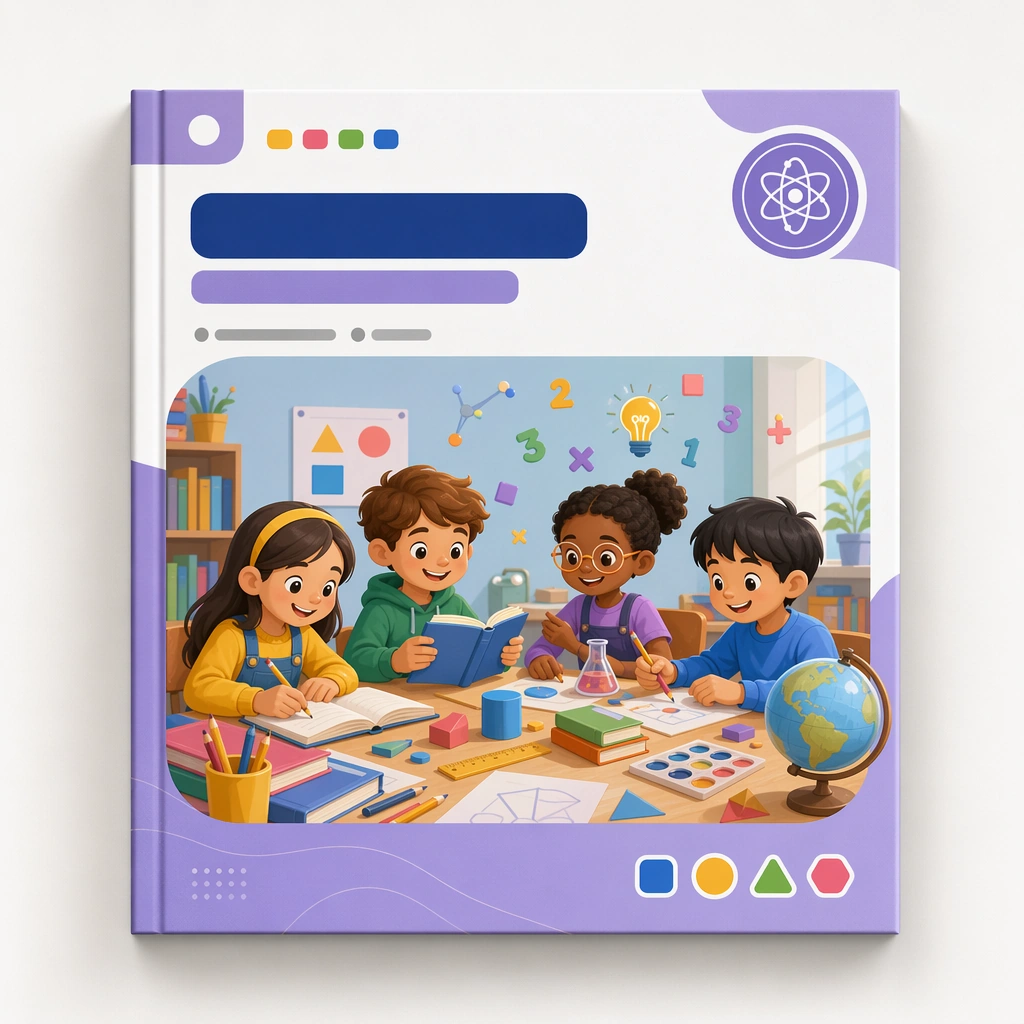
Example generated from “Kids Course Cover And Module Family — Reference Master Cover”
GPT Image 2en

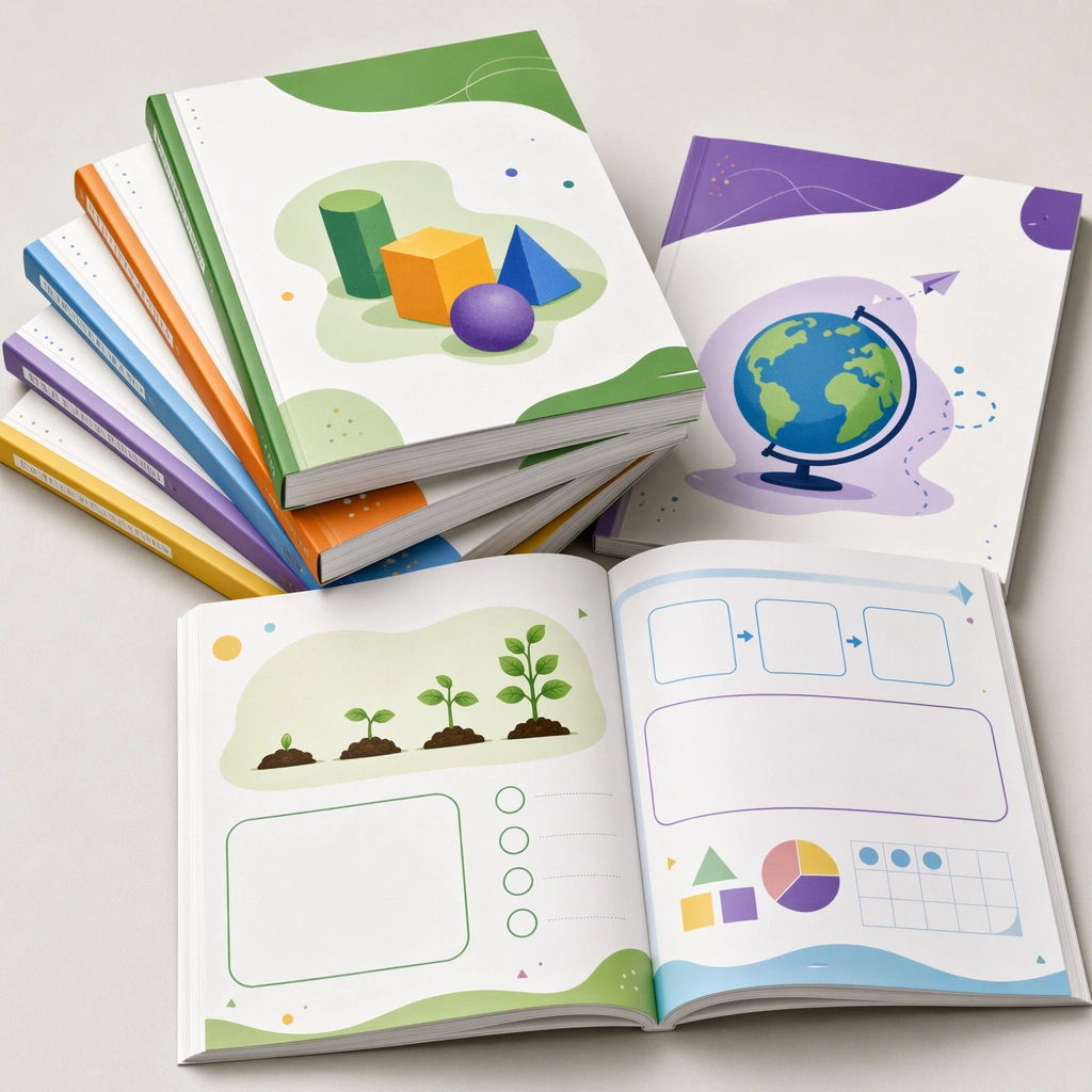
Scene: Create a square course-cover mockup centered on one hero cover card or workbook front against a clean studio background with soft shadows and premium print realism. The cover should feel suitable for a real education platform, with blank title zones, category markers, and a clear visual hierarchy that can repeat across a product family. Keep the square frame balanced, calm, and production-ready so the asset can serve gallery review, research comparison, and real educational delivery at the same time. Subject: Use a cheerful but structured illustration featuring children, learning tools, and a modular subject world arranged inside a disciplined frame. The visual must feel specific enough for curriculum branding and flexible enough to branch into many subjects and age bands. The subject matter should feel intentionally selected for a coherent curriculum family rather than like a random decorative assortment. Important details: Lock a repeatable system: cover frame, badge placement, illustration window, color accents, and whitespace proportions. The design should communicate quality, consistency, and easy browsing across a curriculum shelf. Preserve the same cover frame, subject badge placement, illustration ratio, color hierarchy, and blank title-zone architecture from the reference cover. Use variation only in the teaching content, supporting props, and scene-specific mood while preserving the core visual system exactly. Use case: Kids Course Cover and Module Family series study 1/4, reference master cover. Constraints: No readable text, no watermark, no logos, preserve exact 1:1 aspect ratio, no readable course titles, no logos, no brand mascots from existing IP, no cluttered marketplace graphics, no fake awards, no generic stock-book covers.

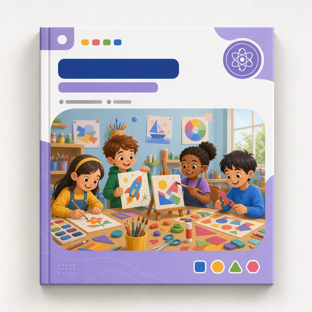
Example generated from “Kids Course Cover And Module Family — Art Adventure Cover”
GPT Image 2en

Scene: Keep the same square cover presentation, studio backdrop, and print realism established by the reference cover. The asset should look like the second module in the same educational series, maintaining identical proportions, framing, and packaging discipline. Keep the square frame balanced, calm, and production-ready so the asset can serve gallery review, research comparison, and real educational delivery at the same time. Subject: Shift the illustration content toward painting tools, collage shapes, clay, easels, and joyful making gestures, all staged inside the same cover architecture and blank labeling zones. The cover should feel energetic but still tightly controlled. The subject matter should feel intentionally selected for a coherent curriculum family rather than like a random decorative assortment. Important details: Preserve the full reference system, including frame, badge placement, illustration ratio, and palette hierarchy. Let the subject matter provide the variation while the product identity remains unmistakably stable. Preserve the same cover frame, subject badge placement, illustration ratio, color hierarchy, and blank title-zone architecture from the reference cover. Use variation only in the teaching content, supporting props, and scene-specific mood while preserving the core visual system exactly. Use case: Kids Course Cover and Module Family series study 2/4, art adventure cover. Constraints: No readable text, no watermark, no logos, preserve exact 1:1 aspect ratio, no readable course titles, no logos, no brand mascots from existing IP, no cluttered marketplace graphics, no fake awards, no generic stock-book covers.

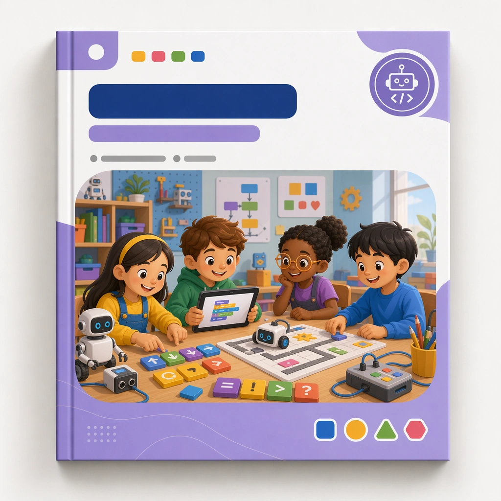
Example generated from “Kids Course Cover And Module Family — Junior Coding Cover”
GPT Image 2en

Scene: Render the same square cover mockup again with identical lighting, shadow depth, and presentation style from the reference image. It should clearly belong to the same curriculum line while speaking to a different learning domain. Keep the square frame balanced, calm, and production-ready so the asset can serve gallery review, research comparison, and real educational delivery at the same time. Subject: Use visual cues such as block commands, robots, pathways, logic tiles, and friendly screens inside the same modular cover frame. The scene should feel smart and child-accessible rather than tech-corporate or game-like. The subject matter should feel intentionally selected for a coherent curriculum family rather than like a random decorative assortment. Important details: Hold the reference system tightly: same cover structure, blank title area, badge behavior, and browsing clarity. The variation should come from the learning metaphors and supporting icons, not from redesigning the entire package. Preserve the same cover frame, subject badge placement, illustration ratio, color hierarchy, and blank title-zone architecture from the reference cover. Use variation only in the teaching content, supporting props, and scene-specific mood while preserving the core visual system exactly. Use case: Kids Course Cover and Module Family series study 3/4, junior coding cover. Constraints: No readable text, no watermark, no logos, preserve exact 1:1 aspect ratio, no readable course titles, no logos, no brand mascots from existing IP, no cluttered marketplace graphics, no fake awards, no generic stock-book covers.

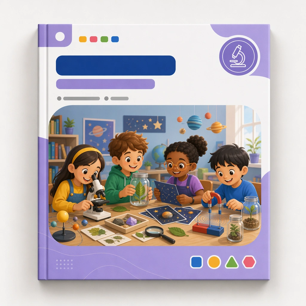
Example generated from “Kids Course Cover And Module Family — Science Discovery Cover”
GPT Image 2en

Scene: Return to the same square cover mockup and premium print presentation, now focused on a science discovery module. The image should feel like a third category card in a coherent shelf-ready family built for a kids education business. Keep the square frame balanced, calm, and production-ready so the asset can serve gallery review, research comparison, and real educational delivery at the same time. Subject: Use microscopes, leaves, stars, magnets, jars, and curious observation scenes inside the same structured cover frame, with blank label zones and a stable badge position. The cover should feel exploratory and educational without becoming noisy or generic. The subject matter should feel intentionally selected for a coherent curriculum family rather than like a random decorative assortment. Important details: Preserve the entire reference system while shifting the subject universe. The final sequence should prove that the cover family can support multiple disciplines and still look like one intentional product line. Preserve the same cover frame, subject badge placement, illustration ratio, color hierarchy, and blank title-zone architecture from the reference cover. Use variation only in the teaching content, supporting props, and scene-specific mood while preserving the core visual system exactly. Use case: Kids Course Cover and Module Family series study 4/4, science discovery cover. Constraints: No readable text, no watermark, no logos, preserve exact 1:1 aspect ratio, no readable course titles, no logos, no brand mascots from existing IP, no cluttered marketplace graphics, no fake awards, no generic stock-book covers.

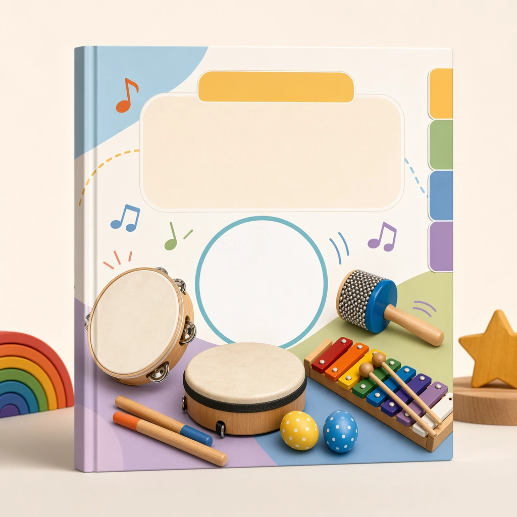
Example generated from “Kids Course Cover And Module Family — Music Rhythm Cover”
GPT Image 2en

Scene: Show a square course-cover product shot with the same premium print realism and balanced shadow as a polished curriculum listing image. The cover should feel distinct in subject matter yet clearly built for the same education marketplace. Keep the square frame balanced, calm, and production-ready so the asset can serve gallery review, research comparison, and real educational delivery at the same time. Subject: Use percussion, notes represented as abstract icons, movement cues, and child-scale instruments arranged in one clean composition with blank title areas and category tabs. The cover should communicate rhythm and joy without visual chaos. The subject arrangement should feel complete and self-contained, able to stand alone as a real supporting deliverable inside the same education business line. Important details: Emphasize shelf clarity and brand stability. The asset should feel like one dependable module in a large educational library. Keep the visual hierarchy modular, commercially believable, and clearly tied to a real educational use case rather than a generic mood board. Use case: Kids Course Cover and Module Family single study 2/5, music rhythm cover. Constraints: No readable text, no watermark, no logos, preserve exact 1:1 aspect ratio, no readable course names, no logos, no fake ratings, no crowded marketplace clutter, no generic stock templates, no IP likeness.

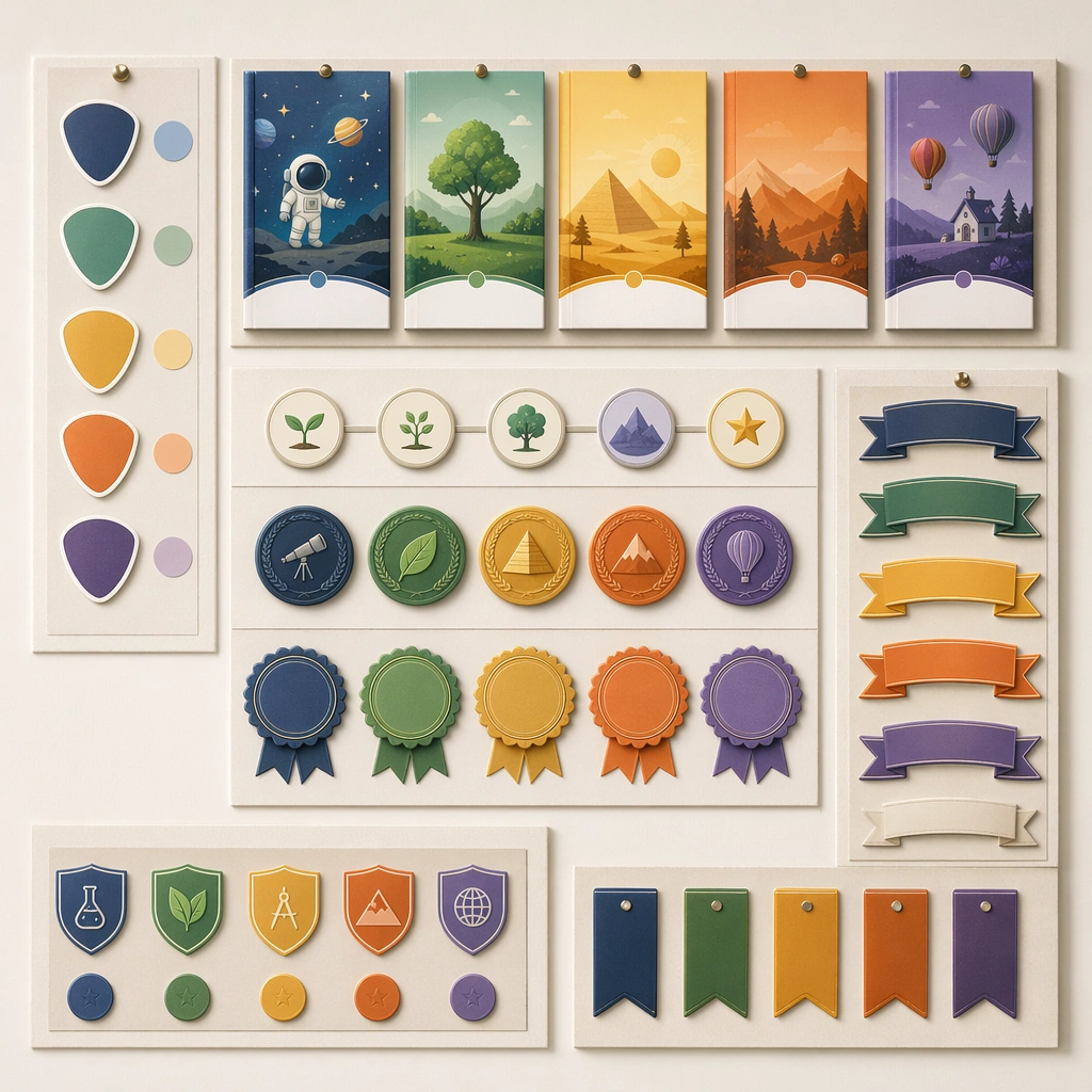
Example generated from “Kids Course Cover And Module Family — Credential Badge Board”
GPT Image 2en

Scene: Create a square editorial board showing course badges, completion seals, module markers, and cover snippets pinned on a neutral backdrop. The composition should feel like a curriculum-brand system presentation, crisp and intentionally organized. Keep the square frame balanced, calm, and production-ready so the asset can serve gallery review, research comparison, and real educational delivery at the same time. Subject: Use shape-coded subject markers, progress emblems, reward medallions, and blank ribbons arranged with obvious hierarchy. The visual should support browsing, completion, and motivation without drifting into flashy game UI. The subject arrangement should feel complete and self-contained, able to stand alone as a real supporting deliverable inside the same education business line. Important details: Keep the board modular and product-minded. It should show that the cover family can expand into adjacent identity assets while staying coherent and educational. Keep the visual hierarchy modular, commercially believable, and clearly tied to a real educational use case rather than a generic mood board. Use case: Kids Course Cover and Module Family single study 3/5, credential badge board. Constraints: No readable text, no watermark, no logos, preserve exact 1:1 aspect ratio, no readable course names, no logos, no fake ratings, no crowded marketplace clutter, no generic stock templates, no IP likeness.

Example generated from “Kids Course Cover And Module Family — Homepage Course Shelf”
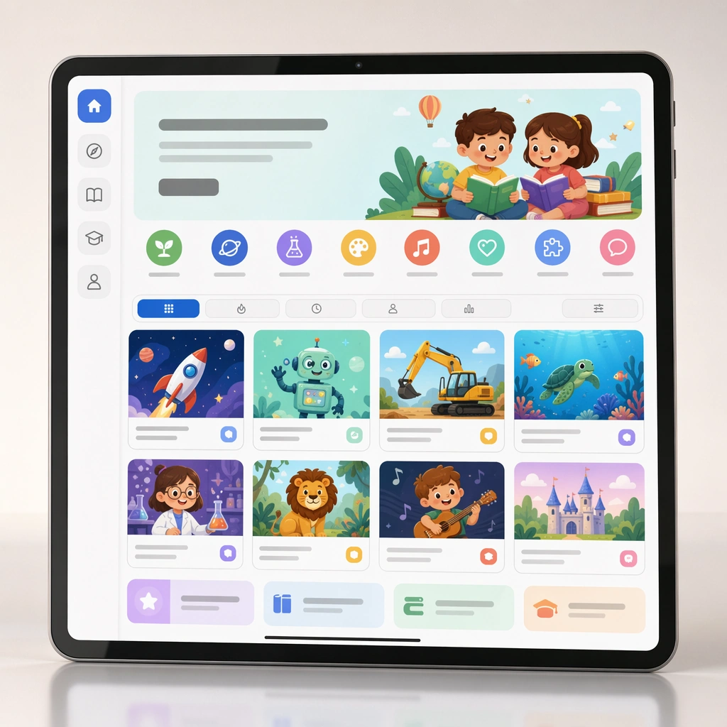
GPT Image 2en

Scene: Render a square digital-product mockup showing a course homepage on a tablet or desktop crop with a clean backdrop and polished reflections. The layout should feel like a real education-platform storefront, organized and inviting for parents. Keep the square frame balanced, calm, and production-ready so the asset can serve gallery review, research comparison, and real educational delivery at the same time. Subject: Display multiple course covers in a structured shelf, with filter chips, category icons, and preview cards that remain blank where text would go. The browsing experience should feel curated and easy to understand without any readable labels. The subject arrangement should feel complete and self-contained, able to stand alone as a real supporting deliverable inside the same education business line. Important details: Favor clear information architecture and strong card hierarchy. The scene should prove that the course-cover system works not only as individual covers but also as a scalable browsing environment. Keep the visual hierarchy modular, commercially believable, and clearly tied to a real educational use case rather than a generic mood board. Use case: Kids Course Cover and Module Family single study 4/5, homepage course shelf. Constraints: No readable text, no watermark, no logos, preserve exact 1:1 aspect ratio, no readable course names, no logos, no fake ratings, no crowded marketplace clutter, no generic stock templates, no IP likeness.

Example generated from “Kids Course Cover And Module Family — Workbook Stack”
GPT Image 2en

Scene: Show a square product photograph of several stacked workbooks on a light studio surface, with clean daylight and subtle shadows emphasizing thickness, binding, and cover finish. The image should feel retail-ready and plausible for an education publisher or course platform. Keep the square frame balanced, calm, and production-ready so the asset can serve gallery review, research comparison, and real educational delivery at the same time. Subject: Use a small stack of subject-varied workbooks, each with one disciplined cover design from the same product family. Add one slightly opened book to reveal interior activity pages with blank module zones and gentle supporting graphics. The subject arrangement should feel complete and self-contained, able to stand alone as a real supporting deliverable inside the same education business line. Important details: Keep the composition orderly and commercially sharp. The stack should communicate depth of curriculum and real product value, not just visual style. Keep the visual hierarchy modular, commercially believable, and clearly tied to a real educational use case rather than a generic mood board. Use case: Kids Course Cover and Module Family single study 5/5, workbook stack. Constraints: No readable text, no watermark, no logos, preserve exact 1:1 aspect ratio, no readable course names, no logos, no fake ratings, no crowded marketplace clutter, no generic stock templates, no IP likeness.

Example generated from “Korean Minimal Beauty Retail Language — Reference Anchor”
GPT Image 2en

Scene: Create a square reference image for Korean Minimal Beauty Retail Language. Build a reference anchor establishing the core system with a premium, production-ready finish. Use a polished modular board or campaign surface with clean spacing, premium game-UI finish, and clear focal hierarchy. The composition should feel intentional, clean, and reusable for gallery, research, campaign, or internal handoff contexts. Lighting must support readability first, with the main forms clearly separated from the background and enough breathing room for the system to stay legible at both hero scale and thumbnail scale. Subject: Center a coherent original game-art system built for premium production and marketing surfaces. For this image, focus on reference anchor. Keep the same system logic stable across screenshots, cards, banners, and overview boards. This image is the canonical anchor that later series images must follow. The viewer should immediately understand what role this surface plays inside a cohesive game-production asset pack. Important details: Lock framing, icon grammar, palette blocking, and surface hierarchy so the kit feels production-ready and consistent. Preserve the core silhouette, framing language, and material logic from the reference image while each variation changes function. Keep materials believable, edge hierarchy disciplined, and the visual language consistent with K-Beauty Minimal. Use abstract interface blocks or diagram accents when helpful, but avoid any readable language. The final result should feel like a deliberate production asset rather than a random illustration. Use case: Korean Minimal Beauty Retail Language series study 1/9, designed as reference anchor within a cohesive asset pack. Constraints: No readable text, no watermark, no logos, preserve exact 1:1 aspect ratio, no unrelated objects, no broken visual hierarchy, no malformed anatomy or broken perspective, no random decorative clutter.
Example generated from “Korean Minimal Beauty Retail Language — Variant One”
GPT Image 2en

Scene: Create a square dependent image for Korean Minimal Beauty Retail Language. Build a first controlled variation in the same system with a premium, production-ready finish. Use a polished modular board or campaign surface with clean spacing, premium game-UI finish, and clear focal hierarchy. The composition should feel intentional, clean, and reusable for gallery, research, campaign, or internal handoff contexts. Lighting must support readability first, with the main forms clearly separated from the background and enough breathing room for the system to stay legible at both hero scale and thumbnail scale. Subject: Center a coherent original game-art system built for premium production and marketing surfaces. For this image, focus on the intended support surface. Keep the same system logic stable across screenshots, cards, banners, and overview boards. Preserve exact identity or system logic from the reference image while changing only the intended variation axis. The viewer should immediately understand what role this surface plays inside a cohesive game-production asset pack. Important details: Lock framing, icon grammar, palette blocking, and surface hierarchy so the kit feels production-ready and consistent. Preserve the core silhouette, framing language, and material logic from the reference image while each variation changes function. Keep materials believable, edge hierarchy disciplined, and the visual language consistent with K-Beauty Minimal. Use abstract interface blocks or diagram accents when helpful, but avoid any readable language. The final result should feel like a deliberate production asset rather than a random illustration. Use case: Korean Minimal Beauty Retail Language series study 2/9, designed as variant one within a cohesive asset pack. Constraints: No readable text, no watermark, no logos, preserve exact 1:1 aspect ratio, no unrelated objects, no broken visual hierarchy, no malformed anatomy or broken perspective, no random decorative clutter.
Example generated from “Korean Minimal Beauty Retail Language — Variant Two”
GPT Image 2en

Scene: Create a square dependent image for Korean Minimal Beauty Retail Language. Build a second controlled variation in the same system with a premium, production-ready finish. Use a polished modular board or campaign surface with clean spacing, premium game-UI finish, and clear focal hierarchy. The composition should feel intentional, clean, and reusable for gallery, research, campaign, or internal handoff contexts. Lighting must support readability first, with the main forms clearly separated from the background and enough breathing room for the system to stay legible at both hero scale and thumbnail scale. Subject: Center a coherent original game-art system built for premium production and marketing surfaces. For this image, focus on the intended support surface. Keep the same system logic stable across screenshots, cards, banners, and overview boards. Preserve exact identity or system logic from the reference image while changing only the intended variation axis. The viewer should immediately understand what role this surface plays inside a cohesive game-production asset pack. Important details: Lock framing, icon grammar, palette blocking, and surface hierarchy so the kit feels production-ready and consistent. Preserve the core silhouette, framing language, and material logic from the reference image while each variation changes function. Keep materials believable, edge hierarchy disciplined, and the visual language consistent with K-Beauty Minimal. Use abstract interface blocks or diagram accents when helpful, but avoid any readable language. The final result should feel like a deliberate production asset rather than a random illustration. Use case: Korean Minimal Beauty Retail Language series study 3/9, designed as variant two within a cohesive asset pack. Constraints: No readable text, no watermark, no logos, preserve exact 1:1 aspect ratio, no unrelated objects, no broken visual hierarchy, no malformed anatomy or broken perspective, no random decorative clutter.
Example generated from “Korean Minimal Beauty Retail Language — Variant Three”
GPT Image 2en

Scene: Create a square dependent image for Korean Minimal Beauty Retail Language. Build a third controlled variation in the same system with a premium, production-ready finish. Use a polished modular board or campaign surface with clean spacing, premium game-UI finish, and clear focal hierarchy. The composition should feel intentional, clean, and reusable for gallery, research, campaign, or internal handoff contexts. Lighting must support readability first, with the main forms clearly separated from the background and enough breathing room for the system to stay legible at both hero scale and thumbnail scale. Subject: Center a coherent original game-art system built for premium production and marketing surfaces. For this image, focus on the intended support surface. Keep the same system logic stable across screenshots, cards, banners, and overview boards. Preserve exact identity or system logic from the reference image while changing only the intended variation axis. The viewer should immediately understand what role this surface plays inside a cohesive game-production asset pack. Important details: Lock framing, icon grammar, palette blocking, and surface hierarchy so the kit feels production-ready and consistent. Preserve the core silhouette, framing language, and material logic from the reference image while each variation changes function. Keep materials believable, edge hierarchy disciplined, and the visual language consistent with K-Beauty Minimal. Use abstract interface blocks or diagram accents when helpful, but avoid any readable language. The final result should feel like a deliberate production asset rather than a random illustration. Use case: Korean Minimal Beauty Retail Language series study 4/9, designed as variant three within a cohesive asset pack. Constraints: No readable text, no watermark, no logos, preserve exact 1:1 aspect ratio, no unrelated objects, no broken visual hierarchy, no malformed anatomy or broken perspective, no random decorative clutter.
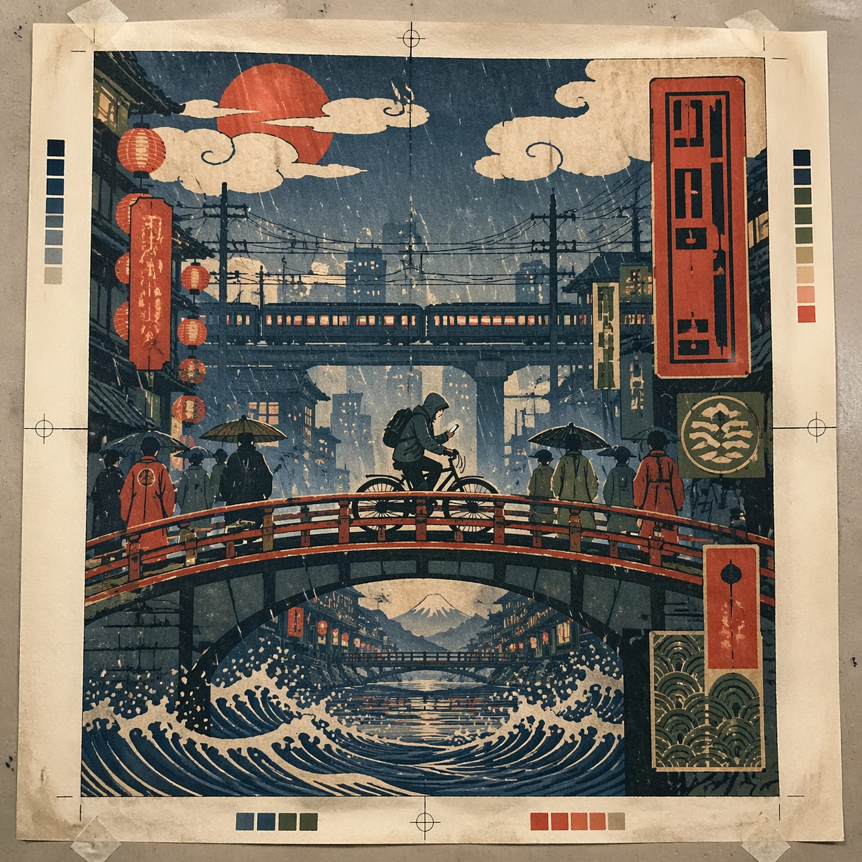
Example generated from “Korean Minimal Beauty Retail Language — Support One”
GPT Image 2en

Scene: Create a square standalone support image for Korean Minimal Beauty Retail Language. Build a support-surface study with a clear focal hierarchy and a finished professional surface. Use a polished modular board or campaign surface with clean spacing, premium game-UI finish, and clear focal hierarchy. The frame should feel self-contained and polished, with enough structure to explain the system even without the reference series, yet still obviously belonging to the same theme and production world. Subject: Show a coherent original game-art system built for premium production and marketing surfaces in a way that emphasizes the intended support surface. Keep the same system logic stable across screenshots, cards, banners, and overview boards. Even though this image is independent, the viewer should still recognize the same universe, same commercial logic, and same production intent as the core package. Important details: Lock framing, icon grammar, palette blocking, and surface hierarchy so the kit feels production-ready and consistent. Preserve the broader theme language through color, framing, material choices, and modular composition. Use clean panel rhythm, premium asset presentation, and believable detail density. The image should work equally well as a gallery study, research reference, and mock production deliverable. Use case: Korean Minimal Beauty Retail Language single study 5/9, exploring support one as a support surface. Constraints: No readable text, no watermark, no logos, preserve exact 1:1 aspect ratio, no unrelated objects, no broken visual hierarchy, no visual noise that obscures the main surface, no accidental brand resemblance.
Example generated from “Korean Minimal Beauty Retail Language — Support Two”
GPT Image 2en

Scene: Create a square standalone support image for Korean Minimal Beauty Retail Language. Build a second support-surface study with a clear focal hierarchy and a finished professional surface. Use a polished modular board or campaign surface with clean spacing, premium game-UI finish, and clear focal hierarchy. The frame should feel self-contained and polished, with enough structure to explain the system even without the reference series, yet still obviously belonging to the same theme and production world. Subject: Show a coherent original game-art system built for premium production and marketing surfaces in a way that emphasizes the intended support surface. Keep the same system logic stable across screenshots, cards, banners, and overview boards. Even though this image is independent, the viewer should still recognize the same universe, same commercial logic, and same production intent as the core package. Important details: Lock framing, icon grammar, palette blocking, and surface hierarchy so the kit feels production-ready and consistent. Preserve the broader theme language through color, framing, material choices, and modular composition. Use clean panel rhythm, premium asset presentation, and believable detail density. The image should work equally well as a gallery study, research reference, and mock production deliverable. Use case: Korean Minimal Beauty Retail Language single study 6/9, exploring support two as a support surface. Constraints: No readable text, no watermark, no logos, preserve exact 1:1 aspect ratio, no unrelated objects, no broken visual hierarchy, no visual noise that obscures the main surface, no accidental brand resemblance.

Example generated from “Korean Minimal Beauty Retail Language — Support Three”
GPT Image 2en

Scene: Create a square standalone support image for Korean Minimal Beauty Retail Language. Build a third support-surface study with a clear focal hierarchy and a finished professional surface. Use a polished modular board or campaign surface with clean spacing, premium game-UI finish, and clear focal hierarchy. The frame should feel self-contained and polished, with enough structure to explain the system even without the reference series, yet still obviously belonging to the same theme and production world. Subject: Show a coherent original game-art system built for premium production and marketing surfaces in a way that emphasizes the intended support surface. Keep the same system logic stable across screenshots, cards, banners, and overview boards. Even though this image is independent, the viewer should still recognize the same universe, same commercial logic, and same production intent as the core package. Important details: Lock framing, icon grammar, palette blocking, and surface hierarchy so the kit feels production-ready and consistent. Preserve the broader theme language through color, framing, material choices, and modular composition. Use clean panel rhythm, premium asset presentation, and believable detail density. The image should work equally well as a gallery study, research reference, and mock production deliverable. Use case: Korean Minimal Beauty Retail Language single study 7/9, exploring support three as a support surface. Constraints: No readable text, no watermark, no logos, preserve exact 1:1 aspect ratio, no unrelated objects, no broken visual hierarchy, no visual noise that obscures the main surface, no accidental brand resemblance.

Example generated from “Korean Minimal Beauty Retail Language — Support Four”
GPT Image 2en

Scene: Create a square standalone support image for Korean Minimal Beauty Retail Language. Build a fourth support-surface study with a clear focal hierarchy and a finished professional surface. Use a polished modular board or campaign surface with clean spacing, premium game-UI finish, and clear focal hierarchy. The frame should feel self-contained and polished, with enough structure to explain the system even without the reference series, yet still obviously belonging to the same theme and production world. Subject: Show a coherent original game-art system built for premium production and marketing surfaces in a way that emphasizes the intended support surface. Keep the same system logic stable across screenshots, cards, banners, and overview boards. Even though this image is independent, the viewer should still recognize the same universe, same commercial logic, and same production intent as the core package. Important details: Lock framing, icon grammar, palette blocking, and surface hierarchy so the kit feels production-ready and consistent. Preserve the broader theme language through color, framing, material choices, and modular composition. Use clean panel rhythm, premium asset presentation, and believable detail density. The image should work equally well as a gallery study, research reference, and mock production deliverable. Use case: Korean Minimal Beauty Retail Language single study 8/9, exploring support four as a support surface. Constraints: No readable text, no watermark, no logos, preserve exact 1:1 aspect ratio, no unrelated objects, no broken visual hierarchy, no visual noise that obscures the main surface, no accidental brand resemblance.

Example generated from “Korean Minimal Beauty Retail Language — Support Five”
GPT Image 2en

Scene: Create a square standalone support image for Korean Minimal Beauty Retail Language. Build a fifth support-surface study with a clear focal hierarchy and a finished professional surface. Use a polished modular board or campaign surface with clean spacing, premium game-UI finish, and clear focal hierarchy. The frame should feel self-contained and polished, with enough structure to explain the system even without the reference series, yet still obviously belonging to the same theme and production world. Subject: Show a coherent original game-art system built for premium production and marketing surfaces in a way that emphasizes the intended support surface. Keep the same system logic stable across screenshots, cards, banners, and overview boards. Even though this image is independent, the viewer should still recognize the same universe, same commercial logic, and same production intent as the core package. Important details: Lock framing, icon grammar, palette blocking, and surface hierarchy so the kit feels production-ready and consistent. Preserve the broader theme language through color, framing, material choices, and modular composition. Use clean panel rhythm, premium asset presentation, and believable detail density. The image should work equally well as a gallery study, research reference, and mock production deliverable. Use case: Korean Minimal Beauty Retail Language single study 9/9, exploring support five as a support surface. Constraints: No readable text, no watermark, no logos, preserve exact 1:1 aspect ratio, no unrelated objects, no broken visual hierarchy, no visual noise that obscures the main surface, no accidental brand resemblance.