PROMPTY · TWÓRCZE ODKRYWANIE

Galeria promptów

Odkrywaj prawdziwe prompty i wygenerowane przykłady. Znajdź inspirację do kolejnej twórczej misji i kopiuj pełne prompty bezpłatnie.

Przykłady
10,974
Modele
17
Źródła
1277
10 974 przykładów promptów · strona 60 z 229
Example generated from “Banksy Street Satire — Behind the Scenes Board”
GPT Image 2en

Scene: A square campaign image designed for distribution, with bold focal hierarchy, strong color blocking, and cinematic energy. The framing should read instantly from a distance while still rewarding close inspection with layered secondary details and coherent scene logic. Subject: The subject is a campaign-ready visual system for anonymous stencil street satire. Build the frame from anonymous stencil street satire. A Prompt Atlas theme for anonymous stencil street satire Street Satire, testing reasoning- composition, style- transfer with GPT Image 2.. anonymous stencil street satire. Focus on concrete visual elements, believable material behavior, and layered subject hierarchy so the result feels authored instead of template-like. Process-style support board without literal text. Important details: This is an independent support study inside the same theme, so it should feel related in visual language without relying on a runtime reference image. Keep the concept specific to anonymous stencil street satire, with concrete forms and believable relationships between primary subject, support elements, and background structure. Avoid visual noise. Every secondary detail should reinforce the main idea instead of competing with it. The composition should feel immediately legible and impressive, with a self-explaining core idea and enough finish to work without heavy post-production. Use case: anonymous stencil street satire single study 8/9 for Prompt Atlas. Constraints: No readable text, no watermark, no logos, preserve exact 1:1 aspect ratio, no irrelevant brand marks, no generic clip-art simplification, no broken anatomy, no muddy lighting, no random collage fragments, no empty background without purpose.

Example generated from “Banksy Street Satire — Recap Cover Panel”
GPT Image 2en

Scene: A square campaign image designed for distribution, with bold focal hierarchy, strong color blocking, and cinematic energy. The framing should read instantly from a distance while still rewarding close inspection with layered secondary details and coherent scene logic. Subject: The subject is a campaign-ready visual system for anonymous stencil street satire. Build the frame from anonymous stencil street satire. A Prompt Atlas theme for anonymous stencil street satire Street Satire, testing reasoning- composition, style- transfer with GPT Image 2.. anonymous stencil street satire. Focus on concrete visual elements, believable material behavior, and layered subject hierarchy so the result feels authored instead of template-like. Square recap or after-event cover image. Important details: This is an independent support study inside the same theme, so it should feel related in visual language without relying on a runtime reference image. Keep the concept specific to anonymous stencil street satire, with concrete forms and believable relationships between primary subject, support elements, and background structure. Avoid visual noise. Every secondary detail should reinforce the main idea instead of competing with it. The composition should feel immediately legible and impressive, with a self-explaining core idea and enough finish to work without heavy post-production. Use case: anonymous stencil street satire single study 9/9 for Prompt Atlas. Constraints: No readable text, no watermark, no logos, preserve exact 1:1 aspect ratio, no irrelevant brand marks, no generic clip-art simplification, no broken anatomy, no muddy lighting, no random collage fragments, no empty background without purpose.
Example generated from “Baroque Bestiary Candlelight — Ram Herald”
GPT Image 2en

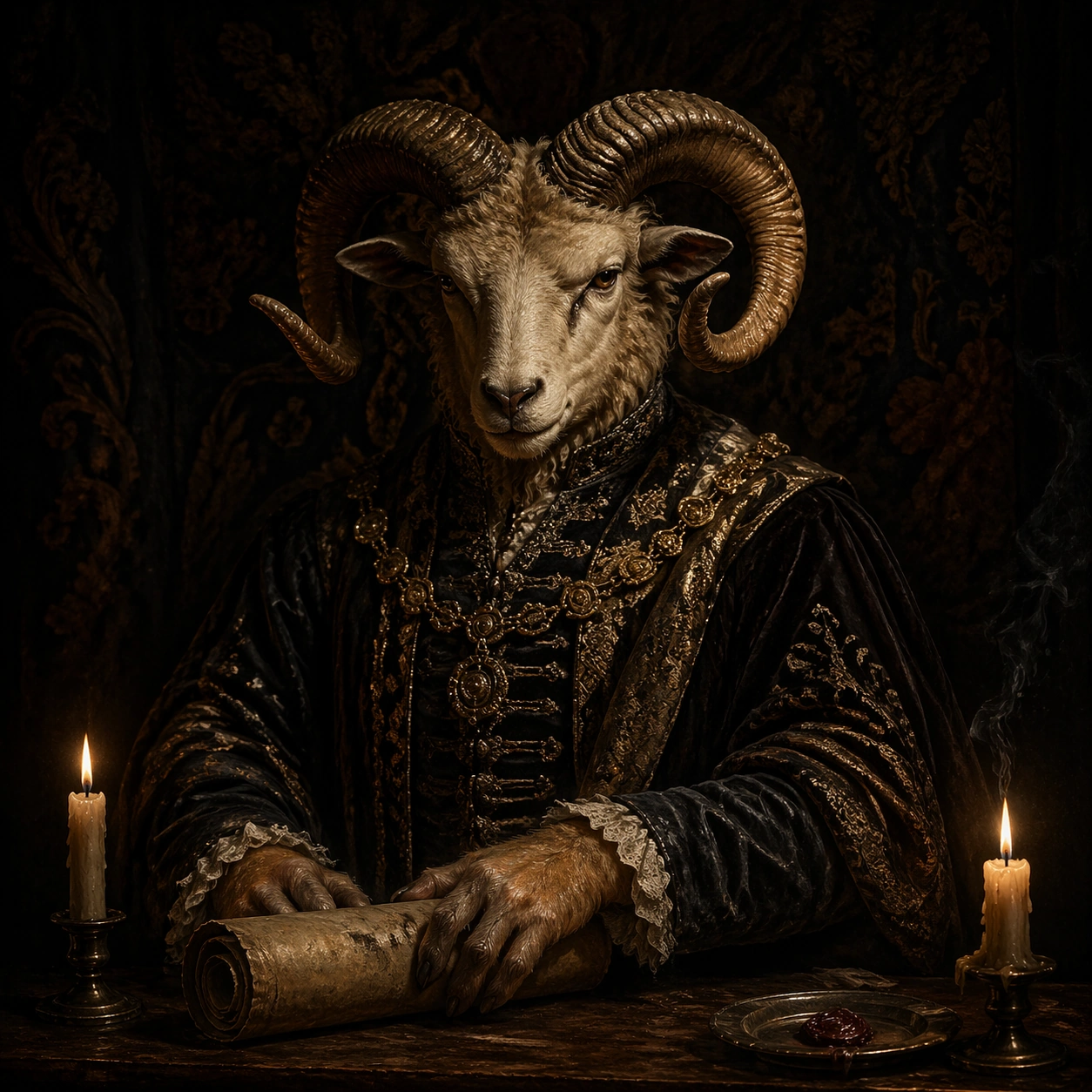
Scene: A square portrait staged in a dark chamber lit by candles, embers, or a single hidden lantern, with heavy shadows, warm ochre skin tones, black velvet darkness, and a painterly yet physically believable material presence. The frame should feel ceremonial, intimate, and heavy with air, fabric, and oil-rich color. Stage the portrait against a near-black tapestry with two low candles and a table edge holding a wax seal dish. Subject: The subject is a fantastical humanoid beast presented with aristocratic gravity: horned, feathered, scaled, furred, or antlered, dressed in ornate garments and posed as if for an old court portrait. The creature should feel specific, dignified, and psychologically readable rather than monstrous chaos. A ram-headed herald in brocade coat and tarnished chain rests one hand on a rolled parchment tube, looking toward the viewer with ceremonial patience. Important details: The visual law is baroque portrait discipline fused with invented natural history. Preserve luxurious fabric folds, worn metal embroidery, candle smoke, skin texture, fur detail, and solemn hand placement. Avoid cartoon exaggeration, playful fantasy tropes, or bright modern polish. Let the horns carry subtle weathering and the velvet sleeves absorb light so the face remains the true focal point. Use case: Baroque Bestiary Candlelight single study 1/9. Constraints: No readable text, no watermark, no logos, preserve exact 1:1 aspect ratio, no crowns copied from real regalia, no readable heraldic text, no slapstick fantasy, no modern makeup styling, no glossy digital sheen, no broken anatomy, no low-detail background, no accidental text fragments.

Example generated from “Baroque Bestiary Candlelight — Heron Cardinal”
GPT Image 2en

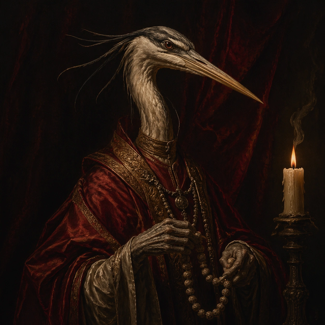
Scene: A square portrait staged in a dark chamber lit by candles, embers, or a single hidden lantern, with heavy shadows, warm ochre skin tones, black velvet darkness, and a painterly yet physically believable material presence. The frame should feel ceremonial, intimate, and heavy with air, fabric, and oil-rich color. Use a narrow crimson drape backdrop and a side candle that carves the neck and beak from darkness. Subject: The subject is a fantastical humanoid beast presented with aristocratic gravity: horned, feathered, scaled, furred, or antlered, dressed in ornate garments and posed as if for an old court portrait. The creature should feel specific, dignified, and psychologically readable rather than monstrous chaos. A long-necked heron-like cleric in layered red robes holds a rosary-like string of carved seeds, projecting austere spiritual authority. Important details: The visual law is baroque portrait discipline fused with invented natural history. Preserve luxurious fabric folds, worn metal embroidery, candle smoke, skin texture, fur detail, and solemn hand placement. Avoid cartoon exaggeration, playful fantasy tropes, or bright modern polish. Keep the beak elegant, the robe folds weighty, and the candle edge light thin enough to preserve mystery. Use case: Baroque Bestiary Candlelight single study 2/9. Constraints: No readable text, no watermark, no logos, preserve exact 1:1 aspect ratio, no crowns copied from real regalia, no readable heraldic text, no slapstick fantasy, no modern makeup styling, no glossy digital sheen, no broken anatomy, no low-detail background, no accidental text fragments.

Example generated from “Baroque Bestiary Candlelight — Lion Archivist”
GPT Image 2en

Scene: A square portrait staged in a dark chamber lit by candles, embers, or a single hidden lantern, with heavy shadows, warm ochre skin tones, black velvet darkness, and a painterly yet physically believable material presence. The frame should feel ceremonial, intimate, and heavy with air, fabric, and oil-rich color. Place the figure beside a shadowed cabinet of drawers and a brass reading stand under amber candle glow. Subject: The subject is a fantastical humanoid beast presented with aristocratic gravity: horned, feathered, scaled, furred, or antlered, dressed in ornate garments and posed as if for an old court portrait. The creature should feel specific, dignified, and psychologically readable rather than monstrous chaos. A lion-faced archivist in worn scholar robes holds a tiny magnifier over an illuminated specimen card, with mane texture emerging from the dark. Important details: The visual law is baroque portrait discipline fused with invented natural history. Preserve luxurious fabric folds, worn metal embroidery, candle smoke, skin texture, fur detail, and solemn hand placement. Avoid cartoon exaggeration, playful fantasy tropes, or bright modern polish. The portrait should balance beastly strength with librarian calm, using paper edges and brass fittings as quiet status symbols. Use case: Baroque Bestiary Candlelight single study 3/9. Constraints: No readable text, no watermark, no logos, preserve exact 1:1 aspect ratio, no crowns copied from real regalia, no readable heraldic text, no slapstick fantasy, no modern makeup styling, no glossy digital sheen, no broken anatomy, no low-detail background, no accidental text fragments.

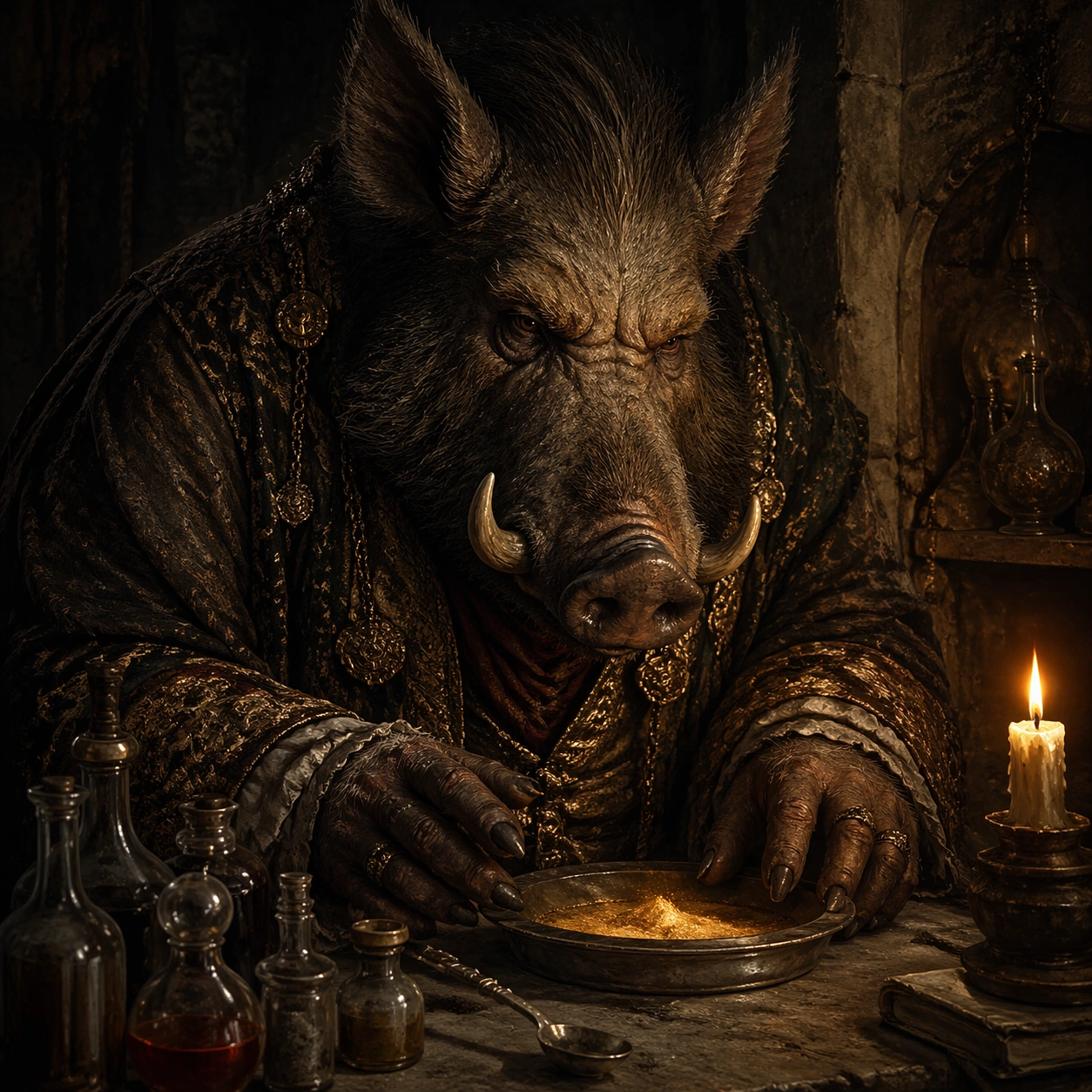
Example generated from “Baroque Bestiary Candlelight — Boar Alchemist”
GPT Image 2en

Scene: A square portrait staged in a dark chamber lit by candles, embers, or a single hidden lantern, with heavy shadows, warm ochre skin tones, black velvet darkness, and a painterly yet physically believable material presence. The frame should feel ceremonial, intimate, and heavy with air, fabric, and oil-rich color. Frame a stone worktable with glass vials, an iron spoon, and one guttering candle beside a cracked wall niche. Subject: The subject is a fantastical humanoid beast presented with aristocratic gravity: horned, feathered, scaled, furred, or antlered, dressed in ornate garments and posed as if for an old court portrait. The creature should feel specific, dignified, and psychologically readable rather than monstrous chaos. A boar-faced alchemist in stained damask sleeves leans forward protectively over a shallow dish of glowing mineral powder. Important details: The visual law is baroque portrait discipline fused with invented natural history. Preserve luxurious fabric folds, worn metal embroidery, candle smoke, skin texture, fur detail, and solemn hand placement. Avoid cartoon exaggeration, playful fantasy tropes, or bright modern polish. Make the powders and glass feel tangible but secondary to the heavy brow, tusks, and serious concentration of the sitter. Use case: Baroque Bestiary Candlelight single study 4/9. Constraints: No readable text, no watermark, no logos, preserve exact 1:1 aspect ratio, no crowns copied from real regalia, no readable heraldic text, no slapstick fantasy, no modern makeup styling, no glossy digital sheen, no broken anatomy, no low-detail background, no accidental text fragments.

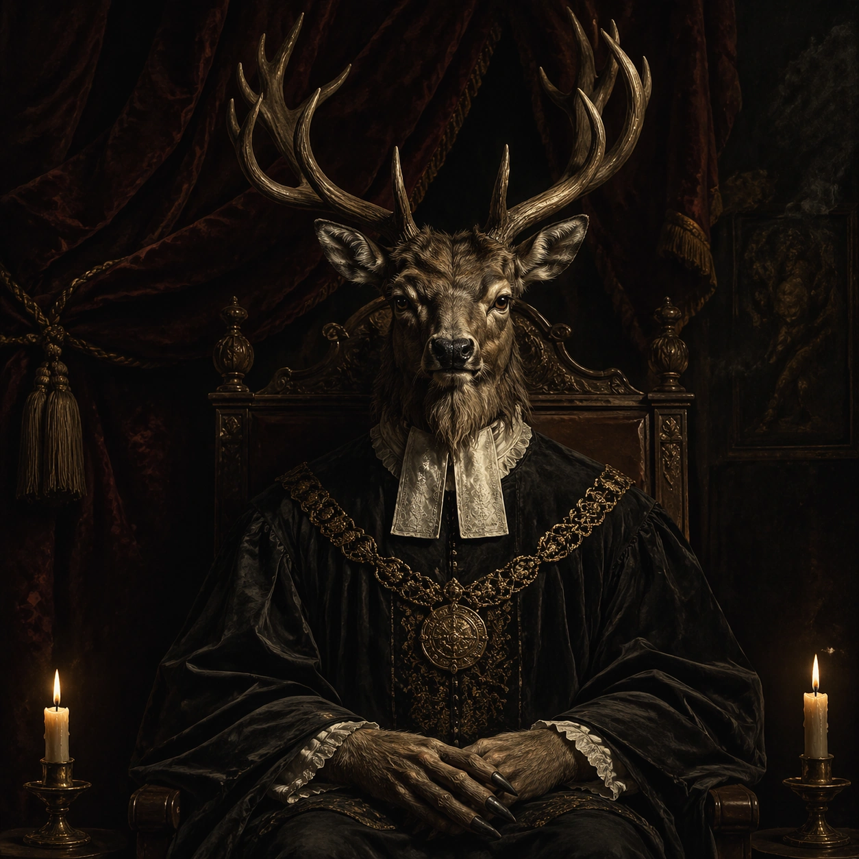
Example generated from “Baroque Bestiary Candlelight — Stag Magistrate”
GPT Image 2en

Scene: A square portrait staged in a dark chamber lit by candles, embers, or a single hidden lantern, with heavy shadows, warm ochre skin tones, black velvet darkness, and a painterly yet physically believable material presence. The frame should feel ceremonial, intimate, and heavy with air, fabric, and oil-rich color. Use a judicial chamber with a dark oak chair, velvet curtain, and two faint candles low in the frame. Subject: The subject is a fantastical humanoid beast presented with aristocratic gravity: horned, feathered, scaled, furred, or antlered, dressed in ornate garments and posed as if for an old court portrait. The creature should feel specific, dignified, and psychologically readable rather than monstrous chaos. A stag-antlered magistrate in black robe and white collar sits upright with hands folded, presenting judgment without motion. Important details: The visual law is baroque portrait discipline fused with invented natural history. Preserve luxurious fabric folds, worn metal embroidery, candle smoke, skin texture, fur detail, and solemn hand placement. Avoid cartoon exaggeration, playful fantasy tropes, or bright modern polish. The antlers should create a formal crown-like silhouette, but the emotional tone must remain grave and human. Use case: Baroque Bestiary Candlelight single study 5/9. Constraints: No readable text, no watermark, no logos, preserve exact 1:1 aspect ratio, no crowns copied from real regalia, no readable heraldic text, no slapstick fantasy, no modern makeup styling, no glossy digital sheen, no broken anatomy, no low-detail background, no accidental text fragments.

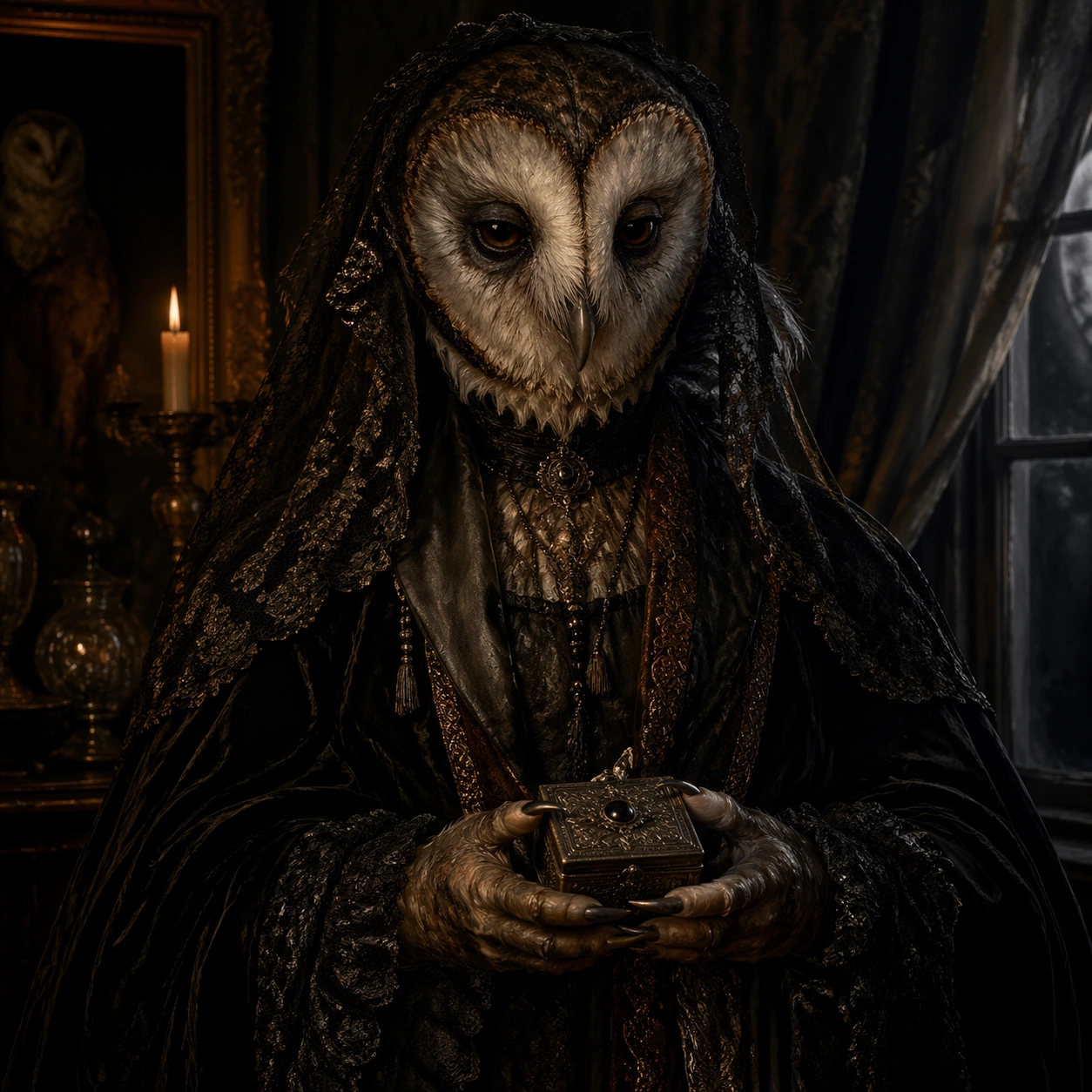
Example generated from “Baroque Bestiary Candlelight — Owl Widow”
GPT Image 2en

Scene: A square portrait staged in a dark chamber lit by candles, embers, or a single hidden lantern, with heavy shadows, warm ochre skin tones, black velvet darkness, and a painterly yet physically believable material presence. The frame should feel ceremonial, intimate, and heavy with air, fabric, and oil-rich color. Stage the portrait near a curtained window where candlelight and a sliver of moonlight barely separate the figure from the room. Subject: The subject is a fantastical humanoid beast presented with aristocratic gravity: horned, feathered, scaled, furred, or antlered, dressed in ornate garments and posed as if for an old court portrait. The creature should feel specific, dignified, and psychologically readable rather than monstrous chaos. An owl-faced widow in layered black lace holds a small ring box closed in both hands, staring with exhausted intelligence. Important details: The visual law is baroque portrait discipline fused with invented natural history. Preserve luxurious fabric folds, worn metal embroidery, candle smoke, skin texture, fur detail, and solemn hand placement. Avoid cartoon exaggeration, playful fantasy tropes, or bright modern polish. Favor quiet textures such as lace, feather edge, dried tears of wax, and dusty wood over theatrical action. Use case: Baroque Bestiary Candlelight single study 6/9. Constraints: No readable text, no watermark, no logos, preserve exact 1:1 aspect ratio, no crowns copied from real regalia, no readable heraldic text, no slapstick fantasy, no modern makeup styling, no glossy digital sheen, no broken anatomy, no low-detail background, no accidental text fragments.

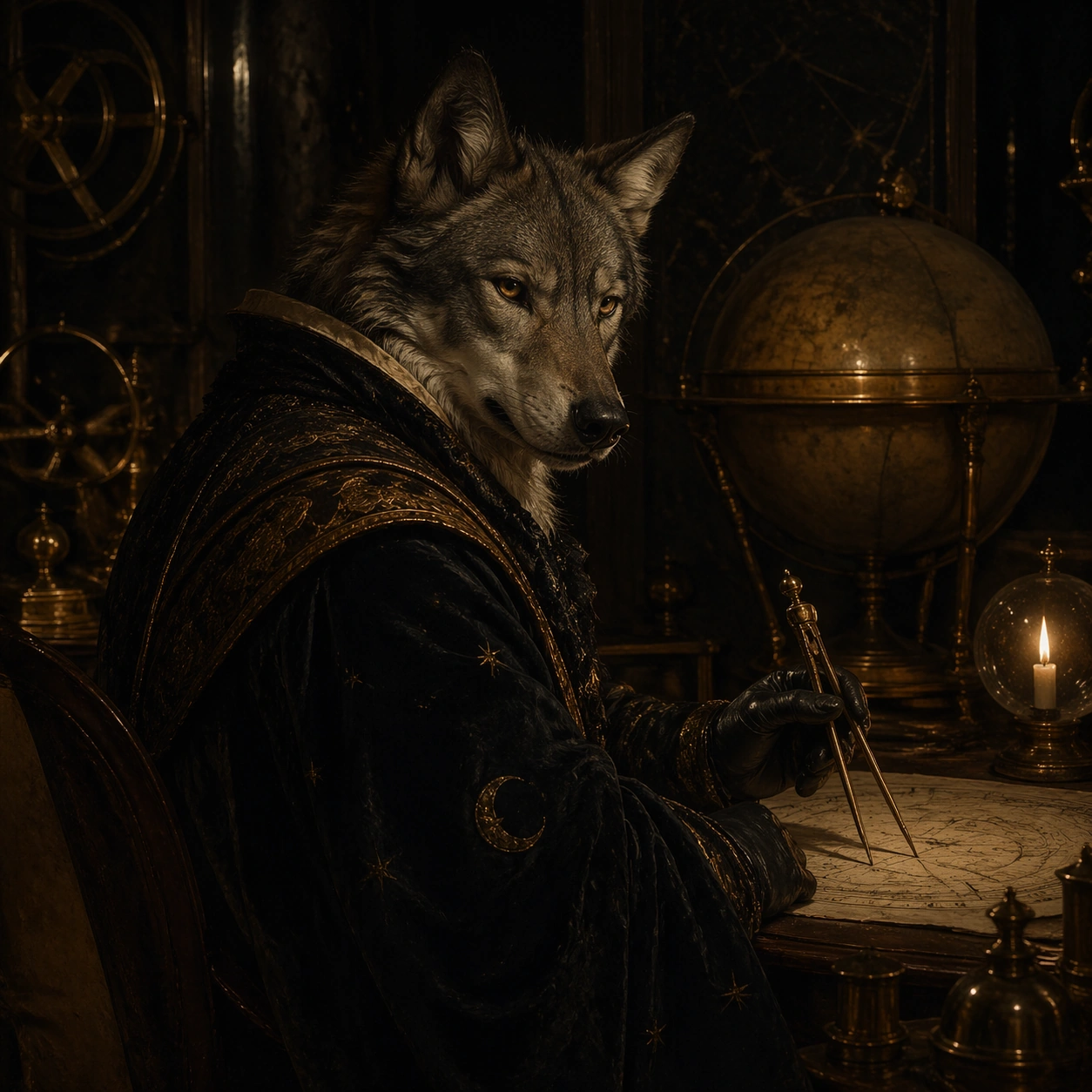
Example generated from “Baroque Bestiary Candlelight — Wolf Astronomer”
GPT Image 2en

Scene: A square portrait staged in a dark chamber lit by candles, embers, or a single hidden lantern, with heavy shadows, warm ochre skin tones, black velvet darkness, and a painterly yet physically believable material presence. The frame should feel ceremonial, intimate, and heavy with air, fabric, and oil-rich color. Use a dim observatory study with brass dividers, a star globe, and a candle reflecting off smoked glass. Subject: The subject is a fantastical humanoid beast presented with aristocratic gravity: horned, feathered, scaled, furred, or antlered, dressed in ornate garments and posed as if for an old court portrait. The creature should feel specific, dignified, and psychologically readable rather than monstrous chaos. A wolf-faced astronomer in night robe turns slightly toward the viewer while one gloved hand steadies a charting compass. Important details: The visual law is baroque portrait discipline fused with invented natural history. Preserve luxurious fabric folds, worn metal embroidery, candle smoke, skin texture, fur detail, and solemn hand placement. Avoid cartoon exaggeration, playful fantasy tropes, or bright modern polish. The room should feel scholarly and nocturnal, with brass instruments serving as quiet satellites around the main portrait. Use case: Baroque Bestiary Candlelight single study 7/9. Constraints: No readable text, no watermark, no logos, preserve exact 1:1 aspect ratio, no crowns copied from real regalia, no readable heraldic text, no slapstick fantasy, no modern makeup styling, no glossy digital sheen, no broken anatomy, no low-detail background, no accidental text fragments.

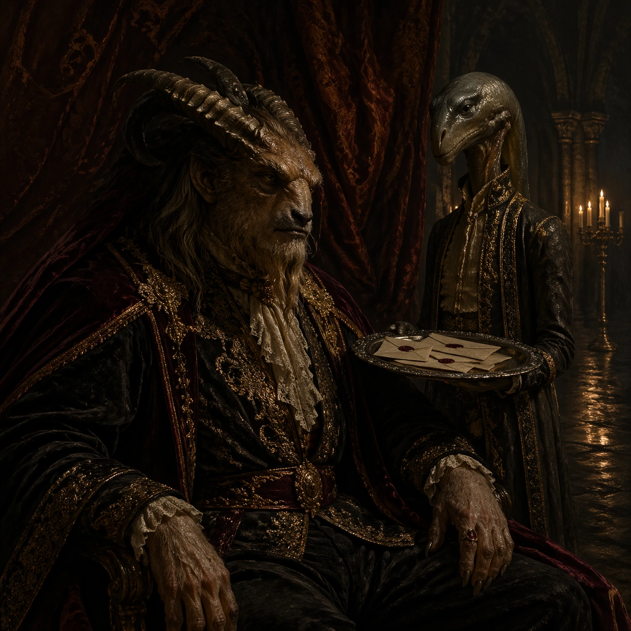
Example generated from “Baroque Bestiary Candlelight — Eel Chamberlain”
GPT Image 2en

Scene: A square portrait staged in a dark chamber lit by candles, embers, or a single hidden lantern, with heavy shadows, warm ochre skin tones, black velvet darkness, and a painterly yet physically believable material presence. The frame should feel ceremonial, intimate, and heavy with air, fabric, and oil-rich color. Set the image in a damp stone hall with candelabras reflected on glossy floor patches and a heavy curtain behind the sitter. Subject: The subject is a fantastical humanoid beast presented with aristocratic gravity: horned, feathered, scaled, furred, or antlered, dressed in ornate garments and posed as if for an old court portrait. The creature should feel specific, dignified, and psychologically readable rather than monstrous chaos. An eel-skinned chamberlain in embroidered courtwear holds a silver tray with sealed correspondence, their elongated face both elegant and unsettling. Important details: The visual law is baroque portrait discipline fused with invented natural history. Preserve luxurious fabric folds, worn metal embroidery, candle smoke, skin texture, fur detail, and solemn hand placement. Avoid cartoon exaggeration, playful fantasy tropes, or bright modern polish. Preserve the slippery skin sheen carefully so it feels organic, not plastic, and keep the embroidery rich but worn. Use case: Baroque Bestiary Candlelight single study 8/9. Constraints: No readable text, no watermark, no logos, preserve exact 1:1 aspect ratio, no crowns copied from real regalia, no readable heraldic text, no slapstick fantasy, no modern makeup styling, no glossy digital sheen, no broken anatomy, no low-detail background, no accidental text fragments.

Example generated from “Baroque Bestiary Candlelight — Moth Empress”
GPT Image 2en

Scene: A square portrait staged in a dark chamber lit by candles, embers, or a single hidden lantern, with heavy shadows, warm ochre skin tones, black velvet darkness, and a painterly yet physically believable material presence. The frame should feel ceremonial, intimate, and heavy with air, fabric, and oil-rich color. Close on a throne alcove with deep burgundy cloth, one central candle cluster, and ash drifting through the darkness. Subject: The subject is a fantastical humanoid beast presented with aristocratic gravity: horned, feathered, scaled, furred, or antlered, dressed in ornate garments and posed as if for an old court portrait. The creature should feel specific, dignified, and psychologically readable rather than monstrous chaos. A moth-faced empress with powdery wings folded like a mantle sits frontally in richly stitched robes, projecting soft but absolute authority. Important details: The visual law is baroque portrait discipline fused with invented natural history. Preserve luxurious fabric folds, worn metal embroidery, candle smoke, skin texture, fur detail, and solemn hand placement. Avoid cartoon exaggeration, playful fantasy tropes, or bright modern polish. Keep the wings velvety and fragile, with the face lit enough to reveal expression without flattening the mystery. Use case: Baroque Bestiary Candlelight single study 9/9. Constraints: No readable text, no watermark, no logos, preserve exact 1:1 aspect ratio, no crowns copied from real regalia, no readable heraldic text, no slapstick fantasy, no modern makeup styling, no glossy digital sheen, no broken anatomy, no low-detail background, no accidental text fragments.

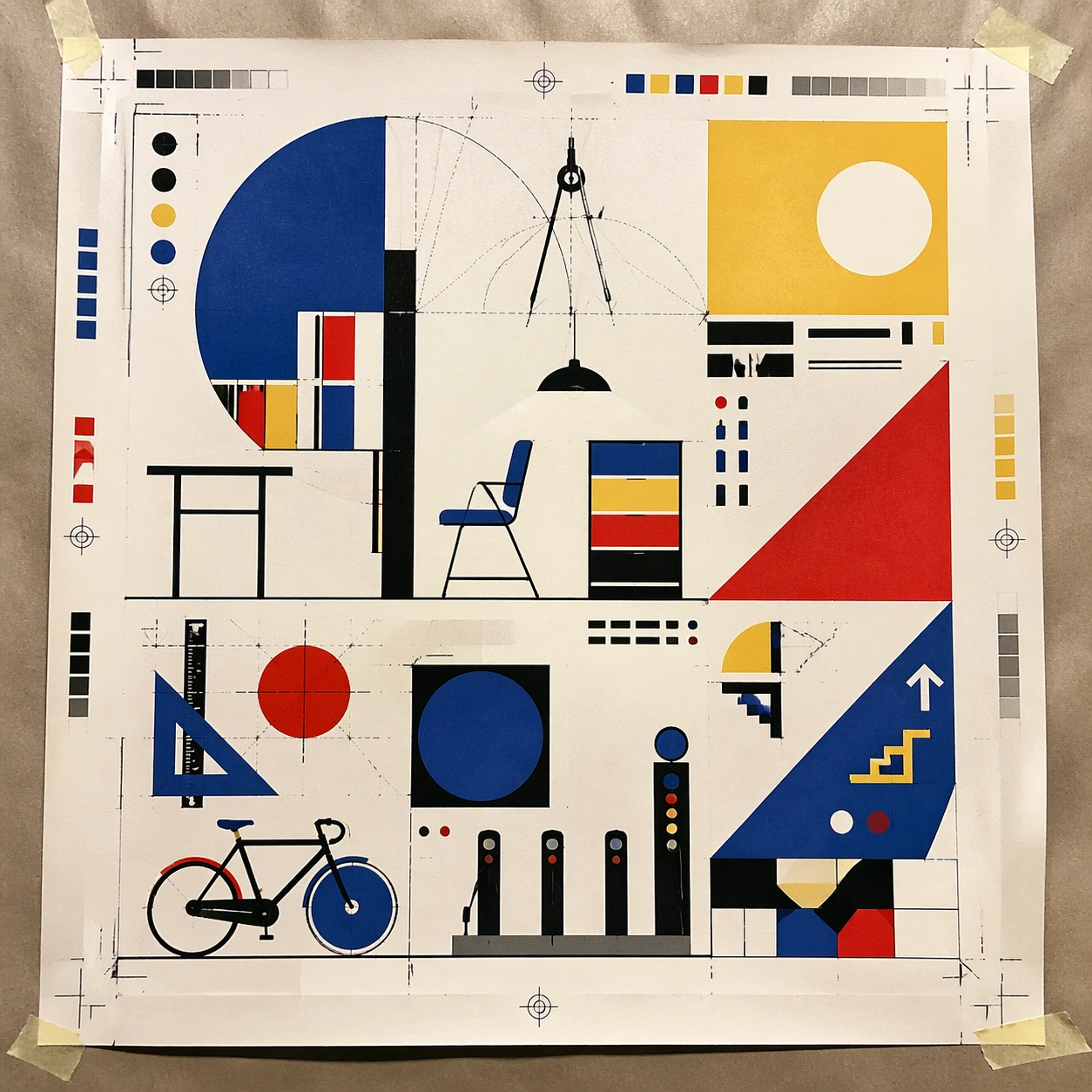
Example generated from “Bauhaus Poster Textbook — Print Proof Flatlay”
GPT Image 2en

Scene: A square overhead tabletop photograph of a fresh poster proof on neutral worktable paper, lit by cool daylight, with crop marks, tape tabs, and slight paper bow visible around the sheet. The poster should express strict geometric modernism built from circles, bars, triangles, squares, and measured negative space, using cobalt blue, mustard yellow, cadmium red, black, and warm paper white and a tactile surface appropriate to the medium. Subject: Design the poster as a print-shop proof, preserving the same poster language while allowing production clues such as edge trims, registration targets, and process marks to frame the composition. Use modular furniture silhouettes, workshop tools, compass arcs, ruler lines, and architecture-school diagrams as the main visual ingredients, and organize them with geometric sans-serif blocks and numerals treated purely as non-readable forms. For the contemporary-subject axis, thread in a bike-share docking station and urban wayfinding elements reduced into pure geometry. The poster must feel like an original design object rather than a reproduction of any known work. Important details: The image must still read as a finished poster concept, but it should carry believable print-process evidence and material tactility instead of gallery-wall perfection. Preserve mathematical spacing, flat planes, hard edges, exact weight distribution, and clean asymmetry. Keep every letterform abstract and non-readable, as if it were a typographic texture rather than language. Make the style unmistakable through composition, palette, surface behavior, and symbolic compression. no decorative flourishes, no gradients, no photoreal portraits, no soft painterly blending. Use case: Bauhaus Poster single study 2/9, testing production realism and process evidence. Constraints: No readable text, no watermark, no logos, preserve exact 1:1 aspect ratio, no copyrighted characters, no real brand marks, no QR codes, no interface chrome, no accidental gibberish lettering.

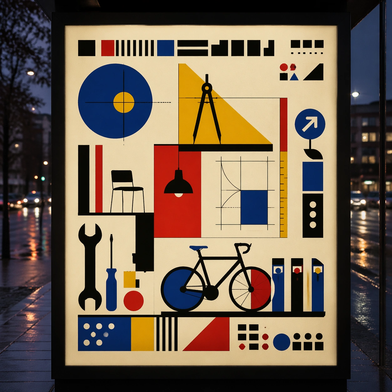
Example generated from “Bauhaus Poster Textbook — Transit Lightbox”
GPT Image 2en

Scene: A square dusk street photograph of a backlit transit poster glowing inside glass, with faint rain reflections, soft city blur in the distance, and the poster remaining fully legible as a composition. The poster should express strict geometric modernism built from circles, bars, triangles, squares, and measured negative space, using cobalt blue, mustard yellow, cadmium red, black, and warm paper white and a tactile surface appropriate to the medium. Subject: Adapt the poster into a public-facing lightbox version that still honors the original style grammar while feeling bold enough to stop a passerby from several meters away. Use modular furniture silhouettes, workshop tools, compass arcs, ruler lines, and architecture-school diagrams as the main visual ingredients, and organize them with geometric sans-serif blocks and numerals treated purely as non-readable forms. For the contemporary-subject axis, thread in a bike-share docking station and urban wayfinding elements reduced into pure geometry. The poster must feel like an original design object rather than a reproduction of any known work. Important details: Let the style survive the illumination test: color blocking, silhouette contrast, and abstract lettering should stay controlled under bright internal light and reflective glass. Preserve mathematical spacing, flat planes, hard edges, exact weight distribution, and clean asymmetry. Keep every letterform abstract and non-readable, as if it were a typographic texture rather than language. Make the style unmistakable through composition, palette, surface behavior, and symbolic compression. no decorative flourishes, no gradients, no photoreal portraits, no soft painterly blending. Use case: Bauhaus Poster single study 3/9, testing distance readability in public display. Constraints: No readable text, no watermark, no logos, preserve exact 1:1 aspect ratio, no copyrighted characters, no real brand marks, no QR codes, no interface chrome, no accidental gibberish lettering.

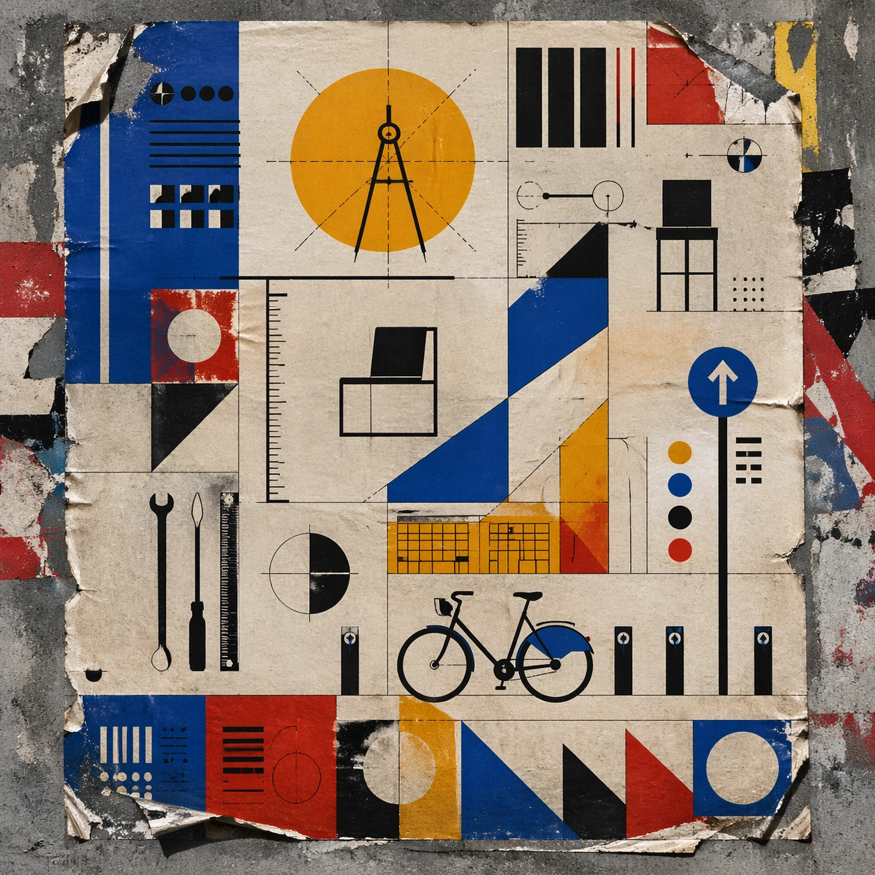
Example generated from “Bauhaus Poster Textbook — Wheatpaste Wall Layer”
GPT Image 2en

Scene: A square urban wall study with the poster pasted onto rough plaster among torn edges and older paper remnants, photographed in soft overcast light so texture, glue bubbles, and surface scars stay visible. The poster should express strict geometric modernism built from circles, bars, triangles, squares, and measured negative space, using cobalt blue, mustard yellow, cadmium red, black, and warm paper white and a tactile surface appropriate to the medium. Subject: Create a version that feels made for the street, with the poster carrying enough formal force to survive abrasion, layering, and imperfect placement without losing its visual identity. Use modular furniture silhouettes, workshop tools, compass arcs, ruler lines, and architecture-school diagrams as the main visual ingredients, and organize them with geometric sans-serif blocks and numerals treated purely as non-readable forms. For the contemporary-subject axis, thread in a bike-share docking station and urban wayfinding elements reduced into pure geometry. The poster must feel like an original design object rather than a reproduction of any known work. Important details: Keep the main design intact but let the environment add grit: lifted corners, tiny tears, wrinkled paper, and older color fragments around the perimeter should amplify the style rather than dilute it. Preserve mathematical spacing, flat planes, hard edges, exact weight distribution, and clean asymmetry. Keep every letterform abstract and non-readable, as if it were a typographic texture rather than language. Make the style unmistakable through composition, palette, surface behavior, and symbolic compression. no decorative flourishes, no gradients, no photoreal portraits, no soft painterly blending. Use case: Bauhaus Poster single study 4/9, testing street-life durability and layered context. Constraints: No readable text, no watermark, no logos, preserve exact 1:1 aspect ratio, no copyrighted characters, no real brand marks, no QR codes, no interface chrome, no accidental gibberish lettering.

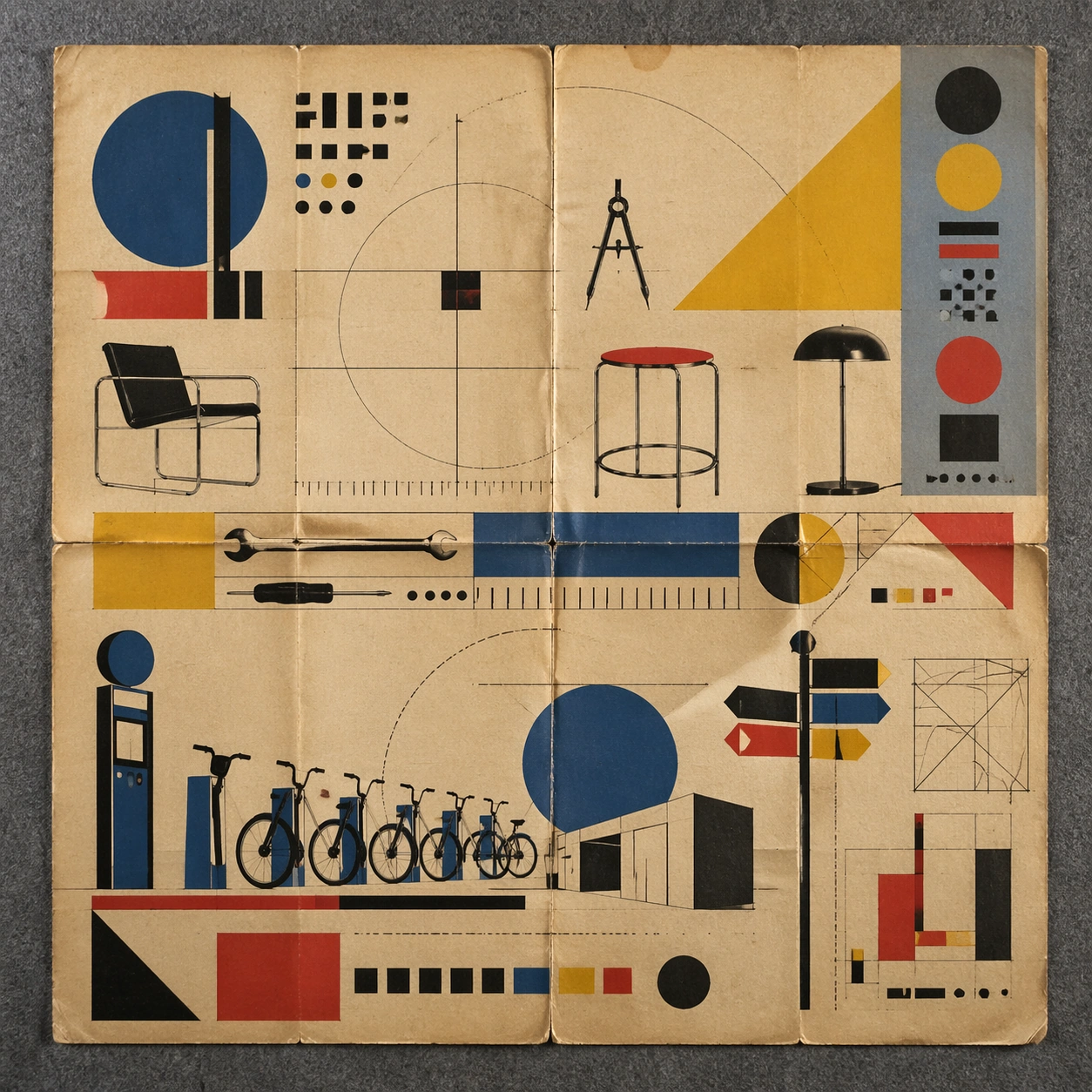
Example generated from “Bauhaus Poster Textbook — Folded Archive Copy”
GPT Image 2en

Scene: A square conservation-table view of a vintage poster laid on gray felt under raking light, with visible fold lines, softened corners, and subtle aging that still preserves the integrity of the image. The poster should express strict geometric modernism built from circles, bars, triangles, squares, and measured negative space, using cobalt blue, mustard yellow, cadmium red, black, and warm paper white and a tactile surface appropriate to the medium. Subject: Present the poster as an archive copy that has been stored, unfolded, and carefully documented, letting age and handling reveal how the design holds up across time. Use modular furniture silhouettes, workshop tools, compass arcs, ruler lines, and architecture-school diagrams as the main visual ingredients, and organize them with geometric sans-serif blocks and numerals treated purely as non-readable forms. For the contemporary-subject axis, thread in a bike-share docking station and urban wayfinding elements reduced into pure geometry. The poster must feel like an original design object rather than a reproduction of any known work. Important details: Aging must stay believable rather than theatrical: slight yellowing, fold memory, edge wear, and pigment variation should support the historical or crafted feeling of the style. Preserve mathematical spacing, flat planes, hard edges, exact weight distribution, and clean asymmetry. Keep every letterform abstract and non-readable, as if it were a typographic texture rather than language. Make the style unmistakable through composition, palette, surface behavior, and symbolic compression. no decorative flourishes, no gradients, no photoreal portraits, no soft painterly blending. Use case: Bauhaus Poster single study 5/9, testing archival endurance and age character. Constraints: No readable text, no watermark, no logos, preserve exact 1:1 aspect ratio, no copyrighted characters, no real brand marks, no QR codes, no interface chrome, no accidental gibberish lettering.

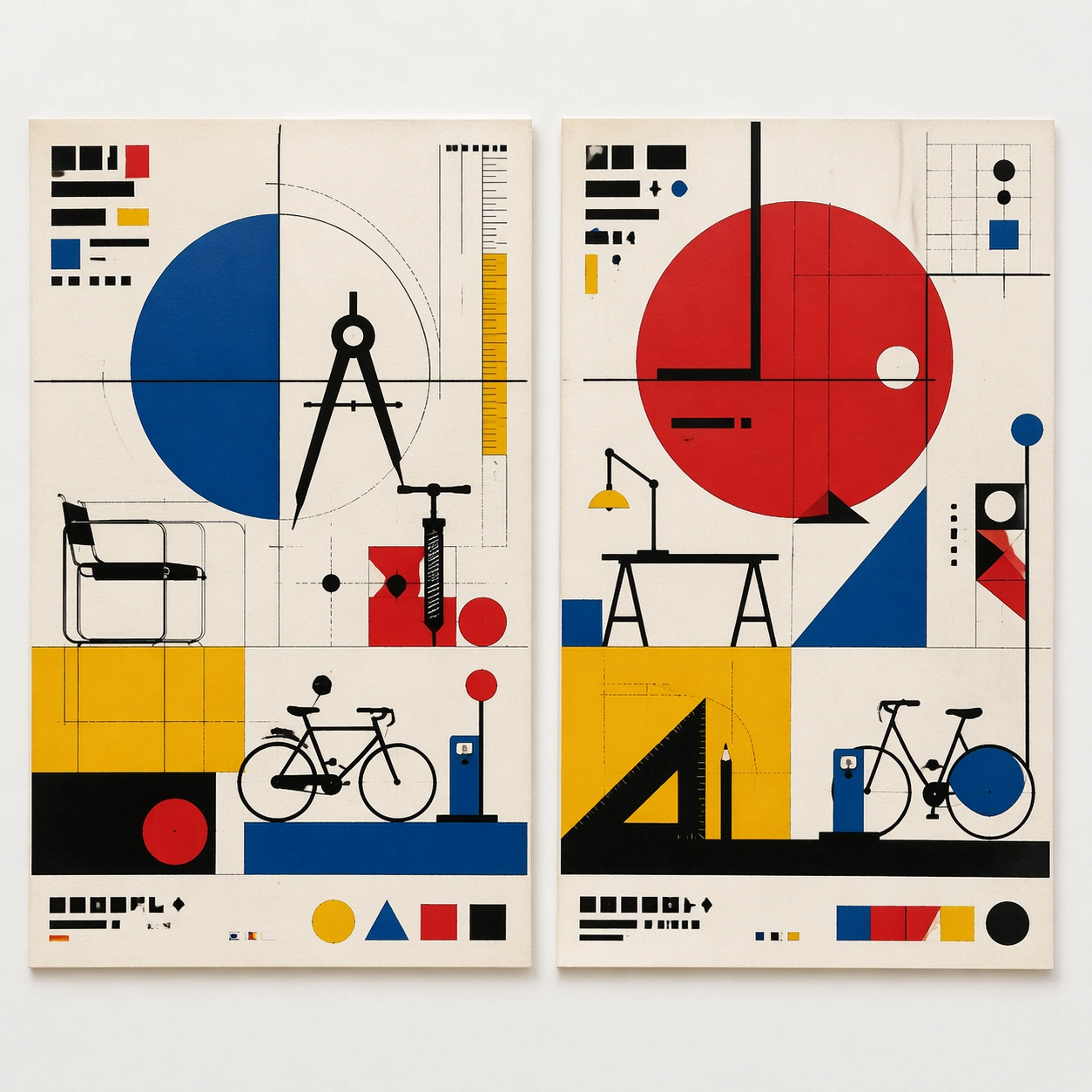
Example generated from “Bauhaus Poster Textbook — Twin Poster Diptych”
GPT Image 2en

Scene: A square white-wall installation showing two companion posters hung side by side with equal spacing, photographed frontally so the pair reads as a designed conversation rather than two unrelated sheets. The poster should express strict geometric modernism built from circles, bars, triangles, squares, and measured negative space, using cobalt blue, mustard yellow, cadmium red, black, and warm paper white and a tactile surface appropriate to the medium. Subject: Compose a matched diptych: two posters sharing one style system while splitting the narrative across paired motifs, mirrored masses, or complementary color emphasis. Use modular furniture silhouettes, workshop tools, compass arcs, ruler lines, and architecture-school diagrams as the main visual ingredients, and organize them with geometric sans-serif blocks and numerals treated purely as non-readable forms. For the contemporary-subject axis, thread in a bike-share docking station and urban wayfinding elements reduced into pure geometry. The poster must feel like an original design object rather than a reproduction of any known work. Important details: Both halves should feel distinct yet inseparable. Preserve one coherent visual language, but let each sheet carry its own focal symbol and rhythm without readable wording. Preserve mathematical spacing, flat planes, hard edges, exact weight distribution, and clean asymmetry. Keep every letterform abstract and non-readable, as if it were a typographic texture rather than language. Make the style unmistakable through composition, palette, surface behavior, and symbolic compression. no decorative flourishes, no gradients, no photoreal portraits, no soft painterly blending. Use case: Bauhaus Poster single study 6/9, testing system flexibility across a paired set. Constraints: No readable text, no watermark, no logos, preserve exact 1:1 aspect ratio, no copyrighted characters, no real brand marks, no QR codes, no interface chrome, no accidental gibberish lettering.

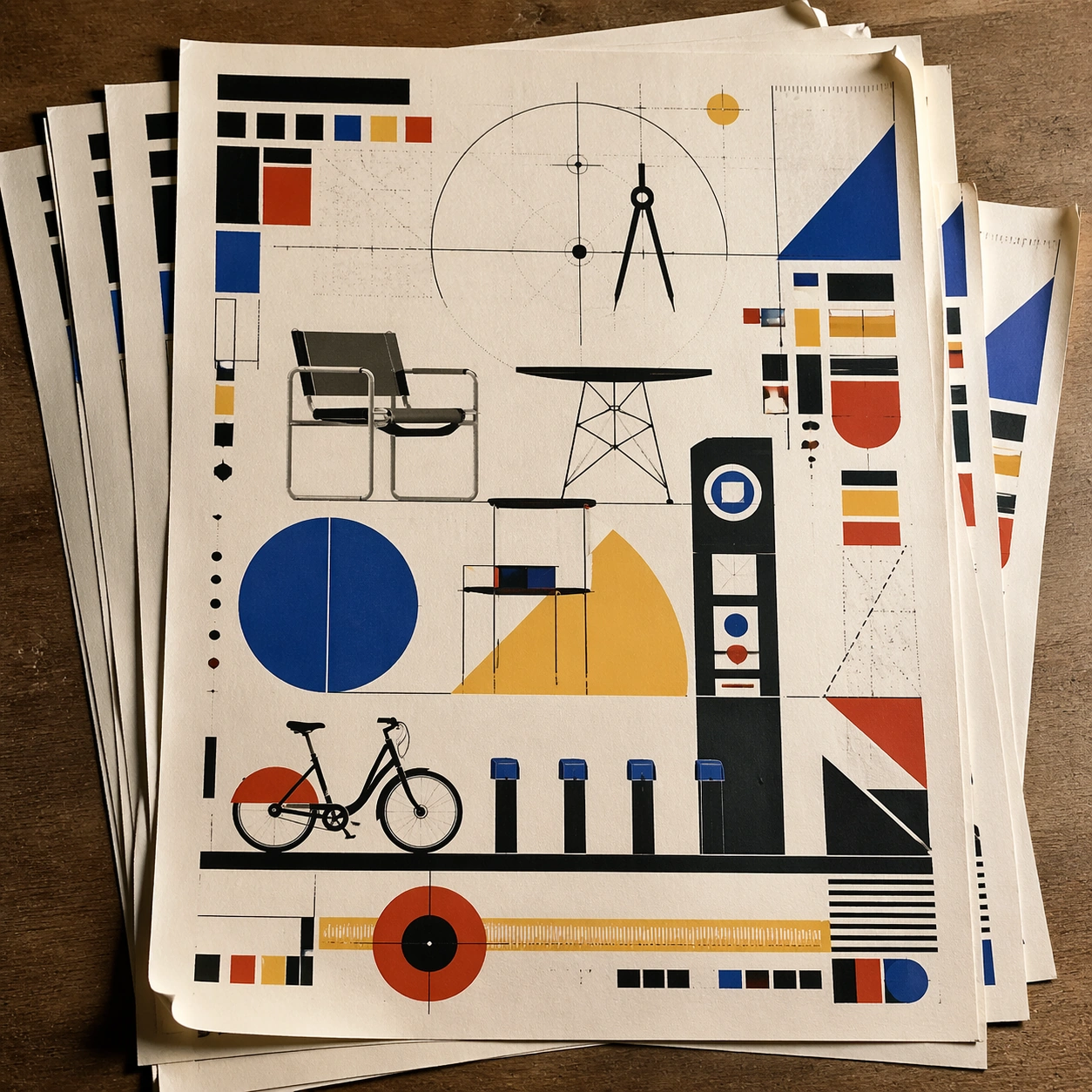
Example generated from “Bauhaus Poster Textbook — Stacked Print Bundle”
GPT Image 2en

Scene: A square tabletop shot of several poster prints stacked and slightly fanned, with curled corners, offset edges, and soft directional light revealing paper thickness and ink behavior. The poster should express strict geometric modernism built from circles, bars, triangles, squares, and measured negative space, using cobalt blue, mustard yellow, cadmium red, black, and warm paper white and a tactile surface appropriate to the medium. Subject: Design the top poster to dominate while nearby duplicate sheets echo the same composition, creating a tactile print-run scene rather than a single isolated sheet. Use modular furniture silhouettes, workshop tools, compass arcs, ruler lines, and architecture-school diagrams as the main visual ingredients, and organize them with geometric sans-serif blocks and numerals treated purely as non-readable forms. For the contemporary-subject axis, thread in a bike-share docking station and urban wayfinding elements reduced into pure geometry. The poster must feel like an original design object rather than a reproduction of any known work. Important details: Use the stack to emphasize production character: edge shadows, repeated motifs peeking from beneath, and subtle misalignment should enrich the material reading without changing the core design. Preserve mathematical spacing, flat planes, hard edges, exact weight distribution, and clean asymmetry. Keep every letterform abstract and non-readable, as if it were a typographic texture rather than language. Make the style unmistakable through composition, palette, surface behavior, and symbolic compression. no decorative flourishes, no gradients, no photoreal portraits, no soft painterly blending. Use case: Bauhaus Poster single study 7/9, testing print-run tactility and repeat presence. Constraints: No readable text, no watermark, no logos, preserve exact 1:1 aspect ratio, no copyrighted characters, no real brand marks, no QR codes, no interface chrome, no accidental gibberish lettering.

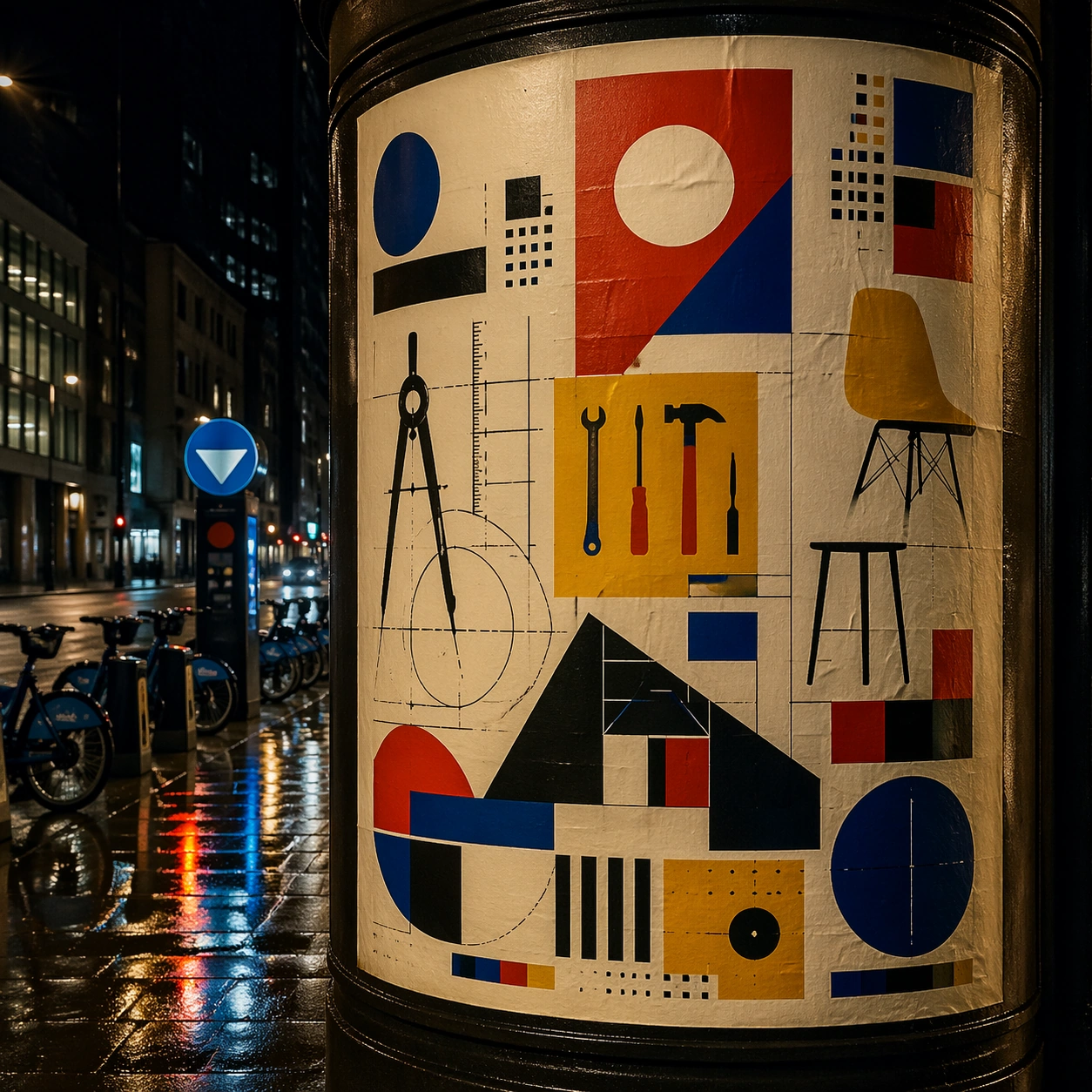
Example generated from “Bauhaus Poster Textbook — Kiosk Night Glow”
GPT Image 2en

Scene: A square nighttime city view with the poster wrapping part of a cylindrical kiosk, wet pavement reflecting nearby light, and the composition holding together under moody urban illumination. The poster should express strict geometric modernism built from circles, bars, triangles, squares, and measured negative space, using cobalt blue, mustard yellow, cadmium red, black, and warm paper white and a tactile surface appropriate to the medium. Subject: Reframe the design for a dramatic street-placement context, where the poster has to project style and mood through reflection, curvature, and surrounding darkness. Use modular furniture silhouettes, workshop tools, compass arcs, ruler lines, and architecture-school diagrams as the main visual ingredients, and organize them with geometric sans-serif blocks and numerals treated purely as non-readable forms. For the contemporary-subject axis, thread in a bike-share docking station and urban wayfinding elements reduced into pure geometry. The poster must feel like an original design object rather than a reproduction of any known work. Important details: The design should remain instantly recognizable despite the cylindrical wrap. Preserve major blocks, symbolic shapes, and abstract title forms so the style still feels authoritative at night. Preserve mathematical spacing, flat planes, hard edges, exact weight distribution, and clean asymmetry. Keep every letterform abstract and non-readable, as if it were a typographic texture rather than language. Make the style unmistakable through composition, palette, surface behavior, and symbolic compression. no decorative flourishes, no gradients, no photoreal portraits, no soft painterly blending. Use case: Bauhaus Poster single study 8/9, testing atmospheric display under rain and glow. Constraints: No readable text, no watermark, no logos, preserve exact 1:1 aspect ratio, no copyrighted characters, no real brand marks, no QR codes, no interface chrome, no accidental gibberish lettering.

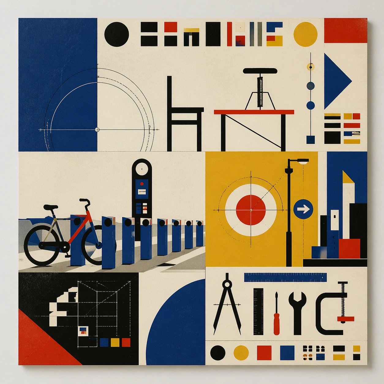
Example generated from “Bauhaus Poster Textbook — Contemporary Remix”
GPT Image 2en

Scene: A square front-facing poster presentation on a clean neutral wall, lit like a premium print test, with crisp edges and a polished but still tactile finish appropriate to the style. The poster should express strict geometric modernism built from circles, bars, triangles, squares, and measured negative space, using cobalt blue, mustard yellow, cadmium red, black, and warm paper white and a tactile surface appropriate to the medium. Subject: Apply the historical poster language to a contemporary urban subject so the old visual grammar proves it can carry present-day themes without losing authenticity or formal discipline. Use modular furniture silhouettes, workshop tools, compass arcs, ruler lines, and architecture-school diagrams as the main visual ingredients, and organize them with geometric sans-serif blocks and numerals treated purely as non-readable forms. For the contemporary-subject axis, thread in a bike-share docking station and urban wayfinding elements reduced into pure geometry. The poster must feel like an original design object rather than a reproduction of any known work. Important details: This is not parody. The contemporary subject should feel genuinely absorbed into the style through palette, composition, symbolic compression, and non-readable lettering treatment. Preserve mathematical spacing, flat planes, hard edges, exact weight distribution, and clean asymmetry. Keep every letterform abstract and non-readable, as if it were a typographic texture rather than language. Make the style unmistakable through composition, palette, surface behavior, and symbolic compression. no decorative flourishes, no gradients, no photoreal portraits, no soft painterly blending. Use case: Bauhaus Poster single study 9/9, testing historical grammar on a present-day subject. Constraints: No readable text, no watermark, no logos, preserve exact 1:1 aspect ratio, no copyrighted characters, no real brand marks, no QR codes, no interface chrome, no accidental gibberish lettering.

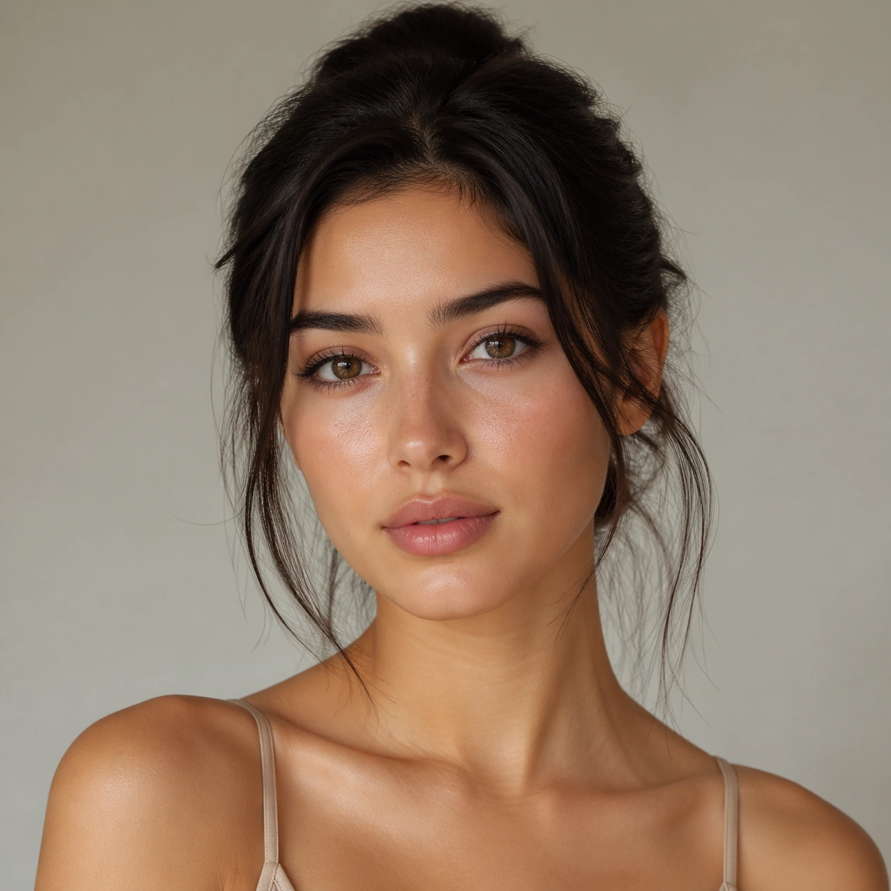
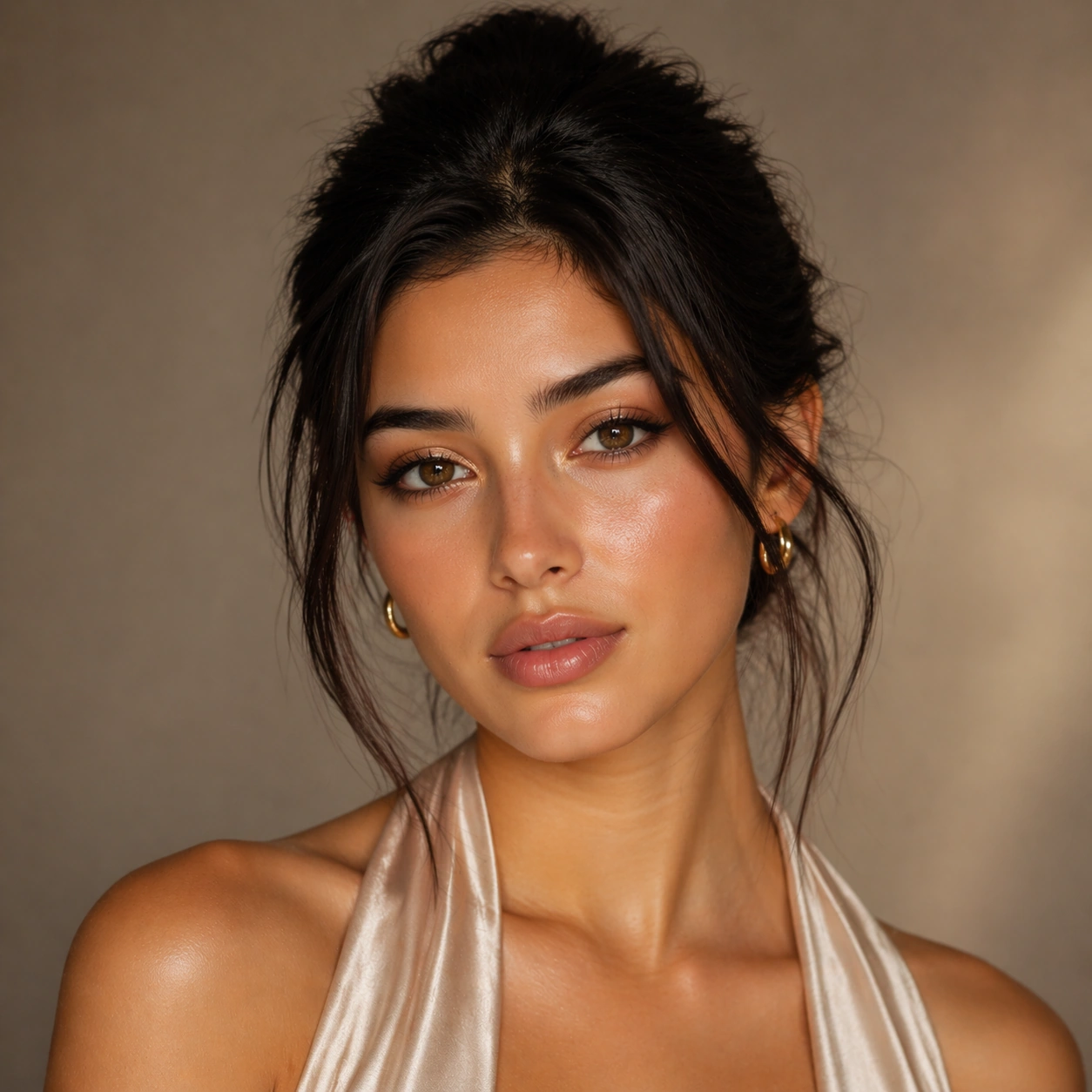
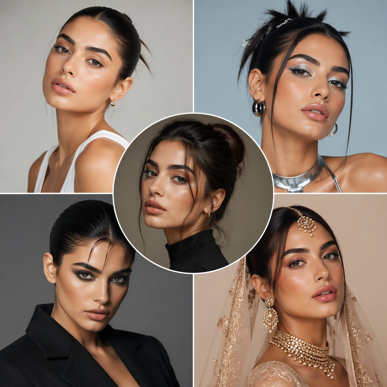
Example generated from “Beauty Look Era Switchboard — Anchor Portrait”
GPT Image 2en

Scene: A square commercial beauty-or-fashion image designed like a polished campaign proof for Beauty Look Era Switchboard. Keep the camera discipline clear and believable: portrait-oriented within the square, premium studio light, controlled tonal contrast, and enough surrounding negative space to feel like an ad layout without relying on readable typography. The image should look production-ready, with realistic skin, hair, fabric, and makeup rendering that supports identity locking instead of distracting from it. Subject: Build the frame around one clearly recognizable person. Anchor Portrait should feel like a specific transformation step that defines the exact face, camera angle, skin texture, and model identity that later images must preserve. The face structure, age, body proportions, and general camera position must stay consistent with the same-person premise of Transform one face across distinct beauty directions such as clean-girl, Y2K, runway editorial, bridal, and retro glamour while preserving recognizability.. Styling, wardrobe, grooming, makeup, hair, or pose can evolve, but the viewer must believe it is unquestionably the same subject across the whole theme. Use a premium editorial-commercial tone rather than a casual portrait session. Important details: The visual test is identity consistency under change. Preserve stable bone structure, eye spacing, nose shape, lip volume, skin tone family, and believable texture response. Let the transformation be visible through styling choices instead of facial drift. This theme studies editing-workflow, multi-image-reference, photorealism, commercial-mockup through a production-ready visual system. Make the composition clean enough for client review, with professional grooming fidelity and enough detail for salon, beauty, or fashion decision-making. Aim for clear hierarchy, polished craft, and immediately usable campaign logic. Use case: Beauty Look Era Switchboard series study 1/4. Constraints: No readable text, no watermark, no logos, preserve exact 1:1 aspect ratio, no face drift, no inconsistent age shift, no extra limbs, no duplicate person, no asymmetric eye placement, no beauty-editorial chaos.

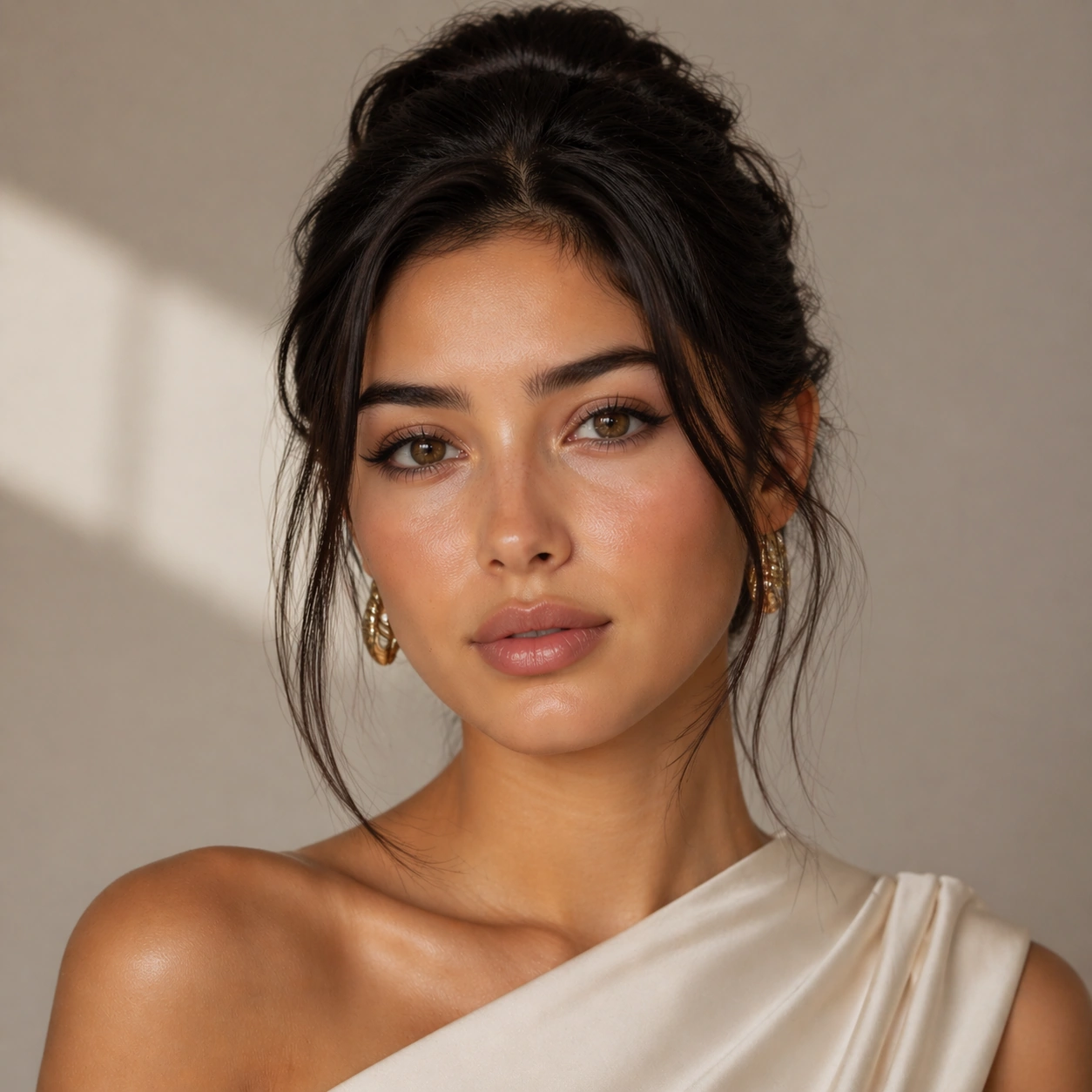
Example generated from “Beauty Look Era Switchboard — First Switch”
GPT Image 2en

Scene: A square commercial beauty-or-fashion image designed like a polished campaign proof for Beauty Look Era Switchboard. Keep the camera discipline clear and believable: portrait-oriented within the square, premium studio light, controlled tonal contrast, and enough surrounding negative space to feel like an ad layout without relying on readable typography. The image should look production-ready, with realistic skin, hair, fabric, and makeup rendering that supports identity locking instead of distracting from it. Subject: Build the frame around one clearly recognizable person. First Switch should feel like a specific transformation step that keeps the same identity but changes the styling direction in a clear and controlled way. The face structure, age, body proportions, and general camera position must stay consistent with the same-person premise of Transform one face across distinct beauty directions such as clean-girl, Y2K, runway editorial, bridal, and retro glamour while preserving recognizability.. Styling, wardrobe, grooming, makeup, hair, or pose can evolve, but the viewer must believe it is unquestionably the same subject across the whole theme. Use a premium editorial-commercial tone rather than a casual portrait session. Important details: The visual test is identity consistency under change. Preserve stable bone structure, eye spacing, nose shape, lip volume, skin tone family, and believable texture response. Let the transformation be visible through styling choices instead of facial drift. This theme studies editing-workflow, multi-image-reference, photorealism, commercial-mockup through a production-ready visual system. Make the composition clean enough for client review, with professional grooming fidelity and enough detail for salon, beauty, or fashion decision-making. Aim for clear hierarchy, polished craft, and immediately usable campaign logic. Use case: Beauty Look Era Switchboard series study 2/4. Constraints: No readable text, no watermark, no logos, preserve exact 1:1 aspect ratio, no face drift, no inconsistent age shift, no extra limbs, no duplicate person, no asymmetric eye placement, no beauty-editorial chaos.

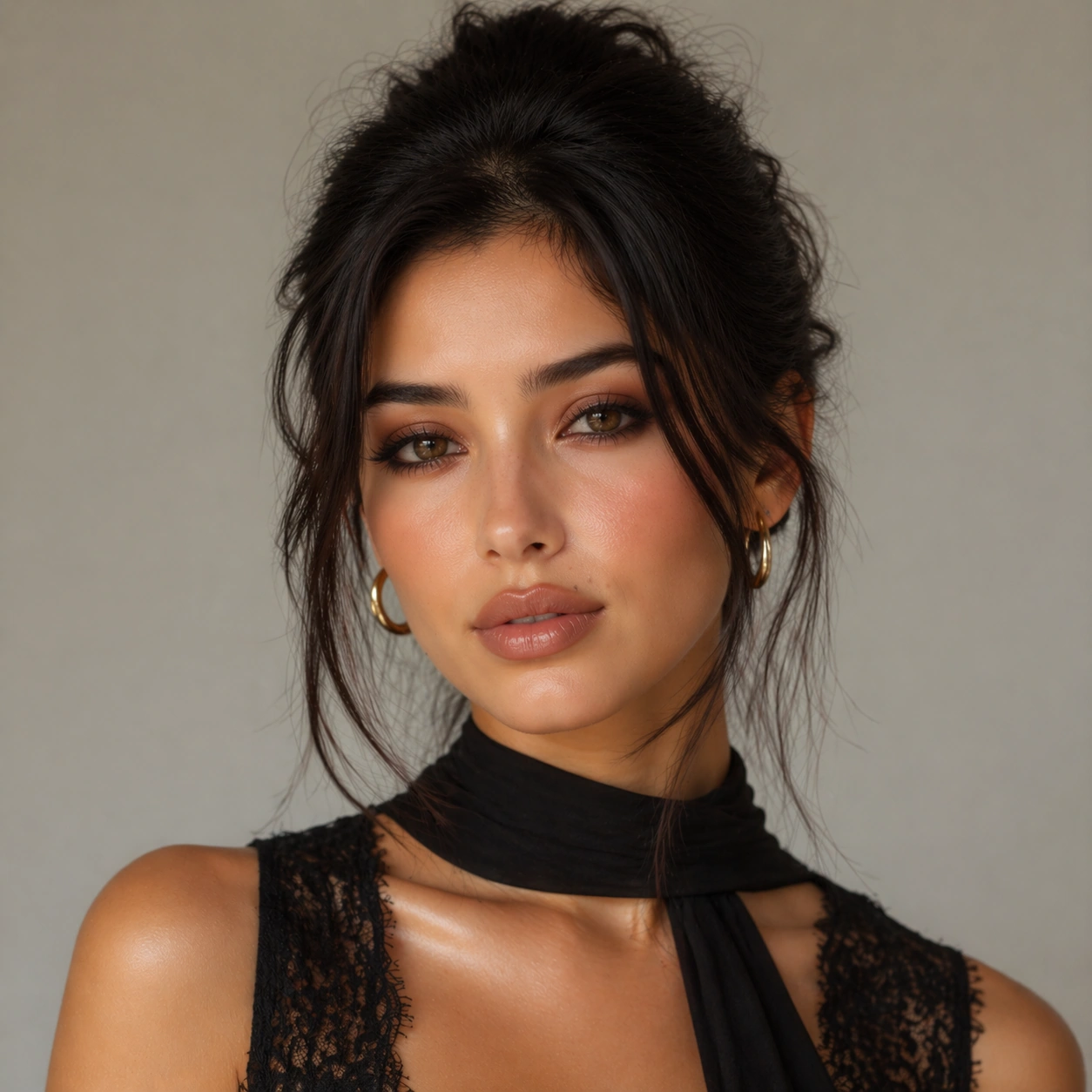
Example generated from “Beauty Look Era Switchboard — Second Switch”
GPT Image 2en

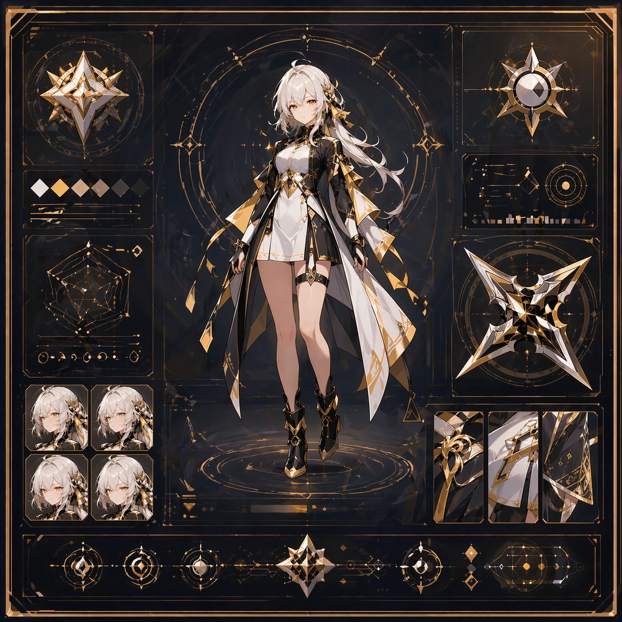
Scene: A square commercial beauty-or-fashion image designed like a polished campaign proof for Beauty Look Era Switchboard. Keep the camera discipline clear and believable: portrait-oriented within the square, premium studio light, controlled tonal contrast, and enough surrounding negative space to feel like an ad layout without relying on readable typography. The image should look production-ready, with realistic skin, hair, fabric, and makeup rendering that supports identity locking instead of distracting from it. Subject: Build the frame around one clearly recognizable person. Second Switch should feel like a specific transformation step that pushes the same identity into a more dramatic transformation without face drift. The face structure, age, body proportions, and general camera position must stay consistent with the same-person premise of Transform one face across distinct beauty directions such as clean-girl, Y2K, runway editorial, bridal, and retro glamour while preserving recognizability.. Styling, wardrobe, grooming, makeup, hair, or pose can evolve, but the viewer must believe it is unquestionably the same subject across the whole theme. Use a premium editorial-commercial tone rather than a casual portrait session. Important details: The visual test is identity consistency under change. Preserve stable bone structure, eye spacing, nose shape, lip volume, skin tone family, and believable texture response. Let the transformation be visible through styling choices instead of facial drift. This theme studies editing-workflow, multi-image-reference, photorealism, commercial-mockup through a production-ready visual system. Make the composition clean enough for client review, with professional grooming fidelity and enough detail for salon, beauty, or fashion decision-making. Aim for clear hierarchy, polished craft, and immediately usable campaign logic. Use case: Beauty Look Era Switchboard series study 3/4. Constraints: No readable text, no watermark, no logos, preserve exact 1:1 aspect ratio, no face drift, no inconsistent age shift, no extra limbs, no duplicate person, no asymmetric eye placement, no beauty-editorial chaos.

Example generated from “Beauty Look Era Switchboard — Campaign Finish”
GPT Image 2en

Scene: A square commercial beauty-or-fashion image designed like a polished campaign proof for Beauty Look Era Switchboard. Keep the camera discipline clear and believable: portrait-oriented within the square, premium studio light, controlled tonal contrast, and enough surrounding negative space to feel like an ad layout without relying on readable typography. The image should look production-ready, with realistic skin, hair, fabric, and makeup rendering that supports identity locking instead of distracting from it. Subject: Build the frame around one clearly recognizable person. Campaign Finish should feel like a specific transformation step that turns the locked identity into a polished campaign-ready hero frame. The face structure, age, body proportions, and general camera position must stay consistent with the same-person premise of Transform one face across distinct beauty directions such as clean-girl, Y2K, runway editorial, bridal, and retro glamour while preserving recognizability.. Styling, wardrobe, grooming, makeup, hair, or pose can evolve, but the viewer must believe it is unquestionably the same subject across the whole theme. Use a premium editorial-commercial tone rather than a casual portrait session. Important details: The visual test is identity consistency under change. Preserve stable bone structure, eye spacing, nose shape, lip volume, skin tone family, and believable texture response. Let the transformation be visible through styling choices instead of facial drift. This theme studies editing-workflow, multi-image-reference, photorealism, commercial-mockup through a production-ready visual system. Make the composition clean enough for client review, with professional grooming fidelity and enough detail for salon, beauty, or fashion decision-making. Aim for clear hierarchy, polished craft, and immediately usable campaign logic. Use case: Beauty Look Era Switchboard series study 4/4. Constraints: No readable text, no watermark, no logos, preserve exact 1:1 aspect ratio, no face drift, no inconsistent age shift, no extra limbs, no duplicate person, no asymmetric eye placement, no beauty-editorial chaos.

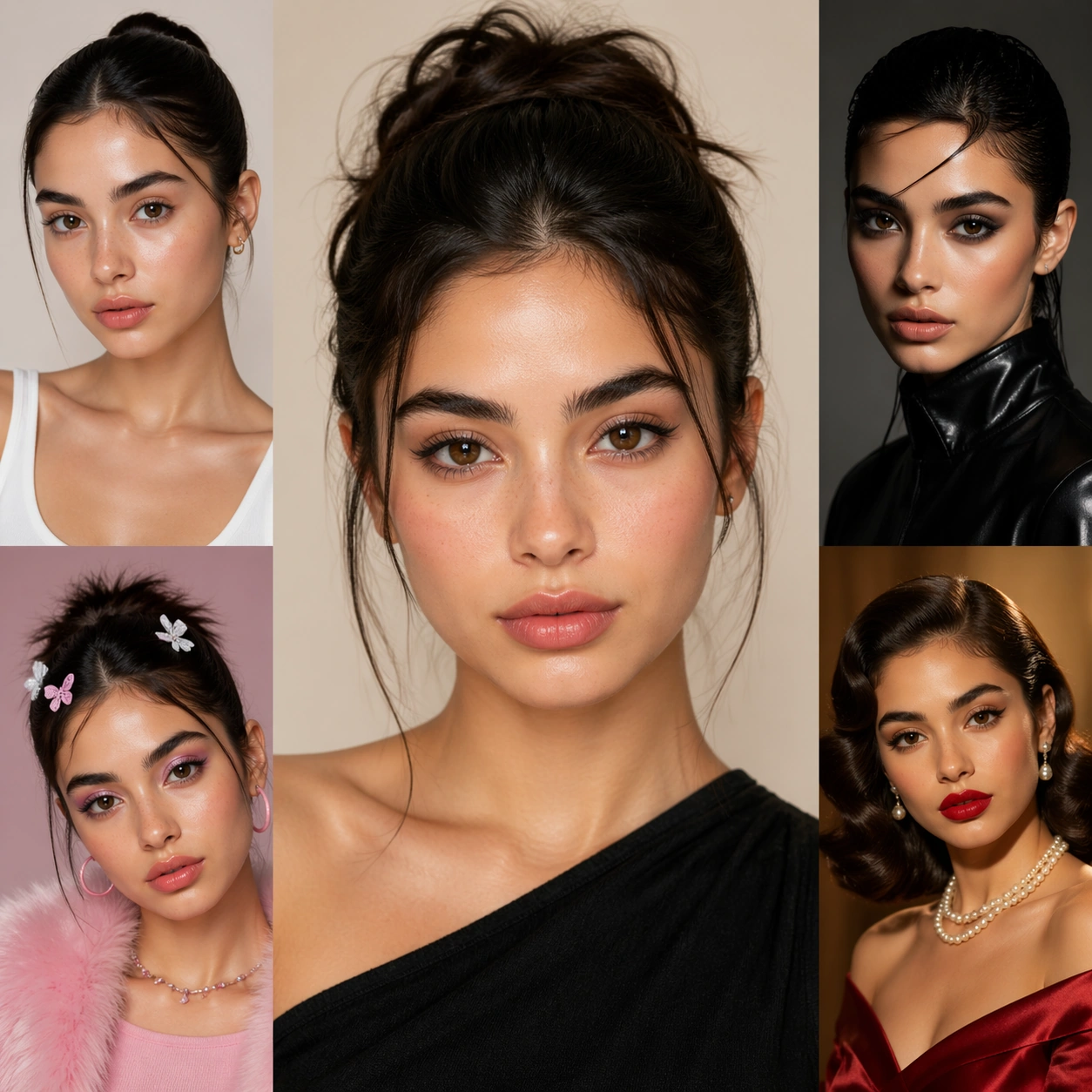
Example generated from “Beauty Look Era Switchboard — Lookbook Sheet”
GPT Image 2en

Scene: A square commercial beauty-or-fashion image designed like a polished campaign proof for Beauty Look Era Switchboard. Keep the camera discipline clear and believable: portrait-oriented within the square, premium studio light, controlled tonal contrast, and enough surrounding negative space to feel like an ad layout without relying on readable typography. The image should look production-ready, with realistic skin, hair, fabric, and makeup rendering that supports identity locking instead of distracting from it. Subject: Build the frame around one clearly recognizable person. Lookbook Sheet should feel like a specific transformation step that a fashion or salon lookbook page using one consistent identity across multiple panels. The face structure, age, body proportions, and general camera position must stay consistent with the same-person premise of Transform one face across distinct beauty directions such as clean-girl, Y2K, runway editorial, bridal, and retro glamour while preserving recognizability.. Styling, wardrobe, grooming, makeup, hair, or pose can evolve, but the viewer must believe it is unquestionably the same subject across the whole theme. Use a premium editorial-commercial tone rather than a casual portrait session. Important details: The visual test is identity consistency under change. Preserve stable bone structure, eye spacing, nose shape, lip volume, skin tone family, and believable texture response. Let the transformation be visible through styling choices instead of facial drift. This theme studies editing-workflow, multi-image-reference, photorealism, commercial-mockup through a production-ready visual system. Make the composition clean enough for client review, with professional grooming fidelity and enough detail for salon, beauty, or fashion decision-making. Aim for clear hierarchy, polished craft, and immediately usable campaign logic. Use case: Beauty Look Era Switchboard single study 2/5. Constraints: No readable text, no watermark, no logos, preserve exact 1:1 aspect ratio, no face drift, no inconsistent age shift, no extra limbs, no duplicate person, no asymmetric eye placement, no beauty-editorial chaos.

Example generated from “Beauty Look Era Switchboard — Detail Close-up”
GPT Image 2en

Scene: A square commercial beauty-or-fashion image designed like a polished campaign proof for Beauty Look Era Switchboard. Keep the camera discipline clear and believable: portrait-oriented within the square, premium studio light, controlled tonal contrast, and enough surrounding negative space to feel like an ad layout without relying on readable typography. The image should look production-ready, with realistic skin, hair, fabric, and makeup rendering that supports identity locking instead of distracting from it. Subject: Build the frame around one clearly recognizable person. Detail Close-up should feel like a specific transformation step that a close-up study focusing on texture, finish, and precise beauty or garment details. The face structure, age, body proportions, and general camera position must stay consistent with the same-person premise of Transform one face across distinct beauty directions such as clean-girl, Y2K, runway editorial, bridal, and retro glamour while preserving recognizability.. Styling, wardrobe, grooming, makeup, hair, or pose can evolve, but the viewer must believe it is unquestionably the same subject across the whole theme. Use a premium editorial-commercial tone rather than a casual portrait session. Important details: The visual test is identity consistency under change. Preserve stable bone structure, eye spacing, nose shape, lip volume, skin tone family, and believable texture response. Let the transformation be visible through styling choices instead of facial drift. This theme studies editing-workflow, multi-image-reference, photorealism, commercial-mockup through a production-ready visual system. Make the composition clean enough for client review, with professional grooming fidelity and enough detail for salon, beauty, or fashion decision-making. Aim for clear hierarchy, polished craft, and immediately usable campaign logic. Use case: Beauty Look Era Switchboard single study 3/5. Constraints: No readable text, no watermark, no logos, preserve exact 1:1 aspect ratio, no face drift, no inconsistent age shift, no extra limbs, no duplicate person, no asymmetric eye placement, no beauty-editorial chaos.

Example generated from “Beauty Look Era Switchboard — Promo Poster”
GPT Image 2en

Scene: A square commercial beauty-or-fashion image designed like a polished campaign proof for Beauty Look Era Switchboard. Keep the camera discipline clear and believable: portrait-oriented within the square, premium studio light, controlled tonal contrast, and enough surrounding negative space to feel like an ad layout without relying on readable typography. The image should look production-ready, with realistic skin, hair, fabric, and makeup rendering that supports identity locking instead of distracting from it. Subject: Build the frame around one clearly recognizable person. Promo Poster should feel like a specific transformation step that a polished advertisement frame turning the same identity into a finished commercial visual. The face structure, age, body proportions, and general camera position must stay consistent with the same-person premise of Transform one face across distinct beauty directions such as clean-girl, Y2K, runway editorial, bridal, and retro glamour while preserving recognizability.. Styling, wardrobe, grooming, makeup, hair, or pose can evolve, but the viewer must believe it is unquestionably the same subject across the whole theme. Use a premium editorial-commercial tone rather than a casual portrait session. Important details: The visual test is identity consistency under change. Preserve stable bone structure, eye spacing, nose shape, lip volume, skin tone family, and believable texture response. Let the transformation be visible through styling choices instead of facial drift. This theme studies editing-workflow, multi-image-reference, photorealism, commercial-mockup through a production-ready visual system. Make the composition clean enough for client review, with professional grooming fidelity and enough detail for salon, beauty, or fashion decision-making. Aim for clear hierarchy, polished craft, and immediately usable campaign logic. Use case: Beauty Look Era Switchboard single study 4/5. Constraints: No readable text, no watermark, no logos, preserve exact 1:1 aspect ratio, no face drift, no inconsistent age shift, no extra limbs, no duplicate person, no asymmetric eye placement, no beauty-editorial chaos.

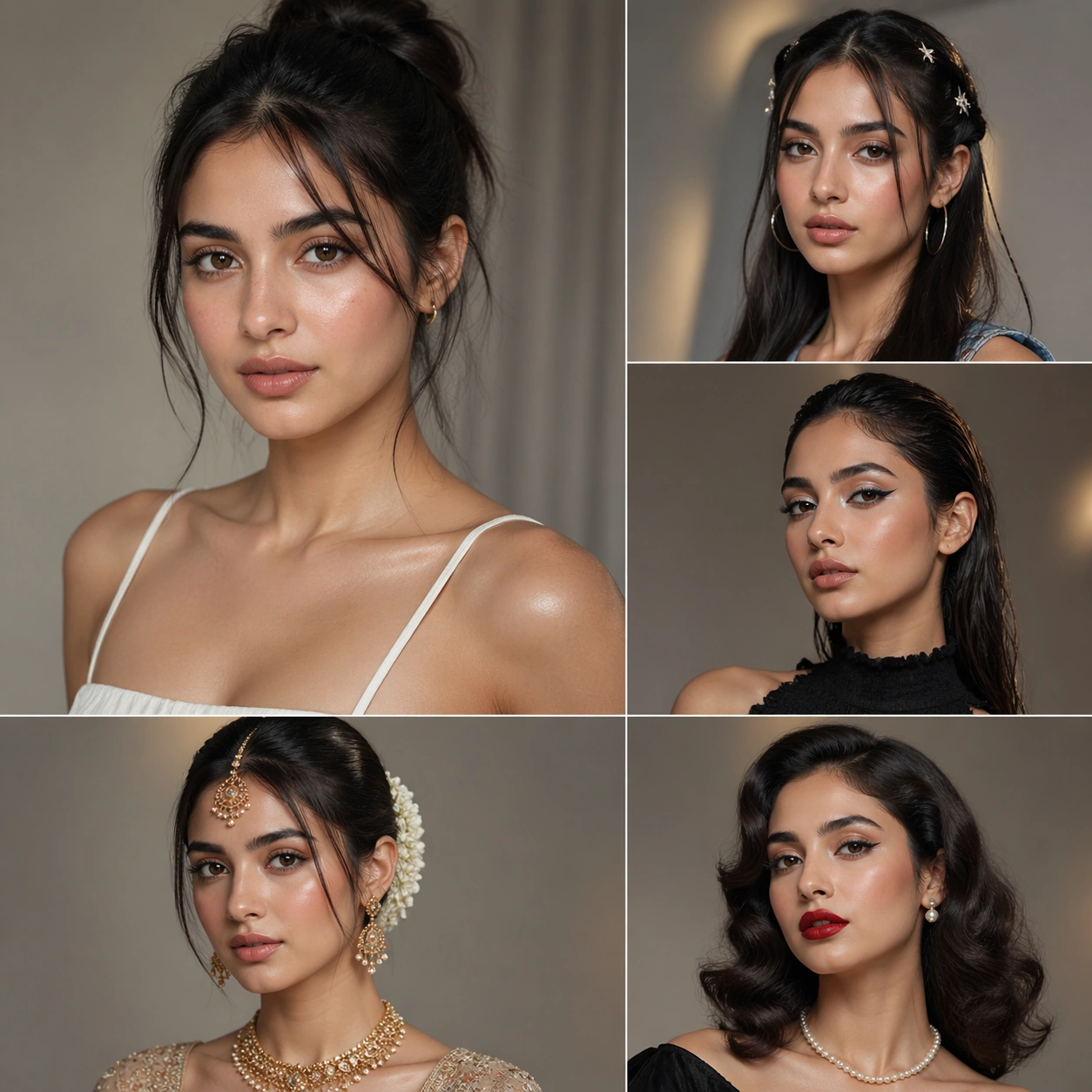
Example generated from “Beauty Look Era Switchboard — Campaign Grid”
GPT Image 2en

Scene: A square commercial beauty-or-fashion image designed like a polished campaign proof for Beauty Look Era Switchboard. Keep the camera discipline clear and believable: portrait-oriented within the square, premium studio light, controlled tonal contrast, and enough surrounding negative space to feel like an ad layout without relying on readable typography. The image should look production-ready, with realistic skin, hair, fabric, and makeup rendering that supports identity locking instead of distracting from it. Subject: Build the frame around one clearly recognizable person. Campaign Grid should feel like a specific transformation step that a multi-panel rollout board proving catalog depth and consistent recognition. The face structure, age, body proportions, and general camera position must stay consistent with the same-person premise of Transform one face across distinct beauty directions such as clean-girl, Y2K, runway editorial, bridal, and retro glamour while preserving recognizability.. Styling, wardrobe, grooming, makeup, hair, or pose can evolve, but the viewer must believe it is unquestionably the same subject across the whole theme. Use a premium editorial-commercial tone rather than a casual portrait session. Important details: The visual test is identity consistency under change. Preserve stable bone structure, eye spacing, nose shape, lip volume, skin tone family, and believable texture response. Let the transformation be visible through styling choices instead of facial drift. This theme studies editing-workflow, multi-image-reference, photorealism, commercial-mockup through a production-ready visual system. Make the composition clean enough for client review, with professional grooming fidelity and enough detail for salon, beauty, or fashion decision-making. Aim for clear hierarchy, polished craft, and immediately usable campaign logic. Use case: Beauty Look Era Switchboard single study 5/5. Constraints: No readable text, no watermark, no logos, preserve exact 1:1 aspect ratio, no face drift, no inconsistent age shift, no extra limbs, no duplicate person, no asymmetric eye placement, no beauty-editorial chaos.

Example generated from “Before After Proof Carousel — Reference Proof Anchor”
GPT Image 2en

Scene: A square master proof frame with stable lighting, strong continuity cues, and a premium commerce-ready layout. Frame the composition like a premium game-production deliverable rather than generic concept art, with disciplined square balance, controlled highlight placement, and enough negative space to keep the focal structure easy to parse. Use lighting, value grouping, and depth layers to make the scene feel intentional, collectible, and immediately useful for internal review or outward-facing promotion. Subject: Present the main product or subject in a neutral anchor composition that can support every later proof variation. Build the image around one dominant primary read, then support it with clearly organized secondary shapes, props, interface shells, or environment structures that reinforce gameplay context and commercial usefulness. Every object should look original, fully resolved, and designed to survive cropping for store, profile, patch, or gallery surfaces. Important details: This image defines the continuity rules for the rest of the carousel system. Make every frame conversion-oriented, with credible product or subject continuity, strong proof logic, and a premium commerce finish that could sit inside a real carousel or detail page. Treat this image as the root visual anchor: it must be especially stable, complete, and easy for later variations to inherit from. Use case: Before-After Proof Carousel series study 1/9. Constraints: No readable text, no watermark, no logos, preserve exact 1:1 aspect ratio, no exaggerated miracle effects, no readable copy blocks, no brand logos, no fake certification seals, no chaotic ecommerce clutter.

Example generated from “Before After Proof Carousel — Before State Frame”
GPT Image 2en

Scene: A square continuity-locked proof frame showing the pre-improvement state with matched angle logic. Frame the composition like a premium game-production deliverable rather than generic concept art, with disciplined square balance, controlled highlight placement, and enough negative space to keep the focal structure easy to parse. Use lighting, value grouping, and depth layers to make the scene feel intentional, collectible, and immediately useful for internal review or outward-facing promotion. Subject: Show the same subject before change, preserving identity, environment logic, and camera coherence. Build the image around one dominant primary read, then support it with clearly organized secondary shapes, props, interface shells, or environment structures that reinforce gameplay context and commercial usefulness. Every object should look original, fully resolved, and designed to survive cropping for store, profile, patch, or gallery surfaces. Important details: The state difference should be honest and grounded. Make every frame conversion-oriented, with credible product or subject continuity, strong proof logic, and a premium commerce finish that could sit inside a real carousel or detail page. Subject identity and proof logic must remain consistent. The variation may change framing, intensity, or layout emphasis, but it must still feel like a direct continuation of the same design system. Use case: Before-After Proof Carousel series study 2/9. Constraints: No readable text, no watermark, no logos, preserve exact 1:1 aspect ratio, no exaggerated miracle effects, no readable copy blocks, no brand logos, no fake certification seals, no chaotic ecommerce clutter.

Example generated from “Before After Proof Carousel — After State Frame”
GPT Image 2en

Scene: A square continuity-locked frame showing the improved state with the same underlying subject logic. Frame the composition like a premium game-production deliverable rather than generic concept art, with disciplined square balance, controlled highlight placement, and enough negative space to keep the focal structure easy to parse. Use lighting, value grouping, and depth layers to make the scene feel intentional, collectible, and immediately useful for internal review or outward-facing promotion. Subject: Show the same subject after change, with credible improvement but no implausible exaggeration. Build the image around one dominant primary read, then support it with clearly organized secondary shapes, props, interface shells, or environment structures that reinforce gameplay context and commercial usefulness. Every object should look original, fully resolved, and designed to survive cropping for store, profile, patch, or gallery surfaces. Important details: Use continuity to make the proof persuasive. Make every frame conversion-oriented, with credible product or subject continuity, strong proof logic, and a premium commerce finish that could sit inside a real carousel or detail page. Subject identity and proof logic must remain consistent. The variation may change framing, intensity, or layout emphasis, but it must still feel like a direct continuation of the same design system. Use case: Before-After Proof Carousel series study 3/9. Constraints: No readable text, no watermark, no logos, preserve exact 1:1 aspect ratio, no exaggerated miracle effects, no readable copy blocks, no brand logos, no fake certification seals, no chaotic ecommerce clutter.

Example generated from “Before After Proof Carousel — Close Proof Detail”
GPT Image 2en

Scene: A square macro proof frame that still feels tied to the same subject system. Frame the composition like a premium game-production deliverable rather than generic concept art, with disciplined square balance, controlled highlight placement, and enough negative space to keep the focal structure easy to parse. Use lighting, value grouping, and depth layers to make the scene feel intentional, collectible, and immediately useful for internal review or outward-facing promotion. Subject: Show a close evidence crop that reveals the mechanism or visual proof of improvement. Build the image around one dominant primary read, then support it with clearly organized secondary shapes, props, interface shells, or environment structures that reinforce gameplay context and commercial usefulness. Every object should look original, fully resolved, and designed to survive cropping for store, profile, patch, or gallery surfaces. Important details: The detail shot must still inherit the anchor identity. Make every frame conversion-oriented, with credible product or subject continuity, strong proof logic, and a premium commerce finish that could sit inside a real carousel or detail page. Subject identity and proof logic must remain consistent. The variation may change framing, intensity, or layout emphasis, but it must still feel like a direct continuation of the same design system. Use case: Before-After Proof Carousel series study 4/9. Constraints: No readable text, no watermark, no logos, preserve exact 1:1 aspect ratio, no exaggerated miracle effects, no readable copy blocks, no brand logos, no fake certification seals, no chaotic ecommerce clutter.

Example generated from “Before After Proof Carousel — Routine Step Board”
GPT Image 2en

Scene: A square process board that explains the improvement path through staged visual cues. Frame the composition like a premium game-production deliverable rather than generic concept art, with disciplined square balance, controlled highlight placement, and enough negative space to keep the focal structure easy to parse. Use lighting, value grouping, and depth layers to make the scene feel intentional, collectible, and immediately useful for internal review or outward-facing promotion. Subject: Show a reference-driven step or routine variation using the same subject family and commercial language. Build the image around one dominant primary read, then support it with clearly organized secondary shapes, props, interface shells, or environment structures that reinforce gameplay context and commercial usefulness. Every object should look original, fully resolved, and designed to survive cropping for store, profile, patch, or gallery surfaces. Important details: Keep the progression concise and product-focused. Make every frame conversion-oriented, with credible product or subject continuity, strong proof logic, and a premium commerce finish that could sit inside a real carousel or detail page. Subject identity and proof logic must remain consistent. The variation may change framing, intensity, or layout emphasis, but it must still feel like a direct continuation of the same design system. Use case: Before-After Proof Carousel series study 5/9. Constraints: No readable text, no watermark, no logos, preserve exact 1:1 aspect ratio, no exaggerated miracle effects, no readable copy blocks, no brand logos, no fake certification seals, no chaotic ecommerce clutter.

Example generated from “Before After Proof Carousel — Benefit Comparison”
GPT Image 2en

Scene: A square comparison board that extends the same proof system into a stronger value argument. Frame the composition like a premium game-production deliverable rather than generic concept art, with disciplined square balance, controlled highlight placement, and enough negative space to keep the focal structure easy to parse. Use lighting, value grouping, and depth layers to make the scene feel intentional, collectible, and immediately useful for internal review or outward-facing promotion. Subject: Show the same subject translated into a premium comparison composition with obvious shopper-readable hierarchy. Build the image around one dominant primary read, then support it with clearly organized secondary shapes, props, interface shells, or environment structures that reinforce gameplay context and commercial usefulness. Every object should look original, fully resolved, and designed to survive cropping for store, profile, patch, or gallery surfaces. Important details: The supporting graphics must remain abstract and non-readable. Make every frame conversion-oriented, with credible product or subject continuity, strong proof logic, and a premium commerce finish that could sit inside a real carousel or detail page. Subject identity and proof logic must remain consistent. The variation may change framing, intensity, or layout emphasis, but it must still feel like a direct continuation of the same design system. Use case: Before-After Proof Carousel series study 6/9. Constraints: No readable text, no watermark, no logos, preserve exact 1:1 aspect ratio, no exaggerated miracle effects, no readable copy blocks, no brand logos, no fake certification seals, no chaotic ecommerce clutter.

Example generated from “Before After Proof Carousel — Lifestyle Proof Crop”
GPT Image 2en

Scene: A square continuity-based lifestyle crop that proves the outcome in use. Frame the composition like a premium game-production deliverable rather than generic concept art, with disciplined square balance, controlled highlight placement, and enough negative space to keep the focal structure easy to parse. Use lighting, value grouping, and depth layers to make the scene feel intentional, collectible, and immediately useful for internal review or outward-facing promotion. Subject: Show the same subject in a real-life usage context while maintaining the same product and proof identity. Build the image around one dominant primary read, then support it with clearly organized secondary shapes, props, interface shells, or environment structures that reinforce gameplay context and commercial usefulness. Every object should look original, fully resolved, and designed to survive cropping for store, profile, patch, or gallery surfaces. Important details: The lifestyle setting should amplify trust. Make every frame conversion-oriented, with credible product or subject continuity, strong proof logic, and a premium commerce finish that could sit inside a real carousel or detail page. Subject identity and proof logic must remain consistent. The variation may change framing, intensity, or layout emphasis, but it must still feel like a direct continuation of the same design system. Use case: Before-After Proof Carousel series study 7/9. Constraints: No readable text, no watermark, no logos, preserve exact 1:1 aspect ratio, no exaggerated miracle effects, no readable copy blocks, no brand logos, no fake certification seals, no chaotic ecommerce clutter.

Example generated from “Before After Proof Carousel — Carousel Promo Tile”
GPT Image 2en

Scene: A square social-commerce tile derived from the same proof system. Frame the composition like a premium game-production deliverable rather than generic concept art, with disciplined square balance, controlled highlight placement, and enough negative space to keep the focal structure easy to parse. Use lighting, value grouping, and depth layers to make the scene feel intentional, collectible, and immediately useful for internal review or outward-facing promotion. Subject: Show the same proof story compressed into a high-read promotional card that still matches the anchor image. Build the image around one dominant primary read, then support it with clearly organized secondary shapes, props, interface shells, or environment structures that reinforce gameplay context and commercial usefulness. Every object should look original, fully resolved, and designed to survive cropping for store, profile, patch, or gallery surfaces. Important details: This should feel campaign-ready. Make every frame conversion-oriented, with credible product or subject continuity, strong proof logic, and a premium commerce finish that could sit inside a real carousel or detail page. Subject identity and proof logic must remain consistent. The variation may change framing, intensity, or layout emphasis, but it must still feel like a direct continuation of the same design system. Use case: Before-After Proof Carousel series study 8/9. Constraints: No readable text, no watermark, no logos, preserve exact 1:1 aspect ratio, no exaggerated miracle effects, no readable copy blocks, no brand logos, no fake certification seals, no chaotic ecommerce clutter.

Example generated from “Before After Proof Carousel — Detail Page Master”
GPT Image 2en

Scene: A square master board combining the whole proof sequence into one refined ecommerce system view. Frame the composition like a premium game-production deliverable rather than generic concept art, with disciplined square balance, controlled highlight placement, and enough negative space to keep the focal structure easy to parse. Use lighting, value grouping, and depth layers to make the scene feel intentional, collectible, and immediately useful for internal review or outward-facing promotion. Subject: Show a capstone board that unifies the before-after story into one production-ready detail-page system. Build the image around one dominant primary read, then support it with clearly organized secondary shapes, props, interface shells, or environment structures that reinforce gameplay context and commercial usefulness. Every object should look original, fully resolved, and designed to survive cropping for store, profile, patch, or gallery surfaces. Important details: Use continuity and structure to make the system feel complete. Make every frame conversion-oriented, with credible product or subject continuity, strong proof logic, and a premium commerce finish that could sit inside a real carousel or detail page. Subject identity and proof logic must remain consistent. The variation may change framing, intensity, or layout emphasis, but it must still feel like a direct continuation of the same design system. Use case: Before-After Proof Carousel series study 9/9. Constraints: No readable text, no watermark, no logos, preserve exact 1:1 aspect ratio, no exaggerated miracle effects, no readable copy blocks, no brand logos, no fake certification seals, no chaotic ecommerce clutter.

Example generated from “Bilibili Video Cover Persona System — Reference Anchor”
GPT Image 2en

Scene: Create a square reference image for creator video cover persona system. Build a reference anchor establishing the core system with a premium, production-ready finish. Use a polished modular board or campaign surface with clean spacing, premium game-UI finish, and clear focal hierarchy. The composition should feel intentional, clean, and reusable for gallery, research, campaign, or internal handoff contexts. Lighting must support readability first, with the main forms clearly separated from the background and enough breathing room for the system to stay legible at both hero scale and thumbnail scale. Subject: Center a coherent original game-art system built for premium production and marketing surfaces. For this image, focus on reference anchor. Keep the same system logic stable across screenshots, cards, banners, and overview boards. This image is the canonical anchor that later series images must follow. The viewer should immediately understand what role this surface plays inside a cohesive game-production asset pack. Important details: Lock framing, icon grammar, palette blocking, and surface hierarchy so the kit feels production-ready and consistent. Preserve the core silhouette, framing language, and material logic from the reference image while each variation changes function. Keep materials believable, edge hierarchy disciplined, and the visual language consistent with Bili Covers. Use abstract interface blocks or diagram accents when helpful, but avoid any readable language. The final result should feel like a deliberate production asset rather than a random illustration. Use case: creator video cover persona system series study 1/9, designed as reference anchor within a cohesive asset pack. Constraints: No readable text, no watermark, no logos, preserve exact 1:1 aspect ratio, no unrelated objects, no broken visual hierarchy, no malformed anatomy or broken perspective, no random decorative clutter.

Example generated from “Bilibili Video Cover Persona System — Variant One”
GPT Image 2en

Scene: Create a square dependent image for creator video cover persona system. Build a first controlled variation in the same system with a premium, production-ready finish. Use a polished modular board or campaign surface with clean spacing, premium game-UI finish, and clear focal hierarchy. The composition should feel intentional, clean, and reusable for gallery, research, campaign, or internal handoff contexts. Lighting must support readability first, with the main forms clearly separated from the background and enough breathing room for the system to stay legible at both hero scale and thumbnail scale. Subject: Center a coherent original game-art system built for premium production and marketing surfaces. For this image, focus on the intended support surface. Keep the same system logic stable across screenshots, cards, banners, and overview boards. Preserve exact identity or system logic from the reference image while changing only the intended variation axis. The viewer should immediately understand what role this surface plays inside a cohesive game-production asset pack. Important details: Lock framing, icon grammar, palette blocking, and surface hierarchy so the kit feels production-ready and consistent. Preserve the core silhouette, framing language, and material logic from the reference image while each variation changes function. Keep materials believable, edge hierarchy disciplined, and the visual language consistent with Bili Covers. Use abstract interface blocks or diagram accents when helpful, but avoid any readable language. The final result should feel like a deliberate production asset rather than a random illustration. Use case: creator video cover persona system series study 2/9, designed as variant one within a cohesive asset pack. Constraints: No readable text, no watermark, no logos, preserve exact 1:1 aspect ratio, no unrelated objects, no broken visual hierarchy, no malformed anatomy or broken perspective, no random decorative clutter.

Example generated from “Bilibili Video Cover Persona System — Variant Two”
GPT Image 2en

Scene: Create a square dependent image for creator video cover persona system. Build a second controlled variation in the same system with a premium, production-ready finish. Use a polished modular board or campaign surface with clean spacing, premium game-UI finish, and clear focal hierarchy. The composition should feel intentional, clean, and reusable for gallery, research, campaign, or internal handoff contexts. Lighting must support readability first, with the main forms clearly separated from the background and enough breathing room for the system to stay legible at both hero scale and thumbnail scale. Subject: Center a coherent original game-art system built for premium production and marketing surfaces. For this image, focus on the intended support surface. Keep the same system logic stable across screenshots, cards, banners, and overview boards. Preserve exact identity or system logic from the reference image while changing only the intended variation axis. The viewer should immediately understand what role this surface plays inside a cohesive game-production asset pack. Important details: Lock framing, icon grammar, palette blocking, and surface hierarchy so the kit feels production-ready and consistent. Preserve the core silhouette, framing language, and material logic from the reference image while each variation changes function. Keep materials believable, edge hierarchy disciplined, and the visual language consistent with Bili Covers. Use abstract interface blocks or diagram accents when helpful, but avoid any readable language. The final result should feel like a deliberate production asset rather than a random illustration. Use case: creator video cover persona system series study 3/9, designed as variant two within a cohesive asset pack. Constraints: No readable text, no watermark, no logos, preserve exact 1:1 aspect ratio, no unrelated objects, no broken visual hierarchy, no malformed anatomy or broken perspective, no random decorative clutter.

Example generated from “Bilibili Video Cover Persona System — Variant Three”
GPT Image 2en

Scene: Create a square dependent image for creator video cover persona system. Build a third controlled variation in the same system with a premium, production-ready finish. Use a polished modular board or campaign surface with clean spacing, premium game-UI finish, and clear focal hierarchy. The composition should feel intentional, clean, and reusable for gallery, research, campaign, or internal handoff contexts. Lighting must support readability first, with the main forms clearly separated from the background and enough breathing room for the system to stay legible at both hero scale and thumbnail scale. Subject: Center a coherent original game-art system built for premium production and marketing surfaces. For this image, focus on the intended support surface. Keep the same system logic stable across screenshots, cards, banners, and overview boards. Preserve exact identity or system logic from the reference image while changing only the intended variation axis. The viewer should immediately understand what role this surface plays inside a cohesive game-production asset pack. Important details: Lock framing, icon grammar, palette blocking, and surface hierarchy so the kit feels production-ready and consistent. Preserve the core silhouette, framing language, and material logic from the reference image while each variation changes function. Keep materials believable, edge hierarchy disciplined, and the visual language consistent with Bili Covers. Use abstract interface blocks or diagram accents when helpful, but avoid any readable language. The final result should feel like a deliberate production asset rather than a random illustration. Use case: creator video cover persona system series study 4/9, designed as variant three within a cohesive asset pack. Constraints: No readable text, no watermark, no logos, preserve exact 1:1 aspect ratio, no unrelated objects, no broken visual hierarchy, no malformed anatomy or broken perspective, no random decorative clutter.

Example generated from “Bilibili Video Cover Persona System — Support One”
GPT Image 2en

Scene: Create a square standalone support image for creator video cover persona system. Build a support-surface study with a clear focal hierarchy and a finished professional surface. Use a polished modular board or campaign surface with clean spacing, premium game-UI finish, and clear focal hierarchy. The frame should feel self-contained and polished, with enough structure to explain the system even without the reference series, yet still obviously belonging to the same theme and production world. Subject: Show a coherent original game-art system built for premium production and marketing surfaces in a way that emphasizes the intended support surface. Keep the same system logic stable across screenshots, cards, banners, and overview boards. Even though this image is independent, the viewer should still recognize the same universe, same commercial logic, and same production intent as the core package. Important details: Lock framing, icon grammar, palette blocking, and surface hierarchy so the kit feels production-ready and consistent. Preserve the broader theme language through color, framing, material choices, and modular composition. Use clean panel rhythm, premium asset presentation, and believable detail density. The image should work equally well as a gallery study, research reference, and mock production deliverable. Use case: creator video cover persona system single study 5/9, exploring support one as a support surface. Constraints: No readable text, no watermark, no logos, preserve exact 1:1 aspect ratio, no unrelated objects, no broken visual hierarchy, no visual noise that obscures the main surface, no accidental brand resemblance.

Example generated from “Bilibili Video Cover Persona System — Support Two”
GPT Image 2en

Scene: Create a square standalone support image for creator video cover persona system. Build a second support-surface study with a clear focal hierarchy and a finished professional surface. Use a polished modular board or campaign surface with clean spacing, premium game-UI finish, and clear focal hierarchy. The frame should feel self-contained and polished, with enough structure to explain the system even without the reference series, yet still obviously belonging to the same theme and production world. Subject: Show a coherent original game-art system built for premium production and marketing surfaces in a way that emphasizes the intended support surface. Keep the same system logic stable across screenshots, cards, banners, and overview boards. Even though this image is independent, the viewer should still recognize the same universe, same commercial logic, and same production intent as the core package. Important details: Lock framing, icon grammar, palette blocking, and surface hierarchy so the kit feels production-ready and consistent. Preserve the broader theme language through color, framing, material choices, and modular composition. Use clean panel rhythm, premium asset presentation, and believable detail density. The image should work equally well as a gallery study, research reference, and mock production deliverable. Use case: creator video cover persona system single study 6/9, exploring support two as a support surface. Constraints: No readable text, no watermark, no logos, preserve exact 1:1 aspect ratio, no unrelated objects, no broken visual hierarchy, no visual noise that obscures the main surface, no accidental brand resemblance.

Example generated from “Bilibili Video Cover Persona System — Support Three”
GPT Image 2en

Scene: Create a square standalone support image for creator video cover persona system. Build a third support-surface study with a clear focal hierarchy and a finished professional surface. Use a polished modular board or campaign surface with clean spacing, premium game-UI finish, and clear focal hierarchy. The frame should feel self-contained and polished, with enough structure to explain the system even without the reference series, yet still obviously belonging to the same theme and production world. Subject: Show a coherent original game-art system built for premium production and marketing surfaces in a way that emphasizes the intended support surface. Keep the same system logic stable across screenshots, cards, banners, and overview boards. Even though this image is independent, the viewer should still recognize the same universe, same commercial logic, and same production intent as the core package. Important details: Lock framing, icon grammar, palette blocking, and surface hierarchy so the kit feels production-ready and consistent. Preserve the broader theme language through color, framing, material choices, and modular composition. Use clean panel rhythm, premium asset presentation, and believable detail density. The image should work equally well as a gallery study, research reference, and mock production deliverable. Use case: creator video cover persona system single study 7/9, exploring support three as a support surface. Constraints: No readable text, no watermark, no logos, preserve exact 1:1 aspect ratio, no unrelated objects, no broken visual hierarchy, no visual noise that obscures the main surface, no accidental brand resemblance.

Example generated from “Bilibili Video Cover Persona System — Support Four”
GPT Image 2en

Scene: Create a square standalone support image for creator video cover persona system. Build a fourth support-surface study with a clear focal hierarchy and a finished professional surface. Use a polished modular board or campaign surface with clean spacing, premium game-UI finish, and clear focal hierarchy. The frame should feel self-contained and polished, with enough structure to explain the system even without the reference series, yet still obviously belonging to the same theme and production world. Subject: Show a coherent original game-art system built for premium production and marketing surfaces in a way that emphasizes the intended support surface. Keep the same system logic stable across screenshots, cards, banners, and overview boards. Even though this image is independent, the viewer should still recognize the same universe, same commercial logic, and same production intent as the core package. Important details: Lock framing, icon grammar, palette blocking, and surface hierarchy so the kit feels production-ready and consistent. Preserve the broader theme language through color, framing, material choices, and modular composition. Use clean panel rhythm, premium asset presentation, and believable detail density. The image should work equally well as a gallery study, research reference, and mock production deliverable. Use case: creator video cover persona system single study 8/9, exploring support four as a support surface. Constraints: No readable text, no watermark, no logos, preserve exact 1:1 aspect ratio, no unrelated objects, no broken visual hierarchy, no visual noise that obscures the main surface, no accidental brand resemblance.

Example generated from “Bilibili Video Cover Persona System — Support Five”
GPT Image 2en

Scene: Create a square standalone support image for creator video cover persona system. Build a fifth support-surface study with a clear focal hierarchy and a finished professional surface. Use a polished modular board or campaign surface with clean spacing, premium game-UI finish, and clear focal hierarchy. The frame should feel self-contained and polished, with enough structure to explain the system even without the reference series, yet still obviously belonging to the same theme and production world. Subject: Show a coherent original game-art system built for premium production and marketing surfaces in a way that emphasizes the intended support surface. Keep the same system logic stable across screenshots, cards, banners, and overview boards. Even though this image is independent, the viewer should still recognize the same universe, same commercial logic, and same production intent as the core package. Important details: Lock framing, icon grammar, palette blocking, and surface hierarchy so the kit feels production-ready and consistent. Preserve the broader theme language through color, framing, material choices, and modular composition. Use clean panel rhythm, premium asset presentation, and believable detail density. The image should work equally well as a gallery study, research reference, and mock production deliverable. Use case: creator video cover persona system single study 9/9, exploring support five as a support surface. Constraints: No readable text, no watermark, no logos, preserve exact 1:1 aspect ratio, no unrelated objects, no broken visual hierarchy, no visual noise that obscures the main surface, no accidental brand resemblance.

Example generated from “Billboard Transit Takeover Pack — Reference Poster Anchor”
GPT Image 2en

Scene: A square master poster that defines the campaign thesis, palette, and focal structure for the full set. Frame the composition like a premium game-production deliverable rather than generic concept art, with disciplined square balance, controlled highlight placement, and enough negative space to keep the focal structure easy to parse. Use lighting, value grouping, and depth layers to make the scene feel intentional, collectible, and immediately useful for internal review or outward-facing promotion. Subject: Present the root campaign image that all later rollout assets inherit from. Build the image around one dominant primary read, then support it with clearly organized secondary shapes, props, interface shells, or environment structures that reinforce gameplay context and commercial usefulness. Every object should look original, fully resolved, and designed to survive cropping for store, profile, patch, or gallery surfaces. Important details: This becomes the reference anchor for the poster family. Build every image like a campaign-ready poster system with a memorable central thesis, strong negative space for hypothetical typography, and high-value commercial finish. Treat this image as the root visual anchor: it must be especially stable, complete, and easy for later variations to inherit from. Use case: Billboard Transit Takeover Pack series study 1/9. Constraints: No readable text, no watermark, no logos, preserve exact 1:1 aspect ratio, no readable titles, no movie/IP mimicry, no unrelated secondary concepts, no flat stock-poster composition, no brand logos.

Example generated from “Billboard Transit Takeover Pack — Close Crop Poster”
GPT Image 2en

Scene: A square derived crop built from the same poster DNA but pushed closer and sharper. Frame the composition like a premium game-production deliverable rather than generic concept art, with disciplined square balance, controlled highlight placement, and enough negative space to keep the focal structure easy to parse. Use lighting, value grouping, and depth layers to make the scene feel intentional, collectible, and immediately useful for internal review or outward-facing promotion. Subject: Show the same campaign idea in a tighter hero view. Build the image around one dominant primary read, then support it with clearly organized secondary shapes, props, interface shells, or environment structures that reinforce gameplay context and commercial usefulness. Every object should look original, fully resolved, and designed to survive cropping for store, profile, patch, or gallery surfaces. Important details: Continuity with the anchor must remain obvious. Build every image like a campaign-ready poster system with a memorable central thesis, strong negative space for hypothetical typography, and high-value commercial finish. Hook, logo zone, and core image must survive scale changes. The variation may change framing, intensity, or layout emphasis, but it must still feel like a direct continuation of the same design system. Use case: Billboard Transit Takeover Pack series study 2/9. Constraints: No readable text, no watermark, no logos, preserve exact 1:1 aspect ratio, no readable titles, no movie/IP mimicry, no unrelated secondary concepts, no flat stock-poster composition, no brand logos.

Example generated from “Billboard Transit Takeover Pack — Supporting Poster View”
GPT Image 2en

Scene: A square derived poster that broadens the same campaign world with more context. Frame the composition like a premium game-production deliverable rather than generic concept art, with disciplined square balance, controlled highlight placement, and enough negative space to keep the focal structure easy to parse. Use lighting, value grouping, and depth layers to make the scene feel intentional, collectible, and immediately useful for internal review or outward-facing promotion. Subject: Show the same campaign identity with added support elements or wider cast. Build the image around one dominant primary read, then support it with clearly organized secondary shapes, props, interface shells, or environment structures that reinforce gameplay context and commercial usefulness. Every object should look original, fully resolved, and designed to survive cropping for store, profile, patch, or gallery surfaces. Important details: It should read as a direct extension, not a remix. Build every image like a campaign-ready poster system with a memorable central thesis, strong negative space for hypothetical typography, and high-value commercial finish. Hook, logo zone, and core image must survive scale changes. The variation may change framing, intensity, or layout emphasis, but it must still feel like a direct continuation of the same design system. Use case: Billboard Transit Takeover Pack series study 3/9. Constraints: No readable text, no watermark, no logos, preserve exact 1:1 aspect ratio, no readable titles, no movie/IP mimicry, no unrelated secondary concepts, no flat stock-poster composition, no brand logos.