PROMPTS · EXPLORAÇÃO CRIATIVA

Galeria de prompts

Explore prompts reais e exemplos gerados. Encontre inspiração para sua próxima missão criativa e copie o prompt completo grátis.

Exemplos
10,974
Modelos
17
Fontes
1277
10.974 exemplos de prompts · página 18 de 229
Example generated from “Zen Enso Golden Ratio — Sand Gold Spiral”
GPT Image 2en

Scene: Create a square minimal composition that feels deliberate, costly, and exact rather than merely empty. The image should read as a face-on paper, wall, or material study in which negative space has been tuned with the same seriousness as the brushstroke itself. Lighting should be quiet and precise, revealing texture without cluttering the frame. Render it like a luxury paper object, viewed squarely with raking light that reveals only minimal surface sparkle. Keep the square crop exact, the camera flat, and the tonal design disciplined enough that structure stays clear at poster scale and under close inspection. Subject: Use one enso brush circle or near-circle as the compositional anchor, positioned according to a disciplined proportional system that implies golden-ratio balance. The mark should feel made in one alive gesture, with real pressure variation, ink pooling, dry-brush edges, and breathing room around it. Surrounding grids or guides may be hinted at, but only as quiet structural support. Focus this variation on a subtle warm study where faint golden-ratio dusting and sandy paper grain support the brush circle. The composition should feel complete and singular, as though one finished artifact has been resolved with full conviction rather than one fragment pulled from a larger sheet. Important details: The main challenge is proportion, not decoration. Keep the empty field active, the circle poised, and the material surface believable. Small shifts in fiber, mineral pigment, metallic dust, or wall grain should strengthen the image's meditative authority without turning it into a poster gimmick. Any guide geometry must remain subtle and non-literal. Gold accents must be nearly subliminal and should guide the eye through proportion, not announce themselves as ornament. Preserve crisp edge behavior, stable hierarchy, and enough fine information that the image rewards slow viewing without losing the main read from a distance. Use case: Zen Enso Ratio single study 5/9, designed as a self-contained sacred-geometry image with a distinct material and compositional emphasis. Constraints: No readable text, no watermark, no logos, preserve exact 1:1 aspect ratio, no readable calligraphy, no random bamboo props, no crowded zen cliche decor, no weak center of gravity, no muddy brush texture, no decorative motifs that compete with the circle, no glitter, no festive metallic confetti, no literal spiral diagram.


Example generated from “Zen Enso Golden Ratio — Weathered Wall Mural”
GPT Image 2en

Scene: Create a square minimal composition that feels deliberate, costly, and exact rather than merely empty. The image should read as a face-on paper, wall, or material study in which negative space has been tuned with the same seriousness as the brushstroke itself. Lighting should be quiet and precise, revealing texture without cluttering the frame. Keep the wall front-facing and calm, like an architectural detail plate rather than a room scene. Keep the square crop exact, the camera flat, and the tonal design disciplined enough that structure stays clear at poster scale and under close inspection. Subject: Use one enso brush circle or near-circle as the compositional anchor, positioned according to a disciplined proportional system that implies golden-ratio balance. The mark should feel made in one alive gesture, with real pressure variation, ink pooling, dry-brush edges, and breathing room around it. Surrounding grids or guides may be hinted at, but only as quiet structural support. Focus this variation on a mural-like interpretation where the enso sits on mineral plaster with quiet cracks and measured wall breath. The composition should feel complete and singular, as though one finished artifact has been resolved with full conviction rather than one fragment pulled from a larger sheet. Important details: The main challenge is proportion, not decoration. Keep the empty field active, the circle poised, and the material surface believable. Small shifts in fiber, mineral pigment, metallic dust, or wall grain should strengthen the image's meditative authority without turning it into a poster gimmick. Any guide geometry must remain subtle and non-literal. Surface age can add gravity, but the brushstroke must still dominate and the proportion of void to mark must remain exact. Preserve crisp edge behavior, stable hierarchy, and enough fine information that the image rewards slow viewing without losing the main read from a distance. Use case: Zen Enso Ratio single study 6/9, designed as a self-contained sacred-geometry image with a distinct material and compositional emphasis. Constraints: No readable text, no watermark, no logos, preserve exact 1:1 aspect ratio, no readable calligraphy, no random bamboo props, no crowded zen cliche decor, no weak center of gravity, no muddy brush texture, no decorative motifs that compete with the circle, no room furniture, no graffiti feel, no large broken plaster chunks.

Example generated from “Zen Enso Golden Ratio — Ink Pool Close Study”
GPT Image 2en

Scene: Create a square minimal composition that feels deliberate, costly, and exact rather than merely empty. The image should read as a face-on paper, wall, or material study in which negative space has been tuned with the same seriousness as the brushstroke itself. Lighting should be quiet and precise, revealing texture without cluttering the frame. Even as the brush texture becomes more tactile, preserve the full square composition and the integrity of the empty field. Keep the square crop exact, the camera flat, and the tonal design disciplined enough that structure stays clear at poster scale and under close inspection. Subject: Use one enso brush circle or near-circle as the compositional anchor, positioned according to a disciplined proportional system that implies golden-ratio balance. The mark should feel made in one alive gesture, with real pressure variation, ink pooling, dry-brush edges, and breathing room around it. Surrounding grids or guides may be hinted at, but only as quiet structural support. Focus this variation on a closer, darker study emphasizing ink pooling, dry edge breakup, and the material intelligence of one gesture. The composition should feel complete and singular, as though one finished artifact has been resolved with full conviction rather than one fragment pulled from a larger sheet. Important details: The main challenge is proportion, not decoration. Keep the empty field active, the circle poised, and the material surface believable. Small shifts in fiber, mineral pigment, metallic dust, or wall grain should strengthen the image's meditative authority without turning it into a poster gimmick. Any guide geometry must remain subtle and non-literal. The viewer should feel the pressure changes and paper absorption while still perceiving a disciplined overall ratio. Preserve crisp edge behavior, stable hierarchy, and enough fine information that the image rewards slow viewing without losing the main read from a distance. Use case: Zen Enso Ratio single study 7/9, designed as a self-contained sacred-geometry image with a distinct material and compositional emphasis. Constraints: No readable text, no watermark, no logos, preserve exact 1:1 aspect ratio, no readable calligraphy, no random bamboo props, no crowded zen cliche decor, no weak center of gravity, no muddy brush texture, no decorative motifs that compete with the circle, no cropped-off circle, no abstract smear, no expressionist chaos.

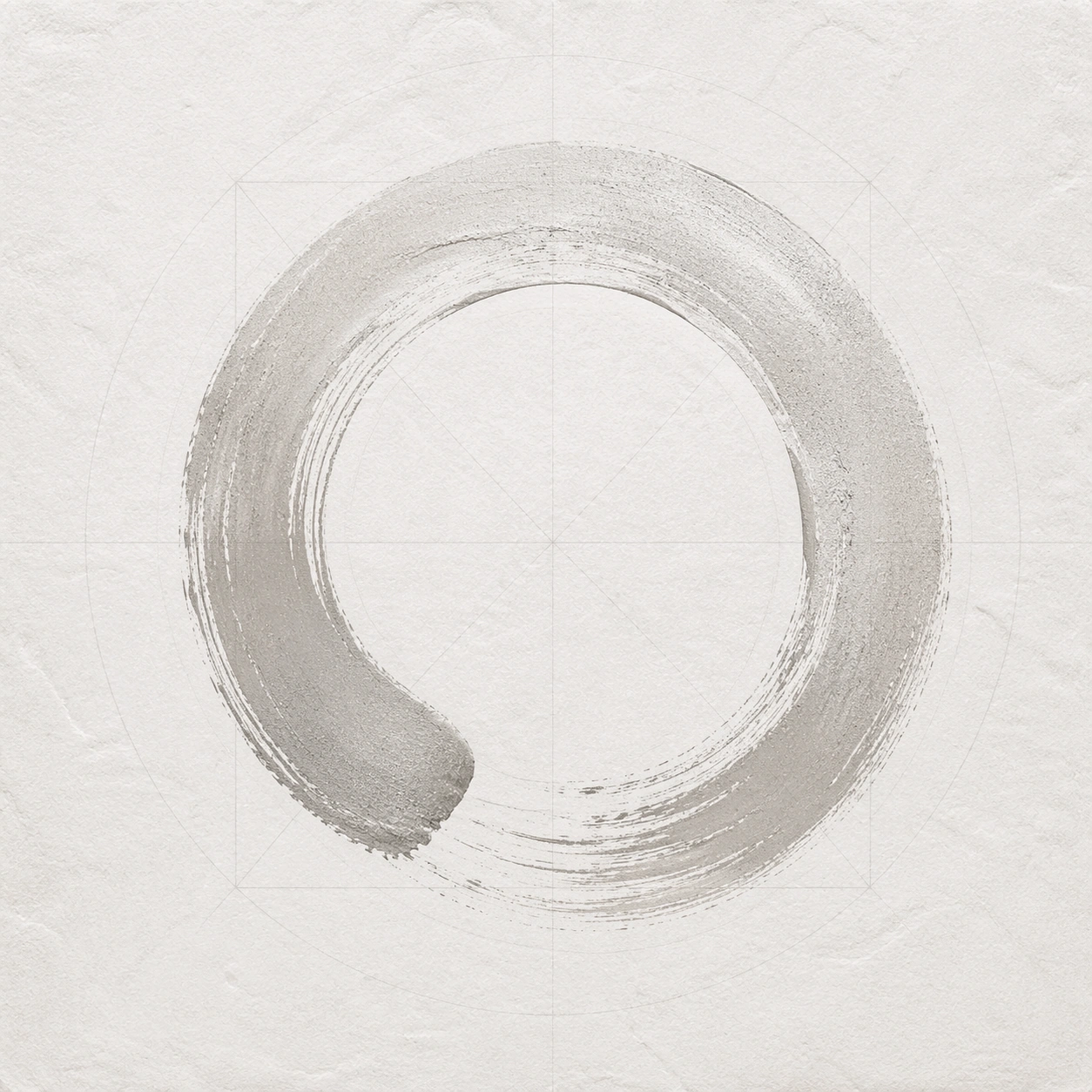
Example generated from “Zen Enso Golden Ratio — Moon White Negative Space”
GPT Image 2en

Scene: Create a square minimal composition that feels deliberate, costly, and exact rather than merely empty. The image should read as a face-on paper, wall, or material study in which negative space has been tuned with the same seriousness as the brushstroke itself. Lighting should be quiet and precise, revealing texture without cluttering the frame. Use whisper-soft contrast and frontal conservation lighting so minute paper relief becomes visible. Keep the square crop exact, the camera flat, and the tonal design disciplined enough that structure stays clear at poster scale and under close inspection. Subject: Use one enso brush circle or near-circle as the compositional anchor, positioned according to a disciplined proportional system that implies golden-ratio balance. The mark should feel made in one alive gesture, with real pressure variation, ink pooling, dry-brush edges, and breathing room around it. Surrounding grids or guides may be hinted at, but only as quiet structural support. Focus this variation on a near-monochrome white-on-white study where the enso is built from subtle ash grey and silvered paper depth. The composition should feel complete and singular, as though one finished artifact has been resolved with full conviction rather than one fragment pulled from a larger sheet. Important details: The main challenge is proportion, not decoration. Keep the empty field active, the circle poised, and the material surface believable. Small shifts in fiber, mineral pigment, metallic dust, or wall grain should strengthen the image's meditative authority without turning it into a poster gimmick. Any guide geometry must remain subtle and non-literal. The composition should prove that emptiness can carry weight, with the circle held by proportion, texture, and barely-there tonal shifts. Preserve crisp edge behavior, stable hierarchy, and enough fine information that the image rewards slow viewing without losing the main read from a distance. Use case: Zen Enso Ratio single study 8/9, designed as a self-contained sacred-geometry image with a distinct material and compositional emphasis. Constraints: No readable text, no watermark, no logos, preserve exact 1:1 aspect ratio, no readable calligraphy, no random bamboo props, no crowded zen cliche decor, no weak center of gravity, no muddy brush texture, no decorative motifs that compete with the circle, no invisible subject, no snow-scene metaphor, no decorative emboss pattern.

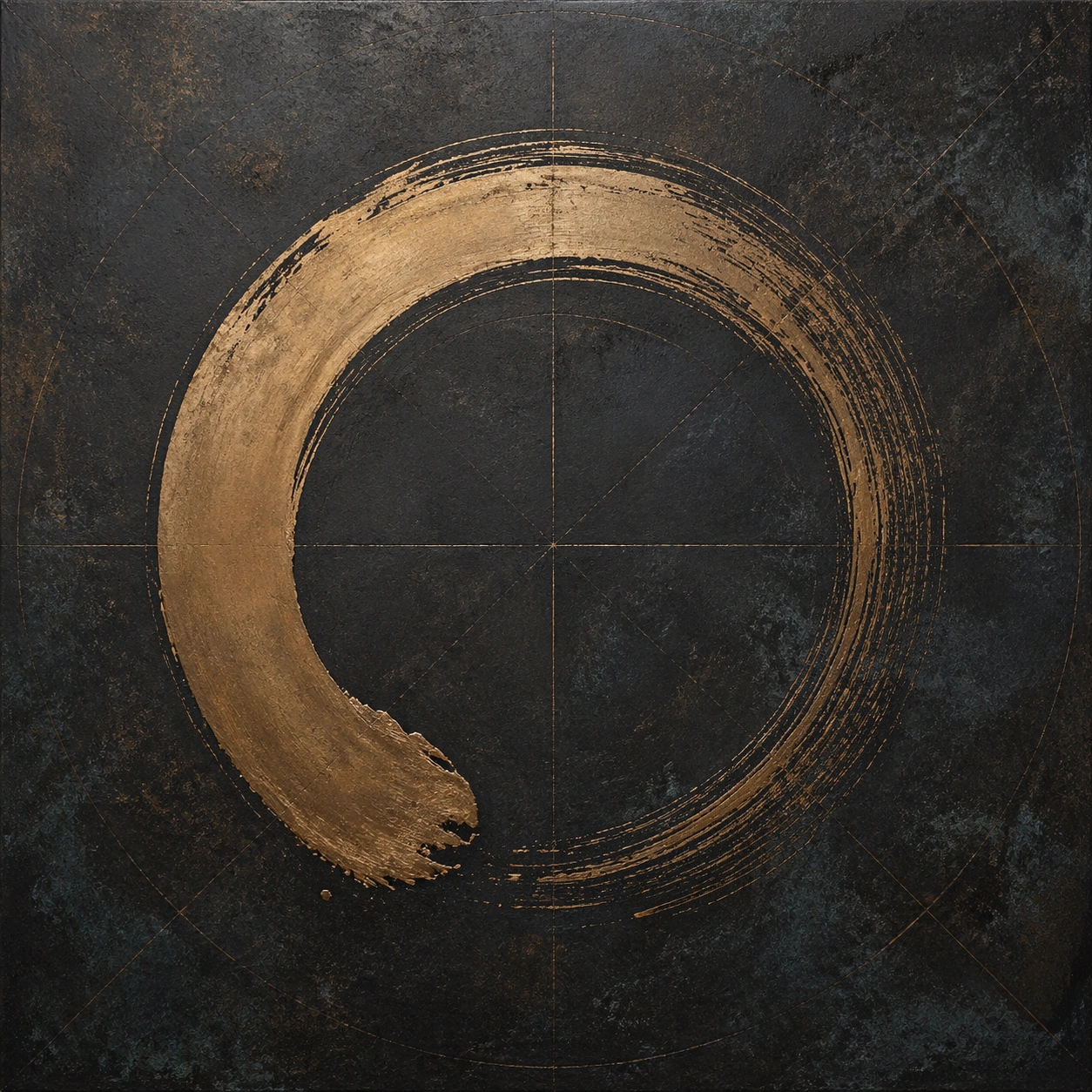
Example generated from “Zen Enso Golden Ratio — Bronze Oxide Circle”
GPT Image 2en

Scene: Create a square minimal composition that feels deliberate, costly, and exact rather than merely empty. The image should read as a face-on paper, wall, or material study in which negative space has been tuned with the same seriousness as the brushstroke itself. Lighting should be quiet and precise, revealing texture without cluttering the frame. Keep the surface tactile but controlled, using cool bronze and charcoal with no distracting environment. Keep the square crop exact, the camera flat, and the tonal design disciplined enough that structure stays clear at poster scale and under close inspection. Subject: Use one enso brush circle or near-circle as the compositional anchor, positioned according to a disciplined proportional system that implies golden-ratio balance. The mark should feel made in one alive gesture, with real pressure variation, ink pooling, dry-brush edges, and breathing room around it. Surrounding grids or guides may be hinted at, but only as quiet structural support. Focus this variation on a darker mineral study where the enso feels brushed over oxidized metal or patinated board with measured stillness. The composition should feel complete and singular, as though one finished artifact has been resolved with full conviction rather than one fragment pulled from a larger sheet. Important details: The main challenge is proportion, not decoration. Keep the empty field active, the circle poised, and the material surface believable. Small shifts in fiber, mineral pigment, metallic dust, or wall grain should strengthen the image's meditative authority without turning it into a poster gimmick. Any guide geometry must remain subtle and non-literal. Material richness should intensify the circle's gravity while the empty surrounding square remains spacious and balanced. Preserve crisp edge behavior, stable hierarchy, and enough fine information that the image rewards slow viewing without losing the main read from a distance. Use case: Zen Enso Ratio single study 9/9, designed as a self-contained sacred-geometry image with a distinct material and compositional emphasis. Constraints: No readable text, no watermark, no logos, preserve exact 1:1 aspect ratio, no readable calligraphy, no random bamboo props, no crowded zen cliche decor, no weak center of gravity, no muddy brush texture, no decorative motifs that compete with the circle, no industrial hardware, no rust damage spectacle, no steampunk mood.

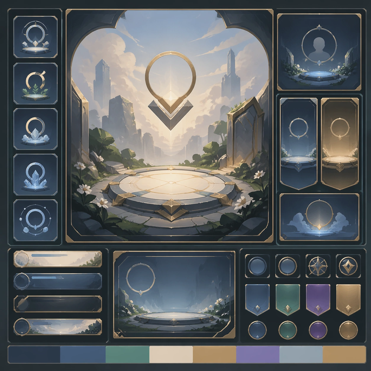
Example generated from “Onboarding Empty State Premium Kit — Support Five”
GPT Image 2en

Scene: Create a square standalone support image for Onboarding Empty State Premium Kit. Build a fifth support-surface study with a clear focal hierarchy and a finished professional surface. Use a polished modular board or campaign surface with clean spacing, premium game-UI finish, and clear focal hierarchy. The frame should feel self-contained and polished, with enough structure to explain the system even without the reference series, yet still obviously belonging to the same theme and production world. Subject: Show a coherent original game-art system built for premium production and marketing surfaces in a way that emphasizes the intended support surface. Keep the same system logic stable across screenshots, cards, banners, and overview boards. Even though this image is independent, the viewer should still recognize the same universe, same commercial logic, and same production intent as the core package. Important details: Lock framing, icon grammar, palette blocking, and surface hierarchy so the kit feels production-ready and consistent. Preserve the broader theme language through color, framing, material choices, and modular composition. Use clean panel rhythm, premium asset presentation, and believable detail density. The image should work equally well as a gallery study, research reference, and mock production deliverable. Use case: Onboarding Empty State Premium Kit single study 9/9, exploring support five as a support surface. Constraints: No readable text, no watermark, no logos, preserve exact 1:1 aspect ratio, no unrelated objects, no broken visual hierarchy, no visual noise that obscures the main surface, no accidental brand resemblance.

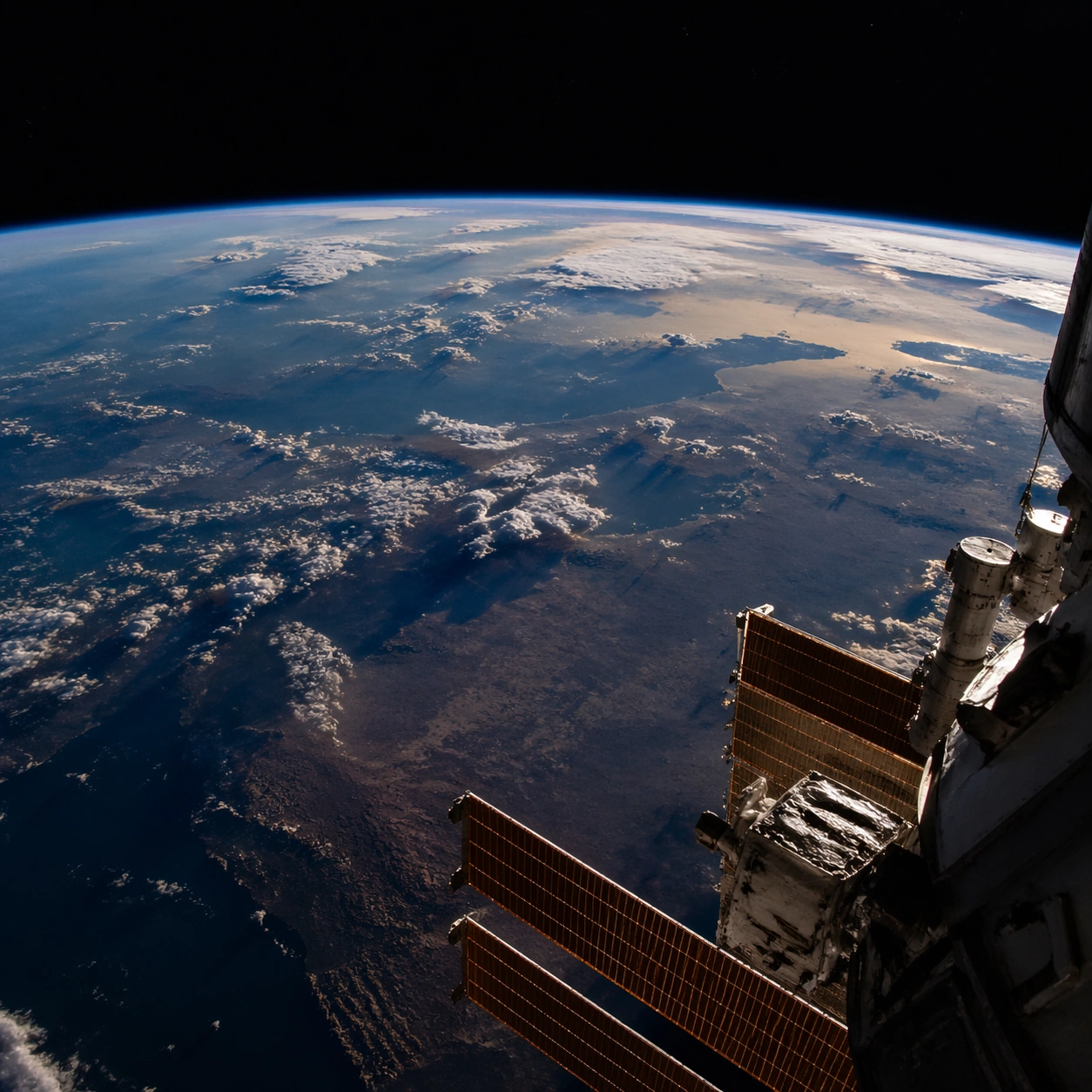
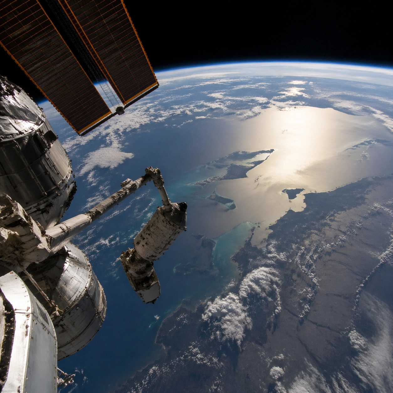
Example generated from “Orbital Earth Photography — Hero Shot”
GPT Image 2en

Scene: A square photographic image with intentional lens choice, coherent light, and a subject that feels observed rather than merely decorated. Build the frame around a definitive frame that establishes the subject’s strongest visual identity. Keep the lighting, camera distance, and spatial organization tuned for a high-signal research image rather than a casual snapshot. The image belongs to the Orbital Earth Photography theme and should feel immediately legible as a prompt atlas theme for orbital earth photography, testing photorealism, world-knowledge, style-transfer, editing-workflow with gpt image 2.. Subject: Center the study on a definitive frame that establishes the subject’s strongest visual identity. Translate the theme into a concrete visual statement instead of an abstract mood board: the viewer should understand what kind of image this is, what is being tested, and why the composition is difficult. Use the slug idea of orbital earth photography as a literal guide for subject matter, materials, and staging. If helpful, borrow the broad visual cues suggested by NASA ISS, but keep the result original and specific to this study. Important details: The realism should come from timing, optics, and material response: atmosphere, contrast, depth, motion, and tiny physical cues all need to agree. Preserve a disciplined square composition, clear focal hierarchy, and enough secondary information to make the image feel complete rather than underspecified. The image should look polished, novel, and exhibition-ready, with topic-specific credibility coming from the way surfaces, structure, and visual language reinforce Orbital Earth Photography. Avoid generic filler elements that do not serve the main concept. Use case: Orbital Earth Photography single study 1/8, testing photorealism, world-knowledge, style-transfer, editing-workflow through the hero shot variation. Constraints: No readable text, no watermark, no logos, preserve exact 1:1 aspect ratio, no watermark, no cheap HDR excess, no unreadable signage, no fake stock-photo posing, no compositing seams, no arbitrary lens flare.

Example generated from “Orbital Earth Photography — Macro Study”
GPT Image 2en

Scene: A square photographic image with intentional lens choice, coherent light, and a subject that feels observed rather than merely decorated. Build the frame around closer observation that reveals fine structure and optical behavior. Keep the lighting, camera distance, and spatial organization tuned for a high-signal research image rather than a casual snapshot. The image belongs to the Orbital Earth Photography theme and should feel immediately legible as a prompt atlas theme for orbital earth photography, testing photorealism, world-knowledge, style-transfer, editing-workflow with gpt image 2.. Subject: Center the study on closer observation that reveals fine structure and optical behavior. Translate the theme into a concrete visual statement instead of an abstract mood board: the viewer should understand what kind of image this is, what is being tested, and why the composition is difficult. Use the slug idea of orbital earth photography as a literal guide for subject matter, materials, and staging. If helpful, borrow the broad visual cues suggested by NASA ISS, but keep the result original and specific to this study. Important details: The realism should come from timing, optics, and material response: atmosphere, contrast, depth, motion, and tiny physical cues all need to agree. Preserve a disciplined square composition, clear focal hierarchy, and enough secondary information to make the image feel complete rather than underspecified. The image should look polished, novel, and exhibition-ready, with topic-specific credibility coming from the way surfaces, structure, and visual language reinforce Orbital Earth Photography. Avoid generic filler elements that do not serve the main concept. Use case: Orbital Earth Photography single study 2/8, testing photorealism, world-knowledge, style-transfer, editing-workflow through the macro study variation. Constraints: No readable text, no watermark, no logos, preserve exact 1:1 aspect ratio, no watermark, no cheap HDR excess, no unreadable signage, no fake stock-photo posing, no compositing seams, no arbitrary lens flare.

Example generated from “Orbital Earth Photography — Side Light Study”
GPT Image 2en

Scene: A square photographic image with intentional lens choice, coherent light, and a subject that feels observed rather than merely decorated. Build the frame around a directional-light treatment that increases form and drama. Keep the lighting, camera distance, and spatial organization tuned for a high-signal research image rather than a casual snapshot. The image belongs to the Orbital Earth Photography theme and should feel immediately legible as a prompt atlas theme for orbital earth photography, testing photorealism, world-knowledge, style-transfer, editing-workflow with gpt image 2.. Subject: Center the study on a directional-light treatment that increases form and drama. Translate the theme into a concrete visual statement instead of an abstract mood board: the viewer should understand what kind of image this is, what is being tested, and why the composition is difficult. Use the slug idea of orbital earth photography as a literal guide for subject matter, materials, and staging. If helpful, borrow the broad visual cues suggested by NASA ISS, but keep the result original and specific to this study. Important details: The realism should come from timing, optics, and material response: atmosphere, contrast, depth, motion, and tiny physical cues all need to agree. Preserve a disciplined square composition, clear focal hierarchy, and enough secondary information to make the image feel complete rather than underspecified. The image should look polished, novel, and exhibition-ready, with topic-specific credibility coming from the way surfaces, structure, and visual language reinforce Orbital Earth Photography. Avoid generic filler elements that do not serve the main concept. Use case: Orbital Earth Photography single study 3/8, testing photorealism, world-knowledge, style-transfer, editing-workflow through the side light study variation. Constraints: No readable text, no watermark, no logos, preserve exact 1:1 aspect ratio, no watermark, no cheap HDR excess, no unreadable signage, no fake stock-photo posing, no compositing seams, no arbitrary lens flare.

Example generated from “Orbital Earth Photography — Motion Moment”
GPT Image 2en

Scene: A square photographic image with intentional lens choice, coherent light, and a subject that feels observed rather than merely decorated. Build the frame around a time-sensitive or kinetic phenomenon captured at the right instant. Keep the lighting, camera distance, and spatial organization tuned for a high-signal research image rather than a casual snapshot. The image belongs to the Orbital Earth Photography theme and should feel immediately legible as a prompt atlas theme for orbital earth photography, testing photorealism, world-knowledge, style-transfer, editing-workflow with gpt image 2.. Subject: Center the study on a time-sensitive or kinetic phenomenon captured at the right instant. Translate the theme into a concrete visual statement instead of an abstract mood board: the viewer should understand what kind of image this is, what is being tested, and why the composition is difficult. Use the slug idea of orbital earth photography as a literal guide for subject matter, materials, and staging. If helpful, borrow the broad visual cues suggested by NASA ISS, but keep the result original and specific to this study. Important details: The realism should come from timing, optics, and material response: atmosphere, contrast, depth, motion, and tiny physical cues all need to agree. Preserve a disciplined square composition, clear focal hierarchy, and enough secondary information to make the image feel complete rather than underspecified. The image should look polished, novel, and exhibition-ready, with topic-specific credibility coming from the way surfaces, structure, and visual language reinforce Orbital Earth Photography. Avoid generic filler elements that do not serve the main concept. Use case: Orbital Earth Photography single study 4/8, testing photorealism, world-knowledge, style-transfer, editing-workflow through the motion moment variation. Constraints: No readable text, no watermark, no logos, preserve exact 1:1 aspect ratio, no watermark, no cheap HDR excess, no unreadable signage, no fake stock-photo posing, no compositing seams, no arbitrary lens flare.

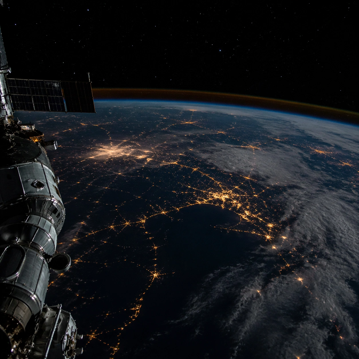
Example generated from “Orbital Earth Photography — Low-Light Atlas”
GPT Image 2en

Scene: A square photographic image with intentional lens choice, coherent light, and a subject that feels observed rather than merely decorated. Build the frame around a dusk, night, or low-light frame with disciplined exposure. Keep the lighting, camera distance, and spatial organization tuned for a high-signal research image rather than a casual snapshot. The image belongs to the Orbital Earth Photography theme and should feel immediately legible as a prompt atlas theme for orbital earth photography, testing photorealism, world-knowledge, style-transfer, editing-workflow with gpt image 2.. Subject: Center the study on a dusk, night, or low-light frame with disciplined exposure. Translate the theme into a concrete visual statement instead of an abstract mood board: the viewer should understand what kind of image this is, what is being tested, and why the composition is difficult. Use the slug idea of orbital earth photography as a literal guide for subject matter, materials, and staging. If helpful, borrow the broad visual cues suggested by NASA ISS, but keep the result original and specific to this study. Important details: The realism should come from timing, optics, and material response: atmosphere, contrast, depth, motion, and tiny physical cues all need to agree. Preserve a disciplined square composition, clear focal hierarchy, and enough secondary information to make the image feel complete rather than underspecified. The image should look polished, novel, and exhibition-ready, with topic-specific credibility coming from the way surfaces, structure, and visual language reinforce Orbital Earth Photography. Avoid generic filler elements that do not serve the main concept. Use case: Orbital Earth Photography single study 5/8, testing photorealism, world-knowledge, style-transfer, editing-workflow through the low-light atlas variation. Constraints: No readable text, no watermark, no logos, preserve exact 1:1 aspect ratio, no watermark, no cheap HDR excess, no unreadable signage, no fake stock-photo posing, no compositing seams, no arbitrary lens flare.

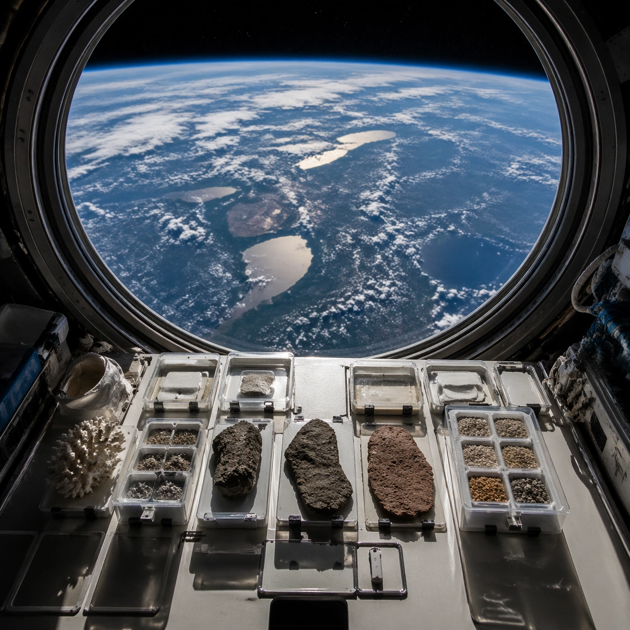
Example generated from “Orbital Earth Photography — Specimen Table”
GPT Image 2en

Scene: A square photographic image with intentional lens choice, coherent light, and a subject that feels observed rather than merely decorated. Build the frame around a carefully arranged or comparative frame that still feels photographic. Keep the lighting, camera distance, and spatial organization tuned for a high-signal research image rather than a casual snapshot. The image belongs to the Orbital Earth Photography theme and should feel immediately legible as a prompt atlas theme for orbital earth photography, testing photorealism, world-knowledge, style-transfer, editing-workflow with gpt image 2.. Subject: Center the study on a carefully arranged or comparative frame that still feels photographic. Translate the theme into a concrete visual statement instead of an abstract mood board: the viewer should understand what kind of image this is, what is being tested, and why the composition is difficult. Use the slug idea of orbital earth photography as a literal guide for subject matter, materials, and staging. If helpful, borrow the broad visual cues suggested by NASA ISS, but keep the result original and specific to this study. Important details: The realism should come from timing, optics, and material response: atmosphere, contrast, depth, motion, and tiny physical cues all need to agree. Preserve a disciplined square composition, clear focal hierarchy, and enough secondary information to make the image feel complete rather than underspecified. The image should look polished, novel, and exhibition-ready, with topic-specific credibility coming from the way surfaces, structure, and visual language reinforce Orbital Earth Photography. Avoid generic filler elements that do not serve the main concept. Use case: Orbital Earth Photography single study 6/8, testing photorealism, world-knowledge, style-transfer, editing-workflow through the specimen table variation. Constraints: No readable text, no watermark, no logos, preserve exact 1:1 aspect ratio, no watermark, no cheap HDR excess, no unreadable signage, no fake stock-photo posing, no compositing seams, no arbitrary lens flare.

Example generated from “Orbital Earth Photography — Atmospheric View”
GPT Image 2en

Scene: A square photographic image with intentional lens choice, coherent light, and a subject that feels observed rather than merely decorated. Build the frame around weather, haze, or volumetric light used to deepen realism. Keep the lighting, camera distance, and spatial organization tuned for a high-signal research image rather than a casual snapshot. The image belongs to the Orbital Earth Photography theme and should feel immediately legible as a prompt atlas theme for orbital earth photography, testing photorealism, world-knowledge, style-transfer, editing-workflow with gpt image 2.. Subject: Center the study on weather, haze, or volumetric light used to deepen realism. Translate the theme into a concrete visual statement instead of an abstract mood board: the viewer should understand what kind of image this is, what is being tested, and why the composition is difficult. Use the slug idea of orbital earth photography as a literal guide for subject matter, materials, and staging. If helpful, borrow the broad visual cues suggested by NASA ISS, but keep the result original and specific to this study. Important details: The realism should come from timing, optics, and material response: atmosphere, contrast, depth, motion, and tiny physical cues all need to agree. Preserve a disciplined square composition, clear focal hierarchy, and enough secondary information to make the image feel complete rather than underspecified. The image should look polished, novel, and exhibition-ready, with topic-specific credibility coming from the way surfaces, structure, and visual language reinforce Orbital Earth Photography. Avoid generic filler elements that do not serve the main concept. Use case: Orbital Earth Photography single study 7/8, testing photorealism, world-knowledge, style-transfer, editing-workflow through the atmospheric view variation. Constraints: No readable text, no watermark, no logos, preserve exact 1:1 aspect ratio, no watermark, no cheap HDR excess, no unreadable signage, no fake stock-photo posing, no compositing seams, no arbitrary lens flare.

Example generated from “Orbital Earth Photography — Signature Frame”
GPT Image 2en

Scene: A square photographic image with intentional lens choice, coherent light, and a subject that feels observed rather than merely decorated. Build the frame around the most memorable final image for the topic. Keep the lighting, camera distance, and spatial organization tuned for a high-signal research image rather than a casual snapshot. The image belongs to the Orbital Earth Photography theme and should feel immediately legible as a prompt atlas theme for orbital earth photography, testing photorealism, world-knowledge, style-transfer, editing-workflow with gpt image 2.. Subject: Center the study on the most memorable final image for the topic. Translate the theme into a concrete visual statement instead of an abstract mood board: the viewer should understand what kind of image this is, what is being tested, and why the composition is difficult. Use the slug idea of orbital earth photography as a literal guide for subject matter, materials, and staging. If helpful, borrow the broad visual cues suggested by NASA ISS, but keep the result original and specific to this study. Important details: The realism should come from timing, optics, and material response: atmosphere, contrast, depth, motion, and tiny physical cues all need to agree. Preserve a disciplined square composition, clear focal hierarchy, and enough secondary information to make the image feel complete rather than underspecified. The image should look polished, novel, and exhibition-ready, with topic-specific credibility coming from the way surfaces, structure, and visual language reinforce Orbital Earth Photography. Avoid generic filler elements that do not serve the main concept. Use case: Orbital Earth Photography single study 8/8, testing photorealism, world-knowledge, style-transfer, editing-workflow through the signature frame variation. Constraints: No readable text, no watermark, no logos, preserve exact 1:1 aspect ratio, no watermark, no cheap HDR excess, no unreadable signage, no fake stock-photo posing, no compositing seams, no arbitrary lens flare.

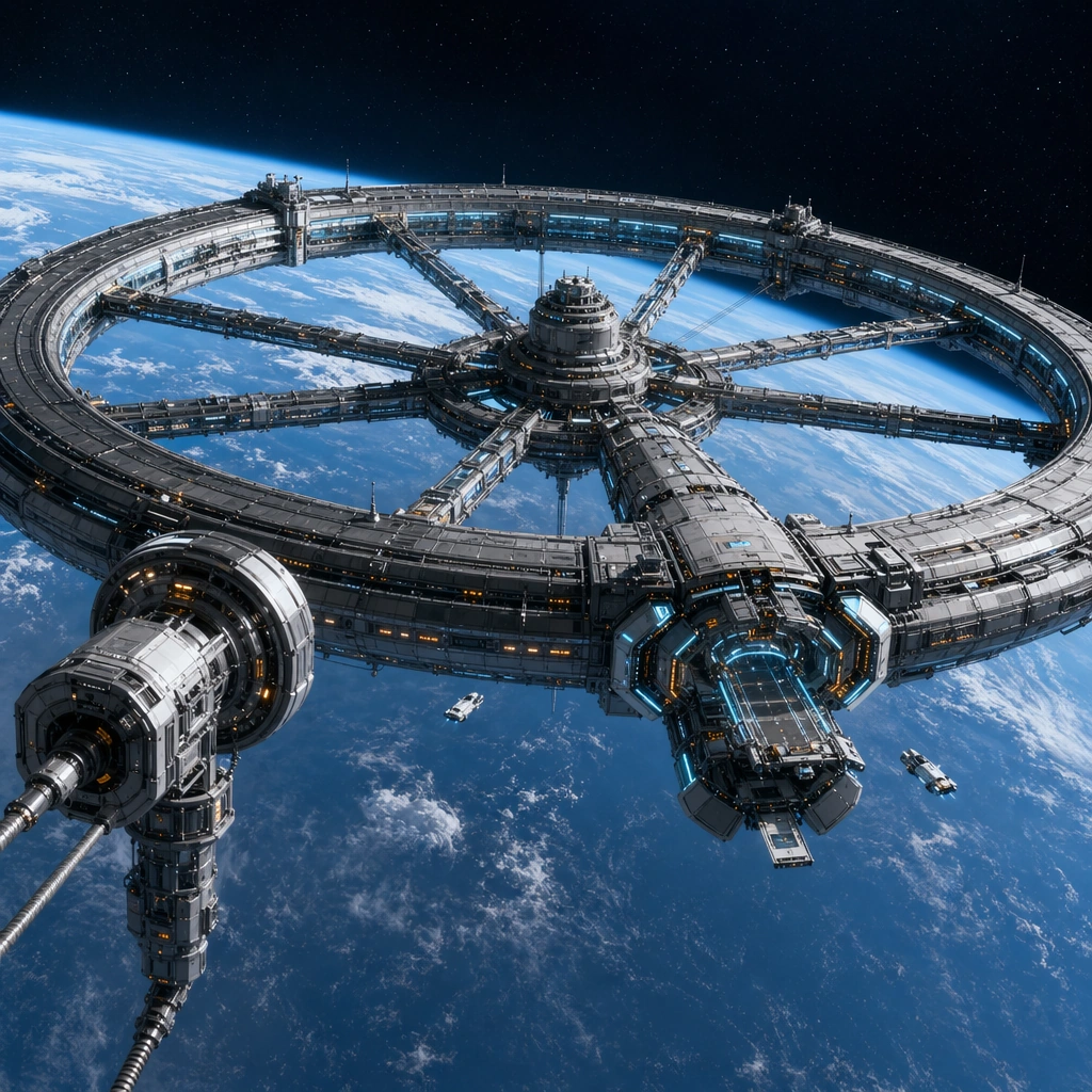
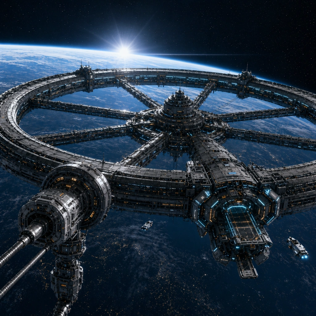
Example generated from “Orbital Megastructure Vista System — Planet Ring Anchor”
GPT Image 2en

Scene: Create a square cinematic concept-poster view of an orbital engineering landscape suspended above a luminous planet. The camera should feel slightly distant but still specific enough to read docking logic, structural depth, and scale cues from tiny service craft and maintenance windows. Use hard vacuum clarity, disciplined reflections on alloy surfaces, and the planet glow as the main light source. Frame the ring three-quarters across the square with a bright planet limb below and a tether port drifting in the near foreground. Subject: Center the composition on a coherent orbital megastructure language: a monumental ring habitat, tethered port geometry, segmented truss bands, docking petals, and believable traffic lanes for cargo shuttles. The architecture should read as designed by one civilization with clear engineering priorities rather than a random collage of science-fiction shapes. Establish one dominant habitable ring, one spoke cluster, one cargo docking crown, and a few tiny inspection craft so the infrastructure hierarchy resolves immediately. Important details: Keep engineering plausibility ahead of pure fantasy. Module spacing, rotational logic, light hierarchy, and human scale cues must all feel intentional. Use restrained graphite, silver, pale cyan, amber signal lights, and planetary blues so the set feels reusable across posters, key art, and worldbuilding decks. This is the anchor image for the fanout package, so the ring proportion, spoke cadence, and docking family must read cleanly at a glance and under close inspection. Resolve the anchor rules that later reference-dependent variants must inherit, especially the dominant ring silhouette, spoke spacing, dock petal rhythm, and cool-metal lighting hierarchy. Use case: Orbital Vistas series study 1/4, designed as a reusable core-system image for this topic. Constraints: No readable text, no watermark, no logos, preserve exact 1:1 aspect ratio, no fantasy throne shapes, no impossible gravity waterfalls, no chaotic ship clutter, no battle damage spectacle, no exaggerated lens flare.

Example generated from “Orbital Megastructure Vista System — Tether Port Dawn”
GPT Image 2en

Scene: Create a square cinematic concept-poster view of an orbital engineering landscape suspended above a luminous planet. The camera should feel slightly distant but still specific enough to read docking logic, structural depth, and scale cues from tiny service craft and maintenance windows. Use hard vacuum clarity, disciplined reflections on alloy surfaces, and the planet glow as the main light source. Shift the camera toward the tether port at orbital sunrise so the planet atmosphere glows softly behind the structure and the ring arcs into the distance. Subject: Center the composition on a coherent orbital megastructure language: a monumental ring habitat, tethered port geometry, segmented truss bands, docking petals, and believable traffic lanes for cargo shuttles. The architecture should read as designed by one civilization with clear engineering priorities rather than a random collage of science-fiction shapes. Make the tether elevators, cargo airlocks, and service gantries more prominent while keeping the same parent ring, spoke pattern, and docking crown from the reference. Important details: Keep engineering plausibility ahead of pure fantasy. Module spacing, rotational logic, light hierarchy, and human scale cues must all feel intentional. Use restrained graphite, silver, pale cyan, amber signal lights, and planetary blues so the set feels reusable across posters, key art, and worldbuilding decks. Use low-angle dawn light to reveal panel seams and truss depth without breaking the established silhouette or replacing the main ring with a different megastructure family. Preserve the exact structural language established by the reference image, especially the dominant ring silhouette, spoke spacing, dock petal rhythm, and cool-metal lighting hierarchy. Use case: Orbital Vistas series study 2/4, designed as a reusable core-system image for this topic. Constraints: No readable text, no watermark, no logos, preserve exact 1:1 aspect ratio, no fantasy throne shapes, no impossible gravity waterfalls, no chaotic ship clutter, no battle damage spectacle, no sunrise clouds inside space.

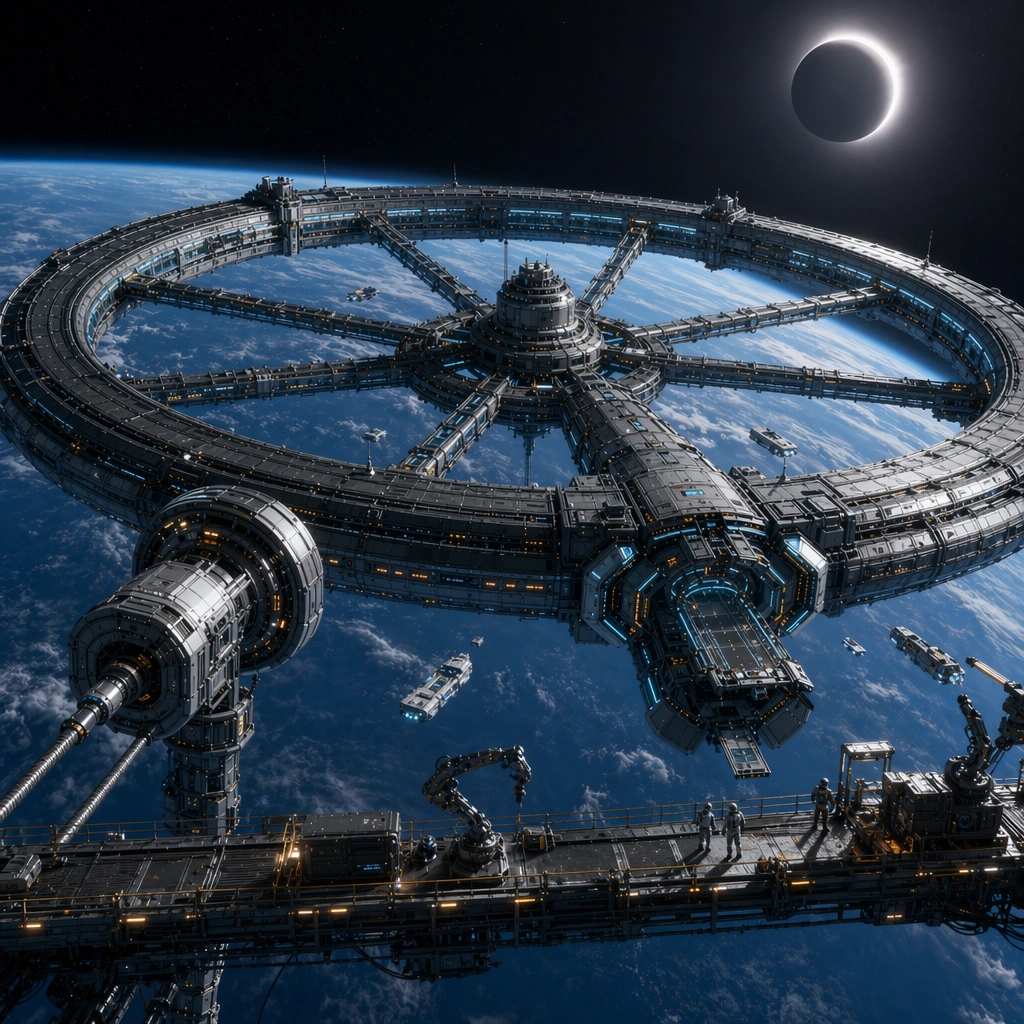
Example generated from “Orbital Megastructure Vista System — Eclipse Maintenance Span”
GPT Image 2en

Scene: Create a square cinematic concept-poster view of an orbital engineering landscape suspended above a luminous planet. The camera should feel slightly distant but still specific enough to read docking logic, structural depth, and scale cues from tiny service craft and maintenance windows. Use hard vacuum clarity, disciplined reflections on alloy surfaces, and the planet glow as the main light source. Stage the ring against a partial eclipse so one side falls into crisp shadow while maintenance lights trace along the service span in the foreground. Subject: Center the composition on a coherent orbital megastructure language: a monumental ring habitat, tethered port geometry, segmented truss bands, docking petals, and believable traffic lanes for cargo shuttles. The architecture should read as designed by one civilization with clear engineering priorities rather than a random collage of science-fiction shapes. Show repair platforms, articulated cranes, and tiny suited workers on an exterior span while the same ring and spoke geometry remains unmistakable in the background. Important details: Keep engineering plausibility ahead of pure fantasy. Module spacing, rotational logic, light hierarchy, and human scale cues must all feel intentional. Use restrained graphite, silver, pale cyan, amber signal lights, and planetary blues so the set feels reusable across posters, key art, and worldbuilding decks. The scene should feel operational rather than catastrophic, using shadow and work lights to expose engineering layers without inventing new architecture unrelated to the reference. Preserve the exact structural language established by the reference image, especially the dominant ring silhouette, spoke spacing, dock petal rhythm, and cool-metal lighting hierarchy. Use case: Orbital Vistas series study 3/4, designed as a reusable core-system image for this topic. Constraints: No readable text, no watermark, no logos, preserve exact 1:1 aspect ratio, no fantasy throne shapes, no impossible gravity waterfalls, no chaotic ship clutter, no battle damage spectacle, no explosion debris, no warfare mood.

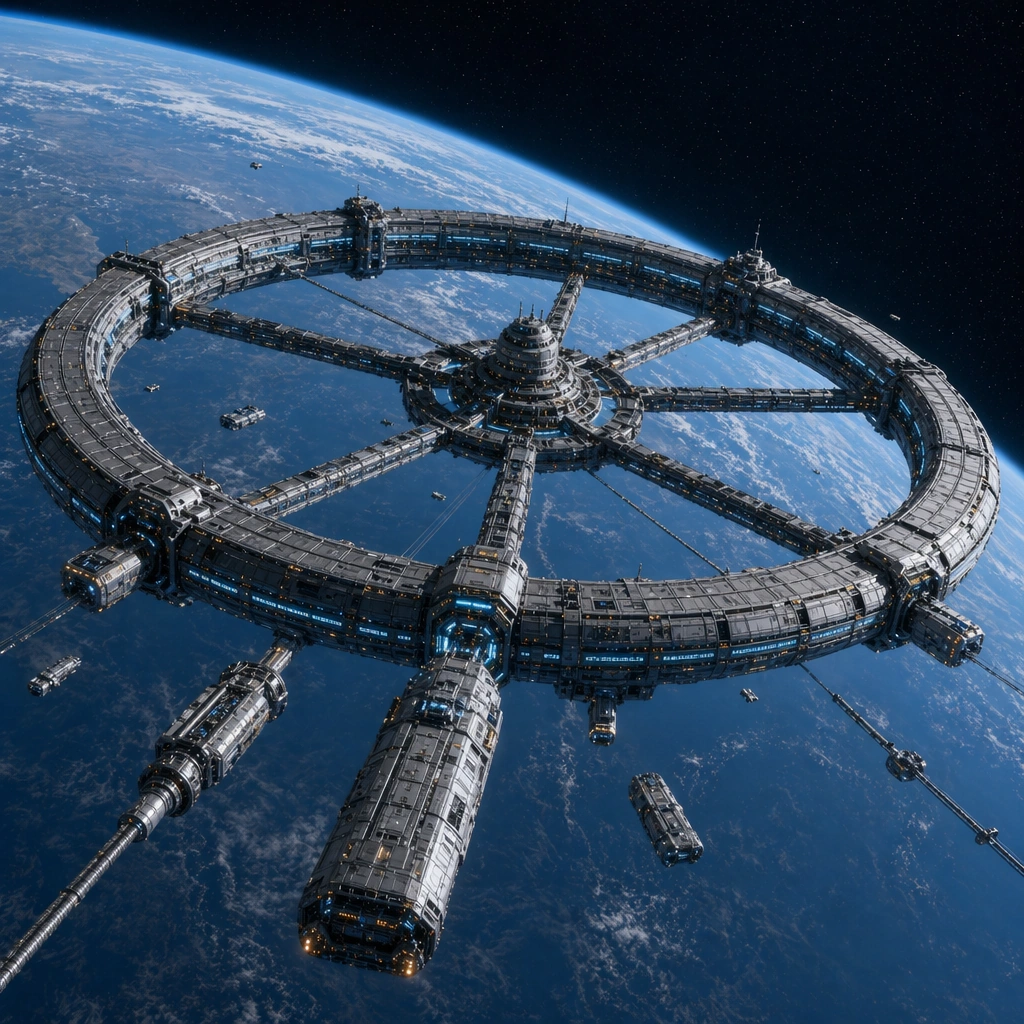
Example generated from “Orbital Megastructure Vista System — Cargo Orbit Approach”
GPT Image 2en

Scene: Create a square cinematic concept-poster view of an orbital engineering landscape suspended above a luminous planet. The camera should feel slightly distant but still specific enough to read docking logic, structural depth, and scale cues from tiny service craft and maintenance windows. Use hard vacuum clarity, disciplined reflections on alloy surfaces, and the planet glow as the main light source. View the ring from a freight approach corridor where a few large cargo carriers drift toward marked berths and the planet curve fills one corner of the frame. Subject: Center the composition on a coherent orbital megastructure language: a monumental ring habitat, tethered port geometry, segmented truss bands, docking petals, and believable traffic lanes for cargo shuttles. The architecture should read as designed by one civilization with clear engineering priorities rather than a random collage of science-fiction shapes. Keep the same anchor megastructure language while emphasizing berthing rhythm, cargo logistics, and the scale difference between freighters and the permanent habitat. Important details: Keep engineering plausibility ahead of pure fantasy. Module spacing, rotational logic, light hierarchy, and human scale cues must all feel intentional. Use restrained graphite, silver, pale cyan, amber signal lights, and planetary blues so the set feels reusable across posters, key art, and worldbuilding decks. Traffic must feel sparse, deliberate, and believable, with lane spacing and docking choreography that read as real infrastructure instead of a battle scene. Preserve the exact structural language established by the reference image, especially the dominant ring silhouette, spoke spacing, dock petal rhythm, and cool-metal lighting hierarchy. Use case: Orbital Vistas series study 4/4, designed as a reusable core-system image for this topic. Constraints: No readable text, no watermark, no logos, preserve exact 1:1 aspect ratio, no fantasy throne shapes, no impossible gravity waterfalls, no chaotic ship clutter, no battle damage spectacle, no swarming fighter ships, no smoky exhaust plumes.

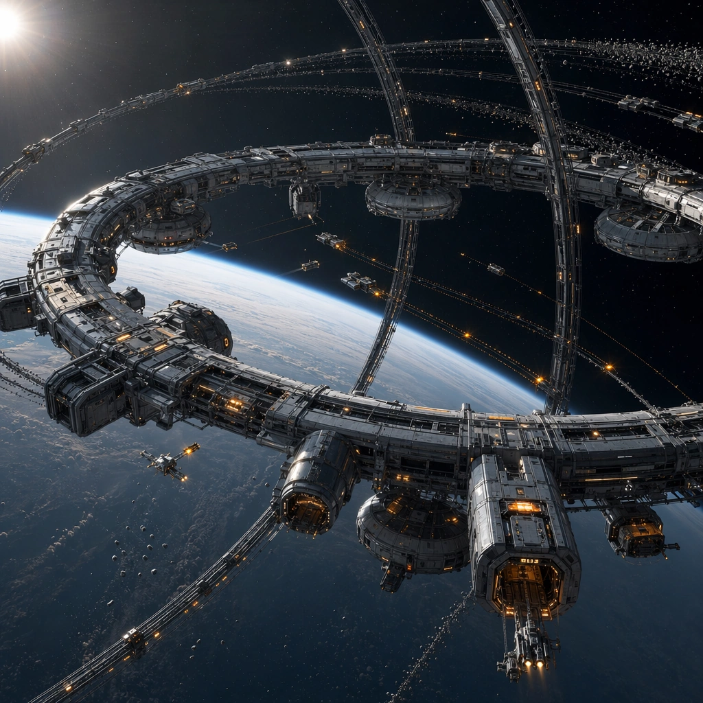
Example generated from “Orbital Megastructure Vista System — Magnet Array Halo”
GPT Image 2en

Scene: Design a square key-art study for speculative orbital infrastructure with strong depth, silent space atmosphere, and enough detail to feel like a finished professional concept poster. Treat each image as a distinct program or mission context rather than a small variation on the same frame. Show a wide orbital halo floating in hard sunlight with slender magnet arcs bending around the frame and a distant debris field under control. Subject: Show one legible orbital typology with disciplined silhouette, clear traffic logic, and small human or vehicle cues that reveal the scale without turning the composition into a crowded fleet battle. The design should feel commercially useful for worldbuilding, editorial, or launch-visual surfaces. The structure should read as a functional orbital sanitation network with guide beacons, collection pods, and repair apertures rather than as a mystical ring. Important details: Favor sharp hierarchy, credible modular engineering, and a palette of cool metals balanced by one environmental accent color. Each image should feel singular, but it must still belong to the same broader orbital design category with believable infrastructure grammar. Use disciplined spacing, crisp negative space, and clear motion cues in the debris lanes so the concept feels like a real public infrastructure program. Preserve internal logic in docking, circulation, and maintenance access so the megastructure feels buildable rather than decorative. Use case: Orbital Vistas single study 2/5, designed as a self-contained support image for this topic. Constraints: No readable text, no watermark, no logos, preserve exact 1:1 aspect ratio, no fantasy insignia, no heroic movie-poster characters, no crowded battle fleets, no readable station markings, no glowing magic field bubbles.

Example generated from “Orbital Megastructure Vista System — Refugee Orbit Corridor”
GPT Image 2en

Scene: Design a square key-art study for speculative orbital infrastructure with strong depth, silent space atmosphere, and enough detail to feel like a finished professional concept poster. Treat each image as a distinct program or mission context rather than a small variation on the same frame. Stage a calm transit corridor between habitation drums and medical docking arms with a planet sunrise far beyond the structure. Subject: Show one legible orbital typology with disciplined silhouette, clear traffic logic, and small human or vehicle cues that reveal the scale without turning the composition into a crowded fleet battle. The design should feel commercially useful for worldbuilding, editorial, or launch-visual surfaces. Include small transport craft, queueing berths, emergency greenhouse pods, and soft civic lighting so the megastructure reads as a humanitarian system instead of a fortress. Important details: Favor sharp hierarchy, credible modular engineering, and a palette of cool metals balanced by one environmental accent color. Each image should feel singular, but it must still belong to the same broader orbital design category with believable infrastructure grammar. Emphasize humane scale markers and orderly circulation while keeping the orbital setting vast, quiet, and engineering-driven. Preserve internal logic in docking, circulation, and maintenance access so the megastructure feels buildable rather than decorative. Use case: Orbital Vistas single study 3/5, designed as a self-contained support image for this topic. Constraints: No readable text, no watermark, no logos, preserve exact 1:1 aspect ratio, no fantasy insignia, no heroic movie-poster characters, no crowded battle fleets, no readable station markings, no military intimidation cues.

Example generated from “Orbital Megastructure Vista System — Debris Cleanse Cathedral”
GPT Image 2en

Scene: Design a square key-art study for speculative orbital infrastructure with strong depth, silent space atmosphere, and enough detail to feel like a finished professional concept poster. Treat each image as a distinct program or mission context rather than a small variation on the same frame. Compose a square vertical-feeling view inside a giant recycler aperture where shredded orbital material travels along luminous conveyor arcs into a processing throat. Subject: Show one legible orbital typology with disciplined silhouette, clear traffic logic, and small human or vehicle cues that reveal the scale without turning the composition into a crowded fleet battle. The design should feel commercially useful for worldbuilding, editorial, or launch-visual surfaces. The main structure should feel like civic infrastructure at megastructure scale, with gantries, capture grids, and repair niches giving the scene believable industrial depth. Important details: Favor sharp hierarchy, credible modular engineering, and a palette of cool metals balanced by one environmental accent color. Each image should feel singular, but it must still belong to the same broader orbital design category with believable infrastructure grammar. Balance awe with function so the void feels impressive but still clearly engineered for recycling, sorting, and safe orbital cleanup. Preserve internal logic in docking, circulation, and maintenance access so the megastructure feels buildable rather than decorative. Use case: Orbital Vistas single study 4/5, designed as a self-contained support image for this topic. Constraints: No readable text, no watermark, no logos, preserve exact 1:1 aspect ratio, no fantasy insignia, no heroic movie-poster characters, no crowded battle fleets, no readable station markings, no religious iconography, no molten fantasy forge.

Example generated from “Orbital Megastructure Vista System — Tourism Observation Rim”
GPT Image 2en

Scene: Design a square key-art study for speculative orbital infrastructure with strong depth, silent space atmosphere, and enough detail to feel like a finished professional concept poster. Treat each image as a distinct program or mission context rather than a small variation on the same frame. Show a broad observation rim above a richly colored planet with glassy pressure galleries and small viewing lounges suspended along the curve. Subject: Show one legible orbital typology with disciplined silhouette, clear traffic logic, and small human or vehicle cues that reveal the scale without turning the composition into a crowded fleet battle. The design should feel commercially useful for worldbuilding, editorial, or launch-visual surfaces. The structure should feel luxurious but still engineered, using support trusses, safety airlocks, service rails, and controlled visitor pods instead of a hotel fantasy. Important details: Favor sharp hierarchy, credible modular engineering, and a palette of cool metals balanced by one environmental accent color. Each image should feel singular, but it must still belong to the same broader orbital design category with believable infrastructure grammar. Let civilian calm, elegant circulation, and premium materials define the mood while the scale remains unmistakably orbital and infrastructural. Preserve internal logic in docking, circulation, and maintenance access so the megastructure feels buildable rather than decorative. Use case: Orbital Vistas single study 5/5, designed as a self-contained support image for this topic. Constraints: No readable text, no watermark, no logos, preserve exact 1:1 aspect ratio, no fantasy insignia, no heroic movie-poster characters, no crowded battle fleets, no readable station markings, no casino styling, no readable ads.

Example generated from “Organic Tech Interface Relic System — Relic Core Anchor”
GPT Image 2en

Scene: Create a square relic-device poster with enough atmosphere to imply archaeology, ritual, and lost interface logic while remaining visually precise. The scene can be staged on stone, resin, mineral, or ceremonial supports, but the framing should keep the device as the clear protagonist. Use directional light that reveals surface relief, embedded channels, and translucent organic layers without obscuring object structure. Stage an ovoid relic core on a carved plinth under angled light, with membrane windows, mineral ribs, and soft internal luminescence clearly visible. Subject: Center the composition on one biotech relic that fuses grown matter, carved mineral, membrane layers, luminous vessels, and interface surfaces into a coherent artifact. It should feel older than the viewer can fully understand, but still legible as a tool, console, or control core created by a sophisticated civilization. Establish the reference object family through one dominant core chamber, tactile interface hollows, channel veins, and supporting mineral frame. Important details: Prioritize object logic over mythology. Vein-like channels, tactile contact areas, hidden mechanisms, soft emissions, and material transitions should all suggest an organic user interface. The poster must feel commercially useful for prop design, worldbuilding boards, or key visual surfaces rather than as generic fantasy treasure. The anchor image should define the devices silhouette, material balance, and glow discipline so later variants can preserve the same relic language. Resolve the anchor rules that later reference-dependent variants must inherit, especially the ovoid core silhouette, vein-like circuitry, mineral-bone materials, and sacred device hierarchy. Use case: Organic Tech series study 1/4, designed as a reusable core-system image for this topic. Constraints: No readable text, no watermark, no logos, preserve exact 1:1 aspect ratio, no fantasy spell circles, no steampunk brass clutter, no readable glyph text, no obvious modern screens, no occult altar theatrics.

Example generated from “Organic Tech Interface Relic System — Awakened Circuit Bloom”
GPT Image 2en

Scene: Create a square relic-device poster with enough atmosphere to imply archaeology, ritual, and lost interface logic while remaining visually precise. The scene can be staged on stone, resin, mineral, or ceremonial supports, but the framing should keep the device as the clear protagonist. Use directional light that reveals surface relief, embedded channels, and translucent organic layers without obscuring object structure. Keep the same core geometry but open membrane petals and exposed channel blooms around the reference object under brighter internal light. Subject: Center the composition on one biotech relic that fuses grown matter, carved mineral, membrane layers, luminous vessels, and interface surfaces into a coherent artifact. It should feel older than the viewer can fully understand, but still legible as a tool, console, or control core created by a sophisticated civilization. Preserve the anchor silhouette and materials while revealing how the relic extends its interface surfaces during active use. Important details: Prioritize object logic over mythology. Vein-like channels, tactile contact areas, hidden mechanisms, soft emissions, and material transitions should all suggest an organic user interface. The poster must feel commercially useful for prop design, worldbuilding boards, or key visual surfaces rather than as generic fantasy treasure. Activation should feel biological and engineered, not magical, with channel growth and light flow following believable paths. Preserve the exact structural language established by the reference image, especially the ovoid core silhouette, vein-like circuitry, mineral-bone materials, and sacred device hierarchy. Use case: Organic Tech series study 2/4, designed as a reusable core-system image for this topic. Constraints: No readable text, no watermark, no logos, preserve exact 1:1 aspect ratio, no fantasy spell circles, no steampunk brass clutter, no readable glyph text, no obvious modern screens, no magic aura fog.

Example generated from “Organic Tech Interface Relic System — Ritual Carried Console”
GPT Image 2en

Scene: Create a square relic-device poster with enough atmosphere to imply archaeology, ritual, and lost interface logic while remaining visually precise. The scene can be staged on stone, resin, mineral, or ceremonial supports, but the framing should keep the device as the clear protagonist. Use directional light that reveals surface relief, embedded channels, and translucent organic layers without obscuring object structure. Render a carried console variant resting on textile supports or a transport frame while preserving the same core cavity, channels, and mineral-bone shell language. Subject: Center the composition on one biotech relic that fuses grown matter, carved mineral, membrane layers, luminous vessels, and interface surfaces into a coherent artifact. It should feel older than the viewer can fully understand, but still legible as a tool, console, or control core created by a sophisticated civilization. The object should clearly belong to the anchor family but compress into a more portable interface with grips, foldout membranes, and tactile activation zones. Important details: Prioritize object logic over mythology. Vein-like channels, tactile contact areas, hidden mechanisms, soft emissions, and material transitions should all suggest an organic user interface. The poster must feel commercially useful for prop design, worldbuilding boards, or key visual surfaces rather than as generic fantasy treasure. Portability must remain believable through weight cues, balance, and structural continuity, not through arbitrary miniaturization. Preserve the exact structural language established by the reference image, especially the ovoid core silhouette, vein-like circuitry, mineral-bone materials, and sacred device hierarchy. Use case: Organic Tech series study 3/4, designed as a reusable core-system image for this topic. Constraints: No readable text, no watermark, no logos, preserve exact 1:1 aspect ratio, no fantasy spell circles, no steampunk brass clutter, no readable glyph text, no obvious modern screens, no tablet-computer clichés.

Example generated from “Organic Tech Interface Relic System — Ruined Sanctum Installation”
GPT Image 2en

Scene: Create a square relic-device poster with enough atmosphere to imply archaeology, ritual, and lost interface logic while remaining visually precise. The scene can be staged on stone, resin, mineral, or ceremonial supports, but the framing should keep the device as the clear protagonist. Use directional light that reveals surface relief, embedded channels, and translucent organic layers without obscuring object structure. Embed the familiar core silhouette into a weathered architectural niche where root-like channels spread through stone and preserved translucent organs remain active. Subject: Center the composition on one biotech relic that fuses grown matter, carved mineral, membrane layers, luminous vessels, and interface surfaces into a coherent artifact. It should feel older than the viewer can fully understand, but still legible as a tool, console, or control core created by a sophisticated civilization. Preserve the anchor material grammar while translating it into architectural scale, with the interface becoming a shrine-like control installation. Important details: Prioritize object logic over mythology. Vein-like channels, tactile contact areas, hidden mechanisms, soft emissions, and material transitions should all suggest an organic user interface. The poster must feel commercially useful for prop design, worldbuilding boards, or key visual surfaces rather than as generic fantasy treasure. The room can feel old and quiet, but the primary read must remain the coherent device family and its functional relationship to the space. Preserve the exact structural language established by the reference image, especially the ovoid core silhouette, vein-like circuitry, mineral-bone materials, and sacred device hierarchy. Use case: Organic Tech series study 4/4, designed as a reusable core-system image for this topic. Constraints: No readable text, no watermark, no logos, preserve exact 1:1 aspect ratio, no fantasy spell circles, no steampunk brass clutter, no readable glyph text, no obvious modern screens, no temple idol worship framing.

Example generated from “Organic Tech Interface Relic System — Seed Vault Key”
GPT Image 2en

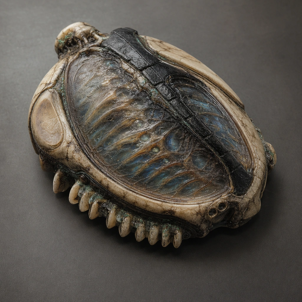
Scene: Design a square prop-study image for one relic interface object or installation, using atmosphere only to support object readability and material storytelling. The composition should feel collectible, publishable, and specific. Compose a collectible prop shot of a small key artifact with layered membranes, mineral teeth, and dormant channel glow against a quiet studio-like surface. Subject: Show a complete biotech relic with a clear function such as navigation, memory storage, ritual control, environmental sensing, or sealing. It should appear ancient yet advanced through the logic of grown channels, touch surfaces, and preserved internal light. The object should feel intimate and precise, with clear grip zones and activation surfaces that imply ritualized practical use. Important details: Favor disciplined object hierarchy, tactile material contrast, and implied use over pure ornament. Every glow, crack, or surface transition should contribute to the story of function and age. Make scale, material age, and interaction points immediately legible without relying on readable symbols. Preserve believable interaction logic so the relic feels operable within its world rather than simply mysterious. Use case: Organic Tech single study 1/5, designed as a self-contained support image for this topic. Constraints: No readable text, no watermark, no logos, preserve exact 1:1 aspect ratio, no wizard props, no superhero sci-fi gadgets, no random glowing runes, no commercial logos, no fantasy amulet clichés.

Example generated from “Organic Tech Interface Relic System — Membrane Observatory Dial”
GPT Image 2en

Scene: Design a square prop-study image for one relic interface object or installation, using atmosphere only to support object readability and material storytelling. The composition should feel collectible, publishable, and specific. Show a dial-like relic laid open under sidelight, with translucent membranes, radial mineral vanes, and sensing cavities revealed in layers. Subject: Show a complete biotech relic with a clear function such as navigation, memory storage, ritual control, environmental sensing, or sealing. It should appear ancient yet advanced through the logic of grown channels, touch surfaces, and preserved internal light. Treat the device as an observation instrument rather than a clock, with environmental sensing logic baked into every surface. Important details: Favor disciplined object hierarchy, tactile material contrast, and implied use over pure ornament. Every glow, crack, or surface transition should contribute to the story of function and age. The board should emphasize tactile measurement and ancient precision rather than decorative symbolism. Preserve believable interaction logic so the relic feels operable within its world rather than simply mysterious. Use case: Organic Tech single study 2/5, designed as a self-contained support image for this topic. Constraints: No readable text, no watermark, no logos, preserve exact 1:1 aspect ratio, no wizard props, no superhero sci-fi gadgets, no random glowing runes, no commercial logos, no astrological chart look.

Example generated from “Organic Tech Interface Relic System — Funerary Memory Pod”
GPT Image 2en

Scene: Design a square prop-study image for one relic interface object or installation, using atmosphere only to support object readability and material storytelling. The composition should feel collectible, publishable, and specific. Compose a solemn object study of an elongated pod with translucent chambers, preserved traces, and protective outer shell fractures. Subject: Show a complete biotech relic with a clear function such as navigation, memory storage, ritual control, environmental sensing, or sealing. It should appear ancient yet advanced through the logic of grown channels, touch surfaces, and preserved internal light. The relic should read as a memory-storage artifact tied to ceremony and care, not as a weapon or coffin cliché. Important details: Favor disciplined object hierarchy, tactile material contrast, and implied use over pure ornament. Every glow, crack, or surface transition should contribute to the story of function and age. Use quiet lighting and material tenderness to make the emotional function legible through form alone. Preserve believable interaction logic so the relic feels operable within its world rather than simply mysterious. Use case: Organic Tech single study 3/5, designed as a self-contained support image for this topic. Constraints: No readable text, no watermark, no logos, preserve exact 1:1 aspect ratio, no wizard props, no superhero sci-fi gadgets, no random glowing runes, no commercial logos, no horror corpse cues.

Example generated from “Organic Tech Interface Relic System — Tide Reading Altar”
GPT Image 2en

Scene: Design a square prop-study image for one relic interface object or installation, using atmosphere only to support object readability and material storytelling. The composition should feel collectible, publishable, and specific. Design a square environmental prop study where a low altar-like device sits beside mineral pools, with channel surfaces reacting to moisture and flow. Subject: Show a complete biotech relic with a clear function such as navigation, memory storage, ritual control, environmental sensing, or sealing. It should appear ancient yet advanced through the logic of grown channels, touch surfaces, and preserved internal light. The object should feel like a civic environmental instrument with ritual dignity, not a mystical magic prop. Important details: Favor disciplined object hierarchy, tactile material contrast, and implied use over pure ornament. Every glow, crack, or surface transition should contribute to the story of function and age. Let water traces, mineral residue, and sensing geometry explain purpose more than glow. Preserve believable interaction logic so the relic feels operable within its world rather than simply mysterious. Use case: Organic Tech single study 4/5, designed as a self-contained support image for this topic. Constraints: No readable text, no watermark, no logos, preserve exact 1:1 aspect ratio, no wizard props, no superhero sci-fi gadgets, no random glowing runes, no commercial logos, no spellcasting pose, no priest figures.

Example generated from “Organic Tech Interface Relic System — Bio Crystal Navigation Rib”
GPT Image 2en

Scene: Design a square prop-study image for one relic interface object or installation, using atmosphere only to support object readability and material storytelling. The composition should feel collectible, publishable, and specific. Compose a sharp prop poster with a rib-like device arcing across the square, translucent crystals nested in organic channels, and a quiet support cradle. Subject: Show a complete biotech relic with a clear function such as navigation, memory storage, ritual control, environmental sensing, or sealing. It should appear ancient yet advanced through the logic of grown channels, touch surfaces, and preserved internal light. The design should imply route selection, memory, and orientation through layered geometry and tactile touch points. Important details: Favor disciplined object hierarchy, tactile material contrast, and implied use over pure ornament. Every glow, crack, or surface transition should contribute to the story of function and age. Keep the object alien and elegant, with clear hierarchy between carrier shell, crystal logic, and user contact surfaces. Preserve believable interaction logic so the relic feels operable within its world rather than simply mysterious. Use case: Organic Tech single study 5/5, designed as a self-contained support image for this topic. Constraints: No readable text, no watermark, no logos, preserve exact 1:1 aspect ratio, no wizard props, no superhero sci-fi gadgets, no random glowing runes, no commercial logos, no spaceship dashboard interface panels.

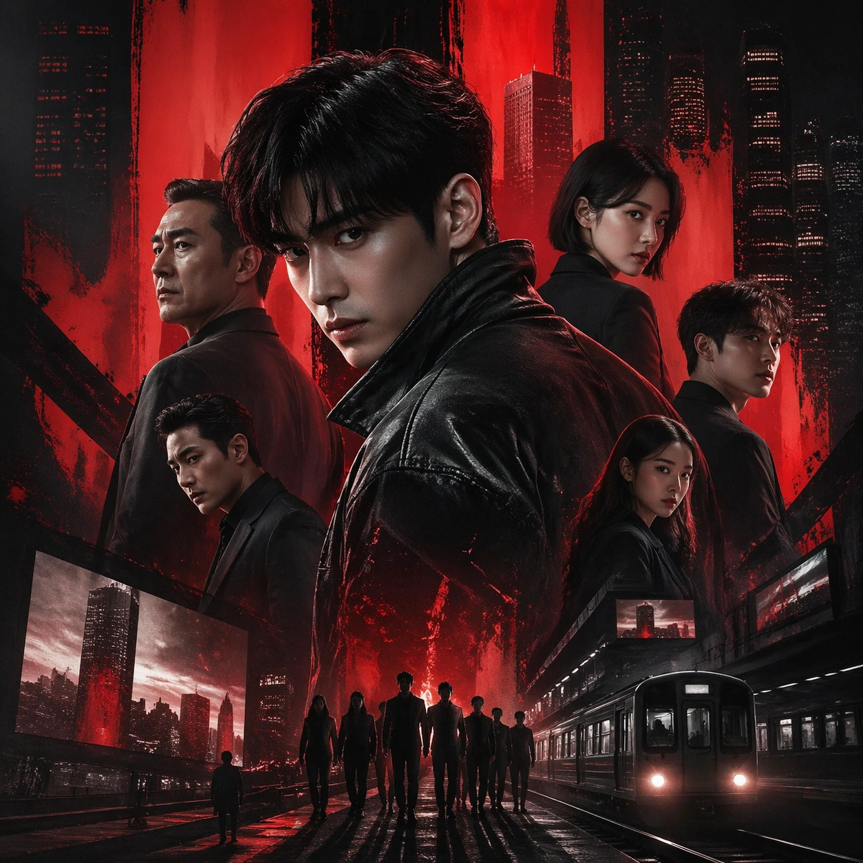
Example generated from “Outdoor Billboard Story Set — Reference Key Art”
GPT Image 2en

Scene: A square entertainment marketing key visual for Outdoor Billboard Story Set, designed like a polished campaign asset ready for posters, covers, feeds, or street placement. The composition should have immediate impact from a distance while still carrying layered detail up close. Keep the lighting dramatic, the hierarchy bold, and the framing tight enough to feel like real promotional art instead of a casual illustration. Subject: Center the piece on Reference Key Art, a frame that locks the cast hierarchy, focal rhythm, and signature sales composition for the series. Translate Extend one campaign idea into metro lightboxes, building screens, bus shelters, and event takeovers without losing clarity or impact. into a concrete campaign image with clear protagonist hierarchy, supporting world-building cues, and unmistakable promotional intent. The viewer should understand the genre, the ensemble relationships, and the commercial purpose at a glance without relying on readable text or existing brand marks. Important details: The challenge is disciplined hype. Preserve focal hierarchy, readable silhouette separation, strong foreground-background layering, and a convincing balance between character energy and structured layout. This theme studies commercial-mockup, structured-layout, world-knowledge, editing-workflow through a production-ready visual system. Even if typography is unreadable, space for title blocks, badges, or platform framing should feel intentionally designed. Aim for clear hierarchy, polished craft, and immediately usable campaign logic. Use case: Outdoor Billboard Story Set series study 1/4. Constraints: No readable text, no watermark, no logos, preserve exact 1:1 aspect ratio, no broken anatomy, no unreadable hierarchy collapse, no muddy montage, no accidental real movie logos, no random filler characters, no off-topic props.

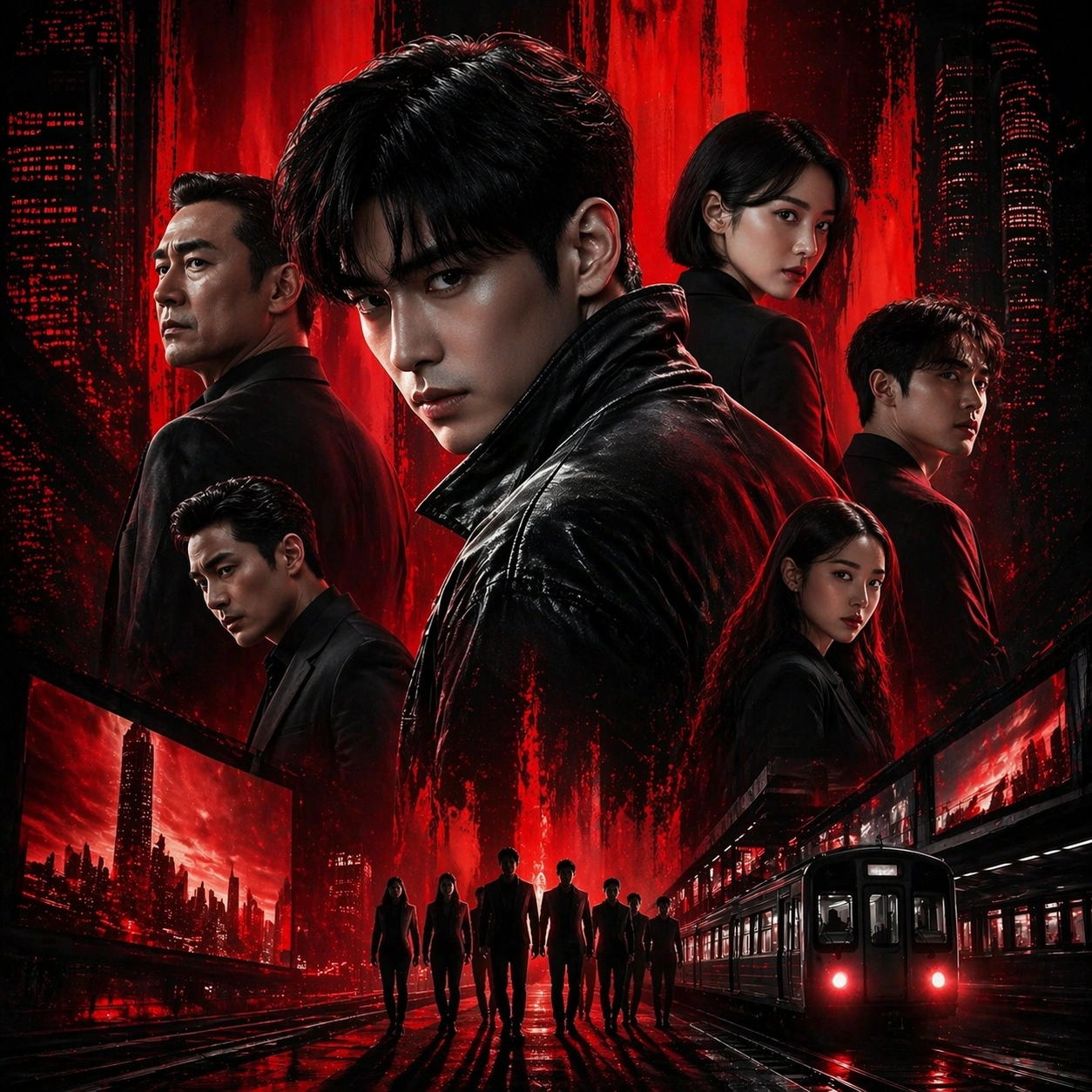
Example generated from “Outdoor Billboard Story Set — Character Surge”
GPT Image 2en

Scene: A square entertainment marketing key visual for Outdoor Billboard Story Set, designed like a polished campaign asset ready for posters, covers, feeds, or street placement. The composition should have immediate impact from a distance while still carrying layered detail up close. Keep the lighting dramatic, the hierarchy bold, and the framing tight enough to feel like real promotional art instead of a casual illustration. Subject: Center the piece on Character Surge, a frame that pushes the same poster language toward a more aggressive character-first emphasis. Translate Extend one campaign idea into metro lightboxes, building screens, bus shelters, and event takeovers without losing clarity or impact. into a concrete campaign image with clear protagonist hierarchy, supporting world-building cues, and unmistakable promotional intent. The viewer should understand the genre, the ensemble relationships, and the commercial purpose at a glance without relying on readable text or existing brand marks. Important details: The challenge is disciplined hype. Preserve focal hierarchy, readable silhouette separation, strong foreground-background layering, and a convincing balance between character energy and structured layout. This theme studies commercial-mockup, structured-layout, world-knowledge, editing-workflow through a production-ready visual system. Even if typography is unreadable, space for title blocks, badges, or platform framing should feel intentionally designed. Aim for clear hierarchy, polished craft, and immediately usable campaign logic. Use case: Outdoor Billboard Story Set series study 2/4. Constraints: No readable text, no watermark, no logos, preserve exact 1:1 aspect ratio, no broken anatomy, no unreadable hierarchy collapse, no muddy montage, no accidental real movie logos, no random filler characters, no off-topic props.

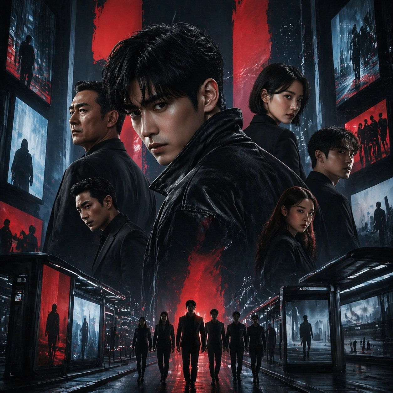
Example generated from “Outdoor Billboard Story Set — Genre Pivot”
GPT Image 2en

Scene: A square entertainment marketing key visual for Outdoor Billboard Story Set, designed like a polished campaign asset ready for posters, covers, feeds, or street placement. The composition should have immediate impact from a distance while still carrying layered detail up close. Keep the lighting dramatic, the hierarchy bold, and the framing tight enough to feel like real promotional art instead of a casual illustration. Subject: Center the piece on Genre Pivot, a frame that keeps the hierarchy but bends color, props, and supporting scenes toward a different subgenre. Translate Extend one campaign idea into metro lightboxes, building screens, bus shelters, and event takeovers without losing clarity or impact. into a concrete campaign image with clear protagonist hierarchy, supporting world-building cues, and unmistakable promotional intent. The viewer should understand the genre, the ensemble relationships, and the commercial purpose at a glance without relying on readable text or existing brand marks. Important details: The challenge is disciplined hype. Preserve focal hierarchy, readable silhouette separation, strong foreground-background layering, and a convincing balance between character energy and structured layout. This theme studies commercial-mockup, structured-layout, world-knowledge, editing-workflow through a production-ready visual system. Even if typography is unreadable, space for title blocks, badges, or platform framing should feel intentionally designed. Aim for clear hierarchy, polished craft, and immediately usable campaign logic. Use case: Outdoor Billboard Story Set series study 3/4. Constraints: No readable text, no watermark, no logos, preserve exact 1:1 aspect ratio, no broken anatomy, no unreadable hierarchy collapse, no muddy montage, no accidental real movie logos, no random filler characters, no off-topic props.

Example generated from “Outdoor Billboard Story Set — Finale Ensemble”
GPT Image 2en

Scene: A square entertainment marketing key visual for Outdoor Billboard Story Set, designed like a polished campaign asset ready for posters, covers, feeds, or street placement. The composition should have immediate impact from a distance while still carrying layered detail up close. Keep the lighting dramatic, the hierarchy bold, and the framing tight enough to feel like real promotional art instead of a casual illustration. Subject: Center the piece on Finale Ensemble, a frame that expands the same layout into a climax-heavy ensemble poster without losing readability. Translate Extend one campaign idea into metro lightboxes, building screens, bus shelters, and event takeovers without losing clarity or impact. into a concrete campaign image with clear protagonist hierarchy, supporting world-building cues, and unmistakable promotional intent. The viewer should understand the genre, the ensemble relationships, and the commercial purpose at a glance without relying on readable text or existing brand marks. Important details: The challenge is disciplined hype. Preserve focal hierarchy, readable silhouette separation, strong foreground-background layering, and a convincing balance between character energy and structured layout. This theme studies commercial-mockup, structured-layout, world-knowledge, editing-workflow through a production-ready visual system. Even if typography is unreadable, space for title blocks, badges, or platform framing should feel intentionally designed. Aim for clear hierarchy, polished craft, and immediately usable campaign logic. Use case: Outdoor Billboard Story Set series study 4/4. Constraints: No readable text, no watermark, no logos, preserve exact 1:1 aspect ratio, no broken anatomy, no unreadable hierarchy collapse, no muddy montage, no accidental real movie logos, no random filler characters, no off-topic props.

Example generated from “Outdoor Billboard Story Set — Teaser Card”
GPT Image 2en

Scene: A square entertainment marketing key visual for Outdoor Billboard Story Set, designed like a polished campaign asset ready for posters, covers, feeds, or street placement. The composition should have immediate impact from a distance while still carrying layered detail up close. Keep the lighting dramatic, the hierarchy bold, and the framing tight enough to feel like real promotional art instead of a casual illustration. Subject: Center the piece on Teaser Card, a frame that a compact mystery-first promo asset built for anticipation and visual tension. Translate Extend one campaign idea into metro lightboxes, building screens, bus shelters, and event takeovers without losing clarity or impact. into a concrete campaign image with clear protagonist hierarchy, supporting world-building cues, and unmistakable promotional intent. The viewer should understand the genre, the ensemble relationships, and the commercial purpose at a glance without relying on readable text or existing brand marks. Important details: The challenge is disciplined hype. Preserve focal hierarchy, readable silhouette separation, strong foreground-background layering, and a convincing balance between character energy and structured layout. This theme studies commercial-mockup, structured-layout, world-knowledge, editing-workflow through a production-ready visual system. Even if typography is unreadable, space for title blocks, badges, or platform framing should feel intentionally designed. Aim for clear hierarchy, polished craft, and immediately usable campaign logic. Use case: Outdoor Billboard Story Set single study 1/5. Constraints: No readable text, no watermark, no logos, preserve exact 1:1 aspect ratio, no broken anatomy, no unreadable hierarchy collapse, no muddy montage, no accidental real movie logos, no random filler characters, no off-topic props.

Example generated from “Outdoor Billboard Story Set — Countdown Poster”
GPT Image 2en

Scene: A square entertainment marketing key visual for Outdoor Billboard Story Set, designed like a polished campaign asset ready for posters, covers, feeds, or street placement. The composition should have immediate impact from a distance while still carrying layered detail up close. Keep the lighting dramatic, the hierarchy bold, and the framing tight enough to feel like real promotional art instead of a casual illustration. Subject: Center the piece on Countdown Poster, a frame that a countdown-ready campaign poster with bold hierarchy and tight emotional framing. Translate Extend one campaign idea into metro lightboxes, building screens, bus shelters, and event takeovers without losing clarity or impact. into a concrete campaign image with clear protagonist hierarchy, supporting world-building cues, and unmistakable promotional intent. The viewer should understand the genre, the ensemble relationships, and the commercial purpose at a glance without relying on readable text or existing brand marks. Important details: The challenge is disciplined hype. Preserve focal hierarchy, readable silhouette separation, strong foreground-background layering, and a convincing balance between character energy and structured layout. This theme studies commercial-mockup, structured-layout, world-knowledge, editing-workflow through a production-ready visual system. Even if typography is unreadable, space for title blocks, badges, or platform framing should feel intentionally designed. Aim for clear hierarchy, polished craft, and immediately usable campaign logic. Use case: Outdoor Billboard Story Set single study 2/5. Constraints: No readable text, no watermark, no logos, preserve exact 1:1 aspect ratio, no broken anatomy, no unreadable hierarchy collapse, no muddy montage, no accidental real movie logos, no random filler characters, no off-topic props.

Example generated from “Outdoor Billboard Story Set — Platform Crop Board”
GPT Image 2en

Scene: A square entertainment marketing key visual for Outdoor Billboard Story Set, designed like a polished campaign asset ready for posters, covers, feeds, or street placement. The composition should have immediate impact from a distance while still carrying layered detail up close. Keep the lighting dramatic, the hierarchy bold, and the framing tight enough to feel like real promotional art instead of a casual illustration. Subject: Center the piece on Platform Crop Board, a frame that a preview board showing how one campaign reads across multiple crop logics. Translate Extend one campaign idea into metro lightboxes, building screens, bus shelters, and event takeovers without losing clarity or impact. into a concrete campaign image with clear protagonist hierarchy, supporting world-building cues, and unmistakable promotional intent. The viewer should understand the genre, the ensemble relationships, and the commercial purpose at a glance without relying on readable text or existing brand marks. Important details: The challenge is disciplined hype. Preserve focal hierarchy, readable silhouette separation, strong foreground-background layering, and a convincing balance between character energy and structured layout. This theme studies commercial-mockup, structured-layout, world-knowledge, editing-workflow through a production-ready visual system. Even if typography is unreadable, space for title blocks, badges, or platform framing should feel intentionally designed. Aim for clear hierarchy, polished craft, and immediately usable campaign logic. Use case: Outdoor Billboard Story Set single study 3/5. Constraints: No readable text, no watermark, no logos, preserve exact 1:1 aspect ratio, no broken anatomy, no unreadable hierarchy collapse, no muddy montage, no accidental real movie logos, no random filler characters, no off-topic props.

Example generated from “Outdoor Billboard Story Set — Street Proof”
GPT Image 2en

Scene: A square entertainment marketing key visual for Outdoor Billboard Story Set, designed like a polished campaign asset ready for posters, covers, feeds, or street placement. The composition should have immediate impact from a distance while still carrying layered detail up close. Keep the lighting dramatic, the hierarchy bold, and the framing tight enough to feel like real promotional art instead of a casual illustration. Subject: Center the piece on Street Proof, a frame that a public-facing proof image showing the campaign translated into a convincing real-world display. Translate Extend one campaign idea into metro lightboxes, building screens, bus shelters, and event takeovers without losing clarity or impact. into a concrete campaign image with clear protagonist hierarchy, supporting world-building cues, and unmistakable promotional intent. The viewer should understand the genre, the ensemble relationships, and the commercial purpose at a glance without relying on readable text or existing brand marks. Important details: The challenge is disciplined hype. Preserve focal hierarchy, readable silhouette separation, strong foreground-background layering, and a convincing balance between character energy and structured layout. This theme studies commercial-mockup, structured-layout, world-knowledge, editing-workflow through a production-ready visual system. Even if typography is unreadable, space for title blocks, badges, or platform framing should feel intentionally designed. Aim for clear hierarchy, polished craft, and immediately usable campaign logic. Use case: Outdoor Billboard Story Set single study 4/5. Constraints: No readable text, no watermark, no logos, preserve exact 1:1 aspect ratio, no broken anatomy, no unreadable hierarchy collapse, no muddy montage, no accidental real movie logos, no random filler characters, no off-topic props.

Example generated from “Outdoor Billboard Story Set — Merch Sell Sheet”
GPT Image 2en

Scene: A square entertainment marketing key visual for Outdoor Billboard Story Set, designed like a polished campaign asset ready for posters, covers, feeds, or street placement. The composition should have immediate impact from a distance while still carrying layered detail up close. Keep the lighting dramatic, the hierarchy bold, and the framing tight enough to feel like real promotional art instead of a casual illustration. Subject: Center the piece on Merch Sell Sheet, a frame that a supporting sell-sheet style visual connecting the campaign to collectible or retail energy. Translate Extend one campaign idea into metro lightboxes, building screens, bus shelters, and event takeovers without losing clarity or impact. into a concrete campaign image with clear protagonist hierarchy, supporting world-building cues, and unmistakable promotional intent. The viewer should understand the genre, the ensemble relationships, and the commercial purpose at a glance without relying on readable text or existing brand marks. Important details: The challenge is disciplined hype. Preserve focal hierarchy, readable silhouette separation, strong foreground-background layering, and a convincing balance between character energy and structured layout. This theme studies commercial-mockup, structured-layout, world-knowledge, editing-workflow through a production-ready visual system. Even if typography is unreadable, space for title blocks, badges, or platform framing should feel intentionally designed. Aim for clear hierarchy, polished craft, and immediately usable campaign logic. Use case: Outdoor Billboard Story Set single study 5/5. Constraints: No readable text, no watermark, no logos, preserve exact 1:1 aspect ratio, no broken anatomy, no unreadable hierarchy collapse, no muddy montage, no accidental real movie logos, no random filler characters, no off-topic props.

Example generated from “Packaged Food Lifestyle Scene System — Pantry Anchor”
GPT Image 2en

Scene: Compose a square packaged-food lifestyle image that connects shelf-ready packaging with actual household use, serving, and meal preparation. The frame should feel commercially precise but lived in, showing how the package belongs inside a believable kitchen, pantry, or dining context rather than isolated white-background product photography. Use a square kitchen-counter composition with soft natural light, visible pantry shelving blur, and a balanced relationship between packaged product and plated food. Subject: The package must stay clearly visible and physically plausible, while the prepared food, ingredients, bowls, or serving scene demonstrate real usage and appetite appeal. Show one packaged food item beside a prepared serving in a bowl or plate, with ingredients or utensils suggesting real household use. Important details: This topic tests bridge-building between package design and lived food context. Preserve realistic kitchen materials, pantry organization, serving logic, and package handling so the brand feels trustworthy and useful. If abstract label areas appear, they must remain unreadable; trust should come from materials, cooking cues, and scene credibility rather than literal copy. This image establishes the reference system for the series, including camera height, tabletop discipline, prop family, and color control that later images must inherit. This anchor image must define the domestic visual system for the series: package readability without legible text, believable kitchen order, and appetite appeal grounded in everyday use. Use case: Food Package Scenes series study 1/9, built for Prompt Atlas coverage of a food and beverage commercial visual system. Constraints: No readable text, no watermark, no logos, preserve exact 1:1 aspect ratio, no readable text, no logos, no sterile white studio void, no messy family chaos, no unrealistic packaging scale, no cluttered supermarket shelf wall, no readable nutrition panel, no giant family spread, no messy sink or appliances.

Example generated from “Packaged Food Lifestyle Scene System — Breakfast Serve Bowl”
GPT Image 2en

Scene: Compose a square packaged-food lifestyle image that connects shelf-ready packaging with actual household use, serving, and meal preparation. The frame should feel commercially precise but lived in, showing how the package belongs inside a believable kitchen, pantry, or dining context rather than isolated white-background product photography. Keep the same kitchen palette and household realism, but brighten the mood with early daylight, ceramic breakfast ware, and a calmer morning counter setup. Subject: The package must stay clearly visible and physically plausible, while the prepared food, ingredients, bowls, or serving scene demonstrate real usage and appetite appeal. Pair the packaged product with a freshly served breakfast bowl, cereal, granola, oats, or another relevant use case that feels natural for the pack type. Important details: This topic tests bridge-building between package design and lived food context. Preserve realistic kitchen materials, pantry organization, serving logic, and package handling so the brand feels trustworthy and useful. If abstract label areas appear, they must remain unreadable; trust should come from materials, cooking cues, and scene credibility rather than literal copy. Preserve the exact camera height, lens feel, prop family, tabletop scale, palette discipline, and brand logic established by 01-pantry-anchor. Preserve the anchor relationship between packaging and prepared food while emphasizing spoonable texture, bowl warmth, and morning ease. Use case: Food Package Scenes series study 2/9, built for Prompt Atlas coverage of a food and beverage commercial visual system. Constraints: No readable text, no watermark, no logos, preserve exact 1:1 aspect ratio, no readable text, no logos, no sterile white studio void, no messy family chaos, no unrealistic packaging scale, no cluttered supermarket shelf wall, no cereal-box mascot, no readable box copy, no kid-targeted cartoon styling.

Example generated from “Packaged Food Lifestyle Scene System — Lunch Prep Counter”
GPT Image 2en

Scene: Compose a square packaged-food lifestyle image that connects shelf-ready packaging with actual household use, serving, and meal preparation. The frame should feel commercially precise but lived in, showing how the package belongs inside a believable kitchen, pantry, or dining context rather than isolated white-background product photography. Maintain the same domestic counter and natural light feel, but introduce one board, one lunch container, and partial ingredient prep elements. Subject: The package must stay clearly visible and physically plausible, while the prepared food, ingredients, bowls, or serving scene demonstrate real usage and appetite appeal. Show the packaged food in the context of assembling a practical lunch or quick meal, with the prepared result clearly visible nearby. Important details: This topic tests bridge-building between package design and lived food context. Preserve realistic kitchen materials, pantry organization, serving logic, and package handling so the brand feels trustworthy and useful. If abstract label areas appear, they must remain unreadable; trust should come from materials, cooking cues, and scene credibility rather than literal copy. Preserve the exact camera height, lens feel, prop family, tabletop scale, palette discipline, and brand logic established by 01-pantry-anchor. The reference kitchen language should remain stable through surfaces, utensils, and palette, while the scene gains more task-oriented energy. Use case: Food Package Scenes series study 3/9, built for Prompt Atlas coverage of a food and beverage commercial visual system. Constraints: No readable text, no watermark, no logos, preserve exact 1:1 aspect ratio, no readable text, no logos, no sterile white studio void, no messy family chaos, no unrealistic packaging scale, no cluttered supermarket shelf wall, no full human face, no chaotic meal prep mess, no readable stickers.

Example generated from “Packaged Food Lifestyle Scene System — Family Style Finish”
GPT Image 2en

Scene: Compose a square packaged-food lifestyle image that connects shelf-ready packaging with actual household use, serving, and meal preparation. The frame should feel commercially precise but lived in, showing how the package belongs inside a believable kitchen, pantry, or dining context rather than isolated white-background product photography. Retain the same kitchen-to-dining-room material palette, but open the crop to include a larger serving vessel and a modest table context. Subject: The package must stay clearly visible and physically plausible, while the prepared food, ingredients, bowls, or serving scene demonstrate real usage and appetite appeal. Present the packaged product alongside a finished family-style serving, showing how the item scales from pantry object to shared meal centerpiece. Important details: This topic tests bridge-building between package design and lived food context. Preserve realistic kitchen materials, pantry organization, serving logic, and package handling so the brand feels trustworthy and useful. If abstract label areas appear, they must remain unreadable; trust should come from materials, cooking cues, and scene credibility rather than literal copy. Preserve the exact camera height, lens feel, prop family, tabletop scale, palette discipline, and brand logic established by 01-pantry-anchor. Continuity with the anchor image matters: package scale, home realism, and serving credibility should stay locked while the meal becomes more communal. Use case: Food Package Scenes series study 4/9, built for Prompt Atlas coverage of a food and beverage commercial visual system. Constraints: No readable text, no watermark, no logos, preserve exact 1:1 aspect ratio, no readable text, no logos, no sterile white studio void, no messy family chaos, no unrealistic packaging scale, no cluttered supermarket shelf wall, no banquet excess, no visible brand text, no party decorations.

Example generated from “Packaged Food Lifestyle Scene System — Lunchbox Flatlay”
GPT Image 2en

Scene: Compose a square packaged-food lifestyle image that connects shelf-ready packaging with actual household use, serving, and meal preparation. The frame should feel commercially precise but lived in, showing how the package belongs inside a believable kitchen, pantry, or dining context rather than isolated white-background product photography. Shoot from overhead on a clean kitchen surface with a lunchbox, one portioned serving, and the package arranged into a tidy square composition. Subject: The package must stay clearly visible and physically plausible, while the prepared food, ingredients, bowls, or serving scene demonstrate real usage and appetite appeal. Connect the original packaged product to a practical meal-prep outcome using clear portions and relatable household context. Important details: This topic tests bridge-building between package design and lived food context. Preserve realistic kitchen materials, pantry organization, serving logic, and package handling so the brand feels trustworthy and useful. If abstract label areas appear, they must remain unreadable; trust should come from materials, cooking cues, and scene credibility rather than literal copy. This image should feel fully self-contained while still belonging to the same broader topic and commercial world. Compartment logic, utensil placement, and ingredient color balance should all reinforce usefulness and appetite without losing package visibility. Use case: Food Package Scenes single study 6/9, built for Prompt Atlas coverage of a food and beverage commercial visual system. Constraints: No readable text, no watermark, no logos, preserve exact 1:1 aspect ratio, no readable text, no logos, no sterile white studio void, no messy family chaos, no unrealistic packaging scale, no cluttered supermarket shelf wall, no office desk clutter, no readable sticky notes, no cafeteria tray aesthetic.

Example generated from “Packaged Food Lifestyle Scene System — Ingredient Spill Study”
GPT Image 2en

Scene: Compose a square packaged-food lifestyle image that connects shelf-ready packaging with actual household use, serving, and meal preparation. The frame should feel commercially precise but lived in, showing how the package belongs inside a believable kitchen, pantry, or dining context rather than isolated white-background product photography. Compose a square still life on a counter with the package partly opened and a controlled spill or arranged reveal of key ingredients. Subject: The package must stay clearly visible and physically plausible, while the prepared food, ingredients, bowls, or serving scene demonstrate real usage and appetite appeal. Keep the package visible while ingredients or product pieces form a small, carefully art-directed spread beside it. Important details: This topic tests bridge-building between package design and lived food context. Preserve realistic kitchen materials, pantry organization, serving logic, and package handling so the brand feels trustworthy and useful. If abstract label areas appear, they must remain unreadable; trust should come from materials, cooking cues, and scene credibility rather than literal copy. This image should feel fully self-contained while still belonging to the same broader topic and commercial world. The result should feel premium and informative without becoming an exploded technical diagram. Material realism, shadows, and packaging folds should carry the story. Use case: Food Package Scenes single study 7/9, built for Prompt Atlas coverage of a food and beverage commercial visual system. Constraints: No readable text, no watermark, no logos, preserve exact 1:1 aspect ratio, no readable text, no logos, no sterile white studio void, no messy family chaos, no unrealistic packaging scale, no cluttered supermarket shelf wall, no messy dump, no readable ingredient list, no sterile lab vibe.

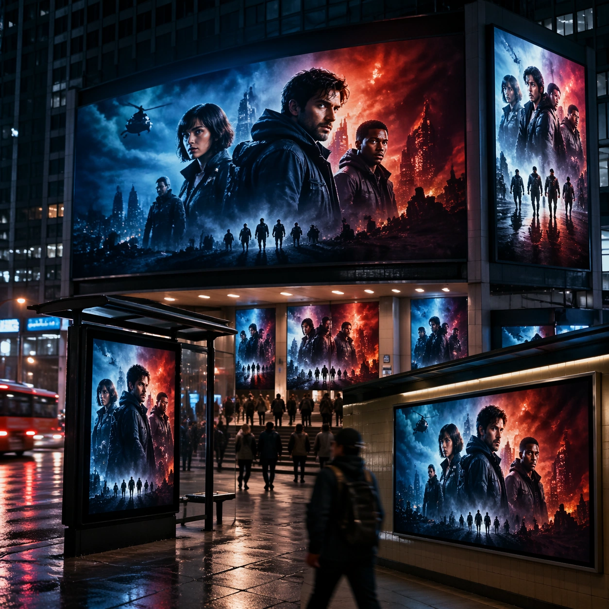
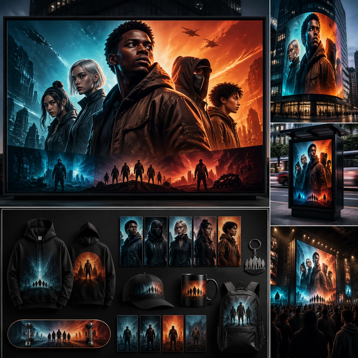
Example generated from “Packaged Food Lifestyle Scene System — Weeknight Cooking Scene”
GPT Image 2en

Scene: Compose a square packaged-food lifestyle image that connects shelf-ready packaging with actual household use, serving, and meal preparation. The frame should feel commercially precise but lived in, showing how the package belongs inside a believable kitchen, pantry, or dining context rather than isolated white-background product photography. Use a square crop of a stovetop-adjacent or prep-counter environment with warm domestic light and a sense of quick, practical cooking. Subject: The package must stay clearly visible and physically plausible, while the prepared food, ingredients, bowls, or serving scene demonstrate real usage and appetite appeal. Show the packaged food integrated into a nearly finished meal, with the pack nearby and one cooking vessel or utensil indicating active use. Important details: This topic tests bridge-building between package design and lived food context. Preserve realistic kitchen materials, pantry organization, serving logic, and package handling so the brand feels trustworthy and useful. If abstract label areas appear, they must remain unreadable; trust should come from materials, cooking cues, and scene credibility rather than literal copy. This image should feel fully self-contained while still belonging to the same broader topic and commercial world. The scene should feel lived in and efficient: minor traces of cooking are welcome, but the composition still needs commercial clarity and appetite appeal. Use case: Food Package Scenes single study 8/9, built for Prompt Atlas coverage of a food and beverage commercial visual system. Constraints: No readable text, no watermark, no logos, preserve exact 1:1 aspect ratio, no readable text, no logos, no sterile white studio void, no messy family chaos, no unrealistic packaging scale, no cluttered supermarket shelf wall, no dirty sink, no readable stovetop display, no chaotic family kitchen.

Example generated from “Packaged Food Lifestyle Scene System — Serving Closeup Materials”
GPT Image 2en

Scene: Compose a square packaged-food lifestyle image that connects shelf-ready packaging with actual household use, serving, and meal preparation. The frame should feel commercially precise but lived in, showing how the package belongs inside a believable kitchen, pantry, or dining context rather than isolated white-background product photography. Move in close on a served portion with just enough of the package visible to connect the prepared food back to the product. Subject: The package must stay clearly visible and physically plausible, while the prepared food, ingredients, bowls, or serving scene demonstrate real usage and appetite appeal. Use texture as the hero: sauce sheen, grain, crunch, ceramic glaze, and package finish should all feel tactile and believable. Important details: This topic tests bridge-building between package design and lived food context. Preserve realistic kitchen materials, pantry organization, serving logic, and package handling so the brand feels trustworthy and useful. If abstract label areas appear, they must remain unreadable; trust should come from materials, cooking cues, and scene credibility rather than literal copy. This image should feel fully self-contained while still belonging to the same broader topic and commercial world. This is a material-credibility study. The image must sell the product through the physical truth of the serving moment rather than through copy. Use case: Food Package Scenes single study 9/9, built for Prompt Atlas coverage of a food and beverage commercial visual system. Constraints: No readable text, no watermark, no logos, preserve exact 1:1 aspect ratio, no readable text, no logos, no sterile white studio void, no messy family chaos, no unrealistic packaging scale, no cluttered supermarket shelf wall, no macro abstraction that hides the food, no fake CGI shine, no readable package panel.