PROMPTS · KREATIV ENTDECKEN

Prompt-Galerie

Echte Prompts und erzeugte Beispiele erkunden. Inspiration für Ihre nächste kreative Mission finden und den vollständigen Prompt kostenlos kopieren.

Beispiele
6,699
Modelle
9
Quellen
67
6.699 Prompt-Beispiele · Seite 18 von 140
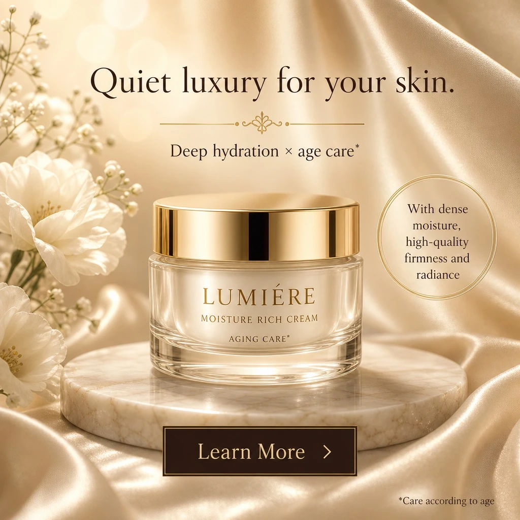
Example generated from “Fictional Cosmetic-jar Advertising Concept — ClawLabs AI · MIT”
GPT Image 2en

A luxurious cosmetic product advertisement featuring a single elegant glass jar with a shiny gold lid resting on a round, light-colored marble slab. The jar displays gold text reading [BRAND_NAME] and [PRODUCT_TYPE], with "AGING CARE*" printed below it. The background consists of soft, draped, shimmering champagne-colored silk fabric with delicate white flowers on the left side. The lighting is warm, ethereal, and sun-drenched, with soft bokeh. At the top center, elegant dark brown typography in [LANGUAGE] reads [MAIN_HEADLINE], above a small decorative gold divider and the text [SUBHEADLINE]. To the right of the jar, a thin gold circle contains the text "With dense moisture, high-quality firmness and radiance" in [LANGUAGE]. At the bottom center is a dark rectangular call-to-action button with a thin gold border containing the text [BUTTON_TEXT] and a right-pointing chevron icon. In the bottom right corner, tiny fine print reads "*Care according to age" in [LANGUAGE].

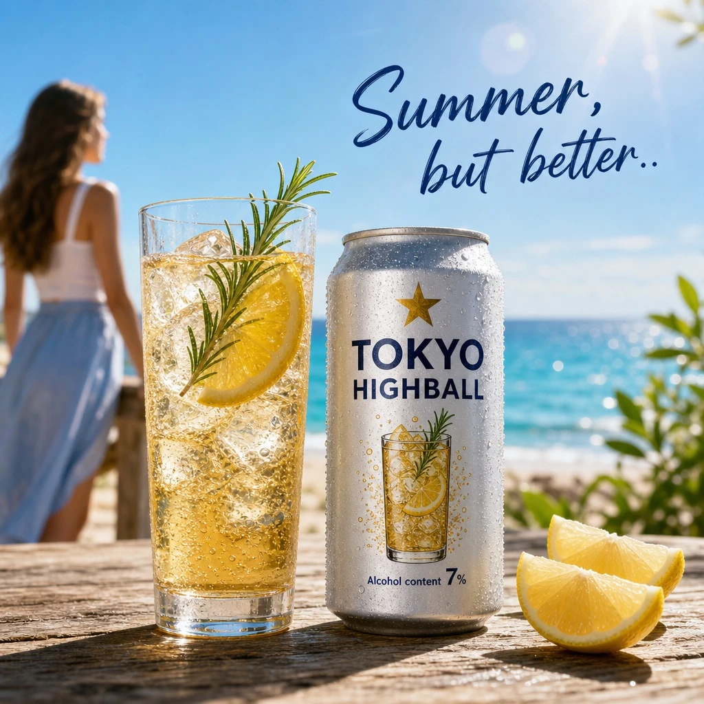
Example generated from “Summer Highball Beach Ad — ClawLabs AI · MIT”
GPT Image 2en

A bright, summery commercial product photography shot featuring a refreshing beverage on a weathered wooden table. In the sharp foreground, there is 1 tall glass filled with a golden, bubbly iced drink garnished with 1 lemon slice and a sprig of rosemary, sitting next to 1 silver aluminum can covered in cold condensation. The can prominently displays the English text [PRODUCT_NAME] below a small gold star logo, featuring a graphic of the drink itself and the text in [LANGUAGE] "Alcohol content [ALCOHOL_PERCENTAGE]%" near the bottom. To the right of the can, 2 cut lemon wedges rest on the table. In the softly blurred background, a sunny beach scene unfolds with sparkling turquoise water and a clear blue sky. Standing to the left in the background is 1 young woman with long brown hair, wearing a white sleeveless top and a light blue skirt, looking out toward the ocean. Floating elegantly in the sky above the scene is the text in [LANGUAGE] [CATCHPHRASE]. The overall lighting is radiant and inviting, with sparkling bokeh and lens flares emphasizing the crisp, cold, and refreshing atmosphere of a perfect summer day.

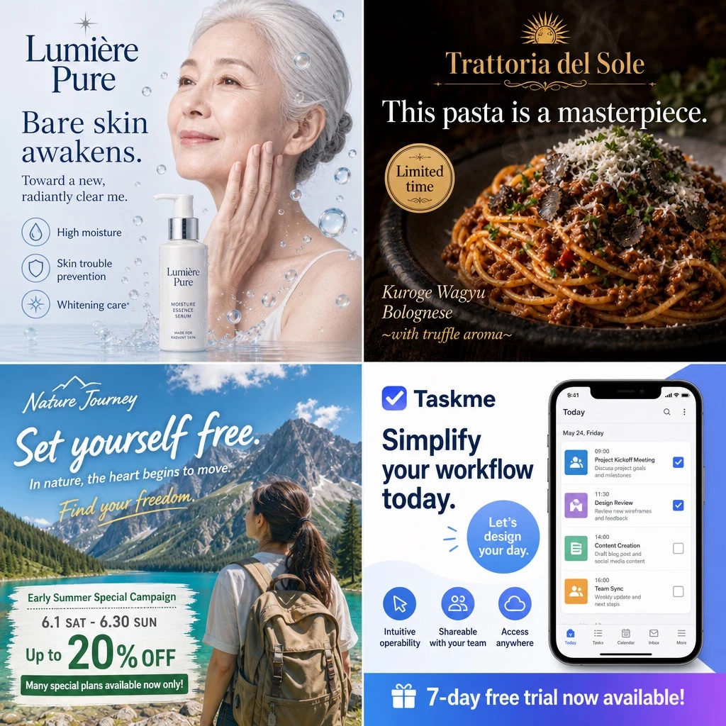
Example generated from “Fictional Four-industry Advertising Layout — ClawLabs AI · MIT”
GPT Image 2en

Design a 2x2 advertising banner grid layout composed of 4 distinct quadrants, each showcasing a different industry advertisement with its own visual style and typography treatment. Top-left quadrant (Skincare): Show a [PERSON_LOOK] gently touching her cheek, surrounded by floating water droplets, with a white pump bottle placed in the composition. The brand name [SKINCARE_BRAND] appears prominently. Headline text (in [LANGUAGE]): [SKINCARE_HEADLINE] (default: 'Bare skin awakens.'), with subheadline 'Toward a new, radiantly clear me.' and three feature labels: 'High moisture', 'Skin trouble prevention', 'Whitening care*'. Top-right quadrant (Restaurant/Food): Feature a close-up shot of spaghetti bolognese topped with grated cheese and fresh parsley, lit with dark, moody lighting for a premium feel. The brand name [RESTAURANT_BRAND] is displayed. Headline text (in [LANGUAGE]): [FOOD_HEADLINE] (default: 'This pasta is next level.'), with a limited-time badge reading 'Limited time' and description text 'Kuroge Wagyu Bolognese ~with truffle aroma~'. Bottom-left quadrant (Travel): Depict a woman wearing a backpack facing a scenic mountain lake under bright daylight. The brand name [TRAVEL_BRAND] appears. Headline text (in [LANGUAGE]): [TRAVEL_HEADLINE] (default: 'A journey that sets me free.'), subheadline 'In nature, the heart begins to move.', script text 'Find your freedom.', and banner details listing: 'Early Summer Special Campaign', '6.1 SAT - 6.30 SUN', 'Up to 20% OFF', 'Many special plans available now only!'. Bottom-right quadrant (SaaS App): Display a smartphone screen showing a task management app interface with 4 schedule items visible. The app brand name is [APP_BRAND] (default: 'Taskme'). Headline text (in [LANGUAGE]): [APP_HEADLINE] (default: 'Make task management simpler and smarter.'), with a circular badge reading 'Let's design your day.', three feature labels: 'Intuitive operability', 'Shareable with your team', 'Access anywhere', and a bottom banner reading '7-day free trial now available!'. Maintain clean commercial ad design conventions in each quadrant, with distinct color palettes and typography suited to each industry (skincare: soft pastel and clean whites; food: warm dark moody tones; travel: bright natural daylight tones; SaaS: modern flat UI colors).

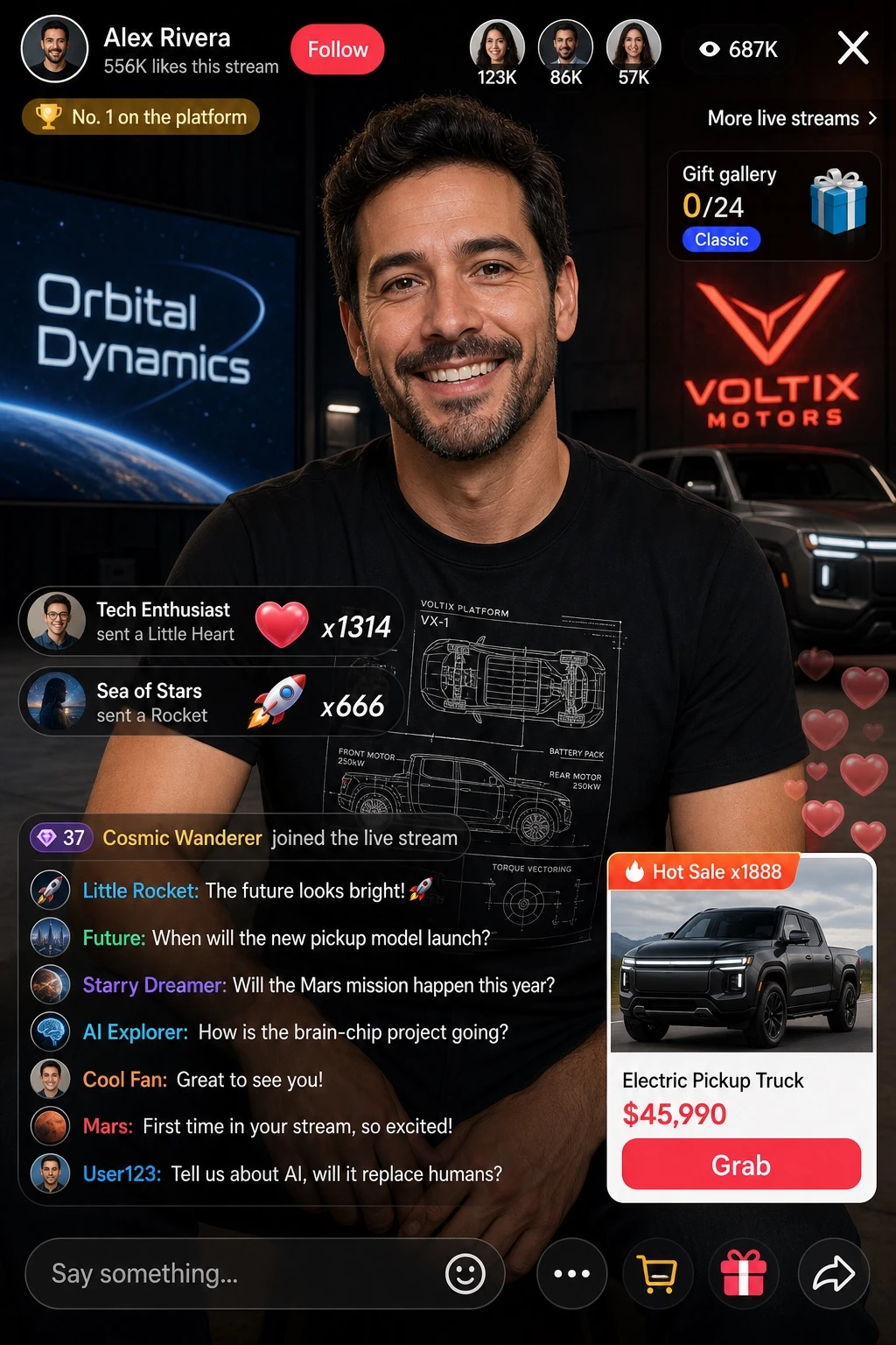
Example generated from “Fictional Sports Livestream Shopping Interface — ClawLabs AI · MIT”
GPT Image 2en

Create a realistic e-commerce livestream interface mockup with a UI/product photography style, formatted as a mobile app screenshot. All interface text, labels, and chat messages must be in [LANGUAGE]. Subject: [PERSON_LOOK] with long wavy dark hair, wearing a white short-sleeve polo shirt and a white pleated tennis skirt, holding a white tennis racket over her right shoulder, looking directly at the camera with a soft expression. Background: soft light grey studio background. Header layout — left side: a circular female portrait avatar, host display name '[HOST_NAME]' (e.g. default 'Little Deer Sports Picks'), stats text '128K likes this stream', a 'Follow' button labeled 'Follow', and a badge reading 'Sales Rank #3'. Header right side: a cluster of 3 small viewer avatars, a viewer counter showing '12K viewers', and a close 'X' icon. Floating UI elements over the video feed: 1. Top right — a coupon card titled 'Livestream Exclusive Coupon', with details '¥20 off orders over ¥199', and a 'Claim' button labeled 'Claim'. 2. Mid left — promotional campaign text with subtitle 'Summer Sports Season', a bold headline '[HEADLINE]' (e.g. default 'Energetic Kickoff'), and 3 bullet points: 'Breathable & quick-dry', 'Stretchy & comfortable', 'Versatile for sports'. 3. Mid right — an active product card with a badge reading 'Currently featured', a flat-lay image of the white polo and skirt, a title '[PRODUCT_NAME]' (e.g. default 'Sports Polo Set'), details 'White, size M', a price '[PRICE]' (e.g. default '¥129'), and a 'Buy now' button labeled 'Buy now'. 4. Bottom right — a secondary product card with a badge 'Best seller x156', an image of a model wearing the outfit, title 'Women's Sports Polo Set, Breathable Quick-Dry, Slimming, Versatile', tags '7-day no-reason return' and 'Shipping insurance', price '¥129', and a 'Grab' button labeled 'Grab'. Chat overlay, bottom left, showing 5 stacked messages: - 'Sister Xiaolu: Welcome new friends to the livestream~' - 'Sports Guru: [CHAT_MESSAGE]' (e.g. default 'This outfit looks great!') - 'Kakashi: Is the fabric breathable?' - 'Little Deer Sports Picks: Our fabric is ice-silk quick-dry, won't feel stuffy even when sweating during exercise~' - 'User_6789: Ordered!' Below the chat, a purchase alert reads 'User_6789 and 3 others are purchasing'. Footer: a text input bar reading 'Say something...', plus 5 icons: smile, shopping cart, heart, share, and more.

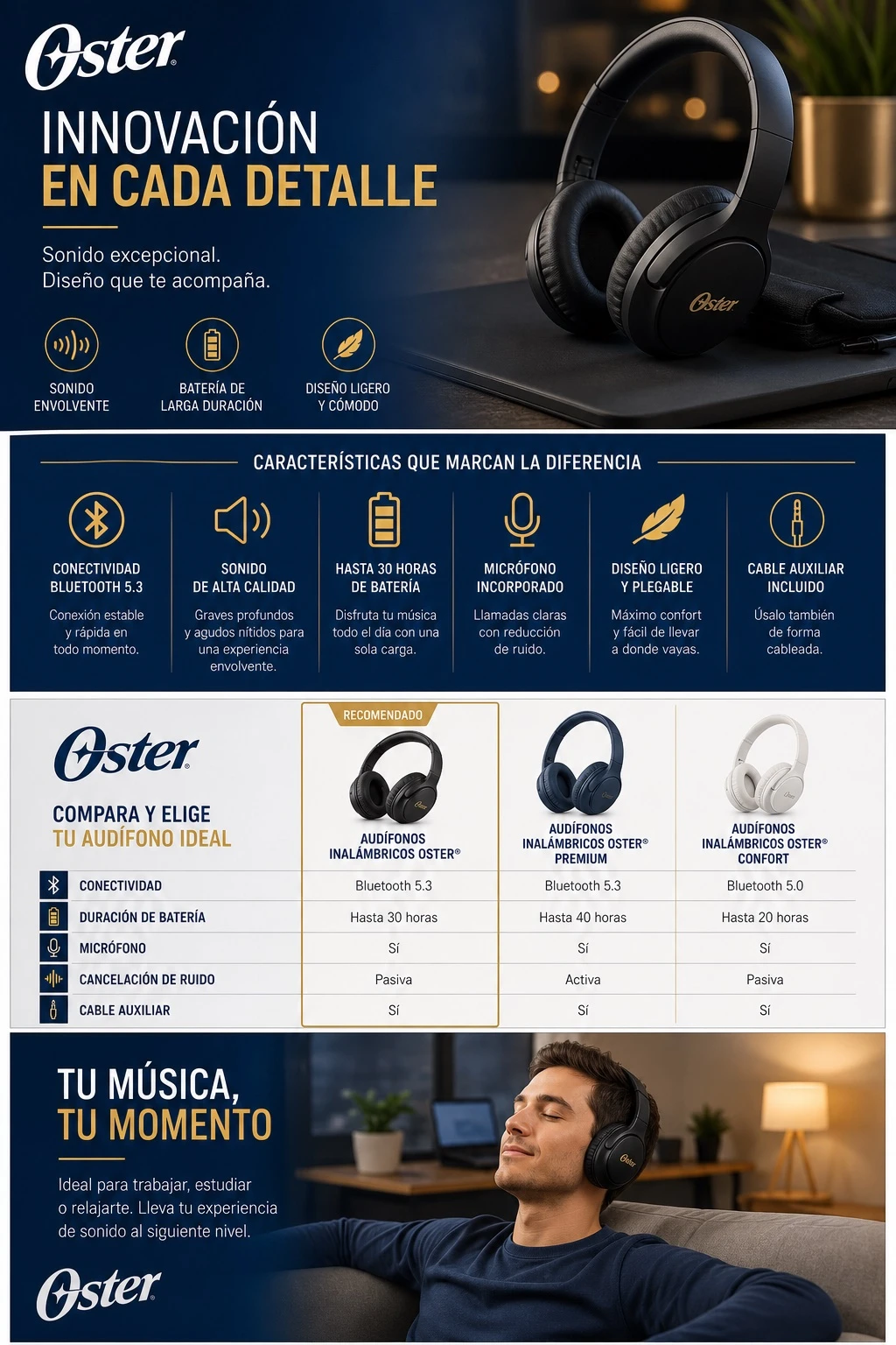
Example generated from “Fictional E-commerce Detail Layout — Spanish-lettered Preview — ClawLabs AI · MIT”
GPT Image 2en

Design a cohesive set of enhanced brand content detail images for a [PLATFORM] product listing page, showcasing [PRODUCT] in a clean, professional e-commerce style. Include multiple modules: a hero banner with lifestyle photography of [PRODUCT], a feature highlight section with icons and short benefit callouts, a size or specification comparison chart, and a lifestyle scene showing the product in use. Use a consistent color palette in [COLOR] tones, modern sans-serif typography for headlines such as "[HEADLINE_TEXT]", high-resolution studio lighting, and a cohesive grid layout optimized for vertical scrolling on product detail pages. Maintain a 1:1 or 4:3 aspect ratio per module, consistent branding for [BRAND], and a polished commercial photography aesthetic suitable for online marketplace listings.

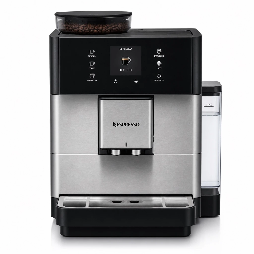
Example generated from “Coffee Machine Product Display — ClawLabs AI · MIT”
GPT Image 2en

Professional e-commerce product photography of a fully automatic coffee machine, showcased against a clean [COLOR] studio background with soft, even lighting that highlights its sleek design, control panel, and brushed metal or matte finish. The composition should be centered and minimalist, with subtle reflections and crisp focus on functional details such as the water tank, drip tray, and dispensing spout, suitable for use as a detail image on an online product listing page. Render in high resolution with balanced negative space for accompanying text callouts.

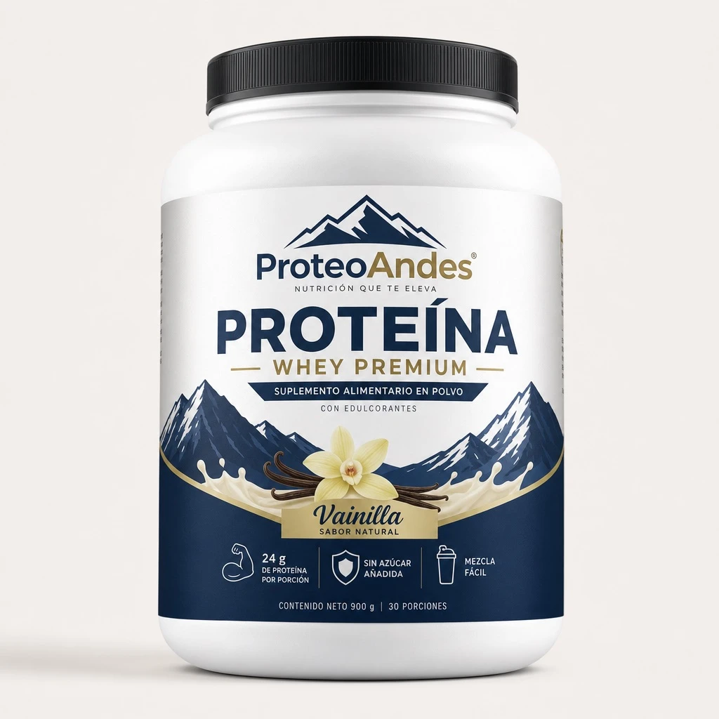
Example generated from “Fictional Protein-powder Packaging — Spanish-lettered Preview — ClawLabs AI · MIT”
GPT Image 2en

Professional e-commerce product photography of a [BRAND] fitness protein powder container, [FLAVOR] flavor, placed on a clean minimalist background with soft studio lighting, high-resolution close-up detail shot suitable for an online store product listing, clearly showcasing the packaging design, label typography, and material texture.

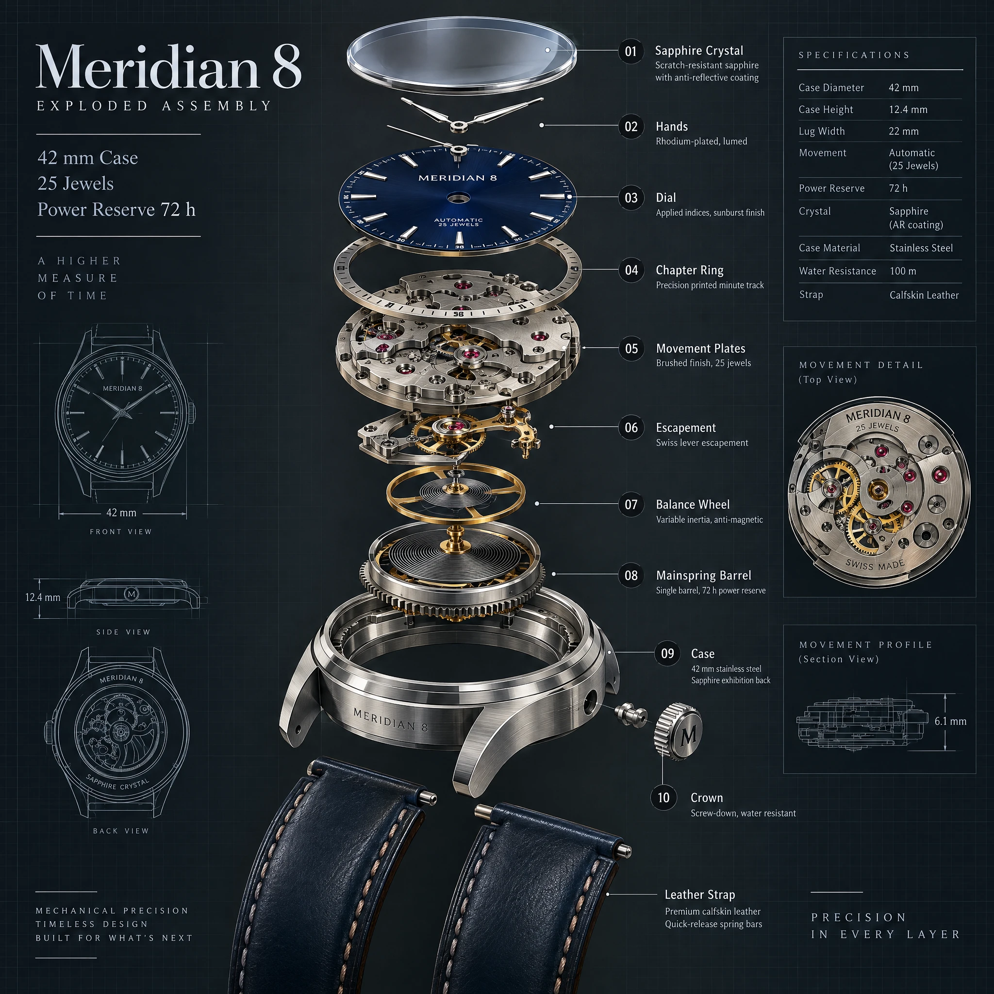
Example generated from “Fictional Meridian 8 Watch Exploded-view Concept — Wuyoscar · GPT Image 2.5”
GPT Image 2.5en

Create a premium technical exploded-view illustration of a fictional mechanical wristwatch called the Meridian 8, centered on a dark slate background with fine blueprint grid accents. Show the watch components separated vertically with precise spacing: sapphire crystal, dial, hands, chapter ring, movement plates, escapement, balance wheel, mainspring barrel, case, crown, and leather strap sections. Use realistic brushed steel, brass, ruby jewel accents, and deep navy dial details. Add crisp callouts and labels with the in-image text "Meridian 8", "Exploded Assembly", "42 mm Case", "25 Jewels", and "Power Reserve 72 h". Include numbered callouts "01" through "10" with short labels like "Balance Wheel", "Mainspring Barrel", and "Sapphire Crystal". The result should be highly detailed, technically believable, sharply rendered, and suitable for an industrial design plate with clean hierarchy, exact labeling, and refined material realism.

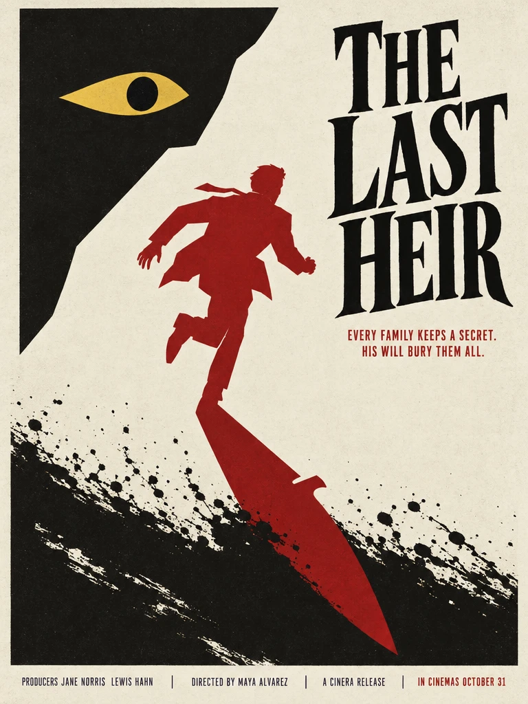
Example generated from “Fictional Thriller Poster — Downward-shadow Source Result — Wuyoscar · GPT Image 2.5”
GPT Image 2.5en

A Saul-Bass-style minimalist thriller movie poster, 3:4 portrait. Off-white paper background with subtle vintage grain. Large flat-color cut-paper shapes, bold geometry, negative-space illusion. Composition: a single stylised human silhouette in crimson running across centre; the shadow warps into a knife blade pointing up into the title. Black ink-brush splatter across the lower third. A single yellow eye motif in the upper-left negative space. Exact typography: - Title (large hand-lettered serif, black): "THE LAST HEIR" - Tagline (small caps sans-serif, dark red): "EVERY FAMILY KEEPS A SECRET. HIS WILL BURY THEM ALL." - Bottom credit block: "PRODUCERS JANE NORRIS LEWIS HAHN DIRECTED BY MAYA ALVAREZ A CINERA RELEASE IN CINEMAS OCTOBER 31" Palette: cream, charcoal black, crimson red, mustard-yellow accent. Pure flat graphic design, no photo elements, no gradients, no 3D — in the lineage of Bass's "Anatomy of a Murder", "Vertigo", and "The Man with the Golden Arm".

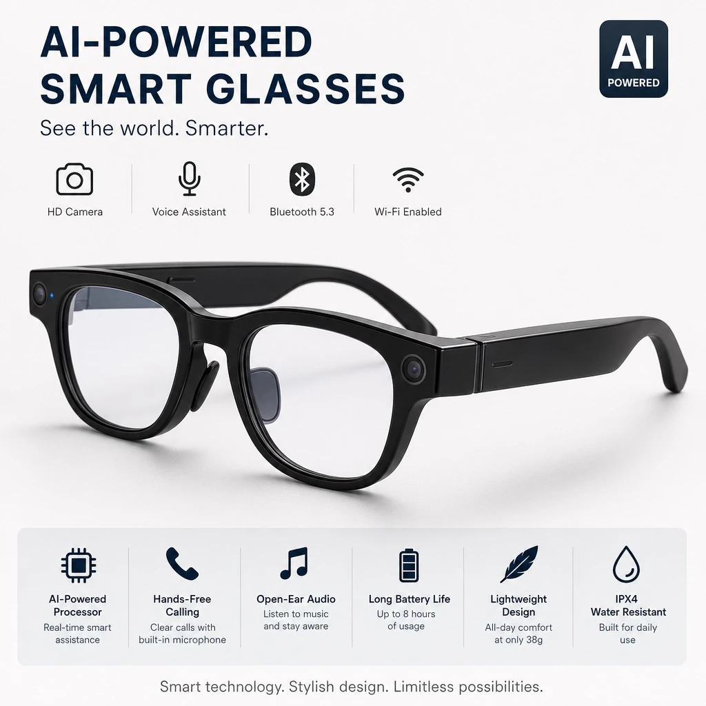
Example generated from “Concept Smart Glasses Product Advertisement — ClawLabs AI · MIT”
GPT Image 2en

Professional e-commerce product detail image of AI-powered smart glasses, clean studio product photography with soft even lighting, minimalist background, sharp focus highlighting the frame design, lenses, and technical features, high resolution suitable for an online marketplace listing.

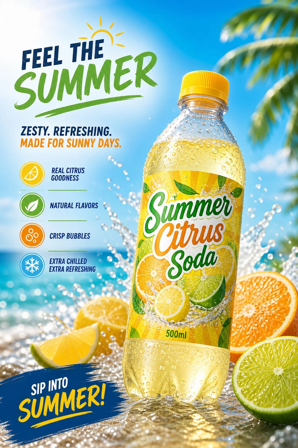
Example generated from “Summer Citrus Beverage Ad Concept — ClawLabs AI · MIT”
GPT Image 2en

Product advertising photograph of a carbonated beverage, a seasonal product suited for summer. Product name displayed on the label: "[PRODUCT_NAME]". Bottle shape: 500ml PET bottle. Design and generate the image specifications based on research into high-CTA (high click-through-rate) beverage advertisement design trends for 2025. Aspect ratio 3:4.

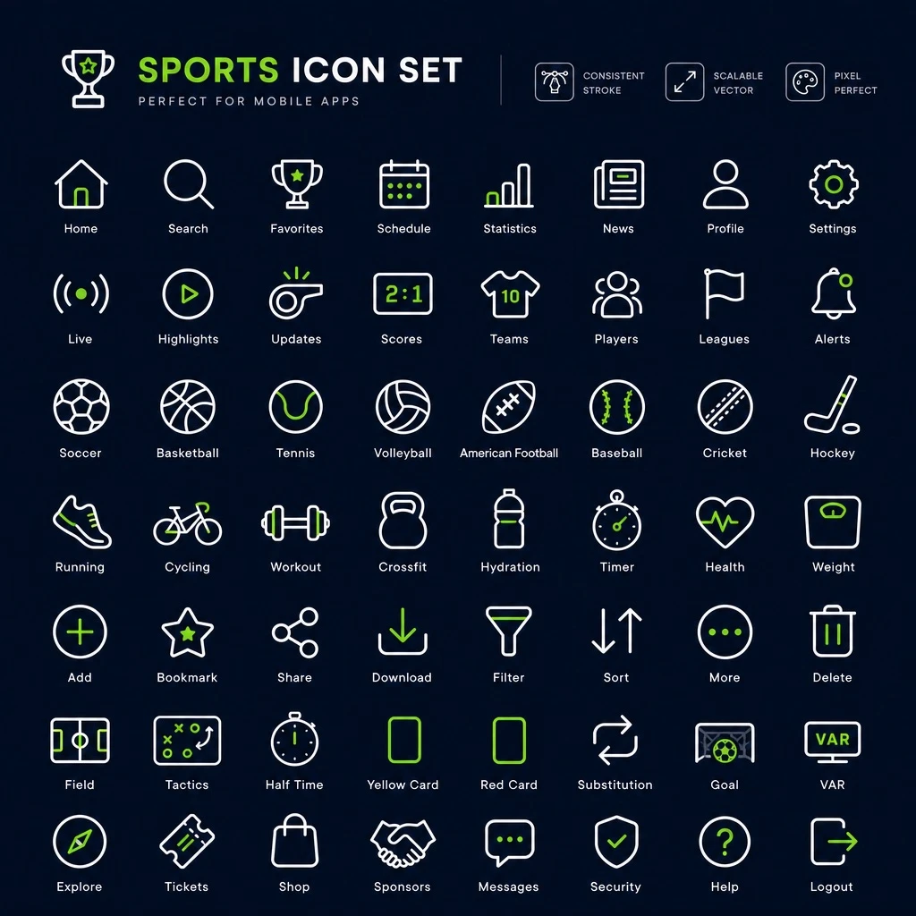
Example generated from “Sports App Icon Sheet Concept — Raster Preview — ClawLabs AI · MIT”
GPT Image 2en

Design a complete icon font set for a sports mobile application. Create a unified series of icon glyphs representing sports-related actions and equipment, maintaining consistent stroke weight, sizing, and visual style across every icon so they form a cohesive, scalable icon family suitable for use within a mobile app interface.

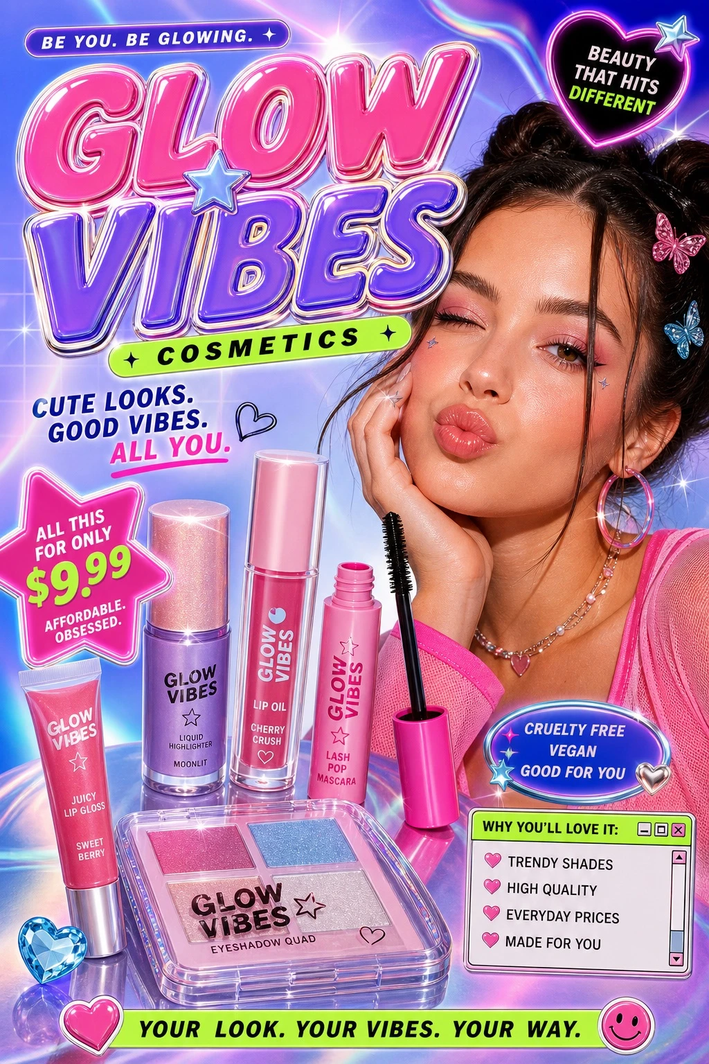
Example generated from “Y2K Cosmetics Ad Design — ClawLabs AI · MIT”
GPT Image 2en

Cute Y2K-style advertising image for an affordable cosmetics product line, designed to appeal to Gen Z. Use a vibrant color scheme, including neon accents, playful typography, and glossy, futuristic textures reminiscent of early-2000s pop aesthetics. Aspect ratio 3:4.

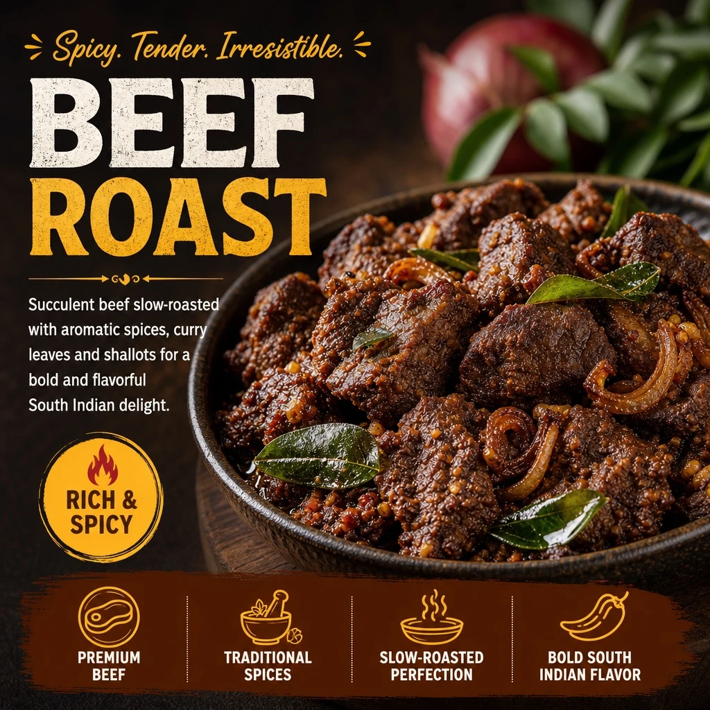
Example generated from “Appetizing Menu Dish Illustration — ClawLabs AI · MIT”
GPT Image 2en

This is an authentic menu item from [CUISINE] cuisine. Based on this, regenerate an engaging, mouth-watering illustrated image with descriptive text captions. Use English text that is clear and easy to read on small mobile screens. This dish is [DISH_NAME].

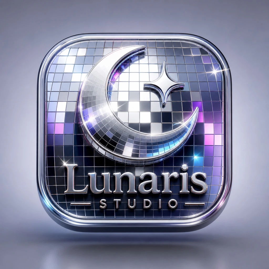
Example generated from “Disco Mirror 3D App Icon — ClawLabs AI · MIT”
GPT Image 2en

A premium 3D app icon for [BRAND], rounded square tile shape, glossy glass and chrome material, disco-ball mosaic mirror tile texture, sparkling specular highlights, soft studio lighting, clean minimal background, high-end product icon style, Blender 3D render, ultra detailed.

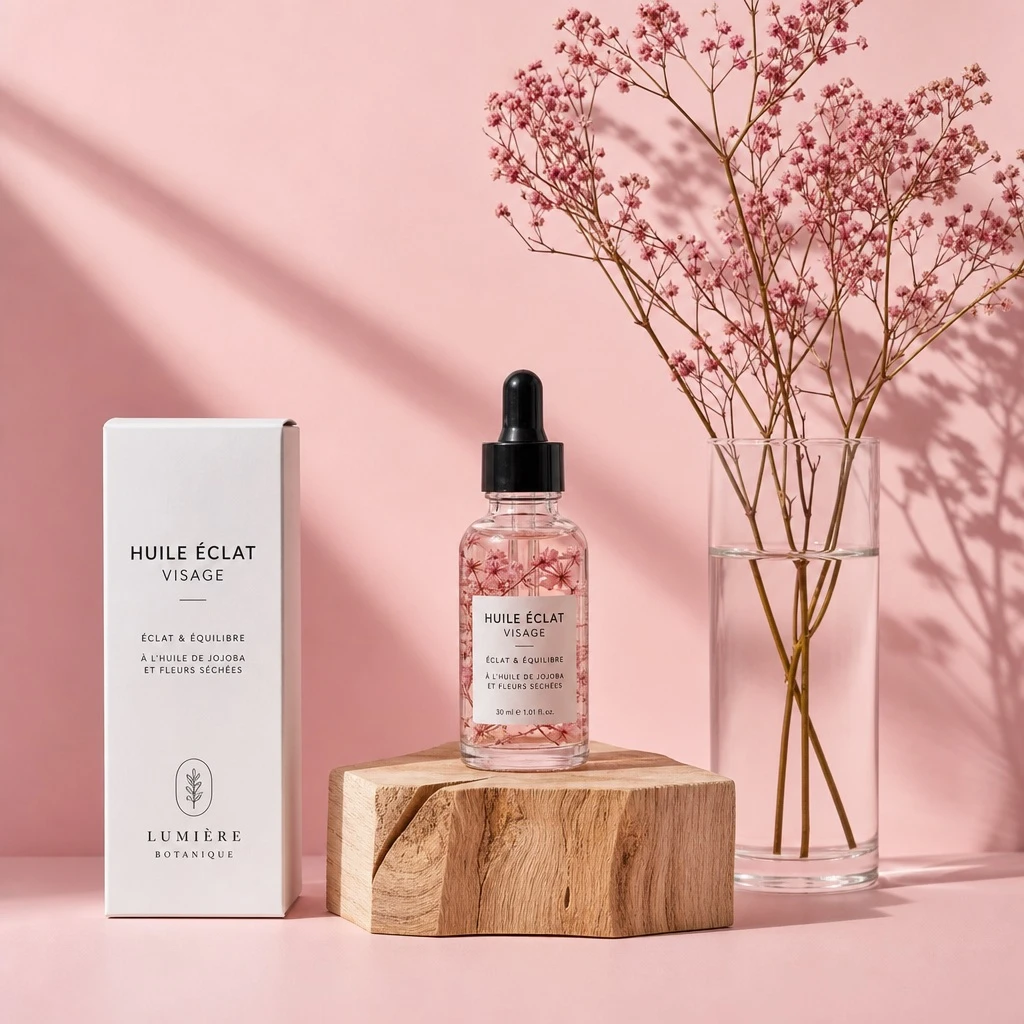
Example generated from “Floral Facial Serum Studio Shot — ClawLabs AI · MIT”
GPT Image 2en

Minimalist studio product photography featuring a small transparent glass facial oil dropper bottle with a black rubber pipette cap, containing pale pink serum with suspended dried pink floral elements, centered on a natural raw wooden block with visible grain and split texture. A tall matte white skincare box sits on the left, labeled "[LABEL_TEXT]" with clean black typography and a subtle logo near the bottom. A clear cylindrical glass vase on the right is filled with water and thin stems of dried pink gypsophila extending upward. The composition rests on a smooth matte pastel pink surface against a matching seamless pink studio background. Strong directional soft light from the left casts long natural-style shadows of the flowers onto the background, with gentle highlights on the glass, subtle reflections on the serum bottle, and soft texture on the wooden block. Straight-on tabletop camera angle, all objects in sharp focus. Color palette: blush pink, soft rose, warm light wood, clean white, transparent glass. Premium Scandinavian minimalist skincare aesthetic, ultra-realistic, studio-grade.

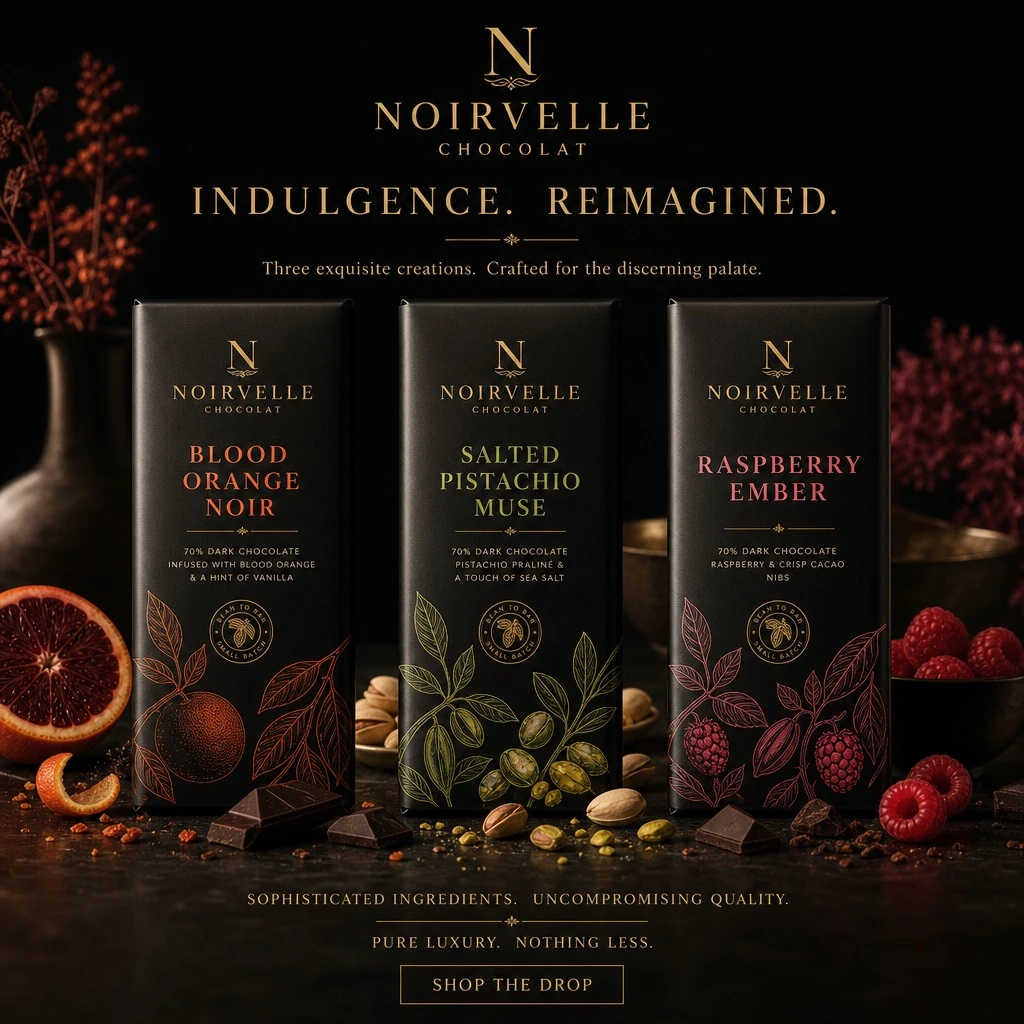
Example generated from “Luxury Chocolate Campaign Poster — ClawLabs AI · MIT”
GPT Image 2en

Create a premium, square (1:1) product advertisement for a fictional luxury chocolate brand called [BRAND], inspired by high-end chocolate brands. The ad should feel like a high-end editorial campaign, combining luxury food photography, refined packaging design, and cinematic lighting. Use a matte black wrapper, subtle gold foil, elegant serif typography, and realistic product rendering. Generate flavor variants such as [FLAVOR_1], [FLAVOR_2], and [FLAVOR_3] with distinct mood, color palette, ingredients, headline, and supporting copy. Keep the chocolate bar as the hero centerpiece with subtle reflections, shallow depth of field, luxury minimalism, and a small CTA reading: "[CTA_TEXT]".

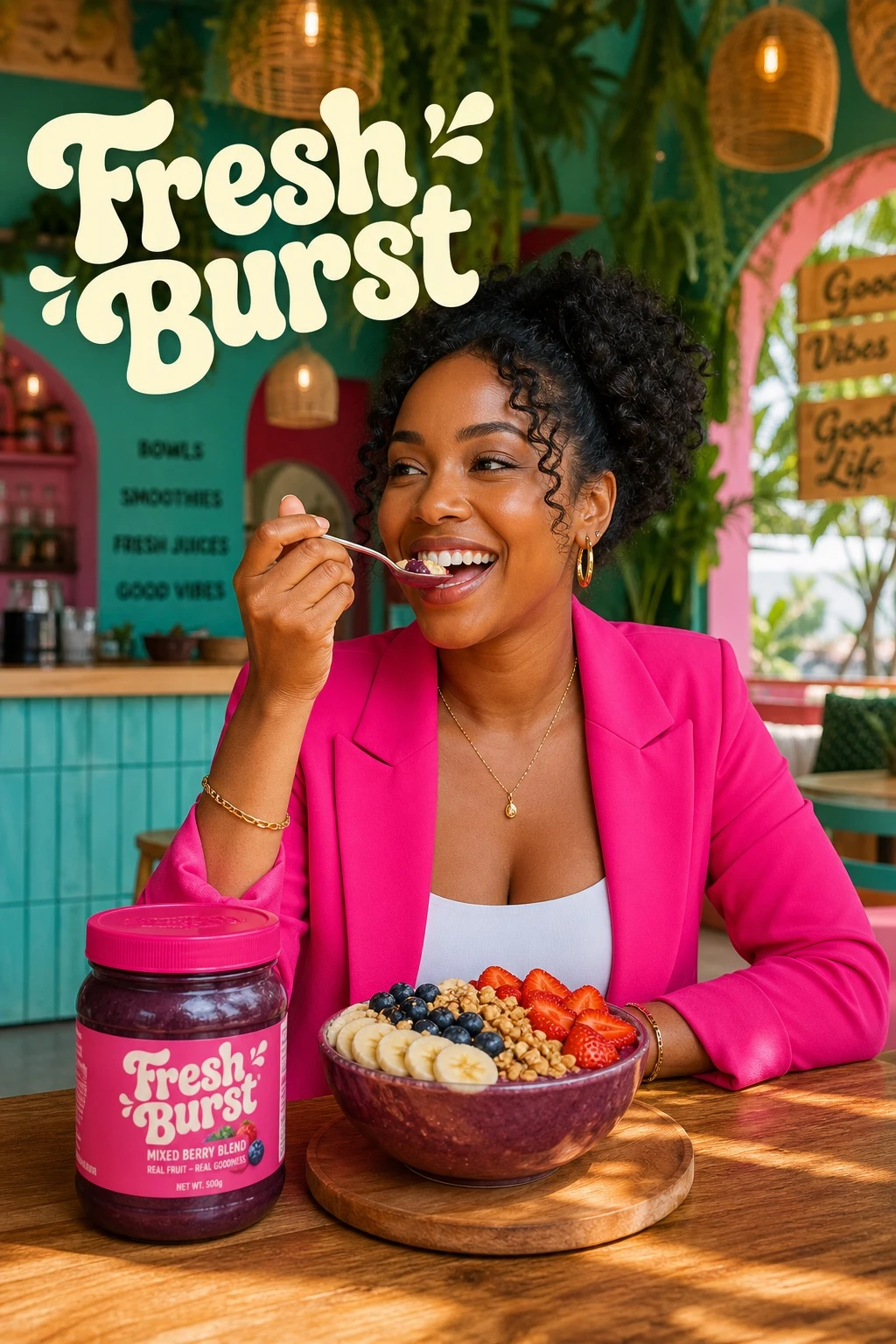
Example generated from “Berry Bowl Brand Campaign — ClawLabs AI · MIT”
GPT Image 2en

Prompt 1: Create a vibrant lifestyle food advertisement set inside a colorful, trendy cafe. Show a smiling woman in a bright hot-pink blazer seated at a wooden table, lifting a spoon as she eats an acai berry bowl topped with strawberries, blueberries, banana slices, and granola. Keep a clearly branded "[BRAND]" jar on the table. Add playful retro cream bubble-letter typography that reads "[BRAND]". Use a tropical cafe interior with hanging plants, warm natural sunlight, a cheerful mood, a bold pink-and-teal palette, shallow depth of field, cinematic food-photography realism, high detail, and a polished commercial campaign finish. Format: vertical 9:16. Quality: ultra realistic, 4k. Prompt 2: Create a dynamic food product advertisement for the "[BRAND]" mixed berry blend. Feature an acai smoothie bowl overflowing with strawberries, raspberries, blueberries, blackberries, banana slices, and granola. Surround it with dramatic berry juice splashes and floating fruit frozen midair. Place a branded jar next to the bowl. Use a vivid hot-pink background and large retro cream typography that says "NEW DROP [BRAND]". Keep the lighting glossy, the composition energetic, the colors vibrant, the textures ultra detailed, and the overall look like a polished studio-shot commercial poster with hyper-realistic food photography and splash-effect motion. Format: vertical 9:16. Quality: 4k.

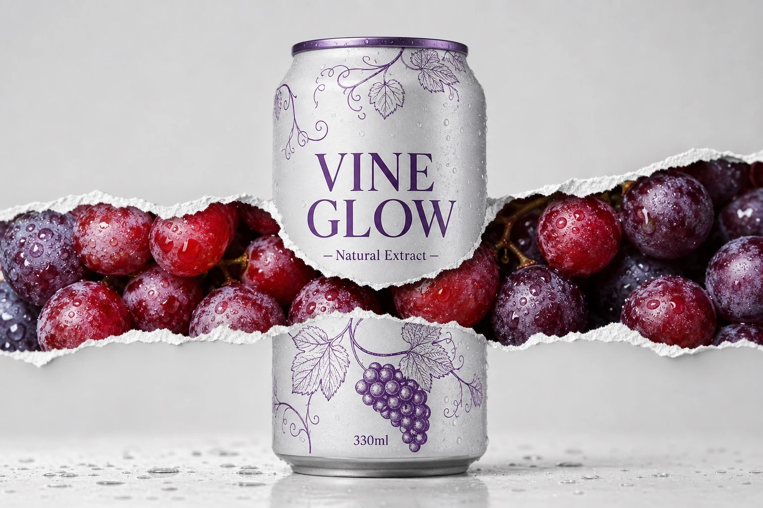
Example generated from “Grape Reveal Can Product Shot — ClawLabs AI · MIT”
GPT Image 2en

Product shot of a 330ml aluminum can labeled "[PRODUCT_NAME]" placed center-frame against a clean light grey studio background. The can is adorned with refined purple vine line illustrations. A dramatic horizontal torn paper reveal slices across the can and background, exposing glistening red and purple grapes inside, covered in water droplets with a glossy wet texture. Soft studio lighting, ultra-sharp focus, photorealistic commercial packaging photography, symmetrical layout, 8K resolution.

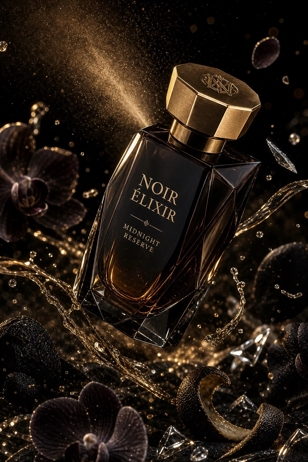
Example generated from “Luxury Perfume Bottle Ad — ClawLabs AI · MIT”
GPT Image 2en

Ultra-cinematic luxury fragrance advertising photography of a "[PRODUCT_NAME]" perfume bottle. Faceted geometric crystal bottle with sharp elegant edges, deep smoked black gradient glass, polished reflective surfaces with subtle matte facets. Magnetic brushed gold metal cap with engraved emblem. Minimal serif typography etched directly into the glass with gold inlay. Dark amber liquid with golden undertones. The bottle floats mid-air at a dramatic diagonal hero angle with a slight forward tilt. Atomized perfume mist trails and fluid fragrance ribbons are suspended in motion. Background: deep black velvet gradient fading into shadow. Surrounding elements: atomized perfume droplets suspended mid-air, shattered crystal glass fragments catching highlights, dark orchid petals drifting slowly, glossy black citrus peel curls, fine gold dust particles sparkling in the light. Micro condensation beads and polished reflections enhance realism. Lighting: dramatic low-key studio setup with soft directional key light sculpting the glass facets, strong rim lights outlining the silhouette and edges, gold-toned specular highlights on the cap and engraved details, deep cinematic shadows, high contrast with controlled reflections and luminous highlights. Color palette: obsidian black, smoked charcoal, deep amber with metallic gold and warm champagne glow accents. Shot on a macro cinema prime lens, shallow depth of field isolating the product from the background, smooth cinematic bokeh from reflective particles, extreme micro-detail clarity. 8K ultra-high-definition, hyper-realistic luxury commercial render, accurate glass refraction and internal reflections, physically accurate fluid dynamics, ultra-detailed crystal, metal, mist, and micro-droplet textures. Vertical 4:5 aspect ratio.

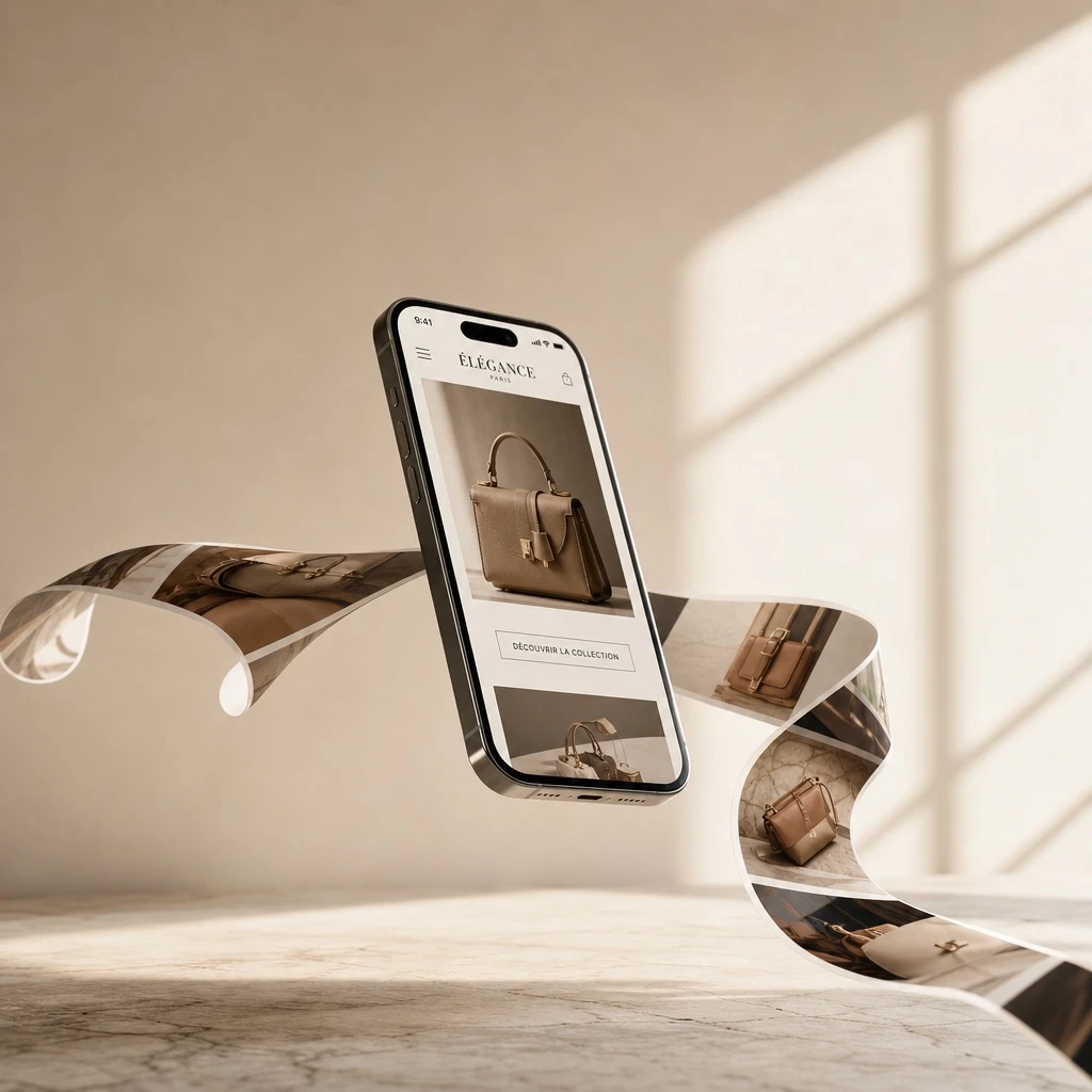
Example generated from “Floating Smartphone Photo Ribbon Mockup — ClawLabs AI · MIT”
GPT Image 2en

A highly realistic, premium 3D product mockup for a [BUSINESS_TYPE]. A sleek, modern smartphone elegantly levitates at a dynamic angle in mid-air. Emerging seamlessly from the phone's screen is a continuous, wavy, physical ribbon of printed photos that flows elegantly and wraps around the device in a surreal, gravity-defying way. The photos on the flowing ribbon display stunning, high-quality images of [PRODUCT_IMAGES]. The background is a minimalist, warm beige and soft cream environment with a subtly textured stone floor. The lighting consists of soft, diffused natural sunlight casting an elegant diagonal window shadow on the back wall, adding depth. Cinematic lighting, shallow depth of field, ultra-photorealistic, 8k resolution, highly detailed, trendy minimal aesthetic, perfect for an engaging and viral social media post, featuring clean negative space at the top for typography.

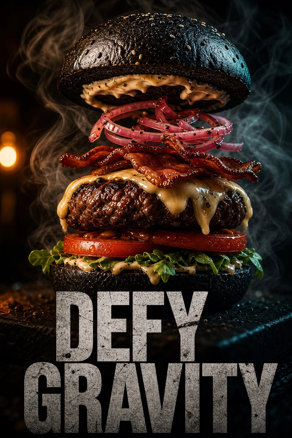
Example generated from “Gourmet Burger Gravity Poster — ClawLabs AI · MIT”
GPT Image 2en

A cinematic 9:16 vertical composition featuring a gourmet "[PRODUCT_NAME]" burger. WHAT: A towering burger with a charcoal brioche bun, a thick Wagyu beef patty with visible sear marks, melting aged gruyère cheese dripping like lava, and crispy maple-glazed bacon. FEEL: An atmosphere of "Urban Indulgence." Dark, moody lighting with a single warm amber spotlight. Wisps of real hickory smoke curl around the bun. The texture is hyper-realistic: you can see the salt crystals on the crust and the moisture on the heirloom tomato. SHOW: The burger is captured in a "deconstructed gravity" moment — the top bun is slightly hovering, revealing the internal layers of house-made aioli and pickled red onions. TYPOGRAPHY: Integration of an ultra-bold, distressed sans-serif typeface overlapping the bottom third of the frame. The text reads "[HEADLINE_TEXT]" in a raw, concrete-texture finish. TECHNICAL: 4K resolution, macro photography style, shallow depth of field, neon-noir color grading (deep blacks, warm ambers, and subtle teal highlights).

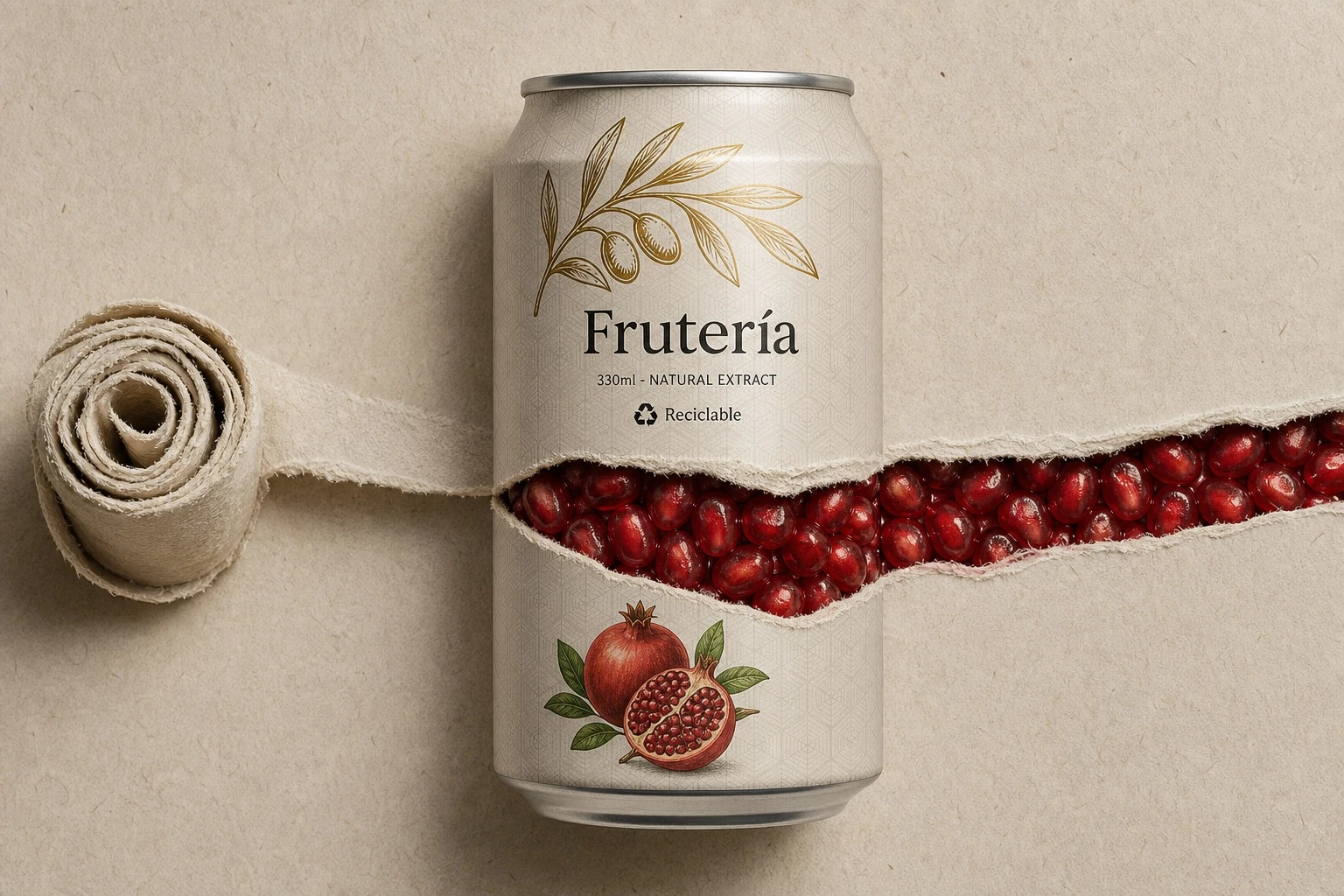
Example generated from “Torn Can Fruit Explosion — ClawLabs AI · MIT”
GPT Image 2en

A photorealistic, highly detailed commercial product shot of a standard aluminum [SODA_CAN_TYPE] can, perfectly centered on a minimal textured [BACKGROUND_COLOR] paper backdrop with subtle visible fibers. A single continuous horizontal torn paper strip crosses the full frame from the right edge to the left edge, with a barely noticeable upward diagonal slant toward the upper left. The tear passes through the can body and continues seamlessly across the background on both sides. Make the torn opening wide and dramatic, exposing a dense, glossy, vibrant mass of [FRUIT_FILLING_DESCRIPTION] packed tightly inside the can. At the far left end of the tear, roll the paper neatly into a tight realistic coil that nearly fills the left margin. Design new minimalist can branding: on the upper can, place a stylized abstract line-art illustration of [PLANT_ILLUSTRATION] in contrasting [INK_COLOR], layered over a subtle matte geometric [PATTERN_TYPE] pattern on the can surface. Below it, print the brand name "[BRAND]" in elegant modern dark typography, with smaller technical text reading "330ml - NATURAL EXTRACT" plus a small "Recyclable" logo. Add a small detailed fruit graphic below the torn path. Use soft cinematic lighting with delicate drop shadows under the torn paper edges and the large left-side coil. Render in 8K with macro-level detail on fibrous paper, brushed aluminum, and glossy fruit texture.

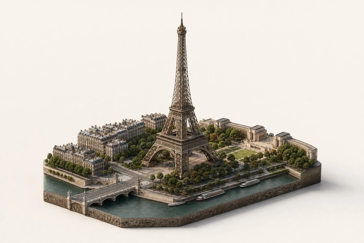
Example generated from “Miniature Landmark Diorama — ClawLabs AI · MIT”
GPT Image 2en

Isometric miniature diorama of [LANDMARK], capturing its real-world structure and proportions on a small floating platform, surrounded by buildings and landscape details from [CITY], [COUNTRY]. Physically accurate materials including stone, concrete, metal, and glass. True-to-life color palette, muted and realistic tones matching the actual landmark. Off-white studio background with soft natural lighting, gentle shadows, and clean composition. High-detail 3D render, premium architectural model aesthetic, no people, no text.

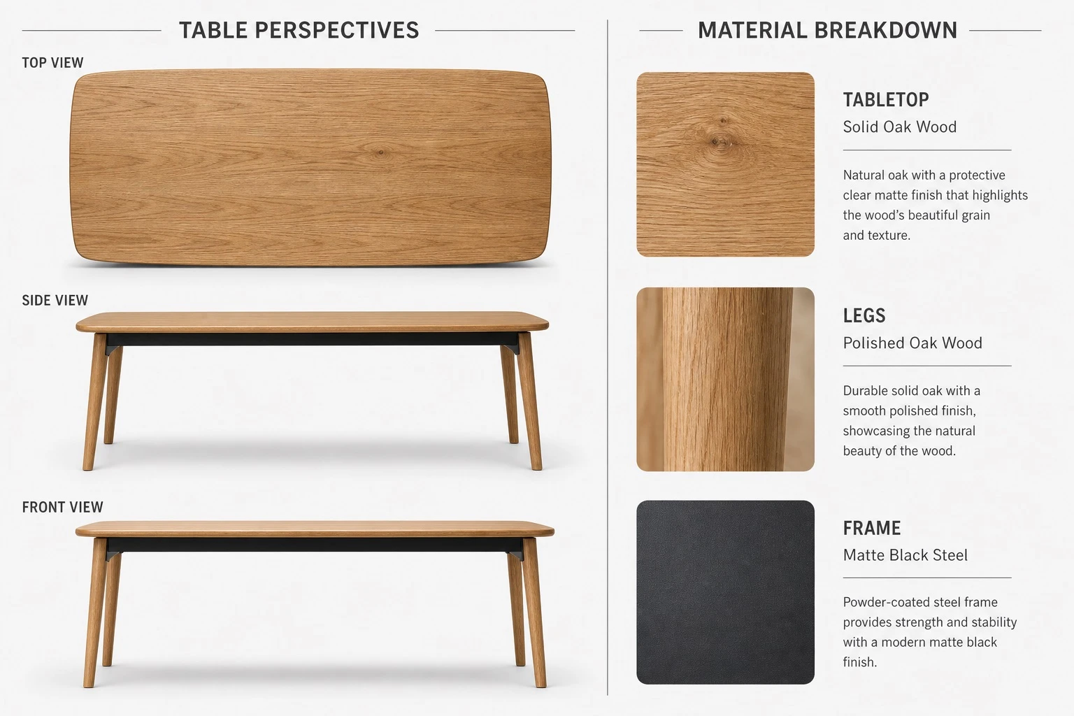
Example generated from “Furniture Product Sheet Layout — ClawLabs AI · MIT”
GPT Image 2en

Create a high-quality, realistic 3D product showcase for a table using a split-view layout with a 3:2 or 4:3 aspect ratio, set against a neutral light gray or white background. Left side — Table Perspectives: - Top-down view: full tabletop shape, surface texture, and edge details - Side view: leg design, table height, and tabletop thickness - Front view: width, symmetry, and leg alignment Use consistent lighting with subtle shadows for realism. Right side — Material Breakdown: - Tabletop: [WOOD_TYPE], with a close-up wood texture swatch and a clean sans-serif label - Legs: [LEG_MATERIAL], with a material texture swatch and consistent labeling - Frame: [FRAME_COLOR] steel, with a small metallic texture swatch and minimalist annotation Separate the two sections with a vertical dividing line or a subtle split background. Use natural tones for the materials and grayscale for the backgrounds and lines. Use a modern, readable font for labels and section titles. Output as a high-resolution image suitable for a product sheet, interior design catalog, or furniture showcase.

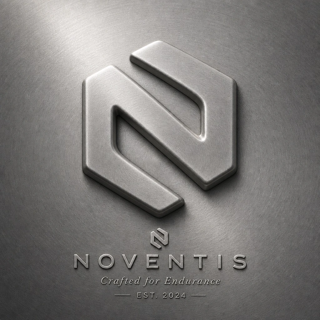
Example generated from “Embossed Metal Logo Bas-Relief — ClawLabs AI · MIT”
GPT Image 2en

Replace [BRAND] with your brand and [COLOR] with your preferred metal tone. Act as a senior CGI artist. Create a premium bas-relief logo visualization where the brand mark appears embossed outward from a metallic surface, like a coin, hallmark stamp, or luxury seal. The logo rises as a unified raised form from the surface itself. Surface: one continuous material plane filling the entire canvas. Use the metal tone from [COLOR]: silver/grey becomes brushed steel, gold becomes warm brushed metal, black becomes anodized aluminum, white becomes matte ceramic, saturated colors become anodized colored metal. Apply radial brushed grain and fine film grain for tactility. Emboss: the brand's primary logo mark rises as a full bas-relief, like a coin die-stamp. The entire filled silhouette pushes outward as one solid mass at uniform height. The top face is slightly convex, catching key light. A smooth beveled edge transitions from the flat surface to the raised form. Interior negative spaces recess back to surface level. Substantial raised height, like a thick coin. Lighting: primary soft area light from upper-left (10-11 o'clock), broad and diffused. Light temperature matches [COLOR]: cool white for silver/grey/blue, warm amber for gold/copper, neutral for white/black. Subtle fill light from lower-right at 10-15% intensity. No hard shadows. Typography: below the embossed mark, a minimal lockup on the same surface. A small flat brand icon, the brand name in spaced geometric caps, and one light italic descriptor line (founding year, category, or tagline). Centered, vertically stacked. Render: ray tracing enabled for self-shadowing. Full sharpness edge to edge. Uniform film grain. No chromatic aberration. The mark must read as pushed outward from the surface.

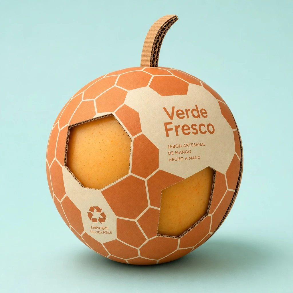
Example generated from “Sculptural Fruit Packaging Design — ClawLabs AI · MIT”
GPT Image 2en

Professional product photography of a sculptural packaging design created for [FRUIT_NAME]. The box is made of premium corrugated cardboard, shaped and cut into the exact silhouette of a giant [SHAPE] [FRUIT_NAME]. The outer surface is printed with a bold, minimal [PATTERN] pattern that echoes the natural skin texture, rendered in a duo-tone color scheme of [COLOR_1] and [COLOR_2]. Die-cut window panels expose the [PRODUCT_INSIDE] nestled inside. Clean modern sans-serif text on the side reads "[BRAND_NAME]". Eco-friendly details include a recycling icon and a sculpted corrugated [STEM_ELEMENT] on top. Soft diffused studio lighting, gentle drop shadows, set against a solid pastel [BACKGROUND_COLOR] background. 8K, photorealistic, cinematic framing, industrial design aesthetic.

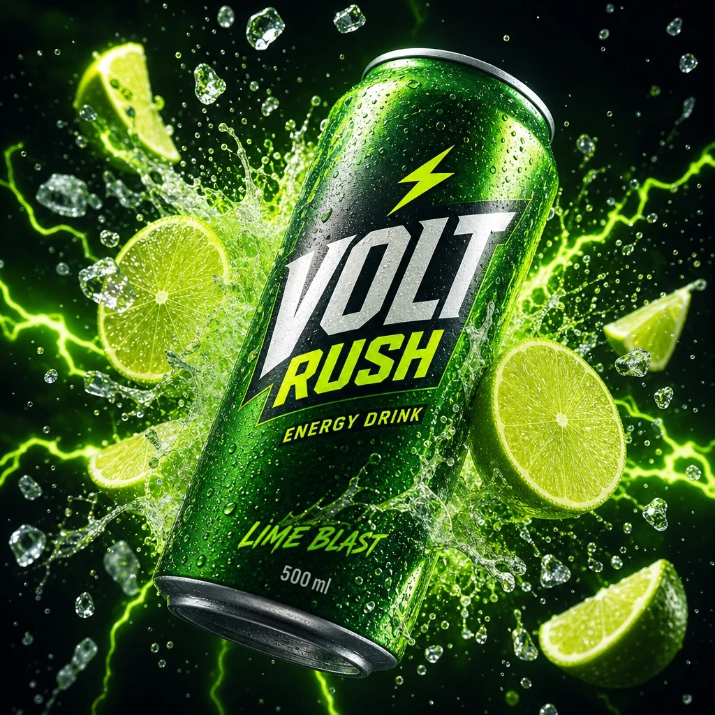
Example generated from “Energy Drink Citrus Explosion — ClawLabs AI · MIT”
GPT Image 2en

Ultra-cinematic product photography of a neon-green energy drink can labeled "[BRAND_NAME]", tilted at a sharp diagonal angle, bursting through glowing citrus slices and electric sparks. Frozen lime juice splashes and ice shards are suspended mid-air, with micro droplets clearly visible. High-contrast studio lighting features green neon rim lights, a deep dark background, and a glossy aluminum surface, shallow depth of field, photorealistic, 8K resolution, premium advertising style.

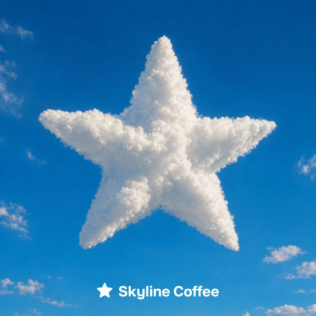
Example generated from “Logo-shaped cloud — ClawLabs AI · MIT”
GPT Image 2en

Minimalist surreal photograph: a massive, photorealistic cumulus cloud shaped exactly like [ICON_SHAPE], puffy and voluminous, with natural sunlight illuminating its edges and soft realistic shadows within its folds to show depth. The cloud floats in a vast, clear, vibrant blue summer sky, with a few small wispy natural clouds scattered far in the background for scale. Lighting is bright, direct daylight from the side, creating high-contrast highlights and shadows. At the bottom center of the frame, the word "[BRAND_NAME]" appears in a clean, bold sans-serif font in [ACCENT_COLOR], next to a small flat icon in the same [ACCENT_COLOR] echoing the shape of [ICON_SHAPE]. Style: surrealist photography, ultra-minimalist composition, high resolution, 8k, cinematic look, clean and airy vibe.

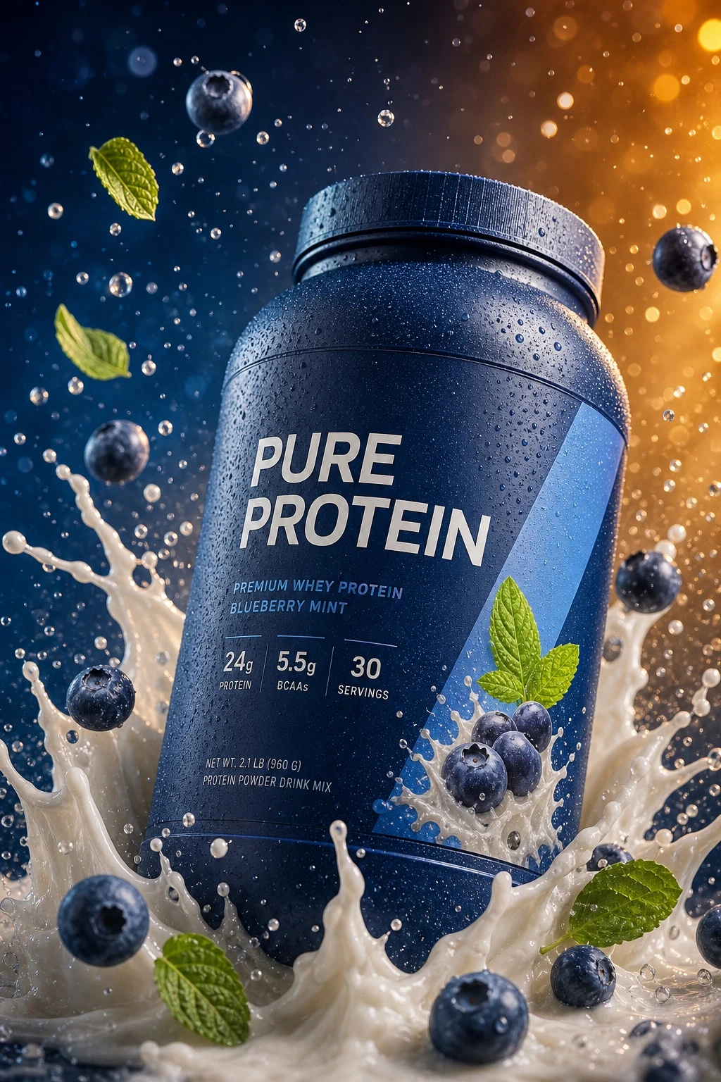
Example generated from “Splash-motion product bottle photography — ClawLabs AI · MIT”
GPT Image 2en

Hyper-realistic 8K commercial product photography, 3:4 vertical aspect ratio, cinematic studio lighting with controlled highlights and soft shadows. A [CONTAINER_TYPE] in [CONTAINER_COLOR], covered in fine condensation droplets, shown in a [VIEW_ANGLE], leaning dynamically into a swirling splash of [LIQUID_COLOR] liquid rising around its base. Around the container, [FLOATING_ELEMENTS] float suspended at different depths alongside fine droplets frozen mid-air. The label reads '[LABEL_TEXT]' in clean sans-serif lettering. Background transitions smoothly from [BACKGROUND_COLOR_1] to [BACKGROUND_COLOR_2], with soft circular bokeh light particles scattered throughout. Extreme micro-detail sharpness, frozen high-speed motion, no noise, no artifacts.

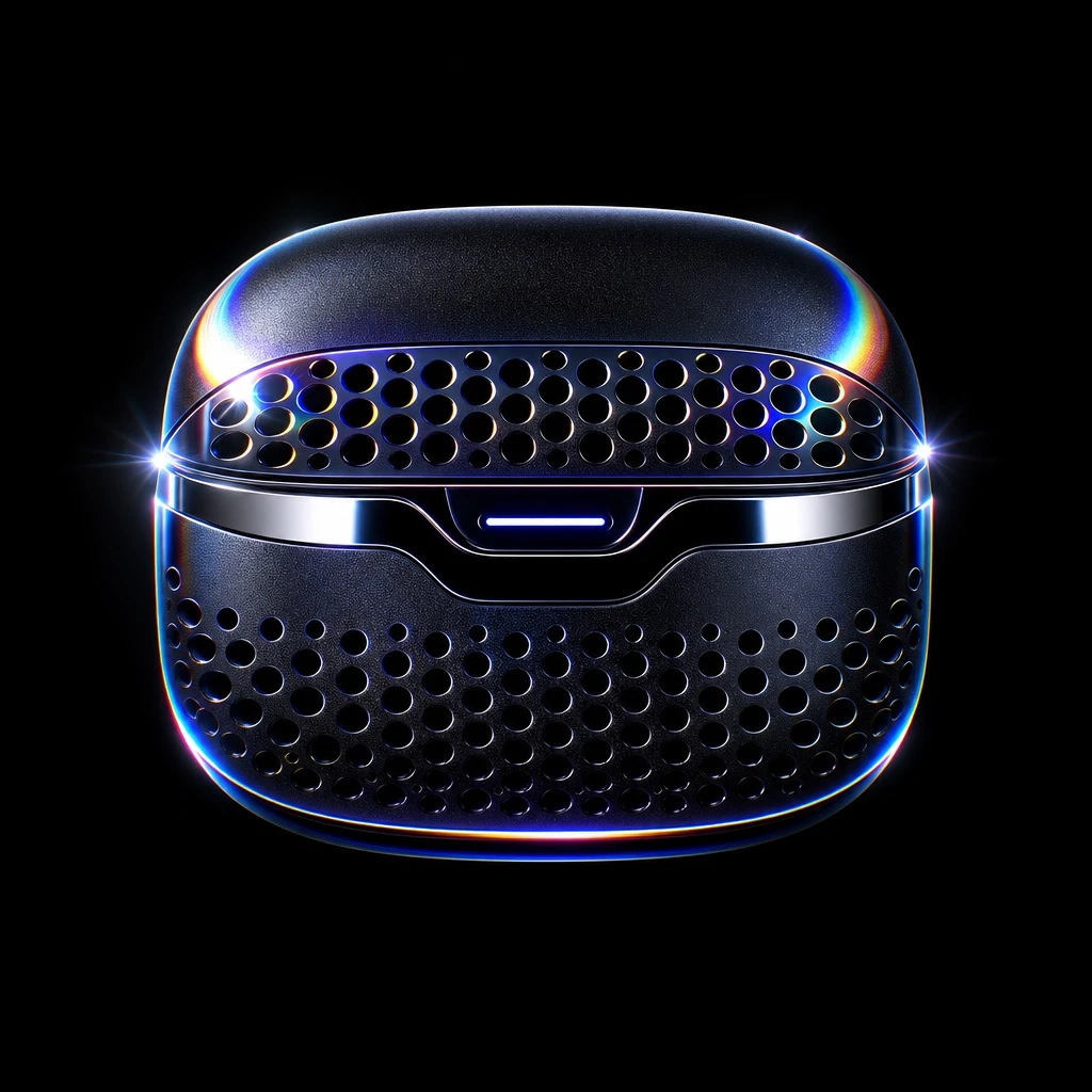
Example generated from “Levitating Product in the Void — ClawLabs AI · MIT”
GPT Image 2en

Hyper-realistic 3D render of [PRODUCT_NAME] floating and levitating in the absolute center of a pure black void, fully visible with generous padding and no cropping. The product features an anodized obsidian metal finish with microscopic grit texture, blended with high-gloss fluid chrome accents and a precision-machined hemispherical lattice venting pattern inspired by premium computer hardware design. Add monatomic light dispersion, prismatic diffraction on the edges, and an ethereal holographic sheen. Lighting is hard rim lighting with chiaroscuro, high contrast, sharp specular highlights, and no ambient fill, using a palette of pure black, [ACCENT_COLOR], and spectral iridescent rainbow highlights from thin-film interference. Rendered in ultra-detailed 8k cinematic quality with ray-traced reflections and dramatic studio-grade lighting. Exclude any visible lighting equipment, stands, pedestals, platforms, text, watermarks, props, surface reflections, floor, shadows, logos, or cluttered background.

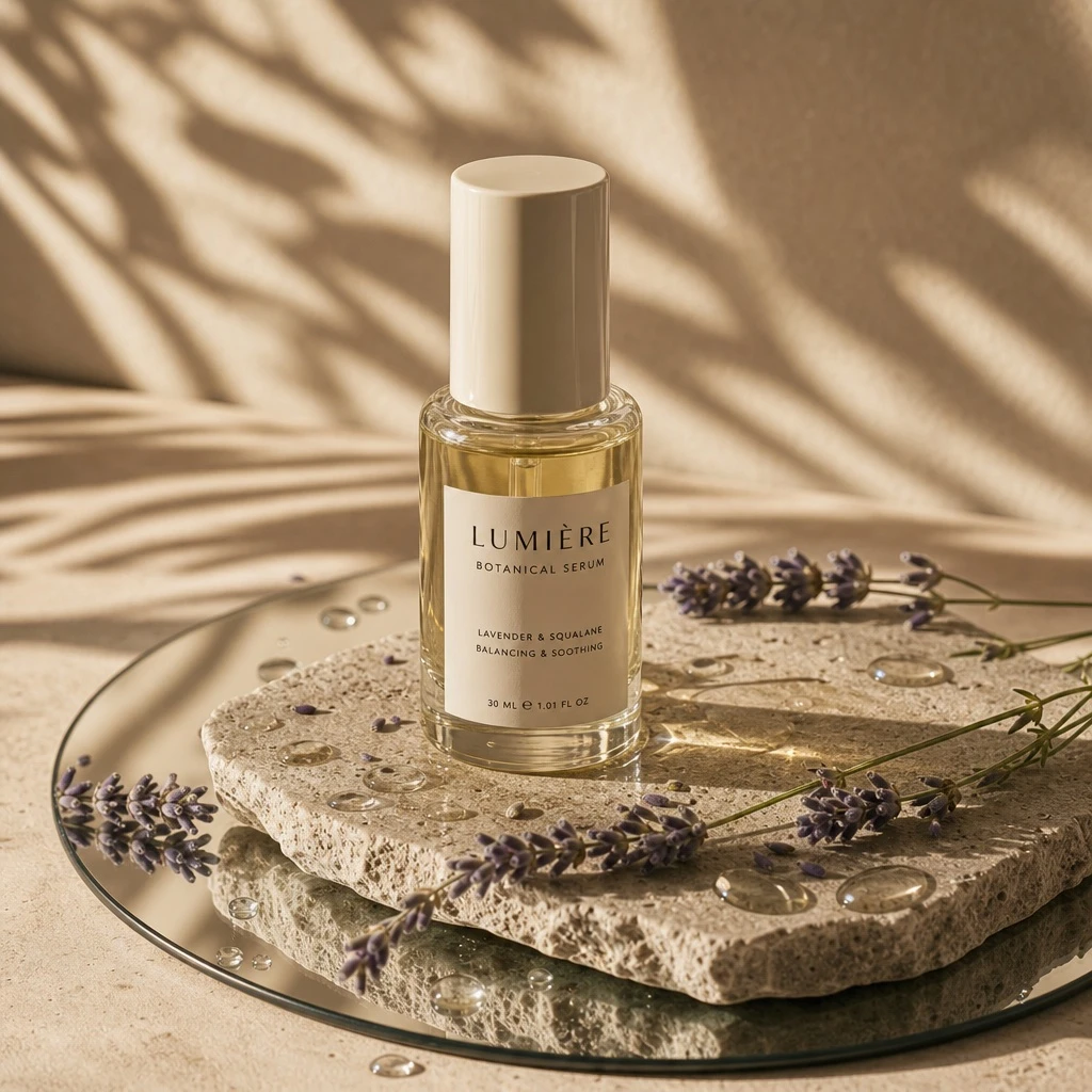
Example generated from “Golden hour product still life — ClawLabs AI · MIT”
GPT Image 2en

A high-end editorial studio photograph of a [PRODUCT_FORM], made of [MATERIAL] with a [COLOR] [DETAIL]. The product is placed on a natural, textured [BASE_SURFACE] slab, itself resting on a round mirror laid on a [SURFACE_TONE] surface. Around the mirror and on the slab are scattered droplets of [LIQUID] with realistic reflections. A few sprigs of [DECORATIVE_ELEMENTS] lie gently across the slab and mirror, connecting both surfaces naturally. Strong, warm sunlight filters from the top left, casting soft diagonal leaf shadows to simulate filtered daylight. The aesthetic is [VISUAL_STYLE], with realistic materials and natural textures highlighted by golden hour tones. Style: 3D realism, luxury product photography, shallow depth of field. Format: 1:1, ultra-detailed.

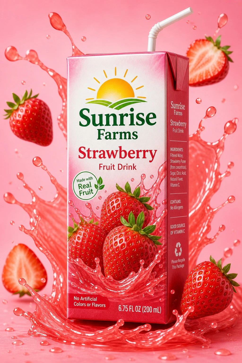
Example generated from “Juice box product mockup — ClawLabs AI · MIT”
GPT Image 2en

Commercial product photograph of a juice box carton labeled '[BRAND_NAME]' in [FLAVOR] flavor. The front of the carton shows a realistic depiction of [FRUIT_DESCRIPTION]. The carton sits centered against a [BACKGROUND_COLOR] background, surrounded by dynamic swirling juice splashes and pieces of [FRUIT_DESCRIPTION] floating around it. High-quality commercial-grade photorealism, crisp packaging material texture, studio lighting, vertical 2:3 packaging mockup composition.

Example generated from “Frutiger Aero product render — ClawLabs AI · MIT”
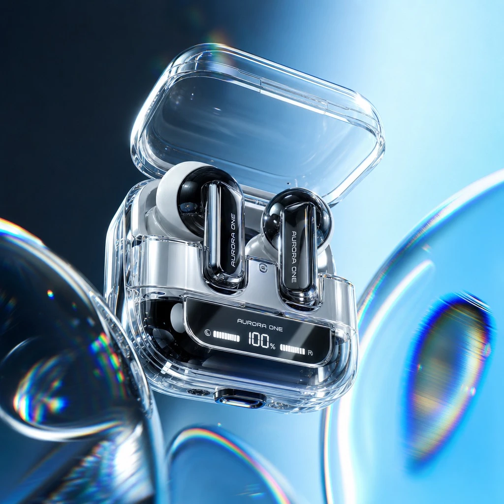
GPT Image 2en

Ultra-detailed hyper-realistic product photograph of [PRODUCT], floating in a gravity-defying, wide-angle composition against a smooth dual-tone studio gradient background transitioning from [COLOR_START] to [COLOR_END]. High-contrast studio lighting with bright rim highlights emphasizes glossy chrome, transparent acrylic, and high-gloss plastic textures. Dynamic glass refraction, prismatic chromatic aberration at the edges of transparent surfaces, iridescent lens flares, and distorted glass overlays float in the foreground. The aesthetic blends Y2K Frutiger Aero optimism with modern hyper-realism, rendered in 8k UHD with Octane-style macro photography focus and hyper-detailed mechanical parts.

LemoLab · CC BY 4.0 · Author-provided 720p film unchanged. Poster resized from 1920×1080 to 1280×720 and converted from JPEG to WebP. Piano samples: Salamander Grand Piano V3 by Alexander Holm, CC BY 3.0 (https://creativecommons.org/licenses/by/3.0/). Full third-party credits are in demo/CREDITS at the linked source.

Art Deco — Midnight at the Starlight Hotel (code-generated animation; creator style recipe)

LemoLab · CC BY 4.0 · Author-provided 720p film unchanged. Poster resized from 1920×1080 to 1280×720 and converted from JPEG to WebP. Piano samples: Salamander Grand Piano V3 by Alexander Holm, CC BY 3.0 (https://creativecommons.org/licenses/by/3.0/). Full third-party credits are in demo/CREDITS at the linked source.

Claude Opus 5.5en

# Art Deco — Style Prompt > Black lacquer, engraved gold line and airbrushed geometry: a 1930s poster that moves. Every composition has a centre axis, transitions open or close along it, and light arrives as bulbs switching on one by one. > References (grammar only): **A. M. Cassandre** posters (giant geometry, steep perspective, airbrush inside hard edges); **Chrysler Building / Rockefeller Center ornament** (setbacks, sunbursts, chevrons); **Busby Berkeley** overhead numbers overheads (human kaleidoscopes); **The Great Gatsby (2013) title sequence** (gold line drawing itself on black); **Gershwin-era symphonic jazz** (clarinet, piano, muted trumpet). Never copy a poster layout, a real building, a character, a typeface design or a melody. ## 1. Essence, and what it is not A world built from **gold keylines on warm black**, filled with **airbrushed hard-edged volumes** (Cassandre, Lempicka), organised around **one vertical axis**. Ornament *is* the picture: sunbursts are backgrounds, stepped arches are frames, a dial is a progress bar, a bulb marquee is a reveal. Motion is **mechanical and symmetrical**: things unfold from the centre, doors split along the seam, lights switch on in counted order. Native register: glamour with a clock ticking (an event, a deadline, a launch). Not a gold-foil slideshow (things move and have volume), not Art Nouveau (no whiplash curves, no flowers), not a flat vector poster (volumes are airbrushed and rimmed), not a 60s spy title (no silhouettes on flat colour). ## 2. Materials & rendering - **Ground**: warm lacquer black, never neutral grey-black; a night sky may drift toward a deep emerald near the horizon. - **Gold is a banded metal gradient** (dark – light – hot – light – dark); animate its `sheen` offset for a light sweep. - **The signature stroke** (`gline`): a dark engraved underline ~1.6 px wider than the line, the gold gradient line, and a hairline highlight on top. Optional glow and a parallel twin (`double`). Nothing gets a black cartoon outline. - **Volumes**: hard edge + airbrush (`airbrush`): a directional gradient from shade to light inside the shape, one consistent light direction (upper left by default), a thin gold rim on the lit side. - **Motifs** (sunburst, stepped arch / ziggurat, fish-scale, chevrons, fan, four-point sparkle, speed lines, clock face, dial) are structural (a background, a frame, a transition), not stickers. - **Perspective is real**: true one-point (mode-7 floors) and two-point perspective through a pinhole camera, so dolly, tilt and pan change perspective instead of scaling flats. - **Characters are deco too**: about 7 heads tall, tapered streamline bodies, faceted lacquer planes (Lempicka), almond or arc eyes, a one-stroke nose, airbrush + gold rim. Give each lead one or two silhouette marks readable at a quarter of frame height. ## 3. Colour logic - Three constants: **warm black ground, gold line and metal, ivory** for paper, gloves, light and type. - **One saturated accent reserved for the protagonist** (or the one object the story follows). It is the only large saturated area, so the eye finds it in any wide shot. A cooler jewel tone may carry secondary surfaces, never competing in area. - **The one-colour exception**: any single element can be drawn in its own colour through the same fill + keyline + glow (`color` option) while everything else stays gold. - Always expand hex to six digits in code (three-digit hex breaks colour mixing). - Examples of the triad (accent / jewel / metal): burgundy / emerald / gold; coral / sapphire / pale gold; jade / plum / rose gold. Our demo's actual values are in DEMO.md. ## 4. Type & subtitles - **Type (OFL)**: Limelight (titles), Poiret One (numbers, sign skeletons, plaques), Josefin Sans (subtitles, labels), Italiana (numerals). - **Titles are architecture**: a stepped gold title bar over an arch or sunburst, optional badge and wings; drawn on in gold, then a sheen sweep. - **Subtitle card** (`subtitleCard`): a lacquer bar (~88 % black) with stepped ends like the title bar, double gold keyline, Josefin Sans SemiBold ~40–42 px ivory, an optional small speaker icon per voice. It **unfolds from the centre** like every other title, so titles, subtitles and transitions are one system. Hold ≥ max(1.8 s, speech + 0.6 s). - Numbers carry plot without narration: dials, clock faces, floor medallions, badges. ## 5. Motion quality - **Characters step on twos (12 fps)**; camera, light, bulbs, gold draw-on and sheen run on ones (24 fps). A stepped camera reads as stutter. - **Everything unfolds from the centre**: a point → a hairline → bars open symmetrically → text rises → wings and sparkle. - **Draw-on follows the music**: a gold line grows at the speed of the phrase under it and lands on the hit. - **Bulbs have an ignition overshoot** (~1.6× flash settling in ~0.18 s) and a relay "chunk"; once a sign is lit, a fast chase may run across it. - **Mechanical easing**: doors, dials and hands move with firm ease-in-out and a small settle, like machinery; nothing floats. - **Performance beats get anticipation** and escalation in threes (once, twice, mash). - What never moves: the centre axis of a composition. Symmetry may rotate or open, but it never drifts off-centre. ## 6. Camera grammar A vocabulary, not a route. Opening and ending come from the topic. | Move | What it expresses | Can serve | |---|---|---| | Symmetric split (two door leaves hinged at the edges; or a revolving-door wipe) | a threshold crossed | a new place; a new chapter; a reveal behind a façade | | Leaves sliding shut over the live shot | a door closing on a moment | leaving; a decision made; the end of an era | | Extreme low-angle Cassandre tilt | scale and aspiration | a goal far above; a tower, a rocket, a monument | | Architectural section (pull out to a cutaway of the whole building) | progress through a structure | climbing, descending, a process in stages; a company's floors | | Busby Berkeley overhead, mirrored and rotating | people become pattern | a team, a release, a celebration, a system of parts | | Push-in on a dial, medallion or clock | the number is the plot | a deadline; a count; a milestone | | Match-cut on shape (circle → circle, ray → ray) | two places, one rhyme | jumping between departments, cities, eras | | Low oblique along a sign or marquee | light travelling letter by letter | a name revealed; a launch; a score being counted | | Pull back from detail to skyline | where the moment sits in the world | aftermath; a city-wide effect; scale | Framing: the centre axis is sacred; an asymmetric frame must resolve to it within the shot. At an emotional peak the protagonist fills ≥ ~1/3 of frame height (smaller, the face reads as a prop in the ornament). Transitions: splits, revolves, arch openings, shape matches; never a generic dissolve or slide. ## 7. Sound palette - **Symphonic jazz of the 1920s–30s, not a 60s big band.** Options: stride or concert piano, clarinet (trill; a glissando by time-varying resampling of a long note), strings (tremolo, rushes, pizzicato), muted trumpet commentary, trombone and sax section, walking pizz bass, brushes or sticks, tubular bells, harp glissandi, banjo, xylophone runs, celesta. - Rhythm families to choose from: foxtrot, Charleston, tango, a slow torch-song ballad, a fanfare in the manner of a newsreel. - **Techniques (options)**: one hit per unit of counted light; accelerate by dividing the beat; plant a theme in fragments so its full statement is a payoff; low-pass a band that is physically far away and open it as we approach; move a period narrator through acoustic spaces (horn, radio, PA, live mic) to make distance audible. - **Foley by material**: brass clicks, bronze clang + chain, iron treads, marble heels, silver trays, wooden doors + spring twang, paper flutter, knife-switch "chunk" + filament hum, relay ticks, elevator ding, champagne cork. - **Silence as a tool**: before the most important sound, drop to one small diegetic sound (a clock tick, wind) and cut back in with that sound alone. - **J/L-cuts** carry architecture: the next room's sound enters a bar before its door opens. - Mix: duck music ~−9 dB under voice (less under a period announcer who is part of the texture), beds −6 dB, −14 LUFS, light film grain. ## 8. Native moves A menu: use the ones your story needs. - **Counted light.** A bulb sign lights one letter per beat or per event, so the audience can count. *Fits content like:* the countdown to a product launch; the letters of a city name lighting as a train arrives; votes tallied into a winner. - **Threshold doors.** Every scene change is a door split along the seam. *Fits content like:* the departments of a company; the rooms of a museum; stages of a career. - **Machine kaleidoscope.** People or objects become a mirrored, rotating pattern that locks into a symbol. *Fits content like:* a team becoming a logo; gears of a supply chain; a choir becoming a clock. - **Dials carry the plot.** A floor indicator, a clock or a gauge moves instead of narration. *Fits content like:* a funding thermometer; the altitude of a climb; a stock ticker at the opening bell. - **The architectural cutaway.** Pull out until a building is a section and the protagonist a coloured dot with speed lines. *Fits content like:* data moving through a server stack; a letter through a post office; a skier down a resort. - **Sheen sweep / draw-on.** Light crosses a gold object on a hit; a gold line engraves itself at the speed of a glissando. *Fits content like:* unveiling a trophy; a map route; a signature on a treaty. - **The one colour.** One element keeps its own colour in a gold world. *Fits content like:* the one product among competitors; the patient among doctors; the new idea in an old firm. ## 9. Pitfalls of the medium - Bulb signs from glyph skeletons break on curves (G, S, R): Zhang–Suen staircase pixels fool a neighbour-count junction test → use the **crossing number** and weld chain ends within ~14 px. - A generic cartoon character looks pasted in → characters are deco (§2). - Fish-scale reads as brickwork → lower half-circles row by row, each overlapping the previous row, plus an inner arc. - Door leaves over a flat "interior" read as a blank frame → draw only the leaves, closing over the live shot. - A gold point on pure black trips `blackdetect` → lift the background wedges and glow slightly. - Period loudspeaker distortion is unintelligible under music → gentle drive; whisper-check every line on the final mix. ## 10. Engine Canvas2D, deterministic in `t`, in `demo/engine/`: `deco.js` (gold gradient, `gline`, `airbrush`, motifs, `drawShape` for any path in the deco manner, `color` for the one-colour exception), `type.js` (title bar, digits, badges, dial, clock, `subtitleCard`), `bulbs.js` (any text → bulb sign, `litSequence`), `cam.js` (pinhole camera, `cardTransform`). `demo/frames.js` renders model sheets and style frames from the real engine. Signatures and a minimal example that draws something not in the demo: DEMO.md "Engine reference". ## 11. Variation space You decide the structure, the characters (or none), the settings, the opening, the ending, the camera path, the pacing, the accent colour and what gets counted. All far from our demo: - Structures: **the exhibition** (five pavilions of a world's fair, one idea of the topic behind each door); **the ocean liner** (three decks from engine room to ballroom, a horn per stage); **the trophy night** (nominees as sunburst panels, the winner revealed in light). - Openings: **the machine room** (gold gears and pistons building to the first beat); **the engraved map** (a gold route crosses a continent before anyone appears); **the telegram** (ticker tape types the premise). - Endings: **the lights go out** (letters switch off in reverse until one bulb remains); **the dawn** (lacquer black warms to a pale sky); **the poster** (the last shot flattens into a printed poster with a date). --- How our demo was made (story, shots, score, end card, build): [DEMO.md](DEMO.md). Read it after your treatment exists.

LemoLab · CC BY 4.0 · Author-provided film unchanged. Poster resized from 1920×1080 to 1280×720 and converted from JPEG to WebP. Full third-party credits are in demo/CREDITS at the linked source.

One-line Drawing — The Line That Never Lifted (code-generated animation; creator style recipe)

LemoLab · CC BY 4.0 · Author-provided film unchanged. Poster resized from 1920×1080 to 1280×720 and converted from JPEG to WebP. Full third-party credits are in demo/CREDITS at the linked source.

Claude Opus 5.5en

# One-line Drawing — Style Prompt > A single ink line that never leaves the paper. Everything on screen is that one line being drawn; scenes don't cut, they morph. > References (grammar only): Osvaldo Cavandoli's *La Linea* (1971) — one line is both the world and the character, and transformations of the line are the jokes and the transitions; Gjon Mili's 1949 photographs of Picasso drawing with light — the confidence and speed of a single gesture; Norman McLaren's *Begone Dull Care* and *Boogie-Doodle* — lines drawn *to* the music. Do not copy La Linea's character, its gibberish voice, or any specific continuous-line illustration. ## 1. Essence, and what it is not - **One continuous line** on warm white paper. The pen never lifts: in code the whole film can literally be one point array, from the first touch of the nib to the last frame. - **Everything is a line**: characters, places, objects, even time. No fills, no shading, no second line weight, no background art. - **We watch the line being drawn**: the camera follows the nib with a little lag and anticipation. - Besides ink there is only the paper and a soft **shadow of the pen** (the real world above the paper). One accent colour at most, used once. Not a whiteboard explainer (no hand, no marker, no erasing, no text-heavy boards), not ink wash (no tones, no brush bloom as a look), not a line-art animation with cuts and many strokes. ## 2. Materials & rendering - **Paper**: warm white (around `#F4EFE4`), procedural mottling (soft-light, large tile), long fibres that fade out when zoomed out (or they shimmer), a sparse paper-tooth speckle over the ink at close zoom, light vignette. All textures anchored to the paper; they move with the camera. - **Ink** is a filled polygon around the path (not `ctx.stroke`), mixed with paper colour to an opaque tone per point. - Width = base width of the current "voice" of the line × pen pressure × fine noise (±8 %); pressure from speed: `0.66 + 0.8·exp(−v/300)` (fast = thin, slow = fat). - The line's character can change along the path (base width, alpha, tremble, dryness); blend over a short stretch at boundaries. - Ink bleed: the same polygon slightly wider, blurred on an offscreen layer, composited at ~20 %. - Pooling: extra round dots where speed drops low. - Tremble (perpendicular noise) and dry-brush gaps (long-scale noise + thin bristle strands) for age, fear or fatigue. - A stop leaves a teardrop-shaped blot: tip at the nib, belly sagging downward as it spreads, a dark tide line at the rim. - **A screen-space minimum width**: widths scale with zoom like a line under a macro lens, but clamp the zoom used for width during pull-backs so a wide view keeps its weight. - **The pen is never drawn**: a soft blurred wedge of shadow from the nib and a tiny contact dot. Hands, if any, appear only as shadows, each hand composited as one flat layer. - **Path design**: chapters written as SVG path strings, sampled by arc length, joined by tangent-continuous connectors; time assigned per point weighted by curvature. ## 3. Colour logic - **Ink on paper.** A warm black (around `#1D1A17`) on warm white; nothing else fills the frame. - **One accent at most, used once**, on a stretch of the line that means something; it returns to ink afterwards and stays visible in the final picture if the picture is revealed. - Examples of an accent's job: red for love or danger; blue for water or cold; gold for money or a prize. Never a second accent. ## 4. Type & subtitles - **Text is written, like the line**: a handwriting face (e.g. Caveat) for subtitles, ink at ~84 %, no box, centred near the bottom, **written on** left to right (~0.2 s + ~17 ms per character) behind a soft paper-coloured halo so passing lines never cross the letters; fade out ~0.45 s. Hold ≥ max(1.8 s, speech + 0.6 s). - Titles in a monoline connected script (e.g. Sacramento: itself a one-line drawing), written on in empty paper away from the drawing, gone before the camera moves into them. ## 5. Motion quality - **Everything on ones** (24 fps): the appeal is the continuous act of drawing; stepping breaks it. - **Timing = chapter windows + curvature**: within a window, time per point is weighted by `1 + K·turn` (sharp turns get more time, smoothed so speed never jumps). Pin musical beats with marks: by arc-length fraction or by position ("the second time the pen passes here"). A stop is two marks at the same place. - Corners (speed minima at high turn) can be exported to the soundtrack as candidate note onsets. - Speeds: ~300–700 units/s for travelling lines, ~50–150 for small details. The most important stroke is usually the slowest. - **Retracing** over an existing line is legal and invisible (it only thickens slightly). ## 6. Camera grammar A vocabulary, not a route. The camera is one continuous move: composition centre, zoom, a few degrees of roll, and a follow weight (0 = composed, 1 = locked to the nib); the follow point averages the nib over roughly −0.55…+0.4 s (lag and anticipation), with a soft clamp keeping the nib inside the central ~70 % of the frame. Opening and ending come from the topic. | Move | What it expresses | Can serve | |---|---|---| | Follow the nib (high follow weight) | travel; momentum; a thread of time | a journey; a process; a timeline | | Composed frame, low follow weight | a scene that must read as a whole | a vignette; a joke; a diagram | | Macro on the nib | intimacy; the act of making | a first touch; a signature; a detail | | Hold with a slow push-in | weight; a stop | a loss; a doubt; a decision | | Mirrored framing | rhyme across time | parent and child; before/after | | Continuous pull-back | everything was one picture | a reveal; a map; a word | | Lateral scroll with the line running ahead | a horizon; a graph; a race | a stock chart; a heartbeat; a road | | Roll with the line | vertigo; play | a loop-the-loop; a fall; a dance | No cuts. Transitions are morphs: the last stroke of one image is the first stroke of the next. ## 7. Sound palette - **Music: one solo instrument, one unbroken melodic line**, the sound equivalent of the drawing: a bowed or plucked string (cello, violin, viola, harp), a solo woodwind (clarinet, flute, bassoon), a hummed voice, a single guitar. A second colour only as a rare accent (a chime, a pizzicato stretch). No pads. - **Write the score to the drawing**: key notes on marks and corners; fast line = short notes; a stopped line = one long note fading into silence; the highest note on the most important touch. - **The pen on paper is the most important sound**, synthesised from the pen speed: band-passed noise (brighter when fast, duller when slow), random paper-fibre ticks with density ∝ speed, amplitude ∝ √speed, panned with the nib's screen position; broken up by dry gaps; lighter and jerkier for a young hand. Plus: a wooden tap on the first touch, a faint wet swell for a blot, a tiny rub for a handoff, a page lift. - **Silence is literal**: zero the music bus including reverb tails; drop room tone. - **Mix**: music ducks ~5 dB and the pen ~4 dB under voice; −14 LUFS; grain 0 (the paper is in the render). - **Voice**: warm, few short lines that leave space for the line; place key words on picture beats with whisper word timestamps. ## 8. Native moves A menu: use the ones your story needs. - **The pen never lifts.** Anything that is one continuous thing. *Fits content like:* a river from source to sea; a relay race; a production line. - **The line is time.** The stroke's character changes with age, mood or strain. *Fits content like:* a building aging; a runner tiring; a machine wearing out. - **Transformation.** One image morphs into the next. *Fits content like:* a seed becoming a tree becoming a table; a sketch becoming a product; a word becoming its object. - **Stopping is an event.** The nib stops, ink pools, music cuts to silence (1.5–3 s). *Fits content like:* a power cut; a pause for a minute's silence; a hesitation before a signature. - **Reverse-designed scale reveal.** Every vignette is secretly part of one big picture seen at the end. *Fits content like:* a city's landmarks forming its skyline; a company's milestones forming its logo; a recipe's steps forming the dish. - **Handoff.** The pen passes to another hand (as a shadow) and a new line begins. *Fits content like:* a teacher and a student; a founder and a successor; one generation to the next. - **Line as graph.** The line becomes a chart while staying a drawing. *Fits content like:* a heartbeat; a temperature record; a football match's momentum. ## 9. Pitfalls of the medium - **Stray connectors ruin a reveal**: every extra line reads as a wrinkle, beard or mask. Fix the topology (where each chapter enters and leaves), not the drawing. Plan it like an Euler path: a closed motif is a circuit (you leave where you came in); retrace or reorder chapters. - Each region of a final picture is drawn exactly once; connectors must fall on natural lines of that picture. - **Test the reveal early and often**: render the whole path at once at final scale after every change. - Lines drawn too close braid together once width is applied; keep a gap. - A round blot reads as a mole → a sagging teardrop. - Thin lines at wide zoom → clamp the width zoom. - Translucent hand shadows double-darken where they overlap → one layer per hand. - Titles collide with the drawing as the camera moves → check every frame of the title's window. - Whisper mishears short lines → rephrase rather than fight it. ## 10. Engine In `demo/`: `geom.js` (samples SVG paths by arc length in the browser, adds tangent-continuous connectors, assigns time by curvature, marks and holds), `ink.js` (the line renderer: pressure, bleed, pooling, tremble, dry brush, accent stretch, blot, minimum screen width), `paper.js` (paper, fibres, tooth, vignette), `cam.js` (composition keys + nib follow + soft clamp), `hands.js` (pen and hand shadows), `subs.js` (written-on subtitles and titles). The drawing itself lives in one file of SVG path strings and a chapter table (`face.js`); replace it with your own path. Debug views (`?all=1`, `?cams=`) render the whole path or many camera views in one session: see [DEMO.md](DEMO.md) "Build notes". ## 11. Variation space You decide what the line draws, whether it reveals one final picture, where it stops, the accent (or none), the opening and the ending. All far from our demo: - Structures: **a line that is a graph** (a data series drawn as a horizon; each peak and trough becomes a scene); **two lines** that start in opposite corners and are drawn in alternation until they meet; **a loop** (the line draws a scene and then retraces its way back to the start, which now means something else). - Openings: **mid-line at speed**, the pen already running across the paper; **a finished drawing** whose line then unravels into the story; **a word written in script** whose last letter becomes the first scene. - Endings: **the line runs off the edge** of the paper and keeps going; **the ink runs out** and the last stroke fades into dry scratches; **the pen stops in mid-air** over the paper before the last stroke. --- How our demo was made (story, shots, score, end card, build): [DEMO.md](DEMO.md). Read it after your treatment exists.
LemoLab · CC BY 4.0 · Author-provided 720p film unchanged. Poster resized from 1920×1080 to 1280×720 and converted from JPEG to WebP. Full third-party credits are in demo/CREDITS at the linked source. The simplified two-dimensional positioning diagram omits receiver-clock correction; ordinary GPS uses a fourth satellite measurement. Reference: https://www.faa.gov/about/office_org/headquarters_offices/ato/service_units/techops/navservices/gnss/gps/howitworks

Whiteboard Explainer — Einstein in Your Pocket (code-generated animation; simplified diagram)

LemoLab · CC BY 4.0 · Author-provided 720p film unchanged. Poster resized from 1920×1080 to 1280×720 and converted from JPEG to WebP. Full third-party credits are in demo/CREDITS at the linked source. The simplified two-dimensional positioning diagram omits receiver-clock correction; ordinary GPS uses a fourth satellite measurement. Reference: https://www.faa.gov/about/office_org/headquarters_offices/ato/service_units/techops/navservices/gnss/gps/howitworks

Claude Opus 5.5en

# Whiteboard Explainer — Style Prompt (v2, no hands) > An explainer drawn live on one glossy dry-erase board: single-line handwriting that is actually *written* stroke by stroke, floating markers with no hand, magnets that can move, an eraser that can rewind, and a camera that travels across the board instead of cutting. > References (grammar only): RSA Animate / Cognitive Media (one continuous board, the camera travels instead of cutting, a full-board view); minutephysics (one sentence = one drawing, the simplest geometry that carries the idea); Steve Reich's *Piano Phase* (two copies of one figure at two tempi as a structure). Never copy their drawings, characters, hands or music. Suits explainers of 60–120 s, usually science or "how does X work". ## 1. Essence, and what it is not - **One physical whiteboard.** Everything the viewer learns is drawn in dry-erase marker in front of them, in real handwriting order. - **The board is a map**: each idea lives in its own region; the camera travels between regions, often led by the pen. Distance on the board = distance in the argument. - **Real marker, not animated text**: ink pools where the nib lands, dry streaks and speckle, strokes overshoot and don't quite close, ghosts of old lessons remain, a glossy sheen drifts slower than the board, and **every stroke makes a sound**. - **No hands.** Markers float with a real cast shadow that grows when they lift, park outside the frame between phrases and fly back in. Magnets and the eraser move on their own. Never draw a hand, an arm or a cursor. Not Blueprint (no blue sheet, no drafting conventions), not Crayon Picture Book (no wax texture, no children's story), not a kinetic-type explainer (text is handwritten stroke by stroke, never animated as blocks). ## 2. Materials & rendering - **Board**: a warm white gradient, a faint scuff and micro-scratch tile, a few dozen **ghost marks** (old words, circles, arrows) at 5–10 % in grey or pale blue, and a soft diagonal **window sheen** (white, 10–16 %) moving at ~0.35× the camera: this one detail sells "glossy". - **Ink**: alpha ~0.94, composited with **multiply** so overlaps darken like real marker. Width 6–11 px for drawing, ~13 % of cap height for lettering. - **Stroke character**: resampled every ~0.6 × width; low-frequency hand wobble along the normal (a few px, long wavelength) plus a finer tremor; chisel-tip width modulated by direction; a pressure ramp at the start and a small taper at the end; circles start at an angle and **overlap past closure**; rectangles are four strokes with small corner overshoot; a darker pooled dot *inside* the start of long strokes. - **Dry-marker texture**: a speckle-and-streak tile subtracted from the ink layer (destination-out), locked to board space, faded out when the camera is wide. - **Lettering**: a single-line (single-stroke) font written in stroke order, each glyph with small rotation, baseline and scale jitter. Missing symbols (μ ≈ → × − ✓ ² ° ±) are hand-defined. - **Props**: dry-erase markers (white barrel, colour band and cap in the ink colour, felt nib), a felt eraser, magnets (glossy, with specular highlight and soft cast shadow). Frame, tray and wall appear only if the camera ever goes past the board edge. ## 3. Colour logic - **Three marker colours at most**, each with a meaning held for the whole film: one dark ink for things and structure, one for signals / measurement / process, one accent for the thing that matters (one accent per region). - **Monochrome variant**: everything in the dark ink, one element in the accent (the "only colour"). - Ghost marks and board stay neutral; the accent never appears on props except its own marker cap and the hero magnet. - Example sets: black `#23262c` / blue `#2a5cb3` / orange `#d97757`; black / green `#2e8b57` / red `#c8363a`; navy `#1f2a44` / teal `#1f8a8a` / purple `#7a4fb3`. ## 4. Type & subtitles - **Handwriting only**: a single-line hand (e.g. EMS Tech, OFL) for all board text; titles large (~120–200 px cap height), labels 30–70 px. - **Title and end card are written on the board** in the same hand. - **Burned subtitles**: an off-white rounded label (~90 %), a handwriting-like face (e.g. Architects Daughter ~44 px), dark text, a short accent-colour marker dash. Split at clauses, ≤ 44 characters per line, bottom ~12 % of the frame kept free for them in every shot. Hold ≥ max(1.8 s, speech + 0.6 s). - **Writing finishes on the word**: a term appears exactly when the narrator says it. - A label is fully in or fully out of every shot it appears in. ## 5. Motion quality - **Hand speed**: every stroke follows a slow-fast-slow curve (`u − sin(2πu)/2π × 0.8`). Strokes are scheduled into a **time window** and the engine solves the speed, so writing always finishes on time. - **Pen hops** between strokes lift in proportion to distance (shadow slides and blurs); long gaps send the pen off-frame to park and back shortly before its next stroke. - **Magnet**: drop with a shrinking shadow; slide with a small lift; lift-off and sink possible. - **Eraser**: constant speed along a path, a wide band at ~90 % strength (a ghost always remains). - **Speed**: faster than real hands (a sped-up lesson) but never so fast the stroke order is lost: a label ~0.3–0.8 s, a title ~3 s. - Camera on ones with real motion blur when it moves fast. ## 6. Camera grammar A 2D camera over a large board (e.g. 8000 × 4500): position, zoom interpolated in 1/z so pushes feel like dollies, a little roll. A vocabulary, not a route. Opening and ending come from the topic. | Move | What it expresses | Can serve | |---|---|---| | Pull back from a tiny drawing | scale | a surprising size; context | | Ride the line the pen is drawing | one idea leads to the next | a transition; a process; a path | | Hold still | read now | an equation; a definition; a list | | Whip to a new region | a new idea after a pause | a twist; a "but" | | Return to an earlier region | a callback, for free | reusing a result; a comparison | | Split view of two regions (zoomed out enough for both) | two things at once | a duet; before/after | | Slow push into one symbol | this term is the point | a unit; a variable; a name | | Track along a long diagram | sequence, time | a timeline; a pipeline; a journey | | Pull back past the board edge to the wall | the whole lesson as one picture | a summary; a scale jump | Motion blur: when the camera moves more than ~14 px per frame, render and average sub-frames (≤ 4 px apart). No cuts on the board; if a cut is needed, it is a whip. ## 7. Sound palette - **Every stroke sounds**: band-passed felt-on-gloss noise (a hiss band ~2–7.5 kHz + body ~0.5–1.5 kHz) enveloped by the stroke's own speed curve, a tiny nib tick at the start, stick-slip grains, and on some long strokes the **dry-erase squeak** (a 1.5–2.6 kHz sine with 7–13 Hz vibrato). Each colour sounds slightly different. Pan = the stroke's screen x; closer camera = louder. - **Props**: magnet on steel = click + metal modes + a low board thump; eraser = felt rub modulated by its zig-zag; cap off/on; marker tray bounce. - **Room**: low room tone; a single diegetic ticker (a wall clock, a fridge hum, a projector fan) can own a silence. - **Music** options: a solo piano figure; a small jazz trio with brushes; plucked strings and kalimba; a synth arpeggio for tech topics; clockwork minimalism (marimba, pizzicato, woodblock, glockenspiel). Mickey-mouse details: a rising whistle for growth, pings for signals, a harp run for a fall. - **Techniques to pick from**: adding one instrument per step of a mechanism; a key change when the frame of reference changes; a full stop into silence before a surprise; the previous cue reversed and squeezed for a rewind; two copies of one figure at two tempi (phasing) for anything that diverges, snapping into unison when resolved. - **Mix**: voice on top (compressed, light room), music well under voice and ducked further under speech, foley ~11 dB under voice; −14 LUFS. ## 8. Native moves A menu: use the ones your story needs. - **Writing in stroke order.** The reveal is the explanation: a formula term by term as it is spoken. *Fits content like:* compound interest; the Drake equation; a recipe's ratios. - **The pen leads the camera.** Transitions are drawn lines the camera rides. *Fits content like:* a nerve signal; a supply chain; the water cycle. - **Magnets.** The only things allowed to move on a board: give the hero to a magnet; slide, lift, drop, sink it. *Fits content like:* a delivery truck on a route; a cell in a bloodstream; a player on a pitch. - **The eraser rewinds.** Wiping a trail backwards reads as undoing time. *Fits content like:* an undo in software; reversing a chemical reaction; "what if we hadn't…". - **Two pens at once.** A live duet comparing two quantities. *Fits content like:* two savings plans; two runners; a population vs its food supply. - **Ghosts of the old lesson.** A faint previous drawing becomes relevant. *Fits content like:* a theory replaced; last year's forecast; a first draft. - **The full-board view.** Every region seen at once as one picture. *Fits content like:* a system diagram; a history; a map of a field. ## 9. Pitfalls of the medium - **One pen, too many jobs** drifts later and later → give each drawing a deadline window and let overlapping jobs go to another pen. - **Minimum stroke duration × many dashes** makes a dashed line take seconds → dashes need their own floor. - **A pooled-ink dot bigger than the stroke start** leaves halos on every letter → keep it inside. - **Punctuation vanishes** (a font period is a 1 px stroke) → render sub-width strokes as dots. - **Labels half-cut by a push-in** look sloppy. - **Motion blur with few sub-frames** strobes text. - **Eraser paths** crossing labels you want to keep. - **Voice and phoneme set mismatch** (a British voice with US phonemes) mispronounces → match the language code to the voice; ASR-check. ## 10. Engine `demo/engine/wb.js`: hand-drawn shapes (`line`, `curve`, `poly`, `arc`, `circle`, `rect`, `arrow`, `dashed`, `hatch`), `text()` in writing order from a single-line font (`loadFont`), `Stroke`, floating `Pen`s, `Timeline.draw(pen, shapes, t, {by})` (solves hand speed to a deadline), `Timeline.erase`, `Timeline.cue`, keyed `Camera`, `Board` (ink multiply, dry texture, erasers, sheen, props), prop drawers. API table and a minimal example that draws something new: [DEMO.md](DEMO.md#engine-reference). ## 11. Variation space You decide the topic's object, the board layout, the colours within the logic, the voice, the music family, the camera route, the opening, the ending and the length. All far from our demo: - Structures: **a proof** (one claim at the top, the board fills downward step by step, each step boxed when proven); **a debate** (two pens, two halves of the board, each drawing its side until the drawings meet in the middle); **a timeline** (one long horizontal line ridden left to right, with events hanging off it). - Openings: **a question mark** drawn huge in the centre, then shrunk to become a dot in the first diagram; **an erased board** where the ghost of a wrong answer is still visible; **a magnet dropping** onto an empty board with a clack. - Endings: **the answer circled** twice and the pen capped; **the board wiped** except for one line that survives; **a push into the smallest symbol** on the board, which becomes the title. --- How our demo was made (story, shots, score, end card, build): [DEMO.md](DEMO.md). Read it after your treatment exists.
LemoLab · CC BY 4.0 · Film unchanged. Original poster proportionally resized from1920×1080to1280×720and converted from JPEG to WebP. Full third-party credits are in demo/CREDITS at the linked source.

Swiss Motion Graphics — Five Rules for a Poster (code-generated animation; creator style recipe)

LemoLab · CC BY 4.0 · Film unchanged. Original poster proportionally resized from1920×1080to1280×720and converted from JPEG to WebP. Full third-party credits are in demo/CREDITS at the linked source.

Claude Opus 5.5en

# Swiss Motion Graphics — Style Prompt > International Typographic Style in motion: a modular grid, one typeface, one signal colour, and movement as exact as a printing press. > References (grammar only): 1950s–70s Zurich posters (Müller-Brockmann, Hofmann, Gerstner, Crouwel) for the grid, flush-left type, scale contrast and "designing programmes"; modern identity systems in motion (Experimental Jetset, Pentagram) for snaps on the beat. Never copy a specific historical poster's composition (no concentric-circle or fan layouts lifted from Müller-Brockmann), never use Helvetica or Akzidenz font files, never name a real institution on a poster. ## 1. Essence, and what it is not - **Pure 2D graphic design animated on a grid**: flat paper, black type and bars, a very light grey and **one** saturated signal colour. - **Every element snaps to the grid, every move lands on a beat, nothing bounces.** - **Rigor with one exception**: the whole frame obeys a system, so the one element that doesn't becomes a character. - **Extreme scale contrast**: a giant numeral next to tiny technical notes. Not a keynote (no gradients, no glow, no device renders), not kinetic typography for a lyric video (words don't fly, spin or bounce), not data visualisation (bars have mass as graphic form, not as charted quantities, unless the grid gives them that meaning), not a Bauhaus pastiche of primary shapes. ## 2. Materials & rendering - **Frame grid**: 1920×1080, 12 columns, ~96 px side margins, 24 px gutters, 24 px baseline. The frame can act as a **spread**: a left page (the programme: numeral, rule text, notes) and a right page (the artifact). - **Artifact grid** derived from the content (Gerstner): what the columns and rows *mean* is a design decision. **Choose module sizes that give the elements mass**; too many thin columns make a layout look like a chart. - **Surfaces**: page, paper, ink, signal colour, grid lines in two or three light greys (on page, while building, on paper). No gradients, no shadows, no particles, no grain (mux grain 0). - **Bars and blocks** are flat rects; consecutive cells of one unit merge into one bar, overdrawn 1 px at seams (antialiasing shows hairlines, especially when rotated or scaled). - **A secondary voice** can be light-grey elements under the black ones: depth without a second colour. - **A 2D camera matrix** (centre, scale, rotation) for all moves. ## 3. Colour logic - **Paper, ink, greys, and one signal colour.** Only one thing carries the signal colour; that makes it the protagonist. It is the only thing allowed to be inexact. - Overprint is allowed: black type on the signal colour. - The signal colour can be red, orange, ultramarine or green; choose it for the topic, then never add a second. - Examples: `#EAE9E5` page, `#FFFFFF` paper, `#111111` ink, signal `#E30613`; or `#F2F0EA` / `#141414` / signal `#FF5A00`; or `#E9ECEF` / `#0B0B0B` / signal `#1F3FFF`. ## 4. Type & subtitles - **One family for the whole film**, an OFL neo-grotesque (Archivo, Inter, Schibsted Grotesk, Instrument Sans…), several weights. Letter-spacing ~−2 % at ≥ 90 px. Headlines can be lowercase. Load every weight with `document.fonts.load` before drawing. - **Flush left, ragged right**; everything on a grid line; big white space is part of the layout. Giant numerals are **optically** flush left (subtract the glyph's left bearing). - **Subtitles are part of the layout**, not a bar at the bottom: each line sits at a column start in the current composition (a small grey lead-in + a large bold statement, or a caption like a museum label), each word clip-revealed on its whisper timestamp. Hold ≥ max(1.8 s, speech + 0.6 s); assert it in code. - **Caption rows**: small (~19 px) medium-weight notes with a 1 px rule above; technical notes in a corner (module sizes, counts, a bar counter). ## 5. Motion quality - **Two curves only**: a precise ease `cubic-bezier(.7,0,.2,1)` for snaps; linear for lines being drawn, playheads and the exception. No overshoot, no spring, no bounce. - **Durations are note values** at the film's tempo. A snap starts one note value early and **lands on the beat**. - **Entrances are wipes or clip-reveals, never fades**: words rise out of a clip rect from below the baseline and leave upward; lines grow along their length; paper appears by a wipe; big numerals climb in eased steps ("one module at a time"). - **Deletions are knife cuts**: a thin line crosses the element, then the element collapses to its midline. - **Ripples are ordered by distance** from their cause, a couple of units per subdivision. - **The exception moves differently**: linear, unsnapped, perhaps pausing mid-flight; a coordinate readout beside it can turn from "on grid" to "off grid". - Smooth 24 fps, no stepping: digital precision, not hand-made. ## 6. Camera grammar A vocabulary, not a route. The camera moves only with the precise ease and only on beats. Opening and ending come from the topic. | Move | What it expresses | Can serve | |---|---|---| | Locked spread | cause (left) → effect (right) | a rule applied; a before/after; a comparison | | Hard pan by one page or column | the next step in a system | a sequence; a catalogue; a timeline | | Rotate 90° and stop | the same thing read another way | a poster as a score; a chart as a map | | Pull out to a wall of artifacts | one programme, many outputs | a brand system; a product range; a series | | Push into one module | detail; the unit of the system | a pixel; a letter; a single data point | | Grid extends past the page | the system is bigger than the artifact | scale; ambition; a break from constraints | | Split frame into equal cells | parallel cases | options; variants; team members | | Vertical scroll through a column | reading; a list | a manifesto; a spec sheet; a timetable | Framing: everything on the grid; the signal element may sit off-grid only when it is being the exception. Transitions are wipes, knife cuts, camera moves and re-flows; never dissolves. ## 7. Sound palette - **Music with a grid of its own**: a steady pulse whose subdivisions give snap durations. Options: motorik / krautrock kit and bass, minimal techno, marimba or vibraphone patterns, a mechanical piano ostinato, a drum machine with a glockenspiel; one instrument added per new rule is a clear build. - **Picture and music can share one data file** (a column → pitch, a row → onset), so a graphic can literally be the score. - **Techniques (options)**: drop the drums for the one moment of the exception; a near-silent bar before a reveal; thin the band during a reveal so every note is audible. - **Foley follows the materials of print**, dry and close, no reverb: letterpress clack, ruling pen "tss", guillotine snick, paper slap and slide, numeral thunk, block snap, felt thump for a landing, rubber stamp, typewriter carriage. - **The exception can be the only element that sings** (a sine glide following its position). - **Silence**: a hard stop of everything on a downbeat; the next snap reads as an event. - **Mix**: voice compressed and ≥ 6 dB above music, music ducked ~10 dB under voice, −14 LUFS. - **Voice**: cool, crisp, rule-like sentences; prefer voices with bright consonants. ## 8. Native moves A menu: use the ones your story needs. - **The grid means something.** Columns and rows become a quantity (notes, hours, floors, years). *Fits content like:* a building's floors and rooms; a week's timetable; a city's districts. - **Snap = beat.** Every arrival is a percussion hit. *Fits content like:* a product's feature list; the steps of a recipe; a countdown. - **Programme.** Rules applied one by one to one artifact, then the same programme generating many. *Fits content like:* a brand identity; a typeface family; a set of stamps. - **Extreme scale contrast.** A giant element as chapter card beside tiny notes. *Fits content like:* a record statistic; a year; a price. - **The exception.** One element breaks the grid, linear and unsnapped. *Fits content like:* an inventor; an outlier in the data; a rebel employee. - **Knife cut.** An element deleted by a line. *Fits content like:* budget cuts; editing a text; removing a feature. - **Re-flow.** Everything else rearranges around a change, nearest first. *Fits content like:* a team reorganised; traffic after a road closes; a layout adapting to a phone. ## 9. Pitfalls of the medium - Too many thin columns look like a chart → fewer, wider modules. - A "better" composition that isn't obviously better → one strong diagonal with long/short rhythm, a larger signal element, bleeds, type over colour. Merely tilting is not enough. - Rotating and labelling at once reads as noise → rotate, hold, then add labels. - Merged bars show seams after rotation → overdraw 1 px. - Elements that share the camera matrix leak into other shots → draw them only when on screen. - Canvas `letterSpacing` affects `measureText` → measure after setting the font. - Onsets that fall between frames flicker → put visual onsets on whole frames. - Whisper splits or merges words and pads the first word → align by letters, clamp to 0. ## 10. Engine In `demo/`: `ease.js` (`cubic-bezier(.7,0,.2,1)`, `snap(t, t_arrive, dur)`, `steps()`, `track()`), `film.js` (layout system, clip-reveal text, knife cuts, bars from a score, rotation reveal, wall of artifacts, caption rows), `main.js` (fonts, whisper word times, `?nosub=1`, `?poster=1`), `score.json` (the shared data file for picture and music), `tools/words.py` and `tools/subs.py` (word timings, asserted subtitle intervals). File list and build steps: [DEMO.md](DEMO.md) "Build notes". ## 11. Variation space You decide the system, what the grid means, the exception (or none), the signal colour, the opening and the ending. All far from our demo: - Structures: **a timetable** (a 24-row grid of hours fills with the topic's day, one row per beat); **an alphabet** (A to Z, each letter a module of the topic, the grid completing as a specimen sheet); **a comparison** (two systems side by side on a split spread until one element crosses the gutter). - Openings: **a single dot** placed on the page, then the grid growing from it; **the finished artifact** that is then dismantled into its rules; **a giant numeral** filling the frame, which turns out to be a detail of a small layout. - Endings: **the empty grid** after every element has been cut away; **a single word** flush left in the corner; **the exception leaves the frame** and the system closes over the space it left. --- How our demo was made (story, shots, score, end card, build): [DEMO.md](DEMO.md). Read it after your treatment exists.
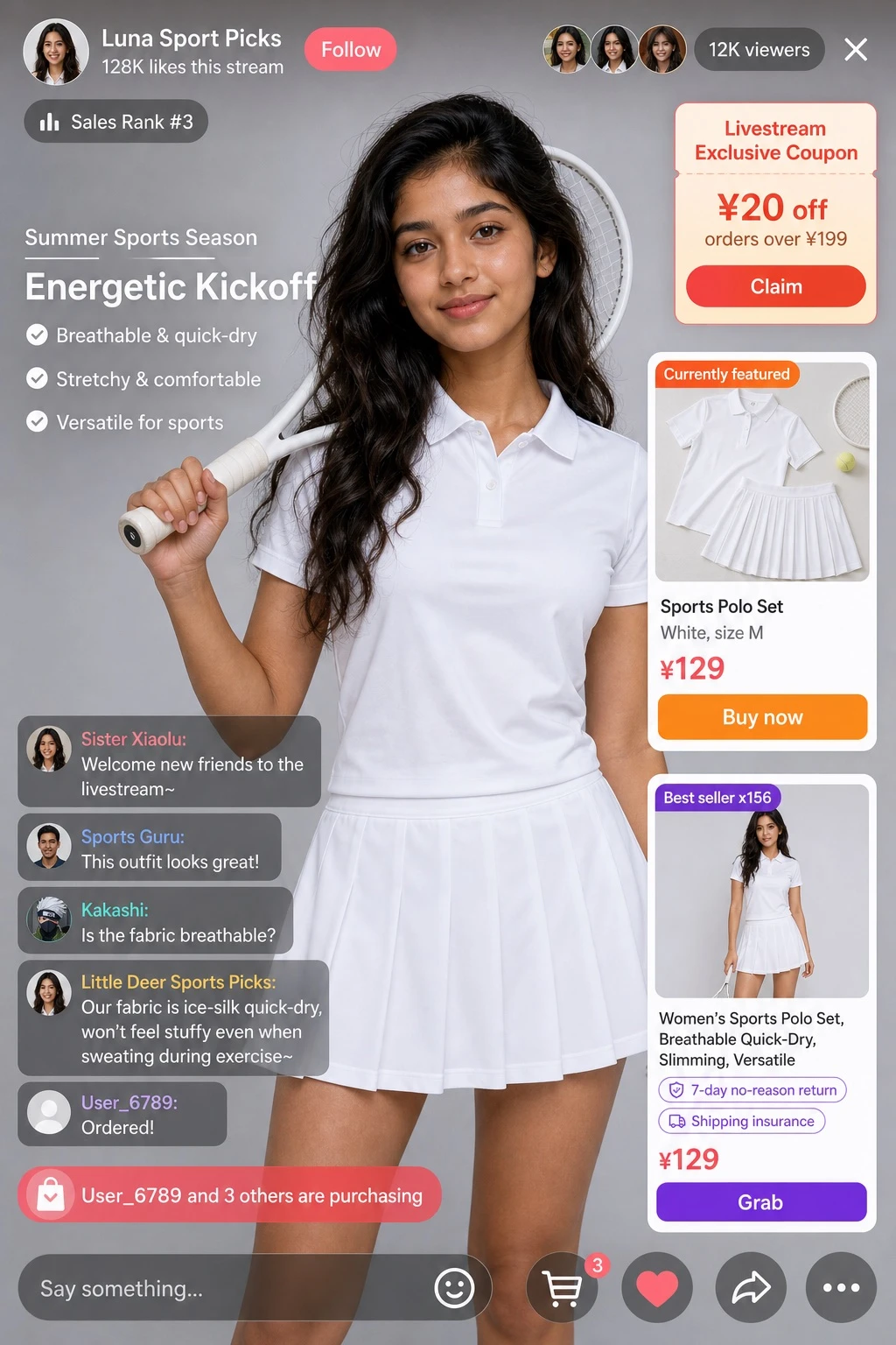
Example generated from “Fictional Livestream Commerce Interface Mockup — ClawLabs AI · MIT”
GPT Image 2en

Design a portrait-orientation mockup of a live-streaming app UI. The main subject is a smiling [PERSON], wearing a black t-shirt printed with a white technical schematic graphic. The background shows, on the left side, a screen displaying the text '[BRAND_1]', and on the right side, a red '[BRAND_2]' logo alongside a dark parked car. Overlay UI elements: - Top header: host avatar and name '[PERSON]', subtext reading '556K likes this stream', red 'Follow' button; a gold coin rank badge reading 'No. 1 on the platform'; three top viewer avatars with counts '123K', '86K', '57K', a total of '687K' viewers, and an 'X' close button; on the right, links reading 'More live streams >' and 'Gift gallery 0/24' with a blue 'Classic' tag. - Middle-left gift notifications (2 items): avatar 'Tech Enthusiast' with text 'sent a Little Heart', heart icon x1314; avatar 'Sea of Stars' with text 'sent a Rocket', rocket icon x666. - Bottom-left chat panel: a system message with a level 37 badge reading 'Cosmic Wanderer joined the live stream'; below it, 7 chat messages: 'Little Rocket: The future looks bright! 🚀', 'Future: When will the new pickup model launch?', 'Starry Dreamer: Will the Mars mission happen this year?', 'AI Explorer: How is the brain-chip project going?', 'Cool Fan: Great to see you!', 'Mars: First time in your stream, so excited!', 'User123: Tell us about AI, will it replace humans?'. - Bottom-right product card: an orange 'Hot Sale x1888' tag, an image of [PRODUCT_NAME], title '[PRODUCT_NAME]', price '[PRODUCT_PRICE]', a red 'Grab' button, and translucent floating hearts animating up the right edge. - Bottom bar: an input field with placeholder text 'Say something...', and icons for smiley face, three-dot menu, shopping cart, gift box, and share.

Example generated from “Fantasy Cast Profile Portrait Grid — ClawLabs AI · MIT”
GPT Image 2en

Create a character portrait grid image with the following specifications: type: character portrait grid; theme: [FRANCHISE_THEME]; style: 2D flat illustration, clean line art, comic style, portraits in profile view facing right, pale skin with blush; layout: 3x3 grid, light gray textured background, each portrait placed inside a white rounded-rectangle frame with a text label below it; total count: 9 portraits. Portrait details: 1) [CHARACTER_1_NAME] – black hair worn half-up, beard, dark fur cloak; 2) [CHARACTER_2_NAME] – silver braided hair, blue dress; 3) [CHARACTER_3_NAME] – curly brown hair, beard, dark tunic with a gold pin; 4) [CHARACTER_4_NAME] – blonde braided hair, ornate red and gold dress; 5) [CHARACTER_5_NAME] – brown hair half-up, beard, dark fur cloak; 6) [CHARACTER_6_NAME] – short dark hair half-up, brown tunic, visible sword hilt; 7) [CHARACTER_7_NAME] – short blonde hair, gold armor with a lion motif; 8) [CHARACTER_8_NAME] – red braided hair, blue dress with a fur collar; 9) [CHARACTER_9_NAME] – short dark curly hair, dark tunic with a kraken pin.
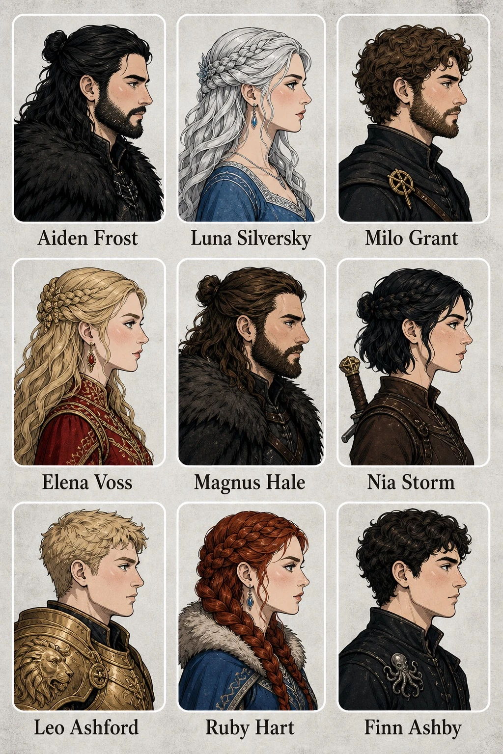
Example generated from “Seven-Day Fashion Lookbook Layout Study — ClawLabs AI · MIT”
GPT Image 2en

Design a 7-day fashion lookbook infographic in a clean UI/infographic style, structured into 7 vertical columns representing the days of the week (Monday through Sunday). Header: - Main title: [MAIN_TITLE] - Subtitle with style keywords: [STYLE_KEYWORDS] - Slogan (must appear in the image as-is, in [LANGUAGE]): Elegance without limits, confidence every day - English slogan: [ENGLISH_SLOGAN] Subject: [SUBJECT_DESCRIPTION], featured as the model wearing each day's outfit. Layout: Each of the 7 columns must include, from top to bottom: a day-of-week header, a main full-body portrait of the model wearing that day's outfit, 4 small detail thumbnails, outfit specification text, keyword and color labels, 3 color swatches, a star rating, fabric and price information, and 4 season icons. Daily outfits and scenes (label each column with the day name in [LANGUAGE]): - Monday: beige blazer suit; scene: important meeting / formal business - Tuesday: pink blazer suit; scene: daily commute - Wednesday: cream knit cardigan set; scene: casual everyday life - Thursday: champagne slip dress; scene: private outing - Friday: blue knit top with white skirt; scene: casual social gathering - Saturday: white sports bra with purple leggings; scene: athletic leisure - Sunday: beige lounge knitwear; scene: at home / date Footer: - Tips text: [FOOTER_TIPS] - Season legend (in [LANGUAGE]): Spring: suitable for spring, Summer: suitable for summer, Autumn: suitable for autumn, Winter: suitable for winter Overall style: modern, clean UI infographic design with a consistent color palette, elegant typography, and a well-organized grid layout suitable for a fashion styling guide.
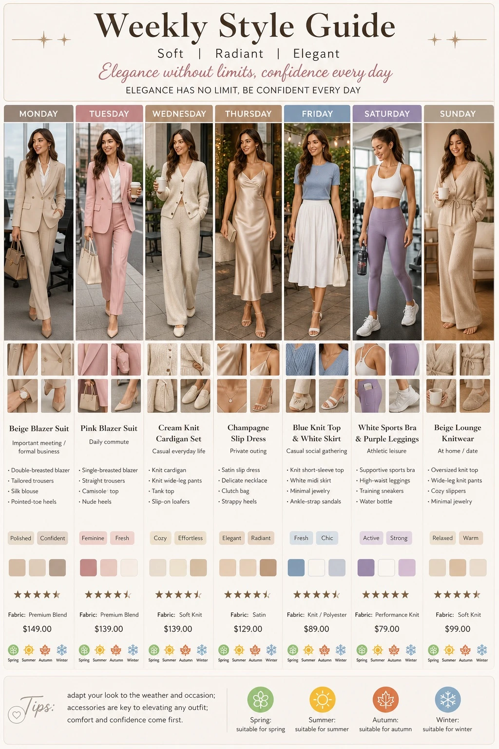
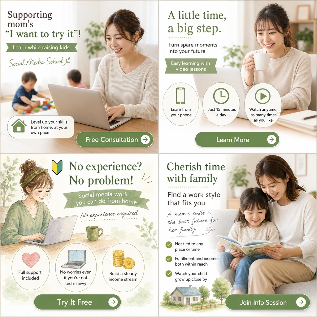
Example generated from “Fictional Lifestyle Course Banner Grid — ClawLabs AI · MIT”
GPT Image 2en

{ "type": "2x2 grid of banner advertisements", "theme": "[MAIN_THEME] for [TARGET_AUDIENCE]", "design_style": "soft, approachable, bright lighting, featuring [COLOR_PALETTE]", "layout": { "sections": [ { "position": "top-left", "visual_style": "photography", "image_description": "Smiling woman working on a laptop at a table, a toddler playing with toys in the blurred background.", "headlines": ["Supporting mom's \"I want to try it\"!", "Learn while raising kids", "Social Media School"], "features": { "count": 1, "type": "icon with text", "labels": ["Level up your skills from home, at your own pace (with house icon)"] }, "call_to_action_button": "Free Consultation" }, { "position": "top-right", "visual_style": "photography", "image_description": "Smiling woman holding a white mug, looking at a laptop.", "headlines": ["A little time, a big step.", "Turn spare moments into your future", "Easy learning with video lessons"], "features": { "count": 3, "type": "circular icons with text below", "labels": ["Learn from your phone (smartphone icon)", "Just 15 minutes a day (clock icon)", "Watch anytime, as many times as you like (play button icon)"] }, "call_to_action_button": "Learn More" }, { "position": "bottom-left", "visual_style": "watercolor illustration", "image_description": "Illustration of a woman with hair in a bun, smiling at a laptop with a green mug nearby.", "headlines": ["No experience? No problem! (with beginner mark)", "Social media work you can do from home", "No experience required"], "features": { "count": 3, "type": "circular icons with text below", "labels": ["Full support included (heart icon)", "No worries even if you're not tech-savvy (laptop icon)", "Build a steady income stream (coin icon)"] }, "call_to_action_button": "Try It Free" }, { "position": "bottom-right", "visual_style": "photography", "image_description": "Smiling mother and young daughter sitting on a sofa reading a picture book together.", "headlines": ["Cherish time with family", "Find a work style that fits you", "A mom's smile is the best future for her family."], "features": { "count": 3, "type": "checkmark bullet points", "labels": ["Not tied to any place or time", "Fulfillment and income, both within reach", "Watch your child grow up close by"] }, "extra_graphics": "Small illustration of a house and trees at the bottom left.", "call_to_action_button": "Join Info Session" } ], "common_elements": "All panels feature a [BUTTON_STYLE] at the bottom." } }

Example generated from “Anime Chat-Stream Cover Design — ClawLabs AI · MIT”
GPT Image 2en

Design an anime-style livestream thumbnail. The character has [HAIR_COLOR], large bright blue eyes, and wears a white collared shirt, a black tie with silver accents, a black jacket, a black beret decorated with a large blue heart jewel, a blue jewel brooch, and a black choker. The character is smiling gently, looking directly at the viewer, and is positioned on the right side of the frame. The background is pastel blue with white clouds, sparkles, stars, small bows, and a subtle grid pattern. Typography and UI elements: a speech bubble in the top-left corner reading "[SPEECH_BUBBLE_TEXT]"; a main title reading "[MAIN_TITLE]" rendered in a large soft blue gradient with a white outline, decorated with small hearts, positioned in the middle-left; three white pill-shaped badge buttons at the bottom-left, each with a purple heart icon on the left, labeled "[BADGE_1_TEXT]", "[BADGE_2_TEXT]", and "[BADGE_3_TEXT]"; and a cloud-shaped speech bubble at the bottom-right reading "[BOTTOM_RIGHT_TEXT]".

Example generated from “Thematic Silhouette Narrative Poster — ClawLabs AI · MIT”
GPT Image 2en

Based on the given [THEME], automatically generate a collectible epic narrative poster: a large, elegant silhouette of a person's profile serves as the outer contour, and within the silhouette, the most fitting complete worldview, iconic scenes, character relationships, symbolic motifs, key architecture, creatures, props, and atmosphere for that theme organically grow and fill the shape. The overall effect should not be an ordinary collage, but rather an elevated silhouette-fill narrative composite, evoking a double-exposure association, leaning more toward a fusion of cinematic poster and dreamy watercolor illustration style; soft aerial perspective, gentle misty transitions, paper grain texture, feathered edges and brush strokes, generous negative space, a restrained and premium layout, with a quiet, grand, sacred, nostalgic, poetic, and legendary feeling. The style, color palette, scenes, and materials should all automatically adapt to the theme, with every element strongly tied to the theme and instantly recognizable — avoid clutter, avoid hard collage effects, avoid templated backgrounds, and avoid cheap fantasy stock assets. Naturally incorporate the exclusive signature "[SIGNATURE_TEXT]" into the composition as part of the poster design, placed subtly but clearly — in the bottom-left corner, bottom-right corner, or near the title — in a style consistent with the overall layout, like the artist's signature or design seal of a collector's edition poster; the signature typeface should be refined, restrained, and premium, not too large, must not disrupt the main composition, and must not appear jarring or cheap.

Example generated from “Character Expression Grid Illustration — ClawLabs AI · MIT”
GPT Image 2en

Create a 3x3 character expression grid illustration, a single composite image divided into nine equal panels arranged in 3 rows and 3 columns, showing the same character in different expressions, poses, and outfits. Render the artwork in [ART_STYLE]. The character is described as: [CHARACTER_DESCRIPTION]. Every panel shares a common visual theme: [FRAMING_CONCEPT]. Layout details for each of the 9 panels: (1) top-left: winking expression, adjusting glasses, wearing a green sweater; (2) top-center: smirking expression, lowering dark sunglasses, wearing a red leather jacket; (3) top-right: thinking expression, finger on chin, wearing a yellow hoodie; (4) middle-left: big smile, arms resting on the edge of the frame, wearing a black and white striped shirt; (5) middle-center: smiling expression, giving a thumbs up, wearing an orange button-up shirt; (6) middle-right: neutral expression, drinking boba tea, wearing a blue sweater; (7) bottom-left: happy expression, waving, wearing a purple sweater vest over a white shirt; (8) bottom-center: laughing with eyes closed, arms crossed, wearing a pink cardigan; (9) bottom-right: silly expression, poking own cheeks, wearing a teal sweater. Keep consistent character design, proportions, and lighting style across all nine panels, with each panel cleanly separated by even borders.

Example generated from “Soft Skeuomorphic Pet-Shop App Icon Concept — ClawLabs AI · MIT”
GPT Image 2en

A macOS app icon for an app named '[APP_NAME]'. A single squircle icon with smooth, continuous rounded corners, centered on a white canvas with padding, occupying about 80% of the canvas. Modern, light skeuomorphic macOS App Store style. Only one icon.

Example generated from “Fisheye Summer Drink Advertising Study — ClawLabs AI · MIT”
GPT Image 2en

Theme: Summer Beyond the Ice Subject: A vertical 2:3 realistic photograph. An ultra-wide fisheye composition as if looking up from inside a large transparent plastic cup. The lower half of the frame is filled with red [FRUIT] pulp and crushed ice, while a thick [STRAW_COLOR] straw extends straight back from the center into the depth of the frame. Beyond the rounded, distorted rim of the cup, a woman's face fills the center of the frame. Person & Expression: A natural, realistic-looking young woman. Her [HAIR_COLOR] hair is gathered into a high bun, with wispy bangs and loose strands around her face catching the sunlight. She wears translucent natural makeup, soft pink cheeks, and glossy lips. Her eyes are wide open, looking straight at the camera, her lips slightly pursed around the straw. Her expression is slightly surprised, cute, and innocent. Clothing & Pose: She wears a [BLOUSE_COLOR] lace blouse with delicate ruffles at the neckline and shoulders, giving it a light, summery texture. She leans her face close to the far side of the cup, her shoulders barely visible at the bottom of the frame. The straw naturally touches her mouth, creating strong depth as it stretches from her lips toward the red ice in the foreground. Background & Lighting: The background shows an old shopping street on a sunny summer day — wooden-style shopfronts, a shaved-ice shop curtain, a strawberry-patterned sign, small white flags, and street trees. All text in the background is treated as blurred, illegible decoration. Strong sunlight enters from the upper left, creating fine reflections and highlights on the water droplets on the cup, the rim, the ice, and the red fruit pulp. Shadows fall toward the lower right, and a ring of white cream residue remains on the inside of the cup. Composition & Camera: The camera is positioned at an extreme low angle, as if placed near the bottom of the cup just above the red ice. The fisheye lens strongly curves the circular rim of the cup, with the surrounding shopping street slightly distorted as well. The bottom 45% of the frame shows red ice and fruit pulp in foreground blur, the center shows the straw and the woman's face, and the top shows blue sky and the transparent rim of the cup. Focus is on the woman's eyes and mouth, with the foreground ice rendered in shallow, sparkling bokeh. Texture & Style: Shot in the style of a professional summer advertisement photograph. High-detail rendering of the refraction of the transparent plastic, droplets of water, the coldness of the ice, and the juiciness of the fruit pulp. Vivid contrast between the blue sky, red ice, [STRAW_COLOR] straw, and [BLOUSE_COLOR] blouse. Skin retains a natural texture without excessive skin-smoothing retouching. Bright, pop, slightly humorous Japanese summer dessert photography style. Negative prompt: No real brand logos, no legible text, no trademark reproduction, no unnatural faces, no unnatural gaze, no distorted teeth or lips, no poor contact with the straw, no extra fingers, no missing fingers, no fused limbs, no floating ice, no unnatural gravity, no incorrect perspective, no shadows inconsistent with the light source, no garbled text, no watermark, no excessive skin-smoothing retouching, no plastic-looking skin.

Example generated from “Volumetric Laser Stage Poster Concept — ClawLabs AI · MIT”
GPT Image 2en

Start in a completely black theater/stage void. Like slicing a specimen, use six real volumetric laser planes to layer the space. Each light plane must have a clear point of origin, defined perspective, and visible thickness within haze. [SUBJECT] stands at the intersection point of the light planes, holding a transparent prop that refracts a small fan of differently-colored light. The composition progresses along a diagonal axis from bottom-left to top-right; the face is revealed only through a single restrained rim light. The title text '[TITLE_TEXT]' shares the same perspective as one of the light planes, while the smaller text '[SUBTITLE_TEXT]' remains in the pure black negative space. Whenever the subject or character changes, the image must not degrade into a nightclub flyer template, a HUD/UI overlay, a neon cityscape, or light sources lacking a physical origin.