PROMPTS · EXPLORAÇÃO CRIATIVA

Galeria de prompts

Explore prompts reais e exemplos gerados. Encontre inspiração para sua próxima missão criativa e copie o prompt completo grátis.

Exemplos
10,974
Modelos
17
Fontes
1277
10.974 exemplos de prompts · página 5 de 229
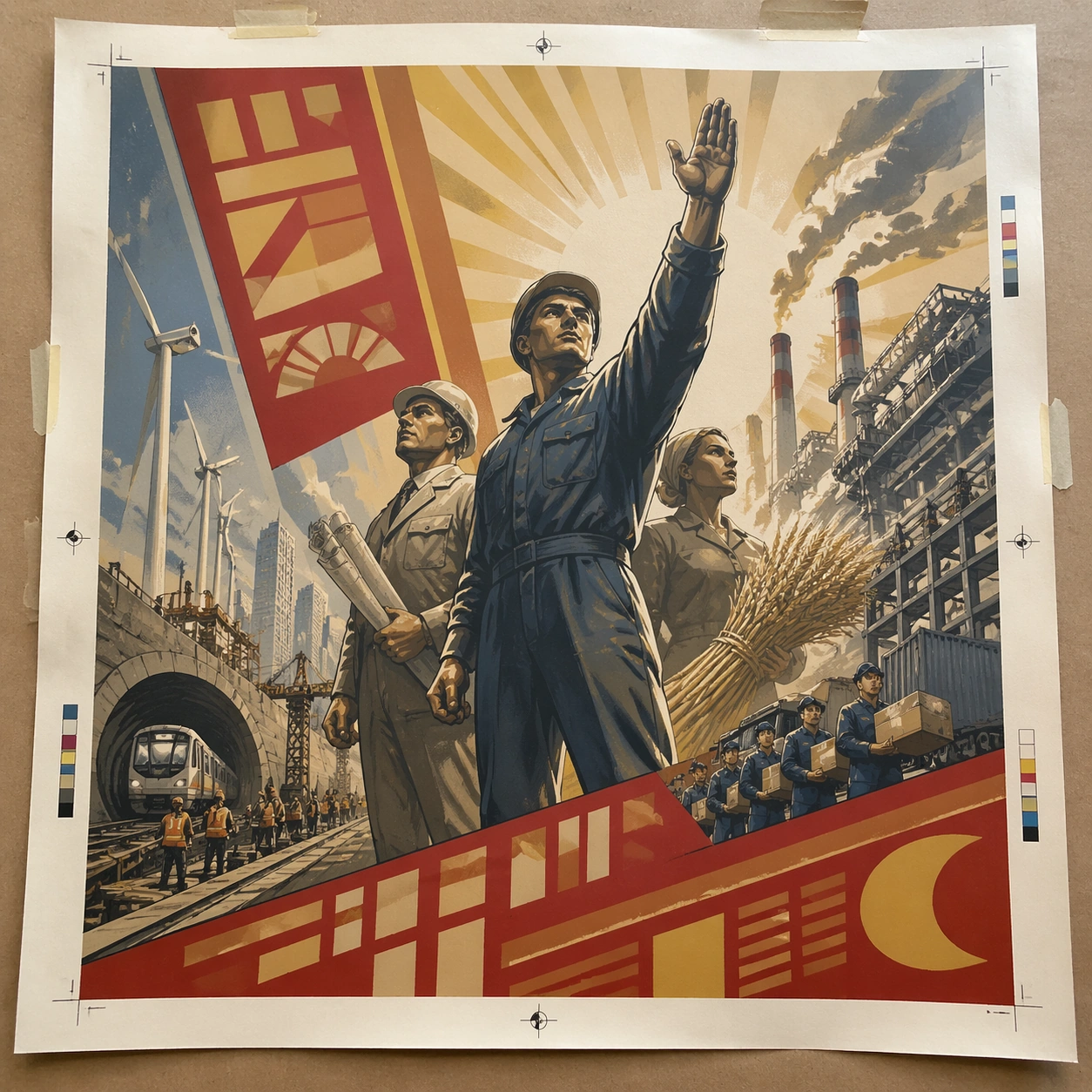
Example generated from “Soviet Propaganda Monumental — Print Proof Flatlay”
GPT Image 2en

Scene: A square overhead tabletop photograph of a fresh poster proof on neutral worktable paper, lit by cool daylight, with crop marks, tape tabs, and slight paper bow visible around the sheet. The poster should express heroic monumental realism with low-angle figures, sunrise shafts, sculptural drapery, and industrial optimism, using red, ochre, cream, steel blue, and warm industrial smoke gray and a tactile surface appropriate to the medium. Subject: Design the poster as a print-shop proof, preserving the same poster language while allowing production clues such as edge trims, registration targets, and process marks to frame the composition. Use workers, engineers, turbines, wheat, chimneys, steel beams, and raised-arm silhouettes as the main visual ingredients, and organize them with bold banner-like glyph panels used as abstract propaganda blocks without readable wording. For the contemporary-subject axis, thread in renewable-energy towers, metro construction, and logistics workers recast through monumental heroic framing. The poster must feel like an original design object rather than a reproduction of any known work. Important details: The image must still read as a finished poster concept, but it should carry believable print-process evidence and material tactility instead of gallery-wall perfection. Preserve upward gaze, idealized anatomy, broad light geometry, and poster clarity at large scale. Keep every letterform abstract and non-readable, as if it were a typographic texture rather than language. Make the style unmistakable through composition, palette, surface behavior, and symbolic compression. no specific leaders, no state emblems, no satire, no gritty collapse imagery. Use case: Soviet Monumental single study 2/9, testing production realism and process evidence. Constraints: No readable text, no watermark, no logos, preserve exact 1:1 aspect ratio, no copyrighted characters, no real brand marks, no QR codes, no interface chrome, no accidental gibberish lettering.
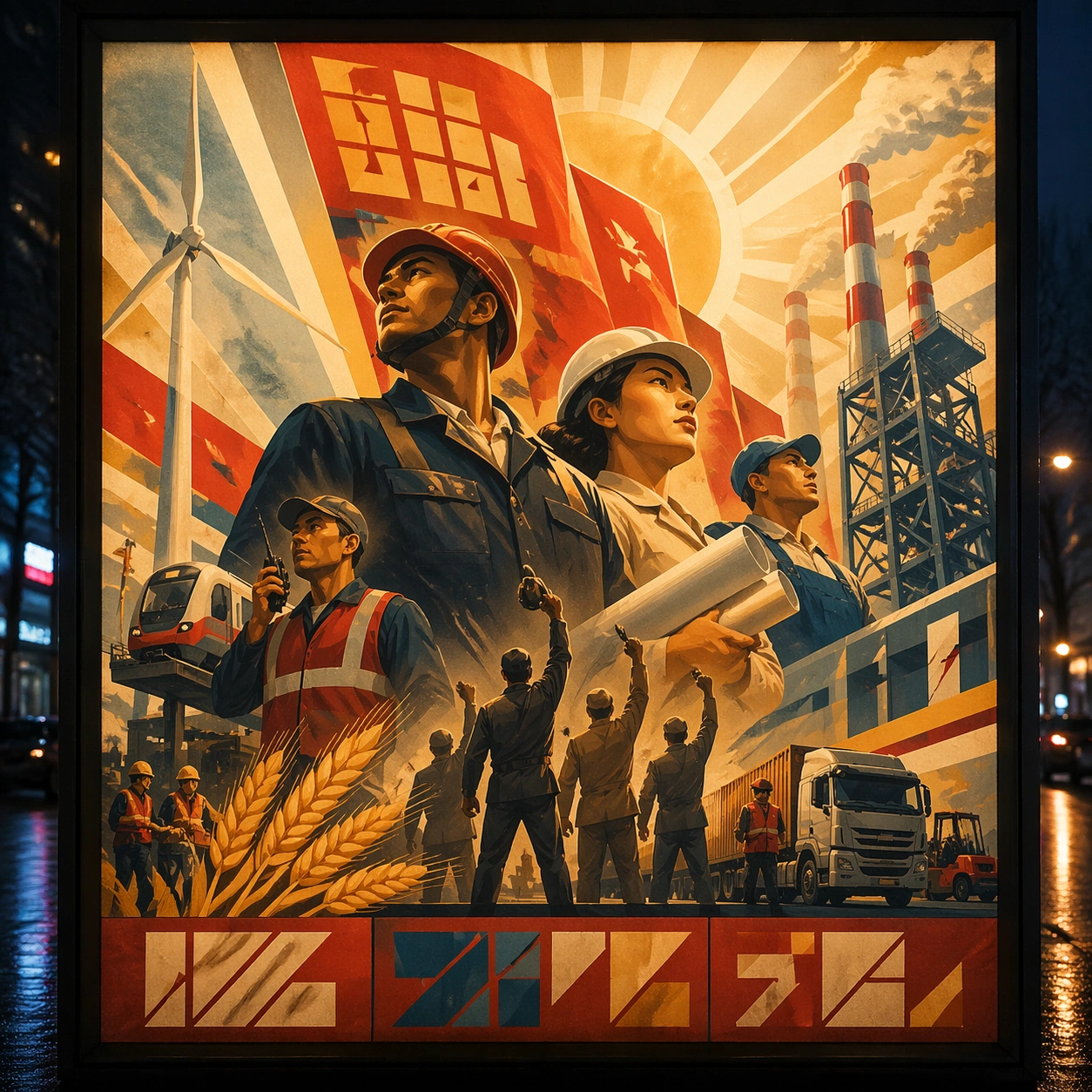
Example generated from “Soviet Propaganda Monumental — Transit Lightbox”
GPT Image 2en

Scene: A square dusk street photograph of a backlit transit poster glowing inside glass, with faint rain reflections, soft city blur in the distance, and the poster remaining fully legible as a composition. The poster should express heroic monumental realism with low-angle figures, sunrise shafts, sculptural drapery, and industrial optimism, using red, ochre, cream, steel blue, and warm industrial smoke gray and a tactile surface appropriate to the medium. Subject: Adapt the poster into a public-facing lightbox version that still honors the original style grammar while feeling bold enough to stop a passerby from several meters away. Use workers, engineers, turbines, wheat, chimneys, steel beams, and raised-arm silhouettes as the main visual ingredients, and organize them with bold banner-like glyph panels used as abstract propaganda blocks without readable wording. For the contemporary-subject axis, thread in renewable-energy towers, metro construction, and logistics workers recast through monumental heroic framing. The poster must feel like an original design object rather than a reproduction of any known work. Important details: Let the style survive the illumination test: color blocking, silhouette contrast, and abstract lettering should stay controlled under bright internal light and reflective glass. Preserve upward gaze, idealized anatomy, broad light geometry, and poster clarity at large scale. Keep every letterform abstract and non-readable, as if it were a typographic texture rather than language. Make the style unmistakable through composition, palette, surface behavior, and symbolic compression. no specific leaders, no state emblems, no satire, no gritty collapse imagery. Use case: Soviet Monumental single study 3/9, testing distance readability in public display. Constraints: No readable text, no watermark, no logos, preserve exact 1:1 aspect ratio, no copyrighted characters, no real brand marks, no QR codes, no interface chrome, no accidental gibberish lettering.
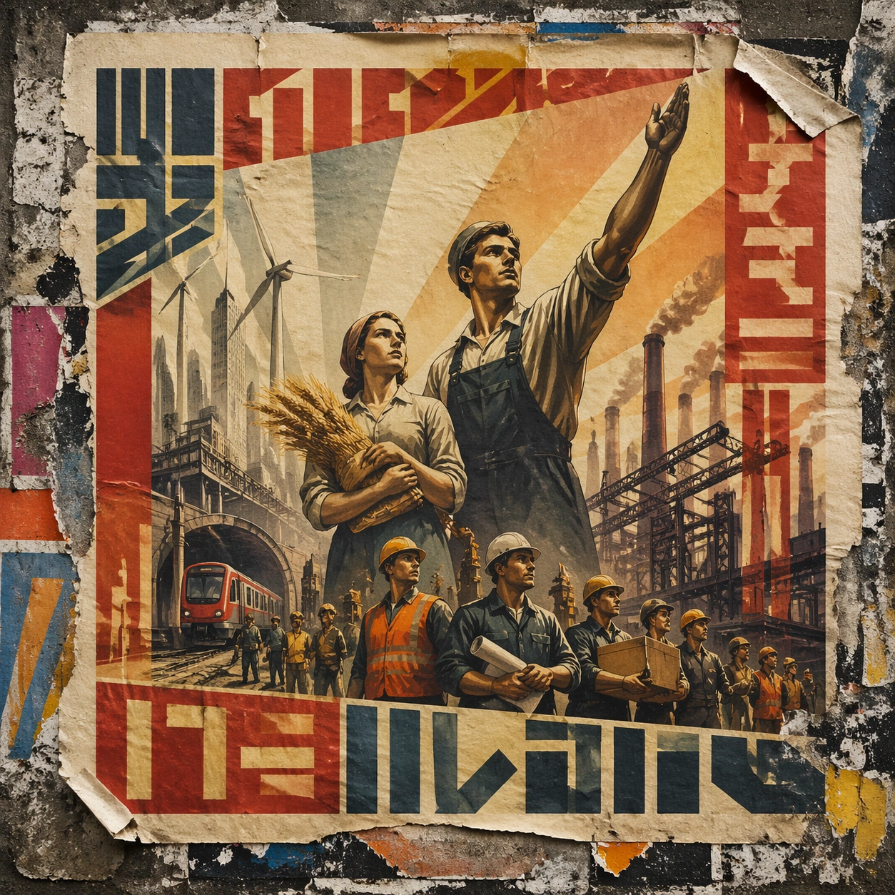
Example generated from “Soviet Propaganda Monumental — Wheatpaste Wall Layer”
GPT Image 2en

Scene: A square urban wall study with the poster pasted onto rough plaster among torn edges and older paper remnants, photographed in soft overcast light so texture, glue bubbles, and surface scars stay visible. The poster should express heroic monumental realism with low-angle figures, sunrise shafts, sculptural drapery, and industrial optimism, using red, ochre, cream, steel blue, and warm industrial smoke gray and a tactile surface appropriate to the medium. Subject: Create a version that feels made for the street, with the poster carrying enough formal force to survive abrasion, layering, and imperfect placement without losing its visual identity. Use workers, engineers, turbines, wheat, chimneys, steel beams, and raised-arm silhouettes as the main visual ingredients, and organize them with bold banner-like glyph panels used as abstract propaganda blocks without readable wording. For the contemporary-subject axis, thread in renewable-energy towers, metro construction, and logistics workers recast through monumental heroic framing. The poster must feel like an original design object rather than a reproduction of any known work. Important details: Keep the main design intact but let the environment add grit: lifted corners, tiny tears, wrinkled paper, and older color fragments around the perimeter should amplify the style rather than dilute it. Preserve upward gaze, idealized anatomy, broad light geometry, and poster clarity at large scale. Keep every letterform abstract and non-readable, as if it were a typographic texture rather than language. Make the style unmistakable through composition, palette, surface behavior, and symbolic compression. no specific leaders, no state emblems, no satire, no gritty collapse imagery. Use case: Soviet Monumental single study 4/9, testing street-life durability and layered context. Constraints: No readable text, no watermark, no logos, preserve exact 1:1 aspect ratio, no copyrighted characters, no real brand marks, no QR codes, no interface chrome, no accidental gibberish lettering.
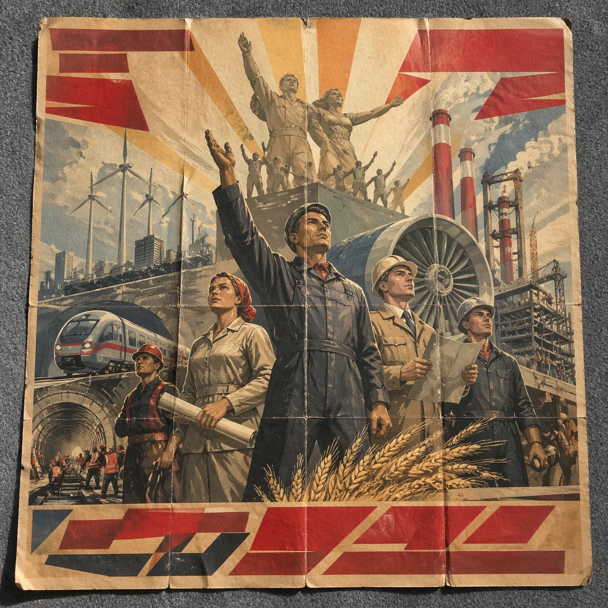
Example generated from “Soviet Propaganda Monumental — Folded Archive Copy”
GPT Image 2en

Scene: A square conservation-table view of a vintage poster laid on gray felt under raking light, with visible fold lines, softened corners, and subtle aging that still preserves the integrity of the image. The poster should express heroic monumental realism with low-angle figures, sunrise shafts, sculptural drapery, and industrial optimism, using red, ochre, cream, steel blue, and warm industrial smoke gray and a tactile surface appropriate to the medium. Subject: Present the poster as an archive copy that has been stored, unfolded, and carefully documented, letting age and handling reveal how the design holds up across time. Use workers, engineers, turbines, wheat, chimneys, steel beams, and raised-arm silhouettes as the main visual ingredients, and organize them with bold banner-like glyph panels used as abstract propaganda blocks without readable wording. For the contemporary-subject axis, thread in renewable-energy towers, metro construction, and logistics workers recast through monumental heroic framing. The poster must feel like an original design object rather than a reproduction of any known work. Important details: Aging must stay believable rather than theatrical: slight yellowing, fold memory, edge wear, and pigment variation should support the historical or crafted feeling of the style. Preserve upward gaze, idealized anatomy, broad light geometry, and poster clarity at large scale. Keep every letterform abstract and non-readable, as if it were a typographic texture rather than language. Make the style unmistakable through composition, palette, surface behavior, and symbolic compression. no specific leaders, no state emblems, no satire, no gritty collapse imagery. Use case: Soviet Monumental single study 5/9, testing archival endurance and age character. Constraints: No readable text, no watermark, no logos, preserve exact 1:1 aspect ratio, no copyrighted characters, no real brand marks, no QR codes, no interface chrome, no accidental gibberish lettering.
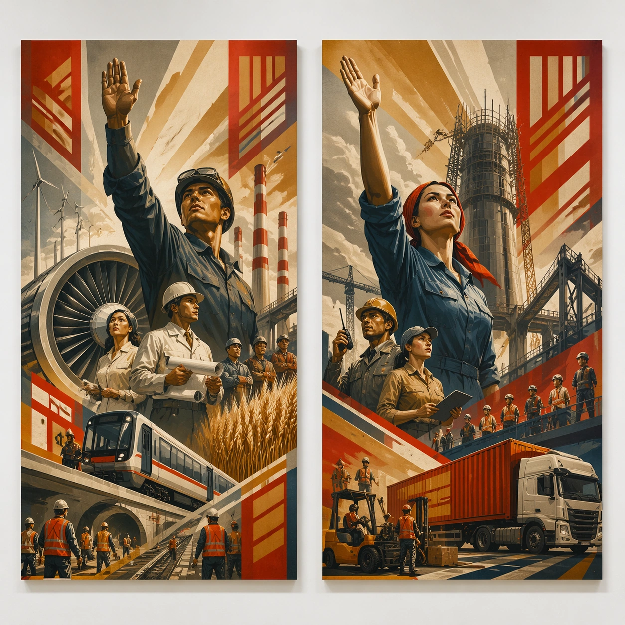
Example generated from “Soviet Propaganda Monumental — Twin Poster Diptych”
GPT Image 2en

Scene: A square white-wall installation showing two companion posters hung side by side with equal spacing, photographed frontally so the pair reads as a designed conversation rather than two unrelated sheets. The poster should express heroic monumental realism with low-angle figures, sunrise shafts, sculptural drapery, and industrial optimism, using red, ochre, cream, steel blue, and warm industrial smoke gray and a tactile surface appropriate to the medium. Subject: Compose a matched diptych: two posters sharing one style system while splitting the narrative across paired motifs, mirrored masses, or complementary color emphasis. Use workers, engineers, turbines, wheat, chimneys, steel beams, and raised-arm silhouettes as the main visual ingredients, and organize them with bold banner-like glyph panels used as abstract propaganda blocks without readable wording. For the contemporary-subject axis, thread in renewable-energy towers, metro construction, and logistics workers recast through monumental heroic framing. The poster must feel like an original design object rather than a reproduction of any known work. Important details: Both halves should feel distinct yet inseparable. Preserve one coherent visual language, but let each sheet carry its own focal symbol and rhythm without readable wording. Preserve upward gaze, idealized anatomy, broad light geometry, and poster clarity at large scale. Keep every letterform abstract and non-readable, as if it were a typographic texture rather than language. Make the style unmistakable through composition, palette, surface behavior, and symbolic compression. no specific leaders, no state emblems, no satire, no gritty collapse imagery. Use case: Soviet Monumental single study 6/9, testing system flexibility across a paired set. Constraints: No readable text, no watermark, no logos, preserve exact 1:1 aspect ratio, no copyrighted characters, no real brand marks, no QR codes, no interface chrome, no accidental gibberish lettering.
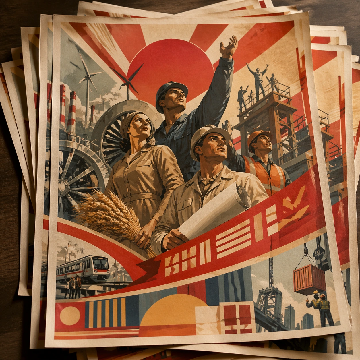
Example generated from “Soviet Propaganda Monumental — Stacked Print Bundle”
GPT Image 2en

Scene: A square tabletop shot of several poster prints stacked and slightly fanned, with curled corners, offset edges, and soft directional light revealing paper thickness and ink behavior. The poster should express heroic monumental realism with low-angle figures, sunrise shafts, sculptural drapery, and industrial optimism, using red, ochre, cream, steel blue, and warm industrial smoke gray and a tactile surface appropriate to the medium. Subject: Design the top poster to dominate while nearby duplicate sheets echo the same composition, creating a tactile print-run scene rather than a single isolated sheet. Use workers, engineers, turbines, wheat, chimneys, steel beams, and raised-arm silhouettes as the main visual ingredients, and organize them with bold banner-like glyph panels used as abstract propaganda blocks without readable wording. For the contemporary-subject axis, thread in renewable-energy towers, metro construction, and logistics workers recast through monumental heroic framing. The poster must feel like an original design object rather than a reproduction of any known work. Important details: Use the stack to emphasize production character: edge shadows, repeated motifs peeking from beneath, and subtle misalignment should enrich the material reading without changing the core design. Preserve upward gaze, idealized anatomy, broad light geometry, and poster clarity at large scale. Keep every letterform abstract and non-readable, as if it were a typographic texture rather than language. Make the style unmistakable through composition, palette, surface behavior, and symbolic compression. no specific leaders, no state emblems, no satire, no gritty collapse imagery. Use case: Soviet Monumental single study 7/9, testing print-run tactility and repeat presence. Constraints: No readable text, no watermark, no logos, preserve exact 1:1 aspect ratio, no copyrighted characters, no real brand marks, no QR codes, no interface chrome, no accidental gibberish lettering.
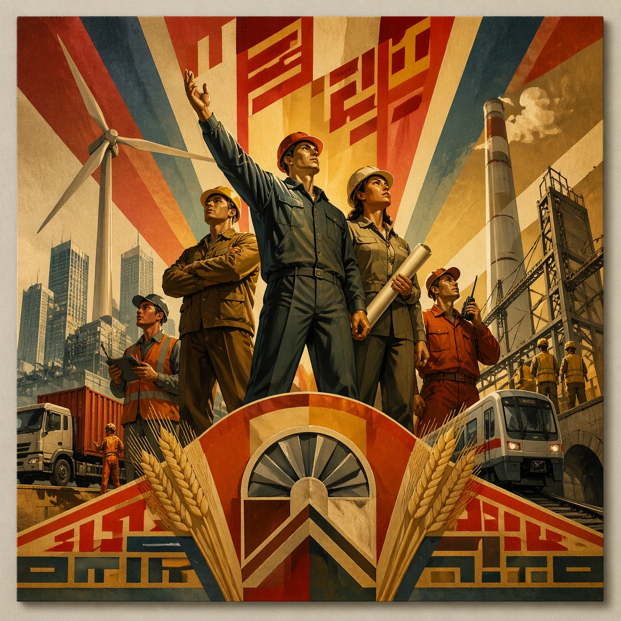
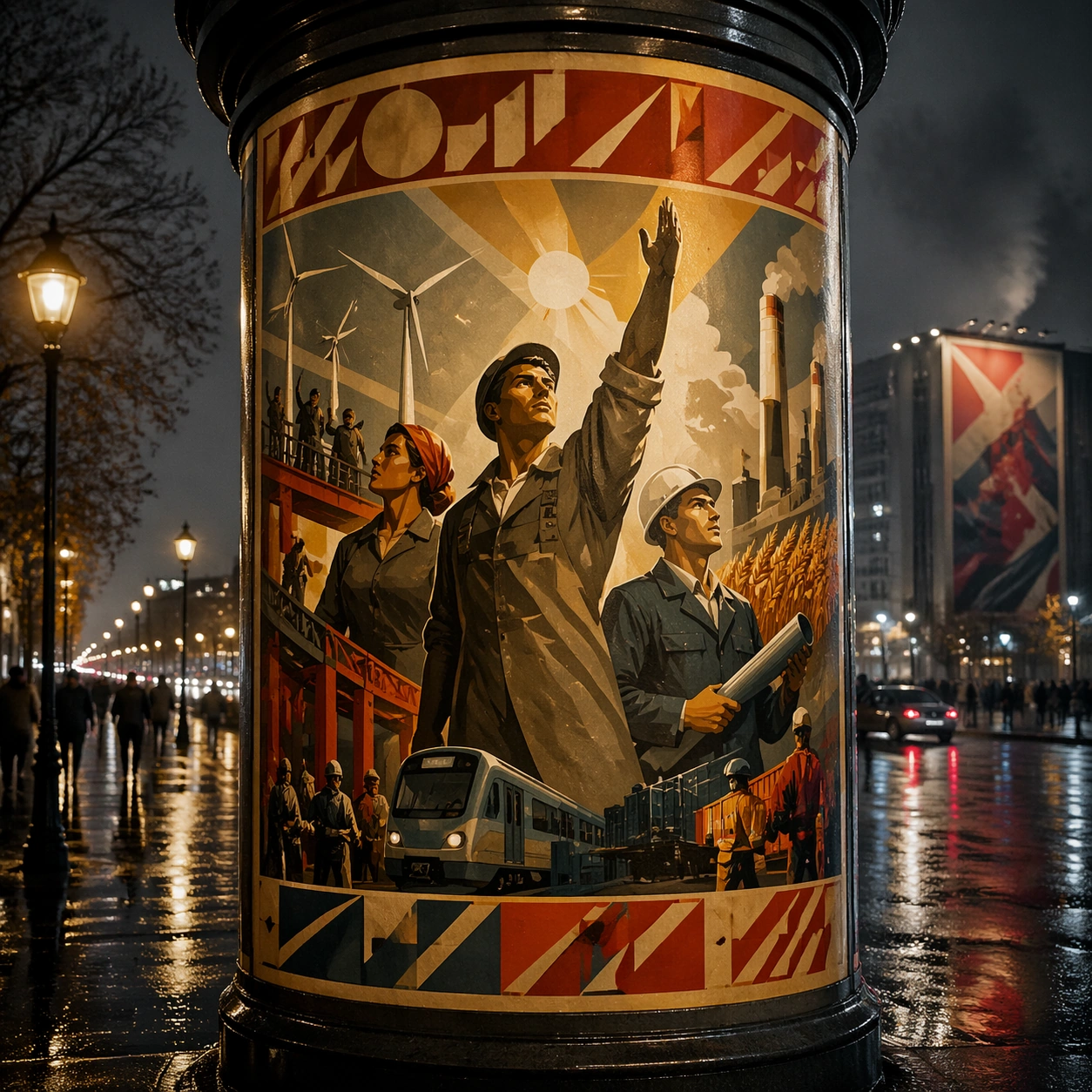
Example generated from “Soviet Propaganda Monumental — Kiosk Night Glow”
GPT Image 2en

Scene: A square nighttime city view with the poster wrapping part of a cylindrical kiosk, wet pavement reflecting nearby light, and the composition holding together under moody urban illumination. The poster should express heroic monumental realism with low-angle figures, sunrise shafts, sculptural drapery, and industrial optimism, using red, ochre, cream, steel blue, and warm industrial smoke gray and a tactile surface appropriate to the medium. Subject: Reframe the design for a dramatic street-placement context, where the poster has to project style and mood through reflection, curvature, and surrounding darkness. Use workers, engineers, turbines, wheat, chimneys, steel beams, and raised-arm silhouettes as the main visual ingredients, and organize them with bold banner-like glyph panels used as abstract propaganda blocks without readable wording. For the contemporary-subject axis, thread in renewable-energy towers, metro construction, and logistics workers recast through monumental heroic framing. The poster must feel like an original design object rather than a reproduction of any known work. Important details: The design should remain instantly recognizable despite the cylindrical wrap. Preserve major blocks, symbolic shapes, and abstract title forms so the style still feels authoritative at night. Preserve upward gaze, idealized anatomy, broad light geometry, and poster clarity at large scale. Keep every letterform abstract and non-readable, as if it were a typographic texture rather than language. Make the style unmistakable through composition, palette, surface behavior, and symbolic compression. no specific leaders, no state emblems, no satire, no gritty collapse imagery. Use case: Soviet Monumental single study 8/9, testing atmospheric display under rain and glow. Constraints: No readable text, no watermark, no logos, preserve exact 1:1 aspect ratio, no copyrighted characters, no real brand marks, no QR codes, no interface chrome, no accidental gibberish lettering.
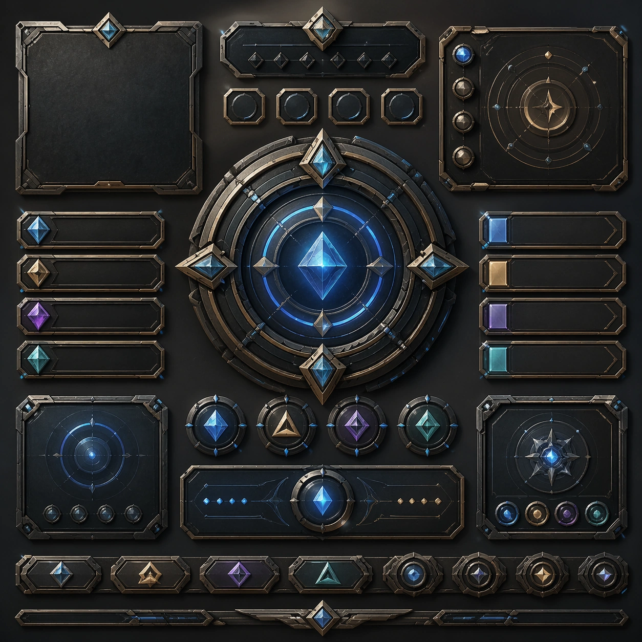
Example generated from “Soviet Propaganda Monumental — Contemporary Remix”
GPT Image 2en

Scene: A square front-facing poster presentation on a clean neutral wall, lit like a premium print test, with crisp edges and a polished but still tactile finish appropriate to the style. The poster should express heroic monumental realism with low-angle figures, sunrise shafts, sculptural drapery, and industrial optimism, using red, ochre, cream, steel blue, and warm industrial smoke gray and a tactile surface appropriate to the medium. Subject: Apply the historical poster language to a contemporary urban subject so the old visual grammar proves it can carry present-day themes without losing authenticity or formal discipline. Use workers, engineers, turbines, wheat, chimneys, steel beams, and raised-arm silhouettes as the main visual ingredients, and organize them with bold banner-like glyph panels used as abstract propaganda blocks without readable wording. For the contemporary-subject axis, thread in renewable-energy towers, metro construction, and logistics workers recast through monumental heroic framing. The poster must feel like an original design object rather than a reproduction of any known work. Important details: This is not parody. The contemporary subject should feel genuinely absorbed into the style through palette, composition, symbolic compression, and non-readable lettering treatment. Preserve upward gaze, idealized anatomy, broad light geometry, and poster clarity at large scale. Keep every letterform abstract and non-readable, as if it were a typographic texture rather than language. Make the style unmistakable through composition, palette, surface behavior, and symbolic compression. no specific leaders, no state emblems, no satire, no gritty collapse imagery. Use case: Soviet Monumental single study 9/9, testing historical grammar on a present-day subject. Constraints: No readable text, no watermark, no logos, preserve exact 1:1 aspect ratio, no copyrighted characters, no real brand marks, no QR codes, no interface chrome, no accidental gibberish lettering.

Example generated from “Spatial Ui And Immersive Control Panels — Reference Anchor”
GPT Image 2en

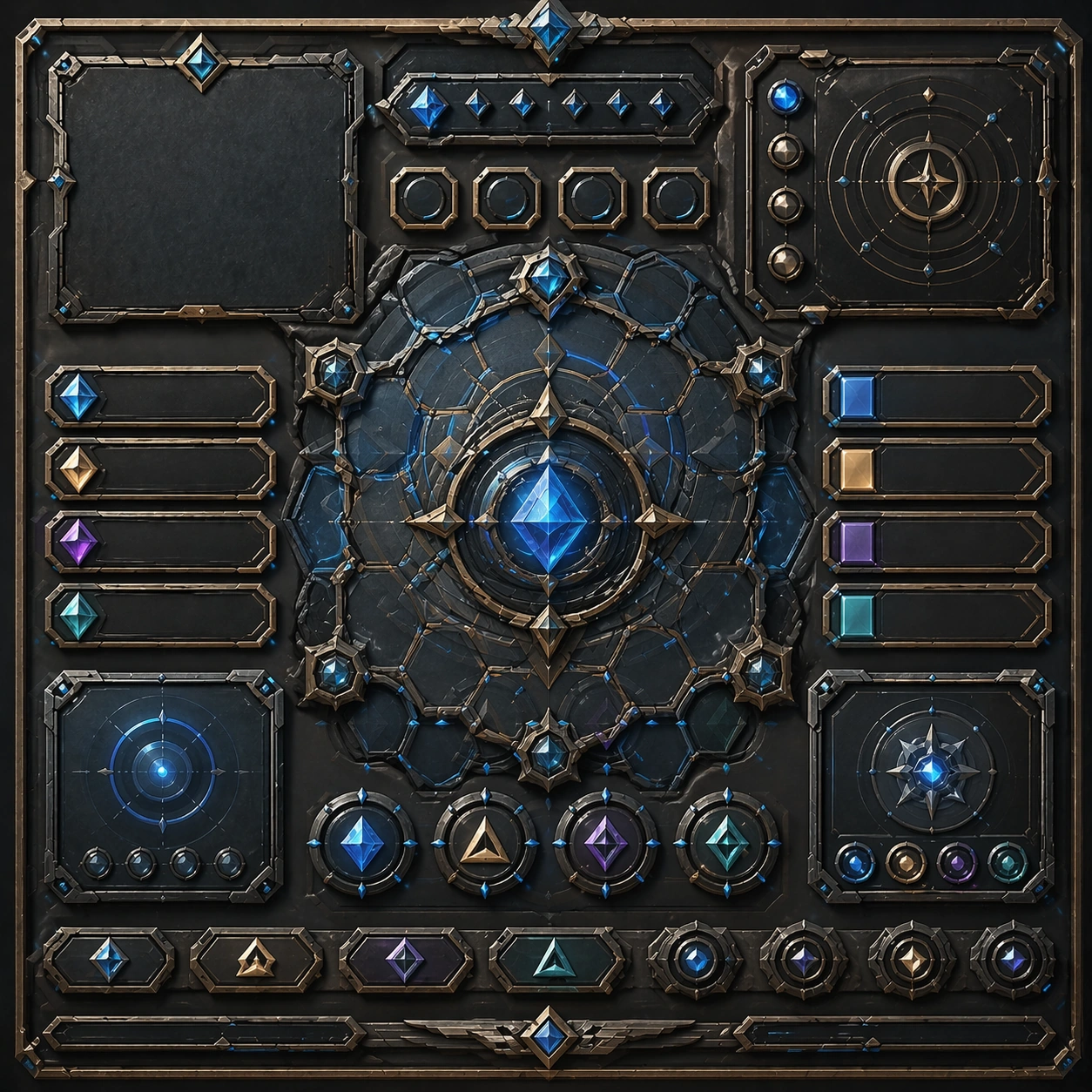
Scene: Create a square reference image for Spatial UI and Immersive Control Panels. Build a reference anchor establishing the core system with a premium, production-ready finish. Use a polished modular board or campaign surface with clean spacing, premium game-UI finish, and clear focal hierarchy. The composition should feel intentional, clean, and reusable for gallery, research, campaign, or internal handoff contexts. Lighting must support readability first, with the main forms clearly separated from the background and enough breathing room for the system to stay legible at both hero scale and thumbnail scale. Subject: Center a coherent original game-art system built for premium production and marketing surfaces. For this image, focus on reference anchor. Keep the same system logic stable across screenshots, cards, banners, and overview boards. This image is the canonical anchor that later series images must follow. The viewer should immediately understand what role this surface plays inside a cohesive game-production asset pack. Important details: Lock framing, icon grammar, palette blocking, and surface hierarchy so the kit feels production-ready and consistent. Preserve the core silhouette, framing language, and material logic from the reference image while each variation changes function. Keep materials believable, edge hierarchy disciplined, and the visual language consistent with Spatial UI. Use abstract interface blocks or diagram accents when helpful, but avoid any readable language. The final result should feel like a deliberate production asset rather than a random illustration. Use case: Spatial UI and Immersive Control Panels series study 1/9, designed as reference anchor within a cohesive asset pack. Constraints: No readable text, no watermark, no logos, preserve exact 1:1 aspect ratio, no unrelated objects, no broken visual hierarchy, no malformed anatomy or broken perspective, no random decorative clutter.

Example generated from “Spatial Ui And Immersive Control Panels — Variant One”
GPT Image 2en

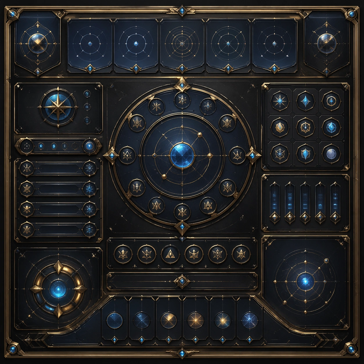
Scene: Create a square dependent image for Spatial UI and Immersive Control Panels. Build a first controlled variation in the same system with a premium, production-ready finish. Use a polished modular board or campaign surface with clean spacing, premium game-UI finish, and clear focal hierarchy. The composition should feel intentional, clean, and reusable for gallery, research, campaign, or internal handoff contexts. Lighting must support readability first, with the main forms clearly separated from the background and enough breathing room for the system to stay legible at both hero scale and thumbnail scale. Subject: Center a coherent original game-art system built for premium production and marketing surfaces. For this image, focus on the intended support surface. Keep the same system logic stable across screenshots, cards, banners, and overview boards. Preserve exact identity or system logic from the reference image while changing only the intended variation axis. The viewer should immediately understand what role this surface plays inside a cohesive game-production asset pack. Important details: Lock framing, icon grammar, palette blocking, and surface hierarchy so the kit feels production-ready and consistent. Preserve the core silhouette, framing language, and material logic from the reference image while each variation changes function. Keep materials believable, edge hierarchy disciplined, and the visual language consistent with Spatial UI. Use abstract interface blocks or diagram accents when helpful, but avoid any readable language. The final result should feel like a deliberate production asset rather than a random illustration. Use case: Spatial UI and Immersive Control Panels series study 2/9, designed as variant one within a cohesive asset pack. Constraints: No readable text, no watermark, no logos, preserve exact 1:1 aspect ratio, no unrelated objects, no broken visual hierarchy, no malformed anatomy or broken perspective, no random decorative clutter.

Example generated from “Spatial Ui And Immersive Control Panels — Variant Two”
GPT Image 2en

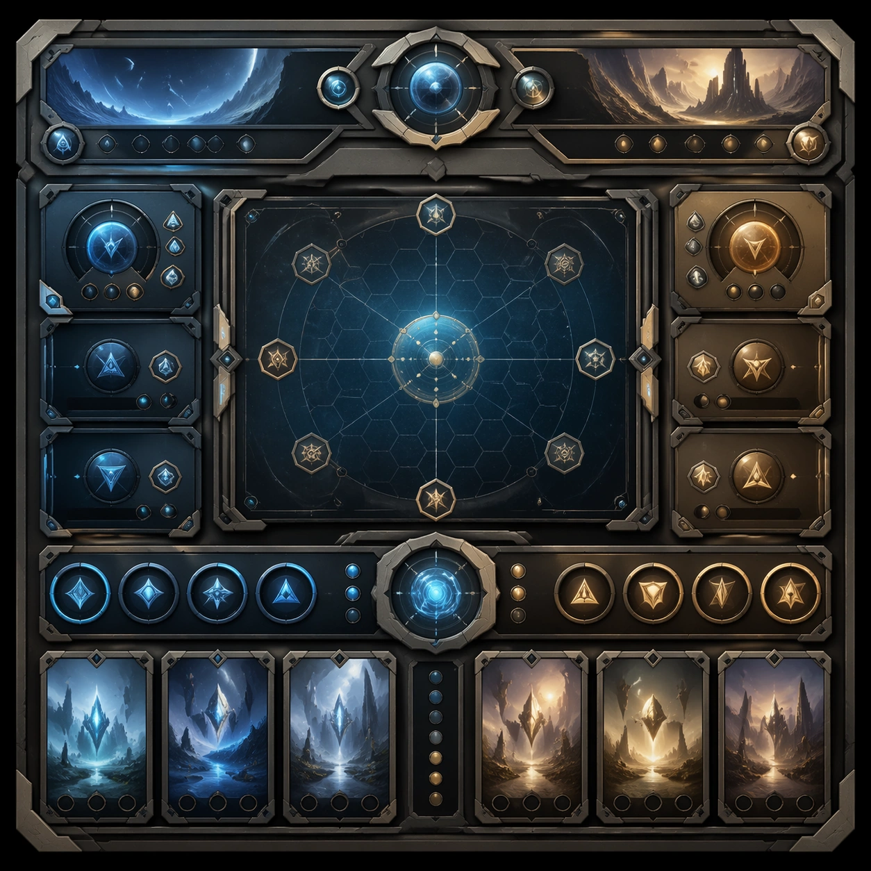
Scene: Create a square dependent image for Spatial UI and Immersive Control Panels. Build a second controlled variation in the same system with a premium, production-ready finish. Use a polished modular board or campaign surface with clean spacing, premium game-UI finish, and clear focal hierarchy. The composition should feel intentional, clean, and reusable for gallery, research, campaign, or internal handoff contexts. Lighting must support readability first, with the main forms clearly separated from the background and enough breathing room for the system to stay legible at both hero scale and thumbnail scale. Subject: Center a coherent original game-art system built for premium production and marketing surfaces. For this image, focus on the intended support surface. Keep the same system logic stable across screenshots, cards, banners, and overview boards. Preserve exact identity or system logic from the reference image while changing only the intended variation axis. The viewer should immediately understand what role this surface plays inside a cohesive game-production asset pack. Important details: Lock framing, icon grammar, palette blocking, and surface hierarchy so the kit feels production-ready and consistent. Preserve the core silhouette, framing language, and material logic from the reference image while each variation changes function. Keep materials believable, edge hierarchy disciplined, and the visual language consistent with Spatial UI. Use abstract interface blocks or diagram accents when helpful, but avoid any readable language. The final result should feel like a deliberate production asset rather than a random illustration. Use case: Spatial UI and Immersive Control Panels series study 3/9, designed as variant two within a cohesive asset pack. Constraints: No readable text, no watermark, no logos, preserve exact 1:1 aspect ratio, no unrelated objects, no broken visual hierarchy, no malformed anatomy or broken perspective, no random decorative clutter.

Example generated from “Spatial Ui And Immersive Control Panels — Variant Three”
GPT Image 2en

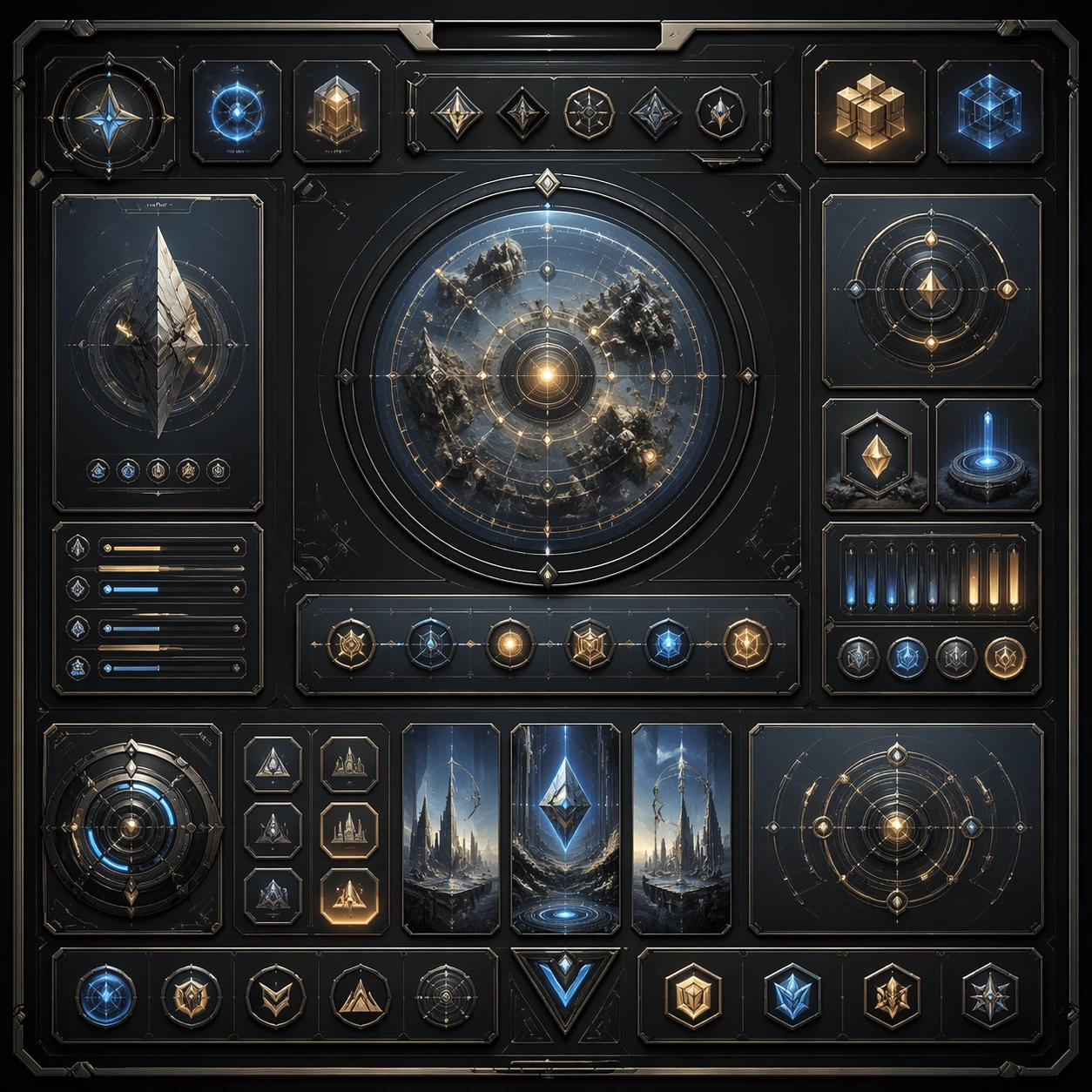
Scene: Create a square dependent image for Spatial UI and Immersive Control Panels. Build a third controlled variation in the same system with a premium, production-ready finish. Use a polished modular board or campaign surface with clean spacing, premium game-UI finish, and clear focal hierarchy. The composition should feel intentional, clean, and reusable for gallery, research, campaign, or internal handoff contexts. Lighting must support readability first, with the main forms clearly separated from the background and enough breathing room for the system to stay legible at both hero scale and thumbnail scale. Subject: Center a coherent original game-art system built for premium production and marketing surfaces. For this image, focus on the intended support surface. Keep the same system logic stable across screenshots, cards, banners, and overview boards. Preserve exact identity or system logic from the reference image while changing only the intended variation axis. The viewer should immediately understand what role this surface plays inside a cohesive game-production asset pack. Important details: Lock framing, icon grammar, palette blocking, and surface hierarchy so the kit feels production-ready and consistent. Preserve the core silhouette, framing language, and material logic from the reference image while each variation changes function. Keep materials believable, edge hierarchy disciplined, and the visual language consistent with Spatial UI. Use abstract interface blocks or diagram accents when helpful, but avoid any readable language. The final result should feel like a deliberate production asset rather than a random illustration. Use case: Spatial UI and Immersive Control Panels series study 4/9, designed as variant three within a cohesive asset pack. Constraints: No readable text, no watermark, no logos, preserve exact 1:1 aspect ratio, no unrelated objects, no broken visual hierarchy, no malformed anatomy or broken perspective, no random decorative clutter.

Example generated from “Spatial Ui And Immersive Control Panels — Support One”
GPT Image 2en

Scene: Create a square standalone support image for Spatial UI and Immersive Control Panels. Build a support-surface study with a clear focal hierarchy and a finished professional surface. Use a polished modular board or campaign surface with clean spacing, premium game-UI finish, and clear focal hierarchy. The frame should feel self-contained and polished, with enough structure to explain the system even without the reference series, yet still obviously belonging to the same theme and production world. Subject: Show a coherent original game-art system built for premium production and marketing surfaces in a way that emphasizes the intended support surface. Keep the same system logic stable across screenshots, cards, banners, and overview boards. Even though this image is independent, the viewer should still recognize the same universe, same commercial logic, and same production intent as the core package. Important details: Lock framing, icon grammar, palette blocking, and surface hierarchy so the kit feels production-ready and consistent. Preserve the broader theme language through color, framing, material choices, and modular composition. Use clean panel rhythm, premium asset presentation, and believable detail density. The image should work equally well as a gallery study, research reference, and mock production deliverable. Use case: Spatial UI and Immersive Control Panels single study 5/9, exploring support one as a support surface. Constraints: No readable text, no watermark, no logos, preserve exact 1:1 aspect ratio, no unrelated objects, no broken visual hierarchy, no visual noise that obscures the main surface, no accidental brand resemblance.

Example generated from “Spatial Ui And Immersive Control Panels — Support Two”
GPT Image 2en

Scene: Create a square standalone support image for Spatial UI and Immersive Control Panels. Build a second support-surface study with a clear focal hierarchy and a finished professional surface. Use a polished modular board or campaign surface with clean spacing, premium game-UI finish, and clear focal hierarchy. The frame should feel self-contained and polished, with enough structure to explain the system even without the reference series, yet still obviously belonging to the same theme and production world. Subject: Show a coherent original game-art system built for premium production and marketing surfaces in a way that emphasizes the intended support surface. Keep the same system logic stable across screenshots, cards, banners, and overview boards. Even though this image is independent, the viewer should still recognize the same universe, same commercial logic, and same production intent as the core package. Important details: Lock framing, icon grammar, palette blocking, and surface hierarchy so the kit feels production-ready and consistent. Preserve the broader theme language through color, framing, material choices, and modular composition. Use clean panel rhythm, premium asset presentation, and believable detail density. The image should work equally well as a gallery study, research reference, and mock production deliverable. Use case: Spatial UI and Immersive Control Panels single study 6/9, exploring support two as a support surface. Constraints: No readable text, no watermark, no logos, preserve exact 1:1 aspect ratio, no unrelated objects, no broken visual hierarchy, no visual noise that obscures the main surface, no accidental brand resemblance.

Example generated from “Spatial Ui And Immersive Control Panels — Support Three”
GPT Image 2en

Scene: Create a square standalone support image for Spatial UI and Immersive Control Panels. Build a third support-surface study with a clear focal hierarchy and a finished professional surface. Use a polished modular board or campaign surface with clean spacing, premium game-UI finish, and clear focal hierarchy. The frame should feel self-contained and polished, with enough structure to explain the system even without the reference series, yet still obviously belonging to the same theme and production world. Subject: Show a coherent original game-art system built for premium production and marketing surfaces in a way that emphasizes the intended support surface. Keep the same system logic stable across screenshots, cards, banners, and overview boards. Even though this image is independent, the viewer should still recognize the same universe, same commercial logic, and same production intent as the core package. Important details: Lock framing, icon grammar, palette blocking, and surface hierarchy so the kit feels production-ready and consistent. Preserve the broader theme language through color, framing, material choices, and modular composition. Use clean panel rhythm, premium asset presentation, and believable detail density. The image should work equally well as a gallery study, research reference, and mock production deliverable. Use case: Spatial UI and Immersive Control Panels single study 7/9, exploring support three as a support surface. Constraints: No readable text, no watermark, no logos, preserve exact 1:1 aspect ratio, no unrelated objects, no broken visual hierarchy, no visual noise that obscures the main surface, no accidental brand resemblance.

Example generated from “Spatial Ui And Immersive Control Panels — Support Four”
GPT Image 2en

Scene: Create a square standalone support image for Spatial UI and Immersive Control Panels. Build a fourth support-surface study with a clear focal hierarchy and a finished professional surface. Use a polished modular board or campaign surface with clean spacing, premium game-UI finish, and clear focal hierarchy. The frame should feel self-contained and polished, with enough structure to explain the system even without the reference series, yet still obviously belonging to the same theme and production world. Subject: Show a coherent original game-art system built for premium production and marketing surfaces in a way that emphasizes the intended support surface. Keep the same system logic stable across screenshots, cards, banners, and overview boards. Even though this image is independent, the viewer should still recognize the same universe, same commercial logic, and same production intent as the core package. Important details: Lock framing, icon grammar, palette blocking, and surface hierarchy so the kit feels production-ready and consistent. Preserve the broader theme language through color, framing, material choices, and modular composition. Use clean panel rhythm, premium asset presentation, and believable detail density. The image should work equally well as a gallery study, research reference, and mock production deliverable. Use case: Spatial UI and Immersive Control Panels single study 8/9, exploring support four as a support surface. Constraints: No readable text, no watermark, no logos, preserve exact 1:1 aspect ratio, no unrelated objects, no broken visual hierarchy, no visual noise that obscures the main surface, no accidental brand resemblance.

Example generated from “Spatial Ui And Immersive Control Panels — Support Five”
GPT Image 2en

Scene: Create a square standalone support image for Spatial UI and Immersive Control Panels. Build a fifth support-surface study with a clear focal hierarchy and a finished professional surface. Use a polished modular board or campaign surface with clean spacing, premium game-UI finish, and clear focal hierarchy. The frame should feel self-contained and polished, with enough structure to explain the system even without the reference series, yet still obviously belonging to the same theme and production world. Subject: Show a coherent original game-art system built for premium production and marketing surfaces in a way that emphasizes the intended support surface. Keep the same system logic stable across screenshots, cards, banners, and overview boards. Even though this image is independent, the viewer should still recognize the same universe, same commercial logic, and same production intent as the core package. Important details: Lock framing, icon grammar, palette blocking, and surface hierarchy so the kit feels production-ready and consistent. Preserve the broader theme language through color, framing, material choices, and modular composition. Use clean panel rhythm, premium asset presentation, and believable detail density. The image should work equally well as a gallery study, research reference, and mock production deliverable. Use case: Spatial UI and Immersive Control Panels single study 9/9, exploring support five as a support surface. Constraints: No readable text, no watermark, no logos, preserve exact 1:1 aspect ratio, no unrelated objects, no broken visual hierarchy, no visual noise that obscures the main surface, no accidental brand resemblance.

Example generated from “Speaker Event Headliner Poster Kit — Reference Anchor”
GPT Image 2en

Scene: Create a square reference image for Speaker Event Headliner Poster Kit. Build a reference anchor establishing the core system with a premium, production-ready finish. Use a polished modular board or campaign surface with clean spacing, premium game-UI finish, and clear focal hierarchy. The composition should feel intentional, clean, and reusable for gallery, research, campaign, or internal handoff contexts. Lighting must support readability first, with the main forms clearly separated from the background and enough breathing room for the system to stay legible at both hero scale and thumbnail scale. Subject: Center a coherent original game-art system built for premium production and marketing surfaces. For this image, focus on reference anchor. Keep the same system logic stable across screenshots, cards, banners, and overview boards. This image is the canonical anchor that later series images must follow. The viewer should immediately understand what role this surface plays inside a cohesive game-production asset pack. Important details: Lock framing, icon grammar, palette blocking, and surface hierarchy so the kit feels production-ready and consistent. Preserve the core silhouette, framing language, and material logic from the reference image while each variation changes function. Keep materials believable, edge hierarchy disciplined, and the visual language consistent with Headliner Kit. Use abstract interface blocks or diagram accents when helpful, but avoid any readable language. The final result should feel like a deliberate production asset rather than a random illustration. Use case: Speaker Event Headliner Poster Kit series study 1/9, designed as reference anchor within a cohesive asset pack. Constraints: No readable text, no watermark, no logos, preserve exact 1:1 aspect ratio, no unrelated objects, no broken visual hierarchy, no malformed anatomy or broken perspective, no random decorative clutter.

Example generated from “Speaker Event Headliner Poster Kit — Variant One”
GPT Image 2en

Scene: Create a square dependent image for Speaker Event Headliner Poster Kit. Build a first controlled variation in the same system with a premium, production-ready finish. Use a polished modular board or campaign surface with clean spacing, premium game-UI finish, and clear focal hierarchy. The composition should feel intentional, clean, and reusable for gallery, research, campaign, or internal handoff contexts. Lighting must support readability first, with the main forms clearly separated from the background and enough breathing room for the system to stay legible at both hero scale and thumbnail scale. Subject: Center a coherent original game-art system built for premium production and marketing surfaces. For this image, focus on the intended support surface. Keep the same system logic stable across screenshots, cards, banners, and overview boards. Preserve exact identity or system logic from the reference image while changing only the intended variation axis. The viewer should immediately understand what role this surface plays inside a cohesive game-production asset pack. Important details: Lock framing, icon grammar, palette blocking, and surface hierarchy so the kit feels production-ready and consistent. Preserve the core silhouette, framing language, and material logic from the reference image while each variation changes function. Keep materials believable, edge hierarchy disciplined, and the visual language consistent with Headliner Kit. Use abstract interface blocks or diagram accents when helpful, but avoid any readable language. The final result should feel like a deliberate production asset rather than a random illustration. Use case: Speaker Event Headliner Poster Kit series study 2/9, designed as variant one within a cohesive asset pack. Constraints: No readable text, no watermark, no logos, preserve exact 1:1 aspect ratio, no unrelated objects, no broken visual hierarchy, no malformed anatomy or broken perspective, no random decorative clutter.

Example generated from “Speaker Event Headliner Poster Kit — Variant Two”
GPT Image 2en

Scene: Create a square dependent image for Speaker Event Headliner Poster Kit. Build a second controlled variation in the same system with a premium, production-ready finish. Use a polished modular board or campaign surface with clean spacing, premium game-UI finish, and clear focal hierarchy. The composition should feel intentional, clean, and reusable for gallery, research, campaign, or internal handoff contexts. Lighting must support readability first, with the main forms clearly separated from the background and enough breathing room for the system to stay legible at both hero scale and thumbnail scale. Subject: Center a coherent original game-art system built for premium production and marketing surfaces. For this image, focus on the intended support surface. Keep the same system logic stable across screenshots, cards, banners, and overview boards. Preserve exact identity or system logic from the reference image while changing only the intended variation axis. The viewer should immediately understand what role this surface plays inside a cohesive game-production asset pack. Important details: Lock framing, icon grammar, palette blocking, and surface hierarchy so the kit feels production-ready and consistent. Preserve the core silhouette, framing language, and material logic from the reference image while each variation changes function. Keep materials believable, edge hierarchy disciplined, and the visual language consistent with Headliner Kit. Use abstract interface blocks or diagram accents when helpful, but avoid any readable language. The final result should feel like a deliberate production asset rather than a random illustration. Use case: Speaker Event Headliner Poster Kit series study 3/9, designed as variant two within a cohesive asset pack. Constraints: No readable text, no watermark, no logos, preserve exact 1:1 aspect ratio, no unrelated objects, no broken visual hierarchy, no malformed anatomy or broken perspective, no random decorative clutter.

Example generated from “Speaker Event Headliner Poster Kit — Variant Three”
GPT Image 2en

Scene: Create a square dependent image for Speaker Event Headliner Poster Kit. Build a third controlled variation in the same system with a premium, production-ready finish. Use a polished modular board or campaign surface with clean spacing, premium game-UI finish, and clear focal hierarchy. The composition should feel intentional, clean, and reusable for gallery, research, campaign, or internal handoff contexts. Lighting must support readability first, with the main forms clearly separated from the background and enough breathing room for the system to stay legible at both hero scale and thumbnail scale. Subject: Center a coherent original game-art system built for premium production and marketing surfaces. For this image, focus on the intended support surface. Keep the same system logic stable across screenshots, cards, banners, and overview boards. Preserve exact identity or system logic from the reference image while changing only the intended variation axis. The viewer should immediately understand what role this surface plays inside a cohesive game-production asset pack. Important details: Lock framing, icon grammar, palette blocking, and surface hierarchy so the kit feels production-ready and consistent. Preserve the core silhouette, framing language, and material logic from the reference image while each variation changes function. Keep materials believable, edge hierarchy disciplined, and the visual language consistent with Headliner Kit. Use abstract interface blocks or diagram accents when helpful, but avoid any readable language. The final result should feel like a deliberate production asset rather than a random illustration. Use case: Speaker Event Headliner Poster Kit series study 4/9, designed as variant three within a cohesive asset pack. Constraints: No readable text, no watermark, no logos, preserve exact 1:1 aspect ratio, no unrelated objects, no broken visual hierarchy, no malformed anatomy or broken perspective, no random decorative clutter.

Example generated from “Speaker Event Headliner Poster Kit — Support One”
GPT Image 2en

Scene: Create a square standalone support image for Speaker Event Headliner Poster Kit. Build a support-surface study with a clear focal hierarchy and a finished professional surface. Use a polished modular board or campaign surface with clean spacing, premium game-UI finish, and clear focal hierarchy. The frame should feel self-contained and polished, with enough structure to explain the system even without the reference series, yet still obviously belonging to the same theme and production world. Subject: Show a coherent original game-art system built for premium production and marketing surfaces in a way that emphasizes the intended support surface. Keep the same system logic stable across screenshots, cards, banners, and overview boards. Even though this image is independent, the viewer should still recognize the same universe, same commercial logic, and same production intent as the core package. Important details: Lock framing, icon grammar, palette blocking, and surface hierarchy so the kit feels production-ready and consistent. Preserve the broader theme language through color, framing, material choices, and modular composition. Use clean panel rhythm, premium asset presentation, and believable detail density. The image should work equally well as a gallery study, research reference, and mock production deliverable. Use case: Speaker Event Headliner Poster Kit single study 5/9, exploring support one as a support surface. Constraints: No readable text, no watermark, no logos, preserve exact 1:1 aspect ratio, no unrelated objects, no broken visual hierarchy, no visual noise that obscures the main surface, no accidental brand resemblance.

Example generated from “Speaker Event Headliner Poster Kit — Support Two”
GPT Image 2en

Scene: Create a square standalone support image for Speaker Event Headliner Poster Kit. Build a second support-surface study with a clear focal hierarchy and a finished professional surface. Use a polished modular board or campaign surface with clean spacing, premium game-UI finish, and clear focal hierarchy. The frame should feel self-contained and polished, with enough structure to explain the system even without the reference series, yet still obviously belonging to the same theme and production world. Subject: Show a coherent original game-art system built for premium production and marketing surfaces in a way that emphasizes the intended support surface. Keep the same system logic stable across screenshots, cards, banners, and overview boards. Even though this image is independent, the viewer should still recognize the same universe, same commercial logic, and same production intent as the core package. Important details: Lock framing, icon grammar, palette blocking, and surface hierarchy so the kit feels production-ready and consistent. Preserve the broader theme language through color, framing, material choices, and modular composition. Use clean panel rhythm, premium asset presentation, and believable detail density. The image should work equally well as a gallery study, research reference, and mock production deliverable. Use case: Speaker Event Headliner Poster Kit single study 6/9, exploring support two as a support surface. Constraints: No readable text, no watermark, no logos, preserve exact 1:1 aspect ratio, no unrelated objects, no broken visual hierarchy, no visual noise that obscures the main surface, no accidental brand resemblance.

Example generated from “Speaker Event Headliner Poster Kit — Support Three”
GPT Image 2en

Scene: Create a square standalone support image for Speaker Event Headliner Poster Kit. Build a third support-surface study with a clear focal hierarchy and a finished professional surface. Use a polished modular board or campaign surface with clean spacing, premium game-UI finish, and clear focal hierarchy. The frame should feel self-contained and polished, with enough structure to explain the system even without the reference series, yet still obviously belonging to the same theme and production world. Subject: Show a coherent original game-art system built for premium production and marketing surfaces in a way that emphasizes the intended support surface. Keep the same system logic stable across screenshots, cards, banners, and overview boards. Even though this image is independent, the viewer should still recognize the same universe, same commercial logic, and same production intent as the core package. Important details: Lock framing, icon grammar, palette blocking, and surface hierarchy so the kit feels production-ready and consistent. Preserve the broader theme language through color, framing, material choices, and modular composition. Use clean panel rhythm, premium asset presentation, and believable detail density. The image should work equally well as a gallery study, research reference, and mock production deliverable. Use case: Speaker Event Headliner Poster Kit single study 7/9, exploring support three as a support surface. Constraints: No readable text, no watermark, no logos, preserve exact 1:1 aspect ratio, no unrelated objects, no broken visual hierarchy, no visual noise that obscures the main surface, no accidental brand resemblance.

Example generated from “Speaker Event Headliner Poster Kit — Support Four”
GPT Image 2en

Scene: Create a square standalone support image for Speaker Event Headliner Poster Kit. Build a fourth support-surface study with a clear focal hierarchy and a finished professional surface. Use a polished modular board or campaign surface with clean spacing, premium game-UI finish, and clear focal hierarchy. The frame should feel self-contained and polished, with enough structure to explain the system even without the reference series, yet still obviously belonging to the same theme and production world. Subject: Show a coherent original game-art system built for premium production and marketing surfaces in a way that emphasizes the intended support surface. Keep the same system logic stable across screenshots, cards, banners, and overview boards. Even though this image is independent, the viewer should still recognize the same universe, same commercial logic, and same production intent as the core package. Important details: Lock framing, icon grammar, palette blocking, and surface hierarchy so the kit feels production-ready and consistent. Preserve the broader theme language through color, framing, material choices, and modular composition. Use clean panel rhythm, premium asset presentation, and believable detail density. The image should work equally well as a gallery study, research reference, and mock production deliverable. Use case: Speaker Event Headliner Poster Kit single study 8/9, exploring support four as a support surface. Constraints: No readable text, no watermark, no logos, preserve exact 1:1 aspect ratio, no unrelated objects, no broken visual hierarchy, no visual noise that obscures the main surface, no accidental brand resemblance.

Example generated from “Speaker Event Headliner Poster Kit — Support Five”
GPT Image 2en

Scene: Create a square standalone support image for Speaker Event Headliner Poster Kit. Build a fifth support-surface study with a clear focal hierarchy and a finished professional surface. Use a polished modular board or campaign surface with clean spacing, premium game-UI finish, and clear focal hierarchy. The frame should feel self-contained and polished, with enough structure to explain the system even without the reference series, yet still obviously belonging to the same theme and production world. Subject: Show a coherent original game-art system built for premium production and marketing surfaces in a way that emphasizes the intended support surface. Keep the same system logic stable across screenshots, cards, banners, and overview boards. Even though this image is independent, the viewer should still recognize the same universe, same commercial logic, and same production intent as the core package. Important details: Lock framing, icon grammar, palette blocking, and surface hierarchy so the kit feels production-ready and consistent. Preserve the broader theme language through color, framing, material choices, and modular composition. Use clean panel rhythm, premium asset presentation, and believable detail density. The image should work equally well as a gallery study, research reference, and mock production deliverable. Use case: Speaker Event Headliner Poster Kit single study 9/9, exploring support five as a support surface. Constraints: No readable text, no watermark, no logos, preserve exact 1:1 aspect ratio, no unrelated objects, no broken visual hierarchy, no visual noise that obscures the main surface, no accidental brand resemblance.

Example generated from “Speculative Product Catalogue Family — Catalogue Family Anchor”
GPT Image 2en

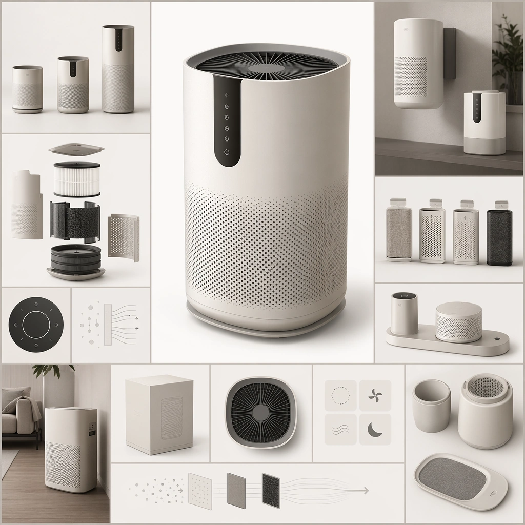
Scene: Create a square near-future catalogue board that feels like a premium consumer-product launch sheet without using readable copy. The composition should combine one hero product or family grouping with secondary modules, packaging-like shapes, and abstract information zones arranged in a clean commercial hierarchy. Lighting should be photographic, precise, and product-friendly. Present several near-future air-care devices on a clean catalogue grid with one hero unit centered, smaller companions nearby, and abstract information blocks balancing the frame. Subject: Center the image on a coherent consumer product family whose forms, finishes, interface surfaces, and accessory logic all belong together. The products can be speculative, but they must still feel market-positioned, manufacturable, and suited to a believable household or urban use case. Establish the reference family through matched finishes, vent geometry, touch surfaces, accessory docks, and calm household use cues. Important details: Think like a product marketer and industrial designer at once. Material choices, scale relationships, accessory combinations, and staged use cues should imply a clear category, audience, and feature set even though no readable text appears. The image should be strong enough for catalog, launch-page, or retail poster use. The anchor image should define how product hierarchy, family resemblance, and catalog balance work for later series variants. Resolve the anchor rules that later reference-dependent variants must inherit, especially the industrial design language, material palette, module family proportions, and catalog layout hierarchy. Use case: Spec Product Catalog series study 1/4, designed as a reusable core-system image for this topic. Constraints: No readable text, no watermark, no logos, preserve exact 1:1 aspect ratio, no real-world brand marks, no readable product copy, no random luxury nonsense props, no inconsistent industrial design, no smartphone-app screenshots with readable text.

Example generated from “Speculative Product Catalogue Family — Compact Apartment Variant”
GPT Image 2en

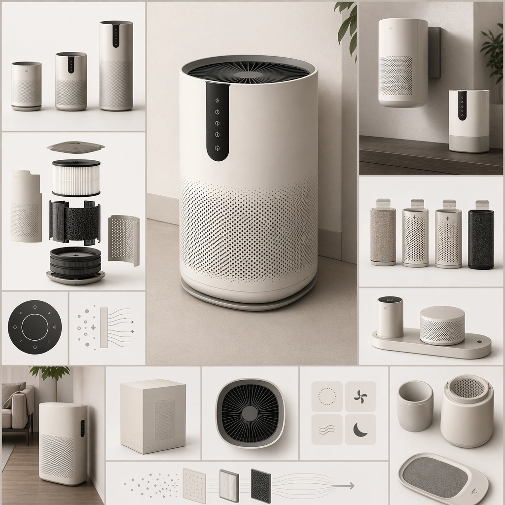
Scene: Create a square near-future catalogue board that feels like a premium consumer-product launch sheet without using readable copy. The composition should combine one hero product or family grouping with secondary modules, packaging-like shapes, and abstract information zones arranged in a clean commercial hierarchy. Lighting should be photographic, precise, and product-friendly. Keep the same industrial design language but stage the family around compact units, wall-adjacent footprints, and tight-space accessories in the same catalog format. Subject: Center the image on a coherent consumer product family whose forms, finishes, interface surfaces, and accessory logic all belong together. The products can be speculative, but they must still feel market-positioned, manufacturable, and suited to a believable household or urban use case. Preserve the reference forms, vent logic, and material palette while emphasizing urban apartment suitability and modular storage. Important details: Think like a product marketer and industrial designer at once. Material choices, scale relationships, accessory combinations, and staged use cues should imply a clear category, audience, and feature set even though no readable text appears. The image should be strong enough for catalog, launch-page, or retail poster use. The board should feel like a real line extension rather than a total redesign, with compactness expressed through packaging and scale decisions. Preserve the exact structural language established by the reference image, especially the industrial design language, material palette, module family proportions, and catalog layout hierarchy. Use case: Spec Product Catalog series study 2/4, designed as a reusable core-system image for this topic. Constraints: No readable text, no watermark, no logos, preserve exact 1:1 aspect ratio, no real-world brand marks, no readable product copy, no random luxury nonsense props, no inconsistent industrial design, no tiny gadget novelty feel.

Example generated from “Speculative Product Catalogue Family — Retail Shelf Campaign”
GPT Image 2en

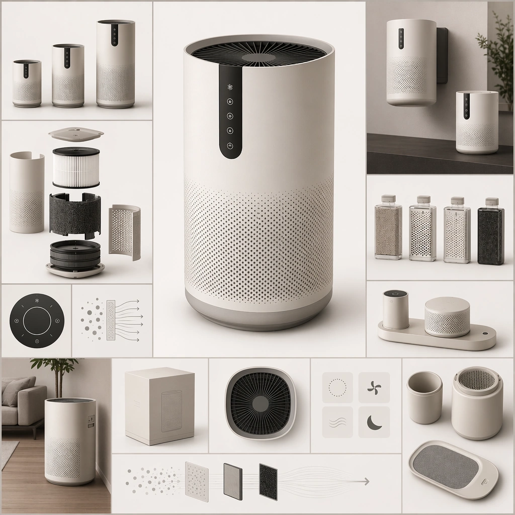
Scene: Create a square near-future catalogue board that feels like a premium consumer-product launch sheet without using readable copy. The composition should combine one hero product or family grouping with secondary modules, packaging-like shapes, and abstract information zones arranged in a clean commercial hierarchy. Lighting should be photographic, precise, and product-friendly. Retain the same product family but arrange the board to imply retail display modules, packaging silhouettes, and grouped merchandising without readable copy. Subject: Center the image on a coherent consumer product family whose forms, finishes, interface surfaces, and accessory logic all belong together. The products can be speculative, but they must still feel market-positioned, manufacturable, and suited to a believable household or urban use case. Preserve the anchor industrial design while making retail arrangement, bundle distinctions, and shopper-facing hierarchy more explicit. Important details: Think like a product marketer and industrial designer at once. Material choices, scale relationships, accessory combinations, and staged use cues should imply a clear category, audience, and feature set even though no readable text appears. The image should be strong enough for catalog, launch-page, or retail poster use. The image should feel useful for a launch deck or retail poster, not like a generic ecommerce tile mosaic. Preserve the exact structural language established by the reference image, especially the industrial design language, material palette, module family proportions, and catalog layout hierarchy. Use case: Spec Product Catalog series study 4/4, designed as a reusable core-system image for this topic. Constraints: No readable text, no watermark, no logos, preserve exact 1:1 aspect ratio, no real-world brand marks, no readable product copy, no random luxury nonsense props, no inconsistent industrial design, no supermarket sale chaos.

Example generated from “Speculative Product Catalogue Family — Kitchen Fermentation Assistant”
GPT Image 2en

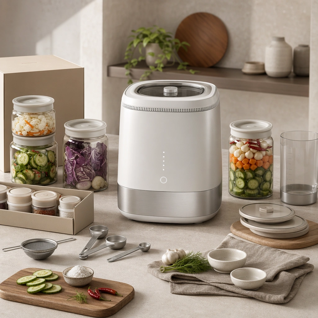
Scene: Design a square product-catalog image for one near-future consumer category, keeping industrial design clarity and marketing hierarchy equally strong. The board should feel commercial and ready to publish, not like a random object render. Compose a product board with one countertop fermenter, accessory jars, measuring tools, and soft kitchen-context props arranged in a premium catalog style. Subject: Show one coherent product or micro-family with believable consumer positioning, accessory logic, and lifestyle relevance. Hints of packaging, use context, or display systems can appear if they support the category read. The family should feel culinary and trustworthy, with interface logic and modular accessories clearly tied to food workflow. Important details: Use restrained props, clear product spacing, and material realism to sell a plausible near-future product direction. The concept should feel like something a real company could market within a few years. Keep the board clean and appetizing without turning it into a food photograph. Preserve category-specific marketing logic so the product, accessories, and staged context all support the same consumer story. Use case: Spec Product Catalog single study 1/5, designed as a self-contained support image for this topic. Constraints: No readable text, no watermark, no logos, preserve exact 1:1 aspect ratio, no price-tag text, no glossy ad cliché overload, no cartoon gadgets, no fake logos, no chef-brand cues.

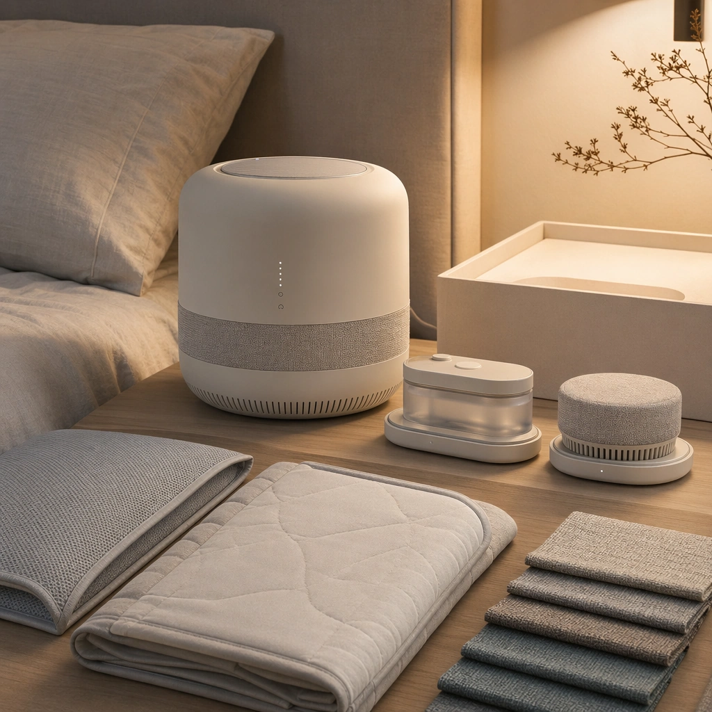
Example generated from “Speculative Product Catalogue Family — Bedside Sleep Climate Orb”
GPT Image 2en

Scene: Design a square product-catalog image for one near-future consumer category, keeping industrial design clarity and marketing hierarchy equally strong. The board should feel commercial and ready to publish, not like a random object render. Show a rounded climate device with docks, fabric accessories, and calm bedroom-context staging under soft evening light. Subject: Show one coherent product or micro-family with believable consumer positioning, accessory logic, and lifestyle relevance. Hints of packaging, use context, or display systems can appear if they support the category read. The products should communicate rest, comfort, and subtle control through materials and form rather than through bright screens. Important details: Use restrained props, clear product spacing, and material realism to sell a plausible near-future product direction. The concept should feel like something a real company could market within a few years. Use commercial hierarchy to make the hero device and companion modules feel like one thoughtful family. Preserve category-specific marketing logic so the product, accessories, and staged context all support the same consumer story. Use case: Spec Product Catalog single study 2/5, designed as a self-contained support image for this topic. Constraints: No readable text, no watermark, no logos, preserve exact 1:1 aspect ratio, no price-tag text, no glossy ad cliché overload, no cartoon gadgets, no fake logos, no wellness-crystal mysticism.

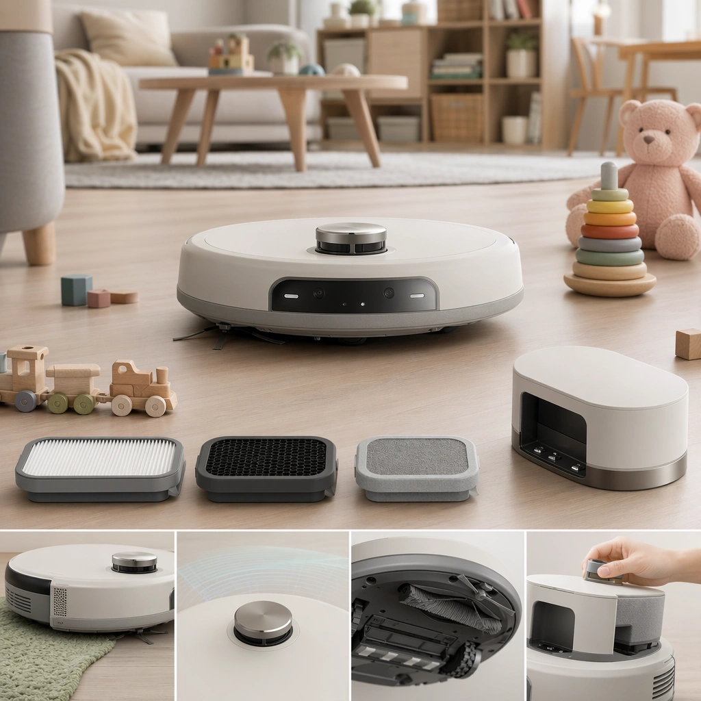
Example generated from “Speculative Product Catalogue Family — Child Safe Cleaning Rover”
GPT Image 2en

Scene: Design a square product-catalog image for one near-future consumer category, keeping industrial design clarity and marketing hierarchy equally strong. The board should feel commercial and ready to publish, not like a random object render. Design a catalog board with a compact rover, dock, filter modules, and toy-safe obstacle examples staged in a bright household environment. Subject: Show one coherent product or micro-family with believable consumer positioning, accessory logic, and lifestyle relevance. Hints of packaging, use context, or display systems can appear if they support the category read. The product family should feel trustworthy, durable, and clearly positioned for homes with children. Important details: Use restrained props, clear product spacing, and material realism to sell a plausible near-future product direction. The concept should feel like something a real company could market within a few years. Balance softness and engineering so the rover does not become toy-like or cartoonish. Preserve category-specific marketing logic so the product, accessories, and staged context all support the same consumer story. Use case: Spec Product Catalog single study 3/5, designed as a self-contained support image for this topic. Constraints: No readable text, no watermark, no logos, preserve exact 1:1 aspect ratio, no price-tag text, no glossy ad cliché overload, no cartoon gadgets, no fake logos, no cute mascot face design.

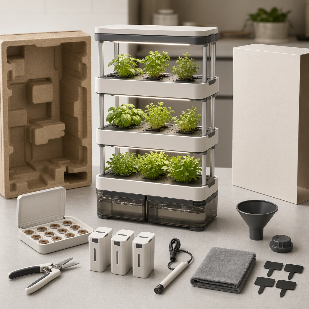
Example generated from “Speculative Product Catalogue Family — Balcony Micro Farm Stack”
GPT Image 2en

Scene: Design a square product-catalog image for one near-future consumer category, keeping industrial design clarity and marketing hierarchy equally strong. The board should feel commercial and ready to publish, not like a random object render. Compose a square board with stacked grow modules, water reservoirs, clip-on tools, and plant-care accessories arranged as a consumer kit. Subject: Show one coherent product or micro-family with believable consumer positioning, accessory logic, and lifestyle relevance. Hints of packaging, use context, or display systems can appear if they support the category read. The system should communicate ease, modularity, and urban practicality through its physical design and staged context. Important details: Use restrained props, clear product spacing, and material realism to sell a plausible near-future product direction. The concept should feel like something a real company could market within a few years. Let product logic and lifestyle relevance drive the image instead of romantic garden styling. Preserve category-specific marketing logic so the product, accessories, and staged context all support the same consumer story. Use case: Spec Product Catalog single study 4/5, designed as a self-contained support image for this topic. Constraints: No readable text, no watermark, no logos, preserve exact 1:1 aspect ratio, no price-tag text, no glossy ad cliché overload, no cartoon gadgets, no fake logos, no rustic farmhouse branding.
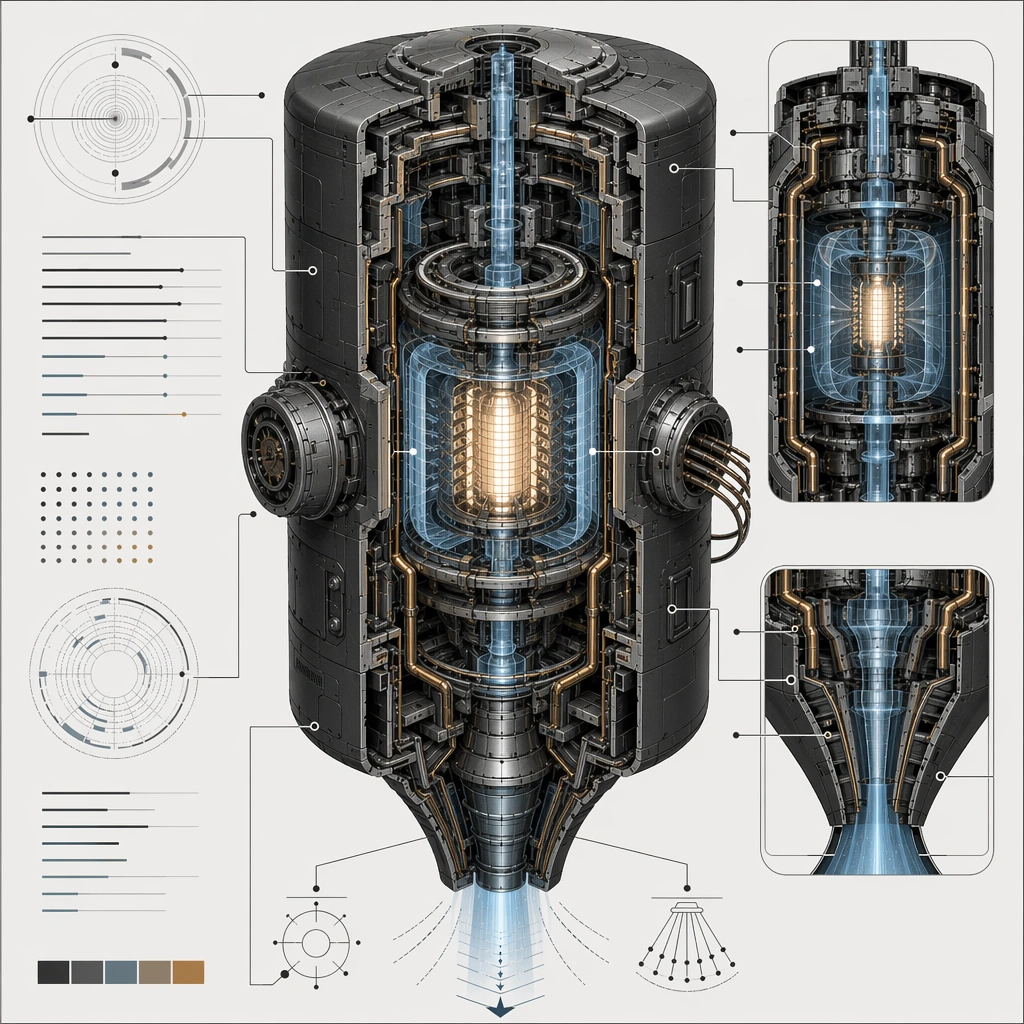
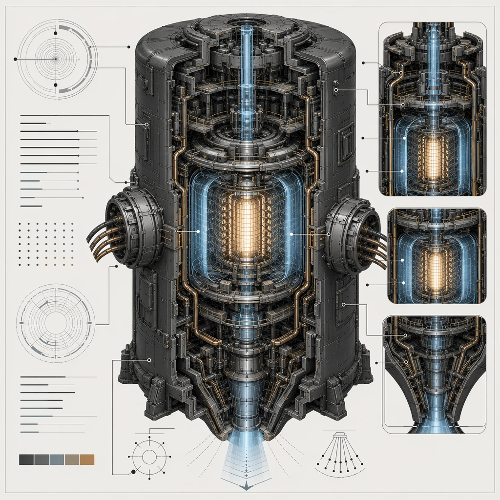
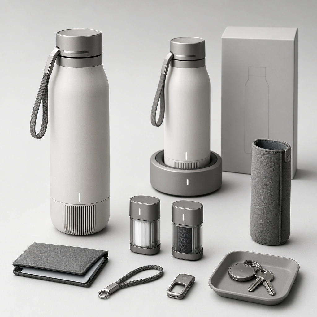
Example generated from “Speculative Product Catalogue Family — Commuter Air Purifying Bottle Dock”
GPT Image 2en

Scene: Design a square product-catalog image for one near-future consumer category, keeping industrial design clarity and marketing hierarchy equally strong. The board should feel commercial and ready to publish, not like a random object render. Present a sleek bottle-like device, docking base, cartridge modules, and carry accessories on a clean commuting-oriented catalog board. Subject: Show one coherent product or micro-family with believable consumer positioning, accessory logic, and lifestyle relevance. Hints of packaging, use context, or display systems can appear if they support the category read. The family should feel compact, modern, and plausible for daily carry, with strong continuity between portable and docked components. Important details: Use restrained props, clear product spacing, and material realism to sell a plausible near-future product direction. The concept should feel like something a real company could market within a few years. Use restrained urban props and crisp product spacing so the category reads immediately without copy. Preserve category-specific marketing logic so the product, accessories, and staged context all support the same consumer story. Use case: Spec Product Catalog single study 5/5, designed as a self-contained support image for this topic. Constraints: No readable text, no watermark, no logos, preserve exact 1:1 aspect ratio, no price-tag text, no glossy ad cliché overload, no cartoon gadgets, no fake logos, no fitness-brand styling.
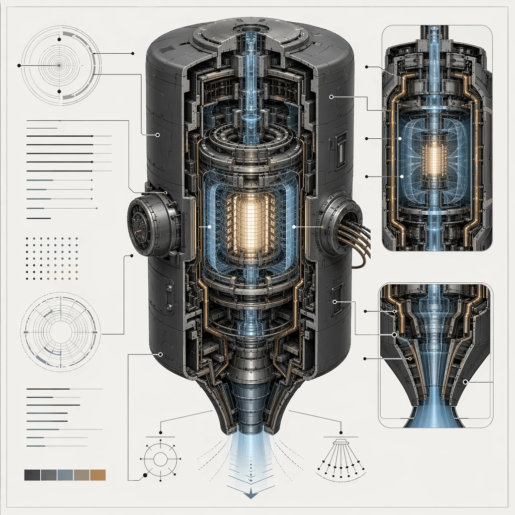
Example generated from “Speculative Technology Cutaway Poster — Jump Core Anchor”
GPT Image 2en

Scene: Create a square technical-poster composition for an impossible but convincing device, using cutaway views, section windows, and disciplined layout. The background should stay clean and poster-ready so internal chambers, conduits, shells, and field zones remain readable at a glance. Use lighting and color sparingly to clarify hierarchy rather than to decorate the page. Center a dense engine core on a clean poster field with one main shell cutaway, two supporting sectional windows, and cool industrial light. Subject: Center the image on one speculative machine whose internal logic feels thought through: shell, core, coolant path, field chamber, maintenance access, and energy routing should all relate coherently. The device can be fantastical, but it must read like it could be explained by an engineering team. Establish the reference device through a protected outer shell, concentric field chamber, coolant spine, maintenance ports, and emission throat arranged in clear sequence. Important details: Treat the poster as a visual explanation system without readable text. Use arrows, callout lines, index dots, section blocks, and sectional contrast only as abstract diagram grammar. The result should feel credible for a concept deck, patent-style board, or advanced product explanation poster. The anchor image should define how cutaway color, section depth, and callout geometry work for the rest of the series. Resolve the anchor rules that later reference-dependent variants must inherit, especially the outer shell silhouette, internal chamber sequencing, conduit routing, and diagram hierarchy. Use case: Spec Tech Cutaway series study 1/4, designed as a reusable core-system image for this topic. Constraints: No readable text, no watermark, no logos, preserve exact 1:1 aspect ratio, no readable labels, no exploded parts floating without logic, no cartoon simplification, no generic spaceship dashboard noise, no rainbow energy blast effects.

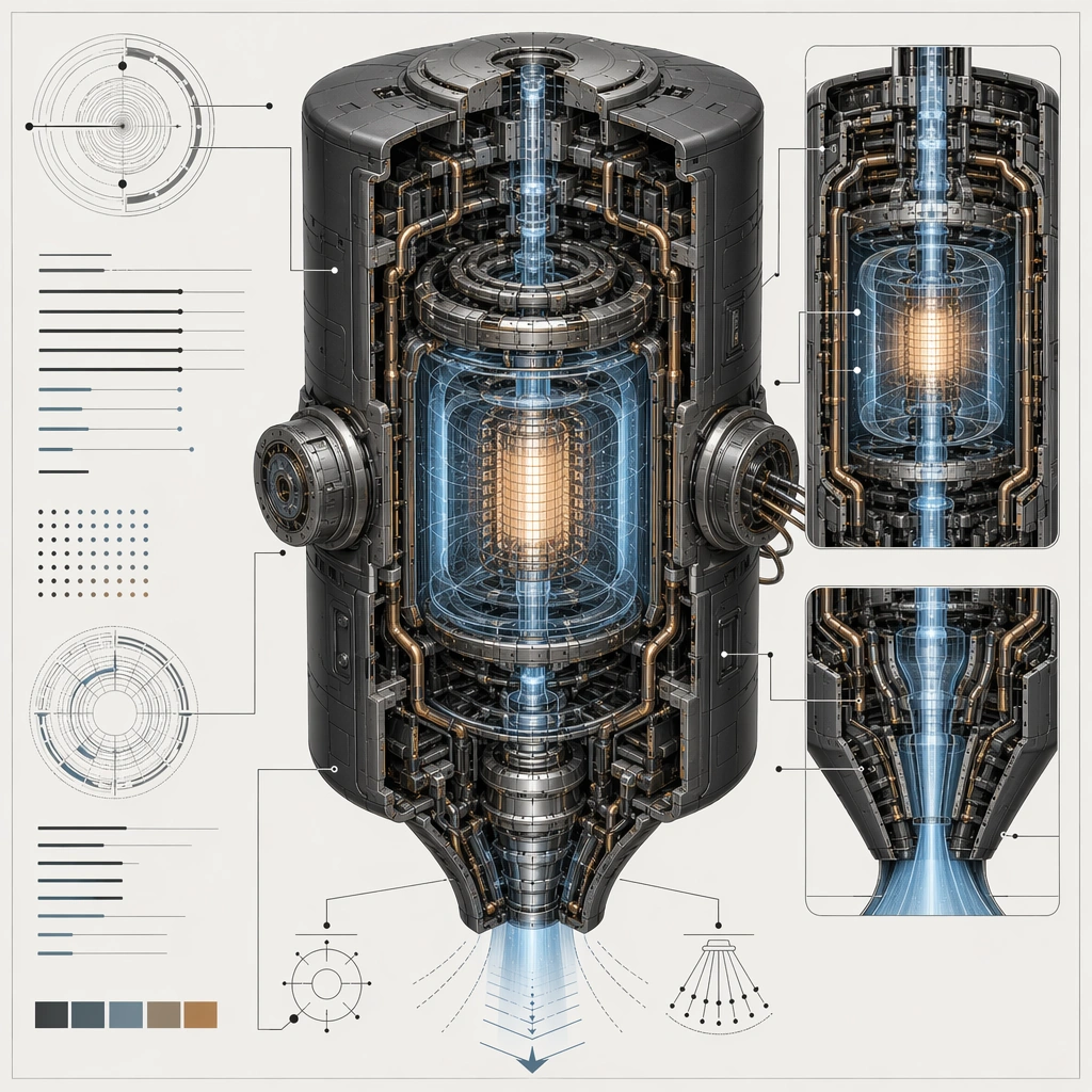
Example generated from “Speculative Technology Cutaway Poster — Field Expanded Mode”
GPT Image 2en

Scene: Create a square technical-poster composition for an impossible but convincing device, using cutaway views, section windows, and disciplined layout. The background should stay clean and poster-ready so internal chambers, conduits, shells, and field zones remain readable at a glance. Use lighting and color sparingly to clarify hierarchy rather than to decorate the page. Keep the same main shell silhouette but open several outer panels and show the field chamber in an expanded operational state on the same poster grid. Subject: Center the image on one speculative machine whose internal logic feels thought through: shell, core, coolant path, field chamber, maintenance access, and energy routing should all relate coherently. The device can be fantastical, but it must read like it could be explained by an engineering team. Preserve the anchor shell and chamber order while foregrounding stabilization rings, service ducts, and protected expansion joints. Important details: Treat the poster as a visual explanation system without readable text. Use arrows, callout lines, index dots, section blocks, and sectional contrast only as abstract diagram grammar. The result should feel credible for a concept deck, patent-style board, or advanced product explanation poster. Operational complexity should increase, but the device must still read as the same machine family at first glance. Preserve the exact structural language established by the reference image, especially the outer shell silhouette, internal chamber sequencing, conduit routing, and diagram hierarchy. Use case: Spec Tech Cutaway series study 2/4, designed as a reusable core-system image for this topic. Constraints: No readable text, no watermark, no logos, preserve exact 1:1 aspect ratio, no readable labels, no exploded parts floating without logic, no cartoon simplification, no generic spaceship dashboard noise, no magical portal vortex.

Example generated from “Speculative Technology Cutaway Poster — Maintenance Open Mode”
GPT Image 2en

Scene: Create a square technical-poster composition for an impossible but convincing device, using cutaway views, section windows, and disciplined layout. The background should stay clean and poster-ready so internal chambers, conduits, shells, and field zones remain readable at a glance. Use lighting and color sparingly to clarify hierarchy rather than to decorate the page. Present the same device on a clean technical background with selected panels removed and maintenance tools or docks implied by abstract holders and brackets. Subject: Center the image on one speculative machine whose internal logic feels thought through: shell, core, coolant path, field chamber, maintenance access, and energy routing should all relate coherently. The device can be fantastical, but it must read like it could be explained by an engineering team. Keep the reference silhouette and chamber layout intact while emphasizing repair access, replaceable modules, and safe isolation zones. Important details: Treat the poster as a visual explanation system without readable text. Use arrows, callout lines, index dots, section blocks, and sectional contrast only as abstract diagram grammar. The result should feel credible for a concept deck, patent-style board, or advanced product explanation poster. The image should feel like a professional maintenance poster, not a chaotic exploded drawing. Preserve the exact structural language established by the reference image, especially the outer shell silhouette, internal chamber sequencing, conduit routing, and diagram hierarchy. Use case: Spec Tech Cutaway series study 3/4, designed as a reusable core-system image for this topic. Constraints: No readable text, no watermark, no logos, preserve exact 1:1 aspect ratio, no readable labels, no exploded parts floating without logic, no cartoon simplification, no generic spaceship dashboard noise, no floating puzzle pieces.

Example generated from “Speculative Technology Cutaway Poster — Industrial Scale Version”
GPT Image 2en

Scene: Create a square technical-poster composition for an impossible but convincing device, using cutaway views, section windows, and disciplined layout. The background should stay clean and poster-ready so internal chambers, conduits, shells, and field zones remain readable at a glance. Use lighting and color sparingly to clarify hierarchy rather than to decorate the page. Scale the familiar shell language up into a larger industrial module with the cutaway still occupying the square frame clearly and cleanly. Subject: Center the image on one speculative machine whose internal logic feels thought through: shell, core, coolant path, field chamber, maintenance access, and energy routing should all relate coherently. The device can be fantastical, but it must read like it could be explained by an engineering team. Preserve the reference chamber order and outer-shell identity while adding service walkways, larger coolant trunks, and more robust containment walls. Important details: Treat the poster as a visual explanation system without readable text. Use arrows, callout lines, index dots, section blocks, and sectional contrast only as abstract diagram grammar. The result should feel credible for a concept deck, patent-style board, or advanced product explanation poster. Scale must feel like a real engineering escalation rather than a total redesign into a different machine. Preserve the exact structural language established by the reference image, especially the outer shell silhouette, internal chamber sequencing, conduit routing, and diagram hierarchy. Use case: Spec Tech Cutaway series study 4/4, designed as a reusable core-system image for this topic. Constraints: No readable text, no watermark, no logos, preserve exact 1:1 aspect ratio, no readable labels, no exploded parts floating without logic, no cartoon simplification, no generic spaceship dashboard noise, no giant hangar scenery taking over the poster.

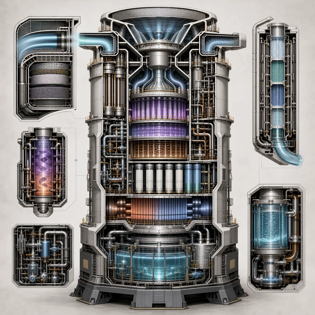
Example generated from “Speculative Technology Cutaway Poster — Atmospheric Processor Cross Section”
GPT Image 2en

Scene: Design a square explanatory board for one speculative machine, making the image useful for a presentation, poster, or worldbuilding manual page. The composition should have one dominant cutaway read supported by controlled secondary views. Compose a vertical-feeling machine within the square frame, showing intake channels, reaction chambers, filter stacks, and output reservoirs in layered section. Subject: Show a complete device with clear internal zones and believable maintenance or operational structure. The machine should look impossible only in ambition, not in the clarity of its construction logic. The device should read as climate infrastructure, with clear progression from raw intake to cleaned outputs. Important details: Prioritize visual explanation, clean sectional hierarchy, and disciplined materials. Every chamber, conduit, shell break, and inset should help the viewer infer what the machine does. Use diagram rhythm and sectional contrast to explain processing steps without needing text. Preserve internal cause and effect so the viewer can follow how material, energy, pressure, heat, or flow moves through the device. Use case: Spec Tech Cutaway single study 1/5, designed as a self-contained support image for this topic. Constraints: No readable text, no watermark, no logos, preserve exact 1:1 aspect ratio, no text blocks, no comic-book speed effects, no pure abstract geometry without function, no brand logos, no smokestack pollution clichés.

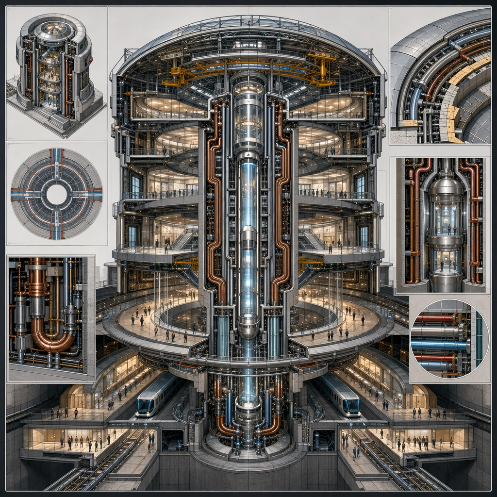
Example generated from “Speculative Technology Cutaway Poster — Gravity Tram Hub Cutaway”
GPT Image 2en

Scene: Design a square explanatory board for one speculative machine, making the image useful for a presentation, poster, or worldbuilding manual page. The composition should have one dominant cutaway read supported by controlled secondary views. Show a station-scale machine hub with passenger circulation implied at tiny scale and the main cutaway focused on routing coils, lift shafts, and safety chambers. Subject: Show a complete device with clear internal zones and believable maintenance or operational structure. The machine should look impossible only in ambition, not in the clarity of its construction logic. The machine should feel civic and infrastructural, not weaponized, with internal systems clearly devoted to public movement. Important details: Prioritize visual explanation, clean sectional hierarchy, and disciplined materials. Every chamber, conduit, shell break, and inset should help the viewer infer what the machine does. Balance architectural scale with diagram clarity so the device still feels like a poster subject rather than a building render. Preserve internal cause and effect so the viewer can follow how material, energy, pressure, heat, or flow moves through the device. Use case: Spec Tech Cutaway single study 2/5, designed as a self-contained support image for this topic. Constraints: No readable text, no watermark, no logos, preserve exact 1:1 aspect ratio, no text blocks, no comic-book speed effects, no pure abstract geometry without function, no brand logos, no sci-fi weapon cues.

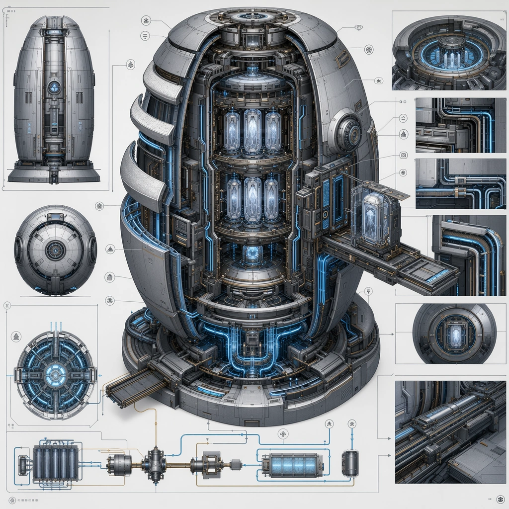
Example generated from “Speculative Technology Cutaway Poster — Cryogenic Archive Vessel”
GPT Image 2en

Scene: Design a square explanatory board for one speculative machine, making the image useful for a presentation, poster, or worldbuilding manual page. The composition should have one dominant cutaway read supported by controlled secondary views. Compose a cylindrical or ovoid archive vessel with shell layers, cooling veins, suspension chambers, and controlled access hatches visible in section. Subject: Show a complete device with clear internal zones and believable maintenance or operational structure. The machine should look impossible only in ambition, not in the clarity of its construction logic. The internal zones should explain preservation, inspection, and retrieval without requiring text or actors. Important details: Prioritize visual explanation, clean sectional hierarchy, and disciplined materials. Every chamber, conduit, shell break, and inset should help the viewer infer what the machine does. Use cold color discipline and precise shell breaks to keep the machine elegant and technical. Preserve internal cause and effect so the viewer can follow how material, energy, pressure, heat, or flow moves through the device. Use case: Spec Tech Cutaway single study 3/5, designed as a self-contained support image for this topic. Constraints: No readable text, no watermark, no logos, preserve exact 1:1 aspect ratio, no text blocks, no comic-book speed effects, no pure abstract geometry without function, no brand logos, no horror cryo-pod trope.

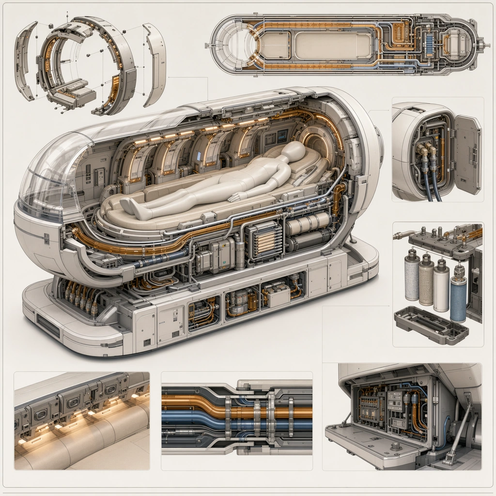
Example generated from “Speculative Technology Cutaway Poster — Medical Regeneration Cradle”
GPT Image 2en

Scene: Design a square explanatory board for one speculative machine, making the image useful for a presentation, poster, or worldbuilding manual page. The composition should have one dominant cutaway read supported by controlled secondary views. Design a balanced poster showing a cradle-like enclosure with fluid routing, scanning arrays, and patient-support structures arranged clearly in section. Subject: Show a complete device with clear internal zones and believable maintenance or operational structure. The machine should look impossible only in ambition, not in the clarity of its construction logic. The machine should feel humane, professional, and believable, with care logic emphasized over spectacle. Important details: Prioritize visual explanation, clean sectional hierarchy, and disciplined materials. Every chamber, conduit, shell break, and inset should help the viewer infer what the machine does. Keep the poster calm and explanatory, using warm-neutral accents to soften the technical complexity. Preserve internal cause and effect so the viewer can follow how material, energy, pressure, heat, or flow moves through the device. Use case: Spec Tech Cutaway single study 4/5, designed as a self-contained support image for this topic. Constraints: No readable text, no watermark, no logos, preserve exact 1:1 aspect ratio, no text blocks, no comic-book speed effects, no pure abstract geometry without function, no brand logos, no body-horror medical imagery.

Example generated from “Speculative Technology Cutaway Poster — Orbital Debris Kiln”
GPT Image 2en

Scene: Design a square explanatory board for one speculative machine, making the image useful for a presentation, poster, or worldbuilding manual page. The composition should have one dominant cutaway read supported by controlled secondary views. Show a dense industrial module with capture inlets, sorting chambers, thermal conversion core, and output molds laid out in clear process order. Subject: Show a complete device with clear internal zones and believable maintenance or operational structure. The machine should look impossible only in ambition, not in the clarity of its construction logic. The machine should communicate recycling and orbital industry through internal sequencing rather than through background scenery. Important details: Prioritize visual explanation, clean sectional hierarchy, and disciplined materials. Every chamber, conduit, shell break, and inset should help the viewer infer what the machine does. Let thermal contrast, chamber geometry, and material flow provide the drama while keeping the overall poster analytical. Preserve internal cause and effect so the viewer can follow how material, energy, pressure, heat, or flow moves through the device. Use case: Spec Tech Cutaway single study 5/5, designed as a self-contained support image for this topic. Constraints: No readable text, no watermark, no logos, preserve exact 1:1 aspect ratio, no text blocks, no comic-book speed effects, no pure abstract geometry without function, no brand logos, no fantasy forge aesthetics.

Example generated from “Sports Camp Enrollment Promo Kit — Reference Camp Hero”
GPT Image 2en

Scene: Create a square camp enrollment hero for Camp Promo, using a trustworthy youth-sports camp world with bright clean facilities, family-friendly daylight, and polished enrollment layouts. The frame should feel commercial, polished, and immediately useful for a real client deliverable rather than a one-off art experiment. Keep the composition readable at thumbnail scale while still rewarding a closer look with layered depth, clean negative space, and strong directional light. Build the image so it clearly supports sports communication, with enough modular structure to imply information architecture without relying on literal words. Subject: Center the image on one original coach and a small group of original young athletes in supervised brandless training activity, arranged as coach guiding small athlete group. Treat the subject as original and brandless, with believable apparel construction, realistic body proportions, and strong emotional legibility. Surround the subject with supporting environmental cues that reinforce the category but never overpower the main figure. All secondary objects, props, and background elements should strengthen the same professional sports or fitness context. Important details: This first image must establish the full reference system for later derivatives: enrollment-ready card modules, non-readable schedule zones, and organized family-friendly campaign structure. The emotional tone should read as safe optimistic energy. Make the visual language reusable, disciplined, and commercially credible, with clean edges, coherent light behavior, and obvious hierarchy. Abstract panels, diagram bands, or stat-like modules are welcome, but they must remain non-readable and subordinate to the main visual message. The result should feel original, specific, and ready to anchor a larger package. Use case: Camp Promo series study 1/9, the reference image for the package. Constraints: No readable text, no watermark, no logos, preserve exact 1:1 aspect ratio, no brand marks, no copied famous team or product identity, no generic stock-photo stiffness, no cluttered background noise, no celebrity likenesses.

Example generated from “Sports Camp Enrollment Promo Kit — Age-band Program Board”
GPT Image 2en

Scene: Build a square age-band program board derived from the reference image for Camp Promo. Preserve the exact world established by the reference image, including the same palette family, lighting direction, environmental logic, and surface finish. The new frame should feel like a deliberate extension of one campaign system, not a separate concept. Shift the hierarchy to suit this use case, but keep the overall composition commercial, polished, and ready for real rollout. Subject: Use the same original subject identity and anchor cues introduced by the reference image, now organized as same coach with grouped activity zones. Keep faces, hair logic, body proportions, apparel or product construction, and major supporting forms consistent with the reference. Allow only the layout emphasis, pose, crop, and contextual energy to change so the result clearly belongs to the same package. Important details: Continuity is the main challenge. Preserve the exact reference language for color, materials, framing rhythm, and overall brandless campaign grammar while steering the tone toward organized clarity. Keep any stat blocks, schedule modules, arrows, badges, or callout panels non-readable. The derivative should prove that the same art direction can handle a different communication task without losing identity or utility. Make it credible for production use, with clean edges, intentional spacing, and no random decorative elements. Use case: Camp Promo series study 2/9, a derivative surface linked to 01-reference-camp-hero. Constraints: No readable text, no watermark, no logos, preserve exact 1:1 aspect ratio, no new subject identity, no brand marks, no palette drift, no unrelated props, no collage chaos, no copied public-figure styling.

Example generated from “Sports Camp Enrollment Promo Kit — Coach Credibility Card”
GPT Image 2en

Scene: Build a square coach credibility card derived from the reference image for Camp Promo. Preserve the exact world established by the reference image, including the same palette family, lighting direction, environmental logic, and surface finish. The new frame should feel like a deliberate extension of one campaign system, not a separate concept. Shift the hierarchy to suit this use case, but keep the overall composition commercial, polished, and ready for real rollout. Subject: Use the same original subject identity and anchor cues introduced by the reference image, now organized as same coach closer to camera. Keep faces, hair logic, body proportions, apparel or product construction, and major supporting forms consistent with the reference. Allow only the layout emphasis, pose, crop, and contextual energy to change so the result clearly belongs to the same package. Important details: Continuity is the main challenge. Preserve the exact reference language for color, materials, framing rhythm, and overall brandless campaign grammar while steering the tone toward reassuring authority. Keep any stat blocks, schedule modules, arrows, badges, or callout panels non-readable. The derivative should prove that the same art direction can handle a different communication task without losing identity or utility. Make it credible for production use, with clean edges, intentional spacing, and no random decorative elements. Use case: Camp Promo series study 3/9, a derivative surface linked to 01-reference-camp-hero. Constraints: No readable text, no watermark, no logos, preserve exact 1:1 aspect ratio, no new subject identity, no brand marks, no palette drift, no unrelated props, no collage chaos, no copied public-figure styling.

Example generated from “Sports Camp Enrollment Promo Kit — Enrollment Deadline Variant”
GPT Image 2en

Scene: Build a square enrollment deadline variant derived from the reference image for Camp Promo. Preserve the exact world established by the reference image, including the same palette family, lighting direction, environmental logic, and surface finish. The new frame should feel like a deliberate extension of one campaign system, not a separate concept. Shift the hierarchy to suit this use case, but keep the overall composition commercial, polished, and ready for real rollout. Subject: Use the same original subject identity and anchor cues introduced by the reference image, now organized as same coach and familiar athletes with reminder blocks. Keep faces, hair logic, body proportions, apparel or product construction, and major supporting forms consistent with the reference. Allow only the layout emphasis, pose, crop, and contextual energy to change so the result clearly belongs to the same package. Important details: Continuity is the main challenge. Preserve the exact reference language for color, materials, framing rhythm, and overall brandless campaign grammar while steering the tone toward encouraging urgency. Keep any stat blocks, schedule modules, arrows, badges, or callout panels non-readable. The derivative should prove that the same art direction can handle a different communication task without losing identity or utility. Make it credible for production use, with clean edges, intentional spacing, and no random decorative elements. Use case: Camp Promo series study 4/9, a derivative surface linked to 01-reference-camp-hero. Constraints: No readable text, no watermark, no logos, preserve exact 1:1 aspect ratio, no new subject identity, no brand marks, no palette drift, no unrelated props, no collage chaos, no copied public-figure styling.

Example generated from “Sports Camp Enrollment Promo Kit — Summer Clinic Poster”
GPT Image 2en

Scene: Create a square summer clinic poster for Camp Promo, using family-friendly sports enrollment marketing with trustworthy supervision, clean logistics framing, and bright athletic atmosphere. The composition should read as a practical, production-ready sports or fitness surface with a clear hierarchy, premium lighting, and obvious commercial intent. Keep the environment specific enough to feel real, but leave enough control in the layout for non-readable information modules, campaign blocks, or visualized metrics. Aim for a finish that works for a brand, club, app, academy, or event operator. Subject: Build the image around coach and youth athletes in simple drill. The subject should be original, believable, and free of any real-brand or celebrity cues. Use realistic apparel, safe body mechanics when movement is visible, and environmental props that support the category without clutter. The subject must stay visually dominant so the design still works as a communication asset rather than a pure scene study. Important details: The mood should read as bright welcoming motion. Treat layout, light, and supporting graphic structure as part of one polished delivery surface. Any schedule blocks, metric panels, quote zones, badges, or path diagrams must stay abstract and non-readable. Prioritize usefulness, clarity, and category truth over spectacle. The image should feel distinct from the series package while still belonging naturally to the same topic and business use case. Use case: Camp Promo single study 5/9, an independent rollout surface for the topic. Constraints: No readable text, no watermark, no logos, preserve exact 1:1 aspect ratio, no brand marks, no public-figure resemblance, no generic stock layout, no cluttered UI imitation, no accidental copyrighted insignia.