原始文档
GPT Image 2 · en
Scene:
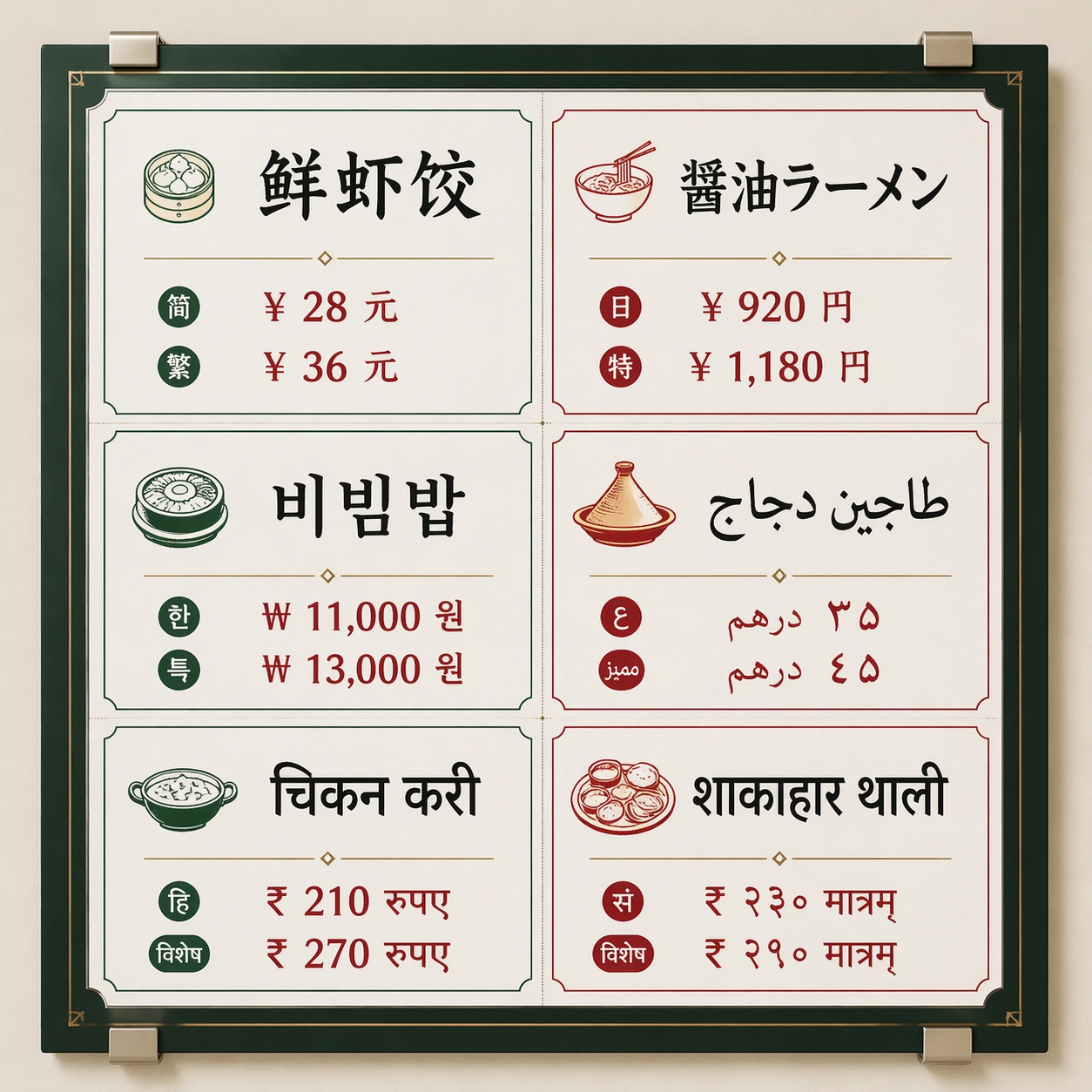
A square front-facing commercial poster photographed as a clean wall-mounted menu board inside a bright international food hall. Use crisp studio lighting, a neutral off-white wall, subtle metal clips, and a disciplined grid with generous margins. The color palette should mix charcoal ink, warm tomato red, jade green, and small brass dividers, with enough contrast for every script block to be readable.

Subject:
A multilingual market menu titled by visual hierarchy rather than brand identity: six equal menu panels arranged in two columns and three rows. Each panel contains one large dish name and two short price-like glyph groups rendered in a different writing system: simplified Chinese, Japanese kana/kanji, Korean hangul, Arabic, Devanagari Hindi, and Sanskrit-style Devanagari. Keep the panels visually parallel so the viewer can compare script density, baseline rhythm, and spacing.

Important details:
The core test is non-Latin text rendering inside a strict commercial layout. Letterforms must be clean, separated by script family, aligned to their own baselines, and not melt into decorative marks. Use real-looking menu typography with consistent padding, thin rules, small food icons, and clear typographic hierarchy. Avoid fake brand marks; make the poster feel usable as a food hall production proof.

Use case:
Multi-Script Poster single study 1/8, testing a dense six-language menu board with readable script blocks and stable grid alignment.

Constraints:
No readable text outside the specified multilingual menu copy, no watermark, no logos, preserve exact 1:1 aspect ratio, no Latin fallback labels, no random extra characters, no mirrored scripts, no misshapen baselines, no smeared letter clusters, no fake QR codes.
使用方法
- 复制完整原始提示词,并保留其中的参数。
- 按需求替换主体、文字和构图要求。
- 在兼容的外部工具中使用,核对当前使用条件并检查结果。
开始前需了解
- 先确认是否需要参考图。标注兼容模型,不代表该示例由这个模型生成。
- 核对名称、数字与画面文字;不同模型版本的结果可能不同。