原始文档
GPT Image 2 · en
Scene:
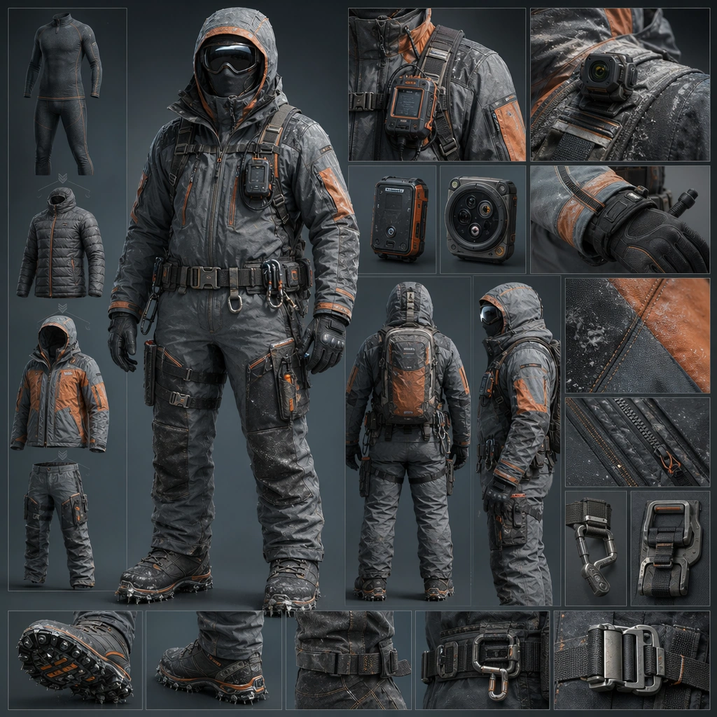
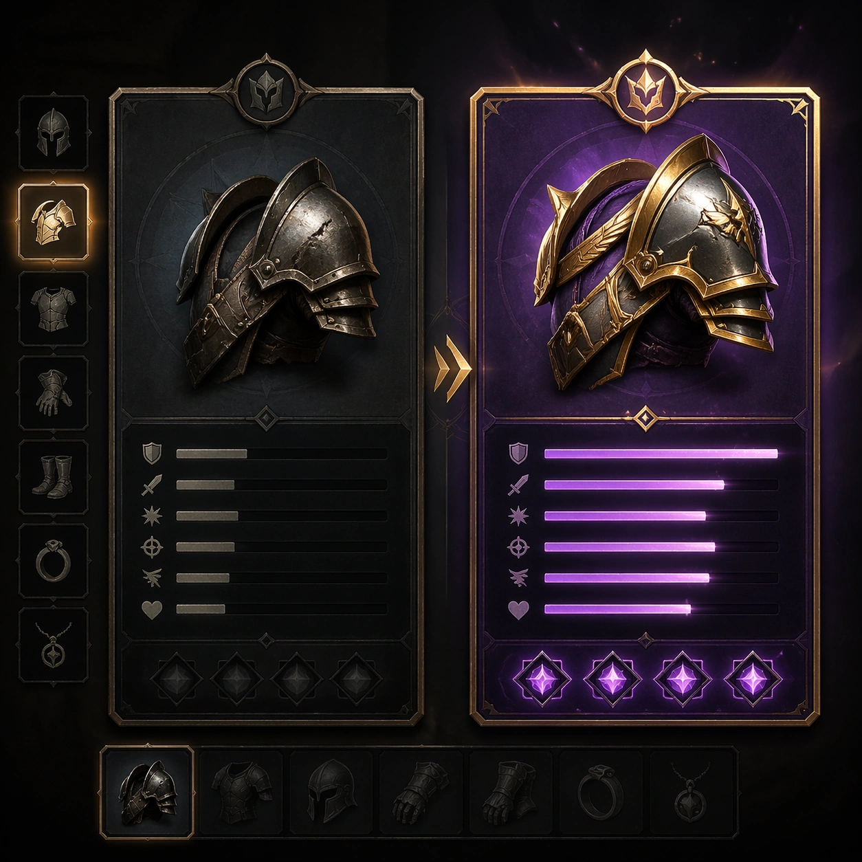
A square production-ready image designed for a game-art review wall and a commercial gallery at the same time. Frame a side-by-side old versus new gear comparison board with clear hierarchy and item desirability with disciplined lighting, clean edge separation, and enough surrounding context to prove how the asset would behave in a real product surface. The camera, crop, and tonal balance should feel intentional rather than generic, with high readability at first glance and convincing material response under closer inspection.

Subject:
Center the study on a side-by-side old versus new gear comparison board with clear hierarchy and item desirability. Translate the topic into a concrete, shippable visual statement instead of a loose mood board. Build layered object relationships, believable surface finish, and strong silhouette grouping so the image reads immediately as part of Inventory Tooltip Comparison Board. The subject should feel made for a live game pipeline: useful in store, UI, campaign, or art-review contexts, with visual hierarchy strong enough to survive aggressive cropping.

Important details:
the player’s upgrade decision should be obvious through shape, rarity framing, and stat-bar rhythm without legible text. Keep every supporting element subordinate to the main read, and make category separation obvious through form, color zoning, depth, and material logic rather than words. Where panels, cards, badges, or interface blocks appear, they must look professionally structured but remain unreadable. The visual language should feel premium, original, and coherent across this package, with no filler clutter and no accidental resemblance to a specific shipped game IP.

Use case:
Inventory Tooltip Comparison Board single study 1/9, focused on old vs new gear.

Constraints:
No readable text, no watermark, no logos, preserve exact 1:1 aspect ratio, no readable stats, no numbers, no broken hierarchy, no generic stock-photo staging, no accidental UI gibberish.
使用方法
- 复制完整原始提示词,并保留其中的参数。
- 按需求替换主体、文字和构图要求。
- 在兼容的外部工具中使用,核对当前使用条件并检查结果。
开始前需了解
- 先确认是否需要参考图。标注兼容模型,不代表该示例由这个模型生成。
- 核对名称、数字与画面文字;不同模型版本的结果可能不同。