详细说明
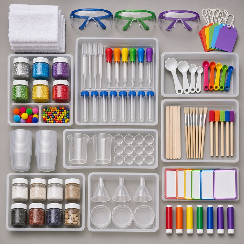
这条提示词解决的是如何把一组教学用品拍得清楚、有秩序:采用正上方视角和方形画幅,让托盘、护目镜、滴管、罐子、量勺及毛巾分组排列,再用柔和而干净的棚拍光呈现材质。它要求的是用品目录式的视觉,而不是正在进行实验的课堂照片。适合放在教学素材介绍、用品组合概念或一组教育主题图的配套位置;画面里的分区和间距,比堆进尽可能多的道具更重要。
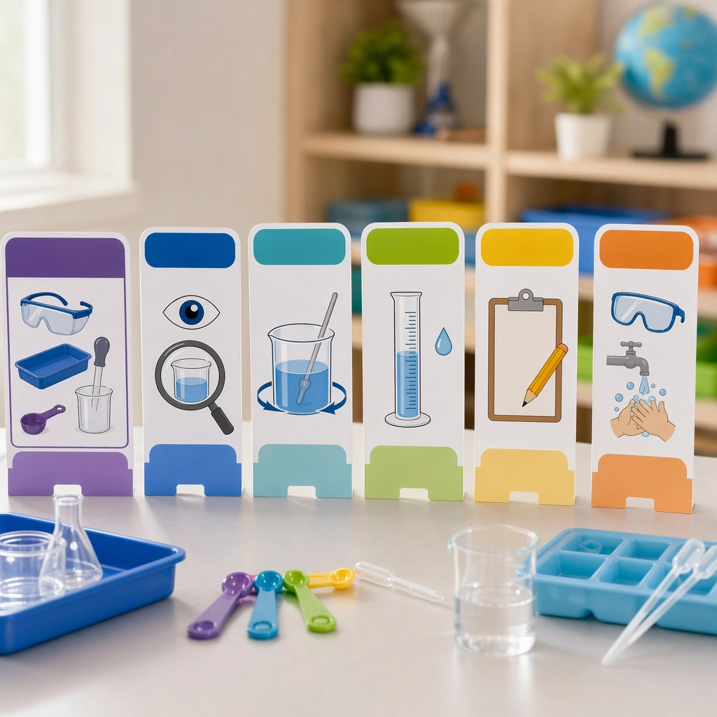
已发布预览用托盘划分滴管、量勺、杯子和其他用品,颜色在护目镜、滴管头及空白卡片之间呼应。需要改成自己的组合时,应先确定物品清单、分组和颜色规则,再一起修改场景与主体段落,保留方形画幅和无可读文字的要求。标题中的系列与第几张研究图只是来源背景,当前记录未声明必须输入其他系列图片。预览是生成的视觉概念,不能用来确认实际包装数量、产品认证或实验步骤。
需要准备什么
- 完整原提示词,以及需要展示的教学用品清单和分组。
- 统一的配色、背景与材质要求;若要加品牌文案,另备经过核对的文字。
- 能接收该文本的外部图像工具及方形输出设置;此记录未声明必需的参考图片。
可以得到什么
- 正上方观察、用品分区清楚的方形视觉概念图。
- 用空白色签或卡片组织信息的配套用品图,而非已排好文字的海报文件。
- 供人工继续核对物品、文字与最终用途的图像候选。
使用步骤
- 先明确用途是用品组合展示还是教育主题配图,列出必要物品与托盘分组,避免把画面改成拥挤的实验现场。
- 在场景和主体两段同步替换物品与配色,保留正上方视角、干净棚拍光和准确的1:1画幅。
- 保留无可读文字、无水印和无品牌标志等约束;需要真实标题或标签时,使用空白区域在后续排版中添加。
- 逐组检查物品数量、托盘边界、透明容器、量勺和护目镜的形状,确认留白和颜色呼应,再决定采用哪张候选。
限制与检查
- 原文描述的视觉方向不保证每次结果都完全相同;这里展示的是作者发布的预览,没有宣称独立复现。
- 检查滴管、杯口、勺柄等重复小物件是否粘连或变形,空白卡片是否出现不需要的文字或标志。
- 真实用品清单、教学内容和使用条件需要另行核对;生成图里的护目镜与整齐摆放不等于产品认证或实际实验记录。
常见问题
这是不是一套可以直接授课的实验方案?
不是。原提示词规定的是用品、光线、分组和画面约束,没有实验配方、步骤或经过验证的教学结果。它适合作为视觉素材概念,实际教学内容另行准备。
必须上传同系列的其他图片吗?
当前记录未声明必须的参考图片或生成依赖。来源里的系列名和single study 2/5描述这张配套图的位置,不能据此推定其他图片是输入要求。
可以直接生成带说明文字的海报吗?
原文明确要求没有可读文字,并用空白色签代替标签。若要用于真实海报,先检查图像,再在排版工具中添加核对过的标题和说明;生成图片不等于可编辑的版面文件。
原始文档
GPT Image 2 · en
Scene:
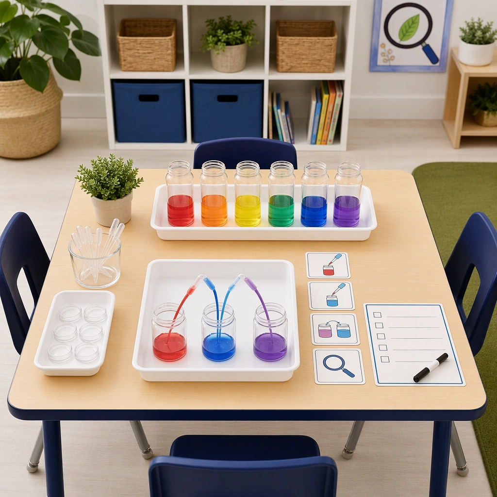
Create a square overhead flatlay on a neutral lab-classroom surface with trays, goggles, droppers, jars, spoons, towels, and colorful experiment tools carefully spaced under clean studio light. The image should feel like a trustworthy school-supply bundle, not a messy science-table snapshot. Keep the square frame balanced, calm, and production-ready so the asset can serve gallery review, research comparison, and real educational delivery at the same time.

Subject:
Make each tool child-safe and easy to understand visually, with grouped components suggesting different experiment types and blank color-coded markers standing in for labels. The arrangement should imply readiness, organization, and repeat classroom use. The subject arrangement should feel complete and self-contained, able to stand alone as a real supporting deliverable inside the same education business line.

Important details:
Keep the hierarchy clear and catalog-ready. Surfaces should be clean, materials tactile, and the entire kit should feel more like an education product than a generic craft assortment. Keep the visual hierarchy modular, commercially believable, and clearly tied to a real educational use case rather than a generic mood board.

Use case:
Science Kids Experiment Poster System single study 2/5, safety supply flatlay.

Constraints:
No readable text, no watermark, no logos, preserve exact 1:1 aspect ratio, no readable text, no brand logos, no unsafe flames, no dangerous chemicals, no crowded lab realism, no cluttered props.