提示词库 · 创作探索

提示词库

探索真实提示词和对应生成示例,按任务找到灵感,免费复制完整提示词,开启下一次创作。

示例
10,974
模型
17
来源
1277
10,974 条提示词示例 · 第 14 / 229 页
Example generated from “Virtual Try On Identity Lock — Sportswear Lock”
GPT Image 2en

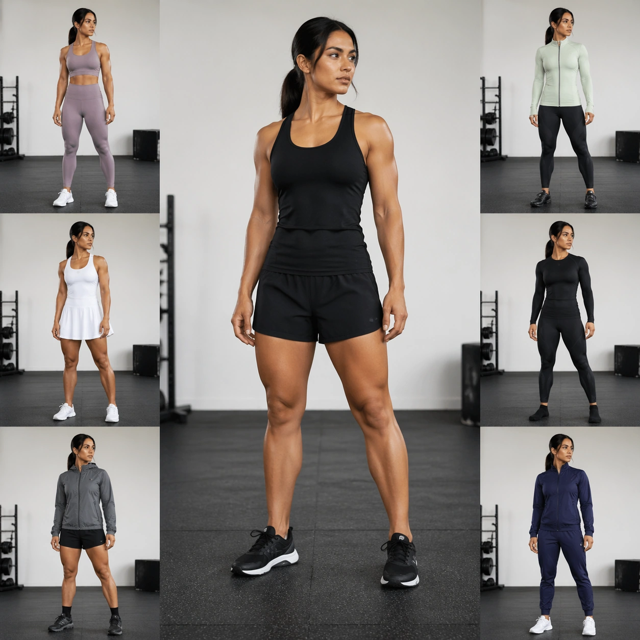
Scene: A square athletic try-on analysis board in a bright training studio with matte rubber flooring, white walls, and clean overhead light. The layout uses one large center figure and six smaller motion-adjacent outfit poses around it, all kept close to the same body angle so identity comparison is possible. The board feels like a sportswear fit test, not an action poster. Subject: A synthetic adult model with tan skin, long black hair tied in a low ponytail, heart-shaped face, strong eyebrows, compact muscular build, and confident neutral expression. The baseline is a plain black fitted tank and shorts. Outfit changes include running kit, yoga set, cycling jacket and leggings, tennis dress, hiking shell, compression recovery layer, and warm-up tracksuit. The same face, ponytail placement, muscle definition, shoulder width, hip width, and limb length must appear in every variant. Important details: Preserve identity during fitted garment changes, where body drift is easy to see. Keep the same jawline, brow, eye shape, nose, mouth, neck tendons, collarbones, hand structure, thigh shape, and calf proportion. Sportswear should show believable stretch, compression, seam placement, breathable mesh, and fabric tension without painting new anatomy. Do not let dynamic clothing or pose changes create a different athlete. Use case: Virtual Try-On Identity Lock single study 5/8, testing activewear edits while preserving one athletic model. Constraints: No readable text, no watermark, no logos, preserve exact 1:1 aspect ratio, no brand marks, no changed muscles, no face swap, no skin tone shift, no ponytail change, no extra athlete, no impossible joints, no oversexualized styling, no floating garments.
Example generated from “Virtual Try On Identity Lock — Eveningwear Lock”
GPT Image 2en

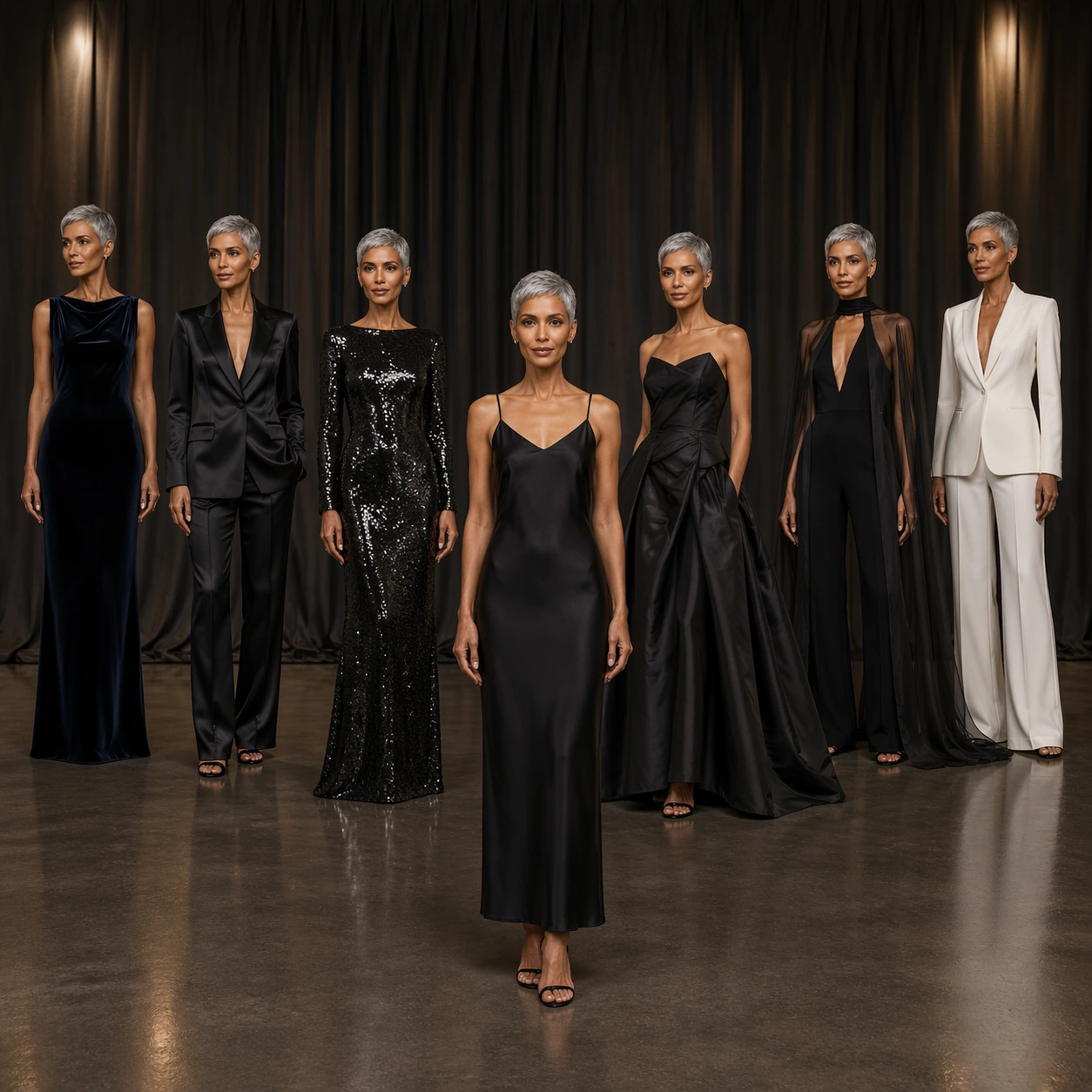
Scene: A square eveningwear virtual fitting board in a softly lit atelier with charcoal drapes, a polished concrete floor, and warm pin lights catching fabric surfaces. Seven full-body garment states are arranged in a graceful arc around a central baseline figure. The image is elegant and controlled, with enough negative space to compare silhouette and identity. Subject: A synthetic adult model with light brown skin, silver-gray pixie haircut, angular cheekbones, narrow nose, fine mouth, tall lean body, and poised hands. The baseline outfit is a simple black slip dress. Try-on looks include velvet column gown, satin tuxedo, sequined long-sleeve dress, sculptural taffeta skirt, sheer cape over tailored jumpsuit, beadwork cocktail dress, and minimalist white evening suit. The same mature face, hair shape, skin tone, height, arm length, hand pose, and composed expression must carry through all looks. Important details: Eveningwear often changes the perceived body; prevent that drift. Preserve cheekbone angle, eye spacing, hairline, ear visibility, neck length, clavicle placement, wrist scale, waist height, and foot stance. Let garments create volume through fabric only, not by resizing the person. Show realistic reflective materials: velvet absorbs light, satin glows, sequins sparkle, taffeta holds crisp folds. Avoid glamour retouching that makes the model younger or changes identity. Use case: Virtual Try-On Identity Lock single study 6/8, testing formalwear transformation with stable age, face, and body. Constraints: No readable text, no watermark, no logos, preserve exact 1:1 aspect ratio, no brand marks, no age change, no face smoothing, no body elongation, no changed haircut, no extra guests, no stage signage, no impossible fabric clipping.

Example generated from “Virtual Try On Identity Lock — Heritage Textile Lock”
GPT Image 2en

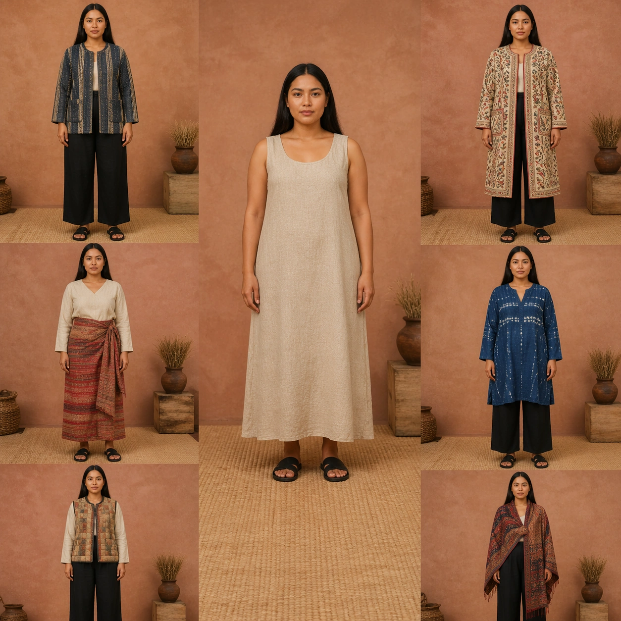
Scene: A square textile-focused try-on board photographed like a museum fashion archive, with soft daylight, muted clay background, woven floor mat, and close enough detail to inspect fabric without losing full-body identity. The layout has one central source-like standing figure and six surrounding garment variations, each in the same calm pose and scale. Subject: A synthetic adult model with golden-brown skin, long straight dark hair parted in the center, round cheeks, straight brows, medium height, soft body, and gentle neutral expression. Clothing changes explore heritage-inspired textiles without copying any specific sacred or ceremonial dress: handwoven jacket, embroidered long coat, pleated wrap skirt, indigo resist-dye tunic, quilted vest, patterned shawl over simple trousers, and textured wool dress. The model's face, hair part, skin tone, body softness, hand shape, and stance must stay identical. Important details: Keep cultural textile cues respectful and generalized: craft detail, weave, embroidery, dye, quilting, fringe, and layered cloth, with no readable symbols or official insignia. Identity lock must survive dense patterning. Preserve eye shape, nose, lips, chin, cheek volume, shoulder curve, waist location, leg length, and hair length. Patterns may change garment surfaces but must not crawl onto skin or alter facial features. Use case: Virtual Try-On Identity Lock single study 7/8, testing ornate textile replacement while preserving one model identity. Constraints: No readable text, no watermark, no logos, preserve exact 1:1 aspect ratio, no sacred symbols, no national flags, no costume caricature, no changed face, no changed body, no altered hair part, no extra people, no pattern bleeding onto skin.

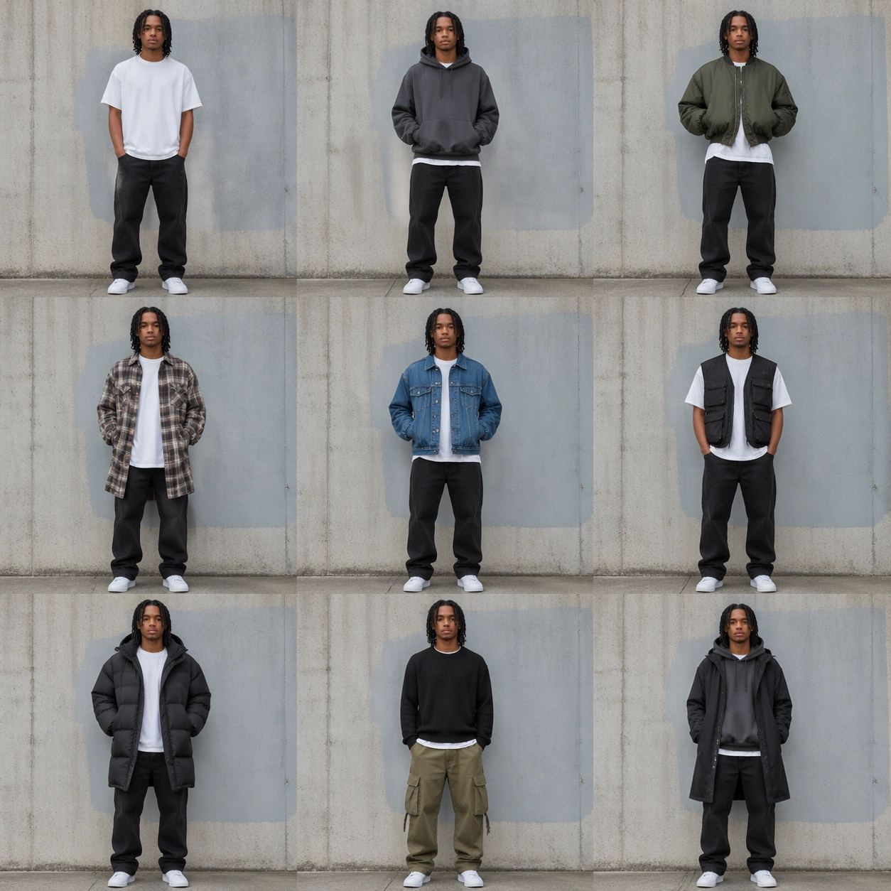
Example generated from “Virtual Try On Identity Lock — Streetwear Layer Lock”
GPT Image 2en

Scene: A square urban streetwear try-on board set against a clean concrete wall with soft overcast light and a faint painted color field that contains no letters. The composition uses a 3 by 3 contact-sheet rhythm: one baseline outfit and eight layered variations, all full-body and aligned to the same floor line. The visual style is sharp, photoreal, and youth-fashion editorial. Subject: A synthetic adult model with medium-dark skin, shoulder-length twists, rectangular face, wide-set eyes, small nose ring, average build, and easy relaxed posture. The baseline is a blank white tee, black jeans, and plain sneakers. Layered variations include oversized hoodie, cropped bomber, long plaid overshirt, denim jacket, technical vest, puffer coat, cargo trousers with knit, and monochrome layered streetwear. The same face, twists, nose ring, skin tone, shoulder width, torso length, and sneaker scale must remain fixed. Important details: Streetwear layering creates strong silhouette changes, but identity cannot drift. Preserve facial landmarks, hair texture and length, nose ring position, ear visibility, neck, hand size, body mass, hip height, and leg proportions. Garments may be oversized, stacked, or cropped, but should drape over the same underlying person. Keep fabric edges, hoods, sleeves, cuffs, pockets, and hems crisp without covering the face in a way that hides identity. Use case: Virtual Try-On Identity Lock single study 8/8, testing layered streetwear variation while maintaining one locked identity. Constraints: No readable text, no watermark, no logos, preserve exact 1:1 aspect ratio, no graffiti letters, no brand marks, no changed face, no changed hair, no removed nose ring, no body resizing, no extra people, no masked face, no distorted pockets or shoes.

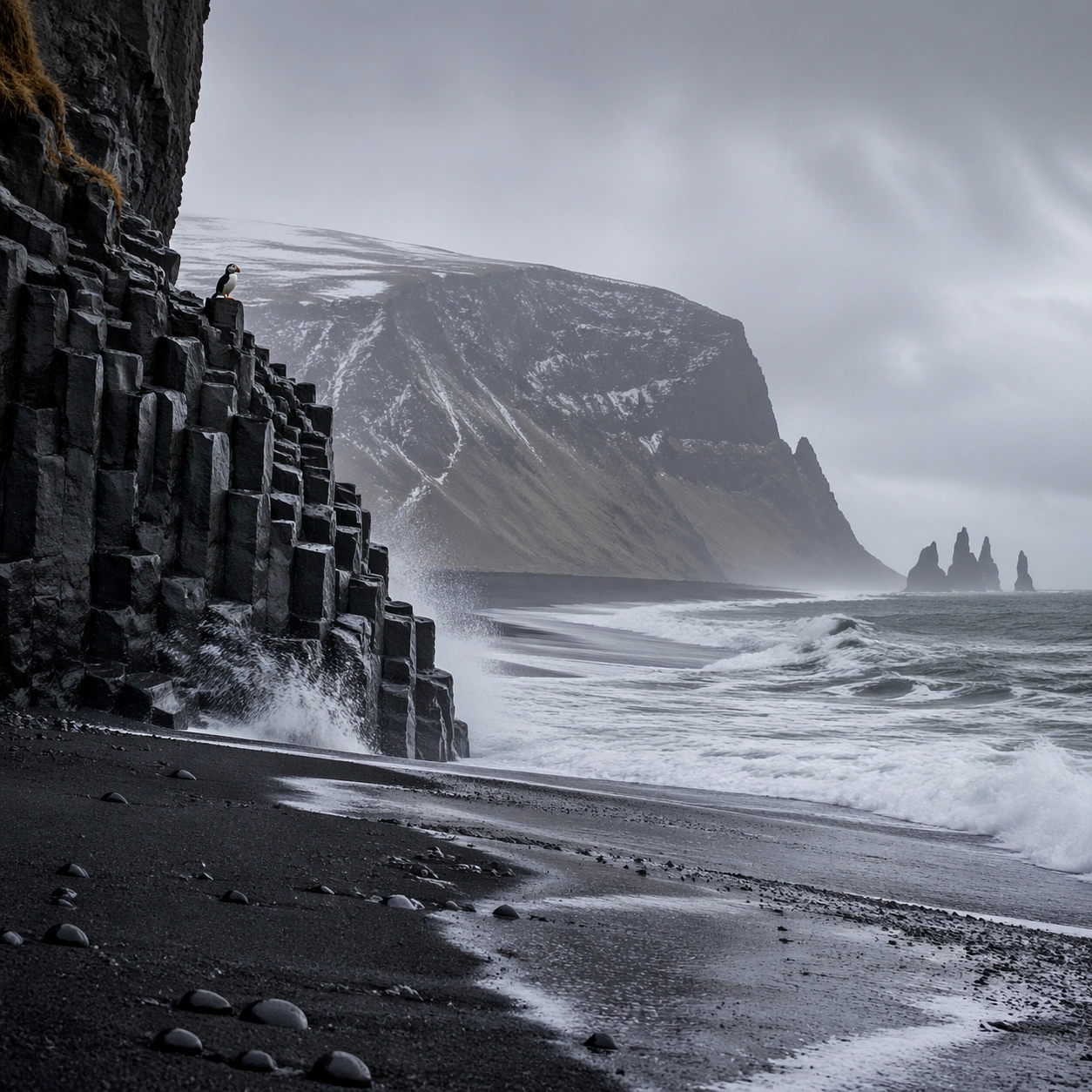
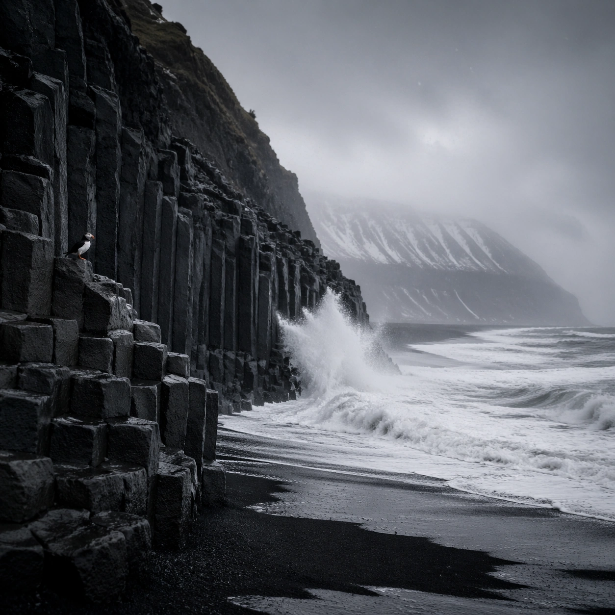
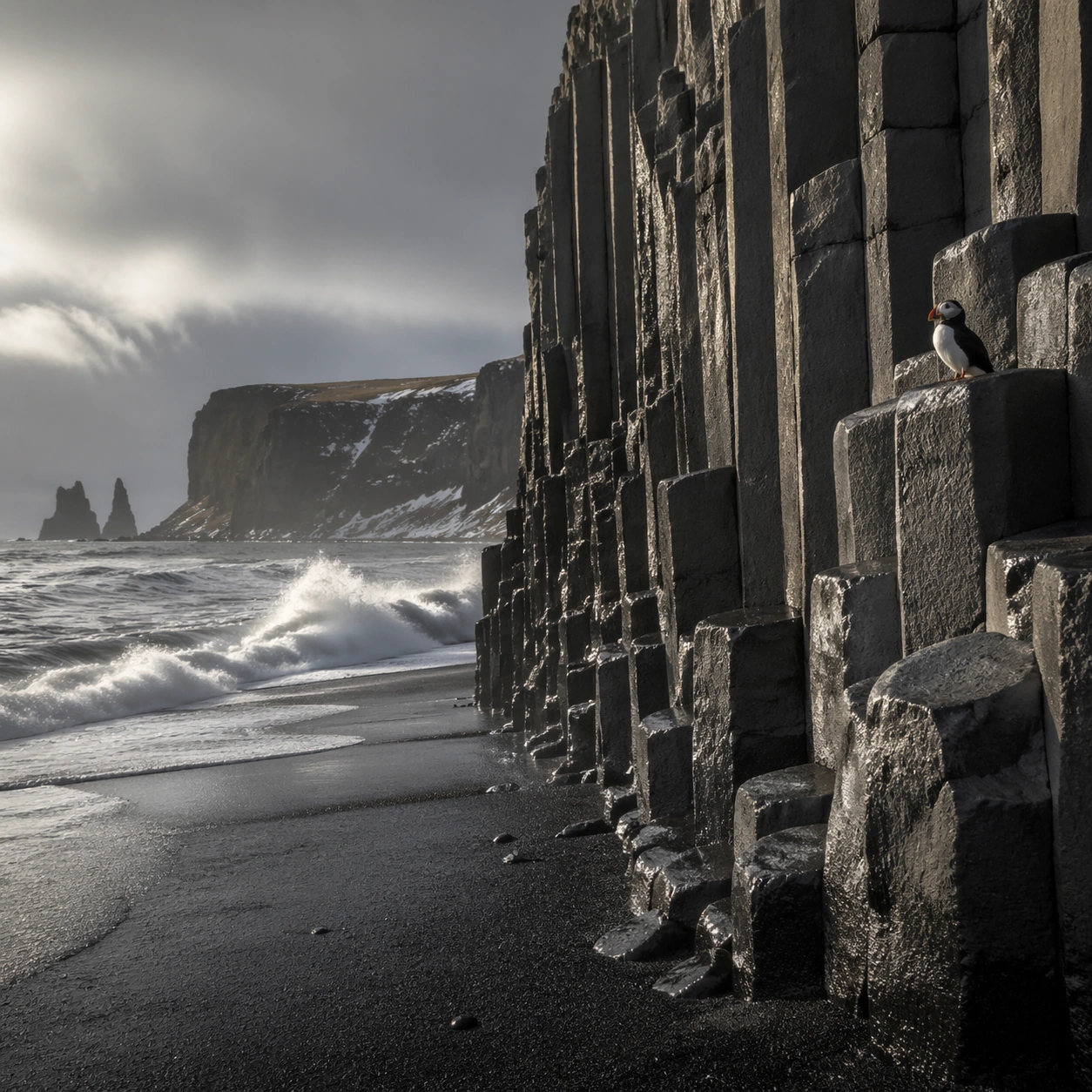
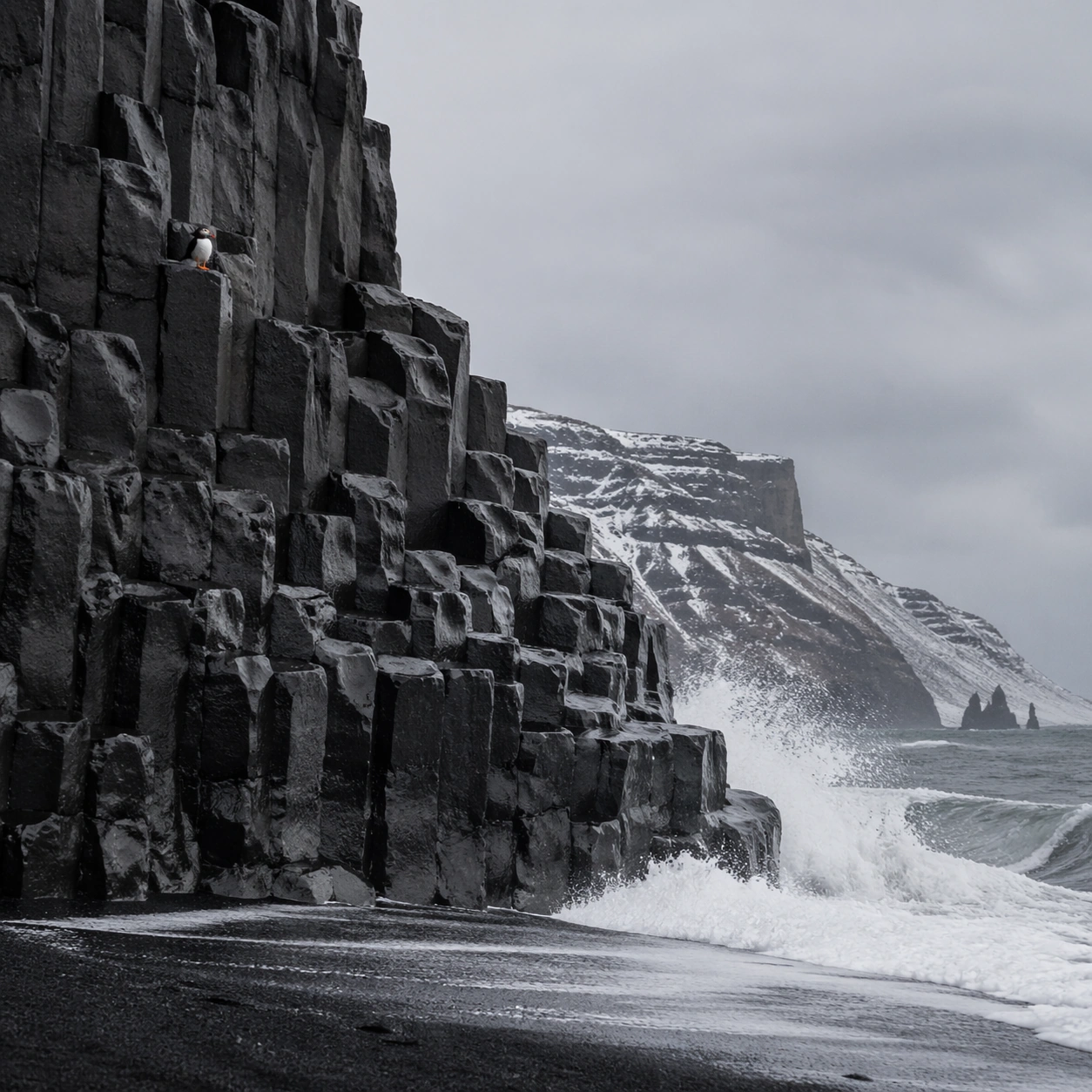
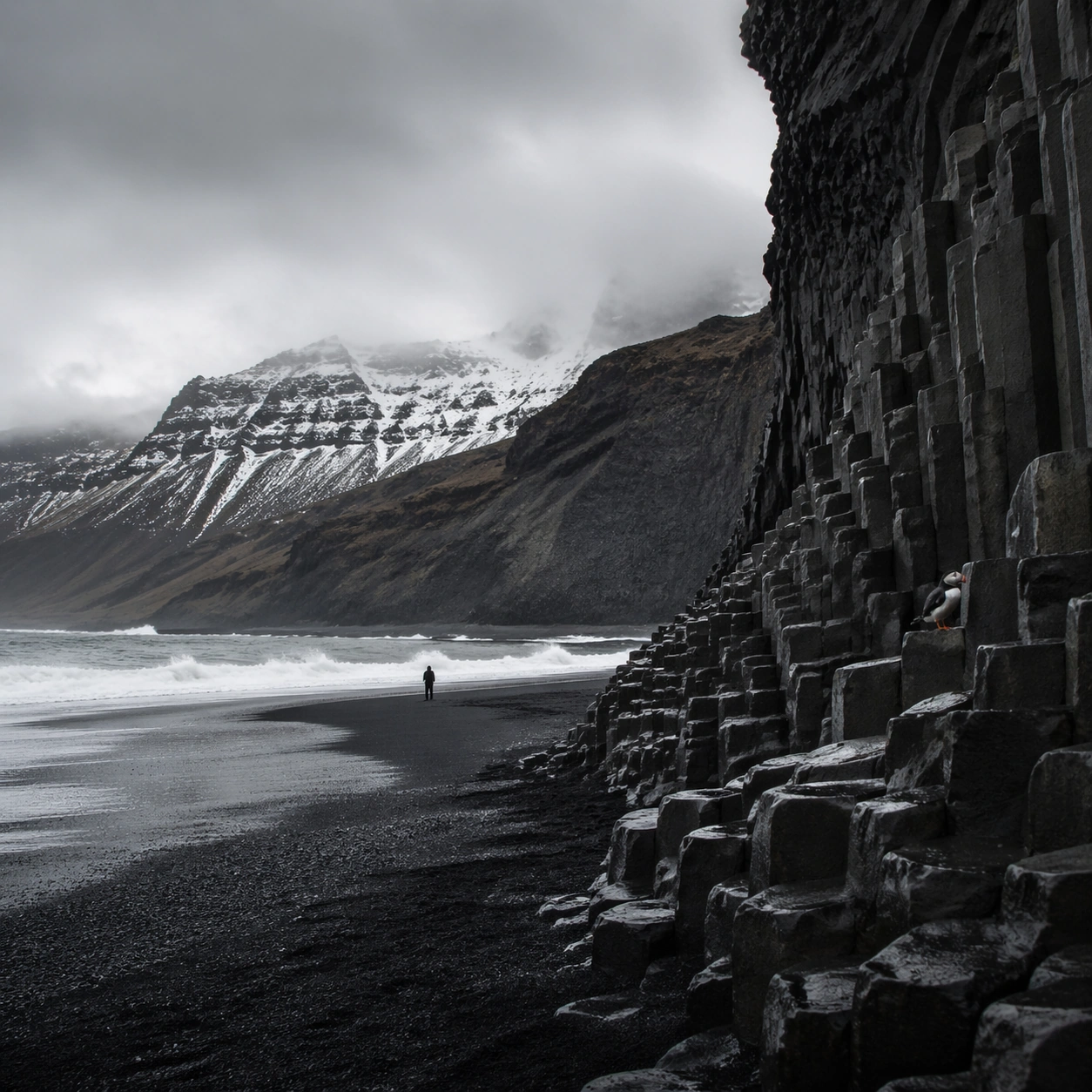
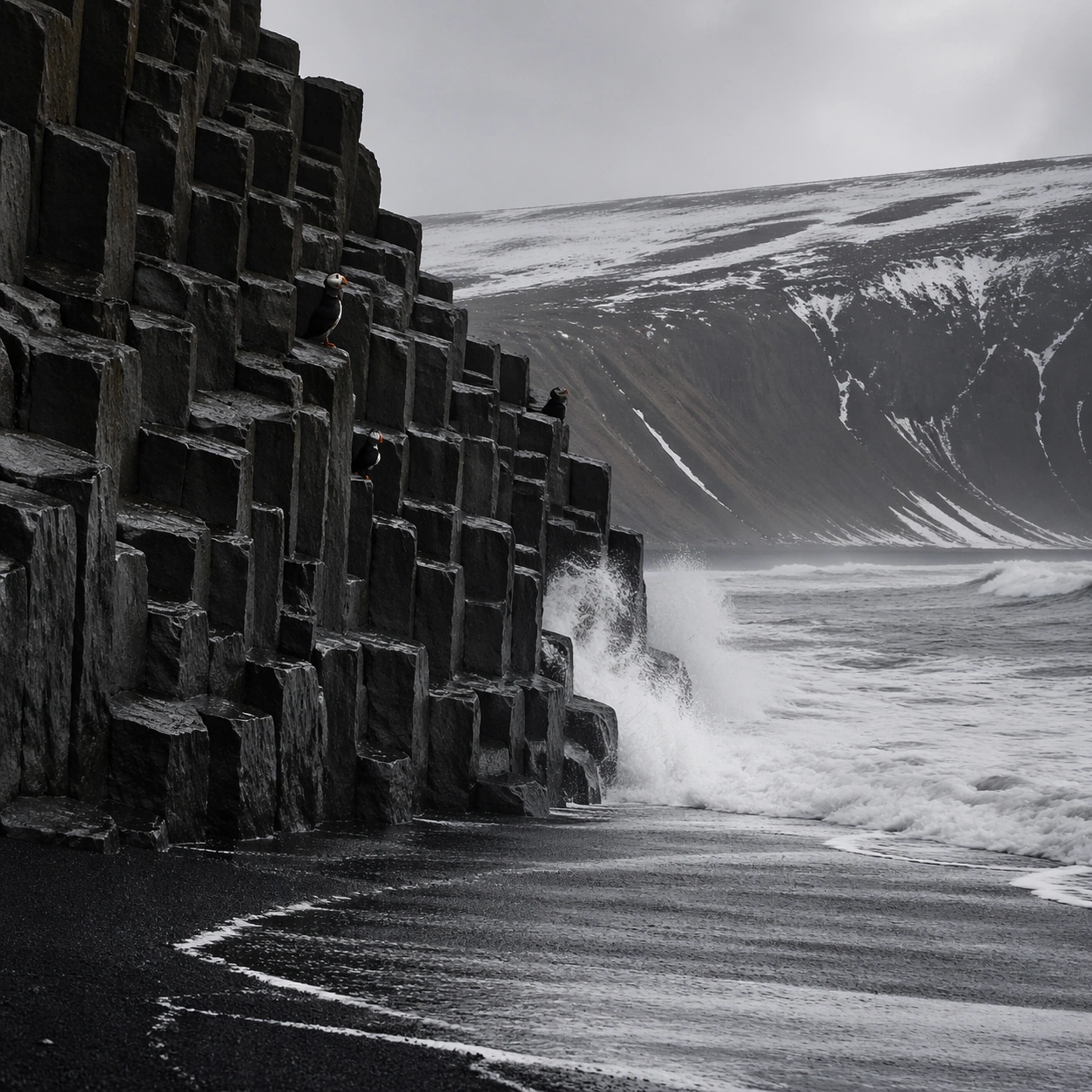
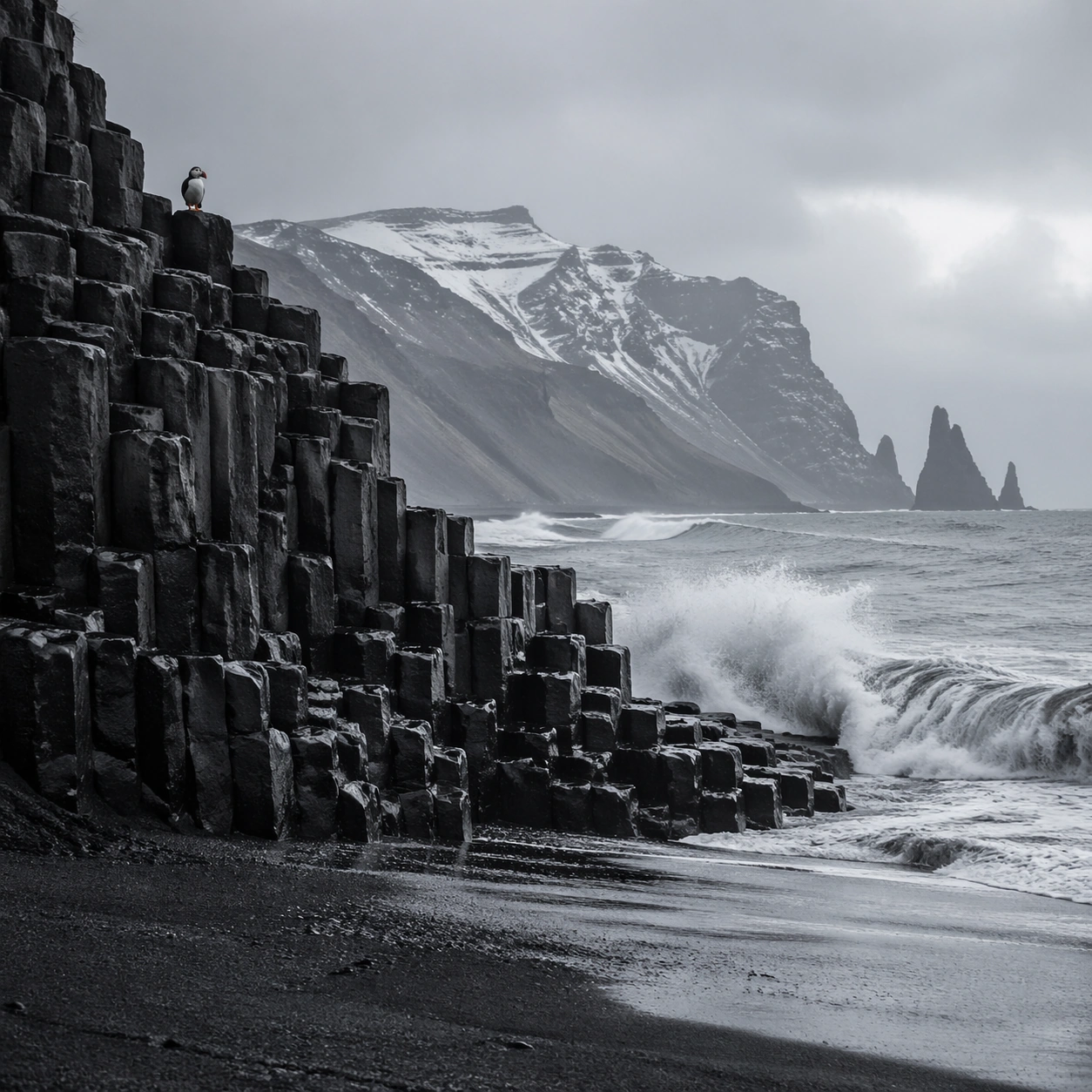
Example generated from “Volcanic Iceland Black Beach — Main Panorama”
GPT Image 2en

Scene: Create a square, photoreal landscape study of icelandic black beach basalt. Compose it as the clearest monument-scale establishing view, using a wide, level camera position with deep atmospheric recession and a calm, authoritative horizon. Let broad, sculpting natural light describe the major masses before it picks out the smaller details Keep the frame cinematic but disciplined, with a clear foreground, middle distance, and far mass so the viewer can measure real depth. The image should feel like a field photograph made with patience, precision, and sublime restraint rather than a fantasy matte painting. Subject: Show an Icelandic black sand beach with hexagonal basalt column cliffs, white Atlantic surf breaking against the columns, wet volcanic sand, and a single puffin perched on a ledge. This variation should emphasize hero panorama. The main landform must dominate the composition, but secondary elements should quietly explain how the place works: water paths, sediment lines, snow bands, surf, ash, wind streaks, stars, or human traces where appropriate. Everything in the image should support the same idea of scale and climate, so the scene reads as one coherent environment rather than a stack of spectacular details. Important details: Preserve basalt hexagon rhythm, wet black mineral surfaces, cold gray weather, convincing surf impact, and the precise natural geometry that makes the coast feel both severe and elegant. Keep one dominant landform, one secondary supporting rhythm, and a restrained scale witness so the scene reads immediately. Keep geology, weather, and atmosphere physically believable. Use subtle micro-texture, tonal separation, and air perspective to reinforce distance. If a human, vehicle, tent, caravan, bird, or boat appears, it must remain tiny and subordinate to the landscape, functioning only as a scale witness. The composition should feel original, severe, and elegant, with no decorative filler and no imitation of any copyrighted visual property. Use case: Icelandic Black Beach Basalt single study 1/9, exploring the hero panorama variation. Constraints: No readable text, no watermark, no logos, preserve exact 1:1 aspect ratio, no tourists, no colorful umbrellas, no seaside town, no tropical blue water, no split-screen layout, no collage fragments, no exaggerated fisheye distortion, no kitsch color grading, no artificial border, no split-panel treatment.

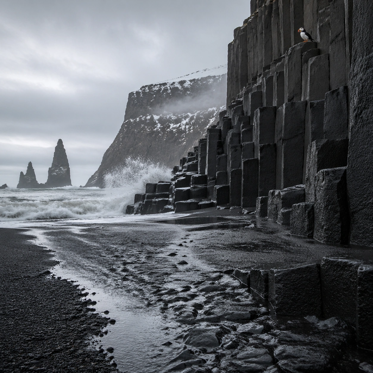
Example generated from “Volcanic Iceland Black Beach — Foreground Path”
GPT Image 2en

Scene: Create a square, photoreal landscape study of icelandic black beach basalt. Compose it as a ground-level entry path that pulls the viewer into the terrain, using a lower vantage with a strong foreground element such as a ridge line, shoreline, stream, boot track, or wet surface leading inward. Let the foreground remain tactile and detailed while the distance opens gradually Keep the frame cinematic but disciplined, with a clear foreground, middle distance, and far mass so the viewer can measure real depth. The image should feel like a field photograph made with patience, precision, and sublime restraint rather than a fantasy matte painting. Subject: Show an Icelandic black sand beach with hexagonal basalt column cliffs, white Atlantic surf breaking against the columns, wet volcanic sand, and a single puffin perched on a ledge. This variation should emphasize foreground-led composition. The main landform must dominate the composition, but secondary elements should quietly explain how the place works: water paths, sediment lines, snow bands, surf, ash, wind streaks, stars, or human traces where appropriate. Everything in the image should support the same idea of scale and climate, so the scene reads as one coherent environment rather than a stack of spectacular details. Important details: Preserve basalt hexagon rhythm, wet black mineral surfaces, cold gray weather, convincing surf impact, and the precise natural geometry that makes the coast feel both severe and elegant. The image should reward close looking through layered depth cues rather than pure spectacle alone. Keep geology, weather, and atmosphere physically believable. Use subtle micro-texture, tonal separation, and air perspective to reinforce distance. If a human, vehicle, tent, caravan, bird, or boat appears, it must remain tiny and subordinate to the landscape, functioning only as a scale witness. The composition should feel original, severe, and elegant, with no decorative filler and no imitation of any copyrighted visual property. Use case: Icelandic Black Beach Basalt single study 2/9, exploring the foreground-led composition variation. Constraints: No readable text, no watermark, no logos, preserve exact 1:1 aspect ratio, no tourists, no colorful umbrellas, no seaside town, no tropical blue water, no blocked foreground, no random props, no awkward dead zone in the lower third, no kitsch color grading, no artificial border, no split-panel treatment.

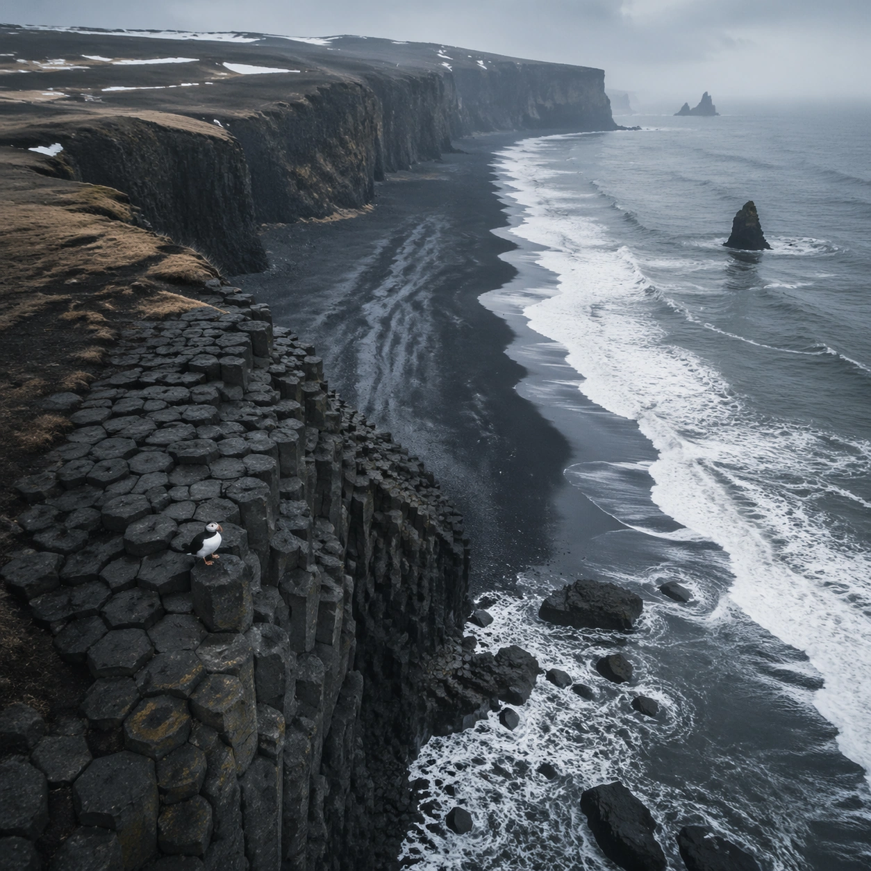
Example generated from “Volcanic Iceland Black Beach — Aerial Geometry”
GPT Image 2en

Scene: Create a square, photoreal landscape study of icelandic black beach basalt. Compose it as the planform geometry and overall shape logic of the landscape, using an elevated oblique aerial view that still preserves believable scale and natural topography. Let light reveal contour, fracture, and pattern instead of flattening the terrain Keep the frame cinematic but disciplined, with a clear foreground, middle distance, and far mass so the viewer can measure real depth. The image should feel like a field photograph made with patience, precision, and sublime restraint rather than a fantasy matte painting. Subject: Show an Icelandic black sand beach with hexagonal basalt column cliffs, white Atlantic surf breaking against the columns, wet volcanic sand, and a single puffin perched on a ledge. This variation should emphasize aerial scale read. The main landform must dominate the composition, but secondary elements should quietly explain how the place works: water paths, sediment lines, snow bands, surf, ash, wind streaks, stars, or human traces where appropriate. Everything in the image should support the same idea of scale and climate, so the scene reads as one coherent environment rather than a stack of spectacular details. Important details: Preserve basalt hexagon rhythm, wet black mineral surfaces, cold gray weather, convincing surf impact, and the precise natural geometry that makes the coast feel both severe and elegant. Emphasize rhythm, repetition, and large-form geometry without losing physical realism. Keep geology, weather, and atmosphere physically believable. Use subtle micro-texture, tonal separation, and air perspective to reinforce distance. If a human, vehicle, tent, caravan, bird, or boat appears, it must remain tiny and subordinate to the landscape, functioning only as a scale witness. The composition should feel original, severe, and elegant, with no decorative filler and no imitation of any copyrighted visual property. Use case: Icelandic Black Beach Basalt single study 3/9, exploring the aerial scale read variation. Constraints: No readable text, no watermark, no logos, preserve exact 1:1 aspect ratio, no tourists, no colorful umbrellas, no seaside town, no tropical blue water, no map labels, no diagram arrows, no satellite-interface graphics, no kitsch color grading, no artificial border, no split-panel treatment.

Example generated from “Volcanic Iceland Black Beach — Atmosphere Event”
GPT Image 2en

Scene: Create a square, photoreal landscape study of icelandic black beach basalt. Compose it as the moment when weather, particles, or moving air become the main dramatic agent, using a stable documentary framing that lets the environmental event stay legible. Let the air itself carry visible density through haze, spray, ash, dust, snow, or storm structure Keep the frame cinematic but disciplined, with a clear foreground, middle distance, and far mass so the viewer can measure real depth. The image should feel like a field photograph made with patience, precision, and sublime restraint rather than a fantasy matte painting. Subject: Show an Icelandic black sand beach with hexagonal basalt column cliffs, white Atlantic surf breaking against the columns, wet volcanic sand, and a single puffin perched on a ledge. This variation should emphasize weather-driven study. The main landform must dominate the composition, but secondary elements should quietly explain how the place works: water paths, sediment lines, snow bands, surf, ash, wind streaks, stars, or human traces where appropriate. Everything in the image should support the same idea of scale and climate, so the scene reads as one coherent environment rather than a stack of spectacular details. Important details: Preserve basalt hexagon rhythm, wet black mineral surfaces, cold gray weather, convincing surf impact, and the precise natural geometry that makes the coast feel both severe and elegant. The atmosphere must feel physically plausible and tied to terrain, wind direction, temperature, and moisture. Keep geology, weather, and atmosphere physically believable. Use subtle micro-texture, tonal separation, and air perspective to reinforce distance. If a human, vehicle, tent, caravan, bird, or boat appears, it must remain tiny and subordinate to the landscape, functioning only as a scale witness. The composition should feel original, severe, and elegant, with no decorative filler and no imitation of any copyrighted visual property. Use case: Icelandic Black Beach Basalt single study 4/9, exploring the weather-driven study variation. Constraints: No readable text, no watermark, no logos, preserve exact 1:1 aspect ratio, no tourists, no colorful umbrellas, no seaside town, no tropical blue water, no disaster-movie excess, no impossible lightning clutter, no synthetic smoke plumes, no kitsch color grading, no artificial border, no split-panel treatment.

Example generated from “Volcanic Iceland Black Beach — Light Contrast”
GPT Image 2en

Scene: Create a square, photoreal landscape study of icelandic black beach basalt. Compose it as directional light carving sharp separation between illuminated and shadowed forms, using a composition built around light falloff, shadow shape, and reflective control rather than camera gimmicks. Let one strong light source create crisp hierarchy and believable color temperature shifts Keep the frame cinematic but disciplined, with a clear foreground, middle distance, and far mass so the viewer can measure real depth. The image should feel like a field photograph made with patience, precision, and sublime restraint rather than a fantasy matte painting. Subject: Show an Icelandic black sand beach with hexagonal basalt column cliffs, white Atlantic surf breaking against the columns, wet volcanic sand, and a single puffin perched on a ledge. This variation should emphasize light-structure study. The main landform must dominate the composition, but secondary elements should quietly explain how the place works: water paths, sediment lines, snow bands, surf, ash, wind streaks, stars, or human traces where appropriate. Everything in the image should support the same idea of scale and climate, so the scene reads as one coherent environment rather than a stack of spectacular details. Important details: Preserve basalt hexagon rhythm, wet black mineral surfaces, cold gray weather, convincing surf impact, and the precise natural geometry that makes the coast feel both severe and elegant. Surface brightness, shadow depth, and reflected light should all agree with the material and weather conditions. Keep geology, weather, and atmosphere physically believable. Use subtle micro-texture, tonal separation, and air perspective to reinforce distance. If a human, vehicle, tent, caravan, bird, or boat appears, it must remain tiny and subordinate to the landscape, functioning only as a scale witness. The composition should feel original, severe, and elegant, with no decorative filler and no imitation of any copyrighted visual property. Use case: Icelandic Black Beach Basalt single study 5/9, exploring the light-structure study variation. Constraints: No readable text, no watermark, no logos, preserve exact 1:1 aspect ratio, no tourists, no colorful umbrellas, no seaside town, no tropical blue water, no blown highlights, no muddy blacks, no theatrical stage lighting, no kitsch color grading, no artificial border, no split-panel treatment.

Example generated from “Volcanic Iceland Black Beach — Material Close”
GPT Image 2en

Scene: Create a square, photoreal landscape study of icelandic black beach basalt. Compose it as surface texture and material transitions while still keeping the full environment recognizable, using a tighter medium-wide crop that gives more area to texture, fracture, grain, water, ice, lava, salt, or stone. Let texture remain readable without making the scene feel like a macro shot Keep the frame cinematic but disciplined, with a clear foreground, middle distance, and far mass so the viewer can measure real depth. The image should feel like a field photograph made with patience, precision, and sublime restraint rather than a fantasy matte painting. Subject: Show an Icelandic black sand beach with hexagonal basalt column cliffs, white Atlantic surf breaking against the columns, wet volcanic sand, and a single puffin perched on a ledge. This variation should emphasize material realism check. The main landform must dominate the composition, but secondary elements should quietly explain how the place works: water paths, sediment lines, snow bands, surf, ash, wind streaks, stars, or human traces where appropriate. Everything in the image should support the same idea of scale and climate, so the scene reads as one coherent environment rather than a stack of spectacular details. Important details: Preserve basalt hexagon rhythm, wet black mineral surfaces, cold gray weather, convincing surf impact, and the precise natural geometry that makes the coast feel both severe and elegant. Micro-texture, edge wear, wetness, frost, dust, foam, or sediment should deepen realism rather than distract from scale. Keep geology, weather, and atmosphere physically believable. Use subtle micro-texture, tonal separation, and air perspective to reinforce distance. If a human, vehicle, tent, caravan, bird, or boat appears, it must remain tiny and subordinate to the landscape, functioning only as a scale witness. The composition should feel original, severe, and elegant, with no decorative filler and no imitation of any copyrighted visual property. Use case: Icelandic Black Beach Basalt single study 6/9, exploring the material realism check variation. Constraints: No readable text, no watermark, no logos, preserve exact 1:1 aspect ratio, no tourists, no colorful umbrellas, no seaside town, no tropical blue water, no extreme macro abstraction, no plastic-looking surfaces, no shallow depth-of-field blur, no kitsch color grading, no artificial border, no split-panel treatment.

Example generated from “Volcanic Iceland Black Beach — Scale Witness”
GPT Image 2en

Scene: Create a square, photoreal landscape study of icelandic black beach basalt. Compose it as a tiny human, animal, tent, vehicle, or craft that reveals the vastness of the environment, using a balanced frame where the witness remains small but unmistakable. Let the scale marker stay visible without becoming the true subject Keep the frame cinematic but disciplined, with a clear foreground, middle distance, and far mass so the viewer can measure real depth. The image should feel like a field photograph made with patience, precision, and sublime restraint rather than a fantasy matte painting. Subject: Show an Icelandic black sand beach with hexagonal basalt column cliffs, white Atlantic surf breaking against the columns, wet volcanic sand, and a single puffin perched on a ledge. This variation should emphasize scale comparison. The main landform must dominate the composition, but secondary elements should quietly explain how the place works: water paths, sediment lines, snow bands, surf, ash, wind streaks, stars, or human traces where appropriate. Everything in the image should support the same idea of scale and climate, so the scene reads as one coherent environment rather than a stack of spectacular details. Important details: Preserve basalt hexagon rhythm, wet black mineral surfaces, cold gray weather, convincing surf impact, and the precise natural geometry that makes the coast feel both severe and elegant. The viewer should understand the environment first and the witness second, with clean spatial separation between them. Keep geology, weather, and atmosphere physically believable. Use subtle micro-texture, tonal separation, and air perspective to reinforce distance. If a human, vehicle, tent, caravan, bird, or boat appears, it must remain tiny and subordinate to the landscape, functioning only as a scale witness. The composition should feel original, severe, and elegant, with no decorative filler and no imitation of any copyrighted visual property. Use case: Icelandic Black Beach Basalt single study 7/9, exploring the scale comparison variation. Constraints: No readable text, no watermark, no logos, preserve exact 1:1 aspect ratio, no tourists, no colorful umbrellas, no seaside town, no tropical blue water, no crowd scenes, no heroic close-up character framing, no busy gear pile, no kitsch color grading, no artificial border, no split-panel treatment.

Example generated from “Volcanic Iceland Black Beach — Abstract Rhythm”
GPT Image 2en

Scene: Create a square, photoreal landscape study of icelandic black beach basalt. Compose it as the near-abstract rhythm of repeated natural forms, lines, and tonal bands, using a disciplined crop that approaches abstraction while remaining unmistakably a real place. Let shape and tonal cadence dominate before small narrative details Keep the frame cinematic but disciplined, with a clear foreground, middle distance, and far mass so the viewer can measure real depth. The image should feel like a field photograph made with patience, precision, and sublime restraint rather than a fantasy matte painting. Subject: Show an Icelandic black sand beach with hexagonal basalt column cliffs, white Atlantic surf breaking against the columns, wet volcanic sand, and a single puffin perched on a ledge. This variation should emphasize formal composition study. The main landform must dominate the composition, but secondary elements should quietly explain how the place works: water paths, sediment lines, snow bands, surf, ash, wind streaks, stars, or human traces where appropriate. Everything in the image should support the same idea of scale and climate, so the scene reads as one coherent environment rather than a stack of spectacular details. Important details: Preserve basalt hexagon rhythm, wet black mineral surfaces, cold gray weather, convincing surf impact, and the precise natural geometry that makes the coast feel both severe and elegant. Pattern, repetition, and negative space should feel discovered in nature, not graphically imposed. Keep geology, weather, and atmosphere physically believable. Use subtle micro-texture, tonal separation, and air perspective to reinforce distance. If a human, vehicle, tent, caravan, bird, or boat appears, it must remain tiny and subordinate to the landscape, functioning only as a scale witness. The composition should feel original, severe, and elegant, with no decorative filler and no imitation of any copyrighted visual property. Use case: Icelandic Black Beach Basalt single study 8/9, exploring the formal composition study variation. Constraints: No readable text, no watermark, no logos, preserve exact 1:1 aspect ratio, no tourists, no colorful umbrellas, no seaside town, no tropical blue water, no graphic overlays, no surreal floating elements, no ornamental symmetry cheats, no kitsch color grading, no artificial border, no split-panel treatment.

Example generated from “Volcanic Iceland Black Beach — Final Iconic”
GPT Image 2en

Scene: Create a square, photoreal landscape study of icelandic black beach basalt. Compose it as the cleanest, most iconic summary of the whole landscape idea, using a distilled composition with one unforgettable silhouette or mass relationship and generous breathing room. Let the scene resolve into a memorable final image with strong legibility at thumbnail size Keep the frame cinematic but disciplined, with a clear foreground, middle distance, and far mass so the viewer can measure real depth. The image should feel like a field photograph made with patience, precision, and sublime restraint rather than a fantasy matte painting. Subject: Show an Icelandic black sand beach with hexagonal basalt column cliffs, white Atlantic surf breaking against the columns, wet volcanic sand, and a single puffin perched on a ledge. This variation should emphasize iconic final plate. The main landform must dominate the composition, but secondary elements should quietly explain how the place works: water paths, sediment lines, snow bands, surf, ash, wind streaks, stars, or human traces where appropriate. Everything in the image should support the same idea of scale and climate, so the scene reads as one coherent environment rather than a stack of spectacular details. Important details: Preserve basalt hexagon rhythm, wet black mineral surfaces, cold gray weather, convincing surf impact, and the precise natural geometry that makes the coast feel both severe and elegant. Keep the frame spare, confident, and monumental, with every element earning its place. Keep geology, weather, and atmosphere physically believable. Use subtle micro-texture, tonal separation, and air perspective to reinforce distance. If a human, vehicle, tent, caravan, bird, or boat appears, it must remain tiny and subordinate to the landscape, functioning only as a scale witness. The composition should feel original, severe, and elegant, with no decorative filler and no imitation of any copyrighted visual property. Use case: Icelandic Black Beach Basalt single study 9/9, exploring the iconic final plate variation. Constraints: No readable text, no watermark, no logos, preserve exact 1:1 aspect ratio, no tourists, no colorful umbrellas, no seaside town, no tropical blue water, no cluttered edges, no competing focal points, no visual noise in empty space, no kitsch color grading, no artificial border, no split-panel treatment.

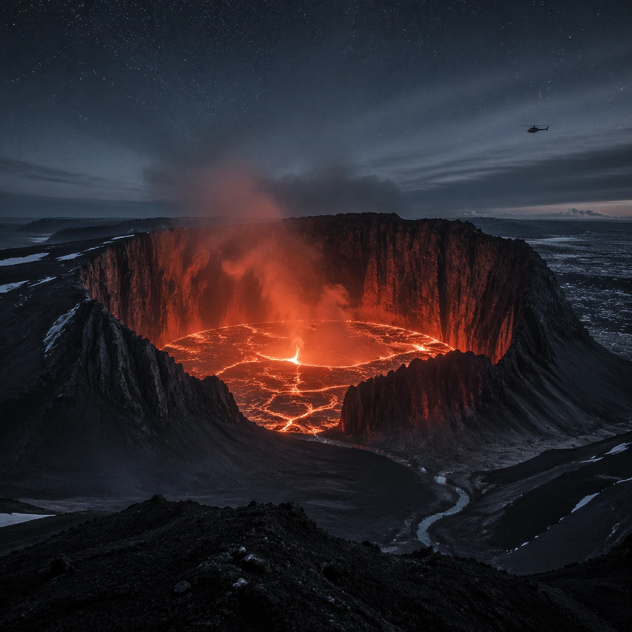
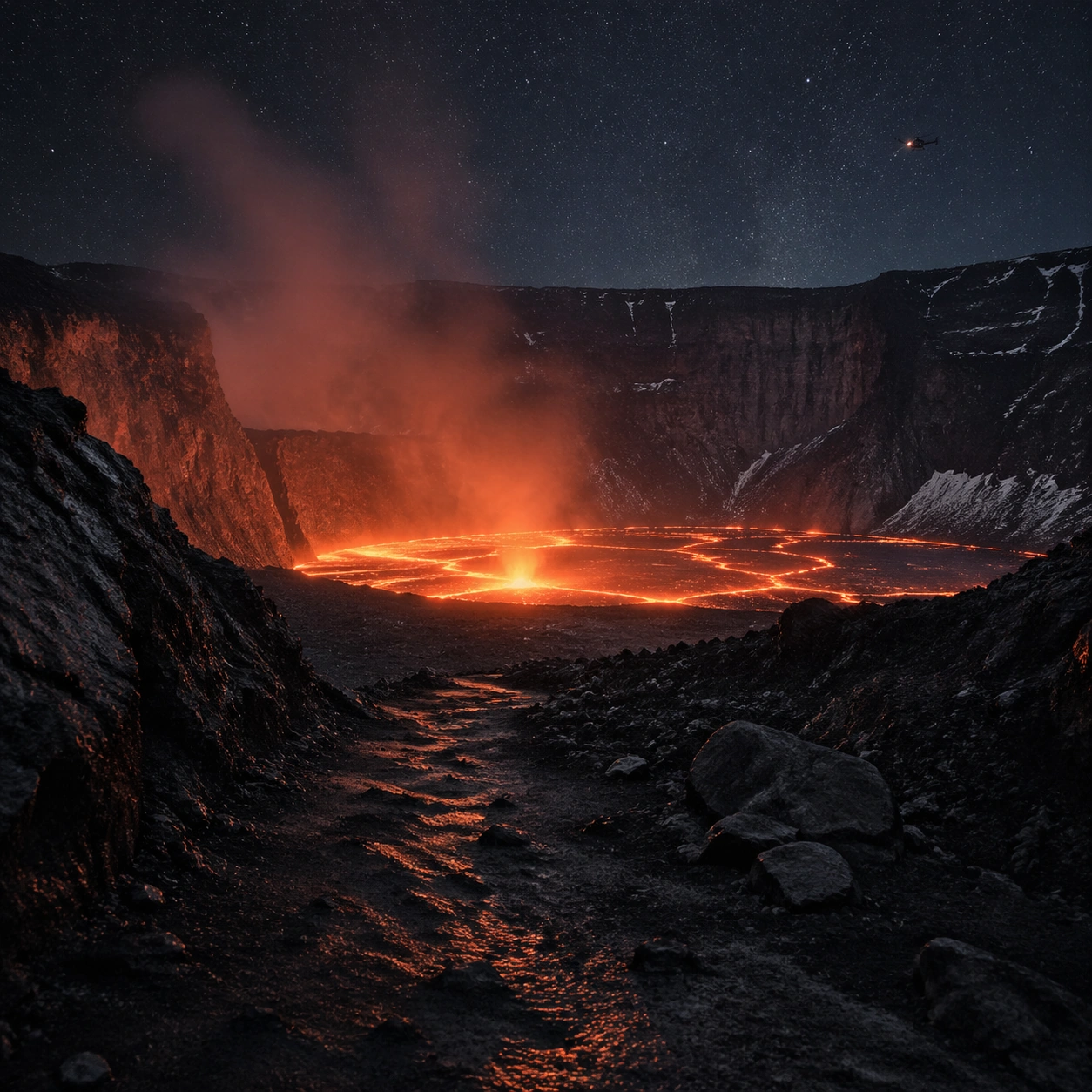
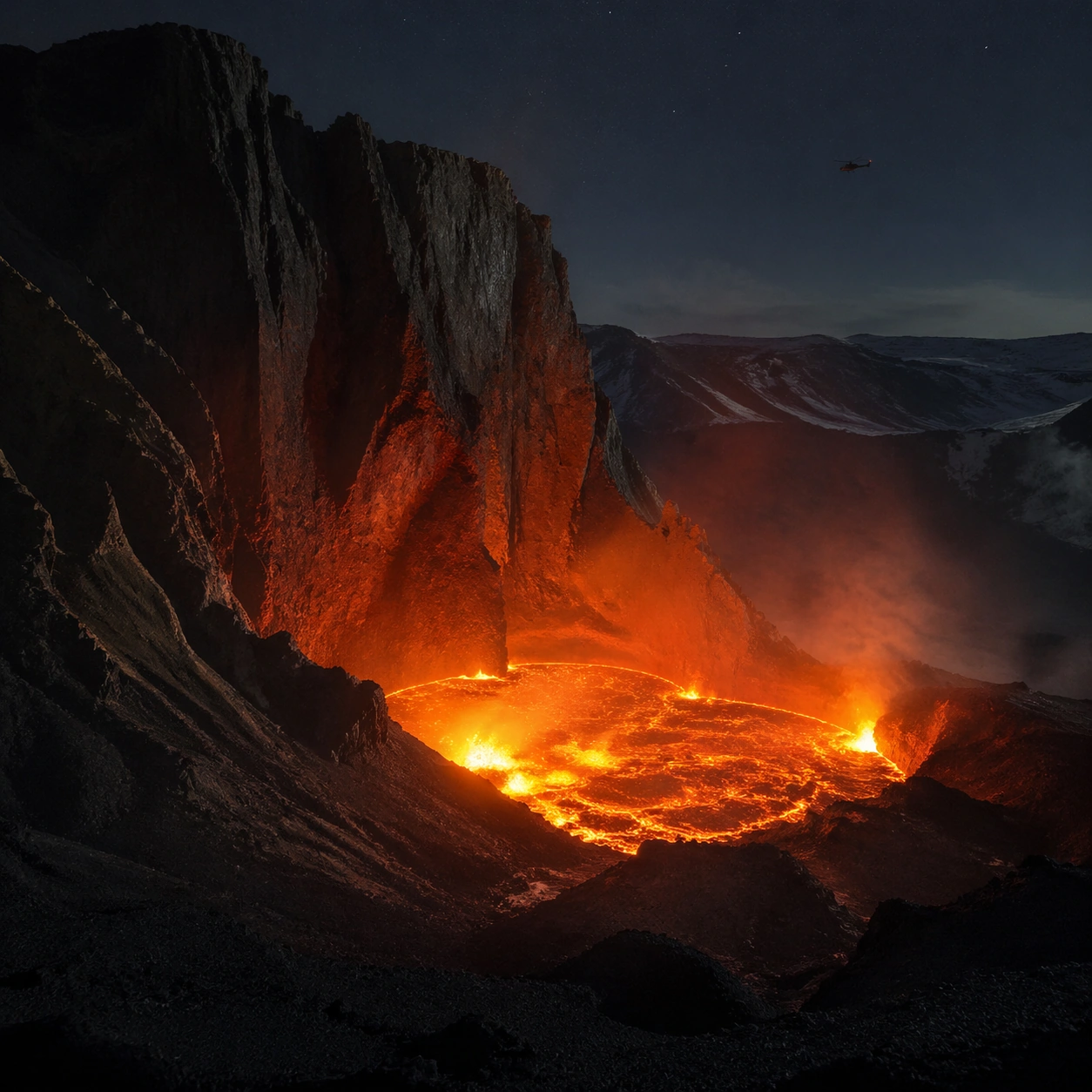
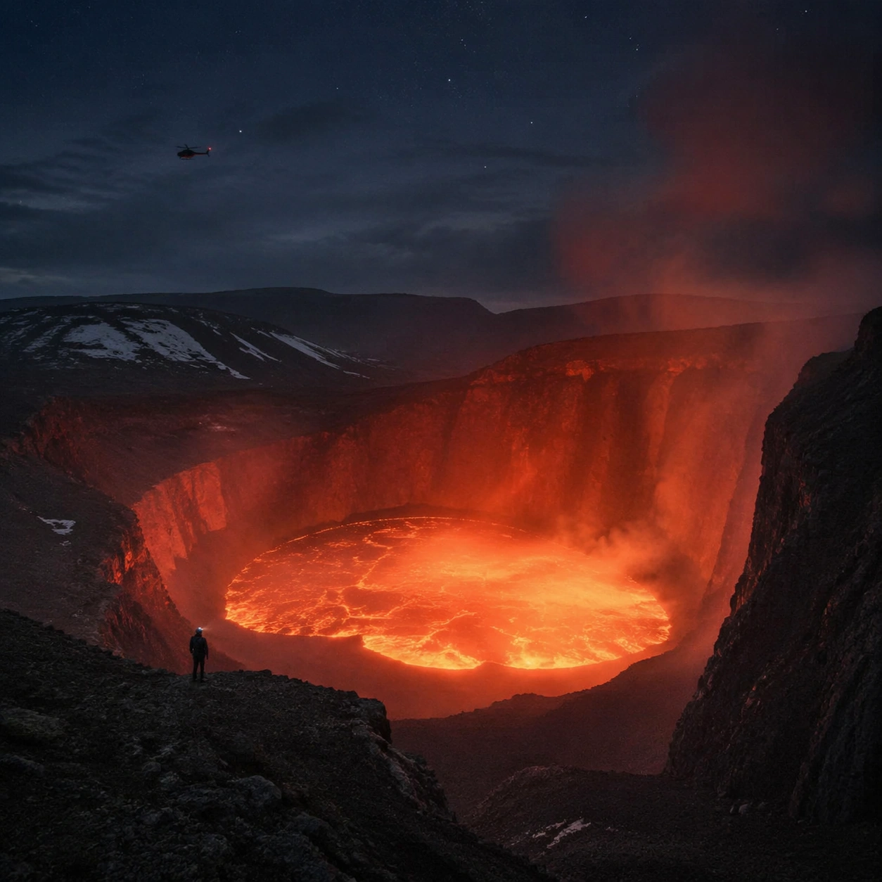
Example generated from “Volcanic Lava Cathedral Night — Main Panorama”
GPT Image 2en

Scene: Create a square, photoreal landscape study of volcanic lava cathedral at night. Compose it as the clearest monument-scale establishing view, using a wide, level camera position with deep atmospheric recession and a calm, authoritative horizon. Let broad, sculpting natural light describe the major masses before it picks out the smaller details Keep the frame cinematic but disciplined, with a clear foreground, middle distance, and far mass so the viewer can measure real depth. The image should feel like a field photograph made with patience, precision, and sublime restraint rather than a fantasy matte painting. Subject: Show an active volcanic crater at night with an orange-red lava lake, towering black basalt walls that rise like natural buttresses, heat shimmer, ash haze, and a distant helicopter silhouette for scale. This variation should emphasize hero panorama. The main landform must dominate the composition, but secondary elements should quietly explain how the place works: water paths, sediment lines, snow bands, surf, ash, wind streaks, stars, or human traces where appropriate. Everything in the image should support the same idea of scale and climate, so the scene reads as one coherent environment rather than a stack of spectacular details. Important details: Preserve believable lava viscosity, thermal glow on adjacent rock, soot-dark basalt structure, deep night atmosphere, and the violent temperature contrast between incandescent liquid rock and cold surrounding darkness. Keep one dominant landform, one secondary supporting rhythm, and a restrained scale witness so the scene reads immediately. Keep geology, weather, and atmosphere physically believable. Use subtle micro-texture, tonal separation, and air perspective to reinforce distance. If a human, vehicle, tent, caravan, bird, or boat appears, it must remain tiny and subordinate to the landscape, functioning only as a scale witness. The composition should feel original, severe, and elegant, with no decorative filler and no imitation of any copyrighted visual property. Use case: Volcanic Lava Cathedral at Night single study 1/9, exploring the hero panorama variation. Constraints: No readable text, no watermark, no logos, preserve exact 1:1 aspect ratio, no fantasy fire monsters, no city lights, no sci-fi machinery, no fireworks, no split-screen layout, no collage fragments, no exaggerated fisheye distortion, no kitsch color grading, no artificial border, no split-panel treatment.

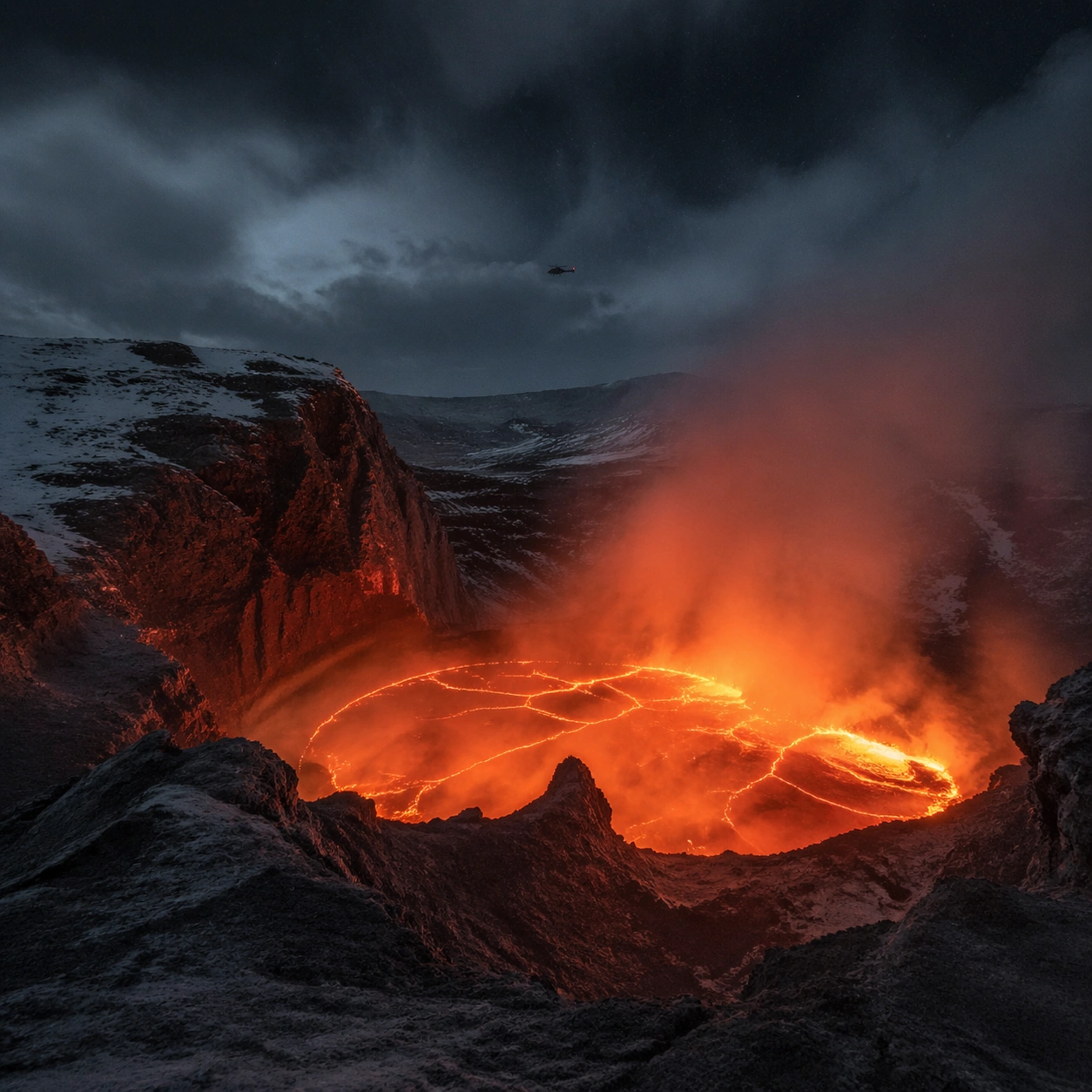
Example generated from “Volcanic Lava Cathedral Night — Foreground Path”
GPT Image 2en

Scene: Create a square, photoreal landscape study of volcanic lava cathedral at night. Compose it as a ground-level entry path that pulls the viewer into the terrain, using a lower vantage with a strong foreground element such as a ridge line, shoreline, stream, boot track, or wet surface leading inward. Let the foreground remain tactile and detailed while the distance opens gradually Keep the frame cinematic but disciplined, with a clear foreground, middle distance, and far mass so the viewer can measure real depth. The image should feel like a field photograph made with patience, precision, and sublime restraint rather than a fantasy matte painting. Subject: Show an active volcanic crater at night with an orange-red lava lake, towering black basalt walls that rise like natural buttresses, heat shimmer, ash haze, and a distant helicopter silhouette for scale. This variation should emphasize foreground-led composition. The main landform must dominate the composition, but secondary elements should quietly explain how the place works: water paths, sediment lines, snow bands, surf, ash, wind streaks, stars, or human traces where appropriate. Everything in the image should support the same idea of scale and climate, so the scene reads as one coherent environment rather than a stack of spectacular details. Important details: Preserve believable lava viscosity, thermal glow on adjacent rock, soot-dark basalt structure, deep night atmosphere, and the violent temperature contrast between incandescent liquid rock and cold surrounding darkness. The image should reward close looking through layered depth cues rather than pure spectacle alone. Keep geology, weather, and atmosphere physically believable. Use subtle micro-texture, tonal separation, and air perspective to reinforce distance. If a human, vehicle, tent, caravan, bird, or boat appears, it must remain tiny and subordinate to the landscape, functioning only as a scale witness. The composition should feel original, severe, and elegant, with no decorative filler and no imitation of any copyrighted visual property. Use case: Volcanic Lava Cathedral at Night single study 2/9, exploring the foreground-led composition variation. Constraints: No readable text, no watermark, no logos, preserve exact 1:1 aspect ratio, no fantasy fire monsters, no city lights, no sci-fi machinery, no fireworks, no blocked foreground, no random props, no awkward dead zone in the lower third, no kitsch color grading, no artificial border, no split-panel treatment.

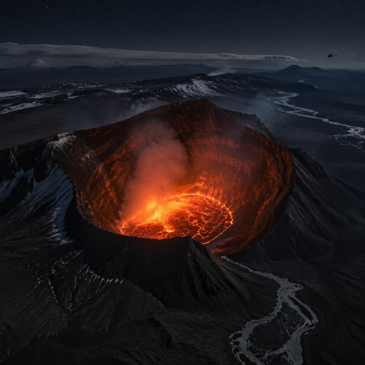
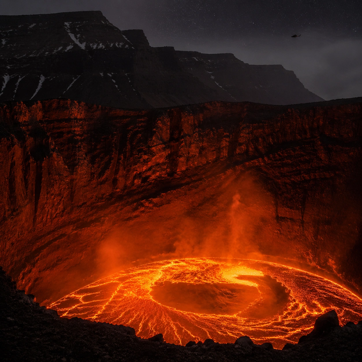
Example generated from “Volcanic Lava Cathedral Night — Aerial Geometry”
GPT Image 2en

Scene: Create a square, photoreal landscape study of volcanic lava cathedral at night. Compose it as the planform geometry and overall shape logic of the landscape, using an elevated oblique aerial view that still preserves believable scale and natural topography. Let light reveal contour, fracture, and pattern instead of flattening the terrain Keep the frame cinematic but disciplined, with a clear foreground, middle distance, and far mass so the viewer can measure real depth. The image should feel like a field photograph made with patience, precision, and sublime restraint rather than a fantasy matte painting. Subject: Show an active volcanic crater at night with an orange-red lava lake, towering black basalt walls that rise like natural buttresses, heat shimmer, ash haze, and a distant helicopter silhouette for scale. This variation should emphasize aerial scale read. The main landform must dominate the composition, but secondary elements should quietly explain how the place works: water paths, sediment lines, snow bands, surf, ash, wind streaks, stars, or human traces where appropriate. Everything in the image should support the same idea of scale and climate, so the scene reads as one coherent environment rather than a stack of spectacular details. Important details: Preserve believable lava viscosity, thermal glow on adjacent rock, soot-dark basalt structure, deep night atmosphere, and the violent temperature contrast between incandescent liquid rock and cold surrounding darkness. Emphasize rhythm, repetition, and large-form geometry without losing physical realism. Keep geology, weather, and atmosphere physically believable. Use subtle micro-texture, tonal separation, and air perspective to reinforce distance. If a human, vehicle, tent, caravan, bird, or boat appears, it must remain tiny and subordinate to the landscape, functioning only as a scale witness. The composition should feel original, severe, and elegant, with no decorative filler and no imitation of any copyrighted visual property. Use case: Volcanic Lava Cathedral at Night single study 3/9, exploring the aerial scale read variation. Constraints: No readable text, no watermark, no logos, preserve exact 1:1 aspect ratio, no fantasy fire monsters, no city lights, no sci-fi machinery, no fireworks, no map labels, no diagram arrows, no satellite-interface graphics, no kitsch color grading, no artificial border, no split-panel treatment.

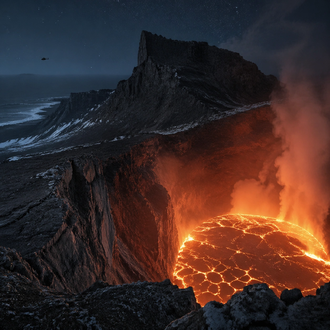
Example generated from “Volcanic Lava Cathedral Night — Atmosphere Event”
GPT Image 2en

Scene: Create a square, photoreal landscape study of volcanic lava cathedral at night. Compose it as the moment when weather, particles, or moving air become the main dramatic agent, using a stable documentary framing that lets the environmental event stay legible. Let the air itself carry visible density through haze, spray, ash, dust, snow, or storm structure Keep the frame cinematic but disciplined, with a clear foreground, middle distance, and far mass so the viewer can measure real depth. The image should feel like a field photograph made with patience, precision, and sublime restraint rather than a fantasy matte painting. Subject: Show an active volcanic crater at night with an orange-red lava lake, towering black basalt walls that rise like natural buttresses, heat shimmer, ash haze, and a distant helicopter silhouette for scale. This variation should emphasize weather-driven study. The main landform must dominate the composition, but secondary elements should quietly explain how the place works: water paths, sediment lines, snow bands, surf, ash, wind streaks, stars, or human traces where appropriate. Everything in the image should support the same idea of scale and climate, so the scene reads as one coherent environment rather than a stack of spectacular details. Important details: Preserve believable lava viscosity, thermal glow on adjacent rock, soot-dark basalt structure, deep night atmosphere, and the violent temperature contrast between incandescent liquid rock and cold surrounding darkness. The atmosphere must feel physically plausible and tied to terrain, wind direction, temperature, and moisture. Keep geology, weather, and atmosphere physically believable. Use subtle micro-texture, tonal separation, and air perspective to reinforce distance. If a human, vehicle, tent, caravan, bird, or boat appears, it must remain tiny and subordinate to the landscape, functioning only as a scale witness. The composition should feel original, severe, and elegant, with no decorative filler and no imitation of any copyrighted visual property. Use case: Volcanic Lava Cathedral at Night single study 4/9, exploring the weather-driven study variation. Constraints: No readable text, no watermark, no logos, preserve exact 1:1 aspect ratio, no fantasy fire monsters, no city lights, no sci-fi machinery, no fireworks, no disaster-movie excess, no impossible lightning clutter, no synthetic smoke plumes, no kitsch color grading, no artificial border, no split-panel treatment.

Example generated from “Volcanic Lava Cathedral Night — Light Contrast”
GPT Image 2en

Scene: Create a square, photoreal landscape study of volcanic lava cathedral at night. Compose it as directional light carving sharp separation between illuminated and shadowed forms, using a composition built around light falloff, shadow shape, and reflective control rather than camera gimmicks. Let one strong light source create crisp hierarchy and believable color temperature shifts Keep the frame cinematic but disciplined, with a clear foreground, middle distance, and far mass so the viewer can measure real depth. The image should feel like a field photograph made with patience, precision, and sublime restraint rather than a fantasy matte painting. Subject: Show an active volcanic crater at night with an orange-red lava lake, towering black basalt walls that rise like natural buttresses, heat shimmer, ash haze, and a distant helicopter silhouette for scale. This variation should emphasize light-structure study. The main landform must dominate the composition, but secondary elements should quietly explain how the place works: water paths, sediment lines, snow bands, surf, ash, wind streaks, stars, or human traces where appropriate. Everything in the image should support the same idea of scale and climate, so the scene reads as one coherent environment rather than a stack of spectacular details. Important details: Preserve believable lava viscosity, thermal glow on adjacent rock, soot-dark basalt structure, deep night atmosphere, and the violent temperature contrast between incandescent liquid rock and cold surrounding darkness. Surface brightness, shadow depth, and reflected light should all agree with the material and weather conditions. Keep geology, weather, and atmosphere physically believable. Use subtle micro-texture, tonal separation, and air perspective to reinforce distance. If a human, vehicle, tent, caravan, bird, or boat appears, it must remain tiny and subordinate to the landscape, functioning only as a scale witness. The composition should feel original, severe, and elegant, with no decorative filler and no imitation of any copyrighted visual property. Use case: Volcanic Lava Cathedral at Night single study 5/9, exploring the light-structure study variation. Constraints: No readable text, no watermark, no logos, preserve exact 1:1 aspect ratio, no fantasy fire monsters, no city lights, no sci-fi machinery, no fireworks, no blown highlights, no muddy blacks, no theatrical stage lighting, no kitsch color grading, no artificial border, no split-panel treatment.

Example generated from “Volcanic Lava Cathedral Night — Material Close”
GPT Image 2en

Scene: Create a square, photoreal landscape study of volcanic lava cathedral at night. Compose it as surface texture and material transitions while still keeping the full environment recognizable, using a tighter medium-wide crop that gives more area to texture, fracture, grain, water, ice, lava, salt, or stone. Let texture remain readable without making the scene feel like a macro shot Keep the frame cinematic but disciplined, with a clear foreground, middle distance, and far mass so the viewer can measure real depth. The image should feel like a field photograph made with patience, precision, and sublime restraint rather than a fantasy matte painting. Subject: Show an active volcanic crater at night with an orange-red lava lake, towering black basalt walls that rise like natural buttresses, heat shimmer, ash haze, and a distant helicopter silhouette for scale. This variation should emphasize material realism check. The main landform must dominate the composition, but secondary elements should quietly explain how the place works: water paths, sediment lines, snow bands, surf, ash, wind streaks, stars, or human traces where appropriate. Everything in the image should support the same idea of scale and climate, so the scene reads as one coherent environment rather than a stack of spectacular details. Important details: Preserve believable lava viscosity, thermal glow on adjacent rock, soot-dark basalt structure, deep night atmosphere, and the violent temperature contrast between incandescent liquid rock and cold surrounding darkness. Micro-texture, edge wear, wetness, frost, dust, foam, or sediment should deepen realism rather than distract from scale. Keep geology, weather, and atmosphere physically believable. Use subtle micro-texture, tonal separation, and air perspective to reinforce distance. If a human, vehicle, tent, caravan, bird, or boat appears, it must remain tiny and subordinate to the landscape, functioning only as a scale witness. The composition should feel original, severe, and elegant, with no decorative filler and no imitation of any copyrighted visual property. Use case: Volcanic Lava Cathedral at Night single study 6/9, exploring the material realism check variation. Constraints: No readable text, no watermark, no logos, preserve exact 1:1 aspect ratio, no fantasy fire monsters, no city lights, no sci-fi machinery, no fireworks, no extreme macro abstraction, no plastic-looking surfaces, no shallow depth-of-field blur, no kitsch color grading, no artificial border, no split-panel treatment.

Example generated from “Volcanic Lava Cathedral Night — Scale Witness”
GPT Image 2en

Scene: Create a square, photoreal landscape study of volcanic lava cathedral at night. Compose it as a tiny human, animal, tent, vehicle, or craft that reveals the vastness of the environment, using a balanced frame where the witness remains small but unmistakable. Let the scale marker stay visible without becoming the true subject Keep the frame cinematic but disciplined, with a clear foreground, middle distance, and far mass so the viewer can measure real depth. The image should feel like a field photograph made with patience, precision, and sublime restraint rather than a fantasy matte painting. Subject: Show an active volcanic crater at night with an orange-red lava lake, towering black basalt walls that rise like natural buttresses, heat shimmer, ash haze, and a distant helicopter silhouette for scale. This variation should emphasize scale comparison. The main landform must dominate the composition, but secondary elements should quietly explain how the place works: water paths, sediment lines, snow bands, surf, ash, wind streaks, stars, or human traces where appropriate. Everything in the image should support the same idea of scale and climate, so the scene reads as one coherent environment rather than a stack of spectacular details. Important details: Preserve believable lava viscosity, thermal glow on adjacent rock, soot-dark basalt structure, deep night atmosphere, and the violent temperature contrast between incandescent liquid rock and cold surrounding darkness. The viewer should understand the environment first and the witness second, with clean spatial separation between them. Keep geology, weather, and atmosphere physically believable. Use subtle micro-texture, tonal separation, and air perspective to reinforce distance. If a human, vehicle, tent, caravan, bird, or boat appears, it must remain tiny and subordinate to the landscape, functioning only as a scale witness. The composition should feel original, severe, and elegant, with no decorative filler and no imitation of any copyrighted visual property. Use case: Volcanic Lava Cathedral at Night single study 7/9, exploring the scale comparison variation. Constraints: No readable text, no watermark, no logos, preserve exact 1:1 aspect ratio, no fantasy fire monsters, no city lights, no sci-fi machinery, no fireworks, no crowd scenes, no heroic close-up character framing, no busy gear pile, no kitsch color grading, no artificial border, no split-panel treatment.

Example generated from “Volcanic Lava Cathedral Night — Abstract Rhythm”
GPT Image 2en

Scene: Create a square, photoreal landscape study of volcanic lava cathedral at night. Compose it as the near-abstract rhythm of repeated natural forms, lines, and tonal bands, using a disciplined crop that approaches abstraction while remaining unmistakably a real place. Let shape and tonal cadence dominate before small narrative details Keep the frame cinematic but disciplined, with a clear foreground, middle distance, and far mass so the viewer can measure real depth. The image should feel like a field photograph made with patience, precision, and sublime restraint rather than a fantasy matte painting. Subject: Show an active volcanic crater at night with an orange-red lava lake, towering black basalt walls that rise like natural buttresses, heat shimmer, ash haze, and a distant helicopter silhouette for scale. This variation should emphasize formal composition study. The main landform must dominate the composition, but secondary elements should quietly explain how the place works: water paths, sediment lines, snow bands, surf, ash, wind streaks, stars, or human traces where appropriate. Everything in the image should support the same idea of scale and climate, so the scene reads as one coherent environment rather than a stack of spectacular details. Important details: Preserve believable lava viscosity, thermal glow on adjacent rock, soot-dark basalt structure, deep night atmosphere, and the violent temperature contrast between incandescent liquid rock and cold surrounding darkness. Pattern, repetition, and negative space should feel discovered in nature, not graphically imposed. Keep geology, weather, and atmosphere physically believable. Use subtle micro-texture, tonal separation, and air perspective to reinforce distance. If a human, vehicle, tent, caravan, bird, or boat appears, it must remain tiny and subordinate to the landscape, functioning only as a scale witness. The composition should feel original, severe, and elegant, with no decorative filler and no imitation of any copyrighted visual property. Use case: Volcanic Lava Cathedral at Night single study 8/9, exploring the formal composition study variation. Constraints: No readable text, no watermark, no logos, preserve exact 1:1 aspect ratio, no fantasy fire monsters, no city lights, no sci-fi machinery, no fireworks, no graphic overlays, no surreal floating elements, no ornamental symmetry cheats, no kitsch color grading, no artificial border, no split-panel treatment.

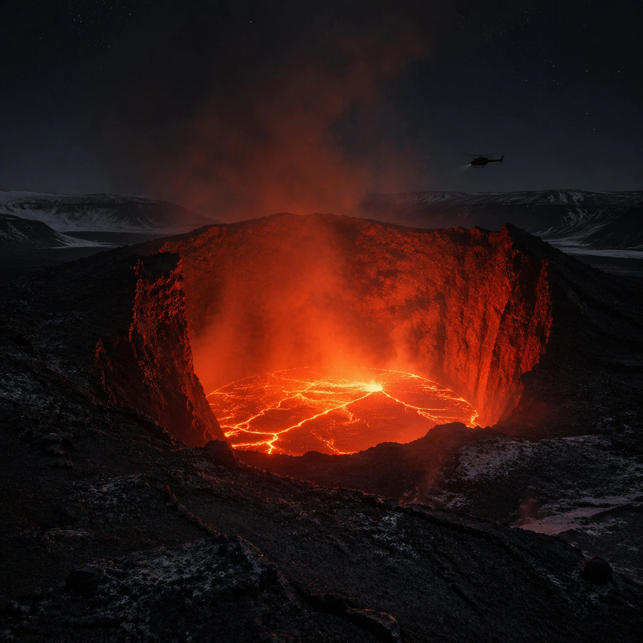
Example generated from “Volcanic Lava Cathedral Night — Final Iconic”
GPT Image 2en

Scene: Create a square, photoreal landscape study of volcanic lava cathedral at night. Compose it as the cleanest, most iconic summary of the whole landscape idea, using a distilled composition with one unforgettable silhouette or mass relationship and generous breathing room. Let the scene resolve into a memorable final image with strong legibility at thumbnail size Keep the frame cinematic but disciplined, with a clear foreground, middle distance, and far mass so the viewer can measure real depth. The image should feel like a field photograph made with patience, precision, and sublime restraint rather than a fantasy matte painting. Subject: Show an active volcanic crater at night with an orange-red lava lake, towering black basalt walls that rise like natural buttresses, heat shimmer, ash haze, and a distant helicopter silhouette for scale. This variation should emphasize iconic final plate. The main landform must dominate the composition, but secondary elements should quietly explain how the place works: water paths, sediment lines, snow bands, surf, ash, wind streaks, stars, or human traces where appropriate. Everything in the image should support the same idea of scale and climate, so the scene reads as one coherent environment rather than a stack of spectacular details. Important details: Preserve believable lava viscosity, thermal glow on adjacent rock, soot-dark basalt structure, deep night atmosphere, and the violent temperature contrast between incandescent liquid rock and cold surrounding darkness. Keep the frame spare, confident, and monumental, with every element earning its place. Keep geology, weather, and atmosphere physically believable. Use subtle micro-texture, tonal separation, and air perspective to reinforce distance. If a human, vehicle, tent, caravan, bird, or boat appears, it must remain tiny and subordinate to the landscape, functioning only as a scale witness. The composition should feel original, severe, and elegant, with no decorative filler and no imitation of any copyrighted visual property. Use case: Volcanic Lava Cathedral at Night single study 9/9, exploring the iconic final plate variation. Constraints: No readable text, no watermark, no logos, preserve exact 1:1 aspect ratio, no fantasy fire monsters, no city lights, no sci-fi machinery, no fireworks, no cluttered edges, no competing focal points, no visual noise in empty space, no kitsch color grading, no artificial border, no split-panel treatment.

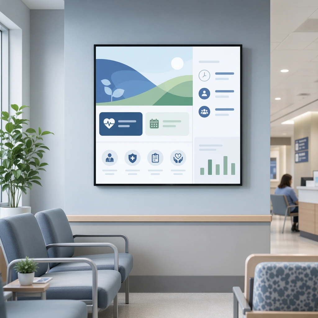
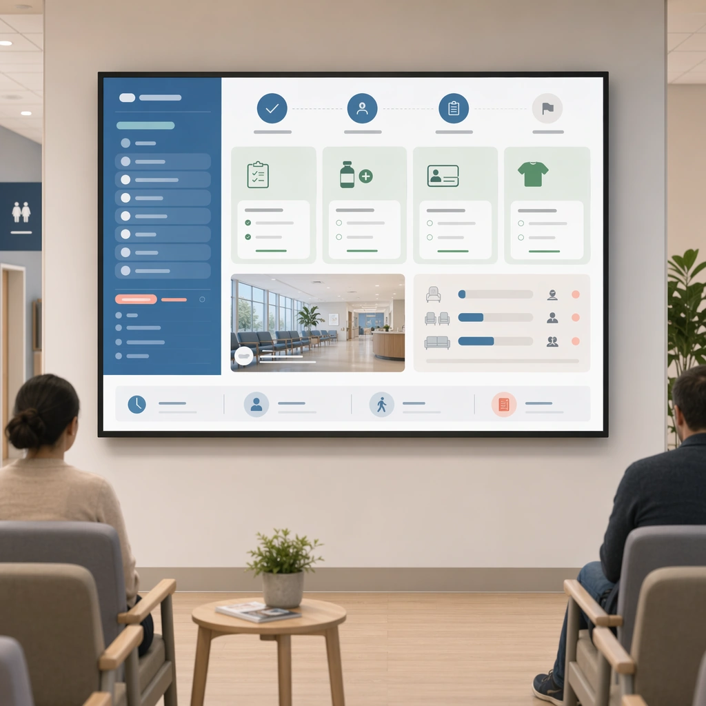
Example generated from “Waiting Room Screen And Patient Info Loop — Welcome Screen Loop”
GPT Image 2en

Scene: A square welcome screen loop board for Waiting Room Screen and Patient Info Loop. Compose it as a square monitor mockup embedded within a believable waiting-room scene. Use a palette of cool white, muted blue, soft green, warm gray, and occasional coral guidance accents, bright public-space lighting with clean screen glow, and a mood of useful, calm, and brand-consistent. The frame should feel like a real healthcare communication asset art-directed for professional delivery, not a stock photo, speculative concept render, or generic corporate template. Keep the camera distance, negative space, and depth cues disciplined so the image reads immediately even at thumbnail size. Subject: Center on a branded welcome screen with queue-free ambience, seating, subtle service icons, and high-level orientation modules visible from a distance. Show enough surrounding context that the viewer understands the intended service surface, user situation, and institutional setting. Every object, person, diagram, device crop, or spatial cue should support clarity, trust, and practical use. If people appear, keep them anonymous, natural, privacy-safe, and grounded in believable body language rather than promotional posing. Important details: Maintain waiting-room communication built from screen-safe hierarchy, ambient public display design, and reassuring information architecture that works from a distance. The visual hierarchy should prioritize calm entry, ambient trust, and immediate orientation for new visitors. Use abstract icon shapes, color blocks, chart bars, interface modules, or non-legible placeholder microcopy whenever information structure is needed, but never readable text. Materials, spacing, lighting, and hierarchy should feel production-ready and healthcare-specific. Avoid generic lifestyle filler, decorative noise, or design gestures that do not reinforce the communication goal. Use case: Waiting Room Loop single study 1/9 for a waiting-room welcome screen. Constraints: No readable text, no watermark, no logos, preserve exact 1:1 aspect ratio, no TV-news chaos, no overbright advertising palette, no crowded ticker aesthetics, no unreadable micro-detail, no flashy motion-graphic vibes, no loud promotional messaging.

Example generated from “Waiting Room Screen And Patient Info Loop — Queue and Prep Panel”
GPT Image 2en

Scene: A square queue and appointment-prep panel for Waiting Room Screen and Patient Info Loop. Compose it as a public display board with large blocks, icon cues, and one environmental support image. Use a palette of cool white, muted blue, soft green, warm gray, and occasional coral guidance accents, bright public-space lighting with clean screen glow, and a mood of useful, calm, and brand-consistent. The frame should feel like a real healthcare communication asset art-directed for professional delivery, not a stock photo, speculative concept render, or generic corporate template. Keep the camera distance, negative space, and depth cues disciplined so the image reads immediately even at thumbnail size. Subject: Center on a display concept showing check-in flow, prep reminders, seating guidance, and next-step indicators for patients in a queue environment. Show enough surrounding context that the viewer understands the intended service surface, user situation, and institutional setting. Every object, person, diagram, device crop, or spatial cue should support clarity, trust, and practical use. If people appear, keep them anonymous, natural, privacy-safe, and grounded in believable body language rather than promotional posing. Important details: Maintain waiting-room communication built from screen-safe hierarchy, ambient public display design, and reassuring information architecture that works from a distance. Make it readable from afar through proportion and contrast while keeping the tone gentle and operational. Use abstract icon shapes, color blocks, chart bars, interface modules, or non-legible placeholder microcopy whenever information structure is needed, but never readable text. Materials, spacing, lighting, and hierarchy should feel production-ready and healthcare-specific. Avoid generic lifestyle filler, decorative noise, or design gestures that do not reinforce the communication goal. Use case: Waiting Room Loop single study 2/9 for a queue management and prep screen. Constraints: No readable text, no watermark, no logos, preserve exact 1:1 aspect ratio, no TV-news chaos, no overbright advertising palette, no crowded ticker aesthetics, no unreadable micro-detail, no airport-departure-board complexity, no urgent alarm colors.

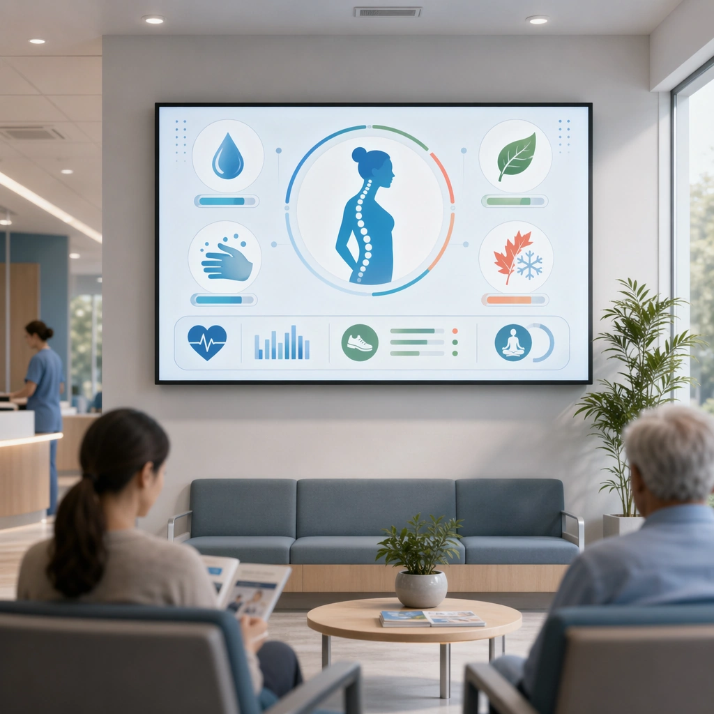
Example generated from “Waiting Room Screen And Patient Info Loop — Prevention Tip Rotation”
GPT Image 2en

Scene: A square preventive-education loop tile for Waiting Room Screen and Patient Info Loop. Compose it as a public-screen card with a central health tip, supporting icons, and environmental lifestyle cues. Use a palette of cool white, muted blue, soft green, warm gray, and occasional coral guidance accents, bright public-space lighting with clean screen glow, and a mood of useful, calm, and brand-consistent. The frame should feel like a real healthcare communication asset art-directed for professional delivery, not a stock photo, speculative concept render, or generic corporate template. Keep the camera distance, negative space, and depth cues disciplined so the image reads immediately even at thumbnail size. Subject: Center on a waiting-room rotation slide teaching simple prevention habits such as hydration, hand care, posture, or seasonal care. Show enough surrounding context that the viewer understands the intended service surface, user situation, and institutional setting. Every object, person, diagram, device crop, or spatial cue should support clarity, trust, and practical use. If people appear, keep them anonymous, natural, privacy-safe, and grounded in believable body language rather than promotional posing. Important details: Maintain waiting-room communication built from screen-safe hierarchy, ambient public display design, and reassuring information architecture that works from a distance. Treat it as ambient education that rewards attention without demanding it, using distance-friendly design. Use abstract icon shapes, color blocks, chart bars, interface modules, or non-legible placeholder microcopy whenever information structure is needed, but never readable text. Materials, spacing, lighting, and hierarchy should feel production-ready and healthcare-specific. Avoid generic lifestyle filler, decorative noise, or design gestures that do not reinforce the communication goal. Use case: Waiting Room Loop single study 3/9 for a rotating prevention tip screen. Constraints: No readable text, no watermark, no logos, preserve exact 1:1 aspect ratio, no TV-news chaos, no overbright advertising palette, no crowded ticker aesthetics, no unreadable micro-detail, no social-media clutter, no tiny card carousel overload.

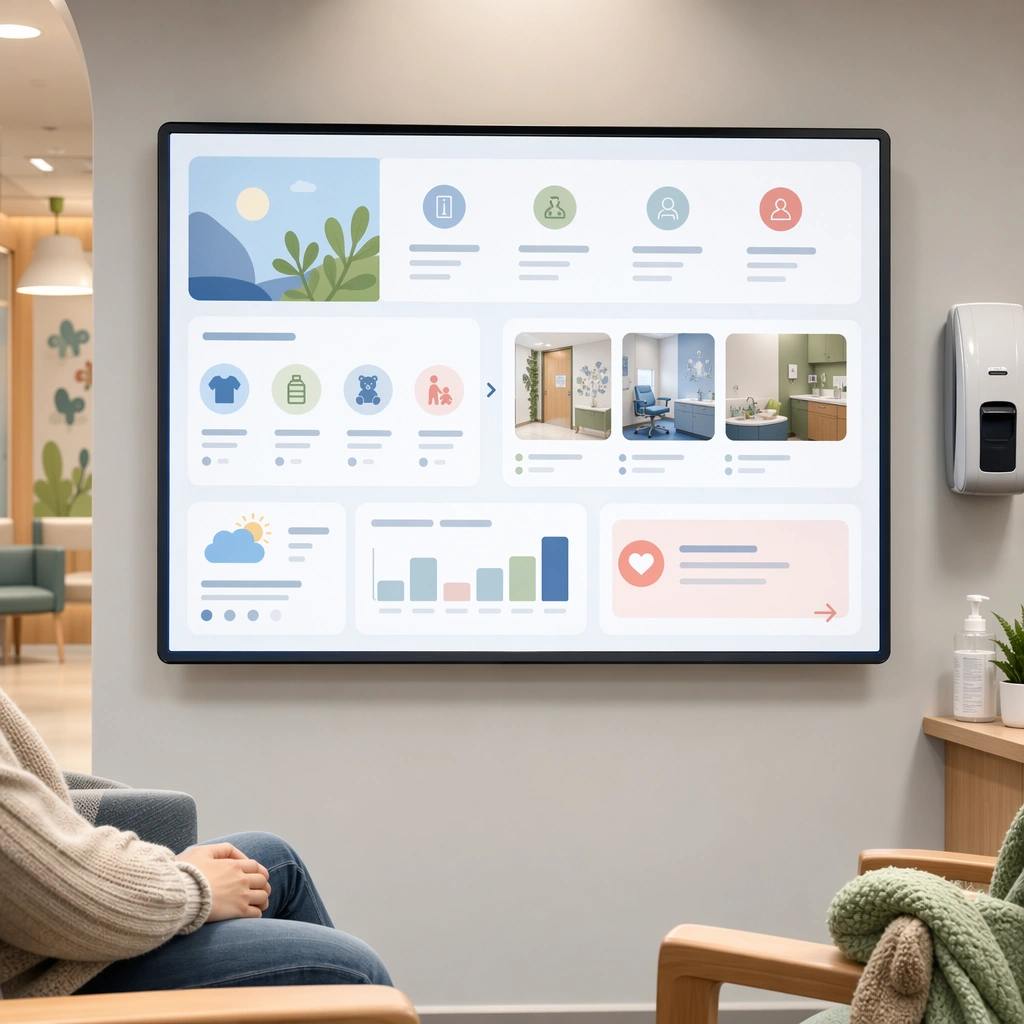
Example generated from “Waiting Room Screen And Patient Info Loop — Pediatric Calm Screen”
GPT Image 2en

Scene: A square pediatric waiting-room display for Waiting Room Screen and Patient Info Loop. Compose it with rounded geometry, family-friendly imagery, and quiet reassurance modules arranged in a soft rhythm. Use a palette of cool white, muted blue, soft green, warm gray, and occasional coral guidance accents, bright public-space lighting with clean screen glow, and a mood of useful, calm, and brand-consistent. The frame should feel like a real healthcare communication asset art-directed for professional delivery, not a stock photo, speculative concept render, or generic corporate template. Keep the camera distance, negative space, and depth cues disciplined so the image reads immediately even at thumbnail size. Subject: Center on a child-oriented waiting-room screen with preparation cues, comfort objects, room visuals, and low-anxiety directional information. Show enough surrounding context that the viewer understands the intended service surface, user situation, and institutional setting. Every object, person, diagram, device crop, or spatial cue should support clarity, trust, and practical use. If people appear, keep them anonymous, natural, privacy-safe, and grounded in believable body language rather than promotional posing. Important details: Maintain waiting-room communication built from screen-safe hierarchy, ambient public display design, and reassuring information architecture that works from a distance. Keep the screen warm and child-friendly without becoming cartoonish or entertainment-first. Use abstract icon shapes, color blocks, chart bars, interface modules, or non-legible placeholder microcopy whenever information structure is needed, but never readable text. Materials, spacing, lighting, and hierarchy should feel production-ready and healthcare-specific. Avoid generic lifestyle filler, decorative noise, or design gestures that do not reinforce the communication goal. Use case: Waiting Room Loop single study 4/9 for a pediatric waiting-room loop screen. Constraints: No readable text, no watermark, no logos, preserve exact 1:1 aspect ratio, no TV-news chaos, no overbright advertising palette, no crowded ticker aesthetics, no unreadable micro-detail, no mascots, no amusement-screen energy.

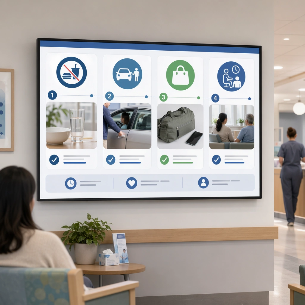
Example generated from “Waiting Room Screen And Patient Info Loop — Procedure Day Reminder”
GPT Image 2en

Scene: A square procedure-day reminder screen for Waiting Room Screen and Patient Info Loop. Compose it as a concise instruction board with large object cues, staging photos, and sequential modules. Use a palette of cool white, muted blue, soft green, warm gray, and occasional coral guidance accents, bright public-space lighting with clean screen glow, and a mood of useful, calm, and brand-consistent. The frame should feel like a real healthcare communication asset art-directed for professional delivery, not a stock photo, speculative concept render, or generic corporate template. Keep the camera distance, negative space, and depth cues disciplined so the image reads immediately even at thumbnail size. Subject: Center on a public-facing reminder slide for procedure-day logistics such as fasting, transport, belongings, and recovery pickup planning. Show enough surrounding context that the viewer understands the intended service surface, user situation, and institutional setting. Every object, person, diagram, device crop, or spatial cue should support clarity, trust, and practical use. If people appear, keep them anonymous, natural, privacy-safe, and grounded in believable body language rather than promotional posing. Important details: Maintain waiting-room communication built from screen-safe hierarchy, ambient public display design, and reassuring information architecture that works from a distance. The design should calm uncertainty through structured essentials rather than through dense warnings. Use abstract icon shapes, color blocks, chart bars, interface modules, or non-legible placeholder microcopy whenever information structure is needed, but never readable text. Materials, spacing, lighting, and hierarchy should feel production-ready and healthcare-specific. Avoid generic lifestyle filler, decorative noise, or design gestures that do not reinforce the communication goal. Use case: Waiting Room Loop single study 5/9 for a day-of-procedure waiting-room screen. Constraints: No readable text, no watermark, no logos, preserve exact 1:1 aspect ratio, no TV-news chaos, no overbright advertising palette, no crowded ticker aesthetics, no unreadable micro-detail, no stern warning-board tone, no dense policy blocks.

Example generated from “Waiting Room Screen And Patient Info Loop — Billing and Insurance Board”
GPT Image 2en

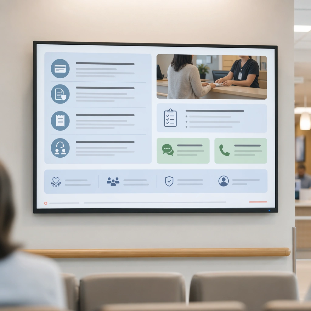
Scene: A square financial guidance display board for Waiting Room Screen and Patient Info Loop. Compose it as a clear administrative information surface with icon-led grouping and one service-desk photo. Use a palette of cool white, muted blue, soft green, warm gray, and occasional coral guidance accents, bright public-space lighting with clean screen glow, and a mood of useful, calm, and brand-consistent. The frame should feel like a real healthcare communication asset art-directed for professional delivery, not a stock photo, speculative concept render, or generic corporate template. Keep the camera distance, negative space, and depth cues disciplined so the image reads immediately even at thumbnail size. Subject: Center on a patient-info display for payment preparation, insurance documents, receipts, and assistance channels translated into distance-friendly modules. Show enough surrounding context that the viewer understands the intended service surface, user situation, and institutional setting. Every object, person, diagram, device crop, or spatial cue should support clarity, trust, and practical use. If people appear, keep them anonymous, natural, privacy-safe, and grounded in believable body language rather than promotional posing. Important details: Maintain waiting-room communication built from screen-safe hierarchy, ambient public display design, and reassuring information architecture that works from a distance. Administrative content should feel navigable and humane, not bureaucratic or intimidating. Use abstract icon shapes, color blocks, chart bars, interface modules, or non-legible placeholder microcopy whenever information structure is needed, but never readable text. Materials, spacing, lighting, and hierarchy should feel production-ready and healthcare-specific. Avoid generic lifestyle filler, decorative noise, or design gestures that do not reinforce the communication goal. Use case: Waiting Room Loop single study 6/9 for a billing and insurance waiting-room display. Constraints: No readable text, no watermark, no logos, preserve exact 1:1 aspect ratio, no TV-news chaos, no overbright advertising palette, no crowded ticker aesthetics, no unreadable micro-detail, no bank-lobby aesthetic, no cold bureaucratic severity.

Example generated from “Waiting Room Screen And Patient Info Loop — Doctor Schedule Board”
GPT Image 2en

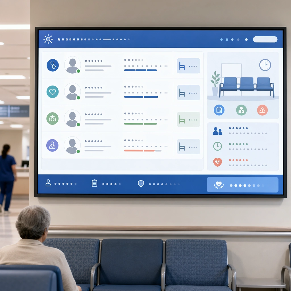
Scene: A square doctor availability and service board for Waiting Room Screen and Patient Info Loop. Compose it as a monitored display with portrait chips, abstract timetable blocks, and service-category color coding. Use a palette of cool white, muted blue, soft green, warm gray, and occasional coral guidance accents, bright public-space lighting with clean screen glow, and a mood of useful, calm, and brand-consistent. The frame should feel like a real healthcare communication asset art-directed for professional delivery, not a stock photo, speculative concept render, or generic corporate template. Keep the camera distance, negative space, and depth cues disciplined so the image reads immediately even at thumbnail size. Subject: Center on a public-facing schedule concept that hints at doctor availability, room assignments, and specialty groupings without readable names. Show enough surrounding context that the viewer understands the intended service surface, user situation, and institutional setting. Every object, person, diagram, device crop, or spatial cue should support clarity, trust, and practical use. If people appear, keep them anonymous, natural, privacy-safe, and grounded in believable body language rather than promotional posing. Important details: Maintain waiting-room communication built from screen-safe hierarchy, ambient public display design, and reassuring information architecture that works from a distance. Use hierarchy, portrait placeholders, and color logic to signal operational order at a glance. Use abstract icon shapes, color blocks, chart bars, interface modules, or non-legible placeholder microcopy whenever information structure is needed, but never readable text. Materials, spacing, lighting, and hierarchy should feel production-ready and healthcare-specific. Avoid generic lifestyle filler, decorative noise, or design gestures that do not reinforce the communication goal. Use case: Waiting Room Loop single study 7/9 for a schedule and service information screen. Constraints: No readable text, no watermark, no logos, preserve exact 1:1 aspect ratio, no TV-news chaos, no overbright advertising palette, no crowded ticker aesthetics, no unreadable micro-detail, no crowded spreadsheet look, no tiny unreadable columns.

Example generated from “Waiting Room Screen And Patient Info Loop — Facility Services Loop”
GPT Image 2en

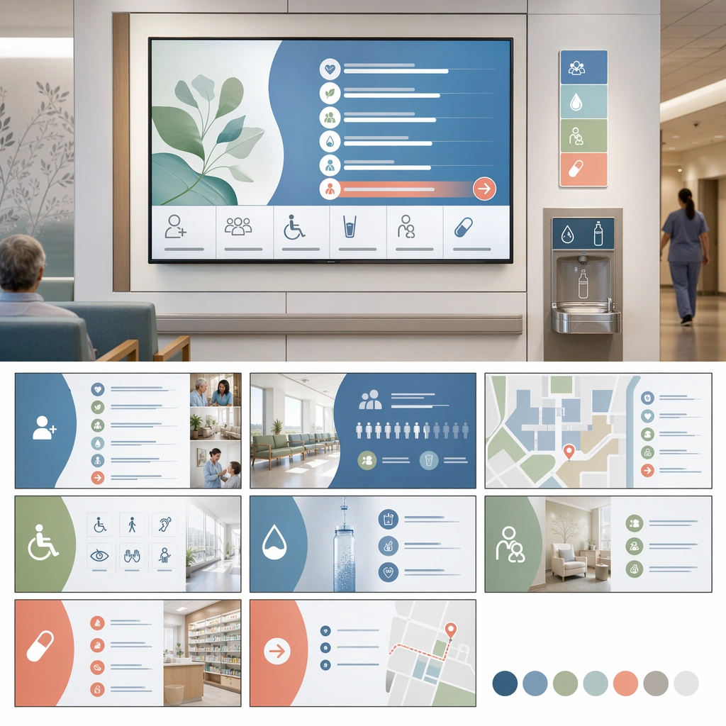
Scene: A square facility services loop board for Waiting Room Screen and Patient Info Loop. Compose it as a square presentation showing multiple slides or loop frames within one branded system. Use a palette of cool white, muted blue, soft green, warm gray, and occasional coral guidance accents, bright public-space lighting with clean screen glow, and a mood of useful, calm, and brand-consistent. The frame should feel like a real healthcare communication asset art-directed for professional delivery, not a stock photo, speculative concept render, or generic corporate template. Keep the camera distance, negative space, and depth cues disciplined so the image reads immediately even at thumbnail size. Subject: Center on a waiting-room display family for facilities, amenities, accessibility, hydration stations, family rooms, and pharmacy directions. Show enough surrounding context that the viewer understands the intended service surface, user situation, and institutional setting. Every object, person, diagram, device crop, or spatial cue should support clarity, trust, and practical use. If people appear, keep them anonymous, natural, privacy-safe, and grounded in believable body language rather than promotional posing. Important details: Maintain waiting-room communication built from screen-safe hierarchy, ambient public display design, and reassuring information architecture that works from a distance. The system should show that ambient information can support comfort and navigation without overpowering the room. Use abstract icon shapes, color blocks, chart bars, interface modules, or non-legible placeholder microcopy whenever information structure is needed, but never readable text. Materials, spacing, lighting, and hierarchy should feel production-ready and healthcare-specific. Avoid generic lifestyle filler, decorative noise, or design gestures that do not reinforce the communication goal. Use case: Waiting Room Loop single study 8/9 for a facility services screen loop. Constraints: No readable text, no watermark, no logos, preserve exact 1:1 aspect ratio, no TV-news chaos, no overbright advertising palette, no crowded ticker aesthetics, no unreadable micro-detail, no shopping-mall digital signage style, no brand-advertisement confusion.

Example generated from “Waiting Room Screen And Patient Info Loop — Full Screen Loop System”
GPT Image 2en

Scene: A square complete loop system summary board for Waiting Room Screen and Patient Info Loop. Compose it as a final toolkit board showing welcome, queue, prevention, schedule, and admin screens together. Use a palette of cool white, muted blue, soft green, warm gray, and occasional coral guidance accents, bright public-space lighting with clean screen glow, and a mood of useful, calm, and brand-consistent. The frame should feel like a real healthcare communication asset art-directed for professional delivery, not a stock photo, speculative concept render, or generic corporate template. Keep the camera distance, negative space, and depth cues disciplined so the image reads immediately even at thumbnail size. Subject: Center on a coherent waiting-room information loop translated across several message types but unified by one clinic visual language. Show enough surrounding context that the viewer understands the intended service surface, user situation, and institutional setting. Every object, person, diagram, device crop, or spatial cue should support clarity, trust, and practical use. If people appear, keep them anonymous, natural, privacy-safe, and grounded in believable body language rather than promotional posing. Important details: Maintain waiting-room communication built from screen-safe hierarchy, ambient public display design, and reassuring information architecture that works from a distance. The board should prove that patient screens can be calm, useful, and spatially integrated rather than generic TV slides. Use abstract icon shapes, color blocks, chart bars, interface modules, or non-legible placeholder microcopy whenever information structure is needed, but never readable text. Materials, spacing, lighting, and hierarchy should feel production-ready and healthcare-specific. Avoid generic lifestyle filler, decorative noise, or design gestures that do not reinforce the communication goal. Use case: Waiting Room Loop single study 9/9 for a full waiting-room screen system summary. Constraints: No readable text, no watermark, no logos, preserve exact 1:1 aspect ratio, no TV-news chaos, no overbright advertising palette, no crowded ticker aesthetics, no unreadable micro-detail, no disconnected template collage, no mismatched screen aesthetics.

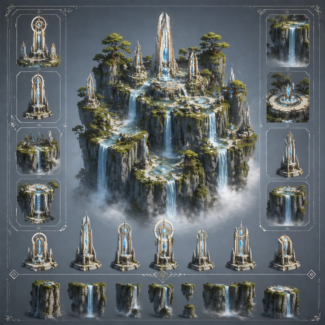
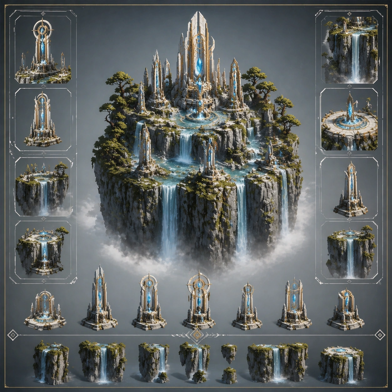
Example generated from “Waterfall Cliff And Mist Monuments — Reference Anchor”
GPT Image 2en

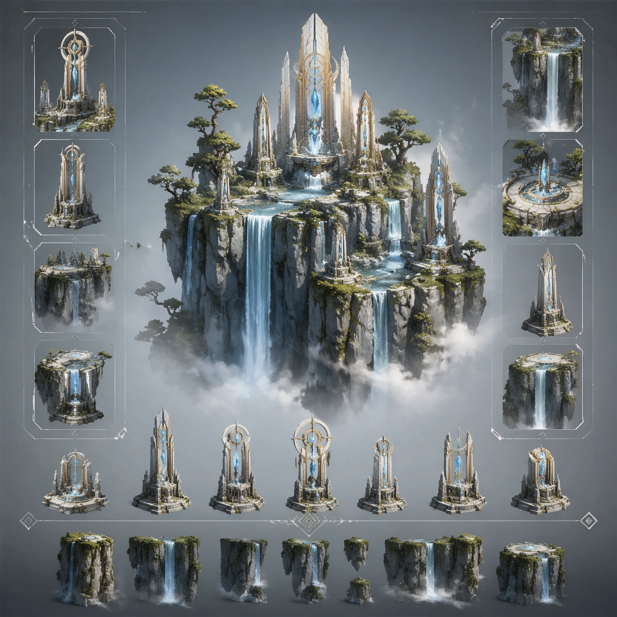
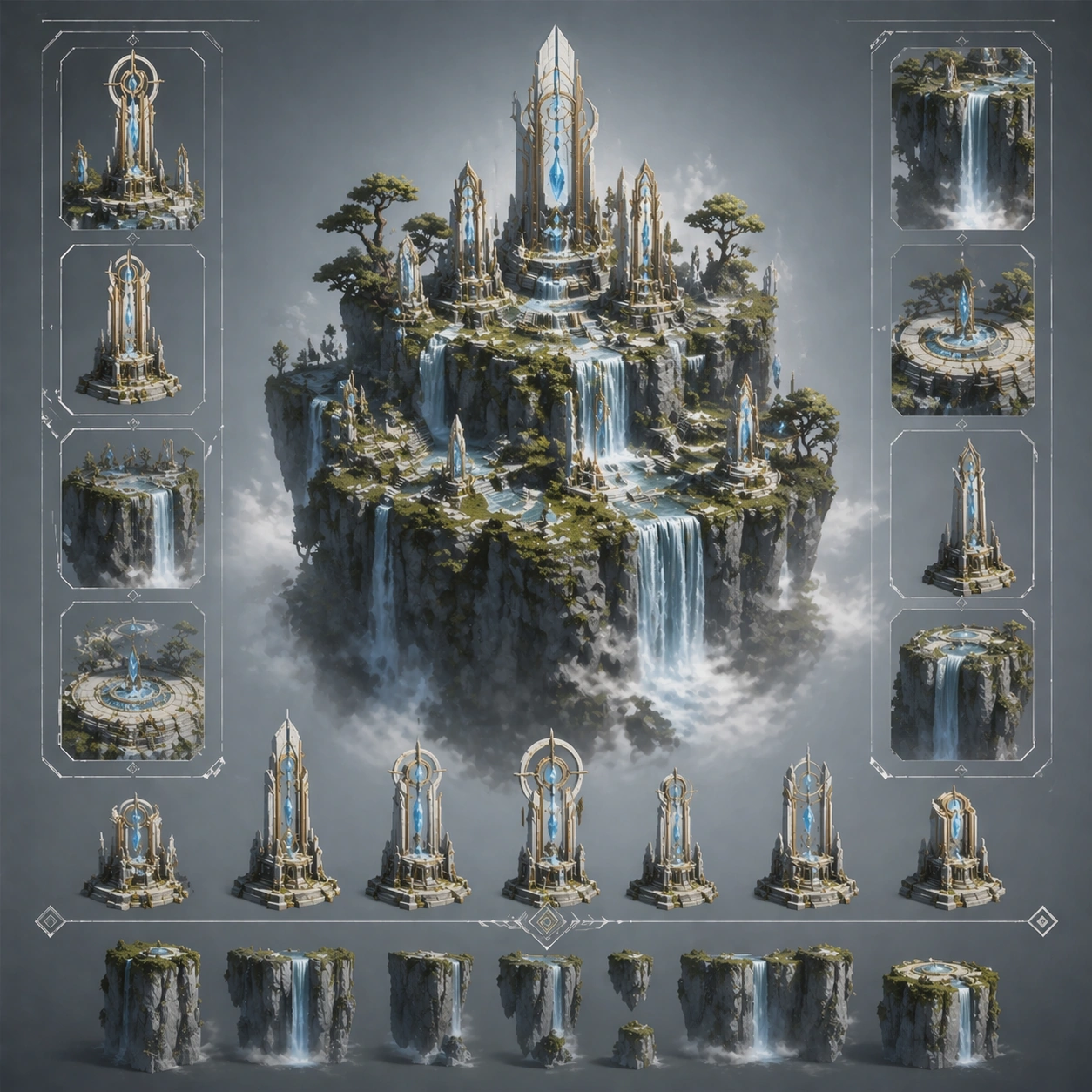
Scene: Create a square reference image for Waterfall Cliff and Mist Monuments. Build a reference anchor establishing the core system with a premium, production-ready finish. Use a polished modular board or campaign surface with clean spacing, premium game-UI finish, and clear focal hierarchy. The composition should feel intentional, clean, and reusable for gallery, research, campaign, or internal handoff contexts. Lighting must support readability first, with the main forms clearly separated from the background and enough breathing room for the system to stay legible at both hero scale and thumbnail scale. Subject: Center a coherent original game-art system built for premium production and marketing surfaces. For this image, focus on reference anchor. Keep the same system logic stable across screenshots, cards, banners, and overview boards. This image is the canonical anchor that later series images must follow. The viewer should immediately understand what role this surface plays inside a cohesive game-production asset pack. Important details: Lock framing, icon grammar, palette blocking, and surface hierarchy so the kit feels production-ready and consistent. Preserve the core silhouette, framing language, and material logic from the reference image while each variation changes function. Keep materials believable, edge hierarchy disciplined, and the visual language consistent with Waterfall Monuments. Use abstract interface blocks or diagram accents when helpful, but avoid any readable language. The final result should feel like a deliberate production asset rather than a random illustration. Use case: Waterfall Cliff and Mist Monuments series study 1/9, designed as reference anchor within a cohesive asset pack. Constraints: No readable text, no watermark, no logos, preserve exact 1:1 aspect ratio, no unrelated objects, no broken visual hierarchy, no malformed anatomy or broken perspective, no random decorative clutter.
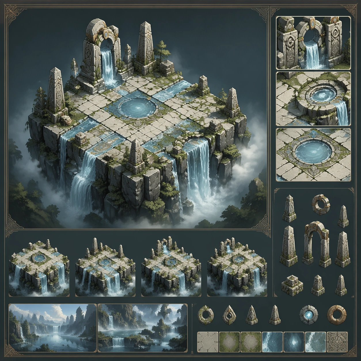
Example generated from “Waterfall Cliff And Mist Monuments — Variant One”
GPT Image 2en

Scene: Create a square dependent image for Waterfall Cliff and Mist Monuments. Build a first controlled variation in the same system with a premium, production-ready finish. Use a polished modular board or campaign surface with clean spacing, premium game-UI finish, and clear focal hierarchy. The composition should feel intentional, clean, and reusable for gallery, research, campaign, or internal handoff contexts. Lighting must support readability first, with the main forms clearly separated from the background and enough breathing room for the system to stay legible at both hero scale and thumbnail scale. Subject: Center a coherent original game-art system built for premium production and marketing surfaces. For this image, focus on the intended support surface. Keep the same system logic stable across screenshots, cards, banners, and overview boards. Preserve exact identity or system logic from the reference image while changing only the intended variation axis. The viewer should immediately understand what role this surface plays inside a cohesive game-production asset pack. Important details: Lock framing, icon grammar, palette blocking, and surface hierarchy so the kit feels production-ready and consistent. Preserve the core silhouette, framing language, and material logic from the reference image while each variation changes function. Keep materials believable, edge hierarchy disciplined, and the visual language consistent with Waterfall Monuments. Use abstract interface blocks or diagram accents when helpful, but avoid any readable language. The final result should feel like a deliberate production asset rather than a random illustration. Use case: Waterfall Cliff and Mist Monuments series study 2/9, designed as variant one within a cohesive asset pack. Constraints: No readable text, no watermark, no logos, preserve exact 1:1 aspect ratio, no unrelated objects, no broken visual hierarchy, no malformed anatomy or broken perspective, no random decorative clutter.
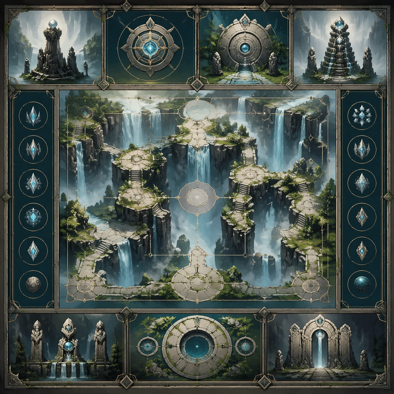
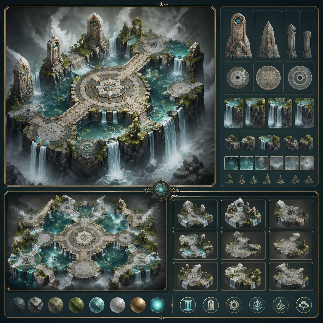
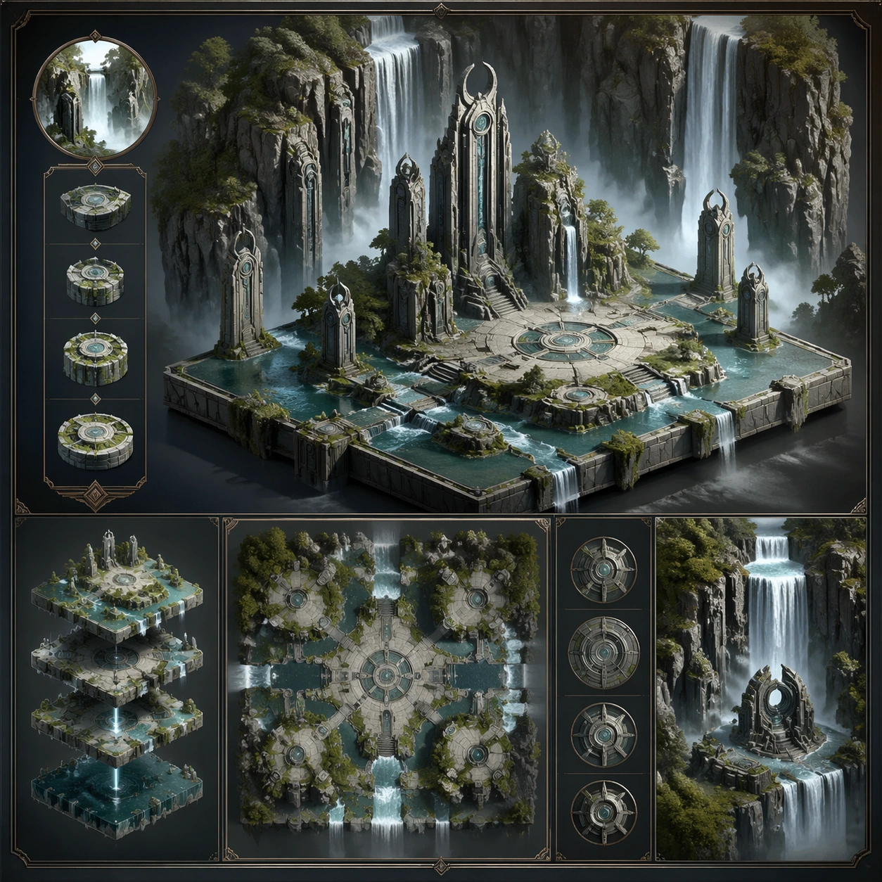
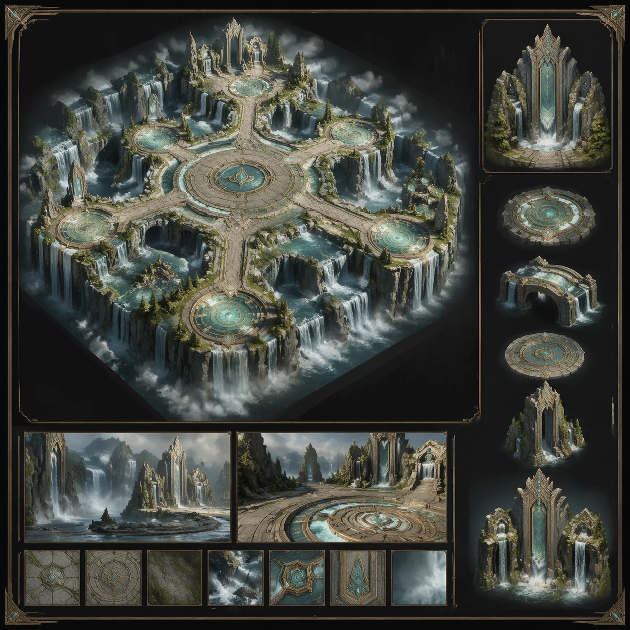
Example generated from “Waterfall Cliff And Mist Monuments — Variant Two”
GPT Image 2en

Scene: Create a square dependent image for Waterfall Cliff and Mist Monuments. Build a second controlled variation in the same system with a premium, production-ready finish. Use a polished modular board or campaign surface with clean spacing, premium game-UI finish, and clear focal hierarchy. The composition should feel intentional, clean, and reusable for gallery, research, campaign, or internal handoff contexts. Lighting must support readability first, with the main forms clearly separated from the background and enough breathing room for the system to stay legible at both hero scale and thumbnail scale. Subject: Center a coherent original game-art system built for premium production and marketing surfaces. For this image, focus on the intended support surface. Keep the same system logic stable across screenshots, cards, banners, and overview boards. Preserve exact identity or system logic from the reference image while changing only the intended variation axis. The viewer should immediately understand what role this surface plays inside a cohesive game-production asset pack. Important details: Lock framing, icon grammar, palette blocking, and surface hierarchy so the kit feels production-ready and consistent. Preserve the core silhouette, framing language, and material logic from the reference image while each variation changes function. Keep materials believable, edge hierarchy disciplined, and the visual language consistent with Waterfall Monuments. Use abstract interface blocks or diagram accents when helpful, but avoid any readable language. The final result should feel like a deliberate production asset rather than a random illustration. Use case: Waterfall Cliff and Mist Monuments series study 3/9, designed as variant two within a cohesive asset pack. Constraints: No readable text, no watermark, no logos, preserve exact 1:1 aspect ratio, no unrelated objects, no broken visual hierarchy, no malformed anatomy or broken perspective, no random decorative clutter.

Example generated from “Waterfall Cliff And Mist Monuments — Variant Three”
GPT Image 2en

Scene: Create a square dependent image for Waterfall Cliff and Mist Monuments. Build a third controlled variation in the same system with a premium, production-ready finish. Use a polished modular board or campaign surface with clean spacing, premium game-UI finish, and clear focal hierarchy. The composition should feel intentional, clean, and reusable for gallery, research, campaign, or internal handoff contexts. Lighting must support readability first, with the main forms clearly separated from the background and enough breathing room for the system to stay legible at both hero scale and thumbnail scale. Subject: Center a coherent original game-art system built for premium production and marketing surfaces. For this image, focus on the intended support surface. Keep the same system logic stable across screenshots, cards, banners, and overview boards. Preserve exact identity or system logic from the reference image while changing only the intended variation axis. The viewer should immediately understand what role this surface plays inside a cohesive game-production asset pack. Important details: Lock framing, icon grammar, palette blocking, and surface hierarchy so the kit feels production-ready and consistent. Preserve the core silhouette, framing language, and material logic from the reference image while each variation changes function. Keep materials believable, edge hierarchy disciplined, and the visual language consistent with Waterfall Monuments. Use abstract interface blocks or diagram accents when helpful, but avoid any readable language. The final result should feel like a deliberate production asset rather than a random illustration. Use case: Waterfall Cliff and Mist Monuments series study 4/9, designed as variant three within a cohesive asset pack. Constraints: No readable text, no watermark, no logos, preserve exact 1:1 aspect ratio, no unrelated objects, no broken visual hierarchy, no malformed anatomy or broken perspective, no random decorative clutter.

Example generated from “Waterfall Cliff And Mist Monuments — Support One”
GPT Image 2en

Scene: Create a square standalone support image for Waterfall Cliff and Mist Monuments. Build a support-surface study with a clear focal hierarchy and a finished professional surface. Use a polished modular board or campaign surface with clean spacing, premium game-UI finish, and clear focal hierarchy. The frame should feel self-contained and polished, with enough structure to explain the system even without the reference series, yet still obviously belonging to the same theme and production world. Subject: Show a coherent original game-art system built for premium production and marketing surfaces in a way that emphasizes the intended support surface. Keep the same system logic stable across screenshots, cards, banners, and overview boards. Even though this image is independent, the viewer should still recognize the same universe, same commercial logic, and same production intent as the core package. Important details: Lock framing, icon grammar, palette blocking, and surface hierarchy so the kit feels production-ready and consistent. Preserve the broader theme language through color, framing, material choices, and modular composition. Use clean panel rhythm, premium asset presentation, and believable detail density. The image should work equally well as a gallery study, research reference, and mock production deliverable. Use case: Waterfall Cliff and Mist Monuments single study 5/9, exploring support one as a support surface. Constraints: No readable text, no watermark, no logos, preserve exact 1:1 aspect ratio, no unrelated objects, no broken visual hierarchy, no visual noise that obscures the main surface, no accidental brand resemblance.

Example generated from “Waterfall Cliff And Mist Monuments — Support Two”
GPT Image 2en

Scene: Create a square standalone support image for Waterfall Cliff and Mist Monuments. Build a second support-surface study with a clear focal hierarchy and a finished professional surface. Use a polished modular board or campaign surface with clean spacing, premium game-UI finish, and clear focal hierarchy. The frame should feel self-contained and polished, with enough structure to explain the system even without the reference series, yet still obviously belonging to the same theme and production world. Subject: Show a coherent original game-art system built for premium production and marketing surfaces in a way that emphasizes the intended support surface. Keep the same system logic stable across screenshots, cards, banners, and overview boards. Even though this image is independent, the viewer should still recognize the same universe, same commercial logic, and same production intent as the core package. Important details: Lock framing, icon grammar, palette blocking, and surface hierarchy so the kit feels production-ready and consistent. Preserve the broader theme language through color, framing, material choices, and modular composition. Use clean panel rhythm, premium asset presentation, and believable detail density. The image should work equally well as a gallery study, research reference, and mock production deliverable. Use case: Waterfall Cliff and Mist Monuments single study 6/9, exploring support two as a support surface. Constraints: No readable text, no watermark, no logos, preserve exact 1:1 aspect ratio, no unrelated objects, no broken visual hierarchy, no visual noise that obscures the main surface, no accidental brand resemblance.

Example generated from “Waterfall Cliff And Mist Monuments — Support Three”
GPT Image 2en

Scene: Create a square standalone support image for Waterfall Cliff and Mist Monuments. Build a third support-surface study with a clear focal hierarchy and a finished professional surface. Use a polished modular board or campaign surface with clean spacing, premium game-UI finish, and clear focal hierarchy. The frame should feel self-contained and polished, with enough structure to explain the system even without the reference series, yet still obviously belonging to the same theme and production world. Subject: Show a coherent original game-art system built for premium production and marketing surfaces in a way that emphasizes the intended support surface. Keep the same system logic stable across screenshots, cards, banners, and overview boards. Even though this image is independent, the viewer should still recognize the same universe, same commercial logic, and same production intent as the core package. Important details: Lock framing, icon grammar, palette blocking, and surface hierarchy so the kit feels production-ready and consistent. Preserve the broader theme language through color, framing, material choices, and modular composition. Use clean panel rhythm, premium asset presentation, and believable detail density. The image should work equally well as a gallery study, research reference, and mock production deliverable. Use case: Waterfall Cliff and Mist Monuments single study 7/9, exploring support three as a support surface. Constraints: No readable text, no watermark, no logos, preserve exact 1:1 aspect ratio, no unrelated objects, no broken visual hierarchy, no visual noise that obscures the main surface, no accidental brand resemblance.

Example generated from “Waterfall Cliff And Mist Monuments — Support Four”
GPT Image 2en

Scene: Create a square standalone support image for Waterfall Cliff and Mist Monuments. Build a fourth support-surface study with a clear focal hierarchy and a finished professional surface. Use a polished modular board or campaign surface with clean spacing, premium game-UI finish, and clear focal hierarchy. The frame should feel self-contained and polished, with enough structure to explain the system even without the reference series, yet still obviously belonging to the same theme and production world. Subject: Show a coherent original game-art system built for premium production and marketing surfaces in a way that emphasizes the intended support surface. Keep the same system logic stable across screenshots, cards, banners, and overview boards. Even though this image is independent, the viewer should still recognize the same universe, same commercial logic, and same production intent as the core package. Important details: Lock framing, icon grammar, palette blocking, and surface hierarchy so the kit feels production-ready and consistent. Preserve the broader theme language through color, framing, material choices, and modular composition. Use clean panel rhythm, premium asset presentation, and believable detail density. The image should work equally well as a gallery study, research reference, and mock production deliverable. Use case: Waterfall Cliff and Mist Monuments single study 8/9, exploring support four as a support surface. Constraints: No readable text, no watermark, no logos, preserve exact 1:1 aspect ratio, no unrelated objects, no broken visual hierarchy, no visual noise that obscures the main surface, no accidental brand resemblance.

Example generated from “Waterfall Cliff And Mist Monuments — Support Five”
GPT Image 2en

Scene: Create a square standalone support image for Waterfall Cliff and Mist Monuments. Build a fifth support-surface study with a clear focal hierarchy and a finished professional surface. Use a polished modular board or campaign surface with clean spacing, premium game-UI finish, and clear focal hierarchy. The frame should feel self-contained and polished, with enough structure to explain the system even without the reference series, yet still obviously belonging to the same theme and production world. Subject: Show a coherent original game-art system built for premium production and marketing surfaces in a way that emphasizes the intended support surface. Keep the same system logic stable across screenshots, cards, banners, and overview boards. Even though this image is independent, the viewer should still recognize the same universe, same commercial logic, and same production intent as the core package. Important details: Lock framing, icon grammar, palette blocking, and surface hierarchy so the kit feels production-ready and consistent. Preserve the broader theme language through color, framing, material choices, and modular composition. Use clean panel rhythm, premium asset presentation, and believable detail density. The image should work equally well as a gallery study, research reference, and mock production deliverable. Use case: Waterfall Cliff and Mist Monuments single study 9/9, exploring support five as a support surface. Constraints: No readable text, no watermark, no logos, preserve exact 1:1 aspect ratio, no unrelated objects, no broken visual hierarchy, no visual noise that obscures the main surface, no accidental brand resemblance.

Example generated from “Weapon Blueprint Rarity Ladder — Reference Platform”
GPT Image 2en

Scene: A square armory showcase rendered like a premium game weapon inspect screen, with the rifle floating in a neutral graphite bay under cool rim lights and one clean overhead key light. The camera is a crisp three-quarter hero angle that shows stock, receiver, barrel shroud, magazine well, and optic mount without perspective exaggeration. The palette is muted steel, charcoal polymer, soft tungsten reflections, and tiny amber diagnostic glints, with enough negative space around the weapon to feel ready for UI framing. Subject: A fictional compact modular assault rifle designed for a fast extraction-shooter world. It has a bullpup-informed silhouette, a vented barrel jacket, a skeletal stock, a low-profile reflex optic, and a restrained industrial finish that feels mass-produced yet high quality. The proportions must feel believable for a handheld weapon: grip, trigger guard, magazine well, charging handle, and rail segments should all align as if they could function mechanically. Show only the weapon, centered and fully visible. Important details: This image is the canonical reference for later rarity variants. Lock the exact outline of the receiver, stock geometry, grip angle, barrel length, optic footprint, muzzle profile, and rail placement. Surface treatment should emphasize honest hard-surface materials: bead-blasted steel, matte polymer, rubberized grip inserts, faint machining marks, small fasteners, and subtle wear on edges. No dramatic fantasy effects yet; desirability must come from precision, believable construction, and a readable base silhouette. Use case: Weapon Blueprint Rarity Ladder series study 1/9, establishing the reference weapon for later rarity escalation. Constraints: No readable text, no watermark, no logos, preserve exact 1:1 aspect ratio, no hands, no character, no firing effects, no exploded parts, no cross-section, no unreadable clutter, no oversized decorative ornaments

Example generated from “Weapon Blueprint Rarity Ladder — Rare Tactical Upfit”
GPT Image 2en

Scene: A square cosmetic reveal frame in the same armory bay and camera position as the reference weapon, lit with slightly brighter side strips and a cool electric accent wash that makes the upgraded finish feel aspirational but still grounded. The rifle should occupy the same scale and placement as the reference, with a premium product-shot calmness rather than a chaotic action poster. Subject: The same fictional modular rifle from the reference image, shown as a rare-tier upgrade. Preserve exact silhouette, attachment placement, receiver proportions, stock shape, grip, optic footprint, and barrel geometry from the reference model. The weapon now carries a refined midnight-blue ceramic coating, brushed titanium fastener caps, a cleaner muzzle device, and a slightly more advanced optic hood, while remaining clearly the same platform. Important details: Rarity should read through controlled surface hierarchy, not by redesigning the gun. Add a few luminous seam accents, slightly richer material contrast, cleaner machining transitions, and one tasteful geometric pattern on the side panels. Keep hard-surface logic plausible, with no floating pieces and no magic aura clouds. The upgrade must feel like a higher-tier production skin sold in an armory page, not a different weapon family. Use case: Weapon Blueprint Rarity Ladder series study 2/9, showing the rare-tier cosmetic step while preserving platform continuity. Constraints: No readable text, no watermark, no logos, preserve exact 1:1 aspect ratio, preserve exact silhouette from the reference model, no character, no muzzle flash, no detached parts, no fantasy runes, no soft toy proportions, no readable labels

Example generated from “Weapon Blueprint Rarity Ladder — Epic Energy Upfit”
GPT Image 2en

Scene: A square premium weapon-card render using the same viewpoint and armory bay as image 01, but with deeper shadows, hotter cyan edge lighting, and a restrained bloom that hints at advanced power systems. The background remains neutral and minimal so the viewer can compare silhouette continuity directly against the earlier tiers. Subject: The exact same modular rifle platform from the reference image, now interpreted as an epic-tier upgrade. Preserve exact silhouette, stock length, receiver profile, grip angle, optic placement, barrel shroud, rail spacing, and overall body proportions from the reference model. Add internal energy conduits visible through thin translucent slots, a denser layered finish of graphite ceramic and oil-slick alloy, and a more engineered high-tier optic without changing the outline. Important details: Epic rarity should feel like the weapon has moved from tactical issue to elite prototype. Introduce brighter reactive seams, higher precision vent cuts, subtle translucent inserts, and richer specular separation between metals, polymers, and coated composite panels. The effect energy must remain disciplined and built into the hardware, never floating around it. Mechanical readability stays primary: screws, panel lines, and assembly logic should still make sense at a glance. Use case: Weapon Blueprint Rarity Ladder series study 3/9, escalating the same rifle into an epic-tier prototype treatment. Constraints: No readable text, no watermark, no logos, preserve exact 1:1 aspect ratio, preserve exact silhouette from the reference model, no character, no environmental debris, no loose sparks cloud, no overgrown ornament, no impossible floating geometry, no readable text

Example generated from “Weapon Blueprint Rarity Ladder — Legendary Relic Upfit”
GPT Image 2en

Scene: A square top-tier store hero render in the same controlled armory set, with a more dramatic gold-and-cobalt lighting scheme, crisp backlight halos hugging the weapon contour, and a faint atmospheric haze kept far behind the subject. The composition should still function as a clean product shot rather than an explosion scene. Subject: The same modular rifle platform from the reference image presented as a legendary-tier finish. Preserve exact silhouette, receiver shape, grip, stock frame, optic mount, muzzle length, and hard-surface proportions from the reference model. Elevate the materials into dark obsidian ceramic, pale brushed alloy, embedded cobalt energy veins, and a ceremonial but still industrial muzzle crown that feels manufactured for a prestige season reward. Important details: Legendary status must read immediately through controlled luxury and engineering confidence. Use brighter emissive channels locked inside the shell, more deliberate contrast between matte and mirror finishes, finer edge trims, and a few inset crystalline modules that remain flush with the weapon body. The gun must still belong to the same family as images 01 to 03, with no silhouette drift, no fantasy sword behavior, and no ornamental clutter hiding the functional parts. Use case: Weapon Blueprint Rarity Ladder series study 4/9, completing the rarity ladder with a prestige legendary treatment. Constraints: No readable text, no watermark, no logos, preserve exact 1:1 aspect ratio, preserve exact silhouette from the reference model, no character, no action scene, no detached attachments, no smoke plumes, no creature motifs, no readable badges

Example generated from “Weapon Blueprint Rarity Ladder — Materials Wear Board”
GPT Image 2en

Scene: A square material study board photographed like a premium industrial design review, with macro close-ups tiled around one small full weapon silhouette in the center. Lighting is cool, controlled, and slightly raking so brushed surfaces, bead blasting, polymer grain, and coated edge wear remain highly legible without becoming glossy noise. Subject: A fictional shooter weapon family represented through surface samples: black ceramic shell panel, midnight blue rare coating, oil-slick epic alloy, obsidian legendary finish, translucent energy window insert, rubber grip overmold, and machined titanium fastener cluster. Each sample should feel pulled from the same rifle platform and arranged around the central weapon reference. Important details: This image must prioritize tactile credibility. Show micro scratches, edge burnish, fine machining grooves, grip stipple, layered clearcoat depth, and subtle heat discoloration near the muzzle components. The board should read like something used by weapon artists deciding rarity treatments and wear passes. Graphic separators can exist as simple lines and shapes, but no readable annotations. Use case: Weapon Blueprint Rarity Ladder single study 7/9, focusing on material hierarchy and believable surface wear. Constraints: No readable text, no watermark, no logos, preserve exact 1:1 aspect ratio, no readable labels, no character, no muddy blur, no fantasy gemstones floating loose, no soft plastic toy finish, no random collage clutter, no non-square crop

Example generated from “Weapon Blueprint Rarity Ladder — Store Hero Angle”
GPT Image 2en

Scene: A square storefront hero composition in a luxury sci-fi armory environment, with the weapon floating above a low pedestal and lit by elegant gold-cobalt spotlights, soft volumetric haze, and a dark architectural backdrop made of blurred industrial panels. The frame should feel like the cover tile for a premium store feature, but still centered on the weapon as product. Subject: One legendary-tier modular rifle from a fictional competitive shooter, shown at a flattering three-quarter hero angle with premium attachments, restrained emissive seams, and immaculate surface finish. It should echo the same platform language as the blueprint ladder: compact bullpup-informed massing, vented barrel housing, skeletal stock, and low-profile optic, all rendered with retail-grade polish. Important details: Commercial appeal and mechanical truth must coexist. Use elegant color separation, premium reflections, a stable silhouette, and enough negative space for hypothetical UI crops while avoiding actual text or logos. The gun should feel exclusive, season-defining, and immediately desirable, yet still like a believable manufactured object rather than a fantasy prop. Keep the composition uncluttered and high-conversion in tone. Use case: Weapon Blueprint Rarity Ladder single study 8/9, providing a premium hero asset for store and reward surfaces. Constraints: No readable text, no watermark, no logos, preserve exact 1:1 aspect ratio, no readable text, no character holding the weapon, no muzzle flash, no battle scene, no huge environmental props, no mascot branding, no distorted proportions

Example generated from “Weapon Blueprint Rarity Ladder — Attachment Comparison Board”
GPT Image 2en

Scene: A square comparison layout on a muted industrial background with the base weapon centered and four attachment families arranged in disciplined radial clusters around it. Lighting is clean and analytical, like a polished UI marketing composite that still respects product photography principles. Subject: A fictional modular rifle platform accompanied by grouped attachment options: compact reflex optic versus enclosed sight hood, short compensator versus extended muzzle, folded skeletal stock versus reinforced brace, and slim magazine versus high-capacity magazine. The attachments should clearly belong to the same design family and feel ready for a shooter customization menu. Important details: Make the comparison logic visually obvious through spacing, alignment, and tonal hierarchy rather than text. Each attachment group needs distinct silhouette differences and believable mounting interfaces. The central weapon should anchor the system, while the surrounding parts show customization breadth without turning the image into random clutter. Materials must stay consistent with a premium near-future armory aesthetic. Use case: Weapon Blueprint Rarity Ladder single study 9/9, summarizing modular customization options for armory and patch-note surfaces. Constraints: No readable text, no watermark, no logos, preserve exact 1:1 aspect ratio, no readable text, no cluttered sticker sheet feel, no hands, no battle background, no impossible connectors, no soft cartoon rendering, no broken geometry

Example generated from “Wellness And Prevention Education Cards — Sleep Habit Card”
GPT Image 2en

Scene: A square sleep-education card for Wellness and Prevention Education Cards. Compose it as a square card with bedtime objects, circadian icons, and habit sequence blocks. Use a palette of fresh white, sage green, butter yellow, muted coral, and soft denim blue, bright editorial lighting with cheerful softness, and a mood of uplifting, practical, and habit-forming. The frame should feel like a real healthcare communication asset art-directed for professional delivery, not a stock photo, speculative concept render, or generic corporate template. Keep the camera distance, negative space, and depth cues disciplined so the image reads immediately even at thumbnail size. Subject: Center on a sleep-health card showing evening routine cues, bedroom environment details, wind-down behaviors, and morning reset markers. Show enough surrounding context that the viewer understands the intended service surface, user situation, and institutional setting. Every object, person, diagram, device crop, or spatial cue should support clarity, trust, and practical use. If people appear, keep them anonymous, natural, privacy-safe, and grounded in believable body language rather than promotional posing. Important details: Maintain prevention education expressed through card-based compositions, small daily-life scenes, simple diagrams, and social-friendly rhythm without empty lifestyle fluff. Keep the advice grounded in behavior design through object-led storytelling and calm bedtime tones rather than wellness mysticism. Use abstract icon shapes, color blocks, chart bars, interface modules, or non-legible placeholder microcopy whenever information structure is needed, but never readable text. Materials, spacing, lighting, and hierarchy should feel production-ready and healthcare-specific. Avoid generic lifestyle filler, decorative noise, or design gestures that do not reinforce the communication goal. Use case: Wellness Cards single study 1/9 for a sleep hygiene education card. Constraints: No readable text, no watermark, no logos, preserve exact 1:1 aspect ratio, no influencer-product placement, no unrealistic body perfection, no childish clip-art tone, no information overload, no luxury bedding advertisement feel, no dreamlike fantasy effects.